Embed Size (px)
Citation preview

Chapter 6: TQM Tools and
Techniques.

Objectives
At the end of this topic, you should be able to DEFINE and EXPLAIN QFD, Benchmarking, Kanban, JIT. DESCRIBE, EXPLAIN and DEMONSTRATE Quality Tools

Why need Quality tools? Most decision point and root causes remain
unclear until valid data are studied and analyzed.
Collecting and analyzing data using total quality tools make the task easy for everyone.

Why need Quality tools? No matter where you fit into organization in
future, you may use all or some of these tool and employers will serve you well for better prospects.
This chapter will explain the most widely used of quality tools.

1. Pareto Chart Pareto charts are useful for separating the
important from the trivial. Named after Italian economist and sociologist
Vilfredo Pareto. Pareto charts are important because they can
help an organization decide where to focus limited resources.
On a Pareto chart, data are arrayed along an X-axis and a Y-axis.

Example In a factory, 20% of problems will produce
80% of defects --> 80% of defect’s cost will be assigned to only 20% of the total number of defect types occurring.
So, 80% of defect costs will spring 20% of total cost element.

Purpose of Pareto Pareto can show you where to apply your
resources by “revealing few from the trivial many”.. (Highlight few most important issues out of many)

Pareto Chart
Figure 15-1

Pareto Chart Figure 15-1 represents customers A,B, C,
D, E and All others. 75% sales are from 2 customers; A,B All others include many more customers
but brings insignificant sales (>5%) Which customers should be kept happy?

Pareto Chart

Pareto Chart Figure 15-2 shows sales of particular model of
automobile by age group of the buyers. The manufacturer has limited budget in
advertising. The chart reveals the most logical choice to target
to advertise. Concentrating on advertising on 26-45 age will
result in the best return of investment. (75%) The significant few 26-45 age The insignificant many are those under 26 &
above 45

Pareto Chart Figure 15-3

Pareto Chart Figure 15-3 shows 80% of the cost was related
to 5 defect causes. All the other (about 30 more) were insignificant. The longest bar ($70k) accounted for 40%, if
solved, immediate reduction in rework cost will happen.
After eliminate the longest bar, the team sorted data again to develop level 2 Pareto Chart *Read page 484-489 for further understanding

Pareto Chart Figure 15-4
Steps in Constructing Pareto Chart1. Select the subject of the chart2. Determine what data to be gathered3. Gather the data related to the quality problem4. Make a check sheet of the gathered data, record the total
numbers in each category.5. Determine total numbers of nonconformities, calculate
percentage each.6. Select scales of the chart7. Draw PARETO Chart from largest category to smallest.8. Analyze the chart
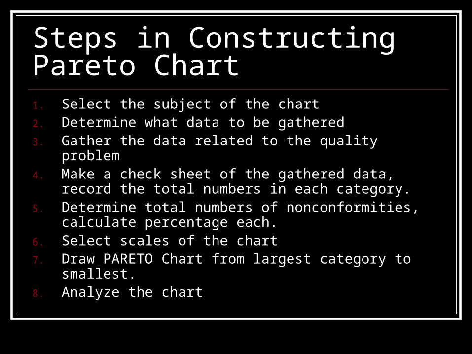
Exercise


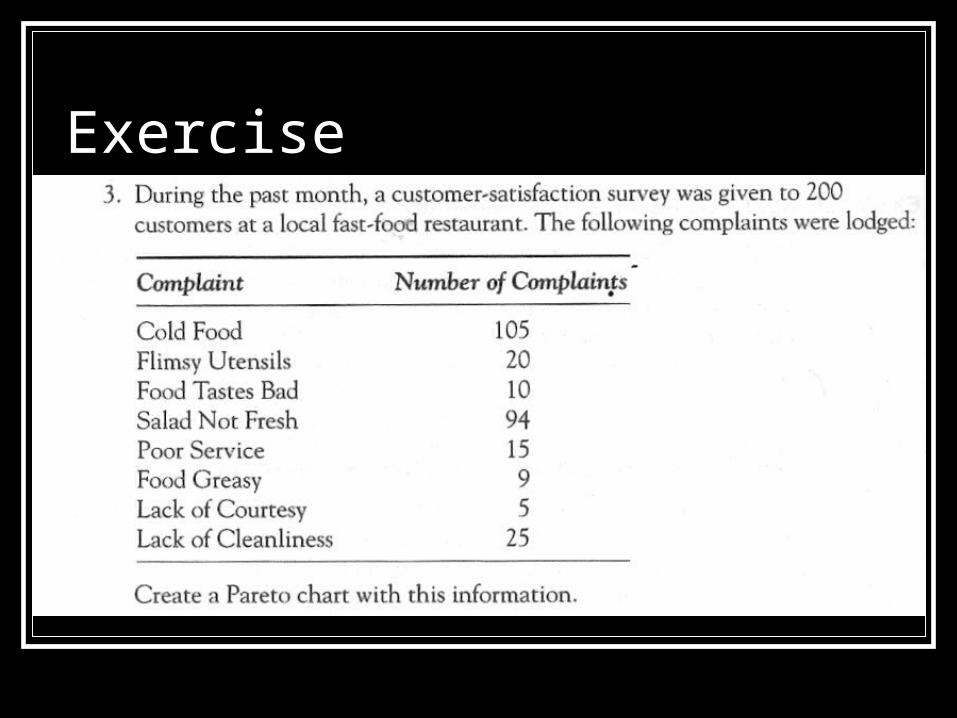
Cause and Effect Diagrams
Cause and Effect Diagrams Use to identify and isolate causes of a
problem. Developed by Dr. Kaoru Ishikawa. Also called Ishikawa Diagram / Fishbone
Diagram.

Cause and Effect Diagrams Benefits;
Creating the diagram – enlightened, instructive process.
Focus a group, reducing irrelevant discussion. Separate causes from symptoms Can be used with any problems

Cause and Effect Diagrams

Cause and Effect Diagrams From figure 15-8, the spine points to the
effect. The effect is the problem we are interested
in. The lower level factors affecting major
factor branch. Check Figure 15-7 to see whether the
major causes can be identified.

Cause and Effect Diagrams E,g: Machine soldering defects
Six major groupings of causes are; Solder machine itself Operators Materials Methods/procedures Measurement of accuracy Environment

Cause and Effect Diagrams
Solder Defects

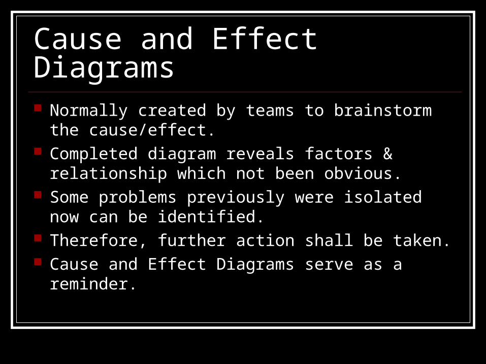
Cause and Effect Diagrams Normally created by teams to brainstorm the
cause/effect. Completed diagram reveals factors & relationship
which not been obvious. Some problems previously were isolated now can
be identified. Therefore, further action shall be taken. Cause and Effect Diagrams serve as a reminder.
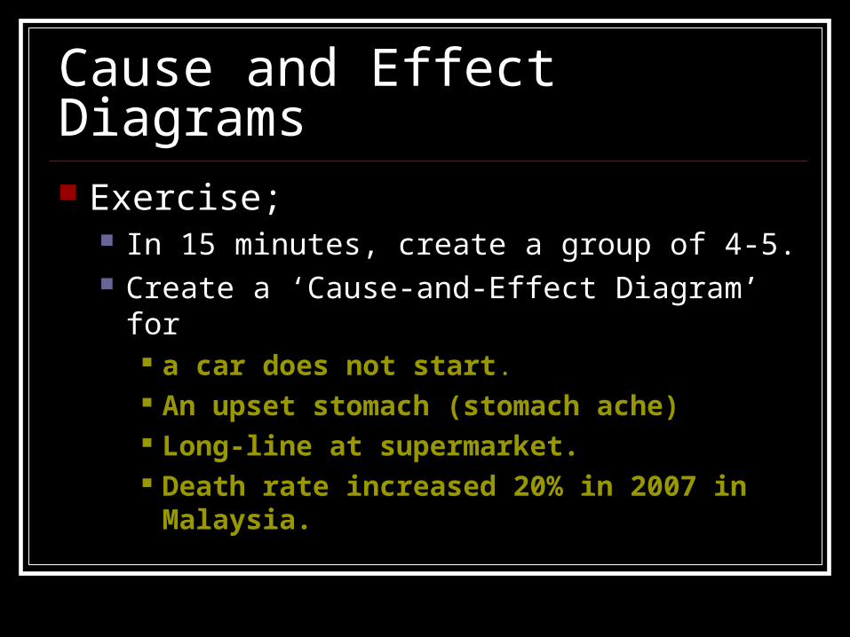
Cause and Effect Diagrams Exercise;
In 15 minutes, create a group of 4-5. Create a ‘Cause-and-Effect Diagram’ for
a car does not start. An upset stomach (stomach ache) Long-line at supermarket. Death rate increased 20% in 2007 in Malaysia.

FIVE WHYs The ‘5 Whys’ is a question-asking method used
to explore the cause/effect relationships underlying a particular problem.
Objective: To determine a root cause of a defect or problem.
The technique was originally developed by Sakichi Toyoda and was later used within Toyota Motor Corporation during the evolution of their manufacturing methodologies.
Part of Toyota Production System activities.

Example of 5 whys My car cannot start. (the problem statement) Why? - The battery is dead. (first why) Why? - The alternator is not functioning. (second why) Why? - The alternator belt has broken. (third why) Why? - The alternator belt was well beyond its useful service
life and has never been replaced. (fourth why) Why? - I have not been maintaining my car according to the
recommended service schedule. (fifth why, root cause)
This example could be taken further to a sixth, seventh, or even greater level.

How To Complete The 5 Whys1. Write down the specific problem. Describe it completely. It
also helps a team focus on the same problem.2. Ask Why the problem happens and write the answer down
below the problem.
3. If the answer doesn't identify the root cause of the problem that you wrote down in step 1, ask Why again and write that answer down.
4. Loop back to step 3 until the team is in agreement that the problem's root cause is identified. Again, this may take fewer or more times than five Whys.

5 Whys ExamplesProblem Statement: Customers are unhappy because they are being shipped products that don't meet their specifications.
1. Why are customers BEING SHIPPED BAD PRODUCTS? - Because manufacturing built the products to a specification that is different from what the customer and the sales person agreed to.2. Why did manufacturing build the products to a different specification than that of sales? - Because the sales person expedites work on the shop floor by calling the head of manufacturing directly to begin work. An error happened when the specifications were being communicated or written down.3. Why does the sales person call the head of manufacturing directly to start work instead of following the procedure established in the company? - Because the "start work" form requires the sales director's approval before work can begin and slows the manufacturing process (or stops it when the director is out of the office).4. Why does the form contain an approval for the sales director? - Because the sales director needs to be continually updated on sales for discussions with the CEO.

5 WHYs Problems: Machine blow Why machine stop? FUSE BLOW Why FUSE BLOW? Because fuse was
WRONG SIZE Why WRONG SIZE? Engineer PUT IT IN
THE BOX Why ENGINEER DO that? Supply room
ISSUE WRONG SIZE FUSE WHY ? The stock bin was MISLABELLED.
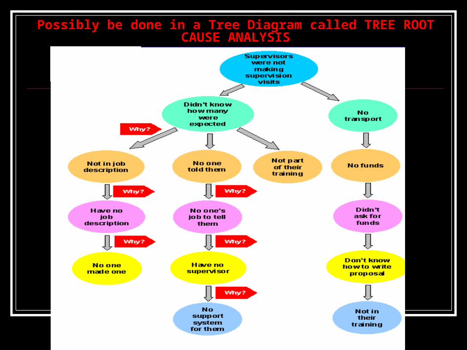
Possibly be done in a Tree Diagram called TREE ROOT CAUSE ANALYSIS

5 whys exercise Form in a group 0f 5, Identify the problem statement below using
5 whys method. Students do not perform well in examinations Students feel sleepy at class Death rate in Malaysia 50% covered by
middle ages (25-35 years old). Why?

Check sheets Many organizations:
They are :”DATA RICH, INFORMATION POOR”
Check sheet can be a valuable tool in wide applications.
Purpose: To make it easy to collect data for specific purposes or to convert into valuable information.

E.g; Weekly Summary of Shaft Dimensional Tolerance Results

Check sheet Figure 15-11 reports how the works being
produced relates to the shaft length specifications.
Machine setup limits 1.120 – 1.130 inches. Outside range waste!
So Figure 15-12 is the check sheet set up to display useful information.
It produces histogram.


Histograms Used to chart frequency of occurrence. (How often
does something happen?) Commonly associated with processes: attributes
and variables
DATA TYPES
EXAMPLES
Attributes Has / has not
Good / bad
Pass / fail
Accept / Reject
Conform / non-conform
Variables Measured values (Dimension, weight, voltage, surface, etc.)

Histograms Figure 15-14

Histograms Attribute data: Go/no go information. Variable data: measurement information. Looking at Figure 15-14, we are using attributes
data; either they passed or they failed the screening.
But, it does not reveal about the process contributing to the adjustment.
Also, does not tell the robust process. This is why variables data is needed.

Histograms and Statistics Example: textbook – page 500
BEAD EXPERIMENT
There are 900 white beads, 100 red beads.
1. The beads mixed thoroughly.2. 50 beads are drawn at random. – Count how many red beads.
– Check mark is entered in histogram.3. All the beads are put back into container and mixed again.4. Repeat Step 1 Step 3
The process does not change, but the output changed!If these steps are taken over and over, Histogram as in Figure 15-
15 will occur

Histograms and Statistics
Figure 15-15 and Figure 15-16

Histograms and Statistics The flatter and wider the frequency
distribution curve, the greater the process variability.
Taller and narrower the curve, the less process variability. 2 things in process variability;
Standard deviation, σ Mean, μ

Histograms and Statistics Mean is the sum of the observations divided by the
number of observations Also describes the central location of the data in the
chart,
Standard Deviation describes the spread.
Calculating the Mean, μ μ=ΣX÷n
X=product of the number of beads in a sample times the number of samples containing the number of beads.
*See Figure 15-17b, page 503 for further understanding.


Histograms and Statistics
μ =ΣX÷n
=510 ÷ 100
=5.1

Histograms and Statistics

Histograms and Statistics Calculating Standard Deviation, σ
d = The deviation of any unit from the mean
n = the number of units sampled.
From Figure 15-17c, n(100)
σσ = 1.49, 2 = 1.49, 2 σσ = 2.99, 3 = 2.99, 3 σσ = 4.47 = 4.47

Figure 15-18

Shapes of Histograms

Figure 15-19 Process A is much tighter, normal distribution, favorable. Process B greater variances. C and D are not centered, skewed to left and right, product
will be lost. F – someone has discarded. Take out the reject, and only
collect data within acceptable range. G –the vendor has screened out the parts, took out the best to
other customers. H – a proper normal distribution between upper and lower
limits. I and J skewing! Significant loss of product… K until P shifting… why???

Run Charts and Control Charts

Run Chart Run Chart records output results of a process over
time. The chart in Figure 15-26 can be continued
indefinitely to keep aware of its performance. Whether is it improving? Staying the same? Or
losing ground? Scales may have to change for clarity.
E.g; if we consistently found defects are always 2%, so it is make sense to change the y-axis to 0-2% maximum.
Longer term chart, can change to weekly, monthly etc.

Run Chart vs Control Chart In run chart – does not show if the variation
is the result of the special causes. Control chart is an appropriate tool to
monitor process. It is important to distinguish between;
“Special Causes” & “Common Causes”

Control Chart
Figure 15-27 shows a basic of control chart. Data stay between Upper Control Limit (UCL) and Lower Control Limit
(LCL)

Control Chart As long as the plots stay between the limits, and don’t congregate on 1 side
or the other of the average line, the process is in STATISTICAL CONTROL.
Common causes/chance: Small random changes in the process that cannot be avoided
Varying out of the centerline of the process Result of the sum of numerous small resources of natural variation that are always
part of the process. Eg; Setting on machines, environment, methods etc.
Special causes/Assignable causes: Variations in the process that can be identified as having a specific cause.
A plot point breaks through UCL or LCL OR there a several points in a row above/below the lines. Result of the factors that are not part of the process and only occur is special case. Eg: New operator involve, electricity blackout, shipment faulty of material etc.

Control Chart Only after the special has been identified, it
should be corrected, and restart the process.
How to correct? (By eliminating root cause) Control chart is usually operated under
Statistical Process Control (SPC) – Chapter 18.

Control Chart - Statistical Process Control (SPC)
What is SPC?
SPC is a statistical method of separating variation resulting from special causes resulting from natural causes, to eliminate the special causes, and to establish and maintain consistency in the process, enabling process improvement.

Control Chart Common factors that can affect output are;
5M’sMachines and environment employed
Material usedMethods (work instructions)
Measurements takenManpower (People who operate the process)
If these factors are perfect; this means;1. Environment facilitates quality work and there are no misadjustments
in the machines2. No flaws in materials3. Follow work instruction accurate and precisely4. Accurate and repeatable measurements5. People work with extreme care – follow instructions extremely well


From Figure 18-5,The average, is;
averagesubgroupx
groupssubofnumberk
kxx
x
067.100
128.1200,
xSo
x)ofvalueMinxofvalue(Max R
R
is R range, subgroup of Average
kR
Average Range, is R
667.51268R,So
RAxLCL
RAxUCL
2
2
A2 is the confidence level for the data, the larger the value of A, the farther the control limits.
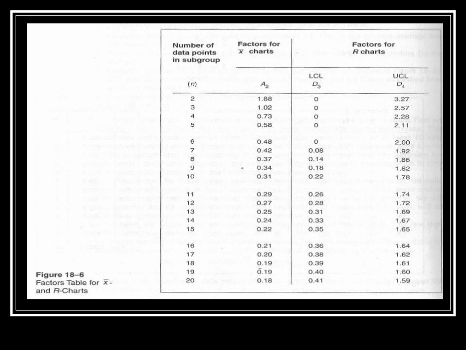

From Figure 18-6;
2467.1667.522.0
08726.10667.578.1
3
4
RDLCL
RDUCL
R
R
And UCL and LCL for the values in R chart;
31023.98)667.531.0(067.100
82377.101)667.531.0(067.100
x
x
LCL
UCL
n=10, so UCL and LCL in x-bar chart is;

Figure 18-7 (a)

Figure 18-7 (b)

Control Chart Suppose that we have been setting up a new process (not stable).
It would look like in Figure 18-8

In Figure 18-8;
Subgroup 7 was out of limits. Can we ignore? Because-control limit has been calculated with the data inclusive of
special cause event. (E.g: result of untrained operator etc) We MUST determine and eliminate the cause. After eliminate it, flush out SUBGROUP 7 and recalculate the
process average (x-bar) and the control limits. We will find narrower limit, Figure 18-9
NO!

Figure 18-9
If still penetrates the new out of limits, repeat the same action.. Until the points are all well between the limits.

X-bar chart is used to show the center of the process measurements (accuracy).
R chart is to show the spread of the data (precision).
Without Range, it would not be able to understand the PROCESS CAPABILITY of the chart.

Advantages of a Stable Process Stable process?? It is a process that exhibits
only common variation. Advantages;
1. Management knows the process capability, so they can predict cost well.
2. Productivity MAX, cost MIN
3. Management can measure effect faster and more reliable.
4. Got data if management wants to alter spec limits.
5. Stable process is basic requirement for process improvement efforts.

State of Control
1. About 34% of the plotted points in an imaginary band between 1 standard deviation on both standard deviation on both sides of the central line.
2. 13.5% of the plotted points between 1 and 2 standard deviation
3. 2.5% of the plotted points between 2 to 3 standard deviations.
4. NO POINTS BEYOND CONTROL LIMIT

Statistical error: Type I and Type II
Statisticians speak of two significant sorts of statistical error.
Type I error: An incorrect decision to REJECT something when it is true. False alarm
Type II error: An incorrect decision to ACCEPT something when it is true. Oversight


Common Use Control Chart for attribute data
(Counted values) P chart – No. of defects in samples of varying size
as a percentage of fraction. (e.g anywhere defects can be counted) np chart- no. of defective pieces in samples of
fixed size. C chart – No. of defects in a single product. (e.g:
blemish, deform, scratches in one part) U chart – No. of defects per-unit area. (Carpet
area, lenght)

Exercise
Quality Function Deployment (QFD)
Quality Function Deployment (QFD)
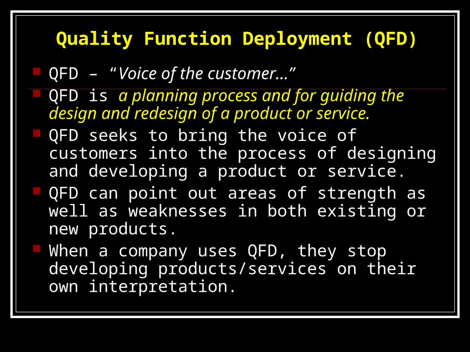
QFD – “Voice of the customer…” QFD is a planning process and for guiding the
design and redesign of a product or service. QFD seeks to bring the voice of customers into
the process of designing and developing a product or service.
QFD can point out areas of strength as well as weaknesses in both existing or new products.
When a company uses QFD, they stop developing products/services on their own interpretation.

Main benefits of QFD1. Customer focused – QFD gives information which is then
translated into a set of specific customer requirements.2. Time efficient – Time is not wasted on developing features
that have no value to customers.3. Teamwork oriented – All decisions are based on
consensus and involve in-depth discussion and brainstorming
4. Documentation oriented – QFD forces the issue of documentation. This document changes as new information gained. Having up-to-date information about customer requirements, will be very helpful.

QFD
In a simple words – QFD clearly shows what the customer wants and how to achieve those wants.

Structure of QFD Most widely used analogy for explaining QFD is structured in a ‘house’.
1. Customer Input.Customer requirements relating to the product are determined.
2. Performance Specifications (Ceilings of house)3. Wall of the house
The planning matrix. Component used to translate customer requirements into plans for meeting or exceeding those requirements
4. Middle of the houseCustomer requirements are converted into manufacturing terms. E.g; if customers
want the life cycle to be 12 months instead of 6 months, what materials to be used? The design? Manufacturing processes?
5. Bottom of the houseManufacturers critical process requirement are prioritized. Which process
requirement is most important? Which is next?6. Roof of the house
Trade-off identified relating to manufacturer's requirement. In view of customer requirement and manufacturer capability, what is the best can the organization do?
See Figure 17-1

Figure 17-1

QFD tools
Figure 17-6

Affinity Diagram Used to promote creative thinking
Mostly used when; The issue in question is so complex and the
known facts so disorganized When it is important to build a consensus for a
proposed solution.


Interrelationship Digraph
Used to bring logic to the process of identifying relationships among the various ideas recorded on the affinity diagram.


Tree Diagram
Shows the tasks that must be accomplished to solve the problem in question.


Matrix Diagram Most widely used of QFD tools To identify and graphically displaying
connections among responsibilities, task, functions and so forth.
The most widely used is L-shaped matrix – shown in Figure 17-11.


QFD sample

Thank you