Embed Size (px)
Citation preview

CHAPTER 4CHAPTER 4FINDINGS & FINDINGS & DISCUSSIONDISCUSSION
1

2
Process It
Present It
Analyze It
Raw Data
What Do You Do With
The Data Collected?

3
1.PROCESSING1.PROCESSING
• Organise manually or using computer
• Record using ‘keyword’• Categorise to see the ‘picture’• Coding helps processing the data
statistically (using SPSS)

4
2.PRESENTING2.PRESENTING
• Turn data into comprehensible ‘pictures’ through
1. Table 2. Figures

5
Bar charts/graphs are good when you want to compare discrete items. The bars can be vertical or horizontal. Making them different colours can help the reader to differentiate each result.
74.6
35.1
25.4
64.9
0
10
20
30
40
50
60
70
80
Engineering Non-Engineering
Major
Perc
enta
ge Easy
Difficult
Figure 4.1 Perceptions towards Reading in English Figure 4.2 Supply and Demand for Kelawar Cars (1998 – 2002)
Line graphs are especially effective at showing trends (how data changes over time) and relationships (how two variables interact).

6
Table 4.1 Comparisons of Drinks Sold in 2007
Tables are useful when you need to present a quantity of numerical data in an accessible format
18.6
16.9
6.8
1.7
20.3
27.1
25.4
Comic
Academic Book
Education Book
Education Magazine
Entertainment Magazine
Novel
Newspaper
Figure 4.3 Most Preferred Reading Materials by Engineering Students in Percentage
Pie charts show the proportion of the whole that is taken by various parts.

7
Figure 4.4 Schematic Diagram of Human Heart
Drawings and diagrams can be used to reinforce or supplement textual information, or where something is more clearly shown in diagrammatic form.
Figure 4.5 The Inside of a Racing Car
Photographs can be useful as illustrations that help to explain what is being discussed in the text.

Layout and Labelling
• All graphs, charts, drawings, diagrams and photographs should be numbered consecutively as Figures according to where they come in the text (e.g. Figure 1, Figure 2, Figure 3 etc).
• All tables should be numbered using a separate sequence (e.g. Table 1, Table 2 etc).
• If your chapters are numbered, you may number figures and tables in separate sequences that refer to the chapter number (e.g. in chapter 3 you would have, Figure 3.1, Figure 3.2 etc).
8

…continuation
• Title or Caption– Should be short and concise– Describe the subject and data illustrated– First letter of the words in the title should
be capitalized except for prepositions– Title for Tables come at the top while titles
for Figures at the bottom• Labels of parts in the illustration
– Should be clear and consist of few words
9

10
The bar chart has no label on the Y axis and a very vague label on the X axis. The colour of the "belief" bars and the background makes the graph difficult to read. There is no overall title for the graph.
Figure 2 Mean Response Times (bars represent standard errors) for belief and reality probes in Conditions 1, 2, and 3).
Look at the following images and identify how they could be improved to be more suitable for an academic report:

11
The table is hard to understand as there are no grid lines and the sizes of the columns are all different. There are no labels for the "Total" columns and no overall title explaining the table.

12
3.ANALYSING3.ANALYSING
• Analyse manually or using computer
• Involves the interpretation of frequencies based on data presentation

13
3 STAGES (QUALITATIVE 3 STAGES (QUALITATIVE DATA)DATA)
1.1. PROCESSINGPROCESSING
2.2. PRESENTINGPRESENTING3.3. ANALYSINGANALYSING

14
1.PROCESSING1.PROCESSING
• Organise by using transcriptions• Categorise by listing the responses • Coding by using flexible codes • Analogy of pieces of a puzzle
– Identifying– Sorting– Reconstructing

15

16
2.PRESENTING2.PRESENTING
• Usually presented in original forms
• Can also be presented using tables

17
3.ANALYSIN3.ANALYSINGG• Involves finding commonalities,
regularities or emerging patterns among the responses

18
HOW TO WRITE HOW TO WRITE IN THE REPORT?IN THE REPORT?
Type AType A Findings• Research Question 1• Research Question 2• Research Question 3
Discussion• Research Question 1• Research Question 2• Research Question 3
Type BType B
• Research Question 1: Findings & Discussion
• Research Question 2: Findings &
Discussion
• Research Question 3: Findings &
Discussion

19
HOW?
• Have an introduction• Have a general statement• Describe figures/tables effectively• Discuss by analyzing them:
– Give reasons– Support with literature review available

ANALYSIS
20
Figure 1: Supply and Demand for Kelawar Cars (1998 – 2002)

• General statement:– Supply ≠ Demand
• Description:1. Supply
– 5000 units in 2008; higher than demand
– Declined dramatically to 3000 units
– 1999-2000 remained constant @ 3000 units
– From 2000 onwards increased rapidly to 4800 units.
21

2. Demand– 3500 units in 1998– Increased rapidly +
reached a peak of 6000 units in 2000
– From 2000 onwards, demand declined sharply to 2000 units
– Year 2001-2002, it remained constant @ 2000 units
22

• Analysis:– Demand initially
increased, then decreased before remaining constant.
– Supply did not keep up with demand.
– WHY?
23

• Possible causes why increase in demand:– New model, good
marketing + pricing strategy
• Possible causes why decrease in demand:– Long waiting period,
competition from other similar category cars, poor service facilities.
24

• Possible causes why supply cannot keep up with demand:– Poor forecasting ability
25

Figure 1 shows the relationship between the supply and demand for Kelawar cars between 1998 and 2002.
In general it can be seen that there was a mismatch between demand and supply.
The demand for Kelawar increased rapidly from 3500 units in 1998, reaching a peak of 6000 units in the year 2000. From this point onwards, demand declined sharply to only 2000 units. Between the year 2001 and 2002 demand remained constant at 2000 units. In contrast, between the year 1998 and 1999 the supply of Kelawar dropped steadily from 5000 units to 3000 units.
26
Figure 1: Supply and Demand for Kelawar Cars (1998 – 2002)
Introduction & General Statement

In contrast, between the year 1998 and 1999 the supply of Kelawar dropped steadily from 5000 units to 3000 units. From 1999 to 2000, supply appeared to level off and then remained constant at 3000 units. However, from the year 2000, it started to increase gradually to 4800 units.
Figure 1: Supply and Demand for Kelawar Cars (1998 – 2002)
27

The initial increase in demand could be due to the fact that Kelawar was then newly introduced (Perodua, 1998). As we know, many people intending to buy cars would normally go for new car models. In addition, the good demand could also be the result of good marketing and pricing strategies. This claim is supported by a statement made by Chairman of Perodua, Abd Raof (2000) who said that any successful business encounter should be accompanied with high-quality advertising and pricing approach.
Figure 1: Supply and Demand for Kelawar Cars (1998 – 2002)
Discussion
28

However, starting from the year 2000, demand for Kelawar started to decrease. This fall in demand could perhaps be due to the availability of other similar small cars such as Kancil, Kelisa and Kenari (Perodua, 2001). Furthermore, according to Malaysian Automotive Association or also known as MAA (2002), the inability of the administrators to forecast future demands could result in a higher waiting time for buyers, making them lose interest. MAA (2002) also stated that poor service facilities could also cause this to happen. Figure 1: Supply and Demand for
Kelawar Cars (1998 – 2002)
Discussion
29

Language Convention- introduction -
• shows• illustrate• demonstrat
e• display• depict• describe• tabulate
• Figure 4.1 [shows]• As shown in Figure 4.1, [main clause]
– As shown in Figure 4.1, the relative pay of construction workers has been falling for two decades, …
• [main clause/NP] … is illustrated in Figure 4.1– The average boarding pattern per bus is
shown/illustrated in Figure 4.1.
• [main clause]… (see Figure 4.1)– A need analysis on office equipment shows a
tremendous requirement for new printers (see Figure 4.1).
• [NP], observed in Figure 4.1, illustrates [clause]– The number of students in the queue, observed in
Figure 4.1, illustrates how congestion is at its worst during the peak period.
30

Describing Figures & Describing Figures & TablesTablesDescribe change effectively – use verbs
•Plummet
•Decrease
•Fluctuate
•Peak
•Rise
•Drop
•Stagnant
•Rocket
•Increase
•Decline
•Level out
•Soar
•Fall
•Trough
•Jump
•Level off
•Plateau
1 Which verbs mean go up? 2 Of these, which 3 mean go up suddenly/a lot? 3 Which verbs mean go down? 4 Which verb means reach its highest level? 5 Which verb means stay the same? 6 Which verb means go up and down?
31

Changes can also be described in more detail by modifying a verb with an adverb
32

… or by using adjective
• The number of fatal cases increased dramatically – (subject + verb + adverbadverb)
• There was a dramatic increase in the number of fatal cases– (There was /were + adjectiveadjective +
noun + in + something)
33

Describing Graphs: Vocabulary
• UP - Verbs go up, take off, shoot up, soar, jump, increase, rise, grow, rocket, improve, climb, escalate (Learn the past tenses!)
• UP - Nouns an increase, a rise, a growth, an improvement, an upturn, a surge, an upsurge, an upward trend
• DOWN - Verbs go/come down, fall, fall off, drop, slump, plunge, slide, dip, decline, decrease, plummet, slip, shrink
• DOWN - Nouns a fall, a decrease, a decline, a drop, a downturn, a downturn trend
• NO CHANGE - Verbs remain stable, level off, stay at the same level, flatten off, remain constant, stagnate, stabilize, hold steady
• AT THE TOP - Verbs reach a peak, peak, top out
• AT THE BOTTOM - Verbs reach a low point, bottom out
• RECOVER pick up, bounce back, rally
•
34

Prepositions
– Between 1995 and 2000– From 1995 to 2000– Rose by (differences between initial
number & subsequent number)– Rose to
35

Vocabulary: Numbers• Look at the following table which shows a number in
different years (1990-1995) :
• You could describe the above table using numbers, fractions or percentages:• The number went up by 600, from 1200 to
1800. (Number)• The number went up by half, from 1200 to
1800. (Fraction)• The number went up by 50%, from 1200 to
1800. (Percentage)
36
1990 1995
1200 1800

• Use "trebled," "-fold," and "times:"
• The number doubled between 1992 and 1994.• The number trebled between 1994 and 1996.• The number quadrupled from 1996 to 1998
• There was a twofold increase between 1992 and 1994.• The number went up sixfold between 1992 and 1996.
• The figure in 1996 was three times the 1994 figure.• The figure in 1998 was four times the 1996 figure.
37
1992 1994 1996 1998
500 1000 3000 12 000

• Use Fraction
• Between 1992 and 1994, the figure fell by one-fifth.
• Between 1994 and 1996, the number dropped by a half.
• The figure in 1998 was one-tenth the 1992 total.
38
1992 1994 1996 1998
1000 800 400 100

Pie ChartThe chart shows the grades obtained by students in a class. Overall more than 90 percent of the students passed.
More than half of the students obtained a very good grade, with 21 percent of the students was awarded a distinction and 33 percent obtained a merit grade. Thirty-six percent of the students passed the test, while only eight failed.
39

40
Pie Chart: The American Food Budget

Pie Chart: The American Food Budget
The graph shows American spending on food for the home in 2002. Overall, the biggest areas of expenditure was on protein.The biggest percentage of spending was on meats, fish and eggs. This totalled over a quarter of the food budget. The second biggest area was on cereals and bakery products. These accounted for 16 percent of spending. Dairy products comprised just over one-tenth of expenditure on food, while fruit and vegetables together accounted for almost 20 percent of spending. Miscellaneous food items comprised 15 percent of purchases.Just under one-tenth of spending went to beverages such as coffee, tea, and soda. Finally, the smallest categories in the typical US food budget were fats and oils, at three percent, and sugar and sweets, at four percent. In conclusion, Americans spent a quarter of their at-home food budget in 2002 on meats, poultry, fish, and eggs.
41

Means of Communication
42Figure 1 Preferred Modes of Communication among Male Students in HD 2 Class
Figure 1 Preferred Modes of Communication among Female Students in HD 2 Class

Means of CommunicationThe two pie charts illustrate preferred modes of communication for six forms of media in a survey undertaken in two HD 2 classes, one male and the other female. Both genders showed similar usage patterns of means of communication. First, the telephone emerged as the most popular mode for males with a proportion of 27 percent. It ranked almost as high, at 22 percent with females, but was tied in their case with text messaging. Text messaging also ranked high with men, who allotted it one percent more. E-mail and instant messenger were close thirds and fourths in popularity, scoring 17 percent and 16 percent respectively for men, 21 percent and 18 percent for their counterparts. Last, male students gave the fax only 10 percent, and letters even less, 7 percent; females reversed the same percentages.To conclude, preferences for the six modes of communication were almost identical for the sexes. Both favoured communicating by telephone and text message the most, e-mail and instant messenger the second most, and letter and fax the least. The only minor difference is that women preferred communicating by letter and men by fax.
43

44Figure 1 Reasons for Choosing a University among Overseas Students

Figure 1 shows 11 reasons why first year students from overseas chose a particular university. The survey of 1,000 first year overseas students was carried out at universities in the UK. The top three reasons were teaching-related.According to the graph, the main reason was the language of tuition. At 95 percent of the sample, it was the main reason most students gave for choosing a university. The second biggest factor was quality of teachers, at 90 percent, followed by facilities, also at 90 percent.Non-teaching factors were also important. Tuition costs were quoted as a reason by 75 percent, and location was mentioned by 70 percent of students. The cost of accommodation was also an important factor for 80 percent of respondents. Almost two-thirds of students said that the friendliness of the university was important.In conclusion the various factors can be divided into two groups, namely those related to teaching and non-teaching related. However, the most important were the language and the teachers. 45

46Figure 1 Number of London Underground Station Passengers over the Course of a Day
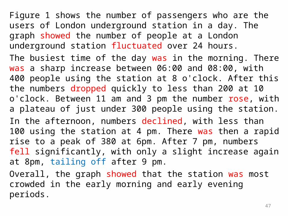
Figure 1 shows the number of passengers who are the users of London underground station in a day. The graph showed the number of people at a London underground station fluctuated over 24 hours. The busiest time of the day was in the morning. There was a sharp increase between 06:00 and 08:00, with 400 people using the station at 8 o'clock. After this the numbers dropped quickly to less than 200 at 10 o'clock. Between 11 am and 3 pm the number rose, with a plateau of just under 300 people using the station.In the afternoon, numbers declined, with less than 100 using the station at 4 pm. There was then a rapid rise to a peak of 380 at 6pm. After 7 pm, numbers fell significantly, with only a slight increase again at 8pm, tailing off after 9 pm.Overall, the graph showed that the station was most crowded in the early morning and early evening periods.
47

Tables: types of cars
Make PriceCountry of origin
Engine size
Miles per gallon
Toyota Corolla $15,550 Japan 1400cc 48
Volkswagen Golf $18,250 Germany 1600cc 40
Ford Focus $15,800 USA 1400cc 50
Nissan Micra $15,500 Japan 1200cc 5248
Table 1 Comparison of Four Small Cars

The table compares four small cars on the basis of their price, engine size and fuel consumption. Overall, the biggest car, the VW Golf, was the most expensive and had the lowest fuel efficiency.Cost is an important factor in buying a car. The most expensive car in the group was the VW Golf, at over $18,000. This was three thousand dollars more expensive than the other three cars, which all cost between $15,000 and $15,800. The German Volkswagen also had the biggest engine size. It had a 1600cc engine. In contrast, the cheapest car in the group, the Nissan Micra, had the smallest engine, at only 1200cc.Fuel economy is also a significant factor to consider before buying a car. The cheapest car in the group, the Nissan Micra, had the lowest fuel consumption, at 52 miles per gallon. This figure was similar to the fuel consumption for the other Japanese car, the Toyota Corolla, and for the American car, the Ford Focus. However, the Volkswagen Golf, had the worst fuel consumption, at only 40 miles per gallon. This was due to its larger engine size.In conclusion, the bigger the car, the more expensive it was and the lower the fuel efficiency. Customers have to choose carefully between power, features and cost before making their dream purchase.
49

50
4 STRATEGIES IN 4 STRATEGIES IN WRITING DISCUSSIONWRITING DISCUSSION
• Explain - Give reason, explain scenario, explain limitations
• Compare - with the findings of other research, relate different findings
• Evaluate – expected, unexpected, unsatisfactory, insignificant
• Infer – develop your own viewpoints
REFER TO PAGE 182 FOR MORE DETAILS