Embed Size (px)
Citation preview

1
Chapter 3Engineering Solutions
3.4 and 3.5 Problem Presentation
Organize your work as follows (see book):
Problem StatementTheory and Assumptions
SolutionVerification
Tools:
Pencil and PaperSee Fig. 3.1 in Book
or useAnalysis Software,
e.g. Mathcad
Tools:Word Processor
See Fig. 3.3a and b in BookBenefits:
Neater appearanceImport graphics
Import results from other tools, such as spread sheets Source: Eide, Fig. 3.3a

2
Analysis Software :Advantages: •Always clean and organized•Numerics will be correct (assuming you entered correct equations)•Automated graphing and presentation tools•Superior error and plausibility checking
Analysis Software :
So why aren’t you using Math software yet?
Examples of Analysis Software:
•Mathematica (symbolic)•Maple (symbolic)•Mathcad (general and symbolic)•Matlab (numerical)•Numerous specialty products
Dipole (physics)analysis example
Mathematica
MathematicaMathematica

3
Mathcad Calculus Example
y x( ) x3
1 x2+ x3+sin 3 x⋅( )
Maple Differentiation
xy x( )d
d3 x2
1 x2+ x3+( )sin 3 x⋅( )
⎡⎢⎣
⎤⎥⎦
12
⋅ 12
x3
1 x2+ x3+( )sin 3 x⋅( )
⎡⎢⎣
⎤⎥⎦
32
⋅ a⋅−
with
a 2 x⋅ 3 x2⋅+( )sin 3 x⋅( )
3 1 x2+ x3+( )sin 3 x⋅( )2
⋅ cos 3 x⋅( )⋅−⎡⎢⎢⎣
⎤⎥⎥⎦
SymbolicsExample(Mathcad)
Examples in Mathcad: compute motionof sliding block.
Motion of sliding block.
Dynamic system analysis example
Dynamic system analysis example
Mathcad can find the solution by symbolicEquation solving:
Dynamic system analysis example

4
What is in it for me?
Yes, you will have to get used to the constraints imposed by the
software. This will pass. All learning is an investment
for your future.
What is in it for me?
Benefits: You will beFaster
More EfficientMore accurate.
Better presentationTime is money.
What is in it for me?
Tools such as Mathcad allow you to create:
•Better presentations•Accurate results.•Better design choices (playwhat if? scenarios)
Conclusion Chapter 3
Plan for the long term.Become familiar with those tools that will make you the
most productive.Your investment will pay off
handsomely.
Chapter 4Representation
ofTechnical Information
A Typical Scenario
We collected data in an experiment.
•The data set might consist of a list, such as the one on page 143 in your book, or a computer data file.•We plot the data.
5
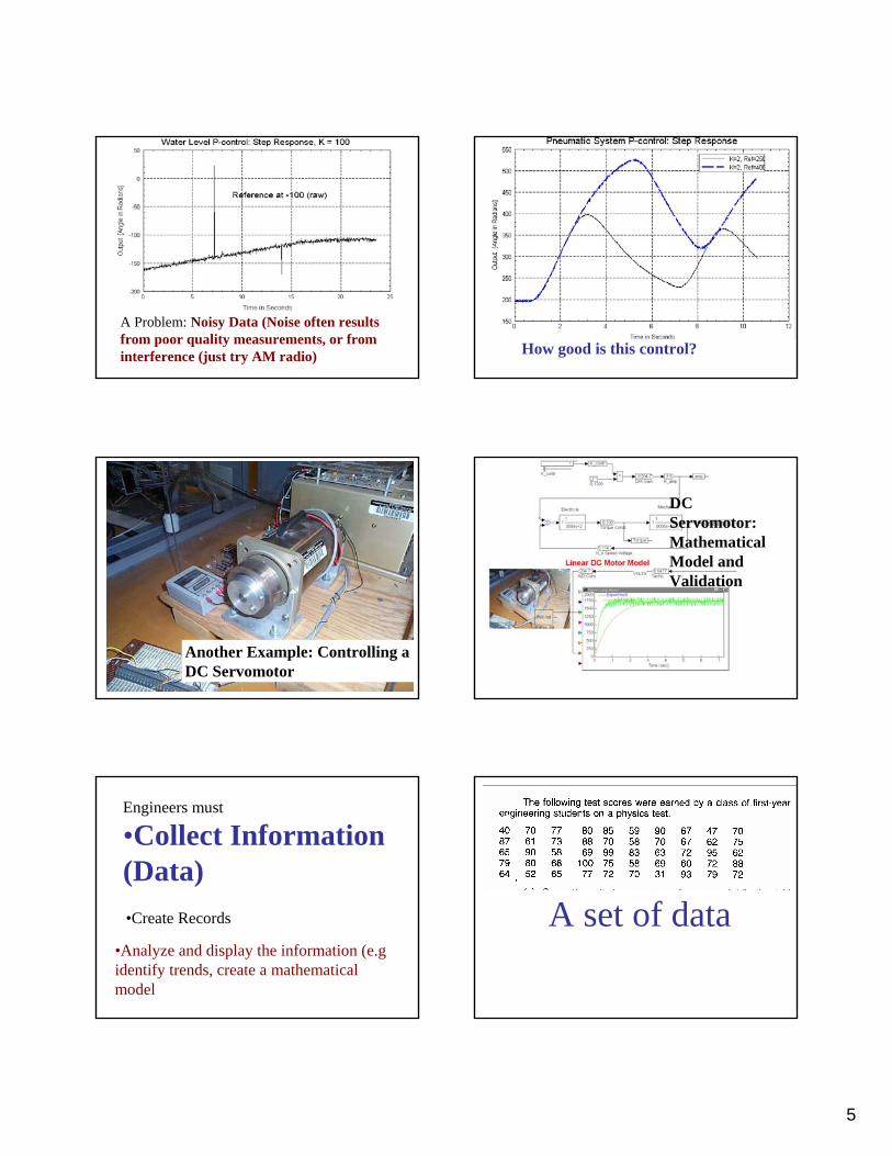
A Problem: Noisy Data (Noise often results from poor quality measurements, or from interference (just try AM radio) How good is this control?
Another Example: Controlling a DC Servomotor
DC Servomotor:Mathematical Model and Validation
Engineers must
•Collect Information (Data)
•Analyze and display the information (e.g identify trends, create a mathematical model
•Create Records A set of data

6
An Example:
A sorted set of data from Tensile Testing of
Materials
A Tensile Testing Machine
Material samples are inserted and the force to break the sample apart is recorded.
Force Force
Force Number512 2517 2522 0527 1532 1537 0542 1547 2552 0557 1562 0567 0572 0577 3582 1587 1
First Column:Force (in Kilo-Newtons) required to break the sample
Second Column:Number of samples broken at the respective Force Level
Total 15 Samples
0
0.5
1
1.5
2
2.5
3
3.5
512 517 522 527 532 537 542 547 552 557 562 567 572 577 582 587
Force in KiloNewtons
Freq
uenc
y
We can enter the data set into a spreadsheet program such as MS Excel, and plot the information in various formats.
-2
0
2
4
6
8
10
12
14
16
500 510 520 530 540 550 560 570 580 590 600
value
freq
uenc
y
Series1
Series2Cumu
Plotting in various formats:Same data, Line graph (in blue)Cumulative (adding all samples) in red
7
512 517
522
527 532
537
542
547
552
557
562 567 572
577
582 587
512
517 522
527
532 537
542
547 552
557 562 567 572
577
582
587
-2
0
2
4
6
8
10
12
14
16
500 510 520 530 540 550 560 570 580 590 600
value
freq
uenc
y
Series1
Series2Cumu
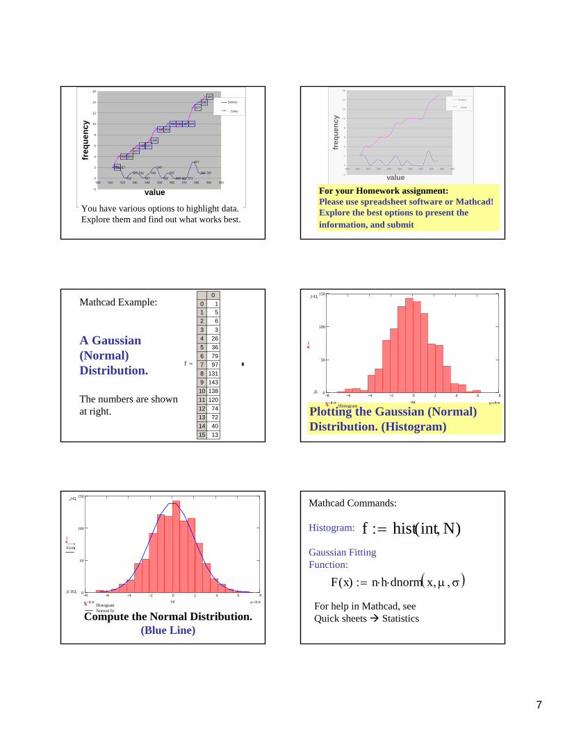
You have various options to highlight data.Explore them and find out what works best.
-2
0
2
4
6
8
10
12
14
16
500 510 520 530 540 550 560 570 580 590 600
value
freq
uenc
y
Series1
Series2Cumu
For your Homework assignment:Please use spreadsheet software or Mathcad!Explore the best options to present the information, and submit
f
00123456789
101112131415
1563
26367997
131143138120
74724013
=
Mathcad Example:
A Gaussian (Normal) Distribution.
The numbers are shown at right. Plotting the Gaussian (Normal)
Distribution. (Histogram)
8 6 4 2 0 2 4 6 80
50
100
150
Histogram
143
0
f
µ 4 σ⋅+µ 4 σ⋅− int
Compute the Normal Distribution.(Blue Line)
8 6 4 2 0 2 4 6 80
50
100
150
HistogramNormal fit
142
0.163
f
F int( )→⎯⎯
µ 4 σ⋅+µ 4 σ⋅− int
f hist int N,( ):=
Mathcad Commands:
Histogram:
Gaussian FittingFunction:
F x( ) n h⋅ dnorm x µ, σ,( )⋅:=
For help in Mathcad, see Quick sheets Statistics

8
Chapter 4.2 Collecting Data•Manual (slow, inefficient, error-prone. don’t waste your time! Sometimes, of course, manual recording of data is expedient)•Computer assisted (typically faster and more accurate) You can also buy special recorders (data loggers) that record very large quantities at very high rates.
Example:During Nuclear testing at the Nevada Test Site, all data must be collected within about 100 nanoseconds after triggering.The instrumentation is destroyed by the explosion
Plotting Experimental Data:A set of x/y data
x123
4
5
6
78
9
10
= y x( )9.87111.09
15.714
17.364
21.608
22.117
27.80828.495
31.351
34.355
=Plotting Experimental Data:Basics
•Present the information clearly and concisely!•Each graph should speak for itself: Label the axes!
Descriptive Title!
Eide,Page 155Fig. 4.9 Scaling the Axes
Eide,Page 155 Fig. 4.10
Please Read and apply!
Axes Graduations

9
Eide,Page 157Fig. 4.12
Eide,Page 157 Fig. 4.13 Proper Representation of Data
You choose.
Plotting Experimental Data:Graphing the data (scatter points)
1 2 3 4 5 6 7 8 9 105
10
15
20
25
30
35
40
Y
X
1 2 3 4 5 6 7 8 9 1010
15
20
25
30
35
40
4540.536
14.305
Y
101 X
Plotting Experimental Data:Graphing the data (data points connected by lines)
1 2 3 4 5 6 7 8 9 1010
15
20
25
30
35
40
4540.536
14.305
Y
101 X
We can use Bar Graphs ..Or steps
1 2 3 4 5 6 7 8 9 1010
15
20
25
30
35
40
4540.536
14.305
Y
101 X

10
Linear Interpolation:Best fit line
1 2 3 4 5 6 7 8 9 1010
15
20
25
30
35
40
4540.536
14.305
Y
µ x⋅ β+
101 X x,
Eide,Page 161Fig. 4.21
MultipleData Sets
Eide,Page 163Fig. 4.23
Spreadsheet RulesPlotting Experimental Data:A Quadratic Function (free fall)The falling distance is proportional totime2
t 1 2, 10..:=
falldrop t( )12
g⋅ t2⋅:=
0 2 4 6 8 100
100
200
300
400
500
Time in Seconds
Dro
p in
Ele
vatio
n (m
eter
s)
490.5
0.049
falldrop t( )
100.1 t
Free Fall: Elev. vs. Time
0.1 1 100.01
0.1
1
10
100
1 .103
Time in Seconds
Dro
p in
Ele
vatio
n
490.5
0.049
falldrop t( )
100.1 t
Free Fall: Elev. vs. TimeSame data, in log-log format

11
0.1 1 100.01
0.1
1
10
100
1 .103
Time in Seconds
Dro
p in
Ele
vatio
n (m
eter
s)
490.5
0.049
falldrop t( )
100.1 t0.1 1 10
0.01
0.1
1
10
100
1 .103
Time in Seconds
Dro
p in
Ele
vatio
n (m
eter
s)
490.5
0.049
falldrop t( )
100.1 t
Log-Log plots: What is different?The axis labels are multiples of 10,Not increments by 10, as in linear graphs
Eide,Page 168 Eide,
Page 169
Log-Log plots: What is different?The axis labels are multiples of 10,In the linear graph, the data were evenly distributed.
0 2 4 6 8 100
100
200
300
400
500
Time in Seconds
Dro
p in
Ele
vatio
n (m
eter
s)
490.5
0.049
falldrop t( )
100.1 t 0.1 1 100.01
0.1
1
10
100
1 .103
Time in Seconds
Dro
p in
Ele
vatio
n (m
eter
s)
490.5
0.049
falldrop t( )
100.1 t
Log-Log plots: What is different?The axis labels are multiples of 10,In the logarithmic plot, the data seem to be clustered in the upper right corner.
Why?

12
d .1 .2, 10..:= f d( ) log d( ):=d
0.10.40.7
1
1.3
1.6
1.9
2.2
2.5
2.8
3.1
3.4
3 7
= f d( )-1
-0.398-0.155
0
0.114
0.204
0.279
0.342
0.398
0.447
0.491
0.531
0 568
=
0 2 4 6 8 101
0.5
0
0.5
11
1−
f d( )
100.1 d
The (decadic) logarithm of 0.1 = -1.Log(1)= 0; Log(10) =1 ……
We can use logarithmic plots to test a data set for polynomial relationships. Look at these three polynomials:
f1 x( ) 2 x1.5⋅:=
f2 x( ) 3 x3⋅:=
f4 x( ) 1.2 x3.5⋅:=
Now graph the three polynomials in log-log format:
f1 x( ) 2 x1.5⋅:=
f2 x( ) 3 x3⋅:=
f4 x( ) 1.2 x 3.5⋅:= 1 101
10
100
1 .103
1 .104
3.795 103×
1.2
f1 x( )
f2 x( )
f4 x( )
101
x1
1.41.82.22.6
33.43.84.24.6
55.45.86.26.6
7
= fp x( )20.08530.62473.48194.966
222.621269.297298.011514.174612.635833.211
1.231·10 3
1.532·10 3
1.625·10 3
2.186·10 3
2.226·10 3
2.821·10 3
=
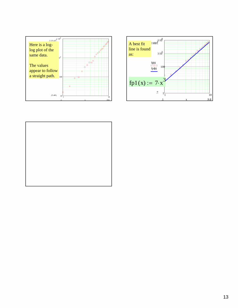
Example:Testing the dataSet at right for Polynomial Properties.
We can use log-log graphing toidentify patterns.
Here is a linear plot of the data.
The values are somewhat scattered due to sensor noise.
0 2 4 6 8 100
1000
2000
3000
4000
5000
6000
7000
8000
fp x( )
x
13
1 1010
100
1 .103
1 .104
7.17 103×
15.401
fp x( )
9.81 x
Here is a log-log plot of the same data.
The values appear to follow a straight path.
1 101
10
100
1.103
1.1047.115103×
7
fpx( )
fp1x( )
9.81 x
A best fit line is found as:
fp1 x( ) 7 x3⋅:=