Embed Size (px)
Citation preview

Key Words
Frequency Tables
Pie Chart, Bar Chart, Line Chart
Stem and Leaf
Histogram, Polygon, Shapes
Cross Tabulation
Scatter Diagram
Parameter, Statistic
Mean (Average), Median, Mode, Percentiles
Range, Variance, Standard Deviation, Coefficient of Variation
Box–and-Whisker Plots
12/5/2017
Biostatistics
Dr. Ahmed Jaradat, AGU
Chapter 2:Strategies for Understanding
the Meanings of Data

Learning Outcomes:
After studying this chapter, you will:
1. Understand how data can be appropriately organized and
displayed.
2. Understand how to reduce data sets into a few useful,
descriptive measures.
3. Be able to calculate and interpret measures of central
tendency, such as the mean, median, and mode.
4. Be able to calculate and interpret measures of dispersion,
such as the range, variance, and standard deviation.
2/5/2017
Biostatistics Dr.
Ahmed Jaradat, AGU 2

Qualitative (Categorical) and quantitative variables are:Graphed
Charted
Tabled and
Statistically summarized
in very different ways
3
Descriptive Statistics:
Organizing and Summarizing Data
2/5/2017
Biostatistics
Dr. Ahmed Jaradat, AGU
Grade
SexFemale 6 31 18 29 33
Male 9 14 20 11 10
GroupA 5 19 18 18 25
B 10 26 20 22 18
Total

Data Summarization and Presentation Qualitative Data:
1. Tables
1. Frequency Table
2. Relative Frequency Table
3. Percent Frequency Table
4. Cross Tabulation
2. Graphs
1. Bar chart
a. Simple Bar Chart
b.Clustered Bar Chart
c.Stacked Bar Chart
2. Pie Chart
Quantitative Data:
1. Tables1. Frequency Table
2. Relative Frequency Table
3. Percent Frequency Table
4. Cumulative Frequency Table
5. Cumulative Relative Freq. Table
6. Stem and Leaf Display
7. Cross Tabulation
2. Graphs1. Line Graph
2. Histogram
3. Frequency Polygon
4. Cumulative Frequency Polygon
5. Scatter Diagram
6. Box and Whisker Plot
2/5/2017
Biostatistics Dr.
Ahmed Jaradat, AGU 4

5
Summarization and Presentation of Qualitative Data:
Frequency Tables
Smoking Status Frequency
Ever Smoked Cigarettes 3222
Stop Smoked Cigarettes 748
Currently Smoked
Cigarettes1274
Total 5244
2/5/2017
Biostatistics
Dr. Ahmed Jaradat, AGU
Frequency distribution of Smoking Status of 5244 persons
Relative
Frequency
0.614
0.143
0.243
1.000
Percent
Frequency
61.4
14.3
24.3
100.0

Summarization and Presentation of Qualitative Data:
Simple Bar Chart
2/5/2017
Biostatistics Dr.
Ahmed Jaradat, AGU 6

7
0
500
1000
1500
2000
2500
3000
Ever Smoked
Cigarettes
Stop Smoked
Cigarettes
Currently
Smoked
Cigarettes
Nu
mb
er
of
Pe
rso
ns
Smoking Status
Male
Femal
2/5/2017
Biostatistics
Dr. Ahmed Jaradat, AGU
0
200
400
600
800
1000
1200
< 18 18-25 25-30 30-40 >40
Nu
mb
er
of
pe
rso
ns
Age
Ever Smoked Cigarettes
Stop Smoked Cigarettes
Currently SmokedCigarettes
Summarization and Presentation of Qualitative Data:
Clustered (Grouped) Bar Chart

8
0
200
400
600
800
1000
1200
1400
1600
1800
< 18 18-25 25-30 30-40 >40
Nu
mb
er o
f P
ers
on
s
Age
Currently Smoked Cigarettes
Stop Smoked Cigarettes
Ever Smoked Cigarettes
2/5/2017
Biostatistics
Dr. Ahmed Jaradat, AGU
Summarization and Presentation of Qualitative Data:
Stacked Bar Chart
Pie Chart

Summarization and Presentation of
Quantitative Data: Frequency Tables
Grade
Limits
Number of
Students
40-49 9
50-59 6
60-69 45
70-79 38
80-89 40
90-100 43
181
2/5/2017
Biostatistics Dr.
Ahmed Jaradat, AGU 9
Relative
Frequency
0.05
0.03
0.25
0.21
0.22
0.24
1.00
Percent
Frequency
4.97
3.31
24.86
20.99
22.10
23.76
100.00
Cumulative
Frequency
9
15
60
98
138
181
Cumulative
Percent Freq.
4.97
8.29
33.15
54.14
76.24
100.00
Summarizing Biostatistics Final Grades 2013/2014 Using Tables
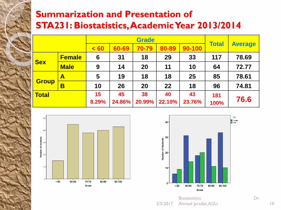
Summarization and Presentation of
STA231: Biostatistics, Academic Year 2013/2014
2/5/2017
Biostatistics Dr.
Ahmed Jaradat, AGU 10
GradeTotal Average
< 60 60-69 70-79 80-89 90-100
SexFemale 6 31 18 29 33 117 78.69
Male 9 14 20 11 10 64 72.77
GroupA 5 19 18 18 25 85 78.61
B 10 26 20 22 18 96 74.81
Total 15
8.29%
45
24.86%
38
20.99%
40
22.10%
43
23.76%181
100%76.6

Stem and Leaf Display:
Biostatistics Final Grades/ 2013-2014
11
Stem
4
5
6
7
8
9
10
2/5/2017
Biostatistics
Dr. Ahmed Jaradat, AGU
Leaf
115577799
111233
000000000000111223455556666666777777778899999
00001111112222333444444455556666677889
0000001122222222233333344556666678888999
0001111222222333444555566666788999
000000000
9
6
45
38
40
34
9

Line Chart:
122/5/2017
Biostatistics
Dr. Ahmed Jaradat, AGU
Temperatures in Manama, in Co, over a 12-hour period

Line graph
0
1
2
3
4
5
6
7
2010 2011 2012 2013 2014
Nu
mb
er
of
clin
icia
ns
Clinic 1
Clinic 2
Clinic 3
Number of Clinicians Working in Each Clinic During Years 2010-2014
2/5/2017 13
Biostatistics Dr.
Ahmed Jaradat, AGU

Use a bar graph if you are not looking for trends (or
patterns) over time; and the items (or categories) are not
parts of a whole
Use a pie chart if you need to compare different parts of
a whole, there is no time involved and there are not too
many items (or categories).
Use a line graph if you need to see how a quantity has
changed over time. Line graphs enable us to find trends
(or patterns) over time.
14
Choosing the Right Graph
2/5/2017
Biostatistics
Dr. Ahmed Jaradat, AGU

How to Choose between Tables, Figures,
and Text to Present Data
2/5/2017
Biostatistics Dr.
Ahmed Jaradat, AGU 15
Use Table Use Figure Use Text
To show many and precise
numerical values and other
specific data in a small space
To show trends, patterns, and
relationships across and
between data sets when general
pattern is more important than
the exact data values (What to
use: graphs, data plots)
When you don’t have extensive
or complicated data to present
To compare and contrast data
values or characteristics among
related items or items with
several shared characteristics or
variables
To summarize research results
(What to use: graphs, data plots,
maps, and pie charts)
When putting you data into a
table would mean creating a
table with 2 or fewer columns
To show the presence or
absence of specific
characteristics
To present a visual explanation
of a sequence of events,
procedures, geographic features,
or physical characteristics (What
to use: schematic diagrams,
images, photographs, and maps)
When the data that you are
planning to present is peripheral
to the study or irrelevant to the
main study findings

Histogram:
Biostatistics Final Grades/2013-2014
162/5/2017
Biostatistics
Dr. Ahmed Jaradat, AGU

Frequency Polygon
2/5/2017 17
Biostatistics Dr.
Ahmed Jaradat, AGU

Frequency Polygon
Relative Frequencies of Serum Cholesterol levels for 2294 U.S. Males, 1976-1980
2/5/2017 18
Biostatistics Dr.
Ahmed Jaradat, AGU

19
Shapes of Histogram
Variable Variable
Symmetry:
A histogram is said to be symmetric, if when we draw a vertical
line down the center of the histogram, the two sides are
identical in shape and size:
2/5/2017
Biostatistics
Dr. Ahmed Jaradat, AGU

Skewness : A skewed histogram is one with a long tail
extending to either the right or the left:
20
Shapes of Histograms
Positively SkewedNegatively Skewed
2/5/2017
Biostatistics
Dr. Ahmed Jaradat, AGU

Bell Shape: A special type of symmetric Unimodal
histogram is one that is bell shaped:
Many statistical techniques require that the population
be bell shaped.
Drawing the histogram helps verify the shape of the
population in question
21
Shapes of Histograms
Bell Shaped
2/5/2017
Biostatistics
Dr. Ahmed Jaradat, AGU

Thus far we have focused on methods that are used to summarize the
data for one variable at a time.
Often one is interested in tabular and graphical methods that will help
understand the relationship between two variables.
Cross-tabulation and a scatter diagram are two methods for summarizing
the data for two (or more) variables simultaneously.
Cross-tabulation: is a tabular method for summarizing the data for two
variables simultaneously.
Cross-tabulation can be used when:
◦ Both variables are qualitative
◦ Both variables are quantitative
◦ One variable is quantitative and one is qualitative
The left and top margin labels define the classes for the two variables.
22
Cross-Tabulations and Scatter Diagrams
2/5/2017
Biostatistics
Dr. Ahmed Jaradat, AGU

Distribution of 60 patients at the chest department of Al-Salmaniya
hospital in May 2008 according to smoking & lung cancer
Smoking
Lung CancerTotal
Positive Negative
No. % No. % No. %
Smoker 15 65.2 8 34.8 23 100
Non Smoker 5 13.5 32 86.5 37 100
Total 20 33.3 40 66.7 60 100
23
Cross-Tabulations: Both Variables are Qualitative
2/5/2017
Biostatistics
Dr. Ahmed Jaradat, AGU

Cross-Tabulations:
One Variable is Quantitative and One is Qualitative
Age
(Years)
Sex
Male Female Total
20 -30 3 (12%) 2 (10%) 5
30 -40 9 (36%) 6 (30%) 15
40-50 7 (8%) 5 (25%) 12
50 -60 4 (16%) 3 (15%) 7
60 - 0 2 (8%) 4 (20%) 6
Total 25 (100%) 20 (100%) 45
242/5/2017
Biostatistics
Dr. Ahmed Jaradat, AGU

Both Variables are Quantitative
Height/cm
Weight/kg <150 150-160 >160 Total
< 50
50-69
70-89
90-109
≥110
Total
252/5/2017
Biostatistics
Dr. Ahmed Jaradat, AGU

A scatter diagram is a graphical presentation of the relationship
between two quantitative variables.
One variable is shown on the horizontal axis and the other variable is
shown on the vertical axis.
The general pattern of the plotted points suggests the overall
relationship between the variables.
Scatter Diagram
262/5/2017
Biostatistics
Dr. Ahmed Jaradat, AGU

2/5/2017
Biostatistics Dr.
Ahmed Jaradat, AGU 27
Scatter Diagram
Positive Correlation Negative Correlation No Correlation