Embed Size (px)
Citation preview

1
Chapter 2. Organizing and graphing data.
Graphing data is the first and often most important step in data analysis
The following handout discuss common graphs for qualitative and quantitative variables.
1
Example 1 In 1969 the war in Vietnam was at its height. An
agency called the Selective Service was charged with finding a fair procedure to determine which young men would be drafted into the U.S. military. The procedure was supposed to be fair - not favoring any culturally or economically defined subgroup of American men. It was decided that choosing "draftees" solely on the basis of a person’s birth date would be fair.
2
A birthday lottery was thus devised. Pieces of paper representing the 366 days of the year (including February 29) were placed in plastic capsules, poured into a rotating drum, and then selected one at a time. The lower the draft number, the sooner the person would be drafted. Men with high enough numbers were not drafted at all.
3
The birth dates selected were: 258 115 365 45 292
250 300 251 327 341 244 342 190 102 194 364 15 270 306 156...
The first number selected was 258, which meant that someone born on the 258th day of the year (September 14th) got a draft number of "1" and was among the first to be drafted.
The second number was 115, so someone born on the 115th day (April 24th) got a draft number of "2.“
All 366 birth dates were assigned draft numbers in this way.
Someone born on the 160th day of the year (the last draft number drawn) got a draft number of 366 (June 8th). 4
The intention was for every birth date to have the same chance of coming up first as coming up second, or third, etc. Things are much clearer if we graph the relation between birth dates and draft number.
First, we’ll divide the 366 birth dates into thirds (122 days each). The first third goes from January 1 to May 1, the second from May 2 to August 31, and the last from September 1 to December 31. The three groups of birth dates yield three groups of draft numbers. The draft number for each birthday is the order it was picked in the drawing.
5
Draft numbers as a function of the part of the year the person was born
If the draft numbers had been chosen randomly, then the three boxes should have been about the same. However, they differ systematically. The later in the year someone was born, the lower their draft number was likely to have been
6

2
Qualitative data - organizing and graphing data.
The graph should give information about:
Values which were measured and how often these values were observed
This information is contained in:
- frequency distribution lists all categories and the number of elements that belong to each of the categories.
- relative frequency = Frequency /sum of all frequencies
- Percentage = (Relative frequency)100
7
Example 2
A bag of M&M®s contains 25 candies:
Raw Data:
Statistical Table: Color Tally Frequency
(f)
Relative Frequency
Percentage
Red 5 5/25 = .20 20%
Blue 3 3/25 = .12 12%
Green 2 2/25 = .08 8%
Orange 3 3/25 = .12 12%
Brown 8 8/25 = .32 32%
Yellow 4 4/25 = .16 16%
m
m
m
m m
m m
m
m m
m
m
m m m
m
m m
m m m m
m m m
m
m
m
m
m
m
m m m m
m m
m
m m
m m m m m m m
m m m
8
Graphs
Bar Chart:
How often a particular
category was observed
Pie Chart:
How the measurements are
distributed among the
categories
9
Pie charts A circle divided into portions that represent the relative frequencies or percentages of a population or a sample belonging to different categories is called a pie chart.
Example 3: Rating of quality of education, sample of 400 school administrators
Rating Frequency Relative F Percent Angle
A 35 0.09 9% 32.4
B 260 0.65 65% 234
C 93 0.23 23% 82.8
D 12 0.03 3% 10.8
Total 400 1 100% 360
.09 x 360 Rating
A
B
C
D
10
Bar Charts
Bar Chart: plot frequencies/relative frequencies against categories. A bar chart with bars displayed in decreasing order( or increasing order) – Pareto diagram. Useful to locate, visually, the value with the largest frequency
Rating Frequency Relative F Percent
A 35 0.09 9%
B 260 0.65 65%
C 93 0.23 23%
D 12 0.03 3%
Total 400 1 100%
Rating
0
50
100
150
200
250
300
A B C D
Fre
qu
en
cy
Series1
11
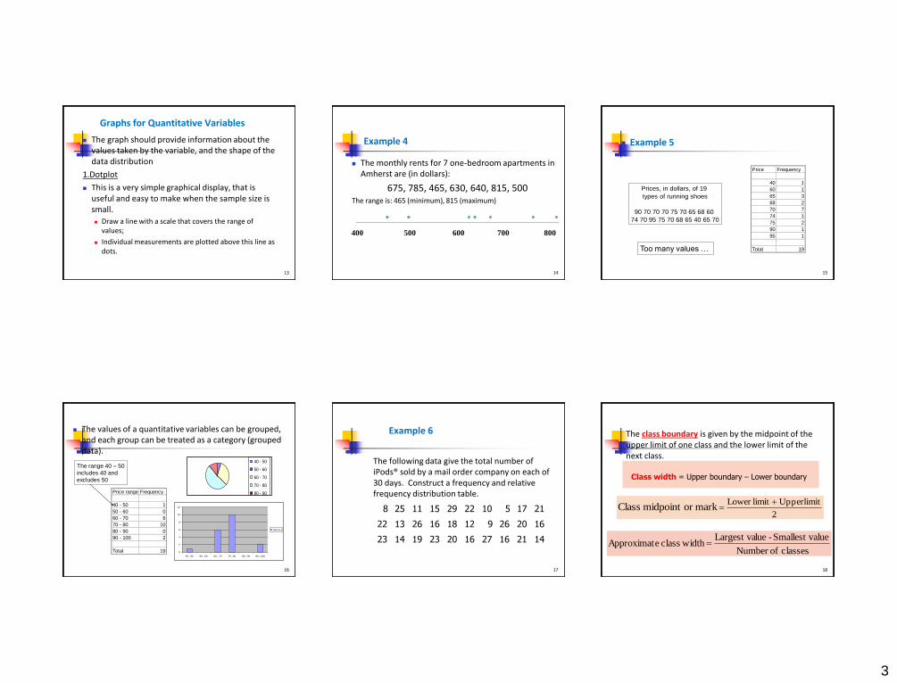
Graphs for Quantitative Variables
Quantitative variables are variables measured on a numeric scale. Height, weight, response time, temperature, and score on an exam are all examples of quantitative variables.
There are many types of graphs that can be used to portray distributions of quantitative variables.
The upcoming sections cover the following types of graphs:
Frequency tables, bar charts, pie charts , dotplots, histograms and stem and leaf displays.
12
3
Graphs for Quantitative Variables
The graph should provide information about the values taken by the variable, and the shape of the data distribution
1.Dotplot
This is a very simple graphical display, that is useful and easy to make when the sample size is small.
Draw a line with a scale that covers the range of values;
Individual measurements are plotted above this line as dots.
13
Example 4
The monthly rents for 7 one-bedroom apartments in Amherst are (in dollars):
675, 785, 465, 630, 640, 815, 500 The range is: 465 (minimum), 815 (maximum)
400 500 600 700 800
14
Example 5
Prices, in dollars, of 19
types of running shoes
90 70 70 70 75 70 65 68 60
74 70 95 75 70 68 65 40 65 70
Price Frequency
40 1
60 1
65 3
68 2
70 7
74 1
75 2
90 1
95 1
Total 19Too many values …
15
The values of a quantitative variables can be grouped, and each group can be treated as a category (grouped data).
Price range Frequency
40 - 50 1
50 - 60 0
60 - 70 6
70 - 80 10
80 - 90 0
90 - 100 2
Total 19
40 - 50
50 - 60
60 - 70
70 - 80
80 - 90
90 - 100
0
2
4
6
8
10
12
40 - 50 50 - 60 60 - 70 70 - 80 80 - 90 90 - 100
Series1
The range 40 – 50
includes 40 and
excludes 50
16
Example 6
The following data give the total number of iPods® sold by a mail order company on each of 30 days. Construct a frequency and relative frequency distribution table.
8 25 11 15 29 22 10 5 17 21
22 13 26 16 18 12 9 26 20 16
23 14 19 23 20 16 27 16 21 14
17
The class boundary is given by the midpoint of the upper limit of one class and the lower limit of the next class.
2
limit Upper limit Lower markor midpoint Class
classes ofNumber
alueSmallest v - lueLargest va widthclass eApproximat
Class width = Upper boundary – Lower boundary
18

4
Example 6- Solution
29 5Approximate width of each class 4.8
5
Now we round this approximate width to a convenient number, say 5. The lower limit of the first class can be taken as 5 or any number less than 5. Suppose we take 5 as the lower limit of the first class. Then our classes will be 5 – 9, 10 – 14, 15 – 19, 20 – 24, and 25 – 29
The minimum value is 5, and the maximum value is 29. Suppose we decide to group these data using five classes of equal width. Then
19
Frequency Distribution for the Data on iPods Sold
20 21
Histograms
This is the most common graphical display of quantitative data.
The idea is to give information about : Range of values;
Frequency of values observed in a class, by grouping values into classes;
Overall shape of the distribution (symmetric or skewed).
Steps: 1. Construct the frequency distribution for the variable;
2. Plot the frequency distribution.
1. Find the range of the data, that is, the minimum and maximum value.
2. Divide the range of the data into 5-15 intervals of equal length (but not necessarily).These intervals are called the class intervals, and the end points are called the class boundaries.
3. Calculate the approximate width of the interval as : range/number of intervals.
4. Round the approximate width up to a convenient value.
5. Use the method of left inclusion, including the left endpoint, but not the right in your tally.
6. Create a statistical table including the intervals, their frequencies or relative frequencies.
size sample
frequency classfrequency relative
Plot
On the x-axis report the class intervals. On each interval, draw a rectangle, whose area
represents the class relative frequency. Remark: If you choose class intervals of equal width, then
you can use height = relative frequency
widthclass
frequency relativeheight
Class width
height
Area= width x height=relative
frequency.
5
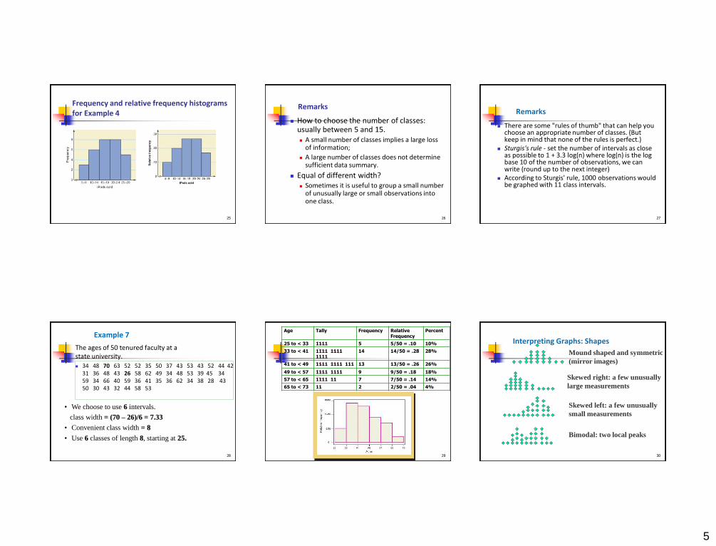
Frequency and relative frequency histograms for Example 4
25
Remarks
How to choose the number of classes: usually between 5 and 15. A small number of classes implies a large loss
of information;
A large number of classes does not determine sufficient data summary.
Equal of different width? Sometimes it is useful to group a small number
of unusually large or small observations into one class.
26
Remarks
There are some "rules of thumb" that can help you choose an appropriate number of classes. (But keep in mind that none of the rules is perfect.)
Sturgis's rule - set the number of intervals as close as possible to 1 + 3.3 log(n) where log(n) is the log base 10 of the number of observations, we can write (round up to the next integer)
According to Sturgis' rule, 1000 observations would be graphed with 11 class intervals.
27
Example 7
The ages of 50 tenured faculty at a state university.
34 48 70 63 52 52 35 50 37 43 53 43 52 44 42 31 36 48 43 26 58 62 49 34 48 53 39 45 34 59 34 66 40 59 36 41 35 36 62 34 38 28 43 50 30 43 32 44 58 53
• We choose to use 6 intervals.
class width = (70 – 26)/6 = 7.33
• Convenient class width = 8
• Use 6 classes of length 8, starting at 25.
28
Age Tally Frequency Relative Frequency
Percent
25 to < 33 1111 5 5/50 = .10 10%
33 to < 41 1111 1111 1111
14 14/50 = .28 28%
41 to < 49 1111 1111 111 13 13/50 = .26 26%
49 to < 57 1111 1111 9 9/50 = .18 18%
57 to < 65 1111 11 7 7/50 = .14 14%
65 to < 73 11 2 2/50 = .04 4%
29
Interpreting Graphs: Shapes
Mound shaped and symmetric
(mirror images)
Skewed right: a few unusually
large measurements
Skewed left: a few unusually
small measurements
Bimodal: two local peaks
30

6
Interpreting Graphs: Outliers
Are there any strange or unusual measurements that stand out in the data set?
Outlier No Outliers
31
Skewed or Symmetric
32
Stem –and- Leaf Displays In a stem-and-leaf display of quantitative data, each value
is divided into two portions – a stem and a leaf.
The leaves for each stem are shown separately in a display.
Example 8. Prices, in dollars, of 19 types of running shoes Divide each figure into a stem and a leaf by considering the magnitude.
90 70 70 70 75 70
65 68 60 74 70 95 75 70
68 65 40 65 70
Range is 40 – 95.
Each measurement has two digits,
Can choose the stem as 4, 5 …, 9
And the leaf as the units 0,…, 9
90
9 0
stem leaf
33
Example cont’d
2. List the stems in a column,
with a vertical bar to their right.
4
5
6
7
8
9
4 0
5
6 5 8 0 8 5 5
7 0 0 0 5 0 4 0 5 0 0
8
9 0 5
3. For each measurement, record
the leaf portion in the same row.
All numbers 60
to 69
4. Order the leaves in increasing
order.
5. Provide coding to interpret the
graph. Leaf unit = 1
4 0
5
6 0 5 5 5 8 8
7 0 0 0 0 0 0 0 4 5 5
8
9 0 5
90 70 70 70 75 70
65 68 60 74 70 95 75 70
68 65 40 65 70
34