Embed Size (px)
Citation preview

Chapter 2 Solutions 2.1 (a) 49,680,000 (this represents the total of those never married, widowed or
divorced). (b)
(c) It would be correct to use a pie chart for this example since the categories
represent distinct parts making up a whole (all adult American women can be placed in one of the four categories given).
2.2 114,808,000. The sum given in exercise 2.1 is 114,807. They are not
exactly equal due to rounding (marital status was likely given in terms of percentages, the counts were found by multiplying the total number of women by these percentages).
2.3 (a) 8.7% (100-25.2-19.3-7.1-16.6-7.8-15.3=8.7)

Chapter 2 10
(b)
Note that a pie chart is not appropriate unless a category representing the remaining fields of study is added; otherwise, not all parts of the whole are represented (the percentages do not sum to 100%).
2.4 (a) The slices in a pie chart represent all parts of a whole. Thus, the
percentages in a pie chart sum to 1. The categories here are not parts of a whole, 4 separate quantities are being compared (for each AP subject, what percentage of the examinations were taken by female?).
(b)
(c) No, these data do not answer the question about whether girls perform
better in these subject areas. The data describes the percentage of candidates taking the Advanced Placement examinations who are female, but says nothing about how they performed.

Chapter 2 11
2.5 (a) No, it would not be appropriate to use a pie chart for these data because the
data is comparing four separate quantities (for each age group, what percentage “always” or “sometimes” use their cell phone while driving?), not four parts of a whole.
(b)
The percentage of drivers who use cell phones while driving decreases for the older generations.
2.6
It would also be appropriate to use a pie chart where each slice represents
the percentage of each type of game.

Chapter 2 12
2.7 (a)
(b) The data is skewed to the right (most of the values are lower, with a few
spread out to the right). The center of the data is 1 goal and the spread is 7. The team scoring 7 goals may be an outlier since this value falls outside of the overall pattern of the data.
2.8 (a) 7 19 8 36 9 99 10 158 11 69 12 0013 13 17 14 033 15 09 16 99 17 3 18 19 20 6 (b) The data is mostly symmetric with a center around 12% and a spread of
roughly 10% (ignoring the outlier). The value for Mississippi, 20.6% appears to be an outlier since it falls outside of the overall pattern of the data.
2.9 The data is roughly centered around 19 mpg and if the outlying values of 10
and 11 are not considered, the data is somewhat skewed right. 2.10 From the dotplot we see that the EPA mpg rating is higher on the highway
than in the city for all of the cars. Most of the cars got at least 9 miles per gallon more on the highway than in the city. Five of the cars got 7 more miles per gallon on the highway than in the city while only two cars got less than 7 miles per gallon more on the highway than in the city.
2.11 (a) 16.0%. The high percentage for Utah may be due to the Mormon church.

Chapter 2 13
(b) Ignoring Utah, the data is roughly symmetric around 13% with a spread of roughly 3.5%.
(c) The distribution for young adults is less spread out than the distribution for older adults since its range is 4.6% (16-11.4) whereas it is 10% (17-7) for the older adults.
2.12 (a) Since the data values are quite spread out (15 to 47), a stemplot might be
preferable. (b) 1 556 2 03334455667778888899 3 11355567778 4 3377 The data is too crowded using a single stem. It is difficult to detect any
patterns in the data using this display. (c) The data has two peaks around 28 and 37 and is centered around 28. The
spread of the data is 32 (47-15) and there do not appear to be any outliers. 2.13 The distribution is skewed to the right since the bars extend far out to the
right while the heights of the bars drop off. This indicates that most of the universities did not give many doctorates in engineering to minorities during the 5-year period, but that a few universities gave between 20 and 55 doctorates in engineering to minorities. The center is between 5 and 10. The spread of the distribution is roughly 55.
2.14 The shape is mound-shaped and symmetric. The graph centers around
noon. All the strikes shown are between 6:30 a.m. and 5:30 p.m. The graph is packed reasonably close about the mean. That is, while there is a large range of values shown, there are relatively few values near the ends of the range. It’s difficult to tell from a histogram if there are outliers. Values near 7 a.m. and 5 p.m. are distant from the bulk of the data (that is, they lie outside the general pattern of the data) and could be considered outliers.
2.15 In a histogram the class intervals (widths of the bars) are the same size. In
Joe’s histogram the first class has a width of 2.2, the second has a width of 1.1, the third has a width of 1, etc.

Chapter 2 14
2.16
The shape of the distribution is easier to see in the histogram with seven classes than in the stemplot. However, the individual data values are lost in the histogram.
2.17 (a)
(b) The distribution of salaries is skewed to the right. Most of the salaries are
under $1,000,000 with a few very high salaries. (c) The spread of the distribution is large, $27,610,000 ($390,000 to
$28,000000). 2.18 Answers will vary.

Chapter 2 15
2.19 (a)
(b) The data is roughly symmetric with a center of 6 hours. The spread is 8
hours. There do not appear to be any outliers. 2.20 The categories overlap-some adolescents have been involved in more than
one type of drug abuse. The categories in a pie chart are mutually exclusive (they do not overlap).
2.21 (a) The distribution is slightly skewed to the right with a center between 7 and 8
percent. The data extends from about 6 to 11% so the spread is roughly 5%.
(b) When making summary statements about the data, it is usually more informative to make statements like “Only 12% of states east of the Mississippi had fewer than 7% of infants born with low birth weight” rather than “3 states east of the Mississippi had fewer than 7% of infants born with low birth weight”.
(c) It is likely to be related to the poverty rate of this state as well as its teen pregnancy rate.
2.22 (a)
(b) Most coins found in current change would more likely be recent rather than
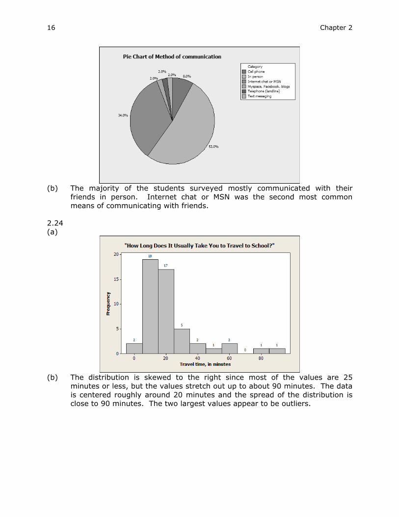
old. The dates would tend to group more toward the higher numbered years. 2.23 (a) Yes, a pie chart is appropriate here since the categories (method of
communication) are mutually exclusive (each student chose one method by which they most often communicated with friends) and are parts of a whole.
Chapter 2 16
(b) The majority of the students surveyed mostly communicated with their
friends in person. Internet chat or MSN was the second most common means of communicating with friends.
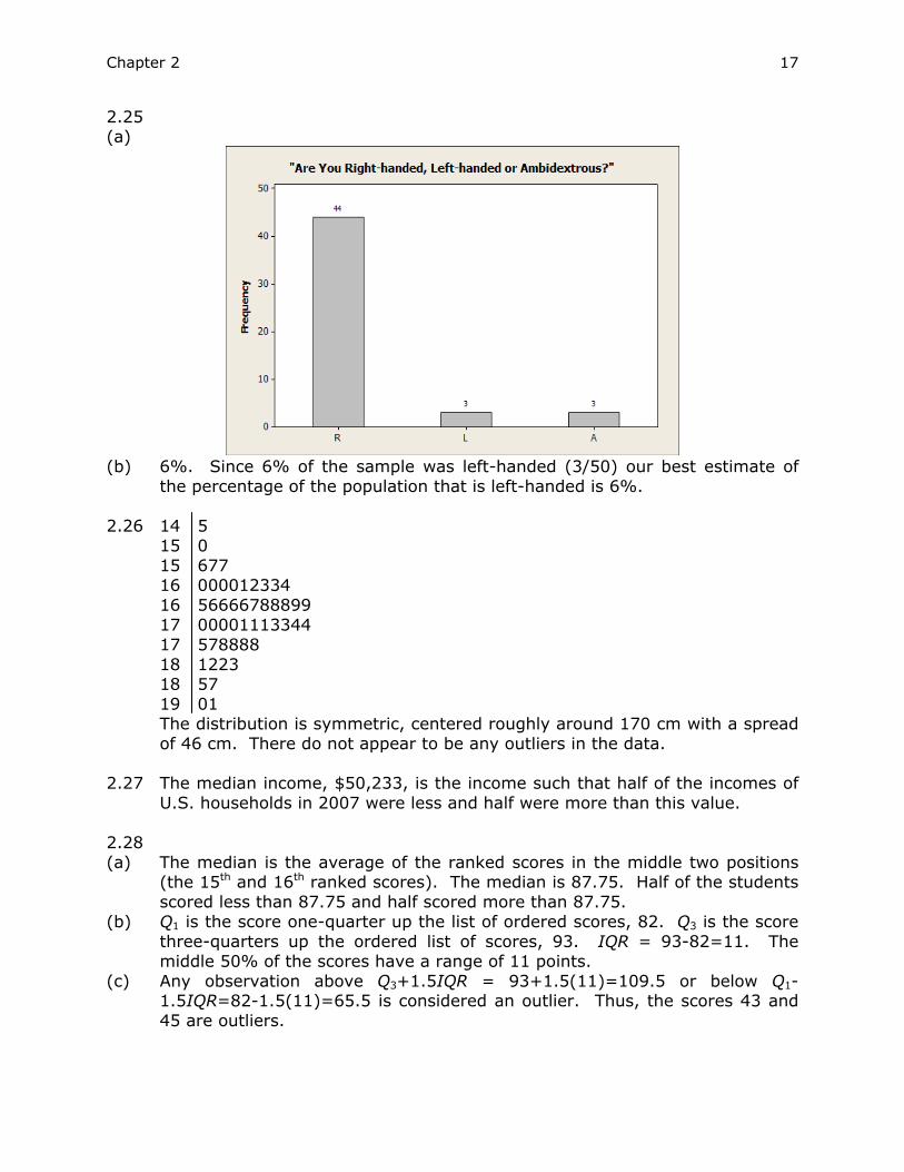
2.24 (a)
(b) The distribution is skewed to the right since most of the values are 25
minutes or less, but the values stretch out up to about 90 minutes. The data is centered roughly around 20 minutes and the spread of the distribution is close to 90 minutes. The two largest values appear to be outliers.
Chapter 2 17
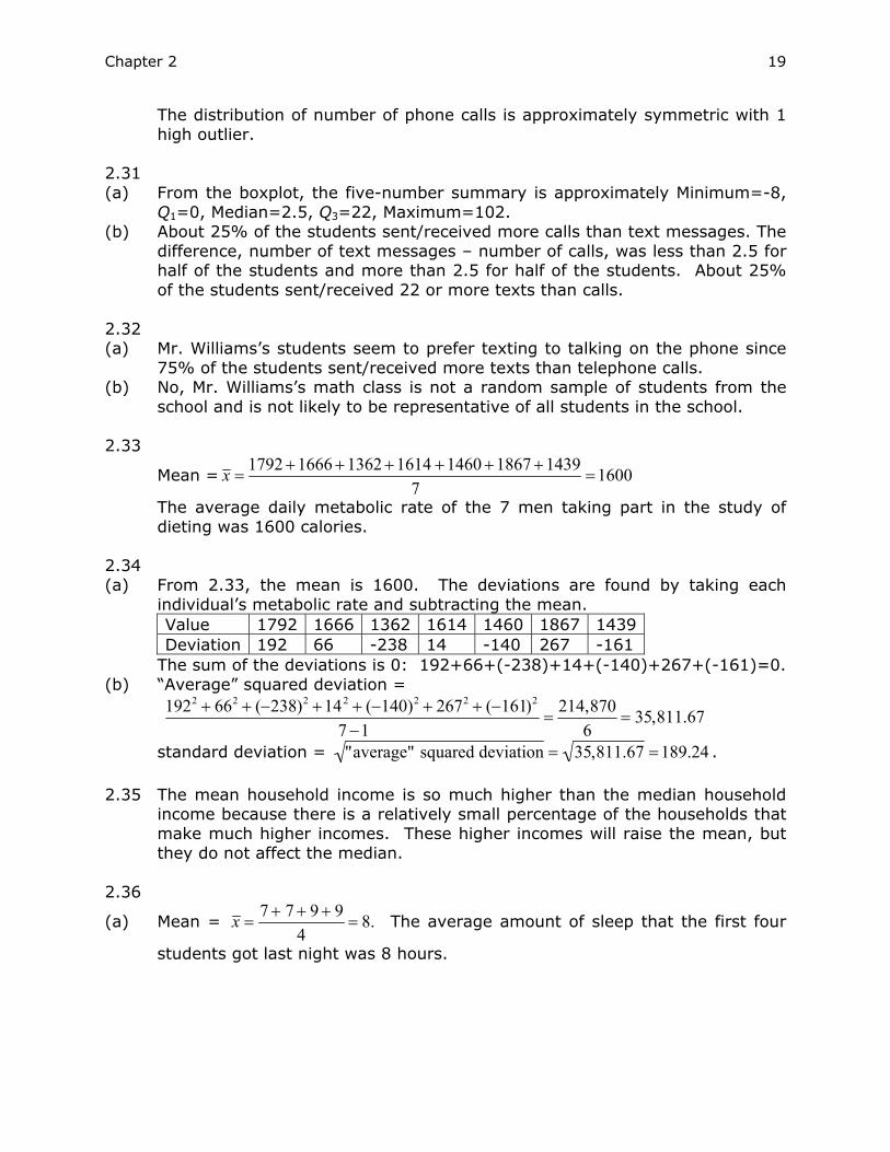
2.25 (a)
(b) 6%. Since 6% of the sample was left-handed (3/50) our best estimate of
the percentage of the population that is left-handed is 6%. 2.26 14 5 15 0 15 677 16 000012334 16 56666788899 17 00001113344 17 578888 18 1223 18 57 19 01 The distribution is symmetric, centered roughly around 170 cm with a spread
of 46 cm. There do not appear to be any outliers in the data. 2.27 The median income, $50,233, is the income such that half of the incomes of
U.S. households in 2007 were less and half were more than this value. 2.28 (a) The median is the average of the ranked scores in the middle two positions
(the 15th and 16th ranked scores). The median is 87.75. Half of the students scored less than 87.75 and half scored more than 87.75.
(b) Q1 is the score one-quarter up the list of ordered scores, 82. Q3 is the score three-quarters up the ordered list of scores, 93. IQR = 93-82=11. The middle 50% of the scores have a range of 11 points.
(c) Any observation above Q3+1.5IQR = 93+1.5(11)=109.5 or below Q1-1.5IQR=82-1.5(11)=65.5 is considered an outlier. Thus, the scores 43 and 45 are outliers.

Chapter 2 18
(d)
2.29 (a) The median is the value in the 13th position of the ordered data. Thus, the
median is 7 phone calls. Approximately half of the students made or received fewer than 7 phone calls and approximately half of the students made or received more than 7 phone calls.
(b) Q1 is the value one-quarter up the ordered list of data, 3.5. Q3 is the score three-quarters up the ordered list of data, 11.5. IQR = 11.5-3.5=8. The middle 50% of the data have a range of 8.
(c) Any observation above Q3+1.5IQR = 11.5+1.5(8)=23.5 or below Q1-1.5IQR=3.5-1.5(8)=-8.5 (round to 0) is considered an outlier. Thus, 35 calls is an outlier.
2.30
Chapter 2 19
The distribution of number of phone calls is approximately symmetric with 1 high outlier.
2.31 (a) From the boxplot, the five-number summary is approximately Minimum=-8,
Q1=0, Median=2.5, Q3=22, Maximum=102. (b) About 25% of the students sent/received more calls than text messages. The
difference, number of text messages – number of calls, was less than 2.5 for half of the students and more than 2.5 for half of the students. About 25% of the students sent/received 22 or more texts than calls.
2.32 (a) Mr. Williams’s students seem to prefer texting to talking on the phone since
75% of the students sent/received more texts than telephone calls. (b) No, Mr. Williams’s math class is not a random sample of students from the
school and is not likely to be representative of all students in the school. 2.33
Mean = x = 1792 +1666 +1362 +1614 +1460 +1867 +14397
=1600
The average daily metabolic rate of the 7 men taking part in the study of dieting was 1600 calories.
2.34 (a) From 2.33, the mean is 1600. The deviations are found by taking each
individual’s metabolic rate and subtracting the mean. Value 1792 1666 1362 1614 1460 1867 1439 Deviation 192 66 -238 14 -140 267 -161
The sum of the deviations is 0: 192+66+(-238)+14+(-140)+267+(-161)=0. (b) “Average” squared deviation =
1922 + 662 + (−238)2 +142 + (−140)2 + 2672 + (−161)2
7 −1=
214,8706
= 35,811.67
standard deviation = "average" squared deviation = 35,811.67 =189.24 .
2.35 The mean household income is so much higher than the median household income because there is a relatively small percentage of the households that make much higher incomes. These higher incomes will raise the mean, but they do not affect the median.
2.36
(a) Mean = x = 7 + 7 + 9 + 94
= 8. The average amount of sleep that the first four
students got last night was 8 hours.

Chapter 2 20
(b) The deviations are 7-8=-1, 7-8=-1, 9-8=1, 9-8=1. The standard deviation is
then (−1)2 + (−1)2 +12 +12
4 −1=
43
=1.15. The distance between a typical
response and the mean response is 1.15 hours. 2.37 (a) Variable = 2. The distribution is skewed slightly left so we expect the mean
to be less than the median. The spread of the data is small so we expect the standard deviation to be relatively small.
(b) Variable = 3. The distribution is somewhat symmetric so we expect the mean to be close to the median. The spread of the data is large so we expect the standard deviation to be relatively large.
(c) Variable =1. Since the distribution is skewed to the right, we expect the mean to be larger than the median. Also, since the spread of the data is large, we expect the standard deviation to be relatively large.
2.38 (a) Yes, Juan is correct. The standard deviation can be zero only if the sum of
squared deviations from the mean is zero. The only way this is possible is if all values are the same. That is, each value in the data set equals the mean.
(b) Letishia is not correct; e.g., {-1,0,1} and {-1,-1,0,1,1}. Both data sets have a mean of 0 and a standard deviation of 1.
2.39 The distribution is highly skewed to the right so the median and IQR will give
better summaries of the center and spread of the distribution of how many music CDs the students own.
2.40 (a) Estimate the frequencies of the bars (from left to right): 10, 40, 42, 58, 105,
60, 58, 38, 27, 18, 20, 10, 5, 5, 1 and 3 (although answers may vary slightly, the frequencies must sum to 500). Using these values, we can estimate the mean by adding 2 ten times, 3 forty times, ..., and 17 three times. This is equivalent to multiplying the value of each bar (2 through 17) by its frequency or height. This gives us a sum of 3504. The mean is then
estimated by dividing my the number of responses: x = 3504500
= 7.01.
We estimate the median by finding the average of the 250th and 251st values. The median is found to be 6.
(b) Since the median is less than the mean, we would use the median to argue that shorter domain names are more popular.
Chapter 2 21
2.41 (a) The mean and median increase by 18 so the mean = 87.188 and the
median=87.5.
Mean2 =sum of student heights standing on chairs
number of students
=(height of first student + 18) + ... + (height of last student + 18)
number of students
=sum of student heights standing on floor + 18*number of students
number of students= Mean1 +18 = 69.188 +18 = 87.188.
The median is still the height of the middle student. Now that this student is
standing on a chair 18 inches from the ground, the median will be 18 inches larger.
(b) The standard deviation and IQR do not change. For the standard deviation, note that although the mean increased by 18, the observations each increased by 18 as well so that the deviations did not change. For the IQR, Q1 and Q3 both increase by 18 so that their difference remains the same as in the original data set.
2.42 (a) To give the heights in feet, not inches, we would divide each observation by
12 (12 inches = 1 foot). Thus,
Mean2 =
height of first student (inches)12
+ ...+ height of last student (inches)12
number of students
=1
12height of first student(inches) + ... + height of last student (inches)
number of students⎛ ⎝ ⎜
⎞ ⎠ ⎟
=1
12Mean1( )=
112
*69.188 = 5.77 feet.
The median is still the height of the middle student. To convert this height to
feet, we divide by 12: Median2=69.512
= 5.79 feet.
(b) To find the standard deviation in feet, note that each deviation in terms of feet is found by dividing the original deviation by 12.
standard deviation2 =first deviation (ft)( )2 + ...+ last deviation (ft)( )2
n -1
=
first deviation (in)12
⎛ ⎝ ⎜
⎞ ⎠ ⎟
2
+ ...+ last deviation (in)12
⎛ ⎝ ⎜
⎞ ⎠ ⎟
2
n −1
=1
12*standard deviation1 =
3.212
= 0.27 feet.

Chapter 2 22
The first and third quartiles are still the medians of the first and second halves of the data, these values must simply be converted to feet. To do this, divide the first and third quartiles of the original data set by 12:
Q1=67.75
12= 5.65 feet and Q3=
7112
= 5.92 feet.
2.43
The distributions of popular color choices are very similar except for the
silver and white options. Silver was more popular for full size/intermediate cars than for SUVs/trucks and white was more popular for SUVs/trucks than for full size/intermediate cars. Silver was the most popular color choice for full size/intermediate cars and White was the most popular color choice for SUVs/trucks. There was not much difference among the other color choices except for beige/brown which was the least popular color choice for both car types.
2.44 Based on the boxplots, the mercury content does vary according to country
of origin. The tuna from Ecuador has the greatest variability in mercury content. It also has the highest median mercury level. The sample sizes from Malaysia and the Phillipines (2 and 3) are too small to make valid comparisons. If lower mercury content is desired, Thailand appears to be the best source since it has the lowest median (aside from the Phillipines) and the mercury values do not vary much from the median.
2.45 (a) Minimum = 3, maximum = 55. The median divides the ordered data in half
and is therefore the 26th ordered observation, 8. Q1 is the median of the first half of the distribution and is therefore the 13th ordered observation, 4. Q3 is the median of the last half of the distribution and is therefore the 39th ordered observation, 12.
Chapter 2 23
(b) IQR=12-4=8. An outlier is any observation that is less than Q1- 1.5*IQR = -9 or greater than Q3+ 1.5*IQR =24. Thus there are 4 outliers: 27, 31, 34 and 55.
(c)
2.46 Since the distribution is skewed right, the median and IQR will provide more
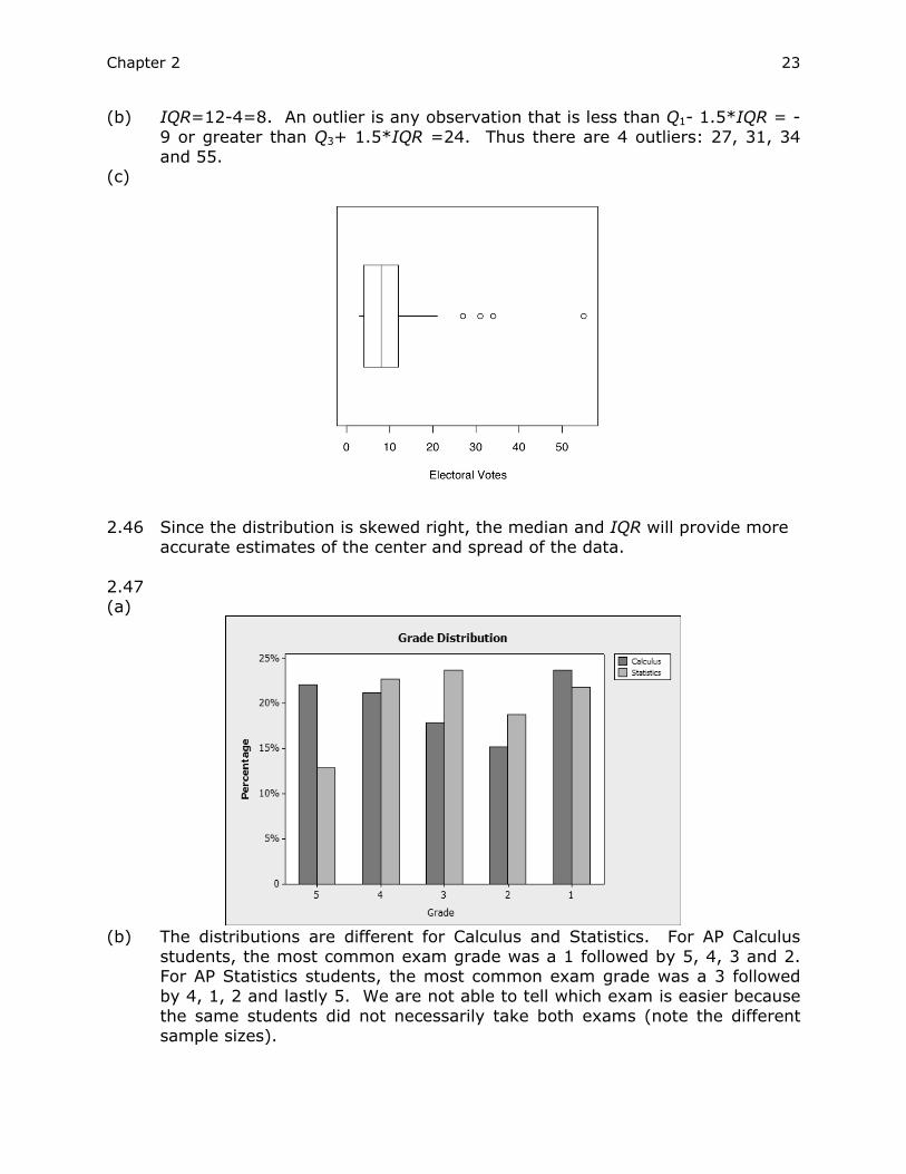
accurate estimates of the center and spread of the data. 2.47 (a)
(b) The distributions are different for Calculus and Statistics. For AP Calculus
students, the most common exam grade was a 1 followed by 5, 4, 3 and 2. For AP Statistics students, the most common exam grade was a 3 followed by 4, 1, 2 and lastly 5. We are not able to tell which exam is easier because the same students did not necessarily take both exams (note the different sample sizes).

Chapter 2 24
2.48 Answers will vary. For example, since the mean is greater than the median, it appears that there are a few guests who will drink a lot of cola but that the “typical” guest will drink about 3 cans. Having 90-100 cans on hand would probably do it. Buying 150 cans (based on the mean) could result in a lot of unused soda.
2.49 The distribution of poverty rates differs for the two geographic regions. The
median poverty rate for the northern states east of the Mississippi was approximately 3% less than for the southern states east of the Mississippi. Since Q3 for the North was less than for Q1 for the South, 75% of the poverty rates were lower than the 25th percentile for the Southern states. There was also less spread among the poverty rates of the northern states than among the southern states.
2.50
(a) x = 5.6+5.2+4.6+4.9+5.7+6.4
6= 5.4.
(b)
s =(5.6 − 5.4)2 + (5.2 − 5.4)2 + (4.6 − 5.4)2 + (4.9 − 5.4)2 + (5.7 − 5.4)2 + (6.4 − 5.4)2
6 −1= 0.64
(c)
They agree with (c) and (d) above!!
2.51 (a) The mean and median salaries will each increase by $1000 (the distribution
of salaries just shifts by $1000). (b) The extremes and quartiles will also each increase by $1000. The standard
deviation will not change. Nothing has happened to affect the variability of the distribution. The center has shifted location, but the spread has not changed.
2.52 (a) The mean and median will each increase by 5% since all of the observations
will increase by 5%.
Chapter 2 25
(b) The 5% raise will increase the distance of the quartiles from the median. The quartiles and the standard deviation will each increase by 5% (the original values will be multiplied by 1.05).
2.53 It is the areas of the phones that should be in proportion, not just the
heights. For example, the picture for “send/receive text messages” should be roughly twice the size of the picture for “camera” when it is actually much more than twice as large.
2.54 (a) The seasonal variation is evident in the cyclical nature of the graph. Within
each year there is a clear peak in the price in the late summer. You would expect to see seasonal variation in the price of fresh oranges since price should be correlated with availability and the availability of oranges is correlated to their growing season.
(b) If we draw a straight line through the data, the overall trend is an increase in the price of fresh oranges.
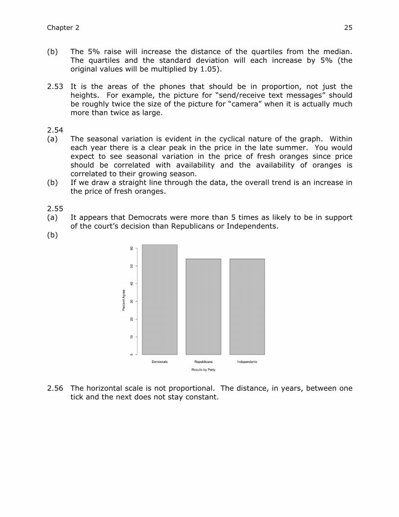
2.55 (a) It appears that Democrats were more than 5 times as likely to be in support
of the court’s decision than Republicans or Independents.
(b)
2.56 The horizontal scale is not proportional. The distance, in years, between one
tick and the next does not stay constant.

Chapter 2 26
2.57
Whereas before it appeared that there was a large initial jump in sales and
then they appeared to level off, once the x-scale is adjusted, we see that the trend has been much steadier (more of a line than a curve) over time.
2.58 (a) The pictures should be proportional to the number of students they
represent. As drawn, it appears that most of the students arrived by car but in reality most came by bus (14 took the bus, 10 came in cars).
(b)

Chapter 2 27
2.59 The size of the graphics is not in proportion with the percentages. Also, the last picture is below the line which gives the incorrect impression of a decrease for this last data point.
2.60 You can’t add percentages like they were counts. Assuming that the counts
of male and female are approximately equal in the school, the percentage of “Greek” would be more like an average of the two figures. For example, assume that the student body has 10,000 students (5,000 male and 5,000 female) and that percentage of male “Greeks” is 16%. Then there are .13(5000) + .16(5000) = 1450 “Greeks,” or 14.5%.
2.61 (a) The vertical scale does not begin at 0 which over-emphasizes the difference
in cholesterol. (b)
The drop in cholesterol is much smaller than it appeared in the original
graph. 2.62 That’s 1826 deer per square mile (800,000/438). Almost 2,000 deer per
square mile would be a lot of deer for a forest (even if they fit, the environment couldn’t support that many of one type of animal), let alone a suburban area near New York City.
2.63 If every single adult had failed the test, 100% would have failed. It is
impossible for more people to have failed the test than took the test. 2.64 (a) The values on the horizontal axis are categorical and cannot be ranked;
therefore, it is misleading to connect the points with a line which indicates some sort of trend.

Chapter 2 28
(b)
2.65 37,276,000 − 32,476,000
32,476,000=
4,800,00032,476,000
= 0.148. It was a 14.8% increase.
Poverty did not necessarily become more common during these years because the population also increased during this time.
2.66 Answers will vary. 2.67 (a)
4 69 5 36678 6 003344567778 7 0112347889 8 01358 9 00
4 69 5 3 5 6678 6 003344 6 567778 7 011234 7 7889 8 013 8 58 9 00
Both stemplots show a
symmetric distribution centered at the upper 60s.

Chapter 2 29
(b)
The shape is symmetric without outliers. The mean is 70.39 years and the
standard deviation is 12.23. The spread of the data is around 50 years. (c) Answers will vary. The visual impressions for the stemplot and the histogram
are similar.
2.68 Answers will vary. e.g., {1,2,3,4,5,6,7,8,9,50} (any last number larger than 45 will do). About 50% of the numbers fall above the median of 5.5.
2.69 The incorrect value is for coronary heart disease. It should be 27.5%, not
2.75%. 2.70 (a) The graph is a correct display of the data. The individual “slices” are distinct
parts of a whole representing 100% of passenger car sales. (b) The two types of graphs
convey the same information but the bar heights do a somewhat better job of visualizing the differences than do the “slices” of the pie. The large market share of General Motors and the Japanese manufacturers is also more dramatic in the bar chart.

Chapter 2 30
2.71 The graph is not a correct comparison of the four interest rates. The cones make the differences between the interest rates seem much larger than they really are. Considered as areas, the cone for 5.9% is about 2.5 times as large as the cone for 3.5%. The actual value is less than twice as large.
2.72 The distribution appears to be bi-modal. That is, there is a peak at about
500 and another peak at about 550. A single measure of center such at the mean or median fails to capture the two distinct peaks.
2.73
2.74
Aside from Bonds’ outlier (73 home runs), McGwire appears to be the better
home run hitter. Whereas the “typical” number of home runs for Bonds is about 34, the “typical” number for McGwire is about 40.

Chapter 2
31
2.75 I. Question of interest: Does the drug increase sleep time? II. Produce data: An experiment was carried out with ten patients. The number of additional hours of sleep gained by each subject after taking the drug was recorded. III. Analyze data: The five-number summary for this data set is: Minimum=-0.1, Q1=0.8, Median=1.75, Q3=4.4, Maximum=5.5.
The mean and standard deviation are calculated to be 2.33 and 2.00,
respectively. IV. Interpret results: The data show that the drug was effective. On
average, the participants gained 2.33 additional hours of sleep and all but 1 gained at least some additional sleep. However, there should have been a control group taking a placebo to insure that the results can be attributed to the treatment.
2.76 If we convert to minutes, the mean, median, standard deviation and IQR will
all be multiplied by 60 (we multiply by 60 to convert from hours to minutes). This is a result of each of the individual observations being multiplied by 60. The mean and median are still measures of center, the scale has just changed by a factor of 60. Denoting the new numerical measures with a prime symbol, IQR’=1.5*(Q’3- Q’1) = 1.5*[(60*Q3)- (60*Q1)]=60*1.5*(Q3- Q1) =60* IQR. The deviations will all be multiplied by a factor of 60 so that (standard deviation)'= sum of squared (deviations)' = sum of squared (60*deviations)
= 602 *sum of squared deviations = 60*standard deviation.
The mean, median, standard deviation and IQR in minutes are then 45, 21, 107.34 and 132, respectively.