Embed Size (px)
Citation preview

Mintab Guide Chapter 2
v.01 - 01/25/08 Page 1
CH 2: FREQUENCY DISTRIBUTIONS AND GRAPHS
2.1 Categorical Data
For this section we will use the following data that represent the housing arrangement for 25 people: H = House, A = apartment, M = mobile home, C = condominium: H C H M H A C A C C M C A M A
C C M C C H A H H C
2.1.1 Frequency Distribution
• Start Minitab and enter the above data in Column C1. Label the column :”H-Type”
• Menu “Stat” → Tables → Tally Individual Variables
Figure 2.1
• Make the “Variable” window active (place cursor inside the window and click). Then double-click on column C1 H Type.
Check all four check boxes and click “OK” The result will display in the Session window (see figure 2.3
Figure 2.2
• Next we will place the above results inside the worksheet:

Mintab Guide Chapter 2
v.01 - 01/25/08 Page 2
o Highlight the data in the Session window, starting at “H-Type” and ending at 100 (place the cursor at the left of H, press and hold the left mouse button while drugging the mouse to the right and down, until the number 100 is highlighted.)
o Copy the data: Lift the left mouse button, then right-click and choose “Copy” from the resulting menu.
o Click inside the cell right below the C3 label, in the worksheet. o Right-click and choose “Paste” from the resulting menu. o Click “OK” on the subsequent dialogue. o The data is place in Columns C3 through C7. o Minitab changes the label of C3 from “H-Type” to “H-Type-1”, because there
already exists a label “H-Type” (column C1). o Go to the cell and replace this value by the value “Type” by overtyping its contents.
• Your Minitab windows should look line the ones in Figure 2.3
Figure 2.3

Mintab Guide Chapter 2
v.01 - 01/25/08 Page 3
2.1.2 Pie Charts
You can create Pie charts either from the raw data in column C1 or from the frequency distribution in columns C3-C7 From Frequency Distribution:
• Click on Graph →→→→ Pie Chart
• Click on Chart values from table
• Click on the inside of the Categorical variable box
• Double-click on the column C3 - Type; C3 Type is placed inside the box
• Click on the inside of the Summary variables box
• Double-click the column that contains the frequencies: C4-Count; the column is placed inside the box.
• Click on the Labels box
• In the Titles/Footnotes tab enter a title and a subtitle for the chart: “Pie Chart”, and “Housing Types”.
• Click on the Slice Labels tab
• Check on all boxes and click OK
• Click OK again
• You should see a new window with the Pie Chart - Figure 2.4
Figure 2.4
From Raw Data: Same process as above, except that you check the Chart raw data option in the Pie Chart window and then you place the column containing the raw data (column C1 in our case) in the Categorical variables box. The resulting Pie Chart should look exactly as above.
Mintab Guide Chapter 2
v.01 - 01/25/08 Page 4
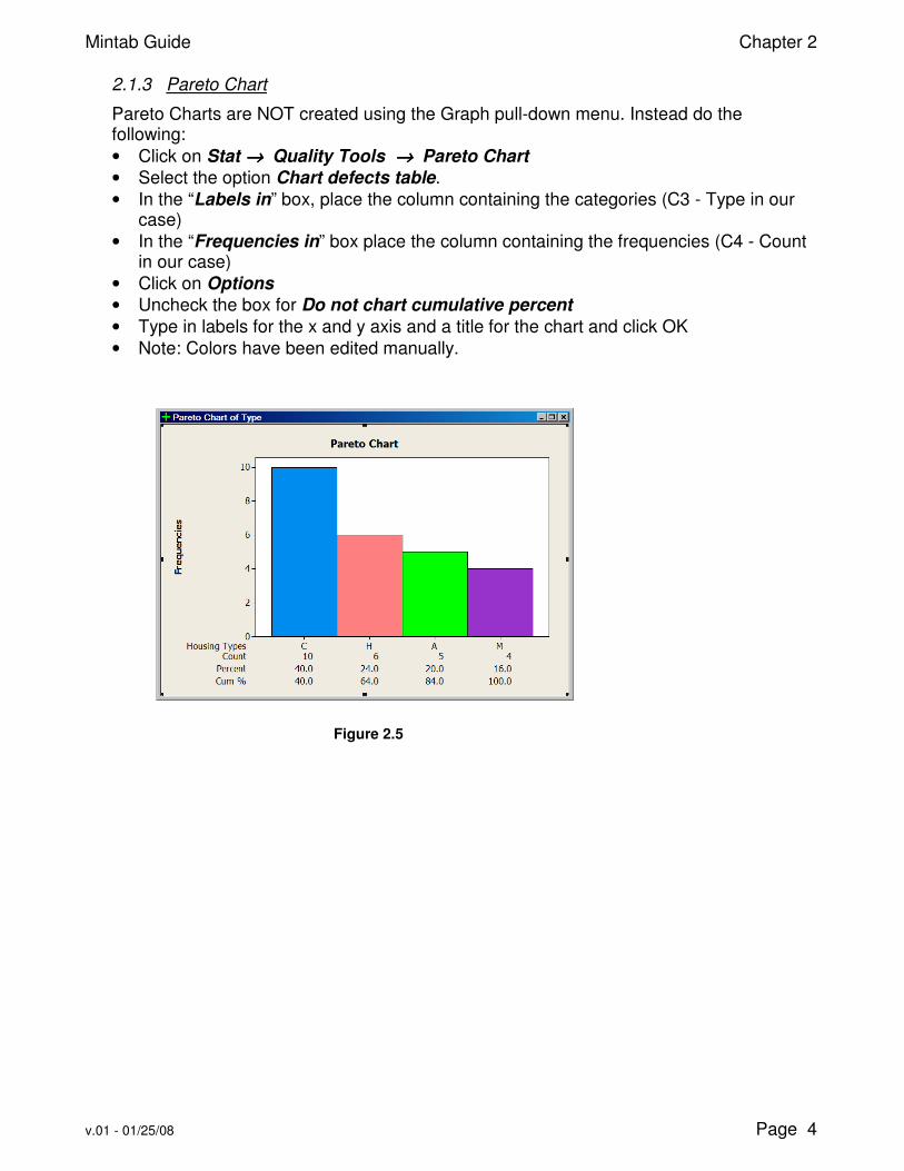
2.1.3 Pareto Chart
Pareto Charts are NOT created using the Graph pull-down menu. Instead do the following:
• Click on Stat →→→→ Quality Tools →→→→ Pareto Chart
• Select the option Chart defects table.
• In the “Labels in” box, place the column containing the categories (C3 - Type in our case)
• In the “Frequencies in” box place the column containing the frequencies (C4 - Count in our case)
• Click on Options
• Uncheck the box for Do not chart cumulative percent
• Type in labels for the x and y axis and a title for the chart and click OK
• Note: Colors have been edited manually.
Figure 2.5

Mintab Guide Chapter 2
v.01 - 01/25/08 Page 5
2.2 Quantitative Data
For this section we will be using the data of example 2-2 of the book. Start Minitab and open the worksheet E-C02-S02-02 from the data in the Data Disc.
• File →→→→ Open Worksheet
• Navigate to the directory where the data from the Data Disc reside
• In the Files of Type box, select Minitab portable (*.mtp)
• Select the file E-C02-S02-02 and click on Open.
• The data of this file will be loaded in Column C1 of the worksheet and the Label of C1 will read TEMPERATURE.
The example constructs a grouped frequency distribution with 7 classes. Minitab does not have an automated way to construct grouped frequency distributions for quantitative data. The way that we will construct one is by a combination of calculator output, creating and adjusting a Frequency Histogram, and entering some of the data of the Frequency distribution into the worksheet manually. We will begin with creating a Histogram.
2.2.1 Histogram
• Click on Graph →→→→ Histogram, select Simple and click OK
• Click inside the box labeled Graph variables and then double click on the column C1, located at the left window area of the Histogram dialog box.
• Click the Scale box.
• In the Y-Scale Type Tab select the Frequency option only and then OK
• Click the Labels box.
• Under the Titles / Footnotes tab enter a title for the graph: “ Histogram of Temperatures”.
• Click on the Data Labels Tab
• Select the “Use y-values label” option and then click OK.
• Click the Data View box.
• In the Data Display Tab make sure that the only option checked is the Bars and then click OK and OK.
• The Histogram in Figure 2.6 should be displayed.
Figure 2.6
We will adjust this Histogram so that it has 7 classes (as the problem requires), and the x-axis labels are those of the boundaries of the distribution.
Mintab Guide Chapter 2
v.01 - 01/25/08 Page 6
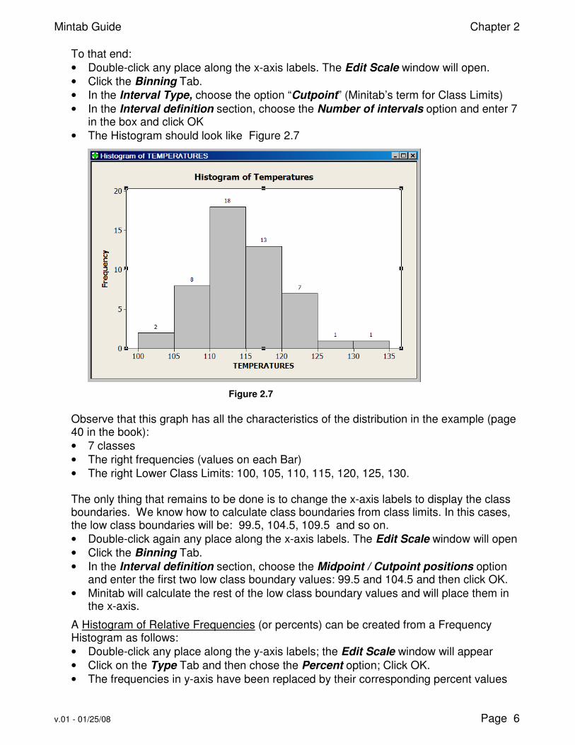
To that end:
• Double-click any place along the x-axis labels. The Edit Scale window will open.
• Click the Binning Tab.
• In the Interval Type, choose the option “Cutpoint” (Minitab’s term for Class Limits)
• In the Interval definition section, choose the Number of intervals option and enter 7 in the box and click OK
• The Histogram should look like Figure 2.7
Figure 2.7
Observe that this graph has all the characteristics of the distribution in the example (page 40 in the book):
• 7 classes
• The right frequencies (values on each Bar)
• The right Lower Class Limits: 100, 105, 110, 115, 120, 125, 130.
The only thing that remains to be done is to change the x-axis labels to display the class boundaries. We know how to calculate class boundaries from class limits. In this cases, the low class boundaries will be: 99.5, 104.5, 109.5 and so on.
• Double-click again any place along the x-axis labels. The Edit Scale window will open
• Click the Binning Tab.
• In the Interval definition section, choose the Midpoint / Cutpoint positions option and enter the first two low class boundary values: 99.5 and 104.5 and then click OK.
• Minitab will calculate the rest of the low class boundary values and will place them in the x-axis.
A Histogram of Relative Frequencies (or percents) can be created from a Frequency Histogram as follows:
• Double-click any place along the y-axis labels; the Edit Scale window will appear
• Click on the Type Tab and then chose the Percent option; Click OK.
• The frequencies in y-axis have been replaced by their corresponding percent values

Mintab Guide Chapter 2
v.01 - 01/25/08 Page 7
2.2.2 Frequency Distribution
We can create now the frequency distribution table by entering appropriate values from the Histogram into a worksheet.
• Label Columns C3 through C11 as in Figure 2.8.
• In Column C3 - LCL (Low Class Limit) enter the Low Class Limits from Figure 2.7
• Calculate C4 - UCL (Upper Class Limit):
o Calc →→→→ Calculator o Enter UCL in Store results in variable box o Enter expression LCL + 4 in Expression box and click OK o Column C4 - UCL is populated with Upper Class Limit values
• Fill now columns C5 and C6 (Low / Upper Class Boundaries) by using the Calculator function and: subtracting 0.5 from C3; adding 0.5 to C4
• Calculate Midpoint (C7) by using the Calculator and the Expression (C5 + C6) /2
• Copy the frequency values from the Histogram into column C8 (Xm)
• Calculate Cumulative Frequency in Column C9, using the Calculator and the function PARS (C8): You can find PARS (Partial sums) in the list of functions in the Calculator window: o Enter “Cum-f” in the box: Store results in variable o Clear the Expression window, and double-click the PARS function. o Double Click the C8 f column and then OK o The cumulative frequencies are placed in column C9
• Calculate Relative Frequency in C10: Use Calculator and the expression C8 / 50
• Cumulative Relative Frequency in C11: Use Calculator and PARS(C10)
Figure 2.8

Mintab Guide Chapter 2
v.01 - 01/25/08 Page 8
2.2.3 Polygon
A Frequency Polygon can be constructed as follows:
• Click on Graph →→→→ Scatterplot and choose With Connect Line.
• Place the “f” column in the Y-variables space and the “Xm” column in the X-variables space.
• Click on Labels and enter Title / Subtitle.
• Click the Data Labels tab and choose the “Use y-values labels” option; Click OK, OK
• In the generated graph, need to adjust the x-axis labels
• Double-click any place along the x-axis labels.
• In the resulting Edit Scale window, perform the following in the Major Tick Positions section: Enter 7 in the number of ticks box, and 102:132/5 (the midpoints of the distribution) in the Position of Ticks box.
• The resulting graph is a Frequency Polygon without connecting lines to the x-axis.
Figure 2.9
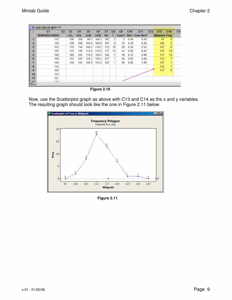
In order to create a polygon connecting to the x-axis, we need to introduce two artificial midpoints; one at the low end and one at the high end with corresponding frequencies of zero. In our case it will be 97 and 137. The easier way to accomplish this is by copying the midpoint and frequency values to a new location:
• Highlight the seven row values of C7 and C8 and then right-click and choose “Copy”.
• Click inside the second cell of Column C13 and then right-click and choose “Paste”.
• Enter the values 97 and 0 in row 1 of columns C13 and C14 and the values 137 and 0 in the 9th row of the same columns.
• Name Column C13 “Midpoint” and Column C14 “Freq”.
• Your new worksheet should look like the worksheet in figure 2.10 below.
Mintab Guide Chapter 2
v.01 - 01/25/08 Page 9
Figure 2.10
Now, use the Scatterplot graph as above with C13 and C14 as the x and y variables. The resulting graph should look like the one in Figure 2.11 below
Figure 2.11

Mintab Guide Chapter 2
v.01 - 01/25/08 Page 10
2.2.4 Ogive
Ogives are constructed the same way as the Polygons, i.e. through the use of the Scatterplot graph. The only difference is in the variables:
• Y-variable is the cumulative frequency
• X-variable is the Upper Class Boundary
• Need to include one artificial entry at the beginning of the table: the Low Class Boundary for the 1st class with corresponding frequency of 0.
• Name column C16 “Bound” and column C17 “C-Freq”
• Copy the Upper Boundary values from C6 to C16, with target location starting at the 2nd row of column C16. Enter the value of 99.5 in the 1st row of the C16 column.
• Copy the Cumulative Frequencies from C7 to C17, with target location starting at the 2nd row of column C17. Enter the value of 0 in the 1st row of the C17 column.
• Create Scatterplot With Connect line, setting the Y-variable to C17 and the X-variable to column C16.
• After the graph is generated, adjust the tick positions by entering: 99.5:134.5/5
• The resulting graph should look like the one in Figure 2.12
Figure 2.12
Mintab Guide Chapter 2
v.01 - 01/25/08 Page 11
2.3 Other Types of Graphs
2.3.1 Time Series Plot
• Click on Graph → Time Series Plot, then click on Simple.
• For the Series variable, select the column that contains the data values
• Click Time/Scale
• Click the Stamp option and select the column that contains the “date” values.
• Click OK twice 2.3.2 Stem-and-Leaf Plot
For this graph we will use the data from example 13 of Section 4, Chapter 2 and we will create a new worksheet to place the data:
• File →→→→ Open Worksheet
• Navigate to the directory containing the Data Disc data.
• Double click on E-C02-S04-13.MTP
• The data are placed in C1, and C1 is named CARS
Create the graph:
• Click on Graph →→→→ Stem-and-Leaf
• Place the variable “C1 Cars” in the Graph Variables box
• Uncheck the Trim Outlier check box.
• In the Increment box, enter the value of 5 (Class width) and click OK.
• The output is placed in the Session window:
Stem-and-leaf of CARS N = 30
Leaf Unit = 1.0
6 5 011233
13 5 5567789
15 6 23
15 6 55667899
7 7 23
5 7 55789
2.3.3 Scatter Plots
For this graph we will use the data from exercise 14 of Section 5, Chapter 2 and we will create a new worksheet to place the data:
• File →→→→ Open Worksheet
• Navigate to the directory containing the Data Disc data.
• Double click on P-C02-S05-15.MTP
• The data are placed in C1 (Ave Price) and C2 (Excise tax). Create the graph:
• Click on Graph →→→→ Scatterplot, then click Simple
• Place the C1 variable in the X-variable box and the C2 variable in the Y-variable box.
• Click on Labels and enter a Title. Click OK.
• The output should look like the one in Figure 2.13

Mintab Guide Chapter 2
v.01 - 01/25/08 Page 12
Figure 2.13