Embed Size (px)
Citation preview

Case study A * Kodak.com
1
case study A kodak.com
Jack Yu University of Michigan Since the completion of this user-centered design project, kodak.com has expanded its emphasis from being primarily an informational and product sales Web site to include a focus on being the Web's premier photo community, offering users a variety of interactive picture enhancement, printing, storage, sharing, and learning opportunities online. Subsequent redesigns of the kodak.com homepage have reflected the ways in which Kodak's business has grown and continues to grow and change. Despite the change in the current site mission, this case study is one of the most-detailed case studies in user-centered design for a web site, and it is rare for a company to provide so much information on their design process. Jack Yu was a User Interaction Designer at the Eastman Kodak Company when he lead the kodak.com redesign effort. At the time of this book's publication, Jack has been on leave while pursuing an MBA degree at the University of Michigan Business school. Background Kodak is the world's largest manufacturer and marketer of imaging products and has one of the world's most recognized and respected brand names. We make photographic films and papers for a wide range of consumer, entertainment, professional, business, and health-related uses. We develop, manufacture, and market traditional and digital cameras, photographic plates and chemicals, processing and audiovisual equipment, as well as document management products, applications software, printers, and other business equipment. We also provide photographic processing and repair and maintenance services. Kodak products are sold throughout the world. (From the Eastman Kodak Share Program Prospectus-httpwww.kodak.com/go/invest)
kodak.com, the Web site of the Eastman Kodak Company, caters to a very diverse audience. Besides serving a broad consumer market for photographic products, Kodak develops, manufactures, and delivers products and services for a variety of business, commercial, and work-related applications, and the content served on kodak.com is appropriately varied.
From 1995 to 1997, the kodak.com top level—including the homepage and the pages to which it linked directly—retained essentially the same standard page layout, visual design motif, and information architecture. Figure A.1 shows the design of the Kodak homepage during this time and Figure A.2 shows a top-level page from this time. The two-year period was one of tremendous growth for kodak.com; traffic to the site grew to roughly a quarter of a million page views daily, and many new types of content were added to the site. At the beginning of 1997, it became evident that the top level of kodak.com needed to be redesigned to accommodate this tremendous growth. From the outset, our goal was to drive the redesign with an
understanding of the needs and desires of kodak.com's diverse user population and the business goals of the company.
Mission of the Web Site In 1997, Kodak utilized its Web site primarily in a marketing and communications capacity. The most abundant content on kodak.com included marketing and technical support information for Kodak products, educational materials about photography, and corporate information.
The primary function of the kodak.com homepage was to act as a gateway to the tens of thousands of pages on the site. We wanted the redesigned version to play this role effectively, and meet the following internal requirements.
1. Have the flexibility to change in appearance, content, and emphasis depending on company or user needs and priorities. If Kodak's business audiences changed, or a new product was launched, or an important announcement was made, or if we found that a certain area of the site just didn't work well, we wanted to be able to modify the homepage easily. The previous homepage did not allow for easy modification.
2. Present a compelling "teaser" for featured information on a regular basis.
3. Showcase outstanding photography. Kodak is the world leader in imaging; we wanted the homepage to convey this message through the display of dazzling imagery.
4. Convey the following attributes: a. Kodak is consumer-friendly. b. Kodak is an imaging technology leader. c. Kodak has a worldwide presence. d. Beyond the general consumer, Kodak also has a stake in professional, business, and government interests. e. Kodak wants to build a community of people who repeatedly visit our Web site. f. Kodak is selling products/services on the Web. g. kodak.com has new and informative content that is continually updated. h. kodak.com's content is diverse, i.e., interesting for a broad range of individuals.

Case study A * Kodak.com
2
Figure A.1 Kodak's homepage from 1995 to 1997.
Case study A * Kodak.com
3
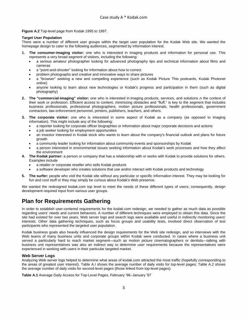
Figure A.2 Top-level page from Kodak 1995 to 1997.
Target User Population There were a number of different user groups within the target user population for the Kodak Web site. We wanted the homepage design to cater to the following audiences, segmented by information interest.
1. The consumer-imaging visitor: one who is interested in imaging products and information for personal use. This represents a very broad segment of visitors, including the following: • a serious amateur photographer looking for advanced photography tips and technical information about films and
cameras • a "point-and-shooter" looking for information about how to correct • problem photographs and creative and innovative ways to share pictures • a "browser" seeking a new and compelling experience (such as Kodak Picture This postcards, Kodak Photonet
online) • anyone looking to learn about new technologies or Kodak's progress and participation in them (such as digital
photography)
2. The "commercial-imaging" visitor: one who is interested in imaging products, services, and solutions in the context of their work or profession. Efficient access to content, minimizing obstacles and "fluff," is key to the segment that includes business professionals, professional photographers, motion picture professionals, health professionals, government contractors, law enforcement personnel, printers, publishers, teachers, and others.
3. The corporate visitor: one who is interested in some aspect of Kodak as a company (as opposed to imaging information). This might include any of the following: • a reporter looking for corporate officer biographies or information about major corporate decisions and actions • a job seeker looking for employment opportunities • an investor interested in Kodak stock who wants to learn about the company's financial outlook and plans for future
growth • a community leader looking for information about community events and sponsorships by Kodak • a person interested in environmental issues seeking information about Kodak's work processes and how they affect
the environment 4. The Kodak partner: a person or company that has a relationship with or works with Kodak to provide solutions for others.
Examples include • a retailer or corporate reseller who sells Kodak products • a software developer who creates solutions that use and/or interact with Kodak products and technology
5. The surfer: people who visit the Kodak site without any particular or specific information interest. They may be looking for fun and cool stuff or they may simply be curious about Kodak's Web presence.
We wanted the redesigned kodak.com top level to meet the needs of these different types of users; consequently, design development required input from various user groups.
Plan for Requirements Gathering In order to establish user-centered requirements for the kodak.com redesign, we needed to gather as much data as possible regarding users’ needs and current behaviors. A number of different techniques were employed to obtain this data. Since the site had existed for over two years, Web server logs and search logs were available and useful in indirectly monitoring users' interests. Other data gathering techniques, such as focus groups and usability tests, involved direct observation of test participants who represented the targeted user population.
Kodak business goals also heavily influenced the design requirements for the Web site redesign, and so interviews with the Web teams of many business units and corporate groups within Kodak were conducted. In cases where a business unit served a particularly hard to reach market segment—such as motion picture cinematographers or dentists—talking with business unit representatives was also an indirect way to determine user requirements because the representatives were experienced in working with users in their particular targeted market.
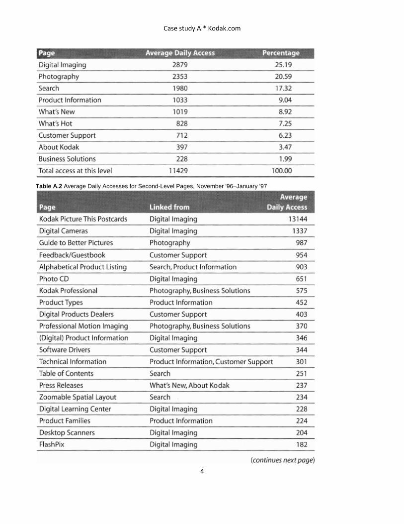
Web Server Logs Analyzing Web server logs helped to determine what areas of kodak.com attracted the most traffic (hopefully corresponding to the areas of greatest user interest). Table A.I shows the average number of daily visits for top-level pages; Table A.2 shows the average number of daily visits for second-level pages (those linked from top-level pages).
Table A.1 Average Daily Access for Top-Level Pages, February '96–January '97
Case study A * Kodak.com
4
Table A.2 Average Daily Accesses for Second-Level Pages, November '96–January '97
Case study A * Kodak.com
5
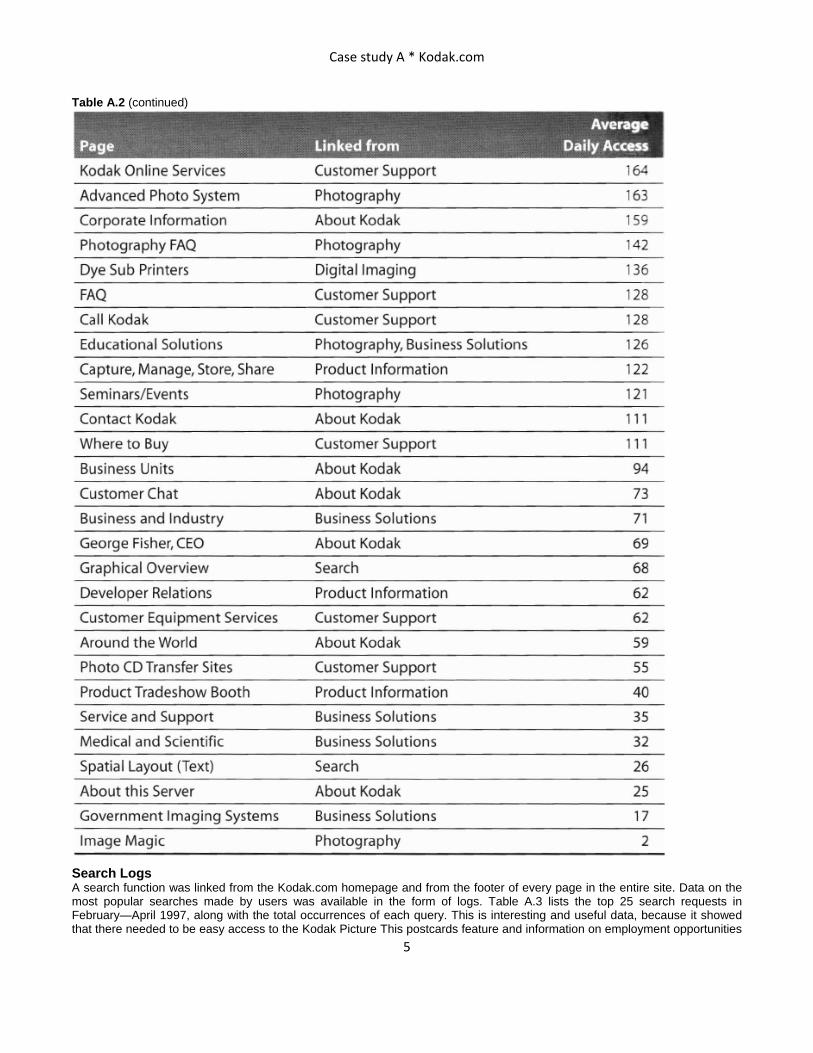
Table A.2 (continued)
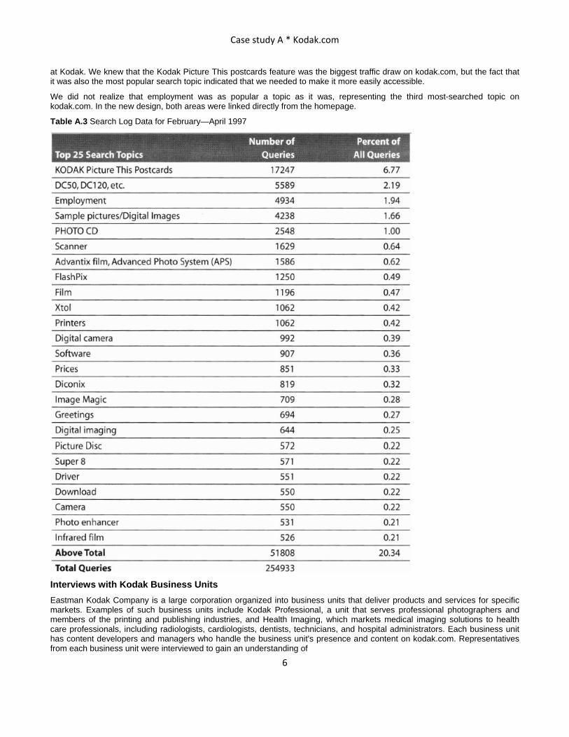
Search Logs A search function was linked from the Kodak.com homepage and from the footer of every page in the entire site. Data on the most popular searches made by users was available in the form of logs. Table A.3 lists the top 25 search requests in February—April 1997, along with the total occurrences of each query. This is interesting and useful data, because it showed that there needed to be easy access to the Kodak Picture This postcards feature and information on employment opportunities
Case study A * Kodak.com
6
at Kodak. We knew that the Kodak Picture This postcards feature was the biggest traffic draw on kodak.com, but the fact that it was also the most popular search topic indicated that we needed to make it more easily accessible.
We did not realize that employment was as popular a topic as it was, representing the third most-searched topic on kodak.com. In the new design, both areas were linked directly from the homepage.
Table A.3 Search Log Data for February—April 1997
Interviews with Kodak Business Units Eastman Kodak Company is a large corporation organized into business units that deliver products and services for specific markets. Examples of such business units include Kodak Professional, a unit that serves professional photographers and members of the printing and publishing industries, and Health Imaging, which markets medical imaging solutions to health care professionals, including radiologists, cardiologists, dentists, technicians, and hospital administrators. Each business unit has content developers and managers who handle the business unit's presence and content on kodak.com. Representatives from each business unit were interviewed to gain an understanding of
Case study A * Kodak.com
7
• the nature of their customers • the customer needs to be met and the value to deliver via the Web the nature of their Web content • other objectives they had for the Web
Focus Groups Kodak enlisted the expertise of American Institutes for Research (http://www.air.org), a consulting firm specializing in behavioral and social science research, to plan and conduct these activities in different locations across the U.S. Focus groups were conducted with two different groups within the target user population of the Kodak Web site: "consumers" and "dealers." Consumers were defined as Web users who were interested in photography—purchasing at least four rolls of film annually but not employed as a professional photographer. Dealers were defined as retailers of digital photographic equipment, interested in using the Kodak Web site to find information about products.
Focus group sessions were held in three different U.S. cities: Lexington, Massachusetts; Dallas, Texas; and San Jose, California. Separate consumer and dealer focus groups were planned for each city, for six sessions. Because different moderators conducted the sessions, detailed moderator's scripts were necessary to ensure that the appropriate topics were covered (see Table AA for agenda of topics). See the following pages for an example of a detailed moderator's script.
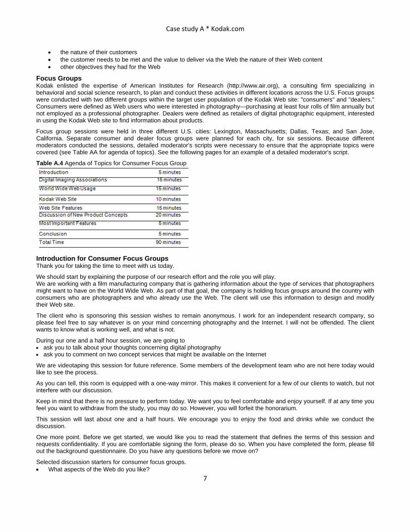
Table A.4 Agenda of Topics for Consumer Focus Group
Introduction for Consumer Focus Groups Thank you for taking the time to meet with us today.
We should start by explaining the purpose of our research effort and the role you will play. We are working with a film manufacturing company that is gathering information about the type of services that photographers might want to have on the World Wide Web. As part of that goal, the company is holding focus groups around the country with consumers who are photographers and who already use the Web. The client will use this information to design and modify their Web site.
The client who is sponsoring this session wishes to remain anonymous. I work for an independent research company, so please feel free to say whatever is on your mind concerning photography and the Internet. I will not be offended. The client wants to know what is working well, and what is not.
During our one and a half hour session, we are going to • ask you to talk about your thoughts concerning digital photography • ask you to comment on two concept services that might be available on the Internet
We are videotaping this session for future reference. Some members of the development team who are not here today would like to see the process.
As you can tell, this room is equipped with a one-way mirror. This makes it convenient for a few of our clients to watch, but not interfere with our discussion.
Keep in mind that there is no pressure to perform today. We want you to feel comfortable and enjoy yourself. If at any time you feel you want to withdraw from the study, you may do so. However, you will forfeit the honorarium.
This session will last about one and a half hours. We encourage you to enjoy the food and drinks while we conduct the discussion.
One more point. Before we get started, we would like you to read the statement that defines the terms of this session and requests confidentiality. If you are comfortable signing the form, please do so. When you have completed the form, please fill out the background questionnaire. Do you have any questions before we move on?
Selected discussion starters for consumer focus groups. • What aspects of the Web do you like?

Case study A * Kodak.com
8
• What aspects of the Web do you dislike? What makes the Web attractive to use? What makes it cool? • For what types of things do you use the Web? How many of you buy products and services through the Internet or Web? • How do you pay for them? • Would you be willing to pay less or more for products you buy on the Web in exchange for credit cards or financial
accounts?
Let's return to the things you do on the Web. • Do you use the web or Internet to communicate with friends? With family? • If your pictures could somehow get onto the Web, how interested would you be in sending pictures to your friends? To
your family? • What would make using the Web fun for sending pictures to people? • What would make using the Web difficult for sending pictures to people? • Do you have any concerns about other people seeing your pictures on the Web? • What kinds of things would you do with your digital images? • Would you want to use digital manipulation on your images? • Would you want to print out your images on other types of materials besides paper? Which materials? What would be the
biggest problem with digital images?
We are going to start our discussion on the topic of how you send and receive information from Kodak. As we do so, let's keep the focus on your individual needs and feelings. We would like you to talk about how you currently receive information, and the types of information you need from Kodak. Let's start by talking about the types of information you currently receive from Kodak.
Selected discussion starters for dealer focus groups. • What are some of the things you receive in the mail from Kodak? Does anybody receive new product announcements,
product updates, product usage tips, or invoices? • Do you receive phone calls from Kodak? • Does anyone from Kodak send you faxes? What types of information do they send? • How many of you receive electronic notes or email from Kodak? What types of information does the e-mail contain?
Let's continue by talking about the types of information you currently send to Kodak. • What are some of the things you send in the mail to Kodak? Do you send payments, problem reports, contracts, purchase
decisions? • When do you call Kodak? What types of information are you looking for when you call? • Do you send faxes to Kodak? What types of information do you fax? • How many of you send e-mail to Kodak? What types of information do you send in your e-mail? • Who's having problems with communicating with Kodak? • What would improve your communication with Kodak?
In today's discussion, we talked about mail, phone, fax, and e-mail. E-mail is sent via the Internet. However, we have not discussed a relatively new method of information delivery, the World Wide Web. The Web is the section of the Internet that contains Web sites or homepages for companies, groups, and individuals. I would now like to discuss the Internet and the Web further.
First, let's talk about the Internet. • Does your dealership currently have Internet access? • What would motivate you to get Internet access? • What role could Kodak play in your decision to get Internet access?
Next let's talk about the World Wide Web. Kodak currently has a Web site and it contains some information about the company. • What types of information do you think is found on Kodak's Web site? • What information would you like to find on the site?
How many people have used the Kodak Web site? • What types of things did you do on the Kodak Web site? • What were your impressions of the Web site? • How easy or difficult was it to find information on the Web site? • How pleasing or unpleasing are the colors and graphics on Kodak's Web site? • How would you improve the Web site? • Concerning information delivery, how do you think the Web site would compare to mail, phone, fax, and e-mail?

Case study A * Kodak.com
9
Usability Testing Usability testing was performed on kodak.com with the current homepage and top level in place, to determine usability issues to be addressed in the redesign. With Kodak's guidance, AIR designed the test protocol and recruited 12 individuals to participate. The test was conducted in Waltham, Massachusetts, and the testing sessions were videotaped for future review. Participants were screened to fit the attributes of the "consumer" focus group participant, described in the previous section. The purposes of the usability testing were to test the usability of the Web site in realistic situations for which a customer would visit the Web site and discuss the features and aspects of the Web site with the customers.
To represent the real browsing conditions of many kodak.com visitors, participants in the usability test used a 15-inch monitor and were connected to the Internet at 28.8 kbps. The usability test included several steps. • Participants filled out an agreement form, agreeing to take part in the usability test. • Participants received an introduction about the purpose and process of the test. • Participants were asked to perform a number of information gathering tasks, such as "find a film that will work well in
bright, sunny conditions." • Participants participated in a post-test interview and provided overall feedback about the Web site.
The usability administrator sat with the participant during the usability test. Participants had some problems finding information about specific products, but they experienced even more difficulty when they looked for information without specific product names (such as advice for taking photographs). Users were given tasks to perform that would lead them to all of the links on the home-page. The search engine for the Web site was perceived as being hard to use. When doing searches, users commented that many of the Web pages were too cramped with text, and therefore, hard to read. The frequently asked questions page was perceived to be useful, but in some cases users weren't sure what "FAQ" meant, and therefore, advised that "Frequently Asked Questions" should be spelled out. In addition, users had trouble finding the location to e-mail questions and comments to Kodak.
During the interviews that took place after the usability test, participants commented that the kodak.com Web site seemed too cluttered. Users indicated that many of the resources that they wanted were available on the site, but they were hindered by the confusing terminology. Users also indicated that the search engine should be improved. Overall, users liked the resources offered at the kodak.com Web site and would be interested in revisiting the site if it was easier to use. All of this data was valuable in developing design requirements for the redesign.
The following are excerpts from the materials used in a usability test of kodak.com. The materials were developed and used by the American Institutes for Research (http://www.air.org) with guidance from Kodak.
Usability Test Materials Introduction Thank you for coming today. I work for the American Institutes for Research, a not-for-profit consulting group hired by outside companies to conduct research about the usability of products, software, and services. Currently, we've been asked by Kodak to evaluate their Web site.
I will guide you through the evaluation and interview you about your impression of the Kodak site. The session will be videotaped, and there may be an observer. Remember, we are not evaluating you in any way: We are interested in evaluating the content and information on the Web site. The information that you give us will be used to improve the site.
I will give you several tasks to complete using the Web site. The tasks will be printed on cards in front of you. I'll ask you to read each task aloud and then try to complete the task.
As you complete each task, I will ask you to think aloud and try to complete it. This will let me keep up with you.
Throughout the session, I will encourage you to express your opinions freely, to comment on what information is clear or unclear to you, and in particular, what you find confusing or difficult to understand.
Participant Tasks Task 1—Top-Level Exploration (talk aloud warm-up)
Take a few minutes to explore this page. As you do, please comment on what you think each link means, and the sorts of things that you would expect to see if you were to click each link. Feel free to comment whenever you come across aspects and features of the Web site that you like, you don't like, you find confusing, or you find helpful.
Task 2—Product Information (search without knowing product name beforehand)
Try to find a film that will work well in bright, sunny conditions.
At first encounter with product information page: Please talk through what you think the different links on this page mean.

Case study A * Kodak.com
10
Return to the top page of the Web site, where you started.
______ Backup _____ "Go" menu _____ Footer Other: _________________________________________
Task 4—Digital Photography (digital learning center)
You have just heard about digital cameras and would like to learn more about what they can do. You wonder if the Kodak Web site contains any online tutorials about digital photography technology and how it is used. Try to find this information.
Return to the top page of the Web site, where you started.
______ Backup _____ "Go" menu _____ Footer
Task 5—Customer Support (dealer locator) Try to find a dealer who sells the DCS 420, a professional quality digital camera. Return to the top page of the Web site, where you started. ______ Backup _____ "Go" menu _____ Footer Other: _____________________________________
Task 6—Digital Photography (sample digital image)
Pictures taken by digital cameras can be viewed on the Web. Try to find sample pictures taken by the DC40 camera so that you can see the quality of the picture.
Return to the top page of the Web site, where you started.
______ Backup _____ "Go" menu _____ Footer
Other: ______________
Task 7—Customer Support (frequently asked questions)
Try to find out whether walking through the X-ray machine at the airport will affect the film in your camera.
Return to the top page of the Web site, where you started.
______ Backup ____ "Go" menu _____ Footer
Other: _________________________________
Task 8—Customer Support (guest book)
Imagine that you have searched the Web site for an answer to a question about a Kodak product that you own, and you are unable to find an answer to your question. What would you do at this point?
If they did not answer that they would e-mail Kodak:
You have heard that there is a way on the Web site to e-mail questions to Kodak. Try to find it.
How long do you expect it will take before you get an answer?
What does the term "guest book" mean to you? Can you suggest a better name for this function?
Go back to the Customer Service page.
Is this what you expected under Customer Service?
Return to the top page of the Web site, where you started.
______ Backup ____ "Go" menu _____ Footer
Other: ______________________________________
Task 9—Product Information (compare search possibilities)
Let's return to the Product Information page. Six of the links on the page can be used to search for information on products, and we are interested in determining how well each of the search strategies work. I am going to give you a couple of things to search for, and I will ask you to use a particular link on the page to do the search.
Try to find a page of information on the DC50 Digital Zoom Camera by clicking on the link.
Now try it from the ______________ link.

Case study A * Kodak.com
11
Which of the two search methods do you prefer?
Is there a different way to find this information that you would prefer?
At the beginning of the session, I asked you to find an appropriate film to use in bright sun. Try to find this information from the ____________________________ link.
Now try it from the _____________ link.
Which of the two search methods do you prefer?
Is there a different way to find this information that you would prefer?
In general, what do you think of having multiple ways of searching for products?
Return to the top page of the Web site, where you started.
Backup "Go" menu _____ Footer
Other: __________________________________
Task 10—Product Information (search, compare navigation aids)
I'd like to direct your attention to a particular page. Click on the Find function. What do you think this page is used for? What is clear or unclear?
Now, I'd like you to look at this section over here (point to You can also search by:) What do you think is meant by each of these links?
Try out each of the links.
Would this be helpful to find what you need on the Web site? Which do you like best?
Post-Test Interview • What were the three things that you liked best about this site? • What were the three things that you liked least about this site? • If you could change one thing about this site, what would it be? • If you could add one thing about this site, what would it be? • Would you go back to this site? • Would you recommend this site to others? Guest Book Messages from Visitors Several hundred messages per day are submitted through the kodak.com guest book (a form by which kodak.com users can send questions, requests, comments, etc., to the company). Typically, the vast majority of these entries are requests for product support, requests for additional information, comments about the company and/or its products, etc., and less than two percent contain feedback about the Web site itself. However, these entries are the only regular means by which kodak.com users can provide direct feedback about the site. Therefore, we analyzed guest book comments from several months as part of our effort to understand user needs and desires.
We found that the majority of guest book feedback pertaining to the site itself was too generic to be useful (e.g., "Great site!"), and that most specific problems identified (e.g., broken links, misspellings, inaccuracies) were not helpful in identifying usability problems. However, some comments inspired our thinking about opportunities to improve kodak.com. For example, a few comments brought up the issue that the essentially static appearance of the existing home-page did not facilitate announcements of new product launches or the availability of popular applications (like the Kodak Picture This postcards feature); also, it gave no indication that new information was forthcoming or that the site was being kept up-to-date. This motivated the development team to make the new homepage more dynamic and flexible.
User Surveys The results from a number of user surveys conducted on kodak.com yielded valuable information about user characteristics and preferences. We gained insights into the reasons users visit (e.g., business or personal reasons), the frequency with which users visit, connection speeds, monitor settings, browsing habits, demographics, etc. These insights were extremely valuable during the development of user requirements for the new site structure.
Requirements Collection and Site Design Many different information-gathering techniques were used to collect data about users' needs and desires and Kodak's business objectives. The next steps were to develop design requirements based on the data and to begin the actual design

Case study A * Kodak.com
12
process itself.
Business Unit Interviews This exercise gave us a clearer understanding of some of the specific markets and audiences Kodak was trying to reach and some of the specific goals Kodak was trying to achieve through the Web. The following overall design requirements for the new kodak.com top level resulted from the interviews with business units.
• Present information in a user-centric way, without regard for corporate business unit boundaries.
• Provide information on applications of products as well as the products themselves.
• Provide a more intuitive and direct path to Kodak's various markets. ("Business Solutions" is not an adequate catchall.)
• Broaden the choices at each level so that the site is "shallower" (i.e., not requiring so many clicks to get to information).
• Provide areas for announcements, highlights, education, and enticement directly on the homepage.
• Provide branding and visual design guidelines that support the diversity of Kodak—its various businesses and markets and its worldwide presence.
Consumer Focus Groups The consumer sessions focused on participants' expectations and understanding of digital imaging terminology and technology, impressions of the digital imaging marketplace, and expectations and preferences for Kodak's offerings on the Web. Twenty-two consumers participated in the three consumer focus groups. Several interesting observations surfaced.
Many focus group participants were confused by terminology related to digital imaging and pictures. Some participants were not aware that Kodak made digital imaging products at all. In terms of general Web usability preferences, participants indicated that they disliked Web sites that took a long time to load, and that flashing pictures were annoying. Participants also sometimes found it hard to find the information that they were looking for. Regarding the Kodak Web site specifically, participants were excited at the possibility of sharing pictures with family and friends over the Web. Interestingly enough, none of the focus group participants had ever visited the Kodak Web site. However, the focus group participants indicated that they would be interested in visiting the site if it offered information on products and instructions about how to use those products, and also photography advice (about how to take good pictures, what type of film to use, etc.). Finally, enthusiastic idea participants were enthusiastic about the idea of Kodak delivering customer support for products directly through its Web site.
Dealer Focus Groups The dealer sessions focused on the dealers' relationships to Kodak and how they could be improved because of Kodak's online presence. Dealers were asked to comment on their current communication with Kodak and indicate what Kodak could do over the Web to make that interaction more effective.
Twenty-seven digital equipment dealers took part in the dealer focus groups. The dealers who participated tended to focus on what resources Kodak made available on the Web. Some participants felt that the information sent out by Kodak through traditional means was geared toward larger consumer dealerships, not smaller organizations, or those who needed more technical information. Approximately half of the focus group participants had visited Kodak's Web site, and many of them felt that the site was geared toward consumers, but did not provide adequate information for the dealers. Such information could relate to new products, product availability, product specification sheets, and technical questions. The main advantage given for having this information available on the Web site was 24-hour-per-day availability. The participants commented that some information (such as dealer pricing information) should not be available to all (including customers). Overall, focus group participants did not like the design of the current kodak.com homepage. For instance, the difference between "What's Hot" and "What's New" was not clear. The dealers reported that many of the categories were confusing; they requested easier paths for finding the information that they wanted.
Synthesizing Requirements Based on our understanding of user needs and behavior, we defined a set of user requirements that guided the design of a new top-level site structure. Some of the requirements specifics follow.
Information Segments. Kodak.com visitors fall into a few broad segments based on information interest. We identified at least five major segments of information in which visitors could potentially be interested.
1. consumer photography and imaging 2. business and professional applications of imaging

Case study A * Kodak.com
13
3. Kodak as a company 4. working with Kodak to deliver products and/or services 5. nothing in particular
All of these information segments needed to be accommodated by the new top-level site structure, and eventually formed the basis for the information "chunks" we developed for the homepage.
Products versus Solutions. Some visitors come to kodak.com seeking information about a specific product; others come with a need or problem in mind but without knowing the product or service that best meets that need. Both needed to be accommodated by the new top-level site structure.
Technological Requirements. Based on surveys, guest book comments, feedback from focus groups, and existing literature on Web site usability, we made fast download times, pages viewable on monitors of varying resolutions, support for textual navigation, and other qualities requirements for our new top-level site structure. These requirements included the following.
• Total file size for the homepage, including graphics, should be kept to a minimum (ideally, around 45K). • The main navigation and graphics should be viewable without scrolling on a low-resolution monitor. The width of the
page should not exceed 472 pixels; no horizontal scrolling or window expansion should be necessary. The vertical constraint may be relaxed with proper design that gives clear visual indication of additional material and entices users to go there.
• No frames. • No gratuitous, incessantly looping animations or blinking text. • The page should be completely navigable with image loading turned off (for text browser users).
Conceptual Design We had gathered a tremendous amount of knowledge—user needs and characteristics, content requirements, and marketing requirements. The next step was to use that knowledge and requirements to build the design of the homepage and top level of kodak.com.
As is usually the case with design, there was no systematic process we could follow to take us automatically from requirements to design. We had to rely on creative problem solving to generate a first prototype, which we could then improve upon using usability testing to drive design iterations. We assembled a multifunctional team consisting of visual designers, a project manager, a Web editor, a Web developer from one of Kodak's business units, a manager with a background in user experience, and usability experts to examine the requirements and brainstorm possible designs for a new top level for kodak.com.
Our primary focus was the design of the homepage. Once we settled on the design, we identified the need to create new top-level hub pages to pull together links to related pieces of content throughout kodak.com. For example, one hub page, "Digital Cameras and Technology," was developed to include links to Kodak's various digital products, including digital cameras, inkjet products, and CD products. We spent less time on the design of these hub pages relative to the time we spent on the homepage. We did not usability test the hub pages. The remainder of the links from the homepage pointed to existing "sitelets" (sub-sites) within kodak.com, which for the most part, we did not alter.
We had several multihour working sessions. Based on the user interface requirements we had defined, we knew that in order to make navigation more efficient, the new homepage would need to contain more links than the previous one. We also knew what content those links had to account for. Our challenge during the design process was to
• Establish the exact wording for the links, understanding that both the descriptiveness of the links themselves and their context among neighboring links on the homepage would impact usability.
• Divide the links into groups to help the user evaluate them more quickly and easily. In going from roughly ten to roughly thirty links, we knew we didn't want to simply add twenty more gray buttons to the current homepage.
• Design the look of the homepage, incorporating imagery into a primarily textual homepage to achieve a compelling look befitting the befitting Leader in Imaging."
To achieve the first two tasks, we wrote the tentative names of the various sections of the site on sticky notes and spent many of our working sessions moving these notes around on large pieces of posterboard. We discussed the sections of the site, their relative importance to users and to the company, and how they could be grouped and organized. For inspiration, we conducted a benchmark comparison of 10 corporate Web sites, making note of
1. theme, if any 2. visual motif 3. organization of major sections of the site with descriptions 4. navigational model/tools 5. common page elements 6. number of choices from the homepage 7. how the following are handled on the homepage:

Case study A * Kodak.com
14
• the path to product information • international content • online commerce, if any • special relationships (e.g., with dealers and/or developers) • feedback/guest book mechanism
Evaluating these sites helped us to identify design and interaction elements and effective words/labels.
Information Architecture When we created groups, we discussed the wording of the links so that the juxtaposed links would not create confusion. After several sessions, we arrived at groupings that we thought were reasonable (see Table A.5).
Table A.5 Groupings for Links
Iterative Design with Usability Testing We subjected our design to an iterative design process. That is, we conducted one Usability test, fed the results of the test into the next iteration of the design, and tested again to refine the design further. The first usability test was paper-based.
Usability Testing, Round One After developing a first draft of the links and groups we wanted for the new homepage, we subjected it to paper-and-pencil usability testing. This was called “round one” of Usability testing. Twenty participants were recruited for the study, which consisted of three stages.
In the first stage, each participant was presented with a simple listing, on paper, of the links we intended to have on the homepage.

Case study A * Kodak.com
15
Links were presented in the major groupings (chunks) we had agreed upon, but no other visual design was employed. Each participant was given the same set of 30 tasks (presented randomly). Tasks were designed to cover a broad range of content on kodak.com, including information most frequently sought by users. For each task, the participant was asked to identify the homepage link most likely to lead to information that would support the completion of that task, and to give a rating of 1-3 of his/her level of confidence that the targeted information would be found using that link. This first stage was intended to examine how well our proposed homepage links were differentiated; that is, for a given set of representative tasks, whether the user knew which link to choose to find a particular piece of information.
Table A.6 shows the percentage of participants, for each task, who picked, as their first choice, the correct homepage link that would lead to the completion of the task. This was the most useful stage of the test, as it provided a preview of what it would be like for a user to use the new homepage.
In the second stage, we asked participants to go through the homepage links and describe what they would expect to find "behind" each link. This second stage was intended to examine the predictability of the links we intended to offer on the homepage. Table A.7 shows the percentage of participants making correct predictions for each link.
We found this stage of testing to be helpful because it identified unfamiliar or ambiguous terms, and terms for which the users' expectations differed from our intent. It also provided insight into possible misinterpretations of terms, and how pervasive these misinterpretations were likely to be. For example, we discovered that 80 percent of our test participants were unfamiliar with the term "Advanced Photo System," and did not realize that the term refers to an industry standard for general consumer photography. As another example, we constructed a link to "What's New at www.kodak.com" hoping that users would realize that it linked to recent updates to the Web site, not necessarily "what's new" with Kodak. However, we found that 75 percent of test participants did not make this distinction, and for the final design we dropped the words "at www.kodak.com" from the link.
In the third stage, again we went through the entire list of links on the homepage with each participant and explained the content we intended to offer under that link. We asked the participant to give a rating on a seven-point scale of how well the link name we chose described the content we intended to offer "behind" it. In this stage, we attempted to discover how accurate the participants found the names we devised. We discovered that this stage of the study was not particularly useful, since participants tended to give us high accuracy ratings for almost every link. We discovered that because a link name is accurate does not necessarily mean that it is predictable, or well differentiated from surrounding links, or otherwise useful to the user.
As an illustration, a link marked "Information" may accurately describe what is found behind the link, but is not useful because it is not predictable or differentiable from other links. A specific example from our study is that we had a link marked "All About Photography" on our prototype homepage. Five of the thirty tasks could be completed using this link, but for four of the tasks, none of the twenty participants chose "All About Photography" as their first or second choice. Yet, when the participants were told the content that would be offered through "All About Photography" (tips for taking great pictures in various situations, suggestions on how to do more with pictures, information about photography clubs, seminars and events, information about Kodak photographic products, and more) all participants gave the name a high rating in terms of accuracy. The problem was that although the title "All About Photography" was accurate, it was not well differentiated from its surrounding links (many of which had to do with photography as well). In addition, because of the great diversity of information to which it pointed, it was difficult for users to predict what lay behind the link. We concluded that this methodology was not useful for measuring the usability of the proposed site structure, or for identifying changes that would increase usability.
When the results of the first set of usability tests came back, we were ready to perform our first iteration on improving the proposed homepage design. Based on the usability test recommendations, we cut down on the number of homepage links subsuming some in others—and recasting the focus of some of the proposed hub pages. Of the homepage links that remained, we renamed the confusing ones.

Case study A * Kodak.com
16
Table A.6 Phase I Usability Testing Results— Percentage of Participants Who Successfully Identified the Correct Homepage Link on the First Try

Case study A * Kodak.com
17
Table A.7 Phase I Usability Test Results— Percentage of Participants Correctly Predicting the Content behind Each Link

Case study A * Kodak.com
18
Page Layout Introduction In addition to selecting the links that would appear on homepage and top-level pages, we needed to determine how these links would be laid out and presented on each page. The page layout decisions affected not only usability, but also each page's ability to convey the aesthetic and emotional qualities we desired.
Focus on Text
In contrast to the previous homepage, which featured a large image map, we decided to make the new homepage primarily textual. There were multiple reasons for this. The first reason was speed. Existing research on W6 usability points to greater speed and shorter download times as being of prime importance to users. Because text downloads faster than images, we chose to use textual links to enable users to navigate the site more quickly and without having to wait for images to download.
The second reason was flexibility. The previous homepage and top-level pages consisted of large image maps with up to eight links, accompanied by text link equivalents. Consequently, changes to these pages were very infrequent, and difficult to make. Usually, an existing item had to be removed in order to accommodate a new item. On rare occasions, new links were added without removing any of the existing ones, which was awkward in terms of visual design.
As an example, the introduction of the "Kodak Picture Network" (an online picture management/sharing service) in 1997 required a homepage link to learn about, join, and use the service. Of the existing homepage links at the time, eight were gray buttons at the bottom of the image map, and one—"What's Hot"—was a graphical link in the upper right hand corner. In order to provide a link to the "Kodak Picture Network," a ninth gray button was placed on top of the other eight—a solution that met the business requirements, but was not an elegant design solution. Because the new homepage was mostly textual, it could easily be modified to reflect the nature of the site. We could add, change, or remove links without much effort whenever necessary to accommodate new or changing content, address usability issues, and special announcements.
The Look of the New Pages
Designing the look of the new homepage proved to be a difficult task. We were dealing with several groups of links, and we wanted to present them in such a way that would not overwhelm the user. We also wanted to highlight photograph and the great imagery that is expected of Kodak. We tried an exercise in which each member of the multifunctional working team sketched his or her own concepts of what the new homepage should look like, and then laid the sketches out for all to see and from which to derive inspiration.
Ultimately, the duty of producing initial concept sketches of the new homepage fell to our lead visual designer, who produced very basic layouts for us to show participants in our second set of usability tests, where users were presented with actual screen layouts. The layouts were similar, involving two alternative arrangements of the same components, and usability test participants were evenly split between which layout they preferred.
The designer proceeded to create several composites of new homepage concepts, based on the layouts, with different color combinations and different uses of images. They were circulated among the kodak.com user experience group for comments. Many colleagues offered feedback, but they did not consistently favor one concept over another.
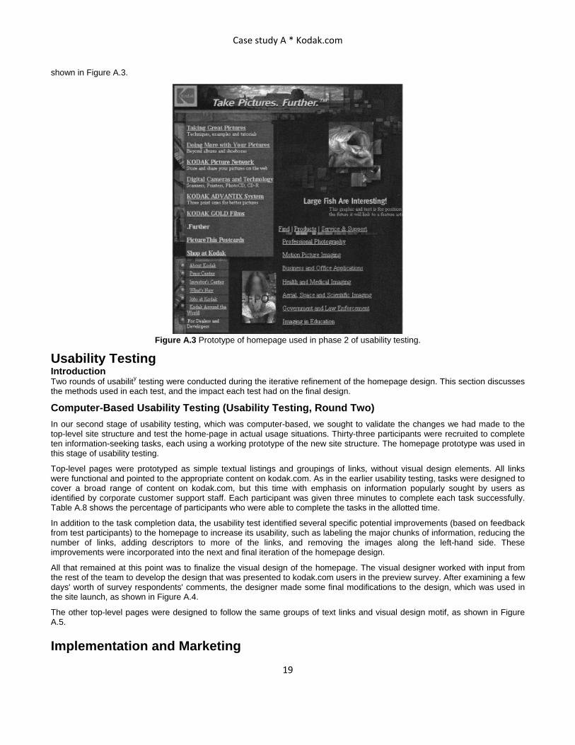
After we had refined the links and groups to address the issues raised in the first usability test, the visual designer again developed a composite design, incorporating the color scheme and visual elements from one of the composites that had received favorable comments (see Figure A.3). This prototype was used in the usability tests.
Physical Design
Developing Web Pages The Web developers at kodak.com used and continue to use a variety of methods to implement Web pages. Most Web developers forgo so-called WYSIWYG ("What You See Is What You Get") authoring tools and instead manually edit HTML with or without the help of HTML editing tools (such as Allaire Homesite) because of the ability to control exactly what elements are used and better understand how the underlying code will interact with various Web browsers. Because browser compatibility is always an important issue, the Web developers who created the actual pages that comprised this particular redesigned site edited the HTML manually.
Web pages were constructed for use in the second usability test. This test was intended to require participants to actually use the page and follow links to existing sitelets on kodak.com. The site redesign did not include any changes in site functionality (e.g., development of new applications), nor- any of the redesigned pages contain scripts. Consequently, testing was limited to checking the new Web pages against different browser/platform combinations to ensure that the Web pages rendered as expected. There were no surprises uncovered during this stage of testing. The new homepage designed for usability testing is
Case study A * Kodak.com
19
shown in Figure A.3.
Figure A.3 Prototype of homepage used in phase 2 of usability testing.
Usability Testing Introduction Two rounds of usability testing were conducted during the iterative refinement of the homepage design. This section discusses the methods used in each test, and the impact each test had on the final design.
Computer-Based Usability Testing (Usability Testing, Round Two) In our second stage of usability testing, which was computer-based, we sought to validate the changes we had made to the top-level site structure and test the home-page in actual usage situations. Thirty-three participants were recruited to complete ten information-seeking tasks, each using a working prototype of the new site structure. The homepage prototype was used in this stage of usability testing.
Top-level pages were prototyped as simple textual listings and groupings of links, without visual design elements. All links were functional and pointed to the appropriate content on kodak.com. As in the earlier usability testing, tasks were designed to cover a broad range of content on kodak.com, but this time with emphasis on information popularly sought by users as identified by corporate customer support staff. Each participant was given three minutes to complete each task successfully. Table A.8 shows the percentage of participants who were able to complete the tasks in the allotted time.
In addition to the task completion data, the usability test identified several specific potential improvements (based on feedback from test participants) to the homepage to increase its usability, such as labeling the major chunks of information, reducing the number of links, adding descriptors to more of the links, and removing the images along the left-hand side. These improvements were incorporated into the next and final iteration of the homepage design.
All that remained at this point was to finalize the visual design of the homepage. The visual designer worked with input from the rest of the team to develop the design that was presented to kodak.com users in the preview survey. After examining a few days' worth of survey respondents' comments, the designer made some final modifications to the design, which was used in the site launch, as shown in Figure A.4.
The other top-level pages were designed to follow the same groups of text links and visual design motif, as shown in Figure A.5.
Implementation and Marketing

Case study A * Kodak.com
20
Previewing the New Design with Users Before the launch of the new Web page design, visitors to the kodak.com Web site were given a chance to preview the new design and offer their feedback. At the end of many Kodak Web pages, a link was provided where users who followed the link could view an HTML prototype of the new homepage. The links, while functional, pointed to "dead-end" pages that described the content to which each link would point. We did not link to the actual content in kodak.com because we didn't want users to navigate any deeper than the new homepage and be sidetracked or provide comments that were not about the homepage. Users then had a chance to fill out a short Web-based survey. The survey was linked from the footer of every page of the site.
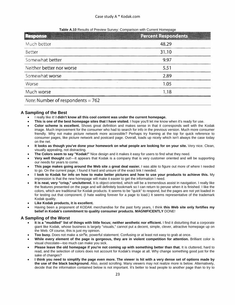
The survey was not intended to be a representative sampling of all kodak.com users. Because we placed the link on every page and invited users to comment, we were not randomly sampling within a defined population and could not make any claims regarding the generalization of the results. Instead, we were simply trying to get as many opinions as we could about the new design. In this sense, the survey was quite successful, yielding opinions and comments from over 800 visitors. Respondents to the survey answered two questions: "How appealing is the overall design of the new Kodak homepage?" (see Table A.9) and "Overall, how does the new Kodak homepage compare with the current Kodak homepage?" (see Table A.10).
We carefully read each of the 1-10 open-ended comments offered by survey respondents, and separated them into three categories: positive (338 comments), negative (162 comments), and neutral or both positive and negative (210 comments). A sampling of positive and negatives comments follows. The fact that the results were so positive gave us confidence that the design would be well received by users.
Table A.8 Usability Test Results—Percentage of Participants Completing the Task Successfully within Three Minutes

Case study A * Kodak.com
21
Figure A.4 The final design used in the site launch.

Case study A * Kodak.com
22
Figure A.5 An example of a top level page in the site launch
Table A.9 Results of Preview Survey: Overall Appeal
Response Percent Respondents Wow!!! 14.36 Very appealing 48.51 Appealing 25.87 Neither appealing nor worse 5.43 Unappealing 3.49 Very unappealing 0.65 Ugh!!! 1.68 Note: Number of respondents = 773
Case study A * Kodak.com
23
Table A.10 Results of Preview Survey: Comparison with Current Homepage
A Sampling of the Best • I really like it! I didn't know all this cool content was under the current homepage. • This is one of the best homepage sites that I have visited. I hope you'll let me know when it's ready for use. • Color scheme is excellent. Shows great definition and makes sense in that it corresponds well with the Kodak
image. Much improvement for the consumer who had to search for info in the previous version. Much more consumer friendly. Why not make picture network more accessible? Perhaps try framing at the top for quick reference to consumer pages, like picture network and postcard page. Overall, loads up nicely which isn't always the case today on the net.
• It looks as though you've done your homework on what people are looking for on your site. Very nice. Clean, visually appealing, not distracting.
• The Colors seem to say "Kodak!" Nice design and it makes it easy for users to find what they need. • Very well thought out!—It appears that Kodak is a company that is very customer oriented and will be supporting
our needs for years to come. • This page makes going around the Web site a great deal easier. I was able to figure out more of where I needed
to go. On the current page, I found it hard and unsure of the exact link I needed. • I look to Kodak for info on how to make better pictures and how to use your products to achieve this. My
impression is that the new homepage will make it easier to get the information I need. • It is neat, very "crisp," uncluttered. It is object-oriented, which will be a tremendous assist in navigation. I really like
the features presented on the page and will definitely bookmark so I can return to peruse when it is finished. I like the colors, which are traditional for Kodak products. It seems to be "quick" to respond, but the pages are not yet loaded in for testing out that component. (I hate waiting forever for a page to load.) It seems representative of the trademark Kodak quality.
• Like Kodak products, it is excellent. • Having been a proponent of KODAK merchandise for the past forty years, I think this Web site only fortifies my
belief in Kodak's commitment to quality consumer products. MAGNIFICENTLY DONE!
A Sampling of the Worst • It is a "muddled" list of things with little focus; neither aesthetic nor efficient. I find it disturbing that a corporate
giant like Kodak, whose business is largely "visuals," cannot put a decent, simple, clever, attractive homepage up on the Web. Of course, this is just my opinion.
• Too busy. Does not make a single, powerful statement. Confusing or at least not easy to grab at once. • While every element of the page is gorgeous, they are in violent competition for attention. Brilliant color is
visual chocolate—too much can make you sick. • Please leave the old homepage if you're not coming up with something better than that. It is cluttered, hard to
read, and the selection of colors does not account for Kodak's image at all. Why change something good just for the sake of changes?
• I think you need to simplify the page even more. The viewer is hit with a very dense set of options made by the use of the black background. Also, avoid scrolling. Many viewers may not realize more is below. Alternatively, decide that the information contained below is not important. It's better to lead people to another page than to try to

Case study A * Kodak.com
24
put everything on the first page. Use cookies to find out what is most interesting for the viewer and give it to them again when they come back to the site. Usually a viewer will be coming back for similar information based on products they own or use. "Hot info" can be placed in a text area on the viewers screen in case they want to jump-start the process.
• The new homepage might be somewhat "busy," I tend to prefer fewer links per page, afraid that I'll overlook what I'm looking for, or miss links that might interest me because of the visual overload from many links.
Based on the results of the survey, we felt comfortable moving ahead with launching the redesigned top level as planned.
Marketing Kodak issued press releases about the new site design. The teamwork and process that went into the design was featured in a local business publication. Because kodak.com was a Web site that had already existed, it was not necessary to address issues such as domain name registration, search engine registration, or marketing. Users already knew about kodak.com and how to access the site.
After the Launch Surprisingly, we received very little feedback on the new site design. Because the design change from the old site to the new was so drastic, we expected to be inundated with user comments via the kodak.com guest book. In fact, we received no more guest book messages pertaining to site design after the launch of the redesign than before it—around one percent of the messages daily.
Because of the need to reassign resources to other work immediately following the launch, Kodak did not have the luxury of thoroughly studying the effects of the new Web site design. Instead, we relied on the knowledge that we had developed the site based on a rigorous user-centered design approach, using various techniques for requirements gathering and thorough usability testing. The endorsement of hundreds of kodak.com users who rated the new design favorably in the pre-launch survey confirmed that the new design was a success.
Ongoing Maintenance The new design was based on text links organized into logical groups. No limit was set on how many links could appear in a group or how many groups could appear on a page. As such, it became much easier to add links, change links, or remove links without significantly affecting the overall look of the page. Change requests became much more frequent, although it is unclear whether this was the result of changes being easier to make, or that Kodak was doing more that required changes to be made, or both. Consequently, change requests needed to be addressed much more frequently than with the previous design—both for the homepage and for top-level pages.
The responsibility of handling change requests became the joint responsibility of three individuals—the site editor, the visual design director, and the user interaction design lead. They worked together to determine the best way to accommodate requests through adding, modifying, or removing links and changing groups, wording, and/or labels. The actual development of kodak.com content was, and continues to be, a responsibility distributed among Kodak's various business units and corporate groups.