Embed Size (px)
Citation preview
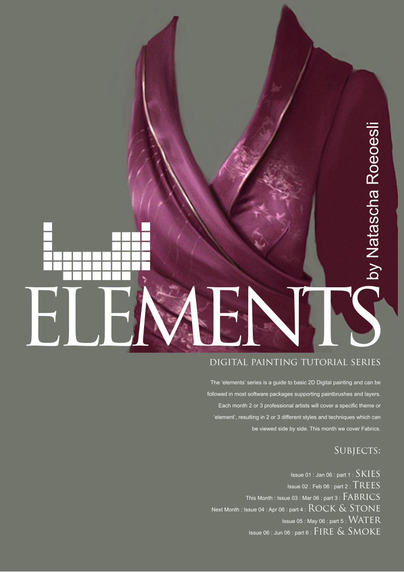
digital painting tutorial series
The ‘elements’ series is a guide to basic 2D Digital painting and can be
followed in most software packages supporting paintbrushes and layers.
Each month 2 or 3 professional artists will cover a specific theme or
‘element’, resulting in 2 or 3 different styles and techniques which can
be viewed side by side. This month we cover Fabrics.
Subjects:
Issue 01 : Jan 06 : part 1 : SkiesIssue 02 : Feb 06 : part 2 : Trees
This Month : Issue 03 : Mar 06 : part 3 : FabricsNext Month : Issue 04 : Apr 06 : part 4 : Rock & Stone
Issue 05 : May 06 : part 5 : WaterIssue 06 : Jun 06 : part 6 : Fire & Smoke
by N
atas
cha
Roe
oesl
i

Introduction
First of all, there are two different approaches
to painting fabrics. If what you want is to
achieve a realistic look, there is no escape
from using references.
In this case, I would advise against using a
photograph, since they sometimes trick the
eye. Besides, you learn more painting from
real life – even when it comes to fabrics.
Instead, use something you have handy which
consists of the texture and fabric you want
to work with. When you’ve located a suitable
item, place it on the table next to you. (At
this point I should add that, if your personal
preference is painting from photos, this is of
course fine too.)
This time around, I would like to introduce
you to a different way of painting fabrics or
clothing. It’s the way I normally work, and it’s a
bit more intuitive and semi-realistic than other
methods. The technique in question demands
a certain level of imagination, as well as a
basic understanding of gravity and of how folds
work.
Folds in general
Most people tend to make the mistake to paint
folds in straight lines without any interaction of
themselves. Folds depend on a great amount
of all different kinds of influences. Gravity, of
course, to name just the most obvious one but
also on the shape underneath, the thickness of
the material or the movement/direction of the
element underneath.
Folds interact. They might go on top of each
other, break, curve or create little wrinkles
much like skin, as a matter of fact (grab your
wrist, push the skin towards your hand and
then bend the wrist in order to have your hand
point at you to create some basic skin folds).
Folds get pushed together if you bend your
arm, or get pulled together at a place where
there is a button sewn on.
Folds do have a tendency to follow a certain
direction but there is always that one little
rebellous fold that goes the other way which
actually creates the realistic feel to a fabric
or surface. Make it a habit to study folds
whenever you can. If you are sitting in a
restaurant, try to make out what causes folds
to look different and try to memorize that.
Step 1: Create a colour scheme and decide on a
fabric.
We plan on painting an asian-influenced silk
dress today.
The first thing you should do is settle on
a colour scheme. In cases such as this, I
normally work with four different colors: a base
colour; a shadow colour (pick the ambient
colour – in this case the background – then
make it much more saturated and darker); a
highlight colour (in this case a much lighter and
less saturated shade of the base colour); and a
colour which is somewhere between highlight
and base colour.
You can see the colours I’m using in the
right hand column of the examples below,
numbered from 1 to 4. It’s a good idea to have
your colours in a separate layer, so that you
can go back to them and pick if necessary.
Step 2: Lay down a rough
shape
Brush: Normal hard edged, Spacing 10%,
Flow and Size Jitter set to pen pressure, check
smoothing. With my beloved hard edged
brush, I start laying down a rough shape of the
dress, using colour #1. Looks quite ugly huh?
Well, no worries, it’s not going to stay like that!
(image 1)
www.2dartistmag.com issue003 march 2006 Elements
Elements
48

Step 3: Starting to feel the forms underneath
Using colour #4, I’m beginning to search out
the forms underneath (chest, bones), and
to give shape to some general flow and fold
ideas. As always in painting, it is of critical
importance that you decide where your light
is coming from. In this case, I settled on a top
frontal light source which is slightly to the left.
Vary your pressure while working on those
folds. Don’t use the same pressure all over.
Press down harder on the higher areas, and
let it fade in areas that lie deeper. Let the folds
find their form – you can always make this on
a separate layer, and delete and start over if it
doesn’t turn out like you wanted. The shapes
should still be quite rough at this stage, which
basically helps us by adding shades of colour
number #4 to work with in the next step. If you
find it hard to control pen pressure manually,
you can lower the flow to 50%. Still with me?
It’ll get more interesting soon. (image 2)
Step 4: Color picking
Now that I have a VERY rough idea, I start
picking colours from all the shades I created.
I try to find folds and work on them some
more. Deepen lower/shadowy/darker parts
in between folds, and slowly blend colours
together. It still looks quite strange, doesn’t
it? Have patience, though, we’re getting there!
(image 3)
Elements
49www.2dartistmag.com issue003 march 2006 Elements

Step 5: Correcting the shape
It’s important that you have a good shape to
work from. Just pick the background colour
and correct folds and outlines. Basically, it’s a
matter of cleaning the rough shape you made
in the second step. (Take a look at the waist
area to see some minor changes). (image 4)
Step 6: Smudging and
blending
Fabrics contain a great number of edges and
folds, some of which are smooth, while others
are more rough/harsh. In order to smooth
some of them out, we use the smudge tool
(just make ABSOLUTELY sure you don’t
overuse it). To be honest with you – it all looks
a bit too smudgy in this step, but since we’ll
work things over again with the normal brush,
it doesn’t really matter for now (image 5).
www.2dartistmag.com issue003 march 2006 Elements
Elements
50

Step 7: Shadows
Up to this point, we’ve only used two different
colours (keep your hands off the highlights for
now). It’s time to add some shadows to the
somewhat monochromatic form we have now.
Use colour #3 to deepen some of the
inbetween fold sections. Just like last time,
vary your pen pressure in between folds.
Deeper value = deeper shadow/fold, lighter
value = shallower fold.
Also, don’t use the shadow color everywhere,
but reserve it for the darkest and deepest
folds. As you can see, I didn’t use a lot of the
shadow color. Don’t forget the seams (like
where the sleeves are attached). Notice how
the whole mess is slowly coming together?
With the current colour combinations and no
harsh highlights, the fabric looks like stretch
or some sort of soft cotton. We could actually
settle down with those colours and refine from
here. However, our plan was to paint silk,
right? Right. (image 6)
Step 8: Highlights
Here come the highlights. If you want to
understand how to paint different fabrics, you
need to know what actually causes them to
be different. The fabric we had in the previous
step didn’t have any highlights because the
surface was of a different type than silk, and it
had more texture. The clothing in step 7 didn’t
create any specular (reflected) light at all. Silk,
on the other hand, is very smooth to the touch,
and it’s surface is flatter. The smoother a
surface is, the more light is reflected. (image 7)
Let’s assume what we have in Step 7 is cotton.
Due to the fact that cotton reveals a very
rugged surface under a microscope, light
doesn’t have enough smooth surface to
bounce off directly and instead bounces off in
all different kind of directions which creates a
dull effect.
Elements
51www.2dartistmag.com issue003 march 2006 Elements

before painting a smaller fold in between (you
can see this on the leftmost side of the left
collar part).
In general, silk doesn’t have many folds. It’s a
smooth and thin material, which in this case is
quite tightly stretched over the body. The fabric
looks much more like silk now, don’t you think?
(image 7)
Step 9: Ornaments and
embroidering
You can add an unlimited amount of detail
to fabrics. In this case, I settled on some
asian-influenced imprints. I picked a new
color (a slightly yellower and brighter shade
than the main color) and started painting in
some leaves and random patterns. This is
quite a delicate procedure. Embroiderings and
patterns need to follow the body, and since
they are imprinted on the silk, they also need
to follow the same light and shadow physics.
If you just paint everything in the same color,
it will look flat and unconvincing. You can
paint over shadows for now, but don’t forget to
erase those parts later. To further add to the
effect, I changed the color I used for the leaves
to a brighter and more saturated hue, and I
revisited the patterns on the parts with the
most highlights (on the edges of the collar and
on the highest part of her chest). It’s hardly
noticable, but it adds to the overall feel.
If you don’t have the patience to paint textures
yourself, you can always create a brush from
some random flowers you painted and use it
on a separate layer on top of everything. Set
it to screen (or try out different layer modes)
and brush off the parts that go over shadows.
To refine those, it is always good to paint over
them and only use the brush as base (image
8).
Silk on the other hand reveals smooth threads,
which the light can bounce off directly into the
viewers eye. This effect is what creates the
bright specular effect.
Now that I’ve bored you with a bit of theory
- it’s on to the practice!
This is a somewhat difficult step to explain.
But, as always, make sure you still remember
where you placed your light source. Start with
a big brush and grab color #2. Once more,
make sure you vary the value of the color by
pressing down more or less depending on the
angle and height relative to your light source.
Make some crazy brush stroke and try to see if
you can create a look that works for you.
Besides adding the actual highlights, I’m also
color picking all over the place and refining
shadows. A little trick is to first create a bigger
shadow area, then pick a lighter color again
www.2dartistmag.com issue003 march 2006 Elements
Elements
52

Step 10: More refining and embroidering
First of all, I refined some of the edges around
the waist/belt to make it look more like some
stiff asian asymmetric belt. I added some
trimming to the collar and a different pattern
to the left side. The fact that I used those lines
helped me to further accentuate the shape
under the clothing. This is a little trick I like to
use quite often. Note how the lines are brighter
on top of the folds, and how they almost
vanish into the shadows. Also pay attention to
how the line follows the fold and note its “ups
and downs.” Once more, I used only the pen
pressure to create highlighted and duller areas
on those little lines. (image 9)
Step 11: Finishing touches
Color picking here and there, I corrected
some more details. I blended colors better
and deepened some shadows. Even though
silk is very smooth, it bothers me if something
looks too “rendered”, or as in this case, a bit
“rubbery”.
You could go over the fabric with a speckled
brush and create the feel of textures manually,
while using darker colors in the highlighted
areas and brighter colors in the shadowy ones.
There is, however, a quick and dirty method: I
created a layer on top of everything and filled it
with a neutral gray (128,128,128). Use the Add
noise Filter on that layer (Filter -> Noise -> add
Noise) with the settings to “uniform” (don’t click
monochromatic) and a high amount of grain.
After this, set the layer mode to overlay and
reduce its opacity until it looks nice.
Voilà! (image 10)
Project Overview by :
Natascha Roeoesliwww.tascha.ch
Elements
53www.2dartistmag.com issue003 march 2006 Elements