Embed Size (px)
Citation preview

University of Mississippi University of Mississippi
eGrove eGrove
Honors Theses Honors College (Sally McDonnell Barksdale Honors College)
2011
But Is It Art?: The Significance of Graphic Design in the Modern But Is It Art?: The Significance of Graphic Design in the Modern
Era Era
Johnny Franklin Miles III
Follow this and additional works at: https://egrove.olemiss.edu/hon_thesis
Recommended Citation Recommended Citation Miles, Johnny Franklin III, "But Is It Art?: The Significance of Graphic Design in the Modern Era" (2011). Honors Theses. 2068. https://egrove.olemiss.edu/hon_thesis/2068
This Undergraduate Thesis is brought to you for free and open access by the Honors College (Sally McDonnell Barksdale Honors College) at eGrove. It has been accepted for inclusion in Honors Theses by an authorized administrator of eGrove. For more information, please contact [email protected].

But Is It Art?The Significance of Graphic Design in the Modern Era
BY
JOHN MILES
A thesis submitted to the faculty of The University of Mississippi in partial fulfillment of therequirements of the Sally McDonnell Barksdale Honors College.
OXFORD, MISSISSIPPI
MAY 2011
.^OVED BYA-P-E
// ,
Advisor: Professor Paula Temple /
U
fI '
iArReader: Dr. Thomas-Devf/ey
. ' /
■ U'
Reader; Dr. Charles Gates

ABSTRACT
JOHN miles; but is it art? the significance of graphic design
IN THE MODERN ERA
(UNDER THE DIRECTION OF PAULA TEMPLE)
The subject of this thesis is graphic design: specifically, the history of graphic design from
the Victorian Period in the late nineteenth century until the end of the Modernist Era around
the mid-twentieth century. This time period encompasses perhaps the most Important
developments in the brief history of graphic design, therefore it is a good place to start when
considering the central question this thesis proposes of whether graphic design is art. The
terminology used to discuss the history of graphic design in this thesis—the Romantic Era, the
Modernist Era, the Postmodernist Era—is the same terminology used to describe the history of
fine art and literature. This underscores the views of the author that graphic design Is
interconnected with the arts, is shaped by many of the same figures and movements as the
arts, and should be considered in a similar light.
This thesis begins by analyzing popular conceptions about graphic design and considering
how these relate to common views about art. It then offers an overview of the history of
graphic design during the aforementioned period, with a special focus on how designers
viewed their craft in relation to art and why the modern observer might view the work of
various design movements as art. Also included are original works by the author intended to
capture the look and spirit of historical graphic design works. Graphic design has a complex
and fascinating history during this period, from the neoclassicism and nature motifs of the
Romantic Era to the abstract, minimalist design of High Modernism. This thesis attempts to
examine this unique history and promote a view that graphic design should be respected as
art.
Ill

TABLE OF CONTENTS
LIST OF FIGURES V
introduction: On Art and Design 1
Defining art 2
Reasons why graphic design is sometimes considered not to be art,
Examining whether graphic design is art
3
7
11LATE VICTORIAN ERA DESIGN.* Looking Backward, Moving Forward.
The Romantic Zeitgeist 12
13The Arts and Crafts Movement,
15Japonisme,
16Art Nouveau
18Moving toward Modernism
20MODERN DESIGN MOVEMENTS: Less Is More.
21The modern era
22Glasgow and the Vienna Secession,
25Art Deco,
29Contributions in modern art.
33The Bauhaus
36The International Typographic Style,
The end of an era 42
conclusion: Revisiting Art and Design. ,44
Design is art 45
LIST OF REFERENCES 47
appendix: Design Work. 52
IV

LIST OF FIGURES
Toni Ewing Photography Logo.FIG. 1 53
Rusalka Poster. 54FIG. 2
E Pluribus Unum 55FIG. 3
White Stripes Poster. 56FIG. 4
57Dove Brubeck Album Cover.FIG. 5
58FIG. 6 NYC Subway Poster.
59Christopher Hitchens Book Cover.FIG. 7
60FIG. 8 My Nose Logo.
V
Introduction:On Art and Design
1

DEFINING ART
What is art? This is always a contentious question among the general public, who are
among the most significant consumers and critics of art. But it is often a no less contentious
question among academics and artists themselves. Some question whether a meaningful
definition of art is possible, arguing that the constant need to reconsider definitions every time
a new form is assessed demonstrates the indefinability of a philosophical "open concept'
(Weitz 28). Others question the value of a definition of art, suggesting such classifications can
only serve to discourage creativity (Adajian).
Those who do see a purpose in defining art and who attempt to do so (and nearly
everyone, when asked, will try) are then confronted with the astonishing diversity of what is
deemed art today. Anti-formalist art, which demands consideration of a work's context and the
artist's background as much as its visual qualities, would seem to undermine any description
centered on aesthetic properties. Any definition must also take into consideration the many
unique of genres of art (collage, installations, video art, performance art, and digital art are just
a few of the mediums that have come into their own within the last century). Radical modern
art movements like Dada and Conceptual Art by their very definition are specifically intended to
challenge preexisting definitions of art. No one wants to appear stodgy and old-fashioned by
rejecting any popular new trend, but if art is indeed definable, surely it must have limits?
One final challenge in defining art comes from the nebulous meaning the plural of the word
has come to represent in the modern English language. Certainly aspirations like the performing
arts or the literary arts have an obvious connection with traditional art and are similarly valued.
We often hear people speak of the liberal arts, the language arts, or even perhaps the political
arts. While all the so-called arts may share some common foundation in intellectual and
2

creative ability, we do not usually consider the work of linguists to be art or politicians to be
artists (perhaps con artists). Perhaps it is the air of deference from its association with
traditional artists and the venerated art they produce that explains the word's ever-expanding
usage. Regardless, it is this conventional notion of art and, specifically, visual art, which we will
henceforth be concerned with as we examine the controversy over whether graphic design is
art.
REASONS WHY GRAPHIC DESIGN IS SOMETIMES
CONSIDERED NOT TO BE ART
Today, graphic design is growing as a respected discipline and gaining in appreciation by
the broader public, even to some extent in the United States, where it has typically not had the
cultural awareness it has in many European countries. However, there are often still arguments
put forth, by both the public and graphic designers themselves, claiming that the process of
graphic design is something that is only tangential to what is considered art, or even that it is
not truly art at all. Some of these arguments imply that graphic design is a "lower" form of
expression than art, while others merely define it as a distinct and separate, though still
respected, endeavor.
One argument claims that graphic design is not art because it is commercial in nature. The
theme of graphic design work usually involves promoting a product or commercial interest.
Likewise, the message behind a graphic design piece is dictated at least in part by a paying
client rather than being a noble product of the designer's own self-expression. This would
seem to violate a major element of most peoples' general conception of art: that it is
something "exhibiting an individual point of view" (Gaut 274). The idea of the graphic designer
as a paid practitioner sometimes firmly ensconced in the corporate world clashes with the
popular notion of the proverbial "starving artist," foregoing concern with recognition
guaranteed financial gain in order to boldly express his own unique vision.
or
3

It s still looked down on by the other arts" argues Dr. Robert Banham, a practicing graphic
designer and professor at The University of Reading in England. "This is inherent in the fact
that it was called 'commercial art' for many years. How many exhibitions of graphic design
have there been at say, MoMA... compared to art exhibitions?" (Banham) This commercial
nature of graphic design is something that designers themselves must also reconcile with a
view of their profession as art. Many do this by playing down the practice's commercial
associations, argues designer and author Steven Heller:
Any association today with marketing, advertising, or capitalism deeply
undermines the graphic designer's self-image... The word 'advertising," like
'commercial art,' makes graphic designers cringe. It signifies all that
sophisticated contemporary graphic design, or, rather, visual communications,
is not supposed to be. Advertising is the tool of capitalism, a con that
persuades an unwitting public to consume and consume again. Graphic design,
by contrast, is an aesthetic and philosophical pursuit that communicates ideas.
Advertising is cultural exploitation that transforms creative expression into
crass propaganda. Graphic design Is a cultural force that incorporates parallel
worldviews. (Heller, "Advertising" 295)
Indeed, designers often chafe at the suggestion that their profession is merely a tool of
commercial interests: the influential First Things First manifestos of 1964 and 2000 explicitly
rejected consumerism and a view of design as a value-free process, instead arguing for a
humanist rationale of the profession. Still, graphic design's typically commercial nature seems
undeniable. Designer Katherine McCoy notes the practice is often defined as a "duality" of
"business/art," suggesting a common view that graphic design is something that perhaps
involves art, but is not itself art per se (McCoy 3). The view then that graphic design's
commercial nature prevents, or at least threatens, its consideration as art is a prominent
among both the public and some design professionals.
one
4

Another argument against a view of graphic design as art is that graphic design is
inherently utilitarian, whereas art, and especially what Is termed fine art, serves an aesthetic or
intellectual rather than a practical purpose. People view art as something similar to poetry:
something that exists to stir thought rather than serve a functional role. Indeed, philosopher
Dr. Thomas Adajian notes that "there are institutions in some but not all cultures which involve
a focus on artifacts and performances having a high degree of aesthetic interest and lacking
any practical... use" (Adajian). A primarily functional purpose of graphic design would also
seem to possibly undermine key elements of common "cluster theories" of art, such as the
view that it should be "intellectually challenging" or "formally complex" (Gaut 274). The
controversy resembles a debate over whether recovered ancient artifacts represent art worthy
of display in an art museum or rather tools better suited for a museum of history.
"Whereas art can be almost anything one wants it to be, design needs to perform its
function first and foremost," says British graphic designer Kaz Kapusniak. "If... [the designer is]
just thinking of design in terms of its artistic merit then he misses the point and ends up with
something that may well look good, but ends up being useless." The view that graphic design's
functional nature separates it from art isn't necessarily a degrading view of the craft. Such a
view might even concede that the work of the graphic designer incorporates art while
producing something that is in a unique category, possibly even a superior category in some
ways because of design's more accessible and perhaps egalitarian nature. The field of
architecture may be a useful analogy here. Architecture Involves some of the same processes
and creative insights as art, but is also highly practical and is often thought of as being
separate from art (although it has historically been considered one of the "greater arts") ("Fine
Arts"). The fact that universities often teach graphic design within departments of "art,
architecture, and design" may also suggest a view of the discipline as separate from, but
equal footing with more traditional forms of art (graphic design sharing a similar classification
on
5

with fashion design, interior design, industrial design, and decorative art under the designation
design or the applied arts.)
Graphic design's practicality and accessible nature may still count against it in the minds of
some, however, in the debate over its value. The characteristics that make it a part of our
everyday lives are directly opposed to many of the characteristics that most people view as
fundamental to something being considered art. "Most great art, isolated In museums or
private collections, is perceived as something different—existing on a pedestal—not as part of
one's day-to-day experience," wrote acclaimed designer Paul Rand. "On the other hand, most
design (great or otherwise) of printed ephemera, logos, advertisements, brochures, posters,
and television commercials is so much a part of everyday experience that eventually it finds
itself not on a pedestal but on a rubbish heap" (Rand, Design Form and Chaos, xi). Various
attributes of graphic design combine to make it a part of our "everyday experience" rather than
something that is traditionally put on a pedestal. Many conceive of art as something created
with traditional media like oil paints or clay; graphic design uses media of mass production.
Much art is prized for representing traditional styles; graphic design strives to be
contemporary in style. Art often addresses fundamental and enduring aspects of the human
condition; the concern a work of graphic design addresses might have come and gone within a
week.
One final reason why graphic design may have difficulty being considered art is because it
is closely linked with technology. The AIGA, the professional association for graphic designers
In the United States, defines graphic design as "a creative process that combines art and
technology to communicate ideas" (Poggenpohl). Designers and typographers have, in fact,
been among the first adopters of major technological advances in communication throughout
history, from the printing press to serigraphy to the Web. But the public typically tends to
define art in terms of its resemblance to preexisting paradigms they are familiar with, so it is
always difficult for new styles of art, and especially art based on new media or technologies to
6

with fashion design, interior design, industrial design, and decorative art under the designation
design or the applied arts.)
Graphic design's practicality and accessible nature may still count against it in the minds of
some, however, in the debate over its value. The characteristics that make It a part of our
everyday lives are directly opposed to many of the characteristics that most people view as
fundamental to something being considered art. "Most great art, isolated in museums or
private collections, is perceived as something different—existing on a pedestal—not as part of
one's day-to-day experience," wrote acclaimed designer Paul Rand. "On the other hand, most
design (great or otherwise) of printed ephemera, logos, advertisements, brochures, posters,
and television commercials is so much a part of everyday experience that eventually it finds
itself not on a pedestal but on a rubbish heap" (Rand, Design Form and Chaos, xi). Various
attributes of graphic design combine to make it a part of our "everyday experience" rather than
something that is traditionally put on a pedestal. Many conceive of art as something created
with traditional media like oil paints or clay; graphic design uses media of mass production.
Much art is prized for representing traditional styles; graphic design strives to be
contemporary in style. Art often addresses fundamental and enduring aspects of the human
condition; the concern a work of graphic design addresses might have come and gone within a
week.
One final reason why graphic design may have difficulty being considered art is because it
is closely linked with technology. The AIGA, the professional association for graphic designers
in the United States, defines graphic design as "a creative process that combines art and
technology to communicate ideas" (Poggenpohl). Designers and typographers have, in fact,
been among the first adopters of major technological advances in communication throughout
history, from the printing press to serigraphy to the Web. But the public typically tends to
define art in terms of its resemblance to preexisting paradigms they are familiar with, so it is
always difficult for new styles of art, and especially art based on new media or technologies, to
6

gain acceptance (Adajian). Serigraphy, pioneered by designers in the early twentieth century,
had to be popularized by artists like Dean Meeker and especially Andy Warhol before
work produced with the method was appreciated as art. Now screen printed poster designs
sometimes collected as art, but graphic design based in newer media such as the Web or other
multimedia applications is rarely considered art outside the profession (installations, video art,
and Internet art are similarly not likely to be the first things that come to many peoples' minds
when they think about art, although each enjoys support from the art establishment and has
been the subject of many exhibitions).
A closely related reason why graphic design may be considered separate from art is that
graphic design usually includes a verbal message. The new technologies that graphic design
has historically helped develop have been used to aid in proliferation of the written word, and
graphic design has always been a tool of writers. Whether it is in the area of editorial design,
poster design, broadcast design, web design, or any other aspect of graphic design, the result
almost always incorporates a body of text or series of words. The graphic designer often fulfills
the task of determining the exact words to be used in his or her role as copywriter. Works that
are considered visual art can, but traditionally don't include prominent written communication,
while graphic design nearly always does. There is even a specific field associated with graphic
design known as typography that concerns itself with designing letterforms and arranging text.
any
are
EXAMINING WHETHER GRAPHIC DESIGN IS ART
Again, these views of graphic design as distinguished from art are not necessarily intended
to suggest that graphic design is a "lower" form of expression. On the contrary, people who
hold these opinions may still celebrate graphic design as a unique tool of human expression.
Still, denying graphic design the aforementioned venerated title of art based on these perhaps
minor distinctions feels like a slight to some designers. These people view the history and
cultural development of design as being too closely linked with art, its various movements and
7

philosophies often being too intimately related to be separated. Likewise, they view the great
impact and lasting significance graphic design has had throughout history as too important to
label this form of expression as anything other than the term that is used to designate
humanity's highest and most respected intellectual endeavors.
How, then, might one attempt to demonstrate that graphic design is, indeed, art? One
might look to the way traditional forms of art are taught and understood for guidance. One
would not claim that someone could have an appreciation of painting or sculpture as art
without an understanding of the history of these forms, or at least a familiarity with some of
their most celebrated works. Indeed, a world in which people were not familiar with at least the
Mona Lisa (c. c. 1503-1519) or Michelangelo's David (1504) seems difficult to imagine. Yet
there is almost no familiarity with important graphic designers or their work among the general
American public. This may indicate why graphic design as a major form of expression is not
recognized or understood by most people outside of the profession. To the extent that non
practitioners of design have an awareness of the profession, they may simply perceive
designers as people who create logos and letterheads for businesses. But designer Brandon
Hunter argues, "there are so many amazing things being produced by graphic designers, that
calling them anything but artists is insulting" (Hunter).
In order to promote an appreciation of graphic design as on par with traditional art, this
thesis will strive to examine many of these works that have been produced by graphic
designers throughout modern history. These works will be examined primarily by a
chronological approach, detailing how various significant works and movements in graphic
design influenced and were influenced by modern history, both at the time they were created
and in terms of their lasting impact. As design author Steven Heller notes, "graphic design...
[is] built firmly upon historical foundations" ("The Beginning of History"). An understanding of
modern history is vital, then, to understanding graphic design. But as it turns out, studying
graphic design's development is also an excellent way to gain an understanding of history.
8

The immediacy and ephemeral nature of graphic design, combined with Its link with the
social, political, and economic life of its culture, enable it to more closely express the Zeitgeist
of an epoch than many other forms of human expression," writes preeminent graphic design
historian Philip B. Meggs (Meggs, "Preface," ix). Studying graphic design produced throughout
history gives us a direct window into the ideas and concerns that were Important to the people
who came before us. Designer Robin Landa concurs: "the study of graphic design and art
history helps us better understand how we arrived at the present, how we came to be as we
are" (Landa).
This thesis will also examine the history of graphic design in terms of the many cultures
that influenced its development throughout history. Far from merely a phenomenon of
Western culture, modern graphic design movements have been influenced by traditions as
diverse as Japanese wood block prints, Arab damask patterns, and Soviet propaganda, and this
overview will strive to acknowledge the contributions of all societies in examining graphic
design's legacy and the question of whether it is an art form. Finally, this overview will pay
special attention to the ways in which graphic design fits in with various art movements
throughout late modern history. As Meggs and fellow design historian Alston Purvis write,
"modern [art] movements... directly influenced the graphic language of form and visual
communications in this century. The evolution of twentieth-century graphic design closely
relates to modern painting, poetry, and architecture" (Meggs, "History," 248). The false
separation between art and graphic design further begins to fade once one realizes how closely
modern art and graphic design follow the same philosophies and trends.
The time period this overview focuses on is from the Victorian period until the end of the
modernist era. Although the beginnings of graphic design can be traced back as far as the
beginnings of visual communication in general, there are multiple reasons for examining
graphic design during this period. One, it was the advances that had become widespread by
the late industrial revolution that truly allowed graphic design to be transformed from an
9
industry bound by a limited technology to something resembling the creative profession as we
know it today. Graphic designers were finally gaining sophisticated tools of mass production
that allowed their work to match the creative potential of traditional artists. Graphic design
shaped, and was shaped by, this period of history: it was "a spontaneous response to the
communication needs of the industrial revolution" (McCoy 3). Secondly, it was around this
time that graphic designers were starting to gain a modern perception of their craft as
something separate and unique. American book designer William Addison Dwiggins actually
coined the term "graphic design" in 1922, after previous decades of progress had led to the
development of a profession that insisted upon a new name. Graphic design was now
becoming a specialized profession, an occupation of content design separate from content
creation.
By examining the complex history of graphic design in the modern era, one might come to
have an appreciation of graphic design akin to one's appreciation of art, and perhaps come to
see the two phenomena as really one phenomenon: closely-related disciplines that share much
the same history, inspiration, and value.
10

Late Victorian Era Design:Looking Backward, Moving Forward
11

THE ROMANTIC ZEITGEIST
The history of the developing world during the nineteenth century is defined by the
Industrial Revolution. This radical period of change—spurred by the development of the
factory system and the creation of new technologies like the steam engine—affected all areas
of society. People began to move from rural areas to cities. Young adults sought work in
factories rather than farms. A politically and economically potent middle class emerged that
would continue to grow in the coming decades, eventually providing a previously unknown
level of wealth and prosperity to great numbers of people. But not all looked positively on
many of the developments of this new industrial age.
Romonticism, the dominant overarching artistic movement of the nineteenth century, was
artists' rebuttal to the changes wrought by the Industrial Revolution. One major component of
the Romantic Movement was nationalism, the idea that people should strive to recover a sense
of national heritage. Romantic composers like Antonin Dvorak and Nikolai Rimsky-Korsakov
composed music influenced by the folk songs of their native lands, while visual art like Eugene
Delacroix's famous Liberty Leading the People (1830) dramatically depicted revolutionary
struggles. A second related component of Romanticism was the exaltation of nature. The
Romantics feared that a sense of spirituality, beauty, and communion with nature was being
lost as society was becoming more urban and materialistic (Meggs, History, 134). This led to
a focus on nature in the poems of William Wordsworth and John Keats and, in America, in the
writings of figures like Henry David Thoreau. In the visual arts, it led to a similar focus on
subjects in nature and a revival of classical themes, albeit with a more expressive, dramatic
style.
12

Both of these elements of Romanticism
late Victorian Era. as motifs borrowed from nature became common in printed ephemera just
as they were in interior design and the decorative arts. Design in this period could also be said
were strongly reflected in the graphic design of the
to exhibit some nationalist influence originally, as designers took inspiration from local folk
styles of decoration and, in England, from the techniques of the Middle Ages (Purvis 13). In
their shared philosophies and sense of aesthetic innovation, designers produced meaningful
graphic art on par with visual and literary art of the era.
THE ARTS AND CRAFTS MOVEMENT
The Industrial Revolution affected the design profession just as it did all other aspects of
life in the nineteenth century, as mechanized processes like letterpress and the bold woodcut
display type it popularized became predominant. The mid-nineteenth century was a period of
dramatic development in graphic design, and especially in typography, with the development
of Egyptian and sans-serif type. But the inexpensive techniques of mass-production did not
originally lend themselves to craft or detail on the part of the designer, and book design
especially saw a decline in quality (Meggs, "History," 167). Historian Alston Purvis claims that
graphic design as a whole reached "a nadir... by the 1870s." The Arts and Crafts Movement,
which originated in England in the late nineteenth century and soon spread throughout Europe
and North America, was a response to what was viewed as the impersonal style of mass
production and the corresponding decline in quality of design.
William Morris, founder of the Kelmscott Press, was the leader of this movement. Morris's
intricate book designs revived Gothic and Rococo styles but represented a renewed focus
typographic readability (Morris was among the first designers to argue that form must
facilitate function in design). Decorative elements of his books included ornate designs based
on natural motifs. The style was inspired both by the flora and fauna of the British countryside
on
13
and by medieval damask styles originally pioneered in Arabia during the Middle Ages
work inspired other designers to produce small editions of meticulously designed books,
creating what became known as the private press movement. Adherents of this
saw the book as both a medium of communication and a work of art.
Indeed, the view of their profession as art was common among members of the Arts and
Crafts Movement, who saw themselves as attempting to elevate perceptions of design through
their work. "How many of us would feel quite secure in saying that the unknown inventor of
patterns to decorate a wall or a water-pot was... an artist?" asked designer Selwyn Image In
The Hobby Horse, a periodical dedicated to spreading the philosophy of the Arts and Crafts
Movement. "Do I compare him with Raphael?... I certainly shall answer, yes." Image rejected
the idea that design was not art because its subject matter differed from that of traditional art.
"That the one [Raphael] employs himself in representing the human form and the highest
human interests, while the other employs himself in representing abstract lines and masses,
this, so far as the claim to being an artist goes, makes no difference. For our principle is, that all
kinds of invented Form, and Tone, and Colour, are alike true and honourable aspects of Art,
whatever the material or purpose may be which employs them." Though the members of the
Arts and Crafts Movement looked to the past for inspiration, their broad definition of art,
which included design, was quite forward-thinking and very much in the tradition of modern
. Morris's
movement
art.
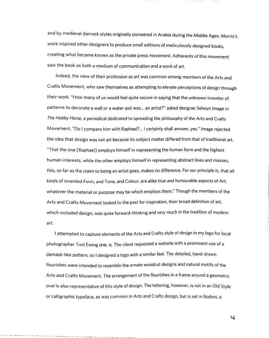
I attempted to capture elements of the Arts and Crafts style of design in my logo for local
photographer Toni Ewing (FIG. 1). The client requested a website with a prominent use of a
damask-like pattern, so I designed a logo with a similar feel. The detailed, hand-drawn
flourishes were intended to resemble the ornate woodcut designs and natural motifs of tho
Arts and Crafts Movement. The arrangement of the flourishes in a frame around a geometric
oval is also representative of this style of design. The lettering, however, is not in an Old Style
or calligraphic typeface, as was common in Arts and Crafts design, but is set in Bodoni, a
H
Modern or Didone face, in order to give the logo a more contemporary feel. The contrasting
thick and thin borders that make up the oval shape echo the contrasts in line thickness of the
typeface.
JAPONISME
In the latter half of the nineteenth century, the fall of trade barriers allowed for centuries of
Japanese culture to be introduced to the Western world for the first time. The French coined
the word Japonisme to refer to the resulting influence of Japanese traditions on Western art. Of
particular interest to European artists were Japan's Ukiyo-e works: woodblock prints with
narrative themes. Ukiyo-e prints were multi-color, and water-based inks were applied to
woodcuts which were then used to print the designs on paper. The prints, with their simplified
forms, stylized outlines, and flat color, heavily influenced Impressionist painters like Monet.
But they had an equally significant impact on illustration and graphic design.
Among the first prominent graphic artists inspired by these prints was Jules Cheret, often
referred to as "the father of the modern poster" (Meggs, "History," 195). Cheret used stone
lithography as his medium of choice rather than woodcut, although his posters still exhibited
broad shapes of flat color and stylized forms. Perhaps even more evocative of Ukiyo-e was the
work of Swiss-born designer Eugene Grasset. Grasset eschewed any kind of painterly
gradation or texture in his poster design, with completely flat blocks of color and bold outlines.
His flowing stylized floral motifs borrowed from the Arts and Crafts Movement and
foreshadowed the even more stylized designs of later Art Nouveau works (Meggs, History,"
199). But perhaps the most enduring designer of this style was French artist Henri de
Toulouse-Lautrec. Lautrec's poster designs employed the varied outlines and flat colors of
Grasset's work but displayed a unique sense of expressiveness and contrast in size of
elements. He is most recognized for his posters for the famous Moulin Rouge cabaret in Paris.
15

Ukiyo-e inspired design was influenced by an artistic technique, but is now itself often
viewed as art. Graphic design brought inventive illustration to the masses with the rise of
poster design in the late nineteenth century. Today, designs by Lautrec and others are often
displayed in homes and public places as art and are appreciated for their innovative style and
inimitable essence of French culture. Indeed, the graphic design of this time is as evocative of
France's Belle Epoque in the public imagination as any Impressionist painting from the era. The
fact that designers and painters shared the same inspiration during this period and that artists
often produced both formal artwork and commercial design further demonstrates that graphic
design is an indispensable part of art's history.
ART NOUVEAU
The culmination of influence from the Arts and Crafts Movement and Japonisme brought
about one of the most celebrated design movements of all time. Art Nouveau. While the
aforementioned Japanese-influenced graphic artists are considered part of the broader Art
Nouveau movement, it was among a handful of designers during the turn of the century that
this eclectic style reached its zenith.
By far the most important of these designers was Czech-born artist Alphonse Mucha.
Known as a skilled illustrator, Mucha received his big break in Paris in 1894 when he was
commissioned to design a poster for the play Gismonda featuring actress Sarah Bernhardt.
Mucha's novel approach, featuring distinctive lettering, stylized floral patterns composed of
"whiplash" lines, and an elongated illustration of Bernhardt, was a sensation. He was
immediately commissioned to design a series of posters for Bernhardt that brought him instant
In Mucha's subsequent posters, his elongated, sensual illustrations of women with
flowing, stylized hair became a hallmark of his style. Mucha s poster art, like Arts and Crafts
and japonisme design, featured prominent outlines, but its floral patterns were even
highly stylized. Mucha's use of color was mostly flat, although much of his work had a slight
success.
more
i6
painterly feel that reflected his training as a traditional artist. His stylized flourishes anticipated
the stylized geometric forms of modernist art and design.
Other Art Nouveau designers in the vein of Mucha Included Emmanuel Orazi, Henri Prlvat-
Livemont, and Louis Rhead. Mucha's style of Art Nouveau became a truly international
movement, spreading to America, Belgium, the Netherlands, Italy, and Germany, where it
became known as Jugendstil (youth style) after a magazine that popularized it. The Art
Nouveau style was also applied to a variety of media, including jewelry, textiles, furniture, and
Tiffany lamps and stained glass. As an architectural style, Art Nouveau flourished throughout
Europe, inspiring the designs of Paris's Metropolitain entrances and numerous landmark
buildings, some of which are now recognized as UNESCO World Heritage sites.
Like Cheret and Lautrec, Mucha brought highly-skilled artistic works to the masses
through his groundbreaking poster design. In addition to becoming fashionable during its time,
the work of Mucha and his proteges is now likewise prized for its artistic value and is often
collected and displayed as art. But what is perhaps most significant about Art Nouveau from
the standpoint of the designer is that this entire artistic, architectural, and decorative
movement has its roots wholly in graphic design. Unlike other movements wherein a style of
graphic design developed from ideas about architecture or crafts. Art Nouveau as it existed
truly would not have emerged without Mucha's pioneering design. The most important figure
of this artistic movement was not a painter or a sculptor, but a graphic designer. It is difficult to
deny graphic design the status of art when it shaped such a widely popular and influential
artistic movement.
Taking into account Mucha's Czech heritage, I chose to design a poster for a performance
of a work by Czech composer Antonin Dvorak for my representation of the Art Nouveau style
(FIG. 2). Given Mucha and Dvorak's shared sense of Czech national pride, it seemed a bit
surprising to me that Mucha apparently never designed anything related to the acclaimed
composer's work, although Mucha completed most of his design work in Paris. Nevertheless,
17

Dvorak's dramatic opera Rusolka, which features a female water sprite as the protagonist,
seems like natural subject matter for a Mucha poster.
As in many of Mucha's designs, my poster has elongated vertical dimensions to emphasize
the elongated female figure. Also like Mucha's work, there is a thick outline around the outside
of the figure, and the color consists of mostly flat warm tones, with subtle painterly shadows
and highlights. I attempted to replicate Mucha's long, flowing curls In the figure's hair and the
poster's floral border. The lettering is in a style highly characteristic of Art Nouveau, with the
text translated into Mucha's native Czech language. The poster advertises a performance of
Rusalko at the Prague State Opera, with contemporary soprano Jitka Burgetova playing the title
role.
MOVING TOWARD MODERNISM
Although graphic design styles of the late Victorian Era looked to nature and classical
themes against the backdrop of the Industrial Revolution, each successive movement
anticipated upcoming Modernist styles in its own way. Perhaps the most significant aspect of
the Arts and Crafts movement was its strong philosophical underpinnings, which
foreshadowed the manifestos of the twentieth century that considered design an important
part of modern society and thought. This was the beginning of design being recognized in an
artistic sense, as something that should respond to society and could help shape it.
Stylistically, the nature-inspired flourishes revived by the Arts and Crafts movement and
carried on through Art Nouveau became increasingly simplified, until they anticipated the
geometric approach of modernist designers. Meanwhile, Japonisme design reflected a growing
openness to foreign influences that would shape the more international design movements of
the twentieth century.
18

Today, the ephemera of the late nineteenth century represents some of the most admired
graphic design ever created. Most people may not be familiar with the key figures of the era,
but many graphic design works produced during this time, especially In the Art Nouveau style,
are widely recognized. Perhaps this is partially due to the age of the work. Art tends to become
more respected with time, as people are able to look back and appreciate its innovations.
Design of this period also often employed stone lithography, which has a long history as a
medium of fine art. The graphic design of this era, which in its organic style still suggests the
hand of the artist at work, conforms more closely to the lay persons' expectations of art than
some of the highly minimalist and geometric design of the coming modernist period. But for
many the admiration of this design is most likely primarily due to these movements' warm,
expressive, and charming feel. During this golden age of poster art, when the medium
rapidly expanding in popularity and innovation, designers created intricate pieces of art to
arrest the viewer's attention. Though there was concern about the effects of the Industrial
Revolution, the graphic design of this era reflected the general sense of pre-World War
optimism at the turn of the century.
was
19

Modern Design Movements:Less Is More
20

THE MODERN ERA
The early twentieth century saw the global change brought about during the Industrial
Revolution accelerate at an astonishing pace. The automobile, motion pictures, and radio
became major technologies. The ideas of Darwin and Freud continued to rock concepts of
human identity. Democracy, socialism, and communism increasingly challenged the social
order (Meggs, "History," 248). And two World Wars proved the strength of national unity and
the extent of technological progress in this new age, while also revealing the shocking brutality
of man.
As always, art imitated life as the creative expression of the era reflected the anxiety and
uncertainty of society. Modernist music Incorporated atonality and challenging structures,
while literature explored nihilism and reflected skepticism toward traditional institutions.
Visual art likewise signaled a movement away from Romanticism, as movements like Italian
Futurism embraced technological progress and the speed, efficiency, and violence it enabled.
Radical movements like Dada and Surrealism similarly mocked conventional norms In light of
the destruction of the First World War. Artists continued to break down existing concepts of
form with highly stylized movements like Cubism, and then attacked ideas about content with
non-objective art.
The common theme in modernist thought was a movement away from tradition, and this i
as evident in the graphic design of the period as anywhere else. Across Europe and eventually
in North America, graphic designers sought to eliminate Romantic-era sentimentality and all
other preconceived notions about design, building new styles from the ground up. Designers
penned defiant manifestos alongside philosophers and traditional artists, arguing what design
should seek to do and how it should do it. The overarching trend was toward minimalism,
IS
21

doing away with the superfluous decoration of previous design in order to convey a clear,
concise message to the viewer.
Indeed, it was this principle of efficiently delivering a message that came to be understood
as the central purpose of graphic design during the twentieth century. Numerous new fields of
study emerged to help understand the human psyche: "experimental psychology, cultural
anthropology, and even sociology developed intensely at this time," writes designer Jorge
Frascara (Frascara 14). All of these developments contributed toward the transformation of
design, which Frascara notes is "the child of the concept of efficiency." These new
developments might superficially seem to have diverged from the view of graphic design as a
form of artistic expression and trend toward idea of design as a tool of marketing or
psychology governed by objective guidelines. But in fact, design during the first half of the
closely tied to the ideas and movements of the art world as
ever. Graphic design, which design historian Alston Purvis notes "was a relatively new artistic
field" when the term was first used in 1922, was merely maturing (Purvis 11). And as designers
discovered effective ideas and best practices that led design in certain directions, designers
still found room within the guidelines that were being established for varied and innovative
an
twentieth century tended to be as
artistic expression.
GLASGOW AND THE VIENNA SECESSION
Part of Art Nouveau's tremendous impact on the design world was the fact that it was
developed not within the stodgy confines of traditional schools and societies of artists. Rather,
the style was driven by a handful of inventive artists who formed their new ideas about design
independently from the established conventions of the era. The unique success of Art Nouveau
would coincide with the emergence of other bold new design movements at the turn of the
22

century. These movements rejected previous styles based on nature and historical precedents
and pioneered highly stylized geometric forms.
Among the first of these new movements was the so-called Glasgow School In Scotland. By
the turn of the century, the city of Glasgow was near the height of a prolonged period of
economic prosperity owing to Scotland's proximity to the epicenter of the Industrial Revolution
in England. As in France, graphic design experienced a renaissance in Glasgow driven by the
city's cultural and economic boom. At the center of the Glasgow School was a small group of
innovative designers from the Glasgow School of Art comprised of Charles Mackintosh, J.
Herbert McNair, and sisters Margaret and Frances Macdonald (Meggs, "History," 221).
Collectively, this group became known as The Four. As with the Arts and Crafts movement in
neighboring England, design at the Glasgow School of Art took cues from the country's
historical artistic precedents ("The Scottish Movement"). However, in Scotland these
precedents included a strong Celtic legacy of geometric patterns and carvings called interlace,
and The Four strongly emphasized these motifs to create radical abstract graphic design that
combined "curvilinear elements with strong rectilinear structure (Meggs, History, 222).
The revolutionary work of the Glasgow School was met with some scorn in conservative
Scotland, where detractors dubbed the group "the spook school because of its use of startling,
Mucha-like illustrations of elongated female forms in spiritual poses ( The Scottish
Movement"). The group was also mostly overlooked in England, but German and Austrian
artists began to take notice when Glasgow School work was praised in the British arts
magazine The Studio for its "eccentricity" and "decorative method" (Meggs, "History," 225).
The Glasgow School soon influenced an offshoot of the Art Nouveau style in Austria known
the Vienna Secession.
The Vienna Secession movement, or Sezessionstil in German, began when a group of
artists broke away from the Viennese Creative Artists Association. The movement, led by
painter Gustav Klimt, was originally formed because of philosophical differences with the
as
young
23

administration of the Kunstlerhaus, as it was known in Vienna. However, the philosophical
defiance of the Vienna Secessionists soon became artistic defiance as the output of the
movement evolved from Art Nouveau-inspired work to geometric design reminiscent of the
Glasgow School (Meggs, "History," 225). The designers of the Vienna Secession would, in fact,
take things a step further, simplifying the long, tapered lines of the Glasgow School to arrive at
designs almost fully composed of straight lines. The lettering of Sezessionstil design developed
a distinctive appearance based on more simplified forms than the lettering in most Art
Nouveau design (although individual members of the group experimented broadly).
Many Vienna Secession designers became part of the Wiener Werkstatte, or Vienna
Workshop, established by Josef Hoffmann and Koloman Moser. They published their work in
Ver Sacrum, or Sacred Spring, which became a wellspring of imaginative design thought and
experimentation. Sezessionstil architect Adolph Loos was perhaps the most audacious of
these proto-modernists. In rebellious essays like Ornament und Verbrechen (Ornament and
of negative space and denounced needless decoration. He even
attacked the then-popular Art Nouveau style, writing "the evolution of culture marches with
the elimination of ornament from useful objects" (Brook). Loos believed that, by eschewing
ornamentation in design, the artist could create work that transcended the trends of the day
and held lasting relevance. Loos considered his buildings the epitome of functionality, while the
public ridiculed his House on Michaelerplatz (1910-12) with its undecorated window frames as
the house without eyebrows."
But the philosophy of Loos and his fellow late-period Sezessionstil artists proved to be
highly prophetic of design in the coming decades. German artist Peter Behrens adopted similar
ideas in his design, concerning himself with harmony and proportions and designing the first
corporate visual identity for Allgemeine Elektrizitats-Gesellschaft, a manufacturer of electrical
equipment, in 1907. Meanwhile, the Berlin-based Berthold Foundry developed the highly
Crime), Loos promoted the use
24

influential Akzidenz Grotesk sans-serif typeface in 1898. In the coming decades Germany
would be home to many more important developments in modernist graphic design.
Though the "hand of the artist" is less evident in the emergent hard-edged design styles of
the Glasgow School and Vienna Secession, developments in the design world during this time
retain unmistakable similarities to the development of art during various times in its history.
The designers of these schools were rebels. They were outsiders. They created according to
their own beliefs. Whether their graphic design was in service to their own published writings
or was created to advertise commercial interests, there is a clear element of personal
expression in the work of designers during this period that always shone through. Incidentally,
the philosophy of these designers was not unlike the philosophy of traditional artists working
in Cubism or collage: namely, that artists could meaningfully express themselves through
simplified, geometric depictions of forms rather than taking such care to base their
representations on reality. Thus graphic designers were able to produce work that captured
the anti-traditionalist Zeitgeist just as skillfully as other artists of this time.
ART DECO
As a decorative and artistic movement, Art Nouveau proved to be highly popular at the
dawn of the twentieth century but, as Loos predicted, the style’s distinctiveness and tendency
toward extravagant ornamentation ensured it would soon fall out of fashion. However, a new
artistic movement, dubbed Art Deco decades later because of its popularity in the design of all
things decorative, would soon prove to be wildly popular around the world.
Like Art Nouveau, Art Deco emerged outside of the formal art world. The style was
"brazenly commercial," writes historian Stanley Meisler, and its ethos defined popular
architecture, decorative art, and graphic design from the 1920s through the early 1940s
(Meisler). But despite its commercial origins. Art Deco was very much influenced by the same
25
trend toward streamlined geometry that also defined developments in art at the time (design
historian Philip Meggs dubs the design of this period "postcubist pictorial modernism
(Meggs, History," 278). Art Deco eschewed much of the focus
')
nature of previous styles
and "embraced machinery and power," replacing the "arabesques, whiplash curves, [and]
on
tendrils" of Art Nouveau with "geometric patterns" including "circles, zigzags, and
(Meisler). Art Deco shared with Art Nouveau an eclectic inspiration by the artistic legacies of
various cultures, including Mesoamerica, sub-Saharan Africa, and especially ancient Egypt
(Meisler).
squares'
One of the pioneers of early Art Deco-influenced graphic design was American-born artist
Edward McKnight Kauffer. Profoundly inspired by the so-called Armory Show, a landmark New
York exhibition of modern art that visited Chicago, Kauffer decided to move to Europe, where
he felt he could obtain better instruction in current artistic trends. Kauffer eventually settled in
London, where he designed posters strongly influenced by Cubism featuring reductive
renderings of English landscapes (Meggs, "History," 280). His simplified style would
increasingly co-opt emerging trends in Art Deco design.
But perhaps the most notable graphic designer of this period, and the one most associated
with Art Deco's impact on graphic design, was Ukrainian-French artist Adolphe Mouron
Cassandre. Cassandre's simplified planes of color demonstrated a strong Cubist influence,
while his mastery of the airbrush endowed his posters with a certain texture and warmth his
highly geometric designs might otherwise lack. His fondness for streamlined design also led
him to experiment with several typeface designs with simplified strokes and letterforms. Some
of Cassandre's most famous poster designs advertised railroads and steamships: appropriate
subject matter for Art Deco's fascination with all things modern. His frequent use of
perspective and depiction of objects advancing toward viewers or racing to distant horizons
optimistic anticipation of the future that was characteristic of Art Deco.also reflected an
26

Art Deco continued to thrive in Europe, where poster artists such as Paul Colin and Jean
Carlu portrayed a distinctively French sense of warmth and personality In their designs. By the
mid-1930s, modern design and Art Deco had finally found their way to North America, where
they strongly influenced a Depression-era style of architecture and design that might be
dubbed "federal deco." President Franklin D. Roosevelt's Works Progress Administration put
unemployed Americans to work In a variety of fields, including the arts, and there was a
demand for poster designs promoting New Deal priorities like housing, rural electrification, and
national parks. The silkscreen printing process used to create the posters encouraged the use
of flat colors, and a style of modern design was promoted that diverged from the more
traditional illustration style that had predominated in America. WPA graphic designers, some
of whom were amateur artists, readily took to this simplified Art Deco-like design style.
However, many WPA posters are now praised as masterpieces of modernist design and serve
as enduring pieces of classic Americana.
Art Deco initially stood for all things luxury when it first emerged during the prosperous
Roaring Twenties, and this aura of lavishness was preserved through the style's association
with the Golden Age of Hollywood and iconic architecture of the era. But Art Deco's
streamlined aesthetics and embrace of cheaper materials ensured it would remain popular
during the Depression years of the 1930s, and "the style of the social elite was repackaged as
the style of the masses" (Grishin 82). Art Deco "elevated simple, everyday objects and
spaces—a cigarette lighter, a railway waiting room—into speed-lined fantasies of exotic
elegance," notes writer Michael Bracewell (Bracewell 38). Art Deco went out of style by the
mid-1940s, its optimism a relic of a more untroubled pre-World War II society. Just as with
Art Nouveau, Art Deco's extravagant, if streamlined, style and embrace of excess eventually
came to be seen as unfashionable as design moved even more in the direction of clarity and
simplicity. The style has come to be held in high regard in recent decades, however, and the
work of poster artists like A.M. Cassandre is frequently revered as art. Like Art Nouveau, with
27

which the style bearssome philosophical, If not stylistic, similarities. Art Deco has become
representative of a specific moment in time. It is synonymous with the lively spirit of the Jazz
Age, and, like all good art, it is essential toward gaining a full understanding of the era that
produced it.
In my f Pluribus Unum design I created for a contest sponsored by the True Patriot
Network, I attempted to capture the spirit of WPA-era posters by using an American Deco
design style as a starting point (fig. 3). The theme of this poster contest was to express liberal
America values such as pluralism and unity as represented by the U.S. motto £ Pluribus Unum:
out of many, one. The Great Depression was a time of great unity, cooperation, and individual
sacrifice in America under the leadership of a great progressive president, and I felt a design
that recalled this era would be ideal for my poster submission.
As was common in Art Deco design, all objects in the poster are highly simplified and
rendered in basic geometric shapes. In particular, the rendering of the figures facial features as
simple connected lines was a motif I observed in a few diffarent WPA era posters, so I adopted
this technique in this piece. Flat blocks of color were used, as was typical in screen printed Art
Deco poster designs, and simple airbrush-like shading is added to the figures and background
to provide a sense of texture authentic of this style of poster. I appropriated the idea of
replacing the stars of the American flag in this design, as was done perhaps most famously in
Adbusters Magazine’s American Corporate Flag, but this time the stars are replaced by symbols
of civil rights struggles, religious faiths, and minority groups that are a part of American
society. The theme of unity is emphasized by the multiethnic figures In the foreground,
representing different races that make up American society. The Art Deco style is made
of a geometric display face characteristic of the era for the poster s
and the constraints of the screen printing technique,
many WPA era posters had a limited use of color; however, I expanded the palette here to
reinforce the theme of diversity. In this poster's combination of retro style and modern subject
complete with the use
lettering. Because of limited resources
28

matte , attempted to create a design that reflected both the best of America's past and its
future.
CONTRIBUTIONS IN MODERN ART
While Art Deco-inspired graphic design was achieving mass popularity, especially in
France, other more avant-garde styles were being developed elsewhere in Europe. Various
radical philosophies about art emerged from the different political and social ideologies of the
day: socialism, communism, fascism, and anti-war sentiment each contributed to art's rapid
evolution during these turbulent times. Design, as the nexus of art and communication, played
a vital role in relating these different ideologies to the public, and thus modernist art
movements usually addressed graphic design. These movements were more confined to
specific areas and groups of enthusiasts than styles such as Art Deco, which found favor
around the world. However, each would have
graphic design.
Italian Futurism was a bold new artistic movement that began when Italian poet Filippo
Marinetti published his Manifesto of Futurism in 1909. Futurism was a broad philosophy that
sought to revolutionize nearly every form of creative expression, including painting, sculpture,
poetry, and fashion. Its primary tenet
idea in a nation so thoroughly defined by the legacy of the Italian Renaissance. Its glorification
of speed, technology, and violence (and support of fascism) reflected a certain sense of
brashness and bravado that reacted to the decadence of Europe's Belle Epoque and predicted
the brutality of the continent's upcoming World Wars.
Futurism sought to influence graphic design just as it did all other forms of fine and applied
art. Art and design became "a disruptive force, a weapon to agitate and propel society into the
future" and a tool to respond to "those who embraced an idealized past and a rigid concept of
the future—the bourgeoisie" (Heller, "Fortunate Depero", 153). The anti-traditional nature of
Important impact on the development ofan
rejection of tradition in all forms, a truly radicalwas a
29
Futurism caused the movement to produce graphic design that was boldly divergent from
previous styles. The movement's focus on typography as a design element (many futurist
posters were composed entirely of novel arrangements of type) would prove highly influential.
Yet outrageous and intentionally disorienting compositions ensured that many elements of
Futurist design would not be absorbed into the mainstream. Typographic designs called parole
in libertd, or words in freedom, by designers like Carlo Carra positioned letters in chaotic paths
that led viewers around the page, representing the futurists' love of motion. Such anarchic
design motifs and the movement's avowed opposition to "utilitarian cowardice" made
Futurism a deviation from the trend of more functional graphic design In the modernist period
(Marinetti). However, the seriousness with which the Futurists regarded "advertising art,"
which Futurist designer Fortunato Depero called "the art of the future," would influence other
modernist approaches to graphic design (Heller, "Fortunato Depero", 157).
Contemporaneously with Futurism, another art movement known as Dado also mounted
assault on the traditions of society and the art world. However, unlike Futurism, which
glorified violence and admired technology, Dada was pacifist in nature and skeptical of blind
faith in technology" (Meggs, "History," 256). The movement, pioneered by poet Hugo Ball in
Switzerland and artist Marcel Duchamp in France, reacted to what Dadaists viewed as the
absurdity of World War I by producing equally absurd "anti-art." Such works included ready
made sculptures composed of found objects and Duchamp's famous Fountain (1917), a glorified
urinal. Shocked by the carnage and irrationality of war, artists of the Dada movement mocked
the conventions of the art world in a society they believed had gone insane (Meggs, "History,"
257).
an
Perhaps Dada's most significant contribution to graphic design was its development of
photomontage by artists like Hannah Hbch and Raoul Hausmann around 1918. For these
artists, photomontage was another way of creating bizarre juxtapositions of found objects, a
common idea in Dada. However, Dada artists like John Heartfield in Berlin used the medium as
30

a tool of political protest against the shortcomings of the Weimar government and the rise of
Hitler. The technique would continue to be employed by graphic designers in the coming
decades, many of whom came to favor the use of photography over illustration as technology
developed. Dada's use of found objects in sculpture and collage further blurred the line
between art and design by using pieces of common ephemera to create fine art. In this way,
Dada could be seen as a precursor to the Pop Art style of art and design in the 1950s and 60s,
which also often appropriated everyday objects for its subject matter.
One final art movement important to the development of graphic design was Russian
Constructivism. The name of the movement suggests the philosophy of its members.
Constructivists saw themselves as fellow "engineers" in the construction of the new society of
the Soviet Union, and viewed art and design
(Mount). The name also reflected the methods of the Constructivists: adopting the Dadaists'
techniques of photomontage, Soviet artists constructed pieces of design by assembling
photographs with text and simple geometric shapes. As in art, the shift away from illustration
allowed designers to create nonobjective pieces and focus more fully on creating a narrative in
their work than on achieving realism, which at this time was considered old fashioned and
bourgeois" (Mount). Unlike the Dadaists, Constructivists embraced technology, both in
society and in their design. They shared "the Bolsheviks' idealization of the machine" and
considered technology an important part of building a utopian communist society (Mount).
This ethos was also influenced by Italian Futurist Filippo Marinetti, who delivered lectures in
Russia (Meggs, "History," 287).
The optimism of the times is evident in the Constructivists' imaginative vision, which
embraced by the Soviet state in its early days before
Stalin's despotism (indeed, the regime encouraged designers to produce ag/fprop—visual
propaganda intended to agitate the masses to action). The Constructivists' creativity was
applied to graphic design as much as it was to painting and other forms of traditional art.
tools to "serve the needs of the proletariatas
produced avant-garde work that was
31

Kasimir Malevich, now known for paintings like Black Square (1913) and other Suprematist
compositions, designed books promoting Russian Constructivist philosophy. Painter El
Lissitzky had become primarily concerned with graphic design by the mid-1920s, and travelled
widely, his ideas profoundly influencing the developing Bauhaus school in Germany.
Meanwhile, designer Alexander Rodchenko continued to develop photomontage in the design
of his Soviet propaganda posters and books. The photomontage technique was perhaps
perfected by the Stenberg brothers Georgii and Vladimir, a pair of half-Swedish designers
renowned for their film posters. During a time when much of Soviet Russia's population was
illiterate, film and graphic design were perhaps the new government's most potent propaganda
tools. The Stenbergs' powerfully communicative posters were admired then and now for their
playful style and emphasis on conveying the mood of a film, rather than depicting a literal
scene as had previously been done. Their designs influenced film posters around the world for
exhibition at the Museum of Modern Art in New York indecades to come and inspired an
1997.
Some Constructivists, such as Malevich, believed artists should concern themselves more
with expressing emotion through traditional art than with promoting social or political ideas
through graphic design (Meggs, "History," 286). Most of the Constructivists, however, were
proud to use their skills to support the Soviet cause through graphic design, and in fact
believed that doing so was nobler than simply creating "art for art's sake. As design historian
Christopher Mount writes "it was believed that... art must be integrated into everyday life" and
"for these young artists, the value of art now lay in its usefulness to the community (Mount).
This outlook arguably placed graphic design, as the most common and clearly communicative
form of art, above all other forms. Constructivism eventually fell out of favor in the Soviet
Union, however. Ironically enough, the designers who had originally dismissed traditional art as
bourgeois now had that dreaded accusation leveled at t/ie/r design. Stalin promoted Socialist
Realism, a more traditional and stridently patriotic mode of art, architecture, and design he felt
32
was more accessible to the masses (Thompson). But as Soviet design took a turn toward the
cliche, Constructivism would live on through its impact on Bauhaus design, and work from the
is still held in high regard by designers today.era
THE BAUHAUS
The best- known design movement to emerge from the rich creative ferment of the
interwar period in Europe came from Germany's famous Bauhaus school. While Russia's
upheaval in the wake of the October Revolution provided the environment for the flourishing of
Constructivist design, the instability of Germany’s short-lived Weimar Republic similarly
allowed for creative experimentation at the Bauhaus. The German-educated El Lissitzky
provided a crucial link between the two movements, publishing a periodical called Vesch (or
Object) to introduce Germans to Constructivist design (Meggs, "For the Voice," 213).
Synthesizing the principles and techniques of Constructivism, as well as previous art
movements and Dutch De Stijl, members of the Bauhaus school arrived at a philosophy of
design obsessed with pure functionality. "In the production the aesthetic aspects
considered quite secondary [to utility]," Harvard professor Rudolf Arnheim wrote admiringly
of the Bauhaus school's striking modernist complex in Dessau (Arnheim 225). But for
members of the Bauhaus, utility and aesthetics in architecture were synonymous: 'the
practically useful is at the same time the beautiful" (225). The name Bauhaus, literally house of
construction in German, both recalls Russian Constructivism and demonstrates the school's
focus on architecture. The school's functionalist philosophy in architecture also prevailed in
Bauhaus graphic design.
Instituted in 1919 by Walter Gropius, the Bauhaus school attracted and produced a series
of individuals who would become luminaries in the development of graphic design. Hungarian
designer Laszio Moholy-Nagy promoted photomontage and the adoption of new technology at
the school; under his influence, photography completely replaced illustration as the preferred
were
33

method of pictorial communication. Marianne Brandt, a student of Moholy-Nagy's, also
pioneered photomontage techniques and became an important professor in her own right at
the Bauhaus. Herbert Bayer, another student of the school, became a professor of graphic
design and pioneered new developments in typography, promoting exclusive use of sans-serif
typefaces. In the pursuit of simplification, Bauhaus designers like Bayer decided an alphabet of
both lower-case and upper-case letterforms was unnecessary, and designs usually Included
typography featuring either one or the other (this was quite radical, given the importance of
capitalization in the German language). This idea eventually led to the design of experimental
"universal alphabets" that eliminated the distinction between upper- and lower-case and
featured highly simplified geometric letterforms.
Other hallmarks of Bauhaus design included a visual hierarchy of type size and weight
based on the importance of information and colored bars to divide space and lead the viewer's
eye around the page (Meggs, "History," 317). The color palette was highly simplified as well,
with only a single pure hue (often red) usually used in addition to black. Numerals, always
representing important information, were usually oversized. Tenets of the Bauhaus's
maxim would soon spread to modernist designers notpersuasive "form follows function
formally affiliated with the Bauhaus. Designer Jan Tschichold promoted asymmetric
typography and functional design, and did more than anyone else inside or outside of the
typography" by producing passionate writings
aimed at printers and typesetters (Meggs, "History," 321). Meanwhile Paul Renner applied the
Bauhaus's ideas about geometric letterforms to produce Futura in 1927, still a staple typeface
Bauhaus to promote the ideals of "the new
for designers more than eighty years later.
Its modernist style decried 'cultural Bolshevism," the Bauhaus school closed under
pressure from the Nazi party in 1933. Yet the architectural style pioneered by the school
spread around the world, including to Chicago, where a few members relocated and created
the Illinois Institute of Technology. The Bauhaus was a bastion of progressive thinking during
as
34

its brief history, both in terms of the design it produced and the ideals it supported. Founder
Walter Gropius welcomed women at the school, and at times women enrollees outnumbered
men. Jewish artist El Lissitzky was admired as an administrator at the Bauhaus in the days
before the rise of the Nazi regime forced him back to his native Russia.
There were indications, however, that the rigid style developed by modern art movements
and popularized at the Bauhaus had its limitations. Jan Tschichold, a stanch modernist, began
to question the absolutism of his theories about design when he was forced to flee to
Switzerland after persecution by the Nazi party. He would ultimately compare his former
insistence on cold modernist design principles to the "German bent for the absolute," and
would abandon most of his ideas (Meggs, "History," 323). Still, in this era of such cross
pollination between traditional art and graphic design, when, as at the Bauhaus, art and design
sprang from the same fundamental theories and frequently influenced one another, there is no
denying graphic design's crucial role in art history. Gropius's declaration in his Bauhaus
Manifesto and Program that there is "no essential difference" between artists and craftsmen
paved the way for the Bauhaus's multidisciplinary approach that elevated all forms of creative
visual expression.
My mock concert poster for alternative rock band The White Stripes is an attempt to
capture the feel of Bauhaus design (I take several cues from Herbert Bayer s 1926 poster for a
Wassily Kandinsky exhibition in particular) (FIG. 4). The White Stripes were well known for
their unique design ethos. The band used black, white, and red as their trademark colors, and
even titled one of their albums De StijI in tribute to the modernist Dutch art movement. Thus,
they seemed like ideal inspiration for a Bauhaus-style poster.
Members of the Bauhaus school were early proponents of the use of photography rather
than illustration in design, so I began my work by searching for a good photo of the band. I
came upon a striking publicity photo of Meg and Jack White that I felt would be perfect for my
design. The photo was a bit low-resolution for my purposes, but I overcame this using a few
35
methods. First, I increased the contrast on the photo, which suited the primitive photographic
look I wanted to capture. Then, I printed the photo and other elements of my design and
copied them on a Xerox machine before scanning them back in. This provided me with a look
that mimicked the early offset printing technology of the Bauhaus era, while also adding a
subtle texture to the design.
I designed the poster with the dimensions of A3 paper, in line with the standardized
system of paper sizes being developed in Germany around this time. The typeface I chose is FF
Bau, a modern version of the original early Breite Halbfette Grotesk face used by Bauhaus
designers. I used bold and regular weights. The size of the different pieces of text is
determined by a hierarchy of their importance, with the most significant information being the
largest. Naturally, I chose red and black for my colors, as did many Bauhaus designers, and
simulated a spot color overprinting effect on the photograph. A few extra touches, such as the
enlarged numeral, the diagonal orientation of the layout, and the yellowed paper effect
complete the design.
the international typographic style
For its time, Bauhaus represented a great leap forward in simplified, functional design,
gradually questioned. A lack of selection in the Bauhaus's
preferred sans-serif typefaces limited designers' options. Problems like consistent organization
of text and pictures in books and magazines still needed addressing. And various quirks of
Bauhaus design, such as its "universal alphabets" and bold rules and rectangles that ostensibly
guided the viewer's eye, were seen as having dubious purpose. Despite the fixation of its
members with creating functional design, the Bauhaus movement produced work that was
highly distinctive. Some felt an approach that stressed neutrality and placed content first
needed, rather than a style that threatened to eclipse the message by calling excessive
attention to itself. Such were the observations of a new generation of post-World War II
However, elements of the style were
was
36
designers who once again dedicated themselves to the goal of practical graphic design. The
style these designers established, known variously as the Swiss Style or the International
Typographic Style, represented the zenith of modernist design and established basic principles
that are still followed by professional designers today.
Among the earliest of the so-called Swiss Style graphic designers was Max Bill. A graduate
of the Bauhaus, Bill brought a highly rational, even mathematical approach to both his famed
industrial design and graphic design. He carefully measured proportions in his work, promoted
the use of left-aligned text with ragged right edges, and made early contributions to the
development of the grid structure in page layout in the 1930s and 40s (Meggs 357). "It is
possible to develop an art largely on the basis of mathematical thinking" claimed Bill in 1949,
encapsulating his thoughts on design.
Subsequent developments in the Swiss style arose largely at the Basel School of Design,
where designers such as Emil Ruder and Armin Hofmann stressed harmony, asymmetric
design, and legible type. In fact, typography
who, like the designers at the Bauhaus, initially had only a handful of dated sans-serif typefaces
to design with. But rather than developing severe, highly geometric sans-serifs as Bauhaus
designers did, Swiss style designers preferred more refined designs similar to Akzidenz
Grotesk (Meggs 361). Univers, designed by acclaimed typographer Adrian Frutiger in 1954,
was seen as a revelation because of its consistency in key measurements across its different
weights. This allowed for all styles of the typeface to be used together while maintaining a feel
of harmony. The true typographic breakthrough of the Swiss style, however, was Helvetica,
created by Swiss typographers Edouard Hoffman and Max Miedinger and released in 1961.
Designed with a very large x-height for superior readability, Hoffman and Miedinger touted
Helvetica as the ideal typeface of the neutral Swiss style, free of the quirks of previous sans-
serifs and perfect for all uses. The typeface remains ubiquitous today.
major concern for Swiss style adherentswas a
37

Swiss designer Josef Muller-Brockman preferred the look of Akzidenz Grotesk, however;
his distinctive use of this typeface, along with his highly geometric designs based
proportions and grids, became a hallmark of his work. Perhaps his most acclaimed posters,
produced for the Tonhalle Symphony Orchestra in Zurich, dispensed with photography entirely.
on
using abstract geometric shapes to express the abstract qualities of music. His poster for a
concert of Beethoven music in 1955 is now particularly admired. Muller-Brockman's work has
been said to capture the "absolute spirit" of the Swiss style, representing the purely distilled
logical conclusion of a design movement that already seemed to have reached a high degree of
maturity even before his contributions (Golec 84).
Important contributions also made to the International Typographic Style by
American designers. Inspired both by earlier European Bauhaus members and by
contemporary developments in Switzerland, American designers took the so-called Swiss style
were
in inventive new directions during the country's Golden Age of Advertising from the 1950s to
the 70s. Buoyed by post-war prosperity, the United States' booming economy fueled this
flourishing of design, and America's contributions to the International Typographic Style
worldwide graphic designrepresented the first time the country played a leading role in a
movement. Two variations of the International Typographic Style emerged
rigidly "Swiss" variety that suited the design of logos, annual reports, and other corporate
ephemera, and a more casual "big idea" variety that drove the playful style of American
in America: a more
advertising during this era (McCoy 7).
Paul Rand was a rare American talent who proved equally adept
approaches. The most important member of the so-called New York School of American
graphic designers, Rand's early work was informed by his study of Kandinsky and other artists
of the European avant-garde. His witty magazine covers and advertisements demonstrated
minimalist design and Swiss influence, and often included his own handwritten additions.
Meanwhile, his influential and enduring logo designs for companies such as Westinghouse, the
at both of these
38
American Broadcasting Corporation, and IBM demonstrated his ability to
solutions to design problems for corporate clients. Rand's logos
arrive at simple
were more restrained than his
other work, but still often maintained an element of quirkiness and wit (his logo for UPS
humorously placed a package, complete with string tied in a bow, on top of an otherwise
'mposing shield with the UPS name).
Saul Bass also proved skillful at achieving different tones in his design. His legendary
posters and title sequences for such films as The Man with the Golden Arm, Alfred Hitchcock's
Vertigo, and Casino (as well as other Scorsese movies) made him an Icon of both the film and
graphic design worlds and demonstrated his skill at combining type with illustration. Bass's
posters reveal the influence of the Stenberg brothers' Constructivist designs, and his cut paper
aesthetic has become synonymous with 50s and 60s graphic design. Bass also designed Iconic
logos for such corporate clients as AT&T, Minolta, Continental Airlines, and the Girl Scouts of
America.
One more American graphic designer of note in the Swiss style was Alvin Lustig, who
could be credited with first Imagining book jacket design as we know It today. Before Lustig's
very conservative and In line with thework in the 1940s, book jacket designs were
straightforward style most publishers believed appealed to those buying books (Heller, "Alvin
Lustig," 147). Lustig shattered existing conventions in his work for the New Directions
publishing house, combining abstract modernist Illustrations inspired by artists like Paul Klee
3nd Joan Mird with Swiss style typography to create groundbreaking new designs. His later
Swiss In approach, featuring symbolic typographic
designs that avoided the "overly rendered illustrations" common in book jacket designs of his
day (Heller, "Alvin Lustig," 151). Design historian Steven Heller calls Lustig's book jacket design
for Lorca: 3 Tragedies a "paradigmatic work" and considers it among the few pieces of graphic
design that "define the various design disciplines and are at the same time works of art"
(Heller, "Alvin Lustig," 147).
50s book designs became even more
39

However,while designers often revere the work of the International Typographic Style as
art, this view might not be as broadly shared among the general public. For most people, the
typographic, highly systematic approach of Swiss style designers diverges sharply from
traditional notions of art. While one may see a poster by Mucha, Lautrec, or Cassandre
hanging in a person's home, they are far less likely to see the work of someone like Max Bill.
Indeed, Swiss designers themselves defined their roles "not as artists, but as objective
conduits for spreading important information," and developers of a method that Involved
"achieving clarity and order" through "a more universal and scientific approach to design
problem solving" (Meggs 357). Even designers disagree with the "unrelenting rationalist
approach" of "high modernists" like Josef Muller-Brockman (Golec 84). But for many, as with
some
Bauhaus design, the artistic appeal of Swiss style design lies precisely in its functionality. What
pioneers of new methods of functional visualIS clear is that the Swiss style designers
communication. These designers strove to create work that did not merely fulfill the short*
were
term needs of their clients during this age of increasing commercialism in graphic design,
able to create design that broke new ground, stood the testRather, the best among them
of time, and is today championed by many graphic designers, if not always the general public.
The exhibition of design from this era in museums of modern art speaks to its value. Truly
these visual works that represent such skill in communication and have had such a profound
impact on our day-to-day lives must be considered. In some form, to be art.
I designed four pieces representing the International Typographic Style of graphic design,
design for the famous Dave Brubeck album Time Out (fig. 5). This
design is not strictly a Swiss Style piece, but incorporates elements of this style's structured
elements of commercial illustration in America in the
were
The first is an album cover
typography as well as other
1950s. The members of the band are drawn in an angular style that demonstrates the effect of
illustration during this period. The style is reminiscent of the work
of UPA, or United Productions of America, a small animation studio that pioneered a highly-
common
Cubism and modern art on
40

stylized form of limited animation (the studio was also known for featuring jazz musical scores
in their cartoons, making the UPA drawing style even more fitting for this piece). The color in
the piece is limited to basic shades of yellow and red, a common technique during the 50s
intended to reduce printing costs. The typeface used is Trade Gothic, a popular sans-serif face
used during this time period.
My second piece illustrating the International Typographic Style is a large-format poster
displaying the late night schedule for the New York City subway (FIG. 6). The signage and
identity of the New York City subway i
straightforward design and text set in Akzidenz Grotesk and Helvetica sans-serif typefaces. I
attempted to capture the feel of the New York City subway's visual identity in this piece, using
condensed and normal versions of Helvetica in various different weights. The piece is designed
according to a basic grid structure; the poster is first divided into two halves with a horizontal
line through the middle. The top half of the poster features the letters and numbers of the
subway's different lines integrated into a photograph of blurred lights representing a
bokeh. The colors of the lights in the photograph were
altered to match the colors of New York's subway lines, and a grain effect was added to give
the photo a dated look. The bottom half of the poster, intended to be placed at eye level, is
divided into three vertical columns. These columns are further subdivided into three smaller
columns, and all the typographic information is aligned to these columns. Finally, the poster
uses the New York City subway's iconic motif of white text on a black background.
My third attempt at creating a piece of design representing the International Typographic
Style is a book cover for a collection of writings by Christopher Hitchens (fig. 7). I chose to
design a book cover for this particular author because Hitchens, known for his often unkempt
appearance and penchant for smoking and drinking, seemed like a personality ripe for
caricature. This book cover is in the style of Paul Rand, featuring sketchy, hand-drawn
illustration and large, flat blocks of color. The typeface is again Trade Gothic and the subtitle is
iconic example of strict Swiss Style, featuringIS an
photographic technique known as
41

handwritten incursive (some of Paul Rand's advertising and other design work featured
handwritten lettering).
My final piece of Swiss Style design attempts to capture the style of Saul Bass (fig. 8). The
design is a logo for My Nose, a film by Jewish independent filmmaker Gayle Kirschenbaum
about her relationship with her mother ("the bigger version" refers to the fact that this is an
extended version of the short film she previously produced). I tried to imitate Bass's cut paper
aesthetic in the lettering for "My Nose," which is based on the display typeface Ultimatum. The
illustration of the nose is a similarly angular rendering. I've once again used Trade Gothic for
the remainder of the lettering because as a sans-serif face predating Helvetica I think its
unique quirks capture the feel of early Swiss Style design (I've used extended and condensed
versions here). Subtle airbrush-like shading completes the vintage look.
THE END OF AN ERA
By the mid-twentieth century, the world was
when the century began. Romantic sentiment in society was replaced with a focus on the
future. Technology had transformed modern culture. In the art world, as in various intellectual
movements, what had seemed like a single path of steady development branched off in
unprecedented directions. For graphic design, this meant that the latest groundbreaking
movement could, and did, emerge from nearly anywhere. But it was believed that whatever
new movement gained currency would be Innovative and practical. For a time, each new
philosophy seemed to lead inexorably toward an ideal of progress.
However, a few began to question the rigidity of modernist design ideals. Perhaps design
was not moving in a direction of inevitable progress and objective functionality; indeed, maybe
there was In fact no such thing. These ideas would be expressed by a new generation of
designers, including pop artists, the psychedelics of the "Fillmore school," the
already a profoundly different place than
42
deconstructionists, the proponents, Memphis adherents, and others. These
movements would often seek to revisit the styles of previous movements, even as they
perhaps disregarded the content of these movements and their original raisons d'etre.
Modernists like Paul Rand opposed the "chaos" of postmodern design, criticizing its "emphasis
on self, on style, rather than on content or idea" (Rand, Confusion and Chaos"). However,
Postmodern movements' revivals of previous styles would often prove to be clever, and the
new wave new
reintroduction of some sense of subjectivism to design perhaps made the designer more an
ortist then ever.
The attitude of these designers mirrored a profound change in the Zeitgeist of the Western
world that was beginning to take hold in some circles by the 1960s. After living through two
World Wars and coming to understand the suffering that had long been experienced by large
numbers of minorities in a supposedly progressive Western society, some began to question
the certainty, and even the very meaning of progress for humanity. Though the traditions of the
Romantic Era were still rejected, people began to question the newer convictions that had
replaced them. These ideas and others formed the basis for the end of the Modernist Era and
to be viewed as a new Postmodernist Era.the beginning of what would soon come
43

Conclusion:Revisiting Art and Design
44

DESIGN IS ART
As we see,even this relatively brief period of 100 years within the history of graphic design
IS incredibly rich. Graphic design has both influenced and been influenced by our culture
iTiuch as any other form of art, and tells us much about our collective past. It also fulfills most
definitions of art, particularly in light of modern art, which has broken down numerous barriers
as
in terms of how art is defined. Graphic design is frequently exhibited now by famous art
galleries and is becoming appreciated by the public, even with its commercial roots (which
traditional art itself, of course, is not entirely free from, its own history shaped by a legacy of
patronage). When one appreciates the true possibilities of graphic design, it becomes clear
that it is a distinctive form of art, unique in its purpose yet still as powerful as any other form of
visual expression.
Why do some people, even those who are themselves educated designers, argue that
graphic design is not art, then? If they do not argue out of ignorance of graphic design's
history, their view may simply stem from strongly-held beliefs about what design is and what it
should accomplish. Many designers like to view their profession as one that demands
discipline, and they are correct in this belief. Graphic design is not about simply following one's
whims and pursuing self-expression. It is about communicating someone's message. This
message may be a simple corporate message or it may be the message of a charity or an
oppressed group, but in order for successful graphic design to be produced, the message must
be communicated effectively all the
In the view of some designers, thinking of graphic design as art threatens for the focus
clear communication to be lost. In light of some postmodernist design trends, these designers
may be right. The teaching of graphic design as if it were like any other form of art, rather than
same.
on
45

an important tool of business and modern communication, is folly. Designers must learn to
appreciate what is required to succeed in the field. They must learn to be practical. The worst
artistic qualities of egoism and pretension are a sure way to fail in the world of graphic design.
Famous designers like Lautrec and Cassandre succeeded because their work appealed to the
masses, not because they focused on appealing to a small circle of art critics.
On the other hand, as a study of the history of graphic design shows, design is undoubtedly
a creative endeavor. Designers are hired by corporate interests precisely because they have an
artistic vision and creative ability others lack. A designer who provides clients with exactly
what they ask for, and nothing more, is not likely to achieve much success. Moreover, he will
certainly not be admired by his peers and celebrated in writings about influential graphic
design. I n order to succeed, the graphic designer must have something of the spirit of the artist
within him.
Ultimately, the argument about whether graphic design is art can trend toward a
the question of how to define art in general. But the
question is useful for more than simply provoking a spirited argument between students of art
and design. Asking how graphic design reconciles with art forces the designer to reflect on his
beliefs about design, about his reason for being a designer. It requires a consideration of one's
view of graphic design's role in the world and one's ambitions in working in this field. Any
discussion that provokes a deep reflection about graphic design by the designer or the public is
sure to enhance appreciation for this relatively young form of human expression.
meaningless semantics game,as can
46

List of References
47

Adajian, Thomas. "The Definition of Art." The Stanford Encyclopedia of Philosophy. Ed. Edward N.
Zalta. Fal l 2008. Web. 6 Mar. 2011.
<http:// plato.stanford.edu/archives/fall2008/entries/art-definition/>.
Arnheim, Rudolf. "The Bauhaus in Dessau." Print Nov.-Dee. 1997. Print. Graphic Design History.
Ed. Steven FHeller and Georgette Ballance. New York: Allworth, 2001.224-26.
Banham, Robert. "E-mail Discussion with Rob Banham." E-mail interview. 14 Sept. 2010.
Bracewell, Michael, and Lisa Allardice. "Another time, another place." NewSfcJfesmon 132.4631
(2003); 38. Academic Search Premier. EBSCO. Web. 26 Mar. 2011.
<http://www.ebscohost.com>.
Brook, James. "Whitewash." Web log post. Graphic Design Discourse. University of the Arts
London, 4 May 2010. Web. 24 Mar. 2011.
<http:// graphicdesigndiscourse.posterous.com/whitewash-4>.
"The Beginning of History." Introduction. Graphic Design History. Ed. Steven Heller and
Georgette Ballance. New York: Allworth, 2001. viii-x. Print.
"Fine Arts." Encyclopaedia Britannica. 11th ed. 1910. Open Library. Web. 8 Mar. 2011.
<http://www.archive.Org/stream/encyclopaediabril0chisrich#page/354/mode/2up>.
Frascara, Jorge. "A History of Design, a History of Concerns." Ed. Steven Heller and Georgette
Ballance. Graphic Design History. New York: Allworth, 2001.13-18. Print.
Gaut, Berys. "The Cluster Account of Art Defended." The British Journal of Aesthetics 45.3
(2005): 273-88. British Journal of Aesthetics. Oxford University Press. Web. 10 Mar. 2011.
<http://bjaesthetics.oxfordjournals.org/content/45/3/273.full.pdf+html>.
Golec, Michael J. "Josef Muller-Brockmann/Swiss Graphic Design: The Origins and Growth of
an International Style, 1920-1965/Format...." Design Issues 24.2 (2008): 84-88. Art &.
Architecture Complete. EBSCO. Web. 30 Mar. 2011.
Grishin, Sasha. "ART DECO 1910-1939." Croft Arts/ntemaf/ono/74 (2008): 82-84. Academ/c
Search Premier. EBSCO. Web. 26 Mar. 2011. <http://www.ebscohost.com>.
48

Heller, Steven. "Advertising: the Mother of Graphic Design." Eye (1995). Rpt. in Graphic Design
History. Ed. Steven Heller and Georgette Ballance. New York; Allworth, 2001.295-302.
Print.
Heller, Steven. "Alvin Lustig: Born Modern." Eye (1993). Rpt. in Graphic Design History. Ed.
Steven Heller and Georgette Ballance. New York: Allworth, 2001.147-51. Print.
Heller, Steven. "Fortunato Depero: Cheering Up the Universe." Print (1987). Rpt. in Graphic
Design History. Ed. Steven Heller and Georgette Ballance. New York: Allworth, 2001.153-
58. Print.
Hunter, Brandon. "Is Graphic Design Art?" Web log post. Art & Perception. 7 Feb. 2009. Web. 3
Mar. 2011. <http://artandperception.eom/2009/02/is-graphlc-deslgn-art-guest-post-by-
brandon-hunter.html>.
Image, Selwyn. "On the Unity of Art." Hobby Horse. By Century Guild of Artists. Vol. 2. London:
K. Paul, Trench and, 1887. 2-8. Google Books. Web. 7 Mar. 2011.
<http://books.google.com/books?id=wwwFAAAAYAAJ>.
Kapusniak, Kaz. "E-mail Discussion with Kaz Kapusniak." E-mail interview. 8 Mar. 2011.
Landa, Robin. "Graphic Design Time Line." Graphic Design Solutions. 4th ed. Boston:
Wadsworth/Cengage Learning, 2011. Print.
Marinetti, Filippo. "The Futurist Manifesto." Three Intellectuals In Politics. By James Joll. New
York: Pantheon, 1960. Internet Archive. Web. 25 Mar. 2011.
<http://www.archive.org/details/threeintellectua017821mbp>.
McCoy, Katherine. "American Graphic Design Expression: the Evolution of American
Typography." Design Quarterly 149 (1990). Rpt. in Graphic Design History. Ed. Steven Heller
and Georgette Ballance. New York: Allworth, 2001. 3-11. Print.
Meggs, Philip B. "For the Voice." Print Sept.-Oct. 1990. Print. Graphic Design History. Ed. Steven
Heller and Georgette Ballance. New York: Allworth, 2001. 212-22.
49

Meggs, Philip B. "Preface to the First Edition.
Hoboken, NJ: J. Wiley & Sons, 2006. lx. Print
^^ggs, Philip B., and Alston W. Purvis. Meggs’ History of Graphic Design. 4th ed. Hoboken, NJ: J.
Wiley & Sons, 2006. Print.
Meisler, Stanley. "Art Deco: High Style." Sm/fhson/an 35.8 (2004): 56-61. Acodem/cSearch
Premier. EBSCO. Web. 26 Mar. 2011. <http://www.ebscohost.com>.
Mount, Christopher. Film Posters by Moscow's Stenberg Brothers, 1923-33." Exhibition
catalog, Stenberg Brothers: Constructing a Revolution in Soviet Design. New York: Museum of
Modern Art, 1997.
Poggenpohl, Sharon H„ ed. "What Is Graphic Design?" Graphic Design: A Career Guide and
Education Directory. Ed. Sharon H. Poggenpohl. New York: AIGA, 1993. A/GA. AIGA. Web. 2
Mar. 2011. <http.//www.aiga.org/content.cfm/guide-whatisgraphicdesign>.
Purvis, Alston W., and Martijn F. Le Coultre. Graphic Design 20th Century. New York: Princeton
Architectural, 2003. Print.
Rand, Paul. "Confusion and Chaos: The Seduction of Contemporary Graphic Design." A/GA
Journal of Graphic Design 10.1 (1992). Poul-Rand.com. Web. 30 Mar. 2011.
<http://www.paul-rand.com/site/thoughts_confusionChaos/>.
Rand, Paul. Design Form and Chaos. New Haven: Yale UP, 1993. Print.
"The Scottish Movement." Head Hand & Heart: The Arts & Crafts Movement in Great Britain 1850-
1915. Web. 24 Mar. 2011. <http://www.artscrafts.org.uk/branches/glasgow.html>.
Smith, Roberta. "Max Bill, 85, Painter, Sculptor and Architect in Austere Style. The New York
Times 14 Dec. 1994, sec. Obituaries. The New York Times. Web. 30 Mar. 2011.
Thompson, Mark. "Red and black and spread all over: The new and improved design language
of Constructivists Rodchenko and Stepanova." Jopon Times 04 June 2010: Newspaper
Source. EBSCO. Web. 26 Mar. 2011.
Preface. Meggs' History of Graphic Design. 4th ed.
50
Appendix:Design Work
52

e wingPHOTOGRAPHY
AV
FIG. 1: Toni Ewing Photography Logo. 2010.
53

C
4
NYC SubwayLate Night Guide12 midnight 6:30 AM every day
SMthFtfiylMt»Kul
NAtrM?4l SIl« Lock
H«(ML St. UalftOr — TinesSnweJJSlMnWa^Eiprm
di^UmoodW Strcel. MntfwUjn -FtrReckawty.OJMm. LocalNotK leftem et^i sfutM connects afocfclAnmoc
Nes«rylce.use a
Bktfn-Oucera loit9bM«»OhC»«IS53*»«'"Crosstown CiMrtI) A» Br»>fvLoca
MSt-Cnursie * loealLocal
iKtcLraJM^
No9terrK6.iM9
● BrMdStHsssmSTLocal
Nassau Stl
. BAwcmieA EsprofS
7Ai
t2 iprtB
7A»*«-^ B Avenue® Loca
@ ^NewlotsAfJomaloo Contor. Queens — World TradeCorner. TAanhataa local
Bread Cnanna — Bockaway Ph'BMchIIBSt Qucem. Local, conneci mtti aaiDtoedCTuomd
No service, use A C # O
e 8 Avenuec Loca
4
5 S'^r*'© ipms
BroadwayLoca
RockswayPkSbuitto
'Coney . itiiMtonA* Pdhun817fart.fcw-BrooWyn6 [S? BridflftttJnhallaa local
flushino'Mdn St, Owens-ThmSquaie,Uanha»an.loeal
Flushing7 Loul
Astarta^Wtmars 8M. Oa«Island. BrocAhit Local,K\jVutt.w
87 SnAv. «*<««"PiwAtTn. Express in I-BttokHfl
FranWInAv-Shullle
No service, use 7
.1-Cone
prospect P«k
oBAvonueExpress
6 AvenueExpress
y IsIm4Manhattan.
Norwood/205 Street, ftIsland.Brookt^-n:Leca inDronxandBrooklyn. Express in Manhattan
Jimalcams SI. Ounena -- Coneylaand. Brooklyn; Express. Forest >flils/71Avenuo-21 Sl/Quocnsbndga Quocns,Loea a Maniialtan and Brooklyn
MetropaiUn Av. Queens — Mnlle Av,Brooklyn: Loca: connoct with 0 aMyrtle Av
-Coney
BroadwayLO6 Avenue
local ocal
.B«ckVLFranktm AvShuttleBAvani
Local©42 StreetShuttle
PMocredi ViCn«v{)hiMUk^
^ New York City Transit
wlonMWnol Juno lOtO. S« w** **Cur
FiG. 6 : NYC Subway Poster. 2011
58

CHRISTOPHERHITCHENS
/
A AFIG. 7 : Christopher Hitchens Book Cover. 2010.
59

the bigger version
W«5ETHE RSION
wsiVERSION
G . 8: My Nose Logo. 2011.FI
6o


![Torpedo Trajectory Visual Simulation Based on Nonlinear ... · MATLAB is brief for programming and graphic display, but it is inefficient in calculation and not [2]. OpenGL graphic](https://img.dokumen.tips/doc/110x75/5e823c7ee09ce851f002d55e/torpedo-trajectory-visual-simulation-based-on-nonlinear-matlab-is-brief-for.jpg)