Embed Size (px)
Citation preview

© 2017 M
errill C. Berman Collection
Bruno Munari
Works froM the Merrill C. BerMan ColleCtion


BRUNO MUNARI
WORKS FROM THE MERRILL C. BERMAN COLLECTION

Published by the Merrill C. Berman Collection
Concept, introduction and annotations by Nicola Lucchi
Design and production by Joelle Jensen
Photography by Jim Frank and Joelle Jensen
Printed and bound by www.blurb.com
Images © 2017 the Merrill C. Berman Collection
Images courtesy of the Merrill C. Berman Collection
© 2017 Merrill C. Berman Collection, Rye, New York
Nicola Lucchi wishes to thank Luca Zafarano for his help in tracking Munari’s engagement with the journal
L’Ala d’Italia (The Wing of Italy).
Cover image:
Munari and Filippo Masoero
Senza titolo (Untitled), before 1934
Photomontage, gelatin silver print
9 1/4 x 7 inches (23.5 x 17.7 cm) by sight
The Merrill C. Berman Collection (see pp. 20-21)


5
Table of Contents
Introduction 9
Plates
Photographs and Photomontage 14
Photocollages for L’Ala d’Italia (The Wing of Italy) 34
Commercial Brochures and Maquettes 48
Posters 72
Letterhead 84
Selected Bibliography 89
Books 78


Introduction

8

9
The work of Bruno Munari (1907-1998) resists sim-
ple categorizations. With an artistic career spanning
over seven decades, Munari engaged with every
major European and extra-European avant-garde
movement, with modern and postmodern aesthetics
and languages, and with an incredible range of artis-
tic media. Munari placed his signature on paintings,
sculptures, photocollages, artistic photographs,
xerographs, typographic experiments, advertising
campaigns, toys, children books, and a substantial
corpus of theoretical pronouncements on art and
design. Munari’s work, while particularly well-known
in Italy, has also been recognized around the world
through countless exhibitions, as well as acquisitions
by museums and private collectors.
With greater success than most Futurist artists, Mu-
nari developed an original approach to the avant-
garde dicta promulgated by Giacomo Balla and
Fortunato Depero in their 1915 manifesto, Futurist
Reconstruction of the Universe. Whereas the mani-
festo encouraged artists to invest themselves in all
ields of economic activity—suggesting, for instance, the manufacturing of toys alongside clothes and fur-
niture—most of these attempts remained squarely in the ield of highbrow artistic production. On the con-
trary, Munari paired the visual impact of contempo-
rary art with the practical needs of industrial product
design and mass advertising, while turning the vitriol
of both Futurist and Fascist propaganda into an in-
strument for product placement and public relations.
The Munari works in the Merrill C. Berman Collection
precisely map the aesthetic, historical, and intellec-
tual coordinates of this multifaceted commercial pro-
duction, which developed in dialogue with Munari’s
own artistic and intellectual growth. Through objects
such as posters, photographs, and commercial bro-
chures, Munari quenched the insatiable thirst for
Bruno Munari:
Forging the Aesthetics of Consumer Culture

10
powerful images that characterizes advertising since
the inception of industrial production and mass con-
sumption.
Munari’s multi-decade engagement with the adver-
tising industry began in the mid-1920s, when the
artist moved to Milan from the Veneto region where
he had spent his youth. At irst, collaborations with advertising agencies served him primarily as a reli-
able source of income in an extremely competitive
art world but soon Munari realized how work in ad-
vertising could play a key role in his development
as an artist. Many Italian companies at the time vied
for an original and daring advertising language that
would position them at the forefront of a sophisti-
cated visual culture, and Munari understood how
these commercial projects would allow him to ex-
plore freely the aesthetic and semantic correlation
between images, words, and objects.
By 1931 Munari had inaugurated his own advertis-
ing agency, Studio R+M, alongside his colleague
Riccardo (Ricas) Castagnedi. Working independent-
ly as well as on subcontracts from other important
advertising irms such as Milan’s celebrated Studio Boggeri, Munari came into contact with Italy’s major
industrial and commercial concerns of the interwar
era. His work in advertising and graphic design in
the 1930s helped advance the corporate image of
textile and pharmaceutical companies, aeronautical
factories, and the food and beverage sector. By the
time of Italy’s “economic miracle” in the early de-
cades after World War II, Munari had secured com-
missions and working relationships with some of Ita-
ly’s most prominent companies, famous not only for
the commercial success of their products but also
for their innovative corporate strategies and advertis-
ing campaigns. I refer to industrial entities such as
Olivetti, Pirelli, Agip, and Campari.
Munari stepped into Milan’s interwar art and design
world with the enthusiasm of a young, self-trained
artist accepted among the ranks of second-gener-
ation Futurists. He engaged with Futurism at a time
when the group began its turn towards the so-called
aeropittura—Futurist Aeropainting—a technologi-cally and spiritually-driven aesthetic that brought the
avant-garde movement ever closer to a compromis-
ing political entanglement with the Fascist regime.
Some of Munari’s work from the 1930s, such as his
aeronautical-themed photo-collages and his col-
laboration with the Fascist-inluenced magazine L’Ala
d’Italia (The Wing of Italy), demonstrates the extent
of these political tensions and accommodations. At
the same time, Munari maintained high formal and
compositional standards in most of these political-
ly-tainted engagements, while the frequent use of
sarcasm derived from Dada and Surrealist motifs—which Munari employed in his aeronautical-themed
work during the 1930s—points to a veiled critical distance from the bombast that characterized both
Fascist and Futurist rhetoric.
Munari’s artistic sensibility, however, does not end
with his observation of Futurism. The photo-collag-
es, brochures, and posters in the Merrill C. Ber-
man Collection reveal a wealth of inluences and crosspollinations: besides the aforementioned reli-
ance upon Dada and Surrealist motifs, Munari also
engaged with the visual language of Russian Con-
structivism and with the typographic experiments of
Northern and Central European avant-garde groups,
a connection that has been explored with great ac-
curacy by scholars such as Alessandro Colizzi in
his recent dissertation (University of Leiden, 2011),
among others. Furthermore, Munari’s use of pup-
pet-like igures, classical fragments, and deserted landscapes recalls the atmosphere of Metaphysical
Art, while the playful interactions prompted by many
of his brochures and books point to a creative, com-
mercial reinterpretation of kinetic art.
In terms of scholarship, attention to Munari’s graphic
design and advertising projects has progressively in-
creased during the last few decades (see Selected
Bibliography in this volume). For many years, given

11
the nature of Munari’s eclectic career in a multiplicity
of ields, scholars had found it necessary to subdi-vide a critical analysis of his work along disciplinary
lines. The main museum exhibitions dedicated to
Munari focused on his production as a painter and
sculptor, while his work in the ields of children lit-erature, typography, and industrial design received
praise and recognition in trade-speciic venues. Some of these separations may have been prompt-
ed by the fear, among art critics, that a contamina-
tion between Munari’s strictly artistic oeuvre and his
more commercial ventures would have diminished
the status of the former, and given undue attention
to the latter.
On the contrary, it is now clear that Munari’s design aesthetics should be read in direct dialogue with,
and frequently in anticipation of, his artistic pursuits.
Munari himself never thought of his career in adver-
tising and industrial design as a lesser endeavor:
in fact, his vast corpus of theoretical writing on the
matter points to highlighting the crucial role that de-
sign plays in the difusion of artistic values and sen-
sibility across civil society. These beliefs are at the
center of countless books, magazine and newspa-
per articles, poems, and even a substantive series
of lectures Munari gave at Harvard University during
the 1960s.
In light of these theoretical and aesthetic conti-
nuities, the study of Munari’s interwar career as a
graphic designer and advertiser allows us to trace
a compelling portrait of his artistic and intellectual
qualities. Despite the distance between Munari’s
conceptual art, mobile sculptures, and the projects
for brochures that may entertain the customers of a
furrier shop, these disparate objects reveal formal
mimicries, a consistent aesthetic sensibility, and
an overarching desire to place art at the service of
society, to mediate the workings of economic ex-
change through the lens of creativity.
The works in the Merrill C. Berman Collection dem-
onstrate just how crucial photography, graphic de-
sign, and advertising proved to Munari’s remark-
able career both as an artist and to his towering
status in the history of twentieth-century industrial
and graphic design. Photocollages, original ma-
quettes for brochures, posters, books—examined both together and individually—chart the emer-gence and evolution of Munari’s artistic language:
from his early engagements with Futurism, to his
dialogue with Constructivism and Dada; from his
ironic and quasi-Surrealist experiments with photo-
collage, to his fascination with machine aesthetics
and the world of labor. In addition to revealing the
vast and stratiied network of Munari’s visual and in-
tellectual sources, the Merrill C. Berman Collection
also paints a portrait of Italy’s economy between the
world wars, and of the birth of a capitalistic con-
sumer culture—a culture whose visual dimensions Munari contributed to delineate.
Nicola Lucchi
October 2017


Photographs and Photomontage

14
Senza titolo (Untitled), 1934
Gelatin silver print
8 3/4 x 6 3/4 inches (22.2 x 17.2 cm)
Verso:
Signature: Munari, in pencil
In ink:
Su 2 col. Il saluto delle Ali Fasciste alla loro Esposizione
[On two columns: The salute of the “Fascist Wings” to Their Exhibition]
Stamps:
Ministero dell’Aeronautica
Gabinetto del Ministero
Uicio di collegamento col Ministero della Cultura Popo-
lare
[Ministry of Aviation
Cabinet of the Minister
Coordination oice with the Ministry of Popular Culture (Propaganda)]
In pencil:
Le Vie (possibly in reference to the magazine Le Vie
d’Italia)
Numerical annotations
This photograph, taken on behalf of the Ministry of Aero-
nautics and possibly destined to the touristic magazine
Le vie d’Italia (The Roads of Italy), depicts the passage
of an airplane formation over the site of the 1934 Ital-
ian Aeronautical Exposition in Milan. Munari captures
the squadron as it lies over the expo’s facade, which was designed by the architect and graphic designer
Erberto Carboni. The airplanes in the sky dialogue with
the white aircraft silhouettes portrayed by Carboni in
Note:
Verso:
Marks and inscriptions:
the top left corner of the facade. Munari evokes the
language and aesthetics of photocollage by captur-
ing words, objects, geometric elements, and lat-tened surfaces in a single frame The image com-
municates a sense of Constructivist strength and
dynamism: the upward angle of the shot and the
multiple intersecting lines create numerous contrast-
ing wedges that subdivide the space of the photo-
graph with powerful juxtapositions of light and shade.

15
16
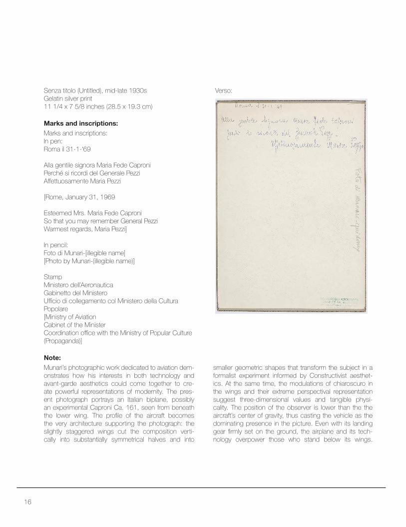
Senza titolo (Untitled), mid-late 1930s
Gelatin silver print
11 1/4 x 7 5/8 inches (28.5 x 19.3 cm)
Note:
Munari’s photographic work dedicated to aviation dem-
onstrates how his interests in both technology and
avant-garde aesthetics could come together to cre-
ate powerful representations of modernity. The pres-
ent photograph portrays an Italian biplane, possibly
an experimental Caproni Ca. 161, seen from beneath
the lower wing. The proile of the aircraft becomes the very architecture supporting the photograph: the
slightly staggered wings cut the composition verti-
cally into substantially symmetrical halves and into
Marks and inscriptions:
Marks and inscriptions:
In pen:
Roma il 31-1-‘69
Alla gentile signora Maria Fede Caproni
Perché si ricordi del Generale Pezzi
Afettuosamente Maria Pezzi
[Rome, January 31, 1969
Esteemed Mrs. Maria Fede Caproni
So that you may remember General Pezzi
Warmest regards, Maria Pezzi]
In pencil:
Foto di Munari-[illegible name]
[Photo by Munari-(illegible name)]
Stamp
Ministero dell’Aeronautica
Gabinetto del Ministero
Uicio di collegamento col Ministero della Cultura Popolare
[Ministry of Aviation
Cabinet of the Minister
Coordination oice with the Ministry of Popular Culture (Propaganda)]
Verso:
smaller geometric shapes that transform the subject in a
formalist experiment informed by Constructivist aesthet-
ics. At the same time, the modulations of chiaroscuro in
the wings and their extreme perspectival representation
suggest three-dimensional values and tangible physi-
cality. The position of the observer is lower than the the
aircraft’s center of gravity, thus casting the vehicle as the
dominating presence in the picture. Even with its landing
gear irmly set on the ground, the airplane and its tech-
nology overpower those who stand below its wings.

17

18
Senza titolo (Untitled), mid-late 1930s
Photomontage gelatin silver print
15 1/2 x 19 1/8 inches (39.5 x 48.8 cm)
When left to his own imagination, Munari tackled the
topics of military technology and prowess with poetic
connotations that hinted at his Surrealist sarcasm. The
present photomontage combines an open landscape,
anchored by hills and mountains in the background, with
a massive parachuting exercise. Scores of individuals,
possibly soldiers, fall from the sky at varying distances
from the viewer and descend upon an empty ield to create a scene at the same time relaxing and concern-
ing. Like jellyish loating in an impossible aerial aquarium, the parachutes reach the ground and their canopies
delate softly, donning grace and peacefulness. The irksome contrasts at the core of this vision, however,
makes the enjoyment of this fantastic picture impossible.
Suspended between the poetics of a dreamy scenario
and the suggestion of a military exercise, the viewer is
constantly alert to the possibility that this may represent
an attack, or an ominous preamble of wars to come.
Note:
Verso:
Signature (pencil): Munari
Stamp:
Ministero dell’Aeronautica
Gabinetto del Ministero
Uicio di collegamento col Ministero della Cultura Popolare
[Ministry of Aviation
Cabinet of the Minister
Coordination oice with the Ministry of Popular Culture (Propaganda)]
Pencil markings
Stamp:
Studio Boggeri S.A. Milano
Verso:
Marks and inscriptions:
Verso details:

19

20
Munari and Filippo Masoero
Senza titolo (Untitled), before 1934
Photomontage, gelatin silver print
9 1/4 x 7 (23.5 x 17.7 cm) by sight
Note:
A serialized portrayal of an airplane engine and its spinning
propeller, this photomontage constitutes a preliminary
stage of Vittoria dell’aria (Victory and the Air; 1934), one
of Munari’s most celebrated photographic artworks (see
Fig. 1). In that instance, the artist superimposed the im-
age of a winged victory sculpture to this sequential repre-
sentation, establishing a connection between the themes
of aviation and war, between ancient and modern myths
of light, and between classical and contemporary artis-
tic expressions. This artwork represents Vittoria dell’aria’s
indispensable premise, a modernist—and industrially
Marks and inscriptions:
Verso:
Stamps:
L’Ala d’Italia [journal]
Ministero dell’Aeronautica
Gabinetto del Ministero
Uicio di collegamento col Ministero della Cultura Popo-
lare
[Ministry of Aviation
Cabinet of the Minister
Coordination oice with the Ministry of Popular Culture (Propaganda)]
Bruno Munari
Filippo Masoero
In pencil:
Markings about journalpage numbers.
modern—grid waiting to be inscribed with further mean-
ing. Already at this stage, the composition demonstrates
Munari’s ingenious eye. The sequential photomontage
creates a motif similar to the modular fabric patterns that
the artist later conceived for the Milan Triennials in 1951
and 1954, thus revealing an aesthetic continuity be-
tween his prewar and postwar oeuvre. At the same time,
the obsessive repetition of a single object signals Mu-
nari’s early gesturing towards the aesthetics of Pop Art,
as well as his understanding of the power of the grid as
a system to generate, collect, and organize information.
Detail of verso, inscriptions seen through cuts in
backing board:
Fig. 1

21

22
Munari with Studio Ricas
Aeroplani in formazione (Airplanes in formation), 1930s
Photocollage with gelatin silver prints on card
7 1/2 x 6 1/8 inches (19.2 x 15.7 cm)
This photomontage depicts the low-altitude passage of an
airplane formation. Munari provides a minimum of contex-
tual clarity by delineating the stylized silhouette of a cloud,
which elicits a perception of the sky above the airplanes.
From a compositional perspective, this object conirms Munari’s sensibility towards Futurist cosmic aeropainting
and the work of artists such as Fillia and Enrico Pram-
polini. The phantom-like appearance of the cloud in the
background and the complete lack of visual references
to any element of the landscape grant the composition a
timeless dimension, and evoke the—admittedly remote—possibility of a non-politicized fruition of the image. The
airplanes, however, can be clearly identiied as belonging to the Italian Royal Air Force, whose frequent participation
in aeronautical exhibitions and appearance in Futurist art-
works supported the fascist propaganda efort centered around Italy’s militaristic and technological superiority.
Note:

23
24
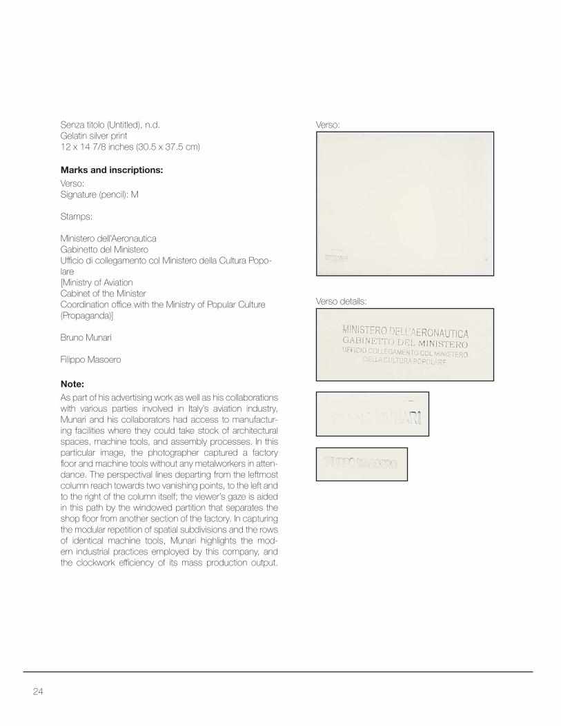
Senza titolo (Untitled), n.d.
Gelatin silver print
12 x 14 7/8 inches (30.5 x 37.5 cm)
Note:
As part of his advertising work as well as his collaborations
with various parties involved in Italy’s aviation industry,
Munari and his collaborators had access to manufactur-
ing facilities where they could take stock of architectural
spaces, machine tools, and assembly processes. In this
particular image, the photographer captured a factory
loor and machine tools without any metalworkers in atten-
dance. The perspectival lines departing from the leftmost
column reach towards two vanishing points, to the left and
to the right of the column itself; the viewer’s gaze is aided
in this path by the windowed partition that separates the
shop loor from another section of the factory. In capturing the modular repetition of spatial subdivisions and the rows
of identical machine tools, Munari highlights the mod-
ern industrial practices employed by this company, and
the clockwork eiciency of its mass production output.
Verso:
Signature (pencil): M
Stamps:
Ministero dell’Aeronautica
Gabinetto del Ministero
Uicio di collegamento col Ministero della Cultura Popo-
lare
[Ministry of Aviation
Cabinet of the Minister
Coordination oice with the Ministry of Popular Culture (Propaganda)]
Bruno Munari
Filippo Masoero
Verso:
Marks and inscriptions:
Verso details:
25

26
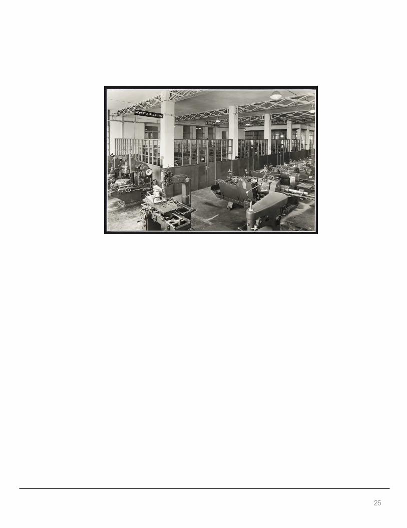
Senza titolo (Untitled), n.d.
Photomontage, gelatin silver print
12 x 13 1/8 inches (30.5 x 33.4 cm)
Note:
Surveying the manufacturing activities at the Caproni
airplane factory, this photomontage captures various
phases of production involving radial engines, wings,
fuselage, and the machining of smaller components.
The juxtaposition of images follows two diferent patterns: while both photographs in the top row illustrate metal-
workers toiling around engines, the middle and bottom
rows alternate and intersect the documentation of work
on the plane’s body and on smaller mechanical compo-
nents. The bright white relection on the wings and fuse-
lage in the center-left and bottom-right quadrants draws
an ideal diagonal line across the entire composition, while
the emphasis on perspectival qualities and a faraway
vanishing point lends the other two illustrations a greater
depth, and a more contemplative character in accordance
with the precise manufacturing activities documented.
Verso:
Signature (pencil): M
Stamps:
Ministero dell’Aeronautica
Gabinetto del Ministero
Uicio di collegamento col Ministero della Cultura Popo-
lare
[Ministry of Aviation
Cabinet of the Minister
Coordination oice with the Ministry of Popular Culture (Propaganda)]
Bruno Munari
Filippo Masoero
Verso:
Marks and inscriptions:
Verso details:

27

28
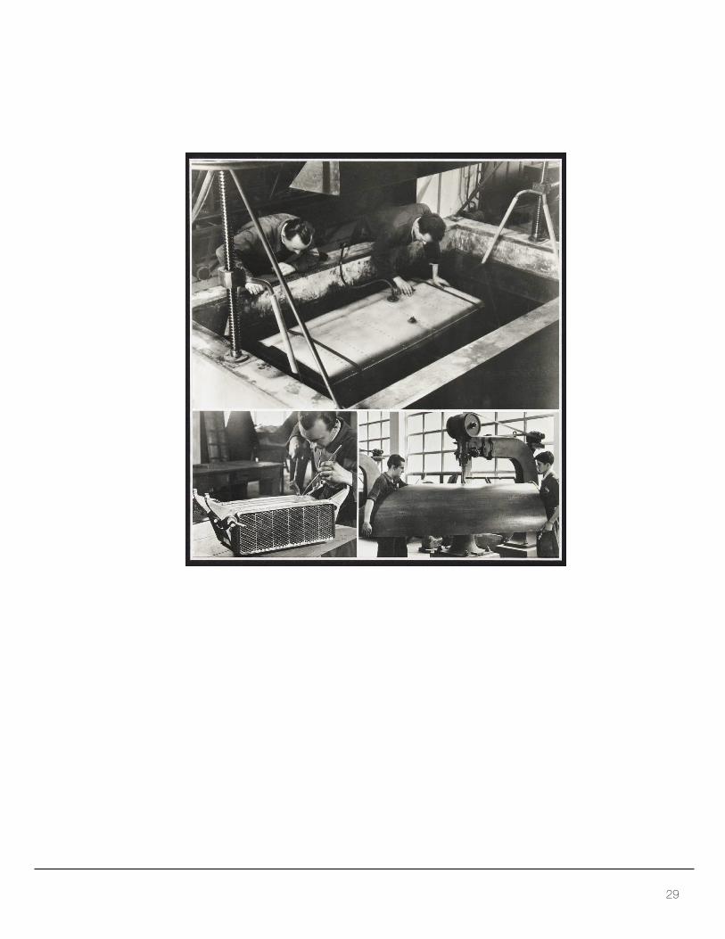
Senza titolo (Untitled), n.d.
Photomontage, gelatin silver print
12 x 13 1/2 inches (30.5 x 34.3 cm)
Note:
This photomontage details various phases of an airplane’s
manufacturing and assembly process. The single pho-
tographs, diferent in size, illustrate activities such as the leak-proof test of a tank and the inishing of a sheet metal piece with a machine tool. While ofering precious histori-cal documentation about the activities of the Caproni air-
plane factory, the photographs also remain anchored to a
solid artistic vision: the interaction between igures, spac-
es, and mechanical objects is orchestrated in accordance
with formal and geometric concerns. Tanks, basins, win-
dow panes, and sheet metal organize the overall picture
through diagonal vector lines, criss-crossing patterns, and
solid ields of shape and color. The resulting ensemble testiies to the technological advancement of the Caproni enterprise and to the aesthetic qualities and possibilities
that industrial design ofers to the eye of a modern viewer.
Verso:
Signature (pencil): Mun.
Stamps:
Caproni collection stamp, with motto by Gabriele
D’Annunzio: “Senza cozzar dirocco” [I hit without clashing
in battle]
Ministero dell’Aeronautica
Gabinetto del Ministero
Uicio di collegamento col Ministero della Cultura Popo-
lare
[Ministry of Aviation
Cabinet of the Minister
Coordination oice with the Ministry of Popular Culture (Propaganda)]
Bruno Munari
Verso:
Marks and inscriptions:
Verso details:
29

30
Senza titolo (Untitled), N.D.
Photomontage, gelatin silver printt
12 x 13 1/2 inches (30.5 x 34.3 cm)
Note:
This photomontage illustrates two phases in the installa-
tion of an airplane’s landing gear. While apparently pedes-
trian in subject and framing, the two photographs capture
a camera movement from an overview of the assembly
process to the speciic assembly of a strut, prompting the perception of closer inspection and greater documentary
value. Furthermore, the photographs engage playfully with
trademark elements of Munari’s graphic design aesthetics:
in both instances, the large airplane tire in the foreground
echos the artist’s frequent use of large, circular shapes in his
advertising posters and commercial brochures, a feature
that can be observed in many of the objects in the Merrill C.
Berman Collection. The circular shapes create a center of
“visual gravity” in the images, highlighting for the observer
one distinct primary subject and ancillary paths of vision.
Marks and inscriptions:
Verso:
Verso:
Signature (pencil): Mun.
Stamps:
Caproni collection stamp, with motto by Gabriele
D’Annunzio: “Senza cozzar dirocco” [I hit without clashing
in battle]
Ministero dell’Aeronautica
Gabinetto del Ministero
Uicio di collegamento col Ministero della Cultura Popolare[Ministry of Aviation
Cabinet of the Minister
Coordination oice with the Ministry of Popular Culture (Propaganda)]
Bruno Munari
Filippo Masoero
Verso details:

31


Photocollages for L’Ala d’Italia (The Wing of Italy)

34
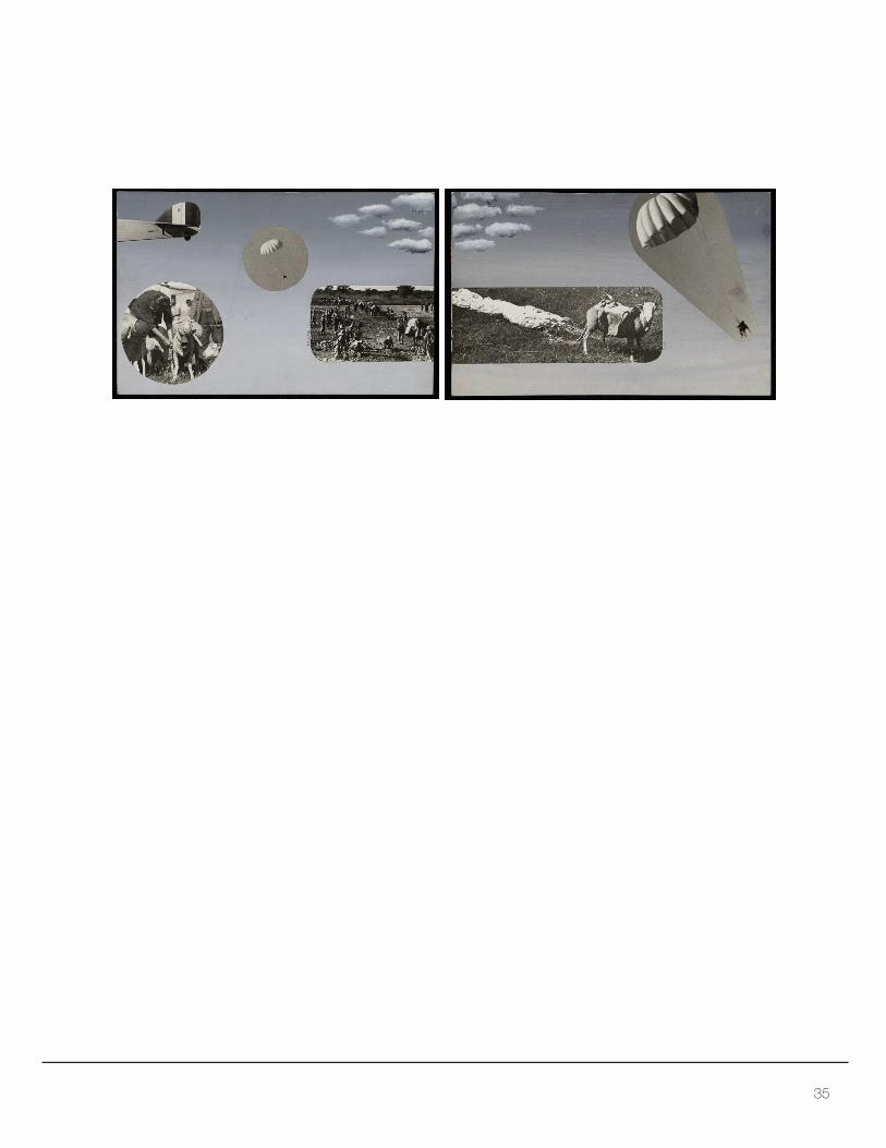
Senza titolo (Untitled), 1936
In two parts
Photocollage with gouache and gelatin silver prints
mounted on card
6 3/8 x 9 7/8 inches (16.21 x 25.1 cm) - each
The two photocollages constitute the originals for an illus-
tration that accompanied an article on the Italian parachute
industry, published in the state-sponsored journal L’Ala
d’Italia (The Wing of Italy) in 1936. The article delves into
the technological development of Italian parachutes, and
their employment in the East African colonial campaign
for the delivery of ammunition and livestock. Munari’s take
on the subject demonstrates his skill in securing a space
for artistic independence within a politically-charged con-
text, a result that he achieves by handling the material
through a lyrical and Surrealist approach. The photocol-
lage allows observers to articulate multiple interpretations:
the tail of an airplane, the clouds, and the ethereal back-
ground evoke a generic aerial scenery and the idea of
light, but the viewer is left to decipher these signs in ab-
solute freedom. Highlighted through the use of cutouts,
parachuting sheep and Italian soldiers in attendance ofer a narrative marked by ironic and Surrealist undertones.
The composition provides an original counterpoint to the
aesthetics of Futurist Aeropainting: rather than speed and
danger, its dominating themes are slowness and safety.
Note:
Signature: Mun.
Marks and inscriptions:
35

36
La buca (The Hole), 1936
Photocollage with gelatin silver prints, ink and pencil
This photocollage appeared on the journal L’Ala d’Italia
(The Wing of Italy) in 1936 as the visual counterpart to a
sarcastic text by Igino Mencarelli. La buca presents a com-
pelling synthesis of Munari’s visual vocabulary: sarcasm,
technology, and the relationship between the human body
and material objects combine in a surreal composition that
constitutes an antiheroic foil to Futurist aeropainting. Mu-
nari places the proile of a plane in a daring nosedive ma-
neuver but transforms the scene into an imminent crash-
upon-landing by drawing the line of the ground very close
to the aircraft. Ironically, the hole caused by the impending
accident already exists in a state of frenzied anticipation,
rushing with human legs to the site of the catastrophic
impact. Body parts play a role in this tragic comedy as
visual markers of a senseless willpower: the disembod-
ied closed ist of the cartoonish airplane pilot sporting a military uniform symbolizes a death wish counterbalanced
by the equally cartoonish legs of the hole in the ground.
Note:
Signature: Mun.
la Buca (the Hole)
Marks and inscriptions:

37
38
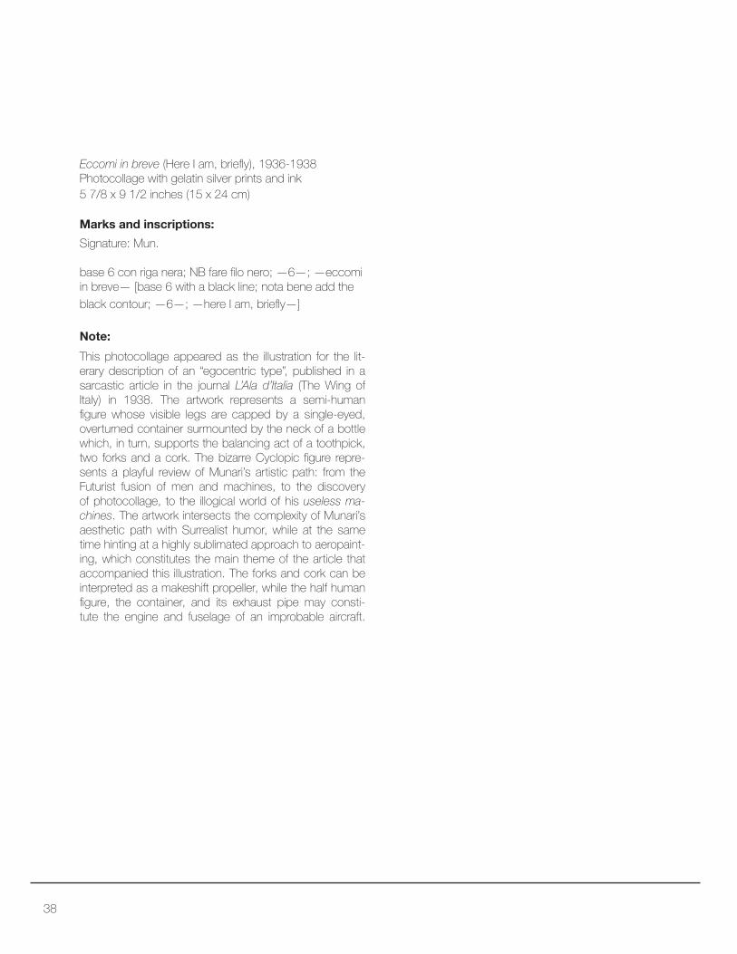
Eccomi in breve (Here I am, briely), 1936-1938Photocollage with gelatin silver prints and ink
5 7/8 x 9 1/2 inches (15 x 24 cm)
This photocollage appeared as the illustration for the lit-
erary description of an “egocentric type”, published in a
sarcastic article in the journal L’Ala d’Italia (The Wing of
Italy) in 1938. The artwork represents a semi-human
igure whose visible legs are capped by a single-eyed, overturned container surmounted by the neck of a bottle
which, in turn, supports the balancing act of a toothpick,
two forks and a cork. The bizarre Cyclopic igure repre-
sents a playful review of Munari’s artistic path: from the
Futurist fusion of men and machines, to the discovery
of photocollage, to the illogical world of his useless ma-
chines. The artwork intersects the complexity of Munari’s
aesthetic path with Surrealist humor, while at the same
time hinting at a highly sublimated approach to aeropaint-
ing, which constitutes the main theme of the article that
accompanied this illustration. The forks and cork can be
interpreted as a makeshift propeller, while the half human
igure, the container, and its exhaust pipe may consti-tute the engine and fuselage of an improbable aircraft.
Note:
Signature: Mun.
base 6 con riga nera; NB fare ilo nero; —6—; —eccomi in breve— [base 6 with a black line; nota bene add the black contour; —6—; —here I am, briely—]
Marks and inscriptions:

39
40
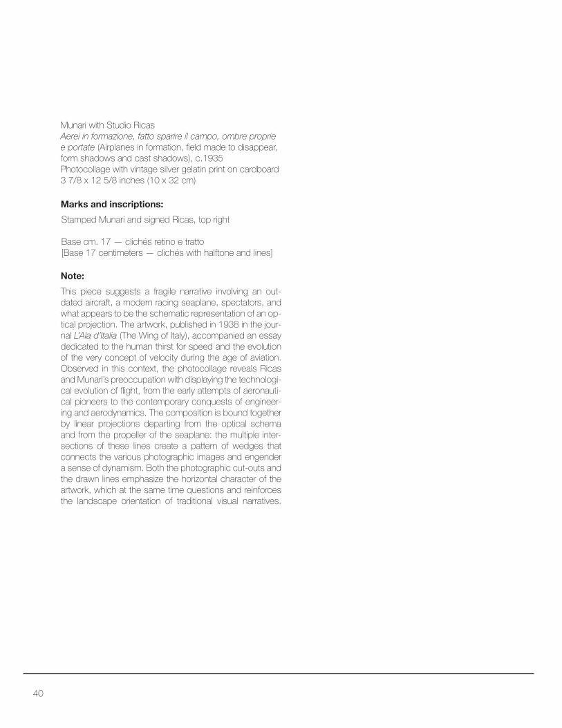
Munari with Studio Ricas
Aerei in formazione, fatto sparire il campo, ombre proprie
e portate (Airplanes in formation, ield made to disappear, form shadows and cast shadows), c.1935
Photocollage with vintage silver gelatin print on cardboard
3 7/8 x 12 5/8 inches (10 x 32 cm)
This piece suggests a fragile narrative involving an out-
dated aircraft, a modern racing seaplane, spectators, and
what appears to be the schematic representation of an op-
tical projection. The artwork, published in 1938 in the jour-
nal L’Ala d’Italia (The Wing of Italy), accompanied an essay
dedicated to the human thirst for speed and the evolution
of the very concept of velocity during the age of aviation.
Observed in this context, the photocollage reveals Ricas and Munari’s preoccupation with displaying the technologi-
cal evolution of light, from the early attempts of aeronauti-cal pioneers to the contemporary conquests of engineer-
ing and aerodynamics. The composition is bound together
by linear projections departing from the optical schema
and from the propeller of the seaplane: the multiple inter-
sections of these lines create a pattern of wedges that
connects the various photographic images and engender
a sense of dynamism. Both the photographic cut-outs and
the drawn lines emphasize the horizontal character of the
artwork, which at the same time questions and reinforces
the landscape orientation of traditional visual narratives.
Stamped Munari and signed Ricas, top right
Base cm. 17 — clichés retino e tratto[Base 17 centimeters — clichés with halftone and lines]
Note:
Marks and inscriptions:
41

42
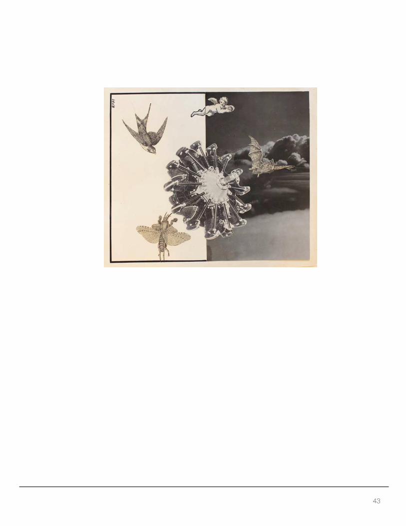
Munari with Studio Ricas
Al centro del volo (At the heart of light), 1934-1935, Photocollage with gelatin silver print, and cut-and-pasted
lithographic illistrations on card
6 3/8 x 7 5/8 inches (16.2 x 19.3 cm)
This artwork accompanied an article dedicated to the
impressions of irst-time lyers, published in L’Ala d’Italia
(The Wing of Italy) in 1935. The photocollage revolves
around the circular silhouette of a radial engine—possibly a Fiat A.70—pasted at the center of the composition and surrounded by diferent typologies of lying creatures: a sparrow, a cherub, a bat, and an insect. The four crea-
tures appear to be cut-outs from old book illustrations
pasted onto the background. Their anachronistic contrast
with the photograph of a shiny new engine provokes a
strong sense of displacement and an irredeemable ex-
periential divergence between these natural and liter-
ary forms of light and their technological counterparts. The background too plays a part in reinforcing this di-
vision between fantasy and reality: on the right side of
the composition, Munari pastes a photograph of clouds
as seen from an airplane window; on the left, the blank
page interrupts the panoramic view and forces view-
ers to complete the image with their own imagination.
Note:
Marks and inscriptions:
Signature: R+M, top left
43
44
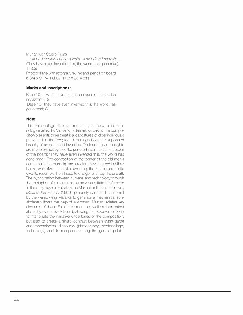
Munari with Studio Ricas
...Hanno inventato anche questa - il mondo è impazzito...
(They have even invented this, the world has gone mad),
1930s
Photocollage with rotogravure, ink and pencil on board
6 3/4 x 9 1/4 inches (17.3 x 23.4 cm)
This photocollage ofers a commentary on the world of tech-
nology marked by Munari’s trademark sarcasm. The compo-
sition presents three theatrical caricatures of older individuals
presented in the foreground musing about the supposed
insanity of an unnamed invention. Their contrarian thoughts
are made explicit by the title, penciled in a note at the bottom
of the board: “They have even invented this, the world has
gone mad.” The contraption at the center of the old men’s
concerns is the man-airplane creature hovering behind their
backs, which Munari created by cutting the igure of an athletic diver to resemble the silhouette of a generic, toy-like aircraft.
The hybridization between humans and technology through
the metaphor of a man-airplane may constitute a reference
to the early days of Futurism, as Marinetti’s irst futurist novel, Mafarka the Futurist (1909), precisely narrates the attempt
by the warrior-king Mafarka to generate a mechanical son-
airplane without the help of a woman. Munari isolates key
elements of these Futurist themes—as well as their patent absurdity—on a blank board, allowing the observer not only to interrogate the narrative undertones of the composition,
but also to create a sharp contrast between avant-garde
and technological discourse (photography, photocollage,
technology) and its reception among the general public.
Note:
Marks and inscriptions:
Base 10; ...Hanno inventato anche questa - il mondo è
impazzito...; 3
[Base 10; They have even invented this, the world has
gone mad; 3]
45


Commercial Brochures and Maquettes

48
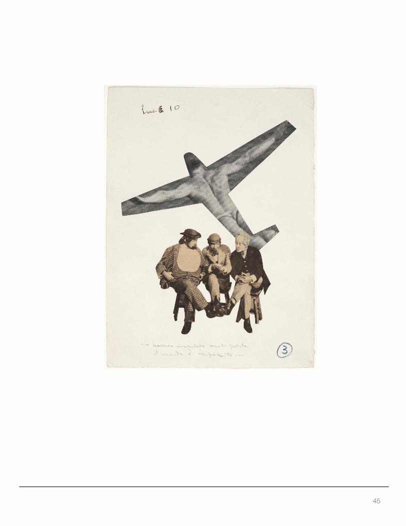
Studio per pubblicità VeDeMe (Study for VeDeMe Adver-
tising) No. 4, 1930
Photocollage with tissue, gouache, gelatin silver print,
and airbrush on board
16 3/4 x 13 5/8 inches (42.5 x 34.6 cm)
Munari’s work for VeDeMe (Venegoni – De Capitani –
Menni, Industrie Riunite Passamanerie), an important
textile manufacturer based in Milan, adapts avant-garde
photocollage technique to develop an advertisement
aimed at documenting work at the textile mill. The jux-
taposition of photographs illustrates the factory spaces
and various phases of its activities, accompanying the
viewers in a surrogate visit to the company. The images
also celebrate the important contracts VeDeMe fulilled for the Italian state: the textiles being produced in the
photographs are Italian lags and an oicial banner. Ad-
ditionally, the lower left photograph contains a poster of
Mussolini, high on the factory wall, overseeing the toil of
the female laborers. Munari subdivides the space of the
study board with vertical and horizontal lines that create
logical and visual partitions accentuated by color; further-
more, he cuts the photographic images in a shape that
recalls rolls of fabrics weaved by an industrial loom. While
the rolls—or reels—of “photographic fabric” organize the visual fruition of the composition along vertical lines,
the company logotype in the bottom third of the board
suggests a horizontal parsing, and nothing impedes the
viewer from scanning the photographs in a similar fashion.
By relying upon the modularity of a grid, Munari thus cre-
ates a space for contemplation that ixes the attention of the viewer into the very products VeDeMe sought to sell.
Printed on glassine overlay inscription: Manifatture di lus-
so in grande serie [Large-scale production luxury textiles]
Note:
Marks and inscriptions:
Fig. 1: Glassine overlay
49

50
Caglio Hansen (Hansen Rennet), c. 1936
Brochure, lithograph on paper
7 1/8 x 26 inches (18.2 x 66.2 cm) - open
Munari’s approach to advertising transforms rennet—a product related to the food industry, deeply connect-
ed to Italy’s agricultural roots—into a fashionable icon of typographic modernism. The front cover of the brochure
for Caglio Hansen displays the name of the company
through a powerful chromatic contrast of red and black,
placed on a diagonal line that conveys a sense of dyna-
mism. A large, diagonal arrow intersects and highlights
the name of the company and carries the motto “always
imitated, never matched!” from the bottom right of the
composition towards the center. The back cover of the
brochure illustrates the company’s products—liquid and powdered rennet—in a style that recalls an avant-garde collage, as the photograph of the products seems past-
ed onto a background drawing. Throughout the compo-
sition, the artist adopts diferent typefaces according to the character of the message at stake: from bold, mon-
umental ones, to others that aim for clarity with a sans-
serif design. Overall, the simplicity of the front and back covers displays Munari’s modernist aesthetic sensibility.
The foldout pages of the brochure conirm this, as sil-houetted igures of scientists, suspended objects, and geometric symbols illustrate Caglio Hensen’s qualities
through a igurative language that borrows from Futur-ist aeropainting, Constructivism, and Metaphysical Art.
Stamped: Bruno Munari and Studio Boggeri S.A. Milano
on the back of the brochure
Note:
Marks and inscriptions:
Covers: imitato sempre, eguagliato mai! (always imi-
tated, never matched!)
Text:
Fig. 1: Front and back covers

51

52
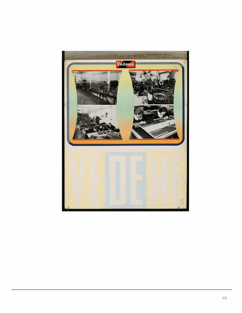
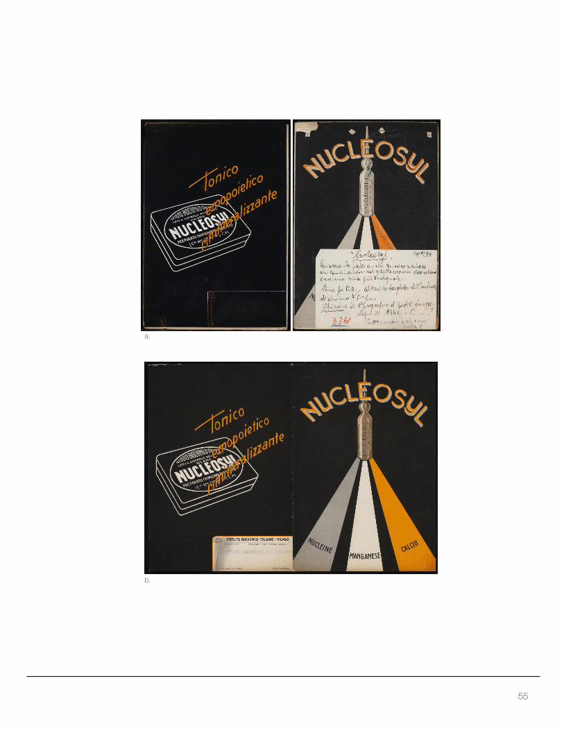
Nucleosyl, early 1940s
Gouache on card
9 5/8 x 6 5/8 inches (24.4 x 16.8 cm)
Munari’s work for the advertising irm Studio Boggeri best exempliies the synergy between avant-garde aesthetics and commodity culture that irst appeared in Italy during the interwar years. This brochure for Nucleosyl, an immu-
nostimulant, illustrates the creative tension at play between
artistic language and the needs of product placement.
On the brochure’s cover, the artist orchestrates a simple, linear composition cast against a black background that
highlights the importance of the advertised product. Mu-
nari doubles the role of Nucleosyl’s glass vial, which ap-
pears not only as a commercial product but also as an
idol-like object of contemplation. The active ingredients
of the medicine—nuclein, manganese, calcium— irradi-ate from the cusp of an imaginary architecture that recalls
both the dynamic force-lines typical of Futurist aesthetics
and the strong perspectival construction of Metaphysical
art. The back of the printed brochure for which this is a
maquette (see p. 55), on the other hand, illustrates the
package design of the medicinal productso so that cus-
tomers could learn to recognize it in a pharmacy. Three
adjectives—tonic, hematopoietic, mineralizing—ofer in-
sights as to the qualities of the medicine and counterbal-
ance the three active ingredients found on the cover. As
one can observe in Munari’s personal annotations on the
brochure’s maquette (p. 55), the artist followed the phas-
es of production closely with an eye to the role color plays
in the composition. He suggests that the vial should be
processed through a halftone screen in order to best ren-
der the chromatic amalgamation of the three ingredients.
Note:
53

54
From top to bottom:
(on top of letter E) levare arancio
[remove orange]
(on the orange line) iala + verde[vial + green]
(on the annotation) “Nucleosyl”; 20/2/40; Lavorare la
iala anche con nero retinato che combinandosi col giallo-arancio dovrebbero dare una tinta più verdog-
nola.- Come per tutti alzare la targhetta dell’indirizzo di
almeno 4/5 mm. Chiedere il n. progressivo di sped-
izione da agg. dopo il 1940. –N--? Levare arancio che
cresce sulla E.
[“Nucleosyl”; February 20, 1940; Work on the vial with
the black halftone, as it combines with the yellow-
orange it should yield a greener hue.- As for all of
them, raise the label for the address by at least 4/5
millimeters. Ask the progressive shipping number to
add after 1940. –N--? Remove the orange that grows
atop the letter E.]
Marks and inscriptions:
Nucleosyl, early 1940s
a. lithograph on paper with collage (mock-up booklet)
9 5/8 x 6 3/4 inches (24.4 x 17.1 cm) - folded
b. brochure, lithograph on paper
9 5/8 x 13 1/4 inches (24.4 x 33.6 cm) - open
Cover recto: nucleine - manganese - calcio (nuclein -
manganese - calcium
Cover verso: tonico - emopoietico - rimineralizzante (tonic
- haematopoietic - mineralizing)
Text:
Stamped: Studio Boggeri S.A. Milano on the back of the
brochure
Marks and inscriptions:
Fig. 1: interior of the brochure
55
c.
b.
a.
56
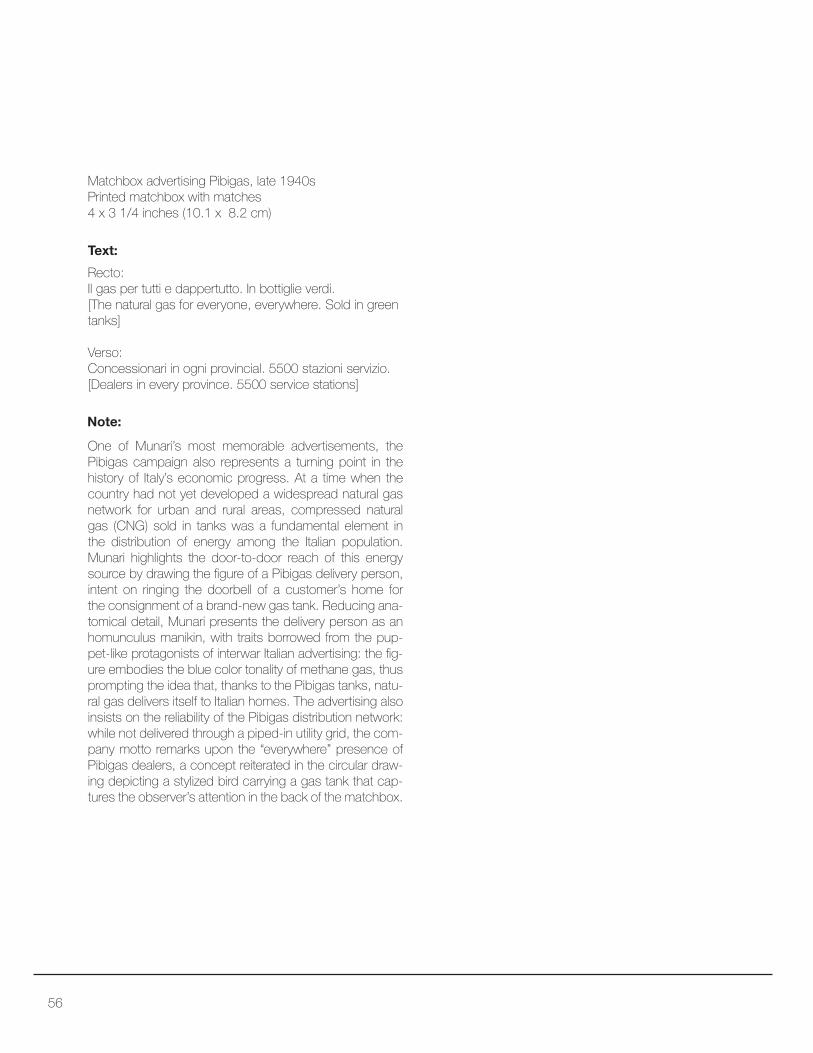
Matchbox advertising Pibigas, late 1940s
Printed matchbox with matches
4 x 3 1/4 inches (10.1 x 8.2 cm)
One of Munari’s most memorable advertisements, the Pibigas campaign also represents a turning point in the
history of Italy’s economic progress. At a time when the
country had not yet developed a widespread natural gas
network for urban and rural areas, compressed natural
gas (CNG) sold in tanks was a fundamental element in
the distribution of energy among the Italian population.
Munari highlights the door-to-door reach of this energy
source by drawing the igure of a Pibigas delivery person, intent on ringing the doorbell of a customer’s home for
the consignment of a brand-new gas tank. Reducing ana-
tomical detail, Munari presents the delivery person as an
homunculus manikin, with traits borrowed from the pup-
pet-like protagonists of interwar Italian advertising: the ig-
ure embodies the blue color tonality of methane gas, thus
prompting the idea that, thanks to the Pibigas tanks, natu-
ral gas delivers itself to Italian homes. The advertising also
insists on the reliability of the Pibigas distribution network:
while not delivered through a piped-in utility grid, the com-
pany motto remarks upon the “everywhere” presence of
Pibigas dealers, a concept reiterated in the circular draw-
ing depicting a stylized bird carrying a gas tank that cap-
tures the observer’s attention in the back of the matchbox.
Recto:
Il gas per tutti e dappertutto. In bottiglie verdi.
[The natural gas for everyone, everywhere. Sold in green
tanks]
Verso:
Concessionari in ogni provincial. 5500 stazioni servizio.
[Dealers in every province. 5500 service stations]
Note:
Text:

57
Recto: Verso:

58
Munari and Filippo Masoero
Pelliccerie Brivio (Brivio furrier’s shop), 1930s
Collage with gouache, ink and rotogravure mounted on
board with irregular brown and black paper
11 1/4 x 14 1/8 inches (28.8 x 35.8 cm) – collage,
irregular shape when open
Munari and Masoero’s draft for this potential commercial
brochure rests upon highly artistic elements and a play-
ful design. When closed, the object recalls an abstract
artwork, with a disembodied and fragmented female
head—seemingly the retouched photograph of a classical sculpture—framed by geometric shapes that organize the space with solid ields of color. Once opened, the brochure reveals the name of the furrier shop at the center of the
advertising. Pelliccerie Brivio, the company name, illustrat-
ed in bold characters, recalls the lettering of shop signage
and neon advertising. An apparently insigniicant black circle in the left portion of the composition draws the eye
precisely to this name and suggests the correct reading of
the wording from top to bottom. As a counterpoint to the
black circle, the artists include the photographic cutout of a
stretched fur in the bottom right of the composition, giving
an obvious and ironic visual reference to the company’s
line of business. Well beyond a merely Futurist language,
Munari’s reliance upon classical statuary, geometry, pho-
tocollage, and typography speaks volumes to his attentive
observation of Metaphysical art, Surrealism, and Dada.
Stamped: Studio Boggeri S.A. Milano, left half of the
composition
Note:
Marks and inscriptions:
Stamp detail:

59
Closed:
Open:

60
Munari and Filippo Masoero
La pubblicità. L’Uicio Moderno (Advertising. The Modern
Oice), 1930sCollage with gouache, ink and rotogravure mounted on
black paper with red cover
12 x 9 1/4 inches (30.4 x 23.5 cm) – collage irregular
shape when open
This brochure proposal follows the same design struc-
ture of the proposal for Pelliccerie Brivio (pp. 58-59),
but its bold colors and diagonal lettering adopt a stron-
ger Futurist and Constructivist stance. Instead of relying
upon classical elements infused with irony, this project
presents an assertive and repeated contrast between
red and black elements, which alternate in rectangular
forms, spherical ones, as well as in the lettering of the
advertisement. Possibly a brochure for the activities of
the Italian trade magazine L’uicio moderno (The Mod-
ern Oice), a journal dedicated to oice furniture and equipment design—of which Munari was a frequent col-laborator—the composition borrows heavily from Futur-ist cosmic aeropainting. Thanks to the ideal downward
movement of the sphere in the foreground, the observer
can peer into the thoughts of the disembodied head pro-
iled in the background, which is cast between a black surface—akin to an x-ray sheet—and a nondescript en-
vironmental element. In the head, a photographic cutout
illustrates a metropolitan crowd on its way to or from work,
perhaps suggesting the importance of placing strategic
advertising signs along these individuals’ work commute.
Signature: Munari
Stamped Studio Boggeri S.A. Milano, left half of the
composition
Note:
Marks and inscriptions:

61
Closed:
Open:

62
Ingranaggi (Gears), 1935
Collage and mixed media on card
8 1/2 x 11 inches (21.5 x 28 cm)
The gears of this collage illustrate the extent of Munari’s
attentive eye towards the work of Northern and Eastern
European avant-gardes, with a particular focus on Con-
structivism. The artwork captivates the viewer with a basic
palette and strong juxtapositions of shapes and colors.
This apparent simplicity results in a well-balanced im-
age, while the interactions between shapes, objects, and
backgrounds create a smooth, visual mechanism. The
presence of several circular shapes is characteristic of
Munari’s visual design vocabulary and seeks to capture
the viewer’s attention by creating anchor points through-
out the composition. Despite these legible elements,
the composition as a whole lacks a clear narrative and
begs an approach informed primarily by formalist consid-
erations. Munari’s adoption of reprographic techniques,
such as the use of halftone to simulate a chiaroscuro varia-
tion, anticipates Roy Lichtenstein’s conceptual retooling of
mass-produced typographic techniques to artistic ends.
Note:
Marks and inscriptions:
Signature: Mun.

63
64
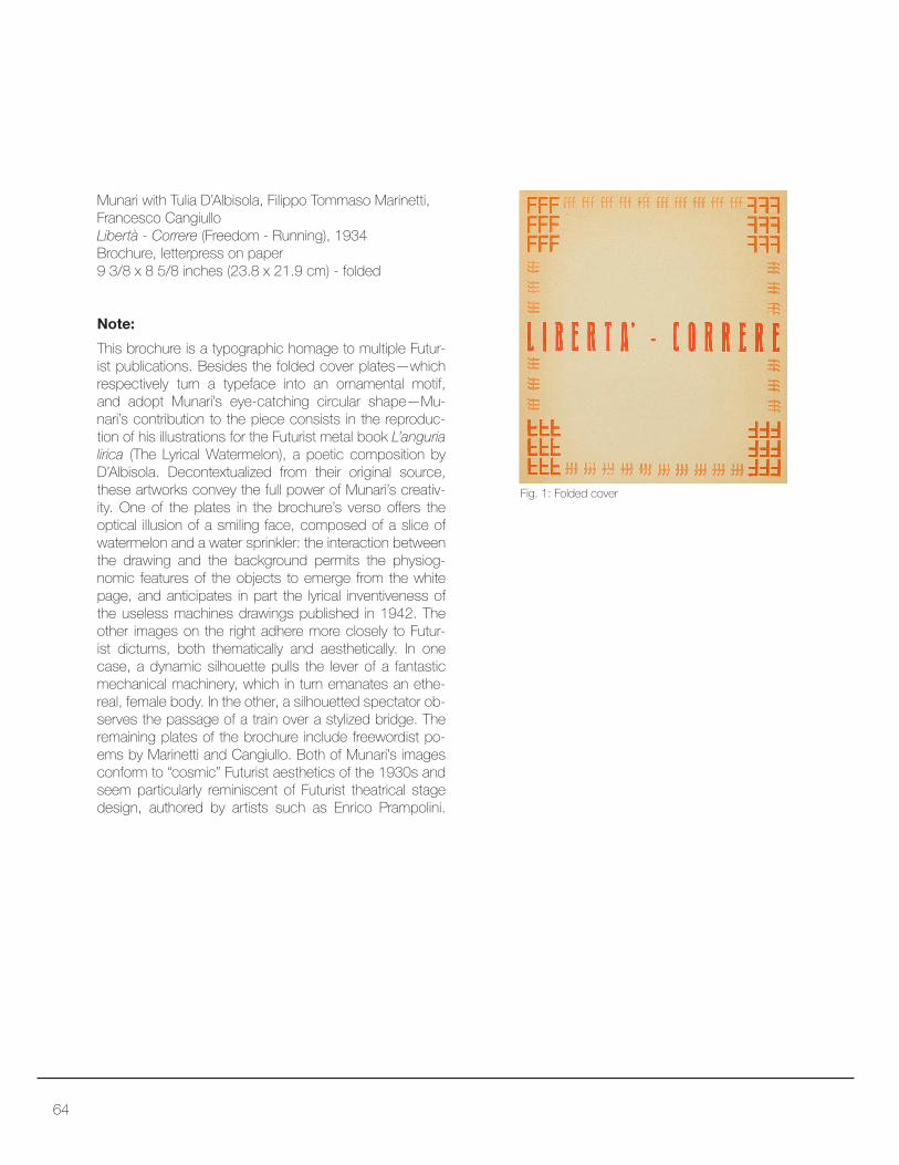
Munari with Tulia D’Albisola, Filippo Tommaso Marinetti,
Francesco Cangiullo
Libertà - Correre (Freedom - Running), 1934
Brochure, letterpress on paper
9 3/8 x 8 5/8 inches (23.8 x 21.9 cm) - folded
This brochure is a typographic homage to multiple Futur-
ist publications. Besides the folded cover plates—which respectively turn a typeface into an ornamental motif,
and adopt Munari’s eye-catching circular shape—Mu-
nari’s contribution to the piece consists in the reproduc-
tion of his illustrations for the Futurist metal book L’anguria
lirica (The Lyrical Watermelon), a poetic composition by
D’Albisola. Decontextualized from their original source,
these artworks convey the full power of Munari’s creativ-
ity. One of the plates in the brochure’s verso ofers the optical illusion of a smiling face, composed of a slice of
watermelon and a water sprinkler: the interaction between
the drawing and the background permits the physiog-
nomic features of the objects to emerge from the white
page, and anticipates in part the lyrical inventiveness of
the useless machines drawings published in 1942. The
other images on the right adhere more closely to Futur-
ist dictums, both thematically and aesthetically. In one
case, a dynamic silhouette pulls the lever of a fantastic
mechanical machinery, which in turn emanates an ethe-
real, female body. In the other, a silhouetted spectator ob-
serves the passage of a train over a stylized bridge. The
remaining plates of the brochure include freewordist po-
ems by Marinetti and Cangiullo. Both of Munari’s images
conform to “cosmic” Futurist aesthetics of the 1930s and
seem particularly reminiscent of Futurist theatrical stage
design, authored by artists such as Enrico Prampolini.
Note:
Fig. 1: Folded cover

65

66
Shell, 1934
Gouache and cut-and-pasted gelatin silver prints on card
7 1/4 x 6 1/2 inches (18.3 x 16.6 cm)
By adapting avant-garde techniques to the needs of
consumer marketing, the maquette for this advertise-
ment aims at demonstrating the importance of Shell
products for all modes of modern transportation. Munari
articulates this message visually through simple geo-
metric combinations, superimposing a tripartite circle to
a tripartite background. Each partition represents a ield of modern transportation: the car in the lower left calls
for a background formed by a modern cityscape; the
speedboat in the lower right appears ready to face the
waves of the open sea; and the hydroplane at the top
of the composition traverses the sky. At the center of
the draft, the word Shell and the company’s corporate
logo remind consumers how all these modern endeav-
ors are possible because of Shell’s petroleum-derived
products. The diagonal tilt of the word and the partitions
hint at sensations of dynamism and vehicular movement.
Note:

67

68
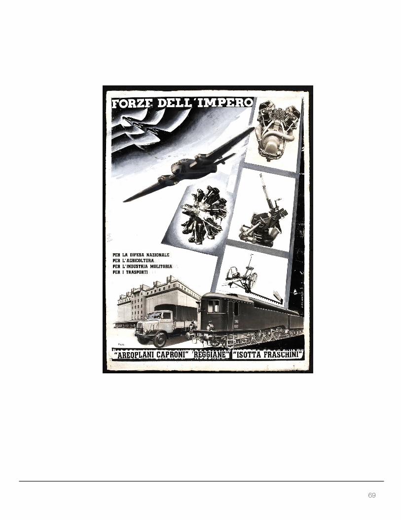
Forze dell’Impero (Forces of the Empire), 1936
Photocollage with gelatin silver prints, paper, ink and
gouache on paper
18 1/2 x 23 3/4 inches (47 x 65.5 cm)
Munari’s advertisement for the Caproni-Reggiane-
Isotta Fraschini industrial conglomerate well illustrates
how avant-garde techniques could serve both eco-
nomic interests and political rhetoric. This photomon-
tage presents a radial engine and a V-cylinder engine,
a cannon, an agricultural machine tool, an airplane, a
modern mill, a truck, and a train. Despite its collage-like
juxtapositions, the ensemble is harmonized by the dis-
tribution of the single elements along strong diagonal,
perspectival vectors, which communicate the idea of
dynamism and a singularity of purpose. The airplane
hovering in the upper half of the composition trans-
forms itself into the silhouette of an eagle, one of the
Note:
Top to bottom:
Forze dell’Impero [Forces of the Empire]
per la difesa nazionale [for national defense]
per l’agricoltura [for agriculture]
per l’industria molitoria [for the milling industry]
per i trasporti [for the transportation industry]
“Areoplani Caproni” [Caproni airplanes]
“Reggiane” [Reggiane (mechanical works)]
“Isotta Fraschini”
Text:
Marks and inscriptions:
Signature: Mun.
most common symbols through which the fascist regime
evoked its penchant for classical romanità. At the same
time, the engines, cannon, and agricultural machinery con-
stitute the building blocks of a fascio, the ancient Roman
ceremonial weapon that gave Fascism its name. These
metamorphoses between images of industrial might and
political symbolism congeal with the nationalistic and im-
perial rhetoric fostered by the fascist regime during the
mid-1930s. The power of the images is reinforced by Mu-
nari’s limited use of words. The artist employs a few, se-
lect slogans that portray the Caproni-Reggiane-Isotta Fra-
schini conglomerate as a purpose-driven enterprise, and
a strategically important one in Italy’s imperial campaign.
69


71
Posters

72
Mostra aeropittura venticinquenni futuristi (Aeropainting
exhibition, twenty-ive-year-old Futurists), 1934Letterpress on paper
27 1/4 x 39 5/8 inches (69.2 x 100.6 cm)
Text-only advertisting requires the careful orchestration of
words, spatially arranged to capture the attention of casual
onlookers. Munari’s advertisement for a Futurist Aeropaint-
ing exhibition sets a high mark for typographic creativity.
The poster makes use of diferent font types and sizes in order to communicate various details about the event. The
largest font is dedicated to the exhibition itself and crosses
the entire page with the two most signiicant keywords, aeropittura venticinquenni, thus signaling the subject of
the exhibition and the young age of the artists. The dates
and organizers of the event are relegated to the left corners
of the composition, while the bottom right of the poster re-
veals the multiple events that will take place at the exhibi-
tion, as well as some of the objects in the show. Among
these items, it is interesting to notice how Munari repre-
sents his own useless machines: the word inutili (useless)
is written part vertically, part upside-down, in an efort to crystallize, at the typographic level, the efete nature of such artworks. Most of the advertisement is composed without
the help of lines, arrows, and other geometric shapes,
but there exist remarkable exceptions: for instance, the
words that indicate the venue of the exhibition, atrio mu-
nicipale (the entrance lobby of Reggio Emilia’s city hall)
are enclosed by a rectangle that literalizes the real space
of the exhibition into the visual language of the poster.
Note:
Gruppo Futurista reggio emilia; macchine inutili; poli-
materici; dibattiti; conferenze; atrio municipale; 22 aprile
6 maggio XII
[Reggio Emilia Futurist Group; useless machines;
polymateric objects; debates; conferences; municipal
entance hall; April 22nd May 6 XII]
Text:

73
74
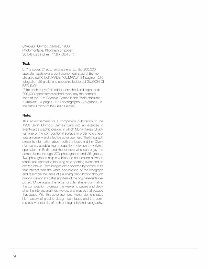
Olimpiadi (Olympic games), 1936Photomontage, lithograph on paper
30 5/8 x 23 inches (77.8 x 58.4 cm)
This advertisement for a companion publication to the
1936 Berlin Olympic Games turns into an exercise in avant-garde graphic design, in which Munari takes full ad-
vantage of the compositional surface in order to orches-
trate an orderly and efective advertisement. The lithograph presents information about both the book and the Olym-
pic events, establishing an equation between the original
spectators in Berlin and the readers who can enjoy the
competitions through 270 photographs and 25 graphs.
Two photographs help establish the connection between
reader and spectator, focusing on a sporting event and an
excited crowd. Both images are dissected by vertical cuts
that interact with the white background of the lithograph
and resemble the lanes of a running track, hinting through
graphic design at spatial signiiers of the original events de-
picted. Once again, the large, circular shape dominating the composition prompts the viewer to pause and deci-
pher the intersecting lines, words, and images that occupy
that space. With this advertisement, Munari demonstrates
his mastery of graphic design techniques and the com-
municative potential of both photography and typography.
Note:
L. 7 la copia; 2° ediz. ampliata e arricchita; 200.000
spettatori assistevano ogni giorno negli stadi di Berlino
alle gare dell’XI OLIMPIADE; “OLIMPIADI” 84 pagine - 270 fotograie - 25 graici è lo specchio fedele dei GIUOCHI DI BERLINO. [7 lire each copy; 2nd edition, enriched and expanded;
200,000 spectators watched every day the competi-
tions of the 11th Olympic Games in the Berlin stadiums; “Olimpiadi” 84 pages - 270 photographs - 25 graphs - is the faithful mirror of the Berlin Games.]
Text:

75


Books

78
Le macchine di Munari (Munari’s Machines), 1942
Book published by Einaudi, Turin, 52 pages
11 1/4 x 8 3/8 x 1/4 inches (28.3 x 21.1 x 0.7 cm)
Munari’s interest in useless machines dates to the early
1930s, when he began sketching and building mobile
sculptures composed of metal, wood, plastic, thread,
and wire. Thanks to their complex joints and interacting
parts, these machines could move to the touch or with
wind and other atmospheric events. Useless machines
embrace the aesthetics of kinetic art while providing in-
sights into Munari’s attitude towards the world of tech-
nology and science. For the artist, machines serve the
higher cause of art: once stripped of their usefulness, their
mechanical surplus value consists of an aesthetic expe-
rience, while their complete lack of meaning represents
an opportunity for training the viewer’s fantasy. Munari’s
projects for Le macchine di Munari (Munari’s Machines),
published by Einaudi in 1942, push these theoretical
propositions towards irony and self-irony. The drawings
represent imaginary, over-engineered machines similar
to the ones popularized by Rube Goldberg’s cartoons
in the 1920s and 1930s. Their diagrammatic, exposi-
tory style illustrates their senseless function in great de-
tail, providing an escapist and ironic counterpart to the
standardized, economic reliability of industrial production.
Note:

79

80
Il venditore di animali, 1945
(English edition: Animals for Sale, 1957)
Book published by Mondadori, Milan
12 1/2 x 9 1/2 inches (31.7 x 24.1 cm)
Alongside ironic art books such as Le macchine di Mu-
nari, during the 1940s the artist also began to explore the
potential uses of graphic design in children literature for
both entertainment and pedagogical purposes. Possibly
the earliest example of this particular research trajectory,
Il venditore di animali is a short book narrating the come-
dic story of a tall, bearded, and distinguished gentleman
who is seeking to sell various live animals to potential
buyers. The imaginary buyers always ind some problem with the proposed deals and ultimately suggest that their
ideal animal is a roasted turkey with potatoes. The book
employs simple, large illustrations that dominate the oth-
erwise blank pages, highlighting at the same time the bi-
dimensionality of the medium and the oneiric character
of the fairytale narrative. Furthermore, Munari orchestrates
the presentation of each proposed animal sale on a dif-
ferent page, and each page decreases in size from the
previous one. Thus, the physical design of the book plays
an integral role in the advancement of the narrative and in
the irony of the work as a whole. While the salesman igure remains a constant presence on the right of each page
spread, the animals on sale vary from a rather cumber-
some lamingo to a diminutive centipede, only to conclude with the diminutive illustration of an oven-roasted turkey.
Note:

81


83
Letterhead
84
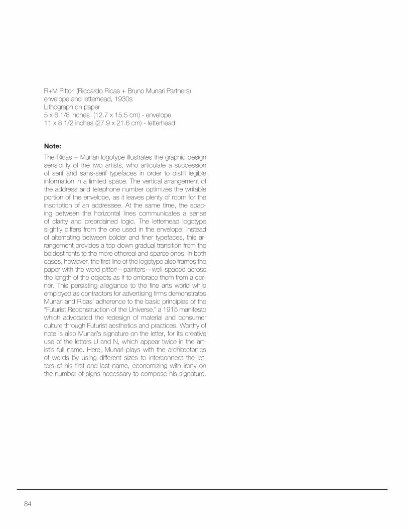
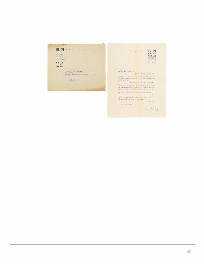
R+M Pittori (Riccardo Ricas + Bruno Munari Partners),
envelope and letterhead, 1930s
Lithograph on paper
5 x 6 1/8 inches (12.7 x 15.5 cm) - envelope
11 x 8 1/2 inches (27.9 x 21.6 cm) - letterhead
The Ricas + Munari logotype illustrates the graphic design
sensibility of the two artists, who articulate a succession
of serif and sans-serif typefaces in order to distill legible
information in a limited space. The vertical arrangement of
the address and telephone number optimizes the writable
portion of the envelope, as it leaves plenty of room for the
inscription of an addressee. At the same time, the spac-
ing between the horizontal lines communicates a sense
of clarity and preordained logic. The letterhead logotype
slightly difers from the one used in the envelope: instead of alternating between bolder and iner typefaces, this ar-rangement provides a top-down gradual transition from the
boldest fonts to the more ethereal and sparse ones. In both
cases, however, the irst line of the logotype also frames the paper with the word pittori—painters—well-spaced across the length of the objects as if to embrace them from a cor-
ner. This persisting allegiance to the ine arts world while employed as contractors for advertising irms demonstrates Munari and Ricas’ adherence to the basic principles of the
“Futurist Reconstruction of the Universe,” a 1915 manifesto
which advocated the redesign of material and consumer
culture through Futurist aesthetics and practices. Worthy of
note is also Munari’s signature on the letter, for its creative
use of the letters U and N, which appear twice in the art-
ist’s full name. Here, Munari plays with the architectonics
of words by using diferent sizes to interconnect the let-ters of his irst and last name, economizing with irony on the number of signs necessary to compose his signature.
Note:
85


87
Selected Bibliography


89
Major Art Books and Theoretical Work on Design by Munari
Le macchine di Munari. Turin: Einaudi, 1942.
Fotocronache di Munari. Milan: Gruppo Editoriale Domus, 1944.
Il venditore di animali. Milan: Mondadori, 1945.
Libro illeggibile bianco e rosso. Amsterdam: Steendrukkerij De Jong & Co., 1953.
Nella notte buia. Milan: Muggiani Editore, 1956.
Teoremi sull’arte. Milan: Scheiwiller, 1961.
Good Design. Milan: Scheiwiller, 1963.
Arte come mestiere. Bari: Editore Laterza, 1966 (Also available in English as Bruno Munari, Design as
Art. Translated by Patrick Creagh. London: Penguin, 2008.).
Design e comunicazione visiva. Bari: Editore Laterza, 1968.
Da cosa nasce cosa. Bari: Editore Laterza, 1981.
Simultaneità degli opposti. Mantua: Corraini Edizioni, 1989.
Scholarly books on Munari
Antonello, Pierpaolo, Matilde Nardelli, and Margherita Zanoletti, eds. Bruno Munari: The Lightness of Art.
Oxford: Peter Lang, 2017.
Finessi, Beppe, ed. Su Munari. 104 testimonianze, 152 inediti. Milan: Abitare Segesta Cataloghi, 1999.
Mafei, Giorgio. Munari. I libri. Milan: Editore Sylvestre Bonnard, 2002 (Also available in English as Gior-
gio Mafei, Munari’s Books. New York: Princeton Architectural Press, 2015.).
Meneguzzo, Marco. Bruno Munari. Bari: Editore Laterza, 1993.
Sammicheli, Marco and Giovanni Rubino, eds. Munari Politecnico. Varese: Nomos Edizioni, 2015.
Quintavalle, Arturo Carlo, ed. Bruno Munari. Parma: CSAC Università di Parma, Quaderno N. 45, Feltri-
nelli, 1979.
Major Exhibition Catalogs
Bianchino, Gloria, ed. Bruno Munari. Il Disegno, il Design. Mantua: Corraini Edizioni, 2008.
Finessi, Beppe and Marco Meneguzzo, eds. Bruno Munari. Cinisello Balsamo (Milan): Silvana, 2007.
Hájek, Miroslava and Luca Zafarano, eds. Bruno Munari: My Futurist Past. Estorick Collection of Mod-
ern Italian Art. Milan: Silvana Editoriale, 2012.
Lichtenstein, Claude and Alfredo Haberli, eds. Air Made Visible: A Visual Reader on Bruno Munari.
Baden: Lars Müller Publisher, 2000.
Meneguzzo, Marco, ed. Bruno Munari. Milan: Electa, 1986.


© 2017 M
errill C. Berman Collection
IMAGES CO
URTE
SY
OF T
HE M
ERRILL C. BERM
AN
CO
LLEC
TIO
N
©
IMAGES CO
URTE
SY
OF T
HE M
ERRILL C. BERM
AN
CO
LLEC
TIO
N
©2017