Embed Size (px)
Citation preview

B R A N D G U I D E L I N E S
O C T O B E R 2 0 2 1

1.1 Brand Architecture
1.2 Masterbrand
1.3 Marque
1.4 Brand Architecture Lockups
1.5 Sponsorships + Partnerships
1.6 Brand Boards
1.7 Sub-Brand System
BRAND IDENTIT Y
1 .0
666

1 . 0 B R A N D I D E N T I T Y
This section demonstrates how to use BAFTA's core visual identity elements, the Masterbrand and Marque along with partnerships and sponsorships. The rules of use outlined here should be carefully considered to ensure a coherent and consistent brand identity.
7
PRODUCTIONS
A W A R D S
C O N N E C T E D S U B - B R A N D S
S P E C I F I C S U B - B R A N D S
T I T L E S P O N S O R S H I P S
M A S T E R B R A N D
8 2 . 0 B R A N D I D E N T I T Y8
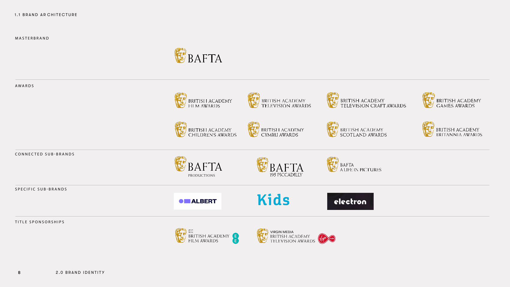
1 . 1 B R A N D A R C H I T E C T U R E

WINNER FILM WINNER TELEVISION
WINNER CHILDREN WINNER GAMES
NOMINEE F ILM NOMINEE TELEVISION NOMINEE TELEVISIONCRAFT
RECOGNISED FESTIVAL BRITISH SHORT FILM
WINNER TELEVISIONCRAFT
NOMINEE CHILDREN NOMINEE GAMES
S T A M P S ( W I N N E R )
S T A M P S ( N O M I N E E )
S T A M P S ( O T H E R )
99 2 . 0 B R A N D I D E N T I T Y
1 . 1 B R A N D A R C H I T E C T U R E

MASTERBRAND LOCKUP
BRITISH ACADEMY OF FILM AND TELEVISION ARTS
1 . 2 M A S T E R B R A N D L O C K U P R E V I E W
This page is an overview of the BAFTA Masterbrand lockup.
The Masterbrand exists in an abbreviated version. The abbreviated version is the primary logotype that should be used across all brand communication.
The logotype is made up of two elements: the Marque and the type. This relationship must not be altered.
N.B. It is essential that the supplied logotype master files are used. In no instance is it appropriate to recreate, colour or redraw the files.
1 0

POSITIVE
11
NEGATIVE
1 . 2 M A S T E R B R A N D P O S I T I V E + N E G A T I V E
To help establish the identity, the logotypes should appear in colour wherever possible.
Positive and negative versions have been created in Pantone colours, CMYK and RGB. Please ensure you select the correct logotype, with the end usage in mind. The highlights on the mask should tonally always be the lightest part of the Marque in both positive and negative lockups.
These rules are also used for the Marque when used in isolation of the BAFTA logotype.
N.B. It is essential that the supplied logotype master files are used. In no instance is it appropriate to recreate, colour or redraw the files.
BRITISH ACADEMY OF FILM AND TELEVISION ARTS
BRITISH ACADEMY OF FILM AND TELEVISION ARTS
1 1

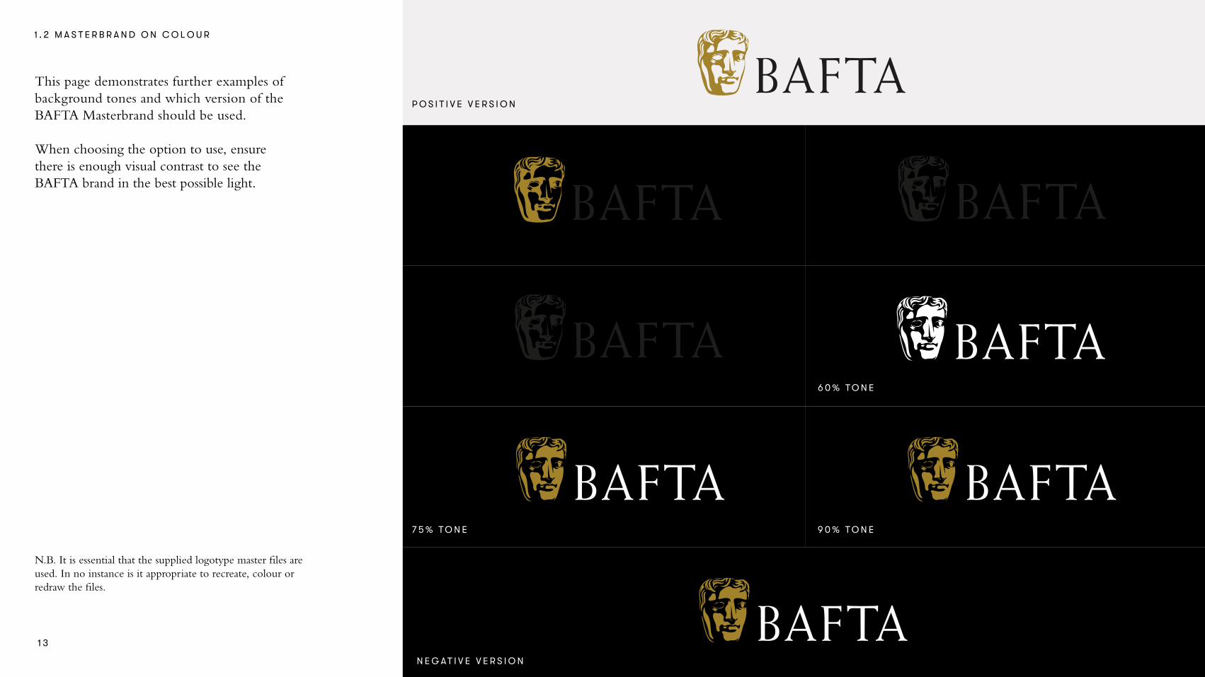
1 . 2 M A S T E R B R A N D O N C O L O U R
When the logo appears on a white or light background, the positive versions should be used, and on a black or dark background the negative versions should be used.
If the logo is not legible using the primary lockup then a white or black version can be used.
Special versions for when the Marque is intended to be foil blocked have also been created.
Brand colour values are specified on page 42.
N.B. It is essential that the supplied logotype master files are used. In no instance is it appropriate to recreate, colour or redraw the files.
BRITISH ACADEMY OF FILM AND TELEVISION ARTS
N E G AT I V E V E R S I O N , C O L O U R
P O S I T I V E V E R S I O N , B L A C K N E G AT I V E V E R S I O N , W H I T E
P O S I T I V E V E R S I O N , C O L O U R
1 2
1 . 2 M A S T E R B R A N D O N C O L O U R
This page demonstrates further examples of background tones and which version of the BAFTA Masterbrand should be used.
When choosing the option to use, ensure there is enough visual contrast to see the BAFTA brand in the best possible light.
N.B. It is essential that the supplied logotype master files are used. In no instance is it appropriate to recreate, colour or redraw the files.
1 3BRITISH ACADEMY OF FILM AND TELEVISION ARTS
BRITISH ACADEMY OF FILM AND TELEVISION ARTS
BRITISH ACADEMY OF FILM AND TELEVISION ARTS
P O S I T I V E V E R S I O N
1 5 % T O N E
4 5 % T O N E
3 0 % T O N E
6 0 % T O N E
9 0 % T O N E7 5 % T O N E
N E G AT I V E V E R S I O N

MASTERBRAND
Minimum size: Print – 63mmScreen – 178px
N.B. It is essential that the supplied logotype master files are used. In no instance is it appropriate to recreate, colour or redraw the files.
1 . 2 M A S T E R B R A N D E X C L U S I O N Z O N E + M I N I M U M S I Z E
In order to maintain the visual integrity of the logotype, there are rules outlining the amount of clear space that must surround it. This is known as the exclusion zone.
The exclusion zone ensures that other visual elements (i.e. headlines, text) do not encroach on the logotype. The exclusion zone is defined by 0.5 X within the logotype. This zone should be considered as the absolute minimum safe distance. In most cases the logo should be given even more room to breathe.
Large and small versions of all logotypes have been created, to achieve maximum clarity when used at small sizes. The logotypes should not be displayed any smaller than the minimum size as outlined here. This is also the case for the Marque when used in isolation.
EXCLUSION ZONE
MINIMUM SIZE
MASTERBRAND MASTERBRAND (SMALL VERSION)
x
0.5x
0.5x
28mm / 80px63mm / 178px 28mm / 80px63mm / 178px
MASTERBRAND
(SMALL VERSION)
Minimum size: Print – 28mmScreen – 80px
1 4

1 . 2 M A S T E R B R A N D P O S I T I O N I N G
The hero logo position is in the left top corner of any format. If the logo cannot be positioned there without interfering with other graphics or imagery then it can be positioned along the left margin.
SECONDARY LOGO POSITIONING – LEFT HAND MARGIN
HERO LOGO POSITIONING – TOP LEFT
1 5

Rough size guidance is included but it is advised to judge and decide based on the visuals and copy of the specific campaign.
1 . 2 M A S T E R B R A N D S I Z E
Advertising will vary according to campaign requirements. The enclosed example shows the most basic structure, where a full bleed image is used with logo lockups applied on top of the image.
30% of width of portrait format
14% of height of landscape format
1 6

1 . 2 M A S T E R B R A N D M I S U S E
It is important to use the BAFTA logotype correctly and consistently.
The logo should not be altered. This page demonstrates some of the most likely mistakes. These examples apply to both the Masterbrand and Marque.
Do not use the negative version on a light background. Do not resolve the logotype in off-brand colours. Do not apply a gradient to the logotype.
Do not use the logotype as a tint. Do not convert any part of the logotype to outline. Do not change the positioning of the elements.
Do not rotate the logotype. Do not add a texture or image inside the logotype. Do not change the scale of logotype components.
1 7

1 . 3 M A R Q U E
The illustrated BAFTA Marque can be used in isolation for social media.
The photographic BAFTA Marque is only to be used in the direct context of the awards. e.g. on the screen or presenter stand at the awards show.
ILLUSTRATED MARQUE
PHOTOGRAPHIC MARQUE
1 8
N.B. It is essential that the supplied Marque master files are used. In no instance is it appropriate to recreate, colour or redraw the files.

1 . 3 M A R Q U E E X C L U S I O N Z O N E
In order to maintain the visual integrity of the Marque, there are rules outlining the amount of clear space that must surround it. This is known as the exclusion zone.
The exclusion zone ensures that other visual elements (i.e. headlines, text) do not encroach on the Marque. For the illustrated marque the exclusion zone is defined by 0.25 X.
For the photographic Marque the exclusion zone is defined by 0.5 X. These zones should be considered as the absolute minimum safe distance. In most cases the logo should be given even more room to breathe.
x
0.25x
0.25x
x
0.5x
0.5x
x
0.25x
0.25x
x
0.5x
0.5x
ILLUSTRATED MARQUE EXCLUSION ZONE
PHOTOGRAPHIC MARQUE EXCLUSION ZONE
1 9

1 .4 B R A N D A R C H I T E C T U R E L O C K U P S
This page demonstrates the positioning and scale and type for the following categories: Awards Connected Sub-Brand and Masterbrand.
The same rules regarding clear space and colour usage for the Masterbrand apply.
SHORT AND LONG EXAMPLE
NOMINEE FILM RECOGNISED FESTIVAL BRITISH SHORT FILM
1/6 x1/6 x
1/6 x1/6 x
x x
NOMINEE FILM RECOGNISED FESTIVAL BRITISH SHORT FILM
RECOGNISED FESTIVAL BRITISH SHORT FILM
NOMINEE FILM2 0

When BAFTA is partnering with an event or company, the relationship within all marketing material should be about 50% BAFTA, 50% partner.
That relationship is expressed with the logo sizes and their positioning. The two logos should sit side by side, or stacked and be contained within an equal size of real estate on any application. This page shows an example of a 'square' format logo and its positioning.
HORIZONTAL LOCK-UP (SQUARE LOGO)
LOGO
LOGO
x
0.5x 0.5x
0.5x
LOGO
LOGO
x
0.5x 0.5x
0.5x
1 . 5 P A R T N E R S H I P L O C K U P
2 1

HORIZONTAL LOCK-UP (LONG & TALL LOGOS)1 . 5 P A R T N E R S H I P L O C K U P
Depending on the partnership logo shape there are unique guidelines for brand positioning.
If the logo is long it is the height of the BAFTA type. If the logo is tall it is the height of the Marque.
TALL LOGOx
0.5x 0.5x
0.5x
LONG LOGOx
0.5x 0.5x
0.5x
TALL LOGOx
0.5x 0.5x
0.5x
LONG LOGOx
0.5x 0.5x
0.5x
2 2

1 . 6 B R A N D B O A R D S P O S I T I O N I N G
In this schematic drawing we aim to demonstrate the 50/50 relationship in both logos as well as layout for use on brand boards at events.
The scale of the logos needs to be visually adjusted based on the logo to achieve a 50/50 balance.
PARTNER LOGO
PARTNER LOGO
LOCK-UP POSITIONING (2 BRAND EXAMPLE)
2 3

Considering photography crops (portrait and landscape) at least two repeated logos need to fit within these crops.
1 . 6 B R A N D B O A R D S L A Y O U T
When considering the amount of rows and columns of repeated logos the scale of a person must be taken into account.
PARTNER 1 PARTNER 2PARTNER 2
PARTNER 1 PARTNER 2
PARTNER 1 PARTNER 2PARTNER 2
PARTNER 1 PARTNER 2
PARTNER 1 PARTNER 2
PARTNER 1 PARTNER 2
PARTNER 1 PARTNER 2
PARTNER 1 PARTNER 2
PARTNER LOGO PARTNER LOGO
PARTNER LOGO
PARTNER LOGOPARTNER LOGOPARTNER LOGO
PARTNER LOGO
PARTNER LOGOPARTNER LOGO
PARTNER LOGO
PARTNER LOGO
PARTNER LOGO PARTNER LOGO
PARTNER LOGO
LAYOUT, GRID
EXAMPLE
2 4

This page demonstrates measurements for the scale shown in the previous page.
1 . 6 B R A N D B O A R D S L A Y O U T S C A L E
PARTNERLOGO
PARTNERLOGO
PARTNERLOGO
PARTNERLOGO
PARTNERLOGO
PARTNERLOGO
PARTNERLOGO
PARTNERLOGO
PARTNERLOGO
PARTNERLOGO
PARTNERLOGO
PARTNERLOGO
PARTNERLOGO
PARTNERLOGO
PARTNERLOGO
EXAMPLE
PARTNERLOGO
PARTNERLOGO
PARTNERLOGO
PARTNERLOGO
PARTNERLOGO
PARTNERLOGO
PARTNERLOGO
PARTNERLOGO
PARTNERLOGO
PARTNERLOGO
PARTNERLOGO
PARTNERLOGO
PARTNERLOGO
PARTNERLOGO
PARTNERLOGO
1380mm
541mm
386mm
124mm
Visually balance 2 logos within this 1380mm space
Visually centred
2 5

1 . 6 B R A N D B O A R D S P O S I T I O N I N G
This schematic drawing demonstrates the layout that would occur with 3 brand logos.
The scale of the logos needs to be visually adjusted based on the set of logos to achieve visual balance. PARTNER 1 PARTNER 2PARTNER 2
PARTNER 1 PARTNER 2
PARTNER 1 PARTNER 2PARTNER 2
PARTNER 1 PARTNER 2
LOCKUP POSITIONING (3 BRAND EXAMPLE)
2 6

This page demonstrates measurements for the scale shown in the previous page.
1 . 6 B R A N D B O A R D S L A Y O U T S C A L E
PARTNER 1PARTNER 1
PARTNER 1
PARTNER 2PARTNER 2
PARTNER 1 PARTNER 2PARTNER 2 PARTNER 1
PARTNER 1 PARTNER 1
PARTNER 1
PARTNER 2
PARTNER 1 PARTNER 2PARTNER 2
PARTNER 1 PARTNER 2
PARTNER 1PARTNER 2
PARTNER 1 PARTNER 2
PARTNER 1 PARTNER 2PARTNER 2
PARTNER 1 PARTNER 2
PARTNER 1 PARTNER 2
PARTNER 1PARTNER 1 PARTNER 2PARTNER 2
PARTNER 1 PARTNER 2PARTNER 2 PARTNER 1
PARTNER 1 PARTNER 1PARTNER 2
PARTNER 1
PARTNER 2PARTNER 1
PARTNER 2
PARTNER 1 PARTNER 2
PARTNER 1 PARTNER 2PARTNER 2
PARTNER 1PARTNER 1
PARTNER 1
PARTNER 2PARTNER 2
PARTNER 1 PARTNER 2PARTNER 2 PARTNER 1
PARTNER 1 PARTNER 1
PARTNER 1
PARTNER 2
PARTNER 1 PARTNER 2PARTNER 2
PARTNER 1 PARTNER 2
PARTNER 1PARTNER 2
PARTNER 1 PARTNER 2
PARTNER 1 PARTNER 2PARTNER 2
PARTNER 1 PARTNER 2
PARTNER 1 PARTNER 2
PARTNER 1PARTNER 1 PARTNER 2PARTNER 2
PARTNER 1 PARTNER 2PARTNER 2 PARTNER 1
PARTNER 1 PARTNER 1PARTNER 2
PARTNER 1
PARTNER 2PARTNER 1
PARTNER 2
PARTNER 1
PARTNER 1
PARTNER 1
PARTNER 1 PARTNER 2
PARTNER 1 PARTNER 2PARTNER 2
PARTNER 1
EXAMPLE
Visually scale of logos on 3 logo board
within this 1380mm space
Visually centred
2 7
451mm
215mm
350mm

This page demonstrates how the programme name 'Kids' can work with the BAFTA Masterbrand. It is never locked up with the Marque or name BAFTA but has an association with it based on scale and positioning.
The 'Kids' logo should remain within the BAFTA colour palette.
The minimum distance for positioning of these two brands should follow the Masterbrand exclusion zone rules.
1 . 7 S U B - B R A N D E X A M P L E
Within the BAFTA brand there is a need to differentiate content related to specific programmes or sub-brands.
2 8
BAFTA AND SUB-BRAND RELATIONSHIP

BRITISH ACADEMY OF FILM AND TELEVISION ARTS
BREAKTHROUGH LOCKUP – POSITIVE
BREAKTHROUGH LOCKUP – NEGATIVE
2 9
1 . 7 S U B - B R A N D E X A M P L E
Within the BAFTA brand there is a need to have a unique system that is used for specific sub-brands.
This page uses the example of the programme 'Breakthrough' in positive and negative colourways.

BREAKTHROUGH LOCKUP WITH SPONSOR
BREAKTHROUGH LOCKUP POSITIONING
3 0
1 . 7 S U B - B R A N D E X A M P L E
It is important that a visual connection is made between BAFTA and the sub-brand. This connection emphasises that the sub-brand is a BAFTA programme. The sponsor logo, in this case Netflix, then sits centered to the right side of this lock-up as demonstrated on this page.
The space between the two logos is defined as 0.6 X with the size of the Netflix logo at 0.5 Y.
x
0.6x 0.5yy

This page uses the example of the programme 'Breakthrough' and the sponsor Netflix on a poster.
1 . 7 S U B - B R A N D E X A M P L E
3 1
1 . 0 B R A N D P O S I T I O N I N G
2.1
2.2
2.3
2.4
Typefaces
Type Usage
Colour Palette
Colour Usage
BRAND ASSETS
1 . 3 O U R B E L I E
2.0F
3 63 2

37
Bembo StdA BCDEFGHIJK LMNOPQRSTU V W XYZabcdefgh ijk lmnopqr s tuvwx yz 0123456789!@£$%^&*( )
GT WalsheimHEADLINE T YPEFACE
GT Walsheim
BODY COPY T YPEFACE
Bembo
2 . 1 T Y P E F A C E S
BAFTA has two typefaces in the brand toolkit. GT Walsheim is our headline font, used to help create various levels of personality in communications. Bembo Std is used for body copy. Both fonts can be used together if required to create visual hierarchy.
The system font to be used internally when GT Walsheim isn't available is Century Gothic.
ABCDEFGHIJKLMNOPQRSTUV WX YZabcdefghijklmnopqrstuv wxyz 0123456789!@£$%^&*( )
3 3

38
2 . 2 T Y P E U S A G E – H I E R A R C H Y
GT Walsheim is the typeface we use for headlines. This should be set in caps. Subheadings can either be caps or sentence case as shown here.
Bembo in used as our body copy typeface.
These examples are a guide only. To work out the typogaraphy appropriate for the medium each piece of communication needs analysing individually based on the content, format and audience.
A–Heading – Caps, GT Walsheim, Thin, 85pt/90pt, 120 tracking
B-Subhead – Caps, GT Walsheim, Medium,35pt/40pt, 120 tracking
Descriptor – Sentence case, GT Walsheim, Regular, 17pt/24pt, 50 tracking
Body copy – Sentence case, Bembo, Regular, 17pt/21pt, 10 tracking
A–HEADINGB–SUBHEAD
Descriptor introduction type here descriptor example text used
In addition to its Awards ceremonies, BAFTA has a year-round, international programme of learning events and initiatives that offers unique access to some of the world’s most inspiring talent through workshops, masterclasses, scholarships, lectures and mentoring schemes in the UK, USA and Asia.
In addition to its Awards ceremonies, BAFTA has a year-round, international programme of learning events and initiatives that offers unique access to some of the world’s most inspiring talent through workshops, masterclasses, scholarships, lectures and mentoring schemes in the UK, USA and Asia.
3 4

39
TITLE 125pt
TITLE 47pt
SUBHEADING 18pt
SUBHEADING 17pt
Supporting copy 13pt
Body copy 13pt
Supporting copy 13pt
Body copy 13pt
2 . 2 T Y P E U S A G E – H I E R A R C H Y
When a variety of fonts, type sizes and weights are used, the differences between them must be clearly recognisable. Information can also be emphasised by using devices such as colour and composition. This contrast will help to create a clear hierarchy between information and create consistent designs.
These examples are a guide/example only based on editorial spread examples on page 37 & 38. Each piece of communication needs analysing individually based on the content, format and audience.
3 5

40
Ultr
2 . 2 T Y P E U S A G E – P O S I T I O N I N G
This page demonstrates a poster format showing type positioning. On a poster format type is best suited to being left aligned to work well over full bleed images.
EVERY WIN IS A JOURNEY
GT WalsheimUltra Light, 54 pt
GT Walsheim Medium, 17 pt
3 6
BRITISH ACADEMY OF FILM AND TELEVISION ARTS

41
Descriptor introduction to the
body copy and narrative
In addition to its Awards ceremonies, BAFTA has a year-round, international programme of learning events and initiatives that off ers unique access to some of the world’s most inspiring talent through workshops, masterclasses, scholarships, lectures mentoring schemes in the UK, USA and Asia. In addition to its Awards ceremonies, BAFTA has a year-round, international programme of learning events and initiatives that off ers unique access to some of the world’s most inspiring talent through workshops, masterclasses, scholarships, lectures mentoring schemes in the UK, USA and Asia.
In addition to its Awards ceremonies, BAFTA has a year-round, international programme of learning events and initiatives that off ers unique access to some of the world’s most inspiring talent through workshops, masterclasses, scholarships, lectures and mentoring schemes in the UK, USA and Asia. In addition to its new Awards ceremonies, BAFTA has a year-round, international programme of learning events and initiatives that off ers unique access to some of the world’s most inspiring talent through workshops, masterclasses, scholarships, lectures and mentoring schemes in the UK, USA and Asia.
12
Descriptor introduction to the
body copy and narrative
In addition to its Awards ceremonies, BAFTA hasa year-round, international programme of learningevents and initiatives that off ers unique access tosome of the world’s most inspiring talent throughworkshops, masterclasses, scholarships, lecturesmentoring schemes in the UK, USA and Asia. Inaddition to its Awards ceremonies, BAFTA has ayear-round, international programme of learningevents and initiatives that off ers unique access tosome of the world’s most inspiring talent throughworkshops, masterclasses, scholarships, lecturesmentoring schemes in the UK, USA and Asia.
In addition to its Awards ceremonies, BAFTA has a year-round, international programme of learning events and initiatives thatoff ers unique access to some of the world’s mostinspiring talent through workshops, masterclasses,scholarships, lectures and mentoring schemes inthe UK, USA and Asia. In addition to its new Awards ceremonies, BAFTA has a year-round,international programme of learning events andinitiatives that off ers unique access to some of theworld’s most inspiring talent through workshops,masterclasses, scholarships, lectures and mentoringschemes in the UK, USA and Asia.
12
2 . 2 T Y P E U S A G E – P O S I T I O N I N G
This page demonstrates an editorial spread when type layout can combine centered titles and left aligned body copy.
Hero title, GT Walsheim Thin, 125pt Descriptor, GT Walsheim Regular, 13pt
Subhead, GT Walsheim, Medium, 17pt3 7

4242
B A F TA G O L D
RGB 208,151,5CMYK 17,40,100,6HEX #D09705PMS 8641
B L A C K
RGB 0,0,0CMYK 0,0,0,100HEX #000000 PMS C BLACK 6PMS U PROCESS BLACK
B A F TA B L U E
RGB 0,61,166CMYK 99,79,0,0HEX #174496 PMS 286
B A F TA R E D
RGB 193,2,48CMYK 16,100,77,7HEX #C21632PMS 186
B A F TA P U R P L E
RGB 105,0,172CMYK 80,92,0,0HEX #6900AC PMS 2088
B A F TA T E A L
RGB 0,192,181CMYK 71,0,38,0HEX #00C0B5PMS 3262
B A F TA D A R K B L U E
RGB 32,30,91CMYK 100,95,4,42HEX #201E5B PMS 2757
B A F TA D A R K R E D
RGB 131,24,42CMYK 30,99,71,38HEX #83182A PMS 202
B A F TA D A R K P U R P L E
RGB 69,10,111CMYK 91,100,22,11HEX #412669PMS MEDIUM PURPLE
B A F TA D A R K T E A L
RGB 0,80,92CMYK 91,47,46,38HEX #01515C PMS 3165
W H I T E
RGB 255,255,255CMYK 0,0,0,0HEX #FFFFFF
2 . 3 C O L O U R P A L E T T E
There are three primary colours in the BAFTA palette: black, white and gold. Black or white should be used in the main, with gold used as an accent colour. The specifications are listed as CMYK, RGB, hex and Pantone colours values.
The palette includes 4 secondary colours, each with a light and dark tone. These are used in a supporting role. They are there to help differentiate from the main brand colours, and emphasise words, headings or areas. These colours can also be used to help reflect the mood of the brand within various sectors of the organisation.
Please ensure that these values are used as demonstrated on this page to ensure brand consistency.
3 8

43
2 .4 C O L O U R U S A G E – P R I M A R Y
3 9

44
2 .4 C O L O U R U S A G E
Within brand communications the primary colours should be most used from the brand palette.
Using the colours in a simple way can help to provide clarity and help focus a readers attention. Black and white are used largely as base colours with gold being a strong pop of recognisable colour.
The secondary colours are used as accent colours and should be used sparingly throughout all applications, from print to digital, to highlight or bring attention to selected elements.
There is no hierarchy within the secondary tones and should be used to create contrast between content.
15% secondary
colours
This diagram is indicative of proportion of colour application
85% white, gold, black
4 0

45
The secondary colours can be used as accents when more visual differentiation is needed.
2 .4 C O L O U R U S A G E – E X A M P L E
4 1

THANK YOU