Embed Size (px)
Citation preview

Brand analysis - Cath Kidston
By E l la ina Braz ier

Introduction
In th is report you wi l l learn about the branding guide l ines of Cath K idston inc lud-ing the typeface, colour schemes and packaging, star t ing of f wi th the h istory of the brand f ind ing out how the brand star ted and how i t has grown into the successfu l company i t is today. To begin the report some research had to be done to gain background knowledge of the company and what i t is about . A v is i t to a store in York was done to get pr imary research of packaging and products , as wel l as order-ing onl ine to get more examples of packaging. The brand i tse l f is recent ly estab l ished with in the last 20 years and has become a successfu l se l ler expanding across the UK.
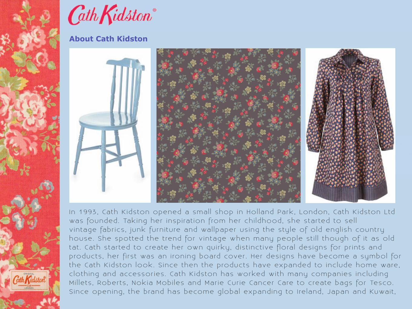
About Cath Kidston
In 1993, Cath K idston opened a smal l shop in Hol land Park, London, Cath K idston Ltd was founded. Taking her insp i rat ion f rom her ch i ldhood, she star ted to se l l v intage fabr ics , junk furn i ture and wal lpaper us ing the sty le of old engl ish country house. She spotted the t rend for v intage when many people st i l l though of i t as old tat . Cath star ted to create her own qui rky, d ist inct ive f lora l des igns for pr ints and products , her f i rs t was an i roning board cover . Her des igns have become a symbol for the Cath K idston look. S ince then the products have expanded to inc lude home ware, c loth ing and accessor ies . Cath K idston has worked with many companies inc lud ing Mi l lets , Roberts , Nokia Mobi les and Mar ie Cur ie Cancer Care to create bags for Tesco.S ince opening, the brand has become global expanding to I re land, Japan and Kuwait ,

Advertising
Advert one isn ’ t a typ ica l advert for a company because i t just shows the brand name and an image however there are adverts out there with s imi lar sty les . The brand name is done in the Cath K idston scr ipt typeface but doesn’ t use the same colours as in the logo, th is wi l l be because the main focus of the advert is the image and that is where a l l the colour is , adding the logo with i ts own colours wi l l probably of made the advert look too much. The image uses products of Cath K idston, the f lora l background the fabr ic wi th her pr ints and in the foreground are candles .

Advertising
Cath K idston has previous ly worked with informat ion technology company, Hewlett-Packard . The advert has the look of both companies merged in to one. The typography is typ ica l of Cath K idston. The colour scheme isn ’ t usual of the brand with i t usual ly being dark p ink and b lue however i t st i l l has s imi lar colours as used in her patterns and products as shown with the laptop cover . The name of the brand is underneath the image in a handwr i t ten typeface, th is is probably the s ignature of Cath herse l f g iv ing the impress ion of qual i ty and she’s approving of the product and putt ing her name on i t .

Logo
When ta lk ing about her products , Cath K idston says she l ikes s impl ic i ty and being symmetr ica l . She l ikes th ings being bold and doesn’ t l ike th ings being too fussy especia l ly wi th f lora l patterns . These preferences are shown throughout the brand inc lud ing the logo which is des igned by Cath K idston herse l f . I t is a l l in l ine but st i l l keeping i t personal looking as the brand is and the colours are bold inc lud ing on shop fonts and inter ior a l lowing i t to stand out on the h igh st reet . The logo is p laced carefu l ly on the packaging, not to make i tse l f stand out f rom the product and other typography on the packaging but to make i t known the product is by Cath K idston. The typeface of the logo is sans ser i f , the sty le is scr ipt wi th i t be ing s l ight ly i ta l ic as wel l . The capi ta l let ters of the logo are s l ight ly bold but the over a l l look of the logo remains s imple . The handwr i t ten look g ives the brand a personal fee l and not something you see everyday on the h igh st reet . Having th is type of logo on the products makes the buyer fee l l ike they are va lued and that they are not just any customer purchas ing a product .

Design Strategy
The logo is a lso posi t ioned on the return st ickers as wel l and the typeface used for the wr i t ing is the same sans ser i f as used in the magazine. As wel l as buying onl ine you can a lso buy in store . Wi th in the store there is a p lace where you can take the products you have purchased and have them gi f t wrapped for f ree and the care that goes in to wrapping a s ing le i tem shows the personal touch the brand wants to get across to i ts customers . When buying onl ine you are not g iven the opt ion to have i t g i f t wrapped but on receiv ing the package i t is wrapped in a s imi lar sty le packaging to that of g i f t wrapping which shows the brand puts thought into everyth ing and doesn’ t miss out deta i ls . The onl ine store i tse l f has a lot of thought put into i t to show off what the brand is about incorporat ing the smal l deta i ls of the brand and us ing the patterns as par t of the layouts . The websi te i tse l f is created by Paul Lewis and uses the colour schemes of the brand as wel l as the same typeface used throughout the l i terature of the brand.

Development of design
The Cath K idston brand hasn’ t changed much with in the past 17 years i t ’s been estab l ished. The patterns are st i l l the main feature and the products st i l l have the same vintage feel to them. The brand has grown with v intage becoming a sort af ter sty le and many people choosing to decorate and furn ish thei r homes as wel l as dress th is way. The brand st i l l has i t ’s personal fee l as i t d id back when i t opened, probably due to the owner who created the brand st i l l des ign ing the products . The colour scheme of the brand is st i l l the same, p ink, b lue and white , th is being used with in the logo and in shops. On products the logo is a lways posi t ioned so i t is not iced but not taking focus away f rom the product . On let ters such as invoices the logo is posi t ioned to the r ight and in p ink with a whi te background to match the paper , g iv ing the s impl ic i ty Cath K idston wants for her brand.

Summary
Overa l l the Cath K idston brand is one which hasn’ t changed much in the short amount of t ime i t has been open and has remained consistent wi th the qual i ty of i ts products and growing popular wi th the demand for v intage products . I ts va lues of g iv ing you a personal touch and being ind iv idua l has come across in i ts products as wel l as in the sty le of i ts shops both on the h igh st reet and onl ine . The logo is wel l known by i t colours and the patterns des igned by Cath K idston are recognizable . The brand has become successfu l in what i t does and wi l l cont inue to grow in future years . I t wi l l probably update i t ’s look to keep up with modern t imes but wont make i tse l f modern because i t wi l l loose the v intage look to the brand which could be the reason behind the brand not changing i tse l f much in previous years .