Embed Size (px)
DESCRIPTION
Graphic Design Year Two, Semster Two Portfolio
Citation preview

Ben FreemanGraphic Design Semester Two
0801131


Infographics
For this brief one of the exhibitions we visited was at the V&A, and was a timeline of isotypes and infographics. The brief stated we needed to produce a piece of work in repsonse to what we saw at the exhibition. My cluttered wardrobe was in need of a sort out, so I combined that with this brief, and produced an infographic of the items that I wear in my wardrobe. I wanted to make it as simple as possible, without losing any meaning, and I think I have succeeded in doing so. One shape equals one item in my wardrobe.

ORIGINS
For this brief I looked into different fonts and styles of typography from around the world and how they differ from place to place. I started with some more ‘traditional’ styles such as traditional japanese and mexican cholo/black letter, but I would like to push this project further and gain an insight into much rarer, hidden and lost typography from not so well known civilizations. The original fonts aren’t mine, but I wanted to keep all of the typography for this project hand rendered, as it is a personal preference of mine and it gives the type much more life. My favourite is the traditional Japanese style font, it is made up of beautiful lines and looks truly complex.


On this page is a larger, filled in version of the Japanese typeface, and to the right are some more fonts representing different cultures from all around the world. Some of these typefaces are quite ‘stereotypical’, and I would like to dig deeper to try and find some truly original typefaces.

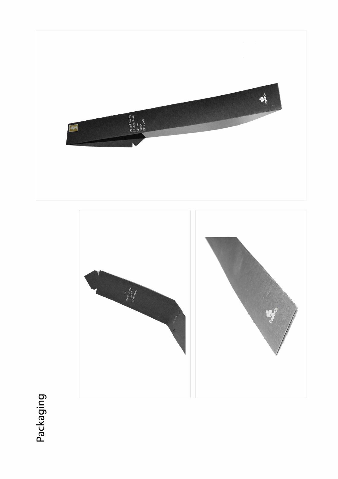
Paper Co.
This industry standard brief required us to design some promotional direct mail pieces for the largest paper retailer in the UK, Paper Co. The rational on the page above explains our intentions and reasoning behind making what we did for this brief. I have kept the boards exactly the same as how they were presented to the client here in my portfolio.


The Girls / What did you want to be when you grew up?
For this project we had only a few hours to create an experimental portrait or series. Our idea was to portray a few occupations that when you’re a kid, you have every ambition to fulfill, but as you get older, things just don’t tend to work out like that. We portrayed a failed professional footballer, a failed architect and a failed army sargeant in these three portraits. I enjoyed this project and I like the results, as it gave you a unique insight into being a kid again and dreaming of what you wanted to be when you were older.

Martin O’Neill / 3D Typography
The brief Martin O’Neill gave us was to find anything that was rubbish, or not useful any-more, and construct some giant lettering from the objects, in order to create a pre-determined sentence. We each built one letter and they all came together to form the phrase. I enjoyed this brief a lot as it let me explore my passion for typography in a whole different way than I normally would.

My letter ‘A’, made from card and wood
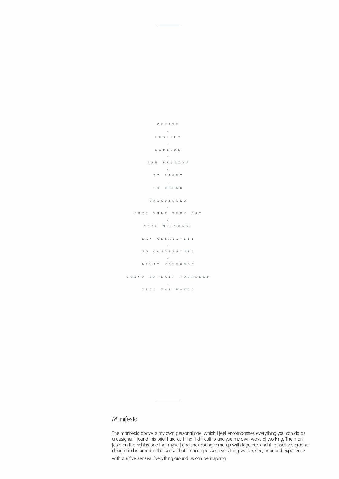
Manifesto
The manifesto above is my own personal one, which I feel encompasses everything you can do as a designer. I found this brief hard as I find it dif ficult to analyse my own ways of working. The mani-festo on the right is one that myself and Jack Young came up with together, and it transcends graphic design and is broad in the sense that it encompasses everything we do, see, hear and experience
with our five senses. Everything around us can be inspiring.


This happened purely by accident as I scanned two things in at the same time without realising. Underneath the manifesto is a printout of one of my photos, of an old abandoned brick tower, and it came out like this and I really like the effect.

This is a continuation of the manifesto brief, in which we had to display a piece of work, or works, that had been produced under our manifesto. Me and Jack collaborated on this big photo wall, and in the cen-tre is our manifesto of LOOK - TOUCH -SMELL - HEAR - TASTE. The photos are all our own, and represent our environment around us, our daily lives, situations and surroundings. In turn, this entire wall sums up what our manifesto is trying to achieve, and that is why I thought the photo wall was such a fitting piece to compliment the ideas behind our manifesto.

Making Do
The aim of this brief was to manipulate an issue of Making Do magazine and to do so by ‘making do’ with the materials and equipment we had around us. We decided to transform the images from the magazine into words, and the words into images. We did this onto acetate, and then placed the acetate over the top of the magazine afterwards. It gave us a really interesting and exciting result. We then scanned in the acetate on top of the original pages, printed them and put them together into a new magazine. The following pages are pages from the new magazine.

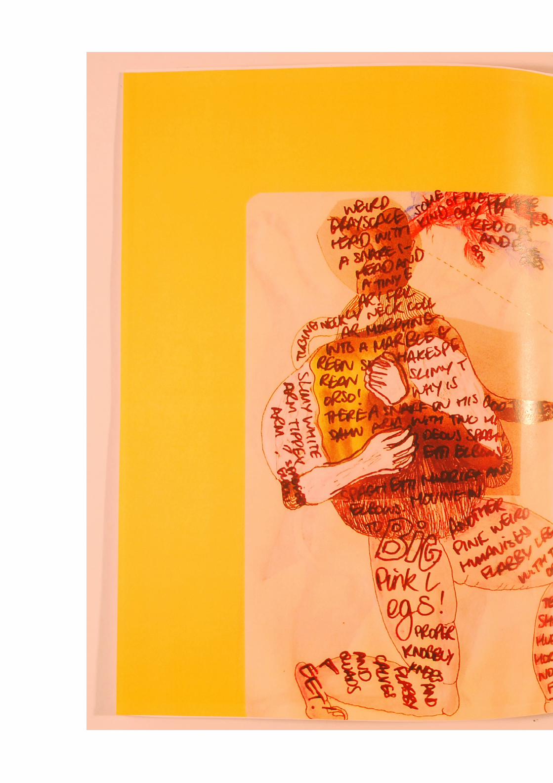


As a secondary response to the Making Do brief, we made another magazine using just the original acetate sheets that we placed on top of the original pages. I don’t think this is as strong as the original response, but I like the idea behind it and the end result, it is totally dif ferent to the original magazine.


Aphorism
This brief required us to produce a 30 minute animated response to an aphorism of our choice. The aphorism we used was ‘I used to have an open mind but my brain kept falling out’. To represent this we used an egg, and slowly cracked it so that the yoke dripped out. We took steady photographs of it and formed a stop motion animation. We then reversed it, and used it in the sense of it being a ‘cautionary tale’.

LAB: Make Me Think
This two week experimental working environment was a great end to the semester. The brief was quite simply; make me think. The entire graphics area was transformed with work everywhere, it was a fantastic creative environment and enabled us to talk to eachother about our work, be inspired by eachother and bounce creativity off of eachother. The main piece of work submitted to fit the make me think description was my flouride screen print, which can be seen a bit later on in my portfolio.
The piece above is a lino cut by Luke Edom, and I added the custom script ‘L’ on the top on acetate. It was just a ran-dom act of drawing but I like how it came out, and it fitted perfectly into the frame on the door of the graphics room.


My best piece that I did completed during the LAB: Make Me Think brief was this piece of typography on the wall. It measures approximately 5x3 feet. The typography is an original piece of mine that appeared on a t-shir t for my friends clothing brand Dirrr tee earlier in the year, and I wanted to project it huge onto a wall. I printed the type onto acetate, then projected it onto the wall, and painted over it by hand. The colour scheme is totally new from the original artwork, and I much prefer this colour scheme. It is mostly a reference to old sign-painting styles, as I am deeply interested in hand type and original sign painting inparticular.

Make Me Think at The Rag Factory, Brick Lane
Ruth Page and Jade Sibley did a brilliant job in organising an exhibiton for Graphic Design at the Rag Factory exhibition space in Brick Lane, and selected works were shown there. My main contribution was within the photo wall (above), which showcased photography from eight students. It made for a great variety of photography styles, subjects and perspectives, and it really worked as a compliment to the screen prints and illustrations around it. This was a fantas-tic experience for everyone involved, and gave everyone a platform to exhibit properly and externally for the first time, and I feel it also acted as a great bonding session for the course.


Darkroom
This year I finally got around to using the darkroom, and these are a couple of photos that I developed and enlarged, the one on the right being one of my favourite photos that I have ever taken, so it was great to enlarger it. Both of these are exposed onto Ilford Multigrade IV RC Deluxe Paper. I am pleased with the results, but I still have some learning to do with regards to exposure times and development tank times, but it is a process of trial and error and I hope to continue to utilise the darkroom next term.


Line Architecture
I developed an obsession with creating structures out of lines and placing them over photographs and after being inspired by something I found on the internet. These are just a couple of my favourites, but I really like the concept of the triangle over the money, as it connotes the all see-ing eye, and I just took it further and onto other images, and I just really enjoy the visual impact. I will be taking this further and building other shapes and structures.

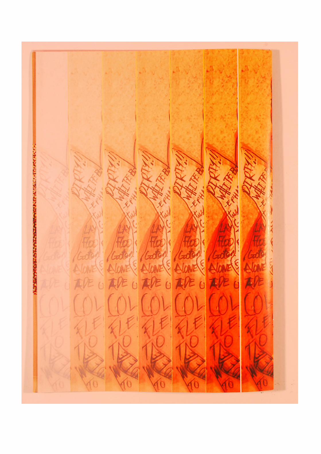
Screenprint Collaboration / Water
This was an independent project instigated by Thomas Hagarty and involved nine of us, who each produced an A3 print with each of them being printed onto a large A0 sheet to form one large collaboration. The theme was simply water, and my design revolved around the theme of flouride in our drinking water supplies, and the fact that it has been proven not to enhance tooth-decay by many studies, and also been proven to accelerate problems with the brain. The flouride typography is 100% hand rendered and it is my favourite piece of typogra-phy through out the entire year. My favourite print is the one above, which involves a blue and green mix of paint, which gives a great marbling effect to the type.

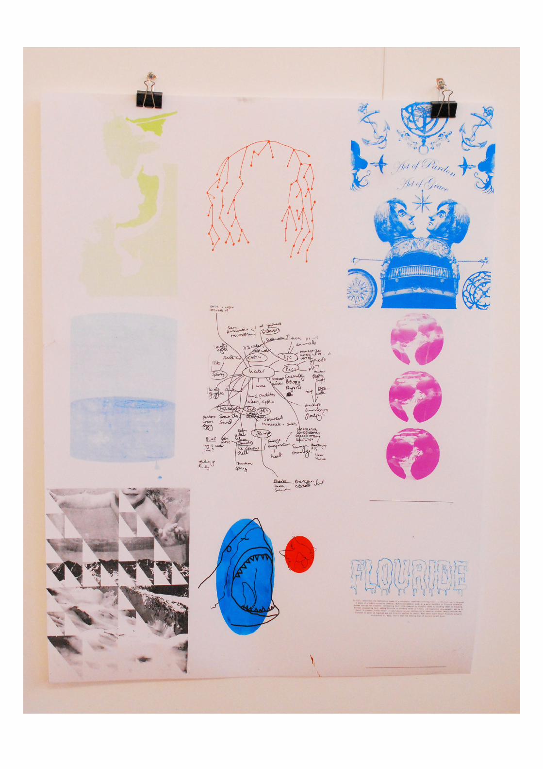

This is the first of two A0 screenprinted posters from the collaborative water project. It was kept to a small range of relatively subtle colours, and I am pleased with how it came out. Not one persons work stands out more than another, and it gives the viewers eyes a chance to take in everything with the same per-spective.


This is the second of the A0 posters from the water brief. The original poster was one that we stumbled across, and printed onto it just as another outcome from the brief. The background image on this poster gives the prints on top a lot more texture and life than the original plain white one, espescially with the bath water. On this poster only blue was used and although some bits stand out more than others, I really like how it turned out with the original image underneath.

Acetate Printing
This was something I had been meaning to do for a while, and it was printing out some of my photog-raphy onto acetate sheets, and then experimenting with different backgrounds when scanning them back into the computer. The background behind these two images is brown packaging paper, which gives it those rough lines behind the image, which I really like. I intend to push this further by experi-menting with plenty more background materials, and different types of photographs.


Pin Up Girl Footlight MT Light 950PT
This was a self initiated project that I really enjoyed. I used the negative space in the letters of the font Footlight MT Light, and placed traditiontal old school pin up girl images into that negative space, then cropped the letters so that only the negative space formed the letter. The end result is still a typeface, with recognisable features, but also something totally abstract and with the use of the pin up girl imagery, it really catches your eye. To the left is the final typeface, and above are some variations on the letters A and B.
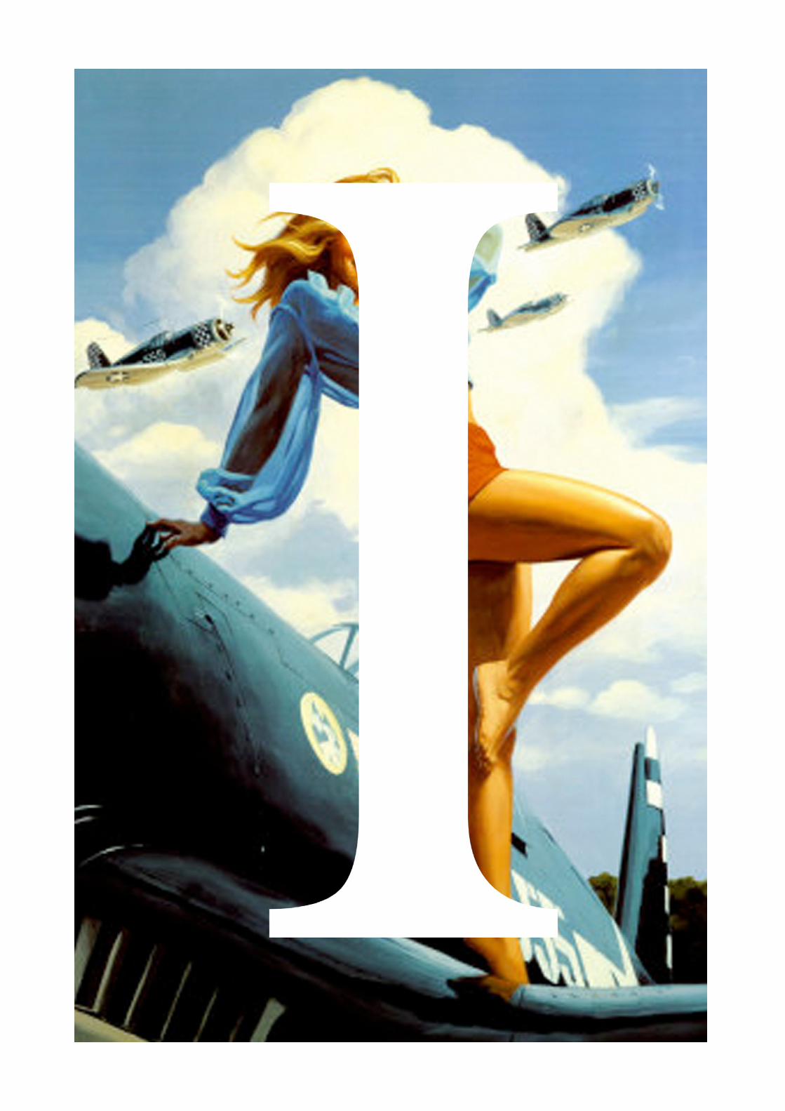

Above is a variation on the letter J, still utilising the nega-tive space aspect, but keeping more of the original let-terform. This letter is a lot easier to read and still keeps the same style as the finalised typeface, but I prefer the final type. Left is a variation on the letter F, and on the adjacent page is a variation on the letter I, which is simply placed over a pin up girl image. I really like this variation, it is simple yet very effective and visually striking, and I plan on producing an entire typeface using this style also.
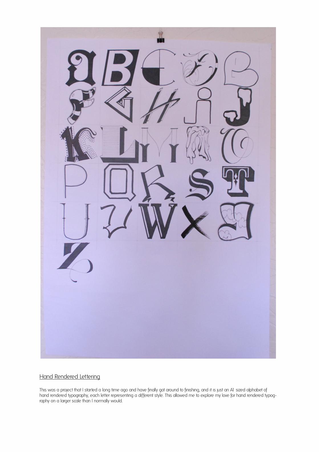
Hand Rendered Lettering
This was a project that I started a long time ago and have finally got around to finishing, and it is just an A1 sized alphabet of hand rendered typography, each letter representing a different style. This allowed me to explore my love for hand rendered typog-raphy on a larger scale than I normally would.


Hand Rendered Typography
On the left is an A3 piece of typography that I plan to vectorize and screenprint over the summer, taken from the lyrics of a Frank Ocean song, and above are other random pieces of hand typography I produced in the last semester. Hand typography is my main point of interest over the summer, and I will always continue to pursue it.

I feel that this year as a whole I have improved myself as a person, as a designer and have been more involved with everything, and it has helped me greatly. This semester brought about mixed feelings for me, as it required us to work in groups and that is one thing that I tend to dislike, unless it is with my close friends who I already have a good work-ing relationship with. However, some of the briefs, such as the aphorism brief, allowed me to work with new people, and it actually turned out to be an enjoyable experience. Having to work in forced groups meant that my motivation level dipped slightly during those periods, but by the second half of the semester and when doing my indepen-dent studies I was highly motivated. The externalization part of the semester was a great one, as we got to show our work at The Ep-som Playhouse and had the opportunity to put on a show at The Rag Factory in Brick Lane, both of which gave us a taste of the world after university. I would say that my least favourite brief was the aphorism brief, as it involved working in forced groups and animation is not one of my strong points or most favourite areas of design. My favourite brief would be the making-do brief, and although that required us to be working in groups, I was able to work with people close to me, which in turn allowed us to have a great relaxed, working relationship, and I am pleased
with the end results of that brief. A lot of the briefs this semester were open-ended, and didn’t elude to one particular outcome, and I would have liked to have taken part in a few more briefs with one solid goal or outcome at the end, and a few more industry style briefs, like the Paper Co. one. I enjoyed that brief as it gave us a chance to externalize once again, and also gave us a real insight into what it’s like to be in the industry. Something that helped me with briefs and my independent practice was visiting galleries and shows throughout the semester. The V&A helped me with the infographics brief, and also inspired me and my friend with a new collection of T-Shir ts that we will be bringing out in the summer. Pick Me Up was just as exciting as last year, if not even better, with plenty of artists and work that really in-spired me. I also visited several small photography exhibitions dotted around London, but Reverting To Type in Hoxton was my personal favourite. Visit-ing these coupled with our own Graphic Design exhibition at The Rag Factory has shown me that it is possible to exhibit our work, independently and relatively easily. This is something a group of us are looking to try and do over the summer and into next year. I am very pleased with my independent practice this semester also, as I continued to explore my fa-vourite areas such as photography and typography, and I also got the chance to explore new things
such as using the dark room, and to be a part of the LAB: Make Me Think two week workshop. Usu-ally, I wouldn’t be able to really get my head down and get work done in the sort of environment that LAB created, but I found it really enjoyable, and the whole process was just a two week period filled with creativity and people bouncing creativity off one another. By painting my work onto the wall, I had the opportunity to interact and get feedback from passers by and my peers, which helped me a lot. I feel as though I have developed a lot as a student and as a designer over this semester, and I am confident that this semester has put stood me in good stead to continue on into third year, and to continue learning over the summer. Over the summer I have many little projects that I wish to continue and many I wish to start. I will most definitely continue pursuing photography, as summer is the greatest time to shoot, and I want to put together a few zines in preparation for Handmade & Bound, and I want to try and venture into setting up my own clothing brand. I would like to couple these things with (hopefully) some work experience in and around London that would really help me when going into third year.
Critical Evaluation

GALLERIES
Kemisty Gallery (2011) Roger That!
Standpoint Gallery (2011) Reverting To Type
Pick Me Up (2011) Pick Me Up Contemporary Graphic Art Fair
Pub Life (2011) Pub Life Exhibition
Victoria & Albert Museum (2011) Isotype: International Picture Language
BOOKS
Perry. M (2007) Hand Job: A Catalog Of Type - Princeton Architectural Press
Fiell. C&P (2005) Graphic Design For The 21st Century - Taschen
Arden. P (2003) It’s Not How Good You Are, It’s How Good You Want To Be - Phaidon
Zappaterra. Y (2007) Editorial Design - Laurence King
McCullin. D (2003) Don McCullin - Random House
Intercity (2008) Art & Sole, Contemporary Sneaker Design - Laurence King
Stawinski. G (2010) Retro Fonts - Laurence King
Paoli. C (2007) Mexican Blackletter - Mark Batty
Taaschen (2008) 1000 Pin Up Girls: 25th Anniversary Edition - Taaschen Publishing
MAGAZINES
Adbusters May/June 2011 #95 Volume 19 Number 3 (2011) Post West – The Philosophy Issue - North America
Fantastic Man Spring & Summer 2011 (2011) - Die Keure, Belgium
Elephant Issues 1-6 (2010-2011) - Frame Publishers
WEB
Airside (2011) http://www.airside.co.uk
Behance (2011) http://www.behance.net/gallery/Large-Type-in-Abandoned-Spaces/815416
Core 77 (2011) http://www.core77.com
Creative Review (2011) http://www.creativereview.co.uk
Ilovedust (2011) http://www.ilovedust.com
Jon Contino (2011) http://www.joncontino.com
Lost Type (2011) http://www.losttype.com
Luca Barcellona (2011) http://www.lucabarcellona.com
Mike Perry (2011) http://www.mikeperrystudio.com/work/typography
Paper Co. (2011) http://www.paperco.co.uk
Vigilant Citizen (2011) http://www.vigilantcitizen.com
Bibliography


![Design Pattern 1 [Eric Freeman & Elisabeth Freeman 1 – 5 ]](https://img.dokumen.tips/doc/110x75/56649cf15503460f949c07c5/design-pattern-1-eric-freeman-elisabeth-freeman-1-5-.jpg)


![[Gordon R. Freeman and Phyllis J. Freeman] Stonehenge Archeology](https://img.dokumen.tips/doc/110x75/5571f81e49795991698cacea/gordon-r-freeman-and-phyllis-j-freeman-stonehenge-archeology.jpg)
![Design Pattern 1 [Eric Freeman & Elisabeth Freeman 1 – 5 ]](https://img.dokumen.tips/doc/110x75/56816844550346895dde1d18/design-pattern-1-eric-freeman-elisabeth-freeman-1-5--56ce9704eb05a.jpg)
