Embed Size (px)
Citation preview

©Copyright Australian Development Strategies 2014 1
Australian Jobs
Profile for
May Qtr. 2015
Prepared by Australian
Development Strategies
Pty Ltd
This report has been prepared as an educational and public relations exercise and has not been designed as
an advisory tool for business and we take no responsibility for those who use it for these purposes. The
sampling errors for smaller Labour Force regions are often large and the raw figures used cannot be easily
adjusted for seasonal trends. The statistical significance of the profiles also need to be considered. We
repeat, caution is urged in any interpretation of these statistics. We acknowledge and thank the Australian
Bureau of Statistics for the provision of original data, Dr Otto Hellwig of MDS for the HES
microsimulation modelling and Phil Henry of Business Geographics for the mapping.
©Copyright Australian Development Strategies 2014 2
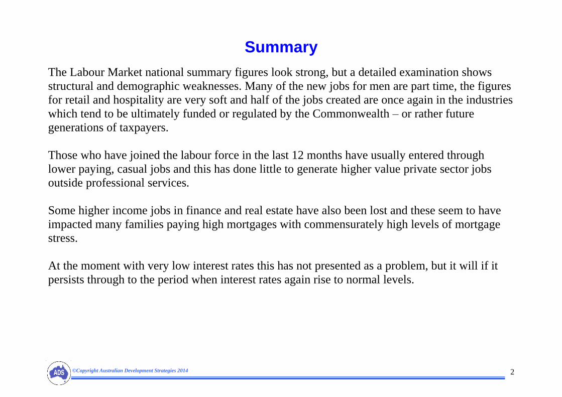
Summary
The Labour Market national summary figures look strong, but a detailed examination shows
structural and demographic weaknesses. Many of the new jobs for men are part time, the figures
for retail and hospitality are very soft and half of the jobs created are once again in the industries
which tend to be ultimately funded or regulated by the Commonwealth – or rather future
generations of taxpayers.
Those who have joined the labour force in the last 12 months have usually entered through
lower paying, casual jobs and this has done little to generate higher value private sector jobs
outside professional services.
Some higher income jobs in finance and real estate have also been lost and these seem to have
impacted many families paying high mortgages with commensurately high levels of mortgage
stress.
At the moment with very low interest rates this has not presented as a problem, but it will if it
persists through to the period when interest rates again rise to normal levels.

©Copyright Australian Development Strategies 2014 3
Method and Presentation
This profile is based on jobs data collected by the Australian Bureau of Statistics. The primary source is the monthly Labour Force survey by
Regions (6291.0.55.001), but includes national data from 6202.0, detailed quarterly data from 6291.0.55.003, earnings by industry 6302.0 Job
Vacancies Australia 6354.0 and Demographic Statistics 3101.0. We have also made some use of ABS data on underemployment and labour
underutilisation. As detailed data is only available in Original form, we use this, unless otherwise stated to be Trend or Seasonally Adjusted.
The modelling used by ADS compares this cross section of data with our Elaborate database and uses inferential statistics to project these sample
results onto all Australian postcodes and Commonwealth Electoral Divisions. Material in the ADS Elaborate database is based on data from the
ABS Census, Electoral Commissions, Household Expenditure Surveys modelled by MDS Data Systems, data on home loan arrears and a wide
range of published data on political and economic behaviour.
We present here, in Correlation Tables, the correlation between our database and the relevant jobs figures by region. The correlations have been
ranked to typically show those which are normally significant to 95 percent or more (0.16). In other words, there’s a five percent probability the
correlations in the table are due to chance. The higher the correlation, plus or minus, the lower the probability it is due to chance.
The Correlation Charts should be read the same way as the worm debating chart – the zero line is neutral and the score heightens as the
correlation increases its distance above or below the zero line. A positive correlation shown well above the zero line means that the demographic
group in question is concentrated in regions or suburbs with high or increasing levels of the relevant jobs figure. A negative correlation well
below the zero line means they’re concentrated in regions or suburbs where the jobs figure is lower or falling.
Growth in hidden unemployment across labour market regions after the GFC led us to rely more on workforce participation and employment
growth as a stronger guide to the health of regional labour markets than the traditional unemployment rate. In this report we return the focus to
unemployment rates, as it appears some of the hidden unemployed are finally returning to the labour market chasing jobs, making the
unemployment figure more reliable again.
Labour Market data provided by the Australian Bureau of Statistics has undergone a major overhaul. The monthly figures for August and
September 2013 appear to contain non-sampling errors due to questionnaire compliance which was has impacted on the Year on Year
employment figures to August and September 2014 and this can be seen in some of the following descriptive charts. These problems appear to
be getting progressively overcome by the ABS.

©Copyright Australian Development Strategies 2014 4
Table 1. National labour market summary (shown in 000’s). The monthly figures for each year are in the left hand columns (green
headings) and the Year on Year figures (YoY) are in the right hand columns (blue headings). These figures are for the months of May from
2008 onwards.
Given our long term participation and unemployment rates of about 65 percent and 5 percent respectively, we should see 12 month
employment growth of 210,000 (not 255,800), unemployment growth of 10,000 (not 14,700) and Not in the Labour Force growth of
120,000 (not 57,400).
So our employment growth was about 45,000 ahead of expectations, unemployment growth was 5,000 too high and Not in the Labour
Force was 60,000 below expectations. These figures show the labour market was growing strongly above trends and sucking 60,000
persons from the hidden unemployed back into the labour market, where the vast majority were finding jobs and some were actively
looking for jobs while unemployed.
This means rise in unemployment rates is not a problem if it is a sign of re-energised labour market and a reduction in the numbers of
discouraged workers. We can see here that this is indeed the case, as the participation rate rose 0.3 percent in the past 12 months (see figure
at bottom right of the above table.
However, of the extra 132,600 jobs for men in the past year, more than half were part time instead of what we usually see for men,
which is fewer than one in five. So about 50,000 of the extra jobs for men gained in the past year which would normally be full
time and on full time pay rates were only part time, with reduced job security and wages. This is a sign a lack of confidence by
employers and contributes to current flat income growth.
Month &
Year
Employed
total
Persons
Unemployed
total
Persons
Labour
Force
Persons
Not in the
Labour
Force
Persons
Civilian
population
Persons
Unemploym
ent rate
Persons
Participation
rate
Persons
12 month
change
Employed
Persons
12 month
change
Unemployed
Persons
12 month
change
Labour
Force
Persons
12 month
change Not
in the Labour
Force
Persons
12 month
change
Civilian
population
Persons
12 month
change
Unemploym
ent rate
Persons
12 month
change
Participation
rate
Persons
May-2008 10690.3 478.3 11168.6 5896.4 17065.0 4.3 65.4 280.3 15.0 295.3 75.0 370.2 0.0 0.3
May-2009 10786.8 667.5 11454.3 5995.0 17449.4 5.8 65.6 93.6 192.1 285.7 107.7 393.4 1.5 0.2
May-2010 10957.4 604.6 11562.0 6191.1 17753.2 5.2 65.1 243.1 -60.9 182.1 211.6 393.8 -0.6 -0.4
May-2011 11196.2 589.8 11786.0 6238.2 18024.2 5.0 65.4 255.4 -13.7 241.7 39.1 280.7 -0.2 0.3
May-2012 11390.0 620.4 12010.4 6331.7 18342.0 5.2 65.5 193.8 30.5 224.4 93.5 317.8 0.2 0.1
May-2013 11490.1 676.1 12166.2 6503.4 18669.6 5.6 65.2 100.1 55.7 155.9 171.7 327.5 0.4 -0.3
May-2014 11572.0 718.0 12290.0 6698.0 18988.0 5.8 64.7 81.9 41.9 123.8 194.6 318.4 0.3 -0.4
May-2015 11827.8 732.7 12560.5 6755.3 19315.9 5.8 65.0 255.8 14.7 270.5 57.4 327.9 0.0 0.3
©Copyright Australian Development Strategies 2014 5
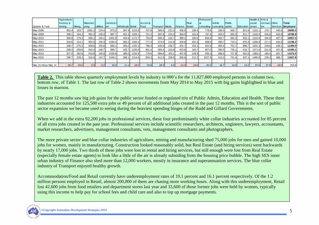
Table 2. This table shows quarterly employment levels by industry in 000’s for the 11,827,800 employed persons in column two,
bottom row, of Table 1. The last row of Table 2 shows movements from May 2014 to May 2015 with big gains highlighted in blue and
losses in maroon.
The past 12 months saw big job gains for the public sector funded or regulated trio of Public Admin, Education and Health. These three
industries accounted for 125,500 extra jobs or 49 percent of all additional jobs created in the past 12 months. This is the sort of public
sector expansion we became used to seeing during the heaviest spending binges of the Rudd and Gillard Governments.
When we add in the extra 92,200 jobs in professional services, these four predominantly white collar industries accounted for 85 percent
of all extra jobs created in the past year. Professional services include scientific researchers, architects, engineers, lawyers, accountants,
market researchers, advertisers, management consultants, vets, management consultants and photographers.
The more private sector and blue collar industries of agriculture, mining and manufacturing shed 75,000 jobs for men and gained 10,000
jobs for women, mainly in manufacturing. Construction looked reasonably solid, but Real Estate (and hiring services) went backwards
by nearly 17,000 jobs. Two thirds of these jobs were lost in rental and hiring services, but still enough were lost from Real Estate
(especially female estate agents) to look like a little of the air is already subsiding from the housing price bubble. The high SES inner
urban industry of Finance also shed more than 12,000 workers, mostly in insurance and superannuation services. The blue collar
industry of Transport enjoyed healthy growth.
Accommodation/Food and Retail currently have underemployment rates of 19.1 percent and 16.1 percent respectively. Of the 1.2
million persons employed in Retail, almost 200,000 of them are chasing more working hours. Along with this underemployment, Retail
lost 42,600 jobs from food retailers and department stores last year and 33,600 of those former jobs were held by women, typically
using this income to help pay for school fees and child care and also to top up mortgage payments.
Quarter & Year
Agriculture\
forestry &
fishing Mining
Manufact
uring Utilities
Construct
ion Wholesale Retail
Accom &
Food Transport Media Finance
Real
Estate
Profession
al
consulting
Admin
consulting
Public
admin Education
Health &
social
assist
Arts &
recreact
ion
Other
Services
Total
Employed
May-2008 352.4 163.7 1062.2 124.4 973.2 397.9 1223.9 707.8 566.6 222.3 406.9 199.4 778.6 339.5 626.7 821.6 1101.1 176.7 445.6 10690.3
May-2009 338.1 154.2 991.3 135.4 987.7 401.3 1205.1 721.2 597.8 223.3 394.9 181.6 767.6 343.2 692.0 811.7 1192.0 204.6 443.9 10786.8
May-2010 358.9 179.2 965.1 140.1 1001.9 404.6 1172.7 753.9 590.2 219.7 388.1 195.6 834.6 365.7 692.3 832.1 1210.9 194.8 457.0 10957.4
May-2011 319.6 214.1 952.6 150.3 1030.4 392.2 1202.4 777.4 574.0 214.6 426.8 202.3 839.6 390.7 710.1 870.4 1266.9 217.4 444.5 11196.2
May-2012 338.7 275.2 939.6 155.6 983.1 400.2 1191.2 766.4 545.0 236.7 431.7 216.1 922.6 394.4 701.7 896.7 1331.3 218.6 445.1 11390.0
May-2013 299.3 259.8 915.4 148.7 989.7 425.7 1235.9 801.4 583.4 219.6 423.6 193.7 907.0 390.5 730.1 915.7 1371.6 221.9 457.0 11490.1
May-2014 327.3 262.6 919.8 145.9 1030.8 385.0 1232.8 779.6 584.6 203.1 407.9 228.9 935.3 396.5 727.8 922.9 1383.2 190.4 507.7 11572.0
May-2015 298.7 229.2 916.8 142.7 1049.1 396.1 1214.6 834.3 612.9 208.5 395.6 212.2 1027.5 413.2 741.4 937.1 1480.8 228.3 488.7 11827.8
May 15 minus May 14 -28.7 -33.5 -3.0 -3.2 18.3 11.1 -18.2 54.8 28.3 5.4 -12.3 -16.6 92.2 16.7 13.6 14.2 97.6 37.9 -19.0 255.8

©Copyright Australian Development Strategies 2014 6

©Copyright Australian Development Strategies 2014 7

©Copyright Australian Development Strategies 2014 8

©Copyright Australian Development Strategies 2014 9

©Copyright Australian Development Strategies 2014 10

©Copyright Australian Development Strategies 2014 11

©Copyright Australian Development Strategies 2014 12
Table 3. The 22 Labour Force Regions with the biggest increases in unemployment rates in the 12 months between May Quarter 2014
and May Quarter 2015 are shown at top left. The 19 regions with unemployment increases greater than 1.5 percent in the past year can be
considered to be in a regional recession. The regions here are biased towards mining centres in Queensland and New South Wales, older,
low income retirement areas and some richer inner city suburbs in Sydney and Brisbane.
The demographic variables at top right dominate these regions in recession and include an interesting mix of highly mobile workers
formerly working in mining and construction, along with high income men and their high income families, living in homes with
commensurately high mortgages and showing some signs of mortgage stress. Most likely cause of this mortgage stress would be recent
job losses or reduced hours for females in these families working in Real Estate or Admin consulting.
Labour Force Regions
Unem May
Qtr 14
Unem May
Qtr 15
Unem May
15 minus
May Qtr 14
Mackay 4.0 8.1 4.1
Illawarra 5.6 9.0 3.4
Southern Highlands and Shoalhaven 6.1 9.5 3.3
Hunter Valley exc Newcastle 8.1 11.3 3.2
Sydney - Outer South West 3.6 6.6 3.0
Fitzroy 4.5 7.4 2.9
Wide Bay 9.2 12.0 2.9
South Australia - South East 5.4 8.1 2.7
Sydney - Inner South West 4.9 7.5 2.6
Central West 5.3 7.9 2.6
Logan - Beaudesert 6.7 9.1 2.4
Brisbane Inner City 3.7 5.5 1.8
Toowoomba 4.5 6.3 1.8
Perth - South East 4.8 6.6 1.8
Newcastle and Lake Macquarie 5.9 7.5 1.6
Adelaide - Central and Hills 4.5 6.2 1.6
Sydney - Eastern Suburbs 2.0 3.6 1.6
Adelaide - West 6.0 7.6 1.6
Townsville 7.2 8.8 1.5
North West 5.0 6.4 1.3
Brisbane - North 4.3 5.6 1.3
Richmond - Tweed 6.4 7.7 1.3
Variables
Aust
Means
Unem May
2014 Qtr
Unem May
2015 Qtr
Unem May Qtr
2015 minus
May Qtr 2014
Fem Real Estate 1.7 -0.27 0.01 0.28
Fem 70-74 one kid 0.3 -0.01 0.23 0.24
Portuguese speakers 0.2 -0.45 -0.22 0.24
Moved past five years 39.2 -0.27 -0.04 0.24
Real Estate 1.5 -0.42 -0.19 0.23
Fem Portuguese speakers 0.2 -0.46 -0.24 0.23
Inc $1500-1999 8.5 -0.56 -0.35 0.22
Moved past year 15.1 -0.26 -0.05 0.21
Per Cap Current Housing Costs $4,516 -0.50 -0.29 0.21
Fem Admin consulting 3.6 -0.05 0.16 0.21
Median mortgage $1,800 -0.49 -0.30 0.21
Fem Construction 2.3 -0.13 0.07 0.20
Mort $3000-3999 9.6 -0.55 -0.37 0.20
Mort $2400-2999 11.2 -0.37 -0.18 0.19
Fam $2500-2999 8.2 -0.56 -0.38 0.19
Inc $2000+ 9.7 -0.54 -0.37 0.19
Mining 2.7 -0.04 0.14 0.18
Per Capita Total Income $28,974 -0.57 -0.40 0.18
Per Cap Wages Income $20,828 -0.59 -0.42 0.18
Motorbike to work 0.6 -0.21 -0.03 0.18
Mortgage stress 33.7 0.10 0.28 0.18
Fam $3500-3999 2.6 -0.57 -0.40 0.18
©Copyright Australian Development Strategies 2014 13
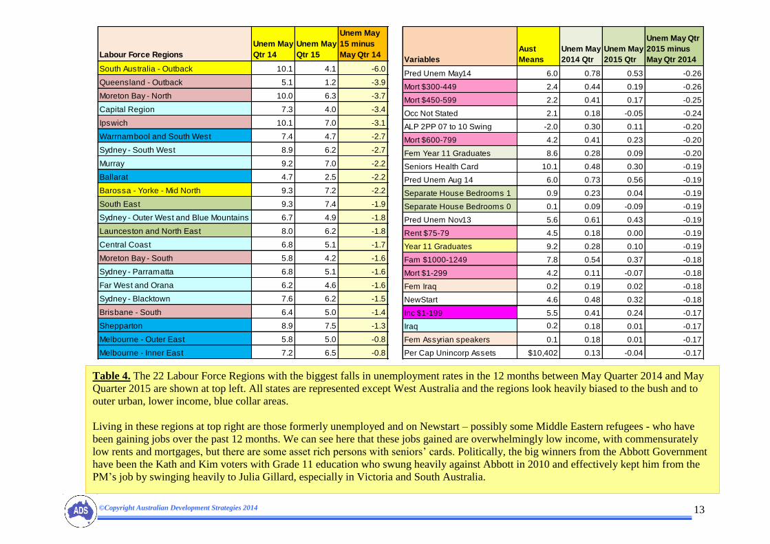
Table 4. The 22 Labour Force Regions with the biggest falls in unemployment rates in the 12 months between May Quarter 2014 and May
Quarter 2015 are shown at top left. All states are represented except West Australia and the regions look heavily biased to the bush and to
outer urban, lower income, blue collar areas.
Living in these regions at top right are those formerly unemployed and on Newstart – possibly some Middle Eastern refugees - who have
been gaining jobs over the past 12 months. We can see here that these jobs gained are overwhelmingly low income, with commensurately
low rents and mortgages, but there are some asset rich persons with seniors’ cards. Politically, the big winners from the Abbott Government
have been the Kath and Kim voters with Grade 11 education who swung heavily against Abbott in 2010 and effectively kept him from the
PM’s job by swinging heavily to Julia Gillard, especially in Victoria and South Australia.
Labour Force Regions
Unem May
Qtr 14
Unem May
Qtr 15
Unem May
15 minus
May Qtr 14
South Australia - Outback 10.1 4.1 -6.0
Queensland - Outback 5.1 1.2 -3.9
Moreton Bay - North 10.0 6.3 -3.7
Capital Region 7.3 4.0 -3.4
Ipswich 10.1 7.0 -3.1
Warrnambool and South West 7.4 4.7 -2.7
Sydney - South West 8.9 6.2 -2.7
Murray 9.2 7.0 -2.2
Ballarat 4.7 2.5 -2.2
Barossa - Yorke - Mid North 9.3 7.2 -2.2
South East 9.3 7.4 -1.9
Sydney - Outer West and Blue Mountains 6.7 4.9 -1.8
Launceston and North East 8.0 6.2 -1.8
Central Coast 6.8 5.1 -1.7
Moreton Bay - South 5.8 4.2 -1.6
Sydney - Parramatta 6.8 5.1 -1.6
Far West and Orana 6.2 4.6 -1.6
Sydney - Blacktown 7.6 6.2 -1.5
Brisbane - South 6.4 5.0 -1.4
Shepparton 8.9 7.5 -1.3
Melbourne - Outer East 5.8 5.0 -0.8
Melbourne - Inner East 7.2 6.5 -0.8
Variables
Aust
Means
Unem May
2014 Qtr
Unem May
2015 Qtr
Unem May Qtr
2015 minus
May Qtr 2014
Pred Unem May14 6.0 0.78 0.53 -0.26
Mort $300-449 2.4 0.44 0.19 -0.26
Mort $450-599 2.2 0.41 0.17 -0.25
Occ Not Stated 2.1 0.18 -0.05 -0.24
ALP 2PP 07 to 10 Swing -2.0 0.30 0.11 -0.20
Mort $600-799 4.2 0.41 0.23 -0.20
Fem Year 11 Graduates 8.6 0.28 0.09 -0.20
Seniors Health Card 10.1 0.48 0.30 -0.19
Pred Unem Aug 14 6.0 0.73 0.56 -0.19
Separate House Bedrooms 1 0.9 0.23 0.04 -0.19
Separate House Bedrooms 0 0.1 0.09 -0.09 -0.19
Pred Unem Nov13 5.6 0.61 0.43 -0.19
Rent $75-79 4.5 0.18 0.00 -0.19
Year 11 Graduates 9.2 0.28 0.10 -0.19
Fam $1000-1249 7.8 0.54 0.37 -0.18
Mort $1-299 4.2 0.11 -0.07 -0.18
Fem Iraq 0.2 0.19 0.02 -0.18
NewStart 4.6 0.48 0.32 -0.18
Inc $1-199 5.5 0.41 0.24 -0.17
Iraq 0.2 0.18 0.01 -0.17
Fem Assyrian speakers 0.1 0.18 0.01 -0.17
Per Cap Unincorp Assets $10,402 0.13 -0.04 -0.17

©Copyright Australian Development Strategies 2014 14

©Copyright Australian Development Strategies 2014 15

©Copyright Australian Development Strategies 2014 16

©Copyright Australian Development Strategies 2014 17

©Copyright Australian Development Strategies 2014 18

©Copyright Australian Development Strategies 2014 19
©Copyright Australian Development Strategies 2014 20

©Copyright Australian Development Strategies 2014 21
©Copyright Australian Development Strategies 2014 22

©Copyright Australian Development Strategies 2014 23

![Item-06-AI0000030418€¦ · ^E Á } v µ ] } v _ µ ] o ] v P W u ] Data 1st Qtr 2016 2nd Qtr 2016 3rd Qtr 2016 4th Qtr 2016 1st Qtr 2017 Permits $ Value Permits $ Value Permits](https://img.dokumen.tips/doc/110x75/5fcb107d1e181d01d75aae23/item-06-ai0000030418-e-v-v-o-v-p-w-u-data-1st-qtr-2016-2nd.jpg)