Embed Size (px)
Citation preview
The Art Institute of Chicago
An Architect's Mind: The Harry Mohr Weese NotebooksAuthor(s): Dana M. LamparelloSource: Art Institute of Chicago Museum Studies, Vol. 34, No. 2, Art through the Pages:Library Collections at the Art Institute of Chicago (2008), pp. 87-89, 96Published by: The Art Institute of ChicagoStable URL: http://www.jstor.org/stable/20205641 .
Accessed: 15/06/2014 05:23
Your use of the JSTOR archive indicates your acceptance of the Terms & Conditions of Use, available at .http://www.jstor.org/page/info/about/policies/terms.jsp
.JSTOR is a not-for-profit service that helps scholars, researchers, and students discover, use, and build upon a wide range ofcontent in a trusted digital archive. We use information technology and tools to increase productivity and facilitate new formsof scholarship. For more information about JSTOR, please contact [email protected].
.
The Art Institute of Chicago is collaborating with JSTOR to digitize, preserve and extend access to Art Instituteof Chicago Museum Studies.
http://www.jstor.org
This content downloaded from 62.122.76.60 on Sun, 15 Jun 2014 05:23:26 AMAll use subject to JSTOR Terms and Conditions
Side Community Art Center.1 At the end of World War II, he served as the field director for the American Red Cross
in Egypt and Iran before returning to Chicago to assume his
post at the Art Institute, where he stayed until 1957. He later
moved to New York, embarking on a freelance journalism career, writing articles, books, and essays on photography
and primitive art. His major works were The Picture
History of Photography (1958) and Understanding Primitive
Art-Sula's Zoo (1969). Pollack was appointed director of the
American Federation of Arts in 1962. Pollack had intended to publish a book on his snapshots
of Van Gogh's worksites; entitled What Van Gogh Saw, the
project was never realized. However, Pollack's extensive
cache of exclusive photographic material served him well for
many years, when he went on the lecture circuit, addressing
large crowds on the life and work of Vincent van Gogh and the fabulous art collection in his
family's possession.
AN ARCHITECT'S MIND: THE HARRY MOHR WEESE NOTEBOOKS
DANAM. LAMPARELLO
Providing an intimate glimpse into the creative
mind of Harry Mohr Weese?the Chicago architect most famous for designing the
Washington, D.C. Metro system?are the one
hundred notebooks included in his personal and
professional records. Donated to the Ryerson and Burnham Archives in 2006, the Harry Weese
Papers span the architect's college years at the
Massachusetts Institute of Technology and Yale
in the mid-1930s to the end of his career in the
1980s. From 1937 to 1988, Weese kept pocket sized notebooks readily available, jotting notes
and sketches on subjects such as art, design, travel, urban planning, and a number of his own
firm's architectural projects. "Oh, yes. Always," was Weese's response when asked whether he
carried a notebook.1 For Weese, a notebook
was a hybrid of sketchbook, daybook, diary, and memo pad: while one page may depict a
figure drawing or his Christmas list, the next
presents detailed design sketches or charts his
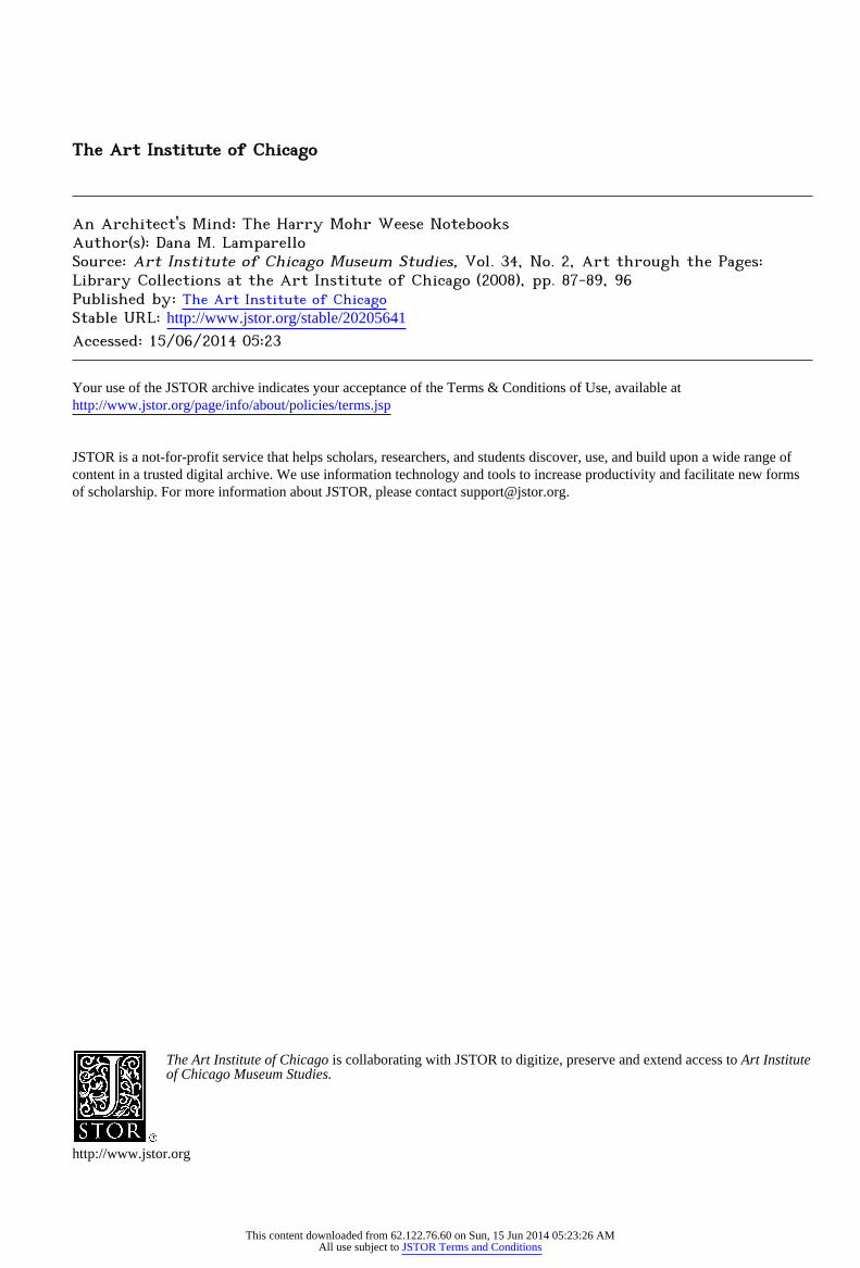
ideas about architectural symbolism (see fig. i). In effect, the notebooks served as a catchall way for the architect to
document his own thought processes, and turning to them
seems to have been his natural first step in tackling the many notions that circled through his mind. Undoubtedly the most substantial portion of Weese's papers, the notebooks
are available to architects, scholars, and students alike, along
with an extensive online subject index.2
Shortly after graduating from MIT in 1938, Weese was awarded a fellowship in city planning at Cranbrook
Academy in Bloomfield Hills, Michigan. The school's
comprehensive approach allowed him to study all aspects of art and design, inspiring him to try his hand at furniture.
Nearly a decade later, with his wife, Kitty Baldwin, and
their friend Jody Kingrey, Weese founded Baldwin Kingrey,
* - **^v v&&Pt?j?g&
jpB ^?&'" *
?riV?AV?-rtt. 3?CUq
i?
$**r? *
M^J
''l^y'ue
*V**W" ̂ ?Stt
*?f*
^*M*^4;*?r
c??*gu ?- fMnnto
Figure i. Harry Mohr Weese (American, 1915-1998). Neo-Symbols?Motifs?Clich?s, notes
and drawings, 1965-66. Harry Weese Papers, series 3, Ryerson and Burnham Archives.
?7
This content downloaded from 62.122.76.60 on Sun, 15 Jun 2014 05:23:26 AMAll use subject to JSTOR Terms and Conditions
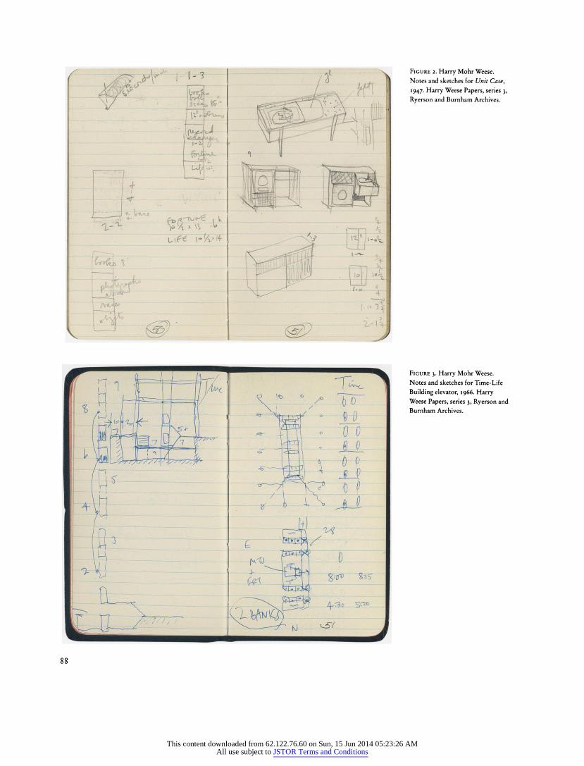
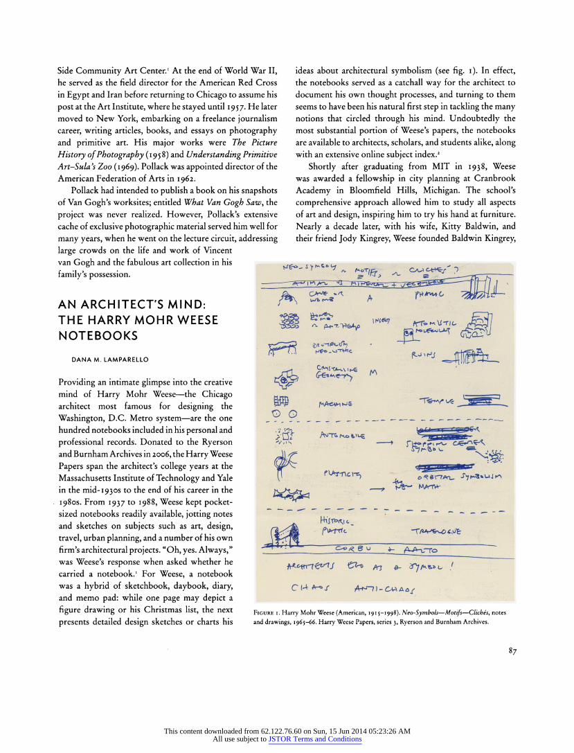
Figure 2. Harry Mohr Weese.
Notes and sketches for Unit Case,
1947. Harry Weese Papers, series 3,
Ryerson and Burnham Archives.
Figure 3. Harry Mohr Weese.
Notes and sketches for Time-Life
Building elevator, 1966. Harry Weese Papers, series 3, Ryerson and
Burnham Archives.
This content downloaded from 62.122.76.60 on Sun, 15 Jun 2014 05:23:26 AMAll use subject to JSTOR Terms and Conditions
a modern furniture store in Chicago for which he acted as
design consultant. In the late 1940s, after Baldwin Kingrey became the first to franchise Alvar Aalto's Artek furniture in the Midwest, Weese designed a few pieces manufactured
by his friend and mentor. In a 1947 notebook, he compiled research and casually sketched a knocked-down shelving unit
that could be used as both a room divider and as open storage for books, magazines, and records (see fig. 2). What appears to be a rather crude sketch served as the basis for Unit Case
in, which was sold in the Artek catalog around 1948.3 In 1947, Weese launched his own architectural firm,
Harry Weese and Associates, which was responsible for the
design of many notable structures in Chicago and around
the world. In his December 1966 notebook, the architect
detailed early sketches of Chicago's Time-Life Building (1970), focusing on its two-story elevator system (see fig. 3). Weese ultimately became a proponent of the system,
which handles high-volume traffic efficiently through the use of a two-level cab, the bottom of which operates for
odd-numbered floors, the top for even-numbered ones.
Because Time, Incorporated supported one of the largest mail operations in the country, it was vital that Weese's
designs include an effective means for staff members to
reach their respective floors on time during the morning and
evening rush hours. This system was the first of its kind to
be implemented in the United States, and Weese went on to
employ it in a number of his subsequent high-rise projects, even
developing plans for a three-story version.4
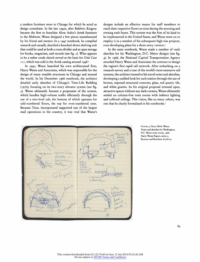
In the same notebook, Weese made a number of vault
sketches for his Washington, D.C. Metro designs (see fig. 4). In 1966, the National Capitol Transportation Agency awarded Harry Weese and Associates the contract to design the region's first rapid rail network. After embarking on a
research survey and a tour of the world's most extensive rail
systems, the architect turned to his travel notes and sketches,
developing a unified look for each station through the use of
bronze, exposed structural concrete, glass, red quarry tile,
and white granite. As his original proposal stressed open, attractive spaces without any dark corners, Weese ultimately
settled on column-free train rooms with indirect lighting and coffered ceilings. This vision, like so many others, was
one that he clearly formulated in his notebooks.5
Figure 4. Harry Mohr Weese.
Notes and sketches for Washington, D.C. Metro train rooms, 1966.
Harry Weese Papers, series 3,
Ryerson and Burnham Archives.
89
This content downloaded from 62.122.76.60 on Sun, 15 Jun 2014 05:23:26 AMAll use subject to JSTOR Terms and Conditions
The Book of the Fair (Bancroft Company, 1893) p. 545. What looked like gold leaf was actually "aluminum treated with yellow lacquer"; see Lauren S. Weingarden, "The Colors of Nature: Louis Sullivan's Architectural Polychromy and
Nineteenth-Century Color Theory," Winterthur Portfolio 20, 4 (Winter 1985),
p. 254 n. 22.
4. This image is reproduced from a digital image that was created by scanning a
color lantern slide, which was itself produced through copy photography of a
color photolithograph. 5. This essay benefited greatly from the information in Natasha Derrickson, "Historic Architecture and Landscape Image Collection, Ryerson and Burnham
Archives" (lecture, "Showing Off Chicago: Digital Resources on Chicago in
Chicago Libraries," Chicago, 111., Aug. 19, 2004). 6. For more on these publicity efforts, see Carl S. Smith, The Plan of Chicago:
Daniel Burnham and the Remaking of the American City (University of Chicago Press, 2006), p. 119.
7. The image is a digital reproduction from a hand-colored lantern slide that was part of a series produced by A. G. McGregor Company of Chicago and the
Chicago Transparency Company; many were hand colored by Rose Kingwill. For more on lantern slides, see Annemarie van Roessel, "Through a Glass, Brightly:
Re-viewing a Lost Architectural and Pedagogical Landscape through Historic
Lantern Slides," Art Documentation 22, 1 (2003), p. 8.
8. Ibid.
Hanson and Woolever, "'Greater, Better, More Glorious': Documenting the
Century of Progress Exposition," pp. 81-83. 1. For more on the Century of Progress Exposition, see Lenox R. Lohr, Fair
Management: The Story of A Century of Progress Exposition; A Guide for Future
Fairs (Cuneo Press, 1952); Robert W. Rydell, World of Fairs: The Century-of
Progress Expositions (University of Chicago Press, 1993); and Lisa Diane Schrenk,
Building a Century of Progress: The Architecture of Chicago's 1933-34 World's
Fair (University of Minnesota Press, 2007). 2. The dome of the Travel and Transport Building was suspended 125 feet above
the ground by cables attached to twelve external steel pylons; see C. D. Innes,
Designing Modern America: Broadway to Main Street (Yale University Press,
2005), p. 104.
3. For more on the use of color at the fair, see A Century of Progress Colors (Textile Color Card Association of the United States, 1933); and S. J. Duncan-Clark, "1934 World's Fair Bigger and Better," New York Times, May 20, 1934, p. E7. 4. Lohr (note 1), p. 172.
5. For more on Urban's scheme, see Official Guide: Book of the Fair, 1933
(Century of Progress, 1933), p. 20.
6. Almus Pratt Evans, "Exposition Architecture: 1893 versus 1933," Parnassus 5, 4 (May 1933), pp. 17-22.
7. Magazine of Light 3, 2 (1933), p. 15; and Electricity at Work: Portraying the
Generation, Transmission, Distribution, and Utilization of Electricity (Electric
Light and Power Industry Commission, 1933). 8. Carter Manny, "World's Fair," vol. 1 (1934), n.pag. Carter H. Manny, Jr.,
Papers, Ryerson and Burnham Archives.
Ryckbosch, "The Engineer and the Photographer: Vincent Willem van Gogh and Peter Pollack," pp. 86-87. 1. Pollack worked at the Illinois Art Project from 1938 to 1941, and at the South Side Community Art Center from 1939 to 1942.
Lamparello, "An Architect's Mind: The Harry Mohr Weese Notebooks," pp. 87-89. 1. Harry Mohr Weese, interview by Betty J. Blum, Mar. 4-24, 1988, oral history transcript, Ryerson and Burnham Archives, p. 25. A downloadable version of this
transcript is available at www.artic.edu/aic/libraries/caohp/weeseh.html. 2. This finding aid can be accessed at http://digital-libraries.saic.edu/cdm4/index_
findingaids.php?CISOROOT=/findingaids. 3. See photographs of Unit Case HI, Sept. 1, 1948, Baldwin Kingrey Collection,
series i, box FF 1.13; and the Artek Furniture catalog, c. 1948, Baldwin Kingrey Collection, series 3, box FF 2.8; both pieces are in the Ryerson and Burnham Archives.
4. The New Chicago Time & Life Building, brochure, c. 1969, Ryerson and
Burnham Archives, Harry Weese Papers, series 1, box FF 1.25; and Weese and
Blum (note 1), p. 181.
5. Stanley Nance Allen, "At the beginning," typescript, Mar. 2001, Ryerson and
Burnham Archives, Harry Weese Papers, series 1, box FF 1.27.
96
This content downloaded from 62.122.76.60 on Sun, 15 Jun 2014 05:23:26 AMAll use subject to JSTOR Terms and Conditions
![Growing Up Weese€¦ · Meet artist and designer Marcia Weese, daughter of Harry Weese 11/1/16, 2:43:26 PM] I grew up on the near north side of](https://img.dokumen.tips/doc/110x75/5f07041f7e708231d41ae0b7/growing-up-weese-meet-artist-and-designer-marcia-weese-daughter-of-harry-weese.jpg)


![De Weese Poetry Notes Ppt[1]](https://img.dokumen.tips/doc/110x75/5549bb5db4c905fc7f8b4d19/de-weese-poetry-notes-ppt1.jpg)