Embed Size (px)
Citation preview

ArcGIS Maps for Office UserGuide
Copyright © 1995-2018 Esri. All rights reserved.

Table of Contents
Get Started
About ArcGIS Maps for Office . . . . . . . . . . . . . . . . . . . . . . . . . . . . . . . . . . . . . 5
ArcGIS Maps for Office and ArcGIS . . . . . . . . . . . . . . . . . . . . . . . . . . . . . . . . . . 6
Add a map
Sign in to ArcGIS . . . . . . . . . . . . . . . . . . . . . . . . . . . . . . . . . . . . . . . . . . 8
Add a map to Excel . . . . . . . . . . . . . . . . . . . . . . . . . . . . . . . . . . . . . . . . . 9
Manage maps . . . . . . . . . . . . . . . . . . . . . . . . . . . . . . . . . . . . . . . . . . 14
Navigate the map . . . . . . . . . . . . . . . . . . . . . . . . . . . . . . . . . . . . . . . . . 16
Change the basemap . . . . . . . . . . . . . . . . . . . . . . . . . . . . . . . . . . . . . . . 17
Configure map settings . . . . . . . . . . . . . . . . . . . . . . . . . . . . . . . . . . . . . . 18
Add layers to the map
Add layers from Excel . . . . . . . . . . . . . . . . . . . . . . . . . . . . . . . . . . . . . . . 20
Location types . . . . . . . . . . . . . . . . . . . . . . . . . . . . . . . . . . . . . . . . . . 28
Tables and named ranges . . . . . . . . . . . . . . . . . . . . . . . . . . . . . . . . . . . . . 32
Add layers from ArcGIS . . . . . . . . . . . . . . . . . . . . . . . . . . . . . . . . . . . . . . 35
Style layers
Change a layer's style . . . . . . . . . . . . . . . . . . . . . . . . . . . . . . . . . . . . . . . 37
Classification methods . . . . . . . . . . . . . . . . . . . . . . . . . . . . . . . . . . . . . . . 45
Configure and display pop-ups . . . . . . . . . . . . . . . . . . . . . . . . . . . . . . . . . . . 47
Manage layers
Customize the map contents . . . . . . . . . . . . . . . . . . . . . . . . . . . . . . . . . . . . 51
Copy a layer . . . . . . . . . . . . . . . . . . . . . . . . . . . . . . . . . . . . . . . . . . . 53
Remove a layer . . . . . . . . . . . . . . . . . . . . . . . . . . . . . . . . . . . . . . . . . 54
Change layer display . . . . . . . . . . . . . . . . . . . . . . . . . . . . . . . . . . . . . . . 55
Set layer refresh interval . . . . . . . . . . . . . . . . . . . . . . . . . . . . . . . . . . . . . . 56
View ArcGIS layer details . . . . . . . . . . . . . . . . . . . . . . . . . . . . . . . . . . . . . 57
Zoom to the full extent of a layer . . . . . . . . . . . . . . . . . . . . . . . . . . . . . . . . . . . 58
Zoom to a feature . . . . . . . . . . . . . . . . . . . . . . . . . . . . . . . . . . . . . . . . 59
Link multiple map views . . . . . . . . . . . . . . . . . . . . . . . . . . . . . . . . . . . . . . 60
Add XY coordinates . . . . . . . . . . . . . . . . . . . . . . . . . . . . . . . . . . . . . . . . 61
ArcGIS Maps for Office User Guide
Copyright © 1995-2018 Esri. All rights reserved. 2

Export layer data . . . . . . . . . . . . . . . . . . . . . . . . . . . . . . . . . . . . . . . . . 62
Perform analysis
Work with Excel data . . . . . . . . . . . . . . . . . . . . . . . . . . . . . . . . . . . . . . . 65
Select features . . . . . . . . . . . . . . . . . . . . . . . . . . . . . . . . . . . . . . . . . . 67
Configure clustering . . . . . . . . . . . . . . . . . . . . . . . . . . . . . . . . . . . . . . . . 70
Find hot spots . . . . . . . . . . . . . . . . . . . . . . . . . . . . . . . . . . . . . . . . . . 72
Find nearby features . . . . . . . . . . . . . . . . . . . . . . . . . . . . . . . . . . . . . . . 74
Map temporal data . . . . . . . . . . . . . . . . . . . . . . . . . . . . . . . . . . . . . . . . 77
Enrich your data . . . . . . . . . . . . . . . . . . . . . . . . . . . . . . . . . . . . . . . . . 80
View and configure infographics . . . . . . . . . . . . . . . . . . . . . . . . . . . . . . . . . . . 82
Generate reports . . . . . . . . . . . . . . . . . . . . . . . . . . . . . . . . . . . . . . . . . 86
Share maps and layers
Share a map to ArcGIS . . . . . . . . . . . . . . . . . . . . . . . . . . . . . . . . . . . . . . 89
Share a layer to ArcGIS . . . . . . . . . . . . . . . . . . . . . . . . . . . . . . . . . . . . . . 90
Copy a map image . . . . . . . . . . . . . . . . . . . . . . . . . . . . . . . . . . . . . . . . 91
Work with PowerPoint
Create a PowerPoint map slide from Excel . . . . . . . . . . . . . . . . . . . . . . . . . . . . . . . 93
Add a dynamic map to a PowerPoint slide . . . . . . . . . . . . . . . . . . . . . . . . . . . . . . . 94
Reference
Frequently asked questions . . . . . . . . . . . . . . . . . . . . . . . . . . . . . . . . . . . . . 99
Essential vocabulary . . . . . . . . . . . . . . . . . . . . . . . . . . . . . . . . . . . . . . . 105
Copyright information . . . . . . . . . . . . . . . . . . . . . . . . . . . . . . . . . . . . . . . 109
ArcGIS Maps for Office User Guide
Copyright © 1995-2018 Esri. All rights reserved. 3

Get Started
ArcGIS Maps for Office User Guide
Copyright © 1995-2018 Esri. All rights reserved. 4

About ArcGIS Maps for OfficeArcGIS Maps for Office, part of the ArcGIS platform, is an add-in for Microsoft Office that brings mapping capabilities into
Microsoft Excel and Microsoft PowerPoint. With ArcGIS Maps for Office, you can easily create a geospatial view of your
organization's data by creating an interactive map that includes data from Microsoft Excel and ArcGIS services—all without
leaving the Microsoft Excel environment. From Excel, you can share your Microsoft Excel data to ArcGIS, add web maps
you've created to Microsoft PowerPoint, or copy maps as images that can be inserted anywhere paste functionality is
supported. ArcGIS Maps for Office brings mapping into Microsoft PowerPoint by allowing you to include dynamic maps from
Microsoft Excel or maps from ArcGIS Online as slides within any Microsoft Excel presentation.
After you install the ArcGIS Maps for Office add-in, the ArcGIS Maps tab is available in both Microsoft Excel and PowerPoint.
Use this tab to create and manage maps.
ArcGIS Maps for Office User Guide
Copyright © 1995-2018 Esri. All rights reserved. 5

ArcGIS Maps for Office and ArcGISWith ArcGIS Maps for Office, you can easily create maps that combine your Microsoft Office data with published geographic
content from ArcGIS. You can also share the maps you create in ArcGIS Maps for Office with others within and outside of your
organization using ArcGIS. ArcGIS provides an online infrastructure for making maps and geographic information available
throughout an organization, across a community, and openly on the web.
ArcGIS Maps for Office works directly with your organization's ArcGIS subscription to allow you to access geographic content
to enhance your business data. You must be signed in to ArcGIS to use ArcGIS Maps for Office; depending how your
administrator has configured the application, you may be prompted to enter your ArcGIS credentials. Your subscription
includes a number of service credits, which are the currency of ArcGIS and are used in exchange for most of the ArcGIS
services your organization uses. The number of service credits required depends on the type of service you are using. To help
you estimate how many service credits you will need, see Understand credits.
With ArcGIS Maps for Office, you can easily add data from ArcGIS to your map to help you visualize your data in new ways.
Once you have created the desired maps and layers in ArcGIS Maps for Office, you can publish them to ArcGIS to share them
with others.
ArcGIS Maps for Office User Guide
Copyright © 1995-2018 Esri. All rights reserved. 6

Add a map
ArcGIS Maps for Office User Guide
Copyright © 1995-2018 Esri. All rights reserved. 7

Sign in to ArcGISTo use ArcGIS Maps for Office, you must be signed in to an ArcGIS Online organizational account or a Portal for ArcGIS
instance. Your organization's administrator grants organizational roles and privileges to ArcGIS accounts. A role defines what
you can do within the organization. For example, with a user role, you can add items, create web maps, and participate in
groups. With a publisher role, you can publish hosted feature services; this is the required role for sharing layers and maps
from ArcGIS Maps for Office to ArcGIS. Your organization's administrator can also create a custom role with specific privileges
to use other features of ArcGIS Maps for Office. If you're unsure as to your role, contact your organization's administrator.
Note: When you're not signed in to ArcGIS, you can pan and zoom the map and turn layers
on and off, but the ArcGIS Maps toolbar is not available.
To start using ArcGIS Maps for Office, do the following:
1. From the Microsoft Office menu, click the ArcGIS Maps tab.
The ArcGIS Maps ribbon appears.
2. Click the Sign In button.
The ArcGIS sign in window opens.
3. Provide your ArcGIS user name and password. Check the Keep me signed in check box to store your credentials on your
local computer.
4. Click Sign In.
ArcGIS Maps for Office User Guide
Copyright © 1995-2018 Esri. All rights reserved. 8
Add a map to ExcelA map provides a geographic view of data and allows you to explore and interact with that data. With ArcGIS Maps for Office,
data that you've stored in an Excel spreadsheet can be displayed on a map. Additionally, you can combine your data with data
from ArcGIS Online on a single map, allowing you to visually analyze the information and share it with others.
A map is a spatial document composed of one or more layers. A layer is the way in which ArcGIS Maps for Office visually
represents geographic datasets. A layer is similar to a legend item on a paper map. For example, on a road map, roads,
national parks, political boundaries, and rivers might be considered different layers. When you add data from Excel to a map,
ArcGIS Maps for Office creates a layer and displays it in the Contents pane. Once the layer is created, you can configure how
it's styled, set its transparency, enable clustering or heat maps, turn on pop-ups, and so on.
You can add up to five maps to an Excel worksheet. Each map floats in its own window, allowing you to move the map to a
second monitor, or move it out of the way entirely when you don't need to see it.
Note: Microsoft Word allows you to embed and work with an Excel spreadsheet in a
document. This workflow is unsupported by ArcGIS Maps for Office and is not
recommended.
ArcGIS Maps for Office User Guide
Copyright © 1995-2018 Esri. All rights reserved. 9

Data import and format considerations
Number of features
When you're creating a map, it's easy to get carried away and try to add a large amount of data to the map. It's important to
keep in mind that plotting too many individual features on a map can lead to viewer confusion and frustration and doesn't
provide a clear picture of your business data. In addition to creating a map that's difficult to interpret, trying to add a large
number of rows to a map may negatively impact the performance of ArcGIS Maps for Office.
For this reason, ArcGIS Maps for Office restricts the number of features you can add to a map at one time. Data import limits
per layer are as follows:
• Areas (polygons)—15,000
• Lines—15,000
• Features (points)—50,000
A map layer can contain a maximum of 1024 data columns.
If your data contains a large number of features, you can add them to the map in subsets; for example, if you have 100,000
features, create two layers containing 50,000 points each. To mitigate performance issues when panning and zooming, ArcGIS
Maps for Office automatically clusters points on a layer that has more than 500 features. You can turn off clustering using the
Cluster Points button on the map ribbon.
Data formats
• Use Excel tables—In most cases, especially if you plan to enrich your data, it's recommended that you format your data as
an Excel table before you add it to the map. Using an Excel table allows ArcGIS Maps for Office to add columns containing
new information to the dataset. For more information, see Tables and named ranges.
• Use text values—Columns in your dataset that will be used for location (ZIP Codes, for example) should be formatted as
textual values, not numerical values. If your data contains a number that includes a leading zero, as is common with ZIP
Codes, Excel interprets these fields as numerical values and strips out the leading zero, changing the original value.
Formatting such columns as text ensures that your data will remain accurate.
• Use time formats— When your data contains time-only fields (as opposed to date and time fields), ArcGIS Maps for Office
converts these values to strings to display them in pop-ups. Because of this, unlike true date and time values, time-only
values cannot be used in time animations. To ensure that time values display properly, use the Format Cells option in Excel
to choose the time format to apply to all cells in that column before creating the layer.
Time values in pop-ups and in layers or maps shared on ArcGIS will display in the format set by the map author before
creating the layer.
Some ArcGIS Maps for Office time formats may contain slight differences from the standard Excel time formats. The
following table shows some of these format differences:
Excel time format ArcGIS Maps for Office time format
13:30:55
30:55:2
37:30:55
13:30:55
ArcGIS Maps for Office User Guide
Copyright © 1995-2018 Esri. All rights reserved. 10

*1:30:55 PM
1:30:55 PM
1:30:55 PM
13:30 13:30
1:30 PM 1:30 PM
Add a quick map
When you begin the Add Data workflow, ArcGIS Maps for Office scans the currently active Excel table or cell range and
attempts to find location-based information. Your data must contain at least one location-based attribute, such as address data
or longitude and latitude values. ArcGIS Maps for Office analyzes the data in your spreadsheet and suggests the best ways to
represent it on a map, offering a selection of styles from which to choose. You can quickly add a map to your spreadsheet by
choosing one of the suggested maps styles.
You can add up to five maps to an Excel workbook.
To add a map to your Excel spreadsheet, do the following:
1. In Microsoft Excel, open the workbook and click on a cell in the Excel table or range of cells that you want to use to create
the map.
2. Click the ArcGIS Maps tab on the Excel ribbon to display the ArcGIS Maps tools.
3. Click Sign In to sign in to your ArcGIS account.
See Sign in to ArcGIS for more information.
4. Click Add Map.
The Add data from worksheet window opens, displaying styling options specific to your data.
Note: If your spreadsheet contains multiple tables or named ranges, or if ArcGIS Maps for
Office cannot find location-based information, the Add Map workflow window opens;
see Add a map from specified Excel data for more information.
5. Review the Data, Location Type, and Style by Column options to ensure that they are correct.
ArcGIS Maps for Office User Guide
Copyright © 1995-2018 Esri. All rights reserved. 11

• Data—Allows you to choose the data in your spreadsheet that will be used to create the map. Choose data from a table,
a cell range, or a named range. For more information, see Tables and named ranges.
If your workbook contains multiple spreadsheets, tables, or named ranges, you must specify which data to use to create
the map.
• Location Type—Determines how your data will be mapped and controls what's displayed in the style options. If you
choose address, city, or coordinates, your locations will be mapped as points. If you choose state, province, or other area
location type, your data will be mapped as polygons. You can also map your data to custom location types, such as park
boundaries or sales territories, that aren't included in the default list. For more information, see Location types.
Note: Click Location Format to verify that ArcGIS Maps for Office found all the columns
necessary to map your data. If you're having trouble getting your data on the map,
it's likely that all your location columns were not identified correctly. You can
manually select the location columns and try again.
• Style by Column—Allows you to choose the column used to compare the points, lines, or areas on your map. For
example, to compare all the stores in a franchise based on sales revenue, choose the column that contains the sales
information. The style options list will display different ways you can compare the records on the map. Typically, you
compare records by varying the size or color of icons. To map your records without comparison, choose None from the
drop-down menu.
6. Scroll through the available styling options.
The currently selected styling option is highlighted, and a check mark appears beside it. Click another option to choose it.
7. Click Add data.
A confirmation window opens, listing the data to use to create the map layer, the location type, and the chosen styling
option.
Tip: To turn off confirmation for each new layer, check the Don't show this again check
box. You can reenable confirmation at any time by changing the option in the map
settings.
8. Review and confirm the layer options and click Add data.
The data from your spreadsheet is added as a layer on the map.
Add a map from specified Excel data
To add a map by specifying data in your spreadsheet, do the following:
1. On the ArcGIS Maps ribbon, click Add Map.
If the currently selected Excel table or range of cells contains location information, the Add data from worksheet window
opens, displaying styling options specific to your data, as described above.
If your spreadsheet contains multiple tables or named ranges, or if ArcGIS Maps for Office cannot find location-based
information, the Add Map workflow window opens.
ArcGIS Maps for Office User Guide
Copyright © 1995-2018 Esri. All rights reserved. 12

2. Click Table, Cell range, or Named range to specify the areas in your spreadsheet that contain the data you want to map.
3. Click OK.
The Add data from worksheet pane opens.
4.
5.
6.
7.
You can add new layers to the map at any time; see Add layers from Excel for more information.
Add a blank map
To add a blank map to your spreadsheet, do the following:
1. On the ArcGIS Maps ribbon, click Add Map.
If the currently selected Excel table or range of cells contains location information, the Add data from worksheet window
opens, displaying styling options specific to your data, as described above.
If your spreadsheet contains multiple tables or named ranges, or if ArcGIS Maps for Office cannot find location-based
information, the Add Map workflow window opens.
2. Click the Close (X) button in the upper right corner of the window or click Cancel to close the Add Data workflow window.
ArcGIS Maps for Office creates a map with the default basemap and no layers.
You can add layers to the map at any time; see Add layers from Excel for more information.
ArcGIS Maps for Office User Guide
Copyright © 1995-2018 Esri. All rights reserved. 13

Manage mapsFloat and anchor maps
ArcGIS Maps for Office lets you decide how to work with the maps that you add to your spreadsheet. You can have floating
maps that open in a separate window, or anchored maps that are embedded in your spreadsheet. You can also define maps
differently and have both anchored and floating maps.
Floating maps
By default, ArcGIS Maps for Office adds maps to a spreadsheet as floating maps. Floating maps are windows outside of your
Excel spreadsheet. With floating maps, you can scroll through your spreadsheet data without losing sight of your map. You can
move a floating map to another monitor, maximize it to fill the extents of your display, or minimize the map to get it out of the
way when you don't need to see it. A floating map has a dark green title bar.
To work with floating maps, use the following options:
• To move a floating map to another area or to another monitor, click the map's title bar and drag the map to the desired
location.
• To hide a floating map, click the Minimize map button ( ) in the map's title bar.
• To display the map using the full extent of your display, click the Maximize map button ( ).
• To delete a map from your spreadsheet, click the Remove map button ( ) in the map's title bar.
Anchored maps
If you prefer to have a map embedded in a specific location in a spreadsheet, you can anchor a floating map using the down
arrow in the upper left corner of the map. Anchored maps can be useful when creating dashboards that have a structured
layout within a worksheet. An anchored map has a light green title bar to indicate it is no longer floating.
To work with anchored maps, use the following options:
ArcGIS Maps for Office User Guide
Copyright © 1995-2018 Esri. All rights reserved. 14

• To minimize the footprint of an anchored map, click the Collapse button ( ) in the map's title bar.
• To view a collapsed map, click the Show Map button ( ).
• To return an anchored map to a floating state, click the Float map button ( ).
• To move an anchored map, click the map's title bar and drag the map to the desired location.
Arrange maps
To view all floating maps, do the following:
1. From the ArcGIS Maps ribbon, click Arrange Maps.
All your floating maps are positioned alongside your Excel window. By default, the windows are tiled. Occasionally, when
there are several maps and not much screen space, the windows will cascade in the desktop area beside the spreadsheet.
Find maps
When your spreadsheet includes multiple maps (a workbook can contain up to five maps), the Go to Map tool helps you
quickly find and display the map you want.
To find a map, do the following:
1. From the ArcGIS Maps ribbon, click Go to Map.
The Go to Map window opens, showing thumbnail images of all the maps in your spreadsheet. The name of the map and,
if the map is anchored, the name of the worksheet in which the map is anchored is listed below each thumbnail.
2. Click the map you want to display.
The Go to Map window closes and the chosen map is selected. A selected map has a yellow boarder. If the map was
minimized or collapsed, ArcGIS Maps for Office expands it.
Resize a map
To resize a floating or anchored map, place the mouse pointer over the map window's border to display the resize icons and
click to resize the window.
ArcGIS Maps for Office User Guide
Copyright © 1995-2018 Esri. All rights reserved. 15

Navigate the mapThere are several options for navigating the map. You can pan and zoom the map using the mouse, or zoom in and out using
the zoom tools.
Zoom and pan with the mouse
To begin exploring with your mouse, move the mouse pointer so it is in the middle of the map display. Use the following list as
a guide for completing navigation actions with the mouse.
• To move or pan the map, click and drag the map in the direction in which you want it to move.
• To zoom in to a specific area on the map, press the Shift key and drag a rectangle to designate the area of interest.
Tip: You can also use the mouse scroll wheel to zoom in and out. Rotate the wheel up to
zoom in and rotate down to zoom out.
• To zoom out to a specific area on the map, press Shift+Ctrl and drag a rectangle to designate the area of interest.
• To zoom in on the map at the location of the mouse pointer, double-click on the point of interest.
Zoom in and out using the zoom tools
The zoom in (+), zoom out (-), and home ( ) buttons are shown at the lower right corner of the map and allow you to easily
zoom in and out.
To use the zoom tools, do the following:
• Click the + (plus sign) button to zoom in.
• Click the - (minus sign) button to zoom out.
• Click the Home button ( ) to return to the default map extent.
ArcGIS Maps for Office User Guide
Copyright © 1995-2018 Esri. All rights reserved. 16

Change the basemapA basemap provides a background, or visual context, for the data in a map. For example, a basemap showing streets can
provide context for your address data. ArcGIS includes several different types of basemaps for you to use in ArcGIS Maps for
Office, including aerial imagery, terrain, streets, and topographic data.
When you first insert a map into your Excel worksheet, the map displays the default basemap for your organization. The
default basemap displayed in the map is determined by your ArcGISadministrator. You can change the basemap at any time to
one of the other basemaps that is provided, but a basemap is required on all maps and cannot be removed.
To change the basemap, do the following:
1. Click the Select basemap button ( ) in the upper right corner of the map.
The basemap gallery opens, showing a thumbnails of available basemaps.
2. Click the desired basemap to select it.
The map automatically displays the new basemap.
ArcGIS Maps for Office User Guide
Copyright © 1995-2018 Esri. All rights reserved. 17

Configure map settingsArcGIS Maps for Office allows you to customize your maps by configuring map settings. You can configure settings for each
map in your workbook.
To change map settings, do the following:
1. Click anywhere on a map to select it.
2. Click the Map settings button ( ) in the map's title bar.
The Map Settings window opens.
3. Type a new name for the map in the Map title field.
4. To specify the color used to display selected features on the map, click the Selection color drop-down arrow to open the
color picker and choose a color.
5. To have ArcGIS Maps for Office show a confirmation dialog box in the Add Data workflow, check the Add Data check box.
6. Click Apply to save your changes and close the Map Settings window.
ArcGIS Maps for Office User Guide
Copyright © 1995-2018 Esri. All rights reserved. 18

Add layers to the map
ArcGIS Maps for Office User Guide
Copyright © 1995-2018 Esri. All rights reserved. 19

Add layers from ExcelAfter you've added a map to your spreadsheet, you can add layers from the data in your Excel spreadsheet. When you begin
the Add Data workflow, ArcGIS Maps for Office analyzes the data in the currently selected Excel table or range of cells and
suggests the best ways to represent it on the map, offering a selection of styles from which to choose. You can quickly add a
layer to your map by choosing one of the suggested styles. You can choose one of the quick map styles, or specify your data
source, location type, and styling options manually.
Data import and format considerations
Number of features
When you're creating a map, it's easy to get carried away and try to add a large amount of data to the map. It's important to
keep in mind that plotting too many individual features on a map can lead to viewer confusion and frustration and doesn't
provide a clear picture of your business data. In addition to creating a map that's difficult to interpret, trying to add a large
number of rows to a map may negatively impact the performance of ArcGIS Maps for Office.
For this reason, ArcGIS Maps for Office restricts the number of features you can add to a map at one time. Data import limits
per layer are as follows:
• Areas (polygons)—15,000
• Lines—15,000
• Features (points)—50,000
A map layer can contain a maximum of 1024 data columns.
If your data contains a large number of features, you can add them to the map in subsets; for example, if you have 100,000
features, create two layers containing 50,000 points each. To mitigate performance issues when panning and zooming, ArcGIS
Maps for Office automatically clusters points on a layer that has more than 500 features. You can turn off clustering using the
Cluster Points button on the map ribbon.
Data formats
• Use Excel tables—In most cases, especially if you plan to enrich your data, it's recommended that you format your data as
an Excel table before you add it to the map. Using an Excel table allows ArcGIS Maps for Office to add columns containing
new information to the dataset. For more information, see Tables and named ranges.
• Use text values—Columns in your dataset that will be used for location (ZIP Codes, for example) should be formatted as
textual values, not numerical values. If your data contains a number that includes a leading zero, as is common with ZIP
Codes, Excel interprets these fields as numerical values and strips out the leading zero, changing the original value.
Formatting such columns as text ensures that your data will remain accurate.
• Use time formats— When your data contains time-only fields (as opposed to date and time fields), ArcGIS Maps for Office
converts these values to strings to display them in pop-ups. Because of this, unlike true date and time values, time-only
values cannot be used in time animations. To ensure that time values display properly, use the Format Cells option in Excel
to choose the time format to apply to all cells in that column before creating the layer.
Time values in pop-ups and in layers or maps shared on ArcGIS will display in the format set by the map author before
creating the layer.
ArcGIS Maps for Office User Guide
Copyright © 1995-2018 Esri. All rights reserved. 20

Some ArcGIS Maps for Office time formats may contain slight differences from the standard Excel time formats. The
following table shows some of these format differences:
Excel time format ArcGIS Maps for Office time format
13:30:55
30:55:2
37:30:55
13:30:55
*1:30:55 PM
1:30:55 PM
1:30:55 PM
13:30 13:30
1:30 PM 1:30 PM
Add a quick map layer
To add a layer from the suggested styles, do the following:
1. If you're not already signed in to your ArcGIS account, click the ArcGIS Maps tab on the Excel ribbon and click Sign In.
2. Click anywhere on the map that you want to edit.
The Home ribbon on the map window shows the map editing tools.
Tip: If the map ribbon isn't visible, click HOME to expand it.
3. Click From Excel.
The Add data from worksheet window opens, displaying styling options specific to your data.
4. Review the Data, Location Type, and Style by Column options to ensure that they are correct.
• Data—Allows you to choose the data in your spreadsheet that will be used to create the map. Choose data from a table,
a cell range, or a named range. For more information, see Tables and named ranges.
ArcGIS Maps for Office User Guide
Copyright © 1995-2018 Esri. All rights reserved. 21

If your workbook contains multiple spreadsheets, tables, or named ranges, you must specify which data to use to create
the map.
• Location Type—Determines how your data will be mapped and controls what's displayed in the style options. If you
choose address, city, or coordinates, your locations will be mapped as points. If you choose state, province, or other area
location type, your data will be mapped as polygons. You can also map your data to custom location types, such as park
boundaries or sales territories, that aren't included in the default list. For more information, see Location types.
Note: Click Location Format to verify that ArcGIS Maps for Office found all the columns
necessary to map your data. If you're having trouble getting your data on the map,
it's likely that all your location columns were not identified correctly. You can
manually select the location columns and try again.
• Style by Column—Allows you to choose the column used to compare the points, lines, or areas on your map. For
example, to compare all the stores in a franchise based on sales revenue, choose the column that contains the sales
information. The style options list will display different ways you can compare the records on the map. Typically, you
compare records by varying the size or color of icons. To map your records without comparison, choose None from the
drop-down menu.
5. Scroll through the available styling options.
The currently selected styling option is highlighted, and a check mark appears beside it. Click another option to choose it.
Choose a data source
If your spreadsheet contains multiple Excel tables or named ranges, or if ArcGIS Maps for Office cannot find location-based
information, you can manually specify the data source to use to create a new map layer.
To choose a data source for your map, do the following:
1. On the map ribbon, click From Excel.
The Add Map workflow window opens.
Note: You can also open this window from the Add data from worksheet window; click the
Data drop-down arrow and choose More.
2. Choose the table, cell range, or named range that contains your location-based data.
For more information, see Tables and named ranges.
• To choose a table, click the drop-down arrow in the Table section and choose one of the available tables.
ArcGIS Maps for Office User Guide
Copyright © 1995-2018 Esri. All rights reserved. 22

• To choose a range of cells in your spreadsheet, click Cell range to display the range field. Click Select range, select the
desired range of cells in your spreadsheet, and click OK. If your cell range contains headers, check the First row
contains headers check box.
• To choose a named range, click Named ranges to display the range field. Click the drop-down arrow and choose the
desired named range. If your named range contains headers, check the First row contains headers check box.
3. Click OK.
The Add data from worksheet window opens. From here, you'll continue the workflow for adding data to your map by
choosing a location type and styling option for your map.
Choose a location type
To add Excel data to a map, your spreadsheet data must contain at least one of these location types: street addresses, latitude
and longitude values (coordinates), or place names such as a United States city, United States county, state, world city,
country, ZIP Code, or postal code. You can also add a location type based on a hosted service in your ArcGIS organization,
such as park boundaries or sales territories for your organization, or specify a custom coordinate system from a map or feature
service on ArcGIS.
ArcGIS Maps for Office automatically uses the default geocoder (location type) set by your organization's administrator.
Multiple geocoders can be configured, and any one of these can be set as the default. For more information, contact your
ArcGIS administrator.
To choose a location type, do the following:
1. In the Add data from worksheet window, choose one of the default location types from the Location Type drop-down
menu.
If the location type you want isn't listed in the defaults, click More to display the Select a location type window.
2. Choose the location type appropriate for your data.
For example, if your spreadsheet includes a state attribute, choose States. A check mark appears on the selected location
type.
3. Click Confirm.
ArcGIS Maps for Office automatically tries to correlate the selected location type with the matching column in your data. If
the location information is not found, or to verify that all the correct fields are identified, you must provide additional
information.
ArcGIS Maps for Office User Guide
Copyright © 1995-2018 Esri. All rights reserved. 23

Note: Because county names may be duplicated across different states, if you choose the
Counties (United States) location type, it is recommended that you also define the
column that contains States to ensure accurate results on the map.
4. Click Location Format.
Depending on the location type you chose, a different dialog box appears.
5. Use the drop-down menus to choose the appropriate columns in your data to match to the location fields.
For example, if your spreadsheet contains both state and province information, choose the States location type and match
it to the State/Province column in your data.
6. Click OK to return to the Add Data workflow window.
Note: For some location types, the information pane may extend beyond the visible area of
the Add data pane. Be sure to scroll to the bottom of the pane to access the OK
button.
Style by column
When your data contains numerical information, such as sales information, ArcGIS Maps for Office lets you choose which
column will be used to compare the points, lines, or areas on your map. For example, to compare all the stores in a franchise
based on revenue, choose the column that contains the sales revenue information. The carousel displays different ways you
can compare the records on the map.
To style by column, do the following:
1. In the Add data from worksheet window, click the Style by column drop-down arrow and choose the column to use to
style the layer.
To map your records using individual features by location only, choose <None>.
The styling options update to reflect suggested styles based on the specified location type.
2. Choose the style you want for your layer and click Add data.
A confirmation window opens, listing the data to use to create the map layer, the location type, and the chosen styling
option.
Tip: To turn off confirmation for each new layer, check the Don't show this again check
box. You can reenable confirmation at any time by changing the option in the map
settings.
ArcGIS Maps for Office User Guide
Copyright © 1995-2018 Esri. All rights reserved. 24

3. Click Add data.
The data from your spreadsheet is added as a layer to the map.
If your data contains duplicate areas, you have the option of aggregating the data before you create the layer. See
Aggregate areas for more information.
Add a custom location type
If your organization has its own boundaries shared on ArcGIS, you can map your data using those boundaries by adding them
as a location type. Custom boundaries can include sales districts, zoning boundaries, or other defined areas.
Note: For information about configuring a custom location type for your organization, see
Configure a custom geocoder in the ArcGIS Maps for Office Installation Guide.
To add a location type, do the following:
1. In the Add data from worksheet window, click the Location Type drop-down arrow and choose More.
The Select a location type workflow window opens.
2. Click the My Locations tab and click Add location type.
The Add location type window opens.
3. Search across ArcGIS or browse your groups or content for the hosted service to use as a location type.
• Type your search query in the search field and press Enter (or press the magnifying glass icon).
• Click a folder from your groups or contents to view available services.
4. Click the desired hosted service.
The Add location type window displays the layers available in the hosted service.
5. From the Choose the location layer drop-down menu, choose a layer to use as a location type.
6. Check the box next to the column or columns that will be used to match your spreadsheet data to the features in the hosted
service.
Be sure the values in both places (spreadsheet and hosted service) are of the same type (number or text) and formatted
identically, or you won't be able to use your custom location type.
7. Provide a unique name for the location type and click Add location type.
Note: If the name already exists, the Add location type button is not available.
The new location type is now available for use on the My Locations tab.
ArcGIS Maps for Office User Guide
Copyright © 1995-2018 Esri. All rights reserved. 25

Note: To remove a location type from the My Locations list, click the location type to select
it and click Remove location type.
Aggregate areas
If your data contains duplicate areas, you have the option of aggregating the data for those areas to summarize the information
in a way that is easier to analyze—by average, sum, or count. For example, if you choose to create a map using the State
location type, but your data contains sales results for many ZIP Codes within each state, you can summarize the information
so that clicking on a state polygon on the map displays a total sum of sales for all ZIP Codes within that state.
To aggregate data, do the following:
1. After you choose a location type, if your data contains duplicate areas, the Choose an option window opens.
2. In the Aggregate areas section, click Select.
3. Choose how to summarize the values in the location column. Choose Sum, Average, or Count.
4. Optionally, choose additional columns to include as attributes, and specify the operation for each one.
5. Click Next.
A confirmation window opens.
6. Click Add data.
ArcGIS Maps for Office creates a PivotTable in your Excel workbook and uses this table to create a new layer on the map.
Add a custom coordinate system
To use a spatial reference other than the standard WGS, Web Mercator, or other well-known coordinate system, you can
specify a map service or feature service from your ArcGIS organization and import its coordinate system to display your data
on a map.
To add a custom coordinate system, do the following:
1. In the Add data from worksheet window, choose Coordinates from the Location Type drop-down menu and click
Location format.
2. Use the Longitude (X) and Latitude (Y) drop-down menus to choose the appropriate columns in your data to match to the
location fields.
3. In the Choose spatial reference pane, choose Other and click Import.
ArcGIS Maps for Office User Guide
Copyright © 1995-2018 Esri. All rights reserved. 26

A new window displays the content available in your ArcGIS organization.
4. Browse or search to find a map or feature service that uses the custom spatial reference as your spreadsheet data. Click
Details to view more information about a map or feature service.
5. Click Select to choose the map or feature service.
The Import custom spatial reference window opens, showing detailed information about the selected spatial reference.
6. In the Alias text box, type a unique name for the custom coordinate system.
7. Click Import to import the spatial reference.
The new coordinate system appears at the top of the Other drop-down menu.
8. To set the custom spatial reference as the default spatial reference when adding data to the map using coordinates, check
the Use as default check box.
9. Click OK to return to the Add Data workflow window.
Fix data errors
If some of your data is invalid or missing when you create a map layer, ArcGIS Maps for Office creates the layer using all the
valid data and reports any rows that failed to load. You can correct these errors directly in the map's Contents pane.
To fix errors in your data, do the following:
1. In the Contents pane, click Fix errors in the message below the layer name.
The Fix error pane opens.
2. Type the new information or correct the invalid field.
3. Click Find again.
ArcGIS Maps for Office searches for the updated information and refreshes the map.
ArcGIS Maps for Office User Guide
Copyright © 1995-2018 Esri. All rights reserved. 27

Location typesWhen you add data from Microsoft Excel, choose the ArcGIS location type that best represents your information. Location
information from Excel is used to create a relationship between your business data and the specified location type.
Default location types
The following default location types are available if your organization is using ArcGIS Online. If you're using Portal for ArcGIS,
only the first two location types in the list (Address and Latitude, Longitude) are supported by default.
• Address—Depending on the geographic region of your organization, address data can be comprised of any of the following:
address, neighborhood, city, subregion, region, state, province, postal code, United States ZIP Code, country, and so on.
The more address elements your data contains, the more accurate your results will be. The address elements can be in
separate fields, or they can be contained in one field (single-line address). Both methods of finding addresses are supported,
but the best results are obtained by using all address elements and storing them in separate fields.
Note: • A map layer can contain a maximum of 1024 columns.
• The Address location type is available only if your administrator has specified a
geocoder for your organization. By default, ArcGIS Online uses the Esri World
Geocode Service to locate addresses, but multiple geocoders can be specified, and
any one of those can be set as the default geocoder. If you're using the World
Geocode Service, see Geocode coverage for information about supported
countries.
Your ArcGIS administrator may impose user credit limits on some features, and you
may receive a message stating that you have insufficient credits to perform a
request. If so, contact your administrator.
• Latitude, Longitude—Latitude and longitude values represent an X, Y coordinate location on the map. You can map X, Y
coordinate data in either the World Geodetic Survey 1984 (WGS84) or the Web Mercator coordinate system. If your latitude
(Y) values fall between -90 and 90 and the longitude (X) values range from -180 to 180, use WGS84. If your latitude and
longitude values are in meters and have 6, 7, or 8 digits before (to the left of) the decimal point, use Web Mercator. You can
also choose one of the many coordinate systems that ArcGIS supports; see Geographic coordinate systems for a detailed
list.
Alternatively, you can specify a custom coordinate system by choosing a map service or feature service from your ArcGIS
organization that contains the spatial reference you want to use.
• Standard administrative boundaries (only available with ArcGIS Online)—Standard administrative boundaries include states,
provinces, United States ZIP Codes, postal codes, and countries. The administrative boundaries available to you are
determined by your locale. States, provinces, postal codes, United States ZIP Codes, and countries are added to the map as
polygons, which represent both the shape and the location of the place. By default, ArcGIS Maps for Office uses the Esri
GeoEnrichment Service to find standard administrative boundaries, but multiple geocoders can be specified, and any one of
those can be set as the default geocoder. If you're using the Esri GeoEnrichment Service, see GeoEnrichment coverage for
more information.
ArcGIS Maps for Office User Guide
Copyright © 1995-2018 Esri. All rights reserved. 28

Custom location types
If none of the default location types represent your data, you can specify a dynamic map service or a feature service from
ArcGIS to use as a location type. For example, if your organization has its own boundaries (water districts, sales districts, or
zoning boundaries), you can map your data using those locations instead of the default location types as long as there is a
one-to-one relationship between the rows in your business data and the shapes in the service used as a location type. ArcGIS
Maps for Office supports feature services and map services.
For more information about configuring a custom location type, see Configure a custom geocoder in the ArcGIS Maps for
Office Installation Guide.
For more information about adding a location to use with your map, see Add a custom location type.
Custom coordinate systems
To use a spatial reference other than the standard WGS, Web Mercator, or other well-known coordinate system, you can
specify a map service or feature service from your ArcGIS organization and import its coordinate system to display your data
on a map. For detailed information, see Add a custom coordinate system.
Choose a location type
When you use ArcGIS Maps for Office to plot your data on the map, it's important to choose the correct location type.
Address and Latitude, Longitude
When you choose the Address location type, points are generated using the Esri World Geocoder by default, but your ArcGIS
administrator may also have configured other geocoders for your organization and set one of those as the default.
For the Latitude, Longitude location type, data from the identified X and Y location columns is used to generate points.
Standard administrative boundaries and custom types
When you choose any standard administrative boundary or custom location type, the appropriate shapes are located and
retrieved using the specified column or columns for the chosen location type. This is done by associating the rows of data with
the location type through a common column, known as a key. ArcGIS Maps for Office typically uses the GeoEnrichment
Service to locate standard administrative boundaries, but your ArcGIS administrator may also have configured other geocoders
for your organization and set one of those as the default.
The name of the column in your data does not have to match the column name in the location type; however, the information in
the column must be in the same order to produce a match. When a row of data cannot be located—that is, the shape cannot
be retrieved from the location type—it's assigned a null shape and is not drawn on the map. The following table shows the
supported keys for each location type:
ArcGIS Maps for Office User Guide
Copyright © 1995-2018 Esri. All rights reserved. 29

Location type Shape type Supported keys
US State Polygon The following is required:
• State—State name. Can be a full name, two-letter abbreviation,or the state FIPS code (for example, "New York", "NY" or 36)
US ZIP Code Polygon One of the following is required:
• ZipCode—ZIP Code (for example ("92373")
• ZipCodePlus4—ZIP Code + 4 (for example, "92373-8100")
World City Point The following is required:
• City—City name (for example, "Budapest")
Optionally, the following can be specified:
• Country—Country name or ISO-3166 alpha 2 code (forexample, "France" or "FR")
Country Polygon The following is required:
• Country—Country name or ISO-3166 alpha 2 code (forexample, "France" or "FR")
Custom Point, line, orpolygon(determined byselected mapor featureservice layer)
Configured by administrator on ArcGIS Online or Portal for ArcGIS.
Specified for use in ArcGIS Maps for Office when adding a layer to amap. See Add a custom location type.
When locating data using standard administrative boundaries or a custom location type, it's important to ensure that there is a
one-to-one relationship between the rows of input data and the shapes in the chosen location type. In a one-to-one
relationship, each row of input data corresponds to a single shape on the map. In the following example, each row of input data
(Profit by state) corresponds to one U.S. state; the State column represents the unique key. The shape for each row of input
data can therefore be easily determined and drawn on the map. In this example, a single polygon shape corresponding to each
row in the Profit by state input data (for example, Arizona) is drawn.
Choosing an inappropriate location type can cause unexpected results. This is because the wrong location type often leads to
a many-to-one or a one-to-many relationship between the input data and the shapes in the chosen location type.
ArcGIS Maps for Office User Guide
Copyright © 1995-2018 Esri. All rights reserved. 30

In some cases, where your data contains duplicate areas such as multiple ZIP Codes in a state, you can choose to aggregate
the data to summarize the values of the locations. If you choose not to aggregate the data, features will be rendered on the
map stacked on one another. In the following example, the input data shows profit by ZIP Code. The data also contains U.S.
state information. Here, ZIP Codes represent the unique key in the input data. Many ZIP Codes are found in any given U.S.
state. If the US State location type is chosen—that is, if State is treated as the unique key—each input row will be located to its
associated state, creating a many-to-one relationship between the rows of input data and the shapes in the location type. This
means that polygon shapes corresponding to the many input rows will be drawn directly on top of one another on a map. In this
example, Arizona will be drawn four times.
ArcGIS Maps for Office User Guide
Copyright © 1995-2018 Esri. All rights reserved. 31

Tables and named rangesArcGIS Maps for Office automatically detects tables and named ranges in the workbook for use in the Add data wizard. If there
are no tables or named ranges in the workbook, you can manually specify the range of cells to use with the Add data wizard. If
your spreadsheet contains a table or named range, the Add data from worksheet window automatically sets that as the
current selection.
It is highly recommended that you convert data to a table before adding it to a map. Converting your spreadsheet data to an
Excel table allows ArcGIS Maps for Office to add new columns of information to the table, provides many ways of filtering the
data, and automatically updates the map to reflect changes to the table.
To create a table, click the Insert tab on the ribbon and click Table. Choose the range that contains your data and click OK.
Now the locations in this table can be added to a map using the Add Data button from the ArcGIS Maps tab.
Note: In Microsoft Excel, a spreadsheet is not equivalent to a table or named range. A table
or named range is an item specifically created by the user of the spreadsheet. For more
information, see Overview of Excel tables.
ArcGIS Maps for Office User Guide
Copyright © 1995-2018 Esri. All rights reserved. 32

If you are unsure as to whether your workbook contains tables or named ranges, use Name Manager on the Excel Formulas
tab to see a list of tables and named ranges.
Tip: When selecting cell ranges, drag the mouse pointer over the desired group of cells. Do
not select cells using the column headers or row numbers, as that selects the entire
worksheet and may impact performance. See Select cells, ranges, rows, or columns on
a worksheet for more information.
ArcGIS Maps for Office User Guide
Copyright © 1995-2018 Esri. All rights reserved. 33

PivotTables are a special type of table in Excel that are used to summarize and analyze data. When adding data, ArcGIS Maps
for Office automatically detects pivot tables for use in the Add data wizard and includes them if appropriate. A pivot table will
not be added to the Add data wizard if it contains an unsupported data type, has a hierarchy, or has more than one row label.
ArcGIS Maps for Office User Guide
Copyright © 1995-2018 Esri. All rights reserved. 34
Add layers from ArcGISArcGIS Maps for Office works directly with the ArcGIS platform, allowing you to search for content within your organization
and, if enabled by your administrator, search for public content published by the GIS community including Esri, local
governments, and agencies around the world. Adding data from ArcGIS is a quick and easy way to add content to your map to
complement your existing spreadsheet data. For example, you may have data showing proposed store locations and want to
add a household income layer from ArcGIS for those areas to get a better understanding of the candidate site neighborhoods.
To add a layer from ArcGIS, do the following:
1. Sign in to ArcGIS if you are not already signed in and add a map to your spreadsheet.
2. From the Add data ribbon group on your map, choose From ArcGIS.
3. Search for a layer to add to the map in any of the following ways:
• Type one or more keywords in the search field and press Enter (or click the magnifying glass) to search all of ArcGIS. If
desired, click My organization to narrow your results to layers that have been shared within your organization.
• Choose one of the popular search categories to browse available maps and services from Esri within that category.
Note: If your organization's administrator has restricted the ability to search for content
outside of your organization, the search only returns results from your organization.
4. Check the Zoom to data check box if you want the map to zoom to the full extent of the data you add.
5. Find the service you want and click the Add button beside it.
Note: Depending on the data you add, you may consume ArcGIS service credits. To help
you estimate how many service credits you will use, see Understand credits.
A layer containing the data is added to the map and is listed in the Contents pane.
Note: • Only operational layers are added to the map; basemaps are not included.
• To view more information about the ArcGIS layers, click the Layer details button at
the bottom of the contents pane.
ArcGIS Maps for Office User Guide
Copyright © 1995-2018 Esri. All rights reserved. 35

Style layers
ArcGIS Maps for Office User Guide
Copyright © 1995-2018 Esri. All rights reserved. 36

Change a layer's styleMaps are powerful because they help us gain a deeper understanding of our data by allowing us to visualize it in many
different ways. For example, population data for countries can be visualized as a sequence of colors, such as from light to
dark, or as graduated circles, such as from small to large.
This flexibility allows us to tell different stories and discover hidden patterns depending on how the data is presented. But
because map making is flexible, it requires making decisions when there isn't always a single best answer.
Fortunately, for any given data or layer, ArcGIS Maps for Office allows you to explore different styling options using smart
mapping defaults. When you use the Layer Style feature, the nature of your data determines the automatically suggested
styling options. Once you've decided how you'd like to present your layer—for example, using circles or colors to show
population—you can make changes to its appearance that are immediately reflected in the map. ArcGIS Maps for Office gives
you control over the graphic elements such as the color ramps, line weights, transparency, and symbols
Layer Style workflow
The styling choices you see when you click Layer Style are determined by the nature of the data you're mapping. For
example, you'll see different styling choices if your layer is composed of point, line, or polygon features. For example, you'll see
heat map styling options for a layer composed of points but not for a line or polygon layer. The styling options are also
influenced by the kind of data associated with features in the layer. For example, a point feature may only have location
information such as geographic coordinates but could also have categorical information such as retail location type, or
numerical information such as sales details. Not every styling type can be used for every kind of data. By analyzing these facts
and other characteristics of your layer, ArcGIS Maps for Office presents the best styling choices.
When you add a new layer to your map, ArcGIS Maps for Office opens the Layer Style pane with suggested styling defaults
for the layer based on its content. Click OK to accept the suggested style.
You can change the style of a layer at any time using the Layer Style pane. To change the style of a layer, do the following:
1. Sign in to ArcGIS if you're not already signed in.
Tip: If you're not signed in to ArcGIS, the ArcGIS Maps ribbon doesn't appear on the map.
2. Click the map that you want to work with, and display the Map Contents pane.
3. In the Map Contents pane, click the layer that you want to style and click Layer Style on the ArcGIS Maps ribbon.
The Layer style options pane opens, showing the current style settings for that layer. Use this pane to customize the look
of your layer.
ArcGIS Maps for Office User Guide
Copyright © 1995-2018 Esri. All rights reserved. 37

4. To use a different style for the layer, click More Styles and choose a style from the available options.
Only the options that apply to the specified attribute appear. For example, if you choose the location only attribute,
available drawing styles include Location (single symbol) and, for point layers, Heat map. If you specify an attribute that
contains numeric data, you can choose from several different mapping styles.
5. Change the layer style options as desired. Different options are available for each drawing style; refer to the sections below
for detailed information about each style.
6. Click OK when you're finished customizing your style, or click Cancel to return to the Layer style pane without saving any
of your changes.
7. Save your worksheet to save the styling changes to the map.
Style by location (using a single symbol)
Drawing your data using a single symbol gives you a sense of how features are distributed—whether they're clustered or
dispersed—and may reveal hidden patterns. For example, mapping a list of restaurant locations, you would likely see that the
restaurants are clustered together in a business district.
To style location data using a single symbol, do the following:
1. Follow the first four steps in the layer style workflow.
2. Choose the Location (Single symbol) style and click Options to display the Layer style options pane.
3. Do any of the following:
• To change the layer that you want to style, choose another layer from the drop-down menu. The style options reflect the
current styling of the selected layer.
4. Click OK to apply the styling changes.
ArcGIS Maps for Office User Guide
Copyright © 1995-2018 Esri. All rights reserved. 38

Style by type (using unique symbols)
Use unique symbols to show different kinds of things (categorical data), not counts of numerical measurements. For example,
you can use different colors to represent the type of products in which stores specialize. Ideally, your layer would show fewer
than 10 categories; more categories than that become hard to distinguish by color alone. As a default, if your data has more
than 10 categories, the 10 most common will be shown, and the remaining will be grouped together into a single others
category. If the counts of your features cannot be determined, ArcGIS Maps for Office shows the first nine alphabetical
categories individually and groups the remainder into the others category.
Note: There is an absolute limit of 200 unique values, though only 10 colors are used, so the
same color may represent multiple categories. This means that unique symbols works
best with 2–10 categories of things—for example, store types, tree species, or political
parties.
To style your data by type using unique symbols, do the following:
1. Follow the first four steps in the layer style workflow.
2. Choose an attribute from the Choose an attribute to show drop-down list.
3. Choose the Types (Unique symbols) style and click Options.
The style options pane opens, showing available options for the selected attribute.
4. Do any of the following:
• To change the layer that you want to style, choose another layer from the drop-down menu. The style options reflect the
current styling of the selected layer.
• To customize any of the categories individually, click the colored symbol next to each category in the list. Depending on
whether your data is points, lines, or polygons, you'll see appropriate styling options for each kind of symbol. For
example, if your data is points, you can change the shape, fill color, outline, and size of the point symbol. For more
information, see Change the symbol.
• To modify all the symbols at once, click the Change all symbols button and change the parameters.
• To reorder the categories, click the left side of a category and move it up or down in the list.
• If you have more than 10 categories in your data, some of the categories may be grouped automatically into an others
category. To ungroup these observations one at a time, click the Move value out button next to the category name. To
ungroup all others category values into the main list, click the Move all values out button .
You can choose to show or hide the features categorized as others. Check the box to show them; uncheck it to hide
them.
ArcGIS Maps for Office User Guide
Copyright © 1995-2018 Esri. All rights reserved. 39

• If you're mapping point symbols that have numeric information attached to the points—for example, the direction in which
the wind is blowing—you can set a rotation angle based on that numeric attribute. For more information, see Rotate
symbols.
5. Click OK to apply the styling changes.
Style by counts and amounts (using colors)
If you have numeric data, you may want to distinguish features based on a color gradient. There are different kinds of color
gradients that you can use; for example, a simple light-to-dark color scheme is good for showing low-to-high data values such
as profit or revenue. Color gradients such as this can be applied to points, lines, or polygons.
To style counts and amounts using colors, do the following:
1. Follow the first four steps in the layer style workflow.
2. Choose an attribute from the Choose an attribute to show drop-down list. For this mapping style, choose an attribute that
contains numeric values.
3. Choose the Counts and Amounts (Color) style and click Options.
4. Do any of the following:
• To change the layer that you want to style, choose another layer from the drop-down menu. The style options reflect the
current styling of the selected layer.
• If your data isn't already normalized, or standardized, use Divided by to turn your raw data into rates or percentages.
Examples of normalized data include X per capita, Y per sq. kilometer, or a ratio of x to y. Raw counts, by comparison,
are better visualized as a color sequence map after they are standardized.
• To further generalize your map, choose a Classification method from the drop-down menu. Set the number of class
breaks and options for rounding out the classes. For more information, see Classification methods. If you're using
standard deviation, choose the standard deviation interval you want to use. For all classification methods other than
Continuous, you can click Legend to manually edit the symbols and labels for the classes in the map legend.
• When you're using the Continuous classification, you can choose a theme for the gradient. A number of different color
themes are available: High to low, Above and below, Centered on, and Extremes. Each tells a different story by
matching colors to data in different ways.
• To change how the data is applied to the color sequence, adjust the bounding handles along the color ramp. You can
either drag the handle or click the number next to the handle and type a precise value. Experiment with the position of the
handles, and use the histogram and calculated average to understand the distribution of the data to fine-tune the
message of the map.
ArcGIS Maps for Office User Guide
Copyright © 1995-2018 Esri. All rights reserved. 40

• To choose a different color sequence, or to change other graphic parameters such as stroke weights and colors, click
Symbols and change the parameters.
• To see details in the histogram more closely, click Zoom in.
Note: The histogram zoom tool magnifies the area between the two sliders. If the sliders
are close together, clicking Zoom in displays the histogram in greater detail. If the
sliders are at the top and bottom of the histogram, zooming in will have no effect.
• To draw locations that are missing data or that are out of range on the map, check Draw features with no values.
Uncheck to hide the features. To change the symbol used to identify these features, click Edit beside the symbol.
• If you're mapping point symbols that have numeric information attached to the points—for example, the direction in which
the wind is blowing—you can set a rotation angle based on that numeric attribute. For more information, see Rotate
symbols.
5. Click OK to apply the styling changes.
Style by counts and amounts (using sizes)
This map style uses graduated symbol sizes to represent your numerical data or ranked categories, allowing you to visually
compare quantities and identify trends. Points, lines, and polygons can all be drawn using this approach. In these proportional
symbol maps, larger symbols represent larger numbers. Adjust the size of the symbols to clarify the story you're telling. For
example, you could use graduated symbols to show store revenue. Polygon features are displayed as graduated points over
polygons.
To style counts and amounts by size, do the following:
1. Follow the first four steps in the layer style workflow.
2. Choose an attribute from the Choose an attribute to show drop-down list. For this mapping style, choose an attribute that
contains numeric values.
3. Choose the Counts and Amounts (Size) style and click Options.
4. Do any of the following:
• To change the layer that you want to style, choose another layer from the drop-down menu. The style options reflect the
current styling of the selected layer.
• If your data isn't already normalized, or standardized, use Divided by to turn your raw data into rates or percentages.
Examples of normalized data include X per capita, Y per sq. kilometer, or a ratio of x to y. Raw counts, by comparison,
are better visualized as a color sequence map after they are standardized.
ArcGIS Maps for Office User Guide
Copyright © 1995-2018 Esri. All rights reserved. 41

• To further generalize your map, choose a Classification method from the drop-down menu. Set the number of class
breaks and options for rounding out the classes. For more information, see Classification methods. If you're using
standard deviation, choose the standard deviation interval you want to use. For all classification methods other than
Continuous, you can click Legend to manually edit the symbols and labels for the classes in the map legend.
• To change the styling of your proportional symbols, click Change symbol style and change the parameters.
• To change how the graduated symbols are applied to the data, adjust the bounding handles along the histogram. You can
either drag the handle or click the number next to the handle and type a precise value. All values above the upper handle
are drawn with the same largest symbol. Values below the lower handle are displayed with the same smallest symbol.
The remaining values in between are drawn with a graduated sequence of sizes between the two bounds. Experiment
with the position of the handles, and use the histogram to see the distribution of the data to fine-tune the message of the
map.
• To see details in the histogram more closely, click Zoom in.
Note: The histogram zoom tool magnifies the area between the two sliders. If the sliders
are close together, clicking Zoom in displays the histogram in greater detail. If the
sliders are at the top and bottom of the histogram, zooming in will have no effect.
• If you're mapping data associated with polygons, choose to adjust size range automatically or specify the size range.
When you choose the automatic option, symbols are optimized for the initial map zoom level and automatically adjust so
they look better across zoom levels.
• If you're mapping data associated with polygons, check Polygons to adjust the fill and stroke properties of the polygons.
• To draw locations that are missing data or that are out of range on the map, check Draw features with no values.
Uncheck to hide the features. To change the symbol used to identify these features, click Edit beside the symbol.
• If you're mapping point symbols that have numeric information attached to the points—for example, the direction in which
the wind is blowing—you can set a rotation angle based on that numeric attribute. For more information, see Rotate
symbols.
5. Click OK to apply the styling changes.
Style by heat map
You can use heat maps when mapping the location of point features. Heat maps are useful when many of the points on the
map are close together or overlapping, making it difficult to distinguish between features. They are also effective for displaying
layers that contain a large number of points.
Heat maps use the points in the layer to calculate and display the relative density of points on the map as smoothly varying
sets of colors ranging from cool (low density of points) to hot (many points). It's best to avoid heat maps if you have only a few
point features; instead, map the actual points.
ArcGIS Maps for Office User Guide
Copyright © 1995-2018 Esri. All rights reserved. 42

Note: If your data contains numeric attribute data, the heat map can weight this data to
calculate the optimal display. Choose an attribute field with numeric data if you want to
take advantage of weighted features. Strings and other nonnumeric data are not
weighted. The attribute field name appears in the heat map options pane when it's
being used for weighting.
To style your location data using a heat map, do the following:
1. Follow the first four steps in the layer style workflow.
2. Choose an attribute from the Choose an attribute to show drop-down list.
You can only generate a heat map from a points layer.
3. Choose the Heat Map style and click Options.
4. Do any of the following:
• To change the layer that you want to style, choose another layer from the drop-down menu. The style options reflect the
current styling of the selected layer.
• To choose a different color ramp, click Change Symbol Style and choose from the available color ramps. Click the
Invert color ramp button to change the direction of the color values.
• To change how the colors are applied based on density, adjust the position of the High and Low handles on the color
ramp slider.
• To make the clusters larger and smoother, or smaller and more distinct, adjust the Area of Influence slider.
• To change the transparency for the overall layer, move the Transparency slider to the left (less transparent) or the right
(more transparent), or type a percentage value in the field. To adjust the transparency of locations per feature, click
Attribute Values and select an attribute field. You can also select an attribute to divide by (for normalizing the data) and
set precise transparency values. You can only adjust per feature if you have numeric data associated with your locations.
For example, if your layer contains income data, you could adjust the transparency of each location proportional to its
income.
5. Click OK to apply the styling changes.
General styling options
After you've chosen the type of styling to use for your layer, you can change or rotate the symbols.
ArcGIS Maps for Office User Guide
Copyright © 1995-2018 Esri. All rights reserved. 43
Change the symbol style
To use different symbols in a layer, you can change all the symbols at once. The choices you see depend on the type of
symbols you're using.
To change symbols, click Change Symbol Style and make any of the following changes:
• For Shape, choose a symbol set from the drop-down menu and click the symbol you want to use. For Location (Single
symbol), adjust the size of the shape.
• To use your own custom symbol, click Use an image, provide the URL of the image file, and click the Add (+) button. For
best results, use a square image (PNG, GIF, or JPG) no greater than 120 pixels wide by 120 pixels high; other sizes will be
adjusted to fit.
• For Fill, choose a color and adjust the transparency. For Counts and Amounts (Color) or Heat Map, choose a color ramp.
Click the Invert color ramp button to change the direction of the color values.
• For Outline, choose a color, change the transparency, and specify a line width and pattern. When working with polygons,
check Adjust outline automatically so that outlines will automatically change as you zoom in and out on the map.
Note: The Fill and Outline options are available only for some basic shapes.
Rotate symbols
You can rotate individual symbols on a layer by a number of degrees, based on the values of a specified attribute. For
example, you can rotate symbols to show the direction the wind is blowing or a vehicle is traveling.
1. To rotate symbols, check the Rotate symbols (degrees) box.
2. From the Rotation field drop-down list, choose an attribute to use to set the rotation angle, and choose to have the angles
measured clockwise (geographic) or counter clockwise (arithmetic).
ArcGIS Maps for Office User Guide
Copyright © 1995-2018 Esri. All rights reserved. 44

Classification methodsIf you style your layer using color or size, you have the option of classifying your data—that is, dividing it into classes, or
groups—and defining the ranges and breaks for the classes. Depending on how much data you have in your layer, you can
also choose the number of classes—one through ten. The more data you have, the more classes you can have. The way in
which you define the class ranges and breaks—the high and low values that bracket each class—determines which features
fall into each class and what the layer looks like. By changing the classes, you can create very different looking maps.
Generally, the goal is to make sure features with similar values are in the same class.
Equal interval
Equal interval divides the range of attribute values into subranges of equal size. With this classification method, you specify the
number of intervals (or subranges), and ArcGIS Maps for Office automatically determines how to divide the data. For example,
if you specify three classes for an attribute field with values ranging from 0 to 300, ArcGIS Maps for Office creates three
classes with ranges of 0–100, 101–200, and 201–300.
The equal interval classification is best applied to familiar data ranges, such as percentages and temperature. This method
emphasizes the amount of an attribute value relative to other values. For example, it could show that a store is part of a group
of stores that make up the top one-third of all sales.
Natural breaks (Jenks)
Natural breaks classes are based on natural groupings inherent in the data. Class breaks that group similar values and
maximize the differences between classes—for example, tree height in a national forest—are identified. The features are
divided into classes with boundaries that are set where there are relatively big differences in the data values.
Because natural breaks classification places clustered values in the same class, this method is good for mapping data values
that are not evenly distributed.
Standard deviation
Standard deviation classification shows you how much a feature's attribute value varies from the mean. By emphasizing values
above and below the mean, standard deviation classification helps show which features are above or below an average value.
Use this classification method when it is important to know how values relate to the mean, such as population density in a
given area, or comparing foreclosure rates across the country. For greater detail in your map, you can change the class size
from 1 standard deviation to .5 standard deviation.
Standard deviation applies only to feature layers.
Quantile
With quantile classification, each class contains an equal number of features, for example, 10 per class or 20 per class. There
are no empty classes or classes with too few or too many values. Quantile classification is well suited to linearly (evenly)
distributed data. If you need to have the same number of features or values in each class, use quantile classification
Because features are grouped in equal numbers in each class, the resulting map can often be misleading. Similar features can
be placed in adjacent classes, or features with widely different values can be put in the same class. You can minimize this
distortion by increasing the number of classes.
ArcGIS Maps for Office User Guide
Copyright © 1995-2018 Esri. All rights reserved. 45

Manual breaks
If you want to define your own classes, you can manually add class breaks and set class ranges that are appropriate for your
data. Alternatively, you can start with one of the standard classifications and make adjustments as needed. There may already
be certain standards or guidelines for mapping your data—for example, an agency might use standard classes or breaks for all
maps, such as the Fujita scale (F-scale) used to classify tornado strength. Place the breaks where you want or need them.
ArcGIS Maps for Office User Guide
Copyright © 1995-2018 Esri. All rights reserved. 46

Configure and display pop-upsPop-ups contain descriptive information about the features in each layer on the map. A pop-up displays a header (title) and
attribute information based on the columns and rows in your data. Pop-ups display when you click a feature on the map. You
can change the way information is presented in the pop-up by changing the header and specifying the fields to display.
Some layers from ArcGIS do not support configuring pop-ups. In these instances, the pop-up option will not be available on the
layer's context menu.
Note: • Pop-ups do not stay open when saving Excel documents, creating PowerPoint slides
from Excel, or copying the map image to the clipboard.
• When sharing maps and layers to ArcGIS, the formatting for the entire column is used
for pop-ups, not the formatting for an individual cell.
ArcGIS Maps for Office User Guide
Copyright © 1995-2018 Esri. All rights reserved. 47

Configure pop-ups
To configure pop-ups, do the following:
1. In the Contents pane, click the More ( . . . ) button to the right of the layer for which you want to configure pop-ups and
choose Pop-ups.
2. Click the On/Off selector beside Pop-ups to turn on pop-up display.
The pop-up configuration options appear in the pane.
3. From the Header drop-down menu, choose the field you want to display as the header (title) of the pop-up.
4. Below the Header menu, a table lists each field in your data. Check or uncheck the box beside each field to specify the
information you want to display in the pop-up.
5. Click OK when finished.
When you click a feature on the map, the newly configured pop-up displays.
Display pop-ups
When pop-ups are configured, you can click any of the features on the map to display a pop-up. By default, the pop-up shows
the list of attributes—or fields—in your data. The pop-up also contains several tools that allow you to work with the selected
feature.
The Previous and Next arrows, along with the feature counter, appear in the title bar of a pop-up when a map contains more
than one layer because additional data was added from ArcGIS or Microsoft Excel. When you click a feature on a multi-layered
map, the arrows allow you to scroll through features from each layer that intersect with the feature you clicked.
The toolbar at the bottom of the pop-up includes the following tools, listed in the order in which they appear on the toolbar:
• Zoom to—Zooms directly to the selected feature.
• Select row—Selects the row in the Excel spreadsheet that corresponds to the currently selected feature on the map.
• Find nearby—Opens the Find nearby tool, which allows you to find features that are near the selected location. See Find
nearby features.
• Configure—Opens a Pop-up Configuration pane, allowing you to change the display options for the selected pop-up.
Changes made here apply to all pop-ups on the current layer.
ArcGIS Maps for Office User Guide
Copyright © 1995-2018 Esri. All rights reserved. 48

• Attributes—Lists all the attributes specified in the pop-up configuration. Click this to return to the attribute table after viewing
infographics.
• Infographics—Displays graphical information about the areas around the selected feature. Infographics are visualizations
that provide contextual information about the areas surrounding the features in your map. For more information, see View
infographics.
Note: The Attributes and Infographics options on pop-ups are persistent, meaning that the
last selected button determines what is displayed in subsequent pop-ups. For
example, if you view Infographics in a pop-up and then close the pop-up, all other
pop-ups will automatically display infographics for selected features. Because viewing
infographics consumes ArcGIS service credits, it is good practice to revert to the
Attributes display before closing the pop-up.
• Create report—Generates a report containing demographic data surrounding the selected feature on the map. For details,
see Generate reports.
ArcGIS Maps for Office User Guide
Copyright © 1995-2018 Esri. All rights reserved. 49

Manage layers
ArcGIS Maps for Office User Guide
Copyright © 1995-2018 Esri. All rights reserved. 50

Customize the map contentsShow or hide the Contents pane
When you add data to your map, the data appears as one or more layers listed in the Contents pane. When you want to work
with the layers in your map—for example, toggle layer visibility, style your data, configure clustering, and so on—you can
display the Contents pane and access your layers of data. You can hide the Contents pane at any time when you want a full
view of the map.
1. To show the Contents pane, click the Contents button on the ArcGIS Maps ribbon or click the double arrow button (>>) in
the upper left corner of the map.
2. To hide the Contents pane, click the double back arrow button (<<) in the upper right corner of the Contents pane.
Toggle a layer's visibility
The Contents pane lists all layers available to display in the map. By default, ArcGIS Maps for Office displays all available
layers. Using the check box beside each layer name, you can specify which layers to display and which to hide from view,
making it easier for you to work with features on the map. For grouped styles, you can also hide individual groups as desired.
1. Show the Contents pane.
2. In the Contents pane, do one of the following to define a layer's visibility:
• To show the layer on the map, check the check box beside the layer name.
By default, all available layers are visible (selected).
• To hide the layer from the map, uncheck the check box.
Items on the specified layer are no longer displayed on the map.
3. You can also toggle the visibility of individual groups:
a. Click the arrow beside the layer name to expand the layer contents.
The Contents pane displays the styling applied to the selected layer. If the features in the layer are styled by group, the
Contents pane shows the styling of all the groups.
b. Click in the center of the row for the group you want to hide.
Text identifying the group turns light gray, and the specified group is hidden in the map.
c. Click the group again to restore its visibility.
Rename a layer
Layers that you add to the map can be renamed in the Contents pane. When you first add a layer, the layer name is
determined by the layer's data source. When you change the layer name in the Contents pane, only the display name of the
layer is changed; the name in the underlying data is not affected.
1. Show the Contents pane.
2. Click the layer name to highlight it.
3. While the layer name is highlighted, type the new layer name.
ArcGIS Maps for Office User Guide
Copyright © 1995-2018 Esri. All rights reserved. 51

4. Press Enter or click outside the text area to finish.
Change the order of layers
The order in which layers are listed in the Contents pane represents how layers are drawn on the map. Within the map, the
layers listed at the top draw over those listed below them, and so on, down the list. You can easily move layers in the Contents
pane to adjust their drawing order.
Note: You cannot change the order of heat map layers and map service layers added from
ArcGIS.
1. Show the Contents pane.
2. Click the desired layer in the Contents pane to highlight it.
3. Use the Move layer up ( ) and Move layer down ( ) buttons at the bottom of the Contents pane to move the
selected layer to the desired order.
ArcGIS Maps for Office User Guide
Copyright © 1995-2018 Esri. All rights reserved. 52

Copy a layerSometimes, you may want to use the same data in your map but style it differently. You can make a copy of any layer in the
map and style it as desired.
1. In the Contents pane, choose the layer you want to copy.
2. Click the Copy layer button to create a copy of the selected layer.
The new layer appears at the top of the layer list in the Contents pane. The new layer is named using the same name as
that of the original layer, with the text "Copy" appended to it.
You can rename the new layer and style it as desired.
ArcGIS Maps for Office User Guide
Copyright © 1995-2018 Esri. All rights reserved. 53

Remove a layerAny layer that you add to the map can be removed.
1. In the Contents pane, select the layer you want to remove.
2. Press the Remove layer button ( ) at the bottom of the Contents pane.
3. When a confirmation message appears, press Yes.
The layer is removed from the map and is no longer listed in the Contents pane.
ArcGIS Maps for Office User Guide
Copyright © 1995-2018 Esri. All rights reserved. 54

Change layer displaySet the visible range of a layer
As you configure or view your map, you may find it appropriate to limit the levels at which layers display. These levels, or
thresholds, allow you to specify that, for example, certain layers should only display when you zoom to the level of a
neighborhood or city, or that a layer only displays when you zoom to the level of an entire region or country.
Setting the visible range of a layer can be particularly useful for ensuring that only the relevant data is displayed when zooming
in and out to different levels on the map. For example, you may have a layer showing the locations of parks throughout a city. It
would be appropriate to display the layer at a city level but not at a continent level. In this scenario, you would set the city level
to be the maximum threshold at which the layer displays. As you zoom out past the city level, the parks layer no longer
displays. Alternatively, your map may have state boundaries that only need to be shown at the country level, but not when
you've zoomed in closer to the city or neighborhood levels. In this scenario, you would set the minimum threshold of the state
boundaries layer to country so that as soon as you zoom in past that level, the layer no longer displays. In other words, with a
minimum threshold of country, the state boundaries layer only displays when you've zoomed out to the country level.
1. In the Contents pane, press the settings button to the right of the layer for which you want to set the visible range.
2. Press Visible range to display the visible range settings.
3. Move the Minimum and Maximum sliders as desired.
4. Press OK.
As you zoom in and out on the map, the layer displays only within the visible range you specified.
Note: You can also set a layer's visible range in the Layer style window. For more information,
see Change a layer's style.
Set layer transparency
You can configure the transparency of layers in the map. This allows you to see more or less of certain layers so that you can
emphasize specific data.
1. In the Contents pane, press the settings button to the right of the layer for which you want to set the transparency.
2. Use the Transparency slider to specify the desired setting. A layer with 0 percent transparency has no transparency
applied. A layer with 100 percent transparency is not visible on the map.
Tip: You can also set the transparency by providing a value in the box beside the slider.
ArcGIS Maps for Office User Guide
Copyright © 1995-2018 Esri. All rights reserved. 55

Set layer refresh intervalYou can specify how often a layer is updated by turning on and specifying the refresh interval for that layer. For example, if you
have a layer that shows traffic flow and incidents, you can set a refresh interval so that the layer automatically reloads at the
specified interval to show the most recent updates.
This feature is currently available only on layers added from ArcGIS. Layer refresh applies only to visible layers; if a layer is
hidden, it does not refresh until it is turned on.
To specify a layer refresh interval, do the following:
1. In the Contents pane, click the layer for which you want to set the refresh interval.
The layer refresh feature is currently available only for layers added from ArcGIS.
2. Click the More button ( ) to expand the layer options.
3. Under Refresh interval, click the Plus (+) or Minus (-) button to increase or decrease the number of minutes between
updates, or type a number in the Minutes field.
Specify the refresh interval in minutes, from 6 seconds to 24 hours. For example, 6 seconds is represented as 0.1 minute; 1
day is represented as 1440 minutes.
4. To immediately refresh the layer, click Refresh.
The layer will automatically refresh at the specified interval, as long as the layer is visible and displayed within the visible
range.
Note: The refresh interval is saved with your Excel worksheet.
ArcGIS Maps for Office User Guide
Copyright © 1995-2018 Esri. All rights reserved. 56

View ArcGIS layer detailsFor layers you've added from ArcGIS or layers you've shared on ArcGIS, you can access information about the item on
ArcGIS. The information associated with the layer may include a description, access use and constraints, tags, service credits,
size, and extent.
1. In the Contents pane, choose the desired layer.
2. Press Layer details ( ) at the bottom of the Contents pane.
If the Layer details button isn't enabled, the selected layer does not have information accessible from ArcGIS.
The ArcGIS details page for the layer opens in your default web browser. If you're viewing details for a layer that is not
shared publically, you are prompted to log in to ArcGIS.
ArcGIS Maps for Office User Guide
Copyright © 1995-2018 Esri. All rights reserved. 57

Zoom to the full extent of a layerYou can easily zoom the map to display all the features of a layer.
1. Choose the layer in the Contents pane.
2. Click the Go to layer button ( ) at the bottom of the Contents pane.
The map automatically zooms to display all the features in the layer.
ArcGIS Maps for Office User Guide
Copyright © 1995-2018 Esri. All rights reserved. 58

Zoom to a featureYou can zoom in to a specific feature on the map in two ways: from the feature's pop-up or from a context menu in Excel.
Zoom to a feature from a pop-up
To zoom in to a feature from a pop-up, do the following:
1. Click the desired feature on the map.
The feature's pop-up opens.
2. Click the Zoom to button ( ) on the pop-up toolbar.
The map zooms in and displays the feature in the center of the map.
Zoom to a feature from Excel
To zoom in to a feature from Excel, do the following:
1. In your Excel spreadsheet, locate the row that contains the feature you want to see on the map. Right-click the row to
display a context menu.
2. Click Go to location.
The map zooms in and displays the feature in the center of the map.
Note: If you select multiple rows in Excel, the map zooms to the combined extent of the
selected features on the map.
ArcGIS Maps for Office User Guide
Copyright © 1995-2018 Esri. All rights reserved. 59

Link multiple map viewsOne of the main advantages of working with multiple map views is to see spatially related content side by side. You can
synchronize your maps to work together so that you can simultaneously use multiple maps to illustrate a scenario.
When you enable map view linking, all maps in your workbook will automatically link to the currently active view. This includes
any hidden or collapsed maps and new maps added to the workbook after map view linking is enabled.
The primary, or active, view drives and coordinates all the other views linked to it. When you select a map and turn on map
view linking, all other map views will automatically update their extents to match the primary map view. The primary view is the
one you're using to drive the navigation. If you click another map while linking is turned on, that map then becomes the new
primary view and drives the views of the other maps in the workbook.
To optimize the visual experience, arrange the layout of your maps so that you can see them all. See Arrange maps for more
information.
Enable map view linking
To link map views, do the following:
1. Click the map you want to use as the primary view, and set the extent and zoom level as desired.
See Navigate the map for more information.
2. On the ArcGIS Maps ribbon in Excel, click Link Map Views.
The Link Map Views window opens, showing all the maps available in the workbook.
3. Choose the map to use as the primary view and click OK.
The zoom level and extent of all maps are linked. When you pan or zoom the primary map view, the display of all other
maps in the workbook changes simultaneously to match that of the primary.
When map view linking is enabled, the button on the ribbon changes to an Unlink Map Views button.
Note: If you save and close your workbook with linking enabled, maps views remain linked
when you reopen the workbook. In new workbooks, map view linking is off by default.
Turn off map view linking
To unlink map views, click the Unlink Map Views button on the ArcGIS Maps ribbon in Excel. You can navigate individual
maps independently of each other. The ArcGIS Maps ribbon shows the Link Map Views button.
ArcGIS Maps for Office User Guide
Copyright © 1995-2018 Esri. All rights reserved. 60
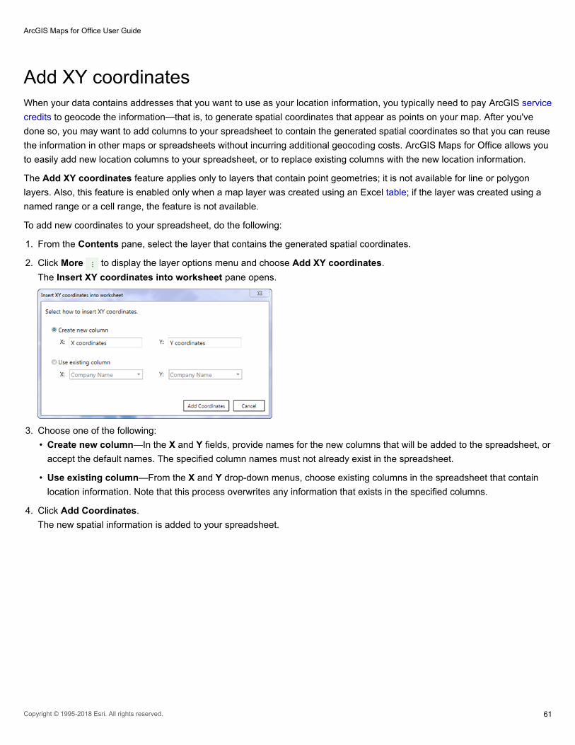
Add XY coordinatesWhen your data contains addresses that you want to use as your location information, you typically need to pay ArcGIS service
credits to geocode the information—that is, to generate spatial coordinates that appear as points on your map. After you've
done so, you may want to add columns to your spreadsheet to contain the generated spatial coordinates so that you can reuse
the information in other maps or spreadsheets without incurring additional geocoding costs. ArcGIS Maps for Office allows you
to easily add new location columns to your spreadsheet, or to replace existing columns with the new location information.
The Add XY coordinates feature applies only to layers that contain point geometries; it is not available for line or polygon
layers. Also, this feature is enabled only when a map layer was created using an Excel table; if the layer was created using a
named range or a cell range, the feature is not available.
To add new coordinates to your spreadsheet, do the following:
1. From the Contents pane, select the layer that contains the generated spatial coordinates.
2. Click More to display the layer options menu and choose Add XY coordinates.
The Insert XY coordinates into worksheet pane opens.
3. Choose one of the following:
• Create new column—In the X and Y fields, provide names for the new columns that will be added to the spreadsheet, or
accept the default names. The specified column names must not already exist in the spreadsheet.
• Use existing column—From the X and Y drop-down menus, choose existing columns in the spreadsheet that contain
location information. Note that this process overwrites any information that exists in the specified columns.
4. Click Add Coordinates.
The new spatial information is added to your spreadsheet.
ArcGIS Maps for Office User Guide
Copyright © 1995-2018 Esri. All rights reserved. 61

Export layer dataFrom the map Contents pane, you can export data from a map layer to a separate file or to a new worksheet in the current
workbook. The exported data includes all information about the features on the layer, including location attributes for point
layers.
When you export data from a point layer on the map, ArcGIS Maps for Office generates latitude and longitude coordinates
relative to the current basemap's coordinate system by default. You can specify the spatial reference system to use, and
optionally define that coordinate system as the default for all future export functions. The default setting applies to both
exporting to a new file and exporting to a new worksheet in the current workbook.
Export to a file
To export layer data to a file, do the following:
1. From the map Contents pane, select the layer that you want to export.
2. Click More to display the layer options menu and choose Export layer to file.
The Export layer to file pane opens.
Note: If ArcGIS Maps for Office is configured to use a specific spatial reference by default,
this pane will not appear. To change the default spatial reference, uncheck the Use
specified spatial reference when exporting point data option in the backstage
configuration.
3. Choose the spatial reference to use for the exported data.
Click the radio button to choose one of the options. If you choose Other, choose a spatial reference from the drop-down
menu.
4. To set the selected spatial reference as the default for future export functions, check the Use this selection by default
check box.
5. Click OK.
A Save window opens.
6. In the File Name field, type a name for the new file.
7. From the Save as type drop-down menu, choose Excel Workbook or CSV (Comma Delimited) and click Save.
ArcGIS Maps for Office creates a new file that includes all the information about each feature on the selected layer. If the
selected layer contains point features, the file will include the coordinates for each feature. Polyline and polygon geometries
are not exported.
When you export to an XLSX file, ArcGIS Maps for Office formats the information as an Excel table in a new workbook.
Note: If you export to CSV, you must convert the file to XLSX before you can use it with
ArcGIS Maps for Office.
Export to a worksheet
To export layer data to a new worksheet, do the following:
ArcGIS Maps for Office User Guide
Copyright © 1995-2018 Esri. All rights reserved. 62

1. From the map Contents pane, select the layer that you want to export.
2. Click More to display the layer options menu and choose Export layer to worksheet.
The Export layer to worksheet pane opens.
Note: If ArcGIS Maps for Office is configured to use a specific spatial reference by default,
this pane will not appear. To change the default spatial reference, uncheck the Use
specified spatial reference when exporting point data option in the backstage
configuration.
3. Choose the spatial reference to use for the exported data.
Click the radio button to choose one of the options. If you choose Other, choose a spatial reference from the drop-down
menu.
4. To set the selected spatial reference as the default for future export functions, check the Use this selection by default
check box.
5. Click OK.
ArcGIS Maps for Office creates a new worksheet in the current workbook that includes all the information about each
feature on the selected layer. If the selected layer contains point features, the file will include the coordinates for each
feature, using the specified spatial reference. Polyline and polygon geometries are not exported. The data is formatted as
an Excel table.
You can also export details about features selected on the map; for more information, see Select features and Find nearby
features.
ArcGIS Maps for Office User Guide
Copyright © 1995-2018 Esri. All rights reserved. 63

Perform analysis
ArcGIS Maps for Office User Guide
Copyright © 1995-2018 Esri. All rights reserved. 64

Work with Excel dataAdd or modify records in Excel
When you add a new record or modify fields in an existing record, all maps created using the modified layer automatically
update to reflect the changes.
Modify a record
To modify an existing record in the spreadsheet, do the following:
1. Click in the cell that you want to modify and update the value.
2. Modify other values as needed.
3. On the map, view the pop-up for the modified record; the values are automatically updated.
Add a new record
To add a new record to the spreadsheet, do the following:
1. Insert a new record in the spreadsheet.
• If you created the layer from data formatted as an Excel table, right-click inside the table and click Insert > Table rows
above or Table rows below. To add a new row to the bottom of the table, place the cursor in the last cell of the table and
press Tab. If necessary, drag the resize handle in the lower right corner of the table to include new rows in the table.
• If you created the layer from a named range or a range of cells in your spreadsheet, insert a new row so that it falls within
the range. To do so, right-click a cell inside the range and click Insert to display the Insert window. Click Entire row and
click OK.
The map layer updates to add the new feature.
Note: Because the location information hasn't yet been provided, a message appears
below the layer name indicating that one of the points on the layer failed to load. As
you add the information to your spreadsheet, the map refreshes to load the new data.
Alternatively, you can fix the errors directly in the Contents pane.
2. In the spreadsheet, populate the cells with the appropriate values.
Be sure to include the same type of location information as used in the other records, such as latitude and longitude
coordinates.
The map refreshes with the new feature added to the layer.
3. To zoom directly to new feature on the map, right-click the new record to display the context menu, and click Go to
Location.
The map zooms in to display the new feature.
Delete a record
To delete a record from the spreadsheet and the map, do the following:
ArcGIS Maps for Office User Guide
Copyright © 1995-2018 Esri. All rights reserved. 65

• If you created the layer from data formatted as an Excel table, right-click inside the row to remove and choose Delete >
Table Rows.
• If you created the layer from a named range or a range of cells in your spreadsheet, select the entire row to delete. Right-
click to display the context menu and click Delete. Click Shift cells up and click OK.
The feature is removed from the map.
Use ArcGIS Maps for Office menu commands
ArcGIS Maps for Office includes several context menu commands that allow you to interact with the map directly from your
spreadsheet.
From Excel, right-click a cell in the spreadsheet to display the context menu. The ArcGIS Maps for Office commands appear at
the bottom of the menu.
Choose from the following commands:
• Go to Location—Zooms in on a feature on the map from its corresponding row in the spreadsheet. Select a row or rows in
the spreadsheet and right-click to display the context menu. Click Go to Location. A submenu lists all the available maps
and layers based on the current spreadsheet. Choose the map or layer on which you want to see the feature. The map
zooms in to display the selected feature. If you have more than one row selected in the spreadsheet, the map zooms to
show the extent that encompasses all the selected features.
• Select on Map—Selects a feature on the map from its corresponding row in the spreadsheet. Select a row or rows in the
spreadsheet and right-click to display the context menu. Click Select on Map. A submenu lists all the available maps and
layers based on the current spreadsheet. Choose the map or layer on which you want to select the feature. The feature
appears selected on the specified map. To view the selection more closely, click Go to Location or zoom in on the map
manually.
If you have more than one row selected in the spreadsheet, corresponding features are selected on the map. If you select
more rows to select on the map, the new selections are added to features that are already selected.
• Clear Selection—Clears all selected features from all maps and layers based on the current spreadsheet.
You can also clear selections from the map; see Select features.
ArcGIS Maps for Office User Guide
Copyright © 1995-2018 Esri. All rights reserved. 66
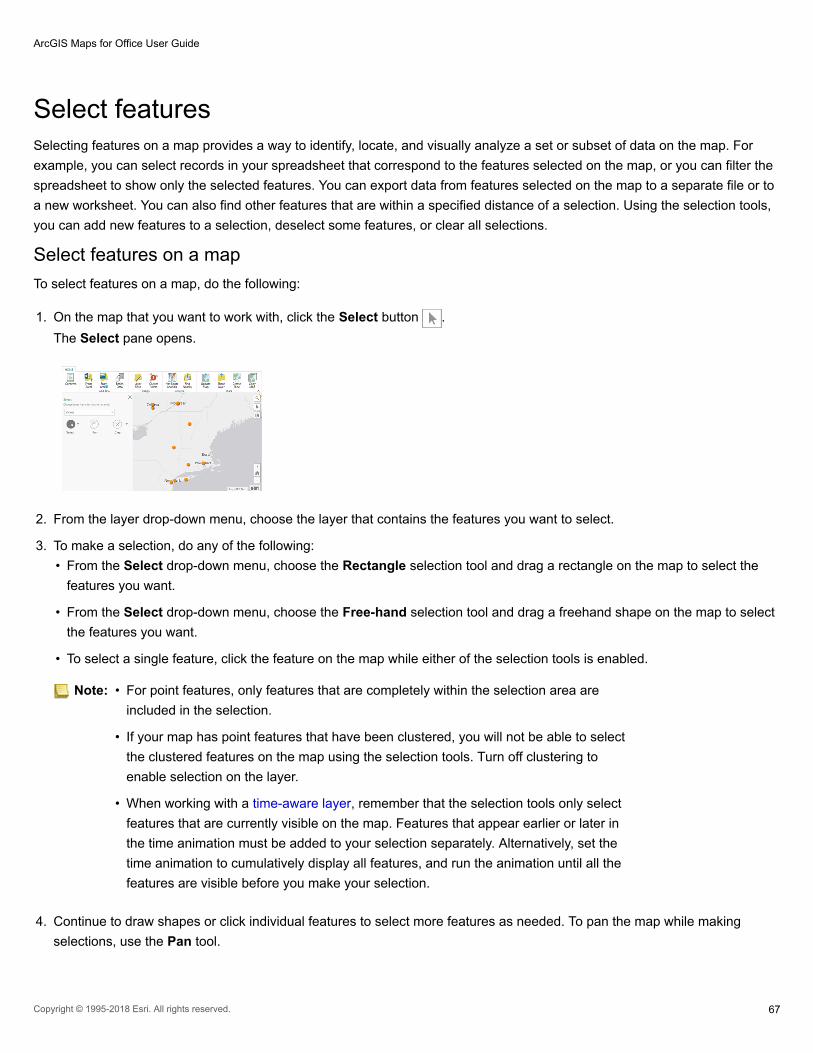
Select featuresSelecting features on a map provides a way to identify, locate, and visually analyze a set or subset of data on the map. For
example, you can select records in your spreadsheet that correspond to the features selected on the map, or you can filter the
spreadsheet to show only the selected features. You can export data from features selected on the map to a separate file or to
a new worksheet. You can also find other features that are within a specified distance of a selection. Using the selection tools,
you can add new features to a selection, deselect some features, or clear all selections.
Select features on a map
To select features on a map, do the following:
1. On the map that you want to work with, click the Select button .
The Select pane opens.
2. From the layer drop-down menu, choose the layer that contains the features you want to select.
3. To make a selection, do any of the following:
• From the Select drop-down menu, choose the Rectangle selection tool and drag a rectangle on the map to select the
features you want.
• From the Select drop-down menu, choose the Free-hand selection tool and drag a freehand shape on the map to select
the features you want.
• To select a single feature, click the feature on the map while either of the selection tools is enabled.
Note: • For point features, only features that are completely within the selection area are
included in the selection.
• If your map has point features that have been clustered, you will not be able to select
the clustered features on the map using the selection tools. Turn off clustering to
enable selection on the layer.
• When working with a time-aware layer, remember that the selection tools only select
features that are currently visible on the map. Features that appear earlier or later in
the time animation must be added to your selection separately. Alternatively, set the
time animation to cumulatively display all features, and run the animation until all the
features are visible before you make your selection.
4. Continue to draw shapes or click individual features to select more features as needed. To pan the map while making
selections, use the Pan tool.
ArcGIS Maps for Office User Guide
Copyright © 1995-2018 Esri. All rights reserved. 67

5. To clear all selections or remove part of your selection, do one of the following:
• From the Clear drop-down menu, choose the Clear selection tool to clear all selections in the layer.
• From the Clear drop-down menu, choose the Remove from selection tool and drag a rectangle on the map around the
features you want to remove from the selection.
Tip: You can also right-click the map to display a context menu and choose Clear
Selection to clear all selections from all layers in the map.
Analyze selected features
After you select features in a layer, you can access more detailed information about those features in several ways.
Work with the spreadsheet
View detailed information about the selected features by viewing the corresponding records in the Excel spreadsheet.
In the Select pane, click one of the following:
• Select Excel rows—Selects all records in the spreadsheet that correspond to the features selected on the map. You can
then use standard Excel functions such as export, copy, and so on.
Select more features on the map and click Select Excel rows again to add additional rows to the selection in your
spreadsheet.
• Filter spreadsheet—Filters the spreadsheet to display only the rows that correspond with features selected on the map.
• Clear filter—All rows appear in Excel, regardless of the features selected on the map.
Note: Filtered rows are marked as hidden in Excel; data is not removed from the spreadsheet.
If you inadvertently click Clear selection instead of Clear filter while the spreadsheet
is filtered, click in the row number column to select the entire span of rows, and right-
click and choose Unhide from the context menu to display all the rows.
ArcGIS Maps for Office User Guide
Copyright © 1995-2018 Esri. All rights reserved. 68

Export data
You can export information about the selected features to a separate file or to a new worksheet in the current workbook.
• Export selection to file—Exports information about the selected features on the layer to a separate file. Save the file as an
Excel workbook (*xlsx) or as a comma-separated values (*csv) file. When exporting to an XLSX file, ArcGIS Maps for Office
creates an Excel table in a new workbook that includes data for each feature selected on the map. If the selection contains
point features, the table will include the coordinates for each feature, and you can specify the spatial reference system to
use. Polyline and polygon geometries are not exported.
• Export selection to worksheet—Exports information about selected features on the map to a new worksheet in the current
workbook. Features in the new worksheet are formatted in an Excel table, which contains data for each feature selected on
the map. If the selection contains point features, the file will include the coordinates for each feature, and you can specify the
spatial reference system to use. Polyline and polygon geometries are not exported.
When you export a selection of point features to a file or to a new worksheet, you can choose to use the spatial reference
defined by the map's current basemap (default), or specify a different spatial reference. You can also specify the chosen spatial
reference as the default for all future point layer export functions; you can change this setting at any time by modifying the
ArcGIS Maps configuration settings.
To specify the spatial reference for the exported data, do the following:
1. On the map, select items from a point layer.
2. In the Select pane, click Export selection to file or Export selection to worksheet.
3. Choose the spatial reference to use for the export function.
You can specify the spatial reference from the current basemap, or choose the standard WGS, Web Mercator, or other well-
known coordinate system.
4. To set the selected spatial reference as the default for all future point layer export functions, check the Use this selection
by default check box.
You can change this setting in the ArcGIS Maps configuration settings.
5. Click OK.
The data from the selected points is exported to a new file or worksheet, along with coordinates using the specified spatial
reference system.
Find nearby locations
Find locations in a layer that are within a specified distance from the currently selected features on the map.
On the ArcGIS Maps ribbon, click Find Nearby. Follow the steps in Find nearby features.
ArcGIS Maps for Office User Guide
Copyright © 1995-2018 Esri. All rights reserved. 69

Configure clusteringWhen a layer contains a large number of point features, showing each feature individually on the map is often not useful. In
this scenario, point features often overlap, making it difficult to distinguish between features. Even when they do not overlap,
it's usually difficult or impossible to visually extract meaningful information when hundreds or thousands of points are shown all
at once.
One approach to resolving this issue is to group point features within a certain distance of one another on screen into one
symbol. This is known as clustering. Since the clustering is dependent on screen distance, more points are aggregated into
fewer groups as you zoom out. Conversely, points are divided into more and more groups as you zoom in. When you zoom to
a level where the clustering area around one point feature no longer contains any other features, that feature will not be
clustered but rather will be shown in its location with the styling specified by the layer.
Clusters are interactive: when you click a cluster, each individual point feature in the cluster appears on the map. The cluster's
pop-up contains a separate page for each feature; use the forward and back arrows in the pop-up's title bar to scroll through
pop-ups for each feature. Although you cannot change the default style of a single cluster, you can change the basic color that
applies to all clusters, and the color of the text that appears within a cluster. In the following screen captures, the image on the
left displays the points with clustering enabled, and the image on the right does not have clustering enabled:
If you style a point layer using shapes grouped by category, the clusters will display a pie chart showing the ratio of different
categories within that cluster. As you zoom in, the cluster is divided into smaller groups, and the pie chart changes to reflect the
information in the new cluster.
For more information about styling a point layer using shapes, see Change a layer's style.
Note: Clustering can be applied while working with maps in ArcGIS Maps for Office. When
sharing a layer to ArcGIS, clustering is turned off. If you want to share the clusters,
share the layer as part of a map. See Share a map on ArcGIS.
1. Click Cluster Points on the ArcGIS Maps ribbon.
The Cluster points pane opens.
ArcGIS Maps for Office User Guide
Copyright © 1995-2018 Esri. All rights reserved. 70

2. From the Layer drop-down menu, choose the layer for which you want to configure clustering.
3. Click the On/Off selector beside Clustering to turn on clustering for the layer.
The map automatically displays the default clustering symbols for the layer.
Note: To turn off clustering, click the On/Off selector again.
4. Do any of the following to configure clustering for the layer:
• To change the distance at which points will be grouped together in a cluster, enter a new pixel value in the Cluster
radius box.
• To change the color of the text on the cluster symbols, click the Cluster number color drop-down menu and choose a
new color.
• To change the color of the cluster symbol, click the Cluster color drop-down menu and choose a new color.
The map automatically updates to reflect the new cluster settings.
5. Click OK to close the Cluster points pane.
ArcGIS Maps for Office User Guide
Copyright © 1995-2018 Esri. All rights reserved. 71

Find hot spotsEven random spatial patterns exhibit some degree of clustering. In addition, human eyes and brains naturally try to find
patterns even when none exist. Consequently, it can be difficult to know if the patterns in your data are the result of real spatial
processes at work or just the result of random chance. This is why researchers and analysts use statistical methods such as
Find Hot Spots (Getis-Ord Gi*) to quantify spatial patterns. When you do find statistically significant clustering in your data, you
have valuable information. Knowing where and when clustering occurs can provide important clues about the processes
promoting the patterns you're seeing. Knowing that residential burglaries, for example, are consistently higher in particular
neighborhoods is vital information if you need to design effective prevention strategies, allocate scarce police resources,
initiate neighborhood watch programs, authorize in-depth criminal investigations, or identify potential suspects.
Note: To use the Hot Spot Analysis tool, your ArcGIS account must have spatial analysis
privileges assigned to it. Contact your ArcGIS organization administrator to request role
changes.
Using this functionality consumes ArcGIS service credits. To help you estimate how
many credits you will use, see Understand credits.
To create a hot spot layer, do the following:
1. Click anywhere on the map to select it.
2. On the ArcGIS Maps ribbon, click the Hot Spot Analysis button.
The Hot spot analysis pane opens.
3. From the Layer drop-down menu, choose the feature layer to analyze.
The point layer must contain at least 60 points to perform a hot spot analysis.
4. In the Find cold and hot spots section, choose whether you want to find clusters of point densities or attribute values.
The available options depend on the number of points in your layer. Choose from the following:
• By point densities—This option is available only for point layers. Choosing this option constructs a fishnet mesh and
places it over the points in the analysis layer. The number of points that fall within each fishnet square are then counted
and analyzed. Only fishnet squares with at least one point are analyzed. Any statistically significant hot spots (red) in the
results layer reflect spatial clusters of fishnet squares with high count values. Similarly, statistically significant cold spots
(blue) reflect spatial clusters of fishnet squares with very low count values.
When you choose to find hot and cold spots by point densities, you can restrict the analysis to a specific area of the map,
rather than on the entire map. Check the Restrict analysis check box, and choose one of the following options from the
drop-down menu:
• The to current extent option restricts the analysis to the map area displayed in the viewer.
• The by drawing areas option allows you to use the drawing tools to define a study area on the map where you want to
perform analysis. Click Clear to discard the area polygons.
Note: The results layer is not a density surface, but rather it indicates locations where high
or low point counts are too clustered to be the result of random processes. You
must have at least 60 features in your layer to use this option.
• By attribute values—When you choose this option, you specify the attributes to use as the analysis field; attributes
defined in your data appear in the drop-down menu. Using the field you provide, the Hot Spot Analysis tool creates a
ArcGIS Maps for Office User Guide
Copyright © 1995-2018 Esri. All rights reserved. 72

layer that shows areas with statistically significant clusters of high values (hot spots, shown in red), low values (cold
spots, shown in blue), and areas that aren't part of a statistically significant cluster (shown in beige). You must have at
least 30 items in your layer to use this option.
• To restrict the analysis to the map area displayed in the viewer, check the Restrict analysis to the map's current extent
check box. To apply the analysis to the entire map, uncheck the check box.
5. In the Result layer name field, type a name to assign to the new layer.
6. Click Run analysis.
When the analysis is complete, a new layer is created and appears in the Contents pane. For the points or the areas in this
result layer, the darker the red or blue colors appear, the more confident you can be that clustering is not the result of
random chance. Points or areas displayed in beige, on the other hand, are not part of any statistically significant cluster; the
spatial pattern associated with these features could very likely be the result of random chance. Sometimes the results of
your analysis will indicate that there aren't any statistically significant clusters at all. This is important information to have.
When a spatial pattern is random, there are no clues about underlying causes. In these cases, all of the features in the
results layer will be beige. When you do find statistically significant clustering, however, the locations where clustering
occurs are important clues about what might be creating the clustering. Finding statistically significant spatial clustering of
cancer associated with certain environmental toxins, for example, can lead to policies and actions designed to protect
people. Similarly, finding cold spots of childhood obesity associated with schools promoting after-school sports programs
can provide strong justification for encouraging these types of programs more broadly.
For technical details on how the Hot Spot Analysis tool works, see How hot spot analysis works.
Note: You cannot change the styling properties of a hot spot layer.
ArcGIS Maps for Office User Guide
Copyright © 1995-2018 Esri. All rights reserved. 73

Find nearby featuresUsing the Find Nearby tool, you can find locations that are near other locations on your map. For example, you may want to
find distribution centers that are near a warehouse.
The Find Nearby tool lets you select features on the map and find features that are within a specified distance or drive time of
the selection.
The Find Nearby tool is only available for layers created from Microsoft Excel data and for feature service layers added from
ArcGIS.
1. Click anywhere on the map to select it.
2. On the ArcGIS Maps ribbon, click the Find Nearby button.
You can also access the Find Nearby tool from a pop-up window. See Configure pop-ups for more information.
The Find Nearby pane opens.
3. From the Choose a source layer drop-down menu, choose the layer containing the features you want to select.
4. Do any of the following to make your selection:
• Click the Rectangle selection tool and drag a rectangle on the map to select the features you want.
• Click the Free-hand selection tool and drag a freehand shape on the map to select the features you want.
• To select a single feature, click the feature on the map while either of the selection tools is enabled.
Continue to draw shapes or click individual features to select more features as needed.
To pan the map while making selections, use the Pan tool.
Note: For point features, only features that are completely within the selection area are
included in the selection.
Note: If your map has point features that have been clustered, you will not be able to select
the clustered features on the map. You can turn off clustering to select the individual
point features. See Configure clustering for more information.
5. To clear all selections or remove part of your selection, do one of the following:
• Click the Remove from selection tool and drag a rectangle on the map around the features you want to remove from the
selection.
• Click the Clear selection tool to clear all selections in the layer.
6. Click Next.
7. In the Refine search area section, click Ring to search within a specified distance around the selection, or click Drive time
to search within a specified drive time of the selection.
8. If you chose Ring in the previous step, specify a radius in either miles or kilometers. If you chose Drive time, specify the
maximum drive time from the selection in minutes or hours.
Note: The Drive time option is only available when the specified selection layer is a point
layer.
ArcGIS Maps for Office User Guide
Copyright © 1995-2018 Esri. All rights reserved. 74

9. Choose a target layer from the drop-down menu.
The search looks for features in the target layer that are near the selected features in the source layer.
10. To save the search area, check the Save search area as layer check box.
The search area for each Find nearby action is generated as a temporary layer in the Contents pane, using the name of
the original layer with a prefix indicating the name of the related action, for example, Find nearby buffer - LayerName. You
can use these layers as reference for future select actions.
11. Click Find.
The results of the search are selected on the map and the Find Nearby pane shows the number of selected features.
Note: Search results are temporary and are not saved with the map. When you close the
Find Nearby window, the features on the map are no longer selected.
Analyze results
Work with the spreadsheet
To work with the results in the spreadsheet, do one of the following:
• Select Excel rows—Selects all records in the spreadsheet that correspond to the features selected on the map. You can
then use standard Excel functions such as export, copy, and so on.
Select more features on the map and click Select Excel rows again to add additional rows to the selection in your
spreadsheet.
• Filter spreadsheet—Filters the spreadsheet to display only the rows that correspond with features selected on the map.
• Clear filter—All rows appear in Excel, regardless of the features selected on the map.
Note: Filtered rows are marked as hidden in Excel; data is not removed from the spreadsheet.
If you inadvertently click Clear selection instead of Clear filter while the spreadsheet
is filtered, click in the row number column to select the entire span of rows, and right-
click and choose Unhide from the context menu to display all the rows.
Export data
You can export information about the selected features to a separate file or to a new worksheet in the current workbook.
• Export selection to file—Exports information about the selected features on the layer to a separate file. Save the file as an
Excel workbook (*xlsx) or as a comma-separated values (*csv) file. When exporting to an XLSX file, ArcGIS Maps for Office
creates an Excel table in a new workbook that includes data for each feature selected on the map. If the selection contains
point features, the table will include the coordinates for each feature, and you can specify the spatial reference system to
use. Polyline and polygon geometries are not exported.
• Export selection to worksheet—Exports information about selected features on the map to a new worksheet in the current
workbook. Features in the new worksheet are formatted in an Excel table, which contains data for each feature selected on
the map. If the selection contains point features, the file will include the coordinates for each feature, and you can specify the
spatial reference system to use. Polyline and polygon geometries are not exported.
ArcGIS Maps for Office User Guide
Copyright © 1995-2018 Esri. All rights reserved. 75

When you export a selection of point features to a file or to a new worksheet, you can choose to use the spatial reference
defined by the map's current basemap (default), or specify a different spatial reference. You can also specify the chosen spatial
reference as the default for all future point layer export functions; you can change this setting at any time by modifying the
ArcGIS Maps configuration settings.
To specify the spatial reference for the exported data, do the following:
1. On the map, select items from a point layer.
2. In the Select pane, click Export selection to file or Export selection to worksheet.
3. Choose the spatial reference to use for the export function.
You can specify the spatial reference from the current basemap, or choose the standard WGS, Web Mercator, or other well-
known coordinate system.
4. To set the selected spatial reference as the default for all future point layer export functions, check the Use this selection
by default check box.
You can change this setting in the ArcGIS Maps configuration settings.
5. Click OK.
The data from the selected points is exported to a new file or worksheet, along with coordinates using the specified spatial
reference system.
ArcGIS Maps for Office User Guide
Copyright © 1995-2018 Esri. All rights reserved. 76

Map temporal dataTemporal data includes time and date information for geographic locations. If your data contains temporal values (date), you
can add a time-aware layer to a map in Excel and run an animation that shows how patterns in the data change over time.
Note: When your data contains time-only fields (as opposed to date/time fields), ArcGIS Maps
for Office converts these values to text strings to display them in pop-ups. Because of
this, unlike true date/time values, time-only values cannot be used in time animations.
When you enable time animation on a map layer, you use the Time Settings pane to configure the field in your data that
contains the time information. You can also configure the animation slider to specify playback speed, time interval, and whether
to display cumulative data on the map.
Enable time animation
To enable time animation on a layer, do the following:
1. Sign in to ArcGIS if you're not already signed in.
2. Add a layer to the map using data that contains date and time information.
You can add a layer from Excel or from ArcGIS.
3. Click More to display the Layer Options and choose Time animation.
The Time settings pane opens.
4. From the Layer drop-down list, choose the layer you want to animate.
The Layer drop-down list shows only the time-enabled layers in your map; these can be time-enabled layers added from
ArcGIS or layers added from an Excel spreadsheet that contains time and date information. By default, the active layer is
the one from which you opened the Time settings pane.
5. Click the Time animation toggle to On.
6. From the Time field drop-down list, choose the column that contains the date and time information you want to animate.
The drop-down list only displays columns that contain temporal data.
7. Click OK.
In the Contents pane, a small clock icon appears beside the layer name to indicate that time animation is enabled.
ArcGIS Maps for Office User Guide
Copyright © 1995-2018 Esri. All rights reserved. 77

The time slider appears on the map, using the default options. You can configure the time slider to change the animation
speed and time interval; see Configure the time slider.
8. To turn off time animation on a layer, choose Time animation from Layer Options to display the Time settings pane for
the layer. Click the Time animation toggle to Off and click OK.
Configure the time slider
The time slider allows you to animate temporal layers on the map to see how your data changes over time. You can configure
the playback speed of time animations, define the time intervals shown, and specify whether to display cumulative data or only
data in the current time interval. Time slider configuration options apply to all time-animated layers on a map.
To configure the time slider, do the following:
1. Click the Configure button in the upper right corner of the time slider.
The Time Settings pane opens.
2. Move the Playback Speed slider toward Slow or Fast to specify the speed of the animation.
The default speed is two seconds per time interval.
3. Enter a numerical value in the Time Interval text box and choose the units for the interval from the drop-down list.
The units that appear in the drop-down list depend on the time lines in the layer data.
4. Choose how to display the data:
• Choose only display the data in the current time interval to show only the data that falls within the current time
window. For example, if you have data representing hurricane paths over a 10-year period and you want to show the
paths of all hurricanes that occurred within a given year, you would choose this option (and specify 1 year as your time
interval). As the map animates, you see the hurricane paths for the first year, the second, the third, and so on. Each year
of data displays independently of the other years.
• Choose cumulatively display all the data to show all the data over time. For example, if you have data representing
hurricane paths over a 10-year period and you want to display all the hurricane paths that occurred over the 10-year
ArcGIS Maps for Office User Guide
Copyright © 1995-2018 Esri. All rights reserved. 78

period in successive years over the previous years, you would choose this option (and specify 1 year as your time
interval). As the map animates, you see the yearly hurricane paths cumulatively over 10 years.
5. Click OK.
Use the time slider
The time slider appears as an animation control overlaid on the map. When you're not interactively working with the time
slider, it appears semitransparent so that it doesn't interfere with the map display. When you play the animation or hover over
the slider, it appears opaque to better display the available controls.
There are several controls you can use to manipulate a time animation.
1. Click the Down arrow to minimize the time slider window. When the window is minimized, click the Up arrow to maximize
the time slider window.
2. Click Play to begin the animation. When the animation is playing, this changes to a Pause button.
3. Click anywhere on the interval section to move directly to that time period. You can also move the interval handles
individually to display a specific time range.
4. Show the currently displayed time range.
5. Show the total date and time range in the current layer.
6. Click Previous to move the animation to the previous time interval.
7. Click Next to move the animation to the next time interval.
8. Click Configure to set the Time Settings configuration options for the map.
Note: When you select features on a time-aware layer and run the time animation, only the
features visible during a specific time period are visible during the animation.
ArcGIS Maps for Office User Guide
Copyright © 1995-2018 Esri. All rights reserved. 79

Enrich your dataMapping the data in your spreadsheet offers insight into spatial patterns and allows for quick visual analysis, but there may be
times when you want to quickly and easily add contextual information about the area surrounding that data. Esri's
geoenrichment capabilities allow you to answer questions about locations that you can't answer with maps alone, for example,
What kind of people live here? What do people like to do in this area? What are their habits and lifestyles? What kind of
businesses are in this area?
Enriching your data allows you to add new columns of contextual data to your spreadsheet. You can choose from a number of
demographic, business, landscape, and policy data collections. Each collection has multiple variables that can be added to
your spreadsheet to help you better understand the area around your locations.
Note: If you plan to enrich your data, it's highly recommended that you format your data as an
Excel table before you add it to the map. Using an Excel table allows ArcGIS Maps for
Office to add columns containing new information to the dataset. If the layer was not
created from an Excel table, you can overwrite the contents of an existing column for
each demographic variable selected. For more information, see Tables and named
ranges.
1. Click the Enrich data button on the map ribbon.
The Enrich layer window opens.
2. Click the layer drop-down arrow and choose the layer you want to enrich.
3. Click the country drop-down arrow and choose the country for which you want to see demographics.
The list of collections changes depending on the available collections for the selected country.
4. Optionally, type keywords in the search field to search for specific variables. Press Enter or click the magnifying glass to
search.
5. Choose a data collection.
On the next screen, you can search for variables within the collection, choose one of the popular variables within the
collection, or show all variables within the collection.
6. Choose the variables you want to add to your spreadsheet, and click Next.
Note: The basket icon in the upper right corner of the window shows the number of
variables you've chosen. Click the basket to view its contents. To remove a variable,
click the X beside its name.
ArcGIS Maps for Office User Guide
Copyright © 1995-2018 Esri. All rights reserved. 80

7. The Enrich layer window shows a summary of the selected data collections, the type of areas that will be enriched, the
number of variables selected, and the number of ArcGIS service credits you'll be charged based on the number of currently
selected variables. To add or remove individual variables, expand the data collections, and check the box beside each
variable you want to include.
• By default, for point layers, data will be returned for a 1-mile circle surrounding each location. To change this value to a
different distance or to a drive-time polygon, click Edit and make the appropriate changes.
• Map layers containing polygons will return results for the area within each polygon.
8. To append the new variables to your spreadsheet, leave <Create new> in the drop-down box beside the selected variables.
This option is available only if the layer was originally created from an Excel table (to learn more about creating a table from
your data, see Tables and named ranges). If the layer was not created from an Excel table, click <None> and choose the
column from your original data to overwrite with the demographic data. Note that overwriting data in your spreadsheet
cannot be undone.
9. Click Add data to system to begin the enrichment process.
Once the enrichment process begins, your account is charged for the transaction. Do not close the window, click Cancel,
close Excel, or otherwise interfere with the process, or you will not receive the enriched data for which you were charged.
When the process is complete, a confirmation message appears over the map. Click OK.
Note: Geographic data enrichment consumes ArcGIS credits based on the number of
variables added to your spreadsheet and the number of features in the selected layer.
For more information, see Understand credits.
ArcGIS Maps for Office User Guide
Copyright © 1995-2018 Esri. All rights reserved. 81

View and configure infographicsInfographics are visualizations that provide contextual information about the areas surrounding the features in your map. When
you click the Infographics button in a pop-up, ArcGIS aggregates the demographics around that feature on your map and
delivers them using easy-to-understand infographics that contain information such as age distribution and income for a set
distance around the selected location. The information contained in infographics is available while the pop-up is open and is
not saved to your business system.
Note: Using this functionality consumes ArcGIS service credits. To help you estimate how
many credits you will use, see Understand credits.
ArcGIS Maps for Office User Guide
Copyright © 1995-2018 Esri. All rights reserved. 82

Display infographics
In the following image, an infographic shows the average household size within a 1-mile radius of the selected city. Many
infographics are interactive; hover over elements in an infographic or use the Forward and Back arrows to display additional
information.
To view a more detailed infographic, click the Maximize button in the pop-up's title bar. Click Restore to return the window to
its original size.
Click the Previous and Next arrows on the Infographics window to scroll through available feature visualizations.
The toolbar at the bottom of the pop-up includes the following tools, listed in the order in which they appear on the toolbar:
• Zoom to—Zooms directly to the selected feature.
• Select row—Selects the row in the Excel spreadsheet that corresponds to the currently selected feature on the map.
• Find nearby—Opens the Find nearby tool, which allows you to find features that are near the selected location. See Find
nearby features.
• Configure—Opens a Configure Infographics pane, allowing you to change the infographics that appear in the carousel for
the selected feature. See View infographics for more information.
• Copy Infographic Image—Takes a snapshot of the currently displayed infographic and copies it to the Windows clipboard.
Users can then paste the static image into another application such as an email message. The camera button appears on
the pop-up toolbar only when infographics are displayed. The static image represents the infographic exactly as it is currently
displayed in the pop-up.
• Attributes—Lists all the attributes specified in the pop-up configuration. Click this to return to the attribute table after viewing
infographics.
• Infographics—Displays graphical information about the areas around the selected feature. Infographics are visualizations
that provide rich contextual information about the areas surrounding the features in your map.
ArcGIS Maps for Office User Guide
Copyright © 1995-2018 Esri. All rights reserved. 83

Note: The Attributes and Infographics options on pop-ups are persistent, meaning that the
last selected button determines what is displayed in subsequent pop-ups. For
example, if you view infographics in a pop-up and then close the pop-up, all other
pop-ups will automatically display infographics for selected features. Because viewing
infographics consumes ArcGIS service credits, it's good practice to revert to the
Attributes display before closing the pop-up.
• Create report—Generates a report containing demographic data surrounding the selected feature on the map. For details,
see Generate reports.
Click the Attributes button to display the feature's attributes list.
Note: Infographics are only available if enabled by your organization's administrator.
Configure infographics
Demographic information is displayed in a carousel of configurable infographics. Each infographic shows the distribution of one
variable around the selected feature. A few infographics are turned on by default, but you can add or remove infographics from
the carousel.
To configure infographics, do the following:
1. Click the configuration (gear) button on the Infographic toolbar.
The Configure Infographics pane opens.
2. Choose the country for which you want to view infographic variables.
Some countries have more data collections available than others; available options appear as thumbnails in the data
collection section.
3. Choose a light or dark theme for the infographics window.
ArcGIS Maps for Office User Guide
Copyright © 1995-2018 Esri. All rights reserved. 84

4. Choose the data collections you want to include in the carousel.
a. Check the boxes beside the infographics you'd like to see. Uncheck the boxes for the infographics you'd rather not see.
b. Click Add more variables to explore the data collections available from ArcGIS.
c. Choose a data collection to see which variables are contained within it.
d. Check the boxes beside the variables you'd like to see in your infographics carousel and click Apply.
e. Click Back to return to the Configure Infographics pane.
5. Define the area for which you want information by choosing one of the following:
• Ring— Returns information from within a specified radius around the selected feature.
• Drive Times—Returns information from an area within a specified number of minutes of driving time from the selected
feature.
• Drive Distances—Returns information from an area within a specified distance of the selected feature, defined in miles,
kilometers, feet, or meters.
6. Click OK to save your changes.
The infographic window updates to reflect your changes.
ArcGIS Maps for Office User Guide
Copyright © 1995-2018 Esri. All rights reserved. 85

Generate reportsYou can create a report for a location or point on the map and save it to PDF or Excel format. You can specify report
parameters to include values within a defined ring, a drive distance, or a specified amount of driving time. ArcGIS allows you to
choose from a wide variety of reports that provide information about the area of your choice, such as Demographic and Income
Profile, Executive Summary and Retail Goods, and Services Expenditures—detailed information available through Esri
Demographics. Types of reports available depend on the demographic data available for the location on the map. You can use
these reports to describe and gain a better understanding about the market, customers, and competition associated with your
area of interest. Once you create a report, you can share it and send it to others.
Note: Using this functionality consumesArcGIS service credits. For more information, see
Service Credits Overview.
ArcGIS Maps for Office User Guide
Copyright © 1995-2018 Esri. All rights reserved. 86

You can create a report for point, line, or polygon features on the map, such as rivers, roads, pipelines, buildings, counties, or
political subdivisions.
1. Click on a feature on the map to display the pop-up.
2. Click the Create report button ( ).
The Report parameters pane opens.
3. From the Select report drop-down list, choose the report you want to run.
4. From the Format drop-down list, select the format for your report. Choose PDF or Excel.
Note: The Site Map report style is available only in PDF format.
5. From the Show data for drop-down list, choose Ring, Drive times, or Drive distance.
6. Specify the radius and units for your report. Choose miles, kilometers, feet, or meters.
7. Click Create report.
The generated report opens in a separate window. Depending on your default browser, you may need to specify whether to
open the report file or to save it to a location on your system.
ArcGIS Maps for Office User Guide
Copyright © 1995-2018 Esri. All rights reserved. 87

Share maps and layers
ArcGIS Maps for Office User Guide
Copyright © 1995-2018 Esri. All rights reserved. 88

Share a map to ArcGISSharing a map created in ArcGIS Maps for Office to ArcGIS is a quick way to share information with others in or outside of your
organization. You can share individual layers or the entire map. When you share a map, a web map is created in ArcGIS. You
can also add the map to a PowerPoint slide.
Note: You can only share a map to ArcGIS if you are signed in with an organizational account
that has publisher permissions with specific privileges enabled. If you're unsure of your
account privileges, contact your ArcGIS organization administrator.
Heat map layers cannot be shared on Portal for ArcGIS. If your map contains a heat
map layer, either remove the layer from the map or change the layer's style.
1. Sign in to ArcGIS if you are not already signed in.
2. On the ArcGIS Maps ribbon, click Share map.
3. Specify a title, tags, and description for the map and choose whether to share it with everyone (public), your organization,
or any groups to which you belong. These fields are used to display information about the map in ArcGIS and are also used
for searching.
4. Click Share to share the map to ArcGIS as a web map. Note that publishing can take several minutes depending on the
amount of data in your map.
Once the map has published successfully, a message appears at the bottom of the Contents pane along with a link to view
the shared map in ArcGIS.
Note: You can update the map and republish it to ArcGIS by clicking Update shared map
on the Tools menu and modifying the information you entered as needed.
5. Click the link at the bottom of the Contents pane to view the published map. The web map details page opens in ArcGIS.
The details page displays the title, tags, and description that you entered previously.
6. Click Open to open the map in the ArcGIS map viewer, ArcGIS Explorer Online, or, if installed, ArcGIS for Desktop.
ArcGIS Maps for Office User Guide
Copyright © 1995-2018 Esri. All rights reserved. 89

Share a layer to ArcGISSharing your ArcGIS Maps for Office layers to ArcGIS is a quick way to share information with others in your organization or in
the ArcGIS public community. You can share individual layers or the entire map.
When you share a layer, a hosted feature service is created in ArcGIS.
Note: You can only share layers to ArcGIS if you are signed in with an organizational account
that has publisher permissions with specific privileges enabled. If you're unsure of your
account privileges, contact your ArcGIS subscription administrator.
Only layers created with ArcGIS Maps for Office can be shared. You cannot share
layers to ArcGIS that you've added through a search.
1. Sign in to ArcGIS if you're not already signed in.
2. In the Contents pane, click the layer you want to share.
Note: Layers styled as heat maps cannot be shared to Portal for ArcGIS. To share the layer,
apply a different style.
If you want to share a layer with clustering applied, the layer is shared as a point
layer without clustering.
3. On the ArcGIS Maps ribbon, click Share map.
4. Specify a title, tags, and a description for the layer and choose whether to share it with everyone (public), your organization,
or any groups to which you belong.
5. Click Share.
ArcGIS Maps for Office User Guide
Copyright © 1995-2018 Esri. All rights reserved. 90

Copy a map imageThere are several ways to share maps and layers: you can create a copy of the map image and save it to the clipboard, you
can create a PowerPoint slide, or you can share the layer or map on ArcGIS Online. Creating a copy of the map image allows
you to paste the image into any program that supports paste functionality, such as word processing software and email clients.
Note: This procedure creates a static image of the map as it appears in the map viewer. You
cannot interact with the map when it's pasted into another program.
To create a copy of the map image and save it to the clipboard, do the following:
1. Click the map you want to copy. Style the map features as desired, and set the map extents and zoom level so that the map
conveys the appropriate information.
The Contents pane does not appear in the copy of the map image.
2. Click the Copy Map button in the Share section of the ArcGIS Maps ribbon.
The map image is automatically saved to the clipboard. The map image copied to the clipboard contains only the image of
the map as it appears in ArcGIS Maps for Office. It does not include the map title, border, Contents pane, or navigation
controls.
Note: If you copy a map with time animation enabled, the Time Slider appears in the
copied image, providing context about the map configuration
3. Open the program in which you want to place the map image.
4. Paste the image into the program. Use the Paste command from the application's menu or use the shortcut key, Ctrl+V.
Use the application's features to style and position the map image, as you would with any other image file.
ArcGIS Maps for Office User Guide
Copyright © 1995-2018 Esri. All rights reserved. 91

Work with PowerPoint
ArcGIS Maps for Office User Guide
Copyright © 1995-2018 Esri. All rights reserved. 92

Create a PowerPoint map slide from ExcelAfter you create a map in Microsoft Excel, you can easily create a PowerPoint slide containing a static image of the map to
enhance your presentations.
To create a PowerPoint map slide from Excel, do the following:
1. In Excel, resize the map window and position the map the way you want it to appear on the slide. Adjust the zoom level,
choose the basemap, and turn on the layers that you want to include in the image.
2. On the ArcGIS Maps ribbon, click Create Slide.
ArcGIS Maps for Office opens Microsoft PowerPoint and creates a new slide containing the map image. You can resize and
position the map image as you would any other image on a slide.
Note: The map contained in the slide is a static image and is no longer interactive as it was in
Excel; that is, you can no longer pan or zoom. To create a dynamic map slide—a map
that you can interact with during a PowerPoint presentation—see Add a dynamic map
to a PowerPoint slide.
ArcGIS Maps for Office User Guide
Copyright © 1995-2018 Esri. All rights reserved. 93

Add a dynamic map to a PowerPoint slideArcGIS Maps for Office provides a fully updated experience for enhancing your PowerPoint presentations with interactive,
dynamic maps by making it simpler and quicker to search for content. Add maps directly to PowerPoint using content from your
ArcGIS organization, or edit existing map slides. Insert the map into a slide and position it as desired—on its own or combined
with other standard PowerPoint features such as charts, images, and text. In Slide Show mode, click Play on the map and it
becomes fully interactive—you can zoom and pan across the map and select features to display detailed information.
Note: Maps are dynamic only in Slide Show mode. Click Unlock Map on the map during your
presentation to activate it.
Add a map to a slide
To add a map to a PowerPoint slide, do the following:
1. On the PowerPoint ribbon, click the ArcGIS Maps tab to display the ArcGIS Maps ribbon.
2. Click Sign in to sign in to your ArcGIS account.
3. Create a new slide or browse to the slide to which you want to add a map.
4. On the ArcGIS Maps ribbon, click Add Map.
The Insert New Map wizard opens, displaying the first tab of the workflow, Browse for Maps.
Note: As you go through the wizard, you can click Next to move through each step of the
workflow, or click the tab that you want to work with. You do not need to perform
workflow steps in order, and you can always go back to a step to change its settings.
5. Search for a web map to add to your slide by doing one of the following:
• Click the My Content tab to display content from your ArcGIS account. Click a folder to display its contents.
• Click Recent to list the last five maps that you used on the current computer.
• Click Favorites to list the items that you've marked as a favorite in ArcGIS.
• Type one or more keywords in the Search field and press Enter.
• Click Groups to see content available to the ArcGIS groups to which you belong.
The list pane on the right displays the results of your search or the contents of the selected folder. Click a map listing to
select it and click the Info button to view details about the map.
6. Click Next.
ArcGIS Maps for Office User Guide
Copyright © 1995-2018 Esri. All rights reserved. 94

The Choose Layers tab opens, listing all the layers available in the web map you selected.
7. Check the box beside a layer to include it in your map slide. Clear the check box beside layers you don't want to include.
8. Click Next.
The Configure Legend tab opens, showing an empty Legend pane.
9. To add map keys to the legend, click the Add button beside the entry in the layers pane.
Note: The legend window has a maximum height of 350 pixels. If the selected keys exceed
the space allowed, an error appears.
10. To configure the map legend, do the following:
• Click and drag map keys in the legend to change their order.
• Click Edit to change the name of the map key.
• Click Delete to remove the key from the legend.
• Click the Theme button to change the theme for the Legend pane. Clicking the button toggles between Light (white
background and black text) or Dark (grey background and white text).
Note: • Configurations set here apply only to the legend. They do not affect layer names
or map order, nor does the theme affect the map itself.
• The legend is added to the map-enabled slide as a static image. When you
activate the map, the map moves to the forefront of the slide and may hide the
legend.
11. Click Next.
The Choose Layout tab opens, showing various slide layout options.
12. Choose the layout to use for the map-enabled slide.
Choices include the following:
• Default Layout—The map is added to the layout of the current slide.
• Fill Bottom—The map fills the bottom half of the slide's content area.
• Fill Right—The map fills the right side of the slide's content area.
• Fill Slide—The map fills the entire content area of the slide.
13. Click Next.
The Review Map and Insert tab opens, showing a preview of the map and legend on the slide. Review the size, extent,
and zoom level of the map and make any necessary changes. Drag the legend to reposition it.
ArcGIS Maps for Office User Guide
Copyright © 1995-2018 Esri. All rights reserved. 95

14. Click Insert to add the map to the current slide.
The wizard closes and the map-enabled slide appears. In Design mode, the map and legend appear as two static images;
you can resize each image and reposition them on the slide as desired. To interact with the map, you must be in Slide
Show mode and activate the map to make it dynamic.
Edit an existing map
Using the Edit Map wizard, you can quickly edit a map that was previously added to a slide.
Note: You cannot edit maps that were added from Excel. Those maps are created as static
images and cannot be modified in PowerPoint.
To edit an existing map slide, do the following:
1. On the PowerPoint ribbon, click the ArcGIS Maps tab to display the ArcGIS Maps ribbon.
2. Click Sign in to sign in to your ArcGIS account.
3. In your presentation, browse to the slide that contains the map you want to modify and click the map image on the slide.
4. On the ArcGIS Maps ribbon, click Edit Map.
The Edit Map wizard opens on the Review Map and Insert tab, displaying the current settings for your map.
5. Click the appropriate tab to make the necessary modifications. Do one or more of the following:
• To change the map, click Browse for Maps and choose a new map.
• To change the layers that appear on your map slide, click Choose Layers and change the current selection.
• To change the legend, click Configure Legend and change the configuration options.
• To change the slide layout, click Choose Layout and choose a different layout from the available options.
6. When you've completed your changes, click Review Map and Insert.
Review the size, extent, and zoom level of the map and make any necessary changes. Drag the legend to reposition it.
7. Click Insert.
The wizard closes and the map is updated in the slide. To interact with the map, you must be in Slide Show mode and
activate the map to make it dynamic.
ArcGIS Maps for Office User Guide
Copyright © 1995-2018 Esri. All rights reserved. 96

Activate the map
When you add a map to a slide, the map and legend appear as two static images on the slide while you're working on the
presentation. When you switch to Slide Show mode, clicking the Unlock Map button on the map brings the map to the
forefront of the slide and makes it dynamic. The map legend remains a static image.
Note: You must be signed in to ArcGIS to activate a map-enabled slide.
To activate a map on a slide, do the following:
1. Open your PowerPoint presentation in Slide Show mode.
2. On the map-enabled slide, click Unlock Map on the map.
The map becomes fully dynamic, allowing you to zoom in and out, pan across the map, and click features to display
detailed information about locations.
3. To place the map in full-screen mode, click the Full Screen button on the map.
The map expands to fill the entire display area, hiding the legend and any other elements on the slide.
Note: When you activate the map, the map moves to the forefront of the slide and may hide
the legend and other slide elements. You can view the map layers and legends by
opening the Contents pane.
4. To view the Contents pane, click the double arrows in the upper left corner of the map.
The Contents pane shows all the layers available in the web map, including any layers that were turned off in the Add Map
wizard. Check or uncheck the boxes beside the layer names to hide or display layers.
Click the double arrows to close the Contents pane.
5. To resume your presentation, deactivate the map by clicking the Lock Map button on the map, or press the Escape key.
ArcGIS Maps for Office User Guide
Copyright © 1995-2018 Esri. All rights reserved. 97

Reference
ArcGIS Maps for Office User Guide
Copyright © 1995-2018 Esri. All rights reserved. 98

Frequently asked questions• I installed ArcGIS Maps for Office, but the ArcGIS Maps tab does not show up on the ribbon.
• Why can't I connect to my Portal for ArcGIS instance from ArcGIS Maps for Office?
• How do I install a Microsoft Office language interface pack?
• How do I set up a proxy PAC file to work with ArcGIS Maps for Office?
• How do I set the language for ArcGIS Maps for Office?
• How do I tell which version of ArcGIS Maps for Office I have installed?
• Do I need an ArcGIS subscription to use ArcGIS Maps for Office?
• Does this app consume ArcGIS credits?
• Does all geocoding consume credits?
• How do I know how many credits I'm using when geocoding or enriching my data?
• Why doesn't my spreadsheet appear in the Add data from Excel wizard?
• I received an error message when signing in to ArcGIS Online.
• If I make a map in Excel, what happens when I send the spreadsheet to my colleagues? Will they see the map?
• My organization has a geocoder registered with ArcGIS. Can I use it with ArcGIS Maps for Office?
• Can I add a custom basemap to the Basemap Gallery in ArcGIS Maps for Office?
• When I add a layer from ArcGIS Online that contains a large number of points, are all the points added to the map at once?
• Why doesn't my clustered layer display in ArcGIS Online?
• Why doesn't ArcGIS Maps for Office recognize my PivotTable when adding data?
• Why isn't cell formatting preserved when sharing to ArcGIS Online?
• Can I add a Bing basemap to my map?
ArcGIS Maps for Office User Guide
Copyright © 1995-2018 Esri. All rights reserved. 99

I installed ArcGIS Maps for Office, but the ArcGIS Maps tab does not show up on the ribbon.
Occasionally, the ArcGIS Maps for Office add-in is not enabled by default in Excel or PowerPoint. To fix this issue, manually
enable the add-in using the following steps:
1. Click the File tab on the ribbon to access the Microsoft Office Backstage.
2. Click Options to display the PowerPoint Options or Excel Options pane.
3. Click Add-Ins and find the ArcGIS Maps for Office add-in. It should be listed under Inactive Application Add-Ins.
4. At the bottom of the pane, set the Manage drop-down menu to COM Add-Ins and click Go.
5. In the COM Add-ins dialog box, check the ArcGIS Maps for Office box and click OK.
You should now see the ArcGIS Maps tab on the ribbon.
Why can't I connect to my Portal for ArcGIS instance from ArcGIS Maps for Office?
If you can't connect to your Portal for ArcGIS instance from ArcGIS Maps for Office, ensure that the ArcGIS connection
specified in the ArcGIS Maps configuration settings uses the HTTPS protocol (for example,
https://sampleportal.xyz.com/portal). ArcGIS Maps for Office does not support HTTP.
How do I install a Microsoft Office language interface pack?
To install ArcGIS Maps for Office in the native operating system (OS) language, you need to first install the Microsoft Office
language pack in the desired language, and set the language as the default display language. To set the default display
language in Microsoft Office, complete the following steps:
1. Open a Microsoft Office program, such as Excel.
2. Click the File tab and click Options.
3. In the Excel Options pane, click Language.
4. Under the Choose Display and Help Languages heading, choose the display language you want to use, and click Set as
Default.
5. After you change the default display language, close and restart Microsoft Office.
How do I set up a proxy PAC file to work with ArcGIS Maps for Office?
ArcGIS Maps for Office uses the proxy that's defined in the IE browser settings. With Microsoft IIS (and other web servers), you
can use a proxy PAC file to dynamically switch proxy settings when your connection changes (for example, if you move your
laptop from your office network to a home-based VPN).
Proxy settings are specific to your web server. For more information, refer to the Microsoft documentation.
ArcGIS Maps for Office User Guide
Copyright © 1995-2018 Esri. All rights reserved. 100

How do I set the language for ArcGIS Maps for Office?
ArcGIS Maps for Office uses the language specified in the Excel Options window, not the operating system (OS) culture
setting. To set the language in Excel, click the File menu and click Options. In the Options window, choose Language, and
specify the language as desired.
How do I tell which version of ArcGIS Maps for Office I have installed?
To see which version of ArcGIS Maps for Office is currently installed, click the File menu and choose ArcGIS Maps. The
current version number is listed under the Current User entry.
Do I need an ArcGIS subscription to use ArcGIS Maps for Office?
Yes. ArcGIS Maps for Office users need a named user license for an ArcGIS Online organization or a Portal for ArcGIS
instance.
Does this app consume ArcGIS credits?
Some features of ArcGIS Maps for Office consume credits. Credits are most often consumed through address geocoding or
data enrichment—functions that add new columns of data to the user's spreadsheet. For more information, see Understand
credits.
Does all geocoding consume credits?
Only geocoding using the Esri World Geocoder (the default address option in ArcGIS Maps for Office, U.S. cities, or world
cities) consumes geocoding credits. Other options, such as ZIP Codes, states, counties, or countries, are considered standard
geographies and do not consume ArcGIS credits.
ArcGIS Maps for Office User Guide
Copyright © 1995-2018 Esri. All rights reserved. 101

How do I know how many credits I'm using when geocoding or enriching my data?
When you use the geocoding or data enrichment features in ArcGIS Maps for Office, you'll be presented with the approximate
number of credits required to complete the operation. When you choose Address, US City, or World City from the Location
Type drop-down list, the estimated number of credits that will be charged to your account appears in the lower left corner of the
Add data from my spreadsheet pane.
The estimated credit consumption also appears on the confirmation pane.
When you enrich your data, the estimated number of credits appears in the Enrich layer pane.
Why doesn't my spreadsheet appear in the Add data from Excel wizard?
ArcGIS Maps for Office recognizes tables and named ranges and automatically adds those to the Add data from Excel
wizard. If there are no tables or named ranges in your worksheet, you need to manually select a cell range.
I received an error message when signing in to ArcGIS Online.
ArcGIS Maps for Office uses an ArcGIS account that is registered as part of an organization's subscription. You cannot use an
ArcGIS Online personal account. If you try to sign in to ArcGIS Online with a personal account, the No ArcGIS subscription
message appears. Contact your ArcGIS administrator to gain access to your organization, or sign up for a free trial of ArcGIS
Online.
ArcGIS Maps for Office User Guide
Copyright © 1995-2018 Esri. All rights reserved. 102
If I make a map in Excel, what happens when I send the spreadsheet to my colleagues? Will they see the map?
What your colleagues see depends on whether they have ArcGIS Maps for Office installed and whether they are signed in to
ArcGIS. Here's what your colleagues will see in various scenarios:
• ArcGIS Maps for Office is installed and the user is signed in to ArcGIS—The map will be fully interactive and your colleagues
will have the ability to pan and zoom the map, add and remove layers, and work with the tools in the map. They will see the
layers they have access to and be able to perform actions that are allowed for the permissions that have been assigned to
them. Changes to the spreadsheet will be reflected in the map, and new rows will be geocoded (as long as your colleagues
have geocoding permissions within ArcGIS).
• Add-in is installed but the user is not signed in to ArcGIS—Your colleagues will be able to pan and zoom the map as well as
view attribute information in pop-ups for visible layers. Only publicly shared ArcGIS layers and layers created from the Excel
spreadsheet will be visible. Map tools will not be available, and generally the map will be in a limited view-only mode.
Changes made to spreadsheet data will be reflected in pop-ups, but new rows will not be geocoded until a named user signs
in.
• Add-in is not installed—A static image of the map will be shown for all anchored maps in the spreadsheet. Floating maps
(maps are floating by default) will not be shown. To anchor a floating map so an image of it can be seen by everyone, use
the arrow control in the upper left corner of the map window.
My organization has a geocoder registered with ArcGIS. Can I use it with ArcGIS Maps for Office?
Yes, you can. When you add data to a map from Excel, click the Location Type drop-down arrow and choose More from the
list. You will find your custom geocoder (that has been registered with ArcGIS) at the top of the window that appears.
Can I add a custom basemap to the Basemap Gallery in ArcGIS Maps for Office?
Custom basemaps can be added to the group selected by the ArcGIS administrator as the Basemap Gallery group.
When I add a layer from ArcGIS Online that contains a large number of points, are all the points added to the map at
once?
No. When you add a layer to your map from ArcGIS Online, not all points are added to the map at the same time. In an effort to
maximize performance, ArcGIS Maps for Office adds feature points in batches, based on the visible map extent. As you zoom
or pan across the map, points that will be visible in the new extent are added to the map.
Why doesn't my clustered layer display in ArcGIS Online?
Clustering is not supported in ArcGIS Online, so a layer that is clustered in ArcGIS Maps for Office will display as a point layer
in the ArcGIS Online Map Viewer. If you share a map that contains a clustered layer then create a dynamic PowerPoint slide
using the shared map, the clustered layer will display as it does in ArcGIS Maps for Office in Excel, with clustering enabled.
Why doesn't ArcGIS Maps for Office recognize my PivotTable when adding data?
When adding data, the Add Data from Excel wizard attempts to recognize tables and named ranges in your spreadsheet. If
possible, it will also recognize existing PivotTables in the spreadsheet. If the PivotTable contains an unsupported data type or
has a hierarchy or more than one row label, the Add Data wizard will not recognize it.
ArcGIS Maps for Office User Guide
Copyright © 1995-2018 Esri. All rights reserved. 103

Why isn't cell formatting preserved when sharing to ArcGIS Online?
Cell formatting, such as double or datetime, may not be preserved in pop-ups when sharing a map or layer to ArcGIS Online.
In these cases, ArcGIS Maps for Office publishes the value in the cell, not the formatted string, so that additional analysis can
be performed on the value if desired.
Can I add a Bing basemap to my map?
ArcGIS Maps for Office does not provide a user interface to add Bing Maps. Bing Maps basemaps must be configured online
by the administrator of your ArcGIS Online organization.
ArcGIS Maps for Office User Guide
Copyright © 1995-2018 Esri. All rights reserved. 104

Essential vocabularyArcGIS
ArcGIS provides an online infrastructure for making maps and geographic information available throughout an organization,
across a community, and openly on the web. By signing in to your ArcGIS organization, you can access ready-to-use maps
and apps, or create new maps that help you tell a story. With ArcGIS Maps for Office, you can combine your business data with
data from ArcGIS to create rich maps that help you analyze your data visually and make better decisions. ArcGIS also makes it
easy to share your maps and map layers within your organization or with colleagues in the field.
For more information, see ArcGIS Maps for Office and ArcGIS.
Autoupdate
After you've added your Excel data to a map, you can update the values in your spreadsheet and insert or delete rows and
columns, and the map automatically refreshes to reflect the changes. Changes are also reflected automatically in pop-ups.
Aggregate
Depending on your data and choice of location type, you may be able to take advantage of the aggregate functionality when
adding data. Aggregating data is a way to summarize data such that it is easier to analyze and explore your data. If you
choose to aggregate your data, ArcGIS Maps for Office creates an Excel PivotTable and adds this table as a worksheet to your
existing Excel workbook. For example, you could aggregate office location data to show the total number of employees in each
state, as opposed to the individual office locations that might span over multiple cities in a single state.
Areas
Areas are enclosed polygons that represent the shape and location of homogeneous features such as states, counties,
parcels, and land-use zones.
Basemap
A basemap provides a geographical context, or background, for the content you want to display in a map. With ArcGIS Maps
for Office, you can choose from several Esri basemaps hosted on ArcGIS. These basemaps include many options that
combine road, aerial, and topographic data with a variety of symbology. If your organization makes them available, you can
also access basemaps in your ArcGIS organization.
Clustering
Clustering in ArcGIS Maps for Office refers to grouping point features within a certain distance of each other into one symbol.
This is different from grouping in ArcGIS Maps for Office where features are grouped by a user-specified category and styled
accordingly.
Contents pane
The Contents pane is a central component of ArcGIS Maps for Office. The Contents pane displays a list of layers contained
in the map, provides the ability to toggle layer visibility, and provides a starting point for setting layer properties such as styling,
heat maps, transparency, visible range, clustering, and pop-ups.
ArcGIS Maps for Office User Guide
Copyright © 1995-2018 Esri. All rights reserved. 105

Coordinate system
Coordinate systems provide a framework for defining real-world locations.
In ArcGIS Maps for Office, you can choose between World Geodetic Survey 1984 (WGS84), Web Mercator, or several other
supported coordinate systems. You can also import a custom coordinate system from a map or feature service hosted on
ArcGIS.
A geographic coordinate system is used to find locations on a globe or sphere. WGS84 is a common geographic coordinate
system in which every location on the earth is specified by a set of numbers (coordinates). Coordinates are often expressed as
latitude and longitude values.
A projected coordinate system is used to translate locations on a globe to locations on a flat surface, such as a monitor or
paper map. Web Mercator is a common projected coordinate system in which locations are identified by x,y coordinates on a
grid, with the origin at the center of the grid. Coordinate values in the Web Mercator system generally have 6, 7, or 8 digits to
the left of the decimal, and the units are meters. If you are unsure as to which coordinate system you should use, contact the
originator of your data or the person who collected it.
Coordinates
A set of values represented by the letters x and y that define a position within a spatial reference. Coordinates are used to
represent locations in space relative to other locations. Coordinates are often shown in latitude-longitude pairs, where x
coordinates range from -180 to 180 and y coordinates range from -90 to 90, or as values with 6, 7, or 8 digits to the left of the
decimal point. When using ArcGIS Maps for Office, these value pairs are often composed of the values from two columns in
your data.
Feature
Geographic features are representations of things located on or near the surface of the earth. Geographic features can occur
naturally (such as rivers and vegetation), can be constructions (such as roads, pipelines, wells, and buildings), and can be
subdivisions of land (such as counties, political divisions, and land parcels). Geographic features are most commonly
represented as points, lines, or polygons. In ArcGIS Maps for Office, data you have added is often referred to as features on
the map.
Feature service
A feature service is a collection of geographic features. Each feature in the collection has a location, set of properties, map
symbology, and pop-up. In ArcGIS Maps for Office, you can search for feature services on ArcGIS and add them to your map.
When you add a feature service to your map, it becomes one or more layers in the map.
Grouping
Grouping in ArcGIS Maps for Office is the process of placing features in user-specified categories and styling them accordingly.
Heat map
When you have too many points on your map to interpret patterns or make sense of the information, consider using a heat
map. A heat map represents point features as density using colors. Areas that look the hottest, where colors are the most
intense, indicate the highest point density.
ArcGIS Maps for Office User Guide
Copyright © 1995-2018 Esri. All rights reserved. 106

Layer
A layer is the way in which ArcGIS Maps for Office visually represents geographic datasets. A layer is rendered as a map, and
each layer has a legend. A map can contain multiple layers. On a road map, for example, roads, national parks, political
boundaries, and rivers might be considered different layers. When you add Microsoft Office business data to a map, ArcGIS
Maps for Office creates a layer and displays it in the Contents pane. Once the layer is created, functionality such as
determining visibility, configuring style, and setting transparency are all enabled.
Lines
Lines represent the linear nature of a feature. For example, the length of a road is the primary interest while the width of the
road might be of secondary interest, so the map displays the road as linear, but the width can be added as an attribute.
Map
A map displays geographic data and allows you to explore and interact with that data. In ArcGIS Maps for Office, you can add
Microsoft Office data directly to the map and combine it with additional content from ArcGIS Online.
You can then save the map in the worksheet or create a map slide in Microsoft PowerPoint.
Map service
A map service is a prestyled collection of map cartography organized by location and scale. In ArcGIS Maps for Office, you can
search for map services on ArcGIS and add them to your map. When you add a map service to your map, it becomes one or
more layers in the map.
Named range (Excel)
In Excel, a table or named range is an item specifically created by the user of the workbook (and is not equivalent to the
spreadsheet). To see if there are any tables or named ranges in your spreadsheet, click the Name Manager button on the
Formulas tab on the ribbon. For more information, see Overview of Excel tables.
Normalization
The values in the chosen Divided By attribute will be used to divide the value of the attribute used to style the map to create
ratios. Normalization ratios are useful when other factors influence the numerical values you are classifying and displaying. For
example, population can be influenced by each county's size, so you can divide population by area to standardize the data.
Data normalization is also useful for providing a meaningful comparison if the values in the fields do not use the same units of
measurement.
Pan (the map display)
Shift a map image relative to the display window without changing the viewing scale. Panning a map can also be thought of as
moving the map image in the display window so you can see different parts of the map.
PivotTable (Excel)
A PivotTable is an Excel tool you can use to create worksheets that can be sorted, filtered, and rearranged dynamically to
emphasize different aspects of your data. In ArcGIS Maps for Office, a PivotTable is used when adding aggregated data.
PivotTables can also be used as input for adding Excel data to a map. For more information, see Overview of PivotTable and
PivotChart reports.
ArcGIS Maps for Office User Guide
Copyright © 1995-2018 Esri. All rights reserved. 107

Points
Points represent discrete locations of geographic features too small to be depicted as lines or areas, such as well locations,
telephone poles, and stream gauges. Points can also represent address locations, Global Positioning System (GPS)
coordinates, or mountain peaks.
Polygons or Areas
Polygons are enclosed areas (many-sided figures) that represent the shape and location of homogeneous features such as
states, counties, parcels, and land-use zones. Polygons are often called areas.
Table (Excel)
In Excel, a table or named range is an item specifically created by the user of the workbook (and is not equivalent to the
spreadsheet). To see if there are any tables or named ranges in your spreadsheet, click the Name Manager button on the
Formulas tab on the ribbon. For more information, see Overview of Excel tables.
Web map
An ArcGIS web map is an interactive display of geographic information that you can use to tell a story and answer questions.
For example, you can create a map that addresses the question, How many people in the United States live within a
reasonable walk or drive to a supermarket? The map could contain layers showing neighborhoods within a 10-minute drive or
1-mile walk to a supermarket, and for context, a topographic basemap that includes cities, roads, and buildings overlaid on
land cover and shaded-relief imagery. In ArcGIS Maps for Office, you can search for web maps on ArcGIS and add them to
your map. When the web map is added to your map, the individual layers in the web map become layers in your map.
Worksheet (Excel)
The primary document you use in Excel to store and work with data. Also called a spreadsheet. A worksheet consists of cells
organized into columns and rows. A worksheet is always stored in a workbook.
ArcGIS Maps for Office User Guide
Copyright © 1995-2018 Esri. All rights reserved. 108
Copyright informationCopyright © 1995-2016 Esri
All rights reserved.
Published in the United States of America.
Visit Esri's Copyright and Trademarks Web site
The information contained in this document is the exclusive property of Environmental Systems Research Institute, Inc. (Esri),
and any respective copyright owners. This work is protected under United States copyright law and other international
copyright treaties and conventions.
No part of this work may be reproduced or transmitted for commercial purposes, in any form or by any means, electronic or
mechanical, including photocopying and recording, or by any information storage or retrieval system, except as expressly
permitted in writing by Esri. Requests by mail should be addressed to Director, Contracts and Legal, Esri, 380 New York Street,
Redlands, California 92373-8100, USA.
U.S. Government Restricted/Limited Rights
Any software, documentation, and/or data delivered hereunder is subject to the terms of the License Agreement. The
commercial license rights in the License Agreement strictly govern Licensee's use, reproduction, or disclosure of the software,
data, and documentation. In no event shall the U.S. Government acquire greater than RESTRICTED/LIMITED RIGHTS. At a
minimum, use, duplication, or disclosure by the U.S. Government is subject to restrictions as set forth in FAR §52.227-14
Alternates I, II, and III (DEC 2007); FAR §52.227-19(b) (DEC 2007) and/or FAR §12.211/12.212 (Commercial Technical Data/
Computer Software); and DFARS §252.227-7015 (NOV 1995) (Technical Data) and/or DFARS §227.7202 (Computer
Software), as applicable. Contractor/Manufacturer is Esri, 380 New York Street, Redlands, CA 92373-8100 USA.
Esri Trademarks
@esri.com, 3D Analyst, Address Coder, ArcAtlas, ArcCAD, ArcCatalog, ArcCOGO, ArcData, ArcDoc, ArcEdit, ArcEditor,
ArcEurope, ArcExplorer, ArcExpress, ArcGIS, ArcGlobe, ArcGrid, ArcIMS, ARC/INFO, ArcInfo, ArcInfo Librarian, ArcLessons,
ArcLocation, ArcLogistics, ArcMap, ArcNetwork, ArcNews , ArcObjects, ArcOpen, ArcPad, ArcPlot, ArcPress, ArcPy,
ArcReader, ArcScan, ArcScene, ArcSchool, ArcScripts, ArcSDE, ArcSdl, ArcSketch, ArcStorm, ArcSurvey, ArcTIN,
ArcToolbox, ArcTools, ArcUSA, ArcUser , ArcView, ArcVoyager, ArcWatch, ArcWeb, ArcWorld, ArcXML, Atlas GIS, AtlasWare,
Avenue, BAO, Business Analyst, Business Analyst Online, BusinessMAP, CityEngine, CommunityInfo, Database Integrator,
DBI Kit, EDN, Esri, Esri-Team GIS, Esri-The GIS Company, Esri-The GIS People, Esri-The GIS Software Leader, FormEdit,
GeoCollector, Geographic Design System, Geography Matters, Geography Network, GIS by Esri, GIS Day, GIS for Everyone,
GISData Server, JTX, Maplex, MapObjects, MapStudio, ModelBuilder, MOLE, MPS-Atlas, PLTS, Rent-a-Tech, SDE, SML,
Sourcebook·America, SpatiaLABS, Spatial Database Engine, StreetMap, Tapestry, the ARC/INFO logo, the ArcGIS Explorer
logo, the Esri globe logo, the Esri Press logo, the GIS Day logo, Water Writes, www.arcgis.com, www.esri.com,
www.gisday.com, are trademarks, service marks, or registered marks in the United States, the European Community, or certain
other jurisdictions. CityEngine is a registered trademark of Procedural AG and is distributed under license by Esri.
Other companies and products or services mentioned herein may be trademarks, service marks or registered marks of their
respective mark owners.
ArcGIS Maps for Office User Guide
Copyright © 1995-2018 Esri. All rights reserved. 109

You may have received Products or Services that include Graph Editor Toolkit, Copyright © 1992-1999 Tom Sawyer Software,
Berkeley, California, All Rights Reserved and Tom Sawyer Visualization Ver. 8.0 Copyright © 1992-2009 Tom Sawyer Software,
Berkeley, California, All Rights Reserved.
ArcGIS Maps for Office User Guide
Copyright © 1995-2018 Esri. All rights reserved. 110