Embed Size (px)
Citation preview

Appendix 2.1 Tabular and Graphical Methods Using Excel 1
Appendix 2.1 ■ Tabular and Graphical Methods Using ExcelThe instructions in this section begin by describing the entry of data into an Excel spreadsheet. Alternatively, thedata may be downloaded from this book’s website. Please refer to Appendix 1.1 for further information aboutentering data, saving data, and printing results in Excel.
Construct a frequency distribution of Jeep sales:
• Enter the Jeep sales data (C � Commander; G � Grand Cherokee; L � Liberty; W � Wrangler) into column A with label Jeep Model in cell A1.
We obtain the frequency distribution by formingwhat is called a PivotTable. This is done as follows:
• Select Insert : PivotTable
• In the Create PivotTable dialog box, click“Select a table or range.”
• Enter the range of the data to be analyzed intothe Table/Range window. Here we have enteredthe range of the Jeep sales data A1.A252—that is, the entries in rows 1 through 252 in columnA. The easiest way to do this is to click in theTable/Range window and to then drag fromcell A1 through cell A252 with the mouse.
• Select “New Worksheet” to have the PivotTableoutput displayed in a new worksheet.
• Click OK in the Create PivotTable dialog box
• In the PivotTable Field List task pane, drag thelabel “Jeep Model” and drop it into the Row Labels area.
• Also drag the label “Jeep Model” and drop it into
the Values area. When this is done, the label will automatically change to “Count of JeepModel” and the PivotTable will be displayed inthe new worksheet.
• To calculate relative frequencies and percent frequencies of Jeep sales, enter the cell formula�B4/B$8 into cell C4 and copy this cell formuladown through all of the rows in the PivotTable(that is, through cell C8) to obtain a relativefrequency for each row and the total relativefrequency of 1.0000. Copy the cells containingthe relative frequencies into cells D4 throughD8, select them, right-click on them, andformat the cells to represent percentages tothe decimal place accuracy you desire.
a
bow02371_app2.1.qxd 3/2/11 9:55 AM Page 1
1st Pass

2 Chapter 2 Descriptive Statistics
After creating a tabular frequency distribution byusing a PivotTable, it is easy to create bar charts andpie charts.
Construct a frequency bar chart of Jeep sales:
• Enter the frequency distribution of Jeep sales asshown in the screen with the various modelidentifiers in column A (with label Jeep Model) and with the corresponding frequencies in col-umn B (with label Frequency).
• Select the entire data set using the mouse.
• Select Insert : Bar : All Chart Types
• In the Insert Chart dialog box, select Column fromthe chart type list on the left, select Clustered Column from the gallery of charts on the right, and click OK.
• The bar chart will be displayed in a graphicswindow.
• As demonstrated in Appendix 1.1, move the barchart to a new worksheet before editing.
• In the new worksheet, the chart can be edited byselecting the Layout tab. By clicking on the Labels,Axes, Background, Analysis, and Propertiesgroups, many of the chart characteristics can beedited, data labels (the numbers above the barsthat give the bar heights) can be inserted, and soforth. Alternatively, the chart can be edited byright-clicking on various portions of the chart andby using the pop-up menus that are displayed.
• To construct a relative frequency or percentage frequency bar chart, simply replace the frequen-cies in the spreadsheet by their correspondingrelative frequencies or percentage frequenciesand follow the above instructions for construct-ing a frequency bar chart.
bow02371_app2.1.qxd 3/2/11 9:55 AM Page 2
1st Pass

Appendix 2.1 Tabular and Graphical Methods Using Excel 3
Construct a percentage pie chart of Jeep sales:
• Enter the percent frequency distribution of Jeepsales as shown in the screen with the variousmodel identifiers in column A (with label JeepModel) and with the corresponding percentfrequencies in column B (with label PercentFreq).
• Select the entire data set using the mouse.
• Select Insert : Pie : 2-D Pie : Pie
• The pie chart is edited in the same way a barchart is edited—see the instructions aboverelated to editing bar charts.
Constructing frequency distributions and histograms using the Analysis ToolPak: The Analysis ToolPak is an Excel add-in that is used for a variety ofstatistical analyses—including construction of frequency distributions and his-tograms from raw (that is, un-summarized) data. The ToolPak is availablewhen Microsoft Office or Excel is installed. However, in order to use it, theToolPak must first be loaded. To see if the Analysis ToolPak has been loadedon your computer, click the Microsoft Office Button, click Excel Options, andfinally click Add-Ins. If the ToolPak has been loaded on your machine, it will bein the list of Active Application Add-ins. If Analysis ToolPak does not appear inthis list, select Excel Add-ins in the Manage box and click Go. In the Add-insbox, place a checkmark in the Analysis ToolPak checkbox, and then click OK.Note that, if the Analysis ToolPak is not listed in the Add-Ins available box,click Browse to attempt to find it. If you get prompted that the Analysis Tool-Pak is not currently installed on your computer, click Yes to install it. In somecases, you might need to use your original MS Office or Excel CD/DVD to installand load the Analysis ToolPak by going through the setup process.
Constructing a frequency histogram of the bottledesign ratings:
• Enter the 60 bottle design ratings into Column Awith label Rating in cell A1.
• Select Data : Data Analysis
• In the Data Analysis dialog box, select Histogramin the Analysis Tools window and click OK.
• In the Histogram dialog box, click in the InputRange window and select the range of the dataA1.A61 into the Input Range window by draggingthe mouse from cell A1 through cell A61.
• Place a checkmark in the Labels checkbox.
• Under “Output options,” select “New WorksheetPly.”
• Enter a name for the new worksheet in the NewWorksheet Ply window—here Histogram 1.
• Place a checkmark in the Chart Output checkbox.
• Click OK in the Histogram dialog box.
• Notice that we are leaving the Bin Rangewindow blank. This will cause Excel to defineautomatic classes for the frequency distributionand histogram. However, because Excel’s automaticclasses are often not appropriate, we will revisethese automatic classes as follows.
bow02371_app2.1.qxd 3/2/11 9:55 AM Page 3
1st Pass

4 Chapter 2 Descriptive Statistics
• The frequency distribution will be displayed in the new worksheet and the histogram will be displayed in a graphics window.
Notice that Excel defines what it calls bins whenconstructing the histogram. The bins define the auto-matic classes for the histogram. The bins that are au-tomatically defined by Excel are often cumbersome—the bins in this example are certainly inconvenientfor display purposes! Although one might betempted to simply round the bin values, we havefound that the rounded bin values can produce anunacceptable histogram with unequal class lengths(whether this happens depends on the particular binvalues in a given situation).
To obtain more acceptable results, we suggest that new bin values be defined that are roughly based on theautomatic bin values. We can do this as follows. First, we note that the smallest bin value is 20 and that this binvalue is expressed using the same decimal place accuracy as the original data (recall that the bottle design ratingsare all whole numbers). Remembering that Excel obtains a cell frequency by counting the number of measure-ments that are less than or equal to the upper class boundary and greater than the lower class boundary, the firstclass contains bottle design ratings less than or equal to 20. Based on the author’s experience, the first automaticbin value given by Excel is expressed to the same decimal place accuracy as the data being analyzed. However, ifthe smallest bin value were to be expressed using more decimal places than the original data, then we suggestrounding it down to the decimal place accuracy of the original data being analyzed. Frankly, the authors are notsure that this would ever need to be done—it was not necessary in any of the examples we have tried. Next, findthe class length of the Excel automatic classes and round it to a convenient value. For the bottle design ratings,using the first and second bin values in the screen, the class length is 22.14285714 – 20 which equals 2.14285714.To obtain more convenient classes, we will round this value to 2. Starting at the first automatic bin value of 20,we now construct classes having length equal to 2. This gives us new bin values of 20, 22, 24, 26, and so on. Wesuggest continuing to define new bin values until a class containing the largest measurement in the data is found.Here, the largest bottle design rating is 35. Therefore, the last bin value is 36, which says that the last class willcontain ratings greater than 34 and less than or equal to 36—that is, the ratings 35 and 36.
We suggest constructing classes in this way unless one or more measurements are unusually large compared tothe rest of the data—we might call these unusually large measurements outliers. We will discuss outliers morethoroughly in Chapter 2 (and in later chapters). For now, if we (subjectively) believe that one or more outliersexist, we suggest placing these measurements in the “more” class and placing a histogram bar over this class hav-ing the same class length as the other bars. In such a situation, we must recognize that the Excel histogram willnot be technically correct because the area of the bar (or rectangle) above the “more” class will not necessarilyequal the relative proportion of measurements in the class. Nevertheless—given the way Excel constructs his-togram classes—the approach we suggest seems reasonable. In the bottle design situation, the largest rating of35 is not unusually large and, therefore, the “more” class will not contain any measurements.
To construct the revised histogram:
• Open a new worksheet, copy the bottle designratings into column A and enter the new bin values into column B (with label Bin) as shown.
• Select Data : Data Analysis : Histogram
• Click OK in the Data Analysis dialog box.
• In the Histogram dialog box, select the range ofthe ratings data A1.A61 into the Input Rangewindow.
• Click in the Bin Range window and enter therange of the bin values B1.B10.
• Place a checkmark in the Labels checkbox.
• Under “Output options,” select “New Work-sheet Ply” and enter a name for the newworksheet—here Histogram 2.
• Place a checkmark in the Chart Output checkbox.
• Click OK in the Histogram dialog box.
bow02371_app2.1.qxd 3/2/11 9:55 AM Page 4
1st Pass
Appendix 2.1 Tabular and Graphical Methods Using Excel 5
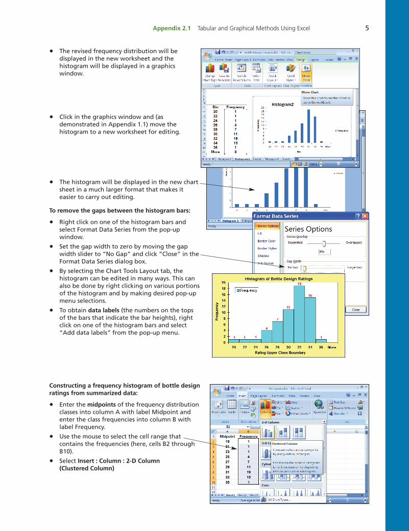
• The revised frequency distribution will be displayed in the new worksheet and the histogram will be displayed in a graphicswindow.
• Click in the graphics window and (as demonstrated in Appendix 1.1) move thehistogram to a new worksheet for editing.
• The histogram will be displayed in the new chartsheet in a much larger format that makes it easier to carry out editing.
To remove the gaps between the histogram bars:
• Right click on one of the histogram bars and select Format Data Series from the pop-up window.
• Set the gap width to zero by moving the gapwidth slider to “No Gap” and click “Close” in theFormat Data Series dialog box.
• By selecting the Chart Tools Layout tab, the histogram can be edited in many ways. This canalso be done by right clicking on various portionsof the histogram and by making desired pop-upmenu selections.
• To obtain data labels (the numbers on the topsof the bars that indicate the bar heights), rightclick on one of the histogram bars and select“Add data labels” from the pop-up menu.
Constructing a frequency histogram of bottle designratings from summarized data:
• Enter the midpoints of the frequency distributionclasses into column A with label Midpoint andenter the class frequencies into column B withlabel Frequency.
• Use the mouse to select the cell range that contains the frequencies (here, cells B2 throughB10).
• Select Insert : Column : 2-D Column (Clustered Column)
bow02371_app2.1.qxd 3/2/11 9:55 AM Page 5
1st Pass
6 Chapter 2 Descriptive Statistics
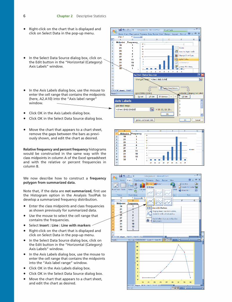
• Right-click on the chart that is displayed andclick on Select Data in the pop-up menu.
• In the Select Data Source dialog box, click onthe Edit button in the “Horizontal (Category)Axis Labels” window.
• In the Axis Labels dialog box, use the mouse toenter the cell range that contains the midpoints(here, A2.A10) into the “Axis label range”window.
• Click OK in the Axis Labels dialog box.
• Click OK in the Select Data Source dialog box.
• Move the chart that appears to a chart sheet, remove the gaps between the bars as previ-ously shown, and edit the chart as desired.
Relative frequency and percent frequency histogramswould be constructed in the same way with theclass midpoints in column A of the Excel spreadsheetand with the relative or percent frequencies incolumn B.
We now describe how to construct a frequency polygon from summarized data.
Note that, if the data are not summarized, first usethe Histogram option in the Analysis ToolPak todevelop a summarized frequency distribution.
• Enter the class midpoints and class frequenciesas shown previously for summarized data.
• Use the mouse to select the cell range that contains the frequencies.
• Select Insert : Line : Line with markers
• Right-click on the chart that is displayed andclick on Select Data in the pop-up menu.
• In the Select Data Source dialog box, click onthe Edit button in the “Horizontal (Category)Axis Labels” window.
• In the Axis Labels dialog box, use the mouse toenter the cell range that contains the midpointsinto the “Axis label range” window.
• Click OK in the Axis Labels dialog box.
• Click OK in the Select Data Source dialog box.
• Move the chart that appears to a chart sheet,and edit the chart as desired.
bow02371_app2.1.qxd 3/2/11 9:55 AM Page 6
1st Pass

Appendix 2.1 Tabular and Graphical Methods Using Excel 7
To construct a percent frequency ogive for thebottle design rating distribution:
Follow the instructions for constructing a his-togram by using the Analysis ToolPak with thefollowing changes:
• In the Histogram dialog box, place a check-mark in the Cumulative Percentage check-box.
• After moving the histogram to a chartsheet, right-click on any histogram bar.
• Select “Format Data Series” from the pop-up menu.
• In the “Format Data Series” dialog box, (1) select Fill from the list of “Series Op-tions” and select “No fill” from the list ofFill options; (2) select Border Color from thelist of “Series Options” and select “No line”from the list of Border Color options; (3) Click Close.
• Click on the chart to remove the histogrambars.
Construct a cross-tabulation table of fund typeversus level of client satisfaction:
• Enter the customer satisfaction data—fundtypes in column A with label “Fund Type”and satisfaction ratings in column B withlabel “Satisfaction Rating.”
• Select Insert : PivotTable
• In the Create PivotTable dialog box, click“Select a table or range.”
• By dragging with the mouse, enter the range of the data to be analyzed into theTable/Range window. Here we have enteredthe range of the client satisfaction dataA1.B101.
• Select the New Worksheet option to placethe PivotTable in a new worksheet.
• Click OK in the Create PivotTable dialogbox.
• In the PivotTable Field List task pane, dragthe label “Fund Type” and drop it into theRow Labels area.
• Also drag the label “Fund Type” and drop it
into the Values area. When this is done,the label will automatically change to“Count of Fund Type.”
• Drag the label “Satisfaction Rating” intothe Column Labels area.
a
bow02371_app2.1.qxd 3/22/11 3:14 PM Page 7
8 Chapter 2 Descriptive Statistics
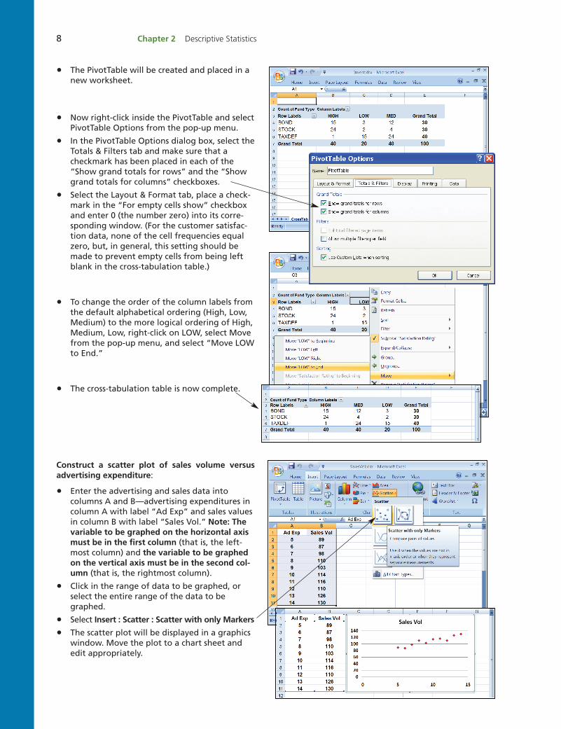
• The PivotTable will be created and placed in anew worksheet.
• Now right-click inside the PivotTable and selectPivotTable Options from the pop-up menu.
• In the PivotTable Options dialog box, select theTotals & Filters tab and make sure that a checkmark has been placed in each of the“Show grand totals for rows” and the “Showgrand totals for columns” checkboxes.
• Select the Layout & Format tab, place a check-mark in the “For empty cells show” checkboxand enter 0 (the number zero) into its corre-sponding window. (For the customer satisfac-tion data, none of the cell frequencies equalzero, but, in general, this setting should bemade to prevent empty cells from being leftblank in the cross-tabulation table.)
• To change the order of the column labels fromthe default alphabetical ordering (High, Low,Medium) to the more logical ordering of High,Medium, Low, right-click on LOW, select Movefrom the pop-up menu, and select “Move LOWto End.”
• The cross-tabulation table is now complete.
Construct a scatter plot of sales volume versusadvertising expenditure:
• Enter the advertising and sales data intocolumns A and B—advertising expenditures incolumn A with label “Ad Exp” and sales valuesin column B with label “Sales Vol.” Note: Thevariable to be graphed on the horizontal axismust be in the first column (that is, the left-most column) and the variable to be graphedon the vertical axis must be in the second col-umn (that is, the rightmost column).
• Click in the range of data to be graphed, or select the entire range of the data to begraphed.
• Select Insert : Scatter : Scatter with only Markers
• The scatter plot will be displayed in a graphicswindow. Move the plot to a chart sheet andedit appropriately.
bow02371_app2.1.qxd 3/2/11 9:55 AM Page 8
1st Pass


![Index [canmedia.mcgrawhill.ca]canmedia.mcgrawhill.ca/college/olcsupport/beechy/6ce/vol2/bee33882... · for exchange rate fluctuations, 788–790 for finance leases, lessee, 1068 for](https://img.dokumen.tips/doc/110x75/5aa0e8767f8b9a89178eb3d2/index-exchange-rate-fluctuations-788790-for-finance-leases-lessee-1068.jpg)