Embed Size (px)
Citation preview
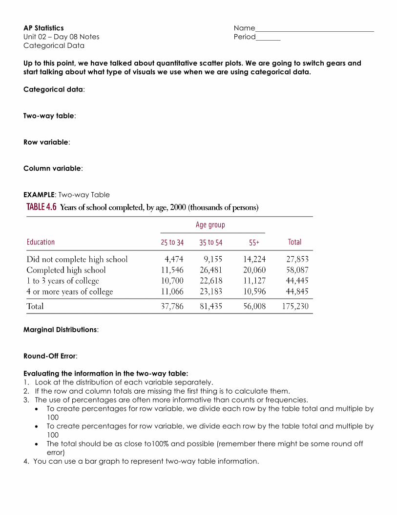
AP Statistics Name Unit 02 – Day 08 Notes Period Categorical Data Up to this point, we have talked about quantitative scatter plots. We are going to switch gears and start talking about what type of visuals we use when we are using categorical data. Categorical data: Two-way table: Row variable: Column variable: EXAMPLE: Two-way Table
Marginal Distributions: Round-Off Error: Evaluating the information in the two-way table: 1. Look at the distribution of each variable separately. 2. If the row and column totals are missing the first thing is to calculate them. 3. The use of percentages are often more informative than counts or frequencies.
• To create percentages for row variable, we divide each row by the table total and multiple by 100
• To create percentages for row variable, we divide each row by the table total and multiple by 100
• The total should be as close to100% and possible (remember there might be some round off error)
4. You can use a bar graph to represent two-way table information.
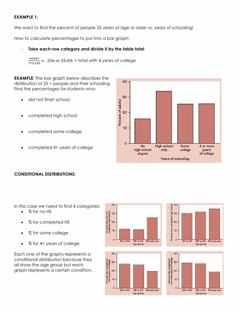
EXAMPLE 1: We want to find the percent of people 25 years of age or older vs. years of schooling! How to calculate percentages to put into a bar graph:
- Take each row category and divide it by the table total !!,#!$
%&$,'()= .256𝑜𝑟25.6% = total with 4 years of college
EXAMPLE: The bar graph below describes the distribution of 25 + people and their schooling. Find the percentages for students who:
• did not finish school • completed high school • completed some college • completed 4+ years of college
CONDITIONAL DISTRIBUTIONS: In this case we need to find 4 categories:
• % for no HS
• % for completed HS
• % for some college
• % for 4+ years of college Each one of the graphs represents a conditional distribution because they all show the age group but each graph represents a certain condition.
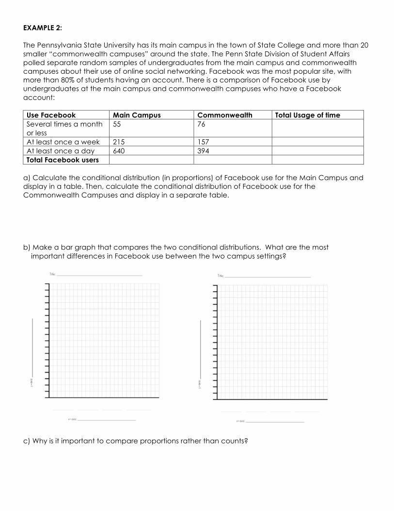
EXAMPLE 2: The Pennsylvania State University has its main campus in the town of State College and more than 20 smaller “commonwealth campuses” around the state. The Penn State Division of Student Affairs polled separate random samples of undergraduates from the main campus and commonwealth campuses about their use of online social networking. Facebook was the most popular site, with more than 80% of students having an account. There is a comparison of Facebook use by undergraduates at the main campus and commonwealth campuses who have a Facebook account: Use Facebook Main Campus Commonwealth Total Usage of time Several times a month or less
55 76
At least once a week 215 157 At least once a day 640 394 Total Facebook users
a) Calculate the conditional distribution (in proportions) of Facebook use for the Main Campus and display in a table. Then, calculate the conditional distribution of Facebook use for the Commonwealth Campuses and display in a separate table. b) Make a bar graph that compares the two conditional distributions. What are the most important differences in Facebook use between the two campus settings?
c) Why is it important to compare proportions rather than counts?
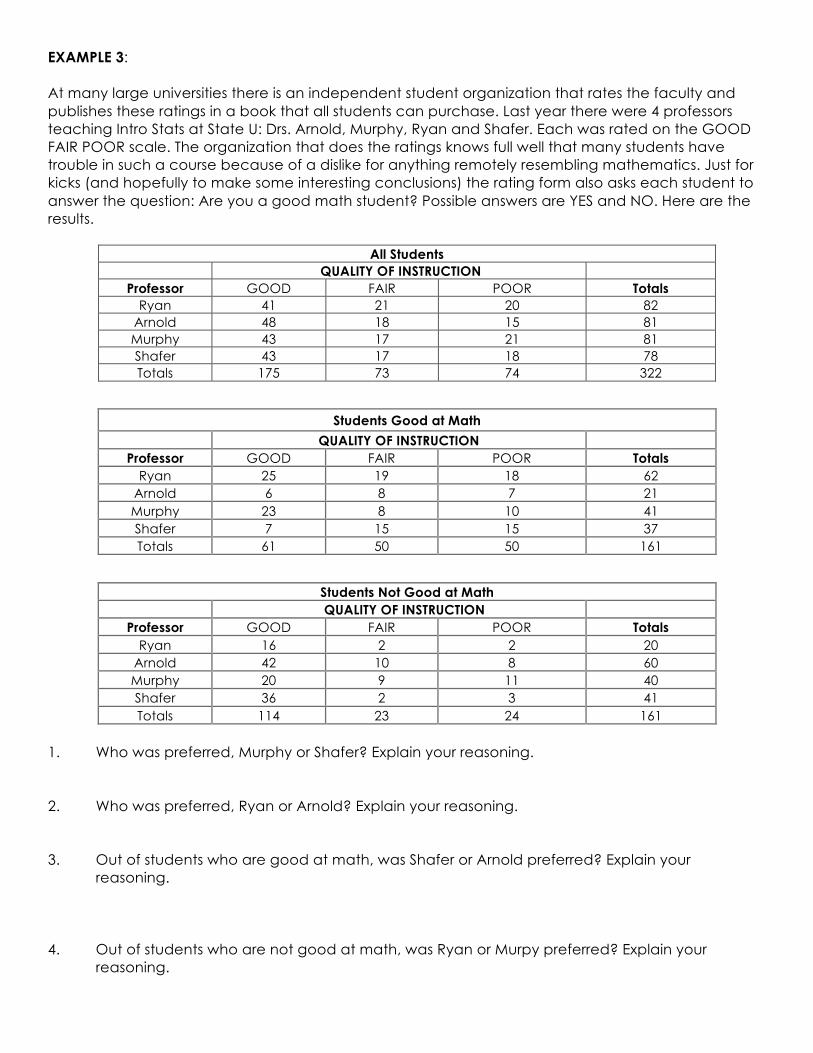
EXAMPLE 3: At many large universities there is an independent student organization that rates the faculty and publishes these ratings in a book that all students can purchase. Last year there were 4 professors teaching Intro Stats at State U: Drs. Arnold, Murphy, Ryan and Shafer. Each was rated on the GOOD FAIR POOR scale. The organization that does the ratings knows full well that many students have trouble in such a course because of a dislike for anything remotely resembling mathematics. Just for kicks (and hopefully to make some interesting conclusions) the rating form also asks each student to answer the question: Are you a good math student? Possible answers are YES and NO. Here are the results.
All Students QUALITY OF INSTRUCTION
Professor GOOD FAIR POOR Totals Ryan 41 21 20 82
Arnold 48 18 15 81 Murphy 43 17 21 81 Shafer 43 17 18 78 Totals 175 73 74 322
Students Good at Math QUALITY OF INSTRUCTION
Professor GOOD FAIR POOR Totals Ryan 25 19 18 62
Arnold 6 8 7 21 Murphy 23 8 10 41 Shafer 7 15 15 37 Totals 61 50 50 161
Students Not Good at Math QUALITY OF INSTRUCTION
Professor GOOD FAIR POOR Totals Ryan 16 2 2 20
Arnold 42 10 8 60 Murphy 20 9 11 40 Shafer 36 2 3 41 Totals 114 23 24 161
1. Who was preferred, Murphy or Shafer? Explain your reasoning. 2. Who was preferred, Ryan or Arnold? Explain your reasoning. 3. Out of students who are good at math, was Shafer or Arnold preferred? Explain your
reasoning. 4. Out of students who are not good at math, was Ryan or Murpy preferred? Explain your
reasoning.