Embed Size (px)
Citation preview

Minitab® Technology Manual for the Advanced Placement Program* to Accompany
Prepared by
Linda Myers Harrisburg Area Community College, Harrisburg, PA
Australia • Brazil • Mexico • Singapore • United Kingdom • United States
*AP and the Advanced Placement Program are registered trademarks of the College Entrance Examination Board, which was not involved in the production of, and does not endorse, this product.
Statistics Learning from Data
AP* EDITION
Roxy Peck California Polytechnic State University,
San Luis Obispo, CA
Chris Olsen Grinnell College, Grinnell, IA and
George Washington High School, Cedar Rapids, IA
© C
enga
ge L
earn
ing.
All
right
s res
erve
d. N
o di
strib
utio
n al
low
ed w
ithou
t exp
ress
aut
horiz
atio
n.

Printed in the United States of America 1 2 3 4 5 6 7 17 16 15 14 13
Minitab® is a registered trademark of Minitab, Inc., in the United States and other countries. *AP and the Advanced Placement Program are registered trademarks of the College Entrance Examination Board, which was not involved in the production of, and does not endorse, this product.
© 2014 Cengage Learning ALL RIGHTS RESERVED. No part of this work covered by the copyright herein may be reproduced, transmitted, stored, or used in any form or by any means graphic, electronic, or mechanical, including but not limited to photocopying, recording, scanning, digitizing, taping, Web distribution, information networks, or information storage and retrieval systems, except as permitted under Section 107 or 108 of the 1976 United States Copyright Act, without the prior written permission of the publisher except as may be permitted by the license terms below.
For product information and technology assistance, contact us at Cengage Learning Customer & Sales Support,
1-800-354-9706.
For permission to use material from this text or product, submit all requests online at www.cengage.com/permissions
Further permissions questions can be emailed to [email protected].
ISBN-13: 978-1-285-16467-0 ISBN-10: 1-285-16467-9 Cengage Learning 200 First Stamford Place, 4th Floor Stamford, CT 06902 USA Cengage Learning is a leading provider of customized learning solutions with office locations around the globe, including Singapore, the United Kingdom, Australia, Mexico, Brazil, and Japan. Locate your local office at: www.cengage.com/global. Cengage Learning products are represented in Canada by Nelson Education, Ltd. To learn more about Cengage Learning Solutions, visit www.cengage.com. Purchase any of our products at your local college store or at our preferred online store www.cengagebrain.com.
NOTE: UNDER NO CIRCUMSTANCES MAY THIS MATERIAL OR ANY PORTION THEREOF BE SOLD, LICENSED, AUCTIONED,
OR OTHERWISE REDISTRIBUTED EXCEPT AS MAY BE PERMITTED BY THE LICENSE TERMS HEREIN.
READ IMPORTANT LICENSE INFORMATION
Dear Professor or Other Supplement Recipient: Cengage Learning has provided you with this product (the “Supplement”) for your review and, to the extent that you adopt the associated textbook for use in connection with your course (the “Course”), you and your students who purchase the textbook may use the Supplement as described below. Cengage Learning has established these use limitations in response to concerns raised by authors, professors, and other users regarding the pedagogical problems stemming from unlimited distribution of Supplements. Cengage Learning hereby grants you a nontransferable license to use the Supplement in connection with the Course, subject to the following conditions. The Supplement is for your personal, noncommercial use only and may not be reproduced, posted electronically or distributed, except that portions of the Supplement may be provided to your students IN PRINT FORM ONLY in connection with your instruction of the Course, so long as such students are advised that they may not copy or distribute
any portion of the Supplement to any third party. You may not sell, license, auction, or otherwise redistribute the Supplement in any form. We ask that you take reasonable steps to protect the Supplement from unauthorized use, reproduction, or distribution. Your use of the Supplement indicates your acceptance of the conditions set forth in this Agreement. If you do not accept these conditions, you must return the Supplement unused within 30 days of receipt. All rights (including without limitation, copyrights, patents, and trade secrets) in the Supplement are and will remain the sole and exclusive property of Cengage Learning and/or its licensors. The Supplement is furnished by Cengage Learning on an “as is” basis without any warranties, express or implied. This Agreement will be governed by and construed pursuant to the laws of the State of New York, without regard to such State’s conflict of law rules. Thank you for your assistance in helping to safeguard the integrity of the content contained in this Supplement. We trust you find the Supplement a useful teaching tool. ©
Cen
gage
Lea
rnin
g. A
ll rig
hts r
eser
ved.
No
dist
ribut
ion
allo
wed
with
out e
xpre
ss a
utho
rizat
ion.
© 2014 Cengage Learning. All Rights Reserved. May not be copied, scanned, or duplicated, in whole or in part, except for use as permitted in a license distributed with a certain product or service or otherwise on a password-protected website for classroom use.
iii
Contents* Chapter 1 ...........................................................................................................................................
Chapter 2 ...........................................................................................................................................
Chapter 3 ......................................................................................................................................... 19
Chapter 4 ......................................................................................................................................... 2
Chapter 6 ......................................................................................................................................... 36
Chapter 9 ......................................................................................................................................... 40
Chapter 10 ....................................................................................................................................... 42
Chapter 11 ....................................................................................................................................... 45
Chapter 12 .......................................................................................................................................
Chapter 13 .......................................................................................................................................
Chapter 15 .......................................................................................................................................
Chapter 16 .......................................................................................................................................
2
8
Chapter ......................................................................................................................................... 34 5
61
6
49
53
66
* Chapters 7, 8 and 14 have been omitted from this guide since they contain no material relevant to Excel.
© C
enga
ge L
earn
ing.
All
right
s res
erve
d. N
o di
strib
utio
n al
low
ed w
ithou
t exp
ress
aut
horiz
atio
n.

© C
enga
ge L
earn
ing.
All
right
s res
erve
d. N
o di
strib
utio
n al
low
ed w
ithou
t exp
ress
aut
horiz
atio
n.

1
PREFACE
This Minitab Manual is a supplement to Statistics: Learning from Data, AP* Edition by Roxy Peck and Chris Olsen. This manual is intended to help students perform the analysis described in that textbook using the Student Version of Minitab 14. Some of the advanced functionality is restricted in the student version. There are also Technology notes at the end of each chapter to help you with the commands used here. Dr. Linda Myers Harrisburg Area Community College Spring, 2013
© 2014 Cengage Learning. All Rights Reserved. May not be copied, scanned, or duplicated, in whole or in part, except for use as permitted in a license distributed with a certain product or service or otherwise on a password-protected website for classroom use.
*AP and the Advanced Placement Program are registered trademarks of the College Entrance Examination Board, which was not involved in the production of, and does not endorse, this product.
© C
enga
ge L
earn
ing.
All
right
s res
erve
d. N
o di
strib
utio
n al
low
ed w
ithou
t exp
ress
aut
horiz
atio
n.

2
CHAPTER ONE Getting Started With Minitab OVERVIEW This chapter covers the basic structure and commands of Minitab for Windows Release 14. After reading this chapter you should be able to :
1. Start Minitab 2. Identify the Main Menu Bar 3. Enter Data into Minitab 4. Save the Data File 5. Print the Session Window 6. Obtain Online Help 7. Exit Minitab.
Minitab commands and software features are featured in areas where they are appropriate for the specific statistical analysis. 1.1 STARTING MINITAB Minitab is a computer software program initially designed as a system to help in the teaching of statistics, and over the years has evolved into an excellent system for data analysis. The procedure for starting Minitab requires only that you select Start > Programs > Minitab 14 for Windows > Minitab
© 2014 Cengage Learning. All Rights Reserved. May not be copied, scanned, or duplicated, in whole or in part, except for use as permitted in a license distributed with a certain product or service or otherwise on a password-protected website for classroom use.
© C
enga
ge L
earn
ing.
All
right
s res
erve
d. N
o di
strib
utio
n al
low
ed w
ithou
t exp
ress
aut
horiz
atio
n.

3
1.2 THE MAIN MENUThe main Minitab window contains numerous sub-windows, two of which are shown above called the Worksheet window and the Session window. A third window is the Project Manager. The Project Manager contains folders that allow access to various parts of your project. These folders include Session, History, Graphs, Report Pad, Related Documents and Worksheet folders. Across the top of the Minitab window is the menu bar, from which menus may be opened and from which you choose commands. The Session and Worksheet windows are the most important and the most frequently used windows. The main menu bar contains selections common to most Windows applications and some selections specific to Minitab.
The File command contains options related to opening files, saving files, printing, and exiting Minitab. The Edit command contains options related to deleting, copying, and pasting.
© 2014 Cengage Learning. All Rights Reserved. May not be copied, scanned, or duplicated, in whole or in part, except for use as permitted in a license distributed with a certain product or service or otherwise on a password-protected website for classroom use.
© C
enga
ge L
earn
ing.
All
right
s res
erve
d. N
o di
strib
utio
n al
low
ed w
ithou
t exp
ress
aut
horiz
atio
n.

4
The other selections on the menu bar, Data, Calc(ulate), Stat(istics), Graph, Editor and Tools are specific to Minitab. The final two selections on the main menu bar, Window and Help are found in most Windows applications. The Window command enables you to switch among windows, while the Help command enables you to get online help from Minitab. 1.3 ENTERING DATA Minitab’s Worksheet window is like a spreadsheet in that it works with data in rows and columns. Typically, a column contains the data for one variable, with each individual observation in a row. Columns are designated as C1, C2, C3,... and rows are numbered 1, 2, 3, .... The size of the worksheet is limited only by the memory available and the size of the hard drive. There are several ways to enter data into the Minitab Data window. You may read data from a file or type in the data. Reading Data from a File Follow these steps to read data from a file: 1. Start Minitab 2. To open the file, select File > Open Worksheet from the menu. At the completion of this operation, all data in the current worksheet will be replaced with the data in the file.
When you select Open Worksheet the dialog box will open. Minitab allows you to open files from many different software packages. Minitab worksheets use the file extension .mtw and Minitab portable files use the extension .mtp. Choose the location and the type of file you want to open, then select the filename from the list and choose Open to open the file.
Typing Data into the Worksheet Follow these steps to add data to the dataset: 1. Make the Worksheet window the active window. Position the cursor in the Worksheet window in the column and cell where you want the data located. Position the cursor in column 1 row 1.
© 2014 Cengage Learning. All Rights Reserved. May not be copied, scanned, or duplicated, in whole or in part, except for use as permitted in a license distributed with a certain product or service or otherwise on a password-protected website for classroom use.
© C
enga
ge L
earn
ing.
All
right
s res
erve
d. N
o di
strib
utio
n al
low
ed w
ithou
t exp
ress
aut
horiz
atio
n.

5
2. Enter the data. 3. Correcting errors: If you enter an incorrect value, highlight the cell, retype the data entry and press {ENTER}. Do not delete the error, just type in the correct value. Deleting the data causes the entire column to move up one line!!
Naming Columns in the Worksheet Columns are generally used for different variables within the dataset. To name a column (variable) in the worksheet, position the cursor in the box at the top of the column above row 1 and below the C# label. Type in the name you want to assign to the column. In version 14 of Minitab, column names may be longer than 8 characters. 1.4 SAVING A FILE There are three basic components in a Minitab session: the worksheet (contained in the Worksheet window), the Session window and graphs. Saving graphs will be covered after you create your first graph. Saving a Worksheet Follow these steps to save a Minitab worksheet for the first time. 1. Choose File > Save Current Worksheet As... 2. Select the drive. Designate the correct drive and path for saving the file in the dialog box, then position the cursor in the box labeled File Name: and type in the filename. Minitab uses the same file naming conventions as Windows. Minitab worksheets use the file extension .mtw and Minitab portable files use the extension .mtp. Designate the drive as A: and enter the filename ex1_12a. Select Save. Saving a Project When you save your work as a project, you save all the information about your work. The contents of every window is saved, including the columns of data in each Worksheet window, the complete text in the Session window and History window, and
© 2014 Cengage Learning. All Rights Reserved. May not be copied, scanned, or duplicated, in whole or in part, except for use as permitted in a license distributed with a certain product or service or otherwise on a password-protected website for classroom use.
© C
enga
ge L
earn
ing.
All
right
s res
erve
d. N
o di
strib
utio
n al
low
ed w
ithou
t exp
ress
aut
horiz
atio
n.
6
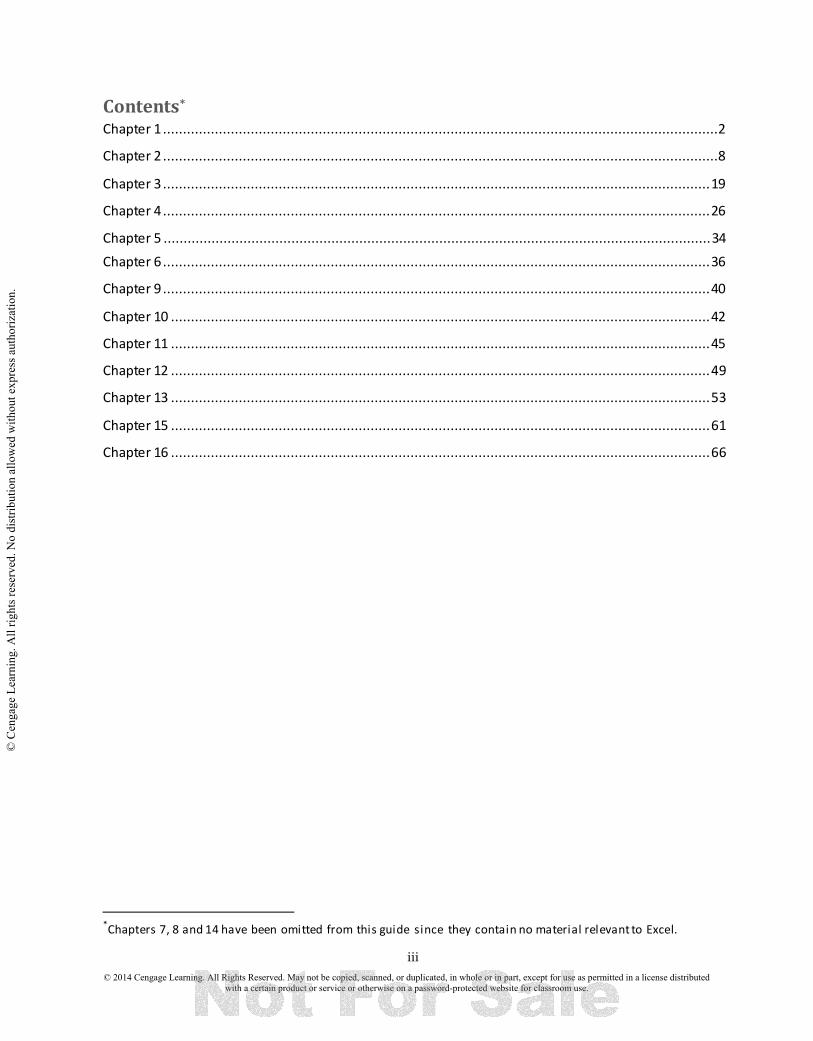
each Graph window. You will want to save these results if it is necessary to examine the output at a later time or use the output in a document. Follow these steps to save a project. 1. Choose File > Save Project As... 2. Designate the correct drive and path for saving the file in the dialog box, then position the cursor in the box labeled File Name: and type in the filename for this project file. 3. Select drive A: and enter the filename ex1_12a.mpj and choose Save. 1.5 PRINTING THE SESSION WINDOW Follow these steps to print a copy of the Session window. 1. Make the Session window the active window. Click on the title bar of the Session window to make it the active window. 2. Select the correct printer. If necessary, select File > Print Setup... to select the correct printer. After selecting the correct printer select OK. 3. Print the Session window. Select File > Print Worksheet. Choose OK to print the Session window. 1.6 OBTAINING ON-LINE HELP Follow these steps to obtain on-line help. 1. Click with the mouse on Help > Help, to bring up the dialog box.
2. Select the topic. Click on the text ’’Getting Started’’ and ’’Introduction to Minitab’’. The Help window displays basic information on using Minitab. Click on the Close option button on the top right of the Help window.
© 2014 Cengage Learning. All Rights Reserved. May not be copied, scanned, or duplicated, in whole or in part, except for use as permitted in a license distributed with a certain product or service or otherwise on a password-protected website for classroom use.
© C
enga
ge L
earn
ing.
All
right
s res
erve
d. N
o di
strib
utio
n al
low
ed w
ithou
t exp
ress
aut
horiz
atio
n.
7
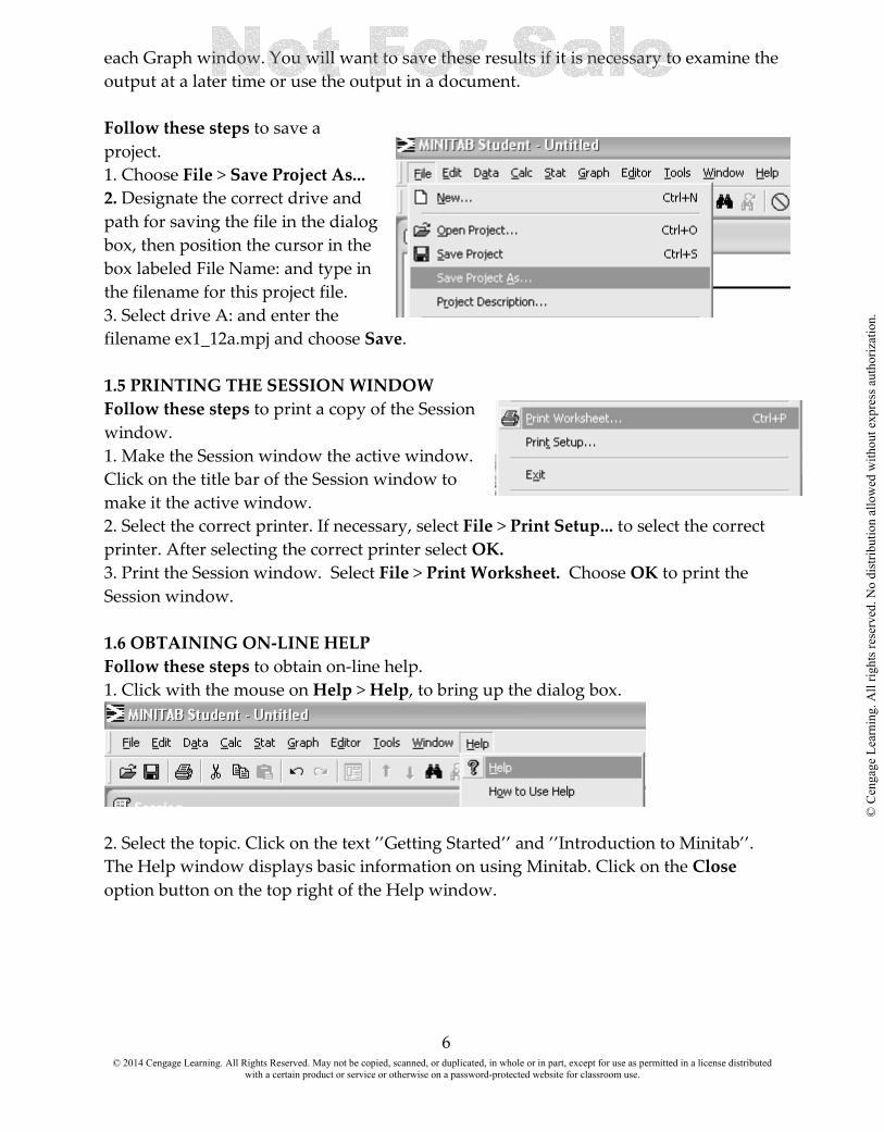
3. Using the Index. Click Index tab, to bring up the dialog box Type ’’Graph Menu’’ in the Type in the keyword to find: textbox. Click on the Display option button. 4. Exiting Help. To return to the Minitab session, Click on the Close option button on the top right of the Help window.
1.7 EXITING MINITAB
To end a MINITAB session and exit the program, choose File from the menu bar and then choose Exit. A dialog box will appear, asking if you want to save the changes made to this worksheet. Click Yes or No. It is also possible to exit MINITAB by clicking the X in the upper right corner of the window.
© 2014 Cengage Learning. All Rights Reserved. May not be copied, scanned, or duplicated, in whole or in part, except for use as permitted in a license distributed with a certain product or service or otherwise on a password-protected website for classroom use.
© C
enga
ge L
earn
ing.
All
right
s res
erve
d. N
o di
strib
utio
n al
low
ed w
ithou
t exp
ress
aut
horiz
atio
n.

8
CHAPTER TWO Graphical Methods for Describing Data Distributions
OVERVIEW: Graphically representing data is one of the most helpful ways to become acquainted with the sample data. There are several ways to display a picture of the data. These graphical displays help us get acquainted with the data and to begin to get a feel for how the data is distributed and arranged. In attempting to get a pictorial representation of data, we must decide what type of graphic display would best present the data and their distribution. The type of display used depends, in large part, on the type of data and the idea to be presented. In this chapter you will use Minitab to present data graphically.
2.1 Bar graphs 2.2 Stem-and-leaf displays 2.3 Histograms. 2.4 Scatterplots and Time Series plots. 2.1 BAR GRAPHS A bar chart is a graphical display of categorical data. Each category in the frequency distribution is represented by a bar or rectangle, and the display is constructed so that the area of each bar is proportional to the corresponding frequency or relative frequency. We will use Example 2.4 How Far Is Far Enough from the text to illustrate how to construct a bar chart using Minitab.
1. If you are working from a data file, select File > Open Worksheet. Select the appropriate file. Select Open. If not you will have to enter the data.
2. Choose Graph > Bar Chart. From the Bars represent: drop down list box, select Values from a table. Fill in the dialog boxes as shown and select OK.
© 2014 Cengage Learning. All Rights Reserved. May not be copied, scanned, or duplicated, in whole or in part, except for use as permitted in a license distributed with a certain product or service or otherwise on a password-protected website for classroom use.
© C
enga
ge L
earn
ing.
All
right
s res
erve
d. N
o di
strib
utio
n al
low
ed w
ithou
t exp
ress
aut
horiz
atio
n.

9
© 2014 Cengage Learning. All Rights Reserved. May not be copied, scanned, or duplicated, in whole or in part, except for use as permitted in a license distributed with a certain product or service or otherwise on a password-protected website for classroom use.
© C
enga
ge L
earn
ing.
All
right
s res
erve
d. N
o di
strib
utio
n al
low
ed w
ithou
t exp
ress
aut
horiz
atio
n.
10
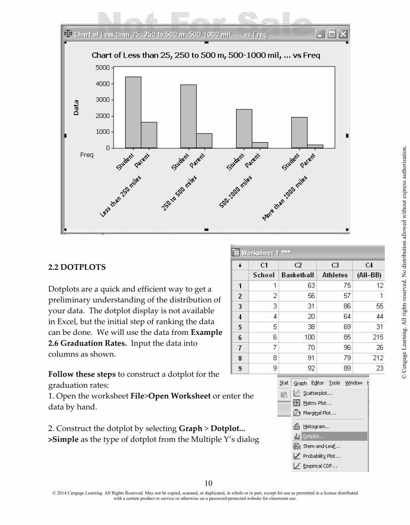
2.2 DOTPLOTS Dotplots are a quick and efficient way to get a preliminary understanding of the distribution of your data. The dotplot display is not available in Excel, but the initial step of ranking the data can be done. We will use the data from Example 2.6 Graduation Rates. Input the data into columns as shown. Follow these steps to construct a dotplot for the graduation rates: 1. Open the worksheet File>Open Worksheet or enter the data by hand. 2. Construct the dotplot by selecting Graph > Dotplot... >Simple as the type of dotplot from the Multiple Y’s dialog
© 2014 Cengage Learning. All Rights Reserved. May not be copied, scanned, or duplicated, in whole or in part, except for use as permitted in a license distributed with a certain product or service or otherwise on a password-protected website for classroom use.
© C
enga
ge L
earn
ing.
All
right
s res
erve
d. N
o di
strib
utio
n al
low
ed w
ithou
t exp
ress
aut
horiz
atio
n.

11
choices. Place in the Graph variables: text box. Choose OK. The graph will appear in its own window.
© 2014 Cengage Learning. All Rights Reserved. May not be copied, scanned, or duplicated, in whole or in part, except for use as permitted in a license distributed with a certain product or service or otherwise on a password-protected website for classroom use.
© C
enga
ge L
earn
ing.
All
right
s res
erve
d. N
o di
strib
utio
n al
low
ed w
ithou
t exp
ress
aut
horiz
atio
n.

12
2.3 STEM AND LEAF DISPLAY
To illustrate the commands necessary to construct a stem-and-leaf display, let's use the data from Example 2.8 Going Wireless. Follow these steps to construct a basic stem-and-leaf display 1. Open the worksheet by selecting File > Open Worksheet or enter the data by hand. 2. To construct the stem-and-leaf display select Graph > Stem-and-Leaf. Fill in the dialog boxes as shown. Click OK.
© 2014 Cengage Learning. All Rights Reserved. May not be copied, scanned, or duplicated, in whole or in part, except for use as permitted in a license distributed with a certain product or service or otherwise on a password-protected website for classroom use.
© C
enga
ge L
earn
ing.
All
right
s res
erve
d. N
o di
strib
utio
n al
low
ed w
ithou
t exp
ress
aut
horiz
atio
n.

13
By changing the increment level we get a nicer graph.
2.4 HISTOGRAMS Histograms are used for large sets of data and don’t work well for small data sets. We expect the histogram of a sample to be similar to that of the population. Histograms are constructed a bit differently, depending on whether the variable of interest is discrete or continuous.) in the interval. We will use Example 2.12 Promiscuous Queen Bees to illustrate how to construct a histogram for a discrete data set. We divide the sample values into many intervals called bins. Bars represent the number of observations falling within each bin (its frequency). 1. Open the worksheet or enter the data by hand. 2. Construct the relative frequency histogram by selecting Graph > Histogram...Select Simple histogram. Click OK. Fill in the dialog boxes as shown and click OK.
© 2014 Cengage Learning. All Rights Reserved. May not be copied, scanned, or duplicated, in whole or in part, except for use as permitted in a license distributed with a certain product or service or otherwise on a password-protected website for classroom use.
© C
enga
ge L
earn
ing.
All
right
s res
erve
d. N
o di
strib
utio
n al
low
ed w
ithou
t exp
ress
aut
horiz
atio
n.

14
© 2014 Cengage Learning. All Rights Reserved. May not be copied, scanned, or duplicated, in whole or in part, except for use as permitted in a license distributed with a certain product or service or otherwise on a password-protected website for classroom use.
© C
enga
ge L
earn
ing.
All
right
s res
erve
d. N
o di
strib
utio
n al
low
ed w
ithou
t exp
ress
aut
horiz
atio
n.

15
Frequency Distributions for Continuous Numerical Data We will be using Example 2.13 Enrollments at Public Universities to illustrate constructing a histogram for continuous data in Minitab. The program will decide the size of the bins. Enter the data and select Graph > Histogram...Select Simple histogram. Click OK. Fill in the dialog boxes as shown and click OK.
© 2014 Cengage Learning. All Rights Reserved. May not be copied, scanned, or duplicated, in whole or in part, except for use as permitted in a license distributed with a certain product or service or otherwise on a password-protected website for classroom use.
© C
enga
ge L
earn
ing.
All
right
s res
erve
d. N
o di
strib
utio
n al
low
ed w
ithou
t exp
ress
aut
horiz
atio
n.
16
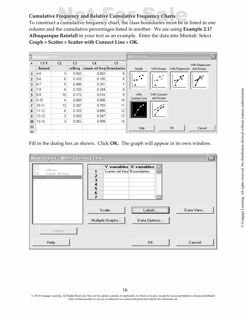
Cumulative Frequency and Relative Cumulative Frequency Charts To construct a cumulative frequency chart, the class boundaries must be in listed in one column and the cumulative percentages listed in another. We are using Example 2.17 Albuquerque Rainfall in your text as an example. Enter the data into Minitab. Select Graph > Scatter > Scatter with Connect Line > OK.
Fill in the dialog box as shown. Click OK. The graph will appear in its own window.
© 2014 Cengage Learning. All Rights Reserved. May not be copied, scanned, or duplicated, in whole or in part, except for use as permitted in a license distributed with a certain product or service or otherwise on a password-protected website for classroom use.
© C
enga
ge L
earn
ing.
All
right
s res
erve
d. N
o di
strib
utio
n al
low
ed w
ithou
t exp
ress
aut
horiz
atio
n.

17
2.5 SCATTER PLOTS AND TIME SERIES PLOTS Scatterplots can be created in Excel by highlighting the columns of variables and selecting Insert Scatter Scatter with only Markers. The explanatory variable should be plotted on the x-axis and the response variable should be plotted on the y-axis. The highlighted columns should have the x variable on the left and the y variable on the right. We will use Example 2.18 Worth the Price You Pay to illustrate the process. Follow these steps to construct a scatterplot of the data. 1. Select File >Open Worksheet. Or enter the data by hand. 2. Create the scatterplot by selecting Graph > Scatterplot > Simple scatterplot > OK Fill in the dialog boxes. You may enter titles and format the graph as you choose.
© 2014 Cengage Learning. All Rights Reserved. May not be copied, scanned, or duplicated, in whole or in part, except for use as permitted in a license distributed with a certain product or service or otherwise on a password-protected website for classroom use.
© C
enga
ge L
earn
ing.
All
right
s res
erve
d. N
o di
strib
utio
n al
low
ed w
ithou
t exp
ress
aut
horiz
atio
n.

18
© 2014 Cengage Learning. All Rights Reserved. May not be copied, scanned, or duplicated, in whole or in part, except for use as permitted in a license distributed with a certain product or service or otherwise on a password-protected website for classroom use.
© C
enga
ge L
earn
ing.
All
right
s res
erve
d. N
o di
strib
utio
n al
low
ed w
ithou
t exp
ress
aut
horiz
atio
n.

19
CHAPTER THREE: Numerical Methods for Describing Data Distributions OVERVIEW: Numerical summaries that indicate where the center of a data set is located are called measures of central tendency. Measures of the center typically include the mean and median. Recall that the mean of a data set is the sum of the data divided by the number of pieces of data, while the median represents the middle value in an ordered data set and divides the data set into two equal parts. Numerical summaries that describe the spread of values about the center are called measures of variability or measures of dispersion. Measures of variability typically include the range and standard deviation. The range represents the difference between the largest (maximum) and smallest (minimum) values in a data set. In this chapter you will be able to use Minitab to:
3.1 Calculate measures of central tendency 3.2 Calculate measures of variability 3.3 Calculate descriptive statistics 3.4 Calculate Quartiles and IQR 3.5 Calculate the Five Number Summary and boxplots 3.1 MEASURES OF CENTRAL TENDENCY We will use the data in Example 3.3 Thinking about Exercise Again to illustrate the commands need to calculate the mean and median of the data. Enter the data into the spreadsheet and select Calc > Column Statistics
© 2014 Cengage Learning. All Rights Reserved. May not be copied, scanned, or duplicated, in whole or in part, except for use as permitted in a license distributed with a certain product or service or otherwise on a password-protected website for classroom use.
© C
enga
ge L
earn
ing.
All
right
s res
erve
d. N
o di
strib
utio
n al
low
ed w
ithou
t exp
ress
aut
horiz
atio
n.

20
Select the column and function you want and click OK. The answer will appear in the session window.
To display the median, select Calc > Column Statistics > Median > Input variable Fun > OK.
© 2014 Cengage Learning. All Rights Reserved. May not be copied, scanned, or duplicated, in whole or in part, except for use as permitted in a license distributed with a certain product or service or otherwise on a password-protected website for classroom use.
© C
enga
ge L
earn
ing.
All
right
s res
erve
d. N
o di
strib
utio
n al
low
ed w
ithou
t exp
ress
aut
horiz
atio
n.
21
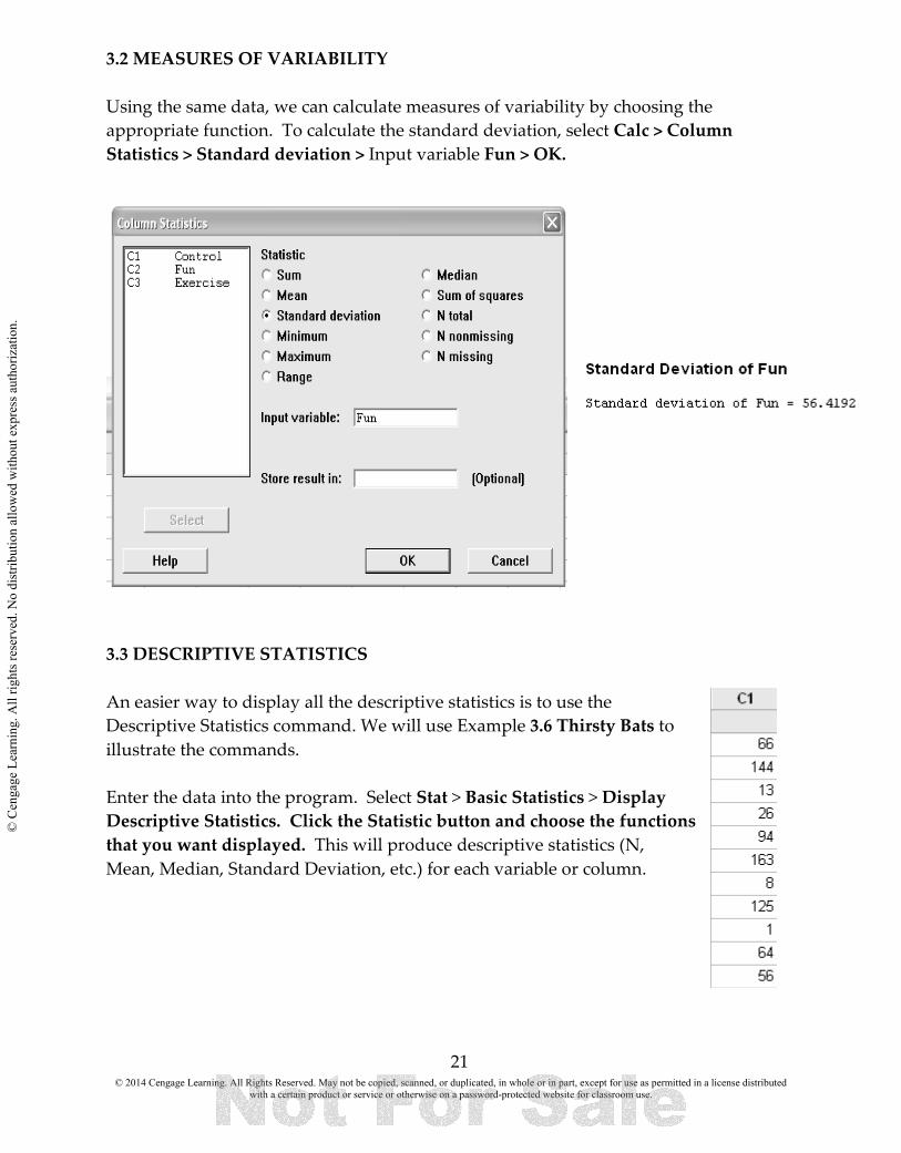
3.2 MEASURES OF VARIABILITY Using the same data, we can calculate measures of variability by choosing the appropriate function. To calculate the standard deviation, select Calc > Column Statistics > Standard deviation > Input variable Fun > OK.
3.3 DESCRIPTIVE STATISTICS An easier way to display all the descriptive statistics is to use the Descriptive Statistics command. We will use Example 3.6 Thirsty Bats to illustrate the commands. Enter the data into the program. Select Stat > Basic Statistics > Display Descriptive Statistics. Click the Statistic button and choose the functions that you want displayed. This will produce descriptive statistics (N, Mean, Median, Standard Deviation, etc.) for each variable or column.
© 2014 Cengage Learning. All Rights Reserved. May not be copied, scanned, or duplicated, in whole or in part, except for use as permitted in a license distributed with a certain product or service or otherwise on a password-protected website for classroom use.
© C
enga
ge L
earn
ing.
All
right
s res
erve
d. N
o di
strib
utio
n al
low
ed w
ithou
t exp
ress
aut
horiz
atio
n.

22
The option provides the option of displaying a histogram, a histogram with a normal curve, a dotplot, a boxplot, or a graphical summary of the variables.
Graphs
3.4 QUARTILES AND IQR Quartiles are a numerical summary that represent a measure of location. The lower quartile (Q1) represents the point such that 25% of the observations are below the point. The median is the second quartile (Q2) and is the point such that 50% of the observations are below the point. The upper quartile (Q3) represents the point such that 75% of the observations are below the point. Let’s look at Example 3.7 Number of Visits to a Class Web Site and determine the numerical summaries for the data set. This time we will include quartiles and the boxplot. Forty students were enrolled in a statistical reasoning course at a California
© 2014 Cengage Learning. All Rights Reserved. May not be copied, scanned, or duplicated, in whole or in part, except for use as permitted in a license distributed with a certain product or service or otherwise on a password-protected website for classroom use.
© C
enga
ge L
earn
ing.
All
right
s res
erve
d. N
o di
strib
utio
n al
low
ed w
ithou
t exp
ress
aut
horiz
atio
n.

23
college. The instructor made course materials, grades, and lecture notes available to students on a class web site, and course management software kept track of how often each student accessed any of these web pages. One month after the course began, the instructor requested a report on how many times each student had accessed a class web page. This same data are used in Examples 3.8 and 3.9 Follow these steps to calculate the numerical summaries for the data set: 1. Enter the data by hand or open the worksheet by selecting File > OpenWorksheet. 2. Calculate the numerical summaries by selecting Stat > Basic Statistics > Display Descriptive Statistics. Enter the variable in the dialog box. 3. Click on the Statistics button and select the appropriate functions. Click OK OK.
The answer will appear in the session window and the boxplot in its own window,
© 2014 Cengage Learning. All Rights Reserved. May not be copied, scanned, or duplicated, in whole or in part, except for use as permitted in a license distributed with a certain product or service or otherwise on a password-protected website for classroom use.
© C
enga
ge L
earn
ing.
All
right
s res
erve
d. N
o di
strib
utio
n al
low
ed w
ithou
t exp
ress
aut
horiz
atio
n.

24
3.5 THE FIVE NUMBER SUMMARY AND BOXPLOTS Similar procedures can be used to calculate the five number summary and a boxplot of the data. We will use Example 3.13 Video Game Practice Strategies to illustrate the steps. Follow these steps to calculate the numerical summaries for the data set: 1. Enter the data by hand or open the worksheet by selecting File > OpenWorksheet. 2. Calculate the numerical summaries by selecting Stat > Basic Statistics > Display Descriptive Statistics. Enter the variable in the dialog box. 3. Click on the Statistics button and select the appropriate functions. Click OK. 4. Click on the Graph button and check Boxplot. Click OK OK.
© 2014 Cengage Learning. All Rights Reserved. May not be copied, scanned, or duplicated, in whole or in part, except for use as permitted in a license distributed with a certain product or service or otherwise on a password-protected website for classroom use.
© C
enga
ge L
earn
ing.
All
right
s res
erve
d. N
o di
strib
utio
n al
low
ed w
ithou
t exp
ress
aut
horiz
atio
n.
25
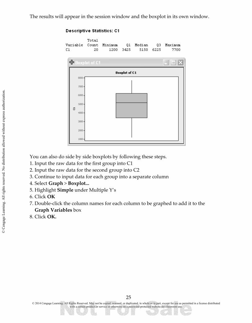
The results will appear in the session window and the boxplot in its own window.
You can also do side by side boxplots by following these steps. 1. Input the raw data for the first group into C1 2. Input the raw data for the second group into C2 3. Continue to input data for each group into a separate column 4. Select Graph > Boxplot... 5. Highlight Simple under Multiple Y’s 6. Click OK 7. Double-click the column names for each column to be graphed to add it to the Graph Variables box 8. Click OK.
© 2014 Cengage Learning. All Rights Reserved. May not be copied, scanned, or duplicated, in whole or in part, except for use as permitted in a license distributed with a certain product or service or otherwise on a password-protected website for classroom use.
© C
enga
ge L
earn
ing.
All
right
s res
erve
d. N
o di
strib
utio
n al
low
ed w
ithou
t exp
ress
aut
horiz
atio
n.
26
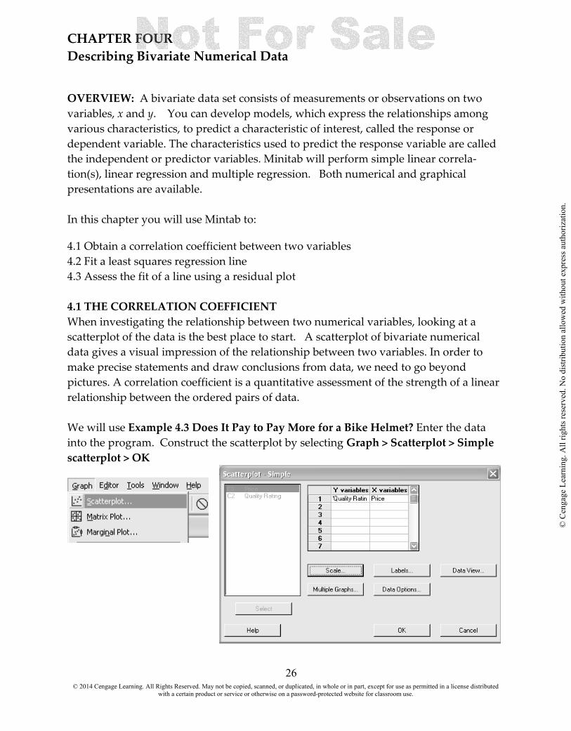
CHAPTER FOUR Describing Bivariate Numerical Data OVERVIEW: A bivariate data set consists of measurements or observations on two variables, x and y. You can develop models, which express the relationships among various characteristics, to predict a characteristic of interest, called the response or dependent variable. The characteristics used to predict the response variable are called the independent or predictor variables. Minitab will perform simple linear correla-tion(s), linear regression and multiple regression. Both numerical and graphical presentations are available. In this chapter you will use Mintab to:
4.1 Obtain a correlation coefficient between two variables 4.2 Fit a least squares regression line 4.3 Assess the fit of a line using a residual plot 4.1 THE CORRELATION COEFFICIENT When investigating the relationship between two numerical variables, looking at a scatterplot of the data is the best place to start. A scatterplot of bivariate numerical data gives a visual impression of the relationship between two variables. In order to make precise statements and draw conclusions from data, we need to go beyond pictures. A correlation coefficient is a quantitative assessment of the strength of a linear relationship between the ordered pairs of data. We will use Example 4.3 Does It Pay to Pay More for a Bike Helmet? Enter the data into the program. Construct the scatterplot by selecting Graph > Scatterplot > Simple scatterplot > OK
© 2014 Cengage Learning. All Rights Reserved. May not be copied, scanned, or duplicated, in whole or in part, except for use as permitted in a license distributed with a certain product or service or otherwise on a password-protected website for classroom use.
© C
enga
ge L
earn
ing.
All
right
s res
erve
d. N
o di
strib
utio
n al
low
ed w
ithou
t exp
ress
aut
horiz
atio
n.

27
Select Stat > Basic Statistics > Correlation Enter the variables in textbox > OK
© 2014 Cengage Learning. All Rights Reserved. May not be copied, scanned, or duplicated, in whole or in part, except for use as permitted in a license distributed with a certain product or service or otherwise on a password-protected website for classroom use.
© C
enga
ge L
earn
ing.
All
right
s res
erve
d. N
o di
strib
utio
n al
low
ed w
ithou
t exp
ress
aut
horiz
atio
n.

28
The results appear in the session window. 4.2 FIT A LEAST SQUAQ RES REGRESSION LINE The Regression command in Minitab fits a simple linear or polynomial (second or third order) regression model and plots a regression line through the data or the log10 of the
data. The fitted line plot shows you how closely the actual data lie to the fitted regression line. In this section, you will obtain a fitted line plot to illustrate how the estimated relationship fits the data in a simple linear regression model. Given two variables x and y, the general objective of regression analysis is to use information about
x to make predictions concerning y. The roles played by the two variables are reflected in the terminology: y is referred to as the dependent or response variable, while x is
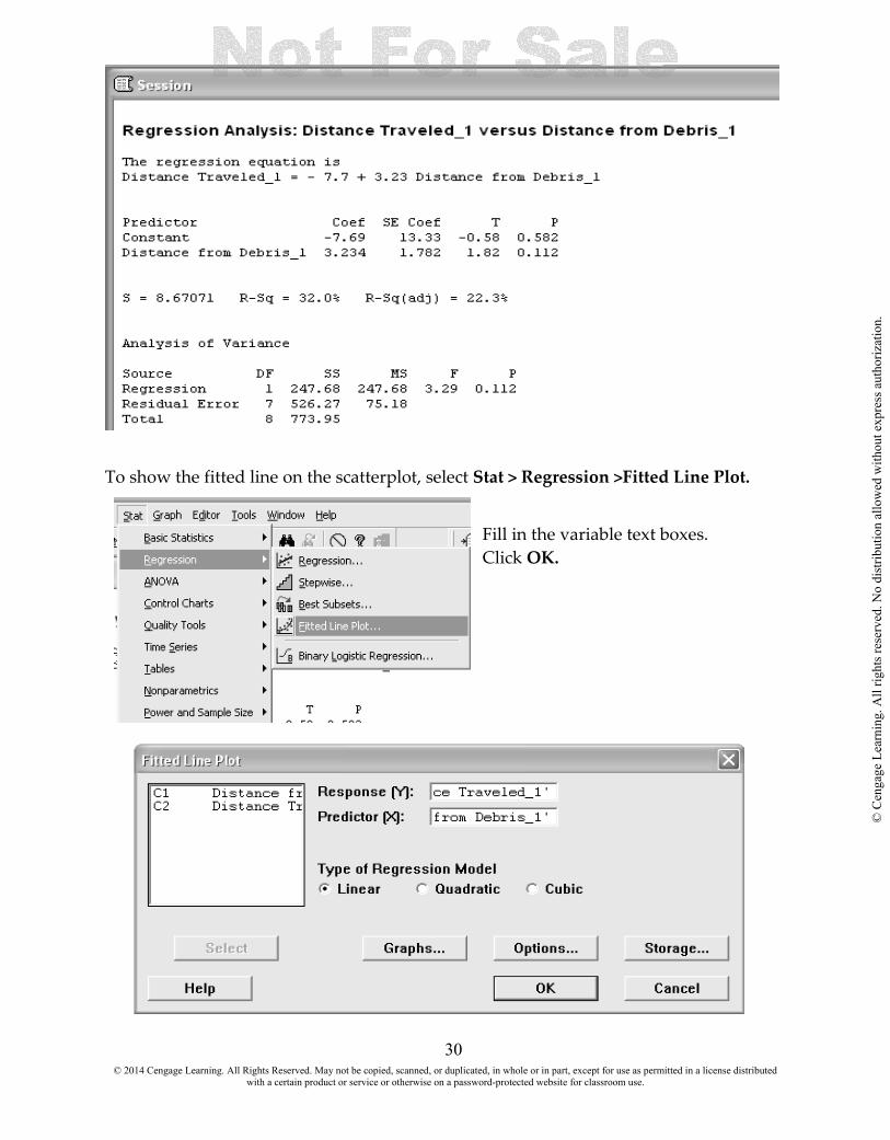
referred to as the independent, predictor, or explanatory variable. We can model the response variable as a linear relationship of the independent variable. The simple linear regression model is a straight line of the form y = a + bx where a is the y-intercept, the point on the y-axis where the straight line crosses the y-axis, and b is the slope, the amount by which y increases when x increases by 1unit. We will use Example 4.6 It May be a Pile of Debris to You, But It Is Home to a Mouse to illustrate the commands. Enter the data into the program. Select Stat > Regression > Regression
© 2014 Cengage Learning. All Rights Reserved. May not be copied, scanned, or duplicated, in whole or in part, except for use as permitted in a license distributed with a certain product or service or otherwise on a password-protected website for classroom use.
© C
enga
ge L
earn
ing.
All
right
s res
erve
d. N
o di
strib
utio
n al
low
ed w
ithou
t exp
ress
aut
horiz
atio
n.

29
© 2014 Cengage Learning. All Rights Reserved. May not be copied, scanned, or duplicated, in whole or in part, except for use as permitted in a license distributed with a certain product or service or otherwise on a password-protected website for classroom use.
© C
enga
ge L
earn
ing.
All
right
s res
erve
d. N
o di
strib
utio
n al
low
ed w
ithou
t exp
ress
aut
horiz
atio
n.
30
To show the fitted line on the scatterplot, select Stat > Regression >Fitted Line Plot.
Fill in the variable text boxes. Click OK.
© 2014 Cengage Learning. All Rights Reserved. May not be copied, scanned, or duplicated, in whole or in part, except for use as permitted in a license distributed with a certain product or service or otherwise on a password-protected website for classroom use.
© C
enga
ge L
earn
ing.
All
right
s res
erve
d. N
o di
strib
utio
n al
low
ed w
ithou
t exp
ress
aut
horiz
atio
n.

31
The graph will appear in its own window.
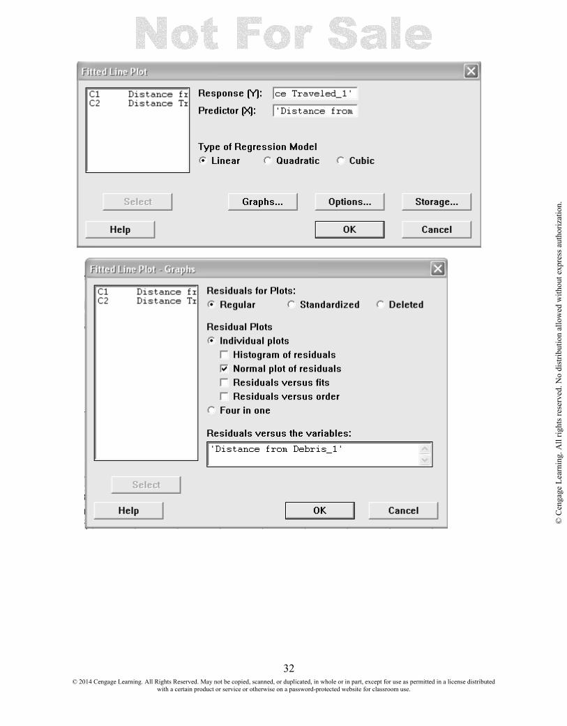
4.3 ASSESS THE FIT OF A LINE USING A RESIDUAL PLOT A residual plot is a plot of the (x, residual) ordered pairs. A desirable plot is one that exhibits no particular pattern such as curvature. An examination of the residual plot after determining the least squares line effectively amounts to examining y after removing any linear dependence on x. Sometimes this examination may reveal the existence of a nonlinear relationship. Select Stat > Regression >Fitted Line Plot and fill in the variable boxes. Click the Graphs button, and make your selections. Click OK.
© 2014 Cengage Learning. All Rights Reserved. May not be copied, scanned, or duplicated, in whole or in part, except for use as permitted in a license distributed with a certain product or service or otherwise on a password-protected website for classroom use.
© C
enga
ge L
earn
ing.
All
right
s res
erve
d. N
o di
strib
utio
n al
low
ed w
ithou
t exp
ress
aut
horiz
atio
n.
32
© 2014 Cengage Learning. All Rights Reserved. May not be copied, scanned, or duplicated, in whole or in part, except for use as permitted in a license distributed with a certain product or service or otherwise on a password-protected website for classroom use.
© C
enga
ge L
earn
ing.
All
right
s res
erve
d. N
o di
strib
utio
n al
low
ed w
ithou
t exp
ress
aut
horiz
atio
n.

33
© 2014 Cengage Learning. All Rights Reserved. May not be copied, scanned, or duplicated, in whole or in part, except for use as permitted in a license distributed with a certain product or service or otherwise on a password-protected website for classroom use.
© C
enga
ge L
earn
ing.
All
right
s res
erve
d. N
o di
strib
utio
n al
low
ed w
ithou
t exp
ress
aut
horiz
atio
n.
34
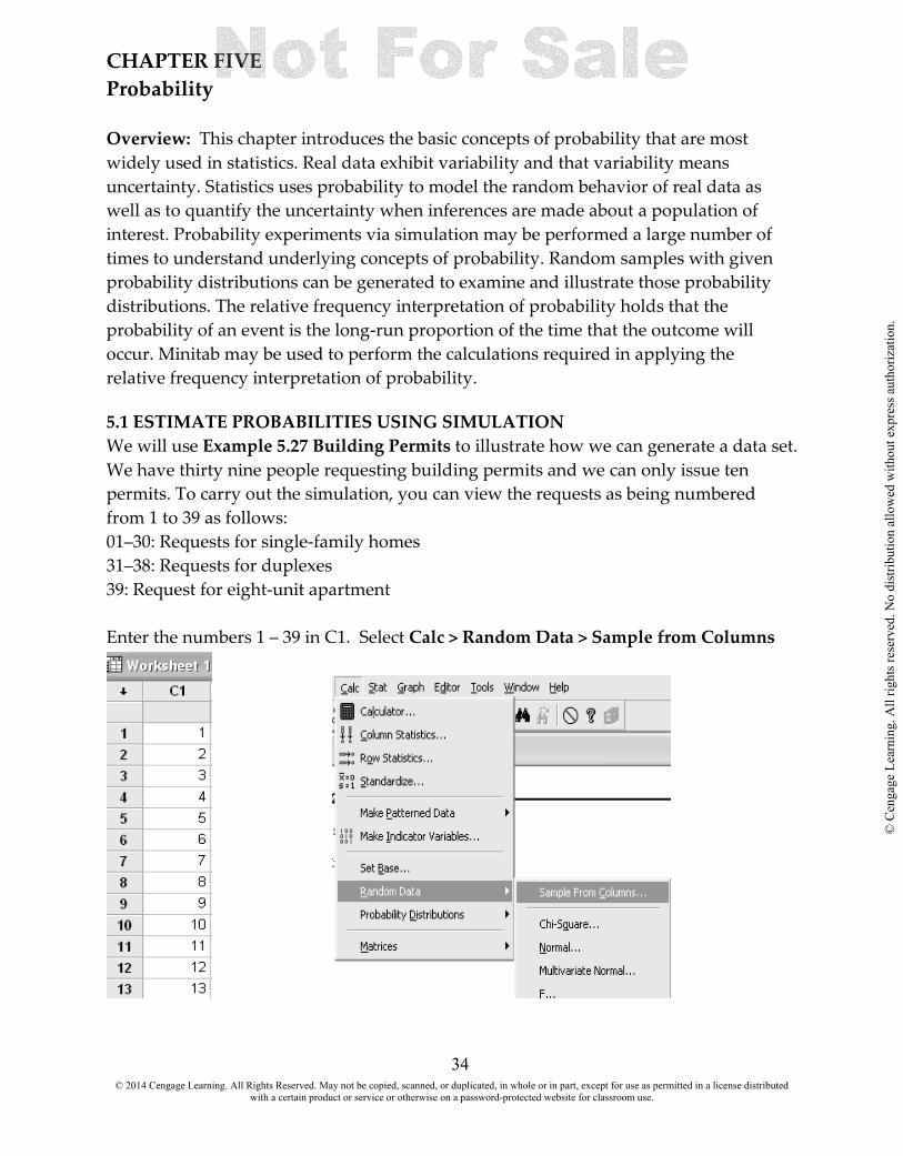
CHAPTER FIVE Probability Overview: This chapter introduces the basic concepts of probability that are most widely used in statistics. Real data exhibit variability and that variability means uncertainty. Statistics uses probability to model the random behavior of real data as well as to quantify the uncertainty when inferences are made about a population of interest. Probability experiments via simulation may be performed a large number of times to understand underlying concepts of probability. Random samples with given probability distributions can be generated to examine and illustrate those probability distributions. The relative frequency interpretation of probability holds that the probability of an event is the long-run proportion of the time that the outcome will occur. Minitab may be used to perform the calculations required in applying the relative frequency interpretation of probability. 5.1 ESTIMATE PROBABILITIES USING SIMULATION We will use Example 5.27 Building Permits to illustrate how we can generate a data set. We have thirty nine people requesting building permits and we can only issue ten permits. To carry out the simulation, you can view the requests as being numbered from 1 to 39 as follows: 01–30: Requests for single-family homes 31–38: Requests for duplexes 39: Request for eight-unit apartment Enter the numbers 1 – 39 in C1. Select Calc > Random Data > Sample from Columns
© 2014 Cengage Learning. All Rights Reserved. May not be copied, scanned, or duplicated, in whole or in part, except for use as permitted in a license distributed with a certain product or service or otherwise on a password-protected website for classroom use.
© C
enga
ge L
earn
ing.
All
right
s res
erve
d. N
o di
strib
utio
n al
low
ed w
ithou
t exp
ress
aut
horiz
atio
n.

35
Fill in the dialog boxes as shown. We will not check the box Sample with replacement, as we do not want duplicates.
The list of selected numbers appears in the column specified. This may be repeated over and over by specifying addition columns for storage.
© 2014 Cengage Learning. All Rights Reserved. May not be copied, scanned, or duplicated, in whole or in part, except for use as permitted in a license distributed with a certain product or service or otherwise on a password-protected website for classroom use.
© C
enga
ge L
earn
ing.
All
right
s res
erve
d. N
o di
strib
utio
n al
low
ed w
ithou
t exp
ress
aut
horiz
atio
n.

36
CHAPTER SIX Random Variables and Probability Distributions OVERVIEW: This chapter begins to link together the basic concepts of probability with the concepts of statistical inference. This chapter introduces probability models that can be used to describe the distribution of characteristics of individuals in a population. Such models are essential if we are to reach conclusions based on a sample from the population. After reading this chapter you should be able to work with:
6.1 The Binomial Distribution 6.2 The Normal Distribution. 6.1 THE BINOMIAL DISTRIBUTION The binomial distribution arises when a chance experiment consists of a sequence of trials, each with only two possible outcomes. This distribution arises when the experiment of interest is a binomial experiment. A binomial experiment consists of a sequence of trials with the following conditions: 1. There is a fixed number of trials. 2. Each trial can result in one of only two possible outcomes, labeled success (S) and failure (F ). We will use Example 6.21 Computer Sales to see how we can find the probabilities. Sixty percent of all computers sold by a large computer retailer are laptops and 40% are desktop models. The type of computer purchased by each of the next 12 customers will be recorded. We want to find the probability that exactly 4 purchases will be laptops. Enter the numbers 1 through 12 in C1 to represent the twelve customers who enter the store. Select Calc > Probability Distributions > Binomial. Select Probability Enter the number of trials: 12 Enter the Probability of success: .6 Enter the input constant: 4 The results will appear in the session window.
© 2014 Cengage Learning. All Rights Reserved. May not be copied, scanned, or duplicated, in whole or in part, except for use as permitted in a license distributed with a certain product or service or otherwise on a password-protected website for classroom use.
© C
enga
ge L
earn
ing.
All
right
s res
erve
d. N
o di
strib
utio
n al
low
ed w
ithou
t exp
ress
aut
horiz
atio
n.

37
You could also calculate all twelve probabilities by entering a column in Optional Storage.
© 2014 Cengage Learning. All Rights Reserved. May not be copied, scanned, or duplicated, in whole or in part, except for use as permitted in a license distributed with a certain product or service or otherwise on a password-protected website for classroom use.
© C
enga
ge L
earn
ing.
All
right
s res
erve
d. N
o di
strib
utio
n al
low
ed w
ithou
t exp
ress
aut
horiz
atio
n.

38
6.2 THE NORMAL DISTRIBUTION We will use Example 6.25 Finding Standard Normal Curve Areas to show how to find the probability or area under the Normal curve using Minitab. The standard normal distribution is the normal distribution with µ = 0 and σ = 1. The corresponding density curve is called the standard normal curve. It is customary to use the letter z to represent a variable whose distribution is described by the standard normal curve. The standard normal curve is also sometimes called the z curve. In this example we want to find the area under the curve for z = − 1.76. Select Calc > Probability Distributions > Normal Select Cumulative probability Enter the mean: 0.0 Enter the standard deviation: 1.0 Enter the input constant: − 1.76 Click OK The results will appear in the session window.
© 2014 Cengage Learning. All Rights Reserved. May not be copied, scanned, or duplicated, in whole or in part, except for use as permitted in a license distributed with a certain product or service or otherwise on a password-protected website for classroom use.
© C
enga
ge L
earn
ing.
All
right
s res
erve
d. N
o di
strib
utio
n al
low
ed w
ithou
t exp
ress
aut
horiz
atio
n.

39
We can extend this to other Normal distributions. In Example 6.29, Birth Weights we are given mean µ = 3,500 grams and standard deviation σ = 600 grams is a reasonable model for the probability distribution of birth weights of a randomly selected full-term baby. What proportion of birth weights are between 2,900 and 4,700 grams. To calculate the probability between to weights, we have to subtract one cumulative probability from the other. Select Calc > Probability Distributions > Normal Select Cumulative probability Enter the mean: 3500 Enter the standard deviation: 600 Enter the input constant: − 1.76 Enter Optional Storage C3 Click OK The results will appear in the specified storage column. You would then have to subtract one from the other to get the probability between the two values.
© 2014 Cengage Learning. All Rights Reserved. May not be copied, scanned, or duplicated, in whole or in part, except for use as permitted in a license distributed with a certain product or service or otherwise on a password-protected website for classroom use.
© C
enga
ge L
earn
ing.
All
right
s res
erve
d. N
o di
strib
utio
n al
low
ed w
ithou
t exp
ress
aut
horiz
atio
n.
40
CHAPTER NINE Estimating a Population Proportion OVERVIEW: A confidence interval estimate specifies a range of plausible values for a population characteristic. For example, using sample data and what you know about the behavior of the sample proportion, it is possible to construct an interval that you think should include the actual value of the population proportion. The objective of inferential statistics is to use sample data to decrease our uncertainty about the corresponding population. Often, data is collected to obtain information that allows the investigator to estimate the value of some population characteristic, such as a population mean, µ, or a population proportion, π. This could be accomplished by using the sample data to arrive at a single number that represents a plausible value for the characteristic of interest. Alternatively, one could report an entire range of plausible values for the characteristic. These two estimation techniques, point estimation and interval estimation, are addressed in this chapter. After reading this chapter you should be able to:
9.1 Construct a confidence interval for a population proportion.
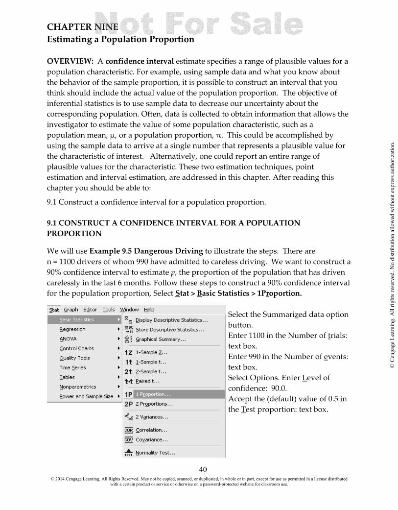
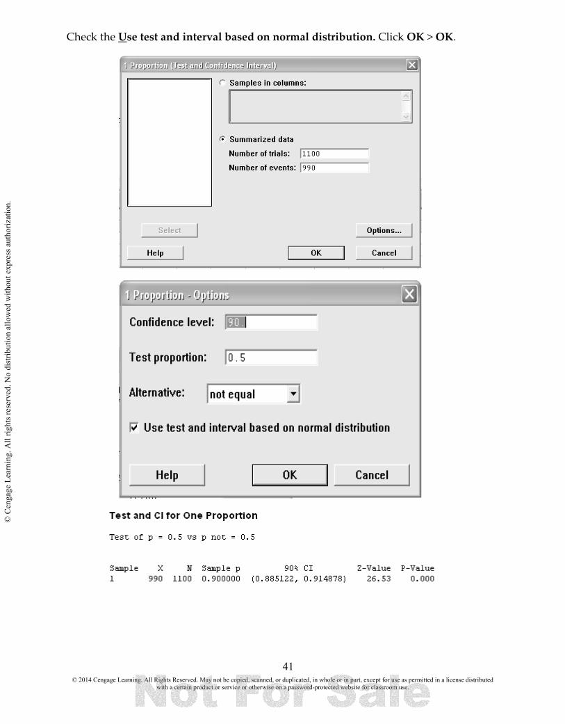
9.1 CONSTRUCT A CONFIDENCE INTERVAL FOR A POPULATION PROPORTION We will use Example 9.5 Dangerous Driving to illustrate the steps. There are n = 1100 drivers of whom 990 have admitted to careless driving. We want to construct a 90% confidence interval to estimate p, the proportion of the population that has driven carelessly in the last 6 months. Follow these steps to construct a 90% confidence interval for the population proportion, Select Stat > Basic Statistics > 1Proportion.
Select the Summarized data option button. Enter 1100 in the Number of trials: text box. Enter 990 in the Number of events: text box. Select Options. Enter Level of confidence: 90.0. Accept the (default) value of 0.5 in the Test proportion: text box.
© 2014 Cengage Learning. All Rights Reserved. May not be copied, scanned, or duplicated, in whole or in part, except for use as permitted in a license distributed with a certain product or service or otherwise on a password-protected website for classroom use.
© C
enga
ge L
earn
ing.
All
right
s res
erve
d. N
o di
strib
utio
n al
low
ed w
ithou
t exp
ress
aut
horiz
atio
n.
41
Check the Use test and interval based on normal distribution. Click OK > OK.
© 2014 Cengage Learning. All Rights Reserved. May not be copied, scanned, or duplicated, in whole or in part, except for use as permitted in a license distributed with a certain product or service or otherwise on a password-protected website for classroom use.
© C
enga
ge L
earn
ing.
All
right
s res
erve
d. N
o di
strib
utio
n al
low
ed w
ithou
t exp
ress
aut
horiz
atio
n.

42
CHAPTER TEN Asking and Answering Questions about a Population Proportion OVERVIEW: In the previous chapter, we considered situations in which the primary goal was to estimate the unknown value of some population characteristic. Sample data may also be used to decide if some claim or hypothesis about a population characteristic is plausible. This chapter addresses the issue of analyzing sample data to determine if a hypothesis about a population characteristic is plausible. Hypothesis testing methods presented in this chapter can be used to determine whether the sample data provides strong support for rejecting or failing to reject a hypothesis. After reading this chapter you should be able to: 10.1 Perform a hypothesis test on a population proportion 10.1 HYPOTHESIS TEST ON A POPULATION PROPORTION A hypothesis is a claim or statement either about the value of a single population characteristic or about the values of several population characteristics we shall initially assume that a particular hypothesis, called the null hypothesis and designated as H0, is the correct one. We then consider the evidence (the sample data), and we only reject the null hypothesis in favor of the competing hypothesis, called the alternative hypothesis and designated as Ha, if there is convincing evidence against the null hypothesis. Once hypotheses have been formulated, we need to devise a method for using sample data to determine whether H0 should be rejected. The decision rule that we use for this purpose is called a test procedure. Just as a jury trial may reach the wrong verdict in a trial, there is some chance that the use of a test procedure on sampling data may lead us to the wrong conclusion. One erroneous conclusion in a criminal trial is for a jury to convict an innocent person, and another is for a guilty person to be set free. Similarly, there are two different types of errors that might be made when making a decision in a hypothesis testing problem. One type of error involves rejecting H0 even though H0 is true. The second type of error results from failing to reject H0 when it is false. Type I error: the error of rejecting H0 when H0 is true
Type II error: the error of failing to reject H0 when H0 is false
© 2014 Cengage Learning. All Rights Reserved. May not be copied, scanned, or duplicated, in whole or in part, except for use as permitted in a license distributed with a certain product or service or otherwise on a password-protected website for classroom use.
© C
enga
ge L
earn
ing.
All
right
s res
erve
d. N
o di
strib
utio
n al
low
ed w
ithou
t exp
ress
aut
horiz
atio
n.
43
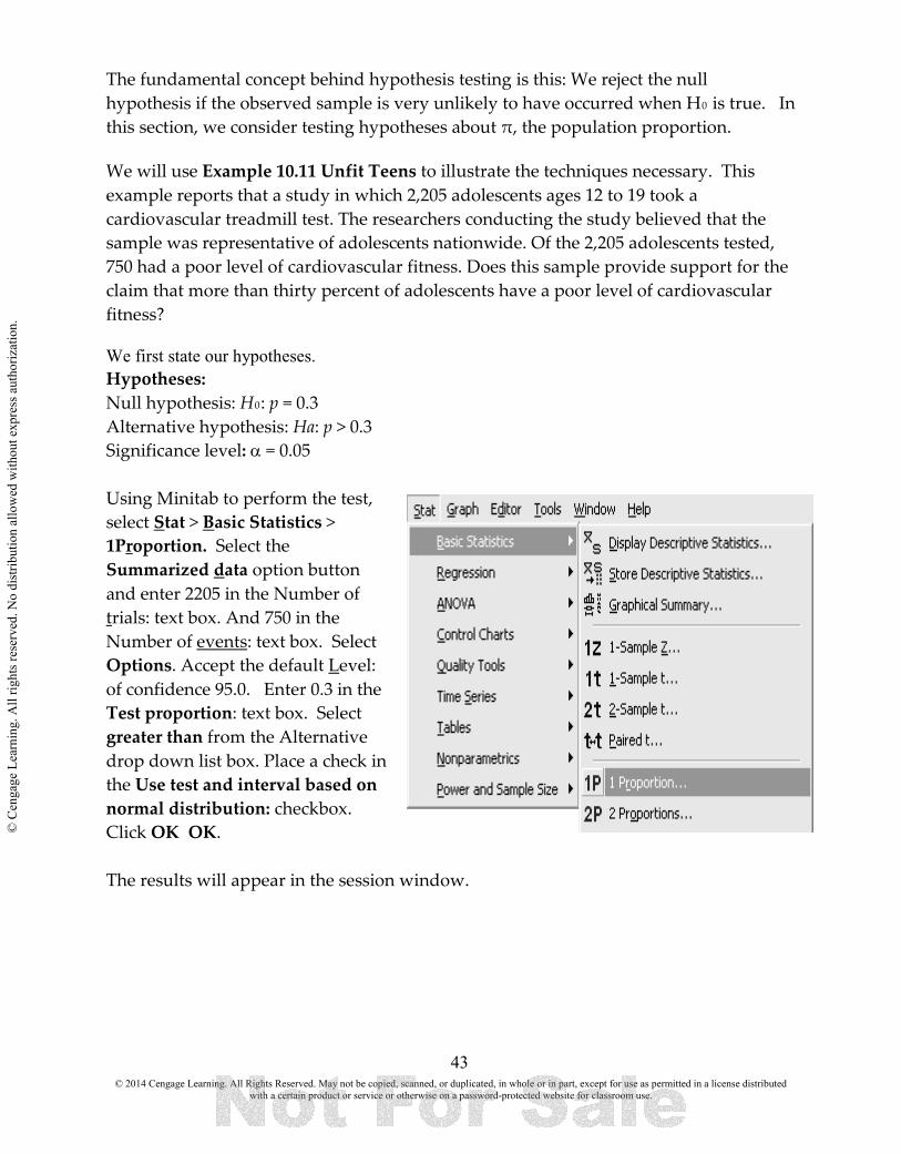
The fundamental concept behind hypothesis testing is this: We reject the null hypothesis if the observed sample is very unlikely to have occurred when H0 is true. In this section, we consider testing hypotheses about π, the population proportion. We will use Example 10.11 Unfit Teens to illustrate the techniques necessary. This example reports that a study in which 2,205 adolescents ages 12 to 19 took a cardiovascular treadmill test. The researchers conducting the study believed that the sample was representative of adolescents nationwide. Of the 2,205 adolescents tested, 750 had a poor level of cardiovascular fitness. Does this sample provide support for the claim that more than thirty percent of adolescents have a poor level of cardiovascular fitness? We first state our hypotheses. Hypotheses: Null hypothesis: H0: p = 0.3 Alternative hypothesis: Ha: p > 0.3 Significance level: α = 0.05 Using Minitab to perform the test, select Stat > Basic Statistics > 1Proportion. Select the Summarized data option button and enter 2205 in the Number of trials: text box. And 750 in the Number of events: text box. Select Options. Accept the default Level: of confidence 95.0. Enter 0.3 in the Test proportion: text box. Select greater than from the Alternative drop down list box. Place a check in the Use test and interval based on normal distribution: checkbox. Click OK OK. The results will appear in the session window.
© 2014 Cengage Learning. All Rights Reserved. May not be copied, scanned, or duplicated, in whole or in part, except for use as permitted in a license distributed with a certain product or service or otherwise on a password-protected website for classroom use.
© C
enga
ge L
earn
ing.
All
right
s res
erve
d. N
o di
strib
utio
n al
low
ed w
ithou
t exp
ress
aut
horiz
atio
n.

44
Because the P-value is less than the selected significance level, you reject the null hypothesis. Decision: 0 < 0.05, Reject H0. The final conclusion for the test should be stated in context and answer the question posed. Conclusion: The sample provides convincing evidence that more than 30% of adolescents have a poor fitness level.
© 2014 Cengage Learning. All Rights Reserved. May not be copied, scanned, or duplicated, in whole or in part, except for use as permitted in a license distributed with a certain product or service or otherwise on a password-protected website for classroom use.
© C
enga
ge L
earn
ing.
All
right
s res
erve
d. N
o di
strib
utio
n al
low
ed w
ithou
t exp
ress
aut
horiz
atio
n.

45
CHAPTER ELEVEN Asking and Answering Questions about the Difference between Two Population Proportions Many statistical studies are carried out in order to estimate the difference between two population proportions. In this chapter, only the case where the two samples are independent samples is considered. Two samples are said to be independent samples if the selection of the individuals that make up one sample does not influence the selection of the individuals in the other sample. This would be the case if a random sample is selected from each of the two populations. After you have read this chapter you should be able to: 11.1 Construct a confidence interval for the difference of two proportions 11.2 Perform a hypothesis test for the difference of two proportions. 11.1 CONSTRUCT A CONFIDENCE INTERVAL FOR THE DIFFERENCE OF TWO PROPORTIONS First we will consider how to construct a confidence interval in Minitab for the difference of two population proportions. Example 11.1 Cell Phones in Bed asks the question, “How much greater is the proportion who use a cell phone to stay connected in bed for cell phone users ages 20 to 39 than for those ages 40 to 49?” The study described earlier found that 168 of the 258 people in the sample of 20- to 39-year-olds and 61 of the 129 people in the sample of 40- to 49-year-olds said that they sleep with their cell phones. Based on these sample data, what can you learn about the actual difference in proportions for these two populations? In this example, you want to estimate the difference in the proportion of cell phone users ages 20 to 39 who sleep with their phones and this proportion for those ages 40 to 49. This is the value of p1 − p2, where p1 is the proportion for the 20 to 39 age group and p2 is the proportion for the 40 to 49 age group. For this example, a confidence level of 90% will be used. Select Stat > Basic Statistics > 2Proportions. Select the Summarized data: option button. Place 258 in the First Trials: text box. Place 168 in the First Events: text box Place 129 in the Second Trials: text box. Place 61 in the Second Events: text box. Choose Options. Enter
© 2014 Cengage Learning. All Rights Reserved. May not be copied, scanned, or duplicated, in whole or in part, except for use as permitted in a license distributed with a certain product or service or otherwise on a password-protected website for classroom use.
© C
enga
ge L
earn
ing.
All
right
s res
erve
d. N
o di
strib
utio
n al
low
ed w
ithou
t exp
ress
aut
horiz
atio
n.
46
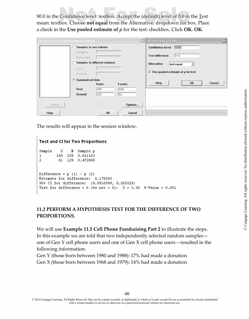
90.0 in the Confidence level: textbox. Accept the (default) level of 0.0 in the Test mean: textbox. Choose not equal from the Alternative: dropdown list box. Place a check in the Use pooled estimate of p for the test: checkbox. Click OK. OK.
The results will appear in the session window.
11.2 PERFORM A HYPOTHESIS TEST FOR THE DIFFERENCE OF TWO PROPORTIONS. We will use Example 11.5 Cell Phone Fundraising Part 2 to illustrate the steps. In this example we are told that two independently selected random samples—one of Gen Y cell phone users and one of Gen X cell phone users—resulted in the following information: Gen Y (those born between 1980 and 1988): 17% had made a donation Gen X (those born between 1968 and 1979): 14% had made a donation
© 2014 Cengage Learning. All Rights Reserved. May not be copied, scanned, or duplicated, in whole or in part, except for use as permitted in a license distributed with a certain product or service or otherwise on a password-protected website for classroom use.
© C
enga
ge L
earn
ing.
All
right
s res
erve
d. N
o di
strib
utio
n al
low
ed w
ithou
t exp
ress
aut
horiz
atio
n.

47
The question posed in the preview example was who donated via cell phone is higher for the Gen Y population than for the Gen X population? The report referenced in the preview example does not say how large the sample sizes were, but the description of the survey methodology indicates that the samples can be regarded as independent random samples. For purposes of this example, let’s suppose that both sample sizes were 1,200. Using p1 and p2 to denote the two population proportions, define p1 = proportion of all Gen Y cell phone users who made a donation by cell phone p2 = proportion of all Gen X cell phone users who made a donation by cell phone Hypotheses: H0: p1 - p2 = 0 Ha: p1 - p2 > 0 Select Stat > Basic Statistics > 2Proportions. Select the Summarized data: option button. Place 1200 in the First Trials: text box. Place 204 in the First Events: text box Place 1200 in the Second Trials: text box. Place 168 in the Second Events: text box. Choose Options. Enter 95.0 in the Confidence level: textbox.
The results appear in the session window.
© 2014 Cengage Learning. All Rights Reserved. May not be copied, scanned, or duplicated, in whole or in part, except for use as permitted in a license distributed with a certain product or service or otherwise on a password-protected website for classroom use.
© C
enga
ge L
earn
ing.
All
right
s res
erve
d. N
o di
strib
utio
n al
low
ed w
ithou
t exp
ress
aut
horiz
atio
n.

48
Because the p-value is smaller than the selected significance level (0.021 , 0.05), the null hypothesis is rejected. The sample data provide convincing evidence that the proportion donating to the Haiti relief effort by cell phone is greater for Gen Y cell phone users than for Gen X cell phone users.
© 2014 Cengage Learning. All Rights Reserved. May not be copied, scanned, or duplicated, in whole or in part, except for use as permitted in a license distributed with a certain product or service or otherwise on a password-protected website for classroom use.
© C
enga
ge L
earn
ing.
All
right
s res
erve
d. N
o di
strib
utio
n al
low
ed w
ithou
t exp
ress
aut
horiz
atio
n.

49
CHAPTER TWELVE Asking and Answering Questions about a Population Mean You have already seen confidence interval estimates in the context of estimating a population proportion, and performing a hypothesis test for a population proportion. The basic idea is the same for estimating a population mean and performing a hypothesis test for a population mean. The confidence level specifies the long-run proportion of the time that this method is expected to be successful in capturing the actual population mean.
After reading this chapter you should be able to:
12.1 Construct a one-sample t Confidence Interval for a population mean µ 12.2 Perform a hypothesis test 12.1 CONSTRUCT A ONE-SAMPLE CONFIDENCE INTERVAL FOR A POPULATION MEAN µ
t
A one-sample t confidence interval for a population mean µ is appropriate when the following conditions are met: 1. The sample is a random sample from the population of interest or the sample is selected in a way that results in a sample that is representative of the population. 2. The sample size is large (n >30) or the population distribution is approximately normal. Since it is rarely the case that σ, the population standard deviation, is known, we will focus our attention on the procedure for the procedure where σ is assumed to be unknown. Here we shall restrict consideration to the case where the original parent population is assumed to be a normal population distribution. In Example 12.7 Drive-Through Medicine Revisited you are given summary data. In the study, 38 people were each given a scenario for a flu case that was selected at random from the set of all flu cases actually seen in the emergency room. The scenarios provided the “patient” with a medical history and a description of symptoms that would allow the patient to respond to questions from the examining physician. These patients were processed using a drive-through procedure that was implemented in the parking structure of Stanford
© 2014 Cengage Learning. All Rights Reserved. May not be copied, scanned, or duplicated, in whole or in part, except for use as permitted in a license distributed with a certain product or service or otherwise on a password-protected website for classroom use.
© C
enga
ge L
earn
ing.
All
right
s res
erve
d. N
o di
strib
utio
n al
low
ed w
ithou
t exp
ress
aut
horiz
atio
n.

50
University Hospital. The time to process each case from admission to discharge was recorded. The following sample statistics were computed from the data: n = 38 x = 26 minutes s = 1.57 minutes. The researchers were interested in estimating the mean processing time for flu patients using the drive-through model.
Select Stat > Basic Statistics > 1-Sample t. Select the Summarized Data: option button. Enter 38 in the Sample size: text box. Enter 26 in the Mean: text box. Enter 1.57 in the Standard deviation: text box. Select Options. Accept the 95.0 default value in the Confidence level: text box. Click OK. OK. The results will appear in the session window.
You can be 95% confident that the actual mean processing time for emergency room flu cases using the new drive-through model is between 25.484 minutes and 26.516 minutes.
© 2014 Cengage Learning. All Rights Reserved. May not be copied, scanned, or duplicated, in whole or in part, except for use as permitted in a license distributed with a certain product or service or otherwise on a password-protected website for classroom use.
© C
enga
ge L
earn
ing.
All
right
s res
erve
d. N
o di
strib
utio
n al
low
ed w
ithou
t exp
ress
aut
horiz
atio
n.

51
Sample data can also be used to test hypotheses about a population mean. Now you’re ready to look at an example, following the five-step process for hypothesis testing problems (HMC3). We will use Example 12.12 Time Stands Still (or So It Seems) to show the Minitab steps. After a 24-hour smoking abstinence, 20 smokers were asked to estimate how much time had passed during a 45-second period. The researchers wanted to determine whether smoking abstinence tends to lead to elapsed time being overestimated. The claim is about the population of smokers and the population characteristic of interest is a population mean µ = mean perceived elapsed time for smokers who have not smoked for 24 hours. Hypotheses: Null hypothesis: H0: µ = 45 Alternative hypothesis: Ha: µ > 45 Significance level: α = 0.05 Enter the data in the first column of the worksheet. Select Stat > Basic Statistics > 1-Sample t. Enter C1 in Samples in column: option button. Enter 45 in Test mean: text box. Select Options. Accept the 95.0 default value in the Confidence level: text box. Select greater than in the Alternative drop down box. Click OK. OK.
© 2014 Cengage Learning. All Rights Reserved. May not be copied, scanned, or duplicated, in whole or in part, except for use as permitted in a license distributed with a certain product or service or otherwise on a password-protected website for classroom use.
© C
enga
ge L
earn
ing.
All
right
s res
erve
d. N
o di
strib
utio
n al
low
ed w
ithou
t exp
ress
aut
horiz
atio
n.

52
The results will appear in the session window.
Because the P-value is less than the selected significance level, the null hypothesis is rejected. Decision: 0 < 0.05, Reject H0. Conclusion: There is convincing evidence that the mean perceived time elapsed is greater than the actual time elapsed of 45 seconds. It would be very unlikely to see a sample mean (and hence a t value) this extreme just by chance when H0 is true.
© 2014 Cengage Learning. All Rights Reserved. May not be copied, scanned, or duplicated, in whole or in part, except for use as permitted in a license distributed with a certain product or service or otherwise on a password-protected website for classroom use.
© C
enga
ge L
earn
ing.
All
right
s res
erve
d. N
o di
strib
utio
n al
low
ed w
ithou
t exp
ress
aut
horiz
atio
n.

53
CHAPTER THIRTEEN Asking and Answering Questions about the Difference between Two Population Means In Chapter 12, you saw how sample data could be used to estimate a population mean and to test hypotheses about the value of a single population mean. In this chapter you will see how sample data can be used to learn about the difference between two population means. After reading this chapter you should be able to:
13.1 Perform a hypothesis test about the difference between two population means using independent samples 13.2 Perform a hypothesis test about the difference between two population means using dependent samples 13.3 Construct a confidence interval to estimate the difference between two population means. 13.1 PERFORM A HYPOTHESIS TEST ABOUT THE DIFFERENCE BETWEEN TWO POPULATION MEANS USING INDEPENDENT SAMPLES We will be using Example 13.2 Salary and Gender to illustrate the procedures in Minitab. A study was carried out in which salary data were collected from a random sample of men and from a random sample of women who worked as purchasing managers and who were subscribers to Purchasing magazine Let’s use the sample data to determine if there is convincing evidence that the mean annual salary for male purchasing managers is greater than the mean annual salary for female purchasing managers. This suggests a two-sample t test for a difference in population means. The population characteristics of interest are
µ1 = mean annual salary for male purchasing managers µ2 = mean annual salary for female purchasing managers
and µ1 - µ2 is then the difference in population means. Translating the question of interest into hypotheses gives
H0: µ1 - µ2 = 0 Ha: µ1 - µ2 > 0
Enter the data in two columns. Select Stat > Basic Statistics > 2-Sample t.
© 2014 Cengage Learning. All Rights Reserved. May not be copied, scanned, or duplicated, in whole or in part, except for use as permitted in a license distributed with a certain product or service or otherwise on a password-protected website for classroom use.
© C
enga
ge L
earn
ing.
All
right
s res
erve
d. N
o di
strib
utio
n al
low
ed w
ithou
t exp
ress
aut
horiz
atio
n.
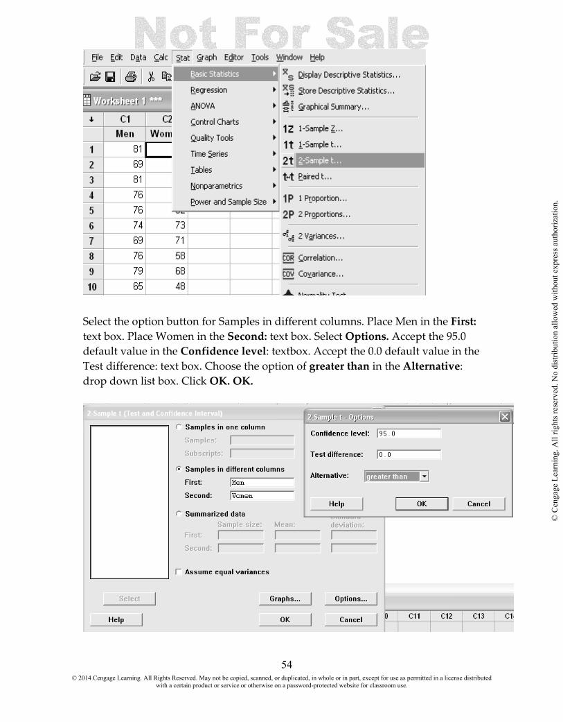
54
Select the option button for Samples in different columns. Place Men in the First: text box. Place Women in the Second: text box. Select Options. Accept the 95.0 default value in the Confidence level: textbox. Accept the 0.0 default value in the Test difference: text box. Choose the option of greater than in the Alternative: drop down list box. Click OK. OK.
© 2014 Cengage Learning. All Rights Reserved. May not be copied, scanned, or duplicated, in whole or in part, except for use as permitted in a license distributed with a certain product or service or otherwise on a password-protected website for classroom use.
© C
enga
ge L
earn
ing.
All
right
s res
erve
d. N
o di
strib
utio
n al
low
ed w
ithou
t exp
ress
aut
horiz
atio
n.
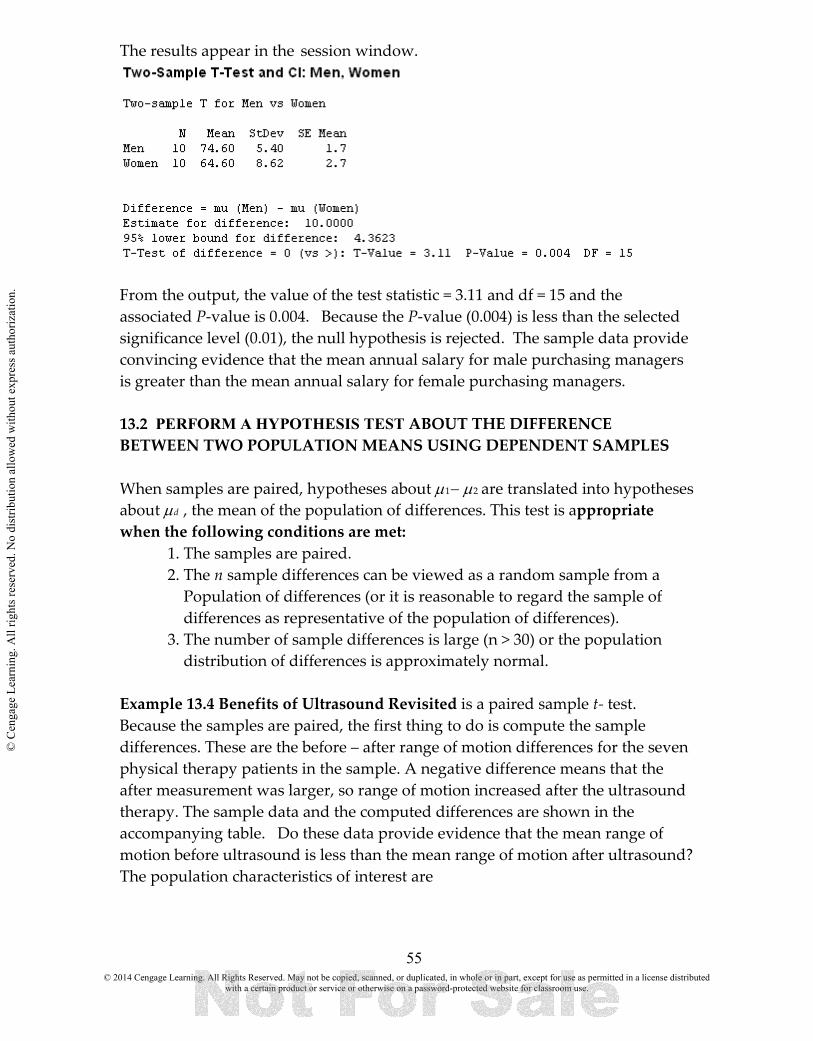
55
The results appear in the session window.
From the output, the value of the test statistic = 3.11 and df = 15 and the associated P-value is 0.004. Because the P-value (0.004) is less than the selected significance level (0.01), the null hypothesis is rejected. The sample data provide convincing evidence that the mean annual salary for male purchasing managers is greater than the mean annual salary for female purchasing managers. 13.2 PERFORM A HYPOTHESIS TEST ABOUT THE DIFFERENCE BETWEEN TWO POPULATION MEANS USING DEPENDENT SAMPLES When samples are paired, hypotheses about µ1− µ2 are translated into hypotheses about µd , the mean of the population of differences. This test is appropriate when the following conditions are met:
1. The samples are paired. 2. The n sample differences can be viewed as a random sample from a Population of differences (or it is reasonable to regard the sample of differences as representative of the population of differences). 3. The number of sample differences is large (n > 30) or the population distribution of differences is approximately normal.
Example 13.4 Benefits of Ultrasound Revisited is a paired sample t- test. Because the samples are paired, the first thing to do is compute the sample differences. These are the before – after range of motion differences for the seven physical therapy patients in the sample. A negative difference means that the after measurement was larger, so range of motion increased after the ultrasound therapy. The sample data and the computed differences are shown in the accompanying table. Do these data provide evidence that the mean range of motion before ultrasound is less than the mean range of motion after ultrasound? The population characteristics of interest are
© 2014 Cengage Learning. All Rights Reserved. May not be copied, scanned, or duplicated, in whole or in part, except for use as permitted in a license distributed with a certain product or service or otherwise on a password-protected website for classroom use.
© C
enga
ge L
earn
ing.
All
right
s res
erve
d. N
o di
strib
utio
n al
low
ed w
ithou
t exp
ress
aut
horiz
atio
n.

56
µ1 = mean range of motion for physical therapy patients before ultrasound µ2 = mean range of motion for physical therapy patients after ultrasound Because the samples are paired, you should also define md : µd = µ1 − µ2 = mean difference in range of motion (before − after) Translating the question of interest into the hypotheses gives
H0: µd = 0 Ha: µd < 0
Enter the data in two columns labeled Before and After. Select Stat > Basic Statistics > Paired t.
Select Samples in columns: option button. Enter Before in the First sample: text box. Enter After in the Second sample: text box. Select Options. Accept the (default) level of 95.0 in the Confidence level: textbox. Accept the (default) level of 0.0 in the Test mean: text box. Accept the (default) option of not equal in the Alternative: dropdown dialog box. Click OK OK.
The results appear in the session window.
© 2014 Cengage Learning. All Rights Reserved. May not be copied, scanned, or duplicated, in whole or in part, except for use as permitted in a license distributed with a certain product or service or otherwise on a password-protected website for classroom use.
© C
enga
ge L
earn
ing.
All
right
s res
erve
d. N
o di
strib
utio
n al
low
ed w
ithou
t exp
ress
aut
horiz
atio
n.

57
Because the P-value (0.02) is less than α (0.05), you reject H0. There is convincing evidence that the mean knee range of motion for physical therapy patients before ultrasound is less than the mean range of motion after ultrasound. 13.3 CONSTRUCT A CONFIDENCE INTERVAL TO ESTIMATE THE DIFFERENCE BETWEEN TWO POPULATION MEANS. We can also look at constructing a confidence interval for the difference of two means. We will use Example 13.7 Freshman Year Weight Gain. The researchers studied a random sample of first-year students who lived on campus and a random sample of first-year students who lived off campus. Data on weight gain (in kg) during the first year, consistent with summary quantities given in the paper, are given below. A negative weight gain represents a weight loss. The researchers believed that the mean weight gain of students living on campus was higher than the mean weight gain for students living off campus and were interested in estimating the difference in means for these two groups. The answers to the four key questions are estimation, sample data, one numerical variable (weight gain), and two independently selected samples. This combination of answers suggests using a two-sample t confidence interval. You can now construct a 95% confidence interval for the difference in mean weight gain for students who live on campus and students who live off campus. You want to estimate m1 - m2 = mean difference in weight gain where m1 = mean weight gain for first-year students living on campus and m2 = mean weight gain for first-year students living off campus. Enter the data into the spreadsheet and select Stat > Basic Statistics > 2-Sample t Darken the Samples in different columns: option button. Place On Campus in the First sample: text box. Place Off Campus in the Second sample: text box.
© 2014 Cengage Learning. All Rights Reserved. May not be copied, scanned, or duplicated, in whole or in part, except for use as permitted in a license distributed with a certain product or service or otherwise on a password-protected website for classroom use.
© C
enga
ge L
earn
ing.
All
right
s res
erve
d. N
o di
strib
utio
n al
low
ed w
ithou
t exp
ress
aut
horiz
atio
n.
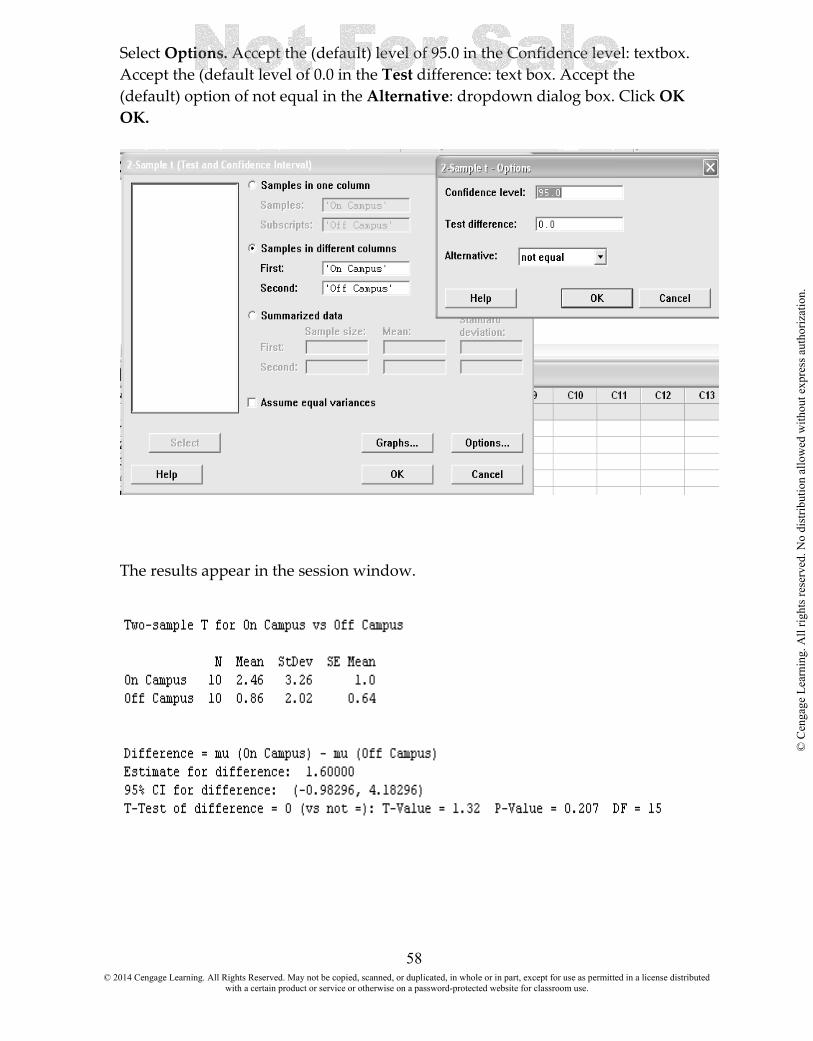
58
Select Options. Accept the (default) level of 95.0 in the Confidence level: textbox. Accept the (default level of 0.0 in the Test difference: text box. Accept the (default) option of not equal in the Alternative: dropdown dialog box. Click OK OK.
The results appear in the session window.
© 2014 Cengage Learning. All Rights Reserved. May not be copied, scanned, or duplicated, in whole or in part, except for use as permitted in a license distributed with a certain product or service or otherwise on a password-protected website for classroom use.
© C
enga
ge L
earn
ing.
All
right
s res
erve
d. N
o di
strib
utio
n al
low
ed w
ithou
t exp
ress
aut
horiz
atio
n.

59
In Example 13.8 Benefits of Ultrasound One More Time we will use the data from Example 13.4. The conclusion was that there was convincing evidence that mean knee range of motion for physical therapy patients was greater after ultrasound than before ultrasound. Once you have reached this conclusion, it would also be of interest to estimate the increase in mean range of motion. The answers to the four key questions are estimation, sample data, one numerical variable (range of motion), and two paired samples. This combination leads to considering the paired-samples t confidence interval. The process for estimation problems can be used to construct a 95% confidence interval for the mean difference in range of motion. Enter the data into the spreadsheet and select Stat > Basic Statistics > Paired- t
Darken the Samples in different columns: option button. Place On Campus in the First sample: text box. Place Off Campus in the Second sample: text box. Select Options. Accept the (default) level of 95.0 in the Confidence level: textbox. Accept the (default level of 0.0 in the Test mean: text box. Accept the (default) option of not equal in the Alternative: dropdown dialog box. Click OK OK.
© 2014 Cengage Learning. All Rights Reserved. May not be copied, scanned, or duplicated, in whole or in part, except for use as permitted in a license distributed with a certain product or service or otherwise on a password-protected website for classroom use.
© C
enga
ge L
earn
ing.
All
right
s res
erve
d. N
o di
strib
utio
n al
low
ed w
ithou
t exp
ress
aut
horiz
atio
n.

60
The results appear in the session window.
© 2014 Cengage Learning. All Rights Reserved. May not be copied, scanned, or duplicated, in whole or in part, except for use as permitted in a license distributed with a certain product or service or otherwise on a password-protected website for classroom use.
© C
enga
ge L
earn
ing.
All
right
s res
erve
d. N
o di
strib
utio
n al
low
ed w
ithou
t exp
ress
aut
horiz
atio
n.

61
CHAPTER FIFTEEN Learning from Categorical Data OVERVIEW: Most of the techniques presented in earlier chapters are designed for numerical data. It is often the case, however, that information is collected on categorical variables such as political affiliation, sex, or college major. As with numerical data, categorical data sets can be univariate (consisting of observations on a single categorical variable), bivariate (observations on two categorical variables), or even multivariate. The use of the chisquare distribution is appropriate when the sample size is large enough for every expected count to be at least 5. If any of the expected counts are less than 5, categories can be combined in a sensible way to create acceptable expected cell counts. If you do this, remember to compute the number of degrees of freedom based on the reduced number of categories. After reading this chapter you should be able to : 15.1 Perform the chi-square goodness-of-fit test 15.2 Perform a test for Independence of Two Categorical Variables 15.1 PERFORM THE CHI-SQUARE GOODNESS-OF-FIT TEST The chi-square goodness-of-fit test is a method you should consider when the answers to the four key questions are hypothesis testing, sample data, one categorical variable (with more than two categories), and one sample. Example 15.3 Tasty Dog Food Continued fits these criteria. Using the dog food taste data of Example 15.1 to test the hypothesis that the five different spreads (duck liver pate, Spam, dog food, pork liver pate, and liverwurst) are chosen equally often when people who have tasted all five spreads are asked to identify the one they think is the dog food. Population characteristics of interest p1 = proportion of all people who would choose duck liver pate as the dog food p2 = proportion of all people who would choose Spam as the dog food p3 = proportion of all people who would choose dog food as the dog food p4 = proportion of all people who would choose pork liver pate as the dog food p5 = proportion of all people who would choose liverwurst as the dog food
© 2014 Cengage Learning. All Rights Reserved. May not be copied, scanned, or duplicated, in whole or in part, except for use as permitted in a license distributed with a certain product or service or otherwise on a password-protected website for classroom use.
© C
enga
ge L
earn
ing.
All
right
s res
erve
d. N
o di
strib
utio
n al
low
ed w
ithou
t exp
ress
aut
horiz
atio
n.

62
The question of interest (are the five spreads identified equally often as the one thought to be dog food) results in a null hypothesis that specifies that all five category proportions are 0.20. Hypotheses Null hypothesis: H0: p1 = 0.20, p2 = 0.20, p3= 0.20, p4 = 0.20, p5 = 0.20 Alternative hypothesis: Ha: At least one of the population proportions is not 0.20 The student version of Minitab 14 does not have the functionality to produce a
chi-square goodness-of-fit test. Here is the output from the full version of Minitab.
The answer is slightly different from the textbook answer because the Minitab calculation carries more significant digits. Because the p-value is less than the selected significance level, the null hypothesis is rejected. Based on these sample data, there is convincing evidence that the proportion identifying a spread as dog food is not the same for all five spreads. When the purpose of a study is to compare two or more populations or treatments on the basis of a categorical variable, the question of interest is whether the category proportions are the same for all the populations or treatments. The test procedure uses a chi-square statistic to compare the observed counts to those that would be expected if there were no differences among populations or treatments. In Example 15.6 Risky Soccer? the researchers compared collegiate soccer players, athletes in sports other than soccer, and a group of students who were not involved in collegiate sports on the basis of their history of head injuries.
© 2014 Cengage Learning. All Rights Reserved. May not be copied, scanned, or duplicated, in whole or in part, except for use as permitted in a license distributed with a certain product or service or otherwise on a password-protected website for classroom use.
© C
enga
ge L
earn
ing.
All
right
s res
erve
d. N
o di
strib
utio
n al
low
ed w
ithou
t exp
ress
aut
horiz
atio
n.

63
Enter the data into the spreadsheet and calculate the expected counts.
Select Stat > Tables > Chi-Square Test (Table in Worksheet) > OK. The results appear in the session window.
© 2014 Cengage Learning. All Rights Reserved. May not be copied, scanned, or duplicated, in whole or in part, except for use as permitted in a license distributed with a certain product or service or otherwise on a password-protected website for classroom use.
© C
enga
ge L
earn
ing.
All
right
s res
erve
d. N
o di
strib
utio
n al
low
ed w
ithou
t exp
ress
aut
horiz
atio
n.

64
A quick comparison of the observed and expected cell counts in Table 15.4 reveals some large discrepancies, suggesting that the proportions falling into the head injury categories may not be the same for all three groups. 15.2 TEST FOR INDEPENDENCE OF TWO CATEGORICAL VARIABLES The X 2 test statistic and test procedure can also be used to investigate association between two categorical variables in a single population. When there is an association, knowing the value of one variable provides information about the value of the other variable. When there is no association between two categorical variables, they are said to be independent. In Example 15.10 Stroke Mortality and Education, one of the questions of interest was whether there was an association between survival after a stroke and level of education. Medical records for a random sample of 2,333 residents of Vienna, Austria, who had suffered a stroke were used to classify each individual according to two variables—survival (survived, died) and level of education (no basic education, secondary school graduation, technical training/apprenticed, higher secondary school degree, university graduate). Expected cell counts (computed under the assumption of no association between survival and level of education) appear below the counts in the table. The hypotheses of interest are H0: Survival and level of education are independent. Ha: Survival and level of education are not independent. Enter the data into the spreadsheet and calculate the expected counts.
Select Stat > Tables > Chi-Square Test (Table in Worksheet) > OK.
© 2014 Cengage Learning. All Rights Reserved. May not be copied, scanned, or duplicated, in whole or in part, except for use as permitted in a license distributed with a certain product or service or otherwise on a password-protected website for classroom use.
© C
enga
ge L
earn
ing.
All
right
s res
erve
d. N
o di
strib
utio
n al
low
ed w
ithou
t exp
ress
aut
horiz
atio
n.
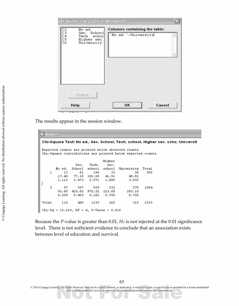
65
The results appear in the session window.
Because the P-value is greater than 0.01, H0 is not rejected at the 0.01 significance level. There is not sufficient evidence to conclude that an association exists between level of education and survival.
© 2014 Cengage Learning. All Rights Reserved. May not be copied, scanned, or duplicated, in whole or in part, except for use as permitted in a license distributed with a certain product or service or otherwise on a password-protected website for classroom use.
© C
enga
ge L
earn
ing.
All
right
s res
erve
d. N
o di
strib
utio
n al
low
ed w
ithou
t exp
ress
aut
horiz
atio
n.

66
CHAPTER SIXTEEN Understanding Relationships—Numerical Data Part 2 OVERVIEW In Chapter 4, you learned how to describe relationships between two numerical variables. When the relationship was judged to be linear you found the equation of the least squares regression line and assessed the quality of the fit using the scatterplot, the residual plot, and the values of the coefficient of determination (r2) and the standard deviation about the least squares line (se ). In this chapter you will learn how to make inferences about the slope of the population regression line. In this chapter, we address inferential methods for this type of data, including a confidence interval (interval estimate) for a mean y value, and a prediction interval for a single y value. After reading this chapter you should be able to:
16.1 Obtain the Least Squares Regression Line 16.2 Check the model adequacy 16.1 OBTAIN THE LEAST SQUARES REGRESSION LINE In Example 16.5 The British (Musical) Invasion an investigator compiled a list of songs from Rolling Stone, Billboard, and Blender lists of songs plus some recent songs familiar to college students. Twenty-three college students were then exposed to 56 clips of songs. Most of these students had had musical training, and they listened to popular music for an average of 21.7 hours per week. After hearing three short clips from a song (only 400 ms in duration), the students were asked in what year each of the songs was released. actual release year and the average of the release years given by the students. The actual release years ranged from 1965 (The Beatles, “Help”) to 2008 (Katy Perry, “I Kissed a Girl”). Is there a relationship between the judged and actual release year for these songs? Enter the data in two columns. A scatterplot of the data suggests that there is a linear relation between these two variables, but this can be confirmed this using the model utility test. In the model utility test, the null hypothesis is there is no useful relationship between the actual and the judged release year: H0: β = 0. The alternative hypothesis specifies that there is a useful relationship: β ≠ 0. Hypotheses: Null hypothesis: H0: β = 0 Alternative hypothesis: Ha: β ≠ 0 Significance level: α = 0.05
© 2014 Cengage Learning. All Rights Reserved. May not be copied, scanned, or duplicated, in whole or in part, except for use as permitted in a license distributed with a certain product or service or otherwise on a password-protected website for classroom use.
© C
enga
ge L
earn
ing.
All
right
s res
erve
d. N
o di
strib
utio
n al
low
ed w
ithou
t exp
ress
aut
horiz
atio
n.

67
Select Stat > Regression > Regression.
Enter the appropriate columns in the response and predictor text boxes. Select Results and select Regression equation, etc > OK OK.
The output appears in the session window. Note in the output, you can find the coefficients of the regression line, the t-statistic, and the p-value. You can also plot the line on the scatter plot by selecting Graphs > Scatterplots > With Regression > OK.
© 2014 Cengage Learning. All Rights Reserved. May not be copied, scanned, or duplicated, in whole or in part, except for use as permitted in a license distributed with a certain product or service or otherwise on a password-protected website for classroom use.
© C
enga
ge L
earn
ing.
All
right
s res
erve
d. N
o di
strib
utio
n al
low
ed w
ithou
t exp
ress
aut
horiz
atio
n.

68
© 2014 Cengage Learning. All Rights Reserved. May not be copied, scanned, or duplicated, in whole or in part, except for use as permitted in a license distributed with a certain product or service or otherwise on a password-protected website for classroom use.
© C
enga
ge L
earn
ing.
All
right
s res
erve
d. N
o di
strib
utio
n al
low
ed w
ithou
t exp
ress
aut
horiz
atio
n.

69
16.2 CHECK THE MODEL ADEQUACY Inferences based on the simple linear regression model are still appropriate if model assumptions are slightly violated. However, interpreting a confidence interval or the result of a hypothesis test when assumptions are seriously violated can result in misleading conclusions. For this reason, it is important to be able to detect any serious violations. For example, a normal probability plot of these deviations would suggest whether or not the normality assumption was plausible. When all model assumptions are met, the mean value of the residuals at any particular x value is 0. Any observation that gives a large positive or negative residual should be examined carefully for any unusual circumstances, such as a recording error or nonstandard experimental condition. Identifying residuals with unusually large magnitudes is made easier by inspecting standardized residuals. Example 16.6 Revisiting the Elk. Enter the data in two columns. A scatterplot of the data suggests that there is a linear relation between these two variables.
Select Data > Regression > Regression > OK. Fill in the dialog boxes as shown.
© 2014 Cengage Learning. All Rights Reserved. May not be copied, scanned, or duplicated, in whole or in part, except for use as permitted in a license distributed with a certain product or service or otherwise on a password-protected website for classroom use.
© C
enga
ge L
earn
ing.
All
right
s res
erve
d. N
o di
strib
utio
n al
low
ed w
ithou
t exp
ress
aut
horiz
atio
n.

70
A large amount of data will appear in the session window. Minitab will give you a table of residuals and standardized residuals, as well as several plots.
© 2014 Cengage Learning. All Rights Reserved. May not be copied, scanned, or duplicated, in whole or in part, except for use as permitted in a license distributed with a certain product or service or otherwise on a password-protected website for classroom use.
© C
enga
ge L
earn
ing.
All
right
s res
erve
d. N
o di
strib
utio
n al
low
ed w
ithou
t exp
ress
aut
horiz
atio
n.

71
You can also see several useful plots. The line is fitted on the scatterplot, a plot of the residuals, and a Normal probability plot. Because the model utility test confirms that there is a useful linear relationship between judged release year and actual release year, it would be reasonable to use the estimated regression model to predict the judged release year for a given song based on its actual release year.
© 2014 Cengage Learning. All Rights Reserved. May not be copied, scanned, or duplicated, in whole or in part, except for use as permitted in a license distributed with a certain product or service or otherwise on a password-protected website for classroom use.
© C
enga
ge L
earn
ing.
All
right
s res
erve
d. N
o di
strib
utio
n al
low
ed w
ithou
t exp
ress
aut
horiz
atio
n.

72
Minitab will give you a table of residuals and standardized residuals, as well as several plots. Note you could choose either Regular or Standardized plots. Both are shown below.
© 2014 Cengage Learning. All Rights Reserved. May not be copied, scanned, or duplicated, in whole or in part, except for use as permitted in a license distributed with a certain product or service or otherwise on a password-protected website for classroom use.
© C
enga
ge L
earn
ing.
All
right
s res
erve
d. N
o di
strib
utio
n al
low
ed w
ithou
t exp
ress
aut
horiz
atio
n.

73
© 2014 Cengage Learning. All Rights Reserved. May not be copied, scanned, or duplicated, in whole or in part, except for use as permitted in a license distributed with a certain product or service or otherwise on a password-protected website for classroom use.
© C
enga
ge L
earn
ing.
All
right
s res
erve
d. N
o di
strib
utio
n al
low
ed w
ithou
t exp
ress
aut
horiz
atio
n.

© C
enga
ge L
earn
ing.
All
right
s res
erve
d. N
o di
strib
utio
n al
low
ed w
ithou
t exp
ress
aut
horiz
atio
n.

© C
enga
ge L
earn
ing.
All
right
s res
erve
d. N
o di
strib
utio
n al
low
ed w
ithou
t exp
ress
aut
horiz
atio
n.

© C
enga
ge L
earn
ing.
All
right
s res
erve
d. N
o di
strib
utio
n al
low
ed w
ithou
t exp
ress
aut
horiz
atio
n.