Embed Size (px)
Citation preview

The Museum of Modern Art, New York
Carolyn Lanchner
Andy Warhol

Stephen Shore (American, born 1947)Andy Warhol and Silver Clouds at the Factory 1966Gelatin silver print, 16 x 20" (40.6 x 50.8 cm)Collection the artist

This book presents ten works by Andy Warhol selected from the collection of The Museum of Modern Art. Gold Marilyn Monroe (discussed here on page 13), the first work by Warhol to enter the collection, was acquired by the Museum the year it was made, in 1962. It was joined in the 1960s and 1970s by additional portraits, featuring art collector Sidney Janis, Jacqueline Kennedy, Marilyn Monroe, and Mao Zedong, and by the artist’s Flower paintings (page 33), images of electric chairs, and Campbell’s Soup Cans (page 15), among others. In 1989, two years after the artist’s death, MoMA mounted Andy Warhol, the first exhibition to explore his entire body of work, from the early 1950s to the late 1980s. The retrospective included eight of the ten works presented in this volume, although at the time only three of them were owned by the Museum. Since that time MoMA’s holdings of works by Warhol have grown from 140 pieces to almost 250. This book is one in a series featuring artists represented in depth in the Museum’s collection.
3

Water Heater 1961Casein on canvas, 44 3/4 x 40" (113.6 x 101.5 cm)The Museum of Modern Art, New York Gift of Roy Lichtenstein, 1971

Water Heater (1961) After graduating from the Carnegie Institute of Technology, in 1949 Andy Warhol moved from Pittsburgh, Pennsylvania, to New York. Thereafter, for just over a decade he enjoyed a career as a highly success-ful commercial artist whose drawings lent a piquant glamour to the merchandising of fashionable products. He loved his work, he said, but noted some of its quirks. Later he remarked, “Everybody’s always being creative. And it’s so funny when you say things aren’t, like the shoe I would draw for an advertise-ment was called a ‘creation’ but the drawing of it was not.” By about 1960, Warhol, who had been noticing the work of art-ists Robert Rauschenberg and Jasper Johns in particular, was ready to rearrange his own creativity equation. His strategy was, at least initially, a not-quite-simple reversal of terms. Instead of making an image of a stylish shoe or other alluring accessory with the intent to inspire covetous impulses in the readers of trendy magazines, he would select a black-and-white repro-duction of some humdrum object from the tabloid press and convert it to another, higher form of mercantile temptation— a unique work of art. 5

Done after a March 1961 advertisement in the New York Daily News, Water Heater was, along with canvases based on ads for such things as television sets, storm windows, iceboxes, corn plasters, and trusses, among the early products of Warhol’s new career as fine artist. Typical of these paintings, Water Heater is deliberately clumsy. Its selectively awkward drawing and dripped paint are both a renunciation of the facility apparent in his com-mercial career and a kind of respectful nod to the still-powerful sway of Abstract Expressionism. Its closest historical precedent is less the small-scale newspaper fragments of Cubist collage or the meticulous mechanical drawings of Francis Picabia, often invoked by commentators, than the deadpan presence of Marcel Duchamp’s Readymades. In Warhol’s hands this subaesthetic object, presented with confounding graphic intensity, became a numinous exemplar of the commonplace.
Before and After (1961) Warhol once said that his two favorite places were museums and depart-ment stores. One of the latter was the site of his first major appear-ance as an artist. In April 1961, in a Bonwit Teller display window, five paintings, including one of the four versions of Before and After, were used as a backdrop to mannequins arrayed in the lat-est fashions [fig. 1]. Of these paintings and their maker, Kynaston McShine has observed that “the imagery of all five works reflects his desires and deficiencies, for all traffic in vernacular metaphors of metamorphosis and self-transcendence.” Three works, drawn 6

Before and After 1961Casein and pencil on canvas, 54 x 69 7/8" (137.2 x 177.5 cm)The Museum of Modern Art, New York Gift of David Geffen, 1995
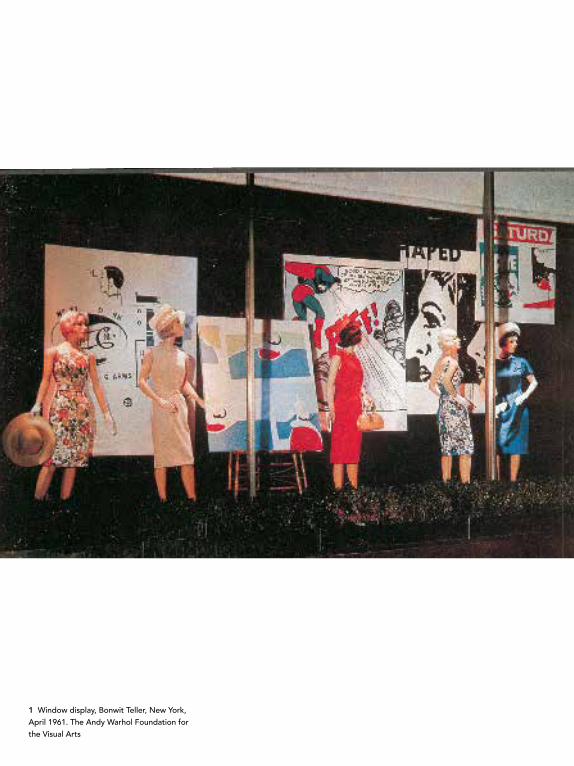
1 Window display, Bonwit Teller, New York, April 1961. The Andy Warhol Foundation for the Visual Arts

from the comics of Superman, Popeye, and The Little King [figs. 2–4], feature psychic overhaul—the first by invigoration of the Clark Kent persona, the second by the ingestion of spinach, and the third by the will to victory of the little guy. The other two, Advertisement and Before and After, focus on improvement through more invasive intervention. 9
2 Superman 1961Casein and wax crayon on cotton duck, 67 x 52" (170.2 x 132.1 cm)The Andy Warhol Foundation for the Visual Arts
3 Saturday’s Popeye 1961Casein on cotton, 42 1/2 x 39" (108 x 99.1 cm)Ludwig Forum für Internationale Kunst Collection Ludwig
4 Little King 1961Casein on cotton, 46 x 40" (116.8 x 101.6 cm)The Andy Warhol Foundation for the Visual Arts

5 Source collage and preparatory drawing for Before and After Left: newspaper collage, 9 3/8 x 6 5/8" (23.8 x 16.8 cm); right: graphite drawing on Strathmore paper, 8 x 8 1/4" (20.3 x 21 cm)The Andy Warhol Foundation for the Visual Arts
6 Andy Warhol (Passport Photograph) 1956Gelatin silver print, 2 3/4 x 2 1/2" (7 x 6.4 cm)The Andy Warhol Museum, Pittsburgh Founding Collection. Contribution of The Andy Warhol Foundation for the Visual Arts
7 Andy Warhol (Passport Photograph with Altered Nose and Hair) 1956Gelatin silver print, 2 3/4 x 2 1/2" (7 x 6.4 cm)The Andy Warhol Museum, Pittsburgh Founding Collection. Contribution of The Andy Warhol Foundation for the Visual Arts

11
Based on an advertisement that ran regularly in the tab-loid The National Enquirer [fig. 5], Before and After’s transforma-tion of a woman’s culturally unacceptable profile to a perky ideal provided camouflage for Warhol’s personal experience, and distanced the artist from it. In 1957, acting on his belief in “trick mirrors . . . and plastic surgery,” Warhol had had an operation to redesign the contours of his nose, which had been inflamed by a childhood disease. His anticipation of the transformation is recorded in a photograph of himself doctored to show a smaller nose and fuller hair [figs. 6 and 7].
Re-recording the before and after appearances of The National Enquirer’s nose job recipient, Warhol manipulated his materials to make his hand-painted copy of the newspaper ad convey the look of commercial print. The gray dots running irreg-ularly over the picture’s edges and occasionally obtruding into its interior exaggerate the patterning of the benday printing pro-cess common to news media. It was, however, a device he would shortly drop. After his first, unexpected encounter with paintings by Roy Lichtenstein at Leo Castelli Gallery, New York, he left the field of the benday dot as well as the imagery of comic books to his newfound rival. This break with sham ambiguity between the processes of the hand and the machine would soon lead Warhol to the invention of artmaking techniques in which touch con-verged with mechanical method.


Gold Marilyn Monroe 1962 Silkscreen ink on synthetic polymer paint on canvas, 6' 11 1/4" x 57" (211.4 x 144.7 cm)The Museum of Modern Art, New York Gift of Philip Johnson, 1962
8 Source mechanical for Andy Warhol’s 1962 Marilyn seriesInk and graphite on gelatin silver print, 10 3/16 x 7 15/16" (25.9 x 20.2 cm)The Andy Warhol Museum, Pittsburgh Founding Collection. Contribution of The Andy Warhol Foundation for the Visual Arts
Gold Marilyn Monroe (1962)Marilyn Monroe’s nationally traumatizing suicide in August 1962 brought together two of Warhol’s lifelong preoccupations—death and celebrity. Almost two decades later, with dissembled indifference he remembered the moment he had heard the news: “I had started doing silkscreens,” and “when Marilyn Monroe happened to die . . . I got the idea to make screens of her beautiful face.” This portrait and many others were based on the same photograph, a publicity still for the 1953 movie Niagara [fig. 8]. After first painting a canvas with a single color—turquoise, green, blue, yellow, or black—he would silkscreen the formatted photo onto it, sometimes alone, sometimes doubled, some-times multiplied in a grid. In this, by far the most monumental of the single Marilyns, her face, a tiny rectangle isolated on a huge abstract field of mottled gold, is at once the instantly recogniz-able sex goddess of the silver screen and her canonized memory. In this updated version of a gilded Byzantine icon, Monroe’s peroxide hair, purpley-black lips, white teeth, and outlandishly 13

turquoised eyes are a garish, semirepellent burlesque of Hollywood makeup. Yet, slightly out of register, their very crudity cannily suggests her vulnerability—behind the public construct of America’s most desirable woman, the private persona whose own desires were always just beyond her grasp.
Reviewing Gold Marilyn Monroe’s first and starring appearance, in an exhibition at the Stable Gallery, New York [fig. 9], some two months after its completion, critic and historian Michael Fried worried that, “necessarily parasitic upon the myths of its time,” Warhol’s Marilyn imagery might become “unintel-ligible or starkly dated.” Accordingly, he registered “an advance protest against the advent of a generation” that might not be “as moved by Warhol’s beautiful, vulgar, heartbreaking icons of Marilyn Monroe as I am. These, I think, are the most successful pieces in the show . . . because . . . Marilyn is one of the overrid-ing myths of our time.” In no small part through the attentions of Warhol, an obsessive myth maven and premier chronicler of late-twentieth-century American life—some say its “recording angel”—she remains so. 14
9 Opening reception at the Stable Gallery, New York, November 6, 1962, with Gold Marilyn Monroe

Campbell’s Soup Cans (1962) Warhol’s first important solo exhibition took place at the Ferus Gallery, Los Angeles, in the summer of 1962 [fig. 10]. It consisted of these thirty-two canvases representing all the varieties of soup then sold by the Campbell’s Soup Company. Each one simul-taneously appeared to hang from the wall, like a painting, and stand on a shelf like groceries in a store. One local critic titled his review “Soup Can Painter Uses His Noodle.” Some four decades later, soon after securing the piece for The Museum of Modern Art, curator Kirk Varnedoe appraised it in a similar spirit as “a smart dumb thing.” While the ingenious installation at the Ferus Gallery was the idea of the gallery’s director, Irving Blum, his inspiration surely reflects an apprehension of what Varnedoe saw as the “polyvalence completely at one with a drop-dead simplicity” in this agglomeration of soup cans.
An object of mass consumption in the most literal sense, the Campbell’s Soup can represented for Warhol an invariant routine of variety combined with monotony. When asked why he had painted them, he claimed with somewhat suspect cool that for twenty years he had eaten soup for lunch: “The same thing
10 The Ferus Gallery, Los Angeles, July 1962, with Campbell’s Soup Cans
15

Campbell’s Soup Cans 1962Synthetic polymer paint on thirty-two canvases, each 20 x 16" (50.8 x 40.6 cm)The Museum of Modern Art, New York Gift of Irving Blum; Nelson A. Rockefeller Bequest, gift of Mr. and Mrs. William A. M.
Burden, Abby Aldrich Rockefeller Fund, gift of Nina and Gordon Bunshaft in honor of Henry Moore, Lillie P. Bliss Bequest, Philip Johnson Fund, Frances Keech Bequest, gift of Mrs. Bliss Parkinson, and Florence B. Wesley Bequest (all by exchange), 1996

over and over again.” Originally he had planned to sell each of these thirty-two canvases separately, as he did with others in the series. By allowing them to be kept together and hung so that all could be seen in one view, he intensified their impact. The Campbell’s Soup label, which in 1962 had not changed since the nineteenth century, was so familiar that—flavor aside—its design went unnoticed. However, re-presented in a single block of canvases, its everyday invisibility took on a totemic, symbolizing force: the ubiquitous consumable as the common denominator of daily experience.
Emblematic of mid-century America’s commercial cul-ture, this visual compilation of the Campbell’s Soup catalogue provoked the same sorts of anxieties as Jasper Johns’s slightly earlier sculptures of beer cans had. How to reconcile the appro-priation of found commercial images or objects with governing notions of art’s claim to individual originality and invention? Reactions were divided: traditionalists tended to see Warhol as a prankster, or worse; more left-leaning viewers perceived his work as trenchant social critique; and some found both qualities coex-isting with another, broader kind of intelligence. In the last group was The Metropolitan Museum of Art curator Henry Geldzahler, one of Warhol’s first champions. Geldzahler defined Warhol as “a painter who was able to hold multiple and contradictory mean-ings in balance. In addition to a brilliant eye for subject matter, he was concerned with the package, the ways in which the public is addressed as consumer. Out of this he invented a fresh way of pic-turing the urban landscape . . . the factual description of a world alight with his own brand of phosphorescence.” 17

S&H Green Stamps (1962)Based on the popular trading stamps that Warhol’s mother and multitudes of others assiduously collected, this canvas, like Warhol’s contemporaneous images of dollar bills, plainly articu-lates art’s commodity status. But it does so with complications. A gifted and exceptionally accomplished draftsman, Warhol might have made a far more convincing replica of his subject had he chosen to paint it. But with the help of his studio assistant, Warhol instead carved the S&H logo into art gum erasers, which, when inked, were applied to the canvas [fig. 11]. Thus, stamps were replicated by stamping. Touch was eliminated through an artisanal method of mechanical reproduction, and the seriality integral to the nature of the subject was repeated. Not surpris-ingly, given the painstaking care that went into the resulting painting, its closest affinities are to such painterly, highly finessed works of art as Jasper Johns’s Gray Alphabets of 1956 [fig. 12].
S&H Green Stamps 1962Silkscreen ink on synthetic polymer paint on canvas, 71 3/4 x 53 3/4" (182.3 x 136.6 cm)The Museum of Modern Art, New York Gift of Philip Johnson, 1998
11 Art gum eraser stamp for S&H Green Stamps series. The Andy Warhol Museum, Pittsburgh. Founding Collection Contribution of The Andy Warhol Foundation for the Visual Arts


Whatever strain S&H Green Stamps’s refinements of technique may have brought to the nexus between art and com-modity, it was alleviated at Warhol’s first, turbulently celebrated, retrospective, held at Philadelphia’s Institute of Contemporary Art in 1965 [figs. 13 and 20]. There the canvas hung relatively unobtrusively on the wall, but its image, multiplied by photo-lithography, dominated the show, becoming both theme and poster. S&H Green Stamps prints were used as wallpaper and folded as announcement mailers, and, selling as posters, they subsidized the exhibition.
20
12 Jasper Johns (American, born 1930)Gray Alphabets 1956Encaustic on newspaper on canvas, 66 x 46" (167.6 x 116.8 cm)Private collection
13 Opening reception for Andy Warhol, Institute of Contemporary Art, Philadelphia, 1965, with Eleanor Biddie Lloyd and museum director Samuel Adams Green

14 Jackie (Gold) 1964Spray paint and silkscreen ink on linen, 20 x 16" (50.8 x 40.6 cm)The Sonnabend Collection. Sonnabend Gallery, New York
15 Jackie (Gold) 1964Spray paint and silkscreen ink on linen, 20 x 16" (50.8 x 40.6 cm)The Sonnabend Collection. Sonnabend Gallery, New York
Orange Car Crash Fourteen Times (1963) Warhol once described his death series as “divided into two parts, the first one famous deaths and the second one people nobody ever heard of.” In the first group are a few celebrity catastrophes, represented most prominently by images of Marilyn Monroe [p. 12] and Jacqueline Kennedy [figs. 14 and 15]. The second includes the wholly anonymous victims of a major disaster such as the explosion of an atomic bomb, others for whom termina-tion of life came through a state-sponsored seat in the electric chair [fig. 16] or tainted cans of tuna fish [fig. 17], and, much more commonly, those lost in the sudden impact of a car crash. However met, the shared fate of Warhol’s subjects, whether illus-trious or unknown, is simultaneously heightened and distanced by the filter of the silkscreened photograph. For the unknowns of the car-crash series, that photo was more often than not culled from the pages of the sensationalist tabloid press. 21

Orange Car Crash Fourteen Times 1963Silkscreen ink on synthetic polymer paint on two canvases, overall 8' 9 7/8" x 13' 8 1/8" (268.9 x 416.9 cm)The Museum of Modern Art, New York Gift of Philip Johnson, 1991

23
16 Blue Electric Chair 1963Acrylic and silkscreen ink on linen, two panels, overall 8' 8 1/8" x 13' 4" (264.8 x 407.6 cm) Private collection
17 Mrs. McCarthy and Mrs. Brown (Tunafish Disaster) 1963Silkscreen ink and silver paint on linen, 45 1/4 x 78 3/4" (114.9 x 200 cm)Froehlich Collection, Stuttgart

24
The source photograph for this painting shows a car crumpled around a tree or telephone pole, its driver thrown side-ways and clutching a disengaged steering wheel. Transferred to canvas, the image retains all the implacable truth of the camera’s eye, hammered home by jittery stop-action repetition. However, through Warhol’s less-than-precise silkscreening process, black ink merged with orange ground, blurring the gruesome details of this fleetingly newsworthy fatality. The accidents that occurred in laying out the silkscreen grid—misalignments and areas of darker and lighter smudging, very likely encouraged—combine to evoke a hellish world of suddenly arrested speed. And why the great monochrome panel to the right? Warhol’s typically gnomic answer: “You see, for every large painting I do, I paint a blank canvas, the same background color. The two are designed to hang together however the owner wants. He can hang it right beside the painting or across the room or above or below it. . . . It just makes them bigger and mainly makes them cost more.” Accordingly, the monochrome canvas was only added to this work when collector Philip Johnson purchased it. This bona fide aside, and without doubting the artist’s word, one can find other, coexisting rationales for its existence. A partial list of overlapping possibilities might be: the orange expanse as the correlative of shock; or of time inexorably waiting for the next car crash—the return of the eternally same; or of the blank of the great beyond. Any and all of these might do in a flourish of form and content that quite plausibly also constitutes a salute to Barnett Newman and later color field painters, whose art Warhol much admired.

Double Elvis (1963) A publicity still of Elvis Presley posing as a gunslinging cowboy in the 1960 film Flaming Star [fig. 17] was the basis for this and more than thirty other single and multiplied images of America’s most famous rock star. With their debut at the Ferus Gallery, Los Angeles, in fall 1963 [fig. 18], Warhol advanced his growing reputation as a maverick aesthetic tactician. Claiming to have run out of time, he shipped the paintings to the gallery in a single untrimmed roll, along with a box of assorted stretcher bars, and instructed the gallery’s director, Irving Blum, to “cut them any way that you think you should, I leave it to you.” The previous year Warhol had been even less active, allowing Blum to be the initiator in the decision to preserve his thirty-two individual canvases of Campbell’s Soup cans as a single unit. Now, with the Elvis series, he solicited the dealer’s intervention. If this permissive behavior scandalized traditionalists, who saw it as an attack on originality and authorial purity—the core values of high art—their reactions were quite deliberately induced. While advertising his emerging celebrity as the enfant terrible of the art world, such assaults on
17 Postcard (publicity still, image of Elvis Presley from Flaming Star, 1960)Color postcard with felt-tip ink inscriptions, 9 5/16 x 7 3/8" (23.7 x 18.7 cm)
The Andy Warhol Museum, Pittsburgh Founding Collection. Contribution of The Andy Warhol Foundation for the Visual Arts
18 The Ferus Gallery, Los Angeles, fall 1963, with Warhol’s Elvis series
Pages 26 and 27 Warhol at Firehouse Studio, May 6, 1963
25


art’s credentials obscured Warhol’s informed, ingeniously logical strategies. Here, as throughout his career, the annexation of the ideas of others—always subject to his veto—acted as a parallel to the hallowed Surrealist and Abstract Expressionist notion of aleatory, or chance-inspired, mark-making.
While Warhol honored inherited ideas of the role of chance after his own fashion, in his use of medium his ties to the traditional were less contrarian. For instance, the grounds of the Elvis series—hand-painted in silver acrylic—achieve an enigmatic, sensual surface not unlike Frank Stella’s earlier shaped-aluminum paintings. For Warhol’s purposes the paint’s indeterminate metallic effects visually convert the canvas plane to the movies’ silver screen, the apparitional field of action for the Elvis persona. However multiplied, Elvis, the Hollywood cowboy, seems at the ready, advancing toward us with deadly, transparently fictive intent. Taking the source image to larger-than-life proportions—feet and head extending beyond the limits of the frame—and then using various densities of black ink to screen it, Warhol turned a single reiterated photo into a simu-lacrum of movement and fluctuating light. In Double Elvis the tonal differences in the blacks joining the two pelvises, the fleet-ing impression of foreshortening between the cocked guns, and the ghostly, almost subliminal smudge of the hand and gun to the left combine to animate the silver ground. Whatever fugitive impact Elvis’s gun-toting moment might have had as Flaming Star flickered across the screens of American movie theaters in the early 1960s is preserved and transfigured in the artificial domain of Warhol’s art.
Double Elvis 1963Silkscreen ink on synthetic polymer paint on canvas, 6' 11" x 53" (210.8 x 134.6 cm)The Museum of Modern Art, New York Gift of the Jerry and Emily Spiegel Family Foundation in honor of Kirk Varnedoe, 2001
29

Self-Portrait (1966) From the early 1960s until his death in 1987, Warhol pictured himself in many guises. According to a close friend, the roles he chose “reflected the period in which he was living, his style, and who he was at that moment.” Unlike the spontaneous mug shots of his ear-lier, photobooth portraits [fig. 19], this now-iconic image was derived from a carefully posed photograph. Index and middle fingers extended over his lips, his gesture is contemplative and reserved; although partially concealed by heavy shadows, his gaze is steady, impassive. The instantly recognizable features, multiplied nine times over and articulated in colored inks and fluorescent paint, compose themselves into an abstraction of celebrity. As presented, Warhol’s image could be an anonymous actor’s headshot or author’s book-jacket photograph, or a snap-shot of a professorial flâneur adrift in a discotheque. The artist’s proper self was, however, far from anonymous. Around the time this self-portrait was made, Warhol and his socialite collabora-tor, Edie Sedgwick, were mobbed at the opening of his first ret-rospective [fig. 20]; his film The Chelsea Girls was released and widely distributed; and rock musicians Brian Jones, Bob Dylan, and Lou Reed and the Velvet Underground were often to be found in his silver-lined studio, known as the Factory.
Now in the superstar role that he had so prominently cast with his Marilyns, Jackies, and Elvises, the artist’s advice to those who “want to know all about Andy Warhol” was, “Just look at the surface of my paintings and my films and me, and there I am. There’s nothing behind it.” Examining the surface of Self-Portrait may yield pleasure and will most certainly reveal calculated formal 30

Self-Portrait 1966Silkscreen ink on synthetic polymer paint on nine canvases, each 22 1/2 x 22 1/2" (57.2 x 57.2 cm), overall 67 5/8 x 67 5/8" (171.7 x 171.7 cm)The Museum of Modern Art, New York Gift of Philip Johnson, 1998

32
moves, rather more meticulously executed than usual. While the artist’s familiar use of serial repetition acts to diffuse the effects of singular personality, it just as importantly behaves as a template for color. In the source photograph the right side of Warhol’s face is shadowed. Translated through the multicolored inks of the silkscreening process, it is a solid opaque shape that creates an anchoring pattern of ochers, oranges, and purplish-reds across the composite surface of the nine abutted canvases. In turn, the hot colors of the space-swallowing shadows are inten-sified by the nine sets of facial features in psychedelic greens, blues, and turquoises that they define. Selectively tinting faces and hair are traces of a saturated yellow underpainting. Three vertical rows of chartreuse, acid teals, magenta, pea yellows, and cerise are formed by the grounds, articulating the artist’s head and shoulder in the symmetrically stacked canvases.
This particular, incomplete exercise in surface looking may not have revealed a private, subcutaneous persona, yet it might
19 Self-Portrait 1963–64Polymer paint and silkscreen ink on canvas, four panels, each 20 x 16" (50.8 x 40.6 cm) Collection Guy and Norma Barron, Bloomfield Hills, Mich.
20 Edie Sedgwick (on steps) at the open-ing reception for Andy Warhol, Institute of Contemporary Art, Philadelphia, 1965. The Architectural Archives, University of Pennsylvania Institute of Contemporary Art

prompt a consideration of the depths of sign and surface. Far from renown, Warhol must have impressed someone in his high school graduating class. Under his picture in the yearbook is the prescient description, “As genuine as a finger print.”
Ten-Foot Flowers (1967) When Warhol had his first, long-hoped-for exhibition at Leo Castelli Gallery, New York, in November of 1964 [figs. 21 and 22], he chose to fill its spaces with his new Flowers series. Canvases in sizes from twenty-four to eighty-two inches square, displaying variants of the same image—a much-manipulated composite of pictures about color processing found in a photography maga-zine—made up virtually the entire show. This initial series was succeeded by many more, culminating in the group of Ten-Foot Flowers paintings Warhol made for his first European retrospec-tive, at the Moderna Museet, Stockholm, in 1968 [fig. 23]. Planned as an alternative to conventional surveys, the exhibi-tion’s guiding theme was the relationship between Warhol’s paintings and his films. Accordingly, the flowers were enlarged to the size of movie screens. Bigger may not always be better, but in this instance the peculiar power of the image was mark-edly intensified. Unlike other of the artist’s familiar subjects, such as soup cans, car crashes, celebrities, race riots, and Old Master paintings, flowers have no cultural specificity as products of a particular civilization. As applied to four hibiscus blossoms, the oxymoronic Warholian two-step that simultaneously expands 33

Ten-Foot Flowers 1967Silkscreen ink on synthetic polymer paint on canvas, 9' 7" x 9' 7" (292.2 x 292.2 cm)The Museum of Modern Art, New York Nina and Gordon Bunshaft Bequest Fund, Blanchette Hooker Rockefeller Fund (by exchange), and the Committee on Painting and Sculpture Fund, 2001

21 Leo Castelli Gallery, New York, late 1964, with Eighty-Two-Inch Flowers and Twenty-Four-Inch Flowers
22 Crowd at a poetry reading by Gerard Malanga at Leo Castelli Gallery, New York, 1964, in front of Warhol’s Twenty-Four-Inch Flowers
23 Moderna Museet, Stockholm, November 1968, with Ten-Foot Flowers

36
and contracts symbolic meaning takes on a distinctly disquieting dimension. Aggrandized and literally de-natured, these accultur-ated flowers are mystifying visions of a gorgeous nightmare.
In a green no garden has ever seen, the flowers in this par-ticular version from the Stockholm suite are poised for gyration yet remain static against a black ground. In the same artificial hue, the printed foliage is as active as the gestural brushstrokes of Abstract Expressionism. As usual, some of the picture’s visual tricks are due to the silkscreening process. Partially obscured by the bulbous, flat hibiscus shapes and busy, apparently rustling leaves, traces of the screens’ edges provide a grid, checking any vestigial whiffs of the natural and preserving the flowers’ uneasy stasis. If their lateral movement is contained, these hibiscus blos-soms—fluorescent reveals of the underlying paint—still stage a visual drama in their theatrical reversal of figure/ground rela-tionships. In person the extraordinary presence of this gigantic, synthetic garden scene so displaces and disconnects us from familiar circuits of meaning, aesthetic or real, that we may enter it as we might a film, finding there an alternative sensory experi-ence that can be variantly thrilling, seductive, confusing, sinister, luxuriant, and alienating. One acute observer of Warhol’s art, the critic and artist John Coplans, went further: “What is incredible about the best of the flower paintings (especially the very large ones) is that they present a distillation of much of the strength of Warhol’s art—the flash of beauty that becomes tragic under the viewer’s gaze. The garish and brilliantly colored flowers always gravitate towards the surrounding blackness. . . . No matter how much one wishes these flowers to remain beautiful, they perish under one’s gaze, as if haunted by death.”

The Last Supper (1986) This painting is one in a suite of monumental canvases based on Leonardo da Vinci’s mural The Last Supper that Warhol pro-duced in the last year of his life. The series was initiated in 1986 in response to Alexandre Iolas’s proposal for an exhibition in his Milan gallery, directly across the street from the church housing the real Leonardo fresco. The project had unusual appeal for Warhol not only because he had recently taken other Renaissance masterpieces as his subjects, but because, con-cealed from all but his closest friends, he still retained the faith of his fervently Catholic upbringing in an immigrant section of Pittsburgh, Pennsylvania. In addition, this particular painting may well have touched off nostalgic memories. According to his brother, a copy of it had hung in the kitchen where the family took their meals, and Warhol’s much-adored mother, who had lived with him in New York for many years, always carried a holy card imprinted with the image in her prayer book [fig. 24].
More often than not, Warhol favored subjects from popu-lar culture—advertising, news, film stills—anything that evoked origins in photography and mass reproduction. Leonardo’s
24 Julia Warhola’s holy card. Paul Warhola Family Collection
37

The Last Supper 1986Synthetic polymer paint on canvas, 9' 11 1/4" x 21' 11 1/4" (302.9 x 668.7 cm)The Museum of Modern Art, New York. Gift of The Andy Warhol Foundation for the Visual Arts, 1994


40
unique masterpiece in Milan’s Convent of Santa Maria delle Grazie might seem removed from this playing field, but, as Warhol’s family experience testifies, it was of a similar breed, born before his own experiments in repetition, marketing, and simulacra. By the time Warhol confronted The Last Supper, rep-licas of it in various forms and media had been circulating across the Christian West for at least two centuries. Compromised by familiarity, the image had become a cliché without wholly losing spiritual resonance. It may well have been this unique accommo-dation of the spiritual and the commercial that allowed Warhol cover for the investment of personal emotion.
However the ubiquitous distribution of Last Supper look-alikes may have facilitated Warhol’s progress, it proved a practi-cal impediment. The artist’s assistant at the time, Rupert Smith, remembered their difficulties: “We couldn’t get a photograph from an art book because they were all too dark.” He did, how-ever, find a sculpture of it in marble—”really white plastic”— on the New Jersey Turnpike and bought it for thirteen dollars. “Andy found another . . . in Times Square . . . a big enameled sculpture . . . he had to pay a couple of thousand for.” Eventually they found two usable copies, one “in a Korean store next to the Factory . . . like one you would buy at Woolworth’s.” The other, Smith reported, was in an “updated Vasari-type book” with “line drawings of every famous painting.” Warhol used the former for his silkscreen versions and the latter for the paintings, made, like this one, by tracing the contours of the image pro-jected onto a canvas.

The resultant cursively hand-drawn paintings, spread over a vast space, present an immaterial vision of Christ and his disciples engaged in the physically animated interaction of Leonardo’s design. Occasionally Warhol left the picture unem-bellished. More often, as in this work, he added stenciled secular motifs far more alien to Leonardo’s conception than any bits of intrusive newsprint had been to the hermetic surfaces of Georges Braque and Pablo Picasso’s Cubist collages. But, like those, Warhol’s additions are messages coded to the ground 41
25 Warhol’s studio in 1987, at the time of his death

42
they invade. In differentially vitiated colors, Dove Soap’s logo in rose and General Electric’s in muted blue announce their presence at the holy scene. God, having separated light and darkness, found his creation to be “good,” and, according to its slogan, GE, with beneficent intent, “brings good things to light.” And did not the Holy Spirit descend upon Jesus at his baptism in the form of a dove? One might suspect a radically recast, reimagined transubstantiation. The much more brightly colored price tag of fifty-nine cents is more difficult to justify; might it be the cost of a Woolworth’s copy of The Last Supper? Reverent and irreverent, this example of the obsessive theme of the artist’s last year [fig. 25] is a homage to the achievement of Leonardo and a witness to Warhol’s belief in the universality of his own faith.


Warhol with two self-portraits, 1962

Andy Warhol was born in Pittsburgh, Pennsylvania, in 1928. In 1945 he entered the Carnegie Institute of Technology, where he studied pictorial design. Upon graduation, in 1949, he moved to New York, and quickly achieved success as an illustrator in the advertising industry.
His early artworks, made in the late 1950s, are handpainted versions of printed advertisements and comic strips, complete with faux benday dots. After seeing paintings by Roy Lichtenstein, in 1961 Warhol abandoned this direction, turning instead to photographic silkscreen printing on canvas. Between 1963 and 1968 he produced more than sixty films and numerous paintings, drawings, and sculptures, all of them reflecting and reproducing aspects of popular and commercial culture and, through serial-ity, shifting art itself toward a more explicit commodity status. In particular, his use of screenprinting seemed to minimize the role of the artist’s hand, definitively ushering art into the age of mass production and commodity overload.
Warhol, with his sunglasses and platinum-blond wig, became emblematic of the brash extravagance of 1960s New York, and the cool, deadpan glamour he embodied came to define the image of the Pop artist in the public imagination. The 1970s were a quieter period in his career, which in the 1980s blossomed again into critical and financial success, partially due to his friend-ships with some of the younger artists dominating the New York art scene in that decade. Warhol died unexpectedly in 1987 after a routine operation. He was one of the most important American cultural figures of the late twentieth century, and the effects of his conceptions of art and celebrity continue to be felt. 45

46
Produced by The Department of Publications, The Museum of Modern Art, New York Edited by Rebecca RobertsDesigned by Amanda WashburnProduction by Elisa Frohlich Printed and bound by Oceanic Graphic Printing, Inc., ChinaTypeset in AvenirPrinted on 140 gsm Gold East Matte Artpaper © 2008 The Museum of Modern Art, New YorkCertain illustrations are covered by claims to copyright noted in the Photograph Credits. All rights reserved. Library of Congress Catalogue Card Number: 2008921262ISBN: 978-0-87070-726-1
Published by The Museum of Modern Art11 West 53 StreetNew York, New York 10019-5497www.moma.org Distributed in the United States and Canada by D.A.P./Distributed ArtPublishers, Inc., New York Distributed outside the United States and Canada by Thames & Hudson, Ltd., London Printed in China In reproducing the images contained in this publication, the Museum obtained the permission of the rights holders whenever possible. If the Museum could not locate the rights holders, notwithstanding good-faith efforts, it requests that any contact information concerning such rights holders be forwarded so that they may be contacted for future editions.

47
Photograph Credits
All works of art by Andy Warhol © 2008 The Andy Warhol Foundation for the Visual Arts, Inc./Artists Rights Society (ARS), New York, except Campbell’s Soup Cans (p. 16) © 2008 Andy Warhol Foundation for the Visual Arts/Artists Rights Society (ARS), New York/TM licensed by Campbell’s Soup Co. All rights reserved.
Anne Gold Aachen: 9 (center); cour-tesy The Andy Warhol Foundation for the Visual Arts/Art Resource, New York: 8; courtesy The Architectural Archives of the University of Pennsylvania: 20 (right); Rudolph Burckhardt/© 2008 Estate of Rudolph Burckhardt: 35 (left); Department of Imaging Services,
The Museum of Modern Art, New York, Thomas Griesel: 7, Kate Keller: 16, 19, Paige Knight: 4, 23, Jonathan Muzikar: 28, John Wronn: 12, 31; Ken Heyman: 44; Evelyn Hofer: 41; Ellen H. Johnson/© 2008 Ellen H. Johnson Estate: 26–27; Edward Meneeley: © 2008 Jasper Johns/Licensed by VAGA, New York, New York: 20 (left); Billy Name-Linich/Ovoworks, New York: 35 (right); George Pohl: 32 (right); Seymour Rosen: 15; Stephen Shore/ © 2008 Stephen Shore/courtesy 303 Gallery, New York: 2; Alfred Statler: 14; Frank J. Thomas/courtesy Frank J. Thomas Archives: 25; Andy Warhol: 7; Rolf Wertheimer: 35 (bottom).

48
David Rockefeller* Honorary Chairman
Ronald S. Lauder Honorary Chairman
Robert B. Menschel* Chairman Emeritus
Agnes Gund President Emerita
Donald B. Marron President Emeritus
Jerry I. Speyer Chairman
Marie-Josée Kravis President
Sid R. BassLeon D. BlackKathleen FuldMimi Haas
Vice ChairmenGlenn D. Lowry
Director Richard E. Salomon
TreasurerJames Gara
Assistant TreasurerPatty Lipshutz
Secretary
Wallis AnnenbergCeleste Bartos*H.R.H. Duke Franz of
Bavaria**Eli BroadClarissa Alcock BronfmanDonald L. Bryant, Jr.Thomas S. Carroll*David M. Childs
Patricia Phelps de Cisneros
Mrs. Jan Cowles**Douglas S. Cramer*Lewis B. Cullman**Gianluigi Gabetti*Howard GardnerMaurice R. Greenberg**Vartan GregorianAlexandra A. HerzanMarlene HessBarbara JakobsonWerner H. Kramarsky*June Noble Larkin*Thomas H. LeeMichael LynneWynton Marsalis**Harvey S. Shipley MillerPhilip S. NiarchosJames G. NivenPeter NortonMaja OeriRichard E. Oldenburg**Michael S. OvitzRichard D. ParsonsPeter G. Peterson*Mrs. Milton Petrie** Gifford Phillips*Emily Rauh PulitzerDavid Rockefeller, Jr.Sharon Percy RockefellerLord Rogers of
Riverside**Anna Marie ShapiroAnna Deavere SmithEmily Spiegel**Joanne M. Stern*
Mrs. Donald B. Straus*Yoshio Taniguchi**David Teiger**Eugene V. Thaw**Jeanne C. Thayer*Joan Tisch*Edgar Wachenheim IIIThomas W. WeiselGary Winnick
Ex OfficioPeter Norton
Chairman of the Board of P.S.1
Michael R. Bloomberg Mayor of the City of New York
William C. Thompson, Jr. Comptroller of the City of New York
Christine C. Quinn Speaker of the Council of the City of New York
Jo Carole Lauder President of The International Council
Franny Heller Zorn and William S. Susman
Co-Chairmen of The Contemporary Arts Council
*Life Trustee**Honorary Trustee
Trustees of The Museum of Modern Art