Embed Size (px)
Citation preview

1
Android Design PatternsChapter 3: Android Fragmentation
Summaryby
Kirk Scott

2
What’s Fragmentation?
• As of 2012, one source counted 3,997 different Android devices
• Samsung had about 40% of market share, with the rest divided up among many different players
• There is also diversity in which version of Android is installed

3
• Screen size is varied• Screen resolution is varied• The range of sizes literally goes from the
smallest handheld devices to big screen TV’s.• This degree of number of differences presents
design challenges• How do you create apps that will run on all or
most of them?

4
Everything Is in Time and Passes Away
• This section heading is based on a Buddhist aphorism
• The point applies to both hardware and software
• Different device makers and devices have had large amounts of market share—and do not now
• And there is a steady migration to higher versions of Android

5
• Fragmentation is international in nature• In some countries, one brand might be strong,
while in other countries another brand might be strong
• The concept of market dominance does have a beneficial effect for designers:
• You can design for the top 2-3 models/versions and reach a large part of the app market

6
• The book cites a timeline of 6 months back—no need to support things older than that
• And similarly, although you may be thinking about the future, it hasn’t been designed, implemented, or rolled out yet
• Focus on the present leaders

7
• Examples of companies which are no longer leaders:
• Palm and Web OS• Motorola (eaten by Google and lost its
hardware edge)• Nokia (eaten by Microsoft and…)• Blackberry (how uncool to have real buttons
instead of virtual buttons…)

8
• Don’t design to a device, per se• Design to touch technology and device trends• The difference is this: The ergonomics of the
human hand (and mind) are not going to change
• Lasting design patterns are based on this

9
Android Device Trends
• Next stop: Flexible screen material• For the time being, the following factors are
relevant:• Thickness and weight of the device• The cost of the components• The size of the screen• The size and flexibility of hands and fingers• The size of pockets
10
• Five basic categories of device:• Compact phones• Full-size mobile phones• Tablet-phone hybrids• Small tablets• Large tablets• Each presents its own set of design issues

11
Compact Phones
• These are the form factors the book identifies:• Inexpensive• Device size: 4.5” X 2.5”• Screen size: 2” X 2”• Whole screen reachable by thumb• However, large amounts of screen covered by
hand

12
• A split navigation bar is probably impractical• There can only be a few buttons across the
screen• To be convenient for one-handed use, the
buttons need to be taller• Menus, wheels, and other controls will tend to
fill the whole space when opened• Transparent menus can be a big benefit in using
them

13
• Here is an irony:• An on-screen keyboard is too small to be
usable• The solution is a flip phone format or other
format with physical keys• Even the hardware keyboards are barely
usable• However, they do save space on the screen

14
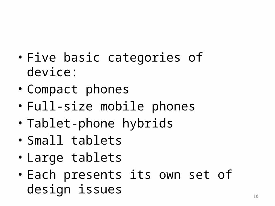
• The compact phone is summarized on the following overhead
• Not the buzzword in the caption: the hot zone is marked in red
• This is the area easily reached depending on the grip used
15

16
Full-Size Mobile Phones
• Representative sizes:• 5”-6” X 3” device size• 5” diagonal screen measurement• Note that resolution is not mentioned• Current device resolution tends to be high
enough for UI purposes• Higher resolution is nice to look at, but
doesn’t affect user interaction

17
• Still small enough for a one-handed grip• The bottom action bar becomes usable• But the top action bar tends to go out of
reach, especially for people with small hands• In this case, the other hand ends up tapping
items at the top of the screen
18
• An even bigger problem is that reaching the top tends to cover up the rest of the screen
• Note how all of this is at odds with Android standards—put the most important stuff in the (top) action bar
• This becomes hard to reach and forces you to cover what you’re looking at

19
• Within this category, there are international and marketing variations
• Because of Apple’s market share in the U.S., Android phones in the U.S. tend to try to compete with an equally large size
• This is less the case in Europe, where smaller, full-sized Android phones are popular

20
• There are various interaction patterns that help cope with screen size issues
• Most will come up later• We’ve already seen one:• If you want to put options in the drawer, there
is an alternative to opening the drawer from the top
• Swiping from right to left over the edge can open the drawer

21
• This size of device has also been sold with a hardware keyboard in the past
• But those days seem to be over• Enablers of “soft” keyboards:• Increasing screen size• Predictive text input software• The full-sized phone is summarized on the
following overhead

22

23
Tablet-Phone Hybrids
• The book doesn’t mention actual sizes for this category
• It says one inch taller and one half inch wider than a full-sized phone
• It mentions a product as an example, the Galaxy Note
• Also, the next section is for, small 7 inch tablets, so this category falls between full-sized phones and 7 inch tablets

24
• They may be unwieldy as phones you hold to your ear
• But the screen is large enough to support text reading and Web surfing
• The resolution supports the same kind of resolution/interface quality as a full-sized cell phone
25
• The hot zone covers less of the screen than a full-sized phone
• Therefore, it may become necessary to use two hands, as described above
• Or, solutions like swiping to get the drawer may solve the problems
• The tablet-phone hybrid is summarized on the following overhead

26

27
Small Tablets
• Small tablets bring two new complexities:• Two-handed grip• And horizontal orientation• The challenge is to build an
interface/navigation features that arrange themselves suitably in the different orientations, and are usable with different grips

28
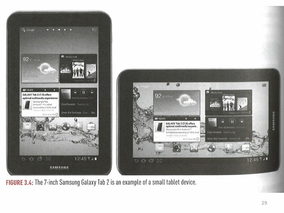
• An illustration is shown on the following overhead
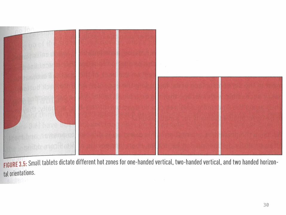
• And on the overhead following the next one, the hot zones are shown for the different grips
29
30

31
• The book claims that in vertical orientation, users still tend to hold the device with one hand
• There is a limited reach with the holding hand• Tapping with the other hand becomes
necessary• It is not really practical to hold a device
horizontally with one hand

32
• Users may use a two-handed grip in both orientations
• This gives access to the whole screen, but in different ways
• In either case, there is full access to the action bar and the split action bar

33
• The tricks which aid navigation on a small device aren’t necessary here
• Things can be out in the open• Hiding them to save space makes the app
more cryptic—leading to cognitive friction—at least the first time it’s used
• Using straightforward Android UI guidelines works fine, and is recommended

34
• What is the preferred orientation of devices?• What uses are they put to in the different
orientations?• As a general rule, for reading text, users prefer
vertical• For using the soft keyboard, horizontal is preferred• With convenient controls, simple actions like
reading may be supportable with a one-handed grip

35
• Overall, a small tablet can be defined in this way:
• The whole screen is reachable with a two-handed grip
• The device is still physically small enough to support one-handed use, as long as the app controls can be arranged suitably

36
Large Tablets
• These tend to be in the 10” range or higher—although 8” and 9” tablets are also coming out
• It turns out that the Android v. 4.x user interface guidelines are not entirely ideal once you reach this size
• And illustration is given on the following overhead
• The hot zones are illustrated on the overhead following the next one

37

38

39
• Note that the whole screen is not reachable• On the other hand, the screen is big enough to
use the keyboard in either orientation• Users may prefer horizontal because a full form
width is visible• Depending on the type of activity, such as
reading or surfing, readers may alternate between the orientations, spending ~50% of their time in each orientation
40
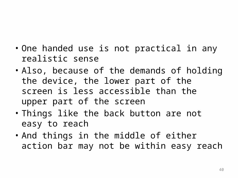
• One handed use is not practical in any realistic sense
• Also, because of the demands of holding the device, the lower part of the screen is less accessible than the upper part of the screen
• Things like the back button are not easy to reach
• And things in the middle of either action bar may not be within easy reach
41
• There is no escaping letting go with one hand and tapping with a finger
• The book cites something called Fitts’s law:• The time required to move to a target area is a
function of the distance to the target and the size of the target
• Reaching small, distant targets is a time-waster

42
• Unsupported gestures like this are awkward• They are prevalent in horizontal mode, when
using the action bar• There are various proposed solutions:• Use only part of the action bar• Try arranging controls down the sides• Use the drawer menu, etc.• This is a real issue, worth solving, in order to
make an app easy to use
43
Celebrate Fragmentation
• Supporting different devices and formats is a big deal, because there is a multiplicity of users
• Android has reached over 195 countries• The top 5: The U.S., Brazil, China, Russia, and
Mexico• Android is reaching a more diverse
demographic than any other medium

44
• It is important to be able to support diverse users with various kinds of hardware
• Making sure this really happens involves testing
• That’s the topic of the next chapter

45
The End