Embed Size (px)
Citation preview
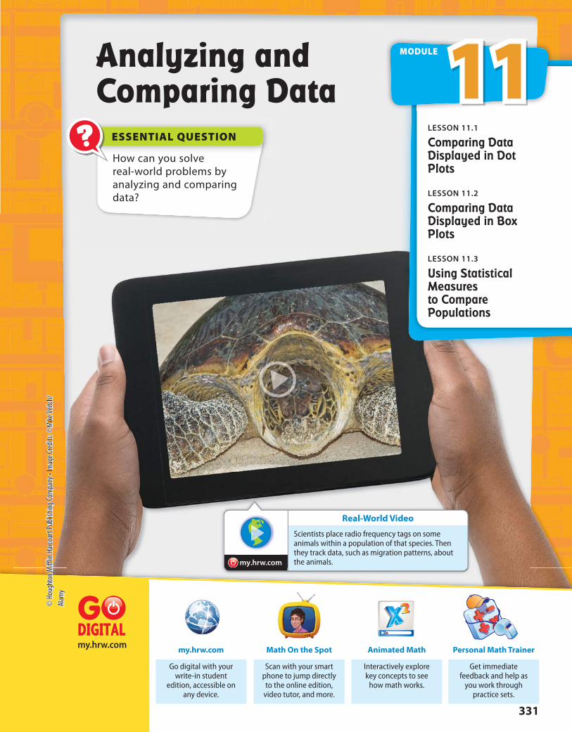
Real-World Video
my.hrw.com
ESSENTIAL QUESTION?
my.hrw.com
How can you solve real-world problems by analyzing and comparing data?
Analyzing and Comparing Data
Get immediate feedback and help as
you work through practice sets.
Personal Math Trainer
Interactively explore key concepts to see
how math works.
Animated Math
Go digital with your write-in student
edition, accessible on any device.
my.hrw.com
Scan with your smart phone to jump directly to the online edition,
video tutor, and more.
Math On the Spot
11MODULE
LESSON 11.1
Comparing Data Displayed in Dot Plots
LESSON 11.2
Comparing Data Displayed in Box Plots
LESSON 11.3
Using Statistical Measures to Compare Populations
Scientists place radio frequency tags on some animals within a population of that species. Then they track data, such as migration patterns, about the animals.
331
© H
ough
ton M
ifflin
Har
cour
t Pub
lishin
g Com
pany
• Im
age C
redit
s: ©
Mike
Veitc
h/Al
amy

Reading Start-Up
Active ReadingLayered Book Before beginning the module,
create a layered book to help you learn the
concepts in this module. Label the first flap with
the module title. Label the remaining flaps with
the lesson titles. As you study each lesson, write
important ideas, such as vocabulary and formulas,
under the appropriate flap. Refer to your finished
layered book as you work on exercises from this
module.
VocabularyReview Words
✔ data (datos) interquartile range (rango
entre cuartiles)✔ mean (media) measure of center (medida
central) measure of spread
(medida de dispersión)✔ median (mediana) survey (encuesta)
Preview Words box plot (diagrama de
caja) dot plot (diagrama de
puntos) mean absolute deviation
(MAD) (desviación absoluta media, (DAM))
Visualize VocabularyUse the ✔ words to complete the right column of the chart.
Understand VocabularyComplete each sentence using the preview words.
1. A display that uses values from a data set to show how the
values are spread out is a .
2. A uses a number line to display data.
Statistical Data
Definition Example Review Word
A group of facts. Grades on history exams:
85, 85, 90, 92, 94
The middle value of a data
set.
85, 85, 90, 92, 94
A value that summarizes a
set of values, found through
addition and division.
Results of the survey show
that students typically
spend 5 hours a week
studying.
Unit 5332
© H
ough
ton
Miff
lin H
arco
urt P
ublis
hing
Com
pany

YOUAre Ready?Personal
Math Trainer
Online Assessment and
Interventionmy.hrw.com
Complete these exercises to review skills you will need
for this module.
Fractions, Decimals, and PercentsEXAMPLE
Write each fraction as a decimal and a percent.
1. 7 _ 8
2. 4 _ 5
3. 1 _ 4
4. 3 __ 10
5. 19 __
20 6. 7 __
25 7. 37
__ 50
8. 29 ___
100
Find the Median and ModeEXAMPLE 17, 14, 13, 16, 13, 11
11, 13, 13, 14, 16, 17
median = 13 + 14
______ 2
= 13.5
mode = 13
Find the median and the mode of the data.
9. 11, 17, 7, 6, 7, 4, 15, 9 10. 43, 37, 49, 51, 56, 40, 44, 50, 36
Find the MeanEXAMPLE 17, 14, 13, 16, 13, 11
mean = 17 + 14 + 13 + 16 + 13 + 11
_____________________ 6
= 84 __
6
= 14
Find the mean of the data.
11. 9, 16, 13, 14, 10, 16, 17, 9 12. 108, 95, 104, 96, 97,106, 94
Write 13 __
20 as a
decimal and a
percent.
0.65
20 ⟌ ⎯
13.00 -12 0 1 00 -1 00 0
0.65 = 65%
Write the fraction as a division problem.Write a decimal point and zeros in the dividend.Place a decimal point in the quotient.
Write the decimal as a percent.
Order the data from least to greatest.
The median is the middle item or the average of the two middle items.
The mode is the item that appears most frequently in the data.
The mean is the sum of the data items divided by the number of items.
333Module 11
© H
ough
ton
Miff
lin H
arco
urt P
ublis
hing
Com
pany

YOUAre Ready? (cont'd)
Complete these exercises to review skills you will need for this module.
Fractions, Decimals, and Percents13. A college basketball team won 21
__ 25
of its games. What is that fraction as a decimal and
as a percent? Show your work.
Find the Median and Mode14. The table shows the weekly total numbers of miles run by members of a running club.
Find the median and the mode of the data.
Member Bill Thea Roz Hal Ana Nate Jess Marcos
Miles 18 15 10 12 17 14 12 20
Find the Mean15. Three of the junior instructors at a tennis camp are 18 years old and two are 19 years
old. The lead instructor is 28 years old. What is the mean age of the instructors?
Explain your thinking.
Unit 5334
© H
ough
ton
Miff
lin H
arco
urt P
ublis
hing
Com
pany
?
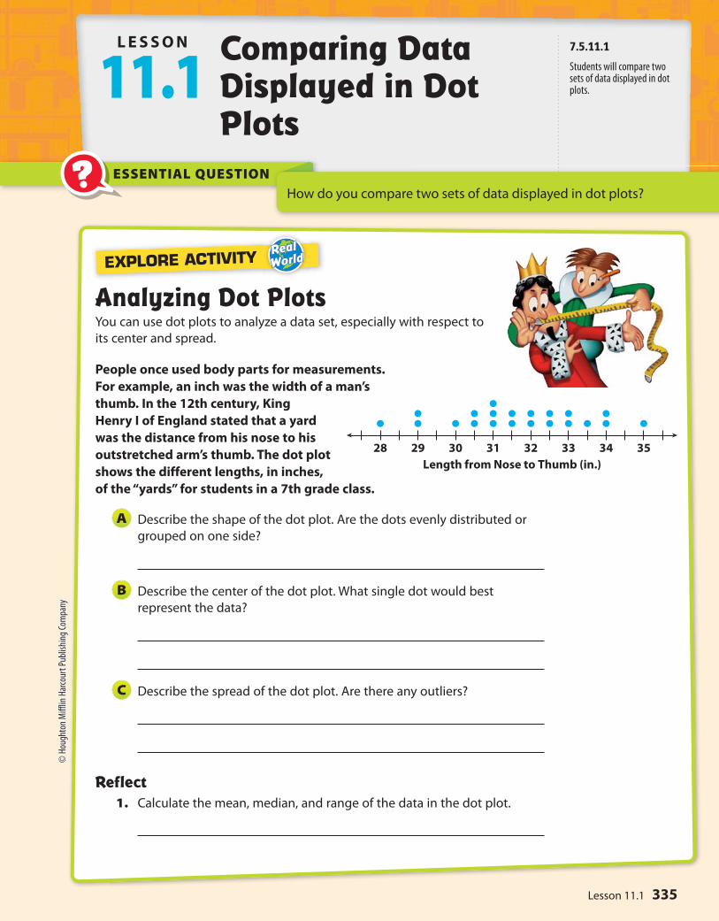
28 29 30 31 32 33 34 35
Length from Nose to Thumb (in.)
ESSENTIAL QUESTION
EXPLORE ACTIVITY
How do you compare two sets of data displayed in dot plots?
Analyzing Dot PlotsYou can use dot plots to analyze a data set, especially with respect to
its center and spread.
People once used body parts for measurements.
For example, an inch was the width of a man’s
thumb. In the 12th century, King
Henry I of England stated that a yard
was the distance from his nose to his
outstretched arm’s thumb. The dot plot
shows the different lengths, in inches,
of the “yards” for students in a 7th grade class.
Describe the shape of the dot plot. Are the dots evenly distributed or
grouped on one side?
Describe the center of the dot plot. What single dot would best
represent the data?
Describe the spread of the dot plot. Are there any outliers?
Reflect1. Calculate the mean, median, and range of the data in the dot plot.
A
B
C
L E S S O N
11.1 Comparing Data Displayed in Dot Plots
7.5.11.1
Students will compare two sets of data displayed in dot plots.
335Lesson 11.1
© H
ough
ton
Miff
lin H
arco
urt P
ublis
hing
Com
pany

5’0” 5’2” 5’4” 5’6”Softball Players’ Heights
5’2” 5’4” 5’6” 5’8” 5’10” 6’0”Basketball Players’ Heights
Math On the Spotmy.hrw.com
5’0 5’2 5’4 5’6Field Hockey Players’ Heights
Math Trainer
Online Assessment and Intervention
Personal
my.hrw.com
Comparing Dot Plots VisuallyYou can compare dot plots visually using various characteristics, such as center,
spread, and shape.
The dot plots show the heights of 15 high school basketball players and
the heights of 15 high school softball players.
Visually compare the shapes of the dot plots.
Softball: All the data is 5’6” or less.
Basketball: Most of the data is 5’8” or greater.
As a group, the softball players are shorter than the basketball players.
Visually compare the centers of the dot plots.
Softball: The data is centered around 5’4”.
Basketball: The data is centered around 5’8”.
This means that the most common height for the softball players
is 5 feet 4 inches, and for the basketball players 5 feet 8 inches.
Visually compare the spreads of the dot plots.
Softball: The spread is from 4’11” to 5’6”.
Basketball: The spread is from 5’2” to 6’0”.
There is a greater spread in heights for the basketball players.
EXAMPLE 1
A
B
C
2. Visually compare the dot plot of heights
of field hockey players to the dot plots
for softball and basketball players.
Shape:
Center:
Spread:
YOUR TURN
How do the heights of field hockey players compare with
the heights of softball and basketball players?
Math TalkMathematical Processes
Unit 5336
© H
ough
ton
Miff
lin H
arco
urt P
ublis
hing
Com
pany

Math On the Spot
my.hrw.com
0 2 4 6 8 10 12Internet Usage (h)
Math Trainer
Online Assessment and Intervention
Personal
my.hrw.com
Animated Math
my.hrw.com
0 2 4 6 8 10 12 14Exercise (h)
0 2 4 6 8 10 12 14Video Games (h)
Comparing Dot Plots NumericallyYou can also compare the shape, center, and spread of two dot plots
numerically by calculating values related to the center and spread. Remember
that outliers can affect your calculations.
Numerically compare the dot plots of the number of hours a class of
students exercises each week to the number of hours they play video
games each week.
Compare the shapes of the dot plots.
Exercise: Most of the data is less than 4 hours.
Video games: Most of the data is 6 hours or greater.
Compare the centers of the dot plots by finding the medians.
Median for exercise: 2.5 hours. Even though there are outliers at
12 hours, most of the data is close to the median.
Median for video games: 9 hours. Even though there is an outlier at
0 hours, these values do not seem to affect the median.
Compare the spreads of the dot plots by calculating the range.
Exercise range with outlier: 12 - 0 = 12 hours
Exercise range without outlier: 7 - 0 = 7 hours
Video games range with outlier: 14 - 0 = 14 hours
Video games range without outlier: 14 - 6 = 8 hours
EXAMPLEXAMPLE 2
A
B
C
3. Calculate the median and range
of the data in the dot plot. Then
compare the results to the dot
plot for Exercise in Example 2.
YOUR TURN
How do outliers affect the results of
this data?
Math TalkMathematical Processes
337Lesson 11.1
© H
ough
ton
Miff
lin H
arco
urt P
ublis
hing
Com
pany

0 2 4 6 8 10 12 14Class A (mi)
0 2 4 6 8 10 12 14Class B (mi)
Guided Practice
The dot plots show the number of miles run per week for two different
classes. For 1–5, use the dot plots shown.
1. Compare the shapes of the dot plots.
2. Compare the centers of the dot plots.
3. Compare the spreads of the dot plots.
4. Calculate the medians of the dot plots.
5. Calculate the ranges of the dot plots.
6. What do the medians and ranges of two dot plots tell you about the data?
ESSENTIAL QUESTION CHECK-IN??
Unit 5338
© H
ough
ton
Miff
lin H
arco
urt P
ublis
hing
Com
pany

0 2 4 6 8 10 12 14Number of Letters
0 2 4 6 8 10 12 14Number of Days of Rain for Montgomery, AL
0 2 4 6 8 10 12 14Number of Days of Rain for Lynchburg, VA
Personal Math Trainer
Online Assessment and
Interventionmy.hrw.com
Name Class Date
The dot plot shows the number of letters
in the spellings of the 12 months. Use the
dot plot for 7–10.
7. Describe the shape of the dot plot.
8. Describe the center of the dot plot.
9. Describe the spread of the dot plot.
10. Calculate the mean, median, and range of the data in the dot plot.
The dot plots show the mean number of days with rain per month
for two cities.
11. Compare the shapes of the dot plots.
12. Compare the centers of the dot plots.
13. Compare the spreads of the dot plots.
14. What do the dot plots tell you about the two cities with respect to their
average monthly rainfall?
Independent Practice11.1
339Lesson 11.1
© H
ough
ton
Miff
lin H
arco
urt P
ublis
hing
Com
pany

Work Area
6 7 8 9 10 11 12 13Group A Shoe Sizes
6 7 8 9 10 11 12 13Group B Shoe Sizes
The dot plots show the shoe sizes of two different groups of people.
15. Compare the shapes of the dot plots.
16. Compare the medians of the dot plots.
17. Compare the ranges of the dot plots (with and without the outliers).
18. Make A Conjecture Provide a possible explanation for the results of the
dot plots.
19. Analyze Relationships Can two dot plots have the same median and
range but have completely different shapes? Justify your answer using
examples.
20. Draw Conclusions What value is most affected by an outlier, the median
or the range? Explain. Can you see these effects in a dot plot?
FOCUS ON HIGHER ORDER THINKING
Unit 5340
© H
ough
ton
Miff
lin H
arco
urt P
ublis
hing
Com
pany
?
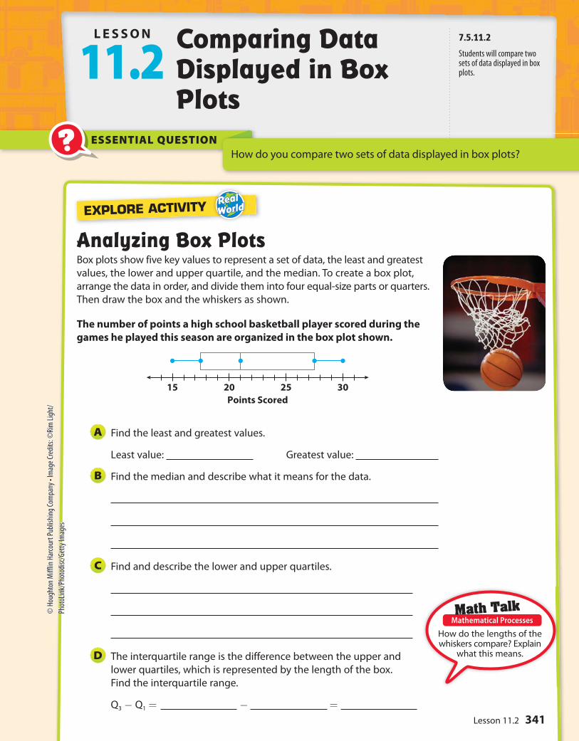
2015 25 30
Points Scored
ESSENTIAL QUESTION
L E S S O N
11.2 Comparing Data Displayed in Box Plots
How do you compare two sets of data displayed in box plots?
Analyzing Box PlotsBox plots show five key values to represent a set of data, the least and greatest
values, the lower and upper quartile, and the median. To create a box plot,
arrange the data in order, and divide them into four equal-size parts or quarters.
Then draw the box and the whiskers as shown.
The number of points a high school basketball player scored during the
games he played this season are organized in the box plot shown.
Find the least and greatest values.
Least value: Greatest value:
Find the median and describe what it means for the data.
Find and describe the lower and upper quartiles.
The interquartile range is the difference between the upper and
lower quartiles, which is represented by the length of the box.
Find the interquartile range.
Q3 - Q1 = - =
A
B
C
D
EXPLORE ACTIVITY
How do the lengths of the whiskers compare? Explain
what this means.
7.5.11.2
Students will compare two sets of data displayed in box plots.
Math TalkMathematical Processes
341Lesson 11.2
© H
ough
ton
Miff
lin H
arco
urt P
ublis
hing
Com
pany
• Im
age C
redi
ts: ©
Rim
Ligh
t/Ph
otoL
ink/
Phot
odisc
/Get
ty Im
ages

My Notes
10 20 30 40 700 50
Shopping Time (min)
Group B
Group A
60
Math On the Spotmy.hrw.com
EXPLORE ACTIVITY (cont’d)
Reflect 1. Why is one-half of the box wider than the other half of the box?
Box Plots with Similar VariabilityYou can compare two box plots numerically according to their centers, or medians, and their spreads, or variability. Range and interquartile range (IQR) are both measures of spread. Box plots with similar variability should have similar boxes and whiskers.
The box plots show the distribution of times spent shopping by two
different groups.
Compare the shapes of the box plots.
The positions and lengths of the boxes and whiskers appear to be very
similar. In both plots, the right whisker is shorter than the left whisker.
Compare the centers of the box plots.
Group A’s median, 47.5, is greater than Group B’s, 40. This means that the
median shopping time for Group A is 7.5 minutes more.
Compare the spreads of the box plots.
The box shows the interquartile range. The boxes are similar.
Group A: 55 - 30 = 25 min Group B: About 59 - 32 = 27 min
The whiskers have similar lengths, with Group A’s slightly shorter than
Group B’s.
Reflect 2. Which group has the greater variability in the bottom 50% of shopping
times? The top 50% of shopping times? Explain how you know.
EXAMPLE 1
A
B
C
Which store has the shopper who shops longest? Explain
how you know.
Math TalkMathematical Processes
342 Unit 5
© H
ough
ton
Miff
lin H
arco
urt P
ublis
hing
Com
pany
Math Trainer
Online Assessment and Intervention
Personal
my.hrw.com
30 40 50 6020 70
Number of Team Wristbands Sold Daily
Store B
Store A
80
180 200 220 240 340320160 260
Football Players’ Weights (lb)
Group B
Group A
280 300
Math On the Spot
my.hrw.com
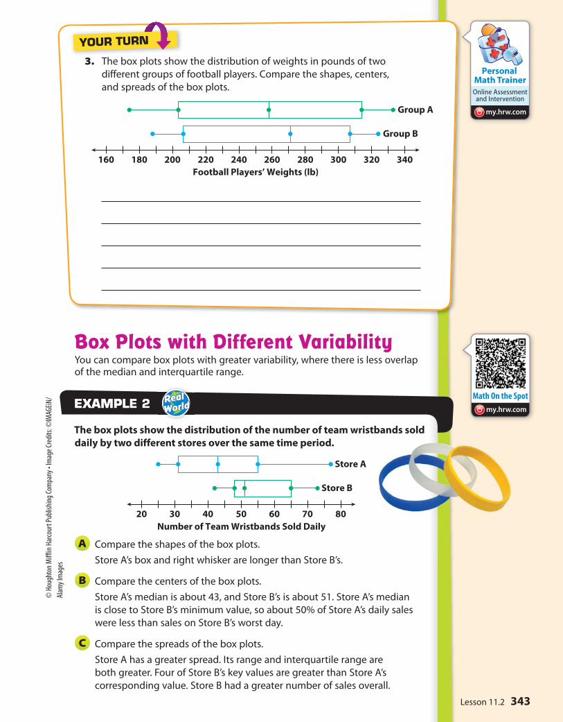
Box Plots with Different VariabilityYou can compare box plots with greater variability, where there is less overlap of the median and interquartile range.
The box plots show the distribution of the number of team wristbands sold
daily by two different stores over the same time period.
Compare the shapes of the box plots.
Store A’s box and right whisker are longer than Store B’s.
Compare the centers of the box plots.
Store A’s median is about 43, and Store B’s is about 51. Store A’s median
is close to Store B’s minimum value, so about 50% of Store A’s daily sales
were less than sales on Store B’s worst day.
Compare the spreads of the box plots.
Store A has a greater spread. Its range and interquartile range are
both greater. Four of Store B’s key values are greater than Store A’s
corresponding value. Store B had a greater number of sales overall.
EXAMPLEXAMPLE 2
A
B
C
3. The box plots show the distribution of weights in pounds of two
different groups of football players. Compare the shapes, centers,
and spreads of the box plots.
YOUR TURN
343Lesson 11.2
© H
ough
ton
Miff
lin H
arco
urt P
ublis
hing
Com
pany
• Im
age C
redi
ts: ©
IMAG
EiN/
Alam
y Im
ages
74 78 82 8670 90 94
Math Test Scores
64 68 72 7660 8480
Heights (in.)
Volleyball Players
Hockey Players
88
Math Trainer
Online Assessment and Intervention
Personal
my.hrw.com
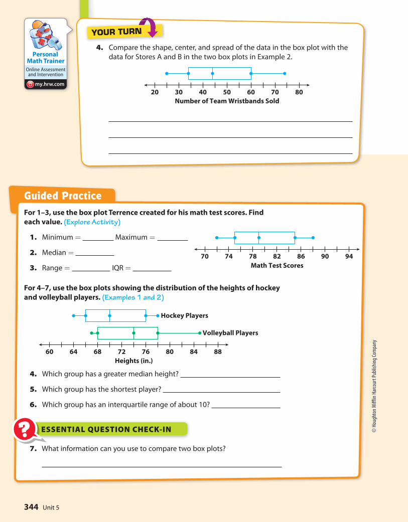
30 40 50 6020 70
Number of Team Wristbands Sold
80
For 1–3, use the box plot Terrence created for his math test scores. Find
each value. (Explore Activity)
1. Minimum = Maximum =
2. Median =
3. Range = IQR =
For 4–7, use the box plots showing the distribution of the heights of hockey
and volleyball players. (Examples 1 and 2)
4. Which group has a greater median height?
5. Which group has the shortest player?
6. Which group has an interquartile range of about 10?
Guided Practice
4. Compare the shape, center, and spread of the data in the box plot with the
data for Stores A and B in the two box plots in Example 2.
YOUR TURN
7. What information can you use to compare two box plots?
ESSENTIAL QUESTION CHECK-IN??
344 Unit 5
© H
ough
ton
Miff
lin H
arco
urt P
ublis
hing
Com
pany

170 180 190 200160 220210
Distance Jumped (in.)
Car B
Car A
Personal Math Trainer
Online Assessment and
Interventionmy.hrw.com
400 450 500 550350 650600
Cost ($)
City B
City A
Name Class Date
For 8–11, use the box plots of the distances
traveled by two toy cars that were jumped
from a ramp.
8. Compare the minimum, maximum, and
median of the box plots.
9. Compare the ranges and interquartile
ranges of the data in box plots.
10. What do the box plots tell you about the
jump distances of two cars?
11. Critical Thinking What do the whiskers
tell you about the two data sets?
For 12–14, use the box plots to compare the
costs of leasing cars in two different cities.
12. In which city could you spend the least
amount of money to lease a car? The
greatest?
13. Which city has a higher median price? How
much higher is it?
14. Make a Conjecture In which city is it
more likely to choose a car at random that
leases for less than $450? Why?
Independent Practice11.2
345Lesson 11.2
© H
ough
ton
Miff
lin H
arco
urt P
ublis
hing
Com
pany

Work Area
15. Summarize Look back at the box plots for 12–14 on the previous page.
What do the box plots tell you about the costs of leasing cars in those
two cities?
16. Draw Conclusions Two box plots have the same median and equally
long whiskers. If one box plot has a longer box than the other box plot,
what does this tell you about the difference between the data sets?
17. Communicate Mathematical Ideas What you can learn about a data set
from a box plot? How is this information different from a dot plot?
18. Analyze Relationships In mathematics, central tendency is the tendency
of data values to cluster around some central value. What does a measure
of variability tell you about the central tendency of a set of data? Explain.
FOCUS ON HIGHER ORDER THINKING
346 Unit 5
© H
ough
ton
Miff
lin H
arco
urt P
ublis
hing
Com
pany

?
Math On the Spot
my.hrw.com
ESSENTIAL QUESTIONHow can you use statistical measures to compare populations?
L E S S O N
11.3 Using Statistical Measures to Compare Populations
Comparing Differences in Centers to VariabilityRecall that to find the mean absolute deviation (MAD) of a data set, first find
the mean of the data. Next, take the absolute value of the difference between
the mean and each data point. Finally, find the mean of those absolute
values.
The tables show the number of minutes per day students in a class spend
exercising and playing video games. What is the difference of the means as
a multiple of the mean absolute deviations?
Minutes Per Day Exercising
0, 7, 7, 18, 20, 38, 33, 24, 22, 18, 11, 6
Minutes Per Day Playing Video Games
13, 18, 19, 30, 32, 46, 50, 34, 36, 30, 23, 19
Calculate the mean number of minutes per day exercising.
0 + 7 + 7 + 18 + 20 + 38 + 33 + 24 + 22 + 18 + 11 + 6 = 204
204 ÷ 12 = 17
Calculate the mean absolute deviation for the number of
minutes exercising.
| 0-17 | = 17 | 7-17 | = 10 | 7-17 | = 10 | 18-17 | = 1
| 20-17 | = 3 | 38-17 | = 21 | 33-17 | = 16 | 24-17 | = 7
| 22-17 | = 5 | 18-17 | = 1 | 11-17 | = 6 | 6-17 | = 11
Find the mean of the absolute values.
17 + 10 + 10 + 1 + 3 + 21+ 16 + 7 + 5 + 1 + 6 + 11 = 108
108 ÷ 12 = 9
EXAMPLEXAMPLE 1
STEP 1
STEP 2
7.5.11.3
Students will use statistical measures to compare populations.
Divide the sum by the number of students.
Divide the sum by the number of students.
© H
ough
ton
Miff
lin H
arco
urt P
ublis
hing
Com
pany
• Im
age C
redi
ts: A
sia Im
ages
Gr
oup/
Getty
Imag
es
347Lesson 11.3

My Notes
Math Trainer
Online Assessment and Intervention
Personal
my.hrw.com
Calculate the mean number of minutes per day playing video
games. Round to the nearest tenth.
13 + 18 + 19 + 30 + 32 + 46 + 50 + 34 + 36 + 30 + 23 + 19 = 350
350 ÷ 12 ≈ 29.2
Calculate the mean absolute deviation for the numbers of minutes
playing video games.
| 13-29.2 | = 16.2 | 18-29.2 | = 11.2 | 19-29.2 | = 10.2
| 30-29.2 | = 0.8 | 32-29.2 | = 2.8 | 46-29.2 | = 16.8
| 50-29.2 | = 20.8 | 34-29.2 | = 4.8 | 36-29.2 | = 6.8
| 30-29.2 | = 0.8 | 23-29.2 | = 6.2 | 19-29.2 | = 10.2
Find the mean of the absolute values. Round to the nearest tenth.
16.2 + 11.2 + 10.2 + 0.8 + 2.8 + 16.8 + 20.8 + 4.8 + 6.8 + 0.8 +
6.2 + 10.2 = 107.6
107.6 ÷ 12 ≈ 9
Find the difference in the means.
29.2 - 17 = 12.2
Write the difference of the means as a multiple of the mean
absolute deviations, which are similar but not identical.
12.2 ÷ 9 ≈ 1.36
The means of the two data sets differ by about 1.4 times the
variability of the two data sets.
STEP 3
STEP 4
STEP 5
STEP 6
1. The high jumps in inches of the students on two intramural track and
field teams are shown below. What is the difference of the means as a
multiple of the mean absolute deviations?
High Jumps for Students on Team 1 (in.)
44, 47, 67, 89, 55, 76, 85, 80, 87, 69, 47, 58
High Jumps for Students on Team 2 (in.)
40, 32, 52, 75, 65, 70, 72, 61, 54, 43, 29, 32
YOUR TURN
Divide the sum by the number of students.
Subtract the lesser mean from the greater mean.
Divide the difference of the means by the MAD.
Divide the sum by the number of students.
348 Unit 5
© H
ough
ton
Miff
lin H
arco
urt P
ublis
hing
Com
pany

0 1 2 3 4 5 6 7 1098 11 12 13 14 15 16 17 18 19 20Hours Per Month Doing Volunteer Work
Two Random Samples of Size 10
Grade 7
Grade 11
0 1 2 3 4 5 6 7 1098 11 12 13 14 15 16 17 18 19 20Medians
Distribution of Medians from 10 Random Samples of Size 10
Grade 7
Grade 11
Math On the Spot
my.hrw.com
Using Multiple Samples to Compare PopulationsMany different random samples are possible for any given population, and
their measures of center can vary. Using multiple samples can give us an idea
of how reliable any inferences or predictions we make are.
A group of about 250 students in grade 7 and about 250 students in grade
11 were asked, “How many hours per month do you volunteer?” Responses
from one random sample of 10 students in grade 7 and one random
sample of 10 students in grade 11 are summarized in the box plots.
How can we tell if the grade 11 students do more volunteer work than the
grade 7 students?
The median is higher for the students in grade 11. But there
is a great deal of variation. To make an inference for the entire
population, it is helpful to consider how the medians vary among
multiple samples.
The box plots below show how the medians from 10 different
random samples for each group vary.
The medians vary less than the actual data. Half of the grade 7
medians are within 1 hour of 9. Half of the grade 11 medians are
within 1 or 2 hours of 11. Although the distributions overlap, the
middle halves of the data barely overlap. This is fairly convincing
evidence that the grade 11 students volunteer more than the
grade 7 students.
EXAMPLEXAMPLE 2
STEP 1
STEP 2
Why doesn’t the first box plot establish that students
in grade 11 volunteer more than students
in grade 7?
Math TalkMathematical Processes
349Lesson 11.3
© H
ough
ton
Miff
lin H
arco
urt P
ublis
hing
Com
pany
• Im
age C
redi
ts: ©
Kids
tock
/Blen
d Im
ages
/Get
ty Im
ages

Math Trainer
Online Assessment and Intervention
Personal
my.hrw.com
0 1 2 3 4 5 6 7 1098 11 12 13 14 15 16 17 18 19 20Means
Distribution of Means from 10 Random Samples of Size 10
Grade 7
Grade 11
Guided Practice
The tables show the numbers of miles run by the students in two classes.
Use the tables in 1–2. (Example 1)
Miles Run by Class 1 Students
12, 1, 6, 10, 1, 2, 3, 10, 3, 8, 3, 9, 8, 6, 8
1. For each class, what is the mean? What is the mean absolute deviation?
2. The difference of the means is about times the mean
absolute deviations.
3. Mark took 10 random samples of 10 students from two schools. He asked
how many minutes they spend per day going to and from school. The
tables show the medians and the means of the samples. Compare the
travel times using distributions of the medians and means. (Example 2)
School A
Medians: 28, 22, 25, 10, 40, 36, 30, 14, 20, 25
Means: 27, 24, 27, 15, 42, 36, 32, 18, 22, 29
4. Why is it a good idea to use multiple random samples when making
comparative inferences about two populations?
ESSENTIAL QUESTION CHECK-IN??
Miles Run by Class 2 Students
11, 14, 11, 13, 6, 7, 8, 6, 8, 13, 8, 15, 13, 17, 15
2. The box plots show the variation in the means for 10 different random
samples for the groups in the example. Why do these data give less
convincing evidence that the grade 11 students volunteer more?
YOUR TURN
School B
Medians: 22, 25, 20, 14, 20, 18, 21, 18, 26, 19
Means: 24, 30, 22, 15, 20, 17, 22, 15, 36, 27
350 Unit 5
© H
ough
ton
Miff
lin H
arco
urt P
ublis
hing
Com
pany

Personal Math Trainer
Online Assessment and
Interventionmy.hrw.com
150 160 170 180 190 200 210 220 230 240 250 260 270 280 290 300 310 320 330 340 350Means
Distribution of Means from 10 Random Samples of Size 10
League A
League B
Name Class Date
Independent Practice11.3
Josie recorded the average monthly temperatures for two cities in
the state where she lives. Use the data for 5–7.
Average Monthly Temperatures for City 1 (°F)
23, 38, 39, 48, 55, 56, 71, 86, 57, 53, 43, 31
Average Monthly Temperatures for City 2 (°F)
8, 23, 24, 33, 40, 41, 56, 71, 42, 38, 28, 16
5. For City 1, what is the mean of the average monthly temperatures? What
is the mean absolute deviation of the average monthly temperatures?
6. What is the difference between each average monthly temperature for
City 1 and the corresponding temperature for City 2?
7. Draw Conclusions Based on your answers to Exercises 5 and 6, what do
you think the mean of the average monthly temperatures for City 2 is?
What do you think the mean absolute deviation of the average monthly
temperatures for City 2 is? Give your answers without actually calculating
the mean and the mean absolute deviation. Explain your reasoning.
8. What is the difference in the means as a multiple of the mean absolute
deviations?
9. Make a Conjecture The box plots show the distributions of mean
weights of 10 samples of 10 football players from each of two leagues,
A and B. What can you say about any comparison of the weights of the
two populations? Explain.
351Lesson 11.3
© H
ough
ton
Miff
lin H
arco
urt P
ublis
hing
Com
pany
• Im
age C
redi
ts: ©
Song
quan
De
ng/S
hutte
rstoc
k
Work Area
10. Justify Reasoning Statistical measures are shown for the ages of middle
school and high school teachers in two states.
State A: Mean age of middle school teachers = 38, mean age of high
school teachers = 48, mean absolute deviation for both = 6
State B: Mean age of middle school teachers = 42, mean age of high
school teachers = 50, mean absolute deviation for both = 4
In which state is the difference in ages between members of the two
groups more significant? Support your answer.
11. Analyze Relationships The tables show the heights in inches of all the adult
grandchildren of two sets of grandparents, the Smiths and the Thompsons.
What is the difference in the medians as a multiple of the ranges?
Heights of the Smiths’ Adult Grandchildren (in.)
64, 65, 68, 66, 65, 68, 69, 66, 70, 67
12. Critical Thinking Jill took many samples of 10 tosses of a standard
number cube. What might she reasonably expect the median of the
medians of the samples to be? Why?
13. Analyze Relationships Elly and Ramon are both conducting surveys to
compare the average numbers of hours per month that men and women
spend shopping. Elly plans to take many samples of size 10 from both
populations and compare the distributions of both the medians and the
means. Ramon will do the same, but will use a sample size of 100. Whose
results will probably produce more reliable inferences? Explain.
14. Counterexamples Seth believes that it is always possible to compare
two populations of numerical values by finding the difference in the
means of the populations as a multiple of the mean absolute deviations.
Describe a situation that explains why Seth is incorrect.
FOCUS ON HIGHER ORDER THINKING
Heights of the Thompsons’ Adult Grandchildren (in.)
75, 80, 78, 77, 79, 76, 75, 79, 77, 74
352 Unit 5
© H
ough
ton
Miff
lin H
arco
urt P
ublis
hing
Com
pany

Ready
180 190
Airplane A
Airplane B
200 210 220
Length of Flight (in.)
230 240 250
5 6 7 8 9 10
Start of School Year
5 6 7 8 9 10
Miles Run Miles Run
End of School Yearl
Math Trainer
Online Assessment and Intervention
Personal
my.hrw.com
MODULE QUIZ
11.1 Comparing Data Displayed in Dot Plots
The two dot plots show the number
of miles run by 14 students at the
start and at the end of the school
year. Compare each measure for the
two dot plots. Use the data
for 1–3.
1. means
2. medians 3. ranges
11.2 Comparing Data Displayed in Box PlotsThe box plots show lengths of flights
in inches flown by two model
airplanes. Use the data for 4–5.
4. Which has a greater median
flight length?
5. Which has a greater interquartile range?
11.3 Using Statistical Measures to Compare Populations6. Roberta grows pea plants, some in shade and some in sun. She picks
8 plants of each type at random and records the heights.
Shade plant heights (in.) 7 11 11 12 9 12 8 10
Sun plant heights (in.) 21 24 19 19 22 23 24 24
Express the difference in the means as a multiple of their ranges.
7. How can you use and compare data to solve real-world problems?
ESSENTIAL QUESTION
353Module 11
© H
ough
ton
Miff
lin H
arco
urt P
ublis
hing
Com
pany

Personal Math Trainer
Online Assessment and
Interventionmy.hrw.com
10 20 30 40 50 60
Set A
10 20 30 40 50 60
Set B
100 200 300 4000 500
City B
City A
52 56 60 64 68 72 76 80
0 2 4 6 8 101214 0 2 4 6 8 101214
Fourth Grade Seventh Grade
Selected Response
1. Which statement about the data is true?
A The difference between the medians is
about 4 times the range.
B The difference between the medians is
about 4 times the IQR.
C The difference between the medians is
about 2 times the range.
D The difference between the medians is
about 2 times the IQR.
2. Which is a true statement based on the
box plots below?
A The data for City A has the greater range.
B The data for City B is more symmetric.
C The data for City A has the greater
interquartile range.
D The data for City B has the greater
median.
3. What is -3 1 _ 2
written as a decimal?
A -3.5
B -3.05
C -0.35
D -0.035
4. Which is a true statement based on the dot
plots below?
A Set A has the lesser range.
B Set B has the greater median.
C Set A has the greater mean.
D Set B is less symmetric than Set A.
Mini-Task
5. The dot plots show the lengths of a
random sample of words in a fourth-grade
book and a seventh-grade book.
a. Compare the shapes of the plots.
b. Compare the ranges of the plots.
Explain what your answer means in
terms of the situation.
MODULE 11 MIXED REVIEW
Assessment Readiness
354 Unit 5
© H
ough
ton
Miff
lin H
arco
urt P
ublis
hing
Com
pany