Embed Size (px)
Citation preview

Analysis of magazine front coversCover 1.NME Sept 2009
Dizzee Rascal Edition
By Tamera Lall

FRONT COVER ANALYSISMASTHEAD – the ‘NME’ could also mean enemy. It is very large and colourful. This makes in stand out and the whole cover looks eye-catching. It helps with the branding as this is the magazine company’s logo.
THE HEADER – tells you what features inside the magazine. It also shows the deals you get for the amount of money you pay.
THE SELL LINES/COVER LINES – state features within the magazine so it attracts the audience and basically sells the magazine to the audience.
THE MAIN IMAGE – of Dizzee Rascal. He has been used as he is a well-known artist of the hip hop genre. This will attract the target audience who are interested in his or this kind of music.
THE MAIN COVER LINE - says his name so you can recognise him and it also tells you that he is included in the magazine.
Barcode(date/issue/price) – the barcode is in the corner which keeps it out of the way so it doesn’t distract from the main cover. The price is kept at a reasonable price so it suits the target audience.
THE FOOTER – mentions artists of different genres which the younger target audience would recognise and be interested in those artists.
USE OF A PULL QUOTE – gives an insight on what is featured in the magazine. The use of the word ‘man!’ keeps it casual and helps target the younger audience.
BACKGROUND – the background is a graffiti wall. This represents the stereotype of hip hop artists.
USE OF A FLASH – the flash stands out against the background which helps to attract the readers.
RULE OF THIRDS/THE LEFT THIRD – all the important information is kept in the left third of the page as this is the side that most people look at and read first.

TARGET AUDIENCE OF THIS MAGAZINE
METHODS USED TO ATTRACT THIS TARGET AUDIENCE ARE:
•A current artist of a popular music genre is featured on the cover.
•Graffiti background is colourful, bright and fun.
•The use of the word ‘man’ is slang which keeps it modern and appealing to the younger audience.
TARGET AUDIENCE – I believe the target audience are interested in more modern music, mainly the hip hop genre. I think the audience is predominately males (74%) and a smaller female audience (26%). The median age of the readers is 23 so the target audience is students and wealthy people. The cost of the magazine is about £2.20.
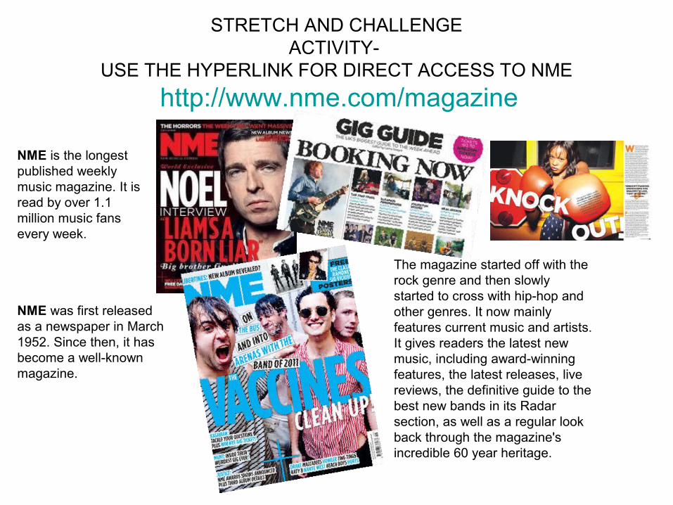
STRETCH AND CHALLENGEACTIVITY-
USE THE HYPERLINK FOR DIRECT ACCESS TO NME
http://www.nme.com/magazine
NME is the longest published weekly music magazine. It is read by over 1.1 million music fans every week.
NME was first released as a newspaper in March 1952. Since then, it has become a well-known magazine.
The magazine started off with the rock genre and then slowly started to cross with hip-hop and other genres. It now mainly features current music and artists. It gives readers the latest new music, including award-winning features, the latest releases, live reviews, the definitive guide to the best new bands in its Radar section, as well as a regular look back through the magazine's incredible 60 year heritage.

Analysis of VIBE front cover - Drake

MASTHEAD – the masthead takes up a large amount of the page. It is white which contrasts with the black background making it stand out and eye-catching.
BACKGROUND – the background is plain black which contrasts with all the text on the page. This makes the text stand out against it and makes it easier to read and understand.
SELL LINES/COVER LINES – highlights the important features inside the magazine that could attract the reader.
RULES OF THIRDS/LEFT THIRD – all the important information is kept in the left third as it is the side that the audience will first read.
BARCODE – this is kept on the side of the cover and out of the way so it doesn’t distract from the main front cover.
HEADER – mentions various artists of the hip-hop genre that would appeal and be of interest of the target audience.
MAIN IMAGE – the image is of Drake - a popular artist of the genre. He is recognisable as he is well-known. This will attract the target audience.
MAIN COVER LINE – although the cover line doesn’t take up much of the cover, it still tells you who is on the front cover and featured inside. As he is well-known everyone will know who he is.
FLASH – the use of a flash in a contrasting colour makes it stand out from the back ground and noticeable to the reader.
The cover in general is fairly simple, in regards to the colour scheme. This works as it allows the reader to pay more attention to the actual information on the page.

The magazine targets its target audience by:• featuring a well-known, popular artists that the audience will admire or inspire to be like.
•Using a simple but striking colour scheme that will catch the eye of the audience.
•Including a list of major artists that the audience is most likely to listen to and be interested in.
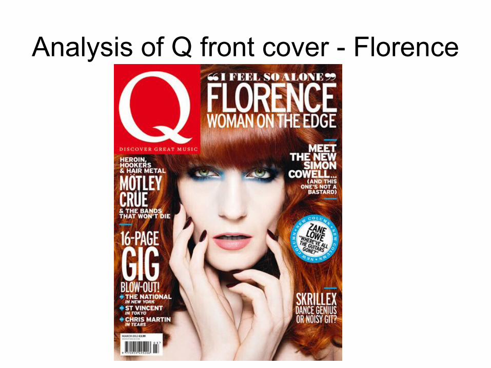
Analysis of Q front cover - Florence

MASTHEAD – the masthead is large and very bright with a recognisable colour that would be associated with the magazine. It is the well-known logo of the magazine company so it makes the cover recognisable, It also is very simple making it memorable.It also is in front of the image which shows its importance.
MAIN IMAGE – the main image features Florence, a current artist in the charts. She is a popular artist in her genre so this will help sell to the target audience as it will gain their interest in the magazine.
MAIN COVER LINE – the main cover line is right at the top of the page and is slightly larger than the other text on the page, this means the audience will look at this first so it will gain their interest in the magazine.
BARCODE – the barcode is put in the bottom left and kept out of the way in order to not distract the readers from the actual main information and image.
SELL LINES/COVER LINES – the sell lines help to sell the magazine as it highlights the main features in the magazine. They all include major artists that is like to target and attract the audience.
BACKGROUND – there actually is not a proper background which is unusual when compared with the other magazine covers. The background could possibly her hair which is a striking colour so you would instantly know who it was. Also it means the main focus is on the cover star.
FLASH – the flash is bright blue which contrasts with the rest of the colours on the cover(except the make up) this makes it stand out so the audience will read this and pay more attention as it is very eye-catching.