Embed Size (px)
Citation preview
“An Art at the Mercy of Light” Recent Works by Eli Bornstein
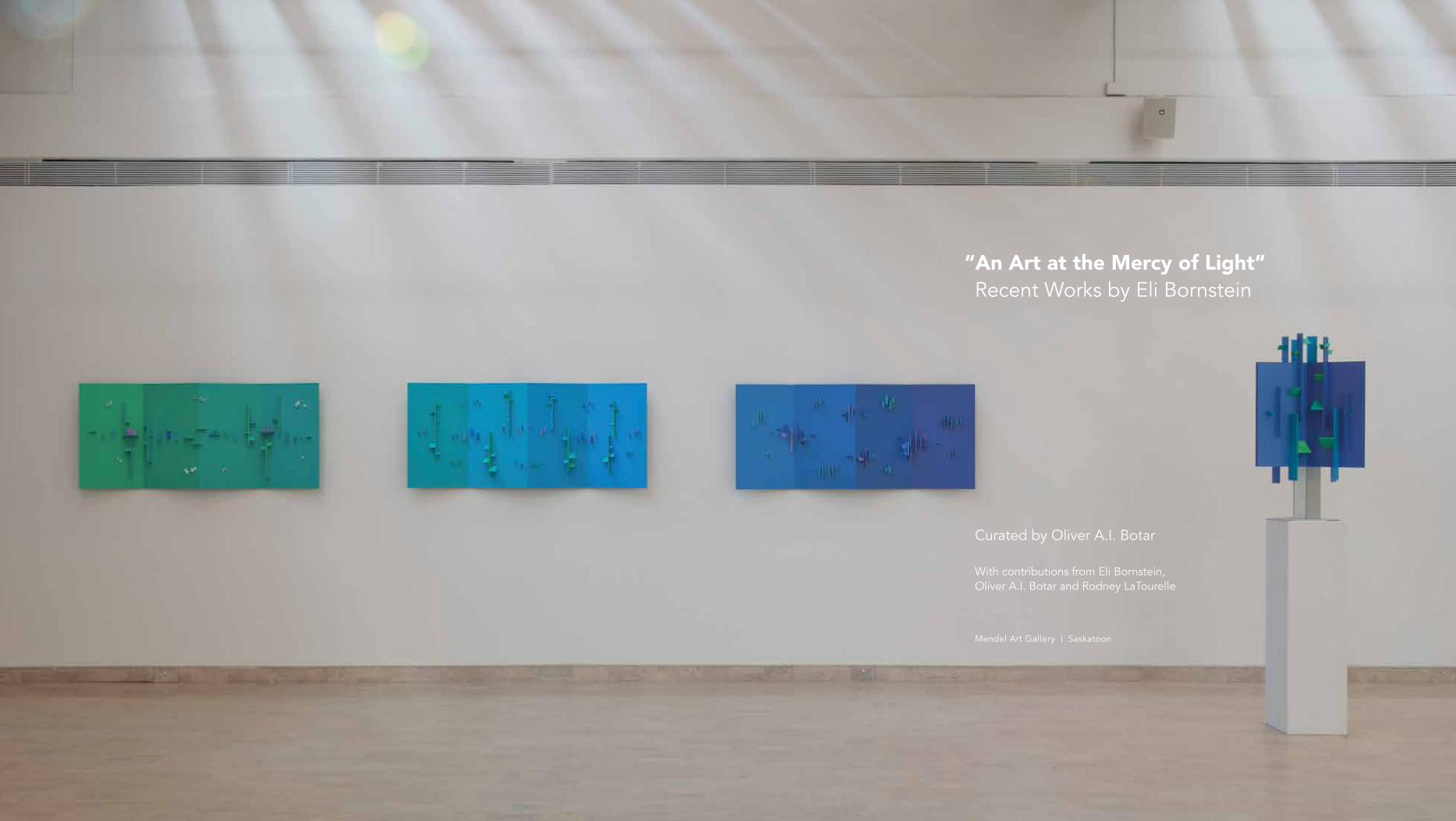
“An Art at the Mercy of Light” Recent Works by Eli Bornstein
Curated by Oliver A.I. Botar
With contributions from Eli Bornstein, Oliver A.I. Botar and Rodney LaTourelle
Mendel Art Gallery | Saskatoon

previous spread Left to right: Quadriplane Structurist Relief No. 1, 2, & 3 (River-Screen Series), 1989–1995, Tripart Hexaplane Construction No. 1, 2002–2004
ForewordGregory Burke
“The constructed relief is an art at the mercy of light”Oliver A.I. Botar
Infinity Playfully Unfolding: Eli Bornstein’s Multiplane ReliefsRodney LaTourelle
Excerpts from the Journals of 1998–2013Eli Bornstein
The StructuristOliver A.I. Botar
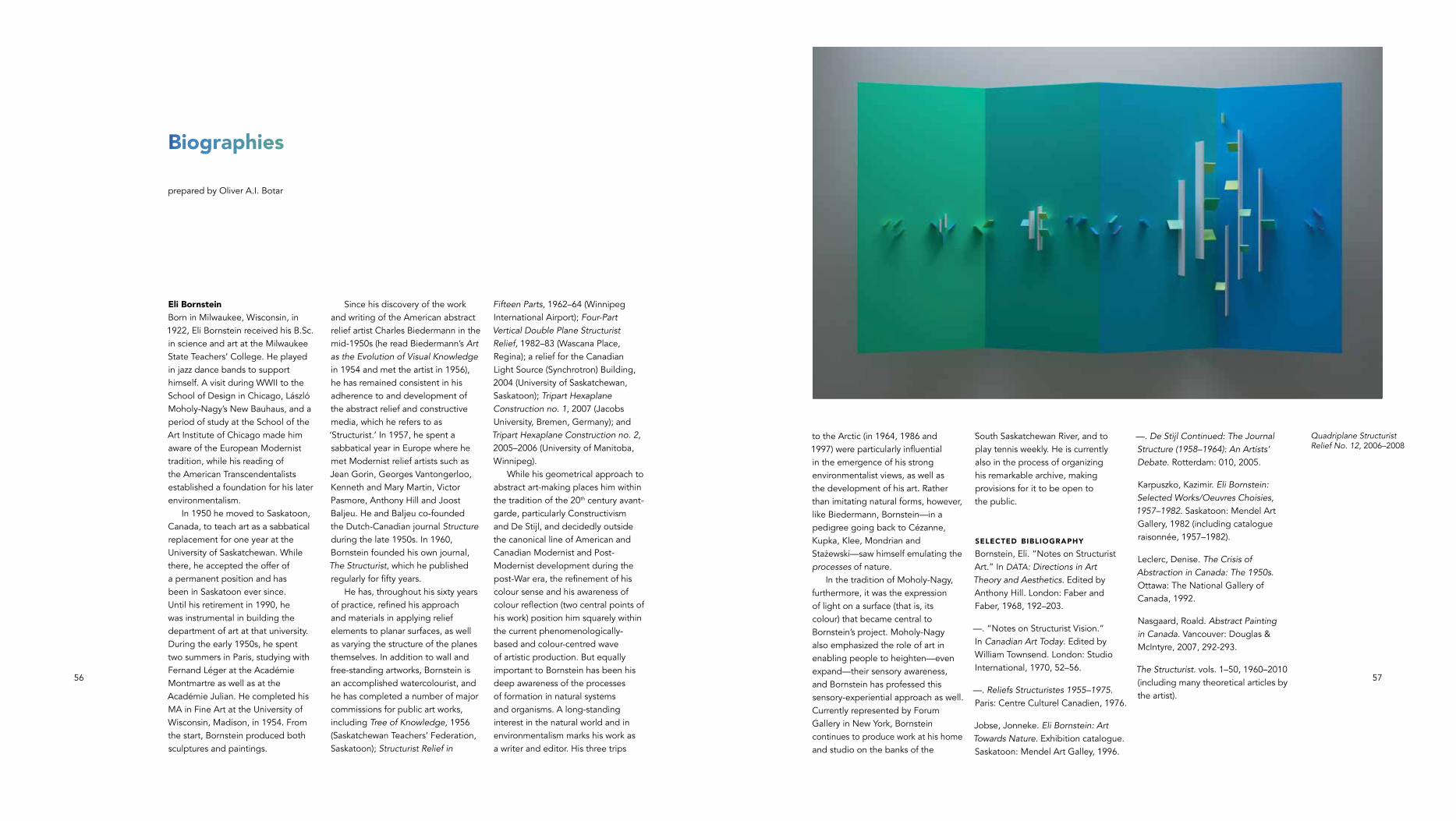
BiographiesOliver A.I. Botar
List of Works
Published to record the exhibition, “An Art at the Mercy of Light:” Recent Work by Eli Bornstein, presented from 14 June to 15 September 2013 at the Mendel Art Gallery, Saskatoon, Saskatchewan, Canada and from 12 November 2013 to 7 February 2014 at the School of Art Gallery, University of Manitoba, Winnipeg, Manitoba, Canada.
COPYRIGHTPublication © 2013 Mendel Art GalleryIndividual texts © 2013 the authors
All rights reserved. No part of this book may be reproduced, stored in a retrieval system or transmitted in any form or by any means with-out prior written permission of the publisher.
Exhibition curator and publication editor Oliver A.I. Botar
Publication Coordinator Troy Gronsdahl
Texts Oliver A. I. Botar, Eli Bornstein, and Rodney LaTourelle
Copy editor Morna Greuel, Fine Line Editing
Design Zab Design & Typography Inc.
Photography Troy Mamer, unless otherwise indicated
Scanning Oliver A. I. Botar
Printed in Canada by Friesens
Contents
7
10
26
32
43
56
59
Distributed by ABC Art Books Canada230-372, rue Sainte-Catherine OuestMontreal, Quebec, Canada H3B 1A2www.ABCartbookscanada.com
Published by the Mendel Art Gallery
LIBRARY AND ARCHIvES CANADA CATALOGUE IN PUBLICATION
“An art at the mercy of light”: recent work by Eli Bornstein / curator Oliver A.I. Botar ; with contributions from Eli Bornstein, Oliver A.I. Botar, Rodney LaTourelle. Published in conjunction with an exhibition held at the Mendel Art Gallery, Saskatoon, Saskatchewan, Canada, from June 14 to September 15, 2013.Includes bibliographical references.ISBN 978-1-896359-83-0 (pbk.) 1. Bornstein, Eli--Exhibitions. I. Born-stein, Eli, writer of added commentary II. Botar, Oliver A.I. (Oliver Arpad Istvan), 1957-, writer of added commentary III. LaTourelle, Rodney, 1965- writer of added commentary Iv. Mendel Art Gallery, issuing body, host institution. NB249.B66A4 2013 730.92 C2013-904344-6
Mendel Art Gallery950 Spadina Crescent EastP.O. Box 569, Saskatoon, SKCanada S7K 3L6www.mendel.ca
The Mendel Art Gallery is a non-profit organization supported by its members and donations and grants from the City of Saskatoon, Saskatchewan Lotteries, the Saskatchewan Arts Board, and the Canada Council for the Arts. “An Art at the Mercy of Light:” Recent Work by Eli Bornstein is sponsored by Mine Supply Company.
All works reproduced in this publication are by Eli Bornstein.
All photo documentation of the exhibition is of the installation at the Mendel Art Gallery.
Eli Bornstein, Saskatoon, Sask., 2013

7
Tripart Hexaplane Construction No. 7, 2011–2013
spread following Hexaplane Structurist Relief No. 2 (Arctic Series), 1995–1998
Foreword
The Mendel Art Gallery celebrates the artistic achievements of Saskatchewan artists and fosters original research that examines the visual art and culture of our time.
An Art at the Mercy of Light is an exploration of sensory experience through the work of one of the province’s most dedicated and focused practitioners, Eli Bornstein. Since he arrived in Saskatoon in 1950 to teach in the University of Saskatchewan Fine Arts Program, Bornstein has made significant contributions to artistic and intellectual life through his work as artist, lecturer and writer.
Bornstein is recognized internationally for his work with abstract reliefs, working in a manner that he refers to as “Structurist.” Curated by art historian Oliver Botar, the exhibition and catalogue contextualize Bornstein’s practice in relation to both early modernist movements and the current revival of perceptual and experiential art. The catalogue also includes excerpts from the artist’s journals, and calls attention to Bornstein’s singular achievement as the editor and publisher of The Structurist (1960–2010).
The exhibition would not be possible without the tremendous enthusiasm and insight of Oliver Botar. Thanks are also due to Paul Hess, Director, School of Art, University of Manitoba and Mary Reid, Director/Curator of The School of Art Gallery as hosting venue for the tour. The gallery would also like to extend its thanks to Rodney LaTourelle for his thoughtful contribution to this publication. Concurrent with the exhibition, the Mendel also presents LaTourelle’s site-specific, interactive project commission, leaves, co-curated by Oliver Botar and Troy Gronsdahl, which has provided a reading space where the
public can enjoy issues of The Structurist and will become part of the Mendel’s permanent collection. Thanks must also be extended to the Mendel staff for their dedication and professionalism: Troy Gronsdahl, coordinating curator, as well as Troy Mamer for publication assistance and his excellent photography, and the installation team: registrar Donald Roach, Ray Lodoen and Jason Hosaluk, with special acknowledgment to senior preparator, Perry Opheim, who has worked closely with Bornstein on this and previous Mendel installations.
The Mendel Art Gallery is grateful for the support of the Saskatoon community, in particular the University of Saskatchewan, as a lender to the exhibition, and Mine Supply Company, for their generous sponsorship. I would also like to acknowledge the Canada Council for the Arts, the Saskatchewan Arts Board, SaskCulture, Museums Assistance Program, and the City of Saskatoon for their support of our program.
Eli Bornstein’s practice spans six decades. His first exhibition at the Mendel Art Gallery was in 1965, the first exhibition held in the new building, and, 48 years later, Bornstein is still actively producing art. His commitment to the artistic exploration of structure, colour, space and light, and the integrity of his practice are truly worth celebrating.
Gregory Burke Executive Director/ceo Mendel Art Gallery
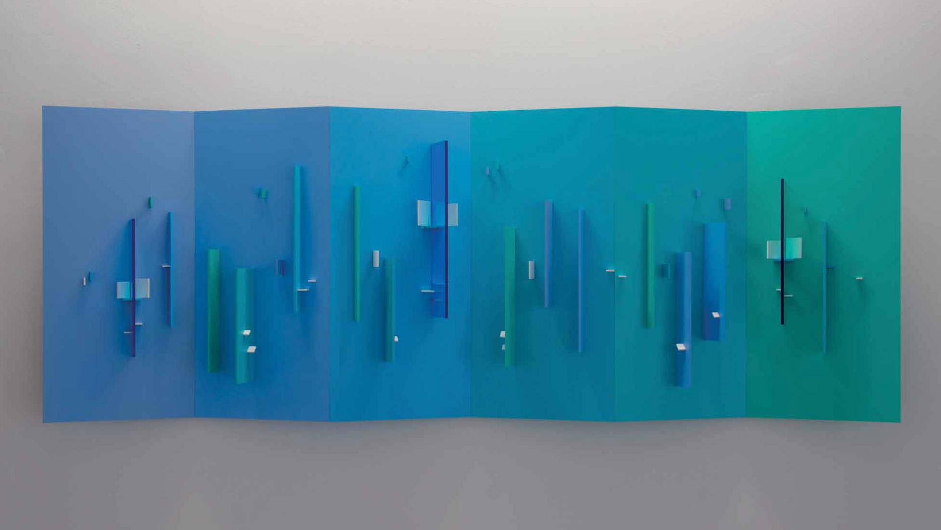
Photo Caption Here. Title, date, dimensions or whatever format you determine will be place in this area.

10 11
7 Stephen Mansbach, “Attitudes Towards Nature in Some Early Twentieth Century Art,” The Structurist, no. 23/24, 1983–84: 87.
8 Eli Bornstein, “Sketches from Nature,” The Structurist, no. 23/24, 1983–84: 43.
9 Eli Bornstein, Reliefs Structuristes 1955–1975, Paris: Centre Culturel Canadien, 1976, unpag.
10 Jonneke Fritz-Jobse, Eli Bornstein—Art Towards Nature. Exhibition catalogue, Saskatoon: Mendel Art Gallery, 1996: 11.
11 Oliver Botar, “Prolegomena to the Study of Biomorphic Modernism: Biocentrism, László Moholy-Nagy’s
“New Vision” and Ernő Kállai’s Bioromantik,” Ph.D. Dissertation, University of Toronto, 1998.
12 See Oliver Botar, “Ernő Kállai, Bioromanticism and the Hidden Face of Nature,” The Structurist no. 23/24, 1983/84, 77–82.
“The constructed relief is an art at the mercy of light”
Oliver A.I. Botar
This is how Eli Bornstein describes his art in his journals of 2001, in which he reflects extensively on his artistic practice and on his value system.1 This unpublished journal (excerpts can be found in this catalogue) is a kind of ars poetica for this nonagenarian, who has lived and worked in Saskatoon since 1950. In his text, “The Burden of an Art Dependent on Light,” from which I have quoted in the title of this essay, Bornstein dwells on the lighting of his works, emphasizing the avoidance of “overlighting and wrong types of illumination [that] destroy colour and structural relationships, cancel all its subtleties and richness.” These are strong words.
More than about their illumination, however, his words speak of the fact that, first and foremost, Bornstein’s art is about perception, perception of colour and the perception of form and formal relationships through colour and light—an indication of the essential (embodied) ocular-centrism of Bornstein’s artistic approach. For Bornstein, “light is primal. It is the most commonplace and miraculous element in our environment, visible only when it falls on reflective matter or is itself shattered. It translates the tactile physical reality of form or object into the visually perceived color image.”2 Following in the footsteps of László Moholy-Nagy, for whom light was also the basic “material” of art making, Bornstein foregrounds the importance of perception; that is, of learning how to see, the
“education of vision,” as Moholy-Nagy phrased it.3 Bornstein wrote in 1958 that “it is only through a slow, patient process of learning and seeing [in art and nature] that one gradually comes to see differently and with
“new” eyes.”4
In this essay, I will contextualize Bornstein’s primary aesthetic concerns in some new ways that perhaps shed light on his position within the history of 20th and early 21st century artistic practice. I see this as a task of particular importance because the artist’s own tendency has been one of the persistent de-contextualization of his own work, of presenting it, mostly on the pages of The Structurist, in relation only to his own aesthetics and that of artists working in modes very similar to his own. As Diana Nemiroff phrased it: “although [Bornstein’s] rigorous work won recognition and led to major public commissions…it remained isolated in the context of the growing influence of “big attack” American colour field and hard-edge painting.”5
Because Bornstein practices an art form—one he refers to as “Structurist”—that is rooted in the tradition of early 20th century geometric abstraction, his work is one that highlights colour and form. In other words, Bornstein’s work is partly based in the “elementarist” tendencies of the early 20th century, the tendencies of de Stijl, Purism, Russian Constructivism and the Bauhaus, which saw the necessity of turning to the basic building blocks of art: simple geometric solids, primary (and secondary) colours, etc. While this tendency was often seen as being antithetical to nature, a kind of mechanistic art, in fact many of the artists involved in these movements were well versed in contemporary “biocentric” modes of thinking, which saw all technology as part of nature.6 Around 1920 the popular biologist Raoul Heinrich Francé, so important to the thinking and practice of key figures in this biocentric Constructivism (such as Lazar el Lissitzky, László Moholy-Nagy, Hannes Meyer, Naum
1 This quotation, and other of Bornstein’s ideas not footnoted in this text, are from the journals of 1998–2013, excerpts from which are published in this catalogue.
2 Eli Bornstein, “The Color ‘Molecule’ in Art,” The Structurist, no. 13/14, 1973–74: 107.
3 See: László Moholy-Nagy, The New Vision, New York: W.W. Norton & Company, 1938 and Vision in Motion, Chicago: Paul Theobald, 1947.
4 Bornstein in: Structure, no. 1, 1958, 44.
5 Nemiroff in: Anne Whitelaw, et al., eds., The Visual Arts in Canada: The Twentieth Century, Toronto: Oxford University Press, 2010: 219. Roald Nasgaard, however, does offer a context for Bornstein’s work within the field of abstract painting: “Given their multiple perspectives, their immersion in time, their resistance to closure, their attention to perpetual event rather than significant form, Bornstein’s reliefs belong to that other history of abstract painting that, beginning in the 1960s, increasingly emerged as the significant abstract alternative to Post-Painterly Abstraction.” Roald Nasgaard, Abstract Painting in Canada, vancouver: Douglas & McIntyre, 2007, 293.
6 See: Oliver Botar, Prolegomena to the Study of Biomorphic Modernism: Biocentrism, László Moholy-Nagy’s
“New Vision” and Ernő Kállai’s Bioromantik, Ann Arbor: UMI Research Press, 2001.
Gabo and Mies van der Rohe), identified seven of what Francé termed Grundformen (basic forms), all of which occur naturally, and combinations of which constitute all technology, both “natural” and “man-made.” It is within this tradition of an avant-garde engaged with the complex interplay of nature, technology, abstract art and nature-centric thinking that Bornstein operates.
Bornstein was not initially aware of this aspect of European Modernism. Echoing art historian Stephen Mansbach’s statement in The Structurist that in order
“to reach this higher culture of the future [the Utopian avant-garde] … believed [it] necessary to abjure nature, for nature was perceived by all as the bane of creative existence,”7 Bornstein states in the same issue that “so many, if not all, of the pioneers of modern abstract art…rejected nature as the source for art. The very foundations of modernism were built in opposition to nature.…” For Bornstein, these attitudes, while “understandable,” established “a cul de sac which could not lead beyond the limits of its own beginnings.”8 Therefore, he identifies more with the tradition of American Transcendentalism, as far as his ecocentric thinking goes, and—following Charles Biederman—with late 19th century French precursors of early 20th century Modernism, in regard to his artistic practice:
Although the origins of the constructed relief can be traced to the pioneer modern art movements of Europe and Russia, structurist involvement with colour in space and light as well as the relationship of this work to Nature is more uniquely North American. Rather than following any Russian or Dutch “traditions”
this work is more closely allied in the unfolding implications of Impressionism as transplanted to this continent. Cézanne said he wished to make something “solid” out of Impressionism. The structurist relief strives to make something spatial out of Impressionism and Cézanne, as an art utilizing colour and light not of but literally in space.9
What is remarkable about Bornstein’s relation to the early 20th century European biocentric Modernist tradition is that when he began to document and address it on the pages of The Structurist during the 1960s, art historians were decades away from recognizing its existence. Bornstein, inspired by Biederman’s “rapprochement between art and science,”10 and as only an erudite, well-read person could do, intuited it and, in essence, sketched it out in his periodical, while developing a sophisticated artistic practice in the process.
In 1998 I completed my Ph.D. dissertation that mapped out an account of the relation between biocentric ideology and Modernist artistic practice in the early 20th century.11 My original intention was to explore how Hungarian artists introduced Russian Constructivism to Central Europe in 1921–22 but after encountering the writings of the art critic Ernő Kállai,12 I became sensitized to the biocentric discourse that pervades the writings of the International Constructivists; this reoriented my work accordingly. It was only after I was well into working on my thesis, however, that I realized that it had been The Structurist, the journal with which I was familiar since my undergraduate days at the University of Alberta during the late 1970s and in which I had even published, that

12 13
15 See: Holger Broeker, ed., Olafur Eliasson, Your Lighthouse: Arbeiten mit Licht 1991-2004, Stuttgart: Hatje Cantz verlag, 2004.
16 Eliassson in conversation with Robert Irwin, in Take your Time, London, 2007.
17 Bornstein, “The Color ‘Molecule’ in Art,” 112.
18 Bornstein experimented during the early 1960s with incorporating lighting into his works, by having an attached light move in a lateral arc around a relief, in order to demonstrate how the work changes with the angle of lighting, but the experiment was abandoned due to technical limitations.
13 Eli Bornstein, Reliefs Structuristes 1955-1975.
14 I would note, however, that particularly in his work after the mid-1920s, Moholy-Nagy’s chromatic practice—unlike that of many elementarist artists of his generation, also became quite sophisticated and moved beyond the primary and secondary colours..
had prepared me for this realization. Bornstein articulated the close relationship between his Structurist art and the
“organic” thus:
Where abstraction ends as a reductive entropic process, construction as a generative and integrative one begins. As a result of abstraction and through construction, new organic form and expression in art can continue to grow toward Nature—no longer as mirror but as parallel creation. The miraculous seed germ, among other biological organisms, offers a paradigm of creation with which art ever seeks new affinities.13
Given that Bornstein’s work was orthogonally geometric in nature, statements such as this one challenged the prevailing orthodoxy that curvilinear abstract art was
“organic” and orthogonal geometric art was not. Though my dissertation was focused on the nexus of biocentric ideology and “biomorphic modernism,” inspired (even if I was not always aware of this) by the program of The Structurist, I came to realize that there was no necessary connection between ideology and style. The writings of International Constructivists demonstrated that biocentric thinking was also associated with geometrically-minded Modernists. Some of the most important International Constructivists such as Moholy-Nagy, El Lissitzky and Mies van der Rohe were both geometrically abstract in their work and biocentric in their thinking.
And yet, while the orthogonal relief elements used by Bornstein to this day derive more from the elementarism of the early 20th century European avant-garde than from
any other source, he moved well beyond elementarism when it came to his chromatic journey. His palette, which during the early years of his abstract practice tended towards the primaries, has evolved over the years into a subtle range of hues that reflects Bornstein’s experience of nature, particularly the flowers and plants, river water and sandbanks, birds and sunsets visible from his home on the banks of the South Saskatchewan River.14 But the colours one sees in his works transcend representation. Because Bornstein chooses to work in the medium of what he refers to as the constructed relief or in three-dimensional constructions, that is, works that extend from the ground plane(s) into real space, he also trades in colour shadows and colour reflections. In fact, these shadows and reflections, depending on one’s eyesight and colour perception, result in an almost endless range of shades and hues. It might be said, therefore, that these shadows and reflections are as or even more important than the pigment he so smoothly applies to the surface of his materials with a spray gun. This is why he makes such strong statements concerning the lighting of his work. They are statements that enable the perception of his work. Harsh lighting prevents one from experiencing Bornstein’s art. It is that simple.
Bornstein’s art, therefore, is first and foremost an art of the perception of light and colour. In this respect, his oeuvre is related to a range of artistic practices partly, but not entirely, within the biocentric Modernist tradition outlined above, from Moholy-Nagy’s colour light reflections on surrounding walls or scrims caused by his Light Prop for an Electric Stage (1930) and its kinetic and/or projective progeny (Thomas Wilfred, Frank Malina, Nicholas Schöffer,
Otto Piene, Stephen Antonakos, György Kepes, Dan Flavin), through the Op artists so concerned with visual perception (victor vasarely, Bridget Riley, Guido Molinari, Claude Tousignant), the Latin American Light artists (Lucio Fontana, Carlos Cruz-Diaz, Jesús Rafael Soto, Helio Oiticia), to the Californian “Light and Space” movement (Robert Irwin, Douglas Wheeler, Helen Pashgian, James Turrell). As proposed by their conceptual father Moholy-Nagy, these artists employed projected or reflected coloured light rather than surface colour in their work for the most part. James Turrell’s oeuvre comes to mind, in which the viewer is made aware of how her perception of colour changes through the projection of barely visible violet light within a darkened room in Spread (2003). Many of these works are immersive, in the sense that they are large enough to dominate one’s field of vision, in that they completely surround the viewer, or in that they carry out either or both of these operations while in motion, and most have depended on some sort of light projection technique.
Recently there has been a revival of art focused on the experience of light. Major museums such as the Los Angeles Museum of Contemporary Art (“Suprasensorial: Experiments in Light, Color and Space,” 2011), the Hayward Gallery (“Light Show,” 2013) and the Grand Palais in Paris (“Dynamo,” 2013) have organized both historical and contemporary exhibitions of such work. After many years of being confined to the storerooms, extensive gallery space has recently been devoted to Light art, Op Art and Kinetic art at the Pompidou Centre in Paris. A new generation of artists, including Anthony McCall, Tomas Saraceno and Ann veronica Janssens,
have made careers of producing immersive light art installations or projections. Perhaps most importantly, since 1990, the Danish-Icelandic artist Olafur Eliason has developed a highly successful and sophisticated practice of Light Art that investigates the processes of perception15 and that promotes a contemplative rather than “spectacular” approach to the experience of art. As Eliason remarked in 2007: “That is why I have decided to call the exhibition Take your time. Taking one’s time means to engage actively in a spatial and temporal situation, either within the museum or in the outside world. It requires attention to the changeability of our surroundings. You could say that it heightens awareness of the fact that our actions have a specific speed, depending on the situation. The question is whether such temporal engagement is supported by society as well as by museums. Often the answer is no.”16 It would seem that after a long eclipse since the early 1970s, Bornstein’s focus on light and perception is back in style.
While sharing this contemplative approach promoted by Eliason, however, Bornstein has resisted the immersion, scale, kineticism and dematerialization of his contemporaries. One might wonder why. Bornstein commented on some of his contemporaries in 1973 thus:
“The limitations of mere pattern making, characteristic of Op art, or the preoccupation with machine technology, characteristic of Kinetic and other current art, either use color in a highly decorative or restrictive manner, or tend to avoid its use in favour of the natural color of industrial materials.”17 But this statement does not address his avoidance of using projected light.18 He continues in the same article that, “the splendour of color is revealed at
Tripart Hexaplane Construction No. 2, shortly after its installation on the University of Manitoba campus in 2007. In the background: John A. Russell Building of the Faculty of Architecture (Smith, Carter and Katelnikoff. James Donahue principal designer, 1959. Reconstruction 2005-06 by LM Architectural Group) PHOTO: O. BOTAR
3 views of Tripart Hexaplane Construction No. 2, 2002–2006 (model)

14 15
25 Bornstein, “The Color ‘Molecule’ in Art,” 112.
26 Ibid., 113–114.
27 Nasgaard, Abstract Painting in Canada, 293.
28 Jonneke Fritz-Jobse, Eli Bornstein—Art Towards Nature, 11–12.
29 On Bornstein’s conception of “Second Ecology” (culture) and “First Ecology” (Nature) as a solution to this conundrum, see, e.g., his “The Ecology of Creativity,” The Structurist no. 33/34, 1993–94 and “Biology and Art,” The Structurist, no. 47/48, 2007–08, 48–52. A full discussion of this issue will not be possible here.
19 Ibid., 108.
20 Ibid., 109.
21 Ibid., 112.
22 Ibid.
23 Ibid., 114.
24 See, e.g., Thomas Kellein’s interview with John McCracken in: McCracken, Basel: Kunsthalle Basle, 1995: 22.
its most brilliant in the refraction of light. By comparison the color of objects or material substances or surfaces, resulting from the absorption of certain light waves and the reflection of others, is less pure or intense… Throughout history artists have primarily used pigment color and seldom used light-refractive color.”19 So why not turn to refracted (projected) coloured light in his own work? The simple answer is that he is wedded to the idea of representing the structures and growth patterns he observes in nature on the one hand, and on the colour shadows and reflections inherent in his chosen mode of operation on the other. He cites Cézanne as the decisive influence in this regard, rephrasing Cézanne’s conception of colour and form as “form without color is like a skeleton without flesh. Color without form is like an apparition in search of embodiment.”20 Another argument for resisting dematerialized colour is “organic”: “The color ‘molecule’ in the structurist relief functions ‘organically’ in that the color-form or color-plane is like the leaf or blade of grass or petal of which the tree, the landscape, the flower are formed, sustained by and brought to life through its interaction with light. In this spatial medium light reveals and vivifies the color ‘molecule,’ without which only its dim tactile form remains.”21 The analogy to nature is intensified in this subsequent passage, where he states that “it is in a sense a kind of ‘photosynthesis’ which is required to activate the color ‘molecule’ bringing it into full structural flowering.”22 And it is through this quasi-photosynthesis that Bornstein sees his work as arriving at the immateriality of pure, refracted light, as in the work of his projectionist contemporaries: “Color ‘molecules’ in the relief can become like prismatic planes of light, transformed or dematerialized into an intangible
but intensely perceivable presence. Here the color ‘molecule’ is both material substance and immaterial image. Through the luminosity of light/color reflection and mixture chromatic radiance transcends the solid color-forms or painted planes, partaking of the glowing essence of rainbows.”23 Bornstein in fact sees his work as an art of dematerialized, refracted light, but unlike some of his contemporaries, he has retained matter.
It is Bornstein’s location in this liminal space between the material and the immaterial within the context of an art of light and colour that has facilitated his highly refined chromatic sensibility. In my view, none of the Modernist artists who have worked in the relief medium: not César Doméla, Georges vantongerloo, or Friedrich vordemberge-Gildewart, not Biederman or Joost Baljeu, nor Bornstein’s highly talented Canadian students David Geary, Ron Kostyniuk or Elizabeth Willmott, have evinced the complexity and subtlety, in short, the sophistication of colour use that Bornstein has in his work. If there are abstract artists who approach Bornstein’s mastery of colour, it is a small group of painters focusing on subtle chromatic relationships, such as Josef Albers, Ad Reinhardt, Yves Gaucher, and Saskatchewan-born Agnes Martin. Bornstein’s work might also be usefully compared to that of John McCracken, the Californian artist emerging from Minimalism, who, through his association with the Californian Light and Space artists, came to prioritize the light/colour alignment in his work, while resisting the de- materialization characteristic of his fellows.24 More recently, it is in the work of “colour” artists such as Bornstein’s much younger compatriot Rodney LaTourelle that the use of colour has approached similar levels of sophistication.
While his works are not “kinetic,” Bornstein does not view them as “static” either. Each work is the result of a long process of production, contemplation, adjustment, and then further contemplation and adjustment on the part of the artist. Despite their high production values, he does not regard his works as “finished,” and as we can read in an excerpt from the journals published in this catalogue, he resists the notion of perfection. They are contingently completed only in the act of being perceived by the viewer. While viewers are not invited to touch or change them (as with certain works by victor vasarely and other artists working during the 1960s and
“70s), Bornstein does demand the participation of the viewer. He believes strongly in the subjective experience of the artwork; that is, that every person experiences the colours differently. Yet, he is conscious of the fact that the work requires the viewer to walk along it or around it, experiencing the changing perspectives of the three-dimensional object, and the attendant changes in colour intensity, reflectivity, shadows and reflections as well as the changes in formal configuration. As he writes: “the multiple effects of light upon the color-form are dynamic and as light sources change in intensity or direction these dynamic ramifications are compounded.”25 “Although the multi-dimensionally structure color-forms become fixed in space it is light, ever-changing light, and its multiple interaction with these fixed elements, which animates and creates the complexities, the ambiguities that result in discovery and surprise—delightful or otherwise—in each work.”26 In other words, the works should be seen under a range of lighting intensities, levels of illumination that literally change the colour of the work. All this requires the physical, embodied presence of viewers,
as well as their attention, an open receptivity of the sensorium. It demands the viewer’s time and attention; time, attention and openness to sensorial experiences. Apart from Bornstein’s essentially intuitive rather than systematic mode of arranging his formal elements and choosing his colours,27 this is the core of the poetics of his work: a subjective, open receptivity to the sensual experience of colour and form. This is the sense in which Bornstein’s work, rather than constructive and somehow systematic in nature, is deeply poetic. As he writes in his journal of 24–30 June 2011: “This young art requires new vision of the art of seeing art. As an emerging, abstract, spatial, chromatic, music-like creation its unique visual expression is non-mimetic, non-literal, non-descriptive or non-narrative representation. It is more an abstract visual metaphor; it is a poetry of light and colour in space and structure...”
Jonneke Fritz-Jobse points out that, taking his cue from Charles Biederman, rather than mimetically reproducing nature through his colour-form, Bornstein sees himself as composing his formal and colour relationships analogously to the processes of growth and change
“in nature.”28 From Paul Klee to Jackson Pollock, this has been a trope of biocentric Modernism. It is a problematic argument for if we are, as Bornstein and other biocentrically-minded individuals hold, ourselves constituent parts of Nature, inseparable from it, then all the art we make (and not only some privileged types of activities, such as Structurist relief making, for example) also involve “natural” processes of making.29 Furthermore, though he has attempted to do so in his journals, Bornstein has not convincingly explained how his art
Detail, Quadriplane Structurist Relief No. 4 (Sunset Series), 1997–1999
16
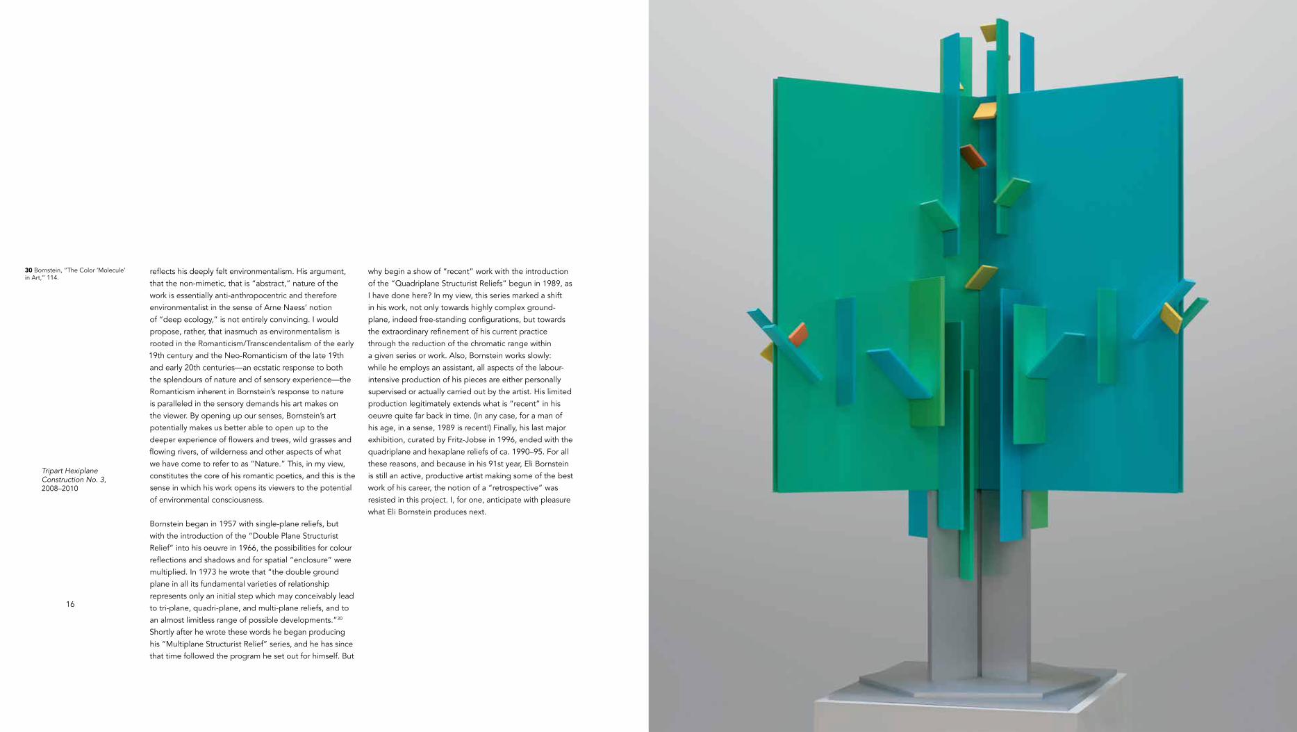
Tripart Hexiplane Construction No. 3, 2008–2010
30 Bornstein, “The Color ‘Molecule’ in Art,” 114.
reflects his deeply felt environmentalism. His argument, that the non-mimetic, that is “abstract,” nature of the work is essentially anti-anthropocentric and therefore environmentalist in the sense of Arne Naess’ notion of “deep ecology,” is not entirely convincing. I would propose, rather, that inasmuch as environmentalism is rooted in the Romanticism/Transcendentalism of the early 19th century and the Neo-Romanticism of the late 19th and early 20th centuries—an ecstatic response to both the splendours of nature and of sensory experience—the Romanticism inherent in Bornstein’s response to nature is paralleled in the sensory demands his art makes on the viewer. By opening up our senses, Bornstein’s art potentially makes us better able to open up to the deeper experience of flowers and trees, wild grasses and flowing rivers, of wilderness and other aspects of what we have come to refer to as “Nature.” This, in my view, constitutes the core of his romantic poetics, and this is the sense in which his work opens its viewers to the potential of environmental consciousness.
Bornstein began in 1957 with single-plane reliefs, but with the introduction of the “Double Plane Structurist Relief” into his oeuvre in 1966, the possibilities for colour reflections and shadows and for spatial “enclosure” were multiplied. In 1973 he wrote that “the double ground plane in all its fundamental varieties of relationship represents only an initial step which may conceivably lead to tri-plane, quadri-plane, and multi-plane reliefs, and to an almost limitless range of possible developments.”30 Shortly after he wrote these words he began producing his “Multiplane Structurist Relief” series, and he has since that time followed the program he set out for himself. But
why begin a show of “recent” work with the introduction of the “Quadriplane Structurist Reliefs” begun in 1989, as I have done here? In my view, this series marked a shift in his work, not only towards highly complex ground-plane, indeed free-standing configurations, but towards the extraordinary refinement of his current practice through the reduction of the chromatic range within a given series or work. Also, Bornstein works slowly: while he employs an assistant, all aspects of the labour-intensive production of his pieces are either personally supervised or actually carried out by the artist. His limited production legitimately extends what is “recent” in his oeuvre quite far back in time. (In any case, for a man of his age, in a sense, 1989 is recent!) Finally, his last major exhibition, curated by Fritz-Jobse in 1996, ended with the quadriplane and hexaplane reliefs of ca. 1990–95. For all these reasons, and because in his 91st year, Eli Bornstein is still an active, productive artist making some of the best work of his career, the notion of a “retrospective” was resisted in this project. I, for one, anticipate with pleasure what Eli Bornstein produces next.

rightQuadriplane Structurist Relief No. 10, 2006–2008
spread followingLeft to right (triptic):Quadriplane Structurist Relief No. 8, 2000–2002,Quadriplane Structurist Relief No. 7, 2000–2001,Quadriplane Structurist Relief No. 6, 1999–2000


Photo Caption Here. Title, date, dimensions or whatever format you determine will be place in this area.
Tripart Hexaplane Construction No. 1, 2002–2004
Tripart Hexaplane Construction No. 4, 2009–2011

Photo Caption Here. Title, date, dimensions or whatever format you determine will be place in this area.

26
Multiplane Structurist Relief VI – No. 1 (Sunset Series), 1998–1999
Infinity Playfully Unfolding: Eli Bornstein’s Multiplane Reliefs
Rodney LaTourelle
To experience the work of Eli Bornstein is to enter into an almost inexpressible state of awareness in which one’s perception of time and space is directly transformed. By reducing visual form to a highly refined play of elemental coloured planes, Bornstein’s reliefs charge the surrounding light with the force of colour, placing the viewer within a matrix of relations between the work, one’s own position, and the changing light conditions. The receptive visitor quickly becomes aware of the manifold nature of each of these “actors” as they interact to form a dynamic network. Under natural lighting conditions, the atmospheric qualities of daylight and darkness modulate the intensity of illumination, expanding and diminishing the depths of coloured shadows as the angle of these shadows migrate, and the viewing position further activates the relationships between shadows and reflected tones. This matrix of movement, light, and awareness continually reveals new aspects in the work. If one is patient and attunes oneself to the richness of this ever-changing space-time, these transformations form a world, or, like stars in the night sky, worlds upon worlds—and this universe is in fact a device for the heightening of the senses.
In order to fully comprehend Bornstein’s art, it is essential to consider his work primarily as a perceptual tool and not merely a formal expression. In his essay in this publication, Oliver Botar relates Bornstein’s reliefs to the work of László Moholy-Nagy who experimented with light and sensory modulation before the Second World War in order to expand the capacities of the human sensory apparatus. As Botar has written, the full impact of this cultural trajectory is finding contemporary relevance as
our sensorial landscape drastically changes with shifting medial technologies. In Bornstein’s work, the preferred light is natural, allowing his sculptural reliefs to connect a moving, modulating illumination to a moving, breathing beholder. As Bornstein himself has commented, his work can be considered as part of a sensory education focused on a greater appreciation of the natural environment and to landscape in general. His works in relief concentrate on this environmental relationship, filtering and reflecting light with a highly developed aesthetic to yield a range of subtle affects towards a potential heightened awareness.
Bornstein’s sophisticated understanding of what one might call “affect,” or of body-based perception and processes, is important to the enduring quality of his work. In the current post-conceptual cultural climate, it is the capacity of art to create an affective or embodied experience without relying on overly complex cultural references and without pacifying the viewer that makes an impact. In particular, Bornstein’s structural motifs employ a set of “epistemological thresholds” that the viewer dissolves through his or her own movements, thereby allowing a sense of change in perception, and possibly in consciousness, to emerge. These “thresholds” are moments of potential “boundary dissolution” that activate the reliefs by joining traditionally autonomous dimensions such as space and colour or subject and object. The thresholds are perceived through intuitive processes rather than linguistic or conceptual approaches and are expanded by the movement-based viewing matrix. Hence, they correspond to specific kinds of affective or embodied knowledge regarding (at the very least) colour, time, and scale/composition.

28 29
Bornstein’s multiplane reliefs integrate colour and structure by rendering flat surfaces monochromatic: multiple-positioned planes of colour are arranged in clusters of smaller coloured planes. Because each plane has a specific colour and its own specific orientation, the resulting work reflects a very particular range of colours and light that taken together produce a radiant system of colour-spaces. And because spaces of reflected colour vary in their perceived spatial dimension depending on hue, chroma and intensity, Bornstein’s work has the appearance of an ever-shifting dynamic spatial composition. Colour is used in such a way that it doesn’t seem to be just a coating but rather acts spatially, both locally and in ensemble. As Michael Taussig notes, “We have forgotten what every butterfly ‘knows’, that the visual effect of colors is created by the interplay between the tone and the body.”1 By employing “organic” structural rhythms of coloured form, Bornstein breaks down the traditional dualism of support and colour. If we meditate on the reliefs, they are active: we are not sure what is space, what is reflection, and to what depth surfaces extend.
What is really interesting is that because the colour tones that Bornstein uses are so refined, and so attuned to their placement and adjacencies that in turn reflect upon each other, he achieves a surprising balance of continuity and contrast. For example, finely graded green ground planes are placed side by side at angles to each other in order to support yet smaller planes that include component blues and greens, complementary purples, and an accent pink, all harmonized to result in a mesmerizing apparition, the radical colour combinations of which appear as the
most natural of choices. The range of colours in a given relief is always extraordinary—taken in pairs there may be quite a contrast between them, but in their entirety, that is in the compositions as wholes, Bornstein achieves an astonishing harmony. This may not be readily appreciated, since his complex compositions are balanced by colour in such subtle and seemingly effortless, even “playful” ways. Bornstein’s palette, inspired by the careful observation of natural phenomena such as meadows and rivers, is modified in the works by precise degrees of chroma and proportion, to form a natural sense of playful movement: unfolding, radiant and potentially infinite.
It is this sense of infinity playfully unfolding that is unique to Bornstein’s work. Combined with the dynamics of natural light and the viewer’s movement, the structural relief opens up readily for sustained meditation. When we become entranced by this work, a separate time comes into play: one connected to the vicissitudes of natural light and our own positioning, simultaneously immediate and far, far away. The colour-structure of the work itself even seems to reinforce this slow, unfolding of “timeless” time; one can easily imagine these works as a kind of
“visual music,” with tempos depending on atmosphere and mood, as Bornstein has suggested.
Bornstein’s multiplane reliefs have a scale that allows the viewer to choose the intensity of affect. Up close, they can serve a meditative, immersive function. Yet, because their edges can be clearly perceived on the wall, a conscious perceptual act is required to be enclosed by them. Bornstein allows for both detached and body-based positions, at the viewer’s discretion, a potential
shift in perception that serves to reinforce a sense of one’s embodiment. Additionally, there is a curious sense of scale within the compositions. Although they seem tightly composed so that the relation of the whole and the parts add up to unified compositions, there is a sense of individuality, even play, in the coloured clusters and their constituent planes that gives one the feeling that they could become serial arrangements, that they could potentially be endless. The overall compositions themselves further a sense of infinity by juxtaposing complementary rhythms in a musical way. Bornstein creates an indeterminate sense of space between the subtle colour progressions of the multiplane base and the dynamic groupings of smaller coloured relief elements.
The thresholds of boundary dissolution identified above begin to articulate the ways in which Bornstein’s reliefs activate the tension between two and three dimensions and engender a sense of infinity, establishing a connection between traditionally discrete elements. The feeling of interconnectivity that comes to the forefront in the experience of Bornstein’s work unfolds as a process of body-based awareness and relates directly to his sense of deep ecological responsibility and belief in the interconnectedness of all things.
This affective connectivity is in counter distinction to today’s digital sense of connection in which social and place-based relations are increasingly dematerialized, even and as the commodification of events at the personal level escalates. While the three-plus-dimensional world is increasingly reduced to the two-dimensionality of the screen interface, Bornstein’s art moves in the opposite
direction. In his work, panels, planes and two-dimensional elements are turned and torqued to construct an active colour-space, allowing for a physical expansion towards the infinite. Because we participate bodily in the awareness of escalating dematerialization, there is no question that we are engaged in a reality far richer than one condensed to screen space. It is in this way that Bornstein’s work grows infinitely (and infinitesimally). You can’t just plug it in and turn it on: coloured shadows are not possible in cyberspace. This organic increase is essential to the cultural trajectory of sensory education introduced earlier.
The relentless increase of digital space and its characteristic relations can only heighten the need for the kind of sensory training that Bornstein’s reliefs enable. Within each of his works there exists a cosmos of refined observation of the natural world, and it is through this kind of technology that we can train ourselves to really see what is around us. Bornstein’s art might look
“abstract” but it produces an awareness of reality in a very immediate way. Recently, Dorothea von Hantelmann has written about the artistic concept of “performativity” as conceptualized by Judith Butler, defining it as the reality-producing character of art that is in fact built on the transformation of previous cultural codes.2 The art of Eli Bornstein might be seen in this light: highly refined structures that “perform” an elemental language by situating it within knowledge gained through the body that can, both playfully and wondrously, grow infinitely.
1 Anita Albus quoted in Michael Taussig, What Colour is the Sacred?, Chicago: The University of Chicago Press, 2009, 71.
2 Dorothea von Hantelmann quotes Judith Butler in Dorothea von Hantelmann, How to Do Things with Art, The Meaning of Art’s Performativity, Zurich: JRP / Ringier Kunstverlag and Les presses du réel, 2010, 18.
spread followingQuadriplane Structurist Relief No. 4, 1997–1999
Sunset over South Saskatchewan River, as seen from Bornstein’s property, 2013.PHOTO: O. BOTAR

32 33
11·vI·98CAPTURED BY COLOUR
The immediate powers of colour to attract, to consume, and overwhelm attention is phenomenal. This power is at the same time complex in its fragility, instability, and sensitivity to change and alteration through interaction with changing light and with other adjacent colours. Colour defies exactitude of definition or replication and remains a relative and quixotic phenomenon. Ephemeral, yet intense in its effect upon our senses and emotions, colour can determine our behaviour and imagination. We are not only language animals, but creatures that communicate and are persuaded, beguiled and influenced endlessly by colour. Where words end, colour begins in its sensory evocation and expression… Form and structure are the vehicle through which colour is communicated. Some would say that colour is the initial attraction through which form and structure are fully experienced. But at their highest union they interact indissolubly. As in Nature, colour functions with its greatest powers both minutely and extravagantly from butterflies and birds to rainbows and the great atmospheric optical manifestations of coronae and perihelia, from violets to sunsets. We are transported and transcended beyond mere physicality through the power of colour.
24·XI·98FOR A DIALOGUE ON ABSTRACT ART
Between an art critic/curator/connoisseur (C) and an artist (A)
C. Are you suggesting that abstract art offers some promise of salvation and that our literal-minded social-commercial culture will consume us by its self-centredness?
A. I’m not suggesting any such simplistic solution to all that ails modern technological society. However, in a sense abstract art continues the process that began with the Enlightenment, progressively reducing the centrality of the human being or image and increasingly focusing upon the larger biological, geological, processes and environments. It parallels current ecological consciousness that strives toward greater integration and connection between all forms of life. The human face or body, in what- ever costume, no longer constitutes the only important consideration or the supreme pinnacle of creation. Abstract constructive art focuses our attention upon process and context, exploring connectedness with other aspects of creation. Popular art, or the prevailing kinds of art that repeat or continue all the past literal, mimetic or narrative focus upon images of human activity remain isolated in a fixed and narrow orientation that is the antithesis of ecological; it is anthropocentric rather than ecocentric. As such it is oriented to the past, to the entrenched status quo perpetuating our mass culture and all the kitsch it embodies.
28·XI·99COMPLETION OF AN ART WORK
The work of art—and this is particularly true of the constructed relief medium with its dynamically interactive elements of structure and colour in space and light—expresses a process. The completion of a work is like stopping or freezing the process in time. ‘Seeing’ gradually exposes aspects and levels of the encounter in which the artist was intensely engaged. Finished works are not finalities but works-in-progress through the continual perceptions, interpretations, or appreciations. The viewer participates in the never-ending completion of the work. Since the Industrial Revolution, and all the scientific and technological developments that followed, there has been an accelerating decline of the agrarian world. Industry replaced agriculture with dramatic movements of population toward…cities. More recently the computer revolution and economic globalization have further increased these trends all of which have contributed to the pollution and destruction of the earth’s natural resources, including loss of plant and animal species. These prevailing conditions have affected society and culture as well as the natural world profoundly. Can art ignore or escape the consequences of these phenomenal transformations? How can art influence a greater critical awareness and appreciation of endangered Nature? Good art should contribute in some positive way to enlarging and celebrating an ecological consciousness and help maintain the cosmic order of Nature. Bad art, when it is not mere banal repetition of past exhausted styles or clichés, is oblivious and destructive of such consciousness. Being preoccupied solely with itself is a kind of solipsism. Such art is a form of cosmic sin that is usually anthropocentric, moving centrifugally ever inward. Good art is more ecocentric, moving outward centripetally, with reference towards things far greater than itself.
6·I·00THE RELIGIOUS IMPULSE
Religions provide simple answers to complex, if not impossible, questions. Why are we here? What is the meaning of life? What happens to us after death? Agnostics and sceptics respond as they do because answers by religions are never completely believable and raise doubts and further unanswerable questions. Some religions are more convincing than others, but none are ever entirely so. Unfortunately religions insist upon regarding all those who are not persuaded to their beliefs as atheists. Whereas, many, if not most, who reject the simplistic explanations as inadequate, are often not irreligious but merely find religious ideologies or doctrines too small, or too narrow to encompass the wonder and majesty of the whole phenomenon of Nature. This perception of the universe is fundamentally at the heart of all religious impulses, which humans inevitably possess. The religious impulse precedes and persists long before and after all religious denominations.
Excerpts from the Journals of 1998–2013*
Eli Bornstein
* Note that these excerpts from the journals were selected by Oliver Botar on the basis of a part of the journal’s contents, rather than on their entirety. Bornstein began to keep this journal in 1986, and has continued to do so thereafter. The journals include texts on a wide variety of subjects, and include poetry.
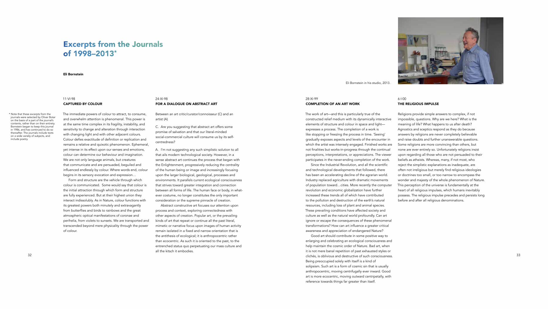
Eli Bornstein in his studio, 2013.

34 35
16·Iv·00COLOUR: THE MOUNT EVEREST OF CONSTRUCTIVE ART
The artist who chooses to work with colour engages what is perhaps the most fragile, the most variable, and excruciatingly difficult element in the visual arts. For it is so capricious: colour appears differently under different light conditions and environments. The painter who works on a flat surface has problems enough, but the constructive relief artist who uses colour in space and light chooses the most horrendously mercurial and complex task of all. It is like walking a tightrope suspended precariously between the cliffs of form, high above the deep chasms of space that must engage the vicissitudes of changing light in the heavens above that are like unpredictable winds, in an attempt to achieve sufficient balance to traverse the dangerous distance. Colour in three-dimensional space and changing light is subject to a wide variety of diverse changes that can simultaneously reveal and obliterate whatever one attempts. Charting a sustainable course of colour utilization here often defies whatever intentions are anticipated. For the unexpected always lurks as an unknown obstacle that suddenly reveals itself. Too close contrasts of colour, value, or intensity can be disastrous in their ineffectiveness under certain lighting conditions from certain points of view. Intervals of hue, value, and intensity that are too great can be more harshly disappointing under varied light and viewpoints, eliminating or canceling the very qualities being pursued. Colour is the most maddening and frustrating of all the elements in its spatial utilization in changing illumination. Yet its very difficulty, if not impossibility, is like Mount Everest in its appeal or challenge that certain artists will continue to engage and attempt to conquer despite its perils, because its achievement, even if always partial or never completely successful, is more satisfying than anything else imaginable.
20·vIII·01A REBIRTH OF BEAUTY
Are we done with beauty then? Are its transcending powers to reveal, enlarge, and elevate our vision and sense of being no longer needed? Or has beauty lost its capacity to move us and thereby is no longer valued? What can take its place? There remains, of course, beauty in Nature, but what about beauty in art—all the arts including architecture? Kitsch and conceptual art, pop and post-modernism, current social and psychological installations and preoccupations with political correctness in art offer little to replace beauty. A new beauty that has its roots in a new ecological ethos is the challenge facing art. Abstract art could be one beginning in that direction, if our society can re-awaken to its need.
19–20·XII·01THE BURDEN OF AN ART DEPENDENT UPON LIGHT
The constructed relief is an art at the mercy of light. It is an art dependent upon the necessary blessing of an adequate quality and quantity of light for its realization. Without sufficient light that falls down upon the work from above and does not drown it in frontal light, as is so customary with painting, the work perishes, is incapable of revealing itself. Overlighting or wrong kinds of illumination destroys colour and structural relationships, cancels all its subtleties and richness. The work cannot survive harsh, frontal lighting, directional spot lights or flood lights that dissolve the work’s true and gentle character or complicate and confuse its actual structure with multiple contradictory shadows. This work has a precarious existence, fraught with the dangers of common gallery and museum rigid track lighting systems. Insufficient light, on the other hand, while not as devastating as too much illumination, prevents colour from revealing its full intensity, its true hue or value… The power of natural light is unequalled by any artificial light source. With all its variation from dawn to dusk, the colour and diffusion, the ambiance of natural light is seldom, if ever, recreated by electrical illumination. Natural light in buildings, particularly galleries and museums, is rarely utilized. So the reliance upon a light source as close to natural as possible remains largely unobtainable. It is finally most often a compromise. Yet the burden for this art of dependency upon light must be borne if its unique powers are to be achieved, further developed, and eventually become a fully recognized and acceptable requirement for its realization.
21·XII·01PERSISTENCE
Persistence is the necessary spine of an artist’s endeavour; it is the flagpole or marker locating an artist’s work. This involves the unyielding, undeterred continuity of search and discovery despite neglect, failures, disappointments, the absence of recognition or appreciation (and more rarely, great fame and fortune). If fortunate to live and work long enough, persistence distills the furthest essence of an artist’s intent and capability. Persistence becomes the guiding teacher that directs the artist dialectically toward fullest realization—both self-realization and realization of the art’s potential. It is the ultimate foundation upon which an artist survives. This relentless drive becomes the banner of the art. It distinguishes or identifies its unique signature. Without such persistence, no significant art of consequence can be conceived, developed, or created. Nor can it flourish or inhabit the world for very long. Like the blade of grass or seed germ in Nature, persistence is the nascent force that generates ever-new life forms in art. Persistence should not be mistaken for obsession, narrow-mindedness, or self-centredness to which it may seem akin. It goes beyond mere stubbornness or contrariness. It has a focus, an objective, or purpose. Finally, it is directed toward worthy and achievable, however difficult or incomplete, ends.
36 37
20·I·02ECO-AESTHETICISM
If Modernism was grounded upon ‘aesthetic humanism,’ Post-modernism can be seen as undermining traditional culture and as the ‘death of man.’* If abstract art began with aspirations toward a new aesthetic humanism, the rejection or termination of abstract art can be seen as a retreat from aesthetic and humanistic concerns and a turn toward the banal, the mediocre—the replacement of more ethical objectives with pseudo-scientific and technological, global consumerism. Whereas humanism has been criticized because of its neglect or failure to consider Nature, the environment, ecology, and other forms of life in its preoccupation with human activity, it has more recently become increasingly ecocentric. A new kind of humanism is evolving that sees humans as part of a much larger whole that does not simply regard human desire as paramount and justification for environmental destructions, extinction of other living creatures, and global catastrophe. Perhaps a new kind of eco-human outlook is required that has a more ecocentric morality or ethic. And perhaps art can provide the aesthetic dimension to such an emerging ethos.
23·vI·02TRIPART HEXAPLANE CONSTRUCTION
The idea of a tripart vertical hexaplane construction occurred to me in 1982 and hovered in my consciousness, surfacing recently with sketches. But it was not until 1998 that the tentative sketches evolved into temporary small cardboard models and eventually more permanent realizations. Like in Nature, this full three-dimensional work cannot be viewed all at once, but is experienced as a continuum of seeing each tripart in its entirety separately, and then in the continuation of succeeding partial or combined views. Like sculpture or architecture, it differs from painting where the two-dimensional plane can be taken in at once. This is reminiscent of the Renaissance debates about the superiority of painting or sculpture, where the argument often favoured painting because you could portray everything on a single plane of vision or that many views of one object could be shown at once. Yet the physical, spatial reality of three-dimensions and tactile form was not possible in painting beyond its partial illusion or virtual representation.
4·vIII·02NOTES FOR A NEW ENGAGEMENT BETWEEN ART AND THE WALL
The abstract constructed relief represented a new engagement of art with the wall. The single plane relief was parallel to the wall and was like a vestigial continuity of the picture plane of painting. The double plane, multi-plane, quadriplane, and hexaplane reliefs became progressively more separate or isolated entities in their oblique relationship projecting from the wall. The four part double-plane construction and the tripart hexaplane construction moved entirely away or apart from the wall approaching a free-standing or free-floating complete three-dimensional entity in space. In a sense the six or eight planes closed in upon or around its own centre, eliminating any close connection to the wall… At the same time, other possibilities suggested themselves with further sketches and initial models, but as yet no completed or finished works have been made. Among these are the possibilities of total separation from the wall and the single, double, triplane, quadriplane, pentaplane, and hexaplane reliefs being double-faced, free-standing, back to back, either directly placed upon the floor or upon stilt-like legs supporting them at an appropriate height. In all instances, this separation from the wall introduced the ancient differences between painting and sculpture that so challenged the Renaissance artists. Isolated, free-standing, double-faced reliefs move into the realm of sculpture and all its problems and potentialities. The wall provided the hung reliefs with specific context and viewer access toward the work as a whole, while by elimination of the wall unlimited spatial access is introduced, whereby it is not possible to experience the work totally from any single position or viewpoint.
11·Iv·04PERFECTION
Responses to my work often focus on the idea of perfection—that its fabrication, assembly, and painting appear as perfect as possible. This centres upon the idea that perfection is the goal of the work, the primary objective most to be viewed or admired. This is a mistaken notion, a misdirection or misunderstanding or disorientation concerning this work. Perfection of execution is of course the easiest aspect to judge, admire, or criticize. Yet, this is not the primary content, meaning, or significance of the work. Such perfection of technique is realizable enough to accomplish as modern industrial technology demonstrates… In the medium of the constructed relief…technical mastery is instrumental and not an end in itself. It is not an attempt to worship, idealize, or consider as absolute the idea of perfection. It is only helpful in directing the viewer toward the chromatic, structural, and spatial interplay with as little distraction of other irregularities as possible. But in the end, regardless of some possible imperfections, the true essence and goal of the work resides in its conception and relative success in its realization. Absolute perfection of technique is unrealizable and hardly something an artist would want to dedicate his life toward. Pursuing such an obsessive, futile quest has by itself little to do with the most vital aspect or raison d’être of art.
* From Neal Oxenhandler, Looking for Heroes in Postwar France: Albert Camus, Max Jacob, Simon Weil, Dartmouth College, University Press of New England, 1996, 76.
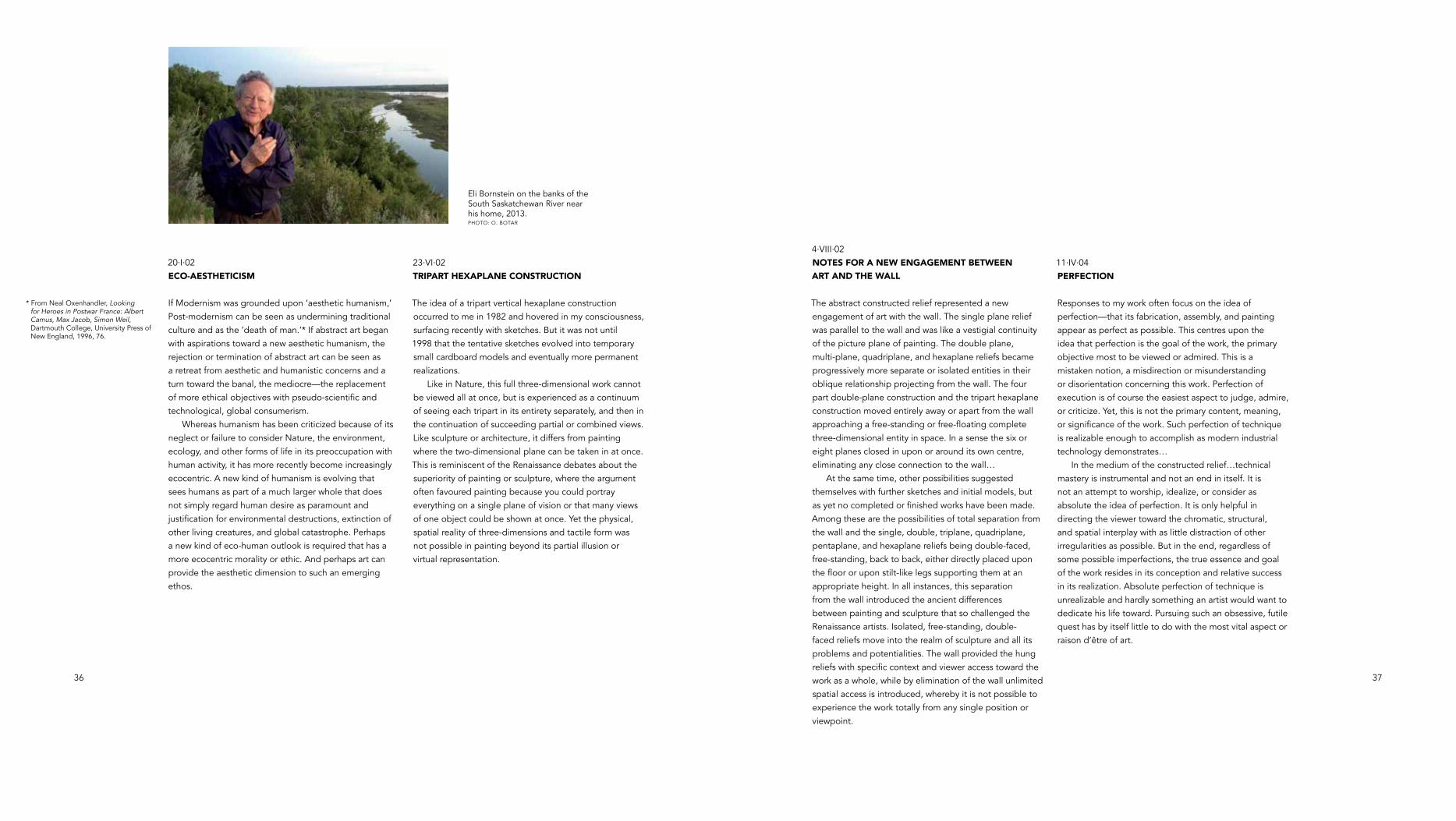
Eli Bornstein on the banks of the South Saskatchewan River near his home, 2013.PHOTO: O. BOTAR
38 39
23·I·06JAZZ AS AN EARLY INFLUENCE TOWARD ABSTRACT ART
In retrospect, an early influence toward abstraction for me was music. I recall my sister Dorothy playing Bach on the piano from the 1930s on in our living room where she practiced her lessons. I had an early interest in making music from playing drums in the high school band and then playing in dance bands to earn money.... Like my early interest in poetry, my interest in jazz music was another unconscious contact with abstraction. The best jazz was involved with moving away from single melody and story-telling lyrics and into forms of rhythm, syncopation, structure, and sound that in certain aspects paralleled abstract visual art.…This is not unlike the focus in abstract art upon the elements of colour, structure, and space, not only transforming metaphorically the reality of Nature, but in doing so creating a new creative, expressive beauty. I was in my late teens in Milwaukee in the late ’30s and early ’40s when I heard some of the best jazz bands and artists that were there often—Benny Goodman, Tommy Dorsey, Gene Krupa, Harry James, Les Brown, Father Hines, Count Basie, Jimmie Lunceford, etc. My playing in a dance band continued until it began to interfere with my art education...Abstraction in poetry and music—classical and jazz—were an early influence for me... They were an early education of mind, senses, and body toward the animality of abstract visual art.
6·X·06WHY ART?
He asked the aging artist, “Why do you go on making your art works? What is the purpose? To what end? Are you not merely adding more objects to an already overcrowded world?” The artist, who had been making art for more than sixty some years replied: “It is a question I have often asked myself and, in fact, increasingly so. I suppose my deepest hope is that in some way these entities of colour, form, structure in space and light will in some way, somehow, touch other persons or…affect their lives so that they are kinder to…humans and animals. Perhaps the arts may help to enlarge perception of the interconnected phenomenon of all life on Earth, including Earth itself. This may sound ridiculously presumptuous, ambitious, and immodest to suppose or suggest that any one can create art that can have such an effect. And yet…is not art often the bridge to an awakening of consciousness, an epiphany-like awareness?… Art …focuses our concentration toward more and better understanding…and ultimately has little, if anything at all, to do with egotism…fame, or glory. In this sense, making art is the most natural activity possible and is not unlike the activities of all life forms in Nature as they seek their fullest self-expression during their momentary existence.”
III-Iv·09ADBUSTERS AND EARTH FIRST!
adbusters and earth first! are two remarkable publications that courageously bring us vital points of view mostly ignored by popular media and culture. Though very different, both are praiseworthy. They invite comparison of their impressive accomplishments as well as their shortcomings. adbusters uses all the slickness in its graphic imagery of fashion magazines to present its mixed, highly selective and often illegible and incoherent messages. Its editor and founder, Kalle Lasn, is the eminence behind every page as a guru of future culture. It often embraces in manner and imagery the mentality of the very commercial, capitalist consumerism it fiercely criticizes. Its selective quotes are often deliberately unreadable by size of text and/or minimal contrast between colour of background and text. It often quotes important philosophers or scholars or social critics selectively and out of context, or without giving detailed sources... Its welcome ventures into political and economic global issues are often simplistic, failing to deal with their complexities or conflicting viewpoints or histories and frequently presents very one-sided positions. Many of the interesting social and cultural subjects are presented with seemingly disconnected imagery sometimes ranging from almost pornographic to the horrific associated with “yellow journalism.” Despite these concerns, its viewpoints are often important, and greatly deserving sympathy and support… In stark contrast to adbusters is the periodical earth first!, whose newsprint pages have little that is sophisticated or elegant about its typography or appearance. Its writing and presentations are often coarse, even juvenile. Yet its focus is far more direct in its tireless pursuit and advocacy of preserving our forests, natural habitats, and wildlife. Its whole approach is Earth-centred…with no pretensions
of being highly intellectual or theoretical, but rather oriented to direct action. While folksier in its image, it relentlessly continues the ongoing battle for preservation of our natural environment...This sharp contrast between luxurious graphic design and common printing is not necessarily meant to praise one over the other—each retaining certain virtues and deficiencies. Rather the comparison is meant to point toward the possibility of more balance or persuasive synthesis between the message and the medium, whereby they could or should reinforce each other more effectively… My criticism of adbusters, since its inception, is that while I am sympathetic to much of its intent, its visual, aesthetic, typographic content often mimics the very appearance and approach of commercialism, the mindless media world it is condemning and trying to change. There is something frantic and hysterical about it that often is equivalent to the worst of tv commercials. Their argument is, of course, that if they publish a calm, sedate, or scholarly journal it would never get attention. Therein lies the dilemma. How to avoid becoming what you are fighting against? Without the glitz of adbusters, the approach and commentary of earth first! is often harsh and oversimplified, but direct and specific…
Addendum (May 2012): It is of particular interest to note that adbusters has been…instrumental in the recent global occupy wall street movement that swept the world. Its revolutionary and anarchist messages for social change, and more recently “regime change” have found considerable sympathy among a wide variety of social activists, students, and a growing public that are discontent with our governments, financial systems, politics, corruption and their growing failures and irresponsibility.
spread following Hexaplane Structurist Relief No. 1 (River-Screen Series), 1989–1996


43
Founded by Eli Bornstein in 1960 and produced regularly by him until 2010, The Structurist is remarkable not only because it is the longest-running Canadian art journal, but also because of its social Utopianism, an approach that paid homage to his socialist parents and was rooted in a pedagogically-oriented social utopianism akin to that found in László Moholy-Nagy’s publications. Even in the first issue of the journal, employing concepts and terminology akin to those used by Moholy-Nagy (though Bornstein himself only realized this kinship later on), Bornstein wrote: “The Structurist view accepts man as capable of expanding his visual knowledge of Nature and art ever further. In his view, art is not through with nature, which is infinitely great, but extends man’s vision towards a new vision of Nature and art. Also it is vitally concerned with the future of man and society…” (The Structurist, no. 1, 1960: 11). This led Bornstein to an early embrace of the art-science-technology-nature nexus in general, and environmentalism in particular.
By eliciting contributions from classic Modernist artists (Josef Albers, Charles Biederman, Naum Gabo, Jean Gorin, Mary Martin, Victor Pasmore, Henryk Stażewski, et al.), Bornstein declared the journal’s adherence to that line of international abstraction linked to the discourse concerning the relations between art, nature and technology. But he also published articles by major intellectual figures of the day, such as Jonathan Benthall, Jacques Ellul, Arthur Koestler, Abraham Maslow, Erwin Panofsky, Rollo May and Sibyl Moholy-Nagy, as well as by Canadian intellectuals and artists such as Murray Adaskin, Edmund Carpenter, Marshall McLuhan, John C. Parkin, Stan Rowe, Elizabeth Willmott and Radoslav Zuk. As
early as 1966, Bornstein’s student Donald K. McNamee published an article on Walter Benjamin’s seminal essay “Art in the Age of its Mechanical Reproducibility,” surely one of the earliest articles in a Canadian art publication on Benjamin. And all this was only during the journal’s first decade! As Bornstein wrote in the third issue of The Structurist (1963):
Although the underlying concern of this annual is more specifically with the development and growth of Structurist art, its general desire and policy is to include numerous articles by writers who are not necessarily directly associated with this direction in art. In fact meaningful and provocative challenges to this art direction are solicited with a view to free inquiry and exchange…. It seems increasingly apparent that real nourishment for art is not to be found in art writing. For this reason numerous articles by writers in other fields such as sociology, psychology, science, philosophy, history and literature are presented. The real problems in art relate to the problems of society and to man himself.
In pursuing this broad editorial policy, Bornstein was placing himself into the avant-garde tradition of journals such as Le Corbusier’s L’esprit nouveau, Theo van Doesburg’s De Stijl, Lajos Kassák’s MA, as well as László Moholy-Nagy’s Bauhausbücher series, and, citing a Canadian literary-based precedent, Marshall McLuhan and Edmund Carpenter’s journal Explorations. By taking this approach, Bornstein declared his social and political objectives (first and foremost ecological thinking and environmentalism), years before the rise of politically
The Structurist
Oliver A.I. Botar
1965 1966 1967 1968
1960-61 1961-62 1963 1964
1969 1970 1971 1972-73

45
engaged art beginning in the late 1960s, and well before any other Canadian artistic periodical. Starting with the publication, in the 1970 issue, of excerpts from Henry Geiger’s subversive journal of ideas, Manas (1948–1988), as well as Edward Fry’s manifesto of the breakaway “New Art Association” (that opposed what it saw as the apolitical position of the College Art Association), Bornstein allied himself with radical cultural-political tendencies. Later, the prominent Canadian Anarchist literary critic and historian George Woodcock would become a regular contributor. Bornstein was, through his very practice, opposed to the “artificial segregation of the study of art from other disciplines—anthropology, history, etc.—and its careful protection from social issues,” as the authors of the NAA manifesto were.
The cover of the 1971 issue of The Structurist was adorned with an iconic NASA view of the Earth from space (here tinted green), and was devoted in its entirety to the relationship between humanity and nature in relation to artistic production, surely the first eco-artistic publication in Canada, and one of the first anywhere. Characteristically, in his essay for the issue, Bornstein related current ecological thinking to its ancient philosophical tradition, particularly the notion of the ‘organic.’ At the end of this article entitled “Ecological view of Man/Nature,” he writes:
The view of our island earth from outer space is that of a blue-green gem-like globe. At such distance many other living forms are not visible. Yet we know that the surface of this planet is teeming with life. This
jewel shimmering in the darkness of space confirms the community of all men and all living things and that man is only a part of the cosmos. This image of our precious orb invokes a profound sense of the organic/ecological processes which unify Man/Nature.
During subsequent decades, contributions appeared by the likes of Marxist art critic John Berger; avant-garde film maker Stan Brackhage; founder of the MIT’s Institute for Advanced visual Studies György Kepes; chronicler of the avant-garde Richard Kostelanetz; art critic Donald Kuspit; feminist film historian Patricia Mellencamp; theorist of the ‘Deep Ecology’ movement Arne Naess; pioneer feminist Betty Roszak; and, Theodore Roszak, author of the 1969 classic The Making of a Counter-Culture. Architect Christopher Alexander’s offers just one example of Bornstein’s deep commitment to questions of the relation between architecture and art, on public art, and on the question of the accessibility of art to the public. As we have seen, George Woodcock became a frequent contributor, but so did the pioneering Eco-Art critic Suzi Gablik. The list of art historians who contributed is also remarkable, a veritable who’s who of the first and second generations of scholars concerned with the history of the European avant-gardes—the likes of John Bowlt, Charlotte Douglas, Linda Dalrymple Henderson, and Patricia Railing , to name a few. Later, Bornstein declared his critical sympathy with both Earth First! (1980–), perhaps the most radical of the environmental activist groups, and Adbusters (1989–), the vancouver-based anti-consumerist and environmentalist journal founded by the documentary filmmakers Kalle Lasn and Bill Schmalz.
1973-74 1975-76 1977-78 1979-80
1981-82 1983-84 1985-86 1987-88
1989-90 1991-92 1993-94 1995-96
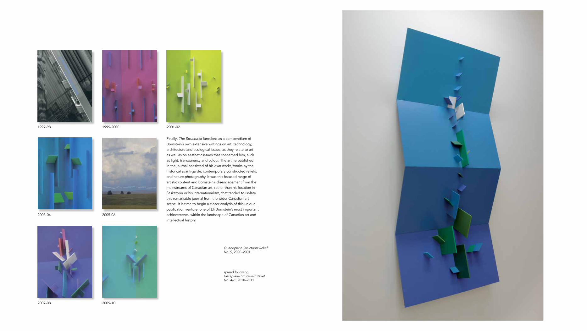
Finally, The Structurist functions as a compendium of Bornstein’s own extensive writings on art, technology, architecture and ecological issues, as they relate to art as well as on aesthetic issues that concerned him, such as light, transparency and colour. The art he published in the journal consisted of his own works, works by the historical avant-garde, contemporary constructed reliefs, and nature photography. It was this focused range of artistic content and Bornstein’s disengagement from the mainstreams of Canadian art, rather than his location in Saskatoon or his internationalism, that tended to isolate this remarkable journal from the wider Canadian art scene. It is time to begin a closer analysis of this unique publication venture, one of Eli Bornstein’s most important achievements, within the landscape of Canadian art and intellectual history.
1997-98 1999-2000 2001-02
2003-04 2005-06
2007-08 2009-10
Quadriplane Structurist Relief No. 9, 2000–2001
spread followingHexaplane Structurist Relief No. 4–1, 2010–2011

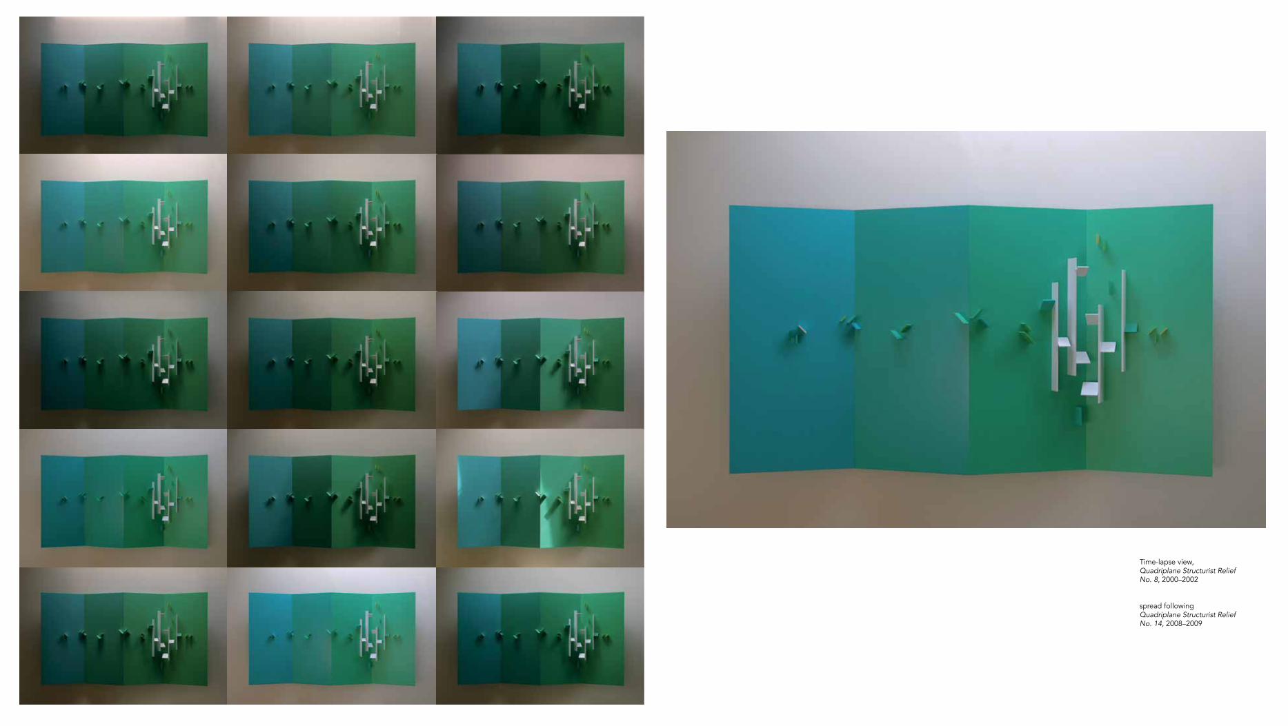
Time-lapse view, Quadriplane Structurist Relief No. 8, 2000–2002
spread followingQuadriplane Structurist Relief No. 14, 2008–2009


right Detail, Hexaplane Structurist Relief No. 4–1, 2010–2011
56 57
Eli Bornstein Born in Milwaukee, Wisconsin, in 1922, Eli Bornstein received his B.Sc. in science and art at the Milwaukee State Teachers’ College. He played in jazz dance bands to support himself. A visit during WWII to the School of Design in Chicago, László Moholy-Nagy’s New Bauhaus, and a period of study at the School of the Art Institute of Chicago made him aware of the European Modernist tradition, while his reading of the American Transcendentalists established a foundation for his later environmentalism. In 1950 he moved to Saskatoon, Canada, to teach art as a sabbatical replacement for one year at the University of Saskatchewan. While there, he accepted the offer of a permanent position and has been in Saskatoon ever since. Until his retirement in 1990, he was instrumental in building the department of art at that university. During the early 1950s, he spent two summers in Paris, studying with Fernand Léger at the Académie Montmartre as well as at the Académie Julian. He completed his MA in Fine Art at the University of Wisconsin, Madison, in 1954. From the start, Bornstein produced both sculptures and paintings.
Since his discovery of the work and writing of the American abstract relief artist Charles Biedermann in the mid-1950s (he read Biedermann’s Art as the Evolution of Visual Knowledge in 1954 and met the artist in 1956), he has remained consistent in his adherence to and development of the abstract relief and constructive media, which he refers to as ‘Structurist.’ In 1957, he spent a sabbatical year in Europe where he met Modernist relief artists such as Jean Gorin, Georges vantongerloo, Kenneth and Mary Martin, victor Pasmore, Anthony Hill and Joost Baljeu. He and Baljeu co-founded the Dutch-Canadian journal Structure during the late 1950s. In 1960, Bornstein founded his own journal, The Structurist, which he published regularly for fifty years. He has, throughout his sixty years of practice, refined his approach and materials in applying relief elements to planar surfaces, as well as varying the structure of the planes themselves. In addition to wall and free-standing artworks, Bornstein is an accomplished watercolourist, and he has completed a number of major commissions for public art works, including Tree of Knowledge, 1956 (Saskatchewan Teachers’ Federation, Saskatoon); Structurist Relief in
Fifteen Parts, 1962–64 (Winnipeg International Airport); Four-Part Vertical Double Plane Structurist Relief, 1982–83 (Wascana Place, Regina); a relief for the Canadian Light Source (Synchrotron) Building, 2004 (University of Saskatchewan, Saskatoon); Tripart Hexaplane Construction no. 1, 2007 (Jacobs University, Bremen, Germany); and Tripart Hexaplane Construction no. 2, 2005–2006 (University of Manitoba, Winnipeg). While his geometrical approach to abstract art-making places him within the tradition of the 20th century avant-garde, particularly Constructivism and De Stijl, and decidedly outside the canonical line of American and Canadian Modernist and Post-Modernist development during the post-War era, the refinement of his colour sense and his awareness of colour reflection (two central points of his work) position him squarely within the current phenomenologically-based and colour-centred wave of artistic production. But equally important to Bornstein has been his deep awareness of the processes of formation in natural systems and organisms. A long-standing interest in the natural world and in environmentalism marks his work as a writer and editor. His three trips
to the Arctic (in 1964, 1986 and 1997) were particularly influential in the emergence of his strong environmentalist views, as well as the development of his art. Rather than imitating natural forms, however, like Biedermann, Bornstein—in a pedigree going back to Cézanne, Kupka, Klee, Mondrian and Stażewski—saw himself emulating the processes of nature. In the tradition of Moholy-Nagy, furthermore, it was the expression of light on a surface (that is, its colour) that became central to Bornstein’s project. Moholy-Nagy also emphasized the role of art in enabling people to heighten—even expand—their sensory awareness, and Bornstein has professed this sensory-experiential approach as well.Currently represented by Forum Gallery in New York, Bornstein continues to produce work at his home and studio on the banks of the
South Saskatchewan River, and to play tennis weekly. He is currently also in the process of organizing his remarkable archive, making provisions for it to be open to the public.
selected bibliography
Bornstein, Eli. “Notes on Structurist Art.” In DATA: Directions in Art Theory and Aesthetics. Edited by Anthony Hill. London: Faber and Faber, 1968, 192–203.
—. “Notes on Structurist vision.” In Canadian Art Today. Edited by William Townsend. London: Studio International, 1970, 52–56.
—. Reliefs Structuristes 1955–1975. Paris: Centre Culturel Canadien, 1976.
Jobse, Jonneke. Eli Bornstein: Art Towards Nature. Exhibition catalogue. Saskatoon: Mendel Art Galley, 1996.
—. De Stijl Continued: The Journal Structure (1958–1964): An Artists’ Debate. Rotterdam: 010, 2005.
Karpuszko, Kazimir. Eli Bornstein: Selected Works/Oeuvres Choisies, 1957–1982. Saskatoon: Mendel Art Gallery, 1982 (including catalogue raisonnée, 1957–1982).
Leclerc, Denise. The Crisis of Abstraction in Canada: The 1950s. Ottawa: The National Gallery of Canada, 1992.
Nasgaard, Roald. Abstract Painting in Canada. vancouver: Douglas & McIntyre, 2007, 292-293.
The Structurist. vols. 1–50, 1960–2010 (including many theoretical articles by the artist).
Biographies
prepared by Oliver A.I. Botar
Quadriplane Structurist Relief No. 12, 2006–2008

58 59
Quadriplane Structurist Relief No. 1 (River-Screen Series), 1989–1995
Rodney LaTourelle Rodney LaTourelle is a Winnipeg-born and Berlin-based multi-disciplinary practitioner. In addition to an art career and an architecture-related colour consultancy practice, he writes the Akimbo blog for Berlin and is the author of numerous exhibition catalogue essays. His phenomenological, colour-based practice and life-long admiration for Bornstein’s work render him uniquely qualified to reflect on Bornstein’s practice.
Oliver A.I. Botar Oliver A.I. Botar is Professor of Art History at the School of Art of the University of Manitoba, in Winnipeg, and is non-resident Curator for The Salgo Trust for Education in New York. His research, writing and exhibition curating have focused on the Hungarian avant-garde and oeuvre of László Moholy-Nagy in particular, on the Bauhaus, and on biocentric ideologies and Modernist art, architecture and photography.
Unless otherwise noted, all works are in the collection of the artist.
Dimensions are in centimetres: height x width x depth
Quadriplane Structurist Relief No. 1 (River-Screen Series), 1989–1995acrylic enamel on aluminum and Plexiglas60.4 x 137.8 x 14.6
Quadriplane Structurist Relief No. 2 (River-Screen Series), 1989–1995acrylic enamel on aluminum and Plexiglas60.4 x 137.8 x 14.6
Quadriplane Structurist Relief No. 3 (River-Screen Series), 1989–1995acrylic enamel on aluminum and Plexiglas60.4 x 137.8 x 14.6
Quadriplane Structurist Relief No. 4 (Sunset Series), 1997–1999acrylic enamel on aluminum95.2 x 155 x 19.3
Quadriplane Structurist Relief No. 6, 1999–2000acrylic enamel on aluminum76.4 x 135.8 x 16.2
Quadriplane Structurist Relief No. 7, 2000–2001acrylic enamel on aluminum76.4 x 135.8 x 16.2
Quadriplane Structurist Relief No. 8, 2000–2002acrylic enamel on aluminum76.4 x 135.8 x 16.2
Quadriplane Structurist Relief No. 9, 2000–2001acrylic enamel on aluminum109.5 x 50.8 x 17.2
Quadriplane Structurist Relief No. 10, 2006–2008 acrylic enamel on aluminum109.4 x 52.7 x 20.3
Quadriplane Structurist Relief No. 12, 2006–2008acrylic enamel on aluminum76.4 x 136.3 x 14.8
Quadriplane Structurist Relief No. 14, 2008–2009acrylic enamel on aluminum86.3 x 148.2 x 22.1
Multiplane Structurist Relief VI- No. 1 (Sunset Series), 1998–1999acrylic enamel on aluminum85 x 71.8 x 15
Hexaplane Structurist Relief No. 1 (River-Screen Series), 1989–1996acrylic enamel on aluminum54.6 x 192.2 x 17.2
Hexaplane Structurist Relief No. 2 (Arctic Series), 1995–1998acrylic enamel on aluminum and PlexiglasCollection of the University of Saskatchewan. Gift of Dorothea Adaskin, 2005.67.2 x 182.2 x 15.9
Hexaplane Structurist Relief No. 4–1, 2010–2011acrylic enamel on aluminum117.2 x 197 x 15
Tripart Hexaplane Construction No. 1, 2002–2004acrylic enamel on aluminum89 x 45.7
Tripart Hexaplane Construction No. 2, 2002–2006 (model)acrylic enamel on aluminum and anodized aluminum 93.4 x 47.5
Tripart Hexaplane Construction No. 22002-2006acrylic enamel on aluminum and anodized aluminumCollection of the University of Manitoba. Gift of Eli Bornstein, 2007.205.25 X 107.8 X 107.8
Tripart Hexaplane Construction No. 3, 2008–2010acrylic enamel on aluminum73.8 x 43
Tripart Hexaplane Construction No. 4, 2009–2011acrylic enamel on aluminum78 x 43
Tripart Hexaplane Construction No. 7, 2011–2013acrylic enamel on aluminum97.2 x 61.8
List of Works
spread following Installation view, Tripart Hexaplane Construction No. 7, 2011–2013