Embed Size (px)
DESCRIPTION
ALTREMENTI MAGAZINE issue 03. contents: pervisioni /sinestetica / guess who's coming to inner / the sea at porta nuova / sketch forniture / protodesin / anders nyquist / new breed / myminutes.org / industrial art core.
Citation preview
featuring: PERVISIONI / SINESTETICA / GUESS WHO’S COMING TO DINNER/ THE SEA AT PORTA NUOVA / SKETCH FORNITURE / PROTODESIGN / ANDERS NYQUIST / NEW BREED / MYMINUTES.ORG / INDUSTRIAL ART CORE
D
03 1st HALF, 2007 ISSUE N.

issue 03 - this is where the silent generation comes out.
altrementiINDUSTRIAL / GRAPHIC / VIRTUAL / / DESIGN MAGAZINE
Siamo sempre più convinti che solo il dialogo fra l’innovazione spontanea e il sistema produttivo rappre-senti la leva strategica per lo sviluppo di nuovi business e per la creazione di stimoli e nuove conoscenze per il mondo industriale.
Il successo delle aziende nel medio e lungo termine sem-pre più si deve basare su una strategia di innovazione costante e di ricerca continua su prodotti e servizi: ne consegue che è necessario selezionare e valorizzare i migliori cervelli creativi, i migliori giovani che sappiano vedere con occhi freschi e liberi la realtà di oggi, che sappiano decodificare, riuscendo a sintetizzarli, gli innu-merevoli stimoli,a volte contraddittori, che possono con-fondere chi, ormai, è avvezzo alla nostra realtà, ma che può, a sua volta, riscoprirla attraverso la loro rilettura.Le nuove condizioni legate alla globalizzazione dei mercati,alle precarie condizioni di crescita e alla scarsa capacità di competizione, impongono a tutto il sistema Italia di ripensare e di riprogettare un sistema di ricerca e di creazione, diffondendo l’innovazione partendo pro-prio dalla materia prima: i cervelli creativi.
Ci sembra sempre più urgente ed indispensabile favorire la transazione verso un’economia della conoscenza in cui trovino spazio sia il settore dei servizi sia un sistema industriale diversificato volto a produzioni innovative e ad alto valore aggiunto.Dovrebbe essere facile trovare occasioni di incontri, di-battiti, confronti ma, per nostra esperienza, sappiamo che ciò è molto difficile: il mondo creativo e quello indus-triale appaiono distanti fra loro, quasi due mondi sepa-rati e spesso non riescono a dialogare efficacemente, soprattutto non riescono a creare sinergie.Le cause sono molteplici: una fra tante, le piccole medie
txt daniele alberti, presidente associazione aLtrementIeditorial aziende, non avendo al proprio interno un equipe di ricer-ca, non possono creare prodotti innovativi, né possono, perché troppo costosi, rivolgersi a servizi in outsourcing, mentre dall’altra parte i giovani creativi, non avendo, per motivi economici,le capacità organizzative necessarie a proporsi e a farsi conoscere, vedono bloccate tutte le loro idee, senza la possibilità di verifica.
Si impone a questo punto l’esigenza di un’organizzazione che permetta di convogliare le “innovazioni spontanee” di giovani creativi, ingegneri, designer e di metterle in comunicazione con le realtà aziendali del nostro paese. Un’altra esigenza, anch’essa di estrema importanza, è quella di creare uno ”spazio d’incontro” tra talenti e aziende per permettere il dialogo e la condivisione degli obiettivi.
Siamo convinti che questo desiderio è fortemente pre-sente sia nelle aziende, sia tra i creativi, e noi vogliamo tracciare questo spazio perché l’incontro sia possibile e foriero di sviluppi positivi per entrambi.
We’re surer and surer that only a dialogue between spontaneous innovation and production system could represent the strategic lever to develop new businesses and create inducements and new know-how for the in-dustries.
Companies’ success, in the medium-long term, must be based on a constant innovation strategy, and an inces-sant products and services research: the consequence is that we need to select and valorize the best creative brains, the best young people who are able to look at nowadays reality with “clear” and free eyes, who can decode countless inducements, sometimes ambiguous, which can confuse people who are already accustomed to reality, but who are able to discover it another time, by re-reading them. new situations, related to trade globalization, uncertain growing conditions and limited competition skills, force the whole Italy-system to re-think and re-design a new research and creation system, spreading innovation by just starting from its raw material: creative brains.
It seems to us it’s more and more urgent and indispens-able to allow an evolution towards a knowledge-economy where both services sector and a various industrial sys-tem, looking at innovative and high-value productions, find their own space. It should be simple to find occasions for meetings and debates but, as we ourselves experienced, we know it’s very difficult: creative and industrial worlds seem to be very distant one from another, almost as they were two separated ones, and they can’t often dialogue between them, above all they aren’t able to create synergies.there are so many reasons: one of them is that small-medium companies, not having their own research team, cannot produce innovative goods, neither turn to outsourcing services, because of their high cost, while, on the other side, young creative people, not having, for economic reasons, the organizing skills needed for pro-posing themselves and standing out, see their ideas all locked, without any chance of being verified. an organization, which allows to unite “spontaneous innovations” by creative young people, engineers and designers and to put them in contact with our country’s business realities, is urgently needed.
another strongly important exigency is to create a “meet-ing space” between talents and companies, allowing dialogue and sharing of intentions.
We are sure this desire is strongly present both in com-panies and creative people, and we want to track this space’s edges, in order to make the meeting possible and herald of positive developments for both of them.
04 eDItOrIaLeeDItOrIaL
L’enorme diffusione delle nuove tecnologie ha favorito il recupero di progettualità e propositività, determinando la nascità di comunità di individui che condividono esperienze, conoscenze e infodiversità, elaborando collettivamente significati e proposte progettuali.
ecco quindi il delinearsi di un movimento senza forma ma ricco di sostanza, una nuova generazione invisibile e silenziosa, ma presente e ben radicata nel tessuto infosociale , poichè titolare di una creatività diffusa e spalmata.
Una nuova ondata di creativi che a slogan e proclami, linguaggi esteticamente seducenti ma forse irrimediabilmente relegati al passato, preferisce una comunicazione a supportata da piccoli gesti, un metalinguaggio segnico, basico ed efficiente.
In questo numero, la generazione silenziosa esce allo scoperto. aprite gli occhi e ascoltate.
the enormous spread of the new technologies has favourite the design’s recovery and designation, determining the born of a community of individuals that shares experiences, acquaintances and infodifferences, elaborating collectively means and proposed projects.
Here therefore delineating itself of a movement without shape but full of substance, maybe invisible and silent, but strongly present because owner of a diffuse creativity, very deep-rooted in the infosociety.
a new big wave of creative that deny slogans and proclaims, as well as aesthetically attractive languages but perhaps absolutely relegate to the past, and that prefer a communication supported by small gestures; a basic and efficient language.
On this issue the silent generation comes out. Open your eyes and listen.
bulletin
05BULLetInBULLetIn
txt dario bovero, editorial director
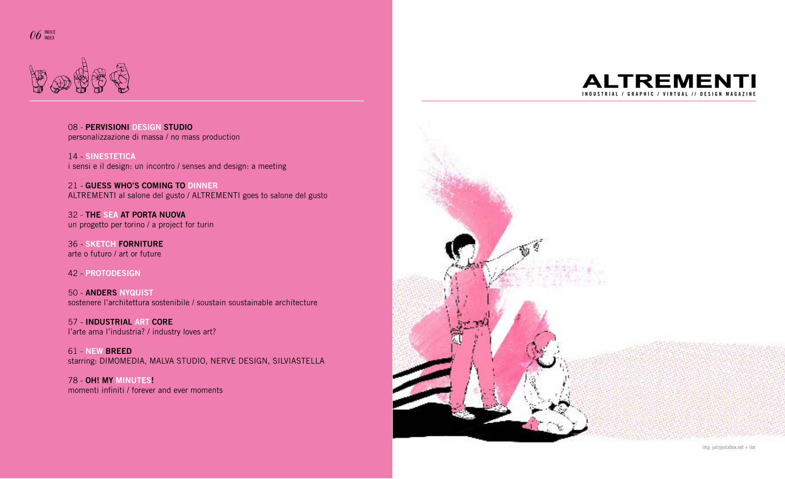
index08 - PERVISIONI DESIGN STUDIOpersonalizzazione di massa / no mass production
14 - SINESTETIcai sensi e il design: un incontro / senses and design: a meeting
21 - GUESS whO’S cOmING TO DINNERALTREMENTI al salone del gusto / ALTREMENTI goes to salone del gusto
32 - ThE SEa aT PORTa NUOVaun progetto per torino / a project for turin
36 - SKETch FORNITUREarte o futuro / art or future
42 - PROTODESIGN
50 - aNDERS NYQUISTsostenere l’architettura sostenibile / soustain soustainable architecture
57 - INDUSTRIaL aRT cORE l’arte ama l’industria? / industry loves art?
61 - NEw BREEDstarring: DIMOMEDIA, MALVA STUDIO, NERVE DESIGN, SILVIASTELLA
78 - Oh! mY mINUTES!momenti infiniti / forever and ever moments
06 InDICeInDeX
img: juicyjuicebox.net + liar
QUanDO e COme avete DeCISO DI fOnDare PervISIOnI?
abbiamo studiato insieme e dopo la laurea abbiamo deciso di fondare, nel gennaio del 2004, uno studio di design a Bologna.abbiamo iniziato davvero con pochissime risorse a nostra dis-posizione, all’inizio dormivamo persino nello studio, ora invece possiamo vivere del nostro lavoro.
COme maI avete SCeLtO DI LavOrare a BOLOgna? Le distanze e i luoghi diventano sempre più relativi, grazie ad
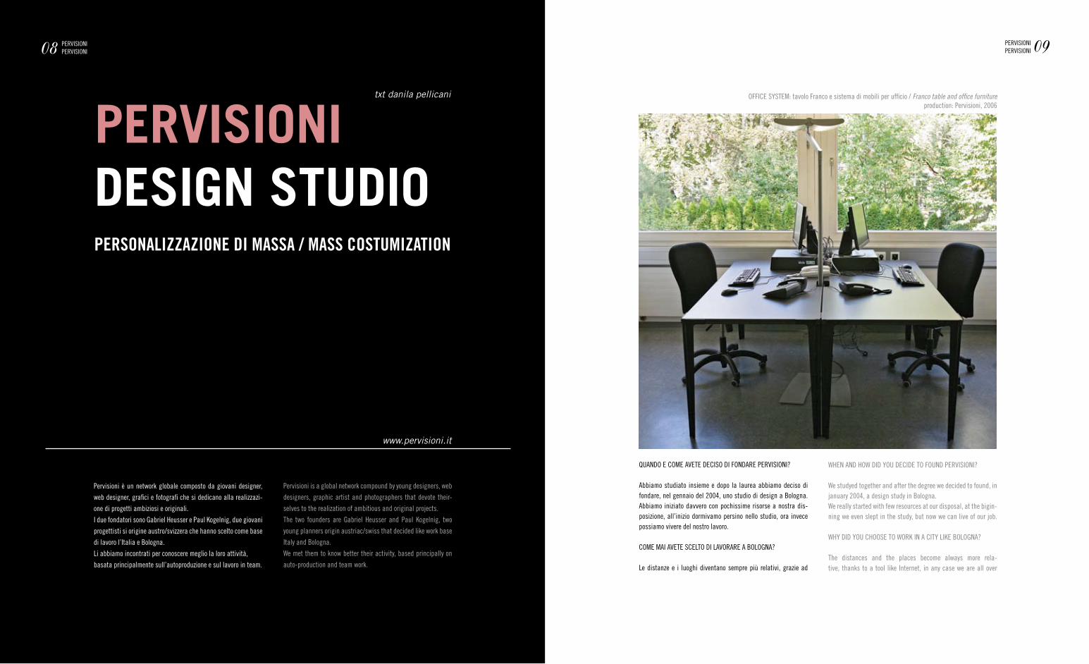
OffICe SyStem: tavolo franco e sistema di mobili per ufficio / Franco table and office furnitureproduction: Pervisioni, 2006
PERVISIONIDESIGN STUDIOPERSONALIZZAZIONE DI MASSA / MASS COSTUMIZATION
www.pervisioni.it
Pervisioni è un network globale composto da giovani designer,
web designer, grafici e fotografi che si dedicano alla realizzazi-
one di progetti ambiziosi e originali.
I due fondatori sono gabriel Heusser e Paul Kogelnig, due giovani
progettisti si origine austro/svizzera che hanno scelto come base
di lavoro l’Italia e Bologna.
Li abbiamo incontrati per conoscere meglio la loro attività,
basata principalmente sull’autoproduzione e sul lavoro in team.
txt danila pellicani
08 PervISIOnIPervISIOnI 09PervISIOnI
PervISIOnI
Pervisioni is a global network compound by young designers, web
designers, graphic artist and photographers that devote their-
selves to the realization of ambitious and original projects.
the two founders are gabriel Heusser and Paul Kogelnig, two
young planners origin austriac/swiss that decided like work base
Italy and Bologna.
We met them to know better their activity, based principally on
auto-production and team work.
WHen anD HOW DID yOU DeCIDe tO fOUnD PervISIOnI?
We studyed together and after the degree we decided to found, in january 2004, a design study in Bologna.We really started with few resources at our disposal, at the bigin-ning we even slept in the study, but now we can live of our job.
WHy DID yOU CHOOSe tO WOrK In a CIty LIKe BOLOgna?
the distances and the places become always more rela-tive, thanks to a tool like Internet, in any case we are all over
uno strumento come internet siamo comunque presenti in tutto il mondo, indipendentemente dal luogo in cui ci si trova fisica-mente. abbiamo scelto Bologna perché ci piace l’atmosfera e lo stile di vita più rilassato se paragonato ad altre città, come ad esempio milano.
COme vI SemBra L’amBIente BOLOgneSe? SeCOnDO vOI rIS-ente DeLLa SUa PrOvInCIaLItà rISPettO aLLe granDI reaLtà DeL DeSIgn?
Bologna e design contemporaneo è in effetti una relazione difficile. I problemi sono essenzialmente due: un’errata cultura del concetto di design, ad esempio, che viene spesso identifi-cato nel locale di tendenza, magari caratterizzato da un’estetica minimal e non in un vero progetto di design, che tiene conto ol-tre dello stile, anche del gusto e delle conoscenze tecniche e di produzione.Inoltre i bravi progettisti di Bologna, che pure ci sono, non creano un vero network; questo è un peccato, personalmente ci aspet-teremmo iniziative più grandi.
La fILOSOfIa DI PervISIOnI?
Le nostre parole d’ordine sono “mass customization” e non “mass production”.La nostra filosofia progettuale fa riferimento al Bauhaus e alla grafica svizzera.Siamo molto attenti a materiali e tecnologie nuovi, con una par-ticolare considerazione al fattore ecologico.Progettualmente siamo due personalità complementari, e ci compensiamo a vicenda: uno rappresenta l’anima tecnica, l’altro quella più artistica.Ci teniamo poi a specificare che Pervisioni non si limita alla progettazione dei suoi prodotti, ma provvede anche alla sua produzione.
QUInDI SIete DeDItI aLLa fILOSOfIa DeL DO It yOUrSeLf. QUaLI vantaggI traete DaLL’aUtOPrODUzIOne DeI PrOgettI? L’autoproduzione ha tanti vantaggi. Innanzitutto, è vantaggiosa economicamente. Solitamente le royalty concesse dalle grandi aziende non superano il 5%, una percentuale minima.Inoltre, l’autoproduzione garantisce indipendenza, il che si tra-muta in libertà creativa e non si è costretti a combattere con i product manager e le loro idee. ma, va detto, il do it yourself è ovviamente è anche tanto lavoro amministrativo.
COme SOnO nate Le COLLaBOrazIOnI COn IL DeSIgner Ca-naDeSe CamerOn SneLgar e COn L’aUStraLIanO JIm Han-nOn-tan?
Jim Hannon-tan lavora da Sebastian Bergne, che è un nostro amico. Jim, gabriel e Paul avevano idee e ideologie simili. ab-biamo partecipato insieme al Salone Satellite della milano De-sign Week nel 2006.Da qui è nato anche il progetto Cutting up Knives, che è stato un grande successo economico e pubblicitario.
Un BILanCIO DI QUeStI tre annI DI attIvItà? COSa vI aSPet-tate DaL fUtUrO?
Si può dire che uno studio di design abbia bisogno di minimo tre anni per avviarsi veramente, quindi è come se fossimo all’inizio di tutto. Dal futuro ci aspettiamo la possibilità di realizzare progetti più grandi, vogliamo continuare a produrre non solamente i nostri progetti ma anche quelli di altri designer che ci piacciono.
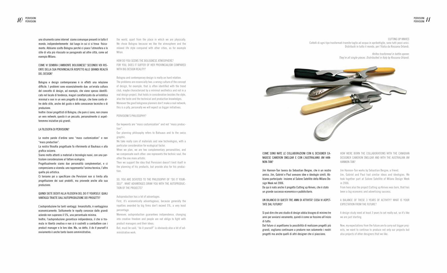
CUttIng UP KnIveS Coltelli di ogni tipo trasformati tramite taglio ad acqua in apribottiglie, sono tutti pezzi unici.
Distribuiti in tutto il mondo, per l’Italia da rossana Orlandi.
Knifes trasformed in bottle opener. They’re all single-pieces. Distribuited in Italy by Rossana Orlandi.
10 PervISIOnIPervISIOnI 11PervISIOnI
PervISIOnI
the world, apart from the place in which we are physically. We chose Bologna because we like the atmosphere and the relaxed life style compared with other cities, as for example milan.
HOW DO yOU SeemS tHe BOLOgneSe atmOSPHere?fOr yOU, DOeS It SUffer Of Her PrOvInCIaLISm COmPareD WItH BIg DeSIgn reaLIty?
Bologna and contemporary design is really an hard relation.the problems are essencially two: a wrong culture of the concept of design, for example, that is often identified with the trend club, maybe characterized by a minimal aesthetics and not in a real design project, that holds in consideration besides the style, also the taste and the technical and production knowledges.moreover the good bolognese planners don’t make a real network; this is a pity, personally we will expect us bigger initiatives.
PervISIOnI’S PHILOSOPHy?
Our keywords are “mass costumization” and not “mass produc-tion”.Our planning philosophy refers to Bahuaus and to the swiss graphic.We take really care of materials and new technologies, with a particular consideration for ecological factor.When we plan, we are two complementary personalities, and we compensate each other: one represents the technic soul, the other the one more artistic.then we support the idea that Pervisioni doesn’t limit itself in the planning of his products, but provide also for his produc-tion.
SO, yOU are DevOteD tO tHe PHILOSOPHy Of “DO It yOUr-SeLf”. WHat aDvantageS DraW yOU WItH tHe aUtOPrODUC-tIOn Of tHe PrOJeCtS?
autoproduction has a lot of advantages. first, it’s economically advantageous, because generally the royalties awarded by big firms don’t exceed 5%, a very least percentage. moreover, autoproduction guarantees indipendence, changing into creative freedom and people are not oblige to fight with product managers and their ideas. But, must be said, “do it yourself” is obviously also a lot of ad-ministrative work.
HOW Were BOrn tHe COLLaBOratIOnS WItH tHe CanaDIan DeSIgner CamerOn SneLgar anD WItH tHe aUStraLIan JIm HannOn-tan?
Jim Hannon-tan works by Sebastian Bergne, a friend.Jim, gabriel and Paul had similar ideas and ideologies. We took together part at Salone Satellite of milano Design Week in 2006.from here also the project Cutting up Knives was born, that has been a big economic and advertising success.
a BaLanCe Of tHeSe 3 yearS Of aCtIvIty? WHat IS yOUr eXPeCtatIOn frOm tHe fUtUre?
a design study need at least 3 years to set really out, so it’s like we are just starting. now, my expectations from the future are to carry out bigger proj-ects, we want to continue to produce not only our projects but also projects of other designers that we like.

treStLe BenCH /Idea: estendere il regolare cavalletto dal tavolo dei cavaletti e farci un banco.Il sedile e lo schienale si possono togliere facilmente e i caval-letti sono ripiegabili.materiali: legno e mDf ricoperto di bianco.
Idea: To extend the regular trestles from the trestle table and making a bench. The seat and backrest you can take off easily and the trestles are folding up.Material: wood and white coated MDF.
SCrIBBLe /La sedia Scribble è stata creata direttamente da uno schizzo su una superficie virtuale studiata, le successive linee vennero girate su superfici che furono poi stampate in 3d in nylon con una macchina Selective Laser Sintering (SLS).
the Scribble chair was create by sketching directly on to a studied virtual surface, the subsequent lines were turned into surfaces which were then 3d printed in Nylon with a Selective Laser Sintering (SLS) machine.
3D SKetCH: un vaso che rende tridimensionale uno schizzo manuale / a vase that translates a hand sketch into third dimensions (production: Industreal, Milan)
12 PervISIOnIPervISIOnI 13PervISIOnI
PervISIOnI
* SIneStetICa
“Colori che si possono ascoltaresuoni da vedereil vuoto che toccate con i gomitiil sapore di spazio sulla linguala fragranza delle dimensioniil succo di una pietra”.
Questa breve poesia di marcel Breuer ci trasmette quanto sia importante la sfera dei sensi nel vissuto quotidiano e si rifà implicitamente a un particolare fenomeno chiamato sinestesia.
Le sinestesie sono un tema ancora poco conosciuto da chi non se ne occupa diret-tamente anche perché per tanto tempo sono rimaste all’interno di un confine medico scientifico e trattate con un linguaggio estremamente specifico. Da qualche anno però, con l’avanzare delle nuove tecnologie multimediali (che richiedono la coopera-zione di più registri sensoriali), se ne vede l’utilità anche nell’ambito della proget-tazione e in particolare nel progetto di design.
Potremmo definire le sinestesie come associazioni tra due o più percezioni sensoriali che avvengono a livello dell’ipotalamo, una zona del nostro cervello che ha il com-pito di smistare gli stimoli che provengono da diversi canali sensoriali e di inviarli alle aree cerebrali deputate a tradurre gli stimoli in sensazioni. È quindi un pro-cesso psico-fisiologico in cui si verifica congruenza tra informazioni provenienti da diversi organi sensoriali, dando origine a sensazioni simultanee, associate tra loro e chiamate fenomeni intermodali. I sinesteti hanno quindi la “capacità”, o il dono se vogliamo chiamarlo così, di integrare sensazioni di diversa provenienza e percepire ad esempio il colore o la forma di un suono o viceversa udire il suono di un colore (nei casi più comuni). ma perché citiamo le sinestesie parlando di design? La multisensorialità e l’intersensorialità che sono loro caratteristiche, ci offrono lo spunto per sviluppare un modo di fare progetto che ponga attenzione al sistema della nostra percezione per creare artefatti in cui le sensazioni prodotte dal loro uso generino volutamente congruenze o interferenze percettive.
L’obiettivo è stimolare l’utente che utilizza un certo oggetto per creare delle reazioni percettive volute e volte ad avvicinare sensorialmente oggetto ed utilizzatore.Una cosa da non dimenticare è che gli oggetti e artefatti comunicativi con cui l’uomo è in relazione vengono continuamente guardati, toccati, annusati, ascoltati e a volte anche assaggiati… e questo ci porta a pensare all’importanza della relazione senso-riale oggetto-utente che canalizzando positivamente l’utilizzo dell’oggetto, lo faccia diventare non solo utile e funzionale ma anche stimolante e in grado di provocare sensazioni che stupiscano piacevolmente (o volutamente non-piacevolmente).
Questo potremmo definirlo un modo di progettare sensocentrico ovvero centrato sulle risposte sensoriali date dall’utente nell’utilizzare l’oggetto in questione. Centrato sui sensi perché non sottovaluta l’aspetto ergonomico e funzionale ma lo integra e af-fianca ad un aspetto più sensoriale e se vogliamo di conseguenza anche emotivo.
15SIneStetICa / SenSI e DeSIgn: Un InCOntrOSIneStetICa / DeSIgn anD SenSeS: a meetIng
*
txt silvia guerini
“Colours you can listen tosounds to see the emptiness you can touch by your elbowtaste of space on the tonguethe fragrance of dimensionsthe juice of a stone”.
These short poetry by Marcel Breuer conveys the importance of the sphere of senses in everyday’s life, recalling in a implicit way the particular phenomenon called syn-æsthesia.
The synæsthesiae are parts of an argument that’s still not well-known, except by medical specialists, that’s also because for a long time they were confined within a medical-scientific circle and treated with a extremely specific language. In the last years though, with the growth of the new multimedia technologies – requiring the cooperation of different sensory registers – the usefulness of synæsthesiae also appears within many works of industrial planning, and particularly in the field of design.
We could define the synæsthesiae as the association between two – or more – bodily perception occurring within the hypothalamus, an area of our brain whose func-tion is to sort all the stimuluses deriving from different sensory channel and to send them to the respective brain areas, charged to turn stimuluses into sensa-tions. Therefore, it’s a matter of psycho-phisiological processes, in which occurs the congruence between the datas resulting from different sensory organs, giving simultaneous sensations which are mutually connected and are called intermodal phenomena. So, the synæsthetes have the skill – or the talent - to integrate sensa-tion from different channels, and to perceive for instance the colour or the shape of a sound, or on the contrary to hear the sound of a colour (in the most common cases)
But why we mention synæsthesiae when we talk about design? Their main peculiari-ties, multisensoriality and intersensoriality, can offer us a starting point to develop a way to design which pays attention to our perceptive system, in order to create objects that can purposely generate perceptive incongruences or interferences.
The goal is to stimulate the consumer who uses a certain article, to give rise to intentional perceptive reactions, which are directed to join both the user and the object in a sensory way.What we should not forget, is that people continuously look, touch, smell, listen and sometimes even taste all the communication items everyone of us interacts with... that makes us think about the importance of the sensory association between user and object, that positively canalizes the use of that article, making it useful and functional but also stimulating, that means to cause pleasantly amazing sensa-tions (or unpleasantly, when requested).
This could be called a “sensocentric” way to design, that means focused on the
sensory answers the people give when using the considered object. It’s based on
the senses for, even though it doesn’t underestimate the ergonomics and functional

Un InPUt DaLLa DIDattICa /
emerge la tendenza, nelle odierne scuole di design e sin dai primi anni di corso a porre attenzione alla percezione sensoriale. L’input della didattica è fondamentale nello sviluppo di una coscienza progettuale sensibile al tema della sensorialità. Porto l’esempio della facoltà del Design del Politecnico di milano dove all’internodi alcuni corsi di design (a cui ho potuto collaborare) si insegna a progettare partendo dall’analisi e dal controllo di vari aspetti percettivi coinvolti simultaneamente: el-ementi di base visivi, sonori, cinetici (legati al movimento) ed aptici (legati alla percezione tattile globale) e tenendo in considerazione il fatto che al giorno d’oggi il fare progettuale attribuisce ancora una importanza quasi esclusiva al senso della vista a scapito degli altri registri sensoriali.
Lo scopo è quello di verificare, attraverso alcune esercitazioni, la congruenza percet-tiva finale tra i diversi elementi coinvolti e realizzare un artefatto comunicativo che trasmetta in modo efficace un messaggio sensoriale. ecco tre esempi di esercitazioni che potrebbero essere significative: - rappresentazione visiva della sensazione del gusto ovvero restituzione visiva di una delle quattro sensazioni di gusto proposte: dolce, salato, acido e amaro, tramite alcune tavole. Da questo esercizio gli studenti hanno ottenuto dei risultati comuni che gli hanno permesso di riflettere sulle relazioni che intercorrono tra diversi registri sensoriali: il dolce (prevalenza di rosso) è spesso rappresentato con linee morbide e cerchi; l’acido (prevalenza di verde-giallo) e il salato (blu chiaro) hanno forme più spigolose e frammentate; l’amaro (marrone) è invece rappresentato in modo ir-regolare;- trasposizione visiva di un evento sonoro (tra 4 brani proposti) tenendo conto dei parametri altezza, intensità, timbro e durata e usando una unica forma geometrica bi o tridimensionale che può cambiare dimensioni, colore e orientamento. In tutti i lavori è emersa la congruenza tra la sequenza visiva e un aspetto della sequenza sonora (soprattutto il ritmo); si è notato inoltre come gli aspetti qualitativi (colore e timbro) corrispondessero a valori soggettivi mentre aspetti quantitativi (dimensioni o intensità) corrispondessero a valori intersoggettivi;- rappresentare tramite l’animazione di una texture (configurazione reiterata di un modulo di base) l’effetto di profondità e di trasformazione cromatica. gli studenti dovevano realizzare una geometria abbastanza complessa partendo da un semplice modulo di base bidimensionale e riprodurlo in una configurazione. L’effetto di pro-fondità veniva generato sia dalla trasformazione geometrica dei moduli (rotazione, traslazione, variazione dimensionale) sia dal cambiamento di colore dello sfond. La natura delle textures è di per sé legata al tatto e l’animazione spingeva in questa di-rezione, cercando di rendere visivamente l’effetto tattile (vedere immagini pag. XX).
SenSI e materIaLI /
Il materiale è una componente fondamentale dell’oggetto, la sua spina dorsale e il mezzo grazie al quale si comunicano aspetti tecnici, modo d’uso, durata e caratter-istiche percettive; una ricerca di dottorato condotta al Politecnico di milano ha anche definito dei parametri espressivo-sensoriali qualitativi legati ai materiali, secondo caratteristiche tattili e fotometriche, che si affiancano ai parametri fisici quantita-tivi. Le aziende a loro volta puntano molto ad investire in innovazione e ricerca sui materiali che vengono sperimentati ed applicati su nuovi prodotti concepiti ad hoc per sfruttarne le potenzialità; ogni materiale finisce così per rinforzare il valore sen-
reversibile Destiny Lofts, mitaka (www.reversibledestiny.org)
16 SIneStetICa / SenSI e DeSIgn: Un InCOntrOSIneStetICa / DeSIgn anD SenSeS: a meetIng 17SIneStetICa / SenSI e DeSIgn: Un InCOntrO
SIneStetICa / DeSIgn anD SenSeS: a meetIng
elements, it is improved by a most sensory aspect, which consequently concern the emotional sphere.
AN INPUT TO DIDACTICS /
In today’s design schools, ever since the first years of course, the tendency comes out to awaken people about sensory perception. The didactic impulse is necessary to form that kind of consciousness that pays attention to the theme of sensoriality. Let’s hold up as an example the Design Faculty of Milan Polytechnic, where within some design courses (with which I collaborated) they teach how to design starting from the analysis and the control of some simultaneous sensory perceptions. That means to work on basic visual elements, sounds, movements, and the atypical ones concerning an all-comprehensive tactile perception, all the same taking into account that today’s design still attributes a nearly absolute importance to the sense of sight, to the detriment of the other sensory channels.
The goal is to check, through some exercises, the final perceptive consistency be-tween the involved elements, in order to realize a communication product that could transmit an efficacious way a sensory message. Here are three meaningful samples of this kind of exercises:-Visual description of the sense of taste, that means a visual feedback of one of the four suggested sensations: sweet, salty, bitter and sour, to be represented through some illustrations. After this exercise, the students obtained similar results, allowing them to reflect on the existing relations between different sensory registers: sweet (where red colour is prevailing) means smooth lines and circles; sour (green-yellow prevailing) and salty (light blue) are represented by broken and angular shapes, whereas bitter means brown colour and irregular shapes.- visual translation of a sound, out of four suggested audio tracks, considering pitch, intensity, timbre and duration, to be represented through one geometric 2-D or 3-D shape by changing its dimensions, colour and position. All works gave out the con-gruence between the visual sequence and the audio track (mainly the rhythm); we could also observe that every qualitative aspect (colour and timbre) corresponds to subjective values, whereas the quantitative ones (size and intensity) mean inter-subjective values.- representing the effects of depth and chromatic changes through the animation of a modular image. The students had to realize a quite complicated geometrical shape starting from one single 2D basic modulus and reproducing it in any configuration. The depth effect was generated both by the geometrical transformation of the modu-luses (rotation, translation, size alteration) and by the change of the back colour. The nature of these modular shapes is deeply connected to tactile sensations, and this was the goal of the animation, to give back into view the tactile effect.
SENSES AND MATERIALS /
The material is a necessary component, and the mainstay of the object, and the mean to communicate technical features, duration, perceptive aspects as well as the way to use the object itself. A doctorate research run by the Polytechnic has also fixed the expressive-sensory parameters for the material qualities, according to their tactile and photometric features, to be combined to the quantitative physic parameters. The industry, in its turn, bets on investing innovation and research in order to try out new materials to be applied on the new products, which are expressly designed to make the most of their potentiality. Therefore, every material ends up
soriale del prodotto a cui appartiene e accentuarne la sua carica espressiva, come in alcuni esempi applicativi qui riportati.
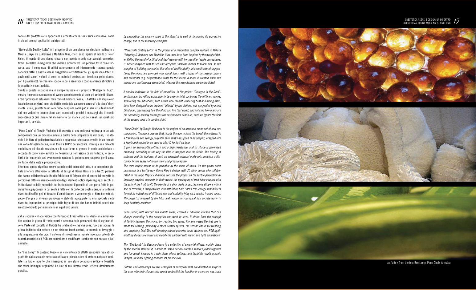
“reversibile Destiny Lofts” è il progetto di un complesso residenziale realizzato a mikata (tokyo) da S. arakawa e madeline gins, che si sono ispirati al mondo di Helen Keller, il mondo di una donna cieca e non udente e delle sue speciali percezioni tattili. La Keller immaginava che vedere e riconoscere una persona fosse come toc-carla, così il complesso di edifici esternamente ed internamente traduce queste capacità tattili e questa idea in suggestioni architettoniche; gli spazi sono dotati di pavimenti sonori, volumi di colori e materiali contrastanti (schiuma poliuretanica per il pavimento). Si crea uno spazio in cui i sensi sono continuamente stimolati e le aspettative contraddette. Simile a questa iniziativa ma in campo museale è il progetto “Dialogo nel buio”, mostra itinerante europea che si svolge completamente al buio; gli ambienti (diversi e che riproducono situazioni reali come il mercato rionale, il battello sull’acqua o un locale dove mangiare) sono studiati in modo tale da essere percorsi ‘alla cieca’ dagli utenti i quali, guidati da un vero cieco, scoprono come può essere vissuto il mondo dai non vedenti e quanto siano vari, numerosi e precisi i messaggi che il mondo circostante ci può inviare nel momento in cui manca uno dei canali sensoriali più importanti, la vista.
“Pane Chair” di tokujin yoshioka è il progetto di una poltrona realizzata in un solo componente con un processo simile a quello della preparazione del pane; il mate-riale è in fibra di poliestere traslucido e spugnoso che cuoce avvolto in un tessuto una volta datagli la forma, in un forno a 104°C per mezz’ora. Coniuga una notevole morbidezza ad elevata resistenza e la sua forma si genera in modo accidentale a seconda di come viene avvolta nel tessuto. La sensazione di morbidezza, le pecu-liarità del materiale così evanescente rendono la poltrona una scoperta per il senso del tatto, della vista e propriocettivo.Il termine aptico significa essere palpabile dal senso del tatto, è la percezione glo-bale esteriore attraverso la tattilità; il design di Kenya Hara e di altre 20 persone che hanno collaborato alla Haptic exhibition di tokyo mette al centro del progetto la percezione tattile inserendo nei lavori degli elementi aptici: il packaging di succhi di frutta rivestito della superficie del frutto stesso, il pomello di una porta fatto in gel, ciabattine giapponesi la cui suola è fatta con la corteccia degli alberi, una lanterna rivestita di soffici peli di tessuto. L’umidificatore a zero energia di Hara è creato da gocce d’acqua di diversa grandezza e stabilità appoggiate su una speciale carta rivestita, ispirandosi al principio delle foglie di loto che hanno infiniti peletti che emettono liquido per mantenere un equilibrio umido.
zaha Hadid in collaborazione con DuPont ed ernestomeda ha ideato una avveniris-tica cucina in grado di trasformarsi a seconda delle percezioni che si vogliono vi-vere. Parte dal concetto di fluidità fra ambienti e crea due zone, fuoco ed acqua; la prima dedicata alla cottura e a un sistema touch control, la seconda al lavaggio e alla preparazione dei cibi. Il sistema di rivestimento murale incorpora potenti at-tuatori acustici e led rgB per controllare e modificare l’ambiente con musica e luci animate.
La “Bee Lamp” di gaetano Pesce è un concentrato di effetti sensoriali regalati so-prattutto dallo speciale materiale utilizzato, piccole sfere di uretano naturale incol-late tra loro e indurite che rimangono in uno stato gelatinoso soffice e flessibile che evoca immagini organiche. La luce al suo interno rende l’effetto ulteriormente plastico.
dall’alto / from the top: Bee Lamp, Pane Chair, ariostea
18 SIneStetICa / SenSI e DeSIgn: Un InCOntrOSIneStetICa / DeSIgn anD SenSeS: a meetIng 15SIneStetICa / SenSI e DeSIgn: Un InCOntrO
SIneStetICa / DeSIgn anD SenSeS: a meetIng
by supporting the sensory value of the object it is part of, improving its expressive charge, like in the following examples.
“Reversible Destiny Lofts” is the project of a residential complex realized in Mikata (Tokyo) by S. Arakawa and Madeline Gins, who have been inspired by the world of Hel-en Keller, the world of a blind and deaf woman with her peculiar tactile perceptions. H. Keller imagined that to see and recognize someone means to touch him, so the complex of building translates this idea of tactile ability into architectural sugges-tions; the rooms are provided with sound floors, with shapes of contrasting colours and materials (e.g. polyurethanic foam for the floors). A space is created where the senses are continuously stimulated, whereas the expectations are contradicted.
A similar initiative in the field of exposition, is the project “Dialogue in the Dark”, an European travelling exposition to be seen in total darkness; the different rooms, simulating real situations, such as the local market, a floating boat or a dining room, have been designed to be explored “blindly” by the visitors, who are guided by a real blind man, discovering how the blind can live that world, and noticing how many are the secondary sensory messages the environment sends us, once we ignore the first of the senses, that’s to say the sight.
“Pane Chair” by Tokujin Yoshioka is the project of an armchair made out of only one component, through a process that recalls the way to bake the bread; the material is a translucent and spongy polyester fibre, that’s designed to be shaped, wrapped into a fabric and cooked in an oven at 104,°C for half an hour.It joins an appreciable softness and a high resistance, and its shape is generated randomly, according to the way the fibre is wrapped into the fabric. The feeling of softness and the features of such an unsettled material make this armchair a dis-covery for the senses of touch, view and proprioceptive.The word haptic means to be palpable by the sense of touch, it’s the global outer perception in a tactile way; Kenya Hara’s design, with 20 other people who collabo-rated to the Tokyo Haptic Exhibition, focuses the project on the tactile perception by inserting atypical elements in their works: the packaging of fruit juice covered with the skin of the fruit itself, the handle of a door made of gel, japanese slippers with a sole of treebark, a lamp covered with soft fabric hair. Hara’s zero-energy humidifier is formed by waterdrops of different size and stability, lying on a special treated paper. The project is inspired by the lotus leaf, whose microscopical hair secrete water to keep humidity constant.
Zaha Hadid, with DuPont and Alberto Meda, created a futuristic kitchen that can change according to the perception one want to have. It starts from the concept of fluidity between the rooms, by creating two zones, fire and water; the first one is made for cooking, providing a touch control system, the second one is for washing and preparing food. The wall covering houses powerful audio systems and RGB light-emitting diodes to control and modify the ambient with music and light animations.
The “Bee Lamb” by Gaetano Pesce is a collection of sensorial effects, mainly given by the special material it is made of, small natural urethan spheres joined together and hardened, keeping in a jelly state, whose softness and flexibility recalls organic images. An inner lighting enhance its plastic look.
Gufram and Serralunga are two examples of enterprise that are directed to surprise the user with their shapes that openly contradict the function in a sensory way, such
gufram e Serralunga sono due esempi di aziende orientate a stupire l’utente con forme che contraddicono sensorialmente la loro funzione come le poltrone Piedras e meteor di Serralunga in polietilene stampato in rotazionale; la loro forma spigolosa che ricorda quella delle pietre e delle meteoriti apparentemente poco invitante si coniuga con un materiale accogliente: le aspettative dell’utente sono differenti da quelle abituali lasciandolo sorpreso. gufram dagli anni 70 ha spesso prodotto oggetti reali in scala o ingranditi, fatti in genere con materiale polimerico espanso; conforte-voli e giocosi. Il Pratone, la Bocca e il Cactus sono degli esempi che vogliono attirare l’attenzione e stimolare l’utilizzatore a guardare le cose abituali da un punto di vista diverso che coinvolge non solo la vista ma anche il tatto e tutto il corpo.Ciò che emerge da questi progetti, seppure ancora timidamente, è l’intenzione di voler progettare dando ascolto al corpo di chi vivrà quegli spazi/oggetti e immagi-nando quali reazioni si possono avere utilizzando un materiale, un suono o un colore, piuttosto che un altro, combinati fra loro.
Un SItO SULLe SIneSteSIe /
Infine, progetti e prodotti multimediali sono presentati anche all’interno di un sito dedicato interamente alle sinestesie, www.sinestesie.it, fondato nel 2001 da Davide riccò (responsabile scientifico), andrea Belluscio e Sivia guerini (web content edi-tor) con lo scopo di raccogliere informazioni sui risultati di attività di ricerca sulle sinestesie e condividere un laboratorio-spazio per gli esperimenti audio-visivi; rap-presenta anche un luogo di scambio per chi vuole presentare i propri lavori sin-estetici. La sezione di archivio tesi raccoglie le tesi di laurea e dottorato che trattano le sinestesie in vari ambiti. La parte sulle sperimentazioni è invece relativa ad alcuni test sull’interazione tra elementi visivi, sonori ed aptici e mette in relazione tra loro diversi parametri quali colori, forme, textures, dimensioni, temperatura, pesantezza, intensità, durata, posizione, distanza.
L’UOmO DeL fUtUrO /
Per concludere riporto una riflessione di Bruno munari sulla prospettiva che si por-rebbe se la progettazione sottovalutasse il fatto che l’essere umano percepisce con tutto il suo corpo e tramite molteplici canali sensoriali integrati fra loro.“Se come pare, la funzione sviluppa l’organo, la non funzione lo atrofizzerà. vedremo quindi nel futuro uomini senza orecchie? e senza naso? O con la schiena e il sedere deformati dalla mancata traspirazione? Sarà questo l’uomo del futuro? Speriamo di no. ricordiamoci quindi, quando progettiamo qualcosa, che le persone umane hanno ancora tutti i sensi, benché alcuni siano già in parte atrofizzati rispetto a quelli degli animali cosiddetti inferiori. […] se teniamo conto anche degli altri sensi, la gente pian piano si abituerà e scoprirà che ci sono tanti recettori sensoriali per conoscere il mondo in cui viviamo.” (B. munari, Da cosa nasce cosa, ed. Laterza, p. 380)
Si può immaginare così quanto sia importante essere consapevoli del fatto che gli oggetti che una persona usa quotidianamente sono anch’essi portatori intrinseci di stimoli sensoriali, di messaggi che i nostri sensi interpretano incessantemente e che sono talvolta capaci di modificare le nostre abitudini e il nostro vissuto emotivo. Un prodotto progettato in modo sensorialmente consapevole è in grado di rispondere più adeguatamente alla percezione umana, alle esigenze percettive che ciascuno di noi ha e renderebbe l’oggetto un veicolo di sensazioni giuste oltre che un elemento che assolve la sua funzione. Ciò che ci si potrebbe auspicare allora è che questa consapevolezza progettuale si faccia strada e diventi strumento di progetto per ideare prodotti destinati a un corpo che risponde.
20 SIneStetICa / SenSI e DeSIgn: Un InCOntrOSIneStetICa / DeSIgn anD SenSeS: a meetIng
as the armchairs Piedras and Metor by Serralunga, made of polyethylene moulded in rotation. Their rude and appearently uninviting shape, recalling stones and meteors, is joined to a comfortable material: the user’s expectations are not the ones he is used to, creating a surprising effect. Gufram, since the ‘70s has often produced real objects in real scale or bigger, usually made of polymeric foam, comfortable and playful. Pratone, Bocca and Cactus are examples, that want to draw attention by stimulating the user to look the usual things from a different point of view, concern-ing not only the sight but also the touch and the whole body.What comes out from these projects, even though still discreetly, is the intention to design putting attention to the bodily feelings of the people who will deal with those spaces/objects, imagining the reactions one can have by using a material, a sound or a colour, rather than others, matched together.
A WEBSITE ABOUT SYNæSTHESIAE /
Finally, multimedial projects and products have been also shown within a website entirely devoted to synæsthesiae, www.sinestesie.it, founded in 2001 by D. Riccò (responsible for science), A. Belluscio and S. Guerini (web content editor) with the goal of collecting informations about the results of the researches on synæsthesiae, and to share a laboratory for the audio-visual experiments; it also represents an exchange place for those who want to show their synæsthetic works. The thesis works archives section collects all the graduation and doctorate thesis projects about syn-æsthesiae in several areas. The section about experimentation, instead, concerns some testings on interaction among visual, atypical and sound elements, and puts together different parameters such as colours, shapes, modular elements, size, tem-perature, weight, intensity, duration, position and distance.
THE MAN OF THE FUTURE /
To finish, I report here a consideration by Bruno Munari about what would happen if the design underestimated the fact that the human being perceives through the whole body, and through many sensory channels that are all joined together.
“If the function makes the organ grow, how it appears to be, the non-function will make it atrophy. Will we see in the future men without ears? Or without nose? Or with the back and the bottom deformed by the lack of transpiration? Will be this the man of the future? Let’s hope that it won’t be like this.Let’s all remember then, when we design something, that human beings still have all the senses, even though some of them are already partially atrophied compared to those of the so-called inferior animals. […] if we consider the oter senses as well, people will get used, little by little, and will realize that there are many sensory channels to discover the world we live in.” (B. Munari, Da cosa nasce cosa, ed. Laterza, p. 380)
So, one can imagine how important is to be aware of the fact that the object we use daily are themselves intrisic holder of sensory stimuluses, of messages that are continuously interpreted by our senses, and that are sometimes able to modify our customs and our emptional background.A product designed with sensory consciousness can meet a better way the human perception and the perceptive needs everyone has, by making the object a vehicle of good sensations, as well as something that performs its tasks.What we should hope then, is that this design consciousness will take shape, to became a project instrument in order to create products that are destined to a re-sponding body.
ALTREMENTI VA AL SALONE DEL GUSTO / ALTREMENTI GOES TO SALONE DEL GUSTO
In occasione del Salone del gusto 2006, otto giovani designer
interpretano per aLtrementI i rituali della preparazione e del
consumo del cibo e delle bevande.
funzionali, ironici, corrosivi, espressivi: comunque originali e
coraggiosi, in equilibrio fra funzione e efficacia, mai banali.
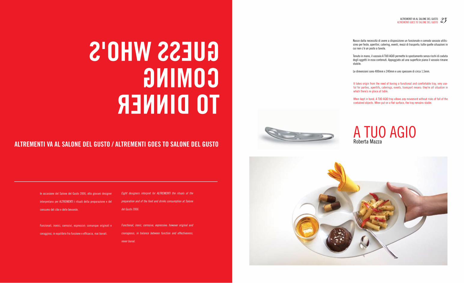
nasce dalla necessità di avere a disposizione un funzionale e comodo vassoio utilis-simo per feste, aperitivi, catering, eventi, mezzi di trasporto; tutte quelle situazioni in cui non c’è un posto a tavola.
tenuto in mano, il vassoio a tUO agIO permette lo spostamento senza rischi di caduta degli oggetti in esso contenuti. appoggiato ad una superficie piana il vassoio rimane stabile.
Le dimensioni sono 400mm x 240mm e uno spessore di circa 1,5mm.
It takes origin from the need of having a functional and comfortable tray, very use-ful for parties, aperitifs, caterings, events, transport means: they’re all situation in which there’s no place at table.
When kept in hand, a tUO agIO tray allows any movement without risks of fall of the contained objects. When put on a flat surface, the tray remains stable.
23aLtrementI va aL SaLOne DeL gUStOaLtrementI gOeS tO SaLOne DeL gUStO
Eight designers interpret for ALTREMENTI the rituals of the
preparation and of the food and drinks consumption at Salone
del Gusto 2006.
Functional, ironic, corrosive, expressive: however original and
courageous, in balance between function and effectiveness,
never banal.
roberta mazzaa tUO agIO
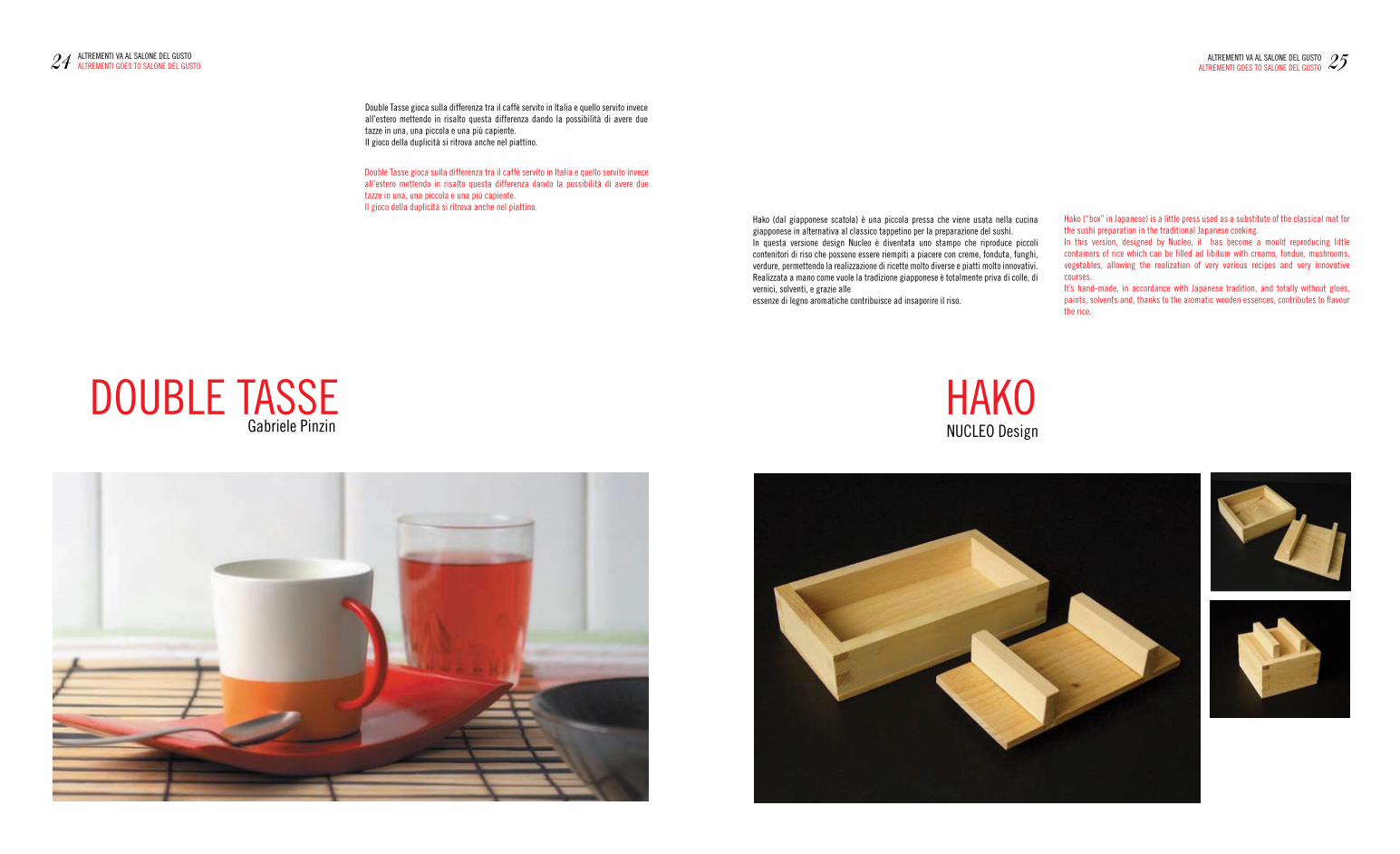
DOUBLe taSSegabriele Pinzin
Double tasse gioca sulla differenza tra il caffè servito in Italia e quello servito invece all’estero mettendo in risalto questa differenza dando la possibilità di avere due tazze in una, una piccola e una più capiente.Il gioco della duplicità si ritrova anche nel piattino.
Double tasse gioca sulla differenza tra il caffè servito in Italia e quello servito invece all’estero mettendo in risalto questa differenza dando la possibilità di avere due tazze in una, una piccola e una più capiente.Il gioco della duplicità si ritrova anche nel piattino.
HaKOnUCLeO Design
Hako (dal giapponese scatola) è una piccola pressa che viene usata nella cucina giapponese in alternativa al classico tappetino per la preparazione del sushi.In questa versione design nucleo è diventata uno stampo che riproduce piccoli contenitori di riso che possono essere riempiti a piacere con creme, fonduta, funghi, verdure, permettendo la realizzazione di ricette molto diverse e piatti molto innovativi.realizzata a mano come vuole la tradizione giapponese è totalmente priva di colle, di vernici, solventi, e grazie alle essenze di legno aromatiche contribuisce ad insaporire il riso.
Hako (“box” in Japanese) is a little press used as a substitute of the classical mat for the sushi preparation in the traditional Japanese cooking.In this version, designed by nucleo, it has become a mould reproducing little containers of rice which can be filled ad libitum with creams, fondue, mushrooms, vegetables, allowing the realization of very various recipes and very innovative courses.It’s hand-made, in accordance with Japanese tradition, and totally without glues, paints, solvents and, thanks to the aromatic wooden essences, contributes to flavour the rice.
24 aLtrementI va aL SaLOne DeL gUStOaLtrementI gOeS tO SaLOne DeL gUStO 25aLtrementI va aL SaLOne DeL gUStO
aLtrementI gOeS tO SaLOne DeL gUStO
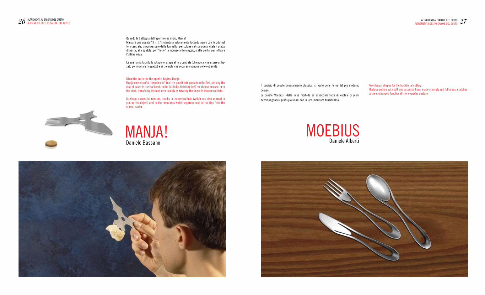
manJa!Daniele Bassano
Quando la battaglia dell’aperitivo ha inizio, manja!manja è una posata “3 in 1”: rotandola velocemente facendo perno con le dita nel foro centrale, si può passare dalla forchetta, per colpire nel suo punto vitale il piatto di pasta, alla spatola, per “finire” la mousse al formaggio, o alla punta, per infilzare l’ultima oliva.
La sua forma facilita la rotazione, grazie al foro centrale (che può anche essere utiliz-zato per impilare l’oggetto) e ai tre archi che separano ognuna delle estremità.
When the battle for the aperitif begins, manja!manja consists of a “three in one” tool: it’s possible to pass from the fork, striking the dish of pasta in its vital heart, to the flat ladle, finishing (off) the cheese mousse, or to the stick, transfixing the last olive, simply by rotating the finger in the central hole.
Its shape makes the rotation, thanks to the central hole (which can also be used to pile up the object) and to the three arcs which separate each of the tips from the others, easier.
new design shapes for the traditional cutlery.moebius cutlery, with soft and essential lines, made of empty and full areas, matches to the unchanged functionality of everyday gesture.
Il servizio di posate generalmente classico, si veste delle forme del più moderno
design.
Le posate moebius dalla linea morbida ed essenziale fatta di vuoti e di pieni
accompagnano i gesti quotidiani con la loro immutata funzionalità.
26 aLtrementI aL SaLOne DeL gUStOaLtrementI gOeS tO SaLOne DeL gUStO 27aLtrementI aL SaLOne DeL gUStO
aLtrementI gOeS tO SaLOne DeL gUStO
mOeBIUSDaniele alberti
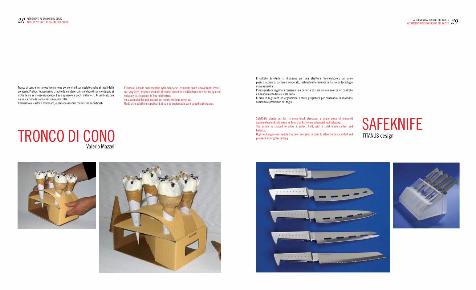
trOnCO DI COnOvalerio mazzei
tronco di cono e’ un innovativo sistema per servire il cono gelato anche ai tavoli delle gelaterie. Pratico, leggerissimo , facile da montare, prima e dopo il suo montaggio si richiude su se stesso riducendo il suo spessore a pochi millimetri. assemblato con un unica fustella senza nessun punto colla.realizzato in cartone politenato, è personalizzabile con texture superficiali.
ttronco di Cono is an innovative system to serve ice-cream cones also at table. Practi-cal, very light, easy to assemble, it can be closed on itself before and after being used, reducing its thickness to few millimetres.It’s assembled by just one hollow-punch, without any glue.made with polythene cardboard, it can be customable with superficial textures.
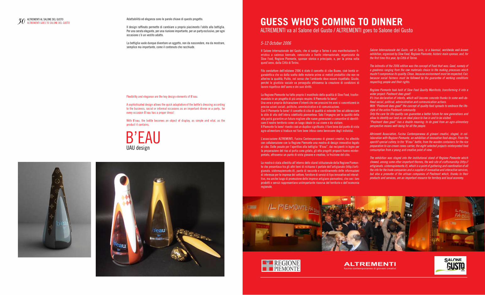
SafeKnIfetItanUS design
Il coltello SafeKnife si distingue per una struttura “monoblocco”; un unico pezzo d’acciaio al carbonio temperato, realizzato interamente in italia con tecnologie d’avanguardia. L’impugnatura sagomata consente una perfetta postura della mano con un controllo e bilanciamento totale sulla lama.Il manico high-tech ed ergonomico è stato progettato per consentire la massima comodità e precisione nel taglio.
SafeKnife stands out for its mono-block structure: a single piece of tempered carbon-steel entirely made in Italy, thanks to very advanced technologies.the handle is shaped to allow a perfect hold, with a total blade control and balance.High-tech ergonomic handle has been designed in order to allow the best comfort and precision during the cutting.
28 aLtrementI aL SaLOne DeL gUStOaLtrementI gOeS tO SaLOne DeL gUStO 29aLtrementI aL SaLOne DeL gUStO
aLtrementI gOeS tO SaLOne DeL gUStO
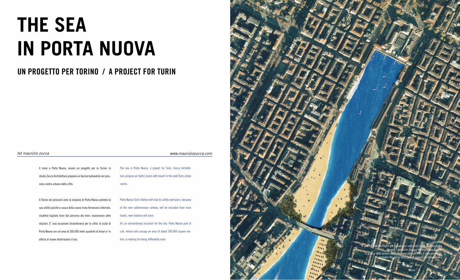
B’eaUUaU design
adattabilità ed eleganza sono le parole chiave di questo progetto.
Il design raffinato permette di cambiare a proprio piacimento l’abito alla bottiglia. Per una serata elegante, per una riunione importante, per un party esclusivo, per ogni occasione c’è un vestito adatto.
La bottiglia vuole dunque diventare un oggetto, non da nascondere, ma da mostrare, semplice ma importante, come il contenuto che racchiude.
flexibility and elegance are the key design elements of B’eau.
a sophisticated design allows the quick adaptation of the bottle’s dressing according to the business, social or informal occasions as an important dinner or a party.. for every occasion B’eau has a proper dress!
With B’eau, the bottle becomes an object of display, as simple and vital, as the product it contains.
30 aLtrementI aL SaLOne DeL gUStOaLtrementI gOeS tO SaLOne DeL gUStO
Il Salone Internazionale del gusto, che si svolge a torino è una manifestazione fi-eristica a cadenza biennale, conosciuta a livello internazionale, organizzata da Slow food, regione Piemonte, sponsor storico e principale, e, per la prima volta quest’anno, dalla Città di torino.
filo conduttore dell’edizione 2006 è stato il concetto di cibo Buono, cioè bontà or-ganolettica che va dalla scelta delle materie prime ai metodi produttivi che non ne alterino la qualità; Pulito, nel senso che l’ambiente deve essere rispettato; giusto, perché la giustizia sociale va perseguita attraverso la creazione di condizioni di lavoro rispettose dell’uomo e dei suoi diritti.
La regione Piemonte ha fatto proprio il manifesto della qualità di Slow food, trasfor-mandolo in un progetto di più ampio respiro: Il Piemonte fa bene!Una vera e propria dichiarazione d’intenti che nei prossimi tre anni si concretizzerà in precise azioni sociali, politiche, amministrative e di comunicazione.Con Il Piemonte fa bene! il concetto di cibo di qualità si estende fino ad abbracciare lo stile di vita dell’intera colettività piemontese. Solo l’impegno per la qualità della vita potrà garantire un futuro migliore alle nuove generazioni e consentire di identifi-care il nostro territorio come un luogo ideale in cui vivere e da visitare.Il Piemonte fa bene! riveste cioè un duplice significato: il fare bene dal punto di vista agro-alimentare si traduce nel fare bene inteso come benessere degli individui.
L’associazione aLtrementI, fucina Contemporanea di giovani creativi, ha allestito con collaborazione con la regione Piemonte una mostra di design innovativo legato al cibo. Dalle posate per l’aperitivo alla bottiglia “B’eau”, dai recipienti in legno per la preparazione del riso al porta-cono gelato, gli otto progetti proposti hanno reinter-pretato, attraverso un punto di vista giovane e creativo, la fruizione del cibo.
La mostra è stata allestita all’interno dello stand istituzionale della regione Piemon-te che presentava tra gli altri temi di richiamo il portale dell’artigianato (http://arti-gianato. sistemapiemonte.it), punto di raccordo e coordinamento delle informazioni di interesse per le imprese del settore, fornitore di servizi di tipo innovativo ed interat-tivo, ma anche luogo di promozione delle imprese artigiane piemontesi, che con i loro prodotti e servizi rappresentano unìimportante risosrsa del territorio e dell’economia regionale.
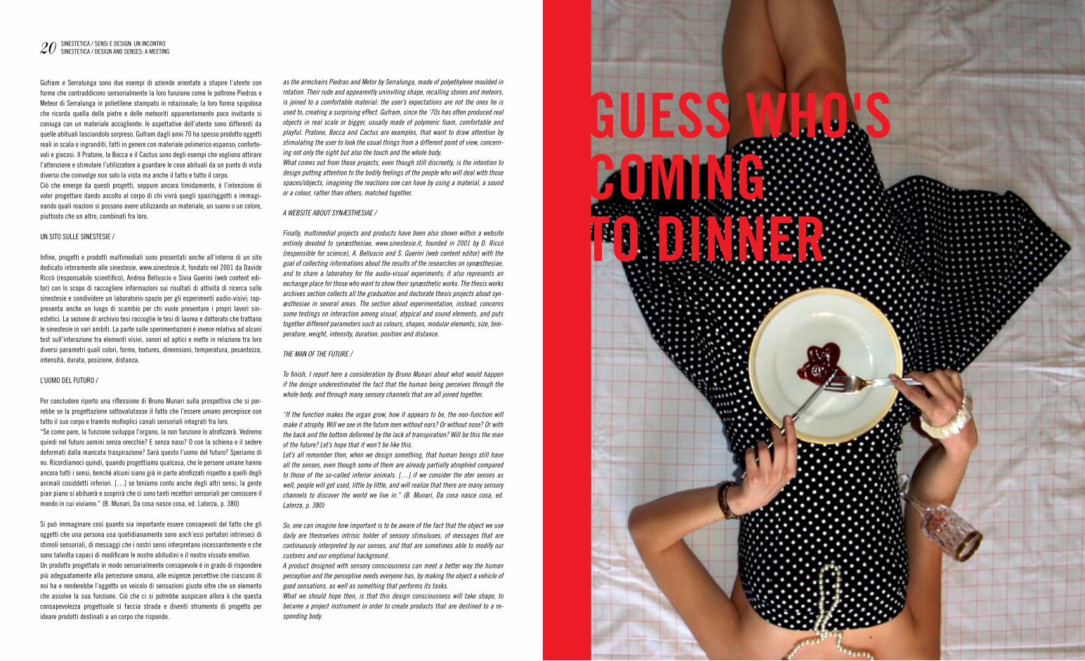
GUESS WHO’S COMING TO DINNERaLtrementI va al Salone del gusto / aLtrementI goes to Salone del gusto
5-12 October 2006 Salone Internazionale del Gusto, set in Turin, is a biennial, worldwide well-known exhibition, organised by Slow Food, Regione Piemonte, historic main sponsor, and, for the first time this year, by Città di Torino.
The leitmotiv of the 2006 edition was the concept of Food that was: Good, namely of a goodness ranging from the raw materials choice to the making processes which mustn’t compromise its quality; Clean, because environment must be respected; Fair, because social fairness must be followed by the guarantee of working conditions respecting people and their rights.
Regione Piemonte took hold of Slow Food Quality Manifesto, transforming it into a wider project: Piedmont does good!It’s true declaration of intents, which will become concrete thanks to some well-de-fined social, political, administrative and communication actions.With “Piedmont does good” the concept of quality food spreads to embrace the life-style of the entire Piedmont community.Only the care for life-quality can guarantee a better future for new generations and allow to identify our land as an ideal place to live in and to be visited.“Piedmont does good” has a double meaning: to do good from an agro-alimentary perspective means well-being for all the people.
Altrimenti Association, Fucina Contemporanea di giovani creativi, staged, in col-laboration with Regione Piemonte, an exhibition of innovative food-design. From the aperitif special cutlery, to the “B’eau” bottle, from the wooden containers for the rice preparation to ice-cream cones carrier, the eight selected projects reinterpreted food consumption from a young and creative point of view.
The exhibition was staged into the institutional stand of Regione Piemonte which showed, among some other important themes, the web site of craftsmanship (http://artigianato. sistemapiemonte.it), which is a point of gathering and coordination of all the info for the trade companies and a supplier of innovative and interactive services, but also a promoter of the artisan companies of Piedmont which, thanks to their products and services, are an important resource for territory and local economy.
txt maurizio zucca
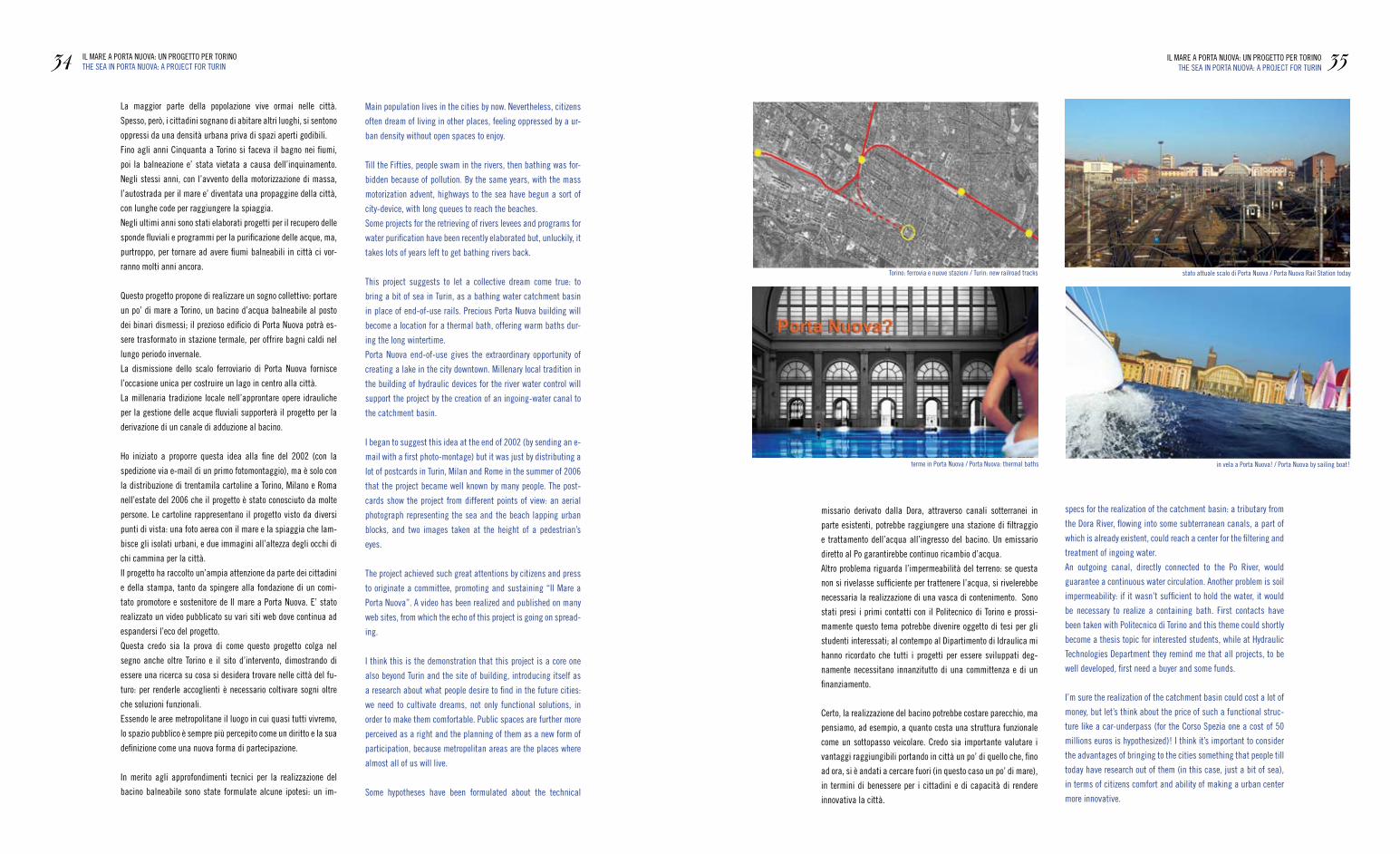
Il mare a Porta nuova, ovvero un progetto per la torino: lo
studio zucca architettura propone un bacino balneabile nel pros-
simo centro urbano della città.
a torino nei prossimi anni la stazione di Porta nuova perderà la
sua utilità poichè a causa della nuova linea ferroviaria interrata,
risulterà tagliata fuori dal percorso dei treni, nasceranno altre
stazioni. e’ una occasione straordinaria per la città: lo scalo di
Porta nuova con un’area di 200.000 metri quadrati di binari e’ in
attesa di nuove destinazioni d’uso.
UN PROGETTO PER TORINO / A PROJECT FOR TURIN
THE SEAIN PORTA NUOVA
www.mauriziozucca.com
the sea in Porta nuova, a project for turin. zucca architet-
tura propose an hydric basin with beach in the next turin urban
centre.
Porta nuova turin Station will lose its utility next years, because
of the new subterranean railway, will be excluded from train
tracks, new stations will arise.
It’s an extraordinary occasion for the city: Porta nuova port of
call, whose rails occupy an area of about 200,000 square me-
ters, is waiting for being differently used.Credits:
la grafica delle immagini per la cartolina sono stati curati da alessandra rasetti / postcards images by alessandra rasetti
la grafica della prima immagine realizzata nel 2002 è stata curata da antonello riu / first 2002 image realized by antonello riu
La maggior parte della popolazione vive ormai nelle città.
Spesso, però, i cittadini sognano di abitare altri luoghi, si sentono
oppressi da una densità urbana priva di spazi aperti godibili.
fino agli anni Cinquanta a torino si faceva il bagno nei fiumi,
poi la balneazione e’ stata vietata a causa dell’inquinamento.
negli stessi anni, con l’avvento della motorizzazione di massa,
l’autostrada per il mare e’ diventata una propaggine della città,
con lunghe code per raggiungere la spiaggia.
negli ultimi anni sono stati elaborati progetti per il recupero delle
sponde fluviali e programmi per la purificazione delle acque, ma,
purtroppo, per tornare ad avere fiumi balneabili in città ci vor-
ranno molti anni ancora.
Questo progetto propone di realizzare un sogno collettivo: portare
un po’ di mare a torino, un bacino d’acqua balneabile al posto
dei binari dismessi; il prezioso edificio di Porta nuova potrà es-
sere trasformato in stazione termale, per offrire bagni caldi nel
lungo periodo invernale.
La dismissione dello scalo ferroviario di Porta nuova fornisce
l’occasione unica per costruire un lago in centro alla città.
La millenaria tradizione locale nell’approntare opere idrauliche
per la gestione delle acque fluviali supporterà il progetto per la
derivazione di un canale di adduzione al bacino.
Ho iniziato a proporre questa idea alla fine del 2002 (con la
spedizione via e-mail di un primo fotomontaggio), ma è solo con
la distribuzione di trentamila cartoline a torino, milano e roma
nell’estate del 2006 che il progetto è stato conosciuto da molte
persone. Le cartoline rappresentano il progetto visto da diversi
punti di vista: una foto aerea con il mare e la spiaggia che lam-
bisce gli isolati urbani, e due immagini all’altezza degli occhi di
chi cammina per la città.
Il progetto ha raccolto un’ampia attenzione da parte dei cittadini
e della stampa, tanto da spingere alla fondazione di un comi-
tato promotore e sostenitore de Il mare a Porta nuova. e’ stato
realizzato un video pubblicato su vari siti web dove continua ad
espandersi l’eco del progetto.
Questa credo sia la prova di come questo progetto colga nel
segno anche oltre torino e il sito d’intervento, dimostrando di
essere una ricerca su cosa si desidera trovare nelle città del fu-
turo: per renderle accoglienti è necessario coltivare sogni oltre
che soluzioni funzionali.
essendo le aree metropolitane il luogo in cui quasi tutti vivremo,
lo spazio pubblico è sempre più percepito come un diritto e la sua
definizione come una nuova forma di partecipazione.
In merito agli approfondimenti tecnici per la realizzazione del
bacino balneabile sono state formulate alcune ipotesi: un im-
missario derivato dalla Dora, attraverso canali sotterranei in
parte esistenti, potrebbe raggiungere una stazione di filtraggio
e trattamento dell’acqua all’ingresso del bacino. Un emissario
diretto al Po garantirebbe continuo ricambio d’acqua.
altro problema riguarda l’impermeabilità del terreno: se questa
non si rivelasse sufficiente per trattenere l’acqua, si rivelerebbe
necessaria la realizzazione di una vasca di contenimento. Sono
stati presi i primi contatti con il Politecnico di torino e prossi-
mamente questo tema potrebbe divenire oggetto di tesi per gli
studenti interessati; al contempo al Dipartimento di Idraulica mi
hanno ricordato che tutti i progetti per essere sviluppati deg-
namente necessitano innanzitutto di una committenza e di un
finanziamento.
Certo, la realizzazione del bacino potrebbe costare parecchio, ma
pensiamo, ad esempio, a quanto costa una struttura funzionale
come un sottopasso veicolare. Credo sia importante valutare i
vantaggi raggiungibili portando in città un po’ di quello che, fino
ad ora, si è andati a cercare fuori (in questo caso un po’ di mare),
in termini di benessere per i cittadini e di capacità di rendere
innovativa la città.
34 IL mare a POrta nUOva: Un PrOgettO Per tOrInOtHe Sea In POrta nUOva: a PrOJeCt fOr tUrIn 35IL mare a POrta nUOva: Un PrOgettO Per tOrInO
tHe Sea In POrta nUOva: a PrOJeCt fOr tUrIn
stato attuale scalo di Porta nuova / Porta nuova rail Station today
in vela a Porta nuova! / Porta nuova by sailing boat!terme in Porta nuova / Porta nuova: thermal baths
torino: ferrovia e nuove stazioni / turin: new railroad tracks
main population lives in the cities by now. nevertheless, citizens
often dream of living in other places, feeling oppressed by a ur-
ban density without open spaces to enjoy.
till the fifties, people swam in the rivers, then bathing was for-
bidden because of pollution. By the same years, with the mass
motorization advent, highways to the sea have begun a sort of
city-device, with long queues to reach the beaches.
Some projects for the retrieving of rivers levees and programs for
water purification have been recently elaborated but, unluckily, it
takes lots of years left to get bathing rivers back.
this project suggests to let a collective dream come true: to
bring a bit of sea in turin, as a bathing water catchment basin
in place of end-of-use rails. Precious Porta nuova building will
become a location for a thermal bath, offering warm baths dur-
ing the long wintertime.
Porta nuova end-of-use gives the extraordinary opportunity of
creating a lake in the city downtown. millenary local tradition in
the building of hydraulic devices for the river water control will
support the project by the creation of an ingoing-water canal to
the catchment basin.
I began to suggest this idea at the end of 2002 (by sending an e-
mail with a first photo-montage) but it was just by distributing a
lot of postcards in turin, milan and rome in the summer of 2006
that the project became well known by many people. the post-
cards show the project from different points of view: an aerial
photograph representing the sea and the beach lapping urban
blocks, and two images taken at the height of a pedestrian’s
eyes.
the project achieved such great attentions by citizens and press
to originate a committee, promoting and sustaining “Il mare a
Porta nuova”. a video has been realized and published on many
web sites, from which the echo of this project is going on spread-
ing.
I think this is the demonstration that this project is a core one
also beyond turin and the site of building, introducing itself as
a research about what people desire to find in the future cities:
we need to cultivate dreams, not only functional solutions, in
order to make them comfortable. Public spaces are further more
perceived as a right and the planning of them as a new form of
participation, because metropolitan areas are the places where
almost all of us will live.
Some hypotheses have been formulated about the technical
specs for the realization of the catchment basin: a tributary from
the Dora river, flowing into some subterranean canals, a part of
which is already existent, could reach a center for the filtering and
treatment of ingoing water.
an outgoing canal, directly connected to the Po river, would
guarantee a continuous water circulation. another problem is soil
impermeability: if it wasn’t sufficient to hold the water, it would
be necessary to realize a containing bath. first contacts have
been taken with Politecnico di torino and this theme could shortly
become a thesis topic for interested students, while at Hydraulic
technologies Department they remind me that all projects, to be
well developed, first need a buyer and some funds.
I’m sure the realization of the catchment basin could cost a lot of
money, but let’s think about the price of such a functional struc-
ture like a car-underpass (for the Corso Spezia one a cost of 50
millions euros is hypothesized)! I think it’s important to consider
the advantages of bringing to the cities something that people till
today have research out of them (in this case, just a bit of sea),
in terms of citizens comfort and ability of making a urban center
more innovative.

ARTE O FUTURO / ART OR FUTURE
txt danila pellicani
e’ possibile che uno schizzo iniziale possa trasformarsi in un oggetto, progettato
direttamente nello spazio?
Con il progetto Sketch forniture questo è possibile e si aprono nuove ed inaspettate
linee progettuali.
36 SKetCH fOrnItUre: arte O fUtUrOSKetCH fOrnItUre: art Or fUtUre 37SKetCH fOrnItUre: arte O fUtUrO
SKetCH fOrnItUre: art Or fUtUre
SKETCH
FORNITURE
Can a sketch become an object, directly designed in a three-dimensional space?
Thanks to Sketch Forniture this is possible, and new unexpected design approaches
appear.
This is Sketch Furniture Design.
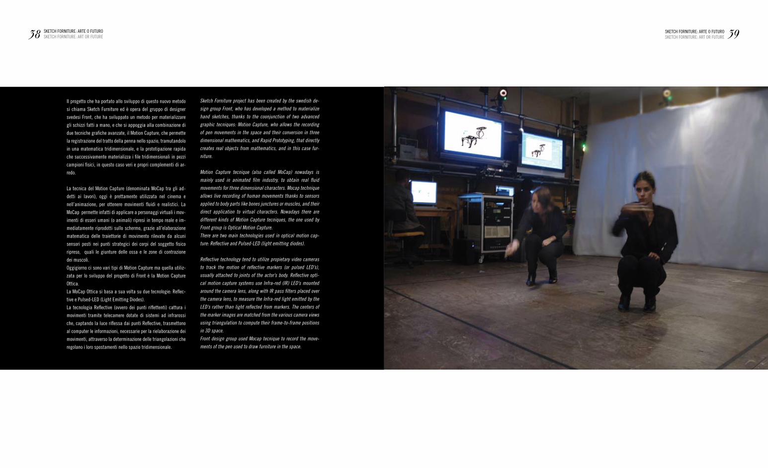
Il progetto che ha portato allo sviluppo di questo nuovo metodo
si chiama Sketch furniture ed è opera del gruppo di designer
svedesi front, che ha sviluppato un metodo per materializzare
gli schizzi fatti a mano, e che si appoggia alla combinazione di
due tecniche grafiche avanzate, il motion Capture, che permette
la registrazione del tratto della penna nello spazio, tramutandolo
in una matematica tridimensionale, e la prototipazione rapida
che successivamente materializza i file tridimensionali in pezzi
campioni fisici, in questo caso veri e propri complementi di ar-
redo.
La tecnica del motion Capture (denominata moCap tra gli ad-
detti ai lavori), oggi è prettamente utilizzata nel cinema e
nell’animazione, per ottenere movimenti fluidi e realistici. La
moCap permette infatti di applicare a personaggi virtuali i mov-
imenti di esseri umani (o animali) ripresi in tempo reale e im-
mediatamente riprodotti sullo schermo, grazie all’elaborazione
matematica delle traiettorie di movimento rilevate da alcuni
sensori posti nei punti strategici dei corpi del soggetto fisico
ripreso, quali le giunture delle ossa e le zone di contrazione
dei muscoli.
Oggigiorno ci sono vari tipi di motion Capture ma quella utiliz-
zata per lo sviluppo del progetto di front è la motion Capture
Ottica.
La moCap Ottica si basa a sua volta su due tecnologie: reflec-
tive e Pulsed-LeD (Light emitting Diodes).
La tecnologia reflective (ovvero dei punti riflettenti) cattura i
movimenti tramite telecamere dotate di sistemi ad infrarossi
che, captando la luce riflessa dai punti reflective, trasmettono
al computer le informazioni, necessarie per la rielaborazione dei
movimenti, attraverso la determinazione delle triangolazioni che
regolano i loro spostamenti nello spazio tridimensionale.
38 SKetCH fOrnItUre: arte O fUtUrOSKetCH fOrnItUre: art Or fUtUre 39SKetCH fOrnItUre: arte O fUtUrO
SKetCH fOrnItUre: art Or fUtUre
Sketch Forniture project has been created by the swedish de-
sign group Front, who has developed a method to materialize
hand sketches, thanks to the coonjunction of two advanced
graphic tecniques: Motion Capture, who allows the recording
of pen movements in the space and their conversion in three
dimensional mathematics, and Rapid Prototyping, that directly
creates real objects from mathematics, and in this case fur-
niture.
Motion Capture tecnique (also called MoCap) nowadays is
mainly used in animated film industry, to obtain real fluid
movements for three dimensional characters. Mocap technique
allows live recording of human movements thanks to sensors
applied to body parts like bones junctures or muscles, and their
direct application to virtual characters. Nowadays there are
different kinds of Motion Capture tecniques, the one used by
Front group is Optical Motion Capture.
There are two main technologies used in optical motion cap-
ture: Reflective and Pulsed-LED (light emitting diodes).
Reflective technology tend to utilize propietary video cameras
to track the motion of reflective markers (or pulsed LED’s),
usually attached to joints of the actor’s body. Reflective opti-
cal motion capture systems use Infra-red (IR) LED’s mounted
around the camera lens, along with IR pass filters placed over
the camera lens, to measure the Infra-red light emitted by the
LED’s rather than light reflected from markers. The centers of
the marker images are matched from the various camera views
using triangulation to compute their frame-to-frame positions
in 3D space.
Front design group used Mocap tecnique to record the move-
ments of the pen used to draw furniture in the space.
front ha utilizzato la tecnica del moCap per registrare gli spos-
tamenti della punta della penna utillzata per schizzare e diseg-
nare nello spazio i pezzi di arredamento.
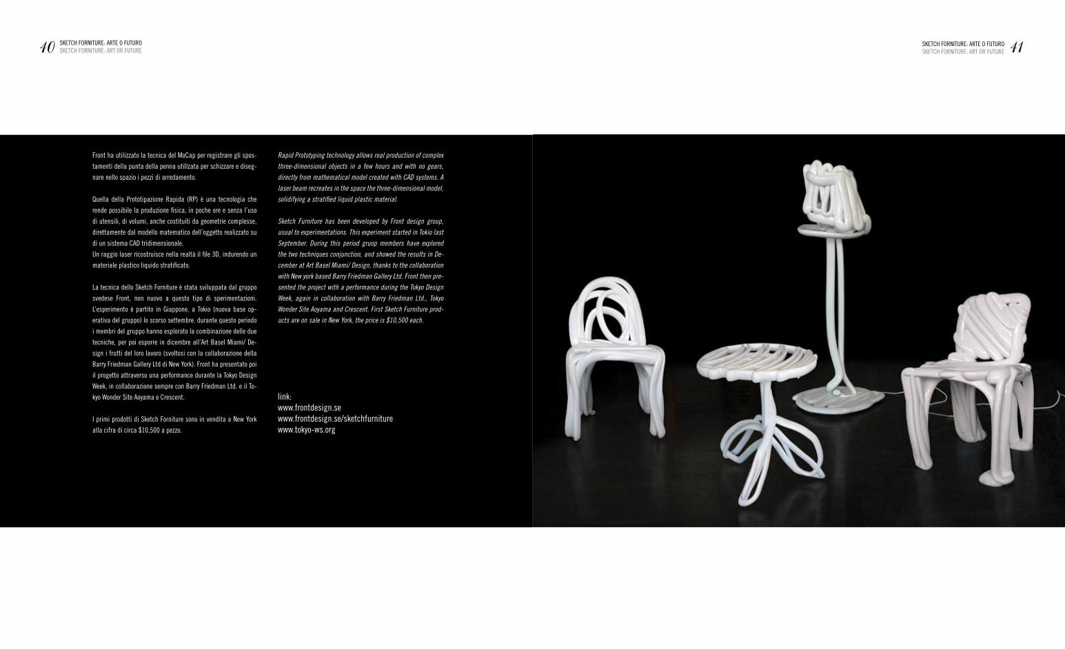
Quella della Prototipazione rapida (rP) è una tecnologia che
rende possibile la produzione fisica, in poche ore e senza l’uso
di utensili, di volumi, anche costituiti da geometrie complesse,
direttamente dal modello matematico dell’oggetto realizzato su
di un sistema CaD tridimensionale.
Un raggio laser ricostruisce nella realtà il file 3D, indurendo un
materiale plastico liquido stratificato.
La tecnica dello Sketch forniture è stata sviluppata dal gruppo
svedese front, non nuovo a questo tipo di sperimentazioni.
L’esperimento è partito in giappone, a tokio (nuova base op-
erativa del gruppo) lo scorso settembre. durante questo periodo
i membri del gruppo hanno esplorato la combinazione delle due
tecniche, per poi esporre in dicembre all’art Basel miami/ De-
sign i frutti del loro lavoro (svoltosi con la collaborazione della
Barry friedman gallery Ltd di new york). front ha presentato poi
il progetto attraverso una performance durante la tokyo Design
Week, in collaborazione sempre con Barry friedman Ltd. e il to-
kyo Wonder Site aoyama e Crescent.
I primi prodotti di Sketch forniture sono in vendita a new york
alla cifra di circa $10,500 a pezzo.
40 SKetCH fOrnItUre: arte O fUtUrOSKetCH fOrnItUre: art Or fUtUre 41SKetCH fOrnItUre: arte O fUtUrO
SKetCH fOrnItUre: art Or fUtUre
Rapid Prototyping technology allows real production of complex
three-dimensional objects in a few hours and with no gears,
directly from mathematical model created with CAD systems. A
laser beam recreates in the space the three-dimensional model,
solidifying a stratified liquid plastic material.
Sketch Furniture has been developed by Front design group,
usual to experimentations. This experiment started in Tokio last
September. During this period gruop members have explored
the two techniques conjunction, and showed the results in De-
cember at Art Basel Miami/ Design, thanks to the collaboration
with New york based Barry Friedman Gallery Ltd. Front then pre-
sented the project with a performance during the Tokyo Design
Week, again in collaboration with Barry Friedman Ltd., Tokyo
Wonder Site Aoyama and Crescent. First Sketch Furniture prod-
ucts are on sale in New York, the price is $10,500 each.
link:www.frontdesign.sewww.frontdesign.se/sketchfurniturewww.tokyo-ws.org
PROTO DESIGN
ALTRODESIGNLAURA D’ANTONI SILVIA GUERINI
MAURIZIO MAIORANA DANIELE ALBERTI
STEFANO PALMETOYET | MATILDE
ANDREA VECERA
43PROTODESIGN
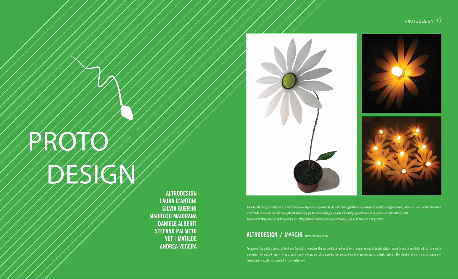
finalità del design artistico di emiliano Coccolo è esplorare la possibilità di realizzare oggettistica attraverso il riutilizzo di oggetti finiti, lavorati o semilavorati che siano,
utilizzando un metodo costruttivo legato all’assemblaggio dei pezzi, perseguendo una metodologia produttiva che si avvicina all’istitività dell’arte.
La lampada margherì è un valido esempio dell’atteggiamento disimpegnato e giocoso della sua vena creativa e progettuale.
Purpose of the artistic design of emiliano Coccolo is to explore the possibility to realize objects through re-use of ended objects, works to you or semifinished that are, using
a constructive method legacy to the assemblage of pieces, pursuing a productive methodology that approaches an artistic instinct. the margherì lamp is a valid example of
disengagied and playful approach of its creative vein.
ALTRODESIGN / margHI’ (www.altrodesign.net)
Sit&more è un sistema modulare per interni in poliuretano espanso con rivestimento in morbido tessuto aderente multicolore. I moduli si incastrano tra loro tramite una parte
concava che ospita una delle parti convesse dell’altro pezzo, disponendosi sia verticalmente che orizzontalmente. La morbidezza del materiale si adatta piacevolmente alle
forme corporee. Può essere usato in diversi modi per altrettanti scopi creando una seduta ma anche un tavolino, un morbido tappeto, un separé verticale e uno spazio gioco per
i bambini.
Sit&more is a modular system for interior spaces made by polyurethane foam and soft multicolour covering. the convex part of a module is fixed to the concave part of the other
one creating vertical and horizontal geometries. the softness of the material adapt itself to human bodies creating a relaxing atmosphere.
It can be used in different ways for different purposes creating a sitting but also a little table, a soft carpet, a vertical separé and a kid game space.
SILVIA GUERINI / SIt&mOre ([email protected])
45PROTODESIGN
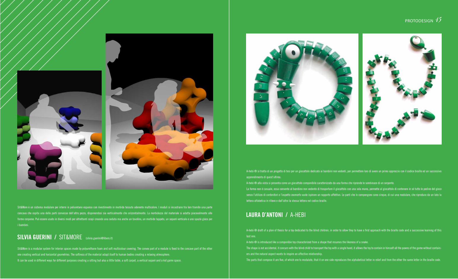
a-hebi ® si tratta di un progetto di tesi per un giocattolo dedicato ai bambini non vedenti, per permettere loro di avere un primo approccio con il codice braille ed un successivo
apprendimento di quest’ultimo.
a-hebi ® alla vista si presenta come un giocattolo componibile caratterizzato da una forma che riprende le sembinaze di un serpente.
La forma non è casuale, essa consente al bambino non vedente di trasportare il giocattolo con una sola mano, permette al giocattolo di contenere in sé tutte le pedine del gioco
senza l’utilizzo di contenitori e l’aspetto zoomorfo vuole ispirare un rapporto affettivo. Le parti che lo compongono sono cinque, di cui una modulare, che riproduce da un lato la
lettera alfabetica in rilievo e dall’altro la stessa lettera nel codice braille.
a-hebi ® draft of a plan of thesis for a toy dedicated to the blind children, in order to allow they to have a first approach with the braille code and a successive learning of this
last one.
a-hebi ® is introduced like a componibie toy characterized from a shape that resumes the likeness of a snake.
the shape is not accidental, it concurs with the blind child to transport the toy with a single hand, it allows the toy to contain in himself all the pawns of the game without contain-
ers and the natural aspect wants to inspire an affective relationship.
the parts that compose it are five, of which one to modulate, that it on one side reproduces the alphabetical letter in relief and from the other the same letter in the braille code.
LAURA D’ANTONI / a-HeBI
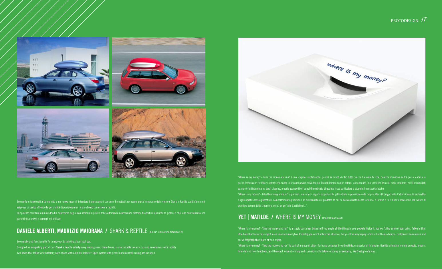
zoomorfia e funzionalità danno vita a un nuovo modo di intendere il portapacchi per auto. Progettati per essere parte integrante delle vetture Shark e reptile soddisfano ogni
esigenza di carico offrendo la possibilità di posizionare sci e snowboard con estrema facilità.
Lo spiccato carattere animale dei due contenitori segue con armonia il profilo delle automobili incorporando sistemi di apertura assistiti da pistoni e chiusura centralizzata per
garantire sicurezza e comfort nell’utilizzo.
zoomorphy and functionality for a new way to thinking about roof box.
Designed as integrating part of cars Shark e reptile satisfy every loading need, these boxes is also suitable to carry skis and snowboards with facility.
two boxes that follow whit harmony car’s shape with animal character. Open system with pistons and central locking are included.
DANIELE ALBERTI, MAURIZIO MAIORANA / SHarK & rePtILe ([email protected])
“Where is my money? - take the money and run” è uno stupido svuotatasche, perchè se svuoti dentro tutto ciò che hai nelle tasche, qualche monetina andrá persa, caduta in
quella fessura che fa dello svuotatasche anche un inconsapevole salvadanaio. Probabilmente non ne noterai la mancanza, ma sarai ben felice di poter prendere i soldi accumulati
quando effettivamente ne avrai bisogno, proprio quando ti eri quasi dimenticato di quanto fosse particolare e stupido il tuo svuotatasche.
“Where is my money? - take the money and run” fa parte di una serie di oggetti progettati da yet|matilde, espressione della propria identità progettuale: l’attenzione alla gestualità
e agli aspetti spesso ignorati del comportamento quotidiano, la funzionalità del prodotto da cui ne deriva direttamente la forma, e l’ironia e la curiosità necessarie per evitare di
prendere sempre tutto troppo sul serio, un pò “alla Castiglioni...”.
“Where is my money? - take the money and run” is a stupid container, because if you empty all the things in your pockets inside it, you won’t find some of your coins, fallen in that
little hole that turns this object in an unaware moneybox. Probably you won’t notice the absence, but you’ll be very happy to find all of them when you really need some coins and
you’ve forgotten the values of your object.
“Where is my money? - take the money and run” is part of a group of object for home designed by yet|matilde, expression of its design identity: attention to daily aspects, product
form derived from functions, and the exact amount of irony and curiosity not to take everything so seriously, like Castiglioni’s way....
YET | MATILDE / WHere IS my mOney ([email protected])
47PROTODESIGN
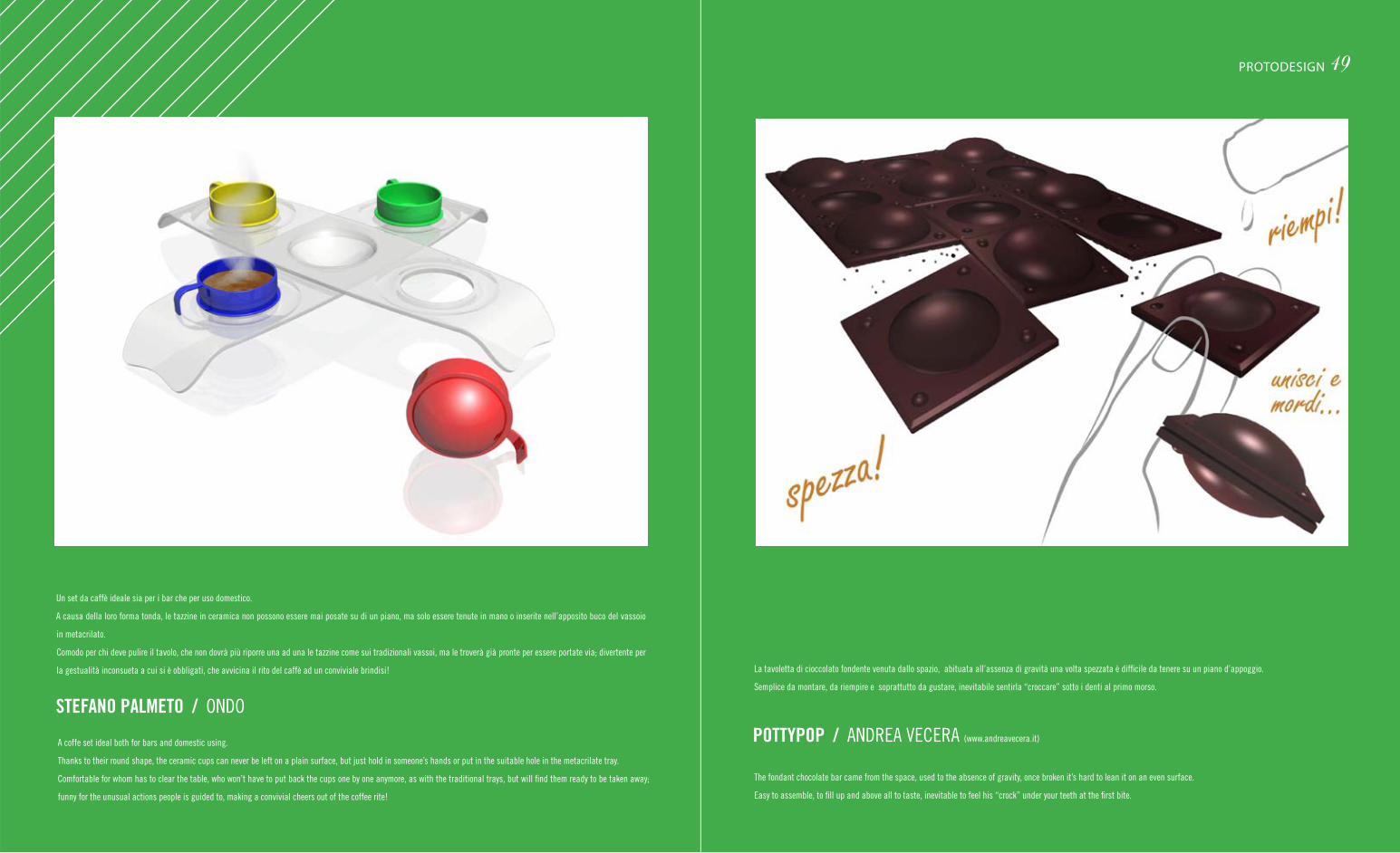
49PROTODESIGN
La tavoletta di cioccolato fondente venuta dallo spazio, abituata all’assenza di gravità una volta spezzata è difficile da tenere su un piano d’appoggio.
Semplice da montare, da riempire e soprattutto da gustare, inevitabile sentirla “croccare” sotto i denti al primo morso.
the fondant chocolate bar came from the space, used to the absence of gravity, once broken it’s hard to lean it on an even surface.
easy to assemble, to fill up and above all to taste, inevitable to feel his “crock” under your teeth at the first bite.
POTTYPOP / anDrea veCera (www.andreavecera.it)
Un set da caffè ideale sia per i bar che per uso domestico.
a causa della loro forma tonda, le tazzine in ceramica non possono essere mai posate su di un piano, ma solo essere tenute in mano o inserite nell’apposito buco del vassoio
in metacrilato.
Comodo per chi deve pulire il tavolo, che non dovrà più riporre una ad una le tazzine come sui tradizionali vassoi, ma le troverà già pronte per essere portate via; divertente per
la gestualità inconsueta a cui si è obbligati, che avvicina il rito del caffè ad un conviviale brindisi!
a coffe set ideal both for bars and domestic using.
thanks to their round shape, the ceramic cups can never be left on a plain surface, but just hold in someone’s hands or put in the suitable hole in the metacrilate tray.
Comfortable for whom has to clear the table, who won’t have to put back the cups one by one anymore, as with the traditional trays, but will find them ready to be taken away;
funny for the unusual actions people is guided to, making a convivial cheers out of the coffee rite!
STEFANO PALMETO / OnDO
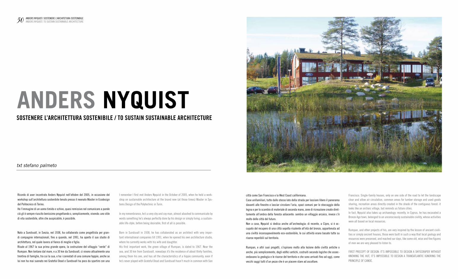
txt stefano palmeto
ricordo di aver incontrato anders nyquist nell’ottobre del 2005, in occasione del
workshop sull’architettura sostenibile tenuto presso il neonato master in ecodesign
del Politecnico di torino.
Ho l’immagine di un uomo timido e schivo, quasi remissivo nel comunicare a parole
ciò gli è sempre riuscito benissimo progettando o, semplicemente, vivendo: uno stile
di vita sostenibile, oltre che auspicabile, è possibile.
nato a Sundsvall, in Svezia, nel 1938, ha collaborato come progettista per gran-
di compagnie internazionali, fino a quando, nel 1991, ha aperto il suo studio di
architettura, nel quale lavora al fianco di moglie e figlia.
risale al 1967 la sua prima grande opera, la costruzione del villaggio “verde” di
rumpan. non lontano dal mare, e a 30 km da Sundsvall, ci vivono attualmente una
trentina di famiglie, tra cui la sua, e ha i connotati di una comune hyppie, anche se
lui non ha mai suonato nei grateful Dead e Sundsvall ha poco da spartire con una
SOSTENERE L’ARCHITETTURA SOSTENIBILE / TO SUSTAIN SUSTAINABLE ARCHITECTURE
ANDERS NYQUIST
città come San francisco e la West Coast californiana.
Case unifamiliari, tutte dallo stesso lato della strada per lasciare libero il panorama
davanti alle finestre e lasciar circolare l’aria, spazi comuni per lo stoccaggio della
legna e per lo scambio di materiale di seconda mano, zone di ricreazione create diret-
tamente all’ombra della foresta adiacente: sembra un villaggio arcaico, invece c’è
molto delle città del futuro.
non a caso, nyquist si dedica anche all’archeologia: di recente, a Cipro, si è oc-
cupato del recupero di una città sepolta risalente all’età del bronzo, appartenuta ad
una civiltà inconsapevolmente eco-sostenibile, le cui attività erano basate tutte su
risorse reperibili sul territorio.
rumpan, e altri suoi progetti, s’ispirano molto alla lezione delle civiltà antiche o
anche, più semplicemente, degli edifici antichi, costruiti secondo logiche che assec-
ondavano la geologia e le risorse del territorio e che sono arrivati fino ad oggi, come
vecchi saggi tutti d’un pezzo che è un piacere stare ad ascoltare.
50 anDerS nyQUISt: SOStenere L’arCHItetUra SOStenIBILeanDerS nyQUISt: tO SUStaIn SUStaInaBLe arCHIteCtUre
I remember I first met anders nyquist in the October of 2005, when he held a work-
shop on sustainable architecture at the brand new (at those times) master in Sys-
tems Design of the Polytechnic in turin.
In my remembrance, he’s a very shy and coy man, almost abashed to communicate by
words something he’s always perfectly done by his design or simply living: a sustain-
able life-style, before being desirable, first of all is possible.
Born in Sundsvall in 1938, he has collaborated as an architect with very impor-
tant international companies till 1991, when he opened his own architecture studio,
where he currently works with his wife and daughter.
His first important work, the green village of rumpan, is dated to 1967. near the
sea, and 30 km from Sundsvall, nowadays it’s the residence of about thirty families,
among them his one, and has all the characteristics of a hippie community, even if
he’s never played with grateful Dead and Sundsvall hasn’t much in common with San
francisco. Single-family houses, only on one side of the road to let the landscape clear and allow air circulation, common areas for lumber storage and used-goods sharing, recreation areas directly created in the shade of the contiguous forest: it looks like an archaic village, but reminds us future cities.In fact, nyquist also takes up archaeology: recently, in Cyprus, he has excavated a Bronze age town, belonged to an unconsciously sustainable civility, whose activities were all based on local resources.
rumpan, and other projects of his, are very inspired by the lesson of ancient civili-ties or simply ancient houses, those were built in such a way that local geology and resources were preserved, and reached our days, like some old, wise and fine figures of men we are very pleased to listen to.
fIrSt PreCePt Of DeSIgn: It’S ImPOSSIBLe tO DeSIgn a SKySCraPer WItHOUt KnOWIng tHe HUt, It’S ImPOSSIBLe tO DeSIgn a tranSatLantIC IgnOrIng tHe
PrInCIPLe Of CanOe.

52 anDerS nyQUISt: SOStenere L’arCHItetUra SOStenIBILeanDerS nyQUISt: tO SUStaIn SUStaInaBLe arCHIteCtUre 53anDerS nyQUISt: SOStenere L’arCHItetUra SOStenIBILe
anDerS nyQUISt: tO SUStaIn SUStaInaBLe arCHIteCtUre
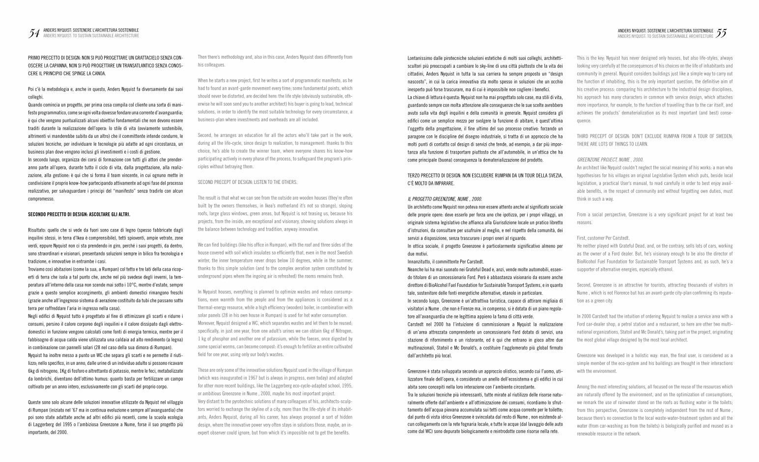
PrImO PreCettO DI DeSIgn: nOn SI PUò PrOgettare Un grattaCIeLO Senza COn-
OSCere La CaPanna, nOn SI PUò PrOgettare Un tranSatLantICO Senza COnOS-
Cere IL PrInCIPIO CHe SPInge La CanOa.
Poi c’è la metodologia e, anche in questo, anders nyquist fa diversamente dai suoi
colleghi.
Quando comincia un progetto, per prima cosa compila col cliente una sorta di mani-
festo programmatico, come se ogni volta dovesse fondare una corrente d’avanguardia;
è qui che vengono puntualizzati alcuni obiettivi fondamentali che non devono essere
traditi durante la realizzazione dell’opera: lo stile di vita (ovviamente sostenibile,
altrimenti vi manderebbe subito da un altro) che il committente intende condurre, le
soluzioni tecniche, per individuare le tecnologie più adatte ad ogni circostanza, un
business plan dove vengono inclusi gli investimenti e i costi di gestione.
In secondo luogo, organizza dei corsi di formazione con tutti gli attori che prender-
anno parte all’opera, durante tutto il ciclo di vita, dalla progettazione, alla realiz-
zazione, alla gestione: è qui che si forma il team vincente, in cui ognuno mette in
condivisione il proprio know-how partecipando attivamente ad ogni fase del processo
realizzativo, per salvaguardare i principi del “manifesto” senza tradirlo con alcun
compromesso.
SECONDO PRECETTO DI DESIGN: ASCOLTARE GLI ALTRI.
risultato: quello che si vede da fuori sono case di legno (spesso fabbricate dagli
inquilini stessi, in terra d’Ikea è comprensibile), tetti spioventi, ampie vetrate, zone
verdi, eppure nyquist non ci sta prendendo in giro, perché i suoi progetti, da dentro,
sono straordinari e visionari, presentando soluzioni sempre in bilico fra tecnologia e
tradizione, e innovative in entrambe i casi.
troviamo così abitazioni (come la sua, a rumpan) col tetto e tre lati della casa ricop-
erti di terra che isola a tal punto che, anche nel più svedese degli inverni, la tem-
peratura all’interno della casa non scende mai sotto i 10°C, mentre d’estate, sempre
grazie a questo semplice accorgimento, gli ambienti domestici rimangono freschi
(grazie anche all’ingegnoso sistema di aerazione costituito da tubi che passano sotto
terra per raffreddare l’aria in ingresso nella casa).
negli edifici di nyquist tutto è progettato al fine di ottimizzare gli scarti e ridurre i
consumi, persino il calore corporeo degli inquilini e il calore dissipato dagli elettro-
domestici in funzione vengono calcolati come fonti di energia termica, mentre per il
fabbisogno di acqua calda viene utilizzata una caldaia ad alto rendimento (a legna)
in combinazione con pannelli solari (28 nel caso della sua dimora di rumpan).
nyquist ha inoltre messo a punto un WC che separa gli scarti e ne permette il riuti-
lizzo; nello specifico, in un anno, dalle urine di un individuo adulto si possono ricavare
6kg di nitrogeno, 1Kg di fosforo e altrettanto di potassio, mentre le feci, metabolizzate
da lombrichi, diventano dell’ottimo humus: quanto basta per fertilizzare un campo
coltivato per un anno intero, esclusivamente con gli scarti del proprio corpo.
Queste sono solo alcune delle soluzioni innovative utilizzate da nyquist nel villaggio
di rumpan (iniziato nel ’67 ma in continua evoluzione e sempre all’avanguardia) che poi sono state adattate anche ad altri edifici più recenti, come la scuola ecologia di Laggerberg del 1995 o l’ambiziosa greenzone a nume, forse il suo progetto più
importante, del 2000.
Lontanissimo dalle pirotecniche soluzioni estetiche di molti suoi colleghi, architetti-
scultori più preoccupati a cambiare lo sky-line di una città piuttosto che la vita dei
cittadini, anders nyquist in tutta la sua carriera ha sempre proposto un “design
nascosto”, in cui la carica innovativa sta molto spesso in soluzioni che un occhio
inesperto può forse trascurare, ma di cui è impossibile non cogliere i benefici.
La chiave di lettura è questa: nyquist non ha mai progettato solo case, ma stili di vita,
guardando sempre con molta attenzione alle conseguenze che le sue scelte avrebbero
avuto sulla vita degli inquilini e della comunità in generale. nyquist considera gli
edifici come un semplice mezzo per svolgere la funzione di abitare, è quest’ultima
l’oggetto della progettazione, il fine ultimo del suo processo creativo: forzando un
paragone con le discipline del disegno industriale, si tratta di un approccio che ha
molti punti di contatto col design di servizi che tende, ad esempio, a dar più impor-
tanza alla funzione di trasportare piuttosto che all’automobile, in un’ottica che ha
come principale (buona) conseguenza la dematerializzazione del prodotto.
terzO PreCettO DI DeSIgn: nOn eSCLUDere rUmPan Da Un tOUr DeLLa SvezIa,
C’È mOLtO Da ImParare.
IL PROGETTO GREENZONE, NUMEẢ, 2000.
Un architetto come nyquist non poteva non essere attento anche al significato sociale
delle proprie opere: deve esserlo per forza uno che ipotizza, per i propri villaggi, un
originale sistema legislativo che affianca alla giurisdizione locale un pratico libretto
d’istruzioni, da consultare per usufruire al meglio, e nel rispetto della comunità, dei
servizi a disposizione, senza trascurare i propri oneri al riguardo.
In ottica sociale, il progetto greenzone è particolarmente significativo almeno per
due motivi.
Innanzitutto, il committente Per Carstedt.
neanche lui ha mai suonato nei grateful Dead e, anzi, vende molte automobili, essen-
do titolare di un concessionario ford. Però è abbastanza visionario da essere anche
direttore di Bioalcohol fuel foundation for Sustainable transport Systems, e in quanto
tale, sostenitore delle fonti energetiche alternative, etanolo in particolare.
In secondo luogo, greenzone è un’attrattiva turistica, capace di attirare migliaia di
visitatori a numeả, che non è firenze ma, in compenso, si è dotata di un piano regola-
tore all’avanguardia che ne legittima appieno la fama di città verde.
Carstedt nel 2000 ha l’intuizione di commissionare a nyquist la realizzazione
di un’area attrezzata comprendente un concessionario ford dotato di servizi, una
stazione di rifornimento e un ristorante, ed è qui che entrano in gioco altre due
multinazionali, Statoil e mc Donald’s, a costituire l’agglomerato più global firmato
dall’architetto più local.
greenzone è stata sviluppata secondo un approccio olistico, secondo cui l’uomo, uti-
lizzatore finale dell’opera, è considerato un anello dell’ecosistema e gli edifici in cui
abita sono concepiti nella loro interazione con l’ambiente circostante.
tra le soluzioni tecniche più interessanti, tutte mirate al riutilizzo delle risorse natu-
ralmente offerte dall’ambiente e all’ottimizzazione dei consumi, ricordiamo lo sfrut-tamento dell’acqua piovana accumulata sui tetti come acqua corrente per le toilette; dal punto di vista idrico greenzone è svincolata dal resto di nume , non esistendo al-cun collegamento con la rete fognaria locale, e tutte le acque (dal lavaggio delle auto come dal WC) sono depurate biologicamente e reintrodotte come risorse nella rete.
54 anDerS nyQUISt: SOStenere L’arCHItetUra SOStenIBILeanDerS nyQUISt: tO SUStaIn SUStaInaBLe arCHIteCtUre 55anDerS nyQUISt: SOStenere L’arCHItetUra SOStenIBILe
anDerS nyQUISt: tO SUStaIn SUStaInaBLe arCHIteCtUre
then there’s methodology and, also in this case, anders nyquist does differently from
his colleagues.
When he starts a new project, first he writes a sort of programmatic manifesto, as he
had to found an avant-garde movement every time; some fundamental points, which
should never be distorted, are decided here: the life style (obviously sustainable, oth-
erwise he will soon send you to another architect) his buyer is going to lead, technical
solutions, in order to identify the most suitable technology for every circumstance, a
business-plan where investments and overheads are all included.
Second, he arranges an education for all the actors who’ll take part in the work,
during all the life-cycle, since design to realization, to management: thanks to this
choice, he’s able to create the winner team, where everyone shares his know-how
participating actively in every phase of the process, to safeguard the program’s prin-
ciples without betraying them.
SeCOnD PreCePt Of DeSIgn: LISten tO tHe OtHerS.
the result is that what we can see from the outside are wooden houses (they’re often
built by the owners themselves, in Ikea’s motherland it’s not so strange), sloping
roofs, large glass windows, green areas, but nyquist is not teasing us, because his
projects, from the inside, are exceptional and visionary, showing solutions always in
the balance between technology and tradition, anyway innovative.
We can find buildings (like his office in rumpan), with the roof and three sides of the
house covered with soil which insulates so efficiently that, even in the most Swedish
winter, the inner temperature never drops below 10 degrees, while in the summer,
thanks to this simple solution (and to the complex aeration system constituted by
underground pipes where the ingoing air is refreshed) the rooms remains fresh.
In nyquist houses, everything is planned to optimize wastes and reduce consump-
tions, even warmth from the people and from the appliances is considered as a
thermal-energy resource, while a high efficiency (wooden) boiler, in combination with
solar panels (28 in his own house in rumpan) is used for hot water consumption.
moreover, nyquist designed a WC, which separates wastes and let them to be reused;
specifically, in just one year, from one adult’s urines we can obtain 6kg of nitrogen,
1 kg of phosphor and another one of potassium, while the faeces, once digested by
some special worms, can become compost: it’s enough to fertilize an entire cultivated
field for one year, using only our body’s wastes.
these are only some of the innovative solutions nyquist used in the village of rumpan
(which was inaugurated in 1967 but is always in progress, even today) and adapted
for other more recent buildings, like the Laggerberg eco-cycle-adapted school, 1995,
or ambitious greenzone in numeả, 2000, maybe his most important project.
very distant to the pyrotechnic solutions of many colleagues of his, architects-sculp-
tors worried to exchange the skyline of a city, more than the life-style of its inhabit-
ants, anders nyquist, during all his career, has always proposed a sort of hidden
design, where the innovative power very often stays in solutions those, maybe, an in-
expert observer could ignore, but from which it’s impossible not to get the benefits.
this is the key: nyquist has never designed only houses, but also life-styles, always
looking very carefully at the consequences of his choices on the life of inhabitants and
community in general. nyquist considers buildings just like a simple way to carry out
the function of inhabiting, this is the only important question, the definitive aim of
his creative process: comparing his architecture to the industrial design disciplines,
his approach has many characters in common with service design, which attaches
more importance, for example, to the function of travelling than to the car itself, and
achieves the products’ dematerialization as its most important (and best) conse-
quence.
tHIrD PreCePt Of DeSIgn: DOn’t eXCLUDe rUmPan frOm a tOUr Of SWeDen;
tHere are LOtS Of tHIngS tO Learn.
GREENZONE PROJECT, NUMEẢ, 2000.
an architect like nyquist couldn’t neglect the social meaning of his works: a man who
hypothesises for his villages an original Legislative System which puts, beside local
legislation, a practical User’s manual, to read carefully in order to best enjoy avail-
able benefits, in the respect of community and without forgetting own duties, must
think in such a way.
from a social perspective, greenzone is a very significant project for at least two
reasons.
first, customer Per Carstedt.
He neither played with grateful Dead, and, on the contrary, sells lots of cars, working
as the owner of a ford dealer. But, he’s visionary enough to be also the director of
Bioalcohol fuel foundation for Sustainable transport Systems and, as such, he’s a
supporter of alternative energies, especially ethanol.
Second, greenzone is an attractive for tourists, attracting thousands of visitors in
numeả, which is not florence but has an avant-garde city-plan confirming its reputa-
tion as a green city.
In 2000 Carstedt had the intuition of ordering nyquist to realize a service area with a
ford car-dealer shop, a petrol station and a restaurant, so here are other two multi-
national organizations, Statoil and mc Donald’s, taking part in the project, originating
the most global village designed by the most local architect.
greenzone was developed in a holistic way: man, the final user, is considered as a
simple member of the eco-system and his buildings are thought in their interactions
with the environment.
among the most interesting solutions, all focused on the reuse of the resources which
are naturally offered by the environment, and on the optimization of consumptions,
we remark the use of rainwater stored on the roofs as flushing water in the toilets;
from this perspective, greenzone is completely indipendent from the rest of numeả,
because there’s no connection to the local waste-water-treatment system and all the
water (from car-washing as from the toilets) is biologically purified and reused as a
renewable resource in the network.
negli interni, vengono proposte, ottimizzate e adattate alla circostanza, soluzioni
già collaudate con successo in opere precedenti, come strutture portanti in legno,
muri rivestiti in legno lamellare e grandi lucernari per lo sfruttamento della luce
solare, con l’introduzione di piante tropicali che favoriscono la circolazione dell’aria
e la rinfrescano.
alcuni dati possono aiutare a farsi un’idea della portata di un progetto del genere.
In ordine sparso: il 99% dei materiali sono riciclabili, con una riduzione del consumo
di energia elettrica pari al 60%, grazie all’ottimizzazione dei consumi e all’impiego
esclusivamente di fonti rinnovabili, e una riduzione, grazie allo sfruttamento
dell’acqua piovana e alla depurazione delle acqua grigie, del 70% nel consumo
idrico da acquedotto.
greenzone, e il successivo progetto di nydala, sempre a numeả, testimoniano quanto
sia importante collaborare con una committenza lungimirante e un’amministrazione
locale altrettanto propositiva, e, soprattutto, ci consolano, nel momento in cui di-
mostrano che un bel progetto non interessa solo agli angeli dell’ecologia, ma anche
ai diavoli dell’economia globale.
QUartO PreCettO DI DeSIgn: a nUme , fOrSe, vaLe La Pena anDarCI aPPOSta.
[Grazie a Silvia Barbero per il prezioso materiale fornitoci.]
56 anDerS nyQUISt: SOStenere L’arCHItetUra SOStenIBILeanDerS nyQUISt: tO SUStaIn SUStaInaBLe arCHIteCtUre
txt fabrizio furchì
É un fatto ormai assodato che anche l’arte abbia un mercato.
figure come galleristi, critici e collezionisti possiedono senza dubbio un peso
rilevante all’interno di questo campo.
L’arte dei grandi nomi, delle grandi opere e dei grandi spazi è di sicuro legata a
queste professioni, producendo spesso dei veri e propri artisti-brand, riconoscibili
e quindi commercializzabili.
Parlando di mercato, è difficile poi non parlare di prodotto. Da qui il collegamento
all’industria e al design è pressoché immediato.
ma quali sono i rapporti tra queste realtà? esistono scambi e collegamenti tra la
sfera dell’espressione e quella della tecnica?
“moltissimi, di concetti e di pensieri”, ci rivela flavio favelli, artista fiorentino,
noto per le sue opere in tutta europa, recentemente impegnato alla mostra anno
ambiente, alla fondazione Sandretto re rebaudengo. Le opere esposte dall’artista
catturano spesso la vita nel suo divenire e nelle tracce che essa lascia nello spazio.
ARTE ♥ INDUSTRIA? / INDUSTRY ♥ ART?
INDUSTRIAL ART CORE
57InDUStrIaL art COre / arte ♥ InDUStrIa?InDUStrIaL art COre / InDUStry ♥ art?
Inside, some solutions, which have been already proposed in older works, are re-
prised, optimized and adapted to the circumstances, like the wooden structure on
the walls, laminated-timber covering and big daylight-lanterns, with tropical plants
increasing air circulation.
Some data will help us in the comprehension of such a project.
In open order: 99% of materials are recyclable, with 60% of electric energy saved,
thanks to the optimization of consumptions and the use of renewable resources, and
70% reduction of the fresh water consumption, thanks to reuse of rainwater and
waste-water depuration.
greenzone, and the more recent project of nydala, in numeả too, show us the impor-
tance of collaborating with a far-seeing customer and an equally enthusiastic local
administration and, above all, comfort us, demonstrating that good design isn’t of
interest only to the angels of ecology, but even to the devils of global economy.
fOUrtH PreCePt Of DeSIgn: It’S WOrtH gOIng On PUrPOSe tO nUmeả .
[Thank you to Silvia Barbero for his precious collaboration]
no doubt anymore, arts have their own market too.
Characters like art galleries managers, reviewers and collectors certainly have
great importance in this field.
Of course, the art of big names, big works and big spaces is deeply connected to
these professions, usually producing proper branded-artists, who are recognizable,
that means suitable for the market.
talking about market, it’s obvious to talk about products. and from this point, the
connection to industry and design is nearly immediate.
But what is the relation between these realities? are there exchanges and connec-
tions existing between the sphere of expression and the one of technique?
“yes, there are many, about concepts and thoughts”, reveals flavio favelli. the
artist from florence, who’s known overall europe for its works, recently took part in
the “environment year” exposition, within the Sandretto re rebaudengo art foun-
dation (turin). the works exposed by the artist usually fix the life in its continuous
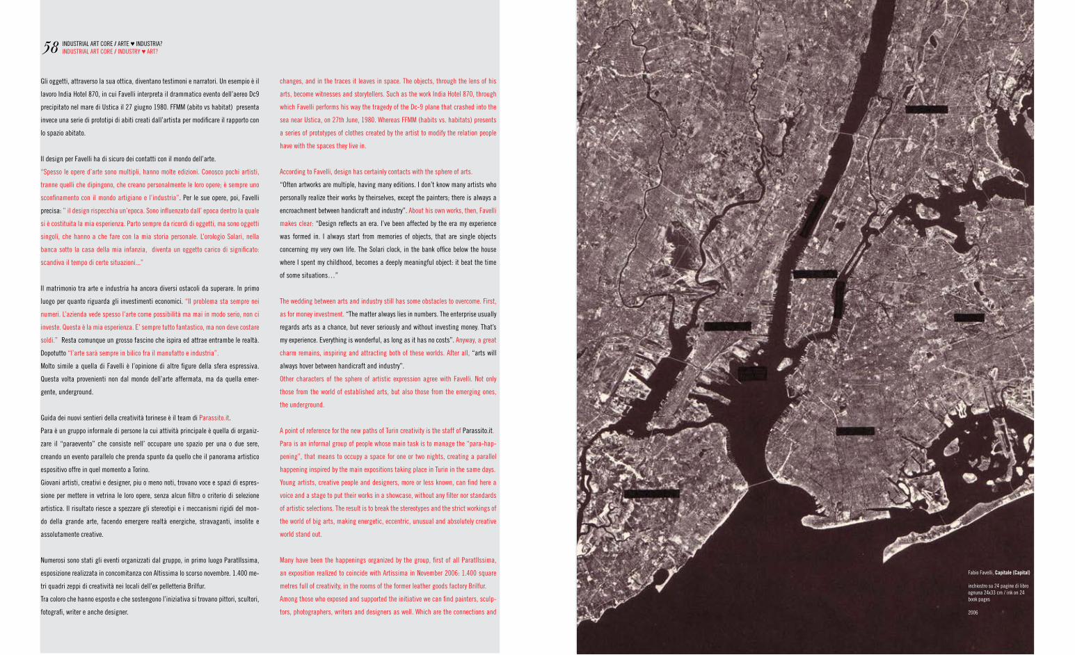
gli oggetti, attraverso la sua ottica, diventano testimoni e narratori. Un esempio è il
lavoro India Hotel 870, in cui favelli interpreta il drammatico evento dell’aereo Dc9
precipitato nel mare di Ustica il 27 giugno 1980. ffmm (abito vs habitat) presenta
invece una serie di prototipi di abiti creati dall’artista per modificare il rapporto con
lo spazio abitato.
Il design per favelli ha di sicuro dei contatti con il mondo dell’arte.
“Spesso le opere d’arte sono multipli, hanno molte edizioni. Conosco pochi artisti,
tranne quelli che dipingono, che creano personalmente le loro opere; è sempre uno
sconfinamento con il mondo artigiano e l’industria”. Per le sue opere, poi, favelli
precisa: ” il design rispecchia un’epoca. Sono influenzato dall’ epoca dentro la quale
si è costituita la mia esperienza. Parto sempre da ricordi di oggetti, ma sono oggetti
singoli, che hanno a che fare con la mia storia personale. L’orologio Solari, nella
banca sotto la casa della mia infanzia, diventa un oggetto carico di significato:
scandiva il tempo di certe situazioni...”
Il matrimonio tra arte e industria ha ancora diversi ostacoli da superare. In primo
luogo per quanto riguarda gli investimenti economici. “Il problema sta sempre nei
numeri. L’azienda vede spesso l’arte come possibilità ma mai in modo serio, non ci
investe. Questa è la mia esperienza. e’ sempre tutto fantastico, ma non deve costare
soldi.” resta comunque un grosso fascino che ispira ed attrae entrambe le realtà.
Dopotutto “l’arte sarà sempre in bilico fra il manufatto e industria”.
molto simile a quella di favelli è l’opinione di altre figure della sfera espressiva.
Questa volta provenienti non dal mondo dell’arte affermata, ma da quella emer-
gente, underground.
guida dei nuovi sentieri della creatività torinese è il team di Parassito.it.
Para è un gruppo informale di persone la cui attività principale è quella di organiz-
zare il “paraevento” che consiste nell’ occupare uno spazio per una o due sere,
creando un evento parallelo che prenda spunto da quello che il panorama artistico
espositivo offre in quel momento a torino.
giovani artisti, creativi e designer, piu o meno noti, trovano voce e spazi di espres-
sione per mettere in vetrina le loro opere, senza alcun filtro o criterio di selezione
artistica. Il risultato riesce a spezzare gli stereotipi e i meccanismi rigidi del mon-
do della grande arte, facendo emergere realtà energiche, stravaganti, insolite e
assolutamente creative.
numerosi sono stati gli eventi organizzati dal gruppo, in primo luogo ParatIIssima,
esposizione realizzata in concomitanza con altissima lo scorso novembre. 1.400 me-
tri quadri zeppi di creatività nei locali dell’ex pelletteria Brilfur.
tra coloro che hanno esposto e che sostengono l’iniziativa si trovano pittori, scultori,
fotografi, writer e anche designer.
58
fabio favelli, Capitale (Capital)
inchiostro su 24 pagine di libro ognuna 24x33 cm / ink on 24 book pages
2006
changes, and in the traces it leaves in space. the objects, through the lens of his
arts, become witnesses and storytellers. Such as the work India Hotel 870, through
which favelli performs his way the tragedy of the Dc-9 plane that crashed into the
sea near Ustica, on 27th June, 1980. Whereas ffmm (habits vs. habitats) presents
a series of prototypes of clothes created by the artist to modify the relation people
have with the spaces they live in.
according to favelli, design has certainly contacts with the sphere of arts.
“Often artworks are multiple, having many editions. I don’t know many artists who
personally realize their works by theirselves, except the painters; there is always a
encroachment between handicraft and industry”. about his own works, then, favelli
makes clear: “Design reflects an era. I’ve been affected by the era my experience
was formed in. I always start from memories of objects, that are single objects
concerning my very own life. the Solari clock, in the bank office below the house
where I spent my childhood, becomes a deeply meaningful object: it beat the time
of some situations…”
the wedding between arts and industry still has some obstacles to overcome. first,
as for money investment. “the matter always lies in numbers. the enterprise usually
regards arts as a chance, but never seriously and without investing money. that’s
my experience. everything is wonderful, as long as it has no costs”. anyway, a great
charm remains, inspiring and attracting both of these worlds. after all, “arts will
always hover between handicraft and industry”.
Other characters of the sphere of artistic expression agree with favelli. not only
those from the world of established arts, but also those from the emerging ones,
the underground.
a point of reference for the new paths of turin creativity is the staff of Parassito.it.
Para is an informal group of people whose main task is to manage the “para-hap-
pening”, that means to occupy a space for one or two nights, creating a parallel
happening inspired by the main expositions taking place in turin in the same days.
young artists, creative people and designers, more or less known, can find here a
voice and a stage to put their works in a showcase, without any filter nor standards
of artistic selections. the result is to break the stereotypes and the strict workings of
the world of big arts, making energetic, eccentric, unusual and absolutely creative
world stand out.
many have been the happenings organized by the group, first of all ParatIIssima,
an exposition realized to coincide with artissima in november 2006: 1.400 square
metres full of creativity, in the rooms of the former leather goods factory Brilfur.
among those who exposed and supported the initiative we can find painters, sculp-
tors, photographers, writers and designers as well. Which are the connections and
InDUStrIaL art COre / arte ♥ InDUStrIa?InDUStrIaL art COre / InDUStry ♥ art?
Quattro giovani graphic designer dell’area torinese.
Innovatori, tecnologici, tradizionali, irriverenti o poetici.
Dalle pulsioni street di malva Studio e Dimomedia alle grafiche con affinita’ oscure di nerve Design, sino alla poesia delle illustrazioni di Silviastella, quattro significativi rappresentati dell’ultima generazione di artisti grafici .
Signore e signori, la nuova razza!
four young graphic designer from the turin area.
Innovators, technological, irriverents or poetics.
from malva Studio and Dimomedia’s street inputs to nerve Design obscure artworks, till the poetry of Silviastella illustrations, four significant representatives from the last generation of turin graphic artists.
Ladies and gentlemen, the new breed!
Quali sono i punti di contatto e le influenze che accomunano il design e le nuove
correnti artistiche? “Con gli ultimi due eventi del 2006, Paramollini e Paratiisima,
diversi creativi e designer hanno esposto le loro opere” spiega Lorenzo germak, uno
dei fondatori del gruppo. “Il consenso che hanno riscosso stimola l´interesse verso
questa forma di espressione artistica, legata alla funzionalita´e non solo all´estetica.
In particolare due artisti hanno prodotto paralumi, attaccapanni e altri oggetti di
design, utilizzando lamine sagomate attraverso il taglio laser di precisione. Questo
dimostra che è chiaramente possibile un rapporto fra produzione industriale e
prodotto artistico”. La strada che mette in contatto con il mondo dell’arte e della
creatività ha per germak una direzione precisa: “Devono moltiplicarsi le occasioni
di interconnessione fra i due mondi. I creativi devono avere le risorse per cercare e
sperimentare, luoghi e occasioni per esporre. Il mondo produttivo deve investire in
occasioni di visibilità per i giovani creativi, uscendo dalla logica degli spazi istituzi-
onali e degli eventi in grande stile, costosissimii... in questo senso Para può essere
il collante, come ha già dimostrato di saper fare.”ảả
anche noi, con loro, ce lo auguriamo.
fabio favelli, Souvenir I,2007h 90 126x58
60
����������������������������������������������
���������
NEW BREED
directed by: dario bovero
proudly presented by:
starring:
DIMOMEDIA LAB
MALVA STUDIO
NERVE DESIGN
SILVIASTELLA
the influences joining design and the new artistic currents? “With the last couple
of happenings in 2006, Paramollini and Paratiissima, several creative people and
designers have seen their works exposed”, explains Lorenzo germak, one of the
group’s founders. “the support they earned stimulates the interest towards this kind
of artistic expression, concerning functionality and not only aesthetics. especially,
two artists have created lampshades, coat hangers and other design products,
using metal foils that have been shaped by a precision laser cut. this shows that
it’s clearly possible a relation between industrial productions and artistic product”.
In germak’s opinion, the way that leads to the world of arts and creativity has a
well-definite direction: “the opportunities of interconnection between these worlds
must multiply. Creative people should have the resources to research and have
experiences, as well as places and chances to display. the production world should
invest into opportunities of visibility for young creative people, getting out from the
logic of institutional spaces and grand style events, which are so expensive…
Para could be the glue that keeps all that together, as it already showed before”.
they hope so, and we also do.
InDUStrIaL art COre / arte ♥ InDUStrIa?InDUStrIaL art COre / InDUStry ♥ art?
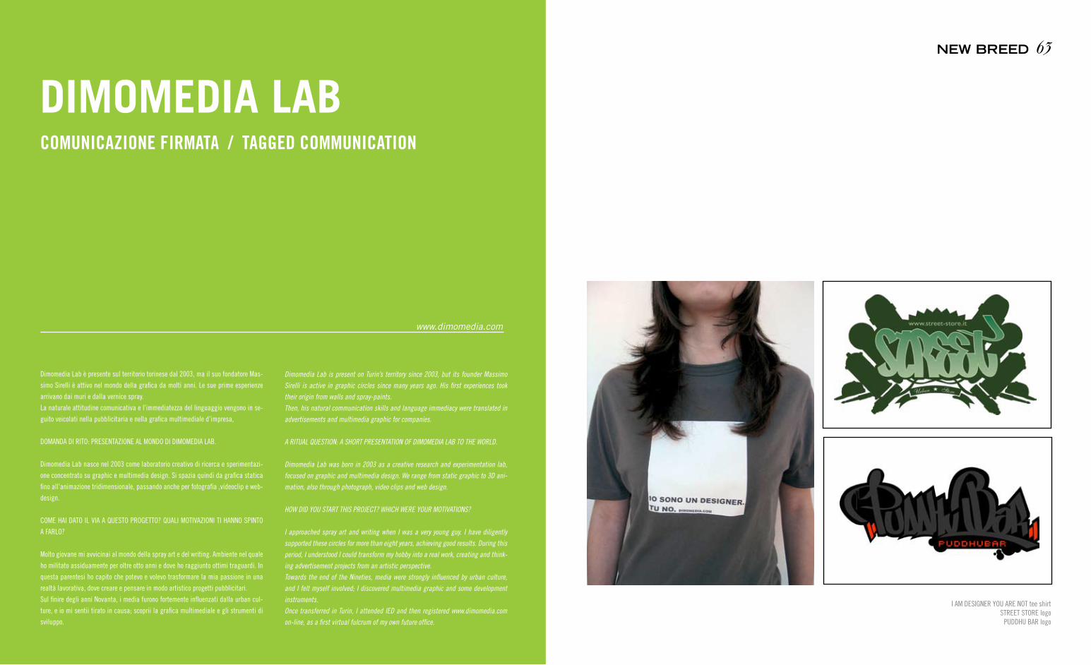
Dimomedia Lab è presente sul territorio torinese dal 2003, ma il suo fondatore mas-
simo Sirelli è attivo nel mondo della grafica da molti anni. Le sue prime esperienze
arrivano dai muri e dalla vernice spray.
La naturale attitudine comunicativa e l’immediatezza del linguaggio vengono in se-
guito veicolati nella pubblicitaria e nella grafica multimediale d’impresa,
DOmanDa DI rItO: PreSentazIOne aL mOnDO DI DImOmeDIa LaB.
Dimomedia Lab nasce nel 2003 come laboratorio creativo di ricerca e sperimentazi-
one concentrato su graphic e multimedia design. Si spazia quindi da grafica statica
fino all’animazione tridimensionale, passando anche per fotografia ,videoclip e web-
design.
COme HaI DatO IL vIa a QUeStO PrOgettO? QUaLI mOtIvazIOnI tI HannO SPIntO
a farLO?
molto giovane mi avvicinai al mondo della spray art e del writing. ambiente nel quale
ho militato assiduamente per oltre otto anni e dove ho raggiunto ottimi traguardi. In
questa parentesi ho capito che potevo e volevo trasformare la mia passione in una
realtà lavorativa, dove creare e pensare in modo artistico progetti pubblicitari.
Sul finire degli anni novanta, i media furono fortemente influenzati dalla urban cul-
ture, e io mi sentii tirato in causa; scoprii la grafica multimediale e gli strumenti di
sviluppo.
COMUNICAZIONE FIRMATA / TAGGED COMMUNICATION
DIMOMEDIA LAB
www.dimomedia.com
I am DeSIgner yOU are nOt tee shirtStreet StOre logo
PUDDHU Bar logo
63NEW BREED
Dimomedia Lab is present on Turin’s territory since 2003, but its founder Massimo
Sirelli is active in graphic circles since many years ago. His first experiences took
their origin from walls and spray-paints.
Then, his natural communication skills and language immediacy were translated in
advertisements and multimedia graphic for companies.
A RITUAL QUESTION: A SHORT PRESENTATION OF DIMOMEDIA LAB TO THE WORLD.
Dimomedia Lab was born in 2003 as a creative research and experimentation lab,
focused on graphic and multimedia design. We range from static graphic to 3D ani-
mation, also through photograph, video clips and web design.
HOW DID YOU START THIS PROJECT? WHICH WERE YOUR MOTIVATIONS?
I approached spray art and writing when I was a very young guy. I have diligently
supported these circles for more than eight years, achieving good results. During this
period, I understood I could transform my hobby into a real work, creating and think-
ing advertisement projects from an artistic perspective.
Towards the end of the Nineties, media were strongly influenced by urban culture,
and I felt myself involved; I discovered multimedia graphic and some development
instruments.
Once transferred in Turin, I attended IED and then registered www.dimomedia.com
on-line, as a first virtual fulcrum of my own future office.

trasferitomi a torino, ho frequentato lo IeD e successivamente ho registrato il
dominio www.dimomedia.com, primo fulcro virtuale del mio futuro studio.
SU CHe tIPO DI CLIenteLa PUntate e CHe PrODOttI OffrIte? QUaL’È IL frUttO
DeL vOStrO LavOrO?
Dimomedia Lab offre soluzioni innovative e di alto profilo professionale allo scopo di
rendere l’immagine finale unica ed incisiva offrendo servizi integrati fra i principali
strumenti di comunicazione pubblicitaria.
Come laboratorio creativo non ci poniamo limiti. mi piace pensare che ci pagano
per pensare. Quello che facciamo è creare idee, utilizzando poi i media, media per
esprimerci. e’ un lavoro che richiede molta attenzione, poichè i metodi e gli strumenti
in un ambito come quello multimediale cambiano in continuazione.
La nostra clientela è eterogenea. nel tempo abbiamo lavorato con: Seven Industries,
IeD, gtt, ras BanK, Camera di Commercio di torino, Kinder & ferrero e anche molti
altri piccoli clienti che hanno reso possibile i nostri sogni.
I vOStrI LavOrI raCCHIUDOnO Un’anIma UrBana, COn SvarIatI rIferImentI
StILIStICI aLL’ImmagInarIO HIP-HOP. PaSSIOne genUIna O SCeLta StILIStICa?
Come si diceva prima, il primo impatto che ho avuto con la grafica e la comunicazione
disegnata è arrivato con i graffiti.
La mia creatività la esprimevo al calare delle tenebre con un passamontagna che mi
copriva il volto e bombolette spray in un sacchetto e un treno che andava poi chissà
dove come foglio bianco. Inizialmente era la passione, poi con il tempo i graffiti di-
vennero uno strumento molto più potente, influenzando con uno stile definito anche
i media mainstream. Iniziai a farmi notare e a ricevere richieste di commissione, e
quindi a guadagnare i primi soldi con quella che comunque è stata la mia passione.
a QUaLI SerBatOI CULtUraLI attIngete? rICOnOSCete DeI maeStrI?
La creatività va nutrita e spesso la nutri senza sapere di farlo. Ovviamente seguiamo
le mostre, gli eventi artistici, riviste e libri di settore, ma fondamentalmente fac-
ciamo un lavoro il cui senso trova riscontro nella vista degli utenti, quindi noi teniamo
sempre gli occhi aperti.
Un’OPInIOne SULL’attUaLe SCena grafICO/artIStICa tOrIneSe?
Credo che torino abbia un ottima realtà, conosco moltissime strutture che seppur
piccole riescono a ritagliarsi il proprio spazio e rendersi riconoscibili.
Io stesso ho trovato il mio spazio in questa città, pur non essendo torinese.
Stiamo valutando di aprire una seconda sede Dimomedia Lab, con sede a Catanzaro,
sarà il nostro ponte verso il sud Italia.
a CHI aPPartIene IL fUtUrO?
Il futuro appartiene a chi vuole possederlo e tutti possiamo influire nel cambiamento
delle cose. La fortuna non è cieca, ma è molto veloce per cui bisogna ricorrerla con
ogni mezzo.
eLeCtrIK-a logoDJ DOUBLe S personal website flash-xml
BIg martInO PerSOnaL personal website flash-xmlBaKeCa.It artwork
65NEW BREED64 NEW BREED
WHICH IS THE TARGET YOU POINT TO AND WHICH PRODUCTS DO YOU OFFER? WHICH
IS THE OUTPUT OF YOUR WORK?
Dimomedia Lab offers innovative and professional high-profile solutions, in order
to make the output image a unique and incisive one, proposing integrated services
using all the main advertisement communication instruments.
As a creative lab, we never limit ourselves. I love thinking they pay us for our thinking
activity. All we do is to generate ideas, then using media to express ourselves. It’s a
kind of work that needs a lot of care, because methods and instruments continuously
exchange in such a framework as the multimedia one.
Our customers are heterogeneous. In the log run, we worked for: Seven Industries,
IED, GTT, Ras BanK, Camera di Commercio di Torino, Kinder & Ferrero and many other
smaller ones which make our dreams possible.
YOUR WORKS HOLD A URBAN SPIRIT, WITH MANY STYLISH REFERENCES TO HIP-HOP
IMAGINARY. IS THIS A GENUINE PASSION OR A STYLISH CHOICE?
As we said before, the first impact I had with graphic and communication derived
from graffiti. I expressed my creativity at nightfall, with a Balaclava helmet covering
my face, some sprays in a plastic bag and a train, then departing to nobody knows
where, as a white sheet. First, it was just a passion, then, in the long run, graffiti
also become a more powerful instrument, influencing also media mainstreams with a
well-defined style. I began to stand out and to receive some purchasers, beginning to
earn my first money, thanks to something that had been anyway just my passion.
WHICH ARE THE CULTURAL TANKS YOU DRAW FROM? DO YOU RECOGNIZE SOME
MASTERS?
Creativity must be fed, and you often feed it without becoming aware of this fact.
Obviously, we know about exhibitions, art events, magazines and books, but our job is
simply based on users’ eyesight, that’s why we always keep our eyes open.
AN OPINION ABOUT PRESENT-DAY GRAPHIC-ARTISTIC TURIN SCENE?
I think Turin has got a very good scene, I know lots of structures those, even if small,
are able to have their own space and be recognizable.
I myself found my space in this city, even if I’m not from Turin.
We are taking into consideration the eventuality of opening a second Dimomedia Lab
site, in Catanzaro, which will be our bridge to South Italy.
WHOSE IS THE FUTURE?
Future belongs to everybody wants to own it, and we are all able to affect any change.
Luck is not blind, but it’s very fast, that’s why we must run after it anyway.

Sono una delle realtà più fresche del panorama torinese, ma i due fondatori, valerio
e massimiliano, sono impegnati già da diversi anni nel campo della comunicazione
grafica.
adesso, hanno unito le forze per continuar a crescere assieme e portare in alto gli
orizzonti.
SeBBene entramBI aBBIate aLLe SPaLLe Un nUtrItO Cv DI COLLaBOrazIOnI,
maLva StUDIO SI PUò COnSIDerare Una reaLtà neOnata. COSa SCrIvereSte In
Un IPOtetICO manIfeStO DI IntentI?
Siamo un gruppo di giovani menti creative al servizio delle esigenze di comunica-
zione delle aziende. Dinamismo, semplicità, innovazione ed efficacia sono le nostre
parole d’ordine. Il linguaggio che utilizziamo è semplice, non proponiamo al cliente di
risolvere problemi di corporate identity, di posizionamento su banner advertising o di
ideazione della brand image. non siamo copy, art e account, ma siamo massimiliano,
valerio e nicole e siamo convinti che delle buone idee possano aiutare a far crescere
un’azienda, proprio come un piccolo seme far nascere dei bei fiori.
COme SI È OrIgInata La vOStra StOrIa artIStICa? In QUaLI CIrCOStanze È natO
maLva StUDIO e COme SI È COStItUItO IL vOStrO grUPPO?
malva Studio nasce dall’esigneza comune di esprimere creatività, senza schemi
prestabiliti, utilizzando il maggior numero di canali e tecniche alla continua ricerca
SELEZIONE NATURALE / NATURAL SELECTION
MALVA STUDIO
www.malvastudio.it
di nuovi stimoli e possibilità di confronto che individualmente non riuscivamo a
trovare.
Da DOve naSCe IL vOStrO nOme, maLva StUDIO?
Il nome malva Studio nasce dall’insieme delle iniziali dei nomi dei due fondatori ov-
vero massimiliano e valerio, quando si pensava a che nome ci saremmo potuti dare è
saltato fuori quasi per caso e dopo aver riletto la lista è stato quello che ci è piaciuto
di più è l’idea di abbinare al nostro brand alle proprietà curative che sono riscontrabili
nella pianta di malva ha subito stuzzicato la nostra fantasia.
Per conto di chi siete in missione e soprattutto, qual’è il vostro obiettivo segreto?
Il nostro obiettivo è formare una collettiva di artisti e creativi in generale, che col-
laborino attivamente tra di loro sotto uno stesso brand con il fine condiviso di creare
valore. riusciamo così a coltivare la nostra passione divertendoci e confrontandoci
con diverse realtà.
COme mOLtI gIOvanI PrOgettIStI DeLL’ULtIma generazIOne, neL vOStrO metODO
COeSIStOnO PIù reaLtà: DaL DeSIgn aLLa grafICa, PaSSanDO Per Le artI aPPLI-
Cate; Un verO e PrOPrIO CrOSSOver artIStICO...
Sì, perchè il mercato è sempre più esigente e la concorrenza nel nostro campo non
manca di certo per questo motivo si cerca di offrire al cliente un ventaglio di opportu-
nità sempre più ampio. Inoltre il nostro lavoro subisce costantemente delle contamin-
67NEW BREED
They represent one of the freshest identities on the Turin scene, but two founders,
Valerio and Massimiliano, have already been active in the graphic communication
framework for many years.
Now, they have united their own forces to go on growing together and point to higher
horizons.
ALTHOUGH BOTH OF YOU HAVE A PAST WITH LOTS OF COLLABORATIONS, MALVA STUDIO
CAN BE CONSIDERED AS A NEW BORN REALITY. WHAT WOULD YOU WRITE ON A HYPO-
THETIC PROGRAMMATIC MANIFESTO?
We are a group of young creative brains, at the services of companies’ communica-
tion requirements. Dynamism, simplicity, innovation and efficacy are our key words.
The language we speak is simple, we don’t suggest our customers to solve corporate
identity problems, banner advertising or brand image ideation. We aren’t a copywriter,
an art director and an account, but just Massimiliano, Valerio and Nicole, and we are
confident that good ideas can help a company to grow, just like a small grain can let
beautiful flowers to be born.
HOW DID YOUR ARTISTIC ExPERIENCE TAKE ORIGIN? WHICH ARE THE CIRCUMSTANCES
OF MALVA’S BIRTH AND HOW WAS YOUR GROUP FORMED?
MALVA STUDIO took its origin from the common exigency of expressing our creativity,
without pre-established schemes, by using the most possible canals and techniques,
continuously researching new inducements and meeting chances, we weren’t able to
find out separately.
WHICH DOES YOUR NAME, MALVA STUDIO, TAKE ORIGIN FROM?
Name MALVA STUDIO take its origin from the initials of the two founders’ names, MAs-
similano and VAlerio; when we were thinking about some possible names, it casually
loomed up, and, when we reviewed the list, we preferred it and the idea of relating our
brand to curative properties of mallow plant soon stimulated our fantasy.
WHICH IS THE TARGET OF YOUR MISSION, AND, ABOVE ALL, WHICH IS YOUR SECRET
ASPIRATION?
Our aspiration is to form a collective of artists and creative people, who actively
collaborate with each other under the same brand-identity, sharing the intention of
creating value. By this way, we are able to cultivate our passion by enjoying and
measuring ourselves with different entities.
LIKE MANY OTHER LAST-GENERATION DESIGNERS, VARIOUS WORLDS COExIST IN YOUR
WORKING METHOD: FROM DESIGN TO GRAPHIC, THROUGH APPLIED ARTS; A REAL AR-
TISTIC CROSSOVER…
Yes, because market is more and more exigent and it doesn’t certainly lack concur-
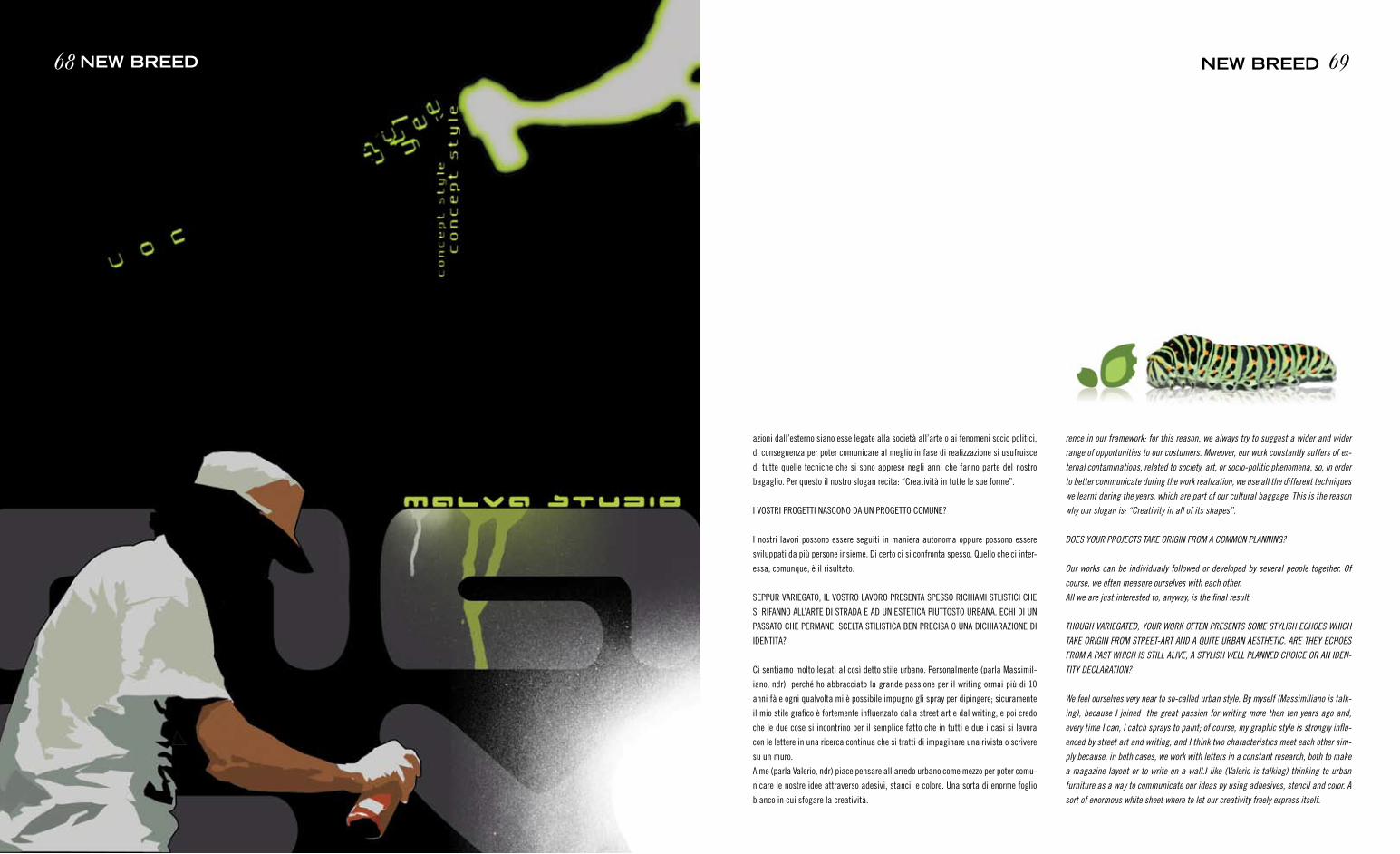
azioni dall’esterno siano esse legate alla società all’arte o ai fenomeni socio politici,
di conseguenza per poter comunicare al meglio in fase di realizzazione si usufruisce
di tutte quelle tecniche che si sono apprese negli anni che fanno parte del nostro
bagaglio. Per questo il nostro slogan recita: “Creatività in tutte le sue forme”.
I vOStrI PrOgettI naSCOnO Da Un PrOgettO COmUne?
I nostri lavori possono essere seguiti in maniera autonoma oppure possono essere
sviluppati da più persone insieme. Di certo ci si confronta spesso. Quello che ci inter-
essa, comunque, è il risultato.
SePPUr varIegatO, IL vOStrO LavOrO PreSenta SPeSSO rICHIamI StLIStICI CHe
SI rIfannO aLL’arte DI StraDa e aD Un’eStetICa PIUttOStO UrBana. eCHI DI Un
PaSSatO CHe Permane, SCeLta StILIStICa Ben PreCISa O Una DICHIarazIOne DI
IDentItà?
Ci sentiamo molto legati al così detto stile urbano. Personalmente (parla massimil-
iano, ndr) perché ho abbracciato la grande passione per il writing ormai più di 10
anni fà e ogni qualvolta mi è possibile impugno gli spray per dipingere; sicuramente
il mio stile grafico è fortemente influenzato dalla street art e dal writing, e poi credo
che le due cose si incontrino per il semplice fatto che in tutti e due i casi si lavora
con le lettere in una ricerca continua che si tratti di impaginare una rivista o scrivere
su un muro.
a me (parla valerio, ndr) piace pensare all’arredo urbano come mezzo per poter comu-
nicare le nostre idee attraverso adesivi, stancil e colore. Una sorta di enorme foglio
bianco in cui sfogare la creatività.
69NEW BREED68 NEW BREED
rence in our framework: for this reason, we always try to suggest a wider and wider
range of opportunities to our costumers. Moreover, our work constantly suffers of ex-
ternal contaminations, related to society, art, or socio-politic phenomena, so, in order
to better communicate during the work realization, we use all the different techniques
we learnt during the years, which are part of our cultural baggage. This is the reason
why our slogan is: “Creativity in all of its shapes”.
DOES YOUR PROJECTS TAKE ORIGIN FROM A COMMON PLANNING?
Our works can be individually followed or developed by several people together. Of
course, we often measure ourselves with each other.
All we are just interested to, anyway, is the final result.
THOUGH VARIEGATED, YOUR WORK OFTEN PRESENTS SOME STYLISH ECHOES WHICH
TAKE ORIGIN FROM STREET-ART AND A QUITE URBAN AESTHETIC. ARE THEY ECHOES
FROM A PAST WHICH IS STILL ALIVE, A STYLISH WELL PLANNED CHOICE OR AN IDEN-
TITY DECLARATION?
We feel ourselves very near to so-called urban style. By myself (Massimiliano is talk-
ing), because I joined the great passion for writing more then ten years ago and,
every time I can, I catch sprays to paint; of course, my graphic style is strongly influ-
enced by street art and writing, and I think two characteristics meet each other sim-
ply because, in both cases, we work with letters in a constant research, both to make
a magazine layout or to write on a wall.I like (Valerio is talking) thinking to urban
furniture as a way to communicate our ideas by using adhesives, stencil and color. A
sort of enormous white sheet where to let our creativity freely express itself.
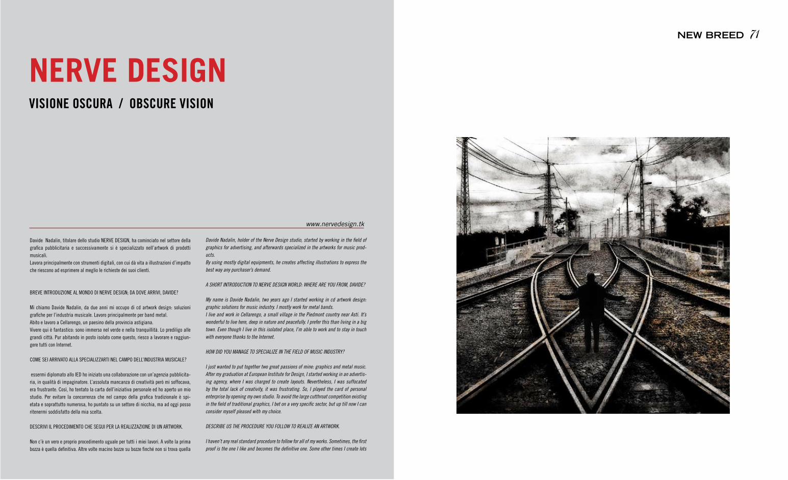
Davide nadalin, titolare dello studio nerve DeSIgn, ha cominciato nel settore della grafica pubblicitaria e successivamente si è specializzato nell’artwork di prodotti musicali. Lavora principalmente con strumenti digitali, con cui dà vita a illustrazioni d’impatto che riescono ad esprimere al meglio le richieste dei suoi clienti.
Breve IntrODUzIOne aL mOnDO DI nerve DeSIgn; Da DOve arrIvI, DavIDe?
mi chiamo Davide nadalin, da due anni mi occupo di cd artwork design: soluzioni grafiche per l’industria musicale. Lavoro principalmente per band metal. abito e lavoro a Cellarengo, un paesino della provincia astigiana. vivere qui è fantastico: sono immerso nel verde e nella tranquillità. Lo prediligo alle grandi città. Pur abitando in posto isolato come questo, riesco a lavorare e raggiun-gere tutti con Internet.
COme SeI arrIvatO aLLa SPeCIaLIzzartI neL CamPO DeLL’InDUStrIa mUSICaLe?
essermi diplomato allo IeD ho iniziato una collaborazione con un’agenzia pubblicita-ria, in qualità di impaginatore. L’assoluta mancanza di creatività però mi soffocava, era frustrante. Così, ho tentato la carta dell’iniziativa personale ed ho aperto un mio studio. Per evitare la concorrenza che nel campo della grafica tradizionale è spi-etata e soprattutto numerosa, ho puntato su un settore di nicchia, ma ad oggi posso ritenermi soddisfatto della mia scelta.
DeSCrIvI IL PrOCeDImentO CHe SegUI Per La reaLIzzazIOne DI Un artWOrK.
non c’è un vero e proprio procedimento uguale per tutti i miei lavori. a volte la prima bozza è quella definitiva. altre volte macino bozze su bozze finché non si trova quella
VISIONE OSCURA / OBSCURE VISION
NERVE DESIGN
www.nervedesign.tk
71NEW BREED
Davide Nadalin, holder of the Nerve Design studio, started by working in the field of graphics for advertising, and afterwards specialized in the artworks for music prod-ucts.By using mostly digital equipments, he creates affecting illustrations to express the best way any purchaser’s demand.
A SHORT INTRODUCTION TO NERVE DESIGN WORLD: WHERE ARE YOU FROM, DAVIDE?
My name is Davide Nadalin, two years ago I started working in cd artwork design: graphic solutions for music industry. I mostly work for metal bands.I live and work in Cellarengo, a small village in the Piedmont country near Asti. It’s wonderful to live here, deep in nature and peacefully. I prefer this than living in a big town. Even though I live in this isolated place, I’m able to work and to stay in touch with everyone thanks to the Internet.
HOW DID YOU MANAGE TO SPECIALIZE IN THE FIELD OF MUSIC INDUSTRY?
I just wanted to put together two great passions of mine: graphics and metal music. After my graduation at European Institute for Design, I started working in an advertis-ing agency, where I was charged to create layouts. Nevertheless, I was suffocated by the total lack of creativity, it was frustrating. So, I played the card of personal enterprise by opening my own studio. To avoid the large cutthroat competition existing in the field of traditional graphics, I bet on a very specific sector, but up till now I can consider myself pleased with my choice.
DESCRIBE US THE PROCEDURE YOU FOLLOW TO REALIZE AN ARTWORK.
I haven’t any real standard procedure to follow for all of my works. Sometimes, the first proof is the one I like and becomes the definitive one. Some other times I create lots
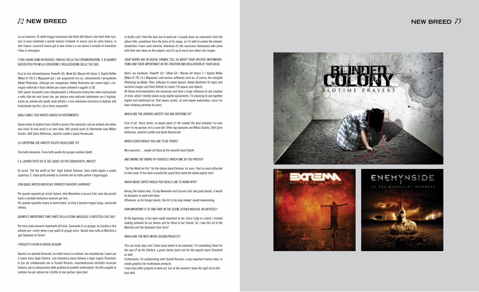
su cui lavorarci. Di solito traggo ispirazione dal titolo dell’album o dai testi delle can-zoni in esso contenute e quindi realizzo l’artwork. In alcuni casi ho carta bianca, in altri invece i musicisti hanno già le idee chiare e a me danno il compito di tramutare l’idea in immagine.
I tUOI LavOrI SOnO In DIgItaLe; ParLaCI DeLLa tUa StrUmentazIOne, e DI QUantO QUeSta PeSI POI neLLa CreazIOne e reaLIzzazIOne DeLLe tUe IDee.
ecco la mia strumentazione: PowerPc g5, iBook g4, Wacom a4 Intuos 3, Digital reflex [nikon D-70] 6.1 megapixel più i vari programmi tra cui, naturalmente l’onnipotente adobe Photoshop. InDesign per impaginare, adobe Illustrator per creare loghi o im-magini vettoriali e vue5 Infinite per creare ambienti e oggetti in 3D. tutti questi strumenti sono indispensabili e influiscono tantissimo nella realizzazione e nello stile dei miei lavori che, per adesso sono realizzati totalmente con il digitale, anche se, avendo alle spalle studi artistici, è mia intenzione mischiare al digitale arte tradizionale (acrilici, olio e forse acquerelli).
QUaLI SOnO I tUOI artIStI grafICI DI rIferImentO?
Senza ombra di dubbio travis Smith in primis! Ha realizzato i più bei artwork che abbia mai visto! ai miei occhi è un vero idolo. altri grandi punti di riferimento sono niklas Sundin, Seth Spiro anthoniou, Joachim Luetke e gyula Havancsák.
La COPertIna CHe avreStI vOLUtO reaLIzzare tU?
Che bella domanda. forse tutte quelle del gruppo svedese Opeth.
e IL LavOrO fattO Da te DeL QUaLe SeI PIù SODDISfattO, InveCe?
Di sicuro “Set the world on fire” degli italiani extrema. Sono molto legato a quella copertina. e’ stata praticamente la scintilla che ha fatto partire l’ingranaggio.
COn QUaLe artISta mUSICaLe vOrreStI DavverO LavOrare?
Per quanto riguarda gli artisti italiani, direi novembre e Lacuna Coil; sono due grandi band e sarebbe fantastico lavorare per loro.Per quanto riguarda invece le band estere, la lista è davvero troppo lunga, pressoché infinita.
QUantO È ImPOrtante fare Parte DeLLa SCena (mUSICaLe O artIStICa CHe SIa)?
Per me è stato davvero importante all’inizio. Suonando in un gruppo, ho iniziato a fare artwork per i nostri demo e per quelli di gruppi amici. Quindi devo tutto ai mainline e agli Ophydian di torino!
I PrOgettI fUtUrI DI nerve DeSIgn?
Questo è un periodo fortunato, ho molto lavoro in cantiere; sto completando i lavori per il nuovo disco degli eldritch, una fantastica band italiana e degli inglesi threshold. In più sto collaborando con la Scarlet records, importantissima etichetta musicale italiana, per la realizzazione delle grafiche di prodotti multimediali. Ho altri progetti in cantiere ma per adesso ho il diritto di non parlare. Ipxie dixit.
73NEW BREED72 NEW BREED
of drafts until I find the best one to work out. I usually draw my inspiration from the album title, sometimes from the lyrics of its songs, so I’m able to realize the artwork. Sometimes I have carte blanche, otherwise it’s the musicians themselves who come with their own ideas on the subject, and it’s up to me to turn ideas into images.
YOUR WORKS ARE IN DIGITAL FORMAT; TELL US ABOUT YOUR SPECIFIC INSTUMENTA-TIONS AND THEIR IMPORTANCE IN THE CREATION AND REALIZATION OF YOUR IDEAS.
Here’s my hardware: PowerPc G5 / iBook G4 / Wacom A4 Intuos 3 / Digital Reflex [Nikon D-70] / 6.1 Megapixel, and various softwares such as, of course, the almighty Photoshop by Adobe. Then, InDesign to create layouts, Adobe Illustrator for logos and vectorial images and Vue5 Infinite to create 3-D spaces and objects.All these instrumentations are necessary and have a large influence on any creation of mine, which I totally realize using digital equipments. I’m planning to mix together digital and traditional art, that means acrylic, oil and maybe watercolour, since I’ve been studying painting for years.
WHICH ARE THE GRAPHIC ARTISTS YOU ARE REFERING TO?
First of all, Travis Smith, no doubt about it! He created the best artworks I’ve ever seen! In my opinion, he’s a real idol. Other big examples are Niklas Sundin, Seth Spiro Anthoniou, Joachim Luetke and Gyula Havancsák.
WHICH COVER WOULD YOU LIKE TO BE YOURS?
Nice question… maybe all those by the swedish band Opeth.
AND AMONG THE WORKS OF YOURSELF, WHICH ONE DO YOU PREFER?
“Set the World on Fire” for the italian band Extrema, for sure. I feel so much attached to that cover. It has been actually the spark that made the whole engine start.
WHICH MUSIC ARTIST WOULD YOU REALLY LIKE TO WORK WITH?
Among the italian ones, I’d say Novembre and Lacuna Coil; two great bands, it would be fantastic to work with them.Otherwise, as for foreign bands, the list is too long indeed, nearly neverending.
HOW IMPORTANT IS TO TAKE PART IN THE SCENE (EITHER MUSICAL OR ARTISTIC)?
At the beginning, it has been really important to me. Since I play in a band, I started making artworks for our demos and for those of our friends. So, I owe this all to the Mainline and the Ophydian from Turin!
WHICH ARE THE NExT NERVE DESIGN PROJECTS?
This are lucky days and I have many works to be prepared; I’m completing those for the new LP by the Eldritch, a great italian band and for the english band Threshold as well. Furthermore, I’m collaborating with Scarlet Records, a very important italian label, to create graphics for multimedia products. I also have other projects to work out, but at the moment I have the right not to tell. Ipse dixit.

*silviastella, declinazione artistica di Silvia Osella, nasce a Piossasco, paese della
seconda cintura di torino, l’ultimo giorno del 1985. Ha vissuto l’infanzia più bella che
potesse desiderare, piena di colori, matite, sorrisi e sogni, ed è forse per questo che
vorrebbe non si esaurisse mai.
attualmente vive a torino, dove frequenta l’ultimo anno del corso di Illustrazione
presso l’Istituto europeo di Design, lavora come illustratrice e graphic designer free-
lance e pare stia cominciando ad accettare l’ipotesi dello scorrere del tempo.
Si, ha sempre voluto assaggiare una nuvola. e cadere dal cielo su un manto d’alberi
improvvisamente gommosi. e camminare sul soffitto, ogni tanto; perché è noiosa-
mente normale non cambiare mai prospettiva. e…
SILvIa, In QUaLe mODO tI SeI avvICInata aL mOnDO DeLL’ILLUStrazIOne?
Crescere è faticoso, e lo è ancora di più in una società che ci vuole “grandi” a tutti
i costi.
ma cosa significa esattamente esserlo? La mia parte bambina spero non smetterà
mai di vivere… ed è forse per questo che ho voluto darle voce, farla cantare at-
traverso il disegno.
Credo che l’illustrazione sia per me un particolare bisogno. Come ripeto spesso, ho
vissuto l’infanzia migliore che potessi desiderare, e forse è per questo che vorrei farla
durare per sempre.
Sono cresciuta in un ambiente pieno di colori, matite, disegni; e questo è sempre
stato il mio modo di esprimere e trasmettere sentimenti, sia quelli positivi che nega-tivi, forse anche per ovviare alla difficoltà di trovare le parole adatte a ciò che sento. Confucio ha detto: “Scegli un lavoro che ami e non dovrai lavorare un solo giorno della tua vita.” Questo è quello che sto cercando di fare.
COME ASSAGGIARE UNA NUVOLA / HOW TO TASTE A CLOUD
SILVIASTELLA
www.silviastella.com
Silvia Osella was born in Northern Italy on New Year’s Eve, 1985.
She has lived the happiest childhood she could have asked for; full of colours, pen-
cils, smiles and dreams. That’s maybe why she’d love to make it last as long as
possible.
She now lives in Turin where she’s pursuing her Illustration BA, working as a freelance
illustrator and graphic designer and beginning to accept the hypothesis of growing
up.
WHAT BROUGHT YOU TO CHOOSE AN ILLUSTRATION CAREER?
Growing up is more difficult than it seems, and even more in a society that necessar-
ily wants you to behave like and “adult”.
But what does exactly “being adult” mean? Hopefully, my inner child will never stop
living… and that’s maybe why I wanted to give him a voice, make it sing through
my drawings.
Yes, I have always wanted to taste a cloud. And to fall down from the sky on a soft,
jelly-like cover of trees. And to walk on the ceiling, sometimes, because never change
point of view is so boring. And…
I think that illustration is for me a special need. As I always say, I had the best child-
hood I could have asked for, and that’s maybe why I’d love to make it last forever.
I’ve grown up in an environment full of colors, pencils, drawings; and that has always
been my way to express and convey feelings, either the good or the bad ones.
Confucio said: “Choose a job that you love and you won’t have to work even a single
day of your life”.
That’s what I’m trying to do.
75NEW BREED
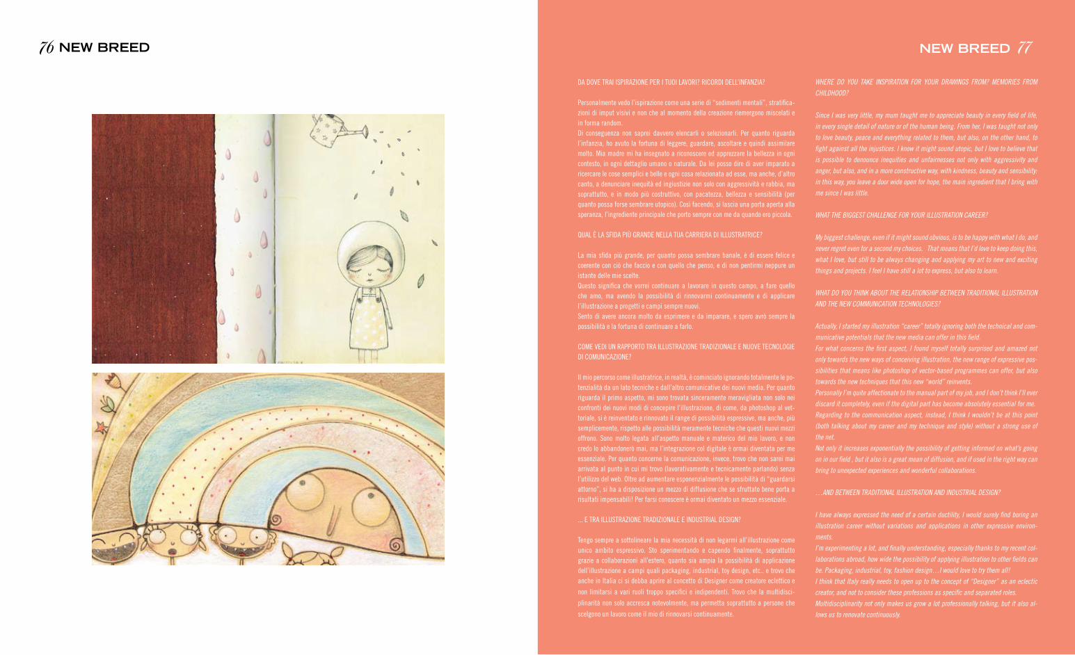
Da DOve traI ISPIrazIOne Per I tUOI LavOrI? rICOrDI DeLL’InfanzIa?
Personalmente vedo l’ispirazione come una serie di “sedimenti mentali”, stratifica-zioni di imput visivi e non che al momento della creazione riemergono miscelati e in forma random. Di conseguenza non saprei davvero elencarli o selezionarli. Per quanto riguarda l’infanzia, ho avuto la fortuna di leggere, guardare, ascoltare e quindi assimilare molto. mia madre mi ha insegnato a riconoscere ed apprezzare la bellezza in ogni contesto, in ogni dettaglio umano o naturale. Da lei posso dire di aver imparato a ricercare le cose semplici e belle e ogni cosa relazionata ad esse, ma anche, d’altro canto, a denunciare inequità ed ingiustizie non solo con aggressività e rabbia, ma soprattutto, e in modo più costruttivo, con pacatezza, bellezza e sensibilità (per quanto possa forse sembrare utopico). Così facendo, si lascia una porta aperta alla speranza, l’ingrediente principale che porto sempre con me da quando ero piccola.
QUaL È La SfIDa PIù granDe neLLa tUa CarrIera DI ILLUStratrICe?
La mia sfida più grande, per quanto possa sembrare banale, è di essere felice e coerente con ciò che faccio e con quello che penso, e di non pentirmi neppure un istante delle mie scelte.Questo significa che vorrei continuare a lavorare in questo campo, a fare quello che amo, ma avendo la possibilità di rinnovarmi continuamente e di applicare l’illustrazione a progetti e campi sempre nuovi. Sento di avere ancora molto da esprimere e da imparare, e spero avrò sempre la possibilità e la fortuna di continuare a farlo.
COme veDI Un raPPOrtO tra ILLUStrazIOne traDIzIOnaLe e nUOve teCnOLOgIe DI COmUnICazIOne?
Il mio percorso come illustratrice, in realtà, è cominciato ignorando totalmente le po-tenzialità da un lato tecniche e dall’altro comunicative dei nuovi media. Per quanto riguarda il primo aspetto, mi sono trovata sinceramente meravigliata non solo nei confronti dei nuovi modi di concepire l’illustrazione, di come, da photoshop al vet-toriale, si è reinventato e rinnovato il range di possibilità espressive, ma anche, più semplicemente, rispetto alle possibilità meramente tecniche che questi nuovi mezzi offrono. Sono molto legata all’aspetto manuale e materico del mio lavoro, e non credo lo abbandonerò mai, ma l’integrazione col digitale è ormai diventata per me essenziale. Per quanto concerne la comunicazione, invece, trovo che non sarei mai arrivata al punto in cui mi trovo (lavorativamente e tecnicamente parlando) senza l’utilizzo del web. Oltre ad aumentare esponenzialmente le possibilità di “guardarsi attorno”, si ha a disposizione un mezzo di diffusione che se sfruttato bene porta a risultati impensabili! Per farsi conoscere è ormai diventato un mezzo essenziale.
... e tra ILLUStrazIOne traDIzIOnaLe e InDUStrIaL DeSIgn?
tengo sempre a sottolineare la mia necessità di non legarmi all’illustrazione come unico ambito espressivo. Sto sperimentando e capendo finalmente, soprattutto grazie a collaborazioni all’estero, quanto sia ampia la possibilità di applicazione dell’illustrazione a campi quali packaging, industrial, toy design, etc.. e trovo che anche in Italia ci si debba aprire al concetto di Designer come creatore eclettico e
non limitarsi a vari ruoli troppo specifici e indipendenti. trovo che la multidisci-
plinarità non solo accresca notevolmente, ma permetta soprattutto a persone che
scelgono un lavoro come il mio di rinnovarsi continuamente.
WHERE DO YOU TAKE INSPIRATION FOR YOUR DRAWINGS FROM? MEMORIES FROM
CHILDHOOD?
Since I was very little, my mum taught me to appreciate beauty in every field of life,
in every single detail of nature or of the human being. From her, I was taught not only
to love beauty, peace and everything related to them, but also, on the other hand, to
fight against all the injustices. I know it might sound utopic, but I love to believe that
is possible to denounce inequities and unfairnesses not only with aggressivity and
anger, but also, and in a more constructive way, with kindness, beauty and sensibility:
in this way, you leave a door wide open for hope, the main ingredient that I bring with
me since I was little.
WHAT THE BIGGEST CHALLENGE FOR YOUR ILLUSTRATION CAREER?
My biggest challenge, even if it might sound obvious, is to be happy with what I do, and
never regret even for a second my choices. That means that I’d love to keep doing this,
what I love, but still to be always changing and applying my art to new and exciting
things and projects. I feel I have still a lot to express, but also to learn.
WHAT DO YOU THINK ABOUT THE RELATIONSHIP BETWEEN TRADITIONAL ILLUSTRATION
AND THE NEW COMMUNICATION TECHNOLOGIES?
Actually, I started my illustration “career” totally ignoring both the technical and com-
municative potentials that the new media can offer in this field.
For what concerns the first aspect, I found myself totally surprised and amazed not
only towards the new ways of conceiving illustration, the new range of expressive pos-
sibilities that means like photoshop of vector-based programmes can offer, but also
towards the new techniques that this new “world” reinvents.
Personally I’m quite affectionate to the manual part of my job, and I don’t think I’ll ever
discard it completely, even if the digital part has become absolutely essential for me.
Regarding to the communication aspect, instead, I think I wouldn’t be at this point
(both talking about my career and my technique and style) without a strong use of
the net.
Not only it increases exponentially the possibility of getting informed on what’s going
on in our field , but it also is a great mean of diffusion, and if used in the right way can
bring to unexpected experiences and wonderful collaborations.
…AND BETWEEN TRADITIONAL ILLUSTRATION AND INDUSTRIAL DESIGN?
I have always expressed the need of a certain ductility, I would surely find boring an
illustration career without variations and applications in other expressive environ-
ments.
I’m experimenting a lot, and finally understanding, especially thanks to my recent col-
laborations abroad, how wide the possibility of applying illustration to other fields can
be. Packaging, industrial, toy, fashion design…I would love to try them all!
I think that Italy really needs to open up to the concept of “Designer” as an eclectic
creator, and not to consider these professions as specific and separated roles.
Multidisciplinarity not only makes us grow a lot professionally talking, but it also al-
lows us to renovate continuously.
77NEW BREED76 NEW BREED
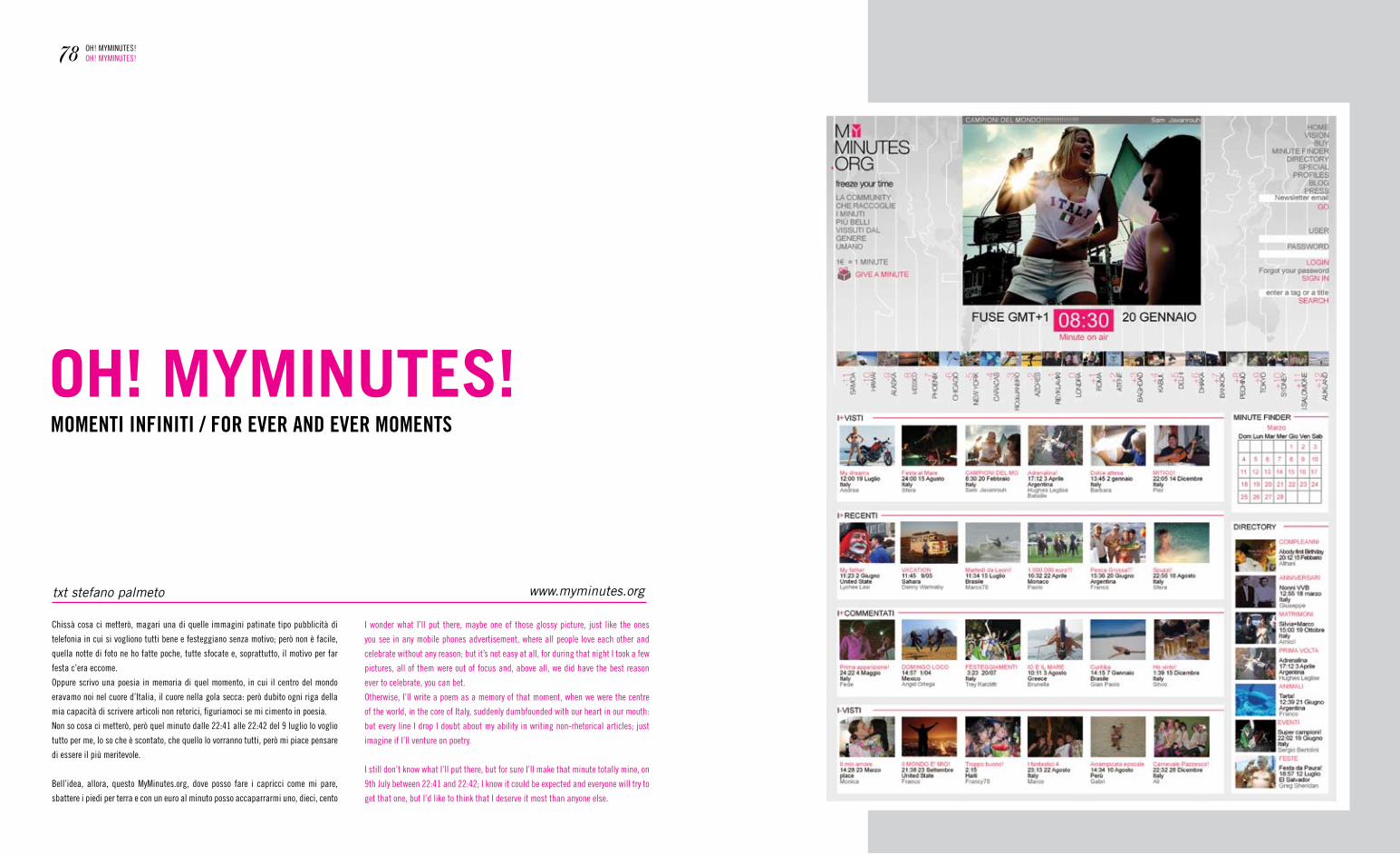
txt stefano palmeto
Chissà cosa ci metterò, magari una di quelle immagini patinate tipo pubblicità di
telefonia in cui si vogliono tutti bene e festeggiano senza motivo; però non è facile,
quella notte di foto ne ho fatte poche, tutte sfocate e, soprattutto, il motivo per far
festa c’era eccome.
Oppure scrivo una poesia in memoria di quel momento, in cui il centro del mondo
eravamo noi nel cuore d’Italia, il cuore nella gola secca: però dubito ogni riga della
mia capacità di scrivere articoli non retorici, figuriamoci se mi cimento in poesia.
non so cosa ci metterò, però quel minuto dalle 22:41 alle 22:42 del 9 luglio lo voglio
tutto per me, lo so che è scontato, che quello lo vorranno tutti, però mi piace pensare
di essere il più meritevole.
Bell’idea, allora, questo myminutes.org, dove posso fare i capricci come mi pare,
sbattere i piedi per terra e con un euro al minuto posso accaparrarmi uno, dieci, cento
OH! MYMINUTES!MOMENTI INFINITI / FOR EVER AND EVER MOMENTS
78 OH! mymInUteS!OH! mymInUteS!
www.myminutes.org
I wonder what I’ll put there, maybe one of those glossy picture, just like the ones
you see in any mobile phones advertisement, where all people love each other and
celebrate without any reason; but it’s not easy at all, for during that night I took a few
pictures, all of them were out of focus and, above all, we did have the best reason
ever to celebrate, you can bet.
Otherwise, I’ll write a poem as a memory of that moment, when we were the centre
of the world, in the core of Italy, suddenly dumbfounded with our heart in our mouth:
but every line I drop I doubt about my ability in writing non-rhetorical articles; just
imagine if I’ll venture on poetry.
I still don’t know what I’ll put there, but for sure I’ll make that minute totally mine, on
9th July between 22:41 and 22:42; I know it could be expected and everyone will try to
get that one, but I’d like to think that I deserve it most than anyone else.
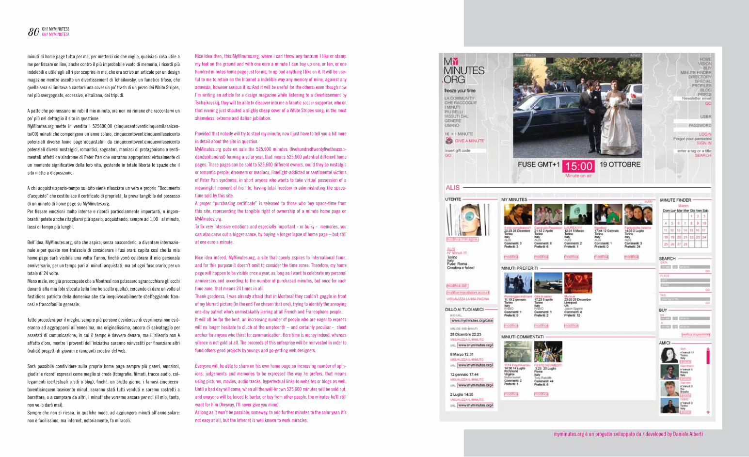
minuti di home page tutta per me, per metterci ciò che voglio, qualsiasi cosa utile a
me per fissare on line, anche contro il più improbabile vuoto di memoria, i ricordi più
indelebili e utile agli altri per scoprire in me, che ora scrivo un articolo per un design
magazine mentre ascolto un divertissement di tchaikovsky, un fanatico tifoso, che
quella sera si limitava a cantare una cover un po’ trash di un pezzo dei White Stripes,
nel più svergognato, eccessivo, e italiano, dei tripudi.
a patto che poi nessuno mi rubi il mio minuto, ora non mi rimane che raccontarvi un
po’ più nel dettaglio il sito in questione.
myminutes.org mette in vendita i 525600,00 (cinquecentoventicinquemilaseicen-
to/00) minuti che compongono un anno solare, cinquecentoventicinquemilaseicento
potenziali diverse home page acquistabili da cinquecentoventicinquemilaseicento
potenziali diversi nostalgici, romantici, sognatori, maniaci di protagonismo o senti-
mentali affetti da sindrome di Peter Pan che vorranno appropriarsi virtualmente di
un momento significativo della loro vita, gestendo in totale libertà lo spazio che il
sito mette a disposizione.
a chi acquista spazio-tempo sul sito viene rilasciato un vero e proprio ”Documento
d’acquisto” che costituisce il certificato di proprietà, la prova tangibile del possesso
di un minuto di home page su myminutes.org.
Per fissare emozioni molto intense e ricordi particolarmente importanti, o ingom-
branti, potete anche ritagliarvi più spazio, acquistando, sempre ad 1,00 ả al minuto,
lassi di tempo più lunghi.
Bell’idea, myminutes.org, sito che aspira, senza nasconderlo, a diventare internazio-
nale e per questo non tralascia di considerare i fusi orari: capita così che la mia
home page sarà visibile una volta l’anno, finché vorrò celebrare il mio personale
anniversario, per un tempo pari ai minuti acquistati, ma ad ogni fuso orario, per un
totale di 24 volte.
meno male, ero già preoccupato che a montreal non potessero sgranocchiare gli occhi
davanti alla mia foto sfocata (alla fine ho scelto quella), cercando di dare un volto al
fastidioso patriota della domenica che sta inequivocabilmente sbeffeggiando fran-
cesi e francofoni in generale.
tutto procederà per il meglio, sempre più persone desiderose di esprimersi non esit-
eranno ad aggrapparsi all’ennesima, ma originalissima, ancora di salvataggio per
assetati di comunicazione, in cui il tempo è davvero denaro, ma il silenzio non è
affatto d’oro, mentre i proventi dell’iniziativa saranno reinvestiti per finanziare altri
(validi) progetti di giovani e rampanti creativi del web.
Sarà possibile condividere sulla propria home page sempre più pareri, emozioni,
giudizi e ricordi espressi come meglio si crede (fotografie, filmati, tracce audio, col-
legamenti ipertestuali a siti o blog), finché, un brutto giorno, i famosi cinquecen-
toventicinquemilaseicento minuti saranno stati tutti venduti e saremo costretti a
barattare, o a comprare da altri, i minuti che vorremo ancora per noi (il mio, tanto,
non ve lo darò mai).
Sempre che non si riesca, in qualche modo, ad aggiungere minuti all’anno solare:
non è facilissimo, ma internet, notoriamente, fa miracoli.
80 OH! mymInUteS!OH! mymInUteS!
nice Idea then, this myminutes.org, where i can throw any tantrum I like or stamp
my feet on the ground and with one euro a minute I can buy up one, or ten, or one
hundred minutes home page just for me, to upload anything I like on it. It will be use-
ful to me to retain on the Internet a indelible way any memory of mine, against any
amnesia, however serious it is. and it will be useful for the others: even though now
I’m writing an article for a design magazine while listening to a divertissement by
tschaikovskij, they will be able to discover into me a fanatic soccer supporter, who on
that evening just shouted a slighly cheap cover of a White Stripes song, in the most
shameless, extreme and italian jubilation.
Provided that nobody will try to steal my minute, now I just have to tell you a bit more
in detail about the site in question.
myminutes.org puts on sale the 525,600 minutes (fivehundredtwentyfivethousan-
dandsixhundred) forming a solar year, that means 525,600 potential different home
pages. these pages can be sold to 525,600 different owners, could they be nostalgic
or romantic people, dreamers or maniacs, limelight-addicted or sentimental victims
of Peter Pan syndrome, in short anyone who wants to take virtual possession of a
meaningful moment of his life, having total freedom in administrating the space-
time sold by this site.
a proper “purchasing certificate” is released to those who buy space-time from
this site, representing the tangible right of ownership of a minute home page on
myminutes.org.
to fix very intensive emotions and especially important - or bulky - memories, you
can also carve out a bigger space, by buying a longer lapse of home page – but still
at one euro a minute.
nice idea indeed, myminutes.org, a site that openly aspires to international fame,
and for this purpose it doesn’t omit to consider the time zones. therefore, my home
page will happen to be visible once a year, as long as I want to celebrate my personal
anniversary and according to the number of purchased minutes, but once for each
time zone, that means 24 times in all.
thank goodness, I was already afraid that in montreal they couldn’t goggle in front
of my blurred picture (in the end I’ve chosen that one), trying to identify the annoying
one-day patriot who’s unmistakably jeering at all french and francophone people.
It will all be for the best, an increasing number of people who are eager to express
will no longer hesitate to cluch at the umpteenth – and certainly peculiar - sheet
anchor for anyone who thirst for communication. Here time is money indeed, whereas
silence is not gold at all. the proceeds of this enterprise will be reinvested in order to
fund others good projects by youngs and go-getting web designers.
everyone will be able to share on his own home page an increasing number of opin-
ions, judgements and memories to be expressed the way he prefers, that means
using pictures, movies, audio tracks, hypertextual links to websites or blogs as well.
Until a bad day will come, when all the well-known 525,600 minutes will be sold out,
and everyone will be forced to barter, or buy from other people, the minutes he’ll still
want for him (anyway, I’ll never give you mine).
as long as it won’t be possible, someway, to add further minutes to the solar year: it’s
not easy at all, but the Internet is well known to work miracles.
myminutes.org è un progetto sviluppato da / developed by Daniele alberti
the
editor at large: Daniele alberti
editorial director: Dario Bovero
editorial staff:Dario Bovero, Stefano Palmeto, Danila Pellicani, Jacopo trivero
guest writers:fabrizio furchì, Silvia guerini, maurizio zucca
translations: Silvia Osella / Ilaria marcolini / Stefano Palmeto / Jacopo trivero
art direction + graphic design: Dario Bovero
additional artwork: gabriele Pinzin
think thank (ringraziamenti / acknowledgement):Silvia Barbero, Dimomedia lab, Lorenzo germak, fabio favelli, nerve Design, Silviastella, malva Studio, zucca architettura, Pervisioni, emiliano Coccolo, alessia Bruno, Juicyjuicye, Liar, yet | matilde, andrea vecera, Ilaria marcolini, Polincontri, Politecnico di torino, POLIteca (Design Knowledge Centre), Politecnico di milano, regione Piemonte.
bottoms up! (saluti):Lab Design touch, Carlo Infante + Performing media, Clarisse merigeot, Wrong Pitch alliance, zona tortona Design, spazio 211, Pueblo, gruppo Sfera, movie Star Junkies, Xanax Party, boss.net, Parassito, nucleo, the Jumpin’ Quails, tspoon.org, annalisadesign, zebra cross media publishing, adbusters.org, massimo rasero, yOU yOU shop, freshcut.it, tUrn design community.
a secret message to you:
*maDe In tUrIn*(recorded and digitally remastered at the Basement)
printed by: agat torino
*realizzato con il contributo per il fondo delle attivitàdidattico culturali del Politecnico di torino*
aLtrementI #03, 1st half 2007pubblicazione semestrale / published two times per yeartutti i diritti riservati: nessuna parte di questa rivista può essere ripodotta in alcuna forma, tramite stampa fotocopia o qualsiasi altro mezzo, senza autorizzazione scritta dei produttori / all rights reserved: no part of this magazine may be reproduced in any form, without
written permission from the editors.
registrazione n.5929 del 23/1/2006, trib. ord. di torino
scriveteci! / please, contact us at [email protected]! / our site is: www.fucina-altrementi.it
ALTREMENTI #03, 1st half 2007
.(agaIn anD agaIn) aLIIve DreamS yOUr KeeP tO IS DUty reaL yOUr rememBer
tHe enD
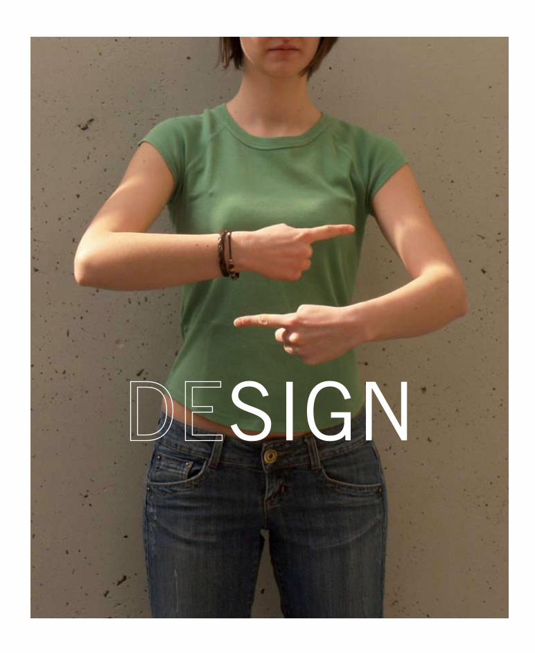
SIGN