Embed Size (px)
Citation preview

Al Jazeera AmericaCreative Direction

2
In late 2012, Al Jazeera Media Network acquired Current TV, a cable news network founded by former U.S. Vice President Al Gore. In its place would be Al Jazeera America, a new news channel presenting compelling, modern and unbiased news to a U.S. audience.Many people already had opinions on the Al Jazeera brand, which ranged from the misperception and prejudice of a ‘terror’ channel, to the informed - the world’s fastest growing media brand, reputed and awarded for its strong journalistic integrity.The creative team collaborated with editorial, business and marketing teams to transform these misperceptions and prejudices about the so-called ‘terror channel’. The challenge was to educate and inform audiences of all sides and all angles, upholding the heritage and integrity that has already been established by the Al Jazeera Media Network brand.It was important to celebrate the infamous Al Jazeera logo as a symbol of value, transparency, fearlessness, objectivity and trust. The on-air look needed to be innovative and provocative, but above all, we sought to earn channel trust through the impact of accuracy, integrity and speed, with a look that reflects this as a timeless elegance with a cultural sensitivity; a style that is clean and simple yet strong, and that can easily be translated across all media platforms.

3
Created in 1996 with the launch of the master channel, Al Jazeera’s trademark is a symbol of real pride for Qatar and the Arabic world. Graphically executed in traditional Arabic calligraphy, the logo reads as the word “AL JAZEERA” meaning “The Peninsula”.With a color palette of golden sand, its provenance is undoubtedly “Made in Qatar”. It’s been said that the logo design resembles the fearlessness of a flame and the sensitivity of a teardrop – both attributes that echo Al Jazeera’s core values.Keeping the logo therefore was imperative, consolidating all our value, and re-investing in the whole Corporation. For Al Jazeera America, the presentation simply needs to be treated in a way that transcends its traditional roots, a translation into a 21st century look. Our emphasis is on the clarity, with a simple but confident design elegance, thereby allowing the editorial content to shine.
The Al JazeeraLogo Brandmark

4
Master Brand Identity

5
Font
AaBbCcAaBbCcAaBbCcAaBbCcAaBbCc
Helvetica Neue 95
Helvetica Neue 85
Helvetica Neue 75
Helvetica Neue 65
Helvetica Neue 55
Helvetica Neue
Helvetica is a long established part of the Al Jazeera Media Network brand. It was therefore important that we keep this font for Al Jazeera America especially as this sets us apart from the other U.S. Networks. Helvetica Neue is used on all elements associated with the network; e.g. schedules, promos, titles, lower thirds, etc. and is never italicized – this enables us to build consistency across all Al Jazeera America programming.In its sans-serif form, the font maintains its integrity with minimal degeneration through digital pixellation and TV scan lines (which can happen with serif fonts).Using a single classic font prevents a piece from dating too quickly. It also saves time and allows for greater creativity with the actual visual content.

6
Al Jazeera America Primary Gold/Yellow Al Jazeera America Secondary Blue
Al Jazeera America Tertiary YellowAl Jazeera America Primary Blue
Al Jazeera America Tertiary Blue
Al Jazeera America Secondary Yellow
RGB RGB
RGBRGB
RGB
RGB
205, 141, 42 4, 26, 64
255, 255, 17738, 42, 104
211, 235, 244
242, 208, 114
Al Jazeera Media Network has an established palette, the essential elements of which have been used for Al Jazeera America. The two components of the logo are used and a set of four colors have been developed that are derivatives of these main colors.
Color Palette
Primary colors Alternative colors

7
Master Channel IdentityThe keyword at the heart of the Media Network brand message is ‘Luminous’. We are at the source, illuminating life with energy and clarity. These values have been carried over to the master channel idents.
A total of three channel identities were made. The vastness and diversity of the American landscape is celebrated and the channel logo is at the center of this. It is important that the branding confidently states, ‘we are here’, in a bold but not brash way, and appeals to both the existing fan base and new viewers who are looking for real news. The whole identity is connected to the logotype with expressive paths of illumination, as well as dimensionality. You can see many different shapes and facets before it resolves.

8
InterstitialIdentsThese interstitial idents are a continuation of the main identity and further illustrate the core brand values of Al Jazeera America. The U.S. landscapes are shown in a 360 degree panoramic format that reflect the compelling unbiased reporting of the network as well as the commitment to coverage that is far-reaching and coast to coast.

9

10
PromotionalToolkitThe promo toolkit uses full frame photography and video in favor of heavy graphic branding. This along with the use of the Helvetica font provides bold and clear signposting. A single consistent style is used across all promotions to reinforce the network identity over individual program identities.
11
Mondays 5 2/p ET p PTHelvetica Neue 75 95 65 45 95 65

12
News

13
News Color Palette
RGB
RGB
RGB
RGB
RGBRGB
RGB
RGB
RGB
250, 250, 250
254, 172, 26
175, 21, 21
218, 69, 49
231, 101, 295, 5, 5
243, 135, 27
175, 175, 175
141, 13, 2
Primary colors Alternative colors

14
The news opening sequences continue the theme of energy and illumination. One single sequence reflects the global to local coverage and four alternate endings are used that reflect the time of day.
News Openers
15
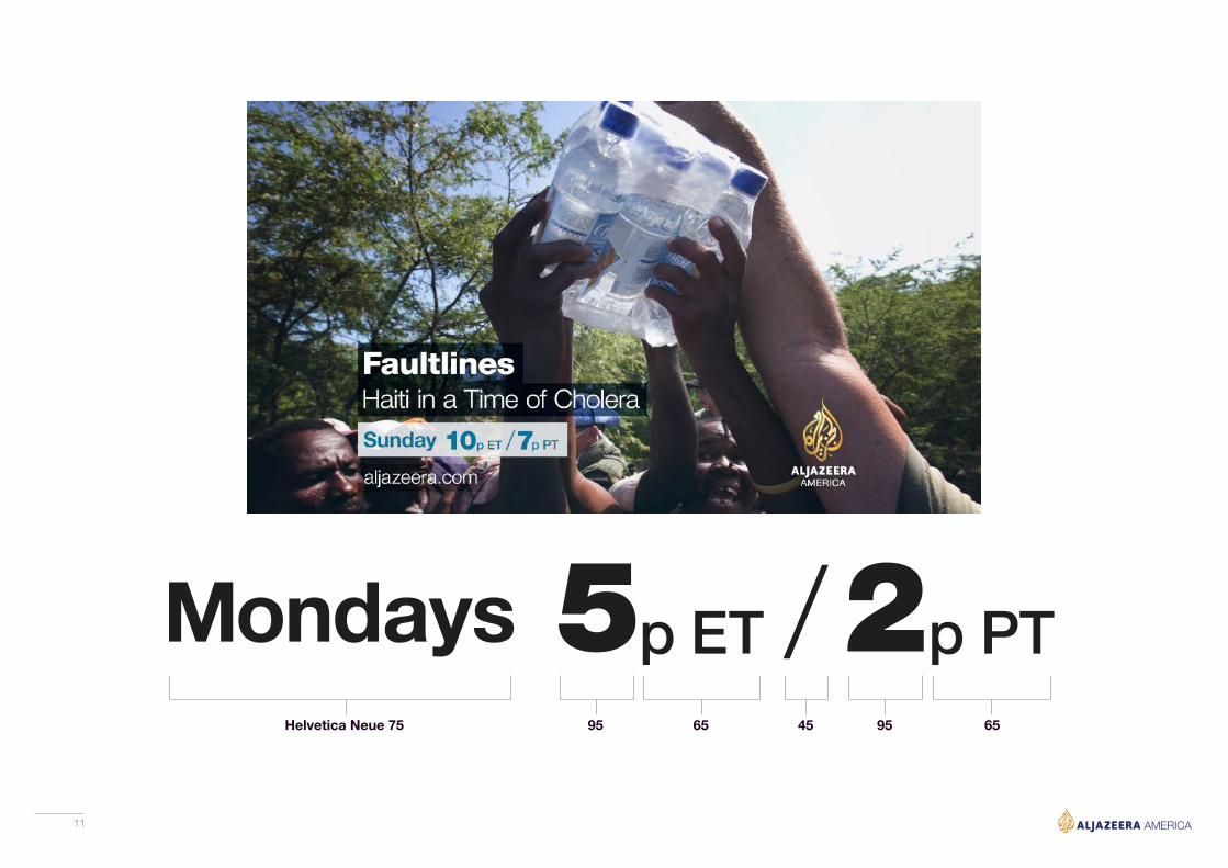
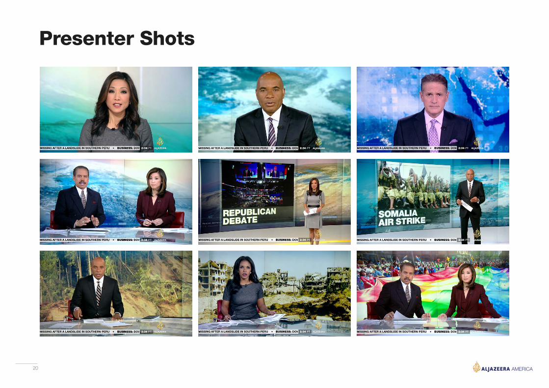
On ScreenArchitectureHelvetica is used consistently for all lower thirds and full screen graphics. Al Jazeera’s commitment to clear and straight forward news reporting is supported by compelling photography and bold, clear typography.The neutral black and white is deployed while the gold/yellow accent color is used to highlight important information.

16
Bespoke Graphics Treatment

17
AmericaVotes 2016
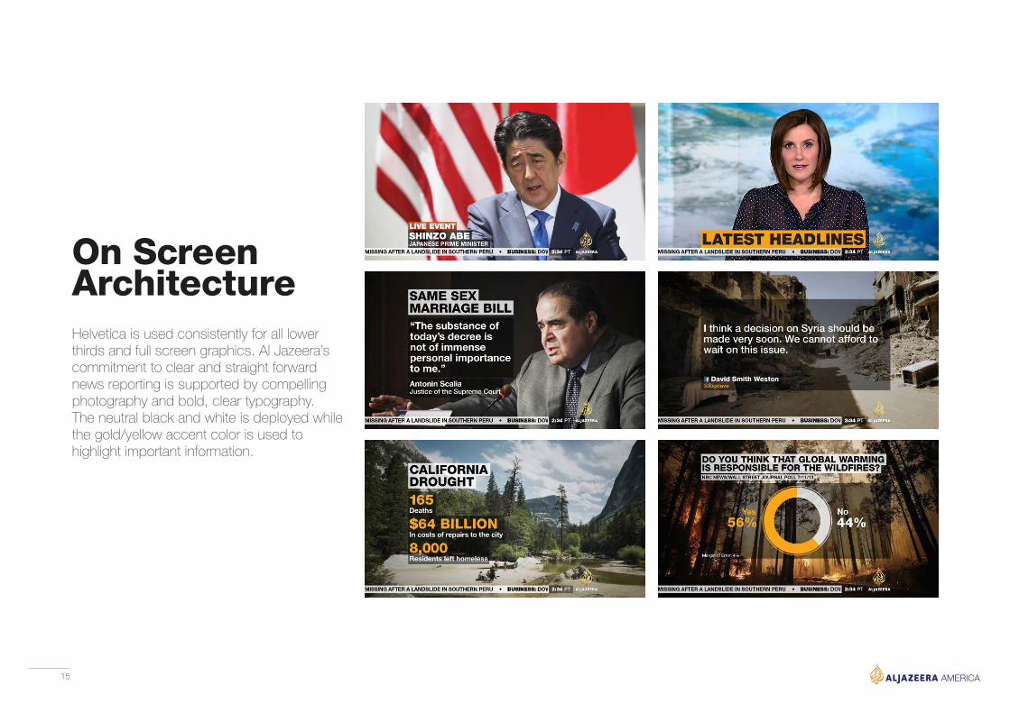
Shedding the obvious and literal visual clichés used in Presidential elections, from waving flags to glass rendered White Houses, we look to present clarity and focus on the design of information and vote results. To that point, we use those same visuals but inferred them rather than lifted them directly, resulting in a presentation that is fresh, contemporary and yet quite familiar. The information is cleanly presented and free of clutter and other distracting elements. Visual protocols were established to distinguish between the various statistics and focus attention on the most important information.
Brand package for ongoingelection coverage
18
Election Information Graphics
19
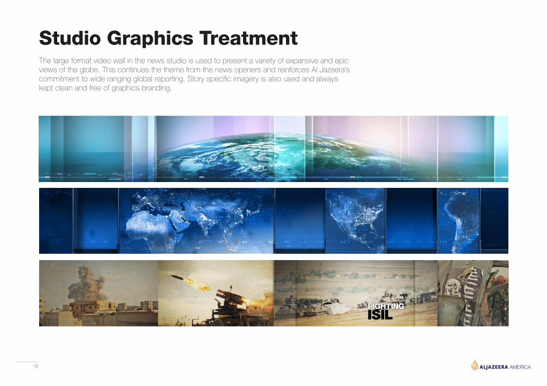
Studio Graphics TreatmentThe large format video wall in the news studio is used to present a variety of expansive and epic views of the globe. This continues the theme from the news openers and reinforces Al Jazeera’s commitment to wide ranging global reporting. Story specific imagery is also used and always kept clean and free of graphics branding.
20
Presenter Shots
21
Programs
22
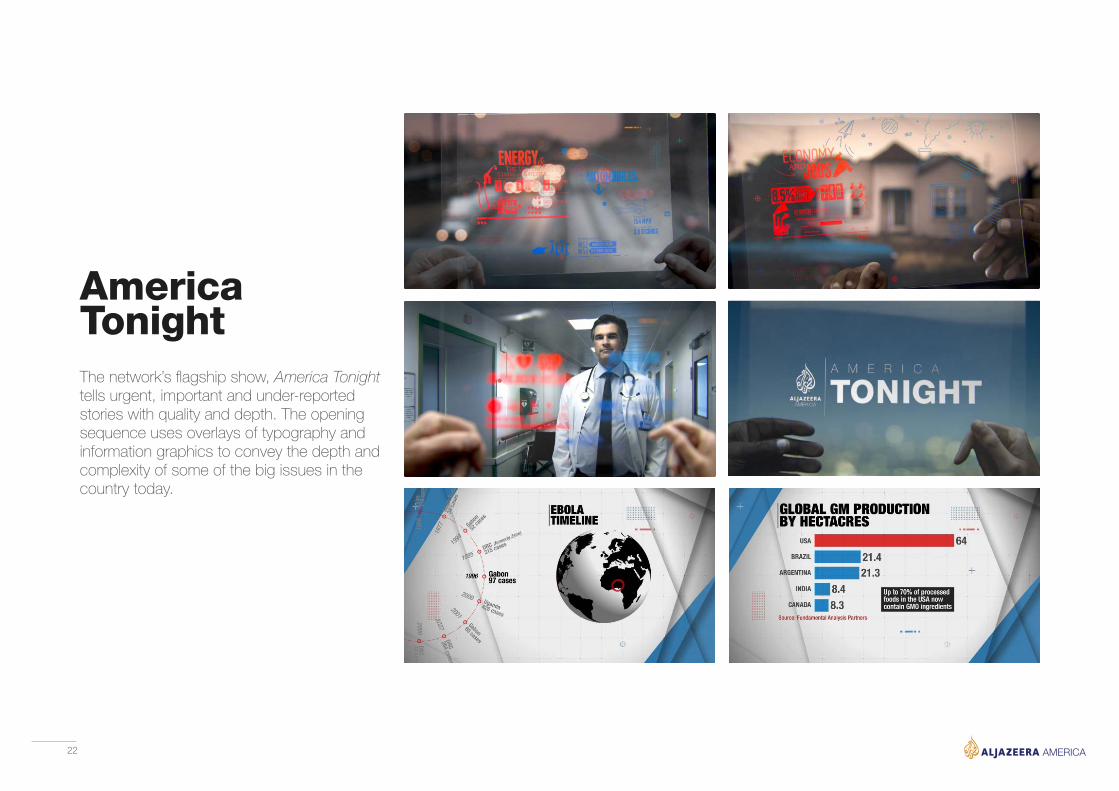
AmericaTonightThe network’s flagship show, America Tonight tells urgent, important and under-reported stories with quality and depth. The opening sequence uses overlays of typography and information graphics to convey the depth and complexity of some of the big issues in the country today.

23
Ali VelshiOn TargetAli Velshi On Target speaks truth to power through debate, in-depth interviews, expert analysis and on-the-ground reporting.The brand for this show exemplifies the fresh and clean approach of the channel. The open and bumpers are short, large format type is used throughtout to create a high impact fast paced show format.

24
The Global View Primetime news show presents stories from around the world giving a perspective on international events not seen anywhere else on U.S. cable news. A fresh and bold graphic approach emphasizes the alternative view, analysis and deep focus on the stories.
Global View

25
Third RailThird Rail presents passionate, dynamic conversations that help the viewer understand issues and stories in ways they never have before. The idea of debate and opposing points of view is explored and reflected in the brand package.

26
Inside StoryInside Story brings the viewer an in-depth look at the story behind the headlines from different points of view. The show branding has an emmersive and exploritatory feel to re-iterate the shows value. The same aesthetic is continued throughout the studio and graphic backdrops.

27
The Stream is an online community and daily television show powered by social media and citizen journalism. The branding for this show seeks to capture the online community through thousands of squares or pixels. The opening sequence shows all the cubes/conversations/ideas forming into the logo brandmark.
The Stream
28
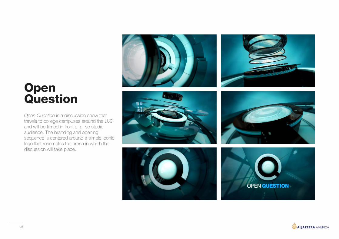
Open Question is a discussion show that travels to college campuses around the U.S. and will be filmed in front of a live studio audience. The branding and opening sequence is centered around a simple iconic logo that resembles the arena in which the discussion will take place.
OpenQuestion
29
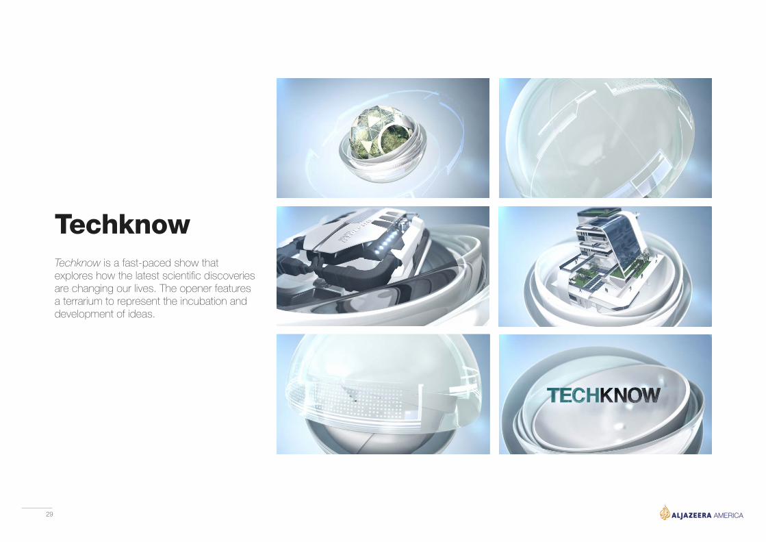
Techknow is a fast-paced show that explores how the latest scientific discoveries are changing our lives. The opener features a terrarium to represent the incubation and development of ideas.
Techknow

30
Studio Design

31
News StudioThe main news studio was conceived as a multi functional space to broadcast short bulletins and long format events such as elections. The set is a bright space composed of clean, sweeping curves that reference the main brand identity.Sport, Business and Weather bulletins are anchored from here as well as in-depth interviews and round table discussions. A large format video wall acts as a backdrop and can display multiple looks and brands.
32
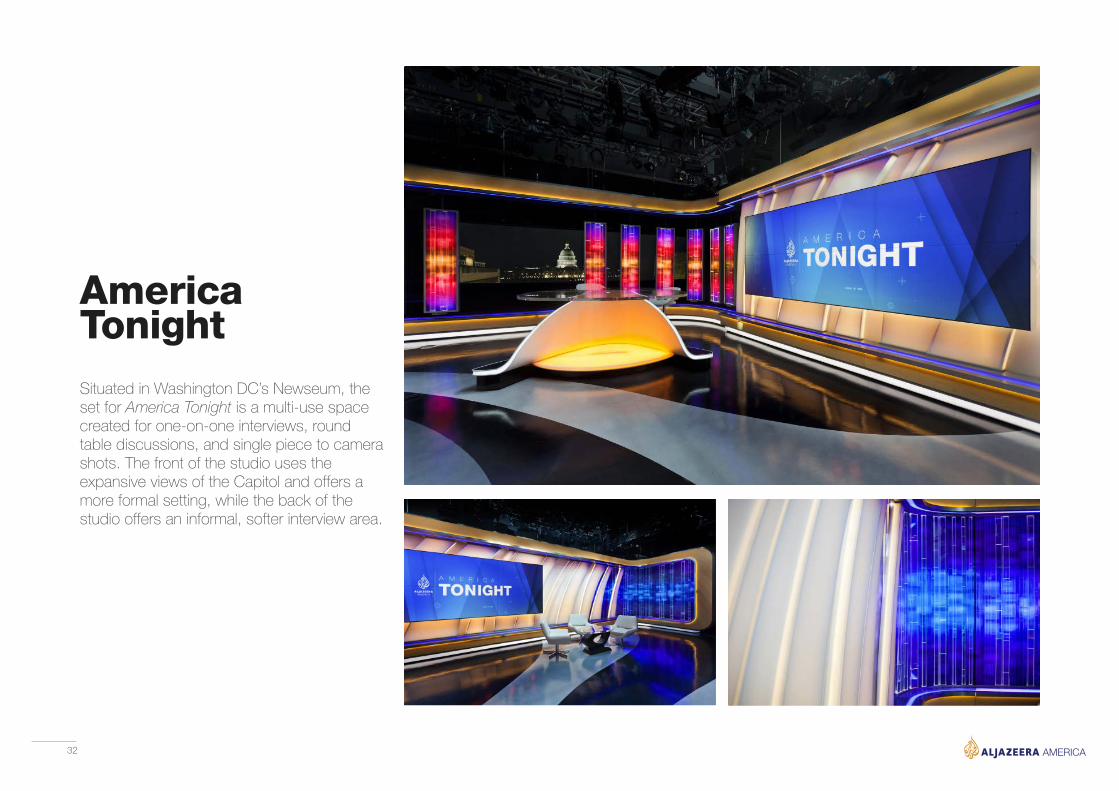
AmericaTonightSituated in Washington DC’s Newseum, the set for America Tonight is a multi-use space created for one-on-one interviews, round table discussions, and single piece to camera shots. The front of the studio uses the expansive views of the Capitol and offers a more formal setting, while the back of the studio offers an informal, softer interview area.

33
The Stream is a show powered by the voices and opinions of the viewers through social media. The studio is a hub for all the information received as well as a dynamic interior space to present stories and discuss ideas. The presenters are surrounded by the faces and messages of the people taking part. It reinforces the idea of the online community that is central to the show.
The Stream
34
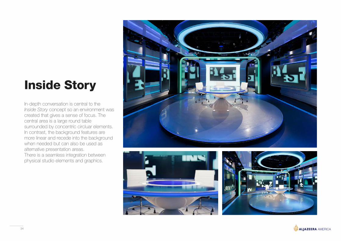
Inside StoryIn-depth conversation is central to the Inside Story concept so an environment was created that gives a sense of focus. The central area is a large round table surrounded by concentric circluar elements. In contrast, the background features are more linear and recede into the background when needed but can also be used as alternative presentation areas. There is a seamless integration between physical studio elements and graphics.
35
Digital and Mobile

36
The overall design ethos of bold simplicity is applied to all plaforms both broadcast and digital. The Helvetica font family is used throughout the website as well as the same clear graphic signposting. This allows for an enjoyable and easy viewer experience on any screen size.
Website

37
For an efficient workflow and consistent brand messaging, the information graphics designed for the web and social media based videos are almost identical to the broadcast news graphics. The information is presented in a larger font and more sporadically used for smaller screen formats.
Digital Videos

38
Users of the mobile application will have a similar visual experience to the web and broadcast formats. Once again brand consistency is of the utmost importance. A simple user experience was developed to allow for easy browsing of stories in a horizontal direction and navigation into story details in a vertical direction.
Mobile App

39
Interior Spaces

40
Reception AreaThe main entrance and lobby at the New York headquarters is many visitors first impression of the network and thus it is very important that the area convey the main brand values. The area is bright modern and clean. It is certainly distinctive and designed to leave a lasting impression.

41

42
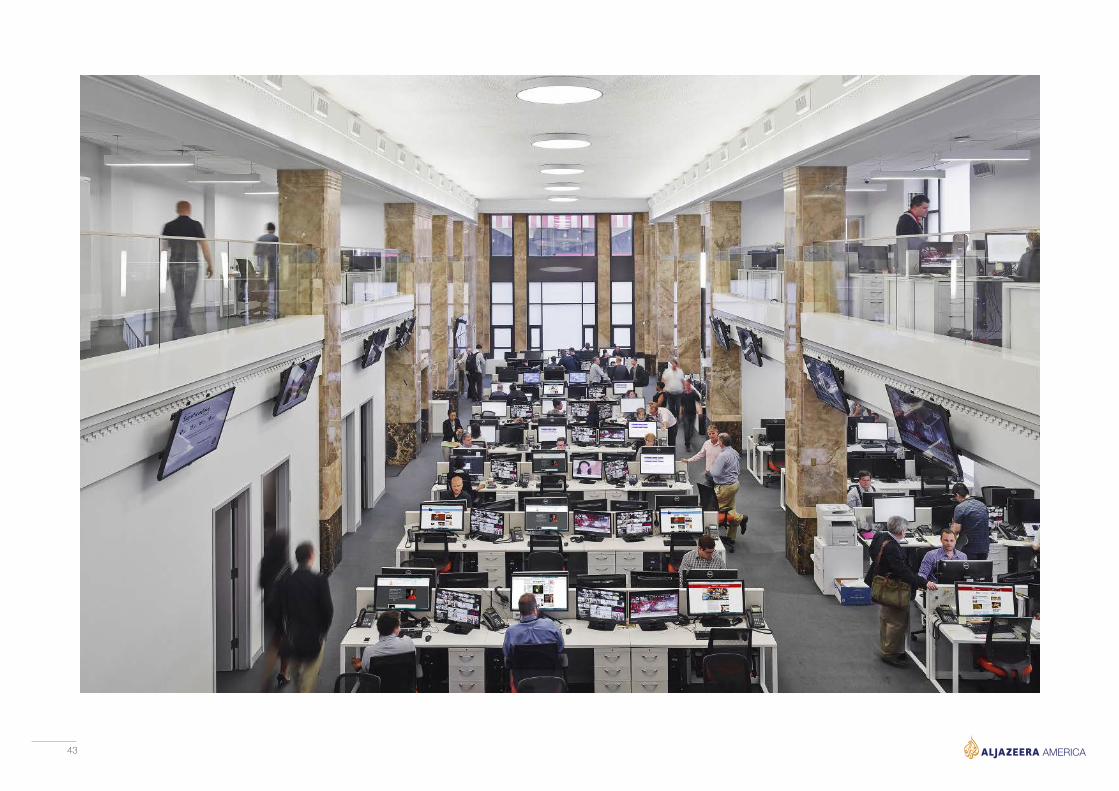
The main newsroom stands in the place of a former banking floor in an iconic art deco building in the heart of Manhattan. The room retains the classic features of the building and is also a clean bright functional space.
Newsroom
43