Embed Size (px)
Citation preview

8/13/2019 Acoustic Album Covers
http://slidepdf.com/reader/full/acoustic-album-covers 1/7
How do these album/single covers
represent the acoustic genre?
What conventions are used?

8/13/2019 Acoustic Album Covers
http://slidepdf.com/reader/full/acoustic-album-covers 2/7
Gabrielle Aplin: Panic CordRepresents acoustic
genre through the
extremely natural
location, connotingthe ‘organic’ style of
acoustic music. The
natural lighting
through the trees also
supports this.
Overall, the
cover is
aesthetically
beautiful,representing the
soft, delicate
instruments and
vocals
The balloon signifies
nostalgia and youth,relating to the
convention that
acoustic music often
evokes memories and
emotion.
Artist is
represented as
conventionally,
very pretty, but
also casual and‘grounded’ due to
her bear feet.
However also
ambitious and
youthful due to the
floating balloon.
The bright colours represent the genre to be
creative and upbeat.
Central camera positioning possibly represents the genre as
very grounded and established within the music industry.

8/13/2019 Acoustic Album Covers
http://slidepdf.com/reader/full/acoustic-album-covers 3/7
Panic Cord Continued… • Focusing upon the font, ‘Gabrielle Aplin’ is in Gabrielle- name is in capitals and
single is in capitals, whilst the song name is in lower capitals. The artists name
in capitals could possibly exaggerate and establish artist credibility within theindustry.
• The central positioning of the font also possibly has the same meaning as the
camera composition; very grounded artist .
• The choice of white font connotes the artists purity and innocence.
• When considering Gabrielle, her gaze is directly is upon the audience;
representing the artist and the acoustic genre as emotionally connecting and
personal.
• The artists positioning could be argued to be quite child-like. Strengthened by
the large, yellow balloon, this positioning potentially evoking nostalgia and
youth from the audience, as well as representing the artist as youthful(mentioned on the previous slide).
• There is somewhat an intertextaul reference to story books within the cover;
the bright bold colours of the balloon and the artists choice in clothing is
similar to that of the primary colours in picture books, as well as the oversized
balloon implying a sense of adventure and imagination that is found in storybooks.

8/13/2019 Acoustic Album Covers
http://slidepdf.com/reader/full/acoustic-album-covers 4/7
Ben Howard:Old Pine
With the artists name in
the top left hand corner,
in a very subtle font,
and the artist himself
hardly in focus,
represents the acoustic
genre to be very casualand humble; musically
driven, they are selling
the music, and the
emotion behind it,
instead of the artists
face appeal.
The colour scheme
is particularly
artistic, and
conventionally,
visually appealing.
This therefore
represents thegenre as creative,
as well as nostalgic
as the exposer and
greyscale looks like
a polaroid photo/
real film etc.
The conventional,
natural setting and
bright, natural light
has the same effect as
in Panic Cord.
Picture relates to single title; a convention is the sense of a relationship
between lyrics and visuals (often portrayed within the music videos).
This particular cover represents the genre as particularly emotional and
heartfelt due to the high exposure. Combined with the vast expanse of space,
the photographic exposure suggests a sense of vulnerability that could be
associated with the lyrics within the song, for example.

8/13/2019 Acoustic Album Covers
http://slidepdf.com/reader/full/acoustic-album-covers 5/7
Old Pine Continued…
• Also, when considering the image of place, youcould argue that it is quite a romantic portrayal ofnature and open space.
• This is because in terms of composition and therule of thirds, our eye is instantly drawn to thelong, dark trees, which are stretching of thecover. This therefore connotes the powerful andheavenly extent of natures beauty; supported by
the positioning of the artist himself, being smallerthan the horizon and consequently ‘engulfed’ bythe nature.
8/13/2019 Acoustic Album Covers
http://slidepdf.com/reader/full/acoustic-album-covers 6/7
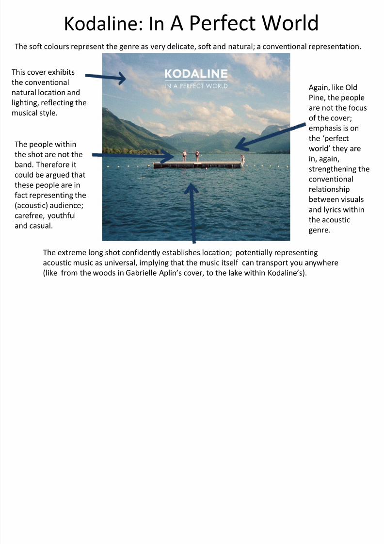
Kodaline: In A Perfect World
This cover exhibits
the conventional
natural location and
lighting, reflecting the
musical style.
The soft colours represent the genre as very delicate, soft and natural; a conventional representation.
Again, like Old
Pine, the people
are not the focus
of the cover;
emphasis is on
the ‘perfect
world’ they are
in, again,
strengthening the
conventional
relationship
between visualsand lyrics within
the acoustic
genre.
The people within
the shot are not the
band. Therefore it
could be argued that
these people are in
fact representing the
(acoustic) audience;
carefree, youthful
and casual.
The extreme long shot confidently establishes location; potentially representing
acoustic music as universal, implying that the music itself can transport you anywhere
(like from the woods in Gabrielle Aplin’s cover, to the lake within Kodaline’s).

8/13/2019 Acoustic Album Covers
http://slidepdf.com/reader/full/acoustic-album-covers 7/7
In A Perfect World Continued… • The font construction of this cover is similar to that of ‘Panic
Cord’; the artists name is larger and in capitals, whilst alsobeing central. Therefore, it could have the same connotations
as the positioning of ‘Panic Cord’.
• Whilst being central, the font is also positioned relatively high
up, not to obstruct the image below. However, the highpositioning could also represent the band as having musical
status and importance, as well as almost heavenly and angelic
connotations; acoustic music, especially theirs, is pure and
emotionally connecting.
• The use of white could be argued as slightly more subtle than
in ‘Panic Cord’, suiting the soft colour scheme of pinks and
blues. Therefore, the choice in colour may be more for
aesthetic appeal, linking the font colour to the positioning;
amongst the clouds.