Embed Size (px)
Citation preview
Cover
10.02 / February 2004Volume 10, Number 2
About This Particular Macintosh: About the personal computing experience™
ATPM
ATPM 10.02 / February 2004 1 Cover

Cover ArtCopyright © 2004 by Lee Bennett1
We need new cover art each month. Write to us!2
Editorial Staff
Contributing Editors
Artwork & Design
EmeritusRD Novo
Robert MadillBelinda Wagner
Edward GossTom Iovino
Daniel ChvatikGrant Osborne
ContributorsRaena Armitage
Lee BennettEric Blair
Ted GoransonMatt JohnsonAndrew Kator
Joe KudrnaRobert Paul Leitao
Kirk McElhearnWes Meltzer
Ellyn RitterskampSylvester RoqueGregory TetraultDave Trautman
Evan TrentMacintosh users like you
SubscriptionsSign up for free subscriptions using the
Web form3 .
Where to Find ATPMOnline and downloadable issues areavailable at http://www.atpm.com.
ATPM is a product of ATPM, Inc.© 1995–2004, All Rights Reserved
ISSN: 1093-2909
Production ToolsAcrobatApache
AppleScriptBBEdit
CVLCVS
DropDMGFileMaker Pro
FrameMaker+SGMLGraphicConverter
MeshMojo Mail
1. http://www.dtpbylee.com2. [email protected]
Publisher/Editor-in-Chief Michael TsaiManaging Editor Christopher Turner
Associate Editor/Reviews Paul FatulaCopy Editors Raena Armitage
Dan BolandJohann CampbellChris LawsonEllyn RitterskampBrooke SmithVacant
Web Editor Lee BennettPublicity Manager Vacant
Webmaster Michael TsaiBeta Testers The Staff
How To Matthew GliddenTed GoransonAndrew KatorChris LawsonDavid OzabSylvester RoqueMary E. TylerVacant
Interviews VacantOpinion Matt Coates
Wes MeltzerEllyn RitterskampMike ShieldsVacant
Reviews Eric BlairKirk McElhearnGregory TetraultVacant
Technical Evan TrentWelcome Robert Paul Leitao
Graphics Director VacantLayout and Design Michael Tsai
Cartoonist Matt JohnsonGraphic Design Consultant Jamal Ghandour
Blue Apple Icon Designs Mark RobinsonOther Art RD Novo
3. http://www.atpm.com/subscribe/
ATPM 10.02 / February 2004 2 Cover

MySQLPerl
Photoshop ElementsPythonrsync
Snapz Pro Xssh
StuffItSuper Get Info
The FontsCheltenham
FrutigerIsla BellaMarydale
Minion
ReprintsArticles and original art cannot be reproduced without the express permission of ATPM, unless otherwise noted. You may, however, print copies of ATPM provided that it is not modified in any way. Authors may be contacted through ATPM’s editorial staff, or at their e-mail addresses, when provided.
Legal StuffAbout This Particular Macintosh may be uploaded to any online area or included on a CD-ROM compilation, so long as the file remains intact and unaltered, but all other rights are reserved. All information contained in this issue is correct to the best of our knowledge. The opinions expressed in ATPM are not necessarily those of this particular Macintosh. Product and company names and logos may be registered trademarks of their respective companies. Thank you for reading this far, and we hope that the rest of the magazine is more interesting than this.
Thanks for reading ATPM.
ATPM 10.02 / February 2004 3 Cover

ATPM 10.02 / February 2004 4 Sponsors
Sponsors
About This Particular Macintosh
has been free since 1995, andwe intend to keep it that way. Our editors and staff arevolunteers with “real” jobs who believe in the Macintosh wayof computing. We don’t make a profit, nor do we plan to. Assuch, we rely on advertisers and readers like you to help uspay for our Web site and other expenses.
We’ve partnered with CafePress.com to bring you high-quality ATPM merchandise
1
. For each item you buy, $1 goestowards keeping the atpm.com server running. You can alsohelp support AT
P
M by buying from online retailers using ourlinks
2
. If you’re going to buy from them anyway, why not helpus at the same time?
We also accept direct contributions using PayPal
3
andAmazon’s Honor System
4
. We suggest $10 for students and$20 for individuals, but we greatly appreciate contributions ofany size.
Finally, we are accepting inquiries from interested sponsorsand advertisers. We have a variety of programs available totailor to your needs. Please contact us [email protected] for more information.
Sponsors
1. http://www.cafeshops.com/cp/store.aspx?s=atpm2. http://www.atpm.com/about/support.shtml3. http://www.paypal.com/xclick/[email protected]. http://s1.amazon.com/exec/varzea/pay/T18F4IYZD196OK

Welcome
Welcome to the February issue of About This ParticularMacintosh! It’s been a month to remember. At January’sMacintosh Expo, Apple Computer announced the iPod mini.Retailing at $249, there’s nothing small about the price. TheMac maker’s high margins on well-designed products haven’tchanged, but the perception of Apple Computer as atechnology and design leader is gaining new ground. In thisissue of ATPM we will look at many of the changes in theworld of Macintosh computing and explore the platform’srenaissance with consumers and creative pros.
When Last We Left YouIn January’s Welcome we talked about the BCS system forselecting the top two teams in NCAA college football. TheBCS computers selected Oklahoma and Louisiana StateUniversity as the top two teams in the nation. This left USC,the nation’s top-ranked football team, out of the nationalchampionship game and LSU to face third-ranked Oklahomain the Sugar Bowl for the BCS championship. Not only wasthe nation denied an opportunity to see the top two teams inthe nation face-off in a championship game, but it highlightswhat happens when we put too much emphasis on computersand too little emphasis on common sense.
USC and LSU won their respective bowl games, so the twoteams share a split national championship designation. USCis the year’s AP champion, and LSU received the national topspot from the BCS. We not only recommend to the folks whorun the BCS that they revise their computer point system forselecting the top two teams in the nation, but we alsorecommend that next year the BCS should use Macs. Younever know. A Mac might have selected the correct two teamsfor the national championship game.
Gateway to Acquire eMachinesWhat happens when you combine a floundering computercompany with a maker of really cheap PCs? We are about tofind out! Gateway Computer, the computer company turnedelectronics retailer, has announced it has purchasedeMachines, the maker of budget-line PCs.
Gateway’s purchase of eMachines roughly doublesGateway’s US market share and launches the company backinto foreign markets. It also provides Gateway entry to otherretail stores. Faced with a fall off in PC sales, Gateway turnedtheir Gateway Country Stores into electronics stores in orderto pay the rent. With the increase in sales through theeMachines acquisition, Gateway may choose to close many ofthe company’s retail stores as the leases on the spaces begin toexpire.
Pixar Dumps DisneyThe “other company” headed by Apple CEO Steve Jobs haschosen to break off talks with the Walt Disney Company on anew distribution deal. Pixar Animation has announced anend to the most recent round of talks with Mickey & Co. andthat the company will look for a new distribution partnerfollowing the end of its current deal with Disney. The five-movie contract with Disney expires toward the end of 2005.
Meanwhile, Finding Nemo, the current Pixar-Disneyrelease, has become the ninth-highest grossing motionpicture in history and the top animated movie of all time. Atpress time Nemo has earned about $850 million at theworldwide box office.
Pixar is dumping Disney in favor of a search for a new dealthat will leave the company with a larger piece of the boxoffice profit pie.
How Much Is Too Much?That’s the question being asked by investors following therelease of Apple’s most recent quarterly numbers. iPodsrepresented 13% of revenue and represented a significantportion of the company’s rising profits. Apple surpassed WallStreet estimates on better than expected revenue andearnings. For the December quarter, Apple earned $.16 pershare after extraordinary items on sales of about $2 billion.But the Street is now concerned that iPods comprise toomuch of the company’s overall sales mix and worries that G5sales should be higher. Go figure.
I Fought the Law, and Pepsi Paid the FineThat seems to be the case after watching Pepsi’s Super Bowladvertisement announcing the $100 million iTunes musicgiveaway. The ad features people busted by the RIAA forillegally downloading music from the Internet. The message:through the iTunes promotion Pepsi makes it legal and freefor winners to get music off the Net. No doubt the appearancein the spot by the former music lawbreakers did not comeabout for free. A happy ending for everyone? Over the nextcouple of months, we’ll know for sure. The Pepsi bottles withwinning bottle tops will be on sale through March 31, 2004.Winners must redeem the bottle caps for songs by the end ofApril.
Meanwhile iTunes rival Napster may get help from parentcompany Roxio’s release of Creator 7, a product that providesusers with functionality similar to iTunes. We’ll see if the newproduct invigorates Napster’s seemingly moribund musicsales.
Welcomeby Robert Paul Leitao, [email protected]
ATPM 10.02 / February 2004 5 Welcome

Debt FreeLater this month Apple Computer will retire its remaininglong-term debt, paying off $300 million in loans. That willleave the company with about $4.5 billion in cash and nolong-term liabilities. Aside from sharing a CEO, Pixar andApple have another thing in common: business models thatmake lots of cash from popular products while allowing thecompanies to finance capital expenditures from cash flow.This includes the costs of Pixar’s new corporate headquarters.
Until Next MonthThanks for reading our February issue! We’ll be back inMarch with another look at the state of Macintosh computingand more reviews from our editors.
Our February issue includes:
The Candy Apple: Technology & ValuesEllyn Ritterskamp summarizes some ideas from a classdiscussion of a piece by Emmanuel Mesthene, a distinguishedprofessor of philosophy.
Bloggable: Fairly Quiet on the Blog FrontIn spite of January marking the Macintosh’s 20th anniversary,Wes Meltzer finds that things like Apple’s much-heraldedforay into RSS feeds and the “H-Bomb” were last month’sbiggest news.
Quick Tips in Design: Part 8—PatternIn this month’s installment, Andrew Kator discusses the roleof pattern in visual arts.
About This Particular Outliner: Outliner User Inter-faces
Ted Goranson continues his survey of outliner features thismonth. The focus in this column is user interface details. Alloutliners are compared.
Web Accessibility: Part 2—Text and LanguageIn her second installment, Raena Armitage explains howeveryone—and not just those with a disability—benefitswhen a little care is given to presenting a page’s text.
How To: Panther Meets NTFSSylvester Roque explores the perks and caveats of using anNTFS-formatted drive with Mac OS X.
Cartoon: CortlandNeoCort confronts the Agents.
Cartoon: iTrollsThe iTrolls ponder entropy, free software updates, the hasslesof flying, and Soundtrack’s price reduction. Plus, a parodyfeaturing Howard Dean and Steve Ballmer was inevitable.
Desktop Pictures: Remembering SummerReader Dave Trautman shares his summermemories—pictures of Canadian prairies and some imagesthat say “summer” to him.
Review: Cyborg 3D USB GoldWhile not perfect and technically having no Macintoshdrivers, Joe Kudrna believes the Cyborg 3D is a better choicethan its closest competition from Logitech.
Review: iFireAndrew Kator has no complaints about this device whichmakes Apple Pro Speakers compatible with computers (andiPods) that don’t normally support them.
Review: iView MediaPro 2.0.2Though it costs nearly twice as much as the 1.x version,Gregory Tetrault discovers greater stability and a number ofuseful new features in this version.
Review: Greppie 1.0.1Following up on his AquaGrep1 disappointment, Eric Blairfinds that Greppie has potential, but its version 1 edges are abit rough.
Review: Old Fart’s Guide to the Macintosh 2nd Ed.(book)
Kirk McElhearn thinks that seniors who look to this book fora little help getting started with a Macintosh may do better tolook elsewhere.
1. http://www.atpm.com/8.06/aquagrep.shtml
ATPM 10.02 / February 2004 6 Welcome

ATPM 10.02 / February 2004 7 E-Mail
Bloggable
1
This kind of article is why I read and support AT
P
M. Nice tosee a blog column. Keep up the great work.
—Jan
ATPM History
2
I still remember downloading the first issue in DOCMakerformat from AOL. Sniff…I miss the blazing fast speed ofwhat was my new 14.4K modem!
—Robyn Lyons
Ethernet Cabling
I have a problem getting two G4s to connect to the router. Ihave in my setup a cable modem, a D-Link 604 router withthe computers, an 8600 and G4s, 50 feet away. The 8600connects fine, but the G4s will not connect. I have found if Iput the G4s by the router it connects no problem. I have triedanother card in the G4, and that did not work. Is theresomething I can install to improve the signal so the G4 willconnect? Because that would be the easy solution. I reallydon’t want to have to install a longer cable to move themodem closer to the computers that would mess up too manywalls and floors.
—John Volk
A 50 ft. run should not present a problem. The signal loss over 50 ft. is negligible for Category 5 wiring. In fact I use a 50 ft. cable in my own apartment and connect with no difficulty.
Given that when you place the G4 “by the router” (which I
assume entails using a shorter cable) I suspect your 50 ft. cable may be the culprit. Try substituting a different 50 ft. cable and see if that resolves the problem. Bad Ethernet cables pop up now and then.
—Evan Trent
Networking
3
Great site. Kudos for the networking section; now I can finallyplay Marathon against my nephew without buying a book tofigure out how to connect two Macs…
—Thomas Giatras
Apple Predictions
4
Your “Maxi-POD” is similar to something I would really liketo see from Apple—the home server. Call it the iServe, if youwill. It would be a stripped-down, headless Mac that wouldbe the gateway to all incoming stuff such as TV, telephone,Internet, etc., and have a honking huge hard drive for storingall of it, a SuperDrive for backing it all up, AirPort Extreme,possibly wireless FireWire, and it would be able to serve up allthat digital goodness throughout the home in true Applestyle.
—DD
When I first read your mention of wireless FireWire, I was, like, “Huh? What have you been smokin’? There’s no such thing.” I was wrong. Anyone who doubts can check this out
5
.
—Lee Bennett
Copyright © 2004 the ATPM Staff,
. We’d love to hear your thoughts about our publication. We always welcome your comments, criticisms, suggestions, and praise. Or, if you have an opinion or announcement about the Macintosh platform in general, that’s OK too. Send your e-mail to
. All mail becomes the property of
ATPM
.
1. http://www.atpm.com/10.01/bloggable.shtml2. http://www.atpm.com/10.01/welcome.shtml
3. http://www.atpm.com/network4. http://www.atpm.com/10.01/ml.shtml5. http://www.hostingtech.com/news/2003/12/9/
St_Nitf_1394_Trade_Association_Complet_b1208062.5sw.html

ATPM 10.02 / February 2004 8 Candy Apple: Technology & Values
Candy Apple: Technology & Values
Technology & Values
Valuing is more important than values.
This column comes from a discussion in my Philosophy ofTechnology class. Many of the ideas here are not my own, butcame out of that conversation. This is my reframing of it.
We read a piece by Emmanuel Mesthene, in which he saysthe way we value things shifts as we make technologicaladvances. Our actual values don’t change, as we want truthand justice and things like that regardless of the way we framethose things. What does happen is that we reconfigure ourwants, our preferences, and our behaviors. Our actual tasteschange, in the sense that at first we appreciate the speed of themicrowave dinner because it allows us to spend more timereading Shakespeare. Over time, it sometimes happens thatwe come to prefer the taste of the microwave dinner overwhatever personally-cooked dinner we used to eat. Thisdoesn’t mean our values have changed in some way thatmakes us ashamed; we still appreciate a meal that isnourishing and tastes good. It just has come to pass that ourunderstanding of what tastes good has shifted. Since thishappens all the time in other contexts (We learn to toleratethe taste of beer, or we come to appreciate a foreign cuisine.),there is no need to attribute horrible techno-anxiety to it.
Mesthene’s commentary said technology means change.He reminds us of Heraclitus’s idea that we cannot step twiceinto the same river. The idea there is that when we try to stepinto the river a second time, it has changed, and so have we.We are changed by the passage of time, and by the experienceof having stepped into the river before. When we apply hisidea to computer technology in particular, I can think of acouple of changes from the past several years that are useful,helpful, and good in some way. There are lots more, of course.
• Speech recognition software is one of the coolest ideas tocome to fruition, especially for those with limited access.If mouse and keyboard functions are outside your scopedue to physical limitations, voice-activated computerfunctions are a blessing.
• The world is more accessible to those with Internet access.Online newspapers and other publications (like this one)expose us to perspectives and cultures different from ourown. We can only become better citizens of the world forlearning more about it.
Mesthene says technology introduces new possibilities. Thisraises questions and issues that were formerly irrelevant. Forexample, if 10 people are in need of a kidney transplant, andone kidney is available, who receives the kidney? There aremany similar questions within the fields of medicine andbiology. Plenty of technological tools are available and wechoose not to use them, perhaps because they are tooexpensive, or we are content with what we have. Their mereavailability, however, changes our options.
Mesthene’s third point is that “technology alters the mix ofchoices.” First off, we have some new way available of doingsomething. We have to decide if it’s worth the trouble to learnthe new way, if it’s worth the cost, whatever. Second, and thisis very important, once lots of people start to use the newmethod, the old one will become clunky or less attractive.People will stop gathering around the radio at the countrystore to listen to the baseball game. We won’t purchase vinylalbums anymore, despite the loss of the attractive covers.
Mesthene’s conclusion was that we need to be lessconcerned with specific values and how they shift, as we needto be concerned with the actual process of assigning value.The ways in which we think about what is important to usmay change slightly over time and with newer glasses toframe them, but the actual things we think are important willstill be important when the day is done.
Copyright © 2004 Ellyn Ritterskamp,
.
The Candy Apple
by Ellyn Ritterskamp, [email protected]
Bloggable: Fairly Quiet on the Blog Front
Fairly Quiet on the Blog FrontHave you ever wondered, upon entering an empty classroom,whether you overslept and didn’t get the e-mail about no classthat day? I have, and it is not fun. Take it from a currentcollege student.
January felt that way to me. Maybe I’m wrong, but thismonth isn’t even going to be especially focused on about theMac blogosphere. A better description for this month’scolumn might be, “It is the 20th anniversary, you know.” Bythe way: happy twentieth anniversary, Macintosh! If onlyyour weblogger devotees were shouting from the hilltops, butwe’ve grown complacent in the years since the Revolution.
All right, enough with the odd references. This column willbe, because of what I’ve mentioned above, different from lastmonth’s1. This means we can play the schadenfreude game, inwhich you enjoy the fruits of Wes’ frustration. However, thereis, slipped in below, a Reader Challenge for the month. Herewe go, for January.
Leading up to Macworld San Francisco, there was a gooddeal of rumor-mongering, about which I’m not going to writebecause most of it was dead wrong. I imagine you’ve all seenthe various rumors discredited. Unless Steve Jobs releasesiWrite2, the video iPod3, a G5 Cube4, or your other favoriterumor before February 1—in which case I’ll have to eatcrow—I am going to declare that dead. This rather lowers oursignal-to-noise ratio for the month.
As far as useful knowledge, discussion and articles fromthe Mac blogosphere, I came up with five topics which youmay find interesting:
• Apple has discovered RSS5, and now both the iTunesMusic Store6 and the Knowledge Base7 have RSS feeds.This means that now you can see a feed of selected tracksfrom the music store, as well as the list of top songs, andalso a set of feeds of current and new Knowledge Basearticles on a variety of Apple products. (For those of youunfamiliar with the term, RSS is a reasonablysophisticated way of syndicating headlines in a series ofdifferent formats and on different devices.)
• The above item raises an interesting Reader Challengeidea: would anyone besides me be interested in a kind ofdirectory of feeds of selected music? I’d publish a feedwith my Most Played smart playlist in iTunes, or justmusic I feel like listening to that week, kind of like theCritic’s Picks selection at a video store. E-mail me, andyou can get a mention next month as well as eternalgratitude, as I would love critic-reviewed playlists for myiPod.
• Have you ever spent four months without your Mac, in anenvironment remarkably hostile to the platform? NoahKravitz8 has, teaching in a PC-only school in New YorkCity, and he thinks9 that although OS X and Macs have asubstantial leg up on Windows XP and PCs, there are stillsome kinks that Apple needs to work out, like proprietaryvideo connectors. In his second column, he reinforces hisargument, saying that although the one-button mousemay be Grandma-safe it’s certainly not any good forteaching10. Also, he explains why it is that I’d never used alaptop until I was in eighth grade, which is that little kidsand portable, flexible computing are incompatible.
• OSViews11 ran a nice piece by Benjamin Horst afterMWSF failed to usher in iWrite, explaining why Appleshould use OpenOffice.org as AppleWorks’s core12. Theidea is sound: “[F]ollow the example Apple created withits Safari Web browser…based on the KHTML renderingengine. Apple could use the OpenOffice.org code andbuild its own custom Mac OS X GUI on top of it.” Just likeKHTML, OpenOffice.org’s code is licensed under theGNU General Public License; and just like KHTML priorto Apple’s development of Safari, using OpenOffice onMac OS X can be a very un-Mac-like experience. Couldbe a good marriage.
• Bruce Tognazzini13 is rather famously a critic of OS X’sGUI. He weighed in again on OS X in January(unfortunately replacing his old column; this is weirdlyOrwellian, by the way). This time, it was on why the Dock
Bloggableby Wes Meltzer, [email protected]
1. http://www.atpm.com/10.01/bloggable.shtml2. http://www.macrumors.com/pages/2003/12/20031215211535.shtml3. http://www.macminute.com/2003/12/16/portalplayer4. http://www.kuro5hin.org/story/2003/12/11/165553/305. http://atpm.com/rss/6. http://phobos.apple.com/WebObjects/MZSearch.woa/wa/MRSS/rssGenerator7. http://www.syndic8.com/
feedlist.php?ShowMatch=docs.info.apple.com&ShowStatus=all
8. http://www.powerbookcentral.com/columns/kravitz/9. http://www.powerbookcentral.com/columns/kravitz/13jan04.shtml10. http://www.powerbookcentral.com/columns/kravitz/22jan04.shtml11. http://www.osviews.com12. http://www.osviews.com/
modules.php?op=modload&name=News&file=article&sid=74813. http://www.asktog.com
ATPM 10.02 / February 2004 9 Bloggable: Fairly Quiet on the Blog Front
still sucks1 and what Apple can do to fix OS X2. I’m notsure I agree with him, but I know Kirk McElhearn3 suredidn’t4.
• I saved the biggest news for last. Hewlett-Packardannounced January 85 that they had agreed to license theiPod, to be rebranded with an HP logo on the back andsold only in rigor-mortis-corpse blue. Gadgetopia6 washardly alone in observing that Apple has a poor trackrecord regarding clone licenses7. John Gruber8, myfavorite analyst and curmudgeon, calls this “the H-Bomb,” and he’s right. HP is huge, and this is a big deal9.
I hope you enjoyed this whirl around the Mac blogosphere,even if it wasn’t strictly the Mac blogosphere per se. By nowyou know how to get the latest updates to the iTunes Music
Store and Apple’s Knowledge Base; know what it’s like tospend four months with no water, err, working with a PC-only lab; can wonder if Apple should use OpenOffice.orgcode as the basis for AppleWorks 7 or iWrite; can see whatmay be wrong with the Dock, from the perspective of AppleEmployee No. 66; and have my permission to talk your next-door neighbor’s ears off about the HP iPod.
Hat tip from last month10: an anonymous reader showedme Jeremiah Cohick’s blog11. I’ve never been to Boston or toEmerson College, so I have no frame of reference for hiswriting, but it’s nice to know that Switchers12 are real peopletoo.
Also, Phil Ulrich13 is still welcoming beta testers14 forUserspace. I bring this up because a reader commented lastweek that he couldn’t find a download link. Please e-mail Philif you want to use Userspace.
Did I miss anything? Let me know.
Copyright © 2004 Wes Meltzer, [email protected]. Wes Meltzer really wishes someone had an RSS feed that could plow snow in front of his dorm in Chicago, or that NetNewsWire could act as a space heater. In the meantime, he’ll settle for feedback on this month’s column.
1. http://www.asktog.com/columns/044top10docksucks.html2. http://www.asktog.com/columns/061PantherReview.html3. http://www.mcelhearn.com4. http://www.macblog.com/comments.php?id=132_0_1_0_C5. http://www.hp.com/hpinfo/newsroom/press/2004/040108b.html6. http://www.gadgetopia.com7. http://www.gadgetopia.com/2004/01/09/HPsIPod.html8. http://daringfireball.com9. http://daringfireball.net/2004/01/the_hbomb
10. http://www.atpm.com/10.01/bloggable.shtml11. http://www.jeremiahlee.com12. http://www.apple.com/switch/13. http://www.interalia.org14. http://www.interalia.org/archives/002091.php
ATPM 10.02 / February 2004 10 Bloggable: Fairly Quiet on the Blog Front

Quick Tips in Design: Part 8: Pattern
Part 8: PatternPattern is a repeating visual element that can be created byduplicating size, shape, position, symmetry, frequency, value,and color. Patterns are usually stronger when combining twoor more repeating elements. Most often, people associatesize, shape, and position of visual objects with pattern, butvalue and color are also strong pattern tools.
Pattern in visual arts is used for building larger objects,decoration, organization, association with other patternedobjects, and meaning.
When a unit is used for building a larger object, patternsare created. When the shape of the units is similar, the patternbecomes more pronounced. Media such as textiles, ceramics,jewelry, and masonry use repeated smaller elements for theconstruction of a larger work. Because of their methods offabrication, these media are naturally suited for the creationof decorative patterns.
Pattern can be used to allude to these media, or it canborrow from them to suggest less direct associations. Apattern similar to one seen on a woven silk damask maysuggest wealth, expense, quality, and conservatism,significantly more than just an association with fabric. Usingpattern in design to create associations with patterns in thereal world is a simple and effective method of patternapplication.
Patterns have cultural, religious, and philosophicalsignificance. Many patterns have traditional meanings thatsymbolize the place of mankind in relation to nature and theuniverse. While this symbolism can be found in patternsfrom most cultures, it is very prominent in Islamic art andarchitecture where pattern is used for the philosophicaldiscussion between humans and God.
Natural icons are common in cultural patterns, especiallyanimals (both real and mythical), flowers, and foliage.Common objects and especially woven objects, such as rope,textiles, and baskets, also become the inspiration forpatterned decorative cultural imagery.
Many cultures share patterns, even such “unrelated”cultures as Native Americans and aboriginal Australianswhich were physically separated from European, Asian, andAfrican cultural influences for millennia. In some cases theonly major differences to the casual observer among thesecultural patterns is the color usage. Color in pattern can beextremely important in dictating cultural meanings.
There are many excellent and specific books availableabout cultural patterns, most offering usable examples. Asearch on the Web for “Celtic pattern”—or any other culture/region—will usually return a myriad of books containingthousands of patterns, for a good desk reference for anyoneusing pattern in design.
Quick Tips in Designby Andrew Kator, [email protected]
ATPM 10.02 / February 2004 11 Quick Tips in Design: Part 8: Pattern
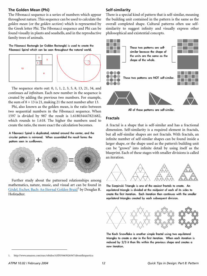
The Golden Mean (Phi)The Fibonacci sequence is a series of numbers which appearthroughout nature. This sequence can be used to calculate thegolden mean (or the golden section) which is represented bythe Greek letter Phi. The Fibonacci sequence and Phi can befound visually in plants and seashells, and in the reproductivefamily trees of animals.
The sequence starts out: 0, 1, 1, 2, 3, 5, 8, 13, 21, 34, andcontinues ad infinitum. Each new number in the sequence iscreated by adding the previous two numbers. For example,the sum of 8 + 13 is 21, making 21 the next number after 13.
Phi, also known as the golden mean, is the ratio betweentwo sequential numbers in the Fibonacci sequence. When1597 is divided by 987 the result is 1.618034447821682,which rounds to 1.618. The higher the numbers used tocreate the ratio, the more exact the calculation becomes.
Further study about the patterned relationships amongmathematics, nature, music, and visual art can be found inGödel, Escher, Bach: An Eternal Golden Braid1 by Douglas R.Hofstadter.
Self-similarityThere is a special kind of pattern that is self-similar, meaningthe building unit contained in the pattern is the same as theoverall completed shape. Cultural patterns often use self-similarity to suggest infinity and visually express otherphilosophical and existential concepts.
Fractals
A fractal is a shape that is self-similar and has a fractionaldimension. Self-similarity is a required element in fractals,but all self-similar shapes are not fractals. With fractals, aninfinite number of self-similar shapes can be found inside alarger shape, or the shape used as the pattern’s building unitcan be “grown” into infinite detail by using itself as theblueprint. Each of these stages with smaller divisions is calledan iteration.
1. http://www.amazon.com/exec/obidos/ASIN/0465026567/aboutthisparticu
ATPM 10.02 / February 2004 12 Quick Tips in Design: Part 8: Pattern
Applying PatternPattern is an extremely powerful method to focus viewerattention. The repetition easily seen in most patterns uses allof the Gestalt principles1 discussed in previous articles. Forthat reason, pattern is often used in design as a tool fororganization, especially when used with text. Commonmethods for pattern-based organization include:
• Bullets and other shapes to list, outline, and highlight• Alternating row colors to make individual items stand
out, yet still be part of a whole• Grid-based layout where similar shapes create a
common theme, even if the content within the shapesis dissimilar (for example, different photos that are allcropped to the same size and shape and arranged in agrid pattern)
• Color-coding
Because of the power of pattern as a visual element, it isimportant to use it for desired effect. A pattern canunintentionally destroy the intended message of a visualwork by competing with other elements. Even if a pattern isdecorative it still must be considered as part of the wholecomposition as with other complex shapes.
Tiled backgrounds can become distracting and make theother content more difficult to follow because the viewer isnaturally drawn to the repetition of the pattern.
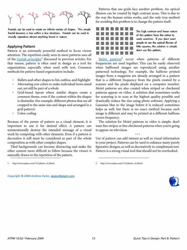
Patterns that use grids face another problem. An opticalillusion can be created by high contrast areas. This is due tothe way the human retina works, and the only true methodfor avoiding this problem is to change the pattern itself.
Moiré patterns2 occur when patterns of differentfrequencies are used together. This can be easily observedwhen halftoned images are reproduced using anotherpatterned technology. For example, the halftone printedimages from a magazine are already arranged in a patternthat is a different frequency from the pixels created by ascanner and the pixels displayed on a computer monitor.Moiré patterns are also created when striped or checkeredpatterns appear on video. A solution that sometimes worksfor scanning is to scan at the highest quality possible anddrastically reduce the size using photo software. Applying aGaussian blur to the image before it is reduced sometimeshelps as well, but there is no exact method because eachimage is different and may be printed at a different halftonescreen frequency.
The solution for Moiré patterns in video is simple: don’twear fine stripes or fine checkered patterns when you’re goingto appear on television.
• • •Use of pattern can add interest as well as visual informationto your project. Patterns can be used to enhance many purelyfigurative designs, as well as decoratively to complement text.Pattern is a strong visual tool that should not be overlooked.
Copyright © 2004 Andrew Kator, [email protected].
1. http://www.atpm.com/7.01/photo-cd.shtml 2. http://www.atpm.com/7.01/photo-cd.shtml
ATPM 10.02 / February 2004 13 Quick Tips in Design: Part 8: Pattern
ATPO: Outliner User Interfaces
Outliner User InterfacesThis month we look at different user interface strategies ofoutliners. If you came late to this movie, we are beginning ajourney into the land of Mac outlining that began with a lookat history1, went to outliner features2—a survey that took asecond month3. We reported two months ago on usagepatterns4.
Now we turn to how we interact with the outline itself. Thisis no small matter, my friends, because outliners may be theenvironment you spend your most creative time in—thattime when the Mac is supposed to be special inunderstanding and supporting.
Good user interface details are like fresh air and bad onesare like a minor toothache you haven’t quite noticed yet. Thisis another of the several elements of outlining that depend onthe user; that’s what makes this your particular outliner.
So in the spirit of our first columns, we’ll survey the variousstrategies and differences more or less without judgement sothat you will know what to look for. However, this time weonly cover Mac OS X outliners, avoiding the cross-platformJava and X11 ones.
History of the Disclosure TrianglePre-computer outlining relied on complex numberingschemes involving numbers and letters, Roman numerals or“dot-levels” (like section 1.2.5.23). This was all a bit hairy andnot visually intuitive. Computers allowed child items to beindented, which was a novel innovation, sort of the “wheel” ofoutlining. With indentation, you can “see” the structure of thewords without reading anything. It was marvelous, and thatsingular idea elevated computerized outlining beyondanything in the world of paper.
Collapsing was the next brilliant invention. As we noted inthe history review, this first appeared in code editors. Thosewere the days (the 1970s) when coders were real men (usuallymen) who wrote monolithic programs of thousands of linesof code by themselves and without the handymodularizations common today. They needed collapsing andfolding to manage the complex structure of the program.
Exactly who developed the “plus-labels” is lost in decades-old history. With plus-labels you had a way of usingcharacters from the standard font set—namely the plus and
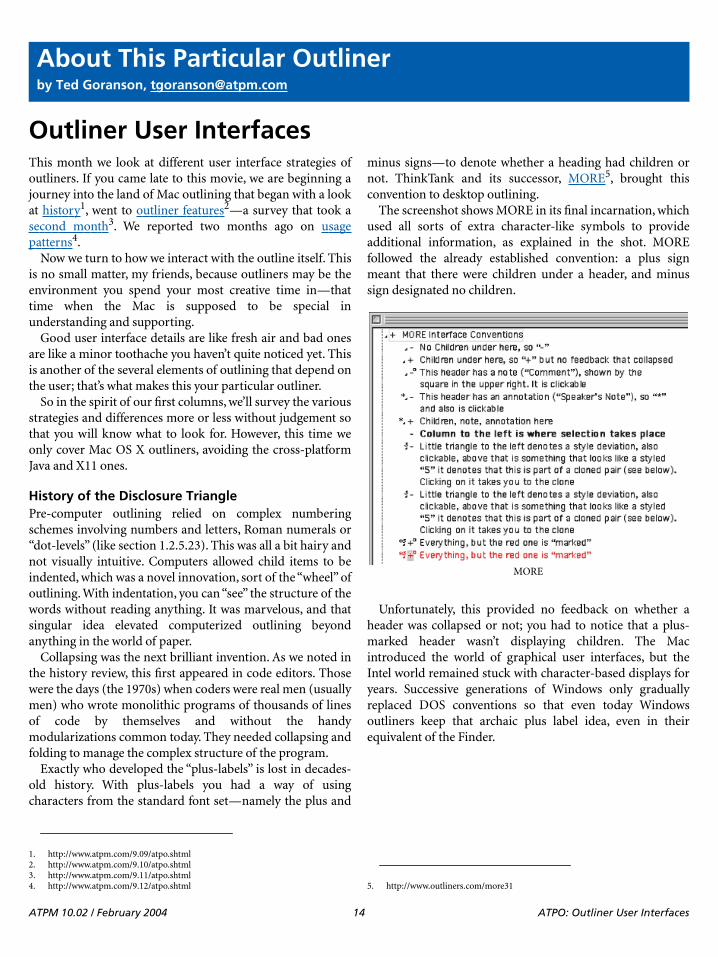
minus signs—to denote whether a heading had children ornot. ThinkTank and its successor, MORE5, brought thisconvention to desktop outlining.
The screenshot shows MORE in its final incarnation, whichused all sorts of extra character-like symbols to provideadditional information, as explained in the shot. MOREfollowed the already established convention: a plus signmeant that there were children under a header, and minussign designated no children.
Unfortunately, this provided no feedback on whether aheader was collapsed or not; you had to notice that a plus-marked header wasn’t displaying children. The Macintroduced the world of graphical user interfaces, but theIntel world remained stuck with character-based displays foryears. Successive generations of Windows only graduallyreplaced DOS conventions so that even today Windowsoutliners keep that archaic plus label idea, even in theirequivalent of the Finder.
About This Particular Outlinerby Ted Goranson, [email protected]
1. http://www.atpm.com/9.09/atpo.shtml2. http://www.atpm.com/9.10/atpo.shtml3. http://www.atpm.com/9.11/atpo.shtml4. http://www.atpm.com/9.12/atpo.shtml 5. http://www.outliners.com/more31
MORE
ATPM 10.02 / February 2004 14 ATPO: Outliner User Interfaces
But somewhere along the way—exactly where is lost in theether—the conventions were mixed: in some outline views aplus means a header has children and is collapsed; a minusmeans that a header has been fully expanded. This at leastgives you some indication of state.
So strong is this plus-label convention that Microsoft evencarries a graphic version of it into its latest word processor.The screenshot shows Word’s outliner, using the MOREconvention of plus for headers with children, and minus forchildless headers. Word gives feedback on collapsing bydrawing a grey line where the collapsed stuff would be.
Fortunately, we Mac users escaped that clumsy convention.Indeed, one of the main discriminators of Mac outlinersversus their Windows counterparts is in the use of thedisclosure triangle. ATPO has sent its Baker Street irregularsinto the rubbish bins of Mac history and has discovered alarge part of the reason why.
In 1983–4, David Carr wrote a pretty advanced “nextgeneration” DOS database that had hyperlinking andrudimentary outlining. It was called Framework and like
Lotus’s Agenda, never really caught on, and died whenWindows came about. It was sold to Ashton-Tate, thenBorland, and finally Selections and Functions, Inc.
Framework had a sort of outline view which used atriangle. David Dunham was inspired by that idea indesigning the user interface for Acta1 shortly thereafter.
Actually, Framework is still supported! One imagines itcontrols some key military air traffic control infrastructure orsomething. You can see the very triangle in question at theFramework site2. That triangle is not clickable and it does notrotate.
Acta’s implementation can still be used in Classic; thescreenshot shows it. It is a marvelous invention; a turnedarrow “opens” the children. A white arrow has no children.Clicking on the arrow collapses or expands. The world ofoutlining would never be the same…at least on the Mac.
That triangle became a fixed part of the Mac toolbox. EvenBruce Tognazzini3, founder and director of Apple’s HumanInterface Group, cannot remember when it crept into general
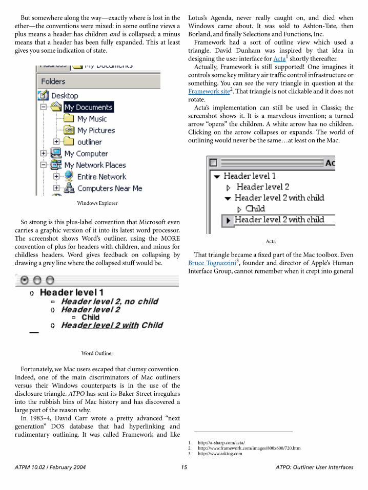
Windows Explorer
Word Outliner
1. http://a-sharp.com/acta/2. http://www.framework.com/images/800x600/720.htm
Acta
3. http://www.asktog.com
ATPM 10.02 / February 2004 15 ATPO: Outliner User Interfaces

use. You can see it all over the place in non-outlining contexts.The screenshots below show a recent Finder Get Info windowand Word’s formatting palette.
These triangles are called “disclosure triangles1,” “flippytriangles,” or simply “outline triangles.” Two things happenedto outline triangles on their way from there to here. The firstis rather profound: in System 7, Apple introduced the “outlineview” in the Finder. The Finder is just an application like anyother, but nearly all of us think of our Macs in terms of theFinder. For us, the Finder is the basic identity of the system,and since 1990 outlining has been the basic identity of theFinder.
The second is that the triangle has evolved from a blackright triangle with a point of 90 degrees to a grey equilateralone with all angles and sides equal. The old arrow wasdesigned for use on a black and white screen. The screenshotenlarges one so you can see the black pixels clearly. Next to itis a modern outliner arrow, which you can see depends on theability to select from more shades of grey.
Several of the more mature (read: older) outliners still use90-degree arrows: Frontier2, Inspiration3, Tinderbox4, andSchedule5. All of these are cross-platform (Tinderbox will besoon) and are unlikely to change. To be fair, Tinderbox andSchedule have been modernized. The screenshot shows thearrows from Schedule, Eudora6, and Tinderbox from left toright.
Collapsing FeedbackThat little triangle—and indentation—is the fulcrum ofoutlining. But different outliners bring all sorts of innovationto how they advise on collapsing. In December7 we describedjEdit8. It is not a native OS X outliner, rather Java, so it hassome interface quirks. But it is free and runs well on OS X. Itindicates feedback on collapsed headers by darkening the
Finder Info
Word Formatting Palette
1. http://developer.apple.com/documentation/mac/HIGOS8Guide/thig-24.htmlhttp://developer.apple.com/documentation/mac/HIGOS8Guide/thig-24.html
Old and New Arrows
2. http://www.userland.com3. http://www.inspiration.com/productinfo/inspiration/index.cfm4. http://www.eastgate.com/Tinderbox/5. http://www.aecsoft.com/products/desktop/fasttrack/Default.asp?bhcp=16. http://www.eudora.com
Modernized Arrows
7. http://www.atpm.com/9.12/atpo.shtml8. http://www.jedit.org
ATPM 10.02 / February 2004 16 ATPO: Outliner User Interfaces

background and also by telling you how many “lines” arecollapsed. Since jEdit is designed as a code editor, “lines” arewhat writers would call paragraphs.
You’ve already seen how Word gives feedback oncollapsing, by drawing a grey line. It is an elegant ideabecause it relates to the matter that is “window-shaded” up.AppleWorks1 has an outliner we haven’t talked much about.That’s because it is a different beast from Word’s; theAppleWorks outliner really exists to make outlines withindocuments rather than of documents. But it is interestingbecause it allows quite a few different labelling styles likebullets, several numbering styles, and a “diamond” mode.Oddly, it doesn’t offer an outlining triangle. Each labellingstyle has a different feedback mechanism for collapsing,always in the label.
NoteBook2 maintains two outlines. One is a “page” thatconsists of an outline, and another of the notebook contentswhich is an outline of outlines. Both use “Aqua-fied” glasstriangles, but different user interface conventions. In theregular outline, the triangle simply will not rotate to pointright if there are no children. This is a unique approach. Itmakes sense but you have to get used to a triangle pointingdown to nothing, something that is disconcertinglyunintuitive.
The screenshot shows the outline-of-outlines behind. Thishas a different philosophy because that round bullet is ahyperlink that when clicked takes you to the page denoted. In
this outline there are two citizens: pages and sections. Again,using some of the same user interface conventions but in adifferent way takes some getting used to.
When we do our comparative review between NoteBookand NoteTaker3, you’ll see how radically different they are.You can get a glimpse of this now in how NoteTaker handles“arrows.” The screenshot shows a part of an outline “page” infront. You’ll note that it doesn’t use arrows at all, but insteaduses an “Aqua-fied” plus-label convention—not the “MORE”and Word version, but the Windows Explorer version where“plus” means a header is collapsed, “minus” means it could bebut is not, and “blank” means it could not be collapsed.
I suppose this choice is because AquaMinds4 intends toport the product to Windows in 2004. The window behind onthe right is NoteTaker’s contents outline. It is similar toNoteBook’s except for the plus-labels and the use of adiamond as the hotlink to the page. But NoteTaker has adrawer on the left that shows the same outline as a fastnavigation tool. This one is based on the Mac Finder, but isoddly neutered: you cannot add or reorder headers here. Itserves more like the navigation outline on the left of AcrobatReader5.
This outline-of-outlines drawer has another pane belowwhich is not shown. It displays an even higher level: all thenotebooks of a user. Thus, in one presentation, you can have
jEdit Collapsed Feedback
1. http://atpm.com/6.05/aw6.shtml
AppleWorks Feedback
2. http://www.circusponies.com
NoteBook
3. http://www.aquaminds.com/index.jsp4. http://www.aquaminds.com/product.jsp5. http://www.adobe.com/products/acrobat/readermain.html
ATPM 10.02 / February 2004 17 ATPO: Outliner User Interfaces
three layers of outline, more or less integrated. Handy andcool featurewise, but the use of two radically different outlineuser interfaces is jarring.
Selection and Dragging
The nature of outlining is organizing and re-organizing. Thatmeans you are going to be moving things around, eitherdemoting/promoting them or relocating them to anotherpart of the document. In another column we’ll deal withautomation in this regard. But here we are concerned withmanual grabbing.
You’ll find a wide variety of approaches to selection anddragging. Generally, you need three “zones,” because youneed to select the text of the header to edit or copy it; youneed to select the whole header to relocate it; and you need toselect some group of headers to move as a group.
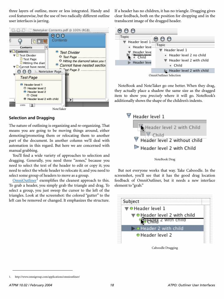
OmniOutliner1 exemplifies the cleanest approach to this.To grab a header, you simply grab the triangle and drag. Toselect a group, you just sweep the cursor to the left of thetriangles. Look at the screenshot: the colored “gutter” to theleft can be removed or changed. It emphasizes the structure.
If a header has no children, it has no triangle. Dragging givesclear feedback, both on the position for dropping and in thetranslucent image of the dragged header.
NoteBook and NoteTaker go one better. When they drag,they actually place a shadow the same size as the draggeditem to show you precisely where it will go. NoteBook’sadditionally shows the shape of the children’s indents.
But not everyone works that way. Take Caboodle. In thescreenshot, you’ll see that it has the good drag locationfeedback of OmniOutliner, but it needs a new interfaceelement to “grab.”
NoteTaker
1. http://www.omnigroup.com/applications/omnioutliner/
OmniOutliner Selection
NoteBook Drag
Caboodle Dragging
ATPM 10.02 / February 2004 18 ATPO: Outliner User Interfaces

Inspiration needs a special “selection column.” That’s thesecond column from the right. Actually it is unnecessarybecause you can click anywhere to the left of a header to selectthat header. In the screenshot, we have selected multipleheaders.
Notes
That last screenshot brings us to the final major user interfacewidget we’ll look at this month: how to show notes. Only afew of the many OS X outliners even have this conceptbecause you must support the feature we noted in theOctober column1 concerning two classes of text: headers andparagraphs (often called “notes” or “comments”).
Word, OmniOutliner, Tinderbox, and Inspiration supportthe notion in the straightforward way we mean. All of thosehave some indicator of notes. (In these outliners, it is alsopossible to have headers without notes.) Many of the “Finder-Note” type outliners (like Hog Bay Notebook2 and SkinkhuntNotes3) have this distinction too, but in those outliners the“headers” are more like Finder names.
The previous screenshot shows Inspiration’s icon for notes,the little pencil/note icon. This supports elegant functionalitybecause clicking on that note icon collapses the note under itsparent header. In other words, the icon serves both asindicator of a note and that note’s “arrow.”
But the award for the most informative of note icons mustgo to Tinderbox. Take a look at the screenshot below. Therectangles indicate notes. Each note has a color, an importantattribute that we’ll discuss in the review. Notice how some ofthe note icons have different numbers of lines? That is toindicate how much text there is in the note.
But wait. There are several other cool things. See how theheader labeled “Container” has no text at all? That’s because itreally is a container, like a folder. You can see that “Child” iscloned twice. I manually made a clone (an alias) and moved itto “Container.” But I also made a simple agent thatautomatically identifies and clones all notes with “Child” intheir names. (There is a “Child2” hidden under the orangeheader that is also cloned.)
Note that the agent is designated as an agent by the thickbar being on the bottom of the rectangle instead of the top.
One final piece of Mac-like wonder: notice that all the iconsbut one are filled with grey. That’s because I just created themas “fresh” notes. But look at the first header labelled “Notes.” Imade that one a month ago and it has a brownish tinge. Noteicons turn tan as they age; now isn’t that cool?
Okay, with that background, we’ll do a quick survey of allour OS X outliners.
AppleWorks4
Several outline labels are supported, as already displayedabove. These labels are hot and can be used to collapse anddrag. Different methods are used to show feedback oncollapsing, depending on the label method. The dragindicator is adequate but rudimentary as seen in thescreenshot.
BrainForest Deluxe5
BrainForest is a long-lived application, so it uses the old-stylearrows. The arrows are not used for dragging. Instead, youcan just select the header itself. This is very handy once youget used to it.
Inspiration
1. http://www.atpm.com/9.10/atpo.shtml2. http://www.hogbay.com/software/notebook/3. http://www.skinkhunt.com/notes/
Tinderbox
4. http://www.apple.com/appleworks/
AppleWorks Drag
5. http://www.ultrasoft.com/BrainForest/
ATPM 10.02 / February 2004 19 ATPO: Outliner User Interfaces

If a header has no children, it has no arrow. The screenshotshows a little dot. You either get that, or a checkbox that goeswith some “action management” capabilities. Headersindicate notes with the icon to the right. In BrainForest’s case,a note is a sort of annotation on the to-do item.
The drag feedback is nice and clear so far as verticalposition, but a little unclear on indentation.
Caboodle1
Caboodle uses new-style conventions: modern triangles, notriangle if no children, and the Omni-style drag indicator.This seems to be the common standard for new outliners.
Unfortunately, it uses a green button as the drag handle.The good news is that Caboodle drags an image of the headeras you can see from the screenshot above. This also seems tobe the new standard.
ConceptDraw Project2
This is a new product. You can see that it uses the older styletriangles, probably in emulation of its competitor, Schedule.Alas, there is no way to select, drag, or rearrange through thegraphical interface—or even from the keyboard.
Deep Notes3
Deep Notes, which I remind you is free, uses all the modernconventions. Its drag indicator is of the OmniOutliner style,just like Caboodle’s. It carries a translucent image. It is unlikeOmniOutliner and like BrainForest in the way you can selectthe header for dragging by just clicking on it.
• • •By now, I assume you’ve discerned two patterns:
• That we are touching on the “arrow controls” and the“drag controls” with the feedback associated with both,and;
• That there are subtle differences among all theseproducts, differences that could mean a lot to you.
We continue:
DEVONthink4
Here is an example of an outliner that looks and behaves likemany others. But look closely. The triangles are attached toevery header regardless of whether there is a child or not.
BrainForest
1. http://www.dejal.com/caboodle/2. http://www.conceptdraw.com/en/products/project/main.php
ConceptDraw Project
3. http://homepage.mac.com/asagoo/deepnotes/index.html
Deep Notes
4. http://www.devon-technologies.com/products/devonthink.php
ATPM 10.02 / February 2004 20 ATPO: Outliner User Interfaces

That way, you get no feedback on whether something iscollapsed and invisible. This is the way the Finder works, bythe way: you can “collapse” an empty folder.
Look also at the drag feedback compared to the previousscreenshot. Deep Notes uses the OmniOutliner methodwhere a line shows position and a circle indicates theindentation level. DEVONthink has a different philosophy; itoutlines the header that you are dropping into. This emulatesthe behavior of the pre-Panther Finder.
You decide which is better.
Frontier/Radio1
Now here’s an interesting case. Frontier is from Dave Winer,the guy behind MORE, which we showed much earlier.MORE stuck to the plus-labels. Frontier finally adoptsarrows, but it does so in the most limited way possible.Frontier’s arrows do not rotate; rather they change from greyto black when collapsed. All headers have arrows. A selectedheader is in reverse text with a black background.
This is a minimalist and elegant solution. The dragfeedback is pretty interesting, too. When dragging, the cursorchanges to a hand, giving feedback that a drag is underway.That blue arrow at the top shows what the part header wouldbe if we dropped the dragged one. This is, I think, the onlycolor used anywhere in Frontier. So the feedback is not so
much tied to where you are, but where you might be placed.In this example, the two are pretty far from each other. Theblue arrow can point southeast when the condition demands.
Hog Bay Notebook2
More variations! Hog Bay’s Notebook uses a Finder-likemetaphor. It has two classes of objects: folders and notes. Itfixes the Finder feedback mechanism though. An emptyfolder has no arrow. The drag positioner is the familiarmodern type. Hog Bay includes a trash can, which is a darnhandy idea, for the same reason that the Finder’s Trash is.
DEVONthink
1. http://www.userland.com
Frontier
2. http://www.hogbay.com/software/notebook
Hog Bay Notebook
ATPM 10.02 / February 2004 21 ATPO: Outliner User Interfaces

IdeaSpiral1
IdeaSpiral almost doesn’t qualify as an outliner. It supportsno mouse-driven reorganization of any kind; instead, aclumsy dialog is used. There is no collapsing.
Inspiration2
You’ve already seen Inspiration. It allows discontinuousselection, with the selection shown both in the gutter to theleft and by outlines around the text. The cursor changes whendragging. The drop indicator is very clear. Also, it supportsthe very cool separate “collapser” for folding notes.
Life Balance3
Once again, something different. This uses a round bulletwhen there is no child. You drag by grabbing the arrow orbullet. There is no explicit drop feedback in terms of agraphic. Instead, it uses a “snap” function, so that the draggedimage jumps from one potential drop location to another.
Liner4
Liner, on the other hand, does things somewhat differently.You grab the text, so you need no extra button for a headerwith no child. Life Balance is a Windows/Mac/Palmapplication, which explains why it stands out. Liner is Mac-only and looks like it.
Deviation from the Macintosh conventions (like LifeBalance and Inspiration) could be a good thing if it is doneintelligently and it fits the way you like your mind-eyedynamic to work.
Mathematica5
We haven’t mentioned this one before because it costs nearly$2,000. Mathematica is a multipurpose environment for workin mathematics with unique strength in symbolic math. Ituses a “notebook” interface consisting of “cells,” what wemight thing of as paragraphs, but these cells can contain allsorts of things including the input, definition, and statementof any mathematical function.
Mathematica notebooks are one of the more flexible andinnovative DTP environments ever created, regardless of themathematics function. And a key innovation is the way youcan nest cells in an outlining mode. The screenshot shows theunique way nesting and collapsing is displayed. The nesting isassigned and manipulated quite independent of the layoutand indentation of the text on the page.
The screenshot shows our example headers only. Note thatthe last header is collapsed, denoted by the small triangle atthe bottom of the bracket. The double tick marks at the top of
1. http://www.midnite-liteman.com/ideaSpiral.php
IdeaSpiral
2. http://www.inspiration.com/productinfo/inspiration/index.cfm3. http://www.llamagraphics.com/LB/LifeBalanceTop.html
Life Balance
4. http://www.imediasw.com/liner.php
Liner
5. http://www.wolfram.com
ATPM 10.02 / February 2004 22 ATPO: Outliner User Interfaces

each bracket indicate that it is a text cell.
Mathematica exports to XML and is a potentiallyinteresting partner to Tinderbox and/or OmniOutliner (andpossibly Word 2004 for Mac if its XML handling is asimproved as in Word 2004 for Windows).
MyMIND1
This application focuses on the graphic view. The outlineuses the common convention: grab the text, no triangle forchildless headers, and the familiar drop indicator. Prettycompetent donation-ware.
NoteBook2
We’ve displayed this above. Remember the unique dropfeedback where the space and shape of the dropped items isdisplayed in context. Attention to detail here. NoteBook hasan option to use “un-Aqua-fied,” “normal” grey triangles andbullets instead of those in our screenshot.
NotePad Deluxe3
Now for something completely different. NotePad is from anexemplary Mac citizen, Ibrium, who is behind the opensource Mac-on-Linux, a huge contribution to thecommunity. NotePad Deluxe uses elements from all over,including Windows. As with Hog Bay Notebook, the Findermetaphor is used for headers with text as notes and headerswithout text as folders. You can drag from an icon or text butnot an arrow. The vertical drop location is shown with a line.The left of the line changes according to the indentation ofthe drop candidate—not obvious, but with those connectorlines between levels it is pretty elegant.
NotePod4
This little application is also unique. It uses a hand dragger.The hand only grabs the “folder” or document icon. The droplocation is indicated by a line. Notice that while the headersare indented the arrows are not. NotePod isn’t the onlyapplication that does this—you have already seen two others.It reflects a design decision to make the arrows a property ofthe window instead of being associated with the text. Emptyfolders have arrows.
I hope you appreciate the profound difference this mightmake to the way you think and work in the outline inaddition to the efficiencies. Just look at the differences among
Mathematica
1. http://www.sebastian-krauss.de/software/
MyMind
2. http://www.circusponies.com3. http://www.ibrium.se
NotePad Deluxe
4. http://personalpages.tds.net/%7Egraffix/software/notepod/index.html
ATPM 10.02 / February 2004 23 ATPO: Outliner User Interfaces

NotePod, NotePad Deluxe, and Hog Bay Notebook. Thesecompete with each other and have radically differentinterface paradigms.
NoteTaker1
You’ve already seen the fascinating approach this applicationhas taken: aquafied plus-labels. You must drag from thebuttons. The drop indicator is not a line but a box thatindicates not only where the text will end up, but alsodisplaces the headers around as they would be when the textis dropped.
Also, NoteTaker has a disconcerting mix of outline displayparadigms. On the other hand, it makes some sense to showthe Finder-like view in a Finder-like manner.
NovaMind2
This application’s outliner function has a few deficiencies onthe keyboard side.
It leaves a childless header arrowless. You grab the text. Thedrop indicator is the familiar line-circle variety.
OmniOutliner3
This popular outliner substitutes a bullet for an arrow whenthe header is childless. When the header has text, a “note”icon is displayed. Clicking that note icon does nothing at all,however. In this application, you drag by the arrow or bullet.The drop indicator is the one we have seen many times.
Incidentally, OmniOutliner has an inspector palette withdisclosure triangles. They are subtly different from theiroutlining triangles. Clunkier. Something better is promisedin an immediately forthcoming version.
We’ll go quickly now.
PocketNotes4
Nothing new here as you can see.
NotePod
1. http://www.aquaminds.com/index.jsp2. http://www.nova-mind.com
NovaMind
3. http://www.omnigroup.com/applications/omnioutliner/
OmniOutliner Inspector
4. http://www.pocketsw.com/PocketSoftware/pocket_notes.php
PocketNotes
ATPM 10.02 / February 2004 24 ATPO: Outliner User Interfaces
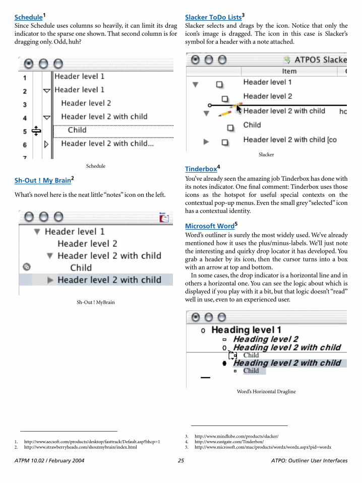
Schedule1
Since Schedule uses columns so heavily, it can limit its dragindicator to the sparse one shown. That second column is fordragging only. Odd, huh?
Sh-Out ! My Brain2
What’s novel here is the neat little “notes” icon on the left.
Slacker ToDo Lists3
Slacker selects and drags by the icon. Notice that only theicon’s image is dragged. The icon in this case is Slacker’ssymbol for a header with a note attached.
Tinderbox4
You’ve already seen the amazing job Tinderbox has done withits notes indicator. One final comment: Tinderbox uses thoseicons as the hotspot for useful special contexts on thecontextual pop-up menus. Even the small grey “selected” iconhas a contextual identity.
Microsoft Word5
Word’s outliner is surely the most widely used. We’ve alreadymentioned how it uses the plus/minus-labels. We’ll just notethe interesting and quirky drop locator it has developed. Yougrab a header by its icon, then the cursor turns into a boxwith an arrow at top and bottom.
In some cases, the drop indicator is a horizontal line and inothers a horizontal one. You can see the logic about which isdisplayed if you play with it a bit, but that logic doesn’t “read”well in use, even to an experienced user.
1. http://www.aecsoft.com/products/desktop/fasttrack/Default.asp?bhcp=1
Schedule
2. http://www.strawberryheads.com/shoutmybrain/index.html
Sh-Out ! MyBrain
3. http://www.mindlube.com/products/slacker/
Slacker
4. http://www.eastgate.com/Tinderbox/5. http://www.microsoft.com/mac/products/wordx/wordx.aspx?pid=wordx
Word’s Horizontal Dragline
ATPM 10.02 / February 2004 25 ATPO: Outliner User Interfaces
My Own Personal PreferencesThe user interface elements surveyed here are only a smallpart of the outliner experience, and we’ve ignored essentialelements like selecting and dragging sets of headers. Butoutlines are a graphical arrangement of text, and theseelements are at the core of the eye-hand interaction with thatorganization. That’s so even if you never touch the mouse.Selecting a specific philosophy is important because the Zenof outlining is in naturally attuning your thoughts to the waythey are displayed.
I hesitate to give my own preferences. The differencesamong offerings and philosophies have been presented inthis lengthy way so that you can select your own particularoutliner.
Here goes for myself—I think arrows should be used, and as a matter of
consistency they should look like the Finder arrows. I have astrong preference for the arrows being associated with theheader, in other words: indented with the text instead ofbeing part of the window or in columns.
That association should continue further with the arrowbeing the grabbable element rather than the text. Part of thereason for this is that if the text is grabbable, you need to gothrough extra steps to enter the text field of a header forediting. OmniOutliner is an example of the several outlinersthat do this the way I prefer.
Contrary to how the Finder handles arrows, they shouldnot apply to a childless header. That solution takes care ofcollapsed feedback nicely—if you have a right-facing arrow,something is always folded underneath.
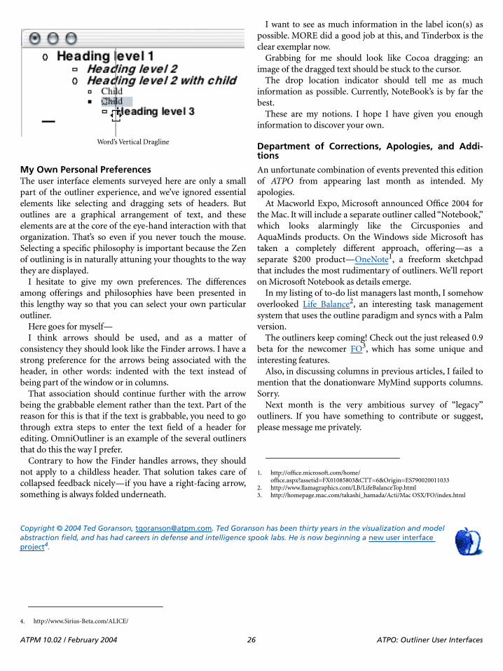
I want to see as much information in the label icon(s) aspossible. MORE did a good job at this, and Tinderbox is theclear exemplar now.
Grabbing for me should look like Cocoa dragging: animage of the dragged text should be stuck to the cursor.
The drop location indicator should tell me as muchinformation as possible. Currently, NoteBook’s is by far thebest.
These are my notions. I hope I have given you enoughinformation to discover your own.
Department of Corrections, Apologies, and Addi-tions
An unfortunate combination of events prevented this editionof ATPO from appearing last month as intended. Myapologies.
At Macworld Expo, Microsoft announced Office 2004 forthe Mac. It will include a separate outliner called “Notebook,”which looks alarmingly like the Circusponies andAquaMinds products. On the Windows side Microsoft hastaken a completely different approach, offering—as aseparate $200 product—OneNote1, a freeform sketchpadthat includes the most rudimentary of outliners. We’ll reporton Microsoft Notebook as details emerge.
In my listing of to-do list managers last month, I somehowoverlooked Life Balance2, an interesting task managementsystem that uses the outline paradigm and syncs with a Palmversion.
The outliners keep coming! Check out the just released 0.9beta for the newcomer FO3, which has some unique andinteresting features.
Also, in discussing columns in previous articles, I failed tomention that the donationware MyMind supports columns.Sorry.
Next month is the very ambitious survey of “legacy”outliners. If you have something to contribute or suggest,please message me privately.
Copyright © 2004 Ted Goranson, [email protected]. Ted Goranson has been thirty years in the visualization and model abstraction field, and has had careers in defense and intelligence spook labs. He is now beginning a new user interface project4.
Word’s Vertical Dragline
1. http://office.microsoft.com/home/office.aspx?assetid=FX01085803&CTT=6&Origin=ES790020011033
2. http://www.llamagraphics.com/LB/LifeBalanceTop.html3. http://homepage.mac.com/takashi_hamada/Acti/Mac OSX/FO/index.html
4. http://www.Sirius-Beta.com/ALICE/
ATPM 10.02 / February 2004 26 ATPO: Outliner User Interfaces
Web Accessibility: Part 2: Text & Language
Part 2: Text and LanguageLast month, we took a look at the reasons why it’s importantto think about Web accessibility1: as well as making life easierfor the disabled, we can make a better site all-round. Thistime, we’ll be doing something about it—by looking at howwe can improve the way we use text and language on our Websites.
Text?!Yes, text. It’s undoubtedly the most accessible format on theWeb: it can be spoken aloud, easily resized, copied andpasted, translated, spidered by Web search engines, and evenconverted into Braille.
However, that doesn’t give you an excuse to slack off,because the way you present your textual content can havesome serious impact on the accessibility of your page. Eventhough text will probably make up the bulk of your site’scontent, it can often be overlooked in the rush to get thegraphics down pat, link your pages properly, and get the siteworking in a bunch of different browsers.
The good news, of course, is that text is easy tomanipulate—much easier than ripping the guts out of yourlayout or color scheme. That means any accessibility issueswith your text will be reasonably easy to fix, and it’s a goodplace for us to start.
Who Benefits?When it comes to accessibility and text, everyone—and I domean everyone—benefits from some attention to the way youpresent your text. A lot of these tips improve your site’sgeneral usability. From an accessibility standpoint, however,some particular groups are worth thinking about:
• Visually impaired users will often have trouble withreading text in general, and reading it on a computerscreen can make it even harder. There’s no reason toput extra barriers in their way with sloppy writing anddifficult presentation.
• People with a cognitive disability have trouble withmental tasks, and often find text content to bedifficult. The same is sometimes true of people withconditions like Attention Deficit HyperactivityDisorder. These conditions can affect a reader’s
comprehension of the text and their ability toconcentrate. Your writing style and presentation areboth important here as well.
Note: People with cognitive disabilities can get agreat deal of benefit from using graphics, multimedia,or other non-text content. However, this time we’ll beconcentrating on text.
• It really is the World Wide Web. It’s likely that some ofyour visitors aren’t native speakers of your language,and their non-native vocabulary isn’t necessarily up toscratch. Simpler writing makes it easier for you to getyour message across.
• Don’t forget about kids! While youth is not adisability, children don’t generally have adult readingskills or vocabularies, and there’s not a lot they can doabout it for now. Like people who don’t speak yourlanguage, simpler writing means that they can spendmore time reading, and less time checkingdictionaries.
Able readers will benefit too:
• Usability expert Jakob Nielsen found that mostreaders will scan a page2, rather than actually read itall the way through. Simpler writing and clearlypresented text mean that it’s easier for people to get tothe meat of your writing, without being distracted bythe trimmings.
• Nobody likes waffle. Many people find technicaljargon, legalese, or marketing fluff to be confusing oreven intimidating. Clearer writing makes your readersfeel a lot more comfortable when using your site.
• There’s usually something else competing for yourreaders’ attention: phones ringing, new mail iconsblinking, other browser windows open, and so on.Attention spans are short. If you can get your messageacross quickly and clearly, it won’t be lost in the noise.
Keep It SimpleHave you ever read something like this?
We are currently in the process of consolidatingour product range to ensure that the products thatwe stock are indicative of our brand aspirations.
Web Accessibilityby Raena Armitage, [email protected]
1. http://www.atpm.com/10.01/web-accessibility.shtml 2. http://www.useit.com/alertbox/9710a.html
ATPM 10.02 / February 2004 27 Web Accessibility: Part 2: Text & Language
As part of our range consolidation we have alsodecided to revisit our supplier list and employ amore intelligent system for stock acquisition. As aresult of the above certain product lines are nowunavailable through jungle.com, whilst potentiallyremaining available from more mainstreamsuppliers.
Uh…what?This horrible mangling of the English language comes
courtesy of the Plain English Campaign’s Golden BullAwards1. Somebody sent a question to online retailerjungle.com, asking whether they still sold blank CDs, andthis was the response. A short, sharp “No” would have beenrude, but at least it wouldn’t make your eyes cross.
When you’re writing for the Web—or anywhere else, forthat matter—you should try to use the clearest and simplestlanguage possible. It’s a good idea for a number of reasons,but from an accessibility viewpoint this will ensure that yourwriting doesn’t compound any other problems that yourreaders may have. And for those keeping score at home, usingthe clearest and simplest language is one of the Priority Onecheckpoints for the World Wide Web Consortium’s WebAccessibility Guidelines2.
Clear and simple language doesn’t mean that you ought to“dumb it down” to first-grade level: the language you need touse also relies a lot on your audience and the text’s purpose.For example, if you’re the webmaster of a meteorology site,you can safely assume that a visitor reading an analysis ofrecent climate data3 will be someone who is already familiarwith meteorology. There’s a good chance that they alreadyknow about terms like “Kelvin wave” and “positive anomaly,”so it’s fair to go right ahead and use them. However, peoplewho just want to see their local weather forecast4 will be morecomfortable with everyday terms like “unusually strongwinds” or “scattered showers.”
Practical Tips
The following pointers can help you keep your writingsimple, clear, and effective.
• Keep your sentences short—15–20 words is about aslong as a sentence should get. It can be hard to do thiswhen you’re trying to explain a complicatedidea—use appropriate punctuation (like thosedashes) to help turn long sentences into moremanageable chunks.
• Stick to one concept or idea per paragraph. If you findthat you’re writing about two different things in asingle paragraph, it’s probably time to break them up.
• Choose common words whenever you can. This is ofparticular benefit to people with a reading or learningdisability, who have to work harder to read your text.
• Try to avoid jargon and other “special” words as oftenas possible. If it’s necessary to use them, define themsomeplace in the document—either with a glossary,or the first time you use them.
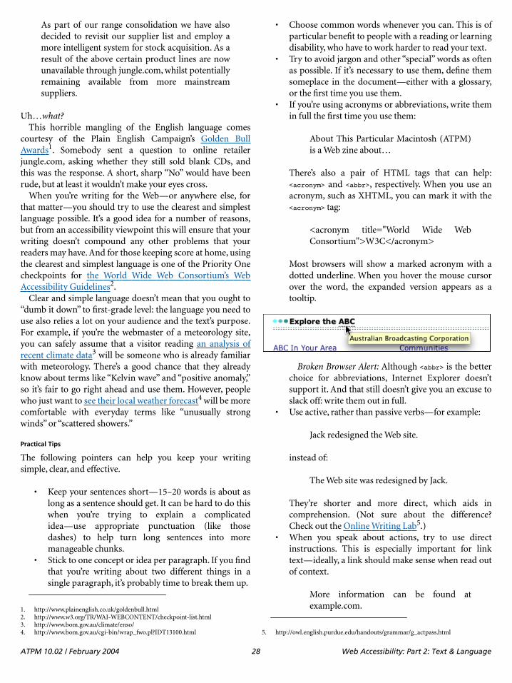
• If you’re using acronyms or abbreviations, write themin full the first time you use them:
About This Particular Macintosh (ATPM)is a Web zine about…
There’s also a pair of HTML tags that can help:<acronym> and <abbr>, respectively. When you use anacronym, such as XHTML, you can mark it with the<acronym> tag:
<acronym title="World Wide WebConsortium">W3C</acronym>
Most browsers will show a marked acronym with adotted underline. When you hover the mouse cursorover the word, the expanded version appears as atooltip.
Broken Browser Alert: Although <abbr> is the betterchoice for abbreviations, Internet Explorer doesn’tsupport it. And that still doesn’t give you an excuse toslack off: write them out in full.
• Use active, rather than passive verbs—for example:
Jack redesigned the Web site.
instead of:
The Web site was redesigned by Jack.
They’re shorter and more direct, which aids incomprehension. (Not sure about the difference?Check out the Online Writing Lab5.)
• When you speak about actions, try to use directinstructions. This is especially important for linktext—ideally, a link should make sense when read outof context.
More information can be found atexample.com.1. http://www.plainenglish.co.uk/goldenbull.html
2. http://www.w3.org/TR/WAI-WEBCONTENT/checkpoint-list.html3. http://www.bom.gov.au/climate/enso/4. http://www.bom.gov.au/cgi-bin/wrap_fwo.pl?IDT13100.html 5. http://owl.english.purdue.edu/handouts/grammar/g_actpass.html
ATPM 10.02 / February 2004 28 Web Accessibility: Part 2: Text & Language

That’s nice, but:
Find out more at example.com.
is much easier to read.• The easiest way to check your work for simplicity is to
ask someone to read it for you, and preferablysomeone who isn’t an expert on what you’re writingabout. When you’ve spent hours preparing yourwriting, you’re probably too close to the action. Nofriends? Well, try leaving the work alone for a littlewhile and go do something else. Come back and readit with a fresh perspective.
Keep It OrganizedThe way you structure your text can have a significant impacton accessibility as well. Headings, lists, paragraph breaks,and good use of white space all contribute to an easier timeon the Web. Using these techniques can help break up yourtext into smaller parts.
What’s more, using the correct HTML structure for yourtext elements can be of great benefit to both you and yourreaders. It’s very noticeable for people who use a screenreader such as Freedom Scientific’s JAWS1, which announcesthe presence of a heading, tells the user when they are readinga list, and more. To do this, it relies on the structure of thepage.
Headings
Using headings and subheadings can be a tremendous aid toaccessibility. Headings make it clear where each section ofyour page begins and ends, making it easier for visually-impaired people to identify each section, and simplifying theprocess for people who have trouble with reading.
Able readers will also find it easier to skim through thecontent to pick out the parts they’re interested in reading.Search engines are paying attention, too—many will viewkeywords in your headings to be more prominent thankeywords in the rest of your page.
Ideally, headings will be larger, bolder, colored, or acombination of all three. Use short, meaningful headings thataccurately describe the text beneath them.
In HTML, the <h1> through to <h6> tags are used to markheadings of varying levels. A visual browser’s defaultrendering of a heading is pretty dry, but you can spice it upwith cascading stylesheets (CSS). For example, using thispiece of CSS would make each instance of a <h2> taggedheading bold, large, dark red, and set in Helvetica.
h2 {font-size: large;font-family: Helvetica, Arial, Geneva, sans-serif;font-weight: bold;
background-color: #fff;color: #900}
If you like to use images as headings, that’s fine too—they cango inside heading tags. Don’t forget to give the headingimages a meaningful “alt” attribute, though.
<h2><img src="/images/whatsnew.gif" height="40"width="120" alt="What's New" /></h2>
ParagraphsThe best way to present paragraphs on a screen is to separatethem with blank space. You’ll notice that we’ve done that hereat ATPM, on both the Web site and in the screen PDF version.It’s harder to read large amounts of text on a computer screen,and breaking up your text helps a great deal.
The “right” way to present a paragraph in HTML is to usethe <p> tag, like so:
<p>Captain Arthur Phillip and the First Fleet landed at PortJackson in the new colony of New South Wales on 26 January1788. Until the American War of Independence, Britain hadsent convicts to America. American independence ended thepractice and the British prisons and prison hulks werefull to overflowing. The island continent at the end ofthe world seemed a perfect place to send them.</p>
It’s common to find people using a pair of linebreaktags—<br> or <br />—to separate paragraphs instead of the“real” paragraph tag. While this looks similar to the spaceyou see in a <p>-marked paragraph, it doesn’t really describewhat the text is. Keep in mind that JAWS relies on structure tomake navigation easier.
Lists
Lists should be used when you’re presenting a group of items.Again, the visual clue of the list items’ markers—bullets,numerals or symbols—makes it easier to identify each part ofthe list. Screen reader users will be able to tell it’s a list, even ifthey can’t see those symbols. For example, JAWS willannounce that a list is beginning and ending as it reads thelist to the user. It can also tell them at a “glance,” as it were,how many items are in the list.
HTML provides a way to construct three kinds of lists:unordered, ordered, and definition. In visual browsers,unordered lists use a symbol like a bullet or square to markeach item. Ordered lists use a numeral or letter to mark eachitem. Definition lists are handy for terms and theirdefinitions—you can use them to more accurately mark up aglossary, for instance.
It’s difficult to give a good and brief example of just howmuch you can do with HTML lists. For a great explanation onhow HTML lists work, check out the W3Schools’ detailedexamples of lists2.
1. http://www.freedomscientific.com/fs_products/software_jaws.asp
ATPM 10.02 / February 2004 29 Web Accessibility: Part 2: Text & Language
White Space
White space is the term used for margins, padding, and other“blank” bits of the page. Good use of white space can beextremely helpful to people with a cognitive disability, whooften find that a “crowded” page makes it much harder toconcentrate on the text.
Reduce some of the clutter by adding margins to your text.How you do this depends on the way you’ve constructed yourpage: if the text is in a table, you could add a generouspadding to the table’s cells. If you construct table-free layoutswith CSS, you can add padding or margin to the text or itssurrounding container.
Increasing the line height (line spacing) of your text canoften help as well. There’s no particularly easy way to do thisin plain old HTML, but adding some CSS means you canadjust the line height of your text.
body {line-height: 180%;}
What About Type and Color?We’ll talk more about type and color in a later article, but thegeneral guidelines for type are these:
• Using high-contrast text, such as a dark text color on apale background, can make a significant difference.Higher contrast means that the words stand out moreclearly, which is crucial for visually-impaired readers.It also makes things easier for some people with acognitive disability.
• Limit your fonts to one or two choices. A page thatuses seven different fonts can be extremely confusing,not to mention cheesy.
• If you’re using CSS on your page, relative font sizeslike percentages or keywords are more flexible thanabsolute pixel- or point-based ones. (If you’re notusing CSS, what’s keeping you?) Relative font sizes arecalculated according to the preference set in the Webbrowser: if a reader has set their browser default sizeto “larger,” they expect larger text. Don’t stomp ontheir preference, because it’s probably there for a goodreason.
Broken Browser Alert: It gets worse for the 80% ofusers who browse with Internet Explorer forWindows. If they go to a page with tiny, absolutely-sized text and try to use the View menu to enlarge it,Internet Explorer does absolutely nothing. What apain.
If all this relative-versus-absolute stuff is gobbledygook toyou, there’s a great explanation at Max Design1.
Again, we’ll be covering this in more detail later on.
Where to StartSo now you know what to do: now, where to start?
You really don’t have to rewrite every single page on yoursite right now, unless you’ve got nothing better to do allweekend. The easiest place to start is by looking at whateveryou’re working on at the moment. If you’re adding new textcontent to your site some time in the near future, try toincorporate some of these techniques for making your siteeasier to read.
What you should think about changing soon are importantand often-used parts of your site. Now is the time to look atthem and see if you can’t improve their textual content. If youhave any of the following, these are particularly useful:
• your “home” (index) page• the instructions for your search engine• Frequently Asked Questions or help pages• product support information• contact details for you or your company• your privacy policy
Yeah, I even said privacy policy. Privacy policies are oftenfilled with legalese and technical jargon, but it is important tomake sure that your readers understand it—disabled or not.Even lawyers and engineers can write like humans when theytry.
Further ReadingLast month’s links2 are still useful for finding informationabout the best ways to use text. However, these resourcesprovide more specific discussions about text, language, anddisabilities.
The Plain English Campaign has free guides and advice3
on how to use simple, plain English. (If you aren’t writing inEnglish, don’t be put off—the principles are still sound.)
Jakob Nielsen’s collection of tips on writing for the Web4 ispacked with goodies, including before-and-after examples ofimproved text.
WebAIM has a section devoted to cognitive disabilities5
and the difficulties that people can encounter when yourcontent isn’t clear. For a great example of what this can belike, do the origami cup activity6 and see how you fare.
The International Dyslexia Association7 discusses theeffect of dyslexia and related conditions. While they don’tseem to have a lot of discussion about dyslexia and the Web,there’s a wealth of information about what it is and how itaffects people.
2. http://w3schools.com/html/html_lists.asp1. http://www.maxdesign.com.au/presentation/relative/
2. http://atpm.com/10.01/web-accessibility.shtml3. http://www.plainenglish.co.uk/guides.html4. http://www.useit.com/papers/webwriting/5. http://www.webaim.org/techniques/cognitive/6. http://www.webaim.org/techniques/cognitive/activity7. http://www.interdys.org/index.jsp
ATPM 10.02 / February 2004 30 Web Accessibility: Part 2: Text & Language

Aphasia is a condition that occurs after brain damage orstroke, and affects a person’s use of language—speaking,writing, or reading. The National Aphasia Association1 in theUnited States provides information about this condition andits effects.
Copyright © 2004 Raena Armitage, [email protected].
1. http://www.aphasia.org
ATPM 10.02 / February 2004 31 Web Accessibility: Part 2: Text & Language
How To: Panther Meets NTFS
Panther Meets NTFSRegular readers of this column know that I have been an avidMac user since System 7 and the LC II. I have even used a fewSystem 6 machines. Unfortunately, I have always attendedschools or worked in settings where Mac users were in theminority. That has meant finding ways to make whatever MacI was using read PC files. In those days, reading MS-DOSdisks often required third-party software.
In the 20-year history of the Mac, things have improvedconsiderably. Making use of PC data has gotten easier witheach succeeding incarnation of the operating system. By thetime Mac OS 9 came along, basic file transfer between theMac and PC had gotten a lot easier. The OS could read FAT32–formatted MS-DOS disks and major programs such asPhotoshop and Microsoft Office were using many of the samefile formats on both platforms. If you had comparableversions of the same program, reading files could beaccomplished relatively easily and with minimal loss of dataor formatting changes.
All of these changes were great, and those of us whoworked in cross-platform environments appreciated all theimprovements, but there was still work to be done. You couldread FAT 32 volumes with relative ease, but the most recentversions of Windows use the NT File System (NTFS). For awhile it appeared as though your options for reading thisformatting scheme were setting up a network or go back tothe days of third-party software to read PC disks. Well, if thatwere all there is to this story, I would not be wasting yourtime.
Normally, I would not worry about reading the NTFSformat since my computer at work is still using FAT 32 andmost of the data I transfer will fit on a floppy disk. Theproblem is that my wife’s Windows XP box recently had anear-meltdown. We were left with an external NTFS-formatted drive with 11 GB of data. We did not want to plugthe drive into the Windows box for fear that it might fallvictim to whatever created the problem in the first place.What were we going to do?
Panther to the Rescue?A few days before our problem developed, I was making myusual visit to MacOSXHints. If you have not been to that site,check it out. You will be amazed at the tidbits of informationfound there. During one of my forays there I found out thatPanther systems can indeed1 mount NTFS drives natively.
As you can see from the collection of hints, reading NTFS-formatted drives under Panther is usually easy. Most userscan simply plug the drive in question into their Mac and thedrive mounts with no difficulty. There is one caveat: Panthermounts NTFS drives as read-only volumes. You will not havewrite access to the data.
Even though you cannot write new data to this drive, youcan move data from that drive to another drive on your Mac.Last month I told you about burning files over the network2
well as a backup plan, just in case something went wrong. Iburned data from the NTFS drive to a DVD without using thenetwork. If you are going to do this, make sure that you burnthe DVD in a format that both the Mac and PC canunderstand. Someday you might want to put that data backon the Windows box.
Sometimes Things Go WrongI have tested Panther’s ability to read NTFS drives under both10.3.1 and 10.3.2. Before you count on it as the only means ofsalvaging your data, there are some things to keep in mind.The most common problems will usually occur whilemounting the drive or while moving certain types of files.
Under some circumstances, Panther may not want tomount the NTFS drive properly. While I had no problemsmounting an NTFS drive, other users have reported thatPanther sometimes complains about not being able torecognize the drive. In this case, you will be given the optionto initialize the drive.
In my testing, I did not have any difficulty getting Pantherto mount an NTFS drive, but it did complain at times aboutfile names. Under 10.3.1, I was able to mount the drive andcopy files with no difficulty. Under 10.3.2 on a different Mac Igot numerous complaints from the OS about file names thatwere too long or contained illegal characters. Both problemswere most noticeable on a series of Favorites created by thePC version of Internet Explorer. The same hard drive andfiles were used during testing.
Hey, What About Jaguar?Right about now those of you that have not yet migrated toPanther may be feeling a little left out. Well, do not give upjust yet. Even without Panther installed, you may be able to
How Toby Sylvester Roque, [email protected]
1. http://www.macosxhints.com/article.php?story=20031031075607668&query=NTFS
2. http://www.atpm.com/10.01/burning.shtml
ATPM 10.02 / February 2004 32 How To: Panther Meets NTFS

read that annoying NTFS drive. The same hint that told mePanther could read NTFS drives also contained a commentfrom someone who reads NTFS drives under Jaguar.
I was unable to duplicate this feat under Jaguar duringtesting. The files would begin to copy and then stop when theprocess was partially completed. Sometimes the copy processstopped with the usual error message about illegal filenames.At other times, attempting this feat under 10.2.8 led to akernel panic. In fairness, I must tell you that at about thistime I was experiencing intermittent problems with my10.2.8 installation. This may have affected the results. If youare running Jaguar and are having trouble getting NTFSsupport to work, check out a small program called NTFileSystem 1.0d21. I was unable to conduct a fair test of thisprogram due to problems with my Jaguar installation, butother users have had success with it.
Closing ThoughtsAs you can see from my experiences, some users are havinggood success reading the NT File System under Panther andJaguar while other users are having more difficulty. When thisworks, it works well. When it does not work, I haveexperienced problems ranging from difficulty reading somefile names to the occasional crash or kernel panic.
If you are going to try this with your system you mightwant to make your initial tests with data that you don’t mindlosing until you are sure that the process works. At no pointdid I lose any data while testing this tip, but why take thatchance with irreplaceable information? It is also a good ideato conduct the testing with a stable system. I do not believethis process caused the instabilities that I experiencedbecause the problems were only present in one of the two testsystems.
Copyright © 2004 Sylvester Roque, [email protected].
1. https://sourceforge.net/project/showfiles.php?group_id=87150&package_id=90738
ATPM 10.02 / February 2004 33 How To: Panther Meets NTFS
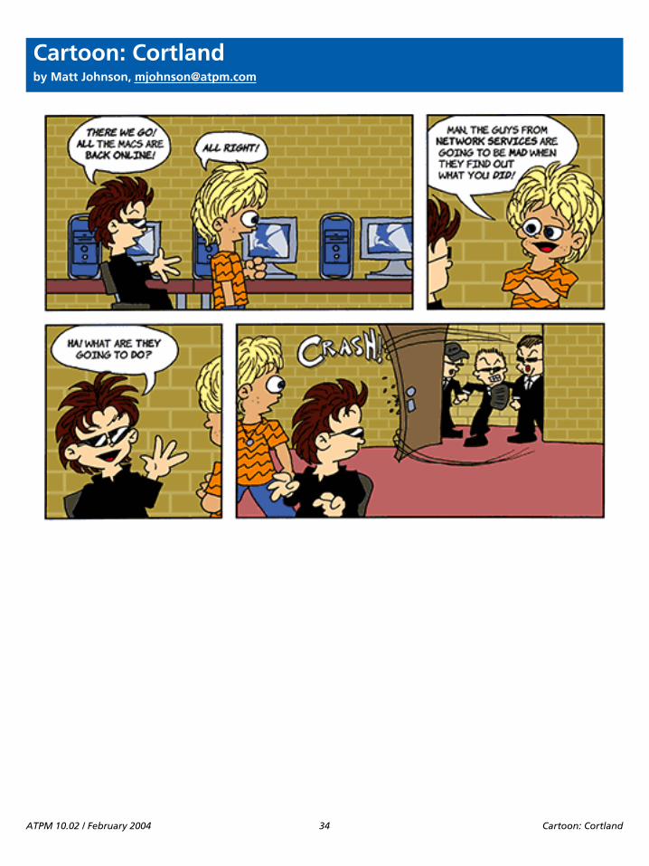
Cartoon: Cortland
Cartoon: Cortlandby Matt Johnson, [email protected]
ATPM 10.02 / February 2004 34 Cartoon: Cortland

Cartoon: iTrolls
Cartoon: iTrollsby GMx, http://homepage.mac.com/gregmx
ATPM 10.02 / February 2004 36 Cartoon: iTrolls
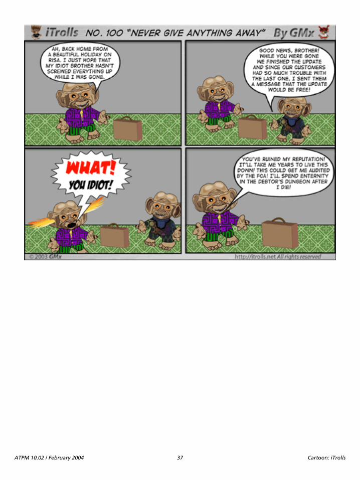
ATPM 10.02 / February 2004 37 Cartoon: iTrolls

ATPM 10.02 / February 2004 38 Cartoon: iTrolls

ATPM 10.02 / February 2004 39 Cartoon: iTrolls
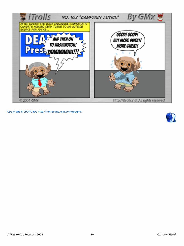
Copyright © 2004 GMx, http://homepage.mac.com/gregmx.
ATPM 10.02 / February 2004 40 Cartoon: iTrolls

Desktop Pictures: Remembering Summer
Remembering Summer
Remembering Summer1
This month’s desktop pictures are from ATPM reader DaveTrautman:
I’ve been a fan of the Desktop Pictures section ofATPM for a long time now and felt I should tryand give something back.
This year my part of the world experienced anoutstanding turn of the colors which brought anend to a fabulous summer. These picturesrepresent a small collection of memories for meabout what was one of the best summers in mylifetime here. The prairie provinces of Canada arewell-known for our big sky. I’ve also includedsome close ups of things which say summer to me.
I’m sure you must get all kinds of “snapshots”from readers. I just hope some of these appeal asuseful desktop images. They were taken with aFuji Finepix 3800 under a variety of conditions.This set of images were reduced from 2048x1536using GraphicConverter for Mac OS X version 4.6.
Previous Months’ Desktop PicturesPictures from previous months are listed in the desktoppictures archives2.
Downloading all the Pictures at OnceiCab and Interarchy (formerly Anarchie) can download anentire set of desktop pictures at once. In iCab, use theDownload command to download “Get all files in samepath.” In Interarchy, use HTTP Mirror feature.
Contributing Your Own Desktop PicturesIf you have a picture, whether a small series or just onefabulous or funny shot, feel free to send it [email protected] and we’ll consider publishing it in nextmonth’s issue. Have a regular print but no scanner? Don’tworry. E-mail us, and we tell you where to send it so we canscan it for you. Note that we cannot return the original print,so send us a copy.
Placing Desktop Pictures
Mac OS X 10.3.x
Choose “System Preferences…” from the Apple menu, clickthe Desktop & Screen Saver button, then choose the Desktoptab. In the left-side menu, select the desktop pictures folderyou want to use.
You can also use the pictures with Mac OS X’s built-inscreen saver. Select the Screen Saver tab which is also in theDesktop & Screen Saver System Preferences pane. If you putthe ATPM pictures in your Pictures folder, click on thePictures Folder in the list of screen savers. Otherwise, clickChoose Folder to tell the screen saver which pictures to use.
Mac OS X 10.1.x and 10.2.x
Choose “System Preferences…” from the Apple menu andclick the Desktop button. With the popup menu, select thedesktop pictures folder you want to use.
You can also use the pictures with Mac OS X’s built-inscreen saver. Choose “System Preferences…” from the Applemenu. Click the Screen Saver (10.1.x) or Screen Effects(10.2.x) button. Then click on Custom Slide Show in the listof screen savers. If you put the ATPM pictures in yourPictures folder, you’re all set. Otherwise, click Configure totell the screen saver which pictures to use.
Mac OS X 10.0.x
Switch to the Finder. Choose “Preferences…” from the“Finder” menu. Click on the “Select Picture…” button on theright. In the Open Panel, select the desktop picture you wantto use. The panel defaults to your “~/Library/DesktopPictures” folder. Close the “Finder Preferences” window whenyou are done.
Mac OS 8.5–9.x
Go to the Appearance control panel. Click on the “Desktop”tab at the top of the window. Press the “Place Picture...”button in the bottom right corner, then select the desiredimage. By default, it will show you the images in the “DesktopPictures” subfolder of your “Appearance” folder in the SystemFolder, however you can select images from anywhere onyour hard disk.
Extras: Desktop Pictures
1. http://www.atpm.com/10.02/summer/2. http://www.atpm.com/Back/desktop-pictures.shtml
ATPM 10.02 / February 2004 41 Desktop Pictures: Remembering Summer
After you select the desired image file and press “Choose,” apreview will appear in the Appearance window. The “PositionAutomatically” selection is usually fine. You can play with thesettings to see if you like the others better. You will see theresult in the little preview screen.
Once you are satisfied with the selection, click on “SetDesktop” in the lower right corner of the window. That’s it!Should you ever want to get rid of it, just go to the desktopsettings again and press “Remove Picture.”
Mac OS 8.0 and 8.1
Go to the “Desktop Patterns” control panel. Click on“Desktop Pictures” in the list on the left of the window, andfollow steps similar to the ones above.
Random Desktop Pictures
If you drag a folder of pictures onto the miniature desktop inthe Appearance or Desktop Pictures control panel, your Macwill choose one from the folder at random when it starts up.
DeskPicture
An alternative to Mac OS’s Appearance control panel is PierceSoftware’s DeskPicture, reviewed1 in issue 5.10 and availablefor download2.
1. http://www.atpm.com/5.10/roundup.shtml2. http://www.peircesw.com/DeskPicture.html
ATPM 10.02 / February 2004 42 Desktop Pictures: Remembering Summer

Review: Cyborg 3D USB Gold
Developer: Saitek GmbH1
Price: $30Requirements: Mac with USBTrial: None
While the market for Macintosh gaming in general hassteadily improved since the introduction of Mac OS X threeyears ago, the market for gaming peripherals seems to be indecline, with more hardware manufacturers droppingsupport for the Macintosh platform. When looking atjoysticks for serious gameplay, one of the few remainingproducts available is Saitek’s Cyborg 3D USB Gold.
The Cyborg 3D is a 4-axis joystick with features uniqueamong its competitors, the most noticeable of which is itsfully adjustable and configurable handgrip. The hand rest hasfour positions of elevation, and the thumb buttons can tiltand swivel for the most comfortable position for the user. Thehand rest can also be flipped to the other side, making thisthe only currently available joystick on the market for left-handers. The stick has a throttle lever at the back of the base,and very thoughtfully includes a hex head driver to adjust theposition of the rests.
The joystick’s ten buttons are accompanied by one largefinger trigger, which while solid is responsive to the touch.Facing you is its pointy cone-shaped 8-way hat switch,
common on this type of joystick, with large buttons flankingthe hat and a smaller one below it. These buttons are alsoresponsive, but many will find it difficult to find some of theeight positions of the hat. The other six buttons are on thebase, four of which act as function keys. These buttons arenearly flush with the base, which makes them a little difficultto locate by touch alone.
Compatibility
Since the big migration to Mac OS X, the sad truth is that fewproducts from the major joystick manufacturers (Logitech,Microsoft, and Thrustmaster) truly support the Macintosh.The Cyborg 3D joystick is no exception, in that Saitek doesnot provide any Macintosh driver software. Instead, thejoystick falls back upon Apple’s Human Interface Deviceprotocols and InputSprockets. I do not know of any casewhere a game could not use the Cyborg; plug-and-playworked as expected. However, Saitek does not providesoftware to configure the buttons and set “macros,”automated series of key presses. Saitek’s Macintosh support
Review: Cyborg 3D USB Goldby Joe Kudrna, [email protected]
1. http://www.saitekusa.com
The Saitek Cyborg 3D USB Gold
Here you can see the “shift” button next to the throttle, and the driver in the hex screw used to adjust the hand rest.
ATPM 10.02 / February 2004 43 Review: Cyborg 3D USB Gold

site1, to its credit, provides links to third-party software thatcan do this, and offers some of the best solutions available forfixing common joystick problems.
PerformanceEven after ten months of both Mac and PC gameplay, theCyborg 3D has proved solid and reliable, without requiringrecalibration or maintenance for the most part. There hasbeen no loss of control, nor has motion started to drift (oftena result of wear and tear), despite some pretty roughhandling. The stick’s one flaw is a slight sticking whenmaking small movements (due to the spring-loadedcentering cone device), and the adjustable thumb buttonhead not holding position. Fortunately, the latter can beeasily fixed by tightening a loose hex screw (see photo), but itrequires a driver smaller than the one provided.
The throttle lever on the back has more friction than onewould expect, but it is smooth, and the lever can also berepositioned to the left side. There are keyholes underneathfor securely mounting to a base, but you need to supply yourown screws and base. With its adjustable nature, this is one ofthe most comfortable joysticks ever manufactured, with thepossible exception of Saitek’s new Cyborg EVO.
The CompetitionWith CH Products completely dropping support for theMacintosh, and Thrustmaster and Microsoft heading in thesame direction (both barely mention the Macintosh), themain competitors in this market are Saitek and Logitech.While MacAlly and other lesser-known brands offer low-endjoysticks, the only serious competition to the Cyborg 3D isLogitech’s Extreme 3D Pro, which retails for $40. TheExtreme 3D Pro has a very nice button layout and features amore accessible throttle (for right-handed users, at least), butit lacks the adjustable hand rests found on the Cyborg 3D.
Buyer BewareOne dry winter day, I touched the Cyborg 3D with a fullyelectrostatically charged finger. The resulting shock not onlymade me jump, but also fried half of the stick’s buttons andall Z-axis movement. My PowerBook suffered no ill effects,and I made a quick trip to the store for a replacement unit.While this incident couldn’t be blamed on the stick, I learnedmy lesson: beware of static electricity!
ConclusionThe Cyborg 3D USB Gold clearly has room for improvement,namely the lack of support software, but for $30 it is a greatjoystick, narrowly beating Logitech’s Extreme 3D Pro interms of features. With Saitek’s new Cyborg EVO destined toreplace the Cyborg 3D, what may make the latter stick evenmore appealing is a possible price drop.
Copyright © 2004 Joe Kudrna, [email protected]. Reviewing in ATPM is open to anyone. If you’re interested, write to us at [email protected].
1. http://www.saitek.com/uk/supp/applemac.htm
Button head, and the hex screw that may need tightening.
ATPM 10.02 / February 2004 44 Review: Cyborg 3D USB Gold
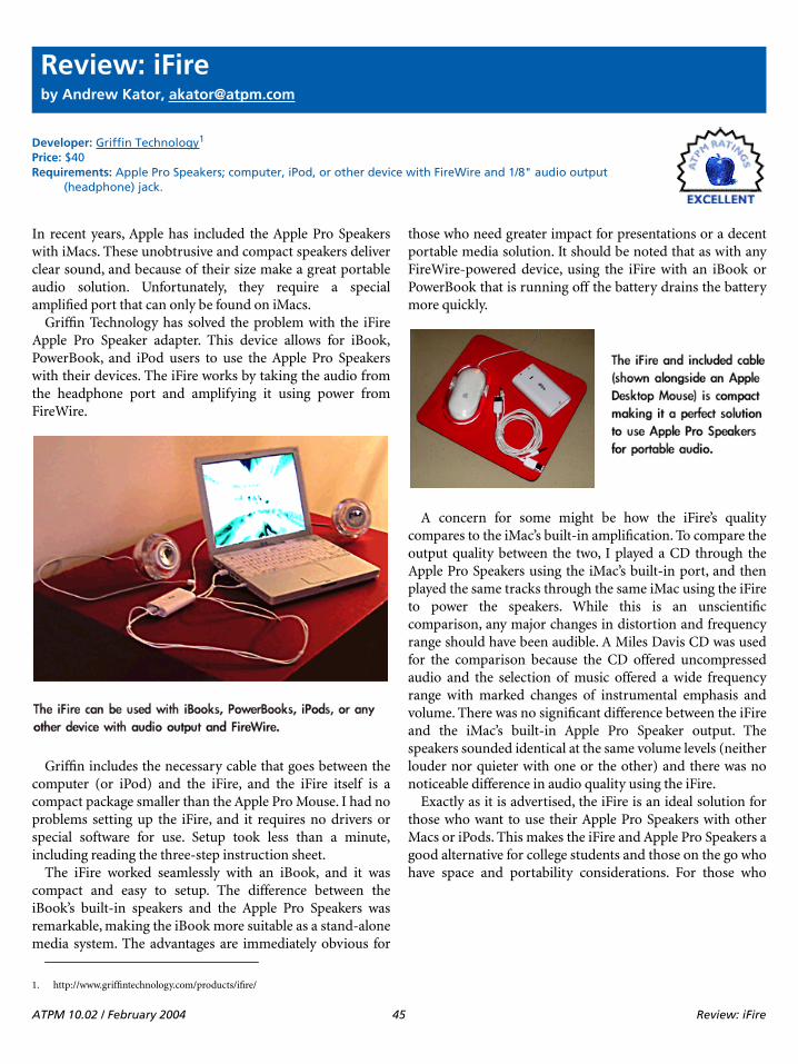
Review: iFire
Developer: Griffin Technology1
Price: $40Requirements: Apple Pro Speakers; computer, iPod, or other device with FireWire and 1/8" audio output
(headphone) jack.
In recent years, Apple has included the Apple Pro Speakerswith iMacs. These unobtrusive and compact speakers deliverclear sound, and because of their size make a great portableaudio solution. Unfortunately, they require a specialamplified port that can only be found on iMacs.
Griffin Technology has solved the problem with the iFireApple Pro Speaker adapter. This device allows for iBook,PowerBook, and iPod users to use the Apple Pro Speakerswith their devices. The iFire works by taking the audio fromthe headphone port and amplifying it using power fromFireWire.
Griffin includes the necessary cable that goes between thecomputer (or iPod) and the iFire, and the iFire itself is acompact package smaller than the Apple Pro Mouse. I had noproblems setting up the iFire, and it requires no drivers orspecial software for use. Setup took less than a minute,including reading the three-step instruction sheet.
The iFire worked seamlessly with an iBook, and it wascompact and easy to setup. The difference between theiBook’s built-in speakers and the Apple Pro Speakers wasremarkable, making the iBook more suitable as a stand-alonemedia system. The advantages are immediately obvious for
those who need greater impact for presentations or a decentportable media solution. It should be noted that as with anyFireWire-powered device, using the iFire with an iBook orPowerBook that is running off the battery drains the batterymore quickly.
A concern for some might be how the iFire’s qualitycompares to the iMac’s built-in amplification. To compare theoutput quality between the two, I played a CD through theApple Pro Speakers using the iMac’s built-in port, and thenplayed the same tracks through the same iMac using the iFireto power the speakers. While this is an unscientificcomparison, any major changes in distortion and frequencyrange should have been audible. A Miles Davis CD was usedfor the comparison because the CD offered uncompressedaudio and the selection of music offered a wide frequencyrange with marked changes of instrumental emphasis andvolume. There was no significant difference between the iFireand the iMac’s built-in Apple Pro Speaker output. Thespeakers sounded identical at the same volume levels (neitherlouder nor quieter with one or the other) and there was nonoticeable difference in audio quality using the iFire.
Exactly as it is advertised, the iFire is an ideal solution forthose who want to use their Apple Pro Speakers with otherMacs or iPods. This makes the iFire and Apple Pro Speakers agood alternative for college students and those on the go whohave space and portability considerations. For those who
Review: iFireby Andrew Kator, [email protected]
1. http://www.griffintechnology.com/products/ifire/
ATPM 10.02 / February 2004 45 Review: iFire

shelved their Apple Pro Speakers to use other speakers withtheir iMac, the iFire gives a reason to bring the unusedequipment back into service.
Copyright © 2004 Andrew Kator, [email protected]. Reviewing in ATPM is open to anyone. If you’re interested, write to us at [email protected].
ATPM 10.02 / February 2004 46 Review: iFire

Review: iView MediaPro 2.0.2
Developer: iView Multimedia Ltd.1
Price: $160 for downloaded or boxed version ($72 upgrade from iView MediaPro 1.5, $128 upgrade from iView Media or Roxio Toast, $128 sidegrade from a list of competing products)
Requirements: G3, Mac OS 9.1 or Mac OS X 10.1.Trial: Fully featured (three weeks)
NoteI reviewed version 1.5.62 last year. This review focuses on thechanges from the previous version.
OverviewiView MediaPro helps you organize and display a variety offile types: images, movies, sounds, fonts, illustrations, textfiles, and HTML pages. Files can be labeled, categorized,voice annotated, renamed, copied, or moved individually orin batches.
InstallationThe download version is a disk image file that contains theiView MediaPro folder. The boxed version contains a CDwith the same folder. Just drag the folder to the desired harddrive location. On first launch of the downloaded version,you will be presented with a registration window. Enter yourlicense number or click the “Remind me Later” button to useMediaPro in demonstration mode.
New or Improved Features in iView MediaPro 2MediaPro 2 supports drag-and-drop for importing,searching, annotating, and classifying media files. TheOrganize view displays all the possible organizationalcharacteristics of the catalog. MediaPro 2 provides directcontrol of the file system (the nested folders that contain theimages in a catalog). MediaPro supports individual and batchrenaming of original media files. It can change file creators,replace desktop icons with image icons, put captioninformation into file comment fields, and embed thumbnailsand ColorSync profiles into image files. MediaPro 2 has a
version control feature that works on image folders. It tracksall image changes and keeps a log of additions andsubtractions from the designated folder.
MediaPro 2 catalogs can contain 128,000 images. Thecompression algorithm was improved to reduce catalog size.Image importing, thumbnail creation, and catalog creationare faster.
New image editing features include more cropping options,red eye correction, precision rotation, image AutoEnhancement (adjusts saturation, brightness and contrast),and one-click enhancements (backlight, under and overexposure, and color cast remove bias). The enhancementfeatures are based on Minolta Image EnhancingTechnologies.
Selected images in a catalog can be used to create custom,high-resolution PDF files with any size or layout. CustomWeb pages can be produced, and MediaPro 2 contains better
Review: iView MediaPro 2.0.2by Gregory Tetrault, [email protected]
1. http://iview-multimedia.com
2. http://www.atpm.com/9.03/iview.shtml
Organize View of Catalog
ATPM 10.02 / February 2004 47 Review: iView MediaPro 2.0.2

HTML code and more theme templates.
Slideshow customization options are available with globaland individual timings, layout grids, more transitions, andsupport for multiple audio files throughout the slideshow. Toimprove slideshow speed, images can be batch-edited to fitcommon screen sizes and resolutions. Slideshows (includingtransitions, audio, and file name menus) can be saved asQuickTime movies.
MediaPro 2 added a playlist feature that sequentially playsall the media in a catalog. This allows you to play through acatalog of audio files or movies. It also acts like a simpleslideshow for displaying images or fonts in a catalog.
MediaPro 2 makes use of QuickTime, rather than internalgraphics routines, for many functions. This improved thestability of the application, but rendered MediaPro 2incompatible with OS 8.
Problems, Bugs, and OmissionsI found Media Pro 2 to be remarkably stable under both OS 9and OS X. It worked well even when many applications wererunning. My only complaint is that MediaPro 2 hogged toomuch CPU time when working in the background on lengthytasks such as importing a folder of images or creating Webpages.
DocumentationThe mediocre documentation of MediaPro did not improvewith this version. The application comes with an 80-pageuser manual (available as a PDF file in the downloadedversion). The PDF user manual has bookmark links, but nolinks within the body of the manual. Neither the PDF nor theprinted manual has an index. The user manual adequatelydescribes most features of iView MediaPro. Again, theAppleScript section is very skimpy (only one page). Themanual fails to list the AppleScript dictionary changes fromversion 1.5, though it warns users that older scripts may needto be amended.
Technical SupportThe iView Web site support area1 contains tutorials2,frequently asked questions, a users forum, a querysubmission form, and a suggestion form. There is notelephone, fax, or live chat room support.
AlternativesUsers who may not need all the features of MediaPro mightprefer the much less expensive ($30) iView Media. If theadditional features of MediaPro are desired at a later time,
Web Page Creation Options
Font Display in MediaPro
Part of MediaPro 2’s AppleScript Dictionary
1. http://iview-multimedia.com/support/support.html2. http://www.iview-multimedia.com/tutorials/index.html
ATPM 10.02 / February 2004 48 Review: iView MediaPro 2.0.2

upgrading is seamless. (And, through a strange quirk iniView Multimedia’s pricing scheme, you will save $2 by firstbuying iView Media and then upgrading to MediaPro.)
Users who import many photos from high resolutiondigital cameras may prefer Photo Mechanic1 due to its fastimporting and cataloging and features designed forprofessional photographers.
SummaryI gave iView MediaPro 1.5 a “Very Nice” rating last year.MediaPro 2.0.2 is more stable and adds some useful features,but its price is substantially greater ($160 vs. $90). I thereforegive MediaPro 2 the same “Very Nice” rating.
Copyright © 2004 Gregory Tetrault, [email protected]. Reviewing in ATPM is open to anyone. If you’re interested, write to us at [email protected].
1. http://www.atpm.com/9.04/photo-mechanic.shtml
ATPM 10.02 / February 2004 49 Review: iView MediaPro 2.0.2

Review: Greppie 1.0.1
Developer: Mole 6E23 Software1
Price: $15Requirements: Mac OS X 10.1.5Trial: Fully-featured (30 days or 30 launches)
Back in 2002, I talked about graphical wrapper applicationsthat attempt to make Unix command-line tools moreaccessible to Mac users who prefer to avoid the command-line whenever possible. Specifically, I was reviewingAquaGrep2, a wrapper around the grep tool.
This month, I’m looking at Greppie, another grep wrapper.Unlike AquaGrep, Greppie goes beyond just passing data togrep and blindly displaying the result; it attempts to makesearching with grep like using most other Macintosh searchtools.
SearchingThe main Greppie search interface is fairly straightforward.There is a text field at the top where you can enter your searchterms, and a list box at the bottom for listing the files andfolders you want to search.
Greppie offers five options for modifying the searches. Youcan search nested directories, toggle case sensitivity, useregular expressions, search non-text files, and show non-matching files.
Unfortunately, the search option settings have no impacton the display of the file and folder list. For instance, it wouldbe nice if turning off the “Search non-text files” option grayedout non-text files in the file and folder list.
Greppie offers two different ways to save old searches. Thelast 10 searches, complete with their option settings, areautomatically saved. The search is only saved, though, if thesearch term is different. Simply changing the search option isnot enough to trigger a save.
Also, you can permanently save any search.The same saving options apply to the file and folder
list—the last 10 sets of search locations are saved, as are anysets specifically saved by the user.
PowerSearchOne of Greppie’s useful features is the PowerSearch palette.PowerSearches are predefined regular expressions forcommon search terms.
There are 17 PowerSearches included in Greppie organizedinto seven different categories: Text, Internet, Date and Time,
Phone Numbers, Miscellaneous, Financial, andInternational.
Review: Greppie 1.0.1by Eric Blair, [email protected]
1. http://toddclements.com/software/greppie/
2. http://atpm.com/8.06/aquagrep.shtml
The Greppie search interface.
Some of the predefined searches that are available in Greppie.
ATPM 10.02 / February 2004 50 Review: Greppie 1.0.1

PowerSearches are not simply text snippets; they arecomplete searches with their own sets of options. Also,instead of showing up as a complex regular expression in thesearch text field, each PowerSearch shows up as an icon,although this feature can be disabled.
The upside of storing PowerSearches as full searches is thatyou will never forget to turn on the regular expression optionbefore running a search. The downside is that you cannotmix and match multiple PowerSearches to form morecomplex searches.
There is also an eighth category in the PowerSearchpalette—Saved Searches. As the name implies, these are thesearches you saved in the Search window. However, it appearsthat only the options are preserved when you access a savedsearch from the PowerSearch menu. If you are displayingPowerSearches as icons, the saved search will appear as anicon. If you try to preform a search, though, you receive anerror that there is no search term.
It seems as though saved searches should include the searchtext when accessed through the PowerSearch palette. Anotheroption would be to disable the Search button when either thesearch field or the file and folder list is empty.
ResultsThe Search Results window displays a list of the filescontaining the search term and the number of times thesearch term appears in the given file. Each text file in theresult list can be expanded to show the lines in the filecontaining the search term.
Double-clicking on an entry in the result list opens the fileusing appropriate application. There doesn’t appear to be anyway to override this so, for instance, you could open a text filewith BBEdit instead of TextEdit. Also, you cannot drag anddrop entries from the result list to application icons.
ConclusionIt seems like a lot of wrapper applications are simply prettyfaces on command-line tools that do not add any additionalvalue. Greppie goes beyond these basics by adding featureslike PowerSearches and the ability to search multiplelocations at the same time. However, there are still somerough edges and shortcomings that prevent Greppie fromliving up to its full potential.
Copyright © 2004 Eric Blair, [email protected]. Reviewing in ATPM is open to anyone. If you’re interested, write to us at [email protected].
A PowerSearch as an icon. “email” is apparently a very common term today.
ATPM 10.02 / February 2004 51 Review: Greppie 1.0.1

Review: Old Fart’s Guide
Author: Aaron RosenzweigPublisher: Cocoa Nuts1, 2004Price: $30Trial: None
The idea of this book is interesting: a book about Macs forpeople who “didn’t grow up with them, paying particularinterest to those of us who are over fifty years young.” But theauthor himself is not “over fifty years young,” and, while itmay be the thought that counts, he just doesn’t deliver on hispromise.
First, consider the market: you may be a “senior,” over fifty,and you want to buy a computer. You may have recentlyretired, and want to keep in touch with your children andgrandchildren, pursue a hobby, or just learn something new.Or if you are younger, you might want to get a Mac for yourparents or grandparents, for the same reason. You want toexchange e-mail, send digital photos and even videos of thekids, use iChat for audio chats to keep the phone bills down,and use the computer as a communication device.
You need a book that takes users from the first stepsthrough to more complex tasks, focusing specifically on thethings they want to do with the computer: e-mail, Webbrowsing, digital photos, and more. Considering the needsand usages of these users should be the first step in creating abook designed for such a specific market.
Novice users need a lot of hand-holding, and also need alot of pictures and screen shots to help them understand. Inthis book, the tone of the writing is appropriate, butadditional help through graphics is sadly absent. Forexample, take a section on pointing devices in the chapterentitled “What is a Computer?” The author describes what amouse is, which is fine, since every desktop computer comeswith one, but then goes on to talk about trackballs, trackpads,and tablets. Yet not a single graphic is used to help the readerunderstand what he’s talking about. The old cliché “a pictureis worth a thousand words,” is applicable here. Rather thanuse a graphic to demonstrate what he is talking about, theauthor says:
Imagine taking the mouse and turning it upsidedown, thus exposing the ball. Now envision usingyour index finger to move the ball, thus directlymoving the pointer on the screen. This, in essence,is what a trackball is.
Think how much more effective such an explanation wouldbe with a picture. The author has led his readers to imagine,rather than see, and readers may be confused.
This lack of graphics and screen shots is presentthroughout the book. Where other books for beginners oftenuse too many screen shots, this one fails by not using enough.And the ones it contains are not very well printed; in additionto the actual printing quality, the paper is not opaqueenough, and when there are graphics on both sides of a pagethey get in the way of each other.
Another aid to the novice is consistent terminology, whichis a problem with this book. The author is not consistent inhis use of terminology, and, while this is not a majorproblem, is certainly something to be avoided. When users goto the Apple Help Center and find different terminology, theyget confused. The author says, for example, that to change thelanguage of the interface you go to the International “settingspanel.” And on the next page, this is called a “preferencespanel.” Apple’s terminology for this is “preference pane,” andyou’ll find this used throughout the help. It’s bad enough toconfuse the reader by giving two names for something withinthe same section, but it’s even worse when both of thesenames are non-standard.
But all this pales in comparison with the “incorrect” covertext, which says, “Covers OS 10.3 Panther.” First, that shouldbe “Mac OS X 10.3,” but even worse is the fact that thePanther section is merely an add-on at the back of the book.Nowhere in the many introductions or prefaces does theauthor point this out, and a user who opens the book to learnhow to use their brand new Mac running Panther will beconfused at best. All the Finder windows, and many of thepreference panes, are different from what is shown anddescribed in the book. Add to that the occasional OS 9 screenshot, and users must be truly confused by what they see.
In essence, this is a “second edition” of a book published in2002, after the release of Jaguar, with no update other thanthe final chapter on Panther. One can see, for example, onpage 276, the photo of an iPod, which is one of the previous
Review: Old Fart’s Guide to the Mac 2nd Ed. (book)by Kirk McElhearn, [email protected]
1. http://www.cocoanutstech.com
ATPM 10.02 / February 2004 52 Review: Old Fart’s Guide

generation models. The prices and capacities mentioned areincorrect as well; this is sloppy work, and one should neverupdate a book without updating everything.
Nevertheless, the writing is good, and the way the authorapproaches the subject is appropriate for the over-50 market.But this book fails because there was clearly noeditor—writing computer books calls for a whole team of
professionals, from writer to editor, from layout artist todesigner. This book, published by a small press, which seemsto be made up essentially of the author and his wife, suffersfrom a lack of professionalism. The writing is good enoughfor this to have been a much better book, but the lack ofunderstanding of just what makes a good computer bookleads to confusion and is ultimately disappointing.
Copyright © 2004 Kirk McElhearn, [email protected]. Reviewing in ATPM is open to anyone. If you’re interested, write to us at [email protected].
ATPM 10.02 / February 2004 53 Review: Old Fart’s Guide

Frequently Asked Questions
What Is ATPM?About This Particular Macintosh (ATPM) is, among otherthings, a monthly Internet magazine or “e-zine.” ATPM wascreated to celebrate the personal computing experience. Forus this means the most personal of all personalcomputers—the Apple Macintosh. About This ParticularMacintosh is intended to be about your Macintosh, ourMacintoshes, and the creative, personal ideas andexperiences of everyone who uses a Mac. We hope that wewill continue to be faithful to our mission.
Are You Looking for New Staff Members?We currently need several Contributing Editors. Pleasecontact us1 if you’re interested.
How Can I Subscribe to ATPM?Visit the subscriptions page2.
Which Format Is Best for Me?The Online Webzine edition is for people who wantto view ATPM in their Web browser, whileconnected to the Internet. It provides sharp text,lots of navigation options, and live links to ATPM
back issues and other Web pages. You can use Sherlock tosearch3 all of the online issues at once.
The Offline Webzine is a HTML version of ATPMthat is formatted for viewing offline and madeavailable in a StuffIt archive to reduce file size. Thegraphics, content, and navigation elements are the
same as with the Online Webzine, but you can view it withoutbeing connected to the Internet. It requires a Web browser.
The Print PDF edition is saved in Adobe Acrobatformat. It has a two-column layout with smallertext and higher-resolution graphics that areoptimized for printing. It may be viewed online in a
browser, or downloaded and viewed in Adobe’s free AcrobatReader on Macintosh or Windows. PDFs may be magnifiedto any size and searched with ease.
The Screen PDF edition is also saved in AdobeAcrobat format. It’s a one-column layout with largertext that’s optimized for reading on-screen. It maybe viewed online in a browser, or downloaded and
viewed in Adobe’s free Acrobat Reader on Macintosh orWindows. PDFs may be magnified to any size and searchedwith ease.
What Are Some Tips for Viewing PDFs?
• You can download4 Adobe Acrobat Reader for free. Ifyou have a Power Macintosh, Acrobat Reader 5 hasbetter quality and performance. ATPM is alsocompatible with Acrobat Reader 3, for those with680x0 Macs.
• You can zoom the PDF to full window width andscroll through articles simply by single-clickinganywhere in the article text (except underlined links).
• You can quickly navigate between articles using thebookmarks pane at the left of the main viewingwindow.
• For best results on small screens, be sure to hide thebookmarks pane; that way you’ll be able to see theentire page width at 100%.
• Try turning Font Smoothing on and off in AcrobatReader’s preferences to see which setting you prefer.
• All blue-underlined links are clickable. Links toexternal Web sites are reproduced in footnotes at thebottoms of pages, in case you are reading from aprinted copy.
• You can hold down option while hovering over a linkto see where it will lead.
• For best results, turn off Acrobat’s “Fit to Page” optionbefore printing.
Why Are Some Links Double-Underlined?In the PDF editions of ATPM, links that are double-underlined lead to other pages in the same PDF. Links thatare single-underlined will open in your Web browser.
What If I Get Errors Decoding ATPM?ATPM and MacFixIt readers have reported problemsdecoding MacBinary files using early versions of StuffItExpander 5.x. If you encounter problems decoding ATPM,we recommend upgrading to StuffIt Expander 5.1.4 or later5.
How Can I Submit Cover Art?We enjoy the opportunity to display new, original cover artevery month. We’re also very proud of the people who havecome forward to offer us cover art for each issue. If you’re aMacintosh artist and interested in preparing a cover forATPM, please e-mail us. The way the process works is prettysimple. As soon as we have a topic or theme for the upcoming
FAQ: Frequently Asked Questions
1. [email protected]. http://www.atpm.com/subscribe3. http://www.atpm.com/search
4. http://www.adobe.com/prodindex/acrobat/readstep.html5. http://www.aladdinsys.com/expander/index.html
ATPM 10.02 / February 2004 54 Frequently Asked Questions
issue we let you know about it. Then, it’s up to you. We do notpay for cover art but we are an international publication witha broad readership and we give appropriate credit alongsideyour work. There’s space for an e-mail address and a Webpage URL, too. Write to [email protected] for moreinformation.
How Can I Send a Letter to the Editor?Got a comment about an article that you read in ATPM? Isthere something you’d like us to write about in a future issue?We’d love to hear from you. Send your e-mail [email protected]. We often publish the e-mail that comesour way.
Do You Answer Technical Support Questions?Of course. E-mail our Help Department at [email protected].
How Can I Contribute to ATPM?There are several sections of ATPM to which readersfrequently contribute:
Segments: Slices from the Macintosh Life
This is one of our most successful spaces and one of ourfavorite places. We think of it as kind of the ATPM “guestroom.” This is where we will publish that sentimentalMacintosh story that you promised yourself you would oneday write. It’s that special place in ATPM that’s specificallydesignated for your stories. We’d really like to hear from you.Several Segments contributors have gone on to becomeATPM columnists. Send your stuff to [email protected].
Hardware and Software Reviews
ATPM publishes hardware and software reviews. However,we do things in a rather unique way. Techno-jargon can beuseful to engineers but is not always a help to most Mac users.We like reviews that inform our readers about how aparticular piece of hardware or software will help theirMacintosh lives. We want them to know what works, how itmay help them in their work, and how enthusiastic they areabout recommending it to others. If you have a new piece ofhardware or software that you’d like to review, contact ourreviews editor at [email protected] for more information.
Shareware Reviews
Most of us have been there; we find that special piece ofshareware that significantly improves the quality ourMacintosh life and we wonder why the entire world hasn’theard about it. Now here’s the chance to tell them! Simply letus know by writing up a short review for our sharewaresection. Send your reviews to [email protected].
Which Products Have You Reviewed?Check our reviews index1 for the complete list.
What is Your Rating Scale?ATPM uses the following ratings (in order from best toworst): Excellent, Very Nice, Good, Okay, Rotten.
Will You Review My Product?If you or your company has a product that you’d like to seereviewed, send a copy our way. We’re always looking forinteresting pieces of software to try out. [email protected] for shipping information. You can sendpress releases to [email protected].
Can I Sponsor ATPM?About This Particular Macintosh is free, and we intend tokeep it this way. Our editors and staff are volunteers with“real” jobs who believe in the Macintosh way of computing.We don’t make a profit, nor do we plan to. As such, we rely onadvertisers to help us pay for our Web site and otherexpenses. Please consider supporting ATPM by advertisingin our issues and on our web site. [email protected] for more information.
Where Can I Find Back Issues of ATPM?Back issues2 of ATPM, dating since April 1995, are availablein DOCMaker stand-alone format. In addition, all issuessince ATPM 2.05 (May 1996) are available in HTML format.You can search3 all of our back issues.
What If My Question Isn’t Answered Above?We hope by now that you’ve found what you’re looking for(We can’t imagine there’s something else about ATPM thatyou’d like to know.). But just in case you’ve read this far (Weappreciate your tenacity.) and still haven’t found that littlepiece of information about ATPM that you came here to find,please feel free to e-mail us at (You guessed it.)[email protected].
1. http://www.atpm.com/reviews2. http://www.atpm.com/Back/3. http://www.atpm.com/search
ATPM 10.02 / February 2004 55 Frequently Asked Questions