Embed Size (px)
Citation preview

DAVID HORNUNG
HANDMADE COLOR
CHAPTER TWO: FIRST PRINCIPLESSELECTIONS REPRINTED WITH PERMISSION OF THE AUTHORALL RIGHTS RESERVED 2002
ABOUT COLOR TERMINOLOGY
The terminology that has been applied to color is not universal, and a comparison among the glossaries of contemporary color texts will show inconsistencies. For example, brightness usually means saturation, but it is sometimes used in reference to value. The term tertiary normally alludes to colors that lay exactly between each primary and secondary color, but tertiary sometimes, though infrequently, refers to colors of low saturation.
Inconsistencies notwithstanding, a few central terms have achieved broad if not universal acceptance and are consistently applied throughout the visual arts. The words hue, value, and saturation are understood by anyone who regularly discusses color in a professional context. Other terms, such as tint, shade, analogous, monochromatic, and complementary are also commonly used. Where two or more terms are synonymous, we prefer the more descriptive one. Thus, saturation wins out over intensity. In addition, for the purposes of this course, we have adopted several terms that are not widely acknowledged but which have proven indispensable. The terms chromatic gray and broken tone, for example, answer the need to make

categorical distinctions within saturation. A glossary of color terms used in this course is provided at the back of the book.
THE STRUCTURE OF COLOR
Most people are aware that colors have more than one visible quality. Color names, such as red, are often coupled with adjectives. Expressions like fiery red, cherry red, or blood red reflect an awareness that colors have characteristics not adequately represented by color name alone. All colors have three distinct, fundamental parts that account for their appearance. Each of these parts can be manipulated independently either by color mixing or, more subtly, by altering the context in which the color appears. They are called hue, value, and saturation.
HUE
Hue is the aspect of color we refer to by name. Color names correspond to particular zones on the full continuum of hues. There are thousands of color names, many invented by the house paint and cosmetics industries to identify specific tones. Artists and designers, usually refer to colors by their pigments or by the names given to commercial artists’ paints.
Certain hue groupings have been given standard, categorical names. Typical of these color schemes are monochromatic (one hue), analogous (adjacent hues), complementary (based on a pair of opposites), and triadic color schemes (any three equidistant colors on the color spectrum when it is configured as a circle of hues). Traditionally, color schemes have evolved to simplify the problem of color harmony and to provide a guideline for the discussion of color in art and design. But, as a formula for color harmony, traditional color schemes are simplistic

because they focus exclusively on hue. Color relationships should be based on other factors including value, saturation, proportion, and the way in whichcolors are distributed throughout a composition. The color of the hooked rug shown at right is unified, not by a recognizable color scheme but by a predominantly muted palette and a refined sense of proportion.
By characterizing the overall configuration, or range, of hues in a particular image we become more conscious of what we see. The range of hue, value, or saturation can be described as broad, medium, or narrow.
Using the piano keyboard as an analogy, to describe a range of notes as broad implies that some notes are being struck in the highest andlowest octaves. It doesn’t necessarily mean that there are many notes being struck. Likewise, a broad hue range draws color from diverse regions of the spectrum (the total continuum of hues). For example, any triad of hues manifests a broad hue range because the three equidistant points of a triad embrace all hues (a). A complementary pair would also imply the full spectrum, even though only two hues are present (b).
Two examples of a broad hue range
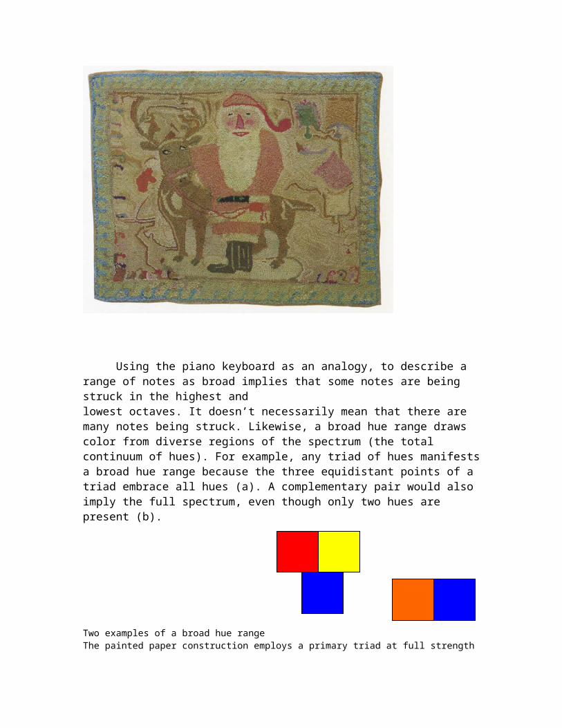
The painted paper construction employs a primary triad at full strength
In this painting Matisse uses many hues from throughout the spectrum
Milton Avery’s Sandbar and Seabirds has a medium hue range. Although it contains many fine permutations of blue and yellow, there are no reds, oranges or red-violets.

Some colors can appear to have different hue qualities depending upon how opaquely they are applied. The opaque version of a color is called its mass tone and the thinner application is referred to as its undertone. A detail of Avery’s painting shows how he exploited the subtle differences in a specific blue by emphasizing its mass tone is some places and its undertone in others to create a range of blues.
A narrow hue range is either monochromatic (one color and tones derived from it) or limited to closely related hues. In this oil painting by Alfred Wallis, every color appears to have been made by missing either white or black with a single color: a reddish yellow earth tone.

Philip Guston used a similarly restricted palette (black, white, and cadmium red) in Red Sky .
This woodcut by Kitagawa Utamaro has closely analogous hues of soft yellows and pinks. Notice how the grays are subtly tinged by the dominant hues.

Visualizing the Hue Continuum
The hue continuum contains an infinite number of hues. Therefore, it is an unwieldy model for visualization.
A more useful representation of the full gamut of hues is a chart showing the primary and secondary triads as they relate to each other in the spectrum. This configuration encompasses the entire spectrum and provides a simple overview from which one can easily concieve of a variety of hue combinations.
VALUE

Value signifies the relative lightness or darkness of a color. Each of the three colored squares shown here manifests a distinct value. The gray squares beside them match their value but lack the qualities of hue (and saturation).
Black-and-white photography eliminates hue and saturation, leaving only value. Two versions of a painting by William Hawkins are shown below. In (b) only the values of the colors are visible.

Visualizing the Value Continuum
As with the hue continuum, the value continuum contains infinite variation.
The full gamut of values is often represented by a graduated scale called a grayscale. The grayscale shown below consists of twelve steps ranging from black to white in even, progressive increments.
Another useful way to visualize value is with a three-part version of the grayscale. Any color can be placed approximately in dark, middle, or light value category.
The value range in an image, like that of hue, can be broad, medium, or narrow. Below, three images seen earlier in this chapter are shown in black and white. Each contains a distinctly different value range.

SATURATION
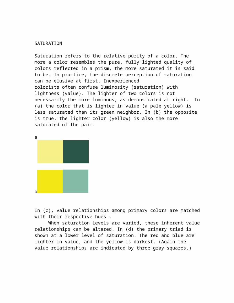
Saturation refers to the relative purity of a color. The more a color resembles the pure, fully lighted quality of colors reflected in a prism, the more saturated it is said to be. In practice, the discrete perception of saturation can be elusive at first. Inexperiencedcolorists often confuse luminosity (saturation) with lightness (value). The lighter of two colors is not necessarily the more luminous, as demonstrated at right. In (a) the color that is lighter in value (a pale yellow) is less saturated than its green neighbor. In (b) the opposite is true, the lighter color (yellow) is also the more saturated of the pair.
a
b
In (c), value relationships among primary colors are matched with their respective hues . When saturation levels are varied, these inherent value relationships can be
altered. In (d) the primary triad is shown at a lower level of saturation. The red and blue are lighter in value, and the yellow is darkest. (Again the value relationships are indicated by three gray squares.)
Visualizing the Saturation Continuum

Mixing two fully saturated complementaries (pure orange with pure blue, for example) can produce an infinite number of tones ranging from the most luminous colors to nonchromatic grays, which have no discernible hue.
The grayscale and color wheel are commonly employed as visual aids to help students make use of the full value and hue continuums. For saturation there is no similar common tool. Its absence is especially problematic because, of the three main structural parts of color, saturation is the most difficult for the beginner to grasp. To distinguish value from saturation one must perceive lightness as distinct from luminosity.
In this course, we use a visual matrix, like those regularly applied to hue and value, to clarify saturation. We acknowledge three categories of saturation:
a. Prismatic color: Unadulterated "pure" hues as cast by a prism on a white wall.b. Broken tones: Colors that are easy to identify by hue but are softer and
perceptibly duller than prismatic colors.c. Chromatic grays: Subtle colors that, although weak, are still chromatic, i.e.,
they contain hue and saturation.
To diagram the relationship between saturation levels and hue we use a color wheel that shows the six co-primaries and three strata of saturation (plus nonchromatic gray).
Prismatic color Broken tone chromatic gray chromatic gray broken tone prismatic color non-chromatic gray
The Three Levels of Saturation
Prismatic color is absolutely pure — in theory. Once a pure color has been altered through color mixing, it ceases to be prismatic (except when the admixture is a closely adjacent hue, as when adding yellow-orange to yellow). But if the amount of admixture is too meager, the result might still appear fully saturated. (Because of the relative strength of thedifferent pigments, it is possible to add small amounts of white, black, or the complement to a prismatic color without an apparent loss of saturation.) Broken tones range from colors that are only slightly dull (just outside the prismatic zone) to the most luminous chromatic grays. To create broken tones, add black (which produces a shade), white (to make a tint) or gray to a prismatic color. Adding the complement of a hue will also diminish its saturation.
Chromatic grays are tones that exhibit subtle, yet discernible hue. Except for the proportions involved, they are mixed in exactly the same manner as broken tones: chromatic grays require a larger quantity of admixture to achieve.
A fourth category called Nonchromatic grays compose the outer circle of the color wheel. The word chroma means color. Grays mixed from black and white are nonchromatic because they lack hue and saturation, and because black and white are, themselves, without chroma. The precise intermixing of two complementary colors can also produce a nonchromatic gray if the mixture is carefully balanced so that each hue cancels the other out. As with prismatic color, nonchromatic grays are theoretically absolute. Insofar as a gray registers the slightest amount of perceptible hue it should be considered a chromatic gray.

Sometimes the optical effects of color interaction can lend chromatic qualities to nonchromatic grays. At right, the nonchromatic gray square (a) is centered upon two different colored squares. In (b), the central square appears slightly reddish. In (c), the same gray takes on a yellow cast due to the effect of the violet surrounding it.
Broken tone and chromatic gray are relative categories. Each consists of an infinite number of tonal variations, and the line between them is ambiguous. Despite the ambiguity however, a general agreement on the location of that line usually emerges after a brief period of classroom practice and discussion. As with similar ambiguities in the arts (such as the difference between piano and pianissimo in music), the relative character of this distinction doesn’t undermine its meaning or its practicality. The idea of two separate categories of saturation residing between pure color and noncolor is useful as long as consistancy is maintained.
Here five chromatic gray tones are aligned with five broken tones in the same hue and with similar value:
Saturation Range

The range of saturation in an image, like that of hue and value, can be described as broad, medium, or narrow. This Matisse still-life has a broad saturation range because it has colors in all three levels of saturation: prismatic color, broken tones, and chromatic grays.
Medium saturation range: The hooked rug shown here has broken tones and chromatic grays; but no prismatic colors.
Narrow saturation range: This Wallis painting is composed entirely of chromatic grays.

Manipulating Contrast in Hue, Value, and Saturation
One may consider any colored image or design strictly as a field of color relationships. The overall quality of a color field is determined by the nature of the contrasts present both within and between the subcategories of hue, value, and saturation.
In the process of making art or design, plans change as color is integrated with other visual considerations. The need sometimes arises for the adjustment of one part of a color without disturbing its other characterstics. For example, a shift in value might be required without any change in hue or saturation. Or the hue of a color might need to be more precisely aligned with its neighbor without altering its value or saturation levels.
Hue, value, and saturation are discrete aspects of color and can be manipulated independently. An apt musical analogy would be that of a single note. A musical tone, like a specific color, manifests several independent aspects: pitch, volume, and duration. One can discuss each of these qualities as a separate part of the whole. Moreover, each can be manipulated without disturbing the other. For example, the pitch of a tone can be raised or lowered without changing its volume or duration. With hue, value, and saturation, similarly independent actions are possible.
The pair of squares shown in (a) are similar in value and hue, but the square on the right is more saturated than its partner.
In (b) the saturation relationship between the two colors are similar to that of (a), but the hue relationship has been altered, as the one on the right is now pitched toward red-orange.
The two green squares in (c) are similar in saturation but the left one is clearly darker in value. In (d), the value relationship of the first pair is maintained, but the saturation of the lighter green is elevated to a nearly prismatic level.
It is also possible to diminish a color’s saturation while maintaining its hue and value as shown in (e) or simply to lighten value while sustaining hue identity and saturation level as in (f).

f
Inherent Limitations To the Independence of Color Parts
The independence of color parts is limited in certain circumstances. For example, when they are fully saturated, yellows are all light in value. The value of any yellow can be raised only marginally before it becomes white. On the other hand, darkening a yellow either by adding black or its complement will speedily diminish its saturation. Yellow pigments tend to be weak and transparent and are consequently easily overpowered in mixtures by darker, more concentrated colors.
Violet, too, is a special case. In its purest state it is the darkest of prismatic hues. As in most hues, lightening its value lowers its saturation and can produce broken tones or chromatic grays. But darkening violet (by adding its complement or black) tends to lead quickly to chromatic gray. It is difficult to create a broken tone in violet that is significantly darker than its prismatic version.
Quirks of visual perception, due to optical illusion, material interference, and changing light conditions are an intrinsic part of color phenomena. To improve color awareness, one must combine a sound grasp of basic color principles with hours of color mixing, matching, and careful observation.
Analyzing the color in artworks sharpens awareness and increases one’s sense of possibility. The simple act of description rivets our attention to visual phenomena in a way that casual looking cannot. Of course, it is impossible to describe any color precisely; but by focusing on contrasts of hue, value, and saturation, and noting qualities of proportion and color distribution, one can discuss color clearly and usefully.
The following "game" is a test of understanding and mixing skill: A student receives a small patch of painted paper containing one color. Without showing it to anyone, she describes the color using only theterminology introduced in this chapter; no other references are allowed. Guided by that description, another student or students attempt to mix the color. Then the result is compared with the original.
Saturation and Light
To envision saturation in terms of light, imagine a small room containing only a single table covered by a white tablecloth. On top of the table rests a pure blue bowl. In the bowl are a bright red apple and a ripe yellow banana. The room is softly illuminated by a single light bulb controlled by a dimmer switch set at its lowest level. The lighting is so low that one can barely make out the distinctions between the blueness of the bowl, the redness of the apple, and the yellowness of the banana. In this low light the local colors

of these three objects appear as chromatic grays. All the colors in view are kept at this weak level of saturation by the uniformly dim light that engulfs them.
Raise the dimmer switch a little and the distinct hues become clearer. But the room is still a bit dark, and the red, yellow, and blue are softly muted. At this level of illumination the apple, banana, and bowl appear as broken tones. Bring the dimmer switch up to full light, and the fruit and bowl become nearly prismatic in saturation.
In two-dimensional art the sensation of intrinsic light depends largely on the readability of hue in a color. The most vibrant (and seeminglyilluminated) are prismatic colors; the most subtle are chromatic grays. But while prismatic colors are individually more "illuminated" thanindividual broken tones or chromatic grays, it is not necessary to use prismatic color to achieve luminosity in two dimensions. Luminous groupings demand a responsiveness to the subtle interplay of all color parts. Tones of slightly differing saturation can be skillfully arranged to make even chromatic grays seem to glow from within. (The word tone refers broadly to any mixed color that is not prismatic in saturation. All chromatic grays and broken tones are tonal variations of specific prismatic hues.)
Now, imagine that the dimmer switch in our room is set very low so that everything in sight is enveloped in semi-darkness. Only one small spot on the apple is illuminated by a distant source of light. Although the lighted area of the apple is only at the level of a broken tone, it glows against the surrounding grays.
A similar circumstance can be seen in the study at right (1). In the center of the painting is a spot of luminosity where broken tones are surrounded by darker and more muted tones of the same hue (chromatic grays).
The next example is more subtle (2). This collage consists of a few simple shapes; all of which are either chromatic gray or broken tone. The arrangement is informal, but

the value levels of all the colors are very close. Here, the differences in hue and saturation come into view a bit more slowly.
Art Objects have their own immanent light. In fact painters can often be identified as much by the quality of their light as by other markers of their personal style, The characteristic glow of a Mark Rothko, for example, is recognizable throughout his work, even though his palette varies from painting to painting. An identifiable quality of light is a distinguishing feature of the style of artists as diverse as Lucien Freud, Elizabeth Murray and Terry Winters to mention a few well-known examples.