Embed Size (px)
Citation preview

ALL NEWFOR
2015
44 BEST PACKAGE DESIGNS
A survey of strategic package designs hand-selected by our editors.

Sign up to receive newsletters and timely updates from our editors and receive this special report consisting of the 44 designs that deserve closer inspection, out of hundreds reviewed by our editors in the last year. This 23-page PDF shows two package designs per page, with large, beautiful photographs and a short summary of what makes each package technically proficient, structurally relevant, or graphically enticing at retail.
This report is divided into three sections: Structure & Branding, Flexible Packaging, and Labeling.
Learn about these highlights:
• A hybrid rigid and flexible salsa package
• Handle-less yet ergonomic bottle from Armor All
• A deodorant package produced by a 3D printer
• Wines from distant lands in single-serve pouches
• High-barrier compostable options
• A two-pouch package for easy stir fry
• An attractive salt grinder from Morton
• Holographic diamond patterns from Crest…and many more.
44 Best Package Designs – 2015 Edition

STRUCTURE & BRANDING
The new Fuller Brush brand owner’s foray into retail begins with the new Stanley 100 detergent in a custom 50-oz HDPE 25% PCR bottle. The 100-load, milk-jug-inspired bottle has a novel ergonomic handle, a stock 43-mm drain-back closure system that also prevents leaking, and a 0.5-oz dosing cap that measures one load with no measurement lines.
Seventh Generation introduced a line of hand-wash products that consumers grabbed up in packaging pretty enough for the counter. The package design stayed true to the brand’s minimalist mission while presenting a bright and colorful presence, clarity to show off the tinted product, and natural imagery patterns that reinforce the simple goodness of the formulas.

The Love Beets line of all-natural, ready-to-eat beets received a brand and package makeover that highlights the vegetable’s superfood status. The new packaging has convenience features and upbeat, modern graphics that make beets more approachable. Peel-and-seal technology keeps the product fresher longer and allows portioning over multiple eating occasions.
This sophisticated design reflects the soul, craftsmanship, and essence of the prestigious brand. The bottle features graphics by an award-winning British illustrator, a 10-point star detail in the neck, an intricately embossed base feature, a metal band with the brand’s 10 botanicals, and an elegant, faceted stopper—all of which work together in perfect harmony.
STRUCTURE & BRANDING

Crest 3D White’s trapezoidal structure with multi-color printing and holographic foil was offset-printed with three process colors, three custom colors, opaque white ink, and an inline UV gloss coating. The multi-layered, diamond-shaped holographic foil pattern on the front and top panels complements the trapezoidal graphic patterns and the carton’s shape to convey the sparkling essence of diamonds.
Hnina’s eco-friendly package also conveys luxury in several sensuous ways. The texture of Kraft paper is soft and pleasing, the decorative graphics are reminiscent of Japanese Nanga art, the warm colors are comforting to the eye, the wax seal signals premium, and intense aromas of the chocolate-covered truffles infuse into the porous Kraft paper to create a delicious-smelling box.
STRUCTURE & BRANDING
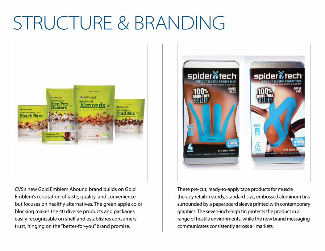
CVS’s new Gold Emblem Abound brand builds on Gold Emblem’s reputation of taste, quality, and convenience—but focuses on healthy alternatives. The green apple color blocking makes the 40 diverse products and packages easily recognizable on shelf and establishes consumers’ trust, hinging on the “better-for-you” brand promise.
These pre-cut, ready-to-apply tape products for muscle therapy retail in sturdy, standard-size, embossed aluminum tins surrounded by a paperboard sleeve printed with contemporary graphics. The seven-inch-high tin protects the product in a range of hostile environments, while the new brand messaging communicates consistently across all markets.
STRUCTURE & BRANDING

This modern, sleek sea salt grinder adds to consumers’ kitchen décor more than it distracts. The minimal label graphics include the recently updated Morton Salt Girl illustration and product identifier text. Removing the label creates a true upscale appearance, revealing a custom cap that carries the Morton Salt branding with a debossed word mark and logo.
The decision to create a single footprint for 220 SKUs of metal-cutting accessories reaped many benefits in easier production, greater retail presence, more impactful graphics, and greater brand protection against counterfeiting. The strategy streamlines the number of different packaging designs required to package these components, uses recycled packaging material, and reduces the overall size of the packaging stock.
STRUCTURE & BRANDING

Switzerland’s leading meat producer is deploying a newly developed thermoformable paper-based package for seven varieties of refrigerated sliced meat products. PaperLite is an FSC-certified paper-based forming web and a “green” alternative that, in this case, reduces plastic content by 60%. It also offers the unique tactile quality of paper for consumers expecting a premium packaging experience.
Anita’s Balm launched its roll-on product in a 1-oz compostable twist-up container in the shape of a tiny amphora jar that is manufactured with a 3D printer and renewable PLA resin. Engineered with AutoCAD, the intricate design features a full body, decorative handles on both sides, and a round concave area on the front that accommodates a pressure-sensitive vinyl label.
STRUCTURE & BRANDING

For this custom redesign, Mills has paid particular attention to the design of the lid so that customers get a perfect fit in terms of both looks and functionality. The in-mold labeling allows for a soft finish, inviting artwork, and benefit messaging that extends all the way to the rim of the lid.
LIQS super-premium, ready-to-drink cocktail shots are packaged in a 50-mL recyclable, crystal polystyrene shot glasses that weigh 21 g. Three individually sealed shots of a single flavor are sold in a 24-pt SBS multi-unit pack, printed in four colors with an aqueous coating to give LIQS’ trademark burst graphic extra pop.
STRUCTURE & BRANDING
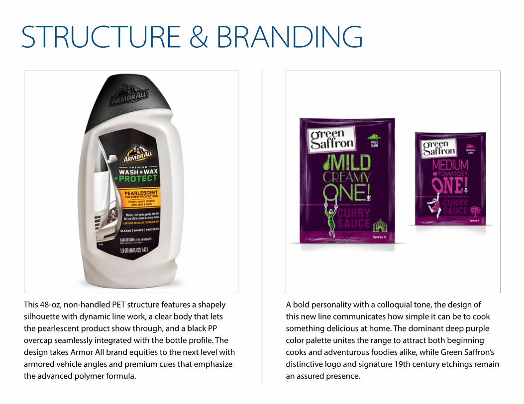
This 48-oz, non-handled PET structure features a shapely silhouette with dynamic line work, a clear body that lets the pearlescent product show through, and a black PP overcap seamlessly integrated with the bottle profile. The design takes Armor All brand equities to the next level with armored vehicle angles and premium cues that emphasize the advanced polymer formula.
A bold personality with a colloquial tone, the design of this new line communicates how simple it can be to cook something delicious at home. The dominant deep purple color palette unites the range to attract both beginning cooks and adventurous foodies alike, while Green Saffron’s distinctive logo and signature 19th century etchings remain an assured presence.
STRUCTURE & BRANDING

This single-serve pouch—just 2% of the product’s weight—addresses consumers’ rising awareness of waste. The virtually unbreakable pouch uses four-layer PreservPak film technology that includes two layers of nylon, one of aluminum, and one of polypropylene. The film is printed in five colors plus a matte and gloss finish to create a high-end feel.
Progresso’s 20-oz, two-and-a-half-serving standup pouches improve the consumer experience, create shelf impact, and offer great product protection over its 18-month shelf life. The standup pouch format allows for consistent seal quality and easy opening while the rotogravure-printing in seven colors gives a warm feeling to the wood grain table motif and product photography.
FLEXIBLE PACKAGING

Nate’s Meatless Meatballs redesign introduced 10.5-oz flexible pouches constructed of a 2.5-mil low-density polyethylene/linear LDPE/ethyl vinyl alcohol film blend, selected to prevent the frozen product from sweating. The color-coded pouches feature a reclose feature at the top of the bag to ensure maximum freshness and optimum quality.
This combination rigid/flexible container is a square, injection-molded tub with flared sides made from rigid PP “posts.” Four panels of flexible, printable PP material are fused with the posts during the injection-molding process to create the sides of the container. The result is greater shelf appeal, stackability, and sustainability.
FLEXIBLE PACKAGING

About 80% of the total package structure uses proprietary eco starch technology and uses up to 40% less energy to produce than conventional ethylene-based polymers. The extremely low oxygen transmission rate of the Plantic eco Plastic™ material can extend the shelf life of fresh foods by 15% to 40%, depending on the application.
Flexible film roll stock on a conventional-looking vertical form/fill/seal system performs like rigid for Fisher snack foods. After reverse printing on a 10-color flexo press, the 70-ga BOPP is combined with a metallized PP and a sealant layer. A clear cast sheet extrusion of polyester with a pressure-sensitive adhesive and a release liner creates the rigid structure.
FLEXIBLE PACKAGING
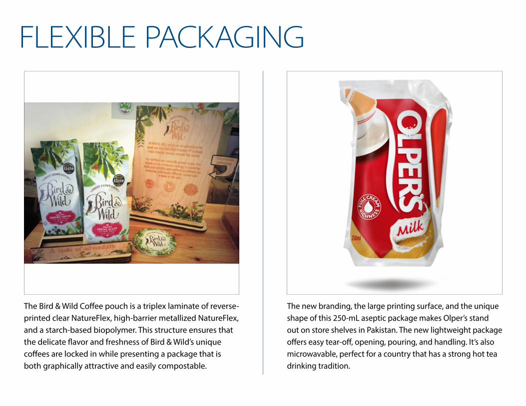
The Bird & Wild Coffee pouch is a triplex laminate of reverse-printed clear NatureFlex, high-barrier metallized NatureFlex, and a starch-based biopolymer. This structure ensures that the delicate flavor and freshness of Bird & Wild’s unique coffees are locked in while presenting a package that is both graphically attractive and easily compostable.
The new branding, the large printing surface, and the unique shape of this 250-mL aseptic package makes Olper’s stand out on store shelves in Pakistan. The new lightweight package offers easy tear-off, opening, pouring, and handling. It’s also microwavable, perfect for a country that has a strong hot tea drinking tradition.
FLEXIBLE PACKAGING

Dare Foods passed on the traditional bag-in-box format in favor of a flexible stand-up bag to gain shelf visibility and communicate the high-end quality of its new product line. The three-layer barrier lamination is reverse-printed in eight colors on a gravure press, and the rich, black background indicates premium positioning.
The premium Seed Sensations brand leads the way with a sugar cane-based bag, said to have a 75% lower product carbon footprint than traditional bread bags. Consumers can learn about the carbon footprint reduction on the package and on the brand’s website, including the Carbon Trust’s Product Carbon Footprint certification.
FLEXIBLE PACKAGING

This new high-end toilet paper range’s mascot is a fluffy yellow duck character known as the Little Duck, and the brand design successfully creates unity throughout the range. Print specialist consultants helped create the soft look on flexographic film—as well as a perfectly soft finish to the packaging exterior.
BIC’s redesign showcases the products’ unique benefits in a way that is ownable, differentiated, meaningful, and clear to BIC’s target demographics. The package design reflects the values of a brand built on quality, reliability, product performance, transparency, and value-for-cost.
FLEXIBLE PACKAGING

The wide front panel allowed the ilumi brand to debut with a complete, information-heavy brand strategy aimed at changing preconceptions about allergy-free food. The vibrant color palette celebrates the tasty varieties, the bold graphic precision reflects the precise ingredient consideration, and the intuitive icons celebrate consumer desire for information and empowerment.
Two separate pouches are conjoined by an easy-tear dotted line, and the triplex lamination structure is printed using rotogravure technology. Made by a smart mold in the bag-making machine, the technology advancement is the clean, simple separation of the two pouches, which allows consumers to create authentic stir-fry flavor easily.
FLEXIBLE PACKAGING

Fiber Choice rearticulated its consumer proposition in an easy-to-understand way that emphasized the key point of difference for Fiber Choice—100% natural fiber. Fresh fruits and vegetables tell the visual story while the entire brand architecture has been simplified and strengthened. The label is a 2-mil clear “hi-shrink” polyvinyl chloride sleeve flexo-printed in six colors.
Petite Crème breaks category expectations with a matte gray background meant to mimic a French bistro chalkboard menu. The Petite Crème name recalls the Art Nouveau era and a dollop of the fresh cheese signifies the thick creaminess of the product, all printed gravure in six colors—plus two adhesives and one varnish—on clear PET.
LABELING

The redesign of the Hoist rehydration sports drink bottle in 16.9-oz PET communicates fitness, movement, and energy. The bottle’s recessed panels will absorb vacuum when the brand eventually expands into hot-fill, and the bottle runs on existing filling lines with minimal changeover. The injection/stretch blow-molded structure features a 38-mm finish and a striking, “partial” shrink-wrap label.
Honest Tea redesigned its labels by dropping “Tea” from the main logo, tweaking the type treatment, and adding a small leaf to the last T in “Honest.” The old black borders were replaced with graphic patterns that build on the central T graphic of each variety, as the “keyhole” T is a window into that variety’s source.
LABELING

The PETG shrink-sleeve labels are gravure-printed in four or five colors. In addition to enhanced tamper-evidence, shrink sleeves around the filled and sealed containers serves two other important purposes—it provides UV light barrier and keeps the packaging clean and uncontaminated during shipping and handling.
The Tribe To Go package is a 2.75-oz spiral-wound, composite can constructed of a paper/film/high-density polyethylene liner adhesive-laminated to a recycled paperboard layer. The hummus cup rests on the rim of the can, and the label is flexo-printed in six colors plus a UV coating.
LABELING

The new Harrogate Spring Water bottle took an architectural icon as inspiration for the striking diamond design, which reflects the enduring, premium nature of the brand. The new labels introduce classic typography from Harrogate’s elegant heyday and combine subtle art deco and Middle Eastern background patterns inspired by the town’s illustrious past.
Each new bottle of Gordon Biersch craft beers is emblazoned with colorful new neck, front, and back labels—and complementary cap—with a different hue corresponding to each brew. The “G” in the circular “GB” Gordon Biersch logo also matches the new color scheme, and the crown caps feature a debossed, textured logo.
LABELING

Lake District Dairy Co. cooking sauces debuted in recyclable, thin-walled thermoformed packages that protect the healthy, soft-cheese-based product. The container is decorated with an in-mold label (IML) that cannot be removed, peeled away, or damaged by the sauce itself.
Warehouse Winery reignited its brand with richer looking pressure-sensitive labels that stake out a stronger retail marketing position. The new Corvino raven design is flexo-printed in two colors on a matte litho face material. A gloss varnish over just the raven image creates an elegant contrast.
LABELING

Traina made its retail debut with this 16-oz bottle of ketchup made from sun-dried tomatoes. The full-body shrink sleeve label is oriented polystyrene flexo-printed in 10 colors. A system applies and shrinks the labels onto the multilayer PP/EVOH bottles, and the bottle is topped with an injection-molded polypropylene cap.
Beech-Nut’s clear, pressure-sensitive labels maximize the visual clarity of its glass jars and reinforce the idea of the brand’s transparency. A new Beech-Nut logo takes center stage on the label, using a loose script and a tree graphic that ties the brand back to nature and the family.
LABELING

Two discrete layers of EVOH (each PP/tie/EVOH/tie/PP) help deliver a three-year shelf life for these attractive Bornholms foods. One barrier layer is introduced in the coinjection molding process, while the second is in the in-mold label that’s added during coinjection, all hinging on a polypropylene resin that withstands retort for two hours at 117° C (242° F).
To enable the printing of the two million different designs, HP Indigo created a software algorithm that allowed 25 base patterns to be randomly stretched, cut, rotated, and otherwise manipulated before being printed on an HP Indigo WS6000 high-volume digital press. A number printed on each label also enables consumers to order other items online, such as t-shirts and phone covers, bearing their personalized Coke design.
LABELING