Embed Size (px)
Citation preview

Chapter 2 – Time Series Graphics (Supplement)
Bringing data from a .csv file into R
I will distribute datasets via my course1 website: http://course1.winona.edu/bdeppa/FIN%20335/fin335.htmin the Datasets section in .csv format. I will demonstrate this process below using the U.S. beverage sales time series contained in the data file U.S. Beverage Sales.csv. It would be a good idea to create a folder on your laptop that contains data files for this course.
Notice all of the variable/column names are simple one word descriptors, thus we are ready to read these data into R.
> BeverageSales = read.csv(file.choose()) read in the data file US Beverage Sales.csv downloaded from my website
The file.choose() option tells R I want to use a standard browser for finding the file to read into R. If the command is successful you should receive a new prompt in R “>”.
1

Datasets in R are saved as what are called data frames. You can see the first few rows of the dataframe by using the command head().
> head(BeverageSales) Time Month Year Date Sales1 1 1 1992 01/01/1992 35192 2 2 1992 02/01/1992 38033 3 3 1992 03/01/1992 43324 4 4 1992 04/01/1992 42515 5 5 1992 05/01/1992 46616 6 6 1992 06/01/1992 4811
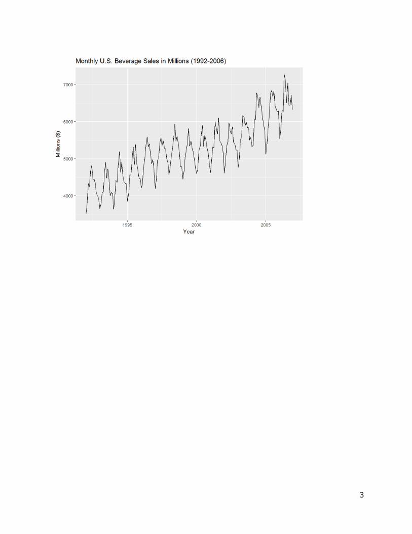
The command names() used above will display the column/variable names of a data frame. The Sales variable in the BeverageSales dataframe is the time series {y t } and it can be plotted versus an Index (i.e. time) by using the command autoplot() in the forecast/fpp2 libraries or alternatively using the plot() command which is one of the base functions in R (i.e. no package needs to be loaded to use it).
> library(fpp2) also loads the library forecast
First we need to create a time series object using the ts()command. The series is monthly and starts 01/1992 ending 12/2006.
Time Series Plots
> BevSales = ts(BeverageSales$Sales,start=1992,frequency=12)> autoplot(BSales) + ggtitle(“Monthly U.S. Beverage Sales (1992 – 2006)”) + xlab(“Year”)+ylab(“Millions ($)”)
2
We can also plot time series using the base R command plot(time series object). Below are some examples of using this function to plot the beverage sales time series.
> plot(BevSales,type="l") type=”l” means use a line to connect data points.> plot(BevSales,type="b") type=”b” means plot both the data points and line.> plot(BevSales,type="p") type=”p” means plot the data points only.
If we want to use the variable Time on the x-axis we could use plot() as shown below. The title() can be used to a main title on the resulting plot.
> plot(BevSales,type="b",xlab=”Time”,ylab=”Millions ($)”)> title(main="Time Series Plot of U.S. Beverages Sales")
To see a help page for any command in R you can use the command ? followed immediately by the function name you want to see the help page on. Help pages will be open in a browser and are in HTML format.
3

> ?plot
A portion of the plot() help documentation is shown below.
4

Seasonal and Subseries PlotsA seasonal plot showing the monthly trends can be constructed using the ggseasonplot() command. We can use either the annual profiles or a polar coordinate plot.
> ggseasonplot(BevSales) + xlab("Month") + ylab("Beverage Sales in Millions") + ggtitle(“Seasonal Plot: Monthly Beverage Sales”)> ggseasonplot(BevSales,polar=T) + ggtitle(“Beverage Sales (seasonal polar plot)”)> ggsubseriesplot(BevSales) + ggtitle(“Monthly Beverage Sales in Millions”)
5

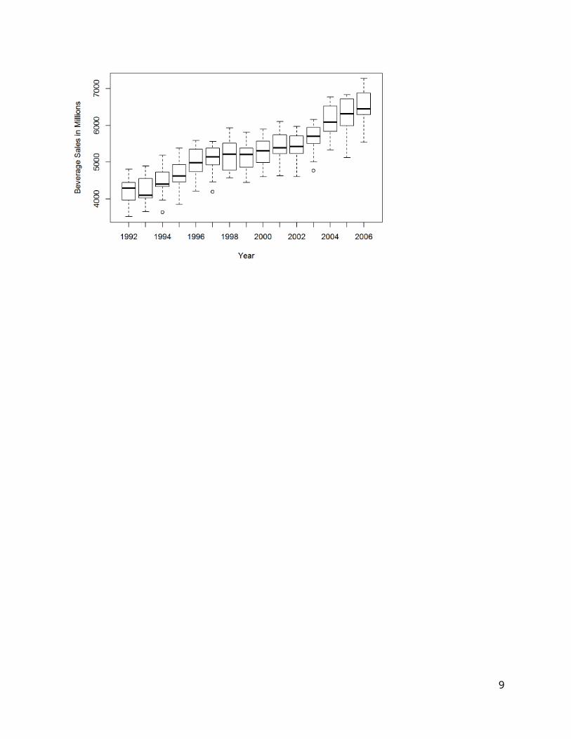
Boxplots for Time SeriesBoxplots of sales by month and year can also help understand the seasonal and annual trends.
> boxplot(BevSales~Month,xlab="Month",ylab="Beverage Sales in Millions",data=BeverageSales)
> boxplot(BevSales~Year,xlab="Year",ylab="Beverage Sales in Millions",data=BeverageSales)
6

7

Summary Statistics for Time SeriesSome basic summary statistics commands for a time series (or any numeric variable) are demonstrated below.> summary(Sales) 5-number summary with mean Min. 1st Qu. Median Mean 3rd Qu. Max. 3519 4660 5268 5239 5750 7270 > mean(Sales) mean of time series values ( y )[1] 5238.661> var(Sales) variance of time series values (sy
2∨s2)[1] 615603.6> sd(Sales) standard deviation of time series values (sy∨s)[1] 784.6041
y= 1T ∑
t=1
T
y t∧s y2=s2= 1
T−1∑t=1T
( y t− y )2 , s y=s=√ s2
Histograms of Time Series
> gghistogram(BevSales)+xlab("Monthly Beverage Sales - Millions ($)")
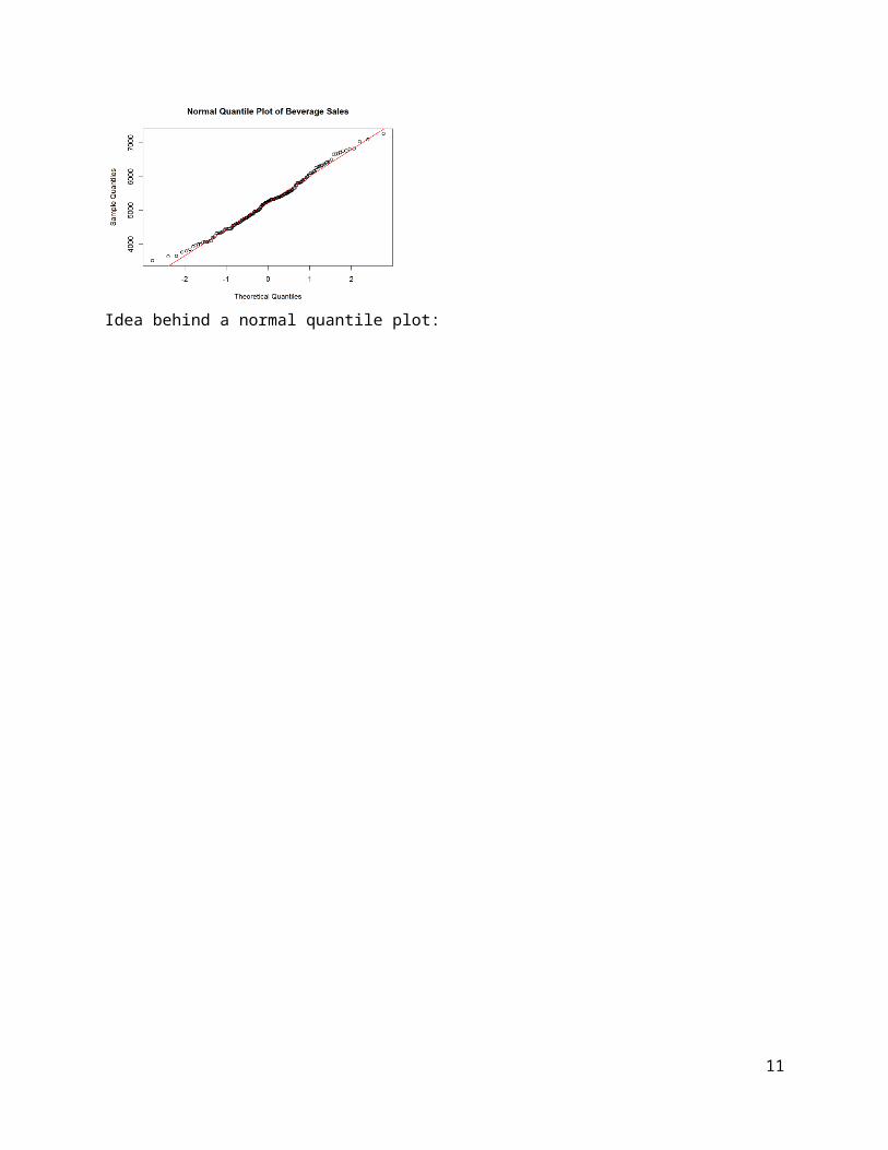
The distribution of beverage sales is approximately normal. Normality of a numeric variable can sometimes be better assessed by using a normal quantile plot. The command qqnorm() will create a normal quantile plot for any numeric variable or time series.
> qqnorm(BevSales,main=”Normal Quantile Plot of Beverage Sales”) > abline(mean(BevSales),sd(BevSales),col="red")
Idea behind a normal quantile plot:
8
9

Smoothing Time Series in R
There are several functions in base R and some from time series related packages in R that can be used to a smooth to a time series plot. In the examples below we will examine several different smoothing methods for time series data.
Moving Averages (centered) – note: the author uses T̂ t to denote the m-MA smooth
A centered m moving average (m-MA) at time t of a time series y t has the form:
M t=T̂ t=1
2k+1∑i=−k
k
y t−i=1m ∑
i=−k
k
yt−i , herem=2k+1
It is simply the mean of the observations with k time periods of t , including y t itself.The command filter() in R can be used to compute a centered moving average of this form to smooth a time series. We can then add the resulting smooth to a time series plot.
For example to take a centered moving average of length m=5 (and hence k=2), i.e. 5-MA, we compute
M t=T̂ t=y t−2+ y t−1+ y t+ yt+1+ y t+2
5=15y t−2+
15y t−1+
15y t+15y t+1+
15y t+2
To do this in R, we use the following command sequence.
> plot(BevSales,type="p",xlab="Time",ylab="Beverage Sales", main="US Beverages Sales with Centered Moving Average (m=5)")> ma5 = filter(Sales,filter=rep(1/5,5)) compute Mt with 1/5 weights> lines(ma5,lty=1,col="blue") add solid (lty=1) blue (col=”blue”) line to an existing plot
Adding two more centered moving averages with larger “windows” or “spans” we can see can see the estimates lose the seasonality and move closer toward estimating the long term trend.
> ma20 = filter(BevSales,filter=rep(1/20,20))
10
> lines(ma20,lty=2,col="red")> ma50 = filter(BevSales,filter=rep(1/50,50))> lines(ma50,lty=3,col="black")
The Hanning filter uses the following weighted moving average to create the smooth,
M t=14y t−1+
12y t+14y t+1
which we can easily implement in R using the filter() command. We will actually write our own function to do this called hann(). You can also vary the “window” width though we will not consider it here.
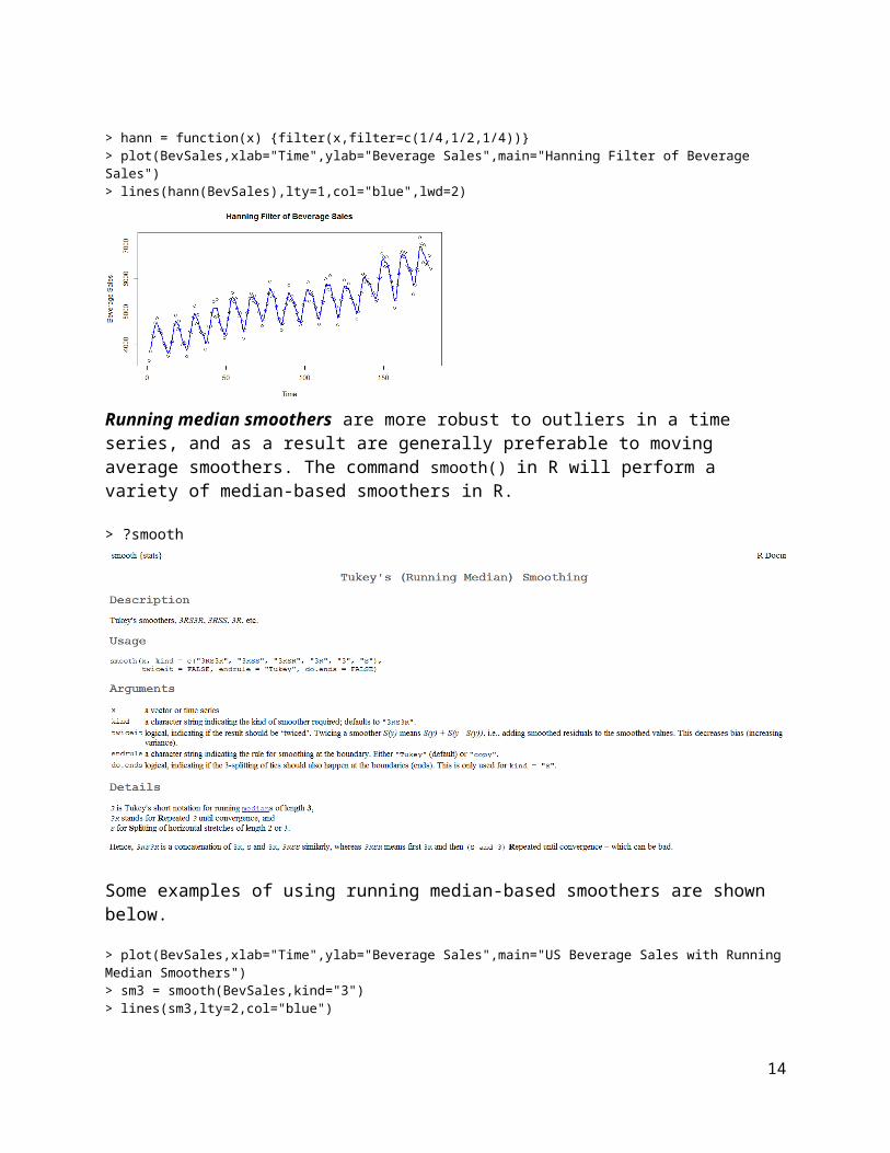
> hann = function(x) {filter(x,filter=c(1/4,1/2,1/4))}> plot(BevSales,xlab="Time",ylab="Beverage Sales",main="Hanning Filter of Beverage Sales")> lines(hann(BevSales),lty=1,col="blue",lwd=2)
Running median smoothers are more robust to outliers in a time series, and as a result are generally preferable to moving average smoothers. The command smooth() in R will perform a variety of median-based smoothers in R.
11
> ?smooth
Some examples of using running median-based smoothers are shown below.> plot(BevSales,xlab="Time",ylab="Beverage Sales",main="US Beverage Sales with Running Median Smoothers")> sm3 = smooth(BevSales,kind="3")> lines(sm3,lty=2,col="blue")
> plot(BevSales,xlab="Time",ylab="Beverage Sales",main="US Beverage Sales with Running Median Smoothers")> sm3RSS = smooth(BevSales,kind="3RSS")> lines(sm3RSS,lty=2,col="black",lwd=2) double the thickness (lwd = 2)
12

13
Local Regression SmoothersWe can also use local regression smoothing to model or highlight trends in a time series. The command lowess() in R will fit a local regression smooth to scatterplot or time series plot. Note: lowess - stands for local weighted regression
> plot(BevSales,type=”p”,xlab="Time",ylab="Beverage Sales",main="US Beverage Sales with Local Regression Smoother (f = 2/3)")> lines(lowess(BevSales,f=2/3),lty=1,col="blue",lwd=1.5)
Choosing much smaller values for the fraction of observations (f) used will allow the smoother to pick up more of the seasonal/cyclical behavior in the time series.
> plot(BevSales,type=”p”,xlab="Time",ylab="Beverage Sales",main="US Beverage Sales with Local Regression Smoother (f = .05)")> lines(lowess(BevSales,f=.05),lty=2,col="black",lwd=2)
14

> plot(Sales,type=”p”,xlab="Time",ylab="Beverage Sales",main="US Beverage Sales with Local Regression Smoother (f = .025)")> lines(lowess(BevSales,f=.025),lty=2,col="black",lwd=2)
General idea behind local weighted regression smoothers:
15

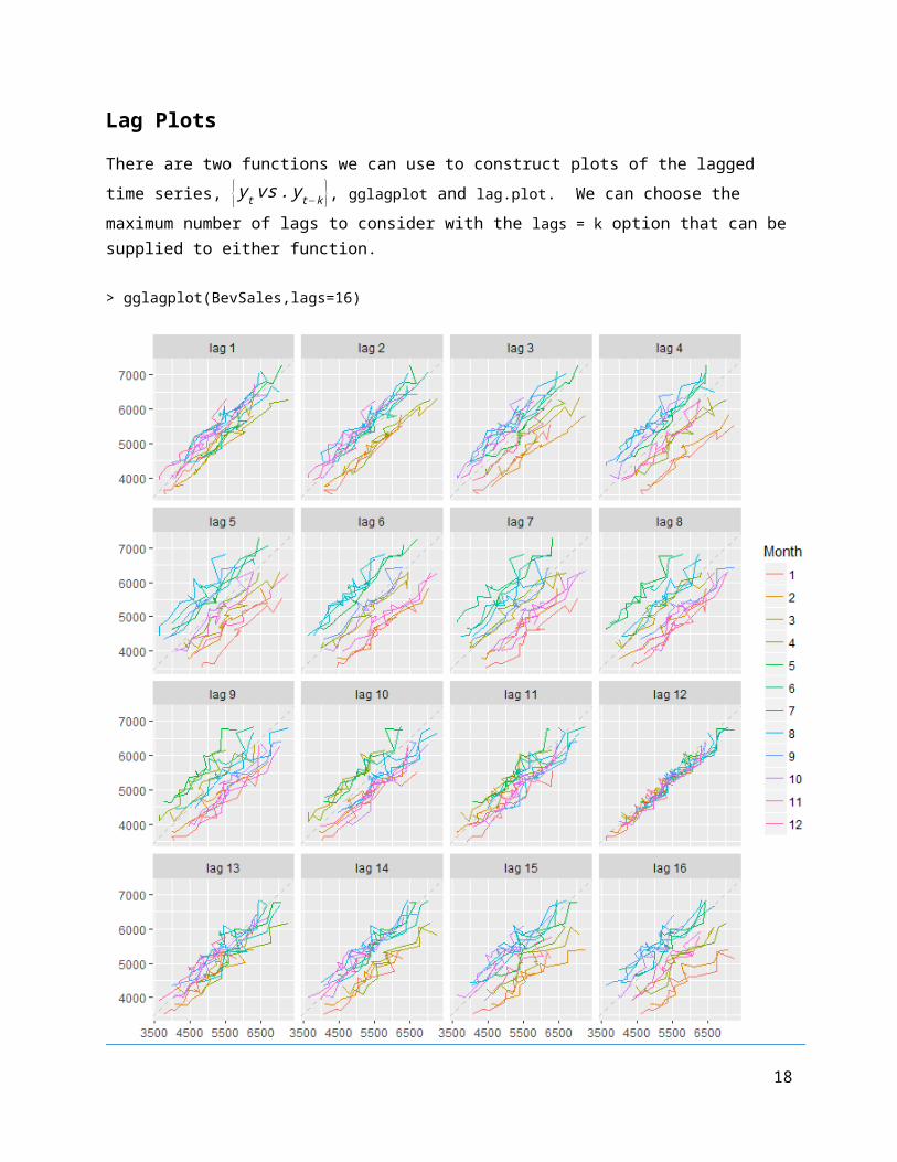
Lag PlotsThere are two functions we can use to construct plots of the lagged time series, { y t vs . y t−k }, gglagplot and lag.plot. We can choose the maximum number of lags to consider with the lags = k option that can be supplied to either function.
> gglagplot(BevSales,lags=16)
16

> lag.plot(BevSales,lags=16)
17
Autocovariance and Autocorrelation in R
The k th sample autocorrelation (r k) is given by the following formula:
rk=∑t=1
T−k
( y t− y )( y t+k− y¿)
∑t=1
T
( yt− y )2, k=0,1,2 ,…, K (K=largest lag considered)¿
It essentially measures the correlation between {y t } and the lagged time series {y t−k }. The numerator is called the autocovariance between {y t } and {y t−k }. The lag plots give a visual impression of the autocorrelation by plotting {y t vs . yt−k} for a sequence of lag values k . The structure found in the autocorrelations, i.e. the autocorrelation function (ACF), provides some guidance how we might develop a model for forecasting future values of the time series.
The function Acf(x,lag.max) in R will form the necessary lagged time series and calculate the autocorrelation for lags up to lag.max (K∈formula above), and will plot the results. R will automatically choose the number lags to compute if no value for lag.max (K ) is set.
We will calculate the autocorrelation function (ACF) for the beverage sales time series and then assign it to an object called BevACF.
> BevACF = Acf(BevSales)
> BevACF
Autocorrelations of series ‘BevSales’, by lag
0 1 2 3 4 5 6 7 8 9 10 11 12 13 14 15 1.000 0.894 0.796 0.700 0.560 0.492 0.477 0.460 0.500 0.599 0.668 0.734 0.791 0.706 0.619 0.517 16 17 18 19 20 21 22 23 24 0.385 0.317 0.298 0.283 0.320 0.412 0.472 0.538 0.591
By default R uses SE(rk )≈1 /√T thus the confidence bands are ± 2√T
=± 2√180
≈± .15
for this time series as T=180.
For a fancier ACF plot, we can use the function ggAcf.
> ggAcf(BevSales)
18

More ACF Examples:The R Markdown file on my website also contains all of the R code for reproducing the example below.
1) Monthly U.S. Unemployment Rate (2000 – present)Unemployment = read.csv(file="http://course1.winona.edu/bdeppa/FIN%20335/Datasets/US%20Unemployment%20(2000-present).csv")names(Unemployment)[1] "DATE" "Year" "Month" "UNRATE"head(Unemployment) DATE Year Month UNRATE1 1/1/2000 2000 1 4.02 2/1/2000 2000 2 4.13 3/1/2000 2000 3 4.04 4/1/2000 2000 4 3.85 5/1/2000 2000 5 4.06 6/1/2000 2000 6 4.0Unemploy = ts(Unemployment$UNRATE,start=2000,frequency=12)
autoplot(Unemploy) + ggtitle("Monthly US Unemployment (%) 2000-present") + xlab("Year") + ylab("% Unemployment")
19

> gglagplot(Unemploy)
> ggAcf(Unemploy) + ggtitle("ACF for U.S. Unemployment Rate (2000-present)")
> UnemployACF = Acf(Unemploy)> UnemployACF
Autocorrelations of series 'Unemploy', by lag 0 1 2 3 4 5 6 7 8 9 10 11 1.000 0.989 0.977 0.961 0.943 0.924 0.901 0.876 0.849 0.820 0.790 0.759 12 13 14 15 16 17 18 19 20 21 22 23 0.726 0.694 0.661 0.627 0.594 0.560 0.526 0.492 0.458 0.424 0.390 0.357 24 0.325
20
Comments:
How does the lag plot and ACF above relate?

2) U.S. Quarterly Percent Change in Gross Domestic Product (GDP) (Q2 1947 – present)> GDPperchg= read.csv(file="http://course1.winona.edu/bdeppa/FIN%20335/Datasets/GDP%20relative%20change.csv")
> names(GDPperchg)[1] "DATE" "Year" "Quarter" "QuarterNum" "GDPchange"
> head(GDPperchg) DATE Year Quarter QuarterNum GDPchange 1 04/01/1947 1947 Q2 2 -0.42 07/01/1947 1947 Q3 3 -0.43 10/01/1947 1947 Q4 4 6.44 01/01/1948 1948 Q1 1 6.05 04/01/1948 1948 Q2 2 6.76 07/01/1948 1948 Q3 3 2.3
> GDP = ts(GDPperchg$GDPchange,start=c(1947,2),frequency=4)> head(GDP) Qtr1 Qtr2 Qtr3 Qtr41947 -0.4 -0.4 6.41948 6.0 6.7 2.3
> GDPsub = window(GDP,start=2000) # form subseries starting in Q1 2000> GDPsub Qtr1 Qtr2 Qtr3 Qtr42000 1.2 7.8 0.5 2.32001 -1.1 2.1 -1.3 1.12002 3.7 2.2 2.0 0.32003 2.1 3.8 6.9 4.82004 2.3 3.0 3.7 3.52005 4.3 2.1 3.4 2.32006 4.9 1.2 0.4 3.22007 0.2 3.1 2.7 1.42008 -2.7 2.0 -1.9 -8.22009 -5.4 -0.5 1.3 3.92010 1.7 3.9 2.7 2.52011 -1.5 2.9 0.8 4.62012 2.7 1.9 0.5 0.12013 2.8 0.8 3.1 4.02014 -0.9 4.6 5.2 2.02015 3.2 2.7 1.6 0.52016 0.6 2.2 2.8 1.82017 1.2 3.1 3.2
> autoplot(GDPsub) + ggtitle("Monthly % Change in U.S. GDP (2000 - present)") + xlab("Year") + ylab("Percent Change (%)")
21

> gglagplot(GDPsub)
> ggAcf(GDPsub) + ggtitle("ACF: Quarterly % Change in GDP")> GDPsubACF = Acf(GDPsub)
> GDPsubACFAutocorrelations of series ‘GDPsub’, by lag
0 1 2 3 4 5 6 7 8 9 10 11 12 1.000 0.346 0.233 0.085 0.073 -0.033 -0.004 0.009 -0.028 0.054 -0.014 -0.138 -0.075 13 14 15 16 17 18 -0.099 -0.064 -0.055 -0.054 -0.114 -0.101
22
How does the lag plot and ACF above relate?

3) Monthly Ramsey County Unemployment Rate (2000 – present)> RamseyUnemploy = read.csv(file="http://course1.winona.edu/bdeppa/FIN%20335/Datasets/Ramsey%20Unemployment.csv")> names(RamseyUnemploy)[1] "DATE" "Month" "Year" "UNRATE"> head(RamseyUnemploy) DATE Month Year UNRATE 1 1/1/2000 1 2000 3.0 2 2/1/2000 2 2000 2.8 3 3/1/2000 3 2000 3.0 4 4/1/2000 4 2000 2.6 5 5/1/2000 5 2000 2.8 6 6/1/2000 6 2000 3.1
> RamseyUE = ts(RamseyUnemploy$UNRATE,start=2000,frequency=12)> autoplot(RamseyUE) + ggtitle("Ramsey County Unemployment Rate (2000-present)") + xlab("Year") +
ylab("% Unemployment")
> gglagplot(RamseyUE)
23

> ggAcf(RamseyUE) + ggtitle(“ACF: Ramsey County Unemployment Rate”)
> RamseyACF = Acf(RamseyUE)> RamseyACFAutocorrelations of series 'RamseyUE', by lag
0 1 2 3 4 5 6 7 8 9 10 11 1.000 0.952 0.909 0.879 0.865 0.865 0.852 0.821 0.778 0.747 0.734 0.730 12 13 14 15 16 17 18 19 20 21 22 23 0.724 0.665 0.611 0.572 0.550 0.539 0.519 0.478 0.427 0.389 0.369 0.360 24 0.349
Consider the change from previous month as a time series, i.e. we will form a new time series given by y t− y t−1= (1−B ) y t. The B is called the backshift operator and can be used to more effectively represent differencing applied to a time series. We will this notation later in the course. Differencing a time series is an important tool we often times use when trying to develop a model to forecast future values of a time series.
To better understand differencing, consider both the original time series { y t } and the differenced time series y t− y t−1= (1−B ) y t.> RamseyUE
Jan Feb Mar Apr May Jun Jul Aug Sep Oct Nov Dec
2000 3.0 2.8 3.0 2.6 2.8 3.1 2.9 2.9 3.3 2.9 2.7 2.5
2001 3.2 3.1 3.3 3.3 3.1 3.9 3.6 3.6 3.6 3.6 3.7 3.8
2002 4.7 4.5 4.8 4.5 4.1 4.9 4.6 4.3 4.2 3.9 4.0 4.0
2003 4.9 4.6 4.8 4.5 4.6 5.4 5.2 5.0 5.1 4.7 4.7 4.5
2004 5.3 4.8 5.2 4.5 4.5 5.2 4.9 4.7 4.7 4.2 4.0 3.9
2005 4.4 4.2 4.3 3.9 3.7 4.2 3.8 3.6 3.9 3.6 3.7 3.6
2006 4.3 4.3 4.2 3.7 3.4 4.0 3.9 3.7 4.0 3.6 3.7 3.7
2007 4.5 4.2 4.4 4.1 4.1 4.8 4.7 4.5 4.8 4.2 4.1 4.3
2008 4.7 4.5 4.8 4.4 4.9 5.5 5.6 5.6 5.7 5.5 5.6 6.1
2009 6.9 7.5 7.8 7.4 7.6 8.3 8.0 8.0 7.9 7.4 7.3 7.2
2010 7.9 7.8 8.0 7.3 7.2 7.6 7.7 7.7 7.4 7.0 7.0 6.8
2011 7.3 7.1 7.0 6.5 6.6 7.1 8.2 6.7 6.3 5.8 5.4 5.6
2012 6.2 6.2 6.2 5.5 5.6 6.2 6.2 6.0 5.4 5.3 5.0 5.2
2013 5.9 5.5 5.3 4.8 4.7 5.3 5.1 4.9 4.6 4.3 4.1 4.3
2014 4.9 4.9 4.8 4.0 3.8 4.3 4.2 4.0 3.7 3.3 3.2 3.4
2015 4.1 4.0 3.9 3.4 3.5 3.9 3.7 3.5 3.3 3.1 3.0 3.2
2016 3.9 3.8 3.9 3.4 3.2 4.0 3.8 3.8 3.7 3.5 3.2 3.5
24
> RamseyDiff = diff(RamseyUE,1)
> RamseyDiff
Jan Feb Mar Apr May Jun Jul Aug Sep Oct Nov Dec
2000 -0.2 0.2 -0.4 0.2 0.3 -0.2 0.0 0.4 -0.4 -0.2 -0.2
2001 0.7 -0.1 0.2 0.0 -0.2 0.8 -0.3 0.0 0.0 0.0 0.1 0.1
2002 0.9 -0.2 0.3 -0.3 -0.4 0.8 -0.3 -0.3 -0.1 -0.3 0.1 0.0
2003 0.9 -0.3 0.2 -0.3 0.1 0.8 -0.2 -0.2 0.1 -0.4 0.0 -0.2
2004 0.8 -0.5 0.4 -0.7 0.0 0.7 -0.3 -0.2 0.0 -0.5 -0.2 -0.1
2005 0.5 -0.2 0.1 -0.4 -0.2 0.5 -0.4 -0.2 0.3 -0.3 0.1 -0.1
2006 0.7 0.0 -0.1 -0.5 -0.3 0.6 -0.1 -0.2 0.3 -0.4 0.1 0.0
2007 0.8 -0.3 0.2 -0.3 0.0 0.7 -0.1 -0.2 0.3 -0.6 -0.1 0.2
2008 0.4 -0.2 0.3 -0.4 0.5 0.6 0.1 0.0 0.1 -0.2 0.1 0.5
2009 0.8 0.6 0.3 -0.4 0.2 0.7 -0.3 0.0 -0.1 -0.5 -0.1 -0.1
2010 0.7 -0.1 0.2 -0.7 -0.1 0.4 0.1 0.0 -0.3 -0.4 0.0 -0.2
2011 0.5 -0.2 -0.1 -0.5 0.1 0.5 1.1 -1.5 -0.4 -0.5 -0.4 0.2
2012 0.6 0.0 0.0 -0.7 0.1 0.6 0.0 -0.2 -0.6 -0.1 -0.3 0.2
2013 0.7 -0.4 -0.2 -0.5 -0.1 0.6 -0.2 -0.2 -0.3 -0.3 -0.2 0.2
2014 0.6 0.0 -0.1 -0.8 -0.2 0.5 -0.1 -0.2 -0.3 -0.4 -0.1 0.2
2015 0.7 -0.1 -0.1 -0.5 0.1 0.4 -0.2 -0.2 -0.2 -0.2 -0.1 0.2
2016 0.7 -0.1 0.1 -0.5 -0.2 0.8 -0.2 0.0 -0.1 -0.2 -0.3 0.3
2017 0.6 -0.1 -0.3 -0.3 0.0 0.3 -0.2 0.1 -0.6 -0.6 0.0

2017 4.1 4.0 3.7 3.4 3.4 3.7 3.5 3.6 3.0 2.4 2.4
We will now plot the differenced time series and examine the lag plot & ACF.
> RamseyDiff = diff(RamseyUE,lag=1)> autoplot(RamseyDiff) + ggtitle("Differenced Unemployment in Ramsey County (k=1)") + xlab("Year") + ylab("Monthly Change Unemployment Rate")
> gglagplot(RamseyDiff)
25

> ggAcf(RamseyDiff) + ggtitle("ACF: Monthly Change in Ramsey County Unemployment Rate")
> RamdiffACF = Acf(RamseyDiff)> RamdiffACF Autocorrelations of series 'RamseyDiff', by lag 0 1 2 3 4 5 6 7 8 9 1.000 -0.086 -0.102 -0.202 -0.158 0.188 0.196 0.166 -0.118 -0.237 10 11 12 13 14 15 16 17 18 19 -0.120 -0.021 0.702 -0.062 -0.158 -0.209 -0.157 0.171 0.204 0.131 20 21 22 23 24 -0.126 -0.226 -0.148 -0.016 0.610
Discussion:
26