Embed Size (px)
Citation preview

2020 marks our second collaboration with Hannon Library Events Manager Carol Raby on the American Library Association’s annual Banned Books Week. This year the graphic design students visually reimagined the cover of Ray Bradbury’s timely novel Fahrenheit 451. Carol provided a literary overview and the designers moved forward focusing on establishing a visual metaphor for a final cover design along with concepts for an exhibition logotype and an exhibition bookmark.
Student Designers
Joseph Capestany Nina Casillas Sara Chang Danica DeForest Katherine Ford Geanne Ge Matthew Goddard Kai Henthorn-Iwane Madeleine Isbell Juliane Johnson Brandon Klein Ana Laughrun Kadi Lawson Emmerson Marechal Pascale Montalvo Paige Petersen
Carol Raby, Hannon Library Events Manager Garland Kirkpatrick, Professor of Art and Art

READF OM
d. Joseph Capestany m. Sara Chang b. Danica DeForest h. Geanne Ge e. Matthew Goddard k. Kai Henthorn-Iwane f. Madeleine Isbell n. Juliane Johnson a. Brandon Klein l. Ana Laughrun j. Kadi Lawson c. Emmerson Marechal g. Pascale Montalvo i. Paige Petersen
g.
d.
a.
l. j.
h.
e.
b.
m. n.
k.
i.
f.
c.
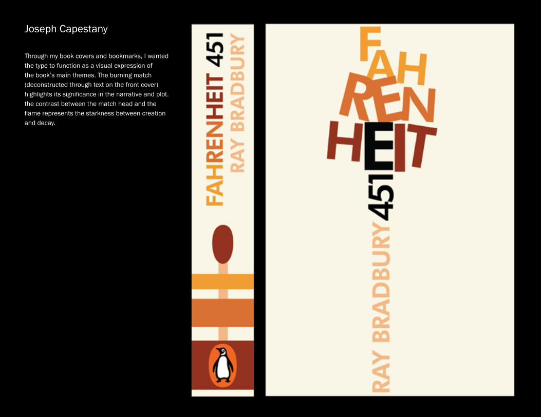
Joseph Capestany
Through my book covers and bookmarks, I wanted the type to function as a visual expression of the book’s main themes. The burning match (deconstructed through text on the front cover) highlights its significance in the narrative and plot. the contrast between the match head and the flame represents the starkness between creation and decay.

FAHRENHEIT
51 FAHRENHEIT
r ay bradbury
ray bradbury
Nina Casillas Founded in the “Thin Red Line” flag, which to me is a bastardization of the American flag, much like the Fahrenheit firefighters are bastardizations of firefighters. Inspired by the constructivism movement, the cover uses its verticality to emphasize the drama of the book, and the severity of its contents. The ‘451’ is merely a shadow of itself, much as the society in Fahrenheit 451 is a dystopian shadow of the creative, educated society it once was.

Ray Bradbury
y ru b
dar b
ya r
Sara Chang
My book cover uses typography and visual metaphor to portray the book Fahrenheit 451.The focus of this cover is the typographic layout and the use of visual imagery to embody the subject matter of Ray Bradbury’s book. By incorporating the “5” in 451 as a bookshelf and the “1” as thermometer, the cover represents the subject of books and heat in order to convey the story in simple text.

Danica DeForest
For my design I wanted to focus on a key plot detail in Fahrenheit 451: the burning of books. I related this idea to the concept that when these books are burned, they are essentially dying. Not only do we experience a physical loss when books are burned, but also a loss of knowledge. I portrayed this by creating a bookcase coffin that personifies these books and pays tribute to those that were burned not only in Fahrenheit 451, but also in real life.

Geanne Ge
To me, the match burning symbolizes not only the burning of the books, but also the burning passion for knowledge and the vehement desire for freedom. I see this in Montag and the old lady who chose to die with the books. The fire is the by-product of the match. They should show up in pairs. I chose to use dots to mimic the flames. I got this inspiration from Paul Rand’s magazine cover. Inspired by what Beatty said ‘We must all be alike,’ I made all dots perfect circles. But they are different in size and colors which is my message: we are not, and do not need to be alike.

Matthew Goddard The themes of censorship within the book remind-ed me of the Cold War’s themes of espionage and secrecy, so my art direction took reference from redacted government documents, black and white photography, and the “grittiness” of an intelligence war. My cover depicts the key moment in the novel when Guy decides to pocket a book, directly disobeying the laws of his society. His hands are covered in documents that have been redacted and censored so that Guy takes on a personification of censorship, working as a new fireman. I attempted to personify that censorship and literally show the pivotal moment in the book where Guy first begins his internal contradictions. The splash of red illuminating the book is meant to emphasize the importance of this seemingly innocuous action.
Matthew Goddard The themes of censorship within the book remind-ed me of the Cold War’s themes of espionage and secrecy, so my art direction took reference from redacted government documents, black and white photography, and the “grittiness” of an intelligence war. My cover depicts the key moment in the novel when Guy decides to pocket a book, directly disobeying the laws of his society. His hands are covered in documents that have been redacted and
to personify that censorship and literally show the
his internal contradictions. The splash of red illuminating the book is meant to emphasize the importance of this seemingly innocuous action.

Ray Bradbury
Kai Henthorn-Iwane This design is a visual metaphor for the act of getting caught with banned knowledge.The spot-light is the eye of society. The red book represents the banned knowledge, and the shadow coming from the book is the individual caught with it.
Kai Henthorn-Iwane This design is a visual metaphor for the act of getting caught with banned knowledge.The spot-light is the eye of society. The red book represents the banned knowledge, and the shadow coming from the book is the individual caught with it.

F A H R E N H E I T
R AY B R A D B U RY
FA
HR
EN
HE
IT 4
51
RA
Y B
RA
DB
UR
Y
Madeleine Isbell
This book cover serves as a metaphorical reference to the theme of fire and matches in the story. I wanted the cover to be as simple as possible to highlight this theme in the clearest way possible. To make this artwork, I arranged the match-es in the shape of “451” and burnt the “1”match. I chose white as the background color in order to maintain simplicity and to highlight the shadow behind the artwork.

FAH
REN
HEIT Ray Bradbury
451
Ray B
radburyFA
HR
EN
HE
IT 451
Visual metaphor of wing of a
bird and pages of a book
Knowledge is power
Checkpoint FourJuliane Johnson
The visual metaphor conveyed in my cover is an analogy between the wing of a bird and pages of a book which are combined to create a larger wingspan. The image illustrates how knowledge and education can provide freedom, hope and power. The bird is a powerful symbol of freedom and successfully represents the content and plot of Fahrenheit 451.

Brandon Klein
to showcase the book title. Using a different approach of the word “Fahrenheit,” I wanted to use the symbol of the word and combine it with the 451 to create a cohesive design. Within the “F” I placed a singed match highlighting the theme of the book and the shape of the “F.” Finally the color choice I went with was a light grey and rich dark red. These colors are

Ana Laughrun
For my cover, I wanted to emphasize what is lost when the Firemen burn the books. Their job is more than just burning paper and covers, they are disposing of the words and stories inside of them causing the loss of history, classics, and other important information. My cover shows a visual of what exactly is being burned, and how much is lost with this “solution” to keeping their society more com-placent. I chose to use Lewis Carroll’s Alice’s Adventures in Wonderland as the text being burned because it has been on and off banned book lists around the world due to it’s referenc-ing to drugs and hallucinations. I feel that it is a good representation of the type of book that inspires the Firemen to burn, but it is also a classic story that has been loved by many over the decades.

Kadi Lawson
For my cover and spine design of Ray Bradbury’s Fahrenheit 451, I used the flame as the main visual imagery, signifying the books that are set ablaze in the novel. A flame arises inside of the word ‘Fahrenheit’ as a metaphor of the idea that the written word is to be burnt away- banished from human lives. I used a dark background color to reflect the harsh and eerie feel of this dystopian world. This may also represent the firemen who have turned from good to evil; instead of putting out fires, they now set them. Lastly, I used Futura- a sans serif bold typeface to convey drama and alarm as well as a typeface with futuristic feel for ‘451’ to reference the story’s given time-period.
Kadi Lawson
For my cover and spine design of Ray Bradbury’s
visual imagery, signifying the books that are set
word ‘Fahrenheit’ as a metaphor of the idea that the written word is to be burnt away- banished from human lives. I used a dark background color
have turned from good to evil; instead of putting
a sans serif bold typeface to convey drama and alarm as well as a typeface with futuristic feel for ‘451’ to reference the story’s given time-period.

451
fahr enhe it
ray bradbury
bradbury451
fahrenheit
Emmerson Marechal
My cover design is primarily typographic. It focusses on the idea that the “1” in “451” represents a lit match.”Fahrenheit” rises up in a cloud of smoke and flames, as it twists and becomes distorted; much like how an actual lit match’s flame begins to grow and transform. “Fahrenheit” is the flame, it is the heat, as the “451” is the temperature causing it to riseand stretch out. As for my book spine design, I chose a more simplified and clean look than my cover; still sticking with the same color scheme. When initially doing my research I realized most of the other Fahrenheit 451 book covers incorporated variations of reds, greys, and muted neutral tones. I wanted to choose colors that would represent fire and heat without being repetative to the other designs already created. I chose variations of orange, yellow, and blue as they are all different flame colors and represent different levels of fire/heat. The symbolism behind the yellow “451” is torepresent the color of flame that fire at that temperature is. I chose to add a barcode and penguin logo from Penguin Books Publishing, to push the idea that this could be a real book cover, and give it the appearance that it is.

The metaphor my cover displays is the comparison of burning pages to black butterflies. The silhouette of the fireman holding a fire hose is meant to show how Guy Montag rejects the burning of books.- Pascale Montalvo
Pascale Montalvo The metaphor my cover displays is the compar-ison of burning pages to black butterflies. The silhouette of the fireman holding a fire hose is meant to show how Guy Montag rejects the burning of books.

Paige Petersen
My cover is a typographic design. I chose to represent the burning of the books caused by the temperature. To achieve this, I burned the numbers out of the title Fahrenheit 451. The negative space is the first page of the book. The other words on the cover and spine are created to look as though they are imprinted in order to put more emphasis on the burning and contrast of the ‘451.’ I utilized the ‘imprinted’ words and paper textures to make the book appear to be an older edition as many of the books featured in the novel are very historic. My bookmarks also continue to represent the burning and destruction of books.
Paige Petersen My cover is a typographic design. I chose to represent the burning of the books caused by the temperature. To achieve this, I burned the numbers out of the title Fahrenheit 451. The negative space is the first page of the book. The other words on the cover and spine are created to look as though they are imprinted in order to put more emphasis on the burning and contrast of the ‘451.’ I utilized the ‘imprinted’ words and paper textures to make the book appear to be an older edition as many of the books featured in the novel are very historic. My bookmarks also continue to represent the burning and destruction of books.
Paige Petersen
My cover is a typographic design. I chose to represent the burning of the books caused by the temperature. To achieve this, I burned the numbers out of the title Fahrenheit 451. The negative space is the first page of the book. The other words on the cover and spine are created to look as though they are imprinted in order to put more emphasis on the burning and contrast of the ‘451.’ I utilized the ‘imprinted’ words and paper textures to make the book appear to be an older edition as many of the books featured in the novel are very historic. My bookmarks also continue to represent the burning and destruction of books.