Embed Size (px)
Citation preview
© 2018 The Authors Journal of the Royal Statistical Society: Series A (Statistics in Society)Published by John Wiley & Sons Ltd on behalf of the Royal Statistical Society.This is an open access article under the terms of the Creative Commons Attribution License, which permits use, dis-tribution and reproduction in any medium, provided the original work is properly cited.
0964–1998/18/182000
Proofs subject to correction. Not to be reproduced without permission. Contributions to the dis-cussion must not exceed 400 words. Contributions longer than 400 words will be cut by the [email protected]://www.rss.org.uk/preprints
RSSA 12379 Dispatch: 18.4.2018 No. of pages:16
J. R. Statist. Soc. A (2018)182, Part 1, pp. 1–16
123456789
101112131415161718192021222324252627282930313233343536373839404142434445464748
Graphics for uncertainty
Adrian W. Bowman
University of Glasgow, UK
[Read before The Royal Statistical Society at a meeting on ‘Data visualization’ at theSociety’s 2018 annual conference in Cardiff on Wednesday, September 5th, 2018, thePresident , Professor D. J. Spiegelhalter, in the Chair ]
Summary. Graphical methods such as colour shading and animation, which are widely avail-able, can be very effective in communicating uncertainty. In particular, the idea of a ‘density strip’provides a conceptually simple representation of a distribution and this is explored in a varietyof settings, including a comparison of means, regression and models for contingency tables.Animation is also a very useful device for exploring uncertainty and this is explored particularlyin the context of flexible models, expressed in curves and surfaces whose structure is of par-ticular interest. Animation can further provide a helpful mechanism for exploring data in severaldimensions. This is explored in the simple but very important setting of spatiotemporal data.
Keywords: Animation; Density strip; Graphics; Spatiotemporal data; Uncertainty
1. Introduction
In 2010, the Royal Statistical Society launched a 10-year statistical literacy campaign with adiscussion paper by Wild et al. (2011) on making statistical concepts accessible. It is stating theobvious to say that graphical methods play a very important role in both the communication ofstatistical information and concepts in a manner which is largely free of technical language. Thereis, of course, a long tradition of the development of innovation in statistical graphics. Examplesinclude exploratory data analysis (Tukey, 1977), the careful visual design expressed in latticegraphics (Sarkar, 2008) and the animation and interaction provided by systems such as XLisp-Stat (Tierney, 1988), ggobi (Cook and Swayne, 2007) and Mondriaan (Theus and Urbanek,2008). The ggplot2 system (Wickham, 2009), based on the ‘grammar of graphics’ (Wilkinson,2005), is proving increasingly popular through its combination of attractive graphical designand flexibility. The wide variety of tools that are now available to general users is illustratedin Chen et al. (2008). There are also general tools for enabling user interaction, provided forexample in systems such as Shiny (Chang et al., 2016).
Despite this array of tools, the standard approaches to graphical display remain those basedon relatively simple point and line drawings, such as histograms, boxplots, bar charts and scatterplots, supplemented occasionally by colour filling. However, to those who are unfamiliar withstatistical methods, the carefully positioned lines of a boxplot, or the boundaries of a confidenceinterval, imply a precision and encourage an algorithmic approach to the evaluation of evidence,which is at odds with the concept of uncertainty and variation. Of course, technicality andprecision are very important but the communication of results, and more informal evaluation
Address for correspondence: Adrian W. Bowman, School of Mathematics and Statistics, University of Glasgow,University Gardens, Glasgow, G12 8QQ, UK.E-mail: [email protected]
2 A. W. Bowman
of the statistical evidence that they encapsulate, is greatly aided by graphical methods whichclearly communicate the uncertainties that are involved.
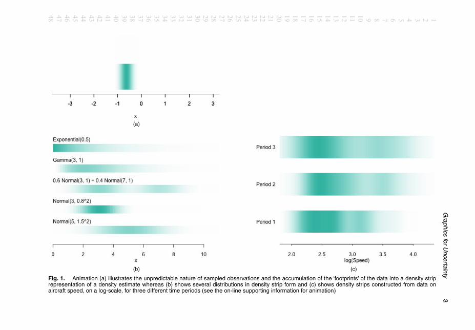
The focus of this paper is on graphical effects which can add considerable value in the ex-ploration of data and models in general and in the quantification of uncertainty in particular.An example is provided by Jackson (2008) who introduced the concept of a density strip torepresent distributions by the simple device of a bar of colour whose intensity is proportionalto the density function at each location. This produces a visually appealing display whose con-tinuous gradations match well with the intuition of what uncertainty means. This is illustratedin Fig. 1(a) which displays an animation. (Animated displays of this type are used repeat-edly through the paper.) Observations are displayed successively, in a manner which representsthe unpredictable ‘there it is—no, there it is’ nature of random variation. Above the displayof individual data points, the accumulated ‘footprints’ of the observations build into a den-sity strip, where intensity reflects the relative frequency of observations at different locations.Use of a footprint with faded edges, centred on the location of each observation, producesa smooth kernel density estimate in a manner which can be appreciated entirely intuitively(with the role of the smoothing parameter refreshingly expressed in shoe size!). Fig. 1(b) rep-resents several distributions of standard form, where features such as skewness and bimodalityare all expressed in a perfectly clear but very compact manner. Fig. 1(c) displays density esti-mates of data on the characteristics of aircraft design from 1914 to 1984, described by Bow-man and Azzalini (1997), using log(Speed) separated into three time periods (1, 1914–1935;2, 1936–1955; 3, 1956–1984). The shifting locations and sizes of the components are appar-ent. The ability to draw a distribution along a single axis is particularly appealing. This fitswell with the recommendation of Wild et al. (2011) that plots should ‘stay in the same visualspace’ as the data, in contrast with a histogram which requires a second axis to display fre-quency.
Another graphical device which can be used to good effect is animation—a device that hasalready been employed in Fig. 1. If animation is not carefully employed it may simply be adistraction. Tversky et al. (2002) reviewed its use from a perceptual perspective and identi-fied that it was likely to be most effective in displaying changes over space and time, partic-ularly when user interaction was available. This is very often precisely the context in whichanimation is used in statistical graphics. Hullman et al. (2015) carried out a detailed study ofdisplays of probability distributions employing static and animated graphics and concludedthat the latter assisted in the perception of distributional properties. It is clear from the widedifferences in individual perceptions across viewers that no graphic display will work effec-tively for everyone, but it is also clear that animation is a form of display which is effective formany.
This paper explores how these relatively simple graphical devices of colour shading and an-imation can assist in the display of data, models and the associated uncertainty. The methodsare particularly geared towards communicating with those who do not have technical statisticalknowledge, but the aim is to do so in ways which are directly compatible with more technicalforms of analysis. Section 2 exploits density strips in a simple comparison of means and extendsthis to the assessment of evidence for interaction in analysis of variance and of association incontingency tables. Section 3 deals with standard regression models whereas Section 4 considershow the uncertainty that is associated with the estimation of flexible curves, and particularlysurfaces, can be displayed through animation. Section 5 uses both colour shading and animationin addressing the issue of displaying spatiotemporal data, which are now a commonly occur-ring data structure, and associated spatiotemporal models. Some final discussion is given inSection 6.
123456789
101112131415161718192021222324252627282930313233343536373839404142434445464748
Graphics
forU
ncertainty3
(a)
(b) (c)
Fig. 1. Animation (a) illustrates the unpredictable nature of sampled observations and the accumulation of the ‘footprints’ of the data into a density striprepresentation of a density estimate whereas (b) shows several distributions in density strip form and (c) shows density strips constructed from data onaircraft speed, on a log-scale, for three different time periods (see the on-line supporting information for animation)
123456789101112131415161718192021222324252627282930313233343536373839404142434445464748

4 A. W. Bowman
The data that are associated with the graphics can be obtained from
http://dx.doi.org/10.5525/gla.researchdata.595
2. Comparing models
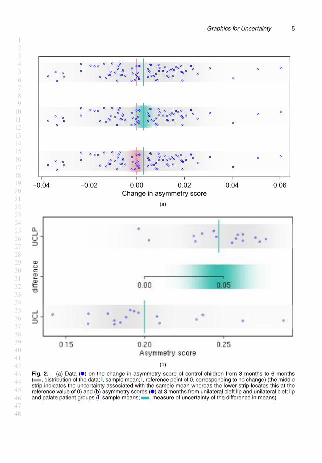
2.1. Comparing meansFig. 2(a) displays data on asymmetry scores derived from the facial images of children in astudy of the effects of corrective surgery on patients who were born with a unilateral cleft lip orunilateral cleft lip and palate. The context of the study is described by Hood et al. (2004) whereasthe methodology for measuring asymmetry is described by Bock and Bowman (2006). The datathat are plotted here show the change in asymmetry scores from facial images captured at 3months and 6 months of age. A substantial change in asymmetry is expected for cleft cases overthis period, as this is when corrective surgery takes place. Interest here lies in whether there is anychange in the mean asymmetry scores for controls. The differences (3 months − 6 months) areplotted, with a grey density strip to highlight the underlying distribution and with the samplemean x and reference value 0 marked as lines. The data are shown as points, with added vertical‘jitter’ simply to avoid overplotting.
The middle strip in Fig. 2 highlights the uncertainty in estimation of the true mean μ. In aBayesian analysis, the posterior distribution of the parameter of interest encapsulates all therelevant information and a density strip provides a simple graphical expression of this. Froma frequentist perspective, with se denoting standard error and n denoting sample size, the keystep in the argument is the distribution of the pivotal quantity .x−μ/=se.x/, which has a tn−1-distribution when an assumption of normality is appropriate. Instead of proceeding to a confi-dence interval through the usual inversion argument, scaling the t-distribution (or its standardnormal approximation) by the standard error expresses the distribution of the distance betweenx and μ. This may be regarded as a kind of ‘ruler’ which measures variation and which, whenplaced at x, provides a graphical expression of uncertainty. This has a direct correspondencewith equivalent confidence intervals but it avoids the rather sophisticated interpretation that isrequired for a detailed derivation. The middle strip of the Fig. 2(a) provides a clear indicationthat, when uncertainty is taken into account, the evidence of a change in mean asymmetry scorefrom 3 months to 6 months is not convincing. An alternative approach is to centre the distribu-tion at the reference value of 0, as in the lower strip of Fig. 2(a), to express uncertainty in theposition of x under the assumption that the true mean is 0. This provides a simple graphicalexpression of the essential concepts of a hypothesis test, without the need for complex explana-tions of p-values. (For the record, the p-value here is 0.17.) This point was well made by Jackson(2008), who provided numerous additional examples of the helpful uses of density strips.
Fig. 2(b) extends this to the two-sample setting, here in the comparison of asymmetry scoresfor unilateral cleft lip and unilateral cleft lip and palate patients at 3 months. The higher meanscore for the unilateral cleft lip and palate group is apparent (for the record, p < 0:001), withthe central density strip expressing the uncertainty in the size of the difference in mean scores.By locating the 0 value on the difference scale at the smaller of the sample means, the graphicaldisplay gives a clear indication of the plausible size of the difference. The linking of the twoscales aids interpretation and respects the principle that was advocated by Wild et al. (2011)that graphics should remain in the same ‘visual space’ as the data.
The intention of these plots is to convey uncertainty through graphics which are based onthe usual technical constructs but which allow inferences to be drawn, and the size and natureof effects identified, in an informal and conceptual manner. In particular, the ‘fuzzy’ nature of
123456789
101112131415161718192021222324252627282930313233343536373839404142434445464748
Graphics for Uncertainty 5
−0.04 −0.02 0.00 0.02 0.04 0.06Change in asymmetry score
(a)
(b)
Fig. 2. (a) Data ( ) on the change in asymmetry score of control children from 3 months to 6 months( , distribution of the data; , sample mean; , reference point of 0, corresponding to no change) (the middlestrip indicates the uncertainty associated with the sample mean whereas the lower strip locates this at thereference value of 0) and (b) asymmetry scores ( ) at 3 months from unilateral cleft lip and unilateral cleft lipand palate patient groups ( , sample means; , measure of uncertainty of the difference in means)
123456789
101112131415161718192021222324252627282930313233343536373839404142434445464748

6 A. W. Bowman
a density strip aligns with an intuitive concept of uncertainty more naturally than the preciseend points of confidence intervals.
2.2. Factor modelsFig. 3 displays data on sulphur dioxide .SO2/ air pollution measured at three European sites inthree different years. Bowman et al. (2009) described the wider data set. Fig. 3(a) displays greydensity strips for each data group, with red lines superimposed to indicate the fitted values froma fitted linear model with site, year and interaction effects.
A simple two-way analysis of variance allows evidence for the presence of interaction to beexplored by the construction of an F -statistic which contrasts the residual sums of squares froman additive and an interaction model. In this form, the F -statistic is rather remote from thegraphical representation of the data in Fig. 3 but the algebra of linear models (Seber, 1977)enables this to be expressed as a comparison of the fitted values from the two models. For fittedvalues {yij, yij0 : i = 1, : : : , I; j = 1, : : : , J}, where the subscript 0 indicates the simpler additivemodel, the F -statistic becomes
F =
∑i,j
nij.yij − yij0/2=ν
σ2 = 1IJ
∑i,j
[yij − yij0√{ν=.IJ/}σ=
√nij
]2
.1/
where ν denotes the difference in the degrees of freedom for the two models and σ denotes theestimate of error standard deviation from the larger model.
This is expressed graphically in Fig. 3(b), where normal distributions, centred on the fittedvalues of the additive model and with standard deviations
√.ν=IJ/σ√
nij,
are represented as density strips. These characterize the location, with uncertainty, of the fittedvalues of the additive model, against which the fitted values of the interaction model can becompared. The focus here is not on representing uncertainty through the standard errors ofthe comparison of fitted values at each factor combination, with suitable adjustment for themultiple comparisons that are involved, but instead to indicate the individual contributions tothe overall assessment of evidence for the suitability of an additive model through the F -statistic.The marked mismatch, on average, between the fitted values from the interaction model and thecorresponding ranges of values consistent with the additive model gives graphical expression tothe evidence that interaction is present. This can, of course, be made more precise by comparingthe observed value of the F -statistic (3.18) with the F4,53-distribution. (There are 62 observationsin the data set.) To strengthen further the link with the graphical comparison of fitted values,the test statistic and its reference distribution can be expressed on a square-root scale, with aninterpretation as the root-mean-square differences of the fitted values from the two models. Thedensity strip representation of this,
indicates a strong degree of mismatch, which is entirely consistent with the technical details ofthe underlying F -test (which, for the record, produces a p-value of 0.020 in this example).
The aim of these examples is not to promote the use of significance tests, whose overuse hasrightly been criticized and whose interpretation is often misunderstood. Instead, the aim is to
123456789
101112131415161718192021222324252627282930313233343536373839404142434445464748

Graphics for Uncertainty 7
Site 1 Site 20 Site 40
1990 1995 2000 1990 1995 2000 1990 1995 2000
−1
0
1
2
Year
SO
2
Site 1 Site 20 Site 40
1990 1995 2000 1990 1995 2000 1990 1995 2000
−1
0
1
2
Year
SO
2
(a)
(b)
Fig. 3. (a) Data on SO2 pollution, with density strips to highlight the groups ( , fitted values froman interaction model) and (b) density strips to expresses the uncertainty in the comparison with the simpleradditive model
123456789
101112131415161718192021222324252627282930313233343536373839404142434445464748
8 A. W. Bowman
advocate the use of a reference model against which the size and nature of effects of interestcan be evaluated, using appropriate graphics to provide measures of uncertainty. These graphicsare consistent with standard methods of analysis of variance. The comparison of fitted valuesexpressed in equation (1) can clearly be extended to a wider range of linear models.
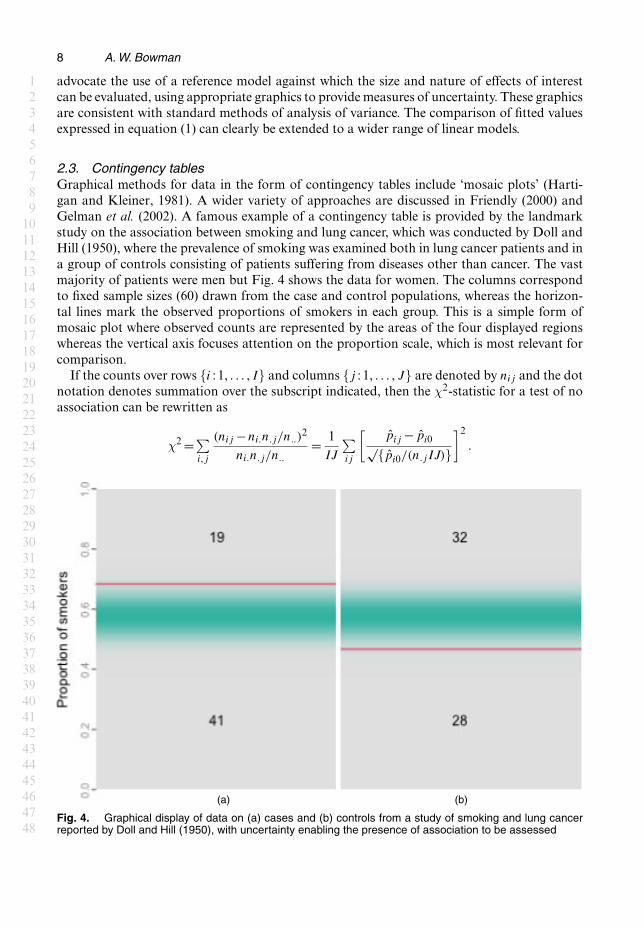
2.3. Contingency tablesGraphical methods for data in the form of contingency tables include ‘mosaic plots’ (Harti-gan and Kleiner, 1981). A wider variety of approaches are discussed in Friendly (2000) andGelman et al. (2002). A famous example of a contingency table is provided by the landmarkstudy on the association between smoking and lung cancer, which was conducted by Doll andHill (1950), where the prevalence of smoking was examined both in lung cancer patients and ina group of controls consisting of patients suffering from diseases other than cancer. The vastmajority of patients were men but Fig. 4 shows the data for women. The columns correspondto fixed sample sizes (60) drawn from the case and control populations, whereas the horizon-tal lines mark the observed proportions of smokers in each group. This is a simple form ofmosaic plot where observed counts are represented by the areas of the four displayed regionswhereas the vertical axis focuses attention on the proportion scale, which is most relevant forcomparison.
If the counts over rows {i : 1, : : : , I} and columns {j : 1, : : : , J} are denoted by nij and the dotnotation denotes summation over the subscript indicated, then the χ2-statistic for a test of noassociation can be rewritten as
χ2 =∑i,j
.nij −ni:n:j=n::/2
ni:n:j=n::= 1
IJ
∑ij
[pij − pi0√{pi0=.n:jIJ/}
]2
:
(a) (b)
Fig. 4. Graphical display of data on (a) cases and (b) controls from a study of smoking and lung cancerreported by Doll and Hill (1950), with uncertainty enabling the presence of association to be assessed
123456789
101112131415161718192021222324252627282930313233343536373839404142434445464748
Graphics for Uncertainty 9
This is expressed as an average over the cells of a weighted distance between the fitted valuesunder the association .pij = nij=n:j/ and no-association (pi0 = ni:=n::) models. Uncertainty inthe model comparison can then be represented by normal density strips with means p0j andstandard deviations
√{pi0=.n:jIJ/}. The small but clear separation between the two models isapparent and the nature of the effect is clear in the elevated proportion of smokers among thecases. The strength of the evidence expressed is consistent with the p-value of 0.027 arising fromthe χ2-test.
3. Regression
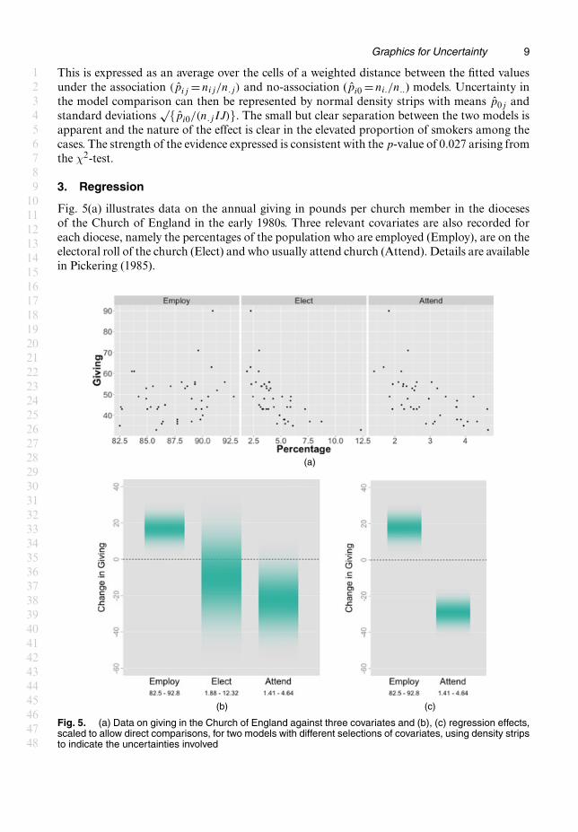
Fig. 5(a) illustrates data on the annual giving in pounds per church member in the diocesesof the Church of England in the early 1980s. Three relevant covariates are also recorded foreach diocese, namely the percentages of the population who are employed (Employ), are on theelectoral roll of the church (Elect) and who usually attend church (Attend). Details are availablein Pickering (1985).
(a)
(b) (c)
Fig. 5. (a) Data on giving in the Church of England against three covariates and (b), (c) regression effects,scaled to allow direct comparisons, for two models with different selections of covariates, using density stripsto indicate the uncertainties involved
123456789
101112131415161718192021222324252627282930313233343536373839404142434445464748
10 A. W. Bowman
Regression effects are usually assessed through the sign and size of the regression coefficients.When covariates are measured on very different scales the associated regression parametersare not immediately comparable. A simple device is to plot βiri for each of the p covariatesi = 1, : : : , p, where ri denotes the length of the range of observed values of covariate i. Thisscaling of the parameter estimates then expresses the change in the response variable across thelength of each covariate axis. These values are displayed in Fig. 5(b), using normal density stripscentred at βiri and with standard deviations s.e..βi/ri to represent the uncertainty. This enablesthe regression effects to be directly compared with one another as they are now expressed on theresponse (Giving) scale in a manner which is naturally associated with the scatter plots, wherethe primary visual signal lies in the movement of the response across the range of the covariate.Once again, this places the regression effects in the same ‘visual space’ as the original data.
Fig. 5(b) shows a positive association between giving and employment, whereas the associ-ations with membership and attendance are less clear. In fact, these latter two covariates arestrongly related to one another, creating an issue with multicollinearity. Fig. 5(c) shows thatwhen only one of these covariates is used, here attendance, then a very strong regression effectis apparent, consistent with the impression that is given by the marginal scatter plots of theobserved data. The negative association between giving and attendance is interesting.
4. Curves and surfaces
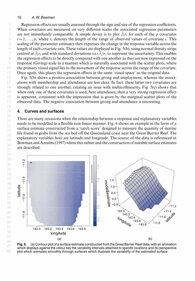
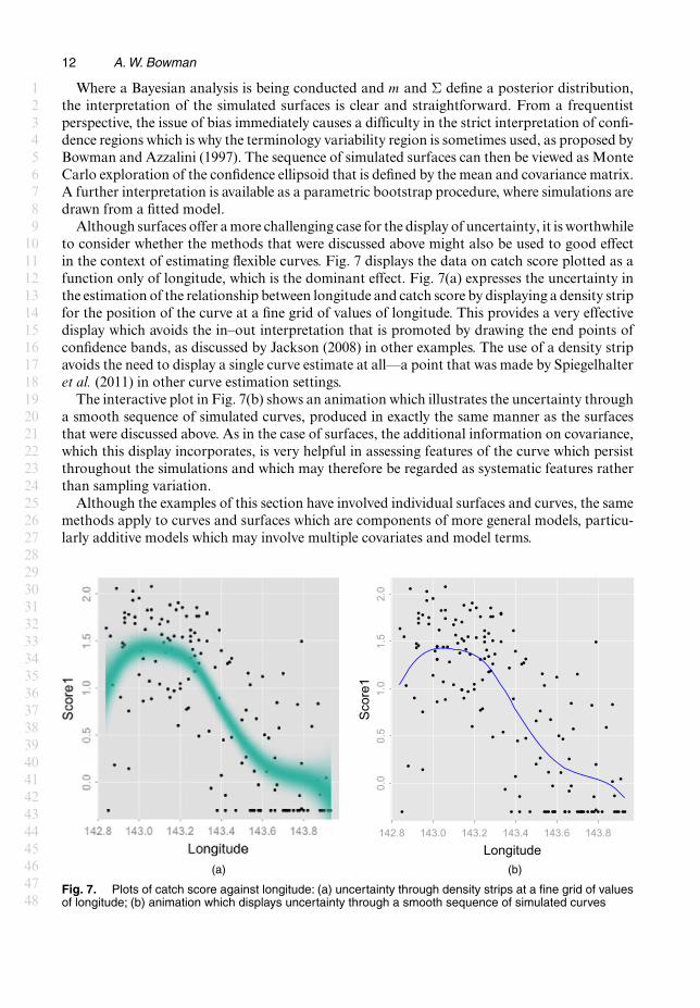
There are many occasions when the relationship between a response and explanatory variablesneeds to be modelled in a flexible non-linear manner. Fig. 6 shows an example in the form of asurface estimate constructed from a ‘catch score’ designed to measure the quantity of marinelife found in grabs from the sea bed off the Queensland coast near the Great Barrier Reef. Theexplanatory variables here are latitude and longitude. The source of the data is referenced inBowman and Azzalini (1997) where this subset and the construction of suitable surface estimatesare described.
143.0 143.2 143.4 143.6 143.8
−11.
8−1
1.6
−11.
4−1
1.2
longitude
latit
ude
+
−0.5
0.0
0.5
1.0
1.5
longitude
143.0143.2
143.4143.6
143.8
latitu
de
−11.8
−11.6
−11.4
−11.2
model$estim
ate −0.5
0.0
0.5
1.0
1.5
(a) (b)
Fig. 6. (a) Contour plot of a surface estimate constructed from the Great Barrier Reef data, with an animationwhich displays against the colour key the variability intervals attached to specific locations and (b) perspectiveplot which animates smoothly through surfaces which illustrate the variability of the estimated surface
123456789
101112131415161718192021222324252627282930313233343536373839404142434445464748
Graphics for Uncertainty 11
One challenging issue is how to display the uncertainty that is associated with this estimate.Bowman (2006) showed how surfaces may be painted with colour to display specific informa-tion such as deviation from linearity, but the display of uncertainty in a more general sense ismore difficult. Information on standard errors is easily obtainable and so it would be feasibleto plot two additional surfaces, defined as 2 standard errors below and above the estimate atevery location, but this creates an entirely atypical representation as it employs the extremes ofvariability at all points simultaneously. It also requires several surfaces to be viewed simultane-ously. Some researchers plot a separate surface to represent the standard errors at each locationor add further contours for standard errors to the contour plots of the estimated surface. Thiscan be difficult to interpret because the standard errors and the surface estimates are on differ-ent scales or, to use again the expression from Wild et al. (2011), they live in different ‘visualspaces’.
The two panels of Fig. 6 propose two solutions to this problem, both using animation. The firstis illustrated in Fig. 6(a), which is an interactive plot. As locations are highlighted (in practiceby clicking and dragging but here in a prepared animation), a confidence interval, or variabilityinterval as discussed by Bowman and Azzalini (1997), is displayed against the colour key. Thisenables the user to interrogate uncertainty at any locations of interest and so to build up a pictureof the uncertainty pattern across the surface. This strategy does remain in the same visual spacebut it also retains some of the difficulties in plotting standard errors that were described aboveand its pointwise nature provides rather partial information.
A more satisfactory approach is to simulate surfaces which conform to the mean and covari-ance properties of the estimate. This is straightforward to do, as the vast majority of methods offlexible regression have estimates of the form m=Sy, where y denotes a vector of response data,S denotes a ‘smoothing matrix’ that is constructed from the values of the covariates and m is avector of estimated values, which is usually constructed at a regular grid across the surface. Un-der an assumption of independent errors, an estimate of the error variance σ2 can also be easilyobtained. The details of the estimation process are described by Bowman and Azzalini (1997) inthe local linear case and are easily accessible in the literature for other methods. The covarianceof the estimated surface points can then easily be estimated as Σ=SST σ2, where σ2 denotes theestimate of error variance. It is then straightforward to simulate surfaces {mÅ
i : i= 1, : : :} fromthe multivariate normal distribution N .m, Σ/.
The display of a series of unconnected simulated surfaces produces rather abrupt visualtransitions and a considerably improved effect is achieved by smoothly tracking between these.It is important to ensure that the intermediate surfaces retain the intended mean and covarianceproperties. Simple linear interpolation αmÅ
1 + .1−α/mÅ2 , for 0 � α � 1, between two simulated
surfaces mÅ1 and mÅ
2 does not achieve this as it produces the correct mean m, but an incorrectcovariance {α2 + .1−α/2}Σ. A solution is provided by constructing intermediate surfaces as
m+ α√{α2 + .1−α/2} .mÅ1 −m/+ 1−α√{α2 + .1−α/2} .mÅ
2 −m/,
as these have the correct mean and covariance structure. This is illustrated by the interactive plotin Fig. 6(b). The smooth sequence of surfaces displayed reflects the uncertainty in the estimatein an attractive visual manner. Intuitively, features of the surface which are retained acrossthese simulations may be regarded as systematic rather than the product of sampling variation.For example, there is strong evidence that the plateau nature of the surface at low values oflongitude is a real feature. The animation could also have been presented in contour form butthe perspective plot is sometimes more effective, especially when combined with interactivecontrol of the viewing angles.
123456789
101112131415161718192021222324252627282930313233343536373839404142434445464748
12 A. W. Bowman
Where a Bayesian analysis is being conducted and m and Σ define a posterior distribution,the interpretation of the simulated surfaces is clear and straightforward. From a frequentistperspective, the issue of bias immediately causes a difficulty in the strict interpretation of confi-dence regions which is why the terminology variability region is sometimes used, as proposed byBowman and Azzalini (1997). The sequence of simulated surfaces can then be viewed as MonteCarlo exploration of the confidence ellipsoid that is defined by the mean and covariance matrix.A further interpretation is available as a parametric bootstrap procedure, where simulations aredrawn from a fitted model.
Although surfaces offer a more challenging case for the display of uncertainty, it is worthwhileto consider whether the methods that were discussed above might also be used to good effectin the context of estimating flexible curves. Fig. 7 displays the data on catch score plotted as afunction only of longitude, which is the dominant effect. Fig. 7(a) expresses the uncertainty inthe estimation of the relationship between longitude and catch score by displaying a density stripfor the position of the curve at a fine grid of values of longitude. This provides a very effectivedisplay which avoids the in–out interpretation that is promoted by drawing the end points ofconfidence bands, as discussed by Jackson (2008) in other examples. The use of a density stripavoids the need to display a single curve estimate at all—a point that was made by Spiegelhalteret al. (2011) in other curve estimation settings.
The interactive plot in Fig. 7(b) shows an animation which illustrates the uncertainty througha smooth sequence of simulated curves, produced in exactly the same manner as the surfacesthat were discussed above. As in the case of surfaces, the additional information on covariance,which this display incorporates, is very helpful in assessing features of the curve which persistthroughout the simulations and which may therefore be regarded as systematic features ratherthan sampling variation.
Although the examples of this section have involved individual surfaces and curves, the samemethods apply to curves and surfaces which are components of more general models, particu-larly additive models which may involve multiple covariates and model terms.
Longitude
Sco
re1
142.8 143.0 143.2 143.4 143.6 143.8
0.0
0.5
1.0
1.5
2.0
(a) (b)
Fig. 7. Plots of catch score against longitude: (a) uncertainty through density strips at a fine grid of valuesof longitude; (b) animation which displays uncertainty through a smooth sequence of simulated curves
123456789
101112131415161718192021222324252627282930313233343536373839404142434445464748

Graphics for Uncertainty 13
5. Spatiotemporal data and models
Spatiotemporal data, where measurements of a response of interest are indexed by both spaceand time, have become very common, leading to considerable research into suitable models.Cressie and Wikle (2011) have provided an excellent introduction to the topic and commenton the lack of suitable graphical methods for exploring spatiotemporal data. The twographical themes of earlier sections, namely density shading and animation, can also be usedto good effect in this setting. Fig. 8 plots data on log-SO2 pollution across Europe. (Asubset of these data was used in Section 2.) Bowman et al. (2009) described the data and
1990 1992 1994 1996 1998 2000year
co−ordinate 1
co−o
rdin
ate
2
−0.1 0.0 0.1 0.2 0.3 0.4
0.1
0.2
0.3
0.4
0.5
0.6
0.7
−6−4
−20
24
logS
O2
2 4 6 8 10 12month
co−ordinate 1
co−o
rdin
ate
2
−0.1 0.0 0.1 0.2 0.3 0.4
0.1
0.2
0.3
0.4
0.5
0.6
0.7
2
3
4
−2
−3
−0.3
−0.2
−0.1
0.0
0.1
0.2
0.3
adju
stm
ent
year1990 1992 1994 1996 1998 2000
1990 1992 1994 1996 1998 2000year
co−ordinate 1
co−o
rdin
ate
2
−0.1 0.0 0.1 0.2 0.3 0.4
0.1
0.2
0.3
0.4
0.5
0.6
0.7
−6−4
−20
24
logS
O2
(a) (b)
(c) (d)
Fig. 8. (a) Animation of SO2 pollution at spatial locations within specific time windows, (b) animation ofthe spatial and seasonal terms from a fitted spatiotemporal model, (c) animation of a spatial region .�/ forwhich the pollution values are plotted over time in (d)
123456789
101112131415161718192021222324252627282930313233343536373839404142434445464748

14 A. W. Bowman
constructed a spatiotemporal model involving spatial, temporal and seasonal effects and inter-actions.
Fig. 8(a) plots the spatial locations of the observations within a specific time window, usingcolour to indicate the value of the pollution level of each observation. This is an interactive plotwhich enables the time evolution of the pollution measurements to be explored in a more effectivemanner than the simultaneous viewing of a set of static plots for selected time windows. Theanimation employs a time window whose width is indicated in the horizontal bar. The shadingthat is shown here indicates that the time window is in fact created by a filter, or weight, function,which allows observations to move smoothly into and out of the plotted data. This is achieved byusing the hue saturation value form of colour representation (see Manjunath et al. (2001)) anddownweighting the saturation component according to its distance from the current centre ofthe time window. The effect of these operations is to create a smooth transition as observationsenter and leave the plotted data.
Figs 8(c) and 8(d) show how the time patterns at specific spatial locations can also be explored,where a click on Fig. 8(c) identifies a spatial region within which the pollution values are plottedover time and which may then be dragged across the plotting area. This is a form of interactionwith plots known as ‘brushing’ (Becker and Cleveland, 1987) which has been adapted here tothe spatiotemporal setting.
Bowman et al. (2009) proposed a flexible regression model for log-SO2, y, with terms involvingspatial location, s (two dimensional), time in years, t, and month, z, the last to reflect the seasonalsignal. In standard model notation, this can be expressed as
y =μ+ms.s/+mt.t/+mz.z/+ms.s/ : mt.t/+ms.s/ : mz.z/+mt.t/ : mz.z/+ ",
where m denotes a smooth function, ‘:’ denotes interaction terms and " is an error term. Thismodel was fitted by Bowman et al. (2009) through local linear regression and the backfittingalgorithm. Here a p-spline representation of each smooth function is used, as described byEilers and Marx (1996), with 6 and 12 degrees of freedom for one- and two-dimensional termsrespectively. The behaviour of the error term " is modelled by a separable combination of aspherical covariance function exp{−.ds=ν/2} of spatial distance ds and temporal correlation ofauto-regressive AR(1) form on a monthly scale, with correlation parameter ρ. For convenience,the estimated values of ν =0:098 and ρ=0:569 that were reported by Bowman et al. (2009) areused. After estimation of model terms by penalized likelihood based on independent errors,with estimated standard deviation 0.793, an estimated covariance matrix can then be used toconstruct adjusted standard errors. Bowman et al. (2009) give the details.
Fig. 8(b) shows the interaction of the spatial and seasonal terms ms.s/ : mz.z/. These arethe adjustments to an additive model that are required to describe the SO2 patterns effectively.(This is a case where controls to display the patterns at particular positions are very helpful.)To highlight the need for these adjustments, contours corresponding to 2 or more standarderrors from 0 draw attention to the areas where the evidence for interaction is strong. Theanimation goes on to display the main effects and interaction together: μ + ms.s/ + mz.z/ +ms.s/ :mz.z/. Here the plot is dominated by the main effects but the contours remain to highlightthe presence of the interaction term. This is an example of graphical display involving not onlydata but also a sophisticated model which can provide clear insight into a complex environmentalprocess.
Fig. 8 was created through the rp.spacetime function in the rpanel package (Bowmanet al., 2007) for R (R Development Core Team, 2013). Jones et al. (2014) described software whichcreates spatiotemporal animations in a convenient automatic manner, specifically designed forthe context of groundwater monitoring.
123456789
101112131415161718192021222324252627282930313233343536373839404142434445464748
Graphics for Uncertainty 15
6. Discussion
The graphics that are discussed in the paper aim to provide displays of uncertainty which areintuitive, particularly for a non-technical audience, but which are aligned as closely as possiblewith the technical construction of the underlying inferential methods. One underlying themehas been the use of colour intensity shading to provide graphics which are more consistentwith the fuzzy nature of uncertainty and which counteract the ‘inside–outside’ interpretation ofconfidence intervals, building on the work of Jackson (2008). A second theme has been the useof animation which, in particular, enables graphics to remain in the same visual space as thedata and model of interest.
Colour selection is an important general issue as this has major implications for the perceptionof changes across categories or along continuous scales. This is a broad topic which was veryhelpfully discussed by Zeileis et al. (2009).
Acknowledgements
The paper has benefitted greatly from the comments of the reviewers and from conversationswith many other colleagues. The embedded animations in the figures were produced in theanimate package for LATEX by Alexander Grahn. The research was supported in part by theEconomic and Social Research Council through an award (grant ES/L011921/1) to the UrbanBig Data Centre at the University of Glasgow.
References
Becker, R. A. and Cleveland, W. S. (1987) Brushing scatterplots. Technometrics, 29, 127–142.Bock, M. T. and Bowman, A. W. (2006) On the measurement and analysis of asymmetry with applications to
facial modelling. Appl. Statist., 55, 77–91.Bowman, A. W. (2006) Comparing nonparametric surfaces. Statist. Modllng, 6, 279–299.Bowman, A. W. and Azzalini, A. (1997) Applied Smooth Techniques for Data Analysis. Oxford: Oxford University
Press.Bowman, A. W., Crawford, E., Alexander, G. and Bowman, R. W. (2007) rpanel: simple interactive controls for
R functions using the tcltk package. J. Statist. Softwr., 17, 1–18.Bowman, A. W., Giannitrapani, M. and Scott, E. M. (2009) Spatiotemporal smoothing and sulphur dioxide trends
over Europe. Appl. Statist., 58, 737–752.Chang, W., Cheng, J., Allaire, J., Xie, Y. and McPherson, J. (2016) Shiny: web application framework for R. R
Package Version 0.13.1.Chen, C.-H., Hardle, W. K. and Unwin, A. (2008) Handbook of Data Visualization. Berlin: Springer.Cook, D. and Swayne, D. F. (2007) Interactive and Dynamic Graphics for Data Analysis: with R and GGobi. New
York: Springer.Cressie, N. and Wikle, C. K. (2011) Statistics for Spatio-temporal Data. New York: Wiley.Doll, R. and Hill, A. B. (1950) Smoking and carcinoma of the lung. Br. Med. J., 2, 739–748.Eilers, P. H. and Marx, B. D. (1996) Flexible smoothing with b-splines and penalties. Statist. Sci., 11, 89–102.Friendly, M. (2000) Visualizing Categorical Data. Cary: SAS Institute.Gelman, A., Pasarica, C. and Dodhia, R. (2002) Let’s practice what we preach: turning tables into graphs. Am.
Statistn, 56, 121–130.Hartigan, J. A. and Kleiner, B. (1981) Mosaics for contingency tables. In Computer Science and Statistics: Proc.
13th Symp. Interface, pp. 268–273. New York: Springer.Hood, C., Hosey, M., Bock, M., White, J., Ray, A. and Ayoub, A. (2004) Facial characterization of infants with
cleft lip and palate using a three-dimensional capture technique. Clft Pal. Cranfacl J., 41, 27–35.Hullman, J., Resnick, P. and Adar, E. (2015) Hypothetical outcome plots outperform error bars and violin plots
for inferences about reliability of variable ordering. PlOS One, 10, no.11, article e0142444.Jackson, C. H. (2008) Displaying uncertainty with shading. Am. Statistn, 62, 340–347.Jones, W. R., Spence, M. J., Bowman, A. W., Evers, L. and Molinari, D. A. (2014) A software tool for the
spatiotemporal analysis and reporting of groundwater monitoring data. Environ. Modllng Softwr., 55, 242–249.Manjunath, B. S., Ohm, J.-R., Vasudevan, V. V. and Yamada, A. (2001) Color and texture descriptors. IEEE
Trans. Circts Syst. Video Technol., 11, 703–715.
123456789
101112131415161718192021222324252627282930313233343536373839404142434445464748

16 A. W. Bowman
Pickering, J. (1985) Giving in the Church of England: an econometric analysis. Appl. Econ., 17, 619–632.R Development Core Team (2013) R: a Language and Environment for Statistical Computing. Vienna: R Founda-
tion for Statistical Computing.Sarkar, D. (2008) Lattice: Multivariate Data Visualization with R. New York: Springer.Seber, G. (1977) Linear Regression Analysis. New York: Wiley.Spiegelhalter, D., Pearson, M. and Short, I. (2011) Visualizing uncertainty about the future. Science, 333, 1393–
1400.Theus, M. and Urbanek, S. (2008) Interactive Graphics for Data Analysis: Principles and Examples. Boca Raton:
Chapman and Hall–CRC.Tierney, L. (1988) XLISP-STAT: a Statistical Environment based on the XLISP Language (Version 2.0). Min-
neopolis: University of Minnesota School of Statistics.Tukey, J. W. (1977) Exploratory Data Analysis. Reading.Tversky, B., Morrison, J. B. and Betrancourt, M. (2002) Animation: can it facilitate? Int. J. Hum. Comput. Stud.,
57, 247–262.Wickham, H. (2009) ggplot2: Elegant Graphics for Data Analysis. New York: Springer.Wild, C. J., Pfannkuch, M., Regan, M. and Horton, N. J. (2011) Towards more accessible conceptions of statistical
inference (with discussion). J. R. Statist. Soc.A, 174, 247–295.Wilkinson, L. (2005) The Grammar of Graphics. New York: Springer.Zeileis, A., Hornik, K. and Murrell, P. (2009) Escaping rgbland: selecting colors for statistical graphics. Computnl
Statist. Data Anal., 53, 3259–3270.
123456789
101112131415161718192021222324252627282930313233343536373839404142434445464748


![arXiv:2005.03760v1 [physics.class-ph] 4 May 20201School of Physics and Astronomy, University of Glasgow, Glasgow, G12 8QQ, UK 2 College of Optical Sciences, University of Arizona,](https://img.dokumen.tips/doc/110x75/5f69573021ff8948d1673e8a/arxiv200503760v1-4-may-2020-1school-of-physics-and-astronomy-university-of.jpg)


