Embed Size (px)
Citation preview
Consistencymatters.MASTER BRAND STYLE GUIDE

Introduction
2Skidmore College | MASTER BRAND GU IDE L I N E S
Since our founding, Skidmore College’s reputation and academic appeal have been indelibly linked to a visual sensibility and flair for creativity. Lucy Skidmore Scribner’s commitment to educate both the “hand and mind” continues today in our promise that here, Creative Thought Matters.
Skidmore stands out for our emphasis on creative thinking—not just in the arts but in science, business, economics, the humanities and every other endeavor. It is up to us, however, to ensure that our story remains clear, compelling and consistent—to reinforce our rightful place among the top institutions of higher learning today and in the future.
To this end, we have developed Skidmore’s most comprehensive communications style guide to date, which I am happy to share with you. These colors, words, logos and imagery are not only the building blocks of our visual storytelling but, when artfully applied, help strengthen and disseminate a sense of place and pride that engages and inspires. Whether you are a student, faculty, staff, a member of our alumni or a friend of the College in the broader Skidmore community, I encourage you to familiarize yourself with this guide and adopt the visual standards that reflect our rich history of creative pursuit.
Sincerely,
Martin A. MbuguaVice President for Communications and Marketing

3Skidmore College | MASTER BRAND GU IDE L I N E S
/01
/03
/02
Table of Contents
MESSAGINGSTRATEGYOur Story
Messaging Map
VOICE ANDPOSITIONINGPositioning Statement
Personality
Voice
Crafting Communications
CREATIVETHOUGHT MATTERSBrand Platform
Lockups
Clearspace
Usage
IDENTITYGraphic Identifiers
College Wordmark
College Seal
Athletic Mascot
COLORColor Swatches
Color Breakdowns
TYPOGRAPHYSerif Typeface
Sans-serif Typeface
Display Typeface
Type Treatments
Leading and Tracking
PHOTOGRAPHYCategories
Photography Tips
Stylistic Considerations
Photo Shoot Prep
DESIGN ELEMENTSOverview
Corner Arrow
Framing Arrows
Distressed Texture
Background Angle
Dot Pattern
Framing Box
Horizontal Rule
Circular Containers
BRINGING THE BRAND TO LIFECreative Brief
Decision Tree
Viewbook Spreads
Campaign Mailer Prototype
Campaign Microsite
Targeted Email
Campus Banners
Campus Activation
/05
/09
/04 /08
/06
/07

4Skidmore College | MASTER BRAND GU IDE L I N E S
/10
/11
Table of Contents
EMAILMARKETINGTypography for Email
Content
Dos and Don’ts
Samples
CAMPAIGNCOMMUNICATIONSOverview
Campaign Priorities

How do you do that?When you create any communication for Skidmore College, it should bethree things:
C LEAR
C OMPE LL ING
C ONS I STENT

/01
MessagingStrategy
Overview
Messaging Map
Our message is what we say.
Our brand messaging strategy defi nes how we position and differentiate Skidmore from our competitors by communicating a unique value proposition. In short, our message conveys what’s special about our brand.

7Skidmore College | MASTER BRAND GU IDE L I N E S
Messaging Strategy
OUR STORY
The messaging map organizes our key messages into a hierarchy and illustrates the relationship between attributes and benefits. Our story always begins with the center of the map — our core value proposition. Based on the focus, the intended audience, and the timing of the delivery, we can then lean on the appropriate secondary messages and proof points.
BUILDING OUR STORY
The messaging map provides the foundation for brand messages that are clear, consistent, and compelling.
ATTRIBUTES : WHAT WE OFFER
An attribute is what we offer to our audiences. Attributes include people, culture, courses, programs, facilities, and initiatives.
BENEF ITS : WHY IT MATTERS
A benefit is what our audiences get. It’s the value of the attributes that we offer, and why they matter.
what we off er (the give)
why it matters (the get)
Attributes
Benefi ts
Secondary Messages
Secondary Messages
Supporting Points
Supporting Points
Core Value Proposition

8Skidmore College | MASTER BRAND GU IDE L I N E S
MESSAGING MAP
Messaging Strategy
Attributes (what we off er)
Benefi ts (what they get)
so that members of the Skidmore
community are…
Skidmoreoffers…
inspired and equipped to think diff erently as they examine, question, and shape the world
a dynamic community where creative thought matters in every pursuit
Core Value Proposition
an ideal location for creative thought to thrive
an unwavering commitment to a meaningful student
experience
exposure and immersion at the intersections of academic,
scientifi c, and artisitic disciplines
thrive as multitalented professionals
lead tomorrow’s positive change
a concentrated focus on each individual
fi nd a clear purpose

9Skidmore College | MASTER BRAND GU IDE L I N E S
MESSAGING MAP
Messaging Strategy
Attributes (what we off er)
Benefi ts (what they get)
so that members of the Skidmore
community are…
Skidmoreoffers…
inspired and equipped to think diff erently as they examine, question, and shape the world
a dynamic community where creative thought matters in every pursuit
Core Value Proposition
an ideal location for creative thought to thrive
close proximity to
New York City, Boston,
and Montreal
access to outstanding resources
like the Tang Museum
a setting in the perfect
college town—
Saratoga Springs
an unwavering commitment to a meaningful student
experience
unlimited co-curricular
and extra-curricular
opportunities
a sustainable lifestyle
opportunities to engage with local,
national, and international communities
exposure and immersion at the intersections of academic,
scientifi c, and artisitic disciplines
the integration
of prominent performing
and visual arts
opportunities for off -campus
study
collaborative faculty
and student research
a liberal arts focus that connects diff erent
ideas, fi elds, and
ways of
thrive as multitalented professionals
lead tomorrow’s positive change
a concentrated focus on each individual
a career development
center that provides focus and
vision
supportive mentors
and advisors
a culture that cultivates
and celebrates passions
and pursuits
fi nd a clear purpose

10Skidmore College | MASTER BRAND GU IDE L I N E S
MESSAGING MAP
Messaging Strategy
Attributes (what we off er)
Skidmoreoffers…
a dynamic community where creative thought matters in every pursuit
Core Value Proposition
an ideal location for creative thought to thrive
an unwavering commitment to a meaningful student
experience
exposure and immersion at the intersections of academic,
scientifi c, and artisitic disciplines
possess a great breadth and depth of
knowledge and experiences
have the agility to keep pace
with the world’s advancements
build a strong network
of mentors, friends,
and peers
be prepared for career paths that
change and evolve
thrive as multitalented professionals
infuse the world with creative and passion
embrace all forms
of diversity
create a healthier
planet
lead tomorrow’s positive change
a concentrated focus on each individual
take smart risks
and keep exploring
possess a strong
sense of self
feel ready to take on new challenges
that face society
fi nd a clear purpose
Benefi ts (what they get)
so that members of the Skidmore
community are…
inspired and equipped to think diff erently as they examine, question, and shape the world

11Skidmore College | MASTER BRAND GU IDE L I N E S
Attributes (what we off er)
Skidmoreoffers…
Benefi ts (what they get)
so that members of the Skidmore
community are…
inspired and equipped to think diff erently as they examine, question, and shape the world
a dynamic community where creative thought matters in every pursuit
Core Value Proposition
an ideal location for creative thought to thrive
close proximity to
New York City, Boston,
and Montreal
access to outstanding resources
like the Tang Museum
a setting in the perfect
college town—
Saratoga Springs
an unwavering commitment to a meaningful student
experience
unlimited co-curricular
and extra-curricular
opportunities
a sustainable lifestyle
opportunities to engage with local,
national, and international communities
exposure and immersion at the intersections of academic,
scientifi c, and artisitic disciplines
the integration
of prominent performing
and visual arts
opportunities for off -campus
study
collaborative faculty
and student research
a liberal arts focus that connects diff erent
ideas, fi elds, and
ways of thinking
thrive as multitalented professionals
lead tomorrow’s positive change
a concentrated focus on each individual
a career development
center that provides focus and
vision
supportive mentors
and advisors
a culture that cultivates
and celebrates passions
and pursuits
fi nd a clear purpose
an ideal location for creative thought to thrive
an unwavering commitment to a meaningful student
experience
exposure and immersion at the intersections of academic,
scientifi c, and artisitic disciplines
possess a great breadth and depth of
knowledge and experiences
have the agility to keep pace
with the world’s advancements
build a strong network
of mentors, friends,
and peers
be prepared for career paths that
change and evolve
thrive as multitalented professionals
infuse the world with creative and passion
embrace all forms
of diversity
create a healthier
planet
lead tomorrow’s positive change
a concentrated focus on each individual
take smart risks
and keep exploring
possess a strong
sense of self
feel ready to take on new challenges
that face society
Messaging Strategy
MESSAGING MAP
fi nd a clear purpose

/02
Voice andPositioning
Positioning Statement
Personality
Voice
Crafting Communications
If our messaging is what we say, our voice is how we say it.
Together, a compelling message and a consistent voice make the Skidmore College story resonate with the right audiences and set us apart from our peers. In this section, you’ll fi nd guidance to help you achieve this across every communication platform.

13Skidmore College | MASTER BRAND GU IDE L I N E S
Voice and Positioning
POSITIONING STATEMENTHow our story begins to take shape
This statement is a creative expression of the brand strategy and messaging map. It details what Skidmore stands for. It articulates our strong belief in creative thought, and how that thought influences every aspect of life. It speaks to our role in our students’ lives, and gives us a rallying cry to stand behind.
Creativity is at our core.
It powers the way we think, communicate, and do. We boldly declare that, here at Skidmore, more than anything, Creative Thought Matters.
It matters in the work we do, the actions we take, and the people we are.
Creativity empowers us to combine unconnected ideas, bring them to life, and turn them into solutions. Creativity drives us to uncover new ways to approach everyday challenges. Creativity opens us up to diverse perspectives so that everything we do is bigger, better, and more inclusive.
At Skidmore, no matter that you think you’re meant to be, or do, or create, or inspire — Creative Thought Matters. And that makes all the diff erence.
CREATIVE THOUGHT MATTERS

14Skidmore College | MASTER BRAND GU IDE L I N E S
Voice and Positioning
POSITIONING STATEMENTHow to use the positioning
If there’s one idea that pervades the Skidmore College experience, it’s the importance we place on creative thought. How we talk about creative thought and how we illustrate it in action can vary, depending on what audience we’re addressing and what content we’re supporting. But it’s always at the core of our story.
GUT- C HEC K THE VO ICE . Does the tone of what you’re writing support our differentiating idea of
“Creative Thought Matters?” Does it sound like the personality of a person who embodies it?
STAY ON MESSAGE . Move beyond facts whenever possible. By illustrating real examples of creative thought at work in our everyday lives, we tell a richer story, marrying the emotional and logical aspects of our positioning.
INFLUENCE V I SUAL C H O ICES . Incorporating this idea goes beyond a single thought or copy point. It should influence the design and other visual elements as well.
Use it to:

15Skidmore College | MASTER BRAND GU IDE L I N E S
Voice and Positioning
POSITIONING STATEMENTHow to use the positioningto craft content
Every message we create links back to the positioning in some way. In doing so, each piece of content feels connected and helps flesh out the larger story of Skidmore. Here are just a few examples of how theidea flexes for different aspects of our College’s messaging.
ABOUT OUR
CAMPUSABOUT OUR
COMMUNITY
“Creativity opens us up to diverse perspectives so that everything we do is bigger, better, and more inclusive.”
“Our Creative Thought Matters philosophy attracts all kinds of different people, from all kinds of different places. It’s something
we all share and live out, despite our diverse interests and backgrounds. Every one of us
makes Skidmore a community of individuals.”
ABOUT OUR
CURR ICULUM
“Creativity empowers us to combine unconnected ideas, bring them to life, and turn them into solutions.”
“Through creativity, the liberal arts at Skidmore tie disciplines together, inspire
ideas, and establish connections. By studying everything from every
angle and collaborating with different departments, we fi nd new approaches
to age-old questions.”
ABOUT OUR CAREERS
“It matters in the work we do, the actions we take, and the people we are.”
“Creative thought prepares us to jump into a world of rapid change and create our impact.
Recognizing problems that aren’t yet apparent, communicating complex thoughts and theories,
and connecting people just as much as ideas—these are the qualities that Skidmore graduates
bring to any career.”
“We boldly declare that, here at Skidmore, more than anything, Creative Thought Matters.”
“Here, we’re given the space for creative thought to thrive. Whether we’re creating environmental sustainability, fi nding our way through our 1,000 acres of beautiful
campus, or building connections in Saratoga Springs, Skidmore allows
us to make this place our own.”

16Skidmore College | MASTER BRAND GU IDE L I N E S
Voice and Positioning
PERSONALITYHow our tone and voice take shape
These personality traits play a large role in how our brand should feel and sound. They help humanize our messages, and make our communications feel uniquely like Skidmore.
When writing, designing, or crafting any communication, ask yourself if what we’re saying captures the essence of our personality.
We’re diff erent, and that’s a good thing. Here, people follow their passions and thrive, because Skidmore accepts and appreciates
who they are and what they contribute.
ECLECTICThis is the core of who we are. Our creative spirit drives everything we do, leading us to explore,
question, and imagine without fear or boundary.
CREATIVE
INDEPENDENTWe’re a community of unique individuals
who each do our own thing, and we own it.
We are unabashedly passionate and know who we are, but we’re also ready to grow
and make new discoveries.
CONFIDENT We support one another, and want to create meaningful experiences that
make our communities better.
UPLIFTING

17Skidmore College | MASTER BRAND GU IDE L I N E S
Voice and Positioning
VO ICEHow we say it
Our brand voice gives us a recognizable style that’s ours alone.
In connects us with our audiences. It gives our content meaning and relevance. It expresses our personality and reinforces our brand.
Remember, our voice is:
PROUDDIRECT
DIFFERENTINSPIRING
SMARTSOPHISTICATED
INCLUSIVE
NOT BOASTFUL
NOT PUSHY
NOT WEIRD
NOT CLICHÉ
NOT PRETENTIOUS
NOT OSTENTATIOUS
NOT PRESUMPTUOUS

18Skidmore College | MASTER BRAND GU IDE L I N E S
Voice and Positioning
CRAFTING COMMUNICATIONS
A few things to keep in mind.
Make it personal. Use fi rst-person plural and second-person pronouns (“we”/”us” and “you”), where appropriate. This engages your reader in a direct, human way.
Make it clear.Make only the point you’re trying to make. Every communication won’t contain every detail, so focus on what’s important to the matter at hand.
Make it relevant. Consult the messaging map when you’re creating communications, and look for places to include key messages.
Make it authentic. Back up your statements with proof points. Share real, honest stories of the work we’re doing.
Make it readable. Vary the cadence within communications. Mix short sentences with longer ones to avoid falling into a rut. Check for rhythm and fl ow by reading passages aloud.
Make it worthwhile. Give your reader a reason to care. Lead with audience-specifi c benefi ts (what they get) and back them up with our brand attributes (what we off er).
Make headlines work harder. Headlines should be more than just labels for the subject at hand. Since they may be the only thing our audience reads as they scan the copy, make sure they’re compelling and informative.
Make it relatable. We write like we speak, aligned with our brand personality. This may occasionally mean breaking a grammar rule or two. Used judiciously, contractions and sentence fragments add personality to communications.
Make it actionable. Give your audience a clear call to action, so they know exactly what you want them to do.
Make it concise. Especially when making a direct ask, make each word count.
1 6
2 7
8
9
3
4
5
10

19Skidmore College | MASTER BRAND GU IDE L I N E S
/03
CreativeThoughtMatters
Brand Platform
Lockups
Usage
Claiming our distinctive identity.
Skidmore’s identity encompasses the institution’s historic strengths in the fi ne, performing, and studio arts; its early championing of “mind and hand” and interdisciplinary study; and its continuing ability to attract well-rounded and multidimensional students, faculty, and staff—including students whose breadth of interests can best be accommodated by two or more majors or minors. Built on this foundation is a tradition of achievement in the humanities, natural sciences, and social sciences; close research, scholarly, and artistic collaboration between faculty and students; and faculty research thatfrequently crosses disciplinary boundaries.

20Skidmore College | MASTER BRAND GU IDE L I N E S
Creative Thought Matters
BRANDPLATFORM
Creative Thought Matters is a philosophy. But more than that, it describes what’s different at Skidmore. To help our audiences better understand what we mean and to protect its prominence, here are a few guidelines to help us remember what it is, and what it isn’t.
It’s how we do things. Creative Thought Matters is our positioning on thought and impact. It’s a practice that prepares our students to think critically about any situation, and bring unexpected solutions to everything we do.
It’s who we are.It’s how our community of individuals collaborates, and how we diff erentiate ourselves from our peers. Creative Thought Matters attracts multi-dimensional students, faculty, and staff —people with a breadth of interests who share them on campus and with our community.
It isn’t a standalone tagline. If you do choose to represent it on covers or other places with high visual priority, use it as a high-level headline. From there, work to describe what it means, so readers understand what we mean when we say “Creative Thought Matters” at Skidmore.
It isn’t an acronym. “Creative Thought Matters” should always be represented as a full statement, with full words. We might say “CTM” internally to save time, but it should not fi nd its way into materials or other external communications.
1
2
3
4
21Skidmore College | MASTER BRAND GU IDE L I N E S
Creative Thought Matters
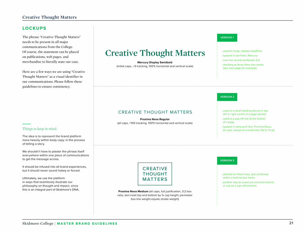
LOCKUPS
The phrase “Creative Thought Matters”needs to be present in all major communications from the College. Of course, the statement can be placed on publications, web pages, and merchandise to literally state our case.
Here are a few ways we are using “Creative Thought Matters” as a visual identifier in our communications. Please follow these guidelines to ensure consistency.
• used for large, display headlines
• typeset in serif font, Mercury
• one-line version preferred, but
• stacking as three lines also works (see next page for example)
• used as a small labeling device in top left or right corner of a page spread
• used as a pay-off line at the bottom of a page
• typeset in sans-serif font, Proxima Nova, all caps, always at a small size (7pt to 10 pt)
• stacked on three lines, and contained within a hairline box frame
• another way to round out communications, or use as a sign-off element
Things to keep in mind:
The idea is to represent the brand platform more heavily within body copy, in the process of telling a story.
We shouldn’t have to plaster the phrase itself everywhere within one piece of communications to get the message across.
It should be infused into all brand experiences, but it should never sound hokey or forced.
Ultimately, we use the platform in ways that seamlessly illustrate our philosophy on thought and impact, since this is an integral part of Skidmore’s DNA.
Mercury Display Semibold (initial caps, –5 tracking, 100% horizontal and vertical scale)
Proxima Nova Regular (all caps, +100 tracking, 100% horizontal and vertical scale)
Proxima Nova Medium (all caps, full justifi cation, 3:2 box ratio, text inset top and bottom by 1x cap height; perimeter
box line weight equals stroke weight)
VERSION 1
VERSION 2
VERSION 3

22Skidmore College | MASTER BRAND GU IDE L I N E S
Creative Thought Matters
CLEAR SPACE
To maintain maximum impact and legibility, clear space must be maintained around all versions of the “Creative Thought Matters” lockup. This area is measured using the width of the capital S in the wordmark, as shown (just like we do with the Skidmore wordmark, as shown below).
No other graphic elements, typography, rules, or images should appear inside this clear space.
VERSION 1
VERSION 2
VERSION 3

23Skidmore College | MASTER BRAND GU IDE L I N E S
Creative Thought Matters
USAGE
A few examples of how we use “Creative Thought Matters” lockups in our communications.
Tagline underneath logo
(as long as these entities have enough separation
between them—we would never tightly
lock up “Creative Thought Matters” with the
Skidmore wordmark)
Viewbook— back cover
Use within subheads and woven into body copy
Viewbook— internal spread
Viewbook— front cover
Use as a headline
/04
Identity Graphic Identifi ers
College Wordmark
College Seal
Athletic Mascot
Our logo represents us at the very highest level. This means it’s vitally important to our brand.
It acts as a signature, a stamp of quality, and a symbol of pride for all of us to rally behind. By following a few simple guidelines, we can ensure that our identity remains unmistakably ours.

25Skidmore College | MASTER BRAND GU IDE L I N E S
Logos
GRAPH IC IDENTIF IERS
These graphic identifiers are the official logos of Skidmore College. They are the only logos that should be used to represent the institution.
C O L LEGE W ORDMARK Our core logo is the Skidmore wordmark, which is used widely as a readily identifiable symbol across publications, stationery, web pages, signage, and merchandise.
C O L LEGE SEA L The Skidmore seal is reserved for formaluses of an academic nature, such as the College Catalog and communications related to Commencement, Honors Convocation, and special lectures.
ATH LE T IC MASC OT The Thoroughbred logo is used for publications, merchandise, and uniforms related to our athletics program.

26Skidmore College | MASTER BRAND GU IDE L I N E S
Logos
COLLEGE WORDMARK
The Skidmore College wordmark is a general identifier for use on College publications, stationery, merchandise, web pages, and other graphic treatments. The wordmark is designed to be used “as is”; the proportions should never be altered, nor should fonts be substituted to create a similar look. This logo can be reduced or enlarged, as long as the proportions remain unaltered.
The wordmark must not be used in conjunction with other type, graphics, or logos to form a combined graphic element.
Approved ways to use the wordmark with these colors:
Use the wordmark in either black or PMS 3298 green.
_
Skidmore Gold Metallic PMS 871 requires coated stock and special attention for the best result.
SKIDMORE COLLEGE (name with college descriptor)
SKIDMORE (name without college descriptor)
PRINT-ONLY VERSION
DIGITAL-ONLY VERSION
COLOR
PMS 3298
Black
PMS 871 Gold Metallic

27Skidmore College | MASTER BRAND GU IDE L I N E S
Logos
CLEAR SPACE
To maintain maximum impact and legibility, clear space must be maintained around the wordmark. This area is measured using the width of the capital S in the wordmark, as shown.
No other graphic elements, typography, rules, or images should appear inside this clear space.
SKIDMORE COLLEGE (name with college descriptor)
SKIDMORE (name without college descriptor)
PRINT-ONLY VERSION
DIGITAL-ONLY VERSION
28Skidmore College | MASTER BRAND GU IDE L I N E S
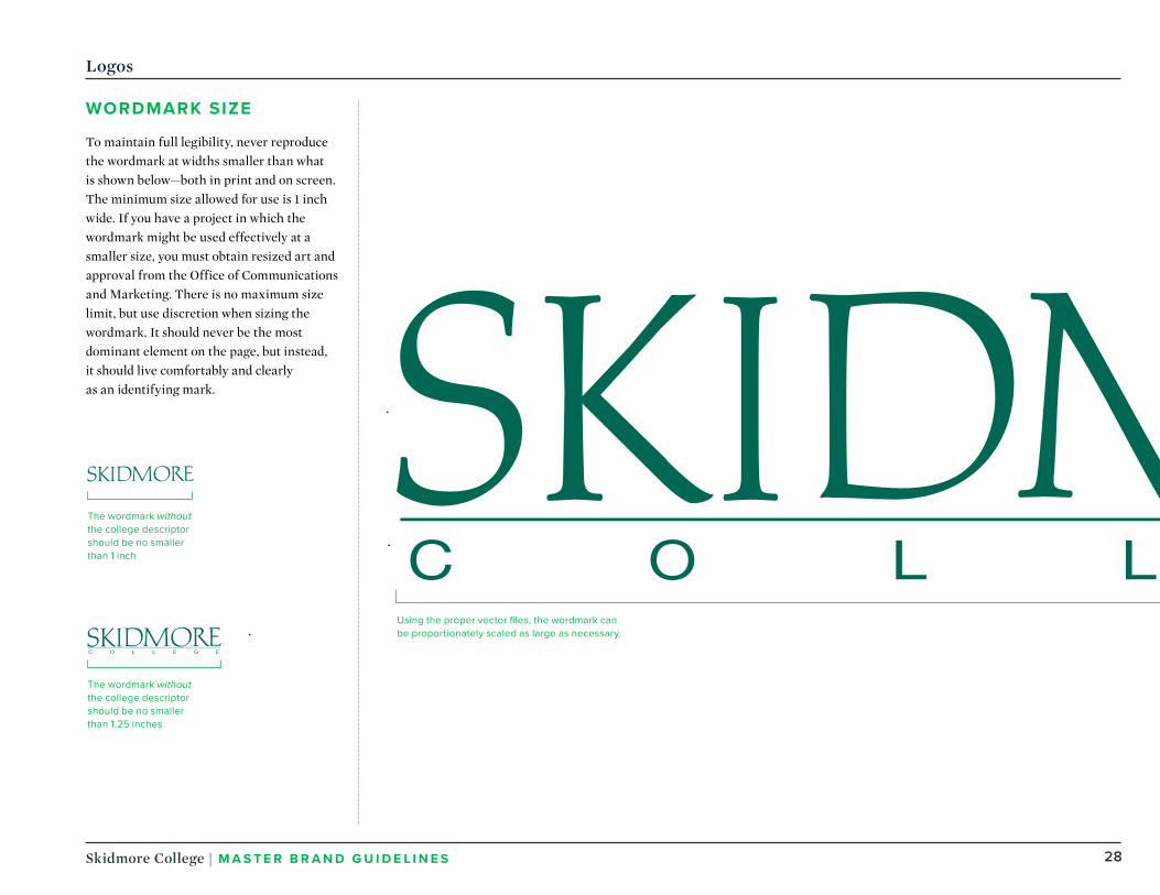
Using the proper vector fi les, the wordmark can be proportionately scaled as large as necessary.
Logos
WORDMARK SIZE
To maintain full legibility, never reproduce the wordmark at widths smaller than what is shown below—both in print and on screen. The minimum size allowed for use is 1 inch wide. If you have a project in which the wordmark might be used effectively at a smaller size, you must obtain resized art and approval from the Office of Communications and Marketing. There is no maximum size limit, but use discretion when sizing the wordmark. It should never be the most dominant element on the page, but instead, it should live comfortably and clearly as an identifying mark.
The wordmark without the college descriptor should be no smaller than 1 inch
The wordmark without the college descriptor should be no smaller than 1.25 inches

29Skidmore College | MASTER BRAND GU IDE L I N E S
COLLEGE SEAL
The Skidmore College seal is our official academic logotype. Where the wordmark is used for general institutional identification, the College seal is reserved for specific uses, generally those of a formal and academic nature.
These include the Skidmore College Catalog and materials related to Opening Convocation, Honors Convocation, Commencement, endowed lectures, and the Alumni Recognition Ceremony.
Logos
Proper ways to use the college seal:
Use the seal in either black, PMS 3298, or PMS 871 gold metallic. The seal may also be foil-stamped in gold or be embossed.
Use the seal screened to lighter shades of black or PMS 3298.
_
Do not use the seal screened in PMS 871 gold metallic.
COLLEGE SEAL(on white background)
COLLEGE SEAL(reversed out of a color fi eld)
COLOR
PMS 3298
Black
PMS 871 Gold Metallic
The seal should be no smaller than 0.75 inches

30Skidmore College | MASTER BRAND GU IDE L I N E S
Logos
ATHLETIC MASCOT
The athletic mascot mark provides a bold, energized symbol for our athletics program. The logo has been designed for use on uniforms, publications, banners, and other merchandise related to athletics. The mark uses the image of a thoroughbred horse in conjunction with designated typefaces.
COLOR
PMS 3298
PMS 7548
Approved ways to use the mascot with these colors:
The mascot logo may be reproduced using the following colors: PMS 3298 green, PMS 7548 yellow, black, or white reversed out of these same colored background values.
When appropriate, a metallic gold ink (PMS 871) may be substituted for the PMS 7548 yellow.
Approved colors are included with each sample provided in this section; these colors should not be altered.
ONE-COLOR(black + white)
TWO-COLOR(fi lled-in PMS 3928 + PMS 7548)
TWO-COLOR PLUS WHITE(PMS 3928 + PMS 7548)
ONE-COLOR(reversed out of color fi eld)
The mascot mark should be no smaller than 1 inch
PMS 871 Gold Metallic

/05
ColorColor Swatches
Color Breakdowns
Our colors say a lot about who we are.
Our palette helps our audiences identify us at a glance, and the way we use color sets the mood for each of our pieces. The elements of our palette are diverse and fl exible, but to maintain visual consistency across all Skidmore materials, we use only the colors outlined in this section.

32Skidmore College | MASTER BRAND GU IDE L I N E S
Color Palette
COLOR SWATCHES
Our color palette is earthy, fresh, and vibrant. It can be broken into three groups: primary, secondary, and neutrals.
TH E PR IMARY PALET TE speaks to our master brand, and establishes consistency with Skidmore College materials.
TH E SEC ONDARY PALET TE adds energy and a contemporary feel. Use these colors often to create pieces that feel lively, while maintaining an air of sophistication.
TH E NEUTRAL PALET TE creates balance with the other palettes. These colors work well as backgrounds to set callouts apart from other blocks of copy.
NOTE: Use the Pantone numbers, CMYK breakdowns, and digital RGB and HEX values shown here.
PMS 3298 is our core heritage color and should feature heavily in all Skidmore materials.
Primary
This tint of PMS 649 is best used for subtle backgrounds that divide sections of content.
PMS 5605 is best used for copy as an alternative to black. It has a subtle green cast that complements the core colors.
Neutrals
PMS 109 C PMS 7548 CPMS 3298 CCMYK 99/11/72/35
RGB0/106/82
HEX #006A52
CMYK 0/9/100/0
RGB255/209/0
HEX #FFD100
CMYK 0/12/98/0
RGB255/198/0
HEX #FFC600
PMS 802 is a fl uorescent color that should only be used for digital tactics or materials printed with Pantone ink. Do not attempt to replicate this color using CMYK methods.
Secondary
PMS 802 CRGB68/214/44
HEX #44D62C
PMS 7481 C CMYK 82/0/86/0
RGB0/183/79
HEX #00B74F
PMS 649 C, 40%
CMYK 4/2/2/0
RGB240/243/245
HEX #F0F3F5
PMS 649 C CMYK 10/3/1/0
RGB219/226/233
HEX #DBE2E9
PMS 5605 C CMYK 82/36/83/90
RGB34/55/43
HEX #22372B
Use PMS 7548 to create more contrast when pairing yellow with white (such as setting white type on a yellow background, or use with the athletics mascot mark).

33Skidmore College | MASTER BRAND GU IDE L I N E S
Color Palette
COLOR BREAKDOWNS
The primary palette should be dominant in all communications, but it can also mix with the supporting palettes to build color schemes that are complementary and balanced.
Our secondary palette complements the primary colors and creates flexibility so that communications can shift for various needs. Secondary colors should never be used exclusively or more prominently than the primary palette.
Our neutral palette works to keep compositions from feeling too saturated or overwhelming.
PRIM
ARY
SEC
ONDARY
NEU
TRALS

/06
Typography Typography
Type Treatments
Type Usage
The Skidmore College type family brings our voice to life.
When it’s used thoughtfully, typography is a powerful brand tool that can refl ect or expand on the meaning of what’s communicated. Skidmore’s typography is clear, clean, and fl exible for a wide range of situations.

35Skidmore College | MASTER BRAND GU IDE L I N E S
Typography
SERIF TYPEFACE
Skidmore’s serif typeface is Mercury Display. It feels both contemporary and classic, and we use it for headlines, subheads, and callouts.
When creating materials that will be displayed on computers that don’t have these fonts, replace Mercury Display with Georgia.
STYLES AND USES
Mercury Display is available in Roman, Semibold, Bold, and their equivalent italics. We use it most often in Roman or Medium for large-type headlines, numbers, facts, and figures, and in Roman for body copy.
MercuryDisplayRomanItalicSemibold
Semibold ItalicBoldBold Italic

36Skidmore College | MASTER BRAND GU IDE L I N E S
Typography
SANS -SERIF TYPEFACE
Skidmore’s sans-serif typeface is Proxima Nova. We use this modern, clean set of fonts for subheads and body copy, and in any instance where legibility is a concern.
When creating materials that will be displayed on computers that don’t have these fonts, replace Proxima Nova with Arial.
STYLE
Proxima Nova can be used in a variety of weights, in either all caps or lowercase.
PROXIMANOVA
BoldExtraboldBlack
LightRegularSemibold
Thin

37Skidmore College | MASTER BRAND GU IDE L I N E S
Typography
DISPLAY TYPEFACE
Skidmore’s display typeface is Trade Gothic Condensed No. 20. This is a strong, bold font that can be used for subheads, numerals, and callouts. Always set Trade Gothic in all caps and use it for short lines of copy. Never use it for body copy.
When creating materials that will be displayed on computers that don’t have these fonts, replace Trade Gothic with Impact.
STYLE
Trade Gothic Condensed No. 20 should be used only in its Bold Condensed weight, and always in all caps.
PROPER LETTER SPAC ING
Trade Gothic Condensed No. 20 default kerning is a bit tightened up. When typesetting headlines or large type, set tracking to approximately –20 points.
TRADE GOTHICBOLDCONDENSED NO. 20
38Skidmore College | MASTER BRAND GU IDE L I N E S
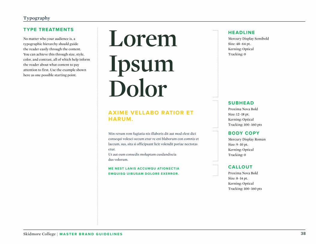
Typography
TYPE TREATMENTS
No matter who your audience is, a typographic hierarchy should guide the reader easily through the content. You can achieve this through size, style, color, and contrast, all of which help inform the reader about what content to pay attention to first. Use the example shown here as one possible starting point.
Lorem Ipsum DolorAX IME VELLABO RATIOR ET HARUM .
Min rerum rem fugiatia nis illaboris dit aut mod elest dici consequi volesci occum etur re eni blaborum con comnis et laccum, sus, sita si officipsant licit volendit poriae nectotas etur. Ut aut eum consedis moluptam cusdandisciadus volorum.
ME NEST LANIS ACCUMQU ATIONECTIAEMQUISQ UIBUSAM DOLORE EXERROR .
HEADLINEMercury Display SemiboldSize: 48–64 pt.Kerning: OpticalTracking: 0
SUBHEADProxima Nova BoldSize: 12–18 pt.Kerning: OpticalTracking: 100–160 pts
BODY COPYMercury Display RomanSize: 9–10 pt.Kerning: OpticalTracking: 0
CALLOUTProxima Nova BoldSize: 8–14 pt.Kerning: OpticalTracking: 100–160 pts

39Skidmore College | MASTER BRAND GU IDE L I N E S
21 PT. TYPE / 31 PT. LEADING
21 PT. TYPE / 18 PT. LEADING
21 PT. TYPE / 23 PT. LEADING
Leading that’s too tight leaves too little pause between lines.
Leading that’s too loose leaves
too much pause between lines.
When leading is correct, the reader won’t even notice.
Typography
LEADING
Line spacing, called leading, should be set tight, but not too tight. In most cases, try leading that’s 2 points higher than the type point size.
TRACK ING
Letter spacing, called tracking, should always be set slightly tighter than the default setting, and optical kerning should be used when it’s available.

Photography
/07
Categories
Photo Tips
Photo Shoot Prep
Stylistic Considerations
Photographs play an important role in our communications because they tell our story visually.
Our documentary-style photography captures the Skidmore culture both inside and outside the classroom. We strive to show authentic interactions with students, faculty, and campus life. Incorporating a balance of images—authentic portraiture, candid moments, and points of impact —makes our communications richer and more interesting.

41Skidmore College | MASTER BRAND GU IDE L I N E S
Photography Categories
MOMENTS
Images of student life and campus should feel natural, so avoid extremely stylized shots and wide angles. Students and professors should look comfortable, candid, and engaged. To convey our culture of authenticity, it’s important to have a mix of shots of campus, students, professors, and details, highlighting what makes the College unique.
Photograph personal interactions between members of the Skidmore community within their environment, using a shallow depth of field and natural lighting whenever it’s possible.
It’s relatively easy to get photos of students working in the classroom, but a large part of the Skidmore story is told in the field. Photographs should help convey that story, whether it’s with a close shot of the action or a wider shot of the surroundings. Show students and professors in action, engaged in doing the work.
PORTRAITS : CANDID
Capture people in the midst of actions with authentic expressions—subjects should never look posed.

42Skidmore College | MASTER BRAND GU IDE L I N E S
Photography Categories
PORTRAITS : STUDIO
Capture subjects on a neutral backdrop in natural or action-oriented poses, rarely looking directly into camera.
PORTRAITS : B&W
Photograph subjects on a studio or simple backdrop with ample contrast.

43Skidmore College | MASTER BRAND GU IDE L I N E S
Photography Categories
DETAILS
Emphasize the work that goes on at Skidmore College with tightly cropped detail images. Focus on tools and objects associated with the task at hand, or close-ups of people doing the work, where possible.
Create a narrative by photographing details of a scene or event, avoiding direct portraiture of people.
ENV IRONMENTS
Capture buildings and spaces with warm, natural light, always seeking out interesting compositions of architecture or nature.

44Skidmore College | MASTER BRAND GU IDE L I N E S
Photography Tips
Focus on the detailsWhen there’s a complicated environment to photograph, focus on the details first, and aim your attention toward the more interesting areas of the subject or environment. These types of images can be just as dynamic as wider shots.
45Skidmore College | MASTER BRAND GU IDE L I N E S
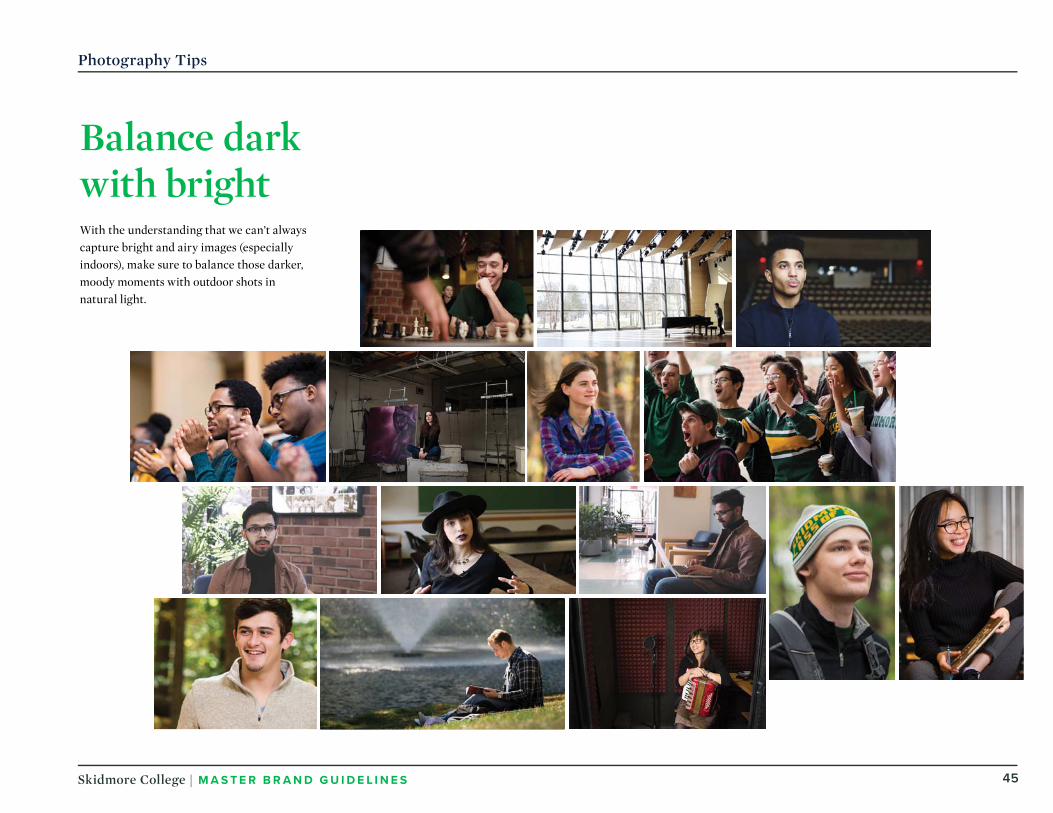
With the understanding that we can’t always capture bright and airy images (especially indoors), make sure to balance those darker, moody moments with outdoor shots in natural light.
Photography Tips
Balance dark with bright

46Skidmore College | MASTER BRAND GU IDE L I N E S
Photography Tips
A B
Crop for interest and effectGet creative with how you compose, crop, and frame your shots, especially when the subject or background is less interesting.

47Skidmore College | MASTER BRAND GU IDE L I N E S
Photography Tips
Always tell a storyAlthough these images are set in black and white, compositionally they hit the mark. The overall photographic sensibility—thoughtful framing, depth of field, subject tone, expressions, and gestures—it all works well in helping to tell a visual story.

48Skidmore College | MASTER BRAND GU IDE L I N E S
STYLISTIC CONSIDERATIONS
By using a consistent style and approach, photo shoots will produce the best and most useful images, in a tone and look that will continue to support the brand as new needs arise.
Scenarios and locations should be AUTHENT IC .
Each scenario should show I ND IV I DUALS I NTERACT ING . When situations present themselves, detail shots of moments can be captured as well.
With portraits, a range of EMOT IONS should be captured, throughout the photo library, whether it’s celebratory or more serious. Emotions shouldn’t be forced, but not every person should be smiling at the camera.
The storytelling of our imagery is more ED ITOR IALand not overly art-directed, except for posed portraits.
A balance of H OR IZ ONTAL and VERT ICAL compositions are needed.
Including PEO PLE within campus and building shots conveys a more vibrant and lively environment.
Photo Shoots
PHOTOGRAPHY TRAITS
Our goal is to use images that show the amount of rewarding work that happens at Skidmore College, and the benefits that come from it. While our subject matters span the classroom, the production floor, the boardroom, and the farm, there are a few traits that unite our photography. Keep the traits listed here in mind when shooting new photos.

49Skidmore College | MASTER BRAND GU IDE L I N E S
Work with people from each school to coordinate schedules with:
• Students (undergrad and graduate)• Faculty (full-time assignments)• Staff
Also make sure to work with each school or department to coordinate schedules with:
• Lecture halls• Classrooms• Labs• On- and off-campus learning environments• Athletic team facilities and areas• Faculty office spaces• Study lounges• Community outreach facilities
Our authentic stories should showcase:
• Authentic interactions• Hands-on learning• Group interactions• Community involvement and outreach• Macro and detail shots that provide
texture and complementary storytelling elements
• Environmental shots that convey a sense of place
PHOTO SHOOT PREP
With proper planning and scheduling ahead of time, we can execute the shoot days efficiently and afford the photographer the most time to capture authentic and unique visual stories.
Photo Shoots
I D ENT IFY AUTHENT IC , C OMPE LL ING
STOR I ES C ONNECTED
TO KEY BRAND MESSAGES
IDENT IFY KEY
I ND IV I DUALS
IDENT IFY KEY
FAC I L I T I E S

Design Elements
/08
Overview
Corner Arrow
Distressed Texture
Background Angle
Dot Pattern
Framing Box
Horizontal Rule
Framing Arrows
Circular Containers
Our brand has a variety of graphic tools that create a unique look and make our communications easy to recognize.
When they’re used consistently, these elements create continuity among families of materials. Each of these elements can be used on its own or in conjunction with others.
51Skidmore College | MASTER BRAND GU IDE L I N E S
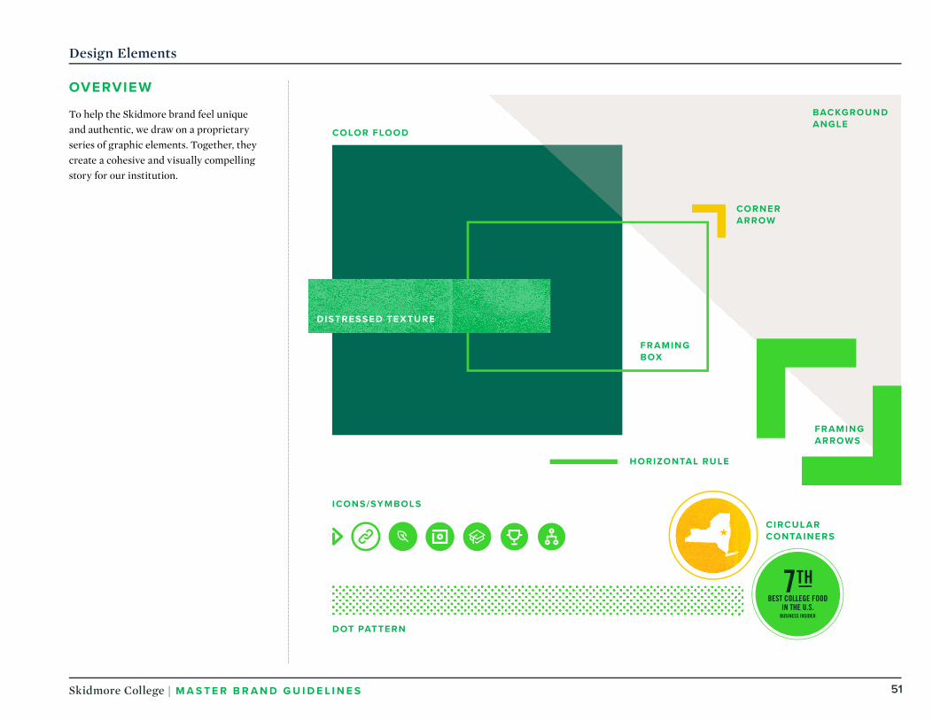
Design Elements
OVERV IEW
To help the Skidmore brand feel unique and authentic, we draw on a proprietary series of graphic elements. Together, they create a cohesive and visually compelling story for our institution.
DOT PATTERN
FRAMINGBOX
COLOR FLOOD
HORIZONTAL RULE
ICONS /SYMBOLS
CORNERARROW
BACKGROUNDANGLE
C IRCULARCONTAINERS
FRAMINGARROWS
DISTRESSED TEXTURE

52Skidmore College | MASTER BRAND GU IDE L I N E S
Headline
Design Elements
CORNER ARROW
One of our signature visual elements is the corner arrow, paired with a headline, an image, or a framing box, to represent the expansive nature of creative thought. This element appears almost exclusively in combination and always at the top right corner of what it accompanies.
When pairing the arrow with an image, the image’s top right corner should align with either the arrow’s outer corner or its inner angle, as shown.
When determining the weight of the corner arrow alongside a headline, consider roughly matching the weight of the strokes in the text. With a framing box, match the line weight of the box itself, and use a contrasting color. In all cases, the goal is to accent the message, not to overpower it.
In every application of the “Create” graphic, the corner arrow must be set in a contrasting color. Never reproduce the graphic in grayscale.

53Skidmore College | MASTER BRAND GU IDE L I N E S
FRAMING ARROWS
The framing arrows draw on the design of the corner arrow element to dramatic visual effect. This outsize element is appropriate for key content that the reader shouldn’t miss: pivotal quotations and dynamic images that speak directly to the topic at hand.
Note that the framing arrows always point in opposite directions, toward the top left and bottom right of the page. (This is unlike the corner arrow, which always appears in the top right corner.)
Design Elements
“There’s a lot of time that goes into being a college athlete. It’s hard, but everyone at Skidmore—professors, coaches, even teammates and classmates— make the whole experience so fun. It’s the best four hours of my day.”
–KELLY DONNELLY ’ 18

54Skidmore College | MASTER BRAND GU IDE L I N E S
Design Elements
DISTRESSED TEXTURE
When layouts make use of large floods of color, we sometimes add a distressed texture to represent the hands-on work that drives Skidmore.
Although this texture is an important visual element, materials should never look worn or dirty. The overall effect should always look sophisticated and approachable.

55Skidmore College | MASTER BRAND GU IDE L I N E S
Here you’re taught how to jump into a
world of rapid change and chase down the
career you want.
Tomorrow’s jobs demand people who can
think differently. People who can connect
disparate ideas and cultures. People who
are ready to seize opportunities and solve
problems that aren’t yet apparent.
We believe by promoting creative thinking
at every turn that we’re creating students
who will matter to the world.
Skidmoreprepares you for anything, so you can pursue your own thing.
Design Elements
BACKGROUND ANGLE
The background angle is a subtle and versatile visual element that we use throughout our communications. It acts as a layering device, sometimes adding simple depth and interest to a layout, and sometimes tying together disparate pieces of a design.
Like many of our graphic elements, it should not be used gratuitously, but only where it can contribute visual interest. It’s particularly effective on floods of white, set in the light gray from our neutral palette.

56Skidmore College | MASTER BRAND GU IDE L I N E S
DOT PATTERN
This element works best as a supporting texture in layouts that need a little extra polish. It should be used sparingly and with careful judgment.
FRAMING BOX
For information that needs a boost in the visual hierarchy, the framing box can convey considerable emphasis. It’s used primarily with text: headlines, subheads, callouts, sidebars, subject names, and more. On occasion, it can be paired to size with a photo, but the box should always be offset diagonally from the image for visual interest. (See examples in the “Bringing It to Life” section of these guidelines.)
Design Elements
FRAMING BOX
HORIZONTALRULE
DOT PATTERN
HORIZONTAL RULE
This simple element is a workhorse within our layouts, typically used to divide related pieces of information or draw the reader’s eye to an important point. It’s also useful as a visual anchor along a margin or at the head of a text block.

57Skidmore College | MASTER BRAND GU IDE L I N E S
Design Elements
C IRCULAR CONTAINERS
We use circular containers to house icons, statistics, and symbols—supplementary content that communicates quickly, at a glance. The shape also offers a welcome contrast to the right angles that characterize most of our visual language.
With statistics, the container typically skews larger, leading with numeric information and keeping any related text at a minimum. With smaller icons and symbols, the goal is often to draw the reader’s eye to a call to action or other verbal element in the design. However they’re used, they should never feel overdesigned or busy, and they should never dominate any layout.
Circular containers may be set in colors from the primary and secondary palette, and often appear with a thin outline. The distressed texture can be incorporated to the color fill for variety and interest.
CALL- OUTS FOR I LLUSTRATIONS AND DATA PO INTS
ICONS /SYMBOLS

Bringing theBrand to Life
/09
Our brand is expressed through the combination of verbal and visual components. This is when a brand really comes to life.
We’ve broken down every element of our brand. But it’s the combination of all these elements—type, photography, color, graphics, and voice—that makes our brand real. This is how we go from a set of guidelines, to a living, breathing brand.
Creative Brief
Decision Tree
Viewbook Spreads
Campaign Mailer Prototype
Campaign Microsite
Targeted Email
Campus Banners
Campus Activation

59Skidmore College | MASTER BRAND GU IDE L I N E S
EXECUTING OUR BRAND
Using a creative brief for projects makes it easy for communicators to identify their content priorities. It also ensures that each communication carries a consistent voice and a strong message that focuses on what benefits the audience.
Bringing the Brand to Life
Format:
Audience(s):
Key Message:Purpose: (check all that apply)
Defi ning the purpose of our communication helps focus on particular pieces of our brand personality and infl uences the tone and voice.
Proof of Message:
Call to Action:
Additional Considerations:
Creative BriefOffi ce of Communications & Marketing
VISUAL SPECTRUM
Our brand can fl ex in many directions, depending on what’s appropriate for the audience. Choose the right balance for your communication here.
FORMAL
CASUAL
SUBT
LE
BOLD
EXAMPLE:
INFORMSmart, Direct, Creative
PROMOTEConfi dent, Inspiring, Direct
PERSUADECreative, Smart, Confi dent
ENTERTAINDiff erent, Creative, Confi dent
Name:
Today’s Date:
Contact Info:
Offi ce:
Due Date:
Project Title:

60Skidmore College | MASTER BRAND GU IDE L I N E S
DEC ISION TREE
When creating any type of communications, consider this decision tree to determine what brand elements and level of approval are needed for the situation.
A FORMAL, UNIVERSITY-WIDE ACADEMIC EVENT
E.G., COMMENCEMENT, CONVOCATION
TH IS EVENT IS . . .
A STUDENT-DRIVEN EVENTSTUDENT CLUBS AND ORGANIZATIONS
AN OFFICIAL UNIVERSITY EVENTFOR THE CAMPUS COMMUNITY
OPEN TO ALUMNIAND THE GENERAL PUBLIC
IS IT A ...
One-Time Event? Recurring Event?
FONTS
WORDMARK
COLORS
FONTS
COLORS
WORDMARK
GRAPHICELEMENTS
MUST CONTAIN APPROVED:
MUST CONTAIN APPROVED:
MUST CONTAIN APPROVED:
FONTS
COLORS
WORDMARK
SEAL
FULLYBRANDED
MUST CONTAIN APPROVED:
MESSAGING
TONE AND VOICE
FONTS
COLORS
GRAPHIC ELEMENTS
PHOTOGRAPHY
NO APPROVAL NEEDED NO APPROVAL NEEDED
MUST BE APPROVED BY THE OFFICE OF COMMUNICATIONS
AND MARKETINGAPP
ROVA
LRE
QU
IRED
BRA
ND
ELE
MEN
TS
CREATED ONLY BYTHE DIVISION OF COMMUNICATION
REFRAIN FROMUSING SKIDMORE
BRANDING ELEMENTS
Bringing the Brand to Life
61Skidmore College | MASTER BRAND GU IDE L I N E S
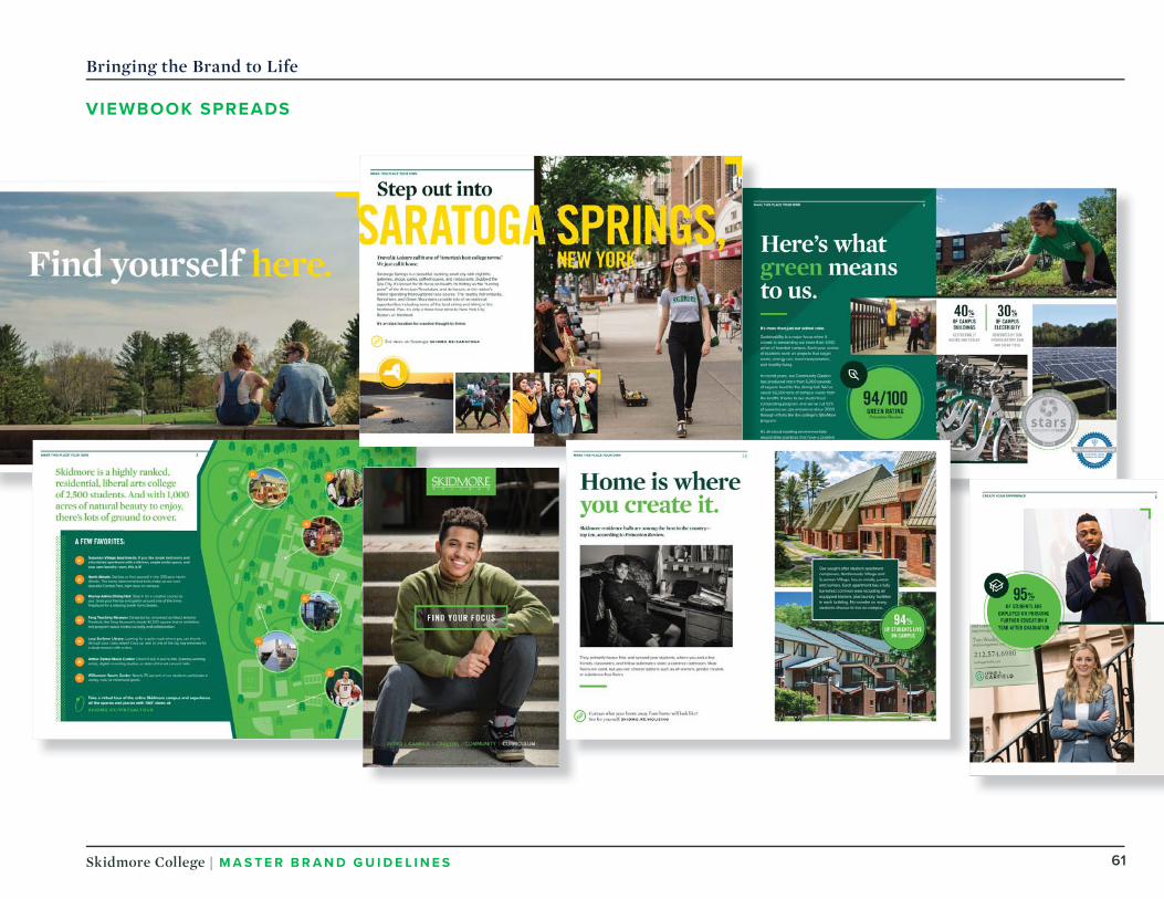
Bringing the Brand to Life
V IEWBOOK SPREADS

62Skidmore College | MASTER BRAND GU IDE L I N E S
Bringing the Brand to Life
V IEWBOOK SPREADS
How do you get ready for one of the most whimsical days of the entire year?
Know where to meet your friends.
Scope out a spot on the green
for your blanket. Check out the
endless lineup of Skidmore’s best
bands, groups, and performers.
Know where to find every
beverage and BBQ and cotton
candy vendor. Do all of this ahead
of time.
Because when Skidmore’s annual
all-out-music-fest-meets-last-
hoorah-of-the-semester rolls
around, you’ll be glad you did.
Prepare yourself for Fun Day.
Check us out on Instagram! instagram.com/lifeatskidmore
COMMUNITY 10 COMMUNITY 11

63Skidmore College | MASTER BRAND GU IDE L I N E S
Bringing the Brand to Life
CAMPAIGN MAILER PROTOTYPE
meaningmore
every day
YOUR GIFT powers creative thought. And here at Skidmore, Creative Thought
Matters. It broadens our perspectives and
shapes the people we become.
Your gift provides more scholarships,
faculty, classrooms, internships, research
opportunities, athletics, and everyday
experiences with creativity at their core.
It empowers us all to apply creative
thought in our own unique ways.
You can create more for the studentswho create everything.

64Skidmore College | MASTER BRAND GU IDE L I N E S
Bringing the Brand to Life
CAMPAIGN MICROSITE
For the ones who create everything.
GET INVOLVED TODAY. Become a part of something more >
G IVE TODAY
For the ones who create everything.
What does your gift make possible? MORE PERSPECTIVES that shape our thoughts. More experiences that inform our actions. More moments that reveal what we’re meant to do. Every gift powers creative thought, so we can create more, every day.
G IVE TODAY

65Skidmore College | MASTER BRAND GU IDE L I N E S
Bringing the Brand to Life
TARGETED EMAIL

66Skidmore College | MASTER BRAND GU IDE L I N E S
MOREpolicies that protect our world.
MOREmoments that excite us.
MORE big ideas that spark the next one.
Skidmore.edu/give
Skidmore.edu/give
Skidmore.edu/give
BEN SHULER ’18 Physics, Philosophy
JONAH FRANKLIN ’20 Dance, History
SARAH THOMAS ’17 Environmental Studies, Political Science
Bringing the Brand to Life
CAMPUS BANNERS

67Skidmore College | MASTER BRAND GU IDE L I N E S
MOREmentors for that next step in our lives.
MOREopportunities that move us.
MORE speakers and pursuers of the truth.
Skidmore.edu/give
Skidmore.edu/give
Skidmore.edu/give
ARWA DAMON ’99 Senior International Correspondent at CNN
NAT SMITOBOL ’98 Master Admissions Counselor, IvyWise LLC
Bringing the Brand to Life
CAMPUS BANNERS
ALTAGRACIA MONTILLA ’12 Director of Educational Programming, Beyond Sports

68Skidmore College | MASTER BRAND GU IDE L I N E S
This interactive installation will pose questions to students and alumni on the video touchscreen. It will then capture the answers and use them as content.
What’syour story?
SAMPLE QUESTIONS:
What makes you proud to be part of the Skidmore community?
Why do you give back to Skidmore? Why do you choose to support your alma mater?
How do you make the most of your Skidmore education?
What do you make of creative thought? What does it mean to you?
How did Skidmore prepareyou for the real world?
What experience helped create who you are today?
Bringing the Brand to Life
CAMPUS ACTIVATION

EmailMarketing
/10
Sub-brand Identifi cation
Typography for Email
Content
Dos and Don’ts
Samples
Email marketing is one key component in how we convey our unique stories.
This guide will help us convey compelling content with a consistent style that will make our messages resonate with our audience.

70Skidmore College | MASTER BRAND GU IDE L I N E S
Email Marketing
SUB -BRANDIDENTIF ICATION
The Skidmore College branding is always first and foremost in our email communications, and is established in the header and footer of our email templates.
In email marketing we avoid using image as- text elements, which become difficult to read when they resize for mobile viewing. Image-as-text also makes content less accessible to those using text readers for the visually impaired.
This most often applies to sub-brand identification - department headers or event headlines.
These types of sub-brand communications are identified by a large text title at the top of the email. This allows those sub-brands to be strongly expressed without diluting the parent brand.

71Skidmore College | MASTER BRAND GU IDE L I N E S
Email Marketing - Typography
SERIF TYPEFACE
Skidmore’s serif typeface for email marketing is Georgia. It feels both contemporary and classic.
Serif fonts should always be used at larger sizes to ensure legibility, and should not be used for regular body text. Email communication relies on web-safe fonts to provide consistent rendering.
Georgia has been substituted forMercury Display.
Fonts in this guide are only for email marketing use.
STYLES AND USES
Use Georgia at regular weight for sub-brand identification, department headers, and call out numerals in lists.
On a light background (#FFFFFF or#F0F3F5) use Georgia in black(#22372B) or green (#006A52).
On a dark background (#006A52) useGeorgia in white (#FFFFFF).
Sub-brand identifi cation: 36px, regularCall out numeral: 48px, bold
Georgia
12345

72Skidmore College | MASTER BRAND GU IDE L I N E S
Email Marketing - Typography
SANS -SERIF TYPEFACE
Skidmore’s sans-serif typeface for email marketing is Arial. We use this modern, clean font for template text, section titles, CTA (call to action) buttons, and all body copy.
Sans-serif fonts should be used anywhere that legibility is a concern.
Email communication relies on websafe fonts to provide consistent rendering.
Arial has been substituted for ProximaNova and Trade Gothic Condensed #20.
Fonts in this guide are only for email marketing use.
STYLE
Use Arial at a variety of different sizes and weights in order to provide visual structure to our content and draw the viewer down the page.
On a light background (#FFFFFF or#F0F3F5) use Arial in black(#22372B) or green (#006A52).
On a dark background (#006A52) use Arial in white (#FFFFFF).
Refer to the graphic for text sizing in various elements.
Arial

73Skidmore College | MASTER BRAND GU IDE L I N E S
Leading that’s too tight leaves too little pause between lines.
Leading that’s too loose leaves
too much pause between lines.
When leading is correct, the reader won’t even notice.
Email Marketing - Typography
LEADING
Industry standard and ADA recommended line height for optimal legibility is 1.5x the font size.
For some selected text areas that occupy more than one line, such as subheaders, the line height may be decreased to create a better visual presentation.
At no point should line height be decreased to the point that ascenders and descenders touch.
ALIGNMENT
Save centered text for large, bold announcements such the primary headline of the email, or CTA (call to action) buttons.
Many email clients will not respect centered text, and will render the content left justified.

74Skidmore College | MASTER BRAND GU IDE L I N E S
Email Marketing - Content
EMAIL CONTENT
A few things to keep in mind whencrafting email content:
Approximately 50% of recipients are using mobile devices to view email, so our design is mobile-first in order to deliver the best email possible.
Links should be large enough to click easily on mobile devices - link to a phrase of 3 or more words for best effect.
Be sparing with use of centered text. Many email clients will not display it correctly, so design a layout that does not rely on centered text.
Images don’t load by default on many email clients (gmail, hotmail, etc.), so images should complement the content but not be the exclusive conveyors of necessary information (dates, times, locations, etc.)
Avoid using image-as-text elements, which become difficult to read when they resize for mobile viewing. Image-as-text also makes content less accessible to those using text readers for the visually impaired. This most often applies to department headers or “sub-brand” identification.
Make it personal. Use fi rst-person plural and second-person pronouns (“we”/”us” and “you”), where appropriate. This engages your reader in a direct, human way.
Make it clear.Make only the point you’re trying to make. Every communication won’t contain every detail, so focus on what’s important to the matter at hand.
Make it relevant. Consult the messaging map when you’re creating communications, and look for places to include key messages.
Make it authentic. Back up your statements with proof points. Share real, honest stories of the work we’re doing.
Make it readable. Vary the cadence within communications. Mix short sentences with longer ones to avoid falling into a rut. Check for rhythm and fl ow by reading passages aloud.
Make it worthwhile. Give your reader a reason to care. Lead with audience-specifi c benefi ts (what they get) and back them up with our brand attributes (what we off er).
Make headlines work harder. Headlines should be more than just labels for the subject at hand. Since they may be the only thing our audience reads as they scan the copy, make sure they’re compelling and informative.
Make it relatable. We write like we speak, aligned with our brand personality. This may occasionally mean breaking a grammar rule or two. Used judiciously, contractions and sentence fragments add personality to communications.
Make it actionable. Give your audience a clear call to action, so they know exactly what you want them to do.
Make it concise. Especially when making a direct ask, make each word count.
1 6
2 7
8
9
3
4
5
10

75Skidmore College | MASTER BRAND GU IDE L I N E S
Email Marketing - Content
SUBJECT LINESAND PREHEADERS
First impressions matter.
Subject lines and preheaders are the first thing our recipients see as our email marketing efforts arrive in their inbox. These should never be an afterthought - they should be mindfully crafted to convey the relevance of the email, and inspire recipients to open and interact with Skidmore messages.
The best subject lines and preheaders work together to be creative, compelling, and informative.
The tips for email content creation also apply to subject lines and preheaders - to pique the recipients’ interest
If your email has no preheader specified, the email service provider (gmail, hotmail, etc.) often fills in with the URL of the first image in the email.
Make them a fi rst priority. Subject line and preheader provide a “fi rst look” at our email and should be an important part ofcontent strategy.
Make them personal.Use name tokens or craft individual subject lines for smaller audience segments. Personalizing emailscan help boost open and interaction rates.
Make them relevant. Subject lines and the preheader are the fi rst opportunity to hook your reader. The content provided by the subject line and preheader should be informative without necessarily trying to convey the entire email message.
Make them work harder. These may be the only items the recipient reads, make sure they’re compelling.
Make them concise. Every character counts, especially in the mobile presentation where there may be a limit on thenumber of characters you can display.
1
2
3
4
5

76Skidmore College | MASTER BRAND GU IDE L I N E S
Email Marketing - Dos and Don’ts
BEST PRACTICES
Be mindful when using alternating blocks of color to break up sections of an email.
DO use the hero image block which has a background matching the block below it, for seamless transition on mobile.
DO use a gray background links block witha green sub-brand block, and vice versa.
DO use alternating color blocks to avoid a layout that is too heavy at the top or bottom.
DO start email content with a hero image, or a gray or white block below the green logo block.
DON’T start email content with a green block below the green logo block.
DO end emails with a gray or white block above the footer.
DON’T end emails with a green block above the footer.
DO use font sizes in descending order as you move down the page - largest text on top, smaller text on bottom. This will draw the eye of the reader downward through the email and provide visual context.
DO:
DON ’T:

77Skidmore College | MASTER BRAND GU IDE L I N E S
Email Marketing
SAMPLE DESKTOP AND MOBILE V IEW

Creating OurFuture: The Campaign for Skidmore
/11
Overview
Campaign Priorities

79Skidmore College | MASTER BRAND GU IDE L I N E S
Creating Our Future: The Campaign for Skidmore
OVERV IEW
In order to provide consistency when communicating about the Creating Our Future: The Campaign for Skidmore, please follow these important guidelines.
STANDALONEFor use in titles, on banners, brochure covers, etc. not italicized
Creating Our Future: The Campaign for Skidmore
IN TEXTWhen the name of the Campaign appears in text the first time, it must be presented in full and italicized
Creating Our Future: The Campaign for Skidmore
It can then be referenced as (italicized): Creating Our Future
OR
It can then be referenced as: the Campaign (capitalize “C” but do not italicize)
Example 1 (preferred usage): Creating Our Future: The Campaign for Skidmore is a comprehensive $200 million campaign.
Example 2 (preferred usage): We sincerely hope that you will support Creating Our Future.
Example 3: Thank you very much for your support of the Campaign.
Example 4: The Campaign is progressing well to date.
If you are using the word “campaign” in a general sense do not capitalize.
Example: Creating Our Future: The Campaign for Skidmore is a comprehensive $200 million campaign.
If your text is already in italics, bold the Campaign name.
Example: We sincerely hope that you will support Creating Our Future: The Campaign for Skidmore this year.

80Skidmore College | MASTER BRAND GU IDE L I N E S
Creating Our Future: The Campaign for Skidmore
CAMPAIGN PRIORITIES When including Campaign priorities in text, do not bold or italicize.
Center for Integrated Sciences $50 million
When the “Center for Integrated Sciences” appears in text the first time it must be presented in full. If you plan to reference a second time, the first instance will need to be followed by (CIS) and then it can be referenced simply as: CIS
Example: The Center for Integrated Sciences (CIS) will establish a new paradigm for teaching. CIS will bring together faculty from across campus…
Scholarships and Financial Aid $50 million
In text, this priority should appear in full as “Scholarships and Financial Aid” the first time it is referenced and each time one refers to the priority itself. However, when not referring to the formal priority, “scholarships” and/or “financial aid” should be lowercase.
The terms “scholarships” and “financial aid” can be used interchangeably, as writing out “scholarships and financial aid” may add unnecessary length to text. However, the preference is to use “scholarships” when possible.
Example: Your support of Scholarships and Financial Aid is essential to Skidmore’s success. Gifts for scholarships allow talented students to attend Skidmore.
Skidmore Fund $50 million
In text, this priority must appear in full as “Skidmore Fund” the first time it is referenced. However, upon second reference, it can be referred to as “the Fund.”
Example: The Skidmore Fund touches every aspect of campus life. Gifts for the Fund…

81Skidmore College | MASTER BRAND GU IDE L I N E S
Creating Our Future: The Campaign for Skidmore
CAMPAIGN PRIORITIES
The Tang Teaching Museum at Skidmore $20 million
If space allows, the first reference of this priority should be “The Frances Young Tang ’61 Teaching Museum and Art Gallery at Skidmore.” If it does not, simply use “The Tang Teaching Museum at Skidmore.” Upon second reference in text, use one of the following: “the Tang”; “the Tang at Skidmore”; or “the Tang Museum and Art Gallery at Skidmore.” You may also refer to it as “the Museum,” always capitalizing “Museum.”
Example: The Frances Young Tang ’61 Teaching Museum and Art Gallery at Skidmore is a national model for learning with museums. A distinctive part of the Skidmore experience, the Tang’s role…
Athletics $20 Million
In text, this priority should appear in full and capitalized as “Athletics” the first time it is referenced and each time one refers to the priority itself. However, when not referring to the formal priority, “athletics” should be lowercase.
Example: Your support of Athletics is greatly appreciated. Today, athletics are an integral part…
Career Development and Transformative Experiences $10 million
In text, this priority should appear in full and capitalized as “Career Development and Transformative Experiences” the first time it is referenced and each time one refers to the priority itself. However, when not referring to the formal priority, it may simply be referred to as “career development” (not capitalized).
Example: One of the Campaign’s priorities, Career Development and Transformative Experiences, focuses on… At Skidmore, career development is essential to…

Skidmore College
Offi ce of Communicationsand Marketing
Communicationsand Marketing Building815 North BroadwaySaratoga Springs, NY 12866
518-580-5733