Embed Size (px)
Citation preview

15.3 The Center of Data: Mean, Median, and Mode 371
15.3 The Center of Data: Mean, Median, and Mode
Class Activity 15L: The Mean as “Making Even” or “Leveling Out”
In this class activity you will use physical objects to help you see the mean as “making
groups even.” This point of view can be useful in calculations involving means. You
will need a collection of 16 small objects such as snap-together cubes or blocks for this
activity.
1. Using blocks, snap cubes, or other small objects, make towers with the following
number of objects in the towers, using a different color for each tower:
2, 5, 4, 1
Determine the mean of the list numbers 2, 5, 4, 1 by “leveling out” the block
towers, or making them even. That is, redistribute the blocks among your block
towers until all 4 towers have the same number of blocks in them. This common
number of blocks in each of the 4 towers is the mean of the list 2, 5, 4, 1.
2. Use the process of making block towers even in order to determine the means
of each of the lists of numbers shown. In some cases you may have to imagine
cutting your blocks into smaller pieces.
List 1: 1, 3, 3, 2, 1
List 2: 6, 3, 2, 5
List 3: 2, 3, 4, 3, 4
List 4: 2, 3, 1, 5
M15_BECK9719_03_SE_ACT15.qxd 12/4/09 2:21 PM Page 371

372 Chapter 15 • Statistics
3. To calculate the mean of a list of numbers numerically, we add the numbers and
divide the sum by the number of numbers in the list. So, to calculate the mean of
the list 2, 5, 4, 1, we calculate
Interpret the numerical process for calculating a mean in terms of 4 block towers
built of 2 blocks, 5 blocks, 4 blocks, and 1 block. When we add the numbers,
what does that correspond to with the blocks? When we divide by 4, what does
that correspond to with the blocks?
Explain why the process of determining a mean physically by making block
towers even must give us the same answer as the numerical procedure for
calculating the mean.
Class Activity 15M: Solving Problems about the Mean
1. Suppose you have made 3 block towers: one 3 blocks tall, one 6 blocks tall, and
one 2 blocks tall. Describe some ways to make 2 more towers so that there is an
average of 4 blocks in all 5 towers. Explain your reasoning.
2. If you run 3 miles every day for 5 days, how many miles will you need to run on
the sixth day in order to have run an average of 4 miles per day over the 6 days?
Solve this problem in two different ways, and explain your solutions.
3. The mean of 3 numbers is 37. A fourth number, 41, is included in the list. What is
the mean of the 4 numbers? Explain your reasoning.
4. Explain how you can quickly calculate the average of the following list of test
scores without adding the numbers:
81, 78, 79, 82
(2 1 5 1 4 1 1) 4 4
M15_BECK9719_03_SE_ACT15.qxd 12/15/09 12:12 PM Page 372

15.3 The Center of Data: Mean, Median, and Mode 373
5. If you run an average of 3 miles a day over 1 week and an average of 4 miles a day
over the next 2 weeks, what is your average daily run distance over that 3-week
period?
Before you solve this problem, explain why it makes sense that your average
daily run distance over the 3-week period is not just the average of 3 and 4,
namely, 3.5. Should your average daily run distance over the 3 weeks be greater
than 3.5 or less than 3.5? Explain how to answer this without a precise calculation.
Now determine the exact average daily run distance over the 3-week period.
Explain your solution.
Class Activity 15N: The Mean as “Balance Point”
1. For each of the next data sets:
• Make a dot plot of the data on the given axis.
• Calculate the mean of the data.
• Verify that the mean agrees with the location of the given fulcrum.
• Answer this question: does the dot plot look like it would balance at the fulcrum
(assuming the axis on which the data is plotted is weightless)?
6 7 8 9 1054320
Data set 1:
3, 4, 4, 5, 5, 5, 6, 6, 7
1
6 7 8 9 1054320
Data set 2:
4, 7, 7
1
6 7 8 9 1054320
Data set 3:
2, 8, 8
1
6 7 8 9 1054320
Data set 4:
1, 1, 1, 3, 3, 9
1
M15_BECK9719_03_SE_ACT15.qxd 12/4/09 2:21 PM Page 373
374 Chapter 15 • Statistics
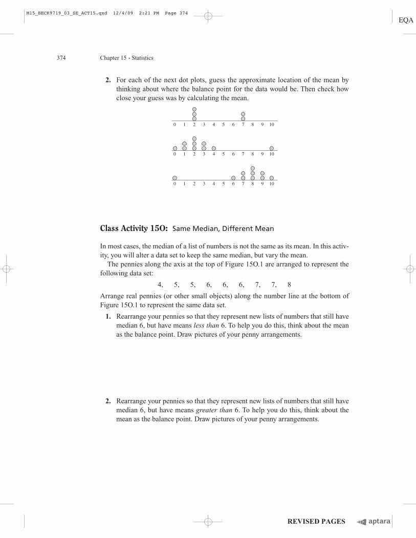
2. For each of the next dot plots, guess the approximate location of the mean by
thinking about where the balance point for the data would be. Then check how
close your guess was by calculating the mean.
Class Activity 15O: Same Median, Different Mean
In most cases, the median of a list of numbers is not the same as its mean. In this activ-
ity, you will alter a data set to keep the same median, but vary the mean.
The pennies along the axis at the top of Figure 15O.1 are arranged to represent the
following data set:
4, 5, 5, 6, 6, 6, 7, 7, 8
Arrange real pennies (or other small objects) along the number line at the bottom of
Figure 15O.1 to represent the same data set.
1. Rearrange your pennies so that they represent new lists of numbers that still have
median 6, but have means less than 6. To help you do this, think about the mean
as the balance point. Draw pictures of your penny arrangements.
2. Rearrange your pennies so that they represent new lists of numbers that still have
median 6, but have means greater than 6. To help you do this, think about the
mean as the balance point. Draw pictures of your penny arrangements.
6 7 8 9 1054320 1
6 7 8 9 1054320 1
6 7 8 9 1054320 1
M15_BECK9719_03_SE_ACT15.qxd 12/4/09 2:21 PM Page 374

15.3 The Center of Data: Mean, Median, and Mode 375
6 7 8 9543
mean: 6
median: 6
Show data sets with the same median, different means.
6 7 8 9543
Figure 15O.1 Same medians, different means
M15_BECK9719_03_SE_ACT15.qxd 12/15/09 1:42 PM Page 375

376 Chapter 15 • Statistics
Class Activity 15P: Can More Than Half Be Above Average?
1. For each of the dot plots shown, decide which is greater: the median or the mean
of the data. Explain how you can tell without calculating the mean.
2. A teacher gives a test to a class of 20 students.
Is it possible that 90% of the class scores above average? If so, give an example
of test scores for which this is the case. If not, explain why not.
Is it possible that 90% of the class scores below average? If so, give an example
of test scores for which this is the case. If not, explain why not.
3. A radio program describes a fictional town in which “all the children are above
average.” In what sense is it possible that all the children are above average? In
what sense is it not possible that all the children are above average?
6 7 8 9 1054320
Dot plot 1:
Dot plot 2:
1
6 7 8 9 1054320 1
M15_BECK9719_03_SE_ACT15.qxd 12/4/09 2:21 PM Page 376

15.3 The Center of Data: Mean, Median, and Mode 377
Class Activity 15Q: Errors with the Mean and the Median
1. When Eddie was asked to determine the mean of the data shown in the next dot
plot he calculated thus:
Eddie concluded that the mean is 2. What error did Eddie make? Why do you
think Eddie calculated the way he did?
2. Discuss the misconceptions about the median that the student work below shows.
0
1
2
3
4
5
6
7
9
8
Maple Dogwood
Median: dogwood
1, 2, 4, 6, 9
Median: oak
Median: 5
Median errors 2 and 3:
Median error 1:
5, 5, 6, 6, 6, 3, 4, 5, 4, 5, 5, 6, 4, 7, 5, 5, 5, 4, 6, 5
Oak Sycamore Pine
What kind of tree should we plant in front of the school?
6 7 8 9 1054320 1
1 1 2 1 4 1 2 1 1 5 10, 10 4 5 5 2
M15_BECK9719_03_SE_ACT15.qxd 12/4/09 2:21 PM Page 377

378 Chapter 15 • Statistics
15.4 The Distribution of Data
Class Activity 15R: What Does the Shape of a Data Distribution
Tell about the Data?
1. Examine histograms 1, 2, and 3 on the next page and observe the different shapes
these distributions take.
• The shape of histogram 1 is called skewed to the right because the histogram
has a long tail extending to the right.
• The shape of histogram 2 is called bimodal because the histogram has two
peaks.
• The shape of histogram 3 is called symmetric because the histogram is
approximately symmetrical.
Histogram 1 is based on data on actual household incomes in the United
States in 2007 provided by the Current Population Survey from the U.S.
Census Bureau. The histogram could be continued to the right, but less than
2% of households had incomes over $250,000. Histograms 2 and 3 are for
hypothetical countries A and B, which have different income distributions
than the U.S. income distribution.
2. Discuss what the shapes of histograms 1, 2, and 3 tell you about household
income in the United States versus in the hypothetical countries A and B. What
do you learn from the shape of the histograms that you wouldn’t be able to tell
just from the medians and means of the data?
3. Discuss how each country could use the histograms to argue that its economic
situation is better than at least one of the other two countries.
4. Write at least three questions about the graphs, including at least one question at
each of the three levels of graph comprehension discussed in Section 15.2.
Answer your questions.
M15_BECK9719_03_SE_ACT15.qxd 12/15/09 12:12 PM Page 378

15.4 The Distribution of Data 379
0
5%
Per
cen
t o
f h
ou
seh
old
s 10%
$0 $50,000
$100,000
$150,000
$200,000
$250,000
Histogram 1 Distribution of household income in the United States in 2007 (approximate)
0
5%
Per
cen
t o
f h
ou
seh
old
s 10%
$0 $50,000
$100,000
$150,000
$200,000
$250,000
Histogram 2 Distribution of household income in hypothetical country A
0
5%
Per
cen
t o
f h
ou
seh
old
s 10%
$0 $50,000
$100,000
$150,000
$200,000
$250,000
Histogram 3 Distribution of household income in hypothetical country B
M15_BECK9719_03_SE_ACT15.qxd 12/4/09 2:21 PM Page 379

380 Chapter 15 • Statistics
Class Activity 15S: Distributions of Random Samples
For this activity, you will need a large collection of small objects (200 or so) in a bag.
The objects should be identical, except that they should come in two different colors:
40% in one color and the remaining 60% in another color. The objects could be poker
chips, small squares, small cubes, or even small slips of paper. Think of the objects as
representing a group of voters. The 40% in one color represent yes votes and the 60%
in the other color represent no votes.
1. Pick random samples of 10 from the bag. Each time you pick a random sample of
10, determine the percentage of yes votes and plot this percent on a dot plot. But
before you start picking these random samples, make a dot plot at the top of the
next page to predict what your actual dot plot will look like approximately.
Assume that you will plot about 20 dots.
• Why do you think your dot plot might turn out that way?
• How do you think the fact that 40% of the votes in the bag are yes votes
might be reflected in the dot plot?
• What kind of shape do you predict your dot plot will have?
2. Now pick about 20 random samples of 10 objects from the bag. Each time you
pick a random sample of 10, determine the percentage of yes votes and plot this
percentage in a dot plot in the middle of the next page. Compare your results with
your predictions in part 1.
3. If possible, join your data with other people’s data to form a dot plot with more
dots. Do you see the fact that 40% of the votes in the bag are yes votes reflected
in the dot plot? If so, how? What kind of shape does the dot plot have?
M15_BECK9719_03_SE_ACT15.qxd 12/4/09 2:21 PM Page 380

15.4 The Distribution of Data 381
4. Compare the two histograms on the next page. The first histogram shows the
percent of yes votes in 200 samples of 100 taken from a population of
1,000,000 in which 40% of the population votes yes. The second histogram
shows the percent of yes votes in 200 samples of 1000 taken from the same
population.
Compare the way the data are distributed in each of these histograms and com-
pare these histograms with your dot plots in parts 2 and 3.
How is the fact that 40% of the population votes yes reflected in these his-
tograms?
What do the histograms indicate about using samples of 100 versus samples of
1000 to predict the outcome of an election?
0 10 20 30 40 50
Percent yes votes
Predicted
60 70 80 90 100
0 10 20 30 40 50
Percent yes votes
Actual
60 70 80 90 100
0 10 20 30 40 50
Percent yes votes
Actual(largernumberof samples)
60 70 80 90 100
M15_BECK9719_03_SE_ACT15.qxd 12/4/09 2:21 PM Page 381

382 Chapter 15 • Statistics
5. What if we made a histogram like the ones above by using the same population,
but by picking 200 samples of 500 (instead of 200 samples of 100 or 1000)? How
do you think this histogram would compare with the ones above? What if samples
of 2000 were used?
Percent “yes”
Nu
mb
er o
f sa
mp
les
10
20
30
40
50
20 25 30 35 40 45 50 55
Percent of yes votes in samples of 1000 taken from 1,000,000 voters in which 40% vote yes.
Percent “yes”
Nu
mb
er o
f sa
mp
les
10
20
30
40
50
20 25 30 35 40 45 50 55
Percent of yes votes in samples of 100 taken from 1,000,000 voters in which 40% vote yes.
M15_BECK9719_03_SE_ACT15.qxd 12/4/09 2:21 PM Page 382

15.4 The Distribution of Data 383
Class Activity 15T: Comparing Distributions: Mercury in Fish
The next two histograms display hypothetical data about amounts of mercury found in
100 samples of each of two different types of fish. Mercury levels above 1.00 parts per
million are considered hazardous.
1. Discuss how the two distributions compare and what this tells you about the
mercury levels in the two types of fish. In your discussion, take the following
into account: mean levels of mercury in each type of fish, and the hazardous
level of 1.00 parts per million.
2. In comparing the two types of fish, if you hadn’t been given the histograms,
would it be adequate just to have the means of the amount of mercury in the
samples, or is it useful to know additional information about the data?
Nu
mb
er o
f sa
mp
les
10
0
20
0.60 0.70 0.80 0.90 1.00 1.10
Mercury levels in parts per million
Mercury levels found in 100 samples of hypothetical fish B
Nu
mb
er o
f sa
mp
les
10
0
20
Mercury levels in parts per million
Mercury levels found in 100 samples of hypothetical fish A
0.60 0.70 0.80 0.90 1.00 1.10
M15_BECK9719_03_SE_ACT15.qxd 12/4/09 2:21 PM Page 383

384 Chapter 15 • Statistics
Class Activity 15U: Determining Percentiles
1. Determine the 25th, 50th, and 75th percentiles for each of the hypothetical test
data shown in the following:
2. Suppose you only had the percentiles for each of the 3 data sets from part 1 and
you didn’t have the dot plots. Discuss what you could tell about how the 3 data
sets are distributed. Can you tell which data set is most tightly clustered and
which are more dispersed?
6 7 8 9 10543210
6 7 8 9 10543210
6 7 8 9 10543210
M15_BECK9719_03_SE_ACT15.qxd 12/4/09 2:21 PM Page 384

15.4 The Distribution of Data 385
Class Activity 15V: Box Plots
1. Make box plots for the 3 dot plots that follow.
2. Suppose you had the box plots from part 1, but you didn’t have the dot plots.
Discuss what you could tell about how the 3 data sets are distributed.
6 7 8 9 10543210 6 7 8 9 10543210
6 7 8 9 10543210 6 7 8 9 10543210
6 7 8 9 10543210 6 7 8 9 10543210
M15_BECK9719_03_SE_ACT15.qxd 12/4/09 2:21 PM Page 385
386 Chapter 15 • Statistics
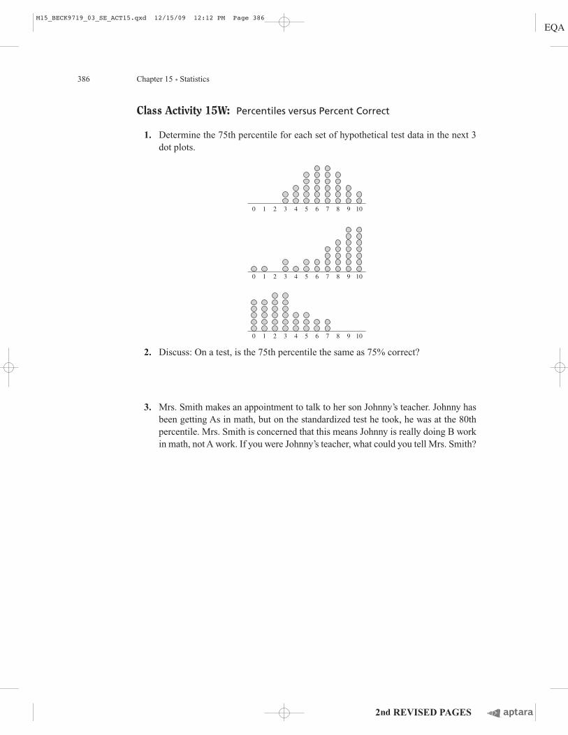
Class Activity 15W: Percentiles versus Percent Correct
1. Determine the 75th percentile for each set of hypothetical test data in the next 3
dot plots.
2. Discuss: On a test, is the 75th percentile the same as 75% correct?
3. Mrs. Smith makes an appointment to talk to her son Johnny’s teacher. Johnny has
been getting As in math, but on the standardized test he took, he was at the 80th
percentile. Mrs. Smith is concerned that this means Johnny is really doing B work
in math, not A work. If you were Johnny’s teacher, what could you tell Mrs. Smith?
6 7 8 9 10543210
6 7 8 9 10543210
6 7 8 9 10543210
M15_BECK9719_03_SE_ACT15.qxd 12/15/09 12:12 PM Page 386


![Mean, Mode, Median[1]](https://img.dokumen.tips/doc/110x75/54625097af7959aa3d8b540f/mean-mode-median1-5584ae32b6452.jpg)


![Mean, Mode, Median[1]](https://img.dokumen.tips/doc/110x75/5462509daf7959fe1b8b57b8/mean-mode-median1-5584ae32b3357.jpg)


