Embed Size (px)
Citation preview
8/3/2019 12 Good HTML Style
http://slidepdf.com/reader/full/12-good-html-style 1/34
28-Apr-12
Good HTML Style

8/3/2019 12 Good HTML Style
http://slidepdf.com/reader/full/12-good-html-style 2/34
2
Style Guides
There are many HTML style guides on the Web One of the best is from Yale,
http://info.med.yale.edu/caim/manual/
This talk is based on that style guide
Another is from the W3C,http://www.w3.org/Provider/Style/
One of the more enjoyable sites is
http://www.webpagesthatsuck.com/
Motto: “Where you learn good Web design by looking at bad Webdesign”
One of my favorite books on the subject:
Don't Make Me Think: A Common Sense Approach to Web Usability,
by Steve Krug, Roger Black
8/3/2019 12 Good HTML Style
http://slidepdf.com/reader/full/12-good-html-style 3/34
3
Know who you’re trying to reach
What is your target audience?
The general public (Web surfers)
Like a magazine cover, your home page should lure people in
Use strong graphics and bold statements
In the fewest words possible, tell visitors what you offer
All your links should point “inward” to your pages
Occasional visitors Navigation should be simple and obvious
Use overview pages, helpful icons, FAQs, and simple organization
Experts and frequent visitors
Provide well-organized information quickly with a minimum of fuss
Avoid fancy graphics, slow-loading pages, and “fluff” Provide site maps and search facilities
International users
Use standard, easily understood language
Consider providing pages in a variety of languages
Avoid region-specific time and date formats, like 10-12-2002

8/3/2019 12 Good HTML Style
http://slidepdf.com/reader/full/12-good-html-style 4/34
4
Know what you’re trying to do
A page without a purpose is like a talk without a
topic
Are you trying to sell something?
Air freshener: Use beautiful outdoor scenes Underarm deodorant: Beautiful people (women and men)
Computers: Attractive pictures and technical specs
Yourself: See any book on writing resumes
Are you trying to convey information?
Use a clear organization with a table of contents
For many topics, a FAQ is often appropriate

8/3/2019 12 Good HTML Style
http://slidepdf.com/reader/full/12-good-html-style 5/34
5
New media require new formats
Books existed well before Gutenberg’s 1456 Bible Here are some “interface standards” for books:
Books have covers
Books are bound along the left edge (in the USA)
The title is on the spine, top to bottom (in the USA) Books have a title page
The pages of a book are numbered
Odd-numbered pages are on the right
The front matter is numbered with Roman numerals
Informative books have a table of contents and an index
How long after Gutenberg did it take to establishthese standards?
Answer: Gradually, over more than 100 years

8/3/2019 12 Good HTML Style
http://slidepdf.com/reader/full/12-good-html-style 6/34
6
Web pages are not books
Standards are evolving rapidly, but are not “finished”
The Web brings new abilities:
Publishing is cheap; anyone can do it
"When I was a boy I was told that anybody could become President.
I'm beginning to believe it." - Clarence S. Darrow Hyperlinks allow nonlinear access to information
Search engines make finding information much easier
I used to have hundreds of bookmarks; now I use Google
The Web brings new challenges:
Users can get “lost in hyperspace”
Good navigation tools are essential
Surfers flit on by, like TV “channel surfers”
You have maybe ten seconds to convey your message

8/3/2019 12 Good HTML Style
http://slidepdf.com/reader/full/12-good-html-style 7/34
7
Very general suggestions
Good writing was, is, and always will be important Everything you ever learned about writing well still applies
Use a spell checker
Bad spelling puts off good spellers
Practically every piece of software includes a spell checker
Don’t use a grammar checker--they all stink
If you are not a native English speaker, they may point out some
trivial grammatical errors
If you don’t see the reason for their advice, it’s probably wrong Make each page stand by itself
You don’t know how someone got here
Don’t use page titles like “Introduction” that require context
8/3/2019 12 Good HTML Style
http://slidepdf.com/reader/full/12-good-html-style 8/34
8
Questions you should answer
The reader should be able to discover: Who wrote the page?
You find a page on lung cancer. Was it written by (a) theAmerican Medical Association, (b) someone who works forPhilip Morris, or (3) a plumber in Hoboken?
What is the page about?
If you have nothing to say, don’t say it
Use a clear, short title--it may become a bookmark
When was the page written/updated?
You find a page about a great new drug available “next month” Another page describes the “latest version” of some software
Where is the page?
Who wrote the page? Who sponsors it?
If I print the page out, will I ever find it on the Web again?
8/3/2019 12 Good HTML Style
http://slidepdf.com/reader/full/12-good-html-style 9/34
9
Build clear navigation aids
When someone accesses your site:
What are they likely to be looking for?
How sophisticated are they?
Hardly anyone does enough user testing A common problem: you find an interesting page,
but you don’t know what pages “surround” it
Are pages organized in a simple and consistent way?
Can the visitor find her way to the home page?
Can the user tell if she’s still in the same site?
Button bars are good, but don’t omit text links
Avoid dead-end pages (those with no links)

8/3/2019 12 Good HTML Style
http://slidepdf.com/reader/full/12-good-html-style 10/34
10
Help visitors find pages in your site
If you have many pages, you can use menu levels...
Look at the table of contents in a textbook; usually, there are mainsection headers, with subheaders
...but users do not like lots of little menus
Studies show that users prefer dense menus with lots of choices overlittle, one-step-at-a-time menus
“Site maps” (basically, an extensive table of contents) have becomepopular
Not everyone loads graphics by default
Image maps are nice, but keep the text links anyway
Think about making pages available to the disabled Consider adding a search engine to your site
Don’t make it easy to accidentally leave your site
Distinguish between local links and links that take the visitor offsite
Give your pages a consistent “look”

8/3/2019 12 Good HTML Style
http://slidepdf.com/reader/full/12-good-html-style 11/34
11
Put the important stuff on top
Web pages are usually bigger than the window theyare viewed in
The first thing visitors see is the top of your Web page
Many visitors will never scroll down
The top of a page should tell visitors what they needto know about the page
If a visitor is lost inside your site, she may not noticelinks at the bottom of the page
Often, links at top and bottom are a good idea This is especially true for a linear set of pages, where the links
are Previous, Next, and (maybe) Home or Table of Contents

8/3/2019 12 Good HTML Style
http://slidepdf.com/reader/full/12-good-html-style 12/34
12
Organize your pages
Any organization is better than no organization A hierarchy (tree) usually works best
Put most important or most general concepts near thetop
Lower pages are more specific
Trees shouldn’t be too deep
Users don’t like to step down through multiple pages tofind the one they want
Trees shouldn’t be “flat”
Users don’t like to wade through a huge list of links tofind the one they want
Draw a picture of your site!

8/3/2019 12 Good HTML Style
http://slidepdf.com/reader/full/12-good-html-style 13/34
13
Other organizations
Grid:
Linear: Pages to be read in order, with Previous and Next links
This design is most often seen in tutorials, or in fiction
HTML XML XSLT
Lecture http://... http://... http://...
Links http://... http://... http://...
Assignment http://... http://... http://...

8/3/2019 12 Good HTML Style
http://slidepdf.com/reader/full/12-good-html-style 14/34
14
Graphics on your home page
The “home page” is your intended starting point for visitors to your site
Nice graphics make your page look better
Complex graphics make your page load more slowly
Who is your target audience?
Potential clients
Appearance is important...
...but most users won’t wait more than 7 or 8 seconds for a page to
load
Existing clients, students, employees
Getting information quickly is most important

8/3/2019 12 Good HTML Style
http://slidepdf.com/reader/full/12-good-html-style 15/34
15
Updating sites
Many types of sites must be updated frequently Using a New! graphic may help point out changes
But how long does an item remain “new”?
Dates on items are more informative
If information is spread out over many pages, a centralWhat’s New page may be a good idea
I typically put dated announcements at the top (good) and add
material at the bottom (maybe not so good)

8/3/2019 12 Good HTML Style
http://slidepdf.com/reader/full/12-good-html-style 16/34
16
FAQs
For many sites a FAQ (Frequently Asked Questions)page, with answers, is very helpful
A FAQ is especially helpful to beginners in an area
The current best site seems to be http://www.faqs.org/
Biggest problem with FAQs is that many of them are
“fakes”
A company puts out a FAQ about its product that
obviously doesn’t answer questions from real users “What is the biggest benefit of using XYZ hair spray?”
Don’t lie to your customers!
8/3/2019 12 Good HTML Style
http://slidepdf.com/reader/full/12-good-html-style 17/34
17
Design standards
Without question, a company should have designstandards for company Web pages
Problems:
Established groups and individuals have already developed their own
standards and are reluctant to change The wrong people may be put in charge of defining the design
standards
They may know little or nothing about existing standards
They may decide on “too many” standards--things that may be a
good idea individually, but don’t work well together
They may take forever to finish, so standards are coming “any day
now”
They have their own goals, and ignore or forget the user
8/3/2019 12 Good HTML Style
http://slidepdf.com/reader/full/12-good-html-style 18/34
18
Site “covers”
A site cover is a page that comes before the homepage
Typically, they just add another mouse click and wastethe user’s precious time
If it doesn’t add any value, users don’t want to see itmore than once
An informational site, such as a newspaper, canhave a cover that provides links to the various
sections A reference site, such a s Yahoo!, should “have its
menu posted on the front door”
A handsome site cover may add interest to an art
or entertainment site

8/3/2019 12 Good HTML Style
http://slidepdf.com/reader/full/12-good-html-style 19/34
19
Design principles
In The Non-Designer’s Design Book: Design andTypographic Principles for the Visual Novice, Robin
Williams discusses these four principles:
Proximity: Related items should be grouped together
Alignment: Nothing should be placed on the page arbitrarily--
every item should have a visual connection with something
else on the page
Repetition: Some aspect of the design should be repeated
throughout the entire piece
Contrast: If two items are not exactly the same, make them
different--really different.
8/3/2019 12 Good HTML Style
http://slidepdf.com/reader/full/12-good-html-style 20/34
20
Proximity
Proximity — nearness — is your best tool for organizingthings on a page
If things are close together, they appear to be related
Therefore:
If things are related, they should be close together If things are not related, they should not be close together
Avoid spacing everything equally
Don’t stick things in the corners or alone in the middle of a
page Avoid having too many groups on a page
Make sure headers look like headers, and things that aren’theaders don’t look like headers
8/3/2019 12 Good HTML Style
http://slidepdf.com/reader/full/12-good-html-style 21/34
21
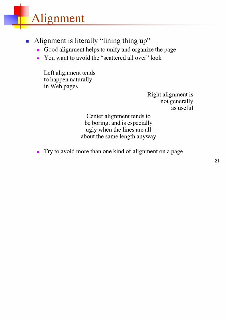
Alignment
Alignment is literally “lining thing up” Good alignment helps to unify and organize the page
You want to avoid the “scattered all over” look
Left alignment tends
to happen naturallyin Web pages
Right alignment isnot generally
as useful
Center alignment tends tobe boring, and is especiallyugly when the lines are all
about the same length anyway
Try to avoid more than one kind of alignment on a page
8/3/2019 12 Good HTML Style
http://slidepdf.com/reader/full/12-good-html-style 22/34
22
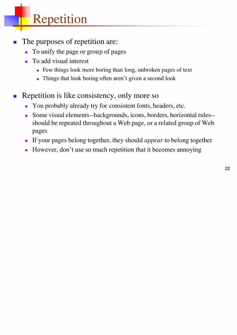
Repetition
The purposes of repetition are: To unify the page or group of pages
To add visual interest
Few things look more boring than long, unbroken pages of text
Things that look boring often aren’t given a second look
Repetition is like consistency, only more so
You probably already try for consistent fonts, headers, etc.
Some visual elements--backgrounds, icons, borders, horizontal rules--
should be repeated throughout a Web page, or a related group of Webpages
If your pages belong together, they should appear to belong together
However, don’t use so much repetition that it becomes annoying
8/3/2019 12 Good HTML Style
http://slidepdf.com/reader/full/12-good-html-style 23/34
23
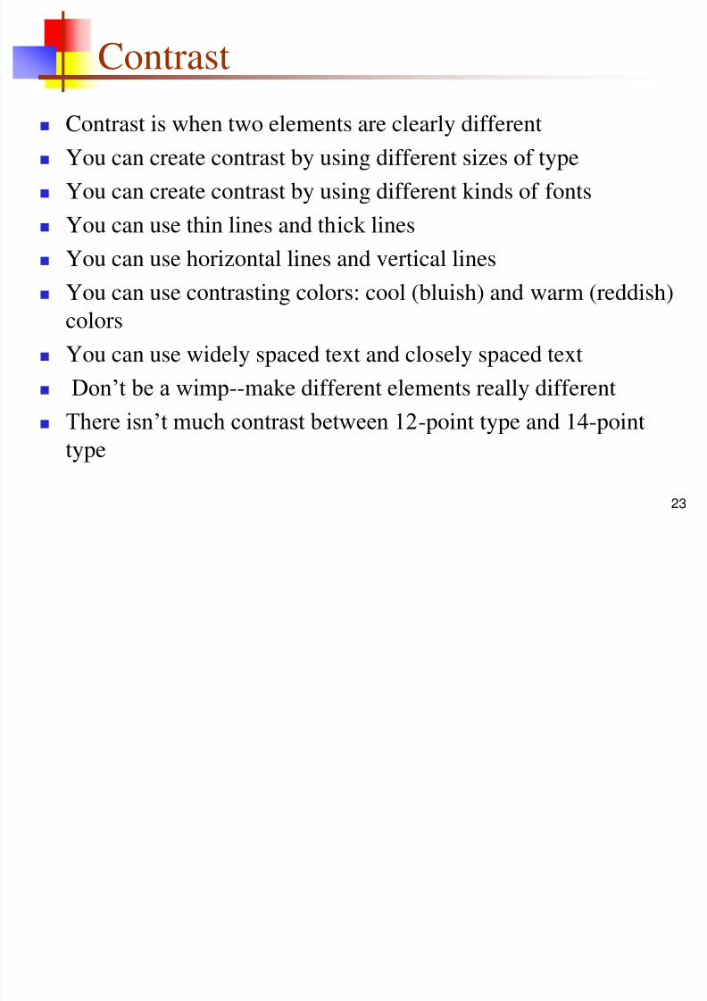
Contrast
Contrast is when two elements are clearly different You can create contrast by using different sizes of type
You can create contrast by using different kinds of fonts
You can use thin lines and thick lines
You can use horizontal lines and vertical lines
You can use contrasting colors: cool (bluish) and warm (reddish)
colors
You can use widely spaced text and closely spaced text
Don’t be a wimp--make different elements really different
There isn’t much contrast between 12-point type and 14-point
type

8/3/2019 12 Good HTML Style
http://slidepdf.com/reader/full/12-good-html-style 24/34
24
Let’s do that again!
Contrast is when two elements are clearly different
You can create contrast by: Using different sizes of type
Using different kinds of fonts
Using thin lines and thick lines
Using horizontal lines and vertical lines
Using contrasting colors: cool (bluish) and warm (reddish) colors
Using widely spaced text and closely spaced text
Don’t be a wimp--make different elements
really different There isn’t much contrast between 12-point type and 14-point type!
8/3/2019 12 Good HTML Style
http://slidepdf.com/reader/full/12-good-html-style 25/34
25
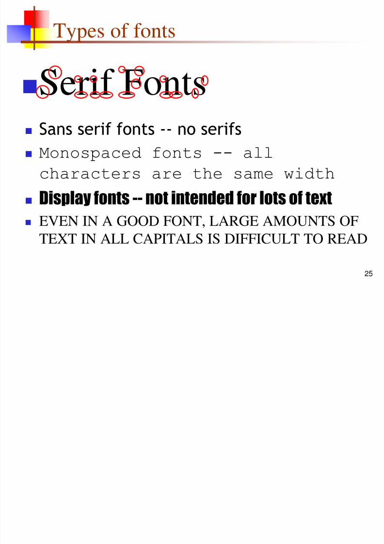
Types of fonts
Serif Fonts
Sans serif fonts -- no serifs Monospaced fonts -- all
characters are the same width
Display fonts -- not intended for lots of text EVEN IN A GOOD FONT, LARGE AMOUNTS OF
TEXT IN ALL CAPITALS IS DIFFICULT TO READ
8/3/2019 12 Good HTML Style
http://slidepdf.com/reader/full/12-good-html-style 26/34
26
A few more simple principles
Establish a visual hierarchy People first see the graphics, then the text
Balance, organization, and visual contrast are vital
Direct the reader’s eye
People scan text left to right, top to bottom
Only the top four inches may be visible
Use pastel shades for backgrounds or minor elements
Beware of distractions
Garish illustrations and (especially) animated graphics or blinking text pullthe user’s eyes away from the content
If everything is emphasized, nothing is emphasized
Be consistent
Don’t have things scattered all over your page
Let your style “evolve” as you improve the page
8/3/2019 12 Good HTML Style
http://slidepdf.com/reader/full/12-good-html-style 27/34
27
Establish a consistent look
Every page on your site should share some styleelements with all the other pages
The idea is that the user should know, without thinkingabout it, that she’s still in the same site
Use the same logo, or the same set of navigationbuttons, on every page
Use a consistent color scheme and set of fonts
Your pages don’t have to all look identical (and
shouldn’t), but they should have a common style CSS style sheets can be a big help in defining a
consistent look
But you need to test them on a variety of browsers

8/3/2019 12 Good HTML Style
http://slidepdf.com/reader/full/12-good-html-style 28/34
28
Legibility and readability
Readability: How easy it is to read a lot of text Legibility: How easy it is to read headlines
In general, a serif font is more readable (in medium sizes)
Because of the coarse resolution of modern screens, a sans serif font is more readable in small sizes
Very high contrast (difference in brightness, not color) makestext more readable
Do not change the default size of body text; the user has it set to
the size she wants Increasing the size for headers or for emphasis is OK
Don’t use more than a couple of different fonts
Usually, one serif font and one sans serif font is enough

8/3/2019 12 Good HTML Style
http://slidepdf.com/reader/full/12-good-html-style 29/34
29
Use tables
HTML <table>s are your best tool for arranging textand graphics on a page
For simply arranging things, use tables without borders
Use borders if you want it to look like a table
Don’t use pixel values for heights and widths--that takes too
much freedom away from the user
Use percentages instead

8/3/2019 12 Good HTML Style
http://slidepdf.com/reader/full/12-good-html-style 30/34
30
Types of graphics
There only three kinds of graphics you can use on theWeb:
GIF (Graphics Interchange Format)
Good for pictures with only a few colors
There are some legal problems involved
JPG or JPEG (Joint Photographic Experts Group)
Good for photographs
PNG (Portable Network Graphics) Modern, fancy, good for everything
Not supported by older browsers

8/3/2019 12 Good HTML Style
http://slidepdf.com/reader/full/12-good-html-style 31/34
31
GIF files
GIF is the most common file format You can specify, in a GIF file, how many colors to use (2, 4,
8, 16, etc.)
The fewer colors, the smaller the file
This is great for charts, cartoons, etc.
GIFs are lossless--you can exactly recreate the original image
GIFs can be animated
GIFs can be interlaced
This allows pictures to appear quickly and get sharper
GIFs can have a transparent color
This lets you use arbitrary shapes on any background
UNISYS owns the patent on GIFs, and has tried to makepeople pay for using them

8/3/2019 12 Good HTML Style
http://slidepdf.com/reader/full/12-good-html-style 32/34
32
JPG files
JPEGs provide a superior compression scheme whenthere are color gradients in the image
That is, for every photograph
JPEGs are lossy-- some information is lost in the
compression, and the information is interpolated (faked) whenthe picture is recreated
You can set the compression ration--the more compression,
the smaller the file, and the more information is lost
JPEGs do a very good job of recreating photographs
JPEGs don’t do a good job of recreating diagrams and line
drawings

8/3/2019 12 Good HTML Style
http://slidepdf.com/reader/full/12-good-html-style 33/34
33
PNG Graphics
PNG has three main advantages: Alpha channels: you can have variable (partial) transparency
Gamma correction, so you can get the same colors on
different platforms
Two-dimensional interlacing
PNG also provides:
Better compression than GIF
A less convenient way to do animations No legal hassles

8/3/2019 12 Good HTML Style
http://slidepdf.com/reader/full/12-good-html-style 34/34
34
The End