Embed Size (px)
Citation preview

?
28 29 30 31 32 33 34 35
Length from Nose to Thumb (in.)
ESSENTIAL QUESTION
EXPLORE ACTIVITY
How do you compare two sets of data displayed in dot plots?
Analyzing Dot PlotsYou can use dot plots to analyze a data set, especially with respect to
its center and spread.
People once used body parts for measurements.
For example, an inch was the width of a man’s
thumb. In the 12th century, King
Henry I of England stated that a yard
was the distance from his nose to his
outstretched arm’s thumb. The dot plot
shows the different lengths, in inches,
of the “yards” for students in a 7th grade class.
Describe the shape of the dot plot. Are the dots evenly distributed or
grouped on one side?
What value best describes the center of the data? Explain how you
chose this value.
Describe the spread of the dot plot. Are there any outliers?
Reflect1. Calculate the mean, median, and range of the data in the dot plot.
A
B
C
L E S S O N
11.2Comparing Data Displayed in Dot Plots
7.12.A
Measurement and data—7.12.A Compare two groups of numeric data using comparative dot plots or box plots by comparing their shapes, centers, and spreads.
355Lesson 11.2
© H
ough
ton
Miff
lin H
arco
urt P
ublis
hing
Com
pany

5’0”4’10” 5’2” 5’4” 5’6”Softball Players’ Heights
5’2” 5’4” 5’6” 5’8” 5’10” 6’0”Basketball Players’ Heights
Math On the Spotmy.hrw.com
5’0 5’2 5’4 5’6Field Hockey Players’ Heights
Math Trainer
Online Assessment and Intervention
Personal
my.hrw.com
Comparing Dot Plots VisuallyYou can compare dot plots visually using various characteristics, such as center,
spread, and shape.
The dot plots show the heights of 15 high school basketball players and
the heights of 15 high school softball players.
Visually compare the shapes of the dot plots.
Softball: All the data is 5’6” or less.
Basketball: Most of the data is 5’8” or greater.
As a group, the softball players are shorter than the basketball players.
Visually compare the centers of the dot plots.
Softball: The data is centered around 5’4”.
Basketball: The data is centered around 5’8”.
This means that the most common height for the softball players
is 5 feet 4 inches, and for the basketball players 5 feet 8 inches.
Visually compare the spreads of the dot plots.
Softball: The spread is from 4’11” to 5’6”.
Basketball: The spread is from 5’2” to 6’0”.
There is a greater spread in heights for the basketball players.
EXAMPLE 1
A
B
C
2. Visually compare the dot plot of heights
of field hockey players to the dot plots
for softball and basketball players.
Shape:
Center:
Spread:
YOUR TURN
Math TalkMathematical Processes
7.12.A
How do the heights of field hockey players compare with
the heights of softball and basketball players?
Unit 6356
© H
ough
ton
Miff
lin H
arco
urt P
ublis
hing
Com
pany

Math On the Spot
my.hrw.com
0 2 4 6 8 10 12Internet Usage (h)
Math Trainer
Online Assessment and Intervention
Personal
my.hrw.com
Animated Math
my.hrw.com
0 2 4 6 8 10 12 14Exercise (h)
0 2 4 6 8 10 12 14Video Games (h)
Comparing Dot Plots NumericallyYou can also compare the shape, center, and spread of two dot plots
numerically by calculating values related to the center and spread. Remember
that outliers can affect your calculations.
Numerically compare the dot plots of the number of hours a class of
students exercises each week to the number of hours they play video
games each week.
Compare the shapes of the dot plots.
Exercise: Most of the data is less than 4 hours.
Video games: Most of the data is 6 hours or greater.
Compare the centers of the dot plots by finding the medians.
Median for exercise: 2.5 hours. Even though there are outliers at
12 hours, most of the data is close to the median.
Median for video games: 9 hours. Even though there is an outlier at
0 hours, these values do not seem to affect the median.
Compare the spreads of the dot plots by calculating the range.
Exercise range with outlier: 12 - 0 = 12 hours
Exercise range without outlier: 7 - 0 = 7 hours
Video games range with outlier: 14 - 0 = 14 hours
Video games range without outlier: 14 - 6 = 8 hours
EXAMPLEXAMPLE 2
A
B
C
3. Calculate the median and range
of the data in the dot plot. Then
compare the results to the dot
plot for Exercise in Example 2.
YOUR TURN
Math TalkMathematical Processes
7.12.A
How do outliers affect the results of
this data?
357Lesson 11.2
© H
ough
ton
Miff
lin H
arco
urt P
ublis
hing
Com
pany

0 2 4 6 8 10 12 14Class A (mi)
0 2 4 6 8 10 12 14Class B (mi)
Guided Practice
The dot plots show the number of miles run per week for two different
classes. For 1–5, use the dot plots shown.
1. Compare the shapes of the dot plots.
2. Compare the centers of the dot plots.
3. Compare the spreads of the dot plots.
4. Calculate the medians of the dot plots.
5. Calculate the ranges of the dot plots.
6. What do the medians and ranges of two dot plots tell you about the data?
ESSENTIAL QUESTION CHECK-IN??
Unit 6358
© H
ough
ton
Miff
lin H
arco
urt P
ublis
hing
Com
pany
Math Coach
Icon to come
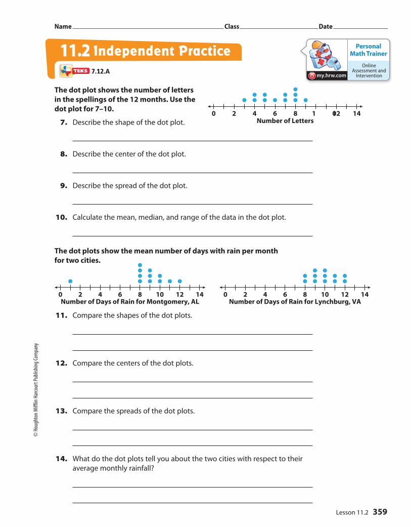
0 2 4 6 8 1 012 14Number of Letters
Personal Math Trainer
Online Assessment and
Interventionmy.hrw.com
0 2 4 6 8 10 12 14Number of Days of Rain for Montgomery, AL
0 2 4 6 8 10 12 14Number of Days of Rain for Lynchburg, VA
Name Class Date
The dot plot shows the number of letters
in the spellings of the 12 months. Use the
dot plot for 7–10.
7. Describe the shape of the dot plot.
8. Describe the center of the dot plot.
9. Describe the spread of the dot plot.
10. Calculate the mean, median, and range of the data in the dot plot.
The dot plots show the mean number of days with rain per month
for two cities.
11. Compare the shapes of the dot plots.
12. Compare the centers of the dot plots.
13. Compare the spreads of the dot plots.
14. What do the dot plots tell you about the two cities with respect to their
average monthly rainfall?
Independent Practice11.27.12.A
359Lesson 11.2
© H
ough
ton M
ifflin
Har
cour
t Pub
lishin
g Com
pany

Work Area
6 7 8 9 10 11 12 13Group A Shoe Sizes
6 7 8 9 10 11 12 13Group B Shoe Sizes
The dot plots show the shoe sizes of two different groups of people.
15. Compare the shapes of the dot plots.
16. Compare the medians of the dot plots.
17. Compare the ranges of the dot plots (with and without the outliers).
18. Make A Conjecture Provide a possible explanation for the results of the
dot plots.
19. Analyze Relationships Can two dot plots have the same median and
range but have completely different shapes? Justify your answer using
examples.
20. Draw Conclusions What value is most affected by an outlier, the median
or the range? Explain. Can you see these effects in a dot plot?
FOCUS ON HIGHER ORDER THINKING
Unit 6360
© H
ough
ton M
ifflin
Har
cour
t Pub
lishin
g Com
pany


![ASPEN 11.2 Updates - surveyor-training …surveyor-training-content2.s3.amazonaws.com/data/172/LTCSP_Webin… · LTCSP ASPEN 11.2 Updates LTCSP 1. This is [Synora Jones] from CMS](https://img.dokumen.tips/doc/110x75/5ba16f5609d3f2b66a8c4903/aspen-112-updates-surveyor-training-surveyor-training-content2s3-ltcsp.jpg)