Embed Size (px)
Citation preview

1
PPRREESSEENNTTAATTIIOONN OOFF DDAATTAA
1.1 IINNTTRROODDUUCCTTIIOONN
Once data has been collected, it has to be classified and organised in such a way that it becomes easily readable and interpretable, that is, converted to information. Before the calculation of descriptive statistics, it is sometimes a good idea to present data as tables, charts, diagrams or graphs. Most people find ‘pictures’ much more helpful than ‘numbers’ in the sense that, in their opinion, they present data more meaningfully. In this course, we will consider the various possible types of presentation of data and justification for their use in given situations.
1.2 TTAABBUULLAARR FFOORRMMSS
This type of information occurs as individual observations, usually as a table or array of disorderly values. These observations are to be firstly arranged in some order (ascending or descending if they are numerical) or simply grouped together in the form of a frequency table before proper presentation on diagrams is possible.
1.2.1 Arrays
An array is a matrix of rows and columns of numbers which have been arranged in some order (preferably ascending). It is probably the most primitive way of tabulating information but can be very useful if it is small in size. Some important statistics can immediately be located by mere inspection.
Without any calculations, one can easily find the
1. Minimum observation 2. Maximum observation 3. Number of observations, n 4. Mode 5. Median, if n is odd

2
Example
2 7 8 11 15 16 18 19 19 19 23 23 24 26 27 29 33 40 44 47 49 51 54 63 68
Table 1.2.1
We can easily verify the following:
1. Minimum = 2 2. Maximum = 68 3. Number of observations = 25 4. Mode = 19 5. Median = 24
1.2.2 Simple tables
A table is slightly more complex than an array since it needs a heading and the names of the variables involved. We can also use symbols to represent the variables at times, provided they are sufficiently explicit for the reader. Optionally, the table may also include totals or percentages (relative figures).
Example
DISTRIBUTION OF AGES OF DCDMBS STUDENTS
Age of student Frequency Relative frequency 19 14 0.0350 20 23 0.0575 21 134 0.3350 22 149 0.3725 23 71 0.1775 24 9 0.0225
Total 400 1.0000
Table 1.2.2
1.2.3 Compound tables
A compound table is just an extension of a simple in which there are more than one variable distributed among its attributes (sub-variable). An attribute is just a quality, property or component of a variable according to which it can be differentiated with respect to other variables.
We may refer to a compound table as a cross tabulation or even to a
contingency table depending on the context in which it is used.

3
Example
UNISA 2004 results for first-year DCDMBS students
COURSE BA B Com B Sc
Pass 37 25 33
Supp 5 10 4
RES
ULT
Fail 11 8 27
Table 1.2.3
1.3 LLIINNEE GGRRAAPPHHSS
A line graph is usually meant for showing the frequencies for various values of a variable. Successive points are joined by means of line segments so that a glance at the graph is enough for the reader to understand the distribution of the variable.
1.3.1 Single line graph
The simplest of line graphs is the single line graph, so called because it displays information concerning one variable only, in terms of its frequencies.
Example
Using the data from the table below,
Age of
students Number of students
(frequency) 19 14 20 23 21 134 22 149 23 71 24 8
Total 399
Table 1.3.1.1
we may generate the following line graph:

4
Line graph for ages of students
0
20
40
60
80
100
120
140
160
19 20 21 22 23 24
Age
Num
ber o
f stu
dent
s
Fig. 1.3.1.2 1.3.2 Multiple line graph
Multiple line graphs illustrate information on several variables so that comparison is possible between them. Consider the following table containing information on the ages of first-year students attending courses the University of Mauritius (UoM), the De Chazal du Mée Business School (DCDMBS) and the University of Technology of Mauritius (UTM) respectively.
AGE DISTRIBUTION OF STUDENTS AT ACADEMIC INSTITUTIONS
Number of students
Age of students UoM DCDMBS UTM
19 14 8 2
20 23 52 23
21 134 101 152
22 149 133 98
23 71 54 34
24 8 18 13
Table 1.3.2.1
This data, when displayed on a multiple line graph, enables a comparison between the frequencies for each age among the institutions (maybe in an attempt to know whether younger students prefer to enrol for courses at one of these institutions).

5
Fig. 1.3.2.2
1.4 PPIIEE CCHHAARRTTSS
A pie chart or circular diagram is one which essentially displays the relative figures (proportions or percentages) of classes or strata of a given sample or population. We should not include absolute values (class frequencies) on a pie chart. Perhaps, this is the simplest diagram that can be used to display data and that is the reason why it is quite limited in its presentation.
The pie chart follows the principle that the angle of each of its sectors
should be proportional to the frequency of the class that it represents. Merits
1. It gives a simple pictorial display of the relative sizes of classes. 2. It shows clearly when one class is more important than another. 3. It can be used for comparison of the same elements but in two or more
different populations. Limitations
1. It only shows the relative sizes of classes. 2. It involves calculation of angles of sectors and drawing them accurately. 3. It is sometimes difficult to compare sectors sizes accurately by eye.
Multiple line graph for age distribution at academic institutions
0
20
40
60
80
100
120
140
160
19 20 21 22 23 24
Age
Num
ber o
f stu
dent
s
UoMDCDMBSUTM

6
1.4.1 Simple pie chart Example
Using the same data from Table 1.2.3, but this time, including the total number of students enrolled for BA, B Com and B Sc, we shall now display the distribution of students for these three courses the population.
UNISA 2004 results for first-year DCDMBS students
COURSE BA B Com B Sc
Pass 37 25 33
Supp 5 10 4
RES
ULT
Fail 11 8 27
TOTAL 53 43 64
Table 1.4.1.1
It is customary to include a legend to relate the colours or patterns used for each sector to its corresponding data.
Distribution of students enrolled for BA, B Com and B Sc
33%
27%
40%
BA
B Com
B Sc
Fig. 1.4.1.2

7
1.4.2 Enhanced pie chart
This is just an enhancement (as the name says itself) of a simple pie chart in order to lay emphasis on particular sector.
Example
Again, using the same data from Table 1.2.3, but this time, including the total number of students enrolled for BA, B Com and B Sc, we shall now display the distribution of students for these three courses the population.
UNISA 2004 results for first-year DCDMBS students
COURSE BA B Com B Sc
Pass 37 25 33
Supp 5 10 4
RES
ULT
Fail 11 8 27
TOTAL 53 43 64
Table 1.4.1.3
It is customary to include a legend to relate the colours or patterns used for
each sector to its corresponding data. In Fig. 1.4.1.4, we show the importance of the number of passes in B Sc.
Distribution of students enrolled for BA, B Com and B Sc
33%
27%
40%
BA
B Com
B Sc
Fig. 1.4.1.4
8
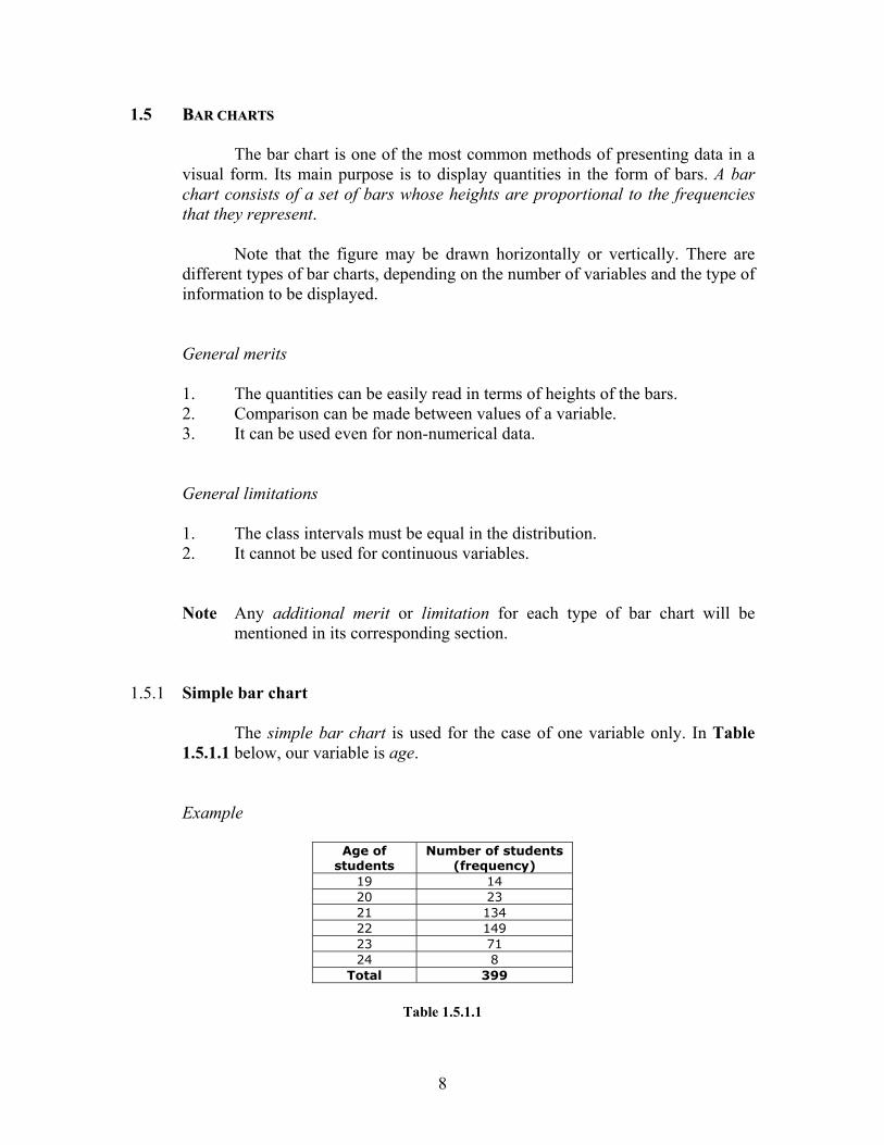
1.5 BBAARR CCHHAARRTTSS
The bar chart is one of the most common methods of presenting data in a visual form. Its main purpose is to display quantities in the form of bars. A bar chart consists of a set of bars whose heights are proportional to the frequencies that they represent.
Note that the figure may be drawn horizontally or vertically. There are
different types of bar charts, depending on the number of variables and the type of information to be displayed.
General merits
1. The quantities can be easily read in terms of heights of the bars. 2. Comparison can be made between values of a variable. 3. It can be used even for non-numerical data.
General limitations
1. The class intervals must be equal in the distribution. 2. It cannot be used for continuous variables.
Note Any additional merit or limitation for each type of bar chart will be mentioned in its corresponding section.
1.5.1 Simple bar chart
The simple bar chart is used for the case of one variable only. In Table 1.5.1.1 below, our variable is age.
Example
Age of students
Number of students (frequency)
19 14 20 23 21 134 22 149 23 71 24 8
Total 399
Table 1.5.1.1

9
Simple bar chart for age distribution of students
0
20
40
60
80
100
120
140
160
19 20 21 22 23 24
Age
Num
ber o
f stu
dent
s
Fig. 1.5.1.2 1.5.2 Multiple bar chart
The multiple bar chart is an extension of a simple bar chart when there are quantities of several variables to be displayed. The bars representing the quantities for the different variables are piled next to one another for each attribute.
Example
UNISA 2004 results for first-year DCDMBS students
COURSE BA B Com B Sc
Pass 37 25 33
Supp 5 10 4
RES
ULT
Fail 11 8 27
TOTAL 53 43 64
Table 1.5.2.1
Fig. 1.5.2.2 shows how an array of frequencies may be very easily displayed on a multiple bar chart.

10
Multiple bar chart showing the results for BA, B Com and B Sc
0
5
10
15
20
25
30
35
40
BA B Com B Sc
Courses
Res
ults Pass
Supp
Fail
Fig. 1.5.2.2 Merits
1. Comparison may be made among components of the same variable. 2. Comparison is also possible for the same component across all variables.
Limitations
1. The figure becomes very cumbersome when there are too many variables and components.
2. Only absolute, not relative, values are available – it is much easier to compare component percentages across variables.
1.5.3 Component bar chart
In this type of bar chart, the components (quantities) of each variable are piled on top of one another.

11
Example
UNISA 2004 results for first-year DCDMBS students
COURSE BA B Com B Sc
Pass 37 25 33
Supp 5 10 4
RES
ULT
Fail 11 8 27
TOTAL 53 43 64
Table 1.5.2.1
Component bar chart showing the results for each course
0
10
20
30
40
50
60
70
BA B Com B Sc
Courses
Res
ults Fail
SuppPass
Fig. 1.5.2.2
Merits
1. Comparison may be made among components of the same variable. 2. Comparison is also possible for the same component across all variables. 3. It saves space as compared to a multiple bar chart.
Limitations
1. Only absolute, not relative, values are available – it is much easier to compare component percentages across variables.
2. It is awkward to compute the quantities for individual components.

12
1.5.4 Percentage (component) bar chart
A percentage (component) bar chart displays the components (quantities) percentages of each variable, piled on top of one another. This is a refinement of the component bar chart since, irrespective of the number of components, the heights of the bars are always kept to a given value (100%).
Fig. 1.5.4 presents the same data as for the previous example.
Percentage bar chart showing the results for each course
0%10%20%30%40%50%60%70%80%90%
100%
BA B Com B Sc
Courses
Res
ults Fail
SuppPass
Fig. 1.5.4
Merits
1. Comparison may be made among components of the same variable. 2. Comparison is also possible for the same component across all variables. 3. It saves space as compared to a multiple bar chart.
Limitations
1. Only relative, not absolute, values are available – it is not possible to compute quantities unless the totals are known.
2. It is awkward to compute the percentages for individual components. 3. Same percentages do not mean necessarily mean same quantities (this may
be calculated unless totals are known).

13
1.6 HHIISSTTOOGGRRAAMMSS
Out of several methods of presenting a frequency distribution graphically, the histogram is the most popular and widely used in practice. A histogram is a set of vertical bars whose areas are proportional to the frequencies of the classes that they represent.
While constructing a histogram, the variable is always taken on the x-axis
while the frequencies are on the y-axis. Each class is then represented by a distance on the scale that is proportional to its class interval. The distance for each rectangle on the x-axis shall remain the same in the case that the class intervals are uniform throughout the distribution. If the classes have different class intervals, they will obviously vary accordingly on the x-axis. The y-axis represents the frequencies of each class which constitute the height of the rectangle.
The histogram should be clearly distinguished from the bar chart. The
most striking physical difference between these two diagrams is that, unlike the bar chart, there are no ‘gaps’ between successive rectangles of a histogram. A bar chart is one-dimensional since only the length, and not the width, matters whereas a histogram is two-dimensional since both length and width are important.
A histogram is mainly used to display data for continuous variables but
can also be adjusted so as to present discrete data by making an appropriate continuity correction. Moreover, it can be quite misleading if the distribution has unequal class intervals.
1.6.1 Histograms for equal class intervals
Example
Consider the set of data in Fig. 1.6.1.1, which represents the ages of workers of a private company. The real limits and mid-class values have already been computed.
Age group Real limits Mid-class value Frequency 21 – 25 20.5 – 25.5 23 5 26 – 30 25.5 – 30.5 28 12 31 – 35 30.5 – 35.5 33 23 36 – 40 35.5 – 40.5 38 39 41 – 45 40.5 – 45.5 43 32 46 – 50 45.5 – 50.5 48 21 51 – 55 50.5 – 55.5 53 9 56 – 60 55.5 – 60.5 58 2 Total 143
Table 1.6.1.1

14
The data is presented on the histogram in Fig. 1.6.1.2.
Presentation of grouped data (uniform class interval) on a histogram
Fig. 1.6.1.2 1.6.2 Histograms for unequal class intervals
When class intervals are unequal, a correction must be made. This consists of finding the frequency density for each class, which is the ratio of the frequency to the class interval. The frequency densities now become the actual heights of the rectangles since the areas of the rectangles should be proportional to the frequencies.
Frequency density = tervalinsClas
Frequency
Example
The temperatures (in degrees Fahrenheit) were simultaneously recorded in
various cities in the world at a specific moment. Table 1.6.2.1 below gives the thermometer readings.
Histogram for grouped data
0
5
10
15
20
25
30
35
40
45
[20.5,25.5)
[25.5,30.5)
[30.5,35.5)
[35.5,40.5)
[40.5,45.5)
[45.5,50.5)
[50.5,55.5)
[55.5,60.5)
Age group of workers
Num
ber o
f wor
kers
(fre
quen
cy)

15
Temperature Class
intervals Frequency Frequency
density [0 – 5) 5 3 0.60 [5 – 10) 5 6 1.20 [10 – 20) 10 10 1.00 [20 – 30) 10 15 1.50 [30 – 40) 10 10 1.00 [40 – 50) 10 5 0.50 [50 – 70) 20 5 0.25
Total 54
Table 1.6.2.1
Note [20 – 30) means ‘from 20 to 30, including 20 but excluding 30’.
Presentation of grouped data (unequal class intervals) on a histogram
Fig. 1.6.2.2 1.7 FFRREEQQUUEENNCCYY PPOOLLYYGGOONNSS
A frequency polygon is a graph of frequency distribution. There are actually two ways of drawing a frequency polygon:
1. By first drawing a histogram for the data 2. Direct construction
Histogram (unequal class intervals) using frequency density
0
0.2
0.4
0.6
0.8
1
1.2
1.4
1.6
0 10 20 30 40 50 60 70 80
Temparature (degrees Fahrenheit)
Freq
uenc
y de
nsity

16
1.7.1 Drawing a histogram first This is indeed a very effective in which a frequency polygon may be
constructed. Draw a histogram of the given data and then join, by means of straight lines, the midpoints of the upper horizontal side of each rectangle with the adjacent ones. It is an accepted practice to close the polygon at both ends of the distribution by extending the lines to the base line (x-axis). When this is done, two hypothetical classes with zero frequencies must be included at each end. This extension is made with the objective of making the area under the polygon equal to the area under the corresponding histogram.
Example
Temperature Frequency
[0 – 10) 2 [10 – 20) 7 [20 – 30) 11 [30 – 40) 17 [40 – 50) 9 [50 – 60) 3 [60 – 70) 1
Total 50
Table 1.7.1.1
Presentation of grouped data on a histogram and frequency polygon
Fig. 1.7.1.2
Histogram and frequency polygon for grouped data
0
2
4
6
8
10
12
14
16
18
-10 0 10 20 30 40 50 60 70 80
Temperature (degrees Fahrenheit)
Freq
uenc
y

17
1.7.2 Direct construction
The frequency polygon may also be directly drawn by finding the points on the figure. The x-coordinate of each point is the mid-class value of the cell whilst the y-coordinate is the frequency of the cell (or frequency density if class intervals are unequal). Successive points are then linked by means of line segments.
In that state, the polygon would be ‘hanging in the air’, that is, it would
not touch the x-axis. To satisfy this ultimate requirement, we determine its left (right) x-intercept by respectively subtracting (adding) the class intervals of the first (last) classes from the x-intercept of the first (last) point.
Example
Using the data from Table 1.6.2.1, we have the following polygon:
Presentation of grouped data on a frequency polygon
Fig. 1.7.2 A frequency polygon sketches an outline of the data pattern more clearly.
In fact, it is the refinement of a histogram, as it does not assume that the frequencies of observations within a class are equal. The polygon becomes increasingly smooth and curve-like as we increase the number of classes in a distribution.
Frequency polygon for grouped data
0
5
10
15
20
25
30
35
40
45
20.5 –25.5
25.5 –30.5
30.5 –35.5
35.5 –40.5
40.5 –45.5
45.5 –50.5
50.5 –55.5
55.5 –60.5
Age of students
Num
ber o
f stu
dent
s (fr
eque
ncy)

18
11..88 OOGGIIVVEESS
An ogive is the typical shape of a cumulative frequency curve or polygon. It is generated when cumulative frequencies are plotted against real limits of classes in a distribution. There are two types of ogives: ‘less than’ and ‘more than’. Before differentiating between these two, let us start by defining cumulative frequency.
1.8.1 Cumulative frequency
This self-explanatory term means that the frequencies of classes are accumulated over the entire distribution. We define the two types of cumulative frequencies as follows:
Definition 1
The ‘less than’ cumulative frequency of a class is the total number of observations, in the entire distribution, which are less than or equal to the upper real limit of the class.
Definition 2
The ‘more than’ cumulative frequency of a class is the total number of observations, in the entire distribution, which are greater than or equal to the lower real limit of the class.
Note For the rest of this course, we will denote ‘cumulative frequency’ by CF. Example
Age group
Real limits Frequency ‘Less than’ CF
‘More than’ CF
21 – 25 20.5 – 25.5 5 5 143 26 – 30 25.5 – 30.5 12 17 138 31 – 35 30.5 – 35.5 23 40 126 36 – 40 35.5 – 40.5 39 79 103 41 – 45 40.5 – 45.5 32 111 64 46 – 50 45.5 – 50.5 21 132 32 51 – 55 50.5 – 55.5 9 141 11 56 – 60 55.5 – 60.5 2 143 2 Total 143
Table 1.8.1
19
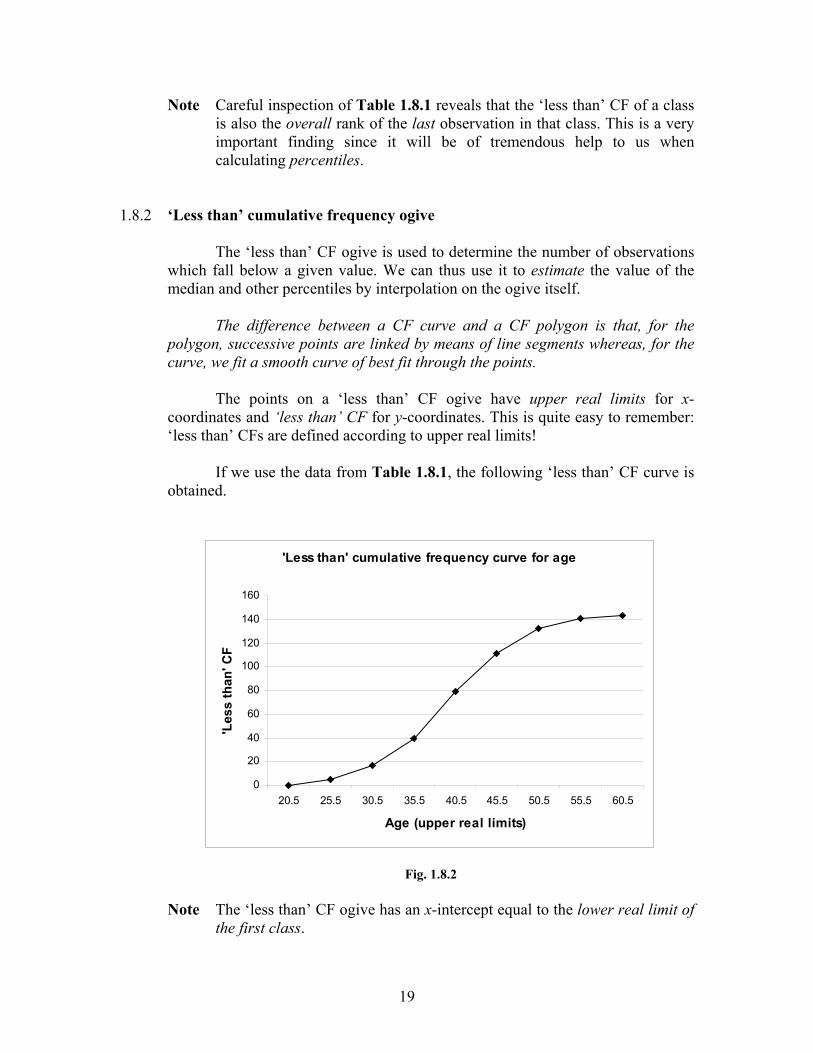
Note Careful inspection of Table 1.8.1 reveals that the ‘less than’ CF of a class is also the overall rank of the last observation in that class. This is a very important finding since it will be of tremendous help to us when calculating percentiles.
1.8.2 ‘Less than’ cumulative frequency ogive
The ‘less than’ CF ogive is used to determine the number of observations which fall below a given value. We can thus use it to estimate the value of the median and other percentiles by interpolation on the ogive itself.
The difference between a CF curve and a CF polygon is that, for the
polygon, successive points are linked by means of line segments whereas, for the curve, we fit a smooth curve of best fit through the points.
The points on a ‘less than’ CF ogive have upper real limits for x-
coordinates and ‘less than’ CF for y-coordinates. This is quite easy to remember: ‘less than’ CFs are defined according to upper real limits!
If we use the data from Table 1.8.1, the following ‘less than’ CF curve is
obtained.
Fig. 1.8.2
Note The ‘less than’ CF ogive has an x-intercept equal to the lower real limit of the first class.
'Less than' cumulative frequency curve for age
0
20
40
60
80
100
120
140
160
20.5 25.5 30.5 35.5 40.5 45.5 50.5 55.5 60.5
Age (upper real limits)
'Les
s th
an' C
F

20
1.8.3 ‘More than’ cumulative frequency ogive
The ‘more than’ CF ogive is used to determine the number of observations which fall above a given value. We can also use it to estimate the value of the median and other percentiles by interpolation on the ogive itself.
The points on a ‘more than’ CF ogive have lower real limits for x-
coordinates and mores than’ CF for y-coordinates. Remember that ‘more than’ CFs are defined according to lower real limits!
Again, if we use the data from Table 1.8.1, the following ‘more than’ CF
curve is obtained.
Fig. 1.8.3
Note The ‘less than’ CF ogive has an x-intercept equal to the upper real limit of the last class.
The main use of cumulative frequency ogives is to estimate percentiles, more specifically the median and the lower and upper quartiles. However, we may also estimate the percentage of the distribution that falls below or above a given value. Alternatively, we may find a value above or below which a certain percentage of the distribution lies.
It is generally advisable to use a CF curve, instead of a CF polygon, since
it has been found to yield more realistic and reliable estimates for percentiles.
'More than' cumulative frequency ogive for age
0
20
40
60
80
100
120
140
160
20.5 25.5 30.5 35.5 40.5 45.5 50.5 55.5 60.5
Age (lower real limits)
'Mor
e th
an' C
F

21
1.9 STEM AND LEAF DIAGRAMS
Stem and leaf diagrams, or stemplots, are used to represent raw data, that is, individual observations, without loss of information. The ‘leaves’ in the diagram are actually the last digits of the values (observations) while the ‘stems’ are the remaining part of the values. For example, the value 117 would be split as ‘11’, the stem, and ‘7’, the leaf. By splitting all the values and distributing them appropriately, we form a stemplot. The example in Section 1.9.1 would be a better illustration of the above explanation.
1.9.1 Simple stem and leaf plot Example
The following are the marks (out of 100) obtained by 20 students in an assignment:
84 17 38 45 47
53 76 54 75 22
66 65 55 54 51
44 39 19 54 72
Table 1.9.1.1
In the first instance, the data is classified in the order that it appears on a stemplot (see Fig. 1.9.1.2). The leaves are then arranged in ascending order (see Fig. 1.9.1.3) – this is indeed a very practical way of arranging a set of data in order if the number of observations is not very large.
Fig. 1.9.1.2 Fig. 1.9.1.3
Stem Leaf Stem Leaf
1 2 3 4 5 6 7 8
7 9 2 8 9 5 7 4 3 4 5 4 1 4 6 5 6 5 2 4
12345678
7 9 2 8 9 4 5 7 1 3 4 4 4 5 5 6 2 5 6 4
Key 1|7 means 17
Note A stemplot must always be accompanied by a key in order to help the
reader interpret the values.
22
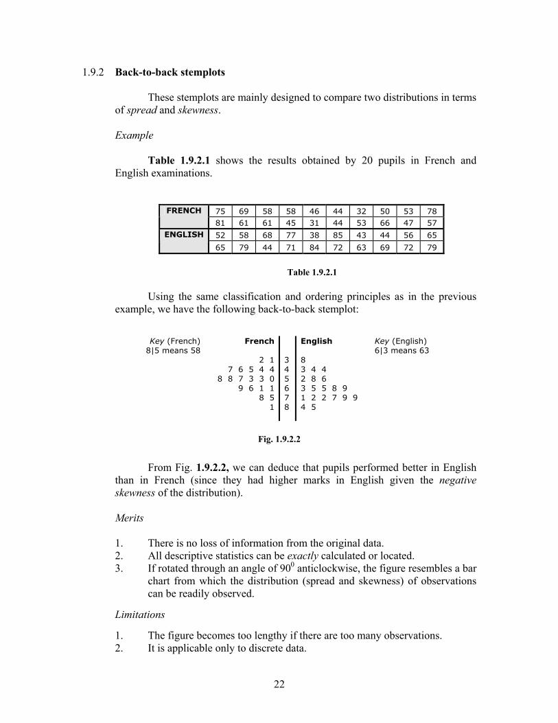
1.9.2 Back-to-back stemplots These stemplots are mainly designed to compare two distributions in terms
of spread and skewness.
Example Table 1.9.2.1 shows the results obtained by 20 pupils in French and
English examinations.
75 69 58 58 46 44 32 50 53 78 FRENCH
81 61 61 45 31 44 53 66 47 57
52 58 68 77 38 85 43 44 56 65 ENGLISH
65 79 44 71 84 72 63 69 72 79
Table 1.9.2.1
Using the same classification and ordering principles as in the previous
example, we have the following back-to-back stemplot: Key (French)
8|5 means 58
French
2 17 6 5 4 4
8 8 7 3 3 09 6 1 1
8 51
3 4 5 6 7 8
English 8 3 4 4 2 8 6 3 5 5 8 9 1 2 2 7 9 9 4 5
Key (English) 6|3 means 63
Fig. 1.9.2.2
From Fig. 1.9.2.2, we can deduce that pupils performed better in English than in French (since they had higher marks in English given the negative skewness of the distribution).
Merits
1. There is no loss of information from the original data. 2. All descriptive statistics can be exactly calculated or located. 3. If rotated through an angle of 900 anticlockwise, the figure resembles a bar
chart from which the distribution (spread and skewness) of observations can be readily observed.
Limitations
1. The figure becomes too lengthy if there are too many observations. 2. It is applicable only to discrete data.

23
1.10 BOX AND WHISKERS DIAGRAMS
Box and whiskers diagrams, common known as boxplots, are specially designed to display dispersion and skewness in a distribution. The figure consists of a ‘box’ in the middle from which two lines (whiskers) extend respectively to the minimum and maximum values of the distribution. The position of median is also indicated in the middle of the box. A boxplot can be drawn either horizontally or vertically on graph. One axis is scaled to accommodate for the values of the observations while the other has no scale given that the width of the box is irrelevant. The boxplot is applicable for both discrete and continuous data.
A boxplot is drawn according to five descriptive statistics:
1. Minimum value 2. Lower quartile 3. Median 4. Upper quartile 5. Maximum value
Note Calculation of these statistics will be explained in detail in the chapter on
Descriptive Statistics. We will simply label the positions of these values on the diagram.
Example
Using the data from Table 1.9.1.1 in Section 1.9.1, we have the following five summary statistics:
Minimum 17 Lower quartile 40.25 Median 53.5 Upper quartile 65.75 Maximum 84
Fig. 1.10.1
Fig. 1.10.2
O 10 20 30 40 50 60 70 80 90 100
Number of marks

24
1.10.1 What information can be gathered from a boxplot?
Apart from the five descriptive statistics, we can deduce the following about the distribution:
1. The range – the numerical difference between the maximum and the
minimum values. 2. The inter-quartile range – the difference between the upper and lower
quartiles. It measures the dispersion for the middle 50% of the distribution. 3. The skewness of the distribution – if the median is closer to the lower
(upper) quartile, the distribution is positively (negatively) skewed. If it is exactly in the middle of those quartiles, the distribution is symmetrical.
1.10.2 Using the boxplot for comparison
Several boxplots may even be plotted on the same axes for comparison purposes. We might wish to compare marks obtained by students in French and English so as to study any similarities and differences between their performances in these subjects.
Fig. 1.10.3 From Fig. 1.10.3, the following can be observed:
1. In general, students have scored higher marks in French than in English (the ‘box’ is more to the right).
2. The range for both subjects is the same. 3. The distribution for French is negatively skewed but that for English
is positively skewed.
O 10 20 30 40 50 60 70 80 90 100
Number of marks
French
English

25
1.11 SCATTER DIAGRAMS
Scatter diagrams, also known as scatterplots, are used to investigate the relationship between two variables. If it is suspected that a causal (cause-effect) relationship exists between two variables, inspection of a scatterplot may well provide us with an answer. In such a relationship, we normally have an independent (explanatory) variable, also known as a predictor, and a dependent (response) variable. Detailed explanations of these terms will be given in the section on Regression.
Just imagine that we wish to know whether the length of a metal rod varies
with temperature. We may choose to record the length of the rod at various temperatures. It is clear here that ‘temperature’ is the independent variable and ‘length’ is the dependent one. These data are kept in the form of a table in which ‘temperature’ and ‘length’ are labelled as X and Y respectively. We next plot the corresponding pairs of readings in (x, y) form on a graph, the scatter diagram. Fig. 1.11.2 is an example of a scatterplot.
Example
Table 1.11.1
Fig. 1.11.2
Temperature (0C) 13 50 63 58 20 78 39 55 29 62
Length (cm) 5.10 5.68 5.85 5.74 5.25 5.98 5.59 5.73 5.46 5.81
Scatterplot of length of metal rod at various temperatures
5
5.1
5.2
5.3
5.4
5.5
5.6
5.7
5.8
5.9
6
6.1
0 10 20 30 40 50 60 70 80 90
Temperature
Leng
th

26
A scatterplot enables us to verify whether there does exist a causal relationship between two variables by checking the pattern of points. In fact, it even reveals the nature of the relationship, that is, if it is linear or non-linear, by the shape of the pattern. Scatter diagrams are especially very useful in regression and correlation analyses.
1.12 TIME SERIES HISTORIGRAMS
A time series is a series of figures which show the evolution of a variable over time. The horizontal axis is labelled as the time axis instead of the usual x-axis. The graph of a time series is known as a historigram. Points on the graph are plotted with x-coordinates as time units while the y-coordinates are the values assumed by the variable at those particular times. Successive points are then linked by means of straight lines (similar to a line graph, Section 1.3).
Example
The following data represent the annual sales of petrol in Iraq in millions of dollars for the period 1985-96.
Table 1.12.1
Fig. 1.12.2
Year (19_) 85 86 87 88 89 90 91 92 93 94 95 96
Sales ($m) 600 840 420 720 640 860 420 740 670 900 430 760
Time series for annual sales of petrol
0
100
200
300
400
500
600
700
800
900
1000
85 86 87 88 89 90 91 92 93 94 95 96
Year
Sale
s ($
m)

27
A time series shows the trend, cycle and seasonality in the behaviour of a variable. It is a very sophisticated means of forecasting the values of the variable on the assumption that history repeats itself.
1.13 LORENZ CURVES
The Lorenz curve is a device for demonstrating the evenness, by verifying the degree of concentration of a property, of a distribution. A common application of the Lorenz curve is to show the distribution of wealth in a population. The explanation for the construction of such a diagram is given by means of the example below.
Example Table 1.13.1 below refers to tax paid by people in various income groups
in a sample. Construct a Lorenz curve for the data and comment on it.
Annual gross income Number of people Tax paid ($)
Less than 6 000 140 60 000 6 000 and less than 8 000 520 200 000 8 000 and less than 10 000 620 660 000 10 000 and less than 14 000 440 700 000 14 000 and less than 20 000 240 740 000 20 000 and less than 32 000 40 680 000
TOTAL 2000 3 040 000
Table 1.13.1
The above table now should be altered in such a way that relative cumulative frequencies may now be displayed for both variables, that is, ‘number of people’ and ‘tax paid’. We must change the labels for the first column, determine the cumulative frequencies and then convert these to percentages (proportions) as shown in Table 1.13.2.
Annual gross income
Number of people
Tax paid ($) Proportion of people
Proportion of tax
Less than 6 000 140 60 000 0.07 0.0197 Less than 8 000 660 260 000 0.33 0.0855 Less than 10 000 1280 920 000 0.64 0.3026 Less than 14 000 1720 1 620 000 0.86 0.5329 Less than 20 000 1960 2 360 000 0.98 0.7763 Less than 32 000 2000 3 040 000 1.00 1.0000
Table 1.13.2

28
Next, we plot one relative cumulative frequency against another. It does not really matter which axis is to be used for which variable, the reason being that we only wish to observe the departure of the Lorenz curve from the line of uniform distribution. On graph, this is simply the line y = x, which represents the ideal situation where, for our example, the proportion of tax paid is equally distributed among the various classes of income earners. This line is also to be drawn on the same graph in order to make the ‘bulge’ of the Lorenz curve more visible. This is clearly illustrated in Fig. 1.13.3 below.
Fig. 1.13.3 The further the curve is from the line of uniform distribution, the more
uneven is the distribution. It can be observed, for example, that approximately 36% of the population of taxpayers pays only 10% of the total tax. This shows a considerable degree of unevenness in the population. In an ideal situation, 36% of the population would have paid 36% of the total tax.
The Lorenz curve is normally used in economical contexts and its
interpretation is very useful whenever there is an imbalance somewhere in the economic sector (for example, distribution of wealth in a population).
Lorenz curve for the distribution of taxpayers
0
0.1
0.2
0.3
0.4
0.5
0.6
0.7
0.8
0.9
1
0 0.2 0.4 0.6 0.8 1
Proportion of taxpayers
Prop
ortio
n of
tax
paid
Line of uniform
distribution

29
1.14 Z-CHARTS The usefulness of a Z-chart is for presenting business data. It shows the
following:
1. The value of a variable plotted against time over the year. 2. The cumulative sum of values for that variable over the year to
date. 3. The annual moving total for that variable. The annual moving total is the sum of the values of the variable for the
12-month period up to the end of the month under consideration. A line for the budget for the year to data may be added to a Z-chart, for comparison with the cumulative sum of actual values.
Example The sales figures for a company for 2002 and 2003 are as follows.
Table 1.14.1
Table 1.14.2 will now include the cumulative sales for 2003 and the annual moving total, that is, the 12-month period will be updated from the period Jan-Dec 2003 to Feb 2003-Jan 2004, then Mar 2003- Feb 2004 and so on until Jan-Dec 2004, whilst these total sales will be continuously calculated and recorded.
Note Z-charts do not have to cover 12 months of a year. They could, for example, also be drawn for four quarters of a year or seven days of a week.
Month 2002 sales ($m) 2003 sales ($m)
January 7 8 February 7 8
March 8 8 April 7 9 May 9 8 June 8 8 July 8 7
August 7 8 September 6 9
October 7 6 November 8 9 December 8 9
90 97

30
Table 1.14.2
Fig. 1.14.3
Month 2002 sales
($m) 2003 sales
($m) Cumulative sales
2003 ($m) Annual moving
total ($m) January 7 8 8 91 February 7 8 16 92
March 8 8 24 92 April 7 9 33 94 May 9 8 41 93 June 8 8 49 93 July 8 7 56 92
August 7 8 64 93 September 6 9 73 96
October 7 6 79 95 November 8 9 88 96 December 8 9 97 97
31
Interpretation of Z-charts
The popularity of Z-charts in practical applications derives from the wealth of information which they can contain.
1. Monthly totals show the monthly results at a glance with any seasonal
variations. 2. Cumulative totals show the performance to data and can be easily compared
with planned and budgeted performance by superimposing the budget line. 3. Annual moving totals compare the current levels of performance with those
of the previous year. If the line is rising, then this year’s monthly results are better than the results of the corresponding month last year. The opposite applies if the line is falling. The annual moving total line indicates the long-term trend of the variable, whether rising, falling or steady.
Note While the values of the annual moving total and the cumulative values are
plotted on month-end positions, the values for the current monthly figures are plotted on mid-month positions. This is because monthly figures represent achievement over a particular month whereas the annual moving totals and the cumulative values represent achievement up to a particular month end.