Embed Size (px)
Citation preview

1
Lesson 3.5.4Lesson 3.5.4
Circle Graphs and Percents
Circle Graphs and Percents
2
Lesson
3.5.4Circle Graphs and PercentsCircle Graphs and Percents
California Standard:Number Sense 1.4Calculate given percentages of quantities and solve problems involving discounts at sales, interest earned, and tips.
What it means for you:You’ll use circle graphs to compare different percents
Key words:• percent• circle graph• 100%• compare

3
Lesson
3.5.4
You’ll have seen circle graphs before in earlier grades.
Circle Graphs and PercentsCircle Graphs and Percents
Circle graphs are useful because they show clearly how the size of one group relates to another.
They’re often used to compare different percents.

4
100% is Equal to the Whole Amount
Lesson
3.5.4
100% of something is all of it.
Circle Graphs and PercentsCircle Graphs and Percents
It’s important to remember this when you’re looking at questions about percents.

5
Example 1
Solution follows…
Lesson
3.5.4
Yesenia has a number of marbles. 65% of the marbles are red. The rest are all blue. What percent of Yesenia’s marbles are blue?
Solution
All the marbles are either red or blue.
percent of red marbles + percent of blue marbles = all marbles
Circle Graphs and PercentsCircle Graphs and Percents
65% + percent of blue marbles = 100%
percent of blue marbles = 100% – 65%
= 35%
So 35% of Yesenia’s marbles are blue.
6
Guided Practice
Solution follows…
Lesson
3.5.4
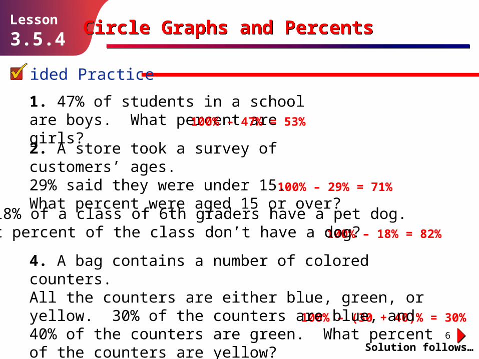
1. 47% of students in a school are boys. What percent are girls? 100% – 47% = 53%
100% – 18% = 82%
100% – 29% = 71%
100% – (30 + 40)% = 30%
Circle Graphs and PercentsCircle Graphs and Percents
2. A store took a survey of customers’ ages. 29% said they were under 15. What percent were aged 15 or over?
3. 18% of a class of 6th graders have a pet dog. What percent of the class don’t have a dog?
4. A bag contains a number of colored counters. All the counters are either blue, green, or yellow. 30% of the counters are blue, and 40% of the counters are green. What percent of the counters are yellow?
7
Guided Practice
Solution follows…
Lesson
3.5.4
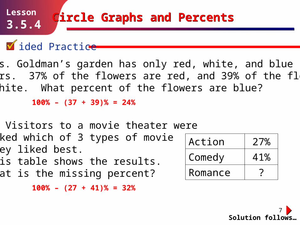
5. Mrs. Goldman’s garden has only red, white, and blue flowers. 37% of the flowers are red, and 39% of the flowers are white. What percent of the flowers are blue?
100% – (37 + 39)% = 24%
100% – (27 + 41)% = 32%
Circle Graphs and PercentsCircle Graphs and Percents
6. Visitors to a movie theater were asked which of 3 types of movie they liked best. This table shows the results. What is the missing percent?
Action 27%
Comedy 41%
Romance ?

8
Circle Graphs Are Often Divided into Percents
Lesson
3.5.4
Circle graphs show how a total splits into different parts.
Circle Graphs and PercentsCircle Graphs and Percents
The girls section is larger.
The two sections represent the boys and the girls.
The whole circle represents the whole class.
This means the class has more girls than boys.
This graph represents a math class split into boys and girls.

9
Lesson
3.5.4Circle Graphs and PercentsCircle Graphs and Percents
When a circle graph shows percents, the whole circle represents 100%.
A section that represents a certain percent fills that percent of the circle.
100%
50%25%
25%

10
Example 2
Solution follows…
Lesson
3.5.4
This circle graph shows the results of a survey to find which out of apples, bananas, and oranges students liked best.
Solution
The whole circle represents 100%, so the total value of all the sections must be 100%.
Call the percent of students who like bananas best b%.
Then 25 + 35 + b = 100
60 + b = 100
Circle Graphs and PercentsCircle Graphs and Percents
What percent of the students like bananas best?
b = 100 – 60 = 40
So 40% of the students like bananas best.
The total of all sections is 100%
25 + 35 = 60
Subtract 60 from both sides

11
Guided Practice
Solution follows…
Lesson
3.5.4
In Exercises 7–10, find the missing value in each circle graph.
7. 8.
9.
100% – 50% = 50% 100% – (55 + 30)% = 15%
100% – (31 + 24)% = 45%
Circle Graphs and PercentsCircle Graphs and Percents
10.
100% – (34 + 19 + 21)% = 26%

12
Guided Practice
Solution follows…
Lesson
3.5.4
A survey asked people which of three drinks they prefer. This graph shows the number of people who said they prefer each drink.
11. How many people answered the survey?20 + 20 + 10 = 50 people
12. What fraction of these people preferred each drink?
Circle Graphs and PercentsCircle Graphs and Percents
13. What percent of these people preferred each drink?Water: (1 ÷ 5) × 100 = 20%, Juice: (2 ÷ 5) × 100 = 40%, Milk: (2 ÷ 5) × 100 = 40%
Water: , Juice: , Milk:=1050
15
=2050
25
=2050
25
13
Guided Practice
Solution follows…
Lesson
3.5.4
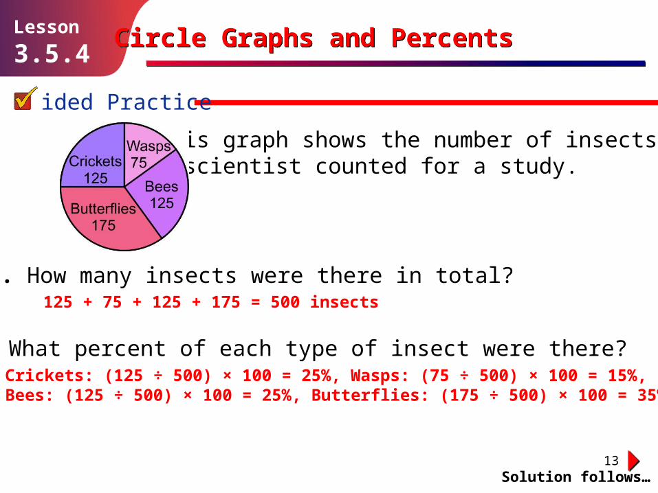
This graph shows the number of insects a scientist counted for a study.
14. How many insects were there in total?125 + 75 + 125 + 175 = 500 insects
Circle Graphs and PercentsCircle Graphs and Percents
15. What percent of each type of insect were there?Crickets: (125 ÷ 500) × 100 = 25%, Wasps: (75 ÷ 500) × 100 = 15%, Bees: (125 ÷ 500) × 100 = 25%, Butterflies: (175 ÷ 500) × 100 = 35%

14
You Can Turn Percents on Circle Graphs into Numbers
Lesson
3.5.4
If you know how many units make up the full 100% of a circle graph, then you can work out how many each section represents.
Circle Graphs and PercentsCircle Graphs and Percents
50%25%
25%
If this graph represents 200 people…
…so 25% = 50 people
…then 100% = 200 people…

15
Example 3
Solution follows…
Lesson
3.5.4
Chris, Martina, and D’Andre each ran for student body president. A total of 150 students voted in the election, and the outcome of the election is shown in the circle graph. How many students voted for Martina?
Solution
The circle graph tells you 40% of the students voted for Martina. You know that the whole circle graph represents 150 students.
So the number of students who voted for Martina is
Circle Graphs and PercentsCircle Graphs and Percents
40% of 150 = 0.4 × 150 = 60
A total of 60 students voted for Martina.
16
Guided Practice
Solution follows…
Lesson
3.5.4
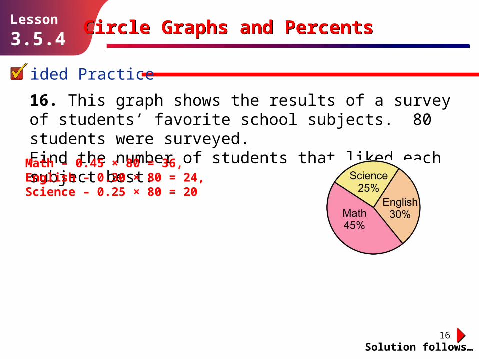
16. This graph shows the results of a survey of students’ favorite school subjects. 80 students were surveyed. Find the number of students that liked each subject best.
Math – 0.45 × 80 = 36, English – 0.30 × 80 = 24, Science – 0.25 × 80 = 20
Circle Graphs and PercentsCircle Graphs and Percents

17
Guided Practice
Solution follows…
Lesson
3.5.4
17. The percents of games won, lost, and tied by a soccer team out of their last 40 games are shown on this graph. How many of the games did they win, lose, and tie?
Circle Graphs and PercentsCircle Graphs and Percents
Won – 0.60 × 40 = 24, Tied – 0.15 × 40 = 6, Lost – 0.25 × 40 = 10

18
Guided Practice
Solution follows…
Lesson
3.5.4
18. This graph shows the percent of each color of balloon at a party. There were a total of 200 balloons at the party. Find how many of each color of balloon were at the party.
Red – 0.48 × 200 = 96, White – 0.27 × 200 = 54, Blue – 0.25 × 200 = 50
Circle Graphs and PercentsCircle Graphs and Percents

19
Guided Practice
Solution follows…
Lesson
3.5.4
19. 300 people were surveyed as to which of 4 types of animals they liked the best. This graph shows the results. How many people in the survey liked each type of animal?
Circle Graphs and PercentsCircle Graphs and Percents
Dog – 0.30 × 300 = 90, Cat – 0.28 × 300 = 84, Goldfish – 0.24 × 300 = 72, Rat – 0.18 × 300 = 54

20
Independent Practice
Solution follows…
Lesson
3.5.4
The percents must add up to 100%. This means that the percent who go to the reading club is: 100 – 15 – 10 – 40 – 10 = 100 – 75 = 25%
Circle Graphs and PercentsCircle Graphs and Percents
1. A group of sixth-grade students each go to one of 5 clubs after school on Tuesdays. The table shows what percent of the students go to each club.
Acting Club 15%
Reading Club ?%
Debate Club 10%
Music Club 40%
Recycling Club 10%
What percent of the students go to the reading club? Explain your answer.

21
Independent Practice
Solution follows…
Lesson
3.5.4
Cabbage: 25%
Circle Graphs and PercentsCircle Graphs and Percents
2. A group of people were asked which of 3 vegetables they like best. This graph shows the results. Calculate the missing percent.
3. 300 people were questioned. Find the number of people who said they like each vegetable.
Carrots – 99, Spinach – 126, Cabbage – 75

22
Independent Practice
Solution follows…
Lesson
3.5.4
Cleveland: 38%
Circle Graphs and PercentsCircle Graphs and Percents
4. A town held a vote to decide who to build a statue of. The results are shown on this graph. Find the missing percent.
5. 250 people voted. Figure out how many people voted for each choice.
Washington – 90, Lincoln – 65, Cleveland – 95

23
Independent Practice
Solution follows…
Lesson
3.5.4
Red: 28%
Circle Graphs and PercentsCircle Graphs and Percents
6. This graph shows the colors of cars in the school parking lot. What percent of the cars are red?
7. If there are 175 cars in the lot, how many of each color are there?
Red – 49, Blue – 42, Silver – 49, Other – 35

24
8. This graph shows the results of a survey asking people about their favorite season. Figure out the missing percent.
Independent Practice
Solution follows…
Lesson
3.5.4
Winter: 24%
Circle Graphs and PercentsCircle Graphs and Percents
9. The survey questioned 325 people. How many said they like each season the best?
Spring – 91, Summer – 104, Fall – 52, Winter – 78

25
Independent Practice
Solution follows…
Lesson
3.5.4
150 acres
Circle Graphs and PercentsCircle Graphs and Percents
10. How many acres of corn are there?
11. Which section of the graph represents each crop? Explain your answer.The smallest section of the graph represents the crop with the least land, so A represents lettuce. B is the largest part of the graph, so it represents the crop with the largest area, the corn. So C represents the tomatoes.
Mr. Benson has 300 acres of land on his farm. He grows corn, lettuce, and tomatoes. There are 60 acres of lettuce and 90 acres of tomatoes. The graph shows how the land on the farm is divided between the three crops.
12. What percent of the land is used for each crop?Corn: 50%, Lettuce: 20%, Tomatoes: 30%

26
Independent Practice
Solution follows…
Lesson
3.5.4
500 sixth-graders were asked which of four sports they liked best. This graph shows the results.
13. How many students said they liked cycling best?100 students
15. What percent of the students preferred each sport?Swimming – 35%, Running – 30%, Cycling – 20%, Tennis – 15%
Circle Graphs and PercentsCircle Graphs and Percents
14. Write down what fraction of the sixth-graders preferred each sport.
Swimming: = , Running: = , Cycling: = , Tennis: = 175500
720
150500
310
75500
15
100500
320

27
Round UpRound Up
Circle graphs are useful for giving out information.
Lesson
3.5.4Circle Graphs and PercentsCircle Graphs and Percents
People who don’t know much about math can still understand what it means when one part of the circle is bigger than another.


![Circle graphs[1]](https://img.dokumen.tips/doc/110x75/55667fb8d8b42a0f168b4bfb/circle-graphs1.jpg)