Embed Size (px)
Citation preview

BIOSTATS 540 – Fall 2016 Exam 2 (Unit 2 –Data Visualization) SOLUTIONS
Exam2 540 2016 SOLUTIONS.docx Page 1 of 24
1. (20 points total) 1a. (5 points) Choose one, bar chart or histogram: Which choice of graph would you use to summarize the distribution of the following variable: Starting salary for the different specialties in a profession. Bar chart reason: specialty is discrete 1b. (5 points) Choose one, bar chart or histogram: Which choice of graph would you use to summarize the distribution of the following variable: Elapsed time since last visit to the dentist. Histogram reason: time is continuous 1c. (5 points) Choose one, bar chart or histogram: Which choice of graph would you use to summarize the distribution of the following variable: Number of hair transplant sessions per person. Bar chart reason: sessions is discrete (0, 1, 2, etc) 1d. (5 points) Choose one, bar chart or histogram: Which choice of graph would you use to summarize the distribution of the following variable: Number of patients with 0, 1, or 2+ vessels with > 75% stenosis. Bar chart reason: number of patients is discrete (0, 1, 2, etc)
BIOSTATS 540 – Fall 2016 Exam 2 (Unit 2 –Data Visualization) SOLUTIONS
Exam2 540 2016 SOLUTIONS.docx Page 2 of 24
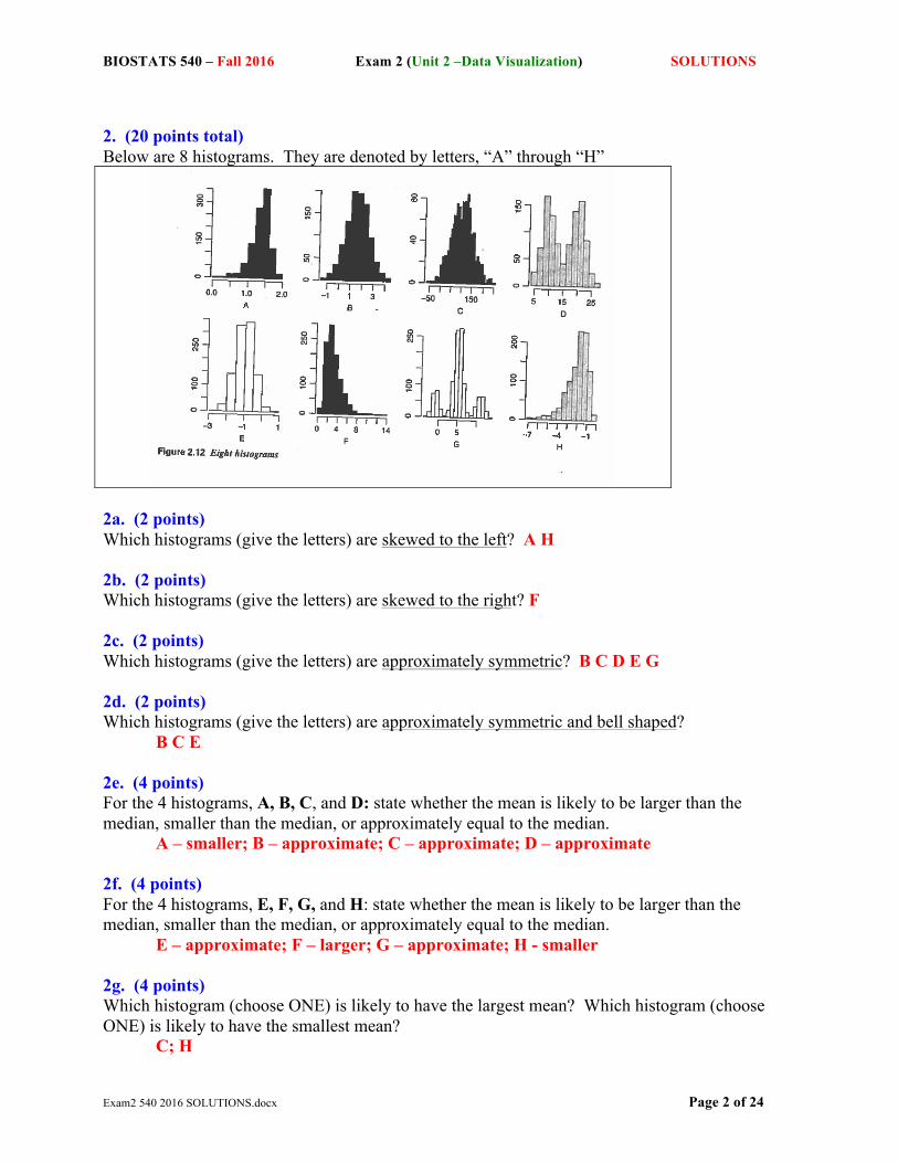
2. (20 points total) Below are 8 histograms. They are denoted by letters, “A” through “H”
2a. (2 points) Which histograms (give the letters) are skewed to the left? A H 2b. (2 points) Which histograms (give the letters) are skewed to the right? F 2c. (2 points) Which histograms (give the letters) are approximately symmetric? B C D E G 2d. (2 points) Which histograms (give the letters) are approximately symmetric and bell shaped? B C E 2e. (4 points) For the 4 histograms, A, B, C, and D: state whether the mean is likely to be larger than the median, smaller than the median, or approximately equal to the median. A – smaller; B – approximate; C – approximate; D – approximate 2f. (4 points) For the 4 histograms, E, F, G, and H: state whether the mean is likely to be larger than the median, smaller than the median, or approximately equal to the median. E – approximate; F – larger; G – approximate; H - smaller 2g. (4 points) Which histogram (choose ONE) is likely to have the largest mean? Which histogram (choose ONE) is likely to have the smallest mean? C; H
BIOSTATS 540 – Fall 2016 Exam 2 (Unit 2 –Data Visualization) SOLUTIONS
Exam2 540 2016 SOLUTIONS.docx Page 3 of 24
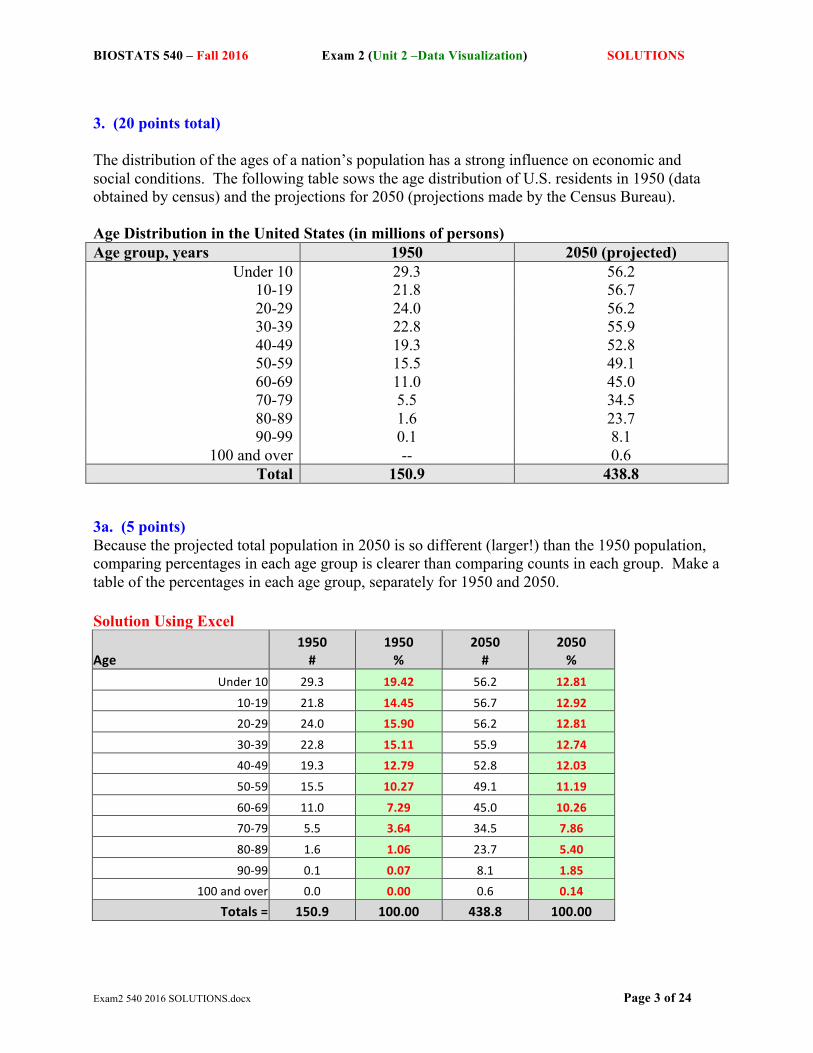
3. (20 points total) The distribution of the ages of a nation’s population has a strong influence on economic and social conditions. The following table sows the age distribution of U.S. residents in 1950 (data obtained by census) and the projections for 2050 (projections made by the Census Bureau). Age Distribution in the United States (in millions of persons) Age group, years 1950 2050 (projected)
Under 10 29.3 56.2 10-19 21.8 56.7 20-29 24.0 56.2 30-39 22.8 55.9 40-49 19.3 52.8 50-59 15.5 49.1 60-69 11.0 45.0 70-79 5.5 34.5 80-89 1.6 23.7 90-99 0.1 8.1
100 and over -- 0.6 Total 150.9 438.8
3a. (5 points) Because the projected total population in 2050 is so different (larger!) than the 1950 population, comparing percentages in each age group is clearer than comparing counts in each group. Make a table of the percentages in each age group, separately for 1950 and 2050. Solution Using Excel
Age 1950 #
1950 %
2050 #
2050 %
Under 10 29.3 19.42 56.2 12.81
10-‐19 21.8 14.45 56.7 12.92
20-‐29 24.0 15.90 56.2 12.81
30-‐39 22.8 15.11 55.9 12.74
40-‐49 19.3 12.79 52.8 12.03
50-‐59 15.5 10.27 49.1 11.19
60-‐69 11.0 7.29 45.0 10.26
70-‐79 5.5 3.64 34.5 7.86
80-‐89 1.6 1.06 23.7 5.40
90-‐99 0.1 0.07 8.1 1.85
100 and over 0.0 0.00 0.6 0.14
Totals = 150.9 100.00 438.8 100.00

BIOSTATS 540 – Fall 2016 Exam 2 (Unit 2 –Data Visualization) SOLUTIONS
Exam2 540 2016 SOLUTIONS.docx Page 4 of 24
Solution Using R First, enter the raw data into R. AgeGroup <-c("<10", "10-19", "20-29", "30-39", "40-49", "50-59", "60-69", "70-79", "80-89", "90-99", "100+") Y1950 <-c(29.3, 21.8, 24.0, 22.8, 19.3, 15.5, 11.0, 5.5, 1.6, 0.1, 0.0) Y2050 <-c(56.2, 56.7, 56.2, 55.9, 52.8, 49.1, 45.0, 34.5, 23.7, 8.1, 0.6) table1 <-data.frame(AgeGroup, Y1950, Y2050) table1 AgeGroup Y1950 Y2050 1 <10 29.3 56.2 2 10-19 21.8 56.7 3 20-29 24.0 56.2 4 30-39 22.8 55.9 5 40-49 19.3 52.8 6 50-59 15.5 49.1 7 60-69 11.0 45.0 8 70-79 5.5 34.5 9 80-89 1.6 23.7 10 90-99 0.1 8.1 11 100+ 0.0 0.6
Now create a table of percents by using the function “prop.table” to perform the calculations. Y1950p <-prop.table(Y1950)*100 Y2050p <-prop.table(Y2050)*100 table2<-data.frame(AgeGroup, Y1950p, Y2050p) options(digits=2) table2 AgeGroup Y1950p Y2050p 1 <10 19.417 12.81 2 10-19 14.447 12.92 3 20-29 15.905 12.81 4 30-39 15.109 12.74 5 40-49 12.790 12.03 6 50-59 10.272 11.19 7 60-69 7.290 10.26 8 70-79 3.645 7.86 9 80-89 1.060 5.40 10 90-99 0.066 1.85 11 100+ 0.000 0.14

BIOSTATS 540 – Fall 2016 Exam 2 (Unit 2 –Data Visualization) SOLUTIONS
Exam2 540 2016 SOLUTIONS.docx Page 5 of 24
3b. (5 points) By any means you like (including by hand!) Construct a histogram of the 1950 age distribution, in percents. Construct a histogram of the projected 2050 age distribution, in percents. Solution in Excel Charts > Column > 2-D Column Clustered TIP!! Take care to specify the same vertical axis tick marks (right click to edit tick marks)
0.00
5.00
10.00
15.00
20.00
25.00
1950
percent
0.00
5.00
10.00
15.00
20.00
25.00
Projected 2050
percent

BIOSTATS 540 – Fall 2016 Exam 2 (Unit 2 –Data Visualization) SOLUTIONS
Exam2 540 2016 SOLUTIONS.docx Page 6 of 24
Solution Using R table2$AgeGroup <- factor(table2$AgeGroup, levels=unique(as.character(table2$AgeGroup))) * Include this line to ensure the age groups are displayed in order, otherwise R will insert the ‘100+’ group after ’10-19’. barchart(Y1950p~AgeGroup, data = table2, main = "Distribution of Age (1950)", xlab = "Age Group (years)", ylab = "Frequency (%)", ylim=c(0,20))
barchart(Y2050p~AgeGroup, data = table2, main = "Projected Distribution of Age (2050)",xlab = "Age Group (years)", ylab = "Frequency (%)", ylim=c(0,20))

BIOSTATS 540 – Fall 2016 Exam 2 (Unit 2 –Data Visualization) SOLUTIONS
Exam2 540 2016 SOLUTIONS.docx Page 7 of 24
Solution in Stata . * Enter data directly into data editor. . save "/Users/cbigelow/Desktop/exam 2 q3b.dta" file /Users/cbigelow/Desktop/exam 2 q3b.dta saved . * Set graph scheme . set scheme s1color . *** graph for 1950 . sort year age . graph twoway bar age_percent age if year==1950, bcolor(dknavy) barwidth(.7) xlabel(1 "Under 10" 2 "10-19" 3 "20-29" 4 "30-39" 5 "40-49" 6 "50-59" 7 "60-69" 8 "70-79" 9 "80-89" 10 "90-99" 11 "100+", angle(45)) ylabel(0(5)25) title("1950") xtitle("Age, years") ytitle("Percent of Population") name(year1950, replace) . * graph for 2050 projected . graph twoway bar age_percent age if year==2050, bcolor(dknavy) barwidth(.7) xlabel(1 "Under 10" 2 "10-19" 3 "20-29" 4 "30-39" 5 "40-49" 6 "50-59" 7 "60-69" 8 "70-79" 9 "80-89" 10 "90-99" 11 "100+", angle(45)) ylabel(0(5)25) title("2050 - Projected") xtitle("Age, years") ytitle("Percent of Population") name(year2050, replace) . * putting the two together . graph combine year1950 year2050

BIOSTATS 540 – Fall 2016 Exam 2 (Unit 2 –Data Visualization) SOLUTIONS
Exam2 540 2016 SOLUTIONS.docx Page 8 of 24
3c. (5 points) In 1-2 sentences at most, describe the main features of the histograms you constructed in question #3b. Each histogram shows the distribution of age (grouped) in the population. On the horizontal axis is plotted the separate intervals of age (grouped). On the vertical axis, the associated percent of the population that is in that age group is plotted (as the height of the bar) 3d. (5 points) In 1-2 sentences at most, what are the most important changes in the U.S. age distribution projected for the 100-year period between 1950 and 2050? The projected changes from 1950 to 2050 include: (a) Aging – fewer younger individuals, relatively; and (b) A non-negligible representation of persons 100 years or older

BIOSTATS 540 – Fall 2016 Exam 2 (Unit 2 –Data Visualization) SOLUTIONS
Exam2 540 2016 SOLUTIONS.docx Page 9 of 24
4. (20 points total) The Irish Department of Public Health publishes health care information on its websites. An issue in the development of these materials is their reading level. The recommended reading level is that of 12-14 year olds. The following is a stem and leaf plot of the reading levels of health information postings on n=46 websites.
08 0 09 10 0 11 0 0 12 0 13 0 0 0 0 14 0 0 0 15 0 0 0 0 0 0 0 16 0 0 0 17 0 0 0 0 0 0 0 0 0 0 0 0 0 0 0 0 0 0 0 0 0 0 0 0
4a. (10 points) Which measures of location and spread would you use to describe these data? In 1-2 students, state your preference and explain your selection. As the data are skewed, the median would be the best measure of location. In this example, the data is skewed to the left (tail dragging to the left or to lower values). For the same reason (the data are skewed), the median absolute deviation from the median (MADM) would be the best measure of spread.

BIOSTATS 540 – Fall 2016 Exam 2 (Unit 2 –Data Visualization) SOLUTIONS
Exam2 540 2016 SOLUTIONS.docx Page 10 of 24
4b. (10 points) By hand or by any means you like, construct a box-plot summary of these data. Tip - In developing your answer, fill in the following table.
P25 = 140 (1.5)* IQR = 45 P50 = 170 Lower Fence = 100 P75 = 170 Upper Fence = 170 Interquartile Range (IQR) = 30 Extreme values (if any) = 80 Solution Using StatKey

BIOSTATS 540 – Fall 2016 Exam 2 (Unit 2 –Data Visualization) SOLUTIONS
Exam2 540 2016 SOLUTIONS.docx Page 11 of 24
Solution Using R q4b<-c(80,100,110,110,120,130,130,130,130,140,140,140,150,150,150,150,150,150,150,160,160,160,170,170,170,170,170,170,170,170,170,170,170,170,170,170, 170,170,170,170,170,170,170,170,170,170)
summary(q4b) Min. 1st Qu. Median Mean 3rd Qu. Max. 80.0 142.5 170.0 153.7 170.0 170.0 IQR(q4b) [1] 27.5
P25 = 140 (1.5)* IQR = 45 P50 = 170 Lower Fence = 100 P75 = 170 Upper Fence = 170 Interquartile Range (IQR) = 30 Extreme values (if any) = 80 *Note that R uses a different method for determining quartiles, and IQR. Quartiles and fences should be real values in the data set. Standard convention for determining lower and upper fences still holds, where: Upper “fence” = The largest value that is still less than or equal to P75 + 1.5*(P75 – P25) = P75 + 1.5*(IQR) Lower “fence” = The smallest value that is still greater than or equal to P25 – 1.5*(P75 – P25) = P25 – 1.5*(IQR) bwplot(e2q4)

BIOSTATS 540 – Fall 2016 Exam 2 (Unit 2 –Data Visualization) SOLUTIONS
Exam2 540 2016 SOLUTIONS.docx Page 12 of 24
Solution in Stata . clear . generate reading=. . *(1 variable, 46 observations pasted into data editor) . univar reading -------------- Quantiles -------------- Variable n Mean S.D. Min .25 Mdn .75 Max ------------------------------------------------------------------------------- reading 46 153.70 22.45 80.00 140.00 170.00 170.00 170.00 ------------------------------------------------------------------------------- . set scheme s1color . graph hbox reading, bar(1, bcolor(navy)) title("Ireland Department of Public Health") subtitle("Reading Level Among 12-14 Year Olds")

BIOSTATS 540 – Fall 2016 Exam 2 (Unit 2 –Data Visualization) SOLUTIONS
Exam2 540 2016 SOLUTIONS.docx Page 13 of 24
5. (20 points total) A study of 13 children with asthma was conducted to compare the effectiveness of two medications for the relief of symptoms: formoterol and salbutamol. Each child was evaluated using both medications. The outcome measured for each was the child’s peak expiratory flow (PEF) and was done at 8 hours following treatment. The following is a listing of the PEF values obtained:
Peak Expiratory Flow (PEF) on Medication =
Child Formoterol Salbutamol
1 310 270 2 385 370 3 400 310 4 310 260 5 410 380 6 370 300 7 410 390 8 320 290 9 330 365 10 250 210 11 380 350 12 340 260 13 220 90
5a. (5 points) A proper analysis would utilize methods for paired data. However, for this question (#5a ONLY), please treat these data as PEF values in two independent groups, analogous to the two group question in the homework (males and females). Construct a plot of your choosing using any approach that compares the distribution of PEF values for formoterol with the distribution of PEF values for salbutamol.

BIOSTATS 540 – Fall 2016 Exam 2 (Unit 2 –Data Visualization) SOLUTIONS
Exam2 540 2016 SOLUTIONS.docx Page 14 of 24
Solution Using StatKey (Choose: One Quantitative Variable and One Categorical Variable) When the sample size is small (here, n=13 in each group) a dot plot is recommended. But you might also have produced a side-by-side box plot

BIOSTATS 540 – Fall 2016 Exam 2 (Unit 2 –Data Visualization) SOLUTIONS
Exam2 540 2016 SOLUTIONS.docx Page 15 of 24
Solution Using R Solution using base package in R.
1) Enter data into Excel
2) In R e2q5 <- read.xlsx(("E:/Exam2.xlsx"), sheet = 2) boxplot(e2q5 [,-1], main = “PEF by Drug”, ylab = "PEF") * Where [,-1] indicates that you want a boxplot for all variables in the dataset except for the first column (A boxplot of Child would be meaningless in this case)

BIOSTATS 540 – Fall 2016 Exam 2 (Unit 2 –Data Visualization) SOLUTIONS
Exam2 540 2016 SOLUTIONS.docx Page 16 of 24
Alternatively, if you want to use the lattice package for a prettier plot, enter the data in Excel, rearranging the layout. This makes it easier to make a side by side plot.

BIOSTATS 540 – Fall 2016 Exam 2 (Unit 2 –Data Visualization) SOLUTIONS
Exam2 540 2016 SOLUTIONS.docx Page 17 of 24
In R: e2q5v2 <- read.xlsx(("E:/Exam2.xlsx"), sheet = 3) bwplot(PEF ~ Drug, data = e2q5v2, main = "PEF by Drug")

BIOSTATS 540 – Fall 2016 Exam 2 (Unit 2 –Data Visualization) SOLUTIONS
Exam2 540 2016 SOLUTIONS.docx Page 18 of 24
Solution in Stata . clear . generate group="" . generate pef=. . *(2 variables, 26 observations pasted into data editor) . * --- side-by-side dot plot ---* . sort group . label variable group "Medication" . dotplot pef, over(group) title("Peak Expiratory Flow (PEF)") ylabel(0(100)500) msymbol(o) . * --- side-by-side box plot ---" . graph box pef, over(group) bar(1, bcolor(navy)) title("Peak Expiratory Flow (PEF)") ylabel(0(100)500)

BIOSTATS 540 – Fall 2016 Exam 2 (Unit 2 –Data Visualization) SOLUTIONS
Exam2 540 2016 SOLUTIONS.docx Page 19 of 24
5b. (5 points) In 3-5 sentences at most, write a summary of your interpretation of the comparison of the two distributions you summarized graphically in #5a. In this sample of 13 children, the distribution of PEF responses to Formoterol and Salbutamol are both negatively skewed. This is reflected in the long fences to the left that accommodate outlying low PEF values. PEF responses to Formoterol are generally higher; this is evidenced by the formoterol interquartile range being at higher PEF values than that for the salbutamol interquartile range. Finally, the formoterol PEF responses are generally less variable than the salbutamol PEF responses. This is reflected in the smaller size of the formoterol box. 5c. (5 points) Now let’s take another look at the same data. This time, however, we will take into consideration the fact that the data are paired. Consider the 13 values obtained by subtraction: d = (PEF on Salbutamol) - (PEF on Formoterol) Calculate for yourself these 13 differences. Now construct a plot of your choosing that summarizes the distribution of the 13 differences “d” you obtained.

BIOSTATS 540 – Fall 2016 Exam 2 (Unit 2 –Data Visualization) SOLUTIONS
Exam2 540 2016 SOLUTIONS.docx Page 20 of 24
Solution Using StatKey (Choose: One Quantitative Variable) Again, I opted (because of the small sample size) to produce a dot plot. But I also produced a box plot

BIOSTATS 540 – Fall 2016 Exam 2 (Unit 2 –Data Visualization) SOLUTIONS
Exam2 540 2016 SOLUTIONS.docx Page 21 of 24
Solution in R Solution 1: Calculate the difference in PEF * Create a new column in the dataset e2q5 called diff. e2q5$diff <- (e2q5$Salbutamol - e2q5$Formoterol) e2q5 Child Formoterol Salbutamol diff 1 1 310 270 -40 2 2 385 370 -15 3 3 400 310 -90 4 4 310 260 -50 5 5 410 380 -30 6 6 370 300 -70 7 7 410 390 -20 8 8 320 290 -30 9 9 330 365 35 10 10 250 210 -40 11 11 380 350 -30 12 12 340 260 -80 13 13 220 90 -130 * Boxplot of difference in PEF boxplot(e2q5$diff, main = "Differences in PEF following Treatment", sub = "Salbutamol - Formoterol", ylab = "PEF (difference)")

BIOSTATS 540 – Fall 2016 Exam 2 (Unit 2 –Data Visualization) SOLUTIONS
Exam2 540 2016 SOLUTIONS.docx Page 22 of 24
Solution 2: Calculate the difference in PEF e2q5v2$diff <- ave(e2q5v2$PEF, e2q5v2$Child, FUN=function(x) c(diff(x))) e2q5v2 Child PEF Drug diff 1 1 310 Formoterol -40 2 2 385 Formoterol -15 3 3 400 Formoterol -90 4 4 310 Formoterol -50 5 5 410 Formoterol -30 6 6 370 Formoterol -70 7 7 410 Formoterol -20 8 8 320 Formoterol -30 9 9 330 Formoterol 35 10 10 250 Formoterol -40 11 11 380 Formoterol -30 12 12 340 Formoterol -80 13 13 220 Formoterol -130 14 1 270 Salbutamol -40 15 2 370 Salbutamol -15 16 3 310 Salbutamol -90 17 4 260 Salbutamol -50 18 5 380 Salbutamol -30 19 6 300 Salbutamol -70 20 7 390 Salbutamol -20 21 8 290 Salbutamol -30 22 9 365 Salbutamol 35 23 10 210 Salbutamol -40 24 11 350 Salbutamol -30 25 12 260 Salbutamol -80 26 13 90 Salbutamol -130 * R repeats the calculated differences, so specify boxplot for rows 1-13. bwplot(e2q5v2$diff[1:13], main = "Difference in PEF after Treatment", xlab = "PEF")

BIOSTATS 540 – Fall 2016 Exam 2 (Unit 2 –Data Visualization) SOLUTIONS
Exam2 540 2016 SOLUTIONS.docx Page 23 of 24
Solution in Stata . clear . generate ydifference=. . *(1 variable, 13 observations pasted into data editor) . dotplot ydifference, title("Change in Peak Expiratory Flow (PEF)") subtitle("Salbutamol PEF - Formoterol PEF") yline(0) xlabel(0(1)5) . graph box ydifference, bar(1, bcolor(navy)) title("Change in Peak Expiratory Flow (PEF)") subtitle("Salbutamol PEF - Formoterol PEF") yline(0)

BIOSTATS 540 – Fall 2016 Exam 2 (Unit 2 –Data Visualization) SOLUTIONS
Exam2 540 2016 SOLUTIONS.docx Page 24 of 24
5d. (5 points) In 3-5 sentences at most, write a summary of your interpretation of the graphical summary of the distribution of differences that you produced in #5c. I obtained the following numerical summaries: sample mean = -45. 385 sample standard deviation = 39 sample range: -130 to +35 Interpretation: In this sample of 13, PEF responses to salbutamol are typically lower than PEF responses to formoterol, with only one positive difference observed (child #9). The latter is difficult to interpret in such a small sample. Possibly, it is a coding error. However, it could reflect the influence of an unmeasured confounder or modifier. Otherwise, these data are consistent with a better clinical outcome with the administration of formoterol relative to that obtained with administration of salbutamol.