Embed Size (px)
Citation preview

02Student: ___________________________________________________________________________
1. (i) A frequency table is a grouping of qualitative data into mutually exclusive classes showing the number of observations in each class.(ii) Simple bar charts may be constructed either horizontally or vertically.(iii) A relative frequency table shows the fraction or percent of the number of observations in each class. A. (i), (ii) and (iii) are all correct statements.B. (i) and, (ii) are correct statements but not (iii).C. (i) and, (iii) are correct statements but not (ii).D. (ii) and, (iii) are correct statements but not (i).E. All statements are false.
2. (i) A frequency table is a grouping of qualitative data into mutually exclusive classes showing the number
of observations in each class.(ii) Simple bar charts may be constructed either horizontally or vertically.(iii) A bar chart is a graphic representation of a frequency table. A. (i), (ii) and (iii) are all correct statements.B. (i) and, (ii) are correct statements but not (iii).C. (i) and, (iii) are correct statements but not (ii).D. (ii) and, (iii) are correct statements but not (i).E. All statements are false.
3. (i) Pie charts are useful for showing the percent that various components compose of the total.
(ii) Simple bar charts may be constructed either horizontally or vertically.(iii) A bar chart is a graphic representation of a frequency table. A. (i), (ii) and (iii) are all correct statements.B. (i) and, (ii) are correct statements but not (iii).C. (i) and, (iii) are correct statements but not (ii).D. (ii) and, (iii) are correct statements but not (i).E. All statements are false.
4. (i) Bar charts are useful for showing the percent that various components compose of the total.
(ii) Simple bar charts may be constructed either horizontally or vertically.(iii) A bar chart is a graphic representation of a frequency table. A. (i), (ii) and (iii) are all correct statements.B. (i) and, (ii) are correct statements but not (iii).C. (i) and, (iii) are correct statements but not (ii).D. (ii) and, (iii) are correct statements but not (i).E. All statements are false.
5. (i) Bar charts are useful for showing the percent that various components compose of the total.
(ii) Simple bar charts may be constructed either horizontally or vertically.(iii) A line chart is ideal for showing the trend or sales of income over time. A. (i), (ii) and (iii) are all correct statements.B. (i) and, (ii) are correct statements but not (iii).C. (i) and, (iii) are correct statements but not (ii).D. (ii) and, (iii) are correct statements but not (i).E. All statements are false.
6. Using the frequency table below, determine the relative frequencies for Apartment and Townhouse listings.
A. .5,000 and .5,000B. .5,000 and .2,653C. .2,653 and .1,429D. .1,429 and .2,495E. .5,918 and .1,429
7. Quinn's Café serves ice cream. She asks 100 of her regular customers to take a taste test and pick the
flavour they like the best. The results are shown in the following table.
Is the data quantitative or qualitative? What is the name of the table shown? A. quantitative, simple tableB. quantitative, frequency tableC. qualitative, frequency tableD. qualitative, cumulative frequency distributionE. quantitative, bar chart
8. Statistics Canada report 2010 results in the following chart.
Is the data quantitative or qualitative? What is the name of the table shown? A. quantitative, simple tableB. quantitative, pie chartC. qualitative, frequency tableD. qualitative, pie chartE. quantitative, bar chart
9. When data is collected using a qualitative, nominal variable, i.e., male or female, what is true about a
frequency distribution that summarizes the data? A. Upper and lower class limits must be calculated.B. Class midpoints can be computed.C. Number of classes corresponds to number of the variable's values.D. The "2 to the k rule" can be applied.
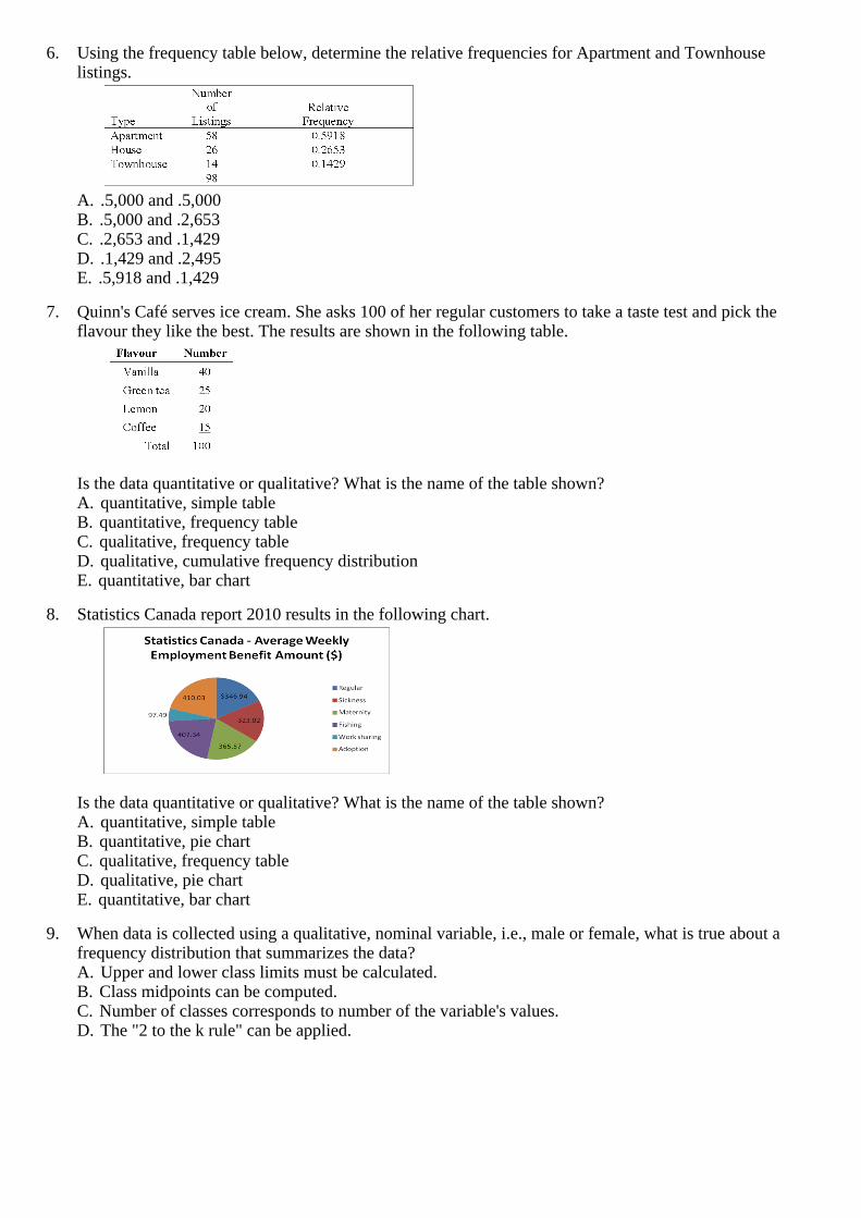
10. A student was interested in the cigarette smoking habits of college students and collected data from an unbiased random sample of students. The data is summarized in the following table:
Why is the table NOT a frequency table? A. The number of males does not equal the sum of males that smoke and do not smoke.B. The classes are not mutually exclusive.C. There are too many classes.D. Class limits cannot be computed
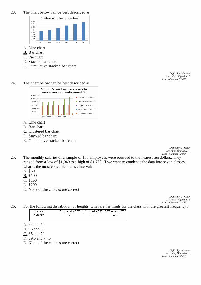
11. The chart below can be best described as
A. Line chartB. Bar chartC. Pie chartD. Stacked bar chartE. Cumulative stacked bar chart
12. Which of the following would be most helpful if you wished to construct a pie chart?
A. a frequency distributionB. a relative frequency tableC. a cumulative frequency distributionD. an ogiveE. a clustered bar chart
13. If the enrolment for this Faculty of Business remained constant at 625 between 2000 and 2001, determine
the change in the enrolment in the School of Accounting during this time.
A. increase of 19 studentsB. decrease of 19 studentsC. increase of 75 studentsD. decrease of 75 studentsE. decrease of 25 students

14. The chart below shows the Gross Domestic Product for 7 nations. Which of the following statements can be determined from this chart?
A. The GDP of the USA is approximately twice the size of each of the other countries.B. Germany's GDP is approximately half of that of Japan.C. Germany's GDP is approximately half of that of Canada.D. The GDP of the USA is larger than the total GDP of all the other 6 countries combined.
15. The chart below shows the Gross Domestic Product for 7 nations. Which of the following statements can
be determined from this chart?
A. The GDP of the USA is approximately twice the size of each of the other countries.B. Germany's GDP is approximately half of that of Italy.C. Germany's GDP is approximately twice of that of Canada.D. The GDP of Japan is approximately $4 trillion.
16. (i) A frequency distribution is grouping of data into classes showing the number of observations in each
class.(ii) The midpoint of a class, which is also called a class mark, is halfway between the lower and upper limits.(iii) A class interval, which is the width of a class, can be determined by subtracting the lower limit of a class from the lower limit of the next higher class. A. (i), (ii) and (iii) are all correct statements.B. (i) and, (ii) are correct statements but not (iii).C. (i) and, (iii) are correct statements but not (ii).D. (ii) and, (iii) are correct statements but not (i).E. All statements are false.
17. (i) A frequency distribution is grouping of data into classes showing the number of observations in each class.(ii) In constructing a frequency distribution, you should try to have open-ended classes such as "Under $100" and "$1,000 and over".(iii) A cumulative frequency distribution is used when we want to determine how many observations lie above or below certain values. A. (i), (ii) and (iii) are all correct statements.B. (i) and, (ii) are correct statements but not (iii).C. (i) and, (iii) are correct statements but not (ii).D. (ii) and, (iii) are correct statements but not (i).E. All statements are false.
18. Monthly commissions of first-year insurance brokers are $1,270, $1,310, $1,680, $1,380, $1,410, $1,570,
$1,180 and $1,420. These figures are referred to as: A. histogram.B. raw data.C. frequency distribution.D. frequency polygon.E. None of the choices are correct.
19. The monthly incomes of a small sample of computer operators are $1,950, $1,775, $2,060, $1,840,
$1,795, $1,890, $1,925 and $1,810. What are these ungrouped numbers called? A. HistogramB. Class limitsC. Class frequenciesD. Raw dataE. None of the choices are correct
20. A group of 100 students were surveyed about their interest in a new International Studies program. The
survey asked students about their interest in the program in terms of high, medium, or low. 30 students responded high interest; 50 students responded medium interest; 40 students responded low interest. What is the relative frequency of students with high interest? A. 30%B. 50%C. 40%D. Cannot be determined.
21. When a class interval is expressed as: 100 to under 200,
A. Observations with values of 100 are excluded from the class frequency.B. Observations with values of 200 are included in the class frequency.C. Observations with values of 200 are excluded from the class frequency.D. The class interval is 99.
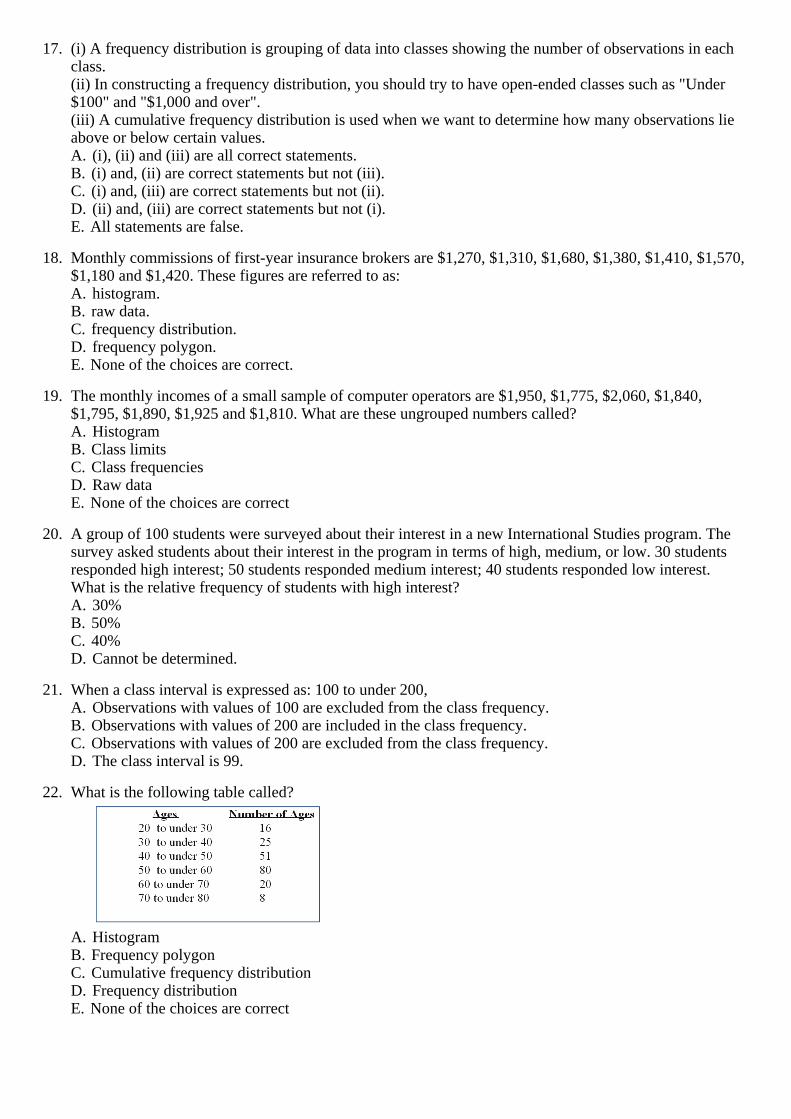
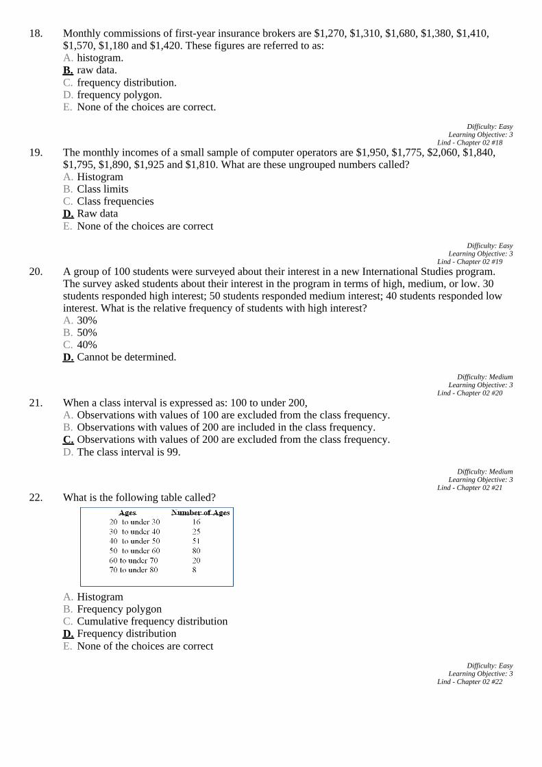
22. What is the following table called?
A. HistogramB. Frequency polygonC. Cumulative frequency distributionD. Frequency distributionE. None of the choices are correct
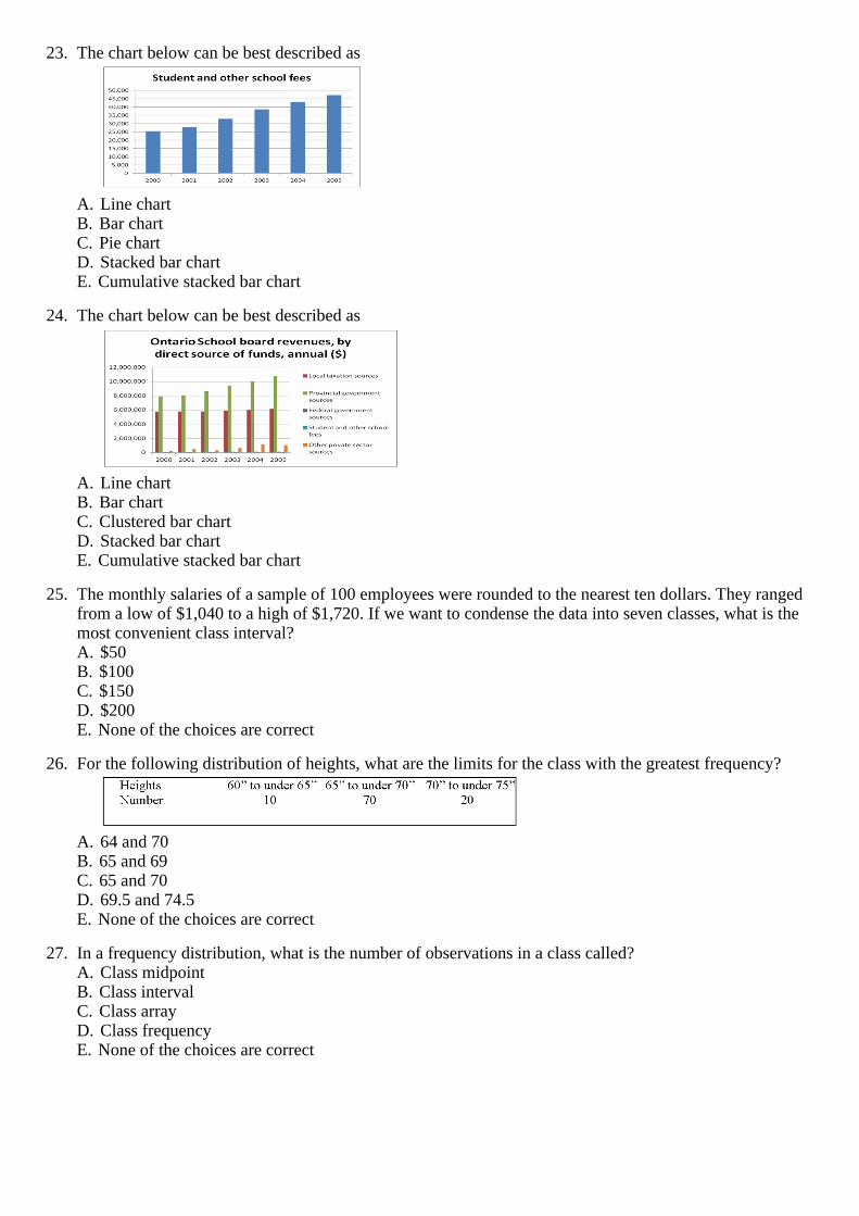
23. The chart below can be best described as
A. Line chartB. Bar chartC. Pie chartD. Stacked bar chartE. Cumulative stacked bar chart
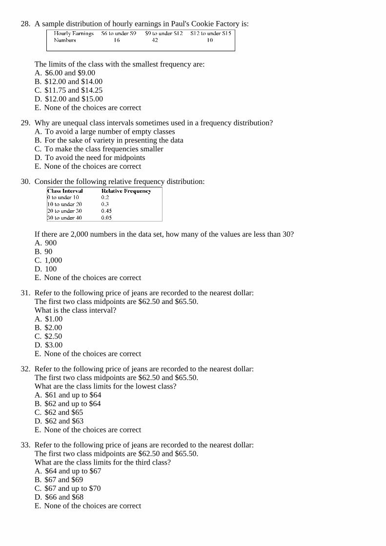
24. The chart below can be best described as
A. Line chartB. Bar chartC. Clustered bar chartD. Stacked bar chartE. Cumulative stacked bar chart
25. The monthly salaries of a sample of 100 employees were rounded to the nearest ten dollars. They ranged
from a low of $1,040 to a high of $1,720. If we want to condense the data into seven classes, what is the most convenient class interval? A. $50B. $100C. $150D. $200E. None of the choices are correct
26. For the following distribution of heights, what are the limits for the class with the greatest frequency?
A. 64 and 70B. 65 and 69C. 65 and 70D. 69.5 and 74.5E. None of the choices are correct
27. In a frequency distribution, what is the number of observations in a class called?
A. Class midpointB. Class intervalC. Class arrayD. Class frequencyE. None of the choices are correct
28. A sample distribution of hourly earnings in Paul's Cookie Factory is:
The limits of the class with the smallest frequency are: A. $6.00 and $9.00B. $12.00 and $14.00C. $11.75 and $14.25D. $12.00 and $15.00E. None of the choices are correct
29. Why are unequal class intervals sometimes used in a frequency distribution?
A. To avoid a large number of empty classesB. For the sake of variety in presenting the dataC. To make the class frequencies smallerD. To avoid the need for midpointsE. None of the choices are correct
30. Consider the following relative frequency distribution:
If there are 2,000 numbers in the data set, how many of the values are less than 30? A. 900B. 90C. 1,000D. 100E. None of the choices are correct
31. Refer to the following price of jeans are recorded to the nearest dollar:
The first two class midpoints are $62.50 and $65.50.What is the class interval? A. $1.00B. $2.00C. $2.50D. $3.00E. None of the choices are correct
32. Refer to the following price of jeans are recorded to the nearest dollar:
The first two class midpoints are $62.50 and $65.50.What are the class limits for the lowest class? A. $61 and up to $64B. $62 and up to $64C. $62 and $65D. $62 and $63E. None of the choices are correct
33. Refer to the following price of jeans are recorded to the nearest dollar:
The first two class midpoints are $62.50 and $65.50.What are the class limits for the third class? A. $64 and up to $67B. $67 and $69C. $67 and up to $70D. $66 and $68E. None of the choices are correct

34. Refer to the following ages (rounded to the nearest whole year) of employees at a large company that were grouped into a distribution with class limits:20 up to 3030 up to 4040 up to 5050 up to 6060 up to 70What is the class interval and the midpoint of the first class? A. 20 and 25B. 20 and 24.5C. 10 and 25D. 10 and 24.5E. None of the choices are correct
35. What is the class midpoint for the $45 up to $55 class?
A. 49B. 49.5C. 50D. 50.5E. None of the choices are correct
36. What are the true class limits for the $55 up to $65 class?
A. 55 and 64B. 54 and 64C. 55 and up to 65D. 55 and 64.5E. None of the choices are correct
37. The following class intervals for a frequency distribution were developed to provide information
regarding the starting salaries for students graduating from a particular school:
Before data was collected, someone questioned the validity of this arrangement. Which of the following represents a problem with this set of intervals? A. there are too many intervalsB. the class widths are too smallC. some numbers between 18,000 and 30,000 would fall into two different intervalsD. the first and the second interval overlapE. None of the choices are correct, there are no problems with the intervals

38. The following class intervals for a frequency distribution were developed to provide information regarding the starting salaries for students graduating from a particular school:
Before data was collected, someone questioned the validity of this arrangement. Which of the following represents a problem with this set of intervals? A. there are too many intervalsB. the class widths are too smallC. some numbers between 18,000 and 30,000 would not fall into any of these intervalsD. the first and the second intervals overlapE. the second and third intervals are mutually exclusive
39. The head of the statistics department wants to determine the number of mistake made by students in their
first online assignment. She gathers information from her classes of the past year.
The approximate range of the data is _________. A. 150B. 40C. 10D. 2E. None of the choices are correct
Refer to the following distribution of commissions:
40. What is the relative frequency for those salespersons that earn between $1,600 and $1,799?
A. 2%B. 2.4%C. 20%D. 24%E. None of the choices are correct
41. The first plot for a cumulative greater than frequency distribution should be:
A. X = 0, Y = 600.B. X = 600, Y = 3.C. X = 3, Y = 600.D. X = 600, Y = 0.E. None of the choices are correct.

42. What is the relative frequency of those salespersons that earn more than $1,599? A. 25.5%B. 27.5%C. 29.5%D. 30.8%E. None of the choices are correct
43. What is the relative frequency for those salespersons that earn between $1,500 and $1,800?
A. 2%B. 2.4%C. 20%D. 24%E. Unable to determine without approximation
44. (i) Simple bar charts may be constructed either horizontally or vertically.
(ii) A frequency polygon is a very useful graphic technique when comparing two or more distributions(iii) A cumulative frequency distribution is used when we want to determine how many observations lie above or below certain values. A. (i), (ii) and (iii) are all correct statements.B. (i) and, (ii) are correct statements but not (iii).C. (i) and, (iii) are correct statements but not (ii).D. (ii) and, (iii) are correct statements but not (i).E. All statements are false.
45. One rule that must always be followed in constructing frequency distributions is that _______.
A. the number of classes must be less than 10B. each data point can only fall into one classC. the width of each class is equal to the rangeD. the number of intervals must be an odd numberE. the class intervals must overlap
Refer to the following chart showing a distribution of exporting firms:
46. For the distribution above, what is the midpoint of the class with the greatest frequency?
A. $6 millionB. $9.5 millionC. $15.5 millionD. The midpoint cannot be determinedE. None of the choices are correct
47. What is the class interval? _____
A. 2B. 3C. 3.5D. 4E. None of the choices are correct
48. How many firms export less than $14 million in product?
A. 3B. 60C. 50D. 49E. None of the choices are correct
49. What percentage of the firms export less than $14 million in product? A. 3%B. 6%C. 49%D. 94%E. 75%
Refer to the following distribution of commissions:
50. What is the class interval for the table of wages above?
A. $2B. $3C. $4D. $5E. None of the choices are correct
51. What is the class midpoint for the class with the greatest frequency?
A. $5.50B. $8.50C. $11.50D. $14.50E. None of the choices are correct
52. What are the class limits for the class with the smallest number of frequencies?
A. 3.5 and 6.5B. 4 and up to 7C. 13 and up to 15D. 12.5 and 15.5E. None of the choices are correct
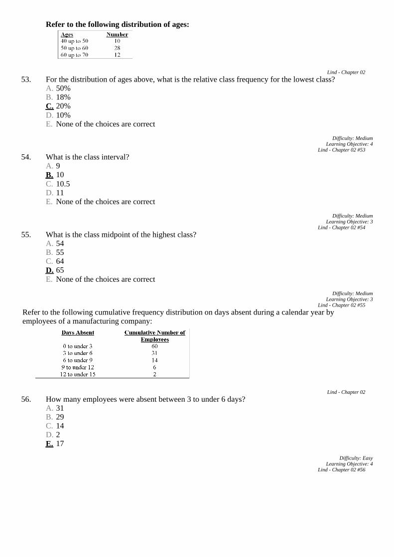
Refer to the following distribution of ages:
53. For the distribution of ages above, what is the relative class frequency for the lowest class?
A. 50%B. 18%C. 20%D. 10%E. None of the choices are correct
54. What is the class interval?
A. 9B. 10C. 10.5D. 11E. None of the choices are correct

55. What is the class midpoint of the highest class? A. 54B. 55C. 64D. 65E. None of the choices are correct
Refer to the following cumulative frequency distribution on days absent during a calendar year by employees of a manufacturing company:
56. How many employees were absent between 3 to under 6 days?
A. 31B. 29C. 14D. 2E. 17
57. How many employees were absent fewer than six days?
A. 60B. 31C. 91D. 46E. None of the choices are correct
58. How many employees were absent six or more days?
A. 8B. 4C. 22D. 31E. None of the choices are correct
59. How many employees were absent from 6 to under 12 days?
A. 20B. 8C. 12D. 17E. None of the choices are correct
60. (i) Pie charts are useful for showing the percent that various components compose of the total.
(ii) Simple bar charts may be constructed either horizontally or vertically.(iii) A line chart is ideal for showing the trend or sales of income over time. A. (i), (ii) and (iii) are all correct statements.B. (i) and, (ii) are correct statements but not (iii).C. (i) and, (iii) are correct statements but not (ii).D. (ii) and, (iii) are correct statements but not (i).E. All statements are false.

61. (i) In constructing a frequency distribution, you should try to have open-ended classes such as "Under $100" and "$1,000 and over".(ii) To convert a frequency distribution to a relative frequency distribution, divide each class frequency by the sum of the class frequencies.(iii) When constructing a frequency distribution, try to include overlapping stated class limits, such as 100 up to 201, 200 up to 301, and 300 up to 401. A. (i), (ii) and (iii) are all correct statements.B. (i) and, (ii) are correct statements but not (iii).C. (i) and, (iii) are correct statements but not (ii).D. (ii) is a correct statement but not (i) or (iii).E. All statements are false.
62. What is the relative class frequency for the $25 up to $35 class?
A. 2%B. 4%C. 5%D. 10%E. None of the choices are correct.
63. The relative frequency for a class is computed as
A. Class width divided by class interval.B. Class midpoint divided by the class frequency.C. Class frequency divided by the class interval.D. Class frequency divided by the total frequency.
64. When a class interval is expressed as: 100 to under 200,
A. Observations with values of 100 are excluded from the class frequency.B. Observations with values of 200 are included in the class frequency.C. Observations with values of 200 are excluded from the class frequency.D. The class interval is 99.
65. The age distribution of a sample of the part-time employees at Lloyd's Fast Food Emporium is:
What type of chart has the data been organized to draw? A. HistogramB. Simple line chartC. Cumulative Frequency DistributionD. Pie chartE. Frequency polygon

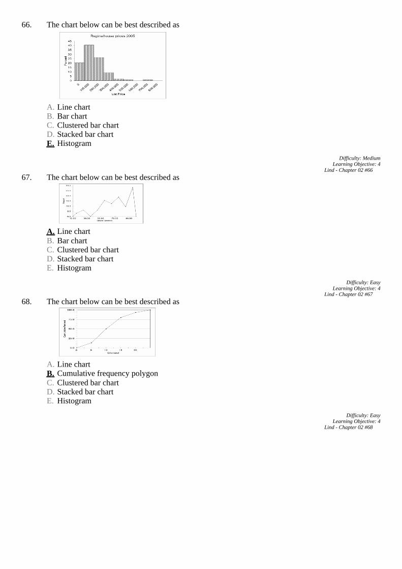
66. The chart below can be best described as
A. Line chartB. Bar chartC. Clustered bar chartD. Stacked bar chartE. Histogram
67. The chart below can be best described as
A. Line chartB. Bar chartC. Clustered bar chartD. Stacked bar chartE. Histogram
68. The chart below can be best described as
A. Line chartB. Cumulative frequency polygonC. Clustered bar chartD. Stacked bar chartE. Histogram
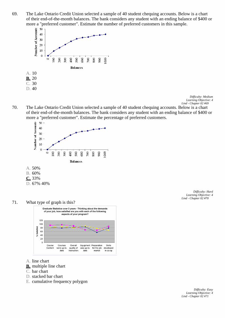
69. The Lake Ontario Credit Union selected a sample of 40 student chequing accounts. Below is a chart of
their end-of-the-month balances. The bank considers any student with an ending balance of $400 or more a "preferred customer". Estimate the number of preferred customers in this sample.
A. 10B. 20C. 30D. 40
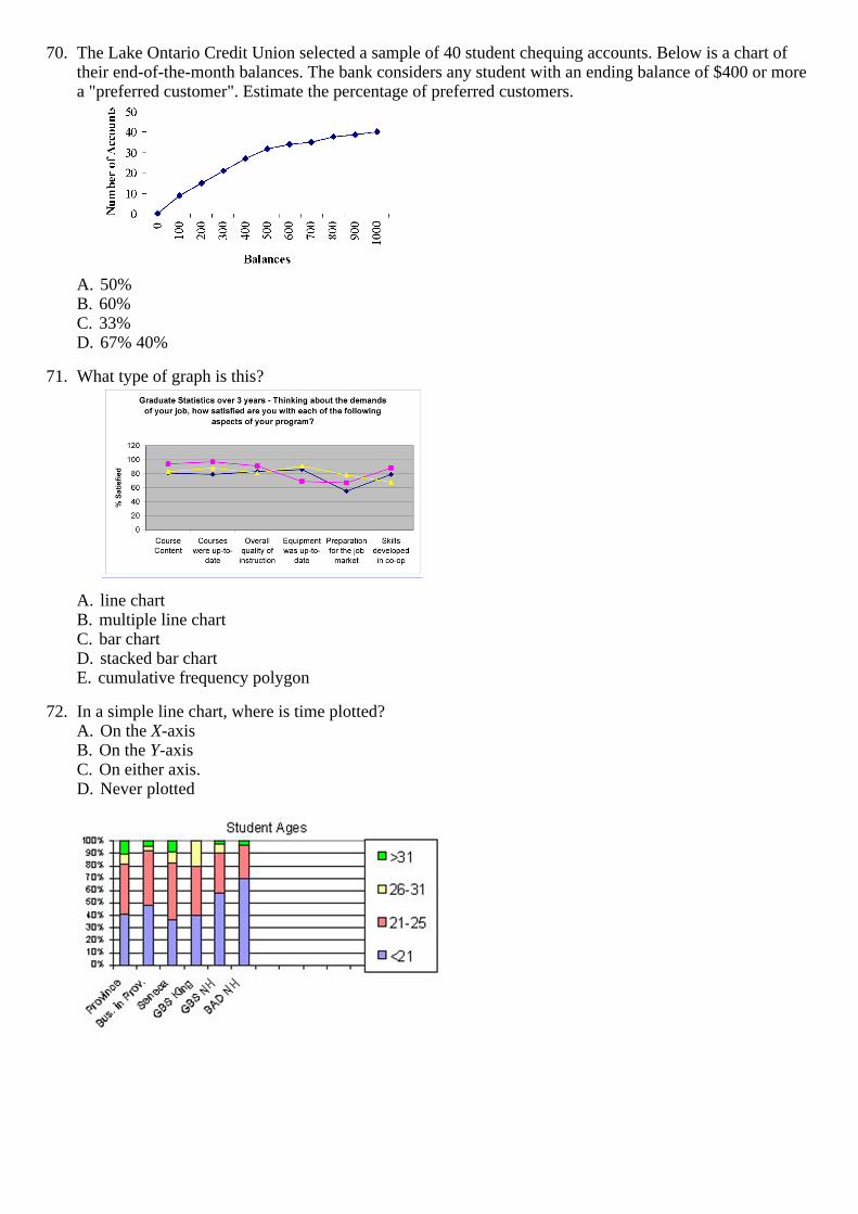
70. The Lake Ontario Credit Union selected a sample of 40 student chequing accounts. Below is a chart of their end-of-the-month balances. The bank considers any student with an ending balance of $400 or more a "preferred customer". Estimate the percentage of preferred customers.
A. 50%B. 60%C. 33%D. 67% 40%
71. What type of graph is this?
A. line chartB. multiple line chartC. bar chartD. stacked bar chartE. cumulative frequency polygon
72. In a simple line chart, where is time plotted?
A. On the X-axisB. On the Y-axisC. On either axis.D. Never plotted
73. What type of graph is this? A. line chartB. multiple line chartC. bar chartD. stacked bar chartE. cumulative frequency polygon
74. Comparing the values province wide, business students across the province and across Seneca College,
which of these three groups has the larger proportion of students under 21? A. Province wide valuesB. Business students across the provinceC. Seneca College studentsD. They are all the sameE. You can't tell from the data given
75. Students under the age of 26 account for approximately what proportion of Business students across the
province? A. 40%B. 50%C. 80%D. 90%E. Over 90%
76. Province wide, approximately what proportion of students is over the age of 31?
A. 10%B. 20%C. 40%D. 50%E. 90%
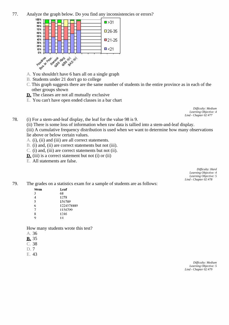
77. Analyze the graph below. Do you find any inconsistencies or errors?
A. You shouldn't have 6 bars all on a single graphB. Students under 21 don't go to collegeC.
This graph suggests there are the same number of students in the entire province as in each of the other groups shown
D. The classes are not all mutually exclusiveE. You can't have open ended classes in a bar chart
78. (i) For a stem-and-leaf display, the leaf for the value 98 is 9.
(ii) There is some loss of information when raw data is tallied into a stem-and-leaf display.(iii) A cumulative frequency distribution is used when we want to determine how many observations lie above or below certain values. A. (i), (ii) and (iii) are all correct statements.B. (i) and, (ii) are correct statements but not (iii).C. (i) and, (iii) are correct statements but not (ii).D. (iii) is a correct statement but not (i) or (ii)E. All statements are false.

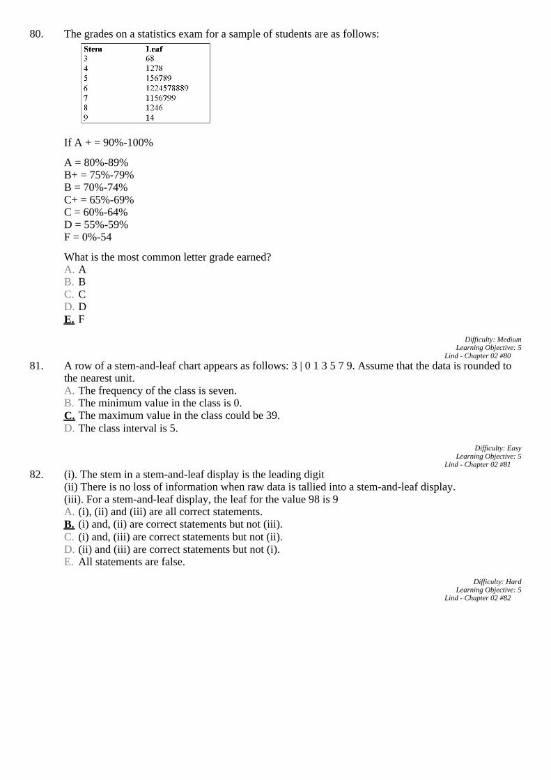
79. The grades on a statistics exam for a sample of students are as follows:
How many students wrote this test? A. 36B. 35C. 38D. 7E. 43
80. The grades on a statistics exam for a sample of students are as follows:
If A + = 90%-100%A = 80%-89%B+ = 75%-79%B = 70%-74%C+ = 65%-69%C = 60%-64%D = 55%-59%F = 0%-54What is the most common letter grade earned? A. AB. BC. CD. DE. F
81. A row of a stem-and-leaf chart appears as follows: 3 | 0 1 3 5 7 9. Assume that the data is rounded to the
nearest unit. A. The frequency of the class is seven.B. The minimum value in the class is 0.C. The maximum value in the class could be 39.D. The class interval is 5.
82. (i). The stem in a stem-and-leaf display is the leading digit
(ii) There is no loss of information when raw data is tallied into a stem-and-leaf display.(iii). For a stem-and-leaf display, the leaf for the value 98 is 9 A. (i), (ii) and (iii) are all correct statements.B. (i) and, (ii) are correct statements but not (iii).C. (i) and, (iii) are correct statements but not (ii).D. (ii) and (iii) are correct statements but not (i).E. All statements are false.

83. Given the following stem and leaf plot, determine the smallest value in the data set.
A. 1B. 19C. 199D. 45E. 2
84. Given the following stem and leaf plot, determine the largest value in the data set.
A. 87B. 819C. 28D. 17E. 817
85. The following represent the ages of students in a class:
19, 23, 21, 19, 19, 20, 22, 31, 21, 20If a stem and leaf plot were to be developed from this, how many stems would there be? A. 1B. 2C. 3D. 4E. 10
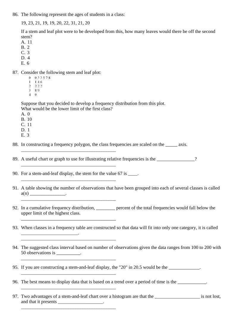
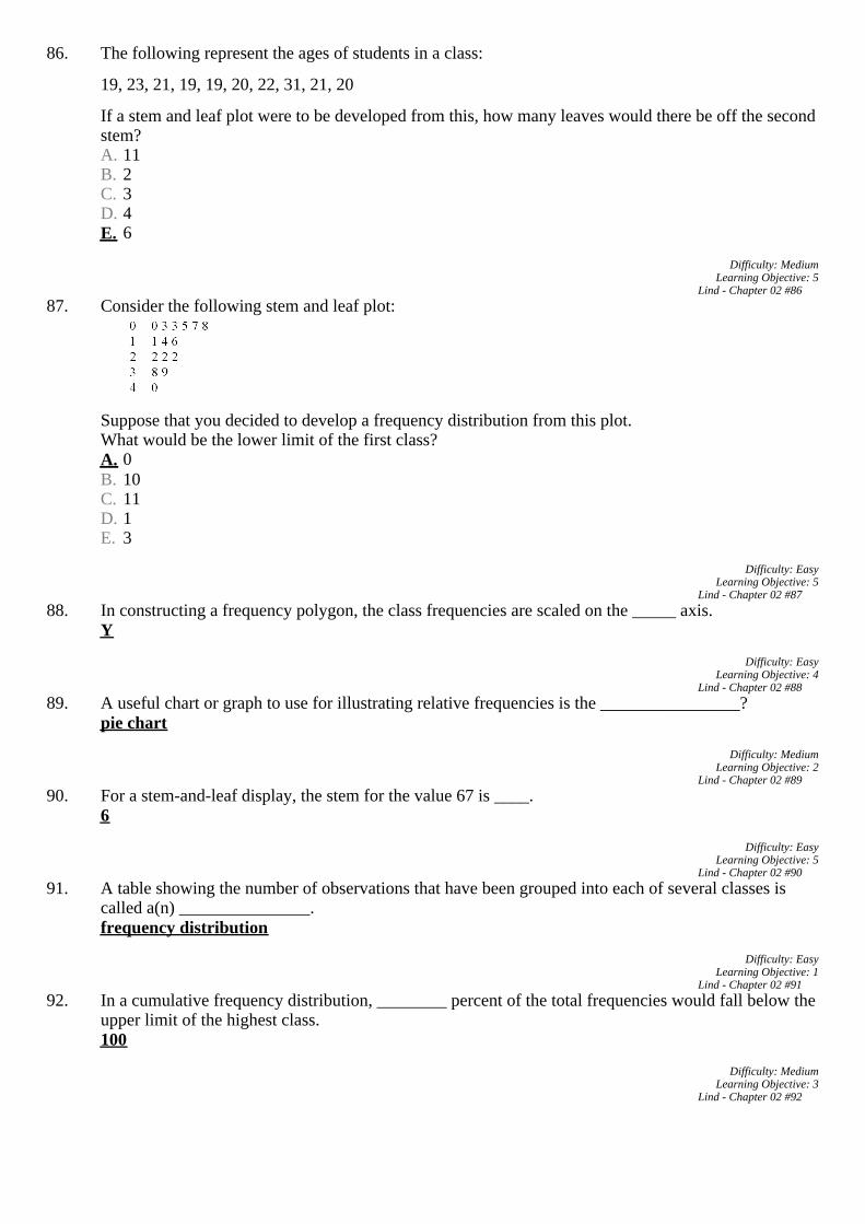
86. The following represent the ages of students in a class:19, 23, 21, 19, 19, 20, 22, 31, 21, 20If a stem and leaf plot were to be developed from this, how many leaves would there be off the second stem? A. 11B. 2C. 3D. 4E. 6
87. Consider the following stem and leaf plot:
Suppose that you decided to develop a frequency distribution from this plot.What would be the lower limit of the first class? A. 0B. 10C. 11D. 1E. 3
88. In constructing a frequency polygon, the class frequencies are scaled on the _____ axis.
________________________________________ 89. A useful chart or graph to use for illustrating relative frequencies is the ________________?
________________________________________ 90. For a stem-and-leaf display, the stem for the value 67 is ____.
________________________________________ 91. A table showing the number of observations that have been grouped into each of several classes is called
a(n) _______________. ________________________________________
92. In a cumulative frequency distribution, ________ percent of the total frequencies would fall below the
upper limit of the highest class. ________________________________________
93. When classes in a frequency table are constructed so that data will fit into only one category, it is called
________________________. ________________________________________
94. The suggested class interval based on number of observations given the data ranges from 100 to 200 with
50 observations is __________. ________________________________________
95. If you are constructing a stem-and-leaf display, the "20" in 20.5 would be the _____________.
________________________________________ 96. The best means to display data that is based on a trend over a period of time is the ____________.
________________________________________ 97. Two advantages of a stem-and-leaf chart over a histogram are that the ___________________ is not lost,
and that it presents ___________________. ________________________________________

Refer to the following ages (rounded to the nearest whole year) of employees at a large company that were grouped into a distribution with class limits:20 up to 3030 up to 4040 up to 5050 up to 6060 up to 70. 98. The class limits for the class 50 up to 60 class are _______ and ________.
________________________________________ 99. The midpoint for the class 40 up to 50 is _________.
________________________________________ 100.The class interval is ______.
________________________________________ 101.IQs were tested for a number of students. The first three IQs are 105, 115, and 125.
The class interval is ______. ________________________________________
102.IQs were tested for a number of students. The first three IQs are 105, 115, and 125.
The lower limit for the third class is _______. ________________________________________
103.IQs were tested for a number of students. The first three IQs are 105, 115, and 125.
The upper limit for the third class is _______. ________________________________________
104.IQs were tested for a number of students. The first three IQs are 105, 115, and 125.
The true class limits for the fourth class are _______ and _______. ________________________________________

02 Key 1. (i) A frequency table is a grouping of qualitative data into mutually exclusive classes showing the
number of observations in each class.(ii) Simple bar charts may be constructed either horizontally or vertically.(iii) A relative frequency table shows the fraction or percent of the number of observations in each class. A. (i), (ii) and (iii) are all correct statements.B. (i) and, (ii) are correct statements but not (iii).C. (i) and, (iii) are correct statements but not (ii).D. (ii) and, (iii) are correct statements but not (i).E. All statements are false.
Difficulty: Hard
Learning Objective: 1Lind - Chapter 02 #1
2. (i) A frequency table is a grouping of qualitative data into mutually exclusive classes showing the number of observations in each class.(ii) Simple bar charts may be constructed either horizontally or vertically.(iii) A bar chart is a graphic representation of a frequency table. A. (i), (ii) and (iii) are all correct statements.B. (i) and, (ii) are correct statements but not (iii).C. (i) and, (iii) are correct statements but not (ii).D. (ii) and, (iii) are correct statements but not (i).E. All statements are false.
Difficulty: Hard
Learning Objective: 1Lind - Chapter 02 #2
3. (i) Pie charts are useful for showing the percent that various components compose of the total.(ii) Simple bar charts may be constructed either horizontally or vertically.(iii) A bar chart is a graphic representation of a frequency table. A. (i), (ii) and (iii) are all correct statements.B. (i) and, (ii) are correct statements but not (iii).C. (i) and, (iii) are correct statements but not (ii).D. (ii) and, (iii) are correct statements but not (i).E. All statements are false.
Difficulty: Hard
Learning Objective: 1Lind - Chapter 02 #3
4. (i) Bar charts are useful for showing the percent that various components compose of the total.(ii) Simple bar charts may be constructed either horizontally or vertically.(iii) A bar chart is a graphic representation of a frequency table. A. (i), (ii) and (iii) are all correct statements.B. (i) and, (ii) are correct statements but not (iii).C. (i) and, (iii) are correct statements but not (ii).D. (ii) and, (iii) are correct statements but not (i).E. All statements are false.
Difficulty: Hard
Learning Objective: 1Lind - Chapter 02 #4

5. (i) Bar charts are useful for showing the percent that various components compose of the total.(ii) Simple bar charts may be constructed either horizontally or vertically.(iii) A line chart is ideal for showing the trend or sales of income over time. A. (i), (ii) and (iii) are all correct statements.B. (i) and, (ii) are correct statements but not (iii).C. (i) and, (iii) are correct statements but not (ii).D. (ii) and, (iii) are correct statements but not (i).E. All statements are false.
Difficulty: Hard
Learning Objective: 1Lind - Chapter 02 #5
6. Using the frequency table below, determine the relative frequencies for Apartment and Townhouse listings.
A. .5,000 and .5,000B. .5,000 and .2,653C. .2,653 and .1,429D. .1,429 and .2,495E. .5,918 and .1,429
Difficulty: Medium
Learning Objective: 1Lind - Chapter 02 #6
7. Quinn's Café serves ice cream. She asks 100 of her regular customers to take a taste test and pick the flavour they like the best. The results are shown in the following table.
Is the data quantitative or qualitative? What is the name of the table shown? A. quantitative, simple tableB. quantitative, frequency tableC. qualitative, frequency tableD. qualitative, cumulative frequency distributionE. quantitative, bar chart
Difficulty: Medium
Learning Objective: 1Lind - Chapter 02 #7

8. Statistics Canada report 2010 results in the following chart.
Is the data quantitative or qualitative? What is the name of the table shown? A. quantitative, simple tableB. quantitative, pie chartC. qualitative, frequency tableD. qualitative, pie chartE. quantitative, bar chart
Difficulty: Medium
Learning Objective: 1Lind - Chapter 02 #8
9. When data is collected using a qualitative, nominal variable, i.e., male or female, what is true about a frequency distribution that summarizes the data? A. Upper and lower class limits must be calculated.B. Class midpoints can be computed.C. Number of classes corresponds to number of the variable's values.D. The "2 to the k rule" can be applied.
Difficulty: Medium
Learning Objective: 1Lind - Chapter 02 #9
10. A student was interested in the cigarette smoking habits of college students and collected data from an unbiased random sample of students. The data is summarized in the following table:
Why is the table NOT a frequency table? A. The number of males does not equal the sum of males that smoke and do not smoke.B. The classes are not mutually exclusive.C. There are too many classes.D. Class limits cannot be computed
Difficulty: Medium
Learning Objective: 1Lind - Chapter 02 #10
11. The chart below can be best described as
A. Line chartB. Bar chartC. Pie chartD. Stacked bar chartE. Cumulative stacked bar chart
Difficulty: Medium
Learning Objective: 2Lind - Chapter 02 #11

12. Which of the following would be most helpful if you wished to construct a pie chart? A. a frequency distributionB. a relative frequency tableC. a cumulative frequency distributionD. an ogiveE. a clustered bar chart
Difficulty: Medium
Learning Objective: 2Lind - Chapter 02 #12
13. If the enrolment for this Faculty of Business remained constant at 625 between 2000 and 2001, determine the change in the enrolment in the School of Accounting during this time.
A. increase of 19 studentsB. decrease of 19 studentsC. increase of 75 studentsD. decrease of 75 studentsE. decrease of 25 students
Difficulty: Medium
Learning Objective: 2Lind - Chapter 02 #13
14. The chart below shows the Gross Domestic Product for 7 nations. Which of the following statements can be determined from this chart?
A. The GDP of the USA is approximately twice the size of each of the other countries.B. Germany's GDP is approximately half of that of Japan.C. Germany's GDP is approximately half of that of Canada.D. The GDP of the USA is larger than the total GDP of all the other 6 countries combined.
Difficulty: Medium
Learning Objective: 2Lind - Chapter 02 #14

15. The chart below shows the Gross Domestic Product for 7 nations. Which of the following statements can be determined from this chart?
A. The GDP of the USA is approximately twice the size of each of the other countries.B. Germany's GDP is approximately half of that of Italy.C. Germany's GDP is approximately twice of that of Canada.D. The GDP of Japan is approximately $4 trillion.
Difficulty: Easy
Learning Objective: 2Lind - Chapter 02 #15
16. (i) A frequency distribution is grouping of data into classes showing the number of observations in each class.(ii) The midpoint of a class, which is also called a class mark, is halfway between the lower and upper limits.(iii) A class interval, which is the width of a class, can be determined by subtracting the lower limit of a class from the lower limit of the next higher class. A. (i), (ii) and (iii) are all correct statements.B. (i) and, (ii) are correct statements but not (iii).C. (i) and, (iii) are correct statements but not (ii).D. (ii) and, (iii) are correct statements but not (i).E. All statements are false.
Difficulty: Hard
Learning Objective: 3Lind - Chapter 02 #16
17. (i) A frequency distribution is grouping of data into classes showing the number of observations in each class.(ii) In constructing a frequency distribution, you should try to have open-ended classes such as "Under $100" and "$1,000 and over".(iii) A cumulative frequency distribution is used when we want to determine how many observations lie above or below certain values. A. (i), (ii) and (iii) are all correct statements.B. (i) and, (ii) are correct statements but not (iii).C. (i) and, (iii) are correct statements but not (ii).D. (ii) and, (iii) are correct statements but not (i).E. All statements are false.
Difficulty: Hard
Learning Objective: 3Lind - Chapter 02 #17
18. Monthly commissions of first-year insurance brokers are $1,270, $1,310, $1,680, $1,380, $1,410, $1,570, $1,180 and $1,420. These figures are referred to as: A. histogram.B. raw data.C. frequency distribution.D. frequency polygon.E. None of the choices are correct.
Difficulty: Easy
Learning Objective: 3Lind - Chapter 02 #18
19. The monthly incomes of a small sample of computer operators are $1,950, $1,775, $2,060, $1,840, $1,795, $1,890, $1,925 and $1,810. What are these ungrouped numbers called? A. HistogramB. Class limitsC. Class frequenciesD. Raw dataE. None of the choices are correct
Difficulty: Easy
Learning Objective: 3Lind - Chapter 02 #19
20. A group of 100 students were surveyed about their interest in a new International Studies program. The survey asked students about their interest in the program in terms of high, medium, or low. 30 students responded high interest; 50 students responded medium interest; 40 students responded low interest. What is the relative frequency of students with high interest? A. 30%B. 50%C. 40%D. Cannot be determined.
Difficulty: Medium
Learning Objective: 3Lind - Chapter 02 #20
21. When a class interval is expressed as: 100 to under 200, A. Observations with values of 100 are excluded from the class frequency.B. Observations with values of 200 are included in the class frequency.C. Observations with values of 200 are excluded from the class frequency.D. The class interval is 99.
Difficulty: Medium
Learning Objective: 3Lind - Chapter 02 #21
22. What is the following table called?
A. HistogramB. Frequency polygonC. Cumulative frequency distributionD. Frequency distributionE. None of the choices are correct
Difficulty: Easy
Learning Objective: 3Lind - Chapter 02 #22
23. The chart below can be best described as
A. Line chartB. Bar chartC. Pie chartD. Stacked bar chartE. Cumulative stacked bar chart
Difficulty: Medium
Learning Objective: 3Lind - Chapter 02 #23
24. The chart below can be best described as
A. Line chartB. Bar chartC. Clustered bar chartD. Stacked bar chartE. Cumulative stacked bar chart
Difficulty: Medium
Learning Objective: 3Lind - Chapter 02 #24
25. The monthly salaries of a sample of 100 employees were rounded to the nearest ten dollars. They ranged from a low of $1,040 to a high of $1,720. If we want to condense the data into seven classes, what is the most convenient class interval? A. $50B. $100C. $150D. $200E. None of the choices are correct
Difficulty: Medium
Learning Objective: 3Lind - Chapter 02 #25
26. For the following distribution of heights, what are the limits for the class with the greatest frequency?
A. 64 and 70B. 65 and 69C. 65 and 70D. 69.5 and 74.5E. None of the choices are correct
Difficulty: Medium
Learning Objective: 3Lind - Chapter 02 #26

27. In a frequency distribution, what is the number of observations in a class called? A. Class midpointB. Class intervalC. Class arrayD. Class frequencyE. None of the choices are correct
Difficulty: Easy
Learning Objective: 3Lind - Chapter 02 #27
28. A sample distribution of hourly earnings in Paul's Cookie Factory is:
The limits of the class with the smallest frequency are: A. $6.00 and $9.00B. $12.00 and $14.00C. $11.75 and $14.25D. $12.00 and $15.00E. None of the choices are correct
Difficulty: Medium
Learning Objective: 3Lind - Chapter 02 #28
29. Why are unequal class intervals sometimes used in a frequency distribution? A. To avoid a large number of empty classesB. For the sake of variety in presenting the dataC. To make the class frequencies smallerD. To avoid the need for midpointsE. None of the choices are correct
Difficulty: Easy
Learning Objective: 3Lind - Chapter 02 #29
30. Consider the following relative frequency distribution:
If there are 2,000 numbers in the data set, how many of the values are less than 30? A. 900B. 90C. 1,000D. 100E. None of the choices are correct
Difficulty: Medium
Learning Objective: 3Lind - Chapter 02 #30
31. Refer to the following price of jeans are recorded to the nearest dollar:The first two class midpoints are $62.50 and $65.50.What is the class interval? A. $1.00B. $2.00C. $2.50D. $3.00E. None of the choices are correct
Difficulty: Easy
Learning Objective: 3Lind - Chapter 02 #31

32. Refer to the following price of jeans are recorded to the nearest dollar:The first two class midpoints are $62.50 and $65.50.What are the class limits for the lowest class? A. $61 and up to $64B. $62 and up to $64C. $62 and $65D. $62 and $63E. None of the choices are correct
Difficulty: Hard
Learning Objective: 3Lind - Chapter 02 #32
33. Refer to the following price of jeans are recorded to the nearest dollar:The first two class midpoints are $62.50 and $65.50.What are the class limits for the third class? A. $64 and up to $67B. $67 and $69C. $67 and up to $70D. $66 and $68E. None of the choices are correct
Difficulty: Hard
Learning Objective: 3Lind - Chapter 02 #33
34. Refer to the following ages (rounded to the nearest whole year) of employees at a large company that were grouped into a distribution with class limits:20 up to 3030 up to 4040 up to 5050 up to 6060 up to 70What is the class interval and the midpoint of the first class? A. 20 and 25B. 20 and 24.5C. 10 and 25D. 10 and 24.5E. None of the choices are correct
Difficulty: Medium
Learning Objective: 3Lind - Chapter 02 #34
35. What is the class midpoint for the $45 up to $55 class?
A. 49B. 49.5C. 50D. 50.5E. None of the choices are correct
Difficulty: Medium
Learning Objective: 3Lind - Chapter 02 #35

36. What are the true class limits for the $55 up to $65 class?
A. 55 and 64B. 54 and 64C. 55 and up to 65D. 55 and 64.5E. None of the choices are correct
Difficulty: Medium
Learning Objective: 3Lind - Chapter 02 #36
37. The following class intervals for a frequency distribution were developed to provide information regarding the starting salaries for students graduating from a particular school:
Before data was collected, someone questioned the validity of this arrangement. Which of the following represents a problem with this set of intervals? A. there are too many intervalsB. the class widths are too smallC. some numbers between 18,000 and 30,000 would fall into two different intervalsD. the first and the second interval overlapE. None of the choices are correct, there are no problems with the intervals
Difficulty: Medium
Learning Objective: 3Lind - Chapter 02 #37
38. The following class intervals for a frequency distribution were developed to provide information regarding the starting salaries for students graduating from a particular school:
Before data was collected, someone questioned the validity of this arrangement. Which of the following represents a problem with this set of intervals? A. there are too many intervalsB. the class widths are too smallC. some numbers between 18,000 and 30,000 would not fall into any of these intervalsD. the first and the second intervals overlapE. the second and third intervals are mutually exclusive
Difficulty: Medium
Learning Objective: 3Lind - Chapter 02 #38

39. The head of the statistics department wants to determine the number of mistake made by students in their first online assignment. She gathers information from her classes of the past year.
The approximate range of the data is _________. A. 150B. 40C. 10D. 2E. None of the choices are correct
Difficulty: Medium
Learning Objective: 3Lind - Chapter 02 #39
Refer to the following distribution of commissions:
Lind - Chapter 02
40. What is the relative frequency for those salespersons that earn between $1,600 and $1,799? A. 2%B. 2.4%C. 20%D. 24%E. None of the choices are correct
Difficulty: Medium
Learning Objective: 3Lind - Chapter 02 #40
41. The first plot for a cumulative greater than frequency distribution should be: A. X = 0, Y = 600.B. X = 600, Y = 3.C. X = 3, Y = 600.D. X = 600, Y = 0.E. None of the choices are correct.
Difficulty: Medium
Learning Objective: 4Lind - Chapter 02 #41
42. What is the relative frequency of those salespersons that earn more than $1,599? A. 25.5%B. 27.5%C. 29.5%D. 30.8%E. None of the choices are correct
Difficulty: Medium
Learning Objective: 4Lind - Chapter 02 #42

43. What is the relative frequency for those salespersons that earn between $1,500 and $1,800? A. 2%B. 2.4%C. 20%D. 24%E. Unable to determine without approximation
Difficulty: Medium
Learning Objective: 4Lind - Chapter 02 #43
44. (i) Simple bar charts may be constructed either horizontally or vertically.(ii) A frequency polygon is a very useful graphic technique when comparing two or more distributions(iii) A cumulative frequency distribution is used when we want to determine how many observations lie above or below certain values. A. (i), (ii) and (iii) are all correct statements.B. (i) and, (ii) are correct statements but not (iii).C. (i) and, (iii) are correct statements but not (ii).D. (ii) and, (iii) are correct statements but not (i).E. All statements are false.
Difficulty: Hard
Learning Objective: 4Lind - Chapter 02 #44
45. One rule that must always be followed in constructing frequency distributions is that _______. A. the number of classes must be less than 10B. each data point can only fall into one classC. the width of each class is equal to the rangeD. the number of intervals must be an odd numberE. the class intervals must overlap
Difficulty: Medium
Learning Objective: 4Lind - Chapter 02 #45
Refer to the following chart showing a distribution of exporting firms:
Lind - Chapter 02
46. For the distribution above, what is the midpoint of the class with the greatest frequency? A. $6 millionB. $9.5 millionC. $15.5 millionD. The midpoint cannot be determinedE. None of the choices are correct
Difficulty: Medium
Learning Objective: 3Lind - Chapter 02 #46
47. What is the class interval? _____ A. 2B. 3C. 3.5D. 4E. None of the choices are correct
Difficulty: Medium
Learning Objective: 3Lind - Chapter 02 #47

48. How many firms export less than $14 million in product? A. 3B. 60C. 50D. 49E. None of the choices are correct
Difficulty: Medium
Learning Objective: 3Lind - Chapter 02 #48
49. What percentage of the firms export less than $14 million in product? A. 3%B. 6%C. 49%D. 94%E. 75%
Difficulty: Medium
Learning Objective: 4Lind - Chapter 02 #49
Refer to the following distribution of commissions:
Lind - Chapter 02
50. What is the class interval for the table of wages above? A. $2B. $3C. $4D. $5E. None of the choices are correct
Difficulty: Easy
Learning Objective: 3Lind - Chapter 02 #50
51. What is the class midpoint for the class with the greatest frequency? A. $5.50B. $8.50C. $11.50D. $14.50E. None of the choices are correct
Difficulty: Medium
Learning Objective: 3Lind - Chapter 02 #51
52. What are the class limits for the class with the smallest number of frequencies? A. 3.5 and 6.5B. 4 and up to 7C. 13 and up to 15D. 12.5 and 15.5E. None of the choices are correct
Difficulty: Medium
Learning Objective: 3Lind - Chapter 02 #52
Refer to the following distribution of ages:
Lind - Chapter 02
53. For the distribution of ages above, what is the relative class frequency for the lowest class? A. 50%B. 18%C. 20%D. 10%E. None of the choices are correct
Difficulty: Medium
Learning Objective: 4Lind - Chapter 02 #53
54. What is the class interval? A. 9B. 10C. 10.5D. 11E. None of the choices are correct
Difficulty: Medium
Learning Objective: 3Lind - Chapter 02 #54
55. What is the class midpoint of the highest class? A. 54B. 55C. 64D. 65E. None of the choices are correct
Difficulty: Medium
Learning Objective: 3Lind - Chapter 02 #55
Refer to the following cumulative frequency distribution on days absent during a calendar year by employees of a manufacturing company:
Lind - Chapter 02
56. How many employees were absent between 3 to under 6 days? A. 31B. 29C. 14D. 2E. 17
Difficulty: Easy
Learning Objective: 4Lind - Chapter 02 #56

57. How many employees were absent fewer than six days? A. 60B. 31C. 91D. 46E. None of the choices are correct
Difficulty: Medium
Learning Objective: 4Lind - Chapter 02 #57
58. How many employees were absent six or more days? A. 8B. 4C. 22D. 31E. None of the choices are correct
Difficulty: Medium
Learning Objective: 4Lind - Chapter 02 #58
59. How many employees were absent from 6 to under 12 days? A. 20B. 8C. 12D. 17E. None of the choices are correct
Difficulty: Medium
Learning Objective: 4Lind - Chapter 02 #59
60. (i) Pie charts are useful for showing the percent that various components compose of the total.(ii) Simple bar charts may be constructed either horizontally or vertically.(iii) A line chart is ideal for showing the trend or sales of income over time. A. (i), (ii) and (iii) are all correct statements.B. (i) and, (ii) are correct statements but not (iii).C. (i) and, (iii) are correct statements but not (ii).D. (ii) and, (iii) are correct statements but not (i).E. All statements are false.
Difficulty: Hard
Learning Objective: 1Learning Objective: 4
Lind - Chapter 02 #60
61. (i) In constructing a frequency distribution, you should try to have open-ended classes such as "Under $100" and "$1,000 and over".(ii) To convert a frequency distribution to a relative frequency distribution, divide each class frequency by the sum of the class frequencies.(iii) When constructing a frequency distribution, try to include overlapping stated class limits, such as 100 up to 201, 200 up to 301, and 300 up to 401. A. (i), (ii) and (iii) are all correct statements.B. (i) and, (ii) are correct statements but not (iii).C. (i) and, (iii) are correct statements but not (ii).D. (ii) is a correct statement but not (i) or (iii).E. All statements are false.
Difficulty: Hard
Learning Objective: 4Lind - Chapter 02 #61

62. What is the relative class frequency for the $25 up to $35 class?
A. 2%B. 4%C. 5%D. 10%E. None of the choices are correct.
Difficulty: Medium
Learning Objective: 4Lind - Chapter 02 #62
63. The relative frequency for a class is computed as A. Class width divided by class interval.B. Class midpoint divided by the class frequency.C. Class frequency divided by the class interval.D. Class frequency divided by the total frequency.
Difficulty: Easy
Learning Objective: 4Lind - Chapter 02 #63
64. When a class interval is expressed as: 100 to under 200, A. Observations with values of 100 are excluded from the class frequency.B. Observations with values of 200 are included in the class frequency.C. Observations with values of 200 are excluded from the class frequency.D. The class interval is 99.
Difficulty: Easy
Learning Objective: 4Lind - Chapter 02 #64
65. The age distribution of a sample of the part-time employees at Lloyd's Fast Food Emporium is:
What type of chart has the data been organized to draw? A. HistogramB. Simple line chartC. Cumulative Frequency DistributionD. Pie chartE. Frequency polygon
Difficulty: Medium
Learning Objective: 4Lind - Chapter 02 #65
66. The chart below can be best described as
A. Line chartB. Bar chartC. Clustered bar chartD. Stacked bar chartE. Histogram
Difficulty: Medium
Learning Objective: 4Lind - Chapter 02 #66
67. The chart below can be best described as
A. Line chartB. Bar chartC. Clustered bar chartD. Stacked bar chartE. Histogram
Difficulty: Easy
Learning Objective: 4Lind - Chapter 02 #67
68. The chart below can be best described as
A. Line chartB. Cumulative frequency polygonC. Clustered bar chartD. Stacked bar chartE. Histogram
Difficulty: Easy
Learning Objective: 4Lind - Chapter 02 #68
69. The Lake Ontario Credit Union selected a sample of 40 student chequing accounts. Below is a chart of their end-of-the-month balances. The bank considers any student with an ending balance of $400 or more a "preferred customer". Estimate the number of preferred customers in this sample.
A. 10B. 20C. 30D. 40
Difficulty: Medium
Learning Objective: 4Lind - Chapter 02 #69
70. The Lake Ontario Credit Union selected a sample of 40 student chequing accounts. Below is a chart of their end-of-the-month balances. The bank considers any student with an ending balance of $400 or more a "preferred customer". Estimate the percentage of preferred customers.
A. 50%B. 60%C. 33%D. 67% 40%
Difficulty: Hard
Learning Objective: 4Lind - Chapter 02 #70
71. What type of graph is this?
A. line chartB. multiple line chartC. bar chartD. stacked bar chartE. cumulative frequency polygon
Difficulty: Easy
Learning Objective: 4Lind - Chapter 02 #71

72. In a simple line chart, where is time plotted? A. On the X-axisB. On the Y-axisC. On either axis.D. Never plotted
Difficulty: Easy
Learning Objective: 4Lind - Chapter 02 #72
Lind - Chapter 02
73. What type of graph is this? A. line chartB. multiple line chartC. bar chartD. stacked bar chartE. cumulative frequency polygon
Difficulty: Easy
Learning Objective: 4Lind - Chapter 02 #73
74. Comparing the values province wide, business students across the province and across Seneca College, which of these three groups has the larger proportion of students under 21? A. Province wide valuesB. Business students across the provinceC. Seneca College studentsD. They are all the sameE. You can't tell from the data given
Difficulty: Easy
Learning Objective: 4Lind - Chapter 02 #74
75. Students under the age of 26 account for approximately what proportion of Business students across the province? A. 40%B. 50%C. 80%D. 90%E. Over 90%
Difficulty: Medium
Learning Objective: 4Lind - Chapter 02 #75
76. Province wide, approximately what proportion of students is over the age of 31? A. 10%B. 20%C. 40%D. 50%E. 90%
Difficulty: Medium
Learning Objective: 4Lind - Chapter 02 #76
77. Analyze the graph below. Do you find any inconsistencies or errors?
A. You shouldn't have 6 bars all on a single graphB. Students under 21 don't go to collegeC.
This graph suggests there are the same number of students in the entire province as in each of the other groups shown
D. The classes are not all mutually exclusiveE. You can't have open ended classes in a bar chart
Difficulty: Medium
Learning Objective: 4Lind - Chapter 02 #77
78. (i) For a stem-and-leaf display, the leaf for the value 98 is 9.(ii) There is some loss of information when raw data is tallied into a stem-and-leaf display.(iii) A cumulative frequency distribution is used when we want to determine how many observations lie above or below certain values. A. (i), (ii) and (iii) are all correct statements.B. (i) and, (ii) are correct statements but not (iii).C. (i) and, (iii) are correct statements but not (ii).D. (iii) is a correct statement but not (i) or (ii)E. All statements are false.
Difficulty: Hard
Learning Objective: 4Learning Objective: 5
Lind - Chapter 02 #78
79. The grades on a statistics exam for a sample of students are as follows:
How many students wrote this test? A. 36B. 35C. 38D. 7E. 43
Difficulty: Medium
Learning Objective: 5Lind - Chapter 02 #79
80. The grades on a statistics exam for a sample of students are as follows:
If A + = 90%-100%A = 80%-89%B+ = 75%-79%B = 70%-74%C+ = 65%-69%C = 60%-64%D = 55%-59%F = 0%-54What is the most common letter grade earned? A. AB. BC. CD. DE. F
Difficulty: Medium
Learning Objective: 5Lind - Chapter 02 #80
81. A row of a stem-and-leaf chart appears as follows: 3 | 0 1 3 5 7 9. Assume that the data is rounded to the nearest unit. A. The frequency of the class is seven.B. The minimum value in the class is 0.C. The maximum value in the class could be 39.D. The class interval is 5.
Difficulty: Easy
Learning Objective: 5Lind - Chapter 02 #81
82. (i). The stem in a stem-and-leaf display is the leading digit(ii) There is no loss of information when raw data is tallied into a stem-and-leaf display.(iii). For a stem-and-leaf display, the leaf for the value 98 is 9 A. (i), (ii) and (iii) are all correct statements.B. (i) and, (ii) are correct statements but not (iii).C. (i) and, (iii) are correct statements but not (ii).D. (ii) and (iii) are correct statements but not (i).E. All statements are false.
Difficulty: Hard
Learning Objective: 5Lind - Chapter 02 #82

83. Given the following stem and leaf plot, determine the smallest value in the data set.
A. 1B. 19C. 199D. 45E. 2
Difficulty: Easy
Learning Objective: 5Lind - Chapter 02 #83
84. Given the following stem and leaf plot, determine the largest value in the data set.
A. 87B. 819C. 28D. 17E. 817
Difficulty: Easy
Learning Objective: 5Lind - Chapter 02 #84
85. The following represent the ages of students in a class:19, 23, 21, 19, 19, 20, 22, 31, 21, 20If a stem and leaf plot were to be developed from this, how many stems would there be? A. 1B. 2C. 3D. 4E. 10
Difficulty: Medium
Learning Objective: 5Lind - Chapter 02 #85
86. The following represent the ages of students in a class:19, 23, 21, 19, 19, 20, 22, 31, 21, 20If a stem and leaf plot were to be developed from this, how many leaves would there be off the second stem? A. 11B. 2C. 3D. 4E. 6
Difficulty: Medium
Learning Objective: 5Lind - Chapter 02 #86
87. Consider the following stem and leaf plot:
Suppose that you decided to develop a frequency distribution from this plot.What would be the lower limit of the first class? A. 0B. 10C. 11D. 1E. 3
Difficulty: Easy
Learning Objective: 5Lind - Chapter 02 #87
88. In constructing a frequency polygon, the class frequencies are scaled on the _____ axis. Y
Difficulty: Easy
Learning Objective: 4Lind - Chapter 02 #88
89. A useful chart or graph to use for illustrating relative frequencies is the ________________? pie chart
Difficulty: Medium
Learning Objective: 2Lind - Chapter 02 #89
90. For a stem-and-leaf display, the stem for the value 67 is ____. 6
Difficulty: Easy
Learning Objective: 5Lind - Chapter 02 #90
91. A table showing the number of observations that have been grouped into each of several classes is called a(n) _______________. frequency distribution
Difficulty: Easy
Learning Objective: 1Lind - Chapter 02 #91
92. In a cumulative frequency distribution, ________ percent of the total frequencies would fall below the upper limit of the highest class. 100
Difficulty: Medium
Learning Objective: 3Lind - Chapter 02 #92

93. When classes in a frequency table are constructed so that data will fit into only one category, it is called ________________________. mutually exclusive
Difficulty: Medium
Learning Objective: 1Lind - Chapter 02 #93
94. The suggested class interval based on number of observations given the data ranges from 100 to 200 with 50 observations is __________. 20
Difficulty: Medium
Learning Objective: 3Lind - Chapter 02 #94
95. If you are constructing a stem-and-leaf display, the "20" in 20.5 would be the _____________. stem
Difficulty: Medium
Learning Objective: 5Lind - Chapter 02 #95
96. The best means to display data that is based on a trend over a period of time is the ____________. line chart
Difficulty: Medium
Learning Objective: 4Lind - Chapter 02 #96
97. Two advantages of a stem-and-leaf chart over a histogram are that the ___________________ is not lost, and that it presents ___________________. identity of each observation; a picture of the distribution.
Difficulty: Easy
Learning Objective: 5Lind - Chapter 02 #97
Refer to the following ages (rounded to the nearest whole year) of employees at a large company that were grouped into a distribution with class limits:20 up to 3030 up to 4040 up to 5050 up to 6060 up to 70.
Lind - Chapter 02
98. The class limits for the class 50 up to 60 class are _______ and ________. 50 up to 60
Difficulty: Medium
Learning Objective: 3Lind - Chapter 02 #98
99. The midpoint for the class 40 up to 50 is _________. 45
Difficulty: Medium
Learning Objective: 3Lind - Chapter 02 #99
100. The class interval is ______. 10
Difficulty: Medium
Learning Objective: 3Lind - Chapter 02 #100
101. IQs were tested for a number of students. The first three IQs are 105, 115, and 125.The class interval is ______. 10
Difficulty: Easy
Learning Objective: 3Lind - Chapter 02 #101

102. IQs were tested for a number of students. The first three IQs are 105, 115, and 125.The lower limit for the third class is _______. 120
Difficulty: Hard
Learning Objective: 3Lind - Chapter 02 #102
103. IQs were tested for a number of students. The first three IQs are 105, 115, and 125.The upper limit for the third class is _______. up to 130
Difficulty: Medium
Learning Objective: 3Lind - Chapter 02 #103
104. IQs were tested for a number of students. The first three IQs are 105, 115, and 125.The true class limits for the fourth class are _______ and _______. 130; up to 140
Difficulty: Hard
Learning Objective: 3Lind - Chapter 02 #104
02 Summary Category # of Questions
Difficulty: Easy 26
Difficulty: Hard 17
Difficulty: Medium 61
Learning Objective: 1 13
Learning Objective: 2 6
Learning Objective: 3 42
Learning Objective: 4 32
Learning Objective: 5 13
Lind - Chapter 02 111

![A414 Corridor Strategy - Summary Consultation Report · A414 Corridor Strategy - Summary Consultation Report [Publish Date] 44 Consultees and Participants We received 1,310 responses](https://img.dokumen.tips/doc/110x75/6011ef233f613b7ef63ef22a/a414-corridor-strategy-summary-consultation-report-a414-corridor-strategy-summary.jpg)