Embed Size (px)
Citation preview

+Catalyst –silently & independently (in the Friday section of your tracker)
1. Mr. Z wanted to see if listening to music during tests increased students’ scores. She played music while Period #3 all took the same version of the unit test. He then gave Period #4 a different version of the test, which they took in silence.
Please explain the problem with Mr. Z’s experiment and state how you would fix the experiment design.

+Agenda
Catalyst & Review
Types of Graphs Foldable Notes
Types of Graphs Review problems
Exit Ticket

+Objectives/Why does this mater?
EQ: how do we become better scientist?
We will be able to explain the types of graphs and when to use them in order to communicate data from our experiments.
We will be able to explain how to set up a graph in order to communicate our data from our experiments

+Updates
Mid-unit exam (exam 1) on Monday over scientific method, IV/DV, hypothesis, correct experimental design, bias, and graphing

+Data Analysis
After an experiment has been conducted, the data must be displayed and analyzed. A conclusion must be determined (whether or not the hypothesis is supported)

+Have you ever heard the saying…
“A picture is worth a thousand words!”
-B. Taylor

+Why do we use graphs?
We use charts and graphs to help us communicate our results and conclusions
Sometimes, complicated information can be made easier to understand by providing an illustration
Graphs can also help your presentation be more impressive

+Collecting and Analyzing Data
Name Picture Uses
Line Graph -To show relationships between variables and trends.
Bar Graph -To compare information that does not continuously change.To compare groups
Pie Graph -Shows parts of a whole and percentages.
Hours Studying vs. Grade on a Test
0
10
20
30
40
50
60
70
80
90
100
0 0.25 0.5 0.75 1 1.25 1.5 1.75 2
Hours Studying
Gra
de

+Data Analysis Foldable
Expectations: 1. Your
foldable will be complete.
2. Your foldable should be creative. (4 color minimum)
3. Your foldable must be ready to use tomorrow.

+How to make the foldable
Fortune tellers? 1. Hold your paper hotdog style. Fold over about a two inch strip so that your paper looks like a square.
2. Fold over each corner to form a smaller square.
+Flap #1
Outside: Line graph
Inside: Used to compare data for an I.V. that is continuous (Example: Time, temperature)

+Flap #2
Outside: Bar graphs
Inside: Used to compare data between groups

+Flap #3
Outside: Pie chart
Inside: Used to show parts of a whole; percentages

+Flap #4
Outside: Labeling Axes and Creating Titles
Inside: Title: across the top; What is it about?
X-axis: Horizontal; IV
Y-Axis: Vertical; DV

+Center
Checklist TitleAxes LabeledUnitsRight kind of graph?
IV and DV?

+What do we mean by labeling axes?

+Data Analysis
1. Display and Analyze your data.
2. Draw a conclusion from your data.
3. Determine whether your data supports your conclusion.

+Data Analysis
Three friends each spent their vacation in three different cities. Each friend bragged that their vacation destination was the warmest. To find out who was really in the best spot, they decided to measure the daily high temperatures in each of their respective cities.

+Here is their data…
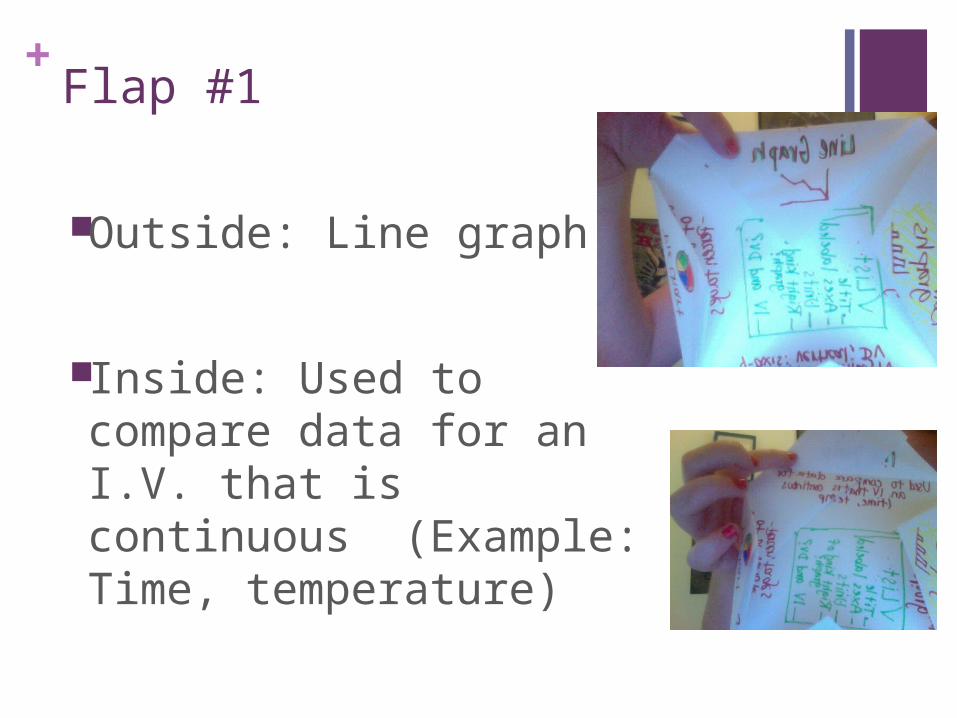
+How should the three friends display this data?
1 finger for line graph2 fingers for bar graph3 fingers for pie chart
+Graphs 101 Worksheet
Work silently and independently on your graphing worksheet.

+Exit Ticket: Hypothesize
1. What is the purpose of the control group?
2. What type of graph do you use to show a continuous trend?
3. Which type of graph compares data between groups?
4. Which type of graph is used to show parts of a whole?
5. Make a hypothesis: What do you think the LEADING cause of death in America is?
+Catalyst – Silently & Independently
1. What type of graph is used to compare data between groups?
2. What type of graph is used to compare data for an independent variable that is continuous?
3. What type of graph is used to show parts of a whole?
4. How do we create hypothesis in this class? What was your hypothesis about the leading cause of Death in America?

+Agenda
Do Now & Review
Review of experimental design
Review of IV vs. DV
Mid-Unit Exam 1

+Objectives/Why is the important?
EQ: how do we become better scientist?
Objective: we will be able to identify which type of graph to use based off experimental data in order to clearly communicate our results.
We will know the importance of properly labeling the axis in order to clearly communicate our results.

+Data Analysis: Death
Type of Death Smoking related deaths: 4,924, 000 Deaths from medical mistakes: 2,250,000 Deaths due to lack of healthcare: 1,010,000 Pedestrians killed by cars: 43,000 Americans murdered by Americans: 165,000 Obesity related deaths : 3,000,000
Determine what type of graph you would use. Plot the data on your graph; don’t forget your title, axes
titles, and units

+Types of Graphs
Bar Graph: Used to compare data between groups.
Line Graph: Used to compare data for an independent variable that is continuous (ex. time or temperature)
Pie Chart: Used to show parts of a whole. The information is given as percentages.

+Labeling Axes and Creating Titles
Title-goes across the top of your graph. Tells you what the graph is about. Usually is written to explain the variables you are comparing.
Axes labels or legend- gives you information on what they represent and how they are measured.
X-axis: the horizontal one (side-to-side). Always has the independent variable.
Y-axis: the vertical one (up and down). Always has the dependent variable.

+Is this OK? What Should I do?
1. Jerome wanted to see if feeding his hamsters less food would help them lose weight. He weighted his 500 hamsters and then started to feed them 20% less food and put an exercise wheel in their cages. At the end of four weeks, his hamsters weighed on average 20g less than they had at the beginning of the experiment. Jerome concluded that the reduction in food helped his hamsters lose weight.

+Is this OK?
2. SaQuanna wanted to figure out if a new fertilizer would help her plants to grow better. She planted all of her 500 plants in the new fertilizer and had most of her plants grow and produce tasty vegetables. She concluded that the fertilizer helped her garden to grow.

+Is this OK?
3. Mary wanted to see if her training schedule would help lab mice through a maze. She timed how long it took for each of 10 mice to make it through the maze. Then she put some of them on the training schedule for one month while the others got to sit in their cages. At the end of the month, she tested all of the rats again and found that the ones who had gone through her training schedule completed the maze in 35 fewer seconds than the others. She concluded that the training schedule helped the rats complete the maze faster.

+Is this OK?
4. Detavious wanted to see if drinking energy drinks helped students to study for tests. He had 500 students drink two red bulls before studying for their weekly quizzes and the average student got 80% correct the next day. He concluded that drinking energy drinks helps you do well on quizzes.

+Is this OK?
5. Marcus wanted to see if he could get his plants to grow better if he watered them more often. He decided to water half of his 250 beans and half of his 250 tomatoes once a week and to water the other halves three times a week. He found that the plants he watered three times a week grew taller and produces more beans and tomatoes. He concluded that watering his garden helps it grow more.

+Is this OK?
6. Francine wanted to test the idea that your cholesterol can be lowered with diet and exercise. She started eating well and exercising every day for two months. At the end, she tested her cholesterol and found that it was 160. She decided diet and exercise lowered her cholesterol. (Hint: There are two)

+A birdy example…
Imagine you want to see what color of bird feeders your local birds preferred.
Red? Blue? Green?

+Our Constants and Variables
Independent Variable: color of the feeders
Dependent Variable: amount of seed eaten
Constants: everything else that is kept the same, for example: the location of the feeders the kind of feeder used putting the feeders out at the same time

Our Experimental Design
Constants Location of feedersKind of seedType of feeder
IndependentVariable Red Blue Green
DependentVariable
Amount of Seed Eaten
Amount of Seed Eaten
Amount of Seed Eaten

+Mid-Unit Exam Expectations
Silently & independently
Believe in yourself and your ability