Embed Size (px)
Citation preview

© 2003 Prentice-Hall, Inc.
Basic Business Statistics Chapter 3
Numerical Descriptive Measures
Chapters Objectives:Learn about Measures of Center.
How to calculate mean, median and midrangeLearn about Measures of Spread
Learn how to calculate Standard Deviation, IQR and Range
Learn about 5 number summariesLearn how to create Box Plots

© 2003 Prentice-Hall, Inc.
Chapter Topics
Measures of Central Tendency Mean, Median, Midrange, Geometric Mean
Quartile Measure of Variation
Range, Interquartile Range, Variance and Standard Deviation, Coefficient of Variation
Shape Symmetric, Skewed, Using Box-and-Whisker
Plots

© 2003 Prentice-Hall, Inc.
Chapter Topics
The Empirical Rule and the Bienayme-Chebyshev Rule
Coefficient of Correlation Pitfalls in Numerical Descriptive
Measures and Ethical Issues
(continued)

© 2003 Prentice-Hall, Inc.
Summary Measures
Central Tendency
MeanMedian
Mode
Quartile
Geometric Mean
Summary Measures
Variation
Variance
Standard Deviation
Coefficient of Variation
Range

© 2003 Prentice-Hall, Inc.
The Second Step of Data Analysis
We looked at displaying data using graphs. But numeric summaries help us to compare variables
and to talk about relationships among variables in precise (exact) ways.
After drawing the graph, it is usual to calculate summary values.
This Lesson considers a different numerical summaries.

© 2003 Prentice-Hall, Inc.
Summaries of Center and Spread
Can you think of a way of estimating the Center of this histogram or How wide it is (Spread or Variance)
Measure of Center
Measureof Spread
Mean Standard Deviation
Media IQR
Midrange Range0
5
10
15
20
25
30
30-40 40-50 50-60 60-70 70-80 80-90 90-100
•The shape that appears over the histogram is called the normal distribution shape
•This shape is used to estimate the shape of the histogram

© 2003 Prentice-Hall, Inc.
Finding the Central Value
We summarize the distribution with mean median and midrange
The mean median and midrange have different idea of what is the center, and behaves differently
The Mode is also used however this is not a good measure of the central value
Geometric Mean will not be covered in this course

© 2003 Prentice-Hall, Inc.
Measures of Central Tendency
Central Tendency
Mean Median Midrange
Geometric Mean1
1
n
ii
N
ii
XX
n
X
N
1/
12
n
Gn XXXX

© 2003 Prentice-Hall, Inc.
Mean (Arithmetic Mean)
Mean (Arithmetic Mean) of Data Values Sample mean
Population mean
1 1 2
n
ii n
XX X X
Xn n
1 1 2
N
ii N
XX X X
N N
Sample Size
Population Size

© 2003 Prentice-Hall, Inc.
Mean (Arithmetic Mean)
The Most Common Measure of Central Tendency
Affected by Extreme Values (Outliers)
(continued)
0 1 2 3 4 5 6 7 8 9 10 0 1 2 3 4 5 6 7 8 9 10 12 14
Mean = 5 Mean = 6

© 2003 Prentice-Hall, Inc.
Approximating the Arithmetic Mean Used when raw data are not available
Mean (Arithmetic Mean)(continued)
1
sample size
number of classes in the frequency distribution
midpoint of the th class
frequencies of the th class
c
j jj
j
j
m f
Xn
n
c
m j
f j

© 2003 Prentice-Hall, Inc.
How to compute the Mean?Step 1: Add all the data points. This is called the SUM or the Total
Step 2: Count the number of Data points. This is sometimes called the count
Step 3: Divide The Total by the Number of Data points
Calculate the mean for the following data points. 5,20,15,3,7
Revision: 5.1 Know how to compute the mean of a collection of data values.

© 2003 Prentice-Hall, Inc.
Median Robust Measure of Central Tendency Not Affected by Extreme Values
In an Ordered Array, the Median is the ‘Middle’ Number If n or N is odd, the median is the middle
number If n or N is even, the median is the average of
the 2 middle numbers
0 1 2 3 4 5 6 7 8 9 10 0 1 2 3 4 5 6 7 8 9 10 12 14
Median = 5 Median = 5

© 2003 Prentice-Hall, Inc.
Example: Find median of the following numbers
14.1 3.2 25.3 2.8 -17.5 13.9 45.8
Step 1 Order the data1 2 3 4 5 6 7
-17.5 2.8 3.2 13.9 14.1 25.3 45.8
Step 2 There are 7 valuesn is oddStep 3 a Median is the middle number
Median is 13.9If we added 35.7 to the above numbers (data set) . What would the median now be?
14.1 3.2 25.3 2.8 -17.5 13.9 45.8 35.7
Step 3 b Median is average of the two middle numbers5 position 14.14 position 13.9
Median = '(13.9+14.1)/2= 14
1 2 3 4 5 6 7 8-17.5 2.8 3.2 13.9 14.1 25.3 35.7 45.8
Step 1 Order the data
n is even
Step 2 There are 8 values
Calculate the median for the following data points. 5,20,15,3,7
Calculate the median for the following data points. 5,20,15,3,7,10
MEDIAN
MEDIAN between 13.9 and 14.1

© 2003 Prentice-Hall, Inc.
Mode
A Measure of Central Tendency Value that Occurs Most Often Not Affected by Extreme Values There May Not Be a Mode There May Be Several Modes Used for Either Numerical or Categorical
Data
0 1 2 3 4 5 6 7 8 9 10 11 12 13 14
Mode = 9
0 1 2 3 4 5 6
No Mode

© 2003 Prentice-Hall, Inc.
Why the mode is not really a measure of center
Often listed among measures of center. Is it really a central value?
1. The mode of a categorical variable is the category with the highest frequency.
It is not a center in because the categories of a categorical variable have no specific order
we can choose to place the modal category in a bar chart on the right, on the left, or in the middle..
2. When a continuous distribution is unimodal and symmetric, the single, central mode is often near to other measures of center.
3. Modes of data measured on quantitative variables are rarely useful as measures of center.
It is a coincidence when two quantitative measurements agree exactly,
counting such occurrences tells us little about the variable. As a consequence, statistics packages rarely compute or report modes.

© 2003 Prentice-Hall, Inc.
Geometric Mean
Useful in the Measure of Rate of Change of a Variable Over Time
Geometric Mean Rate of Return Measures the status of an investment over
time
1/
1 2
n
G nX X X X
1/
1 21 1 1 1n
G nR R R R

© 2003 Prentice-Hall, Inc.
Example
An investment of $100,000 declined to $50,000 at the end of year one and rebounded back to $100,000 at end of year two:
1 20.5 (or 50%) 1 (or 100% )R R
1/ 2
1/ 2 1/ 2
Average rate of return:
( 0.5) (1)0.25 (or 25%)
2Geometric rate of return:
1 0.5 1 1 1
0.5 2 1 1 1 0 (or 0%)
G
R
R

© 2003 Prentice-Hall, Inc.
How to compute the Midrange
The range of the data is defined as the difference between the Maximum and Minimum (Range = Max – Min)
What would the Range be in the previous example?
What would the midrange be? (max + min)/2
DISADVANTAGE: - one extreme value can make the midrange very large, so it does not really represent the data.
If you deleted 45.8 and added 1000 to the previous example what would the midrange be?
63.3
14.15
491.25
Calculate the midrange and range for the following data points. 5,20,15,3,7

© 2003 Prentice-Hall, Inc.
Summary Measures of center
Measures of center are the most commonly used (and misused) summaries of data.
If you understand how they differ and what they really say you can avoid misunderstanding data or being fooled by inappropriate summaries.
5.1 Check your knowledge of centers.

© 2003 Prentice-Hall, Inc.
Quartiles Split Ordered Data into 4 Quarters
Position of i-th Quartile
Q1 and Q3 are Measures of Noncentral Location Q2= Median, a Measure of Central Tendency The calculation will be covered in the IQR slides.
25% 25% 25% 25%
1Q 2Q 3Q
1
4i
i nQ
Do not use this formulaDo not use this formula

© 2003 Prentice-Hall, Inc.
Know the differing properties of the mean, median, and
midrange
The most common summary value describing a distribution of data values is some measure of a typical or central value.
This can be the mean, median or midrange
Revision 5.1 Know the differing properties of the mean, median, and midrange of a set of data values
You have calculate the 3 measures of center (mean, median and midrange) for the following data points. 5,20,15,3,7.
1. Change 15 to 19 and recalculate the mean, median and midrange.
Which measures of center have changed?
2. Change 20 to 200 and recalculate the mean, median and midrange.
Which measures of center have changed?
The median is not effected by outliers like the midrange and Mean
The mean is effected by very small changes to data

© 2003 Prentice-Hall, Inc.
Why Measures Spread? Spread measures how often something varies. Imagine you go to a restaurant and received such very
good meal, you return for the same meal the next day. However, this time the food tastes very bad. You never
go back. The standard of quality has varied. The restaurant management needs to be able to control
the quality of food. A key aspect of management is to reduce variability,
and provide a consistent quality of service or product The first step to control variability is to measure it. Then you can work out what causes the variability Then work out how to reduce variability.
5.2 Compare ways to find the spread of a distribution

© 2003 Prentice-Hall, Inc. Days of Week
The following shows the number of Cakes made by a Bakery in Phnom Penh.It has two bakeries producing identical cakes
Day 1 Day 2 Day 3 Day 4 Day 5Center (Mean)
Spread (Std Dev)
Bakery A 550 750 800 750 500 670 135Bakery B 625 670 650 675 630 650 23Total 1175 1420 1450 1425 1130
The bakery has to produce at least 1200 cakes to meet daily customer demandThe bakery has to produce can not produce more than 1400 cakes because customers will not buy them and they will not be eaten
500
550
600
650
700
750
800
Day 1 Day 2 Day 3 Day 4 Day 5
No
Cak
es b
aked
Bakery A
Bakery B
Mean A
Mean B
Spread A is 135. Variance is very high
Spread B is 23
The two bakeries have been baking too many or too few cakes each day. Why?

© 2003 Prentice-Hall, Inc.
Different Summaries of Spread
Summaries of Spread include Range Interquartile Range (IQR) and Standard Deviation
These summaries highlight different aspects of the distribution and have different values
But they all summarize how the values are spread out.
We have already seen that Range = Max - Min

© 2003 Prentice-Hall, Inc.
Measures of Variation
Variation
Variance Standard Deviation Coefficient of Variation
PopulationVariance
Sample
Variance
PopulationStandardDeviationSample
Standard
Deviation
Range
Interquartile Range

© 2003 Prentice-Hall, Inc.
Range
Measure of Variation Difference between the Largest and the
Smallest Observations:
Ignores How Data are Distributed
Largest SmallestRange X X
7 8 9 10 11 12
Range = 12 - 7 = 5
7 8 9 10 11 12
Range = 12 - 7 = 5

© 2003 Prentice-Hall, Inc.
Measure of Variation Also Known as Midspread
Spread in the middle 50% Difference between the First and Third
Quartiles
Not Affected by Extreme Values3 1Interquartile Range 17.5 12.5 5Q Q
Interquartile Range
Data in Ordered Array: 11 12 13 16 16 17 17 18 21
1317 4

© 2003 Prentice-Hall, Inc.
5 Steps to calculate the Interquartile Range (IQR)
Step 1Put the data in Order Step 2 Divide the dataset in two. Dataset 1 and Dataset 2. NOTE: If n is odd the median should be included in both data sets Step 3Calculate Q1 (25th Percentile)
If n of Dataset 1 is odd, the Q1 is the middle number of Dataset A
If n of Dataset 1 is even, the median is the average of the 2 middle numbers
Step 4Calculate Q3 (75th percentile) As per step 3
Step 5 Find The Interquartile Range (IQR) IQR= Q3-Q1

© 2003 Prentice-Hall, Inc.
5 Steps to Calculate Q1, Q3 and IQR when n is odd
In order to calculate IQR we need to to first of all calculate Q1 and Q3.We are going to calculate the Q1, Q3 and IQR for the following dataset: 7,8,25,11,13,5,6We require to know: Median (Q2 or 50th percentile), Q1 (25th Percentile), Q3 (75th percentile)
Step 1 Order Data
12 3 4 5 6 7
5 6 7 8 11 13 25

© 2003 Prentice-Hall, Inc.
Step 2 Divide the dataset in twoDivide the above data set into Dataset 1 and Dataset 2.NOTE: If n is odd the median should be included in both data sets Dataset 1 is used to calculate Q1 and Dataset 2 is used to calculate Q3
Dataset 1 For Q1 Data Set 2 For Q3
1 2 3 4 1 2 3 4
5 6 7 8 8 11 13 25
Step 3 Calculate Q1 (25th Percentile)N is even so the Q1 is the average of the 2 middle numbers which is position 2 and 3Q1 = (6+7)/2 =6.5(This is the same method used to calculate the median for a even number of data points)
5 Steps Calculate Q1, Q3 and IQR when n is odd (Cont)

© 2003 Prentice-Hall, Inc.
Step 4 Calculate Q3 (75th percentile)N is even for dataset 2, the median is the average of the 2 middle numbers which is position 2 and 3
Thus, Q3 = (11+13)/2 =12
Step 5 Find The Interquartile Range (IQR)IQR= Q3-Q1 = 12-6.5 =5.5
5 Steps to Calculate Q1, Q3 and IQR when n is odd(Cont)
1 2 3 4
8 11 13 25
Calculate the Q1, Q3 and IQR for the following data points. 5,20,15,3,7,16,4

© 2003 Prentice-Hall, Inc.
5 Steps to Calculate Q1, Q3 and IQR when n is EVEN
When n is even we we use almost the same process to calculate Q1 Q3 and IQR. In order to calculate IQR we need to to first of all calculate Q1 and Q3.We are going to calculate the Q1, Q3 and IQR for the following dataset: 7,8,25,11,13,5,6 and 30We require to know: Q1 (25th Percentile), Q3 (75th
Step 1 Order Data
12 3 4 5 6 7 8
5 6 7 8 11 13 25 30

© 2003 Prentice-Hall, Inc.
Step 2 Divide the dataset in twoDivide the above data set into Dataset 1 and Dataset 2.Dataset 1 is used to calculate Q1 and Dataset 2 is used to calculate Q3
Dataset 1 For Q1 Dataset 2 For Q3
1 2 3 4 1 2 3 4
5 6 7 8 11 13 25 30
Step 3 Calculate Q1 (25th percentile)N is even so the Q1 is the average of the 2 middle numbers which is position 2 and 3Q1 = (6+7)/2 =6.5(This is the same method used to calculate the median for a even number of data points)
5 Steps: Calculate Q1, Q3 and IQR when n is even (Cont)

© 2003 Prentice-Hall, Inc.
Step 4 Calculate Q3 (75th percentile)N is even so the Q1 is the average of the 2 middle numbers which is position 2 and 3
Thus, Q3 = (13+25)/2 =19
Step 5 Find The Interquartile Range (IQR)IQR= Q3-Q1 =19-6.5=12.5
5 Steps to Calculate Q1, Q3 and IQR when n is even (Cont)
1 2 3 4
11 13 25 30
Calculate the Q1, Q3 and IQR for the following data points. 5,20,15,3,7,16,4,30

© 2003 Prentice-Hall, Inc.
2
2 1
N
ii
X
N
Important Measure of Variation Shows Variation about the Mean
Sample Variance:
Population Variance:
2
2 1
1
n
ii
X XS
n
Variance

© 2003 Prentice-Hall, Inc.
Standard Deviation Most Important Measure of Variation Shows Variation about the Mean Has the Same Units as the Original Data
Sample Standard Deviation:
Population Standard Deviation:
2
1
1
n
ii
X XS
n
2
1
N
ii
X
N

© 2003 Prentice-Hall, Inc.
Approximating the Standard Deviation Used when the raw data are not available
and the only source of data is a frequency distribution
Standard Deviation(continued)
2
1
1sample size
number of classes in the frequency distribution
midpoint of the th class
frequencies of the th class
c
j jj
j
j
m X f
Sn
n
c
m j
f j

© 2003 Prentice-Hall, Inc.
Standard Deviation
•The sum of the deviations from the mean, divided by the count minus 1 is the variance
•The square root of the variance is a measure of spread called the Standard Deviation
5.2 Know how to calculate the Standard Deviation

© 2003 Prentice-Hall, Inc.
How to Calculate the Standard Deviation?
Step 1 Step 2 Step 3 Step 4
Count Data (y) Mean (y-Mean)1 3.4 33.35 -29.95 8972 20 33.35 -13.35 1783 63 33.35 29.65 8794 47 33.35 13.65 186
Total 133.4 2141 Step 5Mean = SUM/Count =133.4/4=33.35 33.35
Step 6 Total Step 5/( Count -1)=2141/(4-1) = 713.6
Step 7 Square root of 713.6= 26.7
Steps to Calc Standard Deviation1: Calculate the Mean =Sum/Count
Steps to Calc Standard Deviation1: Calculate the Mean =Sum/Count 2: Enter the mean on each line on the table
Steps to Calc Standard Deviation1: Calculate the Mean =Sum/Count 2: Enter the mean on each line on the table3: Take the each data point from the mean
Steps to Calc Standard Deviation1: Calculate the Mean =Sum/Count 2: Enter the mean on each line on the table3: Take the each data point from the mean 4: Square the answer to Step 3 (Multiply each data point by each other)
Steps to Calc Standard Deviation1: Calculate the Mean =Sum/Count 2: Enter the mean on each line on the table3: Take the each data point from the mean 4: Square the answer to Step 3 (Multiply each data point by each other) 5: Sum the all the data points6: Divide the total for Step 5 by (Count -1)7: Calculate the square root of Step 6
Steps to Calc Standard Deviation1: Calculate the Mean =Sum/Count 2: Enter the mean on each line on the table3: Take the each data point from the mean 4: Square the answer to Step 3 (Multiply each data point by each other) 5: Sum the all the data points6: Divide the total for Step 5 by (Count -1)
Steps to Calculate Standard Deviation1: Calculate the Mean =Sum/Count 2: Enter the mean on each line on the table 3: Take the each data point from the mean 4: Square the answer to Step 3 (Multiply each data point by each other) 5: Sum the all the data points
Calculate the Standard Deviation for the following data points. 5,20,15,3,7,16,4

© 2003 Prentice-Hall, Inc.
Histograms to display measures of spread
When the distribution of data is unimodal and symmetric, the middle 38% of the distribution is about one standard deviation wide.
This rule of thumb provides a way to display the standard deviation, but it only applies to unimodal, symmetric distributions.
We can display common measures of spread in a Histogram.
5.2 Learn a way to display the spread in a Histogram.
5.2 Check your knowledge of measures of Spread

© 2003 Prentice-Hall, Inc.
Comparing Standard Deviations
Mean = 15.5 s = 3.338 11 12 13 14 15 16 17 18 19 20 21
11 12 13 14 15 16 17 18 19 20 21
Data B
Data A
Mean = 15.5 s = .9258
11 12 13 14 15 16 17 18 19 20 21
Mean = 15.5 s = 4.57
Data C
© 2003 Prentice-Hall, Inc.
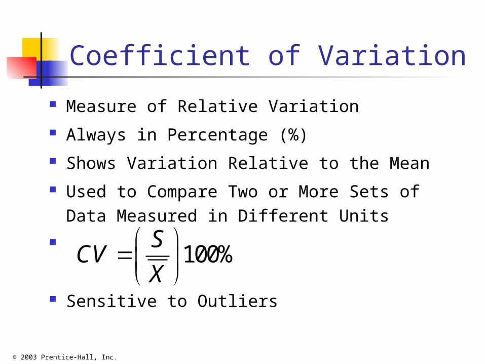
Coefficient of Variation
Measure of Relative Variation Always in Percentage (%) Shows Variation Relative to the Mean Used to Compare Two or More Sets of Data
Measured in Different Units
Sensitive to Outliers
100%S
CVX

© 2003 Prentice-Hall, Inc.
Comparing Coefficientof Variation
Stock A: Average price last year = $50 Standard deviation = $2
Stock B: Average price last year = $100 Standard deviation = $5
Coefficient of Variation: Stock A:
Stock B:
$2100% 100% 4%
$50
SCV
X
$5100% 100% 5%
$100
SCV
X

© 2003 Prentice-Hall, Inc.
Shape of a Distribution
Describe How Data are Distributed Measures of Shape
Symmetric or skewed
Mean = Median =Mode Mean < Median < Mode Mode < Median < Mean
Right-SkewedLeft-Skewed Symmetric

© 2003 Prentice-Hall, Inc.
Describing Distribution:Shape, Center and Spread
Start by displaying the distribution of your data. You should describe: Symmetry vs. skewness * (Look at the tails)
Single vs. multiple modes
Possible outliers separated from the main body of the data.
... But remember that not all distributions have simple shapes.
Symmetry Skewness
Unimodel Bimodel multimodal Uniform
Outliers
4.3 Recognize the important attributes of distribution shape in a histogram or stem-and-leaf display.

© 2003 Prentice-Hall, Inc.
Identifying Distribution Shape
When looking at the distribution of a quantitative variable, consider:
Symmetry, How many modes it has, Whether it has any outliers or gaps.
4.4 Practice describing distribution shapes

© 2003 Prentice-Hall, Inc.
Summary: Describing a Distribution
You should always begin analyzing data by graphing the distributions of the variables.
We describe the shape of the distribution of a quantitative variable by noting whether it is symmetric or skewed, unimodal, bimodal, or multimodal.
Following the general rule that we first describe a pattern and then look for deviations from that pattern, we look at distributions to see if there are straggling outliers or gaps in the distribution shape.
Each of these descriptions is quite general and vague, so people may disagree on the "close calls." Nevertheless, we usually begin describing data by summarizing the distribution shapes.

© 2003 Prentice-Hall, Inc.
Exploratory Data Analysis
Box-and-Whisker NOTE: Different from Basic Business Statistics Book!
Graphical display of data using 5-number summary
Median( )
4 6 8 10 12
Top of Whiskers
Bottom of Whiskers
1Q 3Q2Q

© 2003 Prentice-Hall, Inc.
Distribution Shape & Box-and-Whisker
Right-SkewedLeft-Skewed Symmetric
1Q 1Q 1Q2Q 2Q 2Q3Q 3Q3Q

© 2003 Prentice-Hall, Inc.
Box Plots
Whenever we have a five-number summary of a (QUANTITIVE) variable we can produce a graph (display) called a box plot
NOTE: Basic Business Statistics Book Does not Include Outliers!
1. High Outliers (Above Upper Fence)2. Top of Whiskers3. Q34. Median5. Q16. Bottom of Whiskers7. Low Outliers (Below Lower Fence)

© 2003 Prentice-Hall, Inc.
Box Plot: Good way of Comparing Categories
Category 1
EG Males
Category 2
EG Females
Outliers
Whiskers do not extend further than 1.5 x IQR
5.4 Know how to make boxplots
Top of Whiskers
Bottom of Whiskers

© 2003 Prentice-Hall, Inc.
5 Steps to Create a Box PlotDraw Box Plots for the dataset: 7,8,25,11,13,5,6We require to know: Median, Q1 (25% Percentile), Q3 (75% Percentile, Top of Whiskers, Bottom of Whiskers and Outliers
Step 1 Order Data
12 3 4 5 6 7
5 6 7 8 11 13 25
Step 2 Calculate MedianN is odd so data point at position is the middle value therefore Median = 8

© 2003 Prentice-Hall, Inc.
5 Steps to Create a Box Plot (Cont).
Step 3 Calculate Q1 and Q3Divide the above data set into Data set 1 and Data Set 2.Because n is odd include the median in both setsData set 1 is used to calculate Q1 and Data set 1 is used to calculate Q3
Dataset 1 For Q1 Dataset 2 For Q3
1 2 3 4 1 2 3 4
5 6 7 8 8 11 13 25
For Q1: N for dataset 1 is even so Q1 is the average of the two middle at position 2 and 3
Q1 = (6+7)/2 =6.5(This is the same method used to calculate the median for a even number of data points)

© 2003 Prentice-Hall, Inc.
5 Steps to Create a Box Plot (Cont).For Q3: N for dataset 2 is even so Q3 is the average of the two middle at positions 2 and 3Thus, Q3 = (11+13)/2 =12
Step 4 Find if there are any OutliersIQR= Q3-Q1 =5.5Any data points above Upper Fence (UF) are outliers? UF =Q3+1.5*IQR =12+1.5*5.5=20.25Any data points below Lower Fence (LF) are outliers? LF =Q1- 1.5*IQR = 6.5-1.5*5.5=-1.75
1 2 3 4 5 6 7
5 6 7 8 11 13 25
OutliersOutliers

© 2003 Prentice-Hall, Inc.
That 25 is the only data point that is an outlier.
1 2 3 4 5 6 7
5 6 7 8 11 13 25
OutliersOutliers
Upper Fence (UF) =20.25Lower Fence (LF) =-1.75
Bottom of Whisker is 5
Top of Whisker of is 13

© 2003 Prentice-Hall, Inc.
Step 5: Create the Box Plot (Output from SPSS)
7N =
VAR00001
30
25
20
15
10
5
0
3
1 2 3 4 5 6 7
5 6 7 8 11 13 25Outlier
Outlier = 25
Top of Whisker = 13Bottom
of Whisker
= 5

© 2003 Prentice-Hall, Inc.
Examples
Calculate box plots for the following data points.
1. 5,20,15,3,7,16,4
2. 49,22,22,23,25,2
3. 4,11,10,12,15
4. 4,11,11,9,10,12,18

© 2003 Prentice-Hall, Inc.
Box Plot can be used to compare two categories. Exam Results by
Class
MA1 MA2 MBA8E MBA8W MDM6E MDM6W
Batch
20
40
60
80
100
Pe
rc
en
ta
ge
PHON PHEUY PHEUY
PRUM CHANVIBOL
MENG VICHEKA
Serey ManopCopied

© 2003 Prentice-Hall, Inc.
When comparing groups with boxplots
Compare the medians. Which group has a larger center? Compare the IQR's. Which group is more spread out? Compare the difference between the medians to the IQR's. On the scale of the IQR's are the medians very different? Check for possible outliers. Identify them if you can. Does
knowing which values are outliers tell you anything about the data, the groups, or how they compare?
Numeric comparisons of groups often consider the difference between the centers of the groups.
This difference should be compared to the size of the spreads of the groups.
Data such as the rat lifetimes data that have outliers are better summarized with medians and quartiles than with means and standard deviations.
© 2003 Prentice-Hall, Inc.
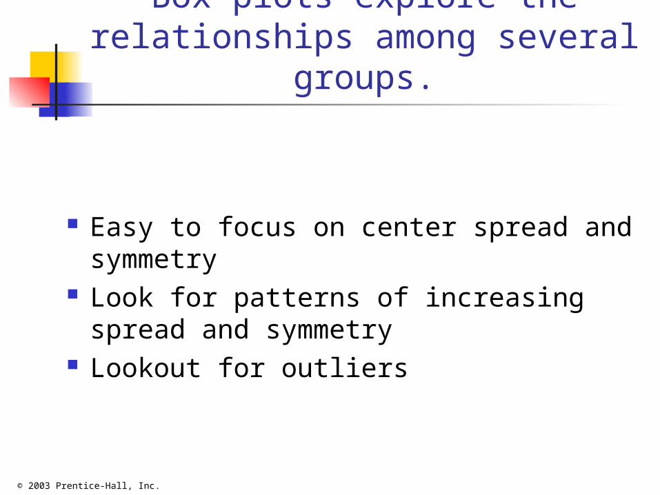
Box plots explore the relationships among several
groups.
Easy to focus on center spread and symmetry
Look for patterns of increasing spread and symmetry
Lookout for outliers

© 2003 Prentice-Hall, Inc.
Examples
Do examples…..

© 2003 Prentice-Hall, Inc.
The Empirical Rule
For Most Data Sets, Roughly 68% of the Observations Fall Within 1 Standard Deviation Around the Mean
Roughly 95% of the Observations Fall Within 2 Standard Deviations Around the Mean
Roughly 99.7% of the Observations Fall Within 3 Standard Deviations Around the Mean

© 2003 Prentice-Hall, Inc.
The Bienayme-Chebyshev Rule
The Percentage of Observations Contained Within Distances of k Standard Deviations Around the Mean Must Be at Least Applies regardless of the shape of the data set At least 75% of the observations must be
contained within distances of 2 standard deviations around the mean
At least 88.89% of the observations must be contained within distances of 3 standard deviations around the mean
At least 93.75% of the observations must be contained within distances of 4 standard deviations around the mean
21 1/ 100%k

© 2003 Prentice-Hall, Inc.
Coefficient of Correlation
Measures the Strength of the Linear Relationship between 2 Quantitative Variables
1
2 2
1 1
n
i ii
n n
i ii i
X X Y Yr
X X Y Y

© 2003 Prentice-Hall, Inc.
Features of Correlation Coefficient
Unit Free Ranges between –1 and 1 The Closer to –1, the Stronger the
Negative Linear Relationship The Closer to 1, the Stronger the
Positive Linear Relationship The Closer to 0, the Weaker Any Linear
Relationship

© 2003 Prentice-Hall, Inc.
Scatter Plots of Data with Various Correlation
CoefficientsY
X
Y
X
Y
X
Y
X
Y
X
r = -1 r = -.6 r = 0
r = .6 r = 1

© 2003 Prentice-Hall, Inc.
Scatter Plots Best way to see relationships between two Quantitative Variables If there is a relationship it is called an association. Scatter plots
are the best way to look for associations
Relationship of Class Attended and Statitstics Score
2025303540455055606570
4 6 8 10 12 14
Number Classes Attended
Sc
ore

© 2003 Prentice-Hall, Inc.
Scatter Plots Only Quantitative Variables can be used The following is the relationship between the Mango Taste
Score and the Number of Weeks it grown for
Weeks Grown on Tree
Time taken to grow the best Mango
0
20
40
60
80
100
6 8 10 12 14 16 18
Ta
ste
Sc
ore

© 2003 Prentice-Hall, Inc.
Direction: Positive
0
10
20
30
40
50
60
70
80
90
100
0 1 2 3 4 5 6
Scatter Plots : DIRECTION and FORM
Negtive Direction
0
10
20
30
40
50
60
70
80
90
0 1 2 3 4 5 6
•Direction: +Ve
•Form: Linear (Straight Line)
•Direction: +Ve
•Form: Linear (Straight Line)

© 2003 Prentice-Hall, Inc.
Form describes the shape
Describe the Form if there is one. EG Straight, or arched or curved
A Curve
0
2
4
6
8
10
12
14
16
18
20
0 1 2 3 4 5 6
An Arch
0
20
40
60
80
100
6 8 10 12 14 16 18
Ta
ste
Sc
ore

© 2003 Prentice-Hall, Inc.
Scatter: The following Scatter Plots have no scatter
0
50
100
150
200
250
0 5 10 15 20
0
5
10
15
20
25
30
0 2 4 6 8 10 12
•The third thing to look for is scatter.
•These graphs have no Scatter because the dots follow each other in a line.

© 2003 Prentice-Hall, Inc.
Scatter: The following Scatter Plots have scatter
•These graphs have Scatter because the dots are like a cloud.
•Always look for something you do not expect to find
•One Graph has an outlier which are very important unexpected points that may occur
0
2
4
6
8
10
12
0 10 20 30 40 500
10
20
30
40
50
60
70
80
90
0 10 20 30 40 50 60

© 2003 Prentice-Hall, Inc.
How to Measure Scatter: Correlation Coefficient, r
I X Y X-Mean X Y-Mean X Product1 2 5 -4 -10 402 4 10 -2 -5 103 6 15 0 0 04 8 20 2 5 105 10 25 4 10 40
Total 30 75 100Mean 6 15Standard Deviation 3.162278 7.905694
Sx = 3.162278 Sy = 7.905694
1905694.7*162278.3*)15(
100
)1(
)(*)(
SxSyn
yyxxCorrCoef

© 2003 Prentice-Hall, Inc.
Plot Chart and describe scatter plot. Calculate Correlation Coefficient
0102030
0 5 10 15X
Y
These data points go in straight line with no scatter in a positive direction (positively correlated)
1905694.7*162278.3*)15(
100
)1(
)(*)(
SxSyn
yyxxCorrCoef

© 2003 Prentice-Hall, Inc.
Example 2
For the following data, plot a scatter plot and describe it. Calculate Correlation Coefficient
n X Y X-Mean X Y-Mean X Product1 4 22 -2 7.6 -15.22 5 23 -1 8.6 -8.63 6 12 0 -2.4 04 7 13 1 -1.4 -1.45 8 2 2 -12.4 -24.8
Total 30 72 -50Mean 6 14.4Standard Deviation 1.581139 8.561542

© 2003 Prentice-Hall, Inc.
Answer: Example 2
n X Y X-Mean X Y-Mean X Product1 4 22 -2 7.6 -15.22 5 23 -1 8.6 -8.63 6 12 0 -2.4 04 7 13 1 -1.4 -1.45 8 2 2 -12.4 -24.8
Total 30 72 -50Mean 6 14.4Standard Deviation 1.581139 8.561542
These data points go in straight line with some scatter in a negative direction (negatively correlated)
0
5
10
15
20
25
3 4 5 6 7 8 9
x
y
92.01214.9*5811.1*)15(
50
)1(
)(*)(
SxSyn
yyxxCorrCoef
© 2003 Prentice-Hall, Inc.
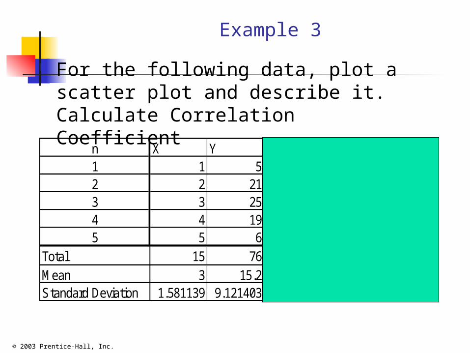
Example 3
For the following data, plot a scatter plot and describe it. Calculate Correlation Coefficient
n X Y X-Mean X Y-Mean X Product1 1 5 -2 -10.2 20.42 2 21 -1 5.8 -5.83 3 25 0 9.8 04 4 19 1 3.8 3.85 5 6 2 -9.2 -18.4
Total 15 76 0Mean 3 15.2Standard Deviation 1.581139 9.121403

© 2003 Prentice-Hall, Inc.
Answer: Example 3n X Y X-Mean X Y-Mean X Product1 1 5 -2 -10.2 20.42 2 21 -1 5.8 -5.83 3 25 0 9.8 04 4 19 1 3.8 3.85 5 6 2 -9.2 -18.4
Total 15 76 0Mean 3 15.2Standard Deviation 1.581139 9.121403
0102030
0 2 4 6X
Y
These data points are in an arched shape with a little scatter.
01214.9*5811.1*)15(
0
)1(
)(*)(
SxSyn
yyxxCorrCoef

© 2003 Prentice-Hall, Inc.
Example 4 For the following data, plot a scatter
plot and describe it. Calculate Correlation Coefficient
n X Y X-Mean X Y-Mean X Product1 1 17 -4.4 5.8 -25.522 3 1 -2.4 -10.2 24.483 6 22 0.6 10.8 6.484 7 3 1.6 -8.2 -13.125 10 13 4.6 1.8 8.28
Total 27 56 0.6Mean 5.4 11.2Standard Deviation 3.507136 9.011104

© 2003 Prentice-Hall, Inc.
Answer: Example 4
n X Y X-Mean X Y-Mean X Product1 1 17 -4.4 5.8 -25.522 3 1 -2.4 -10.2 24.483 6 22 0.6 10.8 6.484 7 3 1.6 -8.2 -13.125 10 13 4.6 1.8 8.28
Total 27 56 0.6Mean 5.4 11.2Standard Deviation 3.507136 9.011104
0102030
0 5 10 15X
Y
0.0059.011*3.5071*1)(5
6.0
1)SxSy(n
)y(y*)x(xCorrCoef
These data points have a lot of scatter and they are not correlated
© 2003 Prentice-Hall, Inc.
Pitfalls in Numerical Descriptive Measures and
Ethical Issues Data Analysis is Objective
Should report the summary measures that best meet the assumptions about the data set
Data Interpretation is Subjective Should be done in a fair, neutral and clear manner
Ethical Issues Should document both good and bad results Presentation should be fair, objective and neutral Should not use inappropriate summary measures to
distort the facts

© 2003 Prentice-Hall, Inc.
Chapter Summary
Described Measures of Central Tendency Mean, Median, Mode, Geometric Mean
Discussed Quartiles Described Measures of Variation
Range, Interquartile Range, Variance and Standard Deviation, Coefficient of Variation
Illustrated Shape of Distribution Symmetric, Skewed, Using Box-and-Whisker
Plots

© 2003 Prentice-Hall, Inc.
Chapter Summary
Described the Empirical Rule and the Bienayme-Chebyshev Rule
Discussed Correlation Coefficient Addressed Pitfalls in Numerical
Descriptive Measures and Ethical Issues
(continued)