Embed Size (px)
Citation preview
WHAT'S HIDING BEHIND STATISTICAL MAPS? Kelvyn Jones
Considerable attention has been expended on how poor design can lead to inappropriate representation on statistical maps. It is the contention of this paper that similar attention must be given to the statistical requirements of map presentation. Casting the argument within the framework of the generalised linear multi-level model, and using maps of disease, health care and educational attainment, it is shown that maps can hide statistical problems as well as reveal them.
INTRODUCTION Statistical maps are concerned with representation of
data. They may serve as illustration of an argument, a way of triggering off an explanation; and as a way of evaluating a hypothesis. If they are to be successful in these tasks, the representation must be faithful and valid. Considerable attention has been focused on the 'map' part of statistical maps with research aiming to enhance the 'signal' coming through the map and to minimise the noise, so that the reader does not receive a false picttire. Consequentiy, topics such as choice of colours, number of class intervals, appropriate symbohsation have received particular attention. In contrast, it appears to me that the 'statistical' part of statistical maps has been downplayed. But here too, there are acute problems of sorting out the signal from the noise. This paper aims to provide an informal introduction to these statistical aspects, and does so by five case studies which are in the main concerned with the author's research area, disease and health. However, before proceeding to these examples, we need to consider the statistical approach in general.
WHAT DOES STATISTICAL ANALYSIS DO? Like all important questions this is a difficult one to
answer. This question was posed at an international conference by an eminent quantitative modeller, who chided the statistical geographers that his equations (he is a mathematical urban modeller) did not contain any error terms. He knew of and had used the tools of statistical analysis, but he had difficulty with the underlying purpose of statistics. While aU subjects have difficulty in providing a meaningful definition, for this is often such contested ground, the problem with statistics is that there are so many Introductions to ... and Statistics for ... books providing how to recipes, that the why question remains unasked. There is this tool and that tool, all different, unrelated and for different purposes. Such treatments usually aim at providing guides to advanced procedures in as basic a way as possible. Here, the reverse operates; basic concepts will be introduced from an advanced perspective.
The perspective used is that provided in the seminal paper of Nelder and Wedderbum (1972) which pulled together many apparently diverse topics into the unified framework of the Generalised Linear Model. ̂ This concept
Dr Kelvyn Jones is Senior Lecturer in Geography, Portsmouth Polytechnic [This paper was first presented at the26th Annual Summer School of the Society of Cartographers, 6th September 1990]
now underlies modem data analysis and increasingly provides the organisation of more advanced statistical textbooks (Aitkin e.t al, 1989; Dobson, 1990; Healy, 1989; McCuUagh and Nelder, 1986). Stripped of all the mathematics and much else, tiie general form of the G L M may be expressed in a number of equivalent, but increasingly obscure ways:
DATA = SIGNAL + NOISE
DATA = SYSTEMATIC + DISTURBANCES COMPONENT
DATA = MODEL + RESIDUALS
D ATA = E K E D + RANDOM PARAMETERS PARAMETERS
Real world data are conceived as consisting of an underlying signal which may be distorted by noise; data are seen as having a systematic pattern which is disturbed by fluctuations which may be an outcome of the measurement process (sampling variation) or because the world is inher-entiy indeterminate (stochastic variation). The aim of statistical analysis is to capture the signal in a model while making due allowances for the disturbances which are accommodated as remainders or residuals from the model. The model part of the equation is represented in the G L M by fixed or unchanging parameters, which is the termed used for an unknown constant. The disturbances are represented by random terms, where random means 'allowed to vary'; that is they do not take on a fixed value but constitute a distribution. We are interested not just in estimating a particular underlying quantity, but in determining the level of uncertainty about that value.
The distinctiveness of the statistical approach is the simultaneous consideration of both signal and noise. This imphes an important philosophical position: the world we have observed is only one of the possible worlds which could have occurred which are consistent with the same underlying model/pattern. Moreover, it impHes that there may be no pattern whatsoever; what we have observed is mere noise. Indeed, a basic cut-off is often made in statistical analysis between significant or not. Significant results are unlikely to be merely a product of noise, rather they are the result of some underlying systematic patterning. The probabihty level, such as 0.05, that is often attached to statistical findings means that such results should come about by chance less than five times in a hundred'"^
sue B U L L E T I N Vol 24 No 1 23
In essence, the statistical approach is centrally concerned with the identification of underlying patterns while making allowance for noise. Previewing later arguments, many statistical maps are based on quite a different perspective:
MAP - SIGNAL - DATA in which the noise element has been ignored during analysis. What now follows is a series of case studies of the importance of statistical modelling for map display, in which the limited mapping approach is contrasted with the G L M .
I THE P R O B L E M OF S M A L L NUMBERS: MAPPING CANCER
Despite politically imposed constraints on data collection and dissemination, (Jones et al, 1989,1990), one of the noticeable feattires of modem health information systems is that data are being routinely provided for analysis at fine spatial resolution. Unfortonately, as Diehr (1984) puts it: small area statistics mean large statistical problems. A general model for analysing such data is:
NO. of = NO. of + ENVIRON- + RANDOM DEATHS PEOPLE MENTAL EFFECTS in AREA in AREA EFFECTS
but this becomes tmncated in much mapping to: DEATH RATE = ENVIRONMENTAL EFFECTS for AREA for AREA
the number of deaths are divided by the number of people in an area to control or remove the obvious size effects (Jones, 1978; Evans and Jones, 1981) the resultant rates are then mapped in the hope of giving clues to environmental causes of the observed spatial pattem.
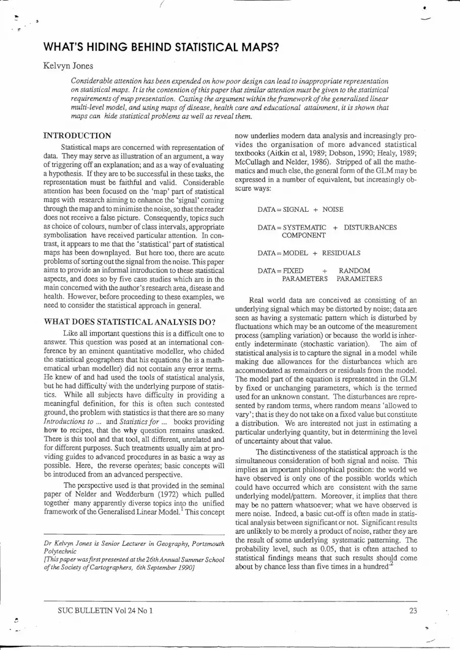
Such a formulation omits the random component and when the data consists of a rare disease or i f there is fine spatial resolution, there is serious risk of encountering the small number problem (Jones and Kirby, 1980). This is best illustrated by a simple experiment beloved of introductory textbooks: the tossing of an unbiased coin. Figure 1 gives the proportion of heads from 24 tosses. The under-
Signal and noise in coin tossing
1.0 p
0.9 -
0.8 -
0.4 -
0.3 -
0.2 -
0.1 -
0.0 L 1—1—J—1—I—I—I—I—1 I 1 I I 1 1 I I I I r r 1 I I 1 4 8 12 16 20 24
Number of throws
Fig. 1 Signal and noise in a coin-tossing experiment
lying signal is that heads occurs half of the time, and as the number of tosses increases the acmal outcome does stabilize around the 0.5 value. But when there are just a few tosses, quite different results can occur. Thus in the first 4 throws, 3 heads are found giving a proportion of 0.75. The astute coin tosser would not conclude that the true proportion of heads is 0.75 but merely with so few tosses that the rate is unreliable. The mortahty rate is based on a similar discrete outcome; dead or alive replacing head or tails. Imagine a parish with 80 inhabitants, if 1 died in particular year, tiie death-rate would be about the national average but if 2 died the place could be labelled a highspot at twice the national average, but if no one died, tiie parish would enjoy the world's lowest recorded rate. Small absolute numbers form highly unreUable rates.
This problem is often compounded in tite spatial display of such data because areas witii low populations tend to be rural areas with large areal extent. One purely cartographic solution is to depict the results in cartograms witii the areal extent directly proportional to the size of the population. Such maps often do considerable violence to the geography and thereby hinder the search for environmental factors that is the aim of the exercise. Another approach (lones and Moon, 1987, chapter 2) is to take into account the effects of random fluctuations in the modelling and show the results of the statistical analysis in map form.
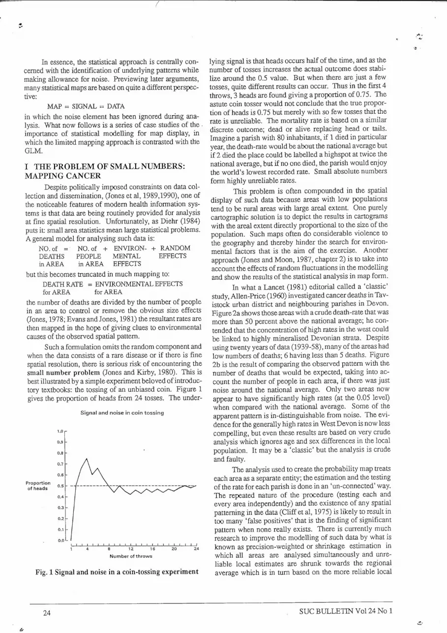
In what a Lancet (1981) editorial called a 'classic' study, Allen-Price (1960) investigated cancer deaths in Tavistock urban district and neighbouring parishes in Devon. Figure 2a shows those areas with a crude death-rate that was more than 50 percent above tiie national average; he contended that the concentration of high rates in the west could be hnked to highly mineralised Devonian strata. Despite using twenty years of data (1939-58), many of the areas had low numbers of deaths; 6 having less than 5 deaths. Figure 2b is the result of comparing the observed pattem witii the number of deatiis that would be expected, taking into account tiie number of people in each area, if tiiere was just noise around the national average. Only two areas now appear to have significantiy high rates (at the 0.05 level) when compared with the national average. Some of the apparent pattem is in-distinguishable from noise. The evidence for the generally high rates in West Devon is now less compelling, but even these results are based on very cmde analysis which ignores age and sex differences in the local population. It may be a 'classic' but the analysis is crude and faulty.
The analysis used to create the probability map treats each area as a separate entity; the estimation and the testing of the rate for each parish is done in an 'un-connected' way. The repeated nature of the procedure (testing each and every area independently) and the existence of any spatial patterning in tiie data (Chff et al, 1975) is likely to result in too many 'false positives' that is the finding of significant pattem when none really exists. There is currentiy much research to improve tiie modelling of such data by what is known as precision-weighted or shrinkage estimation in which all areas are analysed simultaneously and unreliable local estimates are shmnk towards the regional average which is in turn based on the more rehable local
24 sue B U L L E T I N V o l 24 No 1
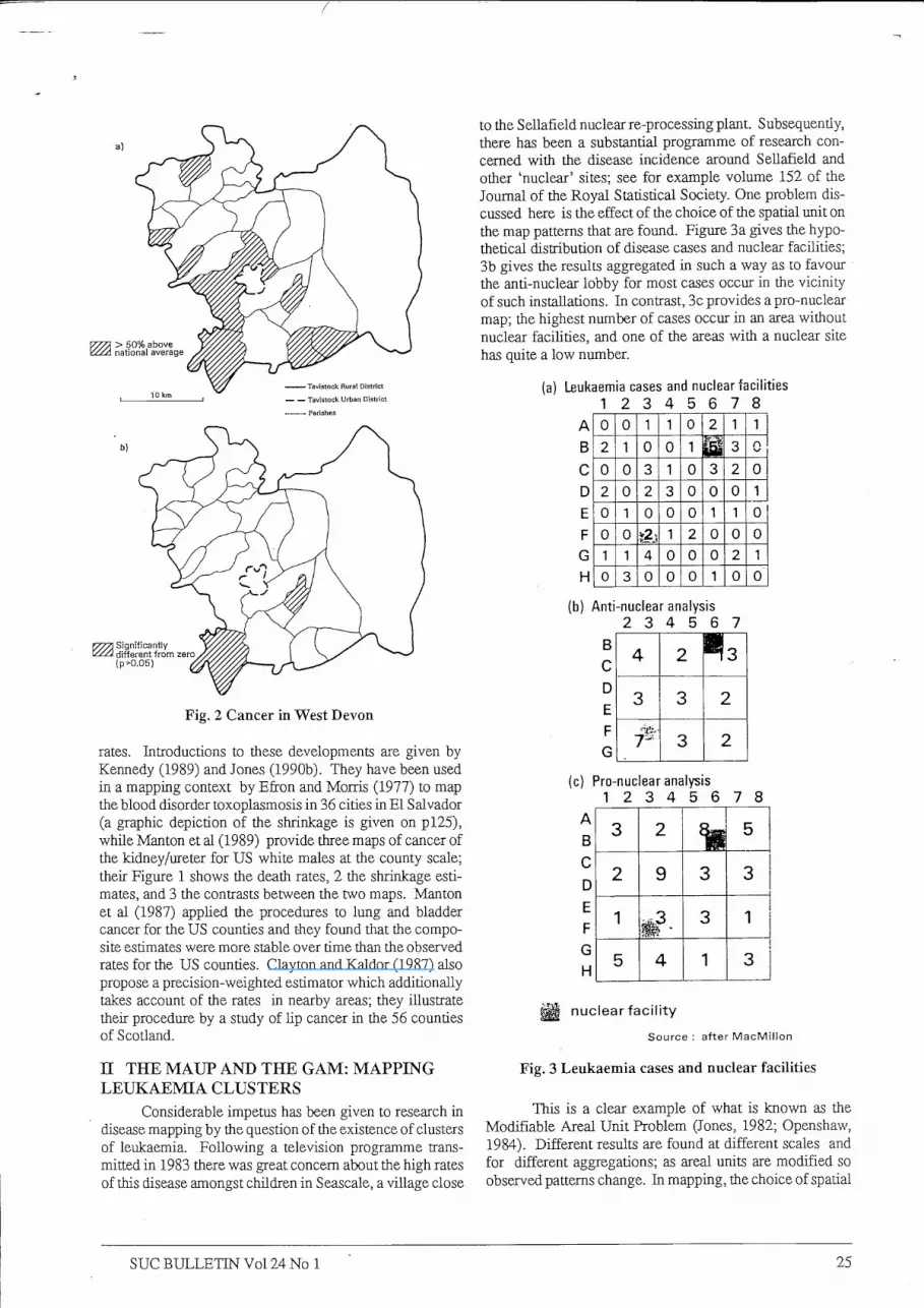
Fig. 2 Cancer in West Devon
rates. Introductions to these developments are given by Kennedy (1989) and Jones (1990b). They have been used in a mapping context by Efron and Morris (1977) to map the blood disorder toxoplasmosis in 36 cities in E l Salvador (a graphic depiction of the shrinkage is given on pl25), while Manton et al (1989) provide three maps of cancer of the kidney/ureter for US white males at the county scale; their Figure 1 shows the death rates, 2 the shrinkage estimates, and 3 the contrasts between the two maps. Manton et al (1987) apphed the procedures to lung and bladder cancer for the US counties and they found that the composite estimates were more stable over time than the observed rates for the US counties. Clayton and Kaldor (1987) also propose a precision-weighted estimator which additionally takes account of the rates in nearby areas; they illustrate their procedure by a study of lip cancer in the 56 counties of Scotland.
n THE MAUP AND THE G A M : MAPPING L E U K A E M I A CLUSTERS
Considerable impetus has been given to research in disease mapping by the question of the existence of clusters of leukaemia. Following a television programme transmitted in 1983 there was great concern about the high rates of this disease amongst children in Seascale, a village close
to the Sellafield nuclear re-processing plant. Subsequently, there has been a substantial programme of research concerned with the disease incidence around SeUafield and other 'nuclear' sites; see for example volume 152 of the Journal of the Royal Statistical Society. One problem discussed here is the effect of the choice of the spatial unit on the map patterns that are found. Figure 3 a gives the hypothetical distribution of disease cases and nuclear facilities; 3b gives the results aggregated in such a way as to favour the anti-nuclear lobby for most cases occur in the vicinity of such installations. In contrast, 3c provides a pro-nuclear map; the highest number of cases occur in an area without nuclear facihties, and one of the areas with a nuclear site has quite a low number.
(a) Leukaemia cases and nuclear fac i l i t ies
1 2 3 4 5 6 7 8
A 0 0 1 1 0 2 1 1
B 2 1 0 0 1 3 r\
C 0 0 3 1 0 3 2 0
D 2 0 2 3 0 0 0 1
E 0 1 0 0 0 1 1 0
F 0 0 1 2 0 0 0 G 1 1 4 0 0 0 2 1 H 0 3 0 0 0 1 0 0
(b) Ant i -nuclear analys is
2 3 4 5 6 7
C
(c) Pro-nuclear analysis
1 2 3 4 5 6 7 8
B C D E F G H
3 2 5
2 9 3 3
1 3 1
5 4 1 3
^ nuc lea r f a c i l i t y
Source ; after M a c M i l l o n
Fig. 3 Leukaemia cases and nuclear facilities
This is a clear example of what is known as the Modifiable Areal Unit Problem (Jones, 1982; Openshaw, 1984). Different results are found at different scales and for different aggregations; as areal units are modified so observed patterns change. In mapping, the choice of spatial
sue B U L L E T I N V o l 24 No 1 25
unit is usually determined by convenience. In the early work on leukaemia clusters, demographic data were available on census wards, so it was on this spatial framework that the analysis was undertaken. The definition of wards is a rather arbitrary division of space. The boundaries could have been drawn differently, the observed clusters may disappear while new ones may have been found.
An ingenious solution has been proposed by Openshaw to this problem which uses a combined statistical and cartographic approach based on the fundamental probabilistic position of examining all different spatial arrangements, or at least as many as time on the computer will aUow. Using his Geographical Analysis Machine the following steps are undertaken:
• place a cncle of a fixed radius over the map of the region, where the circle is considerably smaller than the region;
• count the number of cases (using cancer-registry data, Jones and Moon, 1987,80-83) and the number of children (using the census) that fall within the circle;
• perform statistical simulation, modelhng and testing, if there are substantially more cases than can be expected by chance, draw the circle;
• systematically move the centre of the circle, repeat the above operations, until the entire region is covered;
• repeat all the above using a circle of a larger radius Openshaw et al (1988) placed 812,993 circles of radius
from 1km to 25km over the Northern Region, and found that in 1792 there were substantially more cases than expected on random fluctuations alone. His map revealed a major well-known cluster centred on Seascale, and another on Tyneside which is not within 35 miles of nuclear installations; environmental pollution is suggested as the cause. There are problems with this approach for repeated testing is bound to find 'significant' results just by chance. Indeed, given the large number of circles, even the stringent probabiUty level chosen by Openshaw of 0.002, results in an expectation of 1625 circles exceeding the cutoff merely by chance. Moreover, because rates in overlapping circles are highly correlated, the metiiod may be drawing those apparent clusters that must occur by chance. Further research is needed, but tiie method does appear to be useful in finding potential clusters. This is all tiiat can be achieved by a spatial quantitative analysis (Jones and Moon, 1987, Chapters 3 and 9).
m THE P R O B L E M OF L E V E L : MAPPING SCHOOL PERFORMANCE
Currentiy the British educational system is undergoing major reforms as emphasis is placed on parental choice, school autonomy, competition and accountability (lones and Shurmer-Smith, 1990). Fundamental to these changes is that consumers have up-to-date information on
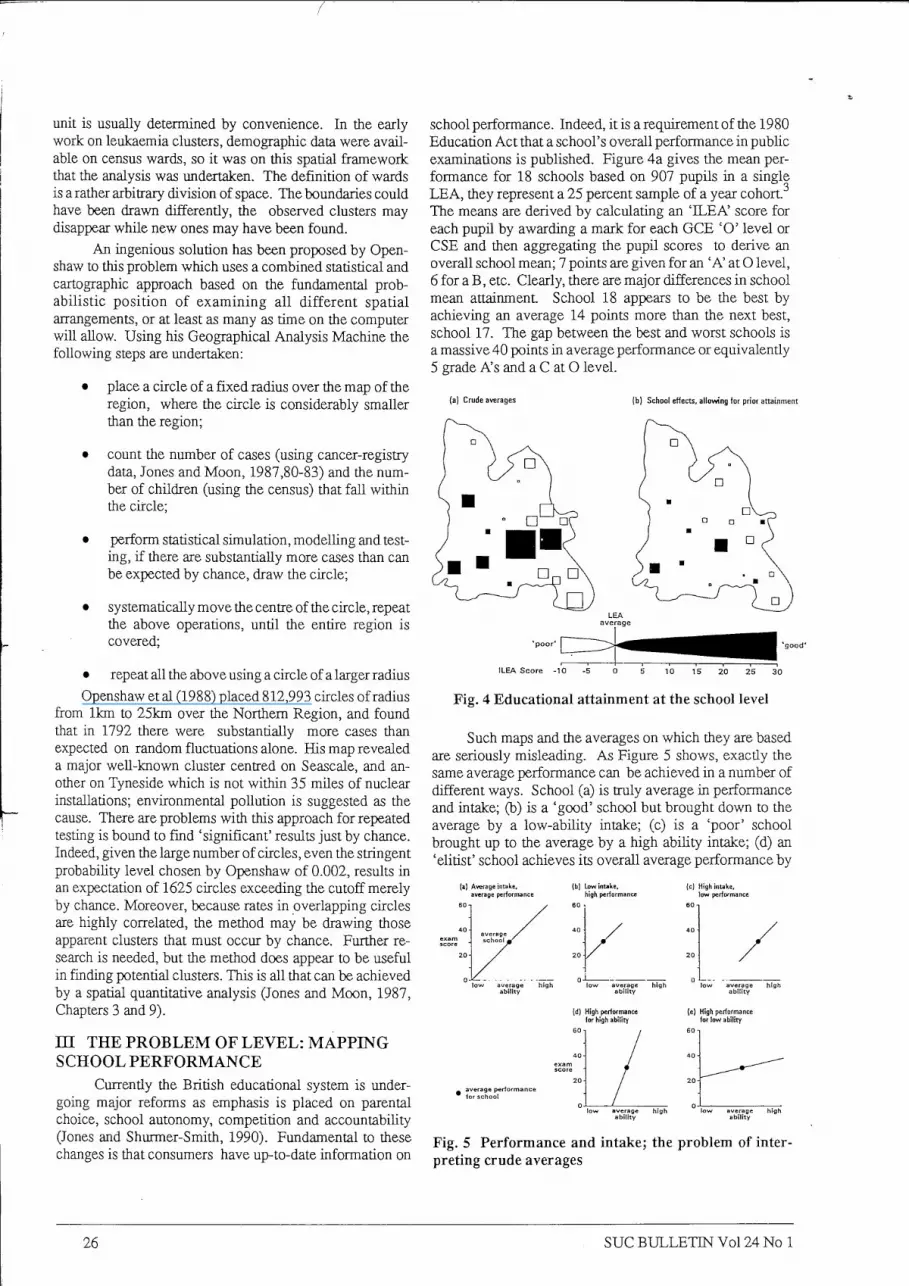
school performance. Indeed, it is a requirement of the 1980 Education Act that a school's overall performance in public examinations is published. Figure 4a gives the mean performance for 18 schools based on 907 pupils in a single L E A , they represent a 25 percent sample of a year cohort.^ The means are derived by calculating an ' ILEA' score for each pupil by awarding a mark for each G C E ' O ' level or CSE and tiien aggregating the pupil scores to derive an overall school mean; 7 points are given for an ' A ' at O level, 6 for a B , etc. Clearly, there are major differences in school mean attainment School 18 appears to be tiie best by achieving an average 14 points more than the next best, school 17. The gap between tiie best and worst schools is a massive 40 points in average performance or equivalently 5 grade A's and a C at O level.
(a) Crude averages (b) School effects, allowing for prior attainment
•good'
ILEA Score -10 -5 0 5 10 15 20 25 30
Fig. 4 Educational attainment at the school level
Such maps and the averages on which they are based are seriously misleading. As Figure 5 shows, exactiy the same average performance can be achieved in a number of different ways. School (a) is truly average in performance and intake; (b) is a 'good' school but brought down to the average by a low-ability intake; (c) is a 'poor' school brought up to the average by a high abitity intake; (d) an 'elitist' school achieves its overall average performance by
(b) luw intake, high peril
High intake, low perfofiTO
(d) High periofmance for high ability
High performan for low ability
Fig. 5 Performance and intake; the problem of interpreting crude averages
26 s u e B U L L E T I N V o l 24 No 1
being a 'good' school for high ability children and poor for low ability children;, while (e) is an 'egalitarian' school which achieves the average by the less-able doing relatively well at the expense of the more-able.
The crude averages are composed of three distinct sources of variation:
AVERAGE COMPOS- CONTEX- COMPOSmON/ SCHOOL = m O N + TUAL + CONTEXTUAL PERFOR- of the SCHOOL INTERACTION MANCE SCHOOL EFFECT (OUTPUT) (INPUT) Composition simply refers to the school make-up in
terms of pupils; the contextual is the overall difference a school makes irrespective of intake; the interaction term represents the differential effect of a school in relation to the composition of its intake. The crude averages in confusing these distinct variations are uninterpretable and meaningless. In Figure 5 the argument is expressed in terms of a single compositional variable, pupil abihty. The contextual effects of 'good', 'poor', 'eUtist' and 'egalitarian' schools are rendered 'average' by differing compositions in schools (b) and (c), and by substantial interactions in schools (d) and (e). The same problems could apply with equal force to other pupil characteristics (such as gender, class, ethnicity) which influence outcome and vary systematically form school to school.
In order to assess the contextual effect of school performance, explicit statistical modelling is required at both the pupil and school level. Very recently, the gener-ahsed hnear model has been extended (as outlined in Jones, Moon and Clegg, 1990) to include a multi-level aspect. Expressed verbally the simplest possible two-level model is (Jones, 1990a)
DATA=SIGNAL + SIGNAL + NOISE at + NOISE at at at at at
LEVEL 1 LEVEL2 LEVEL 1 LEVEL2 Using the specific model (Jones, 1990c):
ATTAINMENT EFFECT EFFECT EFFECT of PUPIL i = for PRIOR +for + for m SCHOOL j ABILITY SCHOOL j PUPIL i
it is possible to estimate the contextual effect for each school allowing for the composition of the school in terms of prior ability (measured before entry by a verbal reasoning test). These are mapped in Figure 4b; the differences between the schools are much smaller and there are major changes of rank. For example, "school 18, with the second best average is now positioned at the bottom of the ranking, while schools such as number 2, 16 and 5 have moved up the ladder.
What is hiding behind the statistical map of Figure 4(a) is pupil variation at the lower level. Moreover, i f there is a significant interaction between the pupil and school levels (as there is in some of the studies reported in Jones, 1990c) then a single map of the contextual effects is not possible. If school performance varies according to pupil abihty, gender, ethnicity and social class, there will have to be separate maps for high, medium and low abihty, for boys and girls, for different ethnic groups and for different social classes. More generally, maps portraying average results at
an aggregate level are very common (and so too are the essentially hierarchical data structures on which they are imphcitly based). Unfortunately, merely dividing by a suitable denominator does not adequately control for the effects of composition. Prior exphcit statistical modelling is required for the valid portrayal of contextual effects.
IV SPATIALITY: MAPPING DEPRIVATION In reviewing recent developments in the philosophy
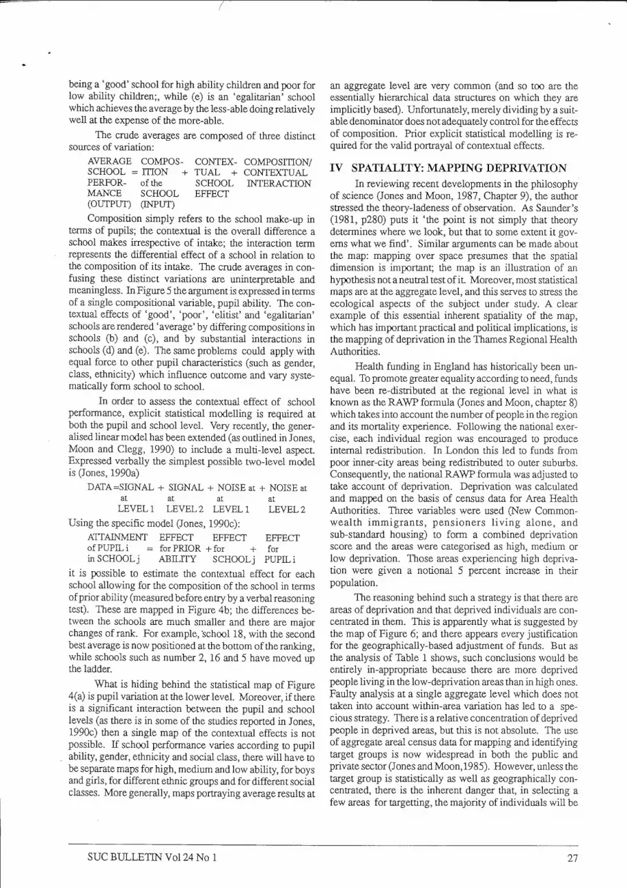
of science (Jones and Moon, 1987, Chapter 9), the author stressed the theory-ladeness of observation. As Saunder's (1981, p280) puts it 'the point is not simply that theory determines where we look, but that to some extent it gov-ems what we find'. Similar arguments can be made about the map: mapping over space presumes that the spatial dimension is important; the map is an illustration of an hypothesis not a neutral test of it. Moreover, most statistical maps are at the aggregate level, and this serves to stress the ecological aspects of the subject under study. A clear example of this essential inherent spatiality of the map, which has important practical and political implications, is the mapping of deprivation in the Thames Regional Health Authorities.
Health funding in England has historically been unequal. To promote greater equality according to need, funds have been re-distributed at the regional level in what is known as the R A W P formula (Jones and Moon, chapter 8) which takes into account the number of people in the region and its mortality experience. Following the national exercise, each individual region was encouraged to produce internal redistribution. In London this led to funds from poor inner-city areas being redistributed to outer suburbs. Consequently, the national R A W P formula was adjusted to take account of deprivation. Deprivation was calculated and mapped on the basis of census data for Area Health Authorities. Three variables were used (New Commonwealth immigrants, pensioners l i v i n g alone, and sub-standard housing) to form a combined deprivation score and the areas were categorised as high, medium or low deprivation. Those areas experiencing high deprivation were given a notional 5 percent increase in their population.
The reasoning behind such a strategy is that there are areas of deprivation and that deprived individuals are concentrated in them. This is apparently what is suggested by the map of Figure 6; and there appears every justification for the geographically-based adjustment of funds. But as the analysis of Table 1 shows, such conclusions would be entirely in-appropriate because there are more deprived people living in the low-deprivation areas than in high ones. Faulty analysis at a single aggregate level which does not taken into account within-area variation has led to a specious strategy. There is a relative concentration of deprived people in deprived areas, but this is not absolute. The use of aggregate areal census data for mapping and identifying target groups is now widespread in both the public and private sector (Jones and Moon, 1985). However, unless the target group is statistically as well as geographically concentrated, there is the inherent danger tiiat, in selecting a few areas for targetting, the majority of individuals wil l be
s u e B U L L E T I N V o l 24 No 1 27
missed. Merely mapping at a specific scale wil l tend to suggest that the specific scale is appropriate for explanation and policy; the map itself is not by itself going to reveal its inadequacies.
Fig. 6 Deprivation factor in the Thames Regional Health Authorities
Table 1 Deprived people and deprived places in the Thames Regional Health Authorities
P E R C E N T A G E OF SELECTED GROUP IN
INDICATOR HIGH depri- L O W deprivation areas vation areas 23.5 56.6
suggesting how it can be improved by the inclusion of relevant variables into the systematic part.
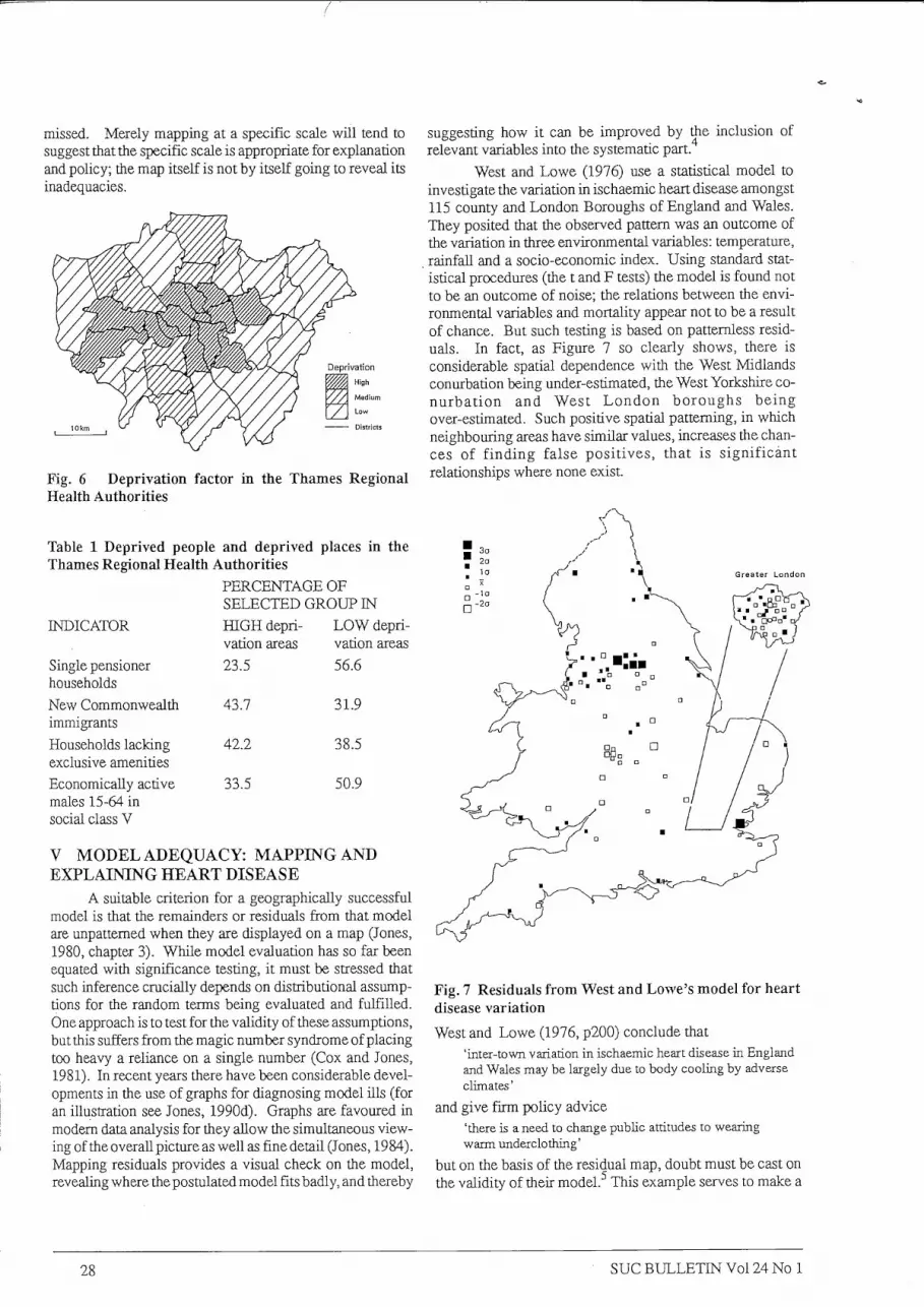
West and Lowe (1976) use a statistical model to investigate the variation in ischaemic heart disease amongst 115 county and London Boroughs of England and Wales. They posited that the observed pattem was an outcome of the variation in three environmental variables: temperature, rainfall and a socio-economic index. Using standard statistical procedures (the t and F tests) the model is found not to be an outcome of noise; the relations between the environmental variables and mortality appear not to be a result of chance. But such testing is based on pattemless residuals. In fact, as Figure 7 so clearly shows, there is considerable spatial dependence with the West Midlands conurbation being under-estimated, the West Yorkshire co-nurbation and West L o n d o n boroughs being over-estimated. Such positive spatial patterning, in which neighbouring areas have similar values, increases the chances of f inding false positives, that is significant relationships where none exist.
Single pensioner households New Commonwealth 43.7 immigrants Households lacking 42.2 exclusive amenities Economically active 33.5 males 15-64 in social class V
31.9
38.5
50.9
V MODEL ADEQUACY: MAPPING AND EXPLAINING HEART DISEASE
A suitable criterion for a geographically successful model is that the remainders or residuals from that model are unpattemed when they are displayed on a map (Jones, 1980, chapter 3). While model evaluation has so far been equated with significance testing, it must be stressed that such inference crucially depends on distributional assumptions for tiie random terms being evaluated and fulfilled. One approach is to test for the validity of these assumptions, but this suffers from the magic number syndrome of placing too heavy a reliance on a single number (Cox and Jones, 1981). In recent years there have been considerable developments in the use of graphs for diagnosing model ills (for an illustration see Jones, 1990d). Graphs are favoured in modem data analysis for they allow the simultaneous viewing of the overall picture as well as fine detail (Jones, 1984). Mapping residuals provides a visual check on tiie model, revealing where the postulated model fits badly, and thereby
Fig. 7 Residuals from West and Lowe's model for heart disease variation
West and Lowe (1976, p200) conclude that 'inter-town variation in ischaemic heart disease in England and Wales may be largely due to body cooling by adverse climates'
and give firm policy advice 'there is a need to change public attitudes to wearing warm underclothing'
but on the basis of the residual map, doubt must be cast on the validity of tiieir model.^ This example serves to make a
28 s u e B U L L E T I N V o l 24 No 1

general poinL Researchers are encouraged to map data at the outset of analysis. But, as argued above, mapping before modelling can result in a confused and confusing message. However, the residual map is a superb, yet informal means of evaluating the product of modelling.
CONCLUSIONS Statistical maps are primarily concerned with captur
ing a part of the world in a valid picture. Once the data has been collected a double translation is necessary: data have to be translated via an appropriate statistical design into a statistical model, and then the results from tiie statistical model have to be translated into the map model via graphical design. In statistical design, the translation has to allow for the inherent noisiness of tiie real world. In map design, the translation has to maximize a clear and valid signal and minimize distorting noise. As argued here, the statistical design is often imphcit (usually no more than dividing by a denominator to produce a rate), but it needs to be made explicit. In particular the analysis should take account of noise and recognise that most spatial problems are inherently multi-level. Data are a blurred and fuzzy image of the real world; statistics is needed both to identify what the underlying object is, and to guard against false conclusions.
ACKNOWLEDGEMENTS Thanks to Alastair Pearson for his encouragement and
comments.
FOOTNOTES 1 The topics include according to Dobson (1990, ix) 'simple and multiple regression, t tests and analysis of variance and covariance, logistic regression, log-linear models for contingency tables and several other analytical methods'. 2 This approach of considering the observed data in relation to all possible outcomes constitutes the classical or frequentist approach to inference. Other approaches include the likehhood and Bayesian. The former asks the question "given the observed data, what is the hkehhood of getting themodel?"; while the latter asks "given my prior subjective beliefs, and taken into account the data, what is the sttength of support for the model?". In practice, these conceptually different approaches often use similar techniques. 3 This is done schematically for the CONTEXTS project (Gray et al, 1986), from which the data are drawn, has maintained both the anonymity of the schools and the L E A . 4 Patterned residuals (the technical term is autocorrelated) can derive from a non-linear model, a true autoregressive structure as well as the omission of importany variables. 5 The author is aware tiiat this analysis is defective in only working at tiie areal level and ignoring variations within the local authorities.
REFERENCES AITKIN, M . et al (1989) Statistical modelling in G L I M ,
Clarendon Press, Oxford. ALLEN-PRICE, E . D. (1960) Uneven cancer distribution
in West Devon, Lancer (1), 1235-8.
C L A Y T O N , D. and K A L D O R , J. (1987) Empirical Bayes estimates of age-standardised relative risks for use in disease mapping. Biometrics., 43, 671-681.
CLIFF, A . D., M A R T I N , R. L . , and ORD, J. K . (1975) A test for autocorrelation in spatial maps based on a modified chi-square statistic. Transactions of the Institute of British Geographers, 65,109-31.
C O X , N and JONES, K (1981) Exploratory data analysis in N . WRIGLEY, and R J . BENNETT, R J . (eds) Quantitative Geography, Routiedge, London.
DIEHR, P. (1984) Small area statistics, large statistical problems, American Journal of Public Health, 74(4), 313-314.
D O B S O N , A J . (1990) A n uitroduction to generalized l i near models. Chapman and Hall, London.
E F R O N , B . and Morris, C. (1977) Stein's paradox in statistics. Scientific American, May, 119-127.
E V A N S , I. S. and JONES, K . (1981) Ratios and closed number systems in N . W R I G L E Y and R.J. B E N N E T T (eds) Quantitative Geography, Routiedge, London.
GRAY, J., JESSON, D . and JONES,B. (1986) The search for a fairer way of comparing schools' examination results, Research Papers in Education, 1, 91-122.
H E A L Y , M J . R . (1989) G L I M an introduction. Clarendon Press, Oxford.
lONES, K . (1978) Percentages, ratios and inbuilt relationships: an overview and bibhography,Dwcu^«on Paper No2, Dept. of Geography, University of Southampton.
JONES, K . (1980) Geographical variation in mortality, unpublished PhD thesis. University of Southampton.
JONES, K . (1984) Graphical methods for exploring relationships in G. B A H R E N B E R G , M . M . FISCHER, and P. N U K A M P (eds) Recent developments in spatial data analysis, Gower, Aldershot.
JONES, K . (1982) Problems in analysing areal data, paper presented to Quantitative Methods Geography Conference, Sheffield.
JONES, K . (1990a) Multi-level models for geographical research. Environmental Publications, Norwich, in press.
JONES, K . (1990b) The specification and estimation of multi-level models. Transactions of the Institute of British Geographers, to appear
JONES, K . (1990c) Variations in school examination performance; the application of multi-level modelling, paper presented to the colloqium Regions et Formations, Europe 1992, Marseille.
JONES, K . (1990d) M M t T A B for geographical analysis. Environmental Publications, Norwich , in preparation.
JONES, K . and K I R B Y , A . (1980) The use of a chi-square map in the analysis of census data, Geoforum, 11,409-417.
JONES, K . M I L L A R D , F. andTWIGG, L . (1989) Government information policy in the 1980's, Talking Politics 1(3), 105-109.
s u e B U L L E T I N V o l 24 No 1 29

JONES, K . MILLAJID, F. and TWIGG, L . (1990) "The right to know", government and information. In S.P. SAVAGE and L . ROBINS (eds) Public pohcy under Thatcher, MacMillan, Basingstoke.
lONES, K . and M O O N , G. (1985) Targetting resources for health education, paper given at the Institute of British geographers Annual Conference, Leeds.
JONES, K . and M O O N , G. (1987) Health, disease and society, Roufledge, London.
JONES, K . and M O O N , G. (1990) A multi-level approach to immunisation uptake. Area, 22(3), 264-271.
JONES, K . M O O N , G. and C L E G G , A . (1990) Ecological and individual effects in childhood immunisation uptake; a generalised linear multi-level approach, paper presented to 4th International Symposium in Medical Geography, Norwich; submitted to Social Science and Medicine.
JONES,K. and SHURMER-SMITH,L (1990) Education and inequality in the United Kingdom, Geographie Sociale, 9, 59-76, special edition on the school in Europe.
KENNEDY, S. (1989) The small number problem and the accuracy of spatial databases In M . GOODCHILD, and S. GOPAL (eds) Accuracy of spatial database, Taylor and Francis, London.
M c C U L L A G H , R and N E L D E R , J.A. (1986) Generalized linear models. Chapman and Hall, London.
M A N T O N , K . G . et al (1987) Statistically adjusted estimates of geographic mortality profiles. Journal of the National Cancer Institute, 78(5), 805-815.
M A N T O N , K . G. et al (1989) Emphical Bayes procedures for stabilizing maps of US cancer mortality rates. Journal of the American Statistical Association, 84(407), 637-650.
N E L D E R , J .A. and W E D D E R B U R N , R.W.M.(1972) Generalized Hnear models. Journal of the Royal Statistical Society, 135, 370-84.
OPENSHAW, S. (1984) The modifiable areal unit problem, Geo Books, Norwich.
OPENSHAW, S. et al (1988) Investigation of leukaemia clusters by use of a geographical analysis machine. Lancet (1), 272-3.
SAUNDERS, P. (1981) Social theory and the urban question, Hutchinson, London.
WEST, C. R. and L O W E , C. R. (1976) Mortahty from ischaemic heart disease: inter-town variation and its association with chmate in England and Wales, International Journal of Epidewdology, 5,195-201.
CONFERENCES
Mapping Awareness '91 Exhibition and Conference, Olympia 2 Conference & Exhibition Centre, 6-8th February 1991
Mapping Awareness '91 Exhibition and Conference, Europe's premier event for Geographic Information Systems (GIS), wil l for the first time be held at Olympia 2 Conference and Exhibition Centre. It is supported by Mapping Awareness Magazine and The British Computer Society.
Mapping Awareness provides an annual showcase and discussion forum for those involved in the development, supply or use of computerised spacial information systems. The exhibition reflects tiie rapid growth of the GIS market. Products on show wil l include computer manufacturers, software and systems houses, peripheral companies, database and information providers and consultancies.
For further information please contact: Caroline Patterson or Arielle Maniguet, Nina Gardiner and Associates (NGA) on 081-741-2828 From Conference press release
The ICA Comes To Britain TJie Director General of the Ordnance Survey and
Conference President, Peter McMaster, launched the lead up to the 1991 conference of the International Cartographic Association (ICA) at a press conference held in London.
Peter McMaster gave an outline and the background to what is the world's largest grouping of cartographic interests, which covers every aspect of the earth sciences from mapping to environmental monitoring.
The I C A has a membership which encompasses almost every country on earth and the international conference, which wil l be held in Bournemouth in September 1991, wil l bring together over 1,000 delegates who wiU discuss and debate wide ranging topics affecting the world's environment and ecosystem.
The ICA is the largest gathering of earth scientists and it wil l only be the second time they have chosen Britain for their meeting which takes place every 4 years.
Peter McMaster stated tiiat tiie choice of tiie U K for the 1991 conference underlines the growing influence of Bri tain on world environmental issues.
For further information on the conference contact: Christine Philbin, Conference Organiser, ICA, Conferences Services Ltd, Congress House, 55, New Cavendish Street, London W I M 7RE: From ICA press release
30 s u e B U L L E T I N V o l 24 No 1


