Embed Size (px)
Citation preview
DISCUSSION PAPER SERIES DPS13.18 OCTOBER 2013
Road pricing and public transport pricing reform in Paris: complements or substitutes? Moez KILANI, Stef PROOST and Saskia VAN DER LOO
Energy, Transport & Environment
Faculty of Economics And Business
1
Road pricing and public transport pricing reform in Paris: complements or substitutes?1
Authors
Moez Kilani : University of Lille 3, Lille (France), [email protected]
Stef Proost: KULeuven, Naamsestraat 69, 3000 Leuven (Belgium), [email protected]
Saskia van der Loo: KULeuven, Naamsestraat 69, 3000 Leuven (Belgium), [email protected]
October, 2013
Abstract
This paper explores reforms of pricing of private and public transport in Paris. Paris has used a policy of
very low public transport prices and no road pricing. The Paris transport network is represented as a
stylized concentric city with the choice between car, rapid rail, metro and busses as well as two income
classes and different transport motives. The model is used to test what are the efficiency gains of
introducing road pricing and of increasing public transit prices in the peak. Are both reforms re-
enforcing each other or are they largely substitutes? We find that a zonal pricing scheme for the center
of Paris combined with higher public transport fares in the peak perform best. The benefits of an overall
capacity extension of public transport supply are much lower than the benefits of pricing reforms and
could very well not pass the cost benefit test.
Keywords
Road pricing, public transport pricing, public transport capacity, Paris
1 We thank guest editor M. Kraus and two anonymous referees for helpful comments. This work has been financed by the
PREDIT program of the French Ministry of Transport and by the EIBurs program of the European Investment Bank.
2
Introduction
The aim of this paper is to get a better understanding of the impacts of pricing reforms on the Paris
transportation network. Paris has, like many metropolitan areas implemented a second best pricing
policy with no road pricing and very low public transport prices. The road network within the Paris
region is severely congested and the public transportation network is operating at the limit of its
capacity. There exist two solutions to solve congestion problems: either increase the capacity of the
network or adapt the pricing of the infrastructure to achieve a more efficient use. In this paper we
mainly consider pricing reforms.
London and Stockholm have shown that road pricing is feasible not only technically but also politically in
large metropolitan areas and that it can generate net positive welfare effects. The full impact of pricing
reforms in large areas requires sophisticated and detailed modeling work. This paper has not the
ambition to give a detailed account of all effects but rather to give a flavor of the possible consequences
of different pricing reforms.
We represent the Paris transport problem as a simplified network, exploiting the concentric symmetry in
Paris. Four types of households (poor/rich and working/not working) live either in the center of Paris
(Paris or P), in the inner ring (“Petite Couronne” or “PC”), in the outer ring (“Grande Couronne” or “GC”)
or outside the Grande Couronne. Each household makes trips either inside the zone they live in or to
other zones. To make these trips they combine different modes (car, bus, metro, RER) in function of the
generalized cost of this mode or combination of modes. The generalized cost includes all monetary
costs and includes congestion and comfort elements. Production prices are taken as constant. The
model is implemented using the MOLINO II model (de Palma, Proost & van der Loo, 2010) and calibrated
to the 2007 equilibrium.
Among the major results, this research confirms the positive economic impact of pricing. If the strategy
is to accommodate additional public transport travelers partly by expanding supply, it is important to
also increase public transport fares in the peak period because a supply extension is a genuine cost to
society. So the introduction of road pricing and higher public transport fares in the peak are
complements to address inefficiencies in the transport sector. Second, we find that, overall, the low-
income earners are not necessarily worse off and this for a variety of reasons, including their more
intensive bus use. Third, a simple general increase in the public transport capacity does not pass the cost
benefit test in our model.
We start the paper with a brief literature review. The third section discusses the stylised model of Paris
that will be used. The fourth section presents the reference equilibrium with unchanged pricing and
capacity. The fifth section discusses the results of alternative pricing scenarios. The last section
concludes with some caveats.
3
Literature review
There exists a large literature on pricing of urban transport. We distinguish two types of complementary
approaches: the tax reform literature and the more specific transport pricing literature.
Revising transport pricing can be considered as a small tax reform with efficiency and distribution effects
on different types of households. More specifically, one can rely on the Guesnerie (1977) and Ahmad &
Stern (1984) approach, further refined to transportation issues by Mayeres & Proost (2001), Parry &
Bento (2001 and 2002), Van Dender (2001) & Calthrop, De Borger & Proost (2010). The main idea is to
start with the government budget equation. Any change in a tax, toll or subsidy needs to be
compensated by an equivalent change in another tax, toll or subsidy. So, only revenue-neutral tax
reforms are considered. The full welfare effect of each pair of taxes, tolls or subsidy reforms is measured
for each type of household and this allows studying the efficiency effects as well as the distribution
effects of a tax reform. Once the different agents are informed about the effects, this can serve as input
for an analysis of the political acceptability. The three main advantages of this more global tax reform
approach are first that the equity effect can be measured. Second this approach can take into account
existing tax distortions outside the transport sector (say on labor or public transport) and this is an
important consideration when one decides on the use of the additional tax revenues or on the way to
finance the subsidy. Third, as there is a complete evaluation of the change of utility per individual, it is
an important input into the political process. The main drawback of this more general approach is
usually the lack of detail in the modeling of the effects inside the transport sector.
In the second approach, one focuses on the private or urban transport sector, assuming mostly that the
rest of the economy is operated efficiently, there are no other taxes and there are no income
distribution issues. Lindsey (2012) reviews the many contributions to the theory of road pricing and the
associated investment questions. Most analysis of transport pricing has focused on the efficiency of
reforming road transport in urban areas where congestion and air pollution are most acute. Before
Singapore, London, Stockholm and Milan demonstrated the feasibility of road pricing, most urban areas
relied on a policy of low prices for public transit to relieve car congestion. Public transport capacity was
extended in many cities and heavily subsidized in order to attract car drivers. Parry & Small (2009)
examine the optimal second best public transport fares for large metropolitan areas (London,
Washington DC, Los Angeles). They find that subsidies that cover up to 90 % of the operating cost are
justified when road pricing cannot be introduced and if the low public transport prices attract many car
users. For the peak period, the main justification for the additional subsidy lies in the substitution of
congested car trips. For the off peak period, the justification lies mainly in the scale economies (available
seats in existing busses or rail). Proost & Van Dender (2008) find similar results for Brussels.
A crucial assumption in the justification of the subsidies in the peak period is that car use is priced below
the marginal social cost. Once road pricing corrects the use of peak car transport, public transport
pricing can also implement marginal social cost pricing. There is no unanimity in the literature on
whether this implies higher or lower transport prices. Kraus (2012) reviews the literature on how to
move from second best pricing of public transit to first best pricing. He distinguishes between papers

4
that jointly optimize pricing and frequency of service and papers that only reform public transport
pricing. Kraus uses a bottleneck model for cars and transit to compare first and second best optimum
fares and frequencies. The main result is that the introduction of road pricing that corrects for the
environmental externality and the queuing externality on the road implies higher public transport prices
and smaller frequencies for public transport than in the second best optimum without road pricing.
There have been several studies on road pricing in Paris. Marin (2003) has studied alternative pricing
schemes for a possible private road network consisting of a certain number of ring roads and access
roads. The analysis is based on simulation to assess the impact of new infrastructure (an automated
highway) on traffic flows by year 2020. The author finds that urban form becomes more compact
(activity relocation around dense areas) and this leads to a reduction in average travel distances. Bureau
& Glachant (2008) considered different types of tolling systems combined with different ways of using
the revenues. They were mainly interested in the distributional impact. They find that road pricing is
regressive (without revenue distribution, it decreases the welfare for poor and rich but its impact,
measured as percentage of the revenue, on the poor is higher). If absolute values are considered the
impact for the low-income group is better. The authors use a simple econometric model and authors
recognize this also as the major weakness of their approach. Compared to Bureau & Glachant (2008) we
focus less on the distributional impact but we include also the pricing, congestion and costs of public
transport supply. de Palma & Lindsey (2006) used the dynamic METROPOLIS model to study the optimal
pricing of the morning peak. This analysis uses the bottleneck model where users choose their departure
times as well as an elaborate network model. This allows them to analyze the effects of different tolling
strategies and perform a more realistic simulation of the reaction of traffic flows. The authors consider
three types of tolls: time independent toll on selected links, time varying cordon toll and network-wide
toll proportional to travel time. The main finding is that, on the basis of welfare impact, this last pricing
scheme dominates the other two. Compared to de Palma & Lindsey (2006), which focus primarily on the
road network, we consider a less detailed road network but pay more attention to the public transport
network. Finally, there are the papers of Prud'homme, Koning, Lenormand & Fehr (2012) who studied
the congestion in the Paris subway and Prud'homme, Koning & Kopp (2011) who studied the costs and
benefits of replacing a bus line by a tramway in 2006. For the tramway one had to reduce the capacity
of one of the parallels to the ringroad. A survey on a population of 1000 users revealed that the main
modal switch was between metro and bus to tramway and not from car to public transport. As one
reduced the capacity of the ringroad, road congestion got worse so that the main benefits were a
reduction of crowding in public transport. Overall the tramway project produced negative net benefits.
Compared to the latter two studies, we use a more macroscopic approach and also focus on the pricing
of road transport.

5
The simulation model
For the simulation of the different pricing policies we use the MOLINO model (de Palma, Proost, Van der
Loo 2010). MOLINO is a research software that can be used to evaluate the effects of a pricing or
investment policy for an arbitrary transport network. Locations of residents and firms, schools and
shops (the Origins’s and Destinations “OD” of the network) are however kept fixed.
The network is defined by several OD’s which are connected by a set of links. Each link has a certain
capacity and has an associated speed-flow relation that is a function of the ratio of the number of users
and the capacity. For each OD several distinct user types can be defined (e.g. different social-economic
classes can be considered in order to evaluate equity issues). The preferences and behavior of the users
are described by a nested CES utility or cost function. These functions can be calibrated with a minimum
of data: reference quantities, reference generalized costs and elasticities of substitution.
To go from an origin to a destination a user can choose between several combinations of links (called
paths "P") and can choose the time of day he travels (peak or off-peak). The following nested utility
structure is used. This structure allows users to decide on their number of trips (first nest), next he
chooses between peak and off-peak trips. In the final step he chooses between different paths, that are
combinations of modes or routes that allow reaching the Destination from the Origin.
There are limited possibilities of substitution at each level of the nest. There is a larger substitution
elasticity at the level of the paths than at the higher levels.
In order to fully specify the model we need to define the network and the different types of users.
Figure 1: Utility tree of each passenger
6
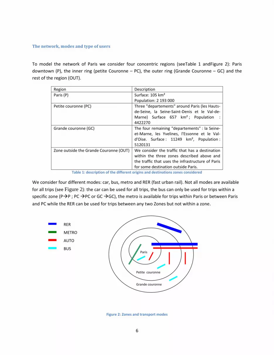
The network, modes and type of users
To model the network of Paris we consider four concentric regions (seeTable 1 andFigure 2): Paris
downtown (P), the inner ring (petite Couronne – PC), the outer ring (Grande Couronne – GC) and the
rest of the region (OUT).
Region Description
Paris (P) Surface: 105 km² Population: 2 193 000
Petite couronne (PC) Three "departements" around Paris (les Hauts-de-Seine, la Seine-Saint-Denis et le Val-de-Marne) Surface 657 km² ; Population : 4422270
Grande couronne (GC) The four remaining "departements" : la Seine-et-Marne, les Yvelines, l'Essonne et le Val-d'Oise. Surface : 11249 km², Population : 5120131
Zone outside the Grande Couronne (OUT) We consider the traffic that has a destination within the three zones described above and the traffic that uses the infrastructure of Paris for some destination outside Paris.
Table 1: description of the different origins and destinations zones considered
We consider four different modes: car, bus, metro and RER (fast urban rail). Not all modes are available
for all trips (see Figure 2): the car can be used for all trips, the bus can only be used for trips within a
specific zone (PP ; PC PC or GC GC), the metro is available for trips within Paris or between Paris
and PC while the RER can be used for trips between any two Zones but not within a zone.
Figure 2: Zones and transport modes
Petite couronne
Paris
Grande couronne
RER
METRO
AUTO
BUS

7
There are two simplifications in this representation. First, we do not consider tramways; secondly the
bus only travels within a zone while the RER is only used for trips between two zones. Although, these
are simplifications imposed on the model it is very unlikely that these will influence the result in a
significant way. The tram attracts relatively little users and can, moreover, be easily assimilated to the
metro.
Table 2 shows which combinations of modes are considered. The table consists of two parts, in the first
part the trips where only one mode is used are given while the second part considers the multi-modal
trips.
OD PP PCP PPC
GCP PGC
PCPC GCPC PCGC
GCGC OUT( . ) ( . ) OUT
Single mode
Car X X X X X X X
Bus X X X
Metro X X
RER X
Multiple modes
Car + bus X
Car + metro X
Car + RER
Bus + metro X
Bus+RER X X X X
Metro +RER X X X
Car + bus + RER X X X
Car + metro + RER X
Bus + metro + RER X X
Table 2: modal combinations considered
For trips between zones the RER is often used and is often combined with another mode of travel within
the zone of origin and within the zone of destination. Many intermodal trips consist of using the car or
bus to get to a metro or RER station and then use this mode for most of the trip.
We distinguish four classes of users and two periods of time. The classes of users differ in their income
and in their professional activity. We have users which are poor and working, poor and non-working,
rich and working and finally rich and non-working. A user is considered as poor if he or she uses public
social housing (25% of population). This distinction is not very accurate but is imposed by the limited
available transport data. The absolute number of different user types is given in Table 3. Note that there
are more rich users than poor users. This is the result of our definition.
Rich Poor
working 4 550 220 1 552 930
non working 910 043 310 586
Table 3: number of users per type
8
We distinguish 4 categories of users and 16 OD pairs. As we work with a fixed OD matrix, we have a total
of 64 types of users (4 types of users x 16 OD pairs). For each user type and OD pair we calibrate a
nested utility function on the basis of observed travel patterns in the reference equilibrium. The total
flow on a given link is then the weighted sum of the travel patterns of up to 64 different types of users.
The two periods of time considered are the peak period and the off-peak period. The working users are
travelling mainly during the peak period and congestion is most severe during this period. The peak
period lasts for six hours a day (three in the morning and three in the afternoon), while the off-peak
period lasts eight hours (we consider that traffic is negligible during the other hours). We only model
half of a day, so assuming symmetry between morning and evening peak.
The elasticities of substitution used are reported in Table 4 and are slightly different between working
and non-working as those working have in general less flexibility in choosing the time of day they travel.
Later we will test a higher elasticity of substitution for the choice between paths (modes): we test an
elasticity of 4 rather than 2.
Poor working Poor non working Rich working Rich non working
Paths in peak 2 2 2 2
Paths in off-peak 2 2 2 2
Peak/off-peak 1.5 2 1.2 1.9
Transport/other 1.4 1.4 1.4 1.4
Table 4: The elasticities of substitution
The notation for the different links is given in the following diagram:
Figure 3: The network and the notation used
Each link is characterized by a letter and a number. The letter refers to the mode: “c” for car, “b” for
bus, “m” for metro and “r” for RER. The links ending with the number 0 (c0, b0 and m0) have their origin
and destination in the center of Paris. Those ending by 1 have as origin PC and destination P, those
ending by 11 are the links going in the opposite direction. The links ending with 2 have their origin and
destination with PC, etc. The links with 5 or 55 have their origin or destination outside of the Paris
P PC GC
c1, m1, r1 c3, r3
c0, m0, b0
c2, b2
c4, b4
c11, m11, r11 c33, r33 OUT c5, r5
c55, r55
9
region. As we only model the first half of a day, the users on c1 are users going from PC to P in the
morning while the users on c11 are users going from P to PC in the morning.
We also consider multi modal trips and thus c2r1b0 denotes a trip which starts in PC using the car (c2) to
go to the RER station (r1), with destination P where a bus (b0) is used to get to the final destination
within P.
Users costs and other costs
In our model, users base their decisions on the generalized cost for a trip. This cost consists of five
terms: (i) a monetary cost2, (ii) a time cost, (iii) an access time cost, (iv) a waiting cost and (v) a crowding
cost. For car users, the monetary term is the sum of the resource cost (which includes the net
purchasing price of the vehicle, the insurance costs, the maintenance costs, parking costs and the fuel
costs), taxes and, when applicable, a toll. For public transport users the monetary term is equal to the
fare the user pays. The time cost is the value of time of a user, times the time needed to accomplish the
trip. In this study we assume that the travel time on the road network is given by the Bureau of Public
Roads formula, which is a power function of the volume-capacity ratio with power four. As we use a
model with only two periods (peak and off peak), we do not consider explicitly schedule delay costs in
private and public transport. The travel time for the metro and RER modes is assumed to be constant
(i.e. we neglect network congestion for rail modes). The three last terms are specific to the public
transport modes. The access time is the average time needed to get to a bus, metro or RER station,
while the waiting time is approximated by half the time between two services3.
Although we neglect congestion of trains on the rail network we take into account that an increase in
usage of public transport entails extra costs. Indeed, two kinds of costs will arise when more people use
public transportation: crowding costs and or operating costs. First the users face crowding costs: the
more people on the bus or metro the less comfortable the journey. There are different ways to model
crowding in public transport: one can model the difference in comfort between standing and seated
passengers (Kraus (1991)), the congestion on the platforms (Kraus & Yoshida (2002)). As we have
already a multi-modal model we opt for the simplest representation: the crowding cost is a linear
function of the passenger density in the vehicles. This type of formulation is also used by Huang (2000)
and Verhoef & Rouwendal (2004) and more importantly also by Prud’homme et al. (2012) from whom
we use the crowding cost estimates for Paris. Second, when the public transportation system is
operating close to its maximum capacity, an increase of users entails an extra operation cost; you need
more or larger busses to serve the additional users as otherwise the crowding costs become too high. To
accommodate for this extra cost we associate to each extra passenger using public transportation during
2 For public transport, many passengers use seasonal passes and the price for an additional trip is 0. We aggregated all users
into one category and used one average price, so we miss this distinction between passes and regular tickets. Our procedure is unlikely to bias the results because the majority of peak users are commuters that make only one return trip per day. An increase in the simulated price means then an increase in the average cost of the pass users who may decide to switch to another mode for their commuting trip. 3 Vuchic (2005,p18) shows that passengers do not care about timetables as long as the headway between two arrivals is
smaller than 5-6 minutes. This is the case for almost all metro, bus and RER trips within the PC of Paris. Vuchic also shows that the rule of one half is still a good approximation as long as the headway between two arrivals is smaller than 20 minutes. Of course if service is unreliable, following the timetable is also less useful.
10
the peak hours an extra cost of 0.18 euro/passenger km for rail and 0.23 euro/passenger-km for busses
(computed on the basis of Parry & Small, 2009). We assume that there are no capacity problems during
the off-peak hours. In this study we capture the extra cost of a passenger on the public transport
network by assuming that one third comes under the form of crowding costs and two thirds via
additional operating costs (more vehicles). This rule of thumb has been taken from Parry and Small
(2009). We also test the sensitivity of the results with respect to the importance of the crowding costs in
the reference equilibrium.
Note that we do not include costs such as maintenance or investment costs in public transport as they
are largely independent from the intensity of use of the network.
Social Welfare function
We measure social welfare with two types of definitions.
The first definition is the simple sum of the change in users' surplus (measured by the unweighted sum
of equivalent variations) plus the net change of the total revenues from transport (toll revenues, taxes
and public transport fares) minus the change in operation costs to accommodate public transport peak
travelers during the peak hours. This type of objective function is used in most of the transport literature
where income distribution issues and distortions in the rest of the economy are not considered. This
type of social welfare function assumes that the marginal cost of public funds (MCPF) equals 1.
The second definition is similar to the first definition but the weight of the poor is double that of the
rich. The average income weight for the population remains equal to 1 so that absolute welfare results
can still be compared with the first definition. Notice that on the basis of the definition of “rich” and
“poor” we have adopted, the population of the poor is relatively small in the entire population (25%).
We could also add a definition of welfare that takes into account the distortion on the labor market. This
may be important as changes in the commuter cost may trigger a decrease in labor supply and this could
be an important welfare loss. We don't do this in our model. The reason is that the local labor market is
not modeled in a sufficiently detailed way.
Reference equilibrium
The different pricing scenarios are evaluated compared to the reference equilibrium. This reference
equilibrium reflects the traffic situation (travel times, traffic flows and prices) observed in the Paris
region in 2007. For a detailed summary of the calibration procedure and data we refer to Kilani, Proost
and van der Loo (2012).

11
Traffic flows To determine the traffic flows and generalised costs in the Paris region in 2007 we used census data
compiled in database files by INSEE.4 The OD matrices and corresponding flows are mainly based on the
home-work census of 2007. For the public transport information on flows, costs and revenues we relied
mainly on the STIF report.5 Notice that some data is not fine enough to be compatible with spatial
structure of this model. In particular, most data aggregates the inner ring and the outer ring. Also, traffic
flows do not distinguish between alternative paths (as defined above), and data is aggregated among
the hours of the day. The census data indicates the main transport mode for commuting, but there are
only very few data on trips that combine different modes. In order to complete our input data we first
had to complete the dataset using complementary data from alternative sources (average travel speed
by mode, unit monetary cost for car usage, etc.). In a second phase we parameterized some variables in
the model, for which we do not have direct observation (average length of a trip by mode and by region,
elasticity of substitution in the decision choice of the users) and adjust these parameters so that a
sample of aggregates, comprising aggregate vehicle kilometers by mode, match those given in STIF data.
The OD matrix indicates the number of trips made each morning between each origin and each
destination. In Table 5the traffic flows are aggregated over time periods, user types and transport
modes:
P PC GC OUT
P 627 423 282 691 79 365 18 368 1 007 847
PC 620 169 1 089 765 1 729 990 19 055 3 458 981
GC 418 142 527 238 1 504 671 38 341 2 488 392
OUT 116 484 94 052 159 413 369 949
1 782 218 1 993 746 3 473 439 75 765 7 325 168 Table 5: Total traffic flows
To get the total traffic volume per day, one needs to multiply the figures in Table 5by two. This means
that there are 14.6 million trips made per day in the Paris region. This is comparable to the number of
trips considered by de Palma & Lindsey (2006, table 4, pg 118), who considered 6.7 million morning trips
in 2002 which extrapolated to 2008 gives us 7.6 million trips.
Compared to its size, the Paris inner region attracts a lot of jobs. Although only 14% of the trips are
made exclusively by car in the inner center of Paris, there is a high level of congestion. In the outer
regions, the car is the dominant mode. Indeed, congestion becomes less important as we move away
from the city center, but also the public transport solutions are less dense for trips between the inner
ring and the outer ring. Actually, there is a large debate on this issue and some programs targeting
better mobility in periphery of the city are being debated, e.g. The Grand Paris project. This project aims
to construct circular public transportation (rail) lines around downtown Paris, so that users travelling in
the outer ring do not have to cross the city center. The next table gives the share of all the trips made
exclusively by car:
4
Most of these are accessible from http://www.recensement.insee.fr/basesTableauxDetailles.action 5 STIF is a public administration managing transportation in Paris region. The documentation we used is available at
http://www.stif.info/les-transports-aujourd-hui/observation-mobilite/les-transports-commun-chiffres/2009-3823.html
12
P PC GC OUT
P 14% 26% 41% 68%
PC 22% 56% 44% 58%
GC 21% 59% 80% 83%
OUT 32% 8% 85% Table 6: share of the trips made exclusively by car
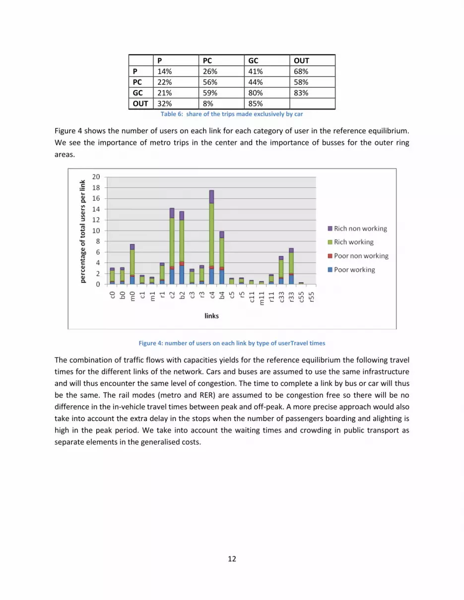
Figure 4 shows the number of users on each link for each category of user in the reference equilibrium.
We see the importance of metro trips in the center and the importance of busses for the outer ring
areas.
Figure 4: number of users on each link by type of userTravel times
The combination of traffic flows with capacities yields for the reference equilibrium the following travel
times for the different links of the network. Cars and buses are assumed to use the same infrastructure
and will thus encounter the same level of congestion. The time to complete a link by bus or car will thus
be the same. The rail modes (metro and RER) are assumed to be congestion free so there will be no
difference in the in-vehicle travel times between peak and off-peak. A more precise approach would also
take into account the extra delay in the stops when the number of passengers boarding and alighting is
high in the peak period. We take into account the waiting times and crowding in public transport as
separate elements in the generalised costs.

13
travel time in minutes
free flow peak Off-peak
C0 3.8 15.80 4.32
B0 3.8 15.80 4.32
M0 10.8 10.80 10.80
C1 7.0 14.00 7.32
M1 1.2 1.20 1.20
r1 12.3 12.30 12.30
c2 3.0 23.69 3.92
b2 3.0 23.69 3.92
c3 13.4 33.49 14.19
r3 23.4 23.40 23.40
c4 5.2 27.74 6.10
b4 5.2 27.74 6.10
c5 19.1 19.09 19.09
r5 52.5 52.50 52.50
c11 16.4 20.58 16.57
m11 1.2 1.20 1.20
r11 12.3 12.30 12.30
c33 13.4 26.85 13.94
r33 23.4 23.40 23.40
c55 5.5 5.45 5.45
r55 15 15.00 15.00 Table 7: travel times per link (min)
Notice that the travel time on road (car and bus modes) is lower in the inner ring than in Paris (as shown
in Table 7 ), even if the average length of the trip is higher on the inner ring. This is because congestion
decreases as we move away from the city center. But on the outer ring the travel time increases
because the average trip distance is larger. As we use calibrated nested CES functions, users on a given
OD do not necessarily take the route (or path) with the smallest generalized cost as assumed in a
Wardrop equilibrium. The imperfect substitution between paths imbedded in the nested CES functions,
reflects then differences in individual access costs, preferences or idiosyncratic elements.
The generalized costs When combined with the average values of time7, the travel time data give the total generalized costs
per link and per period. Note that, even for the uncongested modes, the peak period has larger
generalized costs. This is due to higher values of times during the peak period mainly for the commuters.
7 For a working trip of a rich, the value of time used equals 25 €/hour.
14
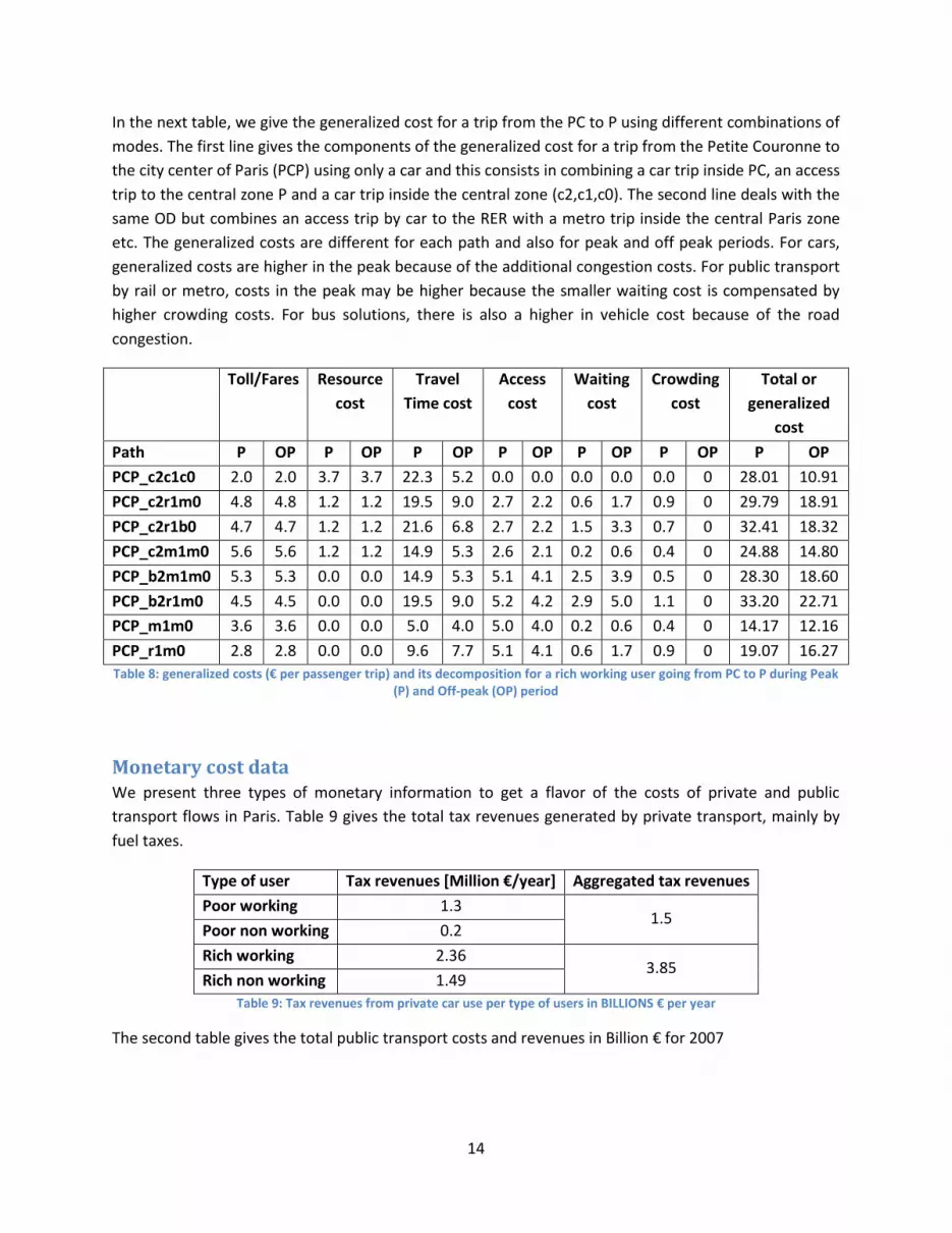
In the next table, we give the generalized cost for a trip from the PC to P using different combinations of
modes. The first line gives the components of the generalized cost for a trip from the Petite Couronne to
the city center of Paris (PCP) using only a car and this consists in combining a car trip inside PC, an access
trip to the central zone P and a car trip inside the central zone (c2,c1,c0). The second line deals with the
same OD but combines an access trip by car to the RER with a metro trip inside the central Paris zone
etc. The generalized costs are different for each path and also for peak and off peak periods. For cars,
generalized costs are higher in the peak because of the additional congestion costs. For public transport
by rail or metro, costs in the peak may be higher because the smaller waiting cost is compensated by
higher crowding costs. For bus solutions, there is also a higher in vehicle cost because of the road
congestion.
Toll/Fares Resource
cost
Travel
Time cost
Access
cost
Waiting
cost
Crowding
cost
Total or
generalized
cost
Path P OP P OP P OP P OP P OP P OP P OP
PCP_c2c1c0 2.0 2.0 3.7 3.7 22.3 5.2 0.0 0.0 0.0 0.0 0.0 0 28.01 10.91
PCP_c2r1m0 4.8 4.8 1.2 1.2 19.5 9.0 2.7 2.2 0.6 1.7 0.9 0 29.79 18.91
PCP_c2r1b0 4.7 4.7 1.2 1.2 21.6 6.8 2.7 2.2 1.5 3.3 0.7 0 32.41 18.32
PCP_c2m1m0 5.6 5.6 1.2 1.2 14.9 5.3 2.6 2.1 0.2 0.6 0.4 0 24.88 14.80
PCP_b2m1m0 5.3 5.3 0.0 0.0 14.9 5.3 5.1 4.1 2.5 3.9 0.5 0 28.30 18.60
PCP_b2r1m0 4.5 4.5 0.0 0.0 19.5 9.0 5.2 4.2 2.9 5.0 1.1 0 33.20 22.71
PCP_m1m0 3.6 3.6 0.0 0.0 5.0 4.0 5.0 4.0 0.2 0.6 0.4 0 14.17 12.16
PCP_r1m0 2.8 2.8 0.0 0.0 9.6 7.7 5.1 4.1 0.6 1.7 0.9 0 19.07 16.27
Table 8: generalized costs (€ per passenger trip) and its decomposition for a rich working user going from PC to P during Peak (P) and Off-peak (OP) period
Monetary cost data We present three types of monetary information to get a flavor of the costs of private and public
transport flows in Paris. Table 9 gives the total tax revenues generated by private transport, mainly by
fuel taxes.
Type of user Tax revenues [Million €/year] Aggregated tax revenues
Poor working 1.3 1.5
Poor non working 0.2
Rich working 2.36 3.85
Rich non working 1.49
Table 9: Tax revenues from private car use per type of users in BILLIONS € per year
The second table gives the total public transport costs and revenues in Billion € for 2007

15
Revenues Costs
Public subsidies 1.50 Operations 6.73
Public transport tax employers 2.88 Investment 1.49
User fees 2.92
Table 10: Public transport costs and revenues in Paris region Source : OMNIL (2011), les transports en commun en chiffres.
The third table compares the costs of the Paris public transport system with the London public transport
system (before road pricing was introduced), putting the Paris data on the same footing as the data
published for London by Parry & Small (2009). Data are not fully comparable as Paris is defined in a
wider sense than London and there are a few other important differences: public transport has a larger
share of trips in the peak in London (35% compared to 18% in Paris) and London has a much larger share
of bus trips. The cost recovery rate is low in both metropolitan areas.
Paris London
Rail Bus Rail Bus
Peak Off
Peak
Peak Off
Peak
Peak Off Peak Peak Off
Peak
Public Transport
Passenger miles, millions 8298 3178 1652 1118 3302 1265 2115 1432
Vehicle occupancy (pass-
mi/veh-mi)
252 138 24 16 138 76 17 12
Average operating cost,
€/vehkm
128 91 9 4 105 68 8 4
Avg operating cost,
€cent/passkm
51 66 39 28 76 89 47 33
Marginal supply cost,
€cent/vehkm
31 40 26 19 46 54 32 22
Fare, €cent/passkm 17 17 17 17 25 25 20 20
Subsidy, % of average operating
cost
66 74 57 39 67 72 59 40
Auto Auto
Peak Off
Peak
Peak Off Peak
Annual passenger-miles,
millions
46 761 42 588 15 450 13 951
Occupancy 1.10 1.20 1.41 1.53
Table 11: comparison between costs of the public transport systems in Paris and London. Sources: Parry & Small (2009) and own computations for Paris

16
Results We present results in three steps. First we discuss the effects of marginal increases in private and public
transport prices separately. Next we discuss what types of combinations of changes in private and public
transport prices make sense. Finally we discuss the benefits of public transport capacity investments and
analyze them as a function of the pricing of public and private transport.
Effects of road pricing We analyze two types of road pricing: zonal pricing and cordon pricing.
In the zonal pricing system a peak toll is imposed on each (car) trip within a specific zone. The goal of
such pricing scheme is to reduce traffic within the zones where congestion is the most severe. London
and Milan have implemented zonal pricing. We therefore consider a zonal pricing system within the
borders of Paris, another within the borders of the first ringzone, “La Petite Couronne” and finally a
zonal pricing within the second ringzone “Grande Couronne”. Although congestion is less severe in the
latter two zones, we perform this exercise for comparative reasons.
When a cordon charge is in place, car users that enter a specific zone pay a toll. The level of the charge
can vary during the day and by type of vehicle. Stockholm has implemented a cordon toll. We compare
two types of cordon charges: one with “Paris” as zone (C_P) and one where “Petite Couronne” (C_PC) is
considered as zone. Cordon charges are technically easier to implement and to monitor but are less
efficient than zonal system because they target only part of the traffic (the traffic that remains inside the
zone is not affected by the cordon toll). Indeed, recall that one of the major problems in transportation
in this region is the excessive usage of cars in the inner and outer rings.
First we analyze the impact on social welfare of different pricing scenarios of a marginal reform of 1
euro in the peak period for the (i) zonal charge within Paris (Z_P), (ii) within “Petite Couronne” (Z_PC)
and (iii) within “Grande Couronne” (Z_GC), (iv) cordon charge around Paris (C_P) and (v) “petite
Couronnne (C_PC). The next three tables give us the impacts on social welfare (∆W) of the different
types of users for different lump sum redistribution schemes. This is the traditional efficiency measure
used in transport economics. In Table 12 the results are given when none of the revenues are
redistributed to the users, in Table 13, 50% of the total revenues are distributed proportionally to the
different user groups and in Table 14 all the revenues are redistributed. The net revenues to be
redistributed are computed taking into account all private transport taxes and charges, all variations in
costs and revenues for the public transport but keeping total employment constant.

17
Pricing scenario ∆W: poor ∆W: rich ∆W: average
Z_P -4.26 -0.79 -1.67
Z_PC -0.92 13.38 9.74
Z_GC 2.70 18.38 14.39
C_P -2.61 -2.32 -2.40
C_PC -8.82 -19.14 -16.51
Table 12: social welfare changes for 1 euro charge (€/individual/year). 0%of the revenues are redistributed
Pricing scenario ∆W: poor ∆W: rich ∆W: average
Z_P 2.14 5.87 4.92
Z_PC 33.99 48.94 45.13
Z_GC 61.53 74.75 71.38
C_P 0.53 0.91 0.82
C_PC -6.06 -17.26 -14.41
Table 13: social welfare changes for 1 euro charge (€/individual/year). 50%of the revenues are redistributed
Pricing scenario ∆W: poor ∆W: rich ∆W: average
Z_P 8.54 12.53 11.51
Z_PC 68.89 84.49 80.52
Z_GC 120.37 131.11 128.38
C_P 3.67 4.15 4.03
C_PC -3.30 -15.37 -12.30
Table 14: social welfare changes for 1 euro charge (€/individual/year). 100%of the revenues are redistributed
The above tables show the effects of a 1 euro toll per car trip on the social welfare and the effects of the
redistribution of the toll revenues on the average yearly welfare of 7.3 million users of the Paris
transport system. The average effect is a weighted average as there are more rich users than poor users
in our definition of the population. We see that, when the revenues are not redistributed (Table 12), the
effect of a toll will be negative or small. The pricing scheme will in this case be difficult to accept by the
users. In Table 13, however, we see that a redistribution of half of the revenues of a zonal system will
have a positive effect on welfare except for the C_PC. In the extreme case, there are no transaction
costs and then all revenues are redistributed. In that case, in almost all road pricing schemes, users will
see their welfare increase. It is thus clear that the redistribution of the revenues will be a key parameter
for the acceptability of the pricing scheme. A majority voting scheme (where users foresee the overall
net impact of pricing) would accept such a toll if at least 50% of the toll revenues are redistributed to the
users. This in as far as the voters are aware of the net impact on them (De Borger & Proost, 2012).

18
The overall impacts (aggregating both groups) are given in Figure 5. This graph gives an idea of the
magnitude of the effects of all the different 1 € charging pricing schemes. We see that the effects of the
zonal charges are much larger than those of the cordon charges. The cordon charges are rather
ineffective because they concern only a minor part of the traffic: many car trips are trips within the PC
or GC and much less trips entering the centre of Paris (cfr. Table 6). In addition, a cordon toll encourages
car trips within the cordon9. When the cordon zone is too large, it is also difficult to have positive effects
for the cordon toll: for a cordon toll around the PC, the welfare effects are negative even after
redistribution (cfr. last line of Table 14). This is in contrast with the positive effect of a larger zonal tolling
area (compare three first lines of Table 14). Of course a larger area also increases the implementation
costs and this is not taken on board in our results.
Z_P Z_PC Z_GC C_P C_PCToll 1€ veh0
200
400
600
800
W in M€ year
Effect of a toll on the Welfare
Figure 5: effects of a pricing scenario on welfare. Legend: Z_P = Zonal within Paris, Z_PC = zonal within Petite Couronne, Z_GC = zonal within Grande Couronne, C_P = Cordon around Paris, C_PC = Cordon charge around Petite Couronne
Effects of an increase in the fares for public transport
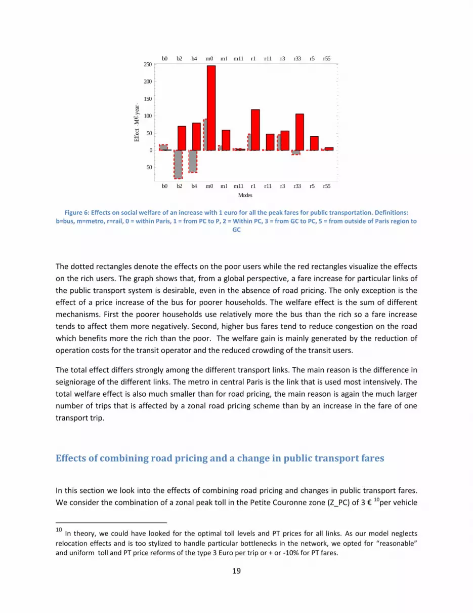
The results of an increase of 1 € for the fares of different public transport links during the peak period
only (considering each link separately) are given in Figure 6. We use two important assumptions to
produce these results. First, we assume that any increase or decrease of passengers is matched by a
2/3increase or decrease of seats. Second, any net government surplus or deficit is redistributed by a
reduction of the head taxes per individual. We show the results for the poor and rich users.
9 This was also experienced with the cordon toll in Stockholm (see Borjesson et al.2012).
19
b0 b2 b4 m0 m1 m11 r1 r11 r3 r33 r5 r55
50
0
50
100
150
200
250b0 b2 b4 m0 m1 m11 r1 r11 r3 r33 r5 r55
Modes
Eff
ect
M€
yea
r
Figure 6: Effects on social welfare of an increase with 1 euro for all the peak fares for public transportation. Definitions: b=bus, m=metro, r=rail, 0 = within Paris, 1 = from PC to P, 2 = Within PC, 3 = from GC to PC, 5 = from outside of Paris region to
GC
The dotted rectangles denote the effects on the poor users while the red rectangles visualize the effects
on the rich users. The graph shows that, from a global perspective, a fare increase for particular links of
the public transport system is desirable, even in the absence of road pricing. The only exception is the
effect of a price increase of the bus for poorer households. The welfare effect is the sum of different
mechanisms. First the poorer households use relatively more the bus than the rich so a fare increase
tends to affect them more negatively. Second, higher bus fares tend to reduce congestion on the road
which benefits more the rich than the poor. The welfare gain is mainly generated by the reduction of
operation costs for the transit operator and the reduced crowding of the transit users.
The total effect differs strongly among the different transport links. The main reason is the difference in
seigniorage of the different links. The metro in central Paris is the link that is used most intensively. The
total welfare effect is also much smaller than for road pricing, the main reason is again the much larger
number of trips that is affected by a zonal road pricing scheme than by an increase in the fare of one
transport trip.
Effects of combining road pricing and a change in public transport fares
In this section we look into the effects of combining road pricing and changes in public transport fares.
We consider the combination of a zonal peak toll in the Petite Couronne zone (Z_PC) of 3 € 10per vehicle
10 In theory, we could have looked for the optimal toll levels and PT prices for all links. As our model neglects
relocation effects and is too stylized to handle particular bottlenecks in the network, we opted for “reasonable” and uniform toll and PT price reforms of the type 3 Euro per trip or + or -10% for PT fares.

20
with an increase or decrease of all the public transport fares of 10%. Next we discuss the sensitivity of
the results to the importance of the crowding cost and to the ease of substitution between transport
alternatives.
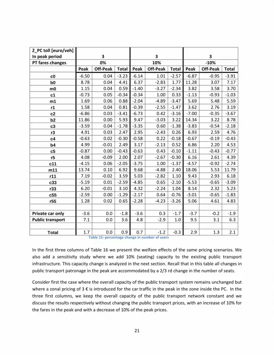
The results are summarized in two tables (Table 15 and Table 16). In Table 15we show the percentage
changes in the use of different links for the zonal peak toll combined with a public transport supply
scenario where 2 out of 3 additional passengers receive a seat. We look into three variants for the
pricing of public transport. Either the fares in the peak are not changed (0%), or they are increased or
decreased by 10% in the peak
Of course whenever the increase in patronage of public transport is accommodated by additional
capacity, this extra passenger is costly in terms of operations costs and additional congestion. This is the
reason why we combine road pricing with public transport fare increases. This runs against the common
wisdom but can be justified on theoretical grounds (Kraus, 2012).
In Table 15 we see the volume effects for the 16 private and public transport links we consider. Private
car links are denoted by "c", bus use by "b" and rail or metro links by "r". Links 0,2,4, denote trips within
Paris (P), within Petite Couronne (PC) and within Grande Couronne (GC). Links 1, 3 and 5 denote links
from PC to P, from GC to PC and from out of GC to GC. The other links are links outbound of the center
of Paris.
Consider the three first columns. We see that the zonal toll in PC discourages all peak car trips inside PC:
c0,c1, c2 ,c3 (c11, c33) all decrease. For all trips inside the PC, metro, bus and rail take over part of the
trips but overall the volume decreases in PC. There is only a small substitution to off peak. The reason is
that most trips in the peak are work related and not very flexible.
Outside the PC, all car trips that are local like the c4,c5 links are much less affected by the zonal toll.
Public transport trips increase but in the zones where car trips are priced, bus trips increase most as
they also benefit from the decrease in road congestion.
Overall the number of trips remains more or less constant - there is even a small increase which is
possible as in the areas with zonal tolls there is a good substitution by public transport and in the non
priced zones, the decrease in car traffic heading to the center may attract more trips.
21
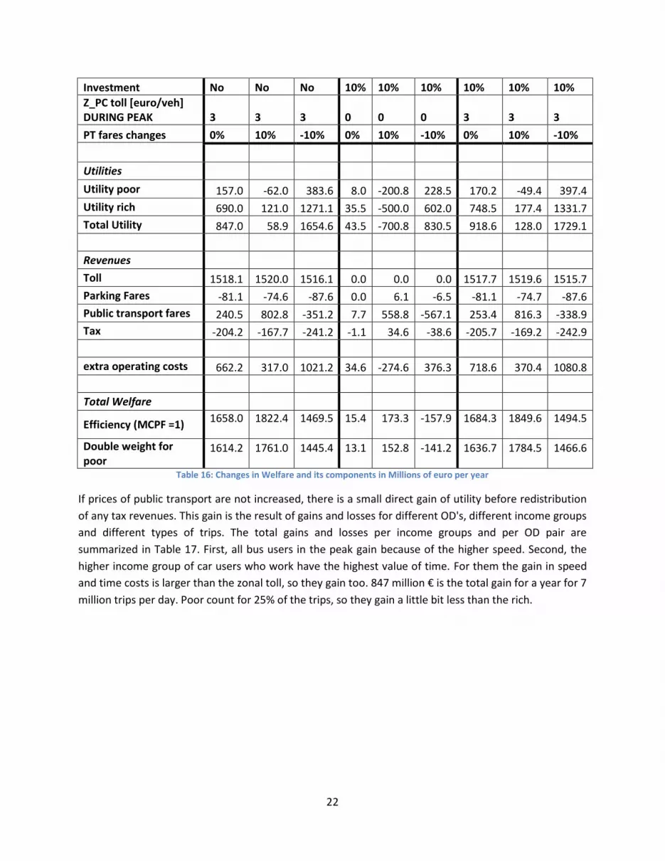
In the first three columns of Table 16 we present the welfare effects of the same pricing scenarios. We
also add a sensitivity study where we add 10% (seating) capacity to the existing public transport
infrastructure. This capacity change is analyzed in the next section. Recall that in this table all changes in
public transport patronage in the peak are accommodated by a 2/3 rd change in the number of seats.
Consider first the case where the overall capacity of the public transport system remains unchanged but
where a zonal pricing of 3 € is introduced for the car traffic in the peak in the zone inside the PC. In the
three first columns, we keep the overall capacity of the public transport network constant and we
discuss the results respectively without changing the public transport prices, with an increase of 10% for
the fares in the peak and with a decrease of 10% of the peak prices.
Z_PC toll [euro/veh] In peak period 3 3 3
PT fares changes 0% 10% -10%
Peak Off-Peak Total Peak Off-Peak Total Peak Off-Peak Total
c0 -6.50 0.04 -3.23 -6.14 1.01 -2.57 -6.87 -0.95 -3.91
b0 8.78 0.04 4.41 6.37 -2.83 1.77 11.28 3.07 7.17
m0 1.15 0.04 0.59 -1.40 -3.27 -2.34 3.82 3.58 3.70
c1 -0.73 0.05 -0.34 -0.34 1.00 0.33 -1.13 -0.93 -1.03
m1 1.69 0.06 0.88 -2.04 -4.89 -3.47 5.69 5.48 5.59
r1 1.58 0.04 0.81 -0.39 -2.55 -1.47 3.62 2.76 3.19
c2 -6.86 0.03 -3.41 -6.73 0.42 -3.16 -7.00 -0.35 -3.67
b2 11.86 0.00 5.93 9.47 -3.03 3.22 14.34 3.22 8.78
c3 -3.59 0.04 -1.78 -3.35 0.60 -1.38 -3.83 -0.54 -2.18
r3 4.91 0.03 2.47 2.95 -2.43 0.26 6.93 2.59 4.76
c4 -0.63 0.02 -0.30 -0.58 0.22 -0.18 -0.67 -0.19 -0.43
b4 4.99 -0.01 2.49 3.17 -2.13 0.52 6.86 2.20 4.53
c5 -0.87 0.00 -0.43 -0.63 0.43 -0.10 -1.11 -0.43 -0.77
r5 4.08 -0.09 2.00 2.07 -2.67 -0.30 6.16 2.61 4.39
c11 -4.15 0.06 -2.05 -3.75 1.00 -1.37 -4.57 -0.92 -2.74
m11 13.74 0.10 6.92 9.68 -4.88 2.40 18.06 5.53 11.79
r11 7.19 -0.02 3.59 5.03 -2.82 1.10 9.43 2.93 6.18
c33 -5.19 0.01 -2.59 -4.85 0.65 -2.10 -5.53 -0.65 -3.09
r33 6.20 -0.01 3.10 4.32 -2.24 1.04 8.14 2.32 5.23
c55 -2.59 0.00 -1.29 -2.17 0.64 -0.76 -3.01 -0.65 -1.83
r55 1.28 0.02 0.65 -2.28 -4.23 -3.26 5.06 4.61 4.83
Private car only -3.6 0.0 -1.8 -3.6 0.3 -1.7 -3.7 -0.2 -1.9
Public transport 7.1 0.0 3.6 4.8 -2.9 1.0 9.5 3.1 6.3
Total 1.7 0.0 0.9 0.7 -1.2 -0.3 2.9 1.3 2.1 Table 15: percentage change in number of users
22
Investment No No No 10% 10% 10% 10% 10% 10%
Z_PC toll [euro/veh] DURING PEAK 3 3 3 0 0 0 3 3 3
PT fares changes 0% 10% -10% 0% 10% -10% 0% 10% -10%
Utilities
Utility poor 157.0 -62.0 383.6 8.0 -200.8 228.5 170.2 -49.4 397.4
Utility rich 690.0 121.0 1271.1 35.5 -500.0 602.0 748.5 177.4 1331.7
Total Utility 847.0 58.9 1654.6 43.5 -700.8 830.5 918.6 128.0 1729.1
Revenues
Toll 1518.1 1520.0 1516.1 0.0 0.0 0.0 1517.7 1519.6 1515.7
Parking Fares -81.1 -74.6 -87.6 0.0 6.1 -6.5 -81.1 -74.7 -87.6
Public transport fares 240.5 802.8 -351.2 7.7 558.8 -567.1 253.4 816.3 -338.9
Tax -204.2 -167.7 -241.2 -1.1 34.6 -38.6 -205.7 -169.2 -242.9
extra operating costs 662.2 317.0 1021.2 34.6 -274.6 376.3 718.6 370.4 1080.8
Total Welfare
Efficiency (MCPF =1) 1658.0 1822.4 1469.5 15.4 173.3 -157.9 1684.3 1849.6 1494.5
Double weight for poor
1614.2 1761.0 1445.4 13.1 152.8 -141.2 1636.7 1784.5 1466.6
Table 16: Changes in Welfare and its components in Millions of euro per year
If prices of public transport are not increased, there is a small direct gain of utility before redistribution
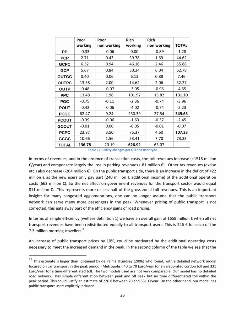
of any tax revenues. This gain is the result of gains and losses for different OD's, different income groups
and different types of trips. The total gains and losses per income groups and per OD pair are
summarized in Table 17. First, all bus users in the peak gain because of the higher speed. Second, the
higher income group of car users who work have the highest value of time. For them the gain in speed
and time costs is larger than the zonal toll, so they gain too. 847 million € is the total gain for a year for 7
million trips per day. Poor count for 25% of the trips, so they gain a little bit less than the rich.
23
Poor working
Poor non working
Rich working
Rich non working TOTAL
PP -0.33 -0.06 0.00 -0.89 -1.28
PCP 2.71 0.43 39.78 1.69 44.62
GCPC 6.32 0.94 46.16 2.46 55.88
GCP 5.67 0.84 50.24 6.04 62.78
OUTGC 0.40 0.06 6.13 0.88 7.46
OUTPC 13.58 2.00 14.64 2.06 32.27
OUTP -0.48 -0.07 -3.05 -0.96 -4.55
PPC 13.48 1.98 101.92 13.82 131.20
PGC -0.75 -0.11 -2.36 -0.74 -3.96
POUT -0.42 -0.06 -4.02 -0.74 -5.23
PCGC 62.47 9.24 250.39 27.54 349.63
PCOUT -0.39 -0.06 -1.63 -0.37 -2.45
GCOUT -0.01 0.00 -0.05 -0.01 -0.07
PCPC 23.87 3.50 75.37 4.60 107.33
GCGC 10.66 1.56 53.41 7.70 73.33
TOTAL 136.78 20.19 626.92 63.07 Table 17: Utility changes per OD and user type
In terms of revenues, and in the absence of transaction costs, the toll revenues increase (+1518 million
€/year) and compensate largely the loss in parking revenues (-81 million €). Other tax revenues (excise
etc.) also decrease (-204 million €). On the public transport side, there is an increase in the deficit of 422
million € as the new users only pay part (240 million € additional income) of the additional operation
costs (662 million €). So the net effect on government revenues for the transport sector would equal
811 million €. This represents more or less half of the gross zonal toll revenues. This is an important
insight: for many congested agglomerations, one can no longer assume that the public transport
network can serve many more passengers in the peak. Whenever pricing of public transport is not
corrected, this eats away part of the efficiency gains of road pricing.
In terms of simple efficiency (welfare definition 1) we have an overall gain of 1658 million € when all net
transport revenues have been redistributed equally to all transport users. This is 226 € for each of the
7.3 million morning travellers11.
An increase of public transport prices by 10%, could be motivated by the additional operating costs
necessary to meet the increased demand in the peak. In the second column of the table we see that the
11 This estimate is larger than obtained by de Palma &Lindsey (2006) who found, with a detailed network model
focused on car transport in the peak period (Metropolis), 40 to 70 Euro/year for an elaborated cordon toll and 331 Euro/year for a time differentiated toll. The two models used are not very comparable. Our model has no detailed road network, has simple differentiation between peak and off peak but no time differentiated toll within the peak period. This could justify an estimate of 226 € between 70 and 331 €/year. On the other hand, our model has public transport users explicitly included.

24
direct utility gain decreases as everybody has now to pay more for their trip. But now there is a strong
increase in public transport fare revenues that is larger than the increase in operation costs.
In terms of overall efficiency, welfare increases due to the combination of better road and better public
transport pricing. This is a clear case of complementarities between road pricing and public transport
pricing. Whenever private pricing is corrected, also public transport can be priced according to its
marginal cost. As additional passengers increase crowding and require additional capacity, the marginal
cost is not zero and larger than the public transport prices in the reference.
In the third column we test the effects of a combination of road pricing and a decrease in public
transport fares by 10%. There are now important direct utility gains before redistribution (+1654.6
million €). On the public revenue side however, the toll revenues (1516 million €) are largely
compensated by an increase in the deficit of public transport operation (revenues - 351 million € and
additional operating costs of 1021 million €). The net welfare gain is now smaller (1469 million €) than in
the first and second column so that an increase of peak public transport prices should accompany the
introduction of the zonal pricing system for roads.
If one increases the weight given to the marginal cost of public funds12, one favors even more the
scenario with an increase of public transport prices as this scenario increases strongly the net public
revenue outcome. However, this result only holds if there is no decrease in the labor supply because a
reduction in labor supply may have a stronger effect on public revenues than a reduction of the public
transport deficit. The ultimate labor supply effect will depend on the way the net revenues are used.
Parry & Bento (2001) and Mayeres & Proost (2001) advocate using the net revenues for a reduction of
the labor tax.
One way to take equity aspects into account is to give a double weight to the poor individuals but to
keep the average welfare weight equal to 1. Also on this account does the combination of a peak zonal
toll and an increase of public transport prices for the peak outperform the other options. In our model
all locations of residences and workplaces are kept fixed.
In Table 18 we make a sensitivity study on the importance of crowding costs. Up to now we used the
assumption that for every three additional passengers of public transport, two passengers were
accommodated by an increased (costly) supply of public transport capacity and only one passenger
added to the existing public transport congestion level. With these assumptions, an overall extension of
public transport was not very beneficial and additional passengers were rather costly in terms of
additional operating expenses (cfr. 4th column in Table 16). This is the reason why we test a scenario
with higher congestion levels in public transport in the reference equilibrium. We recalibrate the model
and increase the crowding costs in the reference equilibrium by one third. In addition we decrease the
operating costs of the public transport supply response by assuming that only one out of three
additional passengers is accommodated by an extra public transport supply. These two elements
12
Kleven & Kreiner (2006) find values for the MCPF for rich countries of the order of 1.5.

25
combined will give rise to much higher levels of congestion in public transport13. Table 18 considers the
same pricing scenarios but uses this new calibration and new public transport supply strategy.
investment No No No 10% 10% 10% 10% 10% 10%
Z_PC toll DURING PEAK
[euro/veh] 3 3 3 0 0 0 3 3 3
PT fares changes 0% 10% -10% 0% 10% -10% 0% 10% -10%
Utilities
Utility poor 149.8 -66.4 373.2 23.8 -187.2 241.9 175.9 -41.3 400.4
Utility rich 659.7 103.2 1227.4 106.1 -438.4 661.4 775.5 215.2 1347.1
Total Utility 809.5 36.7 1600.6 129.9 -625.5 903.2 951.4 173.9 1747.5
Revenues
Toll 1518.6 1520.4 1516.7 0.0 0.0 0.0 1517.8 1519.7 1516.0
Parking Fares -80.9 -74.4 -87.3 0.1 6.1 -6.0 -80.9 -74.5 -87.4
Public transport
fares 228.2 794.9 -367.3 21.9 574.6
-
558.5 252.9 820.9 -343.9
Tax -203.0 -167.2 -239.3 -2.6 32.9 -38.6 -205.9 -170.0 -242.4
extra operating
costs 305.4 146.8 469.9 48.3 -103.3 205.4 358.3 197.1 525.6
Total Welfare
Efficiency (MCPF
=1) 1966.9 1963.8 1953.5 100.9 91.4 94.7 2076.9 2072.9 2064.1
Double weight for
the poor 1924.9 1903.3 1931.9 94.0 66.7 107.5 2027.3 2005.0 2035.0
Table 18: Changes in Welfare and its components in Millions of euro per year taking into account 1/3 higher crowding costs and a smaller supply response by PT
We see now a very flat optimum as regards the pricing of public transport: increasing or decreasing
public transport prices hardly makes a difference. The main reason is that with a higher initial crowding
and a smaller supply response, a PT price decrease is compensated by an increase in crowding costs and
vice versa for a PT price increase. As expected, an overall capacity increase of PT is now more beneficial
13 We used a linear approximation of the public transport congestion cost based on Prud-homme et al (2012). An alternative sensitivity test could be to replace this by a convex function calibrated to the same reference point. We would obtain different results because additional passengers would then create relatively more congestion. The benefits of a capacity increase would be larger at unchanged user charges. If the capacity is not increased, the introduction of road pricing would have a smaller modal shift to PT but a decrease of PT prices would lead to a larger increase of passengers for PT.
26
(comparing the 4th column of table 16 and table 18 we have +100.9 rather than + 15.4 million Euro when
the capacity extension is the only measure .
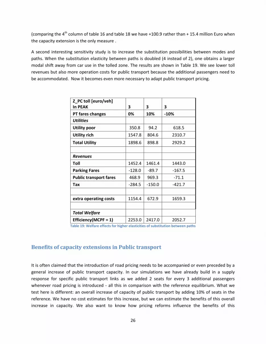
A second interesting sensitivity study is to increase the substitution possibilities between modes and
paths. When the substitution elasticity between paths is doubled (4 instead of 2), one obtains a larger
modal shift away from car use in the tolled zone. The results are shown in Table 19. We see lower toll
revenues but also more operation costs for public transport because the additional passengers need to
be accommodated. Now it becomes even more necessary to adapt public transport pricing.
Z_PC toll [euro/veh] In PEAK 3 3 3
PT fares changes 0% 10% -10%
Utilities
Utility poor 350.8 94.2 618.5
Utility rich 1547.8 804.6 2310.7
Total Utility 1898.6 898.8 2929.2
Revenues
Toll 1452.4 1461.4 1443.0
Parking Fares -128.0 -89.7 -167.5
Public transport fares 468.9 969.3 -71.1
Tax -284.5 -150.0 -421.7
extra operating costs 1154.4 672.9 1659.3
Total Welfare
Efficiency(MCPF = 1) 2253.0 2417.0 2052.7 Table 19: Welfare effects for higher elasticities of substitution between paths
Benefits of capacity extensions in Public transport
It is often claimed that the introduction of road pricing needs to be accompanied or even preceded by a
general increase of public transport capacity. In our simulations we have already build in a supply
response for specific public transport links as we added 2 seats for every 3 additional passengers
whenever road pricing is introduced - all this in comparison with the reference equilibrium. What we
test here is different: an overall increase of capacity of public transport by adding 10% of seats in the
reference. We have no cost estimates for this increase, but we can estimate the benefits of this overall
increase in capacity. We also want to know how pricing reforms influence the benefits of this

27
investment. Do the benefits of pricing reform increase strongly once we start with a larger public
transport capacity?
In Table 16 (columns 4 to 9) we assess the efficiency effects of this capacity increase. In columns 4,5
and 6, the effects of this capacity increase are assessed in the absence of a zonal road toll. If the 10%
increase in capacity is not accompanied by any pricing reform, the annual benefit of this increase in
capacity is 15.4 million € (column 4). We have no cost estimate for this 10% capacity extension but
the annual benefit is small compared with the total investment in public transport in Paris that
amounted to 1.5 billion € in 2007. The two main explanations for the low benefits for capacity
increase in PT are that the fare of PT is very low compared to the marginal congestion + PT supply
(seats) costs. Decreasing overall congestion in PT attracts additional users that do not pay all the
additional costs, even if the congestion part of these additional costs is now lower with the capacity
increase.
Columns 5 and 6 tell us that it is better to combine the capacity increase with a price increase for public
transport rather than with a price decrease for public transport. The reason is that additional passengers
still require extra operation costs, so the marginal cost of additional passengers in the peak remains
important. The large benefit associated to a price increase of public transport has more to do with the
benefits of price increases for public transport rather than with the increase of capacity.
In columns 7 to 9 we combine the 10% capacity increase for public transport with a zonal toll of 3€ and
different pricing reforms for public transport. Comparing the total efficiency gain in columns 1 to 3
(where there is no 10% general increase in capacity) with the efficiency gain in columns 7 to 9 (with 10%
increase in capacity), we can compute the additional benefit brought about by the capacity increase.
This benefit of 10% PT capacity extension is now slightly larger than in the absence of road pricing: resp.
26.3, 27.2 and 25 million € of additional annual benefits.
The same exercise is repeated in Table 18 for a calibration with higher crowding costs in public transport
(+33%) and a smaller supply response to additional passengers (1 extra seat for 3 additional passengers).
As expected we find in this case higher benefits for a 10% capacity extension in public transport: of the
order of 90 to 100 million € per year in the absence of zonal pricing and of the order of 110 million € in
the presence of zonal pricing. In this case, the crowding costs are more important and one way to
address them is to add public transport capacity. The benefits of road pricing are higher with additional
PT capacity (some 100 million € per year) but the overall benefits of a 10% capacity increase of public
transport remain small compared to the (unknown) costs of the capacity increase.
Summing up, the benefits of an overall increase in public transport capacity are fairly low and do
probably not justify the investment cost. The benefits of the overall public transport capacity increase
only marginally in the presence of road pricing. Of course, a general increase of capacity of public
transport is by no means an optimised investment project. A case by case approach that targets
investments in bottlenecks will always be more efficient.

28
Conclusions
This paper has considered the welfare impacts of transport pricing reforms in the region of Paris.
Particular attention was given to the implications of road pricing for the public transport network and its
costs. The most promising policy reforms we found are a zonal toll in the Petite Couronne, combined
with an increase of public transport prices in the peak period. This is in line with economic theory that
advocates the pricing of private and public transport supply at marginal social cost. An overall increase
in public transport capacity only produced relatively small benefits and these benefits did not strongly
increase when it is combined with road pricing.
The results in this paper come with many caveats. First, we use a macroscopic model with a simplified
aggregate private and public transport network for a limited number of OD's. The results of this paper
can therefore not be used to judge particular public transport supply and investment decisions. Second,
the number of trips is variable but the total supply of labor is not modeled explicitly and this may be
important for the ultimate transport pricing decisions. Third, whenever locations of residence, jobs,
schools, etc. are no longer fixed, the interactions become much more complex. de Palma et al. (2011)
consider Paris as a monocentric city with only private road work trips to the CBD. They find that road
pricing can be beneficial and does indeed lead to a more concentrated city. Fourth, our paper ignores
the complex interactions between different levels of government: local governments decide on parking,
public transport supply and pricing is governed at the level of the region and fuel excises and labor taxes
are decided at the country level.
The models that address these caveats follow two approaches: either an analytical approach that
ignores the household’s heterogeneity and multiple transport modes or a detailed network simulation
approach that lacks tractability. The framework considered in this paper, and based on MOLINO model,
is a tradeoff between the two approaches and helps to explore different pricing reform directions.
References
Ahmad E & Stern N. (1984). The theory of reform and Indian indirect taxes. Journal of Public Economics,
vol. 25 (3), pp. 259-298.
Börjesson, Maria, Jonas Eliasson, Muriel B. Hugosson and Karin Brundel-Freij (2012), “The
Stockholm congestion charges—5 years on. Effects, acceptability and lessons learnt”, Transport
Policy 20, 1–12.
Bureau, B. & Glachant, M. (2008). Distributional effects of road pricing: Assessment of nine scenarios for
Paris, Transportation Research Part A, vol. 42 (7), pp. 994-1008.
Calthrop, E., De Borger, B. & Proost, S. (2010). Cost-benefit analysis of transport investments in distorted economies. Transportation Research B, Methodological, vol. 44 (7), pp. 850-869.
29
De Borger, B. & Proost, S. (2012). A political economy model of road pricing. Journal of Urban Economics, vol. 71 (1), pp. 79-92.
de Palma & Lindsey, R. (2006). Modelling and evaluation of road pricing in Paris, Transport Policy, Special
issue : Modelling of urban road pricing and its implementation, vol. 13 (2), pp. 115-126.
de Palma, A., Proost, S. & van der Loo, S. (2010). Assessing transport investments - towards a multi-purpose tool. Transportation Research B, Methodological, vol. 44 (7), pp. 834-849. de Palma, A, Kilani, M., De Lara, M. & Piperno, P. (2011). Cordon pricing in the monocentric city: theory and application to Paris region, Recherches économiques de Louvain, vol. 77(2), pp. 105-124.
Guesnerie, R. (1977). On the direction of tax reform, Journal of Public Economics, vol. 7 (2), pp. 179–202.
Huang, H. J., (2000), `Fares and tolls in a competitive system with transit and highway: the case with two
groups of commuters, Transportation Research,Part E 36(4), 267284.
Kleven H. & Kreiner C. (2006), The marginal cost of public funds: Hours of work versus labor force
participation, Journal of Public Economics, 90 (10-11), pp. 1955–1973.
Kilani M., Proost S. & van der Loo S. (2012). Tarification des Transport individuels et collectifs a Paris,
Rapport final de recherche PREDIT
Kraus, M. (1991). Discomfort externalities and marginal cost transit fares, Journal of Urban Economics,
vol. 29(2), pp. 249-259,
Kraus, M. & Yoshida, Y.(2002). The Commuter's Time-of-Use Decision and Optimal Pricing and Service in
Urban Mass Transit, Journal of Urban Economics, vol. 51(1), pp. 170-195
Kraus, M. (2012). Road Pricing with optimal mass transit. Journal of Urban Economics, vol. 72 (2), pp. 81-
86.
Lindsey, R. (2012). Road pricing and Investment. Economics of Transportation, vol. 1, pp. 49-63
Marin, E. (2003). Demand Forecast, congestion charge and economic benefit of an automated highway
network for the Paris agglomeration. Transport Policy, vol. 10(2), pp. 107-120.
Mayeres, I., Proost, S. (2001). Marginal tax reform, externalities and income distribution. Journal of
public economics, 79(2), pp. 343-363

30
Parry, I. W. H. & Bento, A. (2002). Estimating the Welfare Effect of Congestion Taxes: The Critical Importance of Other Distortions within the Transport System. Journal of Urban Economics, vol. 51(2), pp. 339-365.
Parry, I. W. H. & Bento, A. (2001). Revenue Recycling and the Welfare Effects of Road Pricing. Scandinavian Journal of Economics, vol. 103(4), pp. 645-71. Parry, I.W.H. & Small K.A. (2009), Should urban subsidies be reduced?, American Economic Review, vol. 99 (3), pp. 700-724
Proost, S. & Van Dender, K. (2008). Optimal urban transport pricing in the presence of congestion,
economies of density and costly public funds. Transportation Research Part A - Policy and Practice, vol.
42(9), pp. 1220-1230.
Prud'homme, R., Koning, M., Lenormand, L. & Fehr, A. (2012). Public transport congestion costs: The
case of Paris subway. Transport Policy, vol. 21, pp. 101-109
Prud'homme, R., Koning, M. & Kopp, P. (2011). Substituting a tramway to a bus line in Paris: Costs and
Benefits. Transport Policy 18, pp. 563-572.
Van Dender, K. (2013), Transport taxes with multiple trip purposes, Scandinavian journal of Economics,
105,2, 295-310
Verhoef, E. T. & Rouwendal, J. (2004). Pricing, Capacity Choice, and Financing in Transportation
Networks," Journal of Regional Science, Wiley Blackwell, vol. 44(3), pp. 405-435
Vuchic, V. R. (2005), Urban transit operations, Planning and Eonomics, Wiley.

Copyright © 2013 @ the author(s). Discussion papers are in draft form. This discussion paper is distributed for purposes of comment and discussion only. It may not be reproduced without
permission of the copyright holder. Copies of working papers are available from the author.


