Embed Size (px)
Citation preview

PCRedux Package - An OverviewStefan Rödiger
2018-06-13
Contents0.1 Analysis of Simgmoid Shaped Curves for Data Mining and Machine Learning Applications:
An Introduction . . . . . . . . . . . . . . . . . . . . . . . . . . . . . . . . . . . . . . . . . . 20.1.1 Why is there is need for this software? . . . . . . . . . . . . . . . . . . . . . . . . . 20.1.2 Technologies for Working with Amplification Curve Data . . . . . . . . . . . . . . 30.1.3 Relevance of Amplification Curve Data Analysis . . . . . . . . . . . . . . . . . . . 40.1.4 Software for the Analysis of Amplification Curve Data . . . . . . . . . . . . . . . 50.1.5 Principles of Amplification Curve Data Analysis . . . . . . . . . . . . . . . . . . . 7
0.2 Development, Implementation and Installation . . . . . . . . . . . . . . . . . . . . . . . . 130.2.1 Version Control and Continuous Integration . . . . . . . . . . . . . . . . . . . . . 130.2.2 Naming Convention and Literate Programming . . . . . . . . . . . . . . . . . . . 130.2.3 Installation of the PCRedux Package . . . . . . . . . . . . . . . . . . . . . . . . . . 140.2.4 Unit Testing of the PCRedux Package . . . . . . . . . . . . . . . . . . . . . . . . . 14
0.3 Technologies for Amplification Curve Classification and Classified Amplification Curves . 160.3.1 Classified Amplification Curves . . . . . . . . . . . . . . . . . . . . . . . . . . . . . 160.3.2 Graphical User Interfaces for Amplification Curve Classification . . . . . . . . . . . 17
0.4 Functions of the PCRedux Package . . . . . . . . . . . . . . . . . . . . . . . . . . . . . . . 220.4.1 Helper Functions of the PCRedux Package . . . . . . . . . . . . . . . . . . . . . . . 22
0.4.1.1 decision_modus() - A Function to Get a Decision (Modus) from a Vectorof Classes . . . . . . . . . . . . . . . . . . . . . . . . . . . . . . . . . . . 22
0.4.1.2 visdat_pcrfit() - A Function to Visualize the Content of Data Froman Analysis with the pcrfit_single() Function . . . . . . . . . . . . . 23
0.4.1.3 performeR() - Performance Analysis for Binary Classification . . . . . . 250.4.1.4 qPCR2fdata() - A Helper Function to Convert Amplification Curve Data
to the fdata Format . . . . . . . . . . . . . . . . . . . . . . . . . . . . . 250.4.2 Amplification Curve Analysis Functions of the PCRedux package . . . . . . . . . . 33
0.4.2.1 pcrfit_single() - A Function to Calculate Features from an Amplifica-tion Curve . . . . . . . . . . . . . . . . . . . . . . . . . . . . . . . . . . . 34
0.4.2.2 Model Selection . . . . . . . . . . . . . . . . . . . . . . . . . . . . . . . . 380.4.2.3 Quantification Points, Ratios and Slopes . . . . . . . . . . . . . . . . . . 380.4.2.4 autocorrelation_test() - A Function to Detect Positive Amplification
Curves . . . . . . . . . . . . . . . . . . . . . . . . . . . . . . . . . . . . . 500.4.2.5 earlyreg() - A Function to Calculate the Slope and Intercept in the
Ground Phase of an Amplification Curve . . . . . . . . . . . . . . . . . . 550.4.2.6 head2tailratio() - A Function to Calculate the Ratio of the Head and
the Tail of a Quantitative PCR Amplification Curve . . . . . . . . . . . . 560.4.2.7 hookreg() and hookregNL() - Functions to Detect Hook Effekt-like Cur-
vatures . . . . . . . . . . . . . . . . . . . . . . . . . . . . . . . . . . . . . 580.4.2.8 mblrr() - A Function Perform the Quantile-filter Based Local Robust
Regression . . . . . . . . . . . . . . . . . . . . . . . . . . . . . . . . . . . 600.4.2.9 Change point analysis . . . . . . . . . . . . . . . . . . . . . . . . . . . . . 660.4.2.10 Test of an amplification reaction . . . . . . . . . . . . . . . . . . . . . . . 660.4.2.11 Parallel Programming . . . . . . . . . . . . . . . . . . . . . . . . . . . . 73
1 Summary and Conclusions 75
References 75
1

PCRedux
0.1 Analysis of Simgmoid Shaped Curves for Data Mining and MachineLearning Applications: An Introduction
PCRedux is an open source software package for the analysis and numerical description of sigmoid curves.The descriptors (features) (subsection 0.4) can be used for applications such as data mining, automaticclassification (e. g., positive, negative). This is in useful for applications in machine learning.
In the following chapters information are provided, which can be used for the analysis and numericaldescription of quantitative real-time PCR amplification curves. The determination of quantification pointssuch as the Cq value is dealt with only marginally (e. g., subsubsection 0.1.3 ff.), since specific softwarepackages and analysis procedures have already been described in other studies (subsubsection 0.1.4).
Instead, characteristics of amplification curves and sigmoid functions that can be used for the statisticaland analytical description are discussed (subsubsection 0.4.2). The examples described in the followingfocus on the binary classification as positive of negative. Further, chapters describe the implementationof the hypotheses in the PCRedux package. This includes technologies used for quality control of thePCRedux package.
The availability of classified amplification curve datasets and technologies for the classification of amplifi-cation curves is of high importance to train and validate models. This is dealt with in subsection 0.3 andsubsubsection 0.3.2, respectively.
0.1.1 Why is there is need for this software?
A classification as negative or positive amplification curve is feasible using bioanalytical methods such asmelting curve analysis or an electrokinetic separation. However, this is not always possible or desirable.For example,
• Melting curves cannot be obtained with certain detection chemistries. For example, Taqman probesget hydrolyzed. An electrokinetic separation often requires too much effort for experiments withhigh sample throughput. A classification must also be carried out for both melting curve analysisand electrokinetic separation.
• There are algorithms such as linreg (J M Ruijter et al. 2009) that require information on whetheran amplification curve is negative or positive for subsequent calculation.
• The mere classification into positive or negative is not necessarily the only aim of the PCReduxpackage. Instead, it is aimed that users and developers have tools to classify amplification curvesautomatically by any category conceivable. This can be for example a description of the amplificationcurve quality.
2

0.1.2 Technologies for Working with Amplification Curve Data
Data mining algorithms and machine learning can be used for descriptive and predictive tasks during theanalysis of complex datasets. Data mining uses specific methods from statistical interference, softwareengineering and domain knowledge to
• obtain a better understanding of the data and• to extract hidden knowledge
from the pre-processed data (Herrera et al. 2016). All this implies that a human being interacts withthe data at the different stages of the whole process. The human being is therefore always a part of theworkflow in data mining. Parts of the data mining process are
• the pre-processing of the data subsection 0.3,• the description of the data,• the exploration of the data and• the search for connections and causes.
In contrast, machine learning uses instructions and data in software modules to create models that can beused to make predictions on novel data. In machine learning, the human being is much less necessary inthe entire process. During machine learning, processes (algorithms) are used to create models with tunableparameters. These models automatically adapt their performance to the information (features) from thedata. Well-known examples of machine learning technologies are Decision Trees (DT), Boosting, RandomForests (RF), Support Vector Machines (SVM), generalized linear models (GLM), logistic regression (LR)and deep neural networks (DNN) (Lee 2010). Recently, Reinforcement Learning has become more andmore the focus of interest. The three following classes of machine learning are classically described in theliterature:
• Supervised learning: These algorithms (e. g., logistic regression, SVM, DT, RF) learn from a trainingdataset of labeled and annotated data (e. g., “positive” and “negative”). It is used for building ageneralized model of all data. These algorithms use error or reward signals to evaluate the qualityof a solution found (Bischl et al. 2010, Greene et al. (2014), Igual and Seguí (2017)).
• Unsupervised learning: Algorithms, such as k-means clustering, kernel density estimation, LDA orPCA learn from training datasets of unlabeled or non-annotated data to find hidden structuresaccording to geometric or statistical criteria (Bischl et al. 2010, Greene et al. (2014), Igual andSeguí (2017)).
• Reinforcement Learning: The algorithms learn by reinforcement from criticism. The criticismsinform the algorithm about the quality of the solution found. But the criticism says nothing abouthow to improve. These algorithms iteratively search the improved solution in the entire solutionspace (Bischl et al. 2010, Igual and Seguí (2017)).
Decision trees are a classic approach to machine learning (Quinlan 1986). Here relatively simple algorithmsand simple tree structures are used to create a model. R offers several packages like party (Hothorn,Hornik, and Zeileis 2006) and rpart (Therneau, Atkinson, and Ripley 2017) for creating decision trees.Graphical user interface like Rattle (Williams 2009) offer convenient user interfaces for data mining withR. Applications of decision trees are shown in later chapters.
Binomial logistic regression1 is used in data science and machine learning to gain knowledge about abinary relationship. In specific, Binomial logistic regression can be used to fit a regression model, y = f(x)if y is a categorical variable with two states (e. g., negative, positive). Thus, binary variables have exactlytwo values (negative → 0, positive → 1). Typically, this model is used for predicting y with n predictorsxi1, . . . , xk1, (i = 1, . . . , n). The predictors can be a mixture of continuous and categorical. The logitmodel is a robust and versatile classification method that can be used to explain a dependent binaryvariable. Their codomain of real numbers is limited to [0,1]. Probabilities can therefore be utilized.Logistical distribution function F (η), also known as the response function, is strictly monotone increasingand limited to this range.
ηi establishes the link between the probability of the occurrence and the independent variables. For thisreason, ηi is referred to as a link function. The distribution function of the normal distribution is an
1Logistical regression can also be used to predict a dependent variable that can assume more than two states. In thiscase, it is called a multinomial logistic regression. An example would be the classification y of amplification curves as*slightly noisy*,*medium noisy* or *heavily noisy*.
3
alternative to the logistical distribution function. By using the normal distribution, the Probit modelis obtained. However, since this is more difficult to interpret, it is less widely used in practice. Sinceprobabilities are used, it is possible to make a prediction about the probability of occurrence of an event.When analyzing amplification curves, a diagnosis can be made whether a reaction was unsuccessful (0)or successful (1). For the prediction independent metric variables are used. The metric variables haveinterpretable distances with a defined order. Their codomain is [-∞,∞]. The logistic distribution functionon the independent variables can be used to determine the probability for Yi = 0 or Yi = 1. A logisticregression model can be formulated as follows:
F (η) = 11+exp(−η)
The logistic regression analysis is based on the maximum-likelihood estimation (MLE). In contrast tolinear regression, the probability for Y = 1 is not modeled from explanatory variables. Rather, thelogarithmic chance (logit) is used for the occurrence of Y = 1. The term chance refers to the ratio of theprobability of occurrence of an event (e. g., amplification curve is positive) and the counter-probability(e. g., amplification curve is negative) of an event.
In the ideal case, this should achieve a high degree of objectivity and reproducibility. It is not alwayspossible to justify this ideal, because the algorithms can be biased as the human. One reason is thathumans design the algorithms and curate the dataset used for the learning. In particular, datasets can bebiased if the human expert excludes seemingly problematic data.
The model should then be able to bring new unknown data into a meaningful context. The selectedfeatures have a significant influence on the accuracy of the model. In machine learning, variables arefeatures that are used to train a model (Saeys, Inza, and Larranaga 2007). Therefore, it is important toidentify or generate new features potential features and to test them intensively. Regarding amplificationcurves, only a few features have been described in the literature so far. They are described in thefollowing sections. Dedicated applications and descriptions of features in the peer-reviewed literature isnot described.
Since machine learning algorithm for the analysis of amplification curve data were not available in theliterature, it was necessary to speculate, which characteristics should be extracted by the processingalgorithm and broken down into characteristic vectors. The number of proposed features that can becreated with the algorithms of the PCRedux package was presumably the most extensive collection at thetime of first release in summer 2017. Previously, only a few characteristics of amplification curves weredescribed in the literature. Thus, it would be too few to use them extensively for machine learning withqPCR data. An application of those for machine learning could also not be found.
The algorithms of machine learning consist of several steps including careful data pre-processing andquality management. In a first step, relatively large datasets of known characteristic vectors have to becollected, measured and calculated as raw data. In a second step, these characteristics are used to classifyunknown feature vectors using the machine learning algorithm. For example, the amplification curveswould have to be divided into training data and test data from the entire dataset at random.
0.1.3 Relevance of Amplification Curve Data Analysis
PCRedux is an R package for the analysis of sigmoid curves. Data with sigmoid curves are common inmany biological experiments. A widely used bioanalytical method is the quantitative real-time PCR(qPCR). qPCRs are applied in human diagnostics, life sciences and forensics (Martins et al. 2015, Sauer,Reinke, and Courts (2016)).
qPCRs are performed in thermo-cyclers, which are equipped with a real-time monitoring technology.There are numerous manufactures, which produce thermo-cyclers as commercial products or as part ofscientific projects. An example for a thermo-cycler that originated in scientific project is the VideoScantechnology (Rödiger et al. 2013).
Predefined temperatures can be set in thermo-cyclers to amplify DNA segments using the polymerasechain reaction (PCR). Most of the thermo-cyclers have a thermal block with wells at certain positions.Reaction vessels containing the PCR mix are inserted into these wells. There are also thermo-cyclers thatuse capillary tubes (e. g., Roche Light Cycler 1.5). The capillaries are heated and cooled by air. Thethermo cycler raises and lowers the temperature in the reaction vessels in discrete, pre-programmed steps
4

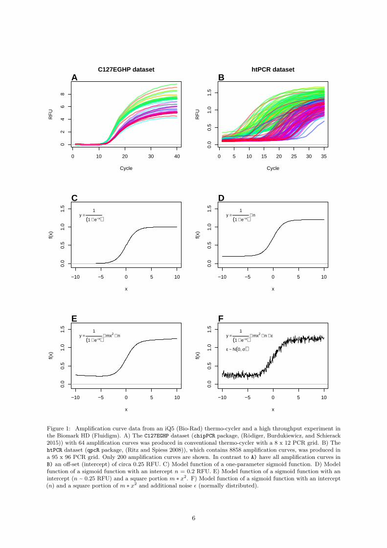
so that the PCR reaction can take place. The instruments with a real-time monitoring function sensorsto measure changes of the fluorescence intensity in the reaction vessel. All thermo-cycler systems havesoftware that processes and outputs the measured data. Plots of the fluorescence observations versus cyclenumber obtained from two different qPCR systems is shown in Figure 1A and B. The thermo-cyclersproduce different amplification curve shapes even with the same sample material and PCR mastermixbecause of their technical design, sensors and software. These factors need to be considered during thedevelopment of analysis algorithms.
Sigmoid functions are non-linear, real-valued, have a S-shaped curvature (Figure 1) and are are differ-entiable (e. g., first derivative maximum, with one local minimum and one local maximum). For thispurpose, a sigmoid function can fitted to the dataset. With the model obtained, predictions can be made.For example, the position of the second derivative maximum can be calculated from this (Figure 3). Inthe context of amplification curves, the second derivative maximum is commonly used to describe therelationship between the cycle number and the PCR product formation (Equation 2).
The analysis of sigmoid data (e. g., quantitative PCR) it is a manageable task if the data volume is low, ordedicated analysis software is available. An example such a scenario (low number of amplification curves)is shown in Figure 1A. All 65 curves exhibit a sigmoid curve shape. In contrast, the vast number ofamplification curves in Figure 1B is barely manageable with a reasonable effort by simple visual inspection.These data originate from a high-throughput experiment that encompasses in total 8858 amplificationcurves. Moreover, a manual analysis of the data is time-consuming and prone to errors.
During the setup of a qPCR assay, a manual analysis is a justified and reasonable approach to getacquainted with the characteristics and challenges of the qPCR data. At least hypothetically, it canhardly be denied that the trained human expert can best interpret the dataset. In particular, artifactsand outliers in a series of measurements can usually be readily identified by humans. When large amountsof data need to be processed, however, manual analysis is unfavorable. In addition, the objectivity of anexpert can be questioned. It is an open secret that data from quantitative real-time PCRs are occasionallysubject to problematic post-processing. In particular, the reproducible and objective analysis of theamplification curve data exposes challenges to inexperienced users. Even among peers is not uncommonthat they judge (classify) results differently. An example on this problem is given in Figure 1.
0.1.4 Software for the Analysis of Amplification Curve Data
There are several open source and closed source software tools, which can be used for the analysis ofqPCR data (Pabinger et al. 2014). A large proportion of the algorithms is implemented in the R statisticalcomputing language. However, more dedicated literature is available from peer-reviewed publications andtextbooks. The software packages deal for example with
• missing values and non-detects (McCall et al. 2014),• noise and artifact removal (Rödiger, Burdukiewicz, and Schierack 2015, Rödiger et al. (2015), Spiess
et al. (2015), Spiess et al. (2016)),• inter run calibration (Jan M. Ruijter et al. 2015),• normalization (Rödiger, Burdukiewicz, and Schierack 2015, Jan M. Ruijter et al. (2013), Feuer et
al. (2015), Matz, Wright, and Scott (2013)),• quantification cycle estimation (Ritz and Spiess 2008, Jan M. Ruijter et al. (2013)),• amplification efficiency estimation (Ritz and Spiess 2008, Jan M. Ruijter et al. (2013)),• data exchange (Lefever et al. 2009, Perkins et al. (2012), Rödiger et al. (2017)),• relative gene expression analysis (Dvinge and Bertone 2009, Pabinger et al. (2009), Neve et al.
(2014)) and• data analysis pipelines (Pabinger et al. 2009, Ronde et al. (2017), Mallona, Weiss, and Egea-Cortines
(2011), Mallona et al. (2017)).
All softwares assume that the amplification resemble a sigmoid curve shape (ideal positive amplificationreaction), or a flat low line (ideal negative amplification reaction). For example, Ritz and Spiess (2008)published the qpcR R package that contains functions to fit several multi-parameter models. This includesthe five-parameter Richardson function (Richards 1959), which is often used for the analysis of qPCRdata.
Researchers have found many solutions to challenges that were daunting the users of the qPCR methodology
5
0 10 20 30 40
02
46
8
C127EGHP dataset
Cycle
RF
U
A
0 5 10 15 20 25 30 35
0.0
0.5
1.0
1.5
htPCR dataset
Cycle
RF
U
B
−10 −5 0 5 10
0.0
0.5
1.0
1.5
x
f(x)
y =1
(1 + e−x)
C
−10 −5 0 5 10
0.0
0.5
1.0
1.5
x
f(x)
y =1
(1 + e−x)+ n
D
−10 −5 0 5 10
0.0
0.5
1.0
1.5
x
f(x)
y =1
(1 + e−x)+ mx2 + n
E
−10 −5 0 5 10
0.0
0.5
1.0
1.5
x
f(x)
y =1
(1 + e−x)+ mx2 + n + ε
ε ~ N(0, σ)
F
Figure 1: Amplification curve data from an iQ5 (Bio-Rad) thermo-cycler and a high throughput experiment inthe Biomark HD (Fluidigm). A) The C127EGHP dataset (chipPCR package, (Rödiger, Burdukiewicz, and Schierack2015)) with 64 amplification curves was produced in conventional thermo-cycler with a 8 x 12 PCR grid. B) ThehtPCR dataset (qpcR package, (Ritz and Spiess 2008)), which contains 8858 amplification curves, was produced ina 95 x 96 PCR grid. Only 200 amplification curves are shown. In contrast to A) have all amplification curves inB) an off-set (intercept) of circa 0.25 RFU. C) Model function of a one-parameter sigmoid function. D) Modelfunction of a sigmoid function with an intercept n = 0.2 RFU. E) Model function of a sigmoid function with anintercept (n ~ 0.25 RFU) and a square portion m ∗ x2. F) Model function of a sigmoid function with an intercept(n) and a square portion of m ∗ x2 and additional noise ε (normally distributed).
6
in the past. For example selected qPCR systems have a periodicity in the amplification curve data (Spiesset al. 2016). Presence a periodicity exposes the risk of introducing artificially shifts in the Cq values.Another commonly employed pre-processing step of qPCR is smoothing and filtering. Both approachescause alterations to the raw data that affects both the estimation of the Cq value and the amplificationefficiency. The particular the cycle threshold method (Ct method) (Figure 3) is affected by these factors(Spiess et al. 2015, Spiess et al. (2016)). Provided that such challenges are addressed, many algorithmsfor the processing of the positive amplification curves are available.
Most software packages do not make a classification if an amplification curve. For example, a classificationcould be if the amplification curve is negative or positive. An other classification could indicate whetherthe quality of the amplification curve is poor (much noise) or good (low noise). Specialized software thatcan distinguish the amplification curves automatically is needed. A classification of amplification curvesis needed for later data processing steps. For example, the linreg method by J M Ruijter et al. (2009)requires a decision, if an amplification curve is positive or negative. The qpcR package (Ritz and Spiess2008) contains an amplification curve test via the modlist() function. The parameter check="uni2"offers an analytical approach, as part of a method for the kinetic outlier detection. It checks for a sigmoidstructure of the amplification curve. Then it tests for the location of the first derivative maximum and thesecond derivative maximum. However, multi-parameter functions fit “successful” in most cases includingnoise and give false positive results. This will be shown on later sections.
Sometimes it is difficult even for a human expert to classify the amplification curves unambiguously andreproducible. To illustrate this an example for the analysis and classification of the htPCR dataset isgiven in Figure 5.
A bottleneck of qPCR data analysis is the lack of features that can be used to build classifiers foramplification curve data. A classifier herein refer to a vector of features that can be used to distinguishthe amplification curves by their shape only.
One reason for this is the lack of features that are known for amplification curve data. Only few featuresfor amplification curves are described in the literature. An example example is the amptester() function,which is part of the chipPCR package (Rödiger, Burdukiewicz, and Schierack 2015). This function usesstatic thresholds and frequentist inference to identify amplification curves that exceed the threshold. Theseare then classified as positive. However, it can also lead to false-positive classifications as exemplified inFigure 6.
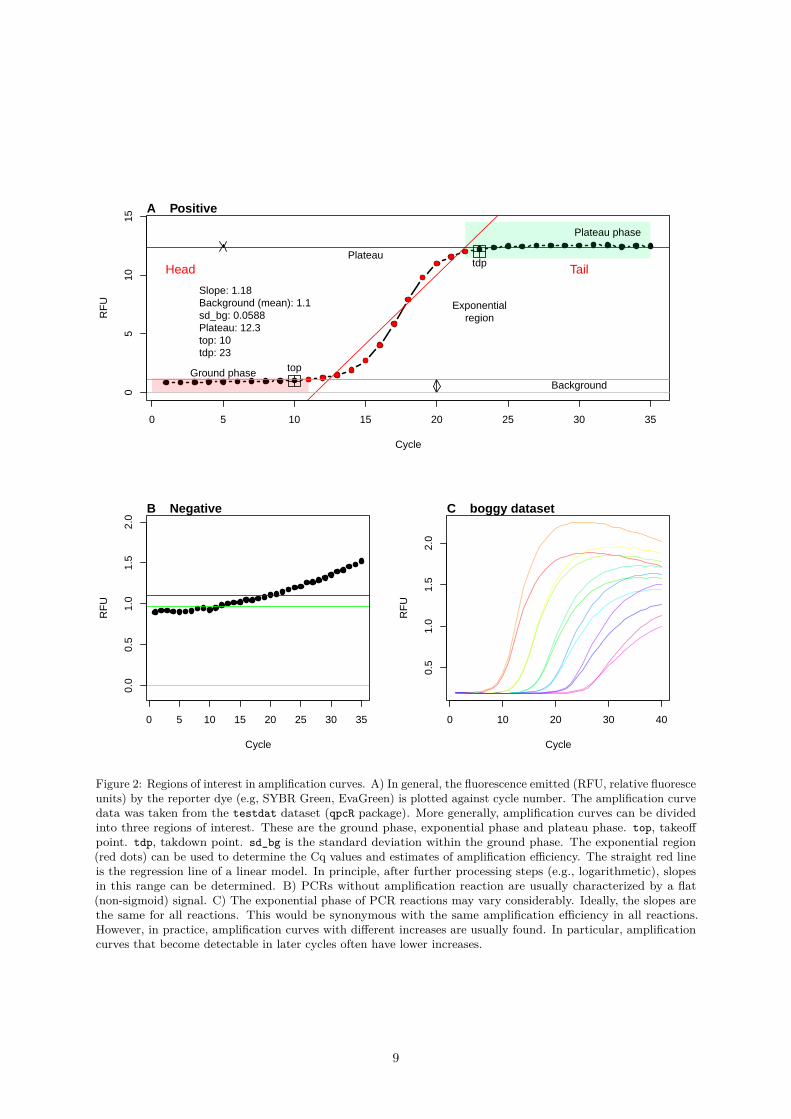
0.1.5 Principles of Amplification Curve Data Analysis
The shape of a positive amplification curve follows in most cases a sigmoid shape. The curvature of theamplification curve can be used as a quality measure. For example, fragmentation, inhibitors and samplematerial handling errors during the extraction can be identified. The kinetic of fluoresce emission isproportional to the quantity of the synthesized DNA. Typical amplification curves have three phases.
1. Ground phase: This phase occurs during the first cycles of the PCR. The fluorescence emissionis in most cases flat. During the ground phase, only a weak fluorescence signal is generated thatcannot be detected by the sensor system. This is often referred to as baseline or background signal.Fragmentation, inhibitors and sample handling errors would result in a prolonged ground phase.Apparently, there is only a phase shift or no signal at all. This is primarily due to the limitedsensitivity of the instrument. Even in a perfect PCR reaction (double amplification per cycle),qPCR instruments cannot detect the fluorescence signal from the amplification. In these early cycles,the fluorescence signals only produce a fluorescence background signal. The PCR product signal isan insignificantly small component of the total signal. Nevertheless, this phase may indicate sometypical properties. For example, the increase and signal variation can be characteristic of the qPCRsystem or probe system. In many instruments, this phase is used to determine the Ct threshold(a statistically relevant increase outside the noise range). A signal that is far enough above thisthreshold is considered as coming from the amplicon. It is assumed that this early cycle phase isflat in the amplification curve. In some qPCR systems a flat amplification curve is expected in thisphase. Slight deviations from this trend are presumed to be due to changes (e. g., disintegration ofprobes) in the fluorophores. Background correction algorithms are often used here to ensure thatflat amplification curves without slope are generated. This can lead to errors and inevitably leadsto a loss of information via the waveform of the raw data (Nolan, Hands, and Bustin 2006).
7
2. Exponential phase: This phase follows the ground phase and is also called log phase. This phase ischaracterized by a strong increase of the emitted fluorescence. In this phase, the amount doubles ineach cycle under ideal conditions. The amount of the synthesized fluorescent labeled PCR productis high enough to be detected by the sensor system. This phase is used for the calculation ofthe quantification point (Cq) and for the calculation of the curve specific amplification efficiency.Fragmentation, inhibitors and sample handling errors would decrease the slop of the amplificationcurve (Spiess, Feig, and Ritz 2008, Ritz and Spiess (2008)).
3. Plateau phase: This phase follows the exponential phase. The cause for this lies in the exploitationof the limited resources (incl. primers, nucleotides, enzyme activity) in the reaction vessel. Thislimits the amplification reaction, so that the theoretical maximum amplification efficiency (doublingper cycle) no longer prevails. This turning point and the progressive limitation of resources finallyleads to a plateau. In the plateau phase, there is sometime a signal decrease called hook effect (Isaac2009).
If the amplification curve has only a slight positive slope and no perceptible exponential phase, it can beassumed that the amplification reaction did not occur. Causes may include poor specificity of the PCRprimers, degraded sample material, degraded probes or detector problems. Such a curve can also occur ifnon-specific PCR products are created at different points in time. In this case, the superimposed signalscan generate such a signal progression. If there is a lot of start DNA (detectable amplification in the firstcycles) and the instrument software makes a background correction, amplification curves with a stronglynegative trend can be erroneously generated.
Such phases can be roughly considered as regions of interest (ROI). As an example, the ground phase isin the head area, while the plateau phase is in the tail area. The exponential phase is located betweenthese two ROIs.
Numerous qPCR systems do not display the raw data of the amplification curves on the screen. Instead,the raw data is usually processed by the instrument software to remove fluorophore-specific effects andbackground noise. The ordinate often does not display absolute fluorescence, but rather the change influorescence per cycle. Smoothing algorithms may also have been used (Spiess et al. 2015). When using thePCRedux package, it is therefore advisable to clarify beforehand, which processing steps the amplificationcurves have been subjected to until data export. Failure to do so may result in misinterpretations andincorrect models (Nolan, Hands, and Bustin 2006, Rödiger et al. (2015), Rödiger, Burdukiewicz, andSchierack (2015), Spiess et al. (2015)).
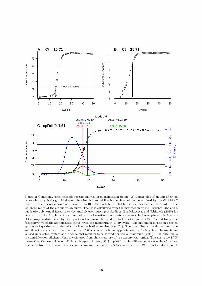
The most important measurement from qPCRs is the cycle of quantification (Cq), which signifies atwhich PCR cycle the fluorescence exceeds a threshold value. There is an ongoing debate as to what asignificant and robust threshold value is since there are several mathematical methods to calculate theCq. The classical threshold value (cycle threshold, Ct) is a straight horizontal line, which intersects withthe quasi-linear phase in the exponential amplification phase of the PCR. Another Cq method uses themaximum of second derivative (SDM) (Rödiger et al. 2015). Figure 3 illustrates the calculation of Cqvalues and Ct values. The threshold based method is claimed to be a simple yet effective approach. Thismethod requires that amplification curves are properly base-lined prior to the analysis. This is not alwaysdesirable. An overview and performance comparison is given in Jan M. Ruijter et al. (2013).
In all cases the Cq value can be used to calculate the concentration of target sequence in a sample (lowCq →high target concentration). In contrast, negative or ambiguous amplification curves loosely resemblenoise. This noise may appear linear or exhibit a curvature (Figure 6). Many factors, such as the samplequality, qPCR chemistry, and technical problems (e. g., sensor errors) contribute to various curve shapes.A common phenomenon of amplification curve shapes is the ‘hook effect’ (Barratt and Mackay 2002, JanM. Ruijter et al. (2014)). This however, may result in faulty interpretation of the amplification curves.
This means that the amplification curve shape, the amplification efficiency and the Cq value are prereq-uisites to judge the outcome of a qPCR reaction. In all phases of PCR the curves should be smooth.Possible peaks in the curves may be due to unstable light sources from the instrument or problems duringsample preparation, such as the presence of bubbles in the reaction vessel.
An important step in the qPCR workflow is data analysis. Progress has been made in qPCR data analysis,primarily due to the availability of sophisticated data analysis pipelines and software packages (e. g.,Jan M. Ruijter et al. (2013), Jan M. Ruijter et al. (2015), Rödiger et al. (2015), Spiess et al. (2015),Spiess et al. (2016)). At this stage amplification curve (Rödiger, Burdukiewicz, and Schierack 2015) andmelting curve pre-processing (Rödiger, Böhm, and Schimke 2013) needs to be performed to continue
8
0 5 10 15 20 25 30 35
05
1015
Cycle
RF
U
Head Tail
Ground phase
Plateau phase
Exponentialregion
top
tdp
Background
Plateau
Slope: 1.18Background (mean): 1.1sd_bg: 0.0588Plateau: 12.3top: 10tdp: 23
A Positive
0 5 10 15 20 25 30 35
0.0
0.5
1.0
1.5
2.0
Cycle
RF
U
B Negative
0 10 20 30 40
0.5
1.0
1.5
2.0
Cycle
RF
U
C boggy dataset
Figure 2: Regions of interest in amplification curves. A) In general, the fluorescence emitted (RFU, relative fluoresceunits) by the reporter dye (e.g, SYBR Green, EvaGreen) is plotted against cycle number. The amplification curvedata was taken from the testdat dataset (qpcR package). More generally, amplification curves can be dividedinto three regions of interest. These are the ground phase, exponential phase and plateau phase. top, takeoffpoint. tdp, takdown point. sd_bg is the standard deviation within the ground phase. The exponential region(red dots) can be used to determine the Cq values and estimates of amplification efficiency. The straight red lineis the regression line of a linear model. In principle, after further processing steps (e.g., logarithmetic), slopesin this range can be determined. B) PCRs without amplification reaction are usually characterized by a flat(non-sigmoid) signal. C) The exponential phase of PCR reactions may vary considerably. Ideally, the slopes arethe same for all reactions. This would be synonymous with the same amplification efficiency in all reactions.However, in practice, amplification curves with different increases are usually found. In particular, amplificationcurves that become detectable in later cycles often have lower increases.
9
0 10 20 30 40 50
02
46
810
Cycles
Raw
fluo
resc
ence
Threshold: 2.356
A Ct = 15.71
0 10 20 30 40 50
−4
−3
−2
−1
01
2Cycles
log(
Raw
fluo
resc
ence
)
B Ct = 15.71
0 10 20 30 40 50
0
2
4
6
8
10
Cycles
Raw
fluo
resc
ence
2.356
1.0
1.2
1.4
1.6
1.8
2.0
2.2
Effi
cien
cy
cpD2: 15.68cpD1: 17.59Eff: 1.795
resVar: 0.00604 AICc: −103.19Model: l5
0 10 20 30 40 50
0
2
4
6
8
10
Cycles
Raw
fluo
resc
ence
C cpDdiff: 1.91
Figure 3: Commonly used methods for the analysis of quantification points. A) Linear plot of an amplificationcurve with a typical sigmoid shape. The Grey horizontal line is the threshold as determined by the 68-95-99.7rule from the fluoresce emission of cycle 1 to 10. The black horizontal line is the user defined threshold in thelog-linear range of the amplification curve. The Ct is calculated from the intersection of the horizontal line and aquadratic polynomial fitted in to the amplification curve (see Rödiger, Burdukiewicz, and Schierack (2015) fordetails). B) The Amplification curve plot with a logarithmic ordinate visualizes the linear phase. C) Analysisof the amplification curve by fitting with a five parameter model (black line) (Equation 2). The red line is thefirst derivative of the amplification curve, with the maximum at 17.59 cycles. The maximum is used in selectedsystem as Cq value and referred to as first derivative maximum (cpD1). The green line is the derivative of theamplification curve, with the maximum at 15.68 cycles a minimum approximately at 19.5 cycles. The maximumis used in selected system as Cq value and referred to as second derivative maximum (cpD2). The blue line isthe amplification efficiency that is estimated from the trajactory of the exponential region. The Eff value 1.795means that the amplification efficiency is approximately 89%. cpDdiff is the difference between the Cq valuescalculated from the first and the second derivative maximum (cpDdiff = |cpD1− cpD2|) from the fitted model.
10
0 10 20 30 40
2500
3500
Cycle
RF
U
A Negative
0 10 20 30 4025
0035
00
Cycle
RF
U
B Positive
2300 2500 2700 2900
0.00
00.
002
0.00
4
N = 756 Bandwidth = 25
Den
sity
C Negative
2300 2500 2700 2900
0.00
00.
003
0.00
6
N = 588 Bandwidth = 25
Den
sity
D Positive
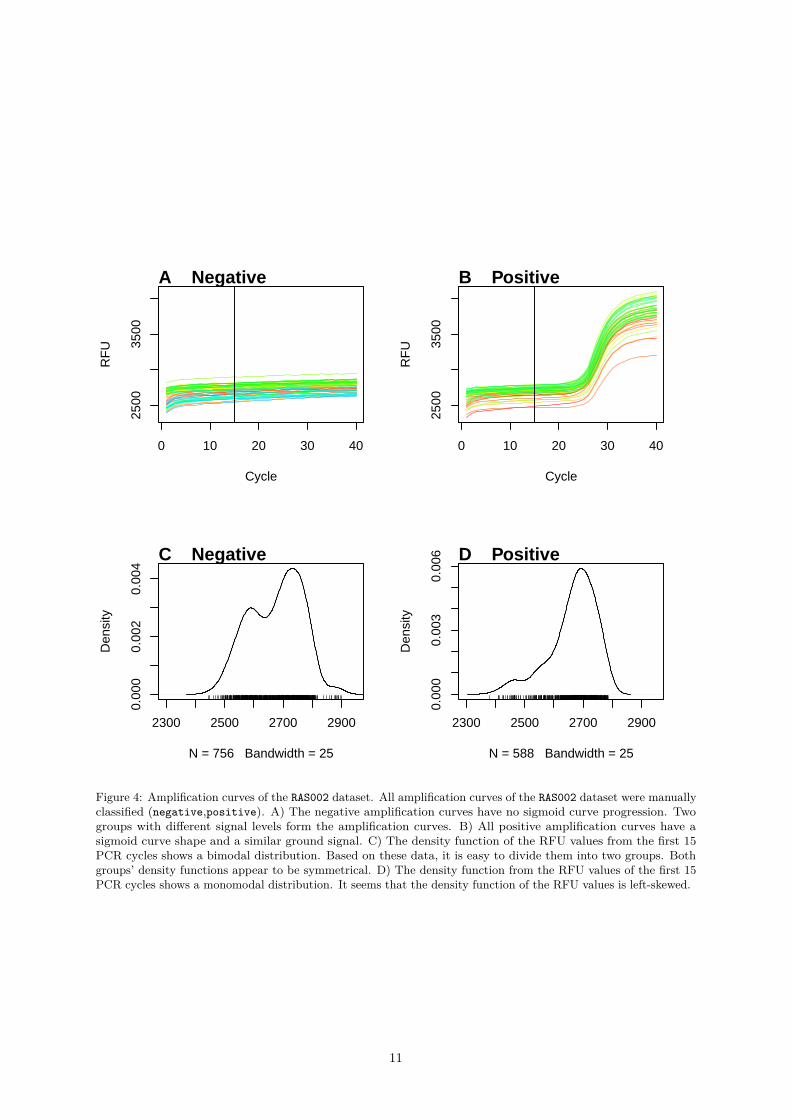
Figure 4: Amplification curves of the RAS002 dataset. All amplification curves of the RAS002 dataset were manuallyclassified (negative,positive). A) The negative amplification curves have no sigmoid curve progression. Twogroups with different signal levels form the amplification curves. B) All positive amplification curves have asigmoid curve shape and a similar ground signal. C) The density function of the RFU values from the first 15PCR cycles shows a bimodal distribution. Based on these data, it is easy to divide them into two groups. Bothgroups’ density functions appear to be symmetrical. D) The density function from the RFU values of the first 15PCR cycles shows a monomodal distribution. It seems that the density function of the RFU values is left-skewed.
11

next with the feature extraction from the curvatures. Several studies have been done, which discuss thepre-processing and post-processing of qPCR data (Rödiger, Burdukiewicz, and Schierack 2015, Spiess etal. (2015), Spiess et al. (2016)). In this work the focus is on amplification curve data. Amplificationcurves can be difficult to interpret and analyze if the curvature deviates from the ideal sigmoid shape, orthe volume of curve data is to large for an economic manual analysis. Moreover, amplification curves maylook acceptable for an inexperienced use but unacceptable for an expert. Therefore, there is a need formethod of statistical interrogation and objective interpretation of results.
The quantification of nucleic acids by curve parameters like the quantification point (Cq) and theamplification efficiency (AE) is only meaningful if the kinetic of the amplification curve follows a sigmoidstructure according to the model the qPCR (Jan M. Ruijter et al. 2013, Jan M. Ruijter et al. (2014), Ritzand Spiess (2008)). In qPCRs is sigmoid shape is characterized by a baseline region, an exponential regionand a (maximum) plateau phase. The magnitude of the raw fluorescence and the shape of the amplificationcurve vary naturally between detection probe systems and devices. Therefore, it is challenging identifyingnegative curves which appear to be positive but just an artifact of scaling.
Most assays have an intrinsic property, which can be used to decide if an amplification reaction is positive,negative or ambiguous. Melting curve analysis belongs to the commonly used approaches (Rödiger, Böhm,and Schimke 2013). For example qPCRs monitored with unspecific dyes (e. g., EvaGreen) use meltingcurve analysis is a post-processing method to identify PCR reactions which contain DNA (positive). Somedetection probe systems like hydrolysis probes do not permit such methods.
A typical situation is that results samples may positive, negative or ambiguous. The later are mostproblematic because both outcomes (positive and negative) might be true. However, in most cases theuser is interested in an automatic distinction between positive and negative samples. This is import inscreening applications.
Provided that the rules are strict and transparent, such a routine can be used for quality management.This is also in conformance with the philosophy that software in research and diagnostics should be afoundation for reproducible research (Rödiger et al. 2015).
The Ct method appears to be the most widely used method despite the fact that this method was shownto be unreliable (Jan M. Ruijter et al. 2013, Spiess et al. (2015), Spiess et al. (2016)). Presumably thisdue to the familiarity of users with this approach since it is also known from chemical analysis proceduresor basic calculus. Another reason might be that the Ct method is easy to implement and to understand.
This kind of calculation strongly dependents on the user, who has to adjust the threshold level manually.Thus, the Ct method is not stable in predictions if several users are given the same dataset to be analyzed.Moreover, the Ct method makes the assumption that the amplification efficiency (~ slope in the log-linearphase) is equal across all amplification curves compared (Jan M. Ruijter et al. 2013). Evidently, this isnot always case as exemplified in Figure 2C.
Another approach is to use non-linear model to fit the amplification curve. For example, five-parameterRichardson functions (Equation 2, Richards (1959)) are often used (Spiess et al. 2015).
A comment on noise in sigmoid amplification curves: Noise in amplification curvescan have very different causes. Among them are incorrectly assigned dye detectors, errorsduring the calibration of dyes for the instrument, errors during the preparation of the PCRmaster mix, sample degradation, lack of a sample in the PCR, too much sample material inthe PCR mix or a low detection probe concentration.
12

0.2 Development, Implementation and Installation
PCRedux is an open source software package for the statistical computing language R. This software ispublished under the terms of the MIT license2. PCRedux contains function for the calculation of featuresfrom amplification curves and classified datasets for machine learning applications.
Reproducibility is a foundation of research. All technical and experimental aspects should be performedunder principles that follow good practices of reproducible research. Numerous authors addressed thematter for experimental design and data report. Examples are the Minimum Information for Publicationof Quantitative PCR Experiments guidelines (MIQE) and the Real-time PCR Data Markup Language(RDML). MIQE is a recommended standard of the minimum information for publication of quantitativereal-time PCR experiments guidelines and RDML is a data exchange format (S. A. Bustin 2014, S. Bustin(2017), Rödiger et al. (2015), Rödiger et al. (2017), Wilson et al. (2017)). Both MIQE and RDML, arewidely used to preform quantitative real-time PCRs (Pabinger et al. 2014).
The development of scientific software is a complex process. In particular, if the development is carriedout by teams who work in different time zones and where no face-to-face meetings a possible. End usersneed releases with stable software that delivers reproducible results. Developers need well documentedsoftware the adopt the software according to their needs.
Under the umbrella Agile Software Development and Extreme Programming, several principles wereproposed to deliver high quality software, which meet the needs of end users and developers. This includesversion control, collaborative editing, unit testing and continuous integration(Lanubile et al. 2010, Myerset al. (2004), Rödiger et al. (2015)). The following paragraphs describe methods implemented in thePCRedux package to ensure high software quality.
0.2.1 Version Control and Continuous Integration
The development of the PCRedux package started 2017 with the submission of a functional, yet immaturesource code, to GitHub (GitHub, Inc.). GitHub is a web-based version control repository hosting service.Both distributed version control and source code management are based on Git. (Lanubile et al. 2010).Additional functionality of GitHub includes the administration of access management, bug tracking,moderation of feature requests, task management, some metrics for the software development, and wikis.The source code of PCRedux is available at:
https://github.com/devSJR/PCRedux/
In continuous integration development team members commit and integrate their contributions severaltimes a day. Team members may include coders, artists and translators. An automated build and testsystem verifies each integration and gives the development team members a timely feedback about theeffect of their commit. In contrast to deferred integration leads this to a reduced number of integrationproblems and less workload because most erros are solved shortly after they were integrated (Myers et al.2004).
TrivsCI was chosen as continues integration service for PCRedux. The TravisCI server communicates withthe GitHub version control system and manages the PCRedux package building process. Currently thecontinuous interaction is available for the R releases oldrel, release and devel. The history of the buildtests are available at
https://travis-ci.org/devSJR/PCRedux
0.2.2 Naming Convention and Literate Programming
The PCRedux software is provided as an R (≥ v. 3.3.3) package. PCRedux is written as S3 object system.S3 has characteristics of object orientated programming but eases the development due to the use of thenaming conventions (Brito 2008). In most places function and parameter names are written as underscoreseparated (underscore_sep), which is a widely used style in R packages (Bååth 2012). This conventionhad to be violated in coding sections where functionality from other packages was used.
2https://opensource.org/licenses/MIT
13

Literate programming, as proposed by Knuth (1984), is a concept where the logic of the source code anddocumentation is integrated in a single file. Markup conventions (e. g., ‘#’) tell in literate programminghow to typeset the documentation. This produces outputs in a typesetting language such as the lightweightmarkup language Markdown, or the document preparation system LATEX.
The roxygen2, rmarkdown and knitr packages were used to write the documentation in-line with codefor the PCRedux package.
0.2.3 Installation of the PCRedux Package
The development version of the package can be installed using the The developer version of the packagecan be installed using the devtools package.# Install devtools, if not already installed.install.packages("devtools")
library(devtools)install_github("devSJR/PCRedux")
PCRedux is available as stable version from the Comprehensive R Archive Network (CRAN) at https://CRAN.R-project.org/package=PCRedux. Package published at CRAN undergo intensive checkingprocedures. In addition, CRAN tests whether the package can be built for common operating systemsand whether all version dependencies are solved. To install PCRedux first install R (≥ v. 3.3.3). Thenstart R and type in the prompt:# Select your local mirrorinstall.packages("PCRedux")
The PCRedux package should just install. If this fails make sure you that write access is permitted to thedestination directory.# The following command points to the help for download and install of packages# from CRAN-like repositories or from local files.?install.packages()
If this fails try to follow the instructions given by De Vries and Meys (2012).
R CMD check
Results from CRAN check can be found at
http://cran.us.r-project.org/web/checks/check_results_PCRedux.html.
0.2.4 Unit Testing of the PCRedux Package
Modules testing, better known as unit testing, is an approach to simplify the refactoring of source codeduring software development. The goal is to minimize errors and regressions. It is also intended to ensurethat the numerical results from the calculations are reproducible and of high quality. An unintendedbehavior of the software should be detected at the latest during the package building process. Pleasenote that Unit Testing is not a guarantee for error-free software (Myers et al. 2004).
The basic concept is to use checkpoints to check whether the software performs calculations and datatransformations correctly for all builds. For this, numerous (logical) queries have to be defined by thedeveloper in advance. They are refereed to expectations. It should be ensured that as many errors aspossible are covered. A logical query can be, for example, whether the calculation has a numeric orBoolean value as output. If the data type is incorrect during output, this is a sufficient terminationcriterion. Or it can be checked whether the length of the result vector is correct after the calculation.There are different approaches for unit tests in R. This also includes testing of units from the packagesRUnit, covr, svUnit and testthat. (Wickham (2011)).
The package testthat was used in PCRedux because it could be well implemented and its maintenance isrelatively simple. The logic is that an expectation defines how the result, class or error in the corresponding
14

unit (e. g., function) should behave. Unit tests can be found in the /test/testthat subdirectory ofthe PCRedux package. The unit tests always run automatically during the creation of the package. Thefollowing is an example of the function qPCR2fdata(). The details of how qPCR2fdata() works aredetailed in the paragraph 0.4.1.4 section. The function test_that(), from the testthat package, isgiven several expectations. The qPCR2fdata() function when processing the amplification curves checkwhether:
• an object of the class fdata is created (see Febrero-Bande and Oviedo de la Fuente (2012) for detailsof the class fdata),
• the parameter rangeval has a length of two,• is the second value of parameter rangeval 49 (last cycle number) and *whether the object structure
of the function qPCR2fdata() does not change if the parameter preprocess=TRUE is set.library(PCRedux)
context("qPCR2fdata")
test_that("qPCR2fdata gives the correct dimensions and properties", {library(qpcR)res_fdata <- qPCR2fdata(testdat)res_fdata_preprocess <- qPCR2fdata(testdat, preprocess = TRUE)
expect_that(res_fdata, is_a("fdata"))expect_that(length(res_fdata$rangeval) == 2 &&
res_fdata$rangeval[2] == 49, is_true())
expect_that(res_fdata_preprocess, is_a("fdata"))expect_that(length(res_fdata_preprocess$rangeval) == 2 &&
res_fdata_preprocess$rangeval[2] == 49, is_true())})
Similar unit tests were implemented for all functions of the PCRedux package. The coverage by PCReduxpackage can be calculated by the package_coverage() function from the covr package or visual analyzedat
https://codecov.io/gh/devSJR/PCRedux/list/master/.
15

0.3 Technologies for Amplification Curve Classification and Classified Am-plification Curves
An extensive literature research showed that in the field of qPCR there are no openly accessible datasets.Open Data is meant in the sense that data are freely available, free of charge, free to use and that datacan be republished, without restrictions from copyright, patents or other mechanisms of control (Kitchin2014). Furthermore, only a few attributes of amplification curves are discussed among peers. Theseinclude:
• the signal height and the slope in the baseline region (gradient and intersection),• the starting point of amplification,• the Cq value and amplification efficiency, and• the signal level including the slope of the plateau phase (slope, intercept).
However, these alone are presumably not enough to describe amplification curves sufficiently. Furthermore,there are no references to further algorithms that can be used to calculate additional features fromamplification curves. All these facts make further studies on machine learning and modeling difficult. Afeature can be described as an entity that characterizes an object. The number of features should belarge enough to describe the object accurately and small enough not to interfere with the learning processwith redundant or information.
Bellman coined the so-called Curse of Dimensionality in 1961, when he dealt with adaptive controlprocesses. It vague describes the practical difficulties encountered in high-dimensional analysis andestimation. It states that for a given sample size, there is a maximum number of features from whichthe performance of an algorithm degrades rather than improves. As a consequence, many data miningalgorithms fail when the dimensionality is high, because the data points are sparsely populated and farapart (Herrera et al. 2016).
Therefore, a large number of records with amplification curves and their classification (negative, ambiguous,positive) were included in the PCRedux package. Another objective was the development of new algorithmsand the transfer of algorithms from other domains (e. g., from digital image processing) to qPCR datasets.A central goal was therefore to develop attributes to enable the classification of amplification curves incategories such as positive, negative and ambiguous.
0.3.1 Classified Amplification Curves
It is worth noting that the classifications of amplification curves in Table 1 were made on the basis ofempirical values. For the amplification curves, only an assessment was made to see if the curves areapproximately sigmoid or resemble a negative amplification reaction with a flat curve shape. Consequently,this does not answer the question of if a specific amplification product has been synthesized, if acontamination has been amplified or if only primer-dimers have been amplified. To answer this question,other methods such as melting curve analysis should be used.
Amplification curves from different sources had to be classified manually. Amplification curves fromthe qpcR, chipPCR, PCRedux and RDML packages were classified with the humanrater(), as described inRödiger, Burdukiewicz, and Schierack (2015) and with the tReem() function from the PCRedux package.The subsubsection 0.3.2 describes approaches that can be used to classify amplification curves.
Data preparation is an important step, that includes data cleansing, data transformation and dataintegration (Herrera et al. 2016). The xray package (Seibelt 2017) can used to analyze the distributionform and variables in records for anomalies such as missing values, zeros, infinite values and their categories.The anomalies() function from the xray package can be used to search for anomalies (including missingvalues (NA), zero values (Zero), blank strings (Blank) and infinite numbers (Inf)). Users of the PCReduxpackage should use such tools before continuing to work with the records. Although most records in thePCRedux package have the same data structure, some records contain missing values or have differentdimensions (compare data from Figure 1). For example, the dataset C127EGHP spans a matrix of 40 x 66(35 cycles x observations (65 amplification curves)), while the htPCR dataset comprises a matrix of 35 x8859.
Raw data were exported as comma separated values from the thermo-cyclers. Some records have beenexported from the devices using the RDML package and transformed into RDML format. A detailed
16
description can be found in Rödiger et al. (2017). The Real-time PCR Data Markup Language (RDML)is data exchange format for quantitative Real-Time PCR Experiments. RDML is a human readable fileformat and is based on XML (eXtensible Markup Language) and was created to enable the exchange ofdata across different information systems (Lefever et al. 2009). The following code section describes theimport of an RDML file from the PCRedux package. The RDML file contains amplification curve data ofa duplex qPCR (HPV 16 & HPV 18) performed in the CFX96 (Bio-Rad).library(RDML)# Load the RDML package and use its functions to import the amplification curve# datalibrary(RDML)filename <- system.file("RAS002.rdml", package = "PCRedux")raw_data <- RDML$new(filename = filename)
The further processing of the amplification data took place as described in Rödiger, Burdukiewicz, andSchierack (2015), Rödiger et al. (2015), Spiess et al. (2015) and Spiess et al. (2016). An introduction tothe use of R for the analysis of melting curves (MBmca package, (Rödiger, Böhm, and Schimke 2013)) andthe calculation of Cq values (chipPCR package, (Rödiger, Burdukiewicz, and Schierack 2015)) is shown indetail in Rödiger et al. (2015). Unless otherwise stated, the Cq values were determined using the secondmaximum derivative method.
The following example shows the export of the RAS002.rdml file from the RDML format to the csvformat.# Export the RDML data from the PCRedux package as the objects RAS002 and RAS003.library(RDML)library(PCRedux)library(magrittr)suppressMessages(library(data.table))
RAS002 <- data.frame(RDML$new(paste0(path.package("PCRedux"),
"/", "RAS002.rdml"))$GetFData())
# The obbject RAS002 can be stored in the working directory as CSV file with# the name RAS002_amp.csv.write.csv(RAS002, "RAS002_amp.csv", row.names = FALSE)
Selected amplification cure datasets were stored in the RDML format as described in (Rödiger et al. 2015,Rödiger et al. (2017)).
RDML data file Device Target gene Detection chemistryRAS002.rdml CFX96 HPV16, HPV18, HPRT1 TaqmanRAS003.rdml CFX96 HPV16, HPV18, HPRT1 Taqmanhookreg.rdml Bio-Rad various Taqman, DNA binding dyes
32HCU: VideoScan (Attomol GmbH), CFX96: Bio-Rad.
Table_human_rated.xlsx
0.3.2 Graphical User Interfaces for Amplification Curve Classification
For machine learning and method validation it was important to classify the amplification curvesindividually. However, the availability of comprehensively annotated datasets of amplification curveswas a bottleneck so far. In Rödiger, Burdukiewicz, and Schierack (2015) the humanrater() functionwas introduced. This function was developed to assist the human expert during the classification ofamplification curves and melting curves. The human expert has to define classes (e. g., negative (“n”),ambiguous (“a”), positive (“p”)) which get assigned to an amplification curve after expert has entered
17
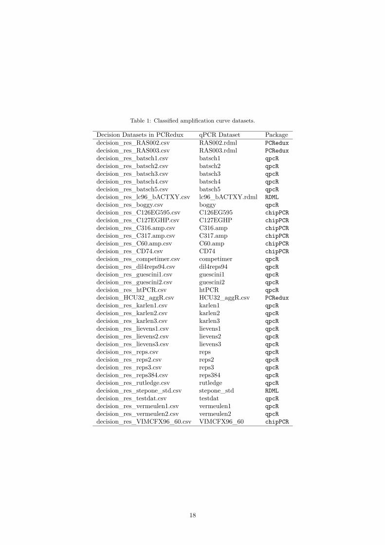
Table 1: Classified amplification curve datasets.
Decision Datasets in PCRedux qPCR Dataset Packagedecision_res_RAS002.csv RAS002.rdml PCReduxdecision_res_RAS003.csv RAS003.rdml PCReduxdecision_res_batsch1.csv batsch1 qpcRdecision_res_batsch2.csv batsch2 qpcRdecision_res_batsch3.csv batsch3 qpcRdecision_res_batsch4.csv batsch4 qpcRdecision_res_batsch5.csv batsch5 qpcRdecision_res_lc96_bACTXY.csv lc96_bACTXY.rdml RDMLdecision_res_boggy.csv boggy qpcRdecision_res_C126EG595.csv C126EG595 chipPCRdecision_res_C127EGHP.csv C127EGHP chipPCRdecision_res_C316.amp.csv C316.amp chipPCRdecision_res_C317.amp.csv C317.amp chipPCRdecision_res_C60.amp.csv C60.amp chipPCRdecision_res_CD74.csv CD74 chipPCRdecision_res_competimer.csv competimer qpcRdecision_res_dil4reps94.csv dil4reps94 qpcRdecision_res_guescini1.csv guescini1 qpcRdecision_res_guescini2.csv guescini2 qpcRdecision_res_htPCR.csv htPCR qpcRdecision_HCU32_aggR.csv HCU32_aggR.csv PCReduxdecision_res_karlen1.csv karlen1 qpcRdecision_res_karlen2.csv karlen2 qpcRdecision_res_karlen3.csv karlen3 qpcRdecision_res_lievens1.csv lievens1 qpcRdecision_res_lievens2.csv lievens2 qpcRdecision_res_lievens3.csv lievens3 qpcRdecision_res_reps.csv reps qpcRdecision_res_reps2.csv reps2 qpcRdecision_res_reps3.csv reps3 qpcRdecision_res_reps384.csv reps384 qpcRdecision_res_rutledge.csv rutledge qpcRdecision_res_stepone_std.csv stepone_std RDMLdecision_res_testdat.csv testdat qpcRdecision_res_vermeulen1.csv vermeulen1 qpcRdecision_res_vermeulen2.csv vermeulen2 qpcRdecision_res_VIMCFX96_60.csv VIMCFX96_60 chipPCR
18
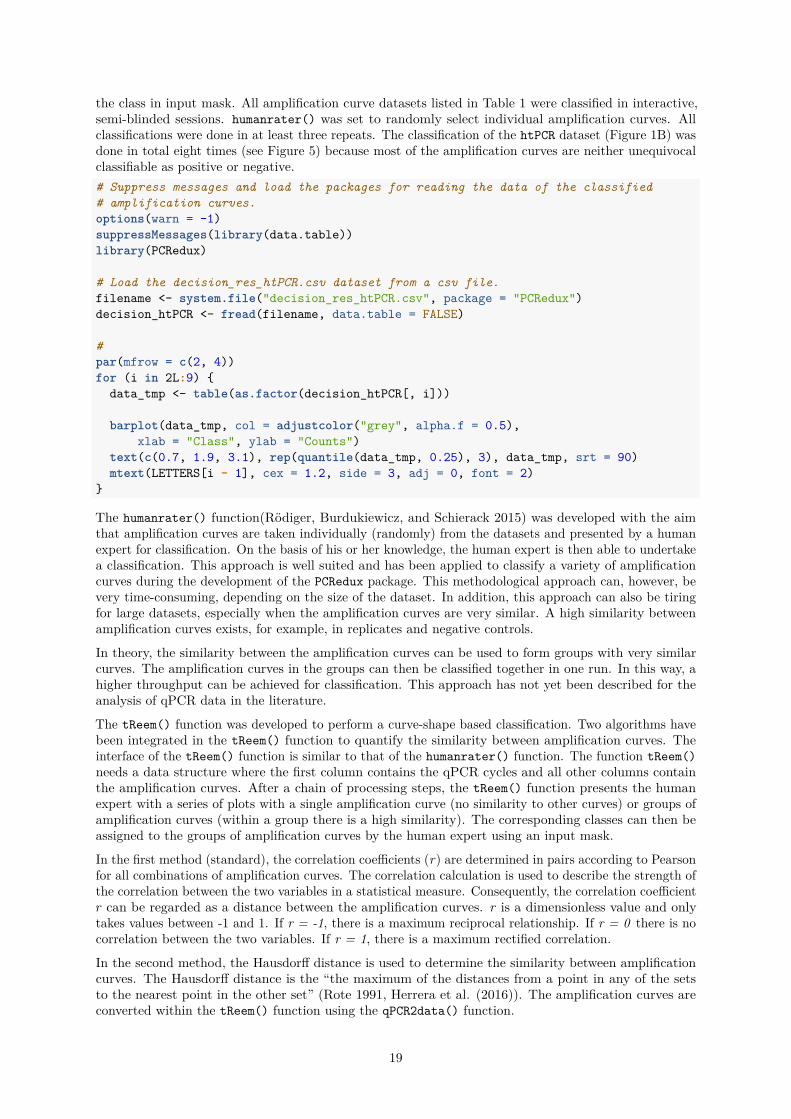
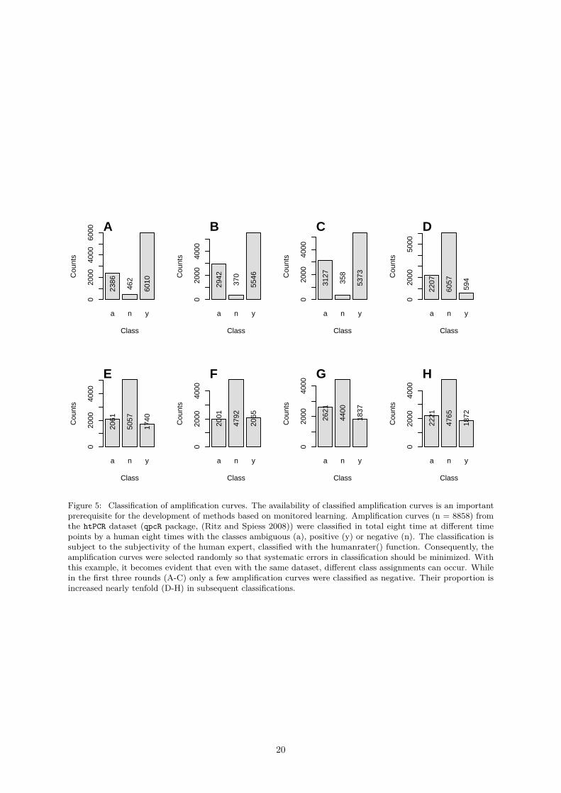
the class in input mask. All amplification curve datasets listed in Table 1 were classified in interactive,semi-blinded sessions. humanrater() was set to randomly select individual amplification curves. Allclassifications were done in at least three repeats. The classification of the htPCR dataset (Figure 1B) wasdone in total eight times (see Figure 5) because most of the amplification curves are neither unequivocalclassifiable as positive or negative.# Suppress messages and load the packages for reading the data of the classified# amplification curves.options(warn = -1)suppressMessages(library(data.table))library(PCRedux)
# Load the decision_res_htPCR.csv dataset from a csv file.filename <- system.file("decision_res_htPCR.csv", package = "PCRedux")decision_htPCR <- fread(filename, data.table = FALSE)
#par(mfrow = c(2, 4))for (i in 2L:9) {
data_tmp <- table(as.factor(decision_htPCR[, i]))
barplot(data_tmp, col = adjustcolor("grey", alpha.f = 0.5),xlab = "Class", ylab = "Counts")
text(c(0.7, 1.9, 3.1), rep(quantile(data_tmp, 0.25), 3), data_tmp, srt = 90)mtext(LETTERS[i - 1], cex = 1.2, side = 3, adj = 0, font = 2)
}
The humanrater() function(Rödiger, Burdukiewicz, and Schierack 2015) was developed with the aimthat amplification curves are taken individually (randomly) from the datasets and presented by a humanexpert for classification. On the basis of his or her knowledge, the human expert is then able to undertakea classification. This approach is well suited and has been applied to classify a variety of amplificationcurves during the development of the PCRedux package. This methodological approach can, however, bevery time-consuming, depending on the size of the dataset. In addition, this approach can also be tiringfor large datasets, especially when the amplification curves are very similar. A high similarity betweenamplification curves exists, for example, in replicates and negative controls.
In theory, the similarity between the amplification curves can be used to form groups with very similarcurves. The amplification curves in the groups can then be classified together in one run. In this way, ahigher throughput can be achieved for classification. This approach has not yet been described for theanalysis of qPCR data in the literature.
The tReem() function was developed to perform a curve-shape based classification. Two algorithms havebeen integrated in the tReem() function to quantify the similarity between amplification curves. Theinterface of the tReem() function is similar to that of the humanrater() function. The function tReem()needs a data structure where the first column contains the qPCR cycles and all other columns containthe amplification curves. After a chain of processing steps, the tReem() function presents the humanexpert with a series of plots with a single amplification curve (no similarity to other curves) or groups ofamplification curves (within a group there is a high similarity). The corresponding classes can then beassigned to the groups of amplification curves by the human expert using an input mask.
In the first method (standard), the correlation coefficients (r) are determined in pairs according to Pearsonfor all combinations of amplification curves. The correlation calculation is used to describe the strength ofthe correlation between the two variables in a statistical measure. Consequently, the correlation coefficientr can be regarded as a distance between the amplification curves. r is a dimensionless value and onlytakes values between -1 and 1. If r = -1, there is a maximum reciprocal relationship. If r = 0 there is nocorrelation between the two variables. If r = 1, there is a maximum rectified correlation.
In the second method, the Hausdorff distance is used to determine the similarity between amplificationcurves. The Hausdorff distance is the “the maximum of the distances from a point in any of the setsto the nearest point in the other set” (Rote 1991, Herrera et al. (2016)). The amplification curves areconverted within the tReem() function using the qPCR2data() function.
19
a n y
Class
Cou
nts
020
0040
0060
00
2386
462
6010
A
a n y
Class
Cou
nts
020
0040
00
2942
370
5546
B
a n y
Class
Cou
nts
020
0040
00
3127
358
5373
C
a n y
Class
Cou
nts
020
0050
00
2207
6057
594
D
a n y
Class
Cou
nts
020
0040
00
2061
5057
1740
E
a n y
Class
Cou
nts
020
0040
00
2001
4792
2065
F
a n y
Class
Cou
nts
020
0040
00
2621
4400
1837
G
a n y
Class
Cou
nts
020
0040
00
2221
4765
1872
H
Figure 5: Classification of amplification curves. The availability of classified amplification curves is an importantprerequisite for the development of methods based on monitored learning. Amplification curves (n = 8858) fromthe htPCR dataset (qpcR package, (Ritz and Spiess 2008)) were classified in total eight time at different timepoints by a human eight times with the classes ambiguous (a), positive (y) or negative (n). The classification issubject to the subjectivity of the human expert, classified with the humanrater() function. Consequently, theamplification curves were selected randomly so that systematic errors in classification should be minimized. Withthis example, it becomes evident that even with the same dataset, different class assignments can occur. Whilein the first three rounds (A-C) only a few amplification curves were classified as negative. Their proportion isincreased nearly tenfold (D-H) in subsequent classifications.
20

Both methods process the distances in the same steps. This involves the calculation of the distancematrix using the Euclidean distances of all distance measures to determine the distance between the linesof the data matrix. This is used to perform a hierarchical cluster analysis. In the last step, the cluster isdivided into groups based on a user-defined k value. For example, two groups are created for k = 2. Ifthe amplification curves are very different, a larger k should be used.
As a rule, the grouping of the amplification curves using the Pearson correlation coefficient as a distancemeasure is faster than the Hausdorff distance. Nevertheless, it is up to the user to find the optimalmethod for his task.
Ideally, only a few iterations are necessary to complete the classification of a dataset. However, aprerequisite for this is that the amplification curves are similar.# Classify amplification curve data by correlation coefficients (r)library(qpcR)tReem(testdat[, 1:15], k = 3)
21
0.4 Functions of the PCRedux Package
The PCRedux package contains functions for analyzing amplification curves. In the following, these aredistinguished into helper functions (subsubsection 0.4.1) and analysis functions (subsubsection 0.4.2).
The helper functions can be used to manually classify amplification curves, convert them into other dataformats or to visualize data structures.
The analysis functions are used to calculate specific characteristic values (features) from the amplificationcurves. For example, these are slopes, turning points and change points.
0.4.1 Helper Functions of the PCRedux Package
0.4.1.1 decision_modus() - A Function to Get a Decision (Modus) from a Vector of Classes
Many approaches to machine learning exist. The subject is very rich. One method is supervised machinelearning, where the goal is to derive a property from user-defined (classified) training data. Classifiedtraining data can be created by one or more individuals. Categories such as negative, ambiguous orpositive are assigned depending on the form of the amplification curve, similar to what was described insubsubsection 0.1.3 and subsubsection 0.1.5 and on the opinion of the individual(s).
For example, the amplification curves in (Figure 6) were taken from the htPCR dataset (see Figure 1B).Assuming that the classification of the amplification curves is delegated to different users, it is likelythat the amplification curve (P06.W47, Figure 6) are considered ambiguous or even positive (positive ↔ambivalent) by the users. A classification experiment was carried out for the complete htPCR dataset.For this purpose, the amplification curves were classified at different time points as described in Rödiger,Burdukiewicz, and Schierack (2015).
Table 3 shows from a total of 8858 amplification curves the first 25 lines classified as negative (confor-mity=TRUE) and the first 25 lines classified as positive. In total, the curves were classified eight times(test.result.1 . . . test.result.8), resulting in a whole of 70864 individually analyzed amplificationcurves for this dataset. All the raw data is included in the CSV file.
This example shows that the amplification curves have been classified differently in 94.5% of the cases(e. g., line 1 “P01. W01”). While for other amplification curves all classifications were the same (e. g.,line 8856 “P95. W94”).
For the systematic statistical analysis of classification datasets, the decision_modus() function has beendeveloped. This allows the most common decision (mode) to be determined. This feature is useful if youwant to consolidate large collections of different decisions into a single decision.
Observed:“a”, “a”, “a”, “a”, “a”, “n”, “n”, “n” → frequencies 5 x “a”, 3 x “n” → mode:“a”
Since the class names are known, they only have to be interpreted by the user (e. g., “a”,“n”,“y” ->“ambivalent”,“negative”,“positive”).
The decision_modus() function was applied to the record decision_res_htPCR.csv with all classifica-tion rounds (columns 2 to 9) and the mode was determined for each amplitude curve.# Use decision_modus() to go through each row of all classification done by# a human.
dec <- lapply(1L:nrow(decision_res_htPCR), function(i) {decision_modus(decision_res_htPCR[i, 2:9])
}) %>% unlist()
names(dec) <- decision_res_htPCR[, 1]
# Show statistic of the decisionssummary(dec)
22

Table 3: Results of the ‘htPCR‘ data set classification. All amplification curves of the ‘htPCR‘ dataset were classifiedas ‘negative‘, ‘ambiguous‘ and ‘positive‘ by individuals in eight analysis cycles (‘test.result.1‘ . . . ‘test.result.8‘).If an amplification curve has always been classified with the same class, the last column (‘conformity‘) shows‘TRUE‘. As an example, the table shows 25 amplification curves with consistent classes and 25 amplificationcurves with differing classes (‘conformity = FALSE‘).
htPCR test.result.1 test.result.2 test.result.3 test.result.4 test.result.5 test.result.6 test.result.7 test.result.8 conformityP01.W01 y a a n n n a n FALSEP01.W02 a y a n n n n n FALSEP01.W03 y a a n n n n n FALSEP01.W04 y a a n n n n n FALSEP01.W05 y a a n n n a n FALSEP01.W06 a a a n n n n n FALSEP01.W07 a a a n n n n n FALSEP01.W08 y a a n n n n n FALSEP01.W09 y a a n n n n n FALSEP01.W10 n a a n n n n n FALSEP01.W11 y y a y y y a y FALSEP01.W12 a a a n n n n n FALSEP01.W13 y a y n n n n n FALSEP01.W14 y a y n n n n n FALSEP01.W15 y a y n n n n n FALSEP01.W16 y a a n n n n n FALSEP01.W17 y a a n n n n n FALSEP01.W18 a a a n n n n n FALSEP01.W19 y a a n n n a n FALSEP01.W20 y a a y a a y a FALSEP01.W21 a a a n n n n n FALSEP01.W22 y a a n n n n n FALSEP01.W23 y a a n n n n n FALSEP01.W24 y a a n n n a n FALSEP01.W25 y a a n n n n n FALSEP01.W58 n n n n n n n n TRUEP02.W09 y y y y y y y y TRUEP02.W19 y y y y y y y y TRUEP02.W31 y y y y y y y y TRUEP02.W41 y y y y y y y y TRUEP02.W72 y y y y y y y y TRUEP02.W81 y y y y y y y y TRUEP02.W84 n n n n n n n n TRUEP03.W09 y y y y y y y y TRUEP03.W21 y y y y y y y y TRUEP03.W22 y y y y y y y y TRUEP03.W31 y y y y y y y y TRUEP03.W32 y y y y y y y y TRUEP03.W39 y y y y y y y y TRUEP03.W56 y y y y y y y y TRUEP03.W59 y y y y y y y y TRUEP03.W68 y y y y y y y y TRUEP03.W72 y y y y y y y y TRUEP03.W73 y y y y y y y y TRUEP04.W19 y y y y y y y y TRUEP04.W31 y y y y y y y y TRUEP04.W66 y y y y y y y y TRUEP04.W81 y y y y y y y y TRUEP04.W91 y y y y y y y y TRUEP05.W20 y y y y y y y y TRUE
## a n y## 1847 4847 3343
Another usage mode decision_modus() function is to set the parameter max_freq=FALSE. That optionspecifies the number of all classifications.library(PCRedux)# Decisions for observation P01.W06res_dec_P01.W06 <- decision_modus(decision_res_htPCR[
which(decision_res_htPCR[["htPCR"]] == "P01.W06"),2L:9
], max_freq = FALSE)print(res_dec_P01.W06)
## variable freq## 1 a 3## 2 n 5
This amplification curve P01. W06 was classified as a=3 times and as n=5 times. Therefore, the decisionwould turn into a negative decision.
0.4.1.2 visdat_pcrfit() - A Function to Visualize the Content of Data From an Analysiswith the pcrfit_single() Function
In all data science projects it is important to look at a new dataset to gain an insight into what is containedtherein and which potential problems might emerge during the further analysis. The pcrfit_single()function uses various algorithms to calculate values that are returned as factors (e. g., adapted model)
23
0 5 10 15 20 25 30 35
0.2
0.4
0.6
0.8
1.0
1.2
1.4
htPCR dataset
Cycle
RF
U
negative P06.W87ambiguos P06.W47positive P07.W55
A
a n y
Decision
Fre
quen
cy
010
0020
0030
0040
00
B Classified by human
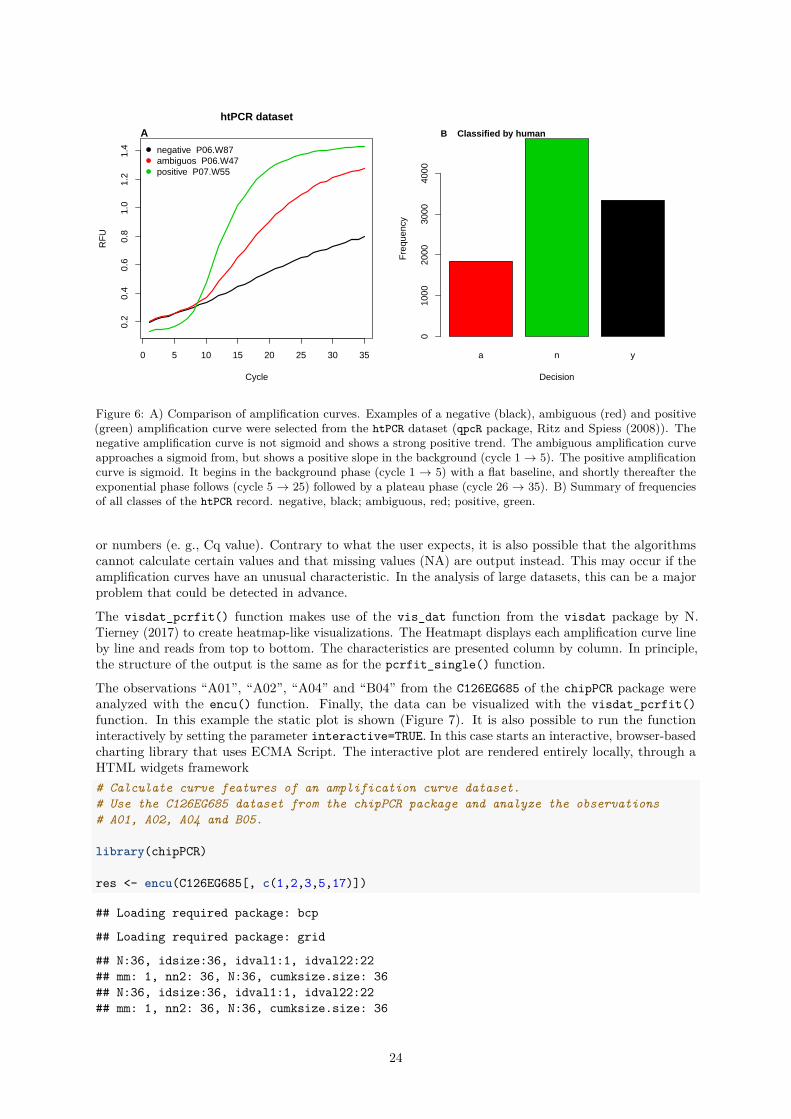
Figure 6: A) Comparison of amplification curves. Examples of a negative (black), ambiguous (red) and positive(green) amplification curve were selected from the htPCR dataset (qpcR package, Ritz and Spiess (2008)). Thenegative amplification curve is not sigmoid and shows a strong positive trend. The ambiguous amplification curveapproaches a sigmoid from, but shows a positive slope in the background (cycle 1 → 5). The positive amplificationcurve is sigmoid. It begins in the background phase (cycle 1 → 5) with a flat baseline, and shortly thereafter theexponential phase follows (cycle 5 → 25) followed by a plateau phase (cycle 26 → 35). B) Summary of frequenciesof all classes of the htPCR record. negative, black; ambiguous, red; positive, green.
or numbers (e. g., Cq value). Contrary to what the user expects, it is also possible that the algorithmscannot calculate certain values and that missing values (NA) are output instead. This may occur if theamplification curves have an unusual characteristic. In the analysis of large datasets, this can be a majorproblem that could be detected in advance.
The visdat_pcrfit() function makes use of the vis_dat function from the visdat package by N.Tierney (2017) to create heatmap-like visualizations. The Heatmapt displays each amplification curve lineby line and reads from top to bottom. The characteristics are presented column by column. In principle,the structure of the output is the same as for the pcrfit_single() function.
The observations “A01”, “A02”, “A04” and “B04” from the C126EG685 of the chipPCR package wereanalyzed with the encu() function. Finally, the data can be visualized with the visdat_pcrfit()function. In this example the static plot is shown (Figure 7). It is also possible to run the functioninteractively by setting the parameter interactive=TRUE. In this case starts an interactive, browser-basedcharting library that uses ECMA Script. The interactive plot are rendered entirely locally, through aHTML widgets framework# Calculate curve features of an amplification curve dataset.# Use the C126EG685 dataset from the chipPCR package and analyze the observations# A01, A02, A04 and B05.
library(chipPCR)
res <- encu(C126EG685[, c(1,2,3,5,17)])
## Loading required package: bcp
## Loading required package: grid
## N:36, idsize:36, idval1:1, idval22:22## mm: 1, nn2: 36, N:36, cumksize.size: 36## N:36, idsize:36, idval1:1, idval22:22## mm: 1, nn2: 36, N:36, cumksize.size: 36
24

## N:36, idsize:36, idval1:1, idval22:22## mm: 1, nn2: 36, N:36, cumksize.size: 36## N:36, idsize:36, idval1:1, idval22:22## mm: 1, nn2: 36, N:36, cumksize.size: 36# Show all results in a plot. Note that the interactive parameter is set to# FALSE.
visdat_pcrfit(res, type = "all", interactive = FALSE)
0.4.1.3 performeR() - Performance Analysis for Binary Classification
Statistical modeling and machine learning can be powerful but expose a risk to the user by introducingan unexpected bias. This may lead to an overestimation of the performance. The assessment of theperformance by the sensitivity and specificity is fundamental to characterize the performance of a classifieror screening test (G. James et al. 2013). Sensitivity is the percentage of true decisions that are identifiedand specificity is the percentage of negative decision that are correctly identified.
An example for the application of the performeR() function is shown in paragraph 0.4.2.4.
Abbreviations: TP, true positive; FP, false positive; TN, true negative; FN, false negative
Measure Formula
Sensitivity - TPR, true positive rate TPR = TPTP+FN
Specificity - SPC, true negative rate SPC = TNTN+FP
Precision - PPV, positive predictive value PPV = TPTP+FP
Negative predictive value - NPV NPV = TNTN+FN
Fall-out, FPR, false positive rate FPR = FPFP+TN = 1− SPC
False negative rate - FNR FNR = FNTN+FN = 1− TPR
False discovery rate - FDR FDR = FPTP+FP = 1− PPV
Accuracy - ACC ACC = (TP+TN)(TP+FP+FN+TN)
F1 score - F1 F1 = 2TP(2TP+FP+FN)
Matthews correlation coefficient - MCC MCC = (TP∗TN−FP∗FN)√(TP+FP )∗(TP+FN)∗(TN+FP )∗(TN+FN)
Likelihood ratio positive - LRp LRp = TPR1−SPC
Cohen”s kappa (binary classification) κ = p0−pc
1−p0
0.4.1.4 qPCR2fdata() - A Helper Function to Convert Amplification Curve Data to thefdata Format
qPCR2fdata() is a helper function to convert qPCR data to the functional fdata class as published byFebrero-Bande and Oviedo de la Fuente (2012). This function prepares the data for further analysis,which includes utilities for functional data analysis. For example, it this can be used to determine thesimilarity measures between amplification curves shapes by the Hausdorff distance. Similarity hereinrefers to the difference in spatial location of two objects (e. g., amplification curves). Objects with a closedistance are presumably more similar. For single objects (e. g., points) one can use a vector distance,such as the Euclidean distance. The Hausdorff distance is an approximation of a shape metrics to definesimilarity measures between shapes. (Charpiat, Faugeras, and Keriven 2003). Several variants of theHausdorff distance have been described (e. g., Minimal Hausdorff distance, Average Hausdorff distance,k-th ranked Hausdorff distance) (Herrera et al. 2016).
The qPCR2fdata() function takes a dataset containing the amplification cycles (first column) and thefluorescence amplitudes (subsequent columns) as input. Noise and missing values may affect the analysisadversely. Therefore, an instance of the CPP() function (chipPCR package (Rödiger, Burdukiewicz, andSchierack 2015)) was integrated in qPCR2fdata(). If preprocess=TRUE in qPCR2fdata(), then all curvesare smoothed (Savitzky-Golay smoother), missing values are imputated and outliers in the ground phaseget removed as described in Rödiger, Burdukiewicz, and Schierack (2015). The non-smoothed amplificationcurves (Figure 8A) have slightly more noise than the smoothed amplification curves (Figure 8C).
25
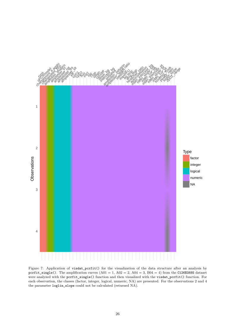
runs
qPCRm
odel
chan
gepo
int_e
.agg
lo
chan
gepo
int_b
cp
ampt
este
r_sh
apiro
ampt
este
r_lrt
ampt
este
r_rg
t
ampt
este
r_th
t
ampt
este
r_slt
effcp
D1cp
D2flu
oini
t2topf.to
psli
win
cpDdif
f
slope
_bg
inter
cept
_bg
polya
rea
ampt
este
r_po
lygon
ampt
este
r_slo
pe.ra
tio
minR
FU
max
RFU
bg.st
op
amp.s
top
head
2tail
_rat
io
auto
core
llatio
n
mblr
r_int
erce
pt_b
g
mblr
r_slo
pe_b
g
mblr
r_co
r_bg
mblr
r_int
erce
pt_p
t
mblr
r_slo
pe_p
t
mblr
r_co
r_pt
hook
reg_
hook
peak
s_ra
tio
loglin
_slop
e
cpD2_
rang
e
1
2
3
4
Obs
erva
tions
Type
factor
integer
logical
numeric
NA
Figure 7: Application of visdat_pcrfit() for the visualization of the data structure after an analysis bypcrfit_single(). The amplification curves (A01 = 1, A02 = 2, A04 = 3, B04 = 4) from the C126EG685 datasetwere analyzed with the pcrfit_single() function and then visualized with the visdat_pcrfit() function. Foreach observation, the classes (factor, integer, logical, numeric, NA) are presented. For the observations 2 and 4the parameter loglin_slope could not be calculated (returned NA).
26

The following example illustrates the usage for the testdat dataset. Hierarchical cluster analysis is widelyapplied in data analysis. This method uses the elements of a proximity matrix to generate a dendrogram.The dendrogram can can be used to further analyze the clusters. Although there are methods to determinethe number of clusters k in the present workflow the number of clusters was determined visually (Cookand Swayne 2007).
Since the distance based on the Hausdorff metric was already done the next steps involved the cutree()function from the stats package to split the dendrogram into smaller junks. A priori was defined thattwo classes (positive & negative) are expected. Therefore, the group parameter was set to k=2 in thecutree().# Calculate the Hausdorff distance of the amplification curves# cluster the curves.# Load additional packages for data and pipes.options(warn = -1)library(qpcR)library(chipPCR)suppressMessages(library(fda.usc))library(magrittr)
# Convert the qPCR dataset to the fdata format# Use unprocessed data from the testdat datasetres_fdata <- qPCR2fdata(testdat)
# Extract column names and create rainbow color to label the datacolumnames <- testdat[-1] %>% colnames()data_colors <- rainbow(length(columnames), alpha = 0.5)
# Calculate the Hausdorff distance (fda.usc) package and plot the distances# as clustered data.
res_fdata_hclust <- metric.hausdorff(res_fdata)res_hclust <- hclust(as.dist(res_fdata_hclust))
# Cluster of the unprocessed amplification curvesres_cutree <- cutree(res_hclust, k = 2)res_cutree <- factor(res_cutree)levels(res_cutree) <- list(y = "1", n = "2")
The results of the cluster analysis led two large clusters. A deeper inspection shows that the observationsare correctly assigned to a cluster of positive or negative amplification curves. Moreover, the later increaseof the fluorescence is reflected in the positive cluster (Figure 8).# Plot the converted qPCR datapar(mfrow = c(1, 2))res_fdata %>% plot(
., xlab = "Cycle", ylab = "RFU", main = "", type = "l",lty = 1, lwd = 2, col = data_colors
)legend(
"topleft", paste0(as.character(columnames), ": ", res_cutree),pch = 19, col = data_colors, bty = "n", ncol = 2, cex = 0.7
)mtext("A", cex = 1.2, side = 3, adj = 0, font = 2)
plot(res_hclust, main = "", xlab = "", sub="")mtext("B", cex = 1.2, side = 3, adj = 0, font = 2)rect(0.5, -3.5, 12.25, 0.5, border = "red")text(7, 1, "negative", col = "red")rect(12.5, -3.5, 24.5, 0.5, border = "green")
27

0 10 20 30 40 50
02
46
810
12
Cycle
RF
U
F1.1: yF1.2: yF1.3: nF1.4: nF2.1: yF2.2: yF2.3: nF2.4: nF3.1: yF3.2: yF3.3: nF3.4: n
F4.1: yF4.2: yF4.3: nF4.4: nF5.1: yF5.2: yF5.3: nF5.4: nF6.1: yF6.2: yF6.3: nF6.4: n
A
F3.
4F
4.3
F5.
3F
1.3
F2.
3F
1.4
F6.
3F
3.3
F4.
4F
2.4
F5.
4F
6.4
F1.
1F
1.2
F3.
1F
3.2
F2.
1F
2.2
F6.
1F
6.2
F5.
1F
5.2
F4.
1F
4.2
02
46
812
Hei
ght
B
negative positive
Figure 8: Shape based grouping of amplification curves. Grouping of amplification curves of the testdatdataset via Hausdorff distance. A) The amplification curves were converted with the qPCR2fdata() function. B)Subsequent they were processed by a cluster analysis using the Hausdorff distance. Faultless differentiation wasachieved between negative amplification curves (n) and positive amplification curves (y).
text(14, 1, "positive", col = "green", cex = 0.9)
Clusters of the amplification curves after an analysis using the Hausdorff distance. The amplificationcurves of the testdat dataset remained as raw data or were pre-processed (smoothed). Subsequent,the amplification curves were converted by the qPCR2fdata(). The converted data were subjected to acluster analysis (Hausdorff distance). All observations were correctly assigned to cluster 1 (positive) orcluster 2 (negative).
This workflow can be used to cluster amplification curve data according to their shape into smaller groupsof similar amplification curves. Classification tasks can be preformed in batches of amplification curves.It is worth to mention that the calculation of the distances is a computing expensive step dependent onthe number of amplification curves. Other distance metric than the Hausdorff distance should also beconsidered. For example, Luo, Lin, and Chao (2010) showed how for image data how shape models usinglocal curve segments with multiple types of distance metrics can improve the shape classification anddetection results.
The following example illustrates the usage for the HCU32_aggR.csv dataset from the 32 channel VideoScanheating and cooling unit. In this experiment the bacterial gene aggR from E. coli was amplified in 32replicate qPCR reactions. Details of the experiment are described in the manual of the PCRedux package.The ambition was to test if the 32 amplification curves of the qPCR reaction are identical. As before,the data were processed with the qPCR2fdata() function and compared by the the Hausdorff distance.Ideally, the amplification curves form only few clusters.# Calculate slope and intercept on positive amplification curve data from the# VideoScan 32 cavity real-time PCR device.# Load additional packages for data and pipes.options(warn = -1)library(data.table)library(fda.usc)library(magrittr)
# Load the qPCR data from the HCU32_aggR.csv dataset# Convert the qPCR dataset to the fdata format
28

filename <- system.file("HCU32_aggR.csv", package = "PCRedux")data_32HCU <- fread(filename, data.table = FALSE)
res_fdata <- qPCR2fdata(data_32HCU)# Extract column names and create rainbow color to label the datacolumnames <- data_32HCU[-1] %>% colnames()data_colors <- rainbow(length(columnames), alpha = 0.55)
In advance the the Cq values were calculated by the following code:# Load the qpcR package to calculate the Cq values by the second derivative# maximum method.options(warn = -1)library(qpcR)
res_Cq <- sapply(2L:ncol(data_32HCU), function(i) {efficiency(pcrfit(data_32HCU, cyc = 1, fluo = i, model = l6))
})
data.frame(obs = colnames(data_32HCU)[-1],
Cq = unlist(res_Cq["cpD2", ]), eff = unlist(res_Cq["eff", ]))
# Results## obs Cq eff# 1 A1 14.89 1.092963# 2 B1 15.68 1.110480# 3 C1 15.63 1.111474# ...# 30 F4 15.71 1.109634# 31 G4 15.70 1.110373# 32 H4 15.73 1.117827
Next, the amplification curves (Figure 9A), the differences between baseline region and plateau region(Figure 9B), the correlation between the Cq value and amplification efficiency (Figure 9C) and the clustersbased on the Hausdorff distance (Figure 9 were taken into account. In total, 32 real-time PCR reactionsfor the bacterial gen aggR were measured in the VideoScan system.
Note: The raw data has not been modified to retain all characteristics of the amplificationcurves.
Some amplification curves (Figure 9A) showed stronger fluctuations and therefore no ideal sigmoid curveprogression. In addition, it can be seen that the amplification curves in the baseline area have a negativenon-linear trend and a shift around the zero point. By contrast, the trend in the plateau region appearsto be positive. This is similar to the curve shown in Figure 1. The comparison of the baseline regionand the plateau region showed a difference between the 32 amplification curves. The observations E1,F1 and H1 had the lowest differences between the baseline and plateau regions. The comparison of Cqvalues and amplification efficiency showed that most amplification curves exhibit similar behavior. Sincethere are 32 replicates, the similarity of the Cq values and amplification efficiencies was to be expected.However, there are also amplification curves that show a greater deviation from the median of all Cqvalues (Figure 9C). The analysis by clustering of the Hausdorff distance did not yield any specific pattern(Figure 9D).library(fda.usc)library(magrittr)
# To save computing time, the Cq values and amplification efficiencies were# calculated beforehand and transferred as a hard copy here.
29
calculated_Cqs <- c(14.89, 15.68, 15.63, 15.5, 15.54, 15.37, 15.78, 15.24, 15.94,15.88, 15.91, 15.77, 15.78, 15.74, 15.84, 15.78, 15.64, 15.61,15.66, 15.63, 15.77, 15.71, 15.7, 15.79, 15.8, 15.72, 15.7, 15.82,15.62, 15.71, 15.7, 15.73
)
calculated_effs <- c(1.09296326515231, 1.11047987547324, 1.11147389307153, 1.10308929700635,1.10012176315852, 1.09136717687619, 1.11871308210321, 1.08006168654712,1.09500422011318, 1.1078777171126, 1.11269436700649, 1.10628580163733,1.1082009954558, 1.11069683827291, 1.11074914659374, 1.10722949813473,1.10754282514113, 1.10098387264025, 1.1107026749644, 1.11599641663658,1.11388510347017, 1.11398547396991, 1.09410798249025, 1.12422338092929,1.11977386646464, 1.11212436173214, 1.12145338871426, 1.12180879952503,1.1080276005651, 1.10963449004393, 1.11037302758388, 1.11782689816295
)
# Plot the converted qPCR datalayout(matrix(c(1, 2, 3, 4, 4, 4), 2, 3, byrow = TRUE))res_fdata %>% plot(
., xlab = "Cycle", ylab = "RFU", main = "HCU32_aggR", type = "l",lty = 1, lwd = 2, col = data_colors
)legend(
"topleft", as.character(columnames), pch = 19,col = data_colors, bty = "n", ncol = 4
)mtext("A", cex = 1.2, side = 3, adj = 0, font = 2)
# Plot the background and plateau phase.
boxplot(data_32HCU[, -1] - apply(data_32HCU[, -1], 2, min),
col = data_colors, las = 2, main = "Signal to noise ratio",xlab = "Sample", ylab = "RFU"
)mtext("B", cex = 1.2, side = 3, adj = 0, font = 2)
# Plot the Cqs and the amplification efficiencies.# Determine the median of the Cq values and label all Cqs, which a less 0.1 Cqs# of the median or more then 0.1 Cqs of the median Cq.
plot(calculated_Cqs, calculated_effs, xlab = "Cq (SDM)",ylab = "eff", main = "Cq vs. Amplification Efficiency",type = "p", pch = 19, lty = 1, lwd = 2, col = data_colors
)
median_Cq <- median(calculated_Cqs)abline(v = median_Cq)
text(median_Cq + 0.01, 1.085, expression(paste(tilde(x))))labeled <- c(
which(calculated_Cqs < median_Cq - 0.1),which(calculated_Cqs > median_Cq + 0.1)
)
30
text(calculated_Cqs[labeled], calculated_effs[labeled],as.character(columnames)[labeled]
)mtext("C", cex = 1.2, side = 3, adj = 0, font = 2)
# Calculate the Hausdorff distance using the fda.usc package and cluster the# the distances.
res_fdata_hclust <- metric.hausdorff(res_fdata)cluster <- hclust(as.dist(res_fdata_hclust))
# plot the distances as clustered data and label the leafs with the Cq values# and colored dots.
plot(cluster, main = "Clusters of the amplification\ncurves as calculated by the Hausdorff distance", xlab = "", sub="")mtext("D", cex = 1.2, side = 3, adj = 0, font = 2)
The analysis gives an overview of the variation of the amplification curve data.
31
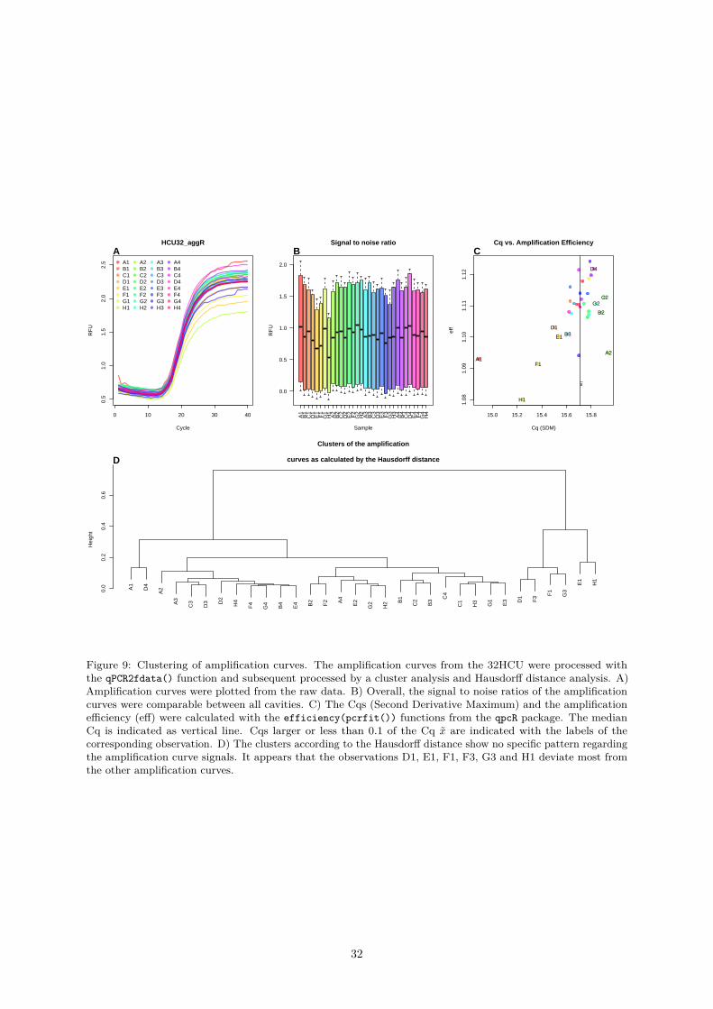
0 10 20 30 40
0.5
1.0
1.5
2.0
2.5
HCU32_aggR
Cycle
RF
U
A1B1C1D1E1F1G1H1
A2B2C2D2E2F2G2H2
A3B3C3D3E3F3G3H3
A4B4C4D4E4F4G4H4
A
A1
B1
C1
D1
E1
F1
G1
H1
A2
B2
C2
D2
E2
F2
G2
H2
A3
B3
C3
D3
E3
F3
G3
H3
A4
B4
C4
D4
E4
F4
G4
H4
0.0
0.5
1.0
1.5
2.0
Signal to noise ratio
Sample
RF
U
B
15.0 15.2 15.4 15.6 15.8
1.08
1.09
1.10
1.11
1.12
Cq vs. Amplification Efficiency
Cq (SDM)
eff
x~
A1
D1
E1
F1
H1
B3
A2
B2
C2G2
D4
C
A1
D4
A2
A3
C3
D3 D
2
H4
F4
G4
B4
E4 B2
F2 A4
E2
G2
H2 B
1
C2
B3 C
4
C1
H3
G1
E3 D
1
F3 F
1
G3
E1
H1
0.0
0.2
0.4
0.6
Clusters of the amplification
curves as calculated by the Hausdorff distance
Hei
ght
D
Figure 9: Clustering of amplification curves. The amplification curves from the 32HCU were processed withthe qPCR2fdata() function and subsequent processed by a cluster analysis and Hausdorff distance analysis. A)Amplification curves were plotted from the raw data. B) Overall, the signal to noise ratios of the amplificationcurves were comparable between all cavities. C) The Cqs (Second Derivative Maximum) and the amplificationefficiency (eff) were calculated with the efficiency(pcrfit()) functions from the qpcR package. The medianCq is indicated as vertical line. Cqs larger or less than 0.1 of the Cq x̃ are indicated with the labels of thecorresponding observation. D) The clusters according to the Hausdorff distance show no specific pattern regardingthe amplification curve signals. It appears that the observations D1, E1, F1, F3, G3 and H1 deviate most fromthe other amplification curves.
32

0.4.2 Amplification Curve Analysis Functions of the PCRedux package
There are a number of ROIs (see Figure 2) in an amplification curve that are potentially useful forcalculating characteristics for the classification of amplification curves. Amplification curves can haveunique shapes and deviate from the ideal sigmoid models (compare Figure 1A and Figure 1B) of qPCRs.For instance, some amplification curves are only flat or have a rise with positive or negative signs withoutsigmoid curvature. In the case of sigmoid amplification curves, there are turning points which can becharacteristic for positive amplification curves. Such differences are interesting candidates to calculatefeatures for machine learning.
On the basis of this observation, various concepts were developed and implemented in algorithms todescribe amplification curves. The intent of Gunay, Goceri, and Balasubramaniyan (2016) was to improvethe determination of the Cq values. They postulated that they can achieve an improved prediction of Cqvalues using a modified sigmoid function (three parameters). An assumption of their approach is, thatthis model can be applied to any dataset. There are several reasons why such an assumption is not valid.In the chapters paragraph 0.4.2.7, for example, the functions hookreg() and hookregNL() are brieflydisplayed. These amplification curves deviate significantly from a three-parameter model. Figure 11shows the distribution of models fitted to amplification curves. In most case models with six and sevenparameters were automatically selected. In addition, non-linear functions also tend to fit models to noise(Figure 10). It becomes clear in Figure 12 that for a considerable proportion of manually negativelyclassified amplification curves a Cq value could be calculated. A computer-assisted decision would behelpful.# Load the qpcR package for the model fit.suppressMessages(library(qpcR))library(chipPCR)
# Select one positive and one negative amplification curve from the PCRedux# package.
amp_data <- RAS002[, c("cyc", "A01_gDNA.._unkn_B.Globin", "B07_gDNA.._unkn_HPRT1")]
# Arrange graphs in an matrix and set the plot parameters. An plot the positive# and negative amplification curve.
layout(matrix(c(1, 1, 2, 3), 2, 2, byrow = TRUE), respect = TRUE)
matplot(amp_data[,1], amp_data[, -1], pch = 19, lty = 1, type = "l",xlab = "Cycle", ylab = "RFU", main = "")
mtext("A", cex = 1.2, side = 3, adj = 0, font = 2)
# Apply the the amptester function from the chipPCR package to the amplification# curve data and write the results to the main of the plots.
for (i in 2:3) {res.ampt <- suppressMessages(amptester(amp_data[, i]))
# Make a logical connection by two tests (shap.noisy, lrt.test and# tht.dec) of amptester to decide if an amplification reaction is# positive or negative.decision <- ifelse(!res.ampt@decisions[1] &&res.ampt@decisions[2] &&res.ampt@decisions[4],"positive", "negative")# The amplification curves were fitted (l7 model) with pcrfit() function. The# Cq was determined with the efficiency() function.
fit <- pcrfit(data = amp_data, cyc = 1, fluo = i, model = l7)
33

res <- efficiency(fit, plot = FALSE)plot(fit, pch = 19, lty = 1, type = "single", xlab = "Cycle", ylab = "RFU",
main = "", col = i - 1)abline(h = res[["fluo"]], v = res[["cpD2"]], col = c("grey", "red"))points(res[["cpD2"]], res[["fluo"]], pch = 19)
mtext(paste0(LETTERS[i], " Cq: ", res[["cpD2"]]), cex = 1.2, side = 3,adj = 0, font = 2)
legend("topleft", paste0(colnames(amp_data)[i], "\nDecision: ", decision),
bty = "n", cex = 1, col = "red")
}
Therefore, several characteristics of an amplification curve should be recorded first and then checked fortheir usefulness. There, it becomes clear that a three-parameter model adaptation can be adapted tonoise and thus provides unreliable predictions.
As shown in Figure 4 have positive amplification curves a typical sigmoid shape, while negative curvesresemble random noise.
Many properties (e. g., experiment condition (hydrolysis probe, DNA binding dye)) can be converted tobinary classifiers (no == 0, yes == 1). From the amplification curve one can calculate the signal rangebefore and after the amplification process.
Next follows a brief introduction of the feature engineering process of this work. For doing this a setfeatures which characterize amplification curves was needed. In total seven function were generated andintegrated in PCRedux package. These functions features have not been described before in the literaturefor the classification of amplification curves.
The function described following are aimed for experimental studies. It is important to note that thefeatures proposed herein emerged during a critical reasoning process. The aim of the package is to proposea set of features, functions and data for an independent research.
0.4.2.1 pcrfit_single() - A Function to Calculate Features from an Amplification Curve
The following chapter includes on exemplary applications of feature vectors from amplification curves,which can be used for automatic classification by machine learning. The focus is mainly on, the concisedescription of the algorithms of the pcrfit_single() function. The underlying hypotheses are formulatedand supported by exemplary analysis.
Some algorithms have been implemented as standalone functions (e. g., earlyreg()) to make themavailable for other applications. The goal is not to examine the limits of their applicability, butrather to prove their basic functionality. Based on considerations and experience the algorithms of thepcrfit_single() function are restricted to ROIs (Figure 2) in order to calculate specific features. Inorder to bring a systematic into the algorithms, the functions with similar approaches are summarizedin groups. Due to the number of algorithms, it is not possible to provide a detailed description withexamples in every place.
The following output shows all features and their data type (num, numeric; int, integer; Factor, factor;logi, boolean) which are determined from the second amplification curve of the RAS002 dataset with thepcrfit_single() function.library(PCRedux)str(pcrfit_single(RAS002[, 2]))
## N:36, idsize:36, idval1:1, idval22:22## mm: 1, nn2: 36, N:36, cumksize.size: 36## 'data.frame': 1 obs. of 48 variables:## $ cpD1 : num 28.1
34
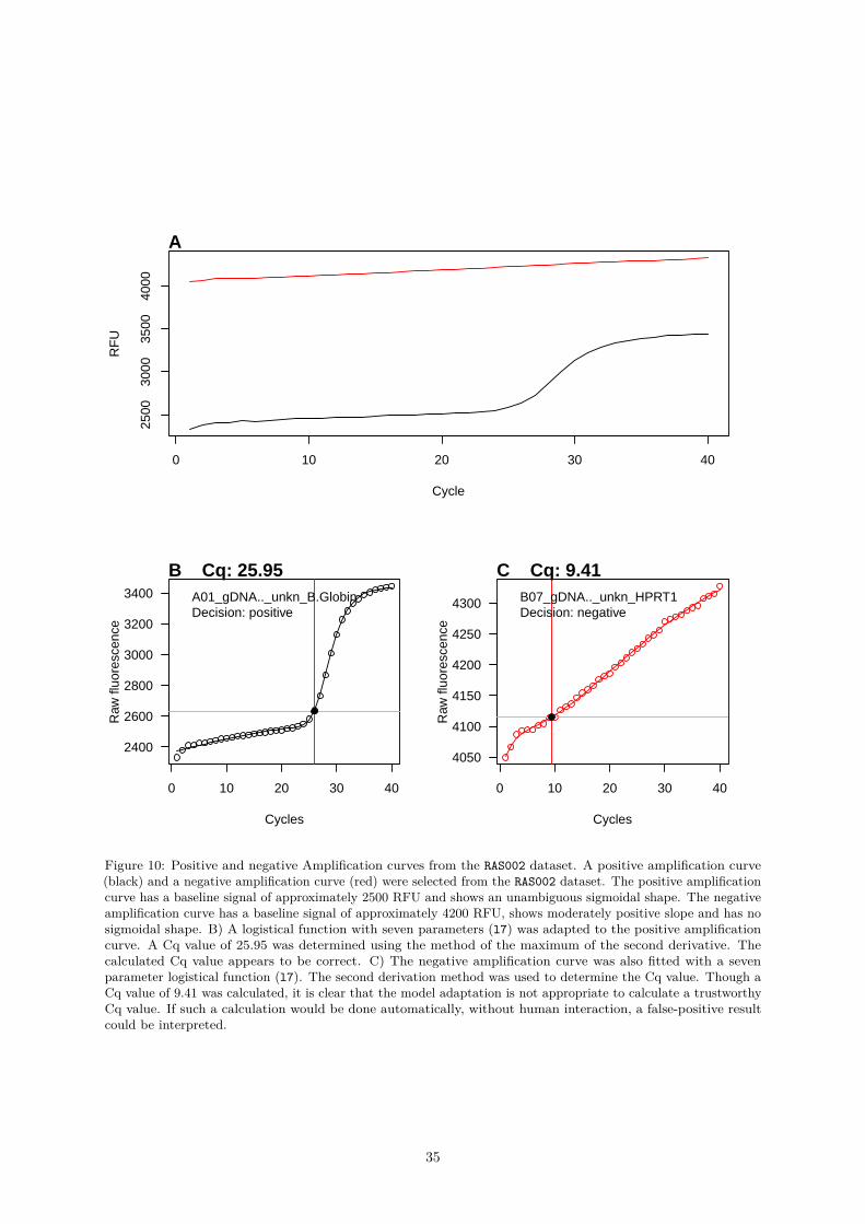
0 10 20 30 40
2500
3000
3500
4000
Cycle
RF
U
A
0 10 20 30 40
2400
2600
2800
3000
3200
3400
Cycles
Raw
fluo
resc
ence
B Cq: 25.95A01_gDNA.._unkn_B.GlobinDecision: positive
0 10 20 30 40
4050
4100
4150
4200
4250
4300
Cycles
Raw
fluo
resc
ence
C Cq: 9.41B07_gDNA.._unkn_HPRT1Decision: negative
Figure 10: Positive and negative Amplification curves from the RAS002 dataset. A positive amplification curve(black) and a negative amplification curve (red) were selected from the RAS002 dataset. The positive amplificationcurve has a baseline signal of approximately 2500 RFU and shows an unambiguous sigmoidal shape. The negativeamplification curve has a baseline signal of approximately 4200 RFU, shows moderately positive slope and has nosigmoidal shape. B) A logistical function with seven parameters (l7) was adapted to the positive amplificationcurve. A Cq value of 25.95 was determined using the method of the maximum of the second derivative. Thecalculated Cq value appears to be correct. C) The negative amplification curve was also fitted with a sevenparameter logistical function (l7). The second derivation method was used to determine the Cq value. Though aCq value of 9.41 was calculated, it is clear that the model adaptation is not appropriate to calculate a trustworthyCq value. If such a calculation would be done automatically, without human interaction, a false-positive resultcould be interpreted.
35
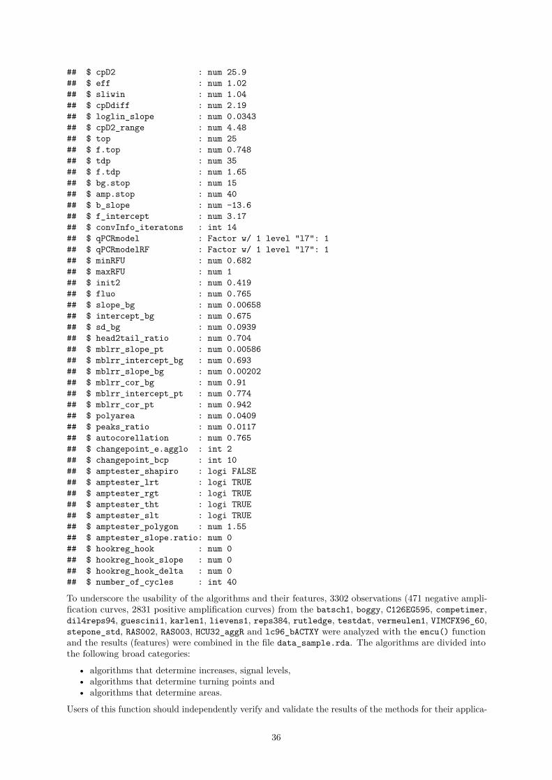
## $ cpD2 : num 25.9## $ eff : num 1.02## $ sliwin : num 1.04## $ cpDdiff : num 2.19## $ loglin_slope : num 0.0343## $ cpD2_range : num 4.48## $ top : num 25## $ f.top : num 0.748## $ tdp : num 35## $ f.tdp : num 1.65## $ bg.stop : num 15## $ amp.stop : num 40## $ b_slope : num -13.6## $ f_intercept : num 3.17## $ convInfo_iteratons : int 14## $ qPCRmodel : Factor w/ 1 level "l7": 1## $ qPCRmodelRF : Factor w/ 1 level "l7": 1## $ minRFU : num 0.682## $ maxRFU : num 1## $ init2 : num 0.419## $ fluo : num 0.765## $ slope_bg : num 0.00658## $ intercept_bg : num 0.675## $ sd_bg : num 0.0939## $ head2tail_ratio : num 0.704## $ mblrr_slope_pt : num 0.00586## $ mblrr_intercept_bg : num 0.693## $ mblrr_slope_bg : num 0.00202## $ mblrr_cor_bg : num 0.91## $ mblrr_intercept_pt : num 0.774## $ mblrr_cor_pt : num 0.942## $ polyarea : num 0.0409## $ peaks_ratio : num 0.0117## $ autocorellation : num 0.765## $ changepoint_e.agglo : int 2## $ changepoint_bcp : int 10## $ amptester_shapiro : logi FALSE## $ amptester_lrt : logi TRUE## $ amptester_rgt : logi TRUE## $ amptester_tht : logi TRUE## $ amptester_slt : logi TRUE## $ amptester_polygon : num 1.55## $ amptester_slope.ratio: num 0## $ hookreg_hook : num 0## $ hookreg_hook_slope : num 0## $ hookreg_hook_delta : num 0## $ number_of_cycles : int 40
To underscore the usability of the algorithms and their features, 3302 observations (471 negative ampli-fication curves, 2831 positive amplification curves) from the batsch1, boggy, C126EG595, competimer,dil4reps94, guescini1, karlen1, lievens1, reps384, rutledge, testdat, vermeulen1, VIMCFX96_60,stepone_std, RAS002, RAS003, HCU32_aggR and lc96_bACTXY were analyzed with the encu() functionand the results (features) were combined in the file data_sample.rda. The algorithms are divided intothe following broad categories:
• algorithms that determine increases, signal levels,• algorithms that determine turning points and• algorithms that determine areas.
Users of this function should independently verify and validate the results of the methods for their applica-
36

tions. The encu() function is based on the pcrfit_single() function. Contrary to the pcrfit_single()function, the encu() function can be used to process large records of amplification curve data arranged incolumns. The progress of processing is displayed in the form of a progress bar and the estimated run-time.The encu() function is not discussed in more detail. Additionally, the encu() allows to specify whichmonitoring chemistry (e. g., DNA binding dye, sequence specific probes) and which thermo-cycler wasused. Such information may well be relevant for data analysis (subsubsection 0.1.3). Jan M. Ruijter etal. (2014) have shown, among other things, that monitoring chemistry of the type of input DNA (singlestranded, double stranded) can be important when analysing qPCR data.
Amplification Curve Pre-processing
The pcrfit_single() function and the encu() function perform two pre-processing steps before eachcalculation. That includes checking whether an amplification curve contains missing values. Missingvalues (NA) are measuring points in a dataset where no measured values are available or if they havebeen removed arbitrarily. Causes of this can be found, for example, in case that no measurement hasbeen carried out (e. g., defective detector) or lengths of the vectors differ (number of cyles) between theobservation. Missing values are automatically imputed by spline interpolation as described in Rödiger,Burdukiewicz, and Schierack (2015). The pcrfit_single() function and the encu() function will onlyterminate with an error message in extreme cases. In the next step, all values of an amplification curve arenormalized to the 99% quantile. The normalization is necessary, because the amplitudes of amplificationcurves depend on the used detection chemistry and thermo-cycler (sensor technology, software processing).As a result considerable differences between the maximum values of raw data are the norm. Users ofthe PCRedux package are advised to take a look at the datasets of amplification curves before startingcomplex analyses. In order to compare amplification curves from different thermo-cyclers, the valuesshould always be scaled systematically using the same method. Although there are other normalizationmethods (e. g., minimum-maximum normalization, see Rödiger, Burdukiewicz, and Schierack (2015)), thenormalization by means of the 99% quantile should ensure that the information about the height of thebackground signal is not lost. That would be the case with a Min-Max-standardization. A normalizationto the maximum is not recommended, because outliers could have an unintentional influence on thenormalization. Consequently, the 99% quantile is a pragmatic compromise to take the aforementionedaspects into account in the processing chain. For example, the data in Figure 17D show that the maxRFUvalues after normalization are approximately 1. There is no statistical significant difference betweenmaxRFU values of positive and negative amplification curves. Inspired by maxRFU value, the minimumof the amplification curve is determined by the 1% quantile to minimize the influence of outliers. It isreferred to as minRFU (Figure 17C). Selected algorithms of the pcrfit_single() function use the CPP()function from the chipPCR package to pre-process (e. g., baselining, smoothing, imputation of missingvalues) the amplification curves. Further details are given in Rödiger, Burdukiewicz, and Schierack (2015).
Handling of Missing Features
Missing values (NA) of features can occur in case that a calculation of a specified value is not possible. Itcan occur, for example, if a logistical function is to be adapted to a measurement series, but the raw datais too noisy to allow model adaptation. As a consequence, no parameters would be determined from thismodel. The apparent lack of information is nevertheless still useful in the context of data analysis. Forthe case described above, it could be deduced from the missing values that the data series does not showa sigmoid curve progression. In this regard, NAs nonetheless provide an informational basis.
However, NAs pose a difficulty in many analyses. Before an analysis is carried out, it must be clarifiedhow to deal with the missing values. Under the term “imputation” there are a number of proceduresbased on statistical methods (e. g., neighboring median, spline interpolation) or on user-defined rules.Such a rule could, for example, consist of setting one of the slope parameters of a model to zero whenit cannot be determined (Williams 2009, Cook and Swayne (2007), Hothorn and Everitt (2014)). Theapplication of fixed rules brings the advantage that the user is relieved of the decision as to how to dealwith missing values. The disadvantage is that certain rules do not necessarily have to reflect a naturalprocess.
The NAs were left unchanged in the PCRedux package up to version 0.2.5-1. Since version 0.2.6, however,
37
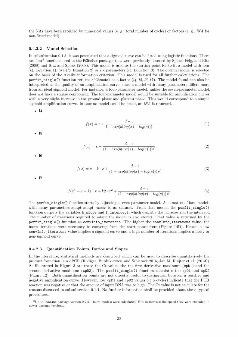
the NAs have been replaced by numerical values (e. g., total number of cycles) or factors (e. g., lNA fornon-fitted model).
0.4.2.2 Model Selection
In subsubsection 0.1.3, it was postulated that a sigmoid curve can be fitted using logistic functions. Thereare four3 functions used in the PCRedux package, that were previously descried by Spiess, Feig, and Ritz(2008) and Ritz and Spiess (2008). This model is used as the starting point for to fit a model with four(l4, Equation 1), five (l5, Equation 2) or six parameters (l6, Equation 3). The optimal model is selectedon the basis of the Akaike information criterion. This model is used for all further calculations. Thepcrfit_single() function returns qPCRmodel as a factor (l4, l5, l6, l7 ). The model found can also beinterpreted as the quality of an amplification curve, since a model with many parameters differs morefrom an ideal sigmoid model. For instance, a four-parameter model, unlike the seven-parameter model,does not have a square component. The four-parameter model would be suitable for amplification curveswith a very slight increase in the ground phase and plateau phase. This would correspond to a simplesigmoid amplification curve. In case no model could be fitted, an lNA is returned.
• l4:
f(x) = c+ d− c1 + exp(b(log(x)− log(e))) (1)
• l5:
f(x) = c+ d− c(1 + exp(b(log(x)− log(e))))f (2)
• l6:
f(x) = c+ k · x+ d− c(1 + exp(b(log(x)− log(e))))f (3)
• l7:
f(x) = c+ k1 · x+ k2 · x2 + d− c(1 + exp(b(log(x)− log(e))))f (4)
The pcrfit_single() function starts by adjusting a seven-parameter model. As a matter of fact, modelswith many parameters adapt adapt easier to an dataset. From that model, the pcrfit_single()function outputs the variables b_slope and f_intercept, which describe the increase and the intercept.The number of iterations required to adapt the model is also stored. That value is returned by thepcrfit_single() function as convInfo_iteratons. The higher the convInfo_iteratons value, themore iterations were necessary to converge from the start parameters (Figure 14D). Hence, a lowconvInfo_iteratons value implies a sigmoid curve and a high number of iterations implies a noisy ornon-sigmoid curve.
0.4.2.3 Quantification Points, Ratios and Slopes
In the literature, statistical methods are described which can be used to describe quantitatively theproduct formation in a qPCR (Rödiger, Burdukiewicz, and Schierack 2015, Jan M. Ruijter et al. (2013)).As illustrated in Figure 3 are these the Ct value, the the first derivative maximum (cpD1) and thesecond derivative maximum (cpD2). The pcrfit_single() function calculates the cpD1 and cpD2(Figure 12). Both quantification points are not directly useful to distinguish between a positive andnegative amplification curve. However, low cpD1 and cpD2 values (< 5 cycles) indicate that the PCRreaction was negative or that the amount of input DNA was to high. The Ct value is not calculate for thereasons discussed in subsubsection 0.1.4. No further information shall be provided about these typicalprocedures.
3Up to PCRedux package version 0.2.5-1 more models were calculated. But to increase the speed they were excluded innewer package versions.
38
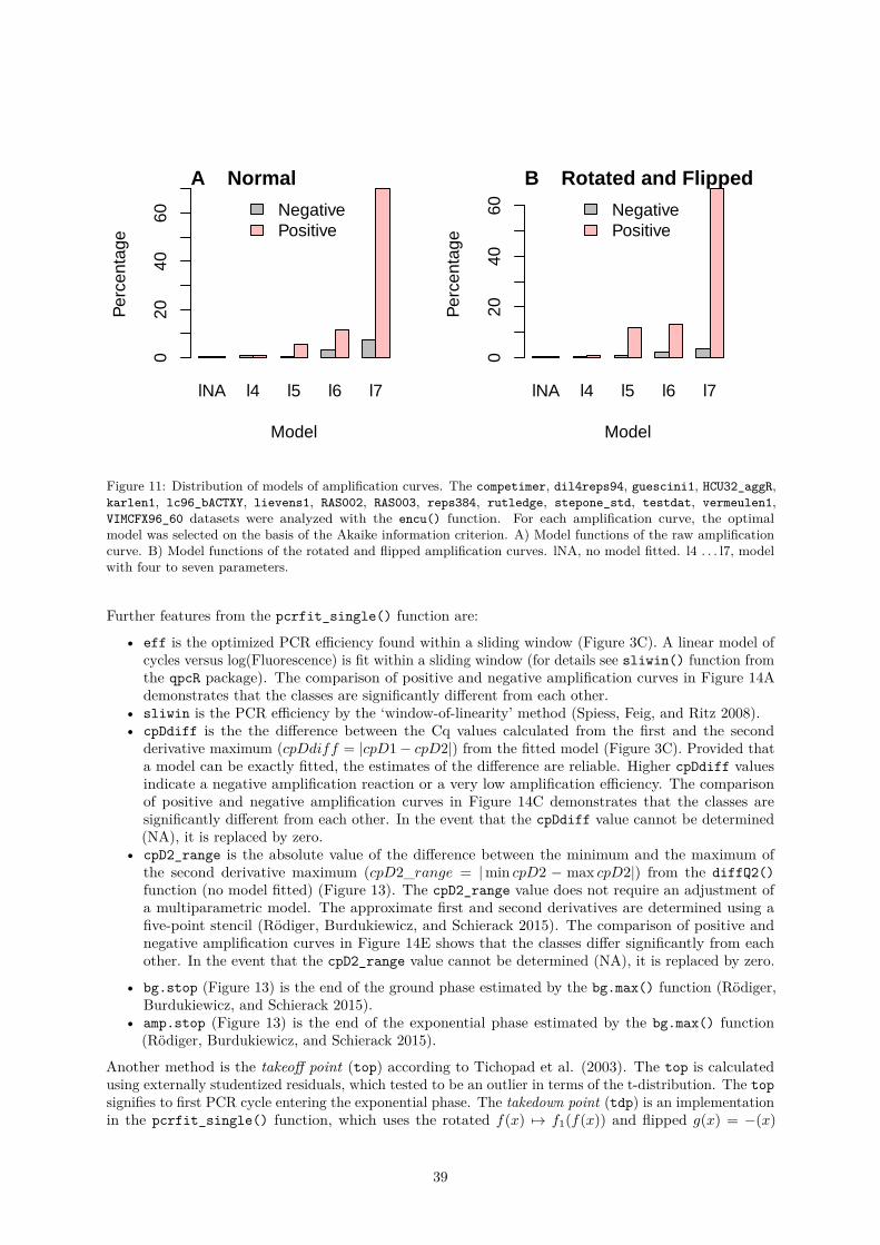
lNA l4 l5 l6 l7
Model
Per
cent
age
020
4060 Negative
Positive
A Normal
lNA l4 l5 l6 l7
ModelP
erce
ntag
e
020
4060 Negative
Positive
B Rotated and Flipped
Figure 11: Distribution of models of amplification curves. The competimer, dil4reps94, guescini1, HCU32_aggR,karlen1, lc96_bACTXY, lievens1, RAS002, RAS003, reps384, rutledge, stepone_std, testdat, vermeulen1,VIMCFX96_60 datasets were analyzed with the encu() function. For each amplification curve, the optimalmodel was selected on the basis of the Akaike information criterion. A) Model functions of the raw amplificationcurve. B) Model functions of the rotated and flipped amplification curves. lNA, no model fitted. l4 . . . l7, modelwith four to seven parameters.
Further features from the pcrfit_single() function are:
• eff is the optimized PCR efficiency found within a sliding window (Figure 3C). A linear model ofcycles versus log(Fluorescence) is fit within a sliding window (for details see sliwin() function fromthe qpcR package). The comparison of positive and negative amplification curves in Figure 14Ademonstrates that the classes are significantly different from each other.
• sliwin is the PCR efficiency by the ‘window-of-linearity’ method (Spiess, Feig, and Ritz 2008).• cpDdiff is the the difference between the Cq values calculated from the first and the second
derivative maximum (cpDdiff = |cpD1− cpD2|) from the fitted model (Figure 3C). Provided thata model can be exactly fitted, the estimates of the difference are reliable. Higher cpDdiff valuesindicate a negative amplification reaction or a very low amplification efficiency. The comparisonof positive and negative amplification curves in Figure 14C demonstrates that the classes aresignificantly different from each other. In the event that the cpDdiff value cannot be determined(NA), it is replaced by zero.
• cpD2_range is the absolute value of the difference between the minimum and the maximum ofthe second derivative maximum (cpD2_range = |min cpD2 − max cpD2|) from the diffQ2()function (no model fitted) (Figure 13). The cpD2_range value does not require an adjustment ofa multiparametric model. The approximate first and second derivatives are determined using afive-point stencil (Rödiger, Burdukiewicz, and Schierack 2015). The comparison of positive andnegative amplification curves in Figure 14E shows that the classes differ significantly from eachother. In the event that the cpD2_range value cannot be determined (NA), it is replaced by zero.
• bg.stop (Figure 13) is the end of the ground phase estimated by the bg.max() function (Rödiger,Burdukiewicz, and Schierack 2015).
• amp.stop (Figure 13) is the end of the exponential phase estimated by the bg.max() function(Rödiger, Burdukiewicz, and Schierack 2015).
Another method is the takeoff point (top) according to Tichopad et al. (2003). The top is calculatedusing externally studentized residuals, which tested to be an outlier in terms of the t-distribution. The topsignifies to first PCR cycle entering the exponential phase. The takedown point (tdp) is an implementationin the pcrfit_single() function, which uses the rotated f(x) 7→ f1(f(x)) and flipped g(x) = −(x)
39
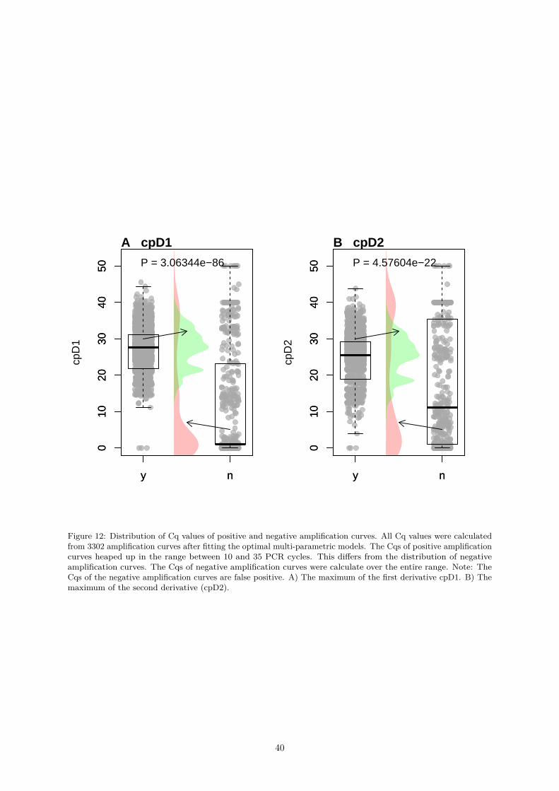
y n
010
2030
4050
cpD
1
y n
010
2030
4050 P = 3.06344e−86
A cpD1
y n
010
2030
4050
cpD
2
y n
010
2030
4050 P = 4.57604e−22
B cpD2
Figure 12: Distribution of Cq values of positive and negative amplification curves. All Cq values were calculatedfrom 3302 amplification curves after fitting the optimal multi-parametric models. The Cqs of positive amplificationcurves heaped up in the range between 10 and 35 PCR cycles. This differs from the distribution of negativeamplification curves. The Cqs of negative amplification curves were calculate over the entire range. Note: TheCqs of the negative amplification curves are false positive. A) The maximum of the first derivative cpD1. B) Themaximum of the second derivative (cpD2).
40

0 10 20 30 40
0.0
0.4
0.8
Cycle
RF
U cpD2 26.1
cpD1 28.25
cpD2m 30.02
cpD2_range 3.92
Amplification curveFirst derivativeSecond derivative
bg.s
top
amp.
stop
Figure 13: Both the minimum (cpD2m) and the maximum (cpD2) of the second derivative were determinednumerically using the diffQ2() function. In addition, the function returns the maximum of the first derivative(cpD1). The difference of cpD2 and cpD2m results in the cpD2_range. Large cpD2_range values indicate a lowamplification efficiency or negative amplification reaction. bg.start provides an estimate for the end of theground phase. The following formula is used for the calculation: bg.start = cpD1− f ∗ (cpD2m− cpD2). Thedistance between cpD1 and cpD2 is multiplied by a factor. bg.stop provides an estimate for the end of theexponential phase. The following formula is used for the calculation: bg.start = cpD1 + f ∗ (cpD2m− cpD2). fis a factor (default 0.6) (see manual of bg.max() for details).
41

amplification curve for calculation Figure 2A describes the location of top and tdp exemplarily. Theposition (f.top, f.tdp) on the ordinate is also determined from these points. If an amplification curveis negative or neither top nor tdp can be calculated, then top & tdp will be assigned the number ofcycles and f.top & f.tdp the value 1. The distribution of top, tdp, f.top and f.tdp is shown inFigure 14I-L. This figure shows that a top value and a tdp value enable a qualitative classification of theamplification reaction. An interesting aspect is that the positive f.top values are markedly lower thanthe negative f.top values (Figure 14J). The same applies inversely to the tdp values (Figure 14L). Inthis way, amplification curves can be classified according to these values.
In Figure 2 it was postulated that an amplification curve can be divided into different regions. Oneassumption is that the slope and intercept of positive amplification curves are markedly different in head(ground phase) and tail (plateau phase). The intercept in the head should be lower than in the tail. Ina negative amplification curve, the intercept should be nearly identical. The slope in the tail shouldalso provide some indication to determine whether the amplification reaction is completed. In order toquantify these values, a linear regression model can be used in these ROIs.
An example is given for the internal parameter loglin_slope which is calculated from the slope determinedby a linear model of the data points from the fluorescence at the minimum and maximum of the secondderivative (Figure 15). The coordinates of the minimum and the maximum were determined as describedin Rödiger, Böhm, and Schimke (2013). This feature uses the exponential phase as ROI. Provided thatthe locations of the minimum of the second derivative and the maximum of the second derivative yield asuitable interval. As a precaution, the algorithm checks, for example, whether the distance between theminimum of the second derivative and the maximum of the second derivative is not more than nine PCRcycles. Failing this, the loglin_slope value is set to zero (no slope). In the following example, the dataFigure 15.
All manufacturers of thermo-cyclers use different sensors and data processing algorithms in their systems.Hence it can be assumed that the signal variation in the ground phase (Figure 1F) differs between thedifferent systems. Moreover, users make use of different detection chemistries (e. g., hydrolysis probes,reporter dyes). However, the latter will not be discussed here. For the distinction between negative andpositive amplification curves, it should be checked whether a difference can be determined on the basis ofthe standard deviation of the background fluorescence.
After analyzing all amplification curves with the pcrfit_single() function, the sd_bg feature wasanalyzed. The feature sd_bg is the standard deviation from the first PCR cycle to the takeoff point(Figure 2A). If no takeoff point can be determined from an amplification curve, the value for sd_bg iscalculated from the first to the eighth PCR cycle. The feature sd_bg in Figure 16 is broken down bythe thermo-cycler and the output of the amplification reaction (negative, positive). It can be seen thatthe signal variation between the thermo-cyclers seems to be different. There is also a difference betweennegative and positive amplification curves. This is also in accordance with the observations from Figure 4.
.
The aim was to predict, based on the polyarea feature, whether an amplification curve is positive ornegative. The computation of polyarea is based on the Gauss polygon area formula. The feature polyareahas been selected to show that the area under an amplification curve can be used to distinguish positive andnegative amplification curves. The hypothesis is that positive amplification curves have a larger area thannegative amplification curves. As shown in Figure 28C, there is a statistically significant difference betweenpositive and negative amplification curves. Also shown are the values of another method to calculate thearea under an amplification curve. This method is called amptester_polygon. amptester_polygon4 ispart of the amptester() function from the chipPCR package (Rödiger, Burdukiewicz, and Schierack 2015).In contrast to the implementation in the amptester() is the amptester_polygon value normalized tothe total number of cycles. It is expected that this method allows comparable predictions (Figure 28Ds).However, this question is not to be dealt with in the following example.
The batsch1, HCU32_aggR, stepone_std, RAS002, RAS003, lc96_bACTXY datasets were used for thecalculation of the polyarea values for all amplification curves. A binomial logistic regression (aka logitregression or logit model) was used to analyze the relationship between the polyarea value and thedecision (negative, positive). This dataset contains almost equal proportions of positive and negative
4This feature is determines from the the points in an amplification curve (like a polygon, in particular non-convexpolygons) are in a ‘clockwise‘ order. The sum over the edges result in a positive value if the amplification curve is ‘clockwise‘and is negative if the curve is ‘counter-clockwise‘.
42

y n
0.0
0.2
0.4
0.6
0.8
1.0
1.2
1.4
eff
y n
0.0
0.2
0.4
0.6
0.8
1.0
1.2
1.4
P = 8.30416e−135
A eff
y n
0.0
0.2
0.4
0.6
0.8
1.0
1.2
1.4
sliw
in
y n
0.0
0.2
0.4
0.6
0.8
1.0
1.2
1.4
P = 5.23192e−134
B sliwin
y n
010
2030
4050
cpD
diff
y n
010
2030
4050 P = 1.3754e−08
C cpDdiff
y n
0.00
0.02
0.04
0.06
0.08
0.10
logl
in_s
lope
y n
0.00
0.02
0.04
0.06
0.08
0.10
P = 3.17211e−140
D loglin_slope
y n
020
4060
8010
0
cpD
2_ra
nge
y n
020
4060
8010
0
P = 1.37895e−78
E cpD2_range
y n
010
2030
40
top
y n
010
2030
40
P = 1.26367e−54
F top
y n
0.2
0.4
0.6
0.8
1.0
f.top
y n
0.2
0.4
0.6
0.8
1.0 P = 1.17883e−135
G f.top
y n
010
2030
4050
tdp
y n
010
2030
4050
P = 0.00292119
H tdp
y n
0.8
1.0
1.2
1.4
1.6
1.8
2.0
f.tdp
y n
0.8
1.0
1.2
1.4
1.6
1.8
2.0
P = 4.66282e−106
I f.tdp
y n
510
1520
2530
bg.s
top
y n
510
1520
2530
P = 9.62307e−68
J bg.stop
y n
2030
4050
amp.
stop
y n
2030
4050
P = 1.67113e−05
K amp.stop
y n
010
0020
0030
0040
0050
00
conv
Info
_ite
rato
ns
y n
010
0020
0030
0040
0050
00 P = 2.91016e−111
L convInfo_iteratons
Figure 14: Analysis of location features. Amplification curves from the datasets stepone_std, RAS002, RAS003,lc96_bACTXY, C126EG595 and dil4reps94 were analyzed with the encu() function. These datasets contain positiveand negative amplification curves. Furthermore, the meta dataset contains amplification curves that exhibit a hookeffect or non-sigmoid shapes, for instance. All amplification curves are manually classified. Altogether 626 positiveand 317 negative amplification curves were included in the analysis. A) eff, optimized PCR efficiency foundwithin a sliding window. B) sliwin, PCR efficiency by the ‘window-of-linearity’ method. C) cpDdiff, differencebetween the Cq values calculated from the first and the second derivative maximum. D) loglin_slope, slopefrom the cycle at the second derivative maximum to the second derivative minimum. E) cpD2_range, absolutevalue of the difference between the minimum and the maximum of the second derivative maximum. F) top,takeoff point. G) f.top, fluorescence intensity at takeoff point. H) tdp, takedown point. I) f.tdp, fluorescenceintensity at takedown point. J) bg.stop, estimated end of the ground phase. K) amp.stop, estimated end of theexponential phase. L) convInfo_iteratons, number of iterations until convergence.
43
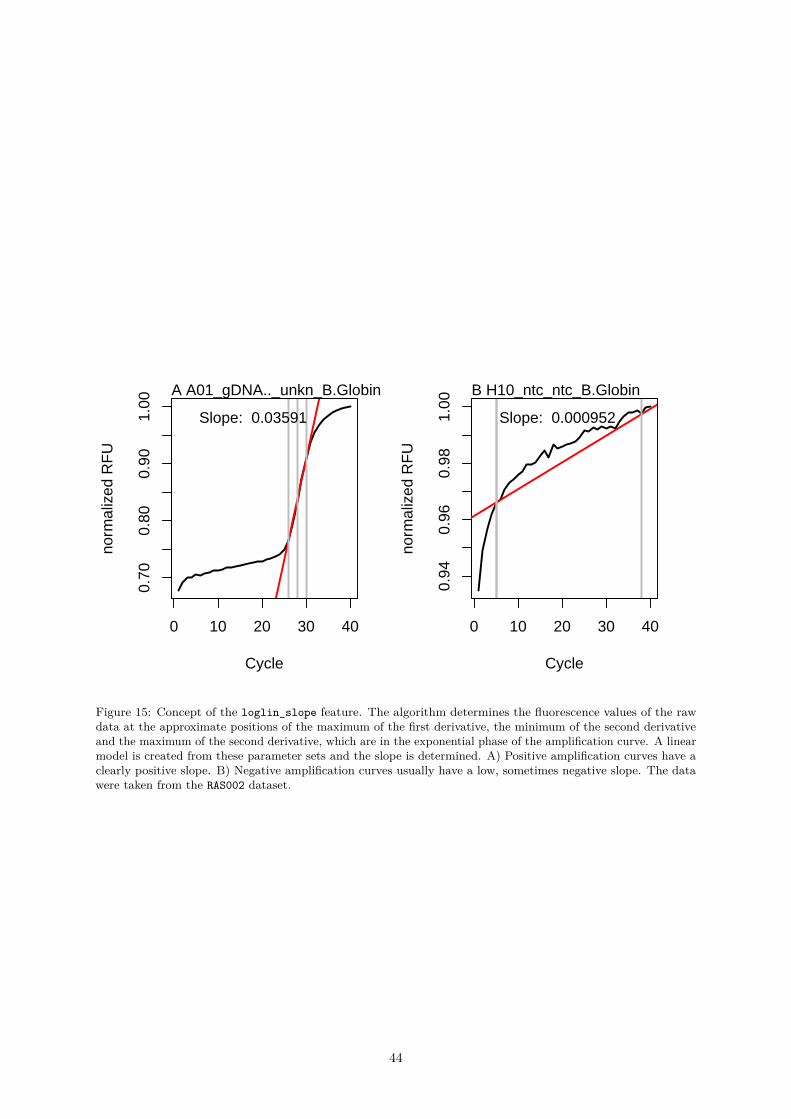
0 10 20 30 40
0.70
0.80
0.90
1.00
Cycle
norm
aliz
ed R
FU
A A01_gDNA.._unkn_B.Globin
Slope: 0.03591
0 10 20 30 40
0.94
0.96
0.98
1.00
Cycle
norm
aliz
ed R
FU
B H10_ntc_ntc_B.Globin
Slope: 0.000952
Figure 15: Concept of the loglin_slope feature. The algorithm determines the fluorescence values of the rawdata at the approximate positions of the maximum of the first derivative, the minimum of the second derivativeand the maximum of the second derivative, which are in the exponential phase of the amplification curve. A linearmodel is created from these parameter sets and the slope is determined. A) Positive amplification curves have aclearly positive slope. B) Negative amplification curves usually have a low, sometimes negative slope. The datawere taken from the RAS002 dataset.
44

y n
0.0
0.2
0.4
Decision
Sta
ndar
d D
evia
tion
y n
0.0
0.2
0.4 P = 5.99301e−68
y (1394)n (117)
A LC_480
y n
0.00
0.15
0.30
Decision
Sta
ndar
d D
evia
tion
y n
0.00
0.15
0.30 P = 0.000800171
y (55)n (25)
B ABI_Prism_7700
y n
0.1
0.3
0.5
Decision
Sta
ndar
d D
evia
tion
y n
0.1
0.3
0.5
P = 2.65388e−05
y (27)n (12)
C LC1.0
y n
0.00
0.05
0.10
0.15
Decision
Sta
ndar
d D
evia
tion
y n
0.00
0.05
0.10
0.15 P = 0.0523715
y (21)n (3)
D StepOne
y n
0.00
0.10
0.20
Decision
Sta
ndar
d D
evia
tion
y n
0.00
0.10
0.20 P = 7.32305e−75
y (179)n (301)
E CFX96
y n
0.00
0.10
0.20
0.30
Decision
Sta
ndar
d D
evia
tion
y n
0.00
0.10
0.20
0.30
P = 5.85213e−08
y (51)n (13)
F LC_96
Figure 16: Standard deviation in the ground phase of various qPCR devices. The sd_bg feature was used todetermine if the standard deviation between the thermo-cyclers and between positive and negative amplificationcurves was different. The standard deviation was determined from the fluorescence values from the first cycle tothe takeoff point. If the takeoff point could not be determined, the standard deviation from the first cycle to theeighth cycle was calculated. The Mann-Whitney test was used to compare the medians of the two populations (y,positive; n, negative). The differences were significant for A) LC_480 (Roche), B) ABI_Prism_7700 (ABI), C)LC1.0 (Roche), E) CFX96 (Bio-Rad) and F) LC96 (Roche). The difference was not significant for D) StepOne(Thermo Fisher).
45
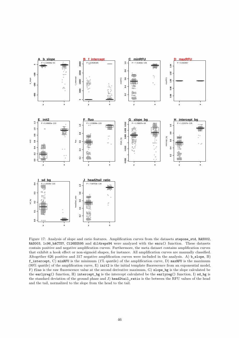
y n
−30
0−
200
−10
00
b_sl
ope
y n
−30
0−
200
−10
00
P = 2.24046e−51
A b_slope
y n
050
0010
000
1500
020
000
f_in
terc
ept
y n
050
0010
000
1500
020
000
P = 0.0536185
B f_intercept
y n
0.2
0.4
0.6
0.8
1.0
min
RF
U
y n
0.2
0.4
0.6
0.8
1.0 P = 7.31483e−135
C minRFU
y n
0.96
0.98
1.00
1.02
1.04
max
RF
U
y n
0.96
0.98
1.00
1.02
1.04
P = 0.552957
D maxRFU
y n
0.0
0.2
0.4
0.6
0.8
1.0
1.2
init2
y n
0.0
0.2
0.4
0.6
0.8
1.0
1.2
P = 6.48883e−133
E init2
y n
0.2
0.4
0.6
0.8
1.0
fluo
y n
0.2
0.4
0.6
0.8
1.0
P = 1.53896e−133
F fluo
y n
−0.
020
−0.
010
0.00
00.
005
0.01
0
slop
e_bg
y n
−0.
020
−0.
010
0.00
00.
005
0.01
0 P = 1.29897e−64
G slope_bg
y n
0.2
0.4
0.6
0.8
1.0
inte
rcep
t_bg
y n
0.2
0.4
0.6
0.8
1.0
P = 1.22337e−135
H intercept_bg
y n
0.0
0.1
0.2
0.3
0.4
sd_b
g
y n
0.0
0.1
0.2
0.3
0.4 P = 1.6439e−133
I sd_bg
y n
0.2
0.4
0.6
0.8
1.0
head
2tai
l_ra
tio
y n
0.2
0.4
0.6
0.8
1.0 P = 7.58703e−136
J head2tail_ratio
Figure 17: Analysis of slope and ratio features. Amplification curves from the datasets stepone_std, RAS002,RAS003, lc96_bACTXY, C126EG595 and dil4reps94 were analyzed with the encu() function. These datasetscontain positive and negative amplification curves. Furthermore, the meta dataset contains amplification curvesthat exhibit a hook effect or non-sigmoid shapes, for instance. All amplification curves are manually classified.Altogether 626 positive and 317 negative amplification curves were included in the analysis. A) b_slope, B)f_intercept, C) minRFU is the minimum (1% qantile) of the amplification curve, D) maxRFU is the maximum(99% qantile) of the amplification curve, E) init2 is the initial template fluorescence from an exponential model,F) fluo is the raw fluorescence value at the second derivative maximum, G) slope_bg is the slope calculated bethe earlyreg() function, H) intercept_bg is the intercept calculated be the earlyreg() function, I) sd_bg isthe standard deviation of the ground phase and J) head2tail_ratio is the between the RFU values of the headand the tail, normalized to the slope from the head to the tail.
46
amplification curves (Figure 18A). Prior to this, the amplification curves were analyzed with the encu()function (paragraph 0.4.2.1) and stored in the data_sample.rda file to save computing time. The file ispart of the PCRedux package. The dataset was split into two chunks. This is an important step duringsuch applications. One chunk is for adapting, i. e. training, the model and the other chunk for testingthe model. Typically, 70% to 80% of the data is used for training (Walsh, Pollastri, and Tosatto 2015,Kuhn (2008)). The binomial logistic regression model was adapted using the function glm() by usingthe parameter family = binomial(link = 'logit'). To objectify the splitting, the sample() functionwas used.options(warn = -1)library(PCRedux)
data <- data_sample[data_sample$dataset %in%c("batsch1",
"HCU32_aggR","lc96_bACTXY","RAS002","RAS003","stepone_std"), ]
n_positive <- sum(data[["decision"]] == "y")n_negative <- sum(data[["decision"]] == "n")
dat <- data.frame(polyarea = data[, "polyarea"],decision = as.numeric(factor(data$decision,
levels = c("n", "y"),label = c(0, 1))) - 1)
# Select randomly observations from 70% of the data for training.# n_train is the number of observations used for training.
n_train <- round(nrow(data) * 0.7)
# index_test is the index of observations to be selected for the trainingindex_test <- sample(1L:nrow(dat), size = n_train)
# index_test is the index of observations to be selected for the testingindex_training <- which(!(1L:nrow(dat) %in% index_test))
# train_data contains the data used for training
train_data <- dat[index_test, ]
# test_data contains the data used for training
test_data <- dat[index_training, ]
# Fit the binomial logistic regression model
model_glm <- glm(decision ~ polyarea, family=binomial(link='logit'),data = train_data)
predictions <- ifelse(predict(model_glm,newdata = test_data, type = 'response') > 0.5,
1, 0)
res_performeR <- performeR(predictions, test_data[["decision"]])[, c(1:10, 12)]
The ‘summary() function returns the results of the model fitting. This can be analysed and interpreted.
47
summary(model_glm)
#### Call:## glm(formula = decision ~ polyarea, family = binomial(link = "logit"),## data = train_data)#### Deviance Residuals:## Min 1Q Median 3Q Max## -4.9056 -0.3749 -0.1990 0.1561 1.6820#### Coefficients:## Estimate Std. Error z value Pr(>|z|)## (Intercept) -2.4997 0.2785 -8.975 <2e-16 ***## polyarea 78.8914 8.2739 9.535 <2e-16 ***## ---## Signif. codes: 0 '***' 0.001 '**' 0.01 '*' 0.05 '.' 0.1 ' ' 1#### (Dispersion parameter for binomial family taken to be 1)#### Null deviance: 494.86 on 362 degrees of freedom## Residual deviance: 179.52 on 361 degrees of freedom## AIC: 183.52#### Number of Fisher Scoring iterations: 7
Based on the results it can be concluded that the parameters (Intercept) and polyarea are statisticallysignificant (P < 2e-16). This indicates a strong association between polyarea and the probability thatan amplification curve is positive.
In order to apply the model to a new dataset, further steps are necessary. predict() is a generic functionfor prediction from the results of a model fitting function. All previously split test data is passed tothe function argument newdata. By setting the type = 'response' parameter, the predict() functionreturns probabilities in the form of P (y = 1|X). In the case in hand, it was decided that a decision limitof 0.5 is to be applied. If P (y = 1|X) < 0.5 then y = 0 (amplification curve negative), otherwise y = 1(amplification curves positive).options(warn = -1)library(PCRedux)
par(mfrow = c(1,2))
# Plot train_data (grey points) and the predicted model (blue)
plot(train_data$polyarea, train_data$decision, pch = 19,xlab = "polyarea", ylab = "Probability",col = adjustcolor("grey", alpha.f = 0.9), cex = 1.5)
mtext("A", cex = 1.2, side = 3, adj = 0, font = 2, las = 0)abline(h = 0.5, col = "grey")
curve(predict(model_glm, data.frame(polyarea = x), type = "resp"),add = TRUE, col = "blue")
# Plot test_data (red)
points(test_data$polyarea, test_data$decision, pch = 19,col = adjustcolor("red", alpha.f = 0.3))
legend("right", paste("Positive: ", n_positive,"\nNegative: ", n_negative), bty = "n")
48
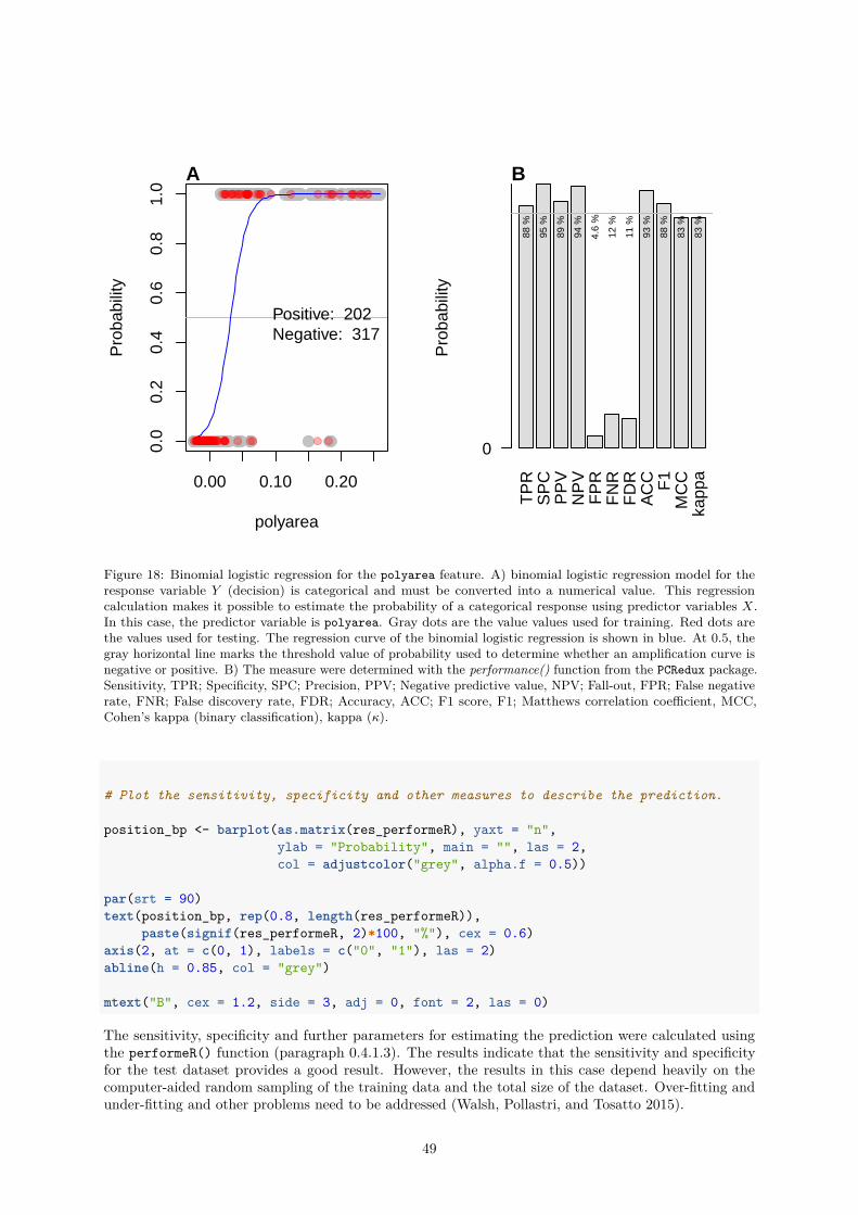
0.00 0.10 0.20
0.0
0.2
0.4
0.6
0.8
1.0
polyarea
Pro
babi
lity
A
Positive: 202 Negative: 317
TP
RS
PC
PP
VN
PV
FP
RF
NR
FD
RA
CC F1
MC
Cka
ppa
Pro
babi
lity
88 %
95 %
89 %
94 %
4.6
%
12 %
11 %
93 %
88 %
83 %
83 %
0
B
Figure 18: Binomial logistic regression for the polyarea feature. A) binomial logistic regression model for theresponse variable Y (decision) is categorical and must be converted into a numerical value. This regressioncalculation makes it possible to estimate the probability of a categorical response using predictor variables X.In this case, the predictor variable is polyarea. Gray dots are the value values used for training. Red dots arethe values used for testing. The regression curve of the binomial logistic regression is shown in blue. At 0.5, thegray horizontal line marks the threshold value of probability used to determine whether an amplification curve isnegative or positive. B) The measure were determined with the performance() function from the PCRedux package.Sensitivity, TPR; Specificity, SPC; Precision, PPV; Negative predictive value, NPV; Fall-out, FPR; False negativerate, FNR; False discovery rate, FDR; Accuracy, ACC; F1 score, F1; Matthews correlation coefficient, MCC,Cohen’s kappa (binary classification), kappa (κ).
# Plot the sensitivity, specificity and other measures to describe the prediction.
position_bp <- barplot(as.matrix(res_performeR), yaxt = "n",ylab = "Probability", main = "", las = 2,col = adjustcolor("grey", alpha.f = 0.5))
par(srt = 90)text(position_bp, rep(0.8, length(res_performeR)),
paste(signif(res_performeR, 2)*100, "%"), cex = 0.6)axis(2, at = c(0, 1), labels = c("0", "1"), las = 2)abline(h = 0.85, col = "grey")
mtext("B", cex = 1.2, side = 3, adj = 0, font = 2, las = 0)
The sensitivity, specificity and further parameters for estimating the prediction were calculated usingthe performeR() function (paragraph 0.4.1.3). The results indicate that the sensitivity and specificityfor the test dataset provides a good result. However, the results in this case depend heavily on thecomputer-aided random sampling of the training data and the total size of the dataset. Over-fitting andunder-fitting and other problems need to be addressed (Walsh, Pollastri, and Tosatto 2015).
49
To proof the results, further methods such as Likelihood Ratio Test, McFadden’s R2, k-fold cross-validation,Receiver Operating Characteristic (ROC) analysis and model interpretation should be used (Arlot andCelisse 2010, McFadden (1974), Sing et al. (2005)).
0.4.2.4 autocorrelation_test() - A Function to Detect Positive Amplification Curves
Autocorrelation analysis is a technique that is used in the field of time series analysis. It can be used toreveal regularly occurring patterns in one-dimensional data (Spiess et al. 2016). The autocorrelationmeasures the correlation of a signal f(t) with itself shifted by some time delay f(t− τ).
The autocorrelation_test() function coercers the amplification curve data to an object of the class“zoo” (zoo package) as indexed totally ordered observations. Next follows the computation of a laggedversion of the amplification curve data. The shifting the amplification curve data is based back by a givennumber of observations (default τ = 12).
Then follows a significance test for correlation between paired observations (amplification curve data &lagged amplification curve data). The hypothesis is that the paired observation of positive amplificationcurves has a significant correlation (stats::cor.test, significance level is 0.01) in contrast to negativeamplification curves (noise). The application of the autocorrelation_test() function is shown in thefollowing example.
In addition, the the decisions file decision_res_RAS002.csv from the human expert was analyzed forthe most frequent decision (modus) using the decision_modus() function (paragraph 0.4.1.1).# Test for autocorrelation in amplification curve data# Load the libraries magrittr for pipes and the amplification curve the data# The amplification curve data from the `RAS002` dataset was used.# The data.table package was used for fast import of the csv dataoptions(warn = -1)library(magrittr)library(PCRedux)suppressMessages(library(data.table))
data <- RAS002
# Test for autocorrelation in the RAS002 dataset
res_ac <- sapply(2:ncol(data), function(i) {autocorrelation_test(data[, i], ns_2_numeric = TRUE)
})
# Curves classified by a human after analysis of the overview. 1 = positive,# 0 = negative
human_classification <- fread(system.file("decision_res_RAS002.csv",package = "PCRedux"
))
head(human_classification)
## RAS002 test.result.1 test.result.2 test.result.3## 1: A01_gDNA.._unkn_B.Globin y y y## 2: A01_gDNA.._unkn_HPRT1 n n n## 3: A02_gDNA.._unkn_B.Globin y y y## 4: A02_gDNA.._unkn_HPRT1 n n n## 5: A03_gDNA.._unkn_B.Globin y y y## 6: A03_gDNA.._unkn_HPRT1 n n n## conformity## 1: TRUE
50
0 10 20 30 40 50
05
1015
Cycle
RF
U
A Positive amplification
Noisemedian + 2 * MAD
Signalmedian − 2 * MAD
W= 0 p−value = 0.000512
−2 −1 0 1 20
6Theoretical Quantiles
Sam
ple
Qua
ntile
s
SHt, W = 0.69 p−value = 7.09e−09
B
0 10 20 30 40
0.0
0.8
Cycle
R2
C LRt
Figure 19: The positive amplification curve F1.1 (testdat dataset) was analyzed with algorithms of theamptester() function. A) The Threshold test (THt) is based on the Wilcoxon rank sum test. The testcompares 20% of the head to 15% of the tail region. A significant difference (p− value = 0.000512) between thetwo regions was found for the amplfication curve F1.1. This is indicative of a positive amplification reaction.B) Quantile-Quantile plot (Q-Q plot) of the the amplification curve. A Q-Q plot is a probability plot for agraphical comparison of two probability distributions by plotting their quantiles against each other. In thisstudy the probability distribution of the amplification curve is compared to a theoretical normal distribution.The orange line is the theoretical normal quantile-quantile plot which passes through the probabilities of thefirst and third quartiles. The Shapiro-Wilk test (SHt) of normality checks whether the underlying populationof a sample (amplification curve) is significantly (α ≤ 5e−4) normal distributed. Since the p-value is 7.09e−9
the null hypothesis can be rejected. C) The Linear Regression test (LRt). This test determines the coefficientof determination (R2) by an ordinary least squares linear (OLS) regression. Usually the non-linear part of anamplification curve has an R2 smaller than 0.8.
51
0 10 20 30 40 50
−0.
020.
000.
020.
040.
06
Cycle
RF
U
B Negative amplification
Noisemedian + 2 * MAD
Signalmedian − 2 * MAD
W = 34 p−value = 0.621
−2 −1 0 1 2−
0.02
Theoretical Quantiles
Sam
ple
Qua
ntile
s
SHt, W = 0.988 p−value = 0.895
B
0 10 20 30 40
0.0
0.8
Cycle
R2
C LRt
Figure 20: The negative amplification curve F1.3 (testdat dataset) was analyzed with algorithms of theamptester() function. A) The Threshold test (THt) is based on the Wilcoxon rank sum test. The test compares20% of the head to 15% of the tail region. No significant difference between the two regions was found for theamplfication curve F1.3. Since the p-value is 0.621 the null hypothesis cannot be rejected. This is indicative of anegative amplification reaction. B) Quantile-Quantile plot (Q-Q plot) of the the amplification curve. A Q-Q plotis a probability plot for a graphical comparison of two probability distributions by plotting their quantiles againsteach other. In this study the probability distribution of the amplification curve is compared to a theoreticalnormal distribution. The orange line is the theoretical normal quantile-quantile plot which passes through theprobabilities of the first and third quartiles. The Shapiro-Wilk test (SHt) of normality checks whether theunderlying population of a sample (amplification curve) is significantly (α ≤ 5e−4) normal distributed. Since thep-value is 0.895 the null hypothesis cannot be rejected. C) The Linear Regression test (LRt). This test determinesthe coefficient of determination (R2) by an ordinary least squares linear (OLS) regression. Usually the non-linearpart of an amplification curve has an R2 smaller than 0.8.
52
## 2: TRUE## 3: TRUE## 4: TRUE## 5: TRUE## 6: TRUEdecs <- sapply(1L:nrow(human_classification), function(i) {
res <- decision_modus(human_classification[i, 2L:(ncol(human_classification) - 1)])if (length(res) > 1) res[[1]] <- "n"res[[1]]
}) %>% unlist()
# Plot curve data as overview# Names of the observations
layout(matrix(c(1, 2, 3, 1, 4, 4), 2, 3, byrow = TRUE))matplot(
data[, 1], data[, -1], xlab = "Cycle", ylab = "RFU",main = "", type = "l", lty = 1,col = decs, lwd = 2
)legend("topleft", c("positive", "negative"), pch = 19, col = c(1, 2), bty = "n")mtext("A RAS002 dataset", cex = 1.2, side = 3, adj = 0, font = 2)
# Convert the n.s. (not significant) in 0 and others to 1.# Combine the results of the aromatic autocorrelation_test as variable "ac",# the human classified values as variable "hc" in a new data frame (res_ac_hc).
cutoff <- 0.8
res_ac_hc <- data.frame(ac = ifelse(res_ac > cutoff, 1, 0),hc = as.numeric(as.factor(decs)) - 1
) %>% as.matrix()res_performeR <- performeR(res_ac_hc[, "ac"], res_ac_hc[, "hc"])
plot(density(res_ac), ylab = "Autocorrelation", main = "")rug(res_ac)
abline(v = cutoff)mtext("B", cex = 1.2, side = 3, adj = 0, font = 2, las = 0)
cdplot(as.factor(decs) ~ res_ac, xlab = "Autocorrelation",ylab = "Decision"
)mtext("C", cex = 1.2, side = 3, adj = 0, font = 2, las = 0)
barplot(as.matrix(res_performeR[, c(1:10, 12)]), yaxt = "n", ylab = "",main = "Performance of autocorrelation_test",col = adjustcolor("grey", alpha.f = 0.5)
)
53
0 10 20 30 40
2500
3000
3500
4000
4500
Cycle
RF
U
positivenegative
A RAS002 dataset
0.5 0.6 0.7 0.8 0.9 1.0 1.1
01
23
45
6
N = 192 Bandwidth = 0.03632
Aut
ocor
rela
tion
B
Autocorrelation
Dec
isio
n
0.7 0.8 0.9
yn
0.0
0.2
0.4
0.6
0.8
1.0C
TPR SPC PPV NPV FPR FNR FDR ACC F1 MCC kappa
Performance of autocorrelation_test
0
1D
Figure 21: Autocorrelation analysis for amplification curves of the RAS002 dataset (PCRedux package). A) Plotof all amplification curves of the RAS002 dataset. B) Density plot of B) Positive curves and negative curves asdetermined by the autocorrelation_test() and a human expert. C) Performance analysis by the performeR()function (see paragraph 0.4.1.3 for details).
axis(2, at = c(0, 1), labels = c("0", "1"), las = 2)mtext("D", cex = 1.2, side = 3, adj = 0, font = 2, las = 0)
As shown in this example, the autocorrelation_test() function is able to distinguish between positiveand negative amplification curves. Negative amplification curve were in all cases non-significant. Incontrast, the coefficients of correlation for positive amplification curves ranged between 0.607 and 0.999at a significance level of 0.01 and a lag of 3.
54

0.4.2.5 earlyreg() - A Function to Calculate the Slope and Intercept in the Ground Phaseof an Amplification Curve
The signal height and the slope in the first amplification curve cycles are helpful information for the analysisof amplification curves. Some qPCR systems calibrate themselves according to the measured values in thefirst cycles. This is noticeable in the form of strong signal changes which appear spontaneously betweenthe first and second cycle. For another, the signal level can be used to determine which background signalis present and whether the ground phase already has a slope. From the slope it could be deduced whetheramplification has already started (see subsubsection 0.1.5).
In addition, the function earlyreg() was developed. This function uses an ordinary least squares linearregression within a limited number of cycles. As ROI, the first 10 cycles were defined. This restriction isbased on empirical data suggesting that during the first ten cycles only a significant increase in signalstrength can be measured within few qPCRs. However, earlyreg() does not ignore the first cycle, asmany thermo-cyclers use this cycle for sensor calibration. Extreme values are therefore included. Asstandard, the next nine amplitude values are used for the linear regression. The number of cycles can alsobe adjusted via the parameter range. Since all amplification curves are normalized to the 99%-percentile,there is also a comparability between the background signals and the slopes.
The following example illustrates a possible use of the function earlyreg(). For that purpose amplificationcurves from the RAS002 dataset were analysed. In figure Figure 22A the amplification curves for all cyclesare shown. Next, the earlyreg() function was used to determine the slope and the intercept in therange of the first ten PCR cycles. The results were used in a cluster analysis using k-means clustering(Figure 22B). Therefore, the increase seems to be an indicator of differences between the amplificationcurves. The Figure 22C shows the first 15 cycles colored according to their cluster. After the clusteranalysis this could also be observed (Figure 22D-F). Hence, it can be postulated that the increase in thebackground phase is helpful for the classification of amplification curves.options(warn = -1)library(PCRedux)
data <- RAS002
well <- substr(colnames(data)[-1], 1, 10)
# Normalize each amplification curve to their 0.99 percentile and use the# earlyreg function to determine the slope and intercept of the first# 5 cycles
res_earlyreg <- do.call(rbind, lapply(2L:ncol(data), function(i) {earlyreg(x = data[, 1], y = data[, i], range = 5, normalize = FALSE)
}))
# Label the observation with their original namesrownames(res_earlyreg) <- colnames(data)[2:ncol(data)]
cl <- kmeans(res_earlyreg, 5)
rownames(res_earlyreg) <- well
par(fig = c(0,1,0,1), las = 0, bty = "o", oma = c(0, 0, 0, 0))matplot(
data[, 1], data[, -1], pch = 19, lty = 1, type = "l",xlab = "Cycle", ylab = "RFU", main = "", col = cl[["cluster"]]
)mtext("A", cex = 1.2, side = 3, adj = 0, font = 2)abline(v = c(1,5))rect(20.5,3500,45,4700, col = "white", border = NA)
55
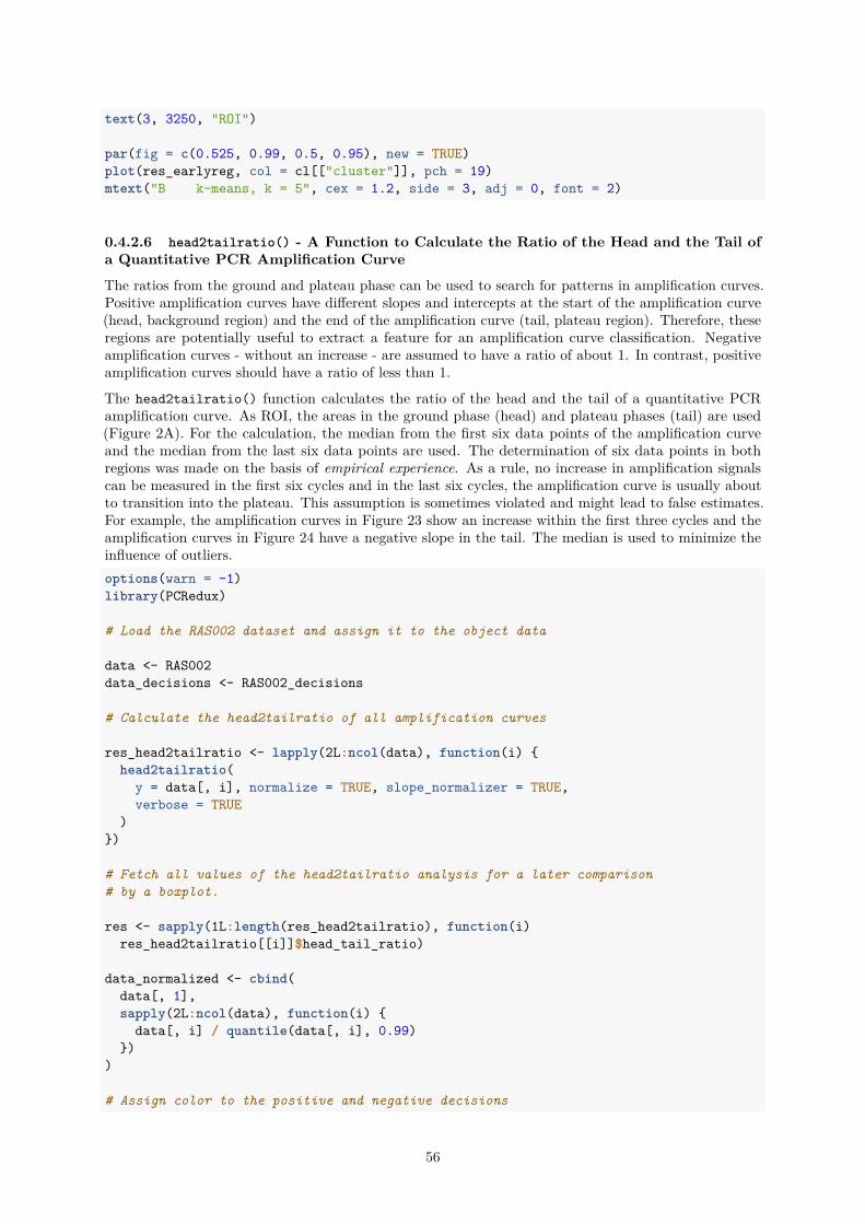
text(3, 3250, "ROI")
par(fig = c(0.525, 0.99, 0.5, 0.95), new = TRUE)plot(res_earlyreg, col = cl[["cluster"]], pch = 19)mtext("B k-means, k = 5", cex = 1.2, side = 3, adj = 0, font = 2)
0.4.2.6 head2tailratio() - A Function to Calculate the Ratio of the Head and the Tail ofa Quantitative PCR Amplification Curve
The ratios from the ground and plateau phase can be used to search for patterns in amplification curves.Positive amplification curves have different slopes and intercepts at the start of the amplification curve(head, background region) and the end of the amplification curve (tail, plateau region). Therefore, theseregions are potentially useful to extract a feature for an amplification curve classification. Negativeamplification curves - without an increase - are assumed to have a ratio of about 1. In contrast, positiveamplification curves should have a ratio of less than 1.
The head2tailratio() function calculates the ratio of the head and the tail of a quantitative PCRamplification curve. As ROI, the areas in the ground phase (head) and plateau phases (tail) are used(Figure 2A). For the calculation, the median from the first six data points of the amplification curveand the median from the last six data points are used. The determination of six data points in bothregions was made on the basis of empirical experience. As a rule, no increase in amplification signalscan be measured in the first six cycles and in the last six cycles, the amplification curve is usually aboutto transition into the plateau. This assumption is sometimes violated and might lead to false estimates.For example, the amplification curves in Figure 23 show an increase within the first three cycles and theamplification curves in Figure 24 have a negative slope in the tail. The median is used to minimize theinfluence of outliers.options(warn = -1)library(PCRedux)
# Load the RAS002 dataset and assign it to the object data
data <- RAS002data_decisions <- RAS002_decisions
# Calculate the head2tailratio of all amplification curves
res_head2tailratio <- lapply(2L:ncol(data), function(i) {head2tailratio(
y = data[, i], normalize = TRUE, slope_normalizer = TRUE,verbose = TRUE
)})
# Fetch all values of the head2tailratio analysis for a later comparison# by a boxplot.
res <- sapply(1L:length(res_head2tailratio), function(i)res_head2tailratio[[i]]$head_tail_ratio)
data_normalized <- cbind(data[, 1],sapply(2L:ncol(data), function(i) {
data[, i] / quantile(data[, i], 0.99)})
)
# Assign color to the positive and negative decisions
56
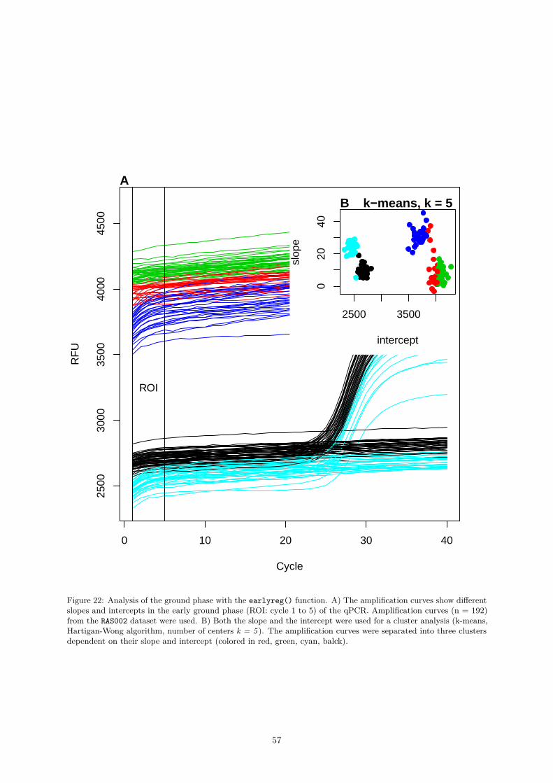
0 10 20 30 40
2500
3000
3500
4000
4500
Cycle
RF
U
A
ROI
2500 35000
2040
intercept
slop
e
B k−means, k = 5
Figure 22: Analysis of the ground phase with the earlyreg() function. A) The amplification curves show differentslopes and intercepts in the early ground phase (ROI: cycle 1 to 5) of the qPCR. Amplification curves (n = 192)from the RAS002 dataset were used. B) Both the slope and the intercept were used for a cluster analysis (k-means,Hartigan-Wong algorithm, number of centers k = 5 ). The amplification curves were separated into three clustersdependent on their slope and intercept (colored in red, green, cyan, balck).
57
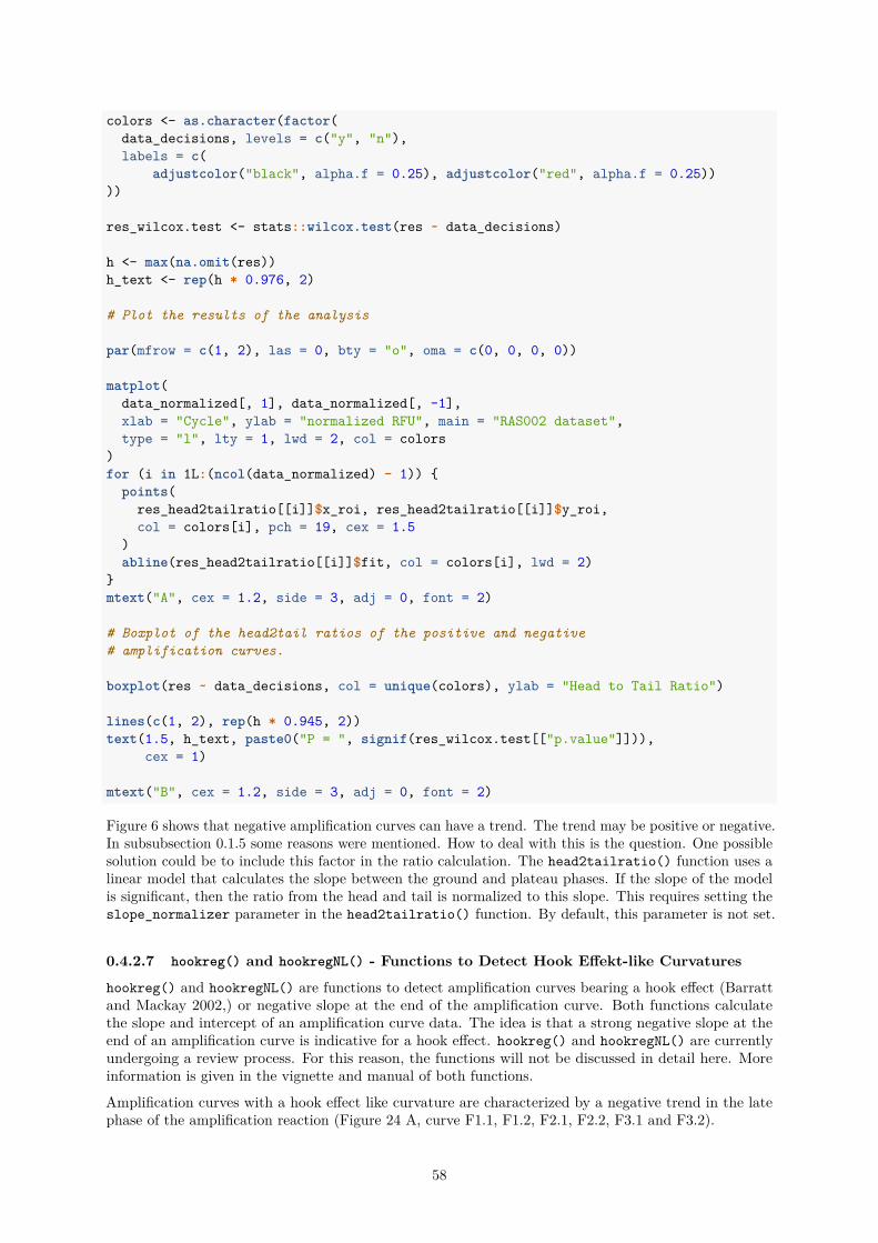
colors <- as.character(factor(data_decisions, levels = c("y", "n"),labels = c(
adjustcolor("black", alpha.f = 0.25), adjustcolor("red", alpha.f = 0.25))))
res_wilcox.test <- stats::wilcox.test(res ~ data_decisions)
h <- max(na.omit(res))h_text <- rep(h * 0.976, 2)
# Plot the results of the analysis
par(mfrow = c(1, 2), las = 0, bty = "o", oma = c(0, 0, 0, 0))
matplot(data_normalized[, 1], data_normalized[, -1],xlab = "Cycle", ylab = "normalized RFU", main = "RAS002 dataset",type = "l", lty = 1, lwd = 2, col = colors
)for (i in 1L:(ncol(data_normalized) - 1)) {
points(res_head2tailratio[[i]]$x_roi, res_head2tailratio[[i]]$y_roi,col = colors[i], pch = 19, cex = 1.5
)abline(res_head2tailratio[[i]]$fit, col = colors[i], lwd = 2)
}mtext("A", cex = 1.2, side = 3, adj = 0, font = 2)
# Boxplot of the head2tail ratios of the positive and negative# amplification curves.
boxplot(res ~ data_decisions, col = unique(colors), ylab = "Head to Tail Ratio")
lines(c(1, 2), rep(h * 0.945, 2))text(1.5, h_text, paste0("P = ", signif(res_wilcox.test[["p.value"]])),
cex = 1)
mtext("B", cex = 1.2, side = 3, adj = 0, font = 2)
Figure 6 shows that negative amplification curves can have a trend. The trend may be positive or negative.In subsubsection 0.1.5 some reasons were mentioned. How to deal with this is the question. One possiblesolution could be to include this factor in the ratio calculation. The head2tailratio() function uses alinear model that calculates the slope between the ground and plateau phases. If the slope of the modelis significant, then the ratio from the head and tail is normalized to this slope. This requires setting theslope_normalizer parameter in the head2tailratio() function. By default, this parameter is not set.
0.4.2.7 hookreg() and hookregNL() - Functions to Detect Hook Effekt-like Curvatures
hookreg() and hookregNL() are functions to detect amplification curves bearing a hook effect (Barrattand Mackay 2002,) or negative slope at the end of the amplification curve. Both functions calculatethe slope and intercept of an amplification curve data. The idea is that a strong negative slope at theend of an amplification curve is indicative for a hook effect. hookreg() and hookregNL() are currentlyundergoing a review process. For this reason, the functions will not be discussed in detail here. Moreinformation is given in the vignette and manual of both functions.
Amplification curves with a hook effect like curvature are characterized by a negative trend in the latephase of the amplification reaction (Figure 24 A, curve F1.1, F1.2, F2.1, F2.2, F3.1 and F3.2).
58
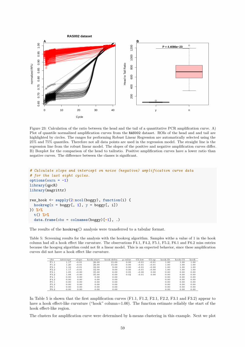
0 10 20 30 40
0.65
0.70
0.75
0.80
0.85
0.90
0.95
1.00
RAS002 dataset
Cycle
norm
aliz
ed R
FU
A
y n
200
400
600
800
1000
1200
Hea
d to
Tai
l Rat
io
P = 4.4086e−23P = 4.4086e−23
B
Figure 23: Calculation of the ratio between the head and the tail of a quantitative PCR amplification curve. A)Plot of quantile normalized amplification curves from the RAS002 dataset. ROIs of the head and and tail arehighlighted by circles. The ranges for performing Robust Linear Regression are automatically selected using the25% and 75% quantiles. Therefore not all data points are used in the regression model. The straight line is theregression line from the robust linear model. The slopes of the positive and negative amplification curves differ.B) Boxplot for the comparison of the head to tailratio. Positive amplification curves have a lower ratio thannegative curves. The difference between the classes is significant.
# Calculate slope and intercept on noise (negative) amplification curve data# for the last eight cycles.options(warn = -1)library(qpcR)library(magrittr)
res_hook <- sapply(2:ncol(boggy), function(i) {hookreg(x = boggy[, 1], y = boggy[, i])
}) %>%t() %>%data.frame(obs = colnames(boggy)[-1], .)
The results of the hookreg() analysis were transferred to a tabular format.
Table 5: Screening results for the analysis with the hookreg algorithm. Samples withe a value of 1 in the hookcolumn had all a hook effect like curvature. The observations F4.1, F4.2, F5.1, F5.2, F6.1 and F6.2 miss entriesbecause the hoogreg algorithm could not fit a linear model. This is an expected behavior, since these amplificationcurves did not have a hook effect like curvature.
obs intercept slope hook.start hook.delta p.value CI.low CI.up hook.fit hook.CI hookF1.1 1.17 -0.01 26.00 15.00 0.00 -0.01 -0.01 1.00 1.00 1.00F1.2 1.20 -0.01 26.00 15.00 0.00 -0.01 -0.01 1.00 1.00 1.00F2.1 1.16 -0.01 32.00 9.00 0.00 -0.01 -0.00 1.00 1.00 1.00F2.2 1.17 -0.01 32.00 9.00 0.00 -0.01 -0.00 1.00 1.00 1.00F3.1 1.05 -0.00 35.00 6.00 0.05 -0.00 0.00 0.00 0.00 0.00F3.2 1.08 -0.00 35.00 6.00 0.02 -0.01 0.00 0.00 0.00 0.00F4.1 0.00 0.00 0.00 0.00 0.00 0.00 0.00F4.2 0.00 0.00 0.00 0.00 0.00 0.00 0.00F5.1 0.00 0.00 0.00 0.00 0.00 0.00 0.00F5.2 0.00 0.00 0.00 0.00 0.00 0.00 0.00F6.1 0.00 0.00 0.00 0.00 0.00 0.00 0.00F6.2 0.00 0.00 0.00 0.00 0.00 0.00 0.00
In Table 5 is shown that the first amplification curves (F1.1, F1.2, F2.1, F2.2, F3.1 and F3.2) appear tohave a hook effect-like curvature (“hook” column=1.00). The function estimate reliably the start of thehook effect-like region.
The clusters for amplification curve were determined by k-means clustering in this example. Next we plot
59
0 10 20 30 40
0.5
1.0
1.5
2.0
Cycle
RF
U
F1.1 Hook start cycle: 26F1.2 Hook start cycle: 26F2.1 Hook start cycle: 32F2.2 Hook start cycle: 32F3.1 Hook start cycle: 35F3.2 Hook start cycle: 35F4.1 Hook start cycle: no hookF4.2 Hook start cycle: no hookF5.1 Hook start cycle: no hookF5.2 Hook start cycle: no hookF6.1 Hook start cycle: no hookF6.2 Hook start cycle: no hook
Figure 24: Detection of the hook effect in amplification curves. Amplification curves of the boggy dataset (qpcR)were analyzed using the hookreg() function. The hook effect is characterized by a negative slope in the supposedplateau phase. Samples F1.1, F1.2, F2.1 and F2.2 (red) show a statistically significant negative slope. In the redrectangle the area of the hook effect is highlighted exemplarily for the sample F1.1. No statistically significantnegative slope (no hook effect) could be observed for the remaining amplification curves (black).
the results of the analysis (Figure 24). For the visualization the intercepts was plotted against the slopewith the clusters as determined by k-means clustering.matplot(
x = boggy[, 1], y = boggy[, -1], xlab = "Cycle", ylab = "RFU",main = "", type = "l", lty = 1, lwd = 2, col = res_hook$hook + 1
)
res_hook$hook.start[res_hook$hook.start == 0] <- "no hook"
legend("topleft", paste(as.character(res_hook$obs), "Hook start cycle:", res_hook$hook.start), pch = 19,col = res_hook$hook + 1, bty = "n"
)rect(26,2,40,2.3, border ="red")
0.4.2.8 mblrr() - A Function Perform the Quantile-filter Based Local Robust Regression
mblrr() is a function to perform the Median based Local Robust Regression (m b l r r) from a quantitativePCR experiment. In detail, this function attempts to break the amplification curve in two ROIs (head(~background) and tail (~plateau)). As opposed to the earlyreg() function, the mblrr()` functiondoes not use a fixed interval. Instead, themblrr()function dynamically determines cutpoints for each amplification curve. For the ``mblrr() function was defined:
60
• The 25% quantile is the value for which 25% of all values are smaller than this value.• The 75% quantile is the value for which 75% of all values are greater than this value.
Subsequent, a robust linear regression analysis (lmrob()) is preformed individually on both regionsof the amplification curve. The rationale behind this analysis is that the slope and intercept of anamplification curve differ in the background and plateau region. This is also shown bey the simulationsin Figure 1C-E. In the example shown below, the observations “P01.W19”, “P06.W35”, “P33.W66”,“P65.W90”, “P71.W23” and “P87.W01” were arbitrarily selected for demonstration purposes Figure 25.Another example is shown in Figure 9A. Those amplification curves have a slight negative trend in thebaseline region and a positive trend in the plateau region.
The correlation coefficient5 is a measure to quantify the dependence on variables (e. g., number of cycles,signal height). The correlation coefficient is always between -1 and 1, with a value close to -1 describing astrong-negative dependency and close to 1 describing a strong-positive dependency; if the value is 0, thereis no dependency between the variables. The most frequently used correlation coefficient to describe alinear dependency is the Pearson correlation coefficient r.
The correlation coefficient can also be used as a feature. Because similar data structures will have similarcorrelation coefficients. Correlation coefficients are between -1 and +1, with -1 being a strong negativecorrelation and 1 a strong positive correlation. The values of -1 and 1 have a perfect correlation. If thevalue is 0, there is no correlation between the two variables. However. variables that are not stronglycorrelated can also be important for modeling.options(warn = -1)library(PCRedux)
# Select four amplification curves from the RAS002 dataset
data <- RAS002[, c(1, 2, 3, 4, 5)]
par(mfrow = c(2, 2))
for (i in 2L:ncol(data)) {x <- data[, 1]y_tmp <- data[, i] / quantile(data[, i], 0.99)res_q25 <- y_tmp < quantile(y_tmp, 0.25)res_q75 <- y_tmp > quantile(y_tmp, 0.75)res_q25_lm <- try(
suppressWarnings(lmrob(y_tmp[res_q25] ~ x[res_q25])),silent = TRUE
)res_q75_lm <- try(
suppressWarnings(lmrob(y_tmp[res_q75] ~ x[res_q75])),silent = TRUE
)
plot(x, y_tmp, xlab = "Cycle", ylab = "RFU (normalized)",main = "", type = "b", pch = 19)
mtext(paste0(LETTERS[i], " ", colnames(data)[i]), cex = 1, side = 3,adj = 0, font = 2)
abline(res_q25_lm, col = "red")points(x[res_q25], y_tmp[res_q25], cex = 2.5, col = "red")abline(res_q75_lm, col = "green")points(x[res_q75], y_tmp[res_q75], cex = 2.5, col = "green")
}
Finally, the results of the analysis were printed in a tabular format.5Pearson’s product moment correlation coefficient
61

0 10 20 30 40
0.70
0.80
0.90
1.00
Cycle
RF
U (
norm
aliz
ed)
B A01_gDNA.._unkn_B.Globin
0 10 20 30 40
0.88
0.92
0.96
1.00
Cycle
RF
U (
norm
aliz
ed)
C A01_gDNA.._unkn_HPRT1
0 10 20 30 40
0.65
0.75
0.85
0.95
Cycle
RF
U (
norm
aliz
ed)
D A02_gDNA.._unkn_B.Globin
0 10 20 30 40
0.88
0.92
0.96
1.00
Cycle
RF
U (
norm
aliz
ed)
E A02_gDNA.._unkn_HPRT1
Figure 25: Robust local regression to analyze amplification curves. The amplification curves were arbitrarilyselected from the RAS002 dataset. Not the differences in slopes and intercepts (red and green lines). The mblrr()function is presumably useful for datasets which are accompanied by noise and artifacts.m, slop; n, intercept.
62
# Load the xtable library for an appealing table outputlibrary(xtable)
# Analyze the data via the mblrr() function
res_mblrr <- do.call(cbind, lapply(2L:ncol(data), function(i) {suppressMessages(mblrr(
x = data[, 1], y = data[, i],normalize = TRUE
)) %>% data.frame()}))colnames(res_mblrr) <- colnames(data)[-1]
# Transform the data for a tabular output and assign the results to the object# output_res_mblrr.
output_res_mblrr <- res_mblrr %>% t()
# The output variable names of the mblrr() function are rather long. For better# readability the variable names were changed to "nBG" (intercept of head region),# "mBG" (slope of head region), "rBG" (Pearson correlation of head region),# "nTP" (intercept of tail region), "mTP" (slope of tail region), "rBG" (Pearson# correlation of tail region)
colnames(output_res_mblrr) <- c("nBG", "mBG", "rBG","nTP", "mTP", "rTP"
)
print(xtable(output_res_mblrr, caption = "mblrr() text intro. nBG, intercept of
head region; mBG, slope of head region; rBG, Pearsoncorrelation of head region; nTP, intercept of tail region; mTP,slope of tail region; rBG, Pearson correlation of tail region",
label = "tablemblrrintroduction"), comment = FALSE, caption.placement = "top")
Table 6: mblrr() text intro. nBG, intercept of head region; mBG, slope of head region; rBG, Pearson correlationof head region; nTP, intercept of tail region; mTP, slope of tail region; rBG, Pearson correlation of tail region
nBG mBG rBG nTP mTP rTPA01_gDNA.._unkn_B.Globin 0.69 0.00 0.91 0.77 0.01 0.94A01_gDNA.._unkn_HPRT1 0.89 0.00 0.87 0.80 0.01 1.00
A02_gDNA.._unkn_B.Globin 0.67 0.00 0.88 0.76 0.01 0.95A02_gDNA.._unkn_HPRT1 0.91 0.00 0.90 0.82 0.00 1.00
In another example, the results from the mblrr() function were combined with the classifications (positive,negative) by a human to apply them in an analysis with Fast and Frugal Trees (FFTrees). A generalintroduction to decision trees is given in (Quinlan 1986, Luan, Schooler, and Gigerenzer (2011)). FFTreesbelong to class of simple decision rules. In many situations, FFTrees make fast decisions based on a fewfeatures (N = 1 - 5). In this example six features were used for the analysis.
The FFTrees package (Phillips et al. 2017) provides an implementation for the R statistical computinglanguage. All that is needed for the present example are:
• the data assessed by the mblrr() function,• the classification of the amplification curve data by a human,• and a standard formula, which looks like outcome ← var1 + var2 + . . . along with the data
arguments. The function FFTrees() returns a fast and frugal tree object. This rich object contains
63
the underlying trees and many classification statistics (similar to paragraph 0.4.1.3). In the followingexample, the RAS002 dataset from the qpcR package was used.
# Load the xtable library for an appealing table outputoptions(warn = -1)suppressMessages(library(FFTrees))library(PCRedux)
# The RAS002 amplification curves were analyzed with the mblrr() function# to save computing time and the.results of this analysis are stored in the# `data_sample` dataset.
data <- data_sample[data_sample$dataset == "RAS002", c("mblrr_intercept_bg","mblrr_slope_bg","mblrr_cor_bg","mblrr_intercept_pt","mblrr_slope_pt","mblrr_cor_pt")]
# The output variable names of the mblrr() function are rather long. For better# readability the variable names were changed to "nBG" (intercept of head# region), "mBG" (slope of head region), "rBG" (Pearson correlation of head# region), "nTP" (intercept of tail region), "mTP" (slope of tail region),# "rBG" (Pearson correlation of tail region).
res_mblrr <- data.frame(class = as.numeric(as.character(factor(RAS002_decisions,
levels = c("y", "n"),label = c(1, 0)))),
data)
colnames(res_mblrr) <- c("class", "nBG", "mBG", "rBG", "nTP", "mTP", "rTP")
res_mblrr.fft <- suppressMessages(FFTrees(formula = class ~., data = res_mblrr))
Figure 26 shows the Fast and Frugal Trees by using the features nBG (intercept of head region), mBG(slope of head region), rBG (Pearson correlation of head region), nTP (intercept of tail region), mTP(slope of tail region), and rBG (Pearson correlation of tail region).
64
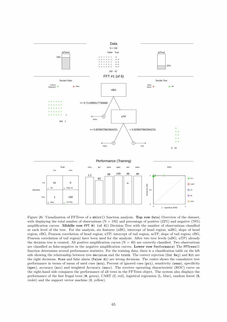
DataN = 192
False True
42150
p(True)
22%
p(False)
78%
FFT #1 (of 6)
CorrectRejection Miss
Decide False Decide True
FalseAlarm Hit
nBG
False1150
>= 0.711990517735668>= 0.711990517735668>= 0.711990517735668>= 0.711990517735668>= 0.711990517735668>= 0.711990517735668>= 0.711990517735668>= 0.711990517735668>= 0.711990517735668>= 0.711990517735668>= 0.711990517735668>= 0.711990517735668>= 0.711990517735668>= 0.711990517735668>= 0.711990517735668>= 0.711990517735668>= 0.711990517735668>= 0.711990517735668>= 0.711990517735668>= 0.711990517735668>= 0.711990517735668>= 0.711990517735668>= 0.711990517735668>= 0.711990517735668>= 0.711990517735668>= 0.711990517735668>= 0.711990517735668>= 0.711990517735668>= 0.711990517735668>= 0.711990517735668>= 0.711990517735668>= 0.711990517735668>= 0.711990517735668>= 0.711990517735668>= 0.711990517735668>= 0.711990517735668>= 0.711990517735668>= 0.711990517735668>= 0.711990517735668>= 0.711990517735668>= 0.711990517735668>= 0.711990517735668>= 0.711990517735668>= 0.711990517735668>= 0.711990517735668>= 0.711990517735668>= 0.711990517735668>= 0.711990517735668>= 0.711990517735668>= 0.711990517735668>= 0.711990517735668>= 0.711990517735668>= 0.711990517735668>= 0.711990517735668>= 0.711990517735668>= 0.711990517735668>= 0.711990517735668>= 0.711990517735668>= 0.711990517735668>= 0.711990517735668>= 0.711990517735668>= 0.711990517735668>= 0.711990517735668>= 0.711990517735668>= 0.711990517735668>= 0.711990517735668>= 0.711990517735668>= 0.711990517735668>= 0.711990517735668>= 0.711990517735668>= 0.711990517735668>= 0.711990517735668>= 0.711990517735668
F nTP
False
>= 0.829937862064231>= 0.829937862064231>= 0.829937862064231>= 0.829937862064231>= 0.829937862064231>= 0.829937862064231>= 0.829937862064231>= 0.829937862064231>= 0.829937862064231>= 0.829937862064231>= 0.829937862064231>= 0.829937862064231>= 0.829937862064231>= 0.829937862064231>= 0.829937862064231>= 0.829937862064231>= 0.829937862064231>= 0.829937862064231>= 0.829937862064231>= 0.829937862064231>= 0.829937862064231>= 0.829937862064231>= 0.829937862064231>= 0.829937862064231>= 0.829937862064231>= 0.829937862064231>= 0.829937862064231>= 0.829937862064231>= 0.829937862064231>= 0.829937862064231>= 0.829937862064231>= 0.829937862064231>= 0.829937862064231>= 0.829937862064231>= 0.829937862064231>= 0.829937862064231>= 0.829937862064231>= 0.829937862064231>= 0.829937862064231>= 0.829937862064231>= 0.829937862064231>= 0.829937862064231>= 0.829937862064231>= 0.829937862064231>= 0.829937862064231>= 0.829937862064231>= 0.829937862064231>= 0.829937862064231>= 0.829937862064231>= 0.829937862064231>= 0.829937862064231>= 0.829937862064231>= 0.829937862064231>= 0.829937862064231>= 0.829937862064231>= 0.829937862064231>= 0.829937862064231>= 0.829937862064231>= 0.829937862064231>= 0.829937862064231>= 0.829937862064231>= 0.829937862064231>= 0.829937862064231>= 0.829937862064231>= 0.829937862064231>= 0.829937862064231>= 0.829937862064231>= 0.829937862064231>= 0.829937862064231>= 0.829937862064231>= 0.829937862064231>= 0.829937862064231>= 0.829937862064231
F
True410
< 0.829937862064231< 0.829937862064231< 0.829937862064231< 0.829937862064231< 0.829937862064231< 0.829937862064231< 0.829937862064231< 0.829937862064231< 0.829937862064231< 0.829937862064231< 0.829937862064231< 0.829937862064231< 0.829937862064231< 0.829937862064231< 0.829937862064231< 0.829937862064231< 0.829937862064231< 0.829937862064231< 0.829937862064231< 0.829937862064231< 0.829937862064231< 0.829937862064231< 0.829937862064231< 0.829937862064231< 0.829937862064231< 0.829937862064231< 0.829937862064231< 0.829937862064231< 0.829937862064231< 0.829937862064231< 0.829937862064231< 0.829937862064231< 0.829937862064231< 0.829937862064231< 0.829937862064231< 0.829937862064231< 0.829937862064231< 0.829937862064231< 0.829937862064231< 0.829937862064231< 0.829937862064231< 0.829937862064231< 0.829937862064231< 0.829937862064231< 0.829937862064231< 0.829937862064231< 0.829937862064231< 0.829937862064231< 0.829937862064231< 0.829937862064231< 0.829937862064231< 0.829937862064231< 0.829937862064231< 0.829937862064231< 0.829937862064231< 0.829937862064231< 0.829937862064231< 0.829937862064231< 0.829937862064231< 0.829937862064231< 0.829937862064231< 0.829937862064231< 0.829937862064231< 0.829937862064231< 0.829937862064231< 0.829937862064231< 0.829937862064231< 0.829937862064231< 0.829937862064231< 0.829937862064231< 0.829937862064231< 0.829937862064231< 0.829937862064231
T
Performance (Training)
Truth
True False
True
False
Decision
1501
041
Cor RejMiss
False AlHit
mcu
1.21.21.21.21.21.21.21.21.21.21.21.21.21.21.21.21.21.21.21.21.21.21.21.21.21.21.21.21.21.21.21.21.21.21.21.21.21.21.21.21.21.21.21.21.21.21.21.21.21.21.21.21.21.21.21.21.21.21.21.21.21.21.21.21.21.21.21.21.21.21.21.21.2
pci
83838383838383838383838383838383838383838383838383838383838383838383838383838383838383838383838383838383838383838383838383838383838383838383838383
spec
100100100100100100100100100100100100100100100100100100100100100100100100100100100100100100100100100100100100100100100100100100100100100100100100100100100100100100100100100100100100100100100100100100100100100100100100100
sens
98989898989898989898989898989898989898989898989898989898989898989898989898989898989898989898989898989898989898989898989898989898989898989898989898
acc
99999999999999999999999999999999999999999999999999999999999999999999999999999999999999999999999999999999999999999999999999999999999999999999999999
BL
wacc
99999999999999999999999999999999999999999999999999999999999999999999999999999999999999999999999999999999999999999999999999999999999999999999999999
ROC
0 10
0.5
1
1 − Specificity (FAR)
Sen
sitiv
ity (
HR
)
C
C CART
L
L LR
R
R RF
S
S SVM
2345 61
# FFT
Figure 26: Visualization of FFTrees of a mblrr() function analysis. Top row Data) Overview of the dataset,with displaying the total number of observations (N = 192) and percentage of positive (22%) and negative (78%)amplification curves. Middle row FFT #1 (of 6)) Decision Tree with the number of observations classifiedat each level of the tree. For the analysis, six features (nBG, intercept of head region; mBG, slope of headregion; rBG, Pearson correlation of head region; nTP, intercept of tail region; mTP, slope of tail region; rBG,Pearson correlation of tail region) have been used for the analysis. After two tree levels (nBG, nTP) alreadythe decision tree is created. All positive amplification curves (N = 40) are correctly classified. Two observationsare classified as false-negative in the negative amplification curves. Lower row Performance) The FFTrees()function determines several performance statistics. For the training data, there is a classification table on the leftside showing the relationship between tree decision and the truth. The correct rejection (Cor Rej) and Hit arethe right decisions. Miss and false alarm (False Al) are wrong decisions. The centre shows the cumulative treeperformance in terms of mean of used cues (mcu), Percent of ignored cues (pci), sensitivity (sens), specificity(spec), accuracy (acc) and weighted Accuracy (wacc). The receiver operating characteristic (ROC) curve onthe right-hand side compares the performance of all trees in the FFTrees object. The system also displays theperformance of the fast frugal trees (#, green), CART (C, red), logistical regression (L, blue), random forest (R,violet) and the support vector machine (S, yellow).
65
0.4.2.9 Change point analysis
Change point analysis (CPA) encompasses methods to identify or estimate single or multiple locationsof distributional changes in a series of data points indexed in time order. A change herein refers toa statistical property. There exist several change point algorithms such as the binary segmentationalgorithm (A. J. Scott and Knott 1974). In the change point analysis one assumes independent orderedobservations X1, X2, . . . , Xn ∈ Rd (N. A. James and Matteson 2013). The the case of qPCR this is simplythe cycle-dependent fluorescence. This is be used to create k homogeneous subsets of unknown size(Erdman, Emerson, and others 2007). While frequentist methods make an estimation of the parameter atthe location (e. g., mean, variance) of the change points at specific points, change point analysis usingthe Bayesian method produces a probability for the occurrence of a change point at certain points. CPAis used for example in econometrics and bioinformatics (Killick and Eckley 2014, Erdman, Emerson, andothers (2007)). For the analysis of the amplification curves it was hypothesized that the number of changepoints differs between positive (sigmoidal) and negative (noise) amplification curves.
The pcrfit_single() function uses two independent approaches for change point analysis. These arethe bcp() function from the bcp package (Erdman, Emerson, and others 2007) and the e.agglo()function from the ecp package (N. A. James and Matteson 2013). The e.agglo() function performs anon-parametric change point analysis based on agglomerative hierarchical estimation and is useful to“detect changes within the marginal distributions” (N. A. James and Matteson 2013). Measurement fromthe qPCR systems typically shows noise that typically has rapidly changing components. Differentiatorsamplify these rapidly changing noise components (Rödiger, Böhm, and Schimke 2013). Therefore, thefirst derivation of the amplification curve was used for both change point analyses. It was assumed forthe change point analysis of amplification curves that this leads to larger differences between positive andnegative amplification curves. An example is shown on Figure 29. In contrast the bcp() [bcp] functionperforms a change point analysis based on a Bayesian approach. This method can detect changes in themean of independent Gaussian observations. As result the analysis returns the posterior probability of achange point at each Xi. An example is shown on Figure 29. Both the change point analysis methodsprovide additional information to distinguish positive and negative amplification curves Figure 28E & F).
## Loading required package: Rcpp
## N:36, idsize:36, idval1:1, idval22:22## mm: 1, nn2: 36, N:36, cumksize.size: 36
## N:36, idsize:36, idval1:1, idval22:22## mm: 1, nn2: 36, N:36, cumksize.size: 36
0.4.2.10 Test of an amplification reaction
A part of the pcrfit_single() function is the amptester() function from the chipPCR package. Thisfunction contains tests to determine whether an amplification curve is positive or negative. The inputvalues for the function differ due to the different pre-processing steps in the pcrfit_single() function.Therefore, the concepts of the tests are briefly described below.
• The first test, designated as SHt, is based on this Shapiro-Wilk test of normality. This relativelysimple procedure can be used to check whether the underlying population of a sample (amplificationcurve) is significantly (α ≤ 5e− 04) normal distributed. In Figure 4 it can be seen that negativeamplification curves resemble a normal distribution, but positive amplification curves are deviatingfrom the normal distribution. The output is binary coded (negative = 0, positive = 1). The nameof the output of the pcrfit_single() function is amptester_shapiro.
• The second test is the Resids growth test (RGt), which tests if the fluorescence values in linearphase are stable. Whenever no amplification occurs, fluorescence values quickly deviate fromlinear model. Their standardized residuals will be strongly correlated with their value. For realamplification curves, situation is much more stable. Noise (that means deviations from linear model)in background do not correlate strongly with the changes in fluorescence. The decision is basedon the threshold value (here 0.5). The output is binary coded (negative = 0, positive = 1). Theoutput name of the pcrfit_single() function is amptester_rgt.
• The third test is the Linear Regression test (LRt). This test determines the coefficient of determina-tion (R2) by an ordinary least squares linear (OLS) regression. The R2 are determined from a runof circa 15% range of the data. If a sequence of more than six R2s is larger than 0.8 is found that is
66
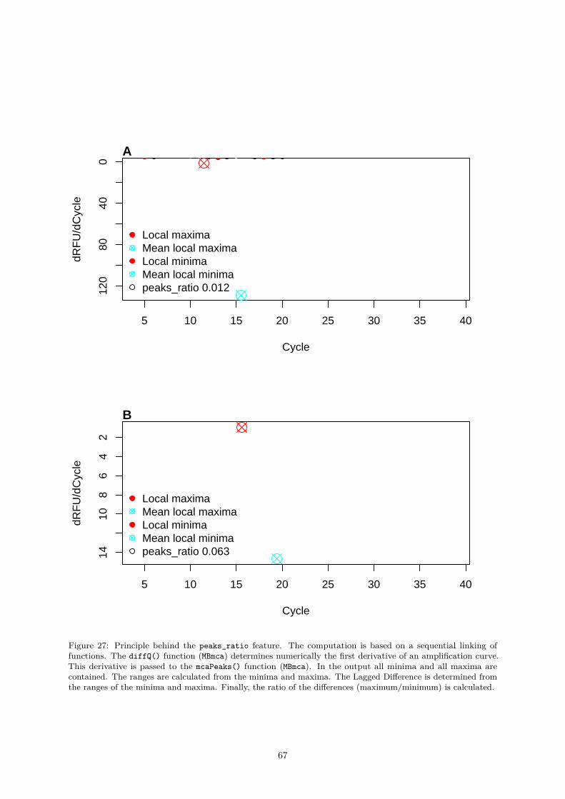
5 10 15 20 25 30 35 40
120
8040
0
Cycle
dRF
U/d
Cyc
le
A
Local maximaMean local maximaLocal minimaMean local minimapeaks_ratio 0.012
5 10 15 20 25 30 35 40
1410
86
42
Cycle
dRF
U/d
Cyc
le
B
Local maximaMean local maximaLocal minimaMean local minimapeaks_ratio 0.063
Figure 27: Principle behind the peaks_ratio feature. The computation is based on a sequential linking offunctions. The diffQ() function (MBmca) determines numerically the first derivative of an amplification curve.This derivative is passed to the mcaPeaks() function (MBmca). In the output all minima and all maxima arecontained. The ranges are calculated from the minima and maxima. The Lagged Difference is determined fromthe ranges of the minima and maxima. Finally, the ratio of the differences (maximum/minimum) is calculated.
67
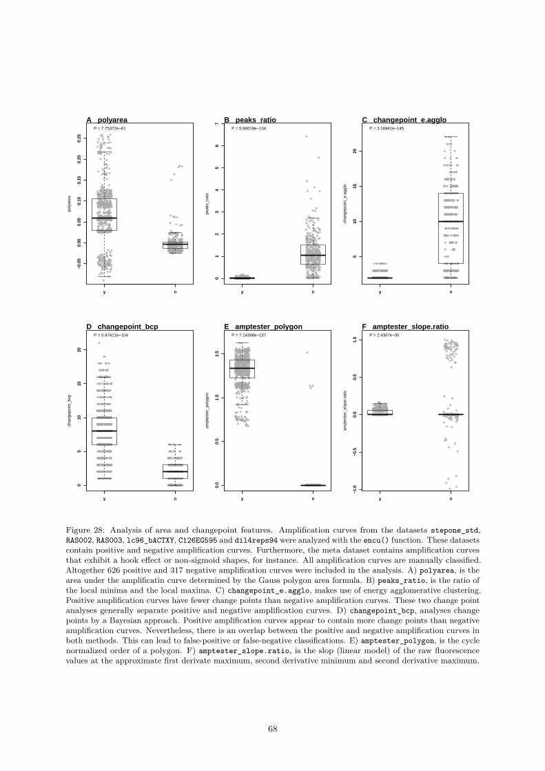
y n
−0.
050.
000.
050.
100.
150.
200.
25
poly
area
y n
−0.
050.
000.
050.
100.
150.
200.
25
P = 7.75372e−61
A polyarea
y n
01
23
45
67
peak
s_ra
tio
y n
01
23
45
67
P = 5.94019e−134
B peaks_ratio
y n
510
1520
chan
gepo
int_
e.ag
glo
y n
510
1520
P = 3.16941e−145
C changepoint_e.agglo
y n
05
1015
20
chan
gepo
int_
bcp
y n
05
1015
20
P = 5.47411e−104
D changepoint_bcp
y n
0.0
0.5
1.0
1.5
ampt
este
r_po
lygo
n
y n
0.0
0.5
1.0
1.5
P = 7.14398e−137
E amptester_polygon
y n
−1.
0−
0.5
0.0
0.5
1.0
ampt
este
r_sl
ope.
ratio
y n
−1.
0−
0.5
0.0
0.5
1.0
P = 2.4307e−05
F amptester_slope.ratio
Figure 28: Analysis of area and changepoint features. Amplification curves from the datasets stepone_std,RAS002, RAS003, lc96_bACTXY, C126EG595 and dil4reps94 were analyzed with the encu() function. These datasetscontain positive and negative amplification curves. Furthermore, the meta dataset contains amplification curvesthat exhibit a hook effect or non-sigmoid shapes, for instance. All amplification curves are manually classified.Altogether 626 positive and 317 negative amplification curves were included in the analysis. A) polyarea, is thearea under the amplificatin curve determined by the Gauss polygon area formula. B) peaks_ratio, is the ratio ofthe local minima and the local maxima. C) changepoint_e.agglo, makes use of energy agglomerative clustering.Positive amplification curves have fewer change points than negative amplification curves. These two change pointanalyses generally separate positive and negative amplification curves. D) changepoint_bcp, analyses changepoints by a Bayesian approach. Positive amplification curves appear to contain more change points than negativeamplification curves. Nevertheless, there is an overlap between the positive and negative amplification curves inboth methods. This can lead to false-positive or false-negative classifications. E) amptester_polygon, is the cyclenormalized order of a polygon. F) amptester_slope.ratio, is the slop (linear model) of the raw fluorescencevalues at the approximate first derivate maximum, second derivative minimum and second derivative maximum.
68
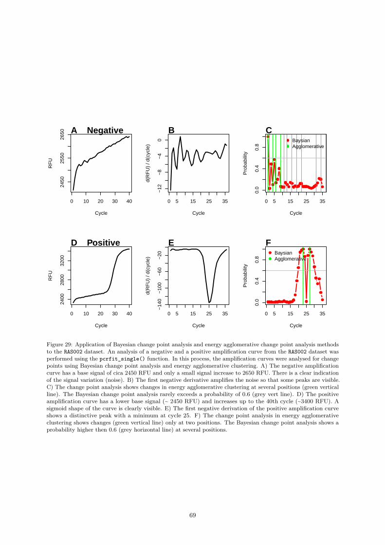
0 10 20 30 40
2450
2550
2650
Cycle
RF
U
A Negative
0 5 15 25 35
−12
−8
−4
0
Cycle
d(R
FU
) / d
(cyc
le)
B
0 5 15 25 35
0.0
0.4
0.8
Cycle
Pro
babi
lity
CBaysianAgglomerative
0 10 20 30 40
2400
2800
3200
Cycle
RF
U
D Positive
0 5 15 25 35
−14
0−
100
−60
−20
Cycle
d(R
FU
) / d
(cyc
le)
E
0 5 15 25 35
0.0
0.4
0.8
Cycle
Pro
babi
lity
FBaysianAgglomerative
Figure 29: Application of Bayesian change point analysis and energy agglomerative change point analysis methodsto the RAS002 dataset. An analysis of a negative and a positive amplification curve from the RAS002 dataset wasperformed using the pcrfit_single() function. In this process, the amplification curves were analysed for changepoints using Bayesian change point analysis and energy agglomerative clustering. A) The negative amplificationcurve has a base signal of cica 2450 RFU and only a small signal increase to 2650 RFU. There is a clear indicationof the signal variation (noise). B) The first negative derivative amplifies the noise so that some peaks are visible.C) The change point analysis shows changes in energy agglomerative clustering at several positions (green verticalline). The Bayesian change point analysis rarely exceeds a probability of 0.6 (grey vert line). D) The positiveamplification curve has a lower base signal (~ 2450 RFU) and increases up to the 40th cycle (~3400 RFU). Asigmoid shape of the curve is clearly visible. E) The first negative derivation of the positive amplification curveshows a distinctive peak with a minimum at cycle 25. F) The change point analysis in energy agglomerativeclustering shows changes (green vertical line) only at two positions. The Bayesian change point analysis shows aprobability higher then 0.6 (grey horizontal line) at several positions.
69
likely a nonlinear signal. This is a bit counter intuitive because R2 of nonlinear data should be low.The output is binary coded (negative = 0, positive = 1). The output name of the pcrfit_single()function is amptester_lrt.
• The fourth test is called Threshold test (THt), which is based on the Wilcoxon rank sum test. Asa simple rule the first 20% (head) and the last 15% (tail) of an amplification curve are used asinput data. From that a one-sided Wilcoxon rank sum tests of the head versus the tail is performed(α ≤ 1e− 02). The output is binary coded (negative = 0, positive = 1). The output name of thepcrfit_single() function is amptester_tht.
• The fifth test is called Signal level test (SLt). he test compares the signals of the head and the tailby a robust “sigma” rule (median + 2 * median absolute deviation) and the the comparison of thehead/tail ratio. If the returned value is less than 1.25 (25 percent), then the amplification curve islikely negative.The output is binary coded (negative = 0, positive = 1). The output name of thepcrfit_single() function is amptester_slt.
• The sixth test is called Polygon test (pco). The pco test determines if the points in an amplificationcurve (like a polygon) are in a “clockwise” order. The sum over the edges result in a positive valueif the amplification curve is “clockwise” and is negative if the curve is counter-clockwise. Fromexperience is noise positive and “true” amplification curves “highly” negative. In contrast to theimplementation in the amptester() function, the result is normalized by a division to the numberof PCR cycles. The output is numeric. The output name of the pcrfit_single() function isamptester_polygon.
• The seventh test is the Slope Ratio test (SlR).This test uses the approximated first derivativemaximum, the second derivative minimum and the second derivative maximum of the amplificationcurve. Next the raw fluorescence at the approximated second derivative minimum and the secondderivative maximum are taken from the original dataset. The fluorescence intensities are normalizedto the maximum fluorescence of this data. This data is used for a linear regression. Where theslope is used. The output is numeric. The output name of the pcrfit_single() function isamptester_slope.ratio.
Application of the “amptester()“ Features
Random Forest is an enhancement of decision tree algorithms. Random Forest uses n random datasubsets. The subset is to be used to capture trends precisely without taking into account the wholedata. In order to do this, an ensemble consisting of n small decision trees is generated. Each decisiontree contains a biased classifier. The majority of the previous classes are then selected for classification.Compared to a single tree classifier, the Random Forest has a high robustness against noise, outliers andover-fitting (Williams 2009, Breiman (2001)).
In the following example, the randomForest() function from the randomForest package (Liaw andWiener 2002) was used for the classification. The aim was to classify positive and negative amplificationcurves. As response vector (y) served decision with its possible states “positive” and “negative” (factor).The features amptester_shapiro, amptester_lrt, amptester_rgt, amptester_tht, amptester_slt,amptester_polygon and amptester_slope.ratio served as a matrix of predictors describing the modelto be adapted. The batsch1, HCU32_aggR, stepone_std, RAS002, RAS003, lc96_bACTXY datasets wereused for the analysis. This dataset contains almost equal proportions of positive and negative amplificationcurves (Figure 18A). Prior to this, the amplification curves were analyzed with the encu() function(paragraph 0.4.2.1) and stored in the data_sample.rda file to save computing time. The file is part ofthe PCRedux package.options(warn = -1)suppressMessages(library(randomForest))library(PCRedux)
data <- data_sample[data_sample$dataset %in%c("batsch1",
"HCU32_aggR","lc96_bACTXY","RAS002","RAS003",
70
"stepone_std"), ]
n_positive <- sum(data[["decision"]] == "y")n_negative <- sum(data[["decision"]] == "n")
dat <- data.frame(data[, c("amptester_shapiro","amptester_lrt","amptester_rgt","amptester_tht","amptester_slt","amptester_polygon","amptester_slope.ratio")],
decision = as.numeric(factor(data$decision,levels = c("n", "y"),label = c(0, 1))) - 1)
# Select randomly observations from 70% of the data for training.# n_train is the number of observations used for training.
n_train <- round(nrow(data) * 0.7)
# index_test is the index of observations to be selected for the trainingindex_test <- sample(1L:nrow(dat), size = n_train)
# index_test is the index of observations to be selected for the testingindex_training <- which(!(1L:nrow(dat) %in% index_test))
# train_data contains the data used for training
train_data <- dat[index_test, ]
# test_data contains the data used for training
test_data <- dat[index_training, ]
model_rf = randomForest(decision ~ ., data = train_data, ntree = 4000,importance = TRUE)
# Determine variable importanceres_importance <- importance(model_rf)
par(mfrow = c(1,3))
plot(model_rf, main = "", las = 2)mtext("A", cex = 1.2, side = 3, adj = 0, font = 2, las = 0)
rownames(res_importance) <- substr(rownames(res_importance), 11, 22)
barplot(t(as.matrix(sort(res_importance[, 1]))),ylab = "%IncMSE", main = "", las = 2,col = adjustcolor("grey", alpha.f = 0.5))
mtext("B", cex = 1.2, side = 3, adj = 0, font = 2, las = 0)
barplot(t(as.matrix(sort(res_importance[, 2]))),ylab = "IncNodePurity", main = "", las = 2,
71
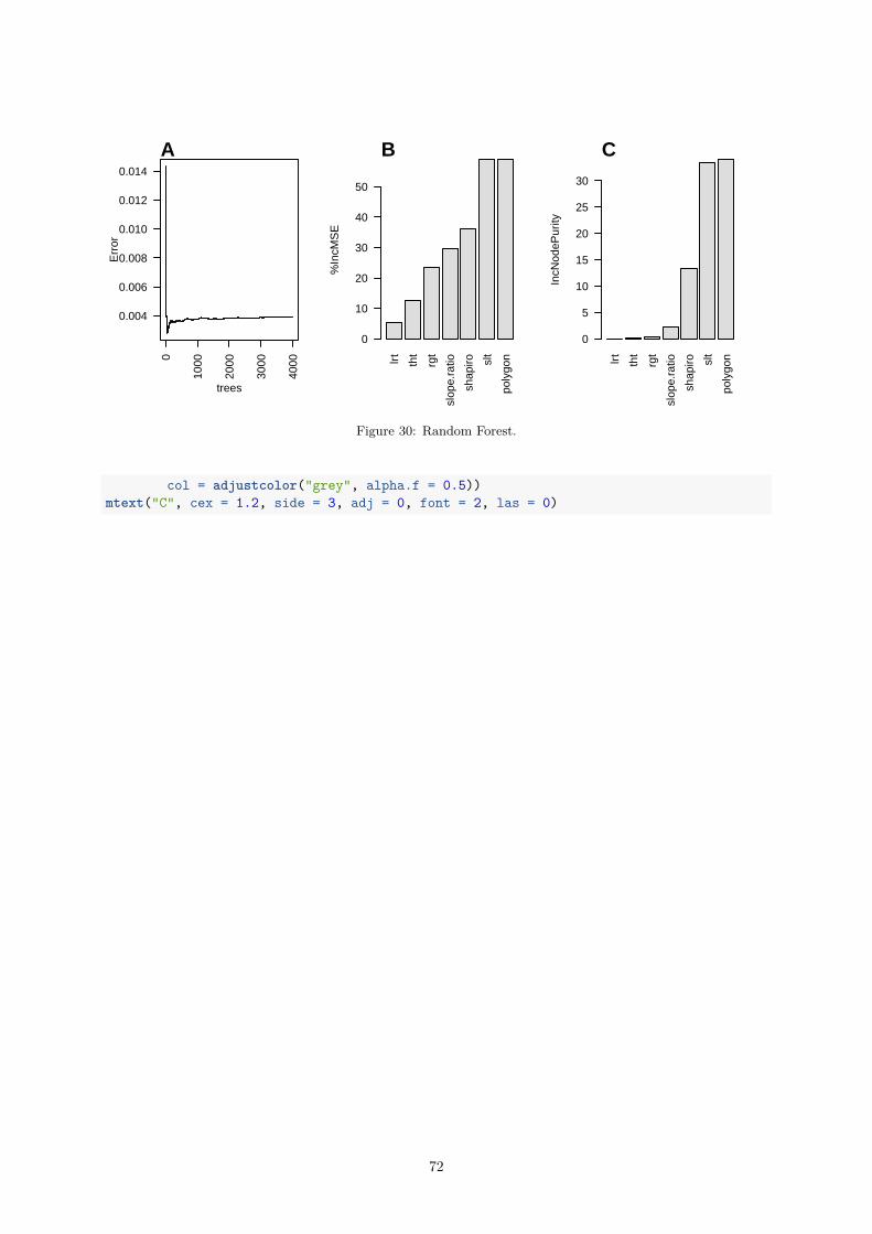
0
1000
2000
3000
4000
0.004
0.006
0.008
0.010
0.012
0.014
trees
Err
or
A
lrt
tht
rgt
slop
e.ra
tio
shap
iro slt
poly
gon
%In
cMS
E0
10
20
30
40
50
B
lrt
tht
rgt
slop
e.ra
tio
shap
iro slt
poly
gon
IncN
odeP
urity
0
5
10
15
20
25
30
C
Figure 30: Random Forest.
col = adjustcolor("grey", alpha.f = 0.5))mtext("C", cex = 1.2, side = 3, adj = 0, font = 2, las = 0)
72

0.4.2.11 Parallel Programming
pcrfit_single() is a function, which calculates 48 potential features from an amplification curve. Thiscomes at a cost, since several internal functions are computational very intensive (Porzelius, Knaus,and Schwarzer 2009, Schmidberger et al. (2009)). For example, pcrfit() function (qpcR package)in pcrfit_single() fits and optimizes eight non-linear (sigmoid) models to the amplification curvedata. encu() (ENcode CUrves) is a relative of the pcrfit_single() function. Similarly, this functioncalculates numerous but with an emphasis on features extraction of large amplification curve datasets.
The pcrfit_single() function is performing the analysis for a single process and the pblapply()function from the pbapply package is used internally to is delivers a progress bar and leverages parallelprocessing. Examples are given in the documentation of the encu() function. Parallel computingtechnologies saves scientists time in their routine tasks of analyzing experimental data. Information aboutparallel computing technologies in R are available from Eddelbuettel (2017).
To process high data volumes and to deal with speed issues several R packages for parallelization wereevaluated (Vera, Jansen, and Suppi 2008, Porzelius, Knaus, and Schwarzer (2009), Boehringer (2013)).For the calculation of the curve parameters the custom-made function pcrfit_parallel() was developed.In particular, to benchmark and evaluate the performance of multiple learners on multiple tasks studiesquickly become resource-demanding. Therefore, packages such as mlr support natively parallelization(Bischl et al. 2010).
The code block below shows an example for a parallelized version of pcrfit_single(). This functionis called pcrfit_parallel(), which is intended for users who wish to calculate the features of a largeamplification curve dataset. This function appears to be works on Linux systems. On Windows systemserror messages were reported. pcrfit_parallel() makes use of parallelized code to make use of multi-core architectures. In this function we import from the parallel package the detectCores() function.This function determines the number of available cores. Function from the foreach package (e. g.,%dopar%, foreach()) are used for the further organization of the CPU usage. The pcrfit_single()performs the analysis for a single process.
• The parameter data is the dataset containing the cycles and fluorescence amplitudes.• The parameter n_cores defines the numbers of cores that should be left unused by this function.
By default, pcrfit_parallel() is using only one core (n_cores=1). n_cores="all" uses all availablecores. The output of the pcrfit_parallel() function is similar to the pcrfit_single() function.# Copy and paste the code to an R console to evaluate it
library(parallel)library(doParallel)
pcrfit_parallel <- function(data, n_cores=1) {# Determine the number of available cores and register themif (n_cores == "all") {
n_cores <- detectCores()}
registerDoParallel(n_cores)
# Prepare the data for further processing# Normalize RFU values to the alpha percentile (0.99)cycles <- data.frame(cycles = data[, 1])data_RFU <- data.frame(data[, -1])data_RFU_colnames <- colnames(data_RFU)data_RFU <- sapply(1L:ncol(data_RFU), function(i) {
data_RFU[, i] / quantile(data_RFU[, i], 0.99, na.rm = TRUE)})colnames(data_RFU) <- data_RFU_colnames
# just to shut RCHeck for NSE we define ith_cycleith_cycle <- 1
73
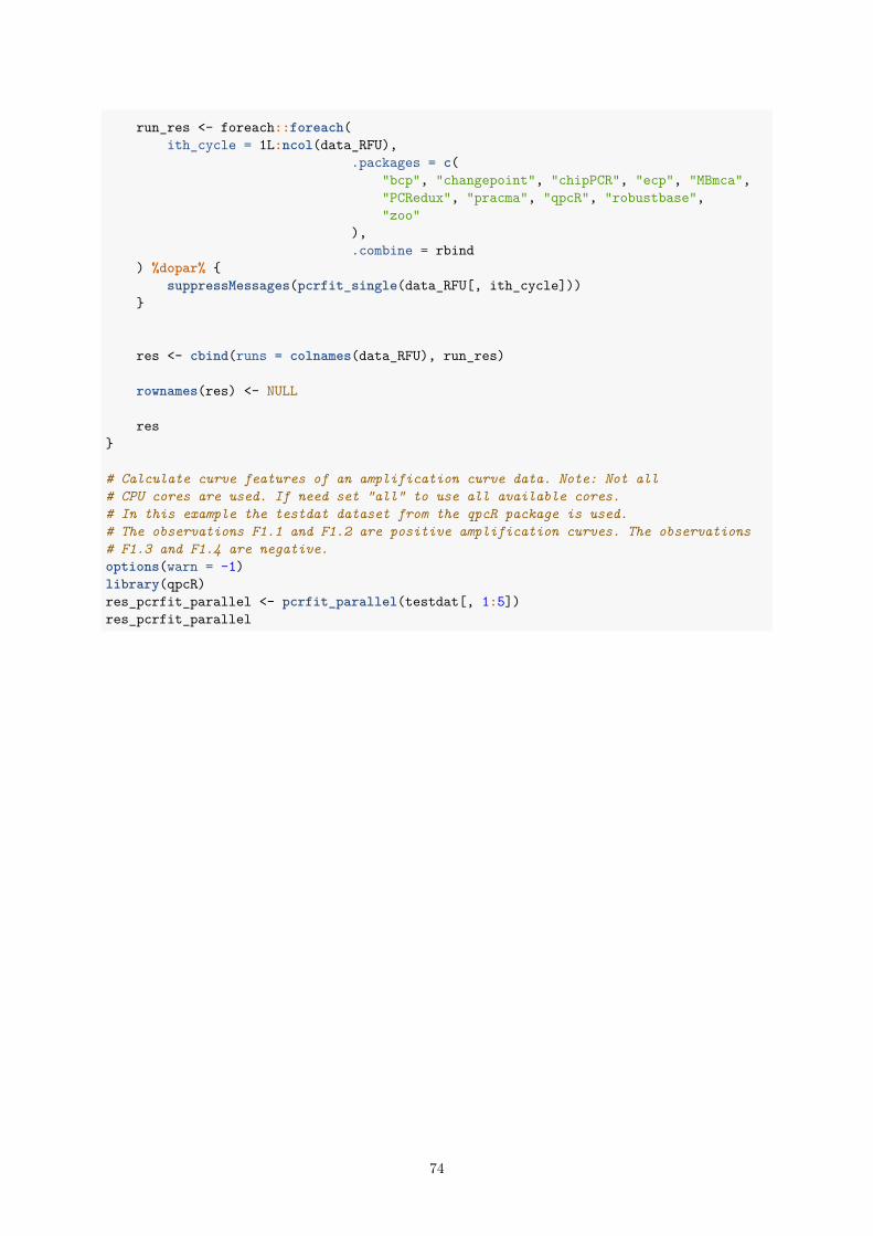
run_res <- foreach::foreach(ith_cycle = 1L:ncol(data_RFU),
.packages = c("bcp", "changepoint", "chipPCR", "ecp", "MBmca","PCRedux", "pracma", "qpcR", "robustbase","zoo"
),.combine = rbind
) %dopar% {suppressMessages(pcrfit_single(data_RFU[, ith_cycle]))
}
res <- cbind(runs = colnames(data_RFU), run_res)
rownames(res) <- NULL
res}
# Calculate curve features of an amplification curve data. Note: Not all# CPU cores are used. If need set "all" to use all available cores.# In this example the testdat dataset from the qpcR package is used.# The observations F1.1 and F1.2 are positive amplification curves. The observations# F1.3 and F1.4 are negative.options(warn = -1)library(qpcR)res_pcrfit_parallel <- pcrfit_parallel(testdat[, 1:5])res_pcrfit_parallel
74

1 Summary and Conclusions
The PCRedux enables the user to extract features from amplification curve data. Numerous features canbe extracted from the amplification curve. Some of them have not been described in the literature. Weconsider PCRedux as enabling technology for further research. For example, the proposed features areuseable for machine learning applications or quality assessment of data.
Such software can be used in high-throughput applications in combination with other technologies, suchas next generation sequencing. Next generation sequencing depends on pre-tests of the input DNA, priorto sequencing and is also used for confirmatory experiments after RNA-Seq quantification. To this endautomatized quality control and decision support are conceivable applications.
The pcrfit_single() function is an extendable wrapper function for several algorithm. Currently, 48features can be calculated from an amplification curve.
Of note, we would like to emphasis that the functionality of this package is not limited to amplificationcurve data from qPCR experiments. As stated before, amplification curves have a sigmoid curve shape.Presumably, this can also be used for melting curve analysis.
References
Arlot, Sylvain, and Alain Celisse. 2010. “A survey of cross-validation procedures for model selection.”Statistics Surveys 4: 40–79. doi:10.1214/09-SS054.
Bååth, Rasmus. 2012. “The State of Naming Conventions in R.” The R Journal 4 (2): 74–75. http://journal.r-project.org/archive/2012-2/RJournal_2012-2_Baaaath.pdf.
Barratt, Kevin, and John F. Mackay. 2002. “Improving Real-Time PCR Genotyping Assays byAsymmetric Amplification.” Journal of Clinical Microbiology 40 (4): 1571–2. doi:10.1128/JCM.40.4.1571-1572.2002.
Bischl, Bernd, Michel Lang, Lars Kotthoff, Julia Schiffner, Jakob Richter, Erich Studerus, GiuseppeCasalicchio, and Zachary M. Jones. 2010. mlr: Machine learning in R. http://www.jmlr.org/papers/volume17/15-066/source/15-066.pdf.
Boehringer, Stefan. 2013. “Dynamic Parallelization of R Functions.” The R Journal 5 (2): 88–97.http://journal.r-project.org/archive/2013-2/RJournal_2013-2_boehringer.pdf.
Breiman, Leo. 2001. “Random forests.” Machine Learning 45 (1): 5–32.
Brito, Paula, ed. 2008. COMPSTAT 2008: Proceedings in Computational Statistics. Physica-VerlagHeidelberg.
Bustin, Stephen. 2017. “The continuing problem of poor transparency of reporting and use ofinappropriate methods for RT-qPCR.” Biomolecular Detection and Quantification 12 (June): 7–9.doi:10.1016/j.bdq.2017.05.001.
Bustin, Stephen A. 2014. “The reproducibility of biomedical research: Sleepers awake!” BiomolecularDetection and Quantification 2 (December): 35–42. doi:10.1016/j.bdq.2015.01.002.
Charpiat, Guillaume, Olivier Faugeras, and Renaud Keriven. 2003. “Shape metrics, warping and statistics.”In Image Processing, 2003. ICIP 2003. Proceedings. 2003 International Conference on, 2:II–627. IEEE.http://ieeexplore.ieee.org/abstract/document/1246758/.
Cook, Dianne, and Deborah F. Swayne. 2007. Interactive and Dynamic Graphics for Data Analysis:With R and GGobi. 2007 edition. 1st Ser. New York: Springer. http://www.springer.com/us/book/9780387717616.
De Vries, Andrie, and Joris Meys. 2012. R for Dummies. 2nd ed. John Wiley & Sons.
Dvinge, Heidi, and Paul Bertone. 2009. “HTqPCR: high-throughput analysis and visualization of quanti-tative real-time PCR data in R.” Bioinformatics 25 (24): 3325–6. doi:10.1093/bioinformatics/btp578.
Eddelbuettel, Dirk. 2017. “CRAN Task View: High-Performance and Parallel Computing with R,”
75

September. https://CRAN.R-project.org/view=HighPerformanceComputing.
Erdman, Chandra, John W. Emerson, and others. 2007. “bcp: an R package for performing a Bayesiananalysis of change point problems.” Journal of Statistical Software 23 (3): 1–13. https://www.researchgate.net/profile/Chandra_Erdman/publication/26538600_bcp_An_R_Package_for_Performing_a_Bayesian_Analysis_of_Change_Point_Problems/links/56dee56608aec8c022cf2fd2.pdf.
Febrero-Bande, Manuel, and Manuel Oviedo de la Fuente. 2012. “Statistical Computing in FunctionalData Analysis: The R Package fda.usc.” Journal of Statistical Software 51 (4): 1–28. http://www.jstatsoft.org/v51/i04/.
Feuer, Ronny, Sebastian Vlaic, Janine Arlt, Oliver Sawodny, Uta Dahmen, Ulrich M. Zanger, and MariaThomas. 2015. “LEMming: A Linear Error Model to Normalize Parallel Quantitative Real-Time PCR(qPCR) Data as an Alternative to Reference Gene Based Methods.” PLOS ONE 10 (9): e0135852.doi:10.1371/journal.pone.0135852.
Greene, Casey S., Jie Tan, Matthew Ung, Jason H. Moore, and Chao Cheng. 2014. “Big DataBioinformatics.” Journal of Cellular Physiology 229 (12): 1896–1900. doi:10.1002/jcp.24662.
Gunay, Melih, Evgin Goceri, and Rajarajeswari Balasubramaniyan. 2016. “Machine Learning forOptimum CT-Prediction for qPCR.” In Machine Learning and Applications (ICMLA), 2016 15thIEEE International Conference on Machine Learning and Applications (ICMLA), 588–92. IEEE.doi:10.1109/ICMLA.2016.0103.
Herrera, Francisco, Sebastián Ventura, Rafael Bello, Chris Cornelis, Amelia Zafra, Dánel Sánchez-Tarragó,and Sarah Vluymans. 2016. Multiple Instance Learning. Cham: Springer International Publishing.http://link.springer.com/10.1007/978-3-319-47759-6.
Hothorn, Torsten, and Brian S. Everitt. 2014. A Handbook of Statistical Analyses using R, Third Edition.3rd ed. Oakville: Chapman; Hall/CRC.
Hothorn, Torsten, Kurt Hornik, and Achim Zeileis. 2006. “Unbiased Recursive Partitioning: A Con-ditional Inference Framework.” Journal of Computational and Graphical Statistics 15 (3): 651–74.doi:10.1198/106186006X133933.
Igual, Laura, and Santi Seguí. 2017. Introduction to Data Science. Undergraduate Topics in ComputerScience. Cham: Springer International Publishing. http://link.springer.com/10.1007/978-3-319-50017-1.
Isaac, Peter G. 2009. “Essentials of nucleic acid analysis: a robust approach.” Annals of Botany 104 (2):vi–vi. doi:10.1093/aob/mcp135.
James, Gareth, Daniela Witten, Trevor Hastie, and Robert Tibshirani. 2013. An Introduction toStatistical Learning. Vol. 103. Springer Texts in Statistics. New York, NY: Springer New York.http://link.springer.com/10.1007/978-1-4614-7138-7.
James, Nicholas A., and David S. Matteson. 2013. “ecp: An R package for nonparametric multiple changepoint analysis of multivariate data.” arXiv Preprint arXiv:1309.3295. https://arxiv.org/abs/1309.3295.
Killick, Rebecca, and Idris A. Eckley. 2014. “changepoint: An R Package for Changepoint Analysis.”Journal of Statistical Software 58 (3): 1–19. http://www.jstatsoft.org/v58/i03/.
Kitchin, Rob. 2014. The data revolution : big data, open data, data infrastructures & their consequences.Los Angeles, California London: SAGE Publications.
Knuth, D. E. 1984. “Literate Programming.” The Computer Journal 27 (2): 97–111. doi:10.1093/comjnl/27.2.97.
Kuhn, Max. 2008. “Building Predictive Models in R Using the caret Package.” Journal of StatisticalSoftware 28 (5). http://www.jstatsoft.org/v28/i05/.
Lanubile, F., C. Ebert, R. Prikladnicki, and A. Vizcaíno. 2010. “Collaboration Tools for Global SoftwareEngineering.” IEEE Software 27 (2): 52–55. doi:10.1109/MS.2010.39.
Lee, J. K. 2010. Statistical Bioinformatics: For Biomedical and Life Science Researchers. Wiley.https://books.google.de/books?id=aT1MBGtxSNsC.
Lefever, Steve, Jan Hellemans, Filip Pattyn, Daniel R. Przybylski, Chris Taylor, René Geurts, AndreasUntergasser, Jo Vandesompele, and on behalf of the RDML Consortium. 2009. “RDML: structured
76

language and reporting guidelines for real-time quantitative PCR data.” Nucleic Acids Research 37 (7):2065–9. doi:10.1093/nar/gkp056.
Liaw, Andy, and Matthew Wiener. 2002. “Classification and Regression by randomForest.” R News 2(3): 18–22. http://CRAN.R-project.org/doc/Rnews/.
Luan, Shenghua, Lael J. Schooler, and Gerd Gigerenzer. 2011. “A signal-detection analysis of fast-and-frugal trees.” Psychological Review 118 (2): 316–38. doi:10.1037/a0022684.
Luo, Ping, Liang Lin, and Hongyang Chao. 2010. “Learning shape detector by quantizing curve segmentswith multiple distance metrics.” In European Conference on Computer Vision, 342–55. Springer.
Mallona, Izaskun, Anna Díez-Villanueva, Berta Martín, and Miguel A. Peinado. 2017. “Chainy:an universal tool for standardized relative quantification in real-time PCR.” Bioinformatics.doi:10.1093/bioinformatics/btw839.
Mallona, Izaskun, Julia Weiss, and Marcos Egea-Cortines. 2011. “pcrEfficiency: a Web tool for PCRamplification efficiency prediction.” BMC Bioinformatics 12: 404. doi:10.1186/1471-2105-12-404.
Martins, C., G. Lima, Mr. Carvalho, L. Cainé, and Mj. Porto. 2015. “DNA quantification by real-time PCR in different forensic samples.” Forensic Science International: Genetics Supplement Series 5(December): e545–e546. doi:10.1016/j.fsigss.2015.09.215.
Matz, Mikhail V., Rachel M. Wright, and James G. Scott. 2013. “No Control Genes Required: BayesianAnalysis of qRT-PCR Data.” PLoS ONE 8 (8): e71448. doi:10.1371/journal.pone.0071448.
McCall, Matthew N., Helene R. McMurray, Hartmut Land, and Anthony Almudevar. 2014. “Onnon-detects in qPCR data.” Bioinformatics 30 (16): 2310–6. doi:10.1093/bioinformatics/btu239.
McFadden, Daniel L. 1974. “Conditional Logit Analysis of Qualitative Choice Behavior.” In Frontiersin Economics, Frontiers in Economics:105–42. P. Zarembka (ed.). New York: Academic Press. https://eml.berkeley.edu/reprints/mcfadden/zarembka.pdf.
Myers, Glenford J., Tom Badgett, Todd M. Thomas, and Corey Sandler. 2004. The art of softwaretesting. 2nd ed. Hoboken, N.J: John Wiley & Sons.
Neve, Jan De, Joris Meys, Jean-Pierre Ottoy, Lieven Clement, and Olivier Thas. 2014. “unified-WMWqPCR: the unified Wilcoxon–Mann–Whitney test for analyzing RT-qPCR data in R.” Bioinformatics30 (17): 2494–5. doi:10.1093/bioinformatics/btu313.
Nolan, Tania, Rebecca E Hands, and Stephen A Bustin. 2006. “Quantification of mRNA using real-timeRT-PCR.” Nature Protocols 1 (November): 1559. http://dx.doi.org/10.1038/nprot.2006.236.
Pabinger, Stephan, Stefan Rödiger, Albert Kriegner, Klemens Vierlinger, and Andreas Weinhäusel. 2014.“A survey of tools for the analysis of quantitative PCR (qPCR) data.” Biomolecular Detection andQuantification 1 (1): 23–33. doi:10.1016/j.bdq.2014.08.002.
Pabinger, Stephan, Gerhard G. Thallinger, René Snajder, Heiko Eichhorn, Robert Rader, and ZlatkoTrajanoski. 2009. “QPCR: Application for real-time PCR data management and analysis.” BMCBioinformatics 10 (1): 268. doi:10.1186/1471-2105-10-268.
Perkins, James R., John M. Dawes, Steve B. McMahon, David LH Bennett, Christine Orengo, and MatthiasKohl. 2012. “ReadqPCR and NormqPCR: R packages for the reading, quality checking and normalisationof RT-qPCR quantification cycle (Cq) data.” BMC Genomics 13 (1): 296. doi:10.1186/1471-2164-13-296.
Phillips, Nathaniel, Hansjoerg Neth, Jan Woike, and Wolfgang Gaissmaer. 2017. FFTrees: Generate,Visualise, and Evaluate Fast-and-Frugal Decision Trees. https://CRAN.R-project.org/package=FFTrees.
Porzelius, Christine, Harald Binder Jochen Knaus, and Guido Schwarzer. 2009. “Easier ParallelComputing in R with snowfall and sfCluster.” The R Journal 1 (1): 54–59. http://journal.r-project.org/archive/2009-1/RJournal_2009-1_Knaus+et+al.pdf.
Quinlan, J. Ross. 1986. “Induction of decision trees.” Machine Learning 1 (1): 81–106. http://link.springer.com/article/10.1007/BF00116251.
Richards, F. J. 1959. “A Flexible Growth Function for Empirical Use.” Journal of Experimental Botany
77

10 (2): 290–301. doi:10.1093/jxb/10.2.290.
Ritz, Christian, and Andrej-Nikolai Spiess. 2008. “qpcR: an R package for sigmoidal model selec-tion in quantitative real-time polymerase chain reaction analysis.” Bioinformatics 24 (13): 1549–51.doi:10.1093/bioinformatics/btn227.
Rödiger, Stefan, Alexander Böhm, and Ingolf Schimke. 2013. “Surface Melting Curve Analysis with R.”The R Journal 5 (2): 37–53. http://journal.r-project.org/archive/2013-2/roediger-bohm-schimke.pdf.
Rödiger, Stefan, Michał Burdukiewicz, and Peter Schierack. 2015. “chipPCR: an R package to pre-processraw data of amplification curves.” Bioinformatics 31 (17): 2900–2902. doi:10.1093/bioinformatics/btv205.
Rödiger, Stefan, Michał Burdukiewicz, Konstantin A. Blagodatskikh, and Peter Schierack. 2015. “R asan Environment for the Reproducible Analysis of DNA Amplification Experiments.” The R Journal 7(2): 127–50. http://journal.r-project.org/archive/2015-1/RJ-2015-1.pdf.
Rödiger, Stefan, Michał Burdukiewicz, Andrej-Nikolai Spiess, and Konstantin Blagodatskikh. 2017.“Enabling reproducible real-time quantitative PCR research: the RDML package.” Bioinformatics, August.doi:10.1093/bioinformatics/btx528.
Rödiger, Stefan, Peter Schierack, Alexander Böhm, Jörg Nitschke, Ingo Berger, Ulrike Frömmel, CarstenSchmidt, et al. 2013. “A highly versatile microscope imaging technology platform for the multiplexreal-time detection of biomolecules and autoimmune antibodies.” Advances in Biochemical Engineer-ing/Biotechnology 133: 35–74. doi:10.1007/10_2011_132.
Ronde, Maurice W. J. de, Jan M. Ruijter, David Lanfear, Antoni Bayes-Genis, Maayke G. M. Kok,Esther E. Creemers, Yigal M. Pinto, and Sara-Joan Pinto-Sietsma. 2017. “Practical data handlingpipeline improves performance of qPCR-based circulating miRNA measurements.” RNA 23 (5): 811–21.doi:10.1261/rna.059063.116.
Rote, Günter. 1991. “Computing the minimum Hausdorff distance between two point sets on a line undertranslation.” Information Processing Letters 38 (3): 123–27. doi:10.1016/0020-0190(91)90233-8.
Ruijter, J M, C Ramakers, W M H Hoogaars, Y Karlen, O Bakker, M J B van den Hoff, and A F MMoorman. 2009. “Amplification efficiency: linking baseline and bias in the analysis of quantitative PCRdata.” Nucleic Acids Research 37 (6): e45. doi:10.1093/nar/gkp045.
Ruijter, Jan M., Peter Lorenz, Jari M. Tuomi, Michael Hecker, and Maurice J. B. van den Hoff.2014. “Fluorescent-increase kinetics of different fluorescent reporters used for qPCR depend on moni-toring chemistry, targeted sequence, type of DNA input and PCR efficiency.” Microchimica Acta, 1–8.doi:10.1007/s00604-013-1155-8.
Ruijter, Jan M., Michael W. Pfaffl, Sheng Zhao, Andrej N. Spiess, Gregory Boggy, Jochen Blom, RobertG. Rutledge, et al. 2013. “Evaluation of qPCR curve analysis methods for reliable biomarker discovery:Bias, resolution, precision, and implications.” Methods 59 (1): 32–46. doi:10.1016/j.ymeth.2012.08.011.
Ruijter, Jan M., Adrián Ruiz Villalba, Jan Hellemans, Andreas Untergasser, and Maurice J. B. vanden Hoff. 2015. “Removal of between-run variation in a multi-plate qPCR experiment.” BiomolecularDetection and Quantification, Special Issue: Advanced Molecular Diagnostics for Biomarker Discovery –Part I, 5 (September): 10–14. doi:10.1016/j.bdq.2015.07.001.
Saeys, Y., I. Inza, and P. Larranaga. 2007. “A review of feature selection techniques in bioinformatics.”Bioinformatics 23 (19): 2507–17. doi:10.1093/bioinformatics/btm344.
Sauer, Eva, Ann-Kathrin Reinke, and Cornelius Courts. 2016. “Differentiation of five body fluids fromforensic samples by expression analysis of four microRNAs using quantitative PCR.” Forensic ScienceInternational: Genetics 22 (May): 89–99. doi:10.1016/j.fsigen.2016.01.018.
Schmidberger, Markus, Martin Morgan, Dirk Eddelbuettel, Hao Yu, Luke Tierney, and Ulrich Mansmann.2009. “State-of-the-art in Parallel Computing with R.” Journal of Statistical Software 47 (1).
Scott, A. J., and M. Knott. 1974. “A Cluster Analysis Method for Grouping Means in the Analysis ofVariance.” Biometrics 30 (3): 507. doi:10.2307/2529204.
Seibelt, Pablo. 2017. xray: X Ray Vision on your Datasets. https://CRAN.R-project.org/package=xray.
Sing, Tobias, Oliver Sander, Niko Beerenwinkel, and Thomas Lengauer. 2005. “ROCR: visualizing
78

classifier performance in R.” Bioinformatics 21 (20): 3940–1. doi:10.1093/bioinformatics/bti623.
Spiess, Andrej-Nikolai, Claudia Deutschmann, Michał Burdukiewicz, Ralf Himmelreich, Katharina Klat,Peter Schierack, and Stefan Rödiger. 2015. “Impact of Smoothing on Parameter Estimation in QuantitativeDNA Amplification Experiments.” Clinical Chemistry 61 (2): 379–88. doi:10.1373/clinchem.2014.230656.
Spiess, Andrej-Nikolai, Caroline Feig, and Christian Ritz. 2008. “Highly accurate sigmoidal fittingof real-time PCR data by introducing a parameter for asymmetry.” BMC Bioinformatics 9 (1): 221.doi:10.1186/1471-2105-9-221.
Spiess, Andrej-Nikolai, Stefan Rödiger, Michał Burdukiewicz, Thomas Volksdorf, and Joel Tellinghuisen.2016. “System-specific periodicity in quantitative real-time polymerase chain reaction data questionsthreshold-based quantitation.” Scientific Reports 6 (December): 38951. doi:10.1038/srep38951.
Therneau, Terry, Beth Atkinson, and Brian Ripley. 2017. rpart: Recursive Partitioning and RegressionTrees. https://CRAN.R-project.org/package=rpart.
Tichopad, Ales, Michael Dilger, Gerhard Schwarz, and Michael W Pfaffl. 2003. “Standardized deter-mination of real-time PCR efficiency from a single reaction set-up.” Nucleic Acids Research 31 (20):e122.
Tierney, Nicholas. 2017. “Visdat: Visualising Whole Data Frames.” The Journal of Open Source Software2 (16). The Open Journal.
Vera, Gonzalo, Ritsert C. Jansen, and Remo L. Suppi. 2008. “R/parallel – speeding up bioinformaticsanalysis with R.” BMC Bioinformatics 9 (September): 390. doi:10.1186/1471-2105-9-390.
Walsh, Ian, Gianluca Pollastri, and Silvio C. E. Tosatto. 2015. “Correct machine learning onprotein sequences: a peer-reviewing perspective.” Briefings in Bioinformatics, September, bbv082.doi:10.1093/bib/bbv082.
Wickham, Hadley. 2011. “testthat: Get Started with Testing.” The R Journal 3 (1): 5–10. http://journal.r-project.org/archive/2011/RJ-2011-002/index.html.
Williams, Graham J. 2009. “Rattle: A Data Mining GUI for R.” The R Journal 1 (2): 45–55. http://journal.r-project.org/archive/2009-2/RJournal_2009-2_Williams.pdf.
Wilson, Greg, Jennifer Bryan, Karen Cranston, Justin Kitzes, Lex Nederbragt, and Tracy K. Teal.2017. “Good enough practices in scientific computing.” PLOS Computational Biology 13 (6): e1005510.doi:10.1371/journal.pcbi.1005510.
79


![Confucianism: An Overview [EOR]](https://img.dokumen.tips/doc/110x75/63130d82b22baff5c40ef2a2/confucianism-an-overview-eor.jpg)


![[Metabolic myopathies - an overview]](https://img.dokumen.tips/doc/110x75/634624f0596bdb97a909418b/metabolic-myopathies-an-overview.jpg)


