Embed Size (px)
Citation preview
A 11 101 78E10D
NATL INST OF STANDARDSi * TECH FjUi.C.
A1 1101782100


UNITED STATES DEPARTMENT OF COMMERCE • John T. Connor, Secretary
NATIONAL BUREAU OF STANDARDS • A. V. Astin, Director
Legibility of Alphanumeric Characters
and Other Symbols
II. A Reference Handbook
D. Y. Cornog and F. C. Rose
Institute of Applied Technology
National Bureau of Standards
Washington, D.C.
National Bureau of Standards Miscellaneous 262-2
Issued February 10, 1967
For sale by the Superintendent of Documents, U.S. Government Printing Office, Washington, D.C. 20402
Price S4.25
National Bureau of Standards
Contents
INTRODUCTION
REFERENCE INFORMATION EXTRACTS
m % 1 1967
APPENDIX A
APPENDIX B
APPENDIX C
APPENDIX D
APPENDIX E
AUTHOR INDEXES (alphabetical and chronological)
CHARACTER FACE NAME INDEX
CHARACTER FACE SAMPLES
GLOSSARY OF MATRIX INDEX TERMS ....
MATRIX SUBJECT INDEX
Page
1
5
389
405
437
453
Inside
BackCover
Library of Congress Catalog Card Number: 64--60082
ii
LEGIBILITY OF ALPHANUMERIC CHARACTERS AND OTHER SYMBOLS:
II. A REFERENCE HANDBOOK
D. Y. Cornog and F. C. Rose
The major psychological findings and data in the field of the
legibility of alphanumeric characters and other symbols are
provided in this detailed Reference Handbook. Summaries and
extracts of information for 203 experimental, developmental,
review, and other legibility reports are presented and are
multiply indexed in depth by (1) a matrix, cross-reference index
(article versus functional variables - environmental typographical),
(2) author indexes (alphabetical and chronological), and (3) a
character -face -name index. These Handbook entries are further
indexed by the permuted title index in NBS Miscellaneous Publica-
tion No. 262-1, "Legibility of Alphanumeric Characters and Other
Symbols: I. A Permuted Title Index and Bibliography. " Selected
samples of several important experimental and other faces are
presented in an appendix. Key words: Alphanumeric Characters,
Displays, Handbook, Human Factors, Legibility, Psychology,
Readability, Standards, Symbols, Type Faces, Typography,
Visibility.
INTRODUCTION
This Reference Handbook is the second of several related reports on the subject of
the legibility of alphanumeric characters and other meaningful symbols. It is designed as
a reference source to the information contained in the primary human factors and
psychological technical and scientific legibility literature. A preceding report, Legibility
of Alphanumeric Characters and Other Symbols: I. A Permuted Title Index and Biblio -
graphy , NBS Miscellaneous Publication No. 262-1, serves as an index-key and biblio-
graphy to the human factors legibility literature. A selection of materials from the
bibliography of Part I serves as the basis for the information presented in this Handbook
(Part II). It is intended that these first two reports should be used in conjunction with one
another, but each is complete in itself.
The Legibility Project of the Research Information Center and Advisory Service on
-1-
Information Processing (RICASIP) is producing the series of legibility reports, including
the Reference Handbook. RICASIP is part of the Information Technology Division, Institute
for Applied Technology, National Bureau of Standards (NBS), and has been jointly
sponsored by NBS and the National Science Foundation. The legibility research of
RICASIP is especially directed toward those people interested in information processing
problems and those areas of information selection and retrieval in which the human
acceptability of machine printouts and various displays of document identification,
abstracts, and text is clearly related to questions of legibility. Closely related are the
problems involved in the design of characters and symbols developed for automatic
character recognition, and also the development of standards and specifications for
printing, including automatic photocomposition techniques.
In the legibility literature, there is much confusion and overlap in the usage of the
terms legibility, readability, perceptibility, and visibility. For the purposes of this
Handbook, the term legibility is considered to include these and any closely related
concepts. In general, legibility refers to the characteristics of printed, written, or other
displayed meaningful symbolic material which determine the speed and accuracy with which
the material may be read or identified. In using the Handbook information, note should be
made of the "legibility" usage of each experimenter. The psychological literature on
perception has been included only when it was closely involved with the specific problems
of alphanumeric characters and other meaningful symbols. "Other symbols" include such
items as the arrows and other coded symbols used to present information on radar
displays. Studies concerned only with environmental variables, i.e. illumination and
symbol-background contrast, and the legibility of dials and scales have received little
attention.
Other criteria for inclusion or rejection of material for the Handbook include (1)
emphasis on post- 1940 information, and (Z) emphasis on psychological, quantitative
experimentation, as contrasted with artist-designer information based primarily on
opinion of and experience with aesthetic considerations and acceptability. The literature
coverage is primarily from the United States, but a few foreign entries are included.
Access to the foreign literature was chiefly through secondary reference sources.
The entries contained in this Reference Handbook represent only a fraction of the
material covered in studying the problems of legibility. For a particular article to have
been included, it was judged to have a substantial degree of pertinency for legibility in
terms of the various criteria discussed in this introduction. Thus, the Handbook contains
-2-
a selective, rather than an exhaustive, coverage. The degree of individual article
coverage varies from article to article, depending mostly upon the length of the original
document and, to a lesser extent, upon the abstractor's subjective evaluation of the
article's relative importance in meeting the selection criteria for the Handbook.
It is intended that the person using the Handbook will be able to ascertain from it
whether or not it would be of value to him to go to the original source of information in
order to determine more complete details of experimental procedures, results, and
conclusions.
Accession numbers at the beginning of each citation (upper-left corner) and the
Document Extract "author-date" method of identification (e.g. Craik-1943, Paterson- 1947a,
etc. ) have been carried forth from the Permuted Title Index and Bibliography (NBS-MP-
262-1). Since the inclusion of literature in this Handbook represents only a selection from
262-1, an author's second article for a particular year may be included (e.g.
Berger- 1944b), while the first (Berger- 1944a) has been omitted. Also, the citations
include several abbreviations and numbers that need further explanation. Contract
numbers, for U. S. material, refer to U. S. Government military and other agency
contracts. Numbers prefixed by AD-, ATI-, and TIP-, are accession numbers assigned
by the Defense Documentation Center, Cameron Station, Alexandria, Virginia 223 14, and
are available from them at no cost to those who are affiliated with the Department of
Defense. For others, the same reports are available from the Clearinghouse for Federal
Scientific and Technical Information, Sills Building, 5285 Port Royal Road, Springfield,
Virginia 22171. AMEL (Aero-Medical Equipment Laboratory) is part of the U.S. Navy.
WADC (Wright Air Development Center later WADD, . . . Division), ESD (Electronic
Systems Division), RADC (Rome Air Development Center), and AFCCDD (Air Force
Command and Control Development Division) are all part of the U. S. Air Force.
Access to the abstracts may be made through (1) the Permuted Title Index and
Bibliography (NBS-MP-262- 1), (2) the Author Indexes (alphabetical and chronological) in
Appendix A, (3) the Character Face Name Index (Appendix B), and (4) the Matrix Subject
Index (rear fold-out). Appendix D, a Glossary and explanation of the subject terms used
in the Matrix Index, will be found of use in conjunction with the Matrix.
The contribution of Mrs. Betty Anderson in the editing and typing of the manuscript
has been invaluable. The staff of the Information Processing Reference Service, a part of
the Information Technology Division, NBS, provided bibliographic support.

REFERENCE INFORMATION EXTRACTS
-5-

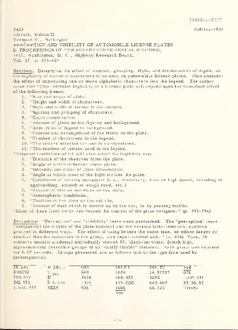
Aldrich-1937
3423 Aldrich-1937
Aldrich, Milton H.
Vermont U. , Burlington
PERCEPTION AND VISIBILITY OF AUTOMOBILE LICENSE PLATESIn PROCEEDINGS OF THE SEVENTEENTH ANNUAL MEETING,1937, Washington, D. C. , Highway Research Board,
Vol. 17, p. 393-412
Problem: Determine the effect of number, grouping, style, and stroke-width of digits, on
the legibility of numeric characters to be used on automobile license plates. Also consider
the effect of introducing one or more alphabetic characters into the legend. The author
notes that "(t)he intrinsic legibility of a license plate will depend upon the combined effect
of the following items:
1. "Size and shape of plate.
2. "Height and width of characters.
3. "Style and width of stroke of characters.
4. "Spacing and grouping of characters.
5. "Color combination.
6. "Amount of gloss on the figures and background.7. "Area ratio of legend to background.
8. "Content and arrangement of the items on the plate.
9. "Number of characters in the legend.
10. "The letters selected for use in combinations.
11. "The number of letters used in the legend.
"External conditions which will also affect the legibility are:
1. "Distance of the observer from the plate.
2. "Angle at which observer views plate.
3. "Intensity and color of plate illumination.
4. "Angle at which most of the light strikes the plate.
5. "Conditions of vehicle movement (i. e. , stationary, slow or high speed, receding or
approaching, smooth or rough road, etc.)
6. "Amount of dirt or moisture on the plate.
7. "Atmospheric conditions.
8. "Position of the plate on the vehicle.
9. "Amount of dust which is thrown up by the car, or by passing traffic.
"Many of these later items are beyond the control of the plate designer. " (p. 393-394)
Procedure: "Perception" and "visibility" tests were performed. The "perception" tests
"compare(d) the merits of the plain numeral and the various letter -numeral systemsgrouped in different ways. The effect of using letters the same size, or either larger or
smaller than the numerals in the group, was experimented with. " (p. 394) Thus, 50
subjects (mostly students) individually viewed 50, black-on-white, 2-inch high,
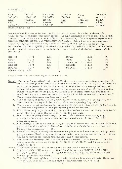
alpha-numeric character groups at an "easily visible" distance. Each group was exposedfor 0. 67 seconds. Groups presented are as follows (not in the type face used byinvestigators ):
36. 286 P. 284. J 68LF4 284. PJF48392 Z385 869 6018 16.52937 076593.652 D J608 468.053 329E LZP. 047DQ. 953 514.076 1306 193. JQC 683.869 59.36.521.652.937 3E29 536 1686 68.723 TD385
398
-7-
Aldrich-1937
68lp4 59PV6 9E. 27. 04 D. 953. Q 1 426 1306.536306.829 1686.398 19.36573 698.968 B 4F. 83. 92
LZP 9ZT63 IB. 426 HQF 1936.573 306829047 HQF. 493 698968 493 9zt63 59PV646. 80. 53 JQC. 193 E92704(above from p. 398)
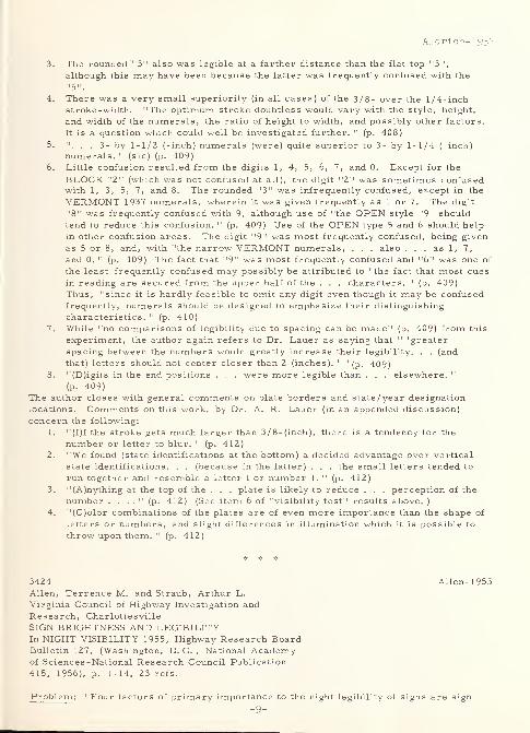
Accuracy was the test criterion. In the "visibility" tests, 14 subjects viewed 10,
black-on-white, numeric character groups. Groups consisted of five to six, 3-inch high,
1-1/4- to 1-1/2 -inch wide, 1/4- to 3/8-inch stroke-width, 1/2-inch spaced digits in the
ROUND, BLOCK, OPEN, and VERMONT 1937 styles. Stimuli were viewed outdoors,under varying weather conditions, and at a distance of 200 feet or less (in 10 foot
increments) until the legibility threshold was reached for individual digits. In the orderdisplayed, digit groups were in the following layout (style/width (inches )/stroke-width(inches) ):
ROUND 1-1/2 3/8 OPEN 1-1/2 3/8OPEN 1-1/2 1/4 OPEN 1-1/2 1/4
OPEN 1-1/2 3/8 VERMONT 1937 1-1/4 3/8BLOCK 1-1/2 3/8 ROUND 1-1/2 3/8
ROUND 1-1/2 1/4 BLOCK 1-1/2 1/4
(above from p. 405) m
Some variants of individual digits were introduced.
Result: From the "perception" tests, the following results and conclusions were derived:
1. One disadvantage in the use of alphabetic characters (when mixed with numefics) onauto license plates is that, if one character is missed in an attempt to read the
number of a retreating car, the car may be traced as one of ten if it is known that
numerics only are on the plate, but as one of 34 if alpha-numerics are present.
2. Combinations of 5 characters were better than 6, which in turn were better than 7.
The striking difference was between 6 and 7.
3. "The presence of letters in the group increases the difficulty of perception, this
difference increasing with the number of letters appearing. " (p. 404)
4. There was a slight preference for grouping characters by three's rather than two's,
but both were superior to the equal spacing of all characters.
5. In 6-character groups containing 1 letter, the preference was for grouping by two's
rather than separating the letter only from the numerics.6. In 5-character groups containing 2 letters, there seemed to be a very slight
preference for the groups in which the letters and numerals were placed in
separate groups.
7. Contrasting letters from numerals by making the former smaller "did not aid in the
perception of the number. " Therefore, "the letters should be ... at least as
large as the numerals. " (p. 404)
8. "Some advantage in perception seems to be gained with 6 and 7 character" (p. 404)
groups when a "Devine" system (over and under) of grouping was employed. Therewas no advantage for groups totaling less than 6 characters.
9. "No extensive investigation on letter confusion seems to have been made, but Dr.
Lauer says the letters A, F, H, K, M, R, S, U, W, X, Y, and Z appear to be
best. " (p. 405)
From the "visibility" tests, the following results and conclusions were derived.
1. "No appreciable difference . . . (was) found between the ROUND and BLOCKstyles. " (p. 406) However, "the OPEN type numerals (were) more visible than
either" (p. 409) of the above.
2. The digit "1" was legible at a farther distance with a base than without. However,"the top should be small lest this digit be confused with '7'. " (p. 410)
Aldrich-1937
3. The rounded "3" also was legible at a farther distance than the flat top "3",
although this may have been because the latter was frequently confused with the
"5".
4. There was a very small superiority (in all cases) of the 3/8- over the 1/4-inchstroke -width. "The optimum stroke doubtless would vary with the style, height,
and width of the numerals, the ratio of height to width, and possibly other factors.
It is a question which could well be investigated further. " (p. 408)
5. ".. . 3- by 1-1/2 (-inch) numerals (were) quite superior to 3- by 1-1/4 (-inch)
numerals. " (sic) (p. 409)
6. Little confusion resulted from the digits 1, 4, 5, 6, 7, and 0. Except for the
BLOCK "2" (which was not confused at all), the digit "2" was sometimes confusedwith 1, 3, 5, 7, and 8. The rounded "3" was infrequently confused, except in the
VERMONT 1937 numerals, wherein it was given frequently as 1 or 7. The digit
"8" was frequently confused with 9, although use of "the OPEN style '9' should
tend to reduce this confusion. " (p. 409) Use of the OPEN type 5 and 6 should help
in other confusion areas. The digit "9" was most frequently confused, being given
as 5 or 8, and, with "the narrow VERMONT numerals, . . . also ... as 1, 7,
and 0. " (p. 409) The fact that "9" was most frequently confused and "6" was one of
the least frequently confused may possibly be attributed to "the fact that most cues
in reading are secured from the upper half of the . . . characters. " (p. 409)Thus, "since it is hardly feasible to omit any digit even though it may be confusedfrequently, numerals should be designed to emphasize their distinguishing
characteristics. " (p. 410)
7. While "no comparisons of legibility due to spacing can be made" (p. 409) from this
experiment, the author again refers to Dr. Lauer as saying that " 'greater
spacing between the numbers would greatly increase their legibility. . . (and
that) letters should not center closer than 2 (inches). ' "(p. 409)
8. "(D)igits in the end positions . . . were more legible than . . . elsewhere. "
(p. 409)
The author closes with general comments on plate borders and state/year designation
locations. Comments on this work, by Dr. A. R. Lauer (in an appended discussion)
concern the following:
1. "(I)f the stroke gets much larger than 3/8-(inch), there is a tendency for the
number or letter to blur. " (p. 412)2. "We found (state identifications at the bottom) a decided advantage over vertical
state identifications. . . (because in the latter) . . . the small letters tended to
run together and resemble a letter I or number 1. " (p. 412)
3. "(A)nything at the top of the . . . plate is likely to reduce . . . perception of the
number . . . ." (p. 412) (See item 6 of "visibility test" results above.
)
4. "(C)olor combinations of the plates are of even more importance than the shape of
letters or numbers, and slight differences in illumination which it is possible to
throw upon them. " (p. 412)
3424 Allen-1955Allen, Terrence M. and Straub, Arthur L.
Virginia Council of Highway Investigation andResearch, Charlottesville
SIGN BRIGHTNESS AND LEGIBILITYIn NIGHT VISIBILITY 1955, Highway Research BoardBulletin 127, (Washington, D. C. , National Academyof Sciences-National Research Council Publication
415, 1956), p. 1-14, 23 refs.
Problem : "Four factors of primary importance to the night legibility of signs are sign
-9-
Allen-1955
brightness, the level of illumination to which the eye is adapted, characteristics of
letters, and contrast direction (black letters on white or vice versa). . . These factors
were investigated in a field . . . and a laboratory experiment to gather information on
the(ir) effects . . . and . . . interrelationships . . . ." (p. 1)
Procedure: The authors first present a review of the literature on the legibility of
reflectorized signs. Then, in the first experiment (field study), eight subjects (25-30years old and with 20/Z5 to 20/15 visual acuity) were used in investigating (1) four levels
of sign reflectance (white paint, beads on paint, moderately reflective sheeting, and highly
reflective sheeting), (2) two conditions of background illumination (incident night lighting
from street lamps, buildings, and other cars versus only the headlamps of the test car),
and (3) high and low headlamp beams. "(S)ubject(s) rode beside the driver as the test carapproached the sign (which contained two 7 -inch high, BPR (Bureau of Public Roads)SERIES C digits) at a constant speed of 10 (miles per hour). " (p. 4) In the secondexperiment (laboratory investigation), "(f)our factors were selected as the most fruitful
for investigation: sign brightness (0. 1, 1.0, 10, and 1 00 foot-lamberts ), surroundingillumination (0. 001 and 0. 1 foot-candles at the subject's eyes), letter series (BPR SERIESA, B, C, D, E, and F capitals) and contrast direction (white -on-black versus black-on-white). 11
(p. 6) In this experiment, 19 subjects (20-35 years old and with 20/25 to 20/17visual acuity) viewed slides of sample messages projected onto a screen.
Result: In the field experiment, all factors (except surrounding illumination) and "(a)ll
interactions of the factors tested were significant. " (p. 4) And, of all these, only
reflectances by surrounding illumination by headlight beams, and surrounding illumination
by headlight beams (both of which were at the 5 percent level) were not significant at the 1
percent level of confidence. "For high beams, however, increases in reflectance beyond'beads on paint' yielded no increase in legibility distance. In fact, results showed a slight
decrease and the high-reflectance sign was read at a greater distance with low beams than
with high beams. " (p. 4) In the laboratory experiment, " (s )tatistical analysis of the
results . . . show(ed) . . . (s )ignificant factor interactions ... as follows: (1)
Brightness x Illumination, (2) Brightness x Contrast Direction, and (3) Brightness x
Letter Series. . . This means that results for illumination, contrast direction, or letter
series were different depending upon the level of brightness. . . The following subject
interactions were significant: (1) Brightness . . . , (2) Illumination . . . , (3) Brightness
x Illumination . . . , and (4) Contrast Direction ... (p. 10) The results of this
(laboratory) study have not yet been validated in the field or related to reflective
materials. However, from the relationships observed . . . , the following . . .
conclusions are made . . . :
1. "Surrounding illumination is . . . important ... in relation to reflective
materials. In a brightly-lit area, higher sign brightness is needed for legibility,
and ... is permissible without excessive irradiation. High- reflectance signs on
a dark open road may have poor legibility because of irradiation.
2. "Letter size is a very important factor, since it determines effective sign
brightness. Large letters can be read at distances where illumination fromheadlights is low, if sign reflectance is high. Small letters, however, must be
read at distances where illumination from headlights is high. In this case, high
sign reflectance may produce excessive irradiation. . .
3. "(T)he wider letters with their wider stroke width are less severely affected byirradiation. However, these differences . . . are small compared to the
differences in legibility distance. SERIES A letters must have about twice the
letter height as SERIES F to have the same legibility distance and the sameillumination from headlights. . .
4. "(W)hite letters on black gave superior legibility in the middle range of brightness,
but results indicate that irradiation is more serious for white letters of the
standard series. White-on-black signs may be very effective, but care should be
used to achieve a well-designed sign. " (p. 12)
-10-
Alluisi-1957
2129 Alluisi-1957
Alluisi, Earl A. and Martin, Hugh B.
Laboratory of Aviation Psychology, Ohio State U. ,
ColumbusCOMPARATIVE INFORMATION-HANDLING PERFORMANCE WITHSYMBOLIC AND CONVENTIONAL ARABIC NUMERALS: VERBALAND MOTOR RESPONSESApr 57, 12p.
Contract AF 33(6l6)-36l2; Project 7192
WADC Technical rept. 57-196; AD-118 160
Problem: "(C)ompare the information-handling performance of subjects in making verbal
(number-naming) and motor (key-pressing) responses to . . . (a) set of symbolicnumerals . . . (generated from an EIGHT-ELEMENT STRAIGHT- LINE MATRIX)along with a set of conventional numerals (AND 10400). " (p. iii)
Procedure : In a two part experiment, 48 male student subjects were randomly divided
into two groups of 24 for each part. In the motor response part, subjects responded, bymeans of finger-keys, to 1/4-inch high numerals (as defined above) back-projected onto a
10-inch diameter opal glass screen in the display of a Serial Discrimeter (sic) (designed
and constructed by the Laboratory of Aviation Psychology, The Ohio State University).
Numerals were presented in random sequence (but not inter-mixed) within sessions to
subjects, who were seated 28 inches from the display screen. Broad-band noise, at
approximately 70 decibels, was presented to subjects through earphones in order to maskextraneous sounds. Conditions for the second (verbal response) part of the experimentwere the same as for the first part, except that subjects responded by speaking into a
boom microphone. Speed and accuracy were the test criteria in both parts of the
experiment.
Result: "On an a priori basis, it seemed reasonable to suppose that information-handling
performance with the symbolic numerals might have at least equaled that with the
conventional numerals. . . The data of the present experiment did not corroborate this
supposition. . . (A)n interaction between the two types of numerals and the two modes of
response . . . was . . . evidenced .... In terms of information handling (bits/second),
time, and errors, performance with the conventional numerals was consistently superior
to performance with the symbolic numerals when verbal responses were made. No suchclear superiority for either set of numerals was evidenced in the motor-responseperformances. 11
(p. 8) The former might be "(b)ecause number-naming responses to
conventional Arabic numerals are greatly overlearned in our culture ... A second line
of argument would suggest that performance with straight-line and angular figures is
superior to performance with conventional numerals only under difficult or threshold-like
viewing situations in which probability of correct identification, and not response time, is
measured. . . Both hypotheses . . . are consistent with the data. " (p. 8-9)
Furthermore, "if the increase in information-handling performance . . . represent(s)
learning, then it was of a special type that result(s) in faster speed performance, but
lower accuracy. " (p. 9) And yet, "if learning was involved, it was probably not a form of
learning related to the perception of the numerals . . . With regard to practicalapplications, the numerals formed by the use of an EIGHT-ELEMENT 'printing' MATRIXdo not appear to be quite as satisfactory as standard AND 10400 numerals. They shouldnot be used if other considerations are equal, but should their use be dictated byexpediency the result should be only a small drop in information-handling performance. "
(p. 9-10)
Note: For the commercially published version of this work, see Alluisi-1958, following.
* * *
-11-
Alluisi-1958
2130 Alluisi-1958Alluisi, Earl A. and Martin, Hugh B.
Laboratory of Aviation Psychology, Ohio State U. ,
ColumbusAN INFORMATION ANALYSIS OF VERBAL AND MOTORRESPONSES TO SYMBOLIC AND CONVENTIONAL ARABICNUMERALSJournal of Applied Psychology, 42:2 (April 1958) 79-84
Problem : "(C)ompare the information-handling performance of (subjects) in makingverbal and motor responses to two sets of Arabic numerals one . . . conventional . . . ,
the other . . . symbolic figures drawn from an EIGHT- ELEMENT , STRAIGHT- LINEMATRIX. " (p. 83)
Procedure: Key-pressing, motor responses and number -naming, verbal responses weremade by two groups of 24 subjects each. The apparatus utilized was a Serial
Discriminator, which for this study contained a 10-inch diameter, opal glass, display
screen. "The various symbols were projected onto the screen from the back by means of
a ten-unit optical projector, each unit of which contained a different photographictransparency . . . The scoring unit consist(ed) of ... a timing . . . and an automaticrecording element. . . The conventional numerals were the AND 10400 . . . Thesymbolic numerals were straight-line figures generated from an EIGHT- ELEMENTMATRIX . . . (as) illustrated . . . The symbols from each of the two sets appeared . . .
as 1/4- (inch) high light patterns at the center of the display, approximately 28 (inches) in
front of the seated (subject). " (p. 80)
Result : "When verbal responses were made, the conventional numerals were consistently
superior in performance to the symbolic numerals. This was true whether performancewas measured in terms of information handling (bits/ second), time, or errors. No such
clear superiority was evidenced for either set of numerals when motor responses weremade. . . (The former) interaction . . . might be a stimulus -response compatibility
effect resulting from use of the much-practiced ensemble of number-naming responses to
conventional Arabic numerals. . . (A)lso . . . , performance with straight-line andangular figures should be superior to performance with conventional numerals underdifficult or threshold-like viewing situations as, for example, in visibility studies, but not
necessarily . . . under speeded-response conditions with stimuli above threshold. . .
With regard to . . . applications, the . . . EIGHT- ELEMENT 'printing' MATRIX do(es)
not appear to be quite as satisfactory as AND 10400 . . . (B)ut should their use be
dictated by expediency the result should be only a small drop in information-handling
performance. " (p. 84)
Note: For the contract- report version of this work, see Alluisi- 1 957, preceding.
3323 AmASHO-1961
American Association of State Highway Officials, Washington, D. C.
MANUAL FOR SIGNING AND PAVEMENT MARKING OF THE
NATIONAL SYSTEM OF INTERSTATE AND DEFENSE HIGHWAYS
1961, 75 p.
Problem : "The National System of Interstate and Defense Highways, referred to as the
Interstate System and now under construction along the Nation's principal travel desire
-12-
AmASHO-1961
lines, was conceived and is being built primarily to provide rapid, convenient and safe
travel between and through major traffic generating centers. Essential to the realization of
these valuable benefits is a uniform system of highway signing and marking that will be
fully adequate in an environment of high volume, high speed motor vehicle traffic on modern
controlled access highways. " (p. 7)
Procedure : "For (the above) reason, a new concept has been developed for signing the
Interstate System. " (p. 7)
Result : The Manual's Table of Contents, which is indicative of its mission, follows (if
brief):
I. Introduction, including signing, uniformity, and standards .
II. General characteristics of signing, including messages and displays; overhead
installations; lettering,spacing , and borders ; color , reflectorization , and
illumination ; destination messages; arrows; and clearances.
III. Interchange signing, including layout; and advance guide, exit direction, gore,
and other guide signs.
IV. Route markers, including application, design provisions, trail blazer
installations, intersecting routes, cardinal direction and off-route markers,
overlapping routes, and signing for memorial highways.
V-IX. Rest areas, signing for services, mileposts, regulatory and warning signs,
and sign structures.
X. Miscellaneous considerations, including adjacent signing, placement for
effective viewing , and sign materials
.
XI. Other details of design and location, including letter height and arrow
specifications , and individual sign designs .
XII. Pavement; including edge, and exit and entrance ramp; marking.
XIII. Delineators location, application, design, performance, and median
crossovers.
Typically, the figures shown are examples of signing, while the two tables concern (1)
letter style and height for principal guide signs, and (2) delineator spacing on horizontal
curves.
* * *
2132 Anderson-1960
Anderson, Nancy S. , Braunstein, Myron and
Novick, Lee
IBM Research Center, Yorktown Heights , N.Y.
AN EVALUATION OF HUMAN READABILITY AND RECOGNITION
OF A SPECIALIZED FONTRept. no. RC-219, 11 Feb 60, 20p.
-13-
Anderson-1960
Problem : Evaluate the readability and recognition of E13B compared to BANKERSGOTHIC and each of these to a mixture of the two numeric fonts.
Procedure : Using the E13B and BANKERS GOTHIC fonts, New York college students
participated in "transcription" and "recognition" experiments. The "transcription"
experiment involved six subjects who were given a training period designed to have them
develop a touch system on a ten-key adding machine. They were then each to read a ten-
digit number (in one font) on a card and transcribe that same number to the machine, for
a number of trials, until a speed/error plateau was reached. Each subject then repeated
the experiment for the other font. Scoring was based on both speed and error rate of the
first and last six trials. The "recognition" experiment involved 38 subjects who were each
given a booklet of test pages containing ten-digit numbers in one font. The fir st occurrence
of a specific single digit on a page was crossed out. The subject was to cross out all other
occurrences of the same digit and count the total crossouts. The experiment was then
repeated for the other font. Scoring was again based on speed and error rate. A similar
"recognition" experiment involving six subjects added a booklet that had numbers in the two
fonts mixed together on the same page.
Result : A difference of means was statistically significant in favor of BANKERS GOTHIC.
However, the differences were very small and decreased with training. In the
"transcription" experiment, which extended over the longest testing period, the differences
were reduced to practically zero toward the end of the experiment.
3458 ArmyWES-1953
Army Engineer Waterways Experiment Station,
Vicksburg, Miss.
NOTES ON THE REPRODUCTION OF DRAWINGS IN WATERWAYSEXPERIMENT STATION TECHNICAL REPORTSMisc. paper no. 5-49, Nov 53, (r. Sep 55), lv.
AD-106 366
Extract : "(T)he Waterways Experiment Station continually strives to improve the
appearance and usefulness of its reports, and at the same time to hold their costs to the
minimum commensurate with the quality desired. . . The basic principle developed is that
practically every drawing can be prepared in such a way as to enable it to be reduced to
... 8 ... by 10-1/2 (inches) in size .... The border dimensions . . . are 6 ... by
9 (inches). . . (D)rawings should be prepared with this reduction in mind in order to
achieve uniform lettering on all drawings in any one report, and to ensure legibility. . .
To illustrate . . . , several groups of sample sheets have been prepared. Group 1 is a
folio of sheets illustrating WRICO (similar to LEROY) lettering. The first six sheets
contain examples of various styles and sizes of WRICO lettering, including STANDARD-14-
Anr.yWES-1953
VERTICAL GOTHIC, STANDARD SLANT GOTHIC, EXTENDED lettering, CONDENSEDlettering, etc. ; each size lettering guide is illustrated with several sizes of lettering pens
.... The remaining sheets in this group illustrate the reduction . . . (p. 1) to 75 . . .,
50 . . . , 33-1/3 . . . , and 25 per cent of the original dimensions. . . Sheets ... A are
prints of tracings that were prepared . . . for eventual reduction to 6 by 9 (inches); . . .
included here ... to illustrate the form and size of the original tracings. Sheets . . . B
are 6- by 9-(inch) reductions of the comparably numbered originals. The reductions range
from 33-1/3 ... to 78 per cent . . . (E)ach of the . . . reductions is clearly legible
,
even in the case of . . . complicated drawing .... This is true because every feature of
the original drawings was drawn with the final reduction in mind, and every size of lettering
. . . was selected so as to produce the desired size on the . . . final copy. . . For
convenient reference, the size of WRICO lettering used has been indicated on all the
originals .... The process illustrated . . . not only has resulted in drawings of
convenient size rather than the bulky, unmanageable plates often found in engineering
reports, but also has saved many thousands of dollars .... This saving results largely
from . . . utilization of the lithographic -offset . . . reproduction ... in contrast to
contact methods (ozalid, black-and-white prints, etc.) required in the reproduction of
large-size illustrations. The contact methods are inherently more expensive and also
afford no reduction in unit cost as the number of prints increases. Moreover, the page
size illustrations eliminate the necessity for costly and time-consuming folding of plates,
which often must be done by hand. 11
(p. 2)
2138 Atkinson-1952
Atkinson, William H. , Crumley, Lloyd M. , and "Willis, Marion P.
Aeronautical Medical Equipment Lab., Naval Air Material Center,
Philadelphia, Pa.
A STUDY OF THE REQUIREMENTS FOR LETTERS, NUMBERS, ANDMARKINGS TO BE USED ON TRANS -ILLUMINATED AIRCRAFTCONTROL PANELS. Part 5 - THE COMPARATIVE LEGIBILITY
OF THREE FONTS FOR NUMERALSRept. no. TED NAM EL-609, 13 Jun 52, 27 p. , 8 refs.
ATI-157 808
Problem : "(E)valuate the legibility of the forms for numerals developed in this
laboratory. . . compared to the forms embodied in Air Force -Navy Drawing 10400 and the
font developed by BERGER. " (p. 2)
Procedure : "The tests were conducted under conditions of red transillumination ranging
from . 10 to 3. 30 footlamberts and under conditions of daylight illumination with intensities
of 11, 24 and 34 footcandles. For the transillumination tests the duration of the exposures
-15-
Atkinson-1952
was approximately 200 milliseconds, while in the daylight tests the duration of exposures
was 5 milliseconds. The transillumination tests employed 30 subjects while the daylight
tests required 48 subjects. " (p. 2) Digits were light on dark.
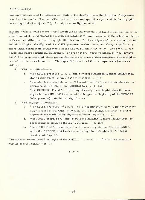
Result : "Where total errors (were) employed as the criterion, it (was) found that under the
conditions of the experiment the AMEL proposed form (was) superior to the other two forms
with red transillumination or daylight illumination. In the analyses of the error scores for
individual digits, the digits of the AMEL proposed series (were) not always significantly
more legible than their counterparts in the (BERGER and AND 10400). However, it was
found that where significant differences in error scores (were) obtained, it (was) always
the AMEL proposed digit which produce(d) the fewer errors when compared with a digit of
one of the other two forms. . . The (specific) results of these comparisons (were) as
follows:
1. "With transillumination,
a. "the AMEL proposed 1, 3, 4, and 5 (were) significantly more legible than
their counterparts in the AND 10400 series. . . (, )
b. "the AMEL proposed 2, 5, and 9 (were) significantly more legible than the
corresponding digits in the BERGER font. . . (, and)
c. "the BERGER '1' and '3' (were) significantly more legible than the same
digits in the AND 10400 series while the greater legibility of the BERGER'4' approache(d) statistical significance.
2. "With daylight illumination,
a. "the AMEL proposed '4' and '5' (were) significantly more legible than their
counterparts in the AND 10400 font, while the AMEL proposed '3' and '6'
approach(ed) statistically significant better legibility. . .(,)
b. "the AMEL proposed '2' and '5' (were) significantly more legible than the
corresponding digits in the BERGER font. . .(, and)
c. "the AND 10400 '2' (was) significantly more legible than the BERGER *2'
while the BERGER font ha(d) the more legible digit when the '4' (was)
considered. " (p. 25)
The authors recommend "the digits of the AMEL . . . form . . . for use in aircraft on
plastic console panels. " (p. 2)
* * *
-16-
2608
Baker, Charles A. and Grether, Walter A.
Aero Medical Lab. , Wright-Patterson Air Force Base, Ohio
VISUAL PRESENTATION OF INFORMATION
WADC Technical rept. 54-160, Aug 54, 111 p., refs.
Project 7 180
AD-43 064
Abstract : "An important factor in the design of equipment for maximum efficiency of
human operation is the design, illumination, and arrangement of visual displays which
provide information to the human operator. This report provides a compilation of general
human engineering recommentations and presents some of the supporting presentations of
information. . . Liberal use is made of pictorial, graphic, and tabular presentations to
illustrate the data and design recommendations. . ." (p. iii)
Contents (with underline emphasis on those parts pertinent to this handbook):
I. Mechanical indicators.
A. General considerations include methods of use (i.e. quantitative, qualitative,
and check reading; setting; and tracking), conditions of use (i.e. reading
distance ,angle of view , illumination
,presence of other instruments, and
location and method of actuation of related controls), and check list for a good
indicator.
B. Selection of mechanical symbolic indicators includes distinction between
symbolic and pictorial indicators in displays, basic symbolic indicator types
(i.e. counters, scales, pointers, and their selection), table of recommended
indicators according to use, variations in basic indicator types (i.e. circular
and curved scales, and horizontal and vertical straight scales), and long scale
indicators (i.e. counters, subdials, multiple pointers, and various pointer-
scale combinations).
C. Selection of mechanical pictorial indicators includes pictorial representation of
aircraft attitude, direction, and position in space; and distinction between flight
(tracking) and navigation (orientation) displays.
D. General design recommendations include those for moving pointer /fixed scale,
moving scale/fixed pointer, and counter type indicators.
E. Scale design includes definition of terms (for scale range, and numbered and
graduation interval values), scale numbering and graduation interval, table of
recommended scale designs,exceptions , transformed scale values , scale
dimensions - low brightness requirements (i.e. graduation mark dimensions
and spacing), graduation mark dimensions when low brightness not required ,
scale interpolation, and additional recommendations.
F. Instrument zone markings include color and shape coding methods.
G. Pointer design.
H. Instrument identification includes labeling; color, shape, and position coding;
-17-
Baker-1954
Baker-1954
Baker-195^
and instrument configuration.
I. Numeral and letter styles .
II. Warning devices include warning light location, brightness, identification, and
intermittency characteristics; and caution and on-off indicators.
III. Cathode-ray tubes and signal coding.
A. Introduction includes definitions of terms (for target, signal, trace, noise,
clutter,background
,surround
,brightness contrast , and scan line) , common
types of radar presentation (i.e. A-, B-, C-, F-, PPI-, and Sector-scan), and
a check list for good design practices in cathode-ray tubes.
B. Cathode -ray tube resolution, including eye versus radar resolution.
C. Cathode -ray tube visibility,including visual factors , signal size and brightness
relationships,design factors that affect visibility (i.e. signal size , scope
brightness and its adjustment, contrast direction , and scope brightness
distribution ) , adaptation level,general recommendations , signal strength,
duration of pre-exposure brightness,signal duration, viewing angle
,viewing
distance , and screen size (for both visibility and resolution considerations).
D. Workplace lighting and cathode -ray tube displays include general
recommendations, selective spectrum and polaroid lighting, and summary table
of lighting systems.
E. Methods for indicating range on radar displays include range markers and
mark interval, range ring separation distance, electronic range cursors,
pantographic methods, evaluation of range aid methods for both speed and
accuracy, and general conclusions .
F. Methods of indicating bearing on radar displays include dial, cursor, counter,
pantograph, and overlay methods; evaluation of bearing aids for accuracy and
speed; time delay in data transmission; and system consideration in radar
design.
G. Three -coordinate information displays, including general discussion and the
coding of the third coordinate.
H. Visual coding - the display of additional target data includes what may be coded,
various coding methods, subjective scaling, code compatibility, and the
following coding methods : color, shape, area, visual number, line length,
angular orientation, brightness, stereo-depth, and compound coding, followed
by recommendations for compound coding and a summary and table of coding
methods
.
IV. Printed materials .
A. Legibility of printed matter includes books, pamphlets, and detailed instruction
cards (for their style of type,type form and size , line length
,leading
,paper ,
contrast, space between columns, margins , and illumination); and decals, check
lists , and labels (for their style and size of print, contrast , word selection, and
brevity)
.
B. Design of graphs, tables, and scales for numerical data.
V. Instrument panel layout, including check list for good layout, representation of
-18-
Baker-195 1*
planes in space, locational parameters (viz. optimum position, viewing angle and
distance , horizontal and vertical separation, position of adjusting knobs and
switches, and right -/left -handed operation), instrument arrangement and pointer
alignment, and combinations of instruments.
VI. Lighting .
A. Definition of terms, including photometry, illumination/illuminance (candle,
footcandle, and lumen), br ightne s
s
/luminance (candles per unit, footlambert,
and lambert), luminous reflectance (diffuse, specular, compound,
reflectance and transmittance factors, and selective reflectance and
transmittance), brightness contrast , visual angle and acuity , conversion factors
for brightness units, and a table of approximate brightnesses.
B. General workplace lighting,including illumination levels, general methods of
light distribution (direct, indirect, and diffuse luminaires), glare (direct and
specular) and its reduction, surround brightnesses,types of illuminants
,
surface reflectance and color, specific color coding recommendations (by
function of display), and color selection.
C. Instrument and control console lighting,including dark adaptation , reflections
,
brightness requirements,uniformity of distribution
,special conditions
(lightning flashes, searchlights, rocket and gun flashes, daytime flight, high
altitude daytime flight, and chart reading), selection among instrument and
console lighting systems (advantages and disadvantages of flood, indirect, edge,
and rear lighting ), and general recommendations.
VII. Visual detection and identification, including visual acuity ( resolution ,detection
,
stereoscopics , glare , perceptibility,visibility , retinal location, and as a function
of illuminant color), detection and recognition of colored targets (surface color,
lights , and recognition thresholds,target detection against non-uniform backgrounds
,
pattern recognition and identification, magnification aids, and visual estimations of
target parameters (size, range, velocity, acceleration, etc.).
3369 Bauch-1954
Bauch, William F. , Jr. and Nagel, John T.
Illinois Division of Highways
EXPRESSWAY SIGNS IN THE CHICAGO METROPOLITAN AREAHighway Research Abstracts, 24:5 (May 1954) 33-39, 4 refs.
Paper presented at the Thirty-Third Annual Meeting of the
Highway Research Board, January 12-15, 1954
Abstract : Methods and activities used to establish standards and policies, and to
coordinate and unify design details, for signs on the expressway system in the Chicago
Metropolitan Area, have been discussed. Observation tests were conducted from movingvehicles using variable numbers of observers (who were men from various highway
Bauch-195^
agencies). Conclusions were drawn on the basis of questionnaires completed by the
observers. The final sign choices included: (1) dark background with white letters, (2)
moulded plastic button reflectors, and (3) 6-, 8-, and 12-inch letters on various signs.
Also, "the message on the sign determined its overall dimensions. " (p. 36)
2613 Bauer-1962
Bauer, Herbert J.
General Motors Research Labs.,Warren, Mich.
SOME SOLUTIONS OF VISIBILITY AND LEGIBILITY PROBLEMSIN CHANGEABLE SPEED COMMAND SIGNS
In DRIVER CHARACTERISTICS, Highway Research Board
Bulletin 330, (Washington, D. C. , National Academy
of Sciences -National Research Council Publication
1010, 1962), p. 60-68.
Problem : "This report details the . . . design criteria specified for (and experimental
development of) a discrete -bulb, matrix, speed command sign. " (p. 60)
Procedure: Criteria established for the sign were as follows:
1. psychophysical - instantly changeable numerals, minimum of reading errors,
legible from 500 feet, exposure time approximately 1 second (for test purposes),
useful for day and night viewing without electrical or mechanical changes, tolerance
of l/l6-inch of solid frost or ice on the sign face, some bulb failure permissible,
chromatic quality of numerals somewhere between yellow and amber, numeral
strokes to be linear rather than discrete points of light in appearance, and sign to
be capable of being blanked without the appearance of spurious numerals.
2. mechanical - two by four feet in overall size, thickness to about 12 inches, weight
less than 100 pounds, minimum dirt collection permissible, adequate ventilation,
ease of maintenance even under adverse conditions, and no day-night mechanical
changes
.
3. cost - minimum,, using standard available parts wherever possible.
"Before experimentation a number of commercially available (highway and sports arena
type) signs were tested. . . Those tested failed on two primary grounds: legibility at the
specified distance and lighting condition, and/or too many reading errors when viewed at
the criterion distance and exposure time. " (p. 62) A new numeral set was developed for
and tested in the 5 by 7 matrix. "The prototype configurations were tested under three
different conditions:
1. "Bright sunlight, clear sky, with sun incident on the sign face with minimum shadow
in the bulb cells.
2. "Bright sunlight, clear sky, with sun behind the sign (the sign oriented for maximum
brightness behind it).
-20-
Bauer-1962
3. "On a dark, moonles's night.
"One digit was presented at a time to each of (twenty) experimental subjects. . . Exposure
time was 1 (second). . . at a distance of 500 (feet) . . . (R)andom bulb failures were
introduced . . . ." (p. 62-63) Stroke linearity was achieved by locating the colored frosted
bulbs in a honeycomb -like structure of rectangular cells. "The linearity can be further
enhanced by the use of lightly frosted glass or plexiglass in front of the cells. However,
such an addition is in conflict with some of the other requirements (especially daylight
usage) of the sign. " (p. 63)
Result : After many trials and errors delineated in the article, the following sign
specifications were developed:
1. "The sign consists of a 5 by 7 bulb matrix composed of rectangular cells 2-3/8 by
2-3/8 (inches) square inside dimensions by 4-5/8 (inches) in depth. The cell matrix
interiors are painted reflective white with the exception of those cells which do not
have bulb sockets, these have a yellow background (sides and edges white) of the
same shade of yellow as the bulbs in unilluminated mode. The bulb sockets
(ceramic) are on 2-l/2-(inch) centers.
2. "The numeral configurations shown . . . have been found most suitable.
3. "The recommended bulb is GE 25AY, the yellow enameled 25-watt bulb rated at
130 volts.
4. "Bulb-operating voltage is 1 10 volts . . . The rated life ... is 1,000 (hours). At
. . . operating voltage the life is increased to 9, 340 (hours which is) well within the
3, OOO-(hour) replacement schedule ....
5. "The face of the sign is equipped with KoolShade screen, type RB. . . mounted so
that it is immediately adjacent to the front edge of the matrix cell. . . (T)he angle
of the louvers (must be) slanted downward. The screen as well as the rest of the
sign is painted flat black. " (p. 67)
The specifications listed met the following requirements:
1. "Legible at 500 (feet) with l-(second) exposure time when viewed under the following
conditions:
(a) Bright sunlight, clear sky with sun incident on sign face with minimum of
shadow on the bulb cells.
(b) Bright sunlight, clear sky with sun behind the sign. The sign-oriented
maximum brightness behind it.
(c) Dark rainy, moonless night.
(d) When sign face is covered with 1 / 17 (inch) of ice.
(e) When as many as five bulbs have failed.
2. "Numerals have definite chromatic (yellow) hue in both daylight and night conditions.
3. "Nighttime legibility is as adequate as daytime legibility without the necessity of
components designed to reduce bulb voltages with lower ambient lighting.
4. "Blanking of sign face when power is removed ... so that ... no spurious
numeral is visible under either day or night viewing." (p. 68)
-21-
Bendix-1959
2 141 Bendix-1959
Bendix Radio Div. , Bendix Aviation Corp. ,Baltimore, Md.
DESIGN FOR LEGIBILITY OF VISUAL DISPLAYS
Preliminary study rept.
Rept. no. 481-1016-97A, 15 Feb 59, 52 p.
AD-230 962
Purpose : "The main purpose of this report is to call attention to the need for more
legibility in the various characters used for visual displays of information. All too often,
displays best signal a need for their own improvement. A little new information, plus a
careful examination of present data, could readily effect this change: an improvement which
would reduce error and aid reading. Not only is the need for greater legibility already
serious, but the need is bound to grow as systems become more complex and time allowances
shorter. " (p. 1) Studies to date "center around three main topics:
1. "Visibility - Studies made to determine those characteristics which provide
visibility at greatest distance or visibility of smallest size of characters. Inaddition,
studies were made to determine optimal size of characters for various viewing
distances
.
2. "Legibility - Studies concerned with those characteristics of type which assure
positive identification of individual letters and numerals. Absolute legibility is
essential in today's application of displays.
3. "Readability - Studies directed toward ease and rapidity of reading and concerned
with rapid recognition of words, word groups, abbreviations, and whole numbers. "
(P- 7)
Procedure : In studying previous work, and in the "design and test(ing) for optimized
legibility. . . (t)his report is directed toward -
1. "Arranging the presently available data in a form directly usable by specification
writers, design engineers, and others for maximum utilization in assuring optimized
display design.
2. "Clarifying the language of communication of visual display requirements between
specification writers, design engineers, and suppliers.
3. "Analyzing the existing, extensive study data and, on the basis of such analysis,
recommending the alphabetic and numeric designs best suited to the provision of
higher error-free legibility.
4. "Determining what further experimentation is most likely to result in further
improvement in character design. " (p. 5)
Result: The following outline of contents, including excerpts from the information contained
therein, shows the results of this very comprehensive study of the literature and the state-
of-the-art conclusions derived by the authors from the literature studied:
-22-
Bendix-1959
I. Purpose of this report.
A. The need for higher legibility of visual displays. "All too often, displays best
signal a need for their own improvement. . . Not only is the need for greater
legibility already serious, but ... is bound to grow as systems become more
complex and time allowances shorter. " (p. 1)
B. Bendix's interest in the problem. "(I)n the design and manufacture of . . .
equipment requiring alphabetic -numeric displays and clear identification and
marking of controls, . . . (determine) those styles . . . which can be expected
to produce optimum ease and rapidity of reading and maximum error -free
legibility. 11
(p. 1)
C. Bendix's experience and understanding of the problem. "(W)hich combination is
the best for each of . . . various display requirements encountered)?). .
(A)pplicable data are . . . scattered . . . (I)ndividual excellence of . . .
displays and markings does not automatically insure an optimized total system.
. . To date, it has been almost impossible to design completely optimized and
. . . compatible alphabetical and numerical displays within a complex system.
This is primarily because the necessary design data are so scattered,
ambiguous, and confusing. . ." (p. 2-3) The Bendix approach is as follows:
"(f)irst, the . . . use(r) task is analyzed; second, the environment is examined;
third, . . . the lettering style, size, proportion, and contrast are specified. . .
(p. 3) (T)he importance of good legibility is obvious beyond any need for
elaboration. " (p. 2)
D. Indicated course of action. (See items 1. -4. , in the above Procedure . )
II. Statement of the problem.
A. Availability of data. "In dealing with (the three items stated in Purpose,above),
the studies deal with the many factors which influence (them). Size, stroke
width, and width-to-height ratios are important. So is the spacing between
characters, words, and lines. But in addition, the effects of lettering style,
geometrical form, the use of capitals versus lower case, color, viewing
distance, vibration, human stress, and the user's visual acuity must be taken
into account. Also critical is the whole complex related to contrast: contrast
with background, black-on-white versus white -on-black, illumination, and
intervening mist or smoke. " (p. 7)
B. Value of data. "The factors investigated by experimental psychologists are
those which are encountered in the equipment design field, and the results
obtained sum up to valid findings applicable to real display problems. Athorough organization of the valid data is very much needed and would be
immediately useful. " (p. 9)
C. Limitations
.
Included here is "a family tree of typical (Government)
specifications and the exact words governing lettering. . . (I)nsofar as they go,
. . . specifications are so worded as to keep the door wide open to excellence
of design. At the same time, . . . writers of specifications do not have enough
precise data to close the door on poor design . . . (M)any specifications go no
-23-
Bendix-1959
further than to require GOTHIC type or 'similar simple style.'. . (T)he first
limit on the improvement of legibility is . . . the scattering and the ambiguity
of the information about existing, available type faces. . . Second, there is an
acute scarcity of good type styles to meet the requirements of unusual
applications. . . The reason ... is that for centuries type designers have
paid prime attention to beauty of the printed page. . . (, ) achiev(ing) great
heights in beauty of type design, often at the direct expense of the quality of
legibility desired for expressing vital quantities or commands ... (p. 9) In
spite of the fact that in the history of printing over ten thousand type styles have
been designed, and hundreds of GOTHIC styles have been designed just since
1920, completely satisfactory displays are not yet achievable for some
applications. . . The FUTURA family ... is the most useful, but is not
completely optimal for many applications. " (p. 13)
D. Positive steps already taken. "An excellent example ... is to be found in the
preparation of . . . AND 10400, superseded by MIL Standard MS33558 (ASG)
. . . (T)he NAMEL style . . . also presents a design for higher legibility. . .
Quite important among the positive steps ... is the restraint which has been
exercised by not calling out in specifications specific styles . . . ." (p. 13)
E. Definitions. "The following terms are the worst offenders (p. 13) . . . :
Visibility - the quality of an item which makes it separately visible from its
surroundings. . . If . . . three width . . . and five height elements can be
distinguished, we may say that the elements of the letter are visible. . . (T)he
popular nominal width-to-height ratio of type is given as 3 (to) 5. Normal
human vision under average lighting can see an object subtending a visual angle
of one minute. It follows then that a letter to be visible . . . must be five
minutes of visual angle in height. . . about one sixty-fourth of an inch at
normal reading distance . . . This is a threshold value, not a recommendation.
. . Legibility - the quality of a letter or numeral which enables the observer
to positively and quickly identify it to the exclusion of all other(s) . . .
(D)ifferent type styles possess different degrees of absolute legibility. Every
factor mentioned in (II. A. , above) is involved in the problem of absolute
legibility. . . (p. 15) (T)he quality of legibility is mainly determined by the
dimensions and style of the character ... (p. 22) Readability - the quality of
a group of letters or numerals of being recognizable as words or whole numbers.
Although similar in many respects, it is quite a different thing from legibility.
. . Involved . . . are . . . spacing of the individual characters, . . . words,
(p. 15) . . . (and) lines, and the ratio of character area to background area. . .
(T)he quality of readability is mainly determined by the dimensions of
surroundings of the individual characters in relation to other characters . . .
GOTHIC Type - . . . 'any character which is of uniform stroke width and whose
strokes terminate without decorations or embellishments called "serifs". ' In
printer's parlance, it also includes styles which have very minor serifs
designed to provide very sharp terminations. . • a reference to
-24-
Bendix-1959
COPPERPLATE GOTHIC . . . (H)owever, . . . (i)n the traditional definition,
. . . GOTHIC means just about everything that the . . . definition (above) does
not. . . (p. 22) Printer's Terms of Measurement - . . . The printer's 'point'
is one seventy-second of an inch. . . (w)hen used as a unit of measure . . . ,
but ... as a measure of type size, it means the size of the slug upon which the
character is cast. . . A close approximation of character height expressed in
points can be made by considering the point as being one one -hundredth ... of
an inch. " (p. 23)
F. Preferred GOTHIC styles. The following list was a tentative selection by
Bendix: Very Light Styles - FUTURA LIGHT, FUTURIA LIGHT, HEADLINER
NO. 48, LINING METROTHIN, METROLITE, SANS SERIF LIGHT, TEMPOLIGHT, and VOGUE LIGHT. Light Styles - FUTURA BOOK, SPARTAN BOOK.
SANS SERIF MEDIUM, SANS SERIF MEDIUM CONDENSED, and TEMPOMEDIUM. Medium Styles - FUTURA MEDIUM, AIRPORT GOTHIC,
HEADLINER NO. 50, SPARTAN MEDIUM, FUTURA MEDIUM CONDENSED,
AIRPORT MEDIUM CONDENSED, SPARTAN MEDIUM CONDENSED, SANS
SERIF BOLD, TEMPO BOLD, VARITYPE NO. 660, TEMPO BOLDCONDENSED, and VOGUE BOLD. Medium Bold Styles - ARTYPE S-274
(NAMEL), FUTURA DEMIBOLD, AIRPORT SEMI BOLD, ARTYPE NO. 1200,
FUTURIA DEMIBOLD, HEADLINER NO. 52, PHOTOTYPE 1900 SERIES,
SPARTAN BOLD, VOGUE MEDIUM, 20th CENTURY BOLD, and MIL Standard
MS-33558. Bold Styles - FUTURA BOLD, AIRPORT BOLD, HEADLINER NO.
54, FUTURA BOLD CONDENSED, AIRPORT BOLD CONDENSED, HEADLINERNO. 60, METR03LACK, VARITYPE NO. 670, SANS SERIF EXTRA BOLD,
TEMPO HEAVY, FUTURIA BOLD, and VOGUE EXTRA BOLD. Engraving
Styles - GORTON EXTENDED, GORTON MODERNE, GORTON NORMAL, and
GORTON CONDENSED.G. Inadequacy of existing styles. "Some of the styles shown (above) qualify as
'preferred' only because they are the best available. " (p. 27) In a simulated
comparison, it was "clearly seen that FUTURA is more legible than
COPPERPLATE of an equal area. . . Experimental . . . studies have indicated
that legibility can be increased by using wide characters. Optimum for absolute
legibility (not . . . readability) appears to occur at a width of 1. 3 times the
height. . . It is clear (however) that design, not width, is the more important
determiner . . . (T)here are occasions when wide characters should be used.
. . (for) example ... a digital indicator using a wheel or tape to carry the
characters to a position in a window. . . Specification MIL-P-7788 suggests
extended styles for letters, but wisely suggests nonextended . . . for numerals,
even though extended (wide) numerals could be superior. " (p. 27)
III. Experimental psychology findings.
A. Common sense. "(W)hen experimental data . . . have accumulated, the
primitive use of common sense should be shelved .... The accumulated data
upon the subjects of visibility, legibility, and readability have reached the point
-25-
Bendix-1959
which indicates that common sense on the subject is no longer valuable in design. "
(p. 29)
B. Stroke width. "Berger found ... a 1 (to) 8 ratio of stroke-to-height . . . best
for black letters on a white background. . . Further, (he) found that when the
characters were white on . . . black . . . , the greatest distance for reading was
achieved with a stroke width of . . . approximately 1 (to) 13. . . Berger's
experiments dealt with optimal conditions of lighting. . . (p. 29) Berger . . .
(also) explor(ed) night reading . . . (, ) us(ing) white letters on black. . . (with)
floodlighting. The optimum stroke turned out to be . . . the same as for daylight.
(Using) luminous characters . . . the results (gave an) amazing. . . ratio of 1
(to) 40. . . (I)n the early uses of neon tubing to form sign displays, ... a ratio
of 1 (to) 100 and better. . . was customary . . . Modern neon sign us(ing)
multiple rows of tubing . . . are more attractive . . . but far less legible . . .
This phenomenon of white letters on black requiring a narrower stroke width
than black ... on white is a familiar one . . . (F)actor(s) . . . such as bad
eyesight; air, dust, smoke, or mist intervening between the display and the
observer; vibration; nervous stress; etc. , cause the light areas to appear larger
than they are. . . Darkness cannot spread into light areas but light can be
dispersed into dark areas. . . This effect is more pronounced as the intensity of
the light is increased. . . Just as it can be shown that very thin strokes are
required for very highly luminous characters, it can also be demonstrated that
very thick strokes are required for black letters on a very highly luminous
background. . . (p. 31) A typical case ... is a warning light having its label
engraved directly on the lens. Here, thick strokes are desirable, but there is
a practical limit. " (p. 33)
C. Low levels of illumination and contrast. "(A)s . . . illumination (or contrast) is
reduced, the thick letters become relatively more readable than the thin ones.
This is true for both black-on-white or white -on-black. . . (A)s . . .
illumination . . . and the consequent contrast is reduced, a new rule comes into
effect. There seems to be a common meeting point at very low levels of
illumination and contrast of an optimum stroke width for both white -on-black and
black-on-white .... The complete answer has not yet been found .... There
are good reasons to expect that . . . the most important factor controlling
legibility is area . . . ( )a simple question of visibility . . . ?" (p. 33)
D. Legibility at great distance or with small size characters. "There are good
reasons to expect . . . that . . . the most important factor governing legibility
of distant or very small type is geometric form. . . If the individual characters
can be made sufficiently distinctive in geometric form, the downward range of
legible size can be extended. 11
(p. 35)
E. Width-to-height ratio. "The experimentally derived optimum . . . for certain
characters appears to be of the order of 1. 3 (width to) 1. 0 (height) . . . partly
because many displays must be viewed from an unfavorable angle, which
-26-
Bendix-1959
artificially reduces the apparent width, and is also partly due to the fact that
there is opportunity to emphasize the distinctive features of some characters by
extension of the geometric patterns in width. . . In matters of proportion, the
modern designer bows in admiration ... (to t)he classic ROMAN alphabet ....
In general, the vertical strokes were made thick in order that they would remain
visible at wide viewing angles. . . (p. 35) (W)hen successive vertical strokes
occur, the most significant were selected for thickening. . . (W)ithout exception,
the most poorly legible styles are all the result of an attempt to 'horse' the design
into a standard (or fixed) ratio and that all the most legible type styles are the
result of pursuing good geometric expression . . . ." (p. 37)
F. Comments on some proposed styles . "The NAMEL . . . was based partly upon
. . . MACKWORTH . . . Another experiment us(ing) numerals of very radical
design. . . reduced (errors) to near zero. . . (p. 37) Perhaps such unmistakable
characters represent a step in the right direction. " (p. 39)
G. Experimental methods. "(M)any different criteria and methods (have been) used.
Careful study is needed . . . (I)t is difficult to test legibility. . . (W)e . . .
want to know . . . how good is the design for optimal or near optimal operating
conditions? However, we cannot get valid test results by testing under optimal
conditions. . . (L)egibility cannot be maximized using only one style of lettering,
however good, for all applications. " (p. 39)
H. Accountant's numerals. 'Absolute legibility . . . has always been of prime
importance . . . With the advent of typewriters and business machines, this
science of handwriting has largely been abandoned, but the records (should) be
studied. " (p. 41)
I. Legibility and beauty are not synonomous. "However, let us not jump to the
conclusion that legibility and beauty are irreconcilable. They are ... in fact,
not separable. " (p. 41)
Summary.
A. Specifications could be more informative. "This is not because of errors to be
found in the specifications, but rather that some erroneous inferences could
easily be made from what is said. . . (T)he fault lies not with the writers but
with the confusing data with which they have had to work. This report makes an
effort to clarify that situation. . . (p. 43) In spite of the work that has been done,
there is still room for improvement in type design. The word GOTHIC should
never be used in specifications .... (p. 44) Use of the term point should be
avoided .... There is nothing to be gained by specifying width-to-height ratios
. . . (M)ost important of all, stroke width should be determined on the basis of
contrast or of one of the factors interrelated to it: illumination, size, or time of
exposure, in this manner:" (p. 45)
-27-
Bendix-1959
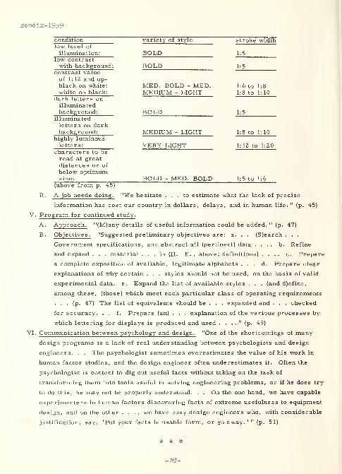
condition variety of style " stroke widthlow level of
illumination: BOLD USlow contrastwith background: BOLD US
contrast valueof 1: 12 and up-black on white: MED. BOLD - MED. 1:6 to 1:8
white on black: MEDIUM - LIGHT 1:8 to 1:10dark letters onilluminatedbackground: BOLD US
illuminatedletters on darkbackground: MEDIUM - LIGHT 1:8 to 1: 10
highly luminousletters: VERY LIGHT 1:12 to 1:20
characters to beread at greatdistances or of
below optimumsize: BOLD - MED. BOLD 1:5 to 1:6
(above from p. 45)
B. A job needs doing. "We hesitate ... to estimate what the lack of precise
information has cost our country in dollars, delays, and in human life. " (p. 45)
V. Program for continued study.
A. Approach. "(M)any details of useful information could be added. " (p. 47)
B. Objectives
.
"Suggested preliminary objectives are: a. . . (S)earch . . .
Government specifications, and abstract all (pertinent) data .... b. Refine
and expand . . . material ... in (II. E. , above; definitions) .... c. Prepare
a complete exposition of available, legitimate alphabets . . . d. Prepare clear
explanations of why certain . . . styles should not be used, on the basis of valid
experimental data. e. Expand the list of available styles . . . (and d)efine,
among these, (those) which meet each particular class of operating requirements
... (p. 47) The list of equivalents should be . . . expanded and . . . checked
for accuracy. . . f. Prepare (an) . . . explanation of the various processes by
which lettering for displays is produced and used " (p. 49)
VI. Communication between psychology and design. "One of the shortcomings of many
design programs is a lack of real understanding between psychologists and design
engineers. . . The psychologist sometimes overestimates the value of his work in
human factor studies, and the design engineer often underestimates it. Often the
psychologist is content to dig out useful facts without taking on the task of
transforming them into tools useful in solving engineering problems, or if he does try
to do this, he may not be properly understood. . . On the one hand, we have capable
experimenters in human factors discovering facts of extreme usefulness to equipment
design, and on the other . . . , we have busy design engineers who, with considerable
justification, say, 'Put your facts in usable form, or go away. 1 " (p. 51)
-28-
3330
Berger, Curt
STROKE WIDTH, FORM AND HORIZONTAL SPACING OF
NUMERALS AS DETERMINANTS OF THE THRESHOLD OF
RECOGNITION (PART II)
Journal of Applied Psychology, 28:4 (August 1944)
336-346
Also in READINGS IN EXPERIMENTAL INDUSTRIAL
PSYCHOLOGY, Milton L. Blum, Editor, (New York,
Prentice -Hall, 1952), p. 295-303, 7 refs.
Problem : "(I)nvestigate (using white and luminous numerals on black backgrounds, and
black numerals on a white background, under conditions of night -vision, and with medium
dark-adaptation) the influence of stroke -width . . . , specific form-factors, distances
between the strokes of numerals, distances between two numerals!, ) and surroundings(, )
upon the threshold of recognition, with a view toward improvement of the recognizability of
... (p. 303) luminous numerals during night-conditions. " (p. 295)
Procedure : As a preliminary procedure, "the optimal light-intensities for white numbers
of optimal day vision under night -conditions were determined, using 5, 10 and 15 watt
lamps as light-sources for reflecting light. . ., (p. 295) in the center, some inches below
and before the . . . license -plate . Ten to 15 Watt-lamps were found practically equal and
better than 5 Watt. A further increase ... (p. 298) did not seem to improve
recognizability .... Similar experiments were made with luminous numbers of equal
appearance, cut out of card-board and illuminated from behind, the light-source being in a
light-tight box. Ten Watt lamps were found most satisfactory. " (p. 298) The author
acknowledges that the major "experiments . . . should have been made in combination with
(the) preliminary ..." (p. 298) procedures. "Such a thorough investigation would . . .
have been carried out but for two reasons. . . First, if reflected light is used under
night -conditions , the numerals were bound to have . . . the optimal daylight structure
(6-millimeter width), since it is . . . practically impossible to use on the same plate two
differently constructed numbers for day- . . . and night -vision, both with reflected light.
. . Second, the intensities . . . should be kept low because . . . the lamps are run from
motorcar batteries. Furthermore, . . . (t)he lower the intensities, the less aberration
and the fewer glaring effects at night. . . Subsequently, experiments were made with the
number(s) 8 and ... 2, using widths of strokes between 2 and 10 (millimeters) for
numerals with reflected light, and ... 1 (to) 5 (millimeters) for luminous numerals. "
(p. 298) Also "compared . . . (were) luminous five -number groups with only 2
(millimeter) stroke-width, the old DANISH numerals with reflected light(, ) and optimally
legible white numerals of 6 (millimeter) stroke-width and with reflected light. " (p. 298)
Five subjects were used in the first experiment and four in the second.
Berger-1944b
Berger-1944b
-29-
Berger-1944b
Result: The following results were obtained from the experimentation:
1. Optimal average recognizability, for numerals in an area 42 by 80 millimeters
each, showed stroke -widths of 6 and 10 millimeters and stroke -width to inner
horizontal distance ratios of about 1:5 and 1:2.2, for white -on-black and black-on-
white (figure -to-ground) numerals, respectively. "The white numerals are (,)
under these conditions, singly, about 8. 2 per cent more recognizable than the
optimally constructed black numerals for the same area. . .
2. "Investigating many detailed characteristics of form, it was found that the angle
under which two horizontal (or two vertical) lines are connected has a particular
importance for the recognition of a numeral. The recognizability is best with
angles which cut the adjacent parts of the area into two equal halves. A vertical or
horizontal connection is least recognizable. . .
3. "A 5-number group requires about 10 per cent more space between the numerals
than 2 numbers alone, even though the space between the 2 numerals already has
been adjusted to standard. . .
4. "A white frame around white numerals improves their legibility only if at a certain
distance from the top and base of the numerals, and only if its width is equal to the
stroke -width of the numerals. Then the improvement is about 9 per cent. . .
5. "Under ordinary night-conditions (medium dark adaptation) very slender, luminous
numerals at threshold brightness are about 17. 8 per cent more recognizable than
optimally constructed white numerals with reflected light. " (p. 303)
As a result, "(a) construction is found for 9 numerals, white on black background,
luminous during night-conditions, which are optimally recognizable [ standard area -42
(millimeters) X 80 (millimeters)] and which at the same time are adjusted to standard in
such a way, that each single numeral as well as 2- and 5-number constellations appear or
disappear at the same distance from the eye, a distance which is the greatest possible
distance for the particular area chosen. " (p. 303) Finally, "(t)he relations of these results
to previous theoretical work are discussed . . . ." (p. 303)
3361 Berger-1948
Berger, Curt
Copenhagen U. (Denmark)
SOME EXPERIMENTS ON THE WIDTH OF SYMBOLS AS
DETERMINANT OF LEGIBILITY
Acta Ophthalmologica, 26:4 (1948) 517-550, 25 refs.
Problem : "This paper describes and analyzes some experiments about the influence of
width of area upon the legibility of some numerals. . . In this paper we will try to
consider legibility as a purely physiological function of the human retina ... (p. 518)
Considering the complexity of legibility . . . , no one single method can possibly claim to
-30-
Berger-19^8
be 'the one' method of measuring legibility. . . Speed of reading . . . ,eye -movements
,
blinking rate, muscular tension, heart-rate, etc. . . are all interesting details . . ., but
there is no doubt that the structure and the function of the retina and the total visual
reception organ is the physiological basis of reading as of all other visual functions. . .
The functions of the human eye can be divided into: (a) Light sense, (b) Color sense, (and)
(c)the physiological resolving power. . . (I)t must be assumed, that both, light sense and
physiological resolving power are always involved in experiments of legibility of printed
letters or words, black on a white background. " (p. 522-523)
Procedure : "In physiological optics we can . . . determine the importance of a factor for
the function of the human eye by threshold determinations. . . The following thresholds
can be used: (la) The 'minimum legible' ... is found by decreasing the size of letters
.... (lb) The 'minimum legible' can also be achieved by changing the distance between
observer and test-object. . . (2a) (T)he differential threshold. . . could be achieved by
gradually changing the reflection coefficient of the letters from the one possessed by the
. . . background . . . (2b) (T)he intensity threshold ... is really the basis of Luckiesh's
visibility meter. . . (3) (D)etermine the time -limit at which a letter is legible. . . The
experiments were carried out monocularly with (2)-5 subjects. . . (p. 523-524) An
apparatus is described with which visual distance thresholds (moving away to, and toward
the subject from 50 centimeters with the screen at 22 foot-candles) and intensity
thresholds (light variations between 2 and 20 foot-candles) with 10 symbols of different
width (1. 5, 2. 0, 2. 75, 3. 3, and 4. 15 millimeters), five 0('s) and five 5('s) but equal
height: 6 (millimeters), have been determined. " (p. 548) A third experimental method
involved use of the Luckiesh-Mos s Visibility Meter. "Experiments were performed with
photographic reproductions on one hand and printed reproductions on the other . . . .
"
(p. 548)
Result : "The experiments . . . show(ed) a general increase of legibility with increased
width of numeral. . . In two (light intensity variation and Luckiesh visibility apparatus) of
the three methods, the increase of legibility with width is more pronounced in the case of
. . . (the 0) than in the case of the . . . (5). " (p. 548) No significant differences were
found between the use of photographic vs. printed reproductions. The difficulties and
problems associated with use of the Luckiesh -Moss Visibility Meter are discussed. The
results of all experimentation here "are explained on the basis of pure physiological
factors of the human retina . . . and the relatio(n) ... to other theories (Spencer and
Moon, Kreiker, Luckiesh-Moss , etc. . . ) . . . (p. 548) The larger increase of legibility
with number 0 can be explained on the ground that increasing the width of the 0 . . .
corresponds to the increase of distance between two parallel vertical bars. . . The
increase of the total length of the line of which the 0 is composed seem(ed) to have no
influence upon (the) dependency .... The minor increase of legibility ... in the case of
number 5 can ... be explained with a similar reason . . . (by t)he fact that the center of
the 5 ... is filled with the line representing this typical form, (thus) bring(ing) . . .
-31-
Berger-1948
about an increase of width . . . (but) not increas(ing) the white space considerably. . .
(and rather increases) the length of the horizontal borders between the black . . . lining
. . . (thus) increas(ing) the resolution threshold but much less . . . than in the case of the
distance between two parallel lines. " (p. 545-546)
3367 Berger-1950
Berger, Curt
Copenhagen U. (Denmark)
EXPERIMENTS ON THE LEGIBILITY OF SYMBOLS OFDIFFERENT WIDTH AND HEIGHT
Acta Ophthalmologica, 28:4 (1950) 423-434, 5 refs.
Problem: Investigate "the influence upon the threshold of legibility of the height of three
black symbols (5, 0, and E, each in three different widths) on a white background . . . ."
(p. 433)
Procedure: The following five different heights were used for each of the symbols 5, 0,
and E: 2. 5, 4. 0, 5. 5, 7. 0, and 8. 5 millimeters. For each height, each symbol had a
width of 1. 0, 2. 5, or 4. 0 millimeters. Stroke-width was held constant at 0. 4 millimeters
for all 15 variants of each symbol. "The method used (three subjects, monocularly, and)
was described in detail in . . . (Berger- 1948) " (p. 423)
Result: "(T)he effect of increasing the height only (was) very similar for all symbols ....
The threshold of their legibility, defined by the distance of the test-object from the subject,
increase(d) slightly less than proportionally as (a) function of height. . . The legibility of
the number 0 increase(d) more with increasing width than the ... 5. This applie(d) to all
heights investigated. For heights above (about) 3.0 (millimeters), the 5, when very narrow,
(was more) legible tha(n) the 0, a relationship . . . which reverse(d) gradually with
increasing width. (When) the height (was) decreased below (about) 3. 0 (millimeters), the
legibility of the 5, when very narrow, gradually approache(d) . . . the 0 and eventually
equal(led) it. . . (R)esults with the letter E resemble(d) those with the ... 5, except
when very narrow. . . The results (as a whole, were) explained as . . . function(s)
primarily of spatial relations between activated units of the fovea, and second(arily) of the
'aligning power'. " (p. 433-434)
* * *
-32-
3363
Berger, Curt
Copenhagen U. (Denmark)
THE INFLUENCE OF STROKE WIDTH UPON THE
LEGIBILITY (THRESHOLD OF RECOGNITION) OF SOMENARROW NUMERALS OF VARYING HEIGHT
Acta Ophthalmologica, 30:4 (1952) 409-420, 21 refs.
Problem: "(S)tudy the influence of stroke -width upon the legibility of narrow numerals '0'
and '5', . . . while changing their height . . . ." (p. 409)
Procedure: The following two different stroke -widths were used for each of the digits 0
and 5: 0. 1 and 0. 25 millimeters. For each stroke -width, each symbol had a height of
2. 5, 4. 0, 5. 5, 7. 0, or 8. 5 millimeters. Width was held constant at 1. 0 millimeters for
all 10 variants of each symbol. "The method used (seven subjects, monocularly, and) was
described in detail in . . . (Berger- 1948) . . . (p. 409) The distance between the eye of the
observer and the test-objects was used as the measure of 'legibility', or 'threshold of
recognition' .... These two terms (were) used synonymously. . . The intensity of light
on the fixed adaptation-screen and the movable screen, carrying the test-objects was 58
foot-candles during the first part of the experiments. Then all the experiments were
repeated at about ... 28 foot-candles . . . ." (p. 411)
Result: "Increasing the retinal height (equivalent to visual angle?) from about 300 ... to
1300 (seconds of arc) had no significant influence upon the recognition of any of the 0's
used. Contrary to this, an increase of retinal height of the numerals '5' from 300 ... to
600 (seconds of arc) increased the threshold of recognition significantly, namely between
17 . . . and 30 (percent). Further increase of height had no influence upon their legibility
. . . Decrease of stroke -wi(d)th . . . increased the legibility of the 0's around 14
(percent), while a similar change . . . did not affect the . . . 5's. . . It is suggested, that
the limiting factors in the case of the 0's (were) mainly the spatial distribution of active
units in the cross -section of their foveal image, double -line and single -line resolution,
while in the case of the 5's mainly the displacement threshold decide(d) recognition. . .
(T)he results (were) correlated to . . . effects reported by other(s) . . . ." (p. 419)
Berger-1952
Berger-1952
-33-
Berger- 1956
3270 Berger-1956
Berger, Curt
Copenhagen U. (Denmark)
GROUPING, NUMBER, AND SPACING OF LETTERS AS
DETERMINANTS OF WORD RECOGNITION
Journal of General Psychology, 55:2 (October 1956)
215-228, 12 refs.
Problem : Determine "the effect (of) number (and) spacing of differently grouped
constituent letters upon (the distance threshold of recognition) of words and nonsensical
letter-groups." (p. 2 15)
Procedure : "The test objects consist of (capital or lower-case) letters of two type-faces
REGAL and WEISS, 10 points, printed isolate(d)ly or in groups black on white (reflection
coefficient 2. 5 percent for black and 78 percent for white). The following words were used:
Group 1
Group 2
Group 3
net nest ernst arrest
sad sand stand strand
AT SAD SAND STAND STRANDSTRANDRET STRANDTEATER" (p. 215)
The following letter spacings were used for "word" groups: 0. 5, 1. 0, 1. 5, 2. 0, 2. 5, 4. 0,
5.0, 7.0, 8.0, 12.0, and 20. 0 millimeters. When single letters (A, D, E, N, S, or T)
were presented, they were in groups of 1 to 7 of the same letter and spaced at 4. 0 milli-
meters. "The apparatus (used) has been described in . . . (Berger- 1948). . . The distance
threshold of recognition . . . (was) defined as that distance from the eye which is the mean
of the distance between eye and test object, at which the test object can just be recognized
(Threshold I) and the distance, at which the test object can no longer be recognized
(Threshold II). . . All experiments (were) performed monocularly with three or four
normal subjects . . . (T)he test object (was) observed . . . while moving. " (p. 217)
Illumination was 2. 0 Lux (retinal).
Result : The following differences had an influence on the "distance threshold of
recognition:
"
1. Groups of isolated letters were arranged as follows: best - D, N, and d, n;
average - T and t; least - A, S, E, and a, s, e.
2. Isolated capitals were approximately 13 to 24 percent better than isolated lower
case letters.
3. The REGAL type -face was 9 to 2 1 percent better than the WEISS.
4. The threshold* "of words of equal number and spacing of letters (were) proportional
to the average (threshold) of their constituent letters. . . (, ) of closely spaced
words down to 20 per cent less, . . . (and) of optimally spaced words up to 60 per
cent higher than the average (threshold) of all single letters, tested isolate(d)ly. "
(p. 227)
-34-
Berger- 1956
5. The threshold "of words increase(d) with increasing space between single letters up
to a maximum (of about 3.25 millimeters), which (was) above average letter-width
(letter-width ranged from T = 2. 35 to D = 2. 70 millimeters). " (p. 227)
6. The threshold "of words increase(d) with the number of constituent letters, apart
from the effect of spacing. The limit of this effect (was) not reached by use of up to
11 (or) 12 letters in a word. " (p. 227)
7. The threshold "of nonsensical letter combinations (decreased) significantly from
(the threshold) of words . . . ." (p. 227)
The following had no significant influence on the "distance threshold of recognition:"
1. The "(f)orm of words due to differences of grouping of constituent letters (Gestalt -
sic) ha(d) no specific influence . . . ." (p. 227)
2. The determination of "optimal spacing (of 3 to 4 millimeters was) independent of the
(word) length . . . ." (p. 227)
3. In ascertaining the lesser threshold for nonsensical letter combinations vs. words,
the nonsense "words" showed basically the opposite or no effect of number of
constituent letters upon (the threshold). "
"The (following) practical and theoretical significance of the results (were) discussed.". . (:)
(p. 227)
1. "Determinations of distance thresholds of recognition deal with one aspect of the
complex problem of 'legibility, ' especially important for signs on highways and
streets, for advertising displays as well as traffic regulations. " (p. 224)
2. Determinations of distance thresholds of recognition should also be "useful for
differentiating different type -faces and
3. "for determination of specific characteristics of structure, spacing, and number of
letters in a word, decisive for their recognition at the longest possible distance
from the human eye. " (p. 224)
4. "Studies of the dependence of (the distance threshold of recognition) on structural
details (such) as stroke-width, width and height of single letters, are a prerequisite
for developing lettering to be read at optimal distances from the eye. " (p. 224 and
226)
The following conclusions were drawn from the results:
1. "Perhaps the most important theoretical conclusion ... is the fact that 'grouping'
of letters as such has no effect on (the threshold) of words. This is not only
contrary to Gestalt-concepts , but seems also to contrast with everyday experience .
"
(p. 226)
2. "Spacing between single letters (up to an optimum) and number of letters in a word
evolve as new and important determinants of (the threshold). The basic
physiological function involved is the resolution threshold of the retina. . . The
. . . effect on (threshold) of number of letters in a word appears to be central in
nature. . . (and) is limited to sensible words. " (p. 226)
Thus, in general, the distance threshold of recognition "of words (is) affected by_ a partly
unconscious process,improved by the number of letters in a_ word , but decreased by
-35-
Berger- 1956
consciously focussing attention upon the single constituent letters of words ."
(p. 227)
* - "Threshold, " or "the threshold, " unless otherwise qualified, as by an adjective, istaken to mean "the distance threshold of recognition. " It is referred to by the author asDtr throughout the paper.
* # *
3447 Berger-1960
Berger, Curt
VISUMETER (A DEVICE FOR EXPERIMENTAL RESEARCH ON THELIVING HUMAN EYE AND FOR A MORE ACCURATEDETERMINATION OF RESOLUTION)
Die Farbe, 9:1/3 (I960) 63-72, 23 refs.
Abstract : "The Visumeter is a device designed for experimental work on the eye's
sensibility (sic) to differences in luminance, color, form, and time, (and) further to
investigate the retinal resolving power, legibility and irradiation. " (p. 63) A well-labeled
drawing of the apparatus is provided. This is a descriptive paper with no experimental or
detailed construction data.
* * *
3445 Berger-1961
Berger, Curt
DIE LESBARKEIT FARBIGER KENNUMMERN (THE LEGIBILITY
OF COLORED SIGNAL NUMERALS)Die Farbe, 10:5/6 (1961) 3-19, 32 refs.
In German, with English summary
Abstract : Numerals were redesigned, as shown in the article's illustrations, with a
resulting legibility improvement of approximately 18 percent. A standard curve was
developed to provide the optimal character height for any legibility distance, for both black
characters on a white background and white characters on a black background. "The
influence of 22 colour combinations on the legibility (was) studied, with special allowance
made for the variation of hue. " (p. 3) The best color combination for distant legibility was
black on yellow; the poorest combination was yellow on white.
* * *
-36-
Betts-1942
3353 Betts-1942
Betts, Emmett A.
Pennsylvania State U. , University Park
A STUDY OF PAPER AS A FACTOR IN TYPE VISIBILITY
The Optometric Weekly, 33:9 (April 9, 1942)
229-232, 45 refs.
Problem : ". . . (S)tudy the effect of paper color, or tint, upon visibility in a controlled
light situation. " (p. 2)
Procedure : "A new type of paper, with the trade name Facilex, has been developed by the
Fitchburg Paper Company for printing school textbooks. This paper was developed to
increase 'ease of reading 1 under varying lighting conditions. The cream tint, special
(calendering), and revised manufacturing process were believed to contribute to 'ease of
reading'. " (p. 2) In testing it, a factorial experiment involved 26, randomly selected,
sixth-grade, public -school students, who viewed four targets each of 16 different types of
paper, * including the Facilex. "Typographical specifications for the total (of text type)
follow: type page---23 x 36 picas, type face -- -MONOTYPE NO. 157-CENTURY OLDSTYLE with long ascenders and descenders, text in 12 point leaded 4 points, head note
on page 61 in 11 point leaded 2 points, story head 12 point NO. 157 caps, section head 11
point NO. 157 caps, and running head 11 point NO. 157 italic caps and lower case. " (p. 3)
In this threshold experiment, 1664 readings were taken using the Luckiesh-Moss Visibility
Meter (laboratory model). Two sittings were used for each subject. Those subjects with
reading handicaps were permitted to spell rather than read the words. Reading distance
was 14 inches. Illumination was twenty foot-candles of diffused artificial light on the target.
Result: "Within the limits of . . . data, the following conclusions appear to be valid:
1. "For practical purposes, the experimental paper, Facilex, appears to produce as
much type visibility as the 'white' paper now used in basal readers.
2. "The tinted experimental paper, Facilex, appears to produce substantially better
results than the other 'white' experimental paper . . . used in this study. " (p. 4)
Preliminary remarks in this study suggest that the following are additional important
considerations:
1. "One of the classic studies on the readability of books was reported by Gray and
Leary. " (p. 1) They compiled the following factors as influencing readability:
Format or mechanical features; size of book, number of pages, quality of paper,
kind of type and printing, length of line, margins, general appearance of page,
binding, and illustrations. General features of organization; title of book, chapter
divisions, paragraph divisions, and reference guides. Style of expression and
presentation; vocabulary, sentences, paragraphs, chapters, attitude of author,
method of presentation, style of presentation, and stylistic devices. Content;
theme, nature of subject matter, and unity of content. Subjectively, the two major
factors that seem to have the greatest influence were found to be "content" and
Betts-1942
"style of expression and presentation", each accounting for approximately one -third
of the solution to the problem of readability.
2. "Visibility" is distinguished from "readability" by Luckiesh and Moss in the
following manner: "Visibility is a term used ... 'to denote the intensity of a
psychophysical stimulus which evokes visual perception and discrimination. 1
Readability is used 'to express the integral effect of physical factors which
influence ease of reading 1." (p. 1)
3. The following experimental test criteria are discussed by the authors: rate of
reading, rate of involuntary blinking , ductions , heart rate, nervous muscular
tension, pupil size, and visibility as measured by the Luckish-Moss Visibility
Meter. "In general, certain conclusions have been reached regarding the use of the
above criteria: 1. The criterion should reveal small increments or decrements of
change. For example, Luckiesh and Moss found that rate of blinking was a more
sensitive 'indicator of readability' than normal rate of reading. 2. The criterion
should be one that can be evaluated in terms of the individual's compensatory
abilities ." (p. 2)
* - "Nine publishers (Bobbs -Merrill Company, Houghton Mifflin Company, JohnsonPublishing Company, Lyons and Carnahan, Row, Peterson and Company, ScottForesman and Company, Silver Burdett and Company, Webster Publishing Company,and the John C. Winston Company) of elementary school basal readers . . . suppl(ied)fresh stock for printing the targets. With the exception of two samples submitted by the
Fitchburg Paper Company, the paper was the same as that used in the basal readerspublished by the co-operating companies. . . The printing . . . was done on one pressof the American Book Company. Plates for pages 61, 62, 63, and 65 of Friendly HourReaders, Grade 5, were used. " (p. 3)
3364 Birren-1957
Birren, Faber
SAFETY ON THE HIGHWAY: A PROBLEM OF VISION,
VISIBILITY, AND COLORAmerican Journal of Ophthalmology, 43:2
(February 1957) 265-270, 2 refs.
Problem : Study the interrelation between color/shape and message legibility on highway
warning, regulatory, guide signs.
Procedure (study I ): "(A) conventional stop sign in red (background) and white (letters and
border) was placed in a prominent location with the letters rearranged to read TOPS. . .
After passing the sign, 100 drivers were questioned.". . (p. 267) as to whether they
noticed anything unusual in passing the sign.
Result (study I ): "Under the assumption that a stop sign registers primarily for its color
and shape, it could be expected that few persons would note anything unusual. . . Of (the
-38-
Birren-1957
drivers questioned), 86 percent (overall 87 percent habitual drivers along the road and
79 percent strangers) admitted that the word TOPS had been overlooked. . . The reason is
simple enough, for visual reaction to color is involuntary, while words require
deliberation. " (p. 267)
Procedure (study II ): "(T)he general subject of legibility was reviewed. . . (F)our
reflectorized signs (white on red word WON, black on yellow letters O, W, and
backwards N, black on white word NOW, and white on green word OWN) were
prepared, using eight inch letters on an octagonal panel. The test was designed to check
relative legibility, and to interpret the data in terms of realistic driving speeds. " (p. 267)
"Several" observers were utilized.
Result (study II) : "(A)ctual legibility (averaged among the observers) was as follows . . .":
(p. 268)
sign day-rank and distance (feet )night-rank and distance (feet)
black on white 1---404 3---316
white on red 2 361 4 312
black on yellow 3---358 1---341
white on green 4 358 2 337
"On an average the signs were legible on night driving at 88 percent of the day viewing
distance. . . In the . . . test described ... a few significant figures . . . would apply if
a driver were proceeding at ... 50 (miles per hour).
1. "During the day, the threshold points of the black on white . . . and the white on
green . . . (were) 0. 627 seconds apart a mere heart beat!
2. "At night, the threshold points of the black on yellow . . . and the white on red . . .
(were) only 0. 395 seconds apart!
"In both instances the time element . . . (was) less than the . 75 second 'reaction time 1 so
often mentioned . . . From the above facts it is perhaps fair to state that slight differences
in the legibility of traffic signs are of no great consequence. If black on white has minor
advantage, it would be impractical to keep adding more and more combinations of it . . . ,
because clear identity and differentiation through color would be lost and a meaningful code
sacrificed. " (p. 268-269)
Result (general) : The following general observations were made (not necessarily supported
by the above):
1. "(C)olor in vision . . . commands attention, arouses interest and pleasure, and
seems to work its way deep into consciousness. . . In the supermarket, for
example, it is conceivable that all packages in black and white would be quite
visible. Yet color is introduced for purposes of outright attraction. 11(p. 265 & 266)
In "studies of black and white . . . versus color advertisements, fully 50 percent
greater readership and memory retention have been demonstrated. " (p. 266)
-39-
Birren-1957
2. "(G)ood legibility is a . . . function of size and contrast. In . . . conditions of
extreme brightness . . . , white on black holds certain advantages because it tends
to control glare. . . In darkness or dim light, black on white is desirable because
it sets up a bigger target and is easier to seize upon visually. " (p. 266)
3. "(T)ests of visibility and legibility . . . conducted under controlled conditions in
which (a) the observer's attention is fixed, and (b) he approaches the sign slowly. . .
(are) not very typical of average driving in which there are countless distractions,
high speed, and a wandering eye and mind. . . Therefore, before the sign serves
a practical purpose at all, it must itself be found and located! . . Having this need
in mind, the value of color begins to loom large. " (p. 2 66)
4. "(R)esearch (by the railroads) led to the accepted fact, that in recognition red was
the color of first importance, then green, then yellow, with white fourth. . .
(W)hile white might be ... of high visibility, it tended to lack impulsive attraction
and psychologic interest. . . (T)he standards . . . adopted later in the red, yellow,
and green traffic signal . . . (were) the same as those of the Association of
American Railroads. " (p. 267)
"The four color schemes used in (study II) are those . . . commonly found on traffic signs.
All have good visibility. . . (a)nd . . . should be reflectorized or illuminated ... to
assure general high brightness at night and a uniform day-night appearance. " (p. 269)
Comments concerning individual combinations were as follows:
1. (white on red warning signs) "The use of red solely for (STOP sign) identification
is . . . sound, for red is a color of high recognition and impulse attraction (although
it may lack distinction to a low percentage of color-blind men). " (p. 269)
2. (black on yellow warning signs) "(T)he choice could hardly be improved. . .
(Y)ellow has more impulse attraction than achromatic white. . . (, ) is less likely to
show glare. . . (, and) reflects in the high visibility region where areas, forms, and
images are sharply focused. " (p. 269)
3. (black on white regulatory signs) The "combination, though commonplace, is
probably satisfactory. . . (H)owever, too much use . . . may offer certain
drawbacks of repetition and monotony. " (p. 269)
4. (black background for highway signs) "A thorough investigation . . . would seriously
question black as a suitable color for . . . backgrounds despite the high legibility
it gives to white legends or characters. . . It affords ... no stimulation of the
. . . retina . . . , it is emotionally negative, . . . (and) it is most difficult to
focus. " (p. 269)
5. (white on green guide signs) "This would apply to directional signs, destination
signs, distance signs, and route markers .... If red is for stop, yellow for
caution, white for regulation or information, green would be a likely symbol to
keep . . . moving .... Obviously the green should be reflectorized so that its
night symbol would be identical with its day likeness (sic). . . Green as a color is
second in recognition only to red. . . (a)nd . . . it is emotionally tranquil rather
than impulsive . . . ." (p. 270)
Relative to color in general, the following overall observations were made:
-40-
Birren-1957
1. "Maria Rickers -Ovsiankina writes, 'Color experience ... is ... a much more
immediate and direct sense datum than the experience of form. . .
1 " (p. 270)
2. "(T)he useful 'spectrum' for traffic purposes is extremely limited. The number of
clearly distinguishable and different colors is few red, green, yellow, white.
Added to these might be orange, pink, blue, purple . . . , and the list is practically
exhausted. . . (O)range and pink might be introduced where high impulses are
desired for some new and vital purpose. The blue and purple, however . . . are
difficult to focus and tend to form a blurred image . . . ." (p. 270)
* # #
2142 Bitterman-1945
Bitterman, M. E.
Cornell U. , Ithaca, N. Y.
HEART RATE AND FREQUENCY OF BLINKING AS
INDICES OF VISUAL EFFICIENCY
Journal of Experimental Psychology, 35:4
(August 1945) 279-292, 41 refs.
Problem : Determine the effect of type size and illumination level on heart rate, frequency
of blinking, and level of performance, with a view to using these as indices of visual
efficiency. Compare the results with those of previous investigators.
Procedure: "Continuous electromyographic recordings of cardiac and eyelid activity were
made as (subjects) performed visual tasks under" (p. 291) varied conditions in two
experiments. The first experiment, using 14 subjects, "was designed to provide data on
the variation in heart rate, frequency of blinking and level of performance with size of
type." (p. 283) Subjects, who were undergraduate psychology students, naive to the
experiment, and had normal vision, sat in comfortable chairs (with writing boards), in a
temperature - and humidity-controlled room, where their task was to compare (in pre-
determined time periods) paired names and number-groups in the Minnesota Vocational
Test for Clerical Workers. The Test was reproduced in two type sizes (approximately 6-
and 10-point height) onto high-quality, non-glossy, white paper, and received a constant
illumination level of 3 foot-candles. Experimenters tested for both accuracy and speed.
The second experiment, which made illumination level (rather than type size) the variable,
utilized 10 subjects (similar to those in the first experiment) under nearly identical
conditions to the above, except for the following: stimulus material was The Battle is the
Payoff , which the subjects "were given to 'settle down and enjoy . . . '; (t)he book was
printed in 10-point type on non-glossy paper. . . ; (h)alf of the subjects read under
illumination of three foot-candles on the first day and 91 foot-candles on the second. . . ;
(t)he others read first under the higher level. . . ; and (t)he illumination was diffuse and
produced no appreciable glare. " (p. 287) Performance level was not measured in the
-41-
Bitterman- 1945
second experiment.
Result : "Although level of performance differed significantly for the two sizes of type
employed in the first experiment, patterns of blinking were very similar under the two
conditions. . . In the second experiment, blink rate was . . . higher during work under
the more intense illumination, but was unrelated to (subjects') preferences in the matter.
. . (p. 289) Even if average trends had been significant, . . . the individual variation would
would indicate that many factors play a part in determining the pattern. . . (p. 290) It is
clear that rate of blinking can have little value as an index of visual fatigue or effort. . .
(p. 289) With reference to heart rate, . . . (d)uring relaxed reading the heart rate shows
a greater tendency to decrease with the passage of time under low as compared with high
illumination. It is not justified, however, to assume that cardiac deceleration is a function
of increased expenditure of effort. . . (p. 290) (T)he results of the first experiment make
untenable the position that visual effort produces cardiac deceleration." (p. 291) Hence,
"(t)he results do not support the conclusions of Luckiesh and Moss with respect to the value
of heart rate and frequency of blinking as indices of the ease of visual work. " (p. 291) In
addition, "(t)he findings of the first experiment support the position of Paterson and Tinker
that under suitably controlled conditions performance tests afford a reliable approach to
problems of visual efficiency. . . It is recognized . . . that studies of visual efficiency
must, by definition, involve some measure of the cost of work. The results of other
(previous) investigations indicate that further experiments with muscular tension might
profitably be undertaken. " (p. 291)
3344 Bitterman- 1946a
Bitterman, M. E. and Soloway, Esta
Cornell U. , Ithaca, N. Y.
THE RELATION BETWEEN FREQUENCY OF BLINKING
AND EFFORT EXPENDED IN MENTAL WORKJournal of Experimental Psychology, 36:2
(April 1946) 134-136, 13 refs.
Problem : Determine the possibility "that there is a tendency for blinking to increase with
effort in so-called mental work. " (p. 134)
Procedure : "The plan of experiment was similar to that outlined in a previous
communication (see Bitterman- 1945) ... (p. 134) dealing with the effect of type size on
frequency of blinking. In the present experiment the variable was distraction produced by
the continuous playing of a record of a man's voice reciting groups of numbers from one to
ten digits in length. . . (at an) intensity level (of) approximately 60 (decibels). Each of
... 10 (subjects) worked (during periods of distraction and of complete silence) ... on
-42-
Bitterman- 1946a
reproductions of the Minnesota . . . Test . . . under illumination measured as 10 foot-
candles at the working surface. . . The method controlled practice, fatigue, adaptation to
the level of illumination, temperature, and humidity. The procedure of obtaining
performance scores and continuous electromyographic tracings of cardiac and eyelid
activity was the same as in the previous experiment. " (p. 135) Performance was measured
by both speed and accuracy.
Result : "Although there was no significant difference in performance under the two
conditions of work, the results for heart rate justify the assumption that the distraction
employed was sufficient to necessitate increased effort on the part of the (subjects). The
negative results for blink rate indicate, therefore, that this index bears no relation to the
difficulty of the task. Since it has generally been found in experiments of this kind that
distraction is accompanied by increases in muscular tension, it must be concluded that
there is no tendency for these tensions to influence frequency of blinking. " (p. 136) In
comparing the present results to those of (Bitterman- 1945), "(i)t might be argued that such
(previous) results cannot lead to any conclusion with respect to the validity of blink rate as
a measure of effort because it may be that the lower performance scores achieved with
smaller type indicated that effort did not increase. The present results remove the basis
for this argument. " (p. 136)
* * *
2145 Bitterman- 1946c
Bitterman, M. E. and Soloway, Esta
FREQUENCY OF BLINKING AS A MEASURE OF VISUAL
EFFICIENCY: SOME METHODOLOGICAL CONSIDERATIONS
American Journal of Psychology, 59:4 (October 1946) 676-681
Minor Studies from the Psychological Lab. of Cornell U. , 93.
Problem : "(D)uplicate the essential conditions of . . . (a)n experiment by Luckiesh and
Moss on the relation of glare to frequency of blinking . . . and . . . introduce variations
relating to the influence of (a) method of recording, (b) kind of work performed, and (c) S's
(subjects') knowledge of what was being measured." (p. 677)
Procedure : Four groups of ten subjects each participated in a reading experiment having
the following group variables:
group recording work performed knowledgeI electromyographic normal reading without
II direct observation normal reading withoutIII electromyographic normal reading withIV electromyographic speed test without
In all cases, the material read was printed in 10-point black type on non-glossy white
paper. Subjects sat in a comfortable chair equipped with an adjustable writing board.
Overhead illumination provided 10 foot-candles on the working surface and a brightness -
-43-
Bitterman- 1946c
ratio (ratio of the brightness of the reading material to that of the surround) within the
range of 1:1 to 5:1. Glare, when introduced, was provided by a separate single lamp "at an
angle of 20° with the line of regard. " (p. 678) Blink rate was recorded by the techniques
indicated above. Normal reading work utilized H. G. Wells' Outline of History , while the
speed test used an adaptation of the Minnesota Vocational Test for Clerical Workers. All
subjects had knowledge that "various physiological processes" were being measured, but
the subjects in group III were specifically told that blink rate was being measured, but
were not told that glare was involved.
Result : "None of the differences . . . (in the m)ean frequencies of blinking for the
various groups . . . under conditions of glare and no glare . . . proved to be significant.
. . (p. 679) Questioned . . . , 19 of the 40 (subjects) reported they considered the glare a
source of distraction or annoyance. . . The results of the experiment by Luckiesh and
Moss . . . are not confirmed by those here presented. . . (p. 680) (T)he value of
frequency of blinking as an index of visual efficiency (sic) must at the present time be
denied. " (p. 681)
2146
Bjelland, H. L.
National Cash Register Co. ,Hawthorne, Calif.
DATA DISPLAY STUDY
First Quarterly Rept. , 1 Dec 62-Mar 63
Rept. no. 1, 56 p.
Contract DA-36-039 SC-90855
Bjelland-(1963)
Problem: Determine the prospective utility of Photochromic techniques in data display
systems, including the parameters necessary for character generation and display.
Procedure : The following author abstract shows the tone of the report: "State-of-the-art
in Photochromic Displays is discussed. Comparisons are made of Army Artillery and
Army Intelligence display parameters. Two possible techniques of advancing the state-of-
the-art of the photochromic display technology are described: one electromechanical; and
one electronic, employing a CRT (cathode-ray tube) for writing on photochromies. 11(p. 1)
Result : "The parameters for a large -screen Intelligence display (formulated in discussions
with Army Intelligence representatives)" (p. 4) are (selectively) as follows:
1. "The number of basic alphanumeric and graphic symbols that would satisfy present
and future requirements is 100 to 12 5.
2. "Basic unit symbol size would be 1-1/4 inch wide by 3/4 inch high.
3. "Symbol line width would be l/32 inch.
-44-
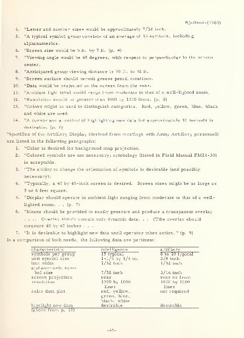
Bjelland-(1963)
4. "Letter and number sizes would be approximately 7/32 inch.
5. "A typical symbol group consists of an average of 15 symbols, including
alphanume ric s
.
6. "Screen size would be 5 ft. by 7 ft. (p. 4)
7. "Viewing angle would be 45 degrees, with respect to perpendicular to the screen
center.
8. "Anticipated group viewing distance is 10 ft. to 12 ft.
9. "Screen surface should permit grease pencil notations.
10. "Data would be projected on the screen from the rear.
11. "Ambient light level would range from moderate to that of a well-lighted room.
12. "Resolution should be greater than 1000 by 1000 lines, (p. 5)
13. "Colors might be used to distinguish categories. Red, yellow, green, blue, black
and white are used.
14. "A cursor and a method of highlighting new data for approximately 30 seconds is
desirable, (p. 6)
"Specifics of the Artillery Display (derived from meetings with Army Artillery personnel)
are listed in the following paragraphs:
1. "Color is desired for background map projection.
2. "Colored symbols are not necessary; symbology (listed in Field Manual FM21-30)
is acceptable.
3. "The ability to change the orientation of symbols is desirable (and possibly
necessary).
4. "Typically, a 40 by 40-inch screen is desired. Screen sizes might be as large as
5 or 6 feet square.
5. "Display should operate in ambient light ranging from moderate to that of a well-
lighted room. . . (p. 7)
6. "Means should be provided to easily generate and produce a transparent overlay
.... Overlay should contain only dynamic data. . . (T)he overlay should
measure 40 by 40 inches . . .
7. "It is desirable to highlight new data until operator takes action. " (p. 9)
In a comparison of both needs, the following data are pertinent:
characteristic intelligence artillerysymbols per group 15 typical 8 to 10 typicalunit symbol size 1-1/4 by 3/4 in. 3/8 inchline width 1/32 inch 1/32 inchalphanumeric sym-
7/32 inch 3/16 inchbol sizescreen projection rear rear or frontresolution 1000 by 1000 1000 by 1000
lines lines
color data plot red, yellow, not requiredgreen, blue,
black, whitehighlight new data desirable desirable(above from p. 10)
-45-
Bjelland-(1963)
Two suggestions made by the author are as follows:
1. "It is suggested that symbol sizes be expressed as a percentage of screen size.
The symbol sizes listed in (the above table) range from 1 to 1.5 percent of screen
size. . . (p. 11)
2. "(B)ased on increased cost, decreased reliability, and increased complexity, it is
preferable not to provide a dynamic color plotting capability. Instead . . . the
suggestion is made that consideration be given to special symbology to differentiate
the desired categories, e.g. , double lines, dotted lines, or simply a meaningful
symbol such as F or U superimposed on the target to distinguish between friendly
or unfriendly. " (p. 13)
In a preliminary system design, the dimensional specifications for a typical character
were as follows:
1. "height =1.5 (percent) of display size
2. "line width = 0. 15 (percent) of display size
3. "repeatability width = l/4 of line width" (p. 42)
"Three character generation techniques have been considered: shaped beam, line trace,
and dot matrix. . . Because all of the three . . . would probably be satisfactory, no
further investigations were conducted (in this area). " (p. 46)
* * *
2 148 Blackhurst-1927
Blackhurst, James H.
INVESTIGATIONS IN THE HYGIENE OF READING
Baltimore, Warwick and York, 1927, 61 p.
Problem: (1) Give an historical review of legibility and readability experimentation. (2)
Determine, for the readability of textual material, the effect of margin on the first grade,
and size of type, length of line, and leading on the first four grades of school children.
Procedure: The results of previous experimentation is reported on below. The
experimentation here involved four tasks. Constants were as follows:
1. Subjects - of normal age for the first through the fourth grades, except in the task
concerning margins, in which only first grade students were used.
2. Environment - pleasant surroundings, quiet and well lighted room, no disturbances,
natural lighting from behind subject, and experimenter out of visual range of
(behind) subject.
3. Task - textual reading assignments were made in a random fashion, and were read
out -loud with subject standing.
4. Test criteria - speed and accuracy.
-46-
Blackhurst- 1927
Experimental variables were as follows:
1. Task one (size of type) - The following point sizes were used: 8-, 10-, 12-, 14-,
18-, 24-, and 30-point. A total of 190 subjects participated in a total of 910
readings.
2. Task two (length of line) - The following approximate line lengths were used: 55,
80, 90, 100, 120, and 140 millimeters. 210 subjects participated in 1296 readings.
3. Task three (leading) - The following leading was used: set solid, 1-, 2-, 3-, 4-,
and 10-point. 156 subjects participated in 588 readings.
4. Task four (regularity of margins) - The following margin formats were used: both
regular, left regular and right irregular, and both irregular. 36 subjects
participated in 108 readings.
Result : A summary of the conclusions made from the author's experiments is as follows:
"Size of Type: Eighteen-point type (height of small letters 2. 75 mm. ) is more readable
in all the first four grades than type which is smaller. Twenty-four -point
type offers about the same reading difficulty in the second grade as does
eighteen-point type. In the first grade twenty-four -point type is more
readable than that which is smaller or larger. The question of its use in
this grade should be one of expense rather than desirability.
"Length of line: The most desirable length of line for the first four grades lies around 100
millimeters
.
"Leading: There is no justification for more than 1. 33 millimeters of leading in the
third and fourth grades. The studies in the first and second grades are
inconclusive
.
"Margin: There is no advantage to be gained in the first grade in making the right
margin (margin on reader's right) irregular. There is an advantage to be
gained in making the left margin irregular. " (p. 61)
Pertinent statements derived from the historical summary are as follows:
1. "Plateau . . . in . . . 1835 said that it took a certain length of time for an
impression to be produced by light. Flick . . . confirmed the opinion ....
Bruecke found this time to be . 119s decreasing in arithmetical progression as the
intensity of light increased in geometrical progression. " (p. 11)
2. "The first to write and experiment with the problems of the hygiene of reading
definitely in mind was Doctor Emele Javal whose work was reported in "Essaies
sur la physiologie de la lecture" 1878-9, Javal attempted to work out the order of
legibility in the letters, which he tested by the distance at which they could be
read. " (p. 12)
3. "Weber . . . found that . . . letters greater in size than 2 mm. retarded the
-47-
Blackhurst- 1927
speed of reading. He set 1. 5 as the minimum. He, also, advanced the theory . . .
that lines 14 to 15 cm. in length could be read more readily than those shorter or
longer. 11(p. 12)
4. "Cohn believed that 100 mm. (4 inches) was the maximum length of line advisable
and 90 mm. (3. 6 inches) the best length of line where the small letters were 1. 5
mm. in height. If larger letters were used Cohn believed a line of 110 mm.
possible. 11
(p. 13)
5. Cattell "found that the time a . . . light must work upon the retina was different for
the several colors, the retina being most sensitive to orange and least sensitive to
violet. . . (I)n the case of one color following another the time necessary for the
recognition of the second was increased from about two and one-half to fifteen times
its usual length. " (p. 14)
6. "With respect to the effect of the intensity of light upon the time of recognition
Cattell makes the following statement: 'The portion of the curve I have investigated
follows the formula,
t = c log i(+ c 1
)
in which t is the necessary time and i the intensity of the light; that is, the time
colored light must work on the retina in order that it may be seen, increases in
arithmetical progression, as the intensity of the light decreases in geometrical
progression. 1 " (p. 14)
7. "(I)n determining the time the light reflected from a letter or a word must work
upon the retina in order that it may be distinguished. . . (Cattell) concludes as
follows: '. . . not only are some types harder to see than others but different
letters in the same alphabet are not equally legible . . . The order of distinctness
for the small letters . . . follows: dkmqhbpwuljtvzrofnaxyeigc s
... As in the case of capital letters, some letters are hard to see (especially s,
g, c, and x) owing to their form; others are misread, because there are certain
pairs and groups in which the letters are similar. A group of this sort is made up
of the slim letters i j 1 f t, which are constantly mistaken the one for the other. '"
(p. 14-15)
8. "Cattell would use a different character for 1 (one) and do away with the dot over
the i (eye). " (p. 18)
9. "Sanford tested legibility of letters using as . . . criteri(a) ... the distance
. . . and . . . time test(s). " (p. 15) The following results were obtained (in
descending order of legibility):
distance - first method:
mwfpqrjvkbyhdgxailustnecoz
-48-
Blackhurst- 1927
distance - second method - subject H:
wmjfvyqpdhbrxlguknzoatcseidistance - second method - subject M:
mwyqphdkbvxjunrlfgtcosaziedistance - second method - subject J:
ymfjwvgqpbxrdhntkiuo zla s c e
time:
mwdqvyjpkfblighrxtouane s c z
". . . by a strange bit of perversity several of the worst letters are those most
frequently used. This is most strikingly true of the letter e. The group most
prone to confusion was . . . f j i 1 t. Small s is more likely to be confused with
these letters than with a or z. (sic) . . . (I)n the words of Sanford: '"With most of
the letters breadth is rather of more advantage, other things being equal, than
length for it gives some visibility to their internal spaces; . . . Javal is
undoubtedly right in preferring short broad letters to long narrow ones. ' The
rounded effects of letters like s proves confusing; while the angular effects of
letters like z ma(k)e them more easily distinguishable. " (p. 17-18)
10. Dearborn concluded the following: " 'The rate of reading depends upon the ease
with which a regular rythmical (sic) movement is established. Uniformity of line
length aids ... in establishing rhythmical eye -movements . Lines should be from
75 to 85 mm. in length. ' " (p. 19)
11. "Dockeray . . . studied the relative legibility of letters . . . The findings
. . . did not well agree with those of Sanford. For example, . . . n, which appears
near the first in Sanford's results, is found to be nearly the poorest .... There
is agreement in that both found broad letters to be the most easily read; while the
tall thin letters were the least satisfactory. " (p. 19-20)
12. "Roethlein studied the relative legibility of some fifty faces of type, comprimising
some thirty ordinary faces together with such variants as italics, bold, condensed,
expanded and various combinations . . . The capital letters which proved to be the
most distinguishable were the JENSEN OLD STYLE (a broad letter with thin lines),
the AMERICAN TYPEWRITER letters were the most difficult to distinguish. . .
The optimal heaviness of face seems ... to lie in a mean between the bold faces
and such light faces as SCOTCH ROMAN and CUSHING MONOTYPE. " (p. 20-21)
13. Gilliland, using short reading specimens in 3-, 4-, 6-, 9-, 12-, 24-, 36-, 54-,
and 90-point type, concluded "that size of type is not an important factor in the
reading process so long as the size of type is not extreme either in the direction of
small or large type. " (p. 22)
-49-
. set up the folkn
Blackhurst-19?.7
14. "The Committee on the Standardization of School text books
norms (in 1911) as regards text books:
a. "The paper should be unglazed, free from shine, and opaque.
b. ". . . The maximum of safety (for line length) is 90 mm. and 60 mm. to 80
mm. is better.
c. "The margin should be sufficient so that the eye, in the backward movement
does not swing off the paper; and the inner margin should be wide enough so
that the inner end of the line is not obscured by the curvature of the paper.
d. "The sizes of type should be as follows: 1. Adult standard (i) The height
of the small letters should be 1. 5 mm. (ii) The width of the vertical stroke
should be . 25 mm. (iii) The space within the letters should be . 5 mm. (iv)
The space between the letters should be . 50 to . 75 mm. (v) The space
between the words should be 2 mm. (vi) The leading should be 2. 5 mm.
2. Standards for children are as follows:
A. First grade (i) The height of the small letters should be at least
2. 6 mm. with the other dimensions in proportion, (ii) The width of
the vertical stroke should be from . 4 mm. to . 5 mm. (iii) The space
within the letters should be from . 8 mm. to . 9 mm. (iv) The space
between the letters should be about 1 mm. (v) The space between the
words should be about 3 mm. (vi) The leading should be 4 mm. to
4. 5 mm.
B. For the second and third year the standard may be reduced slightly,
but the letters should not be less than 2 mm. in height, and the
leading should be 4 mm.
C. For the fourth year height and leading should not be less than 1. 6 mm.
and 3 mm. , respectively. It would be better to retain the standard of
the fourth year through the sixth year. "(p. 22-23)
15. "(A) committee of the British Association for the Advancement of Science"
recommended the following standards for school books:
age he ight * length * space * lines *
7 3. 5 mm. 96 mm. 6. 5 mm. 10
7 to 8 2. 5 mm. 72 mm. 6. 4 mm. 15
8 to 9 2. 0 mm. 55 mm. 2. 9 mm. 20
9 to 12 1. 8 mm. 50 mm. 2. 4 mm. 22
over 12 1. 58 mm. 47 mm. 2. 2 mm. 24
* - height - minimum height of faces of short letters
length = minimum length of alphabet of small letters
measure ;
100 mm.
93 mm.
93 mm.
93 mm.
-50-
Blackhurst- 1927
space = minimum interlinear space
lines = maximum number of lines per vertical 100 mm. (approx. 4 inches)
measure = maximum length of measure of line
16. "Shaw made an analysis of type found in four primers with the following
results:" (p. 24) size of type - 2. 5 to 3. 5 millimeters; leading - 5. 0 to 7. 5
millimeters
.
"The writer made a study of three hundred and twelve elementary school readers published
from 1860 to (1921) for the purpose of determining . . . the trend of their typography. "
(p. 25-30) Results are as follows:
before 1890- 1900- 1910-
height of small letters 1890 1900 1910 19 2 1
first grade median (mm. )2. 53 2. 54 2. 46 2 50
second " " " 2. 09 2. 19 2. 18 2 32
third " " "1. 63 2. 00 2. 00 2 00
fourth " " "1. 63 1. 75 1. 75 1 75
fifth " " "1. 50 1. 75 1. 75 1 75
sixth 11 " 1. 50 1. 50 1. 75 1 75
length of line 1890 -1900 -1910 -1921
first grade median (mm. ) 89. 00 98. 00 101. 41 101 00
second " " " 89. 00 106. 00 102. 00 102 00
third " " " 84. 00 94. 00 97. 00 102 00
fourth " " 89. 00 93. 00 103. 00 101 00
fifth " " 89. 00 96. 00 102. 00 97 50
sixth " " " 88. 00 94. 00 97. 00 101 00
leading 1890 -1899 -1910 -1921
first grade median (mm.)
1. 90 2. 41 2. 78 3 12
second " " 111. 13 2. 19 2. 25 2 63
third " " "1. 25 1. 75 2. 00 2 10
fourth " " "1 (sic) 1. 63 1. 75 1 75
fifth " " ". 87 1. 25 1. 56 1 25
sixth " " "1. 00 1. 50 1. 25 1 50
regularity of margins 1890 -1899 -1910 -1921
(first grade)
both margins regular 29% 27% 13% 13%
both margins irregular 54% 46% 43. 5% 56%
left margin regular only 17% 2 7% 43. 5% 31%
-51-
Blackhurst- 1927
"In general there was an increase in the size of type" with the passage of time. "The first
grade however, (was) an exception. . . (T)ype becomes smaller as we go up the grades
from the first to the fourth but at this grade a minimum has been established which remains
constant . . . (I)n the case of the length of line . . . there is no exception to the increase
(with the passage of time). . . In the books published since 1910 the . . . median length
(has been) 101 millimeters. . . Considering the question of leading . . ., there has been
a steady decrease in the amount . . . used as we go up the grades from the first to the
fifth. . . There was a tendency from 1890 to 1910 to make the left margin regular leaving
the right irregular. From 1910 to (1921), however, the tendency has been to make both
margins irregular. " (p. 25-30)
3331 * * * Botha- 1963a
Botha, B. and Shurtleff , D.
Mitre Corp. ,Bedford, Mass.
STUDIES OF DISPLAY SYMBOL LEGIBILITY: THEEFFECTS OF LINE CONSTRUCTION, EXPOSURE TIME
AND STROKE WIDTHRept. no. TM-3515, Jul 63, lv. , llrefs.
Contract AF33(600)-3958
ESD-TDR-63-249; AD-414 323
Problem : "(D)etermine the effects on the legibility of capital alphabetic letters of: (a) two
simulated TV rasters with horizontal, linear scan constructions of 1 1 and 5 lines per letter
height and a solid (continuous) construction of infinite lines per letter height, (b) two visual
exposure times of 0. 03 and 0. 003 second, and (c) two letter stroke -widths of 16 (percent)
and 28 (percent) of letter height. " (p. iii)
Procedure : "Four subjects identified the letters (in alphabets A and B) presented singly
(white on black) in a tachistoscope under all combinations of (the above) conditions.
Legibility was measured three ways: by information transmitted (in bits), by errors in
identification, and by verbal reaction time. " (p. iii)
Result : "The results showed that for the 0. 03-second exposure time, the letters
constructed with 11 lines were as legible as solid (continuous stroke) letters, but the line
construction was less legible at 0. 003-second exposure. At both exposure times, the
5-line construction was less legible than the solid construction. With 5-line construction
and 0. 003-second exposure, the wide stroke-width gave better legibility than the narrow
width. Confusion between specific letters varied for both line constructions and stroke -
widths. The possible effects on legibility of changes in brightness, contrast and letter
geometry introduced by the experimental conditions are discussed. It was concluded that
the legibility of letters generated by a horizontal linear scan construction is highly
dependent upon apparently minor differences in letter geometry. " (p. iii)
-52-
2610
Botha, B. and Shurtleff, D.
Mitre Corp. ,Bedford, Mass.
STUDIES OF DISPLAY SYM30L LEGIBILITY. PART II.
THE EFFECTS OF THE RATIO OF WIDTHS OF INACTIVE
TO ACTIVE ELEMENTS WITHIN A TV SCAN LINE ANDTHE SCAN PATTERN USED IN SYMBOL CONSTRUCTIONRept. no. TM-3692, Sep 63, 25 p. , 6re£s.
Technical Documentary rept. ESD-TDR-63-440
Contract AF 91(628)-2390
Problem : "(I)nvestigate the effects on legibility of several factors characteristic of linear
scan methods (TV raster) of symbol construction and display. These factors were: (1)
The ratio of the widths of inactive to active elements within a TV scan line (active elements
are those parts of a character that appear on a raster scan line, while inactive elements
are those parts of a character that are missing because they are located between scan
lines), (2) the scan pattern (the path of the scan element over the symbol) used in symbol
construction. . . A second purpose of the present study was to determine whether the
method of symbol illumination (reflected light vs. transilluminated light) had an effect on
legibility. " (p. iii)
Procedure: "Two groups of subjects viewed tachistoscopically transilluminated capital
letters at a . 03 (second) exposure for each of three different ratios of the widths of inactive
to active elements within a TV scan line. Each group viewed letters constructed by a
different scan pattern. " (p. iii)
Result: "The results showed that both accuracy and speed of response in letter
identifications decreased as the ratio of the widths of inactive to active elements increased.
The scan pattern used in the construction of letters had a progressively greater effect on
response accuracy as the ratio of the widths of inactive to active elements within a TV scan
line was increased. The method of symbol illumination had no effect on either response
accuracy or speed. " (p. iii)
Botha-1963b
Botha- 1963b
2149 Bowen-1959
Bowen, Hugh M. , Andreas si, John, Truax, Shaffer, and
Orlansky, Jesse
Danlap and Associates,Inc., Stamford, Conn.
OPTIMUM SYM30LS FOR RADAR DISPLAYS
1 Sep 59, 33 p. , 47 refs.
Contract Nonr 2682(00)
AD-227 014
-53-
Bowen-1959
Problem : "(D)etermine: (1) sets of geometric symbols which can be discriminated from
each other and recognized with high accuracy under a variety of display conditions,
especially those involving degradation of the image; and (2) the size and strokewidth to
height ratio desirable for symbols to be used on complex displays. " (p. 1)
Procedure : "In deciding which shapes to include in the study, first the geometric properties
of shapes were considered, second the requirements for writing shapes on radar tubes, and
third the requirements for using shapes as symbols to form a symbolic code. . . (p. 2)
The primary purpose of (the first) study was to determine the rank discriminability of 20
geometric symbols under various conditions of degradation of noise (none, moderate, and
severe), blur (blur and no blur), and distortion (distortion and no distortion). A secondary
purpose was to select sets of symbols which, used as a group, would yield minimum
confusion between symbols. . . (p. 6) The display conditions produced a light symbol on a
dark ground. . . back projected onto the center of a five by five inch square opal glass
screen. The size of each symbol when displayed was such that it would just fit in a circle
with a 5/8 inch diameter. This gave a symbol height of approximately 0. 5 inch for all
symbols, and a stroke -width to height ratio of 1 (to) 10. Viewing distance was 50 inches;
the brightness of the display was from 4 to 5 foot lamberts, dependent on the noise
conditions of the picture. Each slide was projected for 0. 5 second . . . (to e)ight subjects
(18 to 20 year old male students) . . . (p. 8) The set of ten symbols (derived) was examined
further to see whether any of them had any particular weaknesses. . . (p. 16) The second
experiment was designed to provide information concerning the optimum size and
strokewidth of symbols. . . Four symbols were selected . . . : a circle, a variation of a
cross, a square, and a triangle. Three sizes (0. 25, 0. 375, and 0. 50 inches) and three
strokewidth to height ratios (1 to 6, 1 to 8, and 1 to 10) were utilized ... (p. 17) For
each condition of symbol construction two displays were made. Each display consisted of
40 symbols placed on a 12 (inch) diameter display, and distributed evenly over the display.
Each of the four symbols was shown . . . up to thirteen times . . . There were 8 male
observers of 17 or 18 years of age whose vision was tested as normal. " (p. 18)
Result : "Various combinations of symbols that will not be confused with each other are .". .
(p. 1) as follows: (symbol numbers refer to the 20-figure matrix shown in appendix)
number of recommended symbols (for additional symbols use:
symbols 11, but not with 3; 12, but not with 5 or 7; andin set 13, but not with 8)
2 1 and 2; or 1 and 3; or 2 and 3; or 7 and 14; or5 and 7; or 5 and 14
3 1, 2, and 3; or 5, 7, and 14
4 1, 2, 3, and 4; or 5, 6, 7, and 14
5 1, 2, 3, 4, and 5; or 4, 5, 6, 7, and 14
6 1, 2, 3, 4, 5, and 6
7 1, 2, 3, 4, 5, 6, and 7
8 1, 2, 3, 4, 5, 6, 7, and 8
9 1, 2, 3, 4, 5, 6, 7, 8, and 9
10 1, 2, 3, 4, 5, 6, 7, 8, 9, and 10
(above from p. 15)
-54-
Bowen- 1959
"Symbols should be about l/Z inch high and have a strokewidth l/8 to 1/ 10 of their height.
If small symbols must be used, the strokewidth to height ratio must be 1 (to) 10 or less, but
not smaller than 0. 02 inch. Where display conditions are poor, symbols should be increased
in size. . . Selection and number of symbols should conform to the following rules:
1. "The choice of symbols should permit the observer to identify the class to which a
symbol belongs without necessarily identifying its group or subgroups;
2. "Care should be taken to select distinctive shapes for infrequently occurring symbols
since infrequent symbols are likely to be recognized slowly and with greater error.
Symbols representing very important items must be chosen from the set of 'best'
symbols, particularly when they occur infrequently;
3. "Primary symbols should be large and enclose a space;
4. "No auxiliary symbol should cross, distort, interfere with or in any way obscure
the primary symbol(s);
5. "Symbol complexes should not normally exceed two geometric symbols, a location
dot, and a speed and direction vector line; and
6. "A symbol code should comply with the conventional and stereotyped meanings
normally associated with such symbols. " (p. 1)
3268 Brainard-1961
Brainard, Robert W.,Campbell, Richard J. and
Elkin, Edwin H.
Laboratory of Aviation Psychology, Ohio State U. , Columbus
DESIGN AND INTERPRETABILITY OF ROAD SIGNS
Journal of Applied Psychology, 45:2 (April 1961) 130- 136
Problem : "(I)nvestigate the interpretability of selected European road signs, to determine
if stereotypes exis(t) for signs, to compare the general characteristics of the European
signs with the characteristics embodied in the stereotypes, and to determine if stereotype -
based signs enhanc(e) interpretability. 11
(p. 135)
Procedure : In phase I, 29 Ohio State University subjects viewed 30, 12- by 12-inch signs
mounted on display cards for 30 seconds each. Their task was to write "the meaning
which they thought a sign conveyed . . . ." (p. 135) In phase II, 33 different subjects
viewed the same signs under the same conditions in choosing from a list of possible
meanings the one meaning which best matched the particular sign being shown. . . (p. 135)
The score used was the percentage of correct matchings. . . In (p)hase III, the same(subjects) . . . (as) in (p)hase II were told the meanings of the signs. Then the signs were
presented again and (the subjects) wrote the meaning which they thought the sign conveyed. "
(p. 130) In phase IV, sixteen "sign meanings were read to (31 new subjects), and they
designed (with a 2 -minute time limit each) signs which would convey these meanings. "
(p. 135) In phase V, "10 sign drawings were constructed from the drawings of (p)hase IV.
-55-
Brainard-1961
Twenty-nine new (subjects) .". . (p. 131) viewed and responded to these under the same
conditions as in phase I.
Result : "The results of the study can be summarized as follows:
1. "Interpretability of the European signs was partly a function of the method by which
interpretability was examined. The mean interpretability score from (p)hase I was
considerably lower than for (p)hase II, although the correlation between the two
methods was significant.
2. "The European signs were moderately well interpreted on first presentation; after
one exposure to the correct meaning, interpretability approached 100 (percent).
3. "The easily interpreted European signs were generally pictorial representations of
the sign meanings or were counterparts of American road signs. The signs which
were difficult to interpret generally used abstract, unfamiliar symbols or included
ambiguous cues.
4. "Stereotypes for some road signs exist. The general characteristics found in the
stereotypes were the same as those in the easily interpreted European signs.
5. "Interpretability is enhanced if signs are stereotype -based. However, signs based
on stereotypes of only moderate strength (30-40 percent) will not always be highly
interpretable
.
6. "A small number of the European road signs (not specifically delineated) could be
. . . used in the United States, without necessitating prior instruction as to their
meaning. The majority . . . however, could not be used without a minimal degree
of familiarization. " (p. 136)
# # #
3356 Breland-1944
Breland, Keller and Breland, Marian K.
Minnesota U. ,Minneapolis
LEGIBILITY OF NEWSPAPER HEADLINES PRINTED
IN CAPITALS AND IN LOWER CASE
Journal of Applied Psychology, 28:2
(April 1944) 117-120, 3 refs.
Problem : "(C)ompare the legibility of newspaper headlines printed completely in capitals
with the legibility of those printed in capitals and in lower case where the initial letters of
the important words only are capitalized. . . For purposes of the present study, legibility
is defined in terms of the number of words read during a brief exposure time and correctly
reported by the subject immediately after the exposure. " (p. 117)
Procedure: "The material used . . . consisted of 120 (single -column, ) five -word newspaper
headlines. . . taken from . . . the New York Times . . .(,) printed in 24-(point)
-56-
Breland-1944
CHELTENHAM bold-face, extra-condensed type in two lines on newsprint. . . (and) pasted
on 5-l/2(-inch by) 3-3/4(-inch) tachistoscope cards which had first been covered with
newsprint paper stock. . . Each of the . . . headlines was printed . . . once in capitals
and once in lower case. . . Twenty-two senior and graduate (university) students . . .
(viewed the stimuli in) the Dodge Mirror Tachistoscope. . . for 50 milliseconds . . . (each),
and the subject then wrote on (the) blank (provided) as many words as he could. . . (p. 118)
The responses were scored by recording the number of words correctly reported for each
headline, regardless of the order in which they were reported. . . (M)isspelled words
were counted as wrong. 11
(p. 119)
Result : "Th(e) results indicate that for the length and type face here considered, headlines
printed in lower case are considerably more legible (statistically highly significant) than
those printed entirely in capitals, when legibility is defined as the number of words which
can be correctly reported after a 'glance' at the headline. . . (p. 119) (Specifically), there
(was) 18. 9 per cent loss in reading headlines set in all capitals in comparison with lower
case. . . Furthermore, the percentage difference is larger than that previously obtained
in the reading test comparison by Tinker and Paterson. . . In view of these results, it
seems incontrovertible that a real difference exists in favor of single -column headlines
printed in lower case versus all capitals. Moreover, it does not seem necessary to
compare 24 (point) capitals with 36 or 48 (point) lower case, since 24 (point) lower case
headlines are obviously markedly superior in legibility to headlines in the same size
capitals ." (p. 120)
* * *
3296 Bridgman- 1956
Bridgman, C. S. , and Wade, E. A.
Wisconsin U. , Madison
OPTIMUM LETTER SIZE FOR A GIVEN DISPLAY AREAJournal of Applied Psychology, 40:6 (December 1956) 378-380, 5 refs.
Problem : "Given a certain display space, limited by a high-contrast border, what is the
maximally visible size of (an) inscribed . . . single line of BLOCK capital letters, (using) a
visual acuity criterion of visibility?" (p. 378)
Procedure: Forty male and female subjects (psychology students each having at least
20/20 binocular visual acuity) viewed five, five-letter lines of BLOCK, upper case,
alphabetic characters projected onto (1) "an aluminized projection screen, "(p. 378)and (2) "a
flat black mat surface. " (p. 378) The experiment was of a minimum recognition size
"threshold" design. The two background surfaces provided luminance levels of 8. 45 and
0. 084 millilamberts , respectively. Ratios of letter size to vertical dimension of the
background utilized were 1 to 1, 1 to 1.4, and 1 to 5. 5. Using a variable magnification
projector, "the relations stated above were maintained as letter size was varied to
B ridgeman- 1956
determine thresholds. Projection and observation distance were both 20 feet. " (p. 378)
Result: "Providing a field equal to the stroke width of the letters gave improvement in
mean acuity thresholds of nearly 11 (percent) over those obtained with no field, and the
wider field (2.25 times the letter size) gave improvements of 18 to 20 (percent). These
proportional increases were approximately equal at both luminance levels. . . When the
data are examined in terms of the over-all size of field required to provide threshold
letters, however, it is found that the decrease in letter size is not enough to compensate
for the additional space taken up by the field. It is concluded that, when space limitations
are a consideration, letters should be made as large as possible up to the point of very
nearly filling the available space (margin less than the stroke width of the letters), in
order to permit discrimination at a maximum distance. " (p. 380)
3332 Brown- 1949a
Brown, Fred R. , and Lowery, Edward A.
Aeronautical Medical Equipment Lab.,
Naval Air Material Center, Philadelphia, Pa.
A STUDY OF THE REQUIREMENTS FOR LETTERS, NUMBERSAND MARKINGS TO BE USED ON TRANSILLUMINATED AIRCRAFTCONTROL PANELS. PART 1. THE EFFECTS OF STROKE WIDTHUPON THE LEGIBILITY OF CAPITAL LETTERSRept. TED no. NAM EL-609, Parti, 26 Sep 49, 19 p. , lOrefs.
ATI-205 706
Problem : Determine the effect of varying stroke -width, brightness of red trans -illumination,
level of floodlighting simulating daylight, and time of exposure upon the legibility of capital
letters of fixed height and width "to be used on trans -illuminated control panels in the
cockpits of military aircraft. " (p. 2)
Procedure : A total of 89 subjects, in three test series, viewed (at 28 inches) NavyGROW
CHART capital letters, light-on-dark, in three-letter groups in a tachistoscope. Letter
heights were all 0. 156 (5/32) inches (and width equals height in these letters). Stroke-
width was varied as follows:
- 1 r<>kr -width (inclu-s ) stroke -width to height ratio
0. 0312 1 to 5
0. 0260 1 to 6
0. 0206 1 to 7. 5
0. 0156 1 to 10
0. 0104 1 to 15
The level of floodlighting was varied between none, 40, and 80 foot-candles. The
brightnesses of trans-illumination were 0. 35, 0.85, 1.75, 2.80, and 3 . 60 millilamberts
.
Exposure times were l/5th and l/25th of a second.
Brown- 1949a
Result: The following results were obtained for the conditions indicated:
trans -illumination backgroundexposure time brightnesses lighting
l/25 sec. below 3. 60 darkmillilamberts
(legibility improved non-linearly with increase in stroke -width)
1/25 sec. 3. 60 millilamberts dark
(legibility improved to a maximum at a stroke -width of 0. 0260 inchesand then decreased for the larger width)
l/5 sec. low and middle dark
(legibility improved over 1/2 5 second, but only at the lowest brightnessdid legibility improve with increasing stroke up to the highest widthin the middle range of brightnesses, no great improvement in legibility
is noted when stroke is increased up to the largest width, at which pointlegibility appears to drop)
1/5 sec 3. 60 millilamberts dark
(a definite indication was obtained of optimal legibility with the smalleststroke -width at the same time, the largest stroke -width yieldeddefinitely decreased legibility over the narrower stroke -widths)
unspecified unspecified 40 and 80foot-candle s
(legibility improved markedly when the stroke -width was increasedfrom 1/15 to 1/10 of letter height however, there was only a smallincrease for widths greater than l/lO, and improvement was verysmall for widths greater than 2/15 the letter height)
Thus, "(f)or use on the trans -illuminated plastic plates for the control consoles of aircraft
cockpits, where brightness levels will usually be low to preserve dark adaptation, but when
occassionally higher brightnesses might be used, a ratio of stroke width to letter height of
1 (to) 6 appears optimal. This same ratio shows a high legibility for daylight reading as
well. . . AIRPORT SEMI-BOLD, FUTURA DEMI-BOLD, and VOGUE MEDIUM appear to
have the optimal stroke width/letter height for this use. . . It is also recommended that,
to preserve dark adaptation, trans -illumination brightnesses on these panels be kept as low
as will permit adequate legibility of the markings. " (p. 18)
3333 Brown- 1949b
Brown, Fred R.
Aeronautical Medical Equipment Lab. ,
Naval Air Material Center, Philadelphia, Pa.
A STUDY OF THE LEGIBILITY OF TRANS -ILLUMINATED
MARKINGS IN AIRCRAFT COCKPITS
-59-
Brown- 1949b
Rept. TED no. NAM EL 600, Part 2, 25 Feb 49, 33p. , 11 refs.
ATI-93 994
Problem : "(D)etermine the principles governing the legibility of red trans -illuminated
GROW CHART letters under conditions simulating those encountered in reading markings
on new type aircraft cockpit console panels. " (p. 2)
Procedure: "Seventy-five subjects read the (all capital, light on dark) letters from a
distance of 28 (inches) in the dark .... The variables in the tests were letter size (0. 04,
0.06, 0.08, and 0. 12 inches high), brightness of trans -illumination (24, 40, 62, and 80
microlamberts) and level of background floodlighting (11, 33, and 110 x 10"^ foot-candles
of red illumination on the cards). . . (p. 2) Among the possible problems with this type of
illumination are .". . (p. 5) the following:
1. "Do trans -illuminated markings offer a different legibility problem than do ordinary
low-reflectance markings on a high-reflectance background or the reverse
combination using reflected light?
2. "In what way does the color of the illumination affect legibility of trans -illuminated
markings?
3. "In what way does the brightness of . . . trans -illuminated markings affect (their)
legibility . . . ?
4. "What effect have size and combinations of sizes of trans -illuminated markings on
legibility?
5. "What effect does the amount of background lighting have on the legibility of trans-
illuminated markings?
6. "Is additional floodlighting needed for orientation with trans -illuminated consoles?
7. "Do any illusory effects result from reading trans -illuminated markings? Are these
effects changed with addition of background lighting?
8. "What forms of letters and markings are most legible when trans -illuminated?
9. "Are there any other subjective effective from combinations of background
floodlighting and trans -illumination such as reduction in haze or after-image
occurrence?" (p. 5)
Result: The following conclusions and recommendations were given:
1. "The legibility of red trans -illuminated letters increase(d) with the increasing
brightnesses of trans -illumination . . . and with the increasing letter sizes used.
However, there (were) certain critical size and brightness combinations for which
small changes in brightness or size produce(d) large changes in legibility. With
uneven light distribution and with variable size of letters on individual console
panels, these critical size-brightness combinations . . . occur(red). Thus with
brightness adjusted for one of the larger or better illuminated markings, a smaller
or more poorly illuminated marking might be at a critically low level of legibility. "
-60-
Brown- 1949b
(p. 32) Therefore, it was recommended that "(l)ettering on trans -illuminated
consoles should be of uniform size and brightness. If size differences are needed
for emphasis of some few elements, the number of different sizes should be kept to
a minimum. . .
2. "When a low level of red background floodlighting (up to about 50 x 10 ^ foot candles,
was) added to a trans -illuminated panel with background reflectance of about 5
(percent), no marked change in legibility occur(red), if the legibility lever (were)
already very low or very high. But for those markings which (were) in the
neighborhood of 50 (percent) legibility, a low level of floodlighting tend(ed) to
decrease legibility significantly. A higher level of floodlighting (above 50 x 10
foot candles) increase(d) legibility in all cases. " (p. 32) These results lended
support to a recommendation that there is a "need for uniform console floodlighting
so that the effects on legibility will be the same on all the console panels in a
cockpit. " (p. 32)
In general, it is concluded "that uniformity in size and brightness of markings on console
panels would insure that the legibility of all markings (would) vary uniformly as the
brightness (was) changed. . . (and) that uniformity of floodlighting on . . . panels would
result in equal changes in legibility for all . . . trans -illuminated markings as the
floodlighting level (was) changed. " (p. 2)
* * *
2612 Brown-1951
Brown, Fred R. ,Lowery, Edward A. and
Willis, Marion P.
Aeronautical Medical Equipment Lab. ,
Naval Air Material Center, Philadelphia, Pa.
A STUDY OF THE REQUIREMENTS FOR LETTERS, NUMBERS,
AND MARKINGS TO BE USED ON TRANS-ILLUMINATEDAIRCRAFT CONTROL PANELS. PART 3. THE EFFECT OFSTROKE WIDTH AND FORM UPON THE LEGIBILITY OF NUMERALSRept. TED no. NAM EL-609, Part 3, 24 May 51, 32p. , 19 refs.
ATI- 107 638
Problem : Determine the effect of varying numeral form, stroke -width, and general
illumination on the legibility of numerals. From the results, design a set of "optimal"
numerals
.
Procedure : BERGER and AND 10400 numerals, in stroke-width to height (. 156 inches)
ratios of 1 to 15, 1 to 8. 6, 1 to 8, 1 to 7, and 1 to 6, were viewed (in light on dark), under
-61-
Brown-1951
both "floodlighting simulating daylight (both 40 and 80 foot-candles) and the red trans-
illumination used in night operation.". . (p. 4) by a total of 60 subjects at tachistoscopic
exposures of 0.007, 0.040, and 0. ZOO seconds. As a point of interest, there are "inherent
factors which influence the selection of the markings to be used on . . . aircraft trans
-
illuminated cockpit console . . . panels. These factors may be ... as follows:
1. "The markings have a contrast relationship the reverse of that normally
encountered; that is, the markings are brighter than their surroundings. By day
they are white against a black background; by night they are self-luminous red with
the background either fully blacked out or with a variably low level of red
floodlighting.
Z. "The console panels are arranged in the cockpit at varying distances from the pilot's
eyes. There may be a range of from 15 . . . to 35 (inches) in the reading distances
which will be employed. Frequently, the pilot's head position cannot be altered
enough to change significantly the eye to panel distances ....
3. "For reasons of design economy and simplification of the visual task, it is desirable
that the markings have the same configuration for day and night viewing.
4. "In designing markings, consideration should be given to the range of brightnesses
which actually will be employed in night operations and the range of illumination
levels which will be found during day use. Where optimal design characteristics
may vary with the changing illumination situation, the recommended design should
be based on a consideration of the relative importance and critical nature of each of
the reading situations.
5. "The size of markings is somewhat limited by the overall requirement that the
luminous flux be reduced to a minimum in the cockpit. In addition, the size of
markings is limited hy the cae^d for kee ping nearby markings sufficiently spaced for
clarity.
6. "The size of letters, numerals and other markings should be comparable.
Otherwise, as in a panel employing a variety of sizes for markings, the larger
markings will appear subjectively brighter and will localize attention. In addition,
at the low brightness levels which may be employed, the smaller markings might be
at a critical level of legibility. " (p. 5)
Result : "The results (of the experiment) indicate(d) a general preference for the BERGER
form. Especially noteworthy (was) the much higher legibility of the BERGER '4'. The
remainder . . . (had) only slight differences in legibility . . . ,except the '9' which under
daylight (was) distinctly better in the AN form. . . Of the individual numerals, the '7', '1'
and BERGER '4' (were) the most recognizable. The least recognizable (were) the '8', '0'
and '3'. . . The stroke -width data indicate(d) that a stroke -width to height ratio of 1 (to) 8
is optimal when all the conditions of use (were) considered, especially the low trans-
illumination levels recommended for use in aircraft cockpits to facilitate dark adaptation.
Under trans -illumination, numerals with stroke -width to height ratios of 1 (to) 7 and 1 (to)
8. 6 (were) nearly as legible as those with a ratio of 1 (to) 8. " (p. 4) From these results,
-6Z-
Brown- 1951
"(a) series of digits has been designed incorporating the characteristics of the
numerals tested which appear(ed) to improve digit legibility. " (p. 4)
2611 Brown-1953
Brown, Fred R.
Aeronautical Medical Equipment Lab.,
Naval Air Material Center, Philadelphia, Pa.
A STUDY OF THE REQUIREMENTS FOR LETTERS,
NUMBERS, AND MARKINGS TO BE USED ONTRANS-ILLUMINATED AIRCRAFT CONTROL PANELS.
PART 4. LEGIBILITY OF UNIFORM STROKE CAPITAL
LETTERS AS DETERMINED BY SIZE AND HEIGHT TO
WIDTH RATIO AND AS COMPARED TO GARAMOND BOLDRept. TED no. NAM EL-609, Part 4, 10 Mar 53, ZOp. , 5refs.
AD-10 211
Problem: "(D)etermine the effect of variations in size and in height-to-width ratio upon the
legibility of capital BLOCK letters as they would be used in aircraft cockpit plastic
lighting plates. " (p. 2)
Procedure: A total of 120 male subjects viewed sans-serif, uniform stroke -width, BLOCKcapital letters and also viewed GARAMOND BOLD capital letters, both in light on dark and
in groups of three letters, at tachistoscopic exposures of l/5 and l/25 second. Other
variables were as follows: letter height = 0. 12, 0. 13, 0. 14, 0. 156, 0. 17, and 0. 18 inches;
height -to -width ratio = 1.00, 1. 17, 1.43, and 1.81 to 1 (for GARAMOND BOLD, the height-
to-width ratio was standard, and the letters varied individually from 1 to 0. 67 to 1 to 1. 33);
red trans -illumination = 0. 30, 0. 80, 1. 60, 2. 60, and 3. 30 foot-lamberts ; and background
illumination = dark, and 40 and 80 foot -candle s
.
Re suit : "The experimental studies . . . (led) to the following conclusions:
1. "Letter legibility improve(d) as letter width (was) increased to a width equal to the
height. Marked loss in legibility (was) found when letter width (was) narrower than
2/3 the height, (p. 18)
2. "GARAMOND BOLD, a commercial type characterized by variable strokes, serifs,
and variable widths, was not shown to have legibility advantages over uniform stroke
letters in this application, especially in daylight.
3. "While there (was) legibility improvement with every size increment tested, the data
indicate(d) especially marked legibility improvements up to the size of 0. 140
(inches). This size, especially in daylight and with low transillumination luminance
levels, (was) selected for the general run of lettering on plastic plates. " (p. 19)
-63-
Brown-1953
Final "recommendations for the form and size for letters to be used on plastic lighting
plates . . . derived from (this) and previous studies . . . and from recognized good
practice. . . are as follows:
1. "Uniform stroke-width letters should be used in which the stroke-width is one sixth
the height. The stroke -ends should be squared with no serifs. The width of the
letters shall be equal to the height, where space allows. If necessary, narrower
letters may be used, but not narrower than 2/3 the height. Exceptions where 1 (to)
1 letters are used are: the 'I1
, one stroke wide; the 'J' and 'L 1
, 3/4 the height in
width; the 'W' one stroke-width wider than the height.
2. "Two sizes of letters appear to satisfy the concurrent desirability of uniform size
but with occasional larger letters for special emphasis. These sizes are: 9/64
(inches) for the bulk of the letters and 11/64 (inches) for the emphasized letters.
3. "The BLOCK forms for the recommended letters are shown .... This form is
generally called GOTHIC. Since typographic catalogues are variable as to the
names given to type forms which approach the design (shown) . . . , no fixed
commercial designation can be referenced. However, these are suggested as
commercial designs to be considered: AIRPORT SEMI- BOLD, FUTURA DEMI-
BOLD, VOGUE MEDIUM and LINING GOTHIC NO. 66. For engraving processes
GORTON EXTENDED is a similar form. However, in an engraving technique
stroke width is dependent upon engraving tool size and stroke ends are necessarily
rounded. " (p. 19)
* * *
2619 BurPR-nd(a)
Bureau of Public Roads, Washington, D. C.
SPACING, IN INCHES, FOR 10-, 12-, and
18-INCH (LOOP HEIGHT) LOWER CASE LETTERS WITH
INITIAL CAPITALS OF A HEIGHT 1. 33 TIMES THE
LOWER CASE LOOP HEIGHT
Table, undated
Abstract : This is a chart, showing the spacing, in inches, for 10-, 12-, 15-, and 18-inch
(loop height) lower case letters with initial capitals of a height 1. 33 times the lower case
loop height. The initial or preceding letters are grouped as follows: A W X, B, C E G,
D O Q R, F, H I M N, J U, K L, P, S, T, V, Y, Z, a d g h i j 1 m n q u, bfkops, c e,
r, t z, v y, w, and x. Following letters are grouped as follows: acdegoq, bhiklm n p r u, f w, j, s t, v y, x, and z.
* * *
-64-
BurPR-1958
2617 BurPR-1958
Bureau of Public Roads, Washington, D. C.
STANDARD LOWER-CASE ALPHABETS FOR HIGHWAY SIGNS
March 1958 (Reprint 1962), lv.
Text : 'Approved standards for directional signs on the National System of Interstate and
Defense Highways prescribe that destination names shall be in lower-case letters, with
initial capitals. This lower-case alphabet has accordingly been prepared by the U.S.
Bureau of Public Roads for the American Association of State Highway Officials.
"The alphabet is basically that developed by the California Division of Highways after
extensive research. It has been tested in service in that State and, with some
modifications, on a few expressways elsewhere.
"The standards for signs on the interstate highway system prescribe that initial capital
letters shall be one-third higher than the 'loops' of the lower-case letters used with them.
Esthetically and practically this sets a limit to the height of the 'ascenders' in the lower-
case letters. The present alphabet accordingly has been designed so that all projections
above the nominal or loop height of the lower-case letters are just one-third that loop
height. The same limitation does not apply to extensions below the 'base' line, hence the
'g' and the 'j' are made to drop downward one-half the loop height, and the 'p, ' 'q, ' and 'y'
three-eights the loop height.
"The extended, straight vertical strokes are cut off at an angle of 20 degrees from the
horizontal.
"For proportional enlargement to any desired size the letters have been laid out on a grid
of one -half-inch squares, so that they can easily be transferred, square by square, to a
grid of any other size. They may also, of course, be enlarged photographically.
"In accordance with usual practice, all curves or projecting angles have been extended
slightly above or below the nominal vertical limits of the loop or the over-all letter height.
"It should be noted that the heavy black outlines of the letters lie wholly outside the actual
area of the letters.
"It is recommended that the initial capitals and the numerals used with these lower-case
letters be Series E of the Standard Alphabets for Highway Signs, approved 1945, but with
the stroke -width widened to approximately one -fifth of the letter or numeral height.
"Modification of these letters is permissible within reasonable limits, particularly where
required by manufacturing processes or by the type of reflectorization that will be used. "
* * *
-65-
BurPR-1961
2618 BurPR-1961
Bureau of Public Roads, Washington, D. C.
STANDARD ALPHABETS FOR HIGHWAY SIGNS
1961 (Reprint), lv.
Text : "These Standard Alphabets for Highway Signs were designed by the U.S. Bureau of
Public Roads at the request of the Joint Committee on Uniform Traffic Control Devices,
approved by that committee, and first published in 1945. The 'rounded' style was created
to replace an earlier more angular design, for better legibility and a more pleasing
appearance.
"Most highway departments and sign manufacturers will find it desirable to make up a set
of templates of light material to simplify the laying out of signs. The letters and numerals
may be reproduced in any required size by following the table of dimensions carried on each
sheet of the drawings (or by adjusting dimensions proportionally for sizes not shown), or by
a photographic enlargement or reduction of drawings of any size. It is not recommended,
however, that photographic enlargements be made from the small printed drawings, which
will be found to vary slightly in dimensional accuracy.
"To facilitate the laying out of different sizes of letters and numerals, the detailed
dimensions are shown only in a letter code referring to the tabulation at the bottom of each
sheet. Tangents, major arcs, and certain indicated control points are laid down first,
followed by the connecting arcs of shorter radius. Two circumstances must be noted:
1. "Under certain conditions the radii of connecting arcs cannot be given precisely. In
these cases there is only one possible arc that can fit accurately to all controlling
points. The dimension given on the drawing is a close approximation, but the
draftsman may have to make a slight adjustment to achieve a perfect fit. This
applies especially to the large letters, since the dimensions on the tables were
generally derived from measurements on smaller drawings.
2. "For similar reasons, it is not practical to show the exact centers of all arcs.
Centers are invariably indicated for the controlling arcs. For others the draftsman
must set his compasses and find the center by experiment.
"The stroke-width of the letters and numerals is uniform throughout any size and series of
alphabet, except where otherwise definitely indicated.
"All characters having an arc at top or bottom are extended slightly above or below the line
of the other letters. This is in accord with accepted practice for rounded letters.
"If the design of any particular letter or numeral in a given size is incompatible with any
manufacturing process, necessary modifications may be made within reasonable limits.
For example, the height or length of a horizontal merrfber may have to be adjusted slightly
to permit a satisfactory arrangement of reflector buttons, or to provide necessary
-66-
BurPR-1961
clearance for embossing dies. "
2615
Burt, Cyril L.
London U. (Gt. Brit. )
A PSYCHOLOGICAL STUDY OF TYPOGRAPHYCambridge, University Press, 1959, 68 p.
Burt-1959
Problem : Determine the effect of style, boldness, size, leading, line width, margin width
and interactions between these on the readability and esthetic quality of type faces currently
used in children's books and scientific journals, with a particular view toward improving the
readability of the British Journal of Statistical Psychology .
Procedure: The following outline of contents, including the experimental material, is
indicative of the book's scope and wealth of information on the aspects of typography
pertinent to readability:
Preface.
Introduction by Stanley Morison.
I. The investigation of typographical problems; printing as a medium of communication.
II. Legibility (readability); (including) the legibility (readability) of children's reading
books
.
A. Methods.
B. Influence of various factors.
1. Type faces (styles).
2. Boldness.
3. Size (in points).
4. Leading (between lines).
5. Measure (line width).
6. Margins.
7. The interaction of these factors.
C. Practical corollaries
.
D. Introspections.
III. Aesthetic preferences and the classification of type faces; the study of preferences.
A. Methods.
1. Correlations between persons; introspections,
a. Subjective.
i. Associative,
ii. Emotional,
iii. Anthropomorphic.
-67-
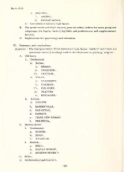
Burt-1959
b. Objective.
i. Intuitive,
ii. Rationalizations.
2. Correlations between type faces.
B. The preferences and their causes; general order; orders for main group and
subgroups; the bipolar factor; legibility and preferences; and supplementary
factors.
C. Implications for psychology and education.
IV. Summary and conclusions.
Appendix - The characteristics of the commoner type faces: readers' comments and
historical notes; (including) modern developments in printing, origins.
A. Old faces.
1. Continental.
a. Italian.
i. BEMBO.ii. VERONESE,
iii. CENTAUR.
b. French.
i. GARAMOND.ii. GRANJON.
iii. FOURNIER.
iv. PLANT IN.
v. EHRHARDT.
British.
a. CASLON.
b. BASKERVILLE
.
c
.
OLD STYLE.
d. IMPRINT.
e. TIMES NEW ROMAN.
f. PERPETUA.
B. Modern faces.
1. Continental.
a. BODONI.
b. DIDOT.
c. WALBAUM.2. British.
a. BELL.
b. SCOTCH ROMAN.c. MODERN SERIES 7.
C. Italic.
D. Mathematical publications.
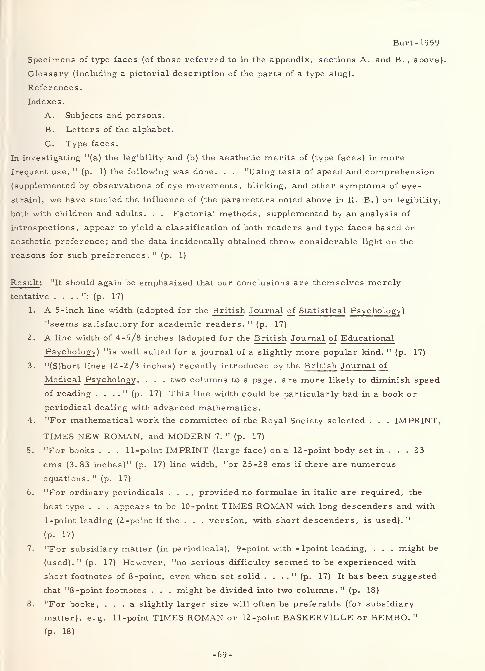
Burt- 1959
Specimens of type faces (of those referred to in the appendix, sections A. and B. , above).
Glossary (including a pictorial description of the parts of a type slug).
References
.
Indexes.
A. Subjects and persons.
B. Letters of the alphabet.
C. Type faces.
In investigating "(a) the legibility and (b) the aesthetic merits of (type faces) in more
frequent use, " (p. 1) the following was done. . . "Using tests of speed and comprehension
(supplemented by observations of eye movements, blinking, and other symptoms of eye-
strain), we have studied the influence of (the parameters noted above in II. B. ) on legibility,
both with children and adults. . . Factorial methods, supplemented by an analysis of
introspections, appear to yield a classification of both readers and type faces based on
aesthetic preference; and the data incidentally obtained throw considerable light on the
reasons for such preferences. " (p. 1)
Result : "It should again be emphasized that our conclusions are themselves merely
tentative . . . . ": (p. 17)
1. A 5 -inch line width (adopted for the British Journal of Statistical Psychology )
"seems satisfactory for academic readers. " (p. 17)
2. A line width of 4-5/8 inches (adopted for the British Journal of Educational
Psychology ) "is well suited for a journal of a slightly more popular kind. " (p. 17)
3. "(S)hort lines (2-2/3 inches) recently introduced by the British Journal of
Medical Psychology , . . . two columns to a page, are more likely to diminish speed
of reading . . . ." (p. 17) This line width could be particularly bad in a book or
periodical dealing with advanced mathematics.
4. "For mathematical work the committee of the Royal Society selected . . . IMPRINT,
TIMES NEW ROMAN, and MODERN 7. " (p. 17)
5. "For books . . . 11-point IMPRINT (large face) on a 12-point body set in ... 23
ems (3. 83 inches)" (p. 17) line width, "or 25-28 ems if there are numerous
equations." (p. 17)
6. "For ordinary periodicals . . . , provided no formulae in italic are required, the
best type . . . appears to be 10-point TIMES ROMAN with long descenders and with
1-point leading (2-point if the . . . version, with short descenders, is used). "
(p. 17)
7. "For subsidiary matter (in periodicals), 9-point with -lpoint leading, . . . might be
(used). " (p. 17) However, "no serious difficulty seemed to be experienced with
short footnotes of 8-point, even when set solid . . . ." (p. 17) It has been suggested
that "8-point footnotes . . . might be divided into two columns. " (p. 18)
8. "For books, ... a slightly larger size will often be preferable (for subsidiary
matter), e.g. 11-point TIMES ROMAN or 12-point BASKERVILLE or BEMBO. "
(p. 18)
-69-
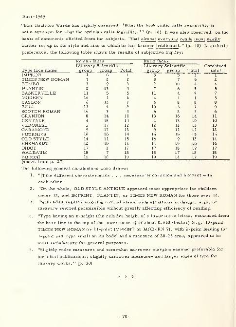
Burt-1959
"Mrs Beatrice Warde has rightly observed, 'What the book critic calls readability is
not a synonym for what the optician calls legibility. 1 " (p. 18) It was also observed, on the
basis of comments elicited from the subjects, "that almost everyone reads most easily
matter set up in the style and size to which he has become habituated ." (p. 18) In esthetic
preference, the following table shows the results of subjective inquiry:
Roman faces Italic facesLiterary Scientific Literary Scientific Combined
Type face name group group Total group group Total totalIMPRINT 1 6 1 3 s 3 1
TIMES NEW ROMAN 7 2 2 8 7 6 2
BEMBO 3 9 3 2 10 4 4PLANTIN 2 13 4 7 6 5 5
BASKERVILLE 11 5 5 11 4 9 7
MODERN 15 1 6 4 1 1 3
CASLON 6 12 7 6 8 8 8
BELL 13 4 8 10 3 7 9
SCOTCH ROMAN 16 3 9 5 2 2 6
GRANJON 8 14 10 13 16 14 11
CENTAUR 4 18 11 1 13 10 10
VERONESE 5 19 12 12 12 13 13
GARAMOND 9 17 13 9 11 11 12
FOURNIER 10 16 14 15 15 15 15
OLD STYLE 14 11 15 16 9 12 14
EHRHARDT 12 15 16 14 19 16 16
DIDOT 17 8 17 17 18 19 17
WALBAUM 18 7 18 18 17 18 18
BODONI 19 10 19 19 14 17 19
The following general conclusions were drawn:
1. "(T)he different characteristics . . . necessarily condition and interact with
each other.
2. "On the whole, OLD STYLE ANTIQUE appeared most appropriate for children
under 12, and IMPRINT, PLANTIN, or TIMES NEW ROMAN for those over 12.
3. "With adult readers enjoying normal vision wide variations in design, size, or
measure seemed permissible without greatly affecting efficiency of reading.
4. "Type having an x-height (the relative height of a lower-case letter, measured from
the base line to the top of the lower-case x) of about 0. 060 (inches) (e. g. 10-point
TIMES NEW ROMAN or 11 -point IMPRINT or MODERN 7), with 2 -point leading (or
1-point with type small on its body) and a measure of 20-23 ems, appeared to be
most satisfactory for general purposes.
5. "Slightly wider measures and somewhat narrower margins seemed preferable for
technical publications; slightly narrower measures and larger sizes of type for
literary works. 11
(p. 30)
* * *
-70-
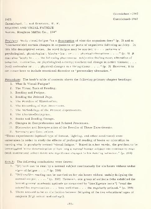
Carmichael- 1947
262 1 Carmichael- 1947
Carmichael, L. and Dearborn, W. F.
READING AND VISUAL FATIGUE
Boston, Houghton Mifflin Co. , 1947
Problem: Study visual fatigue "as a description of what the organism does" (p. 3) and to
"characteriz(e) certain changes in organisms or parts of organisms following activity. In
this (the descriptive) sense, the word fatigue may be applied to . . . patterns of
psychological, physiological, biochemical, or . . . physical alterations . . . ." (p. 3) It
may also "apply to . . . the following phonemena: subjective feeling -tone ; alteration of
behavior, motivation, or physiological activity; biochemical change in active tissues; . . .
(and) molecular or . . . physical changes in a living tissue . . . ." (p. 3) However, it is
not meant here to include emotional disorder or "personality alteration. "
Procedure: The book's table of contents shows the following primary chapter headings:
1. What Is Visual Fatigue?
2. The Visual Task of Reading.
3. Reading and Fatigue.
4. Reading the Printed Page.
5. The Problem of Illumination.
6. The Recording of Eye Movements.
7. The Methodology of the Present Experiments.
8. The Electro-Oculogram.
9. Books and Reading Groups.
10. Changes in Comprehension and Related Processes.
11. Discussion and Interpretation of the Results of These Experiments.
12. Summary and Conclusions.
"These experiments (optimal type of format, lighting, and other conditions) were
undertaken in order to study the effects of prolonged reading of books or microfilm in
causing what is popularly termed 'visual fatigue. ' Stated in other words, the problem to be
investigated is the determination of how long a normal human subject can continue to read
(with motivation) before there are significant changes in his reading behavior. " (p. 206)
Result : The following conclusions were drawn:
1. "(A) book can be read by a normal subject continuously for six hours without undue
signs of fatigue . . . ." (p. 358)
2. "(M)icrofilm reading can be carried on for six hours without unduly fatiguing the
normal subject . . . ." (p. 358) However, one group of subjects (who exhibited the
lowest general academic aptitude as measured by "intelligence tests") "read the
microfilm reproduction . . . less well than . . . the regularly printed. " (p. 359)
3. There seemed to be no distinction between fatiguing of the two educational ages of
subjects (high school and college).
-71-
Carmichael-1947
4. "No single factor that we have isolated as delimiting the experimental situation in
the present investigations produced special differences in ability to read for six
hours. " (p. 359) Nor were there any consistent "significant differences in total
performance . . . when any single factor . . . was varied ... in relation to other
factors. " (p. 360)
5. "The so-called intrinsic interest of the material . . . was not found to be associated
with significant differences in fatigue or in the capacity to read with understanding
for six hours. " (p. 360)
6. "(R)eading for six hours in a relatively fixed posture does in some way (undesirably)
affect the total organism. " (p. 360)
7. "(O)ne seems forced to assume that the total visual mechanism ... is able to
function approximately as effectively at the end of a long period of continuous
activity as at the onset . . . ." However, "eventually a combination of 'local' and
'general' fatigue would . . . produce a change . . . ." Yet, "sleep deprivation . . .
might first show . . . ." (p. 361)
8. "There is no evidence known to the authors which indicates that it is not at least
possible that exercise of eye muscles such as that given in prolonged reading may
not strengthen rather than harm the total visual mechanism. " (sic) (p. 362)
9. "There is little evidence . . . which would make us believe that . . . older subjects
or . . . subjects selected in some other way . . . would alter the present results
. . . ." (p. 36Z-363)
10. "(I)n the case of subjects . . . whose eyes required refractive correction . . . , no
special disadvantageous effects . . . were discovered. " (p. 363)
11. "(T)here seems to be no basis for the belief that . . . long periods of reading (under
optimal conditions?) . . . may be injurious to the visual mechanisms . . . ." (p. 3 63)
12. While "the present experiments do not allow the plotting of a 'feeling of fatigue'
curve, " subjective responses indicated that "satisfyingnes s decreased (while)
accomplishment remained constant. " Also, some subjects seemed "to like the long
continued work of reading. " (p. 366)
13. "(T)here is a specificity of fatigue of . . . systems which has . . . very little
transfer to other comparable mechanisms. " (p. 368)
14. "(C)hanges in the visual system following prolonged work may include an alteration
on the part of the subject in his attitudes toward further work and in his description
of his own feeling state. " (p. 369)
15. Preliminary experiments, in which the subjects were given the simple task (no
response motivation) of reading for four hours and until they were told to stop,
resulted in a decrement "especially noticeable ... in the tendency of subjects to
stop reading for a few seconds or to allow the eyes to roam over the pages without
reading. " (p. 369)
"A conclusion which can be drawn from . . . these . . . experiments . . . and which also
finds support in the literature ... is summed up in the following . . . : In the use of a
mechanism as well protected against the deleterious effects of the prolonged work of
-72-
Carmichael-1947
normal reading as is the visual mechanism, the first index of fatigue seems to come in the
alterations of the general attitudes and general feelings of the subject, not in a breakdown
of the sensory-neuromuscular mechanism which actually performs the task. . . At the
same time, it . . . also demonstrated a . . . more objective characteristic of the oncoming
of fatigue, namely, the so-described starting and stopping phenomenon of temporary
blockings, fluctuations, or the on and off effects in the performance of reading ....
Finally, the most constructive aspect . . . may well be the demonstration of the ease with
which well-considered alterations of the motivational pattern in this instance through
the introduction of regularly interspersed tests of comprehension may forestall these
first phases of fatigue and enable the individual to maintain for hours a high level of
efficiency in reading. " (p. 370-371)
3266 Case-1952
Case, Harry W. ,Michael, J. L. ,
Mount, George E.
and Brenner, Robert
California U. , Berkeley
ANALYSIS OF CERTAIN VARIABLES RELATED TO SIGN LEGIBILITY
In ROAD USER CHARACTERISTICS, Highway Research Board
Bulletin 60, (Washington, D. C. , National Academy of Sciences-
National Research Council Publication 244, 1952), p. 44-58, refs.
Problem : "The recent development of high-speed urban freeways has increased the need
for destination signs of maximum legibility. " (p. 44) With this problem in mind, "determine
(in a field situation) whether or not outdoor, daylight letter legibility varies with letter
-
background arrangement, and in turn how this letter -background legibility is influenced by
spacing between letters and rows. " (p. 44)
Procedure : Three-inch high, BPR SERIES E, rounded capital letters, with a stroke-width
approximately one-sixth of letter height, were used, but only the letters B, C, D, E, F, O,
P, and R. Altogether, there were twenty matched pairs of letter groups, half being spaced
1-1/2 inches between the letters and 2 inches between rows, the other half being spaced 4
inches between both letters and rows. Stimuli were shown in both black-on-white and white-
on-black to four groups of college, summer-student subjects in a shutter-type tachistoscope
,
at distances ranging from 220 to 355 feet. Prior to the experimentation, the authors made
a survey of the literature, which "revealed nine published studies in which the legibilities
of (the) combinations (discussed above) were systematically compared. " (p. 44) (see
Aldrich-1937 and Forbes-1951, elsewhere in this handbook, and also see T. W. Forbes,
A method for analysis of the effectiveness of highway signs, Journal of Applied Psychology,
v. 23 (1939) 669-684; T. W. Forbes and R. S. Holmes, Legibility distances of highway
destination signs in relation to letter height, letter width, and reflectorization, HRB
-73-
Case-1952
Proceedings , v. 19 (1939) 321-335; H. F. Janda and W. N. Volk, Effectiveness of various
highway signs, HRB Proceedings , v. 14 ( 1934) 442 -447; A. R. Lauer, Improvement in
highway safety, HRB Proceedings , v. 12, part I (1932) 389-399; A. R. Lauer, The effect of
increased illumination on acuity readings of singly exposed letters at different distances,
Year Book of Optometry , 1942, 225-232; J. Otuka and T. Honda, Relationship between
visual acuity and contrast under several light intensities, Acta Societatis Ophthalmologicae
Japonicae , v. 44 (1940) 2253-2259; and W. W. Wilcox, The basis of the dependency of
visual acuity on illumination, Proceedings of the National Academy of Sciences , v. 18
(1932) 47-56)
Result : "The results indicated that the widely spaced letters were more legible than those
closely spaced, and that the legibility of the black-white arrangement as compared with the
white -black arrangement was dependent on the letter spacing ... (p. 53) Black letters on
white background (was) the most legible arrangement when the letters (were) closely spaced,
but this (was) not true when the letters (were) widely spaced. It may even be that white
letters (would be) superior when wide spacing is involved. . . (p. 49) (These) interactions
were) discussed in terms of irradiation and fixation fluctuations, and these concepts were
then used to infer the effects of decreasing stroke width. " (p. 53)
2622 Casperson-1950
Casperson, Roland C.
Johns Hopkins U. , Baltimore, Md.
THE VISUAL DISCRIMINATION OF GEOMETRIC FORMSJournal of Experimental Psychology,
40:5 (October 1950) 668-681, 16 refs.
Rept. no. 166-1-108, Special Devices Center
Contract N5-ori-166
Problem : "(D)etermine the discrimination thresholds of six different geometric forms
(ELLIPSE, RECTANGLE, TRIANGLE, DIAMOND, CROSS, and STAR) and . . . relate
their relative discriminability to three quantifiable aspects (area, dimension, and
perimeter) of their construction. " (p. 669)
Procedure : "(F)ive different figures for each form were constructed. . . (that) differed in
maximum dimension and perimeter. . . (E)ach set of figures was reproduced at seven
different areas ..." (p. 669) thus providing a total of 210 different figures. "The seven
areas used were . 032, .072, .128, .200, .288, .512, and . 800 (square centimeters). "
(p. 670) For the smallest area, the following maximum diameters (MD) and perimeters
(P) were used (in centimeters for the . 032 square centimeter area other areas are
enlargements of the basic figure set multiply MD and P by 1. 5, 2, 2. 5, 3, 4, and 5):
-74-
Casperson- 1950
ELLIPSE RECTANGLE TRIANGLE DIAMOND CROSS STAR(6)
1.
MD . 202 . 254 .2 72 . 254 . 240 . 235P . 662 . 716 .817 . 716 . 882 . 720
2.
MD .269 . 287 .311 . 311 . 258 . 272P . 683 . 766 . 828 . 745 . 985 . 944
3.
MD . 310 . 327 . 373 . 358 . 318 . 304P . 748 . 828 . 890 . 803 1. 242 1. 112
4.
MD . 4 14 373 .411 414 .411 334P . 949 .897 . 995 1. 035 1. 635 1. 391
5.
MD . 518 .421 . 455 . 518 . 534 . 433P 1. 157 . 983 . 992 1. 064 2. 132 2. 099
(above from p. 670)
In the experiment, 20 male student subjects (normal acuity by AO test chart no
astigmatics) viewed stimuli (sets of cards, each consisting of nine, solid black, geometric
figures randomly arrayed on a semi-gloss, white card at 2 -inch centers in columns and
rows of three each) from a comfortable chair having arm and chin rests, at 20 feet from
the open end of a five-sided, three -foot-cube box (stimulus card at far end). "Each time a
figure was repeated it appeared in a different relation to the surrounding figures and in a
different orientation. 11
(p. 671) Illuminance on each card was 11.2 foot-candles. A total
of 100,800 individual responses were made by all subjects for all stimuli. Accuracy was
the test criterion, although "(t)he (subjects) were advised not to spend too much time on any
one figure and the method of forced guesses was used. " (p. 671)
Result : The "frequency and percent of reports for each form regardless of accuracy
(theoretical chance percent based on the number of forms = 16. 7)" (p. 672) was as follows:
ELLIPSE RECTANGLE TRIANGLE DIAMOND CROSS STAR total
f* 21,607 17,258 19,619 14,591 14,919 12,806 100,800%** 21.4 17. 1 19.5 14.5 14.8 12.7 100
* - f=frequency; - %=percent
Specific results of the experiment are as follows:
1. "Area was found to be the best measure of discriminability for ELLIPSES and
TRIANGLES.
2. "Maximum dimension be st predicted discriminability for RECTANGLES and DIAMONDS.3. "Perimeter was the best predictor for STARS and CROSSES.
4. "As a group the six basic forms can be evaluated best for discriminability when
their maximum dimensions are known.
5. "Prediction of discriminability for the total of 30 forms and figures was best
accomplished on the basis of their perimeters.
6. "Comparison of ihe relative discriminability of the six forms used in this
-75-
Casper son- 1950
experiment in terms of thresholds and total percent of correct reports confirms
earlier findings that the CIRCLE and elliptical shapes in general are not very easy
to identify.
7. "These results indicate that the Gestalt principle of 'simplicity' is inadequate as a
predictor of the relative discriminability of ELLIPSES, RECTANGLES, TRIANGLES,DIAMONDS, CROSSES, and STARS such as those used in this experiment.
8. "A comparison of the variance contributed by the 20 (subjects) with the variance due
to form differences substantiates the hypothesis that forms do differ in their
discriminability and that differences among individuals making the discrimination
are small compared to these form differences. " (p. 680)
3368 Chapanis-1949
Chapanis, Alphonse, Garner, Wendell R. and Morgan, Clifford T.
Johns Hopkins U. , Baltimore, Md.
APPLIED EXPERIMENTAL PSYCHOLOGY: HUMAN FACTORSIN ENGINEERING DESIGN
New York, John Wiley & Sons, Inc., 1949, 434p.
("Legibility of Numbers, Letters, and Symbols, " p. 170-180)
Extract : "A very important factor in most visual displays is the legibility of the numbers,
letters, and symbols used. . . (T)here are some important perceptual problems involved
in legibility too. " (p. 170)
Confusion - "Capital O's and Q's . . . are very frequently confused when they are seen at a
distance. A's and V's . . . are practically never confused. " (p. 170)
Legibility Studies - "Most of the work on legibility has been done with different kinds of
printer's type. . . Our summary of . . . recommendations ... is taken from the books
by Paterson and Tinker and Luckiesh and Moss. " (p. 170-171)
Styles of Type Face - "GARAMOND, ANTIQUE, SCOTCH ROMAN, BODONL OLD STYLE,
MODERN, CASLON, CHELTENHAM, and KABEL LIGHT all (are read) about equally well.
. . AMERICAN TYPEWRITER . . . definitely slows us down. . . OLD ENGLISH. . . has
so many angles and curlycues that it slows readers down by about 14 percent. 11(p. 171)
Type Form - "(M)aterial in capital letters (is read) much more slowly than ... in lower-
case . . . (O)bjective tests . . . agree with how readers feel about it. . . The reason is
probably that we destroy word form when we use capitals. . . Bold-face type is read about
as well as ordinary type. Most people, however, do not like . . . it . . . (R)estrict the
use of italics and bold-face printing to short sections which require emphasis. " (p. 171)
-76-
Chapanis- 1949
Type Size, Line Width, and Leading - "(T)hese factors are interrelated. . . When the best
line widths and leading are used . . . , it appears that 9-, 10-, 11-, and lZ-point type sizes
are about equally legible. Speed of reading is slowed down with 8 -point type and markedly
slowed with 6-point type. " (p. 171)
Color of Print and Background - "(B)lack print on white is more legible than white on black.
. . (W)hite on black (is) so illegible . . . that (it) should never be used where readability
is important. . . (In) colored inks on different colored papers. . . the colors by
themselves are not very important. The really important thing is the amount of brightness
contrast between the letters and their backgrounds. " (p. 172)
Legibility of Isolated Symbols - "(T)he total context of all the letters and words helps us to
read rapidly. But many visual displays do not have whole words on them. . . Whenever
single letters or numbers are used . . . , the legibility problem becomes more difficult. "
(p. 172-173)
Kinds of Seeing Conditions - "Instruments and dials sometimes have to be read when the
light is very poor. Aircraft status boards, plotting boards, and highway signs have to be
read from great distances. For many types of visual display, ... we want . . . maximumlegibility of single letters or symbols under unfavorable conditions. "
(p. 173)
Kinds of Performance Measured - "(T)he experiments to date did not measure as many
things as we should like to have measured. " (p. 173) Speed of reading and blink rate are
the primary ones used until now. "(I)t is difficult to see what the blink rate has to do with
legibility . . . ." (p. 173)
Basic Studies Versus Comparative Tests - "(C)omparative tests. . . do not get at the real
factors that make symbols legible. . . All we can tell from the (readability) studies . . .
is that certain kinds of type are more readable than others. We still do not know whether
they are the best possible kind of type. " (p. 173)
Factors Affecting Symbol Legibility - "(T)he simplicity of a number or letter markedly
affects its legibility. Different amounts of shading, and different numbers of hair lines in
numbers also make them harder or easier to read. So does the amount of white space
included within the outline of . . . symbols. And finally, emphasizing certain parts . . .
will make them much more readable. The B, for example, is a lot more legible if we put
a little overhang on the top and bottom. The same is true of . . . D. . . (I)t (is) easier to
distinguish C and G if we have well-marked gaps . . . and put a well-marked cross-piece
in . . . G. The Q needs a definite strong oblique stroke so we will not confuse it with . . .
O or C, and the W needs a high center prong so it will not look like an M. S is a difficult
letter no matter what we do. 11
(p. 174)
A Comparison of Letter Designs - "Mackworth . . . improv(ed) the legibility of letters and
-77-
Chapanis- 1949
numbers on sector maps used for air raids. . . (V)iewed ... at 25, 30, 35, and 40 feet(,
t)he average misreading errors at every distance (were) much lower for the new
(MACKWORTH) design. . . (I)t is . . . easier . . . to tell the difference between the 'O'
and 'Q, 1 the 'C and 'G' and '6'. " (p. 174)
The Best Stroke Width - "(T)hicker (U.S. Bureau of Public Roads) series D letters can
always be seen farther away than the thinner (Series B) letters and . . . day vision is
always better than night vision, as we might expect. . . In (an experimental) study, . . .
the best stroke width was 18 percent of the height of the letter, which corresponds very
closely to the one-sixth height of the series D letters . . . ."
(p. 176)
The Most Legible Numbers - In a series of experiments "on automobile license plates. . .
(numbers had outside dimensions of 42 by 80 millimeters, using the numbers 8, 5, and 2,
because they are the hardest to identify correctly) the data show that 6 millimeters (was)
the best stroke width for white numbers on . . . black . . . , but that 10 millimeters (was)
the best width for (the opposite) .... (It is n)oted especially that the white numbers on the
black background (were) recognized farther away than the black . . . on . . . white . . . ,
even when both (had) the best stroke width. " (p. 177)
Numbers at Night - "In a(n) . . . experiment, ... (it was ascertained that) luminous
numbers can be seen better than those illuminated from the front (in white on black), but
they also need a much smaller (1/80 as opposed to 1 / 10 the height) stroke width. . . The
daylight . . . and the luminous (optimal) numbers . . . are shown . . . ." (p. 177-178)
Angle of Viewing - "(D)isplays should be placed perpendicular to the line of sight . . . .
"
(p. 178) The reasons for doing it are the avoidance of (1) distortion, (2) parallax errors,
and (3) ease of reading (accommodation?). For the latter, "reading errors increase(d) for
(MACKWORTH) ... as the viewing angle change(d) from 90 to 35 degrees. 11(p. 178)
Further Research Needed - "The results of . . . studies . . . have not varied enough of
the critical factors ... to emerge with some . . . basic generalizations. We need . . .
more basic studies, for example, in which the height ... is kept constant while the width
and stroke width are varied .... It is possible that there are some important
interactions . . . We need . . . more basic studies on the effects of things like emphasizing
certain parts of letters or numbers. . . Maybe the vertical lines need to be heavier ....
Or vice versa. We need . . . research on the influence of 'overhangs' on certain letters,
. . . and on the width of the white space in . „ . letters .... And, finally, we need . . .
basic research on symbols other than letters and numbers, like ARROWS, DASHES, PLUS
MARKS, and so on. . . (U)ntil we have this . . we will not be able to tell you how to
design the best possible symbols for visual displays. " (p. 179)
-78-
Chaundy- 1954
2623 Chaundy- 1954
Chaundy, Theodore W., Barrett, P. R. and Batey, Charles
THE PRINTING OF MATHEMATICSLondon, Oxford University Press, 1954, 105 p.
Problem : Prepare a reference manual, i. e. a handbook of practice , for use by the authors,
editors, and compositors of mathematical publications (specifically for use at the
University Press, Oxford), including (1) information concerning confusable alpha-numericcharacters and (2) a set of HANDPRINTED, "LATIN and GREEK alphabets, capital and
lower-case, and also the ARABIC NUMERALS, . . . which . . . will minimize the danger
of confusion . . . ." (p. 90)
Procedure : The following outline of contents indicates that the printing of mathematicalworks is necessarily of such an exactitude that there is little, if any, room for
illegibility or confusion:
I. The mechanics of mathematical printing ("a simple explanation of the
technique of printing . . . addressed to those . . . curious to know how . . .
writings are transformed to . . . the printed page"), (p. v)
A. The hand compositor (letterpress method of printing, nature of type, andcomposing type by hand).
B. The machine compositor ('Monotype' keyboard and casting machine).
C. Composing mathematics on the 'Monotype' machine.D. Making -up.
E. Making new matrices.
F. Imposition.
G. A note on offprints.
II. Recommendations to mathematical authors (to the mathematical author,
editor, and reader).
A. Introduction (constraints of type, text and formulae, embellishedcharacters, and consideration for the reader).
B. Fractions (the solidus, bracketing with the solidus, numerical fractions,
and products of fractions).
C. Surds.
D. Superiors and inferiors (including commas, use of solidus, andcorrection signs).
E. Brackets (including symbolic and special uses).
F. Embellished characters.
G. Displayed formulae (including broken formulae and 'assertions',
simultaneous equations, 'broken definition', 'broken inequalities ', andeconomy).
H. Miscellaneous notation (abbreviations, binomial coefficients, definitions,
limits, matrices and determinants, maxima and minima, products,
unfinished series, vectors, and sign of substitution).
I. Headings and numbering (including sections, paragraphs, enunciations,
numbering, equation numbers, and subsidiary results).
J. Footnotes and references.
K. Varieties of type (bold-face, italics, capitals, and special founts).
L. Punctuation (including the comma, full point, semicolon, colon, dashes,
quotation marks, apostrophe, and hyphens).M. Wording (including assertions, proofs, definitions, 'assume',
'arbitrary', 'or', 'as', 'only', 'I', 'we', 'can', 'may', 'will', 'shall',
subjunctives, split infinitives, unattached participles, and 'combinedoperations ')
.
N. Preparing copy (confusable characters, mathematical notation,
typescript, special symbols, text-figures, tables, and final precautions).
-79-
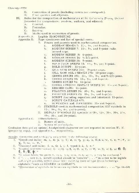
Chaundy-1954
O Correction of proofs (including errata and corrigenda).P. Final queries and offprints.
Rules for the composition of mathematics at the University Press, Oxford(intended for compositors, readers, authors, and editors).
A. General.
B. Formulae.C. Spacing.
D. Marks used in correction of proofs.
Appendix A.
Appendix B.
Legible HANDWRITING.Type specimens and list of special sorts.
Founts and accents used in mathematical composition.and 8 -point.
and 8 -point italic
MODERN SERIES 7: 11-, 9-
MODERN SERIES 7: 11-, 9-
kerned caps
.
MODERN SERIES 18: 6-point.
MODERN SERIES 16: 5-l/2-point.
MODERN SERIES 26: 5-point.
BOLD FACE SERIES 53: 11-, 9-, and 6-point.
BOLD SCRIPT: 11-point.
GILL SANS SERIES 262: 10-point caps.
GILL SANS BOLD SERIES 275: 10-point caps.
GREEK SERIES 106: 11-, 10-, 8-, and 5-l/2-point.
GREEK SERIES 90: 11-, 9-, and 6-point.
GREEK SERIES 91: 11-point.
GREEK UPRIGHT DISPLAY SERIES 92: 11- and 9 -point.
KERNED CAPS: 11-point.
FRAKTUR SERIES 28: 10-, 9-, and 6-point.
FRAKTUR SERIES 29: 10-, 9-, and 6-point.
SCRIPT (including superiors and inferiors): 11-point.
SCRIPT CAPITALS 8/9.
SUPERIORS and INFERIORS: 1 1 - and 9 -point.
2. SYMBOLS used in mathematical composition (117 symbols in
11-, 10-, 9-, 8-, and 6-point).
3. DISPLAY SYMBOLS (12 symbols in 48-, 42-, 36-, 30-, 24-,
20-, 18-, and 14-point).
Appendix C. Abbreviations.
1. Names of units.
2. Names of periodicals.
Confusion data and an optimal handprinted character set are reported in section III. N.
(preparing copy), and appendix A. , respectively.
Result: ise in the following cases:
y; K, k, K; |i, u; v,Confusion and ambiguity may"Greek and italic: ©c, a, d; y, y, Y;
X, X; CO, w, W. "
"Numeral and italic: 0, o, O; 1, i, I, typed 1; 2, 3, z."
"Capital and lower-case: C, c; O, o; S, s; U, u; V, v; W, w; X, x; Z, z; ®, 0;
$, 9 ; 4f", t|t."
"In some hands the pairs h, n; e, 1; n, x; n, r; r, s; m, n may be confused. "
A ". . . new (i.e. novel) symbol should be 'seeable' . . ." in order to be legible
and might possibly better come from existing fonts of type (even in foreign
alphabets "such as HEBREW or GAELIC")."(I)nversion of symbols to form new symbols is not recommended .... "(p. 66-68)
-80-
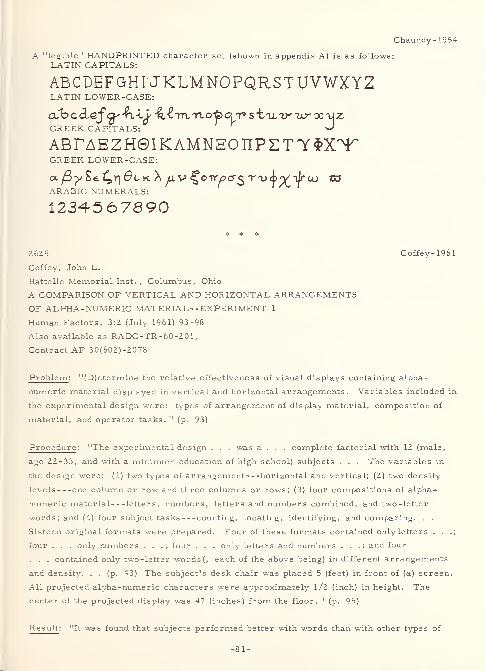
Chaundy-1954
A "legible" HANDPRINTED character set (shown in appendix A) is as follows:
LATIN CAPITALS:
ABCDEFGHUKLMNOPQRSTUVWXYZLATIN LOWER-CASE:
GREEK CAPITALS: ^AB^AEZH@IKAMN30T[PZT'yf,XT,
GREEK LOWER-CASE:
ocyS^ 4n^CK ^
/
jCV C OTr^>crS'r
'u<)
>X"l
/ra-) 1X3
ARABIC NUMERALS:
1234-567890
2625 Coffey-1961
Coffey, John L.
Battelle Memorial Inst. , Columbus, Ohio
A COMPARISON OF VERTICAL AND HORIZONTAL ARRANGEMENTSOF ALPHA-NUMERIC MATERIAL--EXPERIMENT 1
Human Factors, 3:2 (July 1961) 93-98
Also available as RADC -TR -60 -20 1
,
Contract AF 30(602)-2078
Problem : "(D)etermine the relative effectiveness of visual displays containing alpha-
numeric material displayed in vertical and horizontal arrangements. Variables included in
the experimental design were: types of arrangement of display material, composition of
material, and operator tasks. " (p. 93)
Procedure : "The experimental design . . . was a . . . complete factorial with 12 (male,
age 22-33, and with a minimum education of high school) subjects . . . The variables in
the design were: (1) two types of arrangement horizontal and vertical; (2) two density
levels one column or row and three columns or rows; (3) four compositions of alpha-
numeric material letters, numbers, letters and numbers combined, and two -letter
words; and (4) four subject tasks counting, locating, identifying, and comparing. . .
Sixteen original formats were prepared. Four of these formats contained only letters . . .;
four . . . only numbers . . . ; four . . . only letters and numbers . . .; and four
. . . contained only two-letter words (, each of the above being) in different arrangements
and density. . . (p. 93) The subject's desk chair was placed 5 (feet) in front of (a) screen.
All projected alpha-numeric characters were approximately l/2 (inch) in height. The
center of the projected display was 47 (inches) from the floor. " (p. 95)
Result : "It was found that subjects performed better with words than with other types of
-81-
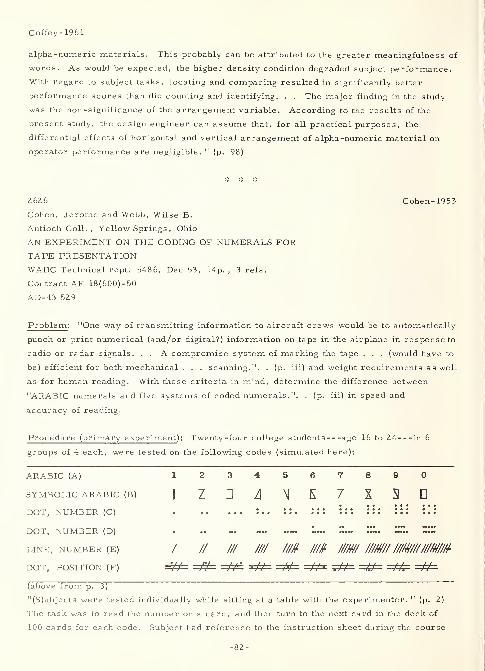
Coffey-1961
alpha -numeric materials. This probably can be attributed to the greater meaningfulness of
words. As would be expected, the higher density condition degraded subject performance.
With regard to subject tasks, locating and comparing resulted in significantly better
performance scores than did counting and identifying. . . The major finding in the study
was the non-significance of the arrangement variable. According to the results of the
present study, the design engineer can assume that, for all practical purposes, the
differential effects of horizontal and vertical arrangement of alpha-numeric material on
operator performance are negligible. " (p. 98)
2626 Cohen-1953
Cohen, Jerome and Webb, Wilse B.
Antioch Coll. , Yellow Springs, Ohio
AN EXPERIMENT ON THE CODING OF NUMERALS FORTAPE PRESENTATIONWADC Technical rept. 5486, Dec 53, 14p. , 3 refs.
Contract AF 18(600)-50
AD-43 529
Problem : "One way of transmitting information to aircraft crews would be to automatically
punch or print numerical (and/or digital?) information on tape in the airplane in response to
radio or radar signals. . . A compromise system of marking the tape . . . (would have to
be) efficient for both mechanical . . . scanning.". . (p. iii) and weight requirements as well
as for human reading. With these criteria in mind, determine the difference between
"ARABIC numerals and five systems of coded numerals.". . (p. iii) in speed and
accuracy of reading.
Procedure (primary experiment): Twenty-four college students age 16 to 24 in 6
groups of 4 each, were tested on the following codes (simulated here):
ARABIC (A) 1234567890SYMBOLIC ARABIC (B)
jj? .1 /lj \| f\ '% 3 0
dot, number (o :.. ::. ::: ::: ::: :::
DOT, NUMBER (D) . .. ~ «... *«« £!• HIH
LINE, NUMBER (E) / // /// //// ///# /M //M //M/ ////#/////M/M
DOT, POSITION (F) =4#= =&= =&± =&= =#= =&= =&P =#=
(above from p. 3)
"(S)ubjects were tested individually while sitting at a table with the experimenter. " (p. 2)
The task was to read the number on a card, and then turn to the next card in the deck of
100 cards for each code. Subject had reference to the instruction sheet during the course
-82-
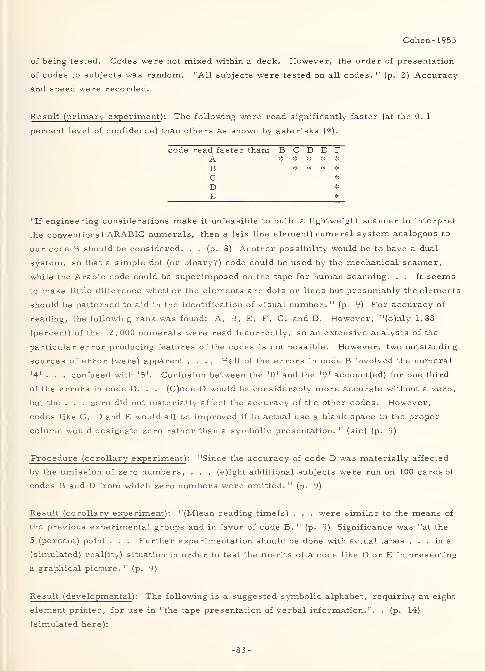
Cohen- 1953
of being tested. Codes were not mixed within a deck. However, the order of presentation
of codes to subjects was random. "All subjects were tested on all codes. " (p. 2) Accuracy
and speed were recorded.
Result (primary experiment ): The following were read significantly faster (at the 0. 1
percent level of confidence) than others as shown by asterisks (*).
code read faster than: B C D E F~A *****B * * * *
C *
D *
E *_
"If engineering considerations make it unfeasible to build a lightweight scanner to interpret
the conventional ARABIC numerals, then a (six line element) numeral system analogous to
our code B should be considered. . . (p. 8) Another possibility would be to have a dual
system, so that a simple dot (or binary?) code could be used by the mechanical scanner,
while the Arabic code could be superimposed on the tape for human scanning. . . It seems
to make little difference whether the elements are dots or lines but presumably the elements
should be patterned to aid in the identification of visual number. 11
(p. 9) For accuracy of
reading, the following rank was found: A, B, E, F, C, and D. However, "(o)nly 1.88
(percent) of the 12, 000 numerals were read incorrectly, so an extensive analysis of the
particular error producing features of the codes is not possible. However, two outstanding
sources of error (were) apparent .... Half of the errors in code B involved the numeral
'4'. . . confused with '5'. Confusion between the '0' and the '9' account(ed) for one third
of the errors in code D. . . (C)ode D would be considerably more accurate without a zero,
but the . . . zero did not materially affect the accuracy of the other codes. However,
codes like C, D and E would all be improved if in actual use a blank space in the proper
column would designate zero rather than a symbolic presentation. " (sic) (p. 9)
Procedure (corollary experiment): "Since the accuracy of code D was materially affected
by the omission of zero numbers, . . . (e)ight additional subjects were run on 100 cards of
codes B and D from which zero numbers were omitted. " (p. 9)
Result (corollary experiment): "(M)ean reading time(s) . . . were similar to the means of
the previous experimental groups and in favor of code B. " (p. 9) Significance was "at the
5 (percent) point . . . Further experimentation should be done with actual tapes ... in a
(simulated) real(ity) situation in order to test the merits of a code like D or E in presenting
a graphical picture. " (p. 9)
Result (developmental ): The following is a suggested symbolic alphabet, requiring an eight
element printer, for use in "the tape presentation of verbal information.". . (p. 14)
(simulated here):
-83-
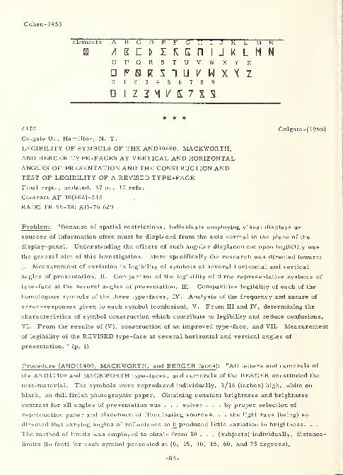
Cohen-1953
elements A BCDEFGHIJKLMNB A
o PQRSTUVWXY Z
00 1Z34567890
* * *
2170 Colgate-(1955)
Colgate U. ,Hamilton, N. Y.
LEGIBILITY OF SYMBOLS OF THE AND10400, MACKWORTH,AND BERGER TYPE-FACES AT VERTICAL AND HORIZONTALANGLES OF PRESENTATION AND THE CONSTRUCTION ANDTEST OF LEGIBILITY OF A REVISED TYPE -FACEFinal rept. , undated, 37 p. , 10 refs.
Contract AF 30(602)-212
RADC TR 55-78; AD-75 629
Problem : "Because of spatial restrictions, individuals employing visual displays as
sources of information often must be displaced from the axis normal to the plane of the
display-panel. Understanding the effects of such angular displacement upon legibility was
the general aim of this investigation. More specifically the research was directed toward:
I. Measurement of variation in legibility of symbols at several horizontal and vertical
angles of presentation, II. Comparison of the legibility of three representative systems of
type-face at the several angles of presentation, III. Comparitive legibility of each of the
homologous symbols of the three type-faces, IV. Analysis of the frequency and nature of
error-responses given to each symbol (confusion), V. From III and IV, determining the
characteristics of symbol construction which contribute to legibility and reduce confusions,
VI. From the results of (V), construction of an improved type -face, and VII. Measurement
of legibility of the REVISED type-face at several horizontal and vertical angles of
presentation. 11
(p. i)
Procedure (AND10400, MACKWORTH, and BERGER faces ): "All letters and numerals of
the AND 10400 and MACKWORTH type -faces, and numerals of the BERGER constituted the
test-material. The symbols were reproduced individually, 3/16 (inches) high, white on
black, on dull finish photographic paper. Obtaining constant brightness and brightness
contrast for all angles of presentation was . . . solved . . . by proper selection of
reproduction paper and placement of illuminating sources. . . the light rays (being) so
directed that varying angles of reflectance to 0 produced little variation in brightness. . .
The method of limits was employed to obtain from 10 . . . (subjects) individually, distance
-
limits (in feet) for each symbol presented at (0, 15, 30, 45, 60, and 75 degrees),
-84-
Colgate -(1955)
horizontally and vertically. Error responses elicited to each stimulus -symbol before the
limit of correct identification was reached, were recorded to be used in an analysis of
relative confusion. Statistical and mathematical treatment: Mean distance -limits were
computed for several combinations of data, converted into conventional visual acuity units
visual angle, and plotted graphically. The error-responses to each symbol were
tabulated both as to total frequency and the frequency of each specific error-symbol to each
stimulus -symbol. " (p. i)
Result (AND10400, MACKWORTH, and BERGER faces ): The "(g)eneral findings were as
follows:
1. "Legibility of symbols on planes displaced from the normal varied according to an
exponential cosine function of the angle of displacement. In terms of mean distance
-
limits, for horizontal and vertical angles the exponents were 2/3 and l/2
respectively, increasing vertical angles producing a smaller decrement in legibility
than equivalent horizontal angles; in terms of visual angle, the reciprocal of the
cosine of the angle described the data.
2. "(a) There was no significant difference between the all-symbol, all-angle mean
distance -limits of the AND and MACKWORTH type-faces; (however, ) the numerals
of both . . . yielded higher mean distance -limits than the BERGER numerals, (b)
Comparison of the type -faces (, ) based on the number of symbols whose all-angle
mean distance -limits reached or exceeded one standard deviation above or below the
average!, ) . . . favored slightly the AND . . . over the MACKWORTH, and both . . .
over the BERGER numerals.
3. "Comparison of mean distance -limits for homologous symbols at all angles and at
each angle of presentation, revealed more instances of higher mean limits for the
AND homologous than for the MACKWORTH. By a similar comparison, the
BERGER numerals were inferior to both ....
4. "(a) The average number of confusions per symbol were quite equal for the three
type-faces studied, (b) There were, however, widespread differences in the
frequencies and nature of confusions to each of the symbols within each type -face
and between homologues of the type-faces, (c) Comparisons of frequencies of error-
response to each symbol using both standard deviation and homologue criteria
indicated a slight superiority (in terms of number of superior symbols) of the ANDover the MACKWORTH type -face, and the numerals of both . . . over the BERGERnumerals
.
5. "On the basis of higher mean distance -limits (greater legibility) and fewer error-
responses (less confus (a)bility) , the superior homologues of the type-faces were
isolated. Examination of the stroke-composition of these as compared to their
inferior homologues revealed characteristics of design, both individually and
generally, which contribute to legibility.
6. "A system of type-faces was constructed in which the strokes, characterizing and
distinguishing each symbol, were emphasized or accented in one or more ways:
-85-
Colgate-(1955)
width, length, intersection, relative position, curvature. " (p. i-ii)
Procedure (REVISED experimental face ): An experimental REVISED type-face (referred to
in 6. above) was "reproduced in the same manner as the symbols in the (above) study and
subjected to tests of legibility at five angles of presentation (0, 30, and 60 degrees),
horizontally and vertically. The symbols of the AND 10400 system, as a standard of
comparison, were retested with the revised. The method, procedure, and treatment of
data closely followed the pattern of the (above) study. " (p. ii)
Result (REVISED experimental face) : "High correlation coefficients (approximately 0.80)
between mean limit-distances . . . , and between frequencies of error-response for ANDsymbols of the (above) and (of this) stud(y), demonstrated a high reliability of method. "
(p. ii) Specific findings were as follows:
1. "The mean limit-distance data of the REVISED type-face and retest data of the ANDtype -face were described by the same mathematical function (exponential cosine
formula) relating legibility to increasing angle of presentation, that held for the
(above) study.
2. "(a) The REVISED system yielded higher all-angle, all-symbol mean distance-
limits than did the AND system. Also the REVISED all-symbol mean limits were
higher at each of the five (sic) angles of presentation, (b) Comparison of the type-
faces based on the number of symbols whose all-angle mean limits reached or
exceeded one standard deviation above or below the average . . . definitely favored
the REVISED system.
3. "Comparison of mean distance -limits for homologous symbols at all angles and at
each angle of presentation, revealed many more instances of higher mean limits for
the REVISED than for the AND homologues.
4. "(a) The symbols of the REVISED type -face in toto, elicited about 10 (percent)
fewer error-responses than did the symbols of the AND. (b) Correlation coefficients
of over — . 80 (for both systems) between error -responses and all-angle mean
distance -limits indicated that the two indices were inversely correlative measures
of symbol legibility, (c) Comparisons of frequencies of error-response to each
symbol using both standard deviation and homologue criteria favored the REVISED
system less confus(a)bility.
5. "The data reveal(ed) that the all-angle mean distance -limit of a symbol is a
reflection of its each-angle data accumulatively; symbols which are significantly
superior in all-angle legibility tend to have good legibility at each angle.
Intercorrelations between symbol-data for each of the angles of presentation yield
high coefficients and tend to confirm the internal consistency. It can be generalized
that characteristics of symbols which contribute to legibility at any one angle of view
contribute to legibility at all other angles. " (p. ii-iii)
Result (overall): "It can be concluded that: 1) Legibility of symbols decreases according
-86-
Colgate-(1955)
to an exponential cosine function of the angle of displacement; and, employing this as a
principle of application, observers angularly displaced from a visual display panel can be
situated appropriately, providing them with conditions for legibility equal to the centrally
located observer. 2) It is possible to improve legibility of type -faces by determining and
accenting those characteristics of symbol construction which contribute to correct
identification and low confus(a)bility. A step in this direction (has been) demonstrated by
the improved legibility of the REVISED system of type -face. " (p. iii)
3263 Craik-1943
Craik, K. J. W.
Flying Personnel Research Committee (Gt. Brit. )
LEGIBILITY OF DIFFERENT COLOURED INSTRUMENT
MARKINGS AND ILLUMINATED SIGNS AT LOW ILLUMINATIONS
Rept. no. F.P. R.C. 415, Jan 43, 3p.
AD-102 931
Problem : Discuss the effect of various colors of fluorescent paint on the legibility of
instrument markings and illuminated signs at low levels of illumination. "Luckiesh and
Moss have pointed out that blue or green fluorescent figures may be blurred for distant
vision . . . though the effect is not very serious . . . (H)owever, . . . the effect can
become serious with some of the blue -filtered tungsten lamps used for illuminated signs
. . . render(ing) them far less legible than red ones of comparable brightness . . . (T)his
phenomenon may possibly account for the superiority of a - 1 (dioptre) focus for night
glasses . . . ."
Procedure : A number of experiments were conducted at brightnesses low enough to be
comparable to instrument-panel night -lighting. These included (1) a photometric match
with a 1 (degree) field, (2) the Bishop Harman test, (3) experiments with colored stencils
and fluorescent paints, (4) tilting parallel lines of paint, under ultra-violet illumination,
until they fuse together, and (5) time required (by three subjects) to pick up aircraft
silhouettes projected on a screen in a comparison of mock-up blind flying panels for their
"dazzle" effect. The last two techniques specifically were utilized because it was
determined that the "(p)hotometric comparison of different colours at low brightnesses with
small fields ... is unsatisfactory, . . . (t)he final criterion of the permissible brightness
of instrument markings (being) not their brightness but their dazzling effect. "
Result : In these experiments, an inferiority, similar to that found by Luckiesh and Moss,
"of blue and green fluorescent paints in legibility has been found even at distances of 18
inches, where the accommodative power of the normal eye can compensate for the maximumchromatic aberration of 2 dioptres. Figures in radio-active luminous paint or green
-87-
Craik-1943
fluorescent paint (Type F) required to be approximately 50 (percent) larger for equal
legibility at equal brightness ... or alternatively required to be about 70 (percent) brighter
to give equal legibility. The green figures had a very blurred appearance and a tendency to
fuse together or diverge in the Bishop Harman test much more readily than orange or red
figures. This blurred appearance was . . . found . . . to be due to the colour (rather than
to a lack of background to enable the eyes to accommodate) . . . ." In the mock-up panel
experiment, "the green one was found to produce significant delay . . . while the orange did
not. For orange paint, brightnesses up to . 005 (effective foot-candles) appear safe from
dazzle. The upper brightness limit of the present fluorescent system is probably necessary
under exceptional conditions (e.g. with moonlight outside the aircraft and the panel in
shadow), but the brightness should always be set to the least necessary. " The "results
have confirmed the good visual qualities of the orange fluorescent paint used in the system
of lighting evolved by the . . . R.A.E. " However, "while orange is markedly superior
(to green) . . . , it is probable that a bright red fluorescent paint would be better still, and
would have the added advantage of . . . avoiding all chance of impaired dark adaptation. "
The current drawback to red is that "(t)he G.E.C. red powders available in this country
(Great Britain) are insufficiently bright. "
2627 Crannell-1958
Crannell, Clarke W. and Debons, Anthony
Miami U. ,Oxford, Ohio and Aero Medical Lab. ,
WADC, Wright-Patterson Air Force Base, Ohio
ILLUMINATION AND TILT AS FACTORS IN THELEGIBILITY OF REFLEX-REFLECTIVE NUMERALSWADC Technical rept. 58-47, Sep 58, 21p. , 2 refs.
Contract AF 33(616)-2844
AD-142 327
Problem: Determine the effect of variations in distance, orientation, and illumination on
the "legibility of AND 10400 digits under nighttime conditions . . . using four different sets
of all ten digits . . . ." (p. 14)
Procedure : A total of 27 male subjects viewed, by groups and at night, "black digits on
aluminum background, black digits on white painted background, black digits on reflex-
reflective background, and reflex-reflective digits on black background. . . Three
experiments were conducted: (1) with digits at four different distances (256, 320, 400, and
500 feet) from the observers and at 90 (degrees) to the line of sight, and also tilted at
angles of 60 (degrees), 40 (degrees) and 27 (degrees) to the line of sight; (2) at three
different distances (256, 320, and 500 feet) and with digits simultaneously turned and tilted
from the line of sight ... (p. 14) For (this) study . . . (, t)he number of degrees of turn,
-88-
Crannell-1958
60 (degrees), 40 (degrees) or 27 (degrees), was always equal to the number of degrees of
tilt . . . ; (p. 4) and (3) at a distance of 500 (feet) when the level of illumination was
increased by moving the spotter lamp closer to the display (and thus varying brightness
from 0. 07 to 0. 52 foot-lamberts, depending on the distance and viewing angle). " (p„ 14)
Digits were all 12 inches tall, 8 inches broad (except for "1"), and 1. 5 inches in stroke-
width. The experiments were performed (statically) to simulate the (dynamic) condition in
which an interceptor aircraft overtakes an unidentified aircraft and wishes to identify it by
the numerals normally found on aircraft vertical stabilizers.
Result : "Under nighttime conditions reflex-reflective digits (were) more legible than the
other display conditions at the greater distances, and at the closer distances when the
digits (were) tilted or turned from the perpendicular to the line of sight. . . Comparison
with . . . previou(s) . . . experiments . . . indicate(d) that tilting the digits to the line of
sight yield(ed) about the same reduction in visibility as turning them from the line of sight.
However, when the plane of the digits was displaced both vertically and horizontally from
the line of sight, legibility was seriously impaired for all types of materials. An increase
of intensity of illumination was found to have little or no effect upon legibility when the
display was viewed from 500 (feet). With the size and strokewidth used, digit 8_ (was) least
legible. " (p. 14)
# * #
2629 Crook- 1947a
Crook, Mason N. , Hoffman Arthur C. ,Wessell, Nils Y.,
Wulfeck, Joseph W. and Kennedy, John L.
Tufts Coll., Medford, Mass.
PRELIMINARY STUDIES OF THE EFFECT OF VIBRATION,
ILLUMINATION AND TYPE SIZE ON LEGIBILITY OF NUMERALS:EFFECT OF VIBRATION ON LEGIBILITY OF TABULARNUMERICAL MATERIAL, EXPERIMENTS 1 TO 4
Report on Aviation Psychology Project Rept. no. 1, May 47, 20 p.
Contract W33-038 ac-14559
Aero Medical Lab. Memorandum rept. no. TSEAA - 694- IF; ATI-64 45 1
Problem: Determine the effect of (1) amplitude of linear surface vibration, (2) brightness
level, (3) type size, (4) orientation of the characters, and (5) interactions between some of
these on the legibility of numeric characters that simulate those normally found on charts,
instruments, manuals, tables, and other visual aids
.
Procedure : Six to twelve male subjects between the ages of 20 and 2 5 (and having binocular
visual acuity of 20/25 or better) participated in four experiments. The task was to read a
series of black-on-white, paired digits and determine whether they were the same or
-89-
Crook- 1947a
different, with response being the actuation (by the subject) of one of two finger keys.
Horizontal linear vibration (induced by means of Risley prisms which rotated in the 14-inch
space between the eyes and the stimulus) was varied from 0. 0079 to 0. 079 inches of double
amplitude (distance between extremes of the excursion). Brightness of the reading material
ranged approximately from 1 to 13 foot-lamberts . Type size varied from 6 to 11 points.
Orientation of the characters was upright or upside down. Interactions between variables
were as follows: experiment one - amplitude of vibration and brightness, experiment two -
amplitude of vibration and type size, experiment three - same as experiment two but with
the reading material inverted, and experiment four (performance under extreme conditions) -
a favorable combination compared with an unfavorable combination of vibration, brightness,
and type size. Accuracy and speed were the test criteria in all experiments.
Result: Major research findings were as follows:
1. Vibration amplitude of 0. 08 inch resulted in significantly slower reading than 0. 02
and 0. 008 inch. However, there was no significant difference in accuracy.
2. Brightness variations between 12.4 and 0.96 foot-lamberts gave no significant
difference in either accuracy or speed.
3. Inverted 6-point type was read with less accuracy and speed than other sizes inverted.
For upright reading, there was no significant difference between sizes,
4. The unfavorable combination, when compared with the favorable combination of
vibration, brightness, and size, increased error rate by approximately 150 percent
and speed by approximately 40 percent.
Thus, it may be concluded (from the above and other experimental results shown) that (1)
the effect of vibration amplitude was roughly comparable to the effects of brightness and
type size, and (2) a combination of unfavorable values of the variables used may go beyond
a subject's capacity to adjust to the impairment.
* * *
2120 Crook-1947b
Crook, Mason N. , Hoffman, Arthur C. , Wessell, NilsY.,
Wulfeck, Joseph W. , and Kennedy, John L.
Tufts Coll. ,Medford, Mass.
FURTHER STUDIES OF THE EFFECT OF VIBRATION ANDOTHER FACTORS ON LEGIBILITY OF NUMERALS;
EFFECT OF VIBRATION ON LEGIBILITY OF TABULARNUMERICAL MATERIAL, EXPERIMENTS 5 TO 7
Report on Aviation Psychology Project
Rept. no. 4, Aug 47, 17 p.
Contract W33-038 ac-14559
Aero Medical Lab. Memorandum rept. no.
TSEAA-694-1K; ATI-14 243
-90-
Crook-1947b
Problem: Determine the following:
1. "Effect of vibration frequency on legibility under favorable conditions of amplitude,
brightness, and numeral size, and under unfavorable conditions of these same
secondary variables.
2. "Effect of different vibration patterns (i.e. ,linear, rotary, and elliptical) on
legibility under two conditions of amplitude and with brightness, numeral size and
vibration frequency held constant.
3. "Relative legibility of white numerals on a black background (versus) blacknumerals
on a white background. " (p. 1)
Procedure: "All studies were made under simulated daylight conditions. . . (p. 1) The
reading material consisted of a series of pairs of digits. The subject's task was to judge
whether the two members of a pair were the same or different, indicating his judgment by
finger keys. . . Subjects were male college students with visual acuities 20/25 or better
at the experimental reading distance, 14 inches. " (p. 6-7) In Experiment 5, "(t)hree
frequencies were used, 480, 930, and 1830 per minute. . . (T)he 930 and 1830 were within
. . . the range of frequencies most commonly encountered (in aircraft). With respect to
the other stimulus variables, two conditions were established. The favorable condition
. . . included the following values: amplitude, 0. 0079 inch (double amplitude of linear
horizontal vibration); brightness, 14. 7 foot-lamberts ; type, 11 point. Values for the
unfavorable condition . . . were: amplitude, 0.079 inch; brightness, 1. 12 foot-lamberts;
type, 11 point. . . Six subjects . . . served . . . ." (p. 9) In Experiment 6, "(t)wo sets
of form patterns were used, alike except for amplitude level. Each set included one linear
pattern, two ellipses, and one circle. In set no. 1, the linear amplitude was 0. 032 inch.
The two ellipses had major axes equal to the linear amplitude and minor axes of 0. 010 and
0. 021 inch. Diameter of the circle was the same as the linear amplitude. . . In set no. 2,
dimensions were one half of set no. 1 . . . . Each of the other stimulus variables was held
constant at an intermediate value: vibration frequency, 1380 per minute; brightness, 5. 69
foot-lamberts; type, 8 point. " (p. 12) Four of the previous six subjects participated. In
Experiment 7, "(r)eading material was prepared in white on black, otherwise identical with
the black on white regularly used. Type size was 11 point. " (p. 14) Also, because of
experimental limitations, "the subject . . . (was) presented with an areal contrast
condition in addition to the demands of the reading task. . . The linear vibration pattern
only was used. With respect to other variables, two conditions were set up: the
(unfavorable) condition was analagous to the (same) condition of Experiment 5; the
(favorable?) condition was mixed, being favorable in brightness and frequency but
unfavorable in amplitude. Values were as follows: (unfavorable) condition—amplitude
,
0.074 inch; frequency, 1380 per minute; brightness, 1. 12 foot-lamberts; (favorable?)
condition - -amplitude , 0. 11 inch; frequency, 480 per minute; brightness, 14.7 foot-
lamberts. . . Four new subjects were trained for this experiment . . . ." (p. 15)
Result: The three experiments here reported show: (1) clear evidence of the effect of
-91-
Crook-1947b
vibration frequency on legibility and of interaction between frequency and other stimulus
variables(, i.e.,) . . . (p. 17) (n)umerals (were) significantly less legible under high
vibration frequencies than under low frequencies. . . (and t)he detrimental effect of high
frequency vibration (became) more marked under unfavorable conditions of brightness,
numeral size and amplitude . . . ; (p. 1) (Z) some indication, not statistically established,
of an effect of circular versus linear vibration and corresponding interaction with other
variables(, however the) ... (p. 17) (p)attern of vibration was not significantly related to
legibility(;) . . . (3) . . . (l)egibility was poorer for high amplitude vibration than for low.
. . (this finding was consistent with previous results; and) ... (p. 2) (4) no indication of a
differential effect of black on white versus white on black under the conditions studied. . .
(p. 17) (which) finding is contrary to earlier reports in the literature that black-on-white
is superior. " (p. Z)
3301 Crook-1950aCrook, Mason N. , Harker, George S. ,
Hoffman, Arthur C. , and Kennedy, John L.
Tufts Coll. , Medford, Mass.EFFECT OF AMPLITUDE OF APPARENT VIBRATION,BRIGHTNESS, AND TYPE SIZE ON NUMERAL READINGAF Technical rept. no. 6246, Sep 50, 54p. , 14 refs.
Contract W33-038 ac-14559ATI-92 222
Problem: Determine the effect of brightness, type size, apparent vibration, andinteractions between them on the legibility of black on white, "dial type, " numerals in a
MODERN type face.
Procedure: Nine exploratory, three main, and two supplementary experiments were run.
The exploratory experiments showed a quite conclusive difference between the legibility
results of single and multiple decrements. For example, "any one of the three factors
(brightness, type size, and vibration amplitude could) be varied over a considerablerange, when all other conditions (were) favorable, with no substantial impairment of
performance .... But the value of such conclusions about the effect of variables in
isolation is limited by the fact that secondary conditions are frequently not optimal. It is
therefore important to consider interactions. " (p. 20) The main experiments (numbers 10,
12, and 14) utilized 12 subjects each in a task that involved reading a three digit group,
mentally adding the numerals, and comparing the result with a two digit group next to it.
Response was by pushing one of two (correct or incorrect) response keys. All subjects
had 20/25 or better visual binocular acuity. Reading distance was 14 inches. Auditorynoise (from a motor driving prisms located between the eye and the stimulus) was present.
Brightness of the reading material was controlled by metal film and cross-polarizedfilters. Vibration (in an elliptic pattern having a 3/2 major/minor axis ratio) wascontrolled by two counter-rotating pairs of disc prisms located two and four inches before
the eye, and being driven at a constant 1050 cycles/ second. The following variables (and
their interactions) were utilized:
-92-
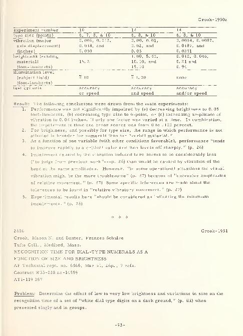
Crook-1950a
experiment number 10 12 14
type size (points) 6, 7, 8, & 10 6, 8, & 10 6, 8, & 10
vibration (major 0. 006, 0. 012, 0. 00, 0. 01, 0. 0014, 0. 0087,
axis displacement) 0. 018, and 0. 02, and 0. 0187, and(inches
)
0. 030 0. 03 0. 0291
brightness (reading 1. 00, 5. 40, 0. 010, 0. 046,
material) 15. 2 10. 10, and 0. 21 and(foot-lamberts
)
15. 10 0. 94
illumination level
(subject field) = 10 = 1. 00 none(foot-lamberts
)
test criteria accuracy accuracy accuracyor speed and speed and/or speed
Result: The following conclusions were drawn from the main experiments:
1. Performance was not significantly impaired by (a) decreasing brightness to 0. 05
foot-lamberts, (b) decreasing type size to 6-point, or (c) increasing amplitude of
vibration to 0. 02 inches, if only one factor was varied at a time. In combination,
the impairment in time and error scores was from 0 to 1100 percent.
2. For brightness, and possibly for type size, the range in which performance is not
affected is broader for numerals than for "verbal material. "
3. As a function of one variable (with other conditions favorable), performance "tends
to improve rapidly to a critical value and then levels off sharply. " (p. 26)
4. Impairment caused by the vibration induced here seems to be considerably less
("to judge from previous work" p. 26) than would be caused by vibration of the
head at the same amplitudes. However, "in some operational situations the visual
vibration might be the more troublesome" (p. 27) because of "excessive amplitudes
of relative movement. " (p. 27) Some specific inferences are made about the
tolerences to be found in "relative vibratory movement. " (p. 27)
5. Experimental results here "should be considered as indicating the minimum
impairments. " (p. 26)
* * *
2606 Crook-1951
Crook, Mason N. and Baxter, Frances Schulze
Tufts Coll., Medford, Mass.
RECOGNITION TIME FOR DIAL-TYPE NUMERALS AS AFUNCTION OF SIZE AND BRIGHTNESS
AF Technical rept. no. 6465, Mar 51, 26p. , 7 refs.
Contract W33-038 ac-14559
ATI-119 387
Problem: Determine the effect of low to very low brightness and variations in size on the
recognition time of a set of "white dial type digits on a dark ground, " (p. iii) when
presented singly and in groups.
-93-
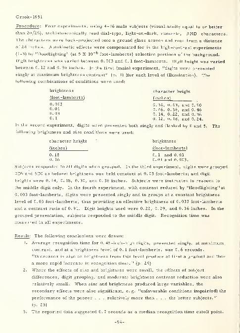
Crook- 1951
Procedure : Four experiments, using 4-16 male subjects (visual acuity equal to or better
than 20/25), tachistoscopically read dial-type, light-on-dark, numeric, AND characters.
The characters were back-projected onto a ground glass screen and read from a distance
of 28 inches. Autokinetic effects were compensated for in the high-contrast experiments
(1-3) by "floodlighting" (at 5 X 10"^ foot-lamberts) selective portions of the background.
Digit brightness was varied between 0. 003 and 0. 1 foot-lamberts. Digit height was varied
between 0. 12 and 0.90 inches. In the first (main) experiment, "digits were presented
singly at maximum brightness contrast" (p. 1) (for each level of illumination). The
following combinations of conditions were used:
brightness character height
(foot-lamberts) (inches)
0- 003 0. 36, 0. 63, and 0. 90°-01 0. 26, 0. 36, and 0. 460. 03 0. 14, 0. 22, and 0. 360- 1 0. 12, 0. 18, and 0. 24.
In the second experiment, digits were presented both singly and flanked by 0 and 5. Thefollowing brightness and size conditions were used:
character height brightness
(inches) (foot-lamberts)
0. 18 0. 1 and 0. 030. 36 0. 01 and 0. 003.
Subjects responded to all digits when grouped. In the third experiment, digits were grouped
0D5 and 5D0 as before; brightness was held constant at 0. 03 foot-lamberts; and digit
heights were 0. 14, 0. 18, 0. 30, and 0. 36 inches. Subjects were instructed to respond to
the middle digit only. In the fourth experiment, with contrast reduced by "floodlighting" at
0.003 foot-lamberts, digits were presented singly and in groups at a constant brightness
level of 0. 03 foot-lamberts, thus providing an effective brightness of 0. 033 foot-lamberts
and a contrast ratio of 0. 91. Digit heights used were 0. 22, 0. 29, and 0. 36 inches. In the
grouped presentation, subjects responded to the middle digit. Recognition time was
measured in all experiments.
Re suit : The following conclusions were drawn:
1. Average recognition time for 0. 48 -inch-high digits, presented singly, at maximumcontrast, and at a brightness level of 0. 1 foot-lamberts, was C. 6 seconds.
"Decreases in size or brightness from this level produce at first a gradual and then
a more rapid increase in recognition time. " (p. 25)
2. Where the effects of size and brightness were small, the effects of subject
differences, digit grouping, and moderate brightness contrast reduction were also
relatively small. When size and brightness produced large variables, the
secondary effects were also significant, e. g. "unfavorable conditions impair(ed) the
performance of the poorer . . . relatively more than . . . the better subjects. "
(p. 25)
3. The reported data suggested 0. 7 seconds as a median recognition time cutoff point.
•94-
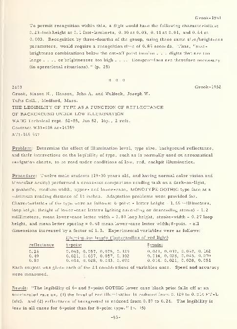
Crook-1951
To permit recognition within this, a digit would have the following characteristics:
0. Z3-inch height at 0. 1 foot-lamberts, 0. 30 at 0. 03, 0.44 at 0.0 1, and 0. 64 at
0.003. Recognition by three -fourths of the group, using these same size/brightness
parameters, would require a recognition time of 0.85 seconds. Thus, "size-
brightness combinations below the cut-off point involve . . . digits that are too
large . . ., or brightnesses too high .... Compromises are therefore necessary
(in operational situations). " (p. 25)
2603 Crook-1952
Crook, Mason N. , Hanson, John A. and Wulfeck, Joseph W.
Tufts Coll. , Medford, Mass.
THE LEGIBILITY OF TYPE AS A FUNCTION OF REFLECTANCEOF BACKGROUND UNDER LOW ILLUMINATION
WADC Technical rept. 52-85, Jun52, 16p. , 2 refs.
Contract W33-038 ac-14559
ATI- 165 547
Problem : Determine the effect of illumination level, type size, background reflectance,
and their interactions on the legibility of type, such as is normally used on aeronautical
navigation charts, to be read under conditions of low, red, cockpit illumination.
Procedure: Twelve male students (19-30 years old, and having normal color vision and
binocular acuity) performed a cross -out comparison reading task on a dark-on-light,
alphabetic, medium width, upper- and lower-case, MONOTYPE GOTHIC type face at a
minimum reading distance of 14 inches. Adaptation problems were provided for.
Characteristics of the type were as follows: 6-point - letter height = 1. 65 millimeters,
loop height (height of lower-case letters lacking ascending or descending stems) =1.2
millimeters, mean lower-case letter width = 0.89 loop height, stroke-width = 0.27 loop
height, and mean letter spacing = 0.48 mean lower-case letter width; 8 -point - all
dimensions increased by a factor of 1. 3. Experimental variables were as follows:
illumination levels (foot -candles of red light)
reflectance 6-point 8 -point
0.26 0.043, 0.057, 0.075, 0.129 0.021, 0.037, 0.057, 0.1020.49 0.021, 0.037, 0.057, 0.102 0.014, 0.028, 0.043, 0.0700.87 0.014, 0.028, 0.043, 0.070 0.014, 0.021, 0.028, 0.051
Each subject was given each of the 24 combinations of variables once. Speed and accuracy
were measured.
Result : "The legibility of 6- and 8-point GOTHIC lower case black print falls off at an
accelerated rate as, (1) the level of red illumination is reduced from 0. 129 to 0. 014 FT-L
(sic), and (2) reflectance of background is reduced from 0. 87 to 0. 2 6. The legibility is
less in all cases for 6-point than for 8-point type. " (p. 15)
-95-
Crook- 1954a
3306 Crook-1954aCrook, Mason N. , Hanson, John A. , and Weisz, AlexanderTufts U. , Medford, Mass.LEGIBILITY OF TYPE AS DETERMINED BY THE COMBINEDEFFECT OF TYPOGRAPHICAL VARIABLES AND REFLECTANCEOF BACKGROUNDWADC Technical rept. 53-441, Mar 54, Z4p.
Contracts W33-038 ac-14559 and AF33(6l6)-Z018AD-43 309
Problem : Determine the effect of letter height, stroke-width, letter spacing, backgroundreflectance, and their interactions on a "regular" width, upper case, EXPERIMENTAL type
face under conditions simulating low level, red, cockpit illumination.
Procedure: After three preliminary experiments that were performed "to give someevidence on interactions involving background reflectance and (type) size .". . (p. 3), the
main experiment was an oral reading task using 12 male subjects that had normal color
vision and binocular acuity. Stimuli were black, experimental (simulated GOTHIC, based onVARIGRAPH template VB-UN, with mean letter height equal to 0. 064 inches), alphabetic
characters under the following conditions (combined factorially to provide 54 interactions):
1. Mean letter width was set at 86. 3 percent of letter height, which is in the range of
"regular" letter widths.
2. Illumination level was set at 0. 082 foot-candles (red).
3. Letter height was varied by changing viewing distance and hence visual angle. This
created equivalent letter heights of 0. 045, 0. 064, and 0. 090, which approximated4, 6, and 8-1/2 points respectively.
4. Stroke-width averaged 9. 8 percent (light), 21. 1 percent (intermediate), and 30. 0
percent (bold) of letter height.
5. Letter spacing averaged 35. 6 percent (medium) and 63. 2 percent (wide) of letter
height.
6. Copy was printed on papers (quality, finish, and color differences not
distinguishable under illumination conditions used) with red light reflectances
(contrast?) of 87, 49, and 26 percent.
Speed and accuracy were measured.
Result : For the conditions stated, i. e. upper case, "regular" width, GOTHIC alphabetic
characters under low level red illumination, the following generalizations were derived
from the statistical evaluation:
1. "No advantage . . . (was) gained by increasing letter spacing beyond 50 (percent) of
mean letter width (sic). " (p. 16)
2. Optimum stroke width was approximately "22 (percent) of mean letter width" (sic !)
(p. 16) with large type and high contrast, but was not critical for these conditions.
As contrast decreased, the optimum stroke-width shifted to 25 percent and becamemore critical. Also, as other variables deteriorated, increasing stroke-width
over optimum had less degrading effect on legibility than decreasing the
stroke-width under optimum with the same deterioration in other variables.
3. For letters of at least 0. 064 inches height, with optimum stroke-width and spacing,
a reduction in background reflectance to 50 percent had little effect on legibility.
For less favorable conditions, reducing reflectance impaired legibility at any level.
4. As letter size was increased, legibility increased at a decelerating rate,
particularly as other conditions became more favorable.
5. Limited data from the three preliminary experiments indicated that the effects of
variables used on lower case were consistent with the effects on capitals whenallowances were made for differences in basic letter size.
A rather detailed discussion of the results is given. This includes specific interpretations
-96-
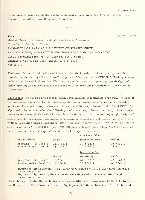
Crook- 1954a
of the data on spacing, stroke -width, reflectance, type size, lower case measurement
variants, and other miscellaneous information.
2604 Crook- 1954b
Crook, Mason N. , Hanson, John A. and Weisz, Alexander
Tufts Coll., Medford, Mass.
LEGIBILITY OF TYPE AS A FUNCTION OF STROKE WIDTH,
LETTER WIDTH, AND LETTER SPACING UNDER LOW ILLUMINATION
WADC Technical rept. 53-440, Mar 54, 34p. , 5 refs.
Contracts W33-038 ac-14559 and AF 33(616)-2018
AD-56 537
Problem : Determine the effect of letter width, stroke -width, letter spacing, and their
interactions on the legibility of small, upper- and lower-case, EXPERIMENTAL typefaces
under conditions of high and low illumination, with a view to improving type design and
letter spacing on aeronautical charts that are to be read under conditions of red cockpit
illumination.
Procedure : Two major and several small supplemental experiments were run. In each of
the two major experiments, 18 male subjects having normal color vision and binocular
acuity read six-point (approximately), black-on-white, experimental (simulated GOTHIC),
alphabetic characters under the following conditions: experiment one (comparison test) -
lower case [based on VARIGRAPH template EV-ULN, and with mean loop height (height of
lower-case letters lacking ascending or descending stems) = 0. 046 inches] in three stroke
widths, two letter widths, and three letter spacings; experiment two (oral reading) - upper
case (based on VARIGRAPH template VB-UN, and with mean letter height = 0. 064 inches)
in the same number and type of variables as for experiment one.
stroke - widths
letter widths (light) (intermediate) (bold)
(regular) 90.3/86.3 22.0/11.4 29.6/24.6 34.4/34.7(condensed) 71. 3/59. 8 18.9/14.6 26.3/25.9 28.6/34.4
letter spacing
(close) (medium) (wide)
(regular) 90.3/86.3 14.3/8.1 54.7/35.6 95.4/63.2(condensed) 71. 3/59. 8 9.1/4.8 35.7/25.4 62.3/46.1
figures to left of virgule (/) are mean percentages of lower-case loop height forexperiment one
figures to right of virgule are mean percentages of upper-case letter height forexperiment two
Factorially combining the variables with two conditions of illumination (0. 08-0. 09 foot-
candles red and 13. 6 foot-candles white light) provided 36 combinations of variables and
-97-
Crook-1954b
interactions in each experiment. Visual adaptation problems were minimized. Speed and
accuracy were measured.
Result : While the report details a large number of typographical design suggestions, the
following generalizations (derived from the experiments) seem pertinent to low illumination
effects:
1. Type characteristics affected legibility more markedly under low illumination.
2. Capitals were read more easily than lower case.
3. Both upper and lower case were read more easily in "regular" vs. "condensed"
widths. Under high illumination, "regular" letters held only a slight advantage.
4. With the exception of material set in close spacing, a stroke -width approximately
equal to "25 (percent) of mean letter width" (sic) (p. 26) is optimum for both upper
and lower case in both "regular" and "condensed" widths. Under high illumination,
stroke -width effect is small, but similar in pattern to the effect under low
illumination.
5. Mean letter spacing approximately equal to "50 (percent) of mean letter width" (sic!)
was optimal under low and high illumination.
6. Interactions occurred among the two design and one spacing factors, with the single
most unfavorable combination being narrow stroked, closely spaced, condensed
letters
.
* # *
2607 Crook-1954c
Crook, Mason N. and Baxter, Frances Schulze
Tufts Coll.,Medford, Mass.
THE DESIGN OF DIGITS
WADC Technical rept. 54-262, Jun 54, 65p. , 47 refs.
Contract W33-038 ac-14559
AD-50 080
Problem : Determine the effect of the following variables on the legibility of luminous digits
of very low brightness: width to height ratio (with area both constant and variable), stroke-
width to height ratio, spacing, configuration, defective strokes, inter -digit confusion,
experimental method, and some interactions between these. Compare the results with the
results of previous experiments with a view to improving the design of low level,
transilluminated, dial type numerals.
Procedure: In an extensive series of recognition (with verbal response) tasks, 4-16 male
subjects (having 20/25 or better visual acuity) tachistoscopically read back-projected,
light on dark, AND numeric characters singly and in groups, under low illumination,
and at a viewing distance of 28 inches. Illumination of the digits was 0. 011-0. 017 foot-
lamberts. Subject adaptation was accounted for. Illumination of the field was 5 X 10"^
-98-
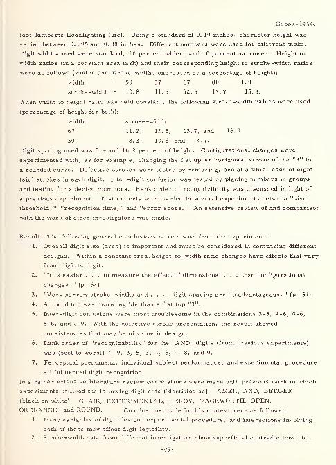
Crook- 1954c
foot-lamberts floodlighting (sic). Using a standard of 0. 19 inches, character height was
varied between 0. 095 and 0. 38 inches. Different numbers were used for different tasks.
Digit widths used were standard, 10 percent wider, and 10 percent narrower. Height to
width ratios (in a constant area task) and their corresponding height to stroke -width ratios
were as follows (widths and stroke -widths expressed as a percentage of height):
width = 50 57 67 80 100
stroke-width = 10.8 11.5 12.5 13.7 15.3.
When width to height ratio was held constant, the following stroke -width values were used
(percentage of height for both):
width s t roke -width
67 11. 2, 12. 5, 13. 7, and 16. 1
50 8. 3, 10. 6, and 12. 7.
Digit spacing used was 5. 4 and 16. 2 percent of height. Configurational changes were
experimented with, as for example, changing the flat upper horizontal stroke of the "3" to
a rounded curve. Defective strokes were tested by removing, one at a time, each of eight
(sic) strokes in each digit. Inter -digit confusion was tested by placing numbers in groups
and testing for selected members. Rank order of recognizibility was discussed in light of
a previous experiment. Test criteria were varied in several experiments between "size
threshold, " "recognition time, " and "error score. " An extensive review of and comparison
with the work of other investigators was made.
Result : The following general conclusions were drawn from the experiments:
1. Overall digit size (area) is important and must be considered in comparing different
designs. Within a constant area, height -to -width ratio changes have effects that vary
from digit to digit.
2. "It is easier ... to measure the effect of dimensional . . . than configurational
changes. " (p. 52)
3. "Very narrow stroke -widths and . . . -digit spacing are disadvantageous. " (p. 52)
4. A round top was more legible than a flat top "3".
5. Inter-digit confusions were most troublesome in the combinations 3-5, 4-6, 0-6,
5-6, and 0-9. With the defective stroke presentation, the result showed
consistencies that may be of value in design.
6. Rank order of "recognizability" for the AND digits (from previous experiments)
was (best to worst) 7, 9, 2, 5, 3, 1, 6, 4, 8, and 0.
7. Perceptual phenomena, individual subject performance, and experimental procedure
all influenced digit recognition.
In a rather extensive literature review correlations were made with previous work in which
experiments utilized the following digit sets (identified as): AMEL, AND, BERGER(black on white), CRAIK, EXPERIMENTAL, LEROY, MACKWORTH, OPEN,
ORDNANCE, and ROUND. Conclusions made in this context were as follows:
1. Many variables of digit design, experimental procedure, and interactions involving
both of these may affect digit legibility.
2. Stroke-width data from different investigators show superficial contradictions, but
-99-
Crook- 1954c
"a general trend in the direction of an increase in optimum strokes as brightness
decreases. " (p. 52) Considering the effects of contrast amount and direction, and
exposure time, "most of the contradictions can be resolved and . . . fitted into a
coherent pattern. " (p. 52)
3. Comparative tests have usually involved digit style or experimental procedure
modifications. It is necessary to take these into account.
4. In dial-type numerals, AMEL has been best validated, but specifically for use on
aircraft control panels.
The paper also defines four levels of design modification. These are as follows:
1. "Changes of detail resulting in only minor departures from some current design. 11
(p. 1)
2. "Substantial innovations, which might or might not show a regard for aesthetic
considerations and printing conventions, but which retain the essential features of
traditional patterns. " (p. 1)
3. "Radical innovations which constitute departures from existing patterns, but which
have enough familiar elements to be correctly recognized at first glance or with a
minimum of learning. " (p. 1)
4. "Entirely new patterns, which could probably be made more discriminable than those
now in use, but which would create a problem of relearning and habituation. " (p. 2)
* * #
3295 Crook-1959Crook, Mason N.
Tufts U. , Medford, Mass.THE EFFECT OF NOISE ON THE PERCEPTION OF FORMSIN ELECTROVISUAL DISPLAY SYSTEMSFinal rept. , 31 Jan 59, 15p. , 15 refs.
Contract DA-49-007 -MD- 536
AD-218 902
Problem : Determine "the effect of visual noise on the perception of familiar andunfamiliar forms against plain and complex backgrounds in a prototype electro-visual
system. " (p. i)
Procedure: In several experiments, 6-18 subjects viewed, and were required to recognize
and/or compare, dark on light (primarily), experimental, silhouette forms in a 52 line per(vertical) inch, experimental, electro-visual, facsimile system. The forms were both
familiar and irregular and were presented on both simple and complex backgrounds.Illumination was at 0. 28, 2. 56, and 30. 60 foot-candles. Varying types and amounts of
visual noise degradation were present. "Landolt rings . . . provided a convenient scale bywhich two types of degradation (size of detail and what detail) could be compared. " (p. 9)
Area, perimeter, geometric construction, and familiarity of objects were the primarycriteria for form construction. Test criteria were accuracy, or accuracy and speed.
Result: Experimental results included the following specific findings:
1. Display system characteristics - "Recognition increased with increasing
signal/noise ratio for all the materials tested . . . (H)igher definition (moreprinting elements in a form of standard size) produced substantially better
-100-
Crook- 1959
recognition under noise. . . (There was) a much more rapid change in recognition
scores when both contrast and contour impairment were operating than whencontrast alone was varied. It is clear that different types of degradation do not
necessarily produce equivalent results. . . For the simpler and more recognizablepatterns, scores improved with increasing illumination from 0. 28 to 2. 56
foot-candles, but not beyond . . . ." (p. 5-6)
2. Form characteristics - "Perimeter, area, and the ratio of perimeter to squareroot of area were determined . . . (but c )orr elations were not computed becauseinspection . . . indicated that all coefficients would be either approximately zero or
very low . . . Results . . . indicate(d) that the response tendencies for the
four-sided forms . . . were different (not necessarily better or easier) from those
for the more complex categories. . . (I)t appeared that the specific requirementsof the task determined whether scores would differ as a function of formcomplexity. . . The recognition-noise functions for the irregular (and 'difficult')
forms . . . indicat(ed) less precision in the judgments. . . Whether the formswere shown in their natural contrast relation or the reverse was found to have no
effect on recognizability. The data provided some indication, however, that copyprinted dark on light was more recognizable than the reverse, regardless of the
type of object represented. " (p. 6-8)
3. Complex backgrounds - "The main effect of complex backgrounds was to disrupt
form contours with resulting impairment of recognition scores. " (p. 9)
4. Interactions - "Various interactions were manifest among form characteristics,
definition, noise level, and background condition. . . They cannot readily be
itemized. " (p. 9)
5. A scaling device - "(O)nce the recognition threshold for a particular form (was)
established in terms of noise level, Landolt rings provide(d) a means for
determining the size of detail which (was) just discriminable at that level, . . .
inferring what detail of the form (was) most critical. " (p. 9)
6. Subjects' response patterns - "(A)ttitudes and assumptions, often unconscious
,
inevitably come into play in operational situations, and eventually undergo whateveradjustment processes the practical requirements make necessary. For moreprecise control and prediction, ... an understanding of the psychological
processes as well as the average performance levels is much to be desired. "
(p. 10)
7. Familiarity - "(I)ncreased familiarity did not improve the same-different judgmentson noisy copy. (It should not be inferred that the same result would hold for anabsolute identification task. ) The several different familiarization procedures usedwere found to differ, not primarily in overall effectiveness, but in effectiveness for
particular types of discrimination, . . . the implication (being) . . . that
generalizations are hazardous unless based on an understanding of the psychological
processes involved." (p. 11-12)
e following broad conclusions were drawn:1. Recognition loss resulting from visual noise degradation in the system used
presented "difficult, but not prohibitive, technical problems. " (p. 13)
2. Recognition in the system was limited by resolution, amount of noise, indefineable
form characteristics, background detail, interactions among these, and the
subject's interpretation of the experimental situation. Tentative interpretations
were presented for interactions among these limitations.
3. "Analysis of the objective variables needs to be supplemented . . . for a full
understanding of form discrimination in complex displays. 11(p. 13)
-101-
Crumley- 1961
2575 Crumley-1961
Crumley, Lloyd, Divany, Richard, Gates, Stephen,
Hostetter, Robert and Hurst, Paul
HRB-Singer, Inc., State College, Pa.
DISPLAY PROBLEMS IN AEROSPACE SURVEILLANCE SYSTEMS.
PART I. A SURVEY OF DISPLAY HARDWARE AND ANALYSIS
OF RELEVANT PSYCHOLOGICAL VARIABLESRept. no. 256-R-2, pt. 1, 30 Jun 61, 257 p. , 348 refs.
Contract AF 19(604)7368
ESD TR-61-33; AD-263 543
Extract : "This report describes . . . work . . . which has as its over-all objective the
determination of the information presentation requirements of human data processing roles
in future air and aerospace surveillance systems. . . Display parameters and operator
characteristics . . . relevant to display selection . . . (, ) reviews of some of the pertinent
literature . . . (, and t)he description and specification of operator roles (are) . . .
included ... (p. vii) This report is (intended as) a working vehicle with information and
reference data intended to support the conclusions and recommendations ... in the final
(classified) report. " (p. ix) Thus, "specific implications of the factors studied are not
delineated ... (p. 2)
"Chapter I begins with a general discussion of surveillance systems and proceeds to a
general discussion of displays, pointing up the information transfer interface problem in
the design of displays for a given system. Finally, the approach used is described and
discussed relative to the problems involved.
"Chapter II defines and discusses the display parameters which are important in the
evaluation and selection of displays. In addition to important physical display factors
(resolution, scale factor, transformation and accuracy, size, brightness, color, and shape),
information factors (capacity load and speed, deliberate and incidental redundancy,
reliability signal/noise and isomorphism, replacement, and selectivity), and the temporal
factors (currentness in parallel and serial presentation and interaction effects, initiation
and termination factors of duration, and access time), a discussion of some of the pertinent
display environment considerations is presented (temperature and humidity, light, and
noise and vibration).
"Chapter III discusses operator characteristics, some of which will operationally dictate
the inclusions or exclusions of certain display characteristics. Some of these will also
define the limits within which certain display parameters can vary and still continue to
produce efficient information flow through the operator.
"Chapter IV presents a functional analysis of the operator roles in the conceptual model
.... This analysis is on a 'block by block' basis in relation to the conceptual model. It
is from these functions that the operator roles will be developed and related to display
selection in the final report ....
"Chapter V presents a digest of the state of the art in displays (see outline shown below).
-102-
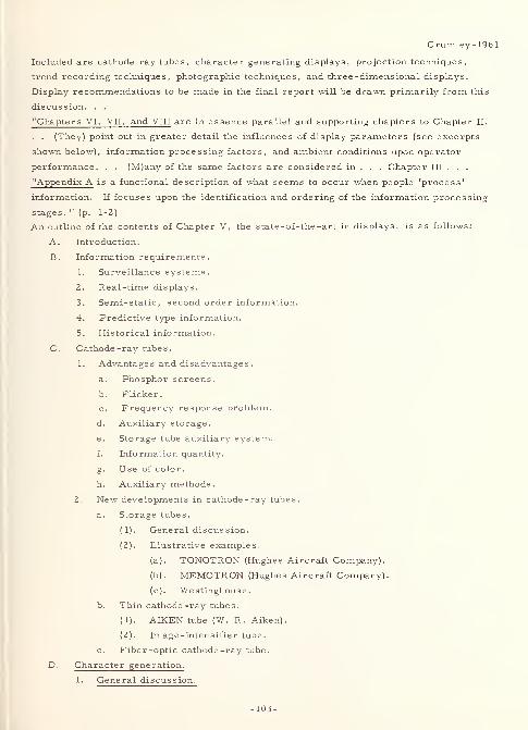
Crumley-1961
Included are cathode ray tubes, character generating displays, projection techniques,
trend recording techniques, photographic techniques, and three-dimensional displays.
Display recommendations to be made in the final report will be drawn primarily from this
discussion. . .
"Chapters VI, VII, and VIII are in essence parallel and supporting chapters to Chapter II.
. . (They) point out in greater detail the influences of display parameters (see excerpts
shown below), information processing factors, and ambient conditions upon operator
performance. . . (M)any of the same factors are considered in . . . Chapter III . . .
"Appendix A is a functional description of what seems to occur when people 'process'
information. If focuses upon the identification and ordering of the information processing
stages. " (p. 1-2)
An outline of the contents of Chapter V, the state-of-the-art in displays, is as follows:
A. Introduction.
B. Information requirements.
1. Surveillance systems.
2. Real-time displays.
3. Semi-static, second order information.
4. Predictive type information.
5. Historical information.
C. Cathode -ray tubes .
1. Advantages and disadvantages.
a. Phosphor screens.
b. Flicker.
c. Frequency response problem.
d. Auxiliary storage.
e. Storage tube auxiliary system.
f. Information quantity.
Use of color.
h. Auxiliary methods.
2. New developments in cathode-ray tubes.
a. Storage tubes.
(1) . General discussion.
(2) . Illustrative examples.
(a) . TONOTRON (Hughes Aircraft Company).
(b) . MEMOTRON (Hughes Aircraft Company).
(c) . Westinghouse.
b. Thin cathode -ray tubes.
(1) . AIKEN tube (W. R. Aiken).
(2) . Image -intensifier tube.
c. Fiber-optic cathode -ray tube.
D. Character generation.
1. General discussion.
-103-
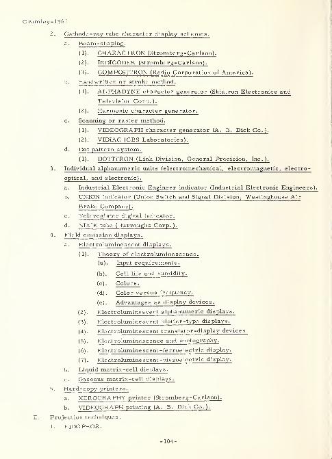
Crumley- 1961
2. Cathode -ray tube character display schemes.
a. Beam-shaping.
(1) . CHARACTRON (Stromberg-Carlson).
(2) . INDICODER (Stromberg-Carlson).
(3) . COMPOSITRON (Radio Corporation of America).
b. Handwritten or stroke method.
(1) . ALPHADfNE character generator (Skiatron Electronics and
Television Corp. ).
(2) . Harmonic character generator.
c . Scanning or raster method.
(1) . VIDEOGRAPH character generator (A. B. Dick Co. ).
(2) . VIDIAC (CBS Laboratories).
d. Dot pattern system.
( 1). DOTITRON (Link Division, General Precision, Inc.).
3. Individual alphanumeric units (electromechanical, electromagnetic, electro-
optical, and electronic).
a. Industrial Electronic Engineer indicator (Industrial Electronic Engineers).
b. UNION indicator (Union Switch and Signal Division, Westinghouse Air
Brake Company).
c. Teleregister digital indicator.
d. NIXIE tube (Burroughs Corp.).
4. Field emission displays.
a. Electroluminescent displays.
(1) . Theory of electroluminescence.
(a) . Input requirements.
(b) . Cell life and humidity.
(c) . Colors
.
(d) . Color versus frequency.
(e) . Advantages as display devices.
(2) . Electroluminescent alphanumeric displays.
(3) . Electroluminescent plotter-type displays.
(4) . Electroluminescent translator -display devices.
(5) . Electroluminescence and photography.
(6) . Electroluminescent-ferroelectric display.
(7) . Electroluminescent -piezoelectric display.
b. Liquid matrix-cell displays.
c. Gas eous matrix-cell displays.
5. Hard-copy printers.
a. XEROGRAPHY printer (Stromberg-Carlson).
b. VIDEOGRAPH printing (A. B. Dick Co.).
E. Projection techniques
.
1. EIDOPHOR.
-104-
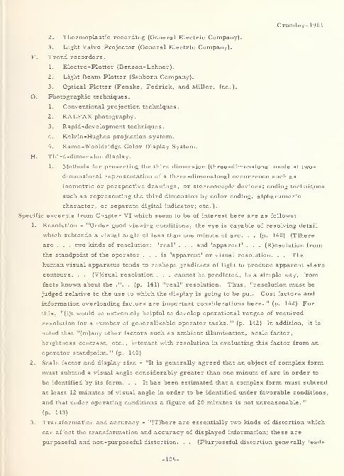
Crumley- 1961
2. Thermoplastic recording (General Electric Company).
3. Light Valve Projector (General Electric Company).
F. Trend recorders
.
1. Electro-Plotter (Benson-Lehner)
.
2. Light Beam Plotter (Sanborn Company).
3. Optical Plotter (Fenske, Fedrick, and Miller, Inc.).
G. Photographic techniques.
1. Conventional projection techniques.
2. KALFAX photography.
3. Rapid-development techniques.
4. Kelvin-Hughes projection system.
5. Ramo-Wooldridge Color Display System.
H. Third-dimension display.
1. Methods for presenting the third dimension (three-dimensional models; two-
dimensional representation of a three-dimensional occurrence such as
isometric or perspective drawings, or stereoscopic devices; coding techniques
such as representing the third dimension by color coding, alphanumeric
character, or separate digital indicator; etc.).
Specific excerpts from Chapter VI which seem to be of interest here are as follows:
I. Resolution - "Under good viewing conditions, the eye is capable of resolving detail
which subtends a visual angle of less than one minute of arc. . . (p. 140) (T)here
are . . . two kinds of resolution: 'real' . . . and 'apparent' . . . (R)esolution from
the standpoint of the operator ... is 'apparent' or visual resolution. . . The
human visual apparatus tends to reshape gradients of light to produce apparent sharp
contours. . . (V)isual resolution . . . cannot be predicted, in a simple way, from
facts known about the .". . (p. 141) "real" resolution. Thus, "resolution must be
judged relative to the use to which the display is going to be put. Cost factors and
information overloading factors are important considerations here. " (p. 142) For
this, "(i)t would be extremely helpful to develop operational ranges of required
resolution for a number of generalizable operator tasks. " (p. 142) In addition, it is
noted that "(m)any other factors such as ambient illumination, scale factor,
brightness contrast, etc. , interact with resolution in evaluating this factor from an
operator standpoint. " (p. 140)
2. Scale factor and display size - "It is generally agreed that an object of complex form
must subtend a visual angle considerably greater than one minute of arc in order to
be identified by its form. . . It has been estimated that a complex form must subtend
at least 12 minutes of visual angle in order to be identified under favorable conditions,
and that under operating conditions a figure of 20 minutes is not unreasonable. "
(p. 143)
3. Transformation and accuracy - "(T)here are essentially two kinds of distortion which
can affect the transformation and accuracy of displayed information; these are
purposeful and non-purposeful distortion. . . (P)urposeful distortion generally leads
-105-
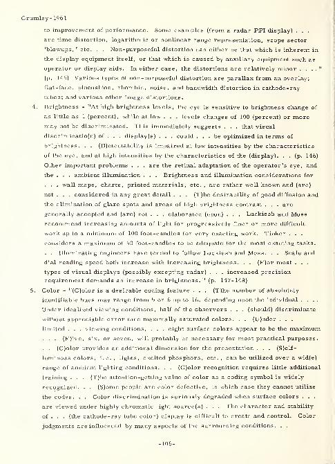
Crumley- 1961
to improvement of performance. Some examples (from a radar PPI display) . . .
are time distortion, logarithmic or nonlinear range representation, scope sector
'blowups, ' etc. . . Non-purposeful distortion can either be that which is inherent in
the display equipment itself, or that which is caused by auxiliary equipment such as
operator or display aids. In either case, the distortions are relatively minor . . . ."
(p. 145) Various types of non-purposeful distortion are parallax from an overlay;
flat-face, pincushion, rhombic, noise, and bandwidth distortion in cathode-ray
tubes; and various other image distortions.
4. Brightness - "At high brightness levels, the eye is sensitive to brightness change of
as little as 1 (percent), while at low . . . levels changes of 100 (percent) or more
may not be discriminated. This immediately suggests . . . that visual
discriminatio(n) of . . . display(s) . . . could ... be optimized in terms of
brightness. . . (D)etectability is impaired at low intensities by the characteristics
of the eye, and at high intensities by the characteristics of the (display). . . (p. 146)
Other important problems . . . are the retinal adaptation of the operator's eye, and
the . . . ambient illumination . . . Brightness and illumination considerations for
. . . wall maps, charts, printed materials, etc. , are rather well known and (are)
not . . . considered in any great detail . . . (T)he desirability of good diffusion and
the elimination of glare spots and areas of high brightness contrast . . . are
generally accepted and (are) not . . . elaborated (upon) . . . Luckiesh and Moss
recommend increasing amounts of light for progressively finer or more difficult
work up to a minimum of 100 foot-candles for very exacting work. Tinker . . .
considers a maximum of 50 foot-candles to be adequate for the most exacting tasks.
. . Illuminating engineers have tended to follow Luckiesh and Moss. . . Scale and
dial reading speed both increase with increasing brightness. . . (F)or most . . .
types of visual displays (possibly excepting radar) . . . increased precision
requirement demands an increase in brightness. 11
(p. 147-148)
5. Color - "(C)olor is a desirable coding feature . . . (T)he number of absolutely
identifiable hues may range from 5 or 6 up to 16, depending upon the individual ....
Under idealized viewing conditions, half of the observers . . . (should) discriminate
without appreciable error nine maximally saturated colors. . . (U)nder . . .
limited . . . viewing conditions, . . . eight surface colors appear to be the maximum
. . . (F)ive, six, or seven, will probably be necessary for most practical purposes
.
. . (C)olor provides an additional dimension for the presentation . . . (S)elf-
luminous colors, i.e.,lights, excited phosphors, etc. , can be utilized over a wid(e)
range of ambient lighting conditions. . . (C)olor recognition requires little additional
training . . . (T)he attention-getting value of color as a coding symbol is widely
recognized. . . (S)ome people are color defective, in which case they cannot utilize
the codes. . . Color discrimination is seriously degraded when surface colors . . .
are viewed under highly chromatic light source(s) . . . The character and stability
of . . . (the cathode -ray tube color) display is difficult to create and control. Color
judgments are influenced by many aspects of the surrounding conditions. . .
-106-
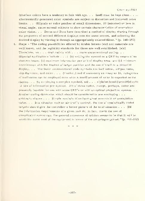
Crumley- 1961
(S)urface colors have a tendency to fade with age. . . (and) must be kept clean ....
Electronically generated color symbols are subject to distortion and (colored) noise
limits. . . (S)ignals or color patches of small dimensions, 20 (minutes) or less in
visual angle, cause normal subjects to show certain characteristics of anomalous
color vision. . . Devoe and Duva have described a method of display sharing through
the projection of several different displays onto the same screen, and selecting the
desired display by viewing it through an appropriately colored filter. " (p. 148-150)
Shape - "The coding possibilities offered by Arabic letters (sic) and numerals are
well known, and the legibility standards for these are well established, (sic)
Therefore, we . . . deal mainly with . . . more unconventional coding. . .
(S)pecial applications include . . . : (a) writing the symbol on a CRT by means of an
electron beam, (b) maximum information per unit of display area, and (c) minimum
interference with the readout of target position and the use of trail on a pictorial
display. . . The basic unconventional code symbols are inclination, ellipse ratio,
blip diameter, and color . . . (Twelve, ) and if necessary as many as 16, categories
of inclination can be employed even when a small amount of noise is expected on the
display. . . By employing a complex symbol(, an) . . . alphabet (could) provid(e) up to
12 bits of information per symbol. All of these codes, except, perhaps, color are
presently feasible for use with some CRT's or with an optical projection system. . .
Another coding dimension which should be considered is one employing . . .
arbitrary shapes . . . Simple symbols often have great mnemonic or associative
value. . . In a situation such as air traffic control, the use of symbolically coded
targets should give the controller a better picture of the total situation . . . (I)f
the information requirements of a given task do, in fact, merit the use of
complicated symbology, the general consensus of opinion seems to be that it will be
worth the extra cost of the equipment in terms of the advantages gained. " (p. 151-152)
* # #
-107-

Dearborn- 1906
2197 Dearborn-1906Dearborn, Walter F.
THE PSYCHOLOGY OF READING, AN EXPERIMENTAL STUDYOF THE READING PAUSES AND MOVEMENTS OF THE EYEArchives of Philosophy, Psychology and Scientific Methods,
J. McKeen Cattell and Frederick J. E. Woodbridge, Editors,
No. 4, March 1906
Columbia U. Contributions to Philosophy and Psychology,Vol. 14, No. 1
New York, The Science Press, 134 p.
Problem: "(D)etermine . . . the form and character of the movement of the eye in reading,
and . . . define or plot the positions on the page which correspond to the so-called fixation
or reading pauses of the eye. " (p. 8)
Procedure: "(Q)uestions . . . concerning the perception and recognition of words andsentences, the typographical and more purely physiological factors which impede or aid in
reading, the basis of the individual differences in the rapidity of reading and other related
problems (are) discussed in reference to the data . . . obtained. " (p. 8) The following
outline of contents indicates the scope and coverage of this monograph:
I. Introduction.
II. Historical summary.
III. Methods and records (including (a) methods and apparatus, (b)
explanation of records and the method of measurement, and (c)
description of accompanying photographs).
IV. The fixation pauses (including (a) the number of fixation pauses and the
extent of page read per fixation, (b) motor habits, and (c) refixations).
V. Is there perception during eye movement ?
VI. The distribution of attention in perception .
VII. Visual processes involved in recollecting.
VIII. The duration of the fixation pauses (including (a) relation to the numberof pauses, and (b) the length of fixation and the reaction time of the eye)
IX. The span of attention and the duration of pauses (including experimentalisolation of the reading pauses).
X. The number span of attention .
XI. The location of the fixation pauses (including (a) the location of pausesin ordinary reading; (b) proof reading, effect of articulation, etc. ; (c)
children's reading; and (d) the effect of long and short words).
XII. The length of text lines and motor habits .
XIII . Rapidity of reading .
XIV . The fatigue of the eyes in reading .
XV. Summary and conclusions .
Appendix. Passages used for experimentation (excerpts only, but excluding the
typewritten nonsense word and number groups).
Regarding "III", above, the apparatus used was a modification of the Dodge falling plate
camera, which photographs movements of the corneal reflection. The apparatus andmethod described were thought to be especially useful in prospective work with children.
-109-
Dearborn-1906
Result : The following selected excerpts are applicable to problems of readability: Theauthor's "relation of fixation and attention is at variance with the Wundtian theory,
developed by Zeitler. . ." (p. 49) who would have the subject fixate on "the so-called
domineering letters. . . (as) the principal basis for perception. (Domineering letters are
( 1) capitals, (2) letters that stand above the line as 1, t, d, h, k, and especially suchcombinations as scht, and (3) in some instances m, w; i. e. , the broader letters . . . )
Messmer's . . . statement" (p. 41-50) compared this theory with the concept that "the
more the letters of slight individual form (with straight lines) predominate, so much the
greater is the impulse to a unitary (perception). " (p. 50) In addition, "(t)here is . . .
evidence to support the observation that the threshold of perception of the domineeringletters ... is lower than that of the other(s) . . . (The following letters were . . .
perceived apart . . . (as) found in Messmer's tables: i, k, h, w, g, . . . b, gew, sch,
her, ge, . . . d, . . . ch, . . . S, nnen). " (p. 52) Messmer contends that "every other
partial perception of a word is by syllables" (p. 52) and that h, t, fl, etc. , are not
dominant letters. In considering dominant letters, Erdmann and Dodge stated that 11 'wordsof characteristic optical "Gesammtform" are more easily recognized than those of
undifferentiated (gleichformiger) configuration. ' " (p. 53) Cattell found the dominant letters,
i. e. , "the letters most easily perceived, mainly 'those letters which project above the
body of the word and the additional middle sized letters x and z. ' " (p. 90) The author
hypothesizes that the dominant letters "furnish ... a better form of peripheral stimulation
. . ., i.e. they 'catch the eye' more readily." (p. 90)
3346 Dearborn- 1951
Dearborn, Walter F. , Johnston, Philip W.
and Carmichael, Leonard
Tufts U. , Medford, Mass.
IMPROVING THE READABILITY OF TYPEWRITTENMANUSCRIPTSProceedings of the National Academy of Sciences,
37:10 (October 1951) 670-672, 2 refs.
Problem : Determine a manner in which "a typewritten page may be prepared which is not
displeasing in appearance to most readers and which significantly increases the
comprehension of the material presented. " (p. 672)
Procedure : After preliminary selection (based on "good experimental (and/)or theoretical
justification"), (p. 670) a "peak stress" typewritten format was adopted for major
experimentation. The article describes only this final format and experiments performed
with it. In this "peak stress" format, "explicit indication of the author's meaning is given
by capitalizing (. . . italics . . . might be preferable) in each sentence that word to which
the author would give maximum oral stress. . . Other changes . . . worthy of mention
are (1) a two-column arrangement . . . ; (2) single -spaced lines . . . ; (3) other 'spatial'
arrangements which break up the article for the reader into more comprehensible units of
thought and; (sic) (4) the blackening of certain sections (effected by retyping over the
original) deemed by the author to be of particular importance. " (p. 671) The first
experiment involved 70 college students, who "were required to read (individually) a long
-110-
Dearborn- 1906
article of moderate to severe difficulty in conventional format and in peak stress format.
The design of the experiment was . . . altered for group experimentation. . . This basic
experiment was subsequently repeated four times. In these . . . , new sets of college
subjects were first given two standardized tests of reading (the Nelson Denny and the
California Advanced Reading Test) and were then 'paired' on the basis of the averages of
their scores in these two tests. One of each pair read the materials in the peak stress
form and the other in the conventional format. Four groups of approximately twenty
students each were thus examined. " (p. 671) Subsequent to these tests, a "demonstration
of the efficiency of (the) new format was . . . made in a class of 38 graduate students at
Harvard. In this case 85 words were deleted from both the new and the standard formats
(the same words from each). . . (S)tudents . . . were . . . asked to read the article and
to fill in the missing words. " (p. 671)
Result: The results of the basic experiment showed "an increase in comprehension of 16
per cent over material presented in conventional typed format. The improvement . . .
(was) significant at the five per cent . . . level. " (p. 671) Also, "(t)he (new) format was
definitely preferred subjectively by 95 per cent of these subjects. " (p. 671) In the
four subsequent experiments, "(t)he percentage gains of the subjects who read the improved
format were for Experiment I, ZZ per cent; for Experiment II, 30 per cent; for Experiment
III, 10 per cent; and for Experiment IV, 18 per cent. The average gain for the half of the
total population which (sic) read the new format was 19. 5 per cent. " (p. 671) In the
Harvard demonstration, "(t)he readers of the new format succeeded in filling in Z 1 percent
more of deleted words . . . than did the readers of the conventional format. 11
(p. 67Z)
Further experimentation on the new format will utilize the electrical recording of eye
movements
.
Z577 Decker-1961
Decker, James D.
Virginia Council of Highway Investigation and
Research, Charlottesville
HIGHWAY SIGN STUDIES -- VIRGINIA I960
In PROCEEDINGS OF THE FORTIETH ANNUAL MEETING, 1961,
Herbert P. Orland, Editor (Washington, D. C. ,
National Academy of Sciences -National Research
Council Publication 863, 1961), Vol. 40, p. 593-609, 5 refs.
Problem : "(C)ompare the (day and night, dynamic) legibility of two signs (placed to
simulate a rural situation on the Interstate System of highways) having different color
combinations but the same letter size and series. " (p. 593) In another, unrelated, study,
"investigat(e) the (day and night) visibility of various designs (stripe width, over-all size,
-111-
Decker- 1961
and color combination variables) for diagonally striped signs which are used as (bridge end)
hazard warning markers on . . . highways. " (p. 593)
Procedure : (Phase I Legibility Study of Roadside Signs)
"Twenty -four subjects
(fourteen male and ten female, ranging in age from 18 to 38 years, and with visual far
acuities ranging from 20/14 to 20/50, with a mean acuity of 20/20. 3, and having normal
color vision, each) read (12 pairs of signs) . . . (from) a moving vehicle (20 miles per
hour) under three levels of illumination (daylight, and high-beam four lamps, 150 watts
and low-beam two lamps, 100 watts at night). . . in a simulated rural Interstate
situation. " (p. 594) On each sign were two^word messages. "The test words . . . all
were four-letter(s) ... so that they could not be identified by length alone. . . (p. 596)
The twelve words chosen (familiar, but not necessarily those encountered on a highway)
were: DOFF, DUDE, ELMS, FELT, FOOT, FUSE, LOOM, MODE, MULE, SELF, SIDE,
(and) TOLL. . . The letters were all standard (U.S. Bureau of Public Roads) 'D' series
upper-case, 10-(inch) high with a stroke width of 1-9/16 (inches). The words had a length
expansion of approximately 10 to 15 percent over standard 'D' series spacing. The spacing
used was that . . . designed for 10-(inch) upper case letters of a 'modified E 1 series. 11
(p. 597) Color combinations used were (1) green non-reflectorized letters on a white
(specified as silver) reflectorized field (this combination is effectively black on white at
night), and (2) white reflectorized letters on a blue reflectorized field. "The (reflective
field) sheeting was . . . made with a flat surface and a non-exposed lens system. . .
(p. 595) (I)dentical words and spacings were used for both color combinations. . . The
message panels (words) were (randomly) presented . . . two at a time, one above the other
. . . ." (p. 597) The signs were posted with the "bottom edge 7 (feet) above the edge of the
pavement and (the) roadside edge 17 (feet) from the edge of the pavement. . . (p. 595)
(T)he sign faces formed an angle of somewhat more than 90 (degrees) with the edge of the
pavement to prevent specular glare. . . (p. 596) (and were) placed . . . facing westbound
traffic. . . (T)he daylight tests were conducted in the morning hours when the weather was
clear. . . (p. 597) Traffic was kept out of the (test) section during night test observations
to prevent opposing headlight glare and headlamp illumination from other cars on the sign
face. . . (p. 598) The (legibility) distance was marked down . . . when (the subject) called
aloud the second word. . . The data were initially subjected to an analysis of variance. "
(p. 600) Since "(t)he experimental design was a 3 (by) 2 factorial with two replications. . .
(, ) (p. 600) (t)he three sources of variation analyzed were the color combination, the level
of illumination, and the interaction of these two factors. " (p. 601)
Result: (Phase I Legibility Study of Roadside Signs ) Mean legibility distances were as
follows:
-112-
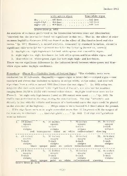
Decker- 1961
white-green signs
day 657 feet
night -high . . 466 feetnight-low . . 404 feet
(above from p. 600)
An analysis of variance performed on the interaction between color and illumination
"show(ed) that the interaction (was) not significant in this test. That is, the effect of color
on mean legibility distances (did) not depend on the effect of illumination level and vice
versa. " (p. 601) However, a second analysis, measured by standard deviation, showed a
significant difference (at the 5 percent level) for the following (better vs. worse):
1. daylight vs. night high-beam for both white -green and blue -white signs,
2. night high- vs. night low-beam for both white -green and blue -white signs, and
3. blue-white vs. white-green signs for both night high- and low-beam.
There was no significant difference (at the indicated level) between white-green and blue-
white signs under daylight conditions.
Procedure : (Phase II Visibility Study of Striped Signs ) "The visibility tests were
conducted (on 12 full-scale, diagonally upper-right to lower-left striped signs one
standard and eleven that included variations in stripe width, stripe color, and over-all
sign size) from a vehicle parked 1000 (feet) from the test signs.". . (p. 602) using ten
subjects who each were seated in the right front of the car, and who had far acuities
ranging from 20/18 to 20/22 with normal color vision. Daylight conditions were as for
Phase I. "At night only high beams (rated at 150 watts) were used . . . ." (p. 602) No
traffic was permitted on the road during the observations. The sign "structure was
directly in line with the vehicle and because of a horizontal curve the signs could be placed
on the shoulder of the highway. . . (S)ign centers were located 4. 2 (feet) above the ground.
. . (T)he sign faces were at an angle somewhat more than 90 (degrees) with the tangent of
the roadway to eliminate . . . specular glare . . . ." (p. 602) Test sign configurations
were as follows:
1. 24 inches 4. 30 inches 7. 36 inches 10. 36 inchessquare
5-inchsquare
5-inchsquare
6-inchsquare
3-inchstripes
redstripes
transparent color on whistripes stripes
te reflectorized sheeting
2. 24 inches 5. 30 inches 8. 36 inches 11. 3 6 inchessquare
5 -inchsquare
5 -inchsquare
6-inchsquare
3-inchstripes
black opaquestripe s
paint on yellowstripes
reflectorizedstripe s
sheeting
3. 24 inches 6. 30 inches 9. 36 inches 12. 36 inchessquare
5 -inchsquare
5-inchsquare
6-inchsquare
3-inchstripes
black opaquestripe s
paint on whitestripes
reflectorizedstripes
sheeting(above from p. 604)
blue -white signs
. . 662 feet
. . 533 feet
. . 488 feet
-113-
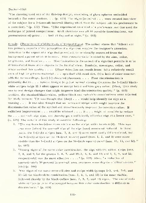
Decker-1961
"The sheeting used was of the flat-top design, consisting of glass spheres embedded
beneath a flat outer surface. . . (p. 603) The signs (in pairs) . . . were rotated into view
of the subject for a 3-(second) interval (during which time the subject told his preference to
a recorder). 11
(p. 602) Thus, "(t)he experiment consisted of a preference test that used the
technique of paired comparisons. Each observer saw all 66 possible (combinations, not
permutations of) pairs . . . both at day and at night. " (p. 603)
Result : (Phase II Visibility Study of Striped Signs ) The author states that "(t)here are
two primary aspects of the perception of a sign that require the designer's attention.
Detection is the aspect of a sign that permits it to be visually separated from the
background against which it is seen. This characteristic is aided by the size, color,
brightness, and location .... Discrimination is the aspect of a sign that permits it to be
differentiated from other objects in the field of view. Symbols, messages, color, and
shape control this quality .... (P)oor detection can result from: (a) a relatively small
area of high brightness material . . . splashed with road dirt, (b) a lack of color contrast
with the surroundings, (and) (c) obscured placement . . . Poor discrimination is
primarily due to . . . symbol design; (e.g.) at normal viewing distances the 3-(inch) black-
white stripes (sign 1Z. ) often appear to merge into a uniform gray color. (Thus, t)his study
was to test design changes that might improve (the) discrimination quality. " (p. 605)
Besides, the standard black-white, yellow-black and red-white combinations were selected
for study because "(i)t was thought that (they) . . . would help identify the sign as a
warning ... It was also thought that an increased stripe width might improve the
discrimination value of the symbol and simultaneously improve its detection value. If
sufficient improvement . . . could be attained . . . , it . . . might be possible to reduce
the . . . over-all sign size, and thereby get a sufficiently effective sign at a lower cost. "
(p. 605) The results of this study showed the following:
1. "The markers bec(a)me more visible as the stripe width increase(d). This was
true even (when) the over -all size of the sign (was) somewhat reduced. In these
tests, the 6-(inch) stripes (nos. 7, 8, and 9) were most easily differentiated, but
the 5-(inch) stripes on the 24-(inch square) panel (nos. 1, 2, and 3) were more
visible than the 3-(inch) stripes on the 36-(inch square) panel (nos. 10, 11, and 12). "
(p. 607)
2. "Among signs of the same color combination, the sign with the widest stripe (nos.
7, 8, and 9; for the groups 1, 4, 7, and 10; 2, 5, 8, and 11; and 3, 6, 9, and 12;
respectively) was the most effective . . . ." (p. 608) Also, "a reduction of
approximately 30 percent in over-all area produces some degree of effectiveness. "
(sic) (p. 608)
3. "For signs of the same over-all size and stripe width (groups 1-3, 4-6, 7-9, and
10-12) the black-white combination (nos. 3, 6, 9, and 12) is the most visible,
followed closely by the black-yellow (nos. 2, 5, 8, and 11) signs. The use of red-
white stripes is to be discouraged because this color combination is difficult to
discriminate. " (p. 608)
-114-
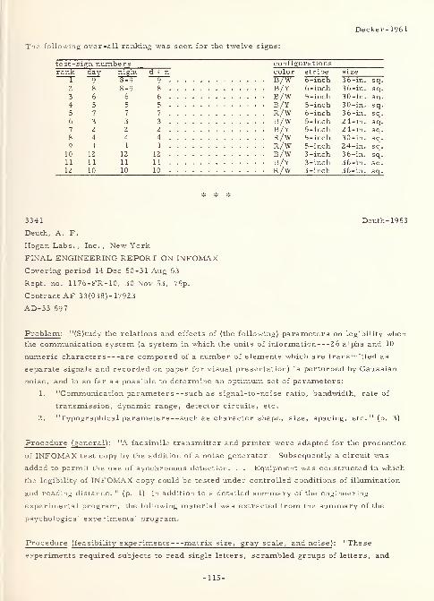
Decker-1961
The following over -all ranking was seen for the twelve signs:
test-s Lgn numbers configurationsrank night d + n color stripe size
r—9 8-9 9 B/W 6-inch 36-in. sq.
2 8 8-9 8 B/Y 6-inch 36-in. sq.
3 6 6 6 B/W 5-inch 30-in. sq.
4 5 5 5 5-inch 30-in. sq.
5 7 7 7 R/W 6-inch 36-in. sq.
6 3 3 3 b/w 5-inch 24-in. sq.
7 2 2 2 b/y 5 -inch 24-in. sq.
8 4 4 4 R/W 5-inch 30-in. sq.
9 1 1 1 R/W 5-inch 24-in. sq.
10 12 12 12 3-inch 36-in. sq.11 11 11 3 -inch 36-in. sq.
12 10 10 10 R/W 3 -inch 36-in. sq.
3341
Deuth, A. F.
Hogan Labs. , Inc. , New York
FINAL ENGINEERING REPORT ON INFOMAXCovering period 14 Dec 50-31 Aug 53
Rept. no. 1176-FR-10, 30 Nov 53, 75p.
Contract AF 33(038)- 17923
AD-33 597
Deuth- 1953
Problem : "(S)tudy the relations and effects of (the following) parameters on legibility whenthe communication system (a system in which the units of information 2 6 alpha and 10
numeric characters are composed of a number of elements which are transmitted as
separate signals and recorded on paper for visual presentation) is perturbed by Gaussian
noise, and in so far as possible to determine an optimum set of parameters:
1. "Communication parameters --such as signal-to-noise ratio, bandwidth, rate of
transmission, dynamic range, detector circuits, etc.
2. "Typographical parameter s - -such as character shape, size, spacing, etc. " (p. 3)
Procedure (general ): "A facsimile transmitter and printer were adapted for the production
of INFOMAX test copy by the addition of a noise generator. Subsequently a circuit was
added to permit the use of synchronous detection. . . Equipment was constructed in which
the legibility of INFOMAX copy could be tested under controlled conditions of illumination
and reading distance. " (p. 1) In addition to a detailed summary of the engineering
experimental program, the following material was extracted from the summary of the
psychological experimental program.
Procedure (feasibility experiments matrix size, gray scale, and noise) : "These
experiments required subjects to read single letters, scrambled groups of letters, and
-115-
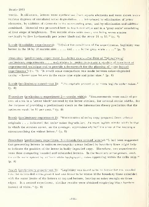
Deuth-1953
words. In all cases, letters were synthesized from square elements and were shown under
various degrees of simulated noise degradation. . . introduced by elimination of letter
elements, by addition of elements in the surrounding area, and by elimination and addition
combined. Material was presented both in black and white and in a 'gray scale' consisting
of four steps of brightness. Two matrix sizes were used, one being seven spaces
vertically by five horizontally per letter block and the other 14 by 10. "(p. 7)
Result (feasibility experiments ): "(U)nder the conditions of the experiments, legibility was
better in the 14 by 10 matrix size . . . , and ... in the gray scale . . . ." (p. 7)
Procedure (preliminary experiment 1 letter case the first of "( a ) series of
preliminary experiments . . . undertaken in order to answer a number of questions of
experimental technique and to provide a framework for the planning of more formal
f-.[K- nments" ) (p. 7): "A small scale comparison was made between noise -degraded
capital - lower case letters in the same type style and point size. " (p. 8)
Result (preliminary experiment 1 ): "The capitals proved to be more legible under noise. "
(p. 8)
Procedure (preliminary experiment 2 stroke width ): "Measurements were made of per
cent of area in a 'letter block' covered by the letter strokes, for several stroke widths, for
the purpose of providing a preliminary check on the information theory prediction that the
optimum would be 50 per cent. " (p. 8)
Result (preliminary experiment 2) : "Examination of noisy copy prepared from printed
originals . . . indicated that under noise degradation, the most legible stroke width is that
in which the strokes cover, on the average, approximately half the area of the rectangle
circumscribing the widest letter. " (p. 8)
Procedure (preliminary experiment 3 boundaries around letters): "It had been suggested
that presenting letters in uniform rectangular areas defined by boundary lines might help
to indicate the position of the letter in badly degraded copy. Therefore, two experiments
were done comparing bounded and unbounded letters. In the boundary arrangement used,
the cells were spaced by uniform white background, noise appearing within the cells only. "
(p. 8)
Result (preliminary experiment 3 ): "Legibility was found to be no better for the bounded
than the unbounded arrangement and was found to be worse if the boundary lines coincided
with the outer limits of the letters at top and bottom, leaving no noisy margin on those
edges. In a second experiment, similar results were obtained employing black borders
instead of white. " (p. 8)
-116-
Deuth-1953
Procedure (preliminary experiment 4 columnar arrangement of letters ): "The effect of
presenting the letters in uniform columns was tested by comparing this arrangement with
one in which the letters were not aligned in columns. " (p. 8)
Result (preliminary experiment 4): "No difference was found. " (p. 8)
Procedure (preliminary experiment 5 letter spacing) : "It had been assumed that . . .
all letters would be assigned the same amount of space in the line, as in typing, rather than
variable spaces as in printing. . . With this arrangement, the closest spacing possible
between letters for a given type face is that in which the uniform letter areas are the width
of the widest letter. In the . . . test, letter areas of this size were compared with
somewhat wider letter areas (i.e. with copy so printed that the average space between
letters was somewhat greater). " (p. 8-9)
Result (preliminary experiment 5 ): "The wider spacing was found to be of no advantage for
legibility. " (p. 9)
Procedure (preliminary experiment 6 letter spacing ): "A second spacing experiment
included a narrower spacing arrangement in which the basic letter area was reduced by
redesigning the widest letters (W, M and A). " (p. 9)
Result (preliminary experiment 6 ): "The data was inconclusive, but there was some
indication that reducing the spacing below the narrowest spacing possible with the type face
as originally designed impaired legibility. " (p. 9)
Procedure (preliminary experiment 7 noise ): "(D)ata were gathered on the relative
legibility under noise of a number of equivalent type sizes at 14 inches, (4-, 8-, 10-, 12-,
14-, 24-, and 36-point sizes). 11
(p. 9)
Result (preliminary experiment 7): "The 8 to 12 point range of sizes appeared to be
optimum. There appeared to be little or no difference in legibility within this range, while
there was impairment of legibility for the larger and smaller equivalent type sizes. " (p. 9)
Procedure (preliminary experiment 8 gray scale ): "Optical density measurements of
black and white noise -degraded copy were made over the available range of S/N (signal-to-
noise) values. " (p. 9)
Result (preliminary experiment 8 ): "Results indicated a discrepancy, probably of minor
importance, from an optimum centering of the density range about a middle gray value. "
(p. 9)
Procedure (preliminary experiment 9 learning) : "A further experiment (was) designed
-117-
Deuth-1953
to provide information on the amount of improvement produced by learning in the reading of
noisy copy . . . ." (p. 9)
Result (preliminary experiment 9): This "indicated relatively small improvement. Data
derived from later experiments showed that at the low error levels of practical interest
virtually all improvements occur within eight experimental trials. " (p. 9)
Procedure (preliminary experiment 10 experimental arrangements): Studied were "(a)
the possible effect of mirrors used to increase the viewing distance, and (b) the effect of
instructing the subject to work for speed. " (p. 9)
Result (preliminary experiment 10): "Some indication was found that the mirrors might
have a small effect on performance which could easily be allowed for. Instructing the
subject to work for speed had the effect of reducing time scores, and for inexperienced
subjects, it tended to increase error scores. " (p. 9-10)
Procedure (preliminary experiment 11 experimenter error ): "To validate (the)
procedure the experimenter practiced recording responses . . . ." (p. 10)
Result (preliminary experiment 11): "Analysis of results indicated that . . . errors
introduced by the experimenter . . . would be negligible. " (p. 10)
Procedure (preliminary experiment 12 printing density) : "Data were derived from
several experiments testing the effect on legibility of differences in printing density
observed between different rolls of recording paper and on the same rolls after varying
lengths of time of exposure to the air. " (p. 10)
Result (preliminary experiment 1Z ): "These results showed no systematic differences
between performance scores on stimulus materials differing in density, demonstrating that,
within the range tested, printing density was not a substantial factor influencing legibility. "
(p. 10)
Procedure (preliminary experiment 13 visual noise variability ): "(T)he effect of the
visual noise pattern in degrading legibility varied considerably ... A minor experiment
was performed to get a rough measure of the variability in legibility between stimulus
cards printed at the same S/N value. " (p. 10)
Result (preliminary experiment 13 ): "Results showed a ratio of nearly six to one in
estimated error level between the best and worst card. These results pointed out the
necessity of employing a fairly large sample of printings in order to obtain precise and
reliable estimates of the average legibility of noise -degraded copy. " (p. 10)
Procedure (experiments on the noise variables ): "Copy was prepared in the form of
-118-
Deuth-19 53
scrambles of 26 (capital) letters; the letters being arranged in five lines of 5 letters each
with a sixth line containing a single letter. The type face employed was (10-point) GOTHIC
TEMPO in a heavy stroke width. In the test situation, stimulus cards were presented 8. 5
inches behind an 11 inch square aperture in a vertical screen. Illumination at the reading
surface was 72. 9 foot candles. . . The subject was seated in a chair equipped with a
headrest. In an experimental trial, the subject began reading aloud after a shutter dropped
to reveal the stimulus card. Experimental instructions emphasized accuracy rather than
speed. Both time and error scores were recorded. . . (p. 11) The twenty-four subjects,
male students and laboratory personnel, were selected for 20/20 visual acuity on the
Ortho-Rater at near and far distances. . . (p. 13) During the experimental periods
,
responses were recorded by individual letters so as to provide additional data on letter
confusions to be used in later work on type design. . . (A)dditional controls employed in
this experimental series) served to provide a definitive set of data on the effect of the
'noise' variables on legibility of unrelated letters. " (p. 14)
Result (experiments on the noise variables ): Curves derived from the data yielded the
following conclusions:
1. "The legibility of noisy copy at a given definition decrease(d) at an accelerating
rate with decreasing ratio of signal to noise.
2. "The legibility of noisy copy increase(d) systematically with increasing definition
(printing elements per letter).
3. "At a given legibility level, the normalized energy per symbol (E = N^S/N) varies
only slightly over a wide range of definitions.
4. "The optimum definition, in terms of such small energy differences as occur(red),
problems of equipment design, and various secondary considerations, appear(ed)to
be in the neighborhood of 20 to 25 elements per letter height (400-625 elements per
letter square). " (p. 42)Procedure (experiments on typographical and related variables capitals versus lower
case for scrambled letters): "Experimental copy . . . was . . . printed in 30- and 36-
point TWENTIETH CENTURY MONOTYPE. The capital letters . . . have definitions of 15
and 20 elements respectively in the vertical dimension. In lower case, because stems of
some letters project above and some below the line, the overall vertical definitions . . .
are 19.3 and 24.3 elements respectively. The lower case letters are, of course, narrower
on the average. . . Overall printing area for capitals and lower case was identical, the
smaller letter-width of lower case being compensated for by larger inter-letter spaces,
and the greater vertical extension ... by less space between the lines." (p. 16)
Result (capitals versus lower case for scrambled letters): "The test data were converted
into normalized energy per symbol values for upper and lower case letters at a number of
error levels. It was found that, for this particular printing arrangement, lower case
require(d) more than twice as much energy per symbol as capitals under noise conditions
producing 4 to 10 (percent) errors. These findings indicate that capitals are to be preferred
for the immediate objective of the Infomax project. " (p. 16-17)
-119-
Deuth-1953
Procedure (experiments on typographical and related variables letter spacing) : This
experiment "tested the legibility of upper case, unrelated letters in two spacing
arrangements. The . . . even spacing arrangement . . . was compared with proportional
spacing, ... in which the width of the letter cell varies with the width of the letter . . .
giv(ing) a 27 (percent) saving in printing area. The test was made employing a single
definition of 20 elements in the vertical dimension of the letter. " (p. 17)
Result (letter spacing) : "Although legibility was found to be poorer with proportional
spacing, this was compensated for by the reduction of printing area. Consequently,
proportional spacing turns out to be slightly more efficient in terms of energy per symbol
requirements at two error levels. It can be inferred from these results that the optimal
spacing for this type face would be found with proportional spacing, the average space
between letters lying somewhere between the standard and proportional values tested . . . .
"
(p. 17)
Procedure (experiments on typographical and related variables capitals versus lower
case for meaningful material ): "Ninety five-letter words were chosen from among the 500
most frequently used words in the language. . . printed five to a card, capitals and lower
case on separate cards, in proportional spacing. Thirty-six point type was used. The
vertical definition of words printed in capitals was 20 elements, that for lower case, 24. 3
elements, but the mean letter cell for lower case was narrower. The definitions expressed
in mean number of elements per cell were 355 for capitals and 367 for lower case. Total
printing space requirements were therefore almost identical for the two cases. " (p. 17) In
the experiment, "(a) word was scored as either correct or incorrect . . . ." (p. 17)
Result (capitals versus lower case for meaningful material) : "(A)t two relatively high
error levels, capitals (were) more efficient than lower case . . . , the energy cost for
lower case being about 50 (percent) greater than for capitals. This difference (was) not as
great at that found between upper and lower case unrelated letters. " (p. 18)
Procedure (experiments on typographical and related variables unrelated letters and
words ): A comparison was made "between energy estimates for unrelated letters and for
words, using data from .". . (p. 18) the previous two experiments. "It should be noted
that, in computation of error percentages, the word (was) the unit of scoring in the word
copy and the letter in the letter copy. The estimate of relative energy per symbol might
(have been) somewhat different if the word copy had been scored by individual letters. "
(p. 18)
Result (unrelated letters and words ): "(W)hen printed in capitals with all typographical
variables equated, five -letter words are considerably more economical than sets of five
unrelated letters, the energy cost for unrelated letters being about 50 (percent) greater
than for words. " (p. 18)
-120-
Deuth-1953
Procedure (experiments on typographical and related variables letter size) : "Six sizes
were selected in the 5 to 24 point range. Capital letter scrambles printed at three
definitions (15, 20, and 32 elements) were employed ... at each of the type-size values.
Each definition was printed at two S/N values. . . Twelve subjects were employed. " (p. 19)
Result (letter size ): "The results in general agreed with those of the exploratory
experiments. An optimum was found in the neighborhood of the 10 point size. At the level
of two errors in 26 tries the effect of type size was quite small with very little difference
between 8 and 12 point. At the level of five to seven errors in 26 tries the loss of legibility
with increasing size was more marked, the optimum region being 8 to 10 point. " (p. 19)
Procedure (experiments on typographical and related variables letter design ):
"Legibility test data generally show confusions among letters to be unevenly distributed
over the alphabet, and the confusions can to some extent be related to obvious
characteristics of the letter designs. . . There are a number of problems involved in . . .
new designs .... A change of one letter sets up new relations within the set . . . and
introduces the possibility of new confusions. . . Information theory suggests that the more
two letters have in common, in terms of . . . their strokes, the greater the probability of
their being confused. This suggests ... a physical measure of overlapping stroke areas
. . . substituted for confusion scores . . . This was done .... The correlation ... of
0. 75 (was) not high enough . . . (p. 20) (and t)he idea . . . was therefore dropped. . . A
method was . . . devised for producing simulated noisy copy by superimposing over the
letters (1) one or more layers of a Zip-a-tone screen bearing an irregular white dot
pattern and (2) a photographic film positive of noise as produced in the facsimile printer.
. . (T)he noise pattern can be changed quickly by slight shifts of the superimposed
screens . . . The process of developing new designs involved . . . (f)irst, . . . division
of the alphabet into the following four (confusion) groups:
1. "O, Q, D, G, C, U
2. "E, F, B, P, R, S
3. "Y, I, V, T, J, L, Z
4. "N, H, K, X, M, W, A"Though there were some marginal cases, confusions within the groups were considerably
more frequent than between groups. This grouping suggests that similarity in such
characteristics of design as roundness, overall width, width greater at the top than at the
bottom, etc. contributes to confusion. It can be further observed that there is considerable
bias in the distribution of elements among the letters; (p. 21) for example, more letters
have a vertical stroke on the left than on the right, more letters are relatively wide at the
top than at the bottom. The detailed examination disclosed a tendency for a letter to be
mistaken for one with a simpler outline more often than the reverse, and for a letter to be
mistaken for one which occurs more frequently in the language more often than the reverse.
. . As a second step, a large number of new designs was worked out, not with reference to
particular letters which they might replace, but with a view to getting some idea of the
-121-
Deuth-1953
variety and type of patterns that might survive noise degradation. These designs were
presented under simulated noise and rated for recognizability by a sampling of subjects.
Results . . . justif(ied) discarding some items and retaining others. . . The next (third)
step was to modify letters . . . , concentrating on the letters most often confused, and
making as much use as seemed advisable of the designs which had survived the preliminary
test. . . The revised alphabet . . . included about 15 characters modified in some degree
.... The original and revised alphabets were then compared . . .,using simulated
noise. " (p. 22)
Result (letter design): "It was found that 50 . . . to 70 (percent) fewer errors were made
on the revised . . . letters .... Learning on the new designs by the subjects was not a
major problem. . . (p. 22) Results up to this time do not justify recommending a
particular set of new designs. Such a recommendation should be based on more extensive
testing with regular facsimile copy. " (p. 23)
3322 Dixon- 1948
Dixon, J. C.
North Carolina U. , Chapel Hill
EFFECT OF EXPOSURE-TIME ON PERCEPTION OF GROUPED DIGITS
American Journal of Psychology, 61:3 (July 1948) 396-399, 4 refs.
Problem : Determine "the effect of variation in exposure time and fixation -point on
immediate recall of digits grouped in 2s and 3s, as measured by immediate reproduction
from tachistoscopic exposure. " (p. 396)
Procedure : "The (subjects) were 108 college students (most of them Naval cadets), 18 for
each exposure-time used. In Experiment 1 (no fixation-point designated) exposure -times of
100, 300, 450, and 700 (milliseconds) were used. In Experiment 2 (central fixation-point
designated) exposure -time was at 100 and 450 (milliseconds). . . (p. 397) The Dodge
tachistoscope was used with a 100-(watt) lamp at pre-stimulus and stimulus windows to
insure good photopic vision. Exposure -time was measured and controlled . . . and light
intensity was varied with exposure-time ... to keep brightness photometrically constant
... (p. 396) White stimulus -card was 5X9 (centimeters) on which were mounted six
black digits, each 13 (millimeters) high, 8 to 9 (millimeters) wide, with stroke-width
between 1-2 (millimeters). Each digit was alloted 1 (centimeter) space with 1 (centimeter)
between each grouping. With identical allotment of space for digits and space between
groups, the 000 000 grouping with 2 -(centimeter ) between the two groups was devised to be
equivalent to the 00 00 00 grouping in total length. The digits were arranged in such an
order as to give no advantage to position, serial location, etc. Eighteen series of six
digits each were used, grouped in 7-(centimeter) 3s, 8 -(centimeter) 3s, and 8-(centimeter)
2s, making a total of 54 cards. . . Written reproduction was required .... Correctness
-122-
Dixon- 1948
of reproduction was measured by Weinland's weighted penalty method. " (p. 397)
Result : In Experiment 1 (no fixation point), "the 7 -(centimeter) 3s enjoyed a consistent
advantage. The 8 -(centimeter ) Zs were equal ... at the shorter exposure-times (100 and
300 milliseconds) . . . ", (p. 397) and the 8-centimeter 3s were equal at the longer
exposure -times (450 and 700 milliseconds). Thus, "(a)t the longer exposure -times the
grouping in 2s was definitely less well apprehended than the grouping in 3s. 11
(p. 398) In
Experiment 2 (central fixation-point), "the grouping in 2s is unquestionably superior at
short exposure -time (100 milliseconds), with the 3s improving somewhat (particularly for
the 8-centimeter) at 450 (milliseconds). " (p. 398) Thus, "it was found that, at exposure-
times precluding effective eye -movements , apprehension of grouped digits varied with
number of digits encompassed within a more effective visual area. Where eye -movements
were effective, digits grouped in 3s were apprehended better than digits grouped in 2s.
Effective visual area and number of fixations required, as controlled by exposure -time
,
fixation-point and grouping -artifact, are offered as an economical, but not exclusive or
complete, explanation. " (p. 399) However, "the question as to whether digits are
apprehended better when grouped in 2s or 3s has no absolute answer. " (p. 398)
2196 Dodge-1907Dodge, RaymondWesleyan U. , Middletown, Conn.
AN EXPERIMENTAL STUDY OF VISUAL FIXATIONThe Psychological Review Monograph Supplements, 8:4
(November 1907) 95 p. , whole no. 35
Problem : Review the problems concerned with the previous work reporting on, and someexperimental studies concerned with visual fixation.
Procedure and Result : The following outline of contents and interspersed summarystatements show the scope of this rather extensive monograph:
I. The fixation field.
A. Visual fixation and its anomalies , as shown by recent photographicregistration of the eye movements.
B. The physical origin of fixation movements; pulse, respiration, and
the general oscillations in muscular tension.
C. Visual motives for fixation movements; retinal fatigue, andbinocular coordination.
D. The inhibition of fixation movements .
E. The reaction time of the eye;apparatus and results.
F. The fixation object ; normal variations in the point of regard andthe importance of extra-foveal vision.
II. Adequate fixation .
-123-
Dodge- 1907
A. The clearing-up process; its differentiation from after-image,and its demonstration.
B. Minimum duration of the clearing-up process;inadequacy of
familiar tests. "(T)he tachistoscope offers the best conditions for
the solution of our problem, provided we realize its limitations. "
(p. 32)
C. Tachistoscopic exposure ; motives for minimal exposures, their
fallacies and practical consequences. "(T)he only exposure,whose results will apply directly to normal processes, is that
which, under the given experimental conditions of illumination,
will permit a full and uniformly cleared-up visual impression. "
(p. 37)
D. Influence of the pre- and post-exposure fields ; six experimentsgiving the minimal clearing-up time under variarion of the pre-and post-exposure fields. Experiment 1 given the following
conditions:
pre -exposure exposure post-exposurewhite /black white white /black
"a maximum clearing up is only accomplished by an exposure of
from (. 5) to several seconds, according to the duration of the
pre-exposure fixation. " (p. 37) Experiment 2 given the
following conditions:
pre-exposure exposure post-exposureblack gray white
"an exposure of 50 0" (milliseconds) may utterly fail to reveal any
trace of the gray. " (p. 38) Above 20 a, words printed in the style
of type used in the Psychological Bulletin "became legible if they
were increased in size, though . . . differential emphasis on
. . . larger letters . . . remained. Words of the same sized
letters were legible if the exposure was increased to 30 o"; or
again, without changing the exposure time, if the relative
illumination of the exposure field was slightly increased. " (p. 40)
Experiment 3 given the following conditions:
pre -exposure exposure post-exposure
white /black g raY white /black
"at 20 a only that part of the phrase that fell on the black pre-
exposure field was sufficiently cleared to be legible. . . Not
until the exposure time reached 120 a was it possible to speak of
a full clearing up of the word on the white field. . . (D)ifferences
(in contrast amount) persisted to 500 a, beyond which the
experiment was not carried. " (p. 40-41) Experiment 4 given
the following conditions (top = every other exposure, bottom =
in between):
pre -exposure exposure post-exposure
black word white
white word black
"(e)ach swing of the pendulum in the direction black, ex. , white
gave a legible exposure. Each swing in the opposite direction
. . . gave an illegible exposure. This was directly contrary to
expectation . . . ." (p. 42) In general, "(e)xperiment discloses
an irregular variation of the clearing-up process consequent to a
regular increase in the complication of the pre - and post-exposure
fields. " (p. 43) Experiment 5 given the following conditions:
-124-
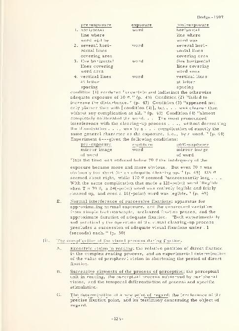
Dodge- 1907
pr e -expo sure e x111sure post-exposurehorizontal
line whereword wasseveral hori-
zontal lines
covering areafive horizontal
lines coveringword areavertical lines
at letter
spacing
1. horizontal wordline whereword will be
2. several hori- wordzontal lines
covering area3. five horizontal word
lines coveringword area
4. vertical lines wordat letter
spacing
condition (1) rendered "uncertain and indistinct the otherwiseadequate exposure of 30 a. " (p. 43) Condition (2) "failed to
increase the disturbance. " (p. 43) Condition (3) "appeared not
only plainer than with [condition (1)], but . . . was clearer thanwithout any complication at all. " (p. 43) Condition (4) "almostcompletely obliterated the word. . . The most pronouncedinterference with the clearing -up process . . ., without decreasingthe illumination . . . , was by a . . . complication of exactly the
same general character as the exposure, i. e. , by a word. " (p. 44)
Experiment 6 given the following conditions:
pre -exposure exposure post-exposuremirror image word mirror imageof word of word
"(a)s the time was reduced below 70 o the inadequacy of the
exposure became more and more obvious. But even 70 o~ wasobviously too short for an adequate clearing up. " (p. 45) 125 a
seemed about right, while 170 o seemed "unnecessarily long . . .
With the same complication that made a 12(-point) word illegible
when T = 70 o", a 24( -point) word was entirely legible and fairly
cleared up, and even a 16(-point) word was legible. " (p. 45)
E. Normal interference of successive fixations; apparatus for
approximating normal exposure, and the consequent variation
from simple tachistoscopic, uncleared fixation pauses, and the
approximate duration of adequate fixation. "Both experimentally
and practically the operation of the visual clearing-up processprecludes a succession of adequate visual fixations under . 1
(seconds) each. " (p. 50)
The complication of the visual process during fixation.
A. Eccentric vision in reading ; the relative position of direct fixation
in the complex reading process, and an experimental determinationof the value of peripheral vision in shortening the period of direct
fixation.
B. Successive elements of the process of perception ; the perceptual
unit in reading, the perceptual process subserved by peripheral
vision, and the temporal differentiation of general and specific
stimulation.
C. The determination of a new point of regard ; the irrelevance of the
precise fixation point,
regard.
and its testimony concerning the object of
-125-
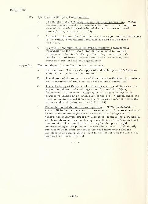
Dodge- 1907
IV. The organization of retinal elements.
A. The function of extra -foveal vision in space perception . "(T)hequestion forces itself . . . whether the more general traditional
view of the spatial organization of the retina does not needthoroughgoing revision. " (p. 65)
B. Retinal local signs ; the functions of a local sign, motor local signs
of the retina, experimental evidence for and against their
existence
.
C. A genetic organization of the retinal elements; differential
integration of the retinal elements consequent to normalstimulation, the standardizing effect of eye movement, the
development of foveal prerogatives, and a connecting bondbetween visual and tactual organization.
Appendix. The technique of recording the eye movements.
A. Introduction. Reviews the apparati and techniques of Delabarre,Huey, Cline, Judd, and the author.
B. The theory of the movements of the corneal reflection ; limitations
and precautions of registration by the corneal reflection.
C. The reliability of the corneal reflection records; difficulties of anexperimental test, after-image control, artificial object,
differential illumination, comparison of the movements of the
corneal reflection and a fixed point of the eye. "(E)ven under the
most accurate control it is doubtful if we can expect to eliminate
errors under 10 (minutes of arc). " (p. 91)
D. The technique of the Wesleyan apparatus . "(T)he probability of
error will be below the error of measurement. In a succession of
fixations the error ought not to be more than 1 (degree). In
general the maximum errors will be in the form of the slow drifts,
which we observed in considering the relation of the head and eye
movements. The smaller errors may be sharp and rapid
corresponding to the pulse and respiration curves. Undoubtedlysubjects vary in their control of the head movements and the
variation in any given case should be tested out with the aid of the
normal head lines. " (p. 95)
-126-
2657
English, E.
Iowa State U. , Iowa City
A STUDY OF THE READABILITY OF FOUR NEWSPAPERHEADLINE TYPES
Journalism Quarterly, 21:3 (September 1944) 217-229
Problem: "(D)etermine if printing types commonly used in setting newspaper headlines
differ in the ease with which they are read. " (p. 217)
Procedure: The following prefacatory remarks are pertinent to the background of this
experiment:
1. "Frederick W. Goudy, the greatest of American type designers, recently wrote (in
a letter to English): 'I feel that too few (designers) realize that a type amply legible
for one purpose may not prove so for another there is no universal type there
is no universal quality of legibility for types for all purposes. ' " (p. 217)
2. "(V)isibility (is) a term referring to the intensity of the psychophysical stimulus
which evokes perception and discrimination. . . For the measurement of the
visual threshold, . . . Luckiesh and Moss have developed a visibility meter . . .
(which) reduc(es) or increas(es) the factor of brightness contrast. " (p. 218) (see
Luckiesh- 1942 , elsewhere in this volume)
3. "Sanford measured the 'legibility' of letters by noting the distance from the observer
that individual letters could be read (distance threshold). " (p. 218) (see E. C.
Sanford, The relative legibility of small letters, American Journal of Psychology,
v. 1 (1888) 402-435)
4. "Burtt and Basch measured the degree that out-of-focus letters could be identified
when projected on a screen. " (p. 218) (see H. E. Burtt and C. Basch, The legibility
of BODONI, BASKERVILLE ROMAN, and CHELTENHAM type faces, Journal of
Applied Psychology , v. 7 (1923) 237-245)
5. "Criteria of reading fatigue include metabolism and pulse rate, variations in visual
near point, eye movements, speed of accommodation, and rate of blinking. . . The
blink rate method has not been found . . . acceptable by (some) experimenters . . . .
McNally . . . concluded that 'there is need for further evaluation of the validity and
reliability of eye-blink frequency as a criterion of readability. 1 " (p. 219) (see H. J.
McNally, The readability of certain type sizes and forms in sight saving classes,
Teachers College Contributions to Education, No. 883, New York: Columbia
University, 1943)
6. "(R)eadability (including all the factors that affect ease of reading, i.e. , visibility,
visual effort, fatigue, etc.) . . . has been investigated by measuring work output,
or speed of reading, of a group of readers. . . Tinker and Paterson. . . (use a)
total time of 1-3/4 minutes ... as a criterion of readability. . . (see Paterson-
1940a, elsewhere in this volume) Luckiesh and Moss . . . employ speed of reading
English- 1944
English- 1944
-127-
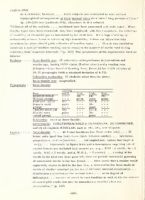
English-1944
as a criterion, however, . . . their subjects are instructed to read various
typographical arrangements at their normal rates over rather long periods of time. 11
(p. 219-220) (see Luckiesh- 1942, elsewhere in this volume)
"(A)lmost all of the methods . . . mentioned have been concerned with body types. When
display types have been measured, they have employed, with few exceptions, the criterion
of visibility or visual fatigue as measured by the blink test. While high visibility is
undoubtedly a basic factor in achieving high readability, it does not follow that this
consideration alone should guide selection of headline types. . . Thus it was decided to
construct a special headline reading test to measure the number of words read during
uniformly brief exposure intervals. " (p. 220) The parameters of the experiments were as
follows:
Subjects .... Inter -family test : 45 university undergraduates in journalism and
psychology, having 20/20 vision (Snellen chart) and a reading rate
(Chapman-Cook Speed of Reading Test, Form A) for 1-3/4 minutes of
20. 35 paragraphs (with a standard deviation of 4. 51).
Subjective evaluation: 50 students other than the above.
Intra -family test : unspecified.
Typography . . Inter -family:
leadingface solid 1-pt. 2-pt. 4-pt.
BODONI BOLD 14- 24- 30-(Roman group) point point pointKARNAK BOLD 14- 24- &(square serifgroup)
point 30-point
TEMPO MEDIUM 14- 24- &(Gothic sans-serif group)
point 30-point
Subjective : same as inter-family.
Intra-family : CHELTENHAM BOLD in (1) REGULAR, (2) CONDENSED,
and (3) all-capitals REGULAR; each in 14-, 24-, and 30-point.
Layout .... Inter-family: ". . . 45 3-line headlines {set flush to the left;) ... 15
letter units (per) line (with 4-em space between words;). . . (a)rticles,
prepositions, and conjunctions . . . not capitalized, unless they begin a
line(;). . . (n)umerals in figure form and abbreviations requiring use of
capital letters are included (and counted as, e.g. , 1934 = 2 words, 6c = 2
words, WAC = 3 words, and A. W. O. L. =4 words;). . . viewing of the
words in the first two lines generally does not permit successful guessing
of successive words in the last line(;). . . (f)or words that a reader would
apparently expect to find in the last line, a substitution has been made of
words of similar external outline but of different internal structure^). . .
distribution approximates the normal curve . . . as to degree of
difficulty(j). . . number of words in each headline is well within the number
of meaningful words that may be immediately recalled after one
presentation. " (p. 220)
-128-
English- 1944
Subjective : same as inter -family.
Intra-family : "experimental design . . . identical with the treatment
employed in the earlier (inter -family) study. " (p. 227)
Presentation . . Inter -family : random (Graeco-Latin square for each group of three
readers) in a modified Seashore spark gap chronoscope with a three -inch-
square opening 450 millisecond exposure with field of stimulus 14 inches
from subject's eyes.
Subjective : "method of paired comparisons ..." (p. 226)
Intra-family : same as inter-family.
Environment . . Inter -family: paper = newsprint, illumination = 50 foot-candles constant,
area around stimulus opening in newspaper pages.
Subjective : unspecified.
Intra-family : same as inte r -family
.
Task Inter -family :recognition.
Subjective: appreciation.
Intra-family: recognition.
Response . . . Inter -family : written.
Subjective: judgment.
Intra-family : written.
Test Inter -family : accuracy (with analysis of variance).
Subjective : preference.
Intra-family : same as inter -family.
Result: The following conclusions were drawn as a result of the experiments:
1. "Printing types under consideration in this study have been shown experimentally to
differ in readability as herein defined. " (p. 229) This is somewhat contrary to the
following statement by Tinker and Paterson: " 'In spite of the opinion of publishers
and printers as well as of readers to the effect that marked differences in legibility
will characterize different type faces, our tests show that type faces in common use
are equally legible. ' Only AMERICAN TYPEWRITER and CLOISTER BLACK ('OLD
ENGLISH') compared unfavorably with several commonly used OLD-STYLE and
MODERN faces, their tests revealed. " (p. 222)
2. "The CHELTENHAM BOLD, BODOHI BOLD, and TEMPO 30LD families were
found superior to KARNAK MEDIUM in the qualities measured in this test (sic).
3. "CHELTENHAM BOLD all-capitals retard the speed with which headlines are read
approximately 18 per cent as compared with the lower case of this design.
4. "There is no reason to believe that the readability of headlines is fairly constant in
the size range between 14 point and 30 point, inclusive.
5. "Reader judgment was found to be an unreliable index of the readability of type in
headline form as measured by objective methods.
6. "To increase the assurance that news presentation to readers occurs under optimum
reading conditions further investigations of other headline type families seemjustified. " (p. 229) ^ 9. .,.
Erdmann- 1898
3457 Erdmann-1898
Erdmann, Benno and Dodge, Raymond
PSYCHOLOGISCHE UNTERSUCHUNGEN UBER DAS LESEN AUF
EXPERIMENTELLER GRUNDLAGE (EXPERIMENTAL PSYCHOLOGICAL
RESEARCH ON READING)
Niemeyer, 1898, 360 p.
Note : As is indicated above, this work is one of the earliest authoritative studies in the
field of readability of text. However, it is not only an historical document, but includes
also rather complete descriptions of Raymond Dodge's early tachistoscopic and
chronographic apparati. In this light, its contents would be of interest to those
experimenters interested in aspects of the legibility problem other than the readability
of text exclusively. The difficulty encountered in using this document is not only that it
is in German, but also that its German is of an idiom now almost 70 years old. As being
indicative of its contents, the following paragraph is extracted from the Foreword:
"Die nachstehende Untersuchung ist aus psychologischen Ubungen uber das Lesen
hervorgegangen, die im Wintersemester 1894/95 an der Universitat Halle von dem
Unter zeichneten geleitet wurden. Ich hatte in diesen Ubungen die Anforderungen an
einen Expositions -A pparat darzulegen, der binokulare Beobachtungen, sichere
Akkommodation der Augen sowie simultanes Auftauchen der Schriftzeichen, und zwar
auch von Wortreihen in Zeilenform gestattete. Auf diese Anregungen hin entwarf einer
der Teilnehmer an jenen Ubungen, Herr Raymond Dodge, selbstandig die Skizze eines
solchen Apparats, sowie uberdies den Plan zu einem neuen, ebenso einfachen wie sicher
funktionirenden Chronographen. . . Prof. Dr. Benno Erdmann. " (p. iii-iv)
* * *
-130-
Flores-1960
3345 Flores-1960
Flores, Ivan
Dunlap and Associates, Inc. , Stamford, Conn.
METHODS FOR COMPARING THE LEGIBILITY OFPRINTED NUMERALSJournal of Psychology, 50:1 (July I960) 3-14, 6 refs.
Problem: Compare the legibility of five, stylized, prospectively machine -readable,
numeric type fonts.
Procedure: In the first experiment, twenty-seven literate subjects tachistoscopically
viewed random, individual digits in each of five type fonts identified as GOTHIC, AIRFORCE, STANFORD RESEARCH, EXPERIMENTAL (examples not provided), and PARKAVENUE. Each digit was illuminated for approximately ten milliseconds, viewed through
a light-tight port in the tachistoscope at approximately normal reading distance, and
verbally identified to the experimenter in the interval between presentations. Errors wererecorded. In a second experiment, the same subjects read a several-digit number to the
experimenter from five (one for each font) series of check-simulating documents. Timeand uncorrected errors were recorded.
Result: For the first experiment, the results of an "F" test were highly significant. A"t" test showed a statistically significant difference between all but the STANFORDRESEARCH and EXPERIMENTAL fonts. The author indicates a superiority for the AIRFORCE font. For the second experiment, an "F" test showed that differences amongtimes were highly significant. A "t" test showed a significant difference between the AIRFORCE and the other four fonts. This experiment indicated that the identification mayhave depended upon a similarity in the type to that normally encountered.
2659 Foley-1956Foley, P. J.
Defence Research Medical Labs. (Canada)
EVALUATION OF ANGULAR DIGITS AND COMPARISONSWITH A CONVENTIONAL SETJournal of Applied Psychology, 40:3
(June 1956) 178-180, 7 refs.
Problem : "This is a report upon four experiments carried out with the revised set (of
LANSDELL digits) to answer the following questions:
1. "What are the confusion errors?2. "Is the legibility of these digits independent of whether they are presented as
black . . . on . . . white . . . , (or vice versa?)3. "Is the set more legible than a typical conventional set under varied conditions of
exposure and illumination?
4. "Is this set more legible than a typical conventional set when the digits are viewedobliquely? " (p. 178)
Procedure (general): "The conventional set chosen for comparison was that of
MACKWORTH. . . because it shows consistently high performance in comparisons madeby other investigators. . . (In) all experiments . . . (t)he digits were presented singly to
the (subjects, who ranged in age from 18 to 37, and all of whom had 20/20 or better
binocular acuity, ) who viewed them (on a 3- by 3-inch white Bristol board screen, from) a
distance of 20 feet. . . The room . . . was dark. . . (E)xposure time, rate of
presentation, and illumination level (on the screen) were controlled . . . (W)henprojected on the screen (all digits) were 3/8 (inch) high. " (p. 178)
-131-
Foley-1956
Procedure (experiment 1 ): "Digits were exposed singly for . 6 second . . . (at) one . . .
every three seconds. . . (I)llumination ... on the screen was ten foot-candles. Therewere 15 (naive subjects).". . (p. 179) who each viewed 30 presentations of everyLANSDELL digit.
Result (experiment 1 ): "The specific confusions which contributed more than 5 per cent to
the total error were the 3 with 5 (6. 12%), the 3 with 7 (6. 0%), the 5 with the 3 (6. 6%), the
9 with the 5 (5. 2%), and the 0 with the 8 (8. 9%). " (p. 179)
Procedure (experiment 2 ): "Revised LANSDELL digits, black on white, were comparedwith . . . white on black, at . . . 10, 30, and 50 foot-candles. . . exposed singly for . 5
second . . . every three seconds. . . There were 10 (subjects) drawn from the 15 used in
Experiment 1. " (p.. 179)
Result (experiment 2 ): " (D)iffer ences between (subjects were) significant .... None of
the subject interactions (were) significant, however .... The interaction between digit
type and illumination level (was) significant . . . (, i. e. when) the illumination level wasof the order of 10 foot-candles, then white digits on a black ground (were) more legible;
(while) . . . from 30 to 50 foot-candles, th(e) black . . . on . . . white . . . (were) morelegible. " (p. 179)
Procedure (experiment 3 ): "Revised LANSDELL . . . were compared with MACKWORTHdigits, (all) black on white at . . . 10, 30, and 50 foot-candles, and . . . (0.3, 0.8, or)
1. 3 seconds. . . every three seconds. . . Six (subjects) from Experiment 2 were used. "
(p. 179)
Result (experiment 3): "(T)he difference between the legibility of the revisedLANSDELL . . . and the MACKWORTH digits (was) highly significant . . . (I)nteraction
between exposure and digit type was not significant. There (was) a highly significant
increase in percentage correct from (. 3 to 1. 3 seconds exposure time) . . . Similarly for
illumination levels as illumination increase(d) . . . there (was) a highly significant
increase in percentage correct . . . ." (p. 179-180)
Procedure (experiment 4 ): "Revised LANSDELL . . . were compared with MACKWORTHdigits, (all) black on white, at three angles of view, 45 (degrees) left, normal, and 45
(degrees) right. . . exposed singly for . 8 second . . . every three seconds. The (screen)
illumination . . . was 30 foot-candles. There were five (subjects) .". . (p. 180) fromExperiment 3.
Result (experiment 4 ): "The Revised LANSDELL . . . (were) significantly more legible
than the MACKWORTH digits under these conditions .... There (was) no interaction
between digit type and viewing angle. (For t)he degrees of freedom . . . the following
comparisons (were) made: (a) 45 (degrees right) - 45 (degrees left); the difference (was)
not significant . . . ; (b) 45 (degrees right) + 45 (degrees left) - 2 (normal); the difference
(was) significant, and show(ed) a decrease in legibility between the normal and the oblique
angle of view. None of the interactions approach(ed) significance. " (p. 180)
Result (general ): "The legibility of the new (LANSDELL) digits is not independent of . . .
(contrast direction). At low illumination levels white on black is more legible, the
reverse being true at high . . . levels. Comparisons with a conventional set, the
MACKWORTH . . . , at different illumination levels, exposure times, and angles of view,
show the new set to be significantly more legible under all of these conditions. " (p. 180)
-132-
2150
Foley, P. J. and Scott, D. M.
Defense Research Medical Labs. (Canada)
LEGIBILITY OF LEROY DIGITS AS A FUNCTION OF SIZE,
DISTANCE, ANGLE OF VIEW, AND ILLUMINATION LEVELDRML rept. no. 76-3, Jun 57, 7p.
AD-141 760
Problem : "(U)sing the LEROY STANDARD GOTHIC Lettering Guides. . . (, ) study . . .
the legibility of twelve sizes of digits ... as a function of size, distance, angle of view,
and illumination level. " (p. iii)
Procedure : "Digit sizes ranged from . 06 . . . to . 5 inches in height. Five viewing
distances were ... 2, 4, 8, 16, and 32 feet; three viewing angles at each distance (were)
45 (degrees right), normal, and 45 (degrees left); (and) three conditions of illumination
(were) 1, 10, and 50 foot-candles. " (p. iii) Digits were drawn in "5 rows of 10 (on 11- by
12 -inch white Bristol boards), such that both the horizontal and vertical distance between
consecutive digits, measured from the centres, was one inch. . . Thirty (Canadian Armypersonnel) subjects were used. . . All had 20/20 binocular visual acuity at near and far
. . . Subjects read the digits aloud to the Experimenter . . . ." (p. 1-2) The following
were the pens and templates used to obtain the stroke -widths shown:
pen size template no. pen no. stroke width (inches)
1 60 00 . 010
2 80 00 . 010
3 100 00 . 010
4 120 0 . 015
5 140 1 . 020
6 175 2 . 025
7 200 3 . 030
8 240 3 . 030
9 290 4 . 040
10 350 4 . 040
11 42 5 5 . 055
12 500 6 . 070(above from p. 2)
Result: "Results are presented showing per cent of the population reading each digit size
with one hundred per cent accuracy, at each viewing distance, from each viewing angle,
and under each illumination level. . . (p. iii) (W)ith the exception of the 2 (foot) viewing
distance under 10 and 50 (foot) candles illumination, the digits . . . (were) always more
legible when viewed from the left than from the right. . . The data show that the only digit
which has a large increase in confusion errors when viewed from the right is the digit 9,
Foley-1957a
Foley- 1957a
-133-
Foley- 1957a
although the digit 6 has almost as large a decrease. " (p. 3) The data are presented
graphically.
2 151 Foley- 1957b
Foley, P. J.
Defence Research Medical Labs. (Canada)
LEGIBILITY OF MOVING DIGITS AS A FUNCTION OF THEIR
SEPARATION AND DIRECTION OF MOVEMENTDRML rept. no. 76-4, Aug 57, 5p.
AD-145 725
Problem : Investigate "(t)he maximum speed of moving digits (on a screen) at which correct
identification is possible . . . ." (p. iii) Use "the separation between digits . . . and the
direction of movement. ". . (p. iii) as variables.
Procedure: "Digits were inscribed, using UNO PEN Stencils, on transparent tapes. . .
Three separation distances were used, . 75 inch, 1. 5 inches, and 2.0 inches, subtending
visual angles (at 8. 8 feet from the subject) of 6. 4°, 12. 8°, and 25. 6° respectively. . . AKeystone projector was modified so that tapes could be moved ... in any direction (right-
left, left-right, up-down, and down-up). . . (It) projected (the digits) onto a screen . . .
(at) speed(s) . . . increased in discrete steps of 2° per second, until the subject (of which
there were five males who each had 20/20 vision or better) no longer gave 100 (percent)
correct responses. . . The . . . actual legibility (visibility of the digits) was not a
factor. " (p. 1)
Result : The following table "shows the average maximum speed, in degrees per second, at
which (the) subjects could correctly identify a series of 25 digits(:)
separationdirectionright -left
6.43T76"
12. 8
4TT425. 66"376~
left-right 30. 4 46. 8 59. 6
down-up 28. 2 37. 4 54. 4up-down 25. 6 32. 6 49. 8'
(above from p. 2)
The results of an analysis of variance show "that all main effects are significant. There
is, however, a significant interaction between the separation of digits and the direction of
movement. . . The differences in the maximum speeds that can be tolerated for each
direction appear to become accentuated as the separation increases. Further, increases
in separation up to 12° result in proportionately greater maximum speeds when the
direction of movement is in the horizontal dimension. . . The superiority of movement
from right to left . . . probably reflects the normal . . . reading habits . . . The
superiority of movement upwards can be similarly explained. " (p. 3) In conclusion, it is
-134-
Foley- 1957b
seen that "more digits can be presented and correctly identified . . . , if the speed is slow
and the separation small, than if the speed is fast and the separation large. " (p. 3)
* * >;<
2578 Forbes-1951
Forbes, T. W. ,Moskowitz, Karl and Morgan, Glenn
Institute of Transportation and Traffic Engineering,
U. of Calif. ,Berkeley, and California Div. of Highways
A COMPARISON OF LOWER CASE AND CAPITAL LETTERSFOR HIGHWAY SIGNS
In PROCEEDINGS OF THE THIRTIETH ANNUAL MEETING, 1951,
Roy W. Crum, Fred Burggraf, and W. N. Carey, Jr. ,Editors,
(Washington, D. C. ,Highway Research Board, National Research
Council, 1951), Vol. 30, p. 355-373
Problem: Compare the legibility (for scrambled letters) and recognition distances (for
familiar names "with" and "without" previous knowledge by the subject as to the names to
be presented) of lower case versus all capital letters (each in three different sizes) for
highway signs under both daylight and night conditions. Ascertain whether the results
compare favorably with the results of previous experimentation that "have shown that
lower case printing gives more rapid reading than solid black printing with capital letters. "
(p. 356)
Procedure : All letters were semi-matte white on a black background. "The capital
letters were rounded standard (U.S. Bureau of Public Roads)SERIES E (average letter
width of (1) neat letters = 0.81, and (2) letter plus spacing = 1. 13, both in inches per inch
of letter height) but with a slightly widened stroke (0.20 inches per inch of letter height).
The lower case alphabet was one based on practical trial and development (average letter
width of (1) neat letters = 0. 77, and (2) letter plus spacing = 1. 15, both in inches per inch
of 'loop' height vertical strokes 0.22-0.25, horizontal strokes 0.20-0.22 inches per
inch of 'loop' height, depending on letter stem height of 'b', 'd', and 'k' = 1.415 inches
per inch of 'loop' height). . . (p. 358 & 370) (L)ower case letters were chosen whose
average width including spacing would be very close to that of the capital letters including
spacing. . . (p. 361) (The) three types of test signs. . . were: (1) scrambled letters in a
six letter combination (24 of the 26 possible letters were used) for determination of true
legibility (involved letter discrimination); (2) familiar (geographic local) names 'without
knowledge' (by the subject) as to the names which would be used (involved letter
discrimination and word pattern recognition); and (3) familiar names "with knowledge'
(involved word and over-all pattern recognition). Both lower case and capital letters were
used in all three types of observations and in different sizes of letter (height = 6. 0, 8. 5,
and 13.0 inches for capitals, and 'loop' height = 5.3, 8.0, and 12.0 inches for lower case).
. . (T)he . . . determinations with the scrambled material were used as a base and the
-135-
Forbes-1951
observations of familiar signs were related to them. " (p. 370) Observations were made by
an average of 55 subjects (age 18-70 years) for each condition. Observations were made at
night (12 to 18 foot lamberts . . . obtained from fluorescent tubes above and below the
sign 30 to 40 foot lamberts gave blurring at longer distances) and during the daytime
with the sun on the face of the signboard. The signboard carried six words (each 6-9
letters in length) at a time (the same word of four for day and four for night was used
for each condition, case, and size). The signboard was 24 feet long by 6 feet high, with
the bottom edge 17 feet above the ground. Thus, "measurements were carried out in full
scale. . . against an outdoor background . . . 'Distance seen' was analyzed on the basis
of known psychological factors into (1) recognition by overall word pattern and (2) actual
discrimination of letters, as the two extremes. . . (p. 356) Where large numbers of
porcelain enamel signs are involved, the amount of sign area required per letter is of
importance in determining cost. An analysis was therefore desired of median 'distance
seen 1 in (these) terms ... In order to make such a determination, assumptions as to
minimum vertical spacing between words and vertical spacing for margins were necessary.
In the case of capital letters, . . . experience . . . indicate(d) that a border width equal to
the letter height above and below each word is satisfactory to eliminate blur from the
brightness of the sky or fusion between two words when arranged one above the other. For
a two line sign, this gives a vertical spacing of 2. 5 letter heights per line . . . For the
lower case letters, however, the vertical spacing required to obtain an equivalent isolation
of words was not clear. If the same factor were used on the basis of stem height . . . , it
would result in a greater effective area of vertical spacing . . . (A)lternative assumptions
were therefore made for exploratory purposes. The first . . . was ... 2. 5 'loop' heights
. . . The second . . . was ... 2. 25 'stem' heights per line . . . ." (p. 366)
Result: Concerning the foregoing, "a considerable advantage resulted for the place names
'with knowledge' when (assumption one) was made. However, on this basis there was very
little difference between lower case and capital letters for the scrambled letter legibility
distances. On the other hand, (the second assumption) made the lower case and capital
letters about equally effective in the case of the most familiar test material and showed the
lower case at some disadvantage in the names 'without knowledge' and the scrambled letter
determinations. The effects of the two assumptions were similar for day and night
conditions except that differences obtained were smaller for the latter. . . (p. 366) (A)
series of observations should be carried out to determine the minimum vertical spacing
necessary for the two forms of letter. " (p. 371) Returning to the primary variables (letter
case, letter size, illumination level, and word composition), the following approximate 85
percentile (representing 20/20 vision) distance values (in feet) were derived from the
observation data (equivalent letter and 'loop' heights interpolated from chart plot):
-136-
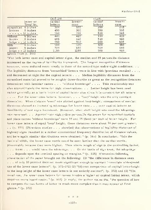
Forbes-1951
daylight nightletter or capital lower- capital lower-loop' ht. letters case letters case
scrambled 6 inches 320 370 250 255letters 8 inches 450 500 350 355
12 inches 700 755 530 545without 6 inches 445 480 310 420know- 8 inches 605 640 510 560ledge - - 1Z inches 950 960 800 855
with 6 inches 500 635 400 480know- 8 inches 720 850 560 640ledge - - 12 inches 1150 1255 900 960
(above from p. 3 64)
"For both lower case and capital letter signs, the median and 85 percentile distance
increased as the degree of familiarity increased. The longest recognition distances
however, were reduced more nearly to those of the second type under night conditions. . .
The legibility distances from 'scrambled' letters were in line with (previous results) . . . ,
and decreased at night for the capital letters . . . Median legibility distances from the
scrambled material proved to be roughly three -fourths as great as the recognition distances
determined with familiar names . . . 'without knowledge' .... This relationship was
also approximately the same for night observations. . . Letter height has been used
rather generally as a basic index of capital letter size since it is constant for all letters
.... For the lower case letters, however, . . . 'loop' height was the only constant
dimension. When distance 'seen' was plotted against loop height, comparison of median
distances showed an increasing advantage for lower case . . . over capital letters as
familiarity of test signs increased. However, when stem height was used the advantage
was reversed. . . Approximate eighty-five percentile distances for scrambled capitals
and place names 'without knowledge' were 55 and 75 (feet) per inch of letter height. For
lower case letters of equal 'loop' height, these distances were about 10 per cent greater.
. . (p. 371) (P)revious studies . . . show(ed) that observations of legibility distances of
highway signs resulted in a rather symmetrical frequency distribution of distance values,
and here again similar distributions were obtained. " (p. 361) In conclusion, "(o)n the
basis of width, the lower case words could be seen farther than the capital words,
presumably because they were higher. Thus where length of sign is the controlling factor,
. . . these . . . would have the advantage. . . On the basis of sign area, the advantage
. . . depends upon the vertical spacing or margins. " (p. 355) Discussion following
presentation of the paper brought out the following: (1) "the difference in distance seen
... of only 10 percent does not seem significant enough to warrant immediate widespread
use of the lower case letters", (p. 371-372) (2) "(d)irect comparison of capital letterheight
to the loop height of the lower case letters is not strictly correct", (p. 372) and (3) "(i)n
usual use, the lower case letters for names involve a higher or capital initial letter, which
requires more board space. " (p. 372) In reply, the author states that "the question of how
to compare the two forms of letter is much more complex than it may appear at first
glance. " (p. 372)
-137-

2153
Gleason, J. G.
Purdue U. ,Lafayette, Ind.
THE DESIGN OF NUMERALS FOR USE IN COUNTER-TYPEINSTRUMENTS: A REVIEW OF THE LITERATURE
Rept. no. 166-1-39, 20 Dec 47, 24 p.
ATI-31 814
Extract : "The works reviewed (of which Berger- 1944b and Luckiesh- 1937a may be found
elsewhere in this volume) appear to provide adequate information (except for styles and
stroke -width) concerning the characteristics of the variables studied (size of the critical
detail to be perceived, contrast between object and background, brightness level to which
object is illuminated, time the image is allowed to rest on the retina, color of the image/
background, height of numeral, stroke -width of numeral, and interactions among these
variables). . . These may be summarized as follows:
1. "The size of the critical detail in the numerals should be as large as is possible
within the necessary practical limitations of overall size. Within these limitations,
it may be said that the larger the numeral of any given type, the greater will be its
visibility . . . , the more rapidly it can be identified, . . . the smaller the contrast
ratio required . . . , the lower the brightness level required ....
2. "The contrast between the numeral and its immediate background should be as great
as it is possible to provide. By increasing this contrast ratio for any given numeral
type, equal visibility may be maintained when the size is reduced, or the brightness
level is reduced, or the time for apprehension is reduced.
3. "The brightness contrast between the dial area and the surround should preferably
yield a ratio of one. If this is not possible, a reduction of surround brightness
below the level of the dial area reduces legibility only slightly. A situation which
yields surround brightness greater than dial areas is to be strenuously avoided as
this condition greatly reduces acuity.
4. "The brightness level of the numeral and its background should be as high as
possible in the situation obtaining. Increasing the brightness level increases the
speed and accuracy of apprehension and with the same type numeral a given visibility
level maybe maintained by increasing the brightness level while decreases in
contrast . . . or . . . size are made, or while time for apprehension is decreased.
5. "For greatest visibility, other factors held equal, numerals should be either black
or white on opposite background. In order of decreasing visibility, . . . inferior to
black on white or (vice versa), are black on yellow, yellow-green, orange, green,
red, blue -green, and blue. The question of the relative merits of black on white
and (vice versa) has not been conclusively answered . . .
"(E)ach of the above factors should be applied to the greatest extent compatible with other
requirements . . . (S)tyle of numeral and width of stroke used . . . have not been
Gleason- 1947
Gleason- 1947
-139-
Gleason- 1947
adequately investigated. . . Therefore, . . . study of the design of numerals for use in
counter -type instruments is conceived to be the study of these two factors while holding
the (other) variables constant." (p. 18-19)
Note : Of the author's 67 references, which formed the basis for his literature review, the
majority are concerned with such problems of perception as visual acuity, object-field
contrast, size of critical detail, and the time an image is allowed to rest on the retina, and
for these areas extensively covers material that is not included in this handbook.
* * *
3317 Green-1953
Green, B. F. ,McGill, W. J. and Jenkins , H. M.
Lincoln Lab. , Mass. Inst, of Tech. , Lexington
THE TIME REQUIRED TO SEARCH FOR NUMBERS ONLARGE VISUAL DISPLAYS
Technical rept. no. 36, 18 Aug 53, 15p.
Contract AF 19(lZ2)-458
AD-21 109
Problem : "(D)etermine the amount of time that is lost in searching for numbers on typical
visual displays. " (p. ii)
Procedure : Seven experiments were conducted "in order to determine . . . time . . . lost
in searching . . . (and) some of the variables that influence search times. . . The displays
used . . . were circular areas in which three-digit numbers were distributed at random.
In some experiments, the displays were projected on a vertical beaded screen; in the
others, numbered plastic tokens were arranged on a horizontal circular table top. In some
cases, the background was uniform, or uncluttered; in other cases, a cluttered background
was used. The properties of the numbers on the display were varied during the
experiments, and the effects of these variations were noted in terms of their influence on
search time. " (p. 1) In Experiment 1 (numbers projected onto a 42 -inch diameter screen
10 feet from each of 20 subjects), "the variables controlled were: (1) Number density: -
. . . 25, 50, 75, or 100 three-digit numbers .... (2) Number size : - ... l/2 ... or
3/4 inch high. . . (3) Number orientation :- . . . upright . . . (and) jumbled in eight
different orientations 45 degrees apart. " (p. 1) In Experiment 2, 17 new subjects read
numbers under "nine experimental conditions: eight single orientations and one random
orientation. " (p. 6) Other conditions were fixed at 50, 3/4-inch numbers. "Experiment 3
was performed in order to determine whether . . . some numbers were easier to find than
others. In (it), each of 12 subjects searched for the same 24 numbers. . . (in) the
condition of 50 . . . 3/4-inch numbers upright on the screen. " (p. 7) Order of presentation
was also a variable. "In (Experiment 4) . . . , the projected displays included a polar
-140-
Green- 1953
coordinate grid . . . , and each number on the display had a marker arrow near it. . . The
numbers were 3/4 (inches) in height, and were all upright .... Five number densities were
used: 20, 30, 40, 54, and 60 numbers, respectively. . . Each of 1 1 subjects was given
four trials at each density. . . In Experiments 5 and 6, a horizontal (60-inch diameter)
circular table top was used for the display. . . (which) was confined to an area 42 inches in
diameter. The numbers were cut into small plastic tokens and the cuts were filled with
fluorescent wax. . . On (a) small token the numbers were l/8 inch high and were colored
yellow. The larg(e) tokens had blue numbers l/2 inch high. The background . . . was a
polar coordinate grid . . . painted (green fluorescent) on vellum . . . The display was
lighted with ultraviolet ... in (a) . . . dark room. . . (T)okens (were placed) in a
haphazard arrangement . . . (T)he experimenter announced the target number ....
(Subject's) eyes were 3 to 4 feet from the display . . . (at an) angle of regard (of) about 45
degrees. In Experiment 5, (25, 50, 75, and 100) number densities were used with each
token type separately . . . ." (p. 8-9) The eleven subjects used "had normal color vision.
. . In Experiment 6, ... 25 large blue . . . and 25 small yellow tokens (were placed) on
the table and (the subject was) instructed to find a particular number of a specified color. "
(p. 10) The experiment was also conducted for 50 of each size token. Experiment 7 was
an extension of Experiment 6. In it were added "some large yellow tokens of the same size
and shape as the large blue (ones). For each token, separately, two density conditions
were used: 25 . . . and 50 numbers. In addition, ... 25 blue . . . (were combined) with
25 large yellow . . . and . . . with 25 small yellow tokens. . . For these . . . (there
were) three conditions of search: search for a blue target number, search for a yellow
target number, and search for a target number with color not specified. " (p. 13) There
were 12 subjects in this experiment.
Result: The following results and conclusions were drawn from the data:
1. "For legible numbers on a large visual display, the most important variable is the
number of alternative numbers that must be scanned. For a moderate number of
alternatives, the average search time in seconds is approximately one -fifth the
number of alternatives.
2. "The search time is shorter for large numbers than for small numbers, unless
there are so many numbers that the display becomes crowded. Smaller numbers
are preferable on crowded displays.
3. "If the numbers on the display are all in an upright orientation, the search time is
shorter than if the numbers are oriented at random .... However, if the numbers
are all oriented in the same way and this orientation is not upright with respect to
the observer, the search time depends on the . . . orientation. The average search
time for all single orientations is equivalent to the search time for a display in
which the various numbers are randomly oriented. Consequently, if operators
must be located around a horizontal display where the numbers cannot be oriented
properly for everyone, there is no advantage in arranging the numbers in a single
orientation.
-141-
Green- 1953
4. "Numbers at some positions in the patterns of numbers are harder to find than
others, but the effect of location is very small.
5. "If the numbers are clearly legible, typical background clutter has no effect on
search time.
6. "When the color of the number to be searched for is specified in advance, the
presence of numbers of a clearly different color does effect the search time.
7. "Some individuals are faster searchers than others, but the differences are
relatively small. . . (p. ii)
"In general, (the) data show that number-searching is a time-consuming process. It is not
likely that search times can be reduced materially unless the number of alternatives to be
scanned is reduced. When decisions must be made in a few minutes, delays up to an
average of 30 seconds can be very costly. When speed is important, procedures involving
number searches should be avoided. " (p. 15)
3273 Gustafson-1960
Gustafson, Charles E.
Behavioral Sciences Lab.,Aerospace Medical Div.
,
Wright-Patterson Air Force Base, Ohio
A METHOD OF ESTIMATING SURFACE COLORDISCRIMINABILITY FOR CODING TRAINING EQUIPMENTAND PREDICTING LABEL LEGIBILITY
WADD Technical Note 60-83, May 60, 8p. , 4 ref s
.
Project 1710, Task 71607
AD-243 721
Problem: "(E)stimate the relative disc riminability of colors solely on the basis of their
relative brightness as obtained from spectrophotometric data or code approximations. . .
Ignor(e) the effect of color contrast (contrast in hue) . . . ." (p. 7)
Procedure: "Using luminous reflectance values for Federal Standard colors, the classic
formula for contrast is suggested as a convenient method of estimating surface color
discriminability for purposes of coding training equipment and predicting the legibility of
panel labels. " (p. iii) A table is shown of "contrast and discrimination error percentages
for selected Federal Standard color combinations. . . (p. 3) Specific applications of the
method are discussed . . . ." (p. iii)
Result: "The following conclusions appear justified ....
1. "Brightness contrast between Federal Standard colors can be estimated by
substituting available luminous apparent reflectance values (or code approximations)
in the classic formula:
-142-
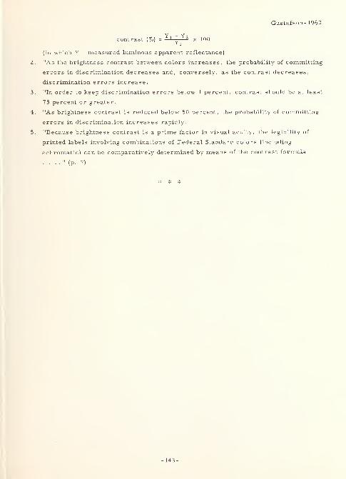
Gustafson- I960
contrast (%) =Yl " Yz x 100
i 1
(in which Y = measured luminous apparent reflectance)
2. "As the brightness contrast between colors increases, the probability of committing
errors in discrimination decreases and, conversely, as the contrast decreases,
discrimination errors increase.
3. "In order to keep discrimination errors below 1 percent, contrast should be at least
75 percent or greater.
4. "As brightness contrast is reduced below 50 percent, the probability of committing
errors in discrimination increases rapidly.
5. "Because brightness contrast is a prime factor in visual acuity, the legibility of
printed labels involving combinations of Federal Standard colors (including
achromatic) can be comparatively determined by means of the contrast formula
. . . ." (p. 7)
-143-

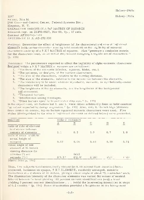
Halsey-1960a
3297 Halsey-1960a
Halsey, Rita M.IBM Command Control Center, Federal Systems Div. ,
Kingston, N. Y.
CHARACTER DESIGNS IN A 5x7 MATRIX OF SQUARESResearch rept. on ECPX-0027, Nov 60, 6p. , 17 refs.
Contract AF30(635)-1404AFCCDD-TN-61-3; AD-252 030
Problem: Determine the effect of brightness (of the characters) and size of individual
elements (with center -to-center spacing held constant) on the legibility of numericcharacters made up of a 5 X 7 MATRIX of squares. Also "generate a confusion matrixfor the characters used, as an initial step toward designing a legible set of characters. "
(p. 133)
Procedure: The parameters expected to affect the legibility of alpha-numeric characters
designed within a 5 X 7 MATRIX of squares are as follows:
1. "The form of the elements (circles, squares, blobs, etc. ).
2. "The patterns, or designs, of the various characters.
3. "The size of the characters, relative to the viewing distance.
4. "The size of the elements, relative to the separation between the elements.
5. "The vocabulary to be used: whether alphabetic, numeric, or symbolically-codedcharacters will be included.
6. "The brightness of the on elements, and the brightness of the background(off -elements).
7. "Temporal factors.
8. "Interference among messages.9. "Other factors specific to particular displays. " (p. 133)
In the experiment, all factors but 4. and 6. were either arbitrarily fixed or held constant
"at values expected by design engineers. " (p. 133) Also, only 0. 10-inch high (distance
from center-to-center, top-to-bottom squares) numeric characters were used. Fivestyles (distinguished by the size of individual elements as defined below) were presented.
measure style of numeralsA B C D E
ratio of side of elementto distance betweencenters of elements 0. 1 0. 3 0. 5 0. 7 1. 0
ratio of actual width to
actual height of
numeral 0. 67 0. 68 0. 69 0. 70 0. 71
visual angle of one
element at 36 inches
viewing distance (in
minutes (' ) and (sic)
seconds (") )0'9. 5 0'2.9" 0'48" 1'7" 1'36"
(above from p. 134)
Thus, five subjects tachistoscopically viewed (at 0. 10-second flash duration) back-projected, luminous on opaque, 5X7 ELEMENT, randomly arranged, numericcharacters at a distance of 36 inches, giving a visual angle of about "9. 5 minutes" each.
The illumination intensity of the character elements was varied (by means of neutral
filters) between "a level yielding 100 percent correct identifications (and) a level
yielding 0 percent correct identifications . . . (with) the intervening intensities in steps
of 0. 2 density. " (p. 134) Room illumination provided a brightness on the background
-145-
Halsey-1960;
panel of approximately 0. 7 foot-lamberts. Accuracy was the test criterion.
Result: For the numeral sets used, the following results were obtained:
1. For a given style, accuracy increased as element illumination intensity increased.
2. To achieve equal performance, a higher intensity was required for style "A" than
for "E" numerals.3. Generally, the "results suggest that a simple relationship exists between element
size and numeral intensity. " (p. 135) Further, "it is reasonable to assume that as
element size and/or brightness is further increased, legibility will reach a
plateau and will finally decline as the character begins to resemble a blob. "
(p. 136)
Thus, "(i)t can be concluded that, for practical situations involving the ranges of sizes
and intensities tested, area and intensity are roughly reciprocally related in determininglegibility. " (p. 135) Finally, the following conclusions were drawn from a confusion
matrix generated by the results:
1. 7, 1, and 4 were correctly identified most frequently 5 and 8 least frequently.
In general, accuracy decreased as the number of elements comprising the
numeral increased. Also, the number of elements predicted inaccuracy better
than it did accuracy.
2. "The numeral 1 was frequently reported as not being seen. " (p. 137)
3. The numerals most frequently confused were as follows: 7 for 1; 4 for 2; 2, 4,
and 7 for 3; 6 for 4; 3, 6, and 9 for 5; 4 for 6; 6, 9, and 0 for 8; and 6 and 8 for 0.
However, a subjective numeral preference seemed to appear in that "moreresponses of 4 and 6 occurred than can be accounted for by confusion patterns. "
(p. 137)
There were no consistent differences between the confusion matrices for the different
styles, although there was an indication that "larger or smaller elements seem to
produce different sorts of confusions. " (p. 137-138) A revised set of numeral designs
(some old and some new) that should reduce some of the major confusions was shown.
These designs have not been evaluated experimentally. When designs are limited to the
5X7 MATRIX shown, the above numerals "are appropriate only when no alphabetic
material is used on the same display. " (p. 138)
2662 Halsey-1960b
Halsey. Rita M.IBM Command Control Center, Federal Systems Div. ,
Kingston, N. Y.
FACTORS INFLUENCING THE LEGIBILITY OF SAGE DISPLAYSResearch rept. on ECPX-0027, Nov 60, lv. , 42 refs.
Contract AF 30(635)-1404
AFCCDD TN 61-7; AD-252 034L
Problem: Determine the effect of type, color, and amount of room illumination; tube
brightness intensity; intensification time (a function of the time, in microseconds, alloted
to the sweep in order to bring a symbol up to a viewable intensity of brightness); display
rate; character size; and some interactions between these on the legibility of
alpha-numeric characters and special symbols on a SAGE-type, shaped-beam,
cathode-ray tube display. Present "infrequent repainting of information (every 2. 5
seconds) requires that the system operate under a low level of blue light. The major
complaints that have been made about the existing system were based on these conditions;
namely, that there is too much flicker, too low an ambient light level, and too muchinformation displayed on every console. " (from the author's foreword) However, "(t)he
primary requirement for alpha -numeric information on a SAGE display is legibility. This
series of experiments uses a method which combines the tasks of detection and
identification for information which does not move nor change with time. " (p. 87)
-146-
Halsey- 1960b
Procedure: Fifteen experiments, designated (within the total experiment 4) A through O,
involved a total of 46 subjects (IBM employees), ranging in age from 21 to 49, with a
median age of 31. Most subjects had good vision. The following conditions were standard,
and thereby fixed unless otherwise stated for a specific experiment:1. Three SAGE consoles were set in a lusterless, neutral gray, painted room; with
gray cloth screens as light baffles behind observers to eliminate ceiling reflections.
2. Tubes were 19-inch, shaped-beam, cathode-ray tubes, each using a P- 1 4 phosphor
,
and having a 60 percent reflectance, a standard SAGE matrix painted in the center
of the tube face, and a yellow implosion shield in place over the tube face.
3. Electrical conditions were those standard for XD-2 operation.
4. On the standard tubes used, the character height was 0. 1 1 inches and the height to
stroke-width ratio was 6 to 1. On the bright tubes, the following were seen: bright
numbers 1 and 2 - height to stroke-width ratio of 5 to 1; bright number 3 - height to
stroke-width ratio of 9 to 1; character heights on all bright tubes was 0. 10 inches
except when intentionally reduced to approximately 0. 07 inches; bright number 3
also had SYMBOLS X> l> and \ without standard center dot )(, i, and H.
5. Sixty-four alpha -numeric characters could be placed in the matrix, with P having a
probability of 5/39 and all others a probability of 1/39. Ten numerics and 25 alphas
were available.
6. All observations were foveal, with the observer's eyes 17 inches (and held by a
brow-rest) from the center of the implosion shield. Dark adaptation was accountedfor where necessary.
7. The observers' task was a recognition one (e. g. count the P's), with the responsebeing by pushbutton, switches, or light gun.
8. Measurement criteria included reading time for static alpha-numeric characters,
reading accuracy for changing SYMBOLS, and tracking performance.The following variables were seen in the total experimentation:
1. Room illumination - type: normal ceiling, fixture, and bare ceiling.
2. Room illumination - color: SAGE blue, commercial blue, and white light.
3. Room illumination - amount: 0. 004 to 1. 0 foot-candles for SAGE blue, 0. 6 to 15
foot-candles for commercial blue, and 0. 017 to 13 foot-candles for white light,
with 0. 001 foot-candles (mostly white) in "lights off" condition. Amount of roomillumination was varied by adjusting the input voltage between 0 and 120 volts, andin addition by the number of bulbs placed in the fixture mode.
4. Tube intensity: Brightness increased as the display rate increased. Two tube
types, standard and bright, were used, with the bright having approximately 10
times the brightness of the standard. Relative brightness only was measured andvaried between approximately 0. 007 and 18. 0. The following nomenclature wasutilized to indicate the intensity of the two tube types: standard - minimum, low,
medium-low, medium, high, and maximum; bright - minimum, low, medium, high,
and maximum.5. Intensification time was varied between 7 and 25 (standard) microseconds.6. Character size was 0. 10 (bright tubes) to 0. 1 1 (standard tubes) inches height,
except for two experiments in which it was (an average of) 0. 07 inches.
7. Display rates (time between successive intensifications) were as follows: Foralpha-numerics - 2. 6 seconds (0. 38 cycles per second), the SAGE standard; and0. 31 seconds (3. 2 cps). For radar - 3. 2 seconds (0. 31 cps); and 2. 3 seconds
(0. 43 cps).
For each of the individual fifteen experiments, the following title, purpose, conditions, andresults, were seen (by experiment):
1. A - Effects of room illumination and tube intensity at the present SAGE display
rate. Purpose: "(D)etermine the settings which would yield optimal performanceon a legibility task. " (p. 90) Conditions: Nine observers. Room illumination =
0.001, 0.004, 0.09, 0.26, and 1 . 0 foot-candles of SAGE blue light. Tubeintensities = minimum, low, medium, and high on standard tubes. Display rate =
2. 6 seconds. Seventeen of 20 possible interactions were tested. Results: "(T)ube
-147-
Halsey- 1960b
intensity is the most important determinant of legibility . . ... "(p. 91)
2. B - Effect of stray light. Purpose: Determine if "stray light from switches andpushbuttons interfered with visibility when the room lights were low. " (p. 92)
Conditions: Nine observers. "Selected conditions of Experiment A were run withand without the masking of stray light. The 'mask' condition was accomplished bydraping opaque black cloth over all lighted units on the console and by taking extraprecautions against stray light in the room. No other changes were made in
programming, procedure, or conditions. " (p. 93) Results: "The presence of straylight does not degrade performance . . . .
" (p. 93)
3. C - Interaction between room illumination and display rate. Purpose: Determinewhether a faster than standard display rate will permit higher and possibly whiteroom illumination. Conditions: Six observers. Display rates = 2. 6 and 0. 31
seconds. Room illumination = 0. 09 and 1. 0 foot-candles of SAGE blue, and 0. 017and 1. 0 foot-candles of white light. "At the fast rate, an illumination of 1 3
foot-candles of white light was also used. Standard tubes at high tube intensity
were used. " (p. 93) Nine interactions of these conditions were tested. Results:
"At the standard . . . rate . . . , performance is much poorer under whitelight . . . , and . . . under higher levels of both kinds .... At the faster
rate . . . , neither the color nor the amount of room illumination affects
performance, except under 13 foot-candles of white light, where a decrement is
noticed. " (p. 94)
4. D - Interaction between tube intensity and room illumination at a fast display rate.
Purpose: "(D)etermine if, for fast rates, lower tube intensities (than in C) also
produced legible displays under high room illumination. " (p. 94) Conditions: Six
observers. Tube intensities = minimum and high on standard tubes. Roomillumination = 0. 09 and 1. 0 foot- candles of SAGE blue; and 0. 017, 1.0, and 13
foot-candles of white light. Display rate = 0. 31 seconds. All conditions weretested. Results: "Under SAGE blue light, the two tube intensities produce equal
legibility. Under white light, performance is poorer with the lower tube intensity.
A high level (13 foot-candles) of white light produces a large decrement in
performance. " (p. 95)
5. E - Comparison of bright tube and standard tube. Purpose: Compare a bright with
a standard tube "for legibility at both the center and the edge of the tube . . . ."
(p. 96) Conditions: Six observers. Tubes = standard and bright number 1. Roomillumination and display rate = 1 foot-candle each of SAGE blue and white light at
2. 6 seconds, and 13 foot-candles of white light at 0. 31 seconds. Matrix positions =
center of tube and edge of tube. All combinations of variables were tested.
Results: "(1) performance is better at the fast rate (even with high roomillumination) than at the slow rate; (2) at the slow rate, legibility is better with
SAGE blue room illumination than with white; (3) the matrix is easier to read at the
center of the tube than at the edge; (4) the Bright tube is superior to the standardtube. . . Under the best observing conditions (0. 31 -second rate, center of
tube), however, there is no difference . . . ." (p. 98)
6. F - Effect of intensification time at a fast display rate. Purpose: "(D)etermine the
legibility of . . . information as a function of intensification time and roomillumination. " (p. 99) Conditions: Four observers. Tube intensity = maximum on
standard and bright number 1. Intensification times = 7, 14, and 25 microseconds.
Room illumination =1, 6, and 13 foot-candles of white; and 1 foot-candle of SAGEblue light. Display rate = 0. 31 seconds. All combinations of variables weretested. Results: "On the standard tube, legibility decreases as intensification time
decreases and as room illumination increases. Excellent legibility was obtained
with the Bright tube at all intensification times. The only objectionable decrementin performance was found when the 7-(microsecond) intensification time and 13
foot-candles of white room illumination occurred together. " (p. 99)
7. G - Effect of character size. Purpose: "(D)etermine if 0. 07-inch characters can
be used under the proposed conditions (for SAGE-II) without degrading
-148-
Halsey- 1960b
legibility. " (p. 101) Conditions: Eight observers. Display rate = 0. 31 seconds.
Intensification time = 14 microseconds. Room illumination = 1 foot-candle of SAGEblue, and 6 foot-candles of white light. Tube intensities = minimum, low, high,
and maximum for the bright numbers 1, 2, and 3; and low, medium, high, and
maximum for the standard tubes. Character heights = 0. 10 (normal), and 0. 065 to
0. 075 (0. 07 proposed) inches for the bright; and 0. 1 1 inches for the standard tubes.
Forty conditions were run in this two part (bright and standard tubes) experiment.
Results: "0. 07-inch characters are less legible . . . under conditions
considered .... The decrement averages about 25 percent in scanning speed but
varies with observing conditions. . . (A)ny decrease below maximum tube
intensity will cause a further decrement in performance. Likewise, an increase in
the amount of room illumination, or a substitution of whiter lights for the present
SAGE blue, or an increase in the transmittance of the room illumination by the
implosion shield, or a decrease in display rate, will probably degrade legibility to
an unacceptable level. " (p. 104)
8. H - Comparison of three sources for room illumination. Purpose: "(E)valuate the
light source proposed by the MITRE Corporation for the SAGE-II Display Systemusing Bright tubes. " (p. 105) Conditions: Four observers. Room illumination =
commercial blue fixtures at 0. 6, 1. 0, 3, 6, and 15 foot-candles of light. "SAGEblue, commercial blue, and white lamps were placed in the fixture to providethe . . . qualit(y) of illumination. " (p. 105) Tube intensities = low and maximumfor bright, and medium and high for standard tubes. Character sizes = 0. 10
inches height on bright number 2, 0. 065 inches height on bright number 3, and0. 11 inches height on standard tubes. Display rate = 0. 31 seconds. Intensification
time = 14 microseconds. Seven conditions of this experiment were tested.
Results: "Illumination with SAGE blue results in better legibility than doesillumination with commercial blue or white. The superiority of SAGE blue is moreevident at higher illuminations. Commercial blue and white produce essentially
equal legibility scores. Performance declines as illumination increases, but
slowly at the lower levels. Decreasing tube intensity or decreasing character size
also degrades legibility. " (p. 106)
9. I - Legibility with changing symbology at a slow display rate. Purpose:"(D)etermine if conditions improving the legibility of static material improve or
degrade the legibility of changing material. " (p. 110) Conditions: Six observers.
Display rate = 2. 6 seconds. Tube intensities = minimum, medium-low, and high
on standard tubes. Room illumination = 0. 004, 0. 09, and 1. 0 foot-candles of
SAGE blue; and 0. 017 and 1. 0 foot-candles of white light. All 15 conditions weretested. Results: "(A)t the standard SAGE rate, the conditions necessary for
maximum legibility of static material also produce maximum legibility of changingmaterial: high tube intensity, SAGE blue light, and low levels of ambientillumination." (p. 112)
10. J - Legibility with changing symbology at a fast display rate. Purpose: Determine"the legibility of overpainted material at a fast display rate. " (p. 112) Conditions:
Eight observers. Display rate = 0. 31 seconds. Tube intensities = minimum,medium-low, and high on standard tubes. Room illumination = 0. 017, 1. 0, and 13
foot-candles of white. "The number of times the test numerals were painted was1, 2, 3, or 4. " (p. 112) All 36 conditions were tested. Results: "There is a
complex interaction among the three principal variables: room illumination, tube
intensity, and number of paints. . . (L)egibility increases as the number of
paints . . . increases. . . (T)he higher the tube intensity the higher the percentageof correct identifications. The improvement is greatest for the highest roomillumination . . . .
" (p. 113) However, "(i)n general, performance deteriorates as
room illumination is increased. " (p. 114) Yet, "for N=l and N=2, 13 foot-candlesof room light actually produces better legibility scores than does one foot-candle,
provided the tube intensity is high. . . (H)igh room illumination degrades the
legibility of static material, but at the fast rate it may permit better legibility than
-149-
Halsey- 1960b
lower room illuminations under certain conditions. . . includ(ing) the requirementthat the message be read on the first or second intensification . . , .
" (p. 114)
11. K - Effect of room illumination on the discrimination of radar data symbols.Purpose: " (E)xperiment . . . with operator performance in handling Radar Data onBright and standard tubes under various levels of SAGE blue and white roomillumination. " (p. 116) Conditions: Eight observers. Head rest removed.Display rate = 2. 3 seconds. Tube intensity = maximum on two standard and onebright number 1 tube. Room illumination = 0. 09 and 1. 0 foot-candles of SAGEblue, and 0. 017 and 1. 0 foot-candles of white light. "(I)n the course of 16 runs,
each (observer) was tested on each console under each room illumination. " (p. 117)
Results: "(O)perator performance is unaffected by the amount of SAGE blue roomillumination; performance deteriorates as the amount of white room illuminationincreases; performance is better under SAGE blue light than under an equal
amount of white light; performance is better with the Bright tube than with the
standard tube. " (p. 118)
12. L - Effect of increased SAGE blue room illumination on the discrimination of
radar data symbols. Purpose: "(D)etermine if an even higher level of roomillumination (than in the previous experiment) can be used. " (p. 118) Conditions:
Four observers. "Only two levels of SAGE blue room illumination were used: 1. 0
foot-candle (normal ceiling) and 2. 4 foot-candles (bare ceiling). All other
conditions were as described for Experiment K. " (p. 118) Results: There is "only
a small decrease in performance (increase in time) as the amount of SAGE blue
room illumination is increased from 0. 09 to 2. 4 foot-candles. Performance on the
Bright tube is much better and less affected by room illumination than performanceon standard tubes. " (p. 118)
13. M - Effect of intensification time on the discrimination of radar data symbols.Purpose: "(D)etermine if intensifications shorter than the standard 25
(microseconds) degrade performance requiring the discrimination of radar
SYMBOLS, which are repainted at relatively slow rates. 11(p. 119) Conditions:
Four observers. Head rest removed. Tube intensity = maximum on one standardand two bright tubes. Intensification times = 7, 14, and 25 microseconds. Displayrates = 2. 3 and 3. 2 seconds. Room illumination = 1 foot-candle each of SAGE blue
and white light. Eleven of the twelve combinations of variables were tested.
Results: "An intensification time of 14 (microseconds) is acceptable for (radar
data) at both display rates .... Performance is about equal with 14 and 25
(microseconds) of intensification .... A 7-(microsecond) intensification brings
about a decline in performance. . . The Bright tubes allow the operator to
perform better than does the standard tube. In general, SAGE blue . . . permitsbetter performance than does white room illumination . . . Comparison betweenthe data for the two rates is not justified because of peculiarities of the program. "
(p. 120)
14. N - Comparison of three sources for room illumination, using normal consoles for
the discrimination of radar data. Purpose: "(D)etermine whether commercialblue room illumination, as proposed by the MITRE Corporation, permits an
operator satisfactorily to discriminate and deal with radar data symbols on his
display. " (p. 120) Conditions: Four observers. Head rest removed. Display
rate = 3.2 seconds. Intensification time = 14 microseconds. Tube intensities =
low and maximum on bright numbers 2 and 3, and medium and maximum on a
standard tube. Room illumination (utilizing fixtures) = 0. 6 and 1. 0 foot-candles of
SAGE blue; and 0. 6, 1. 0, 6, and 15 foot-candles of both commercial blue and white
light. Of all combinations of variables, "certain . . . conditions were omitted
because of time limitations. 11(p. 122) Results: "As usual, more time is required
to perform the task under high levels of room illumination. At the lowest level
there are no differences among the illuminants. At 1 foot-candle, SAGE blue has a
small advantage. At higher levels the differences between commercial blue and
white are not consistent . . . ." (p. 123)
-150-
Halsey-1960b
15. O - Comparison of three sources for room illumination, using tipped consoles for
the discrimination of radar data. Purpose: "(C)ompare the three qualities of
illumination, remedying certain defects in the previous (N) study. " (p. 123)
Conditions: Nine observers. "The . . . consoles were tipped up so that their
faces were five degrees from vertical, and hoods were placed above the display
areas. This arrangement . . . approximated the conditions recommended for . . .
SAGE-II .... The light fixtures were directly over the console shelves, and no
light baffles were used between consoles. " (p. 123) Room illumination = 0. 1, 0. 6,
3, and 15 foot-candles of commercial blue and white; and 0.1, 0. 6, and 3
foot-candles of SAGE blue light from fixtures; sometimes supplemented by the bareceiling mode of lighting. Display rate = 3. 2 seconds. Intensification time = 14
microseconds. Tube intensities = maximum on the standard, medium on the bright
number 2, and maximum on the bright number 3 tube. "The program andprocedure were as . . . for the previous experiment. " (p. 123) However, all
combinations of variables were tested. Results: "The new angle of the tube face,
permitting little light to strike (it), permits good performance under all
illuminations. The data show that SAGE blue light produces the best operatorperformance, and that commercial blue and white are about equal . . . Differences
among the sources . . . increase as illumination increases. . . (p. 125) Theeffects of the other variables are the expected ones ... (p. 127) '(R)oomillumination 1
, in the experiment with normal consoles, may be considered to be
equivalent to 'light incident on the implosion shield', and the data may be combinedwith those obtained with tipped consoles. " (p. 128)
Results: "While the experimental data (seem to) show that SAGE blue is superior to white
light (understandable, since the blue and yellow filters, on the lights and implosion shield,
respectively, are designed to exclude light from the tube face), the differences are not
very great when only small amounts of light are allowed to strike the tube face. " (p. 130)
Further, "it is necessary to consider all possible ways in which room light may degradelegibility. It is assumed that legibility decreases with background luminance. . . (which),
in turn, is a function of three factors: reflections from the implosion shield, reflections
from the tube face, and excitation of the phosphor. . . (R)elationships imply a rather
delicate balance of the constants: relative to white light, commercial blue apparentlyexcites the phosphor sufficiently to cancel the advantage of less reflected light, but with
SAGE blue the increased phosphor excitation is less than the reflected light. " (p. 129-130)Concerning the test criteria, "(p)ositive correlations were found between speed scores andaccuracy scores. Since the speed (time to scan the matrix) measure is more sensitive
than the accuracy measures, it is used as the principal datum in reporting the results . . .
No statistical tests of significance (with one exception H) were performed on these
data ... on the grounds that, in 'applied' experiments such as these, statistical
significance is not sufficient to establish the importance, to actual system performance, of
small differences. " (p. 88) In general, the following conclusions were drawn:1. "The data . . . should be useful to persons designing new display systems or
preparing specifications for improving existing (including both SAGE-I andSAGE-II) displays. " (p. 130)
2. "Legibility was found to be best for: the Bright tube, high tube intensities, SAGEblue room illumination, fast display rates, long intensification times, and largecharacters. However, almost all of these . . . were expected; it is the
interactions among them (as seen by individual experiment in the previous section)
that must be considered. " (p. 130)
3. "(R)esults reported here are valid only for the conditions and ranges tested. Forexample, if the power supply or implosion shield were changed, the legibility
functions might be quite different. " (p. 130)
4. "While SAGE blue has consistently produced the best legibility scores, white light
may be considered (because of economic reasons) for rooms containing SAGE-typedisplays, provided that other display conditions are optimized. " (p. 130)
-151-
Halsey- 1960b
5. "Ability to read printed material and perform other non-CRT-oriented tasks is notnecessarily constant for equal levels of room illumination of different qualities.
Blue light probably does not permit as good visual acuity as does white light, butthe published data are contradictory on this point. A study of the legibility of
typical printed material under the alternative illuminants would be valuable. "
(p. 130)
6. "(D)ifferences in legibility scores . . . (could not) be related to differences in
visual acuity . . . ." (p. 131) The experimenters hypothesized that "level of
aspiration" may have been more responsible for the individual differences found.
7. "(S)ome observers expressed a preference for low levels of illumination, but othersfavored high levels. The data show that low levels produce better legibility for all
observers regardless of their subjective opinions. The same is true for
differences among colors of room illumination. " (p. 131)
8. "(N)o observer . . . ever reported any degree of sickness or discomfort due to the
SAGE arrangements, even after prolonged observation. " (p. 131)"Several problems (including that noted in 5. above) . . . point to the need for furtherresearch or special technical information. These areas include: details of the
relationship between intensification time and display rate, characteristics of phosphors,design of symbols for the tube matrix (especially with respect to stroke width), andmethods for measuring tube intensity. " (p. 131)
2156 Harris-1956
Harris, W. P. , Green, B.F., Wilson, E.A., and
Liaudansky, L. H.
Lincoln Lab. , Mass. Inst, of Tech. , Lexington
THE DESIGN OF CHARACTERS FOR THE CHARACTRONTechnical rept. no. 117, 8 May 56, 25p.
AD-101 142
Problem: On the basis of experimentation, design a set of numerals, alphabetic (upper
case) characters, and special symbols "that would have maximum legibility on the
Charactron display. . . (Also,) interpret confusions among characters to provide tentative
hypotheses for a theory of legibility. " (appendix)
Procedure : "Special cathode-ray tubes called Charactrons are used in the SAGE System to
display information to the operators. This report describes several studies concerned
with the design of characters for use on these displays. . . Legibility was evaluated . . .
by noting how easily a character could be identified and how seldom it was confused with
other characters in the set. . . The studies reported . . . (were) concerned only with the
shapes of the characters. The parameters of size, stroke width and height-width ratio
were held constant. The characters, as they appeared on the display, were about 0. 120
(inches) high, .... They had a nominal stroke width of 0. 010 (inches), but the apparent
stroke width was more nearly 0. 020 (inches) because of light-scattering in the phosphor.
The height-width ratio was 4 (to) 3 for letters and numbers, and 1 (to) 1 for symbols. The
literature indicates that . . . stroke widths for bright numerals on a dark ground should be
slightly thinner . . . ." (p. 1) The author notes that "(s)everal designs for numerals (were)
-152-
Harris-1956
available, including BERGER 's , MACKWORTH's, the . . . AND-10400, the LEROYlettering set and the . . . AMEL. . . MACKWORTH's design was chosen as a starting
point . . . ." (p. 3) Thus, in Experiment 1, five subjects viewed the ten MACKWORTH
numerals, one at a time, in a Charactron-type display. Exposure time was 0.25 seconds
per character, but at various (five different) delay (after the character was written on the
screen) times. Characters were 0.25 inches high and viewed from 60 inches. This
simulated the Charactron display wherein characters are 0. 120 inches high and viewed from
approximately 29 inches. "The fixed conditions of the experiment were chosen to represent
the poorest expected in practice. The purpose (being) ... to raise the subject's error
rate to a level that would give clearcut effects in a short experiment. The level of ambient
illumination was high: 0. 5 (foot-candles) rather than the optimum level of about 0. 1 (foot-
candles). The ambient light was white (incandescent) . . . (rather than blue fluorescent)
. . . ." (p. 4) In Experiment 2, 2 1 symbols were viewed by 10 subjects. "Some of (the
symbols were) line figures, like letters and numbers, while others (had) solid areas.
Some (were) pictorial; others (were) abstract designs. " (p. 8) Experimental conditions
were as in Experiment 1. After a complete set of characters for the Charactron was
designed (on the basis of the above experiments, and presumably others for the alphabetic
set), the set was evaluated in experimentation not detailed in this report, and changes were
made
.
Result : Confusion data between numerals was shown in the results of Experiment 1. The
following were predominant confusions (stimulus-response): 2-7, 3-5, 5-3, 6-4, 7-2, and
9-7. In Experiment 2, "(t)he over-all error rate (was) 30.0 per cent, which (was) much
higher than the 13.2 per cent error rate in Experiment 1 . . . . The difference may (have
been) due in part to the increased number of alternative responses. . . (p. 9) Variations
of a single geometric form were often confused, while pictorial symbols were more legible
than geometric symbols. . . (p. 21) (The) confusion matrix for special symbols in
Experiment 2 .". . (p. 10) showed the following predominant confusions (stimulus-
response): open square -ring, diamond-ring, diamond-O bar, O bar -diamond, bull's eye-
O bar, bull's eye-checker, bull's eye-large dot, large dot-bull's eye, double cross-bull's
eye, double cross-large dot, double cross-star, star-double cross, plus-star, solid up-
star, open down-bull's eye, solid down-propeller, and propeller-open down. From the
evaluation of the complete set of 63 characters designed for the Charactron, "very few
important confusions were noted. " (p. 2 1) However, from the confusion matrix chart,
these were (stimulus -response) as follows: H-N, 1-1, Q-O, Z-2, 1-1, 2-Z, 5-S, 6-rocket,
8-B, block-square, clip-3, cross-plus, key-flag, plus-cross, plus-dot, dot-star, dot-
ring, star-dot, ring-dot, O bar-ball, plane-K, radar-rocket, and rocket-A. The total set
of Charactron Characters (M. I. T. Mod X) developed was as follows: A, B, C, D, E, F,
G, H, I, J, K, L, M, N, O, P, Q, R, S, T, U, V, W, X, Y, Z, 1, 2, 3, 4, 5, 6, 7, 8, 9,
arch, wedge, table, block, clip, square, triple, double, cross, key, plus, dash, dot, star,
ring, up, down, ball, flag, gun, O-bar, plane, post, radar, rocket, and blank. In
reference to the "tentative hypotheses for a theory of legibility, " the following is the only
-153-
Harris-1956
reference in the text alluding to them/it: "From a theoretical standpoint, it is clear that
any kind of difference between members of a confused pair can be accounted for by invoking
an imprecise theory of features in conjunction with an arbitrary assignment of response
probability. However, experiments can be designed which will permit a distinction between
these variables. From the standpoint of the 'art of high-legibility design, 1 the analysis is
a matter of practical judgment, and the usual remedy of using features that are moredistinctive is likely to help in any event. 11
(p. 8)
3272 Hastings-1956
Hastings, Clinton B.
Texas Highway Department
AN INVESTIGATION OF AVAILABLE MATERIALS AND METHODSFOR PRODUCTION OF BEADED RED STOP SIGNS
Undated, 33p.
Abstract in Highway Research Abstracts, 26: 1
(January 1956) 25-26
Abstract : "The adoption of the red stop sign by AASHO prompted the Paint Section of the
Materials and Tests Laboratory to investigate the various types of red pigments and
varnishes that were available and the methods that could be followed in the production of
such signs. Sample quantities of all proposed materials were obtained and two general
types of signs were made. Several different procedures were followed employing various
pigments and formulations of bead binder. The resulting signs were examined and
evaluated. Test results show that:
1. "Care must be exercised in the choice of red pigments, because most of the
common red pigments are not satisfactory for exterior exposure. The addition of
glass beads often accelerates failure of red pigments on exterior exposure.
2. "When either red or yellow beaded signs are made with a single layer of colored,
opaque bead binder, in the manner that the yellow stop signs have been made in the
past, then the yellow signs appear several times as brilliant as the red ones.
Reflected light from this type of red signs usually is a dull, orange -red color.
This single -layer type is relatively less expensive and is easier to make than the
second type of sign described later.
3. "A brighter red sign may be made by starting with a white or metallic reflecting
layer on which is placed a layer of transparent red, topped off with a layer of clear
bead binder and beads. Due to the optical characteristics of the glass beads,
improper thickness of the transparent layer will cause dispersion of the reflected
light and a reduction in brilliance of the sign; lack of uniform thickness will produce
light or dark blotches. Therefore, some accurate means of determining and
controlling the thickness of the transparent layer is required. Many of the possible
-154-
Hastings -19 56
designs are covered by patents.
"The report discusses the light reflectance of pigments, the effect of light
source on color reflectance, relative sensitivity of the human eye to all wave lengths,
optics of glass beads, and selection of transparent pigment and binder having satisfactory
characteristics." (p. Z5-26)
3372 Herrington-1960
Herrington, C. Gordon
Illinois U. , Urbana
DESIGN OF REFLECTORIZED MOTOR VEHICLE LICENSE PLATESIn HIGHWAY RESEARCH BOARD, PROCEEDINGS OF THETHIRTY -NINTH ANNUAL MEETING, I960, Herbert P. Orland,
Editor, (Washington, D.C., National Academy of Sciences -National
Research Council Publication 773, I960), Vol 39, p. 441-466, 17 refs.
Problem : Investigate "the basic factors concerning the legibility of reflectorized license
plates and evaluate each of these components for an optimum plate design. " (p. 441) The
experiment is designed to provide for optimum legibility in daytime and at night under
actual traffic conditions. "The factors given extensive analysis . . . were (a) . . . types
of reflective materials; (b) the effects of reflectorizing the legend, the background, or both
portions of the plate; (c) contrast direction; (d) thickness of stroke; (e) character spacing;
(f) use of . . . borders; and (g) various color combinations. 11
(p. 441)
Procedure : "Ninety-seven specimen license plates of various designs were viewed by 30
observers with a specially designed apparatus which simulated actual nighttime driving
conditions. The data were analyzed . . . (for) reliability of the results and significance of
interactions between variables. . . All of the experiments . . . deal(t) with a relative . . .
and not ... a specific legibility distance. There is no inference that identical distances
would be found under actual conditions. " (p. 441) The following parameters were varied
as shown:
1. Types of reflective materials: flat sheeting, exposed lens sheeting, beads on paint,
semi-gloss paint, and aluminum paint.
2. Systems of reflectorization: background only reflectorization, legend only
reflectorization, and both background and legend reflectorization.
3. Contrast direction: dark legend on light background, and light legend on dark
background.
4. Stroke-width of characters: 8/32-, 10/32-, 12/32-, and 14/32 -inch stroke s,
corresponding to height/stroke-width ratios of 12. 0 to 1, 9. 6 to 1, 8. 0 to 1, and
6.8 to 1, respectively.
5. Spacing of characters: 1- 1/2 and 2- 1/2 inches , center-to-center.
-155-
Herrington- I960
6. Use of borders: with and without borders.
7. Color combinations: "The colors used were the flat sheeting colors. " (p. 458) The
color combinations tested were as follows: light legends on dark bakcgrounds;
white on orange, yellow on red, yellow on green, white on red, white on green,
orange on green, orange on blue, yellow on blue, white on blue, orange on black,
and white on black; dark legends on light backgrounds; orange on white, red on
yellow, red on white, green on yellow, green on orange, green on white, blue on
yellow, blue on orange, black on yellow, black on white, and blue on white.
"Each plate had 4 numbers as the copy or legend, . . The number 1 was omitted . . .
(p. 444) For uniformity, all numbers were 3 (inches) high and were . . . Bureau of Public
Roads Standard Number SERIES B (modified) . . . All plates were the standard 6- by 1Z-
(inch) size with rounded corners. . . (p. 445) This study . . . was performed in two
phases . . . The first group . . . was designed to study . . . the following . . . : 1.
Stroke width of characters. Z. Various types of reflecting materials. 3. Systems of
reflectorization. 4. Contrast direction. The second group . . . was concerned with the
following . . .: 1. Interaction between stroke width and spacing of digits. Z. Character
spacing. 3. Use of borders on plates. 4. Color combinations. " (p. 446)
Result : Analysis of variance of phase 1 reflectorized plates yielded the following
statistically significant variations: stroke-width (5 percent level of confidence), contrast
direction (1 percent), type of material (5 percent), system of reflectorization (1 percent),
system of reflectorization and contrast direction interaction (1 percent), and contrast
direction and stroke -width interaction (1 percent). For the phase 1 nonreflectorized
plates, the following variations were noted: type of material (5 percent), and contrast
direction (1 percent). The phase Z tests yielded the following results, in terms of the
variables studied: interaction between stroke -width and spacing of digits "(t)he use of
an inappropriate stroke width at a narrow spacing ha(d) a greater effect on legibility than
it (did) at a larger spacing.". . ; (p. 456) character spacing "(f)or plates with an opaque
legend on a white reflectorized background, the relationship between spacing and legibility
distance (was) linear . . .,however, ... in the smaller spacing range. . . (i)ncreases
in spacing . . . cause disproportionate increases in legibility distance. ". . ; (p. 456) use
of borders on plates "(a) 3/l6-(inch) opaque border on a plate with a white reflectorized
background had no significant effect on legibility distance. . . (, also t)he legibility
distance of an opaque plate with a white reflectorized legend and l/8-(inch) border was not
significantly different from a similar plate with no border . . . "; (p. 457) and color
combinations the following table of color identification shows the legend and background
colors, the percentage of time identified correctly and the percentage confusion with other
colors:
-156-
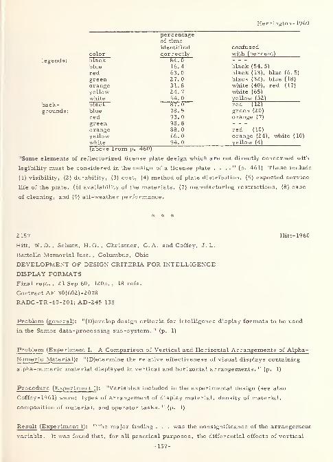
Herrington-1960
legends:
back-grounds :
percentageof timeidentified confused
color correctly with (percent)
black 84. 0
blue 16. 4 black (54. 5)
red 63. 0 black (13), blue (6. 5)
green 27. 0 black (32), blue (18)
orange 31. 8 white (40), red (17)
yellow 24. 7 white (65)
white 54. 0 yellow (32)
black 87. 0 red (12)
blue 78. 5 green (20)red 93. 0 orange (7)
green 98. 8
orange 88. 0 red (10)
yellow 66. 0 orange (24), white (10
white 94. 0 yellow (4)
(above from p. 460)
"Some elements of reflectorized license plate design which are not directly concerned with
legibility must be considered in the design of a license plate . . . ." (p. 461) These include
(1) visibility, (2) durability, (3) cost, (4) method of plate distribution, (5) expected service
life of the plate, (6) availability of the materials, (7) manufacturing restrictions, (8) ease
of cleaning, and (9) all-weather performance.
2157 Hitt-1960
Hitt, W.D.,Schutz, H.G., Christner, C.A. and Coffey, J. L.
Battelle Memorial Inst. , Columbus, Ohio
DEVELOPMENT OF DESIGN CRITERIA FOR INTELLIGENCE
DISPLAY FORMATSFinal rept. , 2 1 Sep 60, 120p. , 18 refs.
Contract AF 30(602)-2078
RADC-TR-60-201; AD-245 138
Problem (general ): "(D)evelop design criteria for intelligence display formats to be used
in the Samos data-processing sub-system. " (p. 1)
Problem (Experiment I. A Comparison of Vertical and Horizontal Arrangements of Alpha-
Numeric Material ): "(D)etermine the relative effectiveness of visual displays containing
alpha-numeric material displayed in vertical and horizontal arrangements. " (p. 1)
Procedure (Experiment I ): "Variables included in the experimental design (see also
Coffey- 1961) were: types of arrangement of display material, density of material,
composition of material, and operator tasks. 11
(p. 1)
Result (Experiment I ): "The major finding . . . was the nonsignificance of the arrangement
variable. It was found that, for all practical purposes, the differential effects of vertical
-157-
Hitt-1960
and horizontal arrangement of alpha -numeric materials on operator performance (were)
negligible ." (p. 1)
Problem (Experiment II. An Evaluation of Formats for Graphic Trend Displays ):
"(D)etermine which of three types of trend formats results in superior performance for a
task requiring the subject to make complex decisions. " (p. 1)
Procedure (Experiment II): "Three commonly used formats were included in the study:
line type, vertical-bar type, and horizontal-bar type. Two secondary independent variables
were: number of time points and amount of missing data. " (p. 1)
Result (Experiment II ): "Results . . . indicate that preference should be given to line-type
graphs, followed closely by the vertical-bar type. A secondary finding was that irrelevant
points and missing data on graphic trend displays represent important factors in the
degradation of operator performance. " (p. 1)
Problem (Experiment III. An Evaluation of Methods for Presentation of Graphic Multiple
Trends ): "(D)etermine the effect of multiple -line versus multiple -graph presentation of
trend-type displays on operator performance. " (p. 2)
Procedure (Experiment HI ): "Four types of lines having low confusability were determined
experimentally from a sample of 25 lines. The primary variable was single -graph,
multiple -line presentation versus multiple -graph, single-line presentation. Other variables
included in this study were: number of lines, degree of confusion among lines, coding of
lines, and two operator tasks: point-reading and comparing. " (p. 2)
R esult (Experiment HI ): "(F)or the point-reading task, either type of display is acceptable,
but for the comparing task, the multiple -line display (was) much superior to the multiple
-
graph display. Moreover, the use of color coding for the graph lines tended to improve
performance slightly. " (p. 2)
Problem (Experiment IV. An Evaluation of Five Different Visual Coding Methods ):
"(A)scertain the relative effectiveness of selected abstract coding methods, based upon
their effects on various operator tasks. " (p. 2)
Procedure (Experiment IV ): "Five different coding methods were selected: numeral,
letter, geometric shape, color, and configuration. Secondary variables included in the
study were target density, number of coding levels, and operator tasks. " (p. 2)
Result (Experiment IV ): "(N)umeral coding and color coding (were) the two superior coding
methods. If greater emphasis is to be placed on identifying symbols, numeral coding is
superior to color coding. No significant differences were found, however, between numeral
coding and color coding for the remaining operator tasks: locating, counting, comparing,
-158-
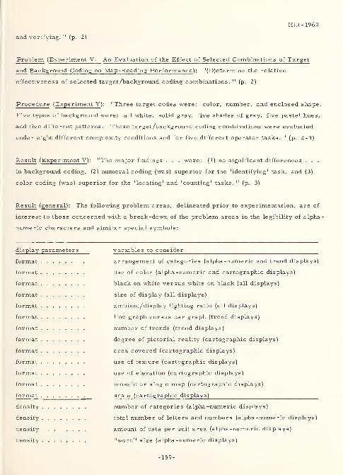
Hitt-1960
and verifying. 11(p. Z)
Problem (Experiment V. An Evaluation of the Effect of Selected Combinations of Target
and Background Coding on Map-Reading Performance ): "(D)etermine the relative
effectiveness of selected target/background coding combinations. " (p. 2)
Procedure (Experiment V ): "Three target codes were: color, number, and enclosed shape.
Five types of background were: all white, solid gray, five shades of gray, five pastel hues,
and five different patterns. These target/background coding combinations were evaluated
under eight different complexity conditions and for five different operator tasks. 11
(p. 2-3)
Result (Experiment V): "The major findings . . . were: (1) no significant differences . . .
in background coding, (2) numeral coding (was) superior for the 'identifying' task, and (3)
color coding (was) superior for the 'locating' and 'counting' tasks. " (p. 3)
Result ( general ): The following problem areas, delineated prior to experimentation, are of
interest to those concerned with a break-down of the problem areas in the legibility of alpha
numeric characters and similar special symbols:
display parameters
format
format
format
format
format
format
format
format
format
format
format
format
format
density
density
density
density
variables to consider
arrangement of categories (alpha -numeric and trend displays)
use of color (alpha -numeric and cartographic displays)
black on white versus white on black (all displays)
size of display (all displays)
ambient/display lighting ratio (all displays)
line graph versus bar graph (trend displays)
number of trends (trend displays)
degree of pictorial reality (cartographic displays)
area covered (cartographic displays)
use of texture (cartographic displays)
use of elevation (cartographic displays)
mosaic or single map (cartographic displays)
scale (cartographic displays)
number of categories (alpha -numeric displays)
total number of letters and numbers (alpha -numeric displays)
amount of data per unit area (alpha -numeric displays)
"word" size (alpha -numeric displays)
-159-
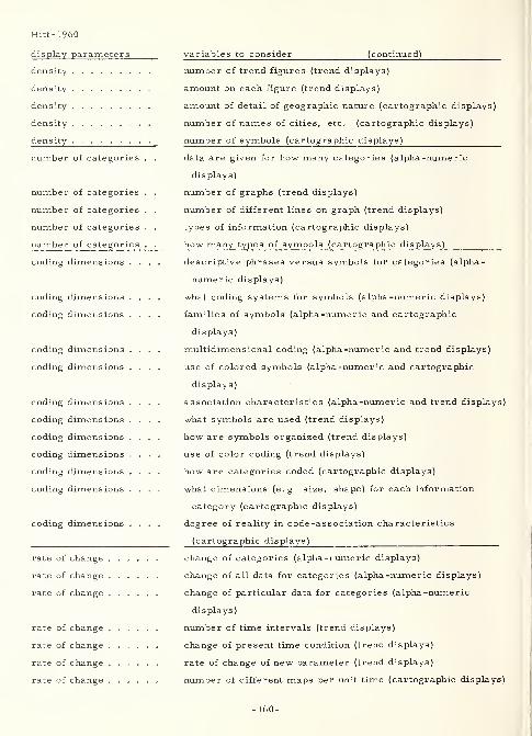
Hitt-1960
display parameters
density
density
density
density
density
variables to consider (continued)
number of categories
number of categories
number of categories
number of categories
number of categories
coding dimensions . .
coding dimensions .
coding dimensions .
coding dimensions .
coding dimensions .
coding dimensions .
coding dimensions .
coding dimensions .
coding dimensions .
coding dimensions .
coding dimensions .
coding dimensions .
rate of change
rate of change
rate of change
rate of change
rate of change
rate of change
rate of change
number of trend figures (trend displays)
amount on each figure (trend displays)
amount of detail of geographic nature (cartographic displays)
number of names of cities, etc. (cartographic displays)
number of symbols (cartographic displays)
data are given for how many categories (alpha -numeric
displays)
number of graphs (trend displays)
number of different lines on graph (trend displays)
types of information (cartographic displays)
how many types of symbols (cartographic displays)
descriptive phrases versus symbols for c?tegories (alpha-
numeric displays)
what coding systems for symbols (alpha -numeric displays)
families of symbols (alpha -numeric and cartographic
displays)
multidimensional coding (alpha-numeric and trend displays)
use of colored symbols (alpha -numeric and cartographic
displays)
association characteristics (alpha -numeric and trend displays)
what symbols are used (trend displays)
how are symbols organized (trend displays)
use of color coding (trend displays)
how are categories coded (cartographic displays)
what dimensions (e. g size, shape) for each information
category (cartographic displays)
degree of reality in code -association characteristics
(cartographic displays)
change of categories (alpha -numeric displays)
change of all data for categories (alpha -numeric displays)
change of particular data for categories (alpha -numeric
displays)
number of time intervals (trend displays)
change of present time condition (trend displays)
rate of change of new parameter (trend displays)
number of different maps per unit time (cartographic displays)
-160-
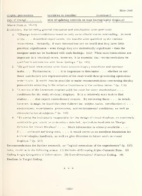
Hitt-1960
display parameters variables to consider (continued)
rate of change rate of updating symbols on map (cartographic displays)
(above from p. 10-11)
In addition, the following general discussion and conclusions were pertinent:
1. "(D)esign recommendations based on only main effects can be misleading. In most
of the . . . described experiments, the results were qualified by the various
interactions. Naturally, if such interactions are so small that they have little
practical significance - even though they are statistically significant - then the
designer need not be burdened with such findings, (sic) When such interactions are
important in a practical sense, however, it is essential that recommendations be
qualified in accordance with these findings. " (p. 116)
2. "(S)ignificant interactions were found between display conditions and operator
tasks. . . Furthermore, ... it is important to determine . . . whether or not
these task factors are representative of the real-world data-processing operations
under study. It would then be possible to make recommendations concerning display
parameters according to the relative importance of the various tasks. " (p. 116)
3. "A review of the literature emphasize (d) the need for more standardized . . .
conditions for the study of visual displays. It is a relatively easy task to find
studies . . . that report contradictory results. By reviewing these ... in detail,
however, it might be found that they differed in: subject tasks, specification of . . .
environment, experimental procedures, and environmental conditions, as well as
characteristics of subjects. " (p. 116)
4. "To assist the individuals responsible for the design of visual displays, an extremely
worthwhile goal would be to develop a detailed, up-to-date handbook on 'Design
Criteria for Visual Displays' .... Much information is already available ....
If . . . collected and integrated, ... it would serve as an excellent foundation for
a visual-display handbook, as well as give direction to future work on visual
displays. 11(p. 117)
Recommendations for further research, as "logical extensions of the experiments" (p. 117)
here, could be in the following areas: (1) Methods of Grouping Alpha -Numeric Data. (2)
Coding Single Categories of Information. (3) Two-Dimensional Abstract Coding. (4)
Realism in Target Coding.
* # *
-161-
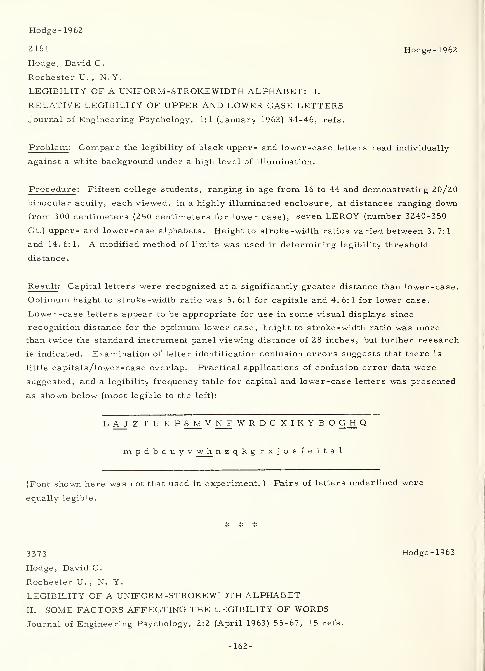
Hodge- 1962
2161 Hodge-1962
Hodge, David C.
Rochester U. , N. Y.
LEGIBILITY OF A UNIFORM-STROKEWIDTH ALPHABET : I.
RELATIVE LEGIBILITY OF UPPER AND LOWER CASE LETTERSJournal of Engineering Psychology, 1:1 (January 1962) 34-46, refs.
Problem : Compare the legibility of black upper- and lower-case letters read individually
against a white background under a high level of illumination.
Procedure : Fifteen college students, ranging in age from 16 to 44 and demonstrating 20/20
binocular acuity, each viewed, in a highly illuminated enclosure, at distances ranging down
from 300 centimeters (250 centimeters for lower case), seven LEROY (number 3240-350
CL) upper- and lower-case alphabets. Height to stroke-width ratios varied between 3. 7: 1
and 14. 6: 1. A modified method of limits was used in determining legibility threshold
distance.
Re suit : Capital letters were recognized at a significantly greater distance than lower-case.
Optimum height to stroke-width ratio was 5. 6:1 for capitals and 4. 6:1 for lower case.
Lower-case letters appear to be appropriate for use in some visual displays since
recognition distance for the optimum lower case, height to stroke -width ratio was morethan twice the standard instrument panel viewing distance of 28 inches, but further research
is indicated. Examination of letter identification confusion errors suggests that there is
little capitals/lower-case overlap. Practical applications of confusion error data were
suggested, and a legibility frequency table for capital and lower-case letters was presented
as shown below (most legible to the left):
L AJ Z T U E P S M V N_F WRDCXIKYBO G H Q
mpdbcuyv w h nzqkgrxjosfeital
(Font shown here was not that used in experiment.) Pairs of letters underlined were
equally legible.
3373 Hodge-1963
Hodge, David C.
Rochester U. , N. Y.
LEGIBILITY OF A UNIFORM-STROKEWIDTH ALPHABET
II. SOME FACTORS AFFECTING THE LEGIBILITY OF WORDS
Journal of Engineering Psychology, 2:2 (April 1963) 55-67, 15 refs.
-162-
Hodge- 1963
Based on Ph. D. Dissertation
Problem: Determine, under varying exposure lengths, letter spacings, and height/stroke
-
width ratios, "the relative legibility of words made up of black upper, lower, and mixed
upper and lower case letters of a uniform-strokewidth alphabet, as might be used on a
white background under a high luminance condition on instrument panels (e.g. a bank of
annunciators). . . In addition, the effect on . . . legibility of . . . (the interaction between)
the amount of spacing . . . and the (height/stroke width) ratio . . . were investigated."
(p. 56) From previous investigation, the possibility is suggested that "words in other than
all upper case letters might be more appropriate for use in visual displays . . . ." (p. 56)
Procedure: "Sixty (subjects 18 female and 42 male university students and staff, age 17
to 41 years, with a mean age of 20. 3, having normal, or corrected to normal, vision, and
with English as their native language assigned at random to the six treatment groups, 10
subjects per group) read (at 28 inches) groups of (eight) unrelated five -letter words (a total
of eighty were selected from the 1000 most common as listed by Thorndike and Lorge)
during exposures of varying duration (0. 30, 0. 55, 0. 80, 1. 05, and 1. 30 seconds in a box
apparatus illuminated with 13 foot-lamberts on the test card), and after each exposure
reported (verbally) what they had been able to read. The measure of legibility was the
mean number of correct responses per (subject) per condition. " (p. 66) Conditions were
as follows: (1) upper (10 cards), lower (10 cards), and mixed (first letter capitalized)
upper and lower case (10 cards), (2) spacing between letters = 25, 50, and 75 percent of
mean letter width, and (3) height/strokewidth ratio = 5.6:1 and 10.2:1. "(S)ubjects . . .
(p. 56) (were) tested under all three levels of the cases variable, and under one of the six
possible combinations of the spacing and ratios variables. . . (p. 57) The words were
drawn (in India ink on tracing paper mounted on white Bristol board cards 4. 0 inches wide
by 3.25 inches high) with the Keuffel and Esser LEROY lettering ... (p. 57) template
number 3240-140CL (upper case letters similar to the standard MS-33558 formerly AND-10400); upper and tall lower case letters were thus about 0. 14 (inches) in height. The two
(height/strokewidth) ratios were drawn by . . . pen number 2 giving . . . 5. 6/1, and pen
number 00 giving . . . 10.2/1. " (p. 58) The arrangement of words on the cards was in two
columns of four each with the left-hand margins of words in the first and second columns
0. 75 and 2. 5 inches, respectively, from the left side of the board. Each of the words had
its base 0. 7 inches from the top of the card or the base of the word above.
Result: The following results were seen:
1. "The finding . . . that words printed in all upper case letters were significantly
superior to those in mixed, or lower, cases was somewhat unexpected, . . . .
"
(p. 64) However, by contrast to the situation reported herein, in which "the task
. . . was designed to incorporate the visual skills used in an actual instrument panel
viewing situation, ... (p. 65) (an) important aspect of (reading) the extended
passage is the context . . . and the meaning of the material may be understood
-163-
Hodge- 1963
without the necessity for reading every single word. " (p. 64)
2. "(T)he 75 percent spacing condition was the most legible one, and . . . the functions
for spacing at the three levels of cases have about equivalent slopes. No explanation
can be found for this discrepancy in results, either . . . ." (p. 65-66)
3. "(T)he 5.6/1 ratio was more legible .... This result was predicted . . .
somewhat paradoxical(ly) . . . since the task used . . . earlier . . . was . . .
considerably different . . . ." (p. 66)
4. "The finding of no interaction between the (height/stroke width) ratio variable and
the two other independent variables (not including the different exposure times)
suggests that in future . . . research . . . (this) variable need not be manipulated. "
(p. 66)
Thus, "(t)he data were interpreted . . . that, for optimal performance, single-word (sic)
instrument panel labels should be printed in all upper case letters with spacing between
letters of at least 75 percent of mean letter width; and that a (height/stroke width) ratio of
5. 6/1 is better than 10. 2/1. " (p. 66)
2162 Hogg-1957
Hogg, Doreen
McGill U. (Canada)
EFFECTS OF LETTER POSITION ON RECOGNITION
M.A. Thesis, Aug 57, 26 p. , 11 refs.
Problem : This study is designed to answer some of the following questions:
1. "Does the (neuro-muscular , ocular coordination) mechanism operate in the same
way when stimuli are displayed on both sides of the fixation point simultaneously?
2. "What would be the effect of the introduction of gaps in the letter formation, or the
effect of the introduction of forms?
3. "Do changes in spacing affect the operation of the mechanism?
4. "What, if any, is the effect of educational level?" (p. 4)
Procedure : "The stimulus material for all experiments consisted of 13 upper case letters
and eight geometric forms. . . arranged in a square in the centre of 3 (inch) by 5 (inch)
white cards so that the midpoint of the letters and forms was equidistant from the fixation
point. The letters were TY PEWRITTEN with an electric typewriter. The recognition threshold
of each letter had been previously determined, and the letters were rotated so that letters
of equal difficulty appeared an equal number of times in each position. The geometric
forms, which were slightly larger than the letters, were stencilled on the cards. Each
form appeared in each position an equal number of times. " (p. 5) A total of 104 Army
personnel and college student subjects participated in three experiments, in which they
viewed and reported on stimuli in a Gerbrands Harvard tachistoscope at 20 and 30
-164-
Hogg-1957
milliseconds. "The object of the first experiment was to see whether the order of report
was affected (1) by the introduction of geometric forms and blank spaces in the letter series
(Z) by using geometric forms alone as stimulus material. (3) by increasing the horizontal
distance between the letters. . . (p. 6) In the second experiment, . . . the same stimulus
materials were presented in the same sequence as ... in the first experiment, but the
subjects were . . . college students (vs. Army personnel). " (p. 10) Since the first two
experiments contained a preponderance of letters, this "may have induced a 'set' to
respond to forms in the same way as letters. " (p. 12) The third experiment "was an
attempt to isolate any such effect. " (p. 1Z)
Result : "(T)he accuracy with which stimuli in different positions (were) recognized (was)
affected by the stimulus arrangement, the context in which they (were) presented, and the
educational level (sic) of the subjects. . . (T)hese findings are, for the most part,
inconsistent with earlier, relatively specific, interpretations .... An explanation is
proposed which attributes the phenomenon to complex interactions among the individual
stimuli. It is suggested that these interactions are the result of a process of selective
attention through many years of reading experience. " (p. Zl) Specifically, "the results are
not entirely compatible with Heron's interpretation. In the first place, the phenomenon
which he describes (the fact that letters exposed in a square are reported from upper left
to lower right) is only obtained when the letter groups subtend the same visual angle as the
groups he used. . . In addition, . . . (the) results . . . (were not) specific to alphabetical
material. . . It seems that when the order of report is disrupted (as by blank spaces or
geometric forms), letters to the right of fixation are more often reported than those to the
left. " (p. 16-17) Otherwise, it follows "the order in which it would normally be read, that
is, from upper left to lower right. . . (p. 18) When the period of time for which the stimuli
were presented was shortened (from 30 to Z0 milliseconds), the effect of letter position on
recognition disappeared. Letters in all four positions were recognized with equal ease.
That is, this might be a case in which the stimulus was strong enough to excite the cell
assemblies corresponding to the individual letters, but not strong enough to excite the
pathways responsible for the ordering process. " (p. Z0)
Note : Upon review, the above work appears to be reported on later by Doreen Kimura
(Kimura- 1959, following). It is possible that the same experimenter is involved, with
the above having been done prior to Mrs. Kimura's marriage.
-165-
Hollingworth- 1913
2164 Hollingworth- 19 13
Hollingworth, Harry
ADVERTISING AND SELLING, PRINCIPLES OF APPEAL ANDRESPONSE
New York, D. Appleton and Co. , 1913, 314 p.
Problem : "(F)ormulate and systematize those facts and laws which relate to the processes
of appeal and response in the selling and advertising of goods, and . . . undertake
investigations which might result in the discovery of new facts and principles of both
practical and scientific interest. 11(p. v)
Procedure: "(F)our distinct aims ..." (p. v) have been utilized:
1. "To sort out, from the general body of psychological doctrine, such principles as
underlie the mental processes involved in creating, presenting and reacting to
appeals which are presented in the form of advertisements, arguments, selling
talks, etc; to state these in systematic form for convenient acquisition and reference
by the active and prosperous business man.
2. "To examine such various methods, media and devices as have proven clearly
successful or unsuccessful in known circumstances, places, and with different
commodities, and to deduce and formulate any principles revealed by such
comparative study.
3. "To carry on, in a cooperative way, new experiments and investigations, by exact
scientific methods, and with the definite intention of helping to render the technique
of the laboratory more and more serviceable in handling the practical problems of
daily business life.
4. "To devise accurate and reliable methods of testing beforehand the probable value
of appeals which are intended for actual use in advertising and selling, (a) by more
exact study of the known principles of appeal and response and their applications in
business transactions, and (b) by a comparison of laboratory tests with keyed results
produced by the appeals in business campaigns. " (p. v-vi)
The following table of contents shows the scope of the book:
I. Measuring the strength of an appeal.
II. The nervous basis of mental processes.
III. The analysis of task and media.
IV. The first task: catching the attention.
V. Mechanical incentives.
VI. Interest incentives.
VII. An experimental test of the relative attention and memory value of the
mechanical and interest devices.
VIII. The second task: holding the attention.
IX. Feeling tone of form.
X. Feeling tone of content.
XI. The third task: fixing the impression.
-166-
Hollingworth- 19 13
XII. The fourth task: provoking the response.
XIII. Instincts, their nature and strength.
XTV. The relative strength of the chief instincts and interests.
XV. Sex and class differences of interest to business men.
Result : The following statements concern typography, environment, and the legibility of
characters:
1. (analysis of advertising types) - The psychology of the classified advertisement
involves ".. . typography the laws of reading, spacing, position, cataloging,
color, legibility of type, etc. " (p. 33) The psychology of the publicity advertisement
". . . is usually mechanical utilizing the principles of size and contrast ." (p. 35)
Both of the above types of factors are involved in the display advertisement.
2. (media) - The eight classes of advertising media, ". . . according to psychological
character and situation" (p. 38) are as follows:
a. Newspapers, magazines, periodicals, and trade journals.
b. Circulars, handbills, posters, bulletin boards , electric signs, and
placards and signs in street cars.
c. Size, form, decoration, color, and illumination of store, comfortable
service, waiting chairs, courteous attendance, etc.
d. Printed and stamped novelties, as lead pencils, paper weights, note books,
calendars, knives, rulers, tapes, toys, puzzles, etc.
e. Registers, directories, theater programs, etc. (resembles b. above).
f. Delivery wagons , street banner s , floats, etc. (resembles c. above).
g. Samples, catalogues, agents, and traveling men.
h. The personal communication, form letter, and "follow-up" literature of
booklet and pamphlet.
3. (the first task: catching the attention) - "(T)he range of attention is limited . . .
(to) five units that can be encompassed in a single act of attention. " (p. 57-58) This
may include five (or six) dots, letters, words, or phrases, providing the latter "are
familiar enough to be perceived as units. . . Nine to sixteen words make a clear
and easily read sentence. . . (G)ood headlines will seldom be found with more than
nine and usually not more than five words. " (p. 58-59)
4. (intensity of the stimulus) - "The intense lights of an electric sign, the brilliant
colors of a billboard placard may force us to look in their direction. But they mayforce us just as quickly to look away again. " (p. 62)
5. (magnitude of the stimulus) - "Scott's general conclusion (from an experiment on the
size, as measured by fraction of a page, of an advertisement) is: 'The attentionand
memory value of an advertisement increases as the size of the advertisement
increases, and the increase of value is greater than the increase in the amount of
space used. ' " (p. 65) However, the response does not necessarily match that.
Figures derived by the author "suggest a more or less definite law of increase
under such circumstances, namely: the number of inquiries tends to increase as
the square root of the amount of space used ." (p. 67)
-167-
Hollingworth-1913
6. (magnitude of the stimulus - typography) - "Gale found progressive increase in
attention value with increase in size of type from two to six millimeters. " (p. 72)
Scott, in a speed of reading test, found that a "HEAVY face" was read faster and
with fewer errors than a "LIGHT face" type. "The writer would ... be inclined to
stress the futility of mere size as an effective advertising device. " (p. 73-74)
7. (contrast) - "(A) striking difference between foreground and background has
strong attention value, and black on white, blue on yellow, red on green are the
most striking combinations . . . ." (p. 76) As to black-on-white vs. white -on-black,
"the principle of irradiation would lead us to expect just the opposite result. " (p. 77)
However, "we habitually associate dark spaces with objects and light spaces with
background . . . ." (p. 78) Thus, "when black letters are seen on white the letters
attract attention. But when white letters appear on black, they seem to be merely
holes in the object ... So far as acuity and legibility go there is no difference
between the two arrangements. " (p. 78)
8. (position) - Gale's experiments indicated that the left-hand side of the page had
greater attention value , while Starch's experiments indicated quite the reverse.
However, the author indicates that, "in flat surfaces the left side will be found the
most favorable, in newspaper pages the outside spaces . . . , while on magazine
pages there will be little difference found. . . A second question relating to position
concerns the relative value of the top and bottom of the page. . . We tend to find
meaning in the top of things . . . We begin to read at the top of the page. Further,
in reading, experiments show that the . . . eye does not run along the middle of a
printed or written line but rather along a line between the middle of the small letters
and the tops of the high ones ... In fixating a general object . . . there is a
constant tendency to fixate the center. . . (p. 82) (I)n Starch's tests, the value of
the upper half of pages was (greater) ... as against . . . the lower half . . . Gale
. . . found that the quarter just above the middle was strongest, and the bottom
weakest. " (p. 83) In preference of pages, Starch found "the outer cover to be twice
as effective, and the inside cover to be half again as effective as the ordinary inside
pages. " (p. 84) In an experiment performed by one of the author's students, the
following results were obtained: "1. The value of the front section is almost 50
(percent) better than that of the back section. 2. The best page . . . is . . . next
to the reading matter in front. The next best . . . next to the reading matter behind.
3. The front cover and the back cover turn(ed) out to be the poorest . . . of . . .
twenty. " (p. 86-87) 4. and 5. The front and back pages were of equal value within
their respective sections. Strong's results were similar, however (and a much
larger publication was used) they showed a definitely higher preference for the
covers
.
9. (color) - Rice showed the visual acuity of colored lights to be in the following order:
To 3/4 meter-candles; white, red, blue, green. 3/4 to 1- 1/4 meter -candles; white,
red, green, blue; Above 1-1/4 (at least to 8-1/2) meter-candles; red, white, green,
blue. Allen, in studying the color preferences of savages, gives the following order:
red, yellow, orange, blue, green. Baldwin, with babies, shows the following: red,
-168-
Hollingworth-1913
blue, white, green, brown. Winch, with English school children, shows: blue, red,
yellow (falling lower with increasing age and intelligence), green (rising higher with
increasing age and intelligence), white, black. Gordon, on a few subjects using
background, shows: on black; red, yellow, green, blue; on white; blue, red, green,
yellow. Vassar students showed: blue, red, green, yellow and orange. Wissler's
studies on Columbia students showed the following results: male preference; blue,
red, violet, green, orange, white, yellow; male dislike; yellow, orange, green, blue,
violet, red, white; female preference; red, violet, green and blue, orange and white,
yellow; female dislike; orange, blue, green, violet, red and yellow (none disliked
white). Other results of Wissler's studies indicated the following: "yellow was
preferred more by the younger students than by the older (with age, he concludes,
the preferred color passes on down toward the violet end of the spectrum); . . .
(p. 100) children and women . . . prefer reds, while men and older women . . .
show greater fondness for blues. . . Taking these studies as a group, the following
points are to be noted. . . (R)eds and blues stand high for educated people, . . .
orange and yellow . . . low. For children and savages just the reverse is the case.
Yellow falls in the development of the race and . . . the individual. No very
striking sex differences for order are shown, but . . . considerable differences for
amount. . . (p. 101) (T)he most saturated colors are preferred." (p. 102)
10. (color and third dimension) - "Brightness is easily taken to mean nearness, while
relative dullness suggests distance. . . (T)he spectral series shows an increasing
suggestion of distance as we go from red . . . to . . . violet. " (p. 103) The latter
is caused by chromatic aberration in the human eye.
11. (the second task: holding the attention - complexity) - "Perhaps three elements or
units . . . represent the ideal; three arguments or propositions of interest, three
figures if (it) takes the form of a picture, three styles or sizes of type, three color
masses, etc. . . (O)ne . . . for the focus, one for the field, and one for the
margin . . . ." (p. 136)
12. (the use of pointers, curves, arrows, borders and similar lines) - "The border . . .
tends to keep the eye within the given area . . . ." (p. 137) All turn the eye "back
toward the center of the composition. . . (T)he eye tends to move along lines
instead of across them . . . ." (p. 138)
13. (lines - quality) - "(F)actors constituting the quality of a line are: (1) breadth;
(2) intensity; (3) texture; (4) color. . . Speaking generally, the following principles
hold: The fine gray line suggests delicacy of texture. T»he fine black line suggests
precision and hardness. The broad rough line suggests homeliness and solidity. "
(p. 142-143)
14. (lines - direction) - "The moderate use of vertical lines conveys a suggestion of
simplicity, firmness and dignity, with a certain severe grace. Excess of verticals,
however, is likely to give stiffness and rigid formality. " (p. 144) Because "(s)ide
to side movements are frequent, as in . . . reading, . . . the horizontal is the line
of ease, quiescence and repose, almost of languor ... (p. 146) The diagonal line
seems to the observer to be full of action and movement. . . (C)urves are more
-169-
Hollingworth- 1913
pleasing than straight lines, whether the curve be arc, serpentine, loop, spiral or
what not. . . (p. 147) giving an atmosphere of grace, pliability, richness, and
voluptuousness (sic). " (p. 149)
15. (closed forms) - "The triangle ... is lively, incisive and delicately balanced.
Especially if . . . not resting on its base, it is . . . (p. 149) suggestive of spirit,
life and constant motion. . . The square . . . suggests solidity and strength,
sturdiness. . . so long as (it) remains on one of its sides. . . (O)n one corner it
resolves itself into triangles and conveys . . . delicate balance and liveliness. The
oblong . . . (whether an ellipse or rectangle, is) most beautiful . . . (in) the
'golden section' ... (p. 150) such a relation that the size of the whole is to the size
of the larger part as that part is to the smaller (a + b : a :: a : b) . . . ." (p. 151)
16. (principles of design) - Quoting Gordon: " '(T)o gain stability, large masses
must be below the center, and this is appropriate when the masses are supposed to
be heavy; to gain freedom and buoyancy, masses may lie above the center, and this
is appropriate when the masses represent something light. '"(p. 157)
17. (character of colors) - Quoting Gordon: " 'Red has been compared to the blare of a
trumpet, loud and ringing; it is also known as one of the "warm" colors. . . (p. 158)
(Y)ellow ... is the brightest ... is joyous and uplifting ... (p. 159) Green is
less exciting than the reds and yellows. . . Blue is . . . suggestive of stillness and
depth. . . (p. 160) White stimulates a joyful but serene mood. . . Gray is . . .
most sober, quiet and subtle. . .' (p. 161) Black by itself is melancholy and
depressing .... It stands also for quiet. In combination with other colors . . .
makes the impression of great concentration and strength. No other color has more
'character' than black. " (p. 162) Color combinations and color balance are also
discussed in some detail.
18. (feeling tone of content) - "(I)n selecting type faces, bulk, weight, mass or
strength demands heavy, strong, bold faced type, while an appeal to feeling or
emotion should be conveyed by means of artistically formed letters, shaded type,
with free, flowing or graceful lines. " (p. 166-167)
19. (feeling tone and imagination) - "An interesting phenomenon which may . . . become
of . . . use to the . . . writer is . . . (synaesthe sia). (E.g.) One man on record
sees consonants as purplish black, while the vowels vary in color. *U* is a light
dove color, 'e' is pale emerald, 'a' is yellow, etc." (p. 176-177)
20. (legibility - favorable length of printed lines) - "The most comfortable . . ., for
ordinary printing, is . . . about three and one-half inches." (p. 181)
21. (legibility - appropriate spacing of letters, words, and lines) - "(T)he space
between letters making up a word should be less than the width of the letters
themselves, while the space between adjacent words should be greater than either
of these two distances. The space between sentences should be somewhat greater
still. . . (S)pacing between . . . lines should be somewhat less than the width
(height of the letters) of the lines themselves , . . (p. 181) Indentation of
paragraphs and even of every other line in the printed matter is found to facilitate
the process of reading. " (p. 182)
-170-
Hollingworth- 19 13
22. (legibility - capitals vs. lower-case) - "(T)he 'lower-case' letters are more
easily perceived and read than are capital letters. " (p. 184)
23. (legibility - ease of reading) - "(T)oo great a variety of type faces. . . cause(s)
lack of unity and organization . . . (Many) different kinds of letters and type faces
occurring on a single page call for excessive and uncomfortable changes in . . .
rhythmical habits of eye movement . . . ." (p. 185)
24. (legibility - type style) - In testing nine different, 10-point Roman, lower-case
styles in a threshold experiment, the following order of legibility was found: NEWSGOTHIC, CUSHING OLD STYLE, CENTURY OLD STYLE, CHELTENHAM WIDE,
CENTURY EXPANDED, SCOTCH ROMAN, BULLFINCH, CASLON, and CUSHING
MONOTYPE.25. (legibility - style vs. grouping) - Roethlein, in testing 16 different faces, found
legibility "to vary little with the form of the type, but to depend chiefly on the size,
width of line, and amount of white space . . . between the letters. The faces
differed less when the letters are grouped than they do ... in isolation. " (p. 186)
This may be because "much of our reading is done, not by perceiving the separate
letters . . . ; but . . . recognizing the words as whole . . . 'word forms. ' " (p. 187)
26. (legibility - background) - "A maximum brightness difference between background
and type makes for easy perception. When colored background or type is used, the
same rule holds, for it is not the difference in color as such, but the difference in
the brightness values of the colors used . . . ." (p. 187)
27. (principle of connection) - In attempting to impart an idea, "(p)lace first the general
class , the purpose or use " (p. 195) that the word should impart "in the moment of
need. . . Place next the name . . . which you desire to connect with the need
. . . ." (p. 196) A number of further comments are made concerning the "Laws of
Original Connection, Principles of Revival, " and miscellaneous memory devices.
28. (memorability of different kinds of facts) - "(T)he relative accuracy with which
different sorts of facts are reported when direct questions are asked concerning
them, runs as follows:" (p. 210)
accuracy (percent )
a. mere presence of things 97
b. number of people 65
c. space relations, form, etc. 58
d. condition of objects 48
e. order of events 35
f. color 26
g. size and quantity 22
h. sounds 10
i. time (duration) 8
j. actions (strong attention value
but not accurately reported)
(above from p. 210)
-171-
Hollingworth-1913
29. (trade marks - geometric forms) - "(T)he relative attention and memory value of
different geometric forms ..." (p. 212) is as follows (left to right and top to
bottom):
con uooo^ao
(above from p. 213)
"The general principle suggested ... is that those forms are best remembered to
which specific names can be given . . . ." (p. 212)
30. (suggestion) - In an experiment with an optical illusion, even though the lines
producing the illusion were so faint as not to be perceptible consciously, the
illusion was reported on by 17 out of 20 subjects.
The following general statements concern experimentation:
1. "(T)he first requirement of a scientific experiment (curiously neglected in
reported tests ... is) that the only variable factor be that which is being
specifically investigated, or that, if other factors vary, this variation be also
measured and reckoned with . . . ." (p. 85)
2. "(T)he image power of words depends largely on their feeling tone. An
appreciation of this feeling tone must come from literary training rather than from
scientific experiment. " (p. 173)
-172-
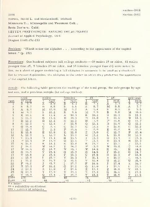
2208
Horton, David L. and Mecherikoff, Michael
Minnesota U. ,Minneapolis and Westmont Coll. ,
Santa Barbara, Calif.
LETTER PREFERENCES: RANKING THE ALPHABETJournal of Applied Psychology, 44:4
(August 1960) 252-253
Problem : "(R)ank order the alphabet . . . according to the appearance of the capital
letter. " (p. 252)
Procedure : One hundred subjects (all college students 19 males 25 or older, 41 males
younger than 25, 5 females 25 or older, and 35 females younger than 25) were asked to
list, on a sheet of paper containing a full alphabet in sequence to be used as a check-off
list to prevent duplication, the alphabet in the order in which they preferred the appearance
of the capital letter.
Result : The following table presents the rankings of the total group, the sub-groups by age
and sex, and a previous sample (22 college males):
total males females < 25 > 25 previousrank 1=:= rank 1 rank 1 rank 1 rank 1 rank 1 rank
B ~771 A 8. 0 B B 7. 1 A 7. B2 S 8. 7 B 8. 8 S 6. 6 S 8. 7 M 8. 8 A 7. 7
3 A 8. 9 M 10. 0 M 9. 2 A 9. 4 S 8. 9 S 9. 6
4 M 9. 7 S 10. 2 R 9. 6 M 9. 9 B 9. 8 M 10. 6
5 R 10. 6 R 11. 4 A 10. 3 R 10. 2 H 11. 3 D 11. 0
6 N 11. 9 O 11. 6 D 10. 9 D 11. 8 T 11. 6 W 11. 3
7 D 12. 2 H 12. 2 N 11. 2 N 11. 9 P 11. 8 o 11. 7
8 C 12. 3 N 12. 4 J 11. 5 O 12. 1 N 11. 9 G 12. 2
9 O 12. 4 C 12. 5 C 12. 0 c 12. 2 R 12. 0 C 12. 2
10 H 12. 7 T 12. 5 P 12. 6 L 12. 9 E 12. 2 R 12. 3
11 E 12. 8 E 12. 8 E 12. 8 E 13. 0 C 12. 7 P 12. 4
12 L 12. 9 L 12. 9 L 13. 0 H 13. 2 L 13. 0 H 12. 9
13 T 13. 1 D 13. 1 H 13. 5 J 13. 3 O 13. 3 E 13. 1
14 P 13. 4 P 13. 9 O 13. 6 T 13. 6 D 13. 4 N 13. 3
15 K 14. 0 K 14. 1 K 13. 8 K 13. 7 V 13. 7 J 13. 6
16 J 14. 0 W 14. 2 T 14. 0 P 13.9 w 13. 8 T 14. 0
17 W 14. 6 G 14. 7 W 15. 1 W 14. 8 K 15. 1 K 14. 2
18 G 14. 9 V 15. 4 G 15. 3 G 14. 8 F 15. 2 Q 14. 7
19 V 15. 8 u 15. 5 F 16. 3 U 15. 8 G 15. 3 F 14. 8
20 U 15. 9 I 15. 7 V 16. 3 I 16. 1 X 16. 0 L 15. 3
21 I 16. 2 X 15. 7 U 16. 6 V 16. 4 U 16. 2 U 15. 922 F 16. 2 J 15. 7 I 17. 0 F 16. 6 J 17. 4 X 16. 7
23 X 17. 1 F 16. 2 Q 17. 2 Q 17. 0 I 17. 5 I 17. 6
24 Z 17. 3 z 17. 0 Z 17. 6 Z 17. 1 Z 18. 0 V 18. 3
25 Q 17. 3 Y 17. 3 X 19. 1 X 17. 4 Q 18. 4 z 19. 2
26 Y 18. 3 Q 17. 4 Y 19. 7 Y 18. 2 Y 18. 5 Y 19. 8
N*** 100 60 40 76 24 22Rr** . 94 . 88 .91 .91 . 78 . 78* = letter** = reliability coefficient*** = number of subjects
Horton-1960
Horton- 1960
-173-
Horton-1960
"Coefficients of concordance among judges (not shown above) are low, but rankings for the
total sample and the age and sex subsamples appear to be quite reliable. " (p. 253) In this
light, it seemed "justified ... to pool all the subgroups for an overall ranking, since
differences between groups can be attributed to chance differences between different groups
of judges. " (p. 253)
3377 Howell-1959
Howell, William C. and Kraft, Conrad L.
Aviation Psychology Lab. , Ohio State U. Research
Foundation, Columbus
SIZE, BLUR, AND CONTRAST AS VARIABLES AFFECTINGTHE LEGIBILITY OF ALPHANUMERIC SYMBOLS ONRADAR -TYPE DISPLAYS
Sep 59, 38 p. , 17 refs.
Contract AF 33(616)3612
WADC TR 59-536; AD-232 889
Problem : Determine the effect of size, blur, and contrast, and their interactions on the
legibility of alpha-numeric characters presented on a radar-type display (light characters
on a dark field).
Procedure : Twelve male university students each tachistoscopically viewed individual
characters of a randomly arranged, 36-character , alphanumeric, MACKWORTH(modified) set that was back-projected onto a ground glass screen. There were four
conditions each of size, blur, and contrast, for a total of 64 conditions. Performance
indices were speed and accuracy.
Result: Optimum legibility was obtained at a 26. 80-minute visual angle, low blur, and
high contrast. Each of the variables and two of the interactions (size vs. blur vs. contrast
and size vs. contrast) between them significantly influenced legibility. Implications of the
data, and how the procedure and result of this experiment are related to the work of others,
were discussed. Specifically, "(t)he major implications of these findings for operational
use are these: (a) in a situation employing white -on-black alpha-numeric symbols,
maximum legibility may be attained when no blur exists, when contrast is at or above 37
(percent), and when size is approximately 27 (minutes) of visual angle of letter height, and
(b) when restrictions prohibit the attainment of this optimum for specific dimensions,
legibility can be maintained by suitable adjustment of the other dimensions. These
restrictions can also be compensated for in another manner, that of choosing from the
confusion data alphabets that minimize the effect of the restriction. " (p. 19) An appendix
reports on confusion data derived from specific conditions.
-174-
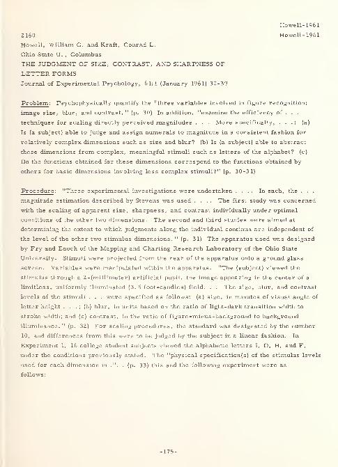
2160
Howell, William C. and Kraft, Conrad L.
Ohio State U. , Columbus
THE JUDGMENT OF SIZE, CONTRAST, AND SHARPNESS OF
LETTER FORMSJournal of Experimental Psychology, 61:1 (January 1961) 30-39
Problem : Psychophysical^/ quantify the "three variables involved in figure recognition:
image size, blur, and contrast. " (p. 30) In addition, "examine the efficiency of . . .
techniques for scaling directly perceived magnitudes . . . More specifically, . . . : (a)
Is (a subject) able to judge and assign numerals to magnitude in a consistent fashion for
relatively complex dimensions such as size and blur? (b) Is (a subject) able to abstract
these dimensions from complex, meaningful stimuli such as letters of the alphabet? (c)
Do the functions obtained for these dimensions correspond to the functions obtained by
others for basic dimensions involving less complex stimuli?" (p. 30-31)
Procedure : "Three experimental investigations were undertaken .... In each, the . . .
magnitude estimation described by Stevens was used .... The first study was concerned
with the scaling of apparent size, sharpness, and contrast individually under optimal
conditions of the other two dimensions. The second and third studies were aimed at
determining the extent to which judgments along the individual continua are independent of
the level of the other two stimulus dimensions. " (p. 31) The apparatus used was designed
by Fry and Enoch of the Mapping and Charting Research Laboratory of the Ohio State
University. Stimuli were projected from the rear of the apparatus onto a ground glass
screen. Variables were manipulated within the apparatus. "The (subject) viewed the
stimulus through a 2 -(millimeter) artificial pupil, the image appearing in the center of a
limitless, uniformly illuminated (3. 5 foot-candles) field. . . The size, blur, and contrast
levels of the stimuli . . . were specified as follows: (a) size, in minutes of visual angle of
letter height . . . ; (b) blur, in units based on the ratio of light-dark transition width to
stroke width; and (c) contrast, in the ratio of figure -minus -background to background
illuminance. " (p. 32) For scaling procedures, the standard was designated by the number
10, and differences from this were to be judged by the subject in a linear fashion. In
Experiment 1, 16 college student subjects viewed the alphabetic letters I, O, H, and F,
under the conditions previously stated. The "physical specification(s) of the stimulus levels
used for each dimension in .". . (p. 33) this and the following experiment were as
follows:
Howell- 1961
Howell-1961
-175-
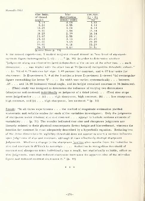
Howell- 1961
size (min. blur contrastof visual distribution Bl - B2angle) stroke width B2
4. 73 0. 00 1. 438. 20 0. 55 4. 14
11. 25 1. 04 8. 14
15. 00 1. 54 12. 1418. 25 2. 09 16. 14~> 1 AO C . DO 2 0.7124. 60 3. 13 25. 2927. 00 3. 63 29. 3931. 00 4. 18 33. 2936. 79 4. 67 37. 57
(above from p. 33)
In the second experiment, 5 student subjects viewed stimuli at "one level of standard-
variable figure heterogeneity (. 50) . . . ." (p. 35) In order to determine whether
"judgments along one dimension (are) independent of the values of the other two. . . each
dimension . . . was scaled with the other two at 75 (percent) recognition threshold values. "
. . (p. 35) of 4. 73 minutes for size, 1. 43 percent for contrast, and 4. 67 blur units for
sharpness. In Experiment 3, 4 of the 5 subjects from Experiment 2 viewed "(a) rectangular
figure resembling the letter 'I' . . . . Its width was varied systematically . . . between
.25 . . . and 16. 00 (minutes) visual angle, and its height remained constant at 36 (minutes).
. . (This) study was designed to determine the influence of varying two dimensions
(sharpness and contrast) individually on judgment of a third (size). . . (Ten) size steps
were judged under . . .: (a) . . . high sharpness, high contrast, (b) . . . low sharpness,
high contrast, and (c) . . . high sharpness, low contrast. " (p. 36)
Result: "In all three experiments . . . the method of magnitude estimation yielded
systematic and reliable scales for each of the variables investigated. Only the judgments
of sharpness under minimal size and contrast . . . appear to include serious amounts of
variability ... (p. 37) The results indicated that size and sharpness judgments are
linearly related to their physical counterparts (letter height and blurrednes s) , whereas the
function for contrast is most adequately described by a hyperbolic equation. Reducing two
of the three dimensions to legibility threshold does not appear to exert a serious influence
upon judgments of size and contrast, although it does effectively disrupt sharpness
judgments. Whether a change in the sharpness function also results from the reduction in
size and contrast is difficult to ascertain .... Reduction to recognition threshold of
contrast and sharpness taken individually has a small, but statistically reliable, effect on
size judgments, such that reduced sharpness increases the apparent size of the stimulus
figure and reduced contrast decreases it. " (p. 39)
* * *
-176-
Huey-1916
2198 Huey-1916
Huey, Edmund Burke
THE PSYCHOLOGY AND PEDAGOGY OF READING
New York, Macmillan Co. , 1916, 469 p.
Problem : With a view to the history of writing, reading, and reading methods, discuss the
application of empirical investigations performed by the author and others to the problems
of the psychology, pedagogy, and hygiene of reading.
Procedure : The following outline of contents gives clues to the scope and coverage of the
book:
INTRODUCTORYI. The mysteries and problems of reading.
THE PSYCHOLOGY OF READINGII. The work of the eye in reading.
III. The extent of reading matter perceived during a reading pause.
IV. The experimental studies upon visual perception in reading.
V. The nature of the perceptual process in reading. «
VI. The inner speech of reading and the mental and physical characteristics of
speech.
VII. The functioning of inner speech in the perception of what is read.
VHI. The interpretation of what is read, and the nature of meaning.IX. The rate of reading.
THE HISTORY OF READING AND OF READING METHODSX. The beginnings of reading, in the interpretation of gestures and pictures.
XI. The evolution of an alphabet and of reading by alphabetic symbols.XII. The evolution of the printed page.
XIII. The history of reading methods and texts.
THE PEDAGOGY OF READINGXIV. Present-day methods and texts in elementary reading.
XV. The views of representative educators concerning early reading.
XVI. Learning to read at home.XVII. Learning to read at school the early period.
XVIII. Reading as a discipline, and as training in the effective use of books.
XIX. What to read; the reading of adolescents.
THE HYGIENE OF READINGXX. Reading fatigue.
XXI. Hygiene requirements in the printing of books and papers.
CONCLUSIONXXII. The future of reading and printing the elimination of waste.
Result : The following excerpts concern the legibility and readability of alphabetic and
syllabic characters and symbols (excluding pictographs) and are especially appropriate to
the subject matter of this Reference Handbook. Also, these excerpts are representative of
the types of material found elsewhere in the text. This book, however, does not attempt to
-177-
Huey-1916
analyze "what we do when we read . . . (for that) would be to describe very many of the
most intricate workings of the human mind (and the processes of perception), as well as to
unravel the tangled story of the most remarkable specific performance that civilization has
learned in all its history. " (p. 6)
1. In reading, the eyes move "by a succession of quick, short movements to the end
(of the line), then return in one quick, usually unbroken movement to the (beginning
of the next line at the) left. . . (T)here are at least two pauses for every line, and
almost always more than that for lines of this (3-1/2 inches) length, from three
to five . . . usually, and even more when the reading proceeds very slowly. . .
(S)ome of the pauses are very much longer than others. . . Javal . . . concluded
that there was a pause about every ten letters, and . . . that this was about the
amount that could be seen clearly at one fixation. " (p. 16-18)
2. "Javal . . . found that after reading he had after-images of straight gray lines
corresponding to the parallel lines of print . . . ." (p. 18)
3. "Javal . . . concluded that the fixation point moves along between the middle and
top of the small letters. . . (T)he conclusion was shown to be unfounded. "
(p. 18 & 31)
4. "Javal . . . stated that the movement was such as to prevent the seeing of what was
read except during the reading pauses. " (p. 18)
5. "Landolt . . . concluded that on an average 1. 55 words were read per reading
pause, at the ordinary reading distance. Reading of a foreign language required
more pauses, as did also the reading of detached words, numbers, and lists of
proper names. He found that the small movements were very fatiguing, and that,
since the angular excursion increases as the reading matter is brought nearer to
the eye, this may account for the tendency of children ... to myopia. Doubling
the distance of the page from the eye increased the number of movements in the
ratio of nine to seven, the number of eye -movements seeming to depend upon the
visual angle subtended. " (p. 19)
6. "(M)ore movements are made by . . . slow readers. " (p. 20)
7. "Erdmann and Dodge . . . found that the number of pauses did not vary greatly
from line to line, for the same reader and with easy familiar reading matter.
There were fewer pauses with familiar matter. " (p. 20)
8. "In reading from a . . . treatise, printed in English, with lines 83 millimeters in
length, Dodge . . . averaged from three to five pauses per line, according to the
familiarity .... Erdmann . . . averaged from five to seven pauses ... in
reading a familiar German scientific work, with lines 122 millimeters in length. 11
(p. 20)
-178-

Huey-1916
9. "Proof reading required about three times as many pauses ... in the case of
Erdmann. " (p. 21)
10. "In writing there seemed to be a pause for about every two letters . . . ." (p. 21)
11. In reading, "the first pause was almost always within the line, and . . . the last
was still farther from the end of the line. The more familiar the text, the greater
was the indentation at the left, and more especially still at the right. " (p. 2 1)
12. "(F)ixations ... in reading were almost exclusively upon words, upon the middle
of the word usually. " (p. 21)
13. "Dodge . . . showed that the forward movements varied from two to seven
degrees . . .." (p. 22)
14. "It seems to me (Huey) probable that the fixation point varies more widely than
(between the middle and top of the small letters), but there is nothing to indicate
that it wanders perceptibly above or below the line. " (p. 2 7)
15. "The return sweep when a line was finished was usually without interruption,
although about once in six lines a halt would be made near the end of the movement
.... These halts . . . are more numerous in reading long lines. " (p. 27)
16. "In reading lines of the length (3-3/4 inches) . . . movements . . . (u)sually . . .
were from four to six. . . Doubling the distance did not appreciably lessen the
number of pauses per line. " (p. 29)
17. "(L)ines of the length (2-3/8 inches) and type (about 8 -point) shown . . . gave an
average of 3. 6 pauses . . . (L)ines (2 inches) and type (about 6-point) . . . gave
3. 8 pauses . . . for one reader and 3. 4 for another. " (p. 30)
18. "From 78 per cent to 82 per cent of the line, on an average, was actually traversed
by the eye . . . ." (p. 30)
19. Tests in which the subjects "were asked to read as fast as possible", as opposed to
reading at their own rate, there was a decrease in both the number and duration of
fixations. There was also an increase in the extent, but not the speed of the eye-
movement. The results of the author's experiments "are fairly congruent with
those of Erdmann and Dodge . . . , except as to the rate of movement. . . The
essential problem as to the movements in reading is to know whether they are of
such a speed as to prevent our perceiving letters or words during the movement. "
(p. 33 & 35)
20. "Cattell advanced the hypothesis that the visual organs respond to retinal changes
more rapidly when the eye moves than when the objects are in motion ..." (p. 36)
2 1. When fixating on a central point, "Erdmann and Dodge, ... on a page of German
printed in good type, found that neither of them could see letters or words clearly
beyond the ends of the lines represented in the diagram below .... Not all of
-179-
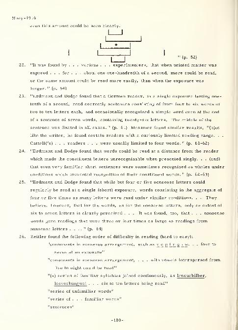
Huey-1916
even this amount could be seen clearly.
J I
" (p. 52)
22. "It was found by . . . various . . . experimenters, that when Drinted matter was
exposed . . . for . . . about one one -hundredth of a second, more could be read,
or the same amount could be read more easily, than when the exposure was
longer. " (p. 54)
2 3. "Erdmann and Dodge found that a German reader, in a single exposure lasting one -
tenth of a second, read correctly sentences consisting of from four to six words of
two to ten letters each, and occasionally recognized a simple word even at the end
of a sentence of seven words, containing twenty-six letters. The middle of the
sentence was fixated in all cases. " (p. 61) Messmer found similar results, "(b)ut
like the writer, he found certain readers with a curiously limited reading range. . .
Cattell('s) . . . readers . . . were usually limited to four words. " (p. 61-62)
24. "Erdmann and Dodge found that words could be read at a distance from the reader
which made the constituent letters unrecognizable when presented singly. . . (and)
that even very familiar short sentences were sometimes recognized as wholes under
conditions which prevented recognition of their constituent words. " (p. 62-63)
2 5. "Erdmann and Dodge found that while but four or five nonsense letters could
regularly be read at a single (short) exposure, words consisting in the aggregate of
four or five times as many letters were read under similar conditions. . . They
believe, however, that for the words, as for the nonsense letters, only an extent of
six to seven letters is clearly perceived ... It was found, too, that . . . nonsense
words gave readings that were three or four times as large as readings from
nonsense letters . . . ." (p. 64)
26. Zeitler found the following order of difficulty in reading (hard to easy):
"consonants in nonsense arrangement, such as v c_ p f_n g_ L w. . . four to
seven at an exposure"
"consonants in nonsense arrangement, . . . with vowels interspersed from
five to eight could be read"
"(a) series of familiar syllables joined continuously, as lencurbilber ,
losverkungwei . . . six to ten letters being read"
"series of unfamiliar words"
"series of . . . familiar words"
"sentences"
-180-
Huey-1916
"familiar expressions or proverbs"
"sentences of four or five short words, with a total of twenty to thirty
letters "
"(s)ingle words having as many as nineteen to twenty-five letters each, as
Bewusstseinszustand and Aufmerksamkeits schwankung " (p. 64-65)
27. There is a suggestion that as one receeds farther from the fixation point, the items
to disappear are first "the small marks" (p. 67) (serifs?), then the dots, then the
small letters, then the large letters, and finally the word outlines.
28. "Two facts . . . are evident . . . : First, reading . . . go(es) on by other means
than the recognition of letters; second, the amount . . . read . . . will vary with
the nature of the matter read, with the associative connections existing between the
letters, words, etc., and with the reader's familiarity . . ., the latter enabling
. . . clear(ing) (of) . . . parts that are indistinct. . . (W)e are limited, in the
amount that can be read during a reading pause, by the inadequacy of the retinal
structure, by our inability to attend to more than a few parts of the total picture
presented, and by the necessity of our attention's concerning itself with
interpretations. " (p. 68 & 70)
29. "Cattell . . . concluded . . . that we read in word-wholes and even, sometimes, in
phrase or sentence wholes, and not by letters. . . that the shortest exposure which
would permit the recognition of single small letters and capitals sufficed also for
the recognition of short words, and that long words needed but one one -thousandth
of a second more. "(p. 72-73)
30. Erdmann and Dodge found: "First, words are recognized when lying too far from
the fixation point to permit recognition of their component letters. Second, words
are recognized when formed of letters so small that the letters could not be singly
identified. Third, . . . words were recognized at distances at which the letters
when exposed singly, could not be recognized. Fourth, . . . words were more
readily recognized when they were long, or of optically characteristic form. Fifth,
when twenty-six selected words were learned thoroughly in a fixed order, as the
alphabet is known, and then exposed beyond the distance at which the letters could
be recognized, the words could be distinguished and recognized in almost every
instance. Sixth, words of four letters are named somewhat more quickly than
single letters, and words of eight, twelve, and sixteen letters need comparatively
little more time, the longest needing only about one -fifth more time than the
shortest. " Thus, "it is not the constituent parts of any given form that make it
recognizable, but it is the familiar total arrangement. . ." ' 3 is not
-181-
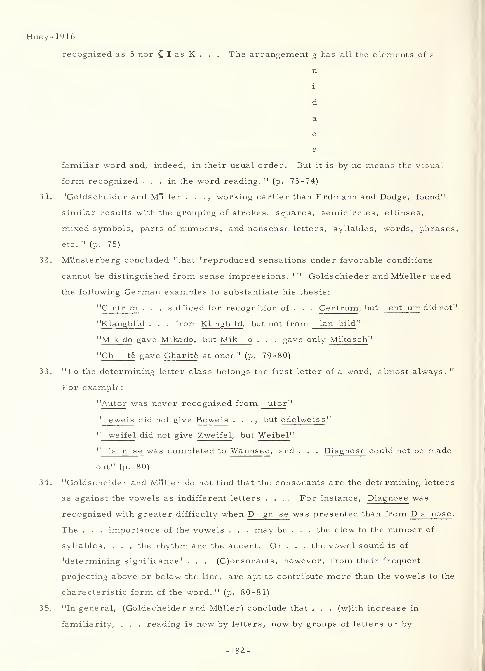
Huey-1916
recognized as 5 nor { I as K . . . The arrangement g has all the elements of a
familiar word and, indeed, in their usual order. But it is by no means the visual
form recognized ... in the word reading. " (p. 73-74)
3 1. "Goldscheider and Muller . . ., working earlier than Erdmann and Dodge, found"
similar results with the grouping of strokes, squares, semicircles, ellipses,
mixed symbols, parts of numbers, and nonsense letters, syllables, words, phrases
etc. " (p. 75)
32. Mtlnsterberg concluded "that 'reproduced sensations under favorable conditions
cannot be distinguished from sense impressions. 1 " Goldschieder and Mtteller used
the following German examples to substantiate his thesis:
"C ntr m . . . sufficed for recognition of . . . Centrum, but ent um did not'
"Klangbild . . . from Kl ngb Id , but not from lan bild "
"M k do gave Mikado, but Mik o . . . gave only Mikosch"
"Ch te gave Charite at once" (p. 79-80)
33. "To the determining letter class belongs the first letter of a word, almost always. "
For example:
"Autor was never recognized from utor "
" eweis did not give Beweis . . ., but edelweiss"
" we ifel did not give Zweifel , but Weibel "
" ia n se was completed to Wannsee, and . . . Diagnose could not be made
out" (p. 80)
34. "Goldscheider and Muller do not find that the consonants are the determining letters
as against the vowels as indifferent letters .... For instance, Diagnose was
recognized with greater difficulty when D gn se was presented than from Da nose .
The . . . importance of the vowels . . . may be . . . the clew to the number of
syllables, . . . the rhythm and the accent. Or . . . the vowel sound is of
'determining significance' . . . (C)onsonants, however, from their frequent
projecting above or below the line, are apt to contribute more than the vowels to the
characteristic form of the word. " (p. 80-81)
35. "In general, (Goldscheider and Muller) conclude that . . . (w)ith increase in
familiarity, . . . reading is now by letters, now by groups of letters or by
-182-
36.
37.
39.
Huey-1916
syllables, now by word-wholes, all in the same sentence sometimes, or even in the
same word, as the reader may most quickly attain his purpose. " (p. 81)
Zeitler, in studying determining or "dominating" parts, found that "letters
projecting above or below the line were recognized preferably. The vowels and
small consonants were misread most often, the long consonants least often. . .
(E)xamples of the dominating letters may be . . . the following:
Gold G Id
Haut H t
Fliege F lg (sic)
Woche W ch (ck) (sic)
Streit St t
Minute M t "( p. 82-84)
"The dominating parts may be silent letters, or letters having a sound that is very
different when heard singly than when combined in the given word. " (p. 85)
"The reading stimulus ... is ordinarily not the . . . sentence or the . . . words
. . . (b)ut ... is the series of dominating letters or complexes. " (p. 85)
"In Zeitler's opinion, . . . word-length and total form are not very important
factors in the recognition. " This result came from the following words being read
for the exposures given:
exposure
Phalanstere
Skioplikon
Pygmalion
Lepidodendron
Ritardando
Epaminondas
Agoraphobie
Farbe
Meludie (exposed for
Melodie)
Gefiidl (Gefflhl)
Kiilge (Kiilpe)
Fniede (Friede)
Analomie (Anatomie)
Thus also, "in the first perception .
reading
Phantasie
Polar stern
Skorpion
Skioptikon
Pygmae
Leoparden
Retoranda
Epimenides
Agraphie
Fabrik
Medulla
Gefilde
Klage
Feinde
Anomalie
. the dominant parts . are not seen m
-183-
Huey-1916
any very fixed spatial arrangement, but are later put in place . . . when the full
recognition completes itself with . . . the associative elements. " (p. 85-87)
40. "Messmer finds that the long letters which project above the line are usually the
dominating ones. . . Letters projecting below the line would be mistaken for
vowels, as g_ for a, p for o, etc. 'They possess optically the value of small
letters. 1 " (p. 91)
41. "The dominating letters play the main role in recognition, but the others . . . play
an important part as well. " (p. 91)
42. "Readers of (one) type apperceive . . . from the total character of the word-form
rather than from the dominating parts ..." (p. 92) and, at a glance, read a
larger amount, less accurately, than do the ones who utilize the dominant letters.
43. "Small letters adjoining the dominant letter may, by their proximity, help in
forming a total configuration and . . . thus ... a dominant complex. " (p. 92)
44. Messmer "finds that word-length plays little part in characterizing words for
children, and that it is usually less important for children than are the dominant
complexes. " (p. 93)
45. "Messmer's analysis of the 'total character of words' has . . . three main factors
. . .,
first, breadth of the letters horizontally; second, height of the letters
vertically; third, geometrical form of the letters. As to breadth, the letters are
composed of one, two, or three vertical strokes, as i, h, m, or of forms
occupying one or another of these three horizontal spaces. . . Differentiation in
letter-width (73. 0 percent of German text letters are small) . . . seems to be of
comparatively little value. . . Viewing the total word-form as to height, (the) long
letters vary it and give a characteristic outline. " (p. 93-94) Compare
Zusammenreisen with Verschiedenheiten. "(L)etters may be grouped, first, into
those composed essentially of vertical strokes, as i, n, m, t, 1, f, h, r, j; second,
those composed essentially of curved lines, as o, e, c, s, a, g; third, those
composed essentially of both perpendicular strokes and curved lines, as b, d, q, p;
fourth, those composed essentially of oblique strokes, as, w, v, y, x, z, k, the
last letter having also a perpendicular stroke. " In frequency (German text), the
following breakdown is seen:
group one (inmtlfhrj) - 46. 9%
group two (o e c s a g) = 37. 1%
group three (b d q p) =6. 1%
group four (w v y x z k) = 4. 6%
(capitals more frequent than in English) = 6. 3%
total = 101. 0% (sic)
-184-
Huey-1916
"The predominance of one or another of these classes of letters, in any given word,
gives it a characteristic total appearance . . . Messmer calls . . . the total
impression . . . in . . . words . . . containing about equal numbers of . . . the
first two groups . . . 'the most favorable total form 1
. . . ." (p. 94-95)
46. "Messmer . . . thinks that for (child readers) . . . word-length is but a minor
factor in word-perception. " (p. 96)
47. "In experiments made some years ago I found that the first half of a word is of
considerably greater importance for perception than is the latter half. . . (T)he
beginning of a word was regularly found to be a determining or dominating part
.... Indeed, the terminal letters are considerably more legible than the others,
perhaps from being partially isolated. . . (R)eaders tested averaged .49 words per
second when reading from the first halves, as against . 33 words per second when
reading from the last halves. . . (F)actors which cooperate to produce this result
(are) . . . the tendency of English to place the accent upon the first part of the
word, . . . the preponderance of . . . suffixes over prefixes, . . . (and) the time -
order (from the first part toward the latter) in ordinary inter-association of
syllables . . . ." (p. 96-98)
48. "The upper half of a word or letter is . . . more important for perception than is
the lower half. . . Javal . . . concluded . . . that the eye's fixation point moved
along between the middle and top of the small letters, thus giving an advantage in
perception to the upper half of the line. . . (I)t seems to me that the greater
importance of the upper part is due rather to the words being better differentiated
there than below, as . . . shown by Messme(r) . . . ." (p. 98-99)
49. "In my own experiments ... it seems certain that the recognition of familiar and
comparatively short words is little affected by doubling the number of letters . . . ."
(p. 101)
50. "(O)ne is inclined to accept what the experiments of Zeitler, Messmer, and others
seem to show, that the first factors of perception in reading are not usually the
total form, word-length, etc., but certain striking 'dominant' parts, . . . word-
form and word-length coming a little later as the recognition is completed at the
suggestion of these dominant cues. " (p. 109)
51. "There is no question but that . . . recognition could well be set off by a skeleton
drawing of the word showing no particular letter forms, and might well occur at
distances at which particular letters were no longer recognizable as such. . .
But Erdmann and Dodge have . . . apparently mistaken what is possible and many
times actual for a usual and almost universal method of recognition. Here the
testimony of the majority of . . . experimenters is against them. . . As a matter
-185-
1916
of fact, the outline form of a word is a rather inconstant quantity. "(p. 110)
"When a single letter is exposed and recognized . . . , the simultaneously given
stimulations from its various parts mutually reinforce each other, having been
associatively knitted together in past experience. . . Doubtless we have dominant
parts of letters as of words. "(p. 11Z)
2667 Hughes- 1961
Hughes, C. L.
International Business Machines, Corp. , New York
VARIABILITY OF STROKE WIDTH WITHIN DIGITS
Journal of Applied Psychology, 45:6
(December 1961) 364-368, refs.
Problem: After a review of the literature and conclusions drawn from it concerning digit
design, "(t)he present study was an attempt to study systematically the effect of variations
in within-variable stroke width, CONVENTIONAL versus SYMBOLIC digits, emphasizing
the unique aspects of digits through stroke boldness, angularity versus curvature, and the
interaction of these variables. " (p. 365)
Procedure : Subjects viewed stimuli (illuminated at 100 foot-candles) from 21 feet. "(T)his
was decreased by one -foot intervals until (the subject) could read the digit correctly. . .
(p. 366) The stimuli were a set of cards on which the digits were drawn, one digit per
card, each digit 9/64 (inches) high .... The stroke width to height ratios . . . were
either 1 (to) 6 (emphasized) or 1 (to) 8 (unemphasized) . . . Eight 'types' of digits, (1
through 0) of each . . . were used .... Some . . . were duplicate(d) ... to prevent
i(m)balance in . . . presentation . . . and as an offset for guessing habits .... The
types were:
"Type A conventional ARABIC, even-overall stroke width, (stroke width to height
ratio) 1 (to) 8
"Type B conventional ARABIC, even-overall stroke width, (stroke width to height
ratio) 1 (to) 6
"Type C SYMBOLIC, even-overall stroke width, (stroke width to height ratio) 1 (to) 8
"Type D SYMBOLIC, even-overall stroke width, (stroke width to height ratio) 1 (to) 6
"Type E SYMBOLIC, emphasized horizontal components, (stroke width to height
ratios) 1 (to) 6 and 1 (to) 8
"Type F SYMBOLIC, emphasized vertical components, (stroke width to height
ratios) 1 (to) 6 and 1 (to) 8
"Type G SYMBOLIC, emphasized unique components, (stroke width to height ratios)
1 (to) 6 and 1 (to) 8
"Type H SYMBOLIC, special design with only unique components, the common
elements absent, (stroke width to height ratio) 1 (to) 6
-186-
Hughes- 1961
"(T)he following terms .". . were defined in the report:
"Form the shape or contour of the digit irrespective of the stroke variations . . .
"Stroke Width the ratios of (stroke width) or line emphasis . . .
"Configuration the total or whole digit including form and (stroke width) variations
"Component any part or stroke or contour of a digit . . .
"Uniqueness the condition of having components or element combinations that are
not present in other configurations, either through changes in (stroke
width) or form ..." (p. 365-366)
R esu lt: "The primary conclusions which may be drawn from the previous research . . .
would appear to be as follows:
1. "The degrees of boldness of stroke lie within the range (stroke width to height
ratios) 1 (to) 6 to 1 (to) 8 for best visibility.
2. "Overall width to height ratios may range from I (to) 1 to 7 (to) 10.
3. "Angularity increases visibility.
4. "Increased enclosed white space aids visibility.
5. "No adequate theory or hypothesis has yet been formulated to account for the
differences in visibility demonstrated in research studies. . . (p. 365)
"The results (of this study) indicated that the symbolic numerals were significantly more
visible than the conventional digits, contrary to prior reports. Form and stroke width
showed a significant interaction, supporting the conclusion that stroke width could vary
within a set of digits or even within a single digit so as to increase the discriminability. . .
We can generalize to say that each digit mast be designed on an individual configuration
basis taking form, stroke widths, and their combinations into account. Two factors must
be considered: (a) absolute recognition of the digit as such, (b) differentiation (by relative
emphasis) of features that suggest similarity (hence ambiguity) of one digit (to) each of the
others. . . Questions still unanswered are: what are the effects of decreasing illumination
to near thresholds, tachistoscopic presentation, and the relative pe rceptability (sic) of
groups of the symbolic digits?" (p. 368)
* * *
2580 Hulbert-1957
Halbert, S. F. and Burg, A.
Institute of Transportation and Traffic Engineering,
U. of Calif. , Los Angeles
THE EFFECTS OF UNDERLINING ON THE READABILITY OFHIGHWAY DESTINATION SIGNS
In HIGHWAY RESEARCH BOARD, PROCEEDINGS OF THETHIRTY -SIXTH ANNUAL MEETING, 1957, Herbert P. Orland,
Editor, (Washington, D.C., National Academy of
-187-
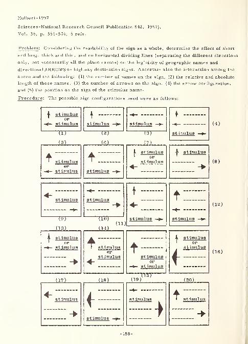
Hulbert-1957
Science s -National Research Council Publication 542, 1957),
Vol. 36, p. 561-574, 6 refs.
Problem : Considering the readability of the sign as a whole, determine the effect of short
and long, thick and thin, and no horizontal dividing lines (separating the different directions
only, not necessarily all the place names) on the legibility of geographic names and
directional ARROWS on highway de stination signs . Ascertain also the interaction among the
above and the following: (1) the number of names on the sign, (2) the relative and absolute
length of these names, (3) the number of arrows on the sign, (4) the arrow configuration,
and (5) the position on the sign of the stimulus name.
Procedure: The possible sign configurations used were as follows:
A stimulusor
stimulus
TTT
151
stimulusor
stimulus
stimulus
W121
stimulus
stimulus
will
i stimulus1 or
stimulus
stimulus
^ stimulus
(4)
(8)
stimulus
19T(13)
4 stimulus' or
stimulus
(17)
stimulus
stimulus
TW(14)
(ii)stimulus
stimulusor
stimulus stimulusor
stimulus
(18) 19)
stimulus
stimulus
stimulus
}stimulus
orstimulus
f(20)
^ stis timulus
(12)
(16)
-188-
Hulbert-1957
"Four conditions were investigated:
1. 26-1/2 (by) 1-1/4 (inch) line, centered on the sign (short thick);
2. 42 (full sign width, by) 1-1/4 (inch) line (long thick);
3. 42 (by) 3/4 (inch) line (long thin); and" (p. 561)
4. a "no-line" condition.
"A number of other characteristics ..." (p. 561) investigated included the following: (1)
the number of destinations per sign was 2, 3, or 4, (2) arrow/name configurations as shownabove, (3) absolute length of place names was short (5 or fewer letters), medium (6 to 9
letters), and long (10 or more letters), (4) relative length of place names per sign either
equivalent or different, and (5) stimulus name at various locations (among the possible
four). All the above gave an experimental matrix design of 176 different signs. Eachsubject saw only 22 of these (with which were mixed 3 "placebo" signs) in the rear
projection, motion picture display (photographed from an automobile moving at 33 miles
per hour). "The subject was seated (in a light-tight projection room) approximately 2-1/2
(feet) behind a curved (2- by 3-foot) translucent screen. " (p. 564) The 140 subjects involved
were licensed drivers, ranging in age from 17 to 50 years, 60 percent male, had driving
experience of from a few weeks to over 25 years, and visual acuity ranging from 20/40 to
better than 20/20. The subject's task was to mark, by drawing an arrow up, right, or
left, the direction in which lay the locality that had been verbally called out and visually
shown to him as the sign approached. Arbitrary test criteria dictated that there must be
no fewer than 4, nor more than 18 errors out of the 22 responses, and that response to the
three placebos indicate a guess only rather than a positive answer. Constant in the
experimentation were the following: (1) all signs were on posts at the roadside, and (2) the
size, style (GOTHIC capitals), and spacing of the letters were "from the manufacturer'sstencils, " (p. 564) and hence "identical with actual highway signs. " (p. 564)
Result : Analysis was by (1) subjects, i.e. who met what criteria, and (2) errors. Fromthe results the following conclusions were drawn:
1. "Underlining (i.e. separating words on the basis of destination direction) reduce(d)
the probability of a destination being associated with the wrong arrow in the unequal-word-length signs.
2. "The probability of a sign being misread (was) greater when the place names (were)
of equal length than when . . . unequal.
3. "Proportionally more errors were made on the 4- . . . than on the 2- and 3-
destination signs.
4. "Proportionally more errors were made on 3- . . . than on 2-arrow signs.
5. "No significant difference among the three styles of underlining was apparent.6. "No correlation was found between visual acuity and number of misread signs. "
(p. 570-571)
-189-
InsTUFTS-1952
3375 InsTUFTS-1952Institute for Applied Experimental Psychology,
Tufts Coll. , Medford, Mass.LEGIBILITY OF PRINTED MATERIALSection II, Chapter IV, Part III of HANDBOOK OFHUMAN ENGINEERING DATASpecial Devices Center, Human Engineering Technical rept.
SDC 199-l-2a, 1 Nov 52, (9p. , 57 refs. of 6l0p. )
Contract N6-ori- 1 99-T. O. 1
NavExos P-643; AD-43 650
Definition of legibility - "(W)e refer to the fact that printed material varies in the ease
with which it can be read. " (p. 1)
Measures of legibility - "Some studies evaluate . . . material by the speed with which it
can be read. . . Another measure ... is the maximum distance .... This measure is
sometimes called . . . perceptibility, and ... is ordinarily used for small units of
material .... A third technique is to present the material ... in a tachistoscope and
determine the mimimum time . . . for correct recognition. Visibility is the rating in
terms of the units on the Luckiesh-Moss Visibility Meter .... A somewhat similar
method. . . is the focus method. . . (, a)n image . . . being . . . projected through
reciprocal lenses in such a way that it can be varied in clearness . . . without changingthe size. Relative legibility can be determined (from this) . . . .
" (p. 1)
Physiological and psychological response - "(T)he two most common are the blink rate andthe number and kind of eye movements made during the reading process. . . (B)link rate
has been (used) in studies concerned with . . . illumination . . . Smooth eye movementswith relatively few fixations and regressions . . . have been used as criteria in
determining differences in legibility. One other technique is occasionally used. Thesubject is asked to rate samples of different types of patterns of printing as to . . .
pleasingness . . . ." (p. 1)
Factors influencing legibility - "Two . . . groups of characteristics . . . have beenconsidered of importance . . . : a. factors dealing with the characteristics of the printed
material itself - the face and size of type, the leading, the length of line, and, b. factors
dealing with the characteristics of the background - its color, intensity, brightness
relations, and spatial relations. . . Combinations of several conditions, each one of
which has only a slight tendency to reduce reading efficiency, will produce significantly
slower reading and more eye movements. " (p. 1)
Vibration - "Tables, charts, . . . graphs . . . (, and) dials are . . . affected. One set
of experiments . . . rotat(ed) prisms between the reading material and the eyes of the
reader .... (from Crook- 1947a and Crook- 1947b, both of which appear elsewhere in this
volume; and also from Crook et al, STUDIES OF THE EFFECT OF TYPOGRAPHICALSPACING ON THE LEGIBILITY OF NUMERALS UNDER VIBRATION, U. S. A. F. , AirMateriel Command, Wright-Patterson Air Force Base, Aero Medical Laboratory,Engineering Division, MCREXD-694- 1 Q, 29 November 1949, 18 pp. ) In another study the
whole book was vibrated in order to achieve the same effect. . . (from Tinker - 1 948b)(V)ibration, if sufficiently large, reduces efficiency of performance. . . (T)he human bodyhas a considerable tolerance for adverse conditions such as vibration, if the . . .
conditions occur singly. When several . . . act together, performance is significantly
impaired . . . ." (p. 1-2)
Comparison of type faces - The following rank order was seen in the visibility,
perceptibility at a distance, speed of reading and reader opinions of legibility for ten type
faces.
-191-
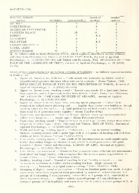
InsTUFTS-1952
SCOTCH ROMAN speed of
versus visibility perceptibility r ending opinion
ANTIQUE 1 3 3 z
CHELTENHAM 2 2 8 1
AMERICAN TYPEWRITER 3 1 9 6
CLOISTER BLACK 4 10 10 10
BODONI 5 7 4. 5 3
GARAMONT 6 6 1 5
OLD STYLE 7 4 4. 5 4
CASLON OLD STYLE 8 5 6 8
KABEL LIGHT 9 9 7 9
SCOTCH ROMAN 10 8 2 7
(p. 3) (above table is from Pater son- 1 940a , which appears elsewhere in this volume;and also from Paterson and Tinker, STYLE OF TYPE FACE, Journal of AppliedPsychology, v. 16 (1932) 605-613; and Tinker and Paterson, THE INFLUENCE OF TYPEFACE ON THE LEGIBILITY OF PRINT, Journal of Applied Psychology, v. 19 (1935)
43-52)
Effect of type characteristics on various criteria of legibility - as follows (quoted materialis from p. 4):
1. Upper vs. lower case, distance - "Both words and nonsense syllables read at
(significantly) greater distance when written in capitals. " (from Tinker, THEINFLUENCE OF FORM OF TYPE ON THE PERCEPTION OF WORDS, Journal of
Applied Psychology, v. 16 (1932) 167-174)
2. Upper vs. lower case, reading speed - "Lower case reads 13.4 (percent) faster
than capitals, and 2. 8 (percent) faster than italics. " (from Tinker and Paterson,
INFLUENCE OF TYPE FORM ON SPEED OF READING, Journal of Applied
Psychology, v. 12 (1928) 359-368)
3. Upper vs. lower case and type face, reading speed judgment - "Lower case
standard is judged more pleasing and . . . legible than lower case boldface, though
reading rates are the same. . . (, and) preferable on both counts to capitals, . . .
(but) read 11.8 (percent) more rapidly. " (from TinkPat- 1 942
)
4. Type size, eye movement - "Ten-point type induces fewer eye movements than
either very large or . . . small type. " (from Pater son- 1 942a
)
5. Type size, reading speed - "Ten-point type is read significantly faster than either
larger or smaller type. " (from Paterson and Tinker, SIZE OF TYPE, Journal of
Applied Psychology, v. 13 (1929) 120-129)
6. Width and leading, reading speed - "Extremes . . . lead to slower reading.
Optimal reading occurs with 9-point type with 1 to 4 points of leading and with line
widths of 14 to 30 picas. " (from TinkPat- 1 949)
7. Line width, reading speed - "Line width of 80 (millimeters) is read significantly
faster than either longer or shorter lines; effect is most pronounced for good
readers. " (from Tinker and Paterson, LENGTH OF LINE, Journal of Applied
Psychology, v. 13 (1929) 205-219)
8. Line width, eye movement - "Standard line produces more efficient eye movementsthan short (or long) line(s), with exception that there were more regressions for
standard line . . . ." (from Pater son- 1 942b)
9. Medley, reading speed - "Speed of reading is significantly reduced . . . and
increase in variation in medley slows reading further. Slight amount of
medley . . . , however, is judged more pleasing. " (from TinkPat- 1 946b)
10. Grouping of digits, speed of perception - "When no fixation point was used, 6 digits
were more accurately reported when presented by means of tachisto(s )cope in 2
groups of 3 extending 7 (centimeters), rather than in 3 groups of 2, especially at
short exposure times. . . (M)ore widely- spaced groups of 2 equalled morecompact groups of 3 in legibility and were superior to widely-spaced groups of 3, if
-192-
InsTUFTS-1952
exposure was short. At long exposure, 3's were better .... When fixation point
was used, grouping in 2's was . . . superior. " (from Dixon- 1948)
11. Letters and digits, speed of perception - from most to least legible: Lower case -
k, d, q, O, b/p, 7/m, w, f, A, 9/lQ, =, 6, h, j/?, y, a, 0, r/t, x, s/, v/3/8, +,
2, 5, z, 4/c, o, a/u, g, +, %, n/f , e, i, n, 1 (one), s, 1 (ell). Upper case - W,Z, X, O, D, M/P, =/E/y/u, 9, N, J, O, ?, 7, Q/k, H, C/s/3, 4/Q/l, 2, T,
1, 8, 6, F, B, +, 5, y/%/R/G, E, A, 0, +/l, -r. (from Tinker, THE RELATIVELEGIBILITY OF THE LETTERS, THE DIGITS AND OF CERTAIN MATHEMATICALSIGNS, Journal of General Psychology, v. 1, (1928) 472-495)
Characteristics of background that affect legibility - as follows (quoted material is fromp. 5):
1. Black vs. white, reading speed - "Black on (w)hite read . . . (significantly) moreefficiently than (w)hite on (b)lack. " (from Paterson and Tinker, BLACK TYPEVERSUS WHITE TYPE, Journal of Applied Psychology, v. 15 (1931) 241-247)
2. Black vs. white, distance - "Black on (w)hite . . . (significantly) more legible than
(w)hite on (b)lack. " (from Holmes, THE RELATIVE LEGIBILITY OF BLACKPRINT AND WHITE PRINT, Journal of Applied Psychology, v. 15 (1931) 248-251)
3. Black vs. white, comparison of apprehension, peripheral legibility, eye
movements, and distance - "Regardless of . . . measurement used, (b)lack print
on (w)hite background is superior to (w)hite on (b)lack. . . (, and) is more markedfor those situations in which there are no pattern or meaning cues to aid in
perception, i. e. , for isolated letters, nonsense words, etc. " (from Taylor, THERELATIVE LEGIBILITY OF BLACK AND WHITE PRINT, Journal of Educational
Psychology, v. 25 (1934) 561-578)4. Black vs. white, distance - "When digits 80 (millimeters) in height are used, a.
Optimal stroke width for (w)hite on (b)lack (equals) 6 (millimeters), for (b)lack on
(w)hite (equals) 10 (millimeters), b. When of optimal proportions, single digits of
(w)hite on (b)lack can be recognized 8. 8 (percent) better than (b)lack on (w)hite. c.
Figure 8 is most legible when lines cross in middle at about 90 (degree) angle.
Optimum form recognition was found in each case to depend on sharp angle in
crossing lines and equality of parts, d. When 5 digits come together, outer
distance between numbers must be increased 10 (percent) to be equally as legible
as standard, e. Frame of (w)hite lines same width as those forming digits
increases legibility though one either narrower or wider decreases legibility. "
(sic) (from Berger- 1944b, which appears elsewhere in this volume; and also
from PART I of the same study, which appeared in Journal of Applied Psychology,v. 28 (1944) 208-231)
5. Achromatic vs. chromatic, eye movements - "42. 6 (percent) retardation
(over black on white) in (r)ed on (g)reen situation. " (from TinkPat- 1 944a)
6. Achromatic vs. chromatic, reading speed - "Green on (w)hite, (b)lue on(w)hite, (b)lack on (y)ellow . . . are almost as quickly read as (b)lack on (w)hite;
. . . (o)range on (b)lack, (o)range on (w)hite, (r)ed on (g)reen, (b)lack on (p)urple
. . . produce very slow reading. " (from Tinker and Paterson, VARIATIONS INCOLOR OF PRINT AND BACKGROUND, Journal of Applied Psychology, v. 15
(1931) 471-479)7. Achromatic vs. chromatic, distance - "Blue on (w)hite is most legible, . . .
(g)reen on (w)hite, (b)lack on (w)hite, and (g)reen on (r)ed are approximately equal. . . (, and r)ed on (g)reen (is) least. Very legible combinations . . . (have)
marked brightness differences. Close correlation indicated between this . . . andreading speed . . . (from Preston et al, THE EFFECTS OF VARIATIONS IN
COLOR OF PRINT AND BACKGROUND ON LEGIBILITY, Journal of GeneralPsychology, v. 6 (1932)459-461) Hue relatively unimportant. (Brightness
c)ontrast ... is significant variable: (b)lue on (g)ray, (b)lack on (g)ray, (b)lack
on (y)ellow, (r)ed on (g)ray most legible, (b)lue on (b)lack, (y)ellow on (w)hite,
(b)lack on (b)lue, (r)ed on (b)lack, and (r)ed on (g)reen least legible. " (from
-193-
InsTUFTS-1952
Sumner, INFLUENCE OF COLOR ON LEGIBILITY OF COPY, Journal of AppliedPsychology, v. 16 (1932)201-204)
8. Type of surface, reading speed - "Finish and color (sic) of paper have no(statistically significant) effect on speed of reading. " (from Stanton and Burtt, THEINFLUENCE OF SURFACE AND TINT OF PAPER ON THE SPEED OF READING,Journal of Applied Psychology, v. 19 (1935) 683-693; with similar results fromPaterson and Tinker, PRINTING SURFACE, Journal of Applied Psychology, v. 20
(1936) 128-131)
9. Type of surface, distance - "Paper surface has no effect on distance at whichwords can be read. " (from Webster and Tinker, THE INFLUENCE OF PAPERSURFACE ON THE PERCEPTIBILITY OF PRINT, Journal of Applied Psychology,v. 19 (1935) 145-147)
10. Letter brightness, distance - "When all letters on (a single stimulus object) are
same brightness, ... no differences are completely reliable. When black, darkand light gray letters are mixed . . . black and dark gray letters are recalled
significantly better . . . ." (from Taylor and Tinker, THE EFFECT OF
LUMINOSITY ON THE APPREHENSION OF ACHROMATIC STIMULI, Journal of
General Psychology, v. 6 (1932) 456-458)
Effects of illumination on legibility - "(It) depends on three factors: brightness of
light to which subject is adapted; sort of light being used; and criterion used. Subject . . .
prefers light ... to which he is adapted, when . . . indirect, but . . . considerablybrighter ... if direct illumination is being used. Only low illumination (below 7
foot-candles) has detrimental influence on rate of reading, and if subject is allowed . . .
to adapt, less than 3 (foot-candles) has no effect, (sic) . . (Use of) blinking or heart rate
as indicators of efficiency . . . is . . . open to question . . . ." (p. 6) (the above effects of
illumination are from Rose-1946, which appears elsewhere in this volume; and also
from Tinker, THE EFFECT OF ILLUMINATION INTENSITIES UPON SPEED OFPERCEPTION AND UPON FATIGUE IN READING, Journal of Educational Psychology, v.
30 (1939) 561 -571; Tinker, EFFECT OF VISUAL ADAPTATION UPON INTENSITY OFILLUMINATION PREFERRED FOR READING WITH DIRECT LIGHTING, Journal of
Applied Psychology, v. 29 (1945) 471-476; Tinker, EFFECT OF VISUAL ADAPTATIONUPON INTENSITY OF LIGHT PREFERRED FOR READING, American Journal of
Psychology, v. 54 (1941) 559-563; and Tinker, ILLUMINATION INTENSITIES FORREADING NEWSPAPER TYPE, Journal of Educational Psychology, v. 34 (1943) 247-250)
Proper illumination levels are cited as follows:
Critical levels:
10-point type - 3 to 4 foot-candles
newspaper - 7 foot-candles
With allowance for margin of safety, following are recommended:good print - 10 to 15 foot-candles
newsprint - 15 to 20 foot-candles
handwriting - 20 to 30 foot-candles6 -point type - 30 to 40 foot-candles
most severe - 40 to 50 foot-candles
(p. 6) (above table is from Tinker, ILLUMINATION STANDARDS FOR EFFECTIVE ANDEASY SEEING, Psychological Bulletin, v. 44, (1947) 435-450)
Effect of vibration on visual tasks - as follows:
1. Ability to discriminate digits - "High frequency of vibration is one of factors
producing most impairment of performance. Increased amplitude of vibration moremore important than particular pattern in reducing efficiency. Reading time and
errors both reflect greater difficulty of task when combination of unfavorable
factors is compared to favorable combination (e. g. , low illumination, high
amplitude, small type vs. high illumination, low amplitude, large type). " (p. 7)
-194-
InsTUFTS-1952
(from Crook et al, referred to in paragraph 5 above)Reading speed - In one experiment, there was a "5 (percent) reduction in speed"
(p. 7) of reading text material, (from Tinker-1948b)
-195-

3371
Karmeier, Delbert F. ,Herrington, C. Gordon and Baerwald, John E
Illinois U., Urbana
A COMPREHENSIVE ANALYSIS OF MOTOR VEHICLE PLATES
In HIGHWAY RESEARCH BOARD, PROCEEDINGS OF THE
THIRTY -NINTH ANNUAL MEETING, I960, Herbert P. Orland,
Editor, (Washington, D. C. , National Academy of Sciences -
National Research Council Publication 773, I960), Vol. 39,
p. 416-440, 17 refs.
Problem : "This . . . analysis of motor vehicle license plates was conducted with the
following objectives .". . (p. 416) in mind:
1." (Djetermine the functions (and their relative importance) of license plates . . .
2. "(D)etermine what information (and the relative importance of each item) should be
displayed . . .
3. "(D ) 3 sign the most (economical,)effective(, ) and efficient license plate. " (p. 416)
Procedure(general ): "To determine the functions of a license plate and their relative
importance (1., above), 475 questionnaires were distributed to (American and Canadian)
persons concerned with vehicle licensing. Analysis of the questionnaire returns provided
information whereby the other two objectives of the study (2. and 3., above) could be
analyzed. This, together with an extensive literature search, was supplemented by
additional field and laboratory tests ." (p. 416) More specifically, the study was directed
toward the following functional, information, and design considerations: (1) legibility
distances for registration and year numbers, and state name, (2) important characteristics
of the registration number, (3) importance of color in year identification, (4) value of
county or area identification, (5) the value of slogans in state identification, (6) importance
of two (front and rear) license plates, (7) plate size and shape, (8) number and letter-
number combinations, (9) relative legibility of letters and numbers, (10) size of state name
and year numbers, (11) effect of slogans on legibility, (12) color combinations, (13)
miscellaneous factors such as registration procedures, area identification, and motor
vehicle laws, and (14) reflectorization of license plates. "(D)esign items . . . studied
(were) (a) composition and size of the . . . registration number, (b) size of state name
and year number, (c) the effect of slogans and emblems, and (d) color combinations. The
size and shape (of the plate), which would logically be determined on the basis of . . .
design items, have instead been (previously) standardized (at 6 by 12 inches) . . .
Miscellaneous factors that affect design are materials and paints, distribution methods,
registration procedures, and various motor vehicle laws. " (p. 419) Thus, the material
herein covers first, the results of the questionnaires, second, the findings of the literature
search, and third, the procedures and results of the field and laboratory experiments
performed all, for the most part, in terms of the fourteen items shown above.
Karmeier- 1960
Karmeier- I960
-197-
Karmeier- I960
Result (questionnaires ): "(L)icense plates are being used to carry many different items of
information. . . (r)egistration numbers and letters, county names, county or area code
numbers or letters, congressional district numbers, state names, year numbers, state
slogans, emblems, and weight indications . . . Sixty-two percent of the questionnaires
were completed and returned. . . On the basis of the replies . . . , the following
conclusions concerning the functions of license plates were evident:
1. "The primary function ... is to display the information necessary for fast and
accurate identification of a motor vehicle under actual traffic conditions. This . . .
is accomplished by . . . the . . . registration number and the state name ....
2. "The second function ... is to display . . . compliance with the . . . registration
laws .... This ... is accomplished by . . . year number . . . , by changing the
color . . . , and by . . . special designations for differing types and weights of
vehicles
.
3. "The designation of . . . county or area of residence is not a true function . . .
(and) usually require(s) more complex and costly administrative procedures . . .
(However, in some) cases . . . (it) may facilitate the accomplishment of the
(primary) function . . . (and also) may help in the enforcement of registration
laws. . .
4. "The advertising and publicizing of the state is not a function . . . (and) tends to
reduce the effective accomplishment of the important functions . . . ." (p. 417-418)
Design considerations drawn from the above functions were as follows:
1. "(E)ach vehicle should be issued two plates ....
2. "The . . . registration number . . . should have the greatest legibility distance
possible in consideration of plate size and design.
3. "(P)late(s) . . . (should) posses(s) maximum legibility under actual traffic
conditions. . . (and be) easy to remember ....
4. "The year number should be legible at a distance approximately one-half that of the
registration number.
5. "The state name should be legible at a distance slightly greater than that required
for reading the year number.
6. "The year number is more important than the color combination .... Cooperation
. . . among the states is necessary for color . . . to be of great help ....
7. "(A)rea designations . . . aid in . . . identification ....
8. "(A)rea designations . . . require more complex and costly administrative
procedures ....
9. "The (area) name is the least popular method of effecting (an area) designation.
10. "The effect of address changes on the value of . . . area designations is slight . . .
(when) plates are issued annually. . .
11. "(A)rea designations are of little value . . . outside the state ....
12. "(S)logans and emblems may have some value in (state) identification ....
13. "(However, ) . . . removal of . . . slogans . . . and the use of the increased space
for a larger state name would make state identification easier.
-198-
Karmeier-196'0
14. "The removal of . . . slogans . . . and the use of larger . . . registration numbers
could be a significant improvement . . . ." (p. 418-419)
"The items of information ... on the plate . . . are the primary design considerations. .
and . . . consis(t) of (a) the vehicle registration number, (b) the name of the state or
province, and (c) the year of issuance. " (p. 419)
Result ( literature search ):
1. (plate size and shape) - "(T)he American Association of Motor Vehicle
Administrators adopted a standard 6- by 12 -(inch) plate size in 1953 . . . (This)
has given auto manufacturers an opportunity to provide better mounting ... to
protect (plates) from damage. . . (H)owever . . . the front plate . . . often
becomes badly damaged and illegible. " (p. 419)
2. (legibility distances) - "The desired legibility distance of the registration number
generally ranges from 100 to 150 (feet). Previous . . . studies (see Aldrich- 1937,
Berger - 1944b, and Kuntz-1950, all elsewhere in this volume; as well as the
following: License plate visibility tests, Michigan Department of State, mimeo. ,
1940; T.M. Matson, W.S. Smith, and F. W. Hurd, Traffic engineering, McGraw-
Hill, 1955; and C-C Wiley, Automobile license plates for Illinois, University of
Illinois, 1937) have shown that this requires a 2-1/2- to 3-(inch) high character.
The state name (and year number) ha(ve) . . . desirable legibility distance(s) of 60
to 75 (feet) which can be achieved with l-(inch) high (characters). . . Allowing
3/4-(inch) margins above and below the characters, and l/2-(inch) spacing between
the state and identification number, gives a total vertical dimension of 6 (inches).
The factors determining length are number of characters, width of characters,
spacing between characters, and edge spacing. " (p. 420)
3. (number of characters) - "(I)t is never desirable to have more than six total
characters in an identification number. " (p. 420)
4. (standard characters) - "(T)he Bureau of Public Roads SERIES C Alphabet has a
daylight legibility distance of approximately 42 (feet) per (inch) of letter height. "
(p. 420) (see Matson, ibid . )
5. (plate size) - "Although a 14-(inch) plate is desirable, it does not appear likely that
any changes will be made soon in the standard . . . Future changes . . . should be
based on . . . legibility distances . . . ." (p. 420-421)
6. (Aldrich on perception of license plate legends) - "For a short observation period
(0.67 seconds), 5-digit numbers are decidedly superior to those with 6, and 6- . . .
(to) those with 7. Little would be gained by reducing the number ... to 4. . .
(Six)-character plates with 1 letter are more easily perceived than 7-digit plates,
and 5- . . . with 2 . . . are better than 6- . . . with 1 . . . ." (p. 421) (see
Aldrich-1937)
7. (legibility distance of letters and numbers) - "The desired daytime legibility
distance of the registration number ... is generally in the range of 100 to 150
(feet). . . (see Matson, ibid. ) There is a definite correlation between the height
-199-
Karmeier-1960
of characters and their legibility. . . that ... is not linear . . . (see T.W.
Forbes and R. S. Holmes, Legibility distances of highway destination signs in
relation to letter height, letter width, and reflectorization , HRB Proceedings, v. 19
(1939) 32 1-335) Regardless of the relationship, an increase in character height
results in an increased legibility distance, provided that the width of the character
increases proportionately. . . (see Matson, ibid . ) The daytime legibility per inch
of letter height of the U. S. Bureau of Public Roads alphabets has been reported as
follows:
"SERIES B, 33 (feet) per (inch);
"SERIES C. 42 (feet) per (inch); and"SERIES D ;
50 (feet) per (inch), (see Matson, ibid.)
"Soar . . . prescribes 1. 33:1 as an optimum height-to-width ratio, (see Soar-
1955a) Lauer (in an unpublished memorandum) . . . indicates that the legibility
distance increases as the height-width ratio approaches unity. (Thus t)he
references . . . suggest the following . . . : (a) the height -to -width ratio ... is
an important determinant in its legibility distance; (b) there is a correlation between
the height of a character and its legibility. . . (N)umbers and letters currently
used on license plates sho(w) . . . (too large) height-to-width ratio(s) .... As a
general guide, . . . (it) should be reduced to 2:1 or less ... It would appear, then,
that as long as the standard plate remains 6 by 12 (inches), the letters and numbers
. . . should have approximately the following dimensions: height, 2-1/2 to 3
(inches) and width, 1-1/4 to 1-3/4 (inches). . . The optimum stroke width ... is
dependent on . . . height and width, and on the colors of . . . character and . . .
background. . . The height (of a character) is measured from the centers of the
top and bottom horizontal strokes. . . Kuntz says the optimum (height/stroke
width) ratio is 5.0:1, but . . . the difference between 5.0:1 and 6.0:1 or 4.0:1 is
not significant. " (p. 427) (see Kantz-1950)
8. (character styling) - "(T)he most important . . . factors involved in the
determination of an optimum character styling . . . are
"(a) simplicity or complexity of the character outline,
"(b) amount of open space within the outline of the character, and
"(c) emphasis on one component of the character which differentiates it
from another.
"Character styles can be grouped into four general categories;
"BLOCK,
"ROUNDED BLOCK,
"ROUNDED, and
"OPEN.
"Neal says that ROUNDED letters are more visible than BLOCK, and do not tend to run
together as much when closely spaced, (see H. E. Neal, The legibility of highway
signs , Traffic Engineering, 1 7: 12 ( 1947) 52 5 - 52 9) Aldr ich s tate s that the OPEN
style. . . is more visible than either the ROUND or BLOCK, (see Aldrich- 1937)
According to Matson . . . the ROUNDED BLOCK style letters yield about 5 percent
-200-
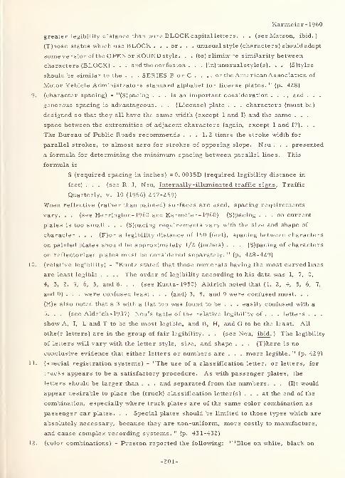
Karmeier-1960
greater legibility distance than pure BLOCK capital letters. . . (see Matson, ibid.)
(T)hose states which use BLOCK . . .or. . . unusual style (characters) should adopt
some version of the OPEN or ROUND style. . . (to) elimin -^e similarity between
characters (BLOCK) . . . and the confusion . . . (in) unusual style(s). . . (S)tyles
should be similar to the . . . SERIES B or C . . ., or the American As sociation of
Motor Vehicle Administrators standard alphabet for license plates. " (p. 428)
9. (character spacing) - "(S)pacing ... is an important consideration . . . , and . . .
generous spacing is advantageous. . . (License) plate . . . characters (must be)
designed so that they all have the same width (except 1 and I) and the same . . .
space between the extremities of adjacent characters (again, except 1 and I?). . .
The Bureau of Public Roads recommends ... 1. 2 times the stroke width for
parallel strokes, to almost zero for strokes of opposing slope. Neu . . . presented
a formula for determining the minimum spacing between parallel lines. This
formula is
S (required spacing in inches) = 0. 0035D (required legibility distance in
feet) . . . (see R. J. Neu, Internally-illuminated traffic signs, Traffic
Quarterly, v. 10 (1956) 247-259)
When reflective (rather than painted) surfaces are used, spacing requirements
vary. . . (see Herrington- 1960 and Karmeier- 1960) (S)pacing . . . on current
plates is too small . . . (S)pacing requirements vary with the size and shape of
character . . . (F)or a legibility distance of 150 (feet), spacing between characters
on painted plates should be approximately 1/2 (inches) . . . (S)pacing of characters
on reflectorized plates must be considered separately. " (p. 428-429)
10. (relative legibility) - "Kuntz stated that those numerals having the most curved lines
are least legible .... The order of legibility according to his data was 1, 7, 0,
4, 3, 2, 9, 6, 5, and 8. . . (see Kuntz-1950) Aldrich noted that ( 1, 2, 4, 5, 6, 7,
and 0) . . . were confused least . . . (and) 3, 8, and 9 were confused most. . .
(H)e also noted that a 3 with a flat top was found to be . . . easily confused with a
5. . . (see Aldrich- 1937) Neu's table of the relative legibility of . . . letters . . .
show A, I, L and T to be the most legible, and B, H, and G to be the least. All
othe(r letters) are in the group of fair legibility. . . (see Neu, ibid . ) The legibility
of letters will vary with the letter style, size, and shape . . . (T)here is no
conclusive evidence that either letters or numbers are . . . more legible. " (p. 429)
11. (special registration systems) - "The use of a classification letter, or letters, for
trucks appears to be a satisfactory procedure. As with passenger plates, the
letters should be larger than . . . and separated from the numbers. . . (I)t would
appear desirable to place the (truck) classification letter(s) ... at the end of the
combination, especially where truck plates are of the same color combination as
passenger car plates. . . Special plates should be limited to those types which are
absolutely necessary, because they are non-uniform, more costly to manufacture,
and cause complex recording systems. 11(p. 431-432)
12. (color combinations) - Preston reported the following: " 'Blue on white, black on
-201-
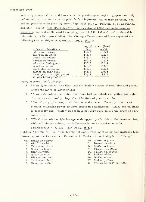
Karmeier-1960
yellow, green on white, and black on white provide good legibility; green on red,
red on yellow, and red on white provide fair legibility; and orange on white, and
red on green provide poor legibility. " (p. 436) (see K Preston, H. P. Schwankl,
and M, A. Tinker, The effect of variations in color of print and background on
legibility , Journal of General Psychology, v. 6 (1932) 459-461; and reviewed in
this volume by Paterson- 1940a) The Michigan Department of State reported the
following (see Michigan Department of State, ibid. ):
color combinationswhite on maroonmaroon on whitebrown on creamcream on brownwhite on dark greenblack on whitedark blue on maizemaize on dark bluedark green on light green(above from p. 436)
legibil. dist. (feet)
day_ night
158. 4
145. 4152. 5
147. 8
152. 7
146. 9
153. 7
142. 3
139. 2
114. 0
102. 7
89. 2
101. 4
102. 8
107. 1
102. 8
110. 5
88. 6
Wiley reported the following:
1. " 'For dark colors, use black and the darker shades of red, blue and green.
Avoid the more brilliant shades.
2. " 'For light colors use white, the more brilliant shades of yellow and light
chrome orange, and perhaps the light tints of green and blue.
3. " 'Avoid grays, browns, and other neutral shades. Do not put colors of
similar reflecting power or wave length in combination. Thus, red on black
is decidedly bad. Yellow on green is not very good unless the green is very
dark, etc.
4. " 'Dark symbols on light backgrounds appear preferable to the reverse, but,
with well chosen colors, the difference is not so marked as to be
objectionable. " (p. 436) (see Wiley, ibid . )
Outdoor Advertising, Inc. reported the following ranking of color combinations (see
Lettering color schemes, Art Department, Outdoor Advertising Inc. , Chicago):
1. Black on yellow 10. White on green2. Black on white 11. Brown on white3. Yellow on black 12. White on brown4. White on black 13. Brown on yellow5. Blue on white 14. Yellow on brown6. White on blue 15. Red on white
7. Blue on yellow 16. White on red8. Yellow on blue 17. Red on yellow9- Green on white 18. Yellow on red" (p
-202-
Karmeier- 1960
General Electric Co. reported the following reflectance values for paints:
r e lie c tanc e rcflcctctncG
black 0 % light green 41 %dark blue 8 % tan 41 %dark green 8 % light orange 53 %dark brown 15 % light pink 62 %red 22 % yellow 66 %orange 36 % ivory 79 %light blue 40 % white 82 %(above from p. 436)
"Lauer has suggested that the differences between the reflectance values of colors
used for legend and background should be no less than 45 percent. Following this
. . ., the following color combinations are suitable for use on license plates (see
A.R. Lauer, Certain structural components of letters for improving the efficiency
of the stop sign, HRB Proceedings, v. 27 (1947) 360-37 1):
color combination diff. bet. reflect, values {
,r0 )
black and white 82
black and ivory 79dark blue and white 74dark green and white 74dark blue and ivory 71
dark green and ivory 71
dark brown and white 67black and yellow 66dark brown and ivory 64black and light pink 62
red and white 60dark blue and yellow 58dark green and yellow 58red and ivory 57dark blue and light pink 54dark green and light pink 54black and light orange 53dark brown and yellow 51dark brown and light pink 47orange and white 46dark blue and light orange 45dark green and light orange 45(above from p. 436-437)
13. (area designations) - "The designation of the vehicle owner's . . . area of
residence is not a true function of license plates. . . (however) area designations
may facilitate the accomplishment of the function of identifying the vehicle quickly
and accurately. " (p. 438) (see D. Karmeier, An evaluation of the purposes of
motor vehicle license plates, Engineering Experiment Station, University of
Illinois, 1958)
14. (reflectorized plates) - "Investigations (not delineated here) were conducted to
reveal the basic factors concerning the legibility of reflectorized plates . . . The
variables studied were as follows:
a. "Types of reflectorized and nonreflectorized materials:
(1) Flat sheeting ....
(2) Exposed lens sheeting ....
(3) Beads on paint ....
-203-
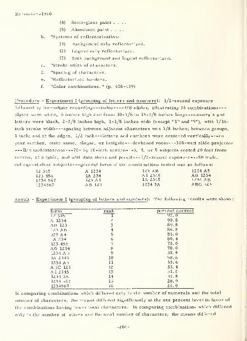
Karmeier-1960
(4) Semi-gloss paint ....
(5) Aluminum paint ....
b. "Systems of reflectorization:
(1) Background only reflectorized.
(2) Legend only reflectorized.
(3) Both background and legend reflectorized.
c. "Stroke width of characters.
d. "Spacing of characters.
e. "Reflectorized borders.
f. "Color combinations. 11(p. 438-439)
Procedure - Experiment I (grouping of letters and numbers ): l/2 -second exposure
followed by immediate recording indoor 128 slides, illustrating 16 combinations
plates were white, 6 inches high and from 10-3/8 to 13-7/8 inches long numerals and
letters were black, 2-3/8 inches high, 1-3/8 inches wide (except "1" and "I"), with 5/16-
inch stroke width spacing between adjacent characters was 3/8 inches; between groups,
1 inch; and at the edges, l/2 inch letters and numbers were centered vertically no
year number, state name, slogan, or insignia darkened room 500-watt slide projector
Ilex tachistoscope 70- by 70-inch screen 3, 4, or 5 subjects seated 20 feet from
screen, at a table, and with data sheet and pencil l/2-second exposure 50 male,
college -student subjects general form of the combinations tested was as follows:
12 345 A 1234 123 AB 1234 A5123 456 1A 234 Al 2345 AB 12341234 567 123 A4 1A 2345 1234 AB1234567 AB 123 1234 5A ABC 123
Result - Experiment I ( grouping of letters and numbers ): The following results were shown:
form rank percent correct12 345 92. 0
A 1234 2 90. 8
AB 123 3 89. 8
123 AB 4 86. 8
123 A4 5 83. 0
1A 234 6 80. 4
123 456 7 75. 0
AB 1234 8 70. 0
1234 AB 9 58. 8
1A 2345 10 58. 6
1234 A5 11 55. 6
ABC 123 12 53. 4
Al 2345 13 51. 0
1234 5A 14 32. 8
1234 567 15 28. 9
1234567 16 26. 0
In comparing combinations which differed only in the number of numerals and the total
number of characters, the means differed significantly at the one percent level in favor of
the combinations having fewer total characters. In comparing combinations which differed
only in the number of letters and the total number of characters, the means differed
-204-
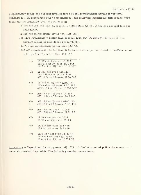
Karmeier-1960
significantly at the one percent level in favor of the combinations having fewer total
characters. In comparing other combinations, the following significant differences were
found (at the indicated level of confidence):
12 345 and AB 123 both significantly better than 1A 234 at the one percent level of
confidence.
12 345 not significantly better than AB 123.
AB 1234 significantly better than both Al 2345 and 1A 2 345 at the one and five
percent levels of confidence respectively.
123 AB not significantly better than 123 A4.
1234 AB significantly better than 1234 5A at the one percent level of confidence but
not significantly better than 1234 A5.
( 1) 12 345 at 1% over 1A 234123 456 at 1% over 1A 23451A 2345 at 1% over 1234 567
(2) 12 345 not over AB 123123 456 not over AB 1234AB 1234 at 1% over 1234 567
(3) 12 345 at 1% over ABC 123123 456 at 1% over ABC 123ABC 123 at 1% over 1234 567
(4) AB 123 at 1% over 1A 234AB 1234 at 5% over 1A 2345
(5) AB 123 at 1% over ABC 123AB 1234 at 1% over ABC 123
(6) AB 123 not over 123 ABAB 1234 at 5% over 1234 AB
(7) 12 345 not over A 123412 345 at 5% over 123 A4
(8) 1A 234 not over 123 456123 A4 not over 123 456
(9) 1234 567 not over 12345671A 2345 not over Al 2 3451234 A5 at 1% over 1234 5A
Procedure - Experiment IA ( supplemental) : "(A) limited number of police observers
were also tested. " (p. 426) The following results were shown:
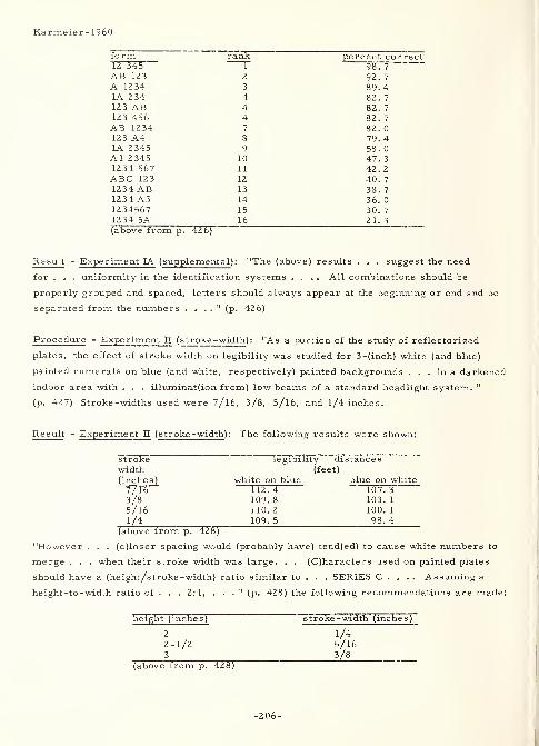
Karmeier- 1960
form rank percent correct12 345 1 98. 7
AB 123 2 92. 7
A 1234 3 39. 41A 234 4 82. 7
12 3 AB 4 82. 7
123 456 4 82. 7
AB 1234 7 82. 0
123 A4 8 79. 41A 2345 9 58. 0
Al 2345 10 47. 3
1234 567 11 42. 2
ABC 123 12 40. 7
1234 AB 13 38. 7
1234 A5 14 36. 0
1234567 15 30. 7
1234 5A 16 21. 3
(above from p. 42 6)
Result - Experiment IA ( supplemental ): "The (above) results . . . suggest the need
for . . . uniformity in the identification systems .... All combinations should be
properly grouped and spaced, letters should always appear at the beginning or end and be
separated from the numbers . . . ." (p. 426)
Procedure - Experiment II ( stroke -width): "As a portion of the study of reflectorized
plates, the effect of stroke width on legibility was studied for 3-(inch) white (and blue)
painted numerals on blue (and white, respectively) painted backgrounds . . . in a darkened
indoor area with . . . illuminat(ion from) low beams of a standard headlight system. "
(p. 427) Stroke-widths used were 7/16, 3/8, 5/l6, and l/4 inches.
Result - Experiment II (s troke -width ): The following results were shown:
stroke legibility distanceswidth (feet)
(inches) white on blue blue on white7/163/85/16
112.4 107.3109. 8 103. 1
110. 2 100. 1
1/4 109.5 98.4(above from p. 428)
"However . . . (c)loser spacing would (probably have) tend(ed) to cause white numbers to
merge . . . when their stroke width was large. . . (C)haracters used on painted plates
should have a (height/stroke -width) ratio similar to . . . SERIES C . . . . Assuming a
height-to-width ratio of ... 2: 1, ... " (p. 428) the following recommendations are made:
height (inches) stroke -width (inches)
2 1/42-1/2 5/16
3 3/8(above from p. 428)
-206-
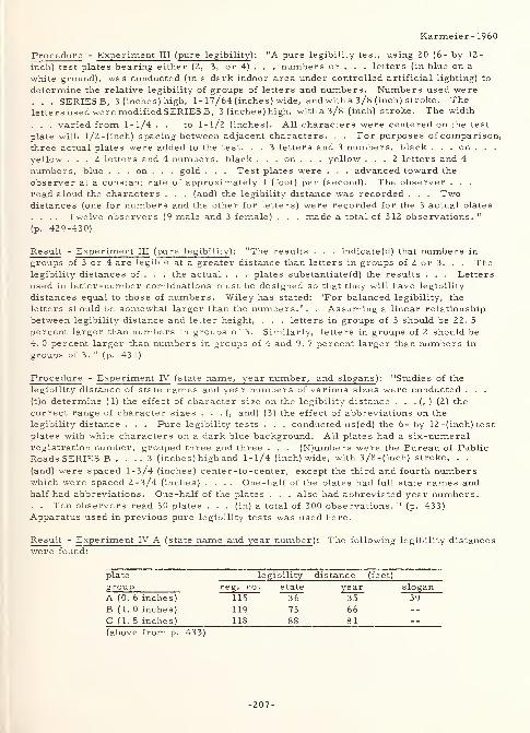
Karmeier- I960
Procedure - Experiment III (pure legibility ): "A pure legibility test, using 20 (6- by 12-
inch) test plates bearing either (2, 3, or 4) . . . numbers or . . . letters (in blue on a
white ground), was conducted (in a dark indoor area under controlled artificial lighting) to
determine the relative legibility of groups of letters and numbers. Numbers used were. . . SERIES B, 3 (inches) high, 1 - 17/64 (inches ) wide, and with a 3/8 (inch) stroke. Theletters used were modified SERIES B, 3 (inches) high, with a 3/8 (inch) stroke. The width
. . . varied from 1-1/4 ... to 1-1/2 (inches). All characters were centered on the test
plate with l/2-(inch) spacing between adjacent characters. . . For purposes of comparison,
three actual plates were added to the test. . . 3 letters and 3 numbers, black . . . on . . .
yellow ... 2 letters and 4 numbers, black . . . on . . . yellow ... 2 letters and 4
numbers, blue . . . on . . . gold . . . Test plates were . . . advanced toward the
observer at a constant rate of approximately 1 (foot) per (second). The observer . . .
read aloud the characters . . . (and) the legibility distance was recorded . . . Twodistances (one for numbers and the other for letters) were recorded for the 3 actual plates
. . . . Twelve observers (9 male and 3 female) . . . made a total of 312 observations. "
(p. 429-430)
Result - Experiment III ( pure legibility ): "The results . . . indicate(d) that numbers in
groups of 3 or 4 are legible at a greater distance than letters in groups of 2 or 3. . . Thelegibility distances of . . . the actual . . . plates substantiate(d) the results . . . Letters
used in letter-number combinations must be designed so that they will have legibility
distances equal to those of numbers. Wiley has stated: 'For balanced legibility, the
letters should be somewhat larger than the numbers.' . . Assuming a linear relationship
between legibility distance and letter height, . . . letters in groups of 3 should be 22. 5
percent larger than numbers in groups of 3. Similarly, letters in groups of 2 should be
4. 0 percent larger than numbers in groups of 4 and 9. 7 percent larger than numbers in
groups of 3. " (p. 431)
Procedure - Experiment IV ( state name, year number, and slogans ): "Studies of the
legibility distance of state names and year numbers of various sizes were conducted . . .
(t)o determine (1) the effect of character size on the legibility distance . . . (, ) (2) the
correct range of character sizes . . . (, and) (3) the effect of abbreviations on the
legibility distance . . . Pare legibility tests . . . conducted us(ed) the 6- by 12 -(inch) test
plates with white characters on a dark blue background. All plates had a six-numeralregistration number, grouped three and three . . . (N)umbers were the Bureau of Public
Roads SERIES B . . .,3 (inches) high and 1-1/4 (inch) wide, with 3/8-(inch) stroke. . .
(and) were spaced 1-3/4 (inches) center-to-center, except the third and fourth numberswhich were spaced 2-3/4 (inches) .... One-half of the plates had full state names andhalf had abbreviations. One-half of the plates . . . also had abbreviated year numbers.. . Ten observers read 30 plates . . . (in) a total of 300 observations. " (p. 433)
Apparatus used in previous pure legibility tests was used here.
Result - Experiment IV A (state name and year number): The following legibility distanceswere found:
plate legibility distance (feet)
group reg. no. state year slogan
A (0. 6 inches) 115 36 35 39
B (1. 0 inches) 119 73 66
C ( 1. 5 inches) 118 88 81
(above from p. 433)
-207-
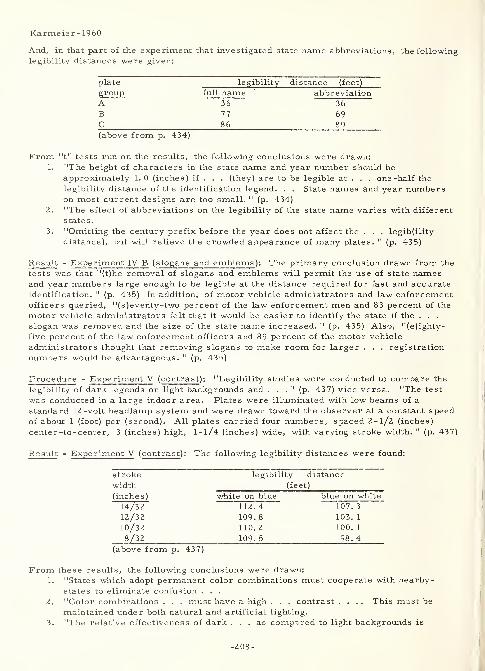
Karmeier-1960
And, in that part of the experiment that investigated state name abbreviations, the followinglegibility distances were given:
plate legibility- distance (feet)
group full name abbreviation
A 36 36
B 77 69
C 86 89
(above from p. 434)
From "t" tests run on the results, the following conclusions were drawn:1. "The height of characters in the state name and year number should be
approximately 1.0 (inches) if . . . (they) are to be legible at . . . one-half the
legibility distance of the identification legend. . . State names and year numberson most current designs are too small. " (p. 434)
2. "The effect of abbreviations on the legibility of the state name varies with different
states
.
3. "Omitting the century prefix before the year does not affect the . . . legibility
distance), but will relieve the crowded appearance of many plates. " (p. 435)
Result - Experiment IV B ( slogans and emblems ): The primary conclusion drawn from the
tests was that "(t)he removal of slogans and emblems will permit the use of state namesand year numbers large enough to be legible at the distance required for fast and accurateidentification. " (p. 435) In addition, of motor vehicle administrators and law enforcementofficers queried, "(s)eventy-two percent of the law enforcement men and 83 percent of the
motor vehicle administrators felt that it would be easier to identify the state if the . . .
slogan was removed and the size of the state name increased. " (p. 435) Also, "(e)ighty-
five percent of the law enforcement officers and 89 percent of the motor vehicle
administrators thought that removing slogans to make room for larger . . . registration
numbers would be advantageous. " (p. 435)
Procedure - Experiment V (contrast ): "Legibility studies were conducted to compare the
legibility of dark legends on light backgrounds and ..." (p. 437) vice versa. "The test
was conducted in a large indoor area. Plates were illuminated with low beams of a
standard 12-volt headlamp system and were drawn toward the observer at a constant speedof about 1 (foot) per (second). All plates carried four numbers, spaced 2-1/2 (inches)
center-to-center, 3 (inches) high, 1-1/4 (inches) wide, with varying stroke width. " (p. 437)
Result - Experiment V (contrast): The following legibility distances were found:
stroke legibility distance
width (feet)
(inche s) white on blue blue on white
14/32 112. 4 107. 3
12/32 109. 8 103. 1
10/32 110. 2 100. 1
8/32 109. 5 98. 4
(above from p. 437)
From these results, the following conclusions were drawn:
1. "States which adopt permanent color combinations must cooperate with nearby-
states to eliminate confusion . . .
2. "Color combinations . . . must have a high . . . contrast .... This must be
maintained under both natural and artificial lighting.
3. "The relative effectiveness of dark ... as compared to light backgrounds is
-208-
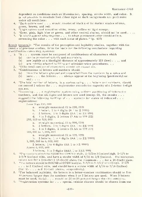
Karmeier- I960
dependent on conditions such as illumination, spacing, stroke width, and color. It
is not possible to conclude that either light or dark backgrounds are preferable
under all conditions.
4. "Dark colors used . . . should consist of black and the darker shades of blue,
green, brown, and red.
5. "Light colors used should be white, ivory, yellow or light orange.
6. "Grey, pink, light blue or green, and other neutral shades, should not be used . . . .
7. "It would appear advantageous ... to adopt permanent color combinations,
reversing the color . . . with each issue of plates. " (p. 437)
Result (general ): "The results of the perception and legibility studies, together with the
results of previous studies, form the basis for the following conclusions regarding
identification numbering systems:1. "A . . . system must be composed of combinations of characters which
(a) can be perceived quickly and accurately,
(b) are legible at a (daylight) distance of approximately 125 (feet) . . . , and(c) are readily adapted to filing and administrative procedures. . .
2. "(T)he total number of characters should not exceed six.
3. "Combinations of letters and numbers should
(a) have the letters grouped and separated from the numbers by a space and(b) have . . . the letters . . . always appear at the beginning (preferably) or
end ....4. "The total number of letters, in a system using . . . letters and numbers, should
not exceed 2 unless the . . . registration exceeds the capacity of a 2-letter 4-digit
system.5. "Assuming ... a registration system using uniform positioning of letters and
numbers, and that all digits and letters are used (except Q), the results . . .
sugges(t) the following rankings of . . . systems for states of indicated . . .
registrations:
Less than 250, 000
a. straight numerical (1 to 250, 000)
b. 1 letter, 1 to 4 digits (A 1 to Z 9999)c. 2 letters, 1 to 3 digits (AA 1 to ZZ 999)d. 1 to 3 digits, 2 letters (1 AA to 999 ZZ)
250, 000 to 500, 000
a. straight numerical (1 to 500, 000)
b. 2 letters, 1 to 3 digits (AA 1 to ZZ 999)
c. 1 to 3 digits, 2 letters ( 1 AA to 999 ZZ)500, 000 to 1, 000, 000
a. straight numerical (1 to 999, 999)
b. 2 letters, 1 to 4 digits (AA 1 to ZZ 9999)
1, 000, 000 to 6, 000, 000
2 letters, 1 to 4 digits (AA 1 to ZZ 9999)Above 6, 000, 000
3 letters, 1 to 3 digits (AAA 1 to ZZZ 999)6. "The numbers should be ROUND or OPEN in style, 2- 1/2 to 3 (inches) high, 1-1/4 to
1-3/4 (inches) wide, and have a stroke width of 5/l6 to 3/8 (inches). The minumumvalues are for a (standard) 12-(inch) plate; the maximum . . . for a 14-(inch) plate.
7. "The letters should be ROUNDor OPEN in style, 2-3/4 to 3- l/2 (inches) high, 1-3/8
... to 2 (inches) wide, and should have a stroke width of 5/16 to 7/16 (inches)
(for 12- . . . and 14-inch plates, respectively).
8. "For balanced legibility, the letters in a letter-number combination should be 5 to
10 percent larger than the numbers when 1 or 2 letters are used. When 3 letters
must be used, the(y) . . . should be 20 to 25 percent larger than the numbers.9. "Registration systems for . . . special vehicle classes should be chosen from one
-209-
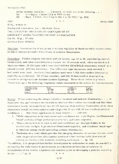
Karmeier- I960
of the systems listed in ... 5 (above), or from one of the following . . . :
(a) 1 to 4 digits, 1 letter ( 1 A to 9999 Z) and(b) 1 digit, 1 letter, 1 to 3 digits ( 1A 1 to 9Z 999). " (p. 432)
2 167 * * * Kelly- 1960
Kelly, Robert B.
Dunlap and Associates, Inc., Stanford, Conn.
THE EFFECT OF DIRECTION OF CONTRAST OF TVLEGIBILITY UNDER VARYING AMBIENT ILLUMINATIONJun 60, 12 p. , 17 refs.
Contract Nonr 1076(00)
Problem : Determine the effect on the television legibility of black-on-white versus white
-
on-black characters under three levels of ambient illumination.
Procedure : Twelve subjects (six male and six female, age 22 to 38, each having normal
visual acuity and color discrimination) viewed, for 15 seconds each, white -on-black and
black-on-white, 20 (14 alpha and 6 numeric) FUTURA DEMIBOLD characters stimuli on a
closed-circuit, 675-line television. The l/8th-inch high characters each covered 5
horizontal scan lines. Ambient illuminations used were 0. 026 foot-candles (simulating
night-flying conditions), 186. 37 foot-candles, and 638. 44 foot-candles (approaching
simulation of high -altitude daytime ambient lighting). These three levels of ambient
illumination gave the following brightness values measured at the screen (in foot-lamberts):
characters low medium highwhite 16. 24 31. 86 56° 81black 5.68 16.10 31.97
Result : "From examining the simple effects of contrast and ambient illumination . . . , it
(was) seen that performance decrease(d) as ambient illumination increase(d) and that white
characters (would be) suitable for low (0. 026 foot-candles) ambient illumination while black
characters (would be) most suitable under high (186. 37 and 638.44 foot-candles) ambient
conditions. . . The direct application of these results . . . call for:
1. "White characters to be used under such conditions as: night flights, low illuminated
'blind' cockpits of high performance aircraft, and space capsules.
2. "Black characters to be used under such conditions as: daylight flights in the
conventional cockpit, high ambient illuminated capsules, and simulator 'mock-ups'
in which no canopy masks prevailing ambient illumination.
3. "Inclusion of a mode which provides for changing direction of contrast for use under
wide ranges of ambient illumination produced either mechanically (two sets of
charts) or electronically (polarity switching technique). . . (p. 11)
"In addition, it is proposed that further investigation be undertaken to study the possibility
of negating the differences in performance as a function of direction of contrast by
manipulation of the screen brightness and contrast prior to developing a polarity switching
device . . . ." (p. i) * * *
-210-
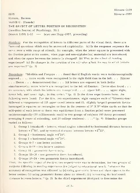
Kimura-1959
2205 Kimura-1959
Kimura, Doreen
McGill U. (Canada)
THE EFFECT OF LETTER POSITION ON RECOGNITION
Canadian Journal of Psychology, 3 1:1
(March 1959) 1-10 (also see Hogg-1957, preceding)
Problem : For the recognition of letters in different parts of the visual field, there are
"several questions which may be answered empirically, (a) Is the response sequence the
same over a wide range of stimuli, for example, when the letter square is presented with
the fixation point at its centre, when gaps and non-alphabetical material are introduced,
and when the space between the letters is changed? (b) What is the effect of reading
experience? (c) Do changes in the duration of the stimulus affect the way in which letters
are reported?" (p. 1)
Procedure : "Mishkin and Forgays . . . found that if English words were tachistoscopically
exposed . . . , more words were recognized in the right field than in the left. . . (L)ater
. . . Heron . . . demonstrated that . . . (i)f letters are exposed in both fields
simultaneously, more letters are recognized to the left of fixation. Heron also found . . .
the accuracy with which the letters are recognized . . . : upper left . . . ,upper right,
lower left, and lower right, in that order. " (p. 1) In the three experiments here, the
following were found: For the first two experiments, eight samples each of "(t)wenty-four
different arrangements of (13 upper case) letters and (8, slightly larger) geometric forms
(arranged in squares or rectangles or four in the centers of 3" X 5" white cards so that the
mid-point of each letter or form was equidistant from a fixation point) were presented
tachistoscopically (30 milliseconds each) to two groups of subjects (40 Army personnel
averaging 8 years of schooling, and 20 college students) . . . ." (p. 9) Stimulus groups
varied as follows:
1. Group 1 (standard) - letters; visual angles subtended by horizontal distance between
letters = 1°56', and by vertical distance between letters =2°22'.
2. Group 2 - horizontal angle =4°2 6'.
3. Group 3 - horizontal angle =6°39'.
4. Groups 4-7 - one letter omitted.
5. Groups 8-13 - two letters omitted.
6. Group 14 - geometric forms only.
7. Groups 15-18 - one geometric form introduced.
8. Groups 19-24 - two geometric forms introduced.
Thus, the specific object of the first two experiments was to determine, for two groups of
subjects differing in reading experience (as judged by educational level), "whether the
accuracy of recognition was affected by (a) using geometric forms and blank spaces in the
letter series; (b) using geometric forms alone as stimuli; (c) increasing the horizontal
distance between letters. " (p. 2) In the third experiment (designed to determine the
-211-
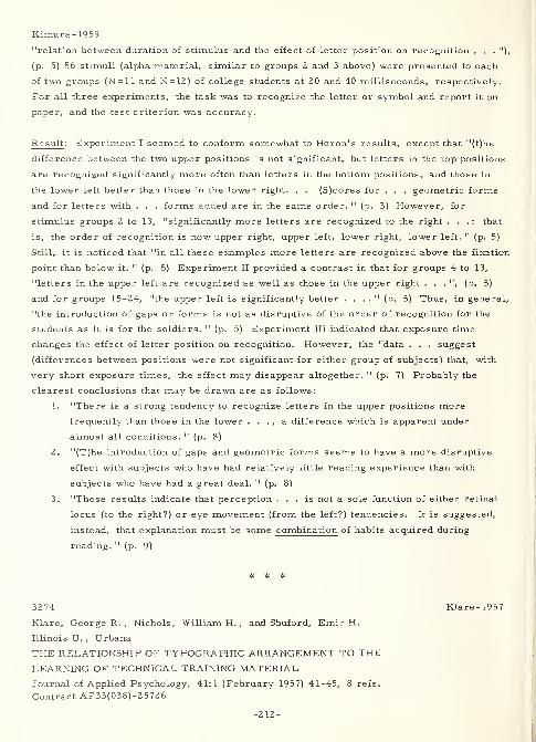
Kimura-1959
"relation between duration of stimulus and the effect of letter position on recognition . . . "),
(p. 5) 56 stimuli (alpha material, similar to groups 2 and 3 above) were presented to each
of two groups (N=ll and N=12) of college students at 20 and 40 milliseconds, respectively.
For all three experiments, the task was to recognize the letter or symbol and report it on
paper, and the test criterion was accuracy.
Result : Experiment I seemed to conform somewhat to Heron's results, except that "(t)he
difference between the two upper positions is not significant, but letters in the top positions
are recognized significantly more often than letters in the bottom positions, and those in
the lower left better than those in the lower right. . . (S)cores for . . . geometric forms
and for letters with . . . forms added are in the same order. " (p. 3) However, for
stimulus groups 2 to 13, "significantly more letters are recognized to the right . . . : that
is, the order of recognition is now upper right, upper left, lower right, lower left. " (p. 5)
Still, it is noticed that "in all these examples more letters are recognized above the fixation
point than below it. " (p. 5) Experiment II provided a contrast in that for groups 4 to 13,
"letters in the upper left are recognized as well as those in the upper right . . . ", (p. 5)
and for groups 15-24, "the upper left is significantly better . . . ." (p. 5) Thus, in general,
"the introduction of gaps or forms is not as disruptive of the order of recognition for the
students as it is for the soldiers. " (p. 5) Experiment III indicated that exposure time
changes the effect of letter position on recognition. However, the "data . . . suggest
(differences between positions were not significant for either group of subjects) that, with
very short exposure times, the effect may disappear altogether. " (p. 7) Probably the
clearest conclusions that may be drawn are as follows:
1. "There is a strong tendency to recognize letters in the upper positions more
frequently than those in the lower . . . , a difference which is apparent under
almost all conditions. " (p. 8)
2. "(T)he introduction of gaps and geometric forms seems to have a more disruptive
effect with subjects who have had relatively little reading experience than with
subjects who have had a great deal. " (p. 8)
3. "These results indicate that perception ... is not a sole function of either retinal
locus (to the right?) or eye movement (from the left?) tendencies. It is suggested,
instead, that explanation must be some combination of habits acquired during
reading. " (p. 9)
3274 Klare-1957
Klare, George R. , Nichols, William H. , and Shuford, Emir H.
Illinois U. , Urbana
THE RELATIONSHIP OF TYPOGRAPHIC ARRANGEMENT TO THELEARNING OF TECHNICAL TRAINING MATERIALJournal of Applied Psychology, 41:1 (February 1957) 41-45, 8 refs.
Contract AF33(038)-25726
-212-
Klare-1957
Problem: Determine whether "two newly developed methods of typographic arrangement,
square span and spaced unit, . . . possess . . . advantages over the usual arrangement. .
(p. 45) One of the chief problems ... (is that) (n)o rules exist for . . . grouping (by so-
called 'thought units ') . . . The present study . . . us(es) 'longer' and 'shorter' sizes of
units. In addition, it assesses the effects of the experimental arrangements upon reading
efficiency, immediate retention, and acceptability of technical material when presented to
subjects of a wide range of ability. " (p. 41)
Procedure: "Below are sample sentences in (the several) . . . arrangements:
1. Standard:
The remaining 30 (percent) to 40 (percent) must be dissipated through the cooling
system.
2. Square span:
The remaining must be through the
30 (percent) to 40 (percent) dissipated cooling system.
3. Spaced unit:
The remaining 30 (percent) to 40 (percent) must be dissipated
through the cooling system.
"A 1, 206-word printed lesson . . . was used in this . . . stud(y). . . (p. 41) (It) was . . .
divided (by five people) into thought units . . . The common rules generated by both longer
and shorter units were: (a) technical terms consisting of more than one word were not
broken into two units; (b) thought units were never arbitrarily broken because of lack of
space at the right margin of the paper; and (c) existing punctuation was used and therefore
determined units to some extent (i.e. , no mark of punctuation was ever used inside a
thought unit). . . For the shorter units, the chief rules were: (a) subject and predicate of
simple sentences were separated, and object was also separated from predicate; (b)
phrases (chiefly prepositional) were set off; (c) noun modifiers, if short, were linked with
the noun, and verb modifiers with the verb, but single subjects or objects stood alone; and
(d) clauses were set and, if long, broken into appropriate thought units. . . For the longer
units, the chief differences were: (a) subject and predicate of short simple sentences were
not separated, but object was separated from predicate; (b) phrases were set off, except in
short sentences (when they were linked chiefly with the verb); (c) single words at beginning
or end of sentences (i.e., used chiefly as subject or object) were joined with adjacent
thought units; and (d) short clauses were not broken. . . The subjects used were 533 male
airmen in indoctrination training . . . Every fifth line of each version was numbered as an
aid in obtaining total number of words read ... A 50-item multiple -choice test was used
to measure immediate retention ... (p. 42) (Individual) aptitude indices . . . were
accounted for in . . . analyses. . . (p. 43) (Q)uestions printed on the back of the answer
sheet . . . asked subjects to indicate which was more pleasant to read . . . and four
possible reasons: (a) 'is more familiar, ' (b) 'is more interesting, ' (c) 'is easier to read, '
and (d) 'permits faster reading. ' " (p. 42)
-213-
Klare-1957
Result : "The results of this study indicated that . . . square span and spaced unit . . .
may possess certain advantages .... While square span slowed the reader on first
encounter, this effect tended to diminish with practice; spaced unit had little effect upon
reading speed. The reader found the newer arrangements less acceptable than the more
traditional, but this feeling was less marked when the "thought units' in the arrangement
were small rather than large. The chief effect upon immediate retention produced by the
newer arrangements . . . was to provide an increase in test scores for the more able
readers. . . (T)he advantages of the newer arrangement(s) are best described as
potential, since they interfere with strongly developed reading habits. . . (H)owever, . . .
the(y) . . . may be of value for subjects who have had some practice in reading them and/
or high ability. Further work in the setting up of thought units was also indicated. " (p. 45)
* * *
3334 Klare-1963Klare, George R.
Ohio U. , AthensTHE MEASUREMENT OF READABILITYAmes, Iowa State U. Press, 1963, 328 p. , 48refs.
Introduction: "This book is primarily a review of research literature (482 annotated items)
in the field of readability, together with an analysis of trends and conclusions that can be
drawn from the existing data. The term 'readability' has come to be used in three ways:
1. "To indicate legibility of either handwriting or typography.
2. "To indicate ease of reading due to either the interest -value or the pleasantness of
writing.
3. "To indicate ease of understanding or comprehension due to the style of writing.
"(R)esearch in each of these areas is legitimately referred to as readability research.
. . This book is restricted to the analysis of research stemming from the third meaning.
. . Studies of the legibility and interest -value of writing have been excluded, except for
occasional studies that also have some relevance to understandability. " (p. 1)
Table of Contents:
Introduction
Part I Practical Applications
1. Useful Information for Communicators: Readability for the Reader;
The Writer's Purpose; Principles of Writing Readably; How to Usea Readability Formula; Which Formula to Use; Limitations of
FormulasPart II Measures of Readability
2. Historical Precedents of Formulas3. Methodology of Formula Development4. Developmental History of Formulas: Early Formulas - 1921-1934;
Detailed Formulas - 1934-1938; Efficient Formulas - 1938-1953;
Specialized Formulas - 1953-1959
5. Other Methods of Measuring Readability
6. Applications of Readability Measures: Education; Business and
Industry; Journalism and Mass Communications; Legal and
Governmental Writing; Psychological Tests and Questionnaires;
Writing; Speech; Foreign Languages; Summary7. Sampling Adequacy and Analyst Reliability: Sampling; Analyst
Reliability
-214-
Klare-1963
8. Validity: Original Criterion Prediction; Comparative Validity Data;
Validation Aganist Outside Criteria; Summary StatementPart III Basic Considerations in Readability
9. Basic Considerations in Written Material: Units of Analysis; FactorAnalyses in Readability Elements; The Word Factor; The SentenceFactor; Other Factors in Written Material
10. Basic Considerations in the Reader: Reading Level; ReaderExperience; Motivation
11. Future Research in Readability: Basic Research; New Readability
Factors; Refinement of Existing Factors and Methods; SummaryPart IV Annotated and Classified Bibliography
A. Introductory ReferencesB. Readability FormulasC. Other Measures of Readability
D. Applications of Readability Measures: Education; Business andIndustry; Journalism and Mass Communications; Legal andGovernmental Writing; Psychological Tests and Questionnaires;
Writing; Speech; Foreign LanguagesE. Sampling and Analyst Reliability
F. Validity: Comparative Data; Outside Criteria
G. Basic Considerations in Readability MeasurementH. Review and Bibliographic References
Index
3319 * * * Klemmer-1958
Klemmer, E. T. and Loftus, J. P.
Operational Applications Lab. , Air Force Cambridge
Research Center, Washington, D.C.
NUMERALS, NONSENSE FORMS, AND INFORMATIONAFCRC-TR-57-2, Feb 58, 22 p. , lOrefs.
Project 7682
AD-110 063
Problem : "How much better are arabic numerals seen and reported than random pattern(s)
of lines of about the same complexity? How do numerals and the related class of forms
compare with other classes of stimuli when performance is measured in terms of the
amount of information transmitted by (a subject)? And, how much more information can
(a subject) perceive than he can transmit with the stimuli used in this study?" (p. 1)
Procedure : "A matrix was constructed of individually lighted line segments such that if
all lines were illuminated, a block figure 8 would be produced. By selectively lighting
only some of the lines, an additional 127 light patterns were generated. . . (A) subclass
of ten patterns formed a reasonably good set of the arabic numeral forms. . . (p. 14)
Each figure was 4 (inches) high and 2-1/2 (inches) wide. . . (p. 2) Four of the matrices
were placed in a row and programmed to produce a random order of the entire class of
patterns or, in a separate test, a set of random four-digit numbers. Each pattern was
flashed tachistoscopically for 0. 02 (seconds).". . (p. 14) from a distance of 30 to 36 feet
from the subject. "Ten (subjects) took tests in which they attempted to reproduce the
-215-
Klemmer-1958
stimulus patterns on specially prepared answer sheets. In some tests they were asked to
reproduce the entire pattern; in other tests a poststimulus cue indicated . . . only that one
(of the four matrices) to be recorded. The time between stimulus and cue was varied
systematically, and visual and auditory cues were compared. . . Performance was
measured in terms of the percentage of line segments correctly reported and ... of the
amount of information transmitted or perceived by (the subject). " (p. 15)
Result : "In the following results, all percentage figures refer to the percentage of line
segments reported correctly.
1. "A delay of 0. 2 (seconds) between stimulus and poststimulus visual cue gave best
performance. The average score was down 7 (percent) with a delay of 3. 2
(seconds). A check of two delay times using an auditory cue showed no large
difference between visual and auditory cuing.
2. "Performance when a complete report of the four matrices was required was 14
(percent) below performance with the partial response and a 0.2-(second) cue delay.
3. "The arabic numerals were reported only slightly better than nonsense figures
when all patterns were mixed.
4. "Several general pattern classifications that emerged correlated with performance.
Continuous patterns were seen better than broken patterns. Patterns containing a
closed loop of line segments were seen better than patterns without such a loop.
Symmetrical patterns were seen better than unsymmetrical patterns. The blank
pattern was seen best of all, and patterns of only one line segment were seen better
than patterns with more line segments.
5. "An informational analysis of performance showed that the average (subject)
transmitted 9. 6 bits when the complete response was required, but perceived 17. 0
bits as estimated from the best partial response test.
6. "In tests requiring a complete response, the average (subject) transmitted
approximately the same amount of information from the arabic numerals as from
the complete set of 128 patterns. Practice effects made exact comparisons
impossible.
7. "There were large individual differences in relative performance on each of the
four positions.
8. "In a controlled association test, the total number of associations given to each
pattern by all (subjects) correlated 0. 446 with a performance measure.
9. "An average rating score of pattern difficulty by all (subjects) correlated 0. 569
with a performance measure.
10. "A large and continuing improvement with practice was observed throughout the 24
days of testing.
11. "Support was found for the hypothesis that information transmission by the human
operator varies as the logarithm of display 'coordinality' (defined as 'the number of
independent dimensions along which each element of the display varies summed
over all independently varying elements' (p. 13)). " (p. 15-16)
* * *
-216-
2572
Krulee, Gilbert K. , Podell, Jerome E. and Ronco, Paul G.
Tufts U. , Medford, Mass.
EFFECT OF NUMBER OF ALTERNATIVES AND SET ON THEVISUAL DISCRIMINATION OF NUMERALSJournal of Experimental Psychology, 48:1 (July 1954) 75-80
Problem : "(I)nvestigate (in two experiments) the effect of the number of alternatives and
the perceptual set of (a subject) concerning these alternatives on the visual discrimination
of numerals. The visual task confronting (subjects is) to discriminate accurately the
particular number displayed. The threshold was defined as the maximum distance at
which this discrimination was possible. . . (p. 80) Two hypotheses were advanced: (a)
that the magnitude of the threshold for discrimination of numerals would increase as the
number of alternative possibilities (amount of uncertainty) was increased, and (b) that in a
situation in which expected uncertainty exceeded actual uncertainty, the visual threshold
would be a function of the number of alternatives expected by (the subject) and not of the
number actually used by (the experimenter). " (p. 75)
Procedure : A total of 76, male, naval, enlisted-personnel subjects participated in two
experiments; (32 in each of two parts of experiment one and 12 in experiment two) in which
they each viewed (through a single eyepiece) 1 -inch-high, white -on-black, BERGERnumerals in 1-, 2-, and 3-digit numbers, projected in random order onto a frosted glass
screen in the rear of a specially designed, 35-l/2-inch long (and 6- by 7-inch square) box.
Numerals were behind the screen on a movable carriage controlled by the subject and were
illuminated by "light from two shielded 25-(watt) lamps fastened to the box. " (p. 75)
Subject's task was to permit the carriage to move, from a predetermined zero position,
toward the box until "he could recognize the number displayed .... The threshold value
was defined as the amount of travel required from the initial starting point before
recognition was possible. " (p. 75) Accuracy was also judged. "The first experiment . . .
(specifically) involved the determination of (the) distance threshold under variations in the
number of alternatives from which a random selection of presentations was made. " (p. 76)
While, "(t)he design of the second experiment was chosen so as to investigate the
consequences of perceived uncertainty being greater than objective uncertainty. " (p. 77)
Result : In the first experiment, "(t)he results for the variable of amount of information
corroborate the findings reached by the use of the "t" test. The variation due to information
is significant at the 1 (percent) level of confidence for the first half of the experiment
(conditions of information used were 2, 4, 8, and 16 alternative categories), but is not
significant even at the 5 (percent) level . . . for the second half (16, 32, 100, and 1000
categories). " (p. 77) In the second experiment, "(f)or all variations, there are sharp
drops in thresholds, all significant at the 1 (percent) level. . . In contrast . . . the
differences in threshold obtained for comparison of the average of the first set of four
Krulee- 1954
Krulee- 19 54
-217-
Krulee-1954
presentations as compared to the second set . . . (gave no) differences . . . significant at
the 1 (percent) level, and only one at the 5 (percent) level. . . (C)omparisons between the
three variations. . . discloses no significant differences . . . (T)hese . . . results are
consistent with the . . . finding of no increase in threshold for amounts of information in
excess of eight categories. " (p. 79) Thus, in general, "(t)he results indicated that the
difficulty of (the) perceptual decision varied directly with the number of possible
alternatives within the limited range of not more than ten categories. . . In addition, . . .
(i)t was shown that thresholds obtained under . . . conditions (of expected uncertainty
greater than actual uncertainty) exceeded those obtained when full knowledge was available
to (a subject) as to the actual set of alternatives. " (p. 80)
* * :
2206
Krulee, Gilbert K. and Weisz, Alexander
Tufts Coll., Medford, Mass.
STUDIES IN THE VISUAL DISCRIMINATION OFMULTIPLE -UNIT DISPLAYS
Journal of Experimental Psychology,
50:5 (November 1955) 316-324
Problem: Experimentally examine the following two general hypotheses:
1. "(I)n single-unit displays, the magnitude of a distance threshold for the recognition
of elemental symbols is directly related to the amount of information involved in
the recognition of that particular symbol.
2. "(T)he recognition of multiple -unit displays involves independent and concurrent
processes such that the distance threshold is primarily a function of that position
in the display containing the most difficult discrimination. " (p. 323)
Specifically, determine the "distance thresholds for 1-, 2-, and 3-digit displays as a
function of the number of alternative possibilities in each position of the display. " (p. 324)
Procedure: "In (the) first experiment, the amount of information displayed was held
constant, but the coding of the categories was manipulated so as to vary the distribution of
information amongst the three possible positions in the display. The (specific) hypothesis
advanced was that the distance threshold would vary directly with the number of categories
possible in the most complex position of the display. " (p. 317) For this experiment, nine
sets of "eight categories (or groups of numbers) were defined in terms of 1-, 2-, and 3-
digit codes using different choices of elemental symbols to define three such sets of codes. "
(p. 324) There were eight presentations of each condition to each of nine subjects.
Numerals used for this and the following experiment were those designed by Berger and
were one inch high. In the second experiment, an "inference that can be drawn from the
initially stated hypothesis is that the threshold for 2- or 3-digit numbers should be the
Krulee- 1955
-218-
Krulee-19 55
same as that obtained for 1-digit numbers, provided that the discrimination required in the
10's or 100's position does not exceed in complexity the discrimination required in the
digits position. . . Similarly, if the discrimination required at each position in a multiple
-
unit display is limited to a binary choice, then the threshold obtained for a 3-digit binary
number should not exceed that obtained for the same binary choice when confined to a
single position display." (p. 319) For this experiment, "thresholds for several binary
choices (defined by the pairs of numbers: 1 & 8, 1 & 2, 0 & 3, 5 & 9, 4 & 6, and 2 & 7)
used both as 1-digit and as 3-digit displays were obtained. " (p. 324) There were eight
presentations of each of twelve conditions to each of twelve subjects. The third experiment
was conducted to ascertain the truth of the following: "With a set of symbols containing a
number of elements in excess of 10, it could be predicted that the threshold would increase
as long as increases in number of possible categories were accomplished by use of a
single unit display. 11(p. 320) However, since "(i)t is conceivable that (variations due to
the perceptual difficulties of symbol discriminations present in experiment three) tend to
obscure the effect of amount of information and thus . . . interfere with the main purpose
of the experiment", (p. 321) experiment four was carried out to determine if "it should be
possible to obtain increases in threshold with each increase in the size of the set of
elemental symbols to be discriminated. " (p. 322) Thus, for these last two experiments,
"an alphabet of 32 symbols (26 letters in a sanserif GOTHIC one inch high and having a
height to stroke -width ratio of 5 to 1, with matching numerals 2 through 7) was used in
order to investigate the relationship of threshold magnitude to amount of information,
provided that only single -position displays were used. " (p. 324) Experiments three and
four each utilized sixteen subjects; experiment three in one group to determine distance
thresholds for conditions of 4, 8, 16, and 32 categories; and experiment four in two groups
of eight each to determine distance thresholds for conditions of 8 and 16, and 16 and 32
categories. Visibility threshold was the test criterion for all four experiments.
Result: Experiment one - "With two of the three (major) sets, results . . . indicat(ed)
that (the) threshold is directly related to the amount of information contained in the most
complex of the three positions. For the third set, the apparent difficulty of the specific
binary choice (2 & 7) chosen for the 3-digit code made this the most difficult of the three
codes in the set. " (p. 324) Experiment two - "With five out of six . . . comparisons no
significant differences could be detected for the 3- vs. the 1-digit binary choice. " (p. 324)
Experiments three and four - "Increases in threshold were obtained in 8 vs. 16 and 16 vs.
32 categories when the comparison was based upon the discrimination of a set of
alternatives first in isolation and finally as part of a larger set of alternatives. (However)
(t)he data indicate that such threshold increases are not necessarily obtained when the
larger set does not contain as members the specific symbols included in the smaller. "
(p. 324) Experiment four specifically confirmed "the hypothesis relating the magnitude of
the distance threshold to the number of possible alternatives . . . for a display limited to
the presentation of single -unit symbols. " (p. 32 3) The following general conclusions were
drawn:
-219-
Krulee-1955
"Ona clear-cut implication of all these findings is that hypotheses concerning
distance thresholds must involve not only the number of alternative possibilities
but also the specific difficulty of discriminating among the elements chosen to
define a set of possible alternatives. " (p. 3Z3)
"It would appear to be desirable if a broader theory of the visual discrimination of
symbols could be developed which would include both types of variables and which
would increase the predictive value of the existing theories of visual displays. "
(p. 324)
3340 Krzhivoglavy-1962
Krzhivoglavy, Yaro
Scientific Research Inst, of Work Safety,
Prague (Czechoslovakia)
ENGINEERING PSYCHOLOGY AND WORK SAFETY
Voprosy Psikhologii (Problems of Psychology),
No. 4 (July-August 1962) 89-93, 12 refs.
Translation in JPR3-17, 219, "Soviet Psychological
Reports-USSR, " 2 1 January 1963, p. 19-30.
Washington, D. C. , Joint Publications Research Service.
AD-407 228
Problem : "(I)nvestigat(e) the problem of interpolating readings within the limits of a
scale's division (5), and ... of legibility of different types of figures (10). " (p. 20) Also,
"stud(y) the effect of the space surrounding (a control panel) indicator on the accuracy and
speed of information reception. " (p. 22) Fourth, study the man-machine, visual-
communication channel. Fifth, design and propose "a unified three-stage (industrial safety)
warning system . . . ." (p. 25) And finally, study "the legibility of road signs. " (p. 28)
Procedure ( scale divisions) : "It was established that the accuracy of interpolation depends
on the number of the scales intradivision (division range). " (p. 20)
Result ( scale divisions) : "(Ninety-six percent) of the accurate readings were observed
when the division range of the scale did not exceed 5 interdivisions (the size of one
interdivision was 6 minutes). This fact (made) it possible to determine the magnitude of
scale divisions and the magnitude of the scale or dial, considering the maximum accuracy
and speed of reading indicators. " (p. 20)
Procedure ( legibility of numerals ): Figures used in the experiment were (1) the
MACKWORTH, (2) the GILL, and (3) the CHSN 902341, TYPE 1 (Czechoslovakian standard).
Of these, "(t)hree significant numbers of (the above) types were displayed . . . (in) a
-220-
Kr zhivoglavy- 1962
modified Neylor tach(i)stoscope (at 1/125 second each) to a group of twenty men. " (p. Zl)
Result (legibility of numerals ): "(A)n important difference was observed . . ., which was
not of a random nature. On the basis of a T-test it was found that the GILL number type
was the most legible . . . The differences . . . are conclusive. " (p. 21)
Procedure ( control panel design ): "(S)ubjects were shown a 'panel' with a complex of
conventional symbols (3X3). . . (and) had to find pairs of symbols . . . occupying an
identical position. The space surrounding the 'panel' was purposefully changed in different
series. . . (p. 22) In the first series the space was homogeneous and unbroken. In the
second series, the symbols were moved in the surrounding space in a pattern similar to the
symbols of the 'panel. ' Also, the 'neutral' external symbols were separated from the basic
(meaningful) ones by a special line. In the third series, as in the second, the space
surrounding the panel was filled with 'neutral' symbols with the difference that the line
separating the basic and 'neutral' symbols was absent. " (p. 24)
Result(control panel design ): "(T)he presence of symbols in the surrounding space which
were similar in form to the meaningful ones significantly lowered the speed and accuracy
of fulfilling the task. " (p. 24)
Procedure (visual communication channel): "(A)t the place of work in the control room, we
determined the amount of information transmitted from the boiler screen and control panel.
. . (T)he variety of situations arising in the condition of the apparent indicator organs was
an impressive figure -- 10^^. The amount of information transmitted by a determined
position of indicator organs was 1460. 3 beats. " (p. 24)
Result (visual communication channel ): "(M)easurements . . . conducted before and after
(work) shifts . . . resulted in established significant individual differences, and the total
average capacity of transmission (channel of communication) was 8. 79 beats (per second).
. . A comparison of the capacity of the visual channel of communication and the information
load of the indicator organs showed that ... in transmitting emergency information, at
least 164 seconds are required. If one considers that random non-signal charges of
indicator organ position is 31. 72 beats (per second), it becomes clear that a reduction in
the amount of transmitted information is essential to creating optimal working conditions
. . . (A) reduction to some degree can be accomplished ... at the sources of information.
. . , for example, (by) designating the inclination tolerance of . . . pointers. Secondly, of
no less importance is the study of psychological forms of reducing informa.tion. " (p. 24-25)
Procedure (warning system ): Color, shape and symbolic devices were desired for the
following three stages of warning systems:
"Stage I - Sources with a small amount of information. The degree of danger is not
a constant magnitude and therefore may be divided into categories. In
-221-
Krzhivoglavy- 1962
practice, a dich(o)tomous division is used most frequently. " (p. 2 5)
"Stage II - Sources with an average amount of information. It is essential to
emphasize that the dichotomous designation of dangerous and non-
dangerous locations by (e. g. ) various colorations cannot completely satisfy
us. " (p. 26)
"Stage III - Sources with a heavy information load. . . (w)hen it is necessary to
transmit safety information in as much detail as possible . . . ." (p. 2 6)
Result (warning system ): The following were devised for each stage:
Stage I - From psychological research, "we devised a system for color designations
of places which may involve danger or risk. . . In the most generalized
terms, our system . . . takes the following form. Danger is designated
by 'warm' colors: red -- stop, orange -- serious danger, yellow --
caution. For designating non-dangerous situations we use 'cold' colors:
green -- safe condition, azure -- organizational messages. . . We
developed this general system into a complete series of general
government standards. Sample standards: 'Colors for transportation
light signals' (CHSN 012 728), standard of 'shades and paints for textile
machines' (CHSN 268810), etc." (p. 25)
Stage II - "(C)onsidering the . . . capability of the human eye to differentiate colors,
it would be permissible to select . . . shades of colors .... However,
there are familiar difficulties here .... We therefore chose another
way -- combining the danger colors, with a (s)imple geometric form
and graphic symbol into one expressive complex. . . We also studied the
role of framing warning signs and the size of the background surface. . .
(E)xperimental results showed that even the smaller frame improves a
sign's legibility. If the frame's surface is increased, the 'reading'
accuracy of the sign is increased. A sufficiently large background surface
behind the symbol also improves the legibility of warning signs. . .
Considerable attention . . . was devoted to the sign legibility in relation to
the color and background of the symbol. In this connection we compiled
. . . pairs of contrasting colors where combinations of chromatic and
achromatic colors were used. . . We tested to see . . . whether sign
legibility depends on the background color of the selected pair of colors
or the degree of brightness, determined by the reflectability of a colored
surface. The results showed that ... a brightness contrast plays a
dominating role in the legibility of various combinations of chromatic and
achromatic colors. . . All . . . warning signs . . . devised. . . have
been standardized in Czechoslovakia. " (p. 26-27)
Stage III - "(T)he best form for this is a warning sign (stage II) with an adjoining
text (warning board). . . (I)n designing the indicated source of information
we utilized data established in (a previous) investigation of the legibility of
-222-
Kr zhivoglavy- 196Z
various types of letters and numbers. " (p. 28)
Procedure (highway signs ): In "determining the legibility of existing road signs. . . we
conducted experiments with twenty subjects to whom various road signs were shown at
distances from 350 meters (maximum) to 20 meters (minimum). The 'reading' accuracy
was recorded. . . (N)ew road signs. . . were subsequently tested . . . on the highways
.... The type of materials used for painting . . . signs were also . . . experimentally
tested. " (p. 28-29)
Result (highway signs ): "This work resulted in the introduction of paraflex road signs on
Czechoslovakian highways. " (p. 29)
Result (general ): "(I)n attempting to utilize psychology for solving . . . problem(s), we
often are at a loss because of not knowing the appropriate psychological features which
ought to be taken advantage of in a given case. In relation to work safety, this concerns
such problems, for example, as the accuracy of visual interpolation within the range of
two hard points, the effect of non-signal stimuli, the effect of surface background size on
symbol legibility, psychological means of reducing information, etc. . . The solution of
this problem lies in the . . . inclusion of psychology into the complex of other sciences. "
(p. 2 9)
2168 Kuntz-1950Kuntz, James E. , and Sleight, Robert B.
LEGIBILITY OF NUMERALS: THE OPTIMAL RATIO OFHEIGHT TO WIDTH OF STROKEAmerican Journal of Psychology, 63:4
(October 1150) 567-575, 12 refs.
Rept. no. 166-1-106, Special Devices CenterContract N5-ori-166Also in READINGS IN EXPERIMENTAL INDUSTRIAL PSYCHOLOGY,Milton L. Blum, Editor, (New York, Prentice -Hall, 1952) p. 289-295, 12 refs.
Problem : Determine the most legible numeral height to stroke-width ratio under conditions
of varying distance, brightness, and background.
Procedure : Fourteen university student subjects, 20-35 years of age, of normal visual
acuity, binocularly viewed LEROY test numerals through a tunnel eight feet long by two feet
square. Brightness was varied between 3 and 31 foot-lamberts . Distance from subject's
cornea (with head at rest) was ranged inward from two meters, until all numerals wereidentified. Background was both black on white and vice -versa. Height to stroke -widthratio was varied between 3. 5 and 6. 5 to one.
Result : The following statements are pertinent:
1. In legibility distance, there seemed to be a consistent, not satistically significant,
superiority for black numerals on a white field.
2. Optimal height to stroke -width ratio for legible distance seems to be between four
and six to one with a peak (more pronounced for black on white) at about 5: 1.
-223-
Kuntz-1950
3. There is a consistent trend for legible distance to increase with increasing
illumination, with optimal height to stroke -width ratio remaining approximately the
same
.
4. Legibility of the numerals seemed to be as follows (in descending rank): 1, 7, 0, 4,
3, 2, 9, 6, 5, and 8. This may possibly indicate the need for redesign of low-
ranking numerals to improve their legibility.
* # *
-224-
Lansdell-1954
2670 Lansdell-1954Lansdell, H.
Defence Research Medical Labs. (Canada)
EFFECT OF FORM ON THE LEGIBILITY OF NUMBERSCanadian Journal of Psychology, 8:2 (June 1954) 77-79, 7 refs.
Superseded by P. J. Foley (Defence Research Medical Labs. , Canada),
EVALUATION OF ANGULAR DIGITS AND COMPARISONS WITH A CONVENTIONAL SET,Journal of Applied Psychology, 40:3 (June 1956) 178-180
Problem : Test the legibility of a newly designed, blocked NEW ANGULAR FORM,numeric character set by experimentally comparing it with two, more conventional sets.
Procedure: Six subjects individually viewed black-on-white, 1 /4-inch-high digits in three
numeric character sets at a distance of 14 feet. Each digit was illuminated at about 10
foot-lamberts for 0. 6 seconds by a shaded photoflood bulb in a dark box, 2x2x3 feet
long. The subject controlled the beginning of each exposure by push-button activation of anelectronic timer. Room illumination was by overhead, indirect fluorescent tubes.
Subjects wrote down the digits, as they were shown, on a record sheet. Each subject wastested on 600 individual digits, with 200 each from the MACKWORTH, MOUND, and NEWANGULAR FORMS sets, randomly arranged in groups of 100. Accuracy was the test
criterion.
Result: "No difference in legibility was found between the MACKWORTH numbers and the
MOUND revision of them. All . . . (subjects) did better on the NEW ANGULAR FORMS,which (gave) a (0). 03 significance level with the Friedman chi-square test of rank. " (p. 78)
This better legibility "may be related to the fact that they were presented singly .... Thedifficult viewing conditions (imposed in order to reduce the number of observationsnecessary to obtain confusion data for further work on the design) may also have beenpartly responsible for better legibility . . . .
" (p. 79) Thus, the NEW ANGULAR FORMSnumeral designs, which broke away from the uniform stroke-width tradition by makinguse of "more easily discriminated form (squares and triangles) components . . . provedto be better than an accepted standard set, when presented singly under difficult viewingconditions. " (p. 79)
2669 Lauer-1948Lauer, A. R.
Iowa State Coll. , Iowa City
CERTAIN STRUCTURAL COMPONENTS OF LETTERS FORIMPROVING THE EFFICIENCY OF THE STOP SIGNIn PROCEEDINGS OF THE TWENTY-SEVENTH ANNUAL MEETING,1947, Roy W. Crum, Fred Burggraf, and W. N. Carey, Jr. , Editors,
(Washington, D. C. , Highway Research Board, National Research Council,
1948), p. 360-371, 10 refs.
Problem (general): Based upon previous work done by the author and others, as reviewedin the early part of the paper, study the most efficient form of STOP sign.
Problem (experiment 1 Differential Perceptibility of Certain Letters ): "(D)etermine the
differential perceptibility of the standard SNELLEN letters S, T, O, and P used for visual
tests under controlled conditions. " (p. 365)
Procedure (experiment 1 ): "Th(e) letters (were) square with a stroke of 20 percent the
width of the letters. The criterion used for vision charts is that each member of the
letter subtend an angle of 1 minute and the characters as a whole subtend an angle of 5
-225-
Lauer-1948
minutes. . . The Clason Acuity Meter was used for testing . . . (f)ifty-five
observers . . . ." (p. 365)
Result (experiment 1 ): "The differences were all significant except in the case of O and Pwhich was borderline. " (p. 365)
Problem (experiment 2 The Optimal Spacing of BLOCK Letters ): Determine the
relation of stroke-width to spacing and legibility.
Procedure (experiment 2): In "(a) preliminary check . . . (i)t was found that strokesabove 25 percent ... or less than 18. 75 percent of the width were inferior. 11
(p. 365)
Then, in the experiment, "(f)ive plates with the word STOP in one-inch letters wereconstructed using spacings 1/4, 1/2, 3/4, 1 and 1-1/4 (inches) respectively and twowidths of stroke, 0. 187 and 0. 250 percent of the width. BLOCK letters were carefully
drawn and inked with India ink. They were mounted on white cardboard . . . for use in the
Stoelting Flash Card Tachistoscope . . . for slow-timed exposures. Twenty-threesubjects were used . . . The projected light was gradually increased on each test carduntil the test object was just legible to the observer. " (p. 365)
Result (experiment 2): "No very significant difference in spacings were noted for
maximum legibility unless it be a slight advantage at about 3/4 (inches), for letters oneinch high. No other reason than scotopic vision can be given . . . for the results obtained
from 1/4- (inch) stroke which has usually been inferior. . . It may be tentatively
concluded that a stroke of 0. 25 percent of the width of SQUARE letters is most desirable
for very low levels of illumination. . . (T)his result may possibly be explained by a
halation effect on the retina, giving in reality a wider effective stroke, while the
reverse would hold for black letters on a light reflectorized background. " (p. 366)
Problem (experiment 3 Optimal Background- Letter Combinations): "(C)hec(k) the
effects of black letters on white background against white letters on dark background with
other conditions being held constant. " (p. 366)
Procedure (experiment 3 ): "Identical sets of one-inch BLOCK letters were constructed
with backgrounds reversed (black-on-white and white -on-black) using spacings varying
from 1/2 to 1-1/4 (inches) and with strokes 3/8 and 1/4 (inches). Two different groups of
observers (91 in one and 56 in the other) were used . . . The same apparatus as
described in (experiment) 2 was used. " (p. 366)
Result (experiment 3 ): "The results in general lead to the general conclusion that for lowlevels of illumination, or scotopic vision, wider strokes are necessary than for photopic
vision. . . (T)he results ... of a stroke of about 0. 183 of the width for BLOCK letters,
hold only at the higher levels of lighting. The superior results obtained by Neal (1944)
from white reflectorized letters on black background probably are due to retinal
irradiation of the luminous letters giving the effect of a broader stroke which offsets the
disadvantage of white on black found in this study. . . Black letters on white weresuperior in practically all combinations used, the average . . . being about 20 to 25
percent. Spacing between letters is a function of several variables but can probably range
between 50 to 100 percent of letter width without doing violence to most letter
combinations. " (p. 367)
Problem (experiment 4 Optimal Letter Shapes ): "(T)est . . . the various styles andsizes of letters to be used as a basis for the final selection of letters to be made for the
word STOP in further studies. " (p. 367-368)
Procedure (experiment 4 ): "The same general methods were used to separate letters of
the various combinations of styles and characteristics as were made in the previous
-226-
Lauer- 1948
(experiments) described. Some modifications of letters were made to test their legibility
value. "(p. 368) Apparatus was the "(s)ame as that (used) in (experiments) 2 and 3. "
(p. 368)
Result (experiment 4 ): "The results were synthesized into a generalized STOP . . . (as)
shown .... Further modifications will need to be made for reflectorization and fitting on
to the background . . . selected. The height may be increased but with diminishing
returns in . . . legibility. . . ROUNDED letters with height and width equal, having a
stroke of 25 percent of the letter width, and spaced 50 percent of the width . . . , seem(ed)
to give the best legibility under conditions of low illumination. " (p. 368)
Problem (experiment 5 Relative Perceptibility of Sign Shape and Color) : "(D)etermine
possible modifications, shapes, and colors, which will give maximum attention value andprovide for maximum legibility of the legend on a STOP sign. " (p. 368)
Procedure (experiment 5): "The first step was to study the octagonal sign and consider its
possibilities. Since only 40 percent of the height of the revised sign is utilized, five
possibilities for modifying the shape were considered. Two of these were modifications to
form a CROSS, by notching the diagonal corners. One was an OCTAGON having a height of
80 percent of the width while two were modified forms of a sign 60 percent as high as
broad. Thirty-six miniature blank signs embracing nine patterns one inch across wereconstructed from white cardboard and three colors of Scotchlite; white, yellow, and red.
These were presented individually to six trained subjects to ascertain at what point the
shape and color could be perceived accurately. . . The apparatus (was) the same as that
described in . . . experiments ... 2, 3, and 4. " (p. 368)
Result (experiment 5): "In very low levels of illumination (below 0. 01 to 0. 40
foot-candles) the yellow reflecting surfaces were difficult to discriminate from white.
This . . . resulted in higher light readings for both white and yellow, than would normallyresult if discrimination of only white and red were made. . . In general, . . . the
DIAMOND and SQUARE are easiest to discriminate while the most difficult are the
CIRCLE and OCTAGON. As the OCTAGONAL shape is decreased in height it becomeseasier to distinguish from the CIRCLE and to be identified as a characteristic shape. . .
Red (was) easiest to distinguish as a color but this experiment did not indicate clearly
whether it showed up equally well at very low levels of illumination. " (p. 368-369)
Experiment 6 (based on the question "When reflectorizations are used, how will this modifythe results obtained on painted signs") (p. 364): This experiment was not included in the
paper.
Problem (experiment 7 Comparison of Thresholds for Visibility, Color, and Shape ):
"(D)etermine which of four types of reflecting and plain surfaces were easiest to perceive;(a) as an object, (b) as a shape, and (c) as a color when relatively large areas wereexposed, well above the angle of normal visual discrimination. " (p. 369)
Procedure (experiment 7) : "The same laboratory apparatus and technique were used as in
(experiment) 6 with shapes 5 (inches) across being exposed at 20 (feet) and four trainedsubjects making a total of 78 observations. " (p. 369)
Result (experiment 7 ): "The results . . . suggest strongly that STOP signs should carrysome combinations of white and red r eflectorized materials since yellow does not have a
low color visibility threshold. No valid conclusions can be drawn on shapes .... Colorvision may in some degree affect the ultimate choice of colors. . . (and) seems muchmore critical at low levels of illumination . . . .
" (p. 369)
Problem (experiment 8 Comparison of Laboratory and Outdoor Results on Typical
-227-
Lauer-1948
Signs Used): Make a preliminary evaluation of a series of model signs constructed of
experimental forms.
Procedure (experiment 8): "To make preliminary evaluations of the experimental formsof STOP signs shown, tests were made with . . . laboratory apparatus at 20 (feet) andwith the signs outdoors in 300 to 400 (foot) candles of light on a hazy afternoon. Theywere set in mild shade with the surface facing the west for the outdoor runs. . . Twotrained subjects were used . . . .
" (p. 370)
Result (experiment 8): The following rank was obtained for the signs shown(best to worst):
Z0 feet 2 6 4 1 5 7 3
distance 4 7 6 12 3 5
combined 2 7 5-1/2 1 3 5-1/2 4
(above from p. 370)
"Some of the designs shown would be more effective if the letters weie taller but they
represent specimens of types to be reflectorized for further study. " (p. 371)
Result (general ): "It was found the ROUNDED letters are superior and that the letter Tneeds to be strengthened to make it equal to other letters as a part of the STOP Gestalt.
Strokes of about 25 percent of the letter width were found best. Ovalizing the O seems to
improve it as an individual letter as well as improving the Gestalt of the STOP sign
generally. . . Preliminary studies of background colors and shapes show(ed) a
superiority of horizontally elongated OCTAGONAL signs for discrimination of form. Asa distinctive target the reflectorized red seems to have an advantage over yellow. Earlier
experiments would indicate the reverse to be true for non- reflectorized signs although this
result might have been suspected on theoretical grounds. . . The results show that the
efficiency of standard signs now in use can be improved from 20 to 50 percent by redesign
of the letters. Target value of the OCTAGONAL form, as a precautionary sign, could bemuch improved by a change in shape. . . Probably the most effective as well as
distinctive STOP sign from all points of view (would) be a combination of red and white
reflectorized materials with a third color or material used for letterings. 11(p. 371)
2171
Legros, Lucien A. and Grant, John C.
TYPOGRAPHICAL PRINTING-SURFACESLondon, Longmans, Green & Co. , 1916, 732 p.
Legros-1916
Extract: "(T)he aim having been not only to produce an interesting volume, but to make it
also a standard text-book (manual of technology) on . . . the art of producing a
(typographical) printing-surface . . . ." (p. xi & v) The following outline of contents, with
emphasis on chapters that are outlined in detail, shows the scope of this rather
extensive typographic design manual:Introduction (including notes on historical origin), and Preface (including raisond'etre). Glossary of common technical terms (referenced to the text).
1. Printing-surfaces (intaglio, lithographic, and relievo).
2. Typography (the art of writing by means of movable types).
3. Description of type.
4. Typefounding (history and current practice).
5. Type design.
a. Principles (including optical illusion, of which figures 25 through 40 are
examples ).
-228-
Legros - 19 16
b. The influence of illusion on the form of characters (including figure 41
alinement and peculiarities of type).
c. The influence of the serif (including samples of the following type faces:
canon CONDENSED SANS, 30-point CONDENSED SANS SERIF, 2-line great
primer GROTESQUE NO. 4, 30-point ANTIQUE NO. 3, 2 -line english 2 7 -point
FRENCH ANTIQUE, 36 -point IONIC, 36-point VENETIAN OLD-STYLE, 2-line
great primer ANTIQUE NO. 8, 36-point OLD-STYLE, 36-point HADDONIAN,
2-line english 27-point OLD-STYLE ANTIQUE NO. 7, 2-line great primer OLD-
FACE, 3-line pica DE VINNE, 2 -line GREAT PRIMER NO. 4, and 24-point
ATLAS).
Founts of type.
a. Conventional founts (including table 1 which shows the 2 75 characters in the
ordinary fount of type, a listing of 76 additional characters used in languages
based on the LATIN character, and figure 42 -- -INTERNATIONAL PHONETICASSOCIATION type).
b. Conventional and ideographic signs (including samples of the following:
ASTRONOMICAL SIGNS, PSEUDO -SCIENTIFIC SIGNS; MATHEMATICALSIGNS and the interrelationship between typesetting and mathematical
composition showing also figure 43 example of mathematical composition and
cross-section through the component type, ECCLESIASTICAL SIGNS,
MEDICAL SIGNS, ARCHEOLOGICAL SIGNS; SCRIBAL ABBREVIATIONS,CARTOGRAPHICAL SIGNS; NATURAL HISTORY SIGNS, BOTANICAL SIGNS,
MONEY SIGNS; COMMERCIAL SIGNS, METEOROLOGICAL SIGNS, WEIGHTSand MEASURES SIGNS; ENGINEERING SIGNS, PEDIGREE SIGNS, CROWNS,
CORONETS, WREATHS, HELMETS, and HERALDIC SIGNS, ORDERS, MEDALS,MASONIC, and other SECRET and PHILANTHROPIC ASSOCIATION SIGNS,
POLITICAL SIGNS, METAL SIGNS, TRAVEL SIGNS, DIRECTION SIGNS,
CAUTION SIGNS, SPORT SIGNS, MISCELLANEOUS SIGNS; and SYMBOLICSIGNS with an example of use of symbolic signs in contemporary work).
Units and dimensions.
a. Spaces and quads.
b. Height-to-paper.
c. Units (including table 2 pica sizes, a chart of sizes above double pica,
table 3 body-sizes of type, table 4 faces and body-sizes, typographic
points including figures 44 through 49 facsimile reproduction of Fournier's
table of proportions of body-sizes, the Didot point system, and other systems
including Fergusson's Rules and table 5 Shanks's point system).
d. Accuracy of body and set (including limits of accuracy, figure 50 single-
ended body-gauge for type, table 6 comparative table giving names of
English and foreign type and their dimensional relationships in Fournier-
Didot- and standard-points in inches and in millimeters, tables 7 and 8 set
widths of modern and old-style pica founts without spaces and quads, and
figures 51 through 55 various gauges).
-229-
Legros - 19 16
e. Self-spacing type (including table 9 which shows the set widths of 281
characters and spaces).
f. Kerning and bearding (including figures 56 and 57 kerned type as cast and
after dressing).
8. Type faces.
a. Variety of faces (classified as old-style, e.g. PICA OLD-STYLE; modern,
e.g. PICA MODERN; and fancy, e.g. BLACKFRIARS, faces). The chief
varieties are as follows: BLACK, BLACK ECCLESIASTICAL (both of which
were formerly referred to as GOTHIC), SANSERIF (sometimes called SANS,
SANS SERIF, GROTESQUE, or GOTHIC, and in its italic form is prefaced by
the adjective INCLINED), OLD-FACE, OLD-STYLE ANTIQUE, DE VINNE,
BLACKFRIARS, CHELTENHAM, LATIN (sometimes called ANTIQUE),
MODERNIZED OLD-STYLE, MODERN, and ANTIQUE (sometimes called
CLARENDON or EGYPTIAN, and has the derivatives IONIC and FRENCHANTIQUE). Figures 58 through 60 show "the sorts . . . arranged in tabular
form for capitals, lower-case, figures and points, and for italics where such
are used . . . ." (p. 88) Specific faces shown in these figures are as follows:
BLACK, TUDOR BLACK (ECCLESIASTICAL), SANSERIF, OLD-FACE,
ANTIQUE OLD-STYLE, DE VINNE, BLACKFRIARS, CHELTENHAM OLD-
STYLE, BOLD LATIN, MODERNIZED OLD-STYLE,MODERN, EGYPTIAN,
INCLINED SANSERIF, OLD-FACE ITALIC, DE VINNE ITALIC,
BLACKFRIARS ITALIC, CHELTENHAM OLD-STYLE ITALIC, MODERNIZEDOLD-STYLE ITALIC, and MODERN ITALIC.
b. Width of face (including figure 61, which shows the following faces and their
a-z em-lengths: EXTRA CONDENSED, CONDENSED, LEAN, STANDARD,
FAT, BROAD-FACED, and EXPANDED; and figure 62 comparison of a-z
lengths of the following 60 type founts: nonpareil BLACK NO. 3 and TUDORBLACK; long primer BLACK NO. 1, AUGUSTAN BLACK, and OLD-STYLE
ANTIQUE NO. 3; brevier OLD-STYLE ANTIQUE NO. 7; minion on
brevier ANTIQUE; brevier ITALIAN; pica and bourgeois OLD-STYLE;
brevier OLD-STYLE ANTIQUE NO. 8; pica and brevier MODERN; 22
long primer ITALIC MODERN; 17 and 23 BOURGEOIS; long primer
ITALIAN, SKELETON ANTIQUE, and CONDENSED SANS NO. 5; brevier
CONDENSED SANS ITALIC; long primer CONDENSED SANS and GOTHIC;
10-point HAWARDEN and WINCHELL; 8-point CONDENSED WINDSOR;
long primer RONALDSON; PICA TYPEWRITER; 12- and 8-point
BLACKFRIARS ROMAN; 10-point BLACKFRIARS ITALIC; 12-point
COLUMBUS; 8-point MORLAND; 12-, 10-, and 8-point CHELTENHAMOLD-STYLE; 12-, 10-, and 8-point CHELTENHAM BOLD CONDENSED; 12-,
10-, 8-, and 6-point CHELTENHAM BOLD; 12-, 10-, and 8-point
CHELTENHAM BOLD EXPANDED; 12-, 10-, and 8-point CHELTENHAMWIDE; 12-, 10-, 8-, and 6-point DE VINNE CONDENSED; 12-, 10-, 8-, and
6-point DE VINNE; and 12-, 10-, and 8-point DE VINNE ITALIC).
-230-
Legros - 1916
c. Type of materials other than type-metal (including steel, brass, and wooden
letters)
.
d. INITIALS.
e. Type for illustrating games (including the following figures: 63 CHESS,
64 DRAUGHTS, 65 PLAYING-CARDS, 66---DICE, 67 ---DOMINOES, and
68 BACKGAMMON or trick-track showing small dice and counters).
f. ITALIC and SCRIPT (including figures 69 through 73 script type sections and
body diagrams).
g. TYPEWRITER, DUPLICATING-MACHINE , and ADDRESSOGRAPH type
(including figure 74- - -CHEQUERED FACE TYPEWRITER type, and figures 75
through 81 which show various type-bodies for machines).
h. Type for miscellaneous purposes, leads, and furniture (including the following
figures: 82 and 83 SEMAPHORE; 84 and 85---MORSE; 86--- WHEATSTONEperforated ribbon and MORSE tape; 87 and 88 embossing machine and
GRAPHOTYPE; no figures for PRINTING-TELEGRAPH type and NUMBERING-MACHINE type; 89---MUSIC; 90 SHORTHAND; 91 and 92 BRAILLE ;
93---
REVERSED; 94- - -LOGOT Y PE matrix-box; 95 through 109---BORDERS,
CORNERS, COMBINATION BORDERS, ORNAMENTS, COMBINATIONORNAMENTS, GROUNDWORK, NATURAL OBJECTS, RULES and CHEQUE-RULES, SCROLLS, BRACES, ARROWS, ORNAMENTAL DASHES, PEN or
LINE DASHES, FLOURISHES, COMBINATION FLOURISHES, COLOPHONS,
and ILLUSIONAL FORMS; 110 lead-cutting machine; and 111 through 117
various types of furniture).
i. Accuracy of type faces (including figures 118 lock-up test for accuracy of
type, and 119 exactitude of face reproductions).
Series, proportions, and weight.
a. Series (including series of type faces, family, line, figure 120 type series,
table 10 amount of beard expressed in points, table 11 position of the
standard line in GERMAN type in Didot points, and figure 121 point title line
of letters).
b. Proportions (including tables 12 through 24, which show the bills of type for
ENGLISH, WELSH, FRENCH, GERMAN, ITALIAN, SPANISH, BOHEMIAN,
GREEK, RUSSIAN, and HEBREW).
c. Weight of type (including tables 25 and 26, which show weights, by sizes, of
English and French types in quantities of 1, 000, 000).
Logotypes (sometimes called polygraphs or polygrams, and includes ligatures).
a. History and frequency (including figure 122 ligatures, and the following
tables: 27 number of logotypes in 100, 000 characters; 28 logotypes per
100,000 characters, roman lower-case, capitals, and points, a comparison;
29 logotypes per 100, 000 character s , roman lower -case,capitals, and
points, variation in frequency of occurrence; and 30 comparison of observed
and calculated frequency of occurrence of individual characters per 100, 000).
b. Possible reforms in or modification of the alphabet (including table 31
Legros-1916
sounds represented by two-letter combinations per 100, 000 characters; and
figure 1Z3 a sample proposal, illustrated textually, wherein "th" and "ng"
are combined into one symbol each).
11. Legibility.
a. Factors affecting legibility (including size of the characters; amount of space
between succeeding lines or the amount of leading; amount of white between the
main strokes or in the counters; length of the printed line; resemblance of
some characters to others; presence of unnecessary lines or marks,
ornamental or otherwise; frequency of kerns in certain characters; quality of
the paper and its colour; colour of the ink; capacity of the paper for reflecting
light; illumination; and irradiation).
b. Type, leading, and length of line for school-books (including size of type and
leading; length of the printed line; recommendations of Dr. Cohn for type for
school-books showing four samples; recommendations of the British
Association Committee showing five samples; the influence upon the style of
character arising from the manner in which payment is made to the compositor
and amount of white between the main-strokes and in the counters).
c. Resemblances of some characters to others (including the following overlay
figures and related tables, respectively: 124/32 illegibility of ROMANMODERN (lower-case), 12-point letters c vs. e vs. o, f vs. f (long s), b vs. h
a vs. s, ivs. 1, and n vs. u; 125/33---illegibility of ROMAN OLD-STYLE
(lower-case), 12-point letters c vs. e vs. o, b vs. h, a vs. s, i vs. 1, and n
vs. u; 126/34---illegibility of ROMAN BLACKFRIARS (lower-case), 12-point
letters c vs. e vs. o, b vs. h, a vs. s, i vs. 1, and n vs. u; 127/35
illegibility of ROMAN SANS SERIF (lower-case), 12-point letters c vs. e vs. o
bvs. h, a vs. s, ivs. 1, and n vs. u; 128/36 illegibility of German
FRAKTUR (lower-case), 12 -point letter s c vs . e vs. o, bvs. h, f vs. f
(long s), i vs. 1, n vs. u, a vs. v, and m vs. w; 129/37---illegibility of
MODERN, OLD-STYLE, BLACKFRIARS, and SANS SERIF 12-point figures 3
vs. 5 and 6 vs. 8; 130- 133/38---illegibiiity of MODERN, OLD-STYLE,
BLACKFRIARS, and SANS SERIF (capital) letters C vs. G, O vs. Q, B vs. R,
X vs. Z, and (for SANS SERIF) F vs. P; 134/38 ---illegibility of FRAKTUR(capital) letters C vs. E, O vs. O, B vs V, and F vs. I; 135/38 illegibility
of GREEK (capital) letters A vs. A, H vs. II. O vs. ®, and A vs. A (i. e. alpha
vs. lambda, eta vs. pi, omicronvs. theta, and delta vs. lambda); 135/39
illegibility of GREEK (lower-case) letters Vvs. u and Cvs. § (i.e. nuvs.
upsilon and zeta vs. xi); 136/39 illegibility of RUSSIAN (lower-case) letters
rivs. H, rivs. VL, Ft vs. H, Mvs. H, andLLIvs. LLI (i. e . pe vs . en, pevs.
ee, pe vs. tse, en vs. tse, and sha vs. shtcha): 137/39 illegibility of
HEBREW letters ^vs. ^ and 2j vs . ^ (i. e . gimelvs. nun and mem -final vs
samech); 138/40---illegibility of DEVANAGARI characters 5f V s. ^J, ^ vs.
^vs. ^\ ^Jvs. £J, J^vs. and "3f vs. "a[vs. ~£[(i.e. avs. ch, bh:
-232-
Legros-1916
vs. m, mvs. n, dhvs. gh, uvs. j, and v vs. bvs. br); 139/40 illegibility
of ARABIC characters i vs. J , ^vs.^, j) vsj vs.^ , \» vs. j ,and J vs.
(;) (i. e . initial bvs. n, medial bvs. y, normal z vs . r vs . w, initial a vs . 1
,
and detached 1 vs. n) ; and figure 140 illegibility of FRENCH (lower-case)
accents e vs. e vs. e and c vs. £, and points ". "vs. ", ").
d. Influence of parts of the character on legibility (including a chart of the number
of lower-case and capital letters still legible after removal of one -half of the
letter, and figure 141 comparison of legibility of upper and lower halves of
type).
e. The line followed by the eye (including figure 14Z mean resultant character
obtained by combining in their proper proportions the whole of the lower-case
characters and f -ligatures of an OLD-STYLE 12 -point face, with the centre of
gravity of the character marked by a white cross).
f. Operations involved in the process of reading (Cattell's experiments).
g. Illumination and reflection (including the quality of the paper, its colour, and
the colour of the ink; reflection of light, and illumination; and irradiation as
shown in figures 143 and 144, which produce illusions of size and tint,
respectively)
.
12. Punch-cutting (history and techniques).
13. Matrices (history, types, and techniques).
14. Moulds (description, types, and techniques)
.
15. Pumps (history, and description of types)
.
16. The classification of typecasting machinery, composing machinery, justifying
appliances and distributing appliances, and of machines which embody two or more
of the operations or processes described.
17. Keyboards (including arrangement of cases, and descriptions of composing
machines and distributing keyboards).
18-30. Casting; composing; line -justifying; distributing; casting/composing; casting/line
-
justifying; casting/distributing; composing /line -justifying; composing/distributing;
casting/composing /line -justifying; composing /line - justifying /distributing; matrix-
composing/line -justifying/type (or slug) casting; and impression, transfer, type-
bar, photographic, and unclassified machines.
31. Stereotyping (processes and techniques).
32. Typographical etching, relief process blocks , and electrotyping.
a. History and processes (including a description of colour-printing, terms
associated with colour, the aesthetic effects of colour, and plate CIV
continuous spectrum reproduced by the three-colour process).
b. Electrotyping.
33. The language of China and its typographical expression (history and description).
34. Hieroglyphic, cognate, syllabic, and other scripts.
35. Ancient and modern scripts and their uses.
a. Alphabets and syllabaries (including the following samples: 10 -point
-233-
MILISEET, 1 1 -point NAMA or KHOI-KHOI, 1 1 -point ANGLO-SAXON, 8-point
INSCRIPTION ROMAN Numbers 3 and 4, 10 -point MANUSCRIPT GREEK(Codex Vaticanus), 18-point MANUSCRIPT GREEK (Codex Alexandrinus) , 10-
point INSCRIPTION GREEK NO. 2, 12 -point GERMAN FRAKTUR NO. 3, 8-
point ANCIENT SLAVONIC (Bulgarian Glagolitic), 12-point BULGARIAN, 10-
point ABKHAZIAN, 1 1 -point RUNIC (Old Norse),
10-point GOTHIC, 11-point
IRISH (Erse) or GAELIC, 14-point ECCLESIASTICAL GEORGIAN, 18-point
CIVIL GEORGIAN, single and double alinement ARABIC, 24-point NESTORIAN(Syro-Chaldaic), 18-point ESTRANGELO (Syriac), 18-point PESHITO (Syriac),
12-point MODERN SYRIAC, 18-point CUFIC (Arabic), 24-point CARSHUNI, 11-
point ARMENIAN NO. 1, 11-point ARMENIAN NO. 1 (Kurdish), 12-point
RABBINICAL (Hebrew), 18-point ACCADIAN CUNEIFORM, 14-point ASSYRIAN
CUNEIFORM, 12-point BABYLONIAN CUNEIFORM, 14-point PHOENICIAN,
12-point SAMARITAN, 12-point PALMYRENE, 18-point OUTLINE
HIEROGLYPHIC (Egyptian), 18-point HIERATIC (Egyptian), 12-point DEMOTIC(Egyptian), 12-point COPTIC NO. 2 (Bohairic or Northern), 12-point COPTIC
NO. 3 (Sa'idic or Southern), 14-point ZEND, 1 1 -point AMHARIC NO. 2, 12-
point ETHIOPIC NO. 1, 16 -point HINDI NO. 3 (Devanagari), 12 -point BENGALI
NO. 2, 12-point PANJABI (or Sikh) NO. 8 (Gurumukhi), 18-point THAKURI
(Chamba), 14-point GUJARATI (Guzerati), 14-point KANARESE NO. 1, 14-
point TELUGU NO. 1, 12-point TAMIL NO. 2, 14-point MALAYALIM, 14-
point ORIYA (Uriya), 1 1 -point SINHALESE (Cingalese), 22 -point LEPCHA, 18-
point TIBETAN, 18-point BURMESE, 18-point SIAMESE, 24-point LAO-TIAN
(Lao-shan), 14-point KANA-MAJIRI (Japanese), 14-point KATA-KANA(Japanese), 14-point HIRA-GANA (Japanese), 14-point KOREAN, 18-point
KALMUK, 18-point MANCHU, 18-point MONGOLIAN, 22 -point JAVANESE
(Sundanese), 10-point BATTA, 14-point BUGI, 18-point BISAYA (Visaya), 10-
point CHEROKEE, 14-point CHIPPEWYAN, and 14-point ESKIMO (Innuit)).
b. Specially devised alphabets and syllabaries (including samples of the following:
11-point COMPASS (or CV), showing also the relationship of characters in its
alphabet; and 18-point UNIVERSAL SYLLABICS).
c. Music composition (including samples of diamond MUSIC, bourgeois PLAIN-
SONG, and brevier (or tonic) SOL-FA).
36. Conclusion.
Appendix I: Bibliography.
Appendix II: British and American patents relating to the preparation of the
typographical printing -surface,together with a brief note on each
patent (British 2923, American 3873, total 6796).
Appendix III: Technical vocabulary; tri-lingual in English, French, and German
(including 709 nomenclature, 55 character-type, and 82 language
-
name terms).
Appendix IV: Note on standardization of nomenclature.
Appendix V: List of (609) illustrations.
Legros - 19 16
Index.
It is especially noted that the illustrations in this encyclopedic work are almost
encyclopedic themselves. Of particular interest are the illustrations of (1) illegibility
(chapter 11), which are shown superimposed one on another, and (2) Chinese,
Hieroglyphic, cognate, syllabic, and other ancient and modern, general- and special-
purpose scripts (chapters 33-35).
* * *
2553 Lippert-1962
Lippert, S.
Douglas Aircraft Co., Inc., El Segundo, Calif.
DYNAMIC VISION- -THE LEGIBILITY OF EQUALLYSPACED ALPHA -NUMERIC SYMBOLSRept. no. LB 30961, 12 Jul 62, 35 p. , 5 refs.
Contract Nonr 1076(00)
AD-285 817
Also in Human Factors, 5:2 (April 1963) 129-138
Problem : Determine the effect of stimulus motion on the legibility of black on white, alpha-
numeric characters, such characters being a simulation of the motion of "targets" whenbeing viewed from a moving vehicle, such as an airplane or an automobile.
Procedure: Six male/female subjects* (having monocular visual acuity of 18/20 or
better) viewed 42-point type (TYPE MASTER VC-V4271, printed on a Coxhead-Liner
Composing Machine using the ALTERNATE GOTHIC, STYLE 7 1 template) black on white (in a
purple -gray cast caused by a two-way mirror), alpha-numeric characters, vertically
arrayed on a moving (top to bottom) endless -belt display at a distance of 38 ^2 inches.
The character height of 7/16 inches provided a visual angle of 39 minutes. Stroke-width
of the characters was l/l6 inches. The vertical space between characters subtended 51
minutes. Average contrast of the stimulus surface, as viewed by the subject, was 93
percent at approximately 3 foot-lamberts. An auditory background masking noise
(simulating the cockpit noise in an airplane) was provided. Speed of the moving belt wasvaried between threshold (the point at which a subject could recognize one character) and100 percent. At various belt speeds, masks were placed over the stimuli that provided
reading areas 2 inches wide and 2, 8, or 20 inches high. Performance criteria was the
number of correct identifications per angular velocity of the stimuli. It was noted that
some of the subjects utilized saccadic eye movements to "stop" the display. Theseincluded judiciously timed blinking and self -induced nystagmus. Head movements werealso noted.
Result : Experimental results were as follows:
1. Mean angular velocity for zero legibility varied from 30 degrees per second for the
2-inch aperture to 56 degrees per second for the 20-inch aperture. For 100 percent
legibility, the mean angular velocity varied from 10 degrees per second for the 2-
inch aperture to 16 degrees per second for the 20-inch (zero : 100% =3:1 angular
velocity).
2. Since the letter "M" seemed to enjoy the highest legibility, it was used in the
threshold trials. Other characters that appeared to have high legibility were 8, E,
A, S, 3, and X.
3. It is difficult to judge the effect of the eye and head movements on the experimentalresults (except that some movements could raise the angular velocity at threshold
by essentially simulating a tachistoscopic display) since eye and head movements
-235-
Lippert-1962
are both permitted in the real-life situation.
* While five of the subjects were "naive, " one was not only a former pilot, but also amember of the human factors group.
* * #
3304 Long-1951
Long, E. R.,Reid, L. S. and Queal, R. W.
Virginia U. , Charlottesville
FACTORS DETERMINING THE LEGIBILITY OF LETTERSAND WORDS DERIVED FROM ELEMENTAL PRINTERS
Third report on the "Infomax" principle (for 1 and 2, see Long- 1952a and b, following)
AF Technical rept. no. 5924, Aug 51, 33p. , 3 refs.
Contract W-33-038 ac-21269
ATI-184 797
Problem: In determining the legibility of letter and word patterns formed by elements or
"dots, " as output from a pulse -activated elemental printer, consider the effect of number,
size, and gray scale of elements vs. each other and vs. the type and degree of degradation,
on letters, words, and letter-group "jumbles. "
Procedure : This was the last of a series of three experiments and differed from the two
previous investigations by the following factors:
1. Letters were presented not only singly, but in groups of four letter actual and
jumbled words.
2. Many more subjects were utilized, each of whom viewed only a specific group of 33,
rather than all of the 1584 stimuli.
3. Only 1 1 of the possible 26 alphabetic characters were utilized for recognition
purposes
.
Thus, "144 subjects were randomly distributed among the 48 different combinations of
matrix size, degradation type , degree of degradation, and printed brightness . Further,
the three subjects assigned to a given combination were to view only the 33 slides (11
single letters, 11 meaningful words, and 11 random four-letter groups) of that particular
combination and no others. " (p. 2) Subjects viewed presentations of dark on white,
experimental, upper case, alphabetic patterns (approximating the Control Instrument
Company's alphabetic element set) for 4 seconds each (with 6 seconds between exposures)
at a constant viewing brightness of 87. 5 millilamberts , and a viewing distance of 14 inches.
Letters were 3/8 inch high, l/4 inch wide, and had a stroke -width of 1 / 1 6 inch, providing
visual angles of 1 degree and 30 seconds, 1 degree, and 20 minutes, respectively. The
experimental design was a factorial of the following variables:
1. 35 and 140 matrix elements, with the latter elements each covering l/4 the area of
one of the "35 matrix" elements,
2a. addition of supurious (randomly inserted) active elements (falling in the non-figure
areas), omission (again random) of signal elements (in figure areas), and a
-236-
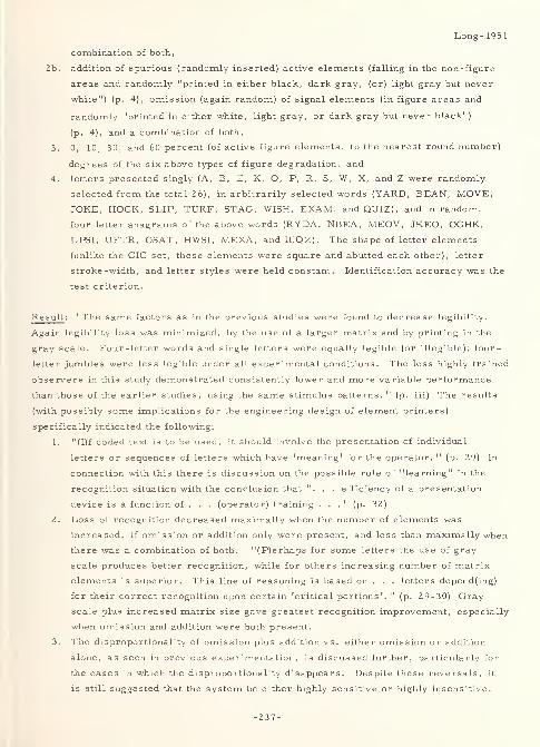
Long- 1951
combination of both,
2b. addition of spurious (randomly inserted) active elements (falling in the non-figure
areas and randomly "printed in either black, dark gray, (or) light gray but never
white") (p. 4), omission (again random) of signal elements (in figure areas and
randomly "printed in either white, light gray, or dark gray but never black")
(p. 4), and a combination of both,
3. 0, 10, 30, and 60 percent (of active figure elements, to the nearest round number)
degrees of the six above types of figure degradation, and
4. letters presented singly (A, B, E, K, O, P, R, S, W, X, and Z were randomly
selected from the total 26), in arbitrarily selected words (YARD, BEAN, MOVE,
JOKE, HOCK, SLIP, TURF, STAG, WISH, EXAM, and QUIZ), and in random,
four letter anagrams of the above words (RYDA, NBEA, MEOV, JKEO, OCHK,
LPSI, UFTR, GSAT, HWSI, MEXA, andlUQZ). The shape of letter elements
(unlike the CIC set, these elements were square and abutted each other), letter
stroke-width, and letter styles were held constant. Identification accuracy was the
test criterion.
Result: "The same factors as in the previous studies were found to decrease legibility.
Again legibility loss was minimized, by the use of a larger matrix and by printing in the
gray scale. Four-letter words and single letters were equally legible (or illegible); four-
letter jumbles were less legible under all experimental conditions. The less highly trained
observers in this study demonstrated consistently lower and more variable performance
than those of the earlier studies, using the same stimulus patterns. " (p. iii) The results
(with possibly some implications for the engineering design of element printers)
specifically indicated the following:
1. "(I)f coded text is to be used, it should involve the presentation of individual
letters or sequences of letters which have 'meaning' for the operator. " (p. 29) In
connection with this there is discussion on the possible role of "learning" in the
recognition situation with the conclusion that ". . . efficiency of a presentation
device is a function of . . . (operator) training ..." (p. 32)
2. Loss of recognition decreased maximally when the number of elements was
increased, if omission or addition only were present, and less than maximally when
there was a combination of both. "(P)erhaps for some letters the use of gray
scale produces better recognition, while for others increasing number of matrix
elements is superior. This line of reasoning is based on . . . letters depend(ing)
for their correct recognition upon certain 'critical portions'. " (p. 29-30) Gray
scale plus increased matrix size gave greatest recognition improvement, especially
when omission and addition were both present.
3. The disproportionality of omission plus addition vs. either omission or addition
alone, as seen in previous experimentation, is discussed further, particularly for
the cases in which the disproportionality disappears. Despite these reversals, it
is still suggested that the system be either highly sensitive or highly insensitive.
-237-
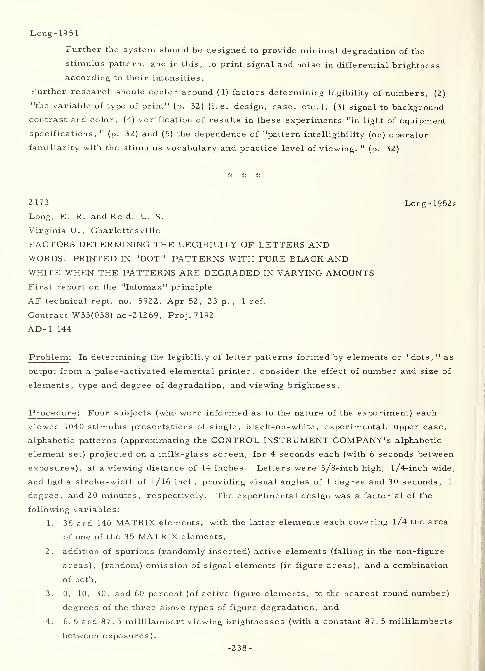
Long-1951
Further the system should be designed to provide minimal degradation of the
stimulus pattern, and in this, to print signal and noise in differential brightness
according to their intensities.
Further research should center around (1) factors determining legibility of numbers, (2)
"the variable of type of print" (p. 32) (i.e. design, case, etc.), (3) signal to background
contrast and color, (4) verification of results in these experiments "in light of equipment
specifications, " (p. 32) and (5) the dependence of "pattern intelligibility (on) operator
familiarity with the stimulus vocabulary and practice level of viewing. "(p. 32)
2173 Long-1952a
Long, E. R. and Reid, L. S.
Virginia U. , Charlottesville
FACTORS DETERMINING THE LEGIBILITY OF LETTERS ANDWORDS, PRINTED IN "DOT" PATTERNS WITH PURE BLACK ANDWHITE WHEN THE PATTERNS ARE DEGRADED IN VARYING AMOUNTSFirst report on the "Infomax" principle
AF technical rept. no. 5922, Apr 52, 23 p. , 1 ref.
Contract W33(038) ac-2 1269, Proj.7192
AD-1 144
Problem: In determining the legibility of letter patterns formed by elements or "dots, " as
output from a pulse -activated elemental printer, consider the effect of number and size of
elements, type and degree of degradation, and viewing brightness.
Procedure: Four subjects (who were informed as to the nature of the experiment) each
viewed 1040 stimulus presentations of single, black-on-white, experimental, upper case,
alphabetic patterns (approximating the CONTROL INSTRUMENT COMPANY'S alphabetic
element set) projected on a milk-glass screen, for 4 seconds each (with 6 seconds between
exposures), at a viewing distance of 14 inches. Letters were 3/8-inch high, l/4-inch wide,
and had a stroke -width of 1 / 1 6 inch, providing visual angles of 1 degree and 30 seconds, 1
degree, and 20 minutes, respectively. The experimental design was a factorial of the
following variables:
1. 35 and 140 MATRIX elements, with the latter elements each covering l/4 tne area
of one of the 35 MATRIX elements,
2. addition of spurious (randomly inserted) active elements (falling in the non-figure
areas), (random) omission of signal elements (in figure areas), and a combination
of both,
3. 0, 10, 30, and 60 percent (of active figure elements, to the nearest round number)
degrees of the three above types of figure degradation, and
4. 6. 5 and 87. 5 millilambert viewing brightnesses (with a constant 87. 5 millilamberts
between exposures).
-238-
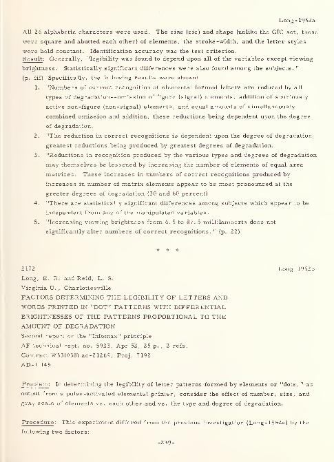
Long -1952a
All 26 alphabetic characters were used. The size (sic) and shape (unlike the CIC set, these
were square and abutted each other) of elements, the stroke -width, and the letter styles
were held constant. Identification accuracy was the test criterion.
Result: Generally, "legibility was found to depend upon all of the variables except viewing
brightness. Statistically significant differences were also found among the subjects. "
(p. iii) Specifically, the following results were shown:
1. "Numbers of correct recognition of elemental formed letters are reduced by all
types of degradation- -omis sion of figure (signal) elements, addition of spuriously
active non-figure (non-signal) elements, and equal amounts of simultaneously
combined omission and addition, these reductions being dependent upon the degree
of degradation.
2. "The reduction in correct recognitions is dependent upon the degree of degradation,
greatest reductions being produced by greatest degrees of degradation.
3. "Reductions in recognition produced by the various types and degrees of degradation
may themselves be lessened by increasing the number of elements of equal area
matrices. These increases in numbers of correct recognitions produced by
increases in number of matrix elements appear to be most pronounced at the
greater degrees of degradation (30 and 60 percent).
4. "There are statistically significant differences among subjects which appear to be
independent from any of the manipulated variables.
5. "Increasing viewing brightness from 6. 5 to 87. 5 millilamberts does not
significantly alter numbers of correct recognitions. " (p. 22)
2172 Long-1952b
Long, E. R. and Reid, L. S.
Virginia U. , Charlottesville
FACTORS DETERMINING THE LEGIBILITY OF LETTERS ANDWORDS PRINTED IN "DOT" PATTERNS WITH DIFFERENTIAL
BRIGHTNESSES OF THE PATTERNS PROPORTIONAL TO THEAMOUNT OF DEGRADATIONSecond report on the "Infomax" principle
AF technical rept. no. 5923, Apr 52, 25 p. , 2 refs.
Contract W33(038) ac-21269, Proj. 7192
AD-1 145
Problem : In determining the legibility of letter patterns formed by elements or "dots, " as
output from a pulse -activated elemental printer, consider the effect of number, size, and
gray scale of elements vs. each other and vs. the type and degree of degradation.
Procedure : This experiment differed from the previous investigation (Long- 1952a) by the
following two factors:
-239-
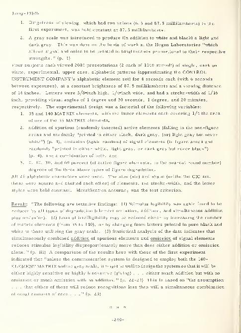
Long-1952b
1. Brightness of viewing, which had two values (6. 5 and 87. 5 millilamberts) in the
first experiment, was held constant at 87. 5 millilamberts.
2. A gray scale was introduced to produce (in addition to white and black) a light and
dark gray. This was done on the basis of work at the Hogan Laboratories "which
allows signal and noise to be printed in brightnesses proportional to their respective
strengths ." (p. 1)
Four subjects each viewed 2080 presentations (2 each of 1040 stimuli) of single, dark on
white, experimental, upper case, alphabetic patterns (approximating the CONTROLINSTRUMENT COMPANY'S alphabetic element set) for 4 seconds each (with 6 seconds
between exposures), at a constant brightness of 87. 5 millilamberts and a viewing distance
of 14 inches. Letters were 3/8-inch high, l/4-inch wide, and had a stroke-width of l/ 16
inch, providing visual angles of 1 degree and 30 seconds, 1 degree, and 20 minutes,
respectively. The experimental design was a factorial of the following variables:
1. 35 and 140 MATRIX elements, with the latter elements each covering 1/4 the area
of one of the 35 MATRIX elements,
2. addition of spurious (randomly inserted) active elements (falling in the non-figure
areas and randomly "printed in either black, dark gray, (or) light gray but never
white") (p. 4), omission (again random) of signal elements (in figure areas and
randomly "printed in either white, light gray, or dark gray but never black")
(p. 4), and a combination of both, and
3. 0, 10, 30, and 60 percent (of active figure elements, to the nearest round number)
degrees of the three above types of figure degradation.
All 2 6 alphabetic characters were used. The size (sic) and shape (unlike the CIC set,
these were square and abutted each other) of elements, the stroke -width, and the letter
styles were held constant. Identification accuracy was the test criterion.
Result : "The following are tentative findings: (1) Stimulus legibility was again found to be
reduced by all types of degradation (element omission, addition, and simultaneous addition
plus omission). (2) Loss of intelligibility may be reduced either by increasing the number
of matrix elements (from 35 to 140), or by changing from letters printed in pure black and
white to those utilizing the gray scale. (3) Statistical analysis of the data indicates that
simultaneously combined addition of spurious elements and omission of signal elements
reduces stimulus legibility disproportionately more than does either addition or omission
alone. " (p. iii) A comparison of the results here with those of the first experiment
indicated that "unless the communication system is designed to employ both the 140-
ELEMENT MATRIX and the grayscale, it might be well to design the system so that it will be
either highly sensitive or highly insensitive (giving) . . . either much addition but with no
omission or much omission with no addition. " (p. 22-23) This is based on "the assumption
. . . that either of these will reduce recognitions less than will a simultaneous combination
of equal amounts of each ..." (p. 23)
-240-
3305
Long, E. R. , Reid, L. S. and Garvey, W. D.
Virginia U. , Charlottesville
THE ROLE OF STIMULUS AMBIGUITY AND DEGREE OF
RESPONSE RESTRICTION IN THE RECOGNITION OF
DISTORTED LETTER PATTERNS
Fourth report on "Set" as a determiner of perceptual
responses
WADC Technical rept. 54147, May 54, 18p. , 4 ref s
.
Contract W33-038 ac-21269
AD-48 906
Problem: "(E)xplore the basic operation of perceptual 'set' as response restriction . . .
(through the) identif(ication of) single distorted letters. " (p. iii) Results should "furnish
answers to the following questions:
1. "Can identification response uncertainty be reduced by figural cuing alone, i. e. ,
when independent from areal cuing?
2. "Are the identification-response restriction effects of figural cuing operations
dependent upon the level of figural contour distortion and thus level of identification
response uncertainty?
3. "Do the setting effects of figural cuing influence the stimulus -identifying response
class directly or by limiting some other earlier response class in the chain, e.g.,
detection or location, which in turn sets the occasion for a correct identifying
response?" (p. 3)
Procedure : Thus, "three variables level of uncertainty, degree of response
limitation, and temporal position of cuing were organized into a . . . factorial design" (p. 4)
experiment. In it, 108 male subjects (college students) viewed degraded, single -letter
(11 of 26 from the "infomax" studies), ELEMENT MATRIX style, black-on-white, uppercase,
alphabetic characters projected on a screen and "subtending visual angles ranging from 3. 5°
to 6°. " (p. 4) Level of uncertainty was varied by providing letters for which varying
degrees of recognition difficulty had been previously ascertained without cuing. Percentages
of correct recognition for the three difficulty levels had been 55 percent, 22 percent, and
4 percent. Degree of response limitation was varied by providing the subject with "small
sheets of paper on which were printed either 4, 6, 8, or 11 letters, one of which
corresponded to the stimulus letter ..." (p. 6) Temporal position of cuing was varied by
providing the subject with one of the above "cuing sheets" either before and after, only
before, or only after, the stimulus presentation. The cuing sheet also served as an answer
sheet. Accuracy was the test criterion.
Result : "(R)esults showed that cuing or response-restricting information greatly
increased the number of correct identifications for the various conditions of the experiment,
thus confirming the hypothesis as to the beneficial effects of response restriction for the
Long- 1954
Long- 1954
Long-1954
identification of ambiguous letter stimuli. Both level of response uncertainty and degree of
response restriction significantly influenced the number of correct letter identifications.
The effects of the setting operations employed in this experiment were, however,
independent from the degree of response uncertainty or stimulus distortion. Pre-stimulus
cuing was significantly poorer than either post-stimulus or pre - plus post-stimulus cuing.
This finding . . . indicat(es) that identification responses are best restricted by post-
stimulus cuing. " (p. 17)
2176 Long-1955Long, E. R. and Garvey, W. D.
Virginia U. , Charlottesville
THE ROLE OF SETTING CUES IN REDUCING THE SIMULTANEOUSLOCATION AND IDENTIFICATION AMBIGUITY OF LETTER PATTERNSFifth report on "Set" as a determiner of perceptual responsesWADC technical rept. 54-289, Apr 55, 19 p. , 6 refs.
Contract W33(038) ac-21269, Proj. 7192
AD-85 564
Problem : "Practical situations involving data presentation frequently require the operator
to search for and select a critical stimulus before attempting to identify it. It wastherefore sought to learn how setting cues might be utilized to facilitate identification whenboth location and identification uncertainty existed simultaneously in the ambiguousstimulus situation. " (p. iii) Specifically, the study sought "answers to the following . . .
questions: (1) When location or search response uncertainty is simultaneously present
with identification response uncertainty, will locational cuing, added to identification cuing,
increase correct identifications of distorted figures? (2) Is the obtained setting effect
related to the degree of figural contour distortion? (3) Will pre-stimulus figural
(identification) cuing combine with locational cuing to produce more correct identifications
than will post-stimulus figural cuing? (4) If such evidence is found, will this facilitation of
identification be a function of the degree of locational cuing and the level of figural contour
distortion?" (p. 17)
Procedure : "Multiple distorted letters of the alphabet were employed to provide (the above)
condition, (72 male, student) subjects being required to select and identify a single critical
letter (from slides containing four distorted letters previously developed for the INFOMAXstudies). Principal experimental variables were degree of location restriction and level of
figural contour distortion. Degree of identification restriction was held constant. . .
(p. iii) The final stimuli were presented by projecting . . . transparencies on a screen.
. . The projected . . . letter patterns subtend(ed) visual angles ranging from 3. 5 ... to
6. 0 (degrees). . . (p. 6) Temporal position of figural cuing was manipulated by having one
-
half of the subjects view four undistorted letter alternatives both before and after stimulus
presentation, while the other half . . . viewed these cuing letters only after stimulus
presentation. " (p. 17)
Result (fifth of the series): "Locational setting cues were found to aid identification, but
only when so specific as to reduce location uncertainty to zero. This setting effect wasindependent from the level of figural distortion, although the latter variable itself
significantly influenced identification. . . (p. iii) Temporal position of figural cuing did
not significantly influence identification, pre- plus post-stimulus cuing being no better
than post-stimulus cuing alone. In addition this variable did not interact significantly with
either level of stimulus difficulty or degree of location restriction. " (p. 18)
-242-
Long- 1955
Result (entire series): "This program of experiments has yielded a number of
generalizations which presumably have application to several practical aspects of the
presentation and reception of information. The more definite of the generalizations are
the following:
1. "Cuing information given to the subject relative to ambiguous stimuli can materially
reduce perceptual errors. This finding holds for both the location of critical
stimuli made difficult by the presence of irrelevant clutter, and the correct
identification of stimuli with distorted contours.
2. "The facilitating effect of the setting cues is dependent upon the degree of responserestriction achieved by the setting information.
3. "The helpful effect of setting the observer depends upon the degree of stimulus
ambiguity, setting being more beneficial as response uncertainty increases. This
interaction is more significant at the extremes of stimulus ambiguity than in the
middle range.
4. "In order to facilitate the location or selection of critical stimuli, presented with
background 'clutter 1
, the setting cues must be given to the observer prior to
presentation of the stimulus field.
5. "Where setting cues are utilized to aid the identification of ambiguous stimuli, the
cuing may be done either before or after stimulus presentation. Post-stimulussetting appears to be as effective, or more so, than pre -stimulus cueing for this
purpose. " (p. 15)
"This last finding, which had not been entirely anticipated, probably warrants somediscussion .... Fundamentally, the facilitating effect of post-stimulus setting cues
indicates that if the number of final instrumental responses to be made by the operator is
decreased , the informational carrying capacity of the same degraded message signal will
be increased . . . Whereas it may be operationally impractical to reduce the number of
responses under most conditions, it should be quite feasible for special situations (such as
unusual flight missions) to cut down stringently the number of response alternatives in
order to save communication or to insure a maximum probability of correct operatorresponse. The evidence afforded by the post-message cuing in the present experimentswith regard to the value of such a response-limiting procedure is of considerable relevancehere. " (p. 16)
* * #
-243-
Long-year- 1936
2181 Longyear-1936
Longyear, William
A DICTIONARY OF MODERN TYPE FACES AND LETTERING
Pelham, N. Y., Bridgman Publishers, Inc., 1936,
Third edition, 122 p.
Problem : Prepare a manual of printing and lettering typefaces, showing each face in
several sizes and both cases together with numerals. Utility of the manual should be to
both advertising layout and new-book typography.
Procedure: "Type history is divided into five periods as follows
Venetian, 16th century, typified by CLOISTER (embellished)
Old Style, 17th century, typified by CASLON (serif)
Transitional, 18th century, typified by BULMER (serif)
Modern, typified by BODONI (serif)
Contemporary, present day, typified by FUTURA. " (sans serif)
The following "facts concerning printing" are shown:
1. "Type is generally classed as follows:"
a. roman and italics
b. upper- and lower-case
c. light, medium, and bold
2. "The printing surface of type is called the face. "
3. "The design of the face gives the type its name . . . ."
4. "The size of type relates to the body. "
5. "The following point system of measuring type is in general use:
a. 6 points = 1 nonpareil
b. 12 points = 2 nonpareil or 1 pica
c. 6 picas = 1 inch
d. 72 points = 1 inch. "
Proofreader's marks and Monotype Rules are also shown.
Result : The following type- and lettering -faces are shown:
ASTREE (roman and italic) - OPEN
BARNUM BODONI (light, medium, and bold)
BERNHARD (roman and italic) - (italic: medium and bold)
- CURSIVE (medium and bold) - BOOK (roman and italic)
- FASHION - SHADED
- FINE - ULTRA (roman and italic)
BETON (medium, bold, and extra bold) - ULTRA (condensed and extra condensed)
-244-
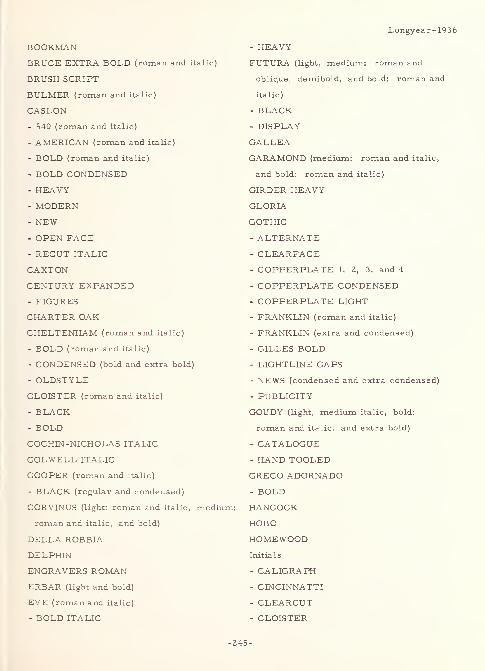
BOOKMAN
BRUCE EXTRA BOLD (roman and italic)
BRUSH SCRIPT
BULMER (roman and italic)
CASLON
- 540 (roman and italic)
- AMERICAN (roman and italic)
- BOLD (roman and italic)
- BOLD CONDENSED
- HEAVY
- MODERN- NEW- OPEN FACE
- RECUT ITALIC
CAXTON
CENTURY EXPANDED- FIGURES
CHARTER OAK
CHELTENHAM (roman and italic)
- BOLD (roman and italic)
- CONDENSED (bold and extra bold)
- OLDSTYLE
CLOISTER (roman and italic)
- BLACK- BOLD
COCHIN-NICHOLAS ITALIC
COLWELL ITALIC
COOPER (roman and italic)
- BLACK (regular and condensed)
CORVINUS (light: roman and italic, medium:
roman and italic, and bold)
DELLA ROBBIA
DELPHIN
ENGRAVERS ROMANERBAR (light and bold)
EVE (roman and italic)
- BOLD ITALIC
Longyear - 19
- HEAVY
FUTURA (light, medium: roman and
oblique, demibold, and bold: roman and
italic)
- BLACK
- DISPLAY
GALLEA
GARAMOND (medium: roman and italic,
and bold: roman and italic)
GIRDER HEAVY
GLORIA
GOTHIC
- ALTERNATE- CLEARFACE- COPPERPLATE 1, 2, 3, and 4
- COPPERPLATE CONDENSED
- COPPERPLATE LIGHT
- FRANKLIN (roman and italic)
- FRANKLIN (extra and condensed)
- GILLES BOLD- LIGHT LINE CAPS
- NEWS (condensed and extra condensed)
- PUBLICITY
GOUDY (light, medium italic, bold:
roman and italic, and extra bold)
- CATALOGUE- HAND TOOLED
GRECO ADORNADO- BOLD
HANCOCK
HOBO
HOMEWOODInitials
- CALIGRAPH
- CINCINNATTI
- CLEARCUT- CLOISTER
-245-
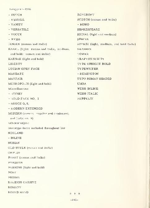
Longyear- 1936
- DUTCH- MISSALL
- VANITY
- VERSATILE
- VOGUE
- WEISS
JENSEN (roman and italic)
KABEL (light: roman and italic, medium,
and bold: roman and italic)
KARNAK (light and bold)
LIBERTY
LUCIAN OPEN FACE
MANDATE
MAYFAIR
METROPOLIS (light and bold)
Miscellaneous
- BINNEY
- BOLD FACE NO. 1
- BRUCE O. S.
- MODERN EXTENDED
MODERN (roman: regular and condensed,
and italic no. 8)
MODERNIQUE
Monotype faces included throughout list
NEULAND- INLINE
NUBIAN
OLD STYLE (roman and italic)
ORPLID
PABST (roman and italic)
PARISIAN
PARSONS (light and bold)
POST
PRISMA
RALEIGH CURSIVE
ROMANY
ROUND HAND
ROYCROFT
SCOTCH (roman and italic)
- MONO
SHAKESPEARE
SIGNAL (light and medium)
SPHINX
STYMIE (light, medium, and bold italic)
SWASHES
TOWER
TRAFTON SCRIPT
TYPE UPRIGHT BOLD
TYPEWRITER
- REMINGTON
TYPO ROMAN SHADED
UMBA
WEBB INLINE
WEISS ITALIC
ZEPPELIN
* # *
-246-
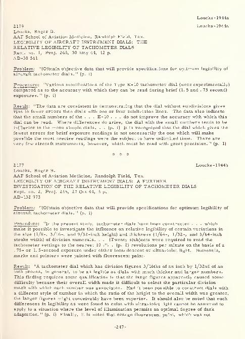
Loucks- 1944a
2179Loucks, Roger B.
AAF School of Aviation Medicine, Randolph Field, Tex.
LEGIBILITY OF AIRCRAFT INSTRUMENT DIALS: THERELATIVE LEGIBILITY OF TACHOMETER DIALSRept. no. 1, Proj. 265, 30 May 44, 12 p.
AD-38 561
Problem : "(O)btain objective data that will provide specifications for optimum legibility of
aircraft tachometer dials. " (p. i)
Procedure: "Various modifications of the Type E-10 tachometer dial (were experimentally)
compared as to the accuracy with which they can be read daring brief (1. 5 and . 75 second)
exposures. " (p. i)
Result : "The data are consistent in demonstrating that the dial without subdivisions gives
rise to fewer errors than dials with one or four subdivision lines. The data also indicate
that the small numbers of the . . . E-10 . . .do not improve the accuracy with which this
dial can be read. Where differences do arise, the dial with the small numbers tends to be
in(f)erior to the more simple dials. . . (p. i) It is recognized that the dial which gives the
fewest errors for brief exposure readings is not necessarily the one which will makepossible the most precise readings were the subject to have unlimited time. There are
very few aircraft instruments, however, which must be read with great precision. " (p. 1)
2177 Loucks -1944bLoucks, Roger B.
AAF School of Aviation Medicine, Randolph Field, Tex.
LEGIBILITY OF AIRCRAFT INSTRUMENT DIALS: A FURTHERINVESTIGATION OF THE RELATIVE LEGIBILITY OF TACHOMETER DIALSRept. no. 2, Proj. 265, 27 Oct 44, 6 p.
AD-132 973
Problem : "(O)btain objective data that will provide specifications for optimum legibility of
aircraft tachometer dials. " (p. i)
Procedure : "In the present study, tachometer dials have been constructed . . . whichmake it possible to investigate the influence on relative legibility of certain variations in
the size (1/8-, 3/16-, and 9/32 -inch height) and thickness (1/64-, 1/32-, and 3/64-inchstroke width) of division numerals. . . (Twenty s)ubjects were required to read the
tachometer settings to the nearest 10 .". . (p. 2) revolutions per minute on the basis of a
. 75- or 1. 5-second exposure under either incandescent or ultraviolet light. Numerals,marks and pointers were painted with fluorescent paint.
Result : "A tachometer dial which has division figures 3/l6ths of an inch by l/32nd of aninch proves, in general, to be as legible as dials with much thicker and larger numbers.This finding requires some qualification in that the large figures apparently caused somedifficulty because their overall width made it difficult to select the particular division
mark with which each number was associated. Had it been possible to construct dials with
a different style of number in which the ratio of the height to the overall width was greater,
the larger figures might conceivably have been superior. It should also be noted that suchdifferences in legibility as were found to exist with ultraviolet light cannot be assumed to
apply to a situation where the level of illumination permits an optimal degree of darkadaptation. " (p. i) Finally, it is noted that orange fluorescent paint, which was not
Loucks- 1944a
-247-
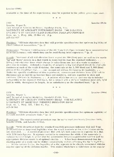
Loucks- 1944b
available at the time of the experiments, may be superior to the yellow-green type used.
2180 Loucks -1944cLoucks, Roger B.
AAF School of Aviation Medicine, Randolph Field, Tex.
LEGIBILITY OF AIRCRAFT INSTRUMENT DIALS: THE RELATIVELEGIBILITY OF VARIOUS CLIMB INDICATOR DIALS AND POINTERSRept. no. 1, Proj. 286, 25 Nov 44, 10 p.
AD-132 977
Problem : "(O)btain objective data that will provide specifications for optimum legibility of
climb indicator assemblies." (p. i)
Procedure : "Various modifications of the AC Type C-2 climb indicator have been comparedas to the accuracy with which they can be read during brief exposures. " (p. i)
Result : "Removal of all mid-division lines beyond the 500 (foot) point as well as the words'up' and 'down' results in a dial which is more legible than the standard indicator. . .
(Also, ) mid-division lines which change in value from one part of a scale to another . . .
give rise to errors. Although a majority of subjects being tested prefer(red) the dial with
numbers at each of the scale divisions, the numerals at the 3, 000 (foot) and 5, 000 (foot)
points of the simplified dial . . . can be omitted without decreasing its legibility. . .
Under the specific conditions of this experiment, numbers and division lines l/32 inch in
thickness are as legible as heavier lines and numbers, and are superior to lines andnumbers l/64 inch in thickness. . . A pointer which has only a luminous tip is inferior
in legibility to the standard dial hand, but a pointer with a strip of luminous paint only l/32
inch in width, throughout its length, is as satisfactory as the standard hand. " (p. i)
2178 Loucks -1944dLoucks, Roger B.
AAF School of Aviation Medicine, Randolph Field, Tex.LEGIBILITY OF AIRCRAFT INSTRUMENT DIALS: THE RELATIVELEGIBILITY OF MANIFOLD PRESSURE INDICATOR DIALSRept. no. 1, Proj. 325, 7 Dec 44, 8 p.
AD-38 562
Problem : "(O)btain objective data that will provide specifications for optimum legibility of
aircraft manifold pressure dials. " (p. i)
Procedure : The experimental procedure was the same used previously (Loucks - 1944a,
Loucks- 1944b, and Loucks - 1944c).
Result : "With ultraviolet light the standard manifold pressure indicator dial (AC TypeD-10) exhibits an improved legibility when the small numbers at the mid-division marksare obscured. . . A manifold pressure dial with 1/4 inch numbers is superior to a dial
with 3/l6 inch figures. It appears desirable to compress the width of the numerals in
relation to their height in order that the association between a particular number and its
appropriate division mark is of optimal clarity. . . It has been demonstrated that the
starting point of a scale can be shifted considerably without affecting the dial's legibility.
. . Within certain limits, the legibility of a dial appears to be closely associated with the
angular spacing of the division marks. Two scales which have a difference in the angular
-248-
Loucks-1944d
spacing of the division marks that is only about one and a half degrees exhibit a
statistically significant difference. . . (p. i) (In general, ) once the dial scale has reached
a certain degree of expansion, further simplification does not appear to affect its
legibility. " (p. 4)
2183 Luckiesh-1923
Luckiesh, Matthew
LIGHT AND COLOR IN ADVERTISING AND MERCHANDISING
New York, D. Van Nostrand, 1923, 268 p.
Problem : Show the utility of light and color as advertising and sales media, including
their effects on the legibility of printed and electrical display materials.
Procedure : This book, whose outline of contents follows, is almost purely textual in
content, without benefit of many objective experimental results or much reference to other
authorities. Included, however, are 37 plates, mostly in color, to illustrate various points
L Introduction (including terminology).
II. Characteristics of color (including color appea•1).
III. Color preference (subjective, absolute, and relative).
IV. Emotional value.
V. Symbolism.
VI. Attention-value
.
VII. Effectiveness of color.
VIII. Selecting colors.
IX. Lighting versus pigments.
X. The show-window.
XI. Displays (lighting and other effects).
XII. Stores (illumination and lighting systems).
XIII. Distinctive interiors (various places of business).
XIV. Electrical advertising (poster boards, painted signs, electric signs
XV. The esthetic sense.
Subject index.
Chapter XIV (electrical advertising) is more concerned with the topic of legibility than the
others, with the single reservation that "the use of color (and illumination) is based upon
the same general principles; therefore, the material of the early chapters is directly
applicable . . . ." (p. 246)
Result : The following points are made concerning the legibility of poster boards and
painted signs:
-249-
Luckiesh- 1923
1. "The printed message on the sign-board must be reduced to a minimum of words
. . . (with) (h)igh concentration on a single idea . . . ."
(p. 246)
2- "(I)n magazine advertisements ... it is easy to achieve legibility . . . by . . .
(h)olding . . . copy or the printer's proof at arm's length (to) reveal its degree of
legibility. " (p. 247)
3. "The white spaces between black letters should be at least as wide as the black
letters and preferably larger. " (p. 247)
4. "Many sign-boards fail to deliver their message effectively because the lettering is
too decorative, the contrast is too small, or the letters are not large enough. "
(p. 247-248)
5. "A large factor of safety should be allowed in order to insure legibility on dark
days, in bad weather, and to allow for the speed of traffic. " (p. 248)
6. "Color contrasts on sign-boards should be striking. Vivid colors are quite
justifiable outdoors. However, in obtaining color -contrast it is a safety measure to
achieve also a brightness -contrast ." (p. 248) Dangers in brightness -contrast occur
when color -vision fails (e.g. at twilight) and is found particularly with the color
combinations red/green, orange/light-green, green/purple, yellow/gray, and any
color with gray of the same brightness.
7. "Owing to certain complexities of vision, letters of certain colors are seen more
clearly than others, assuming brightnes s -contrast to be the same in all cases. It
is easier to focus red, orange, yellow at a distance than green, blue, or violet.
Furthermore . . . the phenomenon termed irradiation (which makes an entity
appear larger when bright than when dark) . . . complicates the legibility of bright
painted letters and is a very important factor in electric signs where the letters and
other portions of the sign are very bright. " (p. 249)
8. Previous experimentation has shown the rank of "legibility of various combinations
of colors in advertisements for reading at a considerable distance" (p. 250) to be in
the following order: black, green, red, and blue on white; white on blue; black on
white; yellow on black; white on red, green, and black; red on yellow; green on red;
and red on green.
The following statements were made concerning primarily the legibility of electrically
lighted signs:
1. The development of illuminated sign-boards (static and dynamic, continuous and
flashing) has made progress primarily because the use of light commands attention,
particularly at night. In this way, they are used for the purposes of designating a
location and broadcasting a message. Legibility is concerned with both but
particularly with the latter. In their development, the first signs (flat, painted,
and studded with lamps) suffered from a low illumination contrast. An improvement
raised the letters from the background. Further improvements sunk the letters
into the background, and then had the letters illuminated by concealed lamps.
Further developments utilized transparent glass or perforated metal letters. A
variant had opaque letters raised from the background with lamps installed behind
-250-
Luckiesh- 1923
the letters to illuminate the background and silhouette the letters. A danger of
illuminated signs is that they may not be legible in the daylight if messages overlap
or contrast is poor.
2. "(R)ange or visibility of an uncolored light-source increases with its candle-
power. " (p. 2 52)
3. "(L)egibility also depends upon the size of the letters and to the relation of the
width of the lines comprising the letter to the size of the letter. " (p. 252)
4. "The atmosphere containing dust and smoke absorbs blue and blue -green light . . . .
For this reason the rank of colored lights of equal candlepower according to range
of visibility is as follows: red, orange, yellow, green, blue. Of course, if
colorless lamps of equal candlepower are covered with colored glass caps, the
range of each will not only be determined by the color but also by the brightness. . .
The rank as to range of visibility will (then) be approximately as follows: yellow,
orange, red, green, blue. . . based upon the assumption that these colors are of
equal purity or saturation. " (p. 252)
5. Reporting on the work done by C.A. Atherton, the relative legibility of GOTHIC
(sanserif) letters is shown as being in the following order: A, I, J, L, T, M/W,
V/X, C/U, K/O/Q, F/P/Y, D, Z, E/N, R, S, G/H, and B.
6. "The attention -value (which is not the same as but holds an intimate relation to
legibility) of an electric sign increases with its brightness .... However, in
signs with small (not necessarily lower-case) letters there is a point at which
another increase in the size of lamps produces so much halation or irradiation
that the letters 'melt 1 or run together. . . (producing) low legibility. " (p. 253-254)
7. "Lettering and pictorial representation must be simple in the bright . . . sign or
there is great risk of illegibility. This is a limitation that the designer may
counterbalance with the effectiveness of color and motion .... There is no
question as to the attention-value of motion but it seems unnecessary to resort to
it excepting in the case of powerful competition of neighboring signs. " (p. 2 54)
8. "Colored lights of moderate tints carry further than the pure colors and have the
advantage of not being too harsh in brightness -contrast as well as in color-contrast.
(However) (i)f pure colors are to be used the bright color should . . . carry the
. . . message." (p. 255)
2185 Luckiesh- 1937aLuckiesh, Matthew and Moss, Frank K.THE SCIENCE OF SEEINGNew York, D. Van Nostrand, 1937, 548 p.
Problem : Study and report on the "science" of vision as a human function, including the
visual task of reading.
Procedure : The following outline of contents gives an indication of the book's breadth:
-251-
Luckiesh- 193 7a
I. Seeing,including evolution of vision, learning to see, light and
brightness outdoors, seeing in modern civilization, and seeing is morethan vision.
II- The human seeing-machine, including visibility and human beings,
various thresholds of seeing, optimum conditions for seeing,correlations, and controllable factors in seeing.
III. Visual sensory processes, including retinal functions, neural pathwaysand activities, pupillary phonomena, the eyelids, orientation andconvergence, binocular vision, accommodation, sensation, perception,
and color vision.
IV. Visual thresholds , including significance of threshold functions in
seeing, characteristics of visual thresholds, parameters of the visualthreshold, interrelationships between fundamental variables,
interpretation of threshold data, energy thresholds, various perceptualthresholds, and the effects of attention and distraction upon visualthresholds
.
V. Visibility of objects, including the measure of visibility, the Luckiesh-Moss Visibility Meter, the variability of threshold measurements,precision of visibility measurements, human characteristics anddeficiencies, visual factors of safety, and visibility and ease of seeing.
VI. Physiological effects of seeing,including nervous muscular tension,
visual effort and the heart-rate, the eyelid reflex in critical seeing,
fatigue of the extrinsic muscles, pupil size and ocular fatigue, andvisual functions and rate of working.
VII. Conservation and achievement, including conservation of vision,
education and seeing, work-world efficiency, safety and seeing, anddemonstrations of seeing.
VIII. Light and lighting, including light versus lighting, level of illumination,
illumination and brightness, backgrounds for seeing, specular
reflection, shadows, reflection of light, definitions and units,
measurement of footcandles, and measurement of brightness andreflection-factor.
IX. Prescribing light, including effectiveness of footcandles, a standard of
visibility, footcandle -levels, footcandle prescriptions, footcandles for
reading, individual selection of footcandle -levels, prescribing for
defective vision, and high levels of illumination.
X. Quality of lighting, including basic considerations, adaptation andbrightness, pupillary criteria, influence of surroundings, psychological
effects, glare, and appraising lighting conditions.
XI. Spectral quality of light,including chromatic aberration and visual
acuity, common illuminants, seeing in mercury and in sodium light,
color-discrimination -matching and -contrast, selectivity of the
atmosphere, colored eyeglasses and printing papers, glare and colored
lights, and ultraviolet and infrared energy.
XII. Reading as a task, including typography, illumination, reading distance,
posture, eye-movements, perceptual factors, and ocular deficiencies.
XIII. Eyesight and seeing,including sensitometric measurements, the control
of dynamic accommodation, visual efficiency and ocular comfort,
sensitometric criteria in refraction, orthoptic training, and visual
efficiency.
Chapter XII (reading as a task) is more concerned with the problems of typographic
visibility, legibility, and readability than the other parts of the book. However, the entire
work bears on the basic problems of seeing; all of which have some bearing on the above
-252-
Luckiesh- 1937a
problems. Reading, then, is detailed in the sense that "it constitutes a critical, uniformand highly controllable visual task. " (p. 454) About the task, some general observations
are made:1. "(T)he characteristics of printed or written material are not completely
describable in terms of the visibility of single letters or characters. In
opthalmology, for example, it has long been known that identical visual acuity
ratings are not necessarily obtained when single letters and a line of letters of the
same size, respectively, are viewed by the patient.
2. "The influence of intellect, experience and education is generally more prominentin readability than in visibility. As this difference decreases readability andvisibility tend to become equivalent. " (p. 455)
3. Comparisons are made concerning the differences in validity between objective
experimentation and subjective "esthetic comfort" reactions.
From these and several other general observations, a review of others' and the authors'
own previous experimental findings are shown.
Result : Specific observations pertinent to visibility, legibility, and (primarily) readability,
then, are as follows:
1. "OLD ENGLISH and MODERN GOTHIC letters are not equally readable to one
who is not familiar with the former.2. "(I)t would seem obvious that a monogram is not as readable as one of the
letters even though the two are of identical visibility as appraised by threshold
measurements ....3. "(T)he average visibility of the lower case letters of seven modern typefaces
was about 40 per cent higher for isolated than for grouped letters. This value
varied from 30 to 56 per cent for the individual type -faces ....4. "(I)f two types were equally visible, it seems reasonable . . . that the one
which yielded the highest integrated reflectance (type and background) would be
preferred. However, actual measurement . . . indicated that the differences . . .
are not large.
5. Measurement of "psychophysical effects of seeing . . . are too unwieldy to be usedin practice . . . .
" However, "measurements of visual function (viz. speed of
reading accuracy in reading and eye -movements) ... as criteria of readability. . .
are rather insensitive to the differences in readability produced by moderatechanges in type-face.
6. "(T)he relationship between type -size and visibility as determined by adult
subjects possessing normal or near -normal vision. . . is a linear one . . .
probably . . . due to empirical factors involved in the design of this particularseries (BODONI) of types ....
7. "3 -point type is about the smallest which unaided eyes may (normally)
resolve ....8. "12 -point type (illuminated by 10 footcandles) represents a practical optimurr
. . . (T)ype of this size has a relative visibility of about 5. 7 or . . . thresholdvisibility to a person with a visual efficiency rating of about 44 per cent, ....This is less than 20/100 ....
9. "(A)n ideal standard of visibility is far above the average type in newspapers.
10. "24-point type is the largest size practicable" for reading.
11. "The degree of visibility, for a given type -size, is also a function of the pattern orconfiguration of the type -face. . . (R)elative visibilities of a series of 20
different 8-point type-faces" (p. 456-462) is as follows (determined with the
Luckiesh-Moss Visibility Meter):
-253-
Luckiesh- 1937a
type -face per cent visibility
BODOWI BOOK 100. 0
BODONI BOOK ITALIC 96. 0
BODONI BOLD 108. 3
CASLON LIGHT 96.2CASLON LIGHT ITALIC 81. 1
CASLON BOLD 106. 5
SANS SEHIF LIGHT 97. 1
SANS SERIF MEDIUM 10 5. 7
SANS SERIF BOLD 104. 3
CHELTENHAM WIDE 100. 5
CHELTENHAM BOLD 108. 5
CHELTENHAM BOLD CONDENSED 93. 2
LIGHT COPPERPLATE GOTHIC 98. 1
HEAVY COPPERPLATE GOTHIC 102. 5
GOUDY LIGHT 94. 0
GOUDY ANTIQUE 106. 2
GOUDY BOLD 104. 8
COCHIN LIGHT 102. 3
COCHIN BOLD 112.6
GARAMOND BOLD 118. 7
12. "Novelty (e.g. boldness and italics) ... in large portions of text ... is (not)
obtained without significant sacrifices in ease of seeing and reading. " (p. 462)
13. "(C)oncerning the optimum length of line, . . . consensus indicates . . . (no)
longer than ten centimeters. . . Upon the basis of speed of reading, . . . 7. 5 to 9
centimeters.
14. "(U)sing speed of reading as a criterion, . . . optimum interlinage (leading)
was: approximately 1/ 10 inch for 12 -point type, l/l4 inch for 9 -point type, and1/17 inch for 6 -point type.
15. "Footcandles necessary for various sizes of type to equal a given standard of
visibility" (p. 466-467) are as follows:
standard (BODONI BOOK) 12-pt. 10-pt. 8-pt. 6-pt.
5 ft. -cdls. on 12-pt. 5 7 10 17
10 " " " " 10 15 21 36
20 " 20 28 42 68
50 " 50 71 93 167.
16. "(R)eaders with normal eyesight and normal eye -movements showed little
variation (in fixational-pauses) between 6-point and 36-point type, " (p. 470) but a
great deal of difference between various types of reading content, familiarity andlanguage, and age.
17. "(R)ather small differences in the (time -dependent) frequencies of . . . eye-
movements were obtained under . . . lighting conditions" (p. 475) of 0.25 and 5
footcandles.
18. "(S)peed of reading decreased about ten per cent during (a 2-hour) period. "
(p. 476)
19. "(O)cular muscle activity . . . increased from 9 to 13 from the beginning to the
end of the (2 -hour) period of reading. 11
(p. 477)
20. In perceptual span, "the average reader, for a tachistoscopic exposure of
0. 01 (seconds?), could perceive three of four single letters, two disconnected
words containing as many as twelve letters, or a sentence of four words.21. "(I)t requires several times as much light on numerals such as stock-market
quotations to make their visibility the same as that of words printed in the same
-254-
Luckiesh- 1937a
size of type and upon the same sheet of paper. " (p. 479)
22. "Approximate number of letters in a single horizontal which may be seen byfoveal
(acute vision afforded by the small rodless area of the retina) and macular(perceived by the yellow spot on the retina) vision at a reading distance of 14
inches" (p. 480) is as follows:
foveal
macular
23. "(S)peed of perception in reading is independent of retinal sensory functions
and must depend upon central nervous processes. " However, "the possible
advantages of enlarging the perceptual span . . . may be discounted by the
possibility of accompanying ocular anomalies.
24. "In general, it would seem better to obtain the desired degree of visibility by
means of higher levels of illumination rather than by unusually large type . .
"
particularly to compensate for visual defects (nystagmus may be an exception).
25. "A survey of 10, 000 school-children . . . established definite correlation between
rate of reading and visual efficiency. 11
(p. 480-482)
2184 Luckiesh- 1937c
Luckiesh, MatthewGeneral Electric Co. ,
Cleveland, OhioTHE PERFECT READING PAGEElectrical Engineering, 56:7 (July 1937) 779-781
Problem : Discuss "the factors that would influence the production of a perfect reading
page, and an opinion, founded upon scientific research, concerning this 'easy reading 1
page as an approximation of the theoretical ideal. " (p. 779)
Procedure : "The visibility of objects depends primarily upon1. Size of the critical details.
2. Contrast between the object and background.
3. Brightness of the object and background, which depends upon the reflection factor
and intensity of illumination.
4. Time available for recognizing the object.
"In general, the theoretically ideal printing page results from1. Large type of the most legible style.
2. Paper of high reflection factor and dull surface. If it is tinted, it should be
optically and aesthetically satisfactory.
3. High level of illumination comparable to that in the shade of a tree or porch.
4. Time usually is not of great importance, if other factors are satisfactory, "(p. 779)
Result : The following specific observations concern various aspects of the "components of
the perfect reading page. " (p. 779)
1. Fixation pauses - "(D)uration of the fixational pause . . . has been found to varychiefly between 0. 07 and 0. 30 second. . . Words, or even groups of them, are
seen at each pause. The number of stops made in reading a line depends uponvisibility, familiarity, practice, and intelligence ....
2. Type size - "12-point type may be concluded to be quite satisfactory for
continued reading. Newspapers commonly are set in 8 -point type, with parts of
them in 6 -point type.
-255-
Luckiesh- 1937c
3. Type style - "The effect ... on legibility is a complex matter, but long
experience has evolved satisfactory styles devoid of needless details and with anopenness necessary for good legibility.
4. Contrast - The formula for computing percentage contrast ratio is as follows:
100 X (kackground - object) brightness
background brightness
"Usually the nearest approach is a contrast of about 97 per cent. For a telephonedirectory the contrast ... is about 80 per cent, and for the better examples of
newsprint about 85 per cent. . . Any color, even a light tint, added to white paperdecreases the contrast slightly; however, the extent to which this decrease causesa decrease in visibility should be considered in weighing this against other
considerations. . . Although contrast is very important in the visibility of objects,
it is of only slight importance in the range of high contrasts . . . The loss in
contrast is very slight in a white paper tinted yellow, and is less in ordinary
artificial light than in daylight.
5. Color - "There can be no justification for the use of highly colored paper for pages
that must be read for extended periods; furthermore, from purely the optics of the
eye, blue, violet, purple, and pink papers are inadvisable. Normal eyes cannot
focus blue light at the usual reading distance. . . (E)limination of the blue andviolet components of light does not decrease visibility appreciably . . . (A)
yellowish tint is better than any other. " There are "other reasons for using a
slightly yellowish paper .... It does not decrease visibility appreciably becauseof its slightly lower reflection factor and the consequent slightly lower contrast;
moreover, its color is in the right direction from the viewpoint of chromaticaberration of the eye. " Also, there seems to be some basis for esthetically
preferring "a slightly yellowish tint.
6. Reflection - "Glossy paper may reflect bright, imperfect images into the eye; dull
paper is ideal . . . Many white papers have reflection factors of from 80 to 85 percent . . . .
" A difference in reflection factors of 76 (percent) and 73 (percent)
(ordinary tungsten-filament slightly greater difference for daylight) for sepia-
tinted paper gave no significant difference in the visibility of print thereon (using
the Luckiesh-Moss Visibility Meter).
7. Contrast vs. reflection - "The reflection factor of a paper having a slight . . . tint
is a few per cent less than it would be if the tint were eliminated, thus reducing the
brightness (and hence contrast) of the paper under a given intensity of illumination
by an amount exactly proportional to the reduction in reflection factor.
8. Illumination - "One foot-candle ... is a common illumination indoors. Thegeneral average in the indoor world is less than 5 foot-candles where reading is
done. Near a window in the daytime there is commonly an illumination of several
hundred foot-candles. . . Experiments have indicated that while the subjects read
a book printed in 12 -point type on excellent dull, white paper, the ease of reading
continues to increase up to at least 1, 000 foot-candles.
9. Illumination vs. type size - "12 -point type could be read at one foot-candle.
10. Psycho-physical response - Nervous muscular tension resulting from visual workcan be measured at the finger tips.
The following general observations also were made:1. "(E)ase of reading cannot be judged by visibility, and the mere possibility of
seeing provides no reason for believing that further improvement in seeing is of no
value
.
2. "Feelings are just as real as any reality ....3. "(K)nowledge (in the legibility of printed materials) springs both from
controlled researches and mass experience. " (p. 779-781)
# * *
-256-
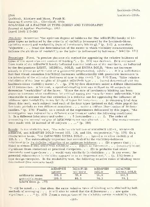
Luckiesh-1940a
2566 Luckiesh- 1940aLuckiesh, Matthew and Moss, Frank K.
General Electric Co. , Cleveland, Ohio
BOLDNESS A3 A FACTOR IN TYPE -DESIGN AND TYPOGRAPHYJournal of Applied Psychology, 24:2
(April 1940) 170-183
Problem : Determine "the optimum degree of boldness for (the MEMPHIS) family of 10-
point types as indicated by the criteria of visibility (measured by the Luckiesh-Mos
s
visibility meter) and readability (rate of involuntary blinking). " (p. 170) A secondary"objective . . . (was) the determination of the extent to which visibility measurementsindicate the attribute of readability as the latter is influenced by boldness. " (sic) (p. 171)
Procedure: First, "a precise photometric method for appraising the relative boldness of
types of the same size and amount of leading.". . (p. 171) was derived. Data extracted
from tests of the MEMPHIS family indicated that the boldness of the members, as indicated
by the designations LIGHT, MEDIUM, BOLD, and EXTRA BOLD, "does not increase
exactly in either an arithmetic or a geometric progression^ w)hile ... it is a well-knownfact that visual sensation (visibility) increases arithmetically with geometric increases in
the intensity of the stimulus (boldness of type in this case). " (p. 173) Then, "(t)he relative
visibilities of the four weights of 10-point MEMPHIS type . . . (were) determined with the
Luckiesh-Moss visibility meter .". . (p. 174) by five observers under a diffuse illumination
of 10 footcandles. After that, a speed-of-reading test was utilized on 40 subjects to
determine "readability" of the faces. "Since the rate of involuntary blinking has beenshown to increase when conditions for critical seeing are made for more unfavorable, # it is
reasonable to assume that this criterion is a reliable one for appraising the influence of
boldness upon readability in any family of types for body-text. . . In obtaining (the) data
(from this test), each subject read each of the four types (printed on dull white paper) for
5-minute periods on two different occasions . . . under a diffuse illumination of 10 foot-
candles. 11
(p. 176) Finally, as a result of the experiments delineated by this paper, "the
investigation was repeated by a different experimenter under the following conditions:
1. In a different laboratory and under ... 5 footcandles .... 2. The order of
presenting the several weights of MEMPHIS types was altered. . . 3. The measurementswere made with 18 instead of 40 subjects . . . .
" (p. 180)
Result : In the visibility test, "the relative visibilities of MEMPHIS LIGHT, MEMPHISMEDIUM, and MEMPHIS BOLD (were) 100, 114, and 116, respectively. " (p. 175) On a
comparative basis, "the (MEMPHIS) EXTRA BOLD . . . (gave) a relative visibility of
115. 5. . . The outstandingly important fact revealed by the visibility-boldness
relationship is the definite indication of an optimum boldness . . . (I)t appears that . . .
(this) is obtained with MEMPHIS MEDIUM . . . (S)uch an increment . . . (however) is not
significant from statistical or practical viewpoints. . . (I)t is probable that other
commonly used type-faces . . . would vary similarly in visibility. . . In any event, the
potential enhancement in visibility appears to be an important one.". . (p. 176) from a
type design viewpoint. In the readability test, the following relative rates of blinking weredetermined (low numbers best):
MEMPHIS MEMPHIS MEMPHIS MEMPHISLIGHT MEDIUM BOLD EXTRA BOLD
arithmetic mean 100.0 90.4 96.0 101.5
geometric mean 100. 0 88. 1 94. 3 99. 1
(above from p. 177)
"It will be noted . . . that about the same relative rates of blinking were obtained by both
methods of averaging ... It will also be noted that the differences . . . are quite
significant . . . ." (p. 177) From a comparison of the visibility versus readability tests,
-257-
Luckiesh- 1940a
the following conclusions were drawn:1. "The optimum degree of boldness, as indicated by the criterion of readability, is
obtained with MEMPHIS MEDIUM;Z. "The optimum degree of boldness is much more sharply defined by the criterion of
readability than by that of visibility;
3. "A somewhat bolder type is indicated by the criterion of visibility than by . . .
readability. . ." (p. 178)
"In view of . . . complex relationships, it seems obvious that introspective methods for
appraising the influence of boldness can possess little intrinsic significance and reliability.
It should also be obvious that utilitarian aspects of type and typography are not appraisableby the esthetic sense. " (sic) (p. 179) "(F)rom the practical viewpoint of type -design, animportant contribution of readability criteria lies in the confirmation of the appropriatenessof visibility measurements under certain definite conditions and limitations. In the absenceof additional data, these conclusions are at present restricted to 10-point types set with Z
points of leading . . . ." (p. 179) In the test by the independent investigator, the results
showed no statistically significant variation from the blink-rate test conducted here. Andfinally, the following general conclusions were drawn "pertaining to the utilitarian merit of
various type -faces . . .:
1. "A marked enhancement in the readability of the printed page can be obtained byaugmenting the boldness of many types which are now being recommended or widely
used for body text.
Z. "An enhancement in readability is decisively less promising by means of alterations
in the configuration of many commonly used type -faces than by utilizing the
optimum degree of boldness.
3. "The design of a type of optimum readability may now be guided with reliability andexactness by measurements of visibility within a range which is now fairly
definitely known.4. "The rate of involuntary blinking while reading under controlled conditions appears
to be well established as a criterion of readability. . .
"(T)hese conclusions are based upon the intrinsic visibility of the types studied and upon the
facility with which they are actually read and not upon introspective appraisals of the
appearance of the printed page. " (p. 18Z)
* By: (1) decreasing the illumination, (Z) increasing the duration of the task, (3) the
presence of glare, (4) increasing the contrast between task and surroundings, (5)
flickering illumination, (6) erroneous eyeglasses, (7) increasing extrinsic muscleeffort, (8) decreasing size of type, (9) decreasing the leading, (10) use of colored
backgrounds, (11) inferior printing, (12) altering type -face, etc. (p. 176)
3348 Luckiesh- 1940b
Luckiesh, Matthew and Moss, Frank K.
General Electric Co. , Cleveland, OhioCRITERIA OF READABILITYJournal of Experimental Psychology, Z7:3
(September 1940) Z56-Z70, 11 refs.
Summary : "Readability has been defined as an attribute of the physical characteristics of
the materials read and has been appraised, on this basis, by the criteria of rate of reading
and rate of involuntary blinking while reading. The results of a series of carefully
controlled investigations, involving diverse visual variables, reveal that the normal rate
of reading is an insensitive indicator of readability as compared with rate of blinking.
Furthermore, the appraisals of readability by the two criteria are frequently in
disagreement. Whether or not the criterion of involuntary blinking adequately appraises
all factors involved in readability, it appears to be far more significant, from both
-Z58-
Luckiesh- 1940b
theoretical and experimental viewpoints, than the criterion of rate of reading. " (p. 269)
Review : The results of previous investigations that used relative rates of blinking as the
experimental criteria are shown as follows:
variable relative rate of blinking
illumination on book (one hour of reading) 100
(100 fc)
118
(10 fc)
154
(1 fc)
duration of reading (first and last 5-min.of 1 hour)
100/108
(100 fc)
100/131
(10 fc)
100/171
(1 fc)
glare while reading (25 L. at 20 degrees) 100
without
156
with
eyeglasses worn while reading 152
+0. 5 D.
100
correct145- 0. 5 D.
type -size of text matter 100
12 -point
148
6-point
type -face of text matter 100
bold
110
medium118
light
color of paper of printed text matter 100
white99
cream111
yellow
118
red
leading of type read 100
6 -point
104
3 -point
111
2 -point
123
solid-set
task requiring rapid shifts in fixation
(periods of 5-minutes of task)
100
first
146
second
171
third
illumination of surroundings(10 FL. on book)
111 100 108
0. 2 1 5
brightness ratio, central : su
116
2 5
rroundings(above from p. 2 58)
In addition, the following tables show relative rates of reading and blinking for the
experiments and variables indicated:
Material: "Outline of History" Wells. Book form. Non-glossy black ink on non-glossywhite paper.
Type: 10 -point DE VINNE; 1 -point leading; 24 pica lines
Tests: Two 5-minute periods by each of 10 subjects.
Relative rate of reading: 100 102.7 107.9at 1 f-c at 10 f-c at 100 f-c
Material: "Why We Behave Like Human Beings" Dorsey. Book form. Non-glossy blackink on non-glossy white paper.
Type: 12 -point BODONI BOOK; 1 -point leading; 22 pica lines.
Tests: Eight 30-minute periods by each of 14 subjects.Relative rate of reading: 100 102.9 104.7
at 1 f-c at 10 f-c at 100 f-c
-259-
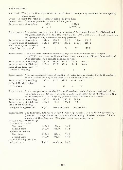
Luckiesh- 1940b
Material: "Outline of History" Wells. Book form. Non glossy black ink on Non-glossywhite paper.
Type: 10 -point DE VINNE; 1 -point leading; 24 pica lines.
Tests: Five 60-minute periods by each of 7 subjects.
Relative rate of reading: 100 107.0
at 1 f-c at 100 f-c
Experiment: The values involve the arithmetic mean of four tests for each individual andthe geometric mean of the data from 2 5 subjects obtained under each condition
of lighting during 5 -minute reading periods.
Relative rate of reading: 101.6 100.0 101.2 99.6 102.7
Relative rate of blinking: 111.4 100.0 108.4 116.4 125.1
each at brightness -ratios
(book/surrounds) of: 0. 2 1 5 25 125
Experiment: The data were obtained from 30 subjects each of whom read 10-point
TEXTYPE composed in 2 1 pica lines under a constant diffuse illumination of
10 footcandles in 5-minute reading periods.
Relative rate of reading: 100.0 98.8 99.6 100.8 101.1
Relative rate of blinking: 100.0 99-6 90.3 84.1 81.2
each at the following
points of leading: 0 12 3 6
Experiment: Average maximal rates of reading 10-point type as obtained with 10 subjects
each of whom read each material on 5 different occasions.
Relative rate of reading: 100.0 97.2 98.8 97.6 99.3
at the following points
of leading: 0 12 3 6
Experiment: The averages were obtained from 40 subjects each of whom read each of the
materials on two different occasions under a constant level of diffuse lighting
of 10 footcandles. All reading periods were 5 minutes in duration.
Relative rate of reading: 100.0 103.2 103.5 101.8
Relative rate of blinking: 100.0 88.1 94.3 99.1each at the following
weights of type-face: light medium bold extra-bold
Experiment: The following data were derived from experiments in a different laboratory
(than for the experiment immediately above) using 18 subjects under 5 foot-
candles of illumination. The same materials were read.
Relative rate of blinking:
arithmetic meansfirst test: 100. 0 90. 4 96. 0
second test: 100. 0 88. 9 94. 5
geometric meansfirst test: 100. 0 88. 1 94. 3
second test: 100. 0 88. 8 95. 0
at the following weightsof type -face: light medium bold
-260-
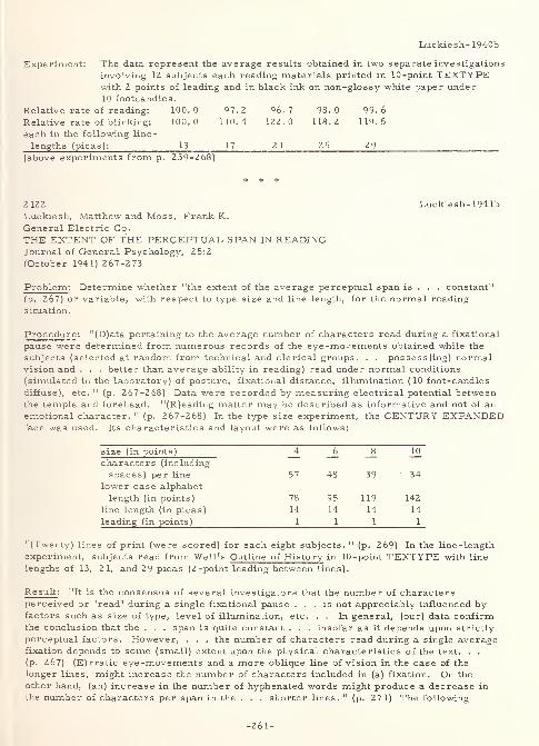
Luckiesh- 1940b
Experiment: The data represent the average results obtained in two separate investigations
involving 1Z subjects each reading materials printed in 10 -point TEXTYPEwith 2 points of leading and in black ink on non-glossy white paper under10 footcandles.
Relative rate of reading: 100.0 97.2 96.7 98.0 99.6
Relative rate of blinking: 100.0 110.4 122.0 118.2 119.5
each in the following line-
lengths (picas): 13 17 21 25 29(above experiments from p. 259-268)
# * #
2 122 Luckiesh- 194 lb
Luckiesh, Matthew and Moss, Frank K.
General Electric Co.
THE EXTENT OF THE PERCEPTUAL SPAN IN READINGJournal of General Psychology, 25:2
(October 1941) 267-273
Problem : Determine whether "the extent of the average perceptual span is . . . constant"
(p. 267) or variable, with respect to type size and line length, for the normal reading
situation.
Procedure: "(D)ata pertaining to the average number of characters read during a fixational
pause were determined from numerous records of the eye -movements obtained while the
subjects (selected at random from technical and clerical groups. . . possess(ing) normalvision and . . . better than average ability in reading) read under normal conditions
(simulated in the laboratory) of posture, fixational distance, illumination (10 foot-candles
diffuse), etc. " (p. 267-268) Data were recorded by measuring electrical potential betweenthe temple and forehead. "(R)eading matter may be described as informative and not of anemotional character. " (p. 267-268) In the type size experiment, the CENTURY EXPANDEDface was used. Its characteristics and layout were as follows:
size (in points) 4 6 _8 10
characters (including
spaces) per line 57 48 39 34
lower case alphabet
length (in points) 78 95 119 142
line length (in picas) 14 14 14 14
leading (in points) 1 1 1 1
"(Twenty) lines of print (were scored) for each eight subjects. " (p. 269) In the line-length
experiment, subjects read from Well's Outline of History in 10-point TEXTYPE with line
lengths of 13, 2 1, and 29 picas (2-point leading between lines).
Result : "It is the consensus of several investigators that the number of charactersperceived or 'read' during a single fixational pause ... is not appreciably influenced byfactors such as size of type, level of illumination, etc. . . In general, (our) data confirmthe conclusion that the . . . span is quite constant . . . insofar as it depends upon strictly
perceptual factors. However, . . . the number of characters read during a single averagefixation depends to some (small) extent upon the physical characteristics of the text. . .
(p. 267) (E)rratic eye -movements and a more oblique line of vision in the case of the
longer lines, might increase the number of characters included in (a) fixation. On the
other hand, (an) increase in the number of hyphenated words might produce a decrease in
the number of characters per span in the . . . shorter lines. " (p. 271) The following
-261-
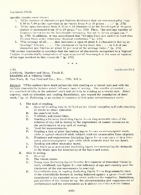
Luckiesh- 1941b
specific results were shown:
1. "(T)he number of characters per fixation decreases (but not monotonically) from8. 50 to 7. 84 as the type-size is increased from 4 to 10 points . . . .
" (p. 272)
2. "(T)he span increases from 8. 14 to 9. 31 characters as the line-length of 10-point
matter is increased from 13 to 29 picas. " (p. 272) Thus, "the average number of
fixations increases as the line-length increases, but not in direct proportion. "
(p. 270) In addition, it was ascertained that "13-pica lines are easier to read than
29-pica lines under otherwise identical conditions. " (p. 272)
3. "The average of all . . . data indicates a span of about 8. 5 characters during an'average' fixation .... The maximum variation from this . . . is 0. 8 of one
character per fixation or about 10 per cent of the average value. " (p. 2 72)
"(I)t seems reasonable to conclude that the number of characters recognized in a 'typical'
fixation is substantially independent of type -size and of line -length in the case of readersof the type involved in this research. " (p. 272)
2182 Luckiesh- 1942
Luckiesh, Matthew and Moss, Frank K.
READING AS A VISUAL TASKNew York, D. Van Nostrand Co. , Inc., 1942, 428 p.
Extract : "(T)he authors have dealt primarily with reading as a visual task and with the
various controllable factors which influence ease of seeing. The results presented . . .
are confined chiefly to the authors' work and entirely to reading as a visual task. Otheraspects, such as retention and reading disabilities, are beyond the boundaries of their
work. " (p. v) Following is an outline of contents of this quite comprehensive work:
I. The task of reading.
A. General (reading may be defined as the visual reception and understanding
of words or other symbols).
B. An unnatural task.
C. Visibility and readability.
D. Reading efficiency (including figure 1 a diagrammatic view of the
relation of any aid to seeing to the expenditure of human resources in
the performance of any task of seeing).
E. Need for measurements.F. Reading a line of print (including figure 2 an electromyogram made
while a typical educated adult subject read two consecutive lines of print).
G. Fixations and regressions (including figure 3 a summary of data frommany electromyograms made while adult subjects read for one hour).
H. Reading and other muscular tasks.
I. The brain as a taskmaster (including figure 4 comparing the demandsof the brain upon the functioning of the heart and eyes).
II. Aids to seeing.
A. General.B. The visual sense.
C. Young eyes (including figure 5 the development of binocular vision in
early childhood; and figure 6 the influence of age and training upon the
character of the eye-movements in reading).
D. Controllable aids to reading (including figure 7 a diagrammatic viewof the controllable factors in seeing balanced against a given visual task
considered in its extended sense which includes the vagaries, limitations,
and abilities of the human being, the characteristics and requirements of
performance and the environment as it affects visibility and the human
-262-
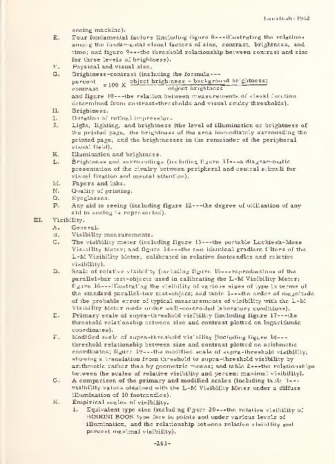
Luckiesh- 1942
seeing machine).
E. Four fundamental factors (including figure 8 illustrating the relations
among the fundamental visual factors of size, contrast, brightness, and
time; and figure 9 the threshold relationship between contrast and size
for three levels of brightness).
F. Physical and visual size.
G. Brightnes s -contrast (including the formulapercent _ 1QQ
object brightness - background brightness;
contrast ~ object brightness
and figure 10 the relation between measurements of visual function
determined from contrast-thresholds and visual acuity thresholds).
H. Brightness.
I. Duration of retinal impression.
J. Light, lighting, and brightness (the level of illumination or brightness of
the printed page, the brightness of the area immediately surrounding the
printed page, and the brightnesses in the remainder of the peripheral
visual field).
K. Illumination and brightness.
L. Brightness and surroundings (including figure II a diagrammaticpresentation of the rivalry between peripheral and central stimuli for
visual fixation and mental attention).
M. Papers and inks.
N. Quality of printing.
O. Eyeglasses.P. Any aid to seeing (including figure 1Z the degree of utilization of any
aid to seeing is represented).
IK. Visibility.
A. General.B. Visibility measurements.C. The visibility meter (including figure 13 the portable Luckiesh-Moss
Visibility Meter; and figure 14 the two identical gradient filters of the
L-M Visibility Meter, calibrated in relative footcandles and relative
visibility).
D. Scale of relative visibility (including figure 15 reproductions of the
parallel-bar test-objects used in calibrating the L-M Visibility Meter;figure 16 illustrating the visibility of various sizes of type in terms of
the standard parallel-bar test-object; and table 1 the order of magnitudeof the probable error of typical measurements of visibility with the L-MVisibility Meter made under well-controlled laboratory conditions).
E. Primary scale of supra-threshold visibility (including figure 17 the
threshold relationship between size and contrast plotted on logarithmic
coordinates)
.
F. Modified scale of supra-threshold visibility (including figure 18
threshold relationship between size and contrast plotted on arithmeticcoordinates; figure 19 the modified scale of supra-threshold visibility,
showing a translation from threshold to supra-threshold visibility byarithmetic rather than by geometric means; and table 2 the relationships
between the scales of relative visibility and percent maximal visibility).
G. A comparison of the primary and modified scales (including table 3
visibility values obtained with the L-M Visibility Meter under a diffuse
illumination of 10 footcandles).
H. Empirical scales of visibility.
1. Equivalent type size (including figure 20 the relative visibility of
BODONI BOOK type face in points and under various levels of
illumination, and the relationship between relative visibility andpercent maximal visibility).
-263-

Luckiesh-1942
2. Illumination factor (including figure 21 the relative visibility,
obtained with the L-M Visibility Meter, of 8-point BODONI BOOKtype under various levels of illumination).
IV. Criteria of readability.
A. General.
B. Criteria of readability.
C. Involuntary blinking (including figure 22 the relative rates of blinking
while reading as various factors which influence visibility and ease of
seeing are varied individually).
D. Technique of the blink-rate criterion.
E. The significance of the criterion.
1. Duration of task.
2. Type-size.3. Refractive errors.
4. Glare.
5. Illumination (including table 4 the rates of involuntary blinking
during periods of reading under various illumination levels).
F. Reliability of blink-rate criterion.
1. Experimental results (including table 5 the relative rates of
blinking determined in repeated investigations involving type -face,
line-length, and brightness of surroundings as variables).
2. Individual variations in rate of involuntary blinking.
G. Speed of reading as a criterion of readability.
1. Discussion.
2. Level of illumination (including table 6 the normal rate of readingunder various levels of diffuse lighting and for varying length readingperiods).
3. Lighting environment (including table 7 relative rates of reading
and blinking for brightnes s -ratios (book/surrounds) of 0.2, 1, 5, 25,
and 125).
4. Leading of type (including table 8 relative rates of reading andblinking for 0, 1, 2, 3, and 6 points of leading; and table 9
average maximal relative rates of reading for 0, 1, 2, 3, and 6
points of leading).
5. Boldness of type -face (including table 10 relative rates of reading
and blinking for light, medium, bold, and extra-bold type).
6. Line -length (including table 11 geometric average relative rates of
reading and blinking for line -lengths of 13, 17, 21, 25, and 29 picas).
H. Speed of reading and compensation phenomena (including figure 23
illustrating an experiment which showed the ability of the human seeing
-
machine to compensate for poor, i.e. vibratory, visual conditions; andfigure 24 indicating the relationship between level of illumination and
speed of reading OLD ENGLISH type printed with black ink on white andgray paper).
I. Summary.V. Size of type.
A. General.B. Type-size and visibility (including table 12 the visibilities of various
sizes of BODONI BOOK type expressed on the RV (type-size versusrelative visibility) and PMV (type-size versus visibility) scales).
C. Type -size versus relative visibility (including figure 25 the relative
visibility of various sizes of BODONI BOOK type; and table 13 a
correlation between the Scale of Relative Visibility (RV) of the L-MVisibility Meter and the Scale of Visual Efficiency of the A. M. A. ).
-264-
Luckiesh- 1942
D. Type -size versus visibility (including figure 26 percent maximalvisibility of various sizes of BODONI BOOK type; figure 2 7 the
visibility of various sizes of BODONI BOOK type expressed upon the
scales of Relative Visibility and Supra-threshold Visibility; and table
14 the percentages of various assumed standards of visibility obtained
with given sizes of type).
E. Type-size and illumination (including figure 28 the percent maximalvisibilities of various sizes of BODONI BOOK types under various levels
of illumination).
F. Illumination, type-size, and standards of visibility (including table 15
footcandles necessary for various sizes of type to equal a given standardof visibility).
G. Type-size and perceptual span (including table 16 the average numberof characters per fixation in reading types varying from 4 to 10 points
inclusively).
H. Type-size and reading habits (including figure 29 showing the decreasein the visibility of 10-point type as the plane of the reading material is
varied with respect to the so-called normal line of vision).
I. Type-size and readability (including table 17 the visibility andreadability of various sizes of TEXTYPE involving line-lengths andleading in accord with modern typographical practice; and figure 30
the relationship between level of illumination and the increase in the rate
of involuntary blinking as the result of reading for an hour).
VI. Type-face.
A. General.
B. Visibility of type-faces (including table 18 the relative visibilities of
8-point types expressed on several appropriate scales; table 19 the
visibilities of seven common type-faces well printed with black ink onexcellent non-glossy white paper; and table 2 0 the experimental
visibility rank of five common type -faces).
C. The readability of various type-faces (including table 21 the relative
visibility, rate of blinking, and speed of reading for three, 10-point type-
faces; table 22 the geometric mean for the relative visibility, frequencyof blinking, and speed of reading for the same faces; and table 23 the
rate of blinking and speed of reading for the same faces, obtained in twoseries of measurements made a month apart).
D. Boldness as a factor in type-design.
E. A measure of boldness (including figure 31 four weights of 10-point
MEMPHIS type with two points of leading; table 24 the reflection
factor and relative boldness for four weights of MEMPHIS type; table
25 the relative and percent visibility, and the alphabet length/relative
character count for the same four weights of MEMPHIS type; and figure
32 the influence of boldness of type as appraised by the criteria of
involuntary blinking, visibility, and speed of reading, respectively).
F. The readability of MEMPHIS types (including table 2 6 arithmetic andgeometric means of the relative rates of reading and blinking for the
four weights of MEMPHIS type).
G. Speed of reading MEMPHIS type (including table 27 number of lines
read and relative rate of reading the four weights of MEMPHIS type in
10-point, by 40 subjects, for 5-minute periods each).
H. Summary pertaining to boldness.
I. Visibility and readability of various type-faces (including table 28 datapertaining to the readability of various type-faces, expressed as a
percentage of those obtained with TEXTYPE; and table 29 showing the
superiority of 10-point TEXTYPE and MEMPHIS MEDIUM ever some
-265-
Luckiesh-1942
other 10-point types as determined by visibility, blink-rate and a
combination o£ the two).
VII. Leading and line -length.
A. General.
B. Leading and readability.
1. Discussion (including figure 33 ten-point TEXTYPE set with five
different degrees of leading and composed in 21-pica lines).
2. Influence of leading on blink-rate (including figure 34 the relative
rate of blinking while reading with various degrees of leading).
3. Influence of leading on speed of reading (including table 30 averagemaximum speeds of reading 0-, 1-, 2-, 3-, and 6-point leaded text
by 10 adult subjects possessing reasonably normal vision; figure35 the individual relationships between leading and speed of reading,
as determined with 10 subjects; figure 36 the average speed of
reading as determined by five subjects for two levels of illumination
and various points of leading; and table 31 average normal speedsof reading 0-, 1-, 2-, 3-, and 6-point leaded text by 23 subjects
under 5 footcandles).
C. Conclusions pertaining to leading.
D. Line -length and readability.
1. Discussion.
2. Rate of blinking (including figure 37 the effect of line-length onthe rate of blinking while reading 10-point TEXTYPE set with 2
points of leading and composed in various line -lengths ; table 32
the geometric average rates of blinking during 5-minute periods of
reading 10-point type, with 2 points of leading, and in 13-, 17-, 21-,
25-, and 29-pica line -lengths ; and table 33 showing the number of
subjects of a total of 24 who blinked faster, the same, or slowerwhile reading 29-pica lines than in reading 13-, 17-, 21-, and 29-pica
lines, respectively).
3. Eye-movements (including table 34 the number of fixations,
fixations -span in picas, and relative length of span for 12 subjects
reading 15 or more lines of 10-point, 2-point leaded, type in line-
lengths of 13, 21, and 29 picas).
4. Speed of reading (including table 35 geometric averages of rates of
reading 10-point, 2-point leaded, type, in line-lengths of 13, 17, 21,
25, and 29 picas by 24 subjects).
E. Conclusions pertaining to line -length.
F. Typographical practice.
VIII. Papers and inks.
A. General.
B. Diffuse reflection-factor (including figure 38 common reflection
characteristics of surfaces).
C. Diffuse reflection and visibility (including table 36 the rank in visibility
of printed matter on nine different specimens of paper; and table 37 the
visibility of printed matter on ten different specimens of paper, eachdiffusely illuminated by 10 footcandles).
D. Specular reflection-factor (including table 38 specular and diffuse
reflection-factors of some common papers and inks; and figure 39
determination of the specular reflection-factor of a glossy paper).
E. Specular reflection and visibility.
F. Tinted and colored papers (including figure 40 the diffuse reflection-
factors of four different papers for light of various wavelengths throughout
the visible spectrum; and table 39 visibility, speed of reading, and
readability of 10-point LINOTYPE TEXTYPE printed with non-glossy ink
on four specimens of tinted or colored papers).
-266-
Luckiesh-1942
G. A practical example (including table 40 percent visibilities of the sameprinted matter with various papers and inks; and table 41 the visibilities,
in percent of 10-point EXCELSIOR, of four 10-point and one 11-point type).
H. Letterheads (including table 42 a comparison of the same typewritten
material on white and on blue letterheads).
I. Advertising material (including table 43 a comparison of results of
printing the same material on red and on white papers).
J. Level of illumination.
K. Quality of lighting (including figure 41 illustrating the effect of
specular reflection-factors of paper and ink upon the brightnes s -contrast
between paper and ink for light-sources of three different brightnesses at
various levels of diffuse illumination).
Various duplicated materials.
A. General.
B. Glimpses of processes.
C. Stencil-duplicated materials (including figure 42 specimens of averageand superior duplicated reading material; table 44 the rate of
involuntary blinking for 12 subjects who read average and superior
stencil-duplicated materials for 30-minute periods; table 45 the rate of
reading for 12 subjects for two qualities of stencil-duplicated materials
compared with visibility and rate of blinking; figure 43 typical
electromyograms for an educated adult reader whose eye -movements in
reading are characteristically somewhat erratic; and figure 44 typical
electromyograms for an educated adult reader whose eye -movements arecharacteristically fairly rhythmic with well-defined fixations).
D. Typewritten material (including table 46 a comparison of twotypewriter types, scaled down to 10-point in size, with 10-point metaltypes commonly used in printing, all leaded 2 points; and table 47
comparative visibility data pertaining to typewritten originals and carboncopies of very good quality, specimens of which were backed with both
white and black cardboard).
E. Hectograph duplication (including table 48 illustrating the variation in
hectograph reproductions with ELITE TYPEWRITER type).
F. Offset printing.
G. Other materials.
H. Hand-lettering (including table 49 relative visibility data obtained for
24 samples from run-of-the -mill comic books compared with a standardconsisting of 12 -point BODONI BOOK type well printed with black ink on
excellent white paper, all samples being under an illumination of 20
footcandles; table 50 relative visibility data obtained for 24 samplesfrom three of the relatively few comic books in which obvious effort hasbeen made to improve visibility and readability, again under anillumination of 20 footcandles for all samples; figure 45 scale
indications of the visibility of various sizes of BODONI BOOK type,
printed in black ink on a good grade of white paper and illuminated to 20footcandles; figure 46 footcandle scale indicating the levels of
illumination required upon various comic books in order that the lettering
be as visible as 12 -point BODONI BOOK type, well-printed with blackink on white paper, under an illumination of 20 footcandles; and table
51 averages of values of samples in tables 49 and 50 compared with
each other and with the standard 12 -point BODONI BOOK type well
printed with black on thick white paper).
Visual efficiencies and deficiencies.
A. General (including figure 47 approximate percentages of persons havingdefective vision in various age -groups in the work-world and also in
schools and colleges; and figure 48 the impairment in visual functions
Luckiesh- 1942
and visual abilities as the eyes grow older).
B. Visual deficiencies and refractive errors (including figure 49 the
percentage loss in visibility resulting from uncorrected refractive errorsof various magnitudes as determined with the L-M ophthalmicsensitometer; figure 50 the percentage loss in visibility resulting fromvarious uncorrected refractive errors, also expressed in terms of
decreasing type -size; figure 51 the relative visibilities of a given test-
object with myopic and hyperopic errors of various magnitudes, as
determined under various brightness -levels, also indicating the
variability of unit size in visual effectiveness; and figure 52
electromyograms obtained during reading by an emmetropic subject andby the same subject while wearing -0. 75 diopter cylindrical lenses, axis
vertical, before both eyes).
C. Appraisals of visual efficiency (including figure 53 the relationship
between the size of the threshold stimulus and visual efficiency expressedin percent; and figure 54 the influence of level of illumination uponvisual acuity as illustrated by SNELLEN characters, expressed in termsof the Snellen fraction, or in terms of the A. M. A. scale of visual
efficiency).
D. Visual deficiencies and the visibility of type (including table 52
visibility measurements of various diagnosed visual deficiencies anddisorders, and the levels of illumination which are required in order to
increase the visibility of 18 -point type to equal that of 24-point type under10 footcandles; table 53 visibilities obtained, with 18- and 24-point type
illuminated to 10 footcandles, by subjects having visual deficiencies; andfigure 55 juxtaposed scales indicating the visibility of various sizes of
BODONI BOOK type under 10 footcandles, as determined for normalvision and by subjects possessing various ocular defects).
E. Education and vision (including figure 56 the age-grade characteristics
of a group of school-children possessing visual deficiencies).
F. Basic eye -movements in reading (including figure 57 electromyogramsshowing the movements of the eyes as the fixation is rapidly shifted fromleft to right and vice versa, and up and down and vice versa; and figure
58 an electromyogram of basic eye -movements of an educated adult
reader whose eye -movements in reading are characteristically erratic).
G. Actual eye -movements in reading.
H. Functional adaptation to near-vision (including figure 59 (a) relative
visibility versus additional power in diopters, and (b) lead and lag in
diopters versus fixational distance in diopters).
I. L-M sensitometric method of refraction.
XI. Reading performance.A. General.
B. Speed and accuracy of visual performance.C. Illumination and reading performance (including figure 60 relative
measures of efficiency in reading).
D. Footcandle scale of effectiveness (including figure 61 illustrating the
relationship between illumination and its influence upon visibility andease of seeing).
E. Work-world tasks involving reading (including figure 62 the increase in
production and the decrease in errors, respectively, which followed the
installation of supplementary lighting units upon business machines).
F. Illumination and educational progress (including figure 63 the influence
of improved lighting on educational age as determined with four well-
balanced test-groups).
G. Visibility and ocular functions (including figure 64 the relative numberof cases in the experimental and control rooms in which the refractive
-268-
Luckiesh- 1942
changes from the beginning o£ the fifth to the close of the sixth gradewere in the direction of less plus power).
H. Recommended levels of illumination (including table 54 conservative
footcandle recommendations on a rational basis of the characteristics of
the visual task and requirements of performance).
I. Visual relaxation and visual distractions (including figure 65 the
relationship between rate of blinking while reading and the ratio of the
brightness of the central to the surrounding field).
J. Ocular comfort and glare (including figure 66 some relationships
between size and brightness of light-sources in the visual field as they
affect the rate of involuntary blinking).
K. Auditory distractions.
L. Distractions within the central field (including table 55 number of
blinks during 5-minute periods of reading under three lighting conditions,
as determined by 5 observers).
M. Reading distance and its stability (including table 56 reading -distance
in inches as observed on four occasions for 13 adult readers under 5,
10, and 20 footcandles, respectively).
XII. Psychophysiological effects associated with reading.
A. General.
B. Nervous muscular tension (including figure 67 showing the method of
obtaining indications of nervous muscular tension while reading, andaverage pressures exerted upon the key while reading under 1, 10, and100 footcandles, respectively; and figure 68 the relationships betweenindicated nervous muscular tension and level of illumination for each of
14 adult readers).
C. The heart-rate (including figure 69 the relationship between heart-rate
and duration of reading for successive intervals of a test-period).
D. Rate of involuntary blinking (including figure 70 percent increase in
rate of blinking after one hour of reading under levels of illumination of
1, 10, and 100 footcandles, respectively, as determined with 10 adult
subjects)
.
E. Fatigue of the extrinsic eye-muscles (including figure 71 illustrating
the extrinsic ocular muscles and presenting the decrease in tonicity of
the lateral muscles after an hour of reading under 1 and 100 footcandles).
F. Pupillary changes (including figure 72 the relative area of the pupil at
different periods of the 5-day work-week).G. Various illuminants (including figure 73 the influence of illumination on
important aspects of visual function and seeing).
H. An extension of Fechner's Law (sensation varies arithmetically as the
stimulus is varied geometrically).
XIII. Specifications for optimum readability.
A. General (including figure 74 reading recommendations presented by the
National Committee for the Prevention of Blindness).
B. Optimum size of type.
C. Optimum brightness.
D. Maximal brightnes s -contrast between ink and paper.
E. Non-glossy paper and ink.
F. Optimum type -face.
G. Clear-cut delineation of characters.
H. Brightness of surroundings.
I. Preventable glare.
J. Other distractions
.
K. Correct eyeglasses
.
L. Optimum leading.
M. Optimum line -length.
-269-
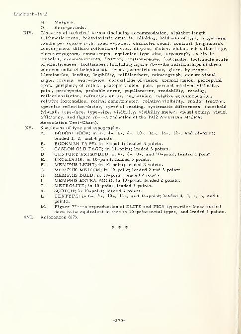
Luckiesh-1942
N. Margins.0. Rest-periods.
XIV. Glossary of technical terms (including accommodation, alphabet length,
arithmetic mean, behavioristic criteria, blinking, boldness of type, brightness,
candle per square inch, candle-power, character count, contrast (brightness),
convergence, diffuse reflection-factor, diopter, distant -vision, educational age,
electromyogram, emmetropia, equivalent type-size, ergograph, extrinsic
muscles, eye -movements, fixation, fixation-pause, footcandle, footcandle scale
of effectiveness, footlambert (including figure 75 the relationships of three
common units of brightness), fovea, geometric mean, glare, hyperopia,illumination, leading, legibility, millilambert, mimeograph, minute visual
angle, myopia, near-vision, normal line of vision, normal vision, perceptualspan, periphery of retina, photopic vision, pica, percent maximal visibility,
point, presbyopia, probable error, pupillometer, readability, reading,
reflection-factor, refractive error, regression, relative accommodation,relative footcandles, retinal sensitometer, relative visibility, Snellen fraction,
specular reflection-factor, speed of reading, systematic differences, threshold
(visual), type -face, type -size, visibility, visibility meter, visual acuity, visual
efficiency, and figure 76 a reduction of the 1932 American MedicalAssociation Test-Chart).
XV. Specimens of type and typography.
A. BODONI BOOK; in 3-, 4-, 6-, 8-, 10-, 12-, 14-, 18-, and 24-point;
leaded 1, 2, and 4 points.
B. BOOKMAN TYPE; in 10 -point; leaded 3 points.
C. CASLON OLD FACE; in 11-point; leaded 3 points.
D. CENTURY EXPANDED; in 4-, 6-, 8-, and 10-point; leaded 1 point.
E. EXCELSIOR; in 10-point; leaded 3 points.
F. MEMPHIS LIGHT; in 10-point; leaded 2 points.
G. MEMPHIS MEDIUM; in 10-point; leaded 2 and 3 points.
H. MEMPHIS BOLD; in 10-point; leaded 2 points.
1. MEMPHIS EXTRA BOLD; in 10-point; leaded 2 points.
J. METROLITE; in 10-point; leaded 3 points.
K. SCOTCH; in 10-point; leaded 3 points.
L. TEXTYPE; in 6-, 8-, 10-, 11-, and 12-point; leaded 0, 1, 2, 3, and 6
points.
M. Figure 77 a reproduction of ELITE and PICA typewriter faces scaled
down to be equivalent in size to 10-point metal types, and leaded 2 points.
XVI. References (67).
# * #
-270-
Mackworth- 1944
2672 Mackworth- 1944
Mackworth, N. H.
Flying Personnel Research Committee (Gt. Brit.)
LEGIBILITY OF RAID BLOCK LETTERS AND NUMBERSF. P. R. C. rept. no. 423(s), Apr 44, 18p.
Problem: "The aims of this investigation have been:- (a) to measure the legibility of the
existing Sector Operations Room display numbers and letters when seen at different
distances and viewing angles; and (b) to find whether there is any way of making these
symbols more legible - first, without increasing the size, and secondly, with a slight
increase in size. " (p. 1)
Procedure: "The following types of display letters and numbers were compared;- (a)
' PRESENT SECTOR' RAID BLOCK equipment - black characters on an orange - yellow
background, the colour code for hostile aircraft, (b) 'NEW SECTOR 1 equipment - modifiedblack characters on a light lemon - yellow background, the suggested new display. (c)
'PRESENT GCI' equipment - black characters somewhat elongated on an orange - yellowbackground, (d) 'NEW SECTOR (GCI SIZE)' equipment - modified black charactersenlarged to the present size on a light lemon - yellow background. . . (e) Red numbers on
a white background - the existing sector display for friendly aircraft. The numbers andletters were automatically exposed (for 1. 62 seconds each every 1-3/4 seconds) one at a
time and each (of 212 W. A. A. F. )subjects read a complete set from ... 25 ... ,
30 . . . , 35 . . . and 40 feet .... Each set consisted of a jumbled series of the numbers0-9 and the letters A - Z with the exception of I, L, O and T. . . shown at right angles
. . . and also at oblique presentations. . . The fluorescent . . . illumination on the
display was 10 foot candles. " (p. 2)
Result: "RESULTS have been considered under five main headings:- ... (p. 2)
1. "Reduced Incidence of errors when only contrast and design were improved. . .
(W)hen the display (was) set square to the line of sight the viewing distance (was of)
great importance. Neither the PRESENT SECTOR nor the NEW SECTOR (could)
be read accurately from distances greater than 25 feet by people with goodeyesight; increasing the . . . distance to 30 feet more than double(d) the incidence
of errors. . . (The) advantage in favour of the NEW SECTOR display was also
found at oblique viewing angles. . . (I)n the case of the NEW SECTOR, alteration
in the viewing angle without any other change can lead to as much as a sixteen fold
increase in errors at this particular distance. . . (p. 3-4)
2. "The Effects of a Slight Increase in the Size of the Characters plus ImprovedContrast and Design . . . (A)t the 25 feet - 30 feet distances it is not real solution
(sic) of the problem simply to increase the size of the display and replace the
PRESENT SECTOR by the PRESENT GCI letters and numbers . . .,provided the
display is set squarely to the line of sight. . . At these two distances and with the
90 (degree) viewing angle the NEW SECTOR display with improved contrast anddesign seems to give a better result than the larger PRESENT GCI display ....This difference is not so definite as it looks because . . . the NEW SECTORsubjects had rather better vision. One can however safely say that there is nosignificant difference in visibility between NEW SECTOR and PRESENT GCIdisplays under these conditions even though the latter takes up more space. . . Atall four distances the effect of improved contrast and design is quite clearly
confirmed (with all differences statistically significant in favor of the GCI SIZE) bycomparing the PRESENT GCI with that of the NEW SECTOR (GCI SIZE). . .
Statistical tests show no real difference between the results given by the NEWSECTOR (SAME SIZE) and those of NEW SECTOR (GCI SIZE) provided the viewingangle is 90 (degrees) and the viewing distance (is) 25 ... or 30 feet. . . Thislast finding has been checked with another set of results obtained from test series
composed entirely of numbers. . . compari(ng) . . . PRESENT SECTOR . . . and
-271-
Mackworth- 1944
. . . PRESENT GCI numbers first set squarely to the line of sight and then . . .
where the viewing angle was 45 (degrees). . . Once again the slightly larger size
(was) of real value when the viewing conditions (were) difficult on account of . . .
distance - or when the display (was) set obliquely . . . The PRESENT SECTORdisplay (gave) 13. 5 (percent) errors with numbers alone and 19. 2 (percent) errorswhen both letters and numbers (were) shown in the same test series - on averagingall four distances and taking only the 90 (percent) viewing angle. . . (U)nder
similar viewing conditions the PRESENT GCI shows a much larger difference: 3. 2
(percent) for numbers alone and 12. 6 (percent) for letters and numberstogether. . . (p. 4-5)
3. " Black on Yellow Display compared with Red on White Display . . . PRESENTSECTOR numbers printed in read ... on a white background. . . averaged 18. 2
(percent) errors when set squarely to the line of sight. This was significantly
worse than the 13. 5 (percent) errors made by the same . . . subjects with
identical numbers printed in black on an orange yellow background. " (p. 5) Thefollowing shows a "(t)able of the reflection factors of the materials used in these
experiments. The lower contrast index explains the higher error incidence with
the red on white display. ".. : (p. 5)
Reflection Percentage Average (percent)
Material Factor (percent) Contrast Error Incidence
PRESENT SECTOR:Red Lettering 19
White Background 73 74 18. 2
PRESENT SECTOR:Black Lettering 4
Orange YellowBackground 48 91 13. 5
NEW SECTOR:Black Lettering 4 not comparableLemon Yellow as design changesBackground 60 93 were also made
(above from p. 5)
Note: Percentage contrast or contrast index =
reflection factor of background - reflection factor of lettering^
reflection factor of background
4. Nature of the errors. "There (was) a wide range in the visibility of the different
characters. . . The improved contrast and design of the NEW SECTOR (SAMESIZE) display reduce(d) the incidence of errors in 26 out of the 32 characters in
spite of the fact that the subjects were all very practised at reading the PRESENTSECTOR display. . . The factor of contrast (was) probably more important than
the design changes. . . There was a tendency ... to read numbers as letters,
possibly because letters were in the majority and the subjects would therefore be
more likely to expect a letter . . . But the PRESENT SECTOR (numbers only)
analysis shows that this is not the only cause .... Other possible reasons are
that the numbers have been allotted less space than the letters - and perhaps also
that the letters tend to make more use of straight lines which are relatively easier
to see than curved lines. " (p. Bl)
5. Relation of the results to the vision gradings of the subjects . "By considering
people with normal vision instead of those with exceptional eyesight and by adding
only 15 feet to the viewing distance . . . turn(ed) absolute success with the
PRESENT SECTOR display into complete failure - an increase from 1. 4 (percent)
... to 100 (percent) errors . . . (T)his is not an argument for a more rigorous
-272-
Mackworth- 1944
selection of plotters. On the contrary, small improvements . . . (should) bring the
work within the capabilities of the ordinary person. . . (F)or example, . . . the
NEW SECTOR (SAME SIZE) display with its improved contrast and design is of
greater value to people with normal eyesight than to those with exceptional
vision. . . An attempt was made to see whether the . . . results . . . wererelated ... to the length of . . . experience in Operations rooms. At first a
slight . . . relationship was found ... It seemed likely however that some at
least (of) this . . . might be due to the factor of age ... A partial
correlation . . . with the influence of age removed. . . reversed the previous
finding and there was now no relation . . . between vision test errors and length
of . . . experience. . . In other words . . . , there (was) no connection . . . that
(could) not be accounted for by . . . age. . . Another analysis . . . showed ... no
difference . . . between . . . more than one year . . . and . . . one year or less
- nor was there any difference between two years or longer and . . . less than two
years .... "(p. C2-C3) From this, "(t)wo conclusions are possible, either (a)
Personnel are quick at noticing any deterioration in . . . acuity and report it . . .
so that . . . eyesight is maintained with . . . spectacles; or (b) Work in Ops.
rooms has no permanent effect on eyesight as measured by the standard visual
acuity test. " (p. C3)
From all these results, the following conclusions were drawn:
1. "The NEW SECTOR (SAME SIZE) display letters and numbers . . . should be
used . . . instead of the PRESENT SECTOR display when the viewing distance is
not more than 25 feet. No alteration in the size of the display is needed but slight
changes in the design of the type and a small improvement in the contrast betweendisplay and background will cut the error incidence to half its present value ....(p. 6)
2. "(I)n . . . circumstances . . . (where) moving the table closer to the dias is not
going to reduce the viewing distance to 25 feet. . . there is a very definite
advantage in using the NEW SECTOR (GCI SIZE) display. This slight increase in
size plus the improved contrast and design cuts down the errors at ... 35
feet ... to less than one-third of its existing value, (p. 7)
3. "When tellers are having some difficulty in seeing the display they are more likely
to guess than admit that they are unable to see properly, (p. 7)
4. "(I)f one takes the factor of age into account a standard eye test fails to show anydifference between the working eyesight of people who have been in Ops. rooms for
one year and those who have been there for several . . . ." (p. 7)
3318 Mackworth- 1952
Mackworth, N. H.
Flying Personnel Research Committee (Gt. Brit.)
SOME NUMBER - LEGIBILITY TESTS IN A MOCK-UPCONTROL ROOMRept. no. F. P. R. C. 785, Mar 52, 2p. , 1 ref.
TIP-71 616
Problem: "Tests were made of the legibility of raid block displays . . . of a proposed new(Royal Air Force) Control Room. The purpose . . . was to test the suggestedarrangements for this Control Room while it was still in the early mock-up stages of
canvas and scaffolding. " (p. 1)
Procedure : Six WRAF tellers, 17-18 years of age, and with normal vision, viewed "(t)en
RAID BLOCKS . . . each with a three-figure index number followed by an identification
letter, the strength and also the height designation. These plaques were fastened to a
(flat) display table . . . Five different telling positions were tried . . . ." (p. 1) The
-273-
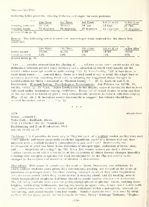
Mackworth- 195Z
following table gives the viewing distance and angle for each position:
2nd floor 1st floor 1 st floor teller dias teller dias
viewing distance 35 feet 30 feet 24 feet 19 feet 27 feet
viewing angle 70 degrees 50 degrees 35 degrees 25 degrees 20 degrees(above from p. 1
)
Result: The following error scores and percentages were derived for the above five
positions
:
2nd floor 1 st floor 1 st floor teller dias teller dias
error score 37/60 41/60 1/60 18/60 59/60error percent 63% 68% 2% 13% 93%(above from p. 1
)
"The . . . results showed that the placing of . . . tellers in the room would make all the
difference between perfect (sic) visibility and a situation in which very nearly all the
identification readings would be quite wrong. " (p. 1) Specifically, "(i)f tellers have to
work from some . . . central dias, there is a real need to try to avoid the slight loss of
accuracy due to the resulting slant view by adopting the suggested shape changes to
identification numbers mentioned in 'Planned Seeing'. ". . (F. C. Bartlett and N. H.
Mackworth. Planned Seeing: Psychological Experiments. Air Publication 3139B, 76.
HMSO, 1950). (p. 2) Also, "(s)ize limitations to the display make it inevitable that tellers
will work under borderline seeing conditions. Reduction of visual acuity by even one line
on the eye chart is known to give a very considerable increase in errors with this display
(Fig. 18 op. cit. ) It therefore seems reasonable to suggest that tellers should havenormal binocular vision . . . .
" (p. 2)
3374 Mead-1954Mead, Leonard C.
Tufts Coll. , Medford, Mass.THE TYPOGRAPHY OF TOMORROWBookbinding and Book Production, 59:3
(March 1954) 72-74
Problem: "Is it possible in some way to 'flag the eyes' of a skilled reader so that they maymore quickly and more accurately catch the significant parts of a manuscript and thus
improve even a skilled reader's comprehension per unit time? Historically the
development of print has been in the direction of sharper type, reduction of letter size,
and . . . simplicity of styling. " (p. 72) Since this seems to have reached a plateau,
further development would seem to be in the directions of either format changes (possibly
meaning less complex programs for such developments as the Photon) and/or basic
changes in the number and direction of strokes in characters.
Procedure: This paper is based upon the work of Mead, Dearborn, and Johnston, in
which college students were given (1) a conventional reading test scored on the basis of
questions on passages read, (2) other reading passages in which they were required to
indicate those words which they would stress in reading aloud, and (3) reading tests in
which typographical emphasis had been placed on words and/or clauses and sentences.
The following methods were used for giving typographical emphasis: color, varying letter
heights, contrasting boldnesses, putting key words in upper case, single line clauses (with
line justification on the center), separation of sentences within a paragraph, two-columnformatting, and accent marks over key words. Similar methods have been used by strip
cartoonists for many years, as for example in "Dick Tracy" (Chicago Tribune), "Orphan
-274-
Mead-1954
Annie" (News Syndicate Co. , Inc. ), and "LiT Abner" (United Feature Syndicate Inc. ).
However, radical changes, such as simplified spelling also found in cartoons, were not
attempted here.
Result : Reader resistance to innovation and habit change indicated that acceptanceappeared to be more related to the character, rather than the amount, of modification, andthat modifications must be immediately acceptable to a majority of competent readers.However, the following results seem to be pertinent:
1. Placing "alternate clauses on slightly different levels provoked . . .
uncomplimentary comments. " (p. 73) Yet, "surprisingly, ... 40 (percent) . . .
preferred this . . . ." (p. 73)
2. 50 percent preferred light and dark clause alternation and the two-column format.3. Word stressing, when done extensively, resulted in such clumsiness that the
reader finally tended to overlook all stresses. However, suitable word stress
improved comprehension per unit time.
4. Better comprehension resulted from coincidence of author and subject stresses.
5. Irregularities in eye movement were the result, rather than the cause, of poorcomprehension.
6. Reasonable modifications in typography were accepted, and some were preferred,"particularly (by) those . . . with estimated high I. Q. 's. " (p. 74)
Generally, to be of benefit, changes in conventional formats should improve the reader'sunderstanding rather than be merely an arrangement to move his eyes in a particular
fashion.
2207 Mecherikoff-1959Mecherikoff, M. and Horton, D. L.
Westmont Coll. , Santa Barbara, Calif, andMinnesota U. , MinneapolisPREFERENCES FOR LETTERS OF THE ALPHABETJournal of Applied Psychology, 43:2
(April 1959) 114-116
Problem : "(D)etermine whether . . . consistent preferences for letters of the alphabetexist . . . , and . . . identify pairs of letters which have equal preference value . . . .
"
(p. 116)
Procedure : "(S)even (capital) letters (G, K, N, P, S, T, and V chosen on the basis of
two preliminary studies as having the least likelihood of being different in sound and in
appearance of the capital from each other in appeal) were presented pairwise in all (2 1)
possible combinations (mimeographed onto sheets of 8-1/2 by 5-1/2 inch paper) to 182college students (of mixed sexes) . . . .
" (p. 116) The subjects' "task was to . . . circlethe letter (in each pair) he preferred. " (p. 114) Preferences for (a) the beginning vs. endof the list, (b) the middle vs. extremes of the list, or (c) the right or left member of apair, were accounted for by the preparation of eight forms of the basic list.
Result : The following three major conclusions were drawn:1. "The following pairs showed a preference for the letter listed first at significance
level indicated:
1% level: SK. SG, SP, ST, GK5% level: PG, NK, NG, SN, SV, TK
2. "The following pairs show no preference for either letter, with . 50 + . 05 as thetolerated limits (described by Walker and Lev, 1953):
Power 85%: GT and VPPower 75%: TV and VK
275-
Mercherikoff-1959
3. "There do not appear to be any consistent position preferences or sex differences,
except that the letter K is significantly preferred by more women than men. " (p. 116)
The authors state that those studies "(c)losest to the present problem are studies of numberpreferences, e.g., Yule (see Chapanis - 1949, elsewhere in this volume; and G. V. Yule,
On reading a scale, Journal of the Royal Statistical Society , v. 90 (19Z7) 570-587) and a
study by Forer (B. R. Forer, A study of consonant preferences, Psychological Bulletin,
v. 37 (1940) 589---an abstract) which deals with preferences for sounds of consonants. "
(p. 114)
3Z75 Melville-1957Melville, Joseph R.
Florida U. , Gainesville
WORD-LENGTH AS A FACTOR IN DIFFERENTIAL RECOGNITIONAmerican Journal of Psychology, 70:Z (June 1957)
316-318, 6 refs.
Problem : Based on the work of Forgays, Mishkin and Forgays, Orbach, and Huey, *
"(t)he purpose . . . is to . . . tes(t) . . . the relative importance of the first letters of
words (in word recognition). . . (and determine whether) seven-letter words would . . .
show significantly greater differential recognition than three-letter words. " (p. 317)
Procedure : Eighty-one subjects (60 men and 21 women) viewed 10 three-letter and 10
seven-letter words. "A Keystone Overhead Tachistoscope was so placed that the projected
image of tall letters in PICA type averaged 2 (centimeters) in height. . . A fixed head-restplaced (the subjects') eyes 2 (meters) from a white screen. . . Words projected on the
screen were centered either 10. 6 (centimeters) to the right or ... to the left of the
fixation-point. . . Exposure-times ranged from 10 to 100 (milliseconds), and monocularand binocular vision were counterbalanced. " (p. 317)
Result : 'Analysis of variance indicated a significant (l/l0 percent level of confidence)
interaction between word-length . . . and word-position . . . ." (p. 318) Seven-letter
words to the right were better than three -letter words to the left or right, which were also
better than seven-letter words to the left. There was no "significant differential recognition
. . . for three-letter words. (However, t)he null hypothesis (whether seven-letter wordswould show significantly greater differential recognition than three -letter words) wasrejected at the 1/10 (percent) level . . . (Thus, ) Huey's argument (concerning the
differential recognition of words as a function of retinal focus the doctrine of
equipotentiality) was supported. . . (and) the doctrine need not be rejected on the basis of
previous studies . . . ." (p. 318)
* D. G. Forgays, The development of differential word-recognition, Journal of Experimental
Psychology , v. 45 (1953) 165-168; Mortimer Mishkin and D.G. Forgays, Word-recognition as a function of retinal locus, Journal of Experimental Psychology , v. 43
(1952) 43-48; Jacob Orbach, Retinal locus as a factor in the recognition of visually
perceived words, American Journal of Psychology , v. 65 (1952) 555-562; and E. B. Huey,
The Psychology and Pedagogy of Reading, 1908, 96-99, of which a subsequent edition has
been abstracted herein as Huey-1916.
-276-
Moore-1958
2189 Moore-1958Moore, Leonard C. and Nida, Paul M.Technical Development Center, Federal Aviation
Agency, Indianapolis, Ind.
AN ANALYSIS OF LETTERING STYLES FOR AN IMPROVEDRASTER -TYPE DATA DISPLAYTechnical development rept. no. 378, Dec 58, 10 p.
Problem: Analyze a study that developed a set of minimum-size, alpha-numeric characters
that would be legible regardless of orientation when presented on a raster-type, pictorial,
air -traffic control display (Spanrad).
Procedure: In analyzing and continuing the work done by Rowland and Cornog (Courtney andCompany, DDC document number AD-203 318), the evaluating group viewed various
commercially available type faces and the specially designed COURTNEY face on a 27-inch,
625 -line, cathode ray tube (CRT) screen. The characteristics of the television equipmentconsidered were (1) number of raster lines, (2) camera resolution, (3) lighting, and someothers not specified. Assuming omni-directionality of character and/or observer position,
the characteristics of the faces considered were (1) minimum size, (2) acceptable style,
(3) form and direction of contrast, (4) illumination, and (5) vertical and horizontal spacing.
Result : After elimination of the commercial faces "since they obviously wereunacceptable, " (p. 3) the COURTNEY face was accepted as a basis for CRT and "markerdata" character display design criteria. From its design, the following recommendationswere derived (assuming numerals and upper case letters of equivalent height):
1. use an 875 vs. 625 raster line system to reduce character height by l/3 and still
retain legibility at the viewing distance of four feet,
2. use "bold" (stroke -width equal to 20-25 percent of height), "expanded" (width equal
to approximately 75 percent of height) characters,
3. use maximum intense white on dead black contrast, except for the use of black onlight red on the marker board when it is not desired to display the characters on the
CRT screen,
4. even though a 5-line character height is considered the theoretical minimum, a 9-
to 10-line height seems a more practicable standard,
5. use horizontal spacing equal to 10-20 percent of character height and vertical
spacing minimum of three raster lines, and6. within limits, use brighter illumination for greater legibility.
Also, further study was indicated as desirable for (1) the reproduction and arranging of
the selected character set, (2) illumination levels, and (3) color combinations.
332 1 Moore-1962Moore, R. L.
TRAFFIC SIGN DESIGNTraffic Engineering and Control, 3:11 (March 1962)
685-688, 1 ref.
Problem : Discuss some of the factors involved in meeting the following principles of
highway sign design:
1. "The driver's act of reading the sign should not require him to slow down or
distract his attention unduly from the task of driving safely in the prevailing traffic
conditions
.
2. "A traffic sign should be perceived and understood by a driver travelling at the
average speed of traffic on the road sufficiently early for him to take any necessaryaction with safety.
-277-
Moo re -19 62
3. "The sign should fulfill the above conditions by night and day. " (p. 685)
Procedure: Theoretical assumptions lead to the conclusion "that letter height h should
be . . .
(N - 6) m n inches• •
•
"where N is the number of names on the sign.
V is the velocity of the vehicle in mile(s per hour),
S is the distance of the sign from the vehicle's path in (feet); and drivers areassumed to have the . . . ability to read signs at 50 (feet per inch) of letter
height. . .
"To test this, the following signs (were) compared in terms of reading distance:
(a) "The conventional panel layout.
(b) "The 'Continental' type with a map of the junction with place names opposite
arrowheads
.
(c) "Signs made with a stack of names one above the other with arrows indicating the
direction. . .
"(O)bservers seated in a vehicle driven at 50 (miles per hour) were asked to report
the instant at which they had identified a given (sign) and knew which direction (and/oraction) to take. " (p. 685-686)
Re sult : "The following represents the score sheet . . . ; the 'best' sign is that which is
interpreted at the greatest range.
British Continental Americanmean feet feet feet
values 570 640 700
Identification of the particular sign:
British Continental Ame rican
mean feet feet feet
values 2 10 240 200
"Notable exceptions to this general pattern were:
1. "Halt signs, where the American sign was best with an identification distance of
405 (feet).
2. "Yield/Slow signs where again the American sign is best with a distance of 615
(feet).
3. "No Waiting and Roundabout signs which came out best on the British system with
distances of 270 and 230 (feet) respectively. " (p. 687)
The following general conclusions concerning sign types were given:
1. "(A)cceptable sizes of lettering . . . may be derived from the formula shown above.
2. "At simple cross-roads at right angles a stack type of sign with arrows is
satisfactory.
3. "At junctions with more unusual layout or more than two roads a map type of layout
without panels is advisable.
4. "Large direction signs should have dark backgrounds and light letters; small signs
should have light-coloured backgrounds (and dark letters). . .
5. "Signs in roads where there is street lighting require illumination with lamps of
better design than those in use .... On all other roads the use of reflective
sheeting or other means of reflectorization if equal efficiency is required. " (p. 68 7)
Concerning sign lettering, "it was found that there was practically no difference betweengood lower-case sans-serif lettering, unserifed upper-case and upper-case with serifs.
If anything, the upper-case with serifs had a small (3 percent) advantage on legibility
distance. . . One advantage of lower-case may . . . be . . . (that) a sign with lower-caseletters is narrower but taller than an equal area upper-case sign. Where there is
-278-
Moore- 1962
restriction on the width of a sign, . . . there are clear advantages in using lower-case
letters. . . (Further, it is) suggested that there are probably advantages in using both
upper- and lower-case letters for different purposes .". . (p. 686) such as the use of
upper-case for all mandatory and warning signs. A more complete discussion of color in
signs than is indicated here. Also discussed in some depth are the economics of sign
design and placement.
3327 Murrell- 1952
Murrell, K. F. H.
THE DESIGN OF INSTRUMENT SCALESInstrument Practice, 6:4 (February 1952) 225-232, 22 refs.
Parpose : "It is not perhaps generally realized that bad scale numbering is a factor whichcontributes much to the inaccuracy of scale reading ... It is the purpose of this paper to
summarize that part of the research which deals with the design of the dial face and its
effect on reading accuracy. 11(p. 225)
Extract : "(F)or black on white the ratio of the height/stroke width should be 6 (to) 1, and for
white on black 10 (to) 1. Thick and thin strokes should never be used. . . (The) height/
width (ratio) . . . shows a difference of opinion. The U, S. Army/Navy standard is 3 (to)
2, while Kuntz and Sleight propose a proportion in which the letters are wider than they
are tall, 0. 77 (to) 1. The general conclusion would seem to be that no advantage is to be
gained in legibility in making figures tall and thin and that the space between digits should
be approximately half the width of the digit. . . The shape of the digits has a very markedeffect on their legibility and the order of legibility appears to be 1, 7, 0, 4, 3, 2, 9, 6, 5,
and 8. . . Berger arrived at the following results:
1. "The angle at the base of 2 and 7 and the tails on the 9 and 6 should be 45
(degrees).
2. "The top of the 4 should be closed.
3. "The bar on 5 should go half-way across the full width.
"Based on these rules he designed a series of square figures. Bartlett and Mackworthhave also studied the legibility of figures and numerals and their design is shown . . .
(I)n general it may be said that 3/8-(inch) figures should be used on a scale 5 (inches) in
diameter and other sizes pro rata . Sewig recommends that parallel figures shouldnormally be used but when the dial is very crowded radial figures should be used. . . Thebest results are obtained when there is a maximum contrast between the numerals and the
dial face. In general the use of black figures on white is to be recommended except whendark adaptation is required. " (p. 230)
2188 Murrell- 1958Murrell, K F.H. ,
Laurie, W. D. and McCarthy, C.
Bristol U. (Gn. Brit. )
THE RELATIONSHIP BETWEEN DIAL SIZE, READINGDISTANCE AND READING ACCURACYErgonomics, 1:2 (February 1958) 182-190
Problem : Determine the effect of variations in dial size and reading distance andinteractions between them on the accuracy of reading circular dials. "(T)he majorfinding(s) (of previous work indicate that) . . . errors decrease with increasing spacebetween scale marks, very rapidly until an interval of 0. 25 (inches) is reached, thengradually to a minimum at 0. 50 (inches). From this it is concluded that for maximumreading accuracy (at a 30-inch reading distance) the width of the space between marks on
-279-
Murrell-1958
any scale should fall between these values. " (p. 182) Since actual practice does not bearout a direct proportionality between dial size and reading distance, "(t)he presentexperiment was undertaken in order to obtain further information on the optimum size of
dial to be used at different reading distances. " (p. 183) Determine also if there is a
correlation between dial reading and the legibility of numerals used thereon.
Procedure: "The method used was that developed by Kappauf, Smith and Bray (1947) whichconsisted in mounting 12 dials on a board and exposing them to the subject who was requiredto read indicated values at his own pace, timing being made from the end of the first
reading to the end of the eleventh reading. " (p. 183) The dials were of 2-, 3-, 4-, 6-, and8-inch nominal diameter. Scale diameters were 5/6 of these. Dial figures were of the
MACKWORTH design in black on a white dial face. Each dial contained 200 units on a
270-degree scale with 0 at 3 o'clock. Graduations were numbered in twenties and sub-divided into tens (a preliminary experiment showed that the 20 by 10 was read faster andwith at least as high accuracy as a 20 by 5, and was read both faster and more accuratelythan a 50 by 10). Brightness at the dial face was 30 foot-lamberts. A buff-colored, hand-drawn blind was used in front of the dial board when it was not being viewed. Dials weremounted on a gray board that had a reflection factor of 60 (percent). Pointer settings onthe dials were random. Subjects' eyes were situated at approximately 2-1/2, 6, 9, 12, 18,
and 24 feet from the dials. The order of dial readings was randomized. Each subject
participated in 14 of a possible total of 30 viewing interactions (dial size by distance).
Subjects were six Naval Chief Petty Officers (four had 6/6 and the two others had 6/12vision) who had not had dial-reading experience in the course of their naval duties.
Accuracy and speed were the test criteria. In order to test a possible correlation betweenthe accuracy of dial reading and the legibility of numerals on the dials, the experimenters"prepared a series of six cards each with five rows of 10 numerals, each row corresponding
to the size of the numerals in each of the five dial sizes. Each subject read one of the
cards at each of the six distances and the whole sequence was repeated once. " (p. 189)
Result : The scores utilized were those taken after a learning effect had levelled off. Fromthese, the following results were seen:
1. accuracy v. dial size - "(I)t is the 'apparent size' . . . which determines the
accuracy . . . (for instance a 3 inch dial at 6 feet and a 6 inch at 12 feet are . . .
the same 'apparent size') . . . (E)xpressing this . . . was obtained by using the
angle (in minutes) subtended at the eye . . . ." (p. 187)
2. accuracy and speed v. dial size - "(T)here (was) an increase in the percentage of
correct readings and a decrease in reading time with increase of apparent size
until a critical point (was) reached, after which there (was) little or no improvement.. . For all ('called intervals') this critical point was reached at about 98 per cent
accuracy except for the . . . interval of 1 unit when it was reached at 80 per cent.
. . With the called interval of 1 unit the points representing the viewing distance of
2-1/2 (feet) did not fall in line with those representing the seats further away. This
suggests that when very great accuracy of judgment is required the proportional
relationship between size and distance does not hold good for short distances of
about 30 (inches) . . . Kappauf and Smith's results (when plotted on the same basis)
behave in much the same way as do ours although their curves reach the critical
points at higher values of apparent size. This may be due to the greater amount of
practice put in by our subjects. " (p. 187-189)
3. pe rformance v. dial size - The critical point for accuracy was reached at an"apparent size of called space (p. 186) (the physical size of the interval into whichthe scale space, i. e. , the physical size of the interval between two scale marks,has to be sub-divided 'by eye' interpolation)" (p. 184) of about 21 minutes of arc
(visual angle). The critical point for speed was reached at about 23 minutes of arc.
4. performance v. visual acuity - "(S)ubjects with 6/12 eyesight gave . . . (e)quivalent
performance . . . at a larger apparent size, representing a decrease of reading
distance of about one -fifth. " (p. 188)
-280-
Murrell-1958
5. performance v. numeral size - "It is evident that when an observer becomes'practised' he does not need to be able to read the numerals in order to find his wayabout. " (p. 189) Specifically, the following chart shows the "(r)elationship of
numerical height and reading distance": (p. 189)
-281-
Nahinsky-1956
2673 Nahinsky-1956Nahinsky, Irwin D.
Minnesota U. ,Minneapolis
THE INFLUENCE OF CERTAIN TYPOGRAPHICAL ARRANGEMENTSUPON SPAN OF VISUAL COMPREHENSIONJournal of Applied Psychology, 40:1 (February 1956) 37-39
Problem: "(C)ompare the span of visual comprehension for the square span, the spacedunit, and the conventional typographical arrangement by presenting tachistoscopically
sentences printed in all three styles. " (p. 37)
Procedure: The following three sentences illustrate the conventional, spaced-unit, andsquare-span typographies, respectively:
The street was not well paved .
Do not leave his glove here .
The two boys sawthe car pass .
Thirty college student subjects (age 18 to 39) viewed these arrangements in the Dodgemirror tachistoscope for an exposure period of 100 milliseconds each. "Each (subject)
was given a point for each word correctly reported irrespective of whether the order wascorrect. " (p. 38)
Result: "The square-span style yielded comprehension spans significantly superior to
both of the other two styles investigated. . . The other two styles yielded comprehensionspans not significantly different from each other. . . All the styles showed a high degreeof interrelationship for all the subjects. . . The data indicate that the greater utilization
of the vertical visual span was the factor that yielded superior comprehension scores for
the square-span style. . . The square span style used in books and advertising mightlead to increased reading and comprehension speed. This warrants further
investigation.". ., (p. 39) especially since the author indicates that, because of the
evidence shown (20 subjects better under square-span, 1 equally well under square-spanand conventional, and 9 better under conventional layout), "great caution should be
exercised in accepting the square-span style as being unequivocally superior . . . .
"
(p. 38)
3302 Neisser-1960Neisser, Ulric and Weene, PaulBrandeis U. , Waltham, Mass.A NOTE ON HUMAN RECOGNITION OF HAND-PRINTED CHARACTERSInformation and Control, 3:2 (June I960) 191-196Contract AF 19(604)-5200
Problem : With a view toward "the development of machines that can read . . . HAND-MINTED material . . . , (p. 191) determine the relative and total legibility of a set of
HAND-PRINTED alpha-numeric characters.
Procedure : Nine subjects (college students or graduates that were aware of the purpose of
the experiment, i. e. the development of an accuracy criterion for HAND- PRINTED character
recognitionmachines) each viewed 18 individual photographs of HAND -PRINT ED, upper-case,
-283-
Neisser-1960
alpha-numeric character samples, A-Z and 0-9 (selected from a pool obtained at the
Lincoln Laboratory). Each photograph showed a blow-up of a black-on-white character,inscribed within a 2-3/4 X 2-3/4 inch square. The stimuli were viewed in random order at
2-3 yards distance with the subject performing a cross -out task, on a record sheet, of his
best guess for each character. Accuracy was the test criterion, since this human accuracywould seem to "serve as (a) standar(d) for the accuracy of mechanical devices . . . .
"
Result : Results were presented in a confusion table. From this, the following conclusions
were drawn:1. O (oh) was not distinguished from 0 (zero) at all.
2. I (eye) was distinguished from 1 (one) only poorly.
3. A, H, K, M, R, Z, 3, and 8 were recognized without error.
4. T, U, V, Y, and 2 presented the most difficulty. However, even for these, correct
recognitions predominated.
5. Overall mean error for the nine subjects was 4. 1 percent.
6. "A particularly meaningful minimum rate (was) the proportion of modal errors,
3.2 (percent). In a sense, this repre sent(ed) the degree of sheer illegibility in
these exemplars of HANDPRINTED characters. " (p. 196)
Overall, "individual accuracies ranged from 94. 9 ... to 96. 5 (percent), and even (the)
pooled best guess was right only 96. 8 (percent) of the time .". . , (p. 191) as shown bymodal errors, above.
North, Alvin J. , and Jenkins, L. B.
Southern Methodist U. ,Dallas, Tex.
READING SPEED AND COMPREHENSION AS A FUNCTION
OF TYPOGRAPHYJournal of Applied Psychology, 35:4 (August
1951) 225-228, 6 refs.
Problem : Compare square span, spaced unit, and standard typographic arrangements by
means of reading speed, comprehension, and accuracy.
Procedure: One hundred and eighty university social science freshmen read three articles
from a popular magazine, each of which was printed in standard, square span, and spaced
unit typography. Each typographic arrangement was presented to one group of 60 subjects.
The following are examples of the two new arrangements:
(p. 191)
* *
3276 North-1951
This is of the style of
an example square span presentation
This is an example of the spaced unit style
of presentation
-284-
North-1951
"In breaking the material into units . . . , an attempt was made to group words into thought
units. 11(p. 225) The first two articles were for practice and the third was tested for
comprehension and accuracy (using an objective test), and reading speed. The test article
had, according to the revised Flesch formula, a "reading ease" score of 36. 9 and a
"human interest" score of 11. 6, indicating a moderately difficult style. The experimental
design was factorial. A secondary consideration in the experiment was to determine the
differential effects of practice.
Result: "In terms of reading speed and comprehension . . ., spaced unit was superior
(statistical significance at the five percent level of confidence) to square span or standard
typography. This advantage . . . was not accompanied by a loss in accuracy of retention.
No differences attributable to the two limited degrees of practice (tested) were found. . .
The hypothesis is offered that spaced unit . . . provid(es) auxiliary cues for the
organization of thought. . . (T)he spaced unit style . . . may have immediate practical
application, perhaps in academic and military instructional materials. . . Further
research ... is recommended. " (p. 228)
-285-

OptRead-1961
2190 OptRead-1961OPTICAL READING (MACHINES THAT READ PRINT ANDAUTOMATICALLY CONVERT THE INFORMATION OBTAINEDINTO A FORM SUITABLE FOR DIRECT INPUT INTO DATAPROCESSING SYSTEMS)Data Processing, 3:2 (April-June 1961) 68-77
Abstract : The author discusses the optical print-reading machines and associated
equipment produced by the Farrington Manufacturing Company (formerly Intelligent
Machines Research Corporation). Reference to this article (and also Utman-1963) is madebecause many optical reading machines are currently in service in this and other countries
in applications such as "keeping the records of a book club . . . (, ) preparing technical
abstracts. . . (and) credit sale accounting . . . ." (p. 68) The application of these
machines to commerce presents the unique problem of requiring a type font that is
designed for recognition not only by the reading machines (whether they be optical or
magnetic), but also by human beings for the purposes of verification, emergency manualoperations, etc. Following a general introduction describing Farrington 1 s majorequipment (transaction recorders and optical readers) and its current applications, the
article describes the SELFCHEK type font, the operation of transaction recorders, the
scanning and decoding operation, equipment that will read type fonts other than
SELFCHEK, and future applications and research. Delineation of the transactions andoperations involved in a typical credit sale and its accounting, is interspersed throughoutthe discussion. It is pointed out that "(t)he major differences that exist between the
various machines are confined to the type of document from which information can be readand the manner in which it is subsequently handled. . . In conformity with . . . other
codes designed for machine reading, the figures (numerals) . . . are of a special
design(, a) fount known as SELFCHEK . . . developed for (the) purpose (of optical
machine-reading) by Farrington. . . Each SELFCHEK figure is formed by utilizing the
appropriate strokes of a seven-line basic pattern. Three of the lines are horizontal andfour vertical (Q). Each long vertical may be treated as two separate lines. This basicpattern is modified slightly where necessary so that the resulting outline conforms moreclosely with the accepted appearance of a figure. For instance, indentations are made in
the basic pattern in the region of the central horizontal stroke so that the resulting figure
8 more nearly resembles its conventionalARABIC counterpart. This particular modification
also serves to increase the contrast between the figures 8 and 0. " (p. 69-70) In a plastic
credit card embossing application "the SELFCHEK figures are approximately 0. 17 inch
high and are spaced horizontally at seven to the inch. The figures are printed (on
transaction cards) in an area approximately 2. 5 inches long by 0. 4 inch deep. Margins1/16 and 3/8 of an inch wide are maintained between the printed line and the top andleft-hand edges of the documents respectively. . . (p. 70) (T)he reversed carbonimpression (on the back of an imprinted card) is chosen (for reading by the optical scanner)in preference to the ink impression (because) the density of the inked image tends to varyas the ink dries out on the roller (of the transaction recorder). In contrast, the density of
the carbon impression (from a two sided carbon behind the card) remains consistent. "
(p. 72) Potential applications for the alpha-numeric reading equipment could be in (1)
preparation of computer input, (2) data transmission, (3) language translation, (4) catalog
indexing, and (5) automatic typesetting. However, for optical reading in general, "(o)ne of
the major difficulties ... is to obtain clearly printed characters on the transaction
documents. If optical reading is (to be) adopted by commerce, . . . business equipmentmanufacturers will not only have to provide machines to which the special typefaces can befitted, . . . but in addition they will have to improve the general quality of print
produced . . . ." (p. 77)
-287-
2191 Ovink-1938Ovink, G. W.LEGIBILITY, ATMOSPHERE- VALUE AND FORMS OF PRINTING TYPESLeyden, A. W. Sijthoff's Uitgever smaatschappij , 1938, 253p.
Problem: Determine the state-of-the-art of the legibility/ readability, esthetic quality,
and styles of printing-type faces.
Procedure : The below outline of contents indicates the book's scope and richness:
I. The legibility of printing types.
A. The problem.B. Theoretical foundations of the legibility of isolated letters.
C. Variations of the shape in proper sense.
D. Variations of the thickness of the constituent parts.
E. Theoretical foundations of reading of letters in context; the difference betweenthe reading of isolated characters, of single lines and of several lines.
1 . The problem.2. Recognition of single characters.
3. Recognition of single words.a. Gestaltfactors.
b. Space and outline.
c. Boldness.
d. Experience.
e. Importance of upper half.
f. Serifs.
g. Horizontal extension.
h. Vertical extension.
4. Recognition of lines of words (reading in a proper sense).
F. The measurement of reading- speed of a line of words.
G. The judgment of the subjects on legibility.
H. Summary and application of the results.
1. The studies on typographical factors influencing speed of reading by Tinker
and Paterson.2. Style of type face, e. g. FRAKTUR vs. ANTIQUA.3. Size of type and length of line.
4. Space between lines.
5. Legibility of small print.
a. Newspapers.b. Time-tables, dictionaries, etc.
c. Continuous texts.
6. Colour and surface of paper.
II. The atmosphere-value (esthetic quality in relation to content) of type faces.
A. (chapter 9. )
1. Description and method of investigation.
2. Former studies.
3. (Experimental) series Vila.
4. (Experimental) series VHb.a. The types.
b. The questionnaire.
c. The instruction.
d. Conditions.
e. Results.
B. The influence of margin, interlineage, colour and quality of paper.
1. Questionnaire.
2. Material.
-288-
Ovink-1938
3. Interlineage.
4. Margin.5. Colour.
6. Paper.
7. Proceeding.
8. Results.
III. Short historical review of the modern printing type.
A. Introduction.
B. United States.
C. England.
D. France.E. Germany.F. Other countries.
1. Spain.
2. Holland.
3. Italy.
4. Czechoslovakia.
IV. Appendices (interspersed at various points in the text).
A. Technical Introduction.
B. Description of the qualities.
C. Description of the type faces.
D. List of the most important modern printing types.
E. Selected references.
New experimental results (too numerous to mention specifically) have been included along
with the discursive review. For this new experimentation, the author discusses the
problems, apparatus, subjects, and experimental procedures involved. The results
include subjective responses ("feeling tone" and legibility) to the type faces individually
and when in context. Responses to individual letters are in terms of what the subject
thought he saw, i. e. a description of the letter. E. g. , the subject saw "a flattened circle,
with a distinctive vertical bar.". . (p. 27), identifying it as an "a". In defining legibility,
the author follows Pyke, with the reservation that he gives an illustration rather than a
definition. Comments are also made on the "subjective facility (feeling of ease)" and the
"objective facility (consumption of energy). " (p. 9) Atmosphere-value is defined as
consisting of "those properties by which it (the type face) excites feelings within the
reader. " (p. 127) A technical introduction, which is unusually comprehensive for its
brevity, discusses type-founding and -setting by describing technique, spacing and fitting,
logotypes and kerns, lining systems, typesetting and composing machines, andnon-typographical lettering.
Result : From the point of view of legibility; the results of previous investigations, someinductions and deductions from them, and suggestions for further research along the samelines, are given. The new experimental results concern primarily the esthetic qualities of
various type faces, and in the context of combination with the type of information they aredesigned to convey.
* * #
-289-
Paterson- 1940a
2119 Paterson- 1940a
Paterson, Donald G. and Tinker, Miles A.
HOW TO MAKE TYPE READABLE- -A MANUAL FORTYPOGRAPHERS, PRINTERS AND ADVERTISERSNew York, Harper, 1940, 209 p.
Problem : On the basis of surveys of current practice, experiments, and subject opinions,
determine the effect of type style, type form, type size, line width, line spacing (leading),
page layout, contrast direction, use of color in print and background, printing surface,
optimal vs. non-optimal printing arrangements, and some interactions between these on
the legibility/readability ("In general, we have used the words legibility and readability
interchangeably to mean 'ease and speed of reading printed material at a natural reading
distance'. ") of printed reading material.
Procedure : Using the Chapman-Cook Speed of Reading Test, a total of 66, 062 tests wasgiven to 33, 031 subjects in a total of 45 experiments. Two hundred to 10, 000 subjects
participated in each experiment. Forms A and B (for experimental purposes) of the Testwere used in the "ordinary reading situation. " Reading times were 1-3/4 minutes for both
the standard and the changed typographical arrangements. While a review of previous
work (as such) was excluded, a criticism of the Luckiesh and Moss book, a comment on
Pyle's report, and a "complete" bibliography were included in this study. For mostsections of the book, the remarks concerning experiments followed the results of a surveythat determined current practices for the particular variable involved. In turn, the
experimental comments were followed by the subjects' personal "reactions" to the stimuli
presented. Experimental variables were as follows:
1. Type styles wereSCOTCH ROMAN BODONI CHELTENHAMGRANJON OLD STYLE AMERICAN TYPEWRITERGARAMOND CASLON CLOISTER BLACK.ANTIQUE KABEL LIGHT
2. Type forms were bold vs. ordinary, italic vs. upright, and upper- and lower-casevs. all capitals.
3. Type sizes were 6-, 8-, 9-, 10-, 11-, 12-, and 14-point.
4. Line width was varied between 5 and 45 picas.
5. Line spacing was varied between 0- (solid) and 8-point leading.
6. Page layout was considered for
a. dimensions of the full page (4 x 6 to 11 x 14 inches),
b. relative size of the printed portion,
c. margins (presence or absence, how much, and what for),
d. single vs. double column (and others),
e. spacing and lines between columns (rule and no space to no rule and 2-picaspace), and
f. paragraphing arrangements.7. Contrast directions were black-on-white and white -on -black.
8. Colors utilized numbered eight for the print and six for the background.9. Printing surfaces considered were Eggshell, White Enamel, Artisan Enamel, and
Flint Enamel.10. Optimal (vs. non-optimal) printing arrangements discussed concerned the results
of interactions between various typographical variables.In addition to an introductory chapter, the main body of the study, and a summary of
recommendations, the book contains several appendices, including ones coveringexperimental methodology and a conversion table for printing measurements. Tables of
detailed experimental results (not included in the book) also are listed by title with the
note that they may be procured from the American Documentation Institute.
-291-
Paterson-1940a
Result : In addition to detailed textual summaries at the end of each chapter and in the last
chapter, the authors present (1) printing specifications for ideal printed pages using (a)
single -column composition and (b) double -column composition, and (2) a tabular summaryof typographical recommendations. The latter is paraphrased below.
factor satisfactory undesirabletype style any commonly used modern AMERICAN TYPEWRITER
or ultra modern OLD ENGLISHtype form upper- and lower-case, all capitals
bold for emphasis anddistance reading, anditalics for emphasis only
type size 9-, 10-, 11-, or 12-point 6- and 7 -point and larger
leaded and in optimal line than 12-point
widths
line width about 19 picas less than 14- or greaterthan 28 -pica
line spacing6 -point type 2 -point leading at 14- to set solid at less than 14-
28 -pica line width or greater than 28-picaline widths
8 -point type same same10 -point type same solid and 1 -point leading
for all line widths1 1 -point type 2 -point leading at 16- to 28- set solid at 16- or less,
pica line width or greater than 28-picaline widths
12 -point type set solid or leaded 1- or 2-point set solid or leaded in 9-
in line width of about 25 picas or less or more than 33-
pica line widths
page layout
margins l/4-inch at top, outer and bottom; wide margins unnecessary3/4-inch at inner for legibility
columns single or double readers disliked single
column spacing l/2 -pica space with no rule inter-columnar rule or
greater than l/2-pica
space unnecessary for
legibility
contrast direction black-on-white or dark-on-light white -on-black, dark-on-and colors dark, or light -on -light
printing surface dull-finish opaque stock glazed in artificial light;
and thin, semi-trans-parent stock
sjc # *
3351 Paterson- 1940b
Paterson, Donald G. and Tinker, Miles A.
Minnesota U. ,Minneapolis
INFLUENCE OF LINE WIDTH ON EYE MOVEMENTSJournal of Experimental Psychology, 27:5
(November 1940) 572-577, 1 ref.
Problem: Determine, through the use of eye -movement studies, the validity of optimal
-292-
Paterson- 1940b
line -widths , as previously ascertained in eleven reading-performance studies using 10-
point, lower-case, SCOTCH ROMAN type, set solid on egg-shell paper stock.
Procedure : "In the first study (here), each of 20 college students read 10 paragraphs from
the Chapman-Cook Speed of Reading Test, Form A, set in an optimal line width (19 picas)
and 10 different paragraphs from Form B of the same test set in an excessively short line
width (9 picas). In the second study, each of 20 additional college students read (10)
paragraphs from Form A in the 19 pica width and 10 paragraphs from Form B in the
excessively long line width of 43 picas. . . (E)ach study (yielded) the following five
analytical measures: number of fixations, number of words per fixation, duration of pauses,
perception time, and number of regressions. . . (E)ye movements were photographed by
the Minnesota eye -movement camera. " (p. 572)
Result: In the first study, there was "a marked increase (15. 7 percent) in the average
number of fixations in reading the 9 pica line width in comparison with the 19 pica optimum.
. . Curiously enough, more time in reading the short line was spent on each fixation (pause
duration percentage difference equals 8.1). Also for the short line there is a striking
increase (24. 7 percent) in the total perception time. The only apparent advantageous
characteristic of the short line width is found in the fact that it was read with fewer
regressions (14.2 percent decrease). . . The . . . factor that could account for the
decreased efficiency in reading the short line would appear to be the difficulty in making
maximum use of peripheral vision in the horizontal direction. . . The results for the
second study . . . sho(w) that fixation frequency in reading the long line is definitely
increased, whereas the average number of words per fixation is decreased. Furthermore,
the average time devoted to fixations (pause duration) is slightly increased and, of course,
total perception time as well. A most striking difference occurs with respect to the number
of regressions. This amounts to 56. 7 percent increase (for the long line). . . (and) come
chiefly at the beginning of each line. . . We interpret the results to mean that an
excessively long line width gives rise to a major difficulty in swinging back to the beginning
of successive lines. " (p. 574-576)
* # *
2674 Paterson- 1942a
Paterson, Donald G. and Tinker, Miles A.
Minnesota U. , MinneapolisINFLUENCE OF SIZE OF TYPE ON EYE MOVEMENTSJournal of Applied Psychology, 26:2
(April 1942) 227-230
Problem : "(D)etermine the specific patterns of eye movements involved in reading anunusually large . . . and a very small size of type (each) in comparison with a mediumsize . . . .
" (p. 227) This is in comparison with previous findings that showed "decreases(in) reading efficiency (as determined by speed of reading) if unusually large or small sizes
are compared with 10 point as a standard. " (p. 227)
-293-
Paterson- 194Za
Procedure : All type was lower-case SCOTCH ROMAN, set solid, in 19-pica line-widths,
on egg-shell paper-stock. The first part compared 10- and 6-point, while the secondcompared 10- and 14-point type sizes. In each part, 20 college students read the standard(10-point) on Form A of the Chapman-Cook Speed of Reading Test, and then compared onForm B of the same test. Each reading consisted of 10 paragraphs. "(E)ye movementswere photographed by the Minnesota eye-movement camera. " (p. 227) In each case, the
items measured were the following: fixation frequency, words per fixation, pause duration,
perception time, and regression frequency.
Result : In the first part, "eye-movement measures show that 10 point type is read moreefficiently. (It) requires fewer fixations .... Pause duration is . . . shorter and total
perception time is appreciably less. " Statistically, "(a)ll differences (were) . . .
significant (beyond the 1 percent level) except for regression frequency. " From these
results and also from the "(u)se of the Luckiesh-Moss Visibility Meter . . . (i)t appearsthat the decreased efficiency with which 6 point type is read is due to reduced visibility. . .
The results for the second (part) . . . again show . . ." an efficiency differential in favor
of 10-point type. "The details . . ., however, are not the same .... Here a striking
difference exists in frequency of fixations (21. 1 percent increase for the 14-point). " Also,
"(i)t is interesting to note that the direction of the difference in pause duration is reversed.
. . The net result in terms of total perception time again favors 10 point type. " Finally,
"(t)here is a slight . . . favor(ing) of 10 point so far as number of regressions is
concerned. " In this second part, "(a)ll differences (were) statistically significant (beyond
the 1 percent level) except for regression frequency . . . The factor responsible for
reducing the efficiency with which 14 point type is read, seems to be due primarily to the
increased amount of printing area that must be covered in reading a given amount of text. "
(p. 228-230)
* * *
3355 Paterson- 1942b
Paterson, Donald G. and Tinker, Miles A.
Minnesota U. ,Minneapolis
INFLUENCE OF LINE WIDTH ON EYE MOVEMENTS FOR
SIX -POINT TYPEJournal of Educational Psychology, 33:7
(October 1942) 552-555.
Problem : "(D)etermine the specific patterns of eye movements involved in reading optimal
versus non-optimal line widths for six-point (lower-case, SCOTCH ROMAN) type set solid
... on egg-shell paper stock. " (p. 552) This is by comparison with the results of reading
performance tests (in which it was) found that a very short line width (seven picas) and an
excessively long line width (thirty-six picas) produced ... an important retardation in
speed of reading in comparison with an optimum line width of about fourteen picas. " (p. 552)
Procedure : In the first part, twenty college students read "(t)en paragraphs from the
Chapman-Cook Speed of Reading Test, Form A, . . . set in a thirteen-pica line width and
ten paragraphs from Form B . . . set in a five-pica line width. " (p. 552) In the second
part, twenty college students read "(t)en paragraphs from . . . Form A, . . . set in a
thirteen-pica line width and ten . . . from Form B . . . set in a thirty-six-pica line width. "
-294-
Pater son- 1942b
(p. 552) Photographic records of eye movements were obtained, for both parts, with the
Minnesota eye-movement camera. Measurements in these experiments were for the
following: fixation frequency, words per fixation, pause duration, perception time, and
regression frequency.
Result : "In only one respect (regression frequency) does the excessively short line have an
advantage. " (p. 554) In this respect and others, the "results parallel . . . findings for the
reading of ten-point type (Paterson- 1940b) . . .."(p. 554) Again, the general "interpretation
stressed the reader's inability to make maximum use of horizontal peripheral cues in
reading an unusually short line of print. " (p. 554) Statistical differences for this first part
showed all differences "significant beyond the one per cent level. " (p. 552) Results of the
second part show "the biggest difference in reading the excessively long line ... is the
number of regressions (67. 7 percent more). Pause duration is also lengthened as is
perception time. . . The direction of all of the differences again parallels the results . . .
for ten point type. " (p. 554) Thus, "the eyes, in reading an excessively long line, are
inaccurate in locating . . . the beginning of each new line. " (p. 555) Statistical differences
for this second part were "significant beyond the one per cent level . . . for regression
frequency and pause duration . . .(; and) at the 2 per cent level ... in perception time
. . . (D)ifferences in fixation frequency and words per fixation (were) not significant. "
(p. 554)
3269 Paterson- 1943
Paterson, Donald G. , and Tinker, Miles A.
Minnesota U. , Minneapolis
EYE MOVEMENTS IN READING TYPE SIZES IN OPTIMALLINE WIDTHS
Journal of Educational Psychology, 34:9
(December 1943) 547-551.
Problem : "(T)he present investigation was undertaken. . . (i)n order to provide an
analytical picture of the oculomotor patterns accompanying the retardation in reading each
of the smaller type sizes (6- and 8-point) in comparison with one of the larger ones (eleven
point) ... A (previous) comparison of . . . optimal (line width and leading) arrangement
revealed that both (the smaller size) type(s) were read significantly slower than the larger
sizes (9-, 10-, 11-, and 12-point) which were read with equal speed." (p. 547)
Procedure : Using the Minnesota eye-movement camera, "(e)ye -movement photographs of
two . . . groups of twenty subjects each indicate(d) the precise changes in oculomotor
patterns involved ... (p. 551) In the first comparison, (subjects) . . . read ten
paragraphs from the Chapman-Cook Speed of Reading Test, Form A, set in eleven-point
-295-
Paterson- 1943
GRANJON type with optimum line width (twenty-two picas) and leading (two points), and ten
different paragraphs from Form B of the same test in eight-point GRANJON type with
optimum line width (sixteen picas) and leading (two points). In the second comparison,
(subjects) . . . read . . . from Form A (as before) . . . and . . . from Form B in six-
point GRANJON with optimum line width (fourteen picas) and leading (two points). " (p. 547)
Parameters measured were fixation frequency, words per fixation, pause duration,
perception time, and regression frequency.
Result : "In reading eight-point type there was a significant increase in fixation frequency,
pause duration and perception time and a significant decrease in words read per fixation.
Regressions were also slightly increased. . . For six-point type there was a significant
increase in pause duration and perception time. The other measures, although not
significantly different, were in line with the findings for eight-point type. . . (T)he main
factor producing the changes in oculomotor behavior. . . appears to be . . . (r)educed
visibility of the smaller type sizes . . . ." (p. 551)
3347 Paterson-1944Paterson, Donald G. and Tinker, Miles A.
Minnesota U. , MinneapolisEYE MOVEMENTS IN READING OPTIMAL ANDNON-OPTIMAL TYPOGRAPHYJournal of Experimental Psychology, 34:1
(February 1944) 80-83, 6 refs.
Problem: Compare "eye -movement patterns employed in reading text in optimal and in
non-optimal typography. " (p. 80) The non-optimal typography was obtained by introducing,
simultaneously, undesirable variations of the following factors that in a previous speed of
reading test (with the exception of the last item) retarded performance 22. 2 percent: "type
size, line width, leading(, ) color of print and background . . . (and) paper surface . . . ."
(p. 80)
Procedure : "The optimal arrangement consisted of type set in ten-point with two-point
leading, 19 pica line width, black print on white eggshell paper stock; the non-optimal, of
text set in six-point set solid, 34 pica line width, white print (with black background) onwhite enamel paper stock (sic). All material was printed in SCOTCH ROMAN, lower case.
. . Each of 20 college students read 10 paragraphs from the Chapman-Cook Speed of
Reading Test, Form A set in the optimal arrangement and 10 different paragraphs fromForm B of the same test set in the non-optimal arrangement. . . (E)ye -movements werephotographed with the Minnesota eye-movement camera. . . The photographic recordsyielded the following analytical measures: number of fixations, number of words per
fixation, duration of pauses, perception time and number of regressions. " (p. 80)
Result: All differences were positive (except, of course, words per fixation) and were
statistically significant "beyond the one percent level" (p. 81) except for pause duration,
which was "at the five percent level. 11
(p. 31) All differences were "larger than found
when any single undesirable variable is concerned. This suggests that, when several
undesirable typographical factors (sic) are combined, they operate together to produce
inefficient oculomotor patterns although the effects are not additive. " (p. 82)
* * *
-296-
2675
Paterson, Donald G. and Tinker, Miles A.
Minnesota U. ,Minneapolis
READABILITY OF NEWSPAPER HEADLINES
CAPITALS AND IN LOWER CASE
Journal of Applied Psychology, 30: 1
(February 1946) 161-168
Paterson- 1946a
Paterson- 1946a
PRINTED IN
Problem : Determine the difference in readability of all-capital vs. capital and lower-case
newspaper headlines at normal, table -length, and far reading distances, using variations
in type-size, line-width (single vs. multiple -column coverage), and exposure method.
Previous experimentation showed "that continuous text set in all capitals was read about 12
per cent more slowly than text set in lower case. (Few typographical factors exert such a
retarding effect on reading speed.) (p. 161) Generalizing from these results . . . , the
writers recommended the abandonment of all capitals printing (in spite of Tinker's previous
finding that all-capitals, in isolated letters and words, had greater perceptibility, because
this latter was a function of perceptibility without reference to speed of perception). This
recommendation was sharply challenged ..." (p. 167) hence, the present
investigations
.
Procedure : Three studies (not factorial) were undertaken to investigate the above. They
utilized the following parameters:
experiment I II III
investigators Breland and Warren WarrenBreland
primary vari- capitals and lower-c ase versus all-c;ipitals
ablesstimuli single -column, five- word headlines 100, multiple-
column, five-word headlinesselected fromMinneapolispapers 1934-1940
type face CHELTENHAM BOLD MEMPHIS BOLDtype size 24-point 60-pointsubjects (N) 40 46testing number single single groupviewing distance 15 inches 5-1/2 feet approximately
6 - 17 feet
viewing angle normal normal variousapparatus Dodge Tach- Whipple Disc screen shutter
istoscope Tachistos
.
exposure time 50 millisec - 180 milli- approximatelyonds seconds 1 second
additional subjectiveparameters judgment
Result : "The results (of the first study) disclosed an 18. 9 per cent difference in favor of
the lower case headlines. " (p. 167) In the "second study . . . both kinds of headlines were
shown to be equally legible.". . (p. 167) by the conditions of the experiment and by
Paterson- 1946a
subjective judgments elicited afterward. In the third study, "(a)t a distance of six feet the
legibility of the lower case banner headline was 5. 3 per cent greater than the legibility of
those set in upper case. At distances from ten feet to fourteen feet, both kinds of headlines
were equally legible. At a distance of seventeen feet, however, the upper case headlines
proved to be more legible. . . The writers conclude that . . . (c)aps and lower case
printing provides characteristic word forms which serve as cues to the rapid and accurate
reading of meaningful material. This advantage has been shown . . . for . . . headlines
when exposed at the distances at which they are ordinarily supposed to be read. For
reading at unusually great distances such as in billboard display advertising, the writers
would insist that lower case is also to be preferred. In this special situation, a larger
point size of lower case than of upper case would have to be specified. . . In conclusion,
. . . (w)hen (the) rule (of the abandonment of all-capitals) is generally adopted, an
occasional use of all capitals might be justified as a device for attracting attention. "
(p. 168)
3360 Paterson- 1947aPaterson, Donald G. and Tinker, Miles A.Minnesota U. , Minneapolis
INFLUENCE OF LEADING UPON READABILITY OFNEWSPAPER TYPEJournal of Applied Psychology, 31:2
(April 1947) 160-163, 4 refs.
Problem : A survey of newspaper practice revealed that amount of leading used rangedfrom solid set to 2 -1/2 -point, with 1/2-, 1-, and 2 -point the most popular. "The purpose(of this) present study is to determine the influence of leading on the readability of
newsprint and to secure reader opinions of legibility for the material used. " (p. 160)
Procedure : "(R)eading material (consisting of Forms A and B of the Chapman-Cook Speedof Reading Test) was set in 7 point NO. 5 IONIC NEWSPAPER type in a 12-1/2 pica line
width on newspaper printing stock. " (p. 161) In each case, Form A, the standard, was set
solid and was compared with the following amounts of leading in Form B: solid (control),
1-, 2-, 3-, 4-, 5-, 7-, and 9-point. In the reading test, 680 university students weredivided into eight groups of 85 subjects each to be tested for each leading amount. In the
subjective judgment experiment, "(a)n additional 221 college students ranked samples of
the print according to apparent . . . (readability). 11(p. 162)
Result : The following conclusions were derived from the results:
1. "All material with leading was read faster than text set solid. " (p. 163)
2. "In comparison with set solid material, the 4 and 5 point leading produceddifferences with the highest significance (beyond the 1 percent level). . . One point
leading is as effective in improving readability as larger amounts of leading except
for 4 and 5 points. Nine point leading is less effective than most of the lesser
amounts of leading. " (p. 163) Specifically, the following rank was found (p. 161)
(from the percent difference between means): 4-, 5-, 1-, 7-, 3-, 9-, and 2-point.
3. "Text with 4 and 5 point leading (also was judged ) to be most legible. . . Materialset solid (was) judged to be least legible. " (p. 163) Specifically, the following rankorder of leading was derived from the reader judgments: (p. 162) 4- and 5-point,
3-, 7-, 2-, 9-, and 1-point, and set solid.
-298-
Paterson-1947a
"In view of practical considerations, readability and readers' judgments, 1 point leading is
indicated for 7 point newspaper type in a 12-1/2 pica line width. This would also hold for
a 12 pica line width since unpublished data of the writers show that variations in line width
from 12 to 12-1/2 to 13 picas do not significantly affect readability of newspaper type. "
(p. 163)
* * ',<
2195 Paterson-1947bPater son, Donald G. and Tinker, Miles A.Minnesota U. , MinneapolisTHE EFFECT OF TYPOGRAPHY UPON THE PERCEPTUAL SPANIN READINGAmerican Journal of Psychology, 60:3 (July 194 7) 388-39 7
Also in READINGS IN EXPERIMENTAL INDUSTRIAL PSYCHOLOGY",Milton L. Blum, Editor, (New York, Prentice -Hall, 1952) p. 275-282
Problem: Study the effect of various typographical factors upon the perceptual span in
reading.
Procedure : Reading from two Forms of the Chapman-Cook Speed of Reading Test,
eight groups of twenty college students each participated in oculomotor behaviorexperiments, in which there was a typographical variant (such as size of type) for eachexperiment. Measures compared were pause duration, fixation-frequency, and words,picas, and characters per fixation. The number of units (e.g. words) read per fixation
yielded the perceptual span. Variations in pause durations were also noted.
Result : Typographical changes found to affect significantly the perceptual span in readingwere as follows:
1. upper vs. lower case,
2. OLD ENGLISH vs. SCOTCH ROMAN3. 6- and 14- vs. 10-point height (with 19 -pica line width),
4. 9- and 43- vs. 19 -pica line widths (for 13 -point height),
5. 5- vs. 13-pica line width (for 6-point height),
6. non-optimal typographical factors combination vs. optimal typography, and7. red print on green field vs. black print on white field.
Those that did not produce significant changes in perceptual span were as follows:
1. 11- vs. 6-point height (in optimal line widths), and2. 13- vs. 3o-pica line width (for 6-point height). Also, certain typographical
variations produced significant changes in pause duration, with or without
significant changes in perceptual span.
In general, typographical variation seems to be an important determinant of perceptualspan in reading, with optimal typography favoring a large perceptual span and non-optimalsignificantly reducing it. It is noted that other factors, such as comprehension, mayaffect perceptual span more than typographical changes.
* * *
2204 Perry-1952Perry, Dallis K.
Minnesota U. , MinneapolisSPEED AND ACCURACY OF READING ARABIC AND ROMAN NUMERALSJournal of Applied Psychology, 36:5 (October 1952) 346-347
Problem : Determine "how much speed and accuracy of reading are lost by the use of
ROMAN numerals. " (p. 346)
-299-
Perry- 1952
Procedure : "Thirty college students were asked to read (aloud) as fast and as accuratelyas possible sets o£ numbers (allowing one minute per set) from one to nine, 10 to 49, and50 to 99 (arranged in random order) in both ARABIC and ROMAN numerals (typed on bondpaper in PICA type, with an inter-numeral space of two typewriter spaces) . . . . " (p. 347)
Speed and accuracy were the test criteria.
Result : Percentage differences for the increase in speed of reading ofARABIC over ROMANnumerals represented 50. 1 percent, 137. 5 percent, and 349. 4 percent more speed for the
1-9, 10-49, and 50-99 sets respectively. "All differences were significant at the one percent level. " (p. 347) Percentage differences for the decrease in errors of ARABIC overROMAN numerals represented 75 percent, 96.4 percent, and 97. 1 percent more accuracyfor the 1-9, 10-49, and 50-99 sets respectively. "The first difference was significant at
the five per cent . . . and the last two at the one per cent level. 11
(p. 347)
2202 Poulton-1959Poulton, E. C.
Applied Psychology Research Unit,
Cambridge (Gt. Brit.)
EFFECTS OF PRINTING TYPES AND FORMATS ONTHE COMPREHENSION OF SCIENTIFIC JOURNALSRept. no. APU 346, 1959, 22 p., 8 refs.
Condensed version (utilized here) of this report appeared in
Nature, 184:4701 (December 5, 1959) 1824-1825, 3 refs.
Problem : "(D)etermine the relative comprehensibility in scientific papers of four different
styles of printing. " (p. 1824)
Procedure : "Two passages of 1, 150 words were written on unfamiliar topics. The layout
was that of a scientific paper, but without title, subheadings, summary or tables, etc.
Both passages were printed in all four styles. . . Comprehension was . . . tested . . .
by 17 questions, each of which could be answered in a few words. . . Altogether 275scientists from the University of Cambridge acted as experimental subjects . . . .
"
(p. 1824) Typography was as shown in the following table:
condition I II III IVmonotype series 7-MODERN 101- 7-MODERN 32 7 -TIMESnumber and name EXTENDED IMPRINT EXTENDED NEW ROMAN
NO. 1 NO. 1
point size 11 11 9 9
letter height (inches)
total 0. 15 0. 15 0. 13 0. 13
x-height (height of the
lower-case letter x) 0. 07 0. 07 0. 05 0. 06
leading between lines
(inches) 0. 03 0. 02 0. 01 0. 01
line length (inches) 5. 2 5. 0 2. 8 2. 8
columns per page 1 1 2 2
.t: The following were the mean comprehens ion scores for each condition:
condition I II III IV
percentage score 63 58 56 58
-300-
Poulton- 1959
"(C)ondition I was considerably easier to comprehend than any of the other styles . . .
(This) is in line with the findings of Burt et al The advantage . . . over condition
II must be due very largely to the style of type . . . The average scores for comprehensionwere 61 per cent for the under 30's, 58 per cent for those between 30 and 39, and only 53
per cent for the over 40's. . . The single -column passages . . . were read more quickly
than the double -column .... (Twenty-six) per cent . . . (had an) average rate of reading
. . . less than 300 words per (minute). . . (and) failed to finish reading both (conditions
III and IV) passages in the alloted time .... The faster readers tended to score morehighly on the tests of comprehension. . . Rate of reading was not related to age ....There were no significant differences between scientific departments on any measure. "
(p. 1824)
* # #
Z201 Poulton- 1960Poulton, E. C.
Applied Psychology Research Unit,
Cambridge (Gt. Brit. )
A NOTE ON PRINTING TO MAKE COMPREHENSION EASIERErgonomics, 3:3 (July I960) 245-248
Problem: "Until more experiments have been carried out it is clear that printers,
especially in (Great Britain), cannot be sure that they are printing in the style which is
most helpful to their readers. What appears to be needed now is fairly specific researchcomparing styles of print . . . .
" (p. 247)
Procedure : The following table "summarizes the recommendations on printing made by. . . Luckiesh and Moss (in) 1942; Burt, Cooper and Martin (in) 1955, also Burt (in) 1959;
and Tinker and Paterson (in) 1940, also Tinker (in) I960 . . . :*
recommended optimal printing
Burt Tinker & Paterson Luckiesh & Mosstype style OLD STYLE best, only AMERICAN MODERN better than
except possibly TYPEWRITER and OLD STYLEfor scientists CLOISTER BLACK
not recommendedtype form roman better than
all capitals or
italics
italics insufficiently
bold
boldness only if eye defects unnecessary medium bold
recommendedsize 10 point 10 point at least 12 point
leading between 1 or 2 point 2 point 3 point or morelines
length of line 3-1/2 to 5-1/2inches
3 inches 2 inches or less
colour of print dark letters on ditto; non-glossy paperand paper light paper best,
contrast alone
matters
and ink recommended
(above from p. 245)
The remainder of the paper discusses the experimental evidence and difficulties in its
interpretation.
Re_su.lt: In conclusion, the author states that "(w)hen more research for special purposes
-301-
Poulton-1960
has been carried out, it may be possible to decide whether additional basic work is
required. If so it will probably be of a rather different kind from most previous researchin this field, in that it will be concerned with the interactions of specific variables,
including as one the type of reader. . . What cannot be predicted for certain is the effects
of a number of simultaneous changes.". . in the parameters of typography andenvironment. " (p. 247)
* See Burt- 1959, Luckie sh- 1942, Paterson- 1940a, and Tinker- I960, all abstracted
elsewhere in this volume; and also see C. Burt, W. F. Cooper, and J. L. Martin, Apsychological study of typography, British Journal of S tatistical Psychology , v. 8 (1955)
29-58.
2193Pyke, Richard L.
Medical Research Council (Gt. Brit. )
REPORT ON THE LEGIBILITY OF PRINTSpecial rept. series, No. 110
London, H. M. Stationery Office, 1926, 1 18 p.
Pyke-1926
Problem: Study the legibility of printing type faces in the light of past theories andresearch. The author states that "(l)egibility must be distinguished from terms like
recognizability, perceptibility, etc. With these we are not concerned. Legibility has to do
with reading. " (p. 25)
Procedure: This is probably the first comprehensive state-of-the-art report in the field
of the legibility (readability) of printing types. Because of its indicative nature, the book's
table of contents is reproduced below to indicate the author's scope of coverage:
I. Introduction
A. Neglect of the problem.B. Significance of the present work.
II. Previous work.A. Its relation to physiology and psychology.
B. Analysis of its results.
III. The Problem.A. Theoretical.
1. Definition.
2. Material.
3. Criterion.
4. Procedure.a. Loud or silent reading?
b. Maximum or normal speed?c. Length of exposure.
5. Classification of data.
6. Subjects.
B. Practical.
1. Typographical.2. Experimental.
a. Apparatus.b. Illumination.
c. Subjects.
-302-
Pyke-1926
d. Procedure (general).
IV. The experiments.
A. Series A, B, C, and D.
B. Series 1-8.
C. Series 9.
D. Series 10.
E. Questionnaires.
V. Conclusions.
VI. Acknowledgements.
Appendices.1. a. Explanatory note to 'Historical Subject-Re sume s '.
b. 'Historical Subject-Resumes '. (these include the author, year,
experimental problem or basis, experimental criteria, andresults or judgments for an extremely extensive literature
review this section of 50 pages, from the perspective of
history, probably the most significant portion of Pyke's work).
(1) Contrast in thickness and thinness.
(2) Criterion of legibility.
(3) Definition of legibility.
(4) Faces of types.
(5) Illumination.
(6) Indentation.
(7) Leading.
(8) 'Legibility' of letters.
(9) Length of line.
(10) Margin.
(11) Paper and ink.
(12) 'Projectors', or long sorts.
(13) Punctuation.
(14) Serifs.
(15) Size of type.
(16) Spacing.
(17) 'The Ideal Type'.
(18) Thickness of limbs.
Index to names of authors appearing in 'Historical
Subject-Resumes '.
2. Specimens.a. Type-faces.b. Nonsense-material.
3. List of books and articles used for reading by subjects in the
present experiments.4. a. Glossary to typographical and other terms used in this Report,
b. List of Abbreviations.5. a. Explanatory note to Table of References,
b. Selected References.
The new experimental work (IV. and V. above) involved the use of the following faces:
Type no. 1 - OLD STYLE (Lanston Monotype Series No. 2)
Type no. 2 - MODERN EXTENDED (Lanston Monotype Series No. 7)
Type no. 3 - IMPRINT OLD FACE (Lanston Monotype Series No. 101)
Type no. 4 - MODERN CONDENSED (Lanston Monotype Series No. 39)
-303-
Pyke-1926
Type no. 5 - MODERN (Caslon Series No. 23)
Type no. 6 - OLD STYLE ANTIQUE (Lanston Monotype Series No. 161)
Type no. 7 - CUSHING (Lanston Monotype Series No. 17)
Type no. 8 - LINING GROTESQUE (Stephenson & Blake Series No. 10)
Experimental series A-D "were intended to compare (1) the effect of a normal with a lowillumination on the reading performance, and (2) the difference in the legibility of the threestandard styles: OLD STYLE, OLD FACE, and MODERN FACE. " (p. 46) Paper used wasknows as "Double Crown Basingwork Parchment Quad Foolscap 80-516", and was a mattewhite. The ink was a dead black. Type body size was "Long Primer" with 48 lines perpage. In series A and B, the face was no. 1; in C, no. 3; and in D, no. 7. Subjects, who"varied considerably" in astigmatism and visual acuity, "read several tens of thousands of
letters in every series. " (p. 47) The main purpose of experimental series 1-8 was "(1) to
re-test in better controlled conditions the three standard styles used in Series A, C, andD, and (2) to test in conjunction with (1) the comparative legibility of five sorts of face,
each embodying a distinct and an important quality, viz:
1. Lateral extension of face (type no. 5).
2. Lateral compression of face (type no. 4).
3. Uniform thickness of limb (type no. 6).
4. Uniform thinness of limb (type no. 7).
5. Absence of serifs (type no. 8). " (p. 47)
Thus, this series involved the use of all eight faces listed above. Experimental test
series 9 was carried out to determine "if tests of a totally different and less elaborate
sort would confirm the results of Series 1-8. " (p. 54) Experimental series 10 was "a
rough attempt to corroborate in a different way Series 1-8, to discover a more realistic
test than by using nonsense (as utilized in all previous series), and to utilize sensematerial by testing every type at every session. 11
(p. 56) Finally, "sixty individuals were(subjectively) canvassed for their opinions as to the relative merits of the eight types.
They were expressly asked to ignore the aesthetic aspect. " (p. 58)
Result: "The experimenter believes that in the laboratory,Type 1 (OLD STYLE) was
probably the most legible and Type 4 (MODERN CONDENSED) the least. He is far moredoubtful (a) of the sizes of the differences and (b) whether the relative legibility of the types
in the experiments holds in the ordinary world. " (p. 60) Also, "the most legible type, in
(a) subjective sense, is unlikely to be the same for all readers. " (p. 60) Very interestingly,
"the results indicate that to some extent it was its ordinariness which helped to make Type1 the best .... If it is correct, to isolate and test a type's objective legibility must be
almost impossible. " (p. 60) In closing the author gives the following: "For the practical,
typographical problems of legibility are still far further than many have believed
from scientific solution. Such solution is not possible until the manifold problems of
principle, method, and technique have been acknowledged to exist and themselves solved.
For this purpose are needed fewer opinions and more facts. " (p. 61)
-304-
263 1
Rabinow, J.
Diamond Ordnance Fuze Labs. , Washington, D. C
STANDARDIZATION OF THE 5X7 FONTDOFL rept. no. TR-39, 15 Jan 54, 8p.
AD-22 1 312
Problem : Develop and propose a standard type font which is legible for human readers, but
is for use as input to and output from automatic data processing equipment.
Procedure : Determine the desirable characteristics of the font, including its ready
reproducibility, utility as machine -readable input, and adaptability to high-speed element
or conventional printing output. If possible, select a font already used in some of the tasks
envisioned for the standard. The face should not be esthetically undesirable.
Result: The following reasons are set forth for the proposed use of a 5 X 7 element grid:
Fonts based on this grid already have widespread use in industry (e. g. high-speed
printers). While a 5 X 7 matrix produces 35 elements (many more than necessary for
machine recognition), a smaller number would result in a far less legible face and a
higher error rate in machine recognition (since the failure of the machine to read or print
a fewer number of elements would give a higher probability of error). A larger grid,
although it would give a font designer much more freedom, would contain a far greater and
hence less manageable number of elements, and would also decrease the stroke -width to
height ratio (using the rules by which this font is constructed). Further, it would be
desirable to standardize not only the "shape" (sic) but also the size. Two sizes (not
specified) could possibly answer a majority of present needs. For reproduction by
template milling, photocopying, or microfilming, some advantages over present typefaces
(such as constant stroke -width to height ratio) are discussed. For printing by elements,
the aspects of present compatability and prospects for future development are also
discussed. For machine reading of the characters (the primary purpose of the report), the
proposed font would, possibly, theoretically permit reading speeds that would now be
considered phenomenal. Finally, the pro's and con's of the font's suitability in the
conventional reading situation are discussed. Specifically, it is pointed out that a simple
"Optical Braille" for machine reading would have the advantages of compactness and
simplicity. The basic objections to it are (1) that for many years there will be a need for
print that is readable by both machines and humans, and (2) as mentioned above, the
disadvantage of a lack of redundancy more than outweighs the advantage of simplicity by
providing for a higher probability of error. For example, "the failure of the machine to
print or read any one dot (of six employed to define up to 64 (sic) characters as is done in
Braille) would result in a certain error. " (p. 5) A double, parallel font (conventional
letters plus special machine -readable marks) is dismissed for the same reasons plus the
fact that it v/ould seem reasonable that a machine capable of reading separate special
Rabinow- 1954
Rabinow- 1954
-305-
Rabinow- 1954
marks could also be designed to read the humanly legible characters, such as English type
(especially since the double font would require a separate printing in any event).
sis * *
3303 Rabinow-1962
Rabinow, J.
Rabinow Engineering Co. , Rockville, Md.
5x9 FONTS15 Jan 62, lv.
Problem : Develop and test a machine -readable, alpha -numeric, type font based on a
5X9 matrix.
Procedure: General considerations of the proposed font(s) are discussed. The desirable
characteristics of a business machine font are as follows:
1. It should be based on a regular geometric pattern for easy reproducibility by
conventional equipment, i.e. by typing, conventional printing, high-speed computer
output printing, and microreproduction.
2. It should be adaptable to reading by most character recognition machines now being
developed.
3. It should be humanly legible and "aesthetically not too objectionable. 11
(p. 2)
While a 5 X 7 matrix of elements could easily lead to characters that (for machine -readable
purposes) are quite unambiguous, the 5X9 grid "gives the designer much more freedom
and produces a character somewhat taller in relation to its width and, therefore, . . .
more suitable for denser packing of characters per line . . . ." (p. 2-3) Characters for the
primary set were made up of horizontal, vertical, and 45 degree angle lines. "We have
made photoelectric tests (of these) characters (in large scale) in our laboratory
equipment. " (p. 5)
Result : Figures show the following fonts:
1. The ASA OCR font is a 5 X 9 compromise meeting the requirements of various
machines and also providing sufficient redundancy to eliminate ambiguities and to
provide a good "starting signal" when the characters are read right-to-left.
However, "it doesn't lend itself particularly well to an alpha-numeric system . ..."
(p- 3)
2. The Rabinow 59N1 numeric font (also based on a 5 X 9 grid) is designed to "give
reasonably good starting signals when read from left or right and ... be
compatible with the (Rabinow 59A1) alphabetic font . . . , shown . . . and (the
Rabinow 59S1) several symbols . . . (also) shown. " (p. 3) Area analyses showed
that the numeric "characters can be distinguished from each other when the line
thickness is . . . one-half . . . two times . . . and three times normal. (They)
-306-
Rabinow-1962
can also be distinguished ... if the top or . . . bottom line is missing, as may
occur in high-speed drum printers. " (p. 4)
3. The Rabinow 59A2, 5X9, alphabetic font is a modification of style 59A1. In it
some of the rules for forming characters were violated to "increase the reliability
of reading (sic) and to improve the appearance. " (p. 4)
4. The Rabinow 59SA1, 5X9, expanded, alphabetic font widens the characters
somewhat (by the insertion between each vertical row of an additional space equal to
27 percent of the normal line thickness) for easier machine reading of some
characters (e. g. M and W) and to cause less smudging in typewriting. The
corresponding Rabinow 59SN1 and 59SS1 fonts are also shown. The resulting sets
are "considerably more pleasant to the eye and can be read by the same logic as the
regular 5X9." (p. 4)
In conclusion, "the fonts proposed . . . have not yet been tested in actual practice. " (p. 5)
Yet, "it is hoped that in the very near future typewriters (specification shown) and other
office machinery will be available, equipped with these characters. We shall then be able
to tell, under . . . operating conditions, how well this font can be read (by machines). "
(p. 5)
3350 Rose-1946
Rose, Florence C. and Rostas, Steven M.
Smith Coll. , Northampton, Mass. and Amherst
Coll. , Mass
.
THE EFFECT OF ILLUMINATION ON READING RATEAND COMPREHENSION OF COLLEGE STUDENTSJournal of Educational Psychology, 37:5
(May 1946) 279-292, 17 refs.
Problem : "(D)etermine the effect of changes in illumination intensities from 2 to 55 foot-
candles* upon the reading rate and comprehension scores of college students. " (p. 290)
Procedure : The following experiments were conducted:
I - part 1: 42 student subjects were divided into two equal groups, each reading a
selection from the Equated Transfer Selections for use with the Harvard
Reading films, under 10 and 2-3 foot-candles, respectively. The groups
were then reversed to read two different selections under the opposite
conditions of illumination,
part 2: The same conditions held for this part except that a total of 30 subjects
participated and illumination levels were 10 and 28 foot-candles.
II - 32 subjects read four selections (from the above noted material) under the following
conditions:
-307-
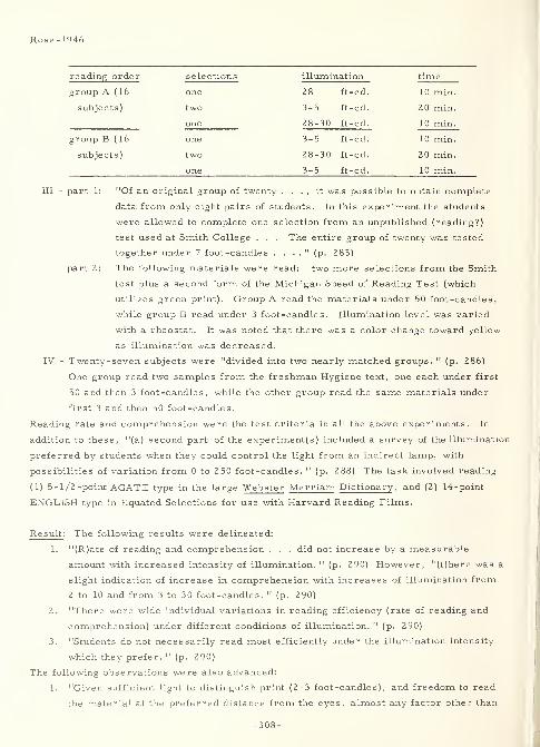
Rose-1946
reading order selections illumination time
group A ( 16 one 2 8 ft -cd 10 min.
subjects) two 3-5 ft-cd. 20 min.
one 28-30 ft-cd. 10 min.
group B ( 16 one 3-5 ft-cd. 10 min.
subjects) two 28-30 ft-cd. 20 min.
one 3-5 ft-cd. 10 min.
III - part 1: "Of an original group of twenty . . . , it was possible to obtain complete
data from only eight pairs of students. In this experiment the students
were allowed to complete one selection from an unpublished (reading?)
test used at Smith College . . . The entire group of twenty was tested
together under 7 foot-candles . . . ." (p. 283)
part 2: The following materials were read: two more selections from the Smith
test plus a second form of the Michigan Speed of Reading Test (which
utilizes green print). Group A read the materials under 50 foot-candles,
while group B read under 3 foot-candles. Illumination level was varied
with a rheostat. It was noted that there was a color change toward yellow
as illumination was decreased.
IV - Twenty-seven subjects were "divided into two nearly matched groups. " (p. 286)
One group read two samples from the freshman Hygiene text, one each under first
50 and then 3 foot-candles, while the other group read the same materials under
first 3 and then 50 foot -candles
.
Reading rate and comprehension were the test criteria in all the above experiments. In
addition to these, "(a) second part of the experiment(s) included a survey of the illumination
preferred by students when they could control the light from an indirect lamp, with
possibilities of variation from 0 to 250 foot-candles. " (p. 288) The task involved reading
(1) 5-l/2-point AGATE type in the large Webster Merriam Dictionary , and (2) 14-point
ENGLISH type in Equated Selections for use with Harvard Reading Films.
Result : The following results were delineated:
1. "(R)ate of reading and comprehension . . . did not increase by a measurable
amount with increased intensity of illumination. " (p. 290) However, "(t)here was a
slight indication of increase in comprehension with increases of illumination from
2 to 10 and from 3 to 30 foot-candles. " (p. 290)
2. "There were wide individual variations in reading efficiency (rate of reading and
comprehension) under different conditions of illumination. " (p. 290)
3. "Students do not necessarily read most efficiently under the illumination intensity
which they prefer. " (p. 290)
The following observations were also advanced:
1. "Given sufficient light to distinguish print (2-3 foot-candles), and freedom to read
the material at the preferred distance from the eyes, almost any factor other than
-308-
Rose-1946
illumination seems to play a more important role in reading efficiency than
illumination. 11(p. 290)
2. "The very low illumination intensities, 2-3 foot-candles, are not to be recommended
for reading because of their effect upon posture, rather than because of their effect
upon reading efficiency. " (p. 290)
"Further studies need to be made . . . upon reading under normal free conditions in order
to balance the widely publicized . . . recommendations for greatly increased intensities of
illumination. " (p. 290)
* - This "includes the extremes found in any classroom at Smith College. " (p. 280)
* * *
2574 Rowland- 1958
Rowland, George E. and Cornog, Douglas Y.
Courtney and Co. ,Philadelphia, Pa.
SELECTED ALPHA-NUMERIC CHARACTERS FORCLOSED-CIRCUIT TELEVISION DISPLAYSTechnical rept. no. 21, 1 Jul 58, 2 1 p.
Contract C13ca-646AD-203 318
Problem : Design and test a set of minimum-size, upper-case, alpha-numeric charactersthat will be legible and appear to be normal on a Spanrad air-traffic control, television
display screen.
Procedure: In describing the requirement for new characters, the report first discussesviewing circumstances in terms of character identity and individuality when viewed fromany direction and mentions the following typographic characteristics pertinent to legibility:
stroke -width, contrast and its direction, size, horizontal and vertical spacing, height-
width ratio, and illumination level. Secondly, it describes the mechanical aspects of the
environment by considering the effect on characters of (1) the number of scan lines, (2)
skipped scan lines, (3) horizontal scan response, and (4) contrast setting. Recognizingthat time for developing the character set was too short for complete statistical evaluation,
the experimenters selecteda team of three subjects to view approximately 3/8-inch high, white-
on-black characters on a Spanrad screen in order to subjectively evaluate their comparativelegibility and eliminate undesirable sets. From 67 commercial type faces, five remained.These were: MEMPHIS BOLD, MEMPHIS EXTRA BOLD, SPARTAN BOLD, SPARTANBOLD ITALIC (numerals only), and SQUARE GOTHIC. More exhaustive variations in
viewing circumstances then left MEMPHIS BOLD for letters and SPARTAN BOLD ITALICfor numbers. Representative reasons for eliminating some of the sets are given.
Incorporating the reasons for previous selection and elimination, an entirely new characterset was designed with several variants for each character. A similar elimination proceduredevolved a single character for each letter and numeral in this set. Inverse and other types
of orientation were considered for character differences; e. g. as between C and U, M andW, E and 3, Y and V, etc. Finally, MEMPHIS BOLD/SPARTAN BOLD ITALIC, a celluloid
menu style not previously considered, and the newly devised set were compared. Thecriteria used in the design of the new character set included specification that the
characters should be (1) small enough to allow a maximum number of alphanumeric tags onthe screen, (2) large enough to minimize recognition error (i.e., maintain legibility),
(3) so designed that loss of a raster (scan) line would not cause such errors as mistakingan "E" for an "F", and (4) designed for projection onto a horizontal plotting table with
-309-
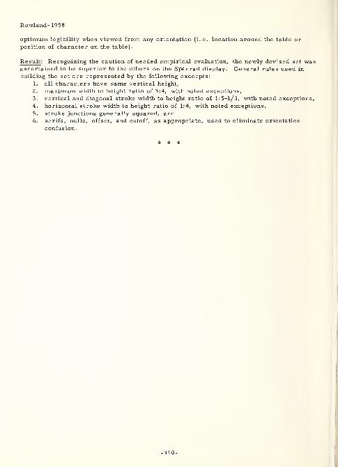
Rowland- 19 58
optimum legibility when viewed from any orientation (i. e. location around the table or
position of character on the table).
Result: Recognizing the caution of needed empirical evaluation, the newly devised set wasascertained to be superior to the others on the Spanrad display. General rules used in
building the set are represented by the following excerpts:
1. all characters have same vertical height,
2. maximum width to height ratio of 3:4, with noted exceptions,
3. vertical and diagonal stroke width to height ratio of 1:5-1/3, with noted exceptions,
4. horizontal stroke width to height ratio of 1:4, with noted exceptions,
5. stroke junctions generally squared, and6. serifs, nulls, offset, and cutoff, as appropriate, used to eliminate orientation
confusion.
# * *
-310-
2720
Schapiro, Harold B.
Rochester U. , N. Y.
FACTORS AFFECTING LEGIBILITY OF DIGITS
WADC technical rept. no. 52- 127,
Jun 52, 17p. , 28 refs.
Contract AF 33(038)18317
AD-1 117
Condensation of doctoral thesis
Problem : Determine how the legibility of single digits is affected by the interactions of
style, illumination, and stroke -width to height ratio.
Procedure : The author first gives a review of previous work. Then, as a speed-of-reading
test, twelve subjects, ages 19-33, with "normal" vision, each tachistoscopically read 3200
black-on-white digits in all possible combinations of the following parameters, with each
digit being read five times for every given combination. Styles utilized were AND 10400,
BERGER, CRAIK, and MACKWORTH. Illumination levels were 0 . 0 1 1 , 0.044, 0.145, and
0. 975 foot-lamberts. Stroke -width to height ratios were 1:5, 1:6.25, 1:8, and 1: 10.
Result: Variance analysis (including the "t" test for significantly high variances) of the
results indicated ( 1) illumination level was the most important parameter and there was marked
improvement in performance up to 0. 044 foot-lamberts but relatively little more for higher
brightness levels, (2) the MACKWORTH digits were most legible with AND 10400 a very
close second, (3) stroke-width to height ratios of 1:5 and 1:6.25 were superior to the others
tested, and (4) except for illumination, the differences between subjects were more
important than the other two variables. Correlation with the results of other investigators
was shown for all parameters of the investigation. Also, informal interviews indicated
that the 1:10 stroke -width to height ratio and the angularity of the BERGER digits were both
disliked.
* * *
3339 Scott-1903Scott, Walter D.
Northwestern U. ,Evanston, 111.
THE THEORY OF ADVERTISINGBoston, Mass., Small, Maynard and Co. , 1903, 240 p.
Problem : Study the effect of grouping, motion, color, type size, angle of viewing, contrast,
comprehension, relevance, repetition, shape, complexity/simplicity, esthetic quality,
convenience, significance, apparent size, and illusion of characters, words, andtypographic environment in advertising media. Also, specifically determine (1) the
legibility of type in railroad time-tables, and (2) the effect of contrast direction on the
legibility of printed material.
Schapiro-1952
Schapiro- 1952
-311-
Scott-1903
Procedure : The following table of contents delineates the scope of the book:
I. The theory of advertising.
II. Attention.
III. Association of ideas.
IV. Suggestion.
v. The direct command.VI. The psychological value of the return cou onre urn couponVII. Fusion.
VIII. Psychological experiment.IX.
X. Apperception.XI. Illusions of perception.
XII. Illusions of apperception.XIII. Personal differences in mental imagery.XIV. Practical application of mental imagery.XV. Conclusion.
In the experiments concerning the legibility of type in railroad time-tables, 4 to 12 subjects
participated in accuracy/speed reading tests involving a SMALL-FACE and a LARGE-FACE
type, each of which was presented in both medium and bold stroke -widths . The contrast
experiments were not delineated for procedure.
Result : The following observations resulted from the "time-table" experiments:
1. "(T)he LARGE-FACE type is easier to read and is not so subject to error as the
SMALL-FACE type. " (p. 125)
2. "(T)he lighter face type increase(d) the chance of errors . . . and increase(d)
the time necessary to read . . . ." (p. 128)
In a "series of laboratory experiments . . . black letters on a white background were seen
oftener than the white type on a black background. " (p. 139) Finally, general observations
concerning the parameters mentioned above are as follows:
1. "The easier and more pleasant the type is to read, the greater are the chances that
it will be read and have the desired effect. " (p. 129) Also, since they are only
symbols, "(t)ype forms must not be regarded as a production of artistic demands,
but as a product of the demands of convenience. . . Those forms of type . . . best
perform their functions which are so easy of interpretation that they are not
noticed at all. " (p. 138)
2. "About four letters, four simple pictures, four geometrical figures or easy words
are as much as we can see or attend to at once. " (p. 7) And also, "the power of
any object to force itself into our attention depends on the absence of counter
attractions ." (p. 9)
3. A corollary to the above rule of four states that ". . . the width of perception for
printed words is about four. " (p. 140)
4. "(T)he power of any object to attract our attention depends on the intensity of the
-312-
sensation aroused. . . (M)oving objects produce a stronger sensation than
objects at rest. . . (R)ed is the color having the greatest attention value, green
is the second and black the third. Black on a white background is more effective
than white on . . . black . . . ." (p. 12-14) Corollary to this is the concept that
". . . white objects appear larger than black ones. . . Red, orange, and yellow
objects look larger than objects of the same size which are green and blue. " (p. 171)
Also, ". . . red objects look closer than green ones. " (p. 172)
5. "(T)he attention value of display (large and heavy) type increases in almost exact
proportion to the increase of its size. " (p. 14)
6. "Objects that fall under the direct gaze of the eyes make stronger visual impres sions
than those which fall out of the focus. " (p. 14-15)
7 .
" (T)he attention value of an object depends upon the contrast it forms to the object
presented with it, preceding or following it. " (p. 15) Thus, ". . . when red and
green are placed in juxtaposition. . . red looks redder and . . . green looks
greener. " (p. 17)
8. "( T)he power which any object has to attract our attention, or its attention value ,
depends on the ease with which we are able to comprehend it ." (p. 18) Thus,
"(s)tyles of lettering that are not easily read . . . are not so attractive (sic) as
lettering . . . that (is) more simple and transparent in . . . meaning. " (p. 19)
9. "(L)ettering that is distinct may be so united and so dimmed by the background that
the whole is an indistinct blur. " (p. 19)
10. 11 '(I)rrelevant words' ... do not attract the attention ... as often as relevant
(ones) . . . ." (p. 19-20)
11. "(T)he attention value of an object depends on the number of times it comes before
us, or on repetition ." (p. 24)
12. "(T)he attention value of an object depends on the intensity of the feeling aroused .
"
(p. 29) Thus, "(a) command in good display type at the beginning of an advertisement
may express in a few words the intent of the entire advertisement. " (p. 7 5)
13. "(T)he TRIANGLE is more attractive than a SQUARE, an OBLONG, or PARALLEL
LINES . . . ." (p. 82)
14. "(A)U things tend to fuse and only those things are analyzed that must be analyzed
. . . and only after the process of analysis ... do we perceive the parts ."
(p. 98-99)
15. "(W)e judge everything in the light of its environment it fuses with its
environment and the environment becomes a part of it. " (p. 101)
16. "(W)e observe only those things which have significance for us . . . ," (p. 153)
as for example the tail of the Q in distinguishing the Q from the O.
* * *
-313-
Seibert-1959
3298 Seibert-1959
Seibert, Warren F. ,Kasten, Duane F. , and
Potter, James R.
Purdue U. , Lafayette, Ind.
A STUDY OF FACTORS INFLUENCING THE LEGIBILITY
OF TELEVISED CHARACTERSJournal of the SMPTE, 68:7 (July 1959) 467-472, 6 refs.
Problem : Determine the effect of viewing distance, viewing angle, image size, figure-
background contrast, and elapsed viewing time on the legibility of upper-case, alpha-
numeric characters when displayed on a television screen.
Procedure : Thirty-six subjects (college students, ages 17-35, and having normal near and
far visual binocular acuity) were randomly seated at specific viewing stations in order to
observe 252, randomly ordered, four character groups presented on a 24-inch television
screen, whose picture -tube center was 6 feet above floor level. Viewing time was 10
seconds per group. Stimuli were FUTURA MEDIUM, upper-case, alpha -numeric character s
displayed on the screen at 85 percent of their normal height. Characters eliminated from
the set for the purpose of this experiment were I, O, R, Z, 1, 2, 7, and 0. The
experimental design was a factorial of the following variables: Viewing distances were 6,
9.8, 13.6, 17.4, 21.2, and 25 feet. Viewing angles were 0, 19, and 38 degrees. Stimuli
sizes were 60-point (ARTY PE catalog numbers 1158 and 1159), 48 -point (number 1108), 36-
point (number 1004), and 24-point (number 1209). Contrast directions (stimulus/field) were
black/white, white/black, and white/medium-gray. The elapsed time variable was
accomplished by showing the stimuli in three periods of approximately 15 minutes each,
with 5 minute "filler" periods in between. Distance between characters in each stimulus
group was three times the stroke-width between the two nearest parts of adjacent
characters. Room illumination was measured at between 6. 5 and 38. 0 foot-candles in
various parts of the room. Accuracy, the test criterion, was based on each subject making
a "best estimate" of the content of each group.
Result : Generally, the "results indicate that no visual fatigue occurred, that black-on-
white and white -on-black contrasts produced about equal visibility, and that characters
subtending 10 min (or more) of vertical visual angle could be perceived with almost
complete accuracy. " (p. 467) Further, "information gathered during the course of the
study . . . lends support to the following conclusions:
1. "Persons with average (or somewhat better . . . ) visual acuity can engage in
moderate. . . to heavy TV viewing for . . . one hour without . . . loss in . . .
ability to perceive and record . . . information presented. . .
2. "(L)egibility (loss) . . . becomes pronounced at an angle (of viewing) between
19 and 38°. . .
3. "(U)nder most conditions, black-on-white characters are . . . more legible
than white -on-black" (p. 471) with white on medium gray less legible than either of
-314-
Siebert-1959
the others. However, "when character size was reduced appreciably, the white-on-
black characters become much less legible than the black-on-white ... (p. 470)
4. "(V)iewing distance and character size influence(d) legibility ..." (p. 471) In
this, with screen centers "5-1/2 to 6 feet" above the floor, "the minimum distance
recommendation should take account of the posture assumed and ... a minimum
(viewing) distance of five to six screen widths (maintained as) . . . acceptable . . .
"
(p. 47 1)
In making use of the study results, the following operational vs. experimental differences
must be considered:
1. Subjects used in the experiment demonstrated "a relatively high level of visual
acuity. " (p. 47 1)
2. The experimental "'nonsense' visuals should . . . underestimate legibility of
meaningful materials ..." (p. 47 1)
3. "(I)t can only be assumed . . . that the characteristics of the TV system used
. . . were 'typical' ..." (p. 471)
3335
Silver, Edwin H.
VISIBLE LICENSE PLATES AS A SAFETY AIDAAMVA Bulletin, 5:1 (January 1940) 20-22
Silver-1940
Extract : The following material is excerpted from this review article:
"(F)actors (that) influence the accuracy of perception of the license plate of a moving car.
. . (are t)he vision and mental attitude of the person observing . . . (, ) the conditions whichsurround the license plate itself: the amount of haze . . . ; dust or moisture on the plate;
the roughness of the highway; the size and stability of the vehicle; the amount of illumination
of the plate, as well as the color of the vehicle against which the tag is exhibited. . .
(F)actors which are found in the plate itself. . . are: the color and gloss of the legend and
background; the height, width, spacing and shape of the numerals and letters; the thickness
or stroke of numerals; the ratio of height to width of numerals, and finally the reflection
coefficients of the legend and background. (It is noted also) that a complementary color
placed beside another tends to make it appear more deeply saturated. " (p. 2 1)
"Legibility of a moving plate decreases if the letter or digit is too broad because of the
positive after-image left on the retina by a series of lateral displacements caused byvibration. Broad letters likewise tend to run together, as will groups of letters when too
closely spaced. The accommodation of the eye when fixing on a moving object also enters
into the subject. . . Because of the . . . complication of (the above) . . . factors, Dr.
Lauer conducted . . . research with the license plate as a fixed object, under the premisethat things read at the greatest distance and under different conditions of illumination while
motionless would be read best when moving. " (p. 21)
"The results showed: (1) Dark legends on a light background offer the highest legibility in
both high and low illumination. (2) Orange and red license plates are not efficient belowfour to five lumens or foot candles. (3) Bright yellow of about 575 mm (sic) makes a verygood background. (4) Greens and blacks are best for numerals in various degrees of
illumination. (5) Colors with long wave lengths are better for legend than background. (6)
A 30 to 50 percent difference in reflection factors of legend and background offers the best
-315-
Silver- 1940
results. (7) The ratio between number and background should not exceed one to four. (8)
Letters and numbers, if not black, should have a width-height ratio of 1 to 3 for bestlegibility. (9) The optimal stroke-width ratio of numberals (sic) is about 1 to 5. (10)
Spacings 50 percent of the width of the numerals give the greatest legibility. (11) Numbersof four digits or less are preferable for legibility. (12) Groupings of two digits are mostlegible when exposed for sufficient time. (13) Metallic colors are best in low illumination,
especially when exposed to a direct beam of light. They act as semi-reflectors. " (p. 21-
22)
* * *
3264 Sleight-1952
Sleight, Robert B.
Johns Hopkins U. , Baltimore, Md.
THE RELATIVE DISCRIMINABILITY OF SEVERALGEOMETRIC FORMSJournal of Experimental Psychology, 43:4
(April 1952) 324-328, 11 refs.
Rept. no. 166-1-55, Special Devices Center,
Contract N5-ori-166
Problem : Concerning the relative discriminability of geometric forms, in sorting previous
"literature into disagreements among comparable data and agreements among unrelated
data, . . . one reaches the . . . conclusion that there can be no efficient ranking of
geometric forms as an unequivocal abstract in itself. . . It seems appropriate, therefore,
to investigate forms as they are 'good' in particular classes of situations and for particular
purposes rather than to search abstractly for 'good' designs per se . . . Two aspects of
discriminability were considered in this study: (a) the efficiency of the various forms in
terms of 'sorting time 1 required, and (b) the 'attention-getting' value of the forms as
measured by the priority of (subjects') selections. " (p. 324)
Procedure : "The stimuli were six each of 2 1 different geometric figures, . . . constructed
of black paper and mounted on l-l/4-(inch) clear lucite squares. Each figure was the
maximum size which could be inscribed within a l-(inch) diameter circle. " (p. 324) Names
of the figures were as follows: AIRPLANE, CIRCLE, CRESCENT, CROSS, DIAMOND,
DOUBLE-CONCAVE, ELLIPSE, HEART, HEPTAGON, HEXAGON, OCTAGON,
PENTAGON, RECTANGLE, SEMI-CIRCLE, SHIELD, SHIP, SQUARE, STAR, SWASTIKA,
TRAPEZOID, and TRIANGLE. "A circular board, 25 (inches) in diameter and painted flat
white, was used as a display background. . . The board was set on a table 30 (inches)
from the floor. The 12 6 figures were spread out in random order and in various
orientations .... Overhead room lighting was used. . . (p. 325) Sixteen male and five
female (subjects, who were told to emphasize accuracy rather than speed) participated"
(p. 32 6) in two tasks. In the first, "each (subject) was instructed to sort first the kind of
figure which, at a glance, seemed to 'stand out' or seemed to be 'easiest to sort quickly. '
All six of these were . . . completed before another kind was sorted. " (p. 325) The other
-316-
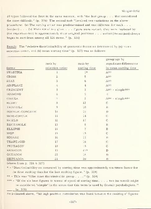
Sleight-1952
20 types followed the first in the same manner, with "the last group . . . that considered
the most difficult. " (p. 32 6) The second task "involved two variations on the above-
procedure: (a) The sorting order was predetermined and was different for each . . .
(subject) . . . (b) When six of any given . . . figure were sorted, they were replaced by
(the experimenter) in approximately their original positions . . . so that (the subject) always
began to sort from among all 126 items. " (p. 326)
Result: The "relative di s c riminability of geometric forms as determined by (a) mean
selection order, and (b) mean sorting time " (p. 327) was as follows:
groupings by
rank by rank by significant differences
forms selection order sorting time in mean sorting time
SWASTIKA 1 1* A**
CROSS 2 5 A**
STAR 3 6 A**
AIRPLANE 4 4 A**
CRESCENT 5 3 A** - simple***
DIAMOND 9 B
CIRCLE 7 2 A** - simple***
HEART g 12 C
T R T A Nr, T FX IV Ur\ _ N V_J J_j Hi Q7 10 B
10 19 D
SEMI-CIRCLE 1
1
14 C
SHIELD 12 17 C
RECTANGLE 13 8 B
ELLIPSE 14 7 B
SHIP 15 13 C
SQUARE 16 11 B
TRAPEZOID 17 16 C
PENTAGON 18 15 C
HEXAGON 19 21* D
OCTAGON 20 18 D
HEPTAGON 21 20 D(above from p. 326 & 327)
* - "Discriminability as measured by sorting time was approximately ten times faster for
the first ranking than for the last ranking figure. " (p. 328)
** - This was "(t)he most discriminable group . . . ." (p. 328)
*** - "Of the six best figures in terms of speed of sorting time, . . . two (as noted) might
be considered 'simple' in the sense that this term is used by Gestalt psychologists. "
(P- 328)
As indicated above, "(a) high positive correlation was found between the ranking of figures
-317-
Sleight- 1952
according to sorting time and ranking based on (subjects') order of selection of items
according to their 'attention-getting' value. . . It would seem that the present study as
well as the earlier researches supports the thesis that neither 'good' nor 'bad' are qualities
intrinsic to form per se but an extrinsic evaluation that may be applied to any given form
depending upon the total situation being considered and the purpose to be served. " (p. 328)
3277 Slivinske-1957
Slivinske, Alec J. , and Crumley, Lloyd M.
Pennsylvania State U. , University Park
HUMAN ENGINEERING INVESTIGATION OF AIRCRAFTCOCKPIT VISUAL DISPLAYS: THE EFFECTS OF CONTRAST,COLOR, AND VIEWING ILLUMINATION ON THE LEGIBILITY
OF LETTERS AND NUMERALSRept. no. NAMC-ACEL-392 (TED NAM AE - 7047 , Part 16a),
27 Feb 57, 13p. , 3 refs
.
AD-129 107
Problem : "(I)nvestigate the effects of contrast, color, and viewing illumination (and their
interactions) on the legibility of printed letters and numerals. " (p. 1)
Procedure : "The letters used were E, L, N, T, Y, and the numerals were 2, 4, 5, 7, and
9 (all from the AND 10400 set). . . (p. 2) They were presented (singly) under three
degrees of contrast (46. 45, 15. 30, 5. 16), two values of color (white on black vs. red on
black), and under conditions of day viewing (30 foot-candles) as opposed to night viewing
(. 09 foot-candles). A total of 50 (student) subjects were run under 10 combinations of
these conditions since the stimuli were not legible under the lowest contrast value (5. 16) at
the night illumination. . . (p. 11) The letters or numbers were flashed (3/l6 inches high)
onto a . . . ground glass viewing plate . . . 2-1/4 (by) 3-1/4 (inches) . . . at 28 (inches
from the subject). " (p. 2)
Result: "Contingent upon the conditions of the study, the following conclusions were
warranted by the findings:
1. "When the effects of contrast and color were analyzed independently under day and
night viewing conditions, they failed to produce reliable effects on . . . legibility
2. "When . . . combined in a single analysis, viewing illumination was found to be
reliably related to legibility. Specifically, day viewing produced significantly
shorter read-out times than the simulated night viewing .... Neither of the other
variables nor any of the interactions . . . yielded reliable effects. . .
3. "It was (shown) that the stability of legibility measures which (were) obtained
after a relatively small number (20 here) of practice trials . . . provide(d) a useful
-318-
Slivinske- 1957
methodological finding.
4. "Slight differences between the rank orders of the letters and numerals . . . were
noted under day and night viewing conditions. The correlation between ranks,
however, was . . . statistically reliable." (p. 12) The rank order was as follows:
day - N, E, L, Y, 5, 2, 9, T, 4, and 7; night - E , N, L, 9, 5, T, 2, Y, 7, and 4.
In general, except for day being significantly better than night viewing, the apparent
superiority of (1) the high contrast ratio, (2) red on black in night viewing, and (3) white on
black in day viewing, did not hold.^ .
;<
3324 Smith- 1958
Smith, G. W. and Israel, R. J.
OVERHEAD SIGNS
California Highways and Public Works, 37:11-12
(November -December 1958) 25-30
Extract : "The use of upper and lower case letters for guide signs . . . (is) of proven
advantage in recognition and legibility .... The CALIFORNIA style of lower case lettering
was subsequently utilized for directional signing by the major eastern toll roads. . . (and)
has been adopted . . . for destinations on the interstate system. . . (W)hite letters on a
dark background . . . (give) more effective nighttime legibility . . . One of the most
important developments in the signing field has been the overhead illuminated signing . . .
(p. 25) lighted . . . (by a) fluorescent . . . fixture . . . mounted below the sign in order to
eliminate the objectionable daytime shadow of the lighting fixture on the sign face. . .
(p. 26) (T)he largest . . . type frame covered by the standard plans is 10 (feet by) 60
(feet). . . (p. 28) (I)nterstate guide signs will have a green background and wid(e) borders,
with rounded corners. The interstate manual reserves upper and lower case lettering for
destinations only, so that (exit) distance, lane assignment, etc. will appear as all
capital letters. This will involve the mixing of upper and lower case letters on
the same sign. Perhaps the major difference in interstate (over California) signing will be
the diagonal up arrow at the exit ramp . . . ." (p. 29)
2721 Soar-1955a
Soar, Robert S.
Vanderbilt U. , Nashville, Tenn.
HEIGHT -WIDTH PROPORTION AND STROKE WIDTHIN NUMERAL VISIBILITY
Journal of Applied Psychology, 39:1 (February 1955)
43-46, 16 refs.
Problem : Study the effect of the interaction between height/width ratio (holding area
-319-
Soar- 1955a
constant) and stroke -width on the legibility of numerals.
Procedure : "A total of 72 (subjects, having 95 percent or better visual acuity, and being
from the university elementary psychology laboratory) provided six replications for all
combinations of height-width proportion at four levels (10:3, 10:4. 5, 10:6, and 10:7. 5) and
stroke width at three levels (. 0167, . 0125, and . 0083 inches). . . The heights and widths
of the finished (HAND-DRAWN) numbers were, in inches, respectively: (p. 43) . 1313 X .0396,
. 1067 X . 0483, . 0934 X . 0558, and . 0834 X . 0625. . . The stroke width to height ratios
(thus) ranged from 1:8 to 1:5 for the widest . . . and 1:16 to 1:10 for the narrowest stroke
width(s) . . . ." (p. 45) A pilot study indicated that 40 milliseconds at 1 foot-candle
illumination in a tachistoscopic exposure would yield about half the responses correct.
"The score for each (subject, therefore,) was the number of digits correctly identified. . .
(p. 43) The data were treated by analysis of variance and covariance. " (p. 45)
Result : "Height-width proportion and stroke width show(ed) no (significant) interaction. . .
Height-width proportion was a source of variation in (legibility) significant beyond the 1
(percent) level for . . . numerals (0, 3, 4, 7, and 9), and beyond the 5 (percent) level for
(the numeral 6) . . . . Stroke width was a significant (1 percent) source of variation for
only (the) numeral (8). The most (legible) combination of height, width, and stroke width
for all numbers (was) a height-width ratio of 10:7. 5 and a stroke width to height ratio of
1:10. . . (p. 45) The only numbers for which one of the two widest combinations (of height-
width) was not the most (legible were) the 5 and 9. " (p. 44)
* * *
3267 Soar-1955b
Soar, Robert S.
Vanderbilt U. ,Nashville, Tenn.
STROKE WIDTH, ILLUMINATION LEVEL, ANDFIGURE-GROUND CONTRAST IN NUMERAL VISIBILITY
Journal of Applied Psychology, 39:6 (December 1955)
429-432, 15 refs.
Problem : In determining numeral visibility, ascertain the effect of the following
interactions: stroke -width vs. illumination level, stroke -width vs . contrast direction,
illumination level vs. contrast direction, and stroke -width vs. illumination level vs.
contrast direction.
Procedure: Forty college students (all having 100 percent normal visual acuity) viewed
stimulus numerals (HAND-DRAWN and photographically reduced to about the size of 10-point
type) in black-on-white and the reverse, in stroke -width to height ratios of 1 to 4 and 1 to
16, and under illumination levels of 0. 5 and 500 foot-candles. "The forms of the numbers
-320-
Soar-1955b
followed those found to be optimal by Brown et al. " (p. 430) In all, "five replications of
eight combinations of experimental conditions" (p. 432) were studied. The task involved "a
variant of the method of constant stimuli, in which each subject observed the . . . numbers
at three different distances under one of the combinations of experimental conditions. The
score for each subject was an estimated threshold distance at which he would have been
expected to read half of the numbers correctly. " (p. 430)
Result: Neither stroke -width nor contrast direction "showed a significant influence on
visibility, but illumination level was highly significant. Stroke width interacted
significantly with illumination level" (p. 432) and with contrast direction. "The interaction
between illumination level and (contrast direction) . . . was not significant; further, there
was no suggestion in the data that such an interaction exists. The interaction of all three
variables was significant. " (p. 432) In addition, the following general statements were
made:
1. The problem of contrast direction (at least for B/W vs. W/B) "can be settled only
if the optimal stroke width is determined separately for each, and for the
illumination under which the comparison is to be made. 11
(p. 431) In converse,
"(b)oth illumination level and (contrast direction) must be known to specify the
optimal stroke width. " (p. 431)
2. "If the application is subject to a wide range of illumination levels, it seems likely
that the best choice of stroke width would be that which would be optimal at the
lowest illumination level, since visibility would be expected to increase more
rapidly with rising illumination than it would decrease as a function of nonoptimal
stroke width. 11(p. 431)
2722 Soar-1958
Soar, Robert S.
Vanderbilt U. , Nashville, Tenn.
NUMERAL FORM AS A VARIABLE IN NUMERAL VISIBILITY
Journal of Applied Psychology, 42:3 (June 1958) 158-162, 9 refs.
Problem : Compare the legibility of individual numerals from five experimentally developed
sets that differ from each other in numeral form.
Procedure : Previous work concerning legibility comparisons between experimental
numeral sets shows contradictions in the results. Even for "errors in reading maximally
legible numeral forms", (p. 159) previous work of the author shows the following
confusions: 0 with 6 and 9; 1 with 4; 2 with 8; 5 with 6 and 8; 6 with 4; 8 with 6 and 9; and
3, 4, 7, and 9 with other numerals in random fashion. "These . . . patterns of confusion
provided the basis for designing experimental numera(l sets). An attempt was made to
-321-
Soar-1958
minimize the . . . common . . . , and to emphasize the unique elements. . . Three . .
numera(l sets) were prepared . . . : one by altering stroke width, a second by altering
form, and a third in which both alterations were made simultaneously. A fourth set
(was) prepared which duplicated . . . those designed by McLAUGHLIN. The control (a
fifth set of) numerals were those whose form had been found to be maximally visible by
Brown . . . , and whose optimal height-width combination and stroke width had been
determined by (the author). . . The stimulus numerals (three sets) were hand-drawn, 2
inches high and 1. 5 inches wide, and with stroke widths of . 2-. 4 of an inch. . .
McLAUGHLIN's numerals were . . . the same external dimensions, but with a maximumstroke width of . 37 (inches). . . These were then reduced to one -twentieth . . .
, resulting
in . . . figures approximately the size of 10-point type. . . One hundred college student
(subjects, having normal visual acuity for the distance required) . . . provid(ed) 20
replications of the five experimental conditions . . . (in the) Harvard Tachistoscope . . .
The exposures were 40 milliseconds . . . under approximately one foot candle of
illumination. . . (A)nalysis of variance and covariance. . ." (p. 159) were made on the
data.
Result: "(S)ix of the experimentally developed numerals (0, 1, 2, 5, 6, and 8) were shown
to be significantly more visible than the current standard. " (p. 162) However, "(t)he data
suggest that boldness, rather than form, is the important factor . . . ." (p. 160) Also,
"there are suggestions (from this) and in (a previous) study . . . that . . . visibility may
be increased by allowing stroke width to vary from numeral to numeral ..." (p. 160)
and/or within one numeral, particularly for their unique elements. Numeral sets were
identified as follows: A = the standard (BROWN?), B = changes in stroke width
(McLAUGHLIN?), C = changes in form (EXPERIMENTAL), D = changes in stroke width
(EXPERIMENTAL?), and E = changes in form and stroke width (EXPERIMENTAL). The
following significant differences were found (with indications as to important variables):
0 - AC < D < BE (beyond l/lO percent) differences not clear, i. e. D vs. B vs. E
1 - AC < BDE (beyond 1/10 percent) differed only in boldness, except rounded ends in B
2 - C < A < DE < B (beyond 1 / 10 percent) form important, as well as boldness
3 - no significant differences, however A, C, D, and E were identical in form
4 - same as 3
5 - A < C < BD < E (beyond 5 percent) form and stroke width both important
6 - ACDE < B (beyond 5 percent) form and stroke width both important
7 - same as 3
8 - AC < BDE (beyond 1 percent) boldness important
9 - no significant differences
Stroke width for the whole number improved 0, 1, and maybe 2; stroke width for a part of
the number (and to a certain extent form of the number) improved 5, 6, and 8; and form
improved 2, 5, and 6. Openness of the internal white space in the numbers was also seen
as a factor.
* X *
-322-
2579
Solomon, David
Bureau of Public Roads, Washington, D. C.
THE EFFECT OF LETTER WIDTH AND SPACING ONNIGHT LEGIBILITY OF HIGHWAY SIGNS
In HIGHWAY RESEARCH BOARD, PROCEEDINGS OF
THE THIRTY -FIFTH ANNUAL MEETING, 1956, Fred
Burgrraf and Elmer M. Ward, Editors, (Washington, D. C. ,
National Academy of Sciences -National Research Council
Publication 42 6, 1956), Vol 35, 600-617, 3 refs.
Problem : "(D)etermine the effect that (letter width, i.e.,height-width ratio, and) spacing
between letters (i.e. , horizontal character spacing) of words, used in highway signs, had
on their nighttime legibility. " (p. 600)
Procedure (primary ): "More than 2, 500 observations were made by 36 observers while
driving an automobile at 30-(miles per hour at night). White reflectorized (all capital)
letters, 10 (inches) high, were displayed on a black nonreflectorized background. Three
different alphabets were used. Two of these, the Standard (U.S. Bureau of Public Roads)
SERIES C with narrow letters and the wider SERIES E, were cut from reflective sheeting
The third alphabet, identified as SERIES ED and similar in width to the SERIES E, was
designed . . . using l-l/4-(inch) diameter plastic reflectors to form the letters. The
spacings between letters were increased as the lengths of the six test words (BALK, DUCK,
FARM, NAVY, STOP, and ZONE) were extended from normal to 20, 40, and 60 percent
above normal. " (p. 600)
Result (primary) : 'As interletter spacing was increased, the legibility distances a.lso
increased for all three alphabets until word lengths were 40 percent above normal. The
resulting gain i(n) legibility at this point was 15 percent for SERIES C, 16 percent for . . .
E, and 7 percent for . . . ED. . . When word lengths were normal or no more than 10
percent above . . . , test signs with the . . . ED alphabet (had) greater legibility. . .
(A)t corresponding letter spacings the SERIES E alphabet was legible at a greater
distance . . . than the narrower . . . SERIES C . . ., the differences . . . rang(ing) from
23 . . . to 27 percent. (However, a) word with letters of the ... C ... is shorter . . .
than one with letters of the . . . E for a given spacing, and a comparison of legibility
distance per inch of word length showed that the . . . C . . . was . . . superior to the . . .
E. " (p. 600)
Procedure (height variant ): 'Also studied was the probable effect of increasing the letter
height of the narrower alphabet until the legend area equaled that of the wider alphabet. "
(p. 600)
Solomon- 1956
Solomon- 1956
-323-
Solomon- 1956
Result (height variant ): "At the point of equivalent legend area and spacing, the two
alphabets proved to be equally legible. " (p. 600)
Result (general ): "The study findings point to the importance of sign proportions and
provide an improved means for efficient determination of legend design. Where vertical
dimensions restrict sign letter heights to something less than desirable, increased spacing
between letters can help to compensate for the loss of legibility distance that would
otherwise occur. " (p. 600)
3354 Spragg-1952
Spragg, S. D. S. and Rock, M. L.
Rochester U. , N. Y.
DIAL READING PERFORMANCE AS A FUNCTION
OF BRIGHTNESS
Journal of Applied Psychology, 36:2 (April 1952)
128-137, 15 refs.
Problem: Determine the speed and accuracy of reading "photographic reproductions of
instrument dials as a function of the brightness of the dial markings. " (p. 136)
Procedure: Twenty (experiment I) and ten (experiment II) young adult males, all vigorously
screened for excellent visual abilities, participated in two speed and accuracy scored
experiments in which the task was to read photo -reproductions of circular dials, through
an 11-inch by 14-inch aperture at a distance of 28 inches. The stimuli each contained
three rows of four dials each, white -on-black, and in high contrast (greater than 10 to 1).
In Experiment I, the dials were each 2. 8 inches in diameter and contained 100 units,
divided (by scale marks and numbers) every 10 units. A sweep pointer indicated the
reading. In Experiment II, the dials were of the same configuration except that they were
1.4 inches in diameter and there were scale marks for every unit. Illumination (from
behind subject) had a color temperature in the neighborhood of 2400° K. Illumination levels
for Experiment I were 0. 005 (just above cone threshold), 0. 018 and 0. 022 (straddling a
pre -determined difficulty transition area), 0. 296 (intermediate), and 6. 0 (relatively high)
foot-lamberts . Similar adjudications for Experiment II provided illumination levels of
0.005, 0.01, 0.05, 0.1, and 1 . 0 foot -lamberts . Dark adaptation was accounted for.
Result : "Both for time and for error frequency scores a critical brightness level was
found at approximately 0. 02 foot-lamberts. At brightnesses below this level performance
was increasingly impaired; above this level increases in brightness produced little or no
improvement in visual performance. . . These findings suggest that for the night-time
operation of equipment where dial-reading and comparable visual tasks are involved
-324-
Spragg-1952
brightness values should be kept safely above the critical . . . level. . . (A)t higher (than
0.05 foot-lamberts) levels . . . brightness ceases to be a significant variable. " (p. 136)
Further, the authors compare their results with those of previous investigators, and in one
instance make the very interesting statement that "contrast, defined physically, is
independent of illumination. " (p. 135) The following limitations are applied to the results:
parallax error due to angle of viewing was not possible, contrast on photo -reproductions
may be lower than on actual dials, reflections from a glass face are lacking, and data
were taken under non-fatiguing conditions.
2723 Squires-1957
Squires , Paul C .
Naval Medical Research Lab. , New London, Conn.
NEW DIGIT DESIGNS FOR USE UNDER REFLECTED REDLIGHT OF LOW BRIGHTNESS
Rept. no. 284, 20 May 57, lip., llrefs.
AD-159 357
Problem : "(D)esign a set of digits uniquely appropriate for use under reflected red light of
low brightness, especially for use on rotating dials. " (p. ii)
Procedure: "Every effort was made to design the digits as nearly as possible in harmony
with our number perception habits. That is to say, radical novelties (were) incorporated
in a NEW design only where deemed absolutely essential for speedy and accurate reading
under low red light. . . In (this) NEW set of digits, uniform stroke-width (was) sacrificed
wherever necessary in the interest of optimum recognizability . . . (p. iii) The digits were
cut out of white Strathmore Bond paper having a reflectance of 80 per cent, under the
condition of a (matte) black background; these were attached ... to a clear Plexiglass
dial 1 (foot) in diameter. . . (, ) vertically mounted in such manner that it could be rotated.
The dial was mounted immediately behind a matte black disc of 1 (foot) diameter . . . with
an open sector large enough to permit one digit to be shown at a time ... at any desired
position on the arc. . . Two sets of digits were tested: (1) The NAMEL (and) ... (2) The
NEW designs. Each digit in both sets was 42 (millimeters) high, subtending a visual angle
of 28. 6 minutes at a viewing distance of 16. 5 (feet). . . (I)lluminating the digits . . . was
... an overhead . . . egg-crate . . . fluorescent, equipped with two 8-watt tubes
(e)nclosed in red acrylic cylinders. . . accepted as standard in submarine lighting. The
brightness of the digits . . . was 0. 165 (foot-lamberts) . . . Each observer . . . was
shown one digit at a time in the upside down position. . . (, ) whereupon (he) began to
increase the brightness of the visual field (in the Luckiesh-Moss Visibility Meter) until he
. . . could 'just barely but with certainty' identify the digit. . . Seven . . . Navy personnel
. . . served . . . (as observers). . . (p. 3) Analysis was by variance technique." (p. 8)
-325-
Squires - 1957
Result: "A set of digits was designed, which was uniquely appropriate for use under
reflected red light of low brightness levels, especially in connection with rotating dials. . .
Findings . . . (were) with regard to the comparative absolute thresholds of the NEW digits
and the NAMEL . . . set . . . used as criterion. . . (p. iii) (O)nly two variances differ(ed)
significantly from chance: between types and between observers. Both . . . (were) beyond
the 1 (percent) level . . . (T)here (was) a significant perceptual difference between the
NEW and NAMEL types of (and individual) digits. Since the interaction between types and
observers (was) not significant, the observers presumably behaved similarly with respect
to the types of digits. . . (p. 4) (However, t)hese NEW digit designs should under no
circumstances be used for general purposes. . . (p. iii) Some typical comments by the
(observers) follow:
'A perfect "8" 1 (this was a NAMEL '3').
1 "8", "2", and "4" are good' (said of NEW).
' "3" and "8" not confused' (NEW).1 "4" is good because of longer extension of horizontal line segment' (NEW).
'This "8" (NEW) is better than the other "8"; I don't confuse this "8" with "3". 1
'I don't mix up this "2" (NEW) with any other number. 1
'The "4", "8", "2", "0" look really good under this low light' (NEW).
'This "8" I don't confuse with "2" ' (NEW).
'This "3" is like an "8"' (NAMEL).
' "2" (NAMEL) looks like a "5" or "7". '
'I confuse "2" with "8" at lower light levels' (NAMEL).
'The "1" like "0" when very dim' (NAMEL).' "3" a hard number to read' (NAMEL).
'1 confuse "2" and "5", "3" and "8", "5" and "3" ' (NAMEL).
'I confuse "3" with "8" a lot' (NAMEL). " (p. 5)
-326-
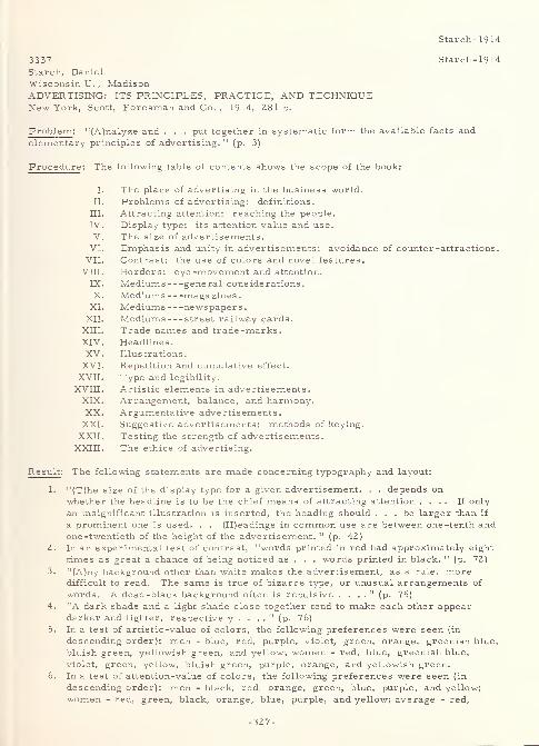
Starch- 1914
3337 Starch-1914
Starch, Daniel
Wisconsin U. , MadisonADVERTISING: ITS PRINCIPLES, PRACTICE, AND TECHNIQUENew York, Scott, Foresman and Co.
, 1914, 281 p.
Problem : "(A)nalyze and . . . put together in systematic form the available facts and
elementary principles of advertising. " (p. 3)
Procedure: The following table of contents shows the scope of the book:
I. The place of advertising in the business world.
II. Problems of advertising: definitions.
HI. Attracting attention: reaching the people.
IV. Display type: its attention value and use.
V. The size of advertisements.VI. Emphasis and unity in advertisements: avoidance of counter-attractions
VII. Contrast: the use of colors and novel features.
vni. Borders: eye -movement and attention.
IX. Mediums general considerations.
X. Mediums magazines
.
XL Mediums newspapers.XII. Mediums street railway cards.
XIII. Trade names and trade -marks.XIV. Headlines.
XV. Illustrations.
XVI. Repetition and cumulative effect.
XVII. Type and legibility.
XVIII. Artistic elements in advertisements.XIX. Arrangement, balance, and harmony.XX. Argumentative advertisements.
XXL Suggestive advertisements: methods of keying.
XXII. Testing the strength of advertisements.
XXIII. The ethics of advertising.
Result: The following statements are made concerning typography and layout:
L "(T)he size of the display type for a given advertisement. . . depends on
whether the headline is to be the chief means of attracting attention .... If only
an insignificant illustration is inserted, the heading should ... be larger than if
a prominent one is used. . . (H)eadings in common use are between one -tenth andone -twentieth of the height of the advertisement. " (p. 42)
2. In an experimental test of contrast, "words printed in red had approximately eight
times as great a chance of being noticed as . . . words printed in black. " (p. 72)
3. "(A)ny background other than white makes the advertisement, as a rule, moredifficult to read. The same is true of bizarre type, or unusual arrangements of
words. A dead-black background often is repulsive . . . ." (p. 75)
4. 'A dark shade and a light shade close together tend to make each other appeardarker and lighter, respectively . . . .
" (p. 76)
5. In a test of artistic -value of colors, the following preferences were seen (in
descending order): men - blue, red, purple, violet, green, orange, greenish blue,
bluish green, yellowish green, and yellow; women - red, blue, greenish blue,
violet, green, yellow, bluish green, purple, orange, and yellowish green.
6. In a test of attention-value of colors, the following preferences were seen (in
descending order): men - black, red, orange, green, blue, purple, and yellow;
women - red, green, black, orange, blue, purple, and yellow; average - red,
-327-
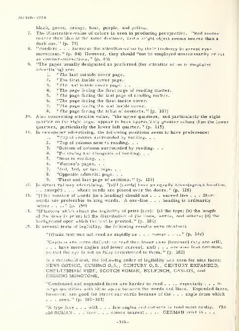
Starch-1914
black, green, orange, blue, purple, and yellow.
7. The illustrative -value of colors is seen in producing perspective. "Red seemsnearer than blue at the same distance, and a bright object seems nearer than a
dark one. " (p. 79)
8. "Borders . . . increase the attention-value by their tendency to arrest eye-movement. " (p. 84) However, they should "not be employed unnecessarily or act
as counter-attractions. " (p. 85)
9. "The pages usually designated as preferred (for attention value in magazineadvertising) are:
1. "The last outside cover page.
2. "The first inside cover page.
3. "The last inside cover page. . .
4. "The page facing the first page of reading matter.5. "The page facing the last page of reading matter.6. "The page facing the first inside cover.
7. "The page facing the last inside cover.
8. "The page facing the table of contents. " (p. 107)
10. Also concerning attention value, "the upper quarters, and particularly the right
quarter on the right page, appear to have appreciably greater values than the lowerquarters, particularly the lower left quarter. " (p. 115)
11. In newspaper advertising, the following positions seem to have preference:
1. "Top of column surrounded by reading. . .
2. "Top of column next to reading. . .
3. "Bottom of column surrounded by reading. . .
4. "Following and alongside of reading. . .
5. "Next to reading. . .
6. "Women's pages. . .
7. "2nd, 3rd, or last page. . .
8. "Opposite editorial page. . .
9. "First and last page of sections. " (p. 126)
12. In street railway advertising, "(a)ll (cards) have an equally advantageous location.
. . excep(t) . . . where cards are placed over the doors. " (p. 128)
13. "(T)he number of words (in a heading) should not . . . exceed five . . . Short
words are preferable to long words. A one -line . . . heading is ordinarily
better . . . ." (p. 150)
14. "(F)actors which affect the legibility of print (are): (a) the type; (b) the length
of the lines in print; (c) the distribution of the lines, words, and letters; (d) the
background upon which the text is printed. " (p. 181)
15. In several tests of legibility, the following results were obtained:
"(I)talic text was not read as rapidly as . . . roman . . . ." (p. 182)
"Capitals are more difficult to read than lower case (because) they are stiff,
. . . have more angles and fewer curves(, and) . . . are also less common,so that the eye is not so fully accustomed to them. " (p. 182)
In a threshold test, the following order of legibility was seen for nine faces:
NEWS GOTHIC, CUSHING O. S. , CENTURY O. S. , CENTURY EXPANDED,CHELTENHAM WIDE, SCOTCH ROMAN, BULFINCH, CASLON, andCUSHING MONOTONE.
"Condensed and expanded faces are harder to read . . ., especially ... in
large quantities with little space between the words and lines. Expanded faces,
however, are good for street car cards because of the . . . angle from which. . . seen. " (p. 182-183)
"A type face . . . with . . . few angles and corners is read most easily. Theold ROMAN . . . face . . . comes nearest .... GERMAN print is . . .
-328-
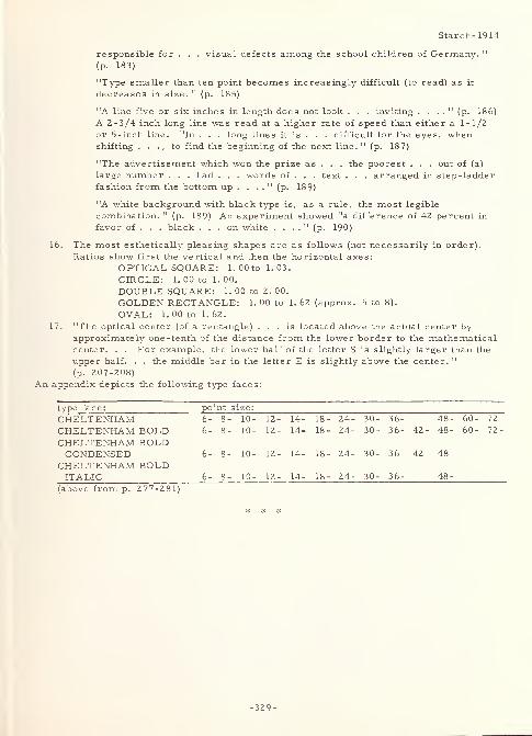
Starch- 1914
responsible for . . . visual defects among the school children of Germany. "
(p. 183)
"Type smaller than ten point becomes increasingly difficult (to read) as it
decreases in size. " (p. 185)
"A line five or six inches in length does not look . . . inviting . . . ." (p. 186)
A 2-3/4 inch long line was read at a higher rate of speed than either a 1-1/2
or 5-inch line. "In . . . long lines it is . . . difficult for the eyes, whenshifting . . . , to find the beginning of the next line. " (p. 187)
"The advertisement which won the prize as . . . the poorest . . . out of (a)
large number . . . had . . . words of . . . text . . . arranged in step-ladder
fashion from the bottom up . . . ." (p. 189)
"A white background with black type is, as a rule, the most legible
combination. " (p. 189) An experiment showed "a difference of 42 percent in
favor of . . . black ... on white . . . ." (p. 190)
16. The most esthetically pleasing shapes are as follows (not necessarily in order).
Ratios show first the vertical and then the horizontal axes:
OPTICAL SQUARE: 1.00 to 1.03.
CIRCLE: 1. 00 to 1. 00.
DOUBLE SQUARE: 1. 00 to 2. 00.
GOLDEN RECTANGLE: 1. 00 to 1. 62 (approx. 5 to 8).
OVAL: 1. 00 to 1. 62.
17. "The optical center (of a rectangle) ... is located above the actual center byapproximately one -tenth of the distance from the lower border to the mathematicalcenter. . . For example, the lower half of the letter S is slightly larger than the
upper half. . . the middle bar in the letter E is slightly above the center. "
(p. 207-208)
An appendix depicts the following type faces:
type face: point size:
CHELTENHAM 6- 8 - 10- 12- 14- 18- 24- 30- 36- 48- 60- 72-
CHELTENHAM BOLD 6- 8 - 10- 12- 14- 18- 24- 30- 36- 42- 48- 60- 72-
CHELTENHAM BOLDCONDENSED 6- 8 - 10- 12- 14- 18- 24- 30- 36- 42- 48-
CHELTENHAM BOLDITALIC 6- 8 - 10- 12- 14- 18- 24- 30- 36- 48-
(above from p. 277-281)
*
-329-
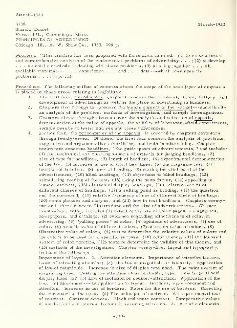
Starch- 1923
3338
Starch, Daniel
Harvard U., Cambridge, Mass.PRINCIPLES OF ADVERTISINGChicago, 111., A. W. Shaw Co. , 1923, 998 p.
Starch-1923
Problem : "This treatise has been prepared with three aims in mind. (1) to make a broadand comprehensive analysis of the fundamental problems of advertising . . . ; (2) to develop. . . scientific methods in dealing with these problems; (3) to bring together . . . all
available material . . . experience . . . and . . . data which bear upon the
problems . . . ." (p. iii)
Procedure: The following outline of contents shows the scope of the book (special emphasisis placed on those areas relating to legibility):
1. The first four, introductory,chapters concern the problems, scope, history, and
development of advertising; as well as the place of advertising in business.
2. Chapters five through ten concern the human aspects of the market specifically
an analysis of the problem, methods of investigation, and sample investigations.
3. Chapters eleven through sixteen cover the analysis and selection of appeals,
determination of the value of appeals, the validity of laboratory-field experiments,sample results of tests, and sex and class differences.
4. Section four, the presentation of the appeals, is covered by chapters seventeenthrough twenty-seven. Of these, the first four concern the analysis of problems,
suggestive and argumentative advertising, and truth in advertising. Chaptertwenty-one concerns headlines, "the guide-posts of advertisements, " and includes
(1) the mechanical and meaning aspects of criteria for judging headlines, (2)
size of type for headlines, (3) length of headline, (4) experimental demonstrationof the law, (5) increase in use of short headlines, (6) the magazine test, (7)
location of headline, (8) form of heading, (9) stating the vital point of the
advertisement, (10) blind headings, (11) objections to blind headings, (12)
stimulating reading of the text, (13) using the news factor, (14) appealing to
human instincts, (15) classes of display headings, (16) relative merits of
different classes of headings, (17) a selling point as heading, (18) the question
and the command, (19) relative frequency of use of different kinds of headings,
(20) catch phrases and slogans, and (21) how to test headlines. Chapters twenty-
two and -three concern illustrations and the size of advertisements. Chaptertwenty-four, color , includes (1) extent of the use of color pages in magazines,newspapers, and catalogs, (2) evidence regarding effectiveness of color in
advertising, (3) "pulling power" of color, (4) opinions of advertisers, (5) use of
color, (6) artistic value of different colors, (7) attention value of colors, (8)
illustrative value of colors, (9) test to determine the relative values of colors andthe colors to be used for a specific purpose, (10) color theory, (11) the Munsellsystem of color notation, (12) tests to determine the validity of this theory, and
(13) methods of the investigation. Chapter twenty-five, layout and typography ,
includes the following:
Importance of layout. 1. Attention elements. Importance of attention factors.
Laws of attracting attention: (a) The law of magnitude or intensity. Application
of law of magnitude. Increase in size of display type used. The point system of
measuring type. Testing the attention value of display type. How large should
display lines be? (b) Law of isolation or counter-attraction. Application of the
law. (c) Movement its application to layout. Borders, eye-movement andattention. Increase in use of borders. Rules for the use of borders. Directing
the movement of the eyes, (d) The principle of contrast. An experimental test
of contrast. Contrast devices. Black and white contrast. Comparative values
of mechanical and interest factors in securing attention. 2. Artistic elements.
-330-
Starch-1923
Art for business' sake. Psychological effects. Artistic forms. Classes of
forms and outlines. Applications in advertisements. Meaning of balance. Theoptical center. Location of the main features. The principle of support or
stability. Representation of action. Meaning of harmony. Harmony in formsand shapes. Styles of type. 3. Comprehension factors: Type and legibility.
Four main factors. The type. Type faces commonly used at the present time.
Individuality in type. The distribution of letters and words. The effect of
background. . . The last two chapters in this section concern trade -marks; andpackages, cartons, and labels.
5. Section five, concerning advertising mediums , is covered by chapters twenty-eight through thirty-three, and includes discussions of magazines, newspapers,direct mail material, street-car cards, and posters and other miscellaneousmediums, as well as an introductory discussion of general considerations.
6. The special fields of advertising , covered by chapters thirty-four through -seven,
are concerned with national, retail, foreign, and financial advertising.
7. An appendix shows samples of type faces in 6-, 8-, 10-, 12-, 14-, 18-, 24-, 30-,
36-, 42-, and 48-point sizes. Of the ones shown, CHELTENHAM BOLD,REGULAR, EXTENDED, CONDENSED, and CONDENSED ITALIC are in all the
above sizes; while CHELTENHAM BOLD ITALIC is in all except the 48-point
sizes; CHELTENHAM OLD STYLE in all less than 42-point sizes; CHELTENHAMOLD STYLE ITALIC in all less than 30-point sizes; and BODONI BOLD,CLOISTER BOLD, SCOTCH ROMAN, and CASLON BOLD in 24-point caps andlower case.
Result: Chapters XXI, XXIV, and XXV in part 4 (the presentation of the appeals), and the
material in the appendix are of special interest to this study. The following statementsextracted from these chapters (and some others as indicated) are of interest to the design
of characters and their typographic environment:1. Chapter XVIII (principles underlying suggestive advertising) - The HANDWRITING
of adults shows the following characteristics: "Average inclination (from the
horizontal) of 1 (el) . . . 65. 1 degrees. . . Average width of letters ... 4. 33
mm. " (p. 394)
2. Chapter XXI (criteria for judging headlines) - "1. The type should be large
enough to set it off and secure the attention of the reader. 2. The headline
should have as few (and short) words as possible (five or less) so that it may be
read as quickly as possible. 3. The type and the arrangement of the wordsshould make the reading as easy (preferably instantaneously) as possible. 4.
The headline should be located where it will be seen to the best advantage (without
counter-attractions and in an optically good location). " (p. 491)
3. Chapter XXI (increase in use of short headlines) - "A one -line or 'single -deck 1
heading is ordinarily better . . . ." (p. 497)
4. Chapter XXIV (evidence regarding effectiveness of color in advertising) - In a
series of letter inquiries sent to dealers by a manufacturer of house dresses,
more replies came back from the letters printed on pink paper. Next in orderwere those printed on gold, green, corn, and white papers.
5. Chapter XXIV (evidence regarding effectiveness of color in advertising) - MApublication can probably not carry over 15 to 20 (percent) of its space in color
without reducing considerably the (overall) effect of contrast. " (p. 587)
6. Chapter XXIV ("pulling power" of color) - "Although ... a booklet illustrated
by the three-color process costs four times as much as ... in black, . . . the
extra cost is clearly justified. . . (since) 'a cut in color will sometimes sell as
high as 15 times as many goods . . . .' 'It has been found, for instance, that a
single word in red ink increased the pulling power . . . exactly one -third. Thiswas plainly due to the contrast . . . and would not be the case if other colorprinting had been in competition . . . .
' " (p. 587-588)
-331-
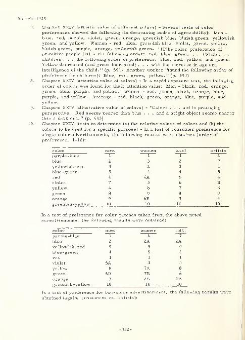
Starch- 1923
7. Chapter XXIV (artistic value of different colors) - Several tests of color
preferences showed the following (in decreasing order of agreeability): Men -
blue, red, purple, violet, green, orange, greenish blue, bluish green, yellowishgreen, and yellow. Women - red, blue, greenish blue, violet, green, yellow,
bluish green, purple, orange, yellowish green. "(T)he color preference of
primitive people (is) in the following order: red, blue, green. . . (W)ith . . .
children . . . the following order of preference: blue, red, yellow, and green.Yellow decreased (and green increased) . . . with the increase in age andintelligence of the child. " (p. 591) Another worker "found the following order of
preference (in children): Blue, red, green, yellow." (p. 591)
8. Chapter XXIV (attention value of colors) - In a rapid exposure test, the following
order of colors was found for their attention value: Men - black, red, orange,green, blue, purple, and yellow. Women - red, green, black, orange, blue,
purple, and yellow. Average - red, black, green, orange, blue, purple, andyellow.
9. Chapter XXIV (illustrative value of colors) - "Colors . . . aid in producingperspective. Red seems nearer than blue . . . and a bright object seems nearerthan a dark one. " (p. 593)
10. Chapter XXIV (tests to determine (a) the relative values of colors and (b) the
colors to be used for a specific purpose) - In a test of consumer preference for
single color advertisements, the following results were obtained (order of
preference, 1-10):
color men women total artists
purple -blue 1 1 1 2
blue 2 3 2 7
yellowish-red 3 2 3 1
blue -green 5 4 4 5
red 6 6A 5 6
violet 7 5 6 8
yellow 4 8 7 3
green 8 9 8 9
orange 9 6B 9 4
greenish -yellow 10 10 10 10
test of preference for color patches taken from the above noted
:rtisements, the following results were obtained:
color men women total
purple -blue 7 6 7
blue 2 2A 2Ayellowish-red 9 9 9
blue-green 4 5 4
red 1 1 1
violet 5A 4 5
yellow 8 7A 8
green 5B 7B 6
orange 3 2B 2Bgreenish -yeHow 10 10 10
In a test of preference for two-color advertisements, the following results wereobtained (again, consumers vs. artists):
-332-
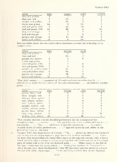
Starch- 1923
color men women total artists
blue and yellow 1 1 1 1
blue and red 2 2A 2 2
purple and yellow 3 5A 3 7
violet and green 5A 4 4A 3
red and green (#4) 4 2B 4B 4
red and green (#9) 5B 5B 6 10
blue and orange 7 7 7 8
red and orange 9 9 8 6
purple and orange 8 10 9A 5
green and yellow 10 8 9B 9
Patches taken from the two-color advertisements showed the following color
preferences:
color men women total
blue and yellow 2 2 2
blue and red 1 5A 3
purple and yellow 8 3 5
violet and green 9 1 1
red and green (#8) 4 7 6
red and green (#10) 7 4 8
purple and yellow (sic ) 5 9A 7
red and yellow (sic) 6 9B 9
purple and orange 3 5B 4
green and yellow 10 8 10
"The third series . . . consisted of 10 multi-colored advertisements . . .
(P)reference tests for the colors off the advertisements . . . showed the results
given . . . :
color men women total artists
green, blue, red ~~T~ 2 1 4
blue, purple, red 3 1 2 6
orange, blue, green 2 4 3 1
red, green, yellow 4 3 4 8
red, yellow, green 5 5 5 3
purple, yellow, red 6 6 6 5
violet, yellow, green 7 7 7 2
green, blue, brown 8 8 8 7
red, blue, yellow 9 9 9 10
yellow, red, green 10 10 10 9
"The results showed a fairly decided preference (in the consumers) for
complementary . . . colors .... The preferences of the artists differ(ed) . . .
materially .... The . . . inference is that the consumer ... is a morereliable index of color preferences . . . .
" (quoted material and tables in the
preceding from p. 599-605)
Chapter XXV (the importance of layout) - " 'In . . . power to attract the reader's
eye as the line of vision enters a page there are various methods .... It canbe done with extraordinarily large black bars at the top and bottom; with a heavyblack border; with a circle; a curve; anything that will intercept the left-to-right
path of vision and carry it to the desired point .... White space to the left of
the type matter has the same effect. . . Setting the headline in "reverse"white letters on a black background has 50 (percent) greater power to attract
the eye than plain black type. . . To be optically correct (the center display)
Starch- 1923
. . . should be two-thirds to three -fourths the length of the advertisement aboveits base. . . It is due to the way the average reader holds a magazine or
newspaper. . . When the type gets down to 6-point it becomes hard to read if the
lines are 5 or 6 inches in length. . . If the headline is set in plain type, then it
should be surrounded with 1-1/2 to 2 inches of white space ... to allow it to
stick out from the surrounding type matter. '*" (p. 609-610) Diagonal lines,
panels, arrows, and check marks are other ways of attracting attention to
specific parts of a layout.
12. Chapter XXV (laws of attracting attention) - "To demonstrate the . . . law (of
magnitude or intensity), an experiment was performed . . . (which showed that)
words printed in large type had about five times as much attention value as the
words printed in small type . . . ." (p. 615-616)
13. Chapter XXV (the point system of measuring type) - "About 1886 the AmericanType Founders Union established what became known as the Point System. . .
The sizes of various kinds of type formerly used are designated according to the
point system:4- point equals Diamond5- point equals Agate or Pearl5- l/2-point equals Ruby6-point equals Nonpareil7- point equals Minion8- point equals Brevier9- point equals Bourgeois10- point equals Long Primer11 - point equals Small Pica12 - point equals Pica
14-point equals English18-point equals Great Primer. " (p. 618)
Other typographic conventions are also given. The more important of these are
the following:
"Seventy-two points equal one inch. . .
"(A)gate ... is the standard . . .
of advertising space. . .
"(U)sually 2 -point leads are placed
between the lines. " (p. 618)
Twelve points equal one pica, hence six
picas equal one inch.
14. Chapter XXV (testing the attention value of display type) - Experiments showedthat "in general the attention value ... is closely proportional to the size of
the letters. " (p. 621)
15. Chapter XXV (how large should display lines be?) - "(T)he headings in commonuse are between one-tenth and one -twentieth of the height of the advertisement. "
(p. 622)
16. Chapter XXV (application of the principle of isolation or counter-attraction) -
"As a general rule, subheadings should not exceed one-third the size of the maindisplay line. " (p. 625)
17. Chapter XXV (movement its application to layout) - "(L)ines which are at
right angles to the movement of the eyes tend to arrest the movement and cause
the eyes either to stop or to follow in the direction of the lines. " (p. 627)
18. Chapter XXV (borders, eye -movement and attention) - "Borders have four . . .
distinct uses: ( 1) . . . increase the attention value . . .; (2) . . . lend unity,
compactness, and individuality; (3) . . . serve to separate . . . ; (4) . . . add a
decorative and illustrative value . . . ." (p. 627)
* - Printers ' Ink,January 25, 1912, p. 10.
-334-
Starch- 1923
19. Chapter XXV (rules for the use of borders) - "(A) plain, simple border is
preferable to a fancy, elaborate border. . . unless there are special reasons for
(the ornamental one) . . . ." (p. 631)
20. Chapter XXV (the principle of contrast) - In an experimental test of contrast,
"words printed in red had approximately eight times as great a chance of being
noticed as . . . words printed in black. " (p. 635)
21. Chapter XXV (contrast devices) - "Some of the devices ... in common use are
the following: Black, gray, or colored backgrounds; large amounts of vacant
white space; odd shapes, circles, ovals, curves, diagonal lines; bizarre type;
. . . odd borders; unusual arrangements of type and words. " (p. 636) However,the use of any of these may have other detrimental effects that outbalance their
benefit as a contrast device.
22. Chapter XXV (classes of forms and outlines) - "The chief . . . forms and outline
(are) ... as follows:" (p. 645)
a. The OPTICAL SQUARE - sides in a ratio of 1. 00 to 1. 03, vertical
to horizontal.
b- The CIRCLE - diameters in a ratio of 1. 00 to 1.00, vertical to horizontal,
c The DOUBLE SQUARE - sides in a ratio of 1. 00 to 2. 00.
d. The GOLDEN SECTION RECTANGLE - sides in a ratio of 1. 00 to
1. 62, or approximately 5 to 8.
e. The OVAL - axes in a ratio of 1. 00 to 1. 62.
23. Chapter XXV (the optical center) - ". . . is located above the actual center byapproximately one -tenth of the distance from the lower border to the
mathematical center. . . For example, the lower half of the letter S is slightly
larger than the upper half. . . (A)lso the middle bar in the letter E is slightly
above center. " (p. 649-650)24. Chapter XXV (location of the main feature) - "(T)he best positions are as
follows, in the order of preference:
a. "At the optical center.
b. "At the upper division point of the 'golden proportion. 1 That is, at the
point so located that the upper area and the lower area maintain the
ratio of 1 to 1. 62. . .
c. "At the lower division point of the 'golden proportion. '
d. "Near the extreme top.
e. "Near extreme bottom. " (p. 651)
25. Chapter XXV (the principle of support or stability) - "If we have a weight, say
... a block of heavy type, in one position, it must be placed above the center of
support. If it is placed at one side ... it must be counter-balanced by a weight
on the opposite side. " (p. 651)
26. Chapter XXV (harmony in forms and shapes) - "(C)urves and curvilinear
forms . . . ; straight lines and rectangular forms go well together. " (p. 656)
27. Chapter XXV (tone) - "(T)oo much dead black . . . give(s) a depressing
effect. " (p. 656)
28. Chapter XXV (styles of type) - "Fancy or special type should be used only whenit adds to . . . effectiveness ... in giving . . . distinctiveness or greater
aesthetic effect. . . As a rule not more than two different (type) faces should be
allowed (in the same text); unless they are closely related . . . ." (p. 656)
29. Chapter XXV (comprehension factors: type and legibility) - "There are four
main factors which affect the legibility of print: (a) The type; (b) the length of
the lines in print; (c) the distribution of the lines, words, and letters; (d) the
background upon which the text is printed. " (p. 657)
30. Chapter XXV (the style or face of the type) - In an experimental test, it wasshown that "italic text (is) not read as rapidly as . . . roman text. " (p. 658)
Another experiment showed "a difference of 10 (percent) in favor of . . . lower-case type" (p. 658) when compared with the reading speed of all capitals. In a
-335-
Starch-1923
threshold experiment, the following rank was seen for the "legibility" of nine
type faces: NEWS GOTHIC, CUSHING OLD STYLE, CENTURY OLD STYLE,CENTURY EXPANDED, CHELTENHAM WIDE, SCOTCH ROMAN, BULFINCH,CASLON, and CUSHING MONOTONE. "Condensed and expanded faces are harderto read than the ordinary widths . . . Expanded faces . . . are good for street-
car cards because of the oblique angle from which they are generally seen. . .
(T)ype . . . constructed on plain, simple lines with relatively few angles andcorners is readmost easily. The old ROMAN . . . face . . . comes nearest . . .
and is generally conceded to be the most legible . . . (T)he angular and difficult
character of the GERMAN print is . . . responsible for the prevalence of visual
defects among the school children of Germany. . . Fancy and unusual types . . .
contain too many nooks and corners, too many angles and curly-cues. . . (and)
should be avoided unless there are good reasons for using it. " (p. 660)
31. Chapter XXV (type faces commonly used at the present time) - "BODONI,CASLON, and CHELTENHAM . . . are used most commonly because experienceand psychological experiment have shown that the small, plain, graceful type face
is, on the whole, the most legible as well as the most pleasing. 11
(p. 662)
32. Chapter XXV (the size of the type) - "Type smaller than 10 point becomesincreasingly difficult (to read) as it decreases in size. " (p. 663)
33. Chapter XXV (length of the line of print) - "A line five or six inches in length
does not look . . . inviting ... A long line printed in large type is easier to
read than the same line in smaller type. " (p. 663) An experiment involving the
reading of lines 1-1/2, 2-3/4, and 5 inches long resulted in the ascertaining that
"a certain optimum length of line (is) somewhere in the neighborhood of 3 inches.
. . The average newspaper line is about 2-1/4 inches and the average magazineline is about 2-1/2 inches long. . . The eyes, in reading, . . . take . . .
glimpses at intervals of three to five words. . . In lines of moderate length the
subject-matter in adjoining lines is more closely related than in long lines. . .
(p. 666) In very long lines it is . . . difficult . . . when shifting (the eyes) . . . ,
to find the beginning of the next line. " (p. 668)
34. Chapter XXV (the distribution of letters and words) - "(U)nusual arrangementsand distributions of letters and words" (p. 668) should be avoided since they tend
to "make an advertisement nothing short of an optical puzzle. " (p. 668)
35. Chapter XXV (the effect of background) - In an experiment, black type on a white
background was found to read 42 percent faster than white type on a dark graybackground.
A rather lengthy dissertation concerning preferred space in different types of magazines(Chapter XXIX) may have some application to the layout of printed material.
* * *
3299 Swartz-1961
Swartz, W. F.
Martin Co. , Baltimore, Md.REVIEW OF THE LITERATURE CONCERNING DESIGN OF DIGITSMemorandum rept. 61-1, 8 Feb 61, 20 p.
In AIR FORCE FLIGHT CONTROL AND FLIGHT DISPLAYINTEGRATION PROGRAM: MARTIN HUMAN ENGINEERINGMEMORANDUM REPORTS, 1961, Engineering rept. no. 12,191, Dec 61, lv.
AD-273 32 1
Problem : Review the "literature concerning the design and construction of digits . . . (in)
an effort to optimize digit design for moving tape instruments. " (p. 1)
Procedure: Twelve critical typographical and environmental parameters have been seen
-336-
Swartz- 196 1
(in the experimental literature) to affect significantly subjects' performance (criteria usedhave been speed, accuracy, maximum reading distance, "or some other score" (p. 2))
either directly or by complex interactions. These parameters are digit (which one of the
ten numeric characters), stroke -width, digit-width, style, illumination (of the viewing
surface), brightness (reflected from the surface), viewing angle, response mode (of the
subject), subject, contrast relation (direction), arrangement-of-numerals (grouping), andexposure time. The styles investigated are Arabic and those that are nove4 by "gradeschool" (p. 3) standards. The Arabic included AND 10400 (characterized by open 4,
exaggerated 6 and 9 loops, and flat stubby 3), MS 33558 (similar), BERGER (for auto
license plates and characterized by horizontal, vertical, and 45 angle lines),
MACKWORTH (for distant recognition and similar to AND 10400 ), AMEL ( AND10400 plus BERGER ), CRAIK (marked differences in size between upper and lower
portions of 3, 6, 8, and 9), MODERN (uniform in height and line position), OLD STYLE(0, 1, and 2 are small in relation to others), LEROY (hand lettering having closed loops
and curved stems), and ORDNANCE (some digits extend above or below the line). TheNOVEL included straight line matrices, dot codes, counting lines, dot positions, line
indications, ellipse -axis ratios, color coding, LANSDELL , and ROMAN NUMERALS.Discussed next are the results of sixteen experiments* that ascertained the effects of
various critical parameters and their interactions on the legibility of both Arabic and novel
digits.
Result : Three factors prohibiting extrapolation of the results of previous work to the design
of digits for moving tape instruments "are (1) the interaction of critical parameters (and
the inability to generalize therefrom), (2) inter-subject differences (particularly with
respect to subject/critical parameter interaction), and (3) the methodological problem (in
the prostitution of results because of poor methodology and the almost non-existent relation
of experiment to the actual use of the digits). " (p. 14) Hence, while "the literature has
pointed out the parameter ... of interest . . . , it seems . . . naive to base the design(of digits for moving tape) upon past . . . results. " (p. 18)
* Experiments were performed by various investigators, whose work may be found
elsewhere in this volume as Alluisi- 1957, Alluisi- 1958, Atkinson- 1952, Brown-1951,Cohen-1953, Colgate-( 1955) (which includes Reinwald's 1953 work), Foley-1956, Kuntz-1950, Lansdell-1954, Loucks - 1944c, Perry-1952, Schapiro- 1952, and Soar - 19 55a
(which is a later publication of Soar's 1952 thesis). Work not shown herein was done byS. C. McLaughlin, Jr., Configuration and stroke-width in numeral legibility,
Unpublished thesis, Tufts College, Medford, Mass., 1948; and also by M. A. Tinker,
The relative legibility of modern and old style numerals, Journal of ExperimentalPsychology , v. 13 (1930) 453-461.
* * *
-337-
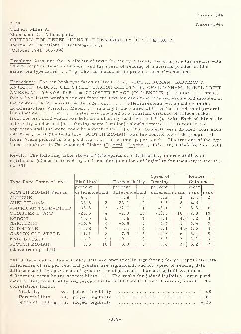
Tinker- 1944
2125 Tinker-1944Tinker, Miles A.
Minnesota U. , MinneapolisCRITERIA FOR DETERMINING THE READABILITY OF TYPE FACESJournal of Educational Psychology, 35:7
(October 1944) 385-396
Problem : Measure the "visibility of text" for ten type faces, and compare the results with"the perceptibility at a distance, and the speed of reading of materials printed in (the
same) ten type faces. . .
11(p. 386) as measured in previous experimentation.
Procedure : The ten book type faces utilized were: SCOTCH ROMAN, GARAMONT,ANTIQUE, BODONI, OLD STYLE, CASLON OLD STYLE, CHELTENHAM, KABEL LIGHT,XMERICAN TYPEWRITER, and CLOISTER BLACK (OLD ENGLISH). "In the . . . study,thirty five-letter words were cut from the text for each type face and each word mounted at
the center of a four-by-six white index card. . . (M)easur ements were made with the
Luckiesh-Moss Visibility Meter. . . in a light laboratory with ten-foot- candles of generalillumination. . . The . . . meter was mounted at a constant distance of fifteen inchesfrom the test card which was held on a slanting reading stand. " (p. 386) Each of thirty- six
university student subjects (having normal vision) "slowly rotated . . . filters in the
apparatus until the word could be apprehended. " (p. 386) Subjects were divided, four each,into nine groups (the tenth face, SCOTCH ROMAN, was the control for each group). All
faces "were printed in ten-point type ... on enamel paper stock. Illustrations of the typefaces are shown in Paterson and Tinker (J. Appl
.Psychol . , 1932, 16, 605-613). "
(p. 386)
Result : The following table shows a "(c)omparison of (v)isibility, (p)erceptibility at
(d)istance, (s)peed of (r)eading, and (r)eader (o)pinions of legibility for (t)en (t)ype faces":
(p. 391)
Type Face Comparison:
SCOTCH ROMAN Versus
Visibility Perceptibility
Speed of
ReadingReaderOpinions
percent
difference rankpercentdifference rank
percent
difference rankmeanrank rank
ANTIQUE + 56. 3 1 -14. 8 3 -0. 2 3 2. 4 2
CHELTENHAM +38. 6 2 -22. 2 2 -2. 5 8 2. 3 1
AMERICAN TYPEWRITER +36. 5 3 -37. 7 1 -5. 1 9 5. 5 6
CLOISTER BLACK +25. 0 4 + 2. 3 10 -16. 5 10 9. 8 10
BODONI + 19. 5 5 -4. 6 7 -1. 1 4.5 4. 2 3
GARAMONT + 16. 9 6 -6. 8 6 + 0. 5 1 5. 4 5
OLD STYLE + 15. 8 7 -11. 4 4 -I. 1 4.5 4. 6 4
CASLON OLD STYLE + 11. 1 8 -7. 9 5 -1. 3 6 6. 4 8
KABEL LIGHT +8. 2 9 +0. 1 9 -2. 3 7 8. 2 9
SCOTCH ROMAN 0. 0 10 0. 0 8 0. 0 2 6. 2 7
(above from p. 391)
"All differences for the visibility data are statistically significant; for perceptibility data,
differences of six per cent and greater are significant; and for speed of reading data,
differences of five per cent and greater are significant. For perceptibility, minusdifferences mean better perceptibility. . . The ranks for judged legibility correspondmore closely to visibility and perceptibility ranks than to speed of reading ranks. Thecorrelations follow:
Visibility vs. judged legibility +.58Perceptibility vs. judged legibility +.67Speed of reading vs. judged legibility +.33
-339-
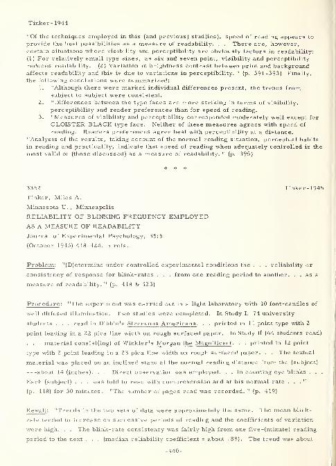
Tinker -1944
"Of the techniques employed in this (and previous) stud(ies), speed of reading appears to
provide the best possibilities as a measure of readability. . . There are, however,certain situations where visibility and perceptibility are obviously factors in readability:
(1) For relatively small type sizes, as six and seven point, visibility and perceptibility
reduces readability. (2) Variation in brightness contrast between print and backgroundaffects readability and this is due to variations in perceptibility. " (p. 391-393) Finally,
the following conclusions were summarized:1. "Although there were marked individual differences present, the trends from
subject to subject were consistent.
2. "Differences between the type faces are more striking in terms of visibility,
perceptibility and reader preferences than for speed of reading.
3. "Measures of visibility and perceptibility corresponded moderately well except for
CLOISTER BLACK type face. Neither of these measures agrees with speed of
reading. Readers preferences agree best with perceptibility at a distance.
"Analysis of the results, taking account of the normal reading situation, perceptual habits
in reading and practicality, indicate that speed of reading when adequately controlled is the
most valid of (those discussed) as a measure of readability. " (p. 395)
3352 Tinker- 1945
Tinker, Miles A.
Minnesota U.,Minneapolis
RELIABILITY OF BLINKING FREQUENCY EMPLOYEDAS A MEASURE OF READABILITY
Journal of Experimental Psychology, 3 5:5
(October 1945) 418-424, 5 refs.
Problem: "(D)etermine under controlled experimental conditions the . . . reliability or
consistency of response for blink-rates . . . from one reading period to another. . . as a
measure of readability. " (p. 418 & 423)
Procedure: "The experiment was carried out in a light laboratory with 10 foot-candles of
well diffused illumination. Two studies were completed. In Study I, 74 university
students . . . read in Dibble's Strenuous Americans . . . printed in 1 1 point type with 2
point leading in a 22 pica line width on rough surfaced paper. In Study II (64 students read)
. . . material consist(ing) of Winkler's Morgan the Magnificent . . . printed in 12 point
type with 2 point leading in a 23 pica line width on rough surfaced paper. . . The textual
material was placed on an inclined stand at the normal reading distance from the (subject)
about 14 (inches). . . Direct observation was employed. . . in counting eye blinks . . .
Each (subject) . . . was told to read with comprehension and at his normal rate ..."
(p. 418) for 30 minutes. "The number of pages read was recorded. " (p. 419)
Result: "Trends in the two sets of data were approximately the same. The mean blink-
rate tended to increase on successive periods of reading and the coefficients of variation
were high. . . The blink-rate consistency was fairly high from one five -(minute) reading
period to the next . . . (median reliability coefficient = about . 88). The trend was about
-340-
Tinker- 1945
the same for adjacent lO-(minute) periods . . . When an interval of 20((minutes) of
reading intervene(d), . . . the reliability drop(ped) to about . 50 for blink-rates during five
(minutes) of reading. For lO-(minute) periods . . . , the coefficient drop(ped) to about . 65.
. . When individual data (were) considered it (was) found that, as reading (went) on, the
blink-rates of some readers increase(d), of others decrease(d), and of still others
show(ed) no change. During successive . . . periods . . . , individual blink-rates . . .
oscillate(d) markedly. . . Th(e) data reveal(ed) highly satisfactory reliability where group
comparisons of means are involved for blink-rates recorded during successive adjacent
periods of reading. . . Since the reliability of the blink-rates . . . increase(d) somewhat
for 10 -(minute) periods, it seems best to record blinks for 10 rather than for five
(minutes) when a period of reading intervenes between the periods compared. . . The
next step is to determine the validity of blink-rates as a measure of readability. "
(p. 423-424)
3343 Tinker-1946
Tinker, Miles A.
Minnesota U. ,Minneapolis
VALIDITY OF FREQUENCY OF BLINKING AS ACRITERION OF READABILITY
Journal of Experimental Psychology, 36:5
(October 1946) 453-460, 24 refs.
Problem : Compare blink frequency in "(t)he reading of text in roman lower case . . . with
the reading of text in all-capitals ..." (p. 453) in order to ascertain "the validity of blink
frequency as a criterion of readability. " (p. 453)
Procedure : "Sixty university students . . . rea(d) for two experimental sessions. . . in a
light laboratory (under) 10 foot-candles of well diffused illumination. . . The textual
material (placed on an inclined stand at about 14 inches from the subject) consisted of
Forms I and II (equivalent) of Tinker's Speed of Reading Test. . . Form I was printed in
10 -point lower case EXCELSIOR type with 2 -point leading in a 2 0 -pica line width on
eggshell paper stock. " (p. 453-454) Form II differed only by being in all-capitals.
Subjects' task was to cross -out (orally) the one word of 30, in each of 450 items, that
spoiled the meaning of the item. This was done in order "to show that the material ha(d)
been read and comprehended. . . The direct method of observing and counting eye blinks
. . . was employed. Speed of reading in terms of number of items read correctly, as
well as number of blinks, was recorded. " (p. 454)
Result : "There was no significant difference in rate of blinking while reading text in all-
capitals in comparison with lower case. . . In every comparison made, text in all-
-341-
Tinker- 1946
capitals was read significantly slower than text in lower case. The percent retardation in
speed of reading ranged from 9. 53 to 19. 01. . . Analysis of the data in this experiment
plus consideration of evidence from other studies indicate(d) that the frequency of blinking
is an unsatisfactory criterion of readability of print. . . The data (also) furnish(ed)
additional evidence that rate of reading is a fairly adequate index of readability. " (sic)
(p. 459)
3325 Tinker-1948a
Tinker, M. A.
Minnesota U. ,Minneapolis
READABILITY OF BOOK PRINT AND NEWSPRINT IN TERMSOF BLINK-RATEJournal of Educational Psychology, 39: 1
(January 1948) 35-39, 9 refs.
Problem : "The purpose of this study is to check the rate of blinking as a criterion of
readability by comparing blink rate while reading book print and newsprint. . . (p. 39)
The . . . experiment aims to duplicate the experimental conditions specified by Luckiesh
in his work. " (p. 35)
Procedure : "The experiment was carried out in a light laboratory with 10 foot-candles of
well diffused illumination. Sixty university students served as readers for two
experimental sessions each. The reading material was placed on an inclined stand at the
normal reading distance . . . , about fourteen inches. . . The book print was . . .
(Winkler's Morgan the Magnificent ) set in twelve-point type with two point leading in a
twenty-three pica line width on a good quality of Matt-white paper. This . . . arrangement
... is optimal . . . For the newsprint material, stories of general interest but
unemotional in character were cut from . . . the Mankato (Minnesota) Free Press , and
mounted on cardboards. The text was set in seven-point type with one -point leading in an
eleven and one-half pica line width on regular newsprint paper stock. . . (T)his
approximates the general trend in newspaper typography. . . (and) is optimal for seven-
point newsprint. . . The direct method of observing and counting eye blinks by a skilled
experimenter was employed. . . The subjects read for five minutes on each kind of
material . . . ." (p. 36-37)
Result : "All requirements specified by Luckiesh for satisfactory use of the blink technique
were fulfilled. . . Significantly fewer blinks were employed for reading the newsprint.
Since other . . . evidence indicates that newsprint is less readable, the blink technique
appears not to be valid as a measure of ease of seeing. Further checking of the validity of
the blink technique is needed. " (p. 39)
-342-
3365
Tinker, Miles A.
Minnesota U. , Minneapolis
EFFECT OF VIBRATION UPON READING
American Journal of Psychology, 61:3 (July 1948)
386-390
Problem : "(S)tudy the effect of vibration of textual material on speed of perception in
reading. " (p. 390)
Procedure: "The experiment was carried out in a light laboratory with 16 foot-candles of
well diffused illumination. Two groups (control and test), each consisting of 69 students,
served as readers. . . The textual material consisted of Forms I and II (equivalent) of
Tinker's Speed of Reading Test. . . Both forms were printed in 10-point EXCELSIOR type
with two-point leading in a 20 pica line -width on eggshell paper stock. " (p. 387) Vibration
was introduced by means of an apparatus attached to an inclined reading table. "The extent
of the vibration was 1 / 1 6 (inch) and there were 5 cycles of movement per (second). This
approximates the vibration of one's book while riding on a fast train. . . (Subjects) in the
control group read Form I and . . . II of the test with the copy stationary but with the noise
of the apparatus persent (sic). In the experimental group, the (subjects) read Form I with
stationary copy and noise; Form II with vibrating copy (and, of course, noise). " (p. 387)
Subjects responded orally throughout the experiment (giving the word that spoiled the
meaning of the item). "Every (subject) read for 10 (minutes) on each form of the test, but
the number of items completed at the end of every 5-(minute) period of reading were
recorded. . . (p. 388) Score was in terms of the number of items, each consisting of 30
words, read by (a subject). " (p. 387)
Result : The "differences indicate, therefore, that vibration of text reduces speed of
perception in reading by a significant amount (about five percent). Here is further
evidence that rate of reading, when measured in a valid manner, is a fairly satisfactory
criterion of readability of print.*. . It is well known that people ordinarily read much
slower than they can read. . . (especially) when there is no check on comprehension. In
such . . . situation(s), non-optimal factors such as print of (sic) poor readability are apt
not to influence the rate of reading. . . Except with extremes, it is not a question of not
being able to discriminate accurately, but of how promptly the discrimination can be made
when the lighting or the print is other than optimal. . . (T)here is also the question of
expenditure of energy but as yet we have no satisfactory measure of this. " (p. 389-390) In
conclusion, " (w)hen a variable reduces significantly rate of perception in reading, it would
seem justifiable to conclude that there is a real difference in readability manifested. "
(p. 390)
* - "The situation is about as follows: (1) speed of reading as used by Tinker andPaterson is a fairly sensitive criterion of the readability of print. (Z) Speed of reading asused by Luckiesh and by Luckiesh and Moss is not an adequate criterion of the readability
-343-
Tinker- 1948b
Tinker-1948b
Tinker- 1948b
of print. Tinker and Paterson employ standardized reading tests and maintainexperimental controls. Luckiesh and Moss use no standardized test-material and make nocheck on the comprehension of what is supposedly read. The reader must decide which of
the two kinds of experimentation is more adequate for measuring the effect of illuminationvariation, typographical changes, vibration of text, etc.
,upon speed of perception in
reading, or readability (sic) of print. " (p. 389)
3358 Tinker-1948c
Tinker, Miles A.
Minnesota U. , Minneapolis
CUMULATIVE EFFECT OF MARGINAL CONDITIONS
UPON RATE OF PERCEPTION IN READINGJournal of Applied Psychology, 32:5
(October 1948) 537-540, 2 refs.
Problem: "(I)nvestigate the effect upon speed of perception in reading of combining three
marginal conditions: illumination intensity, type form and type size. " (p. 540)
Procedure : Two groups (control and experiment) of 83 subjects each were tested
(2 subjects at a time) on Forms I and II of the Tinker Speed of Reading Test* under the
following typographical and environmental conditions (for the control group, both Forms I
and II were under "standard" conditions, while, for the experimental group, Form II was
under "marginal" conditions):
conditions standard marginal
illumination intensity (well-diffused) 25 foot-candles 3 foot-candles
type form roman italic
type size 10-point 8 -point
type face EXCELSIOR EXCELSIOR
leading 2 -point 1 -point
line -width 20-pica 12 -pica
paper eggshell eggshell
Result: "When employed as a single variable (in previous experimentation), neither 8
point type, italic type form, nor reading under 3 foot-candles retard(ed) speed of reading
significantly. " (p. 540) However, a combination of the three together "retarded speed of
perception in reading by 10. 4 per cent in comparison with reading 10 point Roman type
under 25 foot-candles. . . To maintain a hygienic visual environment, therefore, it is
important not to employ marginal (critical) levels of illumination. . . where the details to
be discriminated are also marginal. " (p. 540)
* - "In each form there are 450 paragraphs (items) of 30 words each. As a check oncomprehension, the reader crosses out the one word that spoils the meaning in each item.The two forms are approximately equival(e)nt. " (p. 537-538)
-344-
3366
Tinker, Miles A.
Minnesota U. ,Minneapolis
THE EFFECT OF INTENSITY OF ILLUMINATION
UPON SPEED OF READING SIX-POINT ITALIC PRINT
American Journal of Psychology, 65:4
(October 1952) 600-602, 5 refs.
Problem : "(I)nvestigate the relation between level of illumination and speed of reading
6-(point) italic print. " (p. 600)
Procedure : "The experiment was conducted in a laboratory which provided indirect, well-
diffused incandescent illumination. The (subjects) . . . were 285 sophomores at the
(u)niver sity. . . divided into five groups, one control and four experimental ... (p. 601)
(R)eading material consisted of Forms I and II of Tinker's Speed of Reading Test . . .
(p. 600) Form I, the standard, was printed in lO-(point) EXCELSIOR type face, Roman,
2-(point) leading, 20 pica line-width on eggshell paper stock. Form II, for Group I
(control), was typographically the same .... For all other groups, Form II was printed
in 6-(point) EXCELSIOR type face, italic, l-(point) leading, 12 pica line-width on eggshell
. . . . Form I was always read under 25 (foot-candles). " (p. 602) Form II was read under
1, 10, 25, and 50 foot-candles by Groups II through V, respectively.
Result : 'As illumination intensity . . . increased from 1 to 25 (foot-candles), speed of
reading 6-(point) italic print increase(d) significantly. Then there (was) a further slight
but non-significant gain as the intensity (was) raised from 25 to 50 (foot-candles). It would
appear that the critical level ... is somewhere between 10 and 25 (foot-candles). . . (and)
closer to 25 than 10. If 10 to 15 (foot -candles) are added ... to provide a margin of
safety, the intensity desirable . . . becomes 30 to 40 (foot-candles). There is nothing in
(the) data which suggests that higher intensities are needed for the optimal perception of
this type. " (p. 602) Also, interestingly enough, "(t)he difference ... in Group IV
represents an 8 (percent) loss in speed of reading as a function of type-size alone . . . .
"
(p. 601) In connection with this, the results of previous work indicate that "the deleterious
effects upon speed of perception from reducing size of type and from employing italic
rather than Roman type are cumulative. This trend is similar to the cumulative effect of
certain marginal conditions (variations in illumination and typography) upon rate of
perception in reading discovered in (another) previous study. " (p. 601-602)
Tinker-1952
Tinker-1952
-345-
Tinker-1953
2729 Tinker-1953
Tinker, Miles A.
Minnesota U. ,Minneapolis
EFFECT OF VIBRATION UPON SPEED OF PERCEPTION WHILE
READING SIX POINT PRINT
Journal of Educational Research, 46:6
(February 1953) 459-464, 5 refs.
Problem: "(I)nvestigate the effect of vibration upon speed of perception while reading
material printed in six point Roman and six point italic type. " (p. 459)
Procedure : "The experiment was carried out in a light laboratory with 25 foot-candles of
well-diffused illumination. . . (p. 459) A control (69 university students) and three
experimental (60 students each) groups (of subjects) were employed. . . (p. 463) The
textual material consisted of Forms I and II of Tinker's Speed of Reading Test. . . Form
I, the standard, was printed in 10 point Roman, EXCELSIOR type face with two point
leading in a 20 pica line width on eggshell paper stock. . . (, ) an optimal typographical
arrangement .... In Group I, the control group, Form II was typographically identical
with Form I. In Groups II and III, Form II was printed in six point Roman, EXCELSIOR
type face with one point leading in a 12 pica line width on eggshell paper stock. And in
Group IV, Form II was printed in six point italic, " (p. 459-460) with other parameters the
same as with Form II for Groups II and III. Vibration, at a movement of l/l6-inch and 5
cycles per second (approximates that in a fast train), was introduced by means of a motor
attached to an inclined reading table. The noise of the motor was heard by the subject
whether reading was done with or without vibration. Subjects in Groups I and II read both
forms with the copy stationary. Subjects in Groups III and IV read Form I with the copy
stationary and Form II with vibration.
Result: "In comparison with 10 point type, six point type was read 8.49 percent slower;
six point with vibration, 10. 99 percent slower; and six point italic with vibration, 14.2 1
percent slower. Vibration (alone) reduced speed of reading six point type by 2. 5 percent,
and six point italics by 5. 72 percent. " (p. 463) These differences are all significant. In
addition, the results of previous work compared with this experiment show that "(v)ibration
has less effect upon speed of reading six . . . than upon 10 point type (2. 5 vs. 5. 19 percent)
except when the six point type is printed in italics. " (p. 463) In conclusion, it is stated that
"(t)he effects of non-optimal conditions are cumulative in reducing speed of perception in
reading. The influence of small type, vibration and use of italics combine to produce a
relatively large drop in speed of perception. " (p. 463)
-346-
3326
Tinker, Miles A.
Minnesota U. ,Minneapolis
EFFECT OF SLANTED TEXT UPON THE READABILITY OF PRINT
Journal of Educational Psychology, 45:5
(May 1954) 287-291, 2 refs.
Problem: "In . . . books (where) the printed material does not lie flat . . . (t)o what
degree does this condition interfere with easy and rapid perception in reading? . . The
specific problem . . . is to investigate changes that occur in speed of reading and in
visibility of words when the reading copy is slanted away from the eyes at different
angles. " (p. 287)
Procedure : "(O)ne hundred and eighty (university student) subjects. . . (read m)aterial
slanted at forty-five and at sixty degrees (in) compar(ison) with flat copy. . . (p. 291)
The reading material consisted of Forms I and II of Tinker's Speed of Reading Test . In
each form there (were) four hundred and fifty items of thirty words each. . . The two
forms . . . were printed in ten-point EXCELSIOR type in a twenty pica line width with two-
point leading on eggshell paper stock. . . For the visibility measurements, thirty five-
letter words were cut from the test and pasted on white cards, one word per card. All
words used (were) within the five hundred most familiar . . . The experiment was
conducted in . . . twenty-five foot-candles of indirect, well-diffused incandescent
illumination. . . Visibility measurements were made with the Luckiesh-Moss Visibility
Meter. " (p. 288-289)
Result: "Speed of reading was retarded 5. 7 per cent by the forty-five -degree slant, and
16.4 per cent by the sixty-degree slant. " (p. 291) These differences were highly
significant . "Visibility of word forms was reduced 31.3 per cent by the forty-five- . . .,
and 48.4 per cent by the sixty-degree slant. . . (p. 291) (T)hese differences (were also)
highly significant . . . The role of accommodation changes cannot be determined from
these results. . . It is suggested that a major portion of the retardation in reading speed
is due to the reduced visibility of the words. . . These results have a bearing upon
printing and binding of large books and bound journals where there tends to be considerable
curvature of the lines of print near the inner margin. To avoid the deleterious effects of
this . . . , it is suggested that large books and journals should be printed with a much
wider inner margin." (p. 290-291)
Tinker-1954
Tinker- 1954
-347-
Tinker- 1955
2731 Tinker-1955
Tinker, Miles A.
Minnesota U. , Minneapolis
PROLONGED READING TASKS IN VISUAL RESEARCHJournal of Applied Psychology, 39:6
(December 1955) 444-446, 5 refs.
Problem: "(D)emonstrate the usefulness of prolonged periods of reading in studying the
effects on speed of perception in reading varying typographical arrangements. " (p. 445)
Procedure: "In the first experiment Form I (of the speed of reading test) was set in regular
(roman) 10-point EXCELSIOR type face with 2-point leading in a 20-pica line width on
eggshell paper stock. Form II was the same typographically except that italic rather than
roman type was used. Another copy of Form II was also printed exactly the same as FormI. The 192 university sophomore subjects were tested in . . . groups of about 32 each . . .
In the second experiment . . . (, ) Forms I and II were identical and printed in roman
(upper- and) lower-case type for the control group .... In (another group), . . . Form
II was typographically the same as Form I except that it was printed in all-capitals. There
were 127 subjects . . . (university sophomores) in each test group, 254 in all. They were
tested ... in small classroom groups of about 32. " (p. 444)
Result: "Reading periods of 10 minutes or more produced a significant retardation in
reading italic in comparison with roman print. With a reading period of 1-3/4 minutes in
an earlier experiment the retardation was not significant. . . Retardation in speed of
reading all-capital material in comparison with (upper- and lower-case) roman print was
large and approximately the same irrespective of the length of the reading period within the
limits of 4 to 16 minutes. Approximately the same retardation was found with a time limit
of 1-3/4 minutes in an earlier experiment. " (p. 445) Thus, in general, it was ascertained
that "(m)easuring speed of perception in reading is a relatively sensitive technique for use
in typographical studies when prolonged periods of reading are employed. " (p. 445)
2732 Tinker-1957
Tinker, Miles A.
Minnesota U. ,Minneapolis
EFFECT OF CURVED TEXT UPON READABILITY OF PRINT
Journal of Applied Psychology, 41:4
(August 1957) 2 18-22 1
Problem : "(I)nvestigate changes that occur in speed of reading and in visibility of words
when the reading copy is curved. . . (as, for example,) near the inner or gutter margin
-348-
Tinker-1957
where the pages are bound. " (p. 218)
Procedure : "Traditional practice is to have (the) inner margin narrowest .... In ... a
typical journal page the widths of margin are: inner, 12/16 inch; top, 12/16 inch; outside,
1-2/16 inches; and bottom, 1-4/16 inches. In a large book on typographical practice the
margins run: inner, 1 1 / 16 inch; top, 11/16 inch; outside, 1 inch; and bottom, 1-1/2 inches.
Use of such narrow inner margins results in appreciable curvature of about one -third of the
line of print in single column printing and up to four -fifths of the line in multiple column
printing for the column next to the bound edge. " (p. 218) In the material tested, "(t)he
effect from distortions of letter and word forms on ease of perceiving (was) measured in
terms of visibility of selected words. . . The reading material consisted of Forms A and
B of the Chapman-Cook Speed of Reading Test. . . (printed in) 10-point SCOTCH ROMAN. . . with 2-point leading in a 19-pica line width on eggshell paper stock. . . (from which)
20 five -letter words (were) cut . . . (and) mounted on . . . index card(s). . . (p. 218) (I)na
light laboratory with 25 footcandles of well diffused indirect illumination. . . 104 college
students.". . (p. 219) viewed the materials for speed of reading and visibility (using the
Luckiesh-Moss Visibility Meter) at 15 inches from a special reading stand which "consisted
of a cylinder 8 (inches) in diameter which could be set in any position from the horizontal to
the vertical. . . (and a) flat surface . . . set at 45 (degrees) to the table top .". . , (p. 2 18)
the former approximating "the curvature of a page in a large book lying open on a table.". .
(p. 2 18) (and the latter) "to provide optimal conditions for reading flat copy. " (p. 2 19)
Result : The data provided the following results:
1. "The rate of reading curved print was significantly slower than for flat copy. . .
(This) seem(ed) to be due largely to reduced visibility of word forms.". . (p. 221)
(which also, i.e. visibility or ease of perceiving words, was retarded significantly
for the curved print).
2. "The need for constant changes in accommodation in reading the curved text may
also be involved in reducing speed of reading the curved text.
"It is suggested that wider inner margins be employed in large books and magazines to
avoid the marked curvature of the printed page now present . . . ." (p. 221)
3349 Tinker-1960
Tinker, Miles A.
Minnesota U. , Minneapolis
LEGIBILITY OF MATHEMATICAL TABLESJournal of Applied Psychology, 44:2
(April I960) 83-87. 1 ref.
Problem : "(S)tudy the effect of type size, arrangement of numerals in columns, and space
-349-
Tinker- 1960
vs. space plus rules between columns on the speed with which the correct numbers can be
located. " (p. 83)
Procedure: "Four simulated pages of powers and roots were printed all on one sheet of 70-
(pound) sulphide paper with a non-shiny surface. The four simulated pages extended in
four blocks from left to right with 1-1/4 (inches) of space between pages. The headings of
columns on each page were .". . (p. 83) number, square, cube, square root, and cube root.
"There were 50 numerals in each column so that the four pages listed . . . powers and
roots for the numbers 300 to 499. Numerals in the (number) column were in bold face and
the (others) in ordinary printing. (All) numerals were . . . EXCELSIOR . . . (and) were
the same height. . . (p. 83) All testing was done individually under 25 (foot-candles) of
well diffused illumination. In the nine studies completed there were 24 to 30 (subjects) in
each, a total of 246. . . (p. 87) The particular typographical arrangement employed in
each substudy .". . (p. 83) was as follows:
1. Six and eight point type were compared. "Numerals in columns were grouped by
fives and there was one pica (l/6 inch) of space between columns. " (p. 83)
2. For "grouping of numerals in columns for 6 -point type (, s)et solid (no grouping),
grouping by tens, and grouping by fives were compared. " (p. 84)
3. This substudy was the same as "2" above, except that numerals were in 8-point
type.
4. "Space vs. space plus rules between columns was compared for 6-point type set
solid. " (p. 85)
5. This substudy was the same as "4" above, except that numbers were grouped by
tens
.
6. This substudy was also the same as "4" above, except that numbers were grouped
by fives
.
7. "Space vs. space plus rules between columns for 8-point type set solid was
compared. " (p. 85)
8. This substudy was the same as "7" above, except that numbers were grouped by
tens
.
9. This substudy was also the same as "7" above, except that numbers were grouped
by fives
.
Result : The studies yielded the following results (which correspond numerically to the
individual procedures shown above):
1. "(T)he differences in time were always in favor of the 8-point type, but . . . were
not statistically significant . . . ." (p. 8 3)
2. "Both grouping by tens and by fives were more effective than set solid, and grouping
by fives tended to be better than by tens. " (p. 84)
3. "In the . . . (cubes and square roots) only the five grouping was significantly better
than set solid for square roots. The rest of th(e) differences were not significant. "
(p. 84)
4. "No significant differences were found. " (p. 85)
-350-
Tinker- I960
5. "The results (were) somewhat in conflict in that space appear(ed) best for cubes and
rules (one pica plus a rule) best for square roots. The other differences were not
significant. " (p. 85)
6. "The space alone was significantly better for finding square roots and cube roots.
It made no difference with squares. " (p. 85)
7. "No significant differences appear(ed). " (p. 85)
8. "Rules between columns were significantly better for squares and square roots.
The other differences were not significant. " (p. 86)
9. "Rules between columns led to significantly faster responses in finding square roots
and cube roots. The other differences were not significant. " (p. 86)
In general, these results indicated the following:
1. "When numerals are grouped by fives in columns, 6- and 8-point type were equally
effective in promoting location of powers and roots. " (p. 87)
2. "Grouping numerals in columns by fives or tens tends to promote quick finding of
powers and roots. In general, the grouping by fives tends to be more effective . . .
for both 6- and 8-point type. " (p. 87)
3. "Apparently it makes little difference whether one pica space or (this) plus a rule
between columns is used in tables of powers and roots. In this . . . the results
were not entirely unequivocal. " (p. 87)
3320 Tinker- 1963
Tinker, Miles A.
LEGIBILITY OF PRINT
Ames, Iowa, Iowa State University Press, 1963,
329p. , 238 refs.
Abstract : This comprehensive (too long to delineate here) book is one of a series dealing
with research in human communication. It is based primarily on previous experimentation
by Tinker and Pater son that is reported on elsewhere. Hence, what follows here is only
an outline of its contents.
Outline : I. Introduction.
A. General.
B. Print for adults and children.
C. Legibility versus readability.
D. Nature of legibility.
E. Legibility: methods of investigation.
1. Speed of perception.
2. Perceptibility at a distance.
3. Perceptibility in peripheral vision.
4. Visibility.
-351-
Tinker- 1963
5. The reflex blink technique.
6. Rate of work.
8. Fatigue in reading.
F. Definition of legibility.
Methodology and definitions.
A. General.
B. Visibility measurement.
C. Distance method.
D. The short-exposure method.
E. The focal variator method.
F. Rate of involuntary blinking method.
G. Reliability and validity of measurement
H. Speed-of-reading method.
I. Measurement of eye movements.
J. Length of work period.
K. Measurement cautions.
L. Summary.
Legibility of letters and digits.
A. General.
B. Upper-case letters.
C. Lower-case letters.
D. Legibility of digits.
E. Summary.
Kind s of type.
A. General.
B. Printing practice.
C. Styles of type face.
D. Italic print versus roman lower case.
E. Capitals versus lower case.
F. Mixed type forms.
G. Summary.
Size of type.
A. General.
B. Printing practice.
C. Subsidiary research on type size.
D. Speed-of-reading studies.
-352-
Tinker- 1963
VI. Width of line.
A. General.
B. Printing practice.
C. Experimental results.
D. Line widths for 10 -point type.
E. Line widths for 12 -point type.
F. Line widths for 8 -point type.
G. Line widths for 6 -point type.
H. Simultaneous variation of type size and line width.
I. Summary.
VII. Leading and relationship of leading, type size, and line width.
A. General.
B. Printing practice.
C. Experimental study of leading.
D. Leading with 10 -point type.
E. Leading with 8 -point type.
F. Type size versus leading.
G. Leading and line width in relation to type size
H. Relative legibility of six sizes of type.
I. Summary.
VIII. Spatial arrangements of the printed page.
A. General.
B. Size of full page.
C. Margins
.
D. Single versus multiple -column printing.
E. Inter -columnar space and rules.
F. Paragraphing arrangements.
G. Vertical versus horizontal printing.
H. Summary.
Color of print and background.
A. General.
B. Black print versus white print.
C. Legibility in the ordinary reading situation.
D. Perceptibility of black and white print.
E. Perceptibility at a distance.
F. Black print on tinted paper.
G. Colored print on colored paper.
H. Speed of reading.
I. Trends in use of colored print on tinted papers
J. Summary.
-353-
Tinker- 1963
X. Printing surfaces.
A. General.
B. Experimental studies.
C. Thickness of paper.
D. Summary.
XI. Cumulative effect of combining nonoptimal typographic arrangements.
A. General.
B. Experimental results.
C. Summary.
XII. Newspaper typography.
A. General.
B. Printing practice.
C. Legibility of newspaper type faces.
D. Leading.
E. Line width and leading.
F. Size of type.
G. Newspaper headlines.
H. Reductions in size of newspaper print.
I. Summary.
XIII. Formulas and mathematical tables.
A. General.
B. Reading numerals in problems.
C. Legibility of mathematical signs.
D. Reading formulas.
E. Legibility of mathematical tables.
F. Summary.
XIV. Special printing situations.
A. General.
B. Typewritten material.
C. Linotyped versus typewritten material.
D. Typewriting, manuscript, and cursive script.
E. Handwriting.
F. Stencil duplicated materials
.
G. Print in comic books.
H. Projected materials.
I. Dictionary printing.
J. Items in bibliographies.
K. Telephone directories.
L. Library of Congress cards.
-354-
Tinker-1963
M. Timetable typography.
N. Printing of backbone titles.
O. Summary.
XV. Illumination for reading.
A. General.
B. Spectral quality of color of light.
C. Intensity of illumination.
D. Recommended practice in lighting.
E. Light intensities adequate for reading.
F. Distribution of illumination.
G. Summary.
XVI. The hygenic reading situation.
A. General.
B. Light source and the reader.
C. Proper slope for the reading page.
D. Angular alignment and reading ease.
E. Flat versus curved print.
F. Effect of vibration on reading.
G. Length of the reading period.
H. Summary.
Bibliography: 238 annotated citations.
Index.
3265 TinkPat-1941Tinker, Miles A. and Paterson, Donald G.
Minnesota U. , MinneapolisEYE MOVEMENTS IN READING A MODERN TYPE FACE AND OLD ENGLISHAmerican Journal of Psychology, 54:1 (January 1941) 113-114.
Problem : "(D)etermin(e) . . . the difference in speed of reading . . . (CLOISTER BLACK)in comparison with . . . (SCOTCH ROMAN) . . .."(p. 113)
Procedure : "The eye movements of each of 20 college students were photographed while
reading 10 paragraphs from the Chapman-Cook Speed of Reading Test, Form A, set in
CLOISTER BLACK (Old English) and 10 different paragraphs from Form B of the same test
set in SCOTCH ROMAN. Practice effects were equated by systematic variation of test-
forms and subjects). . . All paragraphs were printed as follows: Lower case, 10 point,
19 pica line-width, set solid, on egg-shell paper stock. " (p. 113) Eye movementsmeasured were fixation frequency, words per fixation, pause duration, perception time,
and regression frequency.
Result: "The results . . . show(ed) that the eye -movement patterns are more efficient in
-355-
TinkPat-1941
reading SCOTCH ROMAN than in reading CLOISTER BLACK. The detailed findings showthat the reading of CLOISTER BLACK resulted in a 5. 0 (percent) increase in the number of
fixations (significant beyond the 5 percent level of confidence) and a 5. 3 (percent) decreasein the number of words per fixation (beyond 5 percent). The average duration of the
fixational pauses, however, was only slightly increased (1. 3 percent beyond the 30
percent level). Perception-time was lengthened by 6. 4 (percent) (beyond 5 percent) andthere was a 10. 7 (percent) increase in the number of regressions (between 5 percent and10 percent). . . It is somewhat surprising to discover that the reading of CLOISTERBLACK, which is read at a strikingly slower rate than SCOTCH ROMAN (about 12 percentin previous performance tests), should not produce an equally striking difference in the
analytical eye-movement records. . . It is suggested that the difficulty encountered in
reading OLD ENGLISH type is due to the necessity for discriminating details in the
perception of word and phrase units. " (p. 113-114)
2726Tinker, Miles A. and Paterson, Donald G.
Minnesota U. ,Minneapolis
READER PREFERENCES AND TYPOGRAPHYJournal of Applied Psychology, 2 6: 1
(February 1942) 33-40
TinkPat-1942
Problem: "(D)etermine the extent to which judged legibility and judged 'pleasingne ss 1
agree or disagree with each other. " (p. 38)
Procedure: "(P)rinted samples were presented to college students who were instructed
'to arrange them in order from most ... to least legible. 1 Legibility was defined as
'ease and speed of reading. ' In a similar manner, pleasingness judgments were obtained
from a different group of . . . students who were instructed to rank the same samples in
order from most ... to least pleasing. No attempt was made to define 'pleasingness. 1. .
Each printing sample consisted of five paragraphs from the Chapman-Cook Speed of
Reading Test printed in 10 point SCOTCH ROMAN, 19 pica line width, set solid on eggshell
paper stock and in the typographical arrangements ..." of lower case vs. boldface (using
100 subjects), and lower case vs. all capitals (using 320 subjects). "(O)ther typographical
arrangements studied were: styles of type face, combinations of colored print and coloredpaper stock, leading, size of type, line width, paper surface, lower case versus italics,
simultaneous variation of line width and type size, space and lines between columns,regularity of alignment versus indentation of alternate lines at left and right ends andsimultaneous variation of type size and leading. " (p. 38-40)
Result: "(R)eaders believe that lower case is far more legible and . . . pleasing than bold
face, although both kinds . . . are actually read at the same rate. . . (L)ower case is
read much more rapidly than all capitals and readers rank lower case ahead of all capitals
both with respect to legibility and pleasingness. " Thus, there is a "striking agreementbetween judged legibility and pleasingness. " The same was true of the other typographical
variations, with "only a slight disagreement . . . (h)ere and there ... In general, the
agreement is so close that we are warranted in concluding that judged legibility may be
accepted as equivalent to pleasingness. 11 However, "(o)ur data fail to disclose the causal
relationship involved. " Thus, "(t)he printer should be guided by the facts regarding the
speed with which particular typographical arrangements can be read, and also by readerjudgments of legibility, (sic) When a printing arrangement is shown to promote rapid
reading and readers judge this arrangement to be legible, the printer, presumably would
employ it. When two or more printing arrangements are equally legible, the printer
presumably would employ the one judged to be most legible. However, when the most
-356-
TinkPat-1942
efficient printing arrangement is judged to be less legible than another, then the printer
will be forced to decide whether or not he will cater to the opinions of the readers. 11(p. 38-
40)
3329 TinkPat-1943Tinker, M. A. and Paterson, D. G.
DIFFERENCES AMONG NEWSPAPER BODY TYPES IN READABILITYJournalism Quarterly, 20:2 (June 1943) 152-155
Also in READINGS IN EXPERIMENTAL INDUSTRIAL PSYCHOLOGY,Milton L. Blum, Editor, (New York, Prentice -Hall, 1952), p. 282-284
Problem : Establish the relative readability of newspaper type faces.
Procedure : Reading from two Forms of the "Chapman-Cook Speed of Reading Test", nine
groups of 100 high school seniors each participated in an experiment that compared nine
different newsprint fonts with a standard that was one of the nine.
Result : The three most readable fonts were: OPTICON , REGAL NO. 1 , and"CENTURY EXPANDED". PARAGON , EXCELSIOR , and IDEAL read significantly
faster than the standard. IONIC NO. 2 and TEXTYPE , while slightly faster than the
standard, IONIC NO. 5 , showed no statistically significant differences. It was only
coincidental that the standard was apparently read more slowly than any of the other faces.
3359 TinkPat- 1944a
Tinker, Miles A. and Paterson, Donald G.
Minnesota U. , MinneapolisEYE -MOVEMENTS IN READING BLACK PRINT ON WHITE BACKGROUNDAND RED PRINT ON DARK GREEN BACKGROUNDAmerican Journal of Psychology, 57:1 (January 1944) 93-94.
Problem : Determine the effect on eye -movements in the reading of black print on a white
ground and red print on a dark green ground.
Procedure: "The eye -movements (fixation frequency, words per fixation, pause duration,
perception time, and regression frequency) of each of 20 university students werephotographed while reading . . . (t)en paragraphs from the Chapman-Cook Speed of
Reading Test, Form A, . . . printed with Ruxton's black ink on white rainbow cover -stockand 10 paragraphs from Form B of the same test . . . printed with Ruxton's Tulip red ink
on green rainbow cover-stock. All paragraphs were set SCOTCH-ROMAN lower case, 10-
point type, 19-pica line width, set solid. " (p. 93)
Result : From the results, "(i)t (was) apparent that the red-on-dark-green text (was) readwith only the greatest difficulty. . . They reveal(ed) . . . marked difference(s significant
beyond the 1 percent level of confidence) in all eye-movement measures (black/whitesuperior to red/green in the following: fixation frequency = 24. 8 percent, words perfixation = 20. 2 percent, pause duration = 14. 5 percent, perception time = 42. 6 percent,
and regression frequency = 35. 2 percent). . . The retardation (total perception-time of)
42. 6 per cent . . . closely approx:m5.te(d) the (previously assembled) performance reading-test results (39. 5 percent retardation with red/green). . . The difficulty encountered . . .
appear(ed) to be due primarily to poor visibility of the printed characters. In other words,the rapid perception of word form and phrase units which occurs in reading ordinary copyis no longer possible under conditions of minimal brightness -contrast . . . .
" (p. 94)
T inkPat -1944b
3328 TinkPat- 1944bTinker, Miles and Pater son, Donald G.
Minnesota U. ,Minneapolis
WARTIME CHANGES IN NEWSPAPER BODY TYPEJournalism Quarterly, 21:1 (March 1944) 7-11, 2 refs.
Problem : "What modifications can be made in typography to save paper and at the sametime maintain readability . . . .
" (p. 7)
Procedure : Several unprinted investigations were carried out using Forms A and B of the
Chapman-Cook Speed of Reading Test. "In each comparison of two typographical
arrangements, 85 to 100 subjects read Form A as a standard and then Form B in a changedtypography. . . In each test form there were thirty sections of thirty words each. A wordmust be crossed out in each section to show that it has been read with understanding. . .
All sections were in IONIC type face on newspaper stock. 11(p. 8)
Result : "(N)o significant change in readability of newsprint was found for certain
comparisons. Thus:1. "7 point on 8 point slug, 11-1/2 pica line = 8-1/2 point on 9-1/2 point slug, 12 pica
line
.
2. "7 point on 9 point slug, 12-1/2 pica line = 8 point on 9-1/2 point slug, 12-1/2 pica
line.
3. "7 point on 9 point slug, 12 pica line = 8 point on 10 point slug, 12 pica line.
4. "7 point on 8 point slug, 12 pica line = 8 point on 10 point slug, 12 pica line.
5. "8 point on 10 point slug, 1Z pica line = 9 point on 1 1 point slug, 12 pica line.
"The(s)e comparisons indicate that text in 7 . . . on 8 point slug, printed in 11-1/2 to 12-
l/2 pica line widths, is read as rapidly as text in a slightly larger type size. . . (H)owever,... it would not be safe to reduce . . . below 7 point .... A consistent advantage wasfound when one point leading was employed .... But two point leading was no bette r than
one. However, readers . . . prefer(red) two . . . over one point and . . . one . . . oversolid. . . One -half to one pica change in line width in the region of 12 picas was found to
produce no significant changes in readability. . . It would seem therefore, that 7 point on8 point slug ... in a 11-1/2 to 12-1/2 pica line width . . . may be (safely) employed . . .
(and) may save considerable paper. . . (A)lso . . . paper may be saved by reducing
margins . . . (which) do not (themselves) promote greater readability. . . It was also
found that text was read just as fast when a rule without space was employed as whengreater intercolumnar space was present. " (p. 7-8)
Problem ( collateral ): Conduct a survey of newspaper printing practice.
Procedure ( collateral ): The first survey was conducted in 1935 and had a response of 89
replies to questionnaires. The follow-up survey in 1942 received 87 replies. In each case,
the "information requested . . . was: 'The front page news columns of your paper are
printed usually as follows: A. Style of type face and name of type founder or manufacturer.
B. Size of type in points. C. Width of line of print in picas. D. Space between lines
(leading). 1 The same information was requested for the editorial page." (p. 8)
Result (collateral ): "The data were assembled in (the following) tables . . . (:)
-358-
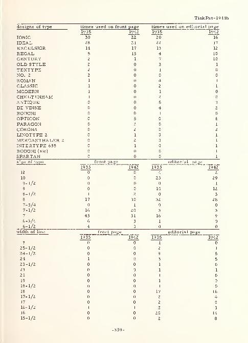
TinkPat- 1944b
designs of type times used, on frontP*f-..S
e times used on editorial page
1935 1942 1 q -j c1 7 -> 0 1942
IONIC 30~ 22 2 0 16"
IDEAL 28 2 1 22 17
EXCELSIOR 14 17 i j 12
REGAL 5 13 4 10
CENTURY 2 1 7i 10
OLD STYLE 2 o•3
J 1
TEXTYPE 2 0 o
NO. 2 2 0 o o
ROMAN 1 0 4 1
CLASSIC 1 o 1
MODERN 1 o I o
CHELTENHAM 1 o 2 o
ANTIQUE 0 o 5 3
DE VINNE 0 o 4. 2
BODONI 0 o I 0
OPTICON 0 5 Q 6
PARAGON 0 2 Q 1
CORONA o 2 o 2
LINOTYPE 2 o 1 J
MERGANTHALER 2 o 2 J l
INTERTYPE 655 o 1 U l
BODONI (sic) o o 0 l
SPAR TAN o o o
size of type front page editorial page1935 1942 1935 1942
12 o"0~ 4 2
10 o 0 £ j 299-1/2 o o 1
9 o o i n1 u 12
8-1/2
8
1
17
2
30
o 3
28
7-3/4 0 1 0
7-1/2 16 20 3 3
7 45 31 lb 9
6-3 /4 b 3 ii o
6-1/2 4 o o
width of line front page—
'•
—Teditorial page
1935 1942 1935 1942? o~ o~ r o"
25-1/2 0 0 1
24-1/2 o 0 Q7 5
24 1 0•3
-> 5
23-1/2 o 0 11 o
23 o o 11
2 1 o o 1 o
19 o o 11 q
18-1/2 o o o
18 o o 17 16
17-1/2 0 0 2 4
17 0 0 2 0
16-1/2 1 1 2 3
16 0 0 20 14
15-1/2 0 0 2 8
-359-
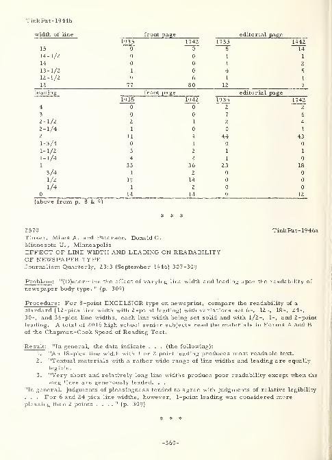
TinkPat- 1944b
width of line front page editorial page1935 1942 19 35 1942
15 0 05~ 14~
14-1/2 0 0 1 1
14 0 0 1 2
13-1/2 1 0 4 5
12-1/2 9 6 1 1
12 77 80 12 7
leading front page editorial page1935 1942 1935 1942
4 0 0 2 2
3 0 0 7 6
2-1/2 2 1 2 4
2-1/4 1 0 0 1
2 11 9 44 43
1-3/4 0 1 0 0
1-1/2 3 2 1 1
1-1/4 4 2 1 0
1 33 36 23 18
3/4 1 2 0 0
1/2 19 18 0 0
1/4 1 2 0 0
0 14 14 9 12
(above from p. 8 & 9)
2570 TinkPat- 1946aTinker, Miles A. and Paterson, Donald G.
Minnesota U. ,Minneapolis
EFFECT OF LINE WIDTH AND LEADING ON READABILITYOF NEWSPAPER TYPEJournalism Quarterly, 23:3 (September 1946) 307-309
Problem : "(D)etermine the effect of varying line width and leading upon the readability of
newspaper body type. " (p. 309)
Procedure: For 8-point EXCELSIOR type on newsprint, compare the readability of a
standard (12-pica line width with 2-point leading) with variations set 6-, 12-, 18-, 24-,
30-, and 36-pica line widths, each line width being set solid and with 1/2-, 1-, and 2-point
leading. A total of 2016 high school senior subjects read the materials in Forms A and Bof the Chapman-Cook Speed of Reading Test.
Result : "In general, the data indicate . . . (the following):
1. "An 18 -pica line width with 1 or 2 point leading produces most readable text.
2. "Textual materials with a rather wide range of line widths and leading are equally
legible.
3. "Very short and relatively long line widths produce poor readability except when the
long lines are generously leaded. . .
"In general, judgments of pleasingness tended to agree with judgments of relative legibility
. . . For 6 and 24 pica line widths, however, 1-point leading was considered morepleasing than 2 points . . . .
" (p. 309)
-360-
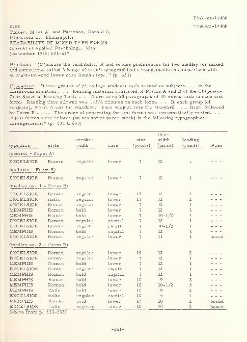
TinkPat- 1946b
2728 TinkPat- 1946b
Tinker, Miles A. and Paterson, Donald G.
Minnesota U. , Minneapolis
READABILITY OF MIXED TYPE FORMSJournal of Applied Psychology, 30:6
(December 1946) 631-637
Problem : "(M)easure the readability of and reader preferences for two medley (or mixed,
and sometimes called 'change of pace') typographical arrangements in comparison with
straight -forward lower case Roman type. " (p. 631)
Procedure : "Three groups of 94 college students each served as subjects. . . in the
classroom situation . . . Reading material consisted of Forms A and B of the Chapman-Cook Speed of Reading Test. . . There were 30 paragraphs of 30 words each in each test
form. Reading time allowed was 1-3/4 minutes on each form. . . In each group (of
subjects), Form A was the standard. Each subject read the standard . . . first, followed
by Form B . . . . The order of presenting the test forms was systematically varied. . .
(T)est forms were printed (on newsprint paper stock) in the following typographical
arrangements:" (p. 631 & 633)
lln!r"
Str_°
6 ~ sizeT
1.
t leading
type face style width case (points
)
(pica s) (points) other
(control - Form A)
EXCELSIOR Roman regular lower 7 1Z A
(uniform - Form B)
EXCELSIOR Roman regular lower 7 12 \
(medley no. 1 - Form B)
EXCELSIOR Roman regular lower 10 12 2
EXCELSIOR italic regular lower 10 12 2
EXCELSIOR Roman regular lower 7 12 1
MEMPHIS Roman bold lower 7 12 1
MEMPHIS Roman bold lower 7 10-1/2 1
EXCELSIOR Roman regular capital 7 12 1
EXCELSIOR Roman regular capital 7 10-1/2 1
MEMPHIS Roman bold capital 7 12 1
EXCELSIOR Roman regular lower 7 11 1 boxed
(medley no. 2 - Form B)
EXCELSIOR Roman regular lower 10 12 2
EXCELSIOR Roman regular lower 7 12 1
MEMPHIS Roman bold lower 7 12 1
EXCELSIOR Roman regular capital 7 12 1
MEMPHIS Roman bold capital 7 12 1
MEMPHIS Roman bold lower 10 9 2
MEMPHIS Roman bold lower 10 10-1/2 2
MEMPHIS italic bold lower 10 9 2
EXCELSIOR italic regular capital 10 9 2
MEMPHIS Roman bold lower 10 10 2 boxedEXCELSIOR italic regular lower 10 10 2 boxed(above from p. 631-633)
-361-
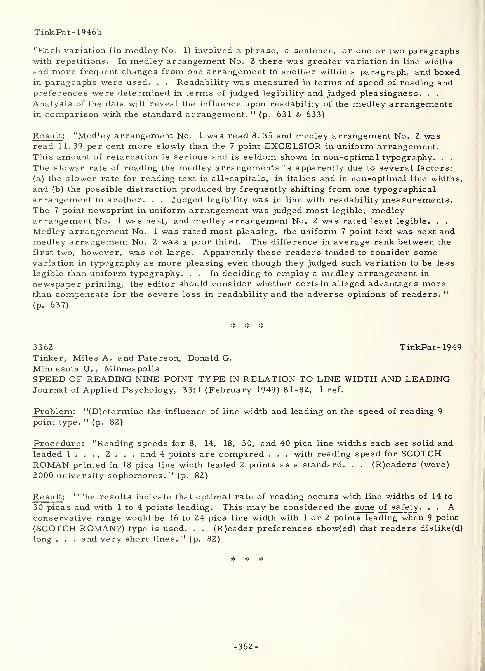
Tink Pat- 1946b
"Each variation (in medley No. 1) involved a phrase, a sentence, or one or two paragraphswith repetitions. In medley arrangement No. 2 there was greater variation in line widthsand more frequent changes from one arrangement to another within a paragraph, and boxedin paragraphs were used. . . Readability was measured in terms of speed of reading andpreferences were determined in terms of judged legibility and judged pleasingness. . .
Analysis of the data will reveal the influence upon readability of the medley arrangementsin comparison with the standard arrangement. " (p. 631 & 633)
Result : "Medley arrangement No. 1 was read 8. 35 and medley arrangement No. 2 wasread 11. 39 per cent more slowly than the 7 point EXCELSIOR in uniform arrangement.This amount of retardation is serious and is seldom shown in non-optimal typography. . .
The slower rate of reading the medley arrangements is apparently due to several factors:
(a) the slower rate for reading text in all-capitals, in italics and in non-optimal line widths,
and (b) the possible distraction produced by frequently shifting from one typographical
arrangement to another. . . Judged legibility was in line with readability measurements.The 7 point newsprint in uniform arrangement was judged most legible, medleyarrangement No. 1 was next, and medley arrangement No. 2 was rated least legible. . .
Medley arrangement No. 1 was rated most pleasing, the uniform 7 point text was next andmedley arrangement No. 2 was a poor third. The difference in average rank between the
first two, however, was not large. Apparently these readers tended to consider somevariation in typography as more pleasing even though they judged such variation to be less
legible than uniform typography. . . In deciding to employ a medley arrangement in
newspaper printing, the editor should consider whether certain alleged advantages morethan compensate for the severe loss in readability and the adverse opinions of readers. "
(p. 637)
3362 TinkPat-1949Tinker, Miles A. and Paterson, Donald G.
Minnesota U. , MinneapolisSPEED OF READING NINE POINT TYPE IN RELATION TO LINE WIDTH AND LEADINGJournal of Applied Psychology, 33:1 (February 1949) 81-82, 1 ref.
Problem : "(D)etermine the influence of line width and leading on the speed of reading 9
point type. " (p. 82)
Procedure : "Reading speeds for 8, 14, 18, 30, and 40 pica line widths each set solid andleaded 1 . . . , 2 . . . and 4 points are compared . . . with reading speed for SCOTCHROMAN printed in 18 pica line width leaded 2 points as a standard. . . (R)eaders (were)
2000 university sophomores. " (p. 82)
Result : "The results indicate that optimal rate of reading occurs with line widths of 14 to
30 picas and with 1 to 4 points leading. This may be considered the zone of safety . . . Aconservative range would be 16 to 24 pica line width with 1 or 2 points leading when 9 point
(SCOTCH ROMAN?) type is used. . . (R)eader preferences show(ed) that readers dislike(d)
long . . . and very short lines. " (p. 82)
* * #
-362-
TinkPat-1950
3262 TinkPat-1950Tinker, Miles A. and Paterson, Donald G.
Minnesota U. , Minneapolis
TYPOGRAPHY AND LEGIBILITY IN READINGSection 9, Chapter II in HANDBOOK OF APPLIEDPSYCHOLOGY, Vol. 1, Douglas H. Fryer and EdwinR. Henry, Editors, (New York, Rinehart & Co. ,
1950), p. 55-60, 7 refs.
Problem : Discuss the process of reading in terms of the problems generated by typographyand the reading environment.
Procedure : This review paper discusses reading in the following sections:
I. Introduction.
II. Analysis of the reading act.
III. Typography and legibility.
IV. Legibility.
V. Visibility.
VI. A typical problem.VII. Recommended typography (including style of type face; type form
(italics, bold face, all-capitals, etc.); size of type; width of line;
interlinear spacing; type size, line width, and leading; margins;columnar arrangement; space between columns; color of print andbackground; and paper surface).
VIII. General conclusion.
Result: The following definitions and situations, stated in the first six sections, are given:
1. (introduction) "(O)ptimal typographical conditions promot(e) ease and comfort in
reading . . . ."
2. (analysis of the reading act) "(A)pproaches are two: perception and eye-movementstudies, and measurements of intelligence and reading achievement. " Factorsinvolved, experimental methodology, and difficulties with them are discussed. As,
for example, "(t)he importance of intelligence as a determinant of reading
proficiency is revealed by the . . . correlation. . . co-efficien(t) range between0. 50 and 0. 70. "
3. (typography and legibility) "Here one is concerned with suitable illumination andoptimal typographical arrangements. . . In what follows the terms legibility andreadability are synonymous . Likewise, the terms perceptibility and visibility aresynonyms (underlining not by Tinker and Paterson). . . (R)eading printed matter at
the ordinary or usual distance of approximately 14 inches. . . deal(s) with the
legibility ... in newspapers, magazines, books, pamphlets, circulars, etc. . .
(R)eading printed matter at a distance. . . one is concerned with . . . newspaperheadlines, billboards, car cards, window display signs, road signs, labels onpackaged goods, etc. . . The distinction is more than verbal . . . .
"
4. (legibility) "Complications arise because one printing arrangement may be readmore rapidly than another and yet involve eyestrain and visual fatigue to such anextent as to make its use inadvisable. Suitable speed of reading tests are available
but suitable fatigue tests are not. " Compromise arrangements are discussed.5. (visibility) "Visibility, or perceptibility of print, refers to the reading of print at
the threshold for visual discrimination of words. . . (T)here is evidence that
although arrangement A may be better than B in terms of visibility or perceptibility,
yet B may actually be read more rapidly than A under ordinary conditions. . . Theproblem of typography is complicated both by the fact that legibility and visibility
are somewhat independent, and by the large number of typographical factors
involved in printing. " The authors discuss the Luckiesh-Moss Visibility Meter, the
-363-
TinkPat-1950
distance and illumination threshold methods, and the tachistoscopic exposure in
terms of their experimental utility in varying situations.
6. (a typical problem) "(T)he relative legibility and perceptibility of printing in all-
capitals and in lower case (with proper capitalization) ... is ... of direct interest
to those who write printing specifications for headlines . . . (, ) posters, billboard(s)
. . . , circulars, . . . names and titles on books, packages, and calling cards. . .
In ... a reliable speed of reading test. . . all-capitals retarded speed of readingby about 1Z per cent. . . (M)ovements of the eye . . . show ... a marked increasein the number of fixations . . . required .... This . . . (is) due in part to the fact
that the all-capital text requires a 35 per cent increase in . . . printing surface.
In addition, 'word form' cues are lacking. " Also, subjective judgments of legibility
showed 90 per cent of subjects in favor of lower case. In another group of subjects,
94 per cent "voted in favor of lower-case printing. " However, "(i)f one wereconcerned with sheer perceptibility then he would advocate the use of all-capitals
. . . (since they) can be recognized at a (39 per cent) greater distance than the samewords printed in lower case. . . Unfortunately, such situations are (usually) the
very ones which require emphasis on speed as well as on perceptibility. . . (f)or
example, billboard advertising and newspaper headlines . . . The visibility of
lower case type can ... be increased by specifying . . . bold face type. . . (A)
use for all-capital printing. . . can be justified as a mechanical device for
attracting attention. . . (f)or example, . . . want-ads . . . This increasedattention value, of course, arises from novelty and contrast. "
Typographic recommendations given in section seven are as follows:
1. (type face) "(C)ommonly used ... or ultramodern type face(s) . . . are equally
legible. Readers . . . prefer a . . . face which borders on the bold ....TYPEWRITER type (except for novelty) and OLD ENGLISH (except for brief formalmessages) should be avoided . . . because of poor legibility. "
Za. (type form - italics) "Italics are read more slowly . . . (and r)eaders over-whelmingly choose Roman as being more legible as well as more pleasing. . .
(I)talics should be employed sparingly and then only when added emphasis is
desired.
"
Zb. (type form - bold face) "Bold face ... is read just as rapidly .... Readersbelieve, however, that (it) is less legible and less pleasing. . . (It) should be usedonly when emphasis is desired or when perceptibility at a distance is involved. "
Zc. (type form - capitals) "All-capital printing is read much more slowly ....READERS JUDGE ALL-CAPITALS TO BE QUITE ILLEGIBLE AND TO BE FARLESS PLEASING THAN LOWER CASE. . . (I)t may be used as a device to attract
attention. "
3. (type size) "Small sizes (6 and 7 point) and unusually large . . . sizes (14 point or
larger) are less legible .... The intermediate . . . sizes (9, 10, 11 and 1Z point),
when appropriate space between lines and suitable line widths are used, are all
equally legible . . . Of these . . . , 11 point is liked slightly more .... Larger. . . sizes should be used . . . where emphasis is desired or where perceptibility
... is involved. "
4. (line width) "(S)hort . . . (less than Z-l/3 inches) and . . . long . . . widths (morethan 4-Z/3 inches) are difficult to read . . . Readers . . . believe (moderatewidths) to be more legible and more pleasing. In general, ... 3 inches (is)
recommended. "
5. (line spacing) "Leading (Z points) improves the legibility of all type sizes except 1Z
point and larger. Readers . . . prefer Z-point . . . (for) legibility as well as . . .
aesthetics. In general leading is . . . more important than line width. "
6. (type size vs. line width vs. line spacing) These "factors . . . are intimately
interrelated . . . (A) series of tables showing safety zones is presented in the
Pater son -Tinker book ( 1940). "
7. (margins) "Most . . . printing devotes far more space . . . than is necessary. . .
-364-
TinkPat-1950
(M)argins do not promote fast reading. "
8. (columnar arrangement) "Double -column printing is preferred by readers . . . (, )
would introduce . . . economies . . . (, and) would promote legible printing bypreventing the frequent use of excessively long lines of print. . . (H)owever, . . .
(it) should (not) lead to the use of excessively short lines. "
9. (columnar spacing) "(A)n intercolumnar rule or line does not promote legibility in
comparison with the use of a one -half pica space (about 3/32 inch). "
10a. (contrast) "(B)lack print on a white background is much more legible than white onblack. . . The occasional use of white on black . . . can be justified . . . an anattention-getting device. 11
10b. (color) "Colored print on colored backgrounds is less legible than black on white.
If used, ... a dark-colored print should be used on a light-colored background. "
11. (paper surface) "Printing on highly glazed . . . stock is ... as legible as ... ondull . . . stock. Nevertheless, because of . . . unsatisfactory . . . illumination,
one should employ . . . dull finish, opaque paper stock. "
"Studies concerned with the legibility of type point to an amazing adaptability of the humaneye in adjusting to . . . typographical arrangements. . . This does not mean . . . that
one . . . arrangement is read just as easily and as rapidly as any other. . . (I)mprovementin legibility can be made by seeking optimal printing arrangements. " (quoted material in
the preceding was taken from p. 55-59)
-365-
3357
Uhlaner, Julius E.
Iowa State Coll. , Ames
THE EFFECT OF THICKNESS OF STROKE ON THE
LEGIBILITY OF LETTERSProceedings Iowa Academy of Science, Vol. 48,
1941, p. 319-324, 4 refs.
Problem: As "part of a study dealing with the optimal characteristics ... of highway
signs. . . deal with the isolation of the stroke (thickness) as a factor in legibility. " (p. 319)
Procedure : Experiment I - Sixteen subjects, in a total of 1344 observations, viewed four,
dull black on mat white, 3 -inch block (height = width) letters (E, N, C, and P corrected
to 100 percent Clason and Snellen visual acuity) outdoors (in shade) under a daylight
illumination level of 250 to 550 foot-candles. Stroke -width of the letters was varied
between 8 percent and 32 percent of the height at 4 percent intervals. Each subject made
three observations for each letter/stroke -width combination. Two observations were made
with the subject approaching the stimulus from 350 feet, and the third with the subject
withdrawing from the stimulus, in each case until the legibility distance was reached. "A
block letter using an eight per cent stroke is equal to a . 4 minute angle of the separate
members of the letter and a 20 per cent stroke to a one minute angle. . . The Snellen
criterion of 20/20 vision is a five minute angle for the . . . letter and a one minute angle
for its individual members as seen from the standard distance. " (p. 319) Experiment II -
This experiment was identical to Experiment I with the following exceptions: Four
additional letters (F, Z, B, and O) were used. Stroke -widths used were 16, 18, and 20
percent of the height. Fifteen subjects participated in a total of 1080 observations.
Result: The following conclusions were stated:
1. "(O)ptimal stroke . . . is . . . closest to 18 per cent of the . . . height . . .
2. "The general acceptance of constancy of angle should make this applicable to any
size block letter. . .
3. "The legibility distances obtained for letters having a stroke of 16 and 20 per cent
are fairly close . . .
4. "A 16 per cent stroke, on the average, gives a higher legibility distance than a 24
per cent stroke. " (p. 323)
"(D)ata are presented with a full knowledge of the limits of application to letters of other
characteristics. . . (S)uggest the need for reduction in the width of stroke with the
reduction of the height-width ratio to assure maximum legibility. " (p. 324)
* * *
Uhlaner- 1941
Uhlaner- 1941
-367-
Ullman- 1958
3280 Ullman- 1958
Ullman, William
TEST-TUBE HIGHWAY AIDS SIGN RESEARCHAutomotive News, 32:3268 (November 11, 1957) 16
Abstract in Highway Research Abstracts, 28:4
(April 1958) 17-18
Abstract; "Two of the most important cities in the Washington area during the past month
have been Metropolis and Utopia, each with a population of zero in the last census. They
have no existence except on some of the biggest highway signs you ever saw, but the ability
of motorists to read and understand them will determine the types of sign to be used
throughout the new 41, 000-mile Interstate System.
"The test area for the Bureau of Public Roads is a winding, three-mile loop of
unopened highway in nearby Maryland. Spotted along the sides of the road and over it
are several dozen signs of varying color and design. They are alternately covered or
uncovered, according to the test plan.
"All day and through half the night for the past 30 days, volunteer motorists of
all ages have been spinning through a 48-mile run through the test course, reporting what
they see to highway engineers seated beside them. Small roadside markers bearing Greek
letters tell engineers precisely at what distance drivers can read each portion of the signs.
"But the best background color for both day and night driving hasn't been
selected yet, though the 15, 000 separate pieces of information collected in the Maryland
test should provide the right answers. Test colors are black, blue, red and green, some
of them luminous.
"The information obtained will be of use to states, counties and foreign
countries as well as to Federal road planners. " (p. 17-18)
1798 Utman-1963Utman, R. E.
Business Equipment Manufacturers Assn., New YorkSTANDARDS FOR INFORMATION PROCESSING: A PROGRESS REPORTComputers and Automation, 12:7 (July 1963) 9-12
Problem : Report on current activity in the development of standards for information
processing, including character and symbol sets used in mechanized information processing
equipment.
Procedure : The following are some of the organizations that have been formally interested
in standardization in information processing since I960:
American Standards Association (ASA); X3, X4, and X6International Organization for Standardization (ISO); TC 95 and TC 97
Business Equipment Manufacturers Association (BEMA); sponsor of X3, X4, and
TC 97
International Electro-Technical Commission (IEC); TC 53
Electronic Industries Association (EIA); sponsor of X6
-368-
Utman- 1963
Committees X3 and TC 97 are particularly concerned with the standardization of character
and symbol sets and codes. Of seven working subcommittees in X3, the first, X3. 1, is
concerned with optical character recognition and includes task-groups on font development,printing, and applications. A closely related subcommittee, X3. 7, which is concerned with
magnetic ink character recognition, has "assumed the work of the Office EquipmentManufacturers Committee in conjunction with the American Bankers Association . . . .
"
(p. 9) A manufacturer's patent application is presently holding this work in abeyance.Further, "the French proposal CMC-7, based on BULL equipment, has recently beenadopted by the EBA (European Bankers Association) as a European Common Marketstandard . . . .
" (p. 10) In general, "the European Computer Manufacturers Association
(ECMA) TC-4 and the European Bankers Association (EBA) are carrying out similar workin parallel to X3. 1 and X3. 7. It is hoped that ISO/TC 97/SC 3 Character Recognition
will compare the X3. 1 work with the ECM\ TC-4 work on a numeric and subsequentalphanumeric font . . . .
" (p. 9) Subcommittee X3. 2, on character sets and data formats,
has investigated the following: "Set Size : Need for letters; digits; programming languagecharacters of COBOL and ALGOL; data processing characters like @, $, %; transmissioncharacters like null/idle, delete/idle, 'Who are you', start of message; carriage control
characters like bell, carriage return, horizontal tab .... Collation Sequence : . . .
where possible the upper case lower case arrangement of characters on a typewriter
should correspond to a single bit difference between characters of such a pair ....International Considerations : Provision was made for expansion of the alphabet. " (p. 10)
Subcommittee "X3. 6 on Problem Description and Analysis has devoted the last two and a
half years ... to the development of a proposed American standard flow chart symbolismfor information processing .... Internationally, ... a counterpart ISO/TC 97/WG G . . .
group was approved (to) . . . consider . . . Flow Chart Symbol draft proposals from the
Netherlands, IFIP (International Federation of Information Processing Societies), ECMAand the USA. " (p. 12)
Result : Proposed American Standards and International Draft Recommendations are shownin the paper in a report of progress. It was deemed pertinent to this volume to include
information concerning work in this area in order to show the directions that are beingtaken in the development of character faces for machine reading that are also humanlyrecognizable
.
-369-
Vernon- 1931
2249 Vernon- 1931
Vernon, Magdalen D.
THE EXPERIMENTAL STUDY OF READINGLondon, Cambridge University Press, 1931, 190 p.
Problem: "The purpose of this book is to give a concise account of . . . experimentalwork . . . which throws . . . light upon the psychology of reading. " (p. xiii)
Procedure : The work is a review of ocular physiology, psycho -ocular reaction,
experimental method (for reading tests and eye movement), and the result of previous
experimental work in readability and legibility (the author's and others'). Hence, the
points pertinent here are found below (#) interspersed in an outline of contents.
Result: I. Methods of observing and recording eye movements.A. Direct observation.
B. Devices attached to the eye.
C. Photographic recording.
D. Miscellaneous methods.
II. Types of eye movement.A. Simple reactive and sweeping eye movements.B. Convergent and divergent movements.C. Tor sional movements
.
D. Pursuit movements, co-ordinate compensatory movements andreactive compensatory movements.
E. Fixation pauses.
III. Sensations of eye movement.A. Kinaesthetic sensations of reflex eye movement.B. Spatial perception.
C. Perception of depth and distance.
D. Perception of the rate of movement.
IV. Eye movements in reading.
A. General description.
*. "The location and relative duration of the fixation pauses in
the printed line are in part functions of fixed habits of
movement, and tend to remain the same whatever the wordsin the line; but they are also affected by the nature of the
reading material. " (p. 45)
*. "Dearborn found that the exact points fixated might bein any part of the words, or even in the spaces betweenthem. " (p. 46)
*. "(W)ith readers . . . whose maturity in reading varied
greatly, there is no correlation between length and duration
(of fixations) . . . ." (p. 48)
B. Variation of eye movements with objective factors in reading.
*• "(T)here is an increase in the number of fixation pauses in
. . . longer printed lines, but this ... is not appreciable
unless the difference ... is about 4 cm. . . In any case, it
does not appear that there is any increase in the number of
fixations relative to the number of words in the line. "
(p. 49-50)
C. Variation of eye movements with age and maturity of reader.
D. Differences of eye movements in silent and oral reading.
-371-
Vernon-1931
E. Variation of eye movements with the purpose of the reading.
*. "(R)apid reading is different from scanning (and skimming),careful reading and detailed studying, summarizing,paraphrasing, analysing for style, etc., and proof-reading."
(p. 58)
F. Variation of eye movements with the nature of the readingmaterial.
1. The native language.
2. Disconnected words.3. Foreign languages.
4. Spelling.
5. Mathematics.G. Variation of eye movements with motor habits.
V. Visual perception in reading.
A. Visual perceptual processes.B. The nature of the perceptual processes in reading.
*. "It seems improbable that we perceive individually everyletter of every word. . . Cattell found that . . . the averagereader could perceive three to four single letters or digits,
two disconnected words containing up to twelve letters, or a
sentence of four words. . . Indeed, Cattell found that it took
longer to name single letters than single words . . . .
"
(p. 111-112)
*. "Erdmann and Dodge . . . found that a whole word could be
read even when its individual letters were too far away or too
small to be perceived separately and individually. . . (L)ong
words, particularly of . . . characteristic form, were morereadily recognized than shorter ones. " (p. 112) However,"Kutzner . . . found that . . . short words could be
recognized at a greater distance .... Korte has shown that
short words can be more readily recognized in peripheral
vision. " (p. 1 12)
*. "Goldscheider and Muller concluded . . . that words are
recognized principally by means of certain 'determining
letters', of which the initial letter, letters projecting aboveor below the line, and vowels, were the most important. "
(p. 112)
*. "Messmer considered that the total word form is determined... by its length . . . vertical profile . . . relative numberof vertical letters (e. g. i, n, m, t, 1, etc. ) and curved letters
(e.g. o, e, c, s, etc. ). " (p. 114) However, "(i)f the word is
composed principally of one of these types of letters, it will
be less readily perceived than if it contains a mixture ... or
several vertical-curved letters (b, d, p, q). " (p. 114)
*. "Kutzner considered that the important factor in perception
(is) the 'form quality' (Gestalt-qualitat) . . . determined bylength (of word), (and) more particularly by the number of
ascending and descending letters . . . their position relative
to one another and to the rest of the word. " (p. 115) Bycontrast, "Korte . . . concluded that the 'total optical form'
(is) not very important in ordinary reading. " (p. 115) Yet,
"(h)e agreed with Messmer that words were more easily
recognized if they contained . . . long and short letters (with)
ascending letters yield(ing) better cues than descending ones. "
(P- H6)
-372-
Vernon- 1931
*. There is "a tendency (in reading) to preserve the uppercontour line of the word, but not the lower. This agrees with
. . . Huey, who found that a passage in which the lower halves
of the words had been deleted was read much more easily than
(one) in which the upper halves . . . had been deleted. "
(p. 116-117)
C. The perceptual span.
*. At the "normal reading distance . . . about four letter spacesof normal sized print can be seen foveally, although nearly
forty can be seen in macular vision. " (p. 122)
D. Variations in the nature of the perceptual processes in reading.
VI. The visual perception and reading of children.
A. The visual perception of children.
B. Children's reading.
*. "N.B. Smith found that . . . there was much liability to
confusion between letters of similar form, such as 'b' and'd', 'p' and 'q'. " (p. 145)
*. "Wiley stated that a large proportion of errors in children's
reading was due to similarity of configuration ... of letters
rather than ... of the total word form. " (p. 147)
*. "Meek found . . . confusion . . . caused by words with
the two final letters the same and less confusion by those with
the first two letters the same." (p. 147-148) Also, she
concluded that "i", "g", "11", "o", and "k" seemed to be
favorite " 'cues' for word recognition. . . The only general
conclusion was that the initial and final letters wererecognized and remembered better than the middle letters of
the words. " (p. 148-150)
C. Reading disabilities.
*. "Orton has attributed reading disability to a purely functional
defect of the brain. . . based upon the following (commonlyobserved) features . . .: (1) confusion of . . . 'p' and 'q',
'b' and 'd', . . . 'was' and 'saw', 'not' and 'ton'; also a
tendency to reversal of pairs of letters or of syllables in
words; (2) capacity to read and write mirror writing. . . Onthe other hand, Smith found that (these confusions) (were)
frequent with normal readers when letters were presentedsingly, but was much less marked when . . . combined . . .
(in) nonsense syllables." (p. 157-159)
VII. Typographical factors.
A. Investigation of the influence of typographical factors upon reading.
*• "Pyke found ... no correlation between the relative
legibility of . . . type faces as determined by the
tachistoscopic reading of nonsense words, and of prose. 11
(p. 162)
*. "Hovde has shown that . . . reading rate and legibility . . .
is far more affected by differences in the context than bydifferences in the sensory content; for instance, in the size
of type and leading. " (sic) (p. 162)
*. Pyke suggests that "the best ultimate measure (of legibility)
would be the degree of fatigue produced by prolongedreading. " (p. 162) But he further states that "we have no
definite accurate and extrinsic measure of fatigue . . . ."
(p. 163)
-373-
Vernon-1931
*. "It is quite possible that the power of accommodation would bemore liable to fatigue than any other part of the visual
apparatus . . . Unfortunately no satisfactory method of
measuring the power of accommodation has been devised. "
(p. 163)
*• "(F)requently employed criteria of legibility are speed of
reading, accuracy of reading, and eye movements. " (p. 163)
*. "(O)nly very extreme typographical changes, such as the
use of type more than 36 point or less than 6 point ... or
. . . a GOTHIC type face (or HANDWRITING), affected the eye
movements appreciably. " (p. 164)
B. General typographical standards.
*. "Huey has summarized the findings of the earlier writers with
regard to the size of type. . . :
"Height of short letters: 1. 5 to 2. 0 mm. (about 10
point).
"Width of letters: 6 or 7 per cm."Thickness of vertical strokes: 0. 25 to 0. 30 mm."Spaces within letters (between vertical strokes):
0. 3 to 0. 5 mm."Spaces between letters: 0. 50 to 0. 75 mm."Spaces between words: 2. 0 mm. " (p. 165)
*. "Hovde found that a narrow variation of type size, from 6-3/4to 8 point, had no significant effect upon the rate of reading. 11
(p. 166)
*. "Paterson and Tinker . . . found that 10 point type was readfaster than 6, 8, 12, or 14 point type . . . .
" (p. 166)
*. "Blackhurst found that the optimum sizes for children in the
first, second, and third and fourth grades . . . were 24 point,
18 to 24 point, and 18 point respectively. " (p. 166)
*. "It is possible that a rather small type, even if it producesrapid reading initially, may be more fatiguing eventually. 11
(p. 166)
*. "With regard to the length of line, there seems to be a
consensus of opinion that it should not exceed 10 cm. . . (and)
should be not less than 7. 5 cm. . . ." (p. 166-167)
*. "Javal and Huey state that interlineage should not be used at
the expense of body size . . . But (others) seem to show that
leading is an advantage with small type. . . Opinion on the
whole is favorable to the use of leading with larger sizes of
type. . . Bentley . . . found that speed seemed to depend upon
the ratio letter height/interlinear space; thus the optimuminterlineage was:
"Approximately l-l/lO in. for 12 point type,
Approximately 1-1/14 in. for 9 point type,
Approximately 1-1/17 in. for 6 point type."
(p. 167-168)
In general, "(a) printed page always appears clearer and morelegible with a moderate amount of interlineage. For normalreading, however, it is probable that an adequate size of type
is more important.
*. "(I)t has been suggested that a slight indentation at the
left-hand end of alternate lines would not interfere with
regular habits, and would help to prevent a return to the line
above or the line below the correct one. " (p. 168)
-374-
Vernon- 193
1
*. "(I)t should be a rule that every book should be printed and
bound in such a way that all the printed part of the page lies
flat . . . ." (p. 170)
*. "A compromise (between white and yellow) of cream colour
(paper) has been suggested, but the general consensus ... is
in favour of white. The surface should, however, be matt,
not glossy, to give diffuse and avoid specular reflection. Thepaper should ... be thick enough to prevent the ink fromshowing through . . . Griffing and Franz found that white,
greyish, yellow and red paper were best in order of legibility.
. . Hall and Ames . . . found that matt white, medium glossy
pink and blue, and glossy white, in order, gave the best
legibility. Black ink is . . . considered . . . best. " (p. 170)
C. Forms of letters.
*. In light of suggestions "to alter the form of some of the
individual letters . . . one can see that 'o' and 'e', 'a' and's', 'r', 'n ! and 'u', 'f
1 and 't1, 4' and '1*, 'b*. 'h' and 'd' are
only slightly differentiated from each other. . . In the
writer's work . . . the most common form of definite letter-
for-letter substitution which caused a mis -reading was a
confusion of the ascending letters, particularly of 'f and 't',
and '1' and 't'. Confusion of vowels was also frequent, not
only of 'o' and 'e1
, but also of 'a' and 'e'. . . (R)esults seemto indicate that . . . letter confusion ... is likely to lead to
the substitution of words differentiated from the correct onesonly by the common vowels or the common ascenders. " (p. 173)
D. Type faces.
*. Some "writers recommend a simple, fairly broad type face,
without great contrast between the thick and thin strokes. "
(p. 174) OLD FACE (e.g. CASLON) types "are to be
preferred to MODERN FACE .... (A)esthetic opinion
nowadays is in favour of OLD STYLE or OLD FACE ....This may ... be merely a matter of fashion, similar to the
fashion for BASKERVILLE and BODONI MODERN faces in the
last century. It has (the) practical justification . . . that the
very fine serifs and hair lines of a MODERN FACE type are
liable to get broken, or to print off so badly as to be almostinvisible; hence in part the illegibility of linotype newspaperprint. " (p. 174)
*. "Javal recommended that OLD STYLE type should be used for
children .... For adults, however, MODERN styles are
preferable, since the total word form is more differentiated,
by the alternation of main strokes and hair lines. But the long
narrow serifs of MODERN faces tend to run into one another,
and the OLD STYLE triangular serifs are more legible and
durable. " (p. 174-175)
*. "Pyke . . . found that, on the whole, an OLD STYLE type face
was the most legible. He concluded . . . that the ideal type
'should be simple, fairly broad, with fairly thick limbs, but
not too much contrast in thickness and thinness, and with
fairly wide spacing. ' 11(p. 175)
*. "(N)ot much is known definitely as to the influence of
typographical factors upon the ease and efficiency of reading.
As long as the existent methods of experimentation are
employed, it seems unlikely that conclusions of importance
-375-
Vernon-1931
will be reached. " (p. 175)
Two general conclusions seem to predominate as a result of the author's review:
1. "In adult reading, in general only a small part of the visual field (is) actually
perceived, probably only the contours of the words together with a few prominentdetails; these (are) sufficient to suggest the corresponding language and thought
units, and hence to convey the meaning of the content. " (p. 177)
2. "(T)he criterion of legibility should be based upon the reading of children. Typewhich is suitable for them will hold no difficulties for the adult, though certain
modifications, such as reduction in size, may be found desirable. " (p. 165)
# * *
2210 Vernon- 1948Vernon, Magdalen D.
THE PROBLEM OF THE OPTIMUM FORMAT FOR SCIENTIFIC JOURNALS.SUGGESTIONS AND POINTS FOR FURTHER INVESTIGATIONPaper No. 11 in THE ROYAL SOCIETY SCIENTIFIC INFORMATIONCONFERENCE, 2 1 Jun-2 Jul 48, Report and Papers Submitted,
(London, The Royal Society, 1948), p. 349-351
Problem : Report on optimum typographic considerations for characters and symbols to be
used in scientific journals.
Procedure : Although no citations are appended to or referenced in the paper, it is apparentthat the author's dissertation is based, at least in part, on previous experimental studies.
However, since "there are large gaps in our knowledge as to the most legible formats . . .
(statements concerning) (t)hese . . . have been selected mainly on the basis of . . .
individual . . . opinion, rather than from the results of scientific experiments." (p. 351)
Result : The following points were made concerning the influence of typography, layout, and
format on legibility and readability:
1. Type face - "In general, the most legible . . . are those to which the reader is
most accustomed. "
2. Character design - "(L)etters should be broad, medium bold, and not too muchcontrast between thick and thin strokes, and with short fairly thick serifs.
TIMES ROMAN is a good example . . . .
"
3. Face style - "Italics are less legible than roman letters, although they are
sometimes useful" for contrast.
4. Letter height - "(O)ptimum type size is 10 to 12 point. "
5. Interlineage - "(A) 2 or 3 point leading (is) the optimum. "
6. Line length - It "should not exceed 10 cms. "
7. Columns - "With double(s) . . . , there should be adequate white space or a
vertical line between . . . .
"
8. Margins - "Adequate (ones) are . . . desirable, particularly on the inside of the
pages . . .
.
"
9. Contrast direction - "Black ... on white . . . gives greater legibility than any
other combination of colours. "
10. Layout - Because of eye movement habits, "the layout . . . should attract the eye
and distract the attention as little as possible. "
11. Formulae - "(M)ake numbers, formulae, etc., stand out to some extent from the
text .... On the other hand, they should not be made so arresting (for instance
... in CLARENDON type) that they attract . . . from some quite different part
of the text. "
12. Character design for formulae - "(T)he most legible letters and digits, ... in
numbers and formulae, are . . . fairly broad, with bold black outlines, no
-376-
Vernon- 1948
narrow hair lines, broad white inner spaces, clearly printed serifs, and (e.g.
with c, e, E, F, 6, and 9) with wide 'gaps' between the ends of the outlines. "
13. Illegible characters and symbols in formulae - The following letters, digits, andsigns "are relatively illegible, and should when possible be thickened": i, j, 1
(el), t, 1 (one), +, -, and = .
14. Simplicity of symbols - "(S)implicity of outline, as in the O and A signs, makesfor good legibility. "
15. Character styles in formulae - "GREEK letters and italic letters and digits
and particularly exponents and subscripts tend to be very illegible; . . . see
that they are as black and as clear as possible. Particularly the parts whichdifferentiate them from one another must be clearly shown; for instance the
tail of 'o 1 should be lengthened. "
16. Formulae character grouping outline - "Formulae containing ascending letters
('b', 'd', 'h', etc. ) and descending letters ('g\ 'p\ 'q'), fractions, capital letters
and mathematical signs are more legible than those made up entirely of short
letters, since the shape and outline of the former is more diversified and less
homogeneous. "
17. Numeral faces - "It seems possible that OLD FACE digits, which project aboveand below the line, are more legible than modern face digits which do not. . .
(M)odernized OLD FACE digits should be used for mathematical tables, and . . .
white space should be used to separate columns . . . .
"
18. Numeral size - "(S)maller numbers with enough white space round them are
superior to larger sized numbers. "
19. Interpolated information - "(T)abular material and diagrams should be placed as
close as possible to that part of the text to which they refer. " Also, "adequate
white spaces should be left between interpolated material and the body of the
text, and also between columns of figures . . . ."
20. Footnotes - They "are tiresome . . . and should be avoided as far as possible. "
The author, in addition, suggests the following concerning future experimental investigation:
1. "Probably the conclusions as to relative legibility should be based, not uponrelative speed of reading, but upon relative accuracy of retention of the
information given. "
2. Subjects "should be of the type for whom the material is ultimately intended . . .
(A) format which is most legible for one class of reader is not necessarily mostlegible for another. " (quoted material in the preceding was taken from p. 349-351)
-377-
Warren-1942
3370 Warren-194ZWarren, Alice L.
Minnesota U. ,Minneapolis
THE PERCEPTIBILITY OF LOWER CASE AND ALLCAPITALS NEWSPAPER HEADLINESMaster's Thesis, Nov 42, 71p. , 28 refs.
Problem : In a "comprehensive study of typography.". . (p. 3), Paterson and Tinker"recommended that all capitals printing be eliminated from all text material, and also
from newspaper headlines and other situations where 'speed of perception is especially
important'. " (p. 3) Whether Paterson and Tinker, who had used the normal reading
situation in arriving at the above conclusions, were correct in these conclusions waschallenged by Theodore M. Bernstein of the New York Times. Bernstein pointed out that
"the readability of headlines is typically a matter, not of 'legibility' . . . , but of . . .
'perceptibility'" (p. 3) at more than the normal reading distance of 10 to 16 inches, "and
that there are no grounds for assuming lower case to be superior to upper case under such
conditions. " (p. 3) Thus, this study was undertaken to determine "(t)he relative
perceptibility of lower case and all capitals type ... in single-column (and banner)headlines. " (p. 40)
Procedure : "Fifty(, five -word) headlines of each type form . . . were presented .". .
(p. 40) for the single- column-head test in 24-point size at 5-1/2 feet by means of the
Whipple Disc Tachistoscope, and for the banner-head test in 60-point size at approximately6 to 17 feet by the short-exposure (1 second) method. Stimuli for the single-column-headtest "were printed on newsprint in . . . CHELTENHAM BOLD FACE EXTRA CONDENSEDtype in two-line single-column form .". . (p. 17) and for the banner-head test "in one-line
multi-column ... in MEMPHIS BOLD FACE . . . ." (p. 25) Forty (male and female)
university student subjects participated in the single-column-head test, and 46 of the samein the banner-head test.
Result: In the single-column-head test, "the headlines proved equally perceptible whenseen in lower case and in all capitals. " (p. 40) In the banner-head test, the following
results were seen: "At a distance of approximately six to eight feet, upper case wasinferior . . . by 5. 3 per cent. At nine and ten feet, upper case was superior by 2. 6 percent, and at thirteen to fourteen feet by 4. 8 per cent. (p. 40) At sixteen to seventeen feet,
upper case was 19. 8 per cent more perceptible . . . The conclusion drawn ... is that
the relative perceptibility . . . , for any given type size, depends upon the distance ....Lower case is more perceptible at shorter distances, due to its more marked work form;upper case ... at greater distances due to the larger size and heaviness of its letters.
At some point . . . , the two type forms are equally perceptible. . . In view of the short
distances at which single-column headlines usually are read, it is recommended that they
be set in lower case. . . Banner headlines, however, are glimpsed under a wide variety
of circumstances. " (p. 41) Because of this, "it is concluded that as far as perceptibility
is concerned(, ) one type form is as satisfactory for this use as the other. " (p. 41)
3316 Whiteside-1951Whiteside, T. C. C. , and Roden, T. G. V.
RAF Inst, of Aviation Medicine (Gt. Brit. )
VISIBILITY OF AERODROME SYMBOLS OF ICAO - NEWISSUE RAF AND MODIFIED NEW RAF MAPSRept. no. FRRC 760, May 51, 5p.
ATI- 116 385
Problem : Test "(t)he comparative visibility of ICAO, NEW ISSUE RAF and MODIFIEDRAF aerodrome symbols on maps . . . by 'normal reading intensity' electric lights. " (p. 1)
-379-
Whiteside-1951
Procedure : "Three types of aerodrome symbols were examined: ICAO in red, RAF in
black, and MODIFIED RAF (center filled in and symbol in black) .... Map sheets of
three areas were used, all the symbols on one map being of one type. " (p. 1) Underillumination "provided by a 100 watt daylight (blue) bulb, 26 inches above the near edge of
the sheet so as to give no specular reflections . . . (, ) (p. 2) subject(s were) shown map"A" under a perspex (clear plastic) sheet and told to tick off in 15 seconds as manyaerodromes as possible. (They) then repeated the performance with map(s) 'B' . . . and. . . 'C. " (p. 1)
Result: "The hypothesis . . . that there was no significant difference between reading RAFNEW ISSUE and ICAO map (symbols). . . was disproved. . . (p. 2) The MODIFIED NEWRAF symbols were easiest of all to see; the ICAO red symbols were easier to see than the
NEW ISSUE RAF black symbols. The difference in score was largely due to the loss of
colour contrast in the NEW RAF map. To increase visibility it was recommended:
-
1. "That aerodrome symbols . . . should be modified as suggested.
2. "That if this could not be done, printing the symbols in electric blue would ensuregood visibility by red light, although the degree of visibility attained might still not
be up to the level of that of ICAO symbols, as in the NEW RAF series the level of
colour contrast produced by electric blue against a purple background wouldprobably be less than that obtained by printing electric blue against the brownbackground of ICAO hypsometric tints.
3. "That where electric blue is used for aerodrome symbols on RAF maps it should be
richly printed in a hue quite distinct from sea blue or the purple of the hypsometrictints.
"In view of th(e) findings . . . (, i)t has been possible ... to reduce slightly the diameterof the (MODIFIED RAF) symbols to save map space. " (p. 1)
* * #
2250 Wright-1958a
Wright, Natalie L. , and Seminara, J. L.
Picatinny Arsenal, Dover, N. J.
READABILITY THRESHOLDS OF LETTERS AND NUMBERSBACKLIGHTED BY RADIOACTIVE ILLUMINANTSTechnical rept. 2471, Mar 58, 36 p. , 7 refs.
Problem: "(D)etermine optimum colors, brightness levels, and letter sizes in connection
with the use of radioactive self-luminous compounds to backlight panel markings. " (p. 1)
Procedure: "Radioactive (Strontium-90*) illuminants of 3 colors and 5 brightness levels
(10.8 effective microlambert green, 13. 2 . . . yellow, 17.6. . . blue, 26.6. . . green,
and 28. 8 . . . yellow) were used to backlight 4 sizes (0. 1 16-, 0. 170-, 0. 184-, and 0. 235-
inch high LEROY characters)** of words (FUZE, FIRE, HIGH, STOP, and DOWN), numbers
(13, 237, 15, 18, and 689), and nonsense syllables (YAD, VOB, SEG, PAM, KIJ, LUS,
RON, WOF, ZUT, and BIP). . . Readability thresholds were established by moving a
board bearing the back-lighted . . . (stimuli) toward and away from a subject (of five) who
was instructed to declare when he could just accurately read and . . . not read the(m)
. . . ." (p. 1)
Result: "The 28. 8 effective microlambert yellow was found to be most readily readable.
The blue illuminant was definitely inferior . . . Dark lettering against an illuminated
background (was found to be) undesirable for night time panel markers since too much
light is given off. However, since black on white has been shown to provide the best
contrast for legibility when outside light sources are used, a part of this study . . .was
-380-
Wright- 1958a
devoted to a comparison ... (p. 1 & 8) No significant difference was foundbetween the thresholds for dark- . . . and . . . light-adapted subjects. . . Of the colors
used . . ., yellow on a black background yield(ed) the best readability thresholds. . .
(T)he particular half life of the . . . isotope . . . (was) taken into consideration . . . ."
(p. 1) Source to eye transmission loss was also computed. It was noted that "(w)heneverradioactive self luminous sources are considered for use in equipment which will be
subjected to a great deal of vibration, suitable tests should be performed to ensure that the
protective shielding remains adequate despite the loosening effects of the vibration. " (p. 2)
This safety consideration is in addition to considerations of legibility loss caused by the
vibration. And finally, there was an "indicat(ion) that color is a more important variable
than intensity within the (same) range of brightnesses . . . ." (p. 17) There were
significant second order interactions between adaptation and subjects, types of stimuli andsubjects, and letter size and brightness. The only significant third order interaction
involved adaptation, type of stimuli, and subjects. In conclusion, the following "tentative"
brightness values for panel markings of various sizes and colors were recommended:
character height yellow green
0. 116 inch 33 effective microlamberts 55 eff. |iL
0. 170 inch 20 eff. nL 35 eff. m-L
0. 184 inch 18 eff. nL 31 eff. M-L
0. 235 inch 9 eff. i-iL 16 eff. M-L
(above from p. 23)
* The authors note that "(t)he use of strontium-90 compounds is . . . limited to situations
which permit the extra space and weight of shield(ing). . . Sources which are excited
by . . . newly developed radioisotopes (e. g. tritium and kryston) . . . offer a grea(t)
range of colors . . . , are eas(y) to apply . . . (, and) require little shielding to prevent
external radiation. " (p. 3 & 4)
** Additional dimensions of characters were as follows (stroke width being the least
consistent dimension because of variance in the amount of ink on the pen):
dimension sizes (in inches) and ratios
height 0.116 0.170 0.184 0.235width 0.089 0.124 0.136 0.176stroke width 0.016 0.019 0.021 0.034stroke width/height 1/7 1/9 1/9 1/7
width/height 3/4 3/4 3/4 3/4
3342 Wright- 1958b
Wright, Natalie L.
Picatinny Arsenal, Dover, N. J.
A STUDY OF LEGIBILITY CONCERNING THE INTERACTION OF LETTERDESIGN WITH THE COLOR AND BRIGHTNESS OF TRANSILLUMINATIONTechnical Memorandum 132, Oct 58, 3 1 p. , 13 refs.
Problem : "(D)etermine the best practical combination of letter design and transilluminationfor optimum legibility at a distance of 28 inches. " (p. iv)
Procedure : "Red and yellow self-luminous (radioactive Strontium 90) sources in lowlevel brightnesses backlighted AND 10400 (height to width ratio equals 3:2, except A, I, N,
and W) and AMEL (height to width ratio equals 1: 1, except I, J, and L) style capital letters,
-381-
Wright-1958b
3/16 inch high.". . (p. iv) and having stroke -widths l/6 and l/8 the height, "were presentedindividually, in a dark room, with time and number of errors as the criteria. . . (p. iv)
One male and one female subject . . . were used. "(p. 9)
Result : The following results were seen:
1. "Red self-luminous letters provide(d) better visual acuity than (did) yellow (with)
the background . . . black, the viewing distance . . . 28 inches, and . . . the twocolors ... of equal brightness. This pertains ... to brightnesses calibrated byphotometric, subjective methods. . . (p. 19) (I)t appears that a more rigid standard(of calibration) is necessary.". ., (p. iv) however. Also, "(w)hen a self-luminousradioactive source is used, the half life of the phosphor . . . must be considered.. . (, usually) requir(ing) a 55 (microlambert) . . . source at the time of
manufacture.". . (p. iv) in order to give an approximately 14 microlambertbrightness at the- normal expiration of equipment shelf-life.
2. "That letter style, AMEL design with a (height of 3/16 inch and a) stroke width l/6the height, which ... (p. 19) supplie(d) excellent transillumination. . . (p. iv)
(and) was best at 14 (microlamberts), was also best when the brightness wasincreased by a factor of four. " (p. i9)
3. "The AMEL letters were definitely easier to read than the AND (10400). Bothstyle and equal height to width ratio appear to be important in providing betteracuity. " (p. 19)
4. "At lower levels of brightness, acuity was definitely better with a 6: 1 stroke width.It was not a disadvantage when the brightness was increased. Therefore, a 6:
1
ratio should be used. " (p. 19)
5. "Four letters were errorless—the 'A, I, R, and Z. 1 The 'G', the only letter whichwas worse in the AMEL style, should have a larger opening and an extended bar.The 'Q' was very poor in the AND (10400) style, probably because of a poorlydefined bar. . . (p. 19) (A)n order of preference has been worked out for letters to
be used in coding: A ZLNEVRWMXPTJYUHKSBFIDCQO (and) G(. )
This order is based on time-to-read and errors and has not been tested for
efficiency when combined with numbers. " (p. 18)
6. "Color, brightness, and style were the important interactions, both two-way andthree-way. Brightness significantly (sic) interacted with stroke width, meaningthat a wider stroke was preferable at lower brightnesses. There was a
significant difference between subjects and color, too, due to the fact that one
subject responded better to yellow than did the other . . . ." (p. 19)
In addition, the following recommendations for the design engineer were specifically
delineated (somewhat repetitious of the results shown above):
"A. Lettering for Transilluminated Panels1. Lettering should be all capitals, 3 / 1 6 inch high. (Capital, rather than lower
case, lettering is generally recommended in the literature. ) (sic)
2. The style should be the AMEL block design or one similar to it which has a
height to width ratio of 1: 1. (In the AMEL style, the 'J' and 'L' are in a
12:9 ratio.
)
3. If possible, two letters in the AMEL style should be changed slightly to
improve acuity. The 'G' should have a larger opening in the circle, and the
bar should be extended to the left to the center of the circle. The bar
through the bottom of the 'Q' should be extended upward. . .
4. The stroke width should be l/6 the height.
5. When letters are used for coding purposes, i. e. , not combined in words,
avoid using the 'G, Q, O, and C 1 whenever possible.
6. The space between the letters probably should be about one -half the letter
width. If space is limited, the distance could be less between those letters
whose outside strokes are not parallel, e.g. 'A' and *T' and 'B 1
, but not 'U'
and 'D' and 'E'. Since this study tested one letter at a time, no empirical
-382-
Wright-1958b
evidence is available.
Trans illumination1. When self-luminous sources are to be used, they will probably be calibrated
by the manufacturer by some subjective photometric method. Where these
methods are employed to measure the level of brightness, red illumination
is recommended for backlighting the above letter design. The surroundingarea should be black.
2. The illuminants should have a brightness of no less than 10 and no morethan 55 microlamberts. At the end of the 20-year shelf life, the brightness
should be no less than 10 (microlamberts) so, depending upon the half life of
the phosphor used, the installed source must be between 40 and 55
(microlamberts).3. Any material which is placed between the light source and the observer must
be taken into consideration. The film on which the_ letters were printed for
this experiment cut out 15 per cent of the light. This should be known so
that the correct brightness can be chosen. " (p. 20-21)
-383-
2251
Young, Katherine D.
Engineering Div. , Air Materiel Command,Wright- Patter son Air Force Base, Ohio
LEGIBILITY OF PRINTED MATERIALSMemorandum rept. no. TSEAA-8-694- 1A,
10 Jun 46, 27 p. , 24 refs.
ATI- 110 570
Problem: "(S)ummarize experimental studies on legibility of printed materials. " (p. 1)
Procedure: "Studies . . . concerned with discovering the conditions under which printed
material is best suited to the capacities and habit patterns of the average person. . . (, )
published in the psychological literature ... on legibility . . . , have been reviewed. Themost important of these studies (which are primarily the work of Paterson and Tinker) aresummarized in the Appendix to this report. " (p. 1)
Result: The following conclusions and recommendations were shown:1. "Under ordinary reading conditions, type faces in common use are equally legible,
as measured by speed of reading. However, material printed in AMERICANTYPEWRITER, ANTIQUE, CHELTENHAM, and OLD STYLE type can be readaccurately at a greater distance than can . . . CLOISTER BLACK, KABEL LIGHT,SCOTCH ROMAN, or BODONI. " (p. 1) Thus, it is recommended "(t)hat anycommonly used type face be used for printed material, which is to be read underordinary conditions, but that if the material must be read at considerabledistance, " (p. 2) the above first mentioned faces should be used.
2. "When size of type is studied as an isolated factor, 10 point type, measured byvisibility and speed of reading, seems to be the most legible under ordinaryreading conditions. This can be varied from 8 to 12 point without seriouslyretarding speed of reading. " (p. 1)
3. "When type size is kept constant at 10 point, and line length is studied as anisolated factor, 80 (millimeters) (19 picas) is found to be the optimum line length
for greatest speed of reading. . . The factors of line length and size of type mustbe properly balanced, as neither one alone can be relied upon in determiningoptimum typographical arrangements. " (p. 2) It is recommended "(t)hat 8, 9, or
10 point type be used with 17, 18, or 19 pica line width respectively for ordinaryreading situations. " (p. 3)
4. "Material printed in lower case is much more legible, as measured by speed of
reading than material printed in capitals. Single words printed in capitals areperceived at a greater distance than words in lower case. " (p. 2) From this, it is
recommended "(t)hat the use of all capitals be eliminated from headlines as well as
from text, and from signs and markers except where perceptibility at the greatest
possible distance is essential. " (p. 3)
5. "Material printed in lower case (roman) is read, under normal reading conditions,
somewhat faster than that printed in italics. " (p. 2) Thus, it is recommended"(t)hat the use of italics be restricted to short passages when needed for contrast
or emphasis. " (p. 3)
6. "The legibility of words and letters printed in black type on white background is
greater than that of white on black. " (p. 2) It is recommended "(t)hat white print
on black background be used only for a small amount of text when contrast is
desired as an attention-getting device. . . (, but is to) be avoided for distance
reading and where possible for instrument panels, labels, and signs. " (p. 3)
7. "When colored print on colored background is used, brightness contrast betweenprint and background is necessary for good legibility. 11
(p. 2) Thus, ". . .
combinations of colors used for print and background (should) be chosen for
maximum brightness contrast. " (p. 3)
Young- 1946
Young- 1946
-385-
Young- 1946
8. "Variations in paper surface have little effect on the legibility of printed material.
If glossy surface tends to retard reading, the retardation is offset by the clearer
white of the paper and the sharper printing impressions on the glossy surface. Theamount of glaze permissible depends upon the type of illumination used. 11
(p. 2)
9. "Leading is a factor in good legibility, but its influence varies with the size of type
used. " (p. 2)
10. "Measured by speed of reading, legibility of material is not affected by width of
margin. " (p. 2)
11. "Speed of reading and clearness of seeing (fatigue) measures indicate that the
minimum level of illumination for 10 point type is between 3 and 10 foot-candles.
Measured by speed of reading, the minimum . . . for ... 7 point type is between15 and 20 foot-candles. " (p. 2)
12. "In isolation, OLD STYLE numerals are somewhat easier than MODERN to
perceive at a distance, and in groups they are much easier to perceive. When byspeed of reading, MODERN numbers are read as fast as OLD STYLE. " (p. 2) Yet,
it is recommended "(t)hat OLD STYLE numerals be used rather than MODERN. "
(p. 3)
-386-
APPENDIX A: AUTHOR INDEXES
(alphabetical and chronological)
AUTHOR INDEX (alphabetical)
author reference page
Aldrich, Milton H. Aldrich-1937 7
Allen, Terrence M. Allen- 1955 9
Alluisi, Earl A. Alluisi- 1957 11
Alluisi-1958 12
American Association of State Highway
(Jliicials AmAbHO- 19 o 1 12
Anderson, Nancy S. Anderson- I960 13
Andreassi, John Bowen- 1959 53
Army Engineer "Waterways Experiment
Station ArmyWES-1953 14
Atkinson, William H. Atkinson- 1952 15
Baerwald, John E. Karmeier-1960 197
Baker, Charles A. Baker-1954 17
Barrett, P. R. Chaundy-1954 79
Batey, Charles Chaundy-1954 79
Bauch, William F. Bauch- 19^4 1 QI 7
Bauer, Herbert J. Bauer-1962 20
Baxter, Frances Schulze LrooK- 1 7 D
1
7 J
Crook- iy d4c 70
Bendix Aviation Corporation Bendix- 1959 22
Berger, Curt Berger-1944b 29
Berger- 1948 30
Berger-1950 32
Berger-1952 33
Berger-1956 34
Berger-1960 36
Berger- 1961 36
Betts, EmmettA. Betts - 1942 37
Birren, Faber Birren- 1957 t. aJO
Bitterman, M. E. Bitterman- 1945 41
Bitterman- 1946a 42
Bitterman- 1946c 43
Bjelland, H. L. Bjelland-(1963) 44
Blackhurst, James Herbert Blackhurst- 1927 46
Botha, B. Botha- 1963a 52
Botha- 1963b 53
Bowen, Hugh M. Bowen- 1959 53
Brainard, Robert W. Brainard-1961 55
-389
author reference page
Braunstein, Myron Anderson- I960 13
Breland, Keller Breland- 1944 56
Breland, Marian K. Breland- 1944 56
Brenner, Robert Case-1952 73
B ridgmEn.) C» S- Rtm r\ rt r-n n - 1 Q R A 57
Brown, Fred R. Brown- 1949a 58
DrOWn- i7^7U 59
Brown - 1951 61
Brown- 1953 63
Bureau of Public Roads BurPR-nd(a) 64
BurPR- 1958 65
Rnr PR _ 1 OA 1U U. J- JlL\ 17U1 66
Burg, A. Hulbert-1957 187
Rn r-f C irT*i 1 TDun, i^yni JDUr L - 1 7 3 7 67
Campbell, Richard J. Brainard-1961 55
Carmichael, Leonard Carmichael- 1947 71
Dearborn- 1951 110
Case, Harry W. Case-1952 73
Casperson, Roland C. Casperson- 1950 74
Chapanis, Alphonse Chapanis -1949 76
Chaundy, Theodore W. Chaundy- 1954 79
Christner, C.A. Hitt-1960 157
Coffey, John L. Coffey-1961 81
Hitt-1960 157
Cohen, Jerome Cohen- 1953 82
Colgate University Colgate-( 1955) 84
Cornog, Douglas Y. Rowland- 1958 309
Craik, K. J. W. Craik- 1943 87
Crannell Clarke W. Crannell- 1958 88
Crook, Mason N. Crook- 1947a 89
Crook- 1947b 90
Crook-1950a 92
Crook-1951 93
Crook-1952 95
Crook-1954a 96
UrooK- lV-Jit) 97
98
K^, TOOK — 1 7 D 7 100
Crumley, Lloyd M. Atkinson- 1952 15
Crumley- 1961 102
Slivinske-1957 318
-390-
author reference page
"Data Processing" OptRead-1961 287
Dearborn, Walter F. Carmichael- 1947 71
Dearborn- 1906 109
Dearborn-1951 110
Debons, Anthony- Crannell-1958 88
Decker, James D. Decker-1961 111
Deuth, A.F. Deuth-1953 115
Divany, Richard Crumley-1961 102
Dixon, J. C. Dixon- 1948 122
Dodge, Raymond Dodge-1907 123
Erdmann- 1898 130
Elkin, Edwin H. Brainard-1961 55
English, E. English- 1944 127
Erdmann, Benno Erdmann- 1898 130
Flores, Ivan Flores-1960 131
Foley, P. J. Foley- 1956 13 1
Foley-1957a 133
Foley- 1957b 134
Forbes, T.W. Forbes-1951 135
Garner, Wendell R. Chapanis - 1949 76
Garvey, W. D. Long -1954 241
Long-1955 242
Gates, Stephen Crumley-1961 102
Gleason, J. G. Gleason- 1947 139
Grant, John C. Legros - 1916 228
Green, B.F. Green-1953 140
Harris-1956 152
Grether, Walter A. Baker-1954 17
Gustafson, Charles E. Gustafson- 1960 142
Halsey, Rita M. Halsey-1960a 145
Halsey- 1960b 146
Hanson, John A. Crook-1952 95
Crook- 1954a 96
Crook-1954b 97
Harker, George S. Crook- 1950a 92
Harris, W. P. Harris-1956 152
Hastings, Clinton B. Hastings-1956 154
-391-
author
Herrington, C. Gordon
Hitt, W.D.
Hodge, David C.
Hoffman, Arthur C.
Hogg, Doreen *
Hoilingworth, Harry
Horton, David L.
Hostetter, Robert
Howell, William C.
Huey, Edmund Burke
Hughes, C. L.
Hulbert, S.F.
Hurst, Paul
Institute for Applied Experimental
Psychology
Israel, R.J.
Jenkins, H. M.
Jenkins, L. B.
Johnston, Philip W.
Karmeier, Delbert F.
Kasten, Duane F.
Kelly, Robert B.
Kennedy, John L.
Kimura, Doreen *
Klare, George R.
Klemmer, E. T.
Kraft, Conrad L.
Krulee, Gilbert K.
reference page
Herrington- 1960 155
Karmeier- 1960 197
Hitt- 1960 157
Hodge-1962 162
Hodge-1963 162
Crook-1947a 89Crook- 1947b 90
Crook-1950a 92
Hogg-1957 164
Hollingworth-1913 166
Horton-1960 173
Mecherikoff-1959 275
Crumley-1961 102
Howell- 1959 174
Howell-1961 175
Huey-1916 177
Hughes- 1961 186
Hulbert-1957 187
Crumley-1961 102
InsTUFTS-1952 191
Smith- 1958 319
Green-1953 140
North- 1951 284
Dearborn- 1951 110
Karmeier-1960 197
Seibert-1959 314
Kelly-1960 210
Crook- 1947a 89
Crook- 1947b 90
Crook-1950a 92
Kimura- 1959 211
Klare-1957 212
Klare-1963 214
Klemmer-1958 215
Howell- 1959 174
Howell-1961 175
Krulee-1954 217
Krulee- 1955 218
-392-
author reference page
Krzhivoglavy, Yaro Krzhivoglavy- 1962 220
Kuntz, James E. Kuntz- 1950 223
Lansdell, H. Lansdell- 1954 225
Lauer, A.R. Lauer- 1948 225
Laurie, W. D. Murrell- 1958 279
Legros, Lucien A. Legros
-
iy lb 228
Liaudansky, L. H. Harris- 1956 152
Lippert, S. Lippert- 19o<: 235
Loftus, J. P. Klemmer-1958 215
Long, E.R. Long-1951 236
Long- 19b<da 238
Long- 1952b 239
Long - Lyo'i 7 A 1
Long-1955 242
Longyear, William Longyear - 1936 244
Loucks, Roger B. Loucks -1944a 247
Loucks - lV44b ? 4.7
Loucks - 1944c 248
LOUCKS
-
IV^tQ 248
Lowery, Edward A. Brown- 1949a 58
Brown-1951 61
Luckiesh, Matthew Luckiesh-1923 249
Luckiesh-1937a 251Luckiesh-1937c 255
Luckie sh- 1940a 257Luckiesh- 1940b 258Luckiesh -194 lb 261Luckiesh- 1942 262
Mackworth, N. H. Mackworth- 1944 271Mackworth- 1952 273
Martin, Hugh B. Alluisi-1957 11
Alluisi- 1958 12
McCarthy, C. Murrell- 1958 279
McGill, W.J. Green-1953 140
Mead, Leonard C. Mead- 1954 274
Mecherikoff, Michael Horton-1960 173
Mecnerikoii- lyby L 1 0
Melville, Joseph R. Melville- 1957 276
Michael, J. L. Case-1952 73
Moore, Leonard C. Moore-1958 277
Moore, R. L. Moore-1962 277
-393-
author references page
Morgan, Cliffort T. Chapanis - 1949 76
Morgan, Glenn Forbes-1951 135
Moskowitz, Karl Forbes-1951 135
Moss, Frank K. Luckie sh- 19 37a 251
Luckiesh- 1940a 257Luckiesh- 1940b 258
Luckiesh-1941b 261
Luckiesh-1942 262
Mount, George E. Case- 1952 73
Murrell, K. F.H. Murrell-1952 279Murrell-1958 279
Nagel, John T. Bauch-1954 19
Nahinsky, Irwin D. Nahinsky- 19 56 283
Neisser, Ulric Neisser-1960 283
Nichols, William H. Klare-1957 212
Nida, Paul M. Moore-1958 277
North, Alvin J. North-1951 284
Novick, Lee Anderson- 1960 13
Orlansky, Jesse Bowen-1959 53
Ovink, G.W. Ovink-1938 288
Paterson, Donald G. Paterson- 1940a 291
Paterson- 1940b 292
Paterson- 1942a 293
Paterson- 1942b 294Paterson-1943 295Paterson- 1944 296
Paterson- 1946a 297
Paterson- 1947a 298
Paterson- 1947b 299
TinkPat-1941 355
TinkPat-1942 356
TinkPat-1943 357
TinkPat- 1944a 357
TinkPat- 1944b 358
TinkPat- 1946a 360
TinkPat- 1946b 361
TinkPat- 1949 362
TinkPat- 1950 363
Perry, Dallis K. Perry-1952 299
Podell, Jerome E. Krulee-1954 217
Potter, James R. Seibert-1959 314
Poulton, E.C. Poulton-1959 300
Poulton-1960 301
-394-
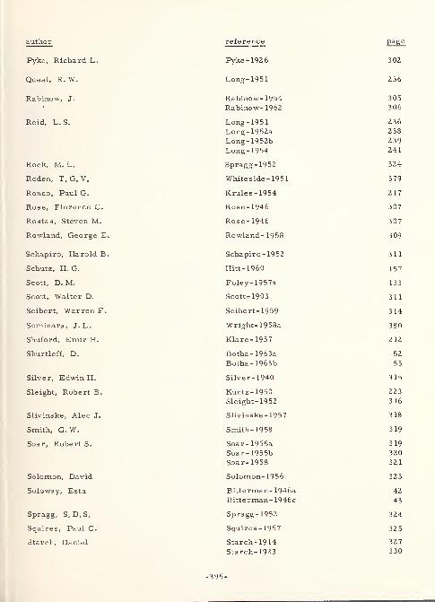
author reference Pag e
Pyke, Richard L. Pyke -192
6
30Z
Queal, R.W. Long- 1951 236
XxelDinOW, J * Rabinow- 1954 305
306
Reid, Li. S. Long -1951 236
Long-1952a 238
Long- 1952b 239
Long- 1954 241
Rock, M. L. Spragg-1952 324
Roden, T.G. V. Whiteside- 1951 379
Ronco, Paul G. Krulee-1954 2 17
Rose - 1946 307
Rostas, Steven M. Rose-1946 307
Rowland, George E. Rowland- 1958 309
Schapiro, Harold B. Schapiro- 1952 311
Schutz, H. G. Hitt-1960 157
Scott, D. M. Foley- 1957a 133
Scott, Walter D. Scott- 1903 311
Seibert, Warren F. Seibert- 1959 314
Seminara, J. L. Wright-1958a 380
Shuford, Emir H. Klare-1957 212
Shurtleff, D. Botha- 1963a 52
Botha- 1963b 53
Silver, Edwin H. Silver-1940 315
Sleight, Robert B. Kuntz-1950 223
Sleight- 1952 316
Slivinske, Alec J. Slivinske -1957 318
Smith, G. W. Smith- 1958 319
Soar, Robert S. Soar-1955a 319
Soar-1955b 320
Soar-1958 32 1
Solomon, David Solomon- 1956 323
Soloway, Esta Bitterman- 1946a 42
Bitterman- 1946c 43
Spragg, S. D. S. Spragg-1952 324
Squires, Paul C. Squires-1957 325
Starch, Daniel Starch- 19 14 327
Starch- 1923 330
-395-
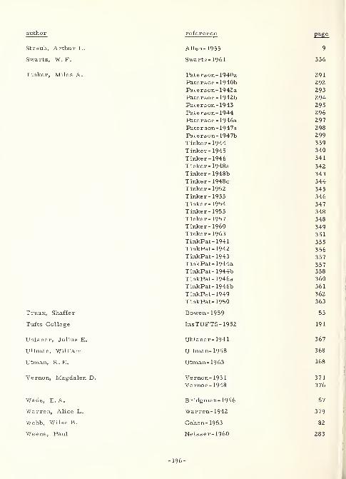
author reference page
Straub, Arthur L. Allen- 1955 9
Swartz, W.F. Swartz-1961 336
Tinker, Miles A. Paterson- 1940a 291Paterson- 1940b 292Paterson- 1942a 293Paterson- 1942b 294Paterson-1943 295Paterson- 1944 296
Paterson- 1946a 297
Paterson- 1947a 298
Paterson- 1947b 299
Tinker-1944 339
Tinker- 1945 340
Tinker-1946 341
Tinker- 1948a 342
Tinker- 1948b 343
Tinker- 1948c 344Tinker- 1952 345Tinker-1953 346Tinker- 1954 347Tinker-1955 348
Tinker-1957 348Tinker- I960 349Tinker-1963 351TinkPat-1941 355TinkPat-1942 356TinkPat-1943 357TinkPat- 1944a 357TinkPat- 1944b 358
TinkPat- 1946a 360
TinkPat- 1946b 361
TinkPat- 1949 362
TinkPat- 1950 363
Truax, Shaffer Bowen-1959 53
Tufts College InsTUFTS- 1952 191
Uhlaner, Julius E. Uhlaner-1941 367
Ullman, William Ullman-1958 368
Utman, R. E. Utman-1963 368
Vernon, Magdalen D. Vernon- 1931 371
Vernon-1948 376
Wade, E.A. Bridgman- 1956 57
Warren, Alice L. Warren- 1942 379
Webb, Wilse B. Cohen- 1953 82
Weene, Paul Neisser-1960 283
-396-
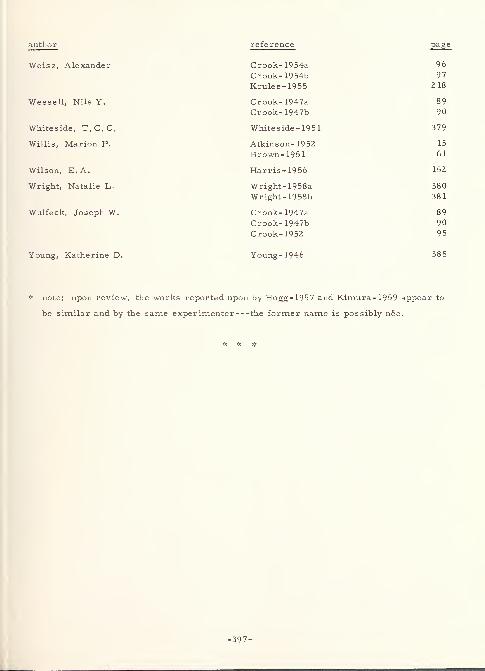
author reference page
Weisz, Alexander Crook-1954a 96
Crook- 1954b 97
Krulee-1955 218
Wessell, Nils Y. Crook- 1947a 89
Crook- 1947b 90
Whiteside, T.C.C. Whiteside- 1951 379
Willis, Marion P. Atkinson- 1952 15
Brown-1951 61
Wilson, E.A. Harris-1956 152
Wright, Natalie L. Wright-1958a 380
Wright- 1958b 381
Wulfeck, Joseph W. Crook- 1947a 89
Crook- 1947b 90
Crook- 1952 95
Young, Katherine D. Young -1946 385
* note: upon review, the works reported upon by Hogg- 1957 and Kimura-1959 appear to
be similar and by the same experimenter the former name is possibly nee.
-397-
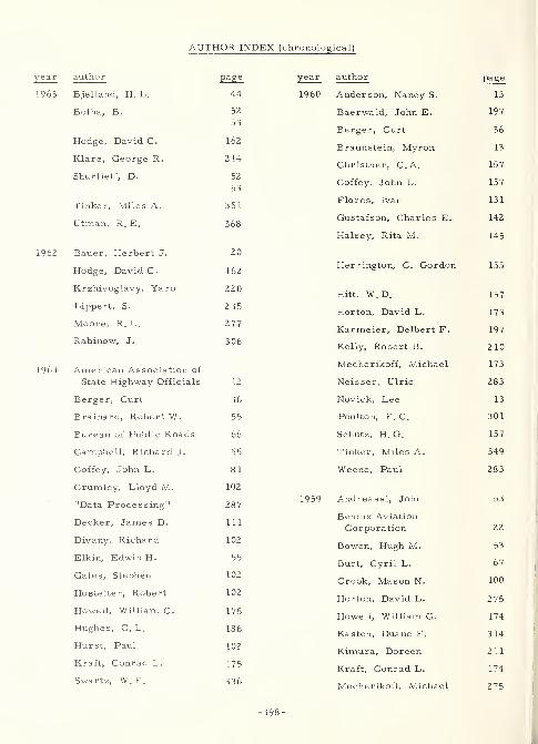
AUTHOR INDEX (chronological)
1961
author page year author page
Bjelland, H. L. 44 1960 Anderson, Nancy S. 13
Botha, B. 52 Baerwald, John E. 197
53Berger, Curt 36
Hodge, David C. 162Braunstein, Myron 13
Klare, George R. 214Christner, C.A. 157
Shurtleff, D. 52
5 3Coffey, John L. 157
Tinker, Miles A. 35 1Flores, Ivan 131
Utman, R. E. 368Gustafson, Charles E.
Halsey, Rita M.
142
145
Bauer, Herbert J. 20
Hodge, David C. 162Herrington, C. Gordon 155
Krzhivoglavy, Yaro 220Hitt, W. D. 157
Lippert, S. 235Horton, David L. 173
Moore, R. L. 277Karmeier, Delbert F. 197
Rabinow, J. 306Kelly, Robert B. 210
American Association ofMecherikoff, Michael 173
State Highway Officials 12 Neisser, Ulric 283
Berger, Curt 36 Novick, Lee 13
Brainard, Robert W. 55 Poulton, E. C. 301
Bureau of Public Roads 66 Schutz, H. G. 157
Campbell, Richard J. 55 Tinker, Miles A. 349
Coffey, John L. 8 1 Weene, Paul 283
Crumley, Lloyd M. 102
"Data Processing" 2871959 Andreassi, John 53
Decker, James D. 1 1 1
Bendix Aviation
Corporation 22
Divany, Richard 102Bowen, Hugh M. 53
Elkin, Edwin H. 55Burt, Cyril L. 67
Gates, Stephen 102Crook, Mason N. 100
Hostetter, Robert 102Horton, David L. 275
Howell, William C. 175Howell, William C. 174
Hughes, C. L. 186Kasten, Duane F. 314
Hurst, Paul 102 Kimura, Doreen 211
Kraft, Conrad L. 175Kraft, Conrad L. 174
Swartz, W. F. 336 Mecherikoff, Michael 275
398-
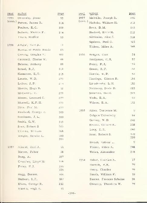
year author page
1959 Orlansky, Jesse 53
(cont -
) Potter, James R. 314
Poulton, E. C. 300
Seibert, Warren F. 314
Truax, Shaffer 53
1958 Alluisi, Earl A. 12
Bureau of Public Roads 65
Cornog, Douglas Y. 309
Crannell, Clarke W. 88
Debons, Anthony 88
Israel, R.J. 319
Klemmer, E. T. 215
Laurie, W. D. 279
Loftus, J. P. 215
Martin, Hugh B. 12
McCarthy, C. 279
Moore, Leonard C. 277
Murrell, K. F. H. 279
Nida, Paul M. 277
Rowland, George E. 309
Seminara, J. L. 380
Smith, G. W. 319
Soar, Robert S. 321
Ullman, William 368
Wright, Natalie L. 380
381
1957 Alluisi, Earl A. 11
Birren, Faber 38
Burg, A. 187
Crumley, Lloyd M. 318
Foley, P.J. 133
134
Hogg, Doreen 164
Hulbert, S. F. 187
Klare, George R. 212
Martin, Hugh B. 11
year author page
1957 Melville, Joseph R. 276(COnt
' ' Nichols, William H. 212
Scott, D. M. 133
Shuford, Emir H. 212
Slivinske, Alec J. 318
Squires, Paul C. 32 5
Tinker, Miles A. 348
1956 Berger, Curt 34
Bridgman, C. S. 57
Foley, P.J. 131
Green, B. F. 152
Harris, W. P. 152
Hastings, Clinton B. 154
Liaudansky, L. H. 152
Nahinsky, Irwin D. 283
Solomon, David 323
Wade, E.A. 57
Wilson, E.A. 152
1955 Allen, Terrence M. 9
Colgate University 84
Garvey, W. D. 242
Krulee, Gilbert K. 218
Long, E. R. 242
Soar, Robert S. 319
320
Straub, Arthur L. 9
Tinker, Miles A. 348
Weisz, Alexander 2 18
1954 Baker, Charles A. 17
Barrett, P. R. 79
Batey, Charles 79
Bauch, William F. 19
Baxter, Frances Schulze 98
Chaundy, Theodore W. 79
-399-
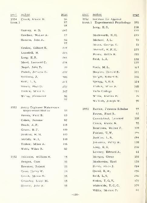
year author page
1954 Crook, Mason N. 96
(cont.) 97
98
Garvey, W. D. 241
Grether, Walter A. 17
Hanson, John A. 96
97
Krulee, Gilbert K. 217
Lansdell, H. 225
Long, E. R. 241
Mead, Leonard C. 2 74
Nagel, John T. 19
Podell, Jerome E. 2 17
Rabinow, J. 305
Reid, L. S. 241
Ronco, Paul G. 2 17
Tinker, Miles A. 347
Weisz, Alexander 96
97
1953 Army Engineer WaterwaysExperiment Station 14
Brown, Fred R. 63
Cohen, Jerome 82
Deuth, A.F. 115
Green, B. F. 140
Jenkins, H. M. 140
McGill, W. J. 140
Tinker, Miles A. 346
Webb, Wilse B. 82
1952 Atkinson, William H. 15
Berger, Curt 33
Brenner, Robert 73
Case, Harry W. 73
Crook, Mason N. 95
Crumley, Lloyd M. 15
Hanson, John A. 95
year author page
1952 Institute for Applied(cont.) Experimental Psychology 191
Long, E. R. 238
239
Mackworth, N. H. 273
Michael, J. L. 73
Mount, George E. 73
Murrell, K. F. H. 279
Perry, Dallis K. 299
Reid, L. S. 238
239
Rock, M. L. 324
Shapiro, Harold B. 311
Sleight, Robert B. 316
Spragg, S. D. S. 324
Tinker, Miles A. 345
Tufts College 191
Willis, Marion P. 15
Wulfeck, Joseph W. 95
1951 Baxter, Frances Schulze 93
Brown, Fred R. 61
Carmichael, Leonard 110
Crook, Mason N. 93
Dearborn, Walter F. 110
Forbes, T. W. 135
Jenkins, L. B. 284
Johnston, Philip W. 110
Long, E.R. 236
Lowery, Edward A. 61
Morgan, Glenn 135
Moskowitz, Karl 135
North, Alvin J. 284
Queal, R.W. 236
Reid, L. S. 236
Roden, T. G. V. 379
Whiteside, T. C. C. 379
Willis, Marion P. 61
-400-
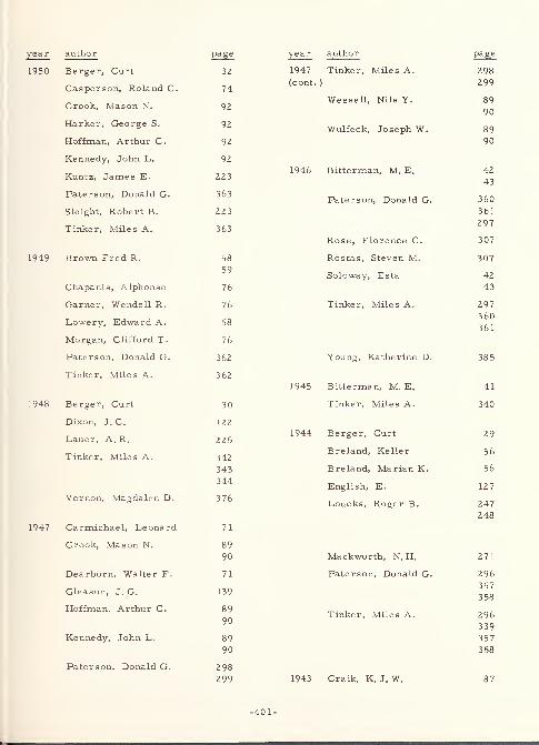
year author page
1950 Berger, Curt 32
Casperson, Roland C. 74
Crook, Mason N. 92
Harker, George S. 92
Hoffman, Arthur C. 92
Kennedy, John L. 92
Kuntz, James E. 223
Paterson, Donald G. 363
Sleight, Robert B. 223
Tinker, Miles A. 363
1949 Brown Fred R. 58
59
Chapanis, Alphonse 76
Garner, Wendell R. 76
Lowery, Edward A. 58
Morgan, Clifford T. 76
Paterson, Donald G. 362
Tinker, Miles A. 362
1948 Berger, Curt 30
Dixon, J. C. 122
Lauer, A. R. 225
Tinker, Miles A. 342
343
344
Vernon, Magdalen D. 376
1947 Carmichael, Leonard 71
Crook, Mason N. 89
90
Dearborn, Walter F. 71
Gleason, J. G. 139
Hoffman, Arthur C. 89
90
Kennedy, John L. 89
90
Paterson, Donald G. 298
299
year author page
1947 Tinker, Miles A. 298(cont.) 299
Wessell, Nils Y. 89
90
Wulfeck, Joseph W. 89
90
1946 Bitterman, M. E. 42
43
Paterson, Donald G. 360
361
297
Rose, Florence C. 307
Rostas, Steven M. 307
Soloway, Esta 42
43
Tinker, Miles A. 297360
361
Young, Katherine D. 38 5
1945 Bitterman, M. E. 41
Tinker, Miles A. 340
1944 Berger, Curt 29
Breland, Keller 56
Breland, Marian K. 56
English, E. 127
Loucks, Roger B. 247
248
Mackworth, N. H. 271
Paterson, Donald G. 296
357
3 58
Tinker, Miles A. 296
339
357
3 58
1943 Craik, K. J. W. 87
-401-
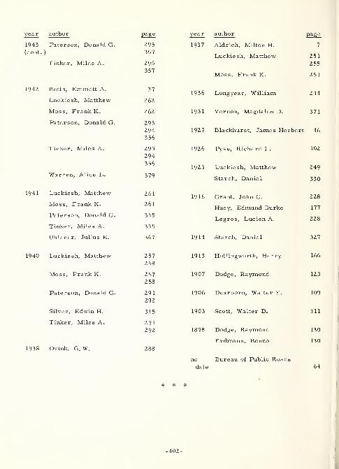
year author page
1943 Paterson, Donald G. 295
(cont. ) 357
Tinker, Miles A. 295
357
1942 Betts, Emmett A. 37
Luckiesh, Matthew 262
Moss, Frank K. 262
Paterson, Donald G. 293
294356
Tinker, Miles A. 293
294
356
Warren, Alice L. 379
1941 Luckiesh, Matthew 261
Moss, Frank K. 261
Paterson, Donald G. 355
Tinker, Miles A. 355
Uhlaner, Julius E. 367
1940 Luckiesh, Matthew 2 57
258
Moss, Frank K. 257
2 58
Paterson, Donald G. 291
292
Silver, Edwin H. 315
Tinker, Miles A. 291
292
1938 Ovink, G. W. 288
year author page
1937 Aldrich, Milton H. 7
Luckiesh, Matthew 251
255
Moss, Frank K. 251
1936 Longyear, William 244
1931 Vernon, Magdalen D. 371
1927 Blackhurst, James Herbert 46
1926 Pyke, Richard L. 302
1923 Luckiesh, Matthew 249
Starch, Daniel 330
1916 Grant, John C. 228
Huey, Edmund Burke 177
Legros, Lucien A. 228
1914 Starch, Daniel 327
1913 Hollingworth, Harry 166
1907 Dodge, Raymond 123
1906 Dearborn, Walter F. 109
1903 Scott, Walter D. 311
1898 Dodge, Raymond 130
Erdmann, Benno 130
no Bureau of Public Roadsdate 64
* *
-402-
APPENDIX B: CHARACTER FACE NAME INDEX
CHARACTER FACE NAME INDEX
There are three types of entries in the following Character Face Name Index. Thes
are as follows: (1) CHARACTER FACE name to Document Extract identification (e.g. ,
VOGUE : Bendix-1959, Brown- 1953, and Longyear- 1936); (2) Document Extract
identification to CHARACTER FACE name (e.g., Pater son- 1946a: See BOLD faces,
CHELTENHAM, and MEMPHIS); and (3) cross-references of various kinds. All of the
above are intermingled together in letter-by-letter alphabetical sequence. Following the
alphabetic sequence are the names, in number -by-number order, of eight character
faces whose names begin with a number.
In addition, several peculiarities should be explained in that they might otherwise
cause difficulty in the use of this Index. (1) The spelling of foreign face names does not
necessarily coincide with the spelling of the language for which it is used (e.g.,
MALAYALIM versus Malayalam). (2) In the case of face names whose acronym is more
commonly known than the spelled-out version, the acronym is underlined and cross-
referenced to the full spelling (e.g. , AMEL : See Aero-Medical Equipment Laboratory).
However, when the face name has been superseded by another, the older version is not
underlined, and cross-reference is made to the new name (e.g. AND 10400 versus
MS 33 558 ). Nonetheless, appropriate citations are listed for both. (3) Several face
names are followed by a parenthetical comment. This was done to identify, when it was
not entirely clear from the face name, the medium in which the face is used (e.g.
COMPOSITRON (display), in this case connoting use in a display medium other than that
commonly encountered in printed text (e.g. , cathode-ray tube displays). (4) Some
underlined names are followed by such names as for example "symbols, " "faces, "
"forms, " etc. (e.g., MACHINE RECOGNITION faces). These entries cover classes of,
rather than individual, character faces. In some few cases, "class" names are made to
stand alone since they are attributed sometimes to a face name but usually are descriptiv
of some special condition, as configuration, of the face (e.g., ITALICS). (5) As noted
below in a fuller listing, there also exist special entries, such as UNSPECIFIED
COMMERCIAL and UNSPECIFIED EXPERIMENTAL faces.
These entries are as follows: BLOCK style (otherwise unspecified), BOLD faces,
BOLD FACE SERIES (listed here as an example of the fact that type face series numbers
are not usually listed in this Index, unless the number is the only identification, in which
case it is listed under NO. . . . ), CALIGRAPH/CUNEIFORM/HIEROGLY PHIC faces
(listed here to indicate those classes of faces in which symbols are used in pictorial
-405-
language form), CONDENSED faces, DIACRITICAL MARKS (PUNCTUATION),
EMBOSSED faces, EXPANDED/EXTENDED/WIDE faces, GOTHIC (GROTESQUE, SANS,
SANSERIF, SANS SERIF, SANS SERIFFED, etc. ) faces, GROUNDWORK, HANDWRITING
(hand-written/-printed see also SCRIPT), HATCHED (CHECKED) faces, INITIALS
(various), IRREGULAR symbols (including FAMILIAR and GEOMETRIC forms,
ARBITRARY shapes, PICTORIAL, ABSTRACT, and DISTORTED figures, etc. ---either
LINE or SOLID), ITALICS (including OBLIQUE faces and INCLINED/SLANT GOTHIC),
KERNED characters, LIGATURES, LIGHT faces, LINING faces (see LINING, INLINE,
OUTLINE, and SKELETON faces, individually), MACHINE RECOGNITION faces (machine
recognition, magnetic and optical characters), MATRIX/ELEMENT faces, MODIFIED
faces, NEWSPAPER faces (otherwise unspecified), NOVELTY faces (otherwise
unspecified), OLD ENGLISH (includes, e.g., BLACK-FACE, TRADITIONAL GOTHIC,
and several others), OPEN style (otherwise unspecified), OPTICAL ILLUSIONS,
ORNAMENTAL faces, OVAL style (otherwise unspecified), PECULIARS , RECTANGULAR
faces, REVERSF D faces, ROUND style (otherwise unspecified), SCRIPT (handwriting and
printing), SEMK IRCULAR faces, SHORTHAND , SUB- and SUPER -SCRIPTS,SWASHES,
SYMBOLS (various composite listing at this entry and individual listings throughout
Index, e.g. BOTANICAL symbols), TRIANGULAR faces, TYPEWRITER (otherwise
unspecified), UNSPECIFIED COMMERCIAL faces (various), and UNSPECIFIED
EXPERIMENTAL faces (various).
-406-
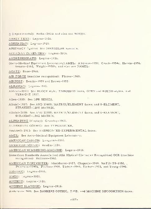
A (experimental): Botha- 1963a and also see BOTHA.
ABBEY TEXT : Legros - 19 16.
ABKHAZIAN : Legros-1916.
ABSTRACT figures: See IRREGULAR symbols.
ACCADIAN CUNEIFORM : Legros-1916.
ADDRESSOGRAPH : Legros-1916.
(Aero-Medical Equipment Laboratory) AMEL: Atkinson- 1952, Crook-1954c, Harris-19Swartz-1961, Wright- 1958b, and also see NAMEL.
AGATE : Rose-1946.
AIR FORCE (machine recognition): Flores-1960.
AIRPORT : Bendix-1959 and Brown-1953.
ALBANIAN : Legros-1916.
Aldrich-1937: See BLOCK style, EMBOSSED faces, OPEN and ROUND styles, andVERMONT 1937.
Allen- 1955: See BPR SERIES.
Alluisi-1957: See AND 10400; MATRIX/ELEMENT faces; and 8 -ELEMENT,STRAIGHT-LINE MATRIX.
Alluisi-1958: See AND 10400; MATRIX/ELEMENT faces; and 6-ELEMENT,STRAIGHT -LINE MATRIX.
ALPHADYNE (display): Crumley- 196 1.
ALTERNATE GOTHIC: See TYPEMASTER.
AmASHO-1961: See UNSPECIFIED EXPERIMENTAL faces.
AMEL : See Aero-Medical Equipment Laboratory.
AMERICAN CASLON : Longyear- 1936.
AMERICAN GOTHIC : Bendix-1959-
AMERICAN NUMBERING-MACHINE : Legros-1916.
(American Standards Association) ASA (Optical Character Recognition) OCR (machinerecognition): Rabinow- 1962.
AMERICAN TYPEWRITER : Blackhur st- 1927, Chapanis - 1949, InsTUFTS - 1952,
Paterson-1940a, Poulton- 1960, Tinker-1944, Tinker-1963, and Young - 1946.
AMHARIC : Legros-1916.
AMOY: Legros-1916.
ANCIENT : Legros-1916.
ANCIENT SLAVONIC : Legros-1916.
Anderson-1960: See BANKERS GOTHIC, E13B, and MACHINE RECOGNITION faces.
-407-
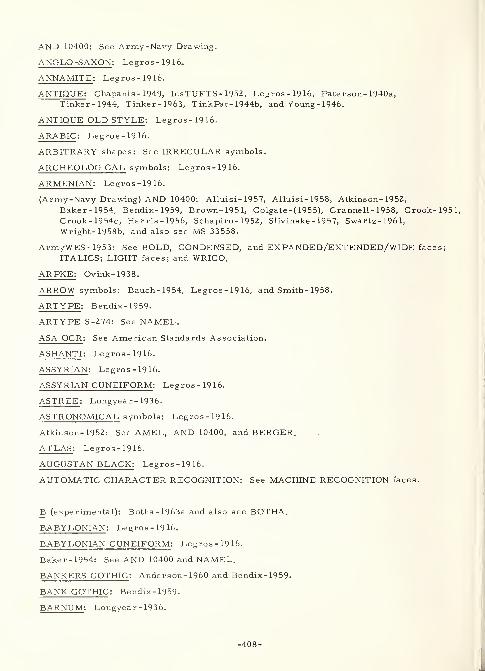
AND 10400: See Army-Navy Drawing.
ANGLO-SAXON : Legros-1916.
ANNAMITE : Legros-1916.
ANTIQU E: Chapanis - 1949, Ins TUFTS - 1 9 52 ,Legros-1916, Pater son- 1940a,
Tinker-1944, Tinker-1963, TinkPat- 1944b, and Young - 1946.
ANTIQUE OLD STYLE : Legros-1916.
ARABIC : Legros-1916.
ARBITRARY shapes: See IRREGULAR symbols.
ARCHEOLOGICAL symbols: Legros-1916.
ARMENIAN : Legros-1916.
(Army-Navy Drawing) AND 10400: Alluisi- 1957, Alluisi- 1958, Atkinson- 1952,
Baker-1954, Bendix-1959, Brown-1951, Colgate -( 1955), Crannell- 1958, Crook-1951,Crook-1954c, Harris-1956, Schapiro - 1952, Slivinske - 1957, Swartz-1961,Wright- 1958b, and also see MS 33558.
ArmyWES-1953: See BOLD, CONDENSED, and EXPANDED/EXTENDED/WIDE faces;
ITALICS; LIGHT faces; and WRICO.
ARPKE: Ovink-1938.
ARROW symbols: Bauch-1954, Legros-1916, and Smith- 1958.
ARTYPE : Bendix-1959.
ARTYPE S-274: See NAMEL.
ASA OCR : See American Standards Association.
ASHANTI : Legros-1916.
ASSYRIAN : Legros-1916.
ASSYRIAN CUNEIFORM : Legros-1916.
ASTREE : Longyear- 1936.
ASTRONOMICAL symbols: Legros-1916.
Atkinson-1952: See AMEL, AND 10400, and BERGER.
ATLAS : Legros-1916.
AUGUSTAN BLACK: Legros-1916.
AUTOMATIC CHARACTER RECOGNITION: See MACHINE RECOGNITION faces.
B (experimental): Botha- 1963a and also see BOTHA.
BABYLONIAN : Legros-1916.
BABYLONIAN CUNEIFORM : Legros-1916.
Baker-1954: See AND 10400 and NAMEL.
BANKERS GOTHIC : Anderson- 1960 and Bendix- 1959.
BANK GOTHIC : Bendix-1959.
BARNUM : Longyear- 1936.
-408-
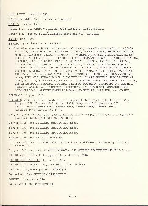
BARTLETT : Murrell- 1952.
BASKERVILLE : Burt- 1959 and Vernon- 193 1.
BATTA : Legros-1916.
Bauch-1954: See ARROW symbols, GOTHIC faces, and SYMBOLS.
Bauer-1962: See MATRIX/ELEMENT faces and 5X7 MATRIX.
BELL : Burt- 1959.
BEMBO : Burt-1959 and Ovink-1938.
Bendix-1959: See AIRPORT, ALTERNATE GOTHIC, AMERICAN GOTHIC, AND 10400,
ARTYPE, ARTYPE S-274, BANKERS GOTHIC, BANK GOTHIC, BERGER, BLOCKstyle, BOLD faces, CLASSIC ROMAN, COMMERCE GOTHIC, CONDENSED faces,
COPPERPLATE GOTHIC, EXPANDED/EXTENDED/WIDE faces, FRANKLIN GOTHIC,FUTURA, FUTURA BOOK, FUTURA DISPLAY, GORTON, GORTON MODERNE,GOTHIC faces, HEADLINER, LABEL GOTHIC, LEROY, LIGHT faces, LININGGOTHIC, LINING METROTHIN, LINING PLATE GOTHIC, MACKWORTH, MARANGOTHIC, METROBLACK, METROLITE, METROTHIN, MIL-C-18012, MODERNE,MS 33558, NAMEL, NEWS GOTHIC, OLD ENGLISH, OPEN style, ORNAMENTALfaces, PHILADELPHIA LINING, PHOTOTYPE, PLATE GOTHIC, RECTANGULARfaces, ROMAN, SANS SERIF, SEMICIRCULAR faces, SPARTAN, SPARTAN BLACK,SPARTAN BOOK, SQUARE GOTHIC, TEMPO, TOURIST, TRADITIONAL GOTHIC,TRIANGULAR faces, TWENTIETH CENTURY, TYPEMASTER, UNSPECIFIEDCOMMERCIAL and EXPERIMENTAL faces, VARITYPE, VERNEN, and VOGUE.
BENGALI : Legros-1916.
BERGER : Atkinson- 1952, Bendix-1959, Berger - 1944b, Berger-1948, Berger-1950,Berger-1952, Berger-1960, Brown-1951, Chapanis - 1949, Colgate-( 1955),
Crook-1954c, Harris-1956, Krulee-1954, Krulee-1955, Murrell- 1952,
Schapiro- 1952, and Swartz- 1961.
Berger- 1944b: See BERGER; BOLD, EMBOSSED, and LIGHT faces; OLD DANISH; and2 and 6 MILLIMETER STROKE-WIDTH.
See BERGER, and GOTHIC faces.
See BERGER, and GOTHIC faces.
See BERGER, and GOTHIC faces.
See REGAL and WEISS.
See BERGER; DOT, IRREGULAR, and PARALLEL BAR symbols; and
Berger-1948
Berger-1950
Berger-1952
Berger-1956
Berger-1960SYMBOLS.
Berger-1961: See MOSAIC-STRUCTURE and UNSPECIFIED EXPERIMENTAL faces.
BERNHARD CURSIVE : Longyear- 1936 and Ovink- 1938.
BERNHARD FASHION : Longyear- 1936.
BERNHARD ROMAN : Longyear- 1936 and Ovink- 1938.
BETON : Longyear - 1936 and Ovink-1938.
Betts-1942: See CENTURY OLD STYLE.
BINNEY : Longyear - 1936.
Birren-1957: See B PR SERIES.
-409-
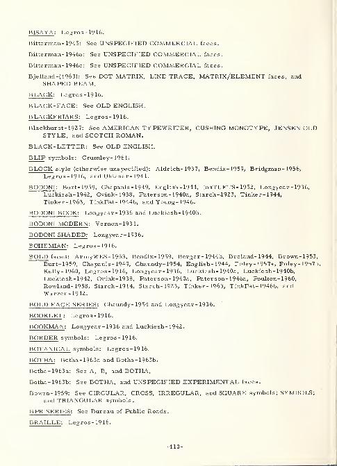
BISAYA : Legros-1916.
Bitterman-1945: See UNSPECIFIED COMMERCIAL faces.
Bitterman- 1946a: See UNSPECIFIED COMMERCIAL faces.
Bitterman- 1946c: See UNSPECIFIED COMMERCIAL faces.
Bjelland-(1963): See DOT MATRIX, LINE TRACE, MATRIX/ELEMENT faces, andSHAPED BEAM.
BLACK : Legros-1916.
BLACK-FACE: See OLD ENGLISH.
BLACKFRIARS : Legros-1916.
Blackhurst-1927: See AMERICAN TYPEWRITER, CUSHING MONOTYPE, JENSEN OLDSTYLE, and SCOTCH ROMAN.
BLACK-LETTER: See OLD ENGLISH.
BLIP symbols: Crumley- 196 1.
BLOCK style (otherwise unspecified): Aldrich- 1937, Bendix-1959, Bridgman- 1956,
Legros-1916, and Uhlaner- 1941.
BODONI : Burt-1959, Chapanis - 1949, English- 1944, InsTUFTS- 1952, Longyear- 1936,
Luckiesh-1942, Ovink-1938, Paterson- 1940a, Starch-1923, Tinker-1944,Tinker-1963, TinkPat- 1944b, and Young - 1946.
BODONI BOOK: Longyear- 1936 and Luckie sh- 1940b.
BODONI MODERN : Vernon- 1931.
BODONI SHADED: Longyear - 1936.
BOHEMIAN : Legros-1916.
BOLD faces: ArmyWES- 1953, Bendix-1959, Berger - 1944b, Breland- 1944, Brown-1953,Burt-1959, Chapanis - 1949, Chaundy- 1954, English- 1944, Foley-1957a, Foley-1957b,
Kelly- 1960, Legros-1916, Longyear - 1936, Luckie sh- 1940a, Luckiesh- 1940b,
Luckiesh-1942, Ovink-1938, Paterson- 1940a, Pater son- 1946a, Poulton- 1960,
Rowland- 1958, Starch- 19 14, Starch- 1923, Tinker-1963, TinkPat- 1946b, andWarren-1942.
BOLD FACE SERIES : Chaundy- 1954 and Longyear- 1936.
BOOKLET : Legros-1916.
BOOKMAN : Longyear - 1936 and Luckiesh-1942.
BORDER symbols: Legros-1916.
BOTANICAL symbols: Legros - 19 16.
BOTHA: Botha- 1963a and Botha- 1963b.
Botha-1963a: See A, B, and BOTHA.
Botha- 1963b: See BOTHA, and UNSPECIFIED EXPERIMENTAL faces.
Bowen-1959: See CIRCULAR, CROSS, IRREGULAR, and SQUARE symbols ; SYMBOLS;and TRIANGULAR symbols.
B PR SERIES : See Bureau of Public Roads.
BRAILLE : Legros-1916.
-410
Brainard-1961: See ROAD SIGN symbols, and SYMBOLS.
Breland-1944: See BOLD faces and CHELTENHAM.
Bridgman-1956: See BLOCK style.
BROWN : Brown-1951, Brown-1953, Soar-1955b, and Soar - 1958.
Brown- 1949a: See GROW CHART,
Brown- 1949b: See GROW CHART.
Brown-1951: See AND 10400, BERGER, and BROWN.
Brown-1953: See AIRPORT, BOLD faces, BROWN, FUTURA, GARAMOND, GOTHICSANS-SERIF, LINING GOTHIC, UNSPECIFIED EXPERIMENTAL faces, andVOGUE MEDIUM.
BRUCE : Longyear-1936.
BRUCE OLD STYLE : Longyear-1936.
BRUSH SCRIPT : Longyear-1936.
BUGI : Legros-1916.
BULGARIAN : Legros-1916.
BULLFINCH : Hollingworth- 19 13, Starch-1914, and Starch- 1923.
(Bureau of Public Roads) BPR SERIES A-F (display): Allen- 1955, Birren-1957,
BurPR-nd(a), BurPR-1958, BurPR-1961, Chapanis - 1949, Decker-1961, Forbes-195Herrington-1960, Karmeier- 1960, Solomon- 1956, and Ullman- 1958.
BURMESE : Legros-1916.
BurPR-nd(a): See BPR SERIES.
BurPR-1958: See BPR SERIES.
BurPR-1961: See BPR SERIES.
Burt- 1959: See BASKERVILLE, BELL, BEMBO, BODONI, BOLD faces, CASLON,CENTAUR, DIDOT, EHRHARDT, FOURNIER, GARAMOND, GRANJON, IMPRINT,MODERN, OLD ENGLISH, OLD STYLE, PERPETUA, PLANTIN, SCOTCH ROMAN,TIMES NEW ROMAN, VERONESE, and WALBAUM.
CALIFORNIA (display): Smith- 1958.
CALIGRAPH : Longyear-1936.
Carmichael-1947: See UNSPECIFIED COMMERCIAL faces.
CARSHUNI : Legros-1916.
CARTOGRAPHIC symbols: Legros-1916.
Case-1952: See UNSPECIFIED EXPERIMENTAL faces.
CASLON : Burt- 1959, Chapanis - 1949, Hollingworth- 19 13, Longyear-1936,Paterson- 1940a, Starch-1914, Starch-1923, Tinker-1963, and Vernon-1931.
CASLON MODERN : Longyear-1936.
CASLON OLD FACE : Luckiesh- 1942.
CASLON OLD STYLE: InsTUFTS- 1952 and Tinker- 1944.
-411-
CASLON 540 : Longyear- 1936.
Casperson-1950: See CROSS, DIAMOND, ELLIPTICAL, RECTANGULAR, and STARsymbols; SYMBOLS; and TRIANGULAR symbols.
CAXTON : Longyear- 1936.
CENTAUR : Burt-1959.
CENTURY : Hollingworth- 19 13, Longyear- 1936, Luckiesh- 1941b, Luckie sh- 1942,
Soar-1955a, Starch-1914, Starch-1923, Tinker-1963, TinkPat- 1943, andTinkPat- 1944b.
CENTURY OLD STYLE : Betts-1942, Hollingworth- 19 13, Starch-1914, and Starch- 1923.
CHANGING symbols: Halsey- 1960b.
Chapanis-1949: See AMERICAN TYPEWRITER, ANTIQUE, BERGER, BODONI, BOLDfaces, BPR SERIES, CASLON, CHELTENHAM, GARAMOND, ITALICS, KABEL,LIGHT faces, MACKWORTH, MODERN, OLD ENGLISH, OLD STYLE, and SCOTCHROMAN.
CHARACTER RECOGNITION: See MACHINE RECOGNITION faces.
CHARACTRON (display): Crumley-1961 and Harris-1956.
CHARTER OAK : Longyear - 1936.
Chaundy-1954: See BOLD faces, BOLD FACE SERIES, DISPLAY symbols,
FRAKTUR, GILL, GREEK, HANDWRITING, ITALICS, KERNED characters,
MATHEMATICAL symbols, MODERN, SCRIPT, SUB - and SUPER -SCRIPTS, and
SYMBOLS.
CHECKED symbols: Legros-1916.
CHECKERED TYPEWRITER : Legros-1916.
CHELTENHAM : Breland- 1944, Chapanis-1949, English- 1944, Hollingworth- 19 13,
InsTUFTS-1952, Legros-1916, Longyear- 1936, Pater son- 1940a, Pater son- 1946a,
Starch-1914, Starch-1923, Tinker- 1944, Tinker-1963, TinkPat- 1944b, Warren- 1942,
and Young- 1946.
CHELTENHAM OLD STYLE : Legros-1916, Longyear- 1936, and Starch- 1923.
CHEROKEE : Legros-1916.
CHINESE : Legros-1916.
CHINESE BRAILLE : Legros-1916.
CHIPPEWYAN : Legros-1916.
CINCINNATI : Longyear- 1936.
CIRCULAR symbols: Bowen-1959, Gleason- 1947, Lauer-1948, Legros-1916, and
Sleight-1952.
CIVIL GEORGIAN : Legros-1916.
CLARENDON : Legros - 19 16 and Vernon- 1948.
CLASSIC : Tinker-1963 and TinkPat- 1944b.
CLASSIC ROMAN: See ROMAN.
CLEARCUT : Longyear- 1936.
CLEARFACE GOTHIC : Longyear- 1936.
-412-
CLOISTER : Longyear- 1936.
CLOISTER BLACK: See OLD ENGLISH.
CMC
7
(machine recognition, magnetic characters): Utman-1963.
COCHIN-NICHOLAS : Longyear - 1936.
CODING symbols: Cohen-1953 and Hitt-1960.
Coffey- 1961: See GOTHIC faces.
Cohen-1953: See CODING, DOT, ELEMENT, and LINE symbols; MACHINERECOGNITION and MATRIX/ELEMENT faces; and SYMBOLS.
Colgate-(1955): See AND 10400, BERGER, MACKWORTH, and REVISED.
COLOR symbols: Gustafson- 1960, Hastings-1956, Swartz-1961, and Ullman- 1958.
COLUMBIA : Ovink-1938.
COLUMBUS : Legros-1916.
COLWELL : Longyear - 1936.
COMMERCE GOTHIC : Bendix-1959.
COMMERCIAL symbols: Legros-1916.
COMPASS : Legros-1916.
COMPOSITRON (display): Crumley- 196 1.
CONDENSED faces: ArmyWES-1953, Bendix-1959, English- 1944, Foley-1957a,Foley- 1957b, Legros-1916, Longyear- 1936, Ovink-1938, Pyke-1926, Starch-19Starch-1923, Tinker-1963, and "Warren- 1942
.
CONTROL INSTRUMENT COMPANY ELEMENT MATRIX (display): Long-1951,Long-1952a, Long-1952b, and also see INFOMAX.
COOPER : Longyear- 1936.
COOPER BLACK : Longyear- 1936.
COPPERPLATE GOTHIC : Bendix- 1959 and Longyear- 1936.
COPTIC : Legros-1916.
CORNER symbols: Legros-1916.
CORONA : Tinker- 1963 and TinkPat- 1944b.
COURTNEY -FAA (display): Moore- 1958 and Rowland- 19 58.
CRAIK (display): Crook- 1954c, Schapiro- 1952, and Swartz- 196 1.
Craik-1943: See UNSPECIFIED EXPERIMENTAL faces.
Crannell-1958: See AND 10400.
CREE : Legros-1916.
Crook- 1947a: See UNSPECIFIED COMMERCIAL faces.
Crook- 1947b: See UNSPECIFIED COMMERCIAL faces.
Crook- 1950a: See UNSPECIFIED COMMERCIAL faces.
Crook-1951: See AND 10400.
Crook- 1952: See GOTHIC and MONOTYPE GOTHIC.
-413-
Crook- 1954a: See VARIGRAPH.
Crook- 1954b: See VARIGRAPH.
Crook-1954c: See AMEL, AND 10400, BERGER, CRAIK, GOTHIC faces, LEROY,MACKWORTH, ORDNANCE, OVAL and ROUND styles, and UNSPECIFIEDEXPERIMENTAL faces.
Crook- 1959: See IRREGULAR symbols, and SYMBOLS.
CROSS symbols: Bowen-1959, Casperson- 1950, Legros-1916, and Sleight- 1952.
Crumley-1961: See ALPHADYNE, BLIP symbols, CHARACTRON, COMPOSITRON,DOTITRON, ELECTROLUMINESCENT ALPHANUMERIC DISPLAY, ELLIPTICALsymbols, GASEOUS MATRIX-CELL DISPLAY, HARMONIC, IEE, INCLINATIONsymbols, INDICODER, IRREGULAR symbols, LIQUID MATRIX-CELL DISPLAY,MATRIX/ELEMENT faces, NIXIE, SYMBOLS, TELEREGISTER, UNION,VIDEOGRAPH, VIDIAC, and XEROGRAPHIC PRINTER.
CUFIC : Legros-1916.
CUNEIFORM : Legros-1916.
CURSIVE SCRIPT: See HANDWRITING and SCRIPT.
CUSHING : Pyke - 1926 and Tinker- 1963.
CUSHING MONOTONE : Starch- 19 14 and Starch- 1923.
CUSHING MONOTYPE : Blackhurst- 192 7 and Hollingworth- 19 13.
CUSHING OLD STYLE : Hollingworth- 19 13, Starch-1914, and Starch- 192 3.
CZECHOSLOVAKIAN STANDARD (display): Kr zhivoglavy- 1962.
Dearborn- 1906: See TYPEWRITER.
Dearborn- 1951: See TYPEWRITER.
Decker-1961: See BPR SERIES, STRIPE symbols, and SYMBOLS.
DELLA ROBBIA : Longyear- 1936.
DELPHIN : Longyear- 1936.
DEMOTIC : Legros-1916.
Deuth-1953: See GOTHIC TEMPO, INFOMAX, MATRIX/ELEMENT faces, and
TWENTIETH CENTURY.
DEVANAGARI : Legros-1916.
DE VINNE : Legros-1916, Luckiesh- 1940b, Ovink-1938, Tinker- 1963, andTinkPat- 1944b.
DIACRITICAL MARKS : Legros-1916, OptRead- 196 1 and Pyke - 192 6.
DIAMOND symbols: Casper son- 19 50, Lauer-1948, and Sleight- 1952.
DIDQT : Burt-1959.
DISPLAY symbols: Chaundy- 1954.
DISTORTED figures: See IRREGULAR symbols.
DIVISION MARK symbols: Loucks - 1944a, Loucks - 1944b, Loucks - 1944c, and
Loucks-1944d.
-414-
Dixon- 1948: See UNSPECIFIED EXPERIMENTAL faces.
Dodge-1907: See TYPEWRITER.
DOTTTRON (display): Crumley- 196 1.
DOT MATRIX (display): Bjelland-( 1963).
DOT symbols: Berger-1960, Cohen-1953, and Swartz- 196 1.
DUPLICATING MACHINE : Legros-1916.
DUTCH : Longyear-1936.
ECCLESIASTICAL: See OLD ENGLISH.
ECCLESIASTICAL GEORGIAN : Legros-1916.
ECCLESIASTICAL symbols: Legros-1916.
ECKMANN : Ovink-1938.
EGYPTIAN : Legros-1916.
EHRHARDT : Burt-1959.
ELBAR : Longyear-1936.
ELECTROLUMINESCENT ALPHANUMERIC DISPLAY (display): Crumley- 196 1.
ELEMENT fonts: See MATRIX/ELEMENT faces.
ELEMENT symbols: Cohen-1953 and Legros-1916.
ELITE GOTHIC (experimental): OptRead- 1961.
ELITE TYPEWRITER : Luckiesh- 1942.
ELLIPTICAL symbols: Casperson- 1950, Crumley- 196 1, Sleight- 1952, and Swartz- 196 1.
ELZEVIR : Legros-1916.
EMBOSSED faces: Aldrich- 1937, Berger- 1944b, Gleason- 1947, Herrington- I960,
Karmeier-1960, Legros-1916, Silver-1940, and Soar- 1955b.
ENGINEERING symbols: Legros-1916.
ENGLISH : Rose- 1946.
English-1944: See BODONI, BOLD faces, CHELTENHAM, CONDENSED faces, KARNAK,OLD ENGLISH, and TEMPO.
ENGRAVERS ROMAN : Longyear-1936.
Erdmann-1898: See UNSPECIFIED COMMERCIAL faces.
ESKIMO : Legros-1916.
ESPERANTO : Legros-1916.
ESTIENNE MORSE : Legros-1916.
ESTRANGELO: Legros-1916.
ETHIOPIC : Legros-1916.
EVE : Longyear-1936.
EXCELSIOR: Luckiesh- 1942, Ovink-1938, Tinker- 1946, Tinker- 1948b, Tinker- 1948c,
-415-
Tinker-1952, Tinker-1953, Tinker-1954, Tinker-1955, Tinker-1960, Tinker-1963,TinkPat- 1943, TinkPat- 1944b, TinkPat- 1946a, and TinkPat- 1946b.
EXPANDED/EXTENDED/WIDE faces: ArmyWES- 1953, Bendix-1959, Foley-1957a,Foley-1957b, Hollingworth- 19 13, Legros-1916, Longyear- 1936, Luckiesh-1941b,Ovink-1938, Poulton- 1959, Pyke-1926, Starch-1914, Starch-1923, Tinker-1963, andTinkPat- 1943.
E 13B (machine recognition, magnetic characters): Anderson- 1960 and Utman-1963.
FAMILIAR forms: See IRREGULAR symbols.
(Federal Aviation Agency) FAA: See COURTNEY -FAA
.
Flores-1960: See AIR FORCE, GOTHIC and MACHINE RECOGNITION faces, PARKAVENUE, STANFORD RESEARCH, and UNSPECIFIED EXPERIMENTAL faces.
Foley- 1956: See LANSDELL and MACKWORTH.
Foley-1957a: See BOLD, CONDENSED, and EXPANDED/EXTENDED/WIDE faces
;
LEROY; and LIGHT faces.
Foley- 1957b: See BOLD, CONDENSED, EXPANDED/EXTENDED/WIDE, and LIGHTfaces; and UNO PEN STENCIL.
Forbes- 1951: See BPR SERIES, and UNSPECIFIED EXPERIMENTAL faces.
FOURNIER : Burt- 1959 and Legros - 19 16.
FRAKTUR : Chaundy- 1954, Huey-1916, Legros-1916, and Starch- 19 14.
FRANKLIN GOTHIC : Bendix-1959 and Longyear- 1936.
FRENCH : Legros-1916.
FRENCH ANTIQUE : Legros-1916.
FRENCH CLARENDON : Legros-1916.
FUTURA : Bendix-1959, Brown-1953, Kelly- 1960, Longyear- 1936, and Seibert- 1959-
FUTURA BOOK : Bendix-1959.
FUTURA DISPLAY : Bendix- 1959 and Longyear- 1936.
GAELIC: See IRISH.
GALLEA : Longyear- 1936.
GALLIA : Ovink-1938.
GAME-COUNTER symbols: Legros-1916.
GAMMETER MULTIGRAPH : Legros-1916.
GARAMOND : Brown-1953, Burt-1959, Chapanis - 1949, InsTUFTS- 1952, Longyear- 1936,
Paterson- 1940a, Tinker-1944, and Tinker-1963.
GASEOUS MATRIX-CELL DISPLAY (display): Crumley- 196 1
.
GENEALOGICAL symbols: Legros-1916.
GEOMETRIC forms: See IRREGULAR symbols.
GERMAN: See FRAKTUR.
-416-
GILL : Chaundy-1954 and Kr zhivoglavy- 1962.
GIRDER : Longyear - 1936.
Gleason-1947: See CIRCULAR symbols, EMBOSSED and LIGHT faces, PARALLEL BARand POINTER symbols, SYMBOLS, and UNSPECIFIED COMMERCIAL andEXPERIMENTAL faces.
GLORIA : Longyear- 1936.
GORTON : Bendix-1959.
GORTON MODERNE : Bendix-1959.
GOTHIC: See OLD ENGLISH.
GOTHIC faces: Bauch-1954, Bendix-1959, Berger- 1948, Berger-1950, Berger-1952,Coffey-1961, Crook-1952, Crook-1954c, Flores-1960, Green-1953, Hulbert- 1957,
Krulee-1955, Lauer-1948, Legros-1916, Longyear - 1936, Luckiesh- 1923,
Ovink-1938, and Vernon- 193 1.
GOTHIC SANS-SERIF : Brown-1953.
GOTHIC TEMPO : Deuth-1953.
GOUDY : Longyear- 1936.
GOUDY CATALOGUE : Longyear- 1936.
GOUDY HAND TOOLED : Longyear- 1936.
GRANJON : Burt-1959, Paterson- 1940a, Paterson- 1943, and Tinker- 1963.
GRASSET : Ovink-1938.
GRECO : Longyear-1936.
GRECO ADORNADO : Longyear-1936.
GREEK : Chaundy-1954, Legros-1916, and Vernon- 1948.
Green-1953: See GOTHIC faces.
GROTESQUE: See GOTHIC faces.
GROUNDWORK : Legros-1916.
GROW CHART : Brown- 1949a and Brown- 1949b.
GUARANI : Legros-1916.
GUJARATI : Legros-1916.
Gustafson- 1960: See COLOR symbols, and SYMBOLS.
Halsey- 1960a: See MATRIX/ELEMENT faces and 5X7 MATRIX.
Halsey- 1960b: See CHANGING symbols, SAGE, and SYMBOLS.
HANDWRITING (hand-written/-printed): Chaundy-1954, InsTUFTS- 1952, Luckiesh- 1942,
Neisser-1960, Soar-1955a, Starch-1923, Tinker-1963, and Vernon- 193 1.
HARMONIC (display): Crumley- 196 1.
Harris-1956: See AMEL, AND 10400, BERGER, CHARACTRON, LEROY, LINCOLNLABORATORY, MACKWORTH, and MATRIX/ELEMENT faces.
Hastings- 1956: See COLOR symbols.
HATCHED faces: Legros-1916.
-417-
HAWARDEN : Legros - 19 1 6.
HEADLINER : Bendix-1959.
HEBREW : Legros-1916.
HERALDIC symbols: Legros-1916.
Herrington-1960: See BPR SERIES, and EMBOSSED faces.
HIERATIC : Legros-1916.
HIEROGLYPHIC : Legros-1916.
HINDI : Legros-1916.
HIRA-GANA : Legros-1916.
Hitt-1960: See CODING symbols, and SYMBOLS.
HITTITE : Legros-1916.
Hodge-196Z: See LEROY.
Hodge-1963: See LEROY.
Hogg-1957: See IRREGULAR symbols, SYMBOLS, and TYPEWRITER.
Hollingworth-1913: See BULLFINCH, CASLON, CENTURY, CENTURY OLD STYLE,CHELTENHAM, CUSHING MONOTYPE, CUSHING OLD STYLE, EXPANDED/EXTENDED/WIDE faces, IRREGULAR symbols, NEWS GOTHIC, SCOTCH ROMAN,and SYMBOLS.
HOMEWOOD : Longyear - 1936.
Horton-1960: See TYPEWRITER.
Howell- 1959: See MACKWORTH.
Howell- 1961: See UNSPECIFIED EXPERIMENTAL faces.
Huey-1916: See FRAKTUR, SYMBOLS, and UNSPECIFIED COMMERCIAL faces.
Hughes-1961: See IRREGULAR symbols, SYMBOLS, and UNSPECIFIED COMMERCIALand EXPERIMENTAL faces.
Hulbert-1957: See GOTHIC faces, IRREGULAR symbols, and SYMBOLS.
IBO : Legros-1916.
ICAO symbols: Whiteside - 195 1.
ICELANDIC : Legros-1916.
IDEAL : Tinker-1963, TinkPat- 1943, and TinkPat- 1944b.
IDEOGRAPH symbols: Legros-1916.
IEE : See Industrial Electronic Engineers.
ILLUSIONAL faces and forms: See OPTICAL ILLUSIONS.
IMPERIAL SCRIPT : Legros-1916.
IMPRINT : Burt-1959 and Poulton- 1959-
IMPRINT OLD FACE : Pyke-1926 and Tinker- 1963.
INCLINATION symbols: Crumley- 196 1, Legros-1916, and Swartz- 196 1.
-418-
INCLINED faces: See ITALICS.
INDICODER (display): Crumley- 196 1.
(Industrial Electronic Engineers) IEE (display): Crumley- 1961.
INFOMAX (display): Deuth-1953, Long-1951, Long-1952a, Long-1952b, Long- 1954, andLong-1955.
INITIALS (various): Legros-1916 and Longyear- 1936.
INSCRIPTION GREEK : Legros-1916.
INSCRIPTION ROMAN : Legros-1916.
InsTUFTS-1952: See AMERICAN TYPEWRITER, ANTIQUE, BODONI, CASLON OLDSTYLE, CHELTENHAM, GARAMOND, HANDWRITING, IRREGULAR symbols,
ITALICS, KABEL, LIGHT faces, OLD ENGLISH, OLD STYLE, SCOTCH ROMAN,SCRIPT, and SYMBOLS.
(International Phonetic Association) IPA (printing): Legros-1916.
INTERSTATE (display): Smith- 1958.
INTERTYPE 655 : Tinker- 1963 and TinkPat- 1944b.
IONIC : Legros-1916, Paterson- 1947a, Tinker-1963, TinkPat- 1943, and TinkPat- 1944b.
IOWA STATE (experimental): Lauer-1948.
IPA : See International Phonetic Association.
IRISH : Legros-1916.
IRREGULAR symbols (including FAMILIAR and GEOMETRIC forms, ARBITRARY shapes,
PICTORIAL, ABSTRACT, and DISTORTED figures, etc. ---either LINE or SOLID):Berger-1960, Bowen-1959, Crook-1959, Crumley- 196 1, Hogg-1957,Hollingworth-1913, Hughes-1961, Hulbert- 1957, InsTUFTS-1952, Kimura-1959,Klemmer-1958, Krzhivoglavy- 1962, Lauer-1948, Legros-1916, Luckiesh- 1923,
Moore-1962, Rabinow- 1962, Scott-1903, Sleight- 1952, Starch-1914, Starch-1923,
Tinker-1963, Ullman-1958, Utman-1963, Vernon-1948, and Webster - 1963
.
ITALIAN : Legros-1916.
ITALICS (including OBLIQUE faces and INC LINED/SLANT GOTHIC): ArmyWES- 1953,
Chapanis-1949, Chaundy- 1954, InsTUFTS-1952, Legros-1916, Longyear- 1936,
Ovink-1938, Pater son- 1940a, Poulton- 1960, Starch-1914, Starch-1923,
Tinker-1948c, Tinker-1952, Tinker-1953, Tinker-1955, Tinker-1963, TinkPat- 1946b,
TinkPat- 1950, Vernon-1948, and Young- 1946.
JAUNSARI : Legros-1916.
JAVANESE : Legros-1916.
JENSEN : Longyear - 1936.
JENSEN OLD STYLE : Blackhurst- 1927.
JENSON : Legros-1916.
KABEL : Chapanis-1949, InsTUFTS-1952, Longyear- 1936, Pater son- 1940a,
Tinker-1944, Tinker-1963, and Young- 1946.
-419-
KALMUK : Legros-1916.
KANA-MAJIRI: Legros-1916.
KANARESE : Legros-1916.
Karmeier-1960: See BPR SERIES, and EMBOSSED and UNSPECIFIED EXPERIMENTALfaces
.
KARNAK : English- 1944 and Longyear- 1936.
Kelly- 1960: See BOLD faces and FUTURA.
KERNED characters: Chaundy- 1954, Legros-1916, and Ovink- 1938.
KHOI-KHOI: See NAMA.
KIENNING : Legros-1916.
Kimura-1959: See IRREGULAR symbols, SYMBOLS, and UNSPECIFIED COMMERCIALfaces.
Klare-1957: See UNSPECIFIED COMMERCIAL faces.
Klare-1963: See UNSPECIFIED COMMERCIAL faces.
Klemmer-1958: See IRREGULAR symbols, MATRIX/ELEMENT faces, SYMBOLS, and7-SEGMENT.
KONTRAST : Ovink- 1938.
KOREAN : Legros-1916.
Krulee-1954: See BERGER.
Krulee-1955: See BERGER, and GOTHIC faces.
Krzhivoglavy-1962: See CZECHOSLOVAKIAN STANDARD, GILL, IRREGULAR symbols,
MACKWORTH, and SYMBOLS.
Kuntz-1950: See LEROY.
LABEL GOTHIC : Bendix-1959.
LANSDELL : Foley-1956, Lansdell- 1954, and Swartz- 196 1.
Lansdell-1954: See LANSDELL, MACKWORTH, MOUND, and NEW ANGULAR FORMS.
LAO-TIAN : Legros-1916.
LARGE-FACE : Scott-1903.
LATIN : Legros-1916.
LAUER: See IOWA STATE.
Lauer-1948: See CIRCULAR and DIAMOND symbols, GOTHIC faces, IOWA STATE,IRREGULAR symbols, SNELLEN, SQUARE symbols, SYMBOLS, and
UNSPECIFIED COMMERCIAL and EXPERIMENTAL faces.
Legros-1916: See ABBEY TEXT, ABKHAZIAN, ACCADIAN CUNEIFORM,ADDRESSOGRAPH, ALBANIAN, AMERICAN NUMBERING-MACHINE, AMHARIC,AMOY, ANCIENT, ANCIENT SLAVONIC, ANGLO-SAXON, ANNAMITE, ANTIQUE,ANTIQUE OLD STYLE, ARABIC, ARCHEOLOGICAL symbols, ARMENIAN, ARROWsymbols, ASHANTI, ASSYRIAN, ASSYRIAN CUNEIFORM, ASTRONOMICAL symbols,
ATLAS, AUGUSTAN BLACK, BABYLONIAN, BABYLONIAN CUNEIFORM, BATTA,
-420-
BENGALI, BISAYA, BLACK, BLACKFRIARS, BLOCK style, BOHEMIAN, BOLDfaces, BOOKLET, BORDER and BOTANICAL symbols, BRAILLE, BUGI,BULGARIAN, BURMESE, CARSHUNI, CARTOGRAPHIC and CHECKED symbols,CHECKERED TYPEWRITER, CHELTENHAM, CHELTENHAM OLD STYLE,CHEROKEE, CHINESE, CHINESE BRAILLE, CHIPPEWYAN, CIRCULAR symbols,CIVIL GEORGIAN, CLARENDON, COLUMBUS, COMMERCIAL symbols, COMPASS,CONDENSED faces, COPTIC, CORNER symbols, CREE, CROSS symbols, CUFIC,CUNEIFORM, DEMOTIC, DEVANAGARI, DE VINNE, DIACRITICAL MARKS,DUPLICATING MACHINE, ECCLESIASTICAL GEORGIAN, ECCLESIASTICALsymbols, EGYPTIAN, ELEMENT symbols, ELZEVIR, EMBOSSED faces,
ENGINEERING symbols, ESKIMO, ESPERANTO, ESTIENNE MORSE, ESTRANGELO,ETHIOPIC, EXPANDED/EXTENDED/WIDE faces, FOURNIER, FRAKTUR, FRENCH,FRENCH ANTIQUE, FRENCH CLARENDON, GAELIC, GAME -COUNTER symbols,GAMMETER MULTIGRAPH, GENEALOGICAL symbols, GOTHIC, GOTHIC faces,
GREEK, GROTESQUE, GROUNDWORK, GUARANI, GUJARATI, HADDON,HADDONIAN, HATCHED faces, HAWARDEN, HEBREW, HERALDIC symbols,HIERATIC, HIEROGLYPHIC, HINDI, HIRA-GANA, HITTITE, IBO, ICELANDIC,IDEOGRAPH symbols, ILLUSIONAL faces and forms, IMPERIAL SCRIPT,INCLINATION symbols, INITIALS, INSCRIPTION GREEK, INSCRIPTION ROMAN,IONIC, IPA, IRISH, IRREGULAR symbols, ITALIAN, JAUNSARI, JAVANESE,JENSON, KALMUK, KANA-MAJIRI, KANARESE, KERNED characters, KHOI-KHOI,KIENNING, KOREAN, LAO-TIAN, LATIN, LEPCHA, LIGATURES, LINE BRAILLE,LITHO-BLOCK, MAGYAR, MALAYALIM, MILISEET, MALTESE, MANCHU,MANUSCRIPT GREEK, MATHEMATICAL symbols, MATRIX/ELEMENT faces,
MAYAN, MEDICAL and METEOROLOGICAL symbols, MIMAC, MODERN,MODERNIZED OLD STYLE, MODERN SYRIAC, MODIFIED faces, MONARCH,MONEY symbols, MONGOLIAN, MONOTYPE, MORLAND, MORSE TAPE, MUSICsymbols, NAMA, NEOSTYLE, NESTORIAN, NKONDI, NORWEGIAN, NSIBIDI, NO.FOUR, NO. SEVENTEEN, NO. TWENTY -THREE, NUPE, OLD ENGLISH, OLDFACE, OLD STYLE, OLD STYLE ANTIQUE, OLD TUDOR BLACK, OPTICALILLUSIONS, ORGANIZATIONAL symbols, ORIYA, ORNAMENTAL symbols,OUTLINE HIEROGLYPHIC, PALMYRENE, PARALLEL BAR symbols, PECULIARS,PESHITO, PHOENICIAN, PICA TYPEWRITER, PLAIN-SONG, POLISH, PUNJABI,RABBINICAL, REVERSED faces, ROAD SIGN symbols, RONALDSON, RONDE,RONEO, ROUMANIAN, RULE symbols, RUNIC, RUSSIAN, RUSSIAN CORPS 12,
SAMARITAN, SANS, SANSERIF, SANS SERIF, SBIDIDI SCRIPT, SCHEUTZ,SCRIBAL abbreviations, SCRIPT, SCROLL symbols, SEMAPHORE, SEX symbols,
SHORTHAND, SIAMESE, SINHALESE, SKELETON ANTIQUE, SLAVONIC,SLOVENIAN, SOL-FA, SPANISH, SWEDISH, SYMBOLS, SYRIAC, TAMIL, TELUGU,THAKURI, TIBETAN, TUDOR, TUDOR BLACK, TYPEWRITER, UNIVERSALSYLLABICS, URDU, VENETIAN, VENETIAN OLD STYLE, WEIGHTS andMEASURES symbols, WELSH, WHEATSTONE PERFORATED RIBBON, WINCHELL,WINDSOR, XYLOGRAPHIC printing, YAHGAN, ZEND, and ZIG-ZAG symbols.
LEPCHA : Legros-1916.
LEROY (display): Bendix-1959, Crook-1954c, Foley-1957a, Harris-1956, Hodge-1962,Hodge-1963, Kuntz-1950, Swartz-1961, and Wright- 1958a.
LIBERTY : Longyear- 1936.
LIGATURES : Legros-1916.
LIGHT faces: ArmyWES- 1953, Bendix-1959, Berger - 1944b, Chapanis- 1949,
Foley-1957a, Foley-1957b, Gleason- 1947, InsTUFTS - 1952, Longyear- 1936,
Luckiesh- 1940a, Luckiesh- 1940b, Ovink-1938, Pater son- 1940a, Tinker- 1944,
Tinker-1963, and Young - 1946.
-421-
LINCOLN LABORATORY (display): Harris- 1956 and Neisser- I960.
LINE BRAILLE : Legros-1916.
LINE symbols: Cohen-1953, Legros-1916, Swartz-1961, and also see IRREGULARsymbols, and SYMBOLS for other LINE figures.
LINE TRACE (display): Bjelland-{ 1963).
LINING GOTHIC : Bendix- 1959 and Brown- 1953.
LINING GROTESQUE : Pyke - 19Z6 and Tinker- 1963.
LINING METROTHIN : Bendix- 1959-
LINING PLATE GOTHIC : Bendix- 1959.
LINOTYPE TEXTYPE : Luckiesh- 1942.
LINOTYPE NO. 2 : Tinker- 1963 and TinkPat- 1944b.
Lippert-1962: See ALTERNATE GOTHIC and TY PEMASTER.
LIQUID MATRIX-CELL DISPLAY (display): Crumley- 196 1.
LITHO-BLOCK : Legros-1916.
LOCARNO : Ovink- 1938.
Long- 1951: See CONTROL INSTRUMENT COMPANY ELEMENT MATRIX, INFOMAX,MATRIX/ELEMENT faces, and 140- and 35-ELEMENT MATRIX.
Long- 1952a: See CONTROL INSTRUMENT COMPANY ELEMENT MATRIX, INFOMAX,MATRIX/ELEMENT faces, and 140- and 35-ELEMENT MATRIX.
Long -1952b: See CONTROL INSTRUMENT COMPANY ELEMENT MATRIX, INFOMAX,MATRIX/ELEMENT faces, and 140- and 35-ELEMENT MATRIX.
Long- 1954: See INFOMAX, and MATRIX/ELEMENT faces.
Long- 1955: See INFOMAX, and MATRIX/ELEMENT faces.
Longyear-1936: See AMERICAN CASLON; ASTREE; BARNUM; BERNHARD CURSIVE,FASHION, and ROMAN; BETON; BINNEY; BODONI; BODONI BOOK and SHADED;BOLD faces; BOLD face SERIES; BOOKMAN; BRUCE; BRUCE OLD STYLE; BRUSHSCRIPT; CALIGRAPH; CASLON; CASLON MODERN and 540; CAXTON; CENTURY;CHARTER OAK; CHELTENHAM; CHELTENHAM OLD STYLE; CINCINNATI;CLEARCUT; CLEARFACE GOTHIC; CLOISTER; COCHIN-NICHOLAS; COLWELL;CONDENSED faces; COOPER; COOPER BLACK; COPPERPLATE GOTHIC; DELLAROBBIA; DELPHIN; DUTCH; ELBAR; ENGRAVERS ROMAN; EVE; EXPANDED/EXTENDED/WIDE faces; FRANKLIN GOTHIC; FUTURA; FUTURA DISPLAY;GALLEA; GARAMOND; GIRDER; GLORIA; GOTHIC faces; GOUDY; GOUDYCATALOGUE and HAND TOOLED; GRECO; GRECO ADORNADO; HOMEWOOD;INITIALS; ITALICS; JENSEN; KABEL; KARNAK; LIBERTY; LIGHT faces; LUCIAN;MANDATE; MAYFAIR; METROPOLIS; MISSALL; MODERN; MODERNIQUE;NEULAND; NEULAND INLINE; NEW CASLON; NOVELTY faces; NUBIAN; OLDSTYLE; OPEN faces; ORPLID; PABST; PARISIAN; PARSONS; POST; PRISMA;PUBLICITY GOTHIC; RALEIGH CURSIVE; RECUT CASLON; REMINGTONTYPEWRITER; ROUND HAND; ROYCROFT; SCOTCH; SCOTCH ROMAN; SCRIPT;SHAKESPEARE; SIGNAL; SIGNAL BLACK; SPHINX; STYMIE; SWASHES; TOWER;TRAFTON SCRIPT; TYPO UPRIGHT; ULTRA BODONI; UMBA; VANITY;VERSATILE; VOGUE; WEBB INLINE; and ZEPPELIN.
Loucks-1944a: See DIVISION MARK symbols, SYMBOLS, and UNSPECIFIED
-422-
COMMERCIAL faces.
Loucks- 1944b: See DIVISION MARK symbols, SYMBOLS, and UNSPECIFIEDCOMMERCIAL faces.
Loucks- 1944c: See DIVISION MARK and POINTER symbols, SYMBOLS, andUNSPECIFIED COMMERCIAL faces.
Loucks-1944d: See DIVISION MARK symbols, SYMBOLS, and UNSPECIFIEDCOMMERCIAL faces.
LUCIAN : Longyear-1936.
Luckiesh-1923: See GOTHIC faces, IRREGULAR symbols, SCRIPT, and SYMBOLS.
Luckiesh- 1937a: See MODERN GOTHIC, NEWSPAPER and NOVELTY faces, and OLDENGLISH.
Luckiesh- 1937c: See UNSPECIFIED COMMERCIAL faces.
Luckiesh- 1940a: See BOLD and LIGHT faces, and MEMPHIS.
Luckiesh- 1940b: See BODONI BOOK, BOLD faces, DE VINNE, LIGHT faces, andTEXTYPE.
Luckiesh- 1941b: See CENTURY, EXPANDED/EXTENDED/WIDE faces, and TEXTYPE.
Luckiesh- 1942: See BODONI, BOLD faces, BOOKMAN, CASLON OLD FACE, CENTURY,ELITE TYPEWRITER, EXCELSIOR, HANDWRITING, LINOTYPE TEXTYPE,MEMPHIS, METROLITE, OLD ENGLISH, PICA TYPEWRITER, SCOTCH ROMAN,SNELLEN, and TEXTYPE.
LUTETIA : Ovink-1938.
MACHINE RECOGNITION faces (machine recognition, magnetic and optical characters):
Anderson- I960, Cohen-1953, Flores-1960, OptRead- 196 1, Rabinow- 1954,
Rabinow- 1962, and Utman- 1963.
MACKWORTH : Bendix-1959, Chapanis - 1949, Colgate -( 1955), Crook-1954c, Foley-1956,Harris-1956, Howell-1951, Krzhivoglavy- 1962, Lansdell- 1954, Mackworth- 1944,
Mackworth-1952, Murrell- 1952, Murrell- 19 58, Schapiro- 1952, and Swartz- 196 1.
Mackworth- 1944: See MACKWORTH and RAID BLOCK.
Mackworth-1952: See MACKWORTH and RAID BLOCK.
MAGNETIC CHARACTER RECOGNITION: See MACHINE RECOGNITION faces.
MAGYAR : Legros-1916.
MALAYALIM : Legros-1916.
MALISEET : Legros-1916.
MALTESE : Legros-1916.
MANCHU : Legros-1916.
MANDATE : Longyear-1936.
MANUSCRIPT GREEK : Legros-1916.
MARAN GOTHIC : Bendix-1959.
MATHEMATICAL symbols: Chaundy- 19 54, Legros-1916, and Tinker- 1963.
-423-
MA T K I X / KLEME N T ta c e s (various): Alluisi- 1957, Alluisi- 1958, Bauer- 1962,Bjelland-(1963), Cohen-1953, Crumley- 196 1, Deuth-1953, Halsey- 1960a,
Harris-1956, Klemmer- 1958, Legros-1916, Long-1951, Long-1952a, Long-1952b,Long-1954, Long-1955, Rabinow- 19 54, Swartz-1961, and Webster- 1963.
MAYAN : Legros-1916.
MAYFAIR : Longyear- 1936.
MCLAUGHLIN: Soar-1958.
Mead- 1954: See UNSPECIFIED COMMERCIAL faces.
Mecherikoff-1959: See TYPEWRITER.
MEDIAEVAL : Ovink-1938.
MEDICAL symbols: Legros-1916.
Melville- 1957: See PICA.
MEMPHIS : Luckiesh- 1940a, Luckiesh- 1942, Pater son- 1946a, Rowland- 1958,
TinkPat- 1946b, and Warren- 1942
.
MENU (display): Rowland- 1958.
MERGENTHALER NO. 2 : Tinker- 1963 and TinkPat - 1944b.
METEOROLOGICAL symbols: Legros-1916.
METROBLACK : Bendix-1959.
METROLITE: Bendix-1959 and Luckiesh- 1942.
METROPOLIS : Longyear- 1936 and Ovink- 1938.
METROTHIN : Bendix-1959.
MIL-C-18012: See NAMEL.
MIMAC : Legros-1916.
MISSAL : Longyear- 1936.
MODERN : Burt-1959, Chapanis - 1949, Chaundy- 1954, Legros-1916, Longyear - 1936,
Poulton- 1959, Poulton-1960, Pyke-1926, Swartz-1961, Tinker-1963, TinkPat- 1944b,
and Young- 1946.
MODERNE: Bendix-1959.
MODERN FACE : Vernon-1931.
MODERN GOTHIC : Luckiesh- 1937a
.
MODERNIQUE : Longyear - 1936.
MODERNIZED OLD STYLE : Legros-1916.
MODERN STYLE : Vernon-1931.
MODERN SYRIAC : Legros-1916.
MODIFIED faces: Legros-1916 and also see UNSPECIFIED EXPERIMENTAL faces.
MONARCH : Legros-1916.
MONEY symbols: Legros-1916.
MONGOLIAN : Legros-1916.
-424-
MONOTYPE : Legros-1916.
MONOTYPE GOTHIC : Crook- 1952.
Moore- 1958: See COURTNEY -FAA
.
Moore-1962: See IRREGULAR symbols, SYMBOLS, and UNSPECIFIED COMMERCIALfaces.
MORLAND : Legros-1916.
MORSE TAPE : Legros-1916.
MOSAIC -STRUCTURE (display): Berger-1961.
MOUND : Lansdell-1954.
MS 33558 : Bendix-1959, Swartz-1961, and also see AND 10400.
Murrell-1952: See BARTLETT, BERGER, MACKWORTH, and UNSPECIFIEDCOMMERCIAL faces.
Murrell-1958: See SCALE MARK symbols, and SYMBOLS.
MUSIC symbols: Legros-1916.
Nahinsky-1956: See UNSPECIFIED COMMERCIAL faces.
NAMA : Legros-1916.
NAMEL : Baker-1954, Bendix-1959, Squires - 1957, and also see AMEL.
NARCISS : Ovink-1938.
NAVY GROW CHART: See GROW CHART.
Neisser-1960: See HANDWRITING and LINCOLN LABORATORY.
NEOSTYLE : Legros-1916.
NESTORIAN : Legros-1916.
NEULAND : Longyear - 1936.
NEULAND INLINE : Longyear - 1936.
NEW (experimental): Squires- 1957.
NEW ANGULAR FORMS (experimental): Lansdell-1954 and also see LANSDELL.
NEW CASLON : Longyear- 1936.
NEWS GOTHIC : Bendix-1959, Hollingworth- 1913, Starch-1914, and Starch- 1923.
NEWSPAPER faces (otherwise unspecified): Luckiesh- 1937a.
NIXIE (display): Crumley- 196 1
.
NKONDI : Legros-1916.
North-1951: See UNSPECIFIED COMMERCIAL faces.
NORWEGIAN : Legros-1916.
NOVELTY faces (otherwise unspecified): Bendix-1959, Legros-1916, Longyear- 1936,
Luckiesh- 1937a, Ovink-1938, and Swartz- 196 1
.
NSIBIDI : See SBIDIDI SCRIPT.
-425-
NUBIAN : Longyear - 1936.
NO. TWO : Tinker- 1963 and TinkPat- 1944b.
NO. FOUR : Legros-1916.
NO. SEVENTEEN : Legros-1916.
NO. TWENTY-THREE : Legros-1916.
NUPE : Legros-1916.
OBLIQUE faces: See ITALICS.
OLD DANISH : Berger-1944b.
OLD ENGLISH : Bendix-1959, Burt-1959, Chapanis - 1949, English- 1944, InsTUFTS- 1952,
Legros-1916, Luckiesh- 1937a, Luckiesh- 1942, Pater son- 1940a, Paterson- 1947b,
Poulton-1960, Starch-1923, Tinker-1944, Tinker-1963, TinkPat- 194 1, TinkPat- 1950,
and Young- 1946.
OLD FACE : Legros-1916, Vernon-1931, and Vernon- 1948.
OLD GERMAN: See FRAKTUR.
OLD ROMAN : See ROMAN.
OLD STYLE : Burt-1959, Chapanis - 1949, InsTUFTS - 1952, Legros-1916, Longyear- 1936,
Paterson-1940a, Poulton-1960, Pyke-1926, Swartz-1961, Tinker-1944, Tinker-1963,
TinkPat- 1944b, Vernon-1931, and Young - 1946.
OLD STYLE ANTIQUE : Legros-1916, Pyke-1926, and Tinker- 1963.
OLD TUDOR BLACK: See OLD ENGLISH.
OMEGA : Ovink-1938.
OPEN style (otherwise unspecified): Aldrich- 1937, Bendix-1959, and Longyear - 1936.
OPTICAL CHARACTER RECOGNITION (otherwise unidentified): Utman-1963, and also
see MACHINE RECOGNITION faces.
OPTICAL ILLUSIONS : Legros-1916.
OPTICON : Tinker-1963, TinkPat- 1943, and TinkPat- 1944b.
OptRead-1961: See DIACRITICAL MARKS, ELITE GOTHIC, MACHINE RECOGNITIONfaces, SELFCHEK, SYMBOLS, and TYPEWRITER.
ORDNANCE : Crook- 1954c and Swartz- 1961.
ORGANIZATIONAL symbols: Legros-1916.
ORIYA : Legros-1916.
ORNAMENTAL faces: Bendix-1959-
ORNAMENTAL symbols: Legros-1916.
ORPHEUS : Ovink-1938.
ORPLID : Longyear-1936.
OUTLINE HIEROGLYPHIC : Legros-1916.
OVAL style (otherwise unspecified): Crook-1954c.
Ovink-1938: See ARPKE, BEMBO, BERNHARD CURSIVE and ROMAN, BETON, BODONI,
-426-
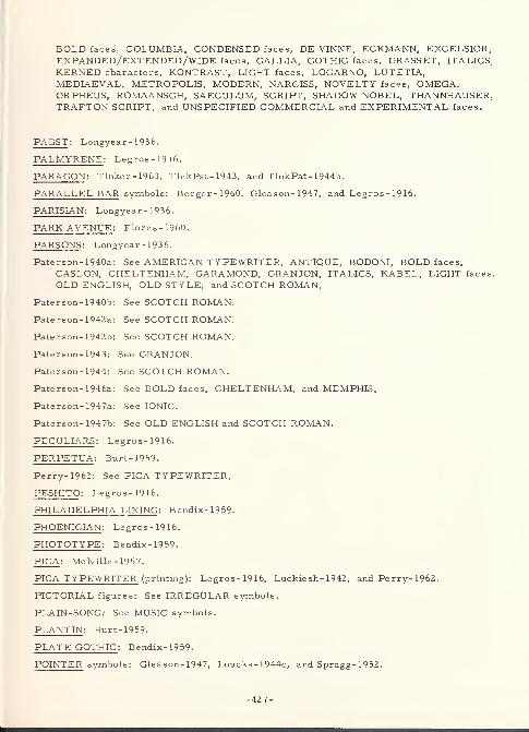
BOLD faces, COLUMBIA, CONDENSED faces, DE VINNE, ECKMANN, EXCELSIOR,EXPANDED/EXTENDED/WIDE faces, GALLIA, GOTHIC faces, GRASSET, ITALICS,KERNED characters, KONTRAST, LIGHT faces, LOCARNO, LUTETIA,MEDIAEVAL, METROPOLIS, MODERN, NARCISS, NOVELTY faces, OMEGA,ORPHEUS, ROMAANSCH, SAECULUM, SCRIPT, SHADOW NOBEL, THANNHAUSER,TRAFTON SCRIPT, and UNSPECIFIED COMMERCIAL and EXPERIMENTAL faces.
PABST : Longyear-1936.
PALMYRENE : Legros-1916.
PARAGON : Tinker - 1963, TinkPat- 1943, and TinkPat- 1944b.
PARALLEL BAR symbols: Berger-1960, Gleason- 1947, and Legros-1916.
PARISIAN : Longyear-1936.
PARK AVENUE : Flores-1960.
PARSONS : Longyear-1936.
Paterson-1940a: See AMERICAN TYPEWRITER, ANTIQUE, BODONI, BOLD faces,
CASLON, CHELTENHAM, GARAMOND, GRANJON, ITALICS, KABEL, LIGHT faces,
OLD ENGLISH, OLD STYLE, and SCOTCH ROMAN.
Paterson-1940b
Paterson- 1942a
Paterson-1942b
See SCOTCH ROMAN.
See SCOTCH ROMAN.
See SCOTCH ROMAN.
Paterson- 1943: See GRANJON.
Paterson- 1944: See SCOTCH ROMAN.
See BOLD faces, CHELTENHAM, and MEMPHIS,
See IONIC.
See OLD ENGLISH and SCOTCH ROMAN.
Paterson- 1946a
Paterson- 1947a
Paterson-1947b
PECULIARS : Legros-1916.
PERPETUA : Burt-1959.
Perry-1962: See PICA TYPEWRITER.
PESHITO : Legros-1916.
PHILADELPHIA LINING : Bendix-1959.
PHOENICIAN : Legros-1916.
PHOTOTYPE : Bendix-1959-
PICA: Melville- 1957.
PICA TYPEWRITER (printing): Legros-1916, Luckiesh- 1942, and Perry- 1962
.
PICTORIAL figures: See IRREGULAR symbols.
PLAIN-SONG: See MUSIC symbols.
PLANTIN : Burt-1959.
PLATE GOTHIC : Bendix-1959.
POINTER symbols: Gleason- 1947, Loucks - 1944c, and Spragg- 1952.
-427-
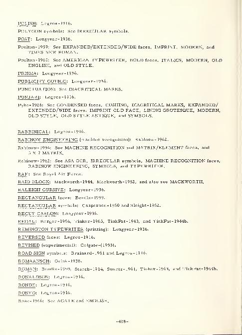
POLISH : Legros-1916.
POLYGON symbols: See IRREGULAR symbols.
POST : Longyear- 1936.
Poulton-1959: See EXPANDED/EXTENDED/WIDE faces, IMPRINT, MODERN, andTIMES NEW ROMAN.
Poulton- 1960: See AMERICAN TY PEWRITER, BOLD faces, ITALICS, MODERN, OLDENGLISH, and OLD STYLE.
PRISMA : Longyear-1936.
PUBLICITY GOTHIC : Longyear-1936.
PUNCTUATION: See DIACRITICAL MARKS.
PUNJABI : Legros-1916.
Pyke-1926: See CONDENSED faces, CUSHING, DIACRITICAL MARKS, EXPANDED/EXTENDED/WIDE faces, IMPRINT OLD FACE, LINING GROTESQUE, MODERN,OLD STYLE, OLD STYLE ANTIQUE, and SYMBOLS.
RABBINICAL : Legros-1916.
RABINOW ENGINEERING (machine recognition): Rabinow- 196Z.
Rabinow-1954: See MACHINE RECOGNITION and MATRIX/ELEMENT faces, and
5X7 MATRIX.
Rabinow- 1962: See ASA OCR, IRREGULAR symbols, MACHINE RECOGNITION faces,
RABINOW ENGINEERING, SYMBOLS, and TYPEWRITER.
RAF : See Royal Air Force.
RAID BLOCK : Mackworth- 1944, Mackworth- 1952, and also see MACKWORTH.
RALEIGH CURSIVE: Longyear-1936.
RECTANGULAR faces: Bendix-1959-
RECTANGULAR symbols: Casperson- 1950 and Sleight- 1952.
RECUT CASLON : Longyear-1936.
REGAL : Berger-1956, Tinker- 1963, TinkPat- 1943, and TinkPat- 1944b.
REMINGTON TYPEWRITER (printing): Longyear-1936.
REVERSED faces: Legros-1916.
REVISED (experimental): Colgate -( 1955).
ROAD SIGN symbols: Brainard- 1961 and Legros-1916.
ROMAANSCH : Ovink-1938.
ROMAN : Bendix-1959, Starch-1914, Swartz-1961, Tinker-1963, and TinkPat- 1944b.
RONALDSON : Legros-1916.
RONDE : Legros-1916.
RONEO: Legros-1916.
Rose-1946: See AGATE and ENGLISH.
-428-
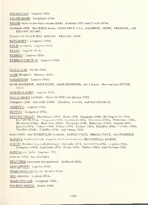
ROUMANIAN : Legros-1916.
ROUND HAND : Longyear - 1936.
ROUND style (otherwide unspecified): Aldrich-1937 and Crook- 1954c.
Rowland- 1958: See BOLD faces, COURTNEY -FAA, MEMPHIS, MENU, SPARTAN, andSQUARE GOTHIC.
(Royal Air Force) RAF symbols: Whiteside - 195 1.
ROYCROFT : Longyear - 1936.
RULE symbols: Legros-1916.
RUNIC : Legros-1916.
RUSSIAN : Legros-1916.
RUSSIAN CORPS 12 : Legros-1916.
SAECULUM : Ovink-1938.
SAGE (display): Halsey- 1960b.
SAMARITAN : Legros-1916.
SANS (SANSERIF, SANS SERIF, SANS SERIFFED, etc.) faces: See various GOTHICfaces.
SBIDIDI SCRIPT : Legros-1916.
SCALE MARK symbols: Murrell-1958 and Spragg-1952.
Schapiro-1952: See AND 10400, BERGER, CRAIK, and MACKWORTH.
SCHEUTZ : Legros-1916.
SCOTCH : Longyear-1936.
SCOTCH ROMAN : Blackhurst- 192 7, Burt-1959, Chapanis - 1949, Hollingworth- 19 13,
InsTUFTS-1952, Longyear-1936, Luckiesh- 1942, Paterson- 1940a, Pater son- 1940b,
Paterson-1942a, Paterson- 1942b, Paterson- 1944, Pater son- 1947b, Starch-1914,
Starch-1923, Tinker-1944, Tinker-1957, Tinker-1963, TinkPat- 1941, TinkPat- 1942,
TinkPat- 1944a, TinkPat- 1949, and Young - 1946.
Scott-1903: See IRREGULAR symbols, LARGE-FACE, SMALL-FACE, and SYMBOLS.
SCRIBAL abbreviations: Legros-1916 and also see DIACRITICAL MARKS.
SCRIPT (handwriting and printing): Chaundy- 1954, InsTUFTS-1952, Legros-1916,Longyear-1936, Luckiesh- 1923, Ovink-1938, Tinker-1963, and Vernon- 193 1.
SCROLL symbols: Legros-1916.
Seibert-1959: See FUTURA.
SELFCHEK (machine recognition): OptRead-1961.
SEMAPHORE : Legros-1916.
SEMICIRCULAR faces: Bendix-1959.
SEX symbols: Legros-1916.
SHAKESPEARE : Longyear-1936.
SHADOW NOBEL: Ovink-1938.
-429-
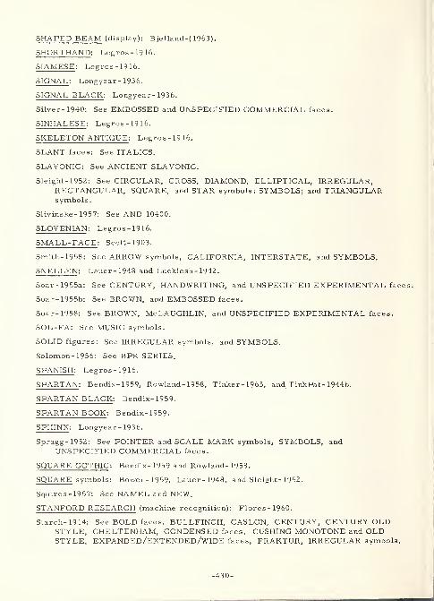
SHAPED BEAM (display): Bjelland-( 1963).
SHORTHAND : Legros-1916.
SIAMESE : Legros-1916.
SIGNAL : Longyear - 1936.
SIGNAL BLACK : Longyear- 1936.
Silver- 1940: See EMBOSSED and UNSPECIFIED COMMERCIAL faces.
SINHALESE : Legros-1916.
SKELETON ANTIQUE : Legros-1916.
SLANT faces: See ITALICS.
SLAVONIC: See ANCIENT SLAVONIC.
Sleight- 1952: See CIRCULAR, CROSS, DIAMOND, ELLIPTICAL, IRREGULAR,RECTANGULAR, SQUARE, and STAR symbols; SYMBOLS; and TRIANGULARsymbols
.
Slivinske-1957: See AND 10400.
SLOVENIAN : Legros-1916.
SMALL-FACE : Scott-1903.
Smith- 1958: See ARROW symbols, CALIFORNIA, INTERSTATE, and SYMBOLS.
SNELLEN : Lauer - 1948 and Luckiesh- 1942.
Soar-1955a: See CENTURY, HANDWRITING, and UNSPECIFIED EXPERIMENTAL faces.
Soar- 1955b: See BROWN, and EMBOSSED faces.
Soar-1958: See BROWN, McLAUGHLIN, and UNSPECIFIED EXPERIMENTAL faces
.
SOL-FA: See MUSIC symbols.
SOLID figures: See IRREGULAR symbols, and SYMBOLS.
Solomon- 1956: See BPR SERIES.
SPANISH : Legros-1916.
SPARTAN : Bendix-1959, Rowland- 1958, Tinker- 1963, and TinkPat- 1944b.
SPARTAN BLACK : Bendix-1959.
SPARTAN BOOK : Bendix-1959.
SPHINX : Longyear- 1936.
Spragg-1952: See POINTER and SCALE MARK symbols, SYMBOLS, andUNSPECIFIED COMMERCIAL faces.
SQUARE GOTHIC : Bendix- 1959 and Rowland- 1958.
SQUARE symbols: Bowen-1959, Lauer- 1948, and Sleight- 1952.
Squires-1957: See NAMEL and NEW.
STANFORD RESEARCH (machine recognition): Flores-1960.
Starch-1914: See BOLD faces, BULLFINCH, CASLON, CENTURY, CENTURY OLDSTYLE, CHELTENHAM, CONDENSED faces, CUSHING MONOTONE and OLDSTYLE, EXPANDED/EXTENDED/WIDE faces, FRAKTUR, IRREGULAR symbols,
-430-
ITALICS, NEWS GOTHIC, OLD ROMAN, SCOTCH ROMAN, and SYMBOLS.
Starch- 1923: See BODONL BOLD faces, BULLFINCH, CASLON, CENTURY, CENTURYOLD STYLE, CHELTENHAM, CHELTENHAM OLD STYLE, CONDENSED faces,
CUSHING MONOTONE and OLD STYLE, EXPANDED/EXTENDED/WIDE faces,
HANDWRITING, IRREGULAR symbols, ITALICS, NEWS GOTHIC, OLD ENGLISH,SCOTCH ROMAN, and SYMBOLS.
STAR symbols: Casperson- 1950 and Sleight- 1952.
STRIPE symbols: Decker-1961.
STYMIE : Longyear - 1936.
SUB- and SUPER -SCRIPTS : Chaundy- 19 54.
Swartz-1961: See AMEL; AND 10400; BERGER; COLOR symbols; CRAIK; DOT,ELLIPTICAL, and INCLINATION symbols; LANSDELL; LEROY; LINE symbols;MACKWORTH; MATRIX/ELEMENT faces; MODERN; MS 33558; NOVELTY faces;
OLD STYLE; ORDNANCE; ROMAN; SYMBOLS; and 6- and 8 -ELEMENT, STRAIGHT-LINE MATRIX.
SWASHES : Longyear-1936.
SWEDISH : Legros-1916.
SYMBOLS (various): Bauch-1954, Berger-1960, Bowen-1959, Brainard- 196 1,
Casperson-1950, Chaundy- 1954, Cohen-1953, Crook-1959, Crumley- 196 1,
Decker-1961, Gleason- 1947, Gustafson- 1960, Halsey- 1960b, Hitt-1960, Hogg-1957,Hollingworth-1913, Huey-1916, Hughes-1961, Hulbert- 1957, InsTUFTS - 1952,
Kimura-1959, Klemmer- 1958, Kr zhivoglavy- 1962, Lauer-1948, Legros-1916,Loucks- 1944a, Loucks - 1944b, Loucks- 1944c, Loucks - 1944d, Luckie sh- 1923,
Moore-1962, Murrell- 1958, OptRead- 1961, Pyke-1926, Rabinow- 1962, Scott-1903,
Sleight-1952, Smith-1958, Spragg-1952, Starch-1914, Starch-1923, Swartz-1961,Tinker-1963, Ullman-1958, Utman-1963, Vernon-1948, Webster- 1963,
Whiteside - 195 1, and also see specific symbol types.
SYRIAC: See MODERN SYRIAC.
TAMIL : Legros-1916.
TELEREGISTER (display): Crumley- 196 1.
TELUGU : Legros-1916.
TEMPO : Bendix-1959 and English- 1944.
TEXTYPE : Luckiesh- 1940b, Luckiesh- 1941b, Luckiesh- 1942, Tinker-1963,TinkPat-1943, and TinkPat- 1944b.
THAKURI : Legros-1916.
THANNHAUSER : Ovink-1938.
TIBETAN : Legros-1916.
TIMES NEW ROMAN : Burt- 1959 and Poulton- 1959.
TIMES ROMAN : Vernon-1948.
Tinker- 1944: See AMERICAN TYPEWRITER, ANTIQUE, BODONI, CASLON OLD STYLE,CHELTENHAM, GARAMOND, KABEL, LIGHT faces, OLD ENGLISH, OLD STYLE,and SCOTCH ROMAN.
-431-
Tinker- 1945: See UNSPECIFIED COMMERCIAL faces.
Tinker- 1946: See EXCELSIOR.
Tinker- 1948a: See UNSPECIFIED COMMERCIAL faces.
Tinker- 1948b: See EXCELSIOR.
Tinker- 1948c: See EXCELSIOR and ITALICS.
Tinker- 1952: See EXCELSIOR and ITALICS.
Tinker- 1953: See EXCELSIOR and ITALICS.
Tinker- 1954: See EXCELSIOR.
Tinker- 1955: See EXCELSIOR and ITALICS.
Tinker- 1957: See SCOTCH ROMAN.
Tinker- 1960: See EXCELSIOR.
Tinker- 1963 See AMERICAN TYPEWRITER, ANTIQUE, BODONI, BOLD faces,
CASLON, CENTURY, CHELTENHAM, CLASSIC, CONDENSED faces, CORONA,CUSHING, DE VINNE, EXCELSIOR, EXPANDED/EXTENDED/WIDE faces,
GARAMOND, GRANJON, HANDWRITING, IDEAL, IMPRINT OLD FACE,INTERTYPE 655, IONIC, IRREGULAR symbols, ITALICS, KABEL, LIGHT faces,
LINING GROTESQUE, LINOTYPE NO. 2, MATHEMATICAL symbols,MERGENTHALER NO. 2, MODERN, NO. 2, OLD ENGLISH, OLD STYLE,OLD STYLE ANTIQUE, OPTICON, PARAGON, REGAL, ROMAN, SCOTCH ROMAN,SCRIPT, SPARTAN, SYMBOLS, TEXTYPE, and TYPEWRITER.
TinkPat-1941
TinkPat-1942
TinkPat- 1943
See OLD ENGLISH and SCOTCH ROMAN.
See SCOTCH ROMAN.
See CENTURY, EXCELSIOR, EXPANDED/EXTENDED/WIDE face!
IDEAL, IONIC, OPTICON, PARAGON, REGAL, and TEXTYPE.
TinkPat- 1944a: See SCOTCH ROMAN.
TinkPat- 1944b: See ANTIQUE, BODONI, CENTURY, CHELTENHAM, CLASSIC,CORONA, DE VINNE, EXCELSIOR, IDEAL, INTERTYPE 655, IONIC, LINOTYPENO. 2, MERGENTHALER NO. 2, MODERN, NO. 2, OLD STYLE, OPTICON,PARAGON, REGAL, ROMAN, SPARTAN, and TEXTYPE.
TinkPat- 1946a: See EXCELSIOR.
TinkPat- 1946b: See BOLD faces, EXCELSIOR, ITALICS, and MEMPHIS.
TinkPat- 1949: See SCOTCH ROMAN.
TinkPat- 1950: See ITALICS, OLD ENGLISH, TYPEWRITER, and UNSPECIFIEDCOMMERCIAL faces.
TOURIST : Bendix-1959.
TOWER : Longyear-1936.
TRADITIONAL GOTHIC: See OLD ENGLISH.
TRAFTQN SCRIPT : Longyear- 1936 and Ovink- 1938.
TRIANGULAR faces: Bendix-1959.
TRIANGULAR symbols: Bowen-1959, Casper son- 1950, and Sleight- 1952.
TUDOR: See OLD ENGLISH.
-432-
TUDOR BLACK: See OLD ENGLISH.
TWENTIETH CENTURY : Bendix- 1959 and Deuth- 1953.
TY PEMASTER (various): Bendix- 1959 and Lippert- 1962.
TYPEWRITER (otherwise unspecified): Dearborn- 1906, Dearborn- 195 1, Dodge-1907,Hogg-1957, Horton-1960, Legros-1916, Mecherikoff- 1959, OptRead- 1961,
Rabinow-1962, Tinker-1963, TinkPat- 1950, and Webster- 1963, and Young- 1946.
TYPO UPRIGHT : Longyear- 1936.
Uhlaner-1941: See BLOCK style.
Ullman-1958: See B PR SERIES, COLOR and IRREGULAR symbols, and SYMBOLS.
ULTRA BODONI : Longyear- 1936.
UMBA : Longyear-1936.
UNION (display): Crumley- 196 1.
UNIVERSAL SYLLABICS : Legros-1916.
UNO PEN STENCIL (display): Foley-1957b.
UNSPECIFIED COMMERCIAL faces (various): Bendix- 1959, Bitterman- 1945,
Bitterman- 1946a, Bitterman- 1946c, Carmichael- 1947, Crook- 1947a, Crook-1947b,Crook-1950a, Erdmann- 1898, Gleason- 1947, Huey-1916, Hughes-1961, Kimura-1959,Klare-1957, Klare-1963, Lauer-1948, Loucks - 1944a, Loucks - 1944b, Loucks - 1944c,
Loucks-1944d, Luckiesh- 1937c, Mead-1954, Moore-1962, Mur rell- 1952,
Nahinsky-1956, North-1951, Ovink-1938, Silver-1940, Spragg-1952, Tinker-1945,Tinker-1948a, TinkPat- 1950, and Vernon- 193 1.
UNSPECIFIED EXPERIMENTAL faces (various): AmASHO-1961, Bendix- 1959,
Berger-1961, Botha-1963b, Brown-1953, Case-1952, Craik-1943, Crook-1954c,Dixon-1948, Flores-1960, Forbes-1951, Gleason- 1947, Howell-1961, Hughes-1961,Karmeier-1960, Lauer-1948, Ovink-1938, Soar-1955a, Soar-1958, andWebster-1963.
URDU : Legros-1916.
Utman-1963: See CMC7, E13B, IRREGULAR symbols, MACHINE RECOGNITION faces,
OPTICAL CHARACTER RECOGNITION, and SYMBOLS.
VANITY : Longyear-1936.
VARIGRAPH : Crook- 1954a and Crook- 1954b.
VARITYPE : Bendix-1959.
VENETIAN : Legros-1916.
VENETIAN OLD STYLE : Legros-1916.
VERMONT 1937 (display): Aldrich- 1937.
VERNEN : Bendix-1959.
Vernon- 1931: See BASKERVILLE, BODONI MODERN, CASLON, GOTHIC faces,
HANDWRITING, MODERN FACE, MODERN STYLE, OLD FACE, OLD STYLE,SCRIPT, and UNSPECIFIED COMMERCIAL faces.
-433-
Vernon- 1948: See CLARENDON, GREEK, IRREGULAR symbols, ITALICS, OLD FACE,SYMBOLS, and TIMES ROMAN.
VERONESE : Burt- 1959.
VERSATILE : Longyear- 1936.
VIDEOGRAPH (display): Crumley- 1961.
VIDIAC (display): Crumley- 196 1.
VOGUE : Bendix-1959, Brown-1953, and Longyear - 1936.
WALBAUM : Burt-1959.
Warren- 1942: See BOLD faces, CHELTENHAM, CONDENSED faces, and MEMPHIS.
WEBB INLINE : Longyear- 1936.
WEIGHTS and MEASURES symbols: Legros-1916.
WEISS : Berger-1956.
WELSH : Legros-1916.
WHEATSTONE PERFORATED RIBBON : Legros-1916.
Whiteside-1951: See ICAO and RAF symbols, and SYMBOLS.
WIDE faces: See EXPANDED/EXTENDED/WIDE faces.
WINCHELL : Legros-1916.
WINDSOR: Legros-1916.
WRICO (display): ArmyWES- 1953.
Wright- 1958a: See LEROY.
Wright- 1958b: See AMEL and AND 10400.
XEROGRAPHIC PRINTER : Crumley- 196 1.
XYLOGRAPHIC printing: Legros-1916.
YAHGAN : Legros-1916.
Young-1946: See AMERICAN TYPEWRITER, ANTIQUE, BODONI, CHELTENHAM,ITALICS, KABEL, LIGHT faces, MODERN, OLD ENGLISH, OLD STYLE, andSCOTCH ROMAN.
ZEND : Legros-1916.
ZEPPELIN : Longyear - 1936.
ZIG-ZAG symbols: Legros-1916.
140-ELEMENT MATRIX (experimental): Long-1951, Long-1952a, Long-1952b, and also
see INFOMAX.
2 MILLIMETER STROKE -WIDTH (experimental): Berger-1944b and also see BERGER.
-434-
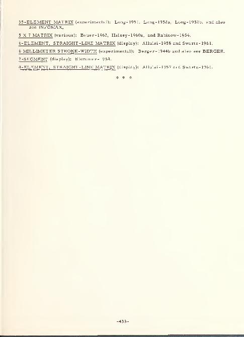
35-ELEMENT MATRIX (experimental): Long-1951, Long-1952a, Long-1952b, and also
see INFOMAX.
5X7 MATRIX (various): Bauer-1962, Halsey- 1960a, and Rabinow- 1954.
6-ELEMENT, STRAIGHT -LINE MATRIX (display): Alluisi-1958 and Swartz-1961.
6 MILLIMETER STROKE-WIDTH (experimental): Berger- 1944b and also see BERGER.
7-SEGMENT (display): Klemmer- 1958.
8
-
ELEMENT, STRAIGHT -LINE MATRIX (display): Alluisi-1957 and Swartz-1961.
* # *
-435-

APPENDIX C: CHARACTER FACE SAMPLES
CHARACTER FACE SAMPLES
The Character Face Samples are intended to illustrate some of the varieties of
alphanumeric characters and other symbols which have been used in the legibility-
experimentation. The applications for these characters range from book text and
automobile license plates to automatic character recognition for back checks and cathode
ray tube (CRT) displays for air traffic control. Standards and specifications have been
developed for labeling, dial faces and other applications in military systems and
equipment.
Anyone desiring an introduction to the many type faces used for foreign languages
should refer to: von Ostermann, George F. , "Manual of Foreign Languages. " New York
Central Book Company, Inc., 1952, 414 p. , Fourth Edition, Revised and enlarged.
Most printers keep a library of type face sample books. These books show the wide
variety of type faces which are commercially available.
-438-
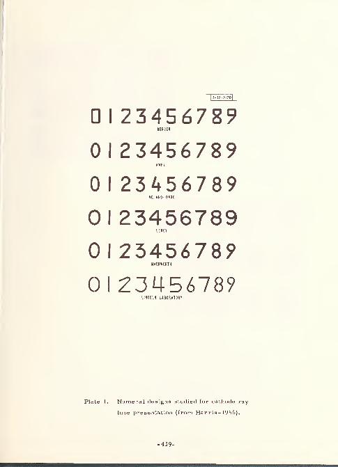
1
3-38-3120]
D I 23456789BERGER
0 I 23456789AMEL
0 I 23456789NO. AND- 10400
01 23456789L E ROY
0 I 2345678?MACKWORTH
0 1 2345678?LINCOLN LABORATORY
Plate 1. Numeral designs studied for cathode ray-
tube presentation (from Harris- 1956).
-439-
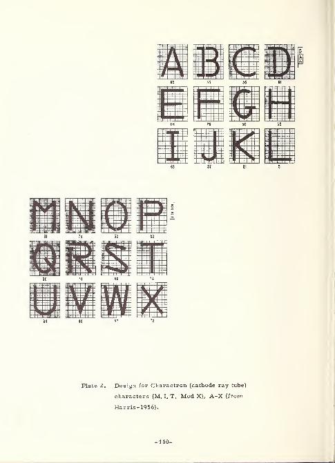
-440-
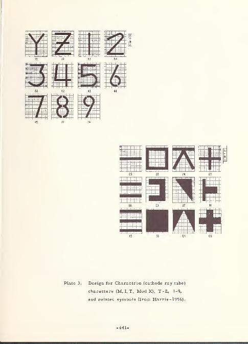
37 53
Plate 3. Design for Charactron (cathode ray tube)
characters (M. I. T. Mod X), Y-Z, 1-9,
and related symbols (from Harris - 1956)
.
-441-
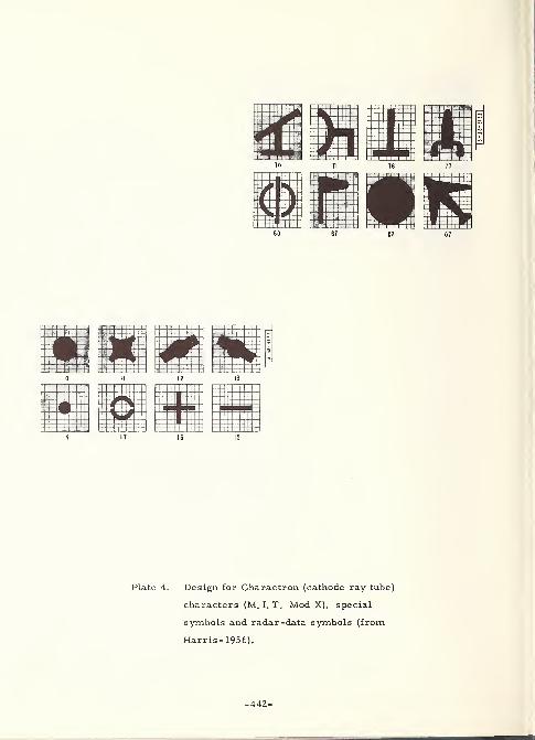
Plate 4. Design for Charactron (cathode ray tube)
characters (M. I. T. Mod X), special
symbols and radar-data symbols (from
Harris-1956).
-442-
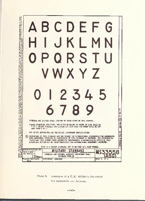
A B C D F F1 G
H 11 1 1 J K I M1 1 Nn pU r U K co T
1
1 1uV wx Y Z
0 12 3456 7 8 9
NUMERALS AND LETTERS SHALL CONFORM TO THOSE SHOWN ON THIS DRAWING.
UNLESS OTHERWISE SPECIFIED, THE RATIO OF HEIGHT TO WIDTH OF LINE SHALL BE8 TO 1 EXCEPT NUMERALS AND LETTERS 1/8 INCH HIOH AND UNDER SHALL BE NOTLESS THAN 6 TO 1.
FOR DETAIL DIMENSIONS, SEE THE DETAIL INSTRUMENT SPECIFICATION.
(T) PROVISIONS OF THIS STANDARD ARE THE SUBJECT OF INTERNATIONAL STANDARDIZATION AGREEMENTS.WHEN AMENDMENT, REVISION OR CANCELATION OF THIS STANDARD IS PROPOSED, THE DEPARTMENTAL
CUSTODIANS WILL INFORM THEIR RESPECTIVE DEPARTMENTAL STANDARDIZATION OFFICE SO THATAPPROPIATE ACTION MAY BE TAKEN RESPECTING THE INTERNATIONAL AGREEMDtT CO]
THIS IS A DESIGN STANDARD, NOT TO BE USED AS A PART NUMBER.
0
ClitTODIMt
N«vy-2uAaAir Fore
MILITARY STANDARDNUMERALS AND LETTERS, AIRCRAFT INSTRUMENT DIAL,
STANDARD FORM OF
JUPEMEBES: ANDlOkOO WttT 1 Ml
Plate 5. Example of a U. S. Military Standard
for numerals and letters.
-443-
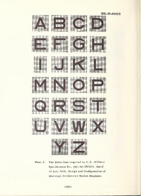
MII^M-18012B
Plate 6. The letter font required by U.S. Military-
Specification No. MIL-M-18012B, dated
20 July 1964, Design and Configuration of
Markings for Aircrew Station Displays.
-444-
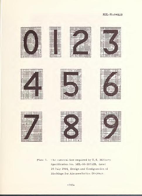
MII^M-18012B
Plate 7. The numeral font required by U.S. Military-
Specification No. MIL-M- 18012B, dated
20 July 1964, Design and Configuration of
Markings for AircrewStation Displays.
-445-
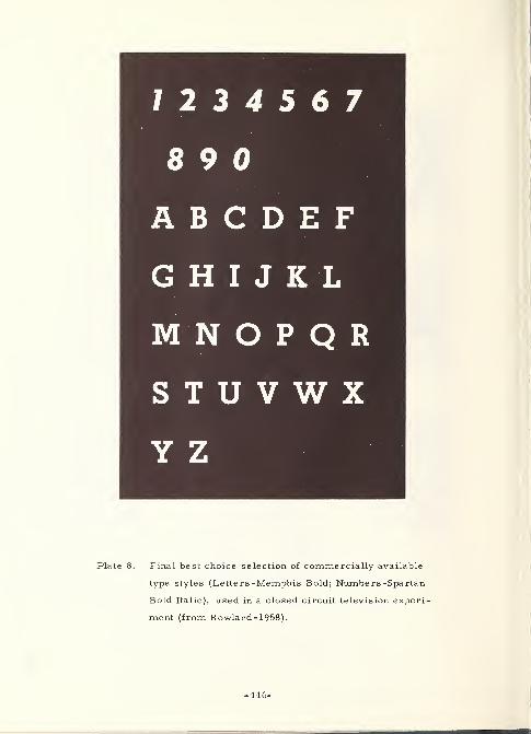
7 2 3 4 5 6 7
8 9 0
ABCDE.FG H I J K L
M N O P Q R
STUVWXY Z
Plate 8. Final best choice selection of commercially available
type styles (Letter s -Memphis Bold; Numbers -Spartan
Bold Italic), used in a closed circuit television experi-
ment (from Rowland- 1958).
-446-
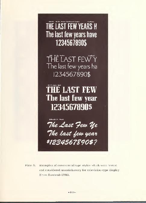
THE LAST FEW YEARS H
The last few years have
1234567890$
36Q -36 Pt. Sleller (Ludlow)
THE LAST FEW YThe last few years ha
1234567890$
36 Pt. Eden Bold
THE LAST FEWThe last few year
1234567890$
3fiB—:>c PI, Itriwli
*7&e loot ^eev yean,
*?234567X90$?
Plate 9. Examples of commercial type styles which were tested
and considered unsatisfactory for television-type display
(from Rowland- 1958).
-447-
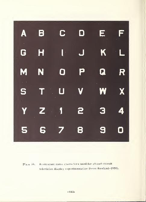
A B C D E F
G H 1 J K L
M N 0 P Q R
S T U V W X
Y Z 1 a 3 4
5 6 7 8 9 0
Plate 10. Restaurant menu characters used for closed circuit
television display experimentation (from Rowland- 1958).
-448-
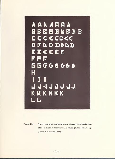
A At Jnfl
A
CCCCCC<C
EESEEEFFFG G G G 6 00 0HI I I
JnInIJJJJJK KKKKKLb
Plate 11a. Experimental alphanumeric characters tested for
closed circuit television display purposes (A-L),
(from Rowland- 1958).
-449-
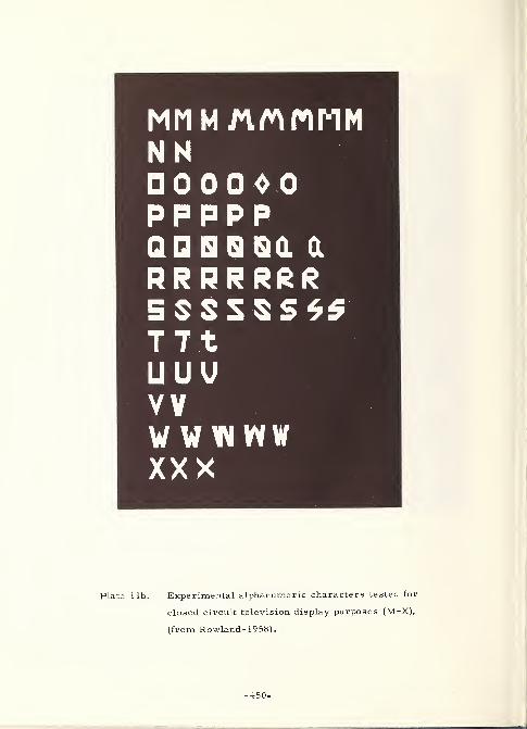
NN0000 0
pppppQDSBQQ IX
RRRRRRR5 S S S S S *ST7tUUUVYWW WWWXXX
Plate lib. Experimental alphanumeric characters tested for
closed circuit television display purposes (M-X),
(from Rowland- 1958).
-450-
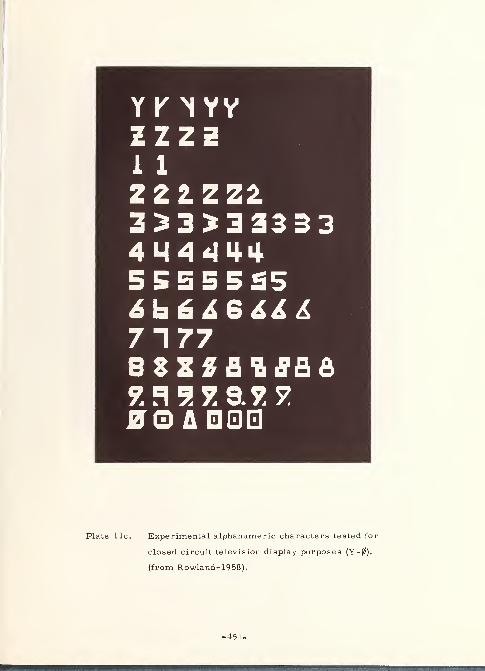
Y K YYYZZZZ1 1
222 ZZ23^3^3333341444445555555
71778SZZfll Jflfi
JJO A
Plate 11c. Experimental alphanumeric characters tested for
closed circuit television display purposes (Y-0),
(from Rowland- 1958).
-451-
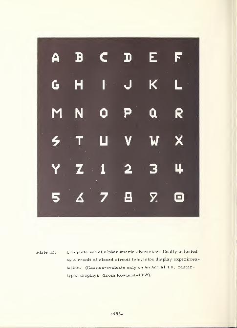
A B C D E F
G H I J K L
M N 0 P Q R
* T U V W X
Y Z 1 2 3 U-
5 6 7 B 7 0
Plate 12. Complete set of alphanumeric characters finally selected
as a result of closed circuit television display experimen
tation. (Caution-evaluate only on an actual TV, raster-
type, display), (from Rowland- 1958).
-452-
APPENDIX D: GLOSSARY OF MATRIX INDEX TERMS
GLOSSARY OF MATRIX INDEX TERMS
The Matrix Index Terms and their descriptions in this Glossary indicate the criteria
used for selection and entry into the Matrix, Subject Index. It must be noted that these
descriptions were determined on a subjective basis, that is to say, they were determined
on the basis of representing commonality of the various aspects of the legibility problem,
as it was seen in the documents extracted for this Handbook. Therefore, the Glossary
descriptions are neither exhaustive in describing the aspect involved, nor do they
represent general, dictionary-type definitions of the Terms.
-454-
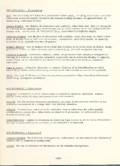
ENVIRONMENT - Presentation
text : the main body of matter on a printed or written page, including short notes and other
continuous material usually viewed at the normal reading distance of approximately 14
inches (e.g. reference books).
opaque display : any display of characters and symbols, other than text, that are designed
for viewing in an ambient light environment and in which neither print nor background are
transparent, translucent, or "reflective" (e.g. non-reflective highway signs).
luminous display : any display of characters and symbols, other than text, in which either
print or background or both are translucent, transparent, self-illuminated, or optically
reflective (e.g. cathode -ray tube displays).
graphic display : text or display of any kind that includes or is in the form of charts, maps,geometric forms, or other non-character content (e.g. aircraft navigation charts).
consoles & panels : character, symbol, color, or geometric form displays designed for
viewing in a control or indicator situation, especially one in which the display is input to,
output from, or an indicator of the status of an operational situation (e.g. computerconsoles).
signs & labels : primarily character or symbol displays of an identification or static
nature (e.g. name-plates identifying various dials and controls in an aircraft cockpit).
other: any type of display or character/symbol presentation other than those delineated
above (e.g. newspaper headlines).
ENVIRONMENT - Illumination
variable : a situation in which illumination is varied in intensity, direction, source,
and/or color while all other parameters are held constant.
unusual : for the viewing situation considered, any type of illumination used that is not
normally encountered in a comparable real viewing situation.
colored : illumination, external to the stimulus, that is other than the color usually
attributed to a source (i.e. blue-white or white for fluorescent, or yellow-white for
incandescent lamps).
trans /luminous : applies to situations in which the light source is either trans -illuminated
through or generated by the stimulus or its immediate background.
ENVIRONMENT - Background
contrast amount: the difference in brightness, reflectance, or hue between the character/symbol and its immediate background.
colors : the use or presence of chromatics on the stimulus background.
-455-
surface features : situations in which the characteristics of the stimulus background areeither unusual or variable (e.g. glossy vs. matte paper).
contrast direction : the condition of either reversing the contrast direction between the
stimulus and its immediate background (e.g. black on white vs. white on black), or the
use of an abnormal direction for a normal situation (e. g. white print on black backgroundfor text reading).
ENVIRONMENT - Viewing Conditions
reading distance : a distance normally used for the reading or viewing of continuous text or
other types of documents viewed within a person's arm reach (i.e. 14 to 27 inches for
continuous text).
console distance : any distance that is either at or somewhat beyond arm's reach and that is
normally encountered in the "control display" rather than the static or distant display situation.
distance > c. 25' : ascribed to those viewing situations in which the display, for the purposeof this Handbook, is located at a distance greater than about 25 feet (e.g. highwaysigns).
variable distances: experimental or real situations in which all other conditions are held
constant while the distance at which a stimulus is viewed is varied either dynamically or
in steps.
variable angles : describes situations in which a stimulus is viewed from some angle other
than normal (i. e. 90 degrees) from the orientation plane of the stimulus.
ENVIRONMENT - Noise
environmental : any condition in the viewing environment that does or could degrade the
subject's viewing performance (e.g. mechanical vibration, ambient light flicker,
acoustic noise, parallax error, etc. ).
stimulus/subject: any condition in the stimulus or subject that tends to degrade viewingperformance (e.g. blur, glare, stimulus errors, halo effects, fatigue, ocular defects,
perceptual span limitations, optical illusions, etc. ).
TYPOGRAPHY - Characters
alphabetic : characters that are or could be used to form continuous text (e.g. A to Z in
English), but including also the special case of Roman Numerals.
numeric : non-alphabetic characters used to represent quantitative values, specifically
0 through 9 in Arabic Notation.
symbolic : characters or geometric representations other than alphabetic or numericnotations, but intended for use in the same context (e.g. $, *, =, diacritical marks, etc.).
-456-
capitals: those alphabetic characters of the upper case, especially with reference to their
exclusive use in continuous text (e.g. a computer print-out), or as single stimuli.
combined cases: the use of both upper and lower cases in the same context
(e.g. continuous text).
lower case : the use of lower case alphabetic characters either singly or in context.
TYPOGRAPHY - Faces
commercial : alphabetic and numeric faces that are commercially available in some type
of printing medium (e.g. lead type, photo -composing templates, acetate overlays, etc.).
experimental/symbolic: non-standard, not commercially available, and usually specially
devised alphabetic, numeric, or symbolic faces developed for experimental purposes.
government : those faces developed for, and specified for use in governmental or public
situations (e.g. MS 33558, BPR Series, etc.).
foreign : any printing or display faces that utilize characters, numerals, symbols, or
diacritical marks not found in English usage.
machine generated : those characters and symbols generated by or in some type of
mechanical and/or electronic device (e.g. typewriters, character generating cathode-raytubes, etc. ).
drafting : characters and symbols generated by the use of pen and template (e. g. Leroy,Wrico, etc. ).
hand-written/ -printed: characters and symbols printed or written by a person without the
use of mechanical aids.
machine recognition : those characters and symbols, generated by any means, for the
distinct purpose of being optically or magnetically read by some type of automaticrecognition device.
TYPOGRAPHY - Face Designs
visual angle : the angle, at the eye, subtended by the stimulus being viewed specified
when this angle is variable, unusual, or used in such a way as to simulate one viewingdistance by the use of another.
height : ascribed to variations in or significance of the height of a character or symbol.
width : ascribed to variations in or significance of the width of a character or symbol.
stroke -width: ascribed to variations in or significance of the actual or mean width of
stroke of a character or symbol.
height : width : significance of or variations in the ratio of character/symbol height to
width (e.g. condensed vs. expanded faces).
-457-
height : stroke -width : significance of or variations in the ratio of character/symbolheight to its actual or mean width of stroke (e.g. thin vs. bold faces).
configuration : significance of or variations in the design of a character (e.g. seriffed vs.sansserif characters, in-line vs. filled characters, etc.).
colors : the use of chromatics in the printing or display of character/symbol faces.
luminosity: the quality of the character/symbol face generating or amplifying illumination(e.g. Nixie tube numerals, electroluminescent characters, trans -illuminated character s,
beaded or reflectorized characters, etc. ).
TYPOGRAPHY - Layout
character orientation : as a significant factor or as a variable, the orientation of a
character or symbol relative to its normally viewed upright position (e.g. upside-down).
character spacing : as a significant factor or as a variable, the distance betweencharacters or symbols in text or other type of display in either an absolute or relative
sense.
grouping : as a significant factor or as a variable, the association of alphabetic, numeric,and/or symbolic characters by position, number, or type of mixture, as in studies of
license plate character combinations.
word/line length : as an absolute or relative variable, consideration of the horizontal widthof a word or group of words (e.g. as measured in picas or inches for a printed line of text).
vertical line spacing: the vertical distance (leading or interlineage) between characters,
words, or lines of print (e.g. as measured in points for letterpress text), when this
distance was considered to be either significant or variable.
margins /borders : where significant, unusual, or variable, the presence, absence, andsize of "white space" around a character grouping to set it off from its backgroundincluding any type of ornamental or symbolic device, such as a black line, designed to
enclose the text or character grouping.
emphasis (various) : any device utilized to regroup characters or text into separate
units (e.g. double -column printing on a page), draw attention to a display (as with arrowsand pointers), make the content easier to read (e.g. by paragraphing), or draw attention to
specific characters, words, or groups of words (as by underlining, italicizing, coloning,
etc. ).
other considerations : any other layout or formatting considerations, when significant,
variable, or unusual, that bear on the legibility of the display (e.g. the position of anadvertisement on a page).
STUDY CONTENT - Basic Functions
readability : considerations involving recognition of the information content of meaningful
material, when this material is represented by groups of alphabetic characters in word,
sentence, or continuous text form.
-458-
recognizability : considerations involving the recognition of individual characters, either
singly or as part of a set, with some statistical significance of certainty that the character
is specifically identified.
perceptibility : considerations involving the recognition of text or display as consisting of
character(s), with some basic recognition as to whether they may be alphabetic, numeric,or symbolic; and possibly that they might be read without explicit recognition of
individual characters.
visibility : considerations involving interference (between stimulus and observer) in
recognizing the presence or absence of a character or character set.
STUDY CONTENT - Type of Article
experiment: those studies in which the content represents the design and/or result of anempirical investigation into the human legibility of characters and/or symbols.
development /design : those studies in which the content represents the attempt or
accomplishment of the development/design of character(s) for use in either improvingtheir legibility or adapting them to an unusual viewing situation includes also the design
of humanly legible characters for automatic character recognition.
standard: the promulgation of a specific character /symbol set when its use is mandatoryor voluntarily agreed upon in specific situations (e.g. the MS 33558 alphabet for military
displays).
review: those studies which contain reference to, information about, and/orrecommendations about past, present, and future research and development in somespecific area of the legibility of characters and symbols.
STUDY CONTENT - Results
statistical : studies in which, usually out of empirical research, the results arestatistically evaluated.
subjective : studies in which the discussions and results are other than those designed for
statistical evaluation (e.g. a compilation of type -face designs).
EXPERIMENTAL FUNCTIONS - Presentation
reading /viewing : all types of experimental presentations other than tachistoscopic.
tachistoscopic: any type of experimental presentation involving a relatively short exposure
(usually less than 0. 1 second) of the stimulus to the subject.
-459-
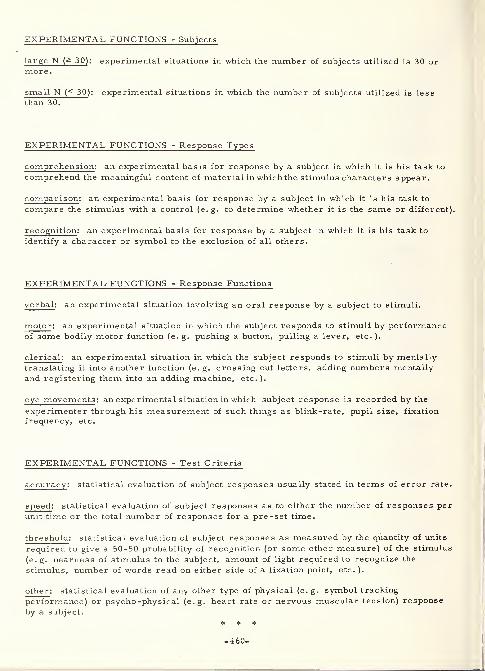
EXPERIMENTAL FUNCTIONS - Subjects
large N (a 30) : experimental situations in which the number of subjects utilized is 30 or
more.
small N (< 30 ): experimental situations in which the number of subjects utilized is less
than 30.
EXPERIMENTAL FUNCTIONS - Response Types
comprehension : an experimental basis for response by a subject in which it is his task to
comprehend the meaningful content of material in which the stimulus characters appear.
comparison : an experimental basis for response by a subject in which it is his task to
compare the stimulus with a control (e.g. to determine whether it is the same or different).
recognition : an experimental basis for response by a subject in which it is his task to
identify a character or symbol to the exclusion of all others.
EXPERIMENTAL- FUNCTIONS - Response Functions
verbal: an experimental situation involving an oral response by a subject to stimuli.
motor : an experimental situation in which the subject responds to stimuli by performanceof some bodily motor function (e. g. pushing a button, pulling a lever, etc. ).
clerical : an experimental situation in which the subject responds to stimuli by mentally
translating it into another function (e. g. crossing out letters, adding numbers mentally
and registering them into an adding machine, etc.).
eye movements : an experimental situation in which subject response is recorded by the
experimenter through his measurement of such things as blink-rate, pupil size, fixation
frequency, etc.
EXPERIMENTAL FUNCTIONS - Test Criteria
accuracy : statistical evaluation of subject responses usually stated in terms of error rate.
speed : statistical evaluation of subject responses as to either the number of responses per
unit time or the total number of responses for a pre-set time.
threshold : statistical evaluation of subject responses as measured by the quantity of units
required to give a 50-50 probability of recognition (or some other measure) of the stimulus
(e.g. nearness of stimulus to the subject, amount of light required to recognize the
stimulus, number of words read on either side of a fixation point, etc. ).
other : statistical evaluation of any other type of physical (e. g. symbol tracking
performance) or psycho -physical (e.g. heart rate or nervous muscular tension) response
by a subject.
* * *
-460-
THE NATIONAL BUREAU OF STANDARDS
The National Bureau of Standards 1 provides measurement and technical information services
essential to the efficiency and effectiveness of the work of the Nation's scientists and engineers. TheBureau serves also as a focal point in the Federal Government for assuring maximum application of
the physical and engineering sciences to the advancement of technology in industry and commerce. Toaccomplish this mission, the Bureau is organized into three institutes covering broad program areas of
research and services:
THE INSTITUTE FOR BASIC STANDARDS . . . provides the central basis within the United
States for a complete and consistent system of physical measurements, coordinates that system with the
measurement systems of other nations, and furnishes essential services leading to accurate and uniform
physical measurements throughout the Nation's scientific community, industry, and commerce. Thi9
Institute comprises a series of divisions, each serving a classical subject matter area:
—Applied Mathematics—Electricity—Metrology—Mechanics—Heat—Atomic Physics—Physical
Chemistry—Radiation Physics—Laboratory Astrophysics 2—Radio Standards Laboratory, 2 which
includes Radio Standards Physics and Radio Standards Engineering—Office of Standard Refer-
ence Data.
THE INSTITUTE FOR MATERIALS RESEARCH . . . conducts materials research and provides
associated materials services including mainly reference materials and data on the properties of ma-terials. Beyond its direct interest to the Nation's scientists and engineers, this Institute yields services
which are essential to the advancement of technology in industry and commerce. This Institute is or-
ganized primarily by technical fields:
—Analytical Chemistry—Metallurgy—Reactor Radiations—Polymers—Inorganic Materials—Cry-
ogenics2—Materials Evaluation Laboratory—Office of Standard Reference Materials.
THE INSTITUTE FOR APPLIED TECHNOLOGY . . . provides technical services to promote the
use of available technology and to facilitate technological innovation in industry and government. Theprincipal elements of this Institute are:
—Building Research—Electronic Instrumentation—Textile and Apparel Technology Center
—
Technical Analysis—Center for Computer Sciences and Technology—Office of Weights and Meas-ures—Office of Engineering Standards Services—Office of Invention and Innovation—Clearing-
house for Federal Scientific and Technical Information. 3
1 Headquarters and Laboratories at Gaithersburg, Maryland, unless otherwise noted; mailing address Washington, D. C,20234.
2 Located at Boulder, Colorado, 80302.3 Located at 5285 Port Royal Road, Springfield, Virginia, 22151.
<r U. S. GOVERNMENT PRINTING OFFICE : 1967 O - 241-533
1
El
E>
T
-4
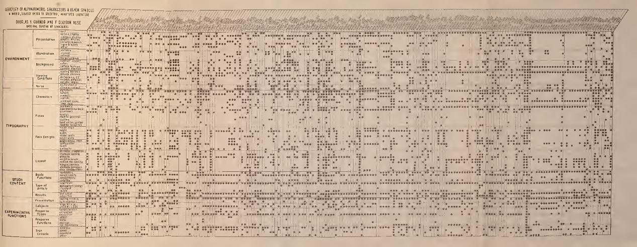


I
i


