Embed Size (px)
Citation preview
Anne Kokkov
INTENTIONALITY OF COLOURS IN KONRAD MÄGI’S PAINTINGS
INTRODUCTION
The following article discusses the intentionality of colours in the art of painting. The discourse deliberates Konrad Mägi’s paintings; the philosophical discussions are based on Roman Ingarden’s ontology of paintings as works of art. Ingarden is well known for his research on the ontological structure of the literary work of art.1 His studies on oth-er arts are not as detailed. Correspondingly, these have attracted less attention by researchers. Ingarden is focused on discriminating the struc-tural strata in the work of art. Other phenomena are discussed from the perspective of those strata. Ingarden has identified the essential aspects in comprehending the structure of pictures. Although, Ingarden’s main interest is characterising the strata, I discuss his essay “The Picture”2 from the perspective of colours. He has briefly canvassed the transition of colours on the surface of painting into the pictorial objects, while leav-ing the status of the pictorial colours in the work of art open to debate. This moment is elaborated further below.
The initial question is how we see a pictorial object in a painting? Actually there is nothing but a set of pastes with different colour quali-ties that have been laid on a canvas by an artist. Certainly, from the very beginning, the intention of the artist has been to evoke an experience of
DOI: http://dx.doi.org/10.12697/BJAH.2014.8.04
1 Roman Ingarden, Das literarische Kunstwerk (Halle: Niemeyer Verlag, 1931); Roman Ingarden, Vom Erkennen des literarishen Kunstwerks (Tübingen: Niemeyer Verlag, 1968).2 Roman Ingarden, „The Picture“, The Ontology of the Work of Art: the Musical Work, the Picture, the Architectural Work, the Film, transl by Raymond Meyer with John Goldthwait (Athens: Ohio University Press, 1989), 137-254.
158 Anne Kokkov
seeing the sum of the patches of colour as an object – a portrait, a land-scape. Some paintings are executed using coarse brushwork; some of them are executed in high level of abstraction. In these cases we need trained eye for seeing the portrait or the landscape. Comprehending objects in pictorial colours is very general; therefore we can conjecture generally valid prerequisite natural abilities in perceiving these. The issue of how we see pictures has often intrigued researchers who have come up with different perspectives and solutions.
Stephen Grossberg discusses seeing a three-dimensional pictorial reality on a flat surface covered with patches of colour in his The Art of Seeing and Painting.3 He characterises the cortical model of the brain’s organisational principles and mechanisms of conscious visual percept that result in representations of three-dimensional boundaries and surfaces. Boundaries and surfaces are computed in parallel cortical processing streams that interact at multiple levels and transform their complementary properties into consistent percepts. Grossberg con-structs a new model of complementary computing that contradicts the previous hypothesis that the brain uses independent modules. During visual perception, strong interactions occur between perceptual quali-ties. The complementary streams compute the boundaries and surfaces and compensate each other’s weaknesses in computing the properties. As a result of the process we see articulated objects on the surfaces. S. Grossberg explicates complementing and filling-in lines and surfaces so that we see depth in flat surfaces.
Grossberg’s approach is focused on brain models. However, while looking at a work of art, we perceive objects in consciousness inde-pendently of the processes that occur in our brain.
Presentational pictures are designed to be based on the way we (sup-posedly) see reality around us. However, William John Thomas Mitchell argues that images in pictures are learned symbols, no matter how pres-entational they seem.4 The meaning of a picture is not self-evident by a simple and direct reference to the object it depicts. We know by learn-ing how to read it. For example, Mitchell characterises the Northwest
3 Stephen Grossberg, The Art of Seeing and Painting, (Boston University: Department of Cognitive and Neural Systems And Center of Excellence for Learning in Education, Science, and Technology, 2006), (http://cns.bu.edu/~steve/Gro2006ArtofSeeingandPaintingSV.pdf, viewed 12. 01. 2010).4 William John Thomas Mitchell, „What Is an Image?“, New Literary History, Vol. 15, No. 3, Image/Imago/Imagination (Spring 1984), 503-537, (http://links.jstor.org/, viewed 04. 05. 2014).
159Intentionality of Colours in Konrad Mägi‘s Paintings
Indian petroglyph of an eagle as the signature of a warrior, the emblem of a tribe, a symbol of courage, or just a picture of an eagle.5 The same applies to Leonardo da Vinci’s painting The Last Supper discussed by Ingarden in “The Picture” – the “story” is the literary theme that we know by learning.
This article elucidates the process of perceiving the picture in pic-ture-consciousness by phenomenological method. Grossberg’s or Mitchell’s accounts do not refute nor contradict with the phenomeno-logical approach; they just characterise other aspects about perceiving of pictures.
Even though it is a learned ability, comprehending pictures presuppos-es an inter-subjective uniformity in the percept of colours. Researchers agree that, on the whole, the effects that colours have on the mind are consistent and colours do not vary subjectively from person to person. Colour theorist Johannes Itten (Kunst der Farbe, 1961) conceives colours as radiant energies that affect us, whether we are aware of the impact or not.6 Fabian Dorsch characterises colours as mind-independent proper-ties of real objects that determine our percepts of objects. While colours are independent of our particular experiences related to them, they are exposed to genuine recognition.7 The independence of colours from sub-jective mind is one of the basic preliminary conditions that enable us to perceive the pictorial colouration generally in the same way. In normal conditions there is no disagreements about the blueness of the blue sky, a “blue sky” in the picture appears blue.
Colours always appear bound to objects. Thus, colours and objects are inextricable. This bond implicates that, based on the phenomeno-logical method colours should be treated in conjunction with objects as two aspects of the same phenomenon.8
5 Ibid., 518. However, the modern presentational picture is designed to present objectivity cor-responding to the „real“ objectivity.6 Johannes Itten, The Art of Color: the Subjective Experience and Objective Rationale of Color (New York: Van Nostrand Reinhold, 1973) 16; 21.7 Fabian Dorsch, “Colour Realism and Colour Resemblance,” Rivista di Estetica, vol 43 (2010), 85-108, (http://perso.unifr.ch/fabian.dorsch/wp-content/uploads/DorschColourResemblanceRealism.pdf, viewed 17.11.2014).8 Johann Wolfgang Goethe already refers to the bound of objects and their colouration in: Johann Wolfgang Goethe, Zur Farbenlehre (Tübingen: J.G.Cotta’schen Buchhandlung,1810), used here: Johann Wolfgang Goethe, Theory of Colours (London: John Murray, 1840), xxxiii-xxxix. (http://books.goog-le.ca/books, viewed 1. 07. 2010).
160 Anne Kokkov
To “see” a picture one has to comprehend the pictorial objectivity9 as a whole. We recognize and comprehend objects as wholes in relation to the background. In reality, the local colour of an object is derived from the general light and colour of the background. Similarly, the general pictorial “light” and colouration determines the “local colour” of the pictorial objects.
The term ‘whole’ is derived from Gestalt theory. Oren Lieberman pointed out that Rudolf Arnheim elaborated the concept of ‘gestalt’ as a special kind of ‘whole’ with qualities different from the component parts. These whole- or complex-qualities are the non-distributive proper-ties of ‘wholes’; ‘wholes’ embody more than the sum of their component parts. O. Lieberman argues that in understanding perception, Gestalt psychology has generally changed the way we “perceive perception.“ Gestalt has made the shift from “stimulus-response” schema to one of “centre and margin”, which means a shift from passive reception to the active creation of relationship fields.10
In discussing the structure of a picture, a striking similarity between phenomenology and Gestalt psychology occurs. Ian Verstegen refers to R. Arnheim as a “theoretical cousin” to Ingarden.11 Although neither R. Ingarden nor R. Arnheim ever cited the other, nor discussed the other’s work in print, there are evident links that demonstrate their mutual in-debtedness to Franz Brentano.12 There are similarities in the passages about the general types of perception that apply to the perception of re-ality and to the perception of the pictorial objectivity by both authors. While the two authors have the common grounds in Franz Brentano, it seems appropriate to draw parallels between the two researchers in
9 The term ’objectivity’ is used here like R. Ingarden does: it means all objects in the pic-torial space; the pictorial reality. Ingarden already uses ’presented objectivity’ (’dargestellten Gegenständlichkeiten’) as a stratum: Roman Ingarden, Das literarische Kunstwerk (Tübingen: Max Niemeyer Verlag, 1972), 26.10 Oren Lieberman, “Figure/Ground: Double Occupations of Discourses and Events”, Occupation: Negotiations with Constructed Space, Proceedings of the Conference held at the University of Brighton 2nd to 4th July 2009, 1-10. (http://arts.brighton.ac.uk/__data/assets/pdf_file/0007/44836/27_Oren-Lieberman-Figure-Ground.pdf, viewed 05. 02. 2014).11 Ian Verstegen, “Arnheim and Ingarden on the Ontology of the Arts”, Gestalt Theory, Vol. 32, No.4, 2010, 307-322; 307, (http://gth.krammerbuch.at/sites/default/files/articles/Create%20Article/Verstegen_KORR_F.pdf, viewed 01. 29. 2014). R. Ingarden’s and R. Arnheim’s teachers had a com-mon teacher Carl Stumpf. Arnheim’s teacher Wolfgang Köhler was C. Stumpf ’s student in Berlin; R. Ingarden’s teacher Edmund Husserl was C. Stumpf ’s student earlier in Halle.12 Ibid., 307. J. Verstegen argues that the approaches of both researchers strongly follow those of their teachers. Still, E. Husserl was primarily interested in the formal ontological aspect of C. Stumpf ’s work while W. Köhler was primarily interested in the experimental psychological aspect of C. Stumpf ’s work.
161Intentionality of Colours in Konrad Mägi‘s Paintings
order to explicate the perception of the objectual colouration in the pic-ture. While J. Verstegen draws parallels to the whole schema of both researchers, two issues will be discussed here: the issue of colours (which J. Verstegen does not discuss) and perceiving general types or categories in objects.
R. Arnheim agrees that colours convey strong expressions. It is well known that bright colour hues, which correspond to long colour wave-lengths [close to red] produce excitement. The effect of colours is much too direct and spontaneous to be the product of learned interpretations or associations.13 Although colour associations can occur in subjective experiences, they do not reflect basic visual percepts which allow us to perceive objects in reality and, correspondingly, in pictures. Associations are learned while percepts are natural – they enable us to comprehend real objects and, based thereon pictorial objects. In the presentational pictures that Ingarden focuses on,14 the analogy of perceiving “real” ob-jectivity and the pictorial objectivity is relevant, since the pictures present a two-dimensional equivalency of objectivity.15 Ingarden also discusses abstract works of art, but these do not meet the conditions he has estab-lished for the intentional picture.16 Therefore, to discuss the colouration of a picture on the basis of Ingarden’s text, I treat the pictures that pres-ent “recognizable” objects based on an analogy with objects in reality.
Konrad Mägi’s (1878-1925) oeuvre presents good illustrations for the discussions. Maie Raitar and Andres Sööt have called Mägi “a miracle of Estonian art”. K. Mägi acquired exceptional individuality in the ex-pression of colours. Especially in his later works, his colours became brilliant in intensity and purity.17 In the selected paintings from the 1920s, the expression of colours dominates over the pictorial objects. The colour areas require some interpretation because they are not exact-ly “lifelike”; the pictorial whole determines the choice of the particular colours. The objects provide moulding and dynamics for colours in the
13 Rudolf Arnheim, Art and Visual Perception, A Psychology of the Creative Eye (London: Berkeley and Los Angeles: University of California Press. 1967), 326.14 R. Ingarden’s deliberations demonstrate that he conceives presentational pictures as those with a perspective in which the objects are focused around one central point on horizon. Arnheim desc-ribes different methods of perspective for rendering three-dimensional space in two dimensions: Arnheim, Art and Visual Perception.15 I specify this later in the text.16 Ingarden, „The Picture“, 207-216. By Ingarden, the pictures present objects. If there are no ob-jects presented, there is no picture.17 Maie Raitar, Andres Sööt, Konrad Mägi: Kunstnik. Looming. Aeg (Tartu: Ilmamaa, 2011), 404-5.
162 Anne Kokkov
pictorial field. Nevertheless, we can clearly talk about the presented ob-jects in these paintings.
The paintings by Konrad Mägi are discussed from different perspec-tives. In Portrait of a Woman, I characterise the relations of a ‘painting’ and ‘the picture’ as Ingarden defines them. In Boats in Venice, I discuss (1) the objects appearing in the interrelations of the pictorial colours and (2) the colours uniting different objects into a whole. In Venice, I study the formation of the pictorial light in the interrelations of colours. In Ruins in Capri, I discuss (1) the pictorial light as the equivalent of real light, and (2) gestalt conveying the metaphysical qualities.
Roman Ingarden’s essay The Picture is focused on differentiating the structural strata in the picture as a work of art. Other phenomena are discussed from the perspective of these strata. Ingarden characterises colours in the process of perception of the pictorial objects, but he as-serts that colours are the material agents for painting. In his account, colours bring forth the pictorial objects but colours themselves do not belong to the intentional picture. Correspondingly, colours have no in-tentional content. However, the patches of colour on a painting do not equal the colour qualities of the pictorial objects. The status of colours in the intentional picture will be reconsidered here.
COLOURS IN A PAINTING AND IN THE INTENTIONAL PICTURE
‘PAINTING’ AND ‘THE PICTURE’
Roman Ingarden’s ontological approach treats a work of art as an inten-tional structure. Whereas, according to Edmund Husserl, the whole world is given in our intentional18 consciousness and materiality is subordi-nate to consciousness, R. Ingarden considers materiality of the physical world be autonomous and to exist independently of consciousness. Ingarden differentiates between the dichotomy of (1) autonomous “real”
18 Ülo Matjus explicates the origin of the concept of ‘intentionality’: it is based on the Greek (teino; tonos= strain, tension; tonicity); the concept in philosophy derives from the Latin ‘tendo’ which gives us ‘intendo’. ’Intentio’ means being targeted, having direction. Ülo Matjus, «К истории проблемы интенциональности в филосoфии», Tartu Riikliku Ülikooli Toimetised, 301: Труды по философии XVI (Tartu: Tartu Riiklik Ülikool, 1973), 188-212; 189.
163Intentionality of Colours in Konrad Mägi‘s Paintings
material “things” and (2) their intentional correlate in consciousness.19 Correspondingly, Ingarden distinguishes two concepts – a ’painting’ and ’the intentional picture’20. He defines ‘painting’ as a real thing cov-ered with various patches of colour. A ‘painting’ is a painted surface with visual and tactile characteristics, chemical and physical properties. A ‘painting’ is the objective condition for the existence of ‘the picture’. When nobody is looking at a ‘painting’, ‘the picture’ is not constituted at the moment, i.e. it does not exist at that moment. ‘The picture’ as an object of our aesthetic contemplation is constituted in the intentional consciousness; it exists only as the intentional act of consciousness. We apprehend a painting as a simple primary visual percept on the basis of which a complex train of acts in picture-consciousness provides the intuitive access to the picture. These two different experiences proceed simultaneously; the second one is based ontically on the first. The mate-rial sense data activate the intuitive consciousness of the picture; at the same time, there is readiness to perceive the painting directly.21
Ingarden distinguishes the structural strata in the ‘work of art’. Discussing the picture, Ingarden is focused on the stratified structure. The stratification concerns solely the work of art, not the physical ma-terial that forms its basis. We can distinguish strata in ‘the intentional picture’ and not in a ‘painting’; in the literary work of art, not in a book. It is obvious that Ingarden elaborates his treatment of ‘painting’ vs. ‘the picture’ on the basis of his theory of the literary work of art; the concepts he presents are similar.22 He distinguishes two strata in the picture: ‘the schematic aspects’ and ‘the presented objectivity’. A third
19 Roman Ingarden, Streit um die Existenz der Welt, Formalontologie I (Tübingen: Max Niemeyer, 1965), 68-75. By R. Ingarden the distinction between the physical reality and the intentional conscious-ness makes the inter-subjective experiencing of objects (and the works of art) possible. 20 Translators Raymond Meyer and John T. Goldthwait use the term ’the picture’ to denote the R. Ingarden’s ’intentional picture’, so ’the’ is used also in this text before the concept ’picture’ although the discussions are often quite general.21 Ingarden, „The Picture“, 137-8; 201-2; 205.22 Ingarden defines the strata in the literary work of art in Das literarische Kunstwerk (Tübingen: Max Niemeyer, 1972), 26: ‘phones and phonetic formations of higher order’, ’semantic units’, ’sche-matic aspects’, ’presented objectivities and their fate’. (German: die Schicht der Wortlaute und der auf ihnen sich aufbauenden Lautgebilde höherer Stufe, die Schicht der Bedeutungseinheiten vershie-dener Stufe; die Schicht der mannigfaltigen schematisierten Ansichten; die Schicht der dargestellten Gegenständlichkeiten und ihrer Schicksal). Ingarden defines ‘stratum’ as a heterogeneous element which unites with other elements into formations of a higher order, and forms an independent and delimited fundamental constituent of the work of art so that an organic union with other fundamen-tal constituents is obtained, see: Ingarden, “The Picture”, 32.
164 Anne Kokkov
stratum that Ingarden attributes to groups of pictures is a ‘historical’ or ‘literary theme’.23
When a viewer is looking at the patches of colour on a painting the objectual aspects appear. The aspects are ‘schematic’ because they pres-ent objects approximately and reconstructed from one side.24 Without these aspects there would be no presentational picture and no aesthet-ic object.25 In our immediate percept of reality, we change the aspects [points of view] of objects by moving around and changing our angle of vision [correspondingly, the appearance of the objects changes]. In picture-consciousness, we reconstruct the objectual aspects known in reality. We involuntarily complement the objects, and believe we see them determined in every way.26 Although, the pictorial objects are not “there” because only the patches of colour are “there”, we intuitively “see” the picture in the painting. The pictorial objects, on the basis of an analogy to objects of reality, are intuitively “there” in loco. 27
According to Ingarden, we have a two-fold experience – we view a painting and, at the same time, see the pictorial objects directly [a “wom-an,” a “landscape”]. Ingarden says that colours are the component of painting with tactile characteristics, and chemical and physical prop-erties. He considers the colour of the pictorial objects to be an objectual characteristic that is not intentional, although, objects themselves are in-tentional in his approach. Obviously, Ingarden conceives colour qualities inseparable from “bodies” (as wholes) while he distinguishes aspects from these “bodies”. ‘Schematic aspects’ mediate objects on a flat sur-face. In reality, “bodies” exist in three dimensions; in the pictures, they exist in two because the picture is a two-dimensional structure. Since the pictorial colouration acquires features that cannot be assigned to a painting, a question about the status of colours as qualities emerges.
23 Ingarden, „The Picture“, 155; 139.24 Ibid., 168. Ingarden conceives reality as a given in a certain aspect (viewpoint) to us; we see one side of the objects which allows us to make a guess about the rear and the contents of the whole ob-ject. In picture-concsiousness we reconstruct the aspect that is known to exist in reality. That is why Ingarden uses the concept of the „reconstructed“ aspect in his passages. 25 Ibid., 147; 149-150. Still, Ingarden (“The Picture”, 159) admits that some genuine works of the art of painting with no presented “things“ do not contain any „reconstructed aspects in the strict sense“. 26 Ibid., 149-150; 224-226. In an aesthetic experience the schematic aspects of objects may be com-plemented differently; so the viewers can perceive different pictures. Therefore, besides, Ingarden distinguishes ‘the picture’ and its ‘concretization’ (complemented version of the perceived picture). 27 Ibid., 203-204.
165Intentionality of Colours in Konrad Mägi‘s Paintings
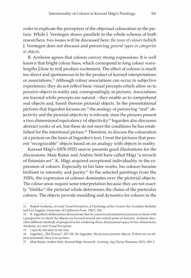
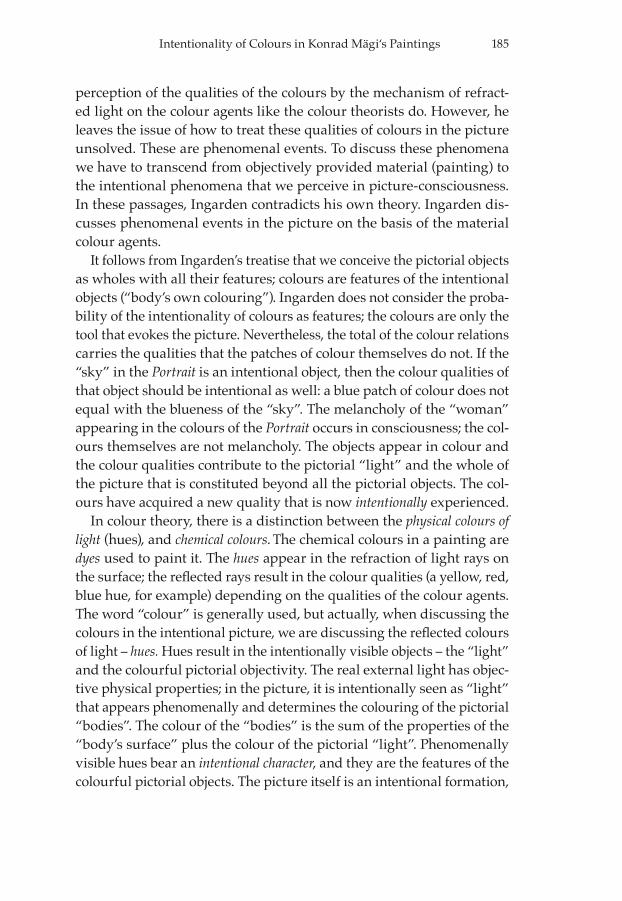
COLOURS CONSTITUTING “THE PORTR AIT OF A WOMAN“
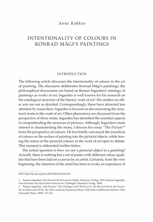
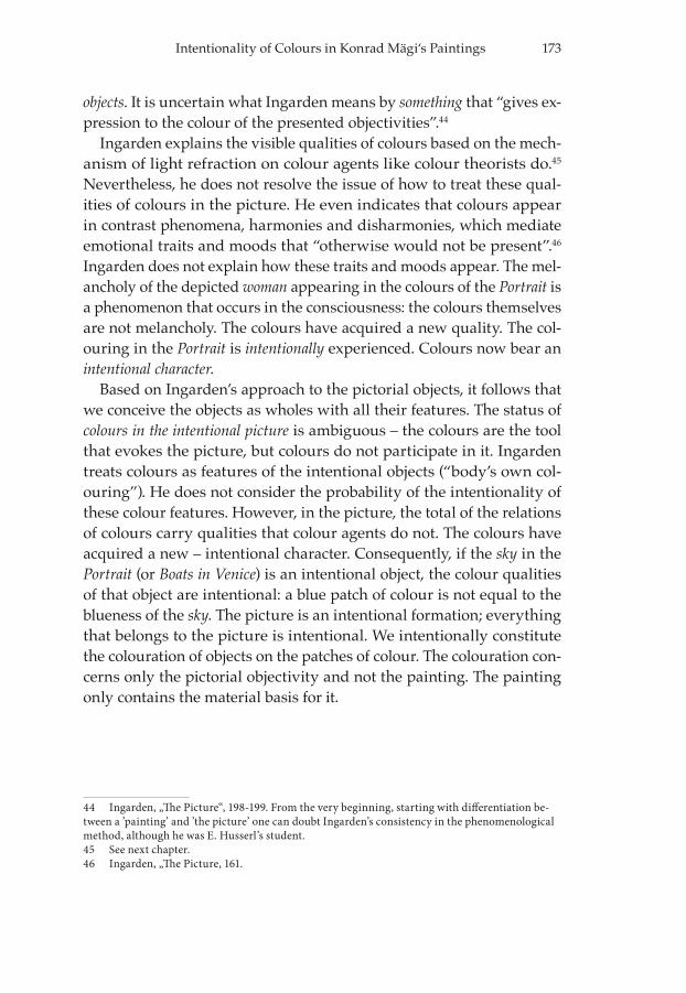
Ingarden argues that colours are sensed directly [direct sensible foun-dation]; they perform a reconstructive function. The picture presents a schematic aspect in which the depicted object appears. The viewer looks at the colour pigments on a painting which, by virtue of their chemical composition, reflect the light falling on them. These patches of colour actualise certain sensory visual data. The colourful information from
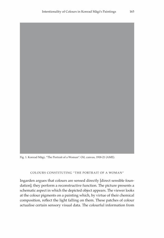
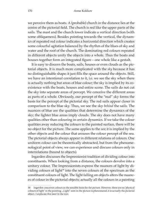
Fig. 1. Konrad Mägi, “The Portrait of a Woman“. Oil, canvas, 1918-21 (AME).
166 Anne Kokkov
the picture responds to the primary original information of objects seen in reality, which leads the viewer to constitute and mentally experience these objects. The patches of colour are interpreted not as the painting’s colour, but as “something that gives expression to the colour of the pre-sented objectivities.”28
Konrad Mägi’s Portrait of a Woman29 is literally covered with different patches of colour executed with rough brushwork. In incident light, we see the relationships of the dark blue, maroon, light green and other colours because the colour pastes on the painting reflect back the giv-en colours. The Portrait presents an image of an “elegant woman”30 in profile. We comprehend that the figure is intended to be a woman be-cause the shape and arrangement of the patches of colour appear in an order that creates the percept of a female. In the image’s background, the patches of colour can be associated with the shape of mountains or clouds in the night sky.
Certainly, when discussing objects in the Portrait one has to descend to the level of ‘the intentional picture’. According to Ingarden’s treatise, the interrelations of colours visible in incident light evoke colourful data that recall the original data received in reality. On the basis of our previ-ous experience we perceive a woman. The woman’s face and the woman herself look schematic; there is no softness and roundness in the brush-work of the presented body like one could expect in the figures by Jean Auguste Dominique Ingres’ discussed by Ingarden31.
We can see the woman’s weary pondering look in a moment of reflec-tion. The dark blue colour areas in the background seem threatening. The impression is even more expressive since the background is presented in sharp contours. Apparently the artist is indicating the confused and upset state of the woman’s mind. The choice of the colouration obvious-ly refers to melancholy and hard times in the woman’s life.
No matter whether we are looking at a work with a smooth and soft treatment like in J. A. D. Ingres’s painting or K. Mägi’s with its rough
28 Ingarden, „The Picture“, 168-169; 198-199.29 Konrad Mägi, Naise portree. Oil on canvas, 70,3 x 59,2 cm, 1918-1921 (Art Museum of Estonia= AME, M 3650).All illustrations by licence from the Art Museum of Estonia.30 The image and its qualities are the pictorial objects. To make it easier to follow the text, in discussing Mägi’s art works, henceforth, I will eliminate the quotation marks. Otherwise, the who-le discussion should be in quotation marks.31 See the next chapter.
167Intentionality of Colours in Konrad Mägi‘s Paintings
brushwork, the system of colours evokes the experience of seeing ob-jects. Although the female body in K. Mägi’s picture appears sketchy and lacks the qualities of feminine meekness and gentleness, there is no doubt we are looking at a woman. The shape of the half-figure and notably the more refined face leaves no doubt. In regard to the entire picture, we grasp the object with all its qualities. We see the woman wearing maroon-coloured clothing. Her hair is covered with a scarf in a light greenish colour. The scarf could be white in the day light, but the dark blue colours of the background indicate the dusk of the approach-ing night; so the scarf acquires the shades of dusk. For the same reason, the colours of her face look paler and her garment apparently appears more brownish than it would in day light. The bearing of her right arm may seem unnatural if one assesses the portrait by the values that ap-ply to Ingres’s figures. It is possible that Mägi wanted to express some method of modern art here, or just left the Portrait uncompleted.
The head of the woman is presented in light colours in contrast to the maroon of her body and the dark blue dusk in the background. This draws attention to her face. The face is the focal point; the whole dynam-ic of the picture points to the face. It is executed with an Impressionist approach to painting: with a juxtaposition of complementary colours instead of the light and shadows in the chiaroscuro method. The light pink and ochre colours present the illuminated parts of her face; the shadows appear bluish and greenish. The adjacency of the dominant dark and cool colours to the pale nuances of pink and ochre render her appearance pale, weary and restless, but animated. The harsh brush-work in the Portrait intensifies the restless expression. The face is more refined; the dabs are finer. On the whole, there is a discrepancy between the refined face and oval head and the coarsely expressed body and back-ground. The image of the head is isolated from body by a black shawl around her neck. The lines of the shawl cut into the face like saw teeth. This makes the whole expression of the Portrait even sharper. It implies that the woman has no power to determine what is happening around her and to her. Of course, we have to look at the original painting not a reproduction to really see the brushwork. In the reproduction we see the areas of colour rather than their execution.
In Visual Thinking R. Arnheim suggests that it was the Impressionists aesthetic theory that made acceptable the view that the pictorial image is a product of mind rather than a deposit of a physical object. Realising
168 Anne Kokkov
that images differ in principle from physical objects has laid the ground-work for modern art. This approach offers the possibility to reduce a theme visually to a skeleton of essential dynamic features which are not tangible parts of the actual objects. Human figures can be reduced to expressive gestures and postures of simple geometry.32
K. Mägi’s Portrait presents the basic structure of the woman. When discussing the execution of objects in the Portrait we remain to the bor-ders of the ‘painting’ vs. ‘picture’ relationships. In the painting, there are only patches of colour, but the woman with all her characteristics ap-pears in the picture. The execution of the work of art with approximately delimited objects suggests possible ways to interpret it. The picture is thus conceived as the viewer’s own mental image based on his or her associations with actual experience.
BoATS i n VeniCe AND IMPRESSIONIST PICTURES
Ingarden discusses examples in the history of art to explicate his argu-mentation regarding the perceiving of pictorial objects in the patches of colour on a painting. He covers two different approaches – in J. A. D. Ingres’s pictures and in Impressionist pictures. In Ingres’s work, the awareness of the painting’s surface disappears almost entirely. The ob-jectual picture aspires to the intuitive given so that the presented objects are brought to a presence in “their own selves”. The viewer sees the surfaces of the presented “bodies” and the “air-filled space” directly.33
In the Impressionist pictures, instead of bodies in their finished forms, the artists paint “patches of colour and light” that form the visually sen-sible basis for the potentially constituted pictorial objects. On the basis of the impulse given by the directly sensed colour data [provided by the corresponding patches of colour on the painting], the viewers combine the data into unitary aspects. Experiencing these aspects, the viewers see the unitary colouration of the presented bodies.34
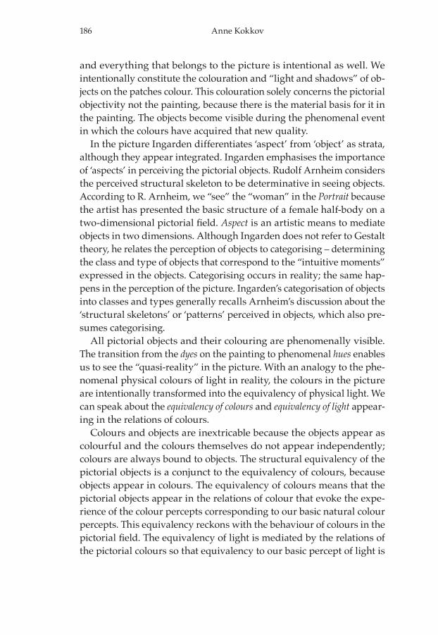
In regard to colour treatment, Konrad Mägi’s paintings are similar to the Impressionist approach. It is indicated that his paintings are also
32 Rudolf Arnheim, Visual Thinking. (Los Angeles, London: University of California Press, Berkeley, 1997), 108-109.33 Ingarden, „The Picture“, 170; 172.34 Ibid., 173-174.
169Intentionality of Colours in Konrad Mägi‘s Paintings
influenced by Neo-Impressionism and Fauvism.35 Evi Pihlak considers the colouration and rhythm of Mägi’s Venetian scenes to be the most ex-quisite for their expressiveness. These scenes exhibit Mägi’s fascination with blues – ultramarine and aquamarine in the sky and the reflections on the water.36
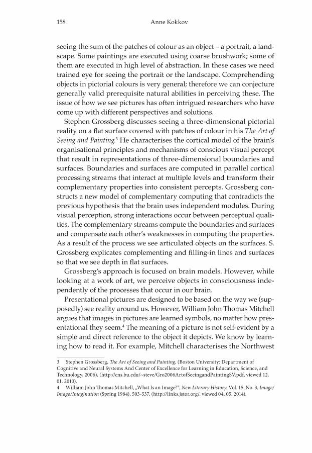
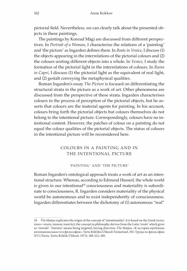
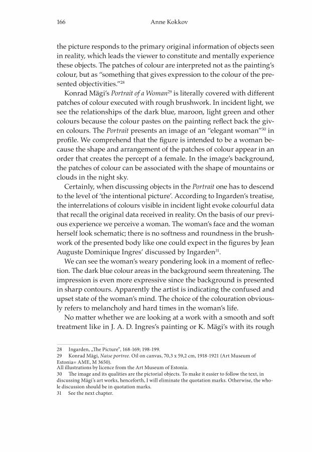
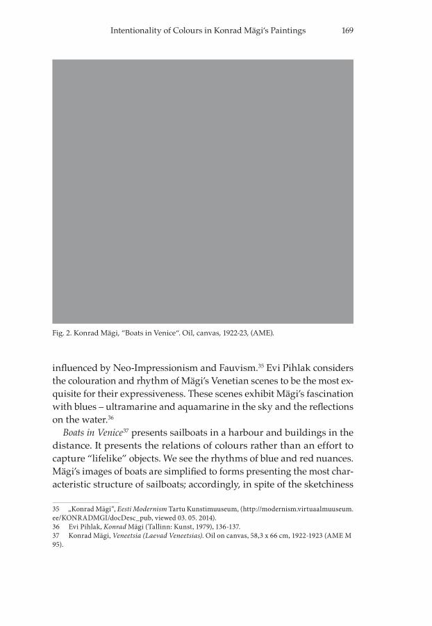
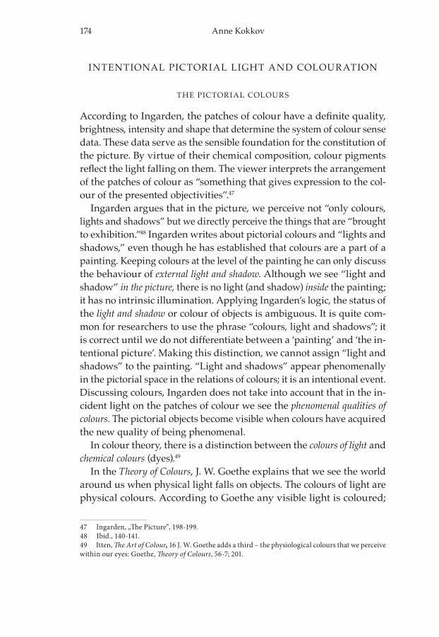
Boats in Venice37 presents sailboats in a harbour and buildings in the distance. It presents the relations of colours rather than an effort to capture “lifelike” objects. We see the rhythms of blue and red nuances. Mägi’s images of boats are simplified to forms presenting the most char-acteristic structure of sailboats; accordingly, in spite of the sketchiness
35 „Konrad Mägi“, Eesti Modernism Tartu Kunstimuuseum, (http://modernism.virtuaalmuuseum.ee/KONRADMGI/docDesc_pub, viewed 03. 05. 2014).36 Evi Pihlak, Konrad Mägi (Tallinn: Kunst, 1979), 136-137.37 Konrad Mägi, Veneetsia (Laevad Veneetsias). Oil on canvas, 58,3 x 66 cm, 1922-1923 (AME M 95).
Fig. 2. Konrad Mägi, “Boats in Venice“. Oil, canvas, 1922-23, (AME).
170 Anne Kokkov
we perceive them as boats. A (probable) church in the distance lies at the centre of the pictorial field. The church is red like the upper parts of the sails. The mast and the church tower indicate a vertical direction (with some obliqueness). Besides pointing towards the vertical, the dynam-ics of repeated red colour indicates a horizontal direction which creates some colourful agitation balanced by the rhythm of the blues of sky and water and the roof of the church. The dominating red colours repeated in different objects unify the objects into a whole. Thus the boats and houses together form an integrated figure – one whole like a gestalt.
It is easy to discern the boats, sails, houses or even clouds as the pic-torial objects. It is much more complicated with the sky because it has no distinguishable shape; it just fills the space around the objects. Still, we have an intentional correlation to it, i.e. we see the sky when there is actually nothing but areas of blue colour; the sky is implied by its co-existence with the boats, houses and entire scene. The sails do not cut the sky into separate areas of percept. We conceive the different areas as parts of a whole. Obviously, our percept of the “real” sky forms the basis for the percept of the pictorial sky. The red sails appear closer in comparison to the blue sky. Thus, we see the sky behind the sails. The nuances of blue are the qualities that determine the dynamics of the sky; the lighter blue areas imply clouds. The sky does not have many qualities other than colouring in certain dynamics. If we take the colour qualities away reducing the colours to the painted surface, there will be no object for the picture. The same applies to the sea; it is implied by the other objects and the colour that arouses the colour percept of the sea. The pictorial objects always appear in different relations of colours. One uniform colour can be theoretically abstracted, but from the phenome-nological point of view, we can experience and discuss colours only in interrelations (bound to objects).
Ingarden discusses the Impressionist tradition of dividing colour into constituents. When looking from a distance, the colours devolve into a unitary colour. The Impressionists express the nuances of light by di-viding colours of light38 into the seven colours of the spectrum as the constituent colours of light. The light falling on objects alters the nuanc-es of colour in the pictorial objects; actually all the colours in a painting
38 Ingarden conceives colours as the sensible basis for the picture. However, there are no ’physical colours of light’ in the painting. „Light“ seen in the picture is phenomenal; it is actually the pictorial object. I explicate this later in the text.
171Intentionality of Colours in Konrad Mägi‘s Paintings
are divided into constituent colours. Instead of grey Impressionists use light green and violet which, at a distance, combine to form a unitary grey. Ingarden argues that the objects in Impressionist paintings are invested with a certain potentiality or unfinished quality. Their reconstruction is based on structural and “contentual” (qualitative) construals, which with the assistance of the sensible foundation, bring the corresponding objectual moments into view. The viewer combines the multiplicity of the patches of colour (providing the data of sensation that he or she directly experiences) into a single whole. On the basis of the sensible founda-tion the viewer can see the aspects of the categorically formed objects.39
In discussing Impressionist pictures, Ingarden uses the terms ‘col-ours of light’ and ‘light’ falling on objects and determining the colour of the objects. However, these are phenomenal events. In these passag-es, Ingarden contradicts his own theory. Taken literally, in Ingarden’s treatment of ‘painting’ vs. ‘the picture’, we could characterise the light green and violet “patches of colour”. Applying Ingarden’s approach we cannot discuss the qualities of the colours. To discuss these phenomena, we have to transcend from the objectively given material agents (patches of colour) to the intentional phenomena perceived in picture-conscious-ness (phenomenal colour qualities of objects). To speak about colours as phenomena we have to treat colours as phenomenal, which Ingarden does not.
Looking at the Konrad Mägi’s picture, we see the blue sky behind the boats. Characterising the ‘object’ (sky) in the ‘intentional picture’ – con-stituted in picture-consciousness upon the material “patches of colour” of the ‘painting’ – we can speak about the object “sky“ which has the colour-quality blue. It seems curious that Ingarden makes a distinction between ‘aspect’ and ‘object’, although they appear integrated. At the same time, he does not distinguish between ‘object’ and its ‘colour qual-ities’. While Ingarden does not treat colours phenomenally he refuses to assign the intentional character to the “body’s own colouring”.
39 Ingarden, „The Picture“, 175-176.
172 Anne Kokkov
DISCUSSING INGARDEN’S APPROACH
TO THE PICTORIAL COLOUR ATION
Ingarden explains the experience of seeing objects as being struck by the similarity between the pictorial object and another object [in mem-ory recollection] so that we involuntarily begin to see this other object. The sensed patches of colour evoke a “quasi-perceptual” discernment of the object presented in the picture. The material of the sensation “clothes itself” in the corresponding “structural and objectual con-struals”, and thereby forms the reconstructed aspect of the presented object. The “body in its own colouring is given to us” directly, almost as in a percept.40 The differently positioned patches of colour correspond to the original visual colour sense data similar to the data of objects ex-perienced in reality. Thus, in the picture they evoke data similar to the original data. The reconstruction of the data is an approximation of the experienced one (in the original percept) related to the corresponding thing. It is perceived as “that thing’s aspect”.41
Ingarden discerns two components in the percepts: first, colour agents provide stimuli and, then, the body’s colouring appears. Obviously, Ingarden’s treatment of stimuli provided by “patches of colour” is based on the stimulus-response schema to which O. Liebermann refers42. In Ingarden’s approach, the stimuli appear at the material level – in sens-ing the patches of colour on painting; the wholes appear intentionally at the conscious level thereby perceiving the pictorial objects. It is doubt-ful that in perceiving surroundings we can distinguish the two parts in the act of perception: the sensations and ensuing judgements.43 The stimulus-response schema is apparently the reason why Ingarden is in trouble with the status of the pictorial colours. He identifies the status of colour agents: these are material; therefore, these are sensed direct-ly. Simultaneously, he does not identify the status of colours in appearing
40 Ingarden, „The Picture“, 203-204. While E. Husserl conceives the object (“the little figure“) as an image signifying an object, Ingarden argues that we intuitively see an object directly in the picture.41 Ibid., 168-169.42 See Introduction.43 By Gestalt theory there is no discrimination like stimulus-response in our acts of percep-tion. Rudolf Arnheim, Art and Visual Perception (London: Berkeley and Los Angeles: University of California Press. 1967), vii-ix, 2.
173Intentionality of Colours in Konrad Mägi‘s Paintings
objects. It is uncertain what Ingarden means by something that “gives ex-pression to the colour of the presented objectivities”.44
Ingarden explains the visible qualities of colours based on the mech-anism of light refraction on colour agents like colour theorists do.45 Nevertheless, he does not resolve the issue of how to treat these qual-ities of colours in the picture. He even indicates that colours appear in contrast phenomena, harmonies and disharmonies, which mediate emotional traits and moods that “otherwise would not be present”.46 Ingarden does not explain how these traits and moods appear. The mel-ancholy of the depicted woman appearing in the colours of the Portrait is a phenomenon that occurs in the consciousness: the colours themselves are not melancholy. The colours have acquired a new quality. The col-ouring in the Portrait is intentionally experienced. Colours now bear an intentional character.
Based on Ingarden’s approach to the pictorial objects, it follows that we conceive the objects as wholes with all their features. The status of colours in the intentional picture is ambiguous – the colours are the tool that evokes the picture, but colours do not participate in it. Ingarden treats colours as features of the intentional objects (“body’s own col-ouring”). He does not consider the probability of the intentionality of these colour features. However, in the picture, the total of the relations of colours carry qualities that colour agents do not. The colours have acquired a new – intentional character. Consequently, if the sky in the Portrait (or Boats in Venice) is an intentional object, the colour qualities of that object are intentional: a blue patch of colour is not equal to the blueness of the sky. The picture is an intentional formation; everything that belongs to the picture is intentional. We intentionally constitute the colouration of objects on the patches of colour. The colouration con-cerns only the pictorial objectivity and not the painting. The painting only contains the material basis for it.
44 Ingarden, „The Picture“, 198-199. From the very beginning, starting with differentiation be-tween a ’painting’ and ’the picture’ one can doubt Ingarden’s consistency in the phenomenological method, although he was E. Husserl’s student.45 See next chapter.46 Ingarden, „The Picture, 161.
174 Anne Kokkov
INTENTIONAL PICTORIAL LIGHT AND COLOURATION
THE PICTORIAL COLOURS
According to Ingarden, the patches of colour have a definite quality, brightness, intensity and shape that determine the system of colour sense data. These data serve as the sensible foundation for the constitution of the picture. By virtue of their chemical composition, colour pigments reflect the light falling on them. The viewer interprets the arrangement of the patches of colour as “something that gives expression to the col-our of the presented objectivities”.47
Ingarden argues that in the picture, we perceive not “only colours, lights and shadows” but we directly perceive the things that are “brought to exhibition.”48 Ingarden writes about pictorial colours and “lights and shadows,” even though he has established that colours are a part of a painting. Keeping colours at the level of the painting he can only discuss the behaviour of external light and shadow. Although we see “light and shadow” in the picture, there is no light (and shadow) inside the painting; it has no intrinsic illumination. Applying Ingarden’s logic, the status of the light and shadow or colour of objects is ambiguous. It is quite com-mon for researchers to use the phrase “colours, light and shadows”; it is correct until we do not differentiate between a ‘painting’ and ‘the in-tentional picture’. Making this distinction, we cannot assign “light and shadows” to the painting. “Light and shadows” appear phenomenally in the pictorial space in the relations of colours; it is an intentional event. Discussing colours, Ingarden does not take into account that in the in-cident light on the patches of colour we see the phenomenal qualities of colours. The pictorial objects become visible when colours have acquired the new quality of being phenomenal.
In colour theory, there is a distinction between the colours of light and chemical colours (dyes).49
In the Theory of Colours, J. W. Goethe explains that we see the world around us when physical light falls on objects. The colours of light are physical colours. According to Goethe any visible light is coloured;
47 Ingarden, „The Picture“, 198-199.48 Ibid., 140-141.49 Itten, The Art of Colour, 16 J. W. Goethe adds a third – the physiological colours that we perceive within our eyes: Goethe, Theory of Colours, 56-7; 201.
175Intentionality of Colours in Konrad Mägi‘s Paintings
colourless light and colourless surfaces are abstract ideas. When light falls on the surface of objects, some of the light is being absorbed, the rest appears coloured; so the colour of objects appears. Objects reflect-ing all light waves appear white; the objects absorbing all light waves appear black; and the objects that absorb all but one appear green, red, yellow, i.e. the colour corresponding to that light wave.50
It is common to just use the word “colour”, but actually, when discuss-ing colours in the picture, we are discussing the reflected colours of light which are seen as hues. 51 Hues appearing phenomenally in light are the ob-ject of research when we discuss the intentionality of pictorial colours.
Colours are bound to objects (and vice versa) in the picture. Still, in the pictorial field, independently from objects, colours themselves have certain rules of behaviour. Colours have the phenomenal effect of pro-truding (warm hues: yellow, orange, red) or receding (cold hues: green, blue, violet). A pure colour advances relative to a duller one. J. Itten ar-gues that the forces that provide the direction of depth are present in the colour itself; the spatial effects appear in the interrelations of colours.52 To attain organisation in the pictorial space, colours are organised in contrasts of light-dark, cold-warm, saturation or extension.53 In pictorial objectivity, the choice and arrangement of colours creates depth, tem-perature, agitation and dynamics.
The colour of “real” objects depends on the ambient light; it changes as the light conditions change. The choice of colours determines the “am-bient” pictorial light and the feeling of coldness or warmth. We speak about colour temperature – about warm and cool colours. In reality we may not be aware of any yellow on a summer day. Dominating yellows
50 Goethe, Theory of Colours, 274; xliii. F. Dorsch discusses the absorption and reflectance of sur-faces giving colours relative to wavelengths of the visible spectrum. According to Dorsch our colour experiences are veridical colour perceptions because under normal viewing conditions, we experi-ence the same colour. Some ambiguity appears in defining second-order colours like green, purple etc. Dorsch, “Colour Realism and Colour Resemblance”, 4-5; 10.51 Colour – hue; Farbe – Farbigkeit (in German); värv – värvus (in Estonian).52 Itten, The Art of Colour, 122-3. Besides, colours define our mental attitude towards the objects presented in pictures. J. Itten writes about the positive or negative effects of colours independent of our knowlegde about the effect (ibid., 16). He describes, for example, yellow as “the most light-gi-ving of all hues.“ Still,“the expressions of diluted yellow are envy, betrayal, falseness, doubt, distrust and unreason.“ Ibid., 132) J. W. Goethe writes: “By a slight and scarcely perceptible change, the be-autiful impression of fire and gold is transformed into one not undeserving the epithet foul; and the colour of honour and joy reversed to that of ignominy and aversion.“: Goethe, Theory of Colours, 308. 53 Itten refers to the fact that spatial effects can also be produced by diagonals or overlapping: Itten, The Art of Colour, 122. S. Grossberg discusses the behaviour of colour surfaces in: Grossberg, The Art of Seeing and Painting.
176 Anne Kokkov
(which contain some red) give the impression of high temperature and a hot day in the picture. Van Gogh’s pictures could not communicate a “hot day” without yellows. Mägi’s Venice series look “sunny” but much “cooler”. The colour temperature is a factor that determines the impact of the whole picture. The colours in the picture behave differently than the ones perceived in reality, because the field of reference is quite different. The pictorial field is in miniature compared to the fields of reference in reality. It is comprised of a small number of objects. Besides, the objects in the pictorial field are enormous relative to the field. Accordingly, the presented pictorial objects and their colouration are more emphasised than in reality. In reality, the objects and colour areas are miniature com-pared to the field of reference. Correspondingly, the values of the colour relations in the picture differ from the values in reality. The pictorial colours convey expressions and percepts that are otherwise conveyed in reality. Artists intentionally design the choice of colours to express the intended purposes.54
It is obvious that in perception, colours are not dependent on objects and vice versa. Different objects can be red, or objects can appear in dif-ferent colours (houses, for example). Colours appear bound to certain objects, but this bond is not necessary to cognise objects.
Gestalt psychologists consider the colour percept to be one of our ba-sic percepts. R. Arnheim argues that we perceive patterns of colour like the patterns of shape. We see colour patterns as elaborations of a few el-ementary pure qualities of yellow, red and blue. Colour qualities mostly appear in mixtures, which are perceived as combinations of the underly-ing primaries. Only the combined colours of orange, green, and purple are sufficiently precise to function as visual concepts. In the pictures, the secondary concepts are transitional links between the fundamen-tal primaries.55 As indicated above, on the whole, we perceive colours similarly. Disagreements that occur in determining colours apparent-ly derive from differences in emphasising the underlying primaries. When we are not sure whether an object is more “blue” or “green”, or more “red” or “orange”, we may think that we see colours in different
54 R. Arnheim discusses thouroughly the fields of references in the relation to the pictorial ob-jects: Arnheim, Art and Visual Perception.55 Arnheim, Visual Thinking, 30. F. Dorsch writes the same in: „Colour Realism and Colour Resemblance” (2009).
177Intentionality of Colours in Konrad Mägi‘s Paintings
ways. If this were really the case, it would also be difficult to perceive and discuss the intentions conveyed by pictorial objects.
“Patches of colour” are dyes. When external light falls on them, some of the rays of light are being absorbed in the colour surface (dyes). The reflected rays constitute hues. Ingarden makes a distinction between a ‘painting’ and ‘the picture’, but he does not make a distinction between colours as dyes and as hues. Dyes are material; hues are phenomenal. Ingarden does not consider the phenomenality of the pictorial colouration.
“LIGHT AND SHADOWS” IN V eniCe
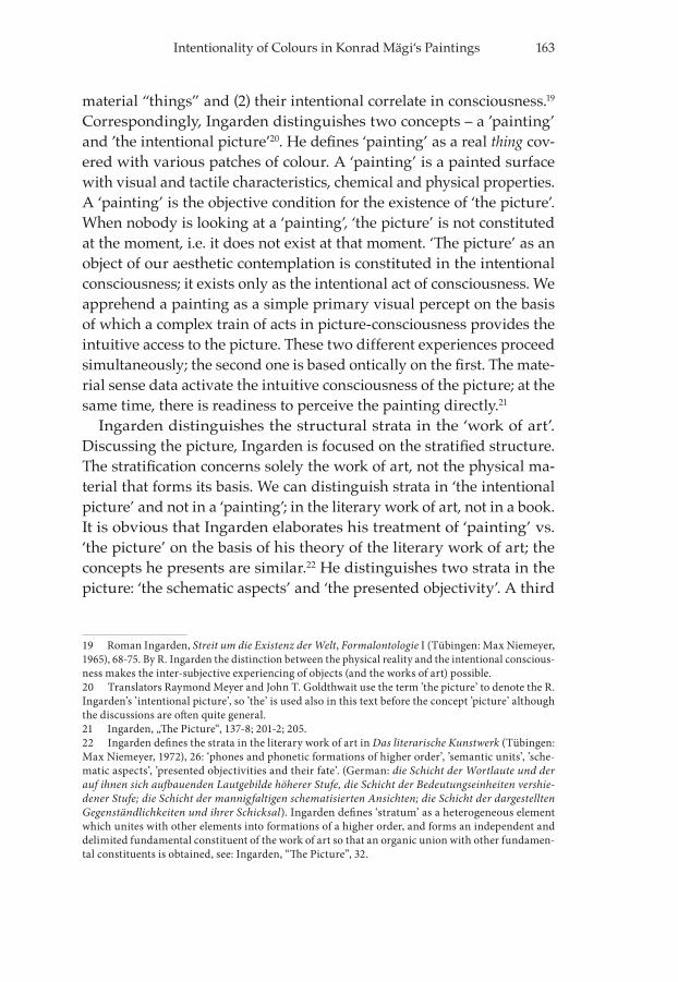
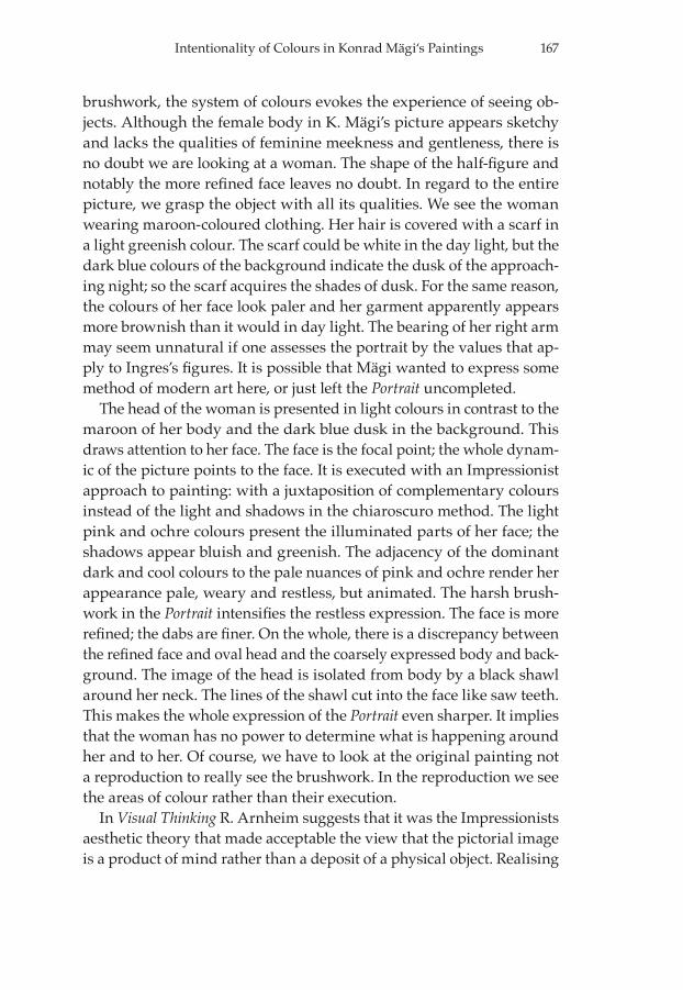
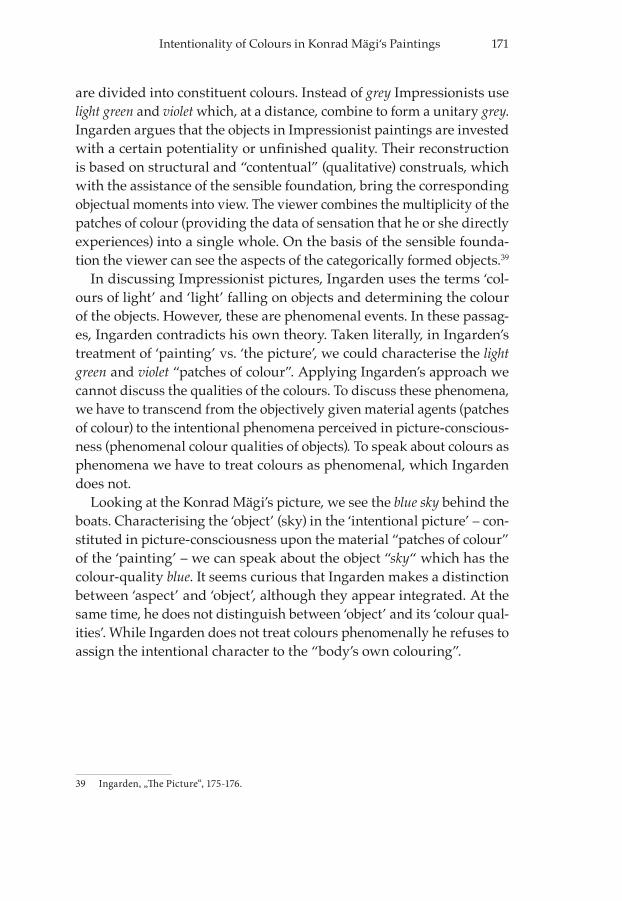
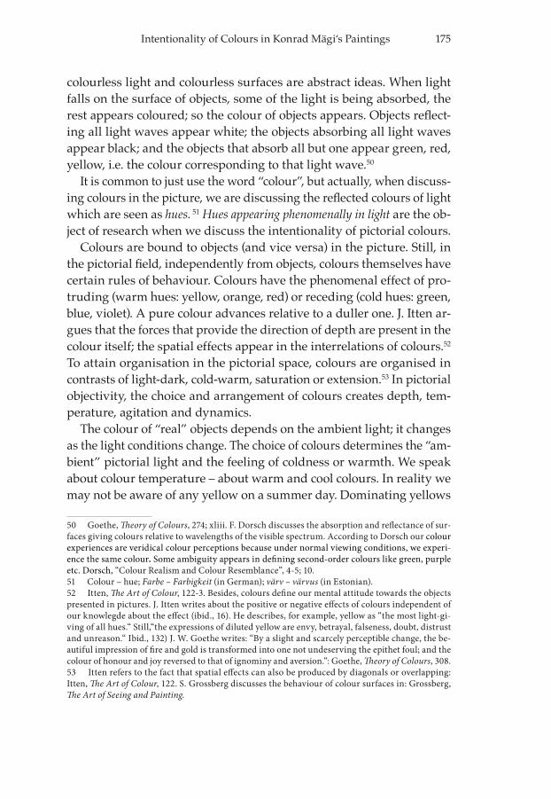
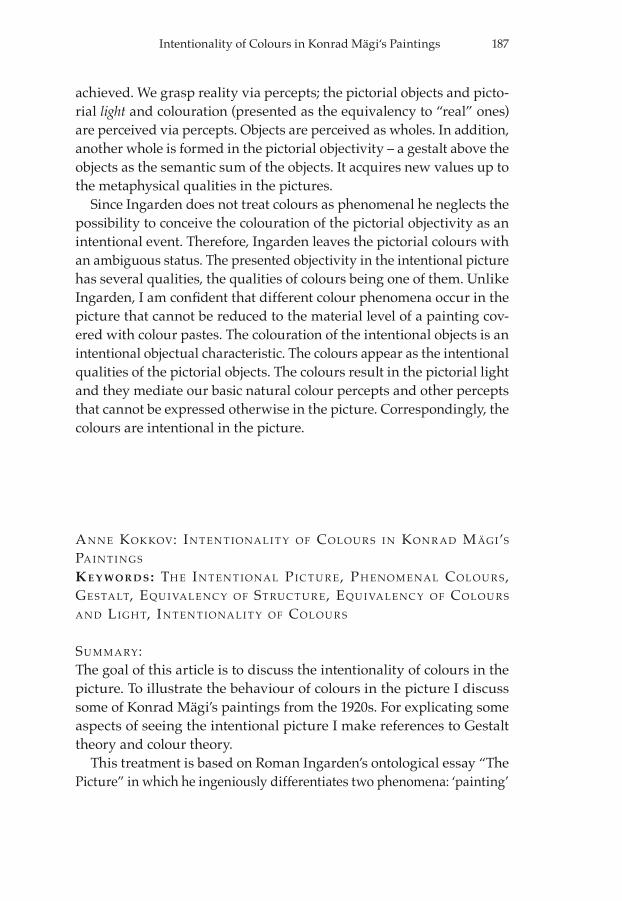
Konrad Mägi’s Venice56 presents a scene full of light. Of course, the for-mation of light in the pictorial space is a phenomenal event occurring in the transition of the patches of colour into the phenomenal colours of light. It is obvious that we see the pictorial light provided that exter-nal light falls on the painting, but the light in Venice is an intentionally perceived pictorial object.
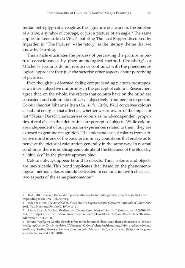
Venice presents the scene of a canal street. The relations between the different colours result in seeing the sky, sunlit walls of houses, water in the canal, terraces alongside the canal and human beings on a bridge. The sunlight glimmers on the water and even on the shaded parts of the buildings and terraces. The human figures dissolve into the street; they are depicted in neutral tones. They are less important to the whole but they make the scene more vivacious. The blue sky and blue (aquama-rine) water determine the whole “cool” impression of greens and reds on the houses. Although, the colouration implies a sunny day, the blu-ishness of the whole colouration provides a feeling of cool and fresh air.
The achieved pictorial incident light in the canal street reflects on the red house at the centre of the pictorial field transforming the shaded side to red-violet; the shaded side of the green house is also darker and colder in tone. The shadows on the left side are comprised of the violet reflections from a red building that is left out of the picture (except for a corner of the building). The reflections from the water make the whole canal street glimmer. The lighted parts of the houses and the shadows on the houses are components of the houses, just like the light and shad-ows on the water are components of the water. In that sense, we really
56 Konrad Mägi, Veneetsia. Oil on canvas, 63,5 x 59,7 cm. 1922 – 1923 (AME M 94).
178 Anne Kokkov
cannot distinguish the colours from the objects and the whole pictorial space: the objects and space are comprised of nuances of colours. The colours unite the different objects into a whole above the objects sepa-rately. So, instead of individual houses we see the canal street.
The centrally located reddish-greenish group of objects (buildings) is dominant in the pictorial field. The repeated colours in the different objects emphasise the importance of the objects depending on the col-ours (red hue is the first to impinge on the eye). The different tones of blue surround this central group of houses; the blue sky and blue water form a frame for the red and green identifying the group as the central
Fig. 3. Konrad Mägi, “Venice“. Oli, canvas, 1922-23, (AME).
179Intentionality of Colours in Konrad Mägi‘s Paintings
figure. The two sides of the pictorial field are linked by the image of the bridge. All the other objects structure the pictorial space and encircle the dominant figure. The recurrence of similar tones in the colouration unites the pictorial objects into a whole.
As a result, this is an agile scene depicted as a joyous day full of sunlight. Being joyous is perceived in consciousness; the choice of col-ours and the way colours are structured in the pictorial field allow the viewers to feel this emotion. It is quite obvious that the artist is not just laying paste on the canvas; he is focusing on the quality of the colours. From the very beginning, he intends to depict the colouration of objects. Although intuitively and directly, we perceive the pictorial objects as the wholes in the interrelations of the phenomenal colours.
COLOUR ATION AND THE PICTORIAL OBJECTIVITY
The intentional objects in the Venice have definite qualities of shape and colour. We obviously conceive the pictorial objects as wholes: we cannot exclude the bluishness from the sky or water or the reddishness or green-ness from the houses. The colouration of the “bodies” in the pictures is conditioned by the whole light and colouration of the picture. This means that from the colours that are actually presented, we infer the “body’s” colouring in the pictorial light.
The objects are perceived as wholes. Besides, in the pictorial objectivi-ty, another whole – a gestalt above the objects is formed as the semantic sum of the objects. The pictorial objectivity is the pictorial “reality”; it includes all the objects within the pictorial space. By itself, the pictorial space is an object like any other “thing” in that space. Like all objects the pictorial space also has qualities of colouration; there is no void in the pictorial field. If a “void” is made objectual it acquires the coloura-tion of the artist’s vision of the void.
Ingarden emphasises the importance of ‘aspects’ [perceived by anal-ogy with memory recollections of objects] while R. Arnheim considers the determinative in seeing the objects in the perceived structural skele-ton of these objects.57 According to Arnheim, we “see” the woman in the
57 See Arnheim, Art and Visual Perception. Arnheim thoroughly treats the different aspects of perceiving the structural skeleton in objects (both in reality and in pictures) in relation to the back-ground as the frame of reference.
180 Anne Kokkov
Portrait58 because the artist has presented the basic structure of a female half-body on a two-dimensional pictorial field. In Arnheim’s approach, the perception of objects is based on grasping the object’s basic struc-tural skeleton. Instead of producing replicas, the pictorial representation presents the object’s structural equivalency.59
Although Ingarden does not indicate Gestalt theory, he writes that the perception of objects is related to categorising – determining the classes and types of objects that correspond to the “intuitive moments” expressed in the objects. The categorising occurs in reality; the same occurs in perceiving the picture.60 Ingarden’s categorising of the objects into classes and types gener-ally resembles Arnheim’s discussion about ‘structural skeletons’ or ‘patterns’ perceived in objects, which likewise presumes categorisation.
We grasp reality via percepts; the pictorial objects and the pictorial “light” and the objectual colouration are perceived via percepts. The structural equivalency of objects is the conjunct to the colours because the objects appear in colours. Accordingly, developing Arnheim’s treat-ment of equivalencies, besides the equivalency of structure, it is correct to speak about the equivalency of colours and equivalency of light appearing in the relations of the pictorial colours. The equivalency of colours means that the pictorial objects appear in the relations of colour that evoke the colour percepts corresponding to our basic natural colour percepts. This equivalency reckons with the behaviour of colours in the pictorial field. In that meaning, this equivalency is the result of “filtered” colours. The equivalency of light is mediated by the relations of pictorial colours so that an equivalency with our basic percept of light is achieved; also con-sidering the behaviour of the colours in the pictorial field.
The colours (hues) result in the intentionally visible objects: “light” and the colourful pictorial objectivity. Real external light has objective physical properties; in the picture, it is visible as the phenomenally ap-pearing “light” that determines the colouring of the pictorial “bodies.” The colour of “bodies” is the sum of the properties of “body’s surface” plus the colouring of the pictorial “light”.
58 See the previous chapter. 59 Arnheim, Art and Visual Perception, 165. Arnheim uses the term ’structural skeleton’ in Art and Visual Perception. The structural skeleton refers to the most simplified form to which we reduce all objects in perception. He also argues that visible objects are perceived as shape patterns: these percepts have generality and they are easily identified. No percept ever refers to a unique, individual shape but “rather to a kind of pattern of which the percept consists.” Arnheim, Visual Thinking, 28) 60 Ingarden, „The Picture“, 168-9; 155.
181Intentionality of Colours in Konrad Mägi‘s Paintings
LIGHT AND THE PICTORIAL OBJECTIVITY IN Rui nS i n CA PR i
J. W. Goethe argues that, in the first place, the eye sees no object forms; light, shade, and colour constitute objects, and help to distinguish the different parts of objects. From light, shade, and colour, we construct the real visible world. According to Goethe, the real world and the qua-si-world in the picture are not perceived in very different ways: light, shadow and the relations of the colour fields give us reality, and the grounds for the picture.61
In the physical shape there are only the patches of colour on the painting’s surface. All the pictorial objects and their colouring are seen phenomenally in the interrelations of hues. The transition from dyes on the painting to phenomenal hues enables us to see the presented pictorial
61 Goethe, Theory of Colours, xxxviii-xxxix. Likewise Ingarden uses the term ’quasi-reality’ in Das literarische Kunstwerk, 250.
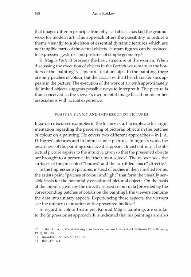
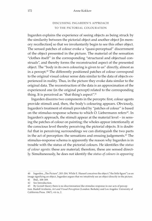
Fig. 4. Konrad Mägi, "Ruins in Capri". Oli, canvas, 1922-23, (AME).
182 Anne Kokkov
equivalency of the real objectivity and the pictorial equivalency of real incident light.
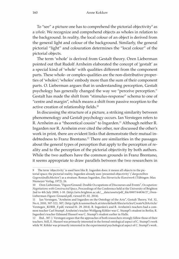
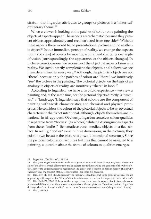
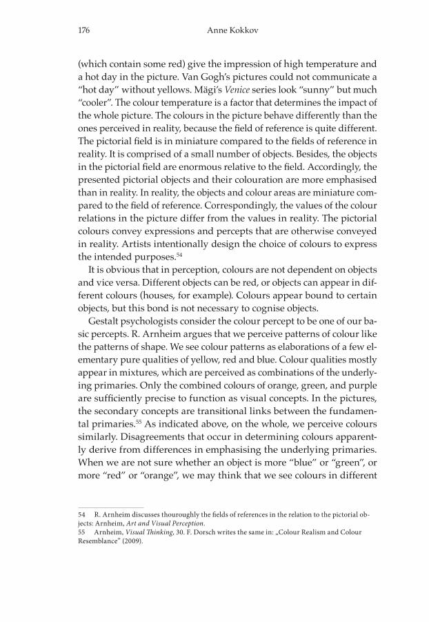
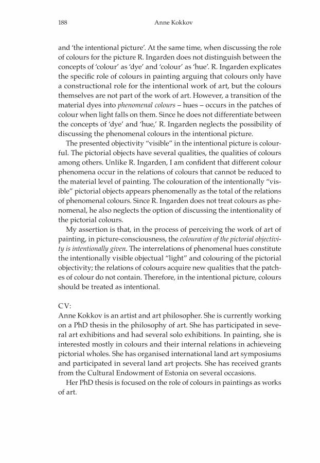
When describing the brushwork in Konrad Mägi’s Ruins in Capri,62 we can talk about the “patches of colour” that are organised in triangular and quadrilateral shapes so that the structure of a house in ruins ap-pears. In viewing the picture we intuitively analyse the colour relations of the whole pictorial field. In wholes, the colours acquire new quali-ties which individual colours do not possess. Based on the structural equivalency of real objects we perceive the ruins in the pictorial objects. This happens intentionally in picture-consciousness because the artist has designed relations of the colours so that we can see the described objects (despite of the knowledge that, actually, there is nothing but dyes on canvas). The picture is seen as a whole because the objects ac-quire their form in relationship to the whole pictorial colouring and the whole structure of the pictorial field. Correspondingly, the qualities of objects are determined by the whole. The whiteness of the image of the ruins is formed by spots, some of which are closer to pure white, while some have greenish, bluish or greyish nuances. We see the object (ru-ins) when we group together the lighter patches of colour. The darker patches form the ground, sky and trees. In contrast to the white build-ing, the sky appears dark blue, and the same applies to the ground – it appears sombre. There are also some more ruins visible in the distance. These balance the image of the ruins in the foreground and contribute to the depth of the pictorial space. In Capri the ruins get their form in reference to the pictorial space, as do the mountains and the blue sky. While we conceive of the blue of the sky as an object in the picture, it is a part of the whole.
We cannot see the source of light. The light reflects off the ruins. In the real world, the light percept is one of our natural percepts. In reality, we do not need to see the source of ambient light; we perceive light in the colours of the sky and the objects. Likewise, we derive the pictorial light from the light colours on the ruins, regardless of the dark sky be-hind them. The artist has presented the equivalency of real incident light conditions in the picture. The equivalency of the light appears in the re-lations of the pictorial colours; they evoke the light and colour percepts according to our basic natural percepts. If we do not see the source of
62 Konrad Mägi, Varemed Capril. Oil on canvas, 52,0 x 67, 2, cm, 1922 – 1923 (AME M 93).
183Intentionality of Colours in Konrad Mägi‘s Paintings
light, we intuitively analyse the colouration of the objects that gives the impression of sunlit walls. From these walls we know that we are seeing sunshine, although the sun itself has been left out of the pictorial field.
The white ruins in the foreground constitute the central figure in the picture. Ruins in Capri presents a deserted area with white ruins locat-ed on rocks. With the whole (ruins, abondoned house) new qualities like the metaphysical questions of the present time fading away into nothingness, and life and death, which are not explicitly contained in the picture, are evoked. Of course, we can experience the same quali-ties looking at the real ruins in Capri. Since the frame of reference for the objects (ruins) is so constrained in the picture, these metaphysical questions are more emphasised. The object fills up the space acquiring greater importance than it has in real life. The pictorial reality (qua-si-reality) exceeds reality becoming metaphysical by accentuating the ruins, thereby allowing the artist to express something more using very simple and non-metaphysical objects. The object’s intent has acquired a new higher level. The house, which is left abandoned and rundown, in Capri expresses questions about the values in human life. Likewise, in The origin of the Work of Art,63 Martin Heidegger interprets Van Gogh’s A Pair of Shoes saying that the object (shoes) represents the whole of hu-man life with its labour. While the shoes are accentuated in the limited pictorial space they express much more than real shoes do in real life. Similarly, the real ruins need not evoke metaphysical questions. While presenting the ruins in such a constrained area, a shift has occurred: instead of presenting a piece of nature, the picture emphasises philo-sophical and metaphysical qualities.
To see “light” in the intentional picture we constitute “light” (and “shadows”) of the pictorial objectivity. By creating an analogy to the phenomenal physical colours of light in reality, the colours in the pic-ture are intentionally transformed into the equivalency of light and colour-qualities of the pictorial objects. The colour qualities of the pic-torial light and colouration bear a phenomenal character and have an intentional content that the dyes on painting do not have. In addition, the whole of the picture acquires metaphysical qualities.
63 Martin Heidegger, Kunstiteose algupära, transl. Ülo Matjus (Tartu: Ilmamaa, 2002).
184 Anne Kokkov
IN CONCLUSION
The goal of this treatment is to discuss the intentionality of colours in the picture.
In his ontological philosophy, Roman Ingarden differentiates between the dichotomy of autonomous “real” material “things” and their inten-tional correlate in consciousness. Correspondingly, in his essay “The Picture,” he differentiates between the ’painting’ as a real thing and ’the intentional picture’. The ‘painting’ is given to us as a simple primary visual percept. Based on that simple percept a complex train of acts in picture-consciousness provide intuitive access to the picture as a ‘work of art’. ‘The picture’ as an object of aesthetic contemplation belongs only to the intentional act of consciousness. Ingarden argues that the colours (patches of colour) are the component part of the painting with chemi-cal and physical properties. According to Ingarden, the systems of the differently positioned patches of colour on the surface of the painting correspond to the original primary visual colour sense data of objects experienced in reality; thus they evoke data similar to the original data. The colourful information received from the picture leads the viewers to constitute and mentally experience the pictorial objects. The sensed patches of colour evoke a quasi-perceptual apprehension of the object presented in the picture: the “body’s” colouring is given to us. We intu-itively see the pictorial objects directly. Ingarden explains this as being similar to memory recollections.
Ingarden argues that colours are the direct sensible foundation that evokes the picture. But the colours themselves do not belong to the pic-ture. Ingarden’s treatment of the “patches of colour” providing stimuli presents the stimulus-response schema: first, the colour agents pro-vide stimuli and, then, the body’s colouration appears. In Ingarden’s approach, the stimuli appear at the material level – when sensing the painting – while the wholes appear intentionally at the conscious level of perceiving the pictorial objects. He identifies the status of colour agents: these are material; therefore, these are sensed directly. At the same time, he does not identify the status of the colours in the appearing objects. Writing about the “body’s” “own colouring,” Ingarden does not assign colours a phenomenal character and he does not conceive colours as intentional.
In discussing Impressionist pictures, Ingarden uses the terms “colours of light”, the “light” determining the colour of objects. He explains the
185Intentionality of Colours in Konrad Mägi‘s Paintings
perception of the qualities of the colours by the mechanism of refract-ed light on the colour agents like the colour theorists do. However, he leaves the issue of how to treat these qualities of colours in the picture unsolved. These are phenomenal events. To discuss these phenomena we have to transcend from objectively provided material (painting) to the intentional phenomena that we perceive in picture-consciousness. In these passages, Ingarden contradicts his own theory. Ingarden dis-cusses phenomenal events in the picture on the basis of the material colour agents.
It follows from Ingarden’s treatise that we conceive the pictorial objects as wholes with all their features; colours are features of the intentional objects (“body’s own colouring”). Ingarden does not consider the proba-bility of the intentionality of colours as features; the colours are only the tool that evokes the picture. Nevertheless, the total of the colour relations carries the qualities that the patches of colour themselves do not. If the “sky” in the Portrait is an intentional object, then the colour qualities of that object should be intentional as well: a blue patch of colour does not equal with the blueness of the “sky”. The melancholy of the “woman” appearing in the colours of the Portrait occurs in consciousness; the col-ours themselves are not melancholy. The objects appear in colour and the colour qualities contribute to the pictorial “light” and the whole of the picture that is constituted beyond all the pictorial objects. The col-ours have acquired a new quality that is now intentionally experienced.
In colour theory, there is a distinction between the physical colours of light (hues), and chemical colours. The chemical colours in a painting are dyes used to paint it. The hues appear in the refraction of light rays on the surface; the reflected rays result in the colour qualities (a yellow, red, blue hue, for example) depending on the qualities of the colour agents. The word “colour” is generally used, but actually, when discussing the colours in the intentional picture, we are discussing the reflected colours of light – hues. Hues result in the intentionally visible objects – the “light” and the colourful pictorial objectivity. The real external light has objec-tive physical properties; in the picture, it is intentionally seen as “light” that appears phenomenally and determines the colouring of the pictorial “bodies”. The colour of the “bodies” is the sum of the properties of the “body’s surface” plus the colour of the pictorial “light”. Phenomenally visible hues bear an intentional character, and they are the features of the colourful pictorial objects. The picture itself is an intentional formation,
186 Anne Kokkov
and everything that belongs to the picture is intentional as well. We intentionally constitute the colouration and “light and shadows” of ob-jects on the patches colour. This colouration solely concerns the pictorial objectivity not the painting, because there is the material basis for it in the painting. The objects become visible during the phenomenal event in which the colours have acquired that new quality.
In the picture Ingarden differentiates ‘aspect’ from ‘object’ as strata, although they appear integrated. Ingarden emphasises the importance of ‘aspects’ in perceiving the pictorial objects. Rudolf Arnheim considers the perceived structural skeleton to be determinative in seeing objects. According to R. Arnheim, we “see” the “woman” in the Portrait because the artist has presented the basic structure of a female half-body on a two-dimensional pictorial field. Aspect is an artistic means to mediate objects in two dimensions. Although Ingarden does not refer to Gestalt theory, he relates the perception of objects to categorising – determining the class and type of objects that correspond to the “intuitive moments” expressed in the objects. Categorising occurs in reality; the same hap-pens in the perception of the picture. Ingarden’s categorisation of objects into classes and types generally recalls Arnheim’s discussion about the ‘structural skeletons’ or ‘patterns’ perceived in objects, which also pre-sumes categorising.
All pictorial objects and their colouring are phenomenally visible. The transition from the dyes on the painting to phenomenal hues enables us to see the “quasi-reality” in the picture. With an analogy to the phe-nomenal physical colours of light in reality, the colours in the picture are intentionally transformed into the equivalency of physical light. We can speak about the equivalency of colours and equivalency of light appear-ing in the relations of colours.
Colours and objects are inextricable because the objects appear as colourful and the colours themselves do not appear independently; colours are always bound to objects. The structural equivalency of the pictorial objects is a conjunct to the equivalency of colours, because objects appear in colours. The equivalency of colours means that the pictorial objects appear in the relations of colour that evoke the expe-rience of the colour percepts corresponding to our basic natural colour percepts. This equivalency reckons with the behaviour of colours in the pictorial field. The equivalency of light is mediated by the relations of the pictorial colours so that equivalency to our basic percept of light is
187Intentionality of Colours in Konrad Mägi‘s Paintings
achieved. We grasp reality via percepts; the pictorial objects and picto-rial light and colouration (presented as the equivalency to “real” ones) are perceived via percepts. Objects are perceived as wholes. In addition, another whole is formed in the pictorial objectivity – a gestalt above the objects as the semantic sum of the objects. It acquires new values up to the metaphysical qualities in the pictures.
Since Ingarden does not treat colours as phenomenal he neglects the possibility to conceive the colouration of the pictorial objectivity as an intentional event. Therefore, Ingarden leaves the pictorial colours with an ambiguous status. The presented objectivity in the intentional picture has several qualities, the qualities of colours being one of them. Unlike Ingarden, I am confident that different colour phenomena occur in the picture that cannot be reduced to the material level of a painting cov-ered with colour pastes. The colouration of the intentional objects is an intentional objectual characteristic. The colours appear as the intentional qualities of the pictorial objects. The colours result in the pictorial light and they mediate our basic natural colour percepts and other percepts that cannot be expressed otherwise in the picture. Correspondingly, the colours are intentional in the picture.
An n e KoK Kov: In t e n t IonA l I t y of Col ou r s I n Kon r A d M äg I ’s PA I n t I ng s
K e y wo r d s: th e In t e n t IonA l PIC t u r e, Ph e no M e nA l Col ou r s, ge s tA lt, equ I vA l e nC y of st ruC t u r e, equ I vA l e nC y of Col ou r s A n d lIg h t, In t e n t IonA l I t y of Col ou r s
su M M A ry: The goal of this article is to discuss the intentionality of colours in the picture. To illustrate the behaviour of colours in the picture I discuss some of Konrad Mägi’s paintings from the 1920s. For explicating some aspects of seeing the intentional picture I make references to Gestalt theory and colour theory.
This treatment is based on Roman Ingarden’s ontological essay “The Picture” in which he ingeniously differentiates two phenomena: ‘painting’
188 Anne Kokkov
and ‘the intentional picture’. At the same time, when discussing the role of colours for the picture R. Ingarden does not distinguish between the concepts of ‘colour’ as ‘dye’ and ‘colour’ as ‘hue’. R. Ingarden explicates the specific role of colours in painting arguing that colours only have a constructional role for the intentional work of art, but the colours themselves are not part of the work of art. However, a transition of the material dyes into phenomenal colours – hues – occurs in the patches of colour when light falls on them. Since he does not differentiate between the concepts of ‘dye’ and ‘hue,’ R. Ingarden neglects the possibility of discussing the phenomenal colours in the intentional picture.
The presented objectivity “visible” in the intentional picture is colour-ful. The pictorial objects have several qualities, the qualities of colours among others. Unlike R. Ingarden, I am confident that different colour phenomena occur in the relations of colours that cannot be reduced to the material level of painting. The colouration of the intentionally “vis-ible” pictorial objects appears phenomenally as the total of the relations of phenomenal colours. Since R. Ingarden does not treat colours as phe-nomenal, he also neglects the option of discussing the intentionality of the pictorial colours.
My assertion is that, in the process of perceiving the work of art of painting, in picture-consciousness, the colouration of the pictorial objectivi-ty is intentionally given. The interrelations of phenomenal hues constitute the intentionally visible objectual “light” and colouring of the pictorial objectivity; the relations of colours acquire new qualities that the patch-es of colour do not contain. Therefore, in the intentional picture, colours should be treated as intentional.
Cv:Anne Kokkov is an artist and art philosopher. She is currently working on a PhD thesis in the philosophy of art. She has participated in seve-ral art exhibitions and had several solo exhibitions. In painting, she is interested mostly in colours and their internal relations in achieveing pictorial wholes. She has organised international land art symposiums and participated in several land art projects. She has received grants from the Cultural Endowment of Estonia on several occasions.
Her PhD thesis is focused on the role of colours in paintings as works of art.


