Embed Size (px)
Citation preview
Nguyen Phuong Trinh Dinh
HOW VISUAL DESIGN INFLUENCES
IN CONVEYING MESSAGES TO
CUSTOMERS
Case: Design Mobile Landing Pages for RoarBike
Business Economics 2020
VAASAN AMMATTIKORKEAKOULU UNIVERSITY OF APPLIED SCIENCES Bachelor of Business Administration, International Business ABSTRACT Author Trinh Dinh
Title How Visual Design Influences in Conveying Messages to
Customers. Case: Design Mobile landing pages for Roar
Bikes
Year 2020
Language English
Pages 84 + 3 Appendices
Name of Supervisor Kenneth Norrgård
The purpose of this study is to figure out a suitable solution for RoarBike to design its landing pages. Understanding the main role of the landing page which is the driving factor to increase in conversion rate, this study was conducted to understand customers’ insight and discover how to deliver messages to customers by applying visual design. The data was collected and analyzed descriptively by applying different analysis tools.
Different aspects and knowledge in design were identified and analyzed based on the combination of quantitative and qualitative research to give a bigger picture for the company and other researchers in the field. Data collected by the survey through private messages and email with target age groups from 15 – 50 in different regions of the world.
The results of the research suggested different approaches and further research to the case company and to other stakeholders. Further research and redesign for RoarBike were offered with the aim to meet the expectation of target customers of the business. The company can get benefit from this study to collect feedback from respondents and to conduct further research for its web page.
Keywords Visual Design, Marketing Message, Landing Pages
CONTENTS ABSTRACT
1 INTRODUCTION ............................................................................................ 8
1.1 Background of topic and earlier research ................................................. 9
1.2 Research limitations ................................................................................ 11
1.3 Gap in knowledge ................................................................................... 12
1.4 Aim of the research ................................................................................. 12
2 VISUAL DESIGN AND MARKETINGF MESSAGE ..................................... 13
2.1 Principles of visual design ........................................................................ 13
2.1.1 Basic principles of visual design .................................................... 13
2.1.2 Elements of visual design .............................................................. 16
2.2 Landing page ............................................................................................ 20
2.2.1 Definition of landing page and types of landing pages .................. 20
2.2.2 Landing page optimization and conversion process ...................... 24
2.2.3 Elements of successful landing page ............................................. 25
2.2.4 Successful and worst landing pages and stories behind ................. 36
2.3 Marketing messages ................................................................................. 41
2.3.1 Marketing message definition ........................................................ 41
2.3.2 The importance of marketing message .......................................... 42
2.4 Customer ................................................................................................... 43
2.4.1 Customer centric conversation ....................................................... 43
2.4.2 Customer online behavior and online marketing mix .................... 44
2.4.3 Conversation and customer emotion .............................................. 48
3 EMPIRICAL RESEARCH ............................................................................. 50
3.1 Research methodology ............................................................................ 50
3.1.1 Qualitative research ....................................................................... 50
3.1.2 Quantitative research ..................................................................... 51
3.2 Introduce to Adobe XD ........................................................................... 51
4 DESIGN FOR THE PROJECT ...................................................................... 53
4.1 Introduction to the project ....................................................................... 53
4.2 Understanding customers ........................................................................ 53
4.3 Design results, outcomes ........................................................................ 54
5 DATA ANALYSIS ........................................................................................ 59
5.1 Data collection ........................................................................................ 59
5.2 Validity and reliability of the data .......................................................... 62
5.3 Data collection ........................................................................................ 63
5.4 Analysis the respondents ......................................................................... 63
6 RESULTS ....................................................................................................... 74
6.1 Discussion and Conslusion ..................................................................... 74
6.2 Recommendations ................................................................................... 77
6.3 Limitation and future research ................................................................ 79
REFERENCES ...................................................................................................... 81
APPENDICES ....................................................................................................... 86
APPENDICES
5
LIST OF FIGURES AND TABLES
Figure 1. Minimalist typography with bold impahe on the Nue Co's website (UXplanet)
........................................................................................................................................ 14
Figure 2. Unity of Selleck's Design (medium.com) ...................................................... 15
Figure 3. White Space design from StudioRotate (Studiorotate.com) .......................... 19
Figure 4. Prudential's campaign-based microsite (Contently.com) ............................... 22
Figure 5. RedBull's microsite (RedBull) ....................................................................... 23
Figure 6. Milk Milk landing page (Milk Inc) ................................................................ 24
Figure 7. Screen Resolution (WebStrategies) ................................................................ 26
Figure 8. Call to action (Evernote) ................................................................................ 29
Figure 9. Call to action (Evernote) ................................................................................ 29
Figure 10. Kissmap's experiment of web users attention (glueglue.com) ..................... 31
Figure 11. Unbounce hero shot (Unbounce) .................................................................. 31
Figure 12. Credibility of Brand Spokespeople from Edelman (Edelman) .................... 32
Figure 13. Reviews on products (Econsultancy) ........................................................... 33
Figure 14. Color wheel (Internet) .................................................................................. 35
Figure 15. Color meaning (Neilpatel) ............................................................................ 36
Figure 16. Cruise's landing page (Cruise) ..................................................................... 37
Figure 17. Square's landing page (Square) .................................................................... 37
Figure 18 Square's headline and subbheadline design (Square) .................................... 38
Figure 19. Chase's call-to-action button design (Chase) ............................................... 38
Figure 20. Shopify’s communication trial page (Shopify) ............................................ 39
Figure 21. Glints’mobile landing page (Glint) .............................................................. 40
Figure 22. Promo’s mobile landing page (Promo) ........................................................ 40
Figure 23. Marketing Messages (Simplicable) .............................................................. 41
Figure 24. Purchasing stages (Author) .......................................................................... 45
Figure 25. 4Ps to 4Cs model (Marketingmix.uk) .......................................................... 47
Figure 26. 7 P's of Online Marketing (Engaiodigital) ................................................... 48
Figure 27. ADI Model’s interaction design strategy (Internet) ..................................... 49
Figure 28. Adobe XD Artboard (Adobe) ....................................................................... 52
Figure 29. Original vectors via Hardguardy (Hardguardy) ........................................... 52
Figure 30. RoarBike's landing page (Author) ................................................................ 54
Figure 31. RoarBike's landing pages (Author) .............................................................. 55
6
Figure 32. RoarBike's landing pages (Author) .............................................................. 56
Figure 33. Rounded button (Material Design) ............................................................... 57
Figure 34. The three-column content block (Author) .................................................... 58
Figure 35. Distribution of the global population in 2020 by age group (Statista) ......... 60
Figure 36. Population size (Calculator.net) ................................................................... 61
Figure 37. Region of Origin Pie Chart (Author) ............................................................ 64
Figure 38. Age Group Pie Chart (Author) ..................................................................... 65
Figure 39. Level of understand Pie Chart (Author) ....................................................... 65
Figure 40. Friendly and Compelling Visual Design Pie Chart (Author) ....................... 67
Figure 41. Percentage of Motivation (Author) .............................................................. 68
Figure 42. Percentage of trust Bar Chart (Author) ........................................................ 70
Figure 43. Rate the elements on landing page bar graph (Author) ................................ 70
Figure 44. Percentage of reason to stop using landing page (Author) ........................... 71
Figure 45. Percentage of respondents to visit company's website (Author) .................. 73
Table 1 Survey structure (Author) ................................................................................. 62
Table 2 Age group and visual design element Crosstabulation (Author) ...................... 66
Table 3 Correlation of level of trust and design elements (Author) .............................. 69
Table 4 Level of Reliability and Buying Decision Crosstabulation (Author) ............... 72
Table 5 Level of Reliability and Visit Webpage Crosstabulation (Author) .................. 73
LIST OF ABBREVIATIONS
B2B. Business to Business
CTA. Call to Action
SMILE Simple-Memorable-Interesting-Link to Brand, Emotional
SPSS Statistical Package for the Social Sciences
7
LIST OF APPENDICES
APPENDIX 1. Survey Questionnaire
APPENDIX 2. Quantitative Questiobs Message Cover for the Questionnaire sending
APPENDIX 3. Qualitative Interview
8
1 INTRODUCTION
Digital technology plays an important role in creating messages and interaction in a
fundamental way and becomes a part of everyday life. The development of digital
technology, digital automation, modern application, and internet activities brought
different and interesting activities to the global mass market. The research will focus on
introducing visual design and how visual design affects the way people perceive
companies’ messages and how mobile landing pages with graphics and colors that have
an influence on the user’s experience and emotion that leads to online shopper’ actions
and decision-making.
In the past, to advertise for customers, companies used posters, banners, newspapers,
public boards, or billboards. However, one of the effective presences in the digital world
is a website that is considered as a useful channel to increase the rapid traffic for the
company besides other traditional types of advertisements.
The work is done for the client Roar Bike with the objective to make mobile landing
pages for a bike manufacturing company that contemporary bicycles sell exclusively from
their own websites and to illustrate how good landing pages have positive effects on
enhancing online shoppers’ experience. The report will provide a general description of
visual design, marketing message, and example of landing pages for the mobile version.
The thesis attempts to provide Roar Bike’s customers with simple but elegant landing
pages for mobile applications.
During the implementation and design process, user interface design, graphical elements,
and colors will be applied in the project. For Roar Bike, this is a crucial process to make
a good impression on potential customers since a landing page is where visitors will pay
a visit through a search engine. Therefore, it is the first impression for visitors to get
general and basic information about unfamiliar companies and also support for a business
to achieve the goals. Increasing the number of visitors to web pages can be done in various
ways, for example, optimization for search engines, buying more traffic to increase
visitors; however, more efforts should be made in creating and improving the company’s
landing pages.
9
The content of the thesis will be structured as follow. For the first chapter, the author will
introduce the background of the thesis topic, present some similar topics, difficulty, and
limitations involved in the thesis process. The second chapter will define the principles
of visual design, marketing message, online marketing mix, landing pages including basic
principles, the process of visual design, and how to have effective and successful landing
pages. In chapter three, the research methodology will be presented together with user
testing and interviews as methods for testing the landing pages. In addition, chapter four
presents the final project that aligns with the final landing pages for Roar Bike on the
mobile version. Chapter five will illustrate the result from the survey questionnaire and
analyze the collected data and in the final chapter conclusion and results are made based
on the research and findings.
1.1 Background of topic and earlier research
In the world of globalization and digitalization nowadays, digital marketing plays an
undeniable role in promoting and attracting all types of customers. A visual landing page
is a part of websites that contributes to the conversion rates and matches modern buyer’s
behavior and is blooming globally and digitally. The main idea of the thesis is to apply
the design aspects as a part of the user interface to a bicycle company and to observe how
customers experience these elements in a complete landing page for the mobile version.
The ideas come from the author’s experience when studying some essential user
experience and user interface courses for marketing how visual design elements support
customers in finding answers through search engines, booking flights, or online shopping.
These are considered as the essential features that together create products and services
that provide customers consequential experience. The main target audience is online
shoppers and can be anyone that has the potential in browsing websites and making
purchase decisions. Since the marketing department cannot make huge changes by itself,
sales managers and business owners can also find useful and valuable information in this
thesis to understand more about customer opinion. Some previous research that also
illustrates the important role of the visual design in marketing was found by the author as
“Enhance Search user interface of an Asset Management”. The topic was written by
Siddhant Gupta that exploring the concept of search user Interface on a deep level to
understand the industry standards and research previously. This thesis well defined the
prototype of a search user interface to identify the problems of a website, such as a lack
10
of features, search criteria to evaluate customers’ perceptions and opinions. This topic is
not exactly close to the author’s topic however, from this topic what the author has gained
is to know the important steps of the search user interface to gain a better insight of
customer opinions and to increase user’s productivity.
Another well worth mentioning topic is “Effective user Interface design for Consumer
Trust” which was written by Xiling Zhou and Xiang Chun Liu. The thesis analyzed user
interface interaction in the accelerating stage of e-commerce. The thesis clarified the
points where e-commerce requires more trust than traditional shopping with an effective
visual design of the user interface. By understanding the crucial role of e-commerce it
illustrates the relationship between visual design and trust then it takes to all the decisions
of buying products later for the customers. As the thesis stated that user interface is the
system to online users that also a fundamental reality of development thus, to have the
impression on the website, beautiful graphic design and layout can directly affect the
acceptability and also the usage of the system. From this thesis topic, the author
understands better that different visual design can also reduce customer confidence and
recreate a barrier to the growth of e-commerce. This thesis may not have many ideas for
the author’s thesis in terms of a mobile landing page, however, based on what was
analyzed here of how to build the initial trust in B2C e-commerce, the author will have
clear ideas to design and interactive appearance for the product and also focus on how to
select design elements for the Roar Bike’s project.
Another thesis topic that the author analyzed was “Improving User Experience and User
Interface on the Havusport Website”. The thesis was written by Rykanova Olga in
November 2015. The thesis analyzed improving user experience is such a crucial step in
increasing the interaction of the users. Since the user interface has a strong relationship
regarding how it works closely and to understand in-depth what the user needs or the
company standards and other criteria. Since this is a practice-based thesis that the author
created a user interface online for a company name Havusport then it is similar to the
author’s plan is to design a mobile landing page appearance for Roar Bike to attract more
potential buyers. Conducting a survey to collect background information from the
mobile’s user then review the content and finalize the product phase. For the thesis, what
the author is really into is how to point out the existing problem of the interface as well
11
as the lack of consistency between elements and “visual noise” or functionality and poor
structure of the mobile landing page. From this thesis, the author discovered various
important ideas to avoid the actual user interface development, understand both negative
and positive feedback that help perceiving the user experience from the customers’ point
of view.
1.2 Research limitations
Regarding different aspects of the study, there are also some limitations and challenges
that the author might have for research writing. The limitations are clearly defined as the
time needed for conducting long research from professionals in the field. The thesis gives
a practical view to understanding customers’ conversation by building a mobile landing
page to test customers’ experience and to analyze its performance from the user’s
perspective. Another challenge for this thesis is the lack of previous research on customer
experience from browsing a landing page and giving critical feedback on how to improve
the landing pages to attract the customers. Some of the research is more focusing on
general design and visual design plays a vital in enhancing customer online shopping.
Therefore, to find more sources for visual design the author has to pay extra effort in
researching the visual design aspects in marketing which is relevant in the researcher’s
field.
Due to the development of e-commerce online shopping plays a vital role in contributing
to analyzing trust and customers’ experience. Therefore, by paying attention to the
webpage, mobile applications create a convenient environment for customers, and also it
is a competitive advantage for the company. Though, designers and marketing
professionals need to provide different ideas and design patterns for the mobile landing
page in the project in order to learn the best customer experience regarding the positive
feedback, visit company websites, or make purchase decisions.
To create an attractive and functional landing page, the author needs to involve various
elements from animations, icons, graphics colors, campaign and call to action. Although,
animation as a tool for engaging customer’s experience, and attention has not been studied
thoroughly. Therefore, the thesis is to indicate how these elements can be applied for
interacting and directing attention from Roar bike potential customers and the testers.
12
1.3 Gap in knowledge
To conduct the thesis the author has been analyzing other similar reports and thesis since
what the author mentioned in the topic is to create a landing page for a mobile phone
application and test it with the users. Therefore more deep knowledge about user interface
and user experience that the author does not understand professionally. By reading more
other sources and books the author will get more knowledge in the field. However, some
practical aspects that the authors need to learn by working on various projects to
experience more skills and understand the taste of users. Besides, learning to design for
landing pages by Adobe XD is important for the author, since it supports what the author
has learned by apply theory into practice.
1.4 Aim of the research
The aim of this research is to understand user opinion based on their experience after
using a landing page to see how visual language has a positive influence in conveying
messages to customers which leads to further decision making. This thesis discusses the
role of mobile landing pages in a way that creates meaningful conversations for customers
in an international context. This study relates different knowledge concerning the
dimensions of customer experience, visual elements, marketing messages, and customer
perception.
Four supporting research questions also need to be identified:
Why are mobile landing pages an indispensable part of marketing that creates good flow
for customer conversation and the best customer experience?
How do customers perceive messages through the landing pages?
How does a company use visual design to convey messages to customers?
What should companies consider when managing visual design in marketing?
13
2 VISUAL DESIGN AND MARKETINGF MESSAGE
2.1 Principles of visual design
2.1.1 Basic principles of visual design
Visual design plays a vital role in conveying information thus understanding the
principles of visual design contributes to the success of the company’s sale and interaction
rate. The purpose of visual design is to improve and shape the experience of users by
using the effects of illustrations, photography, typography, spaces, colors. Since visual
design focuses on the aesthetics of products it helps build trust and interest in making
purchasing decisions. However, there are different taxonomy of visual design ranging
from illustration, photographic, modeled, animation, video, and virtual reality that is
defined by Clark and Lyon (2004). In this thesis, the author will focus on delivering
landing pages for mobile applications in which the project will be tested by non-
moderated users to understand their experience. Several functions of visual designs are
identified as decorative, representational, organizational, transformational, interpretive,
and relational according to Clark and Lyons (2011). Since the purpose of the report is to
test user experience on mobile landing pages the author also considered the cognitive
aspects of the pages but also emotional aspects as they are the initiative process of
customers before making purchasing decisions. In terms of making decisions on visual
design, the selection process of colors, shapes, and typography is considered a
complicated task that follows the requirements of clients. Most design projects go through
different steps and are based on the designer’s personal preference. However, in the
opinion of Brown and Green (2011) visual design is not only solely based on the
designer’s personal preference. The principles and elements of visual design are balance,
unity, proximity, contrast, and alignment.
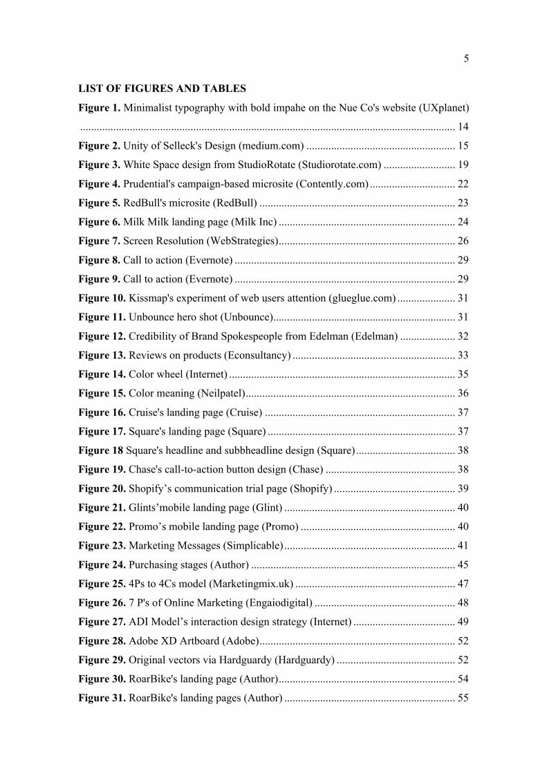
The first concept is the balance that describes the arrangement of visual weight to achieve
visual and psychological equilibrium according to Lohr, 2008. Four types of balance that
were identified by Evans and Thomas (2013), symmetrical, asymmetrical, radial,
crystallographic. Symmetrical balance is the type of balance that requires one half of the
canvas is an exact or mirrored of the adjacent half. To achieve symmetrical balance, the
designer should create a balance with the objects and harmonize with both positive and
negative spaces in the composition. The opposite of symmetrical balance is the
14
asymmetrical balance which is lack of symmetry but still looks balanced and still reaches
the visual expectation of the users. Radial balance focuses on features of circular shapes
with a design that extends and diverges into the center. According to Gatto, Porter and
Sellect in 2011, radial balance conveys more a sense of movement in the design. The last
type of balance is crystallographic or well known as the allover pattern or mosaic balance
that consists of repeating objects to create a uniform emphasis on the design.
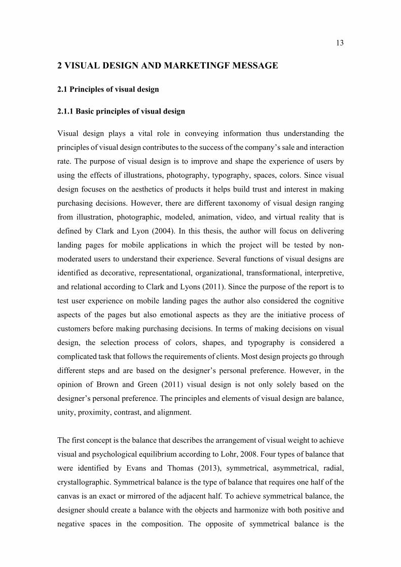
Figure 1. Minimalist typography with bold impahe on the Nue Co's website (UXplanet)
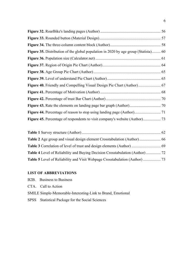
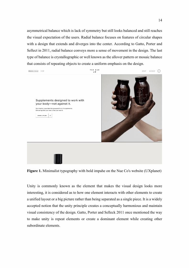
Unity is commonly known as the element that makes the visual design looks more
interesting, it is considered as to how one element interacts with other elements to create
a unified layout or a big picture rather than being separated as a single piece. It is a widely
accepted notion that the unity principle creates a conceptually harmonious and maintain
visual consistency of the design. Gatto, Porter and Selleck 2011 once mentioned the way
to make unity is repeat elements or create a dominant element while creating other
subordinate elements.
15
Figure 2. Unity of Selleck's Design (medium.com)
By using the overlays blue throughout the whole process of design the designer created a
consistent and sense of unity in the design perspective.
The third principle that contributes to the interaction rate is proximity. As good visual
identity proximity requires all the design elements that are placed together while other
unrelated items should be spaced apart to create a connected relationship of the layout.
Evans and Thomas, 2013 believed that the importance of space and position are genuine
matters of visual elements in the proximity. Other researchers also have the same opinion
as proximity is related to arranging elements that help customers perceive better ideas and
contributes to improving the consumption of information (Lohr, 2008; Brown and Green,
2011).
In many elements of design, contrast plays an undeniable role in creating differences in
customers’ moods (Gatto, Porter & Selleck, 2011). There are different ways to create a
contrast to direct the reader’s eyes such as using harmonizing colors, complementary, and
opposite colors to bring value to the whole picture (Lidwell, Holden and Butler, 2003;
Ware 2008; brown and Green, 2011; Gatto, Potter & Selleck, 2011). Objecting different
sizes can also be considered to achieve contrast ( Ware, 2008; Brown and Green, 2011;
16
Gatto, Potter & Selleck, 2011). An example can be to leave white space to bring in size
contrast. By using different shapes, typefaces, alignment and texture that also creates
noticeable value to bring emphasis (Gatto, Porter & Selleck, 2011). By bringing in
hierarchy Lohr, 2008; Evans & Thomas, 2013 believed that will dominate and emphasize
other elements and also make other elements standout from others.
The final principle that aligns with the imaginary line is alignment which Lohr, 2008
perceived as the key principal in visual design. Moreover, other researchers also stated
that by focusing on alignment it can make different effects and add more aesthetic aspects
in the design (Gatto, Porter & Selleck, 2011).
Understanding the basic principles of design is certainly vital for designers, artists, and
art researchers to work successfully on any design project. Besides these principles of
design mentioned above, other principles of design also contribute a huge impact on the
visual design aspect as grid, framing, shape, and typography.
2.1.2 Elements of visual design
Visual elements design is described as fundamental ideas that form a structure and to
convey visual messages to customers. Many researchers, painters, artists, and designers
have applied different theories about elements of visual design to make elegant shapes,
typography, and texture. The ideas of visual were presented in various design books and
resources including the painter and design theorist Maitland E.Graves (1902-1978) who
defined all the visual elements as line, shape, texture, and color in the book “The Art of
Color and Design (1941) as the main materials that built all the design”. Those elements
are also mentioned as tangible elements in design according to Evans and Thomas (2013)
in the book “Exploring the Elements of Design”. All elements will be described and
explained in the following section.
The first element is the line which is defined as the crucial part of the design, it is used to
emphasize the direction of the design or used as decoration and represent information in
infographics. Seven kinds of lines in visual design are outline, structure line, gesture line,
contour line, sketch line, and implied line by Gatto, Porter and Selleck (2011). The outline
is specified as an edge line that gives a visual structure and shows the relationship and
17
hierarchies of the content in the design. The outline is used in organizing the introduction,
thesis, body and also the conclusion of any written paper. While contour lines are used in
representing an imaginary line on a map or shape of objects, Sketch lines indicated lines
that are more detailed and consist of various straight lines to create shapes and objects.
Gesture line of called movement line that the designers converge and create shadows
intending to capture the subject’s movement, form, or structure. Another line that is well
mentioned is the implied line which refers to the path where the viewers’ eyes take as
they follow shapes, colors, and forms along various given paths. Implied lines are created
by numerous rows of objects. In other words, implied lines can be broken by different
intermittent marks or it may not be visible.
Besides all the types of lines mentioned, horizontal, vertical, diagonal, and curved lines
are as crucial as the main six lines. Especially vertical lines that represent stability or the
feeling of height and dignity while horizontal lines are used to denote movement and
dynamism. Horizontal lines tend to create a calm, peaceful, tranquil, and balanced
composition in the design. A diagonal line or called a sloping line is specified as a straight
line that connects two opposite corners of shape and the diagonal line does not go straight
up, down, or across. In design, a diagonal line makes the design more dynamic of energy
and motion. In terms of curved lines, it expresses fluid movement to create calm or
dynamic depending on the level of the curves. The less active of the curve the calmer of
the feeling for the appearance of exuberant emotionality from the audience.
The second element in visual design is mentioned in the two-dimensional option called
shape. The shape is made by lines and can be categorized into two different types as
geometric and organic according to Gatto, Porter and Selleck (2011). The geometric
shape is created by combining the specific amount of straight lines, curves, and points to
make a rectangle, circle, and triangle. Besides geometric shapes, organic shapes are
defined as unusual shapes that are asymmetrical or non-uniform in appearance. Shapes
can also address various concepts of positive or negative environments. For example, a
circle represents eternity since there is no beginning or end while squares and rectangles
indicate stability, honesty, and equality. In any successful design positive and negative
space aligned together can create a story by using creatively and intelligently
composition. The next important element is formed which is defined as three-dimensional
18
figures as spheres, cubes, pyramids, and cones. An object is considered as good quality
when it has depth, width, and height. Differences in design and in architecture can be
obviously seen in terms of form since most forms architecture are geometric. For
example, The Dutch architect Piet Blom’s Cube Village was built by various cubes, each
cube is a repetition of form to create rhythm and balance for the audience.
Color is acknowledged as a powerful element to bring up the emotion of customers in
visual design. It is intrinsically important that color sparks ideas express messages and
decides the mood of a design. An example is blue that has a positive effect on the human
mind and body, as the color spirit invokes the energy of sincerity and peace. The blue
color communicates significance, confidence, and unity in any conversation that intrigues
inspiration and trustworthiness in the design. While yellow stands for freshness,
happiness, and all the positive energy and enlightenment. Yellow can grab the attention
of customers, especially children, who are highly targeted in marketing advertisements
for spontaneous and unstable color. Some research papers stated that yellow has a
disturbing effect since it causes a distraction for employees in a yellow-painted room or
people becoming more critical and demanding in an overwhelmed yellow environment.
It is clarified that in different cultures, colors represent distinctive meaning and perception
(Collin Ware, 2008). Another indispensable element in visual design is a value which is
known as “Brightness and luminance” or called “the intensity of white in a color” (Lohr,
2008, p.262). Value refers to the relationship between light and dark color on an object
or layout where it illuminates the actual color of the subject in the design. Therefore,
value is considered a crucial element in the language of art to make the design more
elegant and create an eye-catching design. Nevertheless, the value does not create mood,
sentiment, and depth of objects since it emphasizes the focal point for the design of a
picture. Gatto, Porter & Selleck, 2011 expresses that lighter values of colors are connected
with high-keyed while low-keyed terms are aligned with dark value colors.
The element of design space indicates that areas where the objects exist including three-
dimensional and two-dimensional objects. In graphic design having space plays a vital
role to place objects or create both negative and positive space. Negative space is
described when the main shape generates other shapes that surround the main one.
19
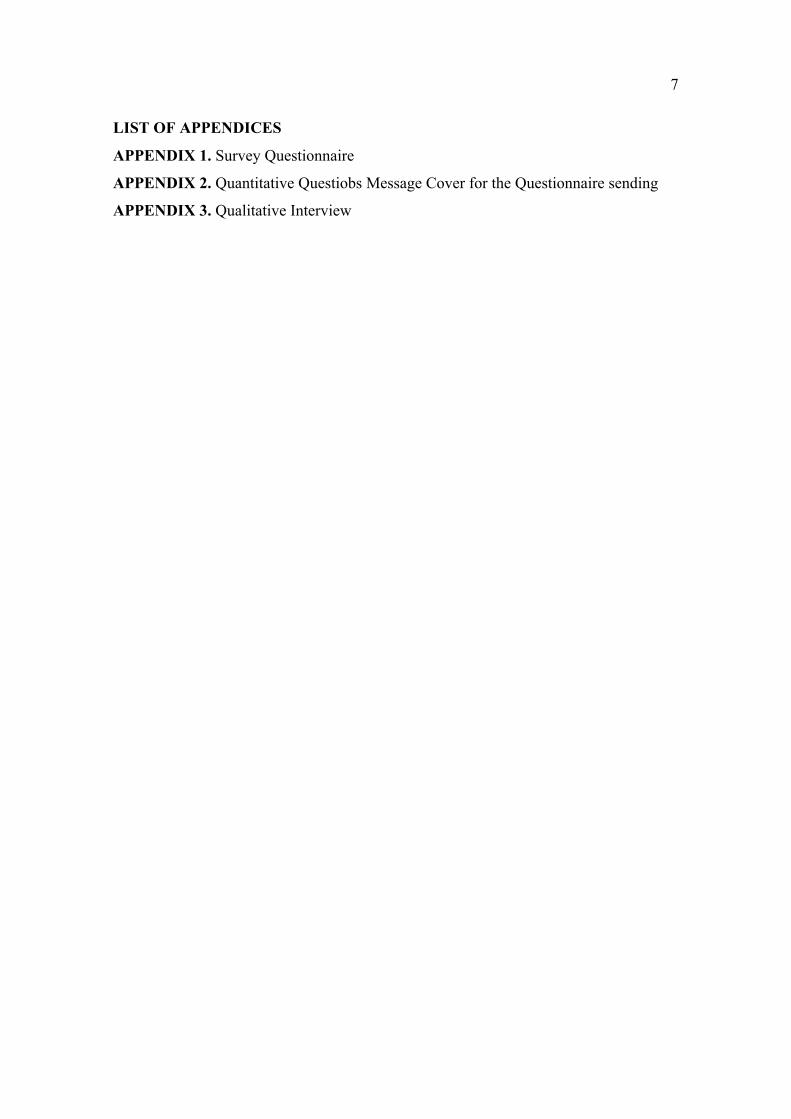
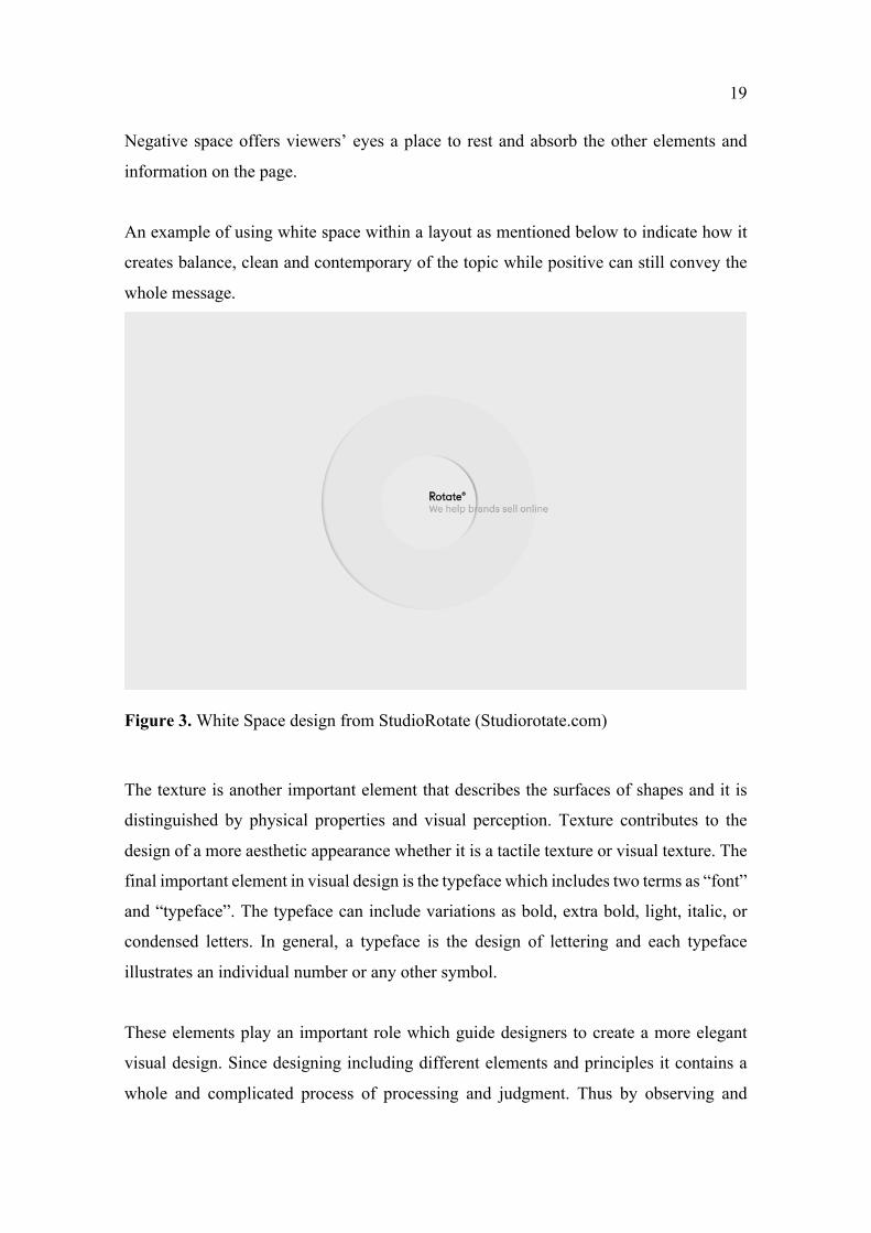
Negative space offers viewers’ eyes a place to rest and absorb the other elements and
information on the page.
An example of using white space within a layout as mentioned below to indicate how it
creates balance, clean and contemporary of the topic while positive can still convey the
whole message.
Figure 3. White Space design from StudioRotate (Studiorotate.com)
The texture is another important element that describes the surfaces of shapes and it is
distinguished by physical properties and visual perception. Texture contributes to the
design of a more aesthetic appearance whether it is a tactile texture or visual texture. The
final important element in visual design is the typeface which includes two terms as “font”
and “typeface”. The typeface can include variations as bold, extra bold, light, italic, or
condensed letters. In general, a typeface is the design of lettering and each typeface
illustrates an individual number or any other symbol.
These elements play an important role which guide designers to create a more elegant
visual design. Since designing including different elements and principles it contains a
whole and complicated process of processing and judgment. Thus by observing and
20
analyzing the actual visual design process it brings valuable knowledge by its far-reaching
impact in the design field.
2.2 Landing page
2.2.1 Definition of landing page and types of landing pages
A landing page is considered a web page that is standalone from company’s website and
was created for marketing, advertising or also other purposes as deliver company
information. It is defined as the word “Land” within the landing page indicates an area
where frequenters pay a visit to look for products after driving from online sources as
social media sites, internet, or other websites result. Landing pages are designed with
different and single goals, and its purposes are different from websites (Scherer 2015;
Harwood & Harwood 2009). Companies can design landing page for various purposes
from collecting emails, signup letters and even free providedd materials. The prolonged
purpose of the landing page is to continue with company marketing advertisement and to
encourage customers to take further actions on the website after visiting. Therefore,
targeting on a specific goal which is termed a call to action is a good solution to enhance
the conversation rates of company’s marketing campaigns, reduce company’s costs of
amassing a lead or sale or increase the level of trust from customers.
The primary objective of landing pages is to draw visitors’ attention to take actions that
were desired by the business as purchasing, visit other pages, watching advertisement
videos, downloading materials, and finally to drive traffic to improve company SEO.
Good landing pages hoist potential customers to the whole process of becoming
customers which converts them from web browsers to make any purchasing decisions.
The landing page can be a part of the principal website therefore, it has its special purpose
to receive traffic and perform marketing and advertising campaigns. Landing pages were
categorized into three major types as a main site landing page, microsite landing page,
and stand-alone landing page (ash et al 2012 and Gardner 2009). Depending on different
purposes of landing pages these types of landing pages perform a specific function in
achieving marketing funnel and customer insight.
21
The first type is the main site landing page or called the internal website landing page and
is considered as the most common type of landing page. It is acceptable as a homepage
or product interpretation page where it represents information about the product and other
specifications of selling items. While the product page displays certain products and
features to help users make decisions, the homepage illustrates different conversation
goals for various advertising campaigns.
The second category os landing page that is acknowledged as a site let of a miniature
version of a website is Microsite. A microsite is designed for a single audience with
branded content sites and is independent of the main website with its different URLs.
Microsite does not include company sponsoring names and odes not have infrastructure
of the primary site since its purpose is to indicate more detailed specifications of the
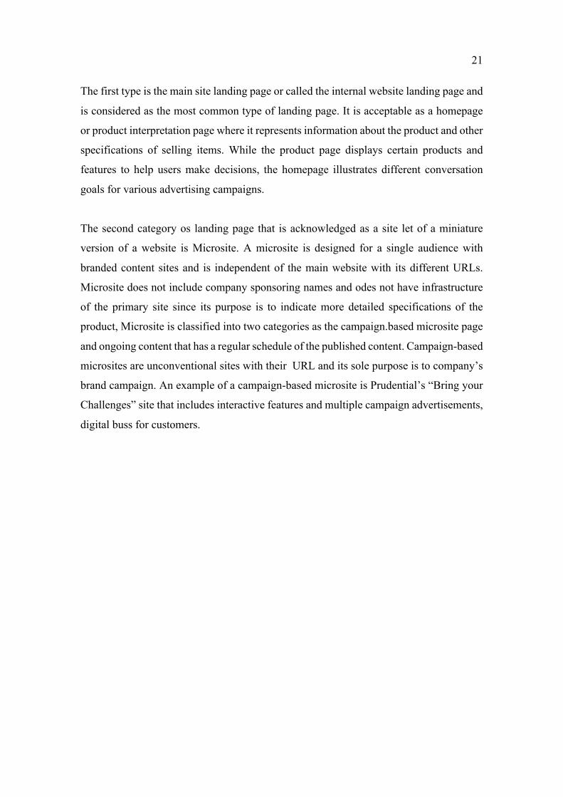
product, Microsite is classified into two categories as the campaign.based microsite page
and ongoing content that has a regular schedule of the published content. Campaign-based
microsites are unconventional sites with their URL and its sole purpose is to company’s
brand campaign. An example of a campaign-based microsite is Prudential’s “Bring your
Challenges” site that includes interactive features and multiple campaign advertisements,
digital buss for customers.
22
Figure 4. Prudential's campaign-based microsite (Contently.com)
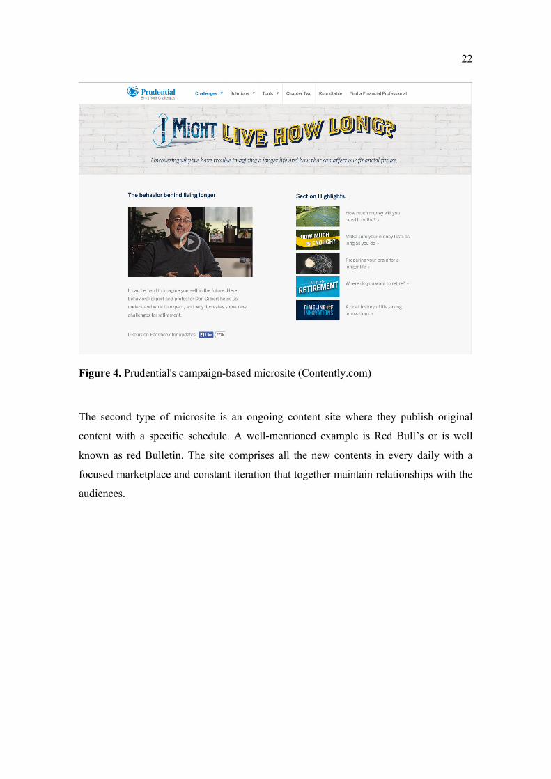
The second type of microsite is an ongoing content site where they publish original
content with a specific schedule. A well-mentioned example is Red Bull’s or is well
known as red Bulletin. The site comprises all the new contents in every daily with a
focused marketplace and constant iteration that together maintain relationships with the
audiences.
23
Figure 5. RedBull's microsite (RedBull)
Since a microsite is a miniature of a website it is created to bolster consistent sales
messages, services, and brand awareness which creates conversation for customers.
Therefore, to embark on microsites, companies focus on strategy and research carefully
before creating any message to communicate with customers. The third type of landing
page is a standalone landing page which is created for online marketing purposes.
Standalone landing pages can be the Lead-Capture, Informercial and Viral landing pages
or click-through pages where it offers advertising and persuades visitors to make
decisions on main websites, lead-capture landing page is designed to draw details of
visitor’s contacts as electronic mail, phone contacts. The role of the lead-capture landing
page is to elicit more trust and authority from other landing pages which contributes to
increasing sales of the company. While the Infomercial landing page boosts product and
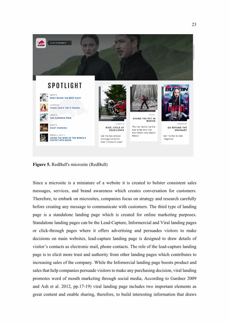
sales that help companies persuade visitors to make any purchasing decision, viral landing
promotes word of mouth marketing through social media, According to Gardner 2009
and Ash et al. 2012, pp.17-19) viral landing page includes two important elements as
great content and enable sharing, therefore, to build interesting information that draws
24
audience’s attraction the company should understand its products, markets, and
customers. An example from Milk Milk which experienced a successful landing page on
its website.
Figure 6. Milk Milk landing page (Milk Inc)
Besides all types of landing pages mentioned above, there are also differences of variation
such as squeeze page, splash landing page, unsubscribe landing page, and thank you
landing page. By understanding different types of landing pages, business goals, and
target audiences, the company will realize how to choose the right landing pages for its
campaign.
2.2.2 Landing page optimization and conversion process
Landing page optimization which is well known as conversion rate optimization is a
procedure with the aim to improve the website’s efficiency by enhancing landing page
elements. Since landing page optimization generates leads and creates meaningful
conversations with customers, it is considered a vital focus to improve performance in
business results. To achieve the highest conversion rate business should focus on
optimizing its landing pages since it reduces acquisition costs while maximizing the value
of the company’s advertisements to reach potential customers. A high conversion rate
illustrates the successful marketing strategies and indicates how well the company
25
conveys its messages to visitors. Therefore, by focusing on improving conversion rate the
company can enahnce its performance on websites and also across the mobile advertising
industry.
According to the research by D. Dave Chaffey a Digital strategist and content director of
an online marketing platform and publisher of Smart Insights indicates that website traffic
visits and sessions are increasing through mobile devices. The amount of mobile
conversion rate for Google Ads with the google search network in the year 2018 is 3.88
percent together with 0.72 percent which illustrates the network across all industries.
Therefore, to achieve a high conversion rate mobile phone also is considered as an
important indicator for achieving conversion targets of the business.
Conversion process including landing page and other multiple assets that cooperate
together to make the company’s conversion rate successful. The conversion rate is
calculated by the number of conversions/unique visitors (Ash et al. 2012, p.2013). The
conversion process is recommended to be defined and measurable beforehand in order to
understand the purpose and message that the company wants to send to target customers.
Marketing landing page conversion focused on gaining high traffic volume which
contributes to the increasing chances that visitors will take specific actions such as
purchase products, subscribe, or register for newsletters (Ash, 2008; Kanagal, 2015).
Consequently, marketing landing page conversion is simple but straightforward which
shapes the company to achieve its objectives and long-term strategies and it needs
thorough study to conduct more market research.
2.2.3 Elements of successful landing page
It is acknowledged that landing pages can do their job to advertise the product when it
can convince online visitors with memorable and desirable information.
26
A good fold
Therefore, the fold area is considered as a crucial part of the successful landing page since
it displays all important information without customers having to scroll down. According
to Ash et al. 2012, p.131 mentioned that a well-organized fold area should avoid
horizontal scrolling since it affects customers’ surfing experience. However, in some
cases as expensive products or services customers may need more detailed information
thus horizontal scrolling is acceptable for the customer’s making process.
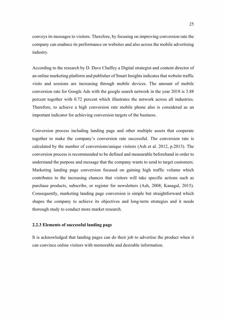
Harwood & Harwood 2009, I. 1389 indicated that information and text on landing pages
should be acceptable for customers scanning and skimming because online users do not
have time and pay attention to read a full page of paragraph words. Standard screen
solution and size browser of windows also be considered for designing the fold area
because it can affect the loading time of the page according to the research of ( hardwood
& Hardwood 2009, I.1389). Recommendation time for the website to fully load is within
two seconds while internet surfers will leave the page when the loading time exceeds
three seconds.
Below is the figure which indicates the percentage of readers to different screen solutions.
Figure 7. Screen Resolution (WebStrategies)
27
Good headline and subheading
According to experts, acquiring attention and elicit curiosity form customers landing
pages should involve strong compelling headlines that retain customers. Ash (2012) states
that the headline determines target customers or not therefore it plays a vital role in
conveying information to customers. The research of Ash (2012) mentioned that eight out
of ten online visitors only read the headline and decide to continue with the page or just
leave depending on the impression of the headline (Ash et at. 2012, p.191).
The heading is recommended to be related to customers’ needs with simple content and
concise information ( Harwood & Harwood 2009, I.1775). Besides grab customers’
attention, heading also increases readership, searchability, and the beginning of messages
for the audience. Morris (2014) stated in the research that the heading should not be too
general since it will not reach the potential online shoppers.
To write better and more attractive headlines Aaron (2013) suggested eight words
headlines which had a positive response in increasing over 21% of the click-through rate
(CTR) average. Contributing to a higher click-through rate is the colon (:), hyphen (-) and
exclamation mark (!!!) or by using some question words as “How to save…” or
questioning the readers.
Subheading may be needed in some cases when the main heading can not convey the
whole message to customers however subheading could be omitted when the headline is
more clarified.
Another element that is involved in the process of creating successful landing pages is
text in the body. Since body text conveys information and knowledge of the products to
customers it should be simplified and shortened with the length not exceeding four lines
and also without unexpected grammatical mistakes (Harwood & Harwood 2009, I. 1736).
The most crucial information or ideas also should be placed in the beginning or at the end
of the paragraph therefore customers can easily conclude the most essential data of the
products while reading through the whole long content.
Call to action button
As stated from some research “read more” or “see details” are recommended to be moved
to supporting pages since it is a good way to optimize the number of limited words on the
28
landing pages. It will reduce the total pages read of customers if more than 200 words are
added on the landing page (Ash et al. 2012, p. 191). In addition, promotion is
recommended not to be included on the landing pages since landing pages should be
objective and focus on conveying precise messages to visitors with information related to
the products.
An important element in landing pages is the call-to-action button which is suggested to
be included within the fold area toward where the customers are able to see without
scrolling to other pages. According to (Ash et al. 2012, p.68) messages if the call-to-
action should be clear, precise. Phrases for example “Book now, to get free delivery” in
order to have an effective call-to-action button. Depending on the type of landing page
designers will have different strategies in selecting words for the call-to-action button to
get the desired outcome. It is said that the goal of the call-to-action button is to convert
visitors to pursuing products consequently it should stand out from other elements of the
page. Aagaard (2013) indicates that colors of the call-to-action button contribute to the
positives result of the landing page, for example, orange and green colors are often used
in landing page design.
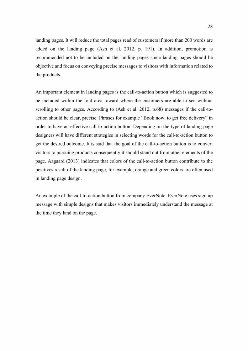
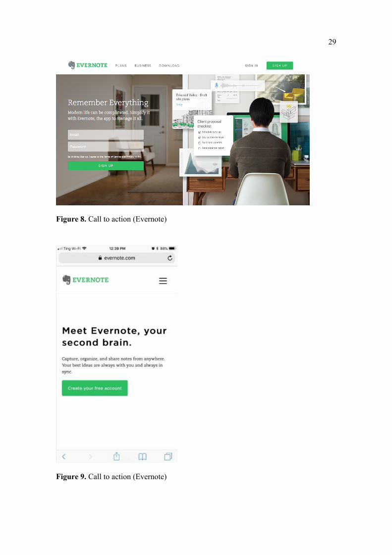
An example of the call-to-action button from company EverNote. EverNote uses sign up
message with simple designs that makes visitors immediately understand the message at
the time they land on the page.
29
Figure 8. Call to action (Evernote)
Figure 9. Call to action (Evernote)
30
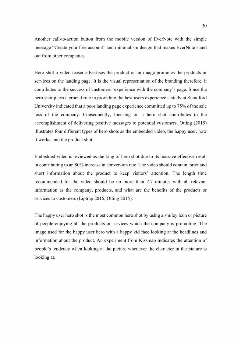
Another call-to-action button from the mobile version of EverNote with the simple
message “Create your free account” and minimalism design that makes EverNote stand
out from other companies.
Hero shot a video teaser advertises the product or an image promotes the products or
services on the landing page. It is the visual representation of the branding therefore, it
contributes to the success of customers’ experience with the company’s page. Since the
hero shot plays a crucial role in providing the best users experience a study at Standford
University indicated that a poor landing page experience committed up to 75% of the sale
loss of the company. Consequently, focusing on a hero shot contributes to the
accomplishment of delivering positive messages to potential customers. Otting (2015)
illustrates four different types of hero shots as the embedded video, the happy user, how
it works, and the product shot.
Embedded video is reviewed as the king of hero shot due to its massive effective result
in contributing to an 80% increase in conversion rate. The video should contain brief and
short information about the product to keep visitors’ attention. The length time
recommended for the video should be no more than 2.7 minutes with all relevant
information as the company, products, and what are the benefits of the products or
services to customers (Liptrap 2016; Otting 2015).
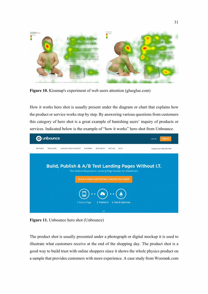
The happy user hero shot is the most common hero shot by using a smiley icon or picture
of people enjoying all the products or services which the company is promoting. The
image used for the happy user hero with a happy kid face looking at the headlines and
information about the product. An experiment from Kissmap indicates the attention of
people’s tendency when looking at the picture whenever the character in the picture is
looking at.
31
Figure 10. Kissmap's experiment of web users attention (glueglue.com)
How it works hero shot is usually present under the diagram or chart that explains how
the product or service works step by step. By answering various questions from customers
this category of hero shot is a great example of banishing users’ inquiry of products or
services. Indicated below is the example of “how it works” hero shot from Unbounce.
Figure 11. Unbounce hero shot (Unbounce)
The product shot is usually presented under a photograph or digital mockup it is used to
illustrate what customers receive at the end of the shopping day. The product shot is a
good way to build trust with online shoppers since it shows the whole physics product on
a sample that provides customers with more experience. A case study from Woorank.com
32
is well worth mentioning when the company added a model wearing bracelets to its page
and surprisingly with an increase of 271% in conversion rate.
Trust elements
Many potential visitors who pay a visit to an online shop do not trust an unknown random
company when landing for the first time on the company’s landing page. It means that
online shoppers will have a look at the overall landing page design, reading some
testimonials of the company products, skimming contents information, and design of the
landing pages top make further decisions. Those elements are mentioned as the trust
elements which are essential to have a far-reaching impact on visitors’ behavior and
customers’ trust in the level of the page’s credibility.
In addition, trust elements also involve the company’s privacy policies. Guarantee, terms
of use, sales and refunds, third-party validation, endorsements, and other trusted
mentioned partnerships in media as some companies used teaser videos of its CEO to
promote products or services. By using credible video the businesses gained positive
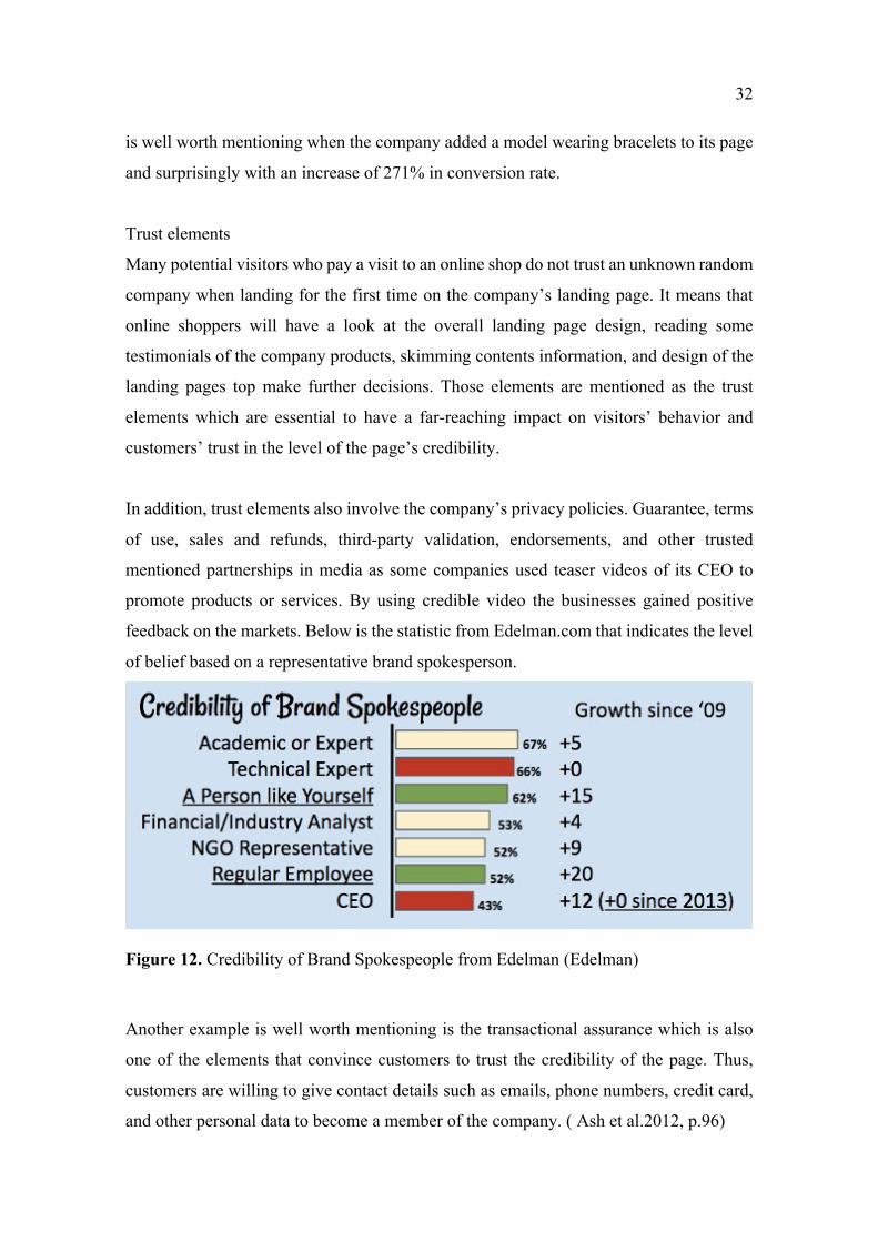
feedback on the markets. Below is the statistic from Edelman.com that indicates the level
of belief based on a representative brand spokesperson.
Figure 12. Credibility of Brand Spokespeople from Edelman (Edelman)
Another example is well worth mentioning is the transactional assurance which is also
one of the elements that convince customers to trust the credibility of the page. Thus,
customers are willing to give contact details such as emails, phone numbers, credit card,
and other personal data to become a member of the company. ( Ash et al.2012, p.96)
33
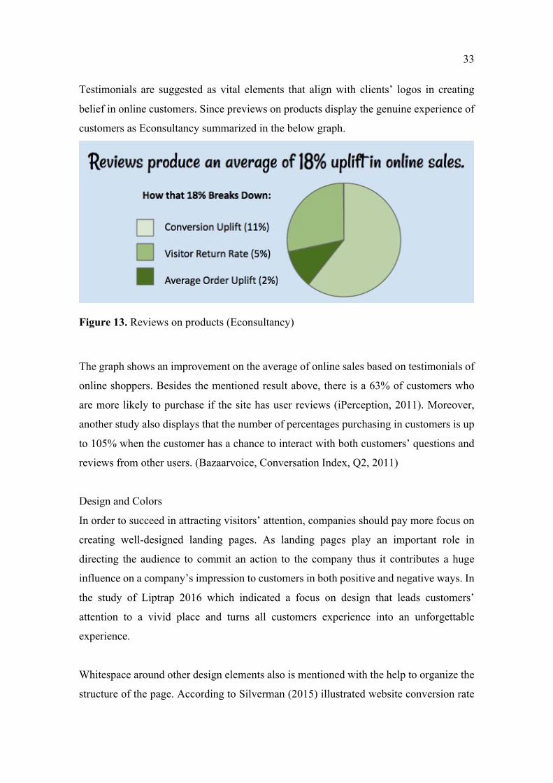
Testimonials are suggested as vital elements that align with clients’ logos in creating
belief in online customers. Since previews on products display the genuine experience of
customers as Econsultancy summarized in the below graph.
Figure 13. Reviews on products (Econsultancy)
The graph shows an improvement on the average of online sales based on testimonials of
online shoppers. Besides the mentioned result above, there is a 63% of customers who
are more likely to purchase if the site has user reviews (iPerception, 2011). Moreover,
another study also displays that the number of percentages purchasing in customers is up
to 105% when the customer has a chance to interact with both customers’ questions and
reviews from other users. (Bazaarvoice, Conversation Index, Q2, 2011)
Design and Colors
In order to succeed in attracting visitors’ attention, companies should pay more focus on
creating well-designed landing pages. As landing pages play an important role in
directing the audience to commit an action to the company thus it contributes a huge
influence on a company’s impression to customers in both positive and negative ways. In
the study of Liptrap 2016 which indicated a focus on design that leads customers’
attention to a vivid place and turns all customers experience into an unforgettable
experience.
Whitespace around other design elements also is mentioned with the help to organize the
structure of the page. According to Silverman (2015) illustrated website conversion rate
34
has a relation with the increase of the font size since it affects the readability of the
audience.
Besides some trust elements, Ash et al (2012) also considered some other aspects that
landing pages should not include for example contrast colors with gaudy text, visual
decorations which distract customers focus, irrelevant video and animation, or annoying
unnecessary pop-up windows which restrain online shoppers from reading content. Since
landing pages create the first impression and substantially improve high conversion rates
therefore it is essential to have a visually appealing design of landing pages.
In terms of the design aspect, color is the most powerful tool which is applied in design
to trigger a customer’s emotion. Since it is a crucial part of branding it is indicated that
the impression of the product or service has 62 – 90% strongly related to the use of color
in the design (Smith, 2004). Michael Campbell the author of the book Color persuasion:
The Science of using Color to Persuade and Influence Purchasing Decisions demonstrated
that colored background has the potential to stir the customer’s emotion deeply and also
online customer buying behavior to a greater extent. The right color usage has a positive
result in customers’ decisions making process as a well-combined color of the company
landing page creates credibility and aesthetics that make customers want to purchase the
product. Although there is no universal guidance on the usage of colors because they have
a different meaning in various contexts and cultures.
35
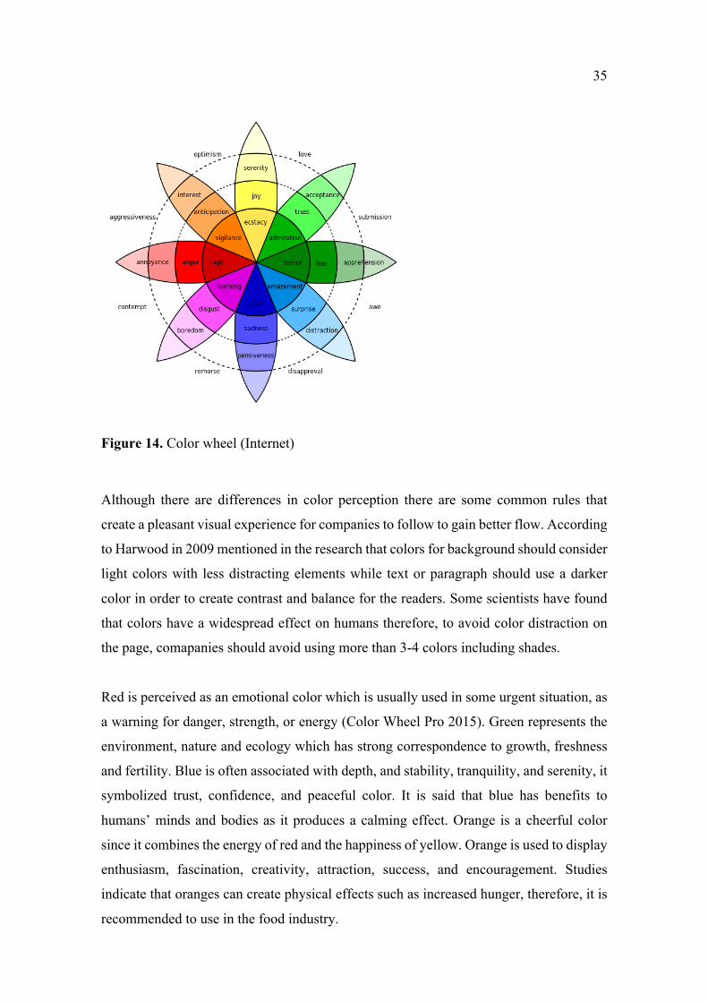
Figure 14. Color wheel (Internet)
Although there are differences in color perception there are some common rules that
create a pleasant visual experience for companies to follow to gain better flow. According
to Harwood in 2009 mentioned in the research that colors for background should consider
light colors with less distracting elements while text or paragraph should use a darker
color in order to create contrast and balance for the readers. Some scientists have found
that colors have a widespread effect on humans therefore, to avoid color distraction on
the page, comapanies should avoid using more than 3-4 colors including shades.
Red is perceived as an emotional color which is usually used in some urgent situation, as
a warning for danger, strength, or energy (Color Wheel Pro 2015). Green represents the
environment, nature and ecology which has strong correspondence to growth, freshness
and fertility. Blue is often associated with depth, and stability, tranquility, and serenity, it
symbolized trust, confidence, and peaceful color. It is said that blue has benefits to
humans’ minds and bodies as it produces a calming effect. Orange is a cheerful color
since it combines the energy of red and the happiness of yellow. Orange is used to display
enthusiasm, fascination, creativity, attraction, success, and encouragement. Studies
indicate that oranges can create physical effects such as increased hunger, therefore, it is
recommended to use in the food industry.
36
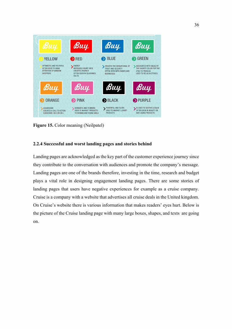
Figure 15. Color meaning (Neilpatel)
2.2.4 Successful and worst landing pages and stories behind
Landing pages are acknowledged as the key part of the customer experience journey since
they contribute to the conversation with audiences and promote the company’s message.
Landing pages are one of the brands therefore, investing in the time, research and budget
plays a vital role in designing engagement landing pages. There are some stories of
landing pages that users have negative experiences for example as a cruise company.
Cruise is a company with a website that advertises all cruise deals in the United kingdom.
On Cruise’s website there is various information that makes readers’ eyes hurt. Below is
the picture of the Cruise landing page with many large boxes, shapes, and texts are going
on.
37
Figure 16. Cruise's landing page (Cruise)
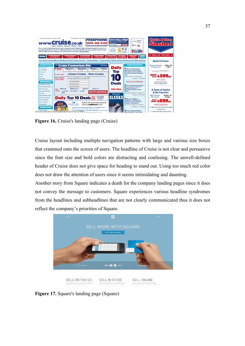
Cruise layout including multiple navigation patterns with large and various size boxes
that crammed onto the screen of users. The headline of Cruise is not clear and persuasive
since the font size and bold colors are distracting and confusing. The unwell-defined
header of Cruise does not give space for heading to stand out. Using too much red color
does not draw the attention of users since it seems intimidating and daunting.
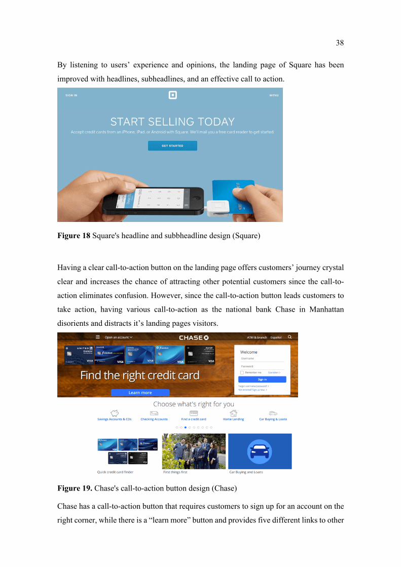
Another story from Square indicates a death for the company landing pages since it does
not convey the message to customers. Square experiences various headline syndromes
from the headlines and subheadlines that are not clearly communicated thus it does not
reflect the company’s priorities of Square.
Figure 17. Square's landing page (Square)
38
By listening to users’ experience and opinions, the landing page of Square has been
improved with headlines, subheadlines, and an effective call to action.
Figure 18 Square's headline and subbheadline design (Square)
Having a clear call-to-action button on the landing page offers customers’ journey crystal
clear and increases the chance of attracting other potential customers since the call-to-
action eliminates confusion. However, since the call-to-action button leads customers to
take action, having various call-to-action as the national bank Chase in Manhattan
disorients and distracts it’s landing pages visitors.
Figure 19. Chase's call-to-action button design (Chase)
Chase has a call-to-action button that requires customers to sign up for an account on the
right corner, while there is a “learn more” button and provides five different links to other
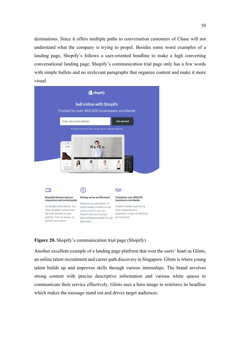
39
destinations. Since it offers multiple paths to conversation customers of Chase will not
understand what the company is trying to propel. Besides some worst examples of a
landing page, Shopify’s follows a user-oriented headline to make a high converting
conversational landing page. Shopify’s communication trial page only has a few words
with simple bullets and no irrelevant paragraphs that organize content and make it more
visual.
Figure 20. Shopify’s communication trial page (Shopify)
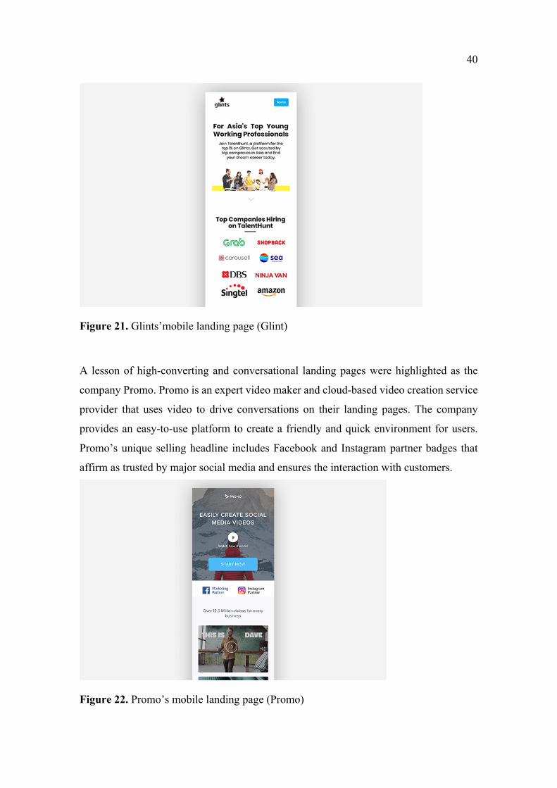
Another excellent example of a landing page platform that won the users’ heart as Glints,
an online talent recruitment and career path discovery in Singapore. Glints is where young
talent builds up and improves skills through various internships. The brand involves
strong content with precise descriptive information and various white spaces to
communicate their service effectively. Glints uses a hero image to reinforce its headline
which makes the message stand out and drives target audiences.
40
Figure 21. Glints’mobile landing page (Glint)
A lesson of high-converting and conversational landing pages were highlighted as the
company Promo. Promo is an expert video maker and cloud-based video creation service
provider that uses video to drive conversations on their landing pages. The company
provides an easy-to-use platform to create a friendly and quick environment for users.
Promo’s unique selling headline includes Facebook and Instagram partner badges that
affirm as trusted by major social media and ensures the interaction with customers.
Figure 22. Promo’s mobile landing page (Promo)
41
2.3 Marketing messages
2.3.1 Marketing message definition
In terms of “messaging” in marketing, it refers to how the organization communicates
about itself and its value for the business. A marketing message is acknowledged as any
type of media or communication which is designed to create a positive or negative
influence on customers. An effective message is acknowledged as the key point which
business uses to communicate about their brand, products, a campaign to target audience.
It is created with different purposes to transmit what the company provides to the
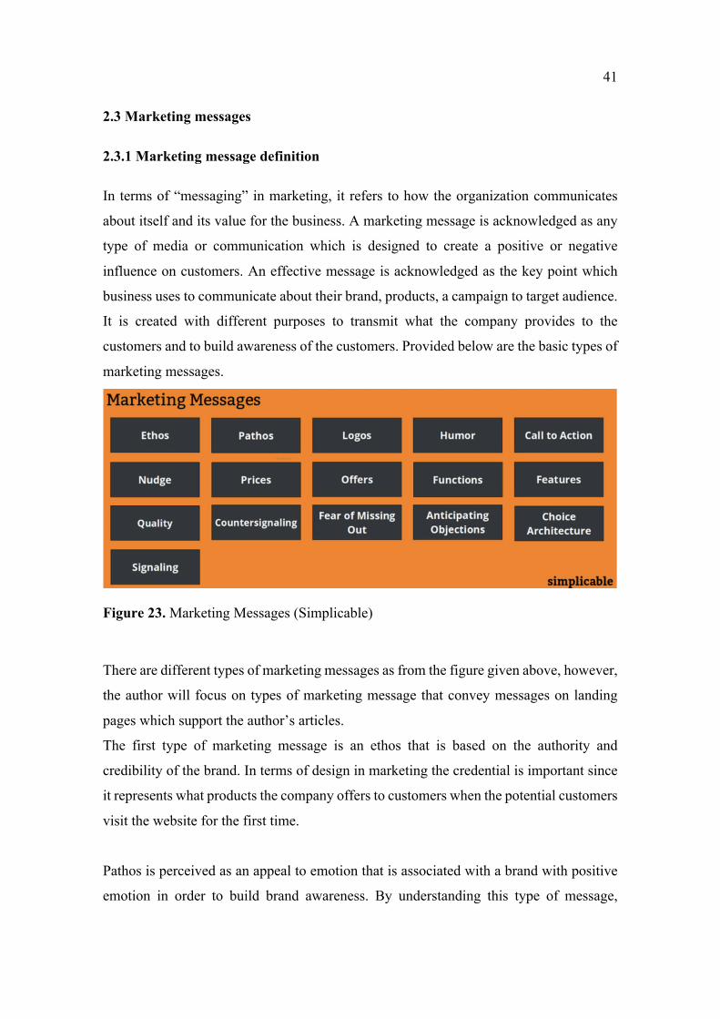
customers and to build awareness of the customers. Provided below are the basic types of
marketing messages.
Figure 23. Marketing Messages (Simplicable)
There are different types of marketing messages as from the figure given above, however,
the author will focus on types of marketing message that convey messages on landing
pages which support the author’s articles.
The first type of marketing message is an ethos that is based on the authority and
credibility of the brand. In terms of design in marketing the credential is important since
it represents what products the company offers to customers when the potential customers
visit the website for the first time.
Pathos is perceived as an appeal to emotion that is associated with a brand with positive
emotion in order to build brand awareness. By understanding this type of message,
42
advertisers, managers, and designers can apply pathos to appeal to the audience’s
emotions which helps increase user. Experience on the website.
Logos is a persuasive appeal to the audience’s logic which is applied to persuade the
audience with reason by using facts and figures.
Call to action is a direct and unambiguous command including the message “buy now”,
“Shop now” or “check it out” with the aim to drive conversion and convince customers
to make further decisions.
Storytelling is an interactive art of transforming information into interesting stories,
humorous and relatable topics that narrows down barriers between the company and the
customers.
Those types of messages mentioned above contribute to the success of the way the author
selects messages to convey to customers by evaluating requirements of the design project,
customer-oriented communication, the company’s vision and objectives. By
understanding different messages, the author is able to understand visual design and how
to apply those aspects into the landing pages to convey positive messages to customers.
2.3.2 The importance of marketing message
Marketing messages contribute to the success of a company’s goal of how the company’s
target customers receive the message that the company wants to convey. Marketing
message has a large impact on the audience since it distinguishes the company from other
competitors. Therefore, understanding markets, customers’ insight, and the company’s
products will reduce the risk of offering wrong messages which damage the brand’s
reputation.
An effective marketing message will address the key target customers while reinforcing
the company image. It is acknowledged as the strategy to engage customers to make
decisions, promote company products or services, and more importantly, it communicates
the company value proposition to the customers.
43
2.4 Customer
This section will represent the role of customers who drive revenues and play an
important role in business strategies. Analyzing customers’ needs, customers’ behaviors,
and perception is the first step in recognizing customers decision-making process,
customers’ purchasing journey and providing to customers suitable products and,
solutions.
2.4.1 Customer centric conversation
According to Schultz’s (1991) that describes the one-way communication of a company
towards its customers by sending a message through all the communication channels at
once. The company plays a role as a sender and the customer as a receiver, and it is
obvious that the communication will be controlled by the originator (Finne and
Grönroons, 2017). However, with the rapid increase of the internet and social media, it is
acknowledged that it requires considerable attention and needs to be focused on the
communication process between customers and organizations.
Finne and Grönroos, 2017 defined that customer-centric communication can be referred
to as the inside-out orientation. This is as a push communication with its one-way content
that was controlled by the organization. Inside-out orientation is well known as customer-
centric communication in which the customers are central in the communication process
while the business can receive feedback and improve the performance of the company
(Bruhn and Schnebelen, 2017).
There is no conflict in understanding customers are quintessential to provide valuable
services and experience. Since listening to customer needs, following the customer
journey, identify and analyze the market the business is able to meet customer
expectations, and higher it chances to gain loyalty from potential customers. Bruhn and
Schnebelen (2017) define key challenges that companies may encounter when executing
customer-centric approaches to the business’s marketing communication. There are
various problems involving for example the accession management when customers
contribute to the communication and content of the organization. As customers are able
to actively contribute to create content, the company will lose control while its customers
44
gain more power in the communication channels. The second challenge which was
highlighted is associated with the sustainable development of marketing on the internet.
Since it creates a dynamic environment that follows the climb of a new number of
generation audiences with different interests in content and knowledge base. The third
challenge for businesses is the comprehensive dialogues that are characterized to meet
the goal of satisfying the audience.
According to Jefferson and Tanton (2013), to be successful define the company’s role in
the obstreperous social media environment, businesses need to be cautious in preparing
its communication strategies, providing consistent content with useful topics, attractive
presentation, clear and visual cues information.
As online shopping is emerging nowadays, the vital role of website service is becoming
a prominent market sector. Therefore, it leads businesses to pay more attention to
communication with potential customers through every means to enhance the chances of
selling products, services, and open up new possibilities for the companies.
Based on the above, the author acknowledges that online communication plays a vital
role in conveying positive messages to audiences. Thus, by investing more in content,
visual design, and focusing on market buyer’s behavior the author believes that helps the
projects’ business to achieve sustainability goals in the current market environment.
2.4.2 Customer online behavior and online marketing mix
Behaviour is defined as the evident and noticeable response of an individual towards
others or towards a specific situation. With the rapid. Increase of the internet, online
shopping is experiencing a profound impact on its process in the digital world in ´recent
years.
Customers’ online behavior has been defined as the study of individuals, groups, or
organizations that together with the emergence of the internet show differences between
internet shopping behavior and offline shopping. A research conducted by Heskett et al
(1977, 2000) indicates that customers are more loyal and enthusiastic when they are more
satisfied. Customer orientation is crucial for the survival of the business, and also was
expressed by the study of Novak at al (2000) which indicated that the number of orders,
45
contacts, cancels, payments and returns are the main characteristics of the overall online
shopping experience of customers. In addition, visual elements contribute to 43% more
effective in persuading audiences to take further action (Randy Krum, 2017).
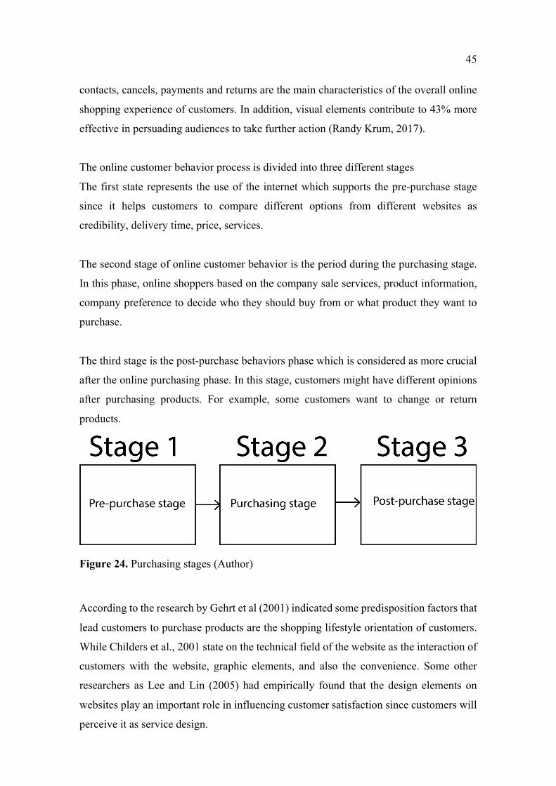
The online customer behavior process is divided into three different stages
The first state represents the use of the internet which supports the pre-purchase stage
since it helps customers to compare different options from different websites as
credibility, delivery time, price, services.
The second stage of online customer behavior is the period during the purchasing stage.
In this phase, online shoppers based on the company sale services, product information,
company preference to decide who they should buy from or what product they want to
purchase.
The third stage is the post-purchase behaviors phase which is considered as more crucial
after the online purchasing phase. In this stage, customers might have different opinions
after purchasing products. For example, some customers want to change or return
products.
Figure 24. Purchasing stages (Author)
According to the research by Gehrt et al (2001) indicated some predisposition factors that
lead customers to purchase products are the shopping lifestyle orientation of customers.
While Childers et al., 2001 state on the technical field of the website as the interaction of
customers with the website, graphic elements, and also the convenience. Some other
researchers as Lee and Lin (2005) had empirically found that the design elements on
websites play an important role in influencing customer satisfaction since customers will
perceive it as service design.
46
In addition, researchers Song and Zinkhan, 2003 identified the behavioral intentions
associated with visual elements on websites as repeat purchases, repetition of visits,
positive recommendation of company’s website illustrated customers’ positive attitude
towards the website and company. There were several tests on trust including the
elemental design on the website which indicated that it is one of the factors that affects
trust and decision making (Hampton-Sosa and Koufairs, 2005)
Several researchers have been conducting research on the influence of marketing mix
elements on the online customers’ mobile and web experience in searching the internet
or buying products and services online, indicated to the research that many researchers
agree that the marketing mix’s 4Ps and it’s modification 4Cs which include
communication are essential contributors to the customers’ experience.
From the definition of concept marketing mix written by Philip T.kotler Gary Armstrong
indicated that “Marketing Mix” as the art of science to select, keep, grow, and
communicate customer value. There are four components of the marketing mix model as
product, price, place, and promotion. However, with the development of internet
strategies and models are developed for online products that have changed the way
customers research and purchase products on websites.
The role of 4Ps was mentioned since it raised a debate on the value and how the marketing
mix contributes to conventional marketing as the tollkit (Dixon & Blois, 1983, Grönroos,
1994, Grummsson, 1997, Goldsmith, 1999). The modification version of 4Ps which is
called 4C was created by Robert F.Lauterborn in 1990 illustrated as below.

47
Figure 25. 4Ps to 4Cs model (Marketingmix.uk)
Online marketing also owns communication as the marketing mix element which refers
to the information provided on a website as the information about selling products or
conditions. Since this element affects the customer’s experience it plays an important role
in engaging with the organization’s audience. Websites belonging to a set of tools that
businesses can use to communicate besides personal selling, advertising, therefore
communication information on websites should connect company and customers’
experience to deliver company messages.
The version of 7P’s of online marketing represents a core marketing decision that brings
a better tool for business marketing. The 7P’s online marketing is an extended marketing
mix developed by (Booms and Bitner, 1981). In 7P’s online marketing mix physical
evidence in an online setting refers to a service experience of online marketing, since it
includes all the elements as design and engagement. All designed elements of the website
contribute to the crucial impact of customer experience and improve their decision
making significantly. It means that by investing in website content will boost company
search engine position to reach potential customers.
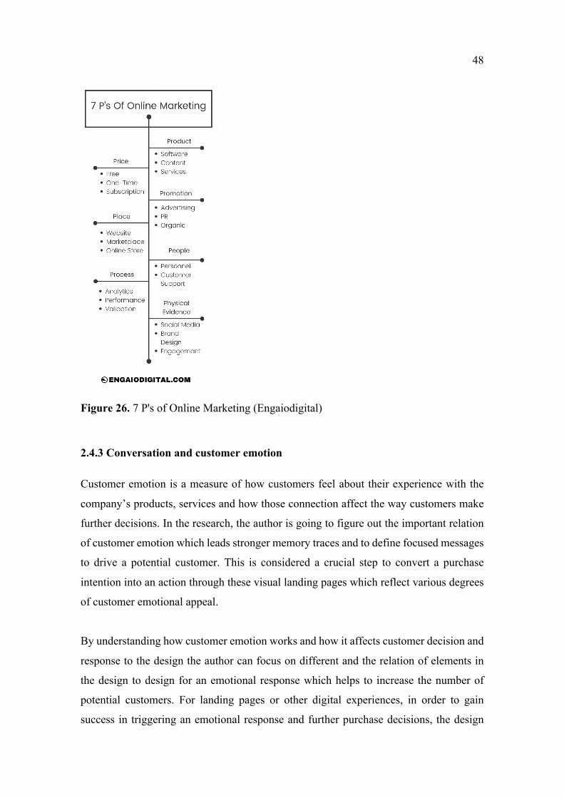
48
Figure 26. 7 P's of Online Marketing (Engaiodigital)
2.4.3 Conversation and customer emotion
Customer emotion is a measure of how customers feel about their experience with the
company’s products, services and how those connection affect the way customers make
further decisions. In the research, the author is going to figure out the important relation
of customer emotion which leads stronger memory traces and to define focused messages
to drive a potential customer. This is considered a crucial step to convert a purchase
intention into an action through these visual landing pages which reflect various degrees
of customer emotional appeal.
By understanding how customer emotion works and how it affects customer decision and
response to the design the author can focus on different and the relation of elements in
the design to design for an emotional response which helps to increase the number of
potential customers. For landing pages or other digital experiences, in order to gain
success in triggering an emotional response and further purchase decisions, the design
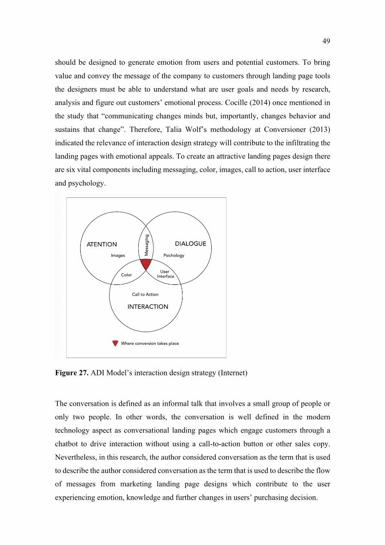
49
should be designed to generate emotion from users and potential customers. To bring
value and convey the message of the company to customers through landing page tools
the designers must be able to understand what are user goals and needs by research,
analysis and figure out customers’ emotional process. Cocille (2014) once mentioned in
the study that “communicating changes minds but, importantly, changes behavior and
sustains that change”. Therefore, Talia Wolf’s methodology at Conversioner (2013)
indicated the relevance of interaction design strategy will contribute to the infiltrating the
landing pages with emotional appeals. To create an attractive landing pages design there
are six vital components including messaging, color, images, call to action, user interface
and psychology.
Figure 27. ADI Model’s interaction design strategy (Internet)
The conversation is defined as an informal talk that involves a small group of people or
only two people. In other words, the conversation is well defined in the modern
technology aspect as conversational landing pages which engage customers through a
chatbot to drive interaction without using a call-to-action button or other sales copy.
Nevertheless, in this research, the author considered conversation as the term that is used
to describe the author considered conversation as the term that is used to describe the flow
of messages from marketing landing page designs which contribute to the user
experiencing emotion, knowledge and further changes in users’ purchasing decision.
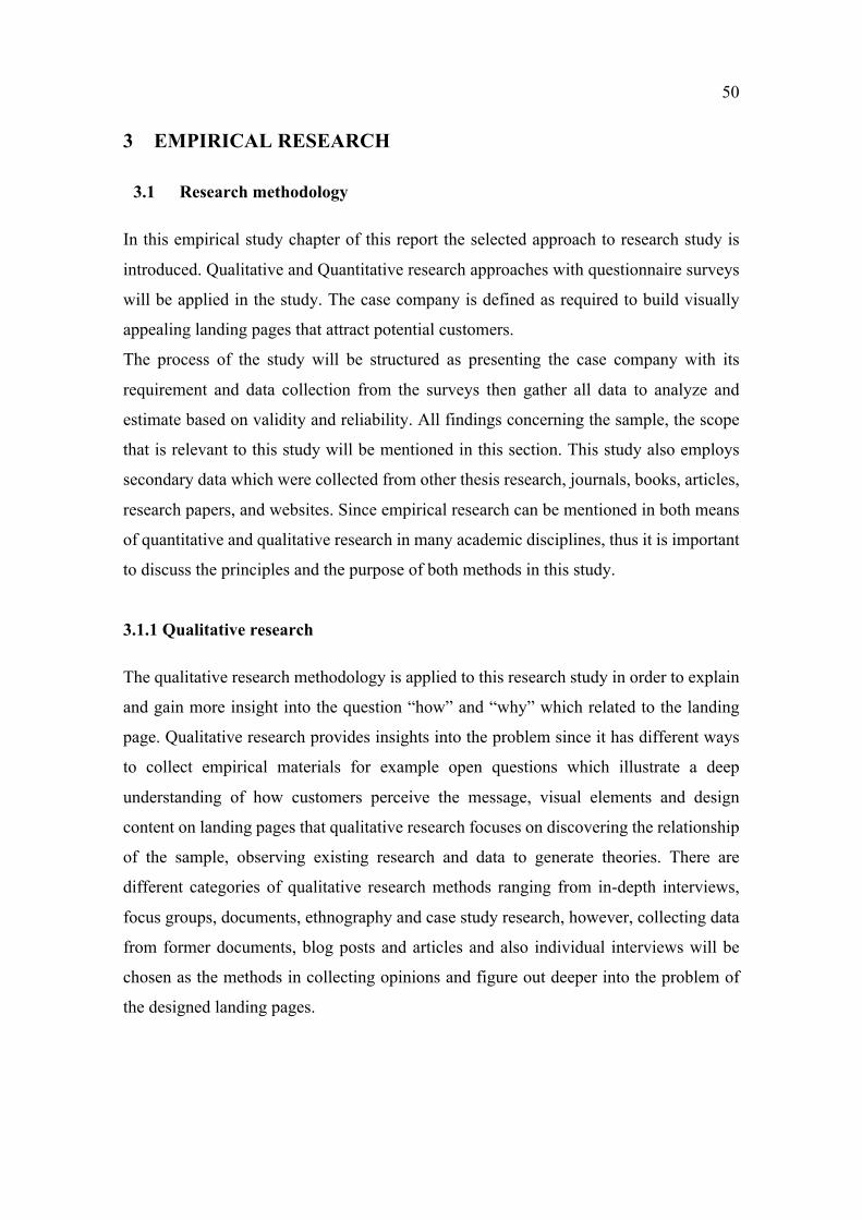
50
3 EMPIRICAL RESEARCH
3.1 Research methodology
In this empirical study chapter of this report the selected approach to research study is
introduced. Qualitative and Quantitative research approaches with questionnaire surveys
will be applied in the study. The case company is defined as required to build visually
appealing landing pages that attract potential customers.
The process of the study will be structured as presenting the case company with its
requirement and data collection from the surveys then gather all data to analyze and
estimate based on validity and reliability. All findings concerning the sample, the scope
that is relevant to this study will be mentioned in this section. This study also employs
secondary data which were collected from other thesis research, journals, books, articles,
research papers, and websites. Since empirical research can be mentioned in both means
of quantitative and qualitative research in many academic disciplines, thus it is important
to discuss the principles and the purpose of both methods in this study.
3.1.1 Qualitative research
The qualitative research methodology is applied to this research study in order to explain
and gain more insight into the question “how” and “why” which related to the landing
page. Qualitative research provides insights into the problem since it has different ways
to collect empirical materials for example open questions which illustrate a deep
understanding of how customers perceive the message, visual elements and design
content on landing pages that qualitative research focuses on discovering the relationship
of the sample, observing existing research and data to generate theories. There are
different categories of qualitative research methods ranging from in-depth interviews,
focus groups, documents, ethnography and case study research, however, collecting data
from former documents, blog posts and articles and also individual interviews will be
chosen as the methods in collecting opinions and figure out deeper into the problem of
the designed landing pages.
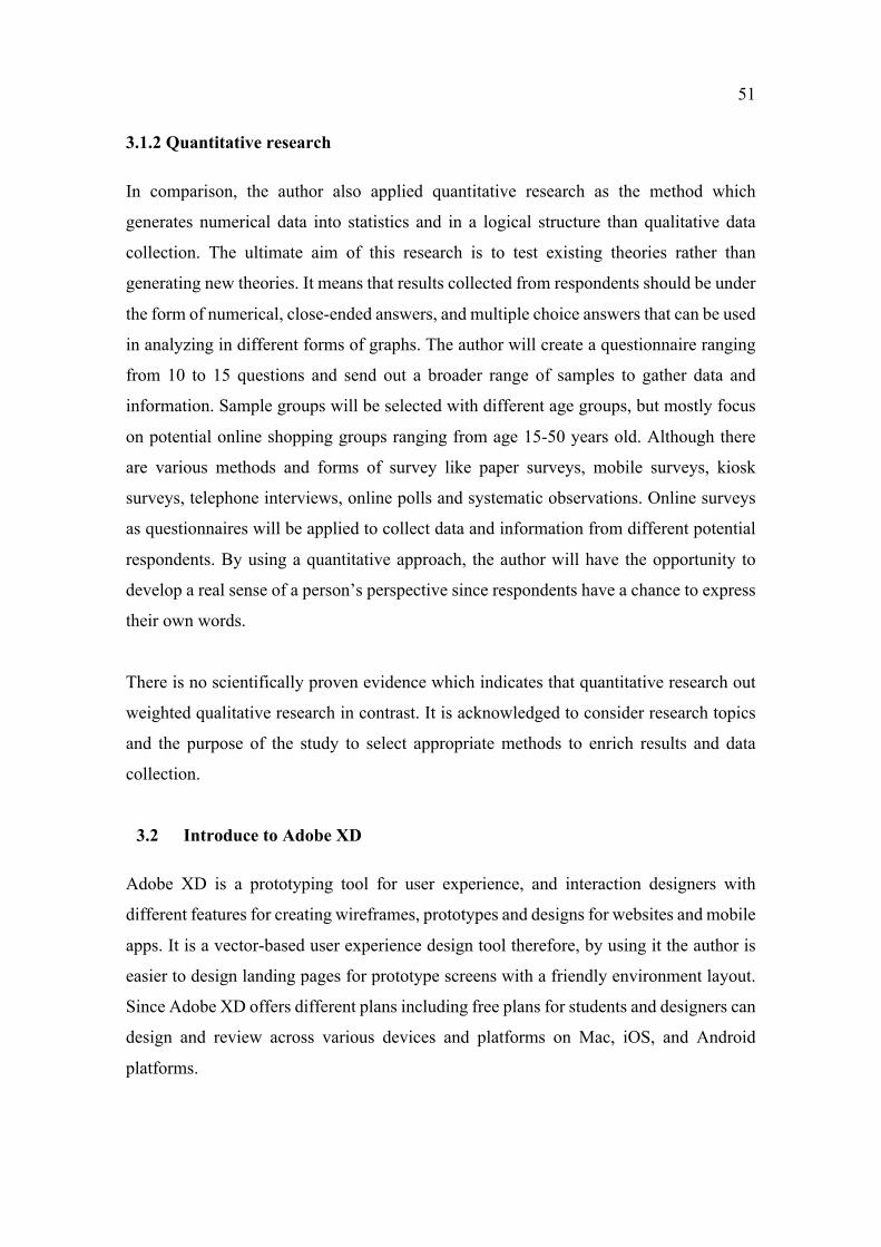
51
3.1.2 Quantitative research
In comparison, the author also applied quantitative research as the method which
generates numerical data into statistics and in a logical structure than qualitative data
collection. The ultimate aim of this research is to test existing theories rather than
generating new theories. It means that results collected from respondents should be under
the form of numerical, close-ended answers, and multiple choice answers that can be used
in analyzing in different forms of graphs. The author will create a questionnaire ranging
from 10 to 15 questions and send out a broader range of samples to gather data and
information. Sample groups will be selected with different age groups, but mostly focus
on potential online shopping groups ranging from age 15-50 years old. Although there
are various methods and forms of survey like paper surveys, mobile surveys, kiosk
surveys, telephone interviews, online polls and systematic observations. Online surveys
as questionnaires will be applied to collect data and information from different potential
respondents. By using a quantitative approach, the author will have the opportunity to
develop a real sense of a person’s perspective since respondents have a chance to express
their own words.
There is no scientifically proven evidence which indicates that quantitative research out
weighted qualitative research in contrast. It is acknowledged to consider research topics
and the purpose of the study to select appropriate methods to enrich results and data
collection.
3.2 Introduce to Adobe XD
Adobe XD is a prototyping tool for user experience, and interaction designers with
different features for creating wireframes, prototypes and designs for websites and mobile
apps. It is a vector-based user experience design tool therefore, by using it the author is
easier to design landing pages for prototype screens with a friendly environment layout.
Since Adobe XD offers different plans including free plans for students and designers can
design and review across various devices and platforms on Mac, iOS, and Android
platforms.
52
Figure 28. Adobe XD Artboard (Adobe)
The project window is indicated above for the iPhone X/XS screens including different
tools and options for design. The author can apply various graphics, by using a pen tool,
picture, and other available elements which are needed for the design.
Figure 29. Original vectors via Hardguardy (Hardguardy)
53
4 DESIGN FOR THE PROJECT
4.1 Introduction to the project
The project is developed based on a company name Roar Bike which is a small run
company selling bikes in the market. The company sold exclusively products from its
website offering three models of bike for customers to select from Siamese, Sphynx, and
Bengal. As e-commerce websites play an important role for the company to runt its
business, Roar Bike’s main plan is to focus on delivering purchases and encourage people
to become its members of the company. Selling abroad is a long-term goal therefore,
RoarBike prefers to convey simple but concise information through its website. RoarBike
wants to offer its potential customers simple messages to advertise its products and bring
the emotional stories of bikes to customers. Some requirements of the company include
a clean design with visual elements that attract online shoppers and use the company’s
main color to create brand awareness to its customers.
4.2 Understanding customers
In the competitive marketplace of the digital age, as a small business Roar Bike target its
market both domestic customers and global customer. Thus Roar Bike’s target online
audience is people from aged 15 to 50 who likely to spend time and purchase through
online platforms. Since there is highly an interaction between age and online shopping
experience it is beneficial for the researcher to understand who to target and what to
provide for the potential customers. It is conventional wisdom to indicate that young
generations and adults have benefits in online platforms in terms of digital learning and
adapting to online environment while in older generation are less familiar with the digital
environment. Compare to young counterparts senior generation prefer to traditional
shopping rather than the online environment.
By understanding the characteristics of the potential group from 15 to 50 Roar Bike is
able to evaluate strategies which are suitable for its customers. It is highly acknowledged
that it is a rough indicator which their shopping experience accumulated through the
times. The younger group has less experience in traditional shopping but easier to adapt
to digitial shopping environment. As a result of several studies, the young generation
purchases online more than the senior generation. As a study by Stafford et al illustrates
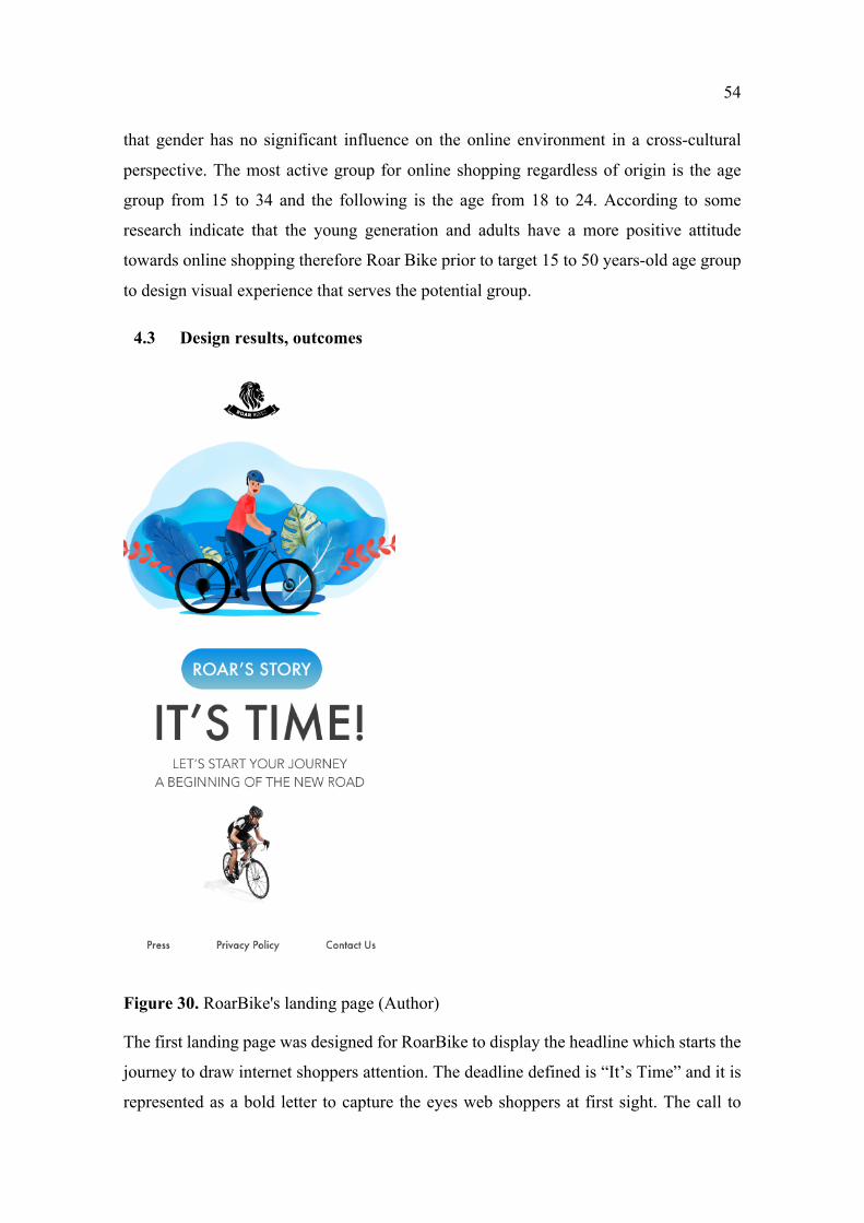
54
that gender has no significant influence on the online environment in a cross-cultural
perspective. The most active group for online shopping regardless of origin is the age
group from 15 to 34 and the following is the age from 18 to 24. According to some
research indicate that the young generation and adults have a more positive attitude
towards online shopping therefore Roar Bike prior to target 15 to 50 years-old age group
to design visual experience that serves the potential group.
4.3 Design results, outcomes
Figure 30. RoarBike's landing page (Author)
The first landing page was designed for RoarBike to display the headline which starts the
journey to draw internet shoppers attention. The deadline defined is “It’s Time” and it is
represented as a bold letter to capture the eyes web shoppers at first sight. The call to
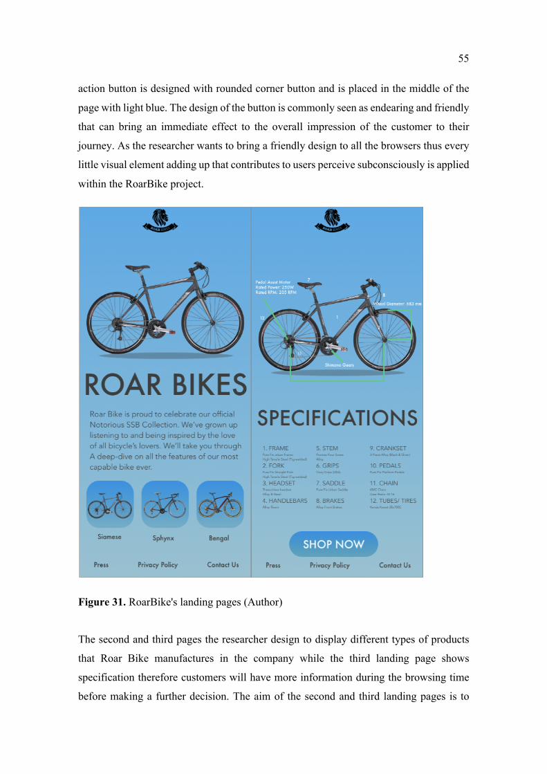
55
action button is designed with rounded corner button and is placed in the middle of the
page with light blue. The design of the button is commonly seen as endearing and friendly
that can bring an immediate effect to the overall impression of the customer to their
journey. As the researcher wants to bring a friendly design to all the browsers thus every
little visual element adding up that contributes to users perceive subconsciously is applied
within the RoarBike project.
Figure 31. RoarBike's landing pages (Author)
The second and third pages the researcher design to display different types of products
that Roar Bike manufactures in the company while the third landing page shows
specification therefore customers will have more information during the browsing time
before making a further decision. The aim of the second and third landing pages is to
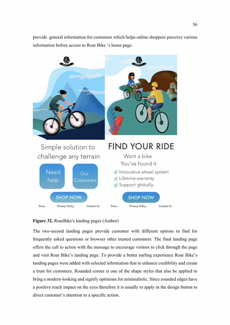
56
provide general information for customers which helps online shoppers perceive various
information before access to Roar Bike ‘s home page.
Figure 32. RoarBike's landing pages (Author)
The two-second landing pages provide customer with different options to find for
frequently asked questions or browser other trusted customers. The final landing page
offers the call to action with the message to encourage visitors to click through the page
and visit Roar Bike’s landing page. To provide a better surfing experience Roar Bike’s
landing pages were added with selected information that to enhance credibility and create
a trust for customers. Rounded corner is one of the shape styles that also be applied to
bring a modern-looking and signify optimism for minimalistic. Since rounded edges have
a positive reach impact on the eyes therefore it is usually to apply in the design button to
direct customer’s attention to a specific action.
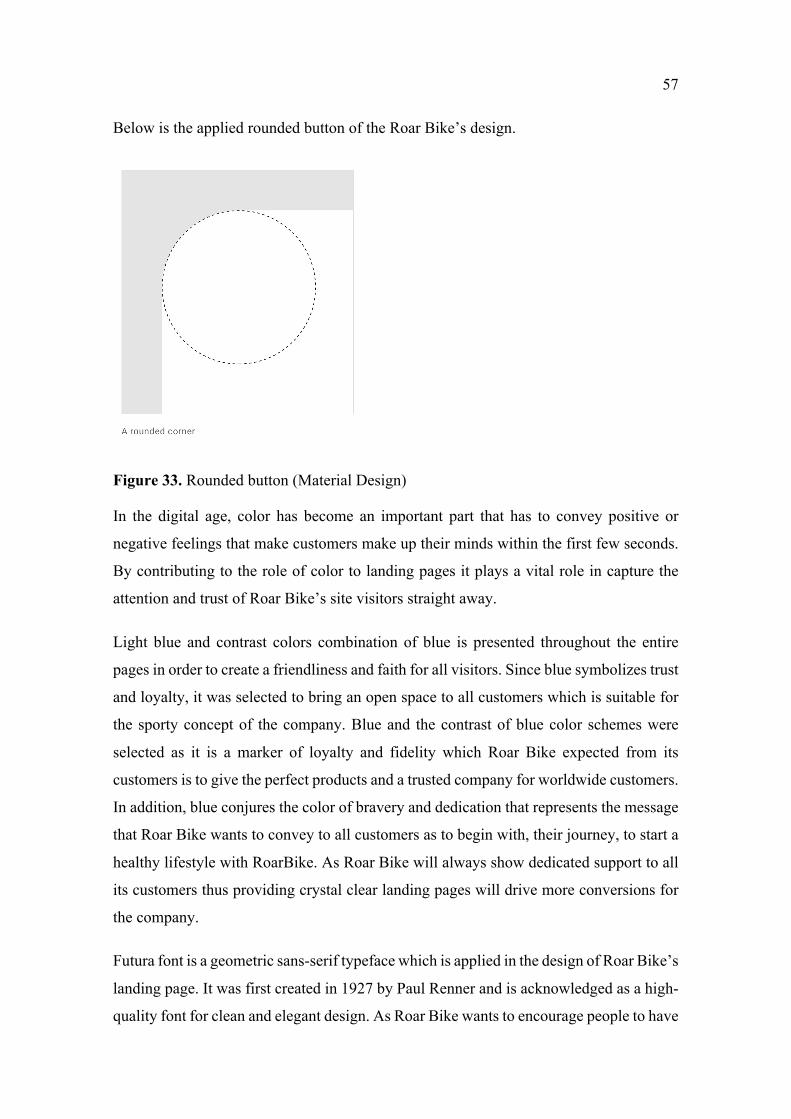
57
Below is the applied rounded button of the Roar Bike’s design.
Figure 33. Rounded button (Material Design)
In the digital age, color has become an important part that has to convey positive or
negative feelings that make customers make up their minds within the first few seconds.
By contributing to the role of color to landing pages it plays a vital role in capture the
attention and trust of Roar Bike’s site visitors straight away.
Light blue and contrast colors combination of blue is presented throughout the entire
pages in order to create a friendliness and faith for all visitors. Since blue symbolizes trust
and loyalty, it was selected to bring an open space to all customers which is suitable for
the sporty concept of the company. Blue and the contrast of blue color schemes were
selected as it is a marker of loyalty and fidelity which Roar Bike expected from its
customers is to give the perfect products and a trusted company for worldwide customers.
In addition, blue conjures the color of bravery and dedication that represents the message
that Roar Bike wants to convey to all customers as to begin with, their journey, to start a
healthy lifestyle with RoarBike. As Roar Bike will always show dedicated support to all
its customers thus providing crystal clear landing pages will drive more conversions for
the company.
Futura font is a geometric sans-serif typeface which is applied in the design of Roar Bike’s
landing page. It was first created in 1927 by Paul Renner and is acknowledged as a high-
quality font for clean and elegant design. As Roar Bike wants to encourage people to have
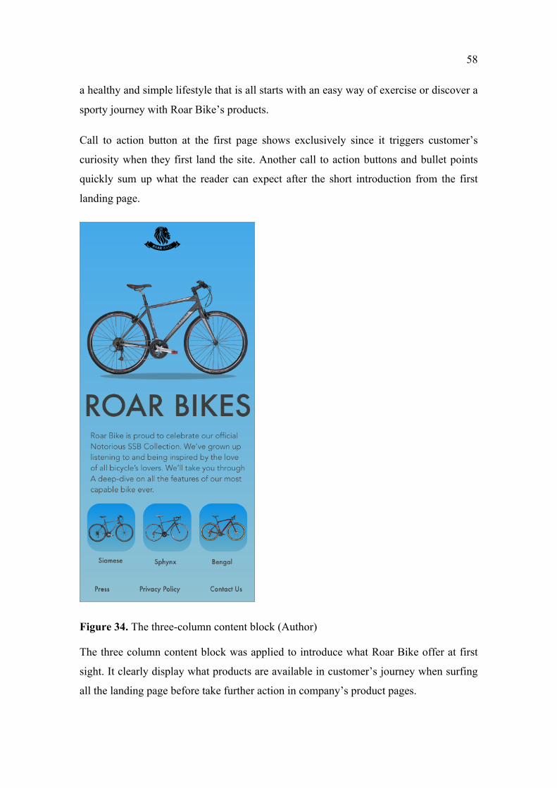
58
a healthy and simple lifestyle that is all starts with an easy way of exercise or discover a
sporty journey with Roar Bike’s products.
Call to action button at the first page shows exclusively since it triggers customer’s
curiosity when they first land the site. Another call to action buttons and bullet points
quickly sum up what the reader can expect after the short introduction from the first
landing page.
Figure 34. The three-column content block (Author)
The three column content block was applied to introduce what Roar Bike offer at first
sight. It clearly display what products are available in customer’s journey when surfing
all the landing page before take further action in company’s product pages.
59
5 DATA ANALYSIS
5.1 Data collection
To collection quantitative data it begins with conducting a research questionnaire for
online customers to obtain different perspectives. Survey questions will be based mostly
on landing page topics and from previous qualitative data to gain insight into how
customers think on landing page designs. Suggestions for improvement and other users’
experience will be given to enrich the information for the research. Important data
collection in this method will be used to understand customers’ experience in the design
and how to find a suitable solution for RoarBike in conveying marketing messages to
online shoppers. Since this mode of survey provides flexibility for the researcher and also
other users to fill in the questionnaire, the researcher will conduct it in different hours of
days. There is a limitation of the age group for this method and a random of respondents
for the survey will be utilized for the objectivity of the finalized results. The data
collection method to be indicated in the research is a probability which is considered to
give the most reliable result. More specifically, simple random samples will be applied
and combined with purposive sampling in order to select who to ask to participate in the
study. The population illustrated in this research is online shoppers from selected age
groups who are under 50-year-old. Researchers combined two different types of sampling
methods to identify a representative sample that suits the need and also based on who has
the potential to browse and do online shopping on smart devices as mobile phones. Once
the data is collected, the researcher will analyze based on previous empirical data
collected will be provided as to indicate the confidence of the survey collection.
Prior sections and analyzed data will be combined together to conclude the final
conclusions. Lessons learned and improvements from respondents will be drawn up in
discussion with the primary goal to understand research objectives and finalize a well-
designed landing page for RoarBike company.
To measure the number of necessary samples to meet the statistical constraints, the
researcher first to know the total number of the world population and find out the
percentages of the population from 15 to 50-year-old group to have a precise number.
Data collection for the samples is being collected through Statista website, as a source to
accumulate the percentages of the world population by age groups in the year 2020.
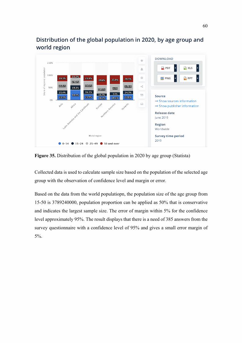
60
Figure 35. Distribution of the global population in 2020 by age group (Statista)
Collected data is used to calculate sample size based on the population of the selected age
group with the observation of confidence level and margin or error.
Based on the data from the world populatiopn, the population size of the age group from
15-50 is 3789240000, population proportion can be applied as 50% that is conservative
and indicates the largest sample size. The error of margin within 5% for the confidence
level approximately 95%. The result displays that there is a need of 385 answers from the
survey questionnaire with a confidence level of 95% and gives a small error margin of
5%.
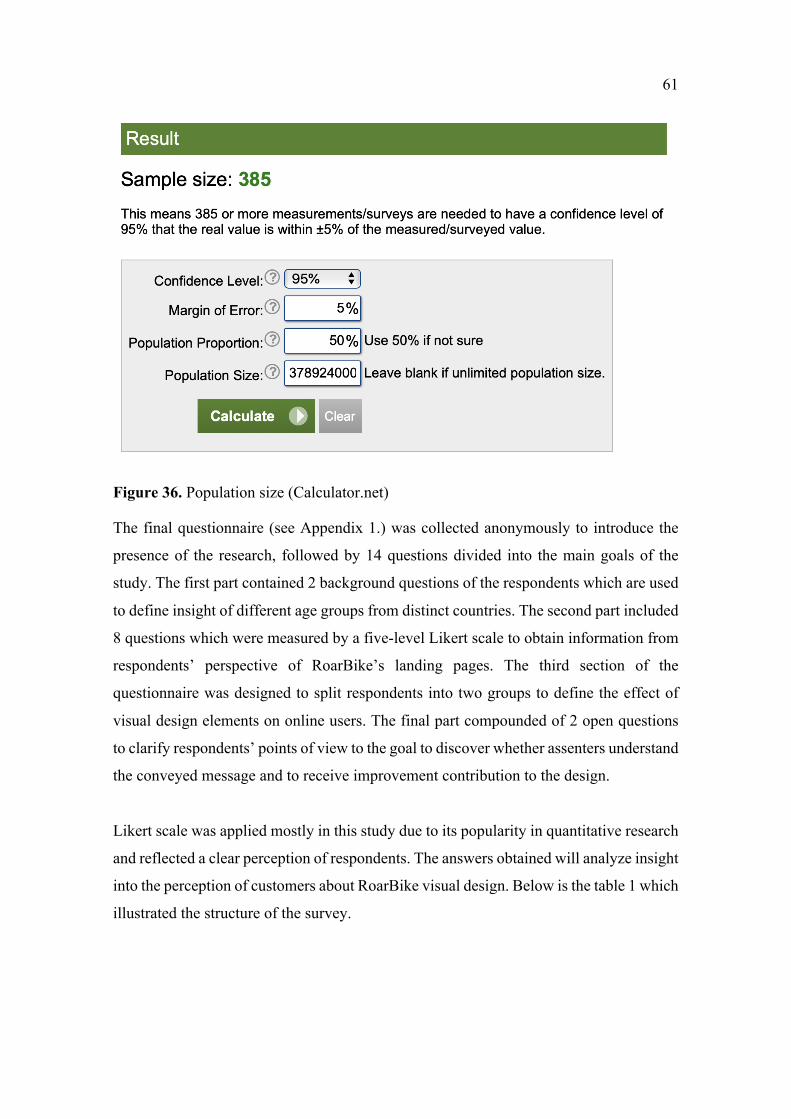
61
Figure 36. Population size (Calculator.net)
The final questionnaire (see Appendix 1.) was collected anonymously to introduce the
presence of the research, followed by 14 questions divided into the main goals of the
study. The first part contained 2 background questions of the respondents which are used
to define insight of different age groups from distinct countries. The second part included
8 questions which were measured by a five-level Likert scale to obtain information from
respondents’ perspective of RoarBike’s landing pages. The third section of the
questionnaire was designed to split respondents into two groups to define the effect of
visual design elements on online users. The final part compounded of 2 open questions
to clarify respondents’ points of view to the goal to discover whether assenters understand
the conveyed message and to receive improvement contribution to the design.
Likert scale was applied mostly in this study due to its popularity in quantitative research
and reflected a clear perception of respondents. The answers obtained will analyze insight
into the perception of customers about RoarBike visual design. Below is the table 1 which
illustrated the structure of the survey.
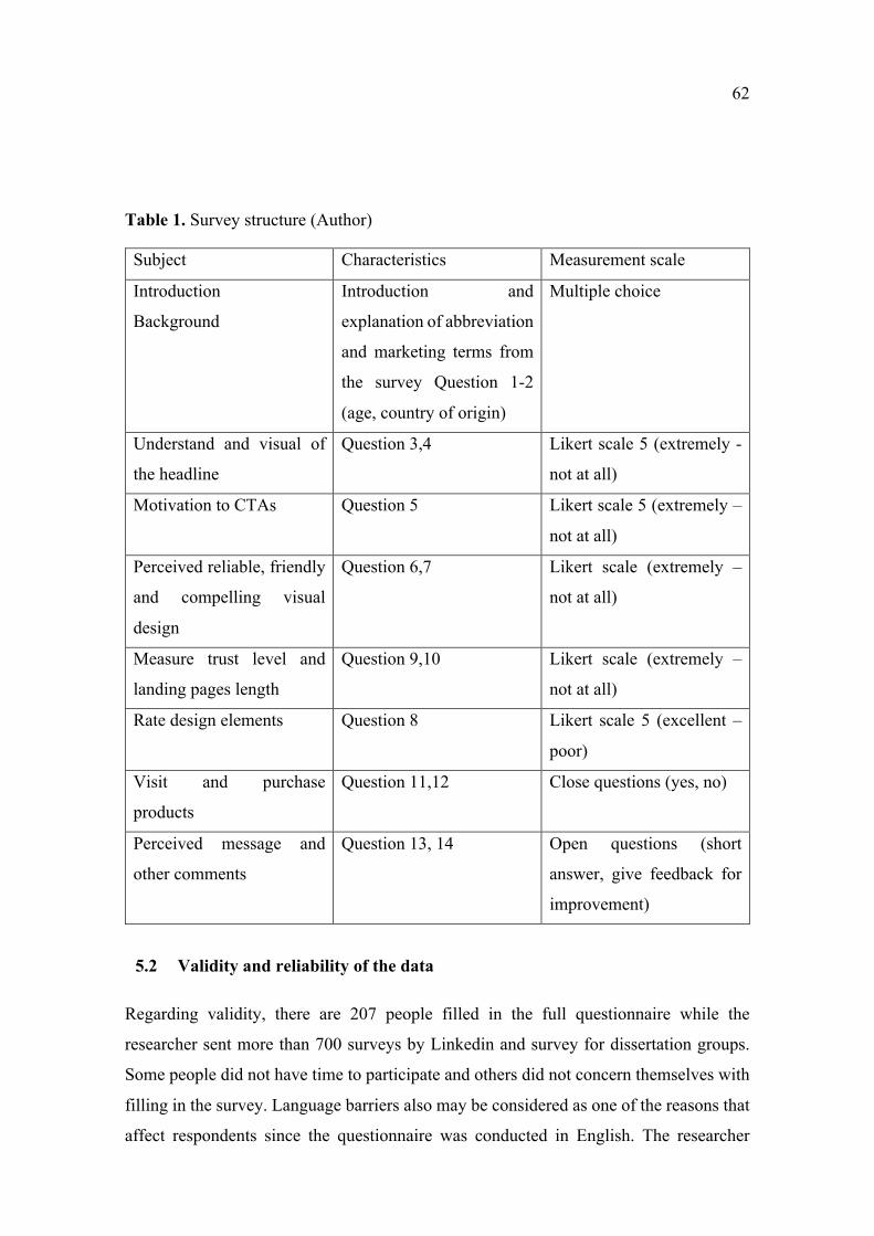
62
Table 1. Survey structure (Author)
Subject Characteristics Measurement scale
Introduction
Background
Introduction and
explanation of abbreviation
and marketing terms from
the survey Question 1-2
(age, country of origin)
Multiple choice
Understand and visual of
the headline
Question 3,4 Likert scale 5 (extremely -
not at all)
Motivation to CTAs Question 5 Likert scale 5 (extremely –
not at all)
Perceived reliable, friendly
and compelling visual
design
Question 6,7 Likert scale (extremely –
not at all)
Measure trust level and
landing pages length
Question 9,10 Likert scale (extremely –
not at all)
Rate design elements Question 8 Likert scale 5 (excellent –
poor)
Visit and purchase
products
Question 11,12 Close questions (yes, no)
Perceived message and
other comments
Question 13, 14 Open questions (short
answer, give feedback for
improvement)
5.2 Validity and reliability of the data
Regarding validity, there are 207 people filled in the full questionnaire while the
researcher sent more than 700 surveys by Linkedin and survey for dissertation groups.
Some people did not have time to participate and others did not concern themselves with
filling in the survey. Language barriers also may be considered as one of the reasons that
affect respondents since the questionnaire was conducted in English. The researcher
63
utilizes and combines two methods quantitative and qualitative measures and the data
collected will be analyzed by SPSS system and by google form survey.
The reliability of the sample plays an important role in providing the data therefore, the
sample size was calculated to narrow the scope based on the total population to meet a
reliable result. The initial sample size expected from the survey was 385, which would
have indicated the confidence level of 95% and an error margin applied is 5%. However,
only 207 answers were obtained which enabled the study to increase the confidence
interval (the margin of error) to 6.81.
5.3 Data collection
Data collection was conducted from 14 of August to 24 September 2020. The answers
were collected online by google form and were delivered to respondents by private
message on Linkedin and emails. To increase the number of answers, the researcher was
motivated to send out the survey to different groups in different countries to collect
answers. Information of respondents accumulated through online channels will be kept
as anonymous and all were recorded to serve for thesis analysis purposes.
A qualitative interview was conducted in late August with the aim to understand the
different opinions of senior designers, and brand strategists in current agencies, with the
aim to understand insight, trends in design and gain a deeper knowledge of how different
companies contrive to communicate with customers.
5.4 Analysis the respondents
For the purpose of data analysis, data collected will be utilized by SPSS statistical
software and google survey form. Firstly, data collected will be analyzed based on
respondents’ background age groups. Variation and crosstabulation will be applied as
analytical tools in this thesis in order to explain and give more information for the study.
Linear correlation analysis is applied to indicate the relation of customers’ experience to
visual elements on RoarBike’s landing pages.
There were 207 survey answers collected during two weeks of questionnaire sending.
Data were collected in different areas of the countries from Asia to Europe, Pacific, South
and North America and Africa to illustrate the background of respondents participating
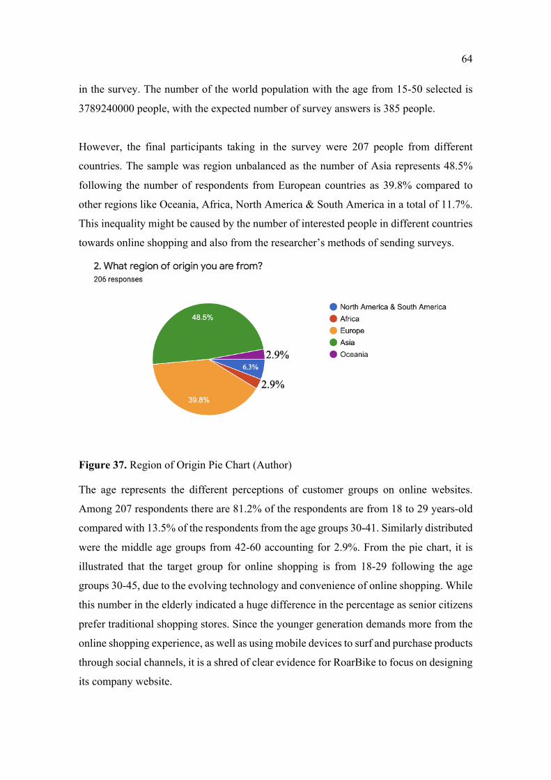
64
in the survey. The number of the world population with the age from 15-50 selected is
3789240000 people, with the expected number of survey answers is 385 people.
However, the final participants taking in the survey were 207 people from different
countries. The sample was region unbalanced as the number of Asia represents 48.5%
following the number of respondents from European countries as 39.8% compared to
other regions like Oceania, Africa, North America & South America in a total of 11.7%.
This inequality might be caused by the number of interested people in different countries
towards online shopping and also from the researcher’s methods of sending surveys.
Figure 37. Region of Origin Pie Chart (Author)
The age represents the different perceptions of customer groups on online websites.
Among 207 respondents there are 81.2% of the respondents are from 18 to 29 years-old
compared with 13.5% of the respondents from the age groups 30-41. Similarly distributed
were the middle age groups from 42-60 accounting for 2.9%. From the pie chart, it is
illustrated that the target group for online shopping is from 18-29 following the age
groups 30-45, due to the evolving technology and convenience of online shopping. While
this number in the elderly indicated a huge difference in the percentage as senior citizens
prefer traditional shopping stores. Since the younger generation demands more from the
online shopping experience, as well as using mobile devices to surf and purchase products
through social channels, it is a shred of clear evidence for RoarBike to focus on designing
its company website.
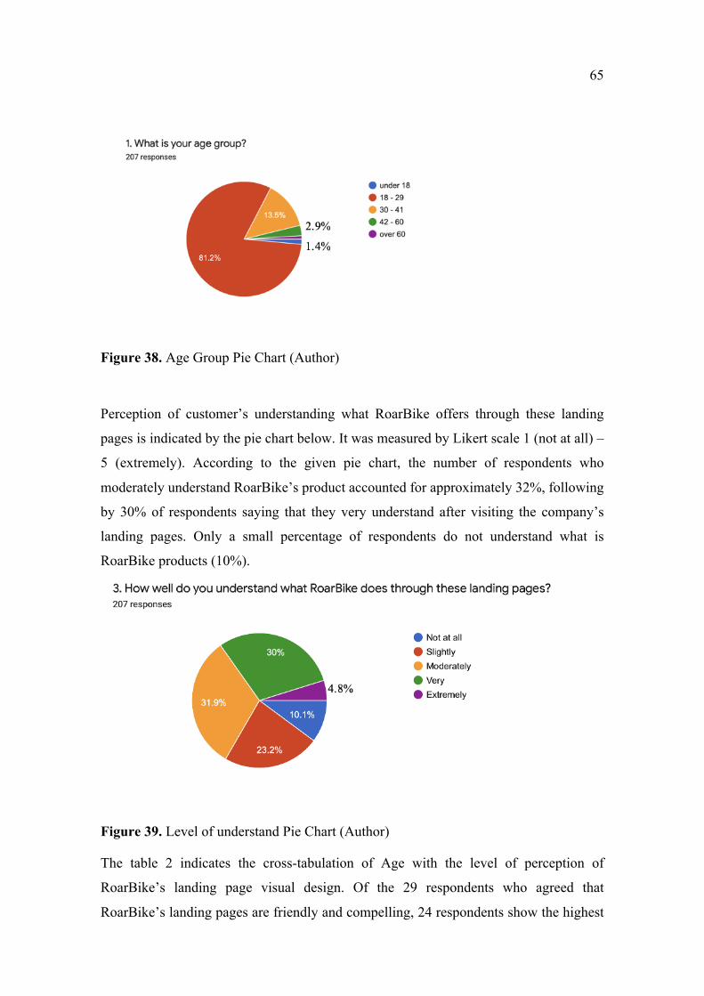
65
Figure 38. Age Group Pie Chart (Author)
Perception of customer’s understanding what RoarBike offers through these landing
pages is indicated by the pie chart below. It was measured by Likert scale 1 (not at all) –
5 (extremely). According to the given pie chart, the number of respondents who
moderately understand RoarBike’s product accounted for approximately 32%, following
by 30% of respondents saying that they very understand after visiting the company’s
landing pages. Only a small percentage of respondents do not understand what is
RoarBike products (10%).
Figure 39. Level of understand Pie Chart (Author)
The table 2 indicates the cross-tabulation of Age with the level of perception of
RoarBike’s landing page visual design. Of the 29 respondents who agreed that
RoarBike’s landing pages are friendly and compelling, 24 respondents show the highest
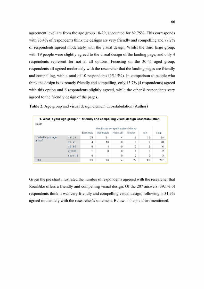
66
agreement level are from the age group 18-29, accounted for 82.75%. This corresponds
with 86.4% of respondents think the designs are very friendly and compelling and 77.2%
of respondents agreed moderately with the visual design. Whilst the third large group,
with 19 people were slightly agreed to the visual design of the landing page, and only 4
respondents represent for not at all options. Focusing on the 30-41 aged group,
respondents all agreed moderately with the researcher that the landing pages are friendly
and compelling, with a total of 10 respondents (15.15%). In comparison to people who
think the design is extremely friendly and compelling, only 13.7% (4 respondents) agreed
with this option and 6 respondents slightly agreed, while the other 8 respondents very
agreed to the friendly design of the pages.
Table 2. Age group and visual design element Crosstabulation (Author)
Given the pie chart illustrated the number of respondents agreeed with the researcher that
RoarBike offers a friendly and compelling visual design. Of the 207 answers. 39.1% of
respondents think it was very friendly and compelling visual design, following is 31.9%
agreed moderately with the researcher’s statement. Below is the pie chart mentioned.
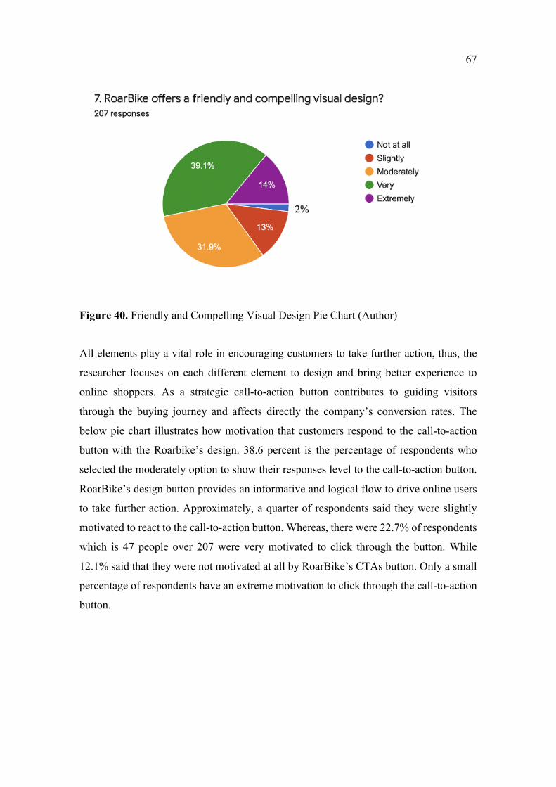
67
Figure 40. Friendly and Compelling Visual Design Pie Chart (Author)
All elements play a vital role in encouraging customers to take further action, thus, the
researcher focuses on each different element to design and bring better experience to
online shoppers. As a strategic call-to-action button contributes to guiding visitors
through the buying journey and affects directly the company’s conversion rates. The
below pie chart illustrates how motivation that customers respond to the call-to-action
button with the Roarbike’s design. 38.6 percent is the percentage of respondents who
selected the moderately option to show their responses level to the call-to-action button.
RoarBike’s design button provides an informative and logical flow to drive online users
to take further action. Approximately, a quarter of respondents said they were slightly
motivated to react to the call-to-action button. Whereas, there were 22.7% of respondents
which is 47 people over 207 were very motivated to click through the button. While
12.1% said that they were not motivated at all by RoarBike’s CTAs button. Only a small
percentage of respondents have an extreme motivation to click through the call-to-action
button.
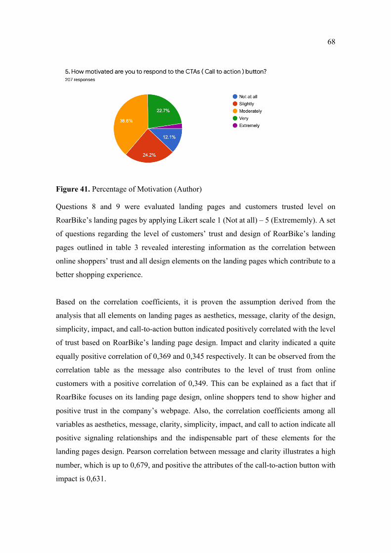
68
Figure 41. Percentage of Motivation (Author)
Questions 8 and 9 were evaluated landing pages and customers trusted level on
RoarBike’s landing pages by applying Likert scale 1 (Not at all) – 5 (Extrememly). A set
of questions regarding the level of customers’ trust and design of RoarBike’s landing
pages outlined in table 3 revealed interesting information as the correlation between
online shoppers’ trust and all design elements on the landing pages which contribute to a
better shopping experience.
Based on the correlation coefficients, it is proven the assumption derived from the
analysis that all elements on landing pages as aesthetics, message, clarity of the design,
simplicity, impact, and call-to-action button indicated positively correlated with the level
of trust based on RoarBike’s landing page design. Impact and clarity indicated a quite
equally positive correlation of 0,369 and 0,345 respectively. It can be observed from the
correlation table as the message also contributes to the level of trust from online
customers with a positive correlation of 0,349. This can be explained as a fact that if
RoarBike focuses on its landing page design, online shoppers tend to show higher and
positive trust in the company’s webpage. Also, the correlation coefficients among all
variables as aesthetics, message, clarity, simplicity, impact, and call to action indicate all
positive signaling relationships and the indispensable part of these elements for the
landing pages design. Pearson correlation between message and clarity illustrates a high
number, which is up to 0,679, and positive the attributes of the call-to-action button with
impact is 0,631.
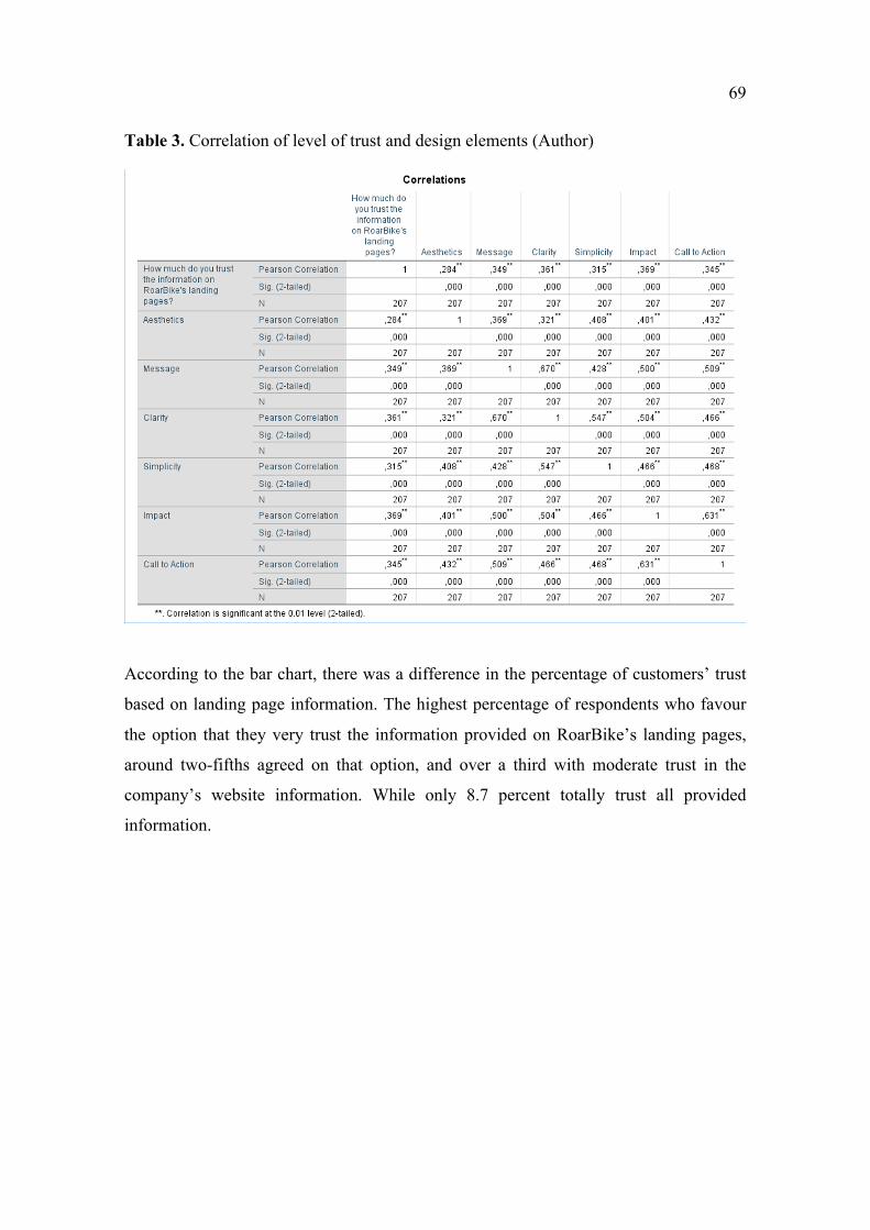
69
Table 3. Correlation of level of trust and design elements (Author)
According to the bar chart, there was a difference in the percentage of customers’ trust
based on landing page information. The highest percentage of respondents who favour
the option that they very trust the information provided on RoarBike’s landing pages,
around two-fifths agreed on that option, and over a third with moderate trust in the
company’s website information. While only 8.7 percent totally trust all provided
information.
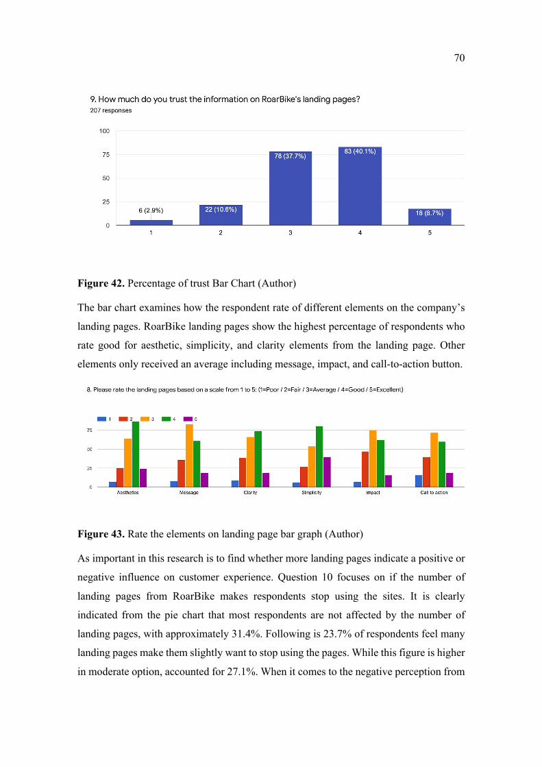
70
Figure 42. Percentage of trust Bar Chart (Author)
The bar chart examines how the respondent rate of different elements on the company’s
landing pages. RoarBike landing pages show the highest percentage of respondents who
rate good for aesthetic, simplicity, and clarity elements from the landing page. Other
elements only received an average including message, impact, and call-to-action button.
Figure 43. Rate the elements on landing page bar graph (Author)
As important in this research is to find whether more landing pages indicate a positive or
negative influence on customer experience. Question 10 focuses on if the number of
landing pages from RoarBike makes respondents stop using the sites. It is clearly
indicated from the pie chart that most respondents are not affected by the number of
landing pages, with approximately 31.4%. Following is 23.7% of respondents feel many
landing pages make them slightly want to stop using the pages. While this figure is higher
in moderate option, accounted for 27.1%. When it comes to the negative perception from
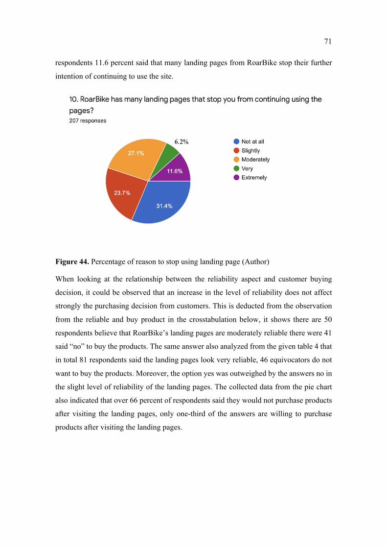
71
respondents 11.6 percent said that many landing pages from RoarBike stop their further
intention of continuing to use the site.
Figure 44. Percentage of reason to stop using landing page (Author)
When looking at the relationship between the reliability aspect and customer buying
decision, it could be observed that an increase in the level of reliability does not affect
strongly the purchasing decision from customers. This is deducted from the observation
from the reliable and buy product in the crosstabulation below, it shows there are 50
respondents believe that RoarBike’s landing pages are moderately reliable there were 41
said “no” to buy the products. The same answer also analyzed from the given table 4 that
in total 81 respondents said the landing pages look very reliable, 46 equivocators do not
want to buy the products. Moreover, the option yes was outweighed by the answers no in
the slight level of reliability of the landing pages. The collected data from the pie chart
also indicated that over 66 percent of respondents said they would not purchase products
after visiting the landing pages, only one-third of the answers are willing to purchase
products after visiting the landing pages.
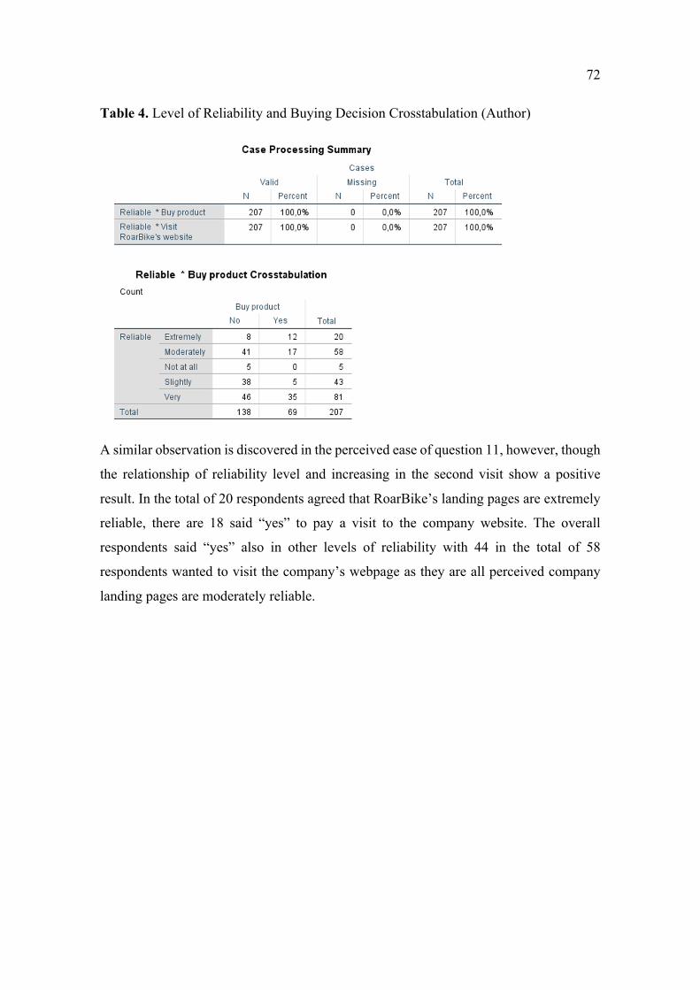
72
Table 4. Level of Reliability and Buying Decision Crosstabulation (Author)
A similar observation is discovered in the perceived ease of question 11, however, though
the relationship of reliability level and increasing in the second visit show a positive
result. In the total of 20 respondents agreed that RoarBike’s landing pages are extremely
reliable, there are 18 said “yes” to pay a visit to the company website. The overall
respondents said “yes” also in other levels of reliability with 44 in the total of 58
respondents wanted to visit the company’s webpage as they are all perceived company
landing pages are moderately reliable.
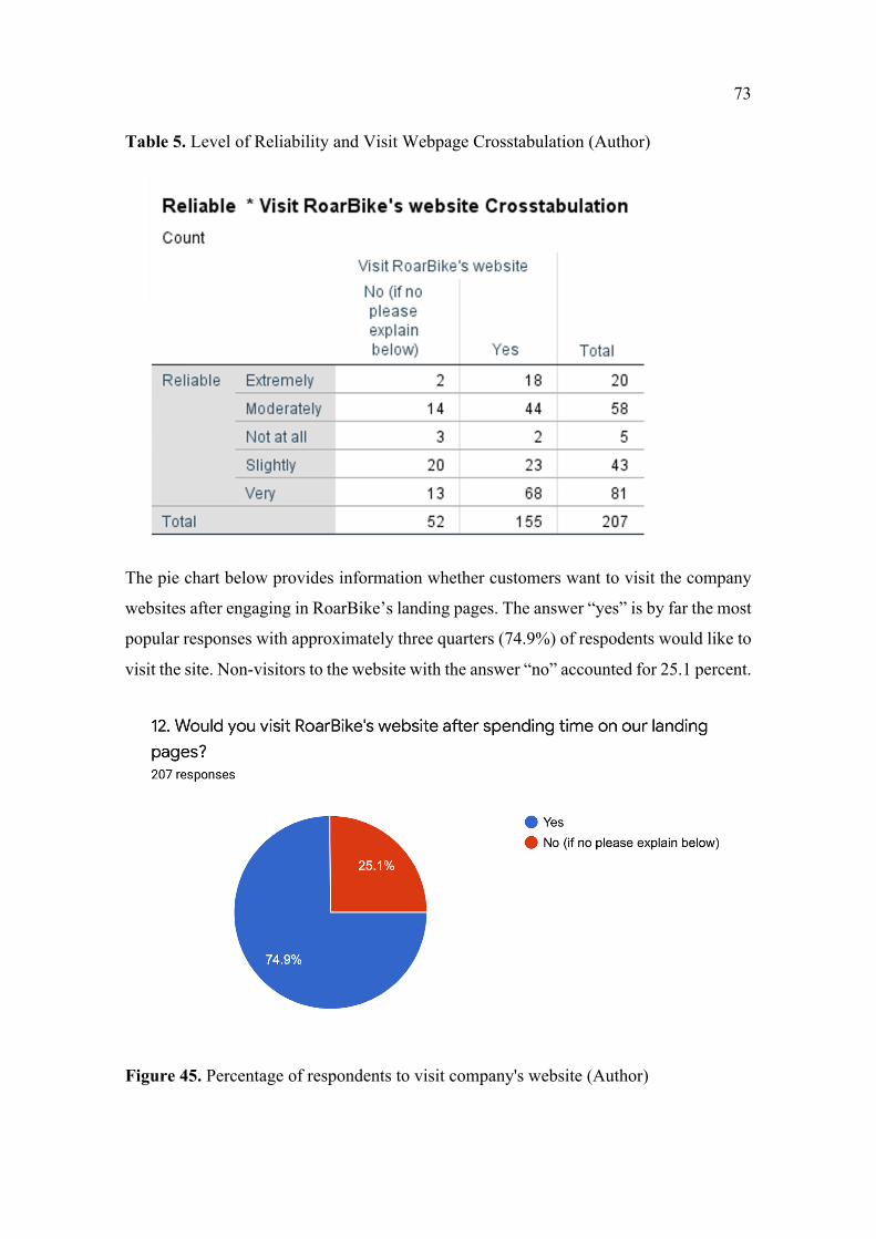
73
Table 5. Level of Reliability and Visit Webpage Crosstabulation (Author)
The pie chart below provides information whether customers want to visit the company
websites after engaging in RoarBike’s landing pages. The answer “yes” is by far the most
popular responses with approximately three quarters (74.9%) of respodents would like to
visit the site. Non-visitors to the website with the answer “no” accounted for 25.1 percent.
Figure 45. Percentage of respondents to visit company's website (Author)
74
6 RESULTS
6.1 Discussion and Conslusion
This conclusion consists of a brief summary of the findings and analyzing parts of the
study. Since the conclusion perceived the foremost concise data and knowledge for the
case company to receive the fultimate result. Recommendation for the design will also be
indicated and knowledge obtained from the survey will be presented in this section.
The objective of this study was to understand the user experience after browsing
RoarBike’s landing pages with a deeper goal to find the influences of visual design in
conveying messages. Methods employed in this research are quantitative research,
descriptive analysis, crosstabulation analysis, design research and applied typography in
Adobe XD software. To give insight of the All the mentioned knowledge was literally
studied concerning marketing and project’s design. Additionally, in terms of literature
relations, the researcher’s perceived knowledge in the design aspect by the supportive
online platforms, theory lessons and other researchers’ papers from the internet. Four
auxiliary questions aligned with the main question to grant deeper knowledge for the
benefit of the company and the researcher. Firstly, to answer “How do customer discern
messages on the landing pages?” Knowledge can be obtained by the survey answers that
different customers from different age groups and nationalities tend to perceive things
differently from the visual design, colors, and information on the landing pages. In total
of 207 answers, there are 76 respondents which accounted for 36.7 percent of the answers
correctly with the message of what researcher want to convey. The message from
RoarBike’s landing pages is “to promote, sell and encourage people to buy bikes”. While
there have been alittle number of 9 respondents replied that they did not understand the
message, provided a blank space and provided senseless answers for question 13.
However, other respondents perceived the question in other away from what they
obtained and understood from the given information on RoarBike’s landing pages. Those
figures mentioned above displayed different aspects of perceiving information and
message from customers, it is different from range of age groups and design expectation,
therefore although the bulk of respondents could understand the fundamental of the
message conveying on the landing pages, there are some colors and products’
75
specification aspects that need to be improved to achieve professional design, meet
potential customer’s expectation and reflect a high conversion rate.
Secondly, answering “Why are mobile landing pages an indispensable part of marketing
that creates good flow for customer conversation and best customer experience?” can be
obtained from the theory part and empirical research part which explains the important
role of landing pages. As collected from Cheryl Baldwin, a Director of Marketing and
Communications stated that the landing page is a good way to drive traffic, which
improves company SEO and builds company brand. According to the researchers, many
B2B businesses use landing pages to generate leads for its further conversion. Since it
directs customers to specific items, products of the company, landing pages encourage
online shoppers to make further decisions. Thus, it considered as a crucial value for many
businesses.
Another well worth mentioning opinion from Pamela Vaugan illustrated that landing
pages support marketing offers that direct website visitors exchange their contact
information for valuable offers. It is a perfect tool to track reconversions of existing leads
which benefits companies to engage with other businesses and collect customer
behaviors’ activities on websites for further study. John Jantsch explained in
DuctTapemarketing some reasons which make landing pages become a must. Besides
promoting company web pages and products, landing pages also help feature companies
to personalize and address target segments, which contribute to engaging online visitors
and an increase in sales.
The third question “ How does a company use visual design to convey messages to
customers?” was illustrated through the whole process of researching, planning and
designing RoarBike’s landing pages. By understanding what is the main message of the
company case and researching the target customer group, the researcher was able to apply
appropriate design elements on the landing pages. Conveying messages to customers
requires a long process of understanding different elements in the landing pages, for
example, the evokes of customer mood, tonality intention of the business, visual aspects,
and other color perception. This could be done in terms of long-time research, user testing,
and learning from other opinions to figure unique strategies in design.
76
From the empirical finding, the researcher was able to understand the whole process of
applying visual elements in conveying company messages to customers by focusing on
all present elements on the landing page. Typography is acknowledged as the essence of
clear communication that raises the voice of the brand. It is used to inspire customers to
express their feelings and connect the audience to the content of the webpages. Contrast
is another element that brings the aesthetics to create an overall picture of the design. As
from the data, the aesthetics aspect received a good score from all the respondents, it
displays an undeniable role of it in general design. Besides some mentioned elements
above, there are some design rules which support the conspectus picture of emphasis
designs that need to be applied including minimalist approach, uniform marketing
messages on different channels, and brand recognition.
Further, according to the qualitative interview research, a Senior Account Executive form
an agency Brand2Asia in Vietname emphasized the crucial role of messages through
photos on the website, visual design and content contribute to enhance the message flow.
Applying SMILE standardize was recommended by a member of iRep Japan Subsidiary,
as. SMILE stands for Simple, Memorable, Interesting, Link to Brand, and Emotional. As
the interviewee said, good design needs to meet all five elements in SMILE, from the
precise message to deliver to customers which encourages customers to remember the
company. Memorable is the other word of impressive and unique which makes customers
pay attention to what the company delivers. Interesting aligns with Memorable since with
interesting information, the topic audiences are easier to remember stories and products
of the company. Nevertheless, Link to Brand is the success of the design when customers
are able to recognize the brand by color, shape, size of its logo. Last but not least,
Emotional involvement plays a vital role as a catalyst for further rational purchasing
decisions and undying brand loyalty from customers.
The final question “What should companies consider when managing visual design in
marketing?” was answered by a member of Brand2Asia in Vietnam. The interviewer
responded that all design elements should be considered however, as the advent of new
design trends and shifting customer preferences in new ideas, the pictures option and
simple designs cannot fully deliver the whole story and messages of businesses.
77
Therefore, the need for animation can bring concept combined thoughts to create a
storyline that keeps the audiences engage and immerse in the company’s story. The
animation is a provable reason for many businesses to cut through the noise to increase
conversion rate, gain customer loyalty, and deliver eye-catching design to interact with
potential customers.
Another suggestion from Thomas Trịnh who is working as a Digital Marketing Vietnam
Corporation in iRep Japan Subsidiary mentioned some aspects that should be considered
including target audience, brand guidelines, and campaign objectives. The target
Audience is acknowledged as the most crucial element because it makes the company
focus on whom it will serve and how to prioritize resources accordingly. By understand
target customers, it provides a clear focus to develop effective marketing communication
strategies. In terms of campaign goals, it is important to contemplate a clear vision and
mission before delivering any marketing messages. As campaign goals cannot be
conceived without doing prior research, businesses should consider defining what they
want to achieve and evaluate different perspective of the market which they want to
operate. After reviewing all points, it can be concluded that these aspects are vital for
businesses to manage visual design in marketing.
6.2 Recommendations
Providing theoretical improvement for the topic, this study also suggests some practical
implications to benefit the RoarBike company and other people who want to gain deeper
knowledge of this study. As providing conveniently brilliant and good landing pages the
whole process of design should be carefully researched and planned. Therefore, by
improving this trial version of RoarBike landing pages the company can bring a positive
perception and good surfing experience for its customers. This research should benefit
the company case, further research, and all other managers, researchers, and designers in
both marketing and design fields.
Since it is a testing landing page version various designing aspects need to be taken into
account to improve the general ideas based on the contribution feedbacks of respondents.
The current color theme and design pictures were not a favorite of all the respondents
therefore, some respondents suggest more clean and suitable color options that are
78
perceived as for sport and energy like orange, yellow combined green. The respondents
recommended using real photos of athletic with RoarBike’s products instead of using
illustrating pictures to create trust and increase visitor engagement due to the fact that
they prefer to connect with other people emotionally than illustrating characters. There
has been significant scientific research on whether using human photos on websites or
illustration photos generates a higher conversion rate. Many public e-commerce as The
Human Face of E-business said that by using facial characteristics from human indicated
an increase in conversion rate and initial trust for online shoppers. Another example is an
online art platform called Mealia Art examined a test to figure out what happens if they
replace all artists’ photos on the websites instead of showcase only paintings. As a result,
the conversion rate with painting photos was 8.8% while in artist photos, the percentage
increased to 17.2%. The same experiment was conducted by Jason was a 48 percent
conversion rate increase compared to the simple icon.
Moreover, as from the previous design, the research provided 7 landing pages. In the
theoretical part indicated that businesses with 10-15 landing pages tend to increase
conversion by 55% over business websites with less than the number of 10 landing pages.
While this percentage increased to over 500% if companies applied more than 40 landing
pages. Nevertheless, having many landing pages was not a good solution for many
respondents as it was the main reason to stop continuing using the pages according to the
researcher collected survey. The number of appropriate landing pages for RoarBike can
be decided through further research to give a positive effect on online customers’
perception leading to a higher intention to visit RoarBike.
Current information on RoarBike’s landing pages still needs to be more attractive and
reduce some irrelevant information as the specification of the product on the landing
page. Provide enough information on what is being offered, headline, and highly
recommended a promotion video was suggested by many participating respondents. As
video on landing pages can enhance the number of conversions by up to 86% according
to a study from an online tutoring company named Eye View Digital, it offers more visual
elements than just written words. Video on the landing page allowed visitors to receive
and experience on the online shopping journey with little effort, thus, by adding a
promotion video on the landing page, it connects products and services with RoarBike’s
79
customers. Besides some suggestions for color and design on the company’s landing
pages, other respondents said that they would like the simple idea of company message
since it personalizes the product itself and encourages them to make a purchase.
Therefore, it is necessary for the company to make further research in order to design a
better version of this landing page to encourage customers to enjoy the online shopping
journey.
6.3 Limitation and future research
This research encountered different limitations during the process of conducting a plan,
research, design, and analysis. The research was conducted on a small sample of 207
respondents who did not meet the expectation of 385 answers. These reasons could be
caused due to the language barriers of different regions and busy time schedules of other
people which stop them from participating in the survey. All survey, were delivered
through personal messages from a circle of acquaintances, emails, and other target groups
of respondents.
Another limitation that is well worth mentioning is the knowledge of the researcher in the
design field. Since the researcher’s background is in international business it took a few
months for the researcher to obtain knowledge and acquire skills in landing page design
and learn to use Adobe. XD software. Therefore, many skills in design and the knowledge
of design aspects in marketing require a prolonged time to comprehend to achieve
professional results.
In terms of questionnaire structure, the length of the survey included an introduction, and
an abbreviation explanation assumably demoralized some attesters to read and finish the
survey. Especially question 13 with the aim to encourage people to show their knowledge
of the message from what they ascertained after browsing RoarBike’s landing pages. The
researcher was mistaken to put example messages thus, some of the respondents copied
the example answer without thinking about the correct message they could perceive. More
accurate answers could have been obtained if the researcher eliminated sample messages
on the question.
80
This study indicated the consequential role of mobile landing pages contributing to the
aggrandizement of online shopping in the digital age. By focusing on company websites
from both the desktop version and mobile version, companies are able to discover the
major potential of e-commerce in the digital world. Further research on creating
interactive landing pages, could be conducted based on insight results from this
foundation study.
Time limitation could restrain the cultural research on the visual design since cultural
plays a crucial role in some design research. Contemporary culture and cultural
background are acknowledged as the mirror that reflects and has an effect on visual
design. As from the background question in the study, the researcher realizes the different
points of view that affect the evaluation and customers’ experience in the design. Some
respondents are extremely like the design, while others said that the design did not
encourage them to take further action. Moreover, absorbing content also reflects their
cultural perspectives that define how customers feel about their online journey.
Therefore, it is stated that visual design and culture have a direct connection with each
other. For further research is highly recommended to aware of the differences and to
create a cross-cultural experience for more effective messages to customers.
81
REFERENCES
Aakansha Damani, 2019. 17 + Eye-catching Minimalist Website Designs Curated for your Inspiration. Accessed on 18.04.2020 https://www.digitaldoughnut.com/articles/2019/october/17-eye-catching-minimalist-website-designs Aaron White, 2019. What is Adobe XD? Your Introduction to Prototyping. Accessed on 04.07.2020 https://www.shutterstock.com/blog/adobe-xd-tutorial-beginners Administrator, 2014. What should my minimum browser resolution be when building websites in 2012. Accessed on 26.05.2020 https://www.webstrategiesinc.com/blog/what-should-my-minimum-browser-resolution-be-when-building-websites-in-2012 Allison Otting, 2015. Four Ways to get More Out of Your Hero Shot. Accessed on 20.05.2020 http://www.disruptiveadvertising.com/conversion-rate-optimization/4-ways-to-get-more-out-of-your-hero-shot/ BlogTyrant, 2019. Above The Fold: How To Take Advantage of Impatient Traffic. Accessed on 27.03.2020 https://www.blogtyrant.com/above-the-fold/ Cameron Chapman, 2019. The Principles of Design and Their Importance. Accessed on 20.04.2020 https://uxplanet.org/the-principles-of-design-and-their-importance-77f959d0d555 Colin Ware. 2008. Visual Thinking for Design. 1st edition. Imprint: Morgan Kaufmann. Coville, 2014. Relevance. Routledge. Clark & Lyons, C.C. 2011. Graphics for Learning. San Francisco, CA:Pfeiffer. CXL, 2018. Emotional Targeting 1010 by Talia Wolf. Accessed on 18.06.2020. https://cxl.com/conversion-rate-optimization/emotional-targeting-101-by-talia-wolf/ Daina Šiltere, Santa Bormane, 2018. Integrated Marketing Communication as a Business Management Tool in the Context of Sustainable Development. Accessed on 01.06.20 https://www.researchgate.net/publication/328605183_Integrated_Marketing_Communication_as_a_Business_Management_Tool_in_the_Context_of_Sustainable_Development Dave Chaffey, 2020. E-commer conversion rates – how do yours compare?. Smart Insights. Accessed on 15.08.2020. https://www.smartinsights.com/ecommerce/ecommerce-analytics/ecommerce-conversion-rates/
82
Ecommerce, 2018 How to Create an eCommerce Website to Sell Online. Accessed on 24.06.2020 https://www.e-learningcentre.co.uk/how-to-create-ecommerce-website Editorial Team, 2018. Landing Pages Guide 101. Create landing Pages That Work. Accessed on 25.05.2020 https://1stwebdesigner.com/landing-pages-101/ Engaiodigital.The 7P’s of Online Marketing Mix. Accessed on 02.07.2020 https://engaiodigital.com/online-marketing-mix/ Evans & Thomas. 2013. Exploring the Elements of Design. Cengage Learning. Fabian Niederkofler, 2017. How to increase conversion with 5 heat map tips. Accessed on 02.06.2020 https://www.glueglue.com/blog/how-to-increase-conversions-with-5-heat-map-tips/ Finne & Grönroos. 2009. “Rethinking marketing communication: from integrated marketing communication to relation ship communication”, Journal of Marketing Communication, pp 177-198. Garrett Hughes, 2019. Mobile landing Page Examples That Seriously Set The Bar. Accessed on 15.05.2020 https://unbounce.com/landing-page-examples/best-mobile-landing-page-examples/ Gatto, Porter & Selleck,J. 2011. Exploring Visual Design: The Elements and Principles, Davis Publications. Graham Charlton, 2012. Ecommerce consumer reviews: why you need them and how to use them. Accessed on 17.05.2020 https://econsultancy.com/ecommerce-consumer-reviews-why-you-need-them-and-how-to-use-them/#i.1fxd1bep4ofi2r Graves, Maitland. 1951. The Art of Color and Design. 2d ed. New York, N.Y., McGrawHill. Hannah Tow, 2019. The Marketing Mix (+ The 4P’s, 7P’s and 4C’s of Marketing). Accessed on 04.03.2020. https://learn.g2.com/marketing-mix unter Liptrap, 2016. Landing page design guide. Accessed on 20.05.2020 https://www.manageinbound.com/blog/landing-page-design Interviewee. 2020a. Senior Account Executive. Company Brand2Asia, Vietnam. Phone call Interview and Questionnaire Brieftly Recorded, 04. October 2020, 6:29 pm. Interviewee. 2020b. Digital Marketing Vietnam Corporation. Company iRep Japan Subsidiary. Phone call Interview and Questionnaire Brieftly Recorded, 06. October 2020, 6:50pm.
83
Jacinda Santora, 2020. 15 Mobile Landing Page Best Practices Proven to get Big Results. Accessed on 01.08.2020 https://optinmonster.com/mobile-landing-page-best-practices/ John Spacey, 2017. 17 Types of Marketing Messages. Accessed on 25.06.2020 https://simplicable.com/new/marketing-messages Ji Hee Song & George M. Zinkhan, 2003. Determinants of perceived website interactivity. Journal of Marketing. Accessed on 20.04.2020 http://dx.doi.org/10.1509/jmkg.72.2.99 Margarnet Penny, 2016. Type of History. Notes on Design. Accessed on 10.05.2020 https://www.sessions.edu/notes-on-design/type-in-history-futura/ Melissa Lafsky, 2015. What the Hell Is a Microsite and Why Do I need One?. Accessed on 05.05.2020 https://contently.com/2015/04/09/what-the-hell-is-a-microsite-and-why-do-i-need-one/ Neilpatel, 2018. How Adding Personality and Trust to your landing Pages. Can Maximize Conversion Rates. Accessed on 22.05.2020 https://neilpatel.com/blog/personality-and-trust/ Neilpatel, 2017. The psychology of Color: How to Use Colors to Increase Conversion Rate. Accessed on 24.06.2020 https://neilpatel.com/blog/the-psychology-of-color-how-to-use-colors-to-increase-conversion-rate/ Philip Kotler, Veronica Wong, John Saunders & Gary Armstrong. 2005. Principles of Marketing, Fourth European Edition, Pearson Prentice Hall. Principles and Elements of Visual Design: A Review of the Literature on Visual Design of Instructional Materials. Accessed on 03.05.2020 https://www.researchgate.net/publication/275155264_Principles_and_elements_of_visual_design_A_review_of_the_literature_on_visual_design_of_instructional_materials Principles and Elements of Visual Design: A Review of the Literature on Visual Design of Instructional Materials. Accessed on 24.03.2020 https://www.researchgate.net/publication/275155264_Principles_and_elements_of_visual_design_A_review_of_the_literature_on_visual_design_of_instructional_materials RandyKrum. 2017. Using Visuals to Enhance Your Credibility. Accessed on 16.06.2020 https://www.huffpost.com/entry/using-visuals-to-enhance-_b_9291406?guccounter=1 Rebecca Maria dos Santos, 2019. Responsive Microsite for Red Bull surf’s Rescue. Accessed on 16.04.2020 https://medium.com/@reb.dossantos/responsive-microsite-for-red-bull-surf-swim-493bd49f6386
84
Riikka livanainen, 2017. Branding through visual design: A case study of a company’s visual identity guided by brand values and story. Accessed on 20.02.2020 https://aaltodoc.aalto.fi/bitstream/handle/123456789/26322/bachelor_Iivanainen_Riikka_2017.pdf?sequence=1&isAllowed=y Ruslan Galba, 2020. Design Principles & Thir Implementation. Accessed on 15.05.2020 https://medium.com/hellotegra/design-principles-their-implementation-d3cd2e6e58f3 Rykanova Olga, 2015. Website redesign: Improving user Experience and User Interface on the Havusport website. Accessed on 22.02.2020 https://www.theseus.fi/bitstream/handle/10024/119451/Rykanova_Olga.pdf?sequence=1&isAllowed=y Salvador.T, 2016. Exploring Quantitative and Qualitative Methodologies: A Guide to Novice Nursing Researchers. European Scientific Journal. 107. Accessed on 07.06.2020 https://doi.org/10.19044/esj.2016.v12n18p107 Scherer, J. 2015 Landing Pages for Travel Agencies, Hotels, Resorts and Tour Operators, Accessed on 15.06.2020 https://www.theseus.fi/bitstream/handle/10024/122604/Bitkulova_Renata.pdf;sequence=1 Siddhant Gupta, 2019. Enhancing Search User Interface of an Assets Management Solution. Accessed on 25.02.2020 https://aaltodoc.aalto.fi/bitstream/handle/123456789/39028/master_Gupta_Siddhant_2019.pdf?isAllowed=y&sequence=1 Stanford guidline for web credebility. Accessed on 07.06.2020 http://credibility.stanford.edu/guidelines/index.html Stafford, T.F., A. Turan, and Raisinghani, M.S, 2004. International and Cross Cultural Influences on Online Shopping Behavior. Accessed on 1.07.2020. Journal of Global Information Technology Management, pp 70-88. https://doi.org/10.1080/1097198X.2004.10856373 Tomita, Kei. 2015. Principles and Elements of Visual Design: A Review of the Literature on Visual Design of Instructional Materials. Accessed on 24.03.2020 https://www.researchgate.net/publication/275155264_Principles_and_elements_of_visual_design_A_review_of_the_literature_on_visual_design_of_instructional_materials The Marketing Mix, 2016. The marketing Mix 4C’s. Accessed on 03.07.2020 https://marketingmix.co.uk/marketing-mix-4cs/ Valerio Puggioni, 2020. How to grow Your Sales with Shopify Landing Pages. Accessed on 30.06.2020 https://unbounce.com/conversion-rate-optimization/shopify-landing-pages/ VWO, 2017. Landing page Optimization. Accessed on 22.06.2020 https://vwo.com/landing-page-optimization/
85
Xiling Zhou, Xiangchun Liu, 2005. Effective User Interface Design for Consumer Trust. Accessed on 28.02.2020 https://www.diva-portal.org/smash/get/diva2:1024188/FULLTEXT01.pdf
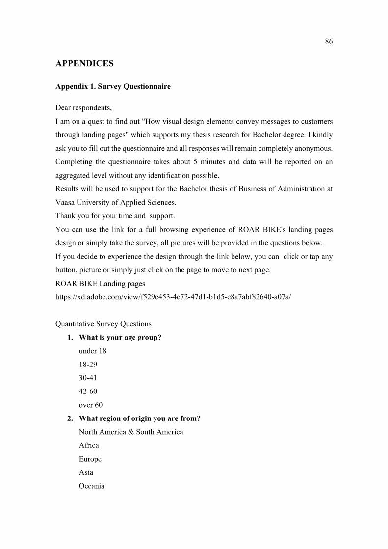
86
APPENDICES
Appendix 1. Survey Questionnaire
Dear respondents,
I am on a quest to find out "How visual design elements convey messages to customers
through landing pages" which supports my thesis research for Bachelor degree. I kindly
ask you to fill out the questionnaire and all responses will remain completely anonymous.
Completing the questionnaire takes about 5 minutes and data will be reported on an
aggregated level without any identification possible.
Results will be used to support for the Bachelor thesis of Business of Administration at
Vaasa University of Applied Sciences.
Thank you for your time and support.
You can use the link for a full browsing experience of ROAR BIKE's landing pages
design or simply take the survey, all pictures will be provided in the questions below.
If you decide to experience the design through the link below, you can click or tap any
button, picture or simply just click on the page to move to next page.
ROAR BIKE Landing pages
https://xd.adobe.com/view/f529e453-4c72-47d1-b1d5-c8a7abf82640-a07a/
Quantitative Survey Questions
1. What is your age group?
under 18
18-29
30-41
42-60
over 60
2. What region of origin you are from?
North America & South America
Africa
Europe
Asia
Oceania
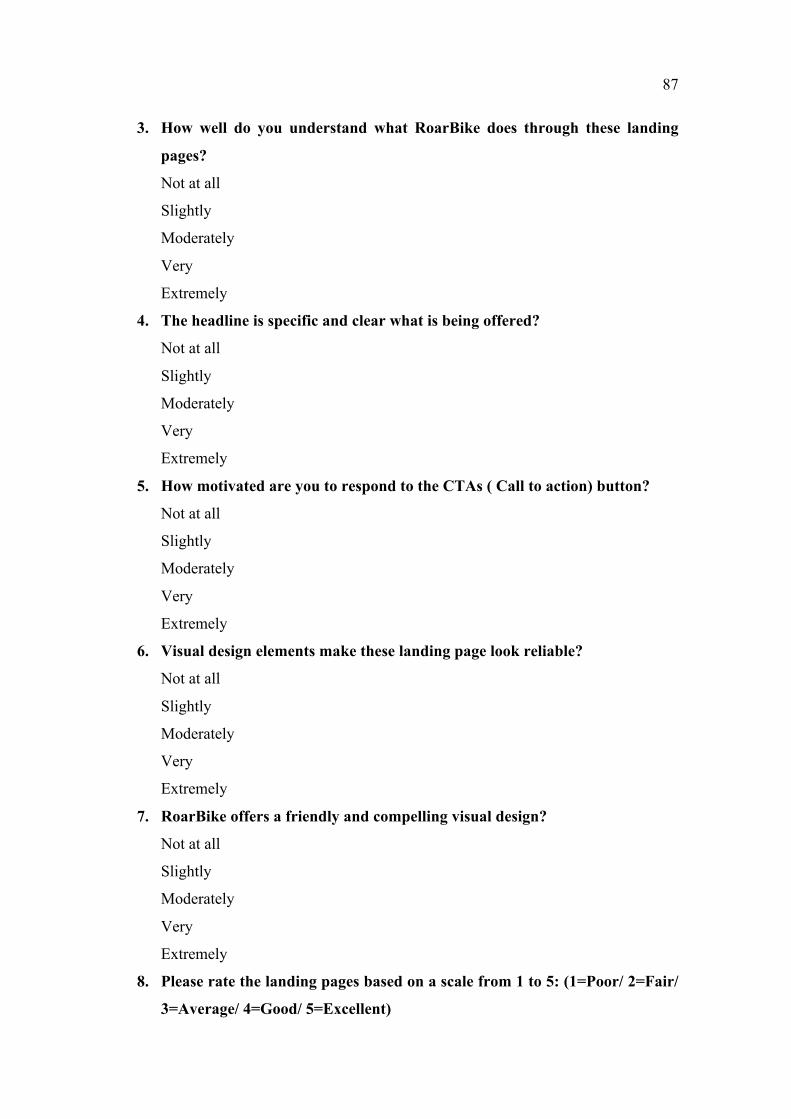
87
3. How well do you understand what RoarBike does through these landing
pages?
Not at all
Slightly
Moderately
Very
Extremely
4. The headline is specific and clear what is being offered?
Not at all
Slightly
Moderately
Very
Extremely
5. How motivated are you to respond to the CTAs ( Call to action) button?
Not at all
Slightly
Moderately
Very
Extremely
6. Visual design elements make these landing page look reliable?
Not at all
Slightly
Moderately
Very
Extremely
7. RoarBike offers a friendly and compelling visual design?
Not at all
Slightly
Moderately
Very
Extremely
8. Please rate the landing pages based on a scale from 1 to 5: (1=Poor/ 2=Fair/
3=Average/ 4=Good/ 5=Excellent)
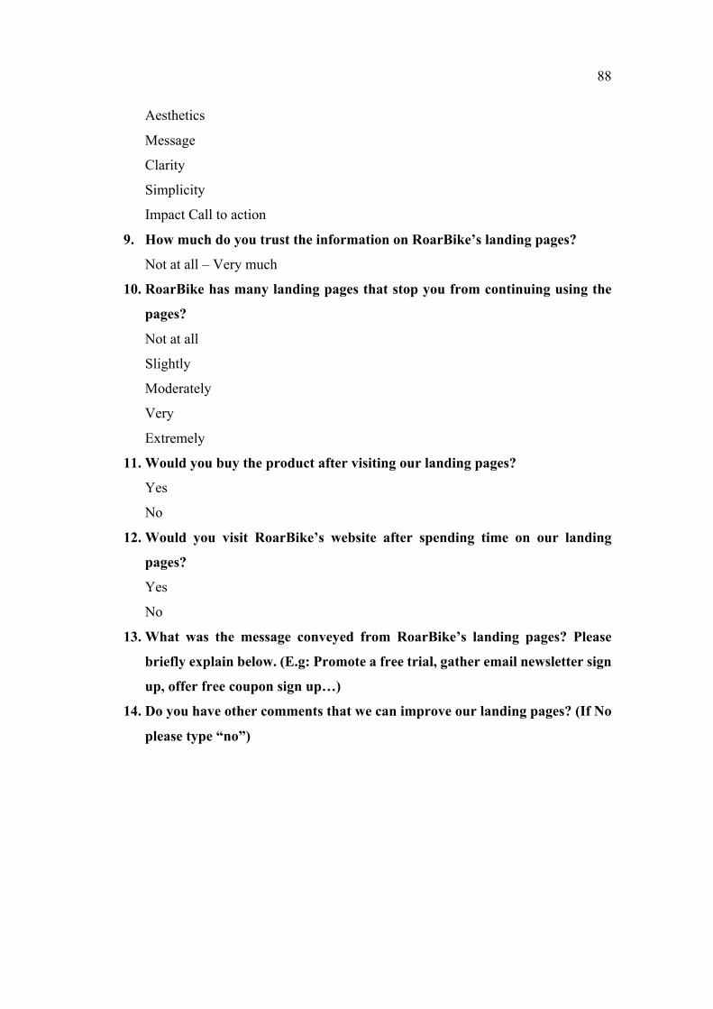
88
Aesthetics
Message
Clarity
Simplicity
Impact Call to action
9. How much do you trust the information on RoarBike’s landing pages?
Not at all – Very much
10. RoarBike has many landing pages that stop you from continuing using the
pages?
Not at all
Slightly
Moderately
Very
Extremely
11. Would you buy the product after visiting our landing pages?
Yes
No
12. Would you visit RoarBike’s website after spending time on our landing
pages?
Yes
No
13. What was the message conveyed from RoarBike’s landing pages? Please
briefly explain below. (E.g: Promote a free trial, gather email newsletter sign
up, offer free coupon sign up…)
14. Do you have other comments that we can improve our landing pages? (If No
please type “no”)
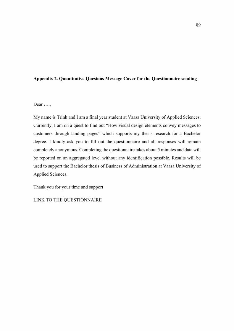
89
Appendix 2. Quantitative Quesions Message Cover for the Questionnaire sending
Dear ….,
My name is Trinh and I am a final year student at Vaasa University of Applied Sciences.
Currently, I am on a quest to find out “How visual design elements convey messages to
customers through landing pages” which supports my thesis research for a Bachelor
degree. I kindly ask you to fill out the questionnaire and all responses will remain
completely anonymous. Completing the questionnaire takes about 5 minutes and data will
be reported on an aggregated level without any identification possible. Results will be
used to support the Bachelor thesis of Business of Administration at Vaasa University of
Applied Sciences.
Thank you for your time and support
LINK TO THE QUESTIONNAIRE
90
Appendix 3. Qualitative Interview
Dear Interviewee,
My name is Trinh and I am a final year student at Vaasa University of Applied Sciences
in Finland. I am on a quest to find out “How Visual Design Elements Convey Messages
to Customer through Landing Pages” which support my thesis research for a bachelor
degree. I kindly ask you to take part in the interview and answer a few questions which
will be used in my thesis.Your answers will be recorded and contributed to the qualitative
data analysing section of this study.
Your participation is voluntary and data will be reported on an aggregated level without
any identification possible. Your personal information as name and job title will be
mentioned in this study as an evidence for the validity of th einterview.
Results will be used to support the Bachelor thesis of Business of Administration at Vaasa
University of Applied Sciences.
Thank you for your time and support.
Qualitative Interview Questions
1. What is your name?
Could you tell me what is your job title?
2. Which company do you work for? (optional)
3. What do you think about the role of landing pages? Do you think landing pages
are an indispensable part of marketing?
4. What does your company consider when managing visual design in marketing?
5. How does your company use visual design to convey messages to customers
(Website)?
6. Do you have any suggestions or tips to design an effective landing page?
91
I extremely grateful for your contributing your valuable time, your honest
information and your thoughtful suggestions.
Thank you very much


